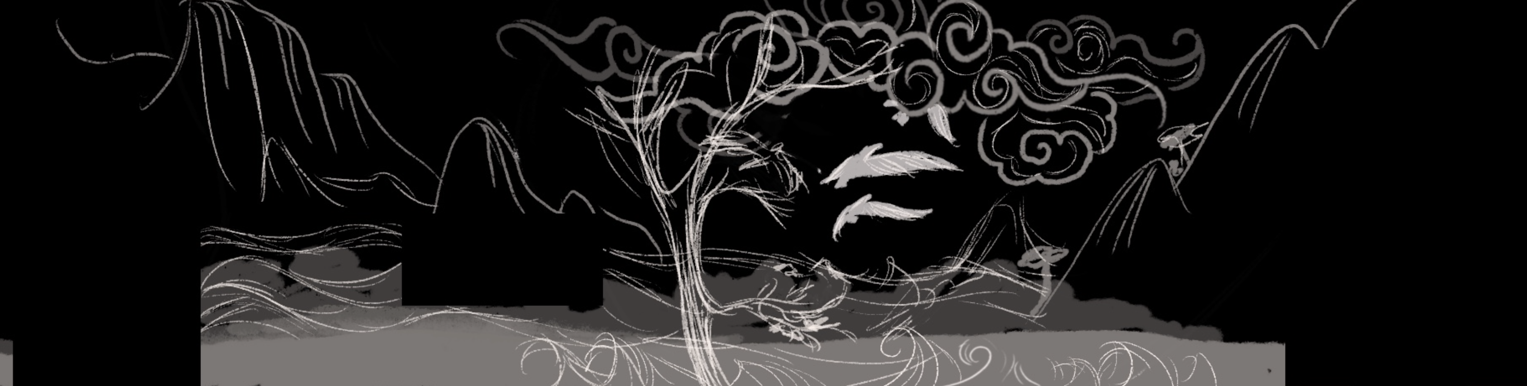
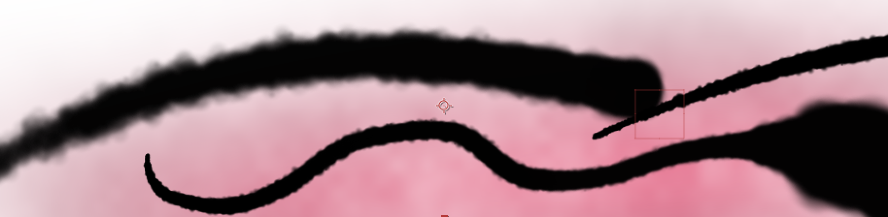
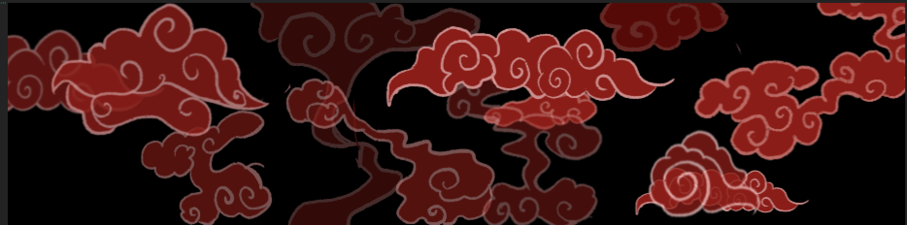
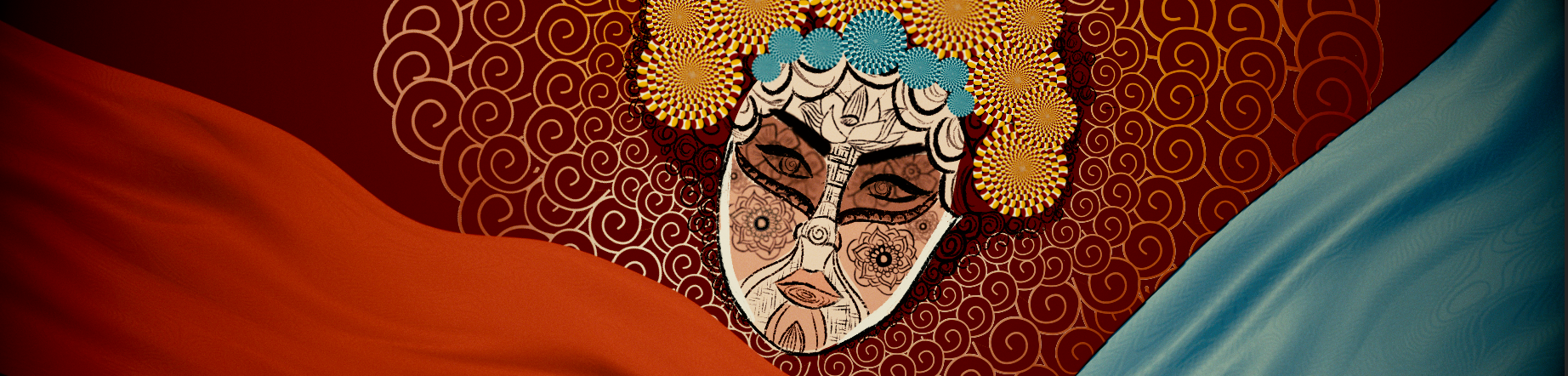
Early ideas and layouts
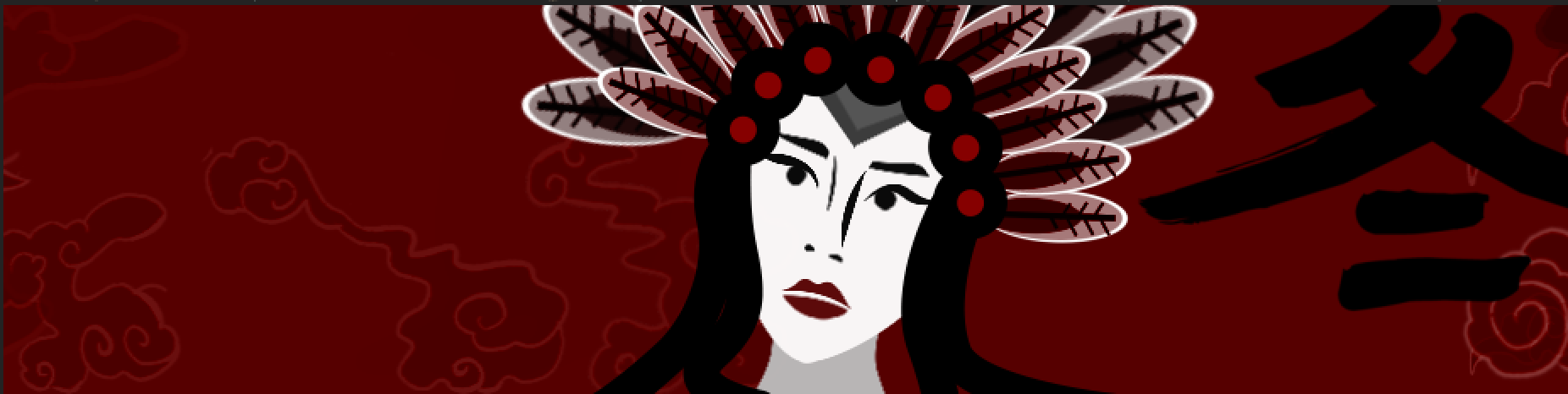
After the first test, we found that the colour scheme is too bright. It might distract the audiences when it comes to the big screen. So, we decide to shift the background to dark red.
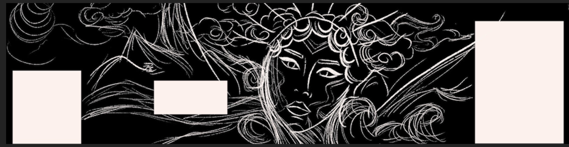
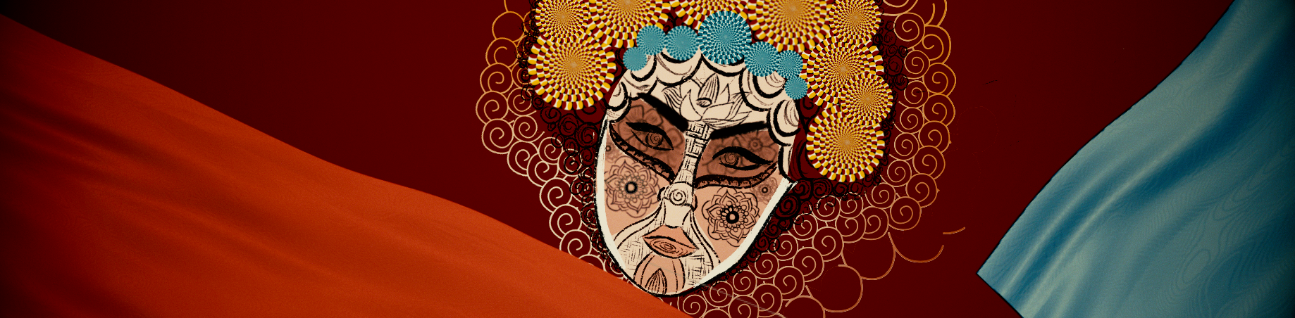
The mock-up
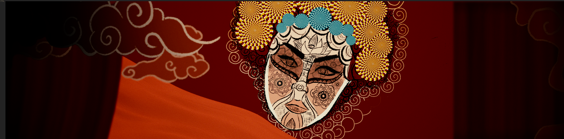
The Second Update
According to the feedback, we added more details to the face, hence made it more decorative and graphical-looking.

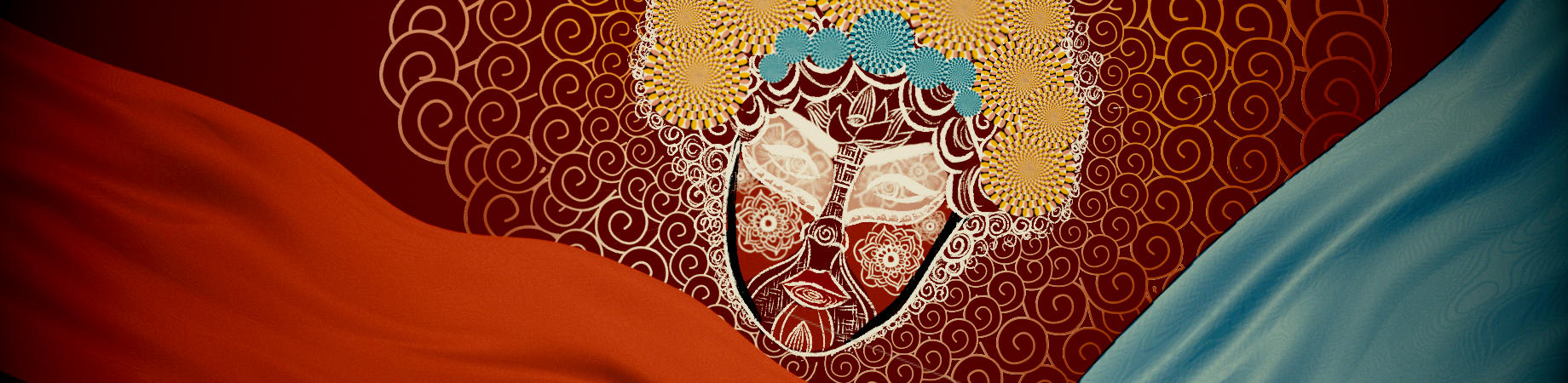
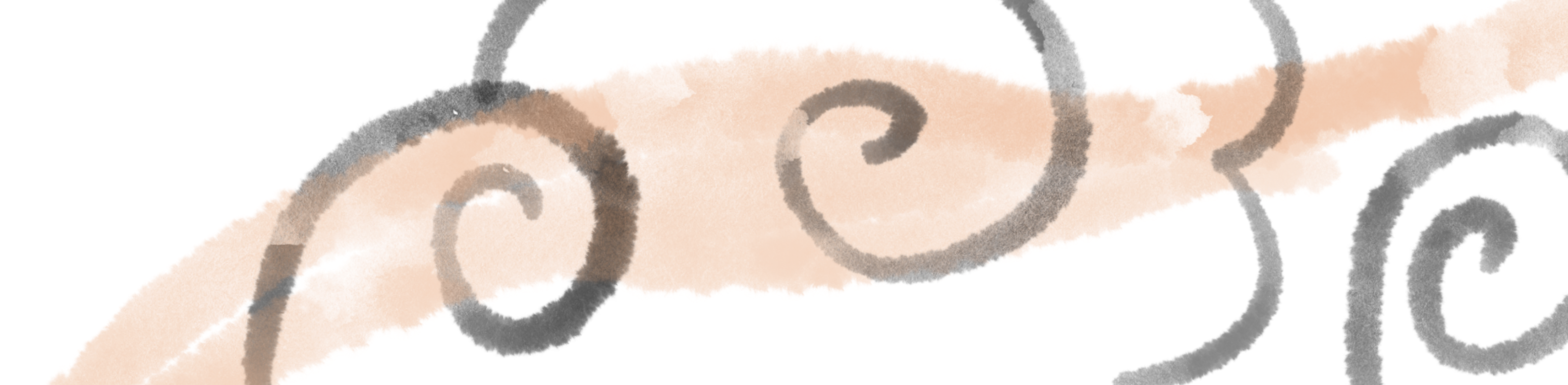
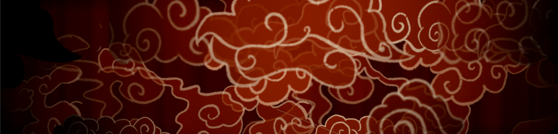
Instead of ink drops, we decided to use elements like curtains and clouds which are tidier, hence, the face will be differentiated from the background.
For colours, we realised that changing the outline from white to black will make the face more outstanding comparing to the background.
See the test renders:
https://drive.google.com/drive/folders/1IEJgWFowVPes_RNH3BDO_H3EdxlvPttK?usp=sharing