So this time, we are tasked to take photos of an object and subvert its meaning.
The object I was appointed with: Tree.
And here are my photos:
Task 1: Denotation:
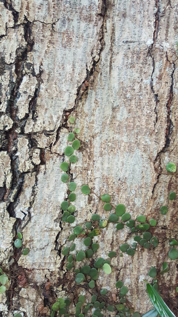
Context: Physical attribute of object
- Photo is a close-up of a tree bark
- Wanted to capture the texture of the tree
- The green ‘climber’ plant is incorporated in the photo to provide a hint that the photo is showing a tree as opposed to a cracked wall.
Camera/Photo technique: Close-up
- Close-up is utilized to capture the details of the texture of the tree which is lost if the camera was further away from the tree

Context : Practical function of object
- Photo depicts the tree being used as a shade
Camera/Photo Technique: Wide shot
- Wide shot is used here to include the patches of grass, some of which are illuminated by the sun while others are not.
- Emphasizes the point of the tree providing shade
- Bark of tree is also included to show that the tree is being used
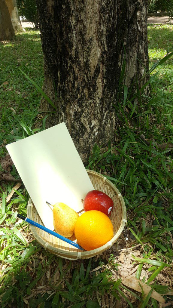
Context : Practical function of object
- Basket of items that originates/are made from trees
- Fruits (Apple, orange, pear) – grown on trees
- Pencil – Body is made of wood
- Book – Paper is cultivated from pulp which is processed from wood
- Basket – Crafted out of wood
Camera/Photo technique: High angled and Middle shot
- High angle shot is utilized to make the contents of the basket visible
- Middle shot is used to include the tree bark in the photo to link the items to their origin – the tree
Task 2: Connotation

Context: Object’s cultural meaning
- In Indonesia, there is a belief on how humans were created – Man was created by 2 gods cutting vertical slices into a Fig Tree, while woman was created by horizontal slices
- Photo shows a ‘female’ tree entering the women’s side of a toilet while a ‘male’tree looks on
Camera/Photo technique: Middle shot/ Focus
- Middle shot is utilized here to incorporate both trees into the photo for comparison
- Focus is centered on the ‘female’ tree and the toilet as they give context to the photo

Context: object’s cultural meaning
- Many early people thought that their ancestors’ souls live in trees
- Image depicts a photo frame of an old tree – used to represent a tree that has passed on – recreating a photo frame such as those found on ancestor shrines
- ‘Tim’ in Grandpa Tim is used in reference to the word ‘timber’
Camera/Photo Techniques: Wide shot/ Black-and-white
- Wide-shot is utilized to include the whole ‘tree’ instead of just a section which may not come across as a tree to the viewer
- Black-and-white effect was used to portray the tree as being old – photo was taken long ago

Context: Critiquing the object’s meaning
- Photo shows a tree shedding blood as it’s being chopped by an axe – represents the idea of a tree having a life like humans do
- Photo critiques our common perception of trees – a living object but not as animate as that of animals
Camera/Photo Technique: Wide shot/ Focus/ Increased exposure/ Vignette
- Wide shot is utilized to include the cut tree at the background – illustrates how the situation of chopping is a process happening in the present
- Focus is centered on the tree and hand holding the axe to emphasize their importance in the photo
- Exposure is increased to heighten the intensity of the blood color for a more compelling touch to the photo
- Vignette is applied to create a dark theme to the photo – presenting the situation as grievous
Task 3: Poster

Context: Screenshot of a computer image file
- The text “Wallpaper_5.jpg” acts as a relay to the interpretation that the image is a screenshot of a computer file
- Photo is visually similar to stock background images found in computers
- Questions our view on trees in everyday life – we don’t usually pay attention to them all the time – they blend into the surroundings like a digital wallpaper in a computer desktop
- Cracks on tree bark symbolizes the tree’s frailness – signifies how trees are not almighty and can perish in the face of human intervention such as deforestation
- Accentuates the point that we should cherish trees and protect them – if we don’t, in the future, this kind of wallpaper images will be the only proof that trees existed
Camera/Photo Technique: Text
- The text “wallpaper_5.jpg” is added at a corner of the image to provoke a second thought in the viewer – contrary to the first thought that may be close to that of “a photo of a tree bark”
- Second thought leads to the questioning of our view on trees
- “5” in “wallpaper_5.jpg” provides a hint that this image file is one part of a set of wallpaper image files
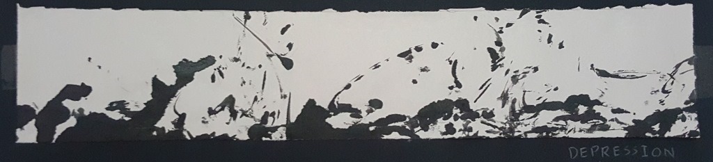
Process
Here are some test shots for task 1:


And some photos of the props used for Task 2: