Foundation 2D Project 2: Forrest Gump

Project 2 started with searching for movie quotes, which are then transformed into surrealist/dadaist compositions.

I had a lot of difficulty in this project, particularly on the abstract part. The compositions that we were to produce had to portray the meaning of a quote without the use of direct symbolism. For this part, I went through quite a fair number of tries.

Quotes:

“Don’t let anybody tell you, you can’t do something”

-Chris Gardner, The pursuit of Happyness

(happyness was purposely spelled with a ‘y”)

Well, this quote really means a lot to me. It’s what i believe in. Even if the whole world disapproves of something you want to do, just do it. It’s your life, it’s your choice, it’s not something for others to decide.

“Happiness can be found in the darkest of times, if one only remembers to turn on the light”

-Albus Dumbledore, Harry Potter and the Prisoner of Azkaban

Well i chose this quote because i like the Harry Potter series as a personal preference.

“Get busy living, or get busy dying”

-Andy Dufresne, The Shawshank redemption

This movie is rated all-time number one on multiple movie review sites such as IMBd.com

This scene in particular, where a man who has been locked up in prison for 10 odd years for a crime he was framed for, does not give up hope of getting out really stuck with me.

Unfortunately, i did not use this quote for the compositions.

Drafts

Draft 1

Fast-forwarding through this one.

This draft was done before i understood the art direction of the project so it was completed off-the-mark and scrapped.


Draft 2

Quote:

“Happiness can be found in the darkest of times, if one only remembers to turn on the light”

-Albus Dumbledore, Harry Potter and the Prisoner of Azkaban

This was my first actual composition, where i broke up the quote into different key words and tried to represent them in a visual manner.

Explanation:

  • Darkest – represented by piles of human skulls, symbolizing a graveyard, demon roaming among the skulls represents terror while the huge moon on the background provides the overall ‘dark’ theme.
  • light – is presented quite literally, with a lamplight
  • happiness – represented by birds flapping freely, showing happiness through freedom, and a grass patch express life and vigor.

Flaws:

  • The overall ‘darkness’ theme on the top-right corner of the composition is too literal and was rejected.
  • The lightlamp is rejected without haste
  • the meaning of ‘happiness’ through the grass patch didn’t come across well
  • The slanted composition didn’t have meaning in it

Verdict:

Rejected


Seeing that the first composition did not go well at all, i decided to go with a more  surrealist approach.

collage from ‘Une Semaine de Bonté’ (A week of kindness), 1934, Max Ernst

I researched more into surrealist works and was inspired particularly by surrealist Max Ersnt’s collages where he connected objects from distinctly different bodies together to form a unique entity to portray a meaning.


Draft 3


Quote:

“Don’t let anybody tell you, you can’t do something”

-Chris Gardner, The pursuit of Happyness

I thus used the same method by connecting ‘stop’ road signs to a man’s head and handcuffed hands to a boy’s legs to portray the meaning of the quote.

Explanation:

  • Can’t do something –  man is used to represent a higher authority looking down and controlling a smaller target (in this case a young boy), hands holding batons show violence as a means of control while ‘stop’ signs means restriction

Flaws:

  • Only half of the quote was expressed in this composition
  • Boy is not apparent in the composition as his head looks like a huge black void in front of the man’s mouth
  • Part of man’s suit is lost due to over-exposure


Along the way, i was thinking about cats, and recalled the Metro Goldwyn Mayer logo.

Metro Goldwyn Mayer logo


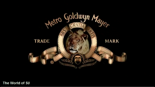
This led to the creation of the next composition:

Draft 4

Quote:

“Happiness can be found in the darkest of times, if one only remembers to turn on the light”

-Albus Dumbledore, Harry Potter and the Prisoner of Azkaban

Explanation:

  • Darkest – represented by the carnivorous members of the feline family such as the tiger, lion, jaguar, fox, wolf and cheetah.
  • Happiness – represented by the little kitten in the center of the composition, like a pleasant surprise of species evolution through centuries
  • Light – represented by the sunflower that provides a clean border that separates the cat and the other felines

Flaws:

  • The negative space within the flower that surrounds the cat is too large and seems to be engulfing the cat


During my research, I was also inspired by Belgian surrealist René Magritte’s Golconda, where images of a person is repeated in a pattern which could imply movement.

Golconda , René Magritte


Draft 5

Quote:

“Don’t let anybody tell you, you can’t do something”

-Chris Gardner, The pursuit of Happyness

Here, I utilized repeated images of the boys to imply that they are jumping around, even though their images are actually static.

Explanation:

  • you can’t do something – as usual, i used a man and two boys to imply control from a higher authority, the hands symbolize control over the boys as they are trying to grab them
  • don’t let anybody tell you – i represented this with the use of the two boys jumping about carefreely, even in the midst of a man reprimanding them – which can be interpretated as a sign of rebelliance – one of the boys is even shown hopping onto the man’s head

Flaws:

  • The boy on the right who is jumping out of the man’s mouth makes it seem like the man is eating him – a loss of focus on the quote’s meaning

Final products:

Final composition 1

Quote:

“Happiness can be found in the darkest of times, if one only remembers to turn on the light”

-Albus Dumbledore, Harry Potter and the Prisoner of Azkaban

After multiple reworking, this was how the composition turned out.

Critique:

  • The fox tail on the bottom-left of the composition looks like a huge black thing which is undecipherable
Final composition 2

Quote:

“Don’t let anybody tell you, you can’t do something”

-Chris Gardner, The pursuit of Happyness

Explanation:

  • you can’t do something – the crane machine represents a cage, a prison, that restricts someone, the crane claw symbolizes control, the ‘toy’ sign shows that the kid was just a plaything for the adults – implying total control
  • don’t let anybody tell you – the kid is shown escaping from the crane machine while the adults are staring and shouting in horror

Critique:

  • the second man beside the one on the right is not needed as his gaze brings the viewer’s focus away from the boy
  • the crane claw’s angle can be further tweaked to face the boy so that the implied line towards the boy are not lost
Final composition 3

Quote:

“Happiness can be found in the darkest of times, if one only remembers to turn on the light”

-Albus Dumbledore, Harry Potter and the Prisoner of Azkaban

Explanation:

  • darkest – the background shows a stormy sky with thunder that implies dark times, the breaking of the fountain pen symbolizes a tragic event
  • happiness – the ink spill from the fountain pen miraculously inks out a scene of a bed of sunflowers  – showing happiness that is chanced upon during an accident – the bed of sunflowers also completes the picture of a patch of grassland with the stormy background
  • light – expressed through the use of sunflowers and the shadow cast by the lightning on the fountain pen

Critique:

  • the head of the pen which is on the table points to nowhere and misguides the viewer’s gaze


Final composition 4

Quote:

“Don’t let anybody tell you, you can’t do something”

-Chris Gardner, The pursuit of Happyness

This composition too went through a liberal amount of changes which included the addition of:

  • jail bars at the background- to reinforce the meaning of restriction and being monitored
  • breaking of handcuffs in the middle – symbolize breaking free from control
  • fighter jets flying at the bottom – imply taking off through flight, which is a universal expression of freedom

The boy’s head is also drawn in digitally as it was obscure in the beginning. The man’s teeth was also drawn in to show that he is actually biting down on the boy.

Implied lines are utilized here where the batons point towards the boy, who becomes the vanishing point as the main focus for attention.


The batons are also in the shape of a jester’s hat to imply a reference to the Batman’s joker, showing that this scene is bizarre and wrong.

Foundation 2D Project 1 “My Line is Emo” Product

Introduction

So the task is to produce 6 lines to express various emotions.

The emotions provided are:

  1. Love
  2. Joy
  3. Surprise
  4. Anger
  5. Sadness
  6. Fear

and they can be branched off into Secondary and Tertiary emotions as well.


As for the method we have to use to create these lines:

Mark-Making


There are so many ways of mark-making, and an almost-infinite number of tools we can use. It became daunting as to knowing where to even begin.

Thus, I’ve decided to work backwards instead – by starting with the end-product in mind. The way and exact tool to use will then follow suit.


Research

Using the internet, i searched up on examples of expressive lines that others have created. Then, utilizing them as inspiration, I created sample products for each emotion.

Love
Joy
Surprise
Anger
Sadness
Fear


Now that I’ve got a general idea of how the marks will turn out, it’s time to consider the tools to use.

Literally anything can be used to make a mark on a piece of paper, and that is quite intimidating as i don’t know which tool to even start with. Therefore,  I’ve decided to narrow them down to a theme:


Personal account of situation related to specified emotion -> Extract an object from that situation to use as a mark-making tool


Alright, now that the planning is settled, it’s time to make some test products.


Test products


Love:

Tool selection:

Love -> Love for an object -> I would be willing to spend any amount of money to buy it -> object:  money -> Coin

coin


Samples:

Love Test 1
Love Test 2


Joy:

Tool selection:

When I’m in happy/ in a good mood -> find fun things to do/ play -> fun things   -> object: toy -> beyblade toy

beyblade


Samples:

Joy Test 1
Joy Test 2


Surprise:

Tool selection:

Nothing surprises me more than an insect that appears suddenly -> I usually try to crush it using a pail or broom -> object: pail or broom


but a pail or broom is too big to use as a mark-making tool


continue situation -> I would then use a tissue to clean up the remains of the “obliterated” insect -> object: tissue

Tissue


Samples:

Surprise Test 1
Surprise Test 2


Anger:

Tool selection:

When I’m pissed off at something -> usually try to suppress my anger and release it somewhere else -> such as by drawing -> drawing tool -> brush

Brush


Samples:

Anger Test 1
Anger Test 2


Sadness:

Tool selection:

When I’m feeling down -> nothing helps better than some cold beverage to comfort the soul -> object: beverage -> water bottle

Bottle


Samples:

Sadness Test 1
Sadness Test 2


Fear:

Tool selection:

When I’m frightened or anxious -> tend to fidget a lot and grab onto my clothes -> object: clothes -> cut-off sleeve from an old shirt

Cut-off sleeve


Samples:

Fear Test 1
Fear Test 2


Draft 1:

Seeing that the test products all have white and plain background, I felt that more could have been done with the unused space. Hence,  I tried using the Monoprint technique to create a background for each of the emotions.


Love Test 3
Joy Test 3
Surprise Test 3
Anger Test 3
Sadness Test 3
Fear Test 3


The backgrounds were created by having an ink layered piece of paper covering over the product (ink side facing the product), and swiping the top of the paper with the mark-making tool.


However, feeling that the backgrounds diminish the appearance of the mark strokes, i have decided not utilize them.


Draft 2:

During the consultation with Professor Joy, I have been recommended to work on a larger scale.


Love large canvas
Joy large canvas
Surprise large canvas
Anger large canvas
Sadness large canvas
Fear large canvas


Having created the marks on a larger piece of canvas, I then cut up a section of them to use as the final product.


Final product

Love:

Love final product

Explanation:

  • The smooth lines of highs and lows represent love as a journey

– There will be good times at the top and bad times at the bottom

– The thicker ends at the top resembles how everyone works hard to make the good times last and memorable

  • The splash at the bottom left of the strip represents a huge crash in any kind of relationship

– But the part that follows into the next upward curve shows that by persevering through thick and thin, we can overcome the odds  and continue the relationship

Method utilized:

I threw and swept the coin across the paper as i would when purchasing something i like in eagerness at the cashier


Elation (Joy) :

Elation final product

Explanation:

  • Quick spirals represent bursts of energy

– Ink marks looks like they are depicting a dance of joy and celebration through long swiping curves and playful splashes with no specific pattern

  • Continuity of the piece represents continuous vigor of enjoyment with no time for rest

Method utilized:

I spun the beyblade piece around the paper energetically as if i’m playing and having fun


Astonishment (Surprise) :

Astonishment final product

Explanation:

  • The darker areas at the bottom of the piece represents the initial impact of a shock

– Ink strokes that gradually becomes lighter towards either ends of the strip represent how one slowly recovers from the shock over time

  • The texture of the ink strokes resemble the red veins one would see at the corners of one’s eyes when suddenly blinded by bright light

Method utilized:

I whipped tissue paper on the strip as if i’m hitting a fleeing insect


Rage (Anger) :

Rage final product

Explanation:

  • Quick upright strokes that are generally lighter at the bottom and heavier at the top represents rising tension
  • Thicker clots of ink concentrated in a few areas represents numbness that arises from a headache during a moment of anger
  • Minimal amount of positive spaces in the strip represents how one’s mind is every tight and susceptible to bursting during a state of anger

Method utilized:

I whacked the brush forcefully on the strip as if i’m venting my anger out


Depression (Sadness) :

Depression final product

Explanation:

  • Numerous blots of scattered ink represents the emotional wave in one’s heart which rises and sinks

– Sweeping flickers of ink at the top of the strip represents how the ups (moments of happiness) are usually short and fleeting during depression

– Majority of ink found at the bottom of the strip represents how one feels down most of the time during depression

Method utilized:

I spun the water bottle in a monotonous fashion – resembling how everything feels grey and lifeless when one is in depression


Anxiety (fear) :

Anxiety final product

Explanation:

  • Dashing strokes to the left and right represents the blur of the surroundings when one looks around quickly and haphazardly during a state of anxiousness.
  • The two dark areas to the left and right of the strip represents tunnel vision which one gets when anxious and not focusing on the surroundings

Method utilized:

I swiped the cut-off sleeve around the paper as i would when grabbing onto my clothes when anxious.


Research for this project can be found here: https://oss.adm.ntu.edu.sg/ryan011/project-1-my-line-is-emo-research/

Foundation 2D Project 1 “My Line Is Emo” Research

So the first project task for Foundation 2D has been assigned and it’s to create 6 expressive lines to evoke 6 different emotions.

First thing first is to do some research.

What is Mark Making?

Mark making is a term used to describe the different lines, patterns, and textures we create ​in a piece of art

(Quoted from https://www.thoughtco.com/how-does-mark-making-affect-your-paintings-2577630)

As the article states, Mark Making is a technique that encompasses any form of mark that is created on a piece of paper with any object.


Sounds simple enough, but having an infinite number of ways to create marks on a piece of paper makes it difficult to know where to start.

So let’s look at some of the techniques that other artists have used to create their works.


Ed Moses

Ed Moses

One of the first paintings that Ed Moses did was during an still life art class where he used his fingers to paint after being terrified by the critique that the teacher was giving other students.

The work that he has produced, something closer to that of abstract expressionism, was different from the others. Not only did it stood out, it also became iconic in his art style throughout his career.


“Just look. Don’t think. Don’t extract some ideas or some meaning. It doesn’t have any meaning — it is what it is. You’ll just look on the wall and see what it is,” – Moses, in an interview

(Quoted from http://www.scpr.org/programs/the-frame/2015/05/29/42820/ed-moses-says-he-doesn-t-make-art-he-makes-magic/)


Here are some of his works:

WC-C’ (2014) by American painter Ed Moses

I really like how some simple lines that Ed Moses have dashed across the canvas here and there can create something that is so astonishingly pleasing to look at.

The color contrast between the reds and blacks gives the painting impact to the eyes. While the hints of yellow really complements the other 2 colors to bring about flavor to the work.


Ed Moses, Untitled Abstraction III


Patterns.

Different patterns brings about different meanings and what Ed Moses have did here is to make a sort of collage of different patterns to create this labyrinth of feelings.

It is amazing how the viewer’s perception of the painting changes as his or her eyes darts from one point of the painting to the next.


Ed Moses, “Avilda,” 1963


Negative spaces.

Ed Moses  is playing around with empty spaces in the canvas to give emphasis on shapes and textures found in this work.

I amazed by how the sudden transition from the blank canvas to the marks produced by graphite can give significance to the shaped produced by the marks.

The small little shapes that have a sharp color difference  from the canvas and graphite adds a neat little “special” touch to the work


“Moses was making drawings where he would try and press so hard on his drawings that supernatural light would come out of them” 

(Excerpt from https://www.kcet.org/shows/artbound/ed-moses-the-compulsive-creator)


Learning points

Seeing how dynamic strokes and patterns can create impact, I would try to emulate them in my mark-making process. Especially so on the stronger emotions such as “Anger” and “Joy”

I would also strive to incorporate the usage of negative space to emphasize the shapes or patterns that i will be creating on the canvas.


Cai Guo Qiang

Cai Guo Qiang

Cai Guo Qiang is a Chinese artist born in Quanzhou, Fujian Province, China.

Cai lived through the Cultural Revolution of China where explosions were common, whether they were the result of cannon blasts or celebratory fireworks which has had an influence on his choice of using gunpowder in his works.

Some of Cai’s works:

Cai Guo-Qiang, Tide-Watching on West Lake:

Most of Cai’s works incorporates real life objects such as animals and buildings, but in the spirit of the project task in hand, i have opted to refer to some of his works that are more abstract in nature.

The above work was done by exploding gunpowder on the canvas to give a very expressionistic feel to the marks. I really like how the marks look so messy and dispersed but yet feels controlled.

The little splatters of marks around the general cluster gives the work a striking impression as it makes the marks look like they are popping out of the canvas.

Typhoon, 1985

This is one of Cai’s earlier works before he started working with gunpowder.

It is created by laying oil paint on the canvas and blowing it with air from an electric fan.

I find this extremely intriguing as it is a whole new way of making marks on a canvas which is not commonly found in other artists’ works.

Not only is the technique interesting, but the marks created are these smooth, natural ink dashes that is exceptionally difficult to reproduce with the usual human hand-and-brush.


“The key is to focus on the process of fabrication of these artworks, to pay attention to the process of the artists making these sculptures, rather than where these sculptures will end up and how they will look in the end.” – Cai Guo Qiang in an interview with the Brookln Rail

(http://brooklynrail.org/2008/04/art/cai-guo-qiang-with-ellen-pearlman)


Learning points

From Cai’s works, it is evident that a great looking work need not be produced by physically pressing or brushing an object on the canvas by hand but can also be done by using external factors such as explosions or wind.

I would want to attempt to replicate this notion by including some techniques that involves getting ink onto the canvas without the condition of contact between the mark-making object and the canvas in my work.