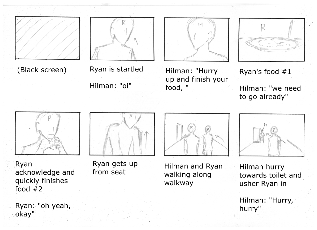
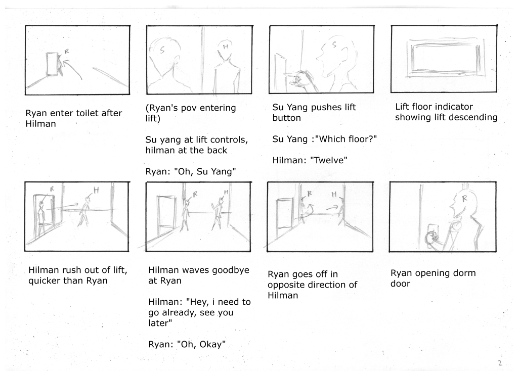
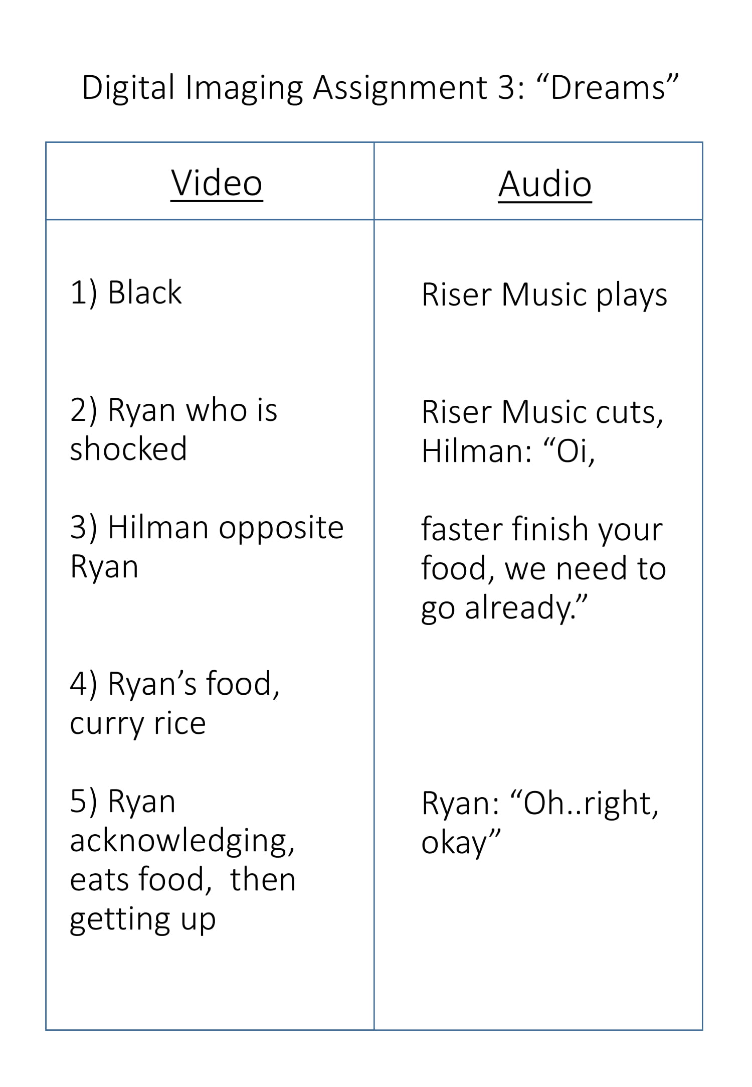
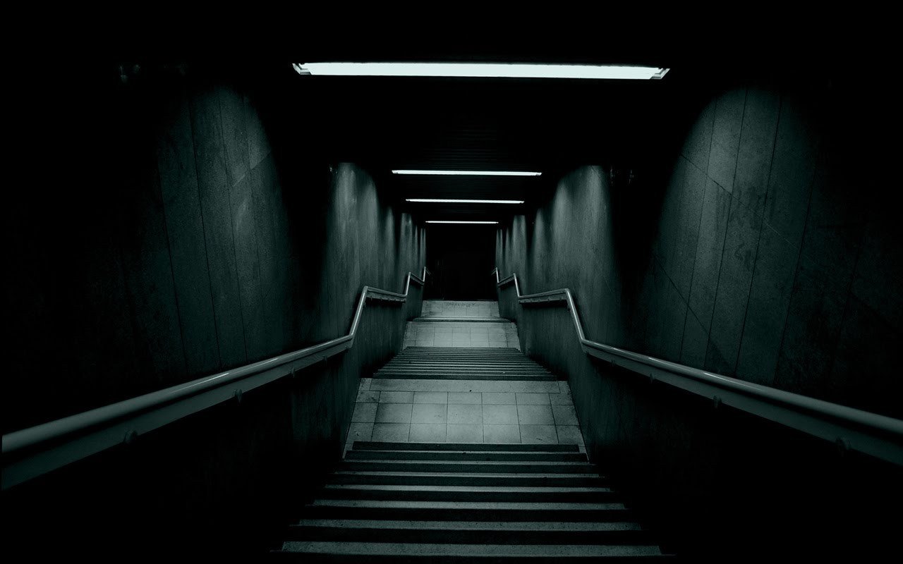
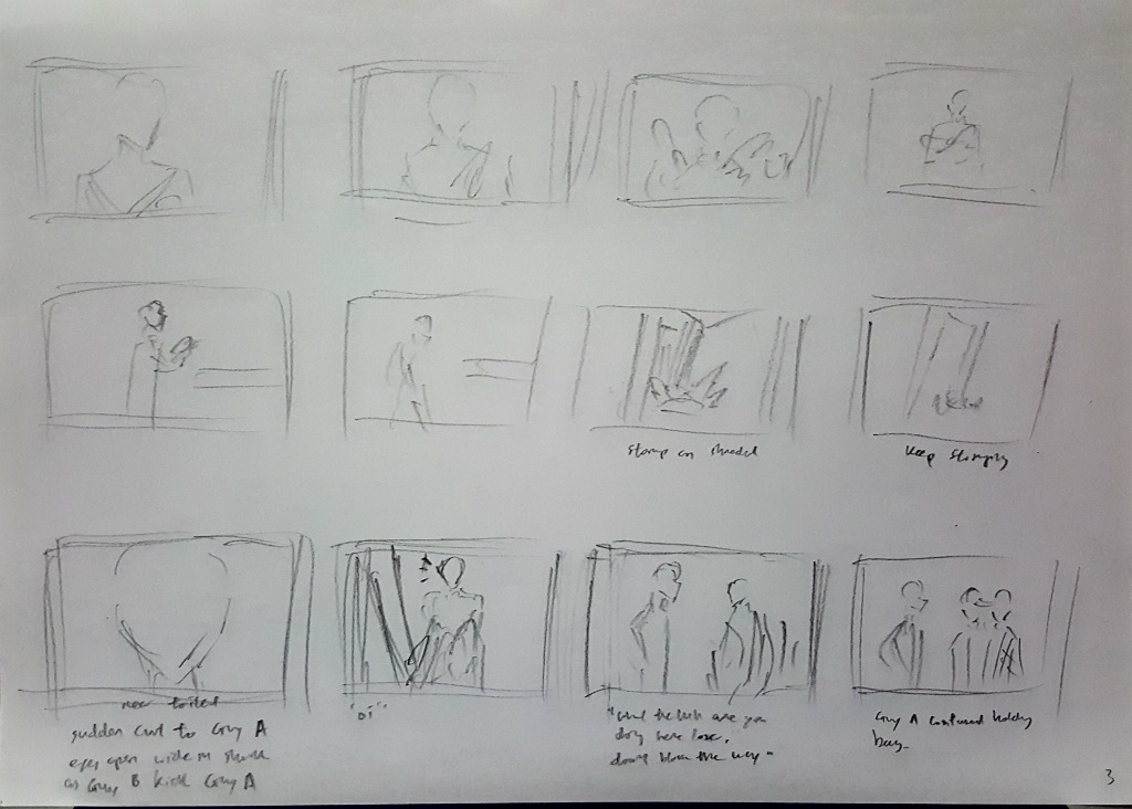
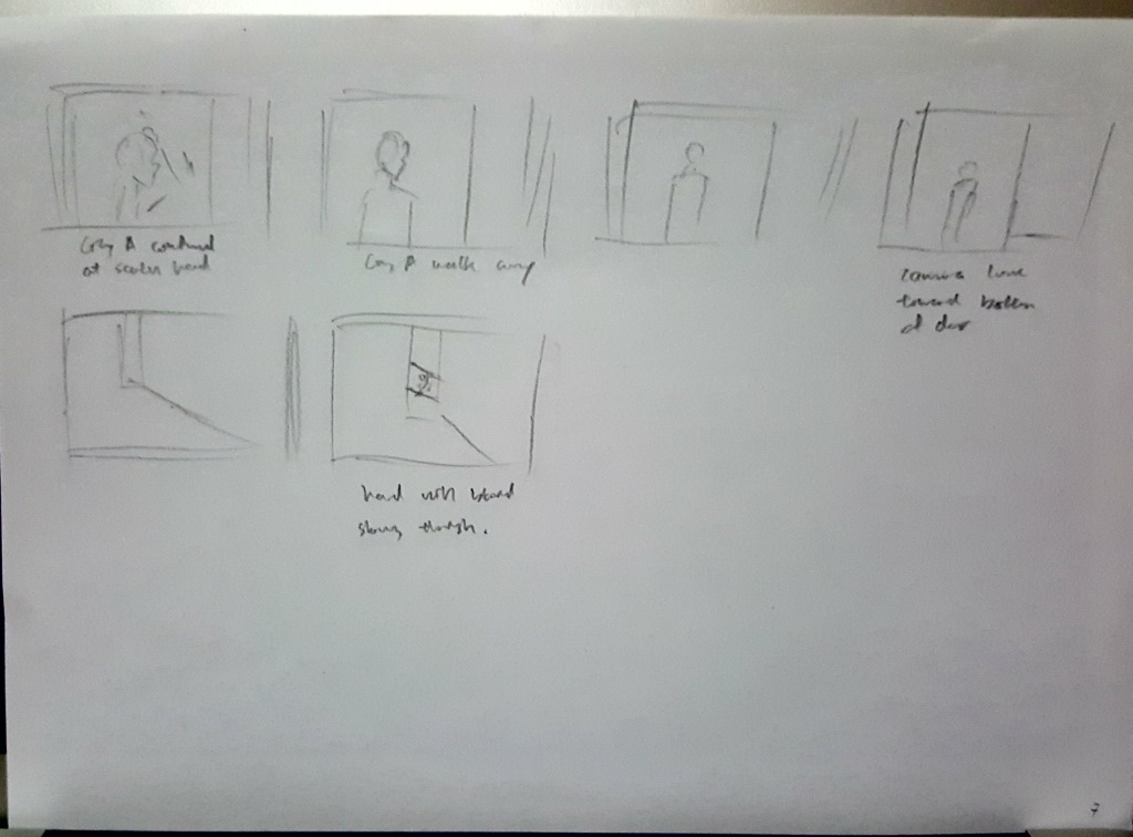
It is a representation of a dream that the main character is having.
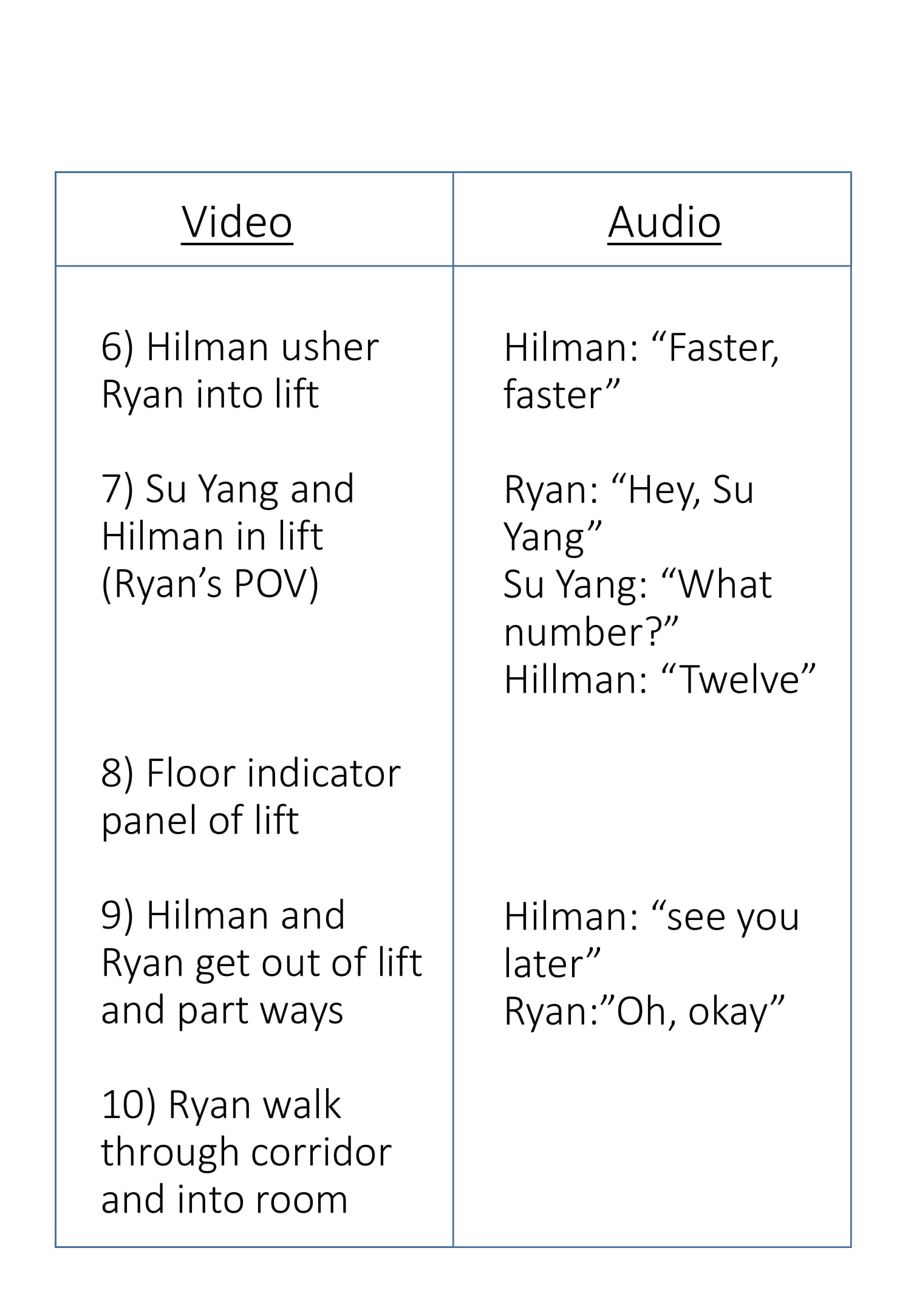
Unrealistic sequences such as entering a lift through a toilet entrance and people who are supposed to be somewhere else appearing in a completely different location is shown.
The fact that the story still somehow continues moving forward even though strange things are occurring drives the notion of it being a dream.
I was intending to go for a cold, dark atmosphere for the short film.
Explanation:
I was thinking of something comedic when i started on the assignment, and wanted to create an exaggerated situation because of the flexibility that the word “dream” gave.
The riser sound effect at the start of the film was to grab the audience’s attention and to set a dark, mysterious tone for the first part of the short film.
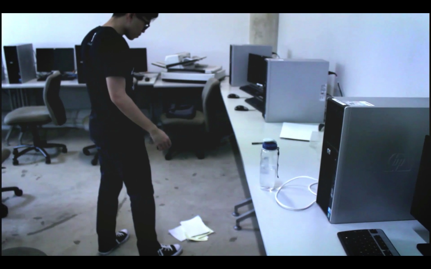
Screenshot 1Screenshot 2
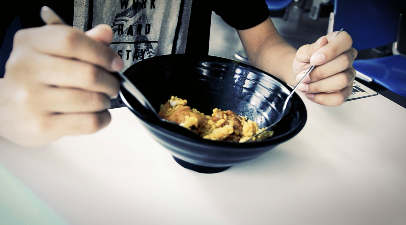
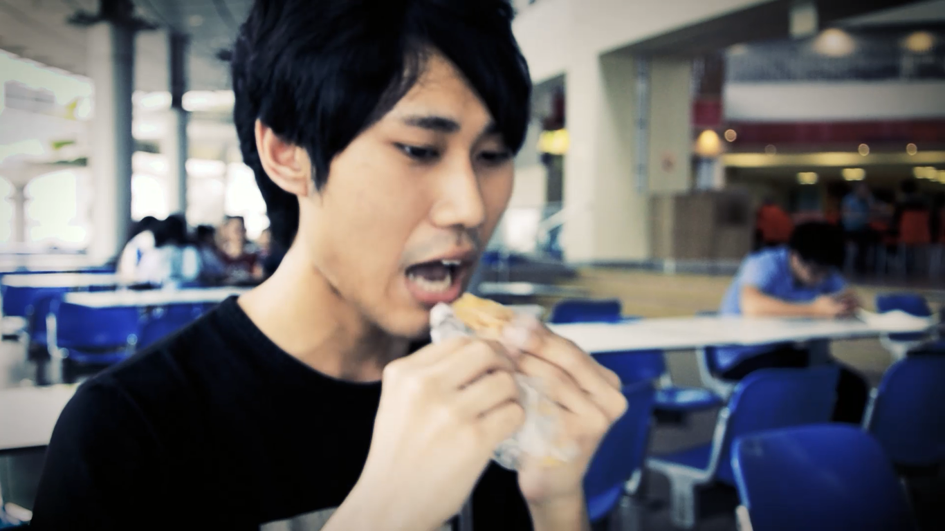
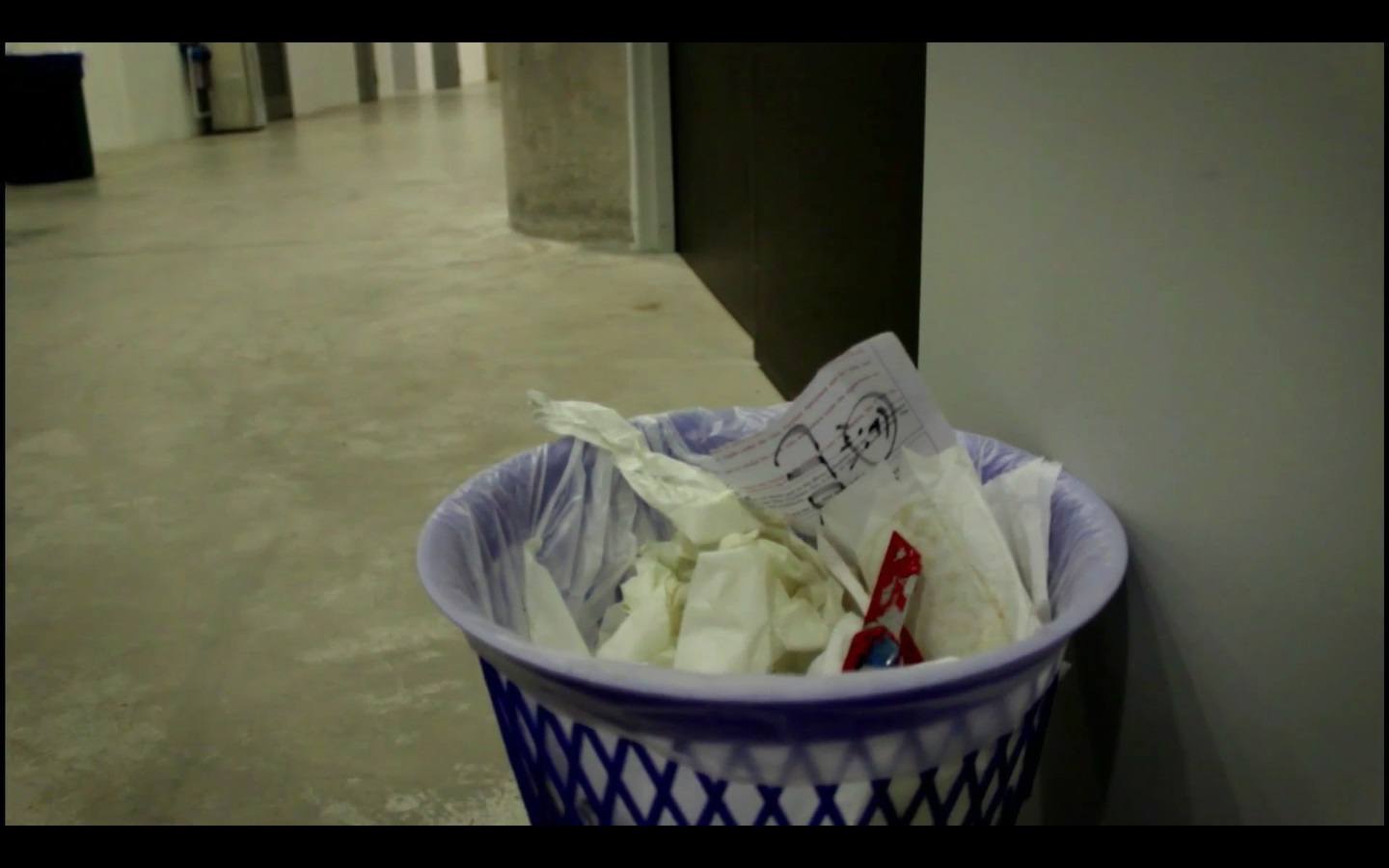
The first strange occurrence is the bowl of curry rice turning into a fried snack between two scenes.
Screenshot 3Screenshot 4
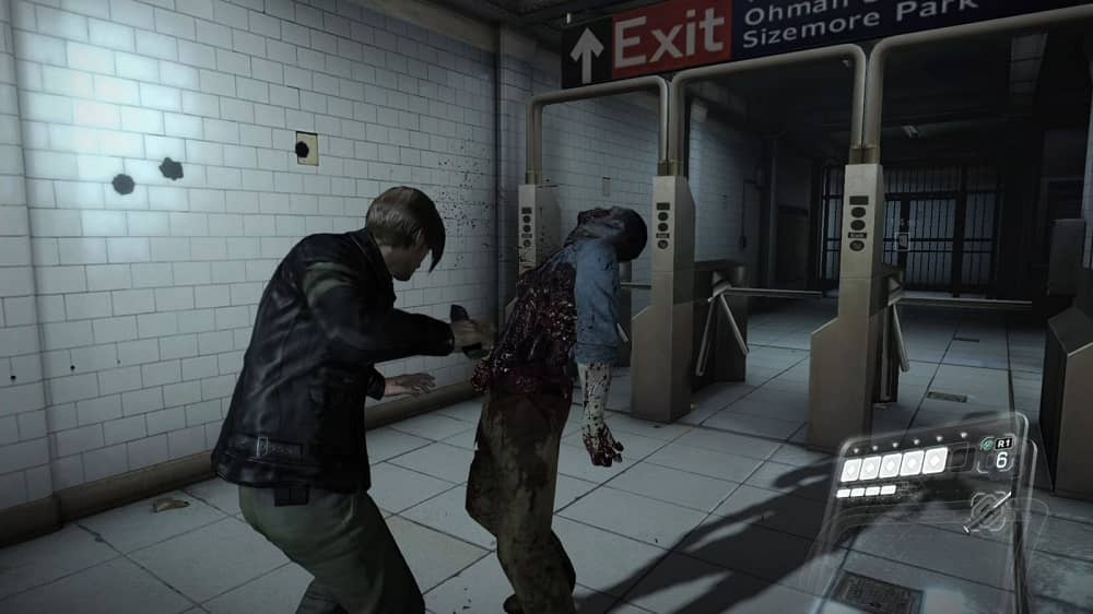
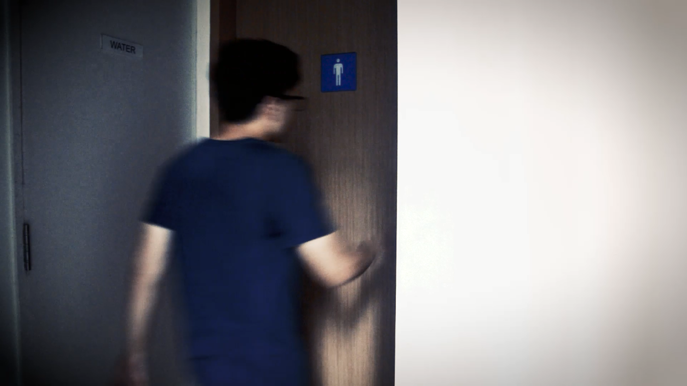
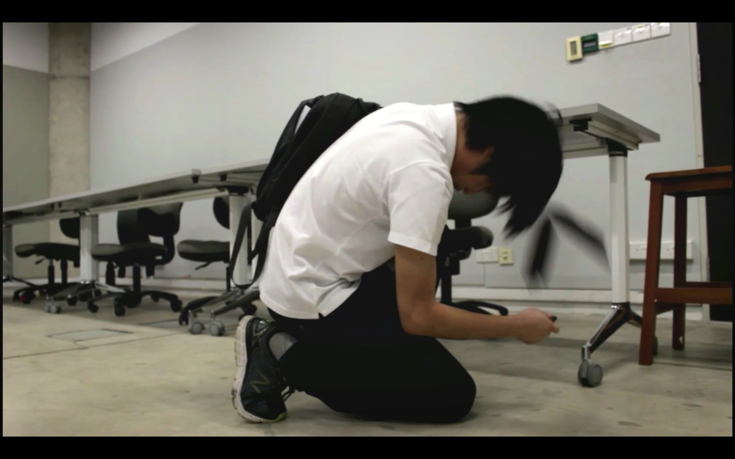
The second strange occurrence is the characters entering the toilet door and ending up in a lift
Screenshot 5
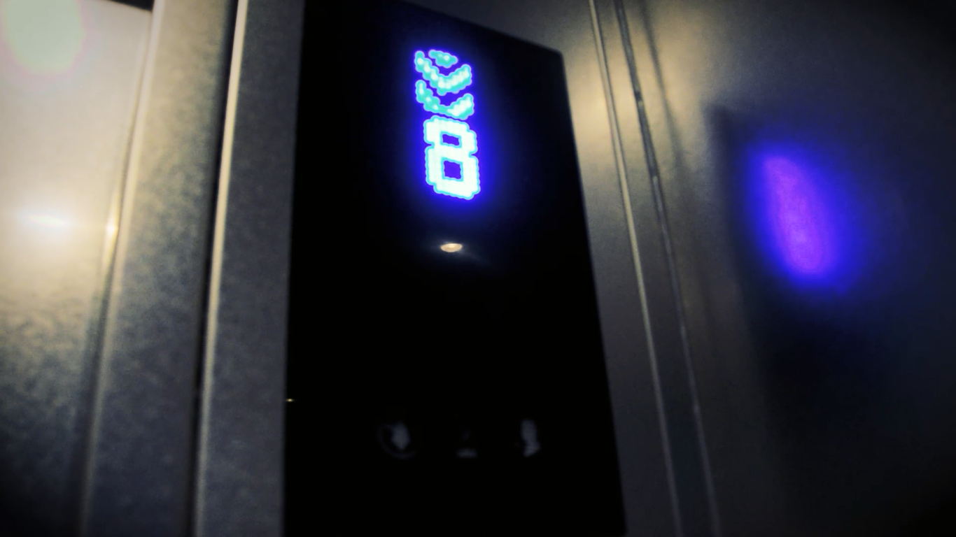
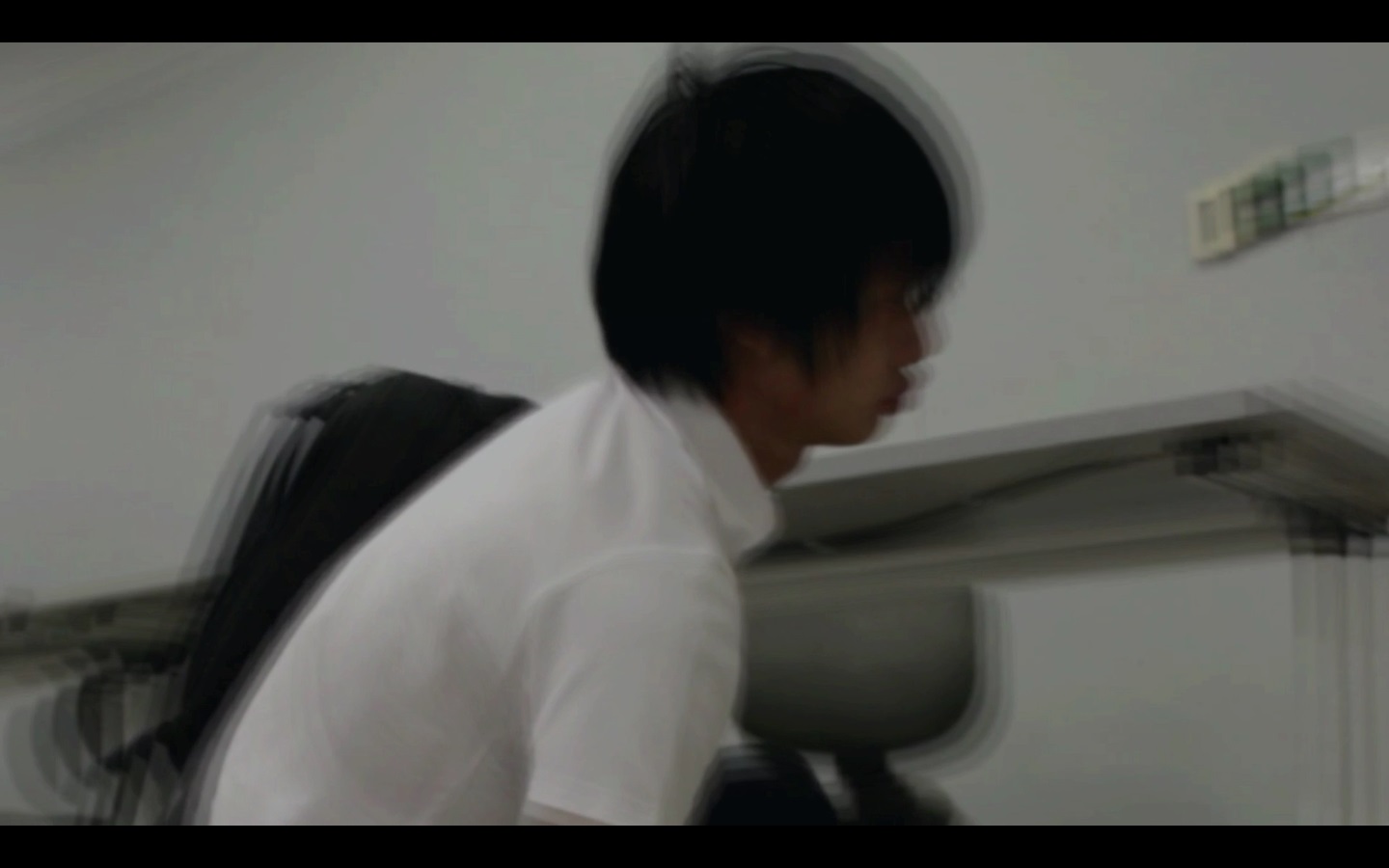
The third strange occurrence is the lift going down, even though the guys were supposed to go up
Screenshot 6
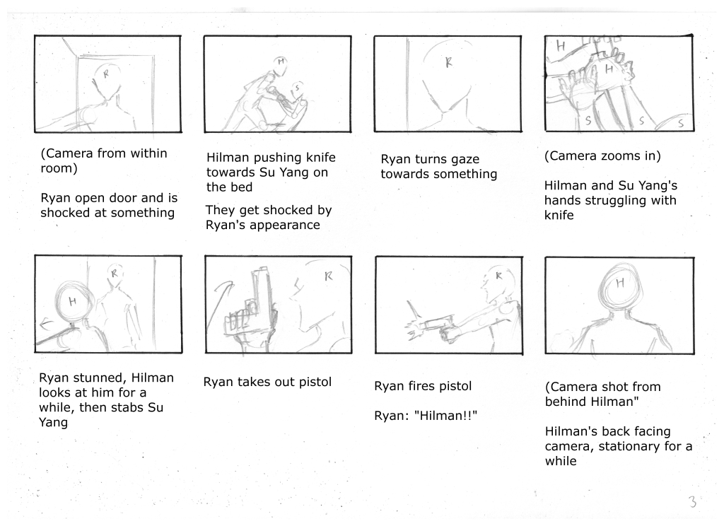
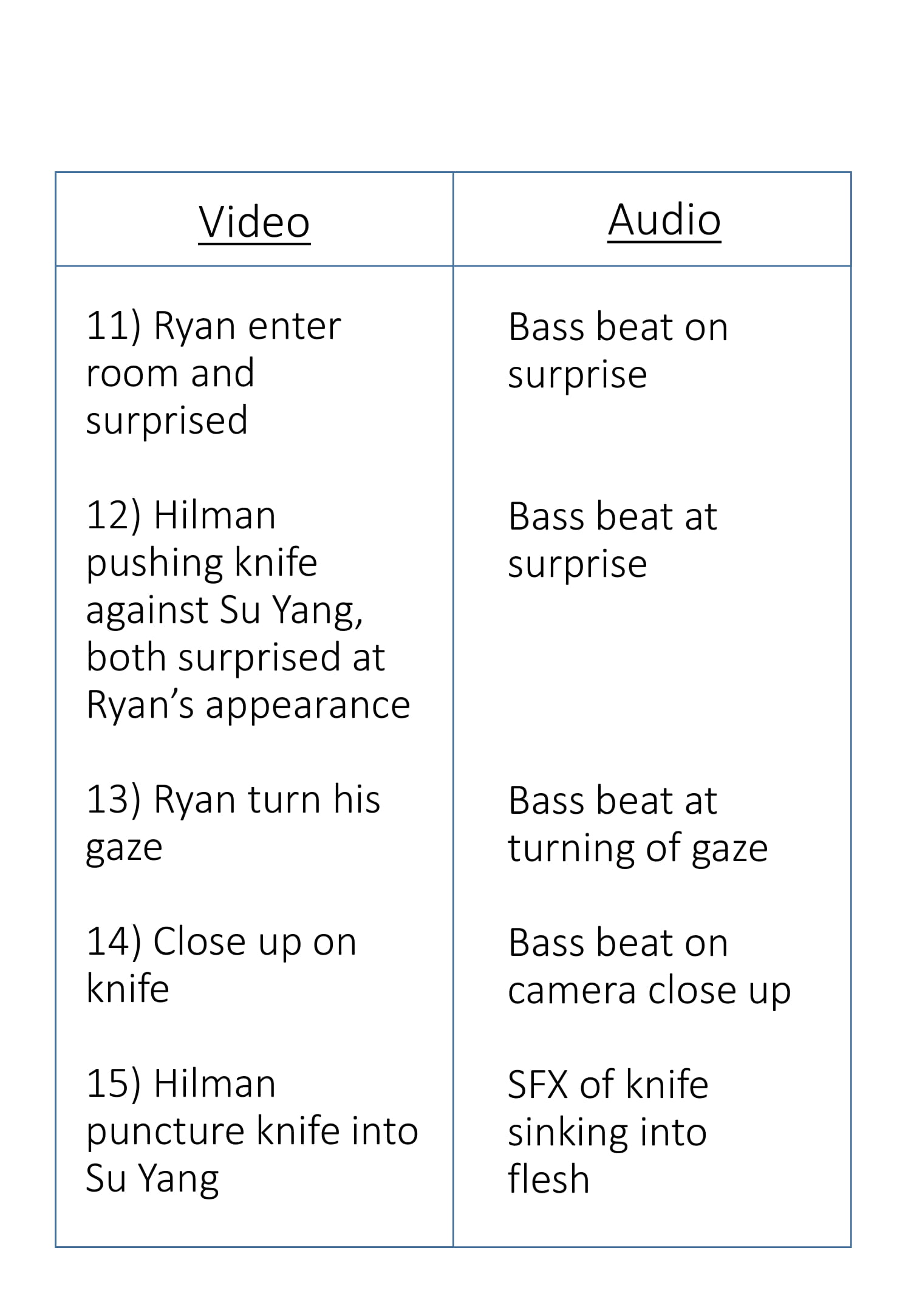
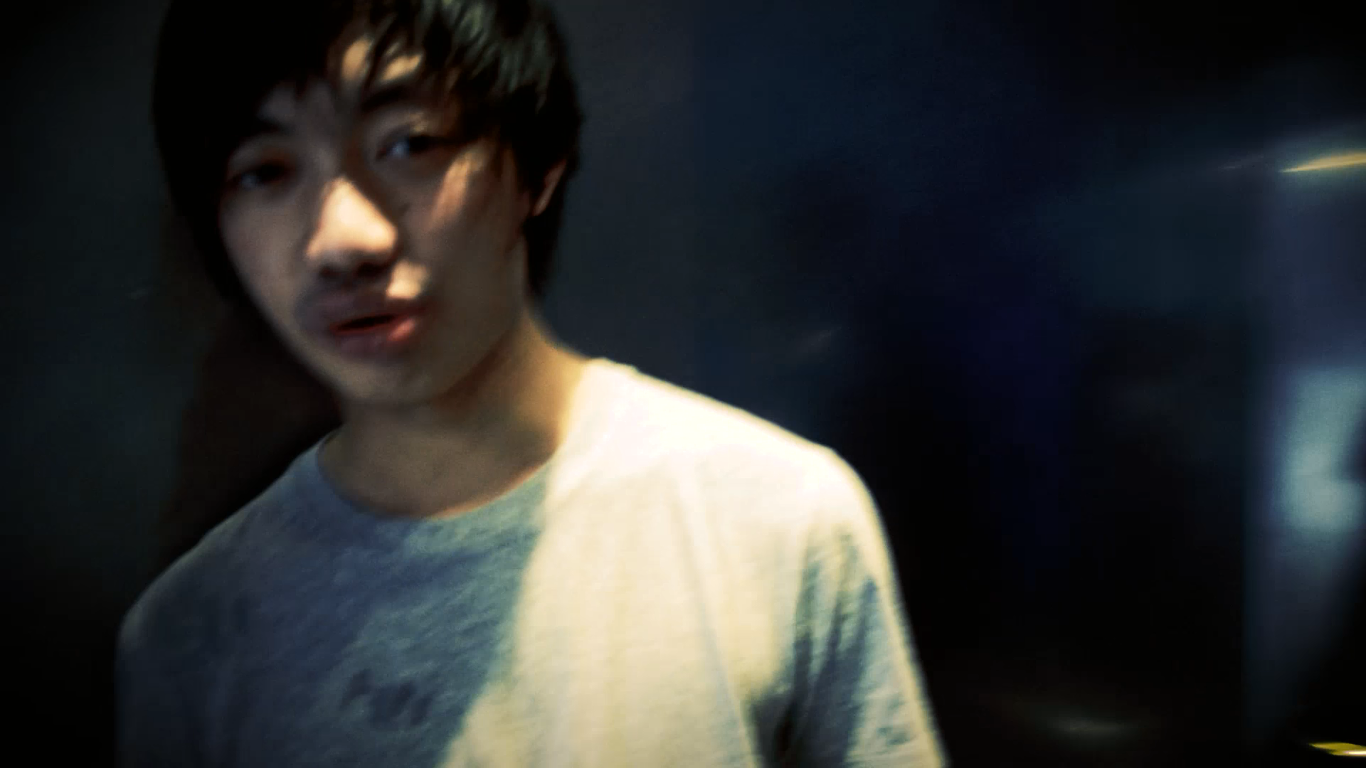
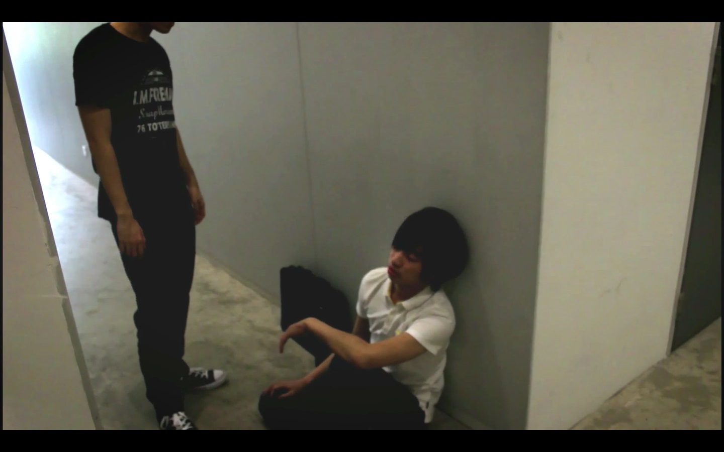
The fourth strange occurrence is when Su Yang and Hilman appears in Ryan’s room, even though the two of them are seen moving towards other locations in the previous scenes
Screenshot 7
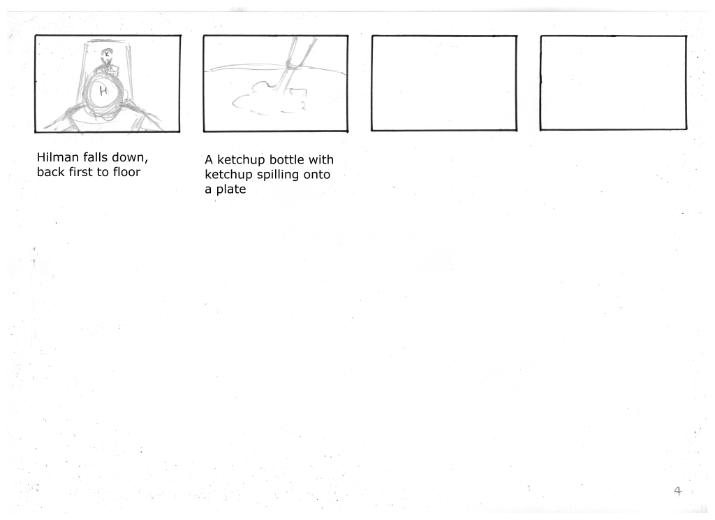
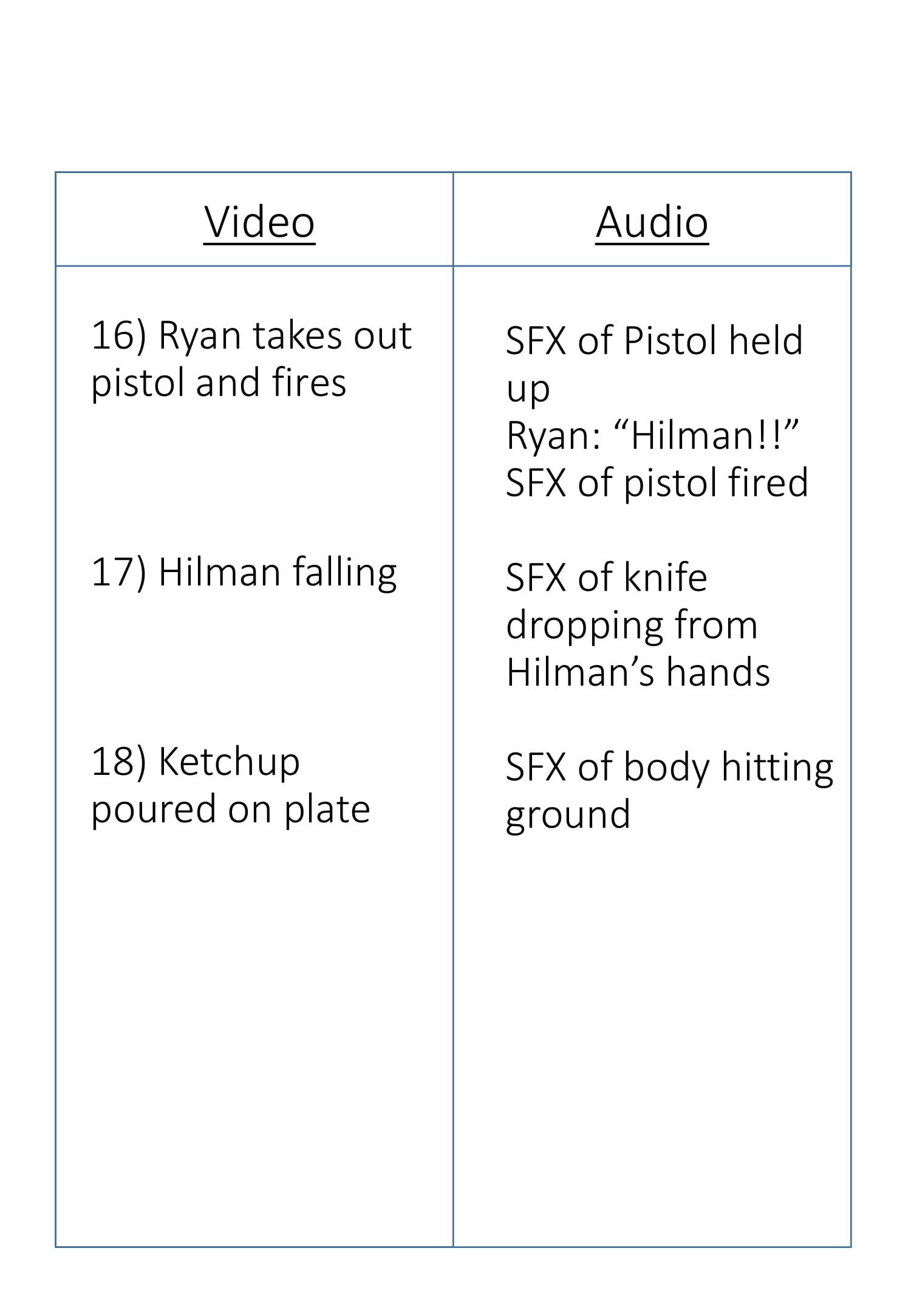
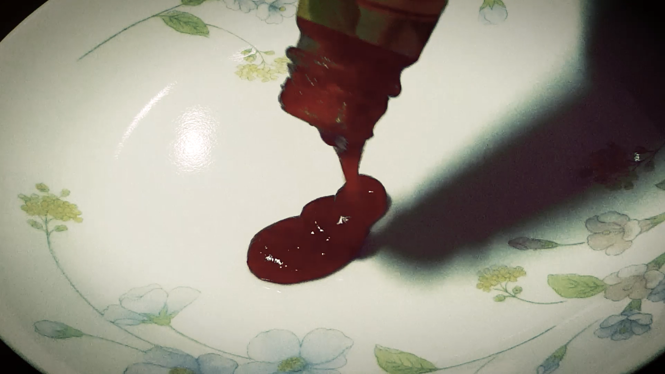
A surrealistic ending of ketchup splattering on a plate. representing blood, juxtaposed with the sound of a body hitting the floor is used to heighten the impossibilities of a dream state.
Since we are not allowed to use sound effects or music downloaded from the internet, I create sound effects by myself.
Ambiance sound for classroom (because classroom was occupied during filming, resulting in conversational sounds)
Sound effect during screen flash (During the character 1’s consciousness shift)
– recorded a metal spoon hitting against a glass table
Sound of character #2 writing and closing his book
– recorded myself writing and closing a book
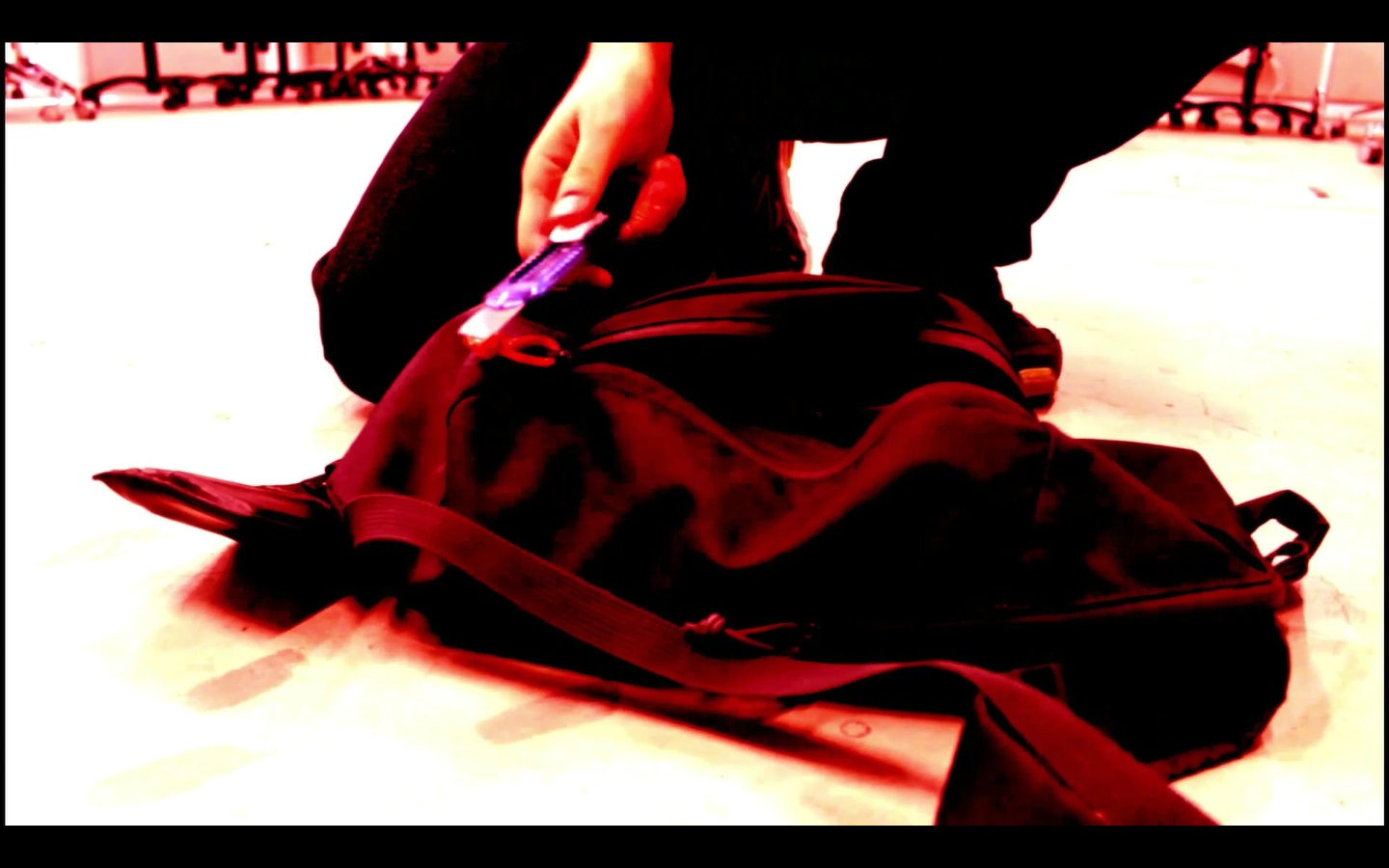
Noise of character #2 hitting the leg of character #1
– recorded the sound of me hitting a leather bag
Sound effect of Character #1’s heart pounding
– recorded myself thumbing my chest with my hand
For the scenes where the “other personality” of character #1 is active, I increased the pitch of the background sounds to create a distinction between them and the other scenes where the “normal personality” of character #1 is active.
It also serves to create an uneasy feeling in the audience, setting the mood for a situation that isn’t going to turn out well.
Visuals
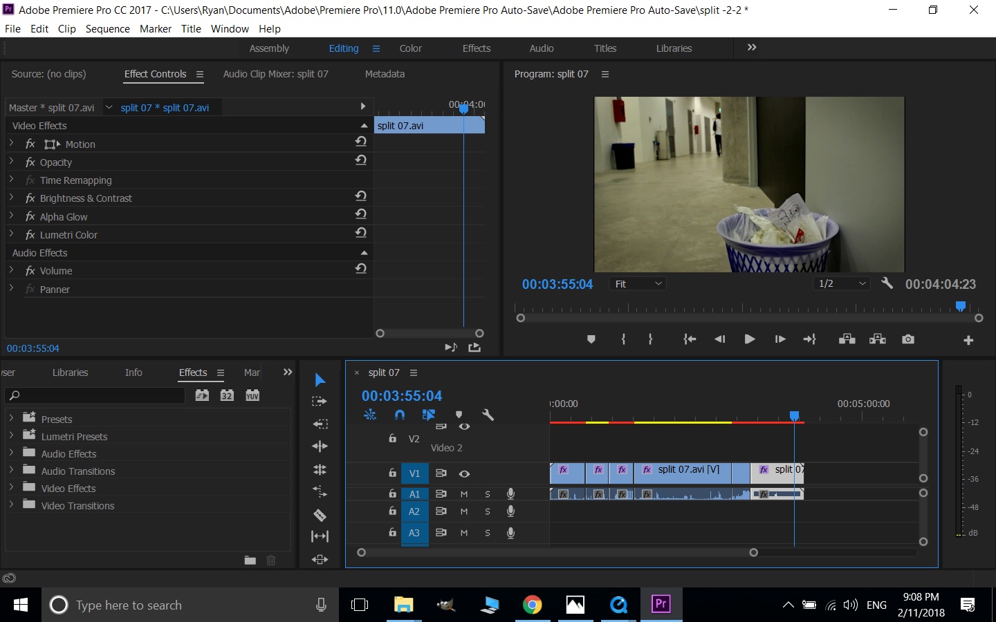
For the scenes where the “other personality” of character #1 is active, I had the video colors turn red through Adobe Premiere Pro:
Premiere pro 1
I want the audience to instinctively understand that this is not the “normal” character #1 so i used this obvious change in visuals.
For the last scene after character #1 has killed character #2, i purposely reduced the brightness of the video to create a dark atmosphere, to induce a mysterious feel to the overall strange event of the video:
Premiere pro 2
Video analysis
Scene 1
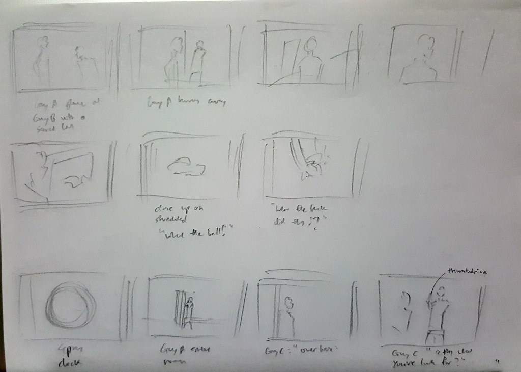
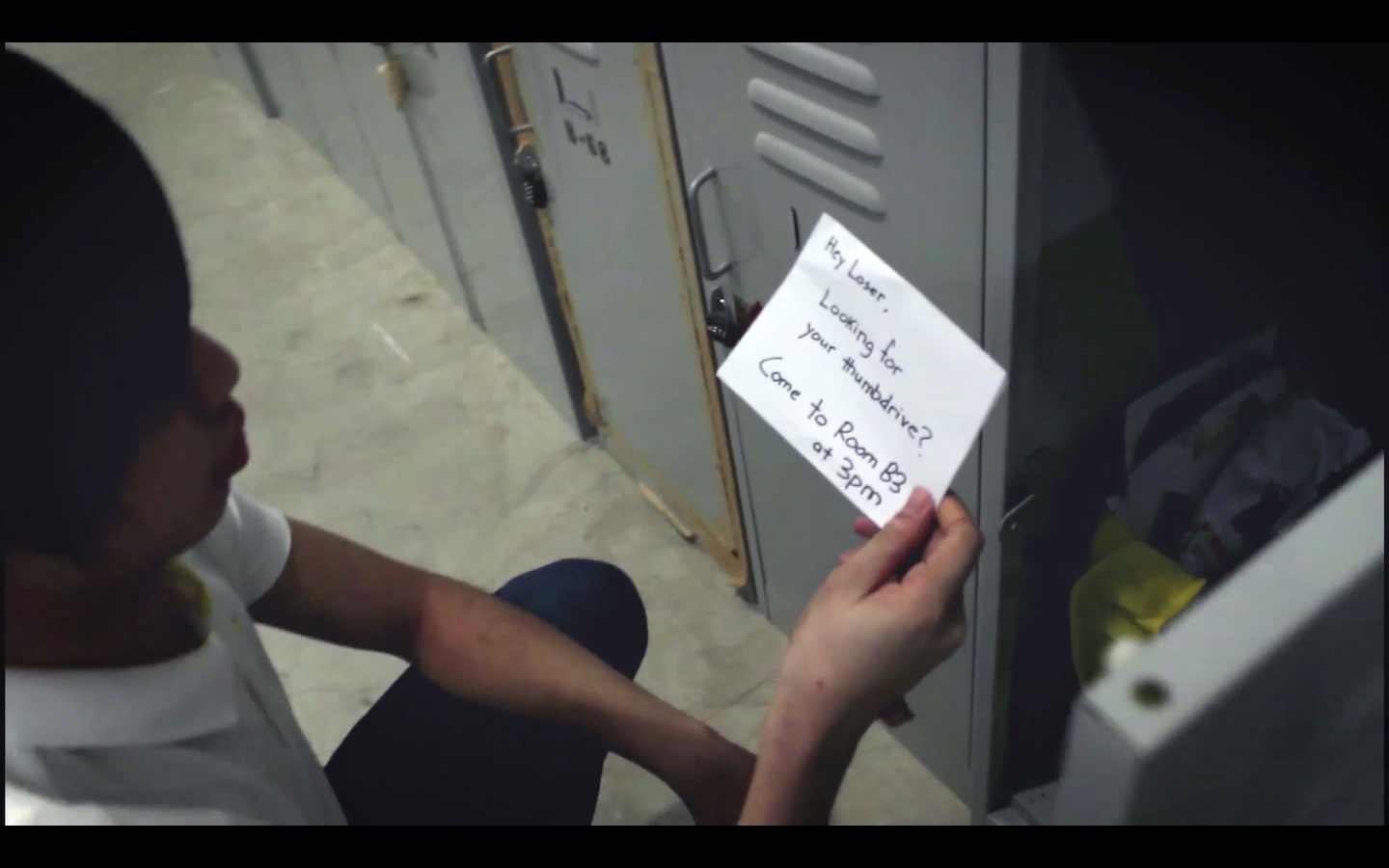
For the first scene, I had character #1 be established as a victim of bullying through the use of the letter he finds in his locker.
After which, character #2 hits his bag against character #1 to further bring this message across.
Scene 2
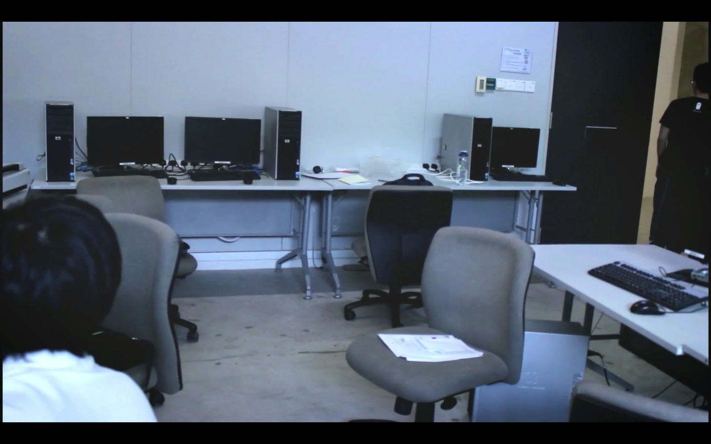
For the second scene, I had the setting be a classroom where both character #1 and character #2 were having a lesson in.
The camera is fixated mostly on character #2’s table as the book that is on it will be the point of focus for the next scene.
Scene 3
For the third scene, the audience would be taken aback by the change in visuals and sound.
After which, this confusion would be resolved when character #1 starts ripping up character #2’s book, as it would imply that this is the work of a “character #1” that is different from the one we saw earlier.
Scene 4 part 1
In the fourth scene, character #1 is woken up by character #2, and he goes into a state of confusion before running off.
This would suggest that character #1 has no memory of ripping up character #2’s book as he does not seem to have any emotion towards character #2.
This would lead the audience to understand that the previous “character #1” and this “character #1” are separates entities that are sharing the same body and thus bring the term “Split-personality” forward.
Scene 4 part 2
In the next part of the scene, character #2 finds the torn-up book, which sets the logic that whatever happens during the red scene, does indeed happen.
This will be important for the later parts of the video.
Scene 5 part 1
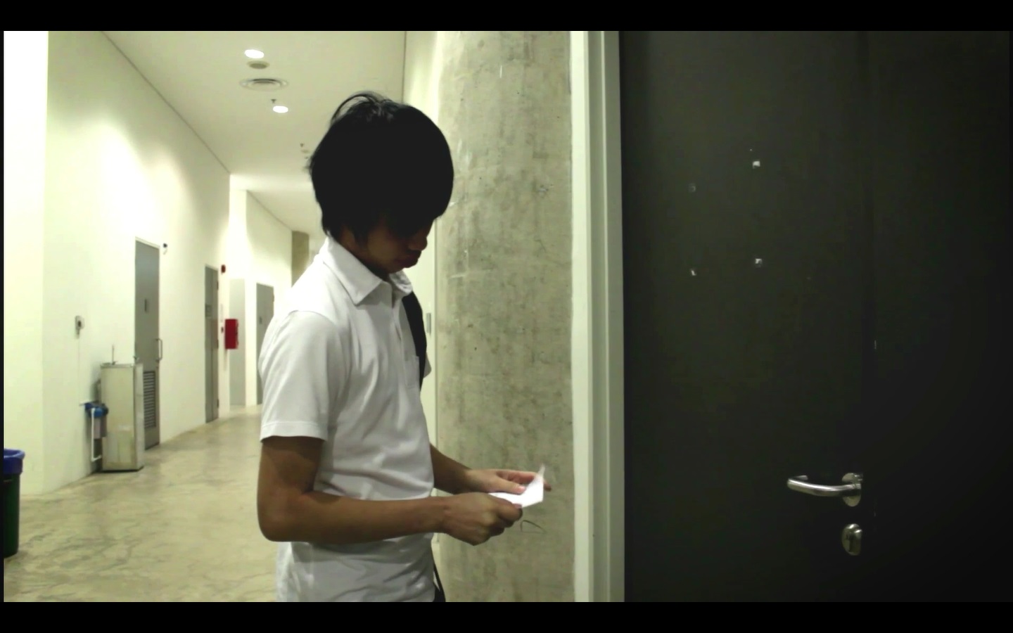
For scene 5 when character #1 is about to enter the room for the meeting, I had the actor retrieve the letter from his pocket to suggest to the audience that he is now entering to the room for the meeting.
Scene 5 part 2
For the part where the sender of the letter meets character #1, i had him ask for money to answer the question of “why did character #1 have his thumbdrive stolen”
I decided to go with an exchange of the thumbdrive for money instead of the whole thing just being an act of bullying as it felt like a more compelling reason for going through all the trouble.
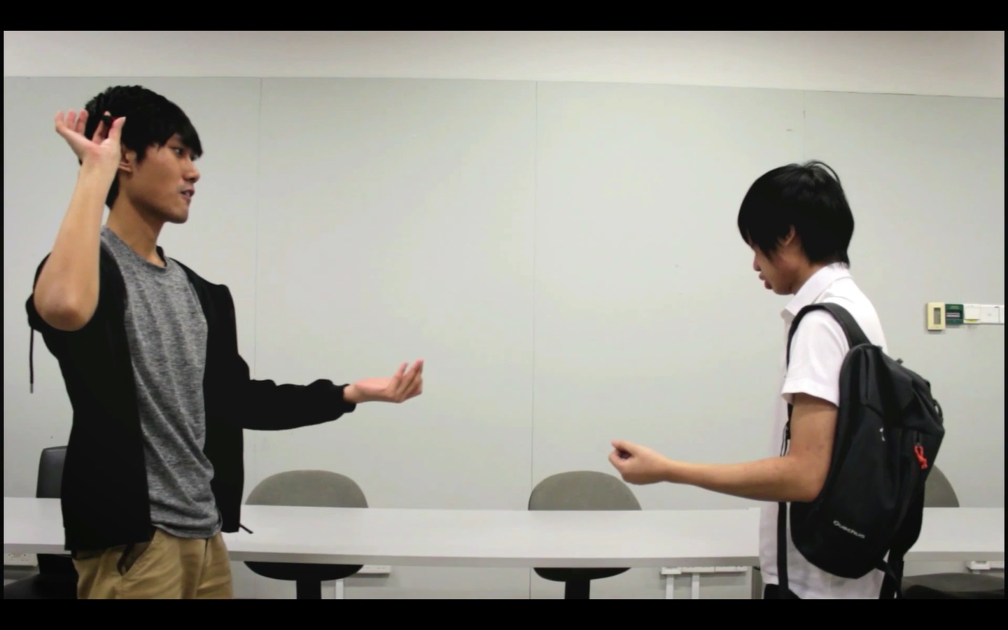
Scene 5 part 3
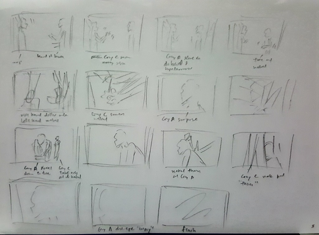
When character #1 picks up his thumbdrive, I had the sender throw his wallet back at him as an act of humiliation fit for a victim of bullying.
Scene 5 part 4
After that, I had the camera zoom onto character #1’s face to show a buildup of anger and hatred.
Flashes and the beating of a heart is also added here to link it to the next scene.
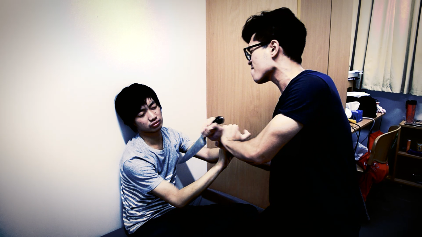
Scene 6
In this scene, the choice of red for the “split-personality” scenes is further explained as this “personality” of character #1 is violent.
The camera stays on the bag and slowly zooms in to create a feeling of tension between the audience and the action that cannot be seen.
This tension is used to further alienate the audience from this “personality” of character #1 for him to appear more foreign and mysterious.
Scene 7 part 1
For this scene, I had character #1 wake up on the floor, similar to that of scene 4.
Scene 7 part 2
After which, he checks the room to find that nobody is there, suggesting to the audience that whatever happened in scene 6 could have not happened at all.
But due to the logic set by scene 4, the audience knows that whatever happens in the red scene does happen. This hence creates a temporary conflict between what is expected and what is happening – a twist to perk the audience’s attention.
Scene 7 part 3
After which, the conflict is subsequently solved with the appearance of a blood-stained knife – that confirms the occurrence of the events of scene 6.
However, even after this conflict is solved, the audience would still have a thought lingering on in their minds – what about the split-personality of character #1? What is going to happen after all this with a serial killer on the loose?
That is where i would end the video with questions for the audience to think about after it finished playing.
So we were placed into various groups for the 4th project and were tasked to create a sound piece with some musical instruments provided.
I was sorted into Group A with the following members:
Tricia
Dhanu
Jia Yi
Ryan
And these are the 2 sound pieces that we have came up with:
Model
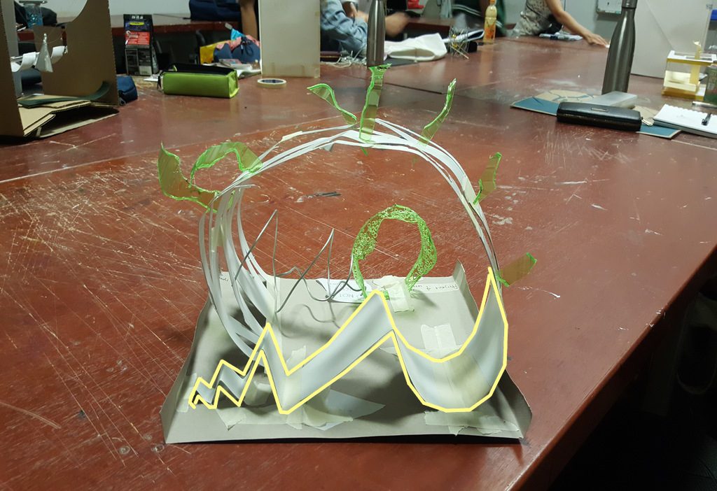
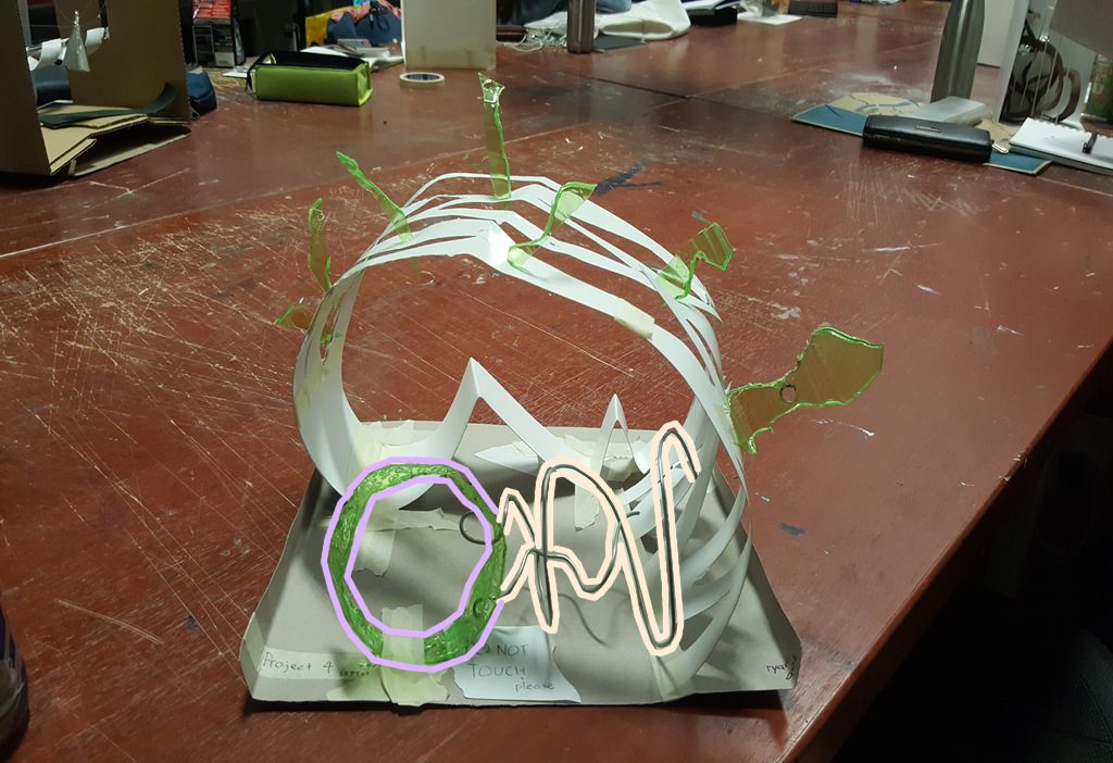
Using the first sound piece as the music model for my Mood Box, I constructed this:
Front viewSide view (right)Back viewSide view (left)Top-down view
Model Analysis
Here’s the sound piece again:
It consists of 5 instruments listed according to the time they appear:
Scrubbing blocks
Scrapping blocks
Xlylophone
Humming
Sand shaker
Analysis 1
Instrument:
Scrubbing blocks
Explanation:
The scrubbing starts off soft then gets louder and louder with time.
The rhythmic movement of the scrubbing is shown from the waves that gets progressively bigger with time as the sound gets louder
Analysis 2
Instrument:
Scrapping blocks (Shown in blue)
Explanation:
The sound of the scrapping blocks has a sharp feel to it as if it is jutting into the sound composition
This is portrayed through the green plastic pieces being pierced into the art card, disrupting the flow of the model
Instrument:
Xylophone (Shown in pink)
Explanation:
The tone of the xylophone sounds smooth and lingers for a while before disappearing
This is shown in the model through long smooth strips being cut into the art card
The shape of the strips start off sharp, becomes larger in the middle then ends of sharply, echoing the rhythm of each beat of the xylophone
Analysis 3
Instrument:
Humming by Jia Yi (Shown in peach)
Explanation:
Jia Yi’s humming sounds circulatory and is thus represented by a spiraling metal wire
Instrument:
Sand Shaker (Shown in purple)
Explanation:
The whole sound piece ends with this sand shaker and is thus being portrayed by a plastic wheel rolling at the end of the model
The texture of the plastic wheel is pierced with holes, mirroring the sound of sand being rough and irregular
In all, even though the model did represent each instrument of the sound piece through it’s different parts, it did not adhere to the set expectations of portraying the number of beats for each instrument.
However, it still looks visually exciting as it can be seen as a course for skaters in a skate park.
That is the place that i’ve chosen for this project.
Hogwarts is the iconic school in the wizarding world of J.K. Rowling which Harry Potter attended to learn magic in the Harry Potter book series.
Having picked Hogwarts as the location and the freedom of choice for the medium of the final product, I was set on creating a video similar to the Harry Potter movies.
Research
So first thing first:
Spells.
Well, you can’t have a Harry Potter film without spells. It’s like how you can’t have raw eggs without the egg yolk in them. So before doing anything else, I went on to research on how to recreate the famous spells seen in all the Harry Potter films.
Here are some of the video tutorials which I learned from:
Seeing that all these people are using After Effects to create the spells, I got my hands on it and started experimenting with it. I had no prior knowledge of After Effects before this project so everything was new and I had to learn everything from scratch.
After a few hours of testing, here is my first test video:
Alright. This video proved that creating spells for the project is possible and i can move on to implementing it in the storyboard.
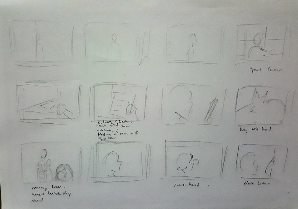
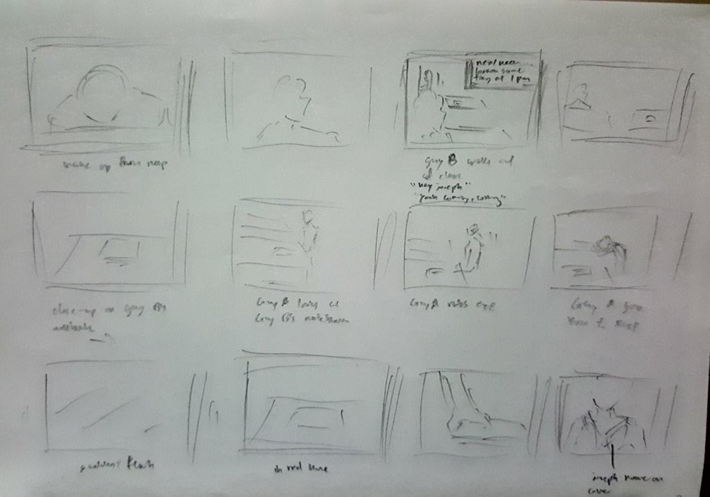
Storyboard:
12345
As seen, i did not go into too much details in the storyboard. As it will be a video, the different shots are subject to on-site adjustments such as the shooting angles and speech lines.
Thus, i kept to the fundamentals of how each scene will look like and placed more importance on technical aspects such as the character’s posture and transition between shots.
Creation
So with the help of classmates Shah and En Cui as actors, filming was done within the ADM library and second floor corridor. It was supposed to only take 1 hour since the video was only a minute long, but it somehow got dragged to 3 hours. That aside, the actors’ hard work paid off and the video went into post-production.
Special effects:
Throughout the week, I continued testing the spells on After Effects.
And after multiple test compositions and trial and error, i came up with something that is considered decent:
With this technique in hand, I went ahead with applying the spell effects for each of the film footage that featured a spell.
Here is an example of an After Effects composition that has a spell in its scene:
Scene where Shah gets hit by En Cui’s Stupefy
This composition you see up here is made up of 5 layers:
“Saber effect” spell
Light Flare for the head of the spell
Ripple explosion for the impact
Ripple blur of video for the impact
Blue translucent layer for impact flash
On an extra note: I assigned different colours to each different spell, taking care to assign the right colour based on the character’s role:
Stupefy: Blue (En Cui) – ‘Good’ guy
Reducto: Orange (Shah) – ‘Bad’ guy
Expelliarmus: Red (Shah) – ‘Bad’ guy
It may look like there are many layers in the above composition, but I’m pretty sure that professional special effects editors in the film industry have way more.
The 3rd effect (ripple blur of video) is the effect I’m most proud of as it was an original effect I came up with while learning the other effects from others.
Here it is shown in good extent:
One thing that I could have done better was to increase the contrast of the video to the maximum when the spell hits something/someone. That could have made the impact appear more powerful.
Editing:
For combining all the film footage together, I used the program called Wondershare Filmora.
Sound:
The program also allows for editing of sound so I used it for adding the sound effects and editing the voices of the video.
Here is a screenshot of the video editing composition in the program:
The bulk of the work went into getting all of the sounds right for the video.
All the sounds i used for the spells are completely different from what their files were labeled as too.
For example, i used the downloaded sound file labeled “Avada Kedavra” for the Stupefy spell.
I basically went ahead with what sounded proper based on the visuals of the video.
Most of the time then went to mixing different spell sound effects together such as taking the beginning of one spell and combining it with the back of another spell to create something that fits with the video – explaining all of the short sound clips used.
Dubbing was done for areas of the video were the actor’s voice were not captured/ not said.
It was a great experience seeing Shah and En Cui dub over themselves.
Shah’s panting at the end of the video was actually just a loop of him panting once.
I wanted to do foley as well for all the lost sounds but due to lack of time, I had to make do with sounds downloaded off the internet.
The one part which showcased ‘foley’ best would be the later part of the video where Shah enters the empty dark corridor – The footsteps that imply someone is approaching him really shows the concept of implied meaning through sound.
As mentioned earlier, I’m pretty sure my layers are nothing compared to those found in the film industry.
Music
And a second composition was created for the background music:
This portion of the work was particularly tricky as the original royalty-free music track I used did not quite fit with the pace of the video.
I thus trimmed the track into multiple pieces and rearranged their orders to create a single long background music (bgm) which fits with the visuals of the video.
I have to salute the audio mixing engineers for the film studios for providing us with such well-timed music pieces to go along with our movies – it is not an easy feat. But, still fun overall.
I knew that a well paced bgm was key to a good video sequence through this video:
This is the introduction scene to a psp game called Final Fantasy: Crisis Core which I played ages ago.
The reason why it stuck with me for so long: The absolute synchronization between the bgm and the part of the scene. It gets high paced when it gets to the action, and slow paced when it gets to the conversation – all within a single music track
That to me, is the pinnacle of bgm in film.
And that is why i placed importance in a good piece of bgm.
Well, after all that, here is the video for this project:
Update from class:
Rhythm:
There is repetition in the bgm – 3 different parts of the music follow a transition of moderately paced tempo to high-paced tempo with increasing loudness.
Movement:
During the fight scenes, there is successional movement for each of the shots of the characters – eg. the camera follows Shah who is dashing away from En Cui
Causality:
The audience have unclear expectations as the narrative is a battle between 2 people with an unpredictable outcome
The video follows a linear narrative which is easy for the audience to track as it follows Shah throughout his escape from En Cui’s confrontation
Duration:
The duration of each scene in the video was optimized to fit in an overall composition that lasts 1 minute – the time limit that was imposed for the project
The scene of Shah looking at the scroll in the dark corridor could have been longer to allow the audience to properly hear the footsteps in the background .
All in all, I had tons of fun throughout this project.
I picked that picture for the featured image because it has the word ‘time’ in it – since time is the focus of project 4
In this project, the key focus is on time and how to incorporate it into interactive media installation.
I’ve seen numerous installations before in the past, thanks to Singapore’s practice of making all school students go on educational field trips. These range from museum trips to tourist attraction spots to more museum trips. However, as good as they may be, I do not actually feel inspired by them in any way. (Probably because we were forced to go to these places) It may be due to their nature in trying to educate the viewer with information that the museum was built to share, which is why they are not interesting on their own.
Thus, I shall go with an installation that actually sparked my interest. (coincidentally, the one which i went to on my own free will)
Case study 1 ; Lights, Camera, Action! Hosted by Steven Spielberg
This is an attraction featured in Universal Studios Singapore.
I would consider this an installation as the whole attraction is fixed in a certain location and the audience who enters it watches a show put for them,
Form
The attraction features a “soundstage” which is a movie set created for special effects equipped with fully functional props.
Context
The soundstage in this case would be a boathouse set near the city of New York during a level 5 hurricane.
Content
The audience is trapped in a boathouse as the hurricane worsens and slowly tears the building apart with the progression of time.
The audience stand in front of a soundstage depicting a boathouse – floor covered with a pool of seawater, small wooden boats scattered around, metal framework with lever systems to lift up the boats, a small television set, a toilet, windows showing the New York City skyline, wooden wall and roof.
The soundstage props are engineered to automatically move at set timings to create the narrative of the boathouse tearing apart during the hurricane.
Automated flamethrowers spew fire while pressure pumps created water splashes to engage the audience through the heat of the fire and the water that hits them.
It gets the most intense when the entire platform which the audience is standing on rumbles towards the end of the show.
Here’s a video of the attraction:
Usage of Time and Space:
Time in this installation is shown through the advancing stages of the hurricane. The audience is physically aware of the progress of time as the hurricane worsens.
The concept of space is utilised through the use of a soundstage to create the environment for the show – in this case a boathouse.
Well, looking back at the installations, films and performances that touched on time from my memory, the first things that came to mind were:
Mission Impossible – sci-fi movie with all the time-attack missions
Looper – a 2012 sci-fi movie about a time-travelling syndicate
But even though these films incorporated time as a core element in their storyline, I still find that one other movie utilized it in a way that cannot be surpassed:
The girl who leapt through time is a Japanese anime movie released in 2006
Form:
Theatrical movie shown in cinemas
Context:
The main character of the movie gains the ability to travel back in time and the movie follows her point of view of time as she continuously travel back to the past.
Content:
The movie focuses on the main character, Makoto, who gains the power to time travel back to the past
She uses her newfound ability excessively to solve all the problems she face and for trivial gains such as eating a delicious dinner repeatedly.
She soon realizes that her time travels cause numerous undesirable rippled effects on others and sought to resolve them.
She then finds out that she has limited number of uses of her ability and matters escalate to the point where she travels back to the moment she gained her ability, effectively cancelling everything that had happened because of her time travels.
Usage of time:
The movie follows Makoto’s point of view, where time that is shown on the screen corresponds to her perceived time. (eg, the time on screen will be the day before if Makoto travels a day back, rendering everyone elses’ self today non-existent)
Time in the movie is thus constantly switching between the past and future, with the present being the current time that Makoto is currently experiencing.
Here’s a video of Makoto leaping through time:
Comparison between 2 case studies:
The linearity of time to tell a narrative is different, the 1st uses the audience’s perceived time that flows linearly, the 2nd uses the character’s perceived time which is non-linear.
The 1st case study is more interactive in nature as the audience can feel the flame and water that is produced from the soundstage, whereas the 2nd case study has the audience simply watch it.
Project 2 started with searching for movie quotes, which are then transformed into surrealist/dadaist compositions.
I had a lot of difficulty in this project, particularly on the abstract part. The compositions that we were to produce had to portray the meaning of a quote without the use of direct symbolism. For this part, I went through quite a fair number of tries.
Quotes:
“Don’t let anybody tell you, you can’t do something”
-Chris Gardner, The pursuit of Happyness
(happyness was purposely spelled with a ‘y”)
Well, this quote really means a lot to me. It’s what i believe in. Even if the whole world disapproves of something you want to do, just do it. It’s your life, it’s your choice, it’s not something for others to decide.
“Happiness can be found in the darkest of times, if one only remembers to turn on the light”
-Albus Dumbledore, Harry Potter and the Prisoner of Azkaban
Well i chose this quote because i like the Harry Potter series as a personal preference.
“Get busy living, or get busy dying”
-Andy Dufresne, The Shawshank redemption
This movie is rated all-time number one on multiple movie review sites such as IMBd.com
This scene in particular, where a man who has been locked up in prison for 10 odd years for a crime he was framed for, does not give up hope of getting out really stuck with me.
Unfortunately, i did not use this quote for the compositions.
Drafts
Draft 1
Fast-forwarding through this one.
This draft was done before i understood the art direction of the project so it was completed off-the-mark and scrapped.
Draft 2
Quote:
“Happiness can be found in the darkest of times, if one only remembers to turn on the light”
-Albus Dumbledore, Harry Potter and the Prisoner of Azkaban
This was my first actual composition, where i broke up the quote into different key words and tried to represent them in a visual manner.
Explanation:
Darkest – represented by piles of human skulls, symbolizing a graveyard, demon roaming among the skulls represents terror while the huge moon on the background provides the overall ‘dark’ theme.
light – is presented quite literally, with a lamplight
happiness – represented by birds flapping freely, showing happiness through freedom, and a grass patch express life and vigor.
Flaws:
The overall ‘darkness’ theme on the top-right corner of the composition is too literal and was rejected.
The lightlamp is rejected without haste
the meaning of ‘happiness’ through the grass patch didn’t come across well
The slanted composition didn’t have meaning in it
Verdict:
Rejected
Seeing that the first composition did not go well at all, i decided to go with a more surrealist approach.
collage from ‘Une Semaine de Bonté’ (A week of kindness), 1934, Max Ernst
I researched more into surrealist works and was inspired particularly by surrealist Max Ersnt’s collages where he connected objects from distinctly different bodies together to form a unique entity to portray a meaning.
Draft 3
Quote:
“Don’t let anybody tell you, you can’t do something”
-Chris Gardner, The pursuit of Happyness
I thus used the same method by connecting ‘stop’ road signs to a man’s head and handcuffed hands to a boy’s legs to portray the meaning of the quote.
Explanation:
Can’t do something – man is used to represent a higher authority looking down and controlling a smaller target (in this case a young boy), hands holding batons show violence as a means of control while ‘stop’ signs means restriction
Flaws:
Only half of the quote was expressed in this composition
Boy is not apparent in the composition as his head looks like a huge black void in front of the man’s mouth
Part of man’s suit is lost due to over-exposure
Along the way, i was thinking about cats, and recalled the Metro Goldwyn Mayer logo.
Metro Goldwyn Mayer logo
This led to the creation of the next composition:
Draft 4
Quote:
“Happiness can be found in the darkest of times, if one only remembers to turn on the light”
-Albus Dumbledore, Harry Potter and the Prisoner of Azkaban
Explanation:
Darkest – represented by the carnivorous members of the feline family such as the tiger, lion, jaguar, fox, wolf and cheetah.
Happiness – represented by the little kitten in the center of the composition, like a pleasant surprise of species evolution through centuries
Light – represented by the sunflower that provides a clean border that separates the cat and the other felines
Flaws:
The negative space within the flower that surrounds the cat is too large and seems to be engulfing the cat
During my research, I was also inspired by Belgian surrealist René Magritte’s Golconda, where images of a person is repeated in a pattern which could imply movement.
Golconda , René Magritte
Draft 5
Quote:
“Don’t let anybody tell you, you can’t do something”
-Chris Gardner, The pursuit of Happyness
Here, I utilized repeated images of the boys to imply that they are jumping around, even though their images are actually static.
Explanation:
you can’t do something – as usual, i used a man and two boys to imply control from a higher authority, the hands symbolize control over the boys as they are trying to grab them
don’t let anybody tell you – i represented this with the use of the two boys jumping about carefreely, even in the midst of a man reprimanding them – which can be interpretated as a sign of rebelliance – one of the boys is even shown hopping onto the man’s head
Flaws:
The boy on the right who is jumping out of the man’s mouth makes it seem like the man is eating him – a loss of focus on the quote’s meaning
Final products:
Final composition 1
Quote:
“Happiness can be found in the darkest of times, if one only remembers to turn on the light”
-Albus Dumbledore, Harry Potter and the Prisoner of Azkaban
After multiple reworking, this was how the composition turned out.
Critique:
The fox tail on the bottom-left of the composition looks like a huge black thing which is undecipherable
Final composition 2
Quote:
“Don’t let anybody tell you, you can’t do something”
-Chris Gardner, The pursuit of Happyness
Explanation:
you can’t do something – the crane machine represents a cage, a prison, that restricts someone, the crane claw symbolizes control, the ‘toy’ sign shows that the kid was just a plaything for the adults – implying total control
don’t let anybody tell you – the kid is shown escaping from the crane machine while the adults are staring and shouting in horror
Critique:
the second man beside the one on the right is not needed as his gaze brings the viewer’s focus away from the boy
the crane claw’s angle can be further tweaked to face the boy so that the implied line towards the boy are not lost
Final composition 3
Quote:
“Happiness can be found in the darkest of times, if one only remembers to turn on the light”
-Albus Dumbledore, Harry Potter and the Prisoner of Azkaban
Explanation:
darkest – the background shows a stormy sky with thunder that implies dark times, the breaking of the fountain pen symbolizes a tragic event
happiness – the ink spill from the fountain pen miraculously inks out a scene of a bed of sunflowers – showing happiness that is chanced upon during an accident – the bed of sunflowers also completes the picture of a patch of grassland with the stormy background
light – expressed through the use of sunflowers and the shadow cast by the lightning on the fountain pen
Critique:
the head of the pen which is on the table points to nowhere and misguides the viewer’s gaze
Final composition 4
Quote:
“Don’t let anybody tell you, you can’t do something”
-Chris Gardner, The pursuit of Happyness
This composition too went through a liberal amount of changes which included the addition of:
jail bars at the background- to reinforce the meaning of restriction and being monitored
breaking of handcuffs in the middle – symbolize breaking free from control
fighter jets flying at the bottom – imply taking off through flight, which is a universal expression of freedom
The boy’s head is also drawn in digitally as it was obscure in the beginning. The man’s teeth was also drawn in to show that he is actually biting down on the boy.
Implied lines are utilized here where the batons point towards the boy, who becomes the vanishing point as the main focus for attention.
The batons are also in the shape of a jester’s hat to imply a reference to the Batman’s joker, showing that this scene is bizarre and wrong.
Project 2 is here and we are to create a structure similar to an Ikebana,
So we were first given 3 shapes:
Cone
Sphere
Cylinder
and we are tasked to create interesting models based on the idea of tilting these shapes against one another.
Here are my 2 3D sketch models and their 2d visual analysis:
3D Sketch Model 1
3D Sketch Model 1 Front view3D Sketch Model 1 Side View (Right)3D Sketch Model 1 Back view3D Sketch Model 1 Side View (Left)3D Sketch Model 1 Top-Down view3D Sketch Model 1 Bottom-Up view3D Sketch Model 1 2D Sketch Analysis
Components:
Dominant – Cylinder
Sub-dominant – Cone
Sub-Ordinate – Sphere
Rule of Thirds:
The Sphere is positioned at 1/3 of the cylinder’s length from the right
The Cone is connected at 1/3 of it’s height to the Cylinder
Flaw:
The diameter of the Cone’s base is roughly the same as that of the Cylinder
3D Sketch Model 2
3D Sketch Model 2 Front view3D Sketch Model 2 Side View (Right)3D Sketch Model 2 Back View3D Sketch Model 2 Side View (Left)3D Sketch Model 2 Top-Down View3D Sketch Model 2 2D Sketch Analysis
Components:
Dominant – Sphere
Sub-Dominant – Cylinder
Sub-Ordinate – Cone
Rule of Thirds:
The Cylinder is connected at 1/3 of it’s length to the Sphere
The Cone is connected at 1/3 of it’s base’s diameter to the Cylinder
Chosen model for final product: 3D Sketch Model 2
Season Mind-map
After having the layout of the 3D Sketch Model formulated, we were to create a final model comprising of the following components:
Cone, Sphere and Cylinder
Tree Branch
1 other element
and the model is to be based off food eaten in Japan during a specified season.
The season that i was tasked to formulate my model upon: Winter
Truth be told, the first thing that comes to mind when i think of Winter is this:
Yui & Ui from the anime K-On! Gif from http://weheartit.com/entry/20011054
Basically Christmas is a big thing for the Japanese and I wanted to create something in relation to this yearly celebration in the country.
Season Mind-map
So after listing down foods and events that the Japanese eat/hold during the Winter season, i’ve selected those that i would possibly use for the model.
Taste/Food Research
So i’ve decided on Christmas and Valentine’s Day as the main themes for the food that i’ll be creating.
Thus the search for food in relation to these events begin:
Knowing that the food will have to be shaped to that of my 3D Sketch Model, I’ve decided to have a look at it again.
In 3D Sketch Model 2, there is a large sphere.
3D Sketch Model 2 Front view
And what better way to use that as an advantage than to make it a scoop of ice-cream?
With this, the foundation of the food has been set: A Dessert
And linking this to the food that appears on the table during Christmas and Valentine’s Day, I’ve decided to go with a Christmas Cake-inspired Dessert.
Final Model
Edible Model:
Determined at creating an Edible Model, I’ve created a dessert that has roughly the same shape as 3D Sketch Model 2:
Video of me preparing the Edible Model:
Video courtesy of En Cui
Final Model (Edible version) Photo Courtesy of Fizah
Ingredients:
Vanilla Ice Cream
Pocky Strawberry Stick
Blueberries
Strawberry Gummy (Covered by ice cream in photo)
it is essentially a Christmas cake recreated into a dessert
Note that all the ingredients provide multiple textures for a wholesome culinary experience:
Ice-cream – Soft
Pocky stick – Hard
Blueberries – Juicy
Strawberry gummy – Chewy
Inedible Model:
The inedible model is modeled with the theme of a “White Christmas” – event where it is snowing during the day of Christmas.
This is a continuation of the episode of the anime which first inspired the theme of Christmas
K-On Gif from http://imaproudsone.tumblr.com/post/70174763003
So it’s a highly anticipated phenomenon for the Japanese and it is recreated with this model:
Final Model (Inedible Version) Edited
Note the Japanese-style snowman face for the Japanese feel.
(Or probably because i just like the Japanese-style)
So this time, we are tasked to take photos of an object and subvert its meaning.
The object I was appointed with: Tree.
And here are my photos:
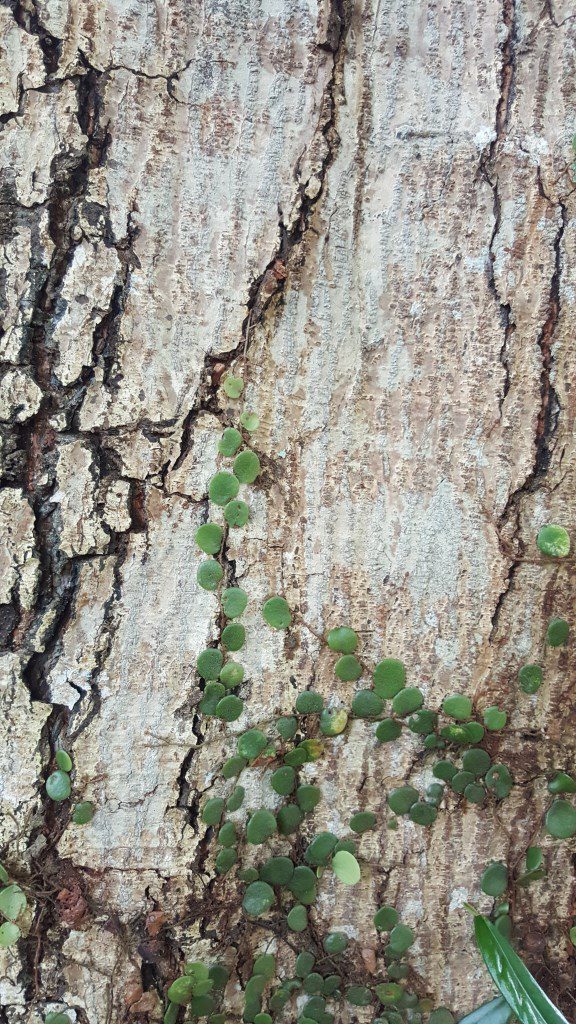
Task 1: Denotation:
Task 1 Image 1
Context: Physical attribute of object
Photo is a close-up of a tree bark
Wanted to capture the texture of the tree
The green ‘climber’ plant is incorporated in the photo to provide a hint that the photo is showing a tree as opposed to a cracked wall.
Camera/Photo technique: Close-up
Close-up is utilized to capture the details of the texture of the tree which is lost if the camera was further away from the tree
Task 1 Image 2
Context : Practical function of object
Photo depicts the tree being used as a shade
Camera/Photo Technique: Wide shot
Wide shot is used here to include the patches of grass, some of which are illuminated by the sun while others are not.
Emphasizes the point of the tree providing shade
Bark of tree is also included to show that the tree is being used
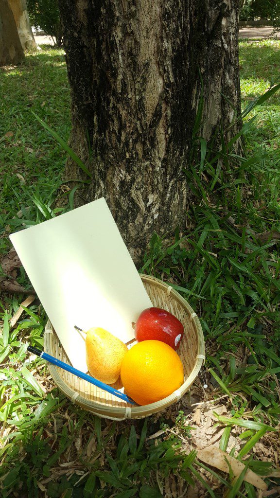
Task 1 Image 3
Context : Practical function of object
Basket of items that originates/are made from trees
Fruits (Apple, orange, pear) – grown on trees
Pencil – Body is made of wood
Book – Paper is cultivated from pulp which is processed from wood
Basket – Crafted out of wood
Camera/Photo technique: High angled and Middle shot
High angle shot is utilized to make the contents of the basket visible
Middle shot is used to include the tree bark in the photo to link the items to their origin – the tree
Task 2: Connotation
Task 2 Image 1
Context: Object’s cultural meaning
In Indonesia, there is a belief on how humans were created – Man was created by 2 gods cutting vertical slices into a Fig Tree, while woman was created by horizontal slices
Photo shows a ‘female’ tree entering the women’s side of a toilet while a ‘male’tree looks on
Camera/Photo technique: Middle shot/ Focus
Middle shot is utilized here to incorporate both trees into the photo for comparison
Focus is centered on the ‘female’ tree and the toilet as they give context to the photo
Task 2 Image 2
Context: object’s cultural meaning
Many early people thought that their ancestors’ souls live in trees
Image depicts a photo frame of an old tree – used to represent a tree that has passed on – recreating a photo frame such as those found on ancestor shrines
‘Tim’ in Grandpa Tim is used in reference to the word ‘timber’
Wide shot is utilized to include the cut tree at the background – illustrates how the situation of chopping is a process happening in the present
Focus is centered on the tree and hand holding the axe to emphasize their importance in the photo
Exposure is increased to heighten the intensity of the blood color for a more compelling touch to the photo
Vignette is applied to create a dark theme to the photo – presenting the situation as grievous
Task 3: Poster
Poster (Edit from Task 1 Image 1)
Context: Screenshot of a computer image file
The text “Wallpaper_5.jpg” acts as a relay to the interpretation that the image is a screenshot of a computer file
Photo is visually similar to stock background images found in computers
Questions our view on trees in everyday life – we don’t usually pay attention to them all the time – they blend into the surroundings like a digital wallpaper in a computer desktop
Cracks on tree bark symbolizes the tree’s frailness – signifies how trees are not almighty and can perish in the face of human intervention such as deforestation
Accentuates the point that we should cherish trees and protect them – if we don’t, in the future, this kind of wallpaper images will be the only proof that trees existed
Camera/Photo Technique: Text
The text “wallpaper_5.jpg” is added at a corner of the image to provoke a second thought in the viewer – contrary to the first thought that may be close to that of “a photo of a tree bark”
Second thought leads to the questioning of our view on trees
“5” in “wallpaper_5.jpg” provides a hint that this image file is one part of a set of wallpaper image files
So my given word for the project was “Tension”, and here is the finished model to express that word:
Finished Project 1 3D Model:
Front viewSide view (right)Back ViewSide view (Left)Top-down viewBottom-up view
Project 1 2D Sketch Analysis:
Front view analysis
Rule of Thirds:
The Sub-Dominant has length of 2/3 of that of the Dominant
The Sub-Ordinate has 1/3 of its length wedged into the Dominant and Sub-Dominant
The Sub-Ordinate is positioned at the 1/3 point of the Dominant’s length
Top-down view Analysis
Rule of Thirds:
The Sub-Ordinate is wedged at the 1/3 point of its length into the Dominant and Sub-Dominant
Materials used for 3D model:
Front view
Dominant : Corrugated plastic board
Sub-Dominant : Crumpled Paper
Sub-Ordinate : Wire Mesh
Explanation:
Dominant: White corrugated plastic board is utilized to mimic the work fence of a construction site
– Sets the tone of the 3D Model to that of a building being built
Sub-Dominant: Crumpled paper with it’s surface shaded with a pencil is used to create a surface akin to that of rock
– Rock surface gives the impression that the Sub-Dominant is heavy
Sub-Ordinate: Wire mesh is deployed to create a view of metal construction frames jutting out of the Dominant ‘building’
– Sub-Ordinate holding onto the heavy Sub-Dominant ‘rock’
– Cracks are cut into the Dominant ‘building’ to emphasis the weight of the sub-Dominant ‘rock’
Process of creating final Project 1 3D Model:
Sub-Dominant with black paper
Initial attempt to make the Sub-dominant look heavy was by using crumpled black paper.
But it didn’t look heavy so,
Creating surface of rock using pencil
I decided to using pencil shadings to create the surface of a rock instead.
Test of finished model
I was initially planning to have the Dominant and Sub-Ordinate white in color, and the Sub-Dominant black to create focus on the Sub-dominant.
However,
Dominant and Sub-Ordinate with white paper/ corrugated plastic board
when it came to the idea of creating cracks on the Sub-Ordinate to make the Sub-Dominant appear heavy,
the Sub-ordinate was too small.
Thus, a revamp of all of the materials was done
Using corrugated plastic board for the DominantCutting Cracks onto the Dominant instead of Sub-OrdinateUsing wire mesh for Sub-Ordinate to better distinguish it from the Dominant
and the final 3D product was formed.
‘Tension’
Explanation:
Gravity is pulling down the rock but the wire frame of the building is holding it up and keeping it from falling.
There is thus 2 opposing forces acting on the rock which exhibits the phenomenon which is ‘Tension’
Applications
Small-scale application: Portable fan
Created using images from: https://www.linsar.com/product/accessories/remote-control/ https://besplatka.ua/aws/10/33/78/00/app/b851a2dcf0c7.jpg
Dominant: Body
Sub-Dominant: Rotating blade
Sub-Ordinate: Bridge supporting blade
Big-scale application: Spaceship
Created using images from: https://www.shutterstock.com/video/clip-3750389-stock-footage-the-sun-rising-over-the-earth-in-space.html http://pre14.deviantart.net/3599/th/pre/f/2007/133/d/7/ogame_space_ship_wallpaper_by_tobioh.jpg https://i.pinimg.com/originals/d6/62/92/d662924667082ed89811e337ab4d8a73.jpg http://www.scifiideas.com/wp-content/uploads/2014/10/SPACESHIP.jpg
So the task is to produce 6 lines to express various emotions.
The emotions provided are:
Love
Joy
Surprise
Anger
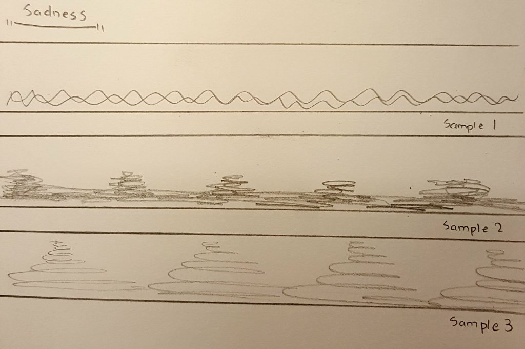
Sadness
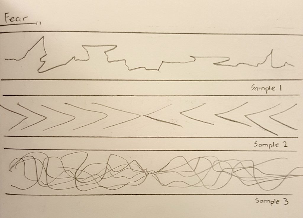
Fear
and they can be branched off into Secondary and Tertiary emotions as well.
As for the method we have to use to create these lines:
Mark-Making
There are so many ways of mark-making, and an almost-infinite number of tools we can use. It became daunting as to knowing where to even begin.
Thus, I’ve decided to work backwards instead – by starting with the end-product in mind. The way and exact tool to use will then follow suit.
Research
Using the internet, i searched up on examples of expressive lines that others have created. Then, utilizing them as inspiration, I created sample products for each emotion.
LoveJoySurpriseAngerSadnessFear
Now that I’ve got a general idea of how the marks will turn out, it’s time to consider the tools to use.
Literally anything can be used to make a mark on a piece of paper, and that is quite intimidating as i don’t know which tool to even start with. Therefore, I’ve decided to narrow them down to a theme:
Personal account of situation related to specified emotion -> Extract an object from that situation to use as a mark-making tool
Alright, now that the planning is settled, it’s time to make some test products.
Test products
Love:
Tool selection:
Love -> Love for an object -> I would be willing to spend any amount of money to buy it -> object: money -> Coin
coin
Samples:
Love Test 1Love Test 2
Joy:
Tool selection:
When I’m in happy/ in a good mood -> find fun things to do/ play -> fun things -> object: toy -> beyblade toy
beyblade
Samples:
Joy Test 1Joy Test 2
Surprise:
Tool selection:
Nothing surprises me more than an insect that appears suddenly -> I usually try to crush it using a pail or broom -> object: pail or broom
but a pail or broom is too big to use as a mark-making tool
continue situation -> I would then use a tissue to clean up the remains of the “obliterated” insect -> object: tissue
Tissue
Samples:
Surprise Test 1Surprise Test 2
Anger:
Tool selection:
When I’m pissed off at something -> usually try to suppress my anger and release it somewhere else -> such as by drawing -> drawing tool -> brush
Brush
Samples:
Anger Test 1Anger Test 2
Sadness:
Tool selection:
When I’m feeling down -> nothing helps better than some cold beverage to comfort the soul -> object: beverage -> water bottle
Bottle
Samples:
Sadness Test 1Sadness Test 2
Fear:
Tool selection:
When I’m frightened or anxious -> tend to fidget a lot and grab onto my clothes -> object: clothes -> cut-off sleeve from an old shirt
Cut-off sleeve
Samples:
Fear Test 1Fear Test 2
Draft 1:
Seeing that the test products all have white and plain background, I felt that more could have been done with the unused space. Hence, I tried using the Monoprint technique to create a background for each of the emotions.
Love Test 3Joy Test 3Surprise Test 3Anger Test 3Sadness Test 3Fear Test 3
The backgrounds were created by having an ink layered piece of paper covering over the product (ink side facing the product), and swiping the top of the paper with the mark-making tool.
However, feeling that the backgrounds diminish the appearance of the mark strokes, i have decided not utilize them.
Draft 2:
During the consultation with Professor Joy, I have been recommended to work on a larger scale.
Love large canvasJoy large canvasSurprise large canvasAnger large canvasSadness large canvasFear large canvas
Having created the marks on a larger piece of canvas, I then cut up a section of them to use as the final product.
Final product
Love:
Love final product
Explanation:
The smooth lines of highs and lows represent love as a journey
– There will be good times at the top and bad times at the bottom
– The thicker ends at the top resembles how everyone works hard to make the good times last and memorable
The splash at the bottom left of the strip represents a huge crash in any kind of relationship
– But the part that follows into the next upward curve shows that by persevering through thick and thin, we can overcome the odds and continue the relationship
Method utilized:
I threw and swept the coin across the paper as i would when purchasing something i like in eagerness at the cashier
Elation (Joy) :
Elation final product
Explanation:
Quick spirals represent bursts of energy
– Ink marks looks like they are depicting a dance of joy and celebration through long swiping curves and playful splashes with no specific pattern
Continuity of the piece represents continuous vigor of enjoyment with no time for rest
Method utilized:
I spun the beyblade piece around the paper energetically as if i’m playing and having fun
Astonishment (Surprise) :
Astonishment final product
Explanation:
The darker areas at the bottom of the piece represents the initial impact of a shock
– Ink strokes that gradually becomes lighter towards either ends of the strip represent how one slowly recovers from the shock over time
The texture of the ink strokes resemble the red veins one would see at the corners of one’s eyes when suddenly blinded by bright light
Method utilized:
I whipped tissue paper on the strip as if i’m hitting a fleeing insect
Rage (Anger) :
Rage final product
Explanation:
Quick upright strokes that are generally lighter at the bottom and heavier at the top represents rising tension
Thicker clots of ink concentrated in a few areas represents numbness that arises from a headache during a moment of anger
Minimal amount of positive spaces in the strip represents how one’s mind is every tight and susceptible to bursting during a state of anger
Method utilized:
I whacked the brush forcefully on the strip as if i’m venting my anger out
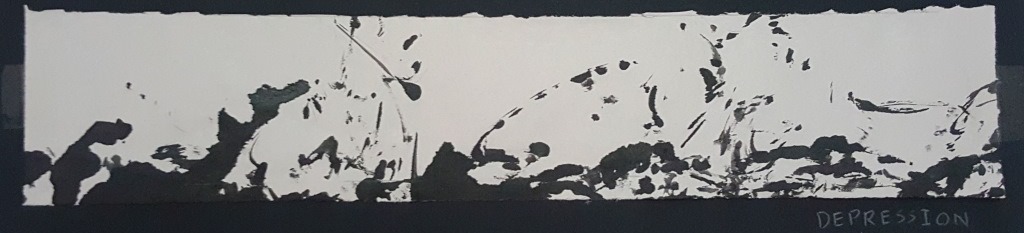
Depression (Sadness) :
Depression final product
Explanation:
Numerous blots of scattered ink represents the emotional wave in one’s heart which rises and sinks
– Sweeping flickers of ink at the top of the strip represents how the ups (moments of happiness) are usually short and fleeting during depression
– Majority of ink found at the bottom of the strip represents how one feels down most of the time during depression
Method utilized:
I spun the water bottle in a monotonous fashion – resembling how everything feels grey and lifeless when one is in depression
Anxiety (fear) :
Anxiety final product
Explanation:
Dashing strokes to the left and right represents the blur of the surroundings when one looks around quickly and haphazardly during a state of anxiousness.
The two dark areas to the left and right of the strip represents tunnel vision which one gets when anxious and not focusing on the surroundings
Method utilized:
I swiped the cut-off sleeve around the paper as i would when grabbing onto my clothes when anxious.
Research for this project can be found here: https://oss.adm.ntu.edu.sg/ryan011/project-1-my-line-is-emo-research/