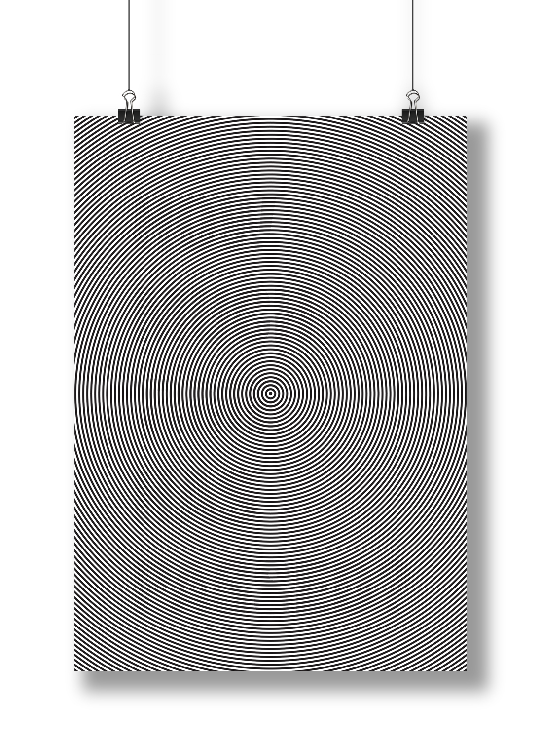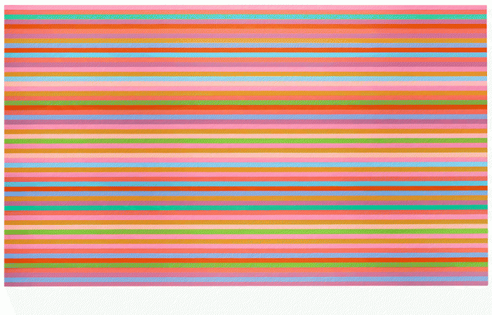
FYP Abstract (1st Draft)

Propose a project: What are the reason(s) or aims for doing project?


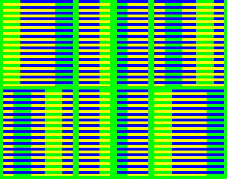
People assume things based on what they see most of the time, little do they know that their senses can be fooled easily. Thus, seeing becomes something that isn’t always about believing as how we see is based on how our minds perceives it.


When assumption is made, negative effects such as disappointments, miscommunications and wrong conclusions arises. Thus, the project aims to create awareness of own consciousness of seeings through colour illusion (lean towards colour interaction/constancy) because colour is often taken for granted as it is presented to us from birth. Colour plays an important and powerful role in the world we live in as it has the ability to change how people observe, think, feel and react.


Design/ Methodology/Approach How are the objectives achieved?

Include the main method(s) used for the project. What is the approach to the topic and what is theoretical or subject scope of the project?


The objectives are achieved through literature and non literature findings. The main method used would be specific surveys where it would focus on details of the viewers’ perception in terms of the experience of seeing. The other method is unstructured interview conducted in from professionals in the related field of studies to understand more about

For literature wise, books and articles would be used as evidences to support the idea and the non literature findings. All these would contribute towards the scope of the project that consist of the study of colour and its effect on individual perception.


Findings: What was discovered while working on the project? Analysis discussion results?


The most intriguing findings was relation to our eyes and function of our brain that changes our way of seeing. Mentioned by Rudolf Arnheim in the book of Art and Visual Perception, human see colour not only with eyes but with the brain as movement of the eyes is “reported to the sensory motor center of the brain”. The feedback that the brain received from the motor influences visual perception of which this perception does not “operate with the mechanical faithfulness of a camera which records everything impartially”. Therefore, the brain does not measure colours but it perceives based on given information from the eyes.


Originality /Value: What is new in your project? State the value of your project and to whom?


Colours and illusions has been explored by many yet it has not been dealt with as a project from another perspective. The project would bring individuals’ towards their own consciousness and this allows them to be more aware of their seeings.


Keywords: Keywords act as search terms and are like entry points to your project


Colours, Illusion, Seeing, Perception

Introduction to Perception & Ted Talk on Optical Illusion

More informations on perception itself as I realised that I’ve just went straight into the various types of perceptions in relation to illusions and colours. Sensation and Perception by E. Bruce Goldstein (Eighth Edition) is a book that covers various aspects of perceptions of which it includes the basics/introduction of it.

Perception is the ability to be aware of something through the senses and this experience is the result of “behind the scenes” processes of which determine our experience and reaction in the environment. The four processes are — Stimulus, Electricity, Experience & Action, Knowledge.

Stimulus

Things that stimulates our receptors and there are two kinds – in the environment and within a body. The environment stimulus is basically everything we can perceive within an environment while attended stimulus focuses on a particular thing of which it forms an image on the retina. This image then becomes a representation of that particular thing.

Electricity

Electric signals “created by the receptors and transmitted to the brain”. (Page 5) It transform energy such as light or mechanical pressure from the environment to the nervous system. This process is also known as transduction where transformation of energy from one form to another takes place. It is important for the signal to transmit to the brain in order to be able to perceive.

Experience & Action

Being able to “perceive, recognise and react to the stimuli”.

Knowledge

Any informations a “perceiver brings to a situation”(Page 9). This process is considered the most important among the rest due to its influential ability to categories objects from acquired knowledge. There are two kinds of processing — Bottom-up (Data-based) and Top-down (Knowledge-based). Bottom-up is basically incoming data of which usually provides as a starting point for perception. Top-down is based on knowledge and often one could be or not be aware of this process.

“Newton’s idea is that the colours that we see in response to different wavelengths are not contained in the rays of light themselves. Instead, these colours are created by our perceptual system as colour is not a property of wavelength but is the brain’s way of informing us what wavelengths are present.” (Page 206)

Thus, perceptual qualities such as colours are created by the nervous system instead.

Ted Talk by Beau Lotto, a Neuroscientist and Artist where he covered on Optical Illusion. At the near end of the video (15:00), he demonstrated his last experiment that left me questioning myself.

Some points noted:

  • Colour enables us to see the similarities and differences between surfaces, according to the full spectrum of light that they reflect.
  • Light that falls onto our eyes is determined by multiple things in the world, not only the colour of objects, but also their illumination and space between us and those objects. Thus, the vary in any one of those parameters change the colour of the light that falls onto your eye.
  • Light that falls onto your eye, sensory information, is meaningless, because it could mean literally anything. There’s no inherent meaning in information, it’s what we do with that information that matters.

Dimension and Illusion

Josef Albers

He is interested in how colour exerts influence to other colour. In the book Interaction of Colour by Josef Albers, Published by Yale University Press, 2006 he mentions the flexibility of colour as it is “constantly related to changing neighbours and changing conditions” (Page 5) thus “a colour is almost never seen as it really is — as it physically is” (Page 1) due our visual fields that captures colours with its surroundings. One of his well known exploration of colour interaction and vision is the Homage to the Square series. He used an early method of which consist of paper cutouts, tracing papers as well as transparent sheets to mask out or reveal different colour interactions.

In terms his teaching methods, he utilise direct observation and self-discovery to allow students to be more aware towards their seeing. His exercises usually appear simple yet it enable students to discover for themselves.

Below is a record (without audio) of his teachings at Yale. As observed, his class is active and engaging as he lead students to see an ellipse from different angles.

The Logic and Magic of Colour – Transparence and Spatial Illusions by Josef Albers (January 19, 1966, University of South Florida, Tampa, Florida)

The Logic and Magic of Colour (Short Clip) – The Bezold Effect by Josef Albers

It is an optical illusion where a colour is affected from other surrounding colours. “There is a special kind of optical mixture, the Bezold Effect, named after its discoverer, Wilhelm von Bezold (1837–1907). He recognized this effect when searching for a method through which he could change the colour combinations of his rug designs entirely by adding or changing 1 colour only. Apparently, there is so far no clear recognition of the optical-perceptual conditions involved.

Red on the left looks brighter as it interacts with white compared to the right one.

Notes from video below:

  • Only a change of one colour and the graphics look different.
  • The amount of proportion within the mixture makes different colours of the same ink.

The Logic and Magic of Colour Full Lecture (Without visuals)

While Josef Alber deals with colours in two dimension, his student Lois Swirnoff deals colour in three dimension together with light, space and perspective. Dimensional Colour (Second Edition) by Lois Swirnoff, Published by W.W. Norton & Company, 2003

Some main points noted:

  • “Variation in hue and brightness can and do produce compelling experiences of outline, form and pattern in the two dimensional of extensity, but their correspondence to experiences of solidity, depth and distance is less precise.” (Page 20)
  • “A colour interacting with its field will change appearance” (Page 29)
  • “A coherent structure relates human experience with the environment and provides the implement for its understanding and manipulation.” (Page 30) Thus, it converts reality to illusion.
  • “A vibration occurs when two hues of precise complementaries and equivalent brightness are placed in depth and observed through the window.” (Page 40)
  • “Less rigorous or logical colour sequences give rise to a variety of spatial effects.” (Page 43) An example is when a bright colour is placed behind a less bright colour, the bright one would tend to advance to less bright one.

Mauritius Cornelis Escher

A famous graphic artist known for his Impossible Constructions Series as well as Transformation Prints. (Surprisingly, he does not belong to any movements.) I was particularly interested in the Impossible Constructions series as it questions people their perception of reality. However, there isn’t much information on the psychological aspects of his works.

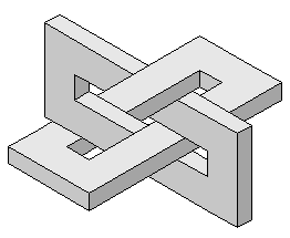
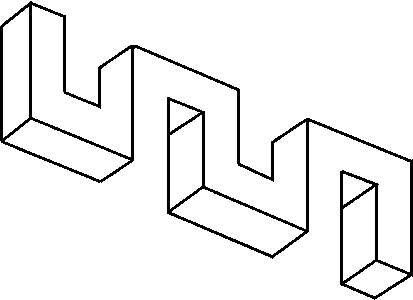
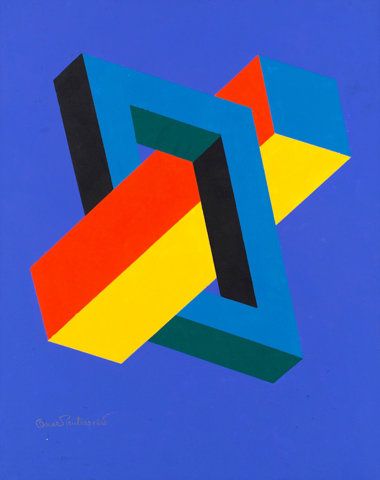
Thus, my research was led to the discovery of another optical/visual illusion called the Impossible Figure/Object (as M.C. Escher was inspired by Oscar Reutersvärd’s Penrose). It is a two dimensional figure that subconsciously makes our visual system to interpret and see it as a three dimensional object of which it can’t be physically constructed. The exact definition from A Dictionary of Psychology
Oxford Quick Reference by Andrew M. Colman, Published by OUP Oxford, 2015 – Impossible Figure is a drawing or other representation of an object that could not exist in actual three-dimensional space. (Page 368)

A famous example is the Penrose Triangle by Oscar Reutersvärd (Father of Impossible Figure).


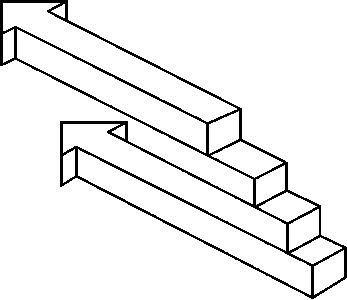
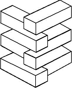
It is believed by psychologists that the “visual system follow the law of proximity” of which when no visible gap is seen between elements then it is “perceived as forming a totality and joining up”. (Macpherson, F. (2010) “Impossible Figures”, in the Sage Encyclopedia of Perception, edited by E. Bruce Goldstein, Thousand Oaks, California: Sage Publications, Inc.) Perspective also play a role in the creation of depth that adds to this illusion. Some of Oscar Reutersvärd works are below.

Two ArrowsLayered Blocks

Graphic Designer Victor Amoda gif

Graphic Designer Victor Amoda gif that links to this illusion

9 Squares

Additional inputs on this project (of which I’ve featured a few works in the previous post) as I felt that useful source for motions and illusions. Below is a compilation video from various artists.

This illusion really questions what I'm really seeing

This illusion really question as to what I’m seeing. I like simpleness of it yet at the same time, able to produce such effects. Below gif (in the middle of the 9 squares is the coloured version)

The coloured version is in the middle

The coloured version in the middle cause more confusion to the eye compared to the B&W version

Plays with dimension illusion

Plays with dimensional illusion

Love how the top right corner square interacts with its neighbouring square as it both shows different perspective (3D & 2D)

Love how the top right corner square interacts with its neighbouring (left) square while showing two different dimensions (3D & 2D)

Idea and Artist References

1st part of this post is on colour, brain, vision research through talks, books and video. 2nd part which is on my idea – identification of problem and aim of the project. 3rd part is a list of reference motion works and artists.

1st Part

Linked the talk with Professor Gerrit Maus (Division of Psychology in NTU, HSS) to Art and Visual Perception: A Psychology of the Creative Eye (New Version) by Rudolf Arnheim, Published by University of California Press, 1974 as I’ve realised that some of the contents overlapped with one another. (The book covers findings on visual process from a psychological point of view) Furthermore, the book is an additional source of justification of conversation we had.

Human see colour not only with eyes but with the brain as movement of the eyes is “reported to the sensory motor center of the brain” (Page 379). The feedback that the brain received from the motor influences visual perception of which this perception does not “operate with the mechanical faithfulness of a camera which records everything impartially” (Page 43). Therefore, the brain does not measure colours but it perceives based on given information from the eyes. This phenomenal also known as Kinaesthetic Perception.

Colour constancy happens when “colour receptors adapt their responses selectively when one particular colour dominates the visual field” (Page 334). An instance would be when one “confronted with a green light, the eyes decreases their response to greenness” (Page 334). The Rubik’s-cube illusion is an example that reflects this phenomenal where the brown square at the top and the yellow square at the side are the same colour.
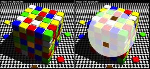
Optical-Illusion

Another topic covered in the book is perceptual shape of which it is the “outcome of an interplay between the physical object, medium of light and the conditions prevailing in the nervous system of the viewer”. In this context, how we see shapes do not only depend on the retinal projection but “the totality of visual experience we have had with that object, during our lifetime” (Page 47). The visual appearance “owes its existence to brightness and colour” as the eyes distinguish the areas between brightness and colour to determine the shape of the objects. However with distance, it weakens how shape is being seen as “perceptual mechanism is left free to impose upon it the simplest possible shape” and “when the actual stimulus had disappeared, the remaining memory trace weakens” (Page 63). The eyes figure shapes with its overall pattern as this visual perception relates to what gestalt psychology calls as visual perception.

To further iterate, a video on Prof Semir Zaki’s (Neuroesthetics) lecture’s on Colour, Vision, Reality and Illusion provided some insights to this topic. Some of the points noted are:

1.There’s no colour in the world outside. It is generated by the brain from which it does not follow the strict rules of Physics (Wavelength of light) and Biological (Ratio Mechanism).

2.Colour is a subjective experience and is an act of judgement.

3.There are no colours but constant colour.

4.There are no hues but inconstant ones. Hue is a subcategory of colour of which its appearance depends strictly on the surroundings.

5.Colour comes first before motion.

Additionally, chanced upon BBC Future website that covered illusions and perception of which further emphasised on the above informations and the last paragraph at the bottom of the page struck me. “Our visual system remains too limited to tackle all of the information our eyes take in”, as our brain is not big enough to store all of it, thus our brain is selective towards the interpretation of what we see. In this context, “seeing, then, is certainly not always believing”. Personally, I’ve always believe that seeing is believing. Therefore, this quote was an interesting take and provides another kind of perspective as to how we see things around us in our daily lives.
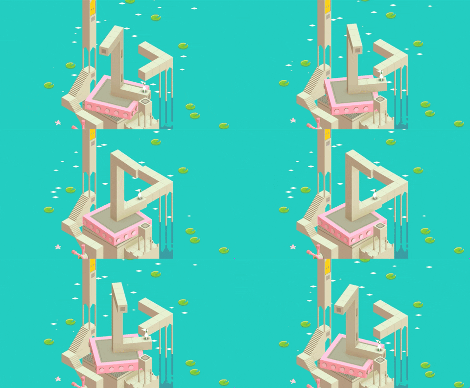
An example that reminded on the shift of perspective is Monument Valley, a game that enables player to explore,interact and unfold optical illusion architectures from different angles to go to the next level of the game. This somehow has the essence of M.C. Escher’s Impossible Constructions collection.

2nd Part

Problem & Idea

People assume things based on what they see most of the time. Little do they know that their “senses can be easily fooled” as Aristotle said (Ambiguous Illusions by Humberto Machado, 2015) because “seeing means grasping some outstanding features of objects” (Art and Visual Perception, Page 43) and with visual perception, seeing becomes something that isn’t always believing as how we see is based on how our minds perceives it.

When assumption is made, it usually connotes to negative effects such as disappointments, miscommunications and even derivation towards wrong conclusions. Thus, the project aims to create awareness of own consciousness of seeings through colour illusion (lean towards colour interaction/constancy) as colour is often taken for granted as it is presented to us from birth. Colour plays an important and powerful role in the world we live in as it has the ability to change how people observe, think, feel and react.

Therefore, I want my work to be an experience that allow viewers to see without the need to interpret or have prior knowledge about it. After all, it’s about the consciousness on the sense of seeing.

3rd Part

Motion References & Artists’ Works
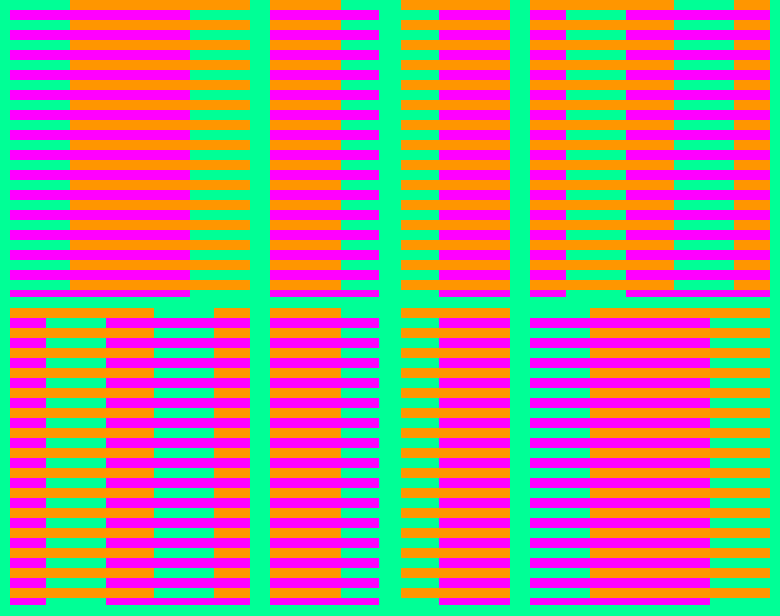
Bunker-White Illusion

An illusion that reflects the result of how our eyes see colours. It guides viewers into seeing how their brain perceives colours as same colour illuminance evokes different perception of brightness through colour interaction. This demonstrates the idea of seeing isn’t always believing.


Florian De Looij

A graphic designer that works on optical illusions inspired from artist such as M.C. Escher as he produces GIFs everyday. One of his works caught my attention for its dimensional and perspective movement of a cube and its surface colours.
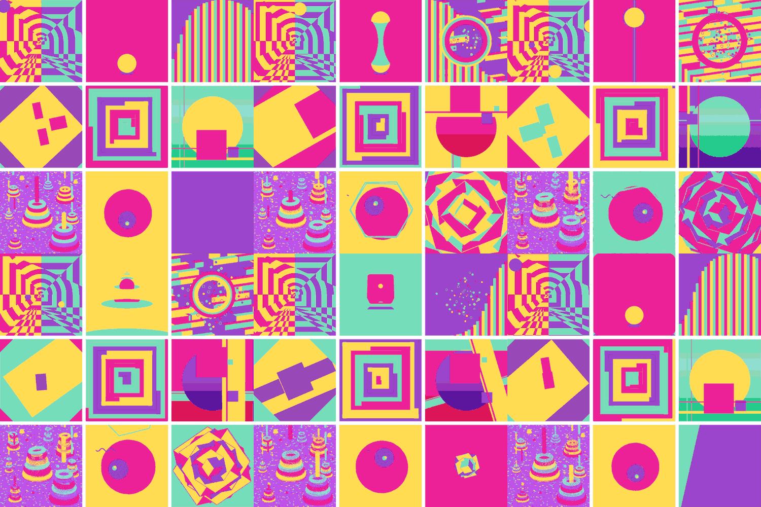



9 Squares – Collaborative work with 9 designers to create 9 squares of 3 seconds abstract GIFs with the use of only 4 colours.

AI Boardman

A motion, animation designer that creates motion GIFs.
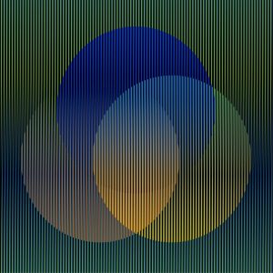
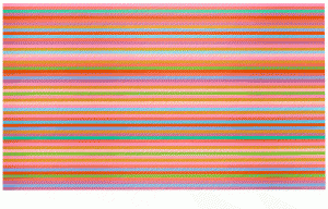
CARLOS CRUZ-DIEZ   CARLOS CRUZ-DIEZ.

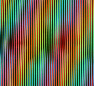
Left: Color Aditivo Serie Caracas A1, 2009 (Chromography on aluminum) Right: Viernes, 2013 (Lithograph)

Carlos Cruz-Diez

A kinetic-optic artist and modernist master whose works are based on the four chromatic conditions – Additive, Subtractive, Inductive and Reflected colour (Focuses more on colour than movement). He explores the sensory possibilities of colour in space and its interaction with the viewers as they become participants of his works.

Colour Additive Series (1950 — 2014)

The investigation based on radiation of colour where 2 colours produces a 3rd colour as the colour plane interacts with one another.
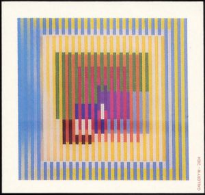
agam_yaacov_withinyellowspace_agamograph_14x1425_L_grande

Agamographe, Within Yellow Space (Silkscreen and Plexiglas)

Yaakov Agam

A well known kinetic artist (studied under Johannes Itten) that works on various media such as drawings and sculptures of which all explores on the idea of movement, colour and perception in non-static forms.
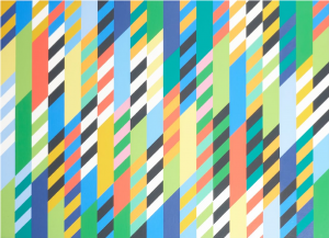
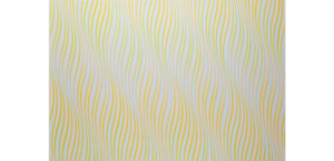
Bridget Riley Conversation   Briget Riley

Left: Conversation, 1992 (Oil on linen) Right: Untitled (Bronze), 1978 (Screenprint in colours)

Bridget Riley

A well known Op Art artist whom was influenced by Futurism’s abstract thinking, explores the optical juxtaposition of colours.

Colour, Space, Perspective

Books that I’ve read:

Colour Theorists

Johann Wolfgang von Goethe: Theory of Colours, Published by J. Murray, 1840

Wassily Kandinsky: Concerning the Spiritual in Art, Published by Dover Publications, 1977

  • Characteristics and spirituality of colours and it’s opposing
  • Shades of colours

Johannes Itten: The Elements of Colour, 1st Edition, Published by John Wiley&Sons, 1970

  • Covers the details (more towards the objective) of colour principles
  • Colour in Physics
  • 12 Colours in the Wheel
  • 7 Types of Colour Contrast
  • Colour Sphere/Star
  • Colour Harmony (Based on the Colour Wheel)
  • Form and Colour
  • Colour Expression (Based on individual colours meaning and its combinations)
  • Colour Composition (Placement of colour at the Top/Side/Bottom make differences)

Josef Albers: Interaction of Colours, 50th Anniversary Edition, Published by Yale University Press, 2013

Reading in progress..

Artists

James Turrell: The Art of Light and Space by Craig Adcock, Published by University of California Press, 1990

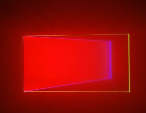
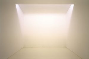
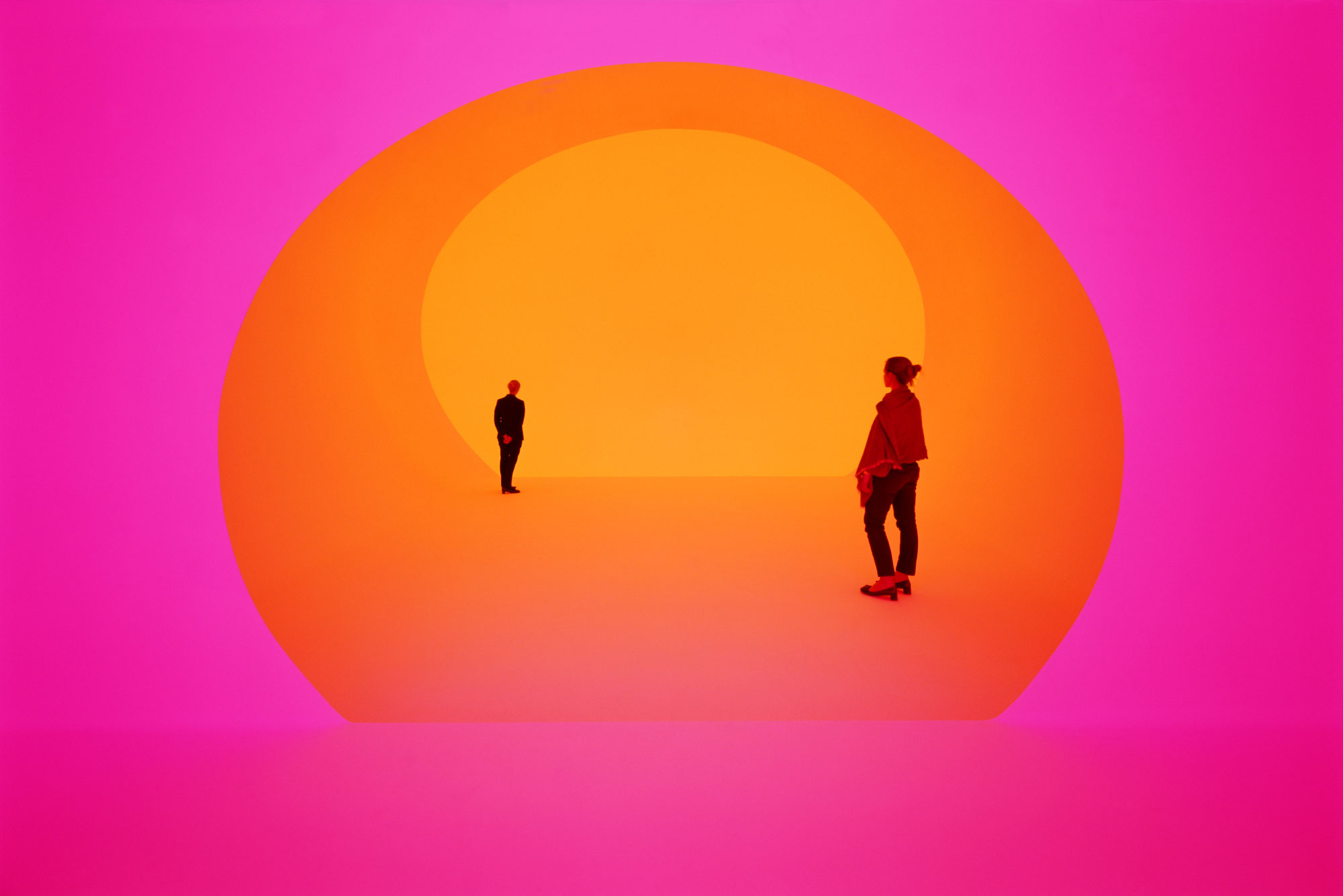
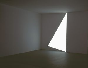
An American artist that creates works which revolves around the idea of wordless thoughts through light and space. His aim is to make the audience to be aware of their own perceptions and “become conscious of their own consciousness” (Page 226). In his case, comprehension is not his primary concern as he does not deal with “science or demonstrations of scientific principles” (Page 225) instead, focus on how people see and perceive. Therefore it is fine for viewers “to remain mystified” (Page 226).

Some of his works that was mentioned:

Pullen-White-1967-s1-1440x1120

Projection Pieces: Pullen (White), 1967

Milk-Run-II11-1440x1122

Wedgeworks: Milk Run II, 1997

Panza_Virga1

Veils: Virga, 1974

Through these images, it can be seen that he deals with the “relationships between veridical and illusionary perception” (Page 223).

James Turrell, Robert Irwin and Douglas Wheeler were associated with one another during the late 1960s as they were most involved with the use of light. Both Turrell and Irwin took perceptual approaches in their works but Irwin leans towards traditional paintings. To him, “paintings were not simply objects, but rather elements in an interactive perceptual experience” (Page 54). As time passes, he gradually went on with light works and installations.

Bridget Riley: The Curve Paintings 1961 – 2014 by Kudielka and Robert, Published by London:Ridinghouse, 2015

An artist known for Op Art with the use of geometric abstractions. Here interest in form and colour led to exploration of perception. Her works started with black & white and gradually added colours to her works.

Arioso (Blue), 2013

Arioso (Blue), 2013

Olafur Eliasson

An artist that is interested in “perception, movement, embodied experience and feelings of self” (olafureliasson.net/biography).

FYP Idea Proposals

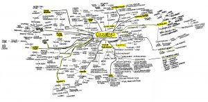
Mind map of Colour(ful)

Mindmap


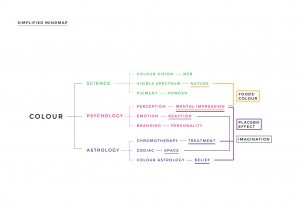
Simplified Version

Simplified Mindmap

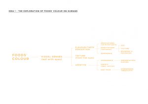
Idea 1

Mindmap-02

The Exploration of Foods’ Colour on Humans

Colours play a significant role in our daily lives as it affects us psychologically, scientifically and in many other aspects. Psychology is an applied science that studies the mind and behaviour. Together with the exploration of the concept of perception, emotion and other areas, it aims to understand the human activity. This FYP intends to interpret human mental impressions of nature through the effects of foods’ colour. Food is part of nature and it revolves around human activity as one of the basic essentials. As a foodie, food visuals hold much importance to me. By exploring and understanding this, it enables people to realise the power of the understated role of colour in food as well as the subconscious process of human behavior in daily lives.

The possible outcome for this idea would probably be an installation of food displayed in a scientific/interesting way together with a booklet to explain the idea.

Mood of Project

Research Method – Experience Sampling Method


Idea 2

Mindmap-03

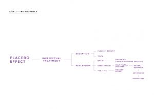
The Prophecy

Mankind has always attached colours with certain perception and emotions. The psychological effect helped us to understand and relate better with colours under various area of studies such as pseudoscience.

Placebo is an effect that produces positive impact based from the result of perception. It is a mechanism that works with astrology where people believe in its horoscope readings and feel better when they follow its advice. This FYP seeks to discover the skeptical relationship between astrology, self fulfilling prophecy and colours. As an individual, I read horoscope out of curiosity and for the fun of it. It provides some sense of hope, positivity and entertainment in life. By exploring this, it aims to portray the prophecy of astrology on humans.

The possible outcome for this idea would be to create a brand in a medical approach.

Mood of Project

Research Method – Diary Studies


Idea 3

Mindmap-04

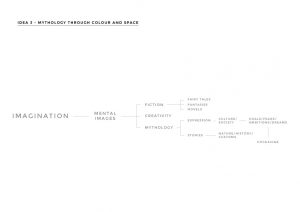
Mythology through Colour and Space

Colours evoke reactions based on the interpretation of one’s senses through the spaces that one interacts. These spaces can be defined to be of physical or non-physical presences that provide a form of freedom towards imagination. Fairytales, fantasies and mythology are part of imagination created through mental imagery. This FYP intends to interpret the mythology of Cockaigne through colours and spaces. As a child, I enjoyed reading stories like Charlie and the Chocolate Factory as it’s very imaginative, colourful and portrays every child’s paradise. Even after being an adult, I wished this factory was a reality. This project would portray how colour and space work together to bring paradise to another level of experience.

The possible outcome for this idea would be packaging / + installation.

Mood of Project

Research Method – Image Boards

Project 3 I Research

Bright Button is an interactive wall installation where coloured pins are attached with a different word on it to describe a mood. People could take these pins that reflect their mood for that day and pin it on them. I like how ‘flexible’ colours are used in this context where it transfers the value from one place to another.

Pins


Nature Matching System is an eye catching installation due to its bright swatches of which is used to attract attention towards food choice people should make as these are the colours of fruits and vegetables.


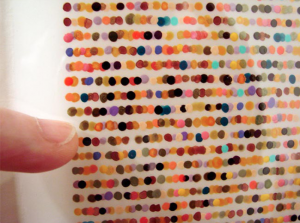
“a system of Braille for the colour inclined” is a colour codification code that uses colour dots to represent alphabets in text blocks for the colour inclined. The result was unique and intriguing!

Dots


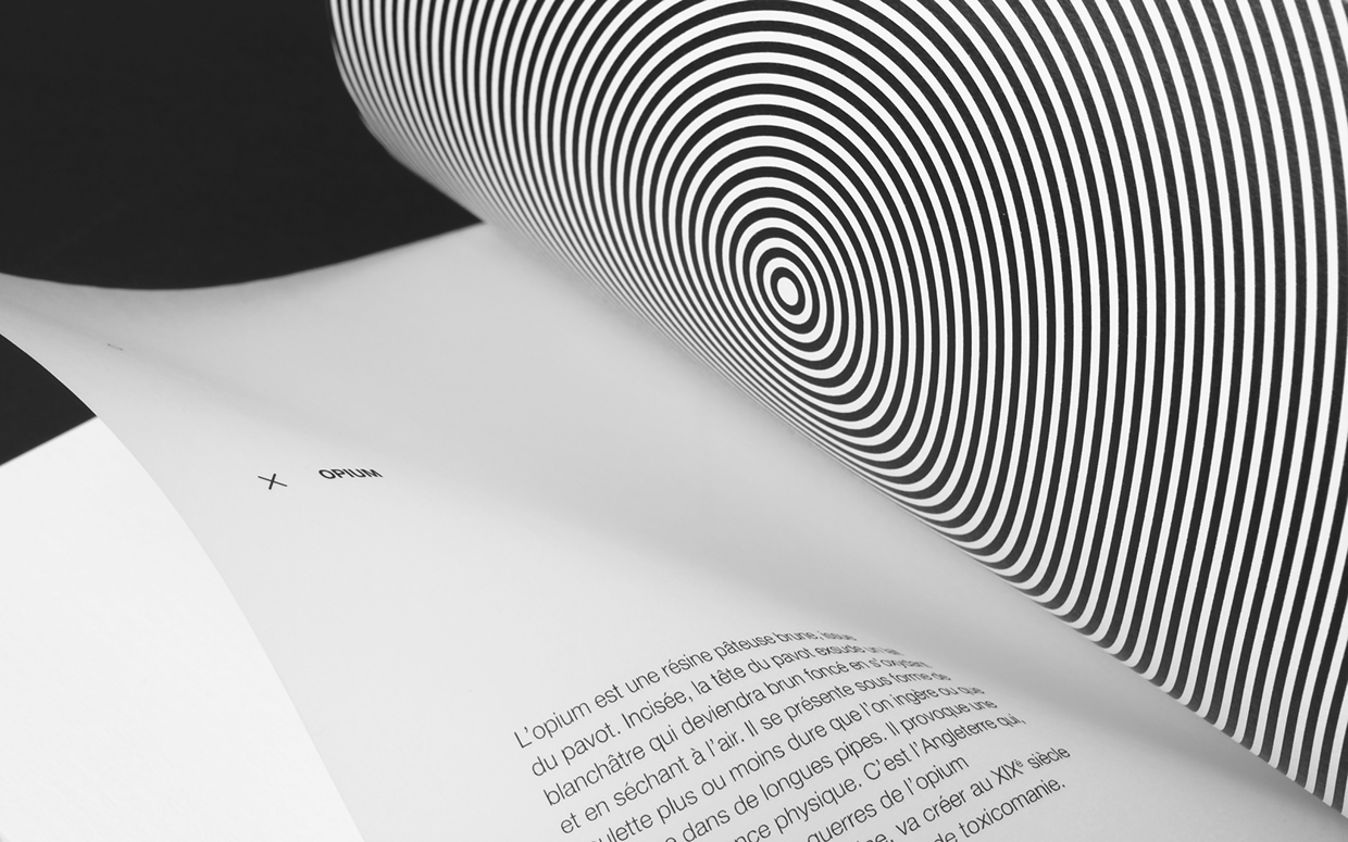
Drogues caught my attention for it’s use of illusion just like the effect I did for Project 1. In this case, the illusions reflect the effects of the different kinds of drugs.


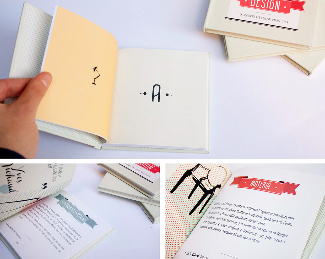
Another example is a small glossary of 20 Words of Design.


My Individual Dictionary is pretty cool as it is illustrates personal interpretation of words using objects and colours. To me, this somehow is an expanded and more detailed version of emoji.
 

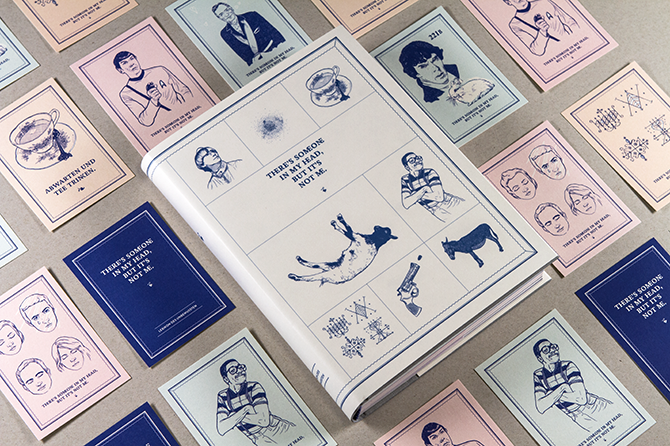
The Lexicon of Unconsciousness is a rather creative approach towards questioning questions. It describes the lexicon book as the brain towards questions.


Slanguage as the title proposed, it is a mini book on slangs. The pages are rather interesting as it reminded me of those paper flyers pasted on lamp posts and boards with tearable telephone numbers at the bottom of the paper.

Project 3 I Mindmap, Proposed Idea & Moodboard

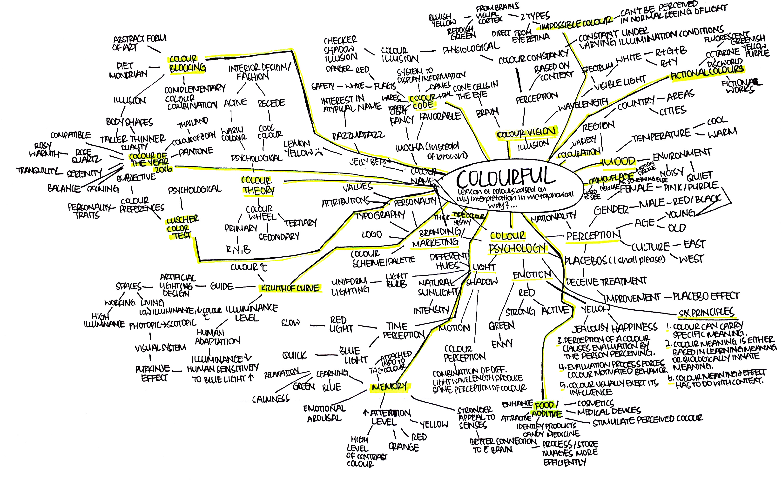
Colourful Mindmap

Based on the 50 words that I’ve came up with, more than half of them are metaphoric representation of me and I plan to use the idea of metaphor as part of the project together with the word Colourful, which I’ve chosen among the 50 words to expand and explore on the possibilities.

Colourful encompasses a variety of definition that includes the psychological, physiological, scientific and other aspects of which I would like to focus on perception, under the psychological aspect. Gender, age and culture contributes to how individuals perceive and react towards colours. Though colours give off specific moods (e.g. red = danger, active), personal emotions, memories and experiences does affect how one feel and think about that particular colour(s).
Thus, my proposed idea is to create a Lexicon of Colours using personal interpretation and perception of colours and represent it in a metaphorical way that would reflect my personality. Basically, it is a vocabulary that uses colours to express my perspective as an asian adult. The aim of this is to show how colours play a part in the psychological aspect of life, in terms of personal preferences and perception. The purpose is to communicate the idea that different colour brings different degree of reaction based on the feeling attached to it and therefore, individuals may share the similar or different views as/from me.

Pinterest – Mood board as to how I could present this idea..

Project 1 I Final (Reflection)

Time perception began with a personal take based on what I’ve experienced as well as the realisation of similar encounters by my friends. This sparked me to create something to reflect upon this kind of experience that is usually taken less seriously as it was just a matter of individual perception. Through my research, I began to understand the “science” behind it and this somehow changes my perception towards time since I know how the brain works. Thus, the idea of illusion and typography came about as a form of medium towards the expression of this topic.

Time perception is defined as a field of study that is link to psychology and neuroscience in which it is subjective to the experience of time and measured by own perception. I couldn’t less agree to this yet I felt that this is a scientific approach toward the definition of such experience. From a less scientific view, I would define it as a rather common yet quite odd encounter with time as it differs from each individual.

Project 3 I Interesting Colour Dictionary Examples

An interesting redesign of Pantone (the dictionary of colour) by artist Pierre David where he created Human Pantone based on human skin tone/colour.


Another kind approach towards colour dictionary is the use of colour pencils as the content / ‘words’.

22178    Screen Shot 2016-03-10 at 10.21.37 pm


Pantone cafe uses their food and furnitures as their ‘dictionary of colour’, which makes the entire cafe more fun and unique. Dictionary in this context, goes beyond the boundaries of just pieces of papers. Objects can be considered as part of the dictionary depending on how you perceive it.
 

Pantone Universe collaborated with Sephora and came up with 2016 Pantone Colour of the Year lipsticks. (Didn’t know that a dictionary could be so adventurous and of different objects, shapes, sizes)
Sephora and Pantone Launch the Makeup Collaboration of Our Dreams


Another Pantone example that used beer colour. Imagine cans of dictionary…
What Pantone Color Is Your Favorite Beer?