Hey! Here’s my reflective essay on Interactivity in “The Penis Wall” for Question iii.

Clickity click –> Final HOD Essay
I try.....

Hey! Here’s my reflective essay on Interactivity in “The Penis Wall” for Question iii.
Clickity click –> Final HOD Essay

This week, I am focusing on two things: International Typographic Style & Psychedelic. The former is an impactful movement that shaped Visual Communication heavily in terms of organisation of information. The latter is a movement that I’m focusing on purely based on aesthetics and the message behind it which intrigued me.
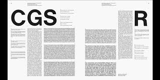
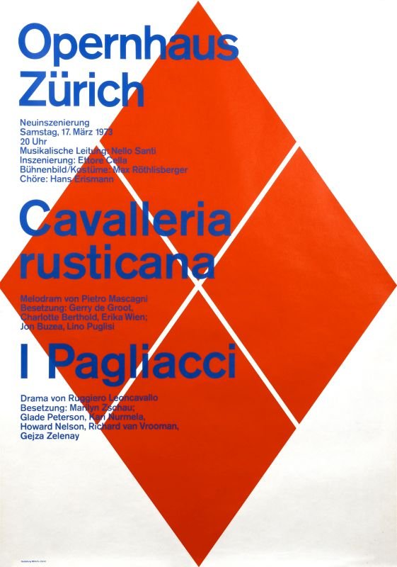
- Traces back to Neue Grafik
- aka Swiss Style
- Emerged in Russia, Netherlands & Germany
- Further developed by designers in Switzerland
- Emphasis on readability & objectivity to communicate ideas effectively

Characteristics:
- Usage of grids & Sans-serif typefaces
- Style is associated with preference for photography instead of illustrations/drawings as a primary design in addition to text

Reflection:
The emphasis on clarity for this movement paved the way for universally understood way of communication through visuals. It creates a sense of order and control in my opinion. This allowed room to play more with the graphic element be it photography or illustrations etc since the texts are more structured using compositional grids. It is also laid out better to create a better eye flow that is natural so that the message comes across more clearly.
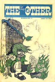
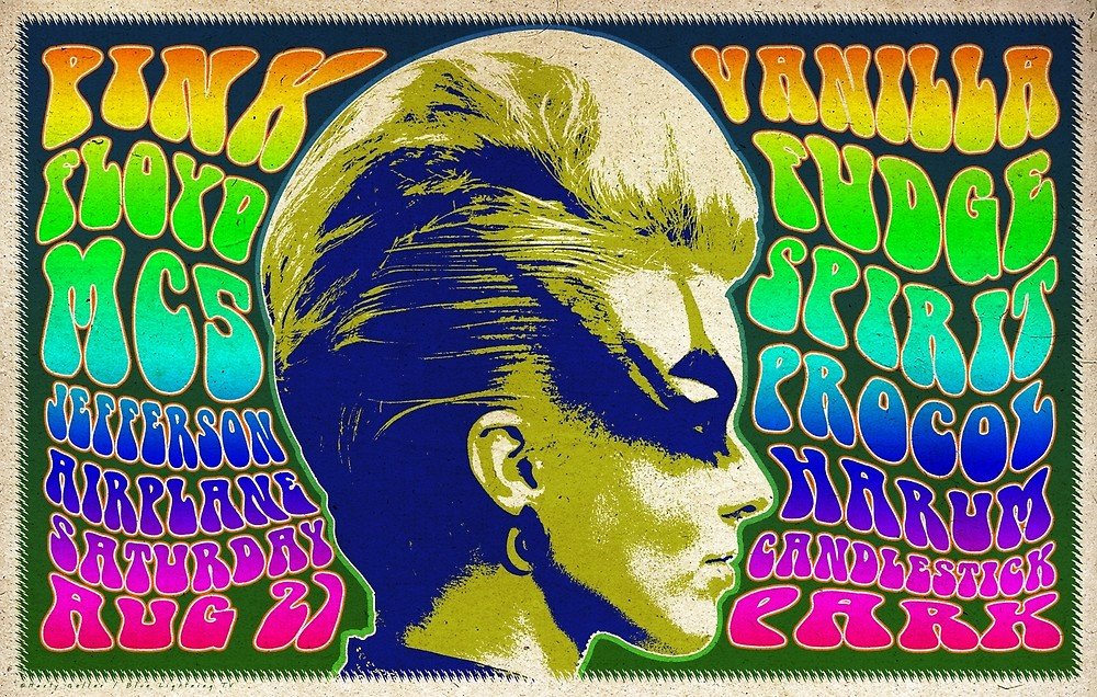
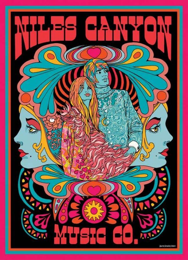
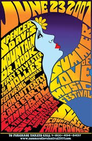
- Art, Graphic or Visual Displays related to/ influenced by Psychedelic experiences & hallucinations form psychoactive drugs
- Visual Arts were a counterpart to psychedelic music
- Evident in concert photos & record album covers
- Generated controversy due to its links to illicit substance

Characteristics:
- Kaleidoscope swirling/spiral patterns
- Strong colour palette
- Concentric circles & repetition of motifs & symbols (eg. Paisley)
- Art Nouveau & Victorian influences
It also had an influence on comic book artists who created undergroudn genre of comic book known as “underground comix“. They were often satirical in nature.
Underground Comix

Posters/Visuals:

Reflection:
I think this movement stood out to me visually due to its association with Art Nouveau influences, which in my reflections before, I did highlight my interest in. The contrasting colours were refreshing to see and although jarring at times, it somehow created harmony as colours were carefully curated to complement one another and placed with thought. In this art form, in my opinion, the text came secondary to the image shown. I believe this is due to the fact that since they were attracting controversy, through this manner, they were still able to attract their targeted audience and those who were interested in the scene. It created almost a, “camoflouge” for them to continue existing and to spread their movement/style/message.

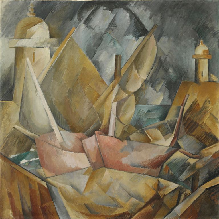
Lecture 3 was pretty insightful and there were many styles/art movement that really intrigued me. However, for the purpose of this reflection, I am going to focus on two of them which is Cubism as well as Surrealism.
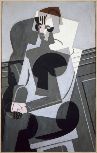
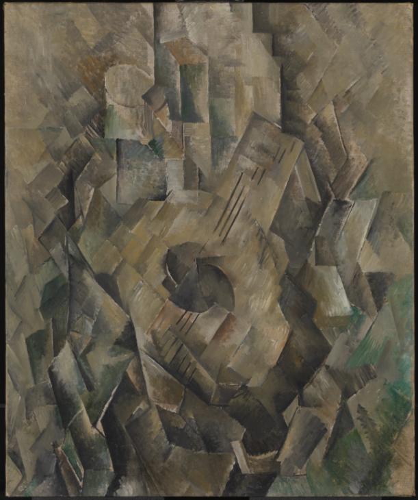
- Invented around 1907-1908
- By artists Pablo Picasso & Georges Braque
- Very much focused on the different perspectives of human figures
- Resulted in painting that appeared fragmented and abstracted.
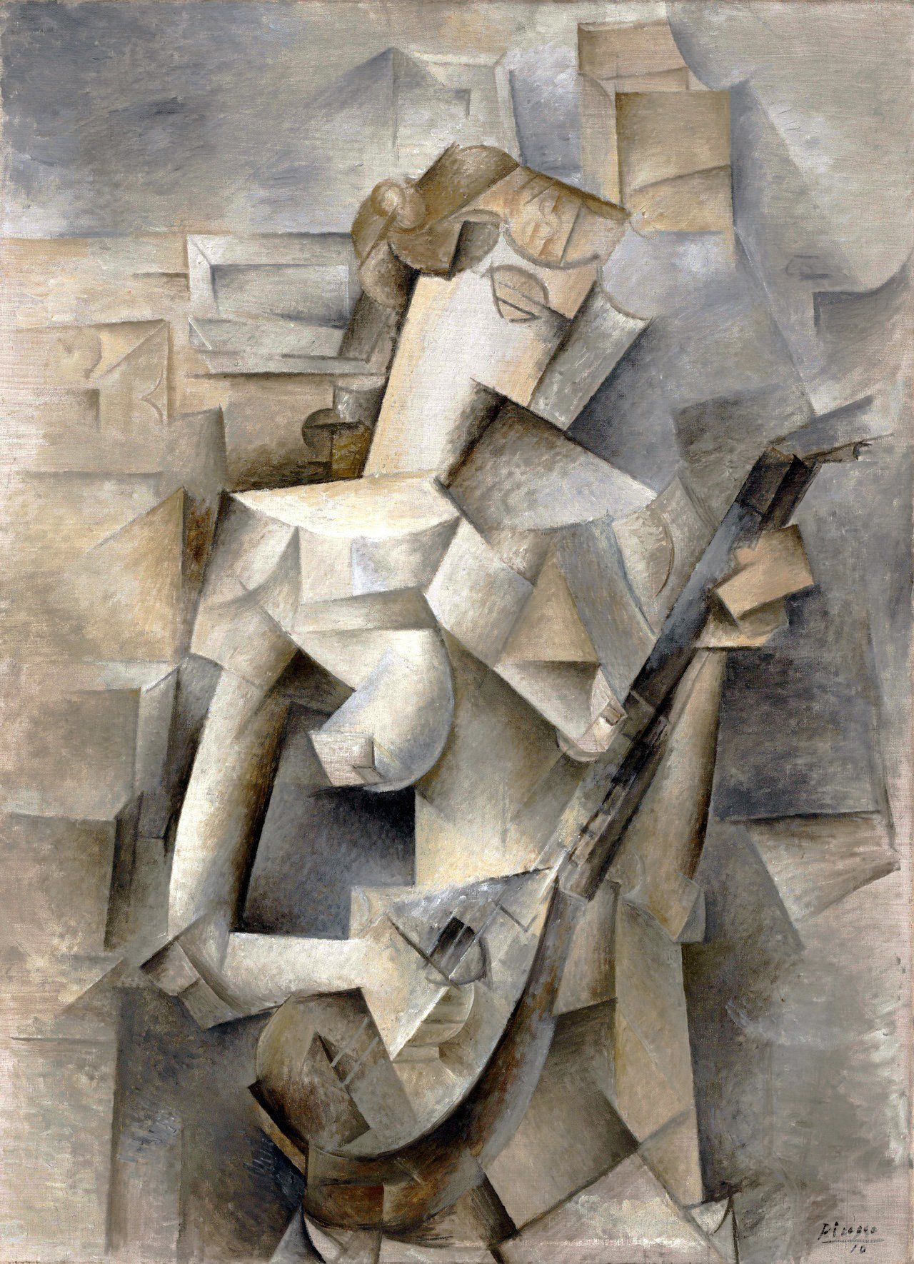
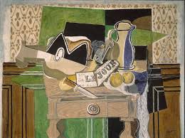
Portrait of Josette Gris, 1916
Juan Gris
My favourite artwork shared during the lecture was one by Juan Gris, called Portrait of Josette Gris. Between the two styles of Cubism, I much rather prefer the Analytical style. Although Juan Gris was more known for his works in Synthetic Cubism Style, this particular painting stood out to me. The earthy tones and the form of the figure created a sombre feeling. The depth was created with shadows in various rigid shape form.
Though the shapes used in Cubism were angular, it’s interesting to still be able to see movement and life in the paintings.
Better known for portraits
Better known for landscapes
- Founded by Andre Breton, a poet in Paris in 1924
- Artistic & Literary movement
- Played with irrational and subconscious mind
- Possessed dream-like visuals, symbolism, unexpected juxtapositions & collage images
- Advocates that artists should bypass reason & rationality by accessing unconscious mind to create art
- These techniques were later known as automatism
- Allowed artists to embrace chance when creating surrealist art
- Influential works, esp book called 'The interpretation of Dreams (1899)
- Legitimised the importance of dreams and unconscious as revelations of human emotion & desire
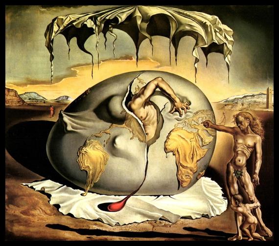
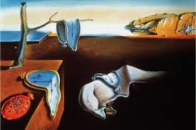
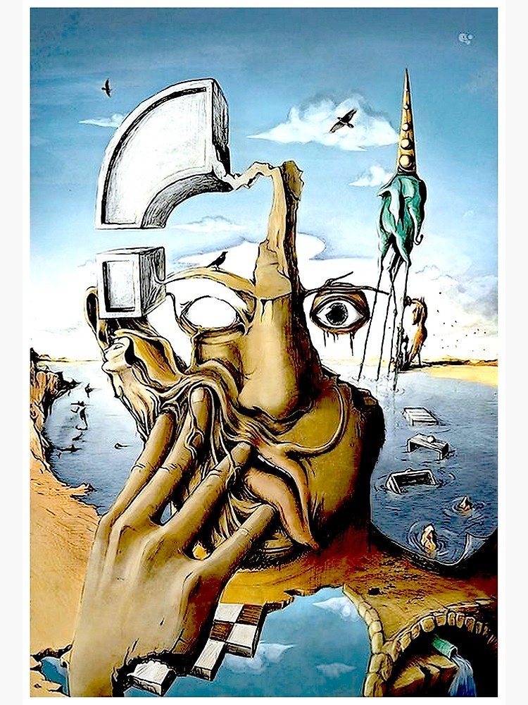
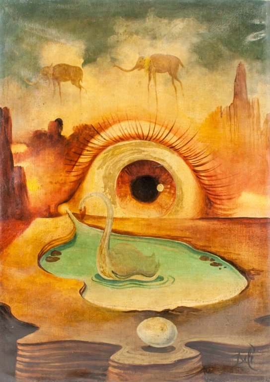
- Influenced by Renaissance masters
- Had a bizarre surrealist style
- A skilled classical painter and illustrator
- Works often include ants or eggs
Final Reflections:
I thoroughly enjoyed this week’s lecture as it encased quite a lot of information that were interesting to me. Surrealism was the first art movement that caught my eyes, back when I was in secondary school as I was intrigued by the peculiar style it has and how it was able to convey a message that was individualistic, subjective and very personal.
It also played with the subconscious mind and was able to capture the essence of what the artists’ minds looked like. In my opinion, due to their renaissance-style, technical paintings, that contrasted with it’s almost “psychedelic” or a state of mind that was a daze etc, it created a sense of believability that could still resonate with a lot of viewers or followers of the art.
Links used:
https://www.theartstory.org/movement/surrealism/
https://en.wikipedia.org/wiki/Sigmund_Freud
https://www.theartstory.org/artist/miro-joan/
https://www.theartstory.org/movement/surrealism/
https://en.wikipedia.org/wiki/Surrealism
During the sharing session in class, Desmond reintroduced us to the art movement called, Art Nouveau. The works that were classified under this particular style really piqued my interest. The organic and expressive lines in the design was something I really identified with and fully appreciate. Hence, this reflection is going to cover that!
Here is some history that I read up on.
Generally, Art Noveau was generated by enthusiasts who were in the decorative, graphic arts and architecture throughout Europe and beyond, including the United States. It was also known as the Glasgow style or more commonly known by the Germans as Jugendstil. The movement lasted between 1890-1910.
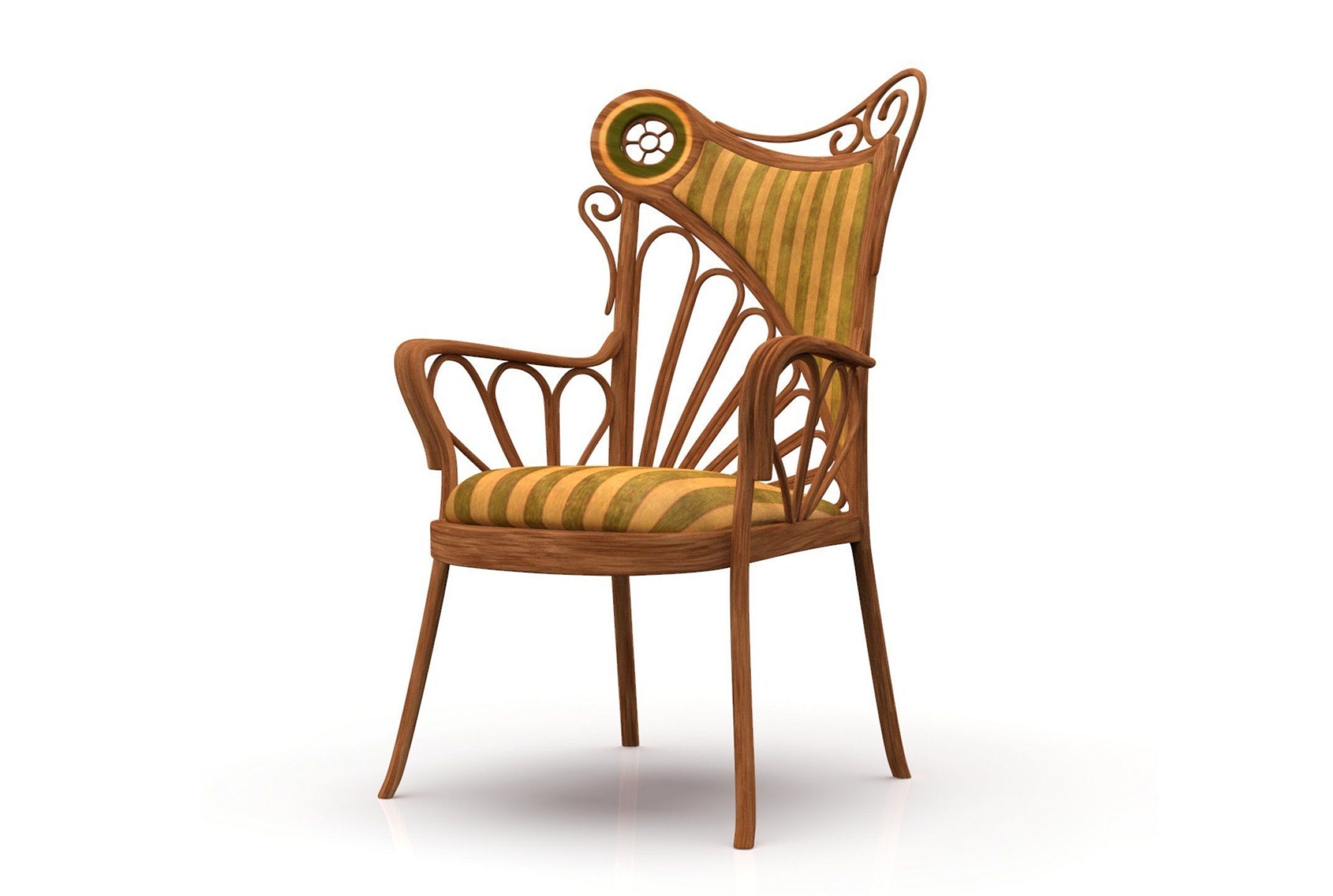

This movement began as an effort to break free from the eclectic historical styles with an aim to modernise design. Inspirations were drawn from organic and geometric forms which formed elegant designs that created visual movement with the flowing lines. Art Noveau reflected transformations of the modern age at the time in an exuberant style that emphasized nature, beauty and optimism. Muted colours of greens, yellows, blues and browns were popular in this art style.
Unfortunately, the style ended before World War I which then led to the development of Art Deco.
Now that the history has been established, I’m going to move on to the artists and works. Although the movement existed in furniture, products etc, I’m going to pull the focus onto the graphic design as that was something that stood out to me most. Perhaps what attracted me to Art Noveau was the emotions that the art provoked.
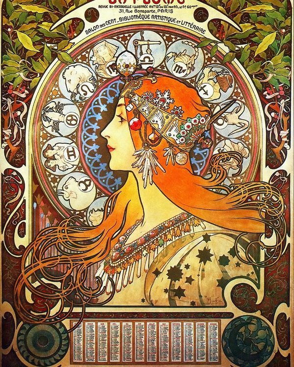
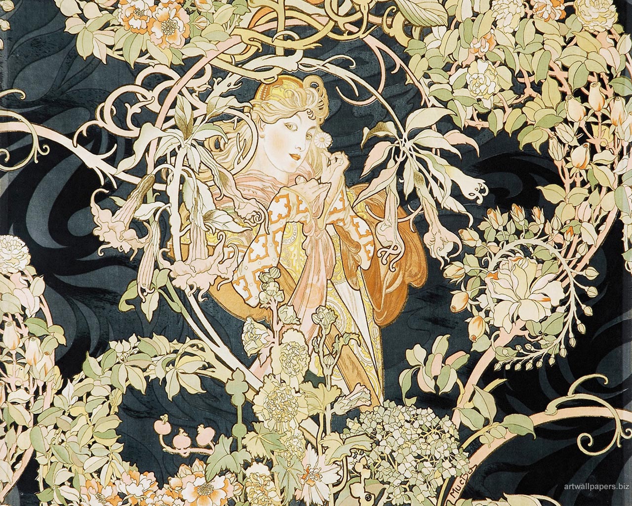
A Czech artist who drew influences from Japanese Ukiyo-e artist, Utagawa Toyokuni. He birthed the ‘Style Mucha’ where he was established as the pre-eminent exponent of French Art Nouveau. He came to popularity from the commissioned work of Sarah Bernhardt.
Works by Alphonse Mucha
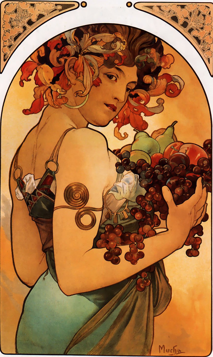
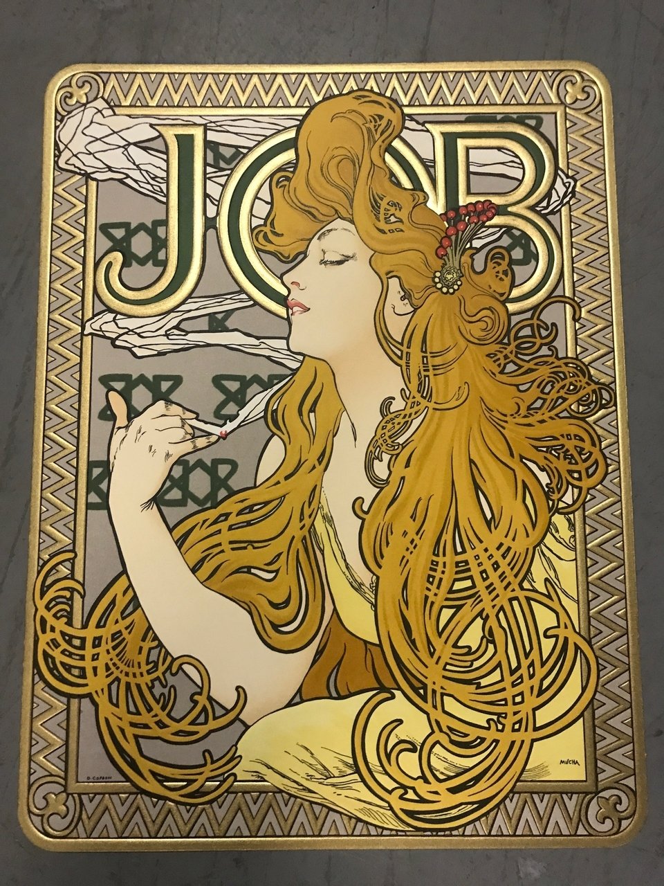
He was a French painter and lithographer but was also known as the father of modern poster from Paris.


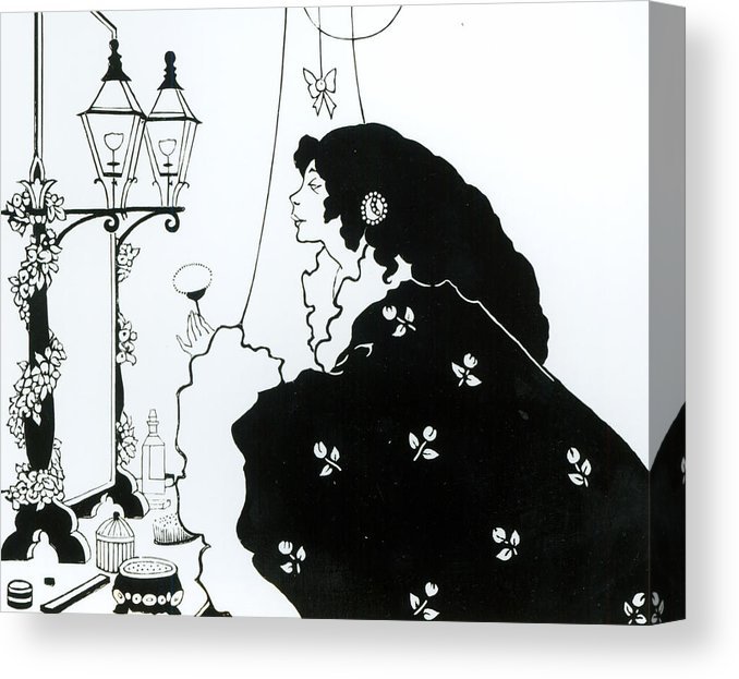
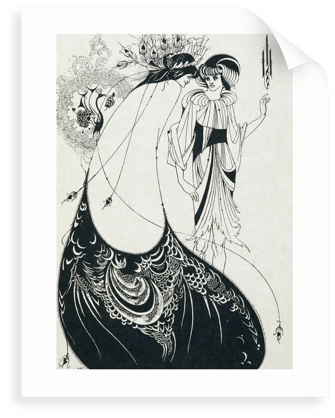
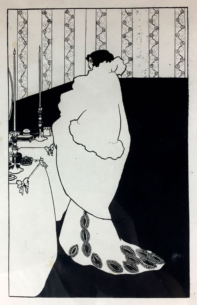
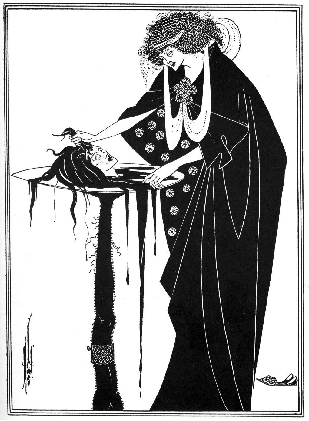
A British artist who was notable due to his impressive impact on illustration art. He was able to make a name for himself in a short span of 7 years and one of his most popular works were his illustrations for Oscar Wilde’s play, Salome. Unfortunately, his career was cut short due to the onset of tuberculosis.
Reflection:
This art movement was something I connected with as I’ve always been a fan of muted tones in graphic designs as well as clean, wavy lines. Hence, Art Noveau was a movement that was not only visually pleasing but also able to evoke an emotion that rested well with me. It communicated a sense of freedom and expressed delicate yet bold statements with its intensity in visual metaphors and expressions along with its flowing lines.
Links used:

This week, we learnt about the Evolution of Communication from Writing and how it led up to Typography.
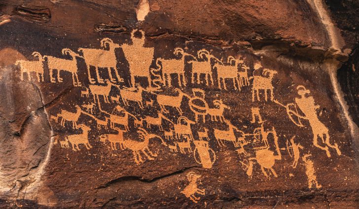
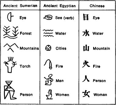
First and foremost, let’s differentiate the terms, ‘Petroglyph’, ‘Pictograph’, ‘Hieroglyph’ & ‘Ideograph’.
Petroglyph:
Engraved carvings/images on rock surface in prehistoric times. While they can be found in literate culture, they’re more commonly practiced by illiterates.
Pictograph:
A symbol for a word/phrase and were the earliest writing system created by the Sumerian. This is often painted onto rocks, not necessarily engraved, using natural pigments.
Hieroglyph:
Characters of the ancient Egyptian writing system, discovered in the Rosetta stone. At the time, only those who were privileged with extensive education were able to read, write and understand Hieroglyphs. (Pharaoh, priests, etc)
Use the ‘rebus‘ principle where they use a combination of pictures that mimic the sound of the word.
Ideograph:
A symbol representing an idea or a thing; graphic representation. It is not made up by suggesting sounds of word and required an educated individual to create ideographs. This was more so influenced by culture.

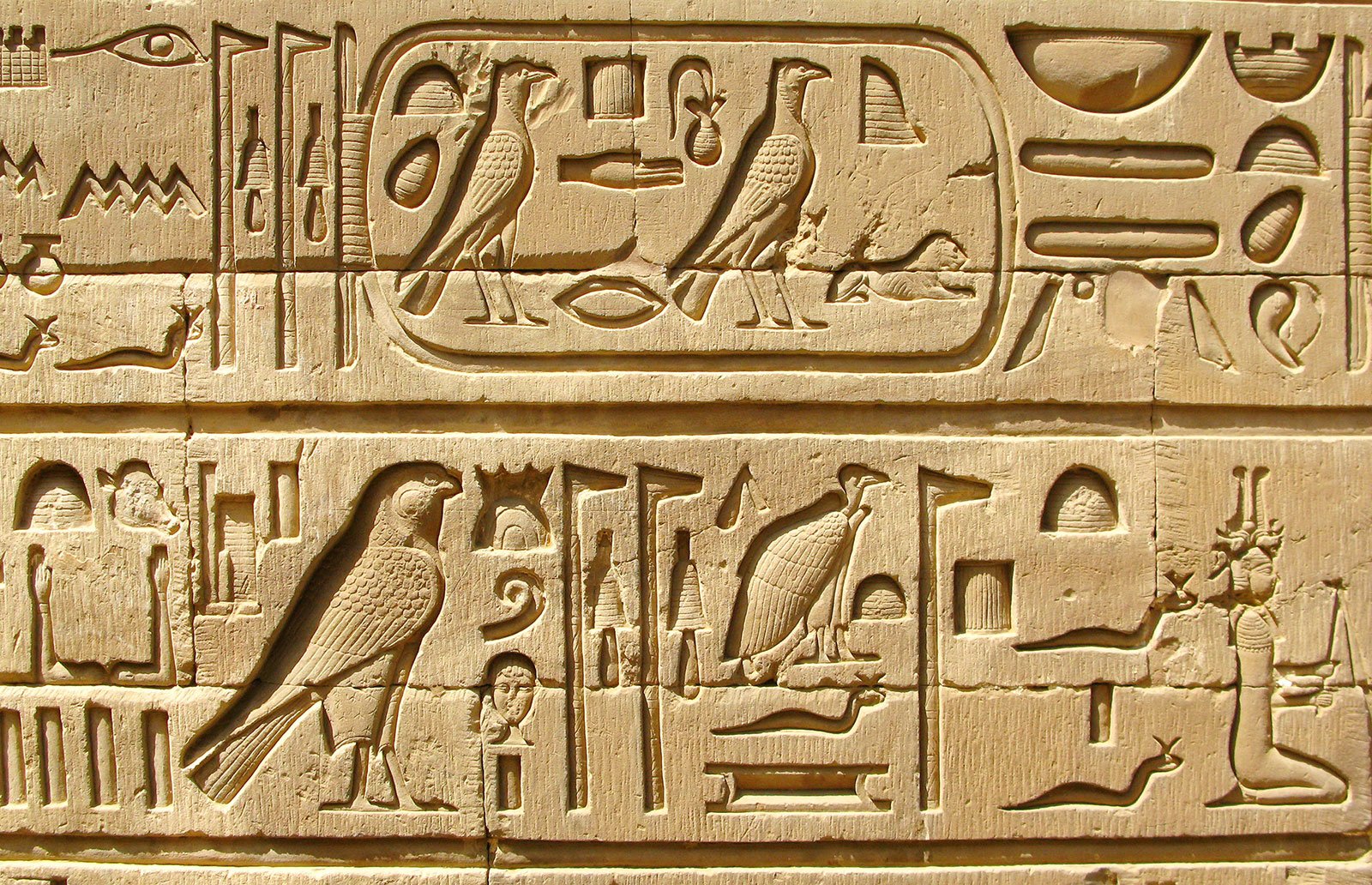
Given that, I was intrigued by the Book of the Dead, which used Hieroglyphic illustrations to communicate the word or phrase with the rebus principle. They were written on papyrus; made from the pith of the papyrus plant.
This is how papyrus is made, though this is a more modern technique:
Really interesting mind boggling how they were able to figure out a way to create what we have today as paper!
Moving on, Book of the Dead! It is essentially a compilation of religious, magical texts of the ancient Egyptians that illustrates the spells for souls of the deceased to navigate in the afterlife through the Duat (underworld).
They have 4 chapters which are as follows:

A Book of the Dead were commissioned by those in preparation for their own funerals or by relatives of those that were recently deceased. This was something that could only be afforded by the rich, royal and the elites.
Karl Richard Lepsius was the first translator of the book.
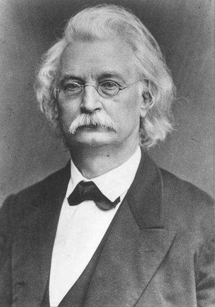
Karl Richard Lepsius, first translator of a complete Book of the Dead manuscript
To get a better understanding of what the Book of the Dead is about, here is an easy-to-understand animation that I watched which gave quite good insights for laymen.
In summary, what the Book of the Dead is, is the compilation of spells on a papyrus scroll that the deceased need to pass through the underworld and into the afterlife. One’s soul must be equipped with the spells that they have commissioned or have been commissioned to have.
The Egyptians mummify the body of the deceased and remove every organ of the dead. They left the heart and top it with an amulet as the heart is thought to be the seed of memory, intelligence and emotion.
In order for the spirit to reunite with its body, it must first pass through the Duat, a realm guarded with scary creatures where the soul used the customised scroll to get through these creatures and reach to Maat; Goddess of Truth & Justice. It is judged by 42 accessor Gods that judge whether he had lived a righteous life. After passing this test, with the help of the amulet, the soul has to pass the test of the weighing of his heart against a feather. If deemed heavier, he will be devoured by Amet; a monstrous creature made of crocodile, leopard and hippopotamus. If it is lighter, it is deemed pure and is then being transported to the afterlife.
What we learnt in class was that it was read from left to right, right to left or top down and this is purely based on the direction of the hieroglyphs. They’re written in rows or columns and the direction can be distinguished by the direction as to where the human or animal figures are facing towards the beginning of the line.
Another thing to note is that the upper symbols are read before the lower.
I found it really interesting on how writing systems evolved throughout the centuries and how it transformed to what it is today to create a way of reading and writing that is vastly understood by many around the world. It was an eye opening lecture, though intense with the bombardment of information. I really enjoyed learning how Serifs and Sans Serifs came about and the insights shared by Desmond. Looking forward to Lecture 2!
Links used:
https://www.ancient.eu/Egyptian_Book_of_the_Dead/
https://en.wikipedia.org/wiki/Book_of_the_Dead
Recent Comments