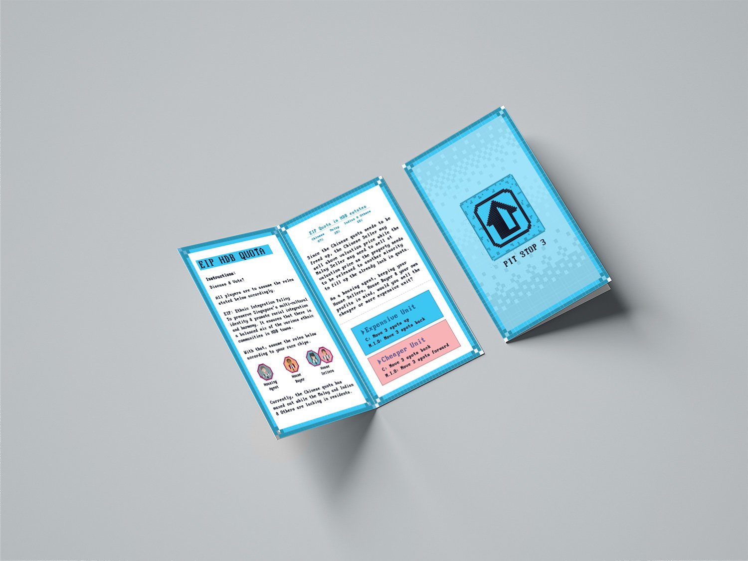
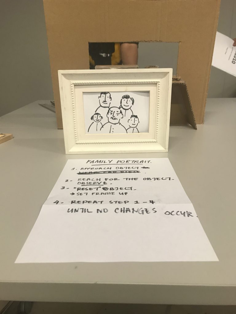
Timing and directions are of the essence when it comes to interaction.
We realised that the interactive experience we need to provide the audience with has to be in correct timing proportions in relation to their reactions. This would provide a more immersive and extensive experience that would provide a better visual and audio association. Basically, it would make more sense if the audio ties in timely with their actions during the experience.
2. It’s all in the details!
What we found was that the smallest details such as placement of lights that are introduced to our visuals and associative sounds that are universally recognised makes a huge difference in the user experience. It would allow the user to either connect or disconnect with the piece.
3. Connection with users
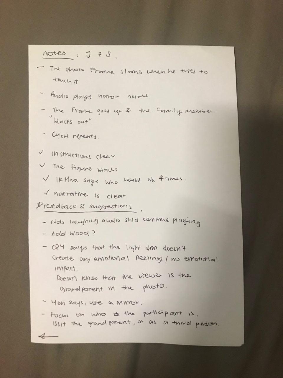
The user and an observer did mention that our piece did not make them feel things the way we intended to. There was barely any emotional impact. The reason being that they did not feel any emotional connection with the people in the photo since they do not know them.
Therefore, perhaps the suggestions that they introduced could help in improving this experience to allow for a better connection that would resonate with the mass audience.
Have the audio of kids playing and laughing in the background throughout as ambience sound
Add a visual effect of blood for everyone else but the grandfather (the last person standing)
Instead of the image of the grandfather, use a mirror to communicate that the if last person standing was you, how would you feel?
Establishing the context of the piece. [Is the participant the sole survivor or is the participant the people who passed on or are they just a third person?
Include the audio of the people who died to amplify the feeling of lost, capturing the essence of the person to create a narrative [eg. the recording of kids] –user will form a connection with the kid that would impact them more as they sympathise as they went along
Include recording of the grandfather (last man standing) of how he’s lost them or him crying.
Include the recording of the kids talking to the grandfather, having the user make the association that they are viewing it from the grandfather’s standpoint and that they’re not replying
Include recording of the kids talking to the grandfather but not have him reply [perhaps he doesn’t hear them?]
What surprised you while going through the process?
The fact that we did not consider the emotional connection the audience would not have since the photo was with people they were unfamiliar with
The unwillingness of some participants to repeat the steps to experience the piece
The critical importance of creating ambience to aid our user experience
The crucial importance on minute details
How can your apply what you have discovered to the designing of your installation?
We would definitely take into consideration all that we gathered through the following steps:
Be sure to add carefully curated ambience sound to allow users to connect with the piece and be emotionally invested
Be mindful of the narrative of the piece and consider the point of view of the participant
Creating an experience that involve the senses of a typical user that creates association and therefore allow for them to paint a visual in their head of our narrative or an interpretation of our narrative [eg. Have the kids call to the grandfather (user), add sense of smell through baby powder and axe oil]
Be critical in our decisions to create an immersive experience that would tug on heartstrings of our users. It has to be a somewhat universally accepted association that the user make to the piece to allow for an emotional connection to be established.
Limiting one’s creative scope and conforming to the industry’s standards all comes within the territory of being an employable designer. Be it graphics, fashion, film or products, the main goal is to have a deliverable that can cater and sell to the masses. The main issue here is the fact that designers see the marketplace as the only outlet to channel their works and that translates to creating products that can be mass produced to generate profits from the marketplace. In addition to that, the lack of funding for designs that challenge the industry’s critical requirements are dismissed due to its niche nature. This therefore, puts designers in a tough position since success is determined by the valuation of their products.
However, with massive technological advancements over the years, rarely do we come across electronics that serves a purpose other than to satisfy physical needs of the masses. Film is a form of art but if you stop to ponder, you will soon realise how emotionally attached this form of art is. Design is exactly that. It requires idealogical-process thinking and challenging the mind to develop emotional connections with the objects. Of course, there is a need to make functional designs but that is what engineers do. What separates a designer from an engineer is their ability to effectively deliver a message with a design. One that is thought-provoking, therefore forcing change. In a social context, the aim industry of the design industry at the moment and what it has been for decades, is the churning out of products that is “smaller, faster, different, better,” Dunne, A. & Raby, F. (2001). The Secret Life of Electronic Objects. Birkhauser.
There is a gap to be bridged in the market for such designs to be purposeful and this is through the concept of Critical Design. Although it may not be widely accepted, the purpose of the nature of these designs are of such; to challenge social norms, question political impacts and generate change for progression, and this goes beyond physical change.
Critical design challenges the norm and pushes boundaries to provoke thought and instigate debate, without exercising the industry’s requirements to create a design that is marketable and commercially functional.
A way to go about this is to pose as a corporation rather than producing these ideas as an individual entity. The reason being that, “corporations have a bigger influence on reality than government, and buying power is more important than voting power.“Dunne, A. & Raby, F. (2001). The Secret Life of Electronic Objects. Birkhauser.
That in itself, is a true manifestation of the concept of power and politics of corporations. One is more likely to accept ideas of a whole corporation rather than a single artist who seems like he or she is experimenting with design which will more likely than not, be looked at as fine arts; something that is already so detached from the mass market consumption.
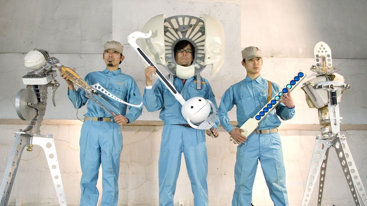
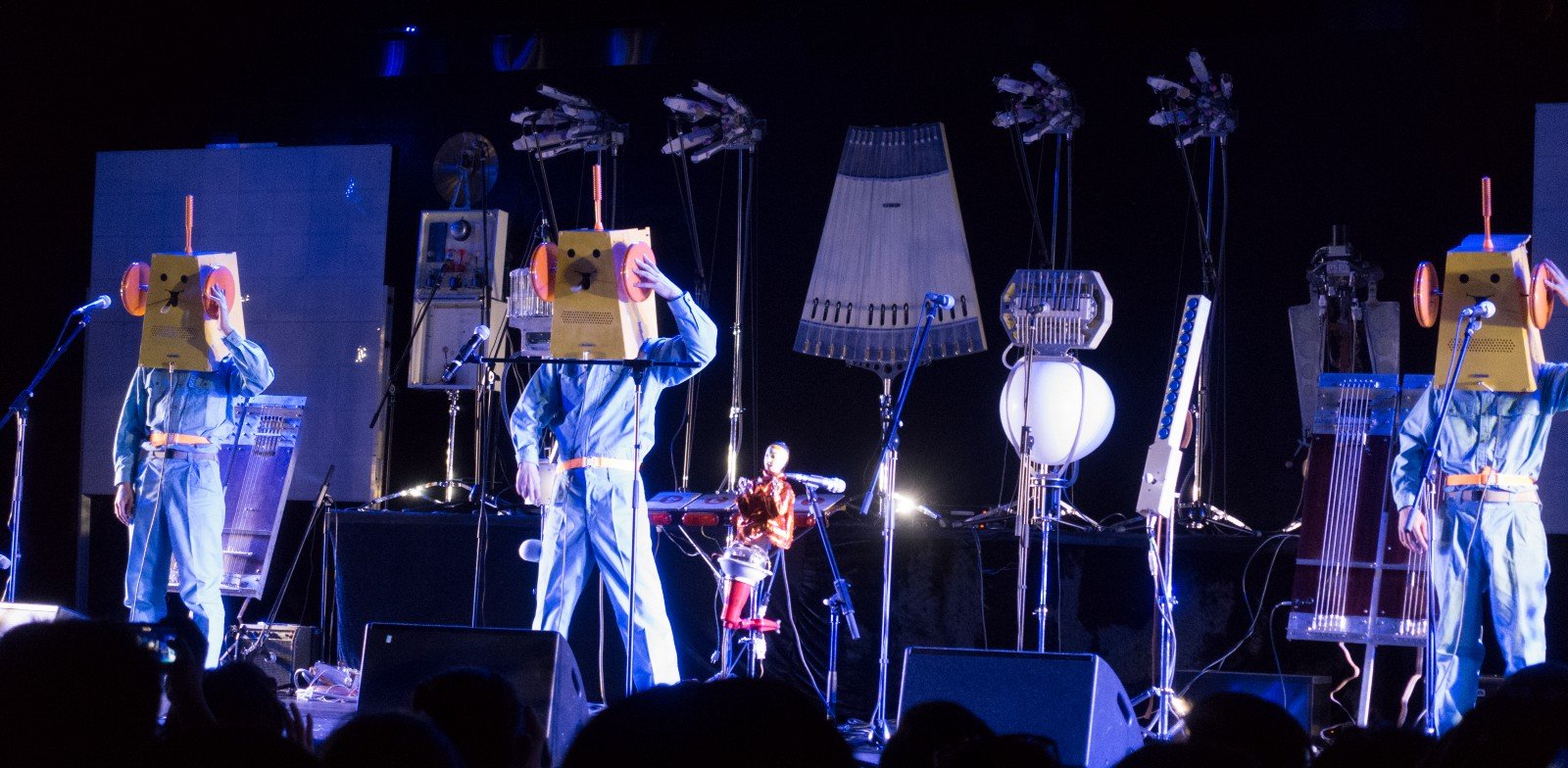
Maywa Denki posing with some of their products, Nobumichi Tosa, founder (middle)
One of the most iconic and extensive example is Maywa Denki. A perfect blend of art and corporate culture, it is originally founded by two brothers, Nobumichi and Masamichi Tosa. Nobumichi is now the sole president of Maywa Denki. They describe themselves as ‘parallel world electricians’ and aptly so. They generated an apprehensive take on a corporation by producing a profile that explained the company’s activities for potential job applicants.
Maywa Denki was named after their father’s s electrical equipment factory that went bankrupt in 1979. “As a parody of a small manufacturer, it describes itself as “an electric company in a parallel world.” The nonsense machines are its “art resource” products; its performances provide “mass promotion;” and its “mass production”. Yamada, M. (2018). Twenty-five years in the company of Maywa Denki. Japan Times, Japan.
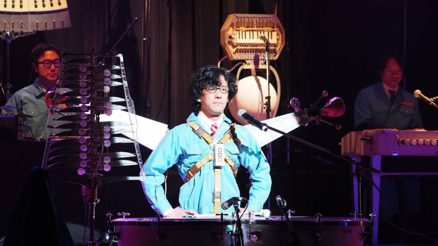
Nobumichi Tosa wearing Pachi-Moku
For the purpose of this essay, I am going to focus on the invention of Pachi-Moku. As former musicians signed with Sony Music Entertainment, it is not surprising that they fused music into their inventions. Pachi-Moku being one of the most well-known inventions by Maywa Denki, is their take on mechanical musical instruments.
On the surface, it may seem silly to some when Nobumichi performs his brilliant work of art. However, through interviews and talks, the essence of his work is clearly motivated by challenging the norm and refusal to conform. In his TED Talk, he provided the example of aircraft starting off as a ‘nonsense machine’ because back then, no one would have believed of a flying vehicle. But since then, it’s become a norm and no longer seen as a ‘nonsense machine’. He also highlighted the difference between art’s ‘nonsense machines’ and engineering ones. Art’s nonsense machines however, involved the unexplained ideas to become the main focus of the concept, something that ‘Can never be explained by humans. That is the reason why art transcends time and moves us.’ This is essentially what critical design is. Maywa Denki places emphasis on ‘displaying rather than expressing.’
Through this, he allows the audience and the general public to experience his work and causes them to reflect upon why such things were created. This generated emotions within the audiences as well and spurt discussions amongst the designers in the industry as well.
Maywa Denki functions on the concept of “Mass-Pros’s”. Namely, Mass-Production and Mass Promotion. Mass Production is self-explanatory where products are created for the purpose of selling to the public.
Live Performances
Live Performances
Live Performances
In comparison, Mass Promotion is done through the live performances they conduct, globally where the demonstrate the use of their instruments, challenging the idea of musician celebrities who charge high prices for their tickets and sell them to those with a high education and are wealthy. In contrast, Maywa Denki’s idea of art is to sell art to a large public, making it more accessible to the masses to share the idea of their art instead of ripping them off for large profits. Instead, mainly to supply their design cycle.
Therefore, an importance should be placed on critical design instead of treating it as an after-thought, like it is currently. The purpose of this essay is not to downplay or criticise the industry’s current design ideology. Rather, it is to shed light and shift the focus on the urgent importance on Critical Design. The idea of it is to go against the conventional supply-demand product design and instead, to take an alternative approach to adopt a design process that could take an effect on the future of design. Critical design stretches the ability of the design process to its full potential and not just focus on the current needs of the masses. Inclusion and experimentation of concepts through Critical Design could lead to new inventions being created that could change the social, political and economic standpoint of the current. It helps to “promote this enlightening quality of critical design,”. Jakobsone, L. (2017). Critical Design As Approach To Next Thinking. Sapienza University of Rome, Italy.
If we refuse to challenge the current industry norm as designers, would the world of design remain stagnant and emotionless? A single person would not make a difference but a community of designers, collectively, could challenge the industry to provide a balance of functionality, practicality as well as expression.
Moving on from a weaving assignment before this one, Part 1 requires us to select a minimum of 2 verbs (from: WRAP . PUNCTURE . CRADLE/GRAB . BIND . SLIDE . LIFT) and come up with 4 expressions that expresses the verbs.
I chose Wrap and Bind as my verbs and did some sketches as I attempt on the expressions. I did some research and was more drawn to the play on ropes and I decided that that would be one of my material along with cane. Figured the two would be a pretty interesting and unifying combination given its ‘raw’ nature.
Sketches:
Process for Expressions:
FINAL 4 expressions:
Part 2
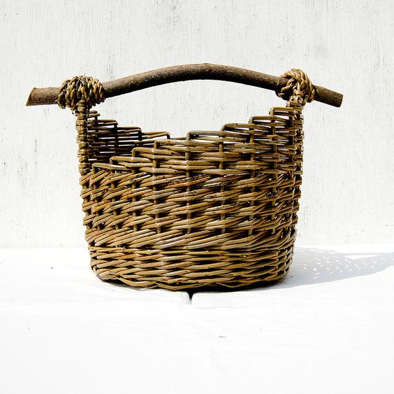
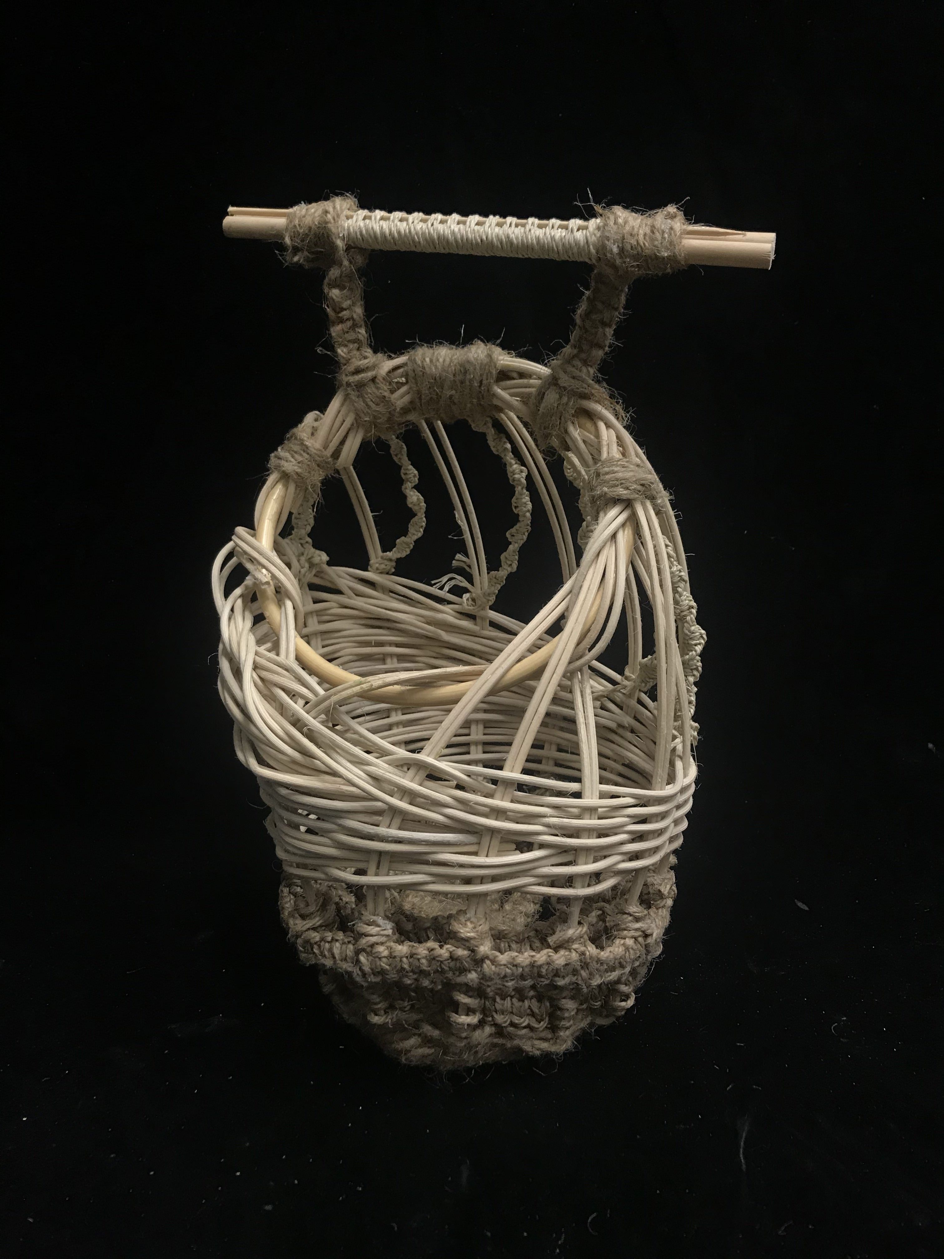
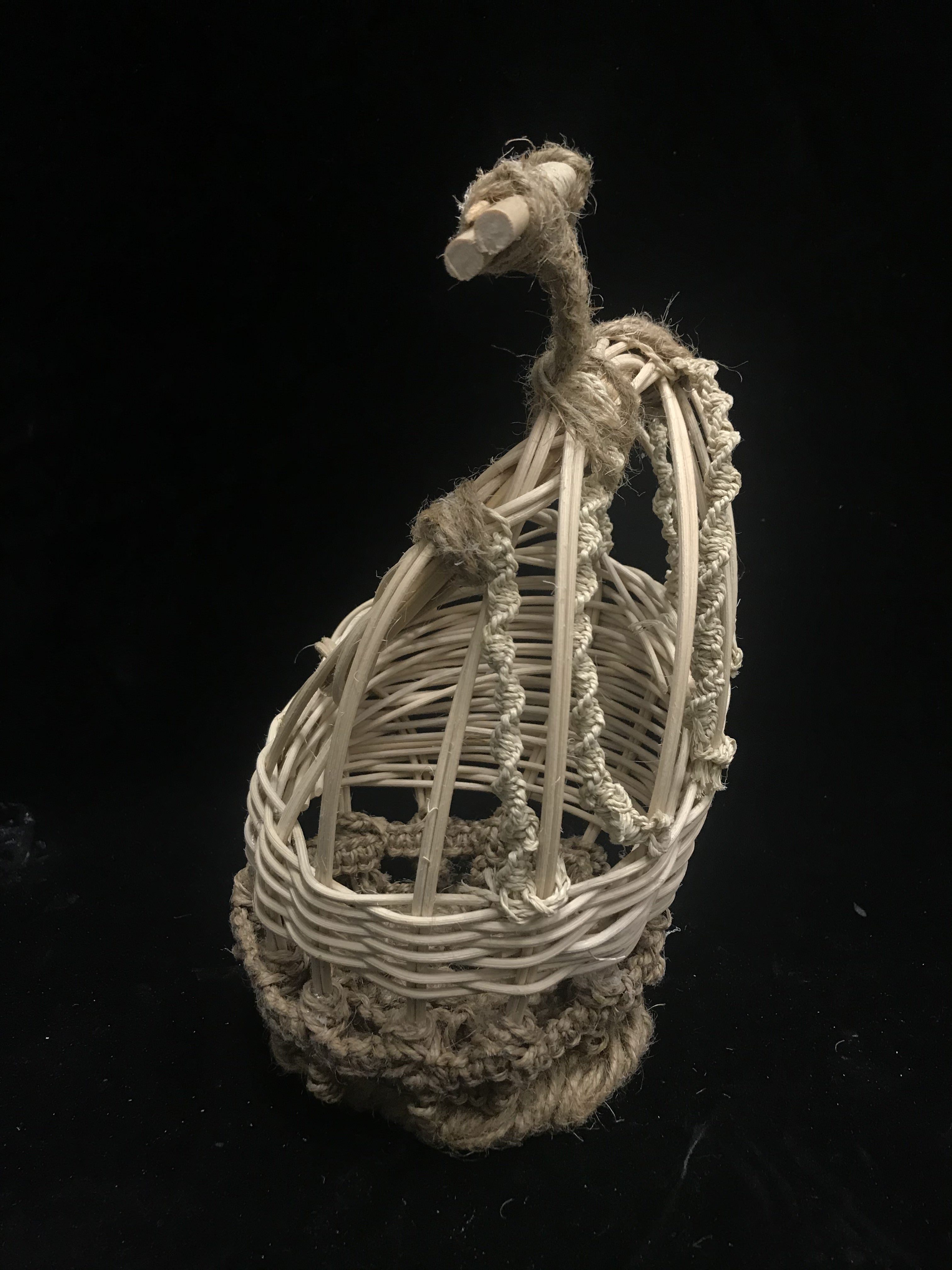
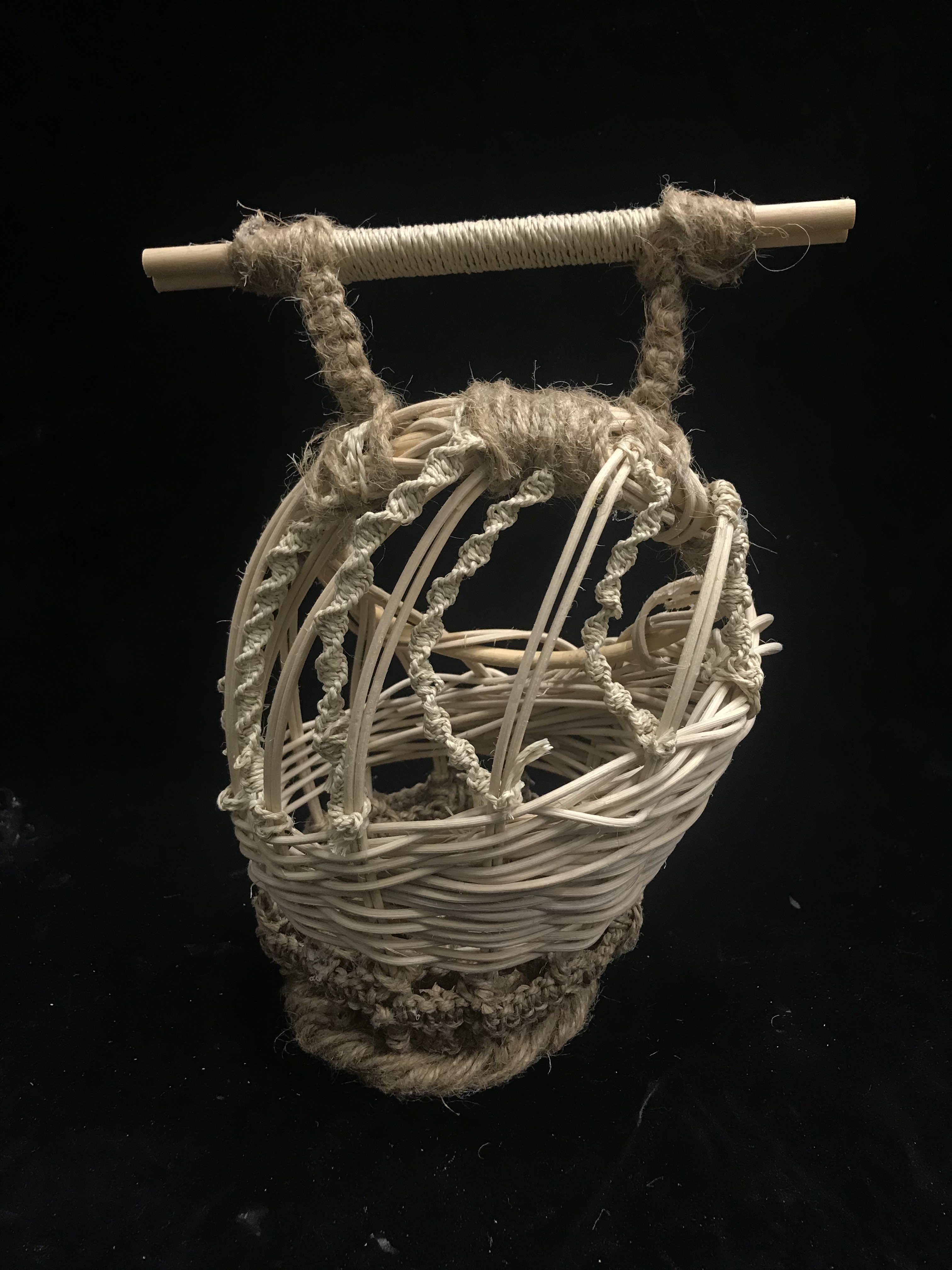
For the second part, we had to create a vessel that is to be held, worn or carried. I looked up some photos for inspiration and was steered to the idea of my final product being a bag of some sort.
Originally, this was my inspiration photo:
I did some sketches to generate some ideas for consultation.
I liked the more curvilinear shapes as they felt more organic and tied better with the materials I had in mind. I sketched these based on the 4 expressions I had in Part 1.
Upon consultation, I decided to pick number 1 as my final product. I wanted it to have spaces so that a complimentary fabric would peek through. I did not want it to all be covered in the weaving expression.
At first, I wanted to use wires as the base and weave cane through it. However, upon consideration, I realised that attaching it together would be a problem as I wasn’t familiar with soldering and I was also pressed for time. Hence, I decided to go ahead with having weaved cane as the base.
I started working on the bag. I soon realised that this can was tougher to control as compared to a thicker rattan that I had used before. I knew it was the cane as I used the same, pine needle pattern as before. The cane was fragile and dries quicker than the thicker rattan.
This served as a problem as the weaved base kept falling apart or rather, it looked messy. I decided to continue on as I really liked how it looked as a base. Another problem I had with it was also the fact that it could not stand as the base was more pointy than I had anticipated.
PROCESS PHOTOS
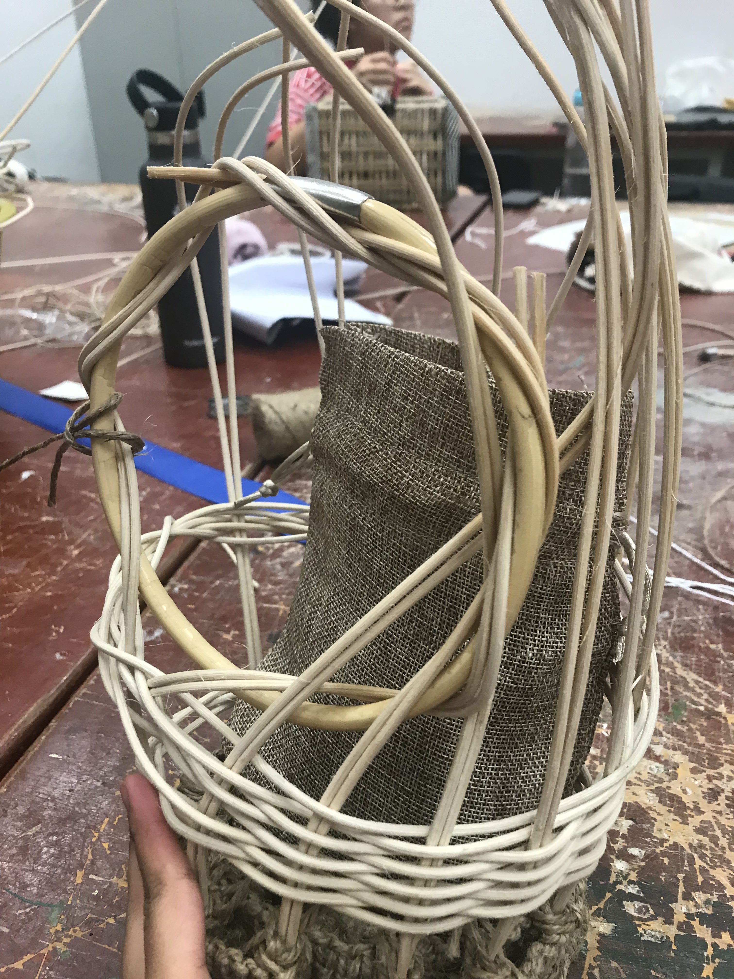
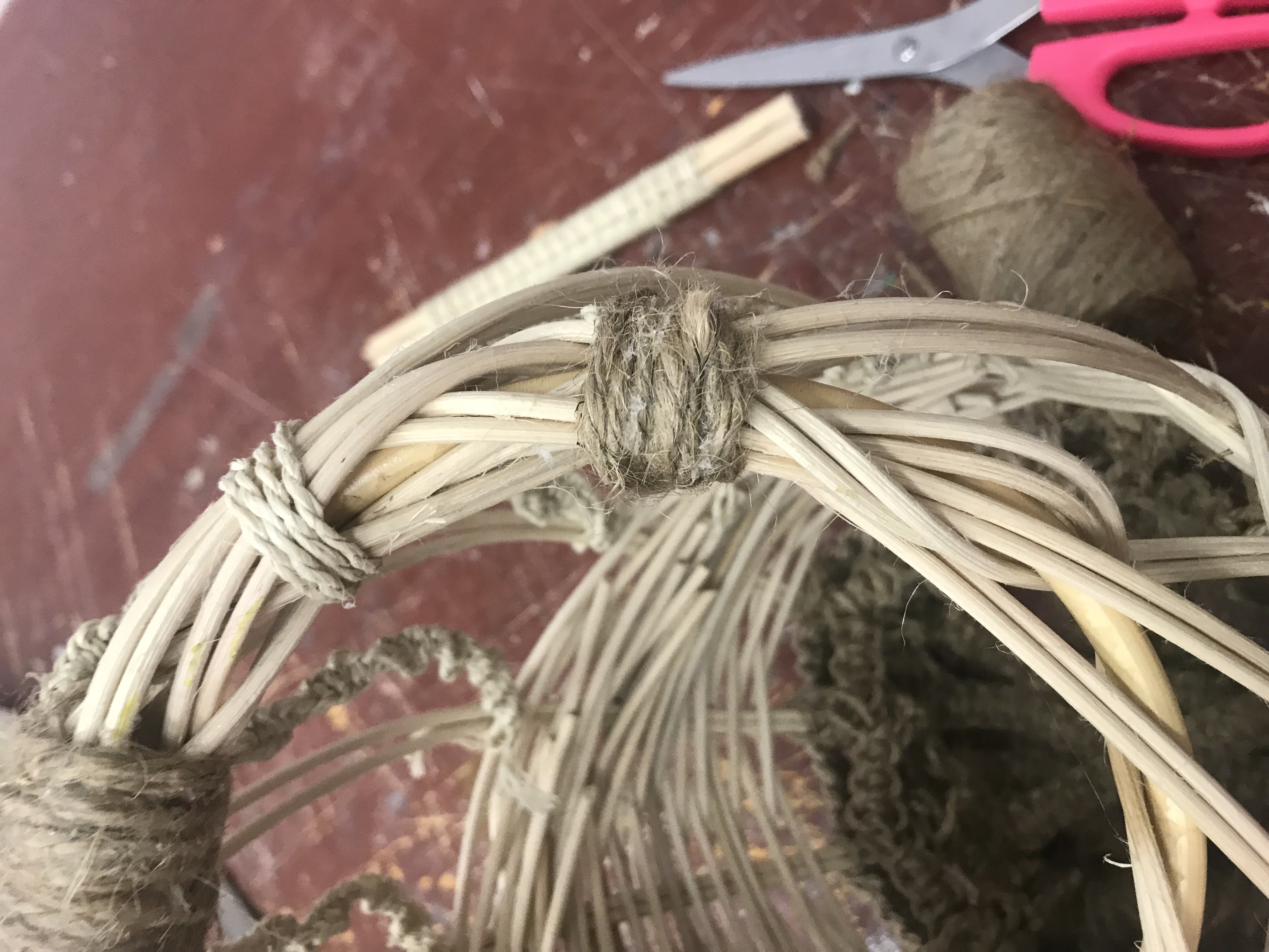
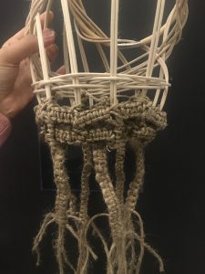
Afterwards, I attached vertical rattan to the base. As I continued on, I added twine in a darker colour horizontally and incorporated the square plait weaving I learnt in Part 1 into the bag.
A mini bucket was used to form the wider base that I was aiming for. I didn’t have a smaller bucket in hand which I intended to have. Had to work with what I had. I tried to use the weaving to keep the base wider.
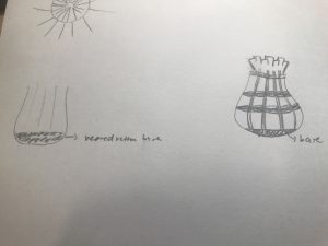
Unfortunately, the challenge to replicate the shape from my sketch was pretty much unachievable with the materials I had on hand.
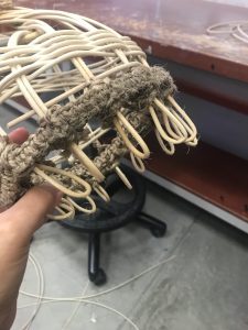
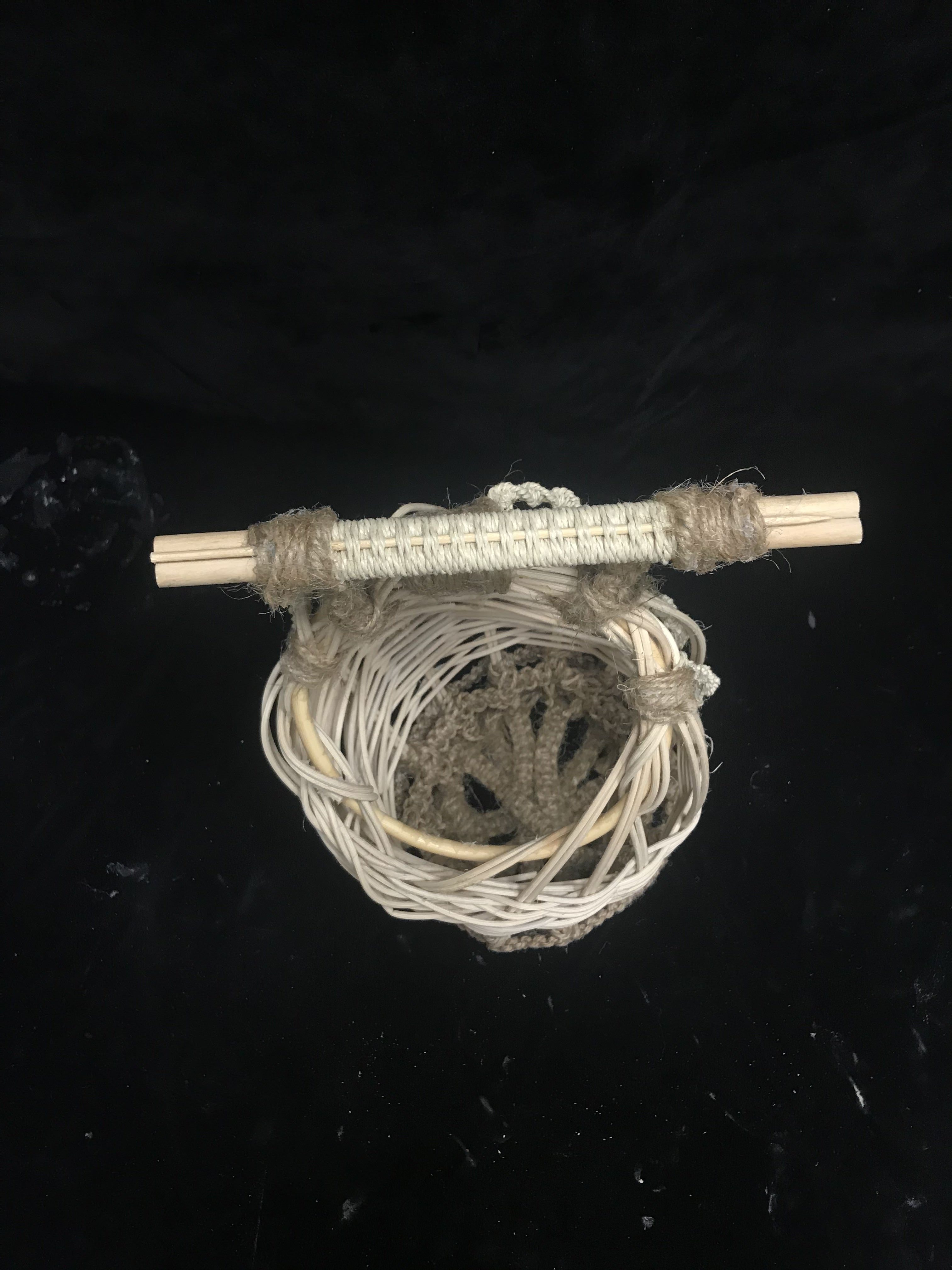
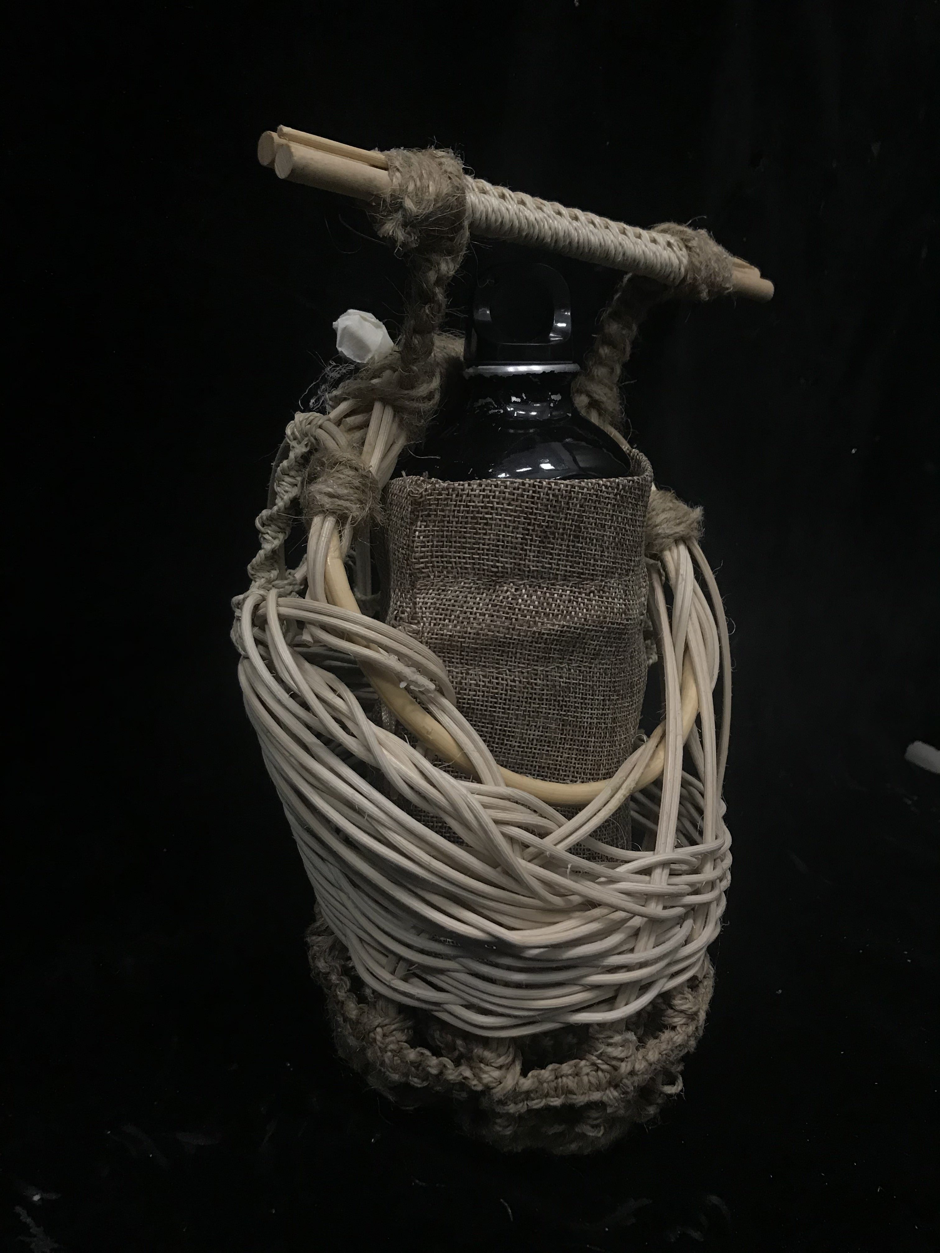
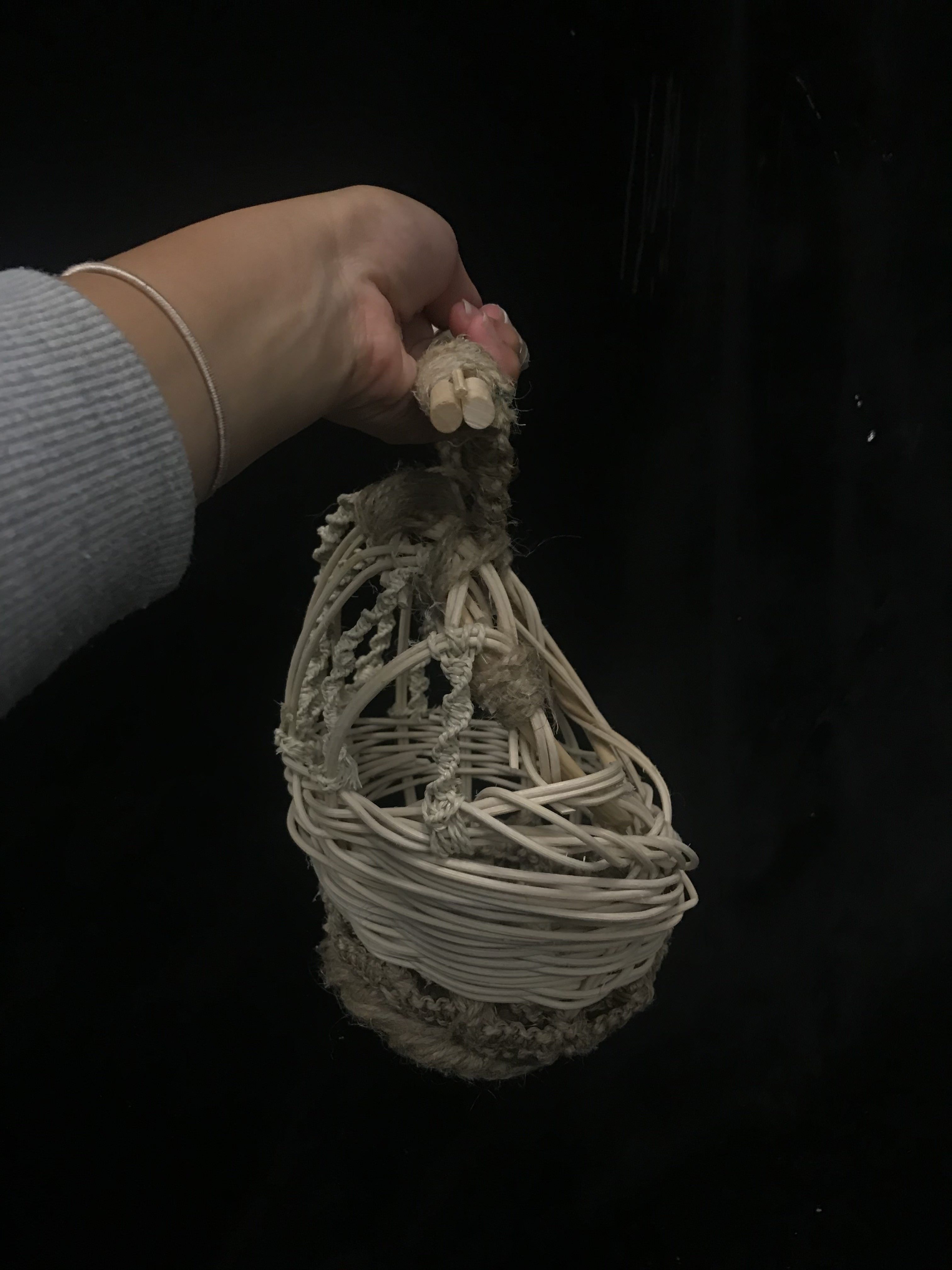
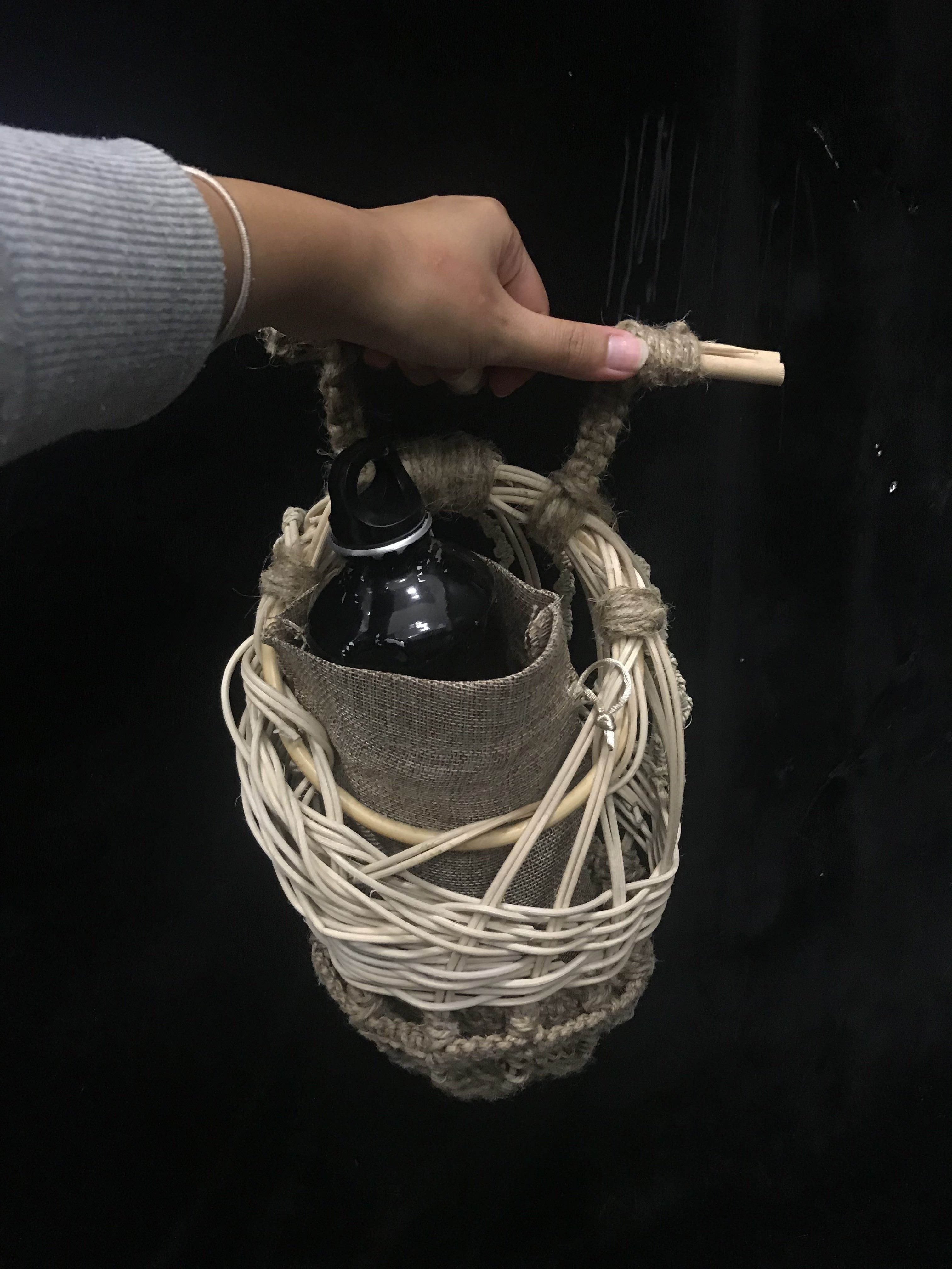
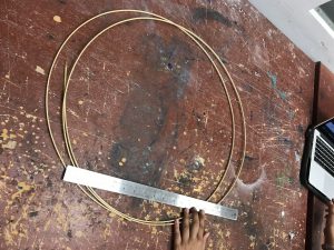
Hence, I brainstormed again and decided to change my plan. I went with a more organic shape where I used a ring to wrap the cane around. I used that as the means to form my shape. The idea of it was for the bag to look raw and have that “unfinished” look as it was aimed at holding things like bottle for those working outdoors like farming. This was also to compliment organic-like materials that I went for.
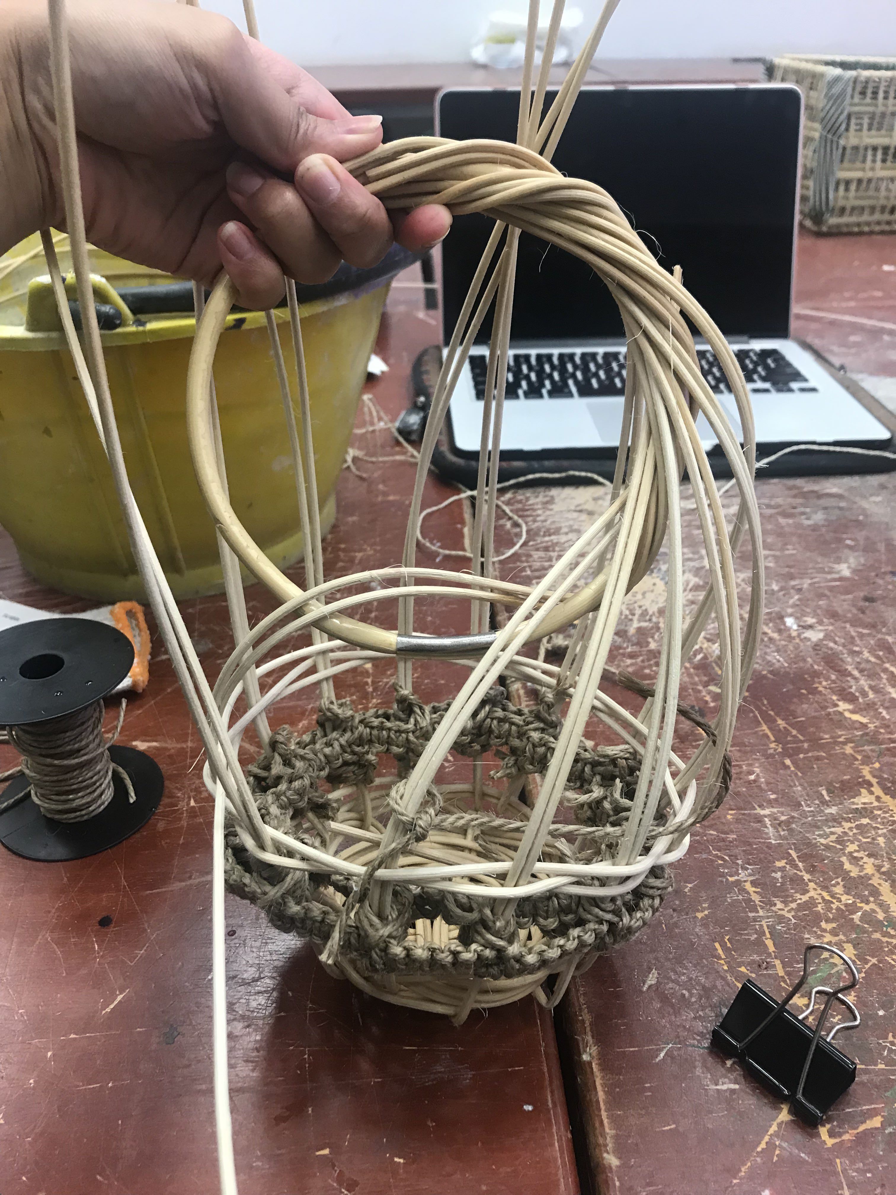
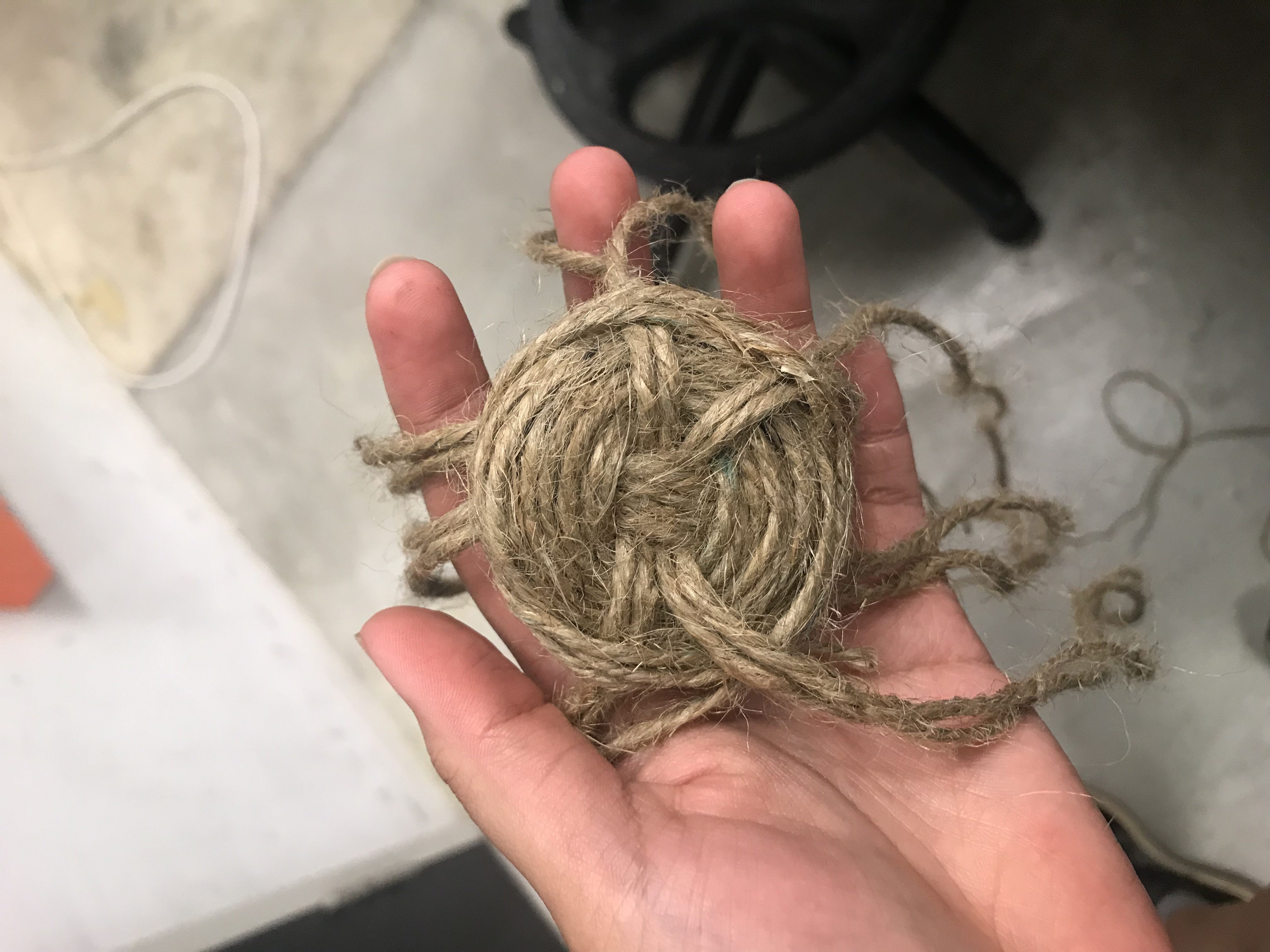
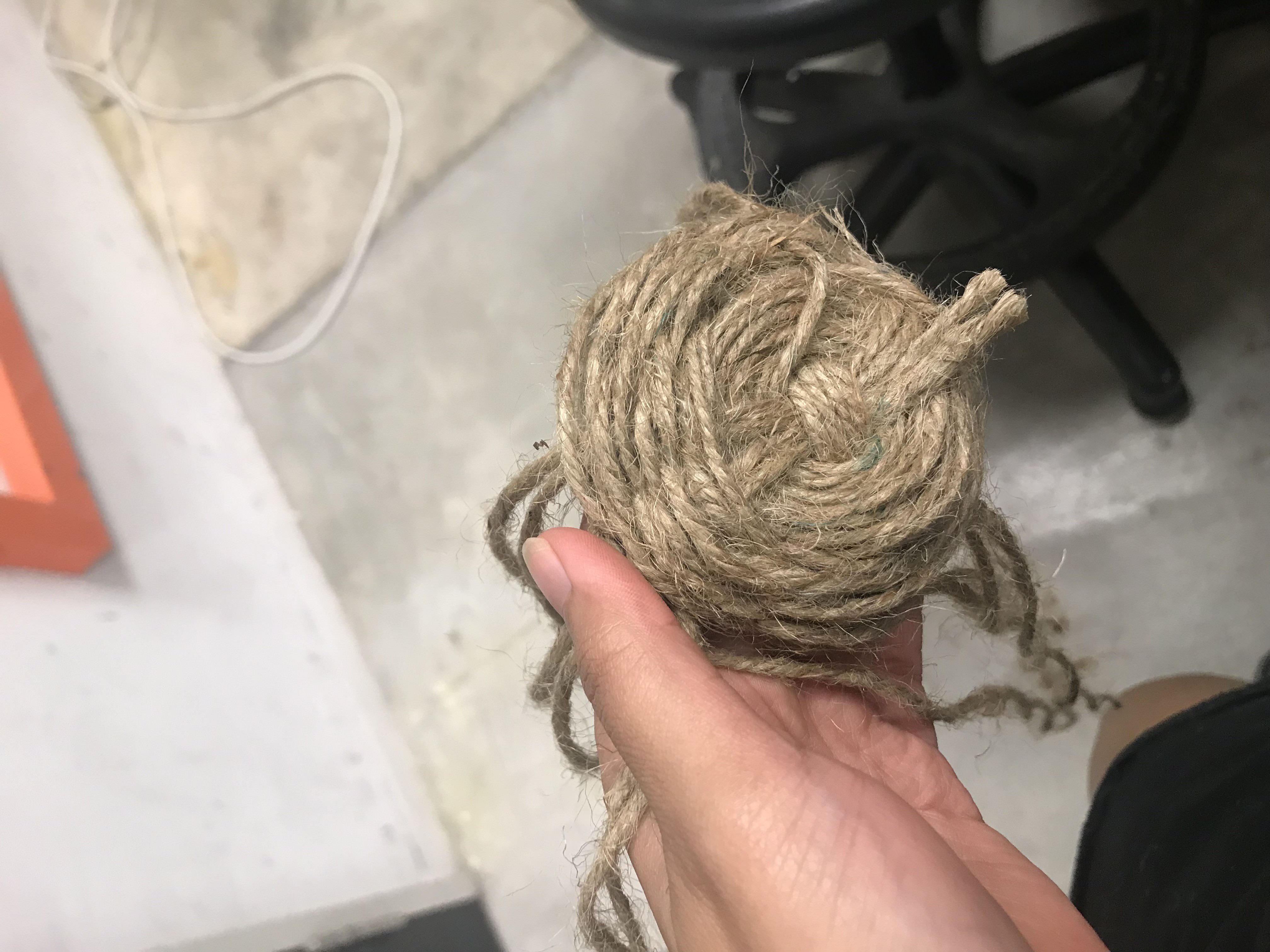
As I continued on, I kept getting frustrated with the unstable base that I decided to remove it completely. I decided to incorporate jute rope for the bottom with cable/square plait weaving that I incorporated from Part 1. Fortunately, the base was detached from the vertical cane that already had weaving on it.
Rough sketch of new plan for weaving
Jute rope was used because it was more thick and rugged. After that, I just experimented with different bases to see what I could come up with.
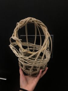
It was not possible to form the pine-needle weaving base with rope. Hence, I decided to use the same cable plait method in vertical form to criss cross it with one another. Thought it created an interesting expression.
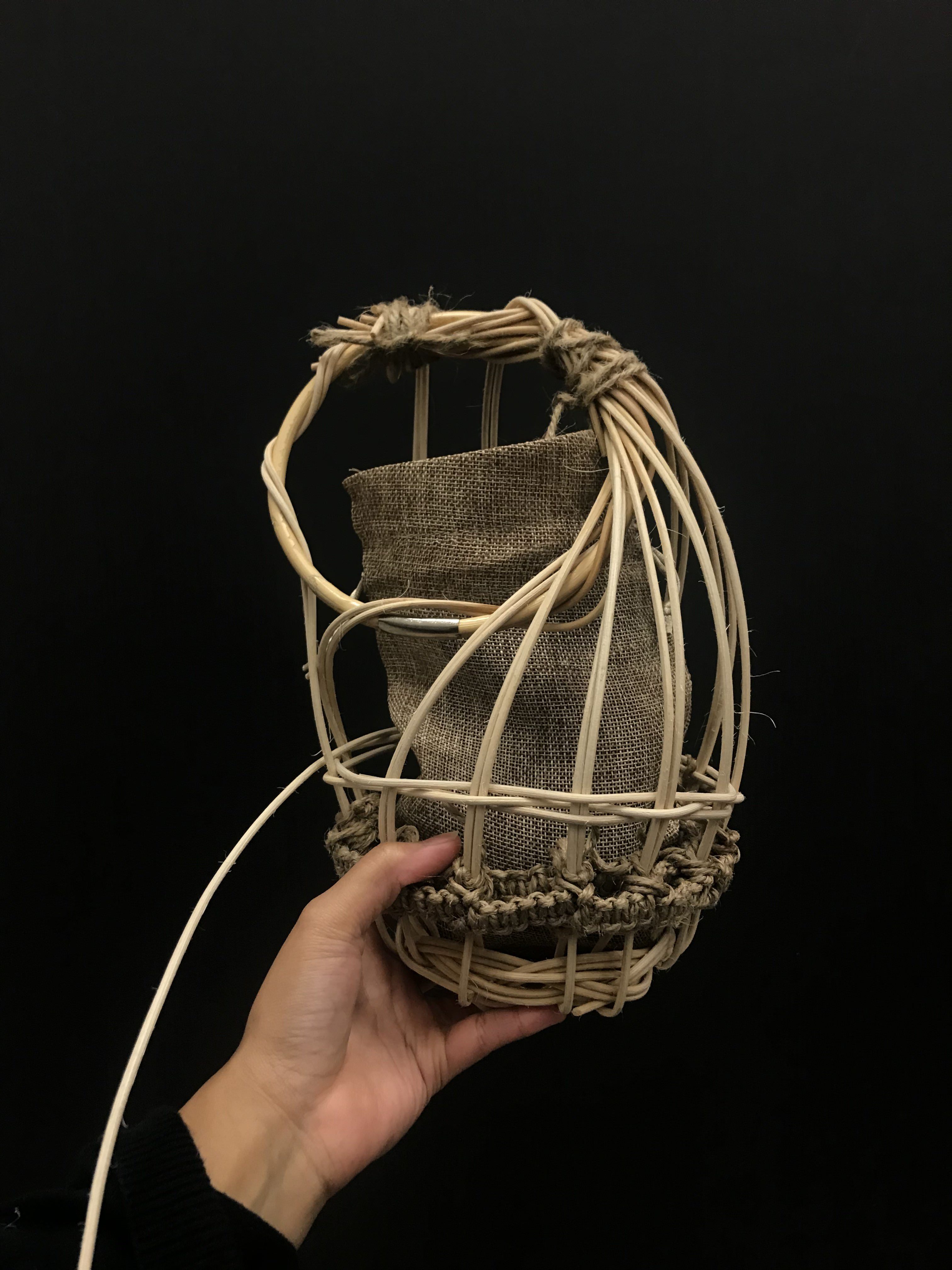
Afterwards, things started to look better. However, the challenge was to form a shape for the bag. I formed the shape as I went along and it was supposed to look have a more irregular shape where it looks different from each angle. To form and keep the shape intact on the ring, it took quite a bit of manipulation with rope to secure it further.
Upon completion of the weaving I realised that one side of the product looked too empty and it didn’t look like it forms a smooth curved shape on the left side of the bag. (front view)
Hence, I incorporated one of the expressions of the twisted cable plait and attached it in a curved manner to the empty slots.
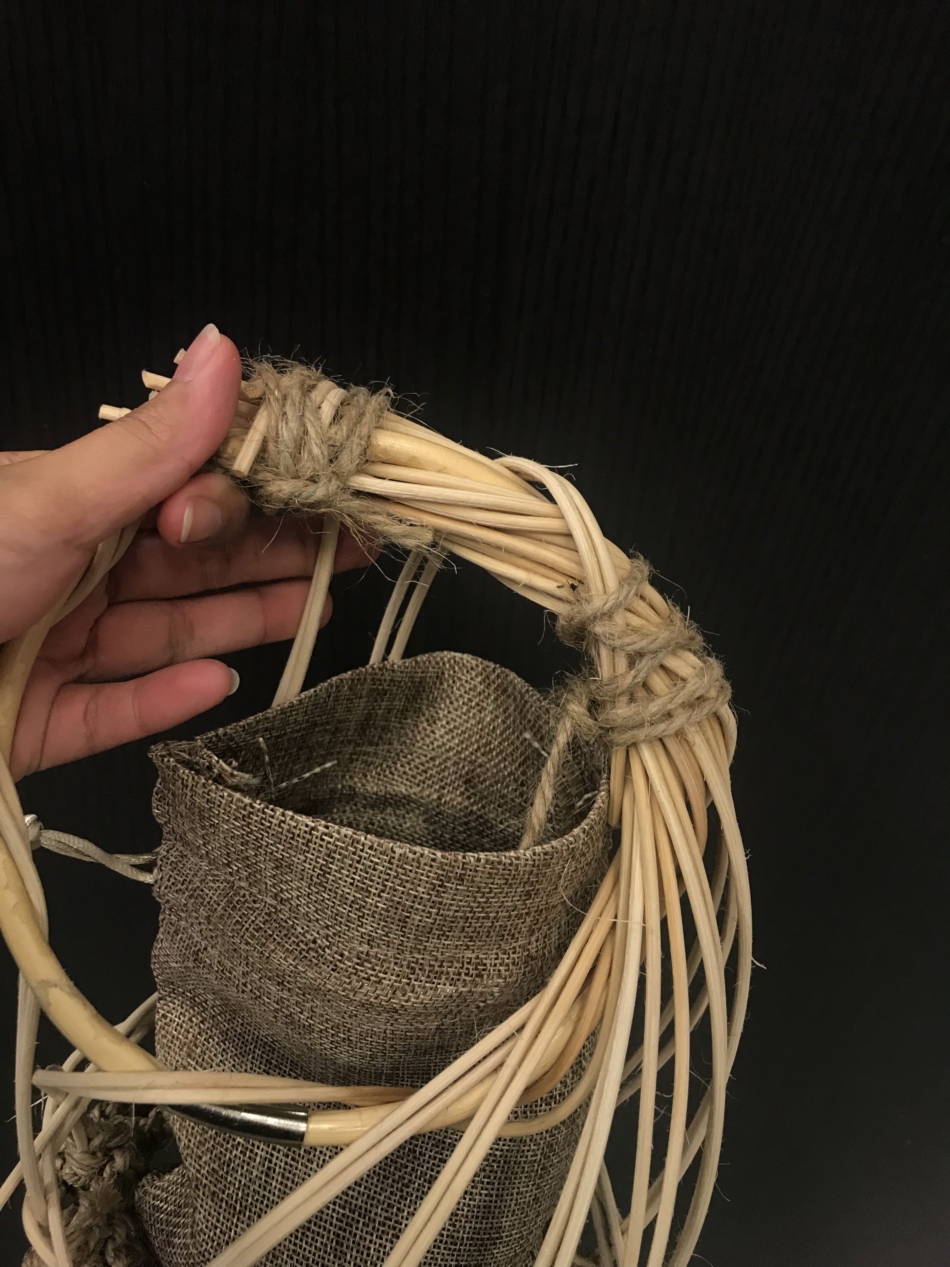
Finally, I added the handle which was from Part 1.
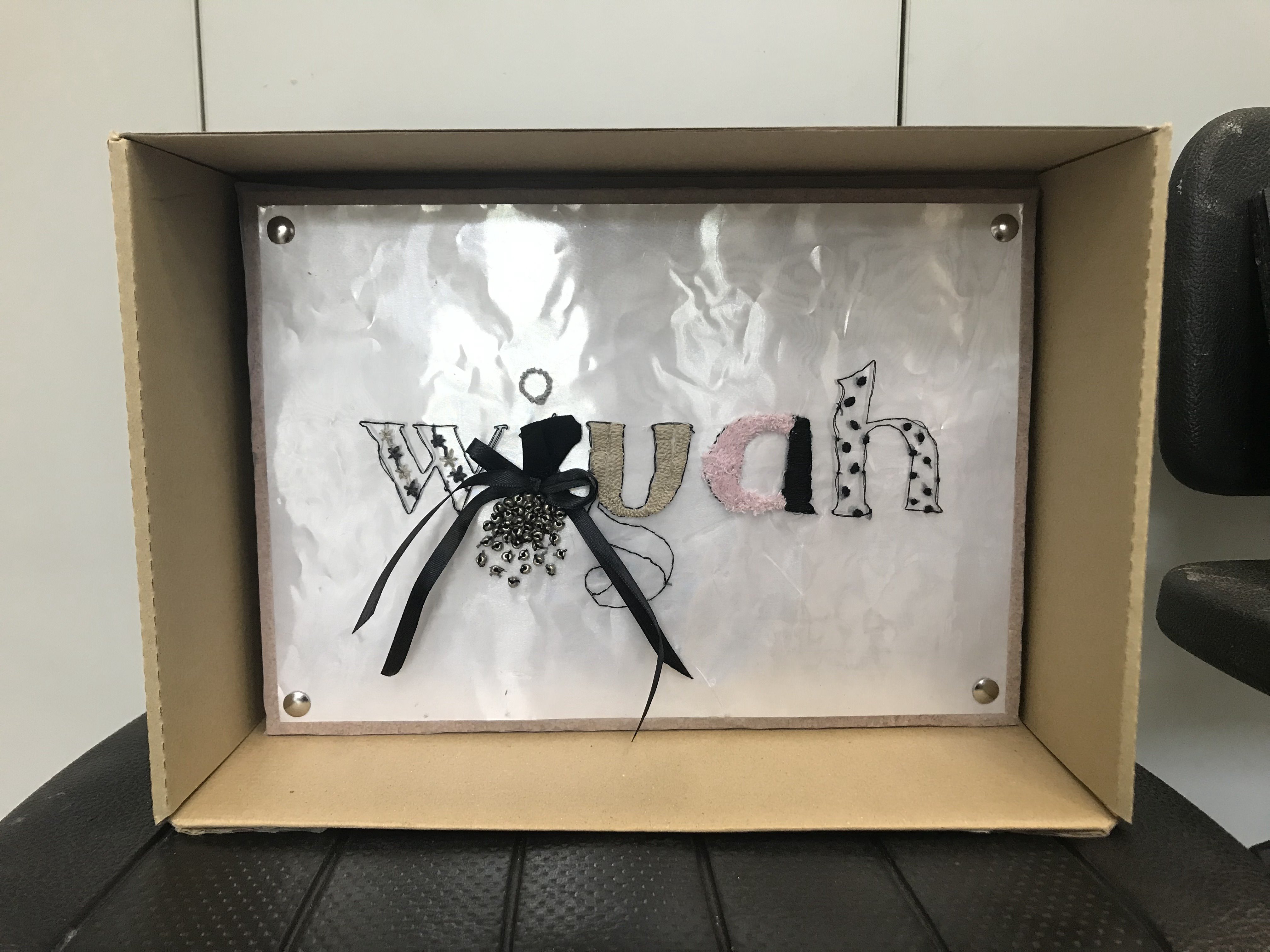
I presented this in a box which I feel, added to my design as I interpreted the box as a box for display. Therefore, adding it helped to relay my design better. It was also placed on a cork board to show how fashion designers usually pin up their inspirations and fabric type, etc whilst in the process of designing. The silver thumbtack just as an accent to that.
Silver Sheet
White Sheet
I also placed a silver sheet underneath it to bring out the type and I chose silver because it tied the design in together better.
I also attempted a white plastic sheet but felt like it was too striking and pushed the eye away from the design of my “collection” in type form.
Presented in class as:
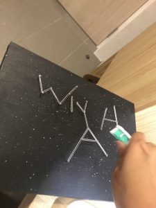
4. Astronomer
Analog
I presented this final piece as is where the nails were being embedded into foam and mdf board that has been sprinkled with white & blue paint to create a galaxy effect. The nails formed the constellation of my name.
I’ve always been interested to explore deeper into the world of Typography. As a Design Art student, knowing the importance of typography and having an understanding of its use in your designs is crucial to produce a harmoniously synergised artwork.
Therefore, I was quite elated when I found out that our first project would allow us to dive into this aspect of design!
Before that, Mimi mentioned that we should attempt to create compositions with the influence of Cubism from the #ispotalphabets in-class assignment.
Here’s my attempt:
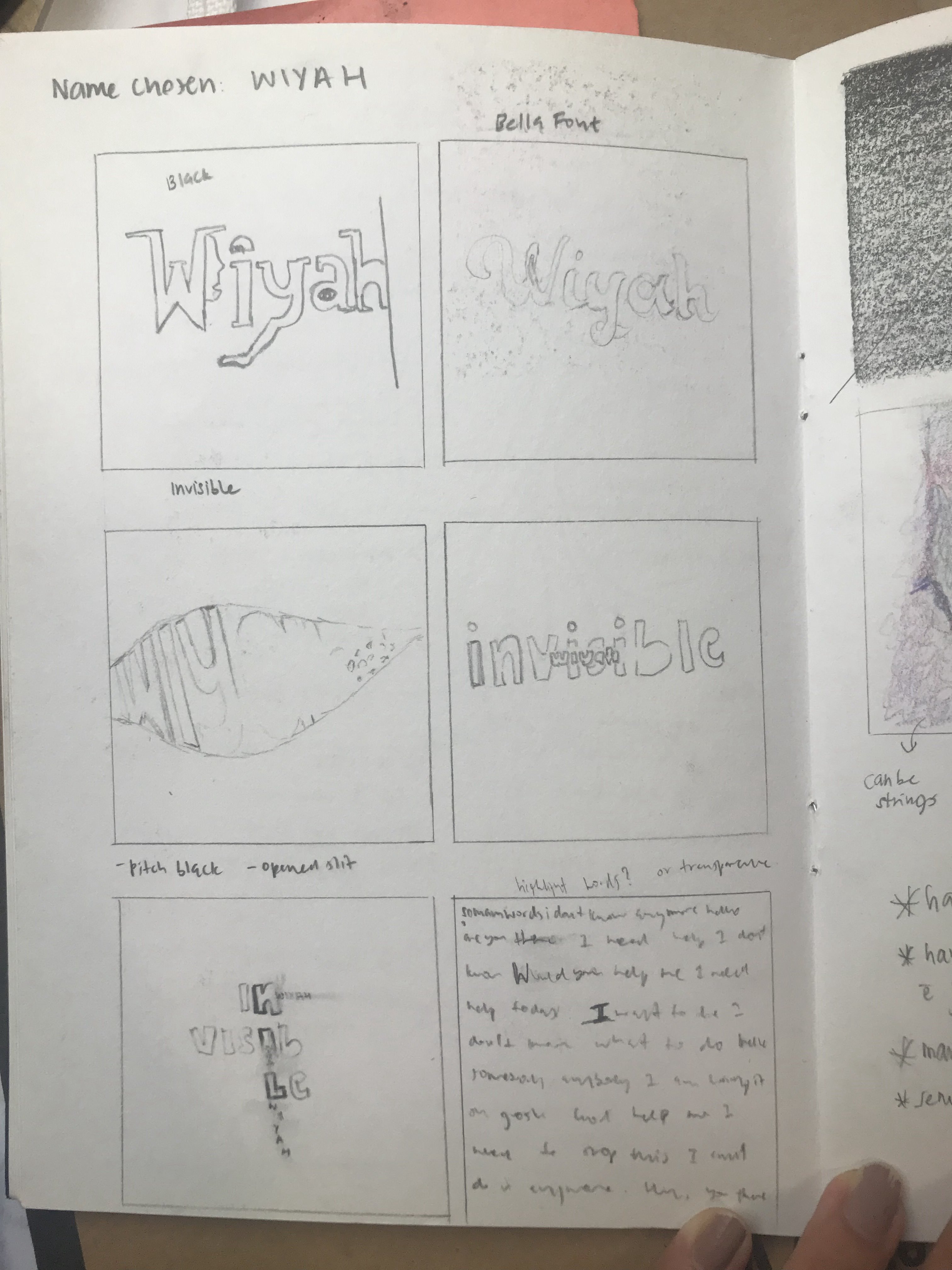
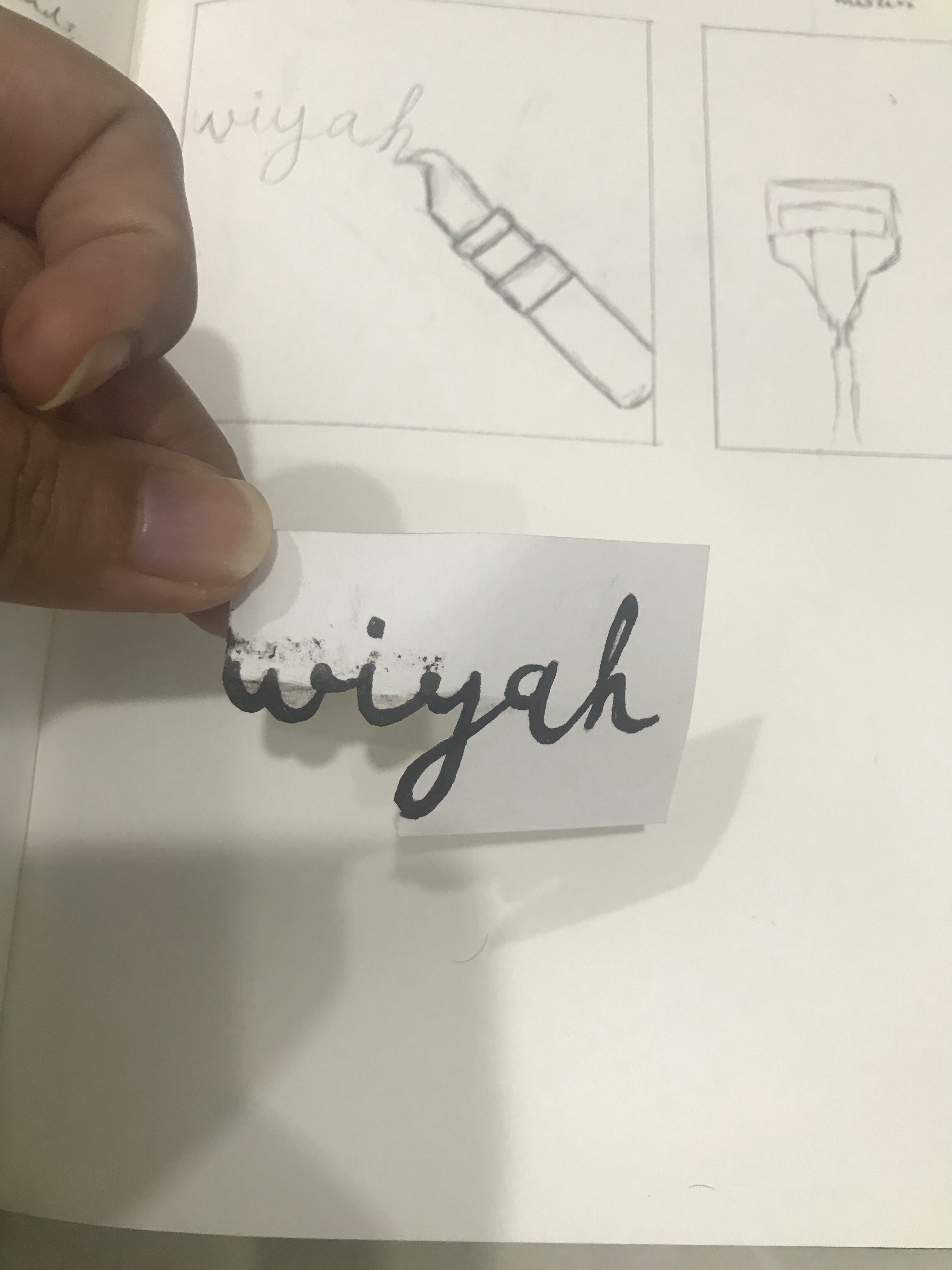
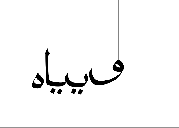
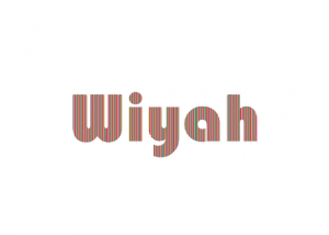
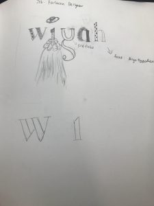
Name used: Wiyah

My call-name within my family, extracted from my name, Alawiyah.
RESEARCH & PROCESS
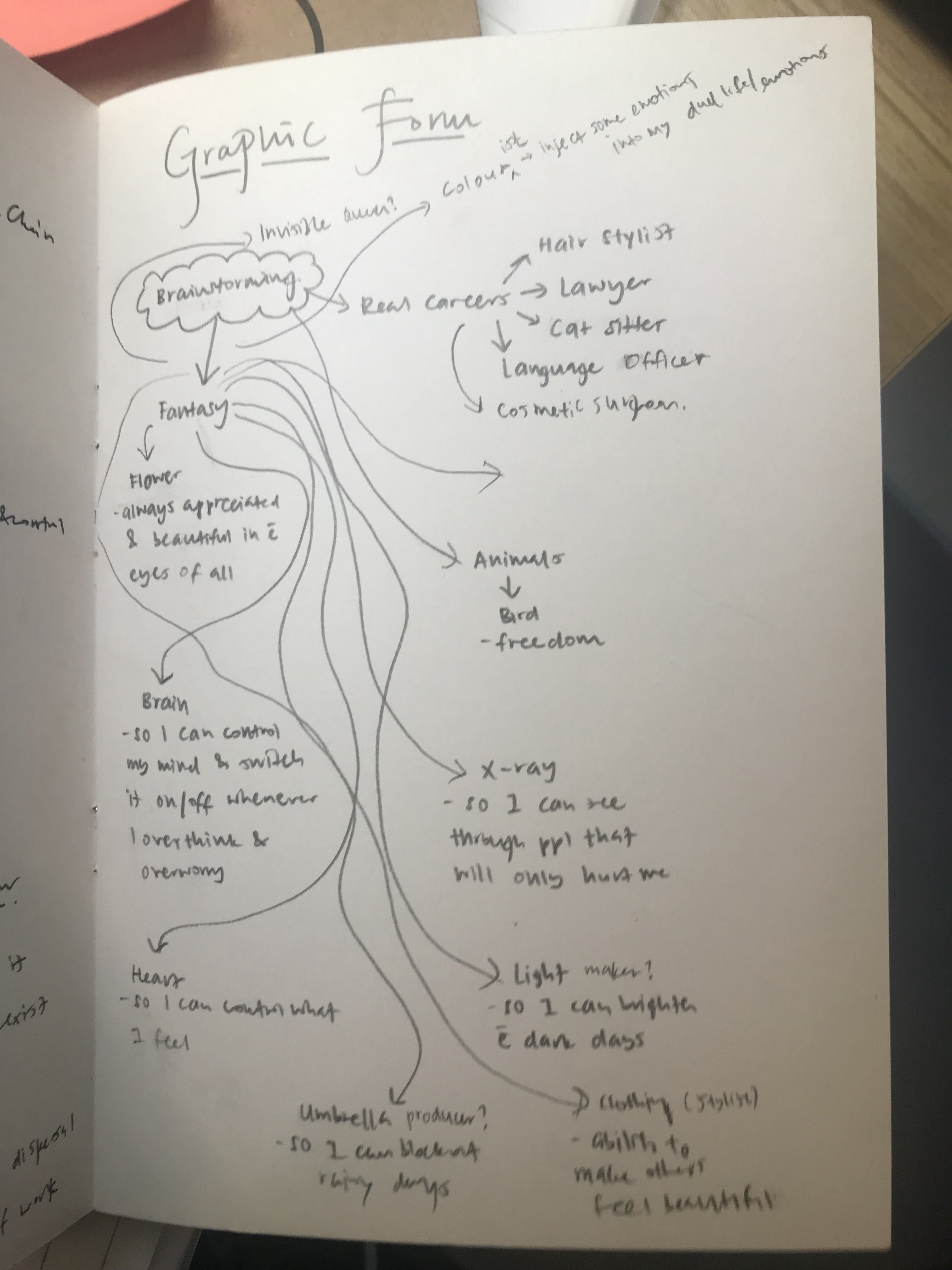
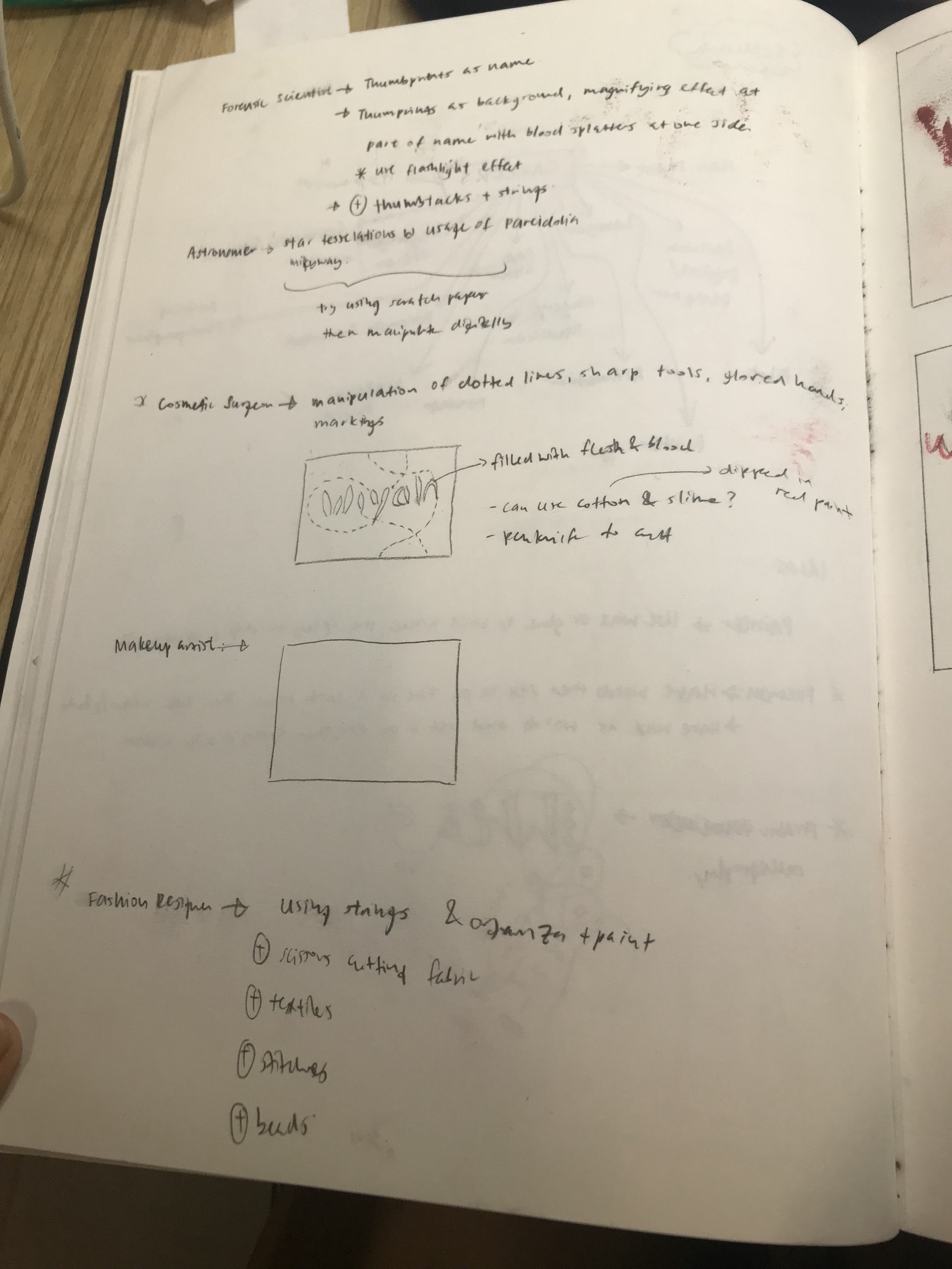
As soon as I got to know about our project, I kickstarted it early via brainstorming on the different ideas of careers I would like to have.
In the very beginning, I approached the project in a more thematic-based way where I explore concepts of careers in a more surrealistic manner.
First Brainstorming Session:
Career:
My name is Wiyah and I’m a…
1. Flower – so I can always be appreciated & be seen as beautiful in the eyes of all
2. Brain – so that I can control my mind ands switch it on/off whenever I overthink or over-worry
3. Colour – so that I would be able to inject emotions into my dull life
4. Heart – so that I can control what I feel
5. X-ray – so that I can see through people that will only hurt me
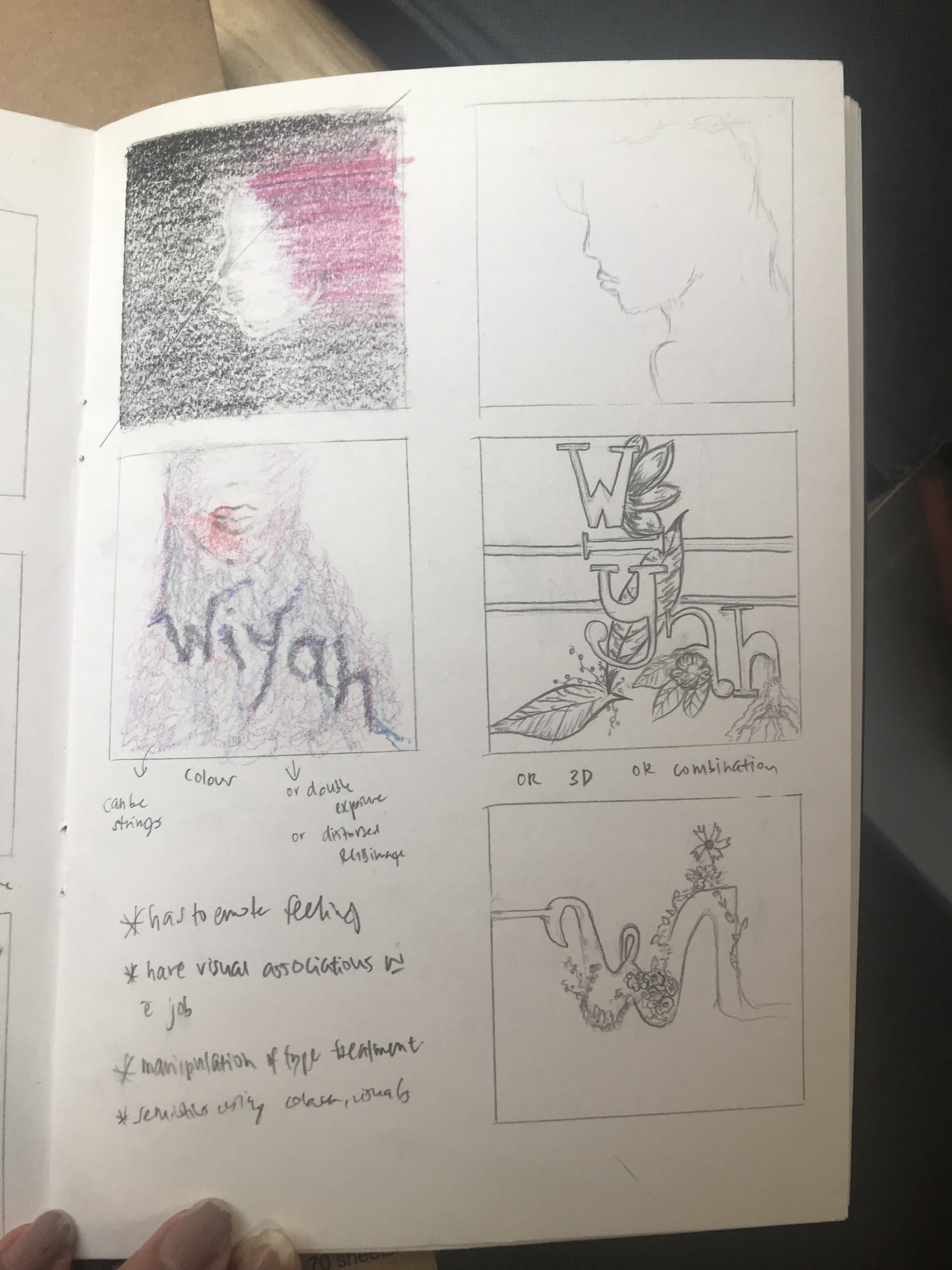
After the first feedback from Mimi, I decided to change my vision to something more basic so that I could attempt analog experimentation. I thought too much before and that restricted my creativity. Hence, after watching the videos that Mimi had shared in class, it really sparked my interest to attempt to have analog elements in my project (which in turn led to most of my Project 1 being done in analog). I figured experimenting with different forms, visuals and materials might create more interesting and unpredictable outcomes.
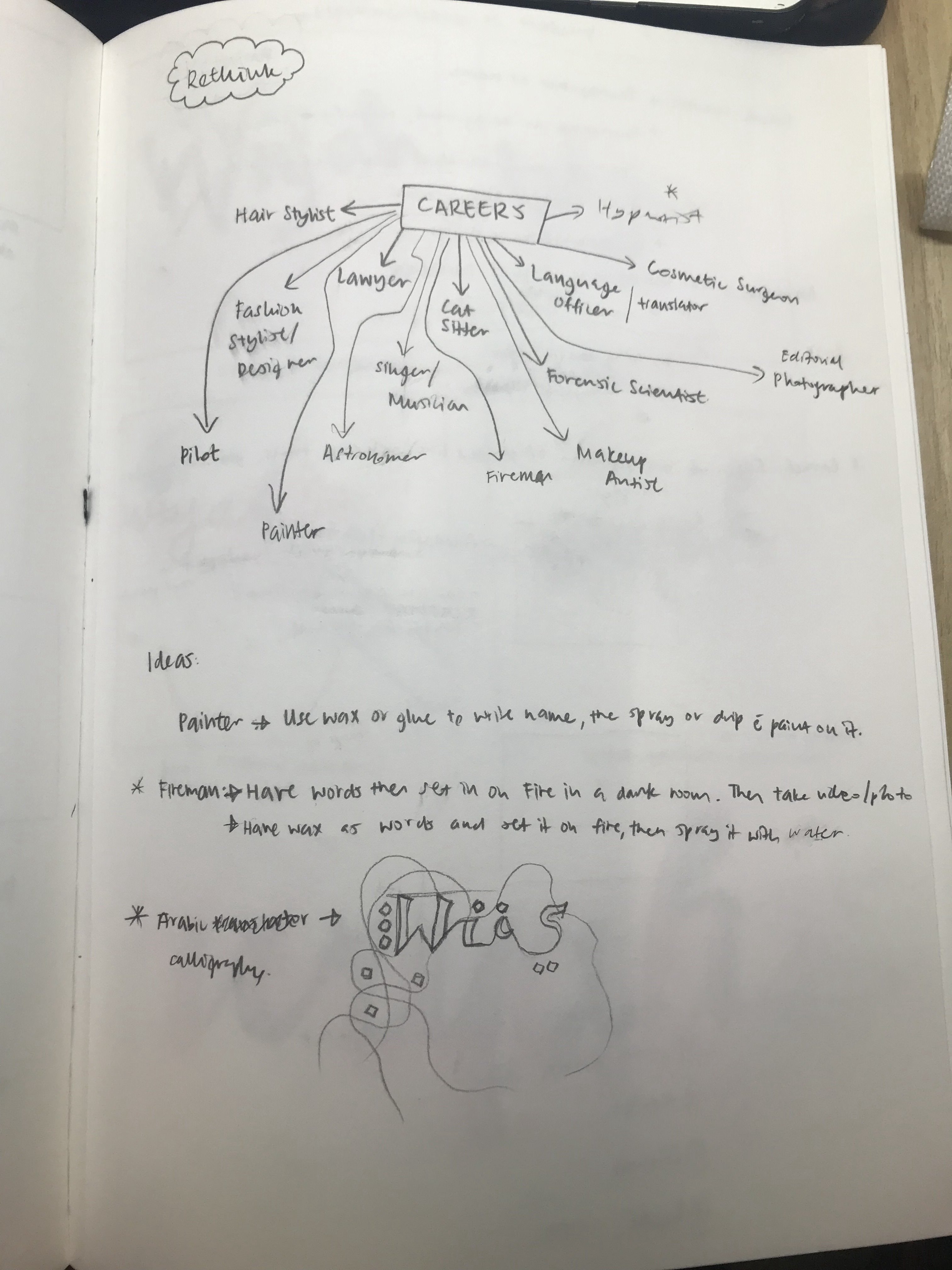
Hence, I started off fresh and brainstormed for ideas once more.
Second Brainstorming Session:
After several rounds of elimination, I narrowed down my choices to these few:
Career:
My name is Wiyah and I’m a…
1. Makeup Artist
2. Photographer
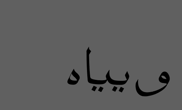
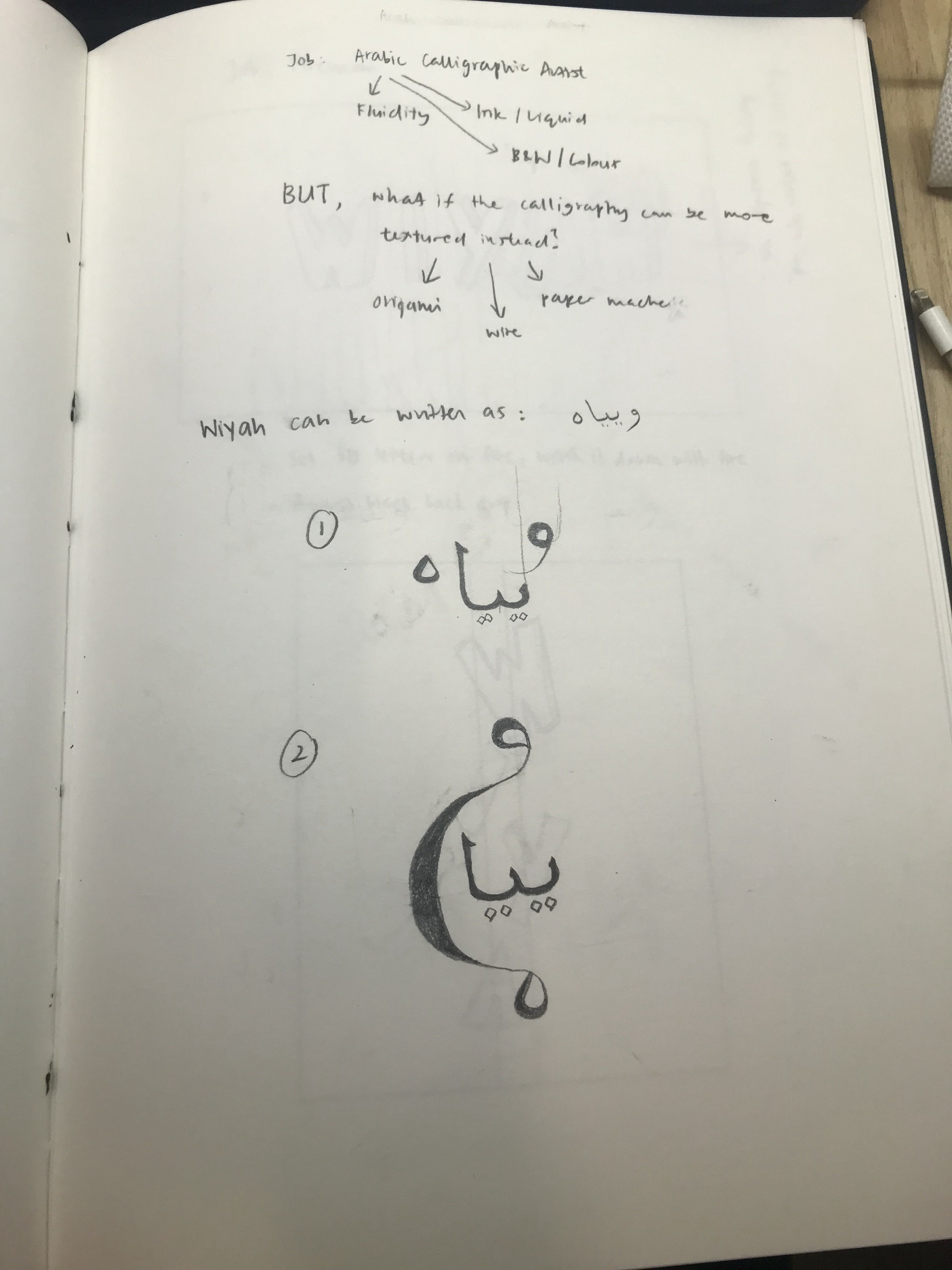
3. Arabic Calligrapher
4. Firefighter
5. Hypnotist
6. Fashion Designer
7. Astronomer
I started off by watching several videos before attempting them on my own to get inspiration.
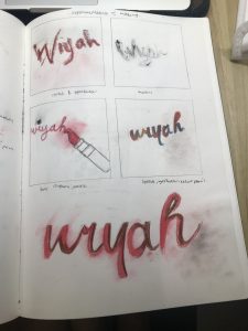
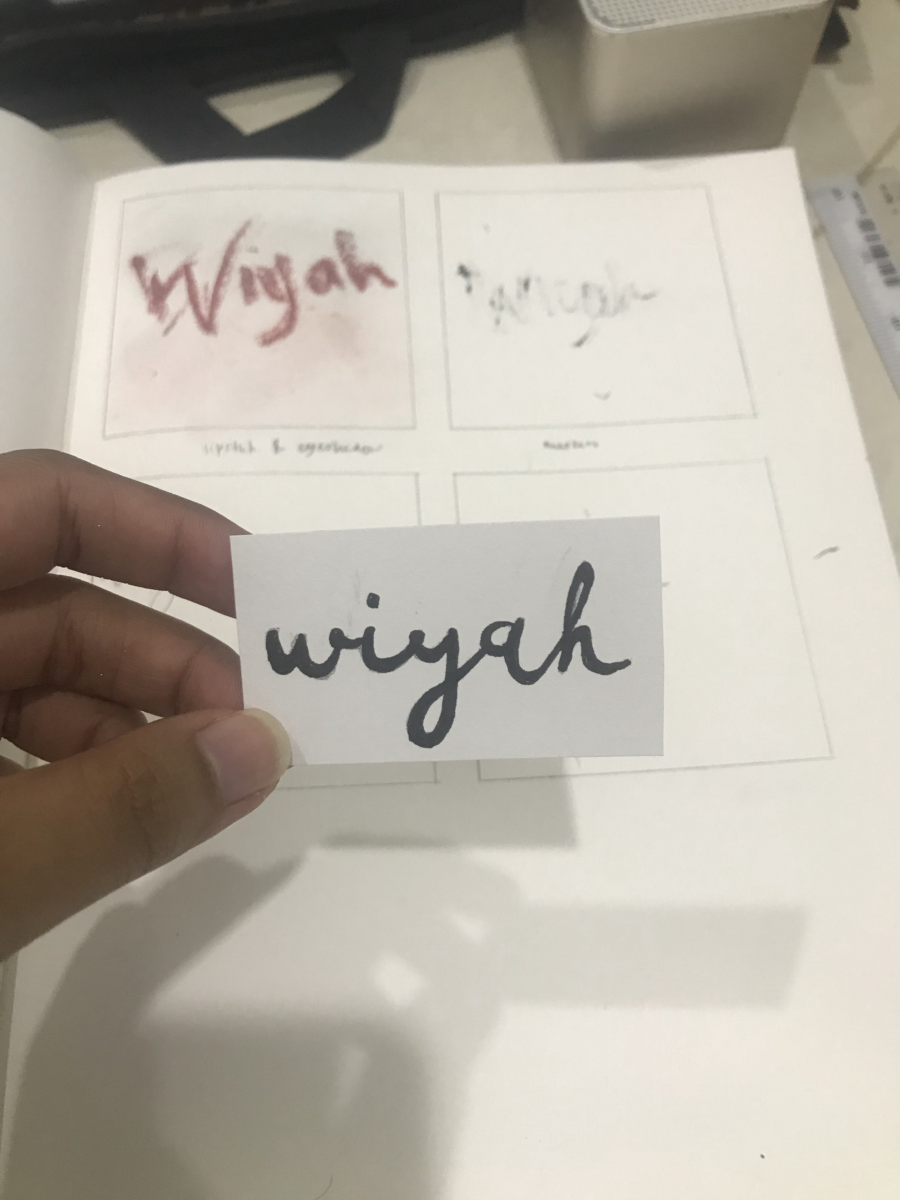
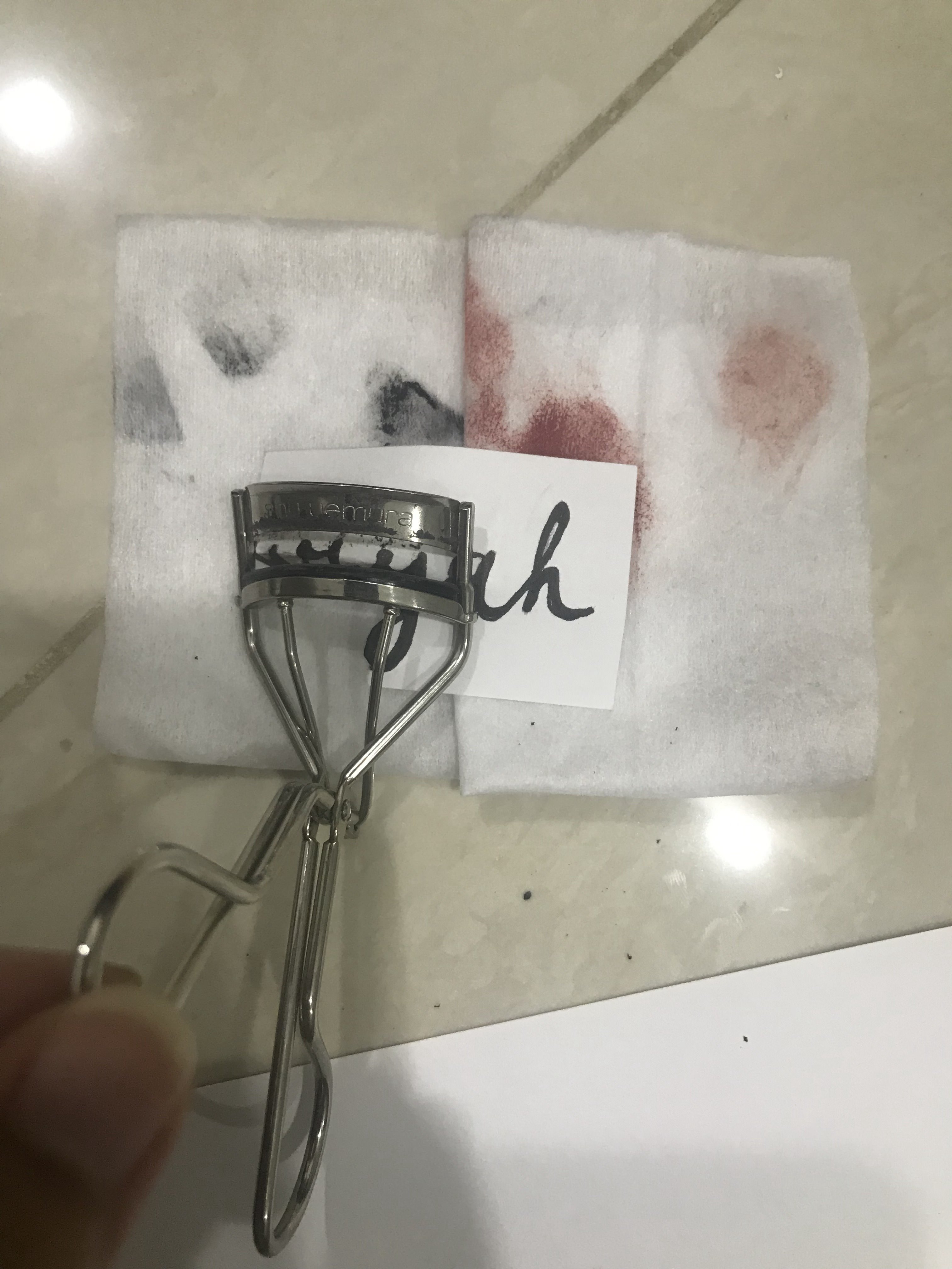
I attempted to play around with makeup, mindlessly, just to see how it works in terms of texture, colour, harmony of texture and the different forms of makeup .
(1st box, LEFT): Done with lipstick and eyeshadows.
(2nd box, RIGHT): Done with mascara
(3rd box, LEFT): Done with lipstick, eyeliner and pencil.
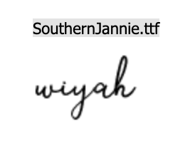
(4th box, RIGHT and BOTTOM): Done with lipstick and eyeshadow, brush, colour pencils. In this particular one, I imitated the font of Southern Jannie.
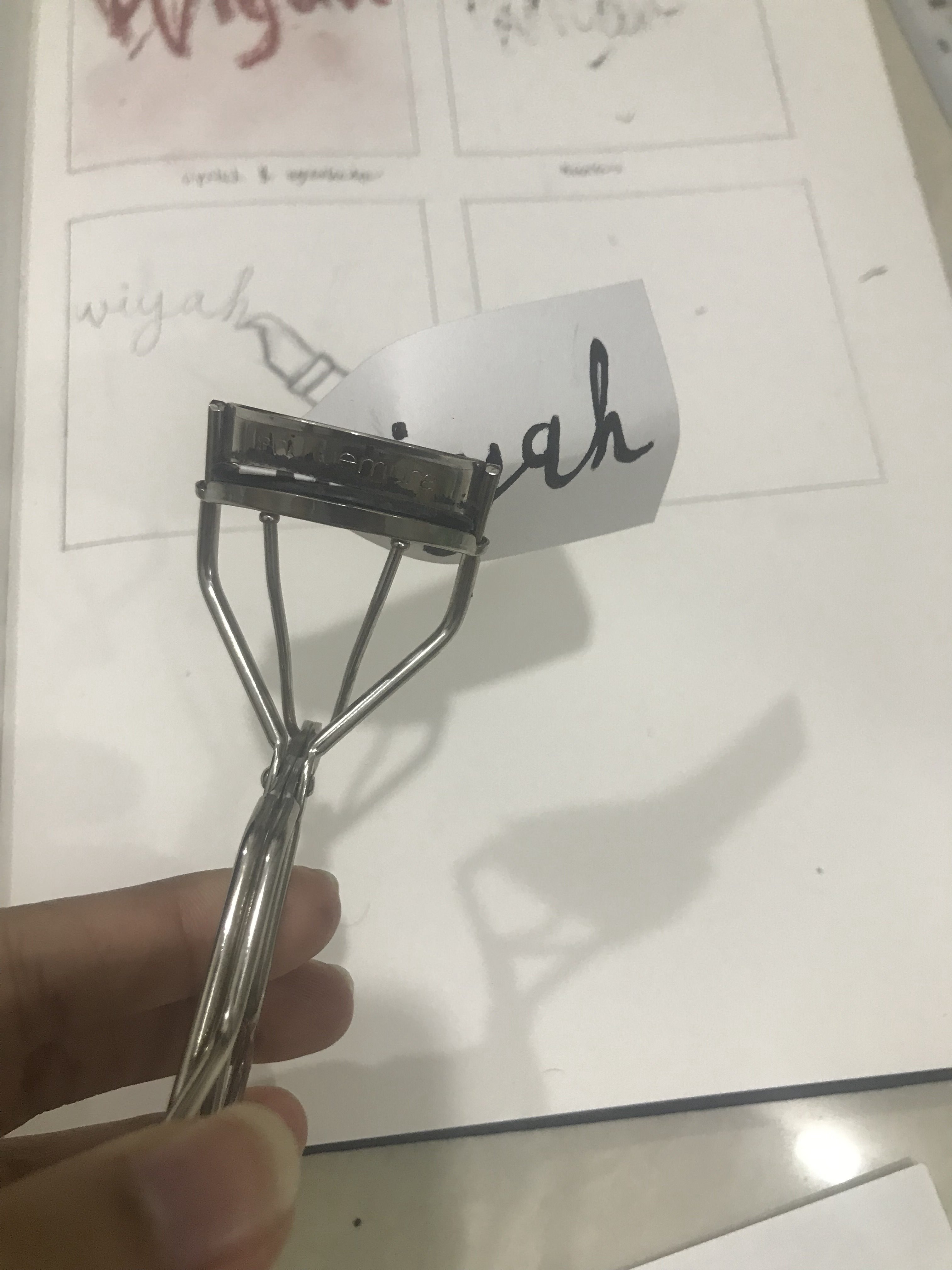
Upon further development, I had the idea to use an eyelash curler to manipulate the font shown in the photo above. The text was written with eyeliner.
After exploration with makeup, I figured that I wasn’t too keen on the idea of it and moved on to explore the other careers.
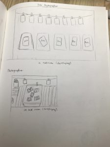
2. Career: Photographer
I had the idea of it being in the red room where items would be arranged to simulate the red room, then photographed and manipulated digitally to add red light effect, etc. I toyed with the positioning through sketch to generate a sense of composition. However, after thinking further, again, I wasn’t too keen on the idea and moved on.
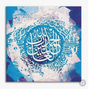
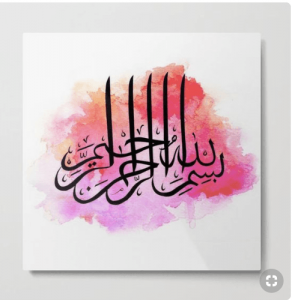
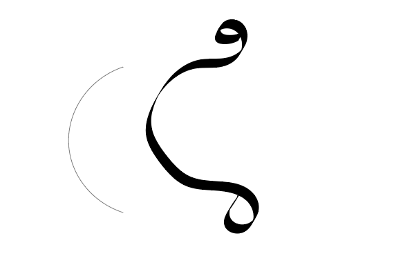
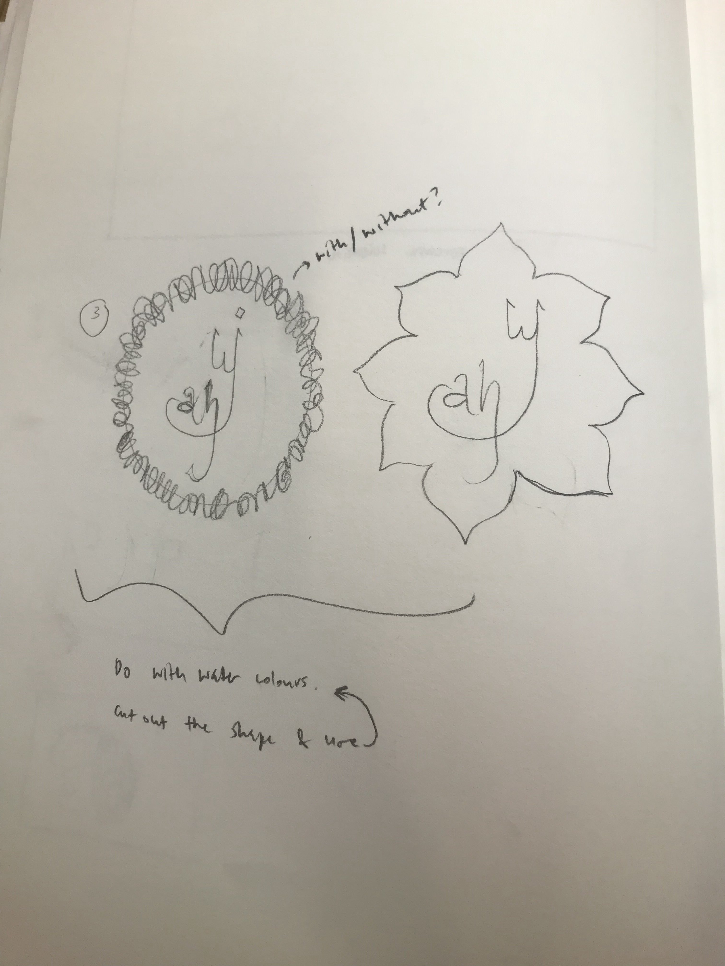
I toyed around with the idea of the calligraphy being in origami, wire or paper mache but soon realised that this does not really portray the fluidity of the lines created by calligraphers.
Hence, I attempted to write the arabic letters using a customised digital calligraphic brush in Illustrator. I tried to rearrange the composition of the letters to create more interesting shapes.
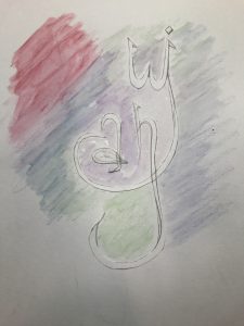
I then applied the influence of these arabic letters to the “English” version of my name. I also added the shapes used in the Arabic calligraphy art such as the flower and the circle made of words.
I had the intention of doing all these on water colour paper with watercolour paint. For some reason, there were a lot of modern calligraphy art that are done on watercolour background which influenced my decisions.
Playing around with colour pencil that can be converted to watercolour with cut out of text
Unfortunately, I didn’t stick by this idea due to development of other ideas in other careers.
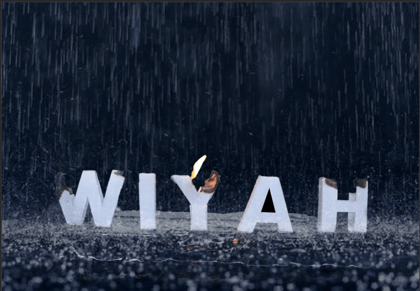
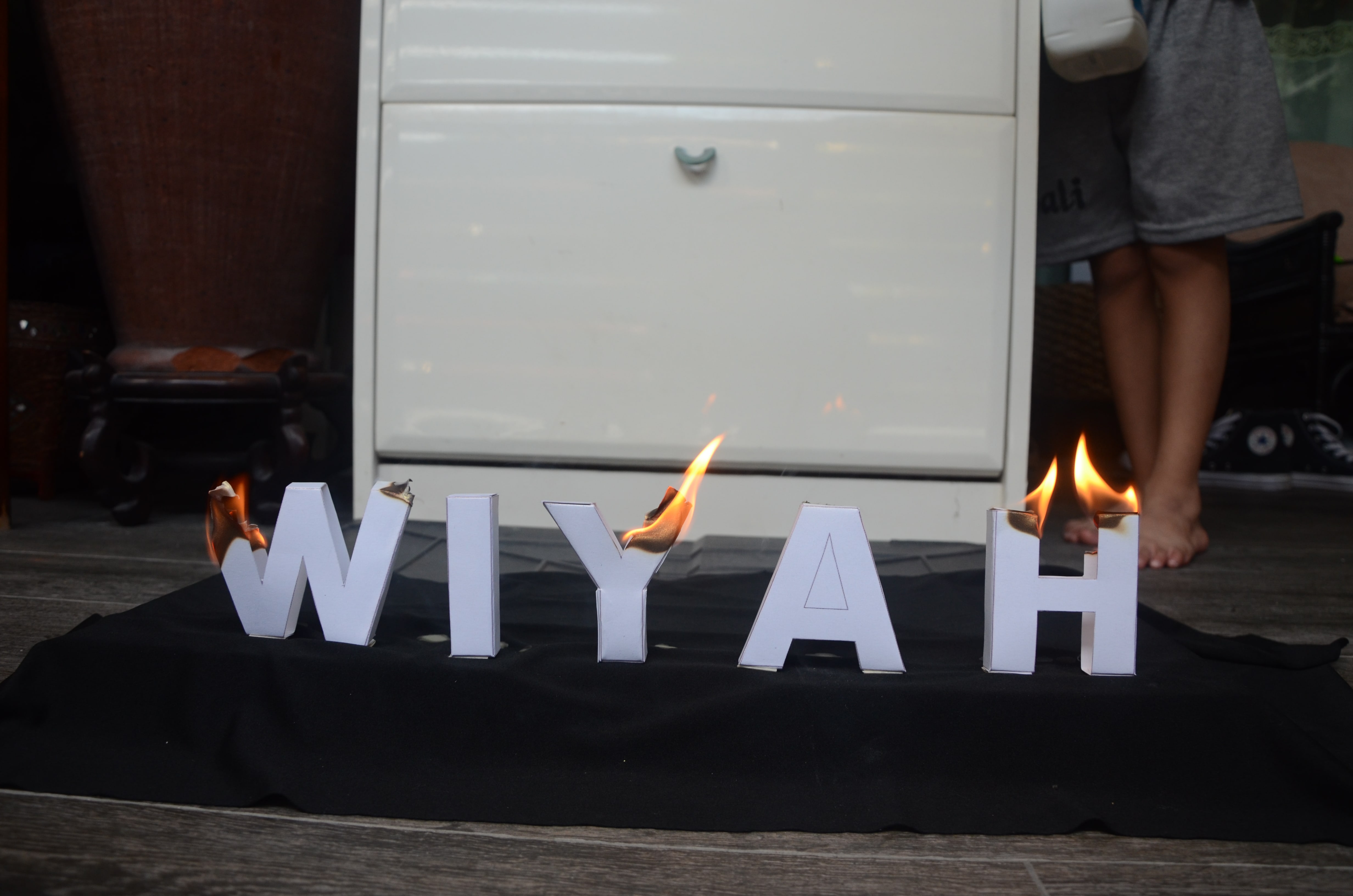
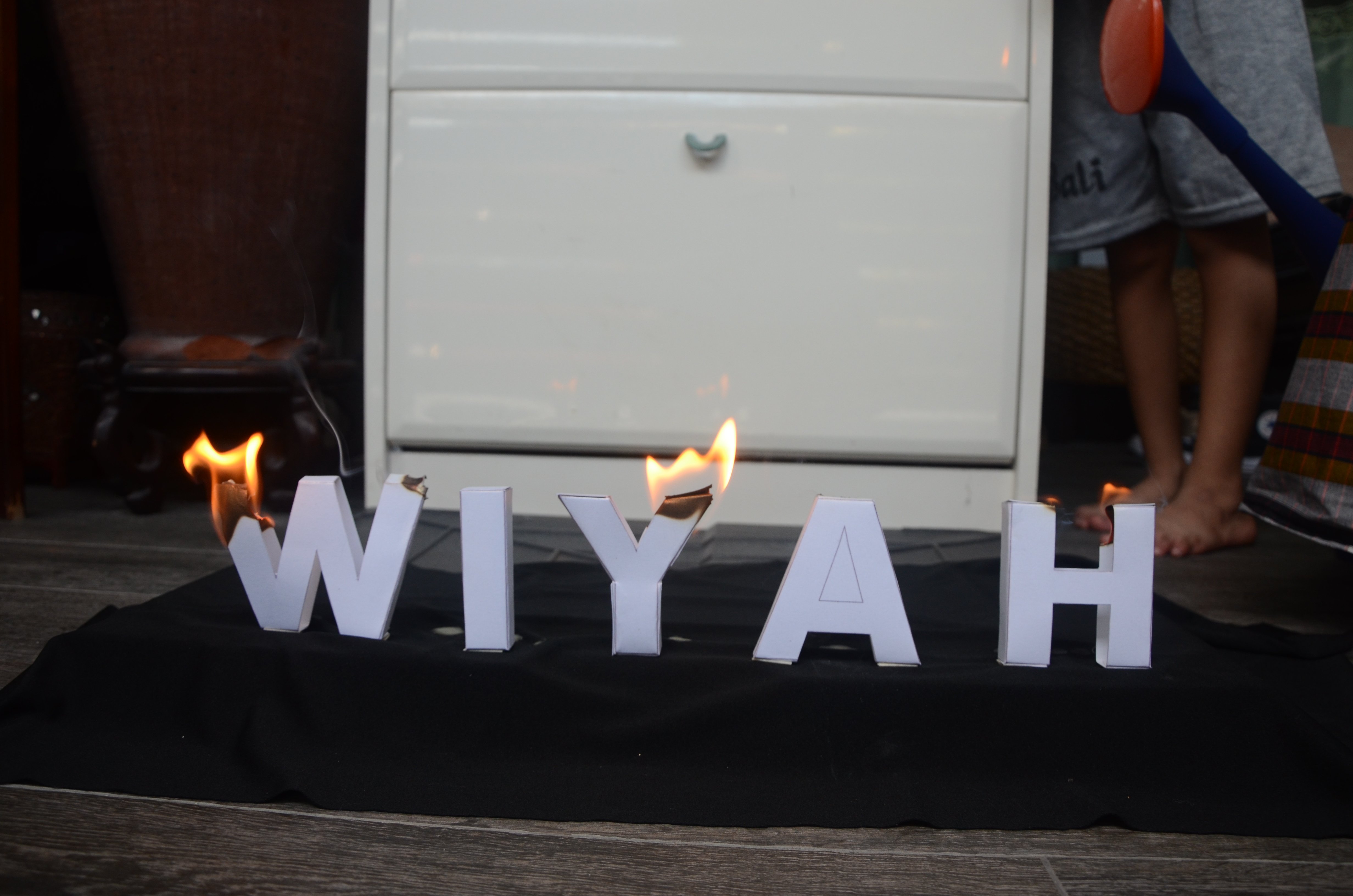
4. Career: Firefighter [Confirmed Image]
PICTURES OF SKETCHES FROM BOOK
Started out with sketches on how I wanted my image to be. For this particular career, I had my vision set out for it to be done via photography and digital manipulation.
Inspiration Photos:
But the above photos were not suited to my career and does not much visual association related to my career and therefore would not create a universal understanding of the visual representations of the career.
Therefore, upon further research, I found the photo below which resulted to being my main inspiration.
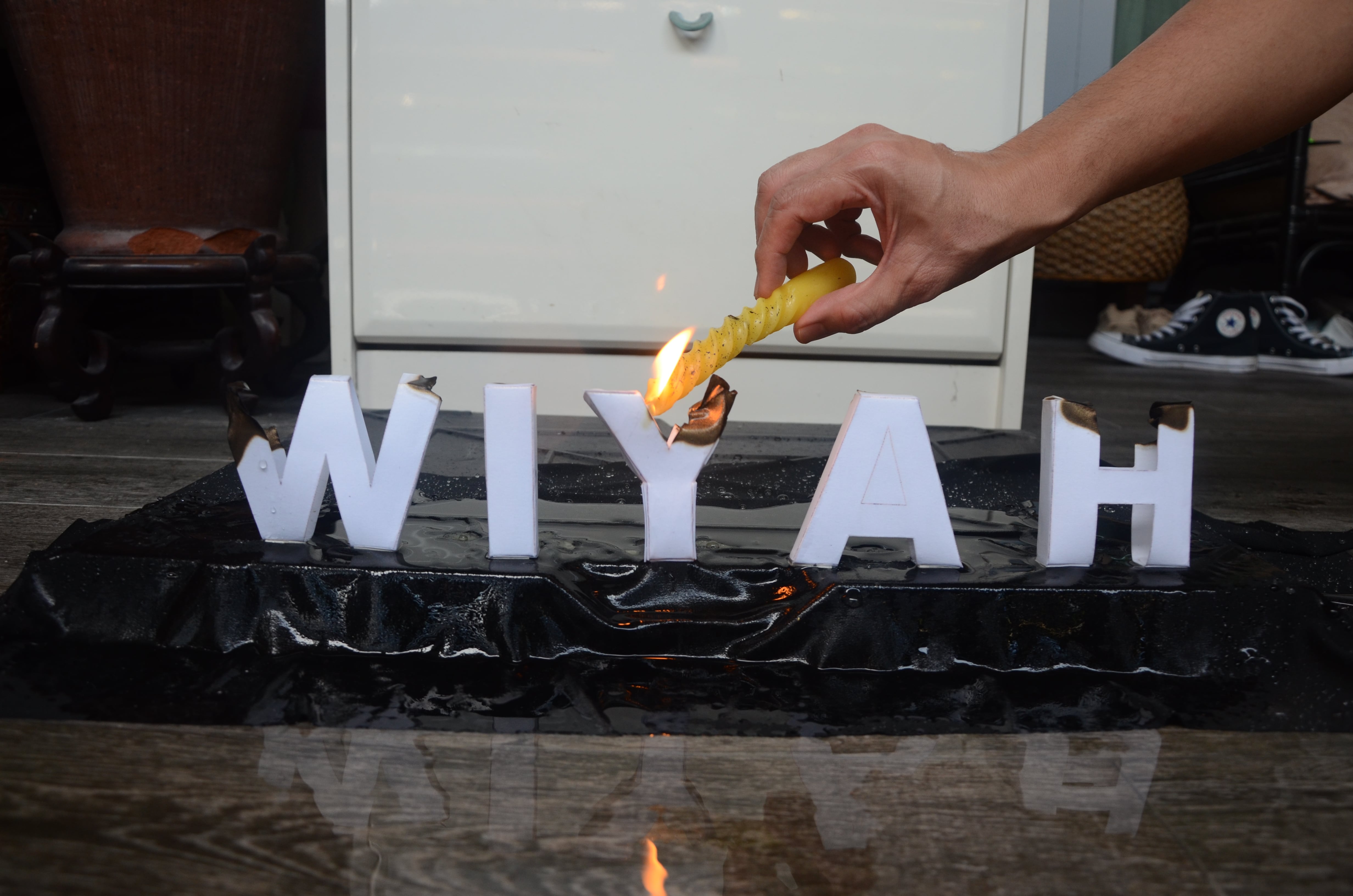
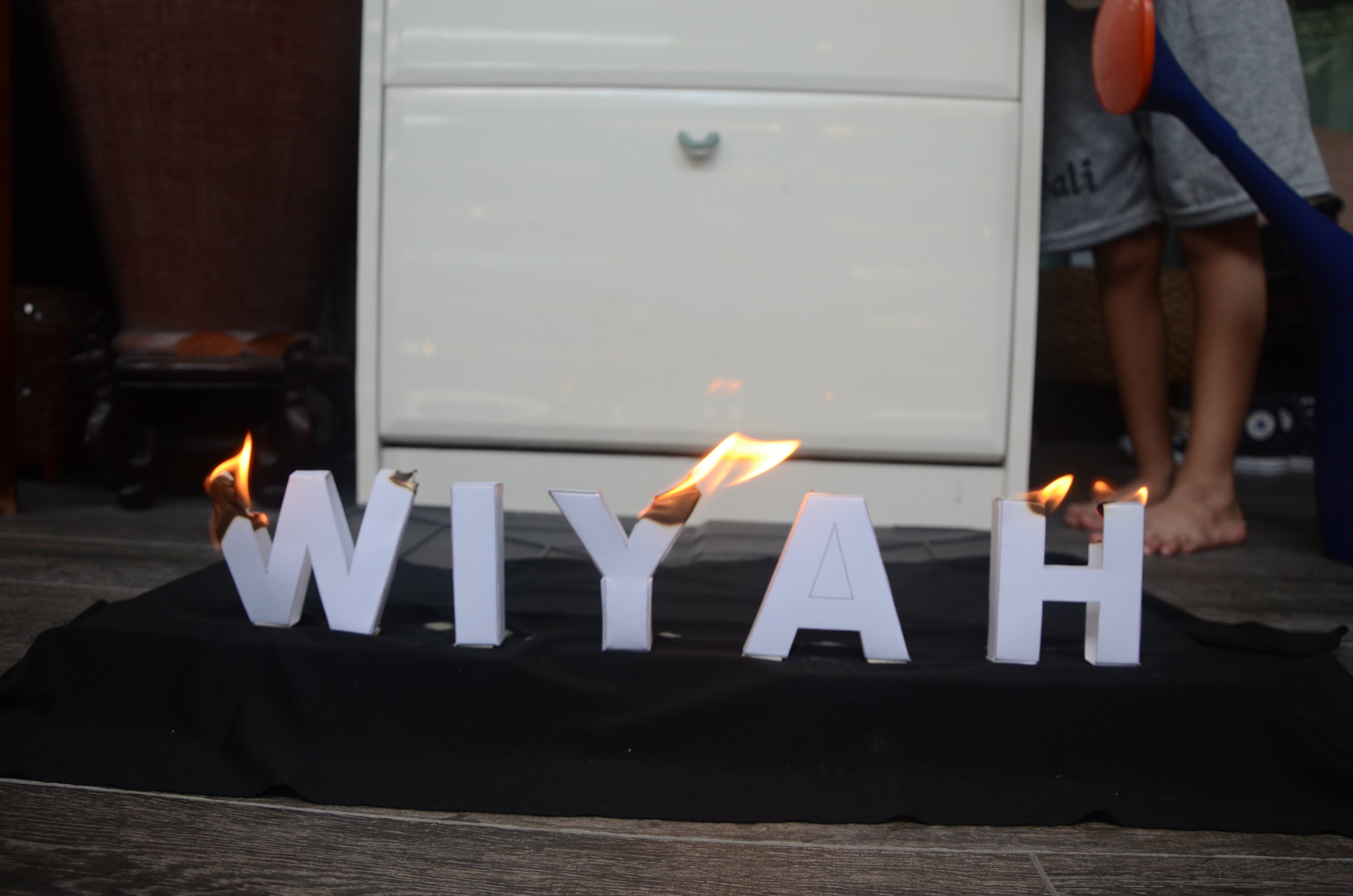
I envisioned 3D block letters in Sans Serif with no decorative features, to be physically burnt and being put out by fire, against a black background.
I did not want any decorative font because it would be too distracting and would not complement my idea very well. With Sans Serif fonts, it would look clean and minimal which suited what I was going for.
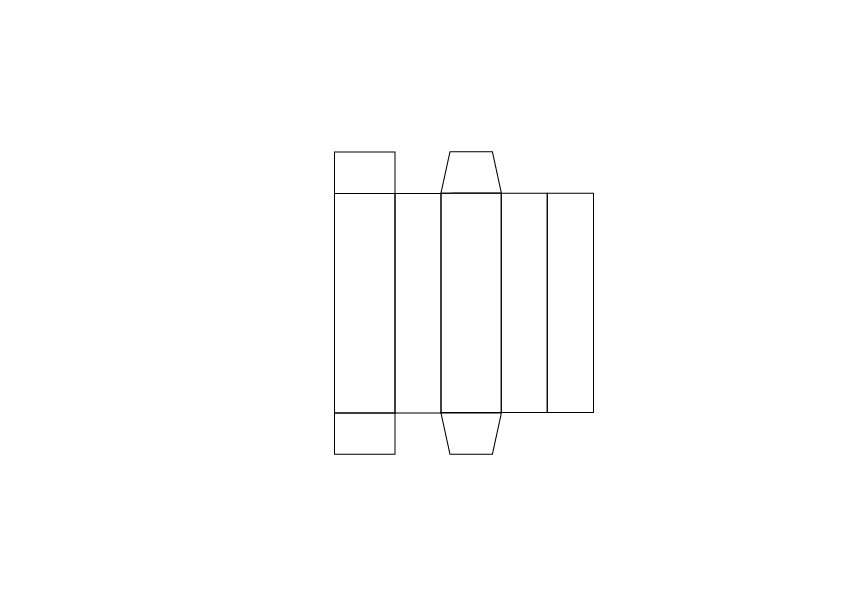
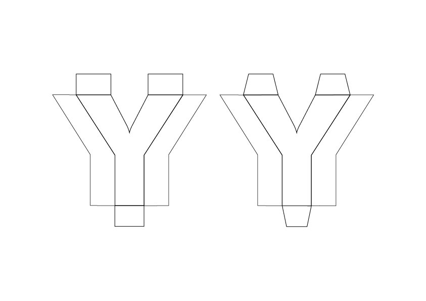
Therefore, I started off by making templates for these 3D block letters of my name with Illustrator.
With regular copier paper, I attempted to fold and glue the 3D block letters into place. I attempted this twice (due to a mistake I made in templates for more complicated letters) before moving on to a thicker art card to achieve a more solid built that would photograph better.
Failed first attempt
3D letters attempt
Paper used:
Template I came up with for 3D letters:
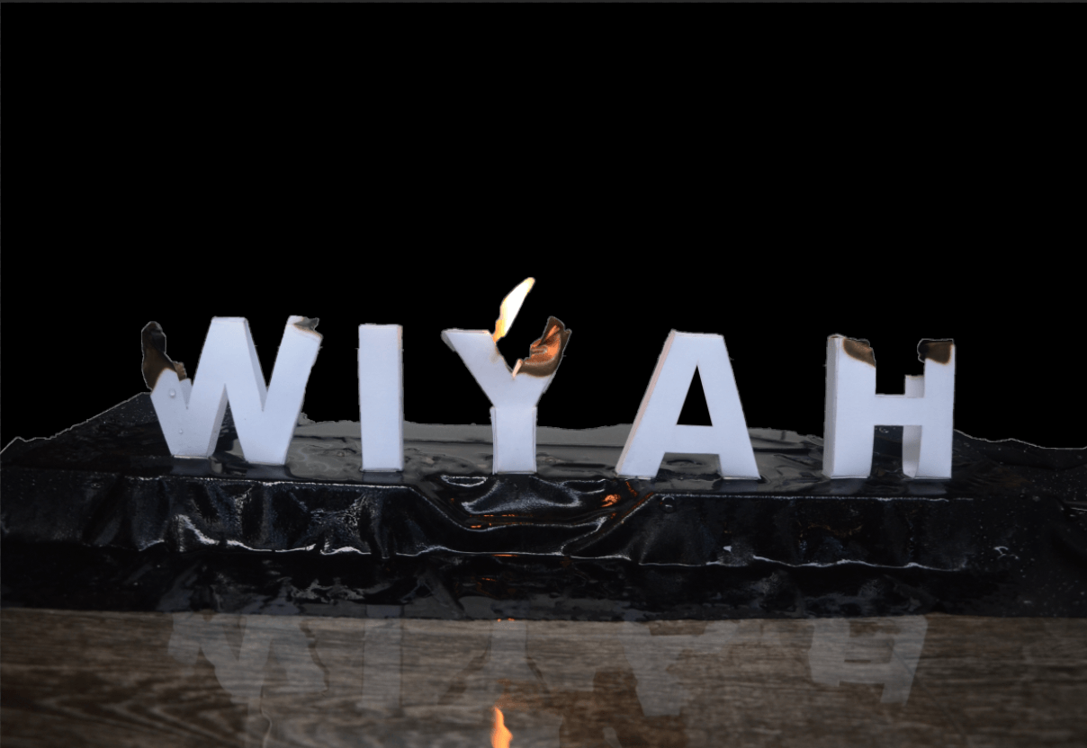
Since the Career is Firefighter, it is clear that the first thing that comes to mind would most likely be Fire and Water. This sparked the idea of having it done in an analog manner where I would burn the letters and have it be put out by water.
The challenge I had during this process was lighting the block letters. Turns out that the paper I used was too thick and had a glossy, metallic effect that hindered it from being lighted easily.
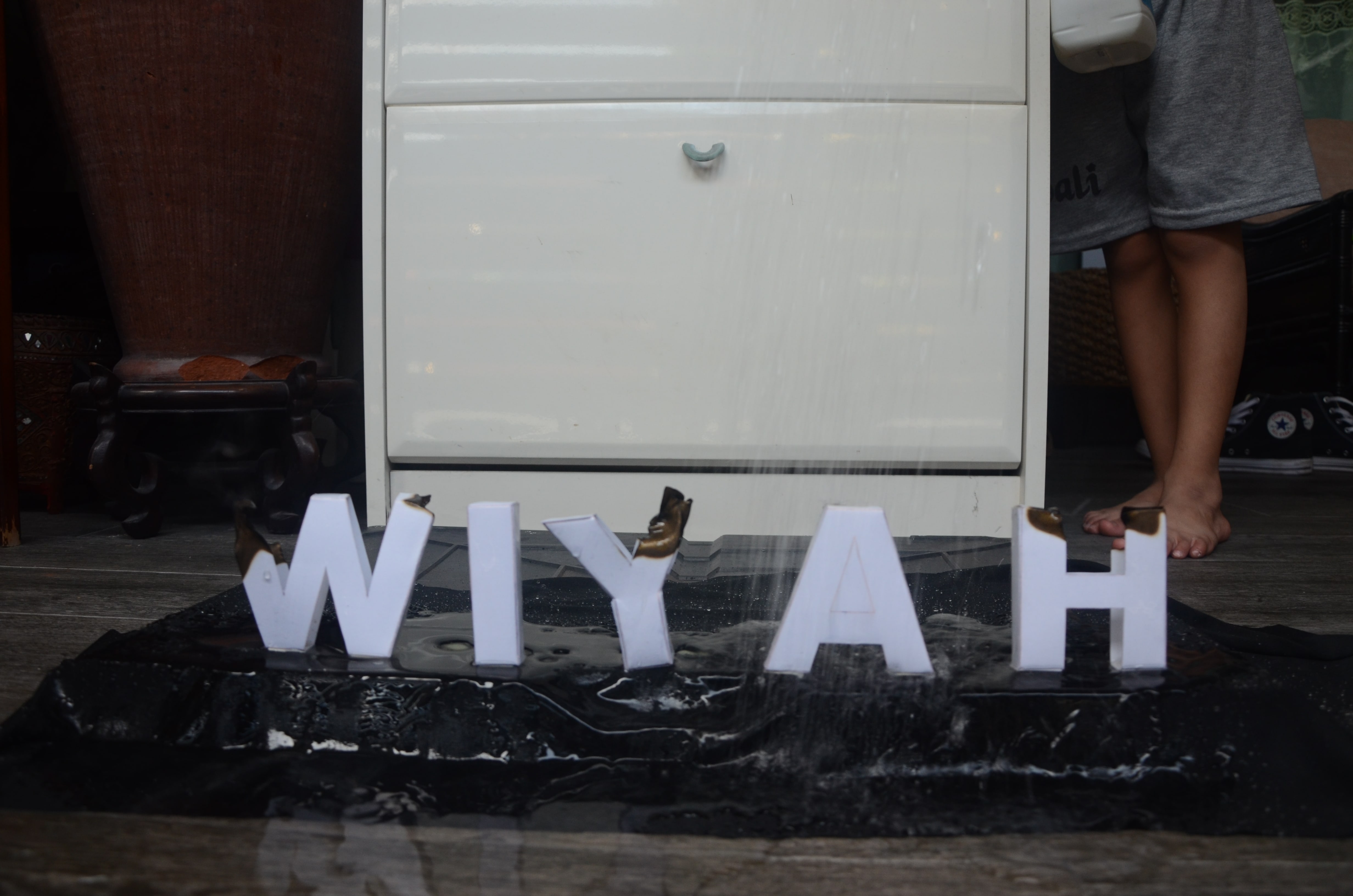
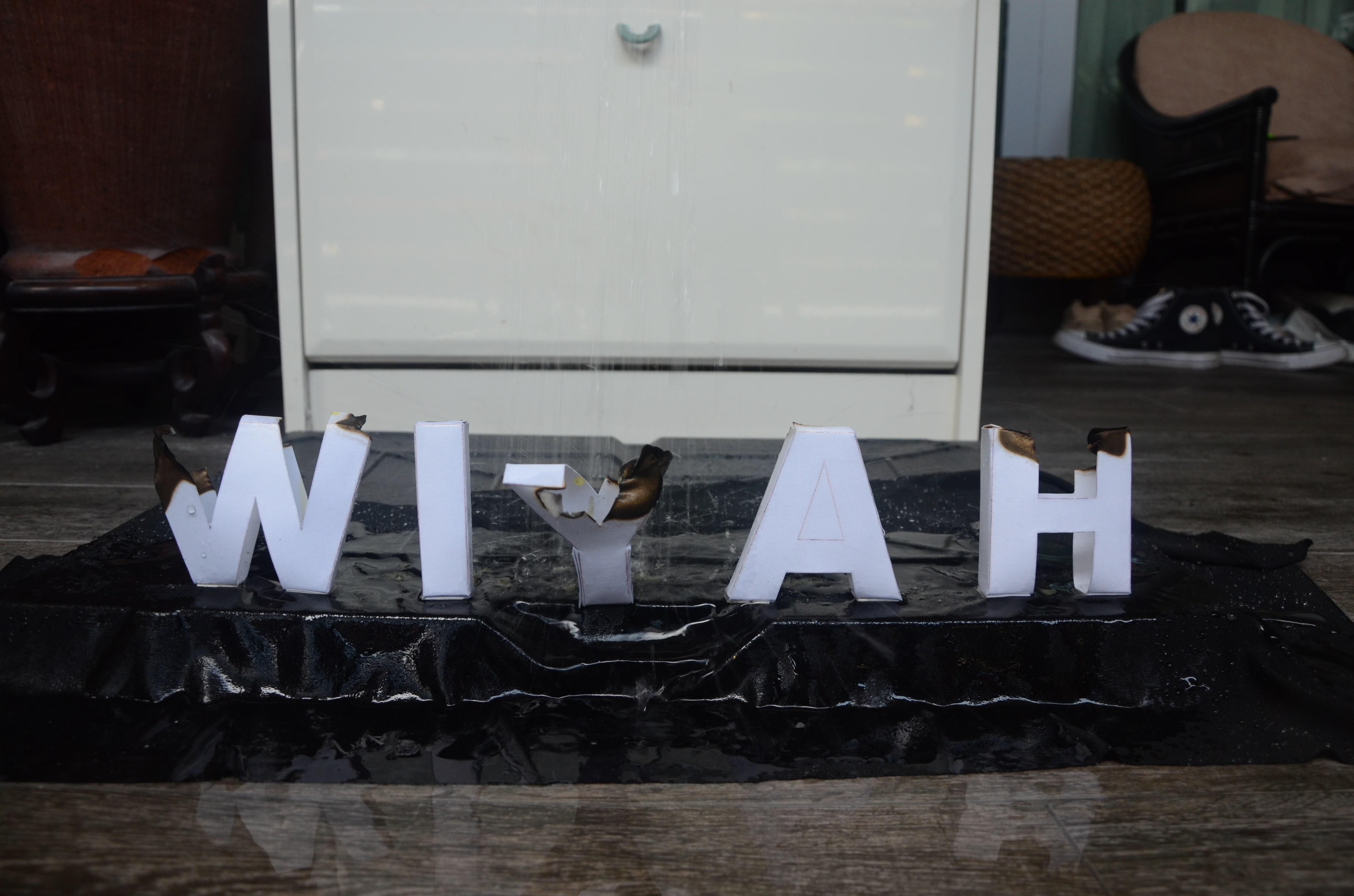
Another challenge was that when I had my dad pour water over the letters so that I could take the shots, the letters kept toppling over due to the pressure of water. Also, the water was not really captured in the shots.
Selected Image
Attempts
Attempts
Attempts
Attempts
Attempts
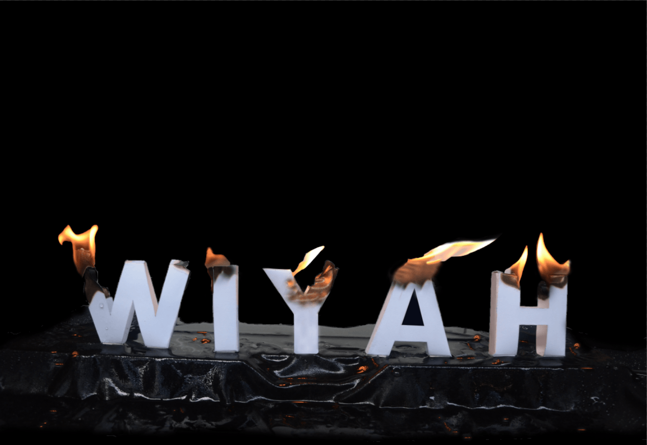
I decided that this had to be heavily manipulated digitally to achieve the effect that I want. Therefore, I first had to remove the the background (leaving the raised platform) to achieve the dark effect that I envisioned using Quick Selection Tool in Photoshop. I then filled the empty space with black with the Paintbrush Tool.
Afterwards, I decided to photoshop flames and burnt areas from other shots into my chosen shots so that every letter would be on fire to create a more dramatic effect. I also added reflections of the flame on the raised platforms.
Selected Image
Removed Background
Further Enhanced with photoshoped flame, burnt effects, reflection of flames
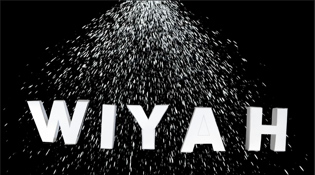
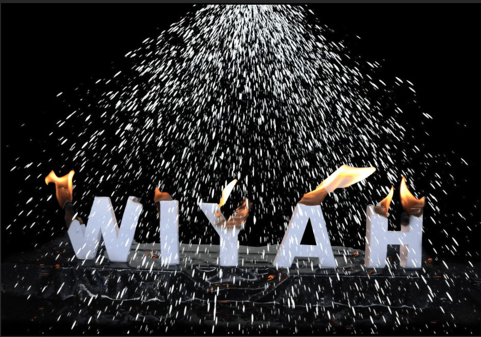
The next step was to add the water that would put out the fire. From the photo attempts above, it was almost impossible to isolate the water from the background and it wasn’t very obvious either. Hence, I had to add it digitally.
It was difficult finding the misty water that I was looking for hence, it required several attempts. I blended the mist I found to the photo using Screen in Photoshop. I also had to photoshop the flames in the middle (Y & A) to have flames that looked more swayed to make it more realistic due to the pressure of the water that I added in the middle. The water effect added was intentionally misty as I attempted something normal water effect but it looked more like rain (as seen below), which didn’t portray what I was going for.
The final outcome was also edited further in Lightroom to increase contrast, lower brightness and increase sharpness.
I’ve always found hypnosis intriguing and therefore the career choice. With this, my vision went straight to illusion-related images with lines and distortion.
Influences:
I then explored the idea of having a raised text with lines with Typography and whilst researching, I found a video that shows exactly that. The problem with this is that it required an older version of software.
I researched further and found a video on Youtube that created Animated Optical Illusions:
It was extremely interesting and I wanted to attempt it. It was quite complicated to understand how it worked so I had to cross-refer to many videos.
Once I saw this, it was apparent that this was the perfect optical illusion that I could use to apply it to the typography for hypnosis. It was very trippy and requires extreme focus to make out what the image is when you slide the black bars across the text.
According to Wikipedia, the definition of Hypnosis is as follows:
Hypnosis is a state of human consciousness involving focused attention, reduced peripheral awareness, and an enhanced capacity to respond to suggestion. The term may also refer to an art, skill, or act of inducing hypnosis.[1]
Therefore, I felt that this was apt for my Career Choice of Hypnotist as I am mimicking the effect of hypnosis for the audience.
Main Video Reference:
I used Sans Serif font so as to not distract from the message of the text too much. I used Upper Case and Lower Case for my First attempt then changed to Lower Case completely as I felt like it complemented my design better. The font I used was also more rounded in nature which suited the design rather then angular fonts.
First Attempt:
I used Colours instead of Positions (like video) to create the animation on paper.
It looked very stagnant and did not portray the image I had in my head.
For this, I decided to distort the text and make it wavy using the Warp Tool. This is another visual association I added to the hypnosis effect. When you think of hypnosis, it’s all about illusion and all things trippy and spinning. Hence, the wavy texted added to that effect and created more movement in the animated illusion text that I created.
Video Reference:
Third Attempt:
I distorted the image further by adding another row of the text below the already distorted image. However, it looked rather complicated and illegible which defeated the purpose of this Project. Mimi’s feedback on it confirmed my thought exactly. Hence, I went with the second attempt instead as my Final Outcome.
I printed the black bars on transparent paper. This is the crucial part of making it an animated image.
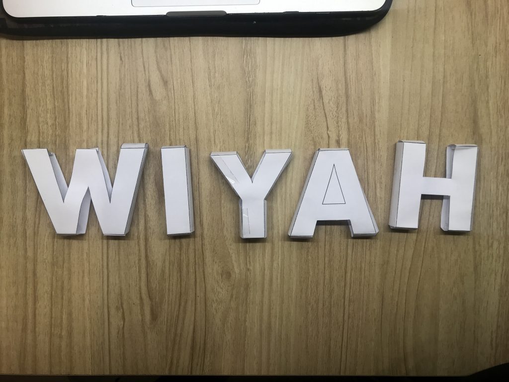
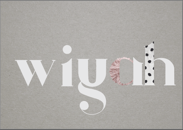
6. Fashion Designer [Confirmed Image]
I’ve always enjoyed looking at clothes and finding clothes as they’re a form of identity for me. Ever since I was a child, this was a form of my creativity since I was a very quiet child. I also enjoyed how different vibes of clothes allowed me to embody different personas.
When I was researching for this, I saw a lot of pictures online that served as inspiration for me. Initially, I wanted to attempt analog methods for this.
However, after considerations, I realised that it would take a lot of hours into me learning new skills of sewing and embroidering to be adapted into my typography designs. It required a lot of time to research for the methods too.
Therefore, I resulted to digital methods using manipulation of images.
I used Argo, a Serif typeface. This is a decorative font and I was inspired by editorial layout designs like such. I also went with all lower-case typeface as it made the piece look more united.
Upon attempting a digital approach, I realised that it didn’t really tie in to my whole concept of literal experimentation of typography.
Hence, I decided to go ahead with my original idea of doing it by hand. I used fabric, thread and beads. I retain the idea of using the same Argo typeface.
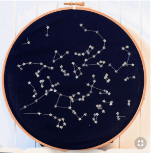
Through research, I was drawn to this String Art..
but I was already going to do String Art for another one of my idea. Hence, I wanted to explore other methods. Also, I felt like it would not have created as strong a visual association to the career of fashion designer.
Other inspirations:
Hence, I decided on another method. I, first sketched out the idea on paper to have a rough creative direction.
As for the methods, I figured things out along the way through experimentation on a separate piece. I tested out patterns and silhouettes on there too.
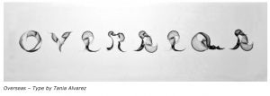
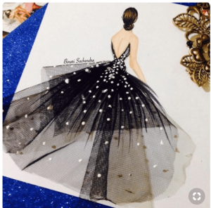
Originally, I wanted to just sew on different fabrics onto the typeface using organza (with end product looking like the photo below…
Fabric Type by Tania Alvarez
..but I felt like it would not portray the idea well. I also wanted to attempt embroidery on the whole typeface but Mimi’s feedback said that it could easily look like my career was to be an embroidery artist.
Hence, I opted to combine the two ideas and creating interesting silhouettes of the typeface.
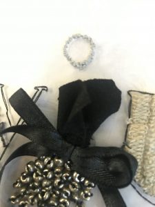
I wanted the whole composition to have a harmonious feel to it and for it to be viewed as a collection, resembling what is released in runways. Therefore, I made sure to use threads that are off the same theme of colour with a pop of pink. I played a lot with texture too through embroidery and fabric.
A reason why I chose Organza as my backing fabric is because I felt that organza had the feeling of elegance and is often associated with girly fashion as it is used to create tulle skirts.
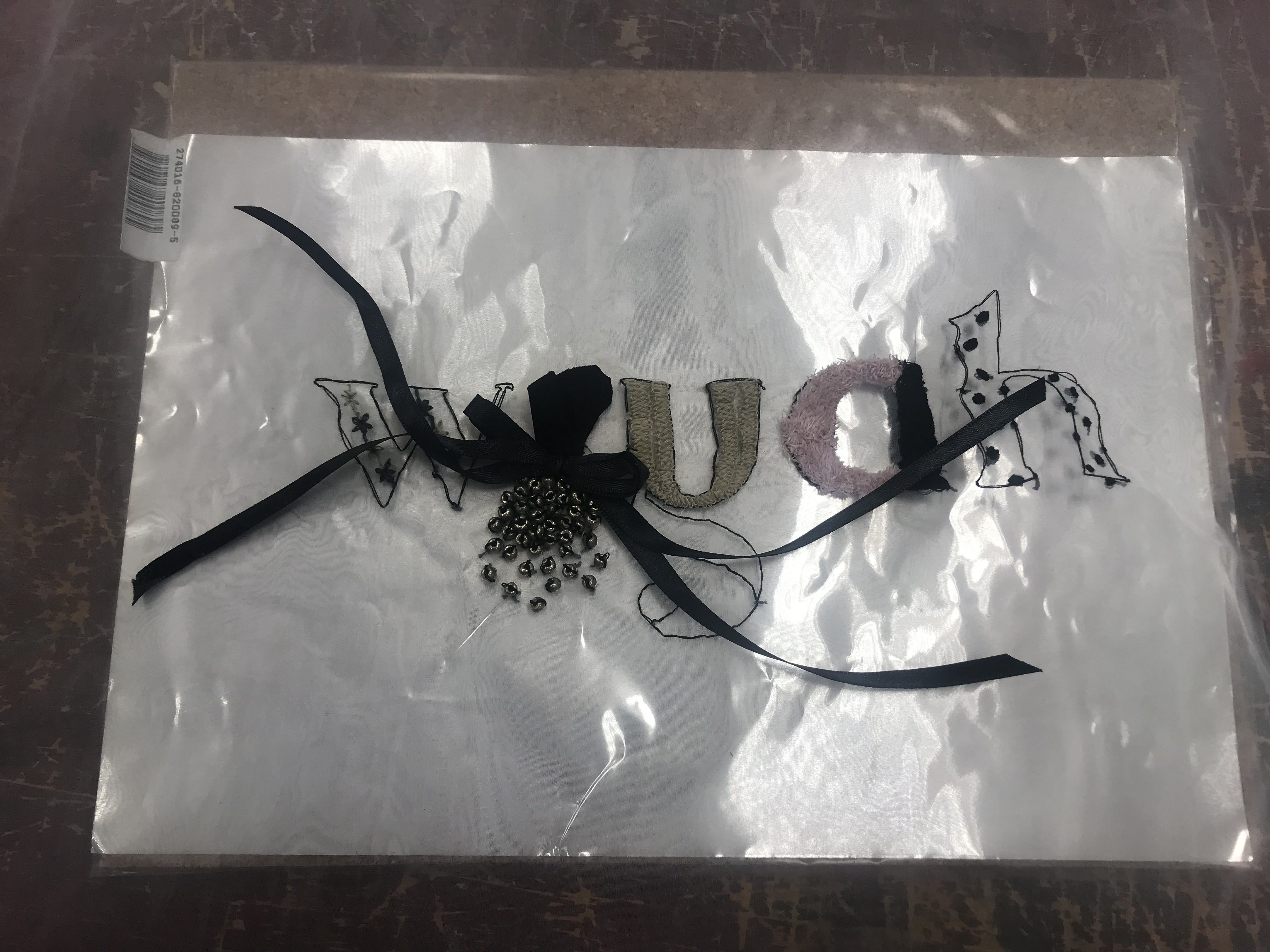
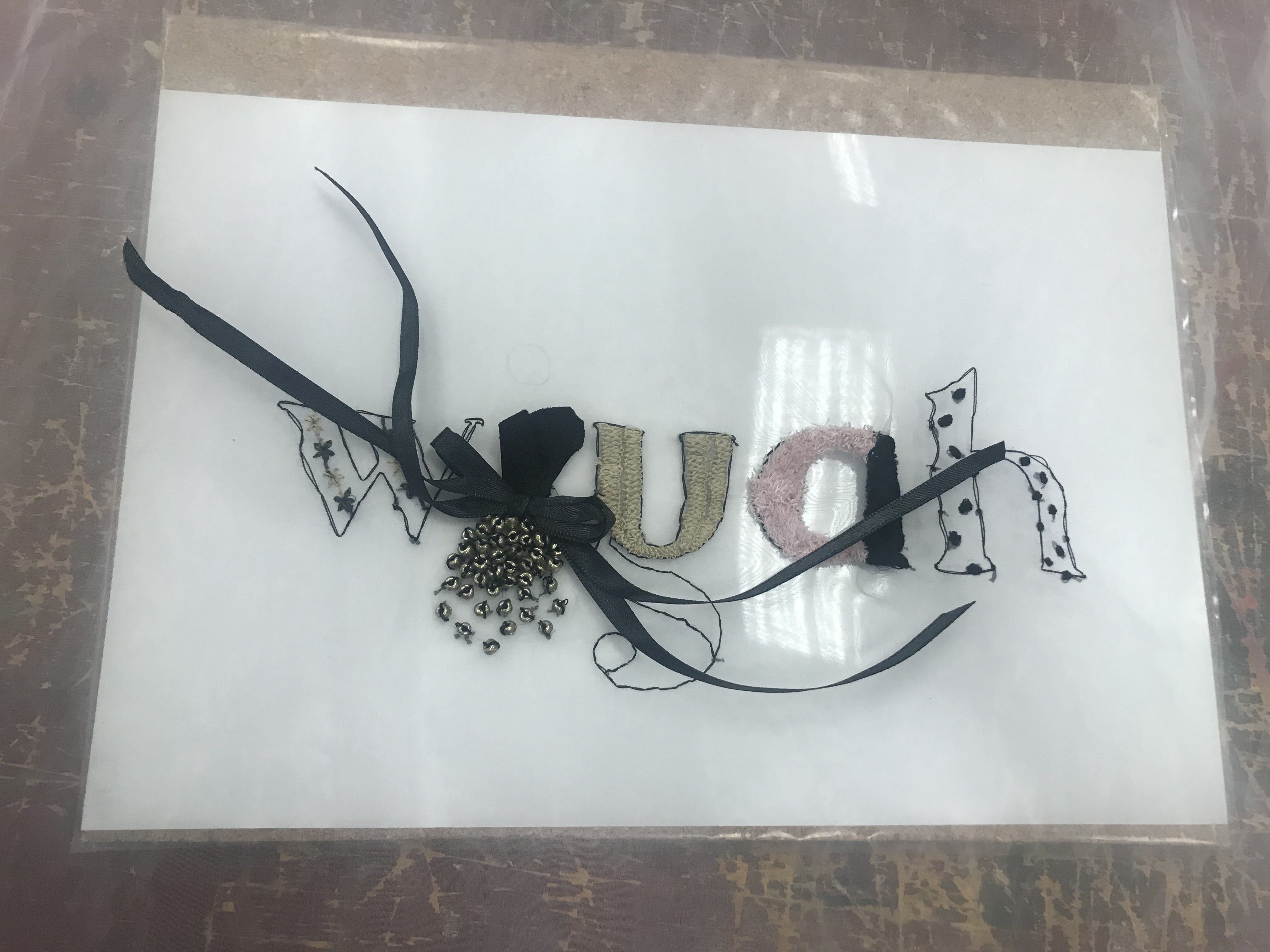
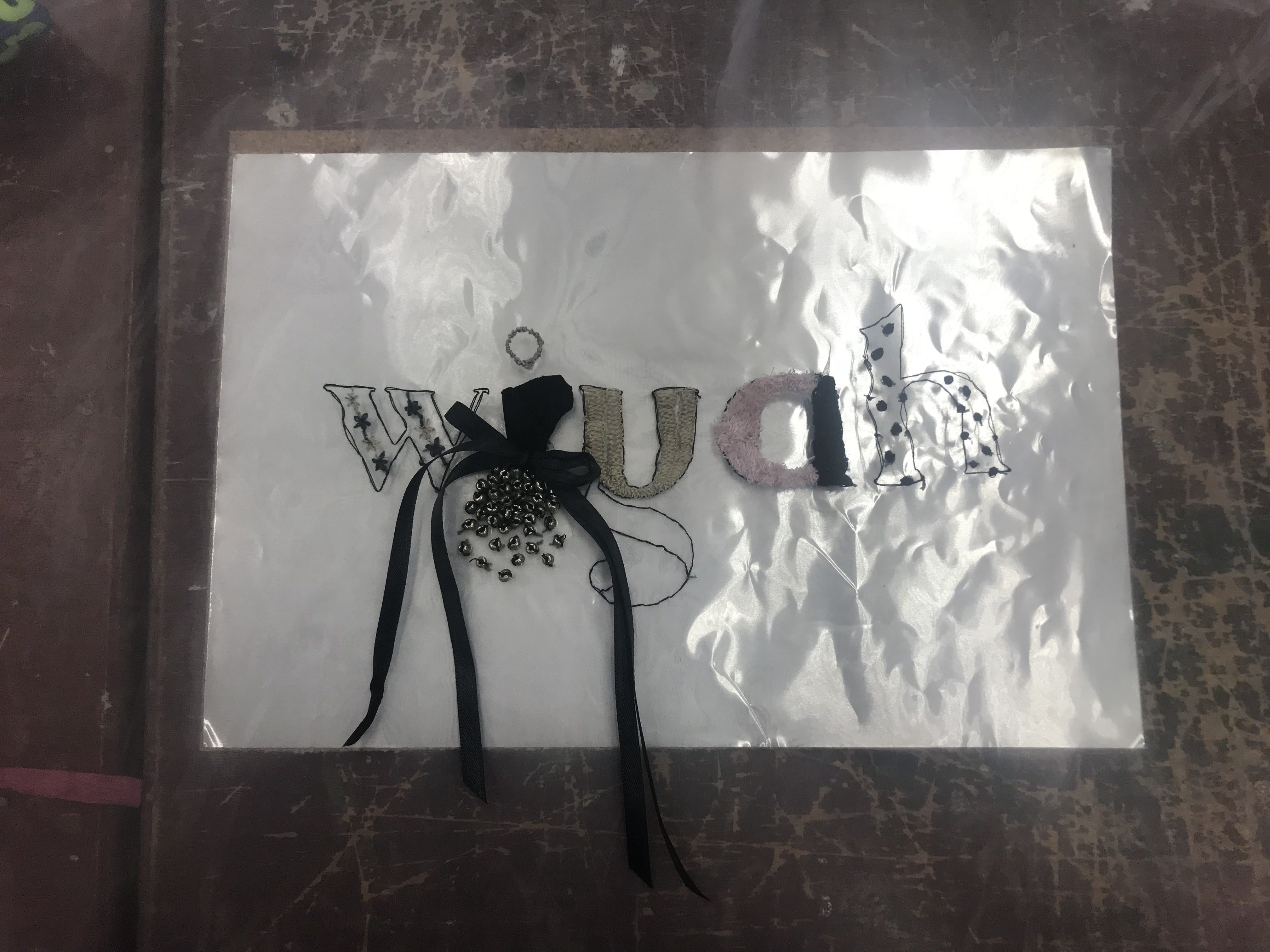
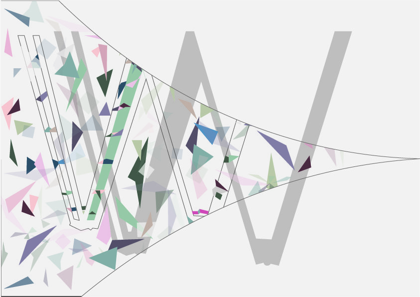
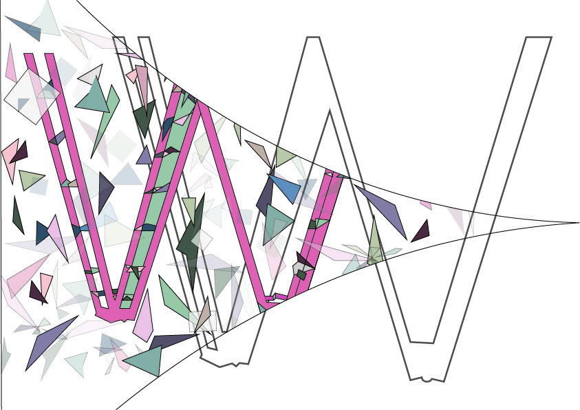
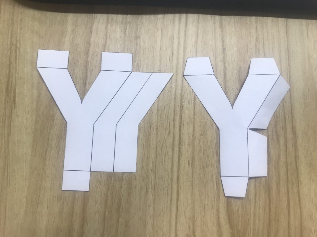
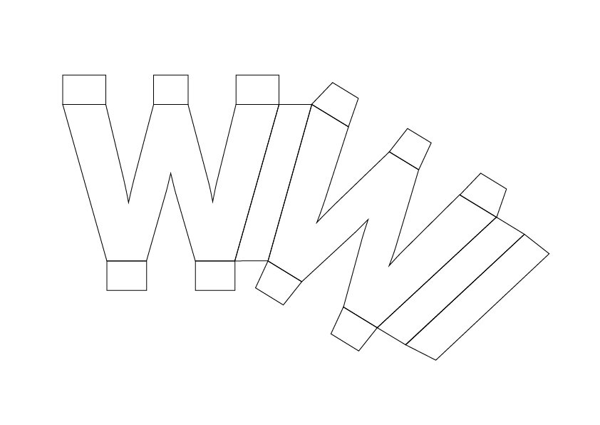
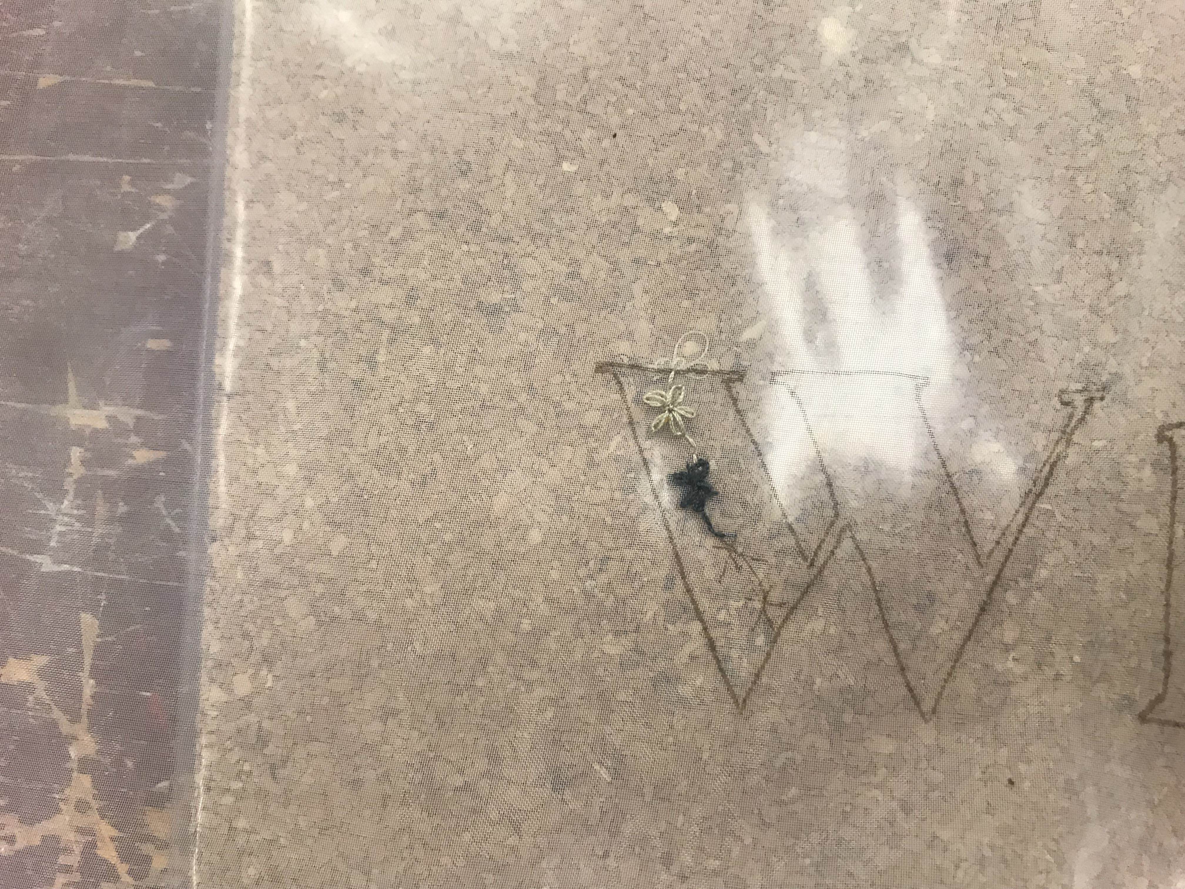
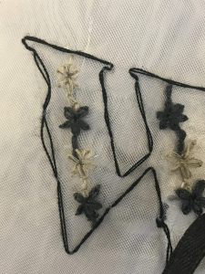
LETTER ‘W’:
I created daisies and attached them together with alternative colours as I felt that it looked more interesting with alternate colours rather than just one dull colour. It also helped tie in my “collection” together with the use of the neutral and the dark colours.
Reference Video:
Detail of my embroidery:
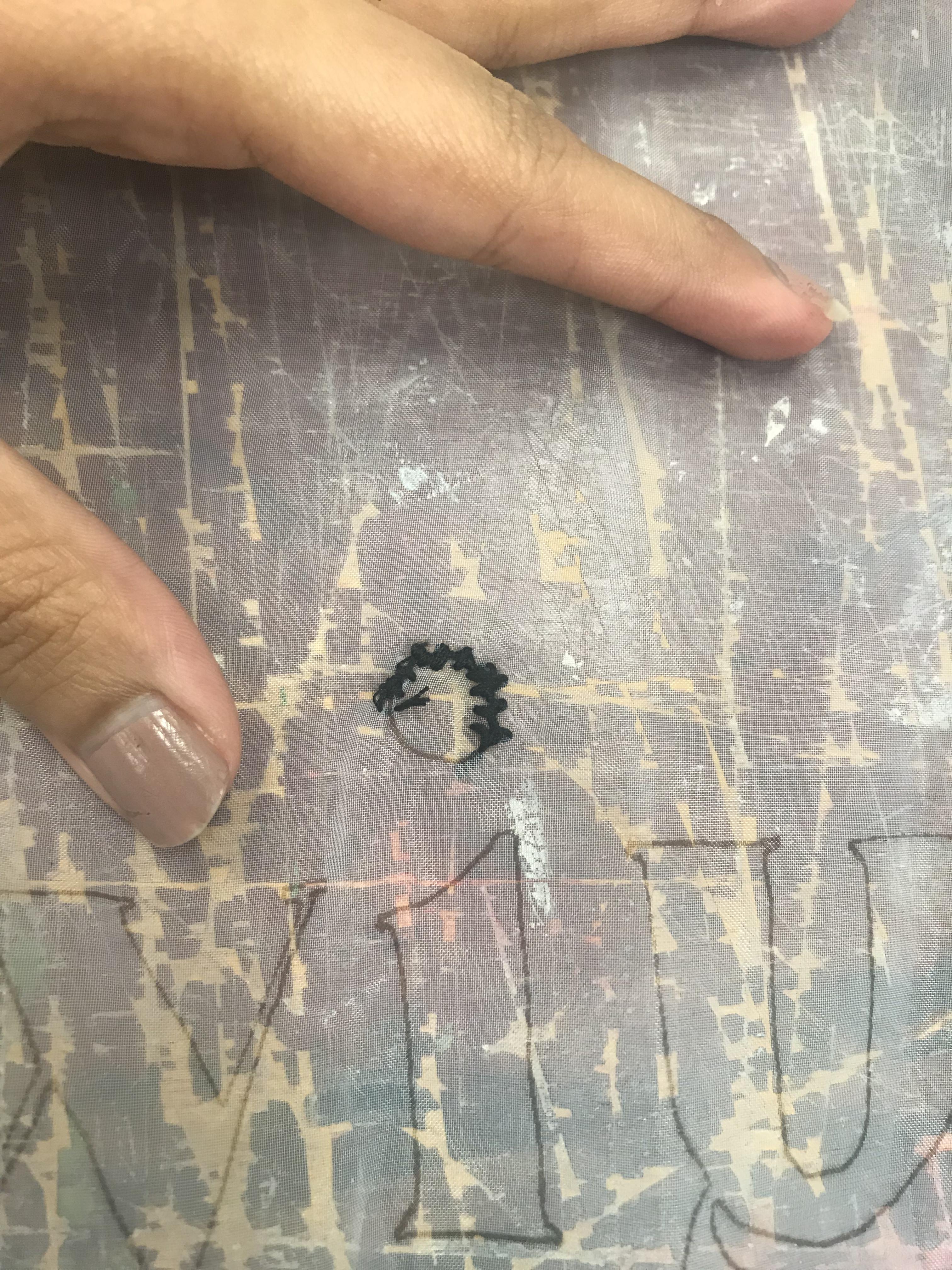
LETTER ‘I’
Inspiration:
I used fabric, ribbon and beads for this and created a silhoutte of a dress. I added embroidery knots along the dot above I in a neutral colour, again playing with the idea of a harmonious collection to ensure that it delivers the association to runway fashion designs. The silhouette resemble a model wearing my “piece”, dot above the silhouette also resemble the head of the model to emphasise the idea.
Detail:
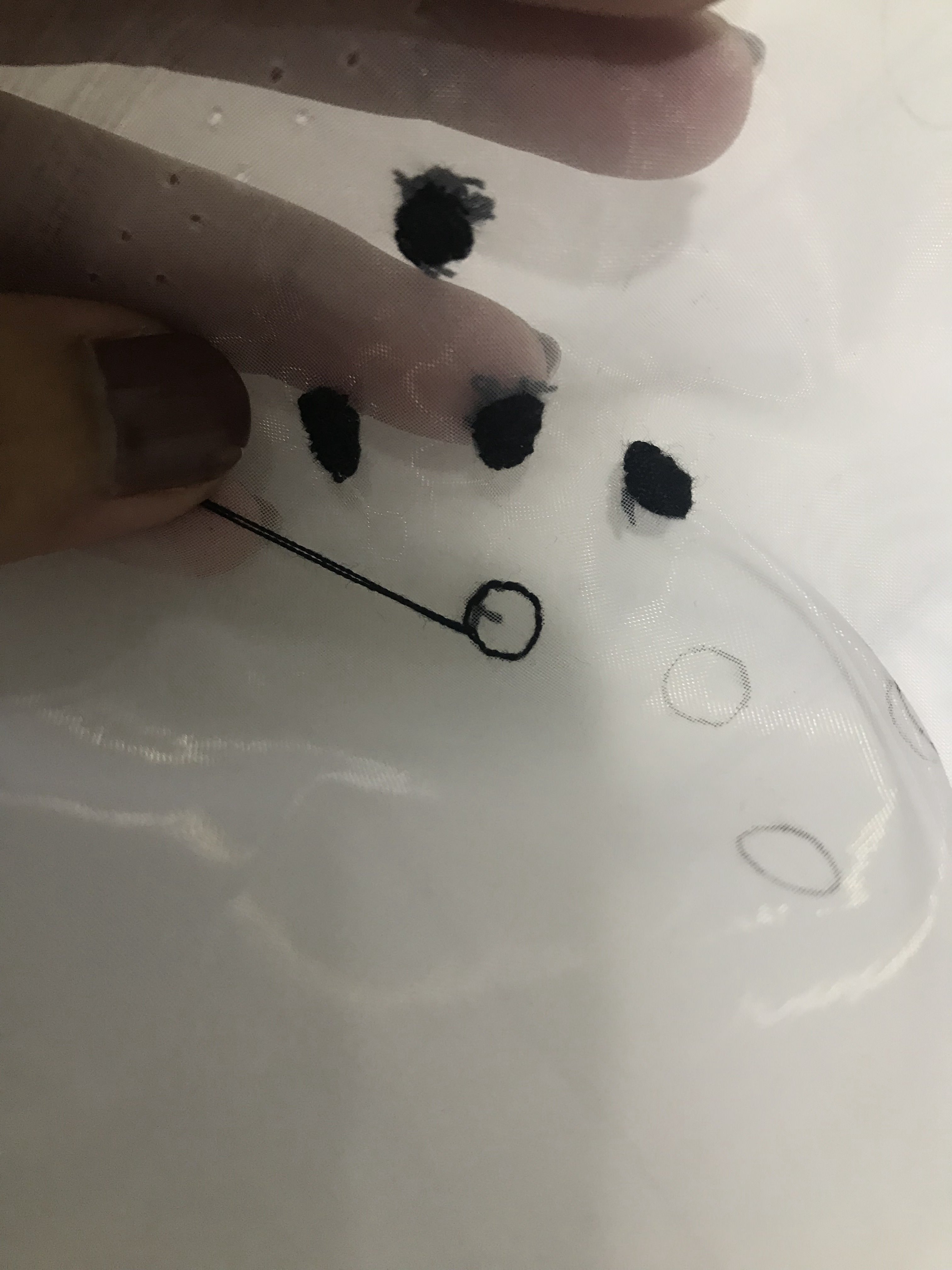
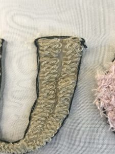
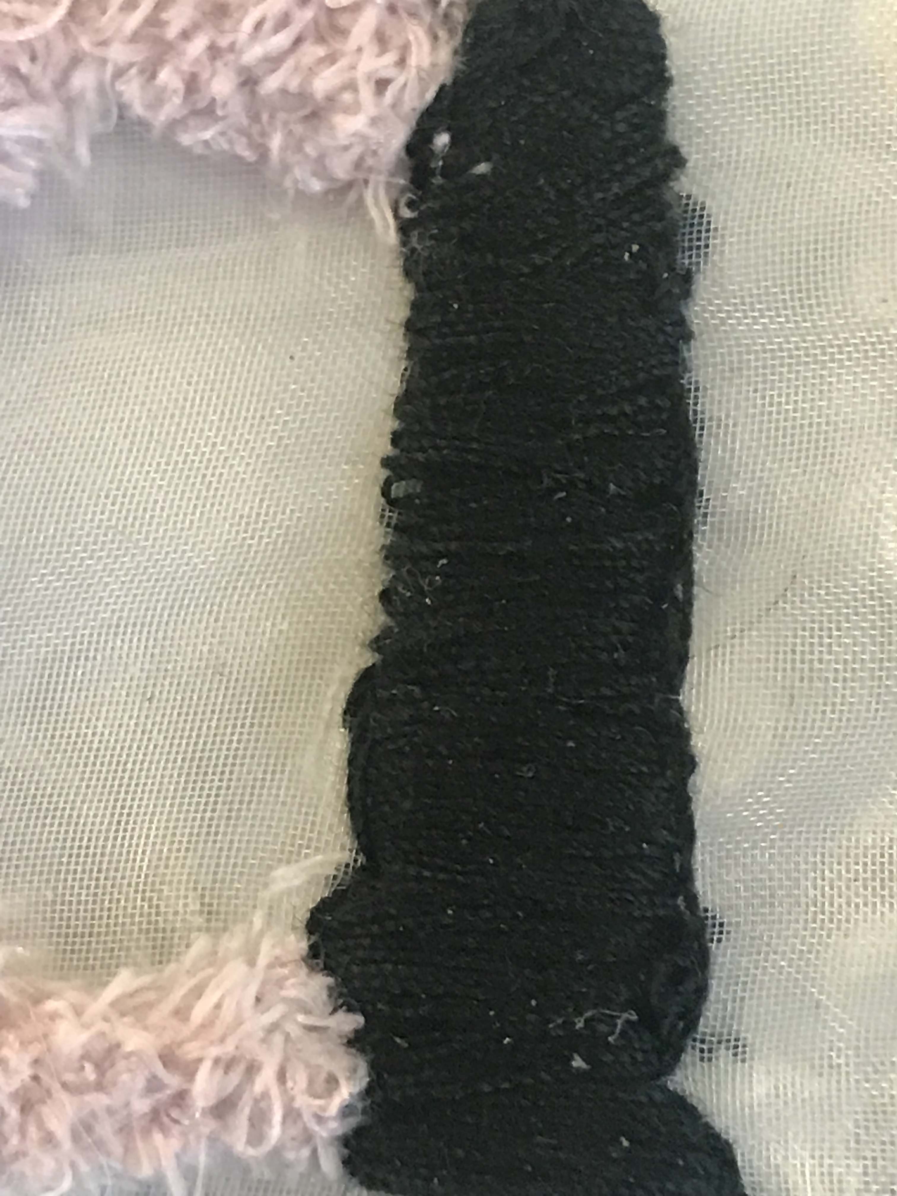
LETTER ‘Y’
For this, I wanted it to be filled with interesting embroidery to insinuate a fabric type. I learnt am embroidery technique called, Braid Stitch or Cable Plait Stitch.
Reference Video:
I tested it on the separate piece of organza before attempting it on the final piece.
Details of my embroidery:
LETTER ‘A’
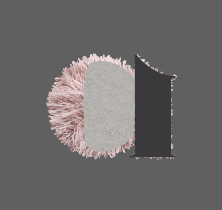
I decided to have a pop of pink colour to represent my personality and identity to my “collection” since I do love the pale-pink colour.
I cut out the fabric from my fuzzy socks to retrieve a furry fabric. This also added texture to my “collection” to make it more interesting and appealing to look at. I stitched the fabric to fill in the curved part of the A.
As for the stamp of the letter, I used linear stitching of fabric. To create a raised texture, I added more thread through the needle. This is to match the fuzzy fabric of the curved part of the letter.
Details:
LETTER ‘H’
Finally, I decided to add polka dots to the letter H with black thread, again using the idea of having a unified “collection”.
I drew circles, stitched around it and filled it in with thread. This was also teted beforehand on the separate piece of organza.
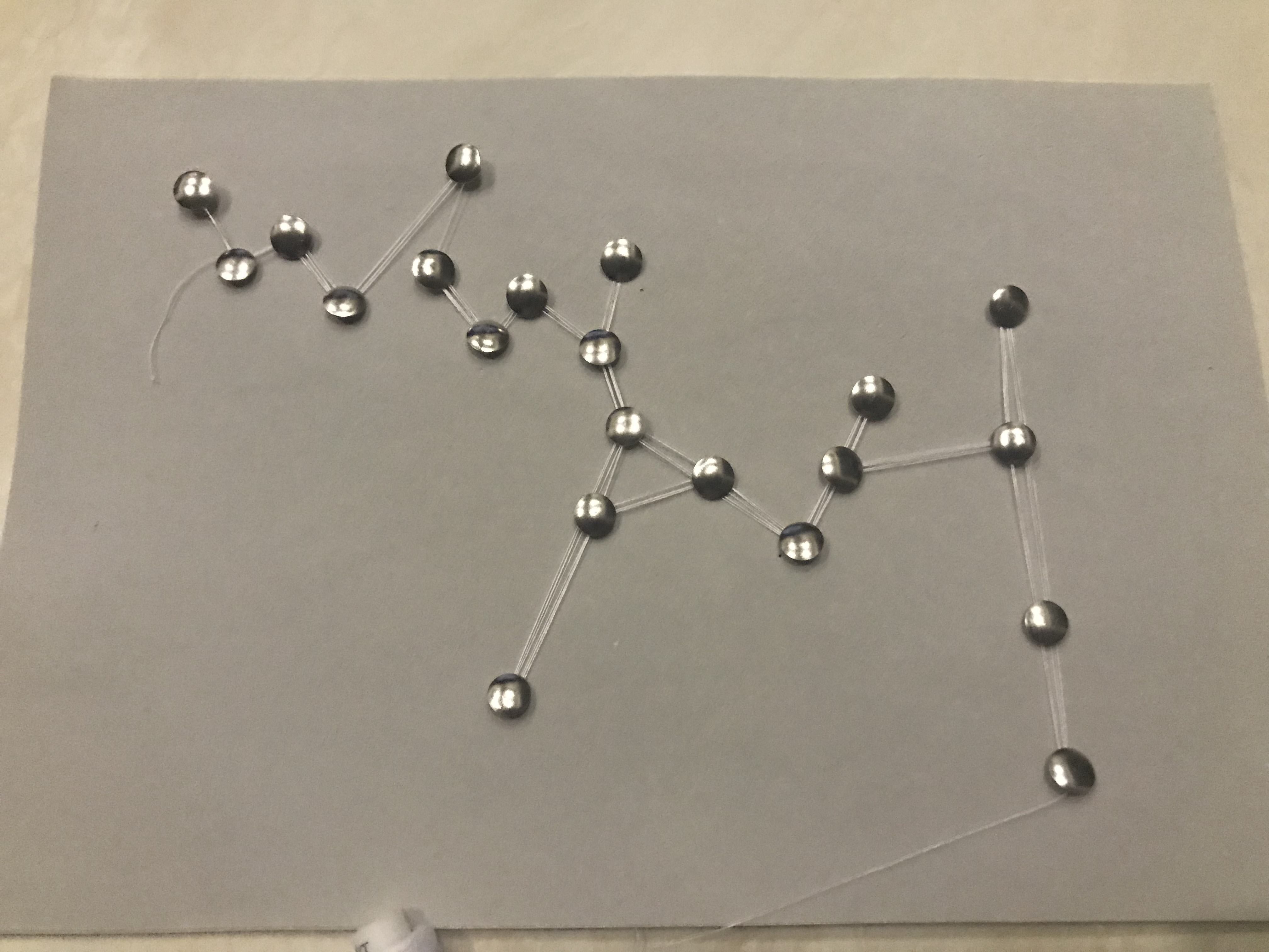
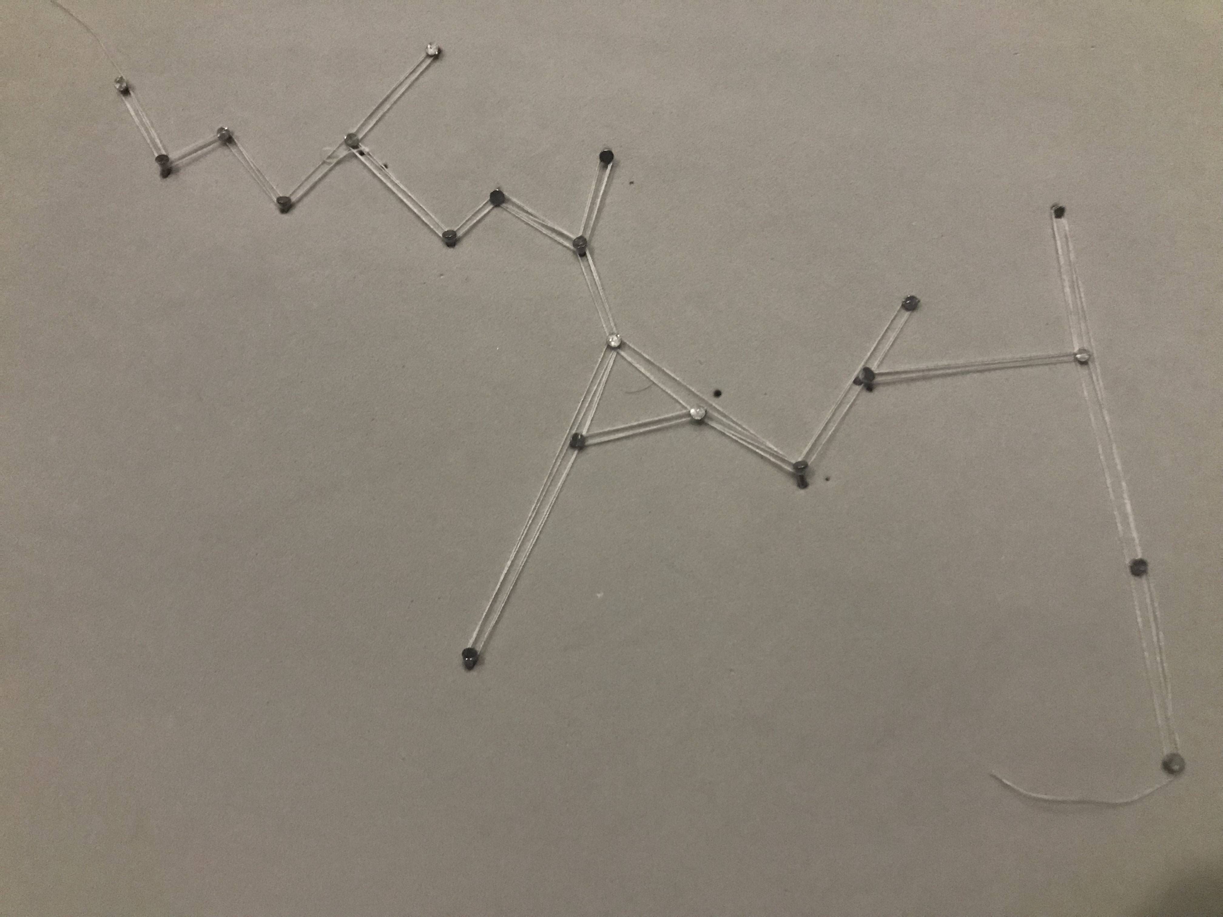
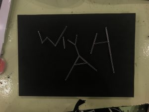
7. ASTRONOMER [Confirmed Image]
For this, I played around with the idea of constellations. I’ve always been drawn to stars and what’s beyond the Earth, galaxies, etc. I asked around and generally, people do agree that constellations do make them think of the galaxy.
Therefore, creating visual associations using constellations would infer the world of Astronomy.
Whilst researching, I already had an idea in mind where I wanted this to particularly be string art to project constellations.
Inspirations:
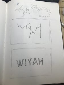
I started sketching different compositions as follows:
Upon consultation with Mimi, I decided on the 2nd sketch as it looked more interesting and customised in composition and type. For this image, I did not have any font references. I decided to have it all in upper case as they look more angular which served this purpose (string art) best.
I practiced on felt board to see how my idea would’ve worked out. I used thumbtacks and realised it was far too big to execute my idea. Hence, I changed to regular screw pins.
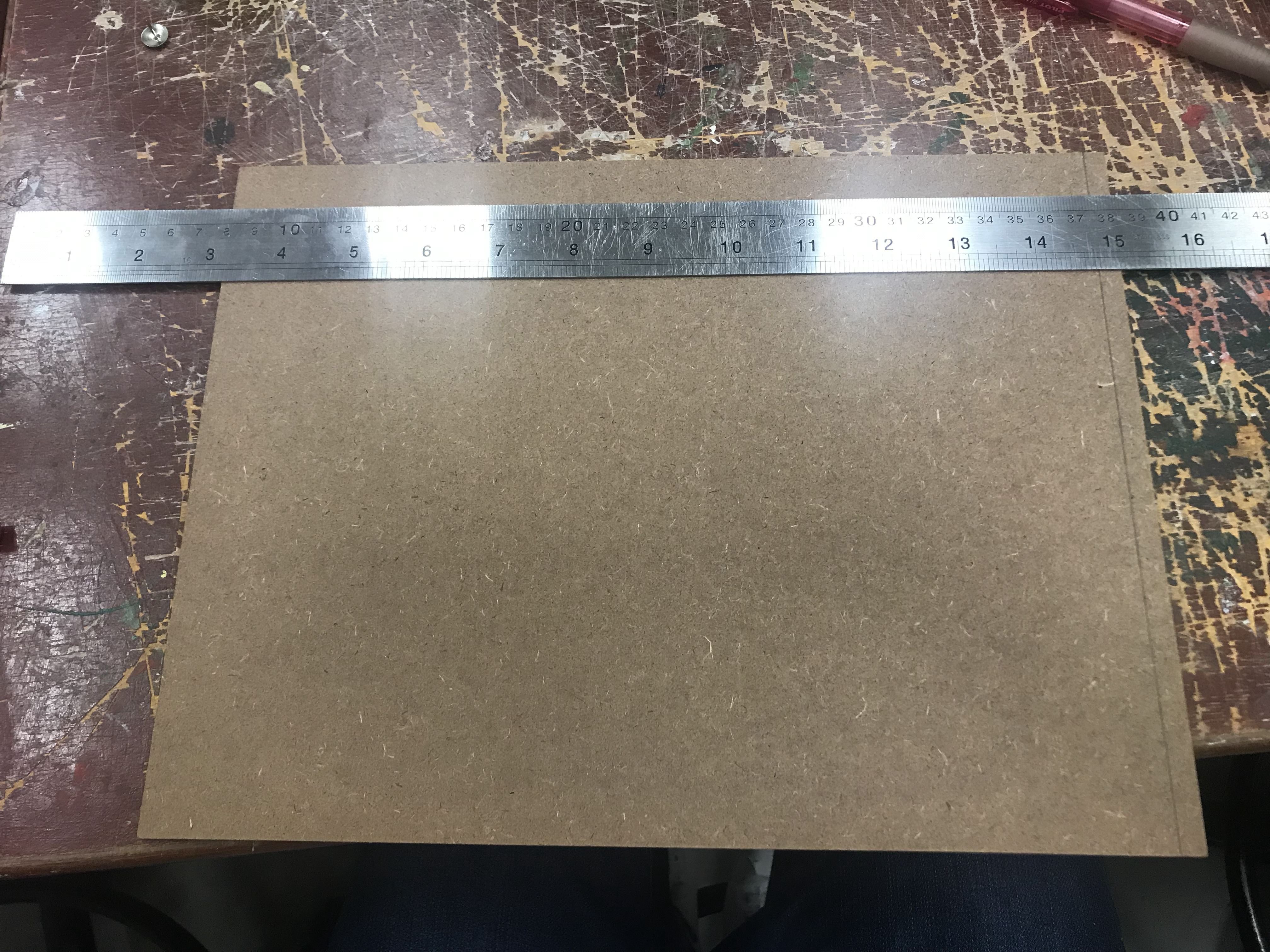
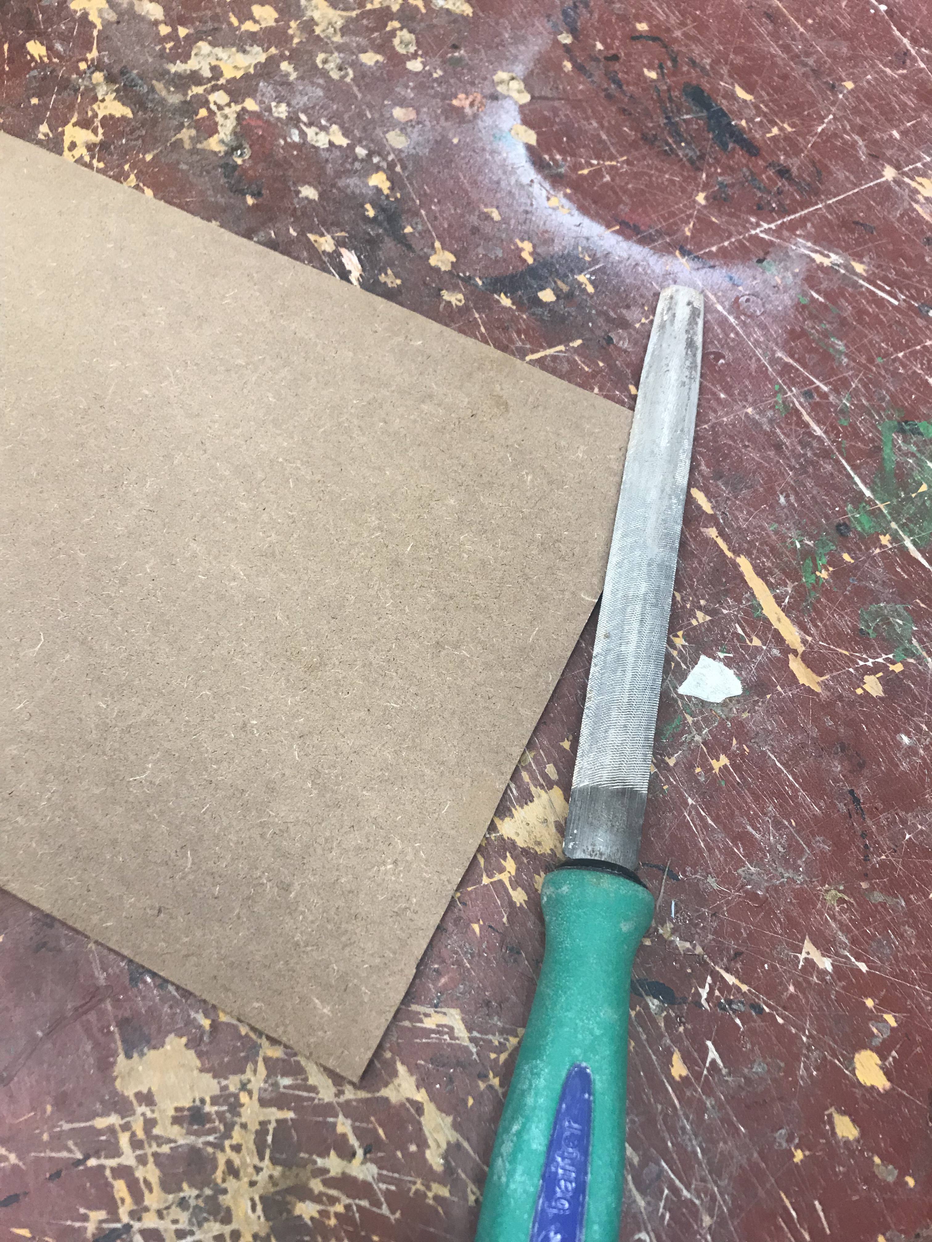
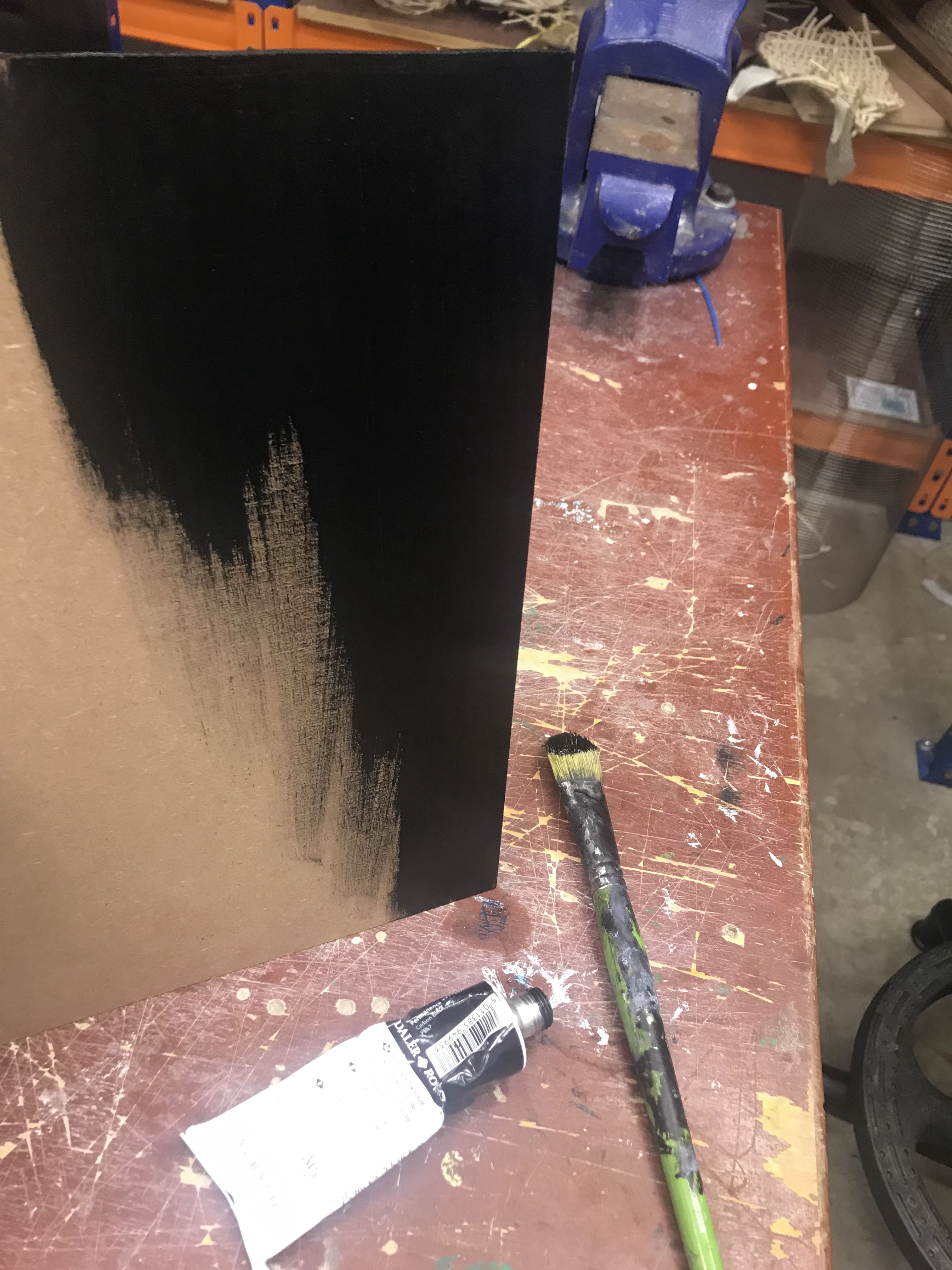
I got an MDF Board and had to cut it down to size and file to create a smooth outline. After which, I painted it black. The reason is because the Galaxy is known to be very dark, almost black (as seen above).
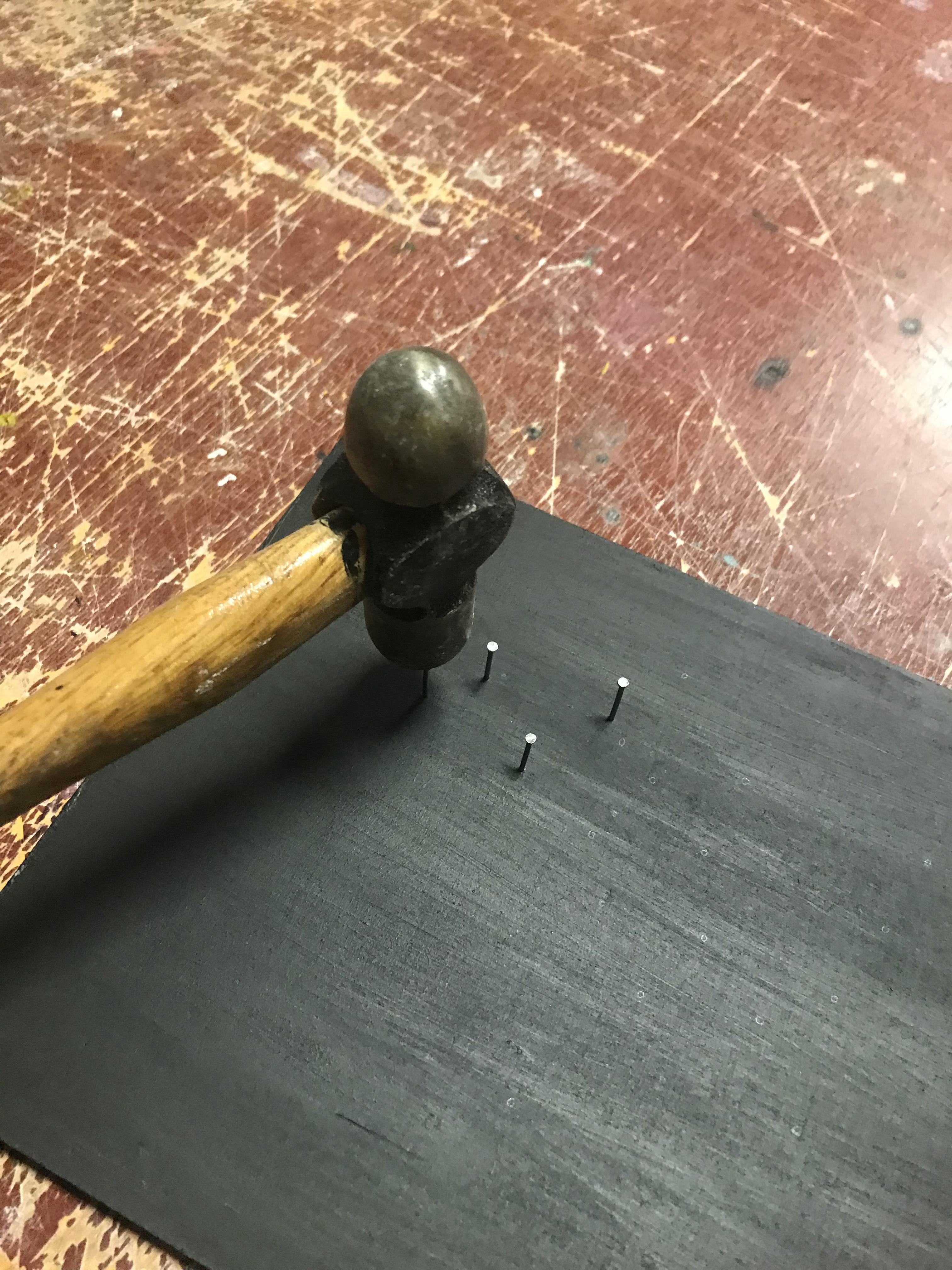
While waiting for it to dry, I cut down a foam board that I bought to act as base for the MDF board. Two A4 pieces were stacked on top of each other. This is to allow the nail to push through and not land on the other side of the board which create a neater finish.
After which, I proceeded to mark the areas I wanted to hammer nails in. This was a challenge because the placements of the points were purely instinctive.
I then coiled regular sewing thread around the points and this was coiled a couple of times to make it slightly thicker than I originally planned.
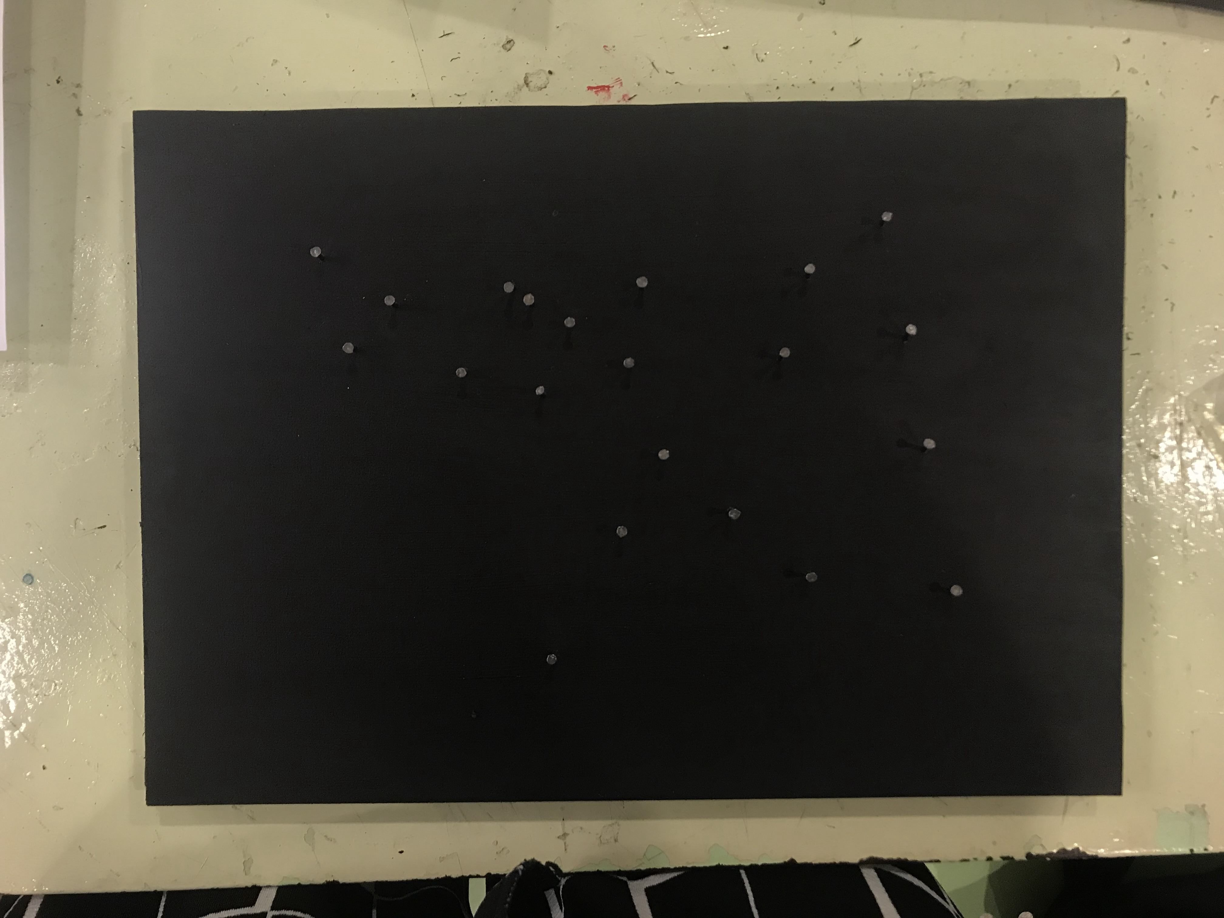
I wanted this to go minimal in design for this but this turned out to be way more plain that I had anticipated. Therefore, I decided to add specks of white and blue paint as the background to create depth. These mainly act as the millions of stars seen in galaxies.
I tested the use watercolour and flicks of the toothbrush on a black surface. When I was ready, I started doing it on the board. This helped to amplify the idea and imagery of galaxy which relates back to Astronomy., together with the constellation of my text.
Assignment 2A is broken down into 2 tasks. Task 1 is Object Studies which is the one that will be covered in this post. Unfortunately, I wasn’t well and could not make it for class. Therefore, I had to try and pick things up via the internet. Thankfully, we did Orthographic Projection studies before in class which aided me in completing some parts of it.
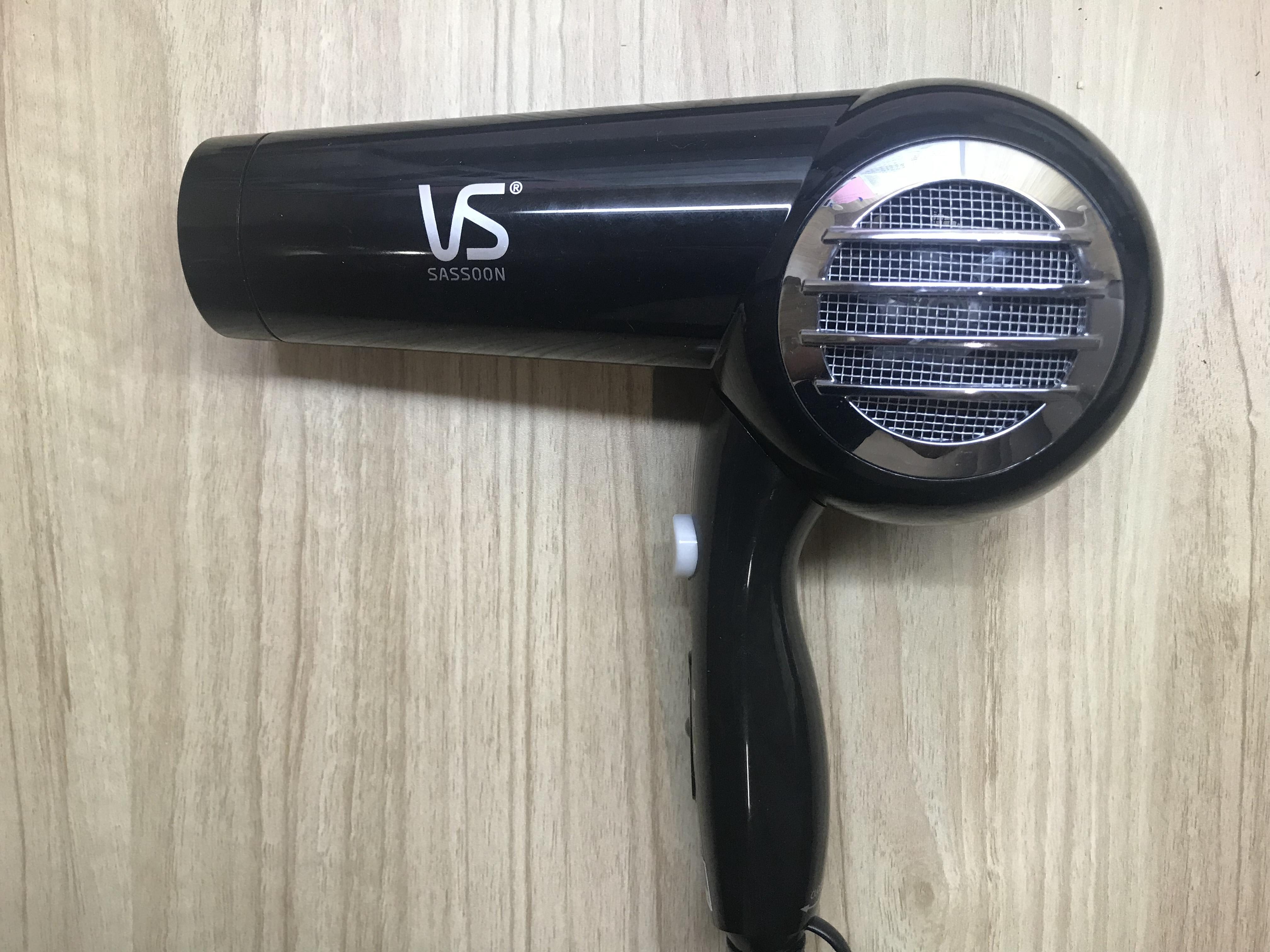
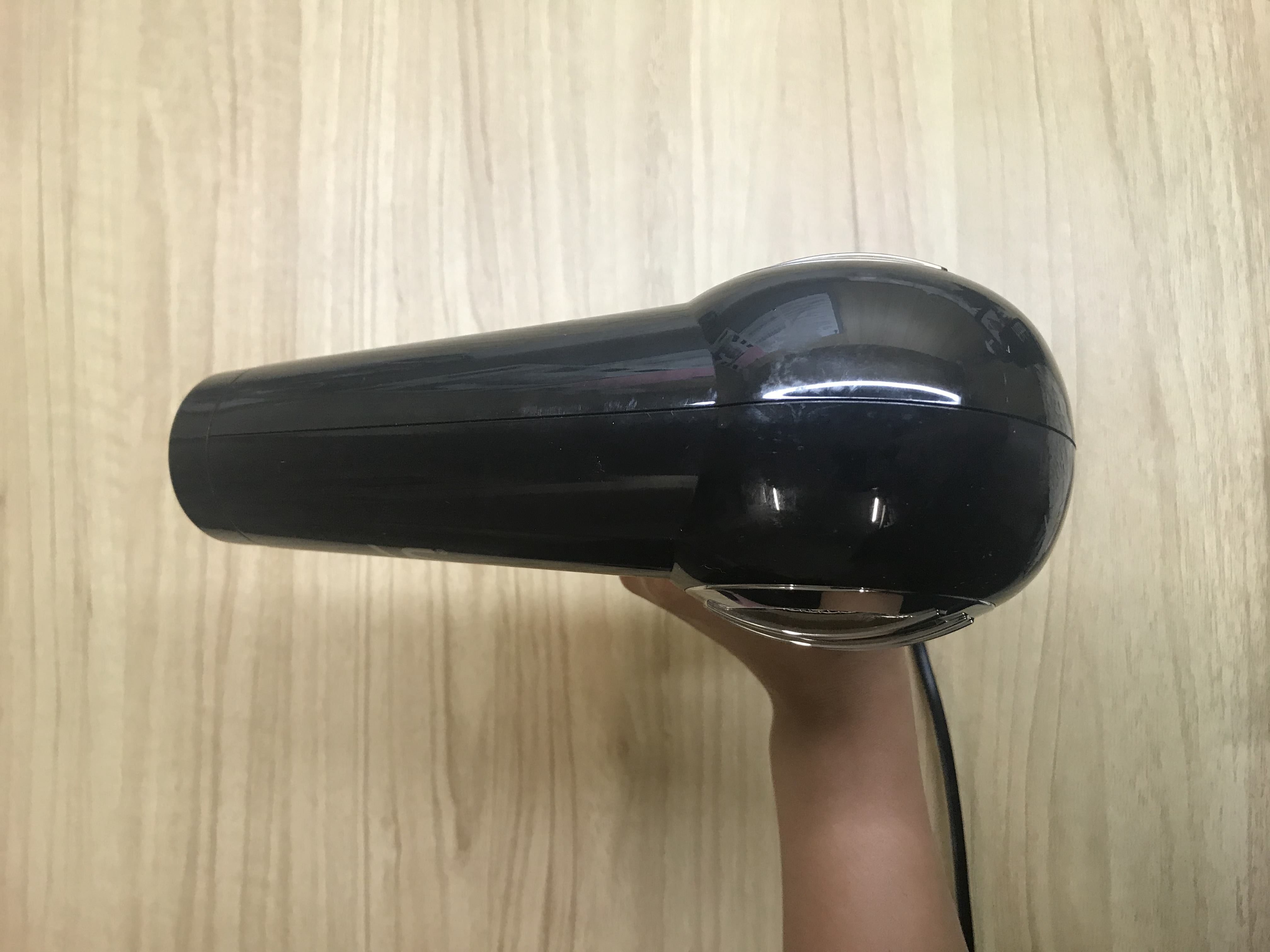
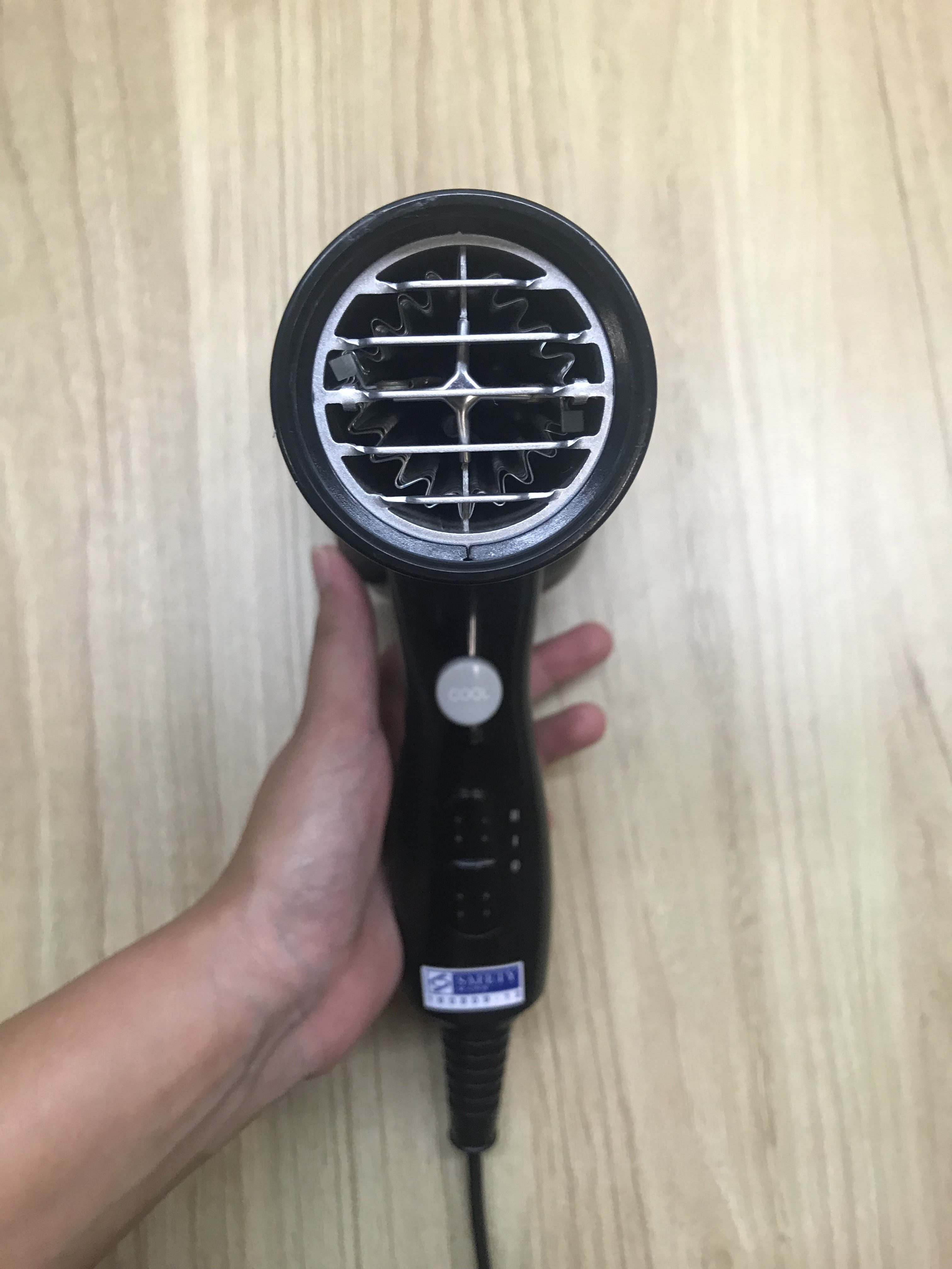
Task 1 requires us to study the form of a chosen object that is either held, worn or carried. I chose a hair dryer as I figured that it would be quite interesting to study.
Side
Top
Front
I attempted the Orthographic Drawing of the Top, Front and Side View of the object. I scaled it down to 1:2. I started off by breaking down the hair dryer into 3 parts. Then, I measured the length, height, diameter (if need be) and pen it down on the graph paper along with a rough mini sketch of the dryer. I then divided these measurements by 2, measured and drew it onto the graph paper. I start with light sketchy lines and darken it as I got the the shapes out. The easiest way for me to get the measurements out, since the hair dryer had a lot of curves, was to lay it down on graph paper and mark it out. From there, I collated the measurements and did the maths.
Example of marking out the measurements of the object
The challenges for the Orthographic drawing was definitely drawing the curvatures as well as getting the details in. The base of the shape was also not easy to achieve. I had to be very systematic in the way that I work in that I had to attempt things, one at a time and get all the measurements right first before moving on. This allows me to get the proportions, sizing and scaling, more or less the same.
Next, the second part to Task 1 is a 2-point perspective drawing of the same object. This was the one that was most challenging to me since I was also absent from class. I can’t seem to visualise perspectives and therefore, putting it down onto paper, in proportion has always been a problem for me. I decided to watch some videos online and mimicked the tips given.
I sketched a lot of circles that helped me visualise the shape better. This took multiple tries before I was somewhat satisfied with the base shape. The problems I had were mainly the proportion and also the perspective of the circles.
This is Part 2 of Assignment 2A which was done in pairs. I was paired up with Ik Hwa.
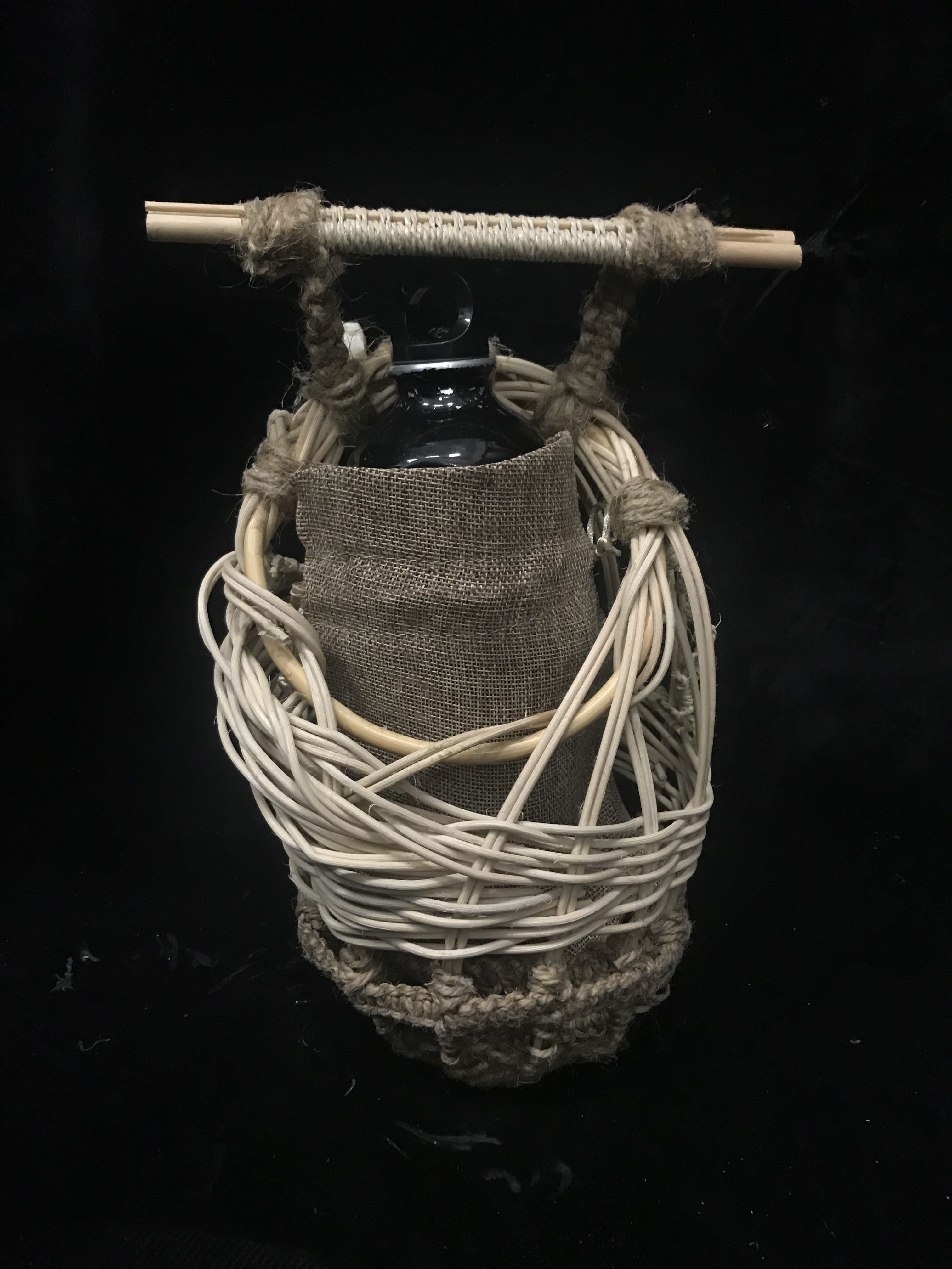
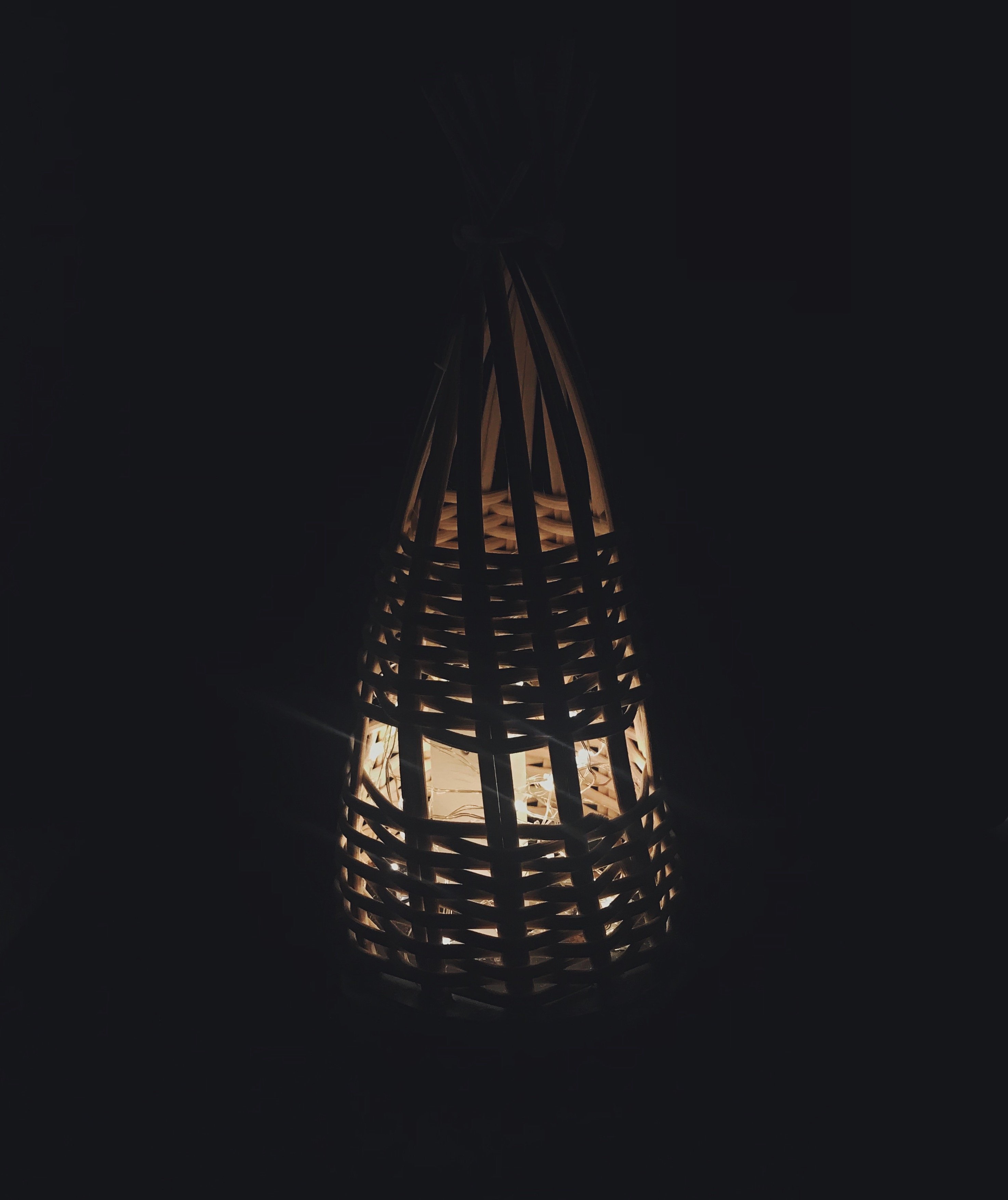
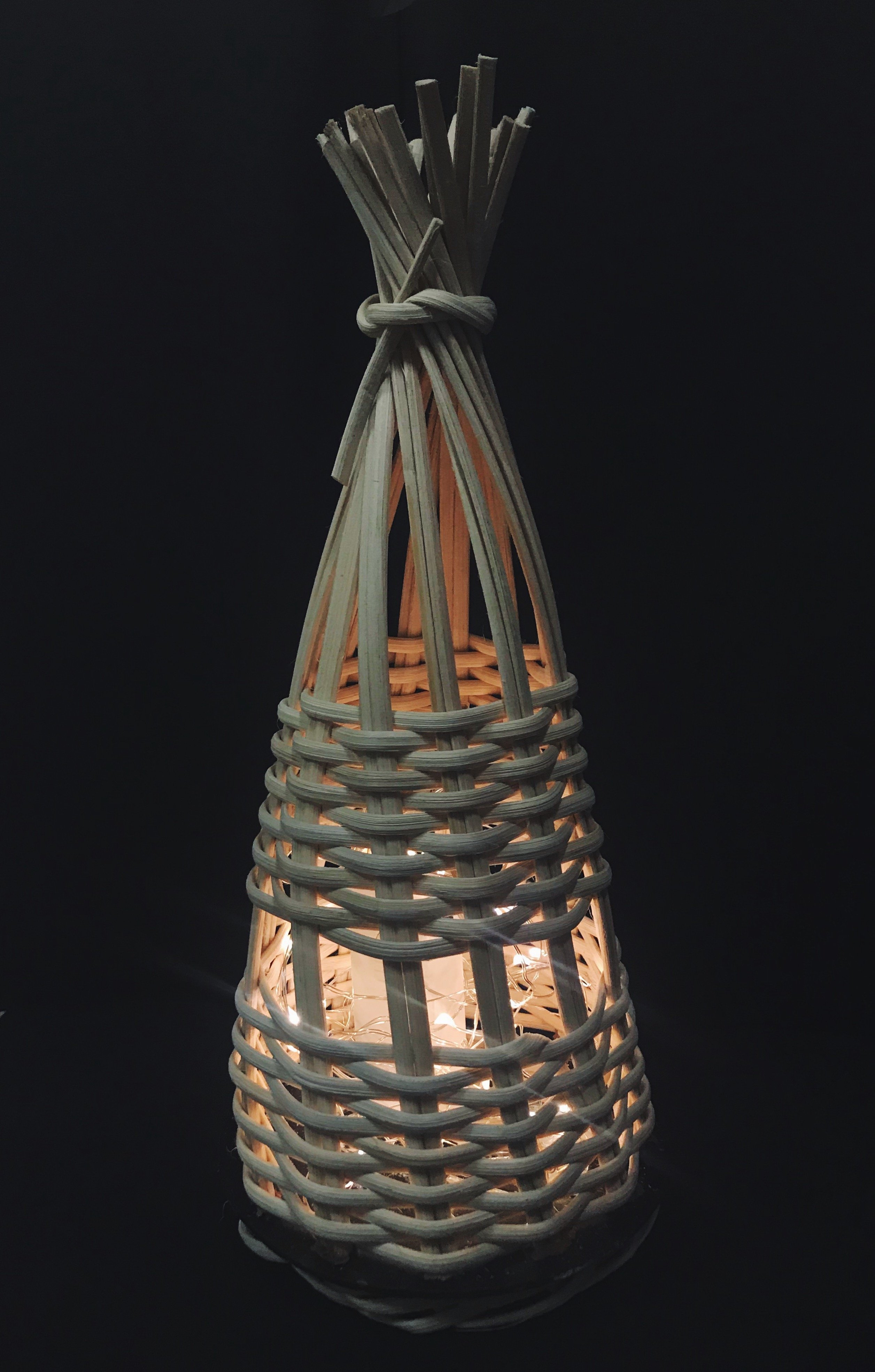
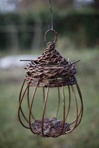
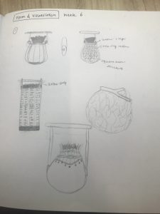
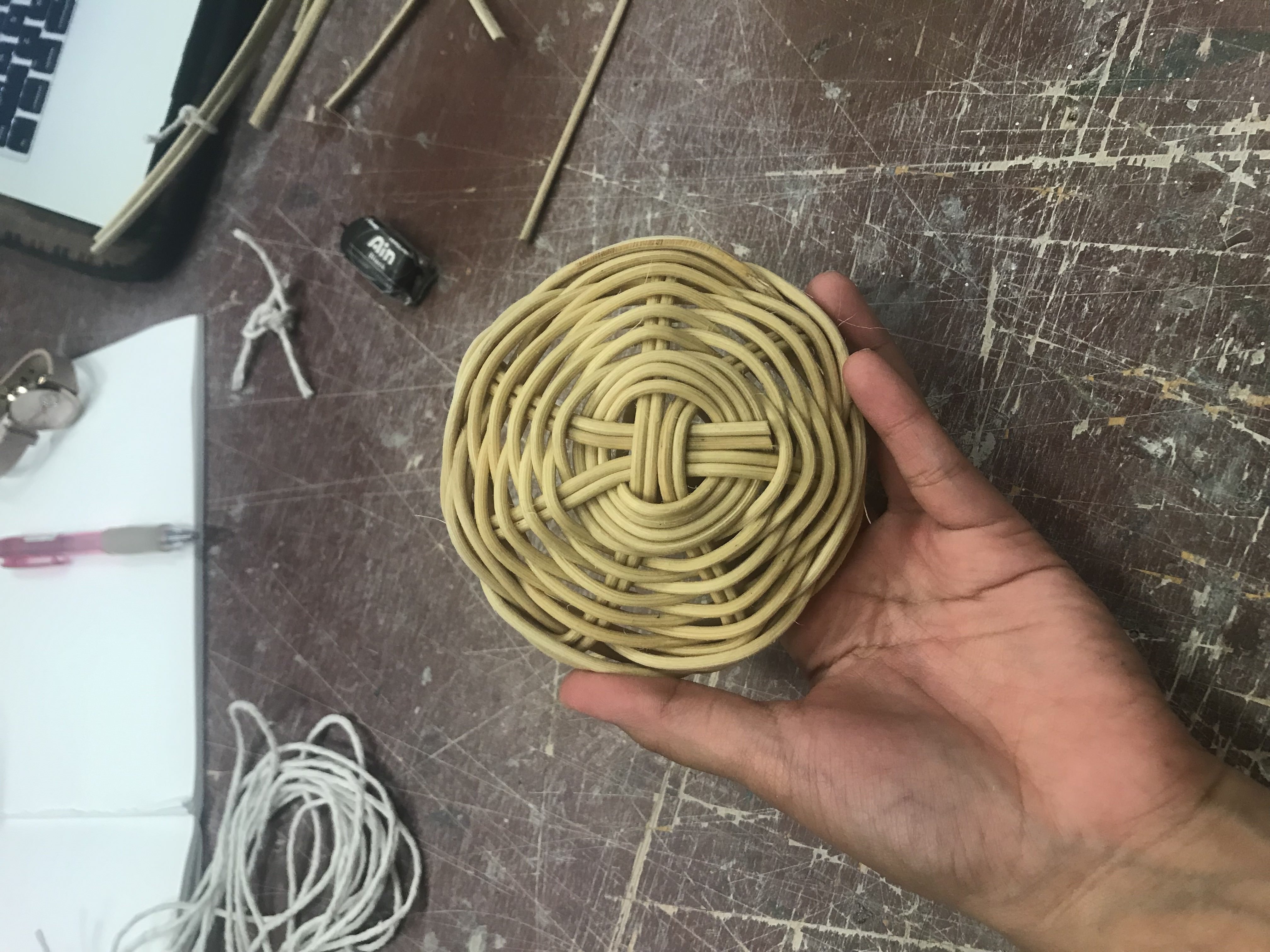
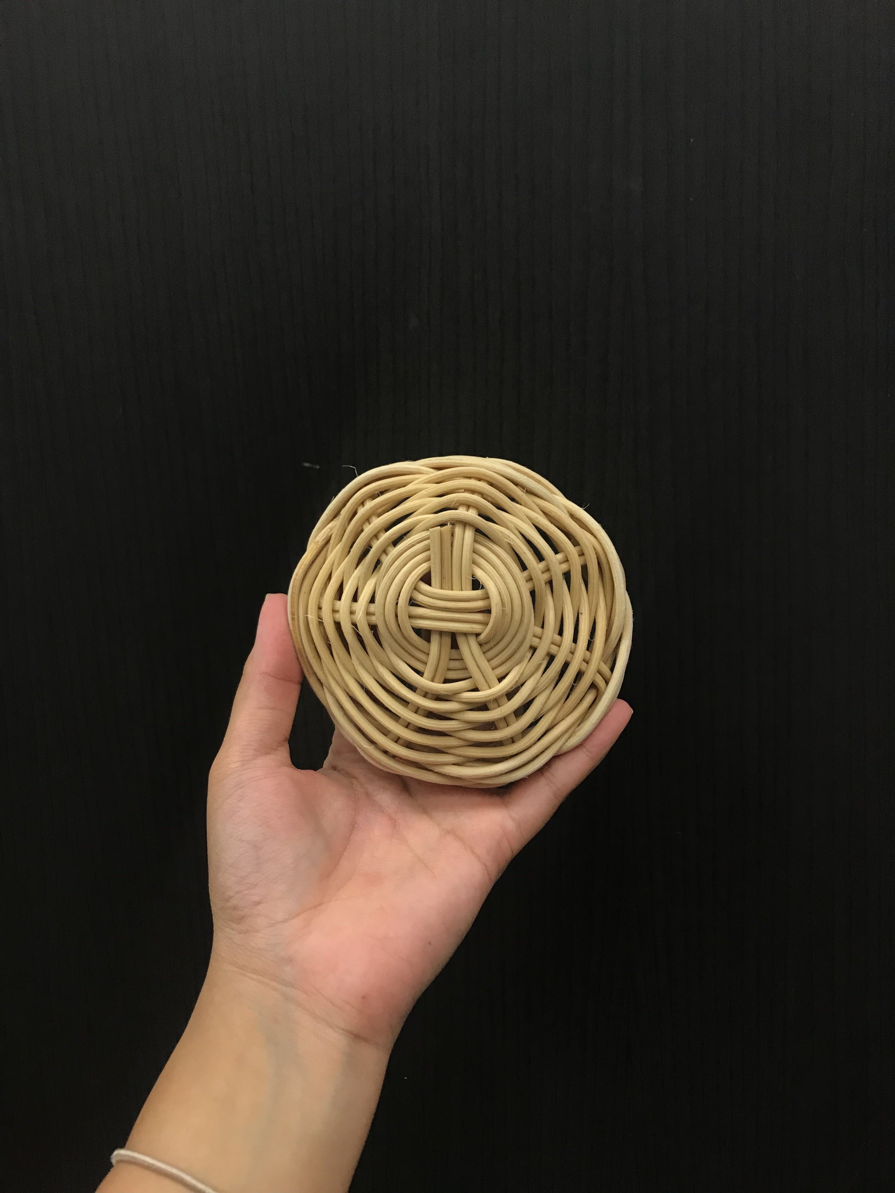
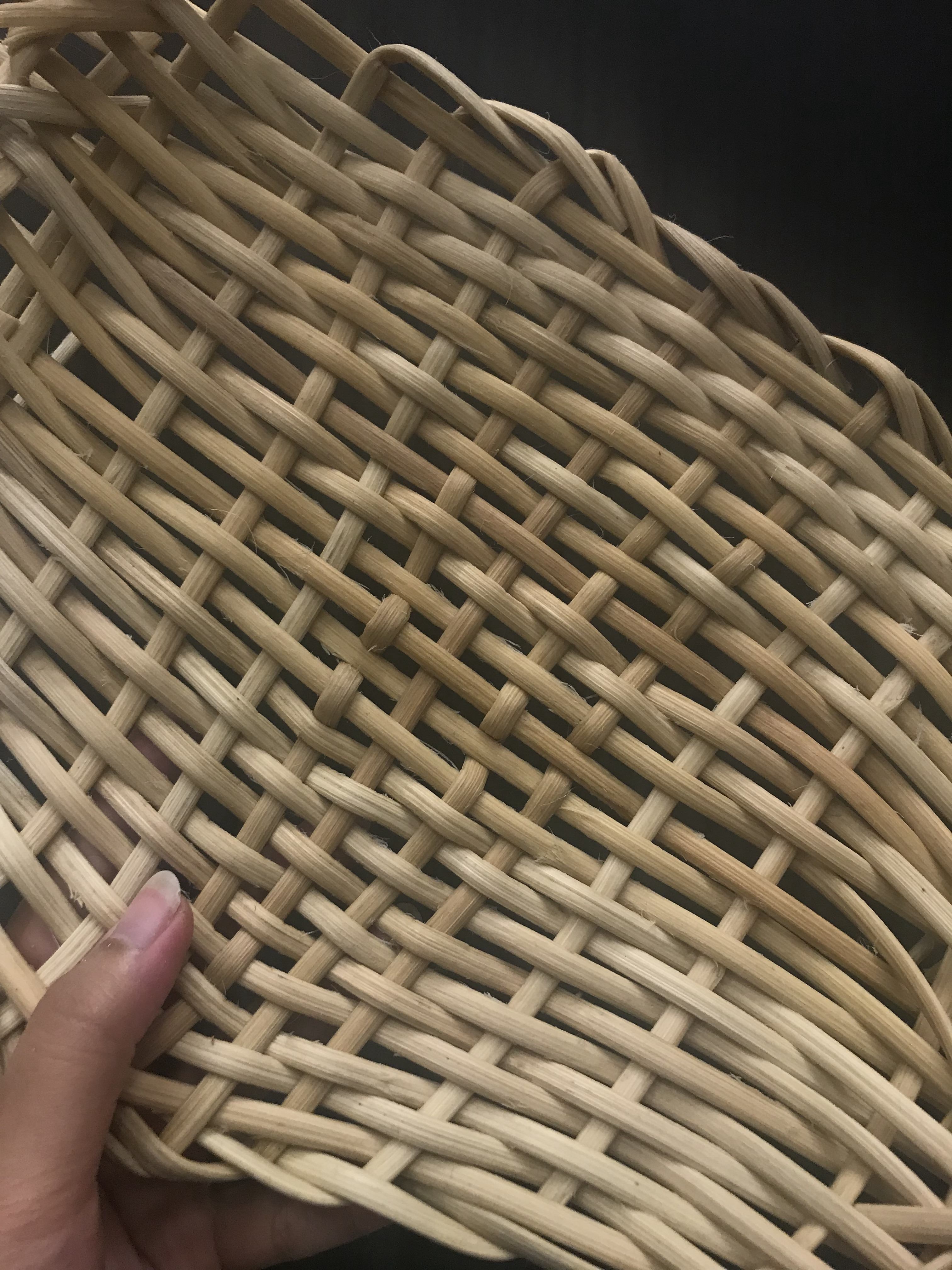
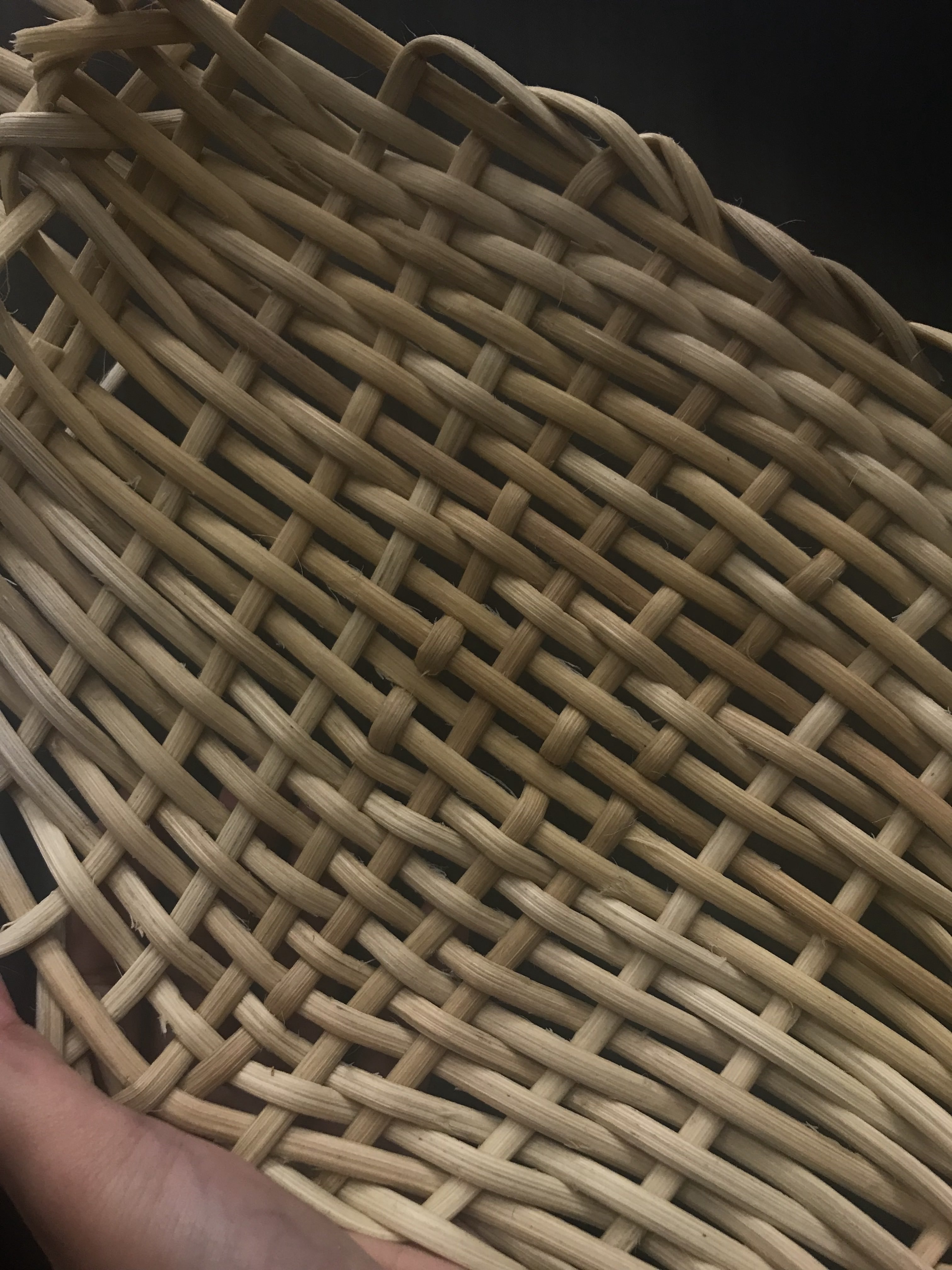
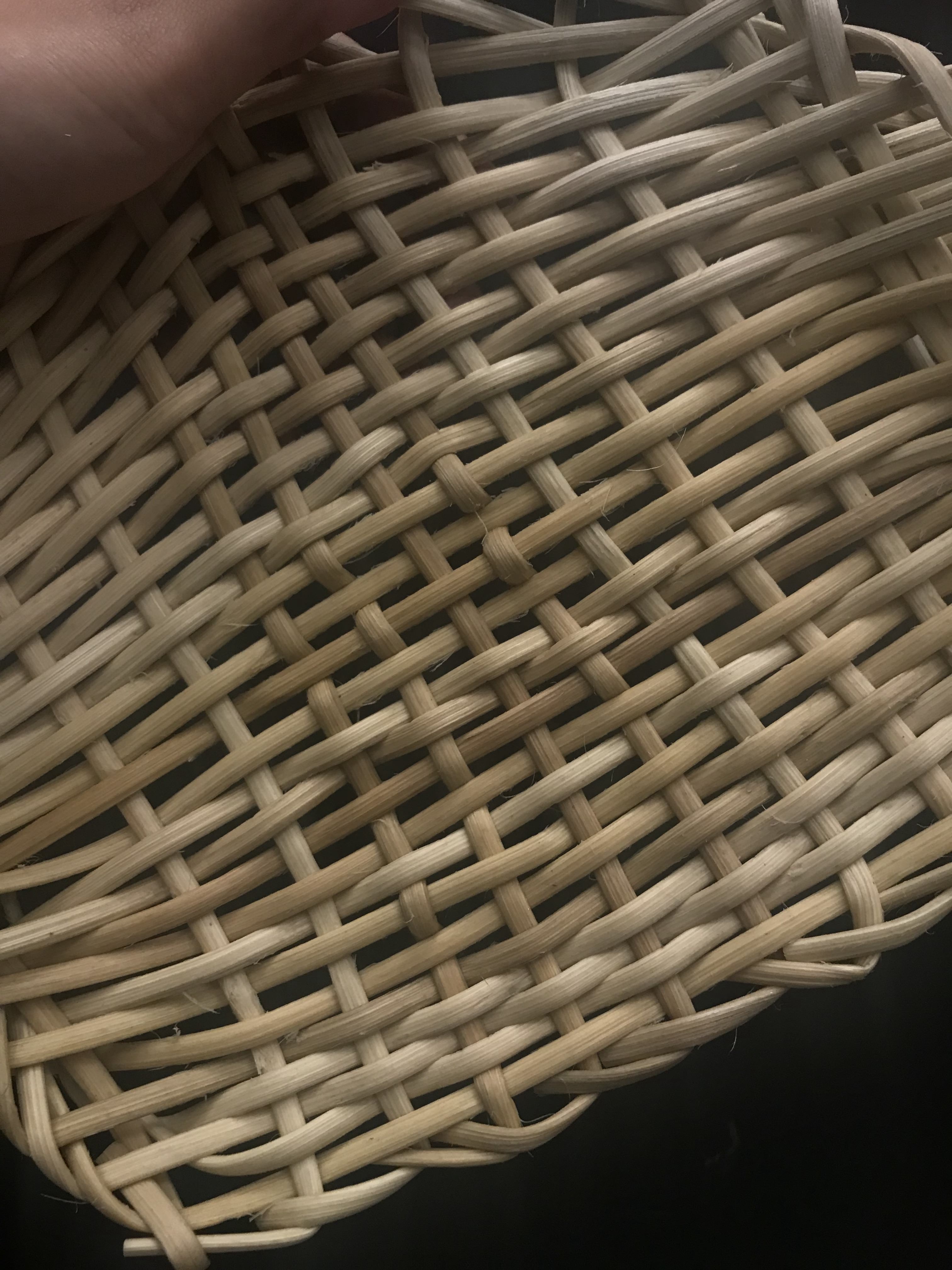
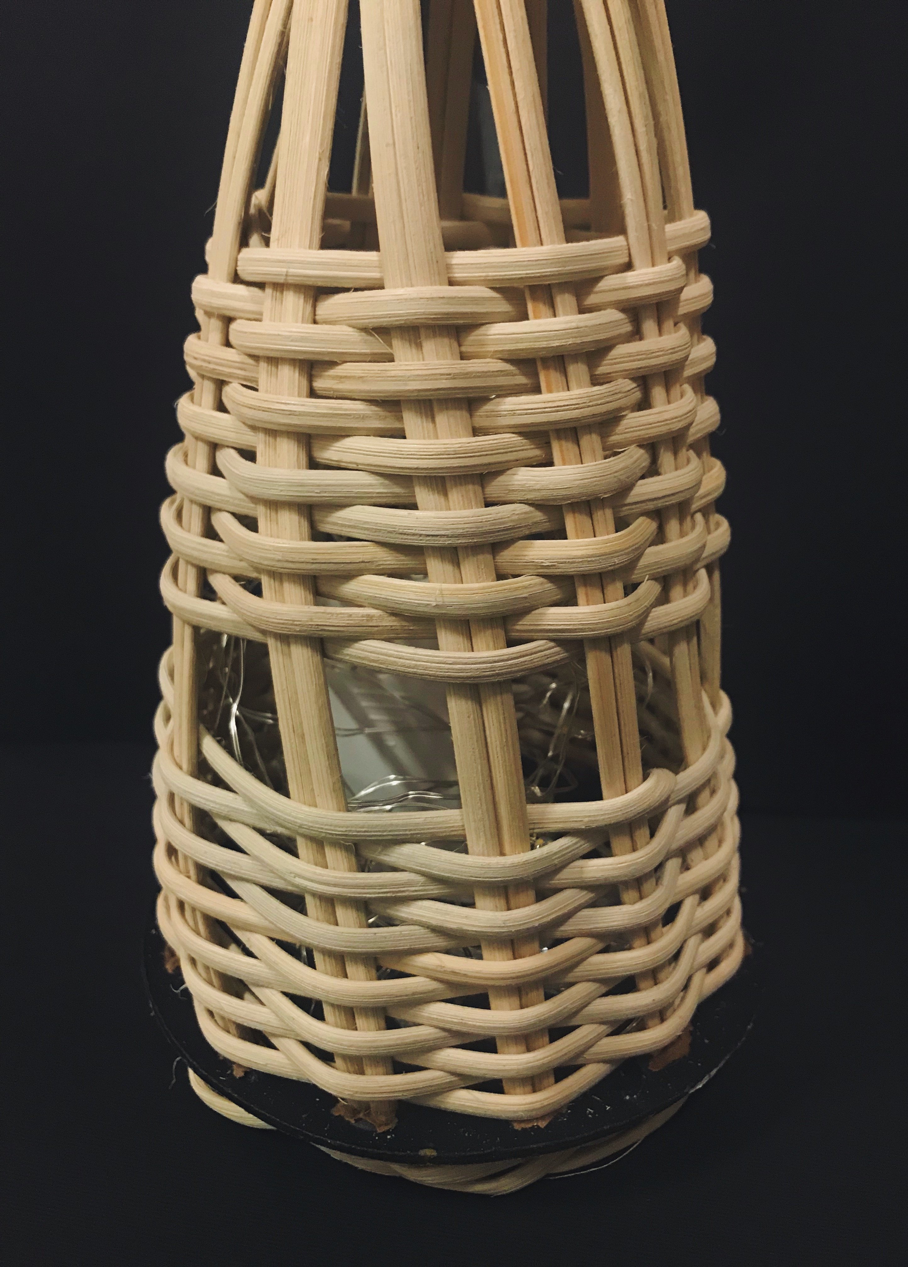
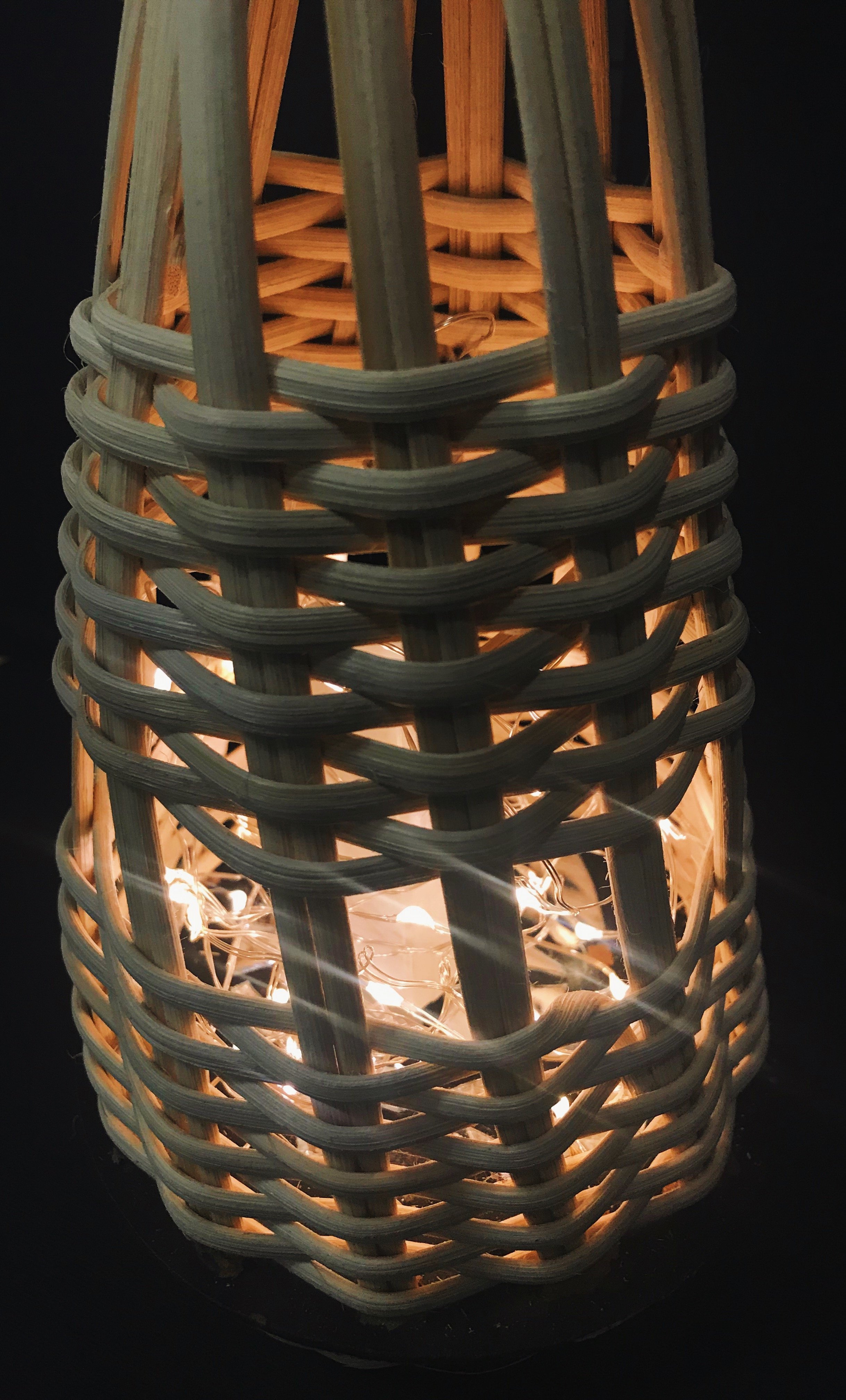
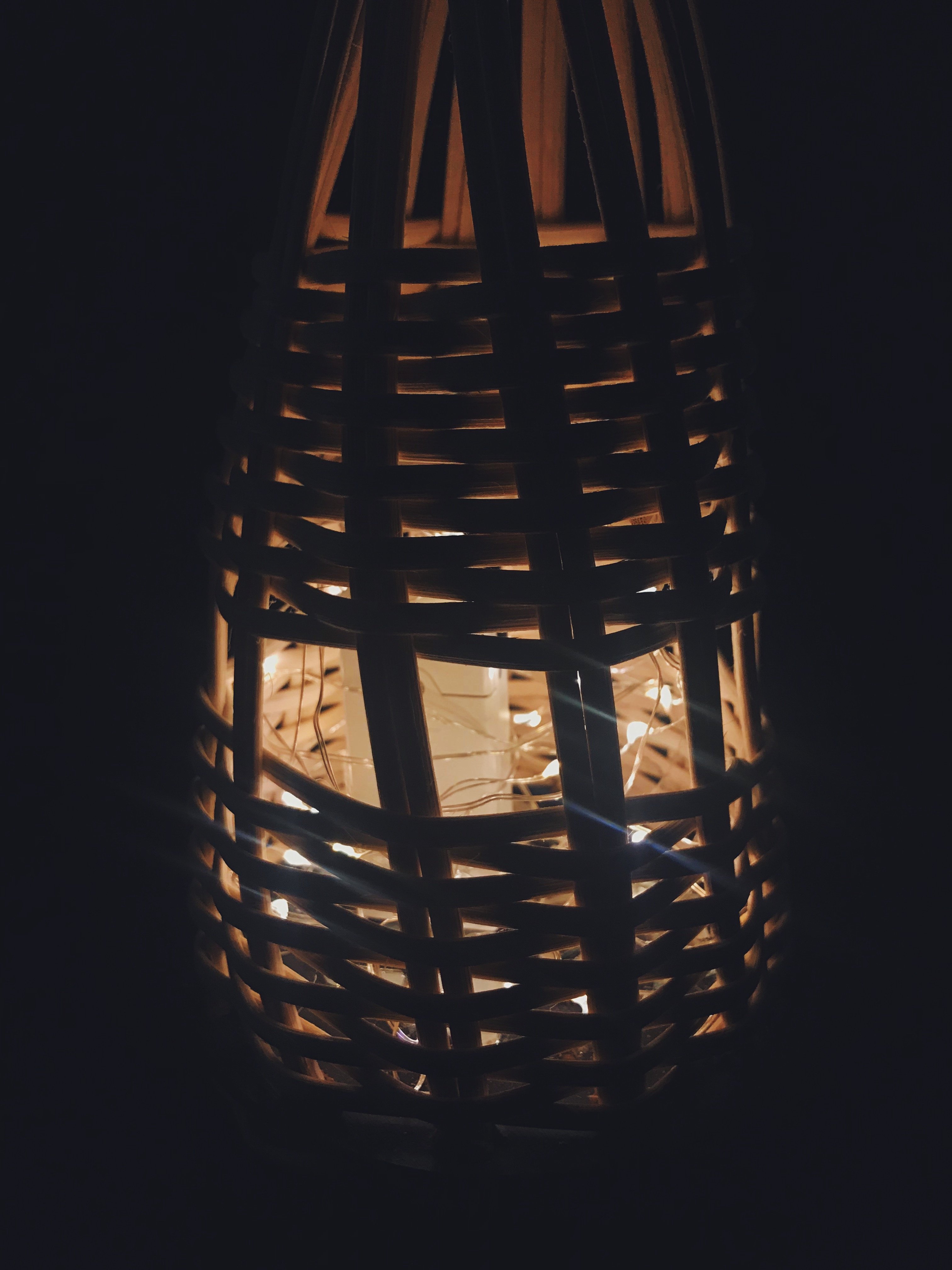
Going into this, both Ik and I had no clue as to where we should even begin as we were both inexperienced in weaving. We started off by doing our own self-studies by watching videos provided by Sherry. We explored other videos when we met up to attempt the project. At first, we contemplated between the Hexagonal and Octagonal Pattern. However, as we went on with our research, we realised that the Octagonal Pattern was a little too ambitious as a first attempt. In contrast, Hexagonal was a little too simple and we want to attempt a pattern that was somewhat challenging but doable. Upon pinning several images on Pinterest, we both decided that we were going to settle for the Pine Needle pattern.
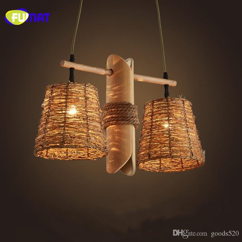
Looking through our Pinterest pins, we realised we were both drawn to the lanterns/light 3D pieces. We felt that the Pine Needle pattern would suit what we were going for as well. It will allow the light to be emitted through the tiny spaces. It also fitted the aesthetic style we were going for.
2D
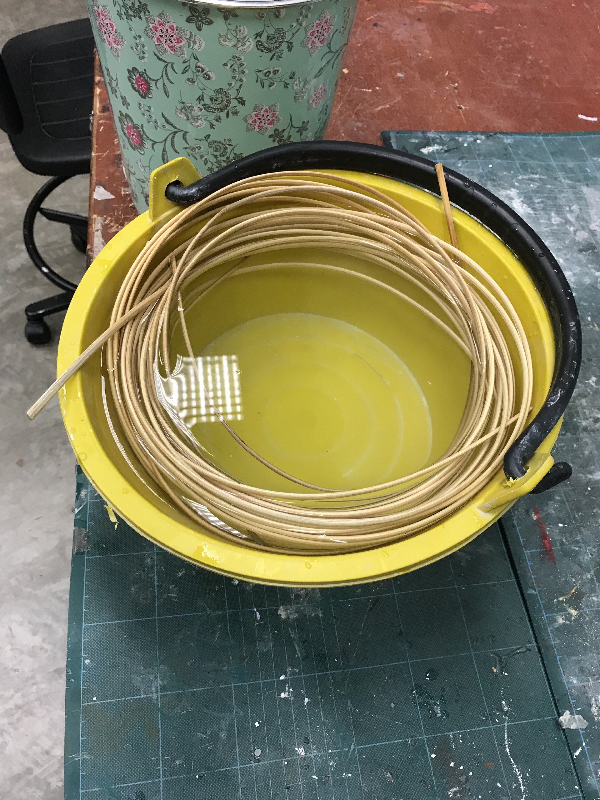
We soaked the rattan provided by Sherry into water. This helped soften and moisten the rattan to allow it to be bent into shape without much fraying and breaking. The idea is that as it dries, it will retain the shape that we’ve created when it was wet and malleable.
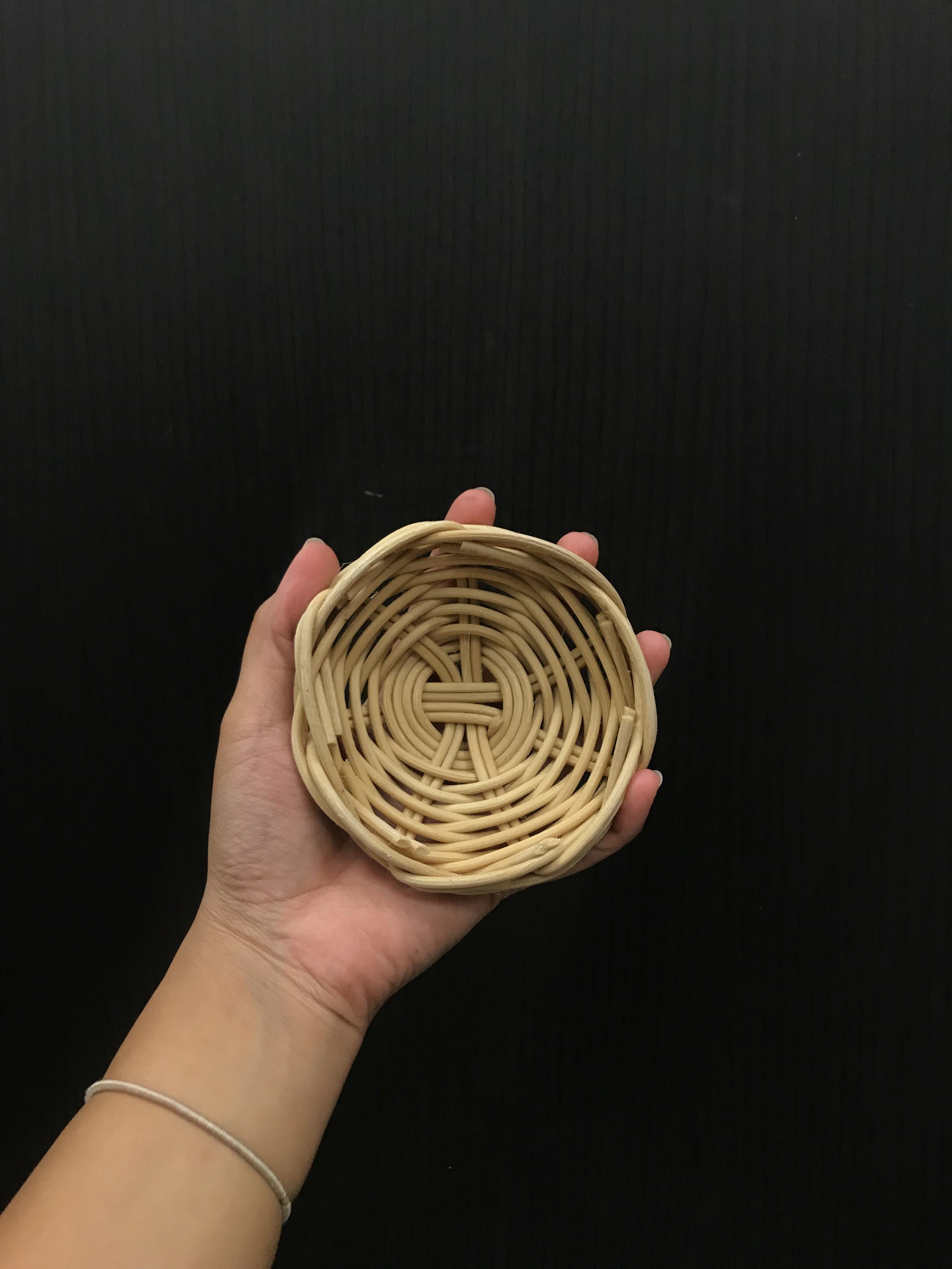
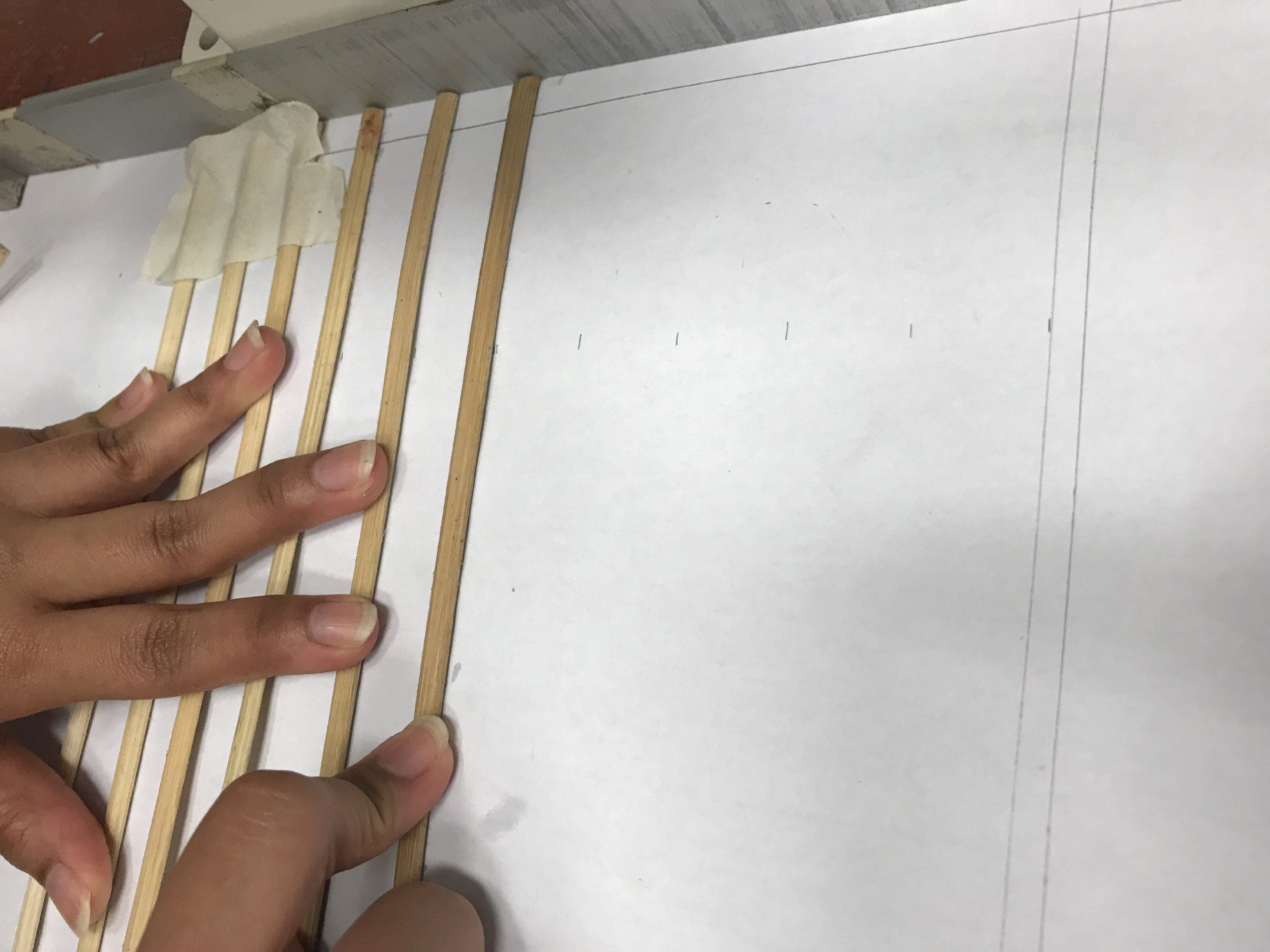
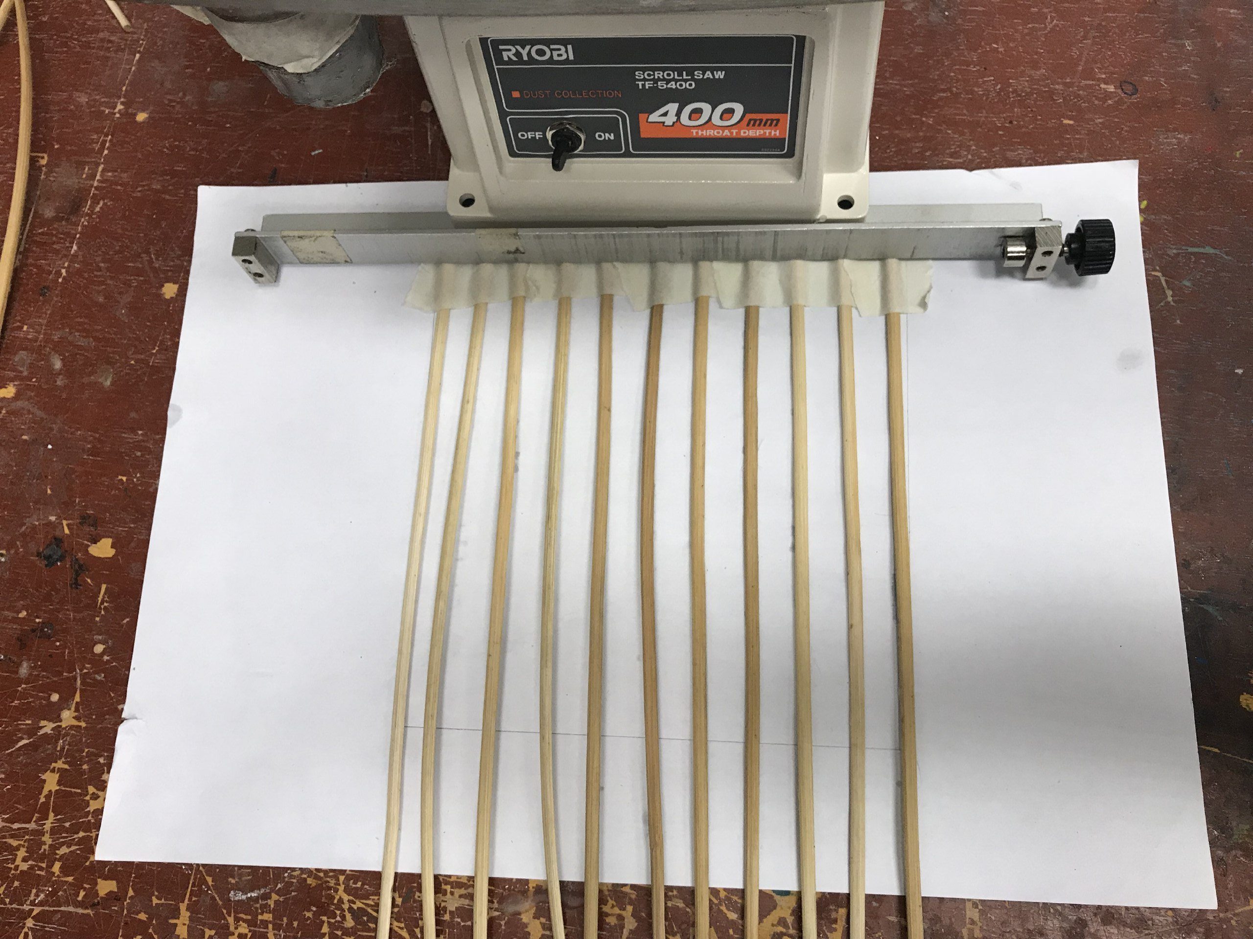
We first had to create a 2D flat weaving pattern (20x20cm) and measured our rattan strips before anything else.
We had trouble starting it off as it needed to be stuck to a strong base to be pushed into place.
Hence, we laid the vertical rattan strips in a row with 2cm spacing between each strip. We stuck it down to a piece of paper with masking tape and secured it further by placing it under something heavy.
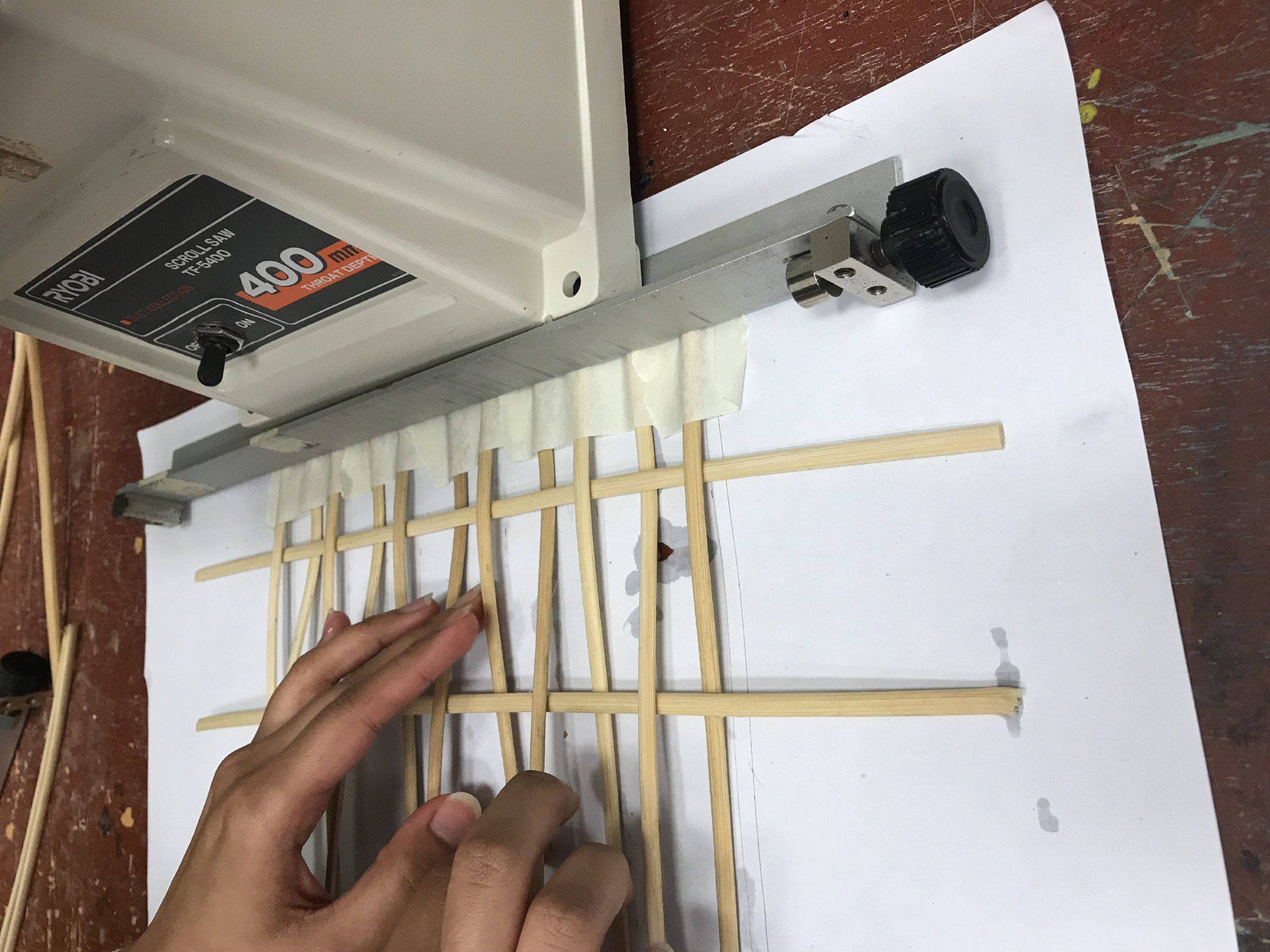
After which, we started weaving with the horizontal strips. It went well at first and the rattan strips were secured tightly to each other without much struggle.
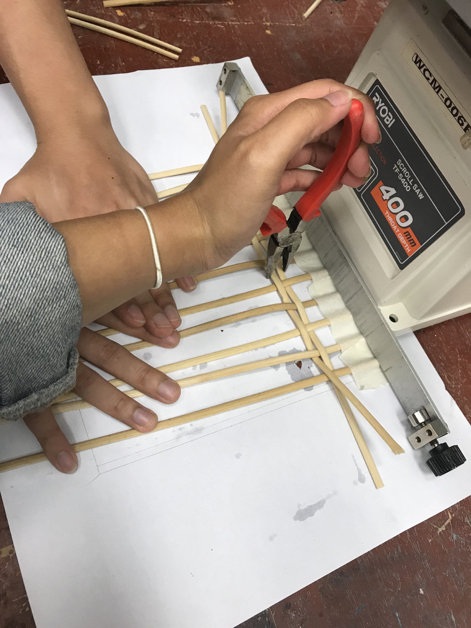
However, as we went along, it got tighter and tighter. Even after using pliers to assist the tightening process, it was still challenging and trick to get the strips to be pushed close to each other. We even tried moistening the rattan again which didn’t help much as well. The whole process was extremely time consuming.
We discovered that the reasons for this:
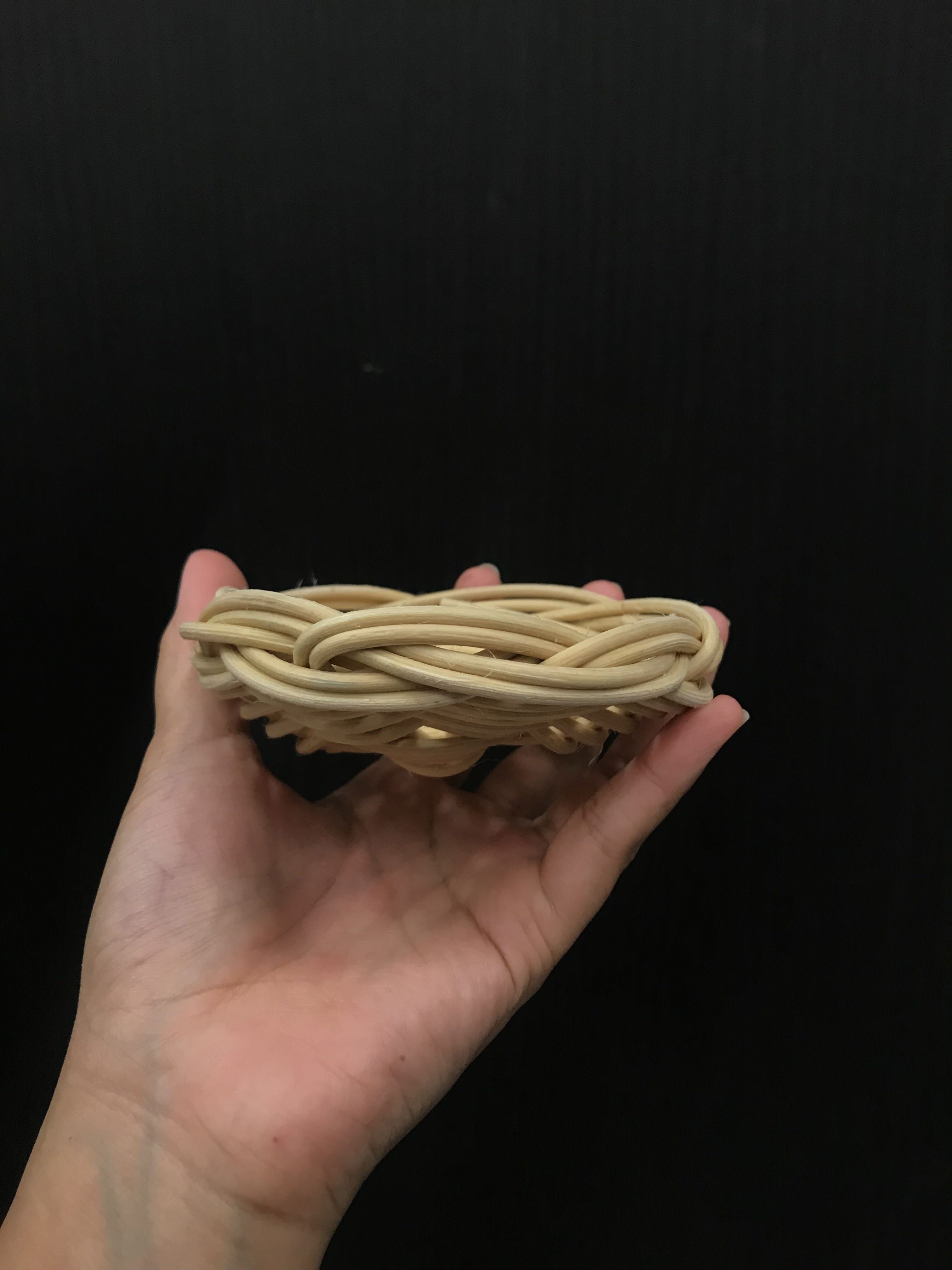
1. The vertical rattan strips were exactly the same size as the horizontal ones which did not create much space for the rattan to be pushed up and be secured.
2. The strips were not long enough which resulted in them being propped up as we went along since it got tighter.
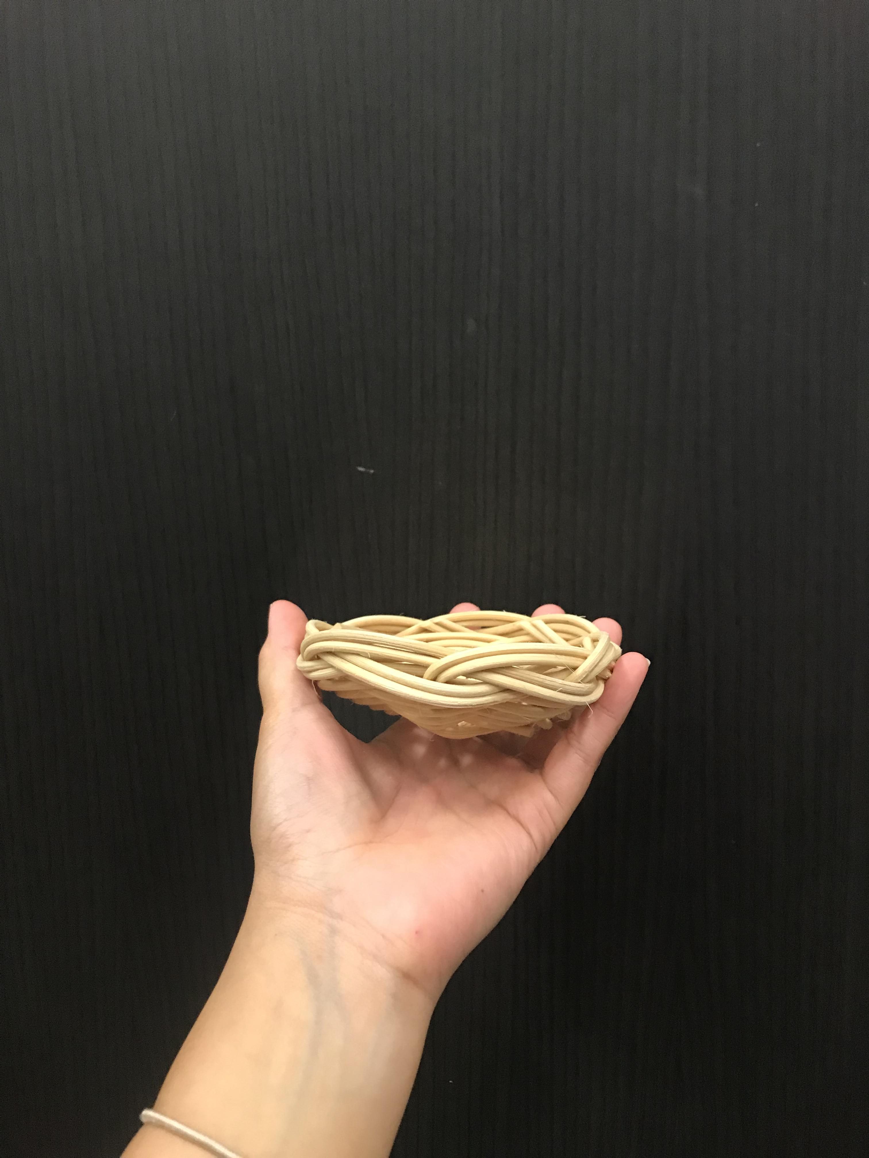
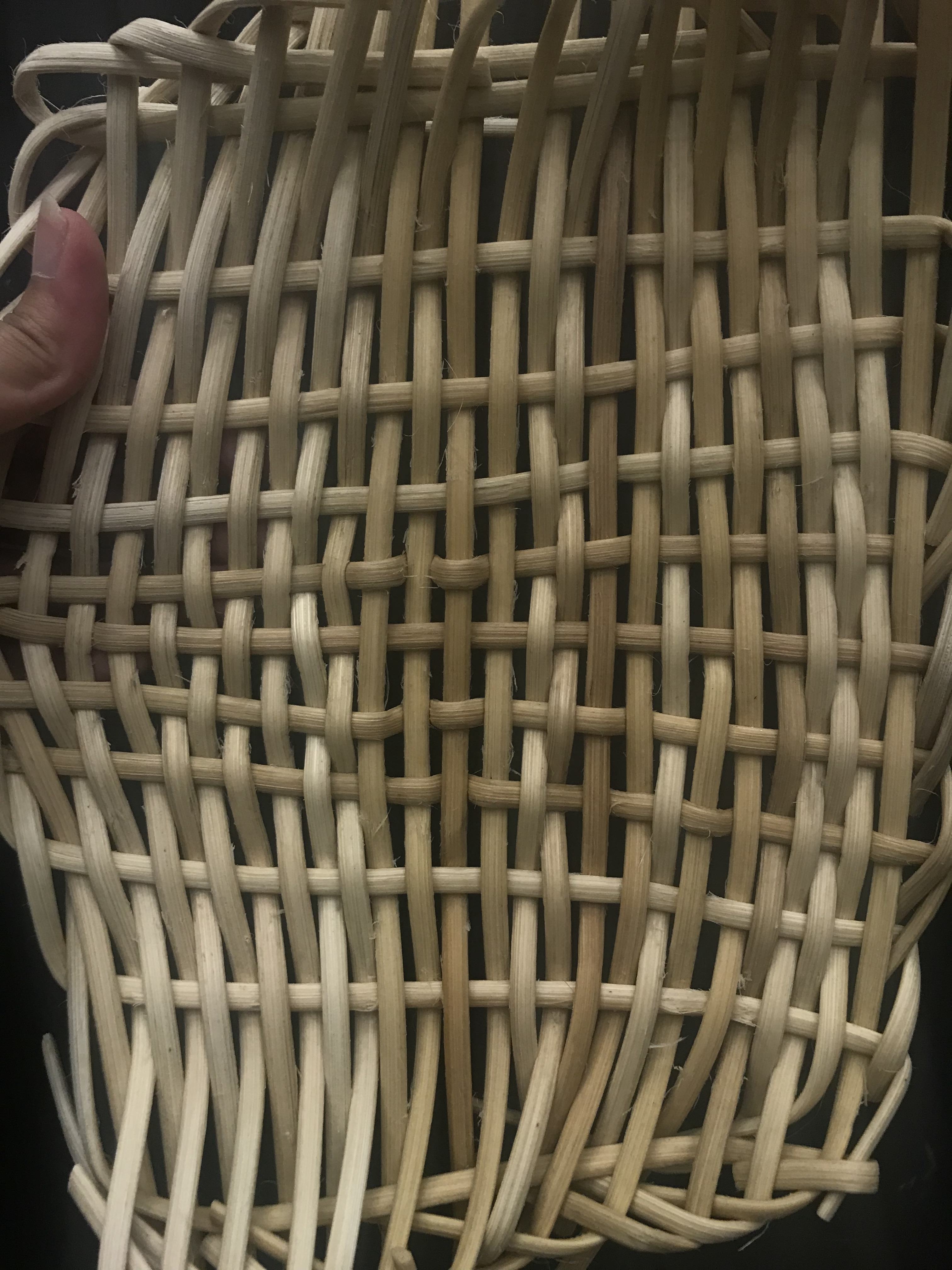
The final result for the 2D weaving:
3D
Knowing the problems we encountered and the reasons behind it, moving forward, we took note of all of it and rectified our errors.
For the 3D object, we drew inspirations from Pinterest and sketched out our idea on paper.
Inspiration
Rough sketch which we modified as we went along
Again, we couldn’t figure out as to where we should begin. Hence, we started watching videos on youtube on wicker baskets etc.
Main video reference:
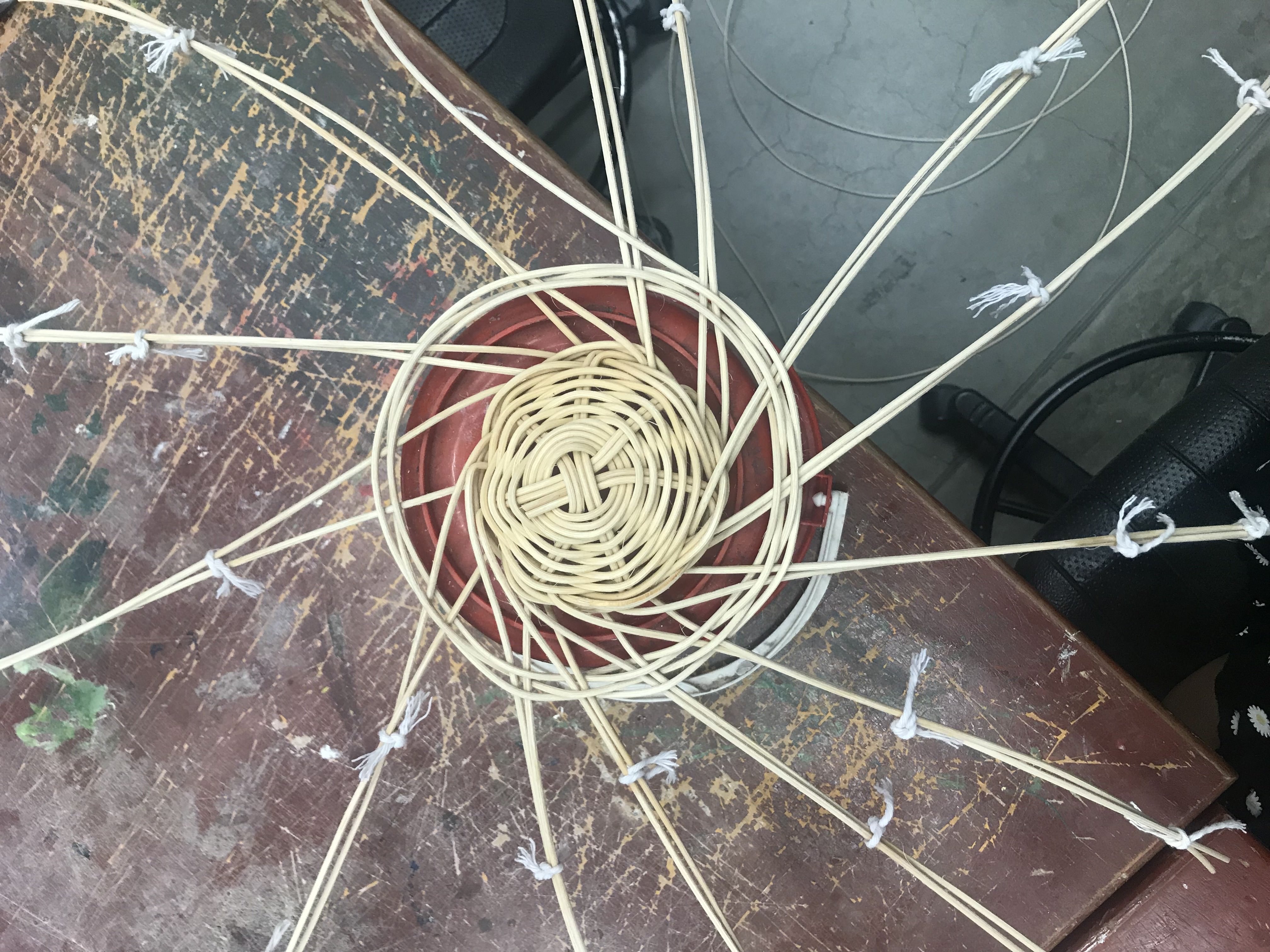
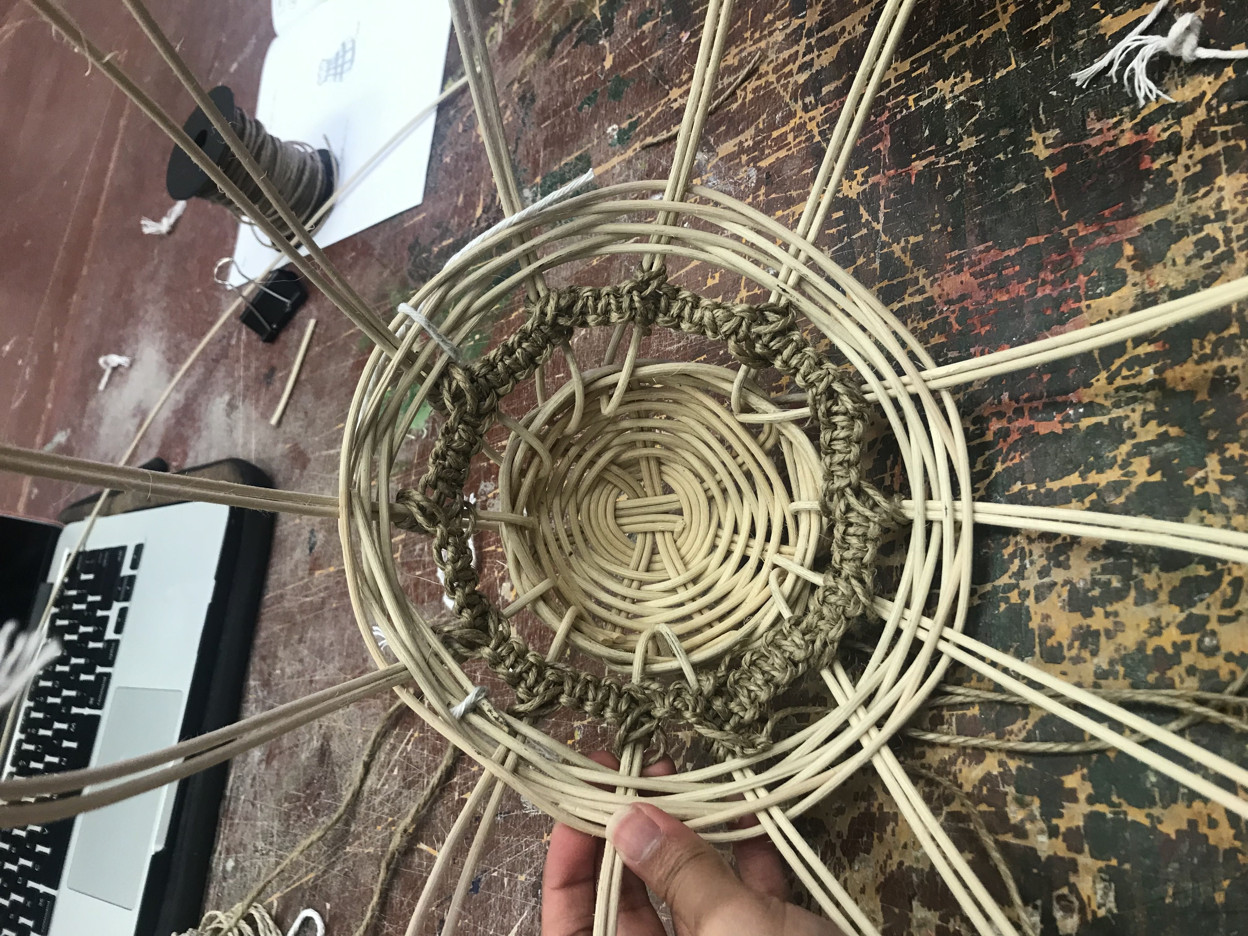
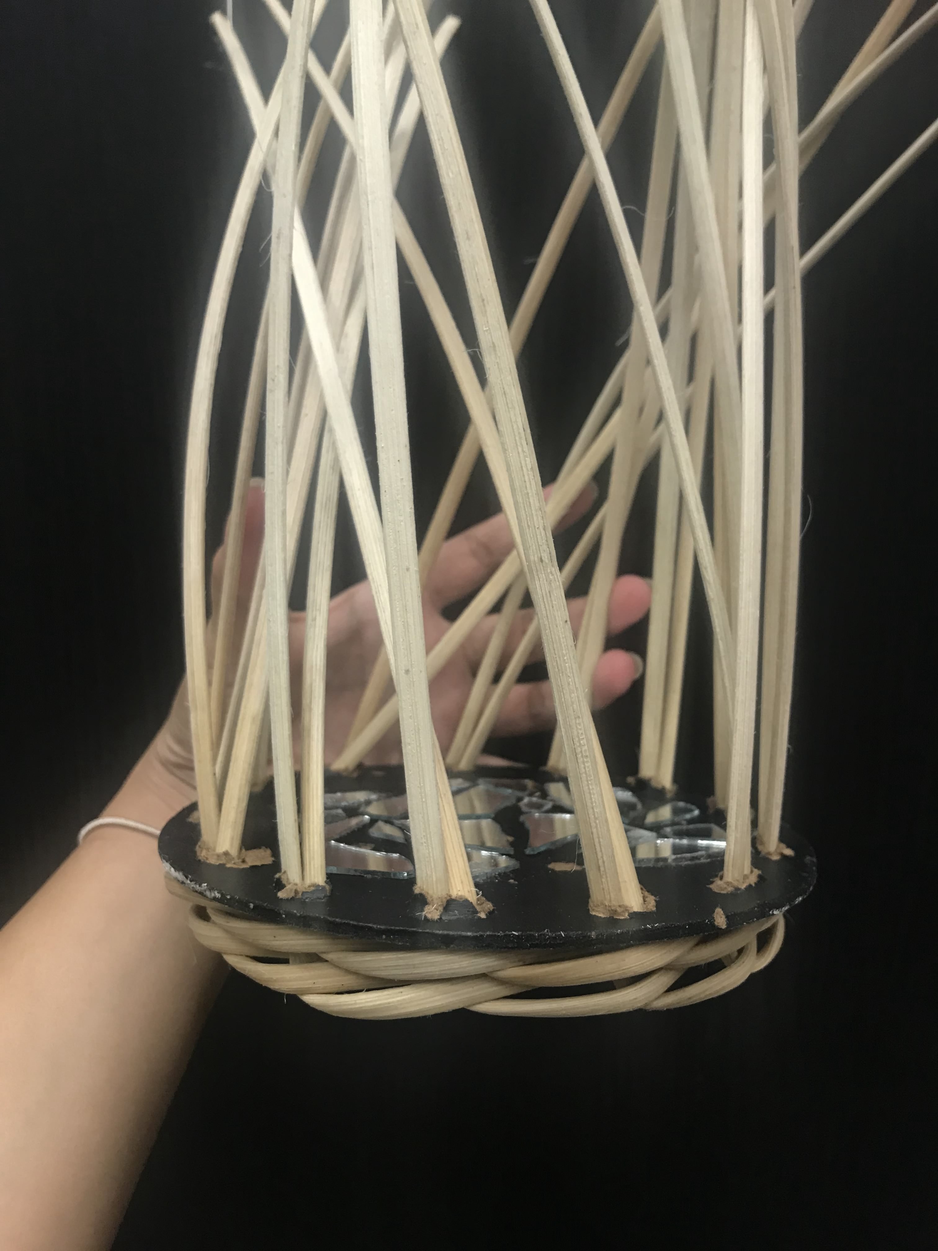
I had a previously used MDF board which I had cut into a circular shape. I brought that which we used as a base.
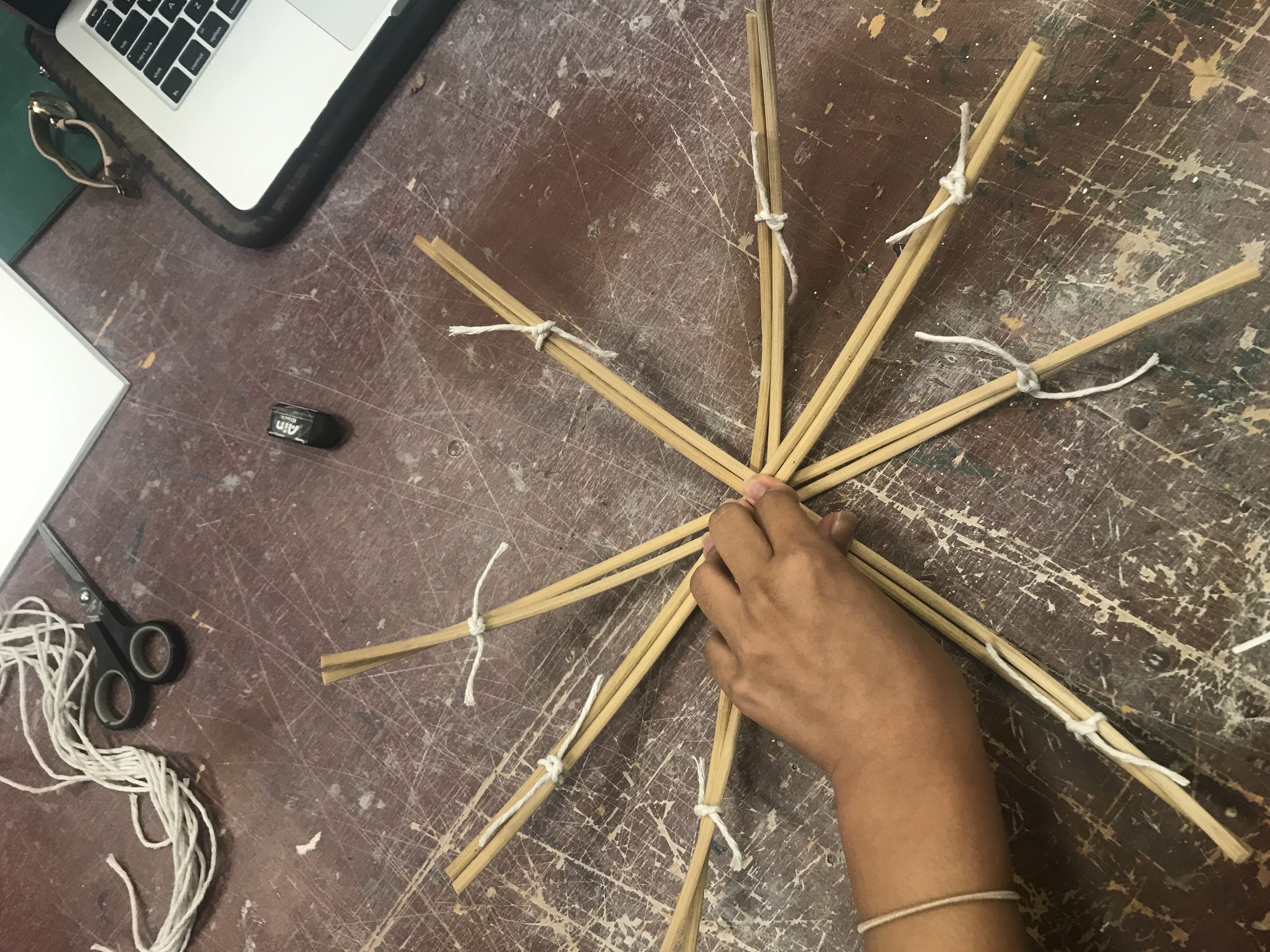
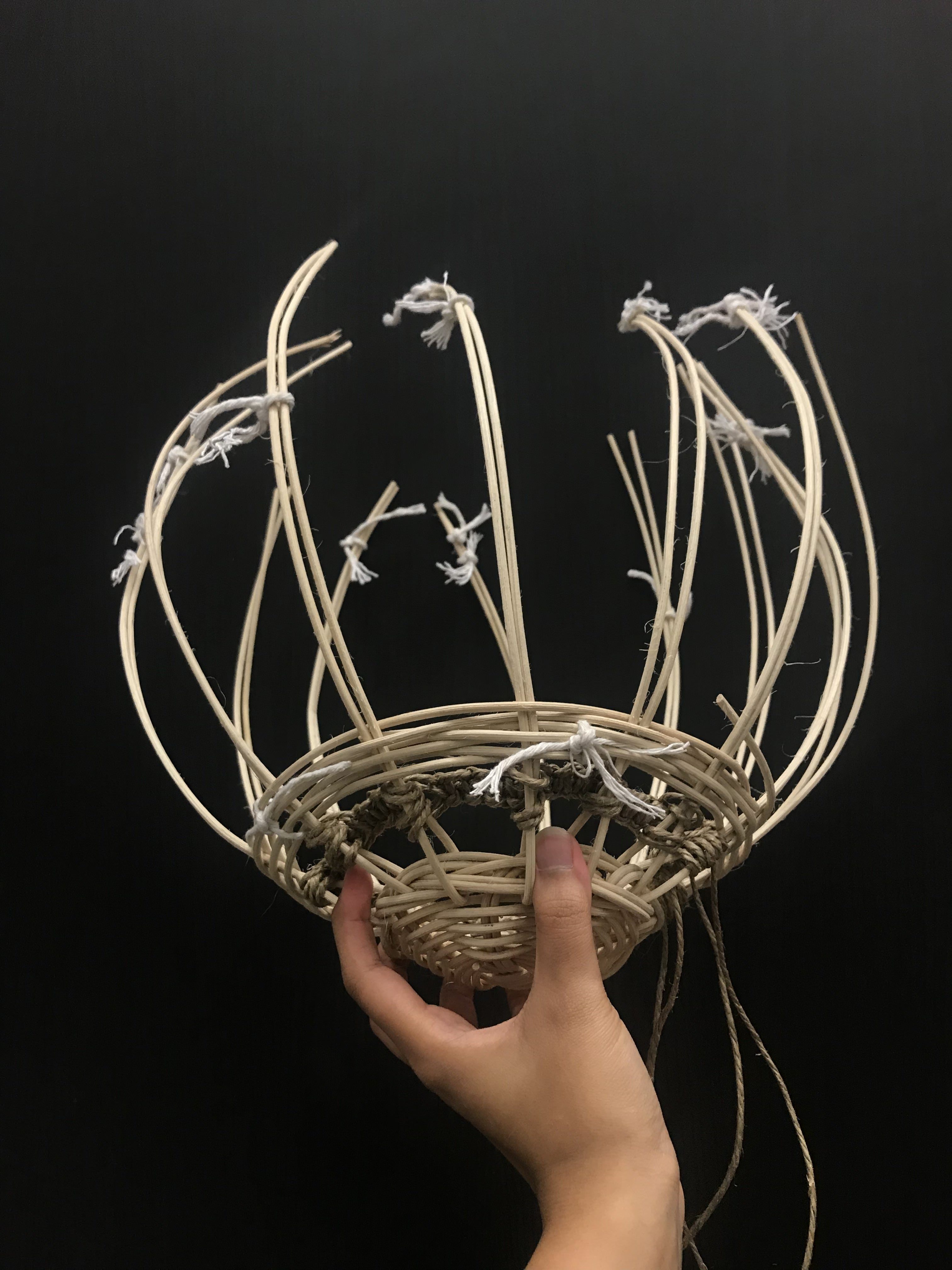
Since we had a problem with spacing in the 2D model. We decided to add two vertical strips (attached together) instead of one and kept the distance between each other to be 2cm. We marked the circular board according to the width of the two pieces of rattan.
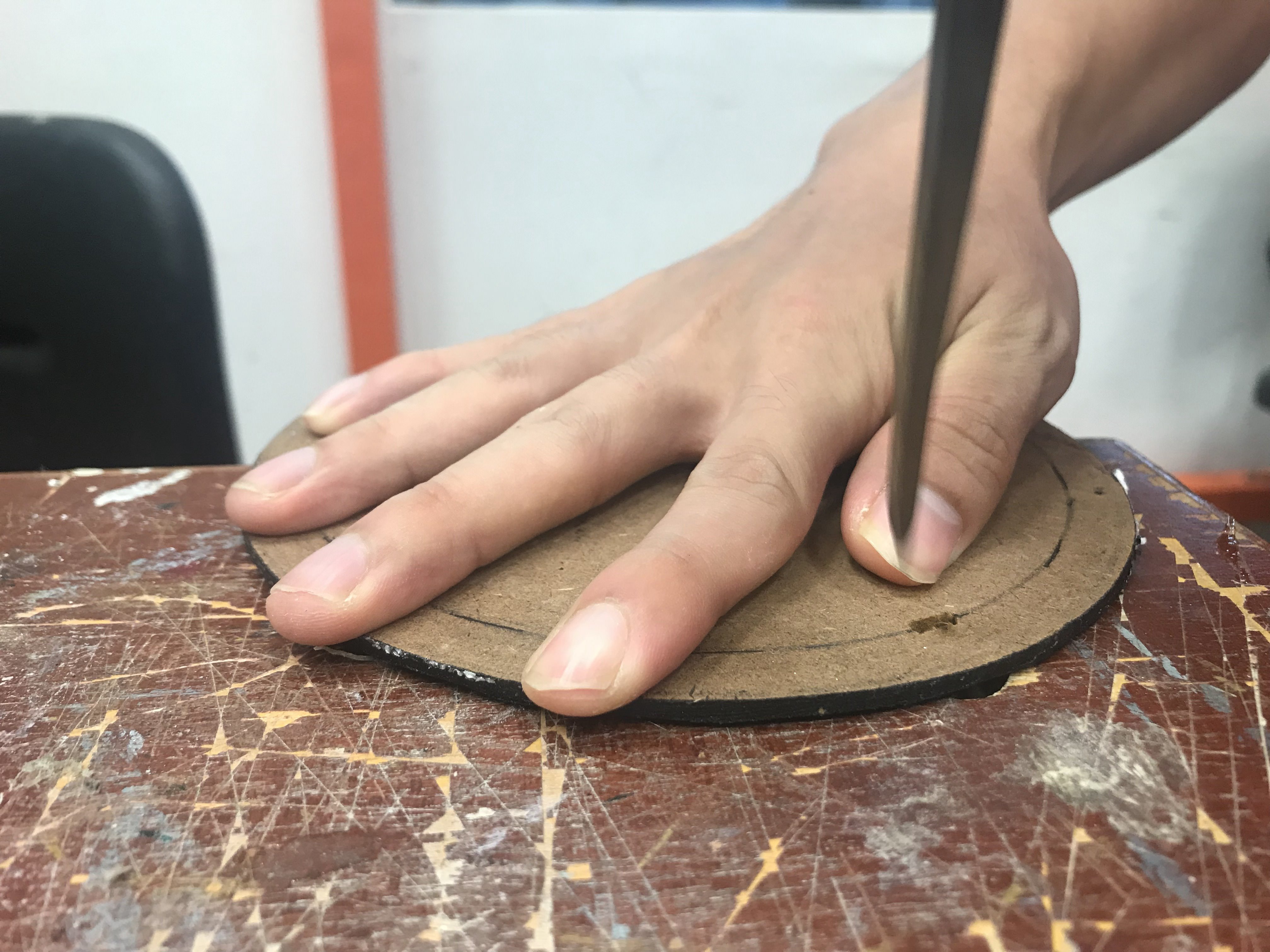
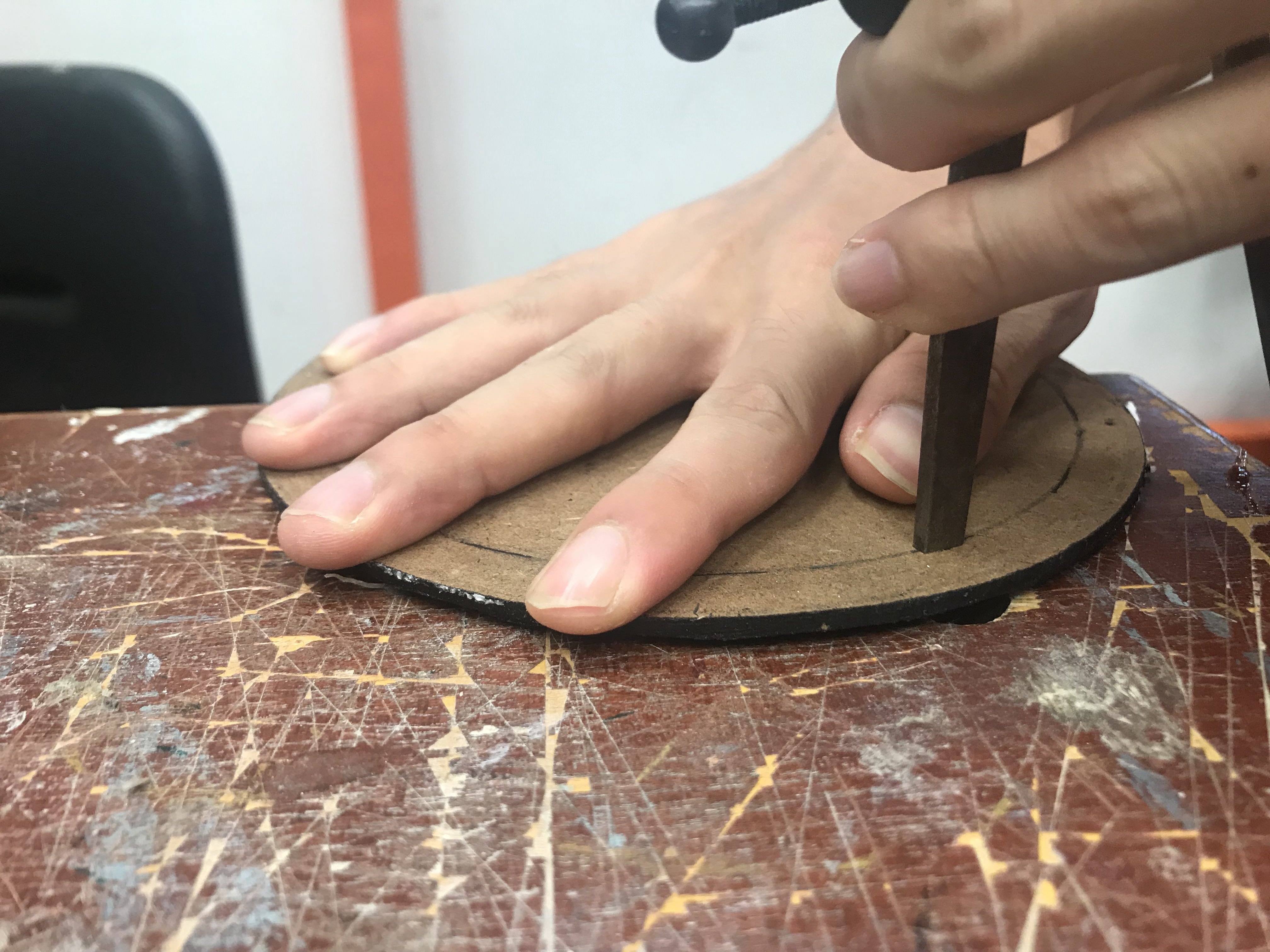
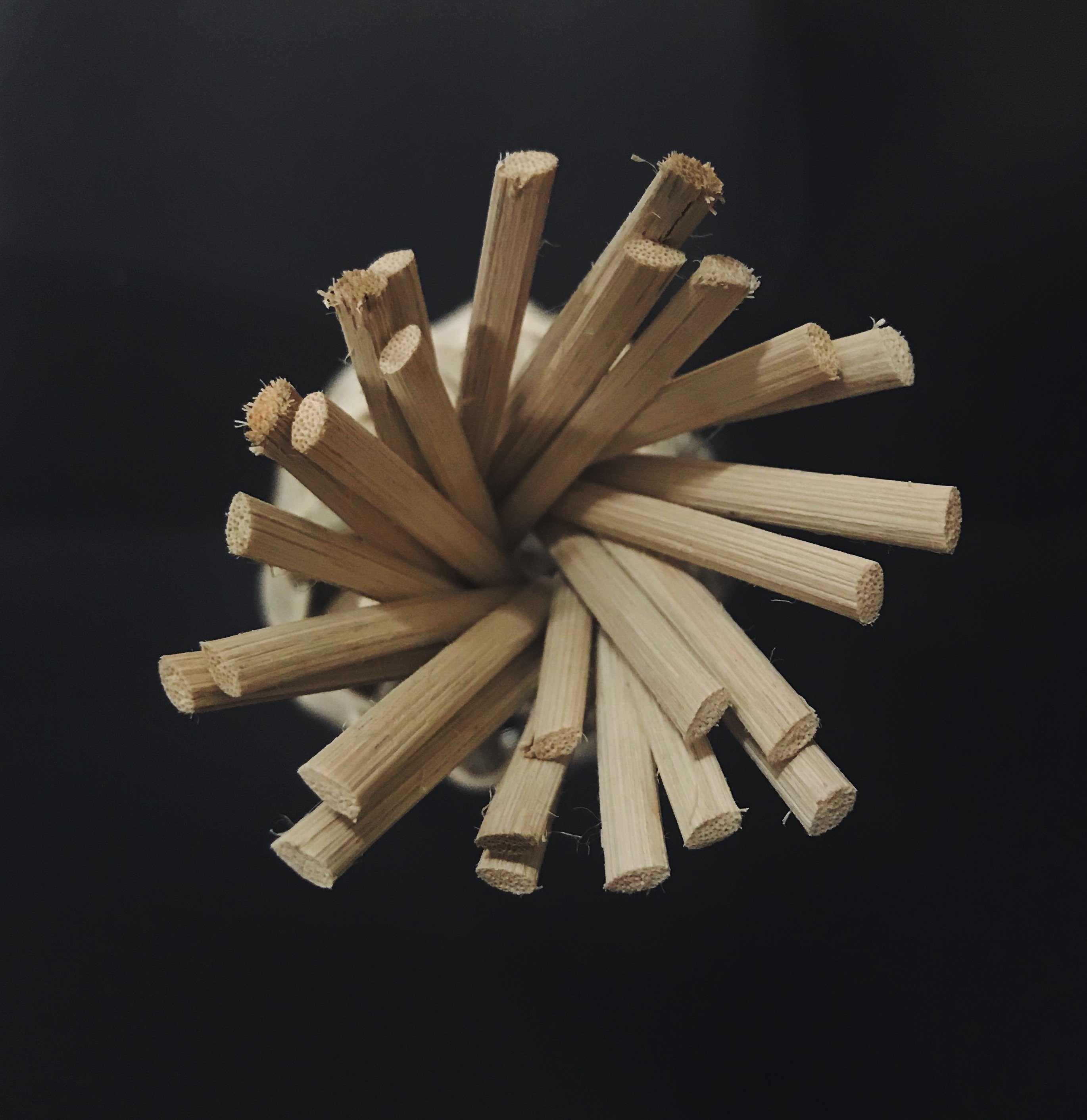
After which, Ik used a hammer and a sharp object to create a inserts/slits into the MDF board.
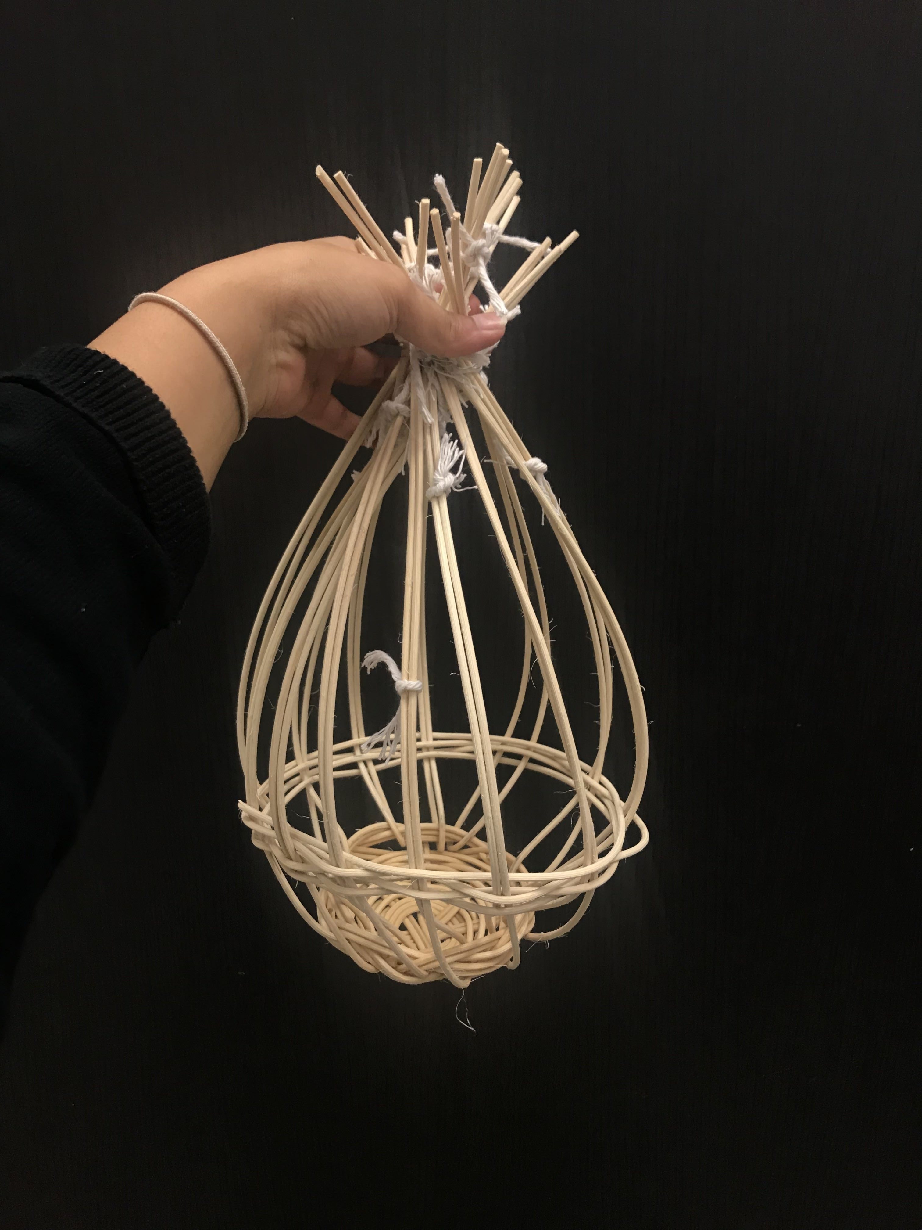
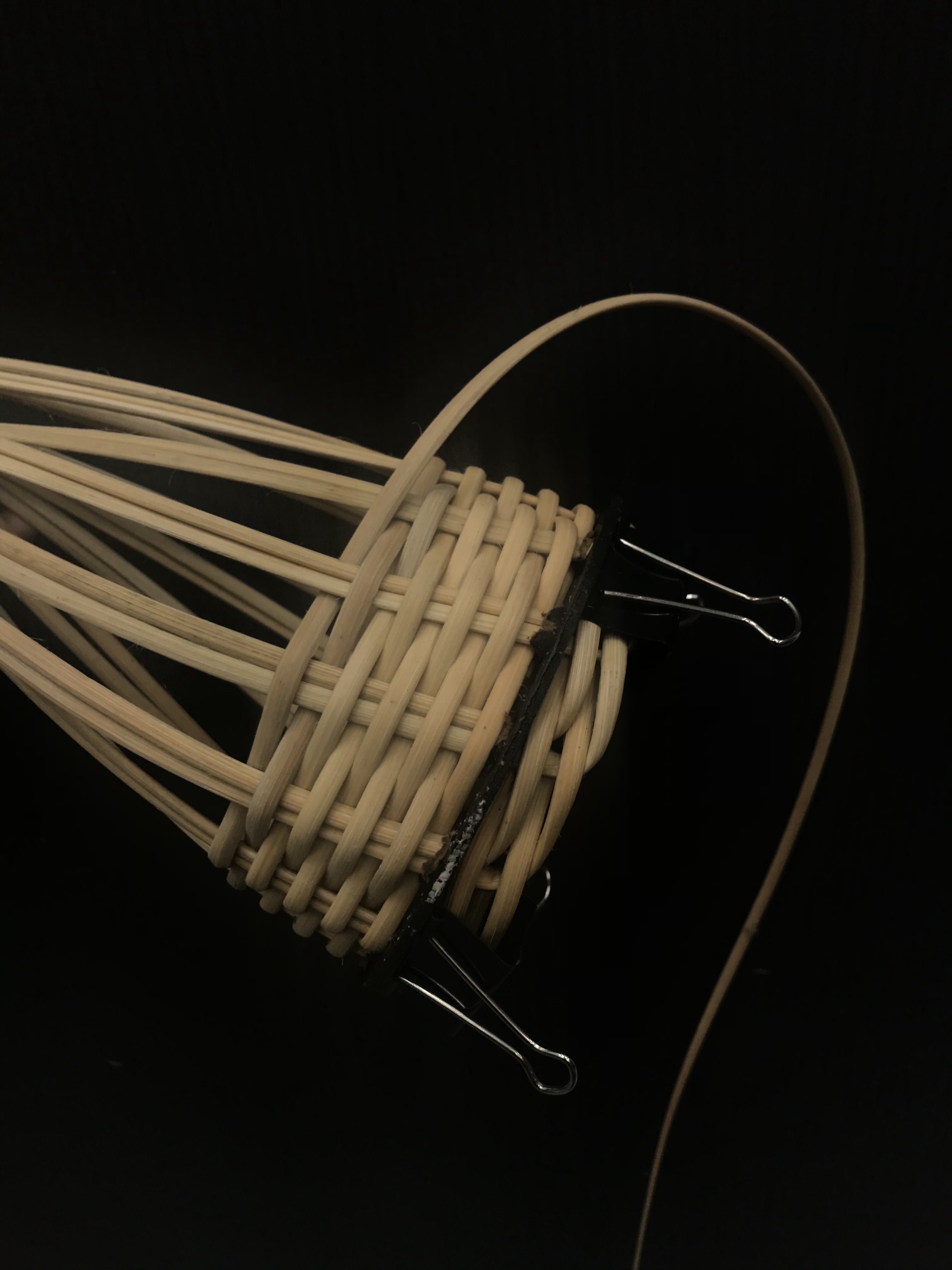
Mimicking the steps from the video reference, I then inserted the rattan strips through the inserts and secured the remaining rattan at the bottom using the same braiding-like method used in the video. This was challenging as the rattan kept sticking out. Hence, we secured it with clips until it dried into shape.
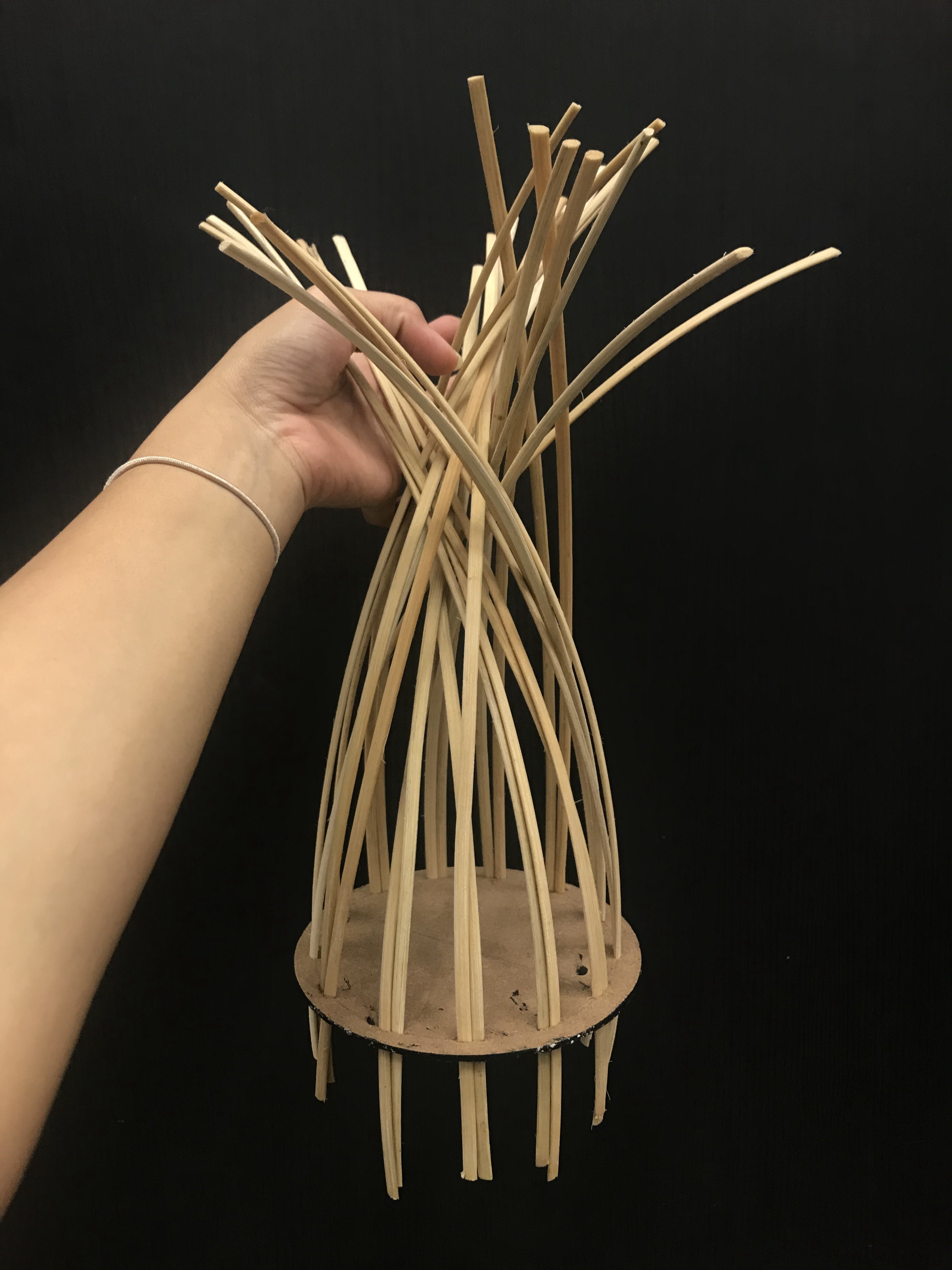
Inserting rattan into slits
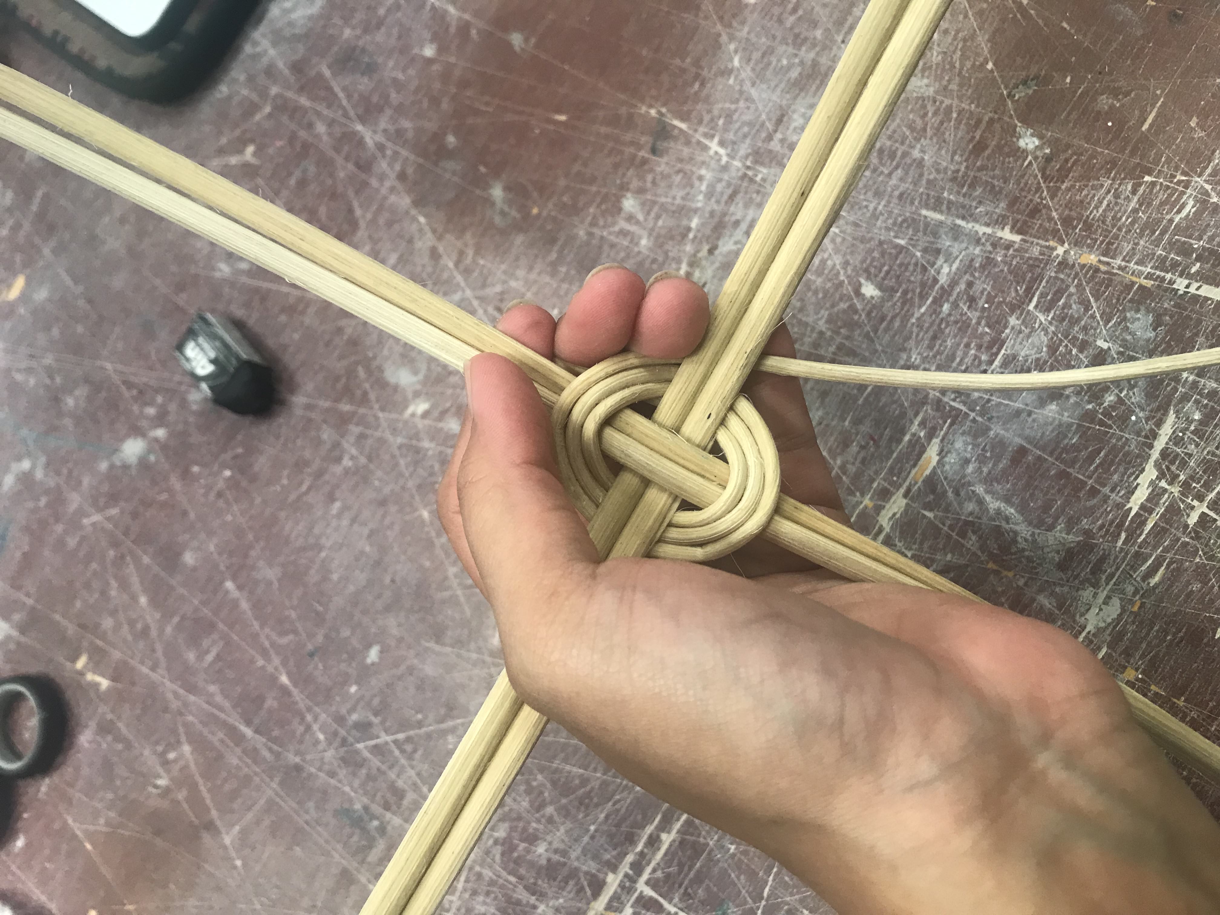
Before weaving the ends
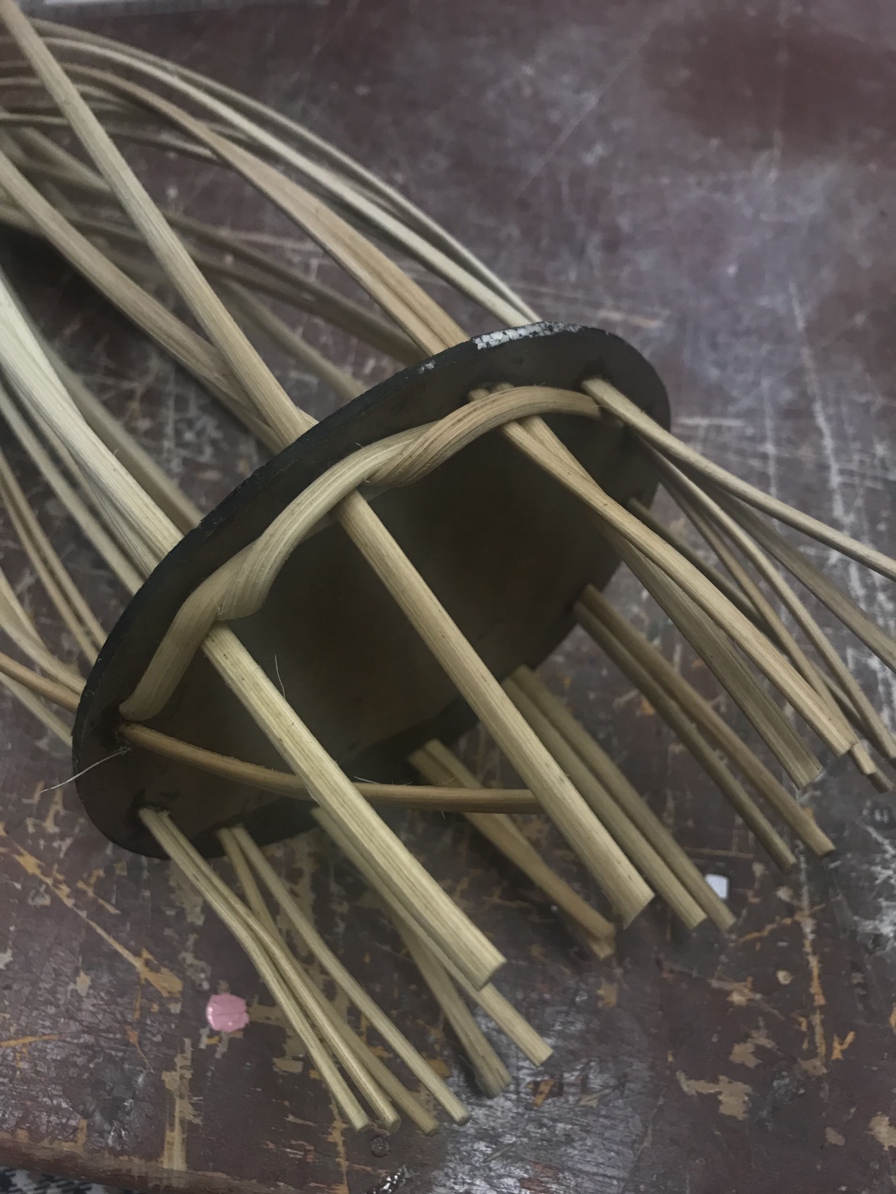
Process of weaving the ends
Completed weaving of the ends
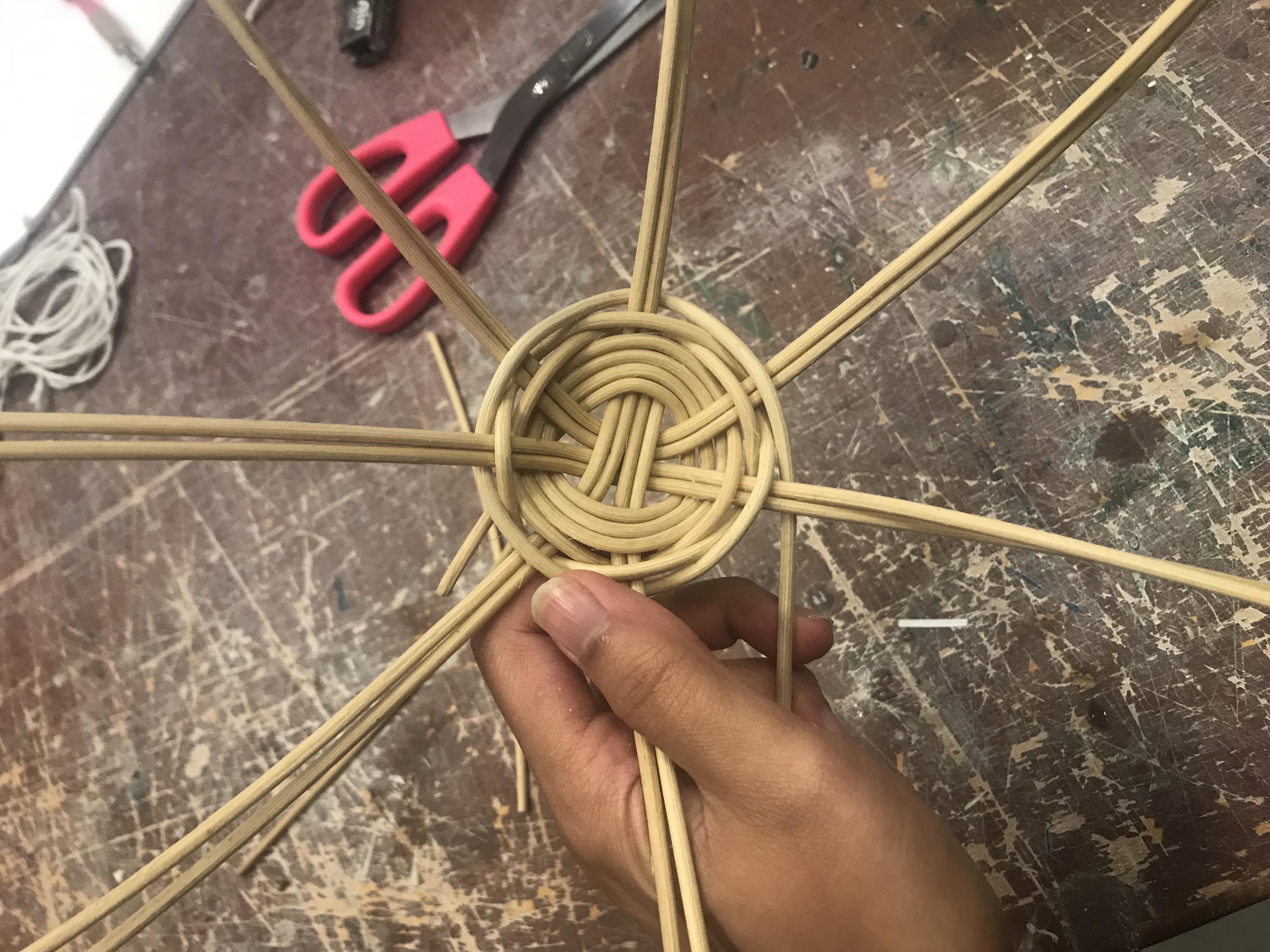
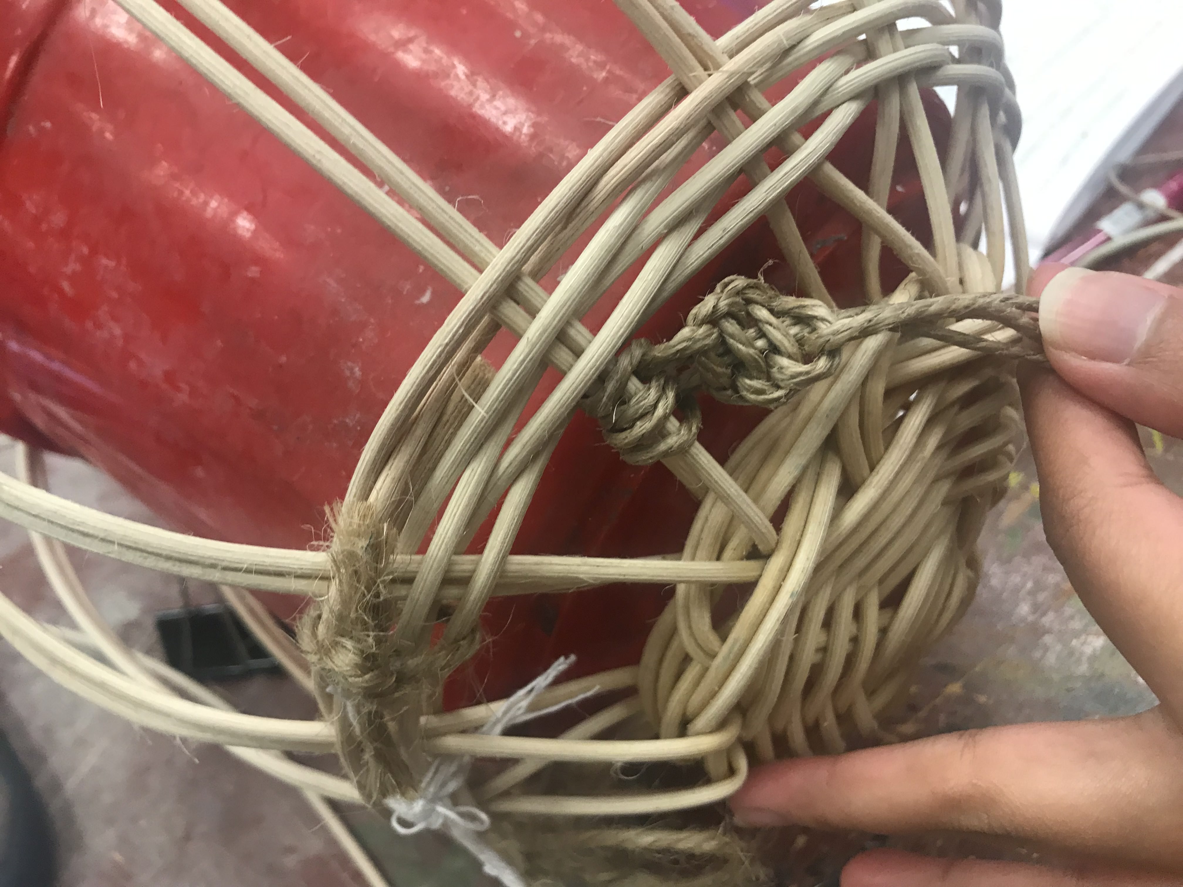
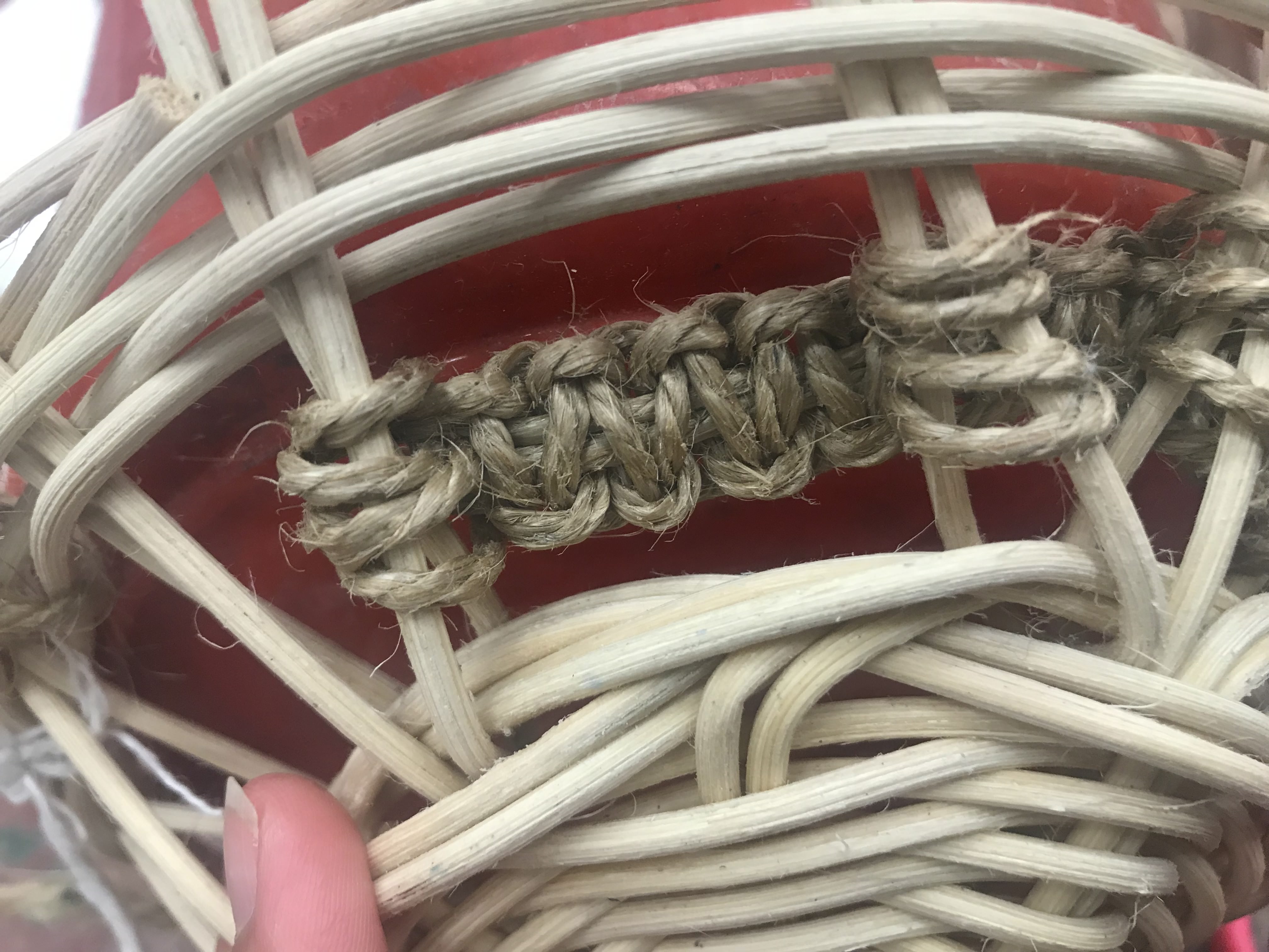
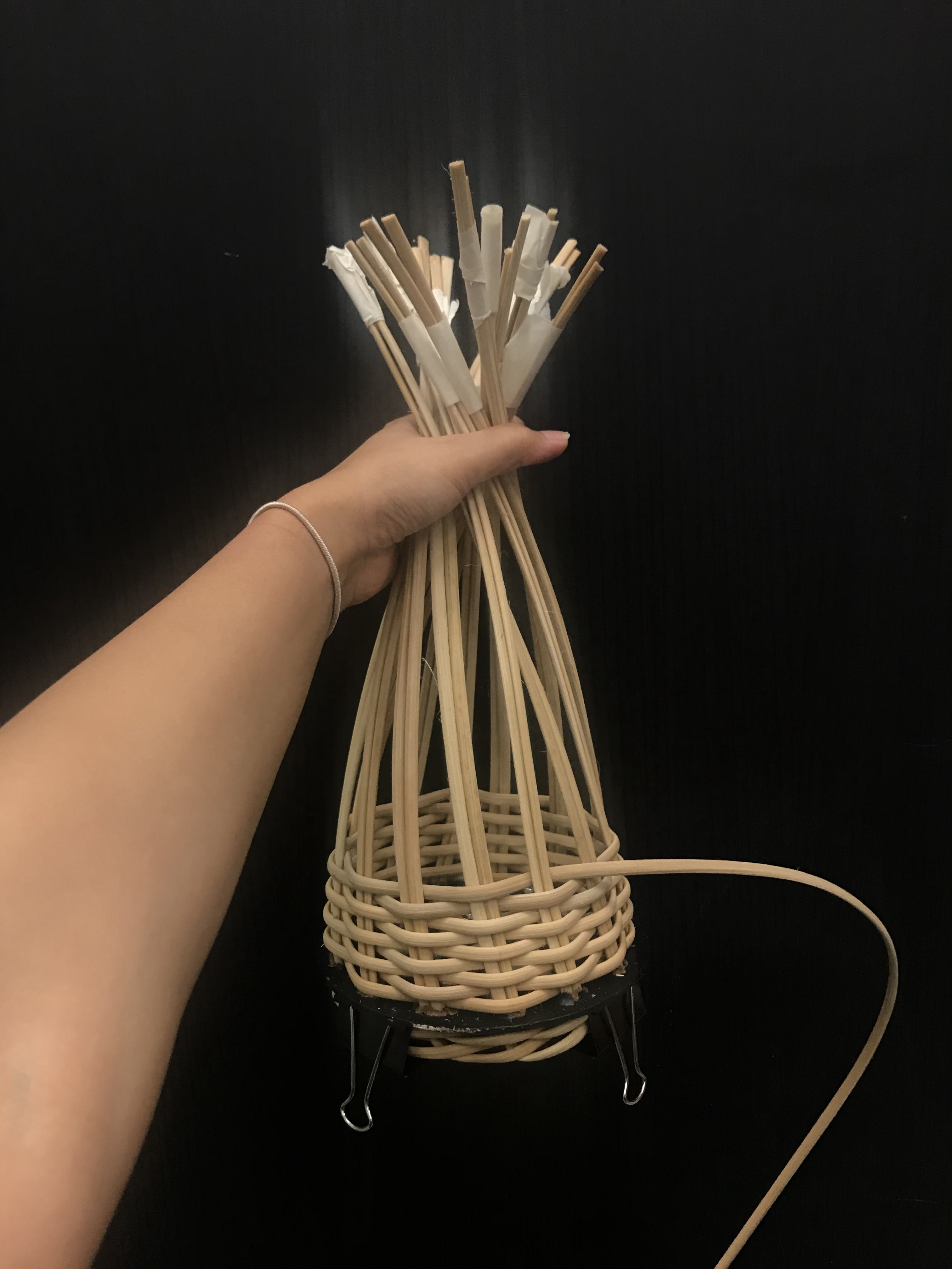
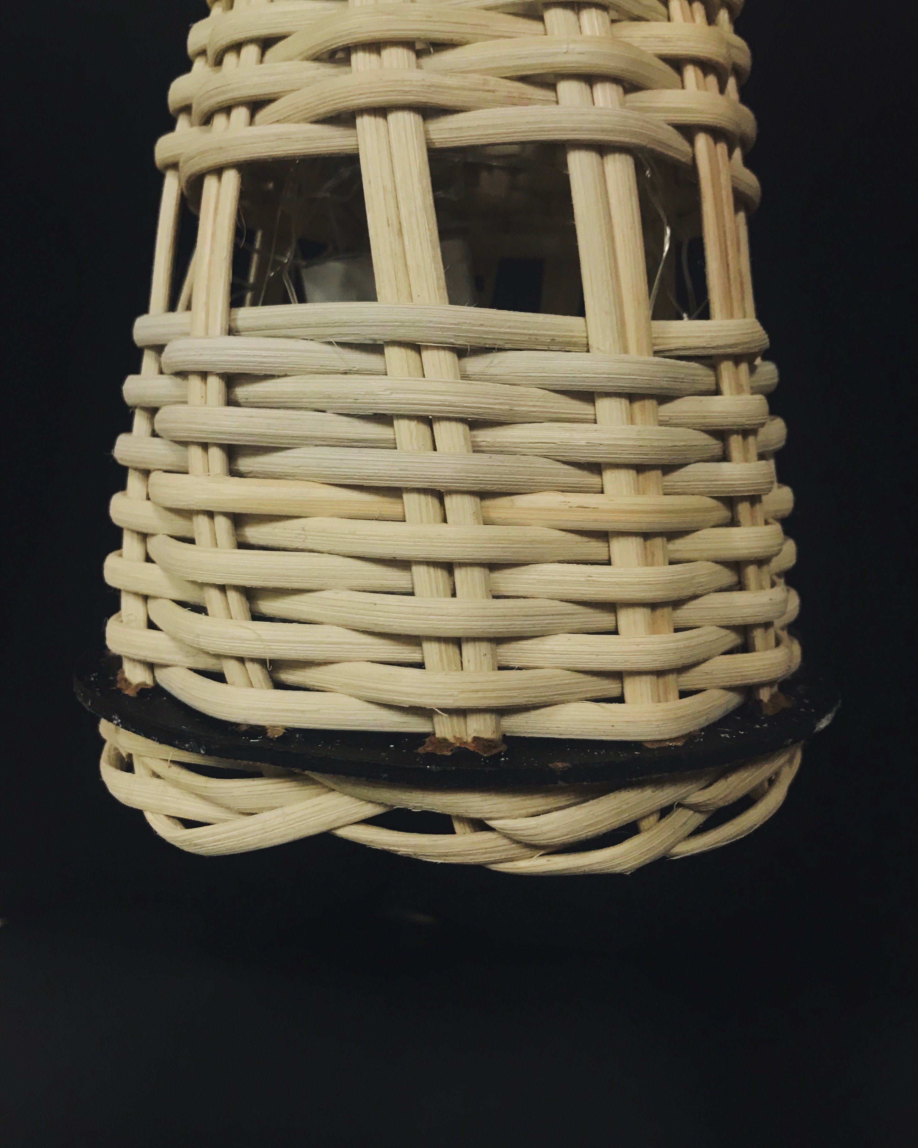
We then started weaving the horizontal strips through the vertical ones. It was a much smoother process compared to the 2D model when we were still exploring the weaving methods. The rectification of our previous mistakes really mad a difference in making the weaving neater. We also taped the rattan together to make the process easier as the weaving did get a little complicated.
Taping other end together
Weaving process
Weaving process
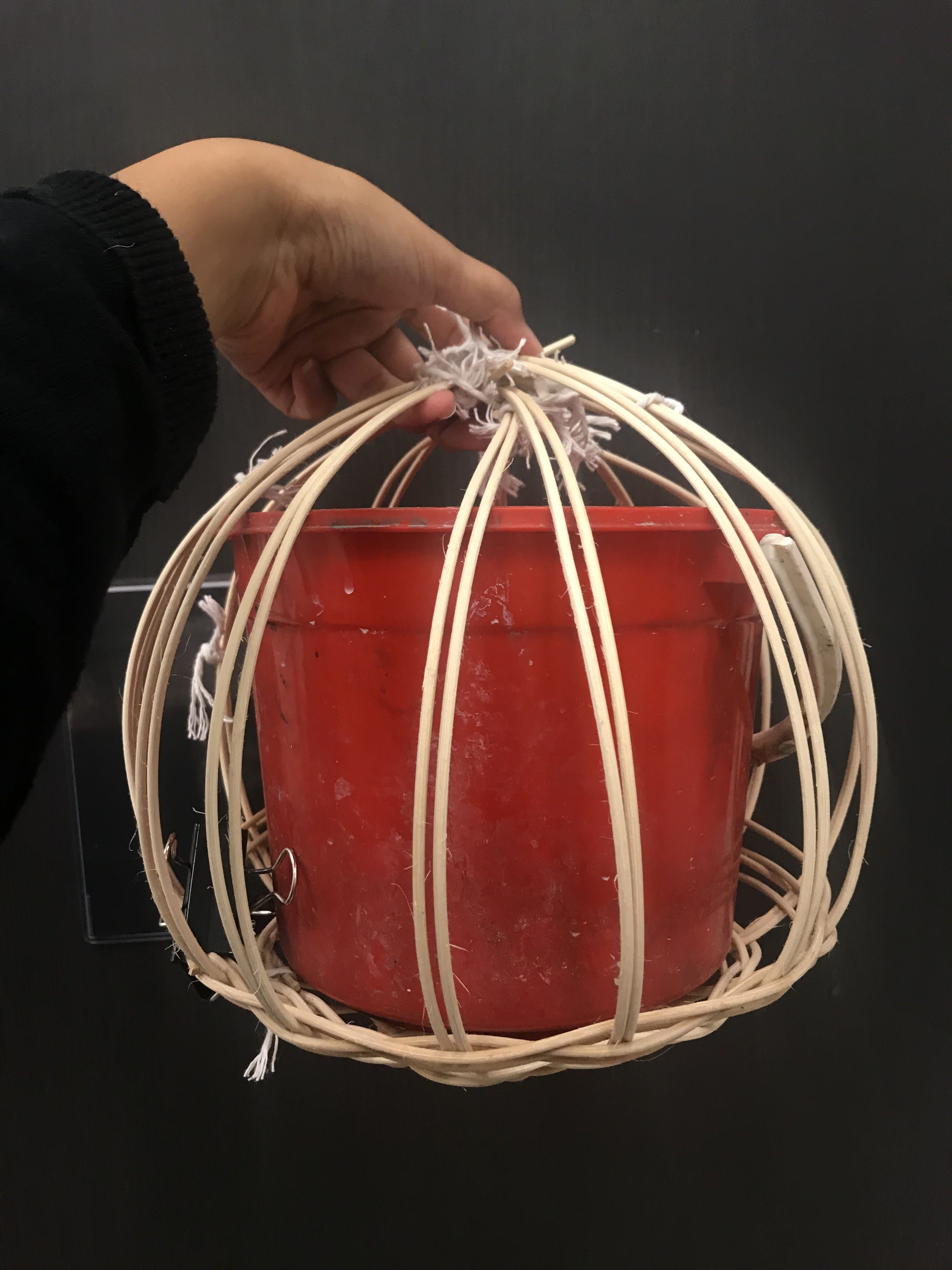
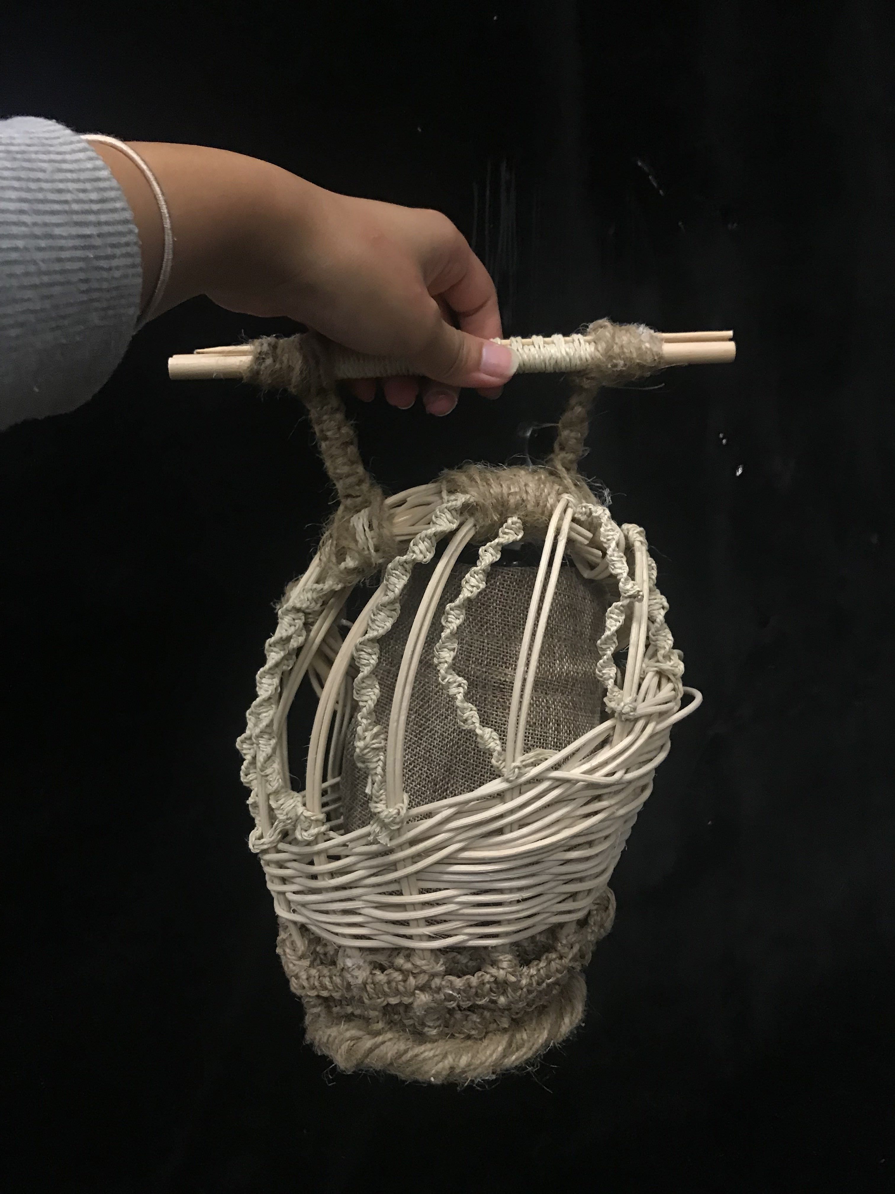
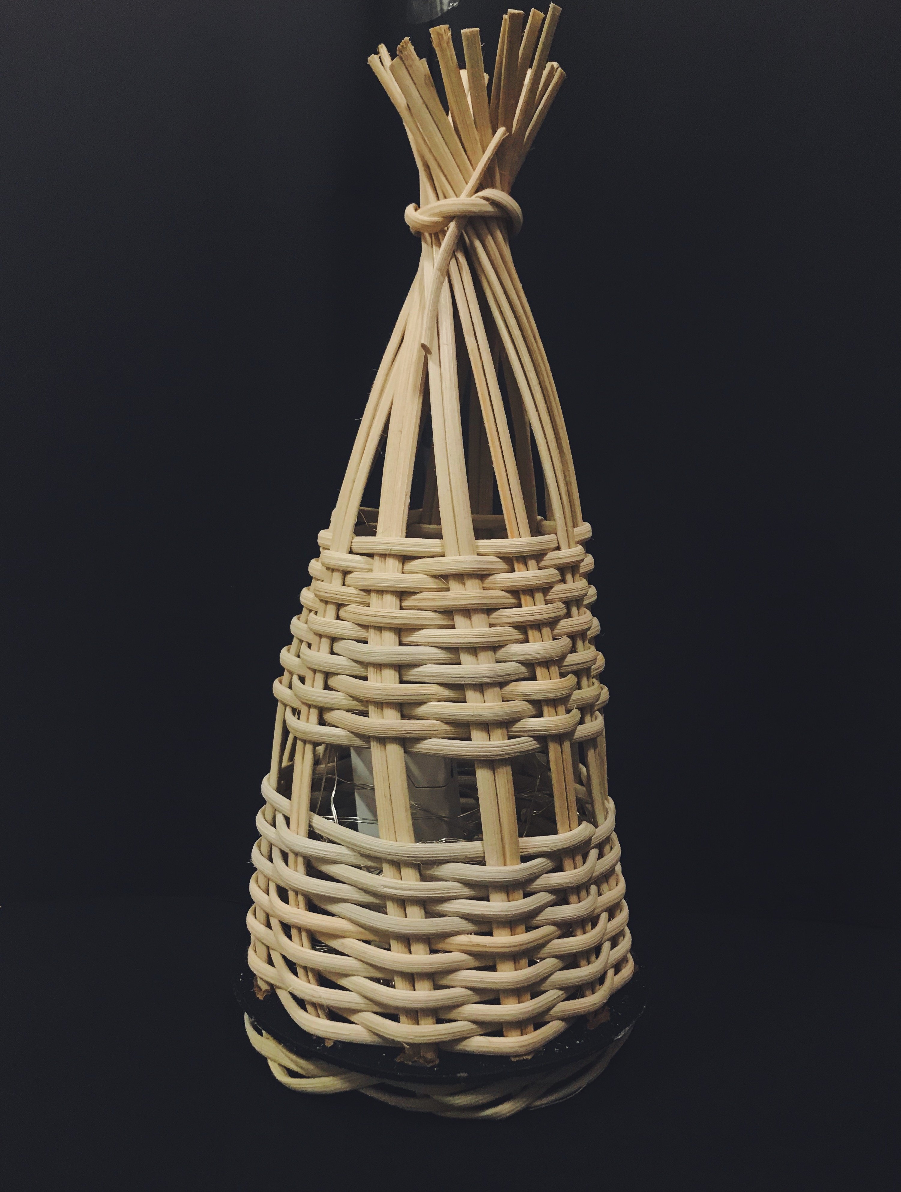
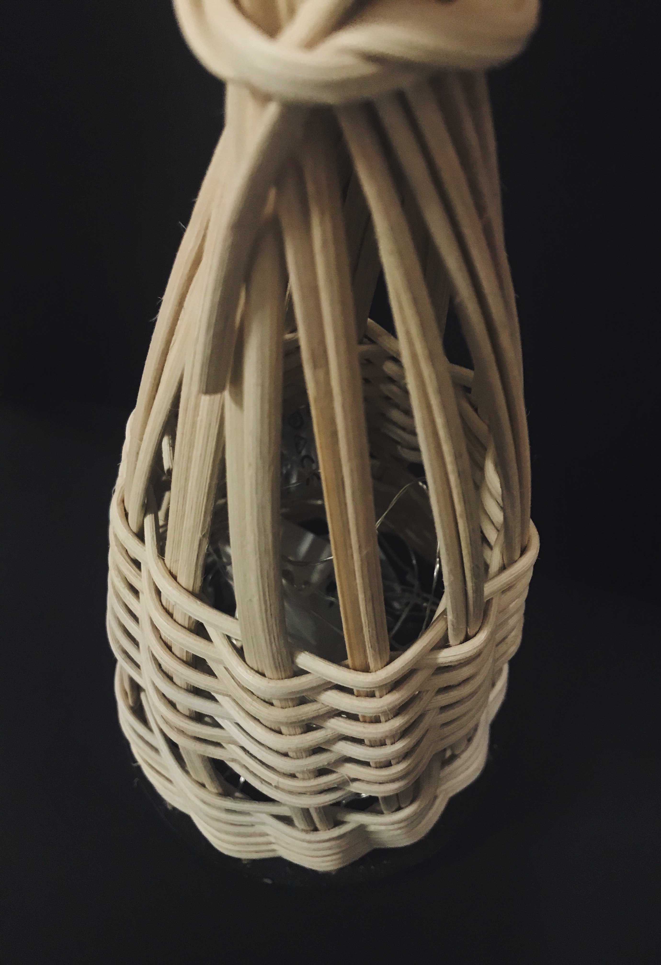
We wanted to add battery operated fairy lights into the 3D model. Hence, I brought it back and inserted the fairy lights before finishing it. Before that, we had discussed that we wanted a space between two sets of weaving as it will allow more light to be radiated out of the model to fit its functionality.
Finished the model off by bunching up the rattan and wrapping a piece of rattan around it. I tied it off with two knots (one in the front and the other in the back).
Overall, Ik and I are quite satisfied with our outcome despite the several hiccups we had. We learnt quite a bit about weaving and have a better understanding of the material.
One thing we would have done differently, given the chance, was to switch up the rattan for a thinner one like a cane or actual pine needles as it would create a better effect.
Micro-Project 3 was probably one of the most challenging one yet but definitely the one where I had the most fun.
For this project, we were required to create a final piece that was a collaborative effort. We all had to work towards a common goal to produce ONE final art piece.
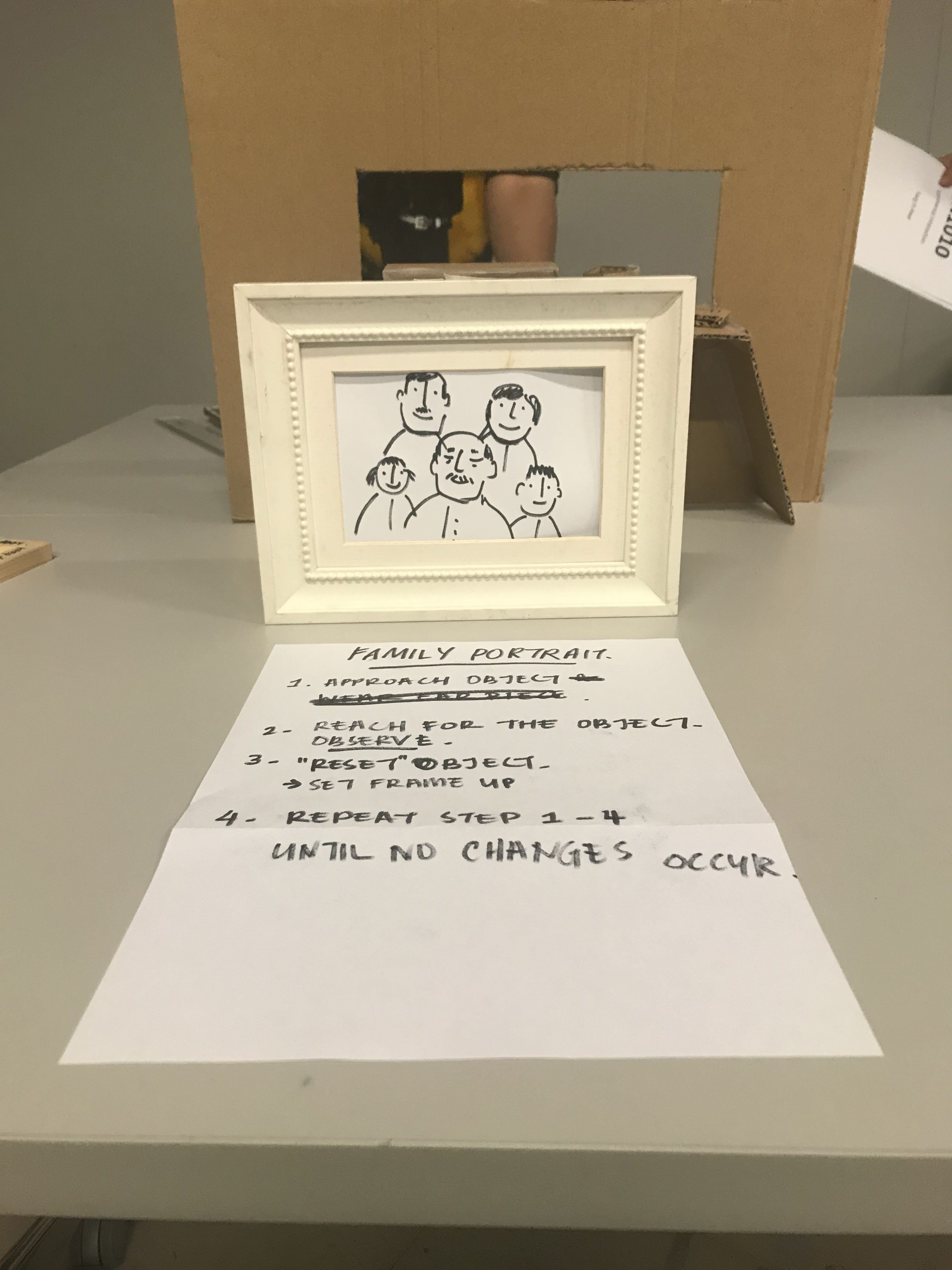
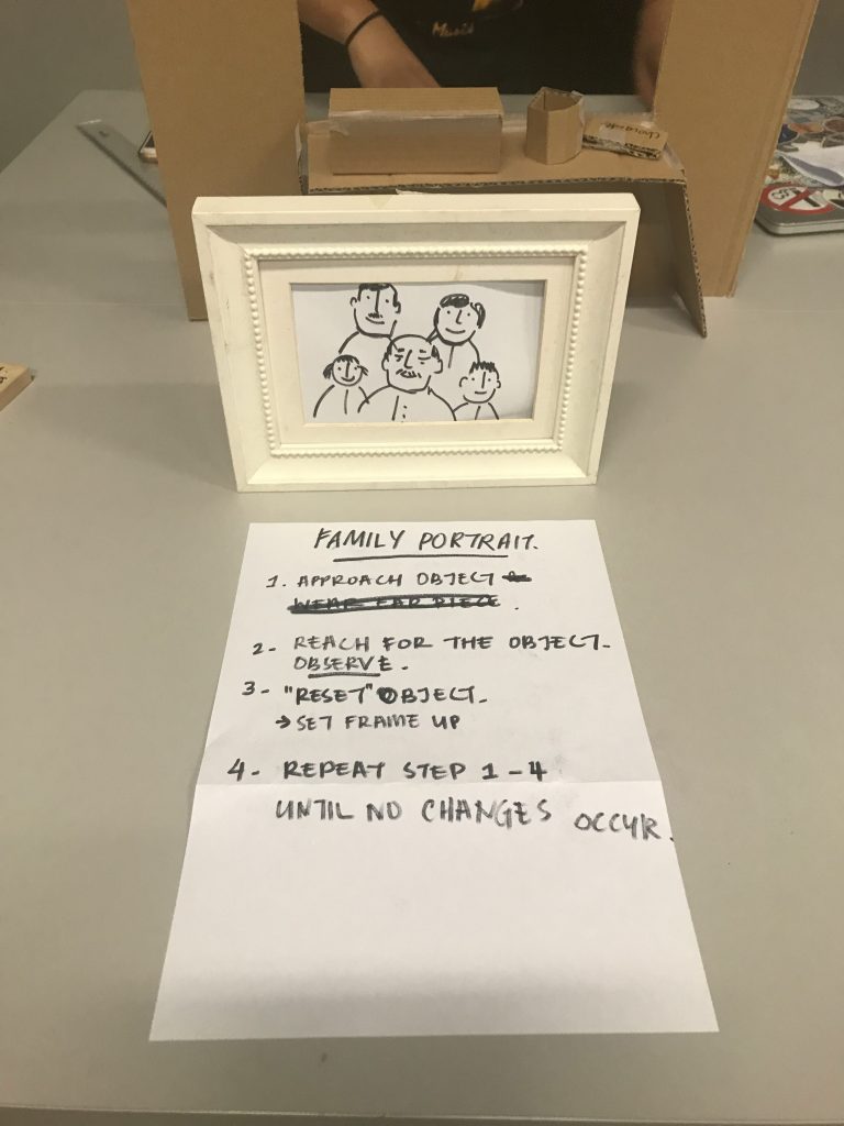
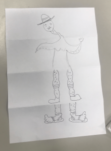
Lei introduced this concept to us by making us do a quick class activity. This was a surrealism game called, Exquisite Corpse. In a group of 4, we folded a piece of A4 paper into 4 sections. Each person had to draw according to the word/description given by Lei. This part of the drawing was to be continued by the next person who was not allowed to take a peek at the previous drawing. This continued on and we all got to see the final piece as we unfolded the drawing and see how our drawings connected to each other. In this case, we each get to draw a part of figure (person/creature/etc) which combined to form the following.
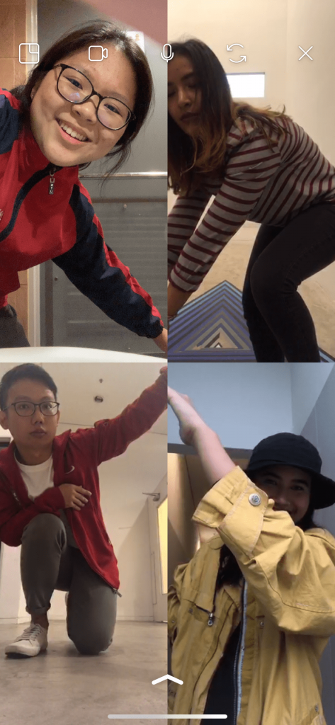
Afterwards, the Micro-Project 3 was introduced. The idea behind this project was to use a streaming platform that could connect the 4 for us in a group together, to produce content in a third space via Instagram video chat. We all had to be in different locations and we had to produce a final piece that would have a sense of continuity amongst the 4 of us!
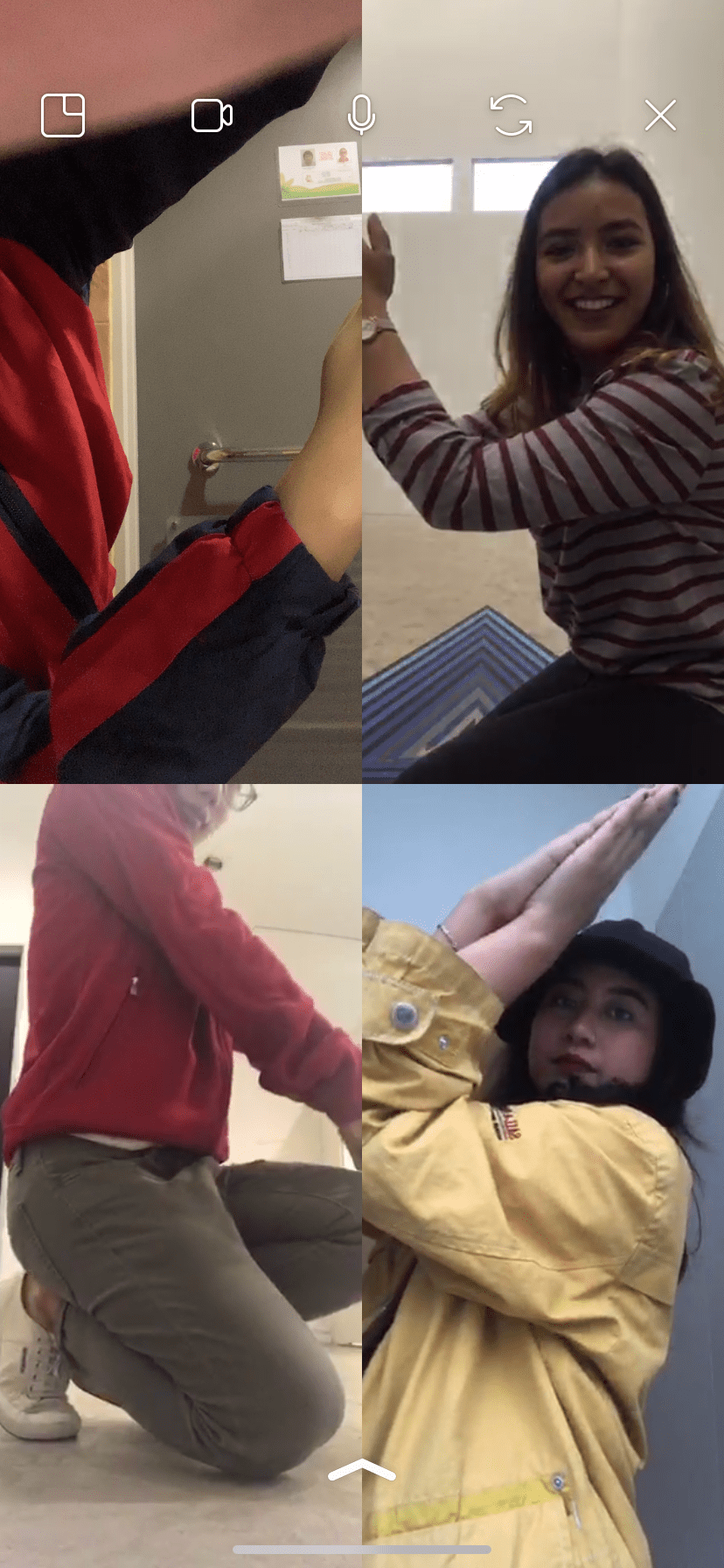
Before we decided on an idea, we attempted to match up our faces to see what we could work with. However, we failed miserably as seen from the photo below.
Hence, we used a different approach and planned things beforehand. Our main objective as a group was to have a dance choreography, singing a simple song that we all knew a.k.a. the Alphabet Song. We did not coordinate our dances but we did coordinate certain movements as it moves along one video to another to create an impact and to attempt to create a shape.
There were so many challenges that we faced. We all separated to different locations and ended up communicating via the video chat. This was especially challenging as firstly, communication was an issue. The timings as to when we spoke led to it being messy as we didn’t know which person was talking to who. There were times where we just gathered in person to discuss which wasn’t ideal given the nature of this project.
Another challenge we faced was coordinating the steps with each other. The positioning of our hands had to be in the right directions to form the shapes we wanted to create through the screen. This was especially difficult to coordinate given the fact that at times, the signal could be interfered and someone would end the call. Due to that, the positioning of each person on screen, would change. After several tries, we figured out that that could be solved by the timing in which each one of us picks up the call. Hence, we did that and coordinated the moves again.
We attempted a total of 4 times before we got the final video. Even so, we couldn’t get the audio to work. We did check to see if turned on the audio while recording the screen but it didn’t work. Hence, what we had to do was to recreate the audio separate from the video and edited it into the final piece.
All in all, although it was the most challenging micro-project we’ve done, I felt that this was the most fun I had. Creating content with other members and listening to everyone’s creative input was helpful to create the final piece. It was also interesting to see how each of us interpreted things.
That being said, to answer some questions,
1. Which project did you feel you had the most creative control? Why?
I felt that Micro-Project 1 was the one where I had the most creative control. This was because everything was entirely based on my own creative direction, my point of view, my curation of filters to use, etc. That’s when I felt that I had the most creative freedom. Micro-Project 3 was the one where I felt I had the least creative control given that we all had to work towards a common goal but had to do things together and work cooperatively. Sure, we could all chip in to give input, but ultimately, we all had to agree and come to a compromise which I feel limits one’s creative exploration.
2. Which project had the most unpredictable outcome? Why?
Personally, I felt like Micro-Project 2 had the most unpredictable outcome. This was because that although we had some control over what our participants get to choose since we curated the choices, we still were not able to control their responses based on the polls we did. The participants had full control given the choices we provide. Therefore, I feel that that was the most unpredictable outcome as we could not have be sure of the choices our participants made collectively.
3. Which project best illustrates the concepts of DIWO & Open–Source? Why?
This is tricky given that all the projects resulted into a final piece that involved a collaborative effort.
If I had to choose one, I would say that Micro-Project 1 illustrated the concept of Open Source best while Micro-Project 3 illustrates DIWO best. To me, they’re slightly different; DIWO & Open Source.
Micro-Project 1 illustrates the concept of Open Source as the hashtag, collectively, as an outsider, it provides a more holistic insight into the life of an ADM student. It was a collective effort from differing opinions and views. Therefore, I felt like viewers are able to take what they may and interpret things accordingly which essentially highlights the strength of Open Source. I see Open Source as an inspirational outlet where people come to share their common knowledge.
Micro-Project 3 illustrates DIWO best because it involved the thorough and active participation of all the members to work towards a roughly planned common goal. As the name suggests, I think that the concept of Do-It-With-Others involves people working towards the same objective and building on each other’s ideas.
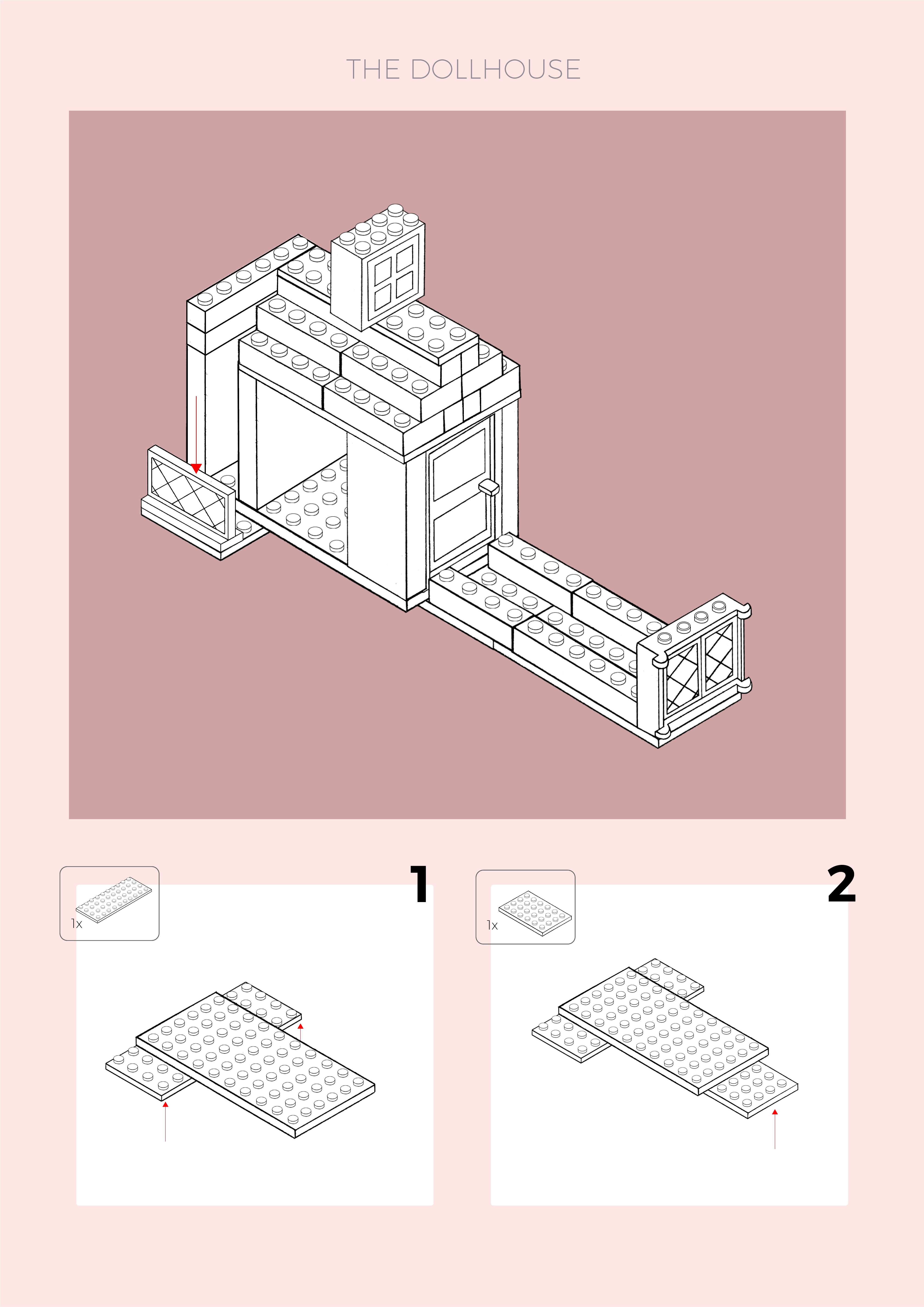
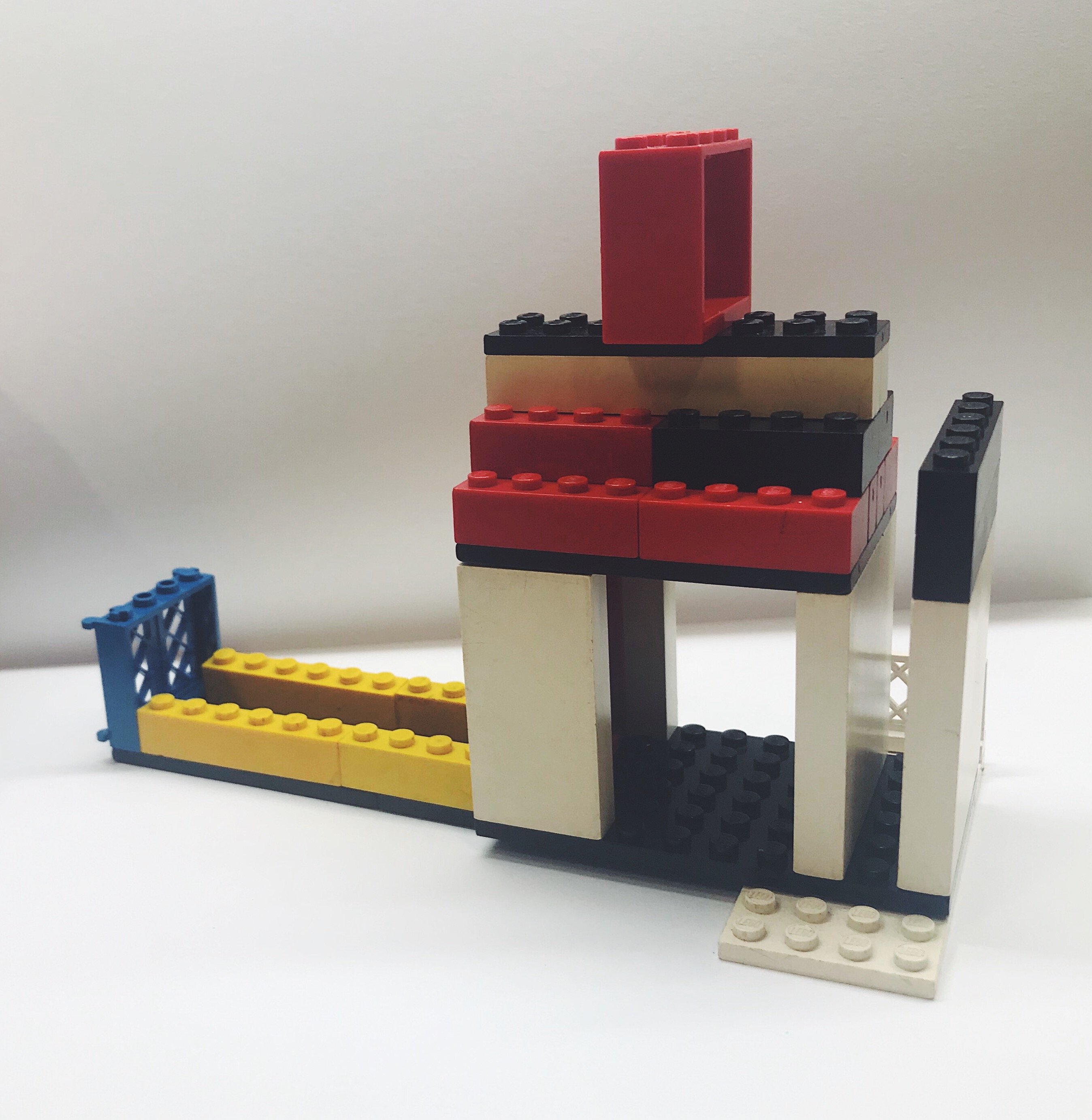
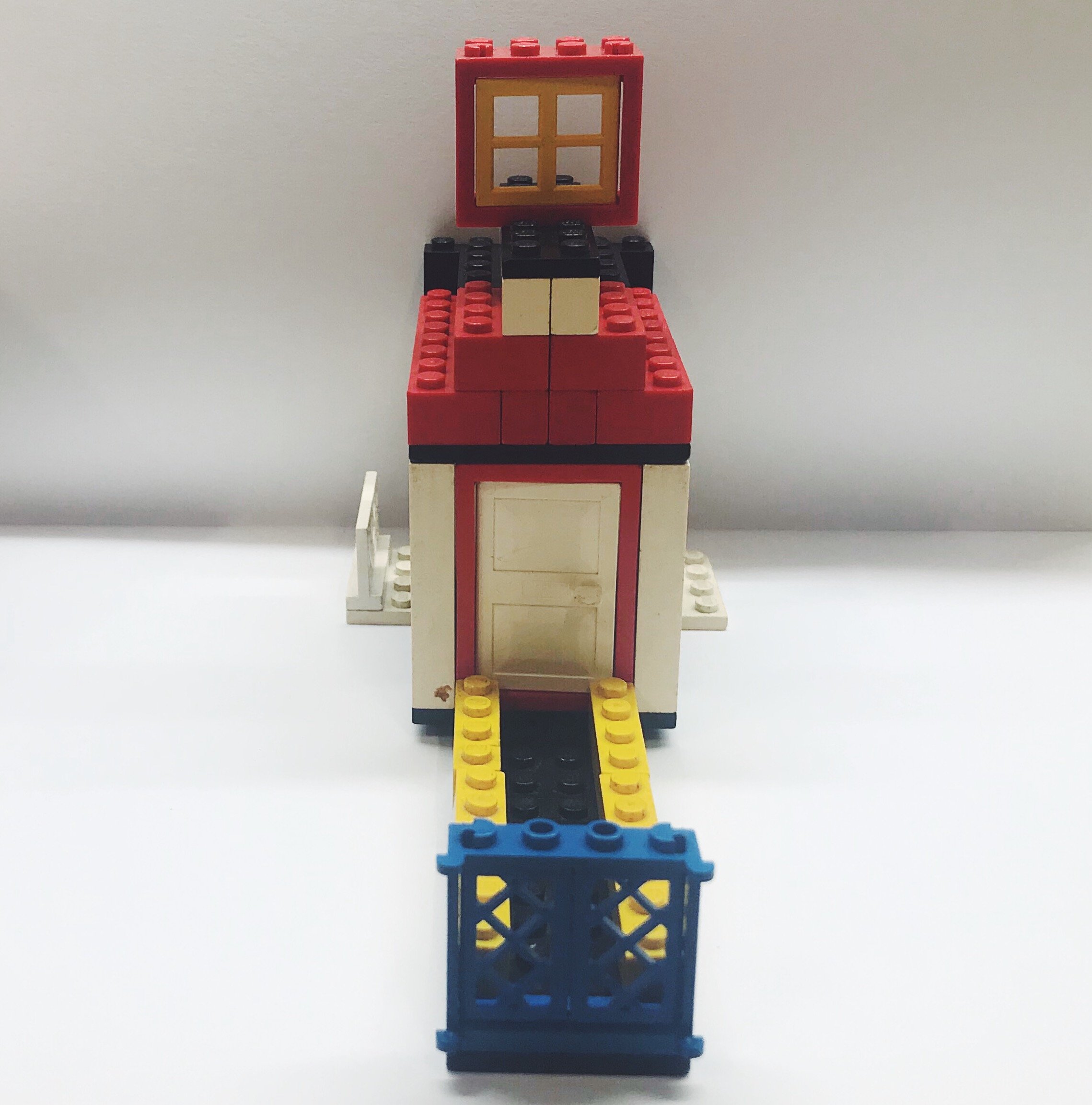
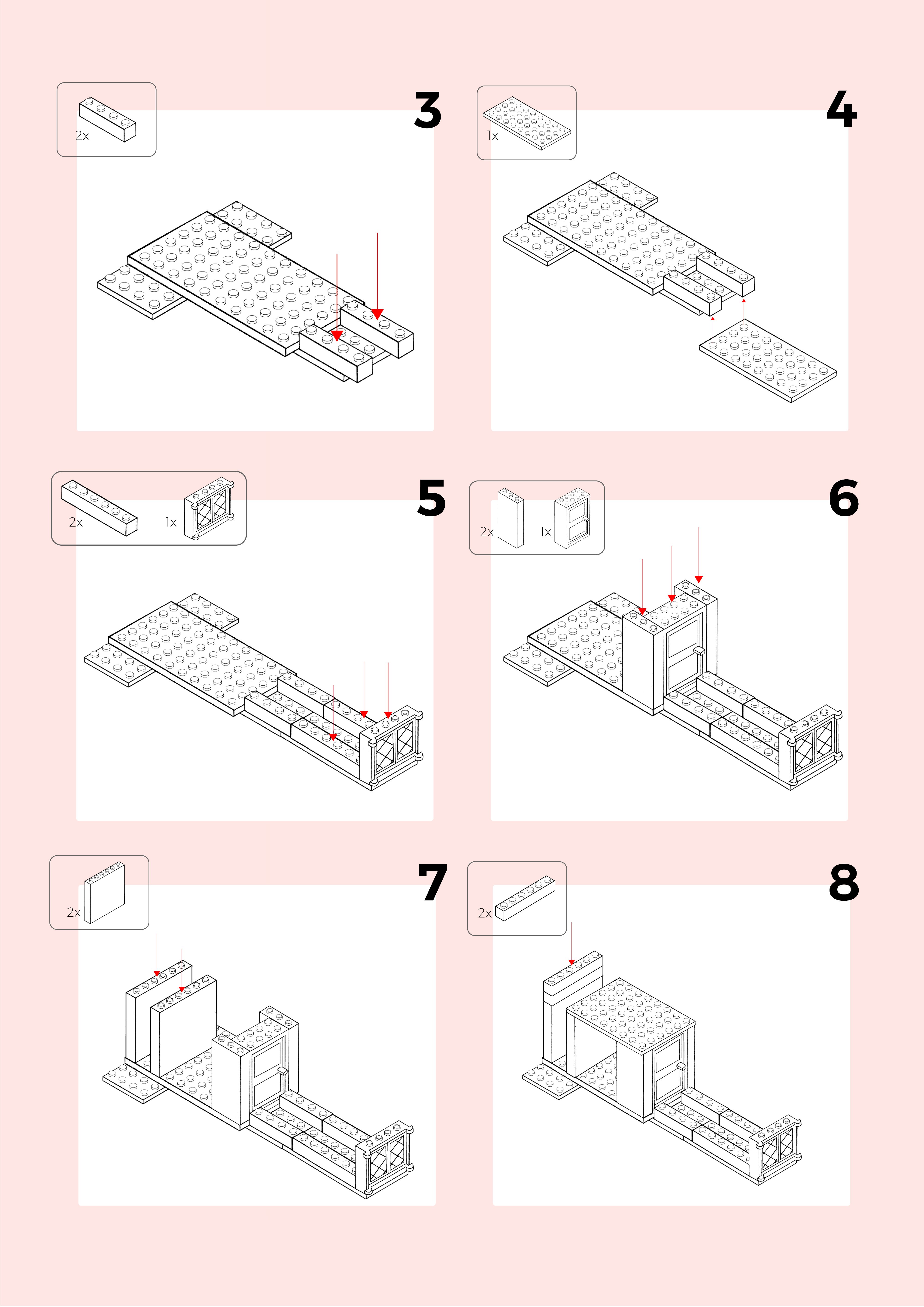
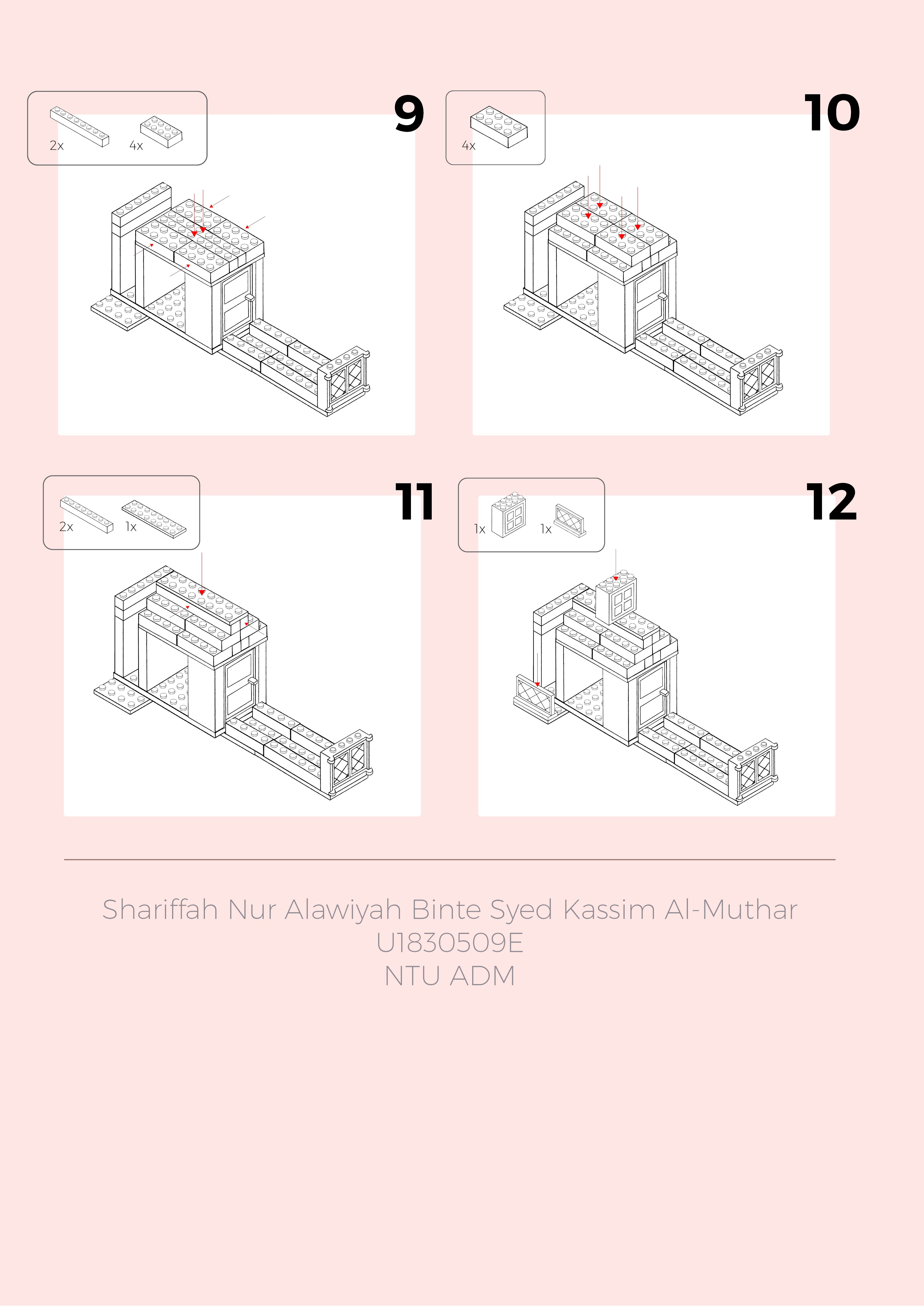
For this first assignment, we learnt Orthographic Projections before attempting to create an instruction manual based on a lego-built of our choice. The objective is to create a clear manual for others to follow and re-create my built.
This was to be done via Axonometric Drawings, specifically, Isometric. Apart from Isometric, Diametric and Trimetric are other branches of Axonometric Drawings. Along with those, we also practiced some Oblique Projection Drawings.
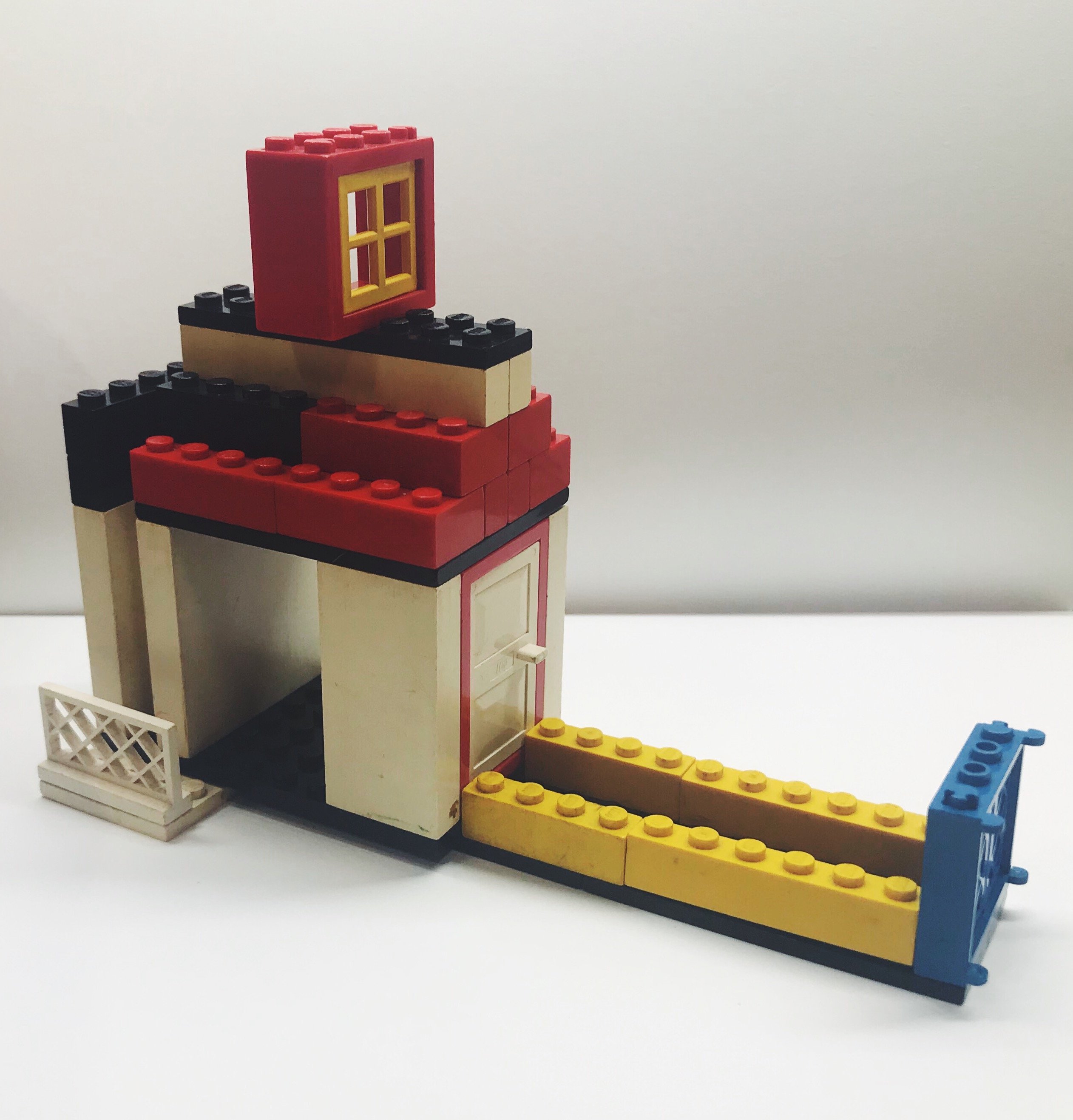
Sherry, our lecturer, provided us with Lego pieces for us to come up with our desired built. I decided to build a Dollhouse. As a kid, I was never really into dolls nor was I into girly things. As I got older, I realise that I missed out on the fun of it all; dressing up dolls, having tea parties in dollhouses. Hence, this is my simple take on a dollhouse that I never had, reliving my childhood as an adult.
Here are the different views of my Lego built.
Side
Side
Front
Back
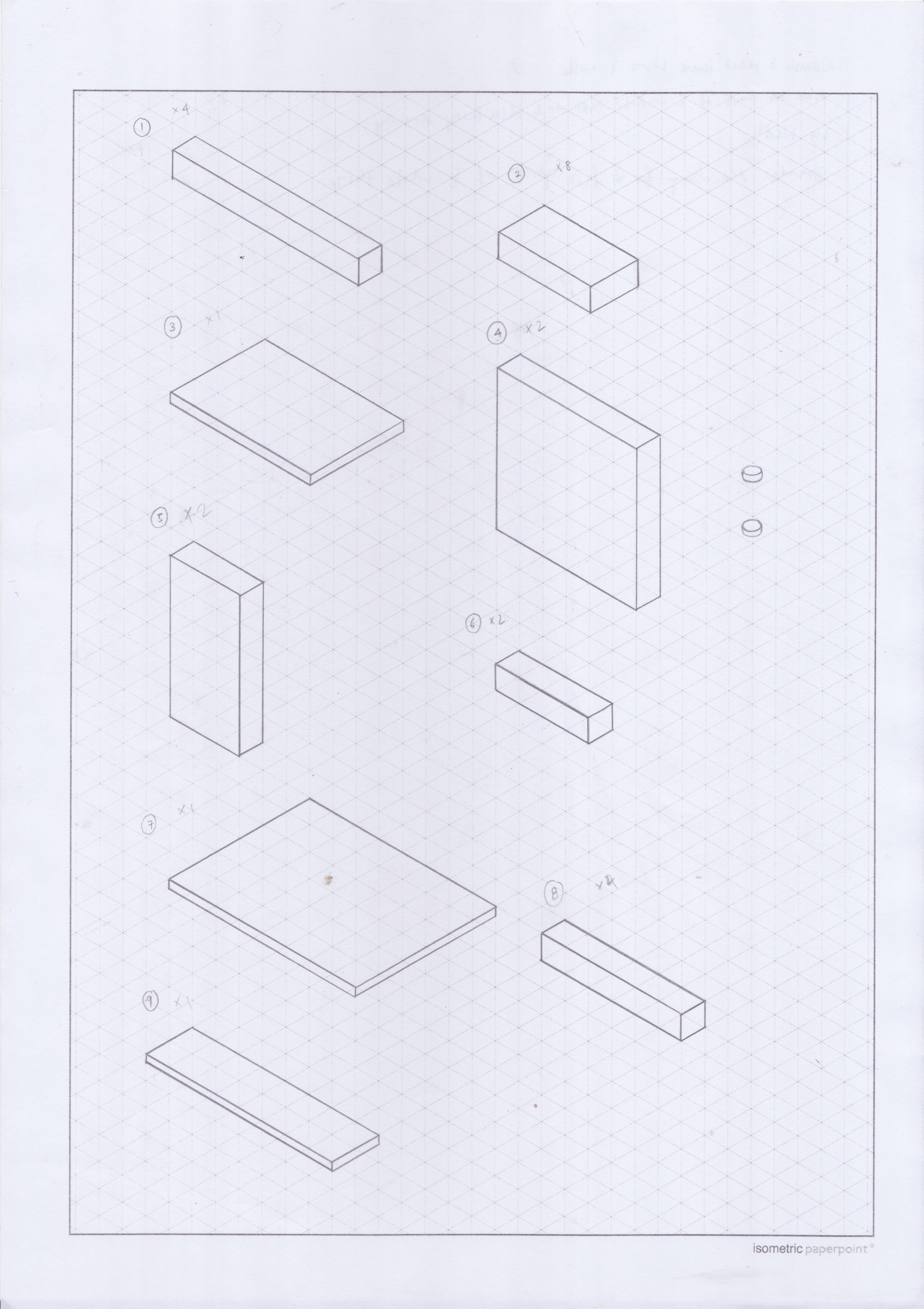
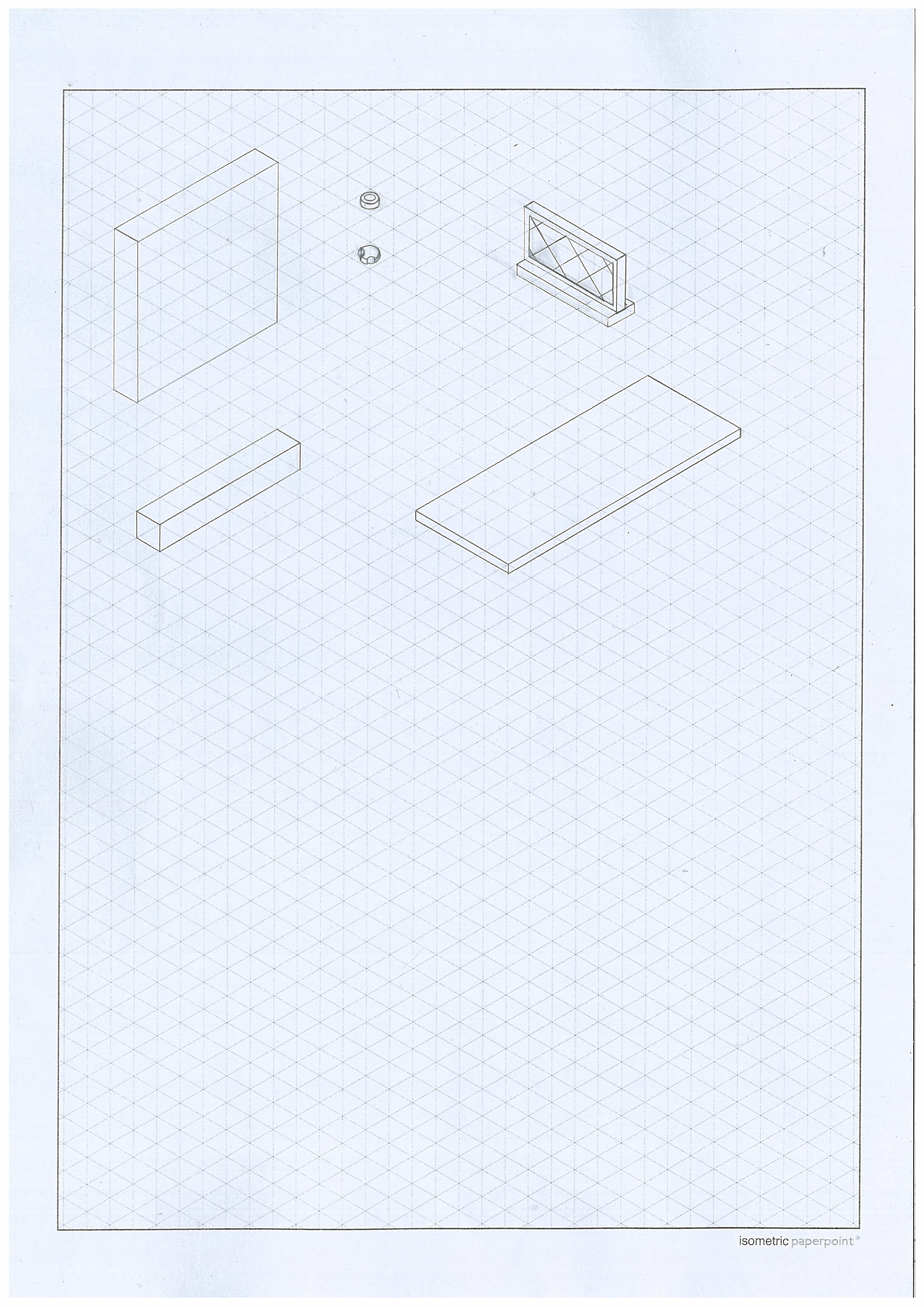
Below are the raw drawings of my Lego pieces.
Page 1
Page 2
Page 3
I realise that although my built looked quite simple and compact, there are many pieces that went into building it as I use quite a bit of “platforms” to raise the height of the built and create bases for my roof and base.
Some pieces from the above drawing were not drawn correctly, which I did not notice at first in Pages 1-2. Page 3 were the corrections of the pieces that were not drawn correctly due to the mistake in perspectives.
Lastly, the photos below are my Instruction Manual for The Dollhouse. I tried to make it as clear as possible with minimal steps per box. I chose to have a clean design with pastel tones for simplicity and to allow maximum focus to the instruction itself. I added small rounded boxes in each step to indicate the pieces needed for that particular step. In addition to that, I placed arrows to indicate the direction as to where the Lego pieces are supposed to be fixed.
The designs software that I used was Photoshop at first but halfway through, I switched over to Illustrator as Photoshop was too consuming to assemble the pieces.


Recent Comments