
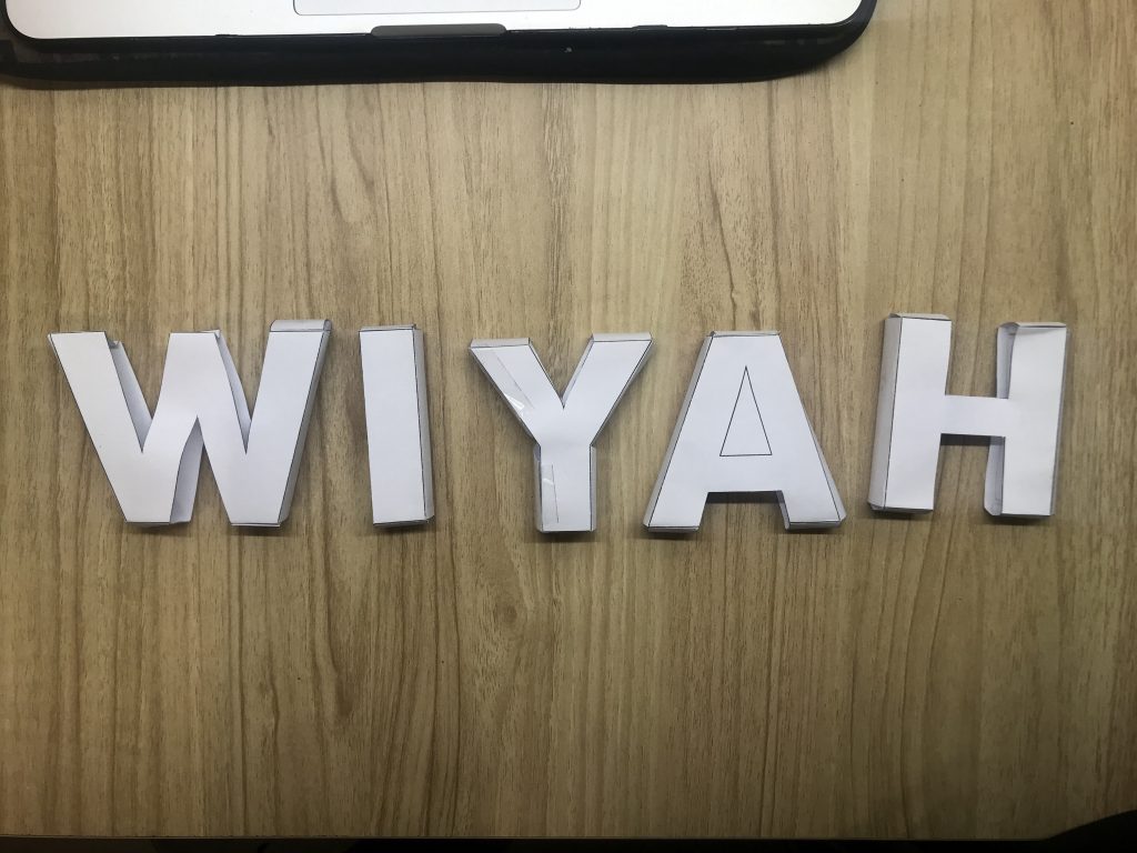
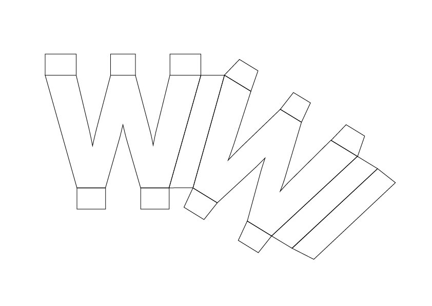
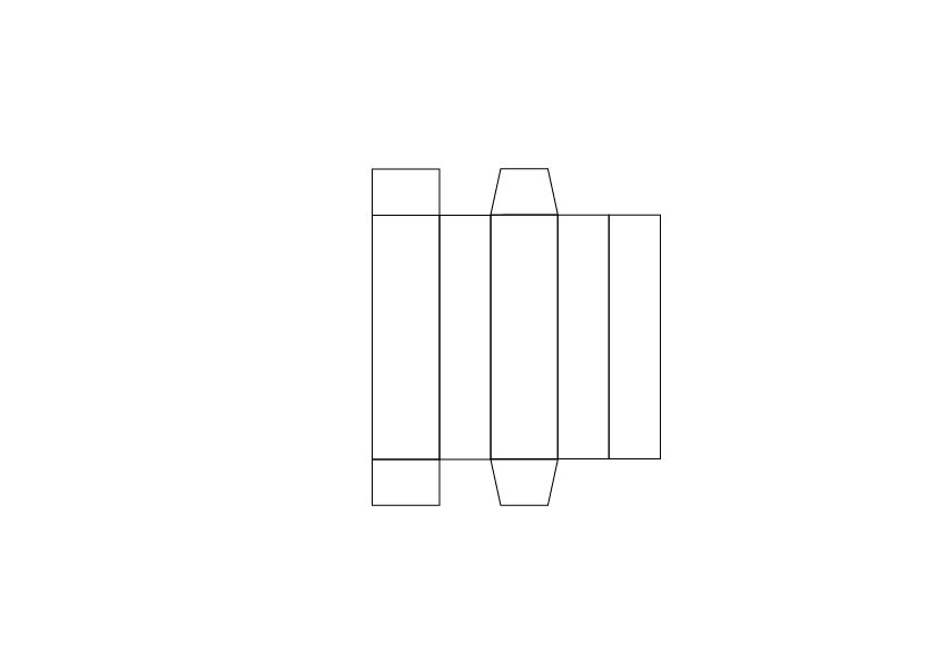
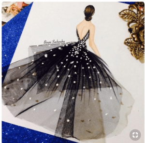
This is it! The final project for Graphic Form this semester.
For Project 2, we were required to create a zine based on the allocated locations.
Zine is a “self-published, non-commercial, independent publication” where you can pretty much be experimental in your different ways to express your ideas or message such as through type, illustrations, form, colour and more.
I was allocated the location, Toa Payoh. At the beginning, I was not quite keen on this location as I was unfamiliar with it. Furthermore, the nature of the location did not really spark any sudden ideas for the direction I would like to take for my zine. However, I tried to keep an open mind!
We were first required to present Part I: Site analysis, documentation & Research.
This allowed us to establish the context, history and uncover stories or architecture of the place, that would help generate for our zines.
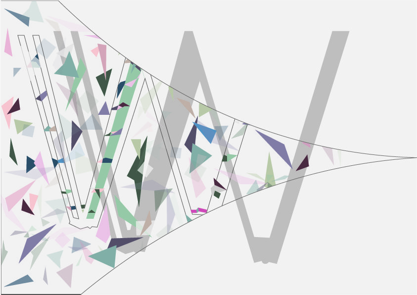
I did a pre-site-research before visiting so that I would roughly be able to look out for things as I went along. It allowed me to cover important or iconic areas of the location and be more focused during site visits.
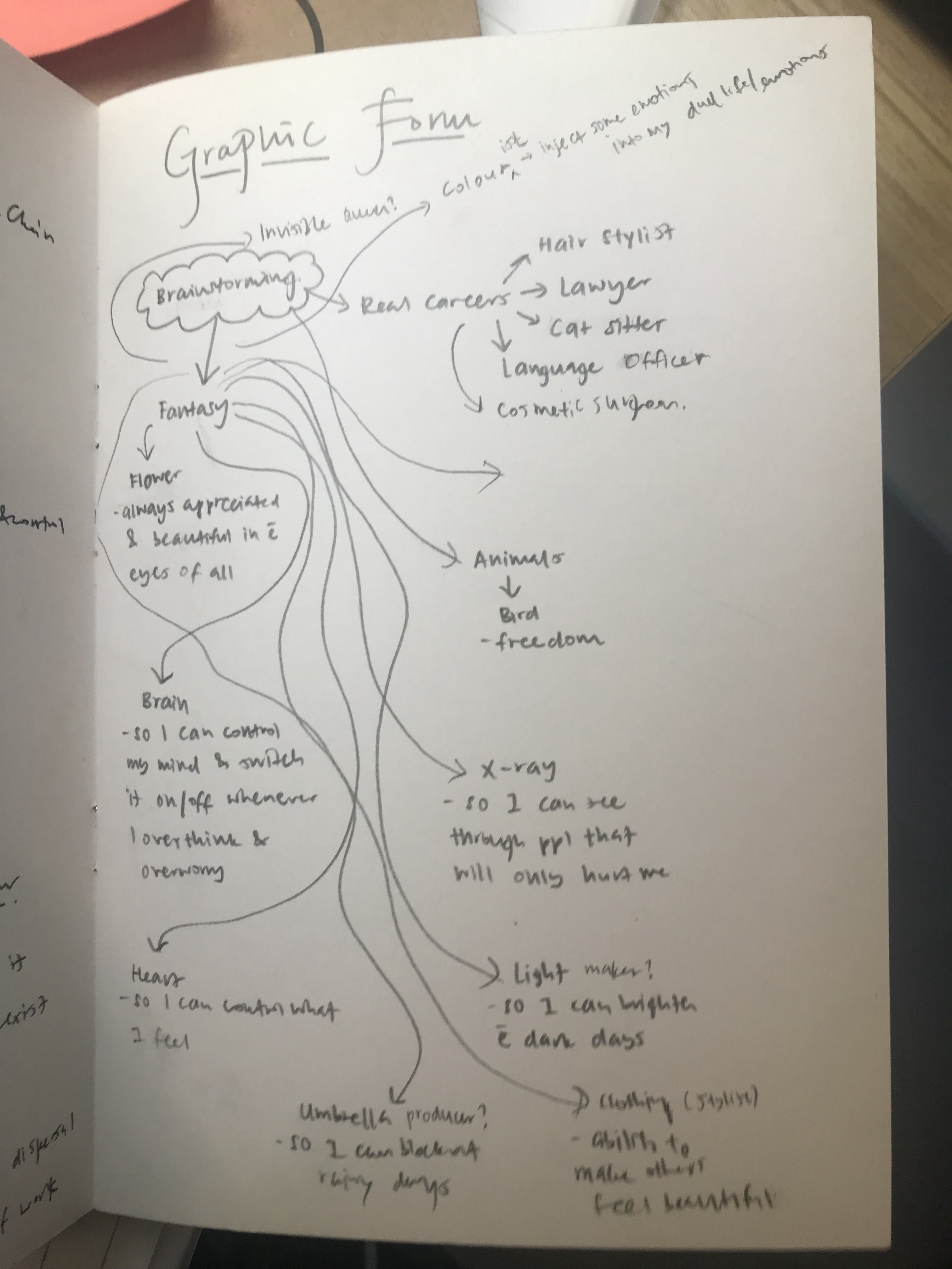
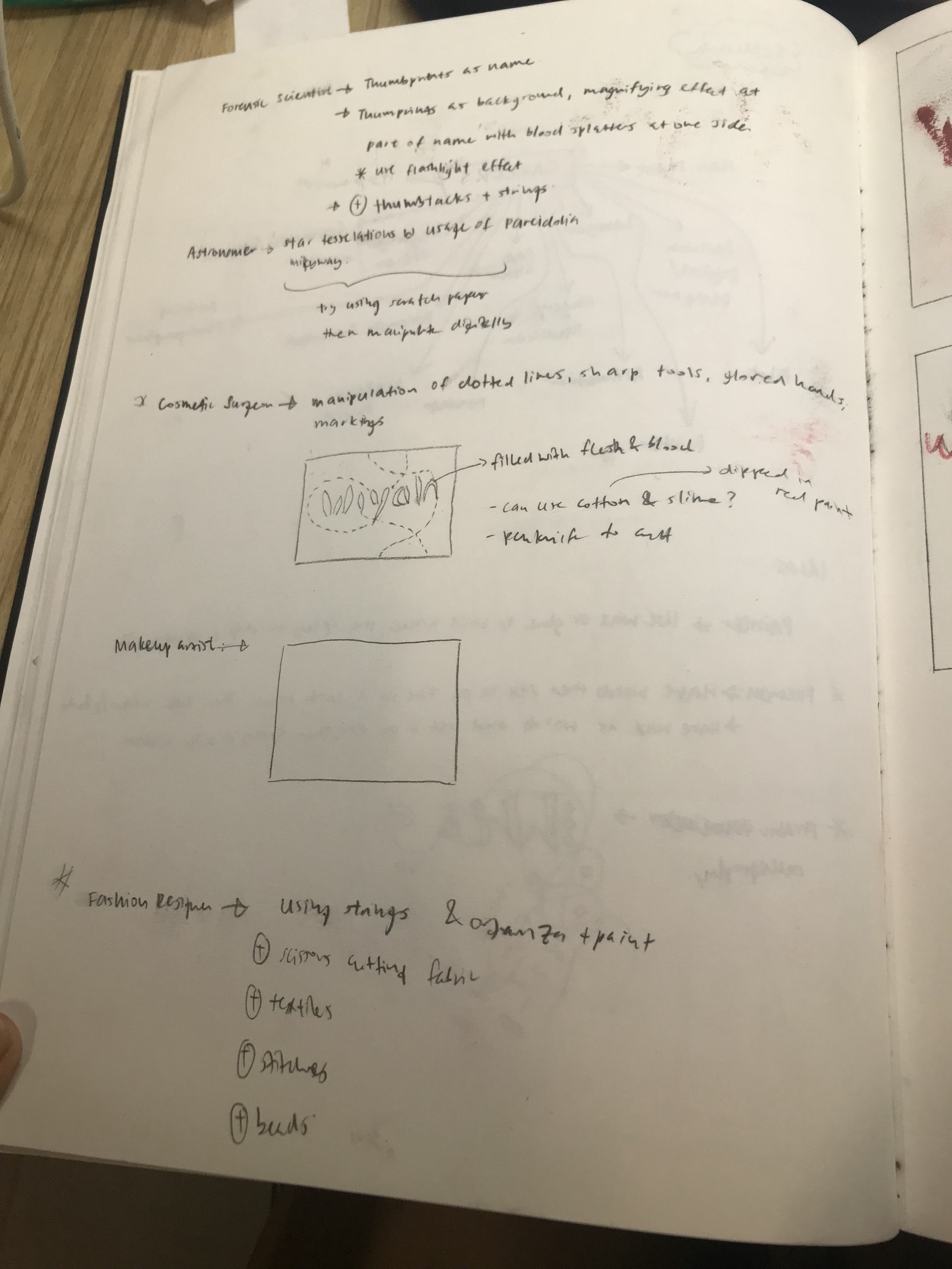
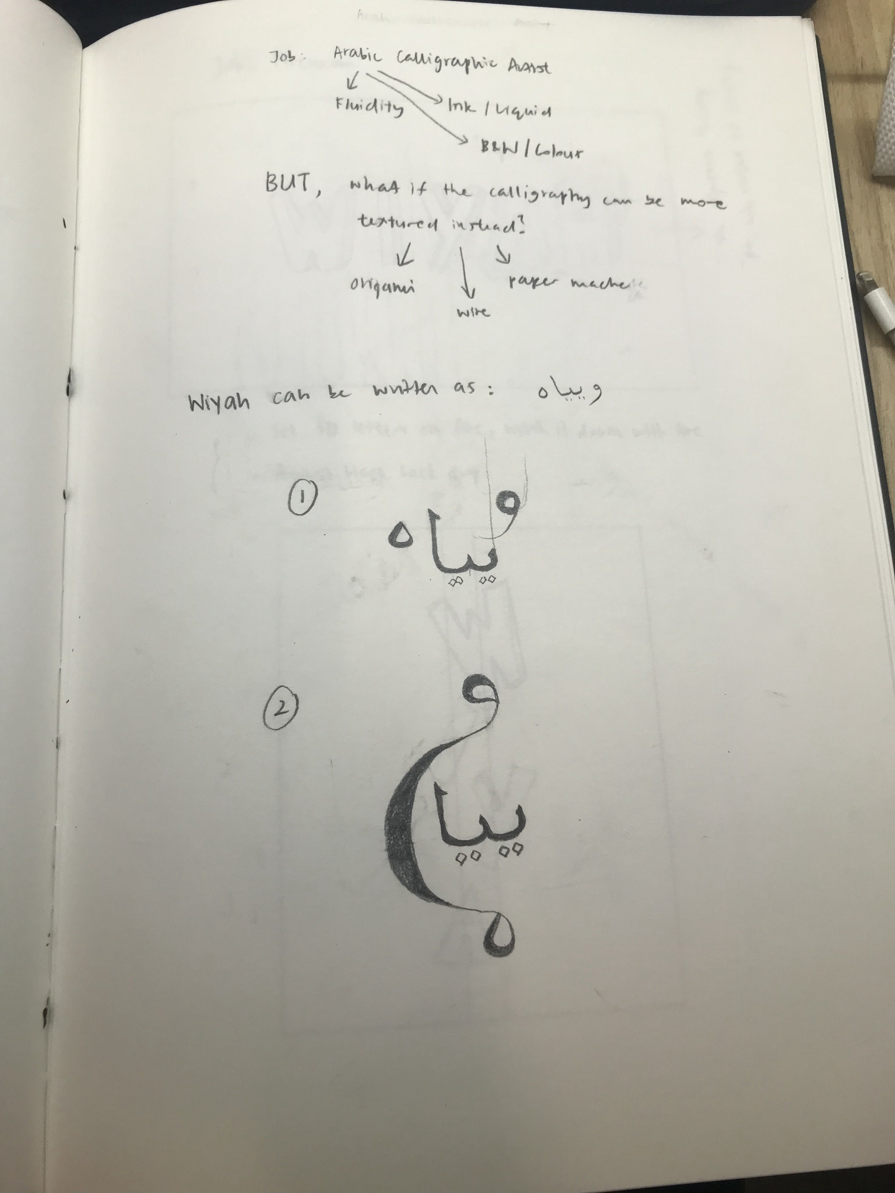
I generated 3 ideas, as stated in the link above:
- “The firsts of..”
- The Old and New
- Freaky Tales
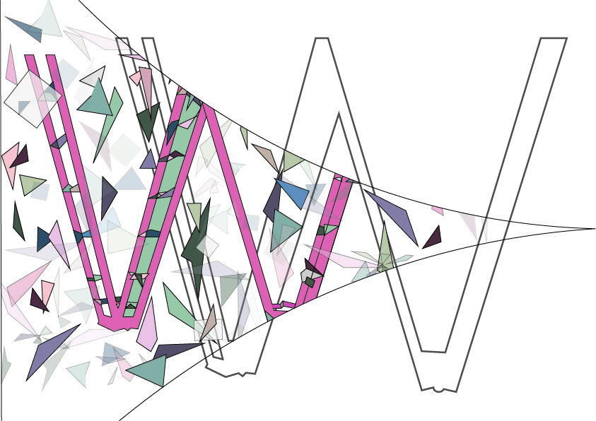
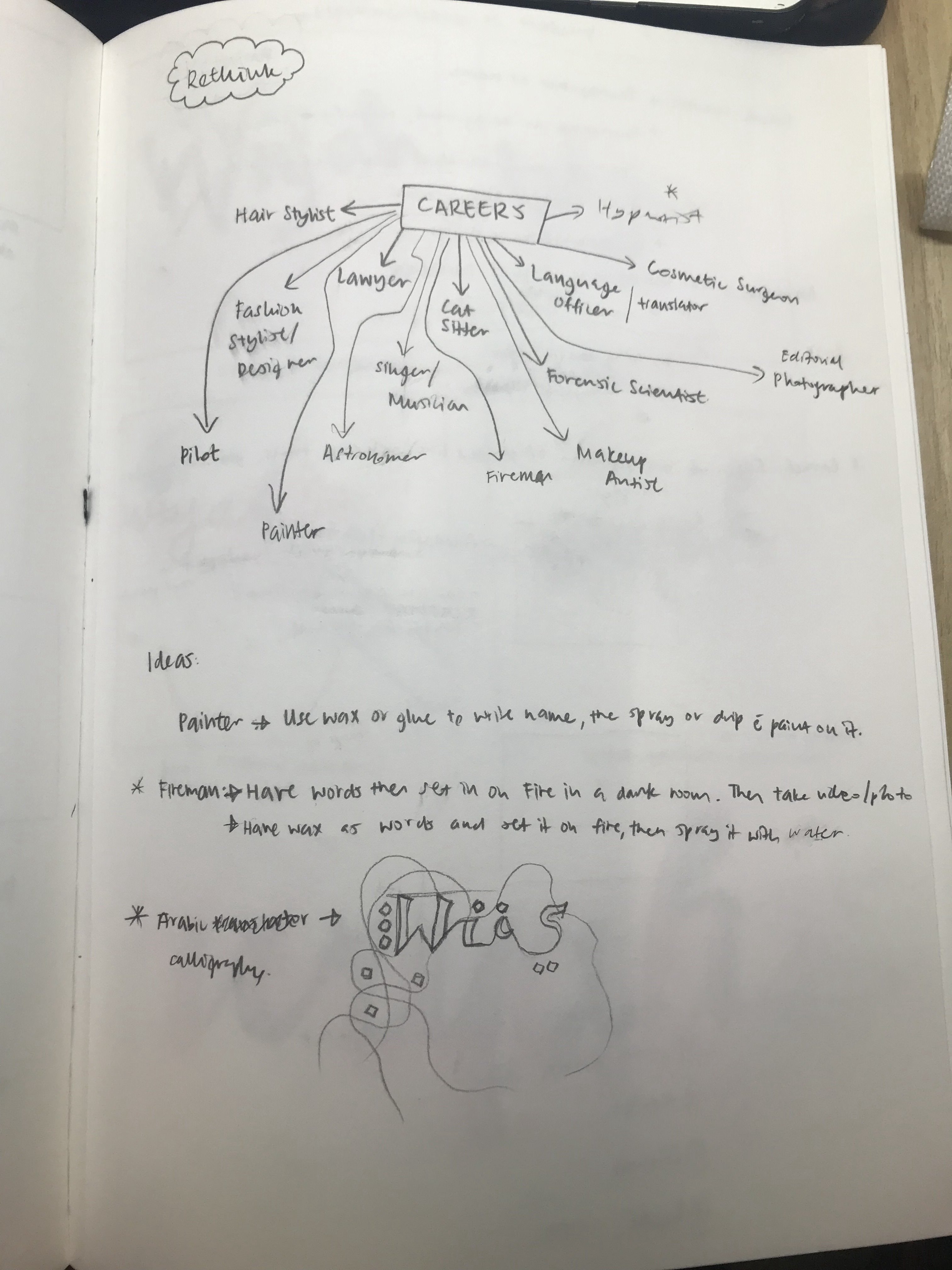
I went back and forth between the 3 ideas as I had several areas of exploration for the three options and was not quite sure which one I wanted to pursue. I felt quite lost for the first couple of weeks as I had a tough time deciding on my creative direction. I wanted to attempt illustration as I knew that it was a weaker area of mine, as compared to photo manipulation.
I ended up deciding to go ahead on Option 3: Freaky Tales of Toa Payoh as I felt like that expressed Toa Payoh quite well when I visited the location. In addition to that, I was genuinely more drawn to and fascinated by the murderous and haunting cases that happened in the area.
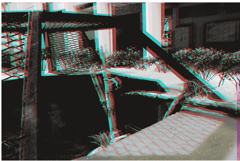
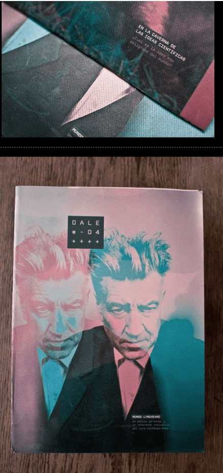
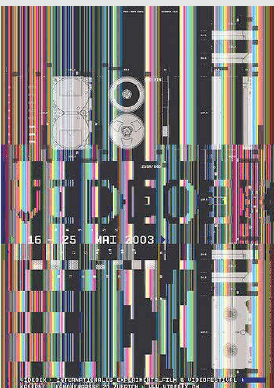
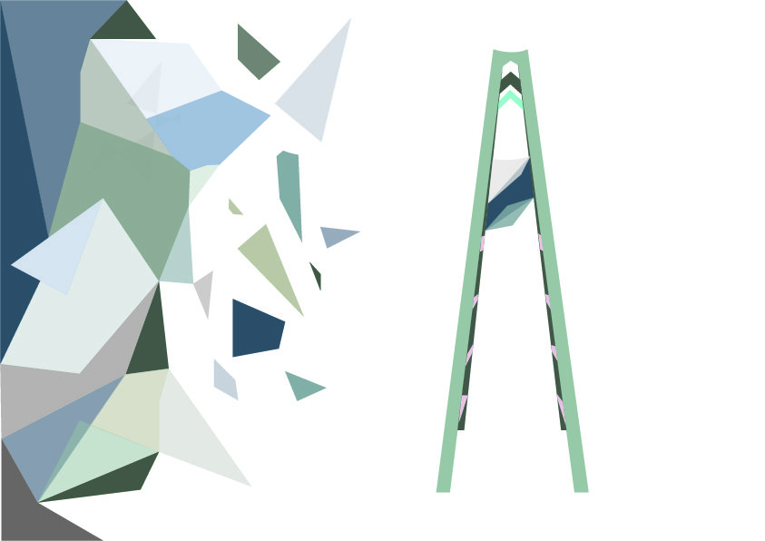
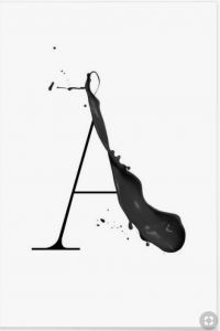
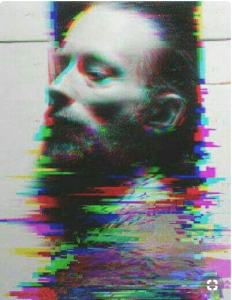
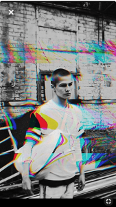
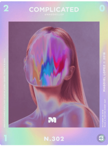
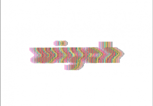
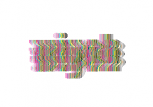
Originally, photo manipulation came to mind. However, I realised that with photo manipulation for the horror theme is something that was quite predictable. For instance, the glitch images using RGB channels such as these:
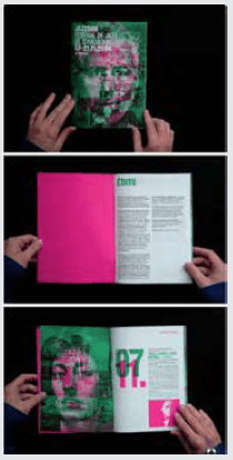
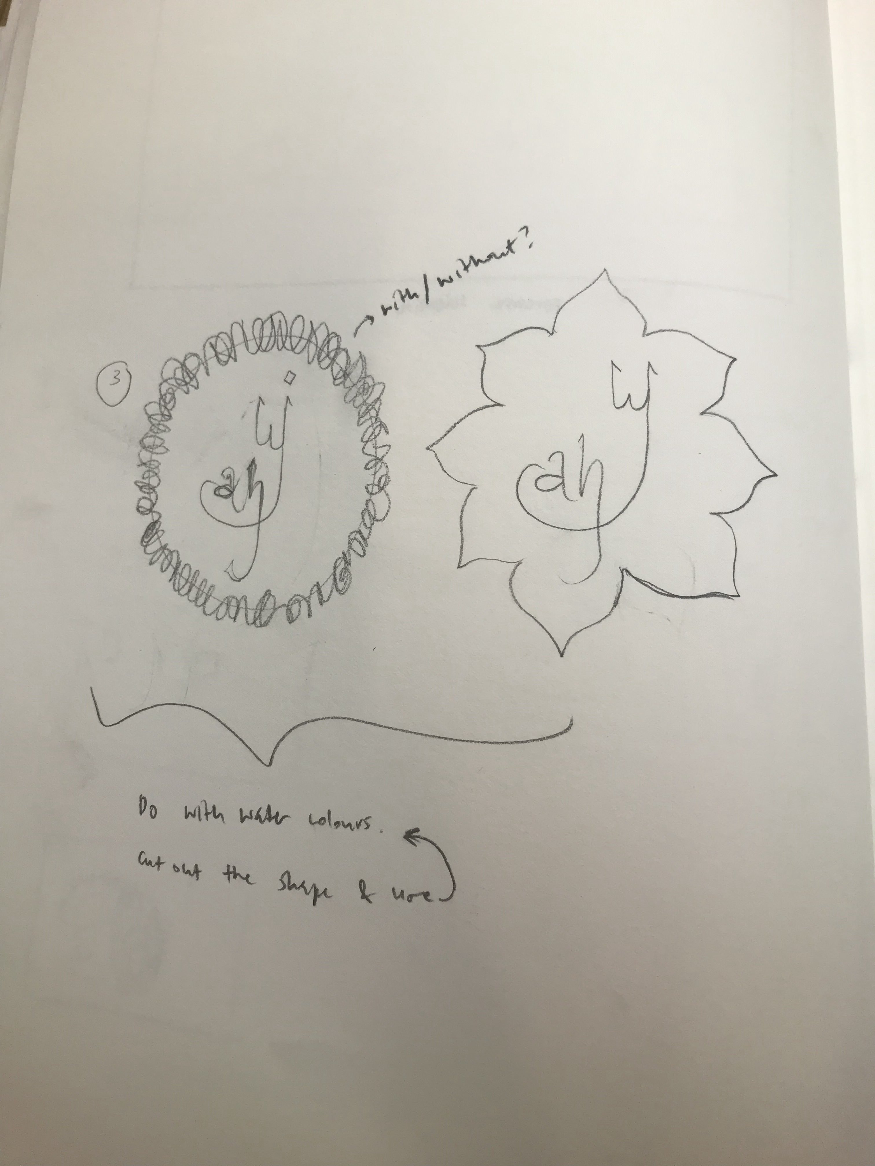
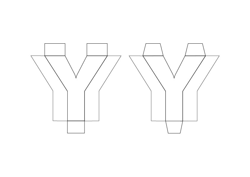
I wanted to try a different direction. I’ve always been interested in Gestalt but never really got around to trying it as my illustrative skills weren’t the best. However, when Ms Mimi showed us images by Noma Bar,
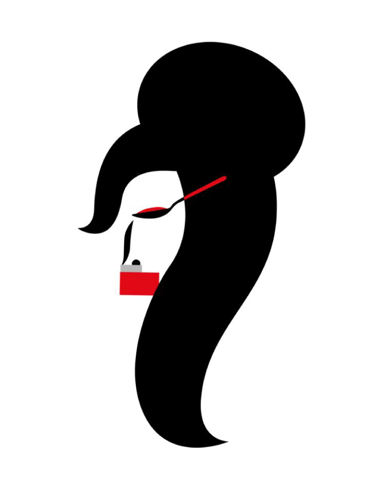
my interest was once again piqued. Of course this stylistic approach demands for critical thinking in design where you are challenged a step further to make universally recognisable associative images and link it to another image metaphorically. Personally, as an aspiring designer, I knew that wasn’t where my capabilities lie as of yet.
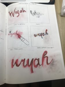
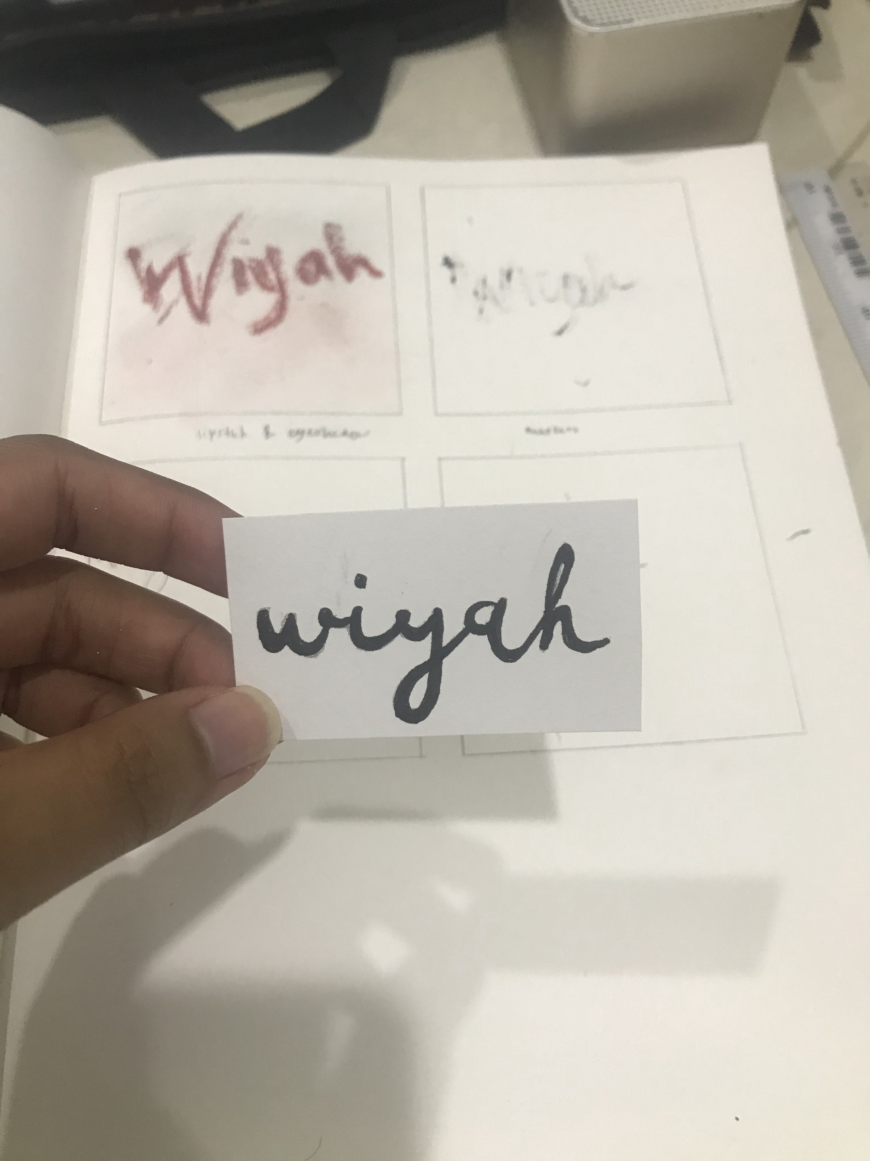
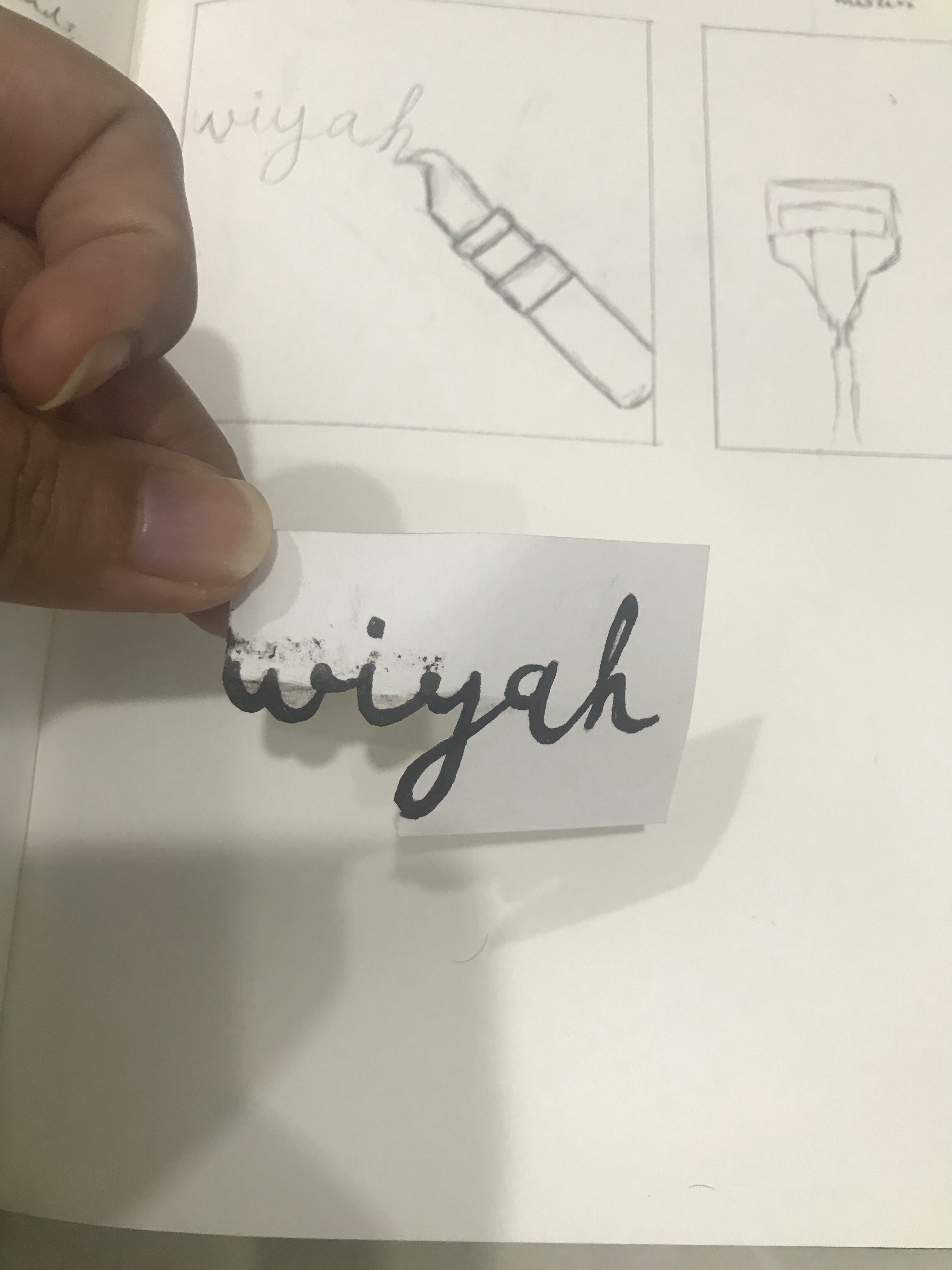
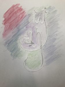
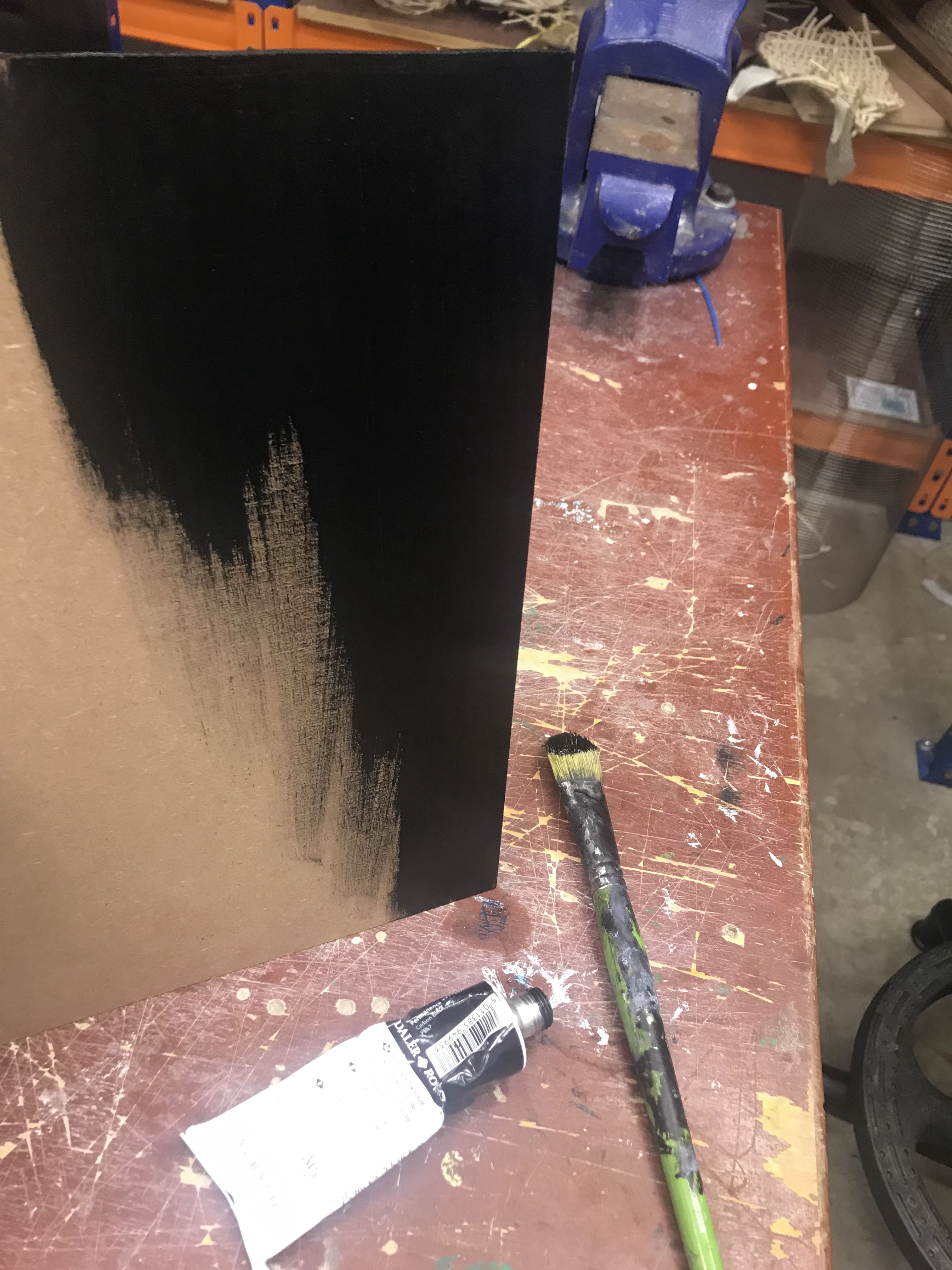
During my many attempts,
PHOTOS
After a few consultations with Ms Mimi, I started my illustrations and went for a different stylistic approach. For this particular zine, I did not really have an artist reference. Rather, I developed my illustrations based on what I thought suited the narrative and played around with composition and visual cues.
I felt like my graphic style was drawn from Noma Bar but I adapted it to fit my style.
This zine was particularly challenging for me due to the very fact that I had to create visual cues that would identify with the masses while connecting the images to the narrative and establishing the architecture of Toa Payoh. In addition to that, I did not really have reference images in terms of style so I had to develop my own. In a way, it was kind of like discovery of my style!
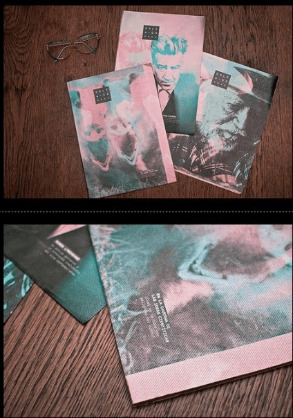
However, in reference to the choice of bold colours, I was influenced by Tom Haugomat
Also, I was very used to using muted pastel tones when I illustrate but I decided to go for bolder colours this time around to communicate my ideas.

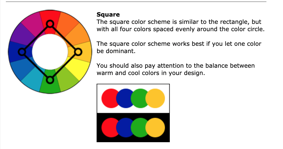
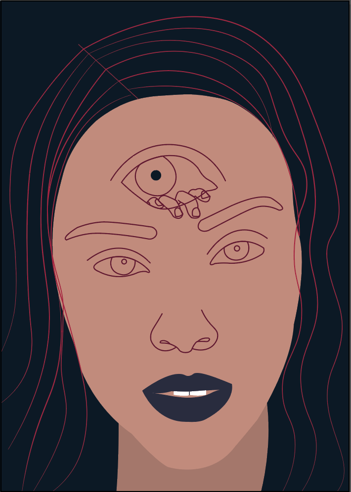
My main selected colour scheme:

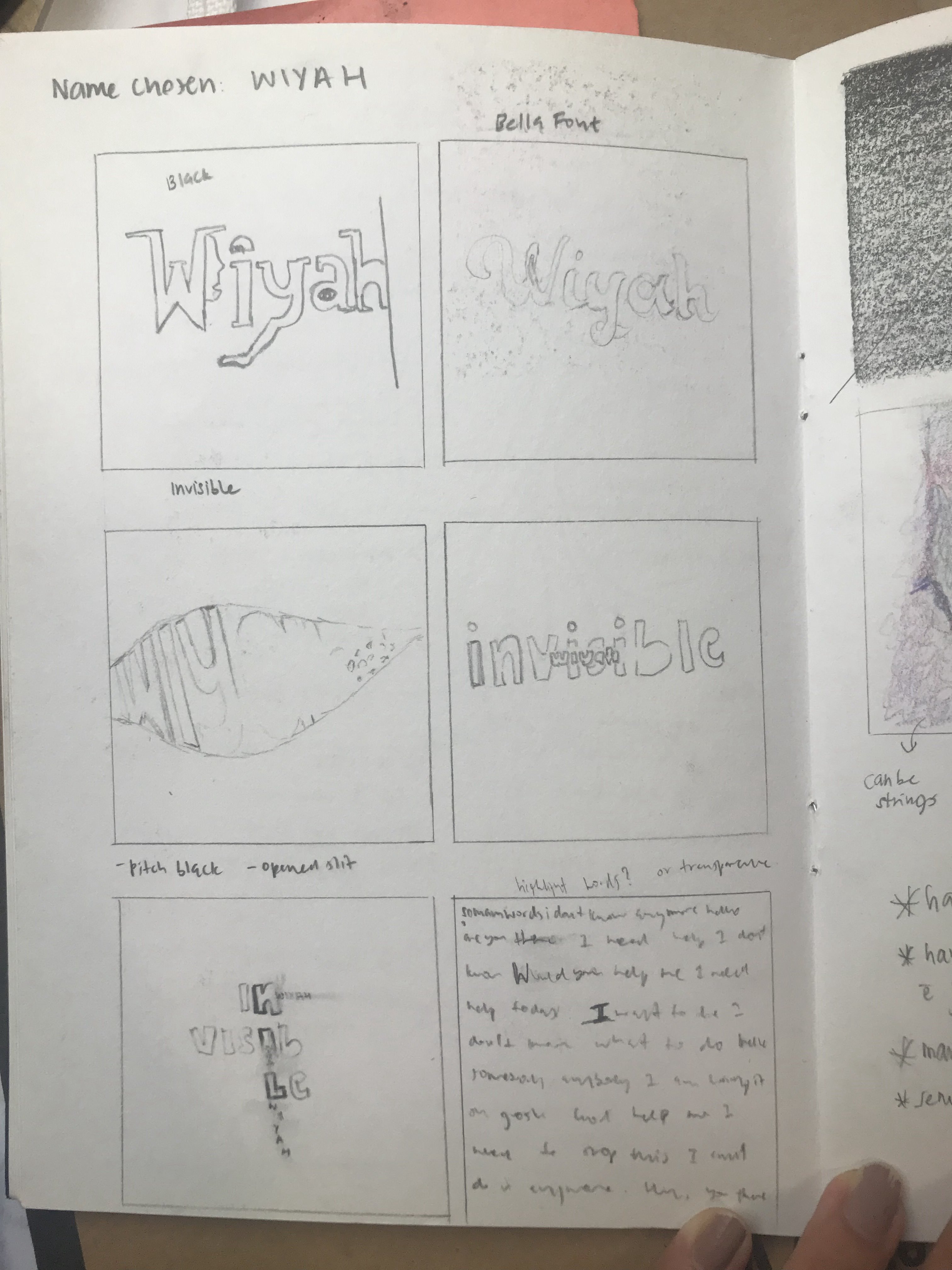
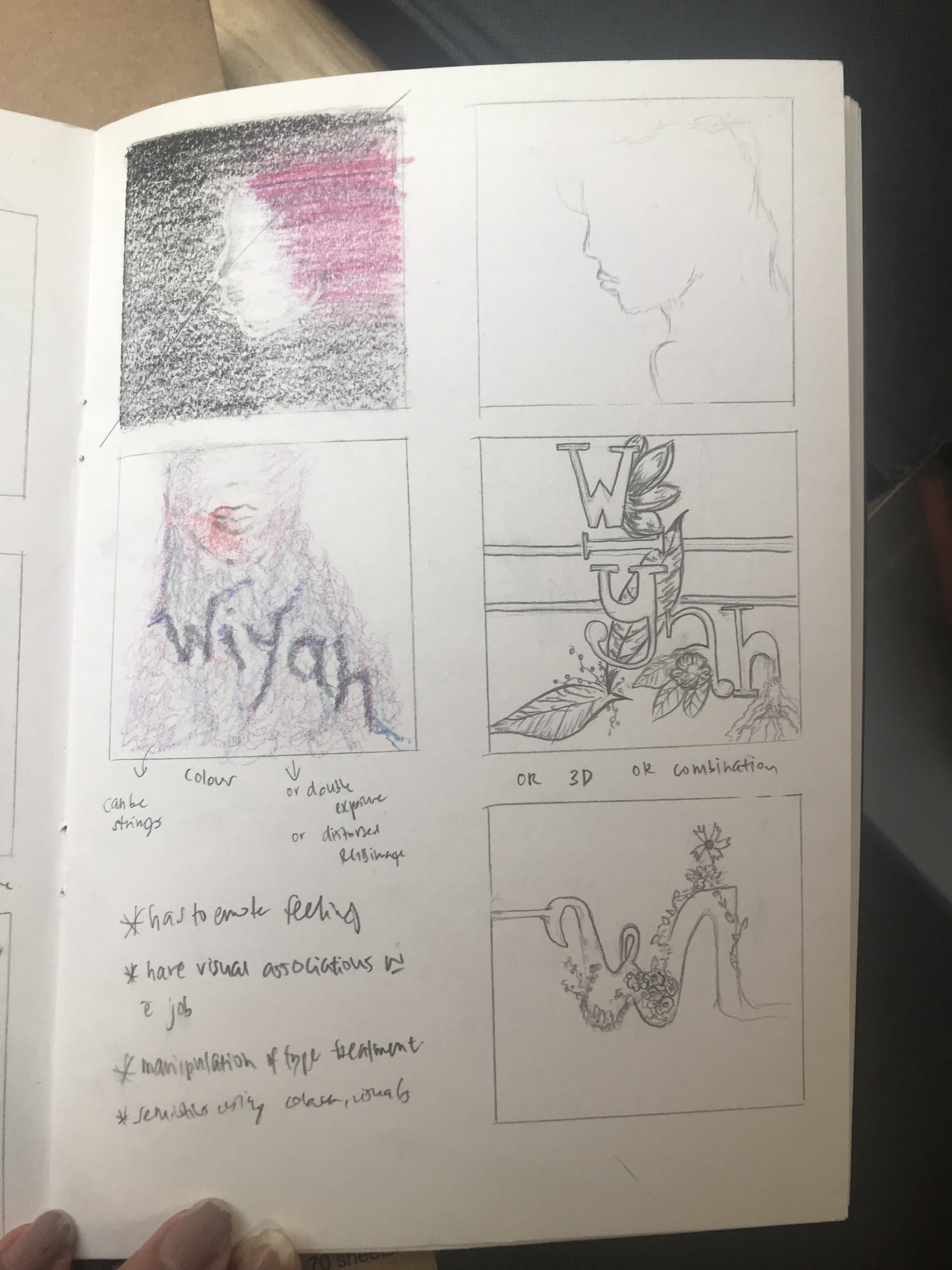
Font:

10pt
My narrative:
Basically, I read up on a lot of paranormal happenings and murder cases in Toa Payoh and wanted to cover many stories but I realised that my zine was only 8 pages and establishing context needs to be done. Therefore, having too many stories may overwhelm the audience.
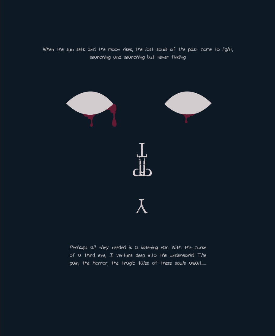
Therefore, I decided on a narrative where I, as a third person, having a third eye, goes to Toa Payoh to explore and met lost souls where I hear their stories and tell them through the zine.
Consistency — The white colour represents the lost souls.
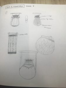
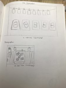
My process:
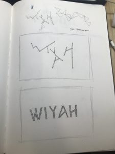
Sketches: PHOTOS
Illustration Process: PHOTOS
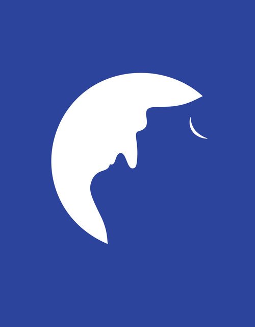
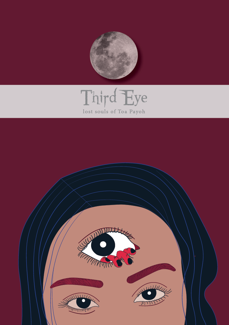
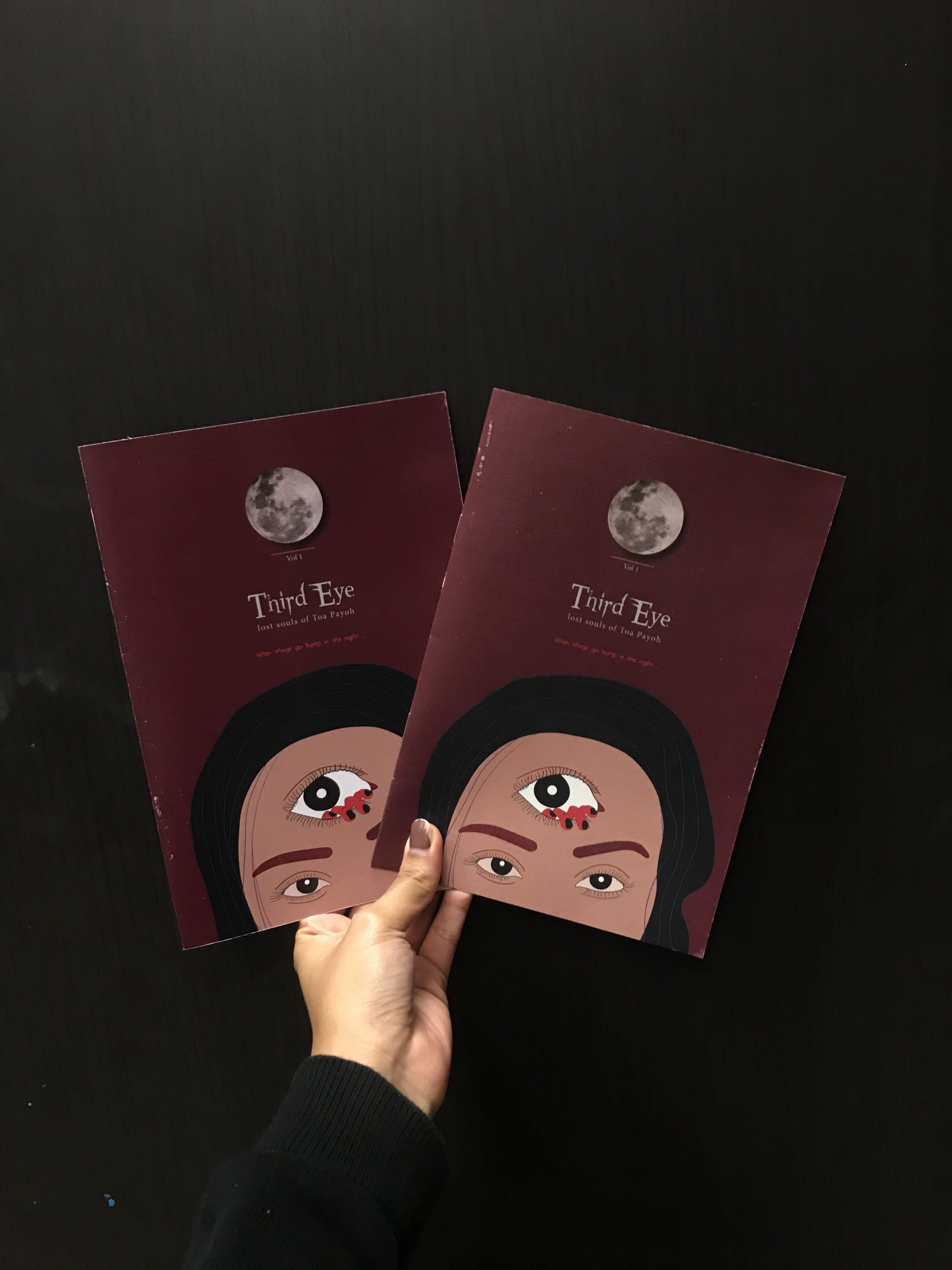
1st page:
This page was meant to communicate the title, The Third Eye and represent the illustration of me, having this ability.
Development:

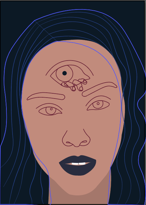
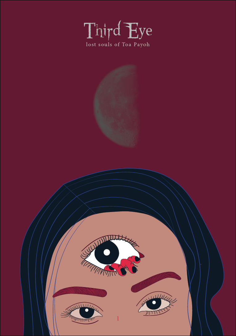
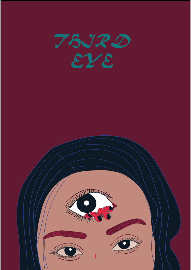
The Final Page:
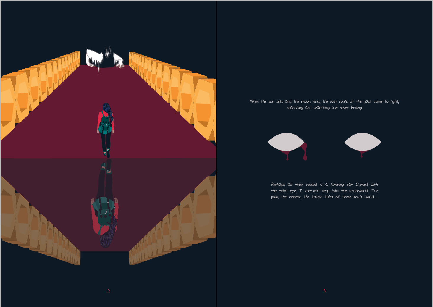
I decided to crop the whole face illustration to just the eyes to communicate the third eye reference. The moon indicates the association of these lost souls who only come out in the dark, at night.

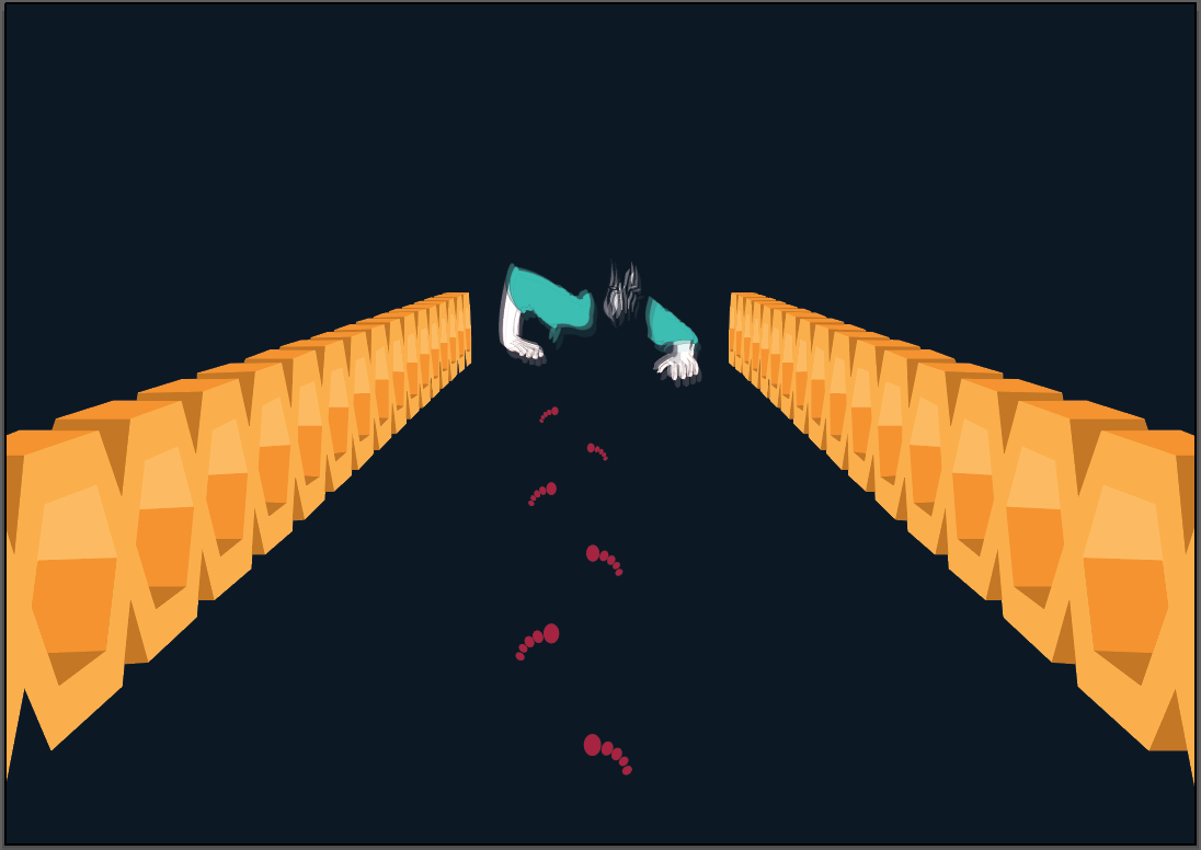
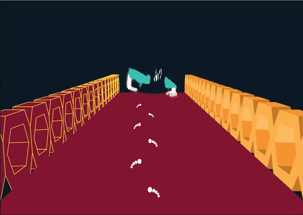
2nd - 3rd page:
This page was meant to set the tone and narrative to readers where I establish that me, as a third person, is going to the other side to communicate with the lost souls from the underworld.
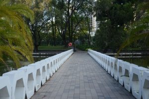
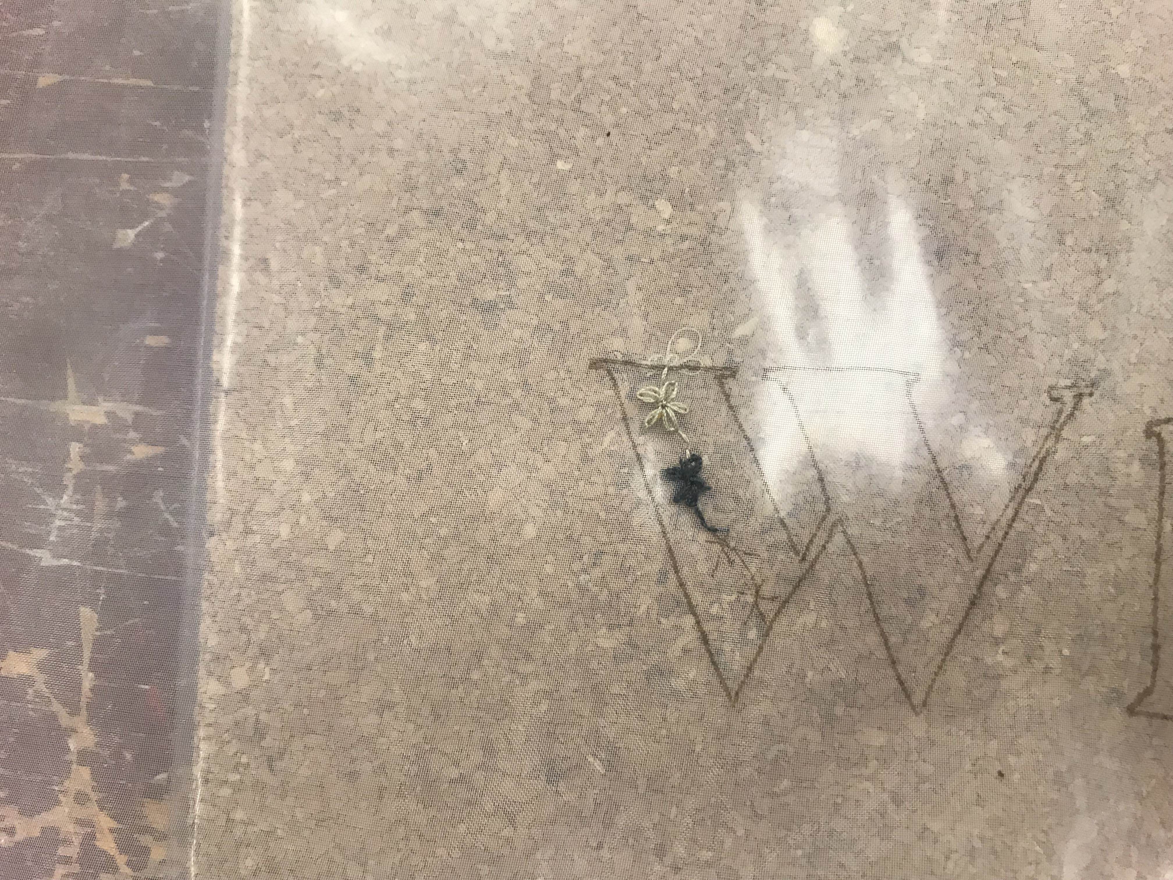
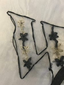
I experimented with compositions and used a unique place in Toa Payoh that had a nice contrast against the nature of old buildings in Toa Payoh; Toa Payoh Town Park. The motif that stood out to me there were the hexagonal-shaped border of a pathway.
Photo I took and used of Toa Payoh Town Park:
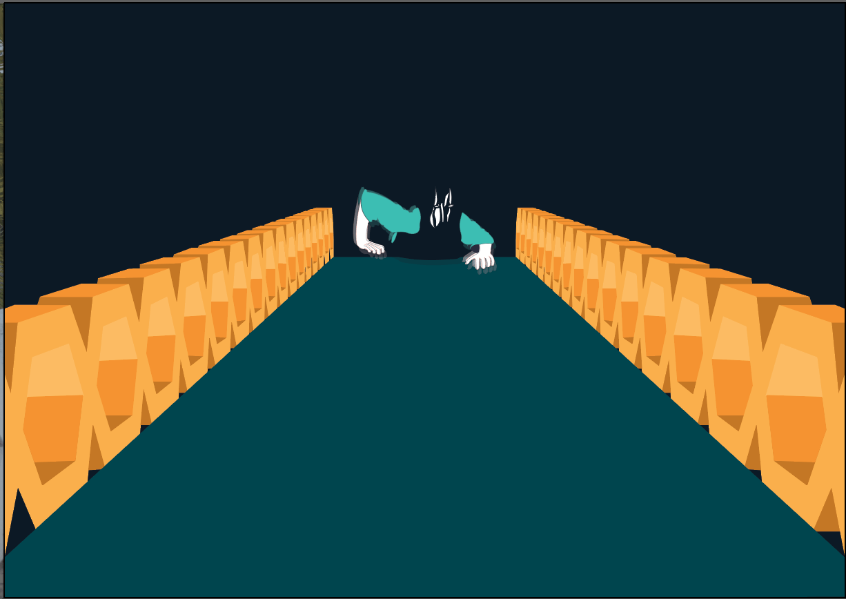
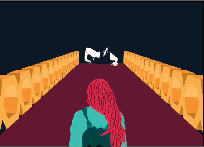
Development:
The message of this particular page was to relay that I was crossing over to the other side to communicate to the unknown. Some of them did not look like I was actually in motion to reach the other side. Constructing the composition of this page to deliver the right message was particularly challenging here. As I had to have a balance between the reaching out of the unknown figure and me, as a third person is mutual.

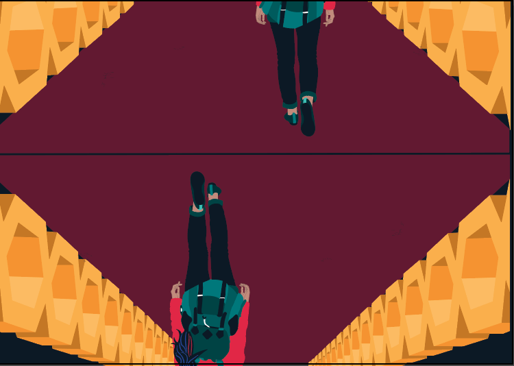

The page next to the above is this one below. I tried to play around with the initials of Toa Payoh (TPY) to fit it into the proportion of the face using typography but I disliked how it looked. Hence, I decided to keep it simple as I wanted the text to stand out in this particular page since it establishes the main context that act as an introduction.
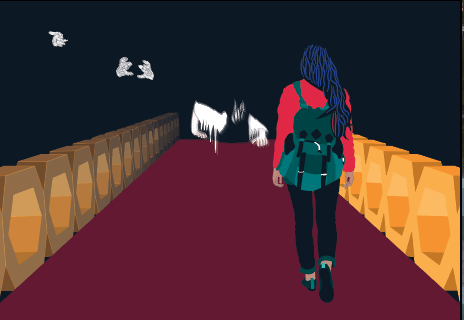
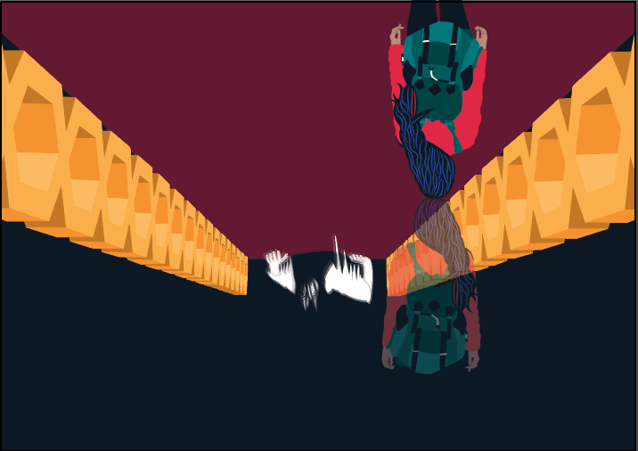
Final spread:
Whilst playing around with layout, I realised that I could communicate the idea of the underworld through the illustration. The underworld is represented as the opaque image where I visibly look smaller compared to the real world depicted below the image above that served as a reflection in lower opacity. I played around with opacity that illustrated the opaque one as the current reality of this zine.
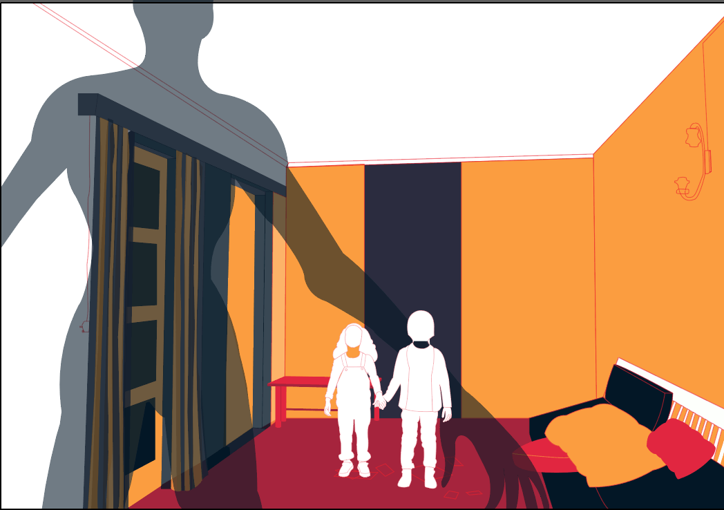
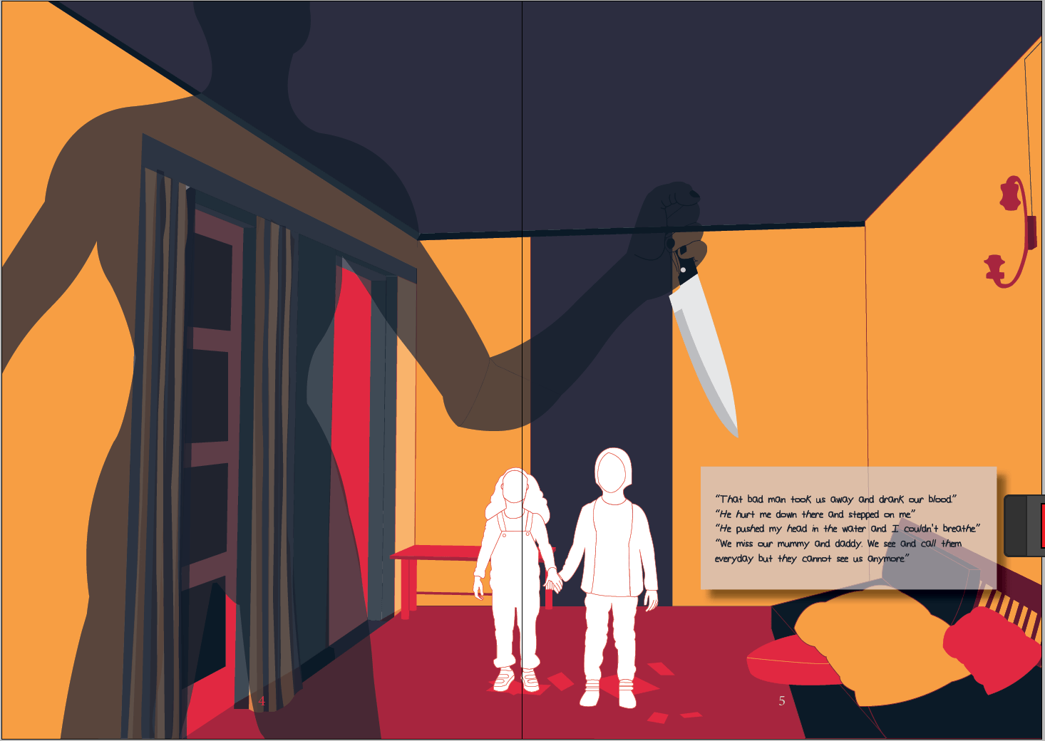
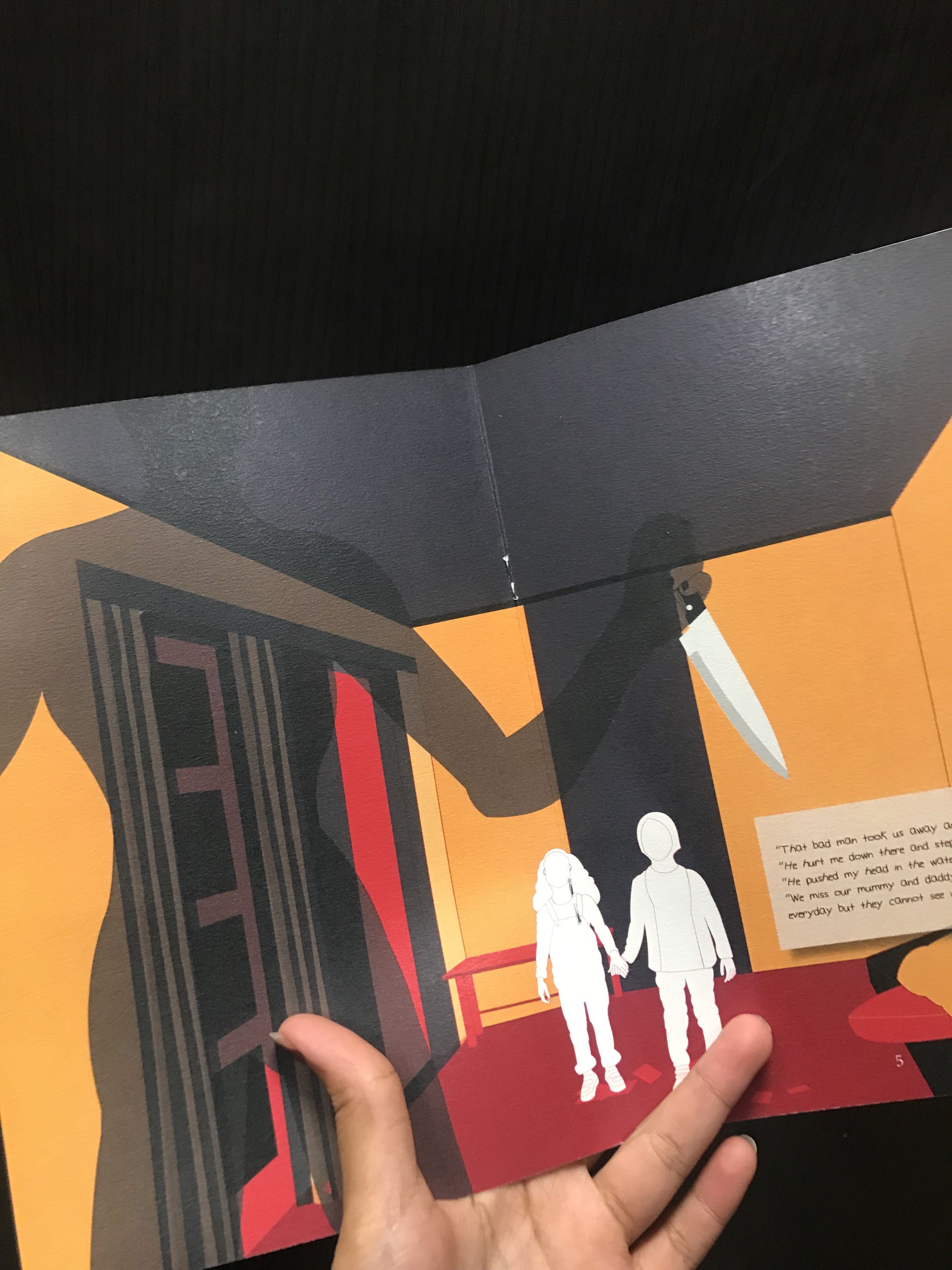
4th - 5th page:
This particular page is the recreation of a case that happened back in 2015.
Reference to story:
Basically, this guy who assumes the job of a medium, kidnapped two kids and tortured, rape and murdered them.
The landscape in this is a graphic illustration of the actual house where this incident happened. I used the shadow man because ‘shadow monster’ is usually associated to the monsters children are afraid of.
Development:

Final spread:
I decided to add a knife that resembles that the man was actually one who is evil and has killed them. The lost souls are represented by the white colour and this was consistent throughout. It also acts as the highlight of the page in which the text, if any, is related to the white figures and it tells their narrative.
6th - 7th page:
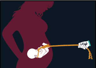
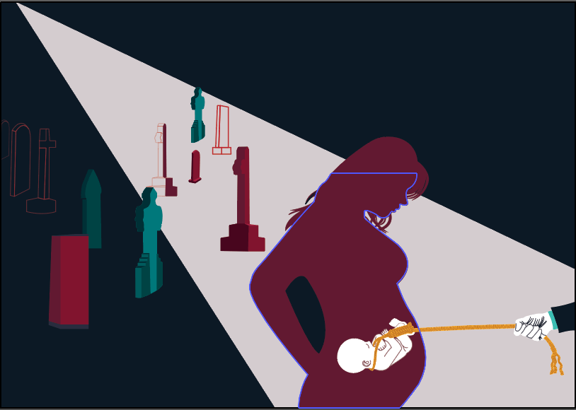
For this spread, the reference to this story was inspired by:
http://www.hungzai.com/bidadari-cemetary/
In summary, this is a story of a cross-cultural love story that was not accepted. The lady experienced unrequited love where she was rejected by her lover even after moving out of her house to pursue her relationship with him. They moved into Bidadari Cemetery where she was forced into prostitution to fund her boyfriend’s gambling habits. She got pregnant and the guy refused to accept her and the baby. Hence, she committed suicide.
In this image, I was trying to communicate that due to the rejection by her boyfriend, who happens to be the only loved one she had left since she abandoned her family to be with him, the boyfriend not only led to her suicide but also the murder of the baby. I used visual metaphor to communicate it where the usage of silhouettes and associative representations were used.
The cemetery illustrated in this imagery is also extracted from the real Bidadari cemetery. The challenges in this particular spread was definitely the composition and where I should introduce a highlight to the page without overwhelming it while still highlighting the cemetery as a location. I also still wanted the attention to also be kept on the stories of the souls.
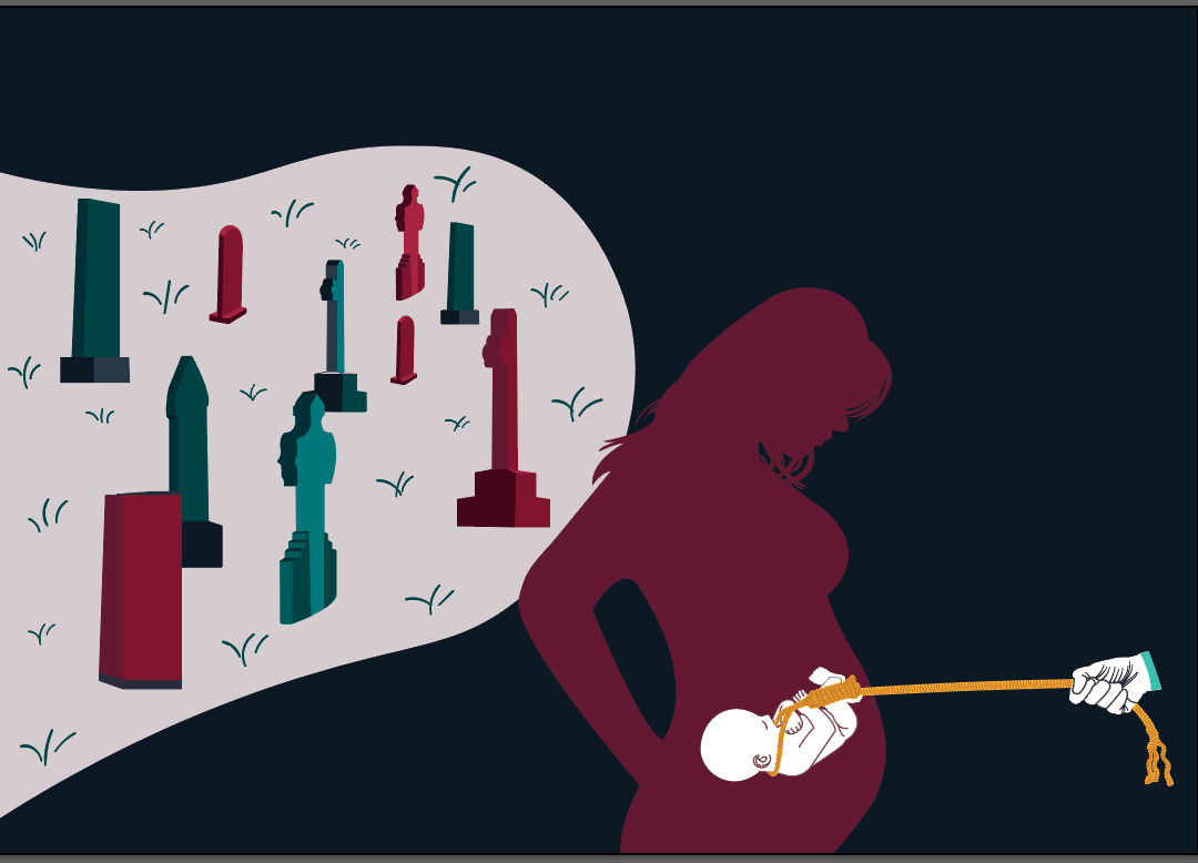
For this particular spread, it was originally just the image of the lady, baby with noose and man’s hand as a whole spread.
But I added other elements as shows below.
Development:
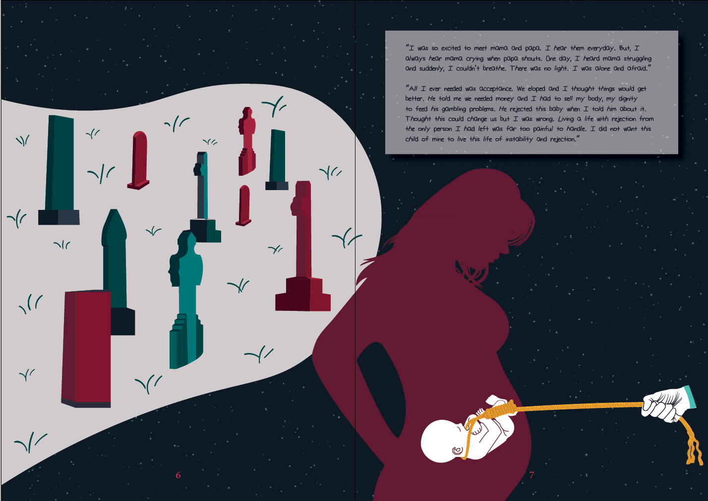
Final Spread:
I decided to introduce a slight textural element to the image with white dots that resemble a starry night as I felt that it looked too plain and didn’t seem interesting enough.
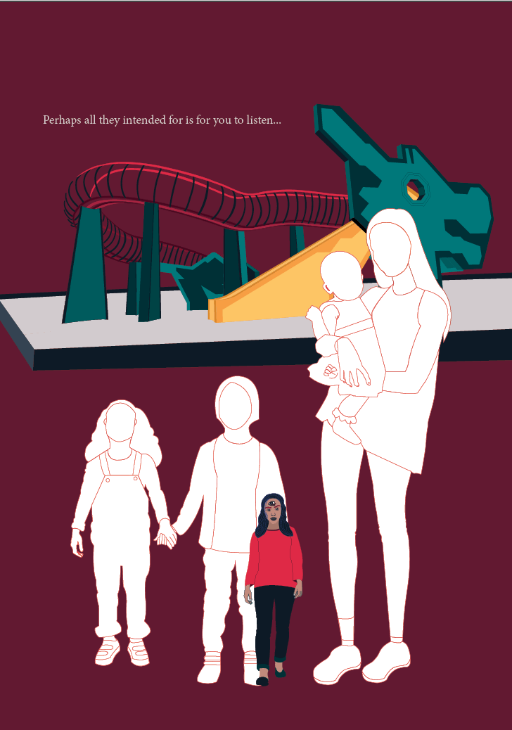
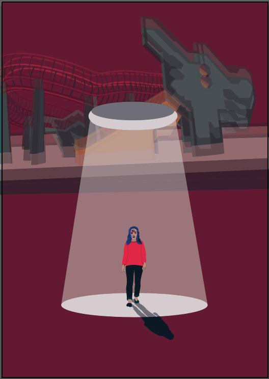
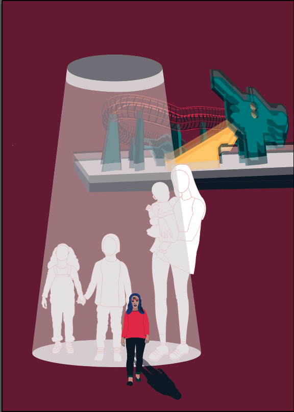
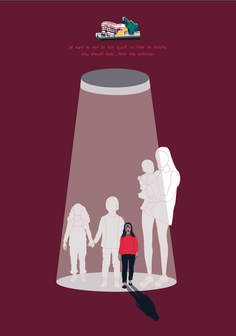
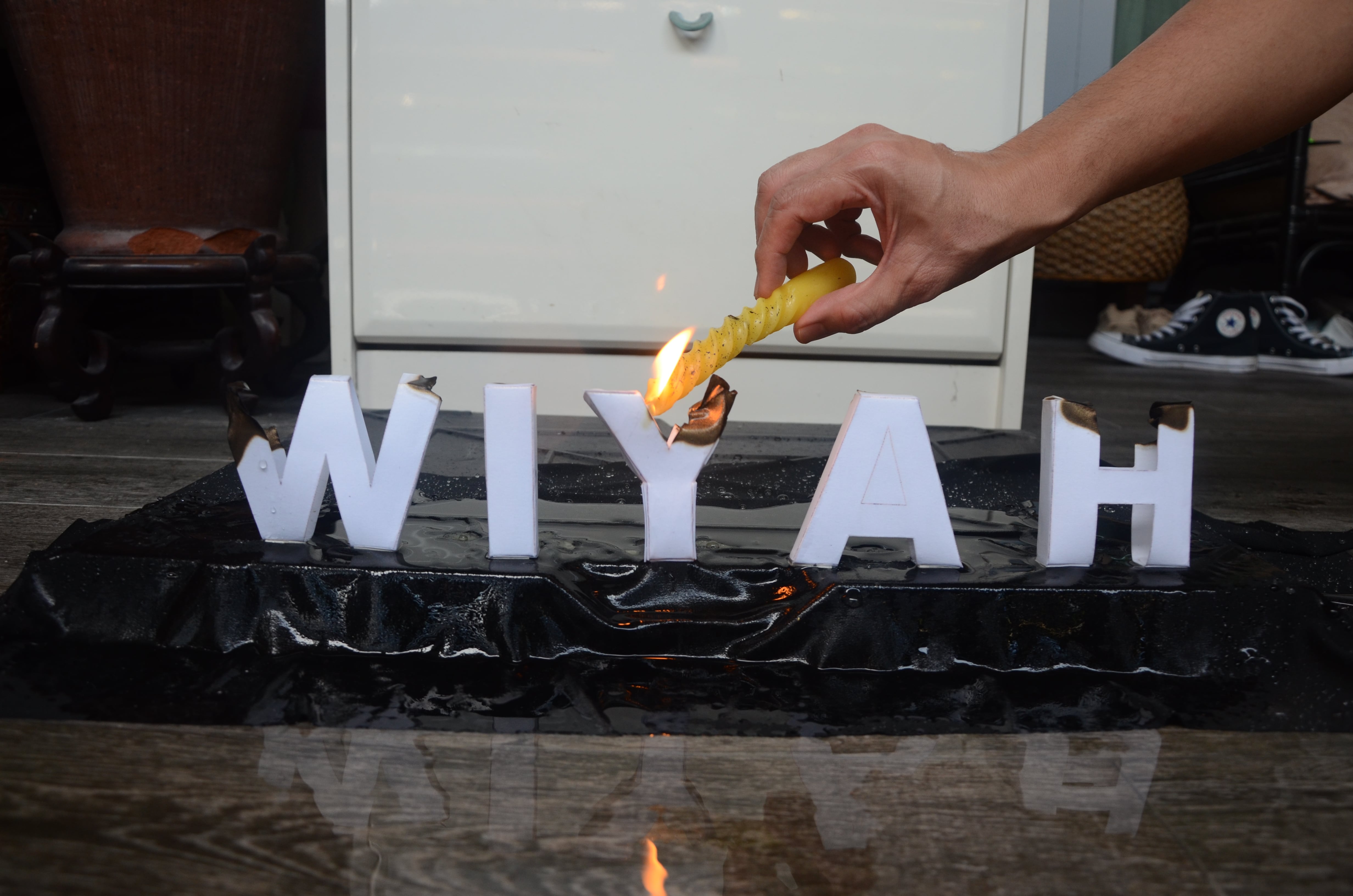
8th page:
For this final page, I wanted it to conclude my zine and relay a location through an iconic image.
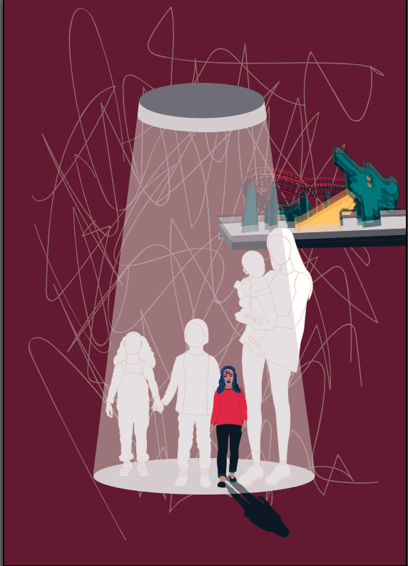
Therefore, with Ms Mimi’s suggestion, I decided to illustrate myself, seemingly depicted smaller compared to the compiled lost souls that are behind me. There is a spotlight shining but the remain to stay in the shadows which metaphorically also symbolise their inability to be spotted by the average person. Also, I added a shadow that for the illustration of me to symbolise that I am “alive” while the lost souls aren’t. I am also in colour which helps to amplify the latter.
To me, this was probably the most challenging page as I was really struggling with composition. I wanted to showcase the iconic dragon playground to establish the location but could not find the correct proportions.
I also played with distortion through replication and opacity for the dragon playground.
Development:

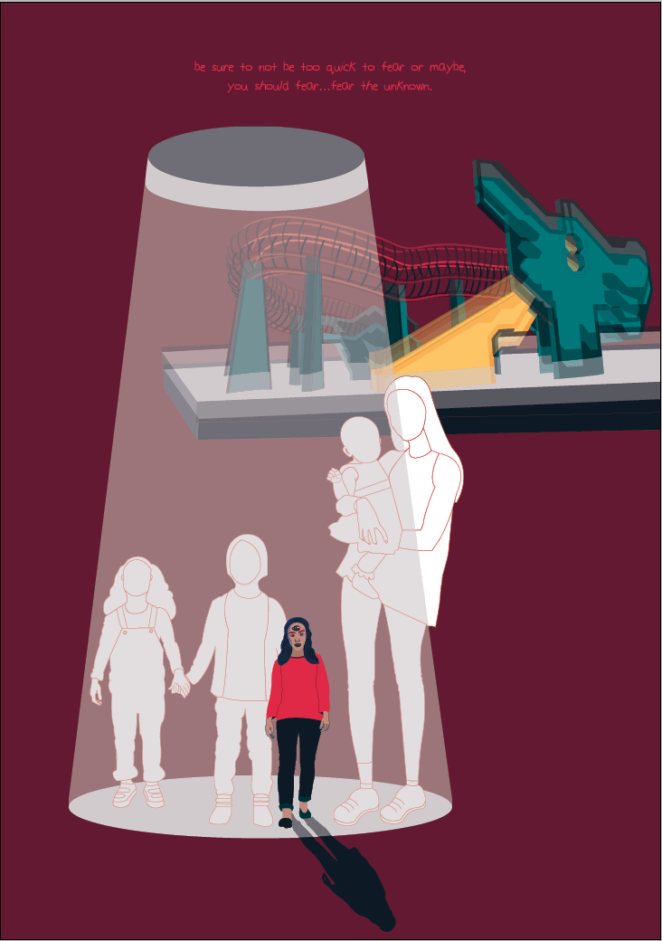
Final Page:
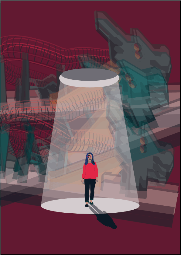
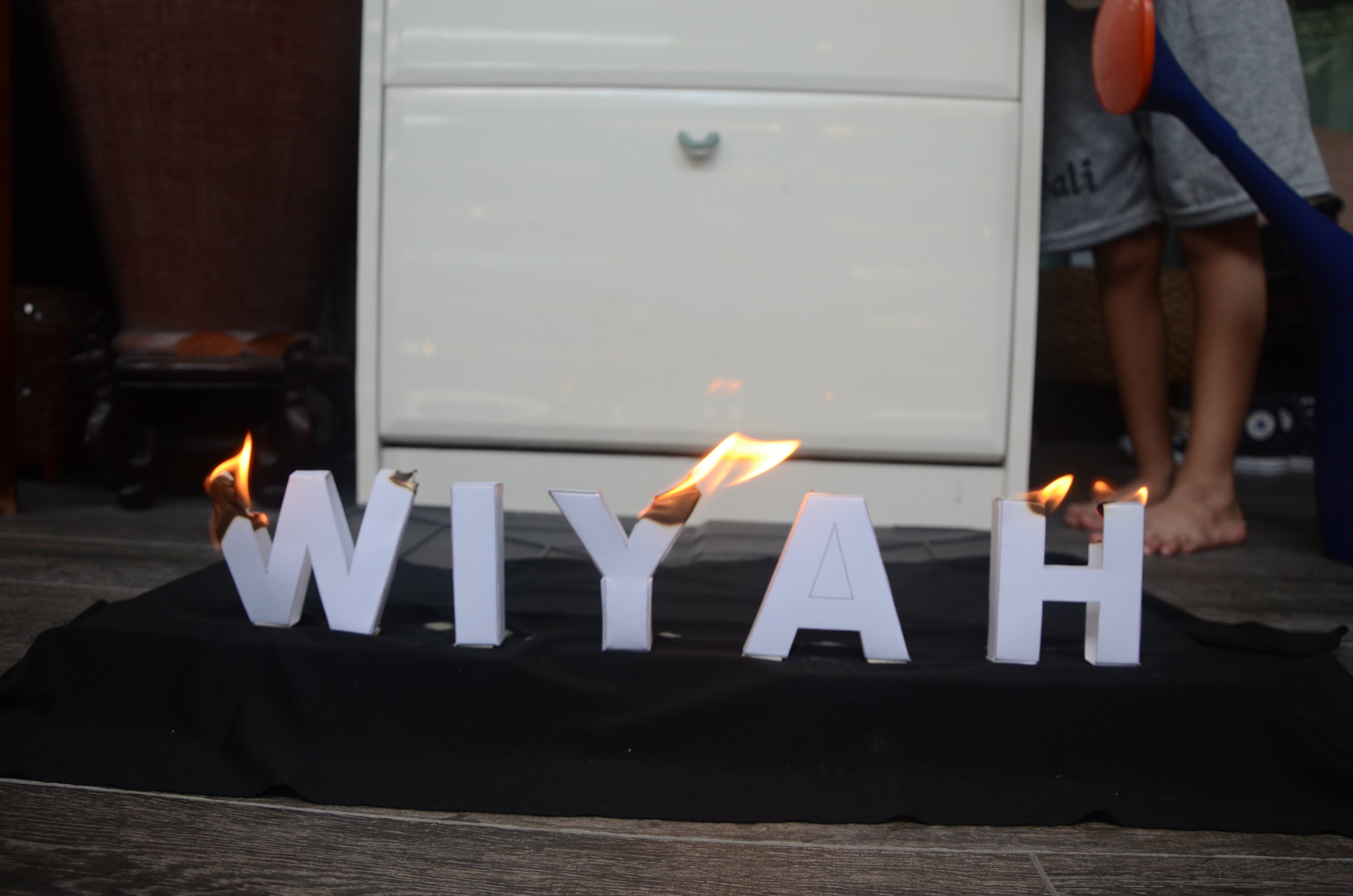
I actually decided to go ahead and print the image below as the last page but ended up really disliking it as it did not look cohesive with the rest of the aesthetics of the zine. Also, it looked very distracting and has an unbalanced composition.
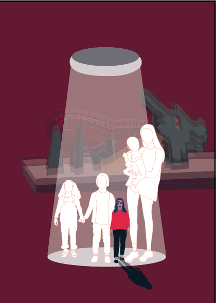
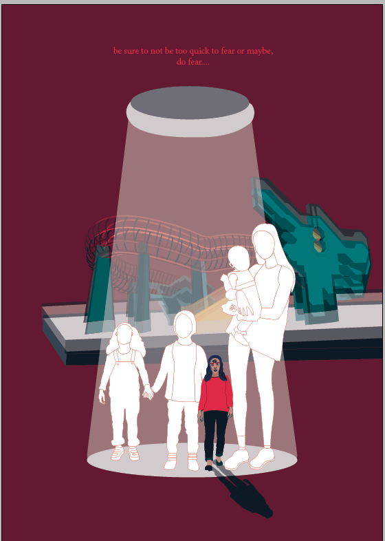
Hence, I went to reprint the whole zine after changing it to the below:
I felt like it looks cleaner and conveys the intention of the idea better, in my opinion.
Also, notice the text here, it is a continuation to the text in the cover page.
I did two print tests before printing the final one where I used Maple White (150gsm) and Coated Paper (135gsm).
Maple White: Matte paper – I didn’t like how the texture absorbed the ink too much to the point where my illustrations looked faded.

Coated Paper – I preferred this effect where it allowed most of the ink to remain on the surface of the paper and reflects the colour better. However, the paper wasn’t bright enough which was why I decided to go with Bright White as my final.
I ended up going with Bright White paper (135/150gsm). It added a slight tinge of red to my zine which added the creepy effect to my zine as well!
All in all, I felt like despite the many challenges (and frustration) I had creating this zine, I felt like I did try my best and am overall satisfied with how it turned out. As with any designs, there are always things you would like and definitely can improve on. I did not manage to communicate the gestalt theory completely, but I am glad I did attempt something out of my comfort zone.

I used the above, which are elements of gestalt to help generate ideas for my illustrations when I can.
Given more time, I would love to develop the architectural part of Toa Payoh and incorporate it more into the zine. However, I guess what I was going with for this zine is more so something that is open for interpretation. Same goes for the dialogues used to communicate storyline. It was supposed to be open for interpretation as well.
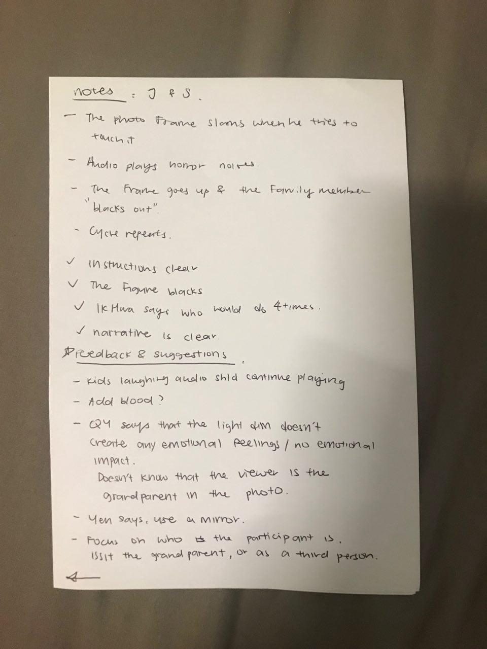
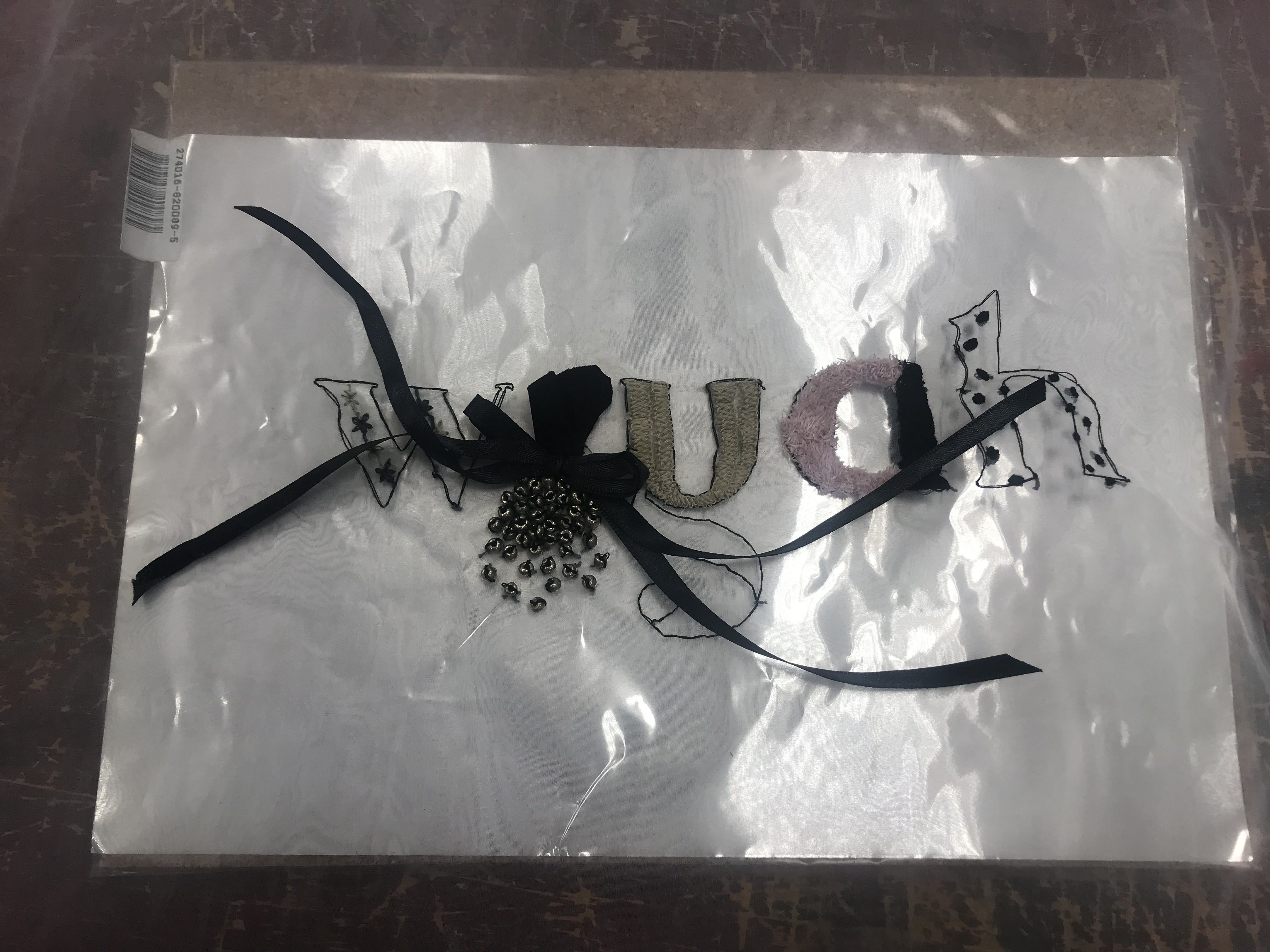
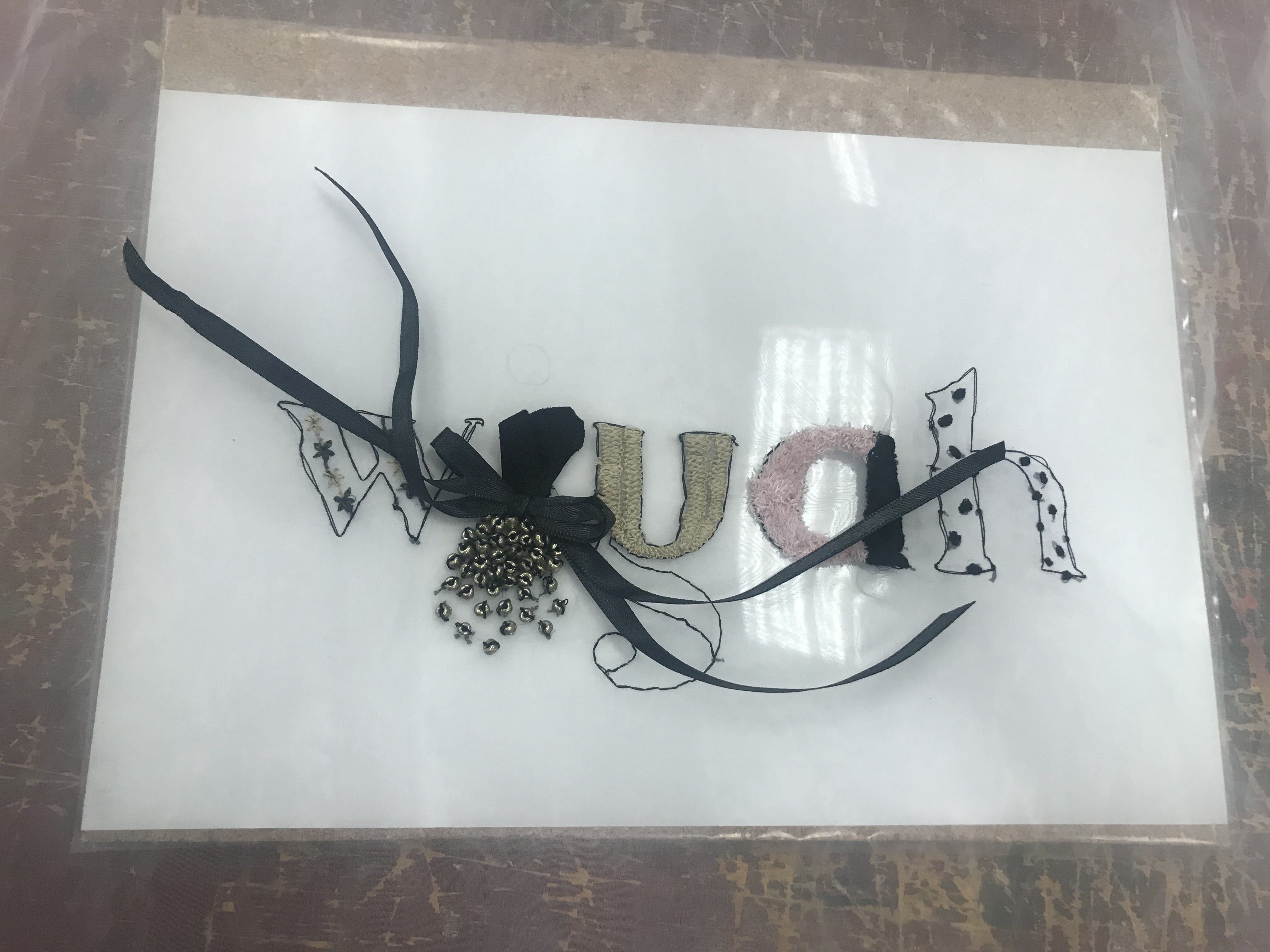
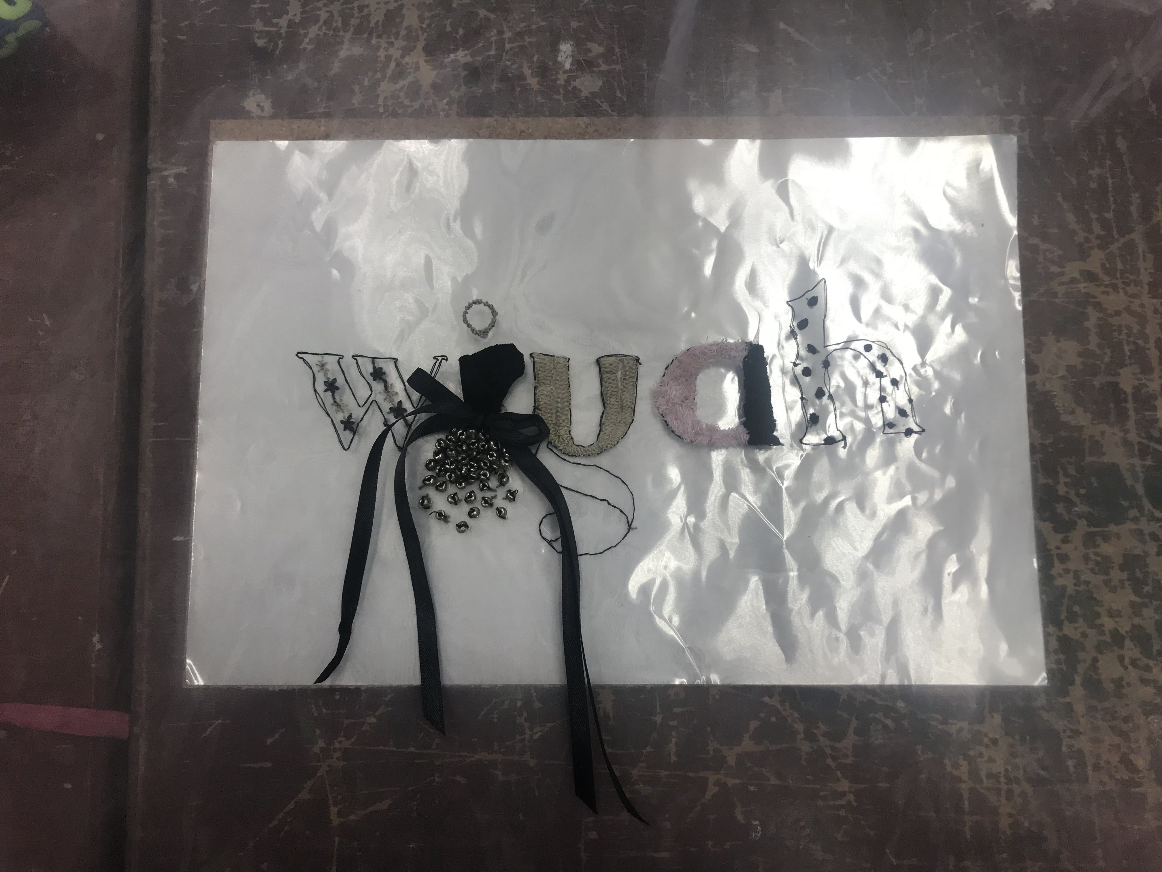
Comments during crit!
However, given the feedback during the crit session, I understood and totally agree that I could do better in the representation of toa payoh. Will think about it for Vol 2 of this zine! Hehe


Recent Comments