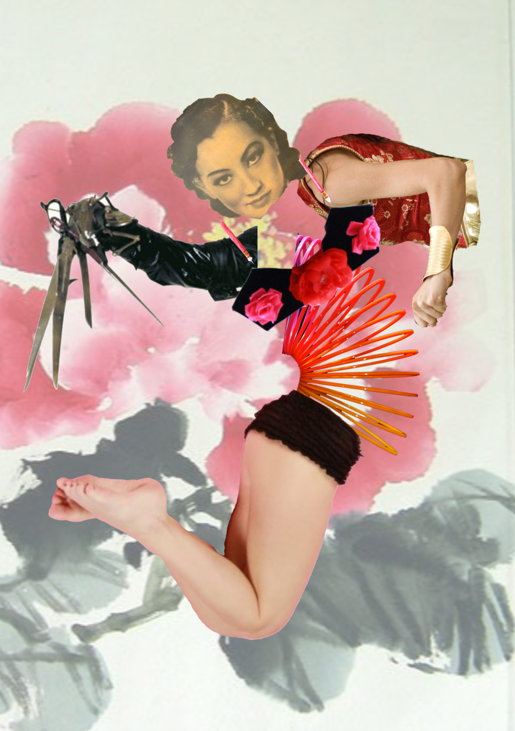
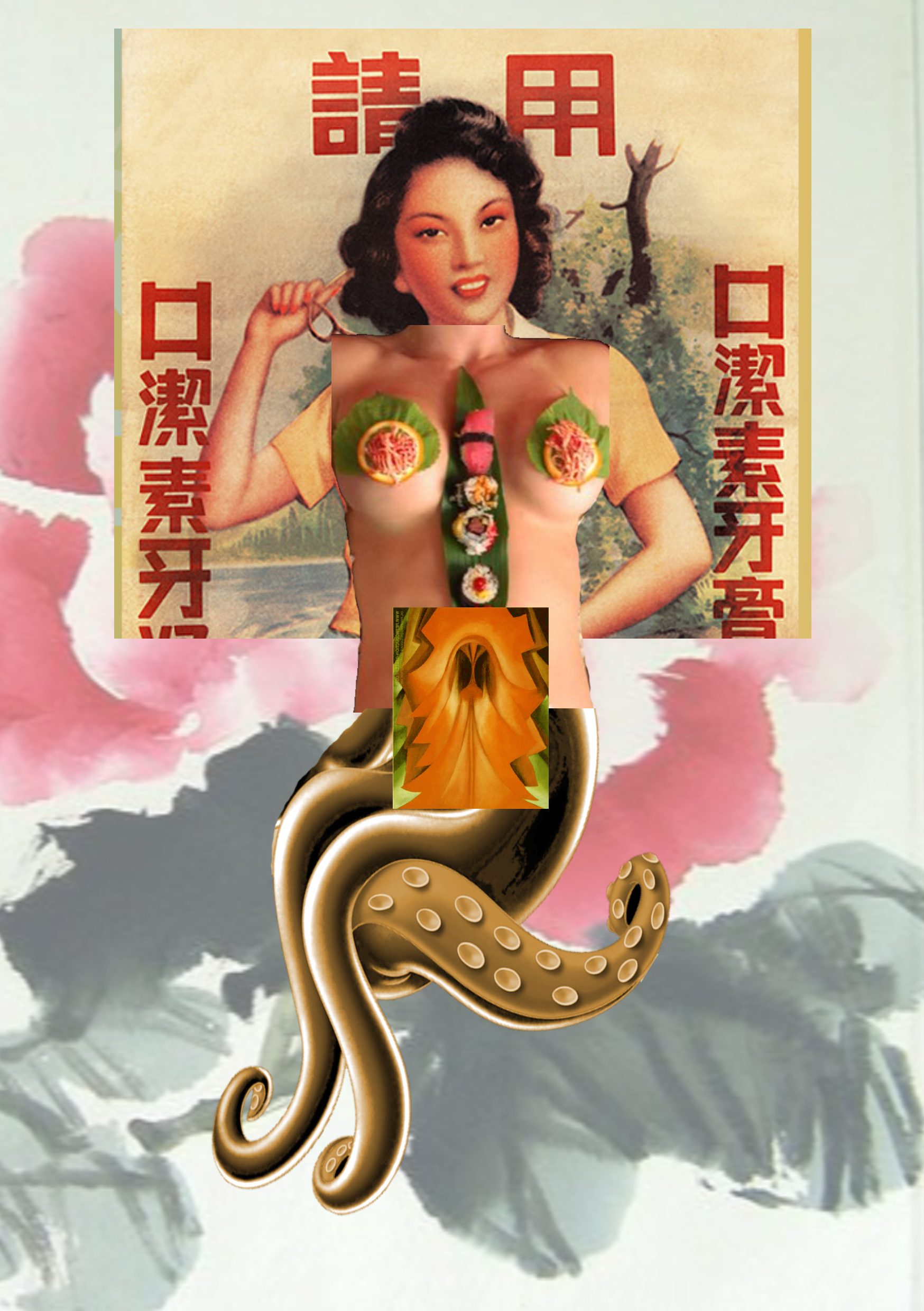
4D Project 3 Process

Concept

For this project, I begun with this set of sketches as my concept:

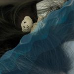
I was very interested in the idea of “what happens when we sleep”. In medical science, a lot of repair functions occur while we sleep, thus I wanted to take a fun twist on that.

Image result for rosy apple cheeks cartoon

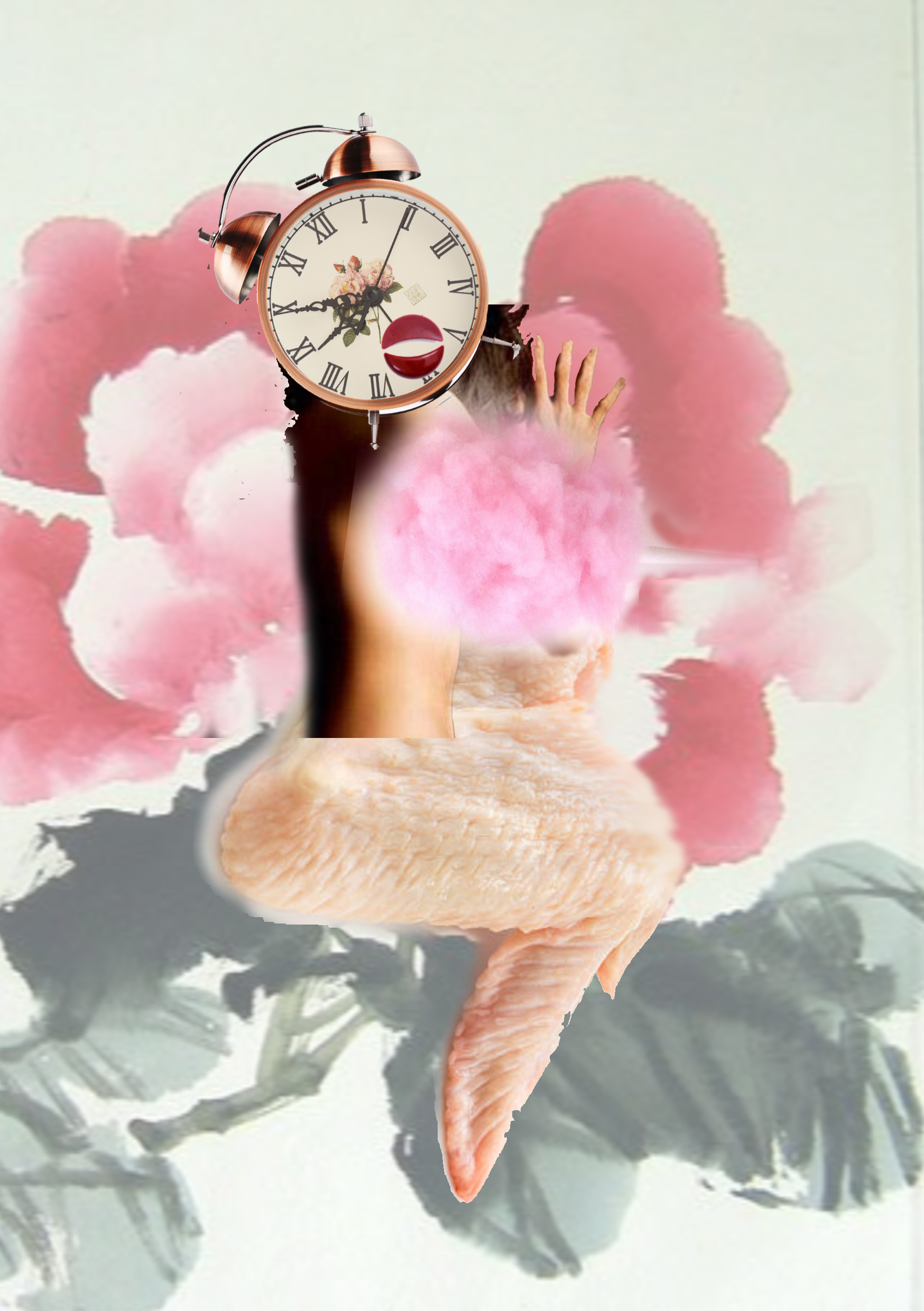
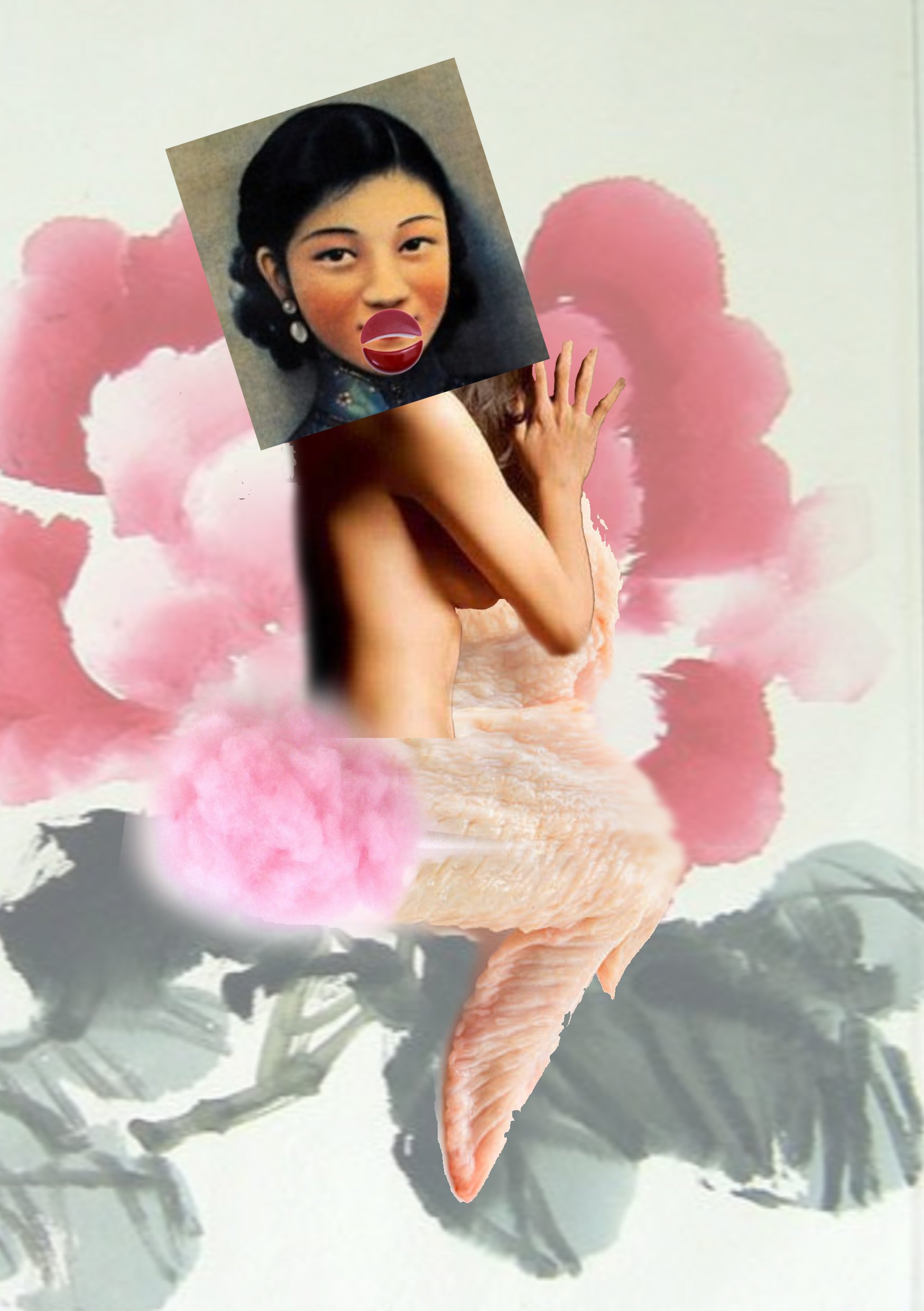
I decided to talk about how “rosy apple cheeks” come about.

Research/ Experimentation

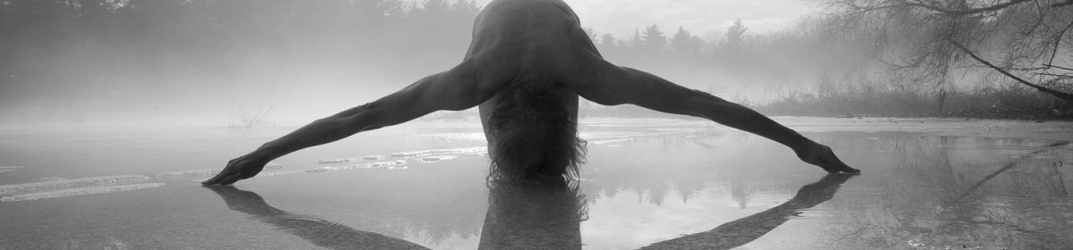
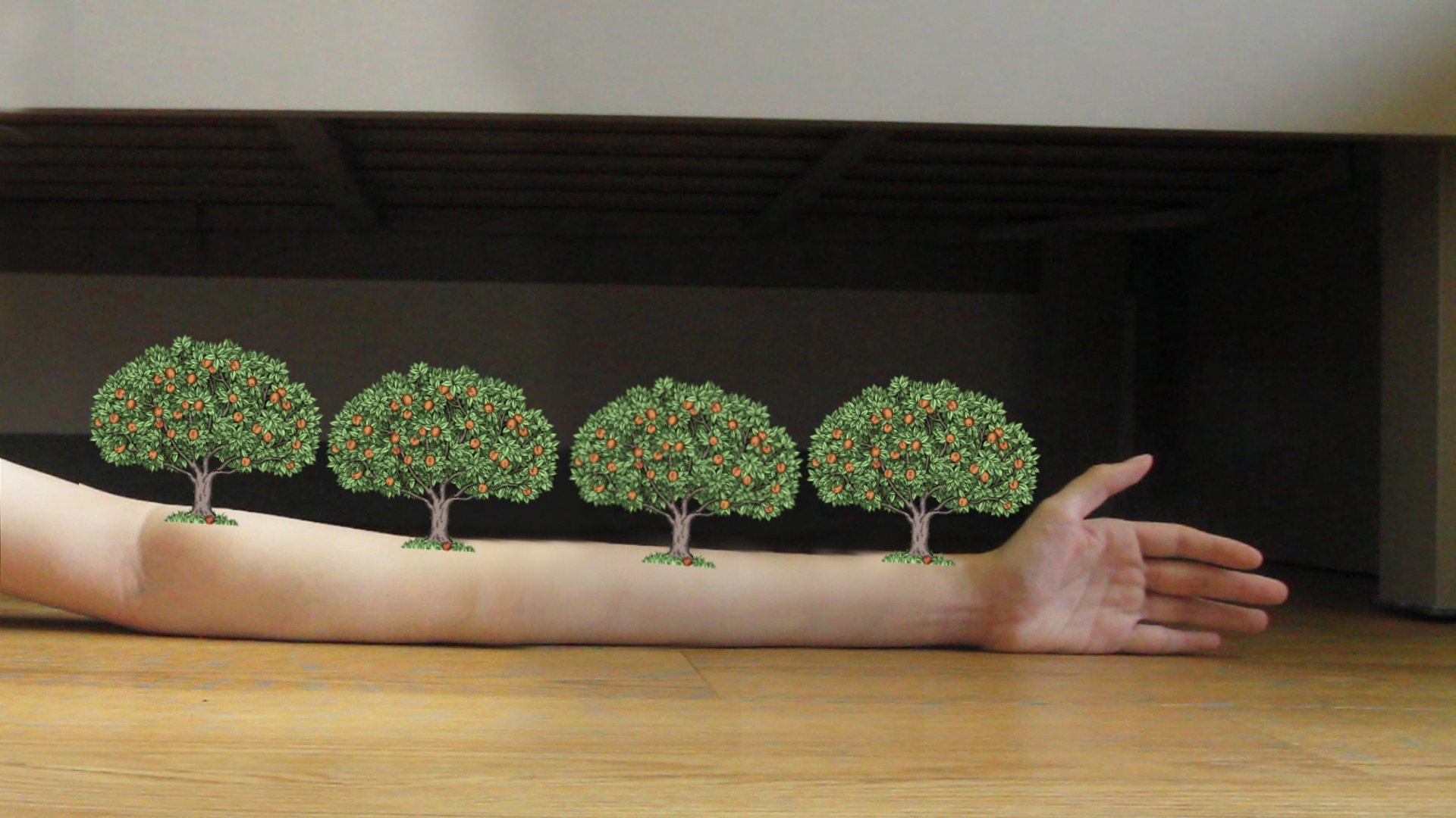
As seen in part (2)–The “fall”

I was looking at this animation to get references for a falling action. However this was too challenging as I had to convey motion, texture and weight. Thus I decided to think of something else.

This transition is however crucial and I still had to cover what I can’t fake. Thus I considered composing for a huge seed to fall, then for seed dispersal to happen before the trees grew again. However, this did not help to obscure the awkward transition I was struggling with.

Eventually, I decided to go further with the theme of a dreamscape/ fantasy and just to suggest the workings of magic.

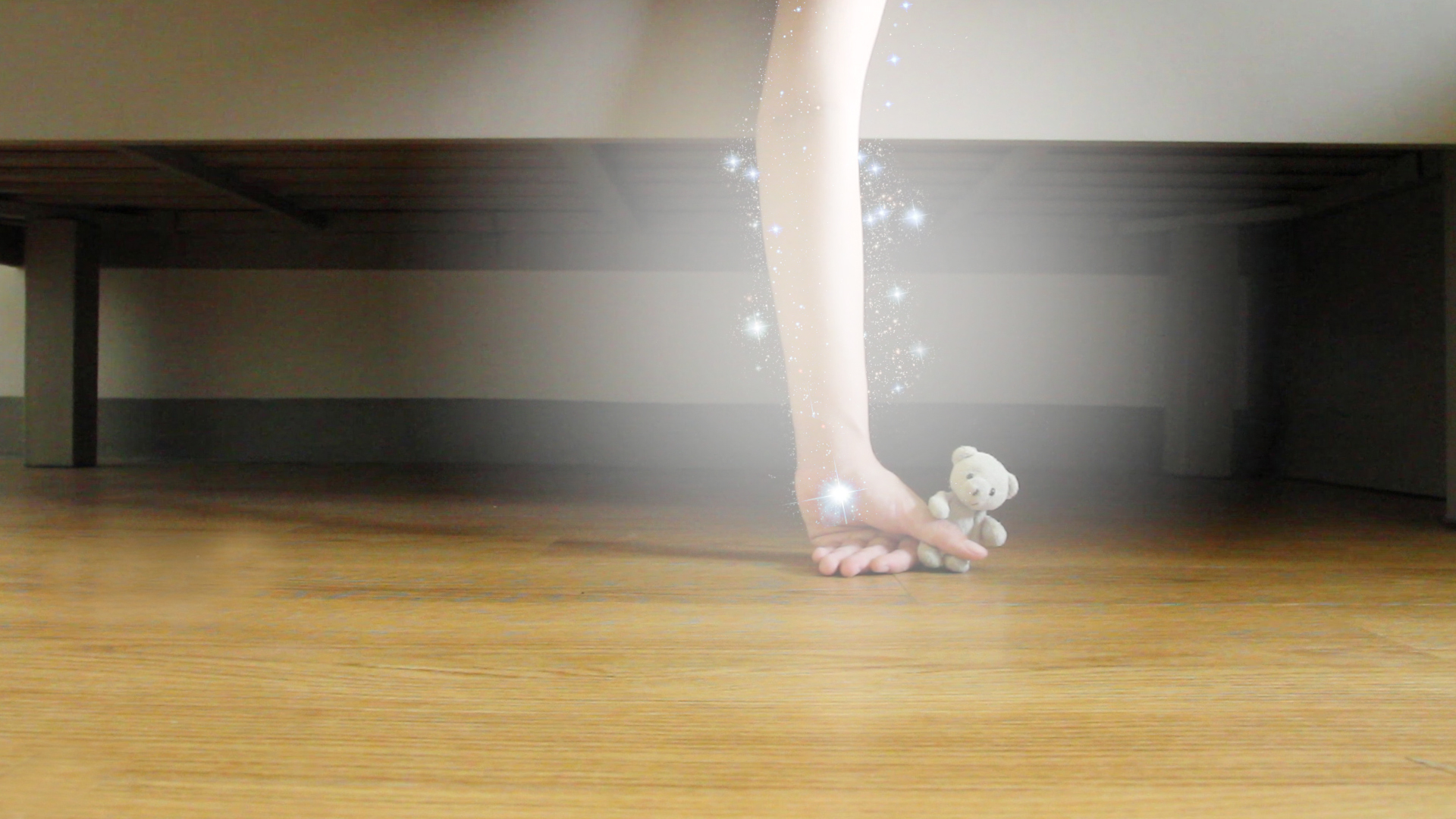
I used a radial gradient to create a glow around my hand. I then added “magic sparkles” by editing a photo of the galaxy. Rather than attempt to obscure it, I chose instead to draw emphasis to this transition.

To further play around with the idea of magic, I let the soft toy extend the length of the hand, making it clear that this was no realistic. This also helped with adding more elements in the mis-en-scene to make it more visually appealing.

As seen in part (2)–The “crumble”

This was overly ambitious and I had absolutely no idea how to execute it. Thus instead, I made the soft toy levitate the hand back to it’s original space.

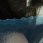
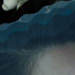
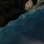
Since the soft toy was “floating up” I tried to play with the idea of going underwater.

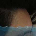
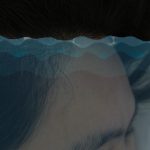
However the rendition below was quite boring, so I tried to slant the water levels so as to play around a bit more with the composition.

I was flirting with the idea of adding in the movement of fishes also to add variety into the pictures. I looked at these videos to gain inspiration.

(02:21 onwards)

However, upon harder consideration, I realised that the sea/fish sequence did not value add to the full story. Thus I scrapped the sequence.

Editing and Technicality
To move my soft toy around, I had to use clothes pins to pin it into shape.  
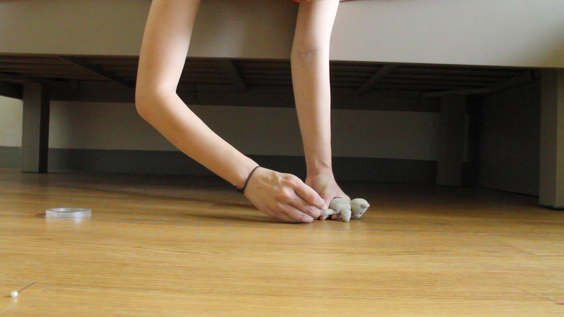
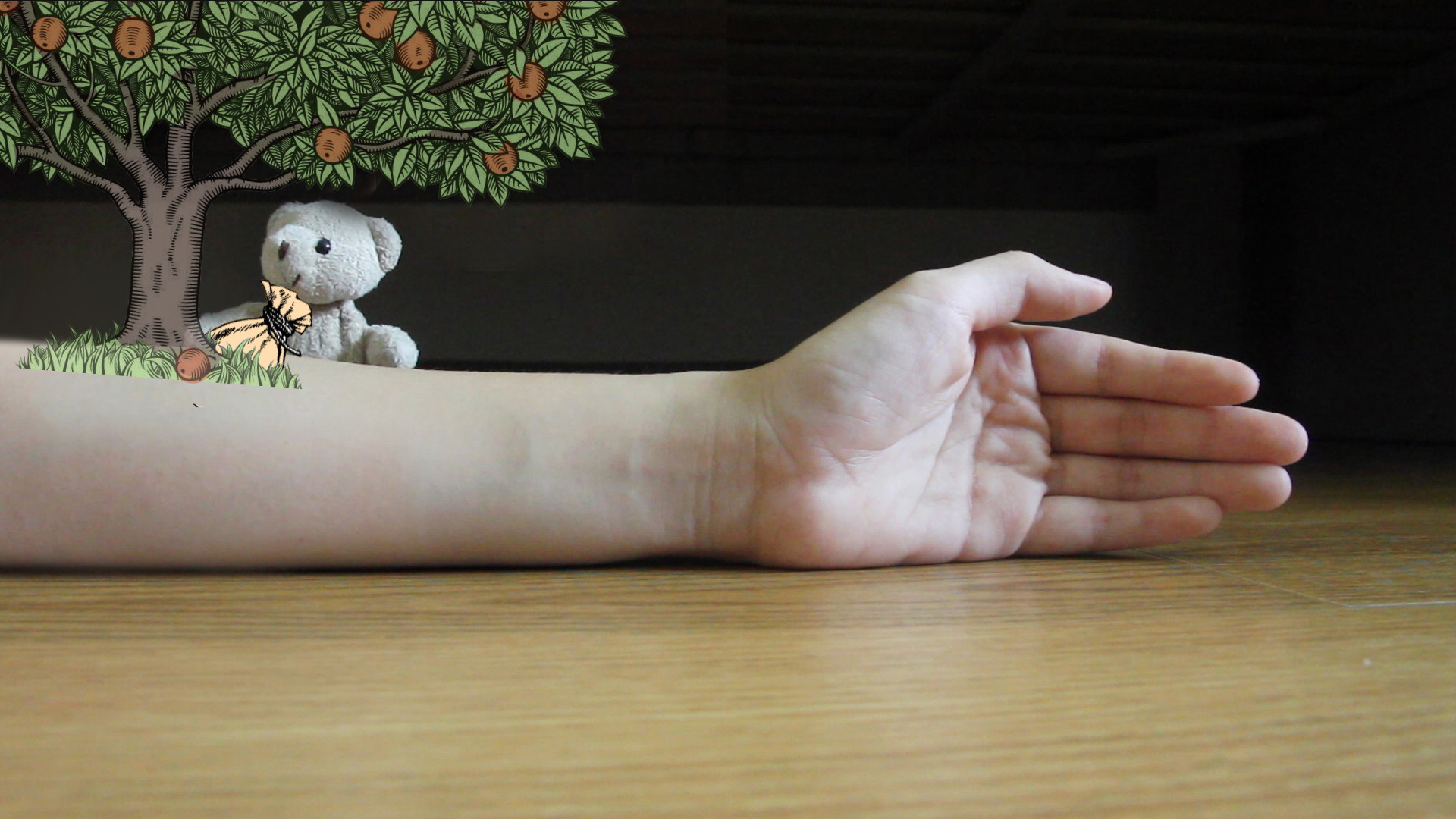
This picture below shows the real photo, before any form of editing. I used to pin to hold the soft toy so as to minimise my contact with the toy and thus help with editing. 
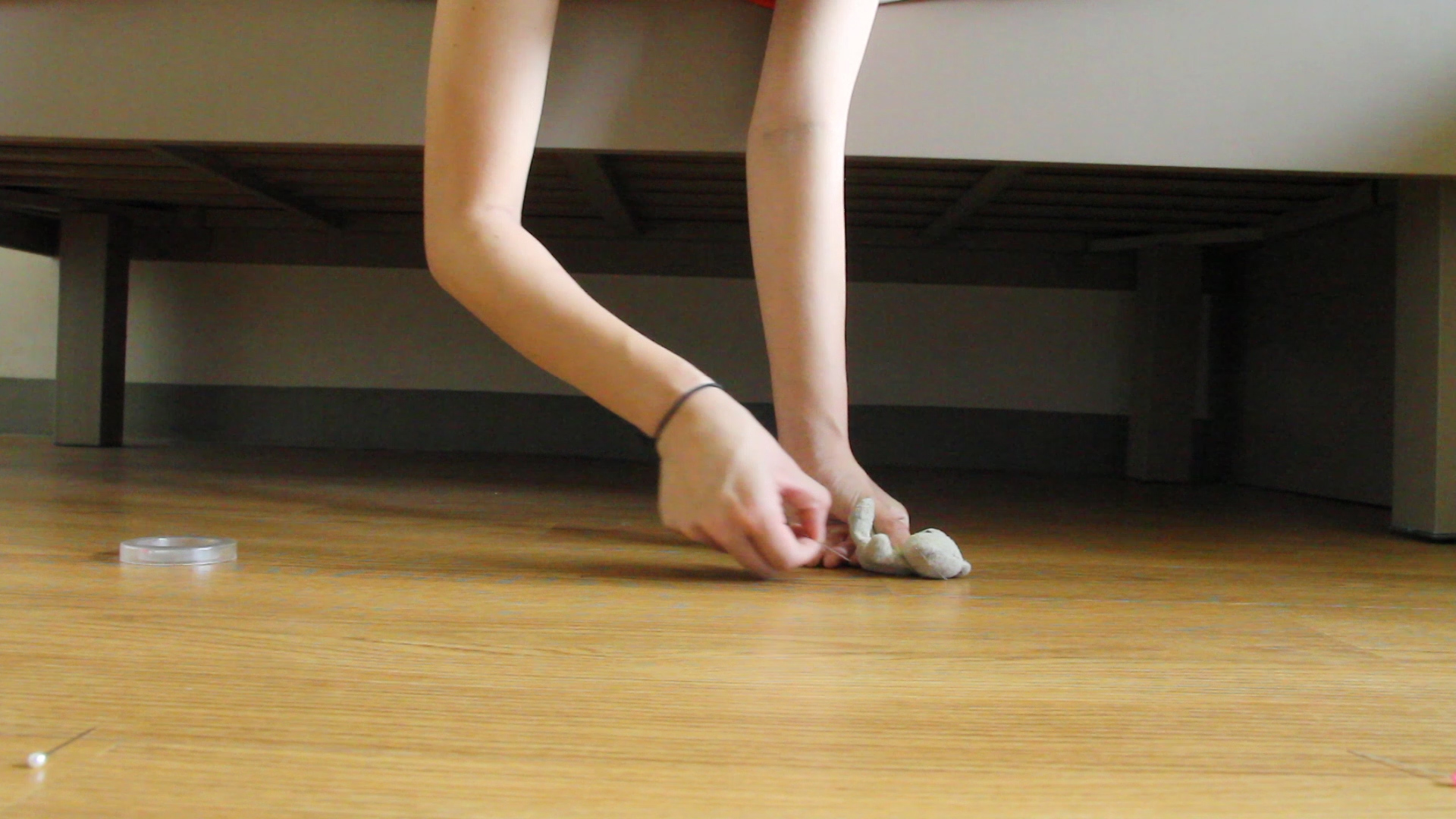
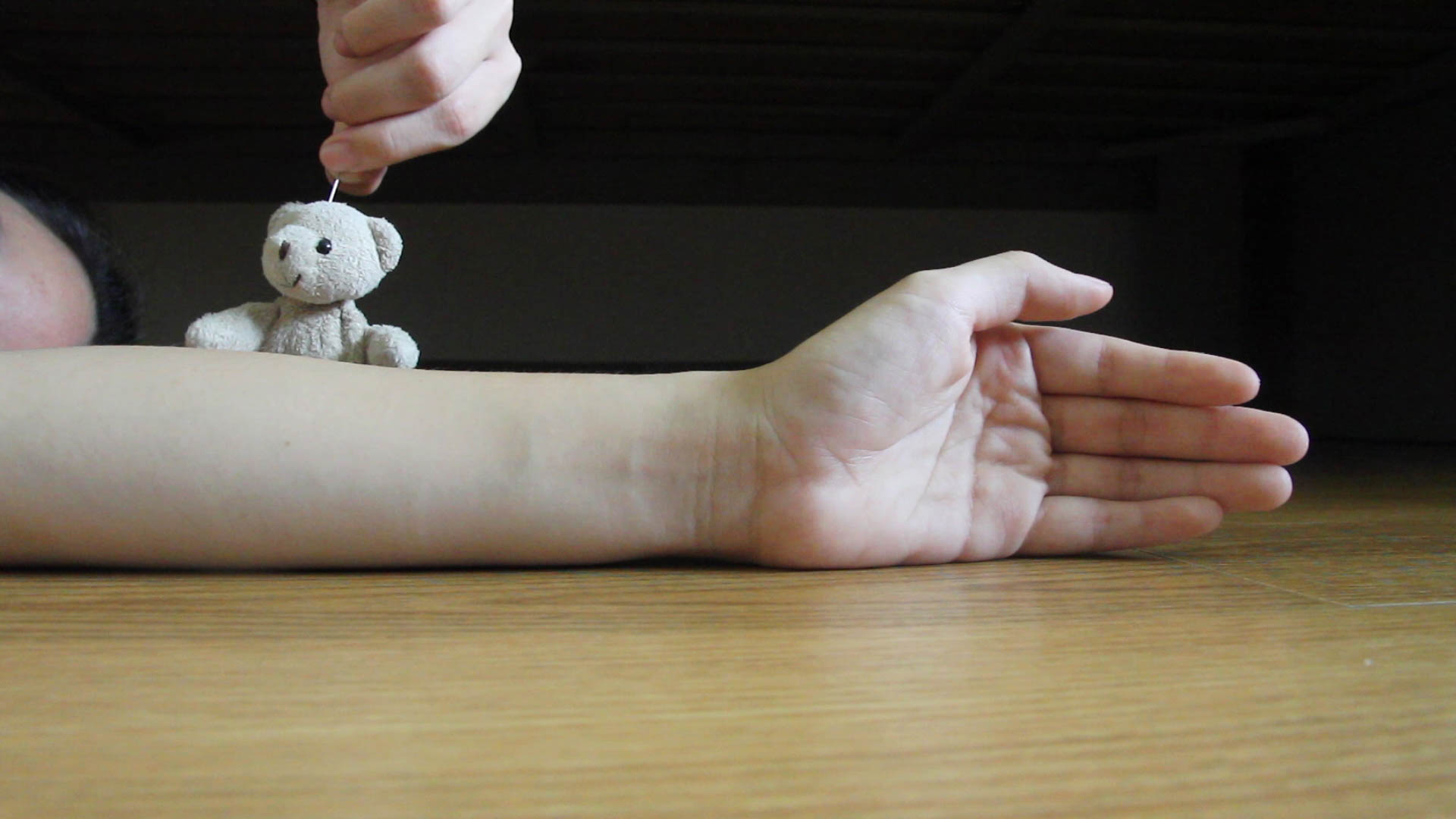
This picture shows the cleaned up version of the photo.
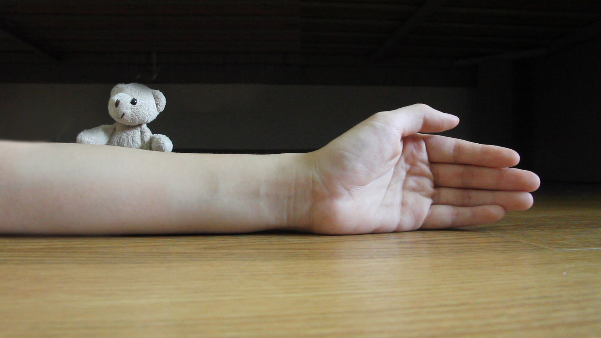
This picture shows the final look of the photo, complete will illustrations added in.

4D Project 2– Walking Together

As mentioned before, I wanted to do a story on slippers and play around with a photo angle that we seldom encounter– the worm’s eye view.

My work is titled, “Walking Together”.


Brainstorming for 4D Project 2

I was really excited to start on this assignment. At first I was interested to tell a non-linear narrative like the one from Memento by Christopher Nolan or Mr Nobody by Jaco Van Dormael. However, I realised that it might be too complicated to do that with merely 10 photos and sound tracks.

Hence I changed my idea and decided to instead give attention to neglected sights in our daily lives. So what is an angle that we usually forget to consider going about daily life? I realised that we seldom look at this from the ground level, literally from the angle one would see from at a worm’s eye view.

Thus I have decided to tell the story of a pair of slippers in this project.

  1. Slippers as a new object.
  2. Slippers running through a traffic light (2)
  3. Slippers on a rainy day (2)
  4. Slippers getting damaged and dirtied (2)
  5. Slippers at the market (2)
  6. Slippers becoming broken

Human +; Tidbits after our FIRST Outing

Disclaimer: I am usually not a big fan of works that are speculative of technological advancements. Thus, the works I will touch on are more “traditional” in terms of subject matters.

Firstly, I actually really enjoyed the use of space of the entire show.

Installation view of “Transfigurations” by Agatha Haines (Photo credits: Agatha Haines)

The whole show was divided into four sections and thought-provoking quotes like those in the picture above are littered around the space. The different takes on how technological and life sciences are seeing their distinction being blurred are juxtaposed with quotes on the issues of bioethics. Hence, I feel that the show was one that questions and examines our definition of humanity more than one that merely surveys scientific advancements.

My favourite work was a video piece by Chinese artist Cao Fei– Whose Utopia?.

Cao Fei (Photo credits: Zhang Zhi)

This three-part video is a product of the artist’s half-a-year residency at the Osram light-bulb factory in Foshan. Cao conducted workshops for the factory workers, many who are young emigrants from the inland provinces of China.

I was really taken in by the ingenuity of juxtaposing different forms of human expressions with the setting of the factory. Cao marries the mundane and ritualistic process of factory work with the fragility and preciousness of an individual’s dreams and aspirations. The use of dance and music becomes almost a form of serenade for the everyday, faceless factories workers. The tension of an individual and mass systems (conforming) has always been a subject matter within creative works.

Charlie Chaplin’s Factory Work in Modern Times

The different worker’s mode of expressions and the use of moving shots give irony towards the factory setting that is fixed and generic. She presents the people as fluid and living, almost as a feminine element. Whereas the factory space is rendered in a slightly greener lighting, denying viewers the comfort of a familiar and naturalistic imagery despite the artfully executed cinematography. The never-ending factory lines, the mammoth scale of capitalistic production becomes almost monolithic and a masculine element. Cao highlights this tension within our society, at once honouring human creativity and resilience of the human spirit while also challenging the systems of productions and economics.

Still from Cao Fei’s “Whose Utopia?” (translates to “my future is not a dream”)

Whose utopia is it when everyone is forced to put aside their own dreams and aspirations? Whose utopia is it when machines are replacing humans and leaving us with less options?

I also really enjoyed Liam Young’s work New City: Machines of Post Human Production.  I really enjoyed the projection of different city skylines being stitched together. I also found it very clever for Young to use a projector rather than a screen or lightbox. This denies viewers a chance to closely inspect the landscape he has composed– which pokes fun at how the cosmopolitan landscape is one that is not foreign but also not close to heart.

This display is placed directly across and in conversation with a video loop of a factory production line. The austerity of a factory setting, how clean, angular and bright it is juxtaposes the sepia-looking and cluttered appearance of the city skyline.

Overall I really enjoyed the whole work. The only regret was the series of machinery mock-ups that were placed in between the two projections.

Image may contain: indoor

I felt that this disrupted the dynamics between the two screens. It would have been preferable if the space between was left empty such that viewers can be engulfed entirely by the two large projections. And the mock-ups would have been nicer if they were placed against the wall outside the room where the projections were so they can act as a prelude to the experience.

All in all, the outing was really fun and I hope to have more of these outings! 🙂

4D Project 1A — Strange Encounter

For this project brief, I wanted to create a feminised world. However, I realised that it would be difficult as it is very difficult to define what a feminised world actually is. Thus I wanted to create three characters that were tongue-in-cheek yet empowering for females.

I realised that there is a lack of Asian female images. Also, since found images are a reflection of our visual culture, the found images of women are often also idealised or objectified.  This reminded me of the Chinese women on cigarette posters back in the 1880’s to 1930’s and I decided to use the aesthetics from that time as my look for this project.

Example of a Cigarette Poster

I mainly appropriated the head of the ladies in the posters. Some of the earlier drafts of my works were like this:

I wanted to try making the work black and white, however I realised that that removed the style of the work. Also, it subdued the cigarette posters aesthetics that I was hoping to achieve.

In this draft, I add a background to help to make the three figures appear more coherent. Also, I realised here that since we are conflating many different elements into a unified form, there needs to be more harmony between the different elements. Over here, the tentacles of Ursula is much cooler than the other earthy and more sepia colours used, thus it looks less assimilated with the rest of the figure.

I decided against using a clock face to represent this figure’s face as it deviated from the other two figures. I wanted my figures to be different but still recognisable as a group of three.

These are my final works.


Over here, the viewer is denied the usual gratification of seeing the bossom and legs of a female. Instead, I replaced the bossom with a candy floss, suggesting the usual idea of innocence and school-girl naivety many females are portrayed with (or expected to emulate). The use of cotton candy subverts those ideas as the symbol of innocence is now used to obscure the bossom, often a target of sexual fantasy for some viewers. Meanwhile, the use of a raw chicken wing to replace the leg pokes fun at how the female body is often consumed in popular culture and also calls out the use of female sexuality to sell food products.

The lips of the figure is made by a “jiao bei” which are chips used in a Chinese divination ritual. Traditionally these chips will determine if a divination lot is true or not, leaving the woman’s fate to luck and denying her anatomy. However as this chips are now the figure’s lips,


This figure is a woman who is physically empowered. She has the hands of Edward Scissorhands and Maggie Q. Thus she is at once able to keep others away and also defend herself. Her slinky waist also gives her flexibility to stretch and bend around. Funnily enough, her legs actually come from a pinup model while the Maggie Q arm is actually appropriated from a character that is more “oriental” than representative of a demographic group in Asian. Thus the elements are again subverted as they have been transformed as images for consumption or fun and novelty into ways the figure can protect and defend herself.

This figure is interesting as it encompasses a female both at one of the most compromising state she can be in and also a female villain. I used a painting of the clitoria flower by Georgia O’keeffe to allude the female genitalia. I purposely edited the painting to make it look more eerie, increasing the tension between the reds and greens to make it look unsettling. Thus, even those the figure has “exposed” her intimate area, she is still untouchable.

The body of the figure is taken from a Nyotaimori, a naked sushi human platter. This is a practice in Japan that is extremely condescending towards women. It is then juxtaposed with the legs of female villain, Ursula. I choose this to show that while a female might be put into a situation where she is disadvantaged  and denied an equal playing field, she still has her ways and potential to fight against it.


All in all, the project was really fun and I enjoyed the thought process and freedom to explore with this brief.

On Sound Art Readings

Sound Art

We Are the World, as performed by the Hong Kong Federation of Trade Unions Choir
Samson Young
2017
Video and multi-channel sound installation Courtesy of the artist
https://www.youtube.com/watch?v=KzJkDR7YvX0 (4:20-4:56)

When I was interning at Venice Biennale earlier this year, I came across the works of Samson Young, a leading artist in Hong Kong. He was the representative of the Hong Kong Pavilion and presented Songs for Disaster Relief, a series of works that attempts to reframe the popularization of “charity singles” as a historic “event” and a culturally transformative moment. He created a fully immersive experience including a handful of Sound Art pieces, I will be talking about We Are the World, as performed by the Hong Kong Federation of Trade Unions.

We are the World was situated near the end of Samson’s ensemble of works. Interestingly, one needs to cross a set of heavy curtains, almost like stage curtains to enter the gallery where the work was at. The setting of the work features a simple projection of the choir singing and rows of old theater chairs. By sitting down, the viewer is implicated into the exhibition itself.

The projection shows a choir of middle-aged women and men. They sing the song “We are the world” in a unique manner– without tones but by reciting the lyrics as they breathe in and out collectively. This creates a eerie yet soothing effect as sound produced skirts between being visceral and also humane.

It then begs the question of whether the choir is in fact making music, and if that is comparable to conventional notions of music or songs. The raspy and raw sound produced with this choir’s performance becomes a critique of the hypocrisy of honor and the dizzying (for being dazzling) effect of pop music on stage. It also shows the limited impact of charity singles, how the mere of singing does not affect the grief and damanges brought about by disasters.

Essentially, Young poses a question – do we become better persons singing charity songs for disaster relief?

In the Summer of 2014 we discovered the inspirational work of Japanese designer Kouichi Okamoto and his Kyouei Design when he released his elegant ‘Square Wind Bell‘. This year Okamoto has returned with another remarkable project named ‘Re-rain’, which was presented to the world at the Shizuoka Prefectural Museum of Art. In his inspirational project the designer created a sound installation through which he aims to express non-visible elements such as gravity, magnetic force, and sound as physical elements. Created with the sound of rain recorded in Japan during the early days of 2016 as its soundtrack, ‘Re-rain’ is constructed out of a set of umbrellas placed on top of speakers. The vibrations of the sounds out of the speakers are transmitted through the umbrella to make a sound, but an umbrella cannot vibrate if the magnetic force of the speaker is too small or if the rain hitting the umbrella is either too high or too low in pitch. For this reason a device picking out a state in which the magnetic force of the speaker, weight of the umbrella, and pitch extent of sound are all in a perfectly balanced state forming this beautiful installation.

Re-rain
Kouichi Okamoto
2016
Umbrella, Speakers, Iron, Speaker Cables, CD Players

I saw this work in Jendela, Esplanade a couple of years back. I really enjoyed how minimalist and simple the whole work was.

Okamoto explores the inter-connectivity of humans and their surrounding spaces with the use of his sound installation. He played the sound of rain through the speakers, the vibrations from this affects the umbrella on top thus creating a cacophony of different sounds based on the environment and also the audio file. Thus it also comments on the harmony of the environment, showing how different (disparate) elements come together to form a peaceful and natural sound environment.

Seminar Questions

  1. What is sound?

Sound according to Neuhas is an aural component. Essentially sound is a vessel for conveying information to be received through the sense of hearing.

  1. How has it been use in culture and society?

Sounds when organised can be regarded as music. And music is a way of expression or preservation of culture, and thus communicative. In popular music, sounds is also used to fill up every minute so as to curb the anxiety of having to confront surface noise (silence).

Of course, sounds when organised and standardized in a different manner can become language. Languages ascribe meaning to sound, thus it allows ideas sharing and communication between people. This is a building block of communities and thus society.

  1. What makes it an art?

Sound becomes art when it is the subject matter of an artwork, when artists begin to examine sound itself. This is not to be confused with simply using sound as a medium in art.

  1. How advancement in audio technology affect our sense?

Advancement in audio technology concurrently heightens our sense. As mentioned in the essay by DeMarinis, after phonography was invented, phonographers learnt about environmental sounds. Environmental sounds are in fact inadvertent sounds of the environment that we commonly regard as “silence”. This heightens one’s sense of hearing as the previously regarded void of sounds is now found to be filled with other sounds which we do not ascribe any hierarchal importance to.

Reading Assignment: Roland Barthes Rhetoric of the Image

  1. What are some of the key questions Barthes aims to investigate in the article?
    • What is the nature of image?
    • When do codes become meaningful carriers of information?
    • How consistent and reliable are images as carriers of information?
  2. What are some of the key terms/ concepts introduced and discussed?
    • Linguistics Message:
      The linguistic message often takes the form of a textual matter. It is often used to give context and set a premise for the information presented in an image, e.g. caption in photos.
    • Pure Image (Denoted and Connoted):
      Pure image is information presented in a series of codes in a visual matter. There are two layers of meaning to an image– denoted which would encapsulate the literal and unadulterated message; connoted which is the inferred meaning gathered from the associated meanings of the visuals in an image.
    • Lexicon:
      A lexicon is a set of codes specific to a certain branch of knowledge or area of specialisation; a specific subset of language.
  3. Do you agree or disagree with his argument and point of view?
    • Barthes mentions that photographs are a form of denoted message, going even as far to say that “for of all the kinds of image only the photograph is able to transmit the (literal information without forming it by means of discontinuous signs and rules of transformation”. He attempts to reinforce his argument by proving that alternative images such as painting are stylised and reflect hierarchical decisions. However, I beg to differ as photography is definitely not a neutral and truth-telling device. The very act of photographing something already means that the photo presents a curated and selected portion of the real world. Also, scale, angle and other formal devices like exclusion of information affects the way image is perceived and encountered.
    • Conversely, I do agree with the idea of the limitation of the “metalanguage” in describing language and intangible states of matter. The poverty of vocabulary in our ordinary language is reflected in how eventually words used to explain words cannot be distilled into simpler terms. Instead words are used in a circular method to convey meaning and words are also not perfectly calibrated to be specific and absolutely accurate.
  4. Provide a brief analysis (200 words) on an advertisement of your choice by using the terms/ concepts proposed by Barthes and discuss the role of text and its relationship with the image in the advertisement. Please include an image the advertisement in your post.35 Clever Poster Advertisement Ideas

This is an advert for Mcdonald’s Filet-O-Fish, it is very focused, engaging and also effective.
Firstly, the product marketed and focus is articulated clearly. The caption is straightforward and introduces the product name, this clarifies the denoted image of a burger-shaped tank as a connotation of the fillet-o-fish. The singular, centralised subject matter within the composition helps establish focus on the burger.
Next,  a burger-shaped bowl with a live goldfish is very attention-grabbing, thus engaging consumers . The stark juxtaposition of a live animal (pet) and food invites viewers to consider this advertisement more than the usual gastronomic photos of food common in advertising.
Lastly, I find this advertisement effective as it coneys the idea of freshness and food safety— important qualities of food. By using the denoted image of a glass container the subject matter is connoted to be clean and refreshing. Meanwhile, a live goldfish suggests that the fillet-o-fish uses real fish meat and is also clean and safe. In view of food security issues and a greater desire for better quality food, I find that the advertisement addresses the fears and wants of the contemporary consumers by promising health and food safety.

(194 words)

Hannah Hoch & Sarah Lucas’s Composite Figures

Hannah Hoch, Balance, 1925

Hannah Hoch is German Dadaist who works extensively with collages and found images. What is interesting is the layers of readings suggested by the title Hoch has chosen. Firstly, the two figures are a conflation of elements from more than one gender, for example the body in a dress is matched with the head of a boy. The collage becomes a mix of both female and male forms, striking a form of balance. Next, the figures are suspended in equilibrium; the bottom figure is inclined on a platform while the top figure perches on an arm. It is interesting that the composition arranges the elements such that they are just shy of losing balance. Lastly, there is also visual balance as the subject matter are carefully distributed across the pictorial plane, there is also attempt to balance warm and cool colours by adding in blue from the cut-outs and hints of blue against the red-yellow dominated background.

Sarah Lucas, Two Fried Eggs and a Kebab, 1992

This is a work by one of the YBA, Sarah Lucas. The work is interesting as it subverts the elements of domesticity and consumption to mock the obsession with anatomical features and gender (sexuality). Just by using two fried eggs, kebab and a dining table, Lucas plays on the trends in contemporary visual culture. She then plays with how there is a visual affinity between facial features (eyes and mouth) and the female organs (breasts and vagina), she then re-appropriates the ensemble she curated in the form of a photo thus using the same elements to represent different parts of the body. This is similar to the technique employed by Surrealist painter Rene Magritte in his work “Le Viol” (The Rape), the appropriation of visual technique from art history anchors Lucas’ practice and defends it against accusation that her work is uninformed.