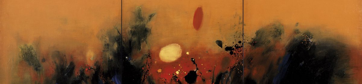


Raise the Red Lanterns 《大红灯笼高高挂》

This is a scene from Zhang Yimou’s Raise the Red Lanterns (1991) 《大红灯笼高高挂》. It is one of the films from the golden period during Chinese cinema during the 90’s. It was nominated for and won various awards.
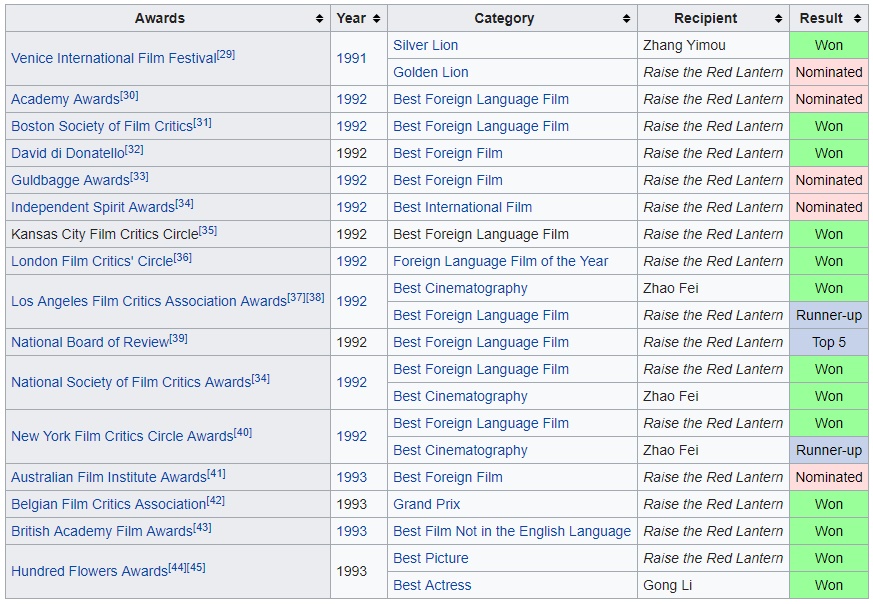 List of Awards and Nominations
The screenshot is taken from an early part of the scene when Songlian, the fourth mistress, first enters the Chen household.
Colours
- Use of black vs. white
- Black is used to allude to the idea of darkness, historical baggage and overbearing presence
- White is used to suggest ideas of purity, youth, innocence and meekness
- The juxtaposition helps to strengthen both the character traits and establish the setting and context of the Chen household.
- Use of Non-colours
- The use of black and white, instead of red that so much defines the movies further shows that this relationship between the lead and her environment is shown bare and with no-frills or facade. The is an abstinence from the ephemeral vanity and passion represented by the colour red in the movie.
- The austere palate effectively and economically establishes the character and setting.
Composition
- Black engulfs the character
- The character is dressed in white against a vast black background dotted with golden calligraphy. This suggests ides of entrapment as the white is surrounded (drowned) within the blackness of the wall.
- Size of golden words are as large as the character’s face
- The power hierarchy between the character and her environment is also quickly established through the space the two elements take up. The character, though the focus of the composition, only occupies around 10% of the frame. Her face, an important part of the character, is around the same size as the words in the background. This in turn shows that the character is trapped within this system and is too insignificant to fight against it.
- “Prison”
- The words are read downwards, directing the audiences to move their eyes in a vertical fashion. In turn, this is like “invisible” railings that imprison the character as she is weighted down by the history of the patriarch. The geometrical golden patterns further reinforces the idea of character being trapped and restricted due to the rigid environment she is in. The couplets at the two sides tightens the composition even more, forcing the character into an almost claustrophobic space.
- The character is rounded and also put behind “bars” as suggested by the calligraphy set against her in this scene.
- Combined with the context of the film, the clever composition helps to initiate the idea of the patriarchy, where women are left powerless and voiceless against men without any means of escape.
Character Design
- School Girl
- Other than dressing in white, the character further radiates the idea of youth and innocence through her dressing. She has blunt bangs and two ribbon-tied pleats that are commonly found on young school girls. The soft blue colour of her hair-tie further enforces the idea of pre-pubescence and purity. Her clothing is also made to be reminiscent of the school uniforms to highlight the fact that she is only a first-year university student of 19 years old.
Overall I feel that the scene is effective and powerful. Zhang has optimised the screen by placing his character against a carefully curated background. His commentary on the patriarch is clearly formed with this scene.
3D Project 2
For the second project I chose my teddy bear as the most precious object.
Bearbear being featured in my 4D work
This teddy bear (I call bearbear) is from my grandma, I thought it was a special gift until I was P4 when I saw another friend with the same bear. Afterwards I learnt that this design of teddy bear is actually a common wedding favour. So for me the quality that I distilled from bearbear is that she is something others have to but is unique to me at the same time.
Keeping that in mind, I thought of the material of hair. I like this idea a lot as hair is a loaded symbol… think of the social norms based upon hairstyling in ancient societies, the shaving of slaves to display dominance, hair checks and regulations in schools and the military. So I feel that while it is something that can be curate (or not) and reflect how it’s owner is like, it is not something entirely unique to each individual. As mammals, hair is one of the characters all humans share.

My collection of hair I cut…
I am also inspired by many female artists who have chosen to use hair in their works. One of them is Mona Hatoum.
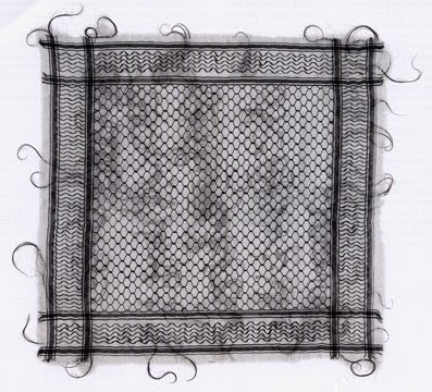
Mona Hatoum, Keffieh, 2003-9, Human Hair on Cotton Fabric
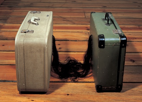
Mona Hatoum, Traffic, 2002, Hair, Suitcases
I really like the wide repertoire of themes and emotions she has managed to discuss and evoke with this simple part of our body. It really shows how protean hair is as a symbol/material in art. Of all the qualities of hair, I was apprehensive about accidentally making it too visceral and making people squirm in disgust or horror.
I came up with the idea of making a kaleidoscope with hair. I thought of this as it will allow viewers to encounter hair through a filter (eyepiece, glass, etc) yet scrutinize it.

However…

I tried cutting glass…
 and it broke…
 and it broke more…
Thus I changed my idea to putting hair in a test tube. The test tube was chosen as a presentation method as it also helps to cue the act of scrutinizing.

I tried to crochet the hair, but it was too thin and snapped very easily. I then tried to crochet more than one strand of hair at once, but I realised that the hair is too strong to be knotted that way.


I then experimented with other ways of amending the hair.
This is how my final work looks:
 All these are my hair, yet they are distinct from each other (it helps also that I have gone through various hair colours too).
4D Project 3 Process
Concept
For this project, I begun with this set of sketches as my concept:
I was very interested in the idea of “what happens when we sleep”. In medical science, a lot of repair functions occur while we sleep, thus I wanted to take a fun twist on that.

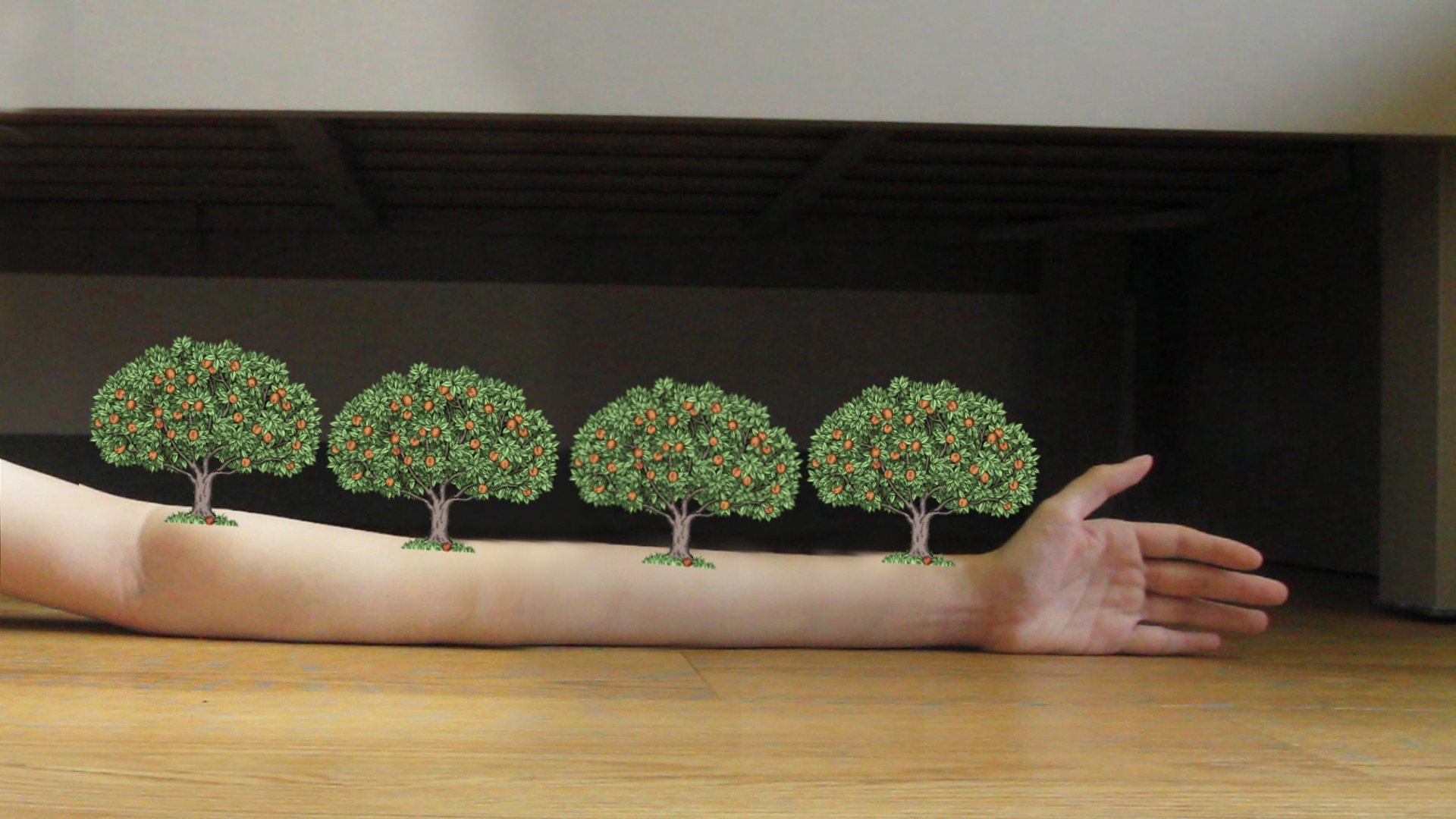
I decided to talk about how “rosy apple cheeks” come about.
Research/ Experimentation
As seen in part (2)–The “fall”
I was looking at this animation to get references for a falling action. However this was too challenging as I had to convey motion, texture and weight. Thus I decided to think of something else.
This transition is however crucial and I still had to cover what I can’t fake. Thus I considered composing for a huge seed to fall, then for seed dispersal to happen before the trees grew again. However, this did not help to obscure the awkward transition I was struggling with.
Eventually, I decided to go further with the theme of a dreamscape/ fantasy and just to suggest the workings of magic.
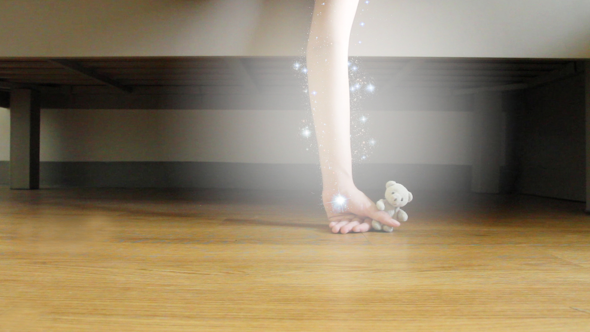
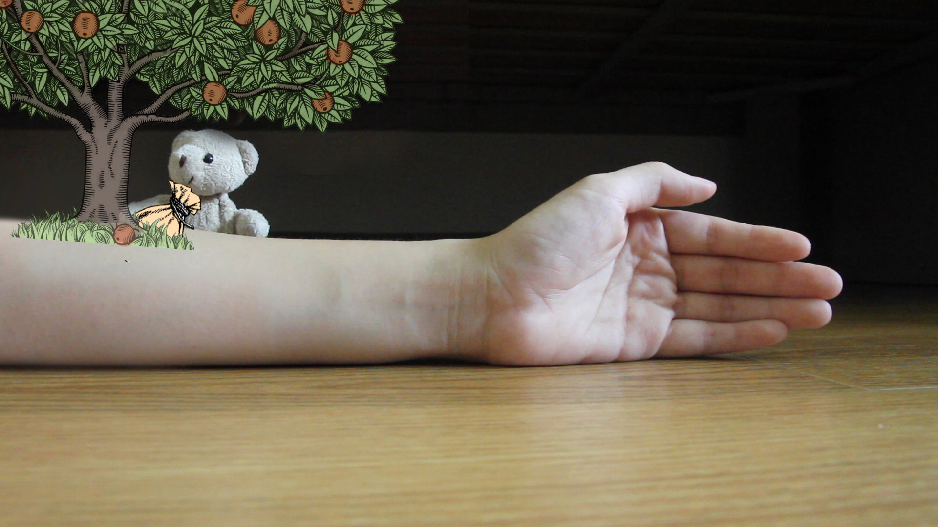
I used a radial gradient to create a glow around my hand. I then added “magic sparkles” by editing a photo of the galaxy. Rather than attempt to obscure it, I chose instead to draw emphasis to this transition.
To further play around with the idea of magic, I let the soft toy extend the length of the hand, making it clear that this was no realistic. This also helped with adding more elements in the mis-en-scene to make it more visually appealing.
As seen in part (2)–The “crumble”
This was overly ambitious and I had absolutely no idea how to execute it. Thus instead, I made the soft toy levitate the hand back to it’s original space.
Since the soft toy was “floating up” I tried to play with the idea of going underwater.


However the rendition below was quite boring, so I tried to slant the water levels so as to play around a bit more with the composition.


I was flirting with the idea of adding in the movement of fishes also to add variety into the pictures. I looked at these videos to gain inspiration.
(02:21 onwards)
However, upon harder consideration, I realised that the sea/fish sequence did not value add to the full story. Thus I scrapped the sequence.
Editing and Technicality
To move my soft toy around, I had to use clothes pins to pin it into shape. 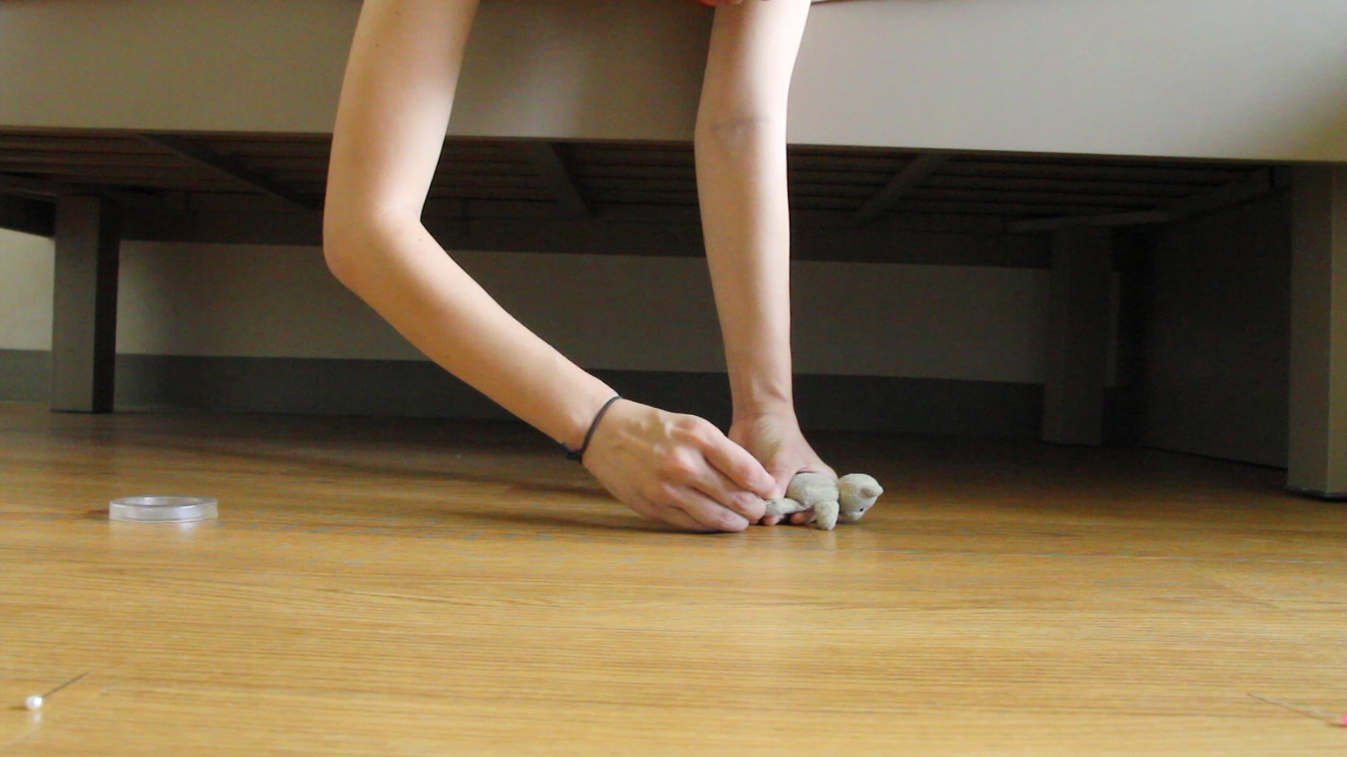
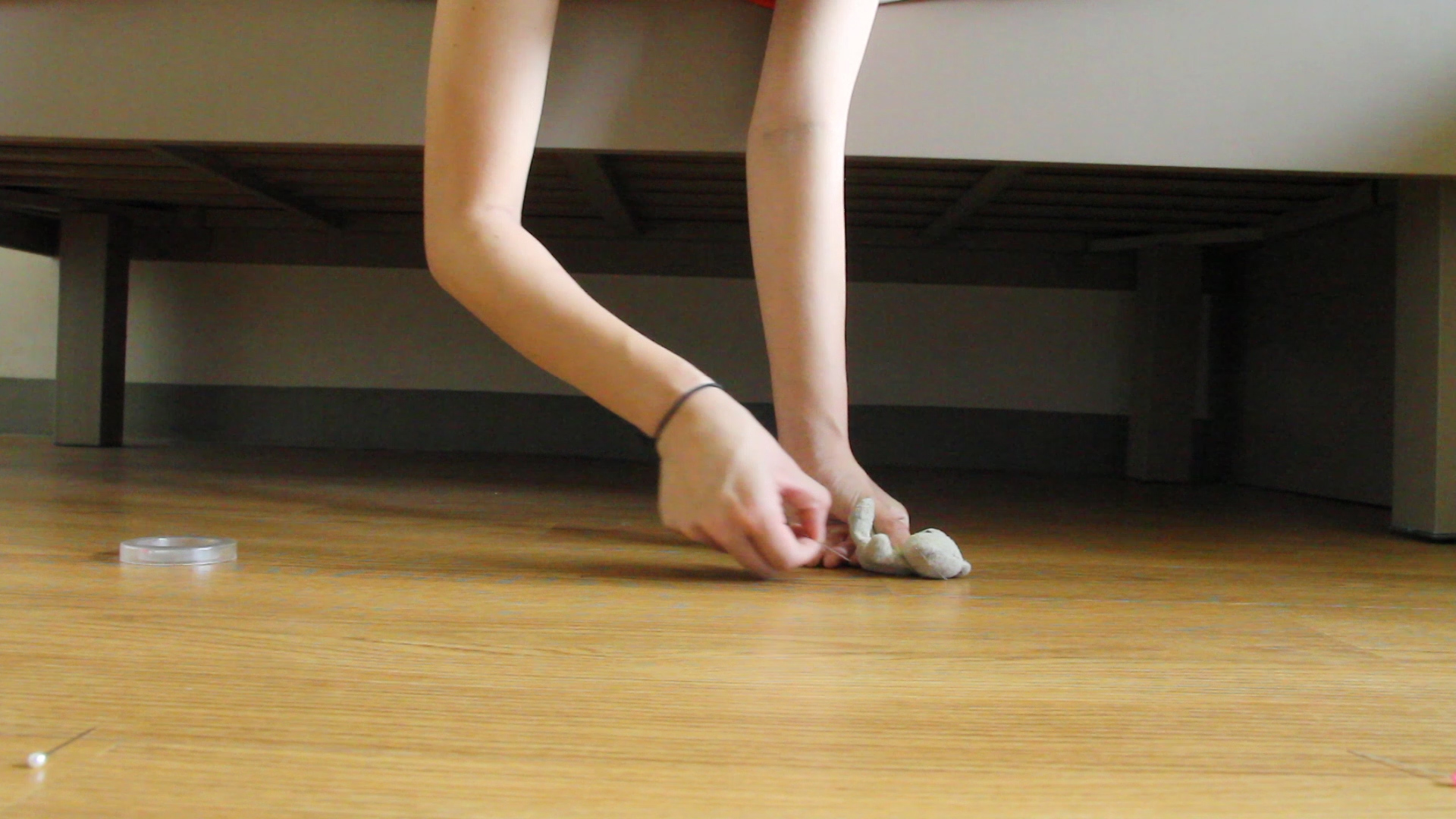 This picture below shows the real photo, before any form of editing. I used to pin to hold the soft toy so as to minimise my contact with the toy and thus help with editing.
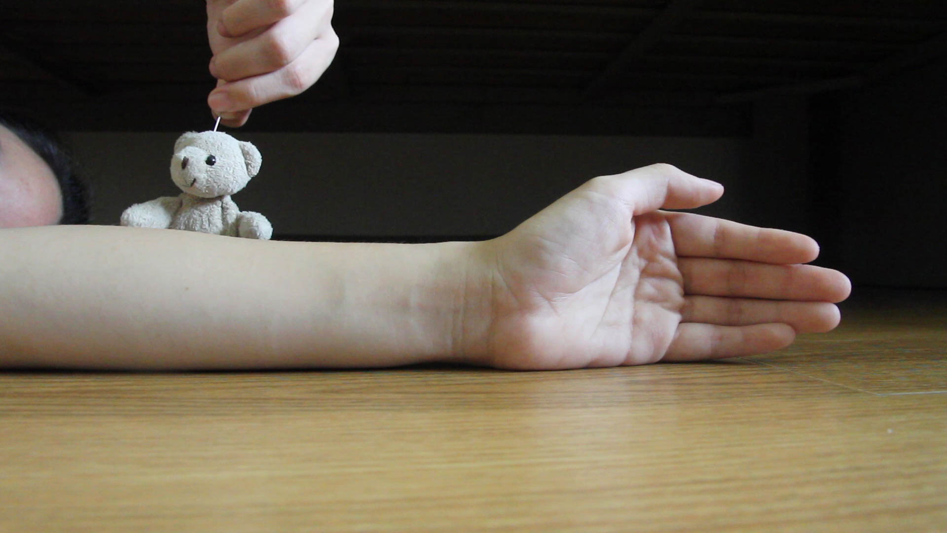 This picture shows the cleaned up version of the photo.
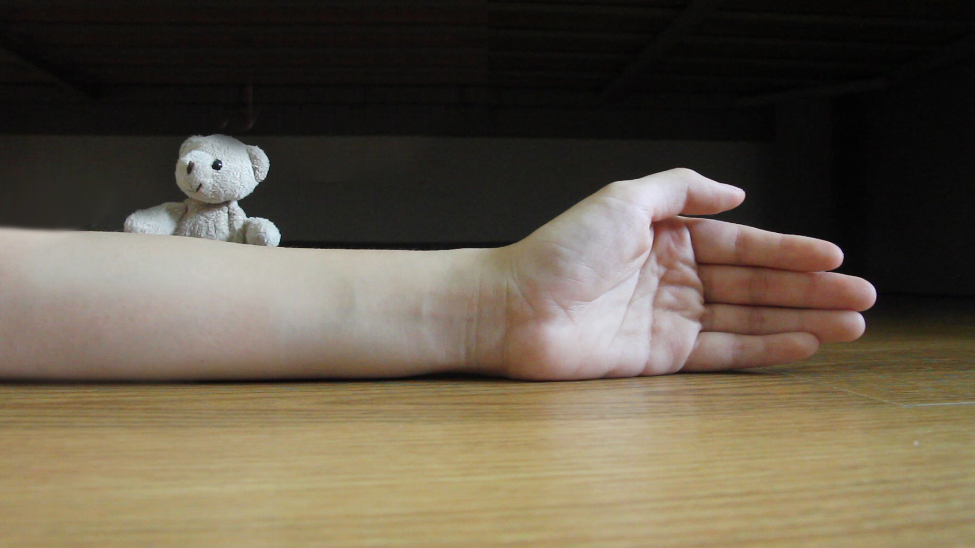 This picture shows the final look of the photo, complete will illustrations added in.
4D Project 3 Final


4D Project 2– Walking Together
As mentioned before, I wanted to do a story on slippers and play around with a photo angle that we seldom encounter– the worm’s eye view.
My work is titled, “Walking Together”.


Brainstorming for 4D Project 2
I was really excited to start on this assignment. At first I was interested to tell a non-linear narrative like the one from Memento by Christopher Nolan or Mr Nobody by Jaco Van Dormael. However, I realised that it might be too complicated to do that with merely 10 photos and sound tracks.
Hence I changed my idea and decided to instead give attention to neglected sights in our daily lives. So what is an angle that we usually forget to consider going about daily life? I realised that we seldom look at this from the ground level, literally from the angle one would see from at a worm’s eye view.
Thus I have decided to tell the story of a pair of slippers in this project.
- Slippers as a new object.
- Slippers running through a traffic light (2)
- Slippers on a rainy day (2)
- Slippers getting damaged and dirtied (2)
- Slippers at the market (2)
- Slippers becoming broken
Human +; Tidbits after our FIRST Outing
Disclaimer: I am usually not a big fan of works that are speculative of technological advancements. Thus, the works I will touch on are more “traditional” in terms of subject matters.
Firstly, I actually really enjoyed the use of space of the entire show.
![]()
Installation view of “Transfigurations” by Agatha Haines (Photo credits: Agatha Haines)
The whole show was divided into four sections and thought-provoking quotes like those in the picture above are littered around the space. The different takes on how technological and life sciences are seeing their distinction being blurred are juxtaposed with quotes on the issues of bioethics. Hence, I feel that the show was one that questions and examines our definition of humanity more than one that merely surveys scientific advancements.
My favourite work was a video piece by Chinese artist Cao Fei– Whose Utopia?.
Cao Fei (Photo credits: Zhang Zhi)
This three-part video is a product of the artist’s half-a-year residency at the Osram light-bulb factory in Foshan. Cao conducted workshops for the factory workers, many who are young emigrants from the inland provinces of China.
I was really taken in by the ingenuity of juxtaposing different forms of human expressions with the setting of the factory. Cao marries the mundane and ritualistic process of factory work with the fragility and preciousness of an individual’s dreams and aspirations. The use of dance and music becomes almost a form of serenade for the everyday, faceless factories workers. The tension of an individual and mass systems (conforming) has always been a subject matter within creative works.
Charlie Chaplin’s Factory Work in Modern Times
The different worker’s mode of expressions and the use of moving shots give irony towards the factory setting that is fixed and generic. She presents the people as fluid and living, almost as a feminine element. Whereas the factory space is rendered in a slightly greener lighting, denying viewers the comfort of a familiar and naturalistic imagery despite the artfully executed cinematography. The never-ending factory lines, the mammoth scale of capitalistic production becomes almost monolithic and a masculine element. Cao highlights this tension within our society, at once honouring human creativity and resilience of the human spirit while also challenging the systems of productions and economics.

Still from Cao Fei’s “Whose Utopia?” (translates to “my future is not a dream”)
Whose utopia is it when everyone is forced to put aside their own dreams and aspirations? Whose utopia is it when machines are replacing humans and leaving us with less options?
I also really enjoyed Liam Young’s work New City: Machines of Post Human Production. I really enjoyed the projection of different city skylines being stitched together. I also found it very clever for Young to use a projector rather than a screen or lightbox. This denies viewers a chance to closely inspect the landscape he has composed– which pokes fun at how the cosmopolitan landscape is one that is not foreign but also not close to heart.
This display is placed directly across and in conversation with a video loop of a factory production line. The austerity of a factory setting, how clean, angular and bright it is juxtaposes the sepia-looking and cluttered appearance of the city skyline.

Overall I really enjoyed the whole work. The only regret was the series of machinery mock-ups that were placed in between the two projections.

I felt that this disrupted the dynamics between the two screens. It would have been preferable if the space between was left empty such that viewers can be engulfed entirely by the two large projections. And the mock-ups would have been nicer if they were placed against the wall outside the room where the projections were so they can act as a prelude to the experience.
All in all, the outing was really fun and I hope to have more of these outings! 🙂
3D Assignment 1– Lines and Planes
I have never struggled so badly in another assignment. 

I started by doing a blind contour drawing and trying to used two parts of the blind contour as the guiding lines for my string sculpture.


 However the result was not very desirable and the patterns got too complicated.
So I decided to play around with how a strip of paper can be shaped such that the strings have a nice tension and the paper will have a sinuous form.


I also looked to Math Art for inspiration due to their use of lines and geometrical forms.

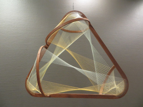
Eventually, I did a sculpture made of many strips. This is my final work.


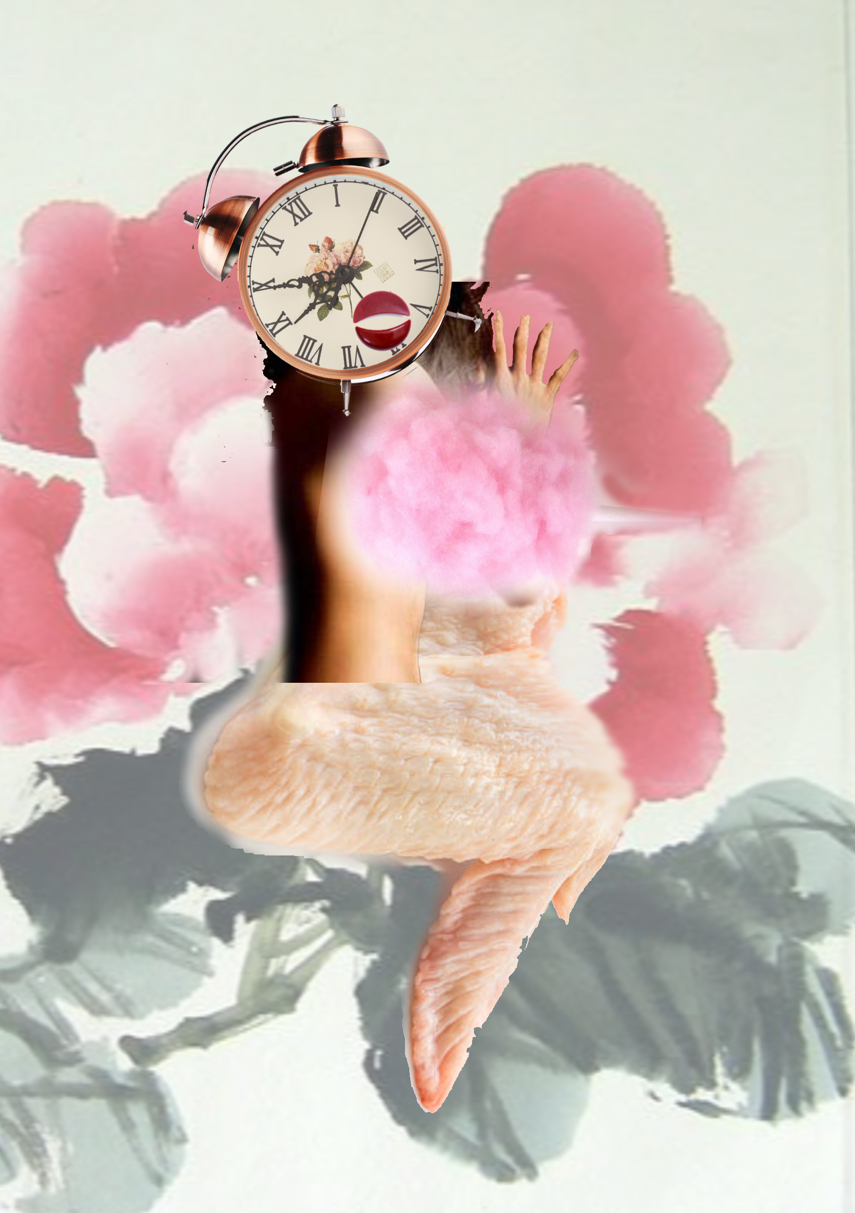
4D Project 1A — Strange Encounter
For this project brief, I wanted to create a feminised world. However, I realised that it would be difficult as it is very difficult to define what a feminised world actually is. Thus I wanted to create three characters that were tongue-in-cheek yet empowering for females.
I realised that there is a lack of Asian female images. Also, since found images are a reflection of our visual culture, the found images of women are often also idealised or objectified. This reminded me of the Chinese women on cigarette posters back in the 1880’s to 1930’s and I decided to use the aesthetics from that time as my look for this project.

I mainly appropriated the head of the ladies in the posters. Some of the earlier drafts of my works were like this:

I wanted to try making the work black and white, however I realised that that removed the style of the work. Also, it subdued the cigarette posters aesthetics that I was hoping to achieve.

In this draft, I add a background to help to make the three figures appear more coherent. Also, I realised here that since we are conflating many different elements into a unified form, there needs to be more harmony between the different elements. Over here, the tentacles of Ursula is much cooler than the other earthy and more sepia colours used, thus it looks less assimilated with the rest of the figure.
I decided against using a clock face to represent this figure’s face as it deviated from the other two figures. I wanted my figures to be different but still recognisable as a group of three.
These are my final works.
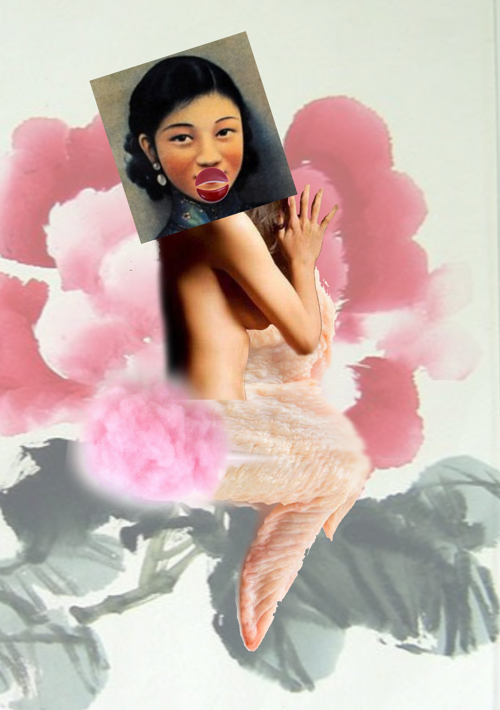 Over here, the viewer is denied the usual gratification of seeing the bossom and legs of a female. Instead, I replaced the bossom with a candy floss, suggesting the usual idea of innocence and school-girl naivety many females are portrayed with (or expected to emulate). The use of cotton candy subverts those ideas as the symbol of innocence is now used to obscure the bossom, often a target of sexual fantasy for some viewers. Meanwhile, the use of a raw chicken wing to replace the leg pokes fun at how the female body is often consumed in popular culture and also calls out the use of female sexuality to sell food products.
The lips of the figure is made by a “jiao bei” which are chips used in a Chinese divination ritual. Traditionally these chips will determine if a divination lot is true or not, leaving the woman’s fate to luck and denying her anatomy. However as this chips are now the figure’s lips,
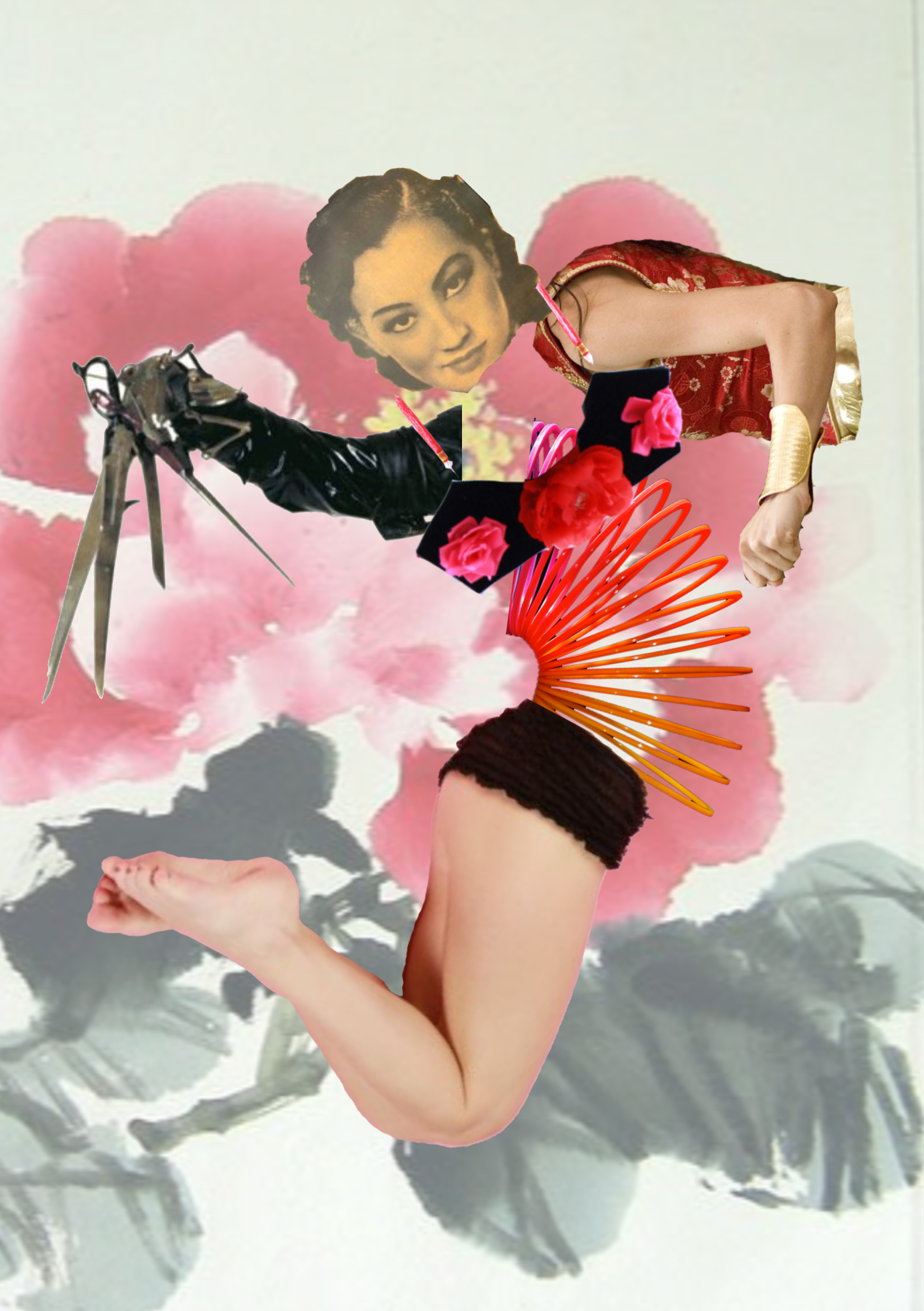
This figure is a woman who is physically empowered. She has the hands of Edward Scissorhands and Maggie Q. Thus she is at once able to keep others away and also defend herself. Her slinky waist also gives her flexibility to stretch and bend around. Funnily enough, her legs actually come from a pinup model while the Maggie Q arm is actually appropriated from a character that is more “oriental” than representative of a demographic group in Asian. Thus the elements are again subverted as they have been transformed as images for consumption or fun and novelty into ways the figure can protect and defend herself.
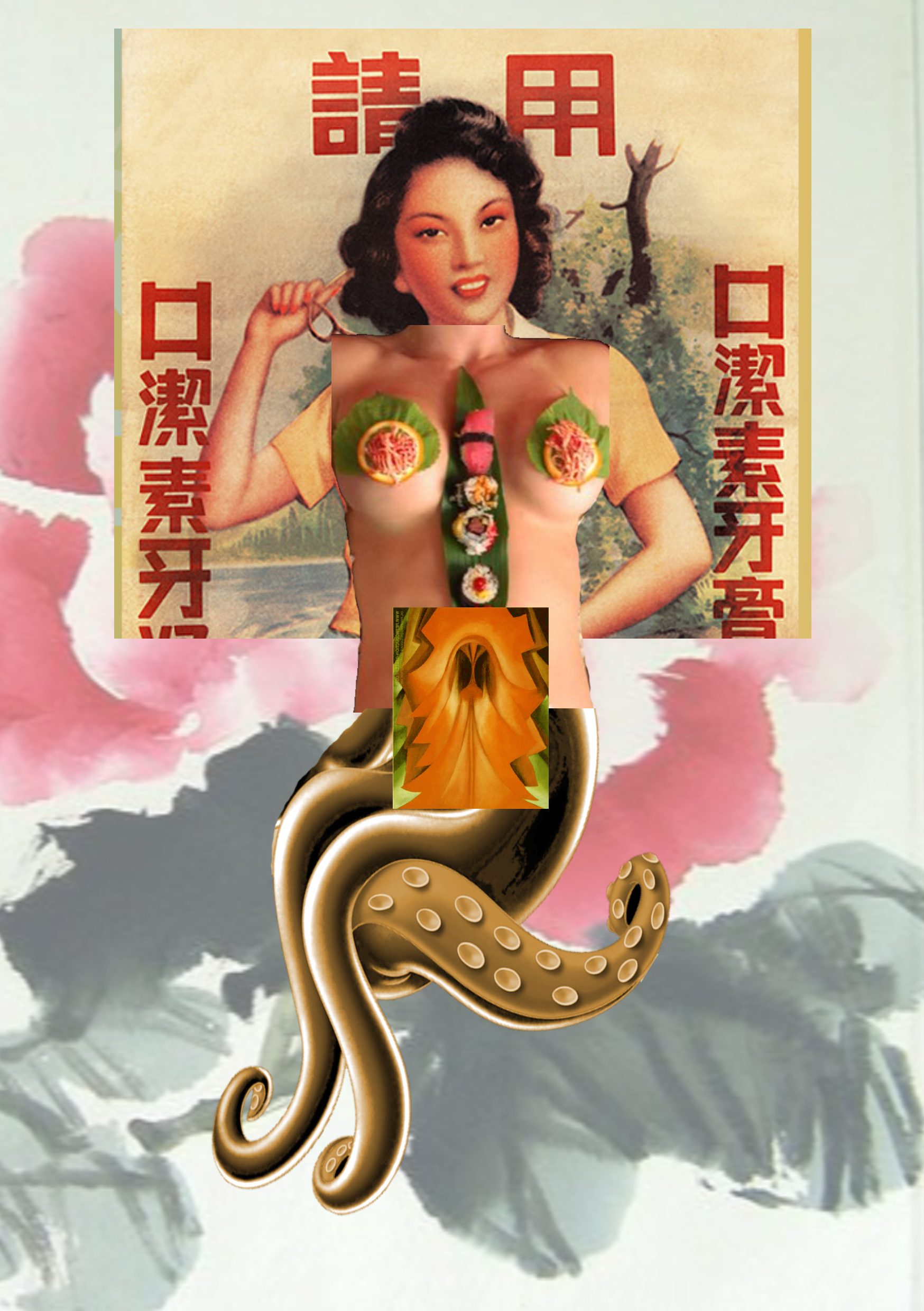 This figure is interesting as it encompasses a female both at one of the most compromising state she can be in and also a female villain. I used a painting of the clitoria flower by Georgia O’keeffe to allude the female genitalia. I purposely edited the painting to make it look more eerie, increasing the tension between the reds and greens to make it look unsettling. Thus, even those the figure has “exposed” her intimate area, she is still untouchable.
The body of the figure is taken from a Nyotaimori, a naked sushi human platter. This is a practice in Japan that is extremely condescending towards women. It is then juxtaposed with the legs of female villain, Ursula. I choose this to show that while a female might be put into a situation where she is disadvantaged and denied an equal playing field, she still has her ways and potential to fight against it.
All in all, the project was really fun and I enjoyed the thought process and freedom to explore with this brief.