My Line is Emo Journey

I had a lot of fun trying out new things in this project.

Earlier on, I experimented with fire…

However I realised that I could not control the fire.

I also tried to do something with fabrics and fibers…

However, I struggled with making the materials less 3D. As a result, I decided to concentrate on using just ink and Chinese ink.

I tried lino printing (linography) from a lino pad…

However, I did not really like the process of craving on the lino pad and then transferring it onto the paper. I also lacked the confidence to be proficient in this technique within the timeline of the assignment.

Thus I tried different ways to work with the lino pad…

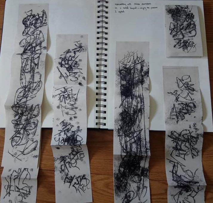
I used my fingers to scribble Chinese characters in a very fast and carefree way. I did it through a paper placed over a loaded lino pad, this inverted the characters and also resulted in other imprints on the paper.

I also tried stamping and printing with different materials. One of the more interesting things I tried was to use a netted new year decoration to stamp the paper differently.

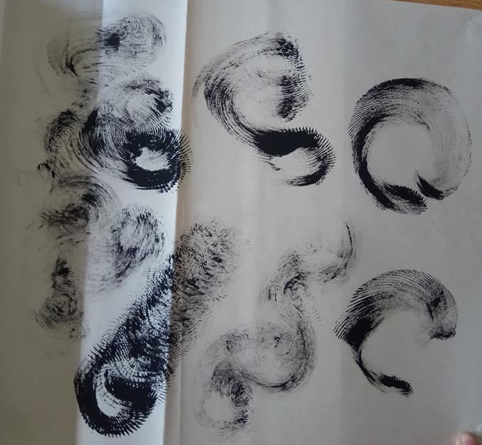
I really enjoyed the texture this material could produce. It also reminded me of the works of Chinese painter, Simon Wee.

Image result for simon wee

Simon Wee, Balance, Acrylic on Canvas, 122 x 152 cm


I also tried printing with crumpled paper, including textured tissue paper and newspress.


Due to my previous interest in fabrics, I also experimented with printing with lace.

However, while the process of trying to figure out how to print lace was fun, I did not find the effect particularly meaningful.

While doing these and washing the lino pad, I realised I really liked the patterns formed on the pad as it is washed. It also intrigued me that this brings across the idea of ephemeral moments.

I also experimented with washing a loaded paper and smudging.

I also played around with Indian Ink and salt…

I really liked the last effect, which was achieved by staining the paper with wet tissue that is loaded with ink.


In the end, I settled with these six techniques and materials for my final work. I wanted to present the spectrum of emotions through a relationship: infatuation- apprehension- bliss- astonishment- disgust- disappointment.

Thank you!

On Sound Art Readings

Sound Art

We Are the World, as performed by the Hong Kong Federation of Trade Unions Choir
Samson Young
2017
Video and multi-channel sound installation Courtesy of the artist
https://www.youtube.com/watch?v=KzJkDR7YvX0 (4:20-4:56)

When I was interning at Venice Biennale earlier this year, I came across the works of Samson Young, a leading artist in Hong Kong. He was the representative of the Hong Kong Pavilion and presented Songs for Disaster Relief, a series of works that attempts to reframe the popularization of “charity singles” as a historic “event” and a culturally transformative moment. He created a fully immersive experience including a handful of Sound Art pieces, I will be talking about We Are the World, as performed by the Hong Kong Federation of Trade Unions.

We are the World was situated near the end of Samson’s ensemble of works. Interestingly, one needs to cross a set of heavy curtains, almost like stage curtains to enter the gallery where the work was at. The setting of the work features a simple projection of the choir singing and rows of old theater chairs. By sitting down, the viewer is implicated into the exhibition itself.

The projection shows a choir of middle-aged women and men. They sing the song “We are the world” in a unique manner– without tones but by reciting the lyrics as they breathe in and out collectively. This creates a eerie yet soothing effect as sound produced skirts between being visceral and also humane.

It then begs the question of whether the choir is in fact making music, and if that is comparable to conventional notions of music or songs. The raspy and raw sound produced with this choir’s performance becomes a critique of the hypocrisy of honor and the dizzying (for being dazzling) effect of pop music on stage. It also shows the limited impact of charity singles, how the mere of singing does not affect the grief and damanges brought about by disasters.

Essentially, Young poses a question – do we become better persons singing charity songs for disaster relief?

In the Summer of 2014 we discovered the inspirational work of Japanese designer Kouichi Okamoto and his Kyouei Design when he released his elegant ‘Square Wind Bell‘. This year Okamoto has returned with another remarkable project named ‘Re-rain’, which was presented to the world at the Shizuoka Prefectural Museum of Art. In his inspirational project the designer created a sound installation through which he aims to express non-visible elements such as gravity, magnetic force, and sound as physical elements. Created with the sound of rain recorded in Japan during the early days of 2016 as its soundtrack, ‘Re-rain’ is constructed out of a set of umbrellas placed on top of speakers. The vibrations of the sounds out of the speakers are transmitted through the umbrella to make a sound, but an umbrella cannot vibrate if the magnetic force of the speaker is too small or if the rain hitting the umbrella is either too high or too low in pitch. For this reason a device picking out a state in which the magnetic force of the speaker, weight of the umbrella, and pitch extent of sound are all in a perfectly balanced state forming this beautiful installation.

Re-rain
Kouichi Okamoto
2016
Umbrella, Speakers, Iron, Speaker Cables, CD Players

I saw this work in Jendela, Esplanade a couple of years back. I really enjoyed how minimalist and simple the whole work was.

Okamoto explores the inter-connectivity of humans and their surrounding spaces with the use of his sound installation. He played the sound of rain through the speakers, the vibrations from this affects the umbrella on top thus creating a cacophony of different sounds based on the environment and also the audio file. Thus it also comments on the harmony of the environment, showing how different (disparate) elements come together to form a peaceful and natural sound environment.

Seminar Questions

  1. What is sound?

Sound according to Neuhas is an aural component. Essentially sound is a vessel for conveying information to be received through the sense of hearing.

  1. How has it been use in culture and society?

Sounds when organised can be regarded as music. And music is a way of expression or preservation of culture, and thus communicative. In popular music, sounds is also used to fill up every minute so as to curb the anxiety of having to confront surface noise (silence).

Of course, sounds when organised and standardized in a different manner can become language. Languages ascribe meaning to sound, thus it allows ideas sharing and communication between people. This is a building block of communities and thus society.

  1. What makes it an art?

Sound becomes art when it is the subject matter of an artwork, when artists begin to examine sound itself. This is not to be confused with simply using sound as a medium in art.

  1. How advancement in audio technology affect our sense?

Advancement in audio technology concurrently heightens our sense. As mentioned in the essay by DeMarinis, after phonography was invented, phonographers learnt about environmental sounds. Environmental sounds are in fact inadvertent sounds of the environment that we commonly regard as “silence”. This heightens one’s sense of hearing as the previously regarded void of sounds is now found to be filled with other sounds which we do not ascribe any hierarchal importance to.

Reading Assignment: Roland Barthes Rhetoric of the Image

  1. What are some of the key questions Barthes aims to investigate in the article?
    • What is the nature of image?
    • When do codes become meaningful carriers of information?
    • How consistent and reliable are images as carriers of information?
  2. What are some of the key terms/ concepts introduced and discussed?
    • Linguistics Message:
      The linguistic message often takes the form of a textual matter. It is often used to give context and set a premise for the information presented in an image, e.g. caption in photos.
    • Pure Image (Denoted and Connoted):
      Pure image is information presented in a series of codes in a visual matter. There are two layers of meaning to an image– denoted which would encapsulate the literal and unadulterated message; connoted which is the inferred meaning gathered from the associated meanings of the visuals in an image.
    • Lexicon:
      A lexicon is a set of codes specific to a certain branch of knowledge or area of specialisation; a specific subset of language.
  3. Do you agree or disagree with his argument and point of view?
    • Barthes mentions that photographs are a form of denoted message, going even as far to say that “for of all the kinds of image only the photograph is able to transmit the (literal information without forming it by means of discontinuous signs and rules of transformation”. He attempts to reinforce his argument by proving that alternative images such as painting are stylised and reflect hierarchical decisions. However, I beg to differ as photography is definitely not a neutral and truth-telling device. The very act of photographing something already means that the photo presents a curated and selected portion of the real world. Also, scale, angle and other formal devices like exclusion of information affects the way image is perceived and encountered.
    • Conversely, I do agree with the idea of the limitation of the “metalanguage” in describing language and intangible states of matter. The poverty of vocabulary in our ordinary language is reflected in how eventually words used to explain words cannot be distilled into simpler terms. Instead words are used in a circular method to convey meaning and words are also not perfectly calibrated to be specific and absolutely accurate.
  4. Provide a brief analysis (200 words) on an advertisement of your choice by using the terms/ concepts proposed by Barthes and discuss the role of text and its relationship with the image in the advertisement. Please include an image the advertisement in your post.35 Clever Poster Advertisement Ideas

This is an advert for Mcdonald’s Filet-O-Fish, it is very focused, engaging and also effective.
Firstly, the product marketed and focus is articulated clearly. The caption is straightforward and introduces the product name, this clarifies the denoted image of a burger-shaped tank as a connotation of the fillet-o-fish. The singular, centralised subject matter within the composition helps establish focus on the burger.
Next,  a burger-shaped bowl with a live goldfish is very attention-grabbing, thus engaging consumers . The stark juxtaposition of a live animal (pet) and food invites viewers to consider this advertisement more than the usual gastronomic photos of food common in advertising.
Lastly, I find this advertisement effective as it coneys the idea of freshness and food safety— important qualities of food. By using the denoted image of a glass container the subject matter is connoted to be clean and refreshing. Meanwhile, a live goldfish suggests that the fillet-o-fish uses real fish meat and is also clean and safe. In view of food security issues and a greater desire for better quality food, I find that the advertisement addresses the fears and wants of the contemporary consumers by promising health and food safety.

(194 words)

Hannah Hoch & Sarah Lucas’s Composite Figures

Hannah Hoch, Balance, 1925

Hannah Hoch is German Dadaist who works extensively with collages and found images. What is interesting is the layers of readings suggested by the title Hoch has chosen. Firstly, the two figures are a conflation of elements from more than one gender, for example the body in a dress is matched with the head of a boy. The collage becomes a mix of both female and male forms, striking a form of balance. Next, the figures are suspended in equilibrium; the bottom figure is inclined on a platform while the top figure perches on an arm. It is interesting that the composition arranges the elements such that they are just shy of losing balance. Lastly, there is also visual balance as the subject matter are carefully distributed across the pictorial plane, there is also attempt to balance warm and cool colours by adding in blue from the cut-outs and hints of blue against the red-yellow dominated background.

Sarah Lucas, Two Fried Eggs and a Kebab, 1992

This is a work by one of the YBA, Sarah Lucas. The work is interesting as it subverts the elements of domesticity and consumption to mock the obsession with anatomical features and gender (sexuality). Just by using two fried eggs, kebab and a dining table, Lucas plays on the trends in contemporary visual culture. She then plays with how there is a visual affinity between facial features (eyes and mouth) and the female organs (breasts and vagina), she then re-appropriates the ensemble she curated in the form of a photo thus using the same elements to represent different parts of the body. This is similar to the technique employed by Surrealist painter Rene Magritte in his work “Le Viol” (The Rape), the appropriation of visual technique from art history anchors Lucas’ practice and defends it against accusation that her work is uninformed.

Foundation 2D Project 1 Artist Reference– Andy Warhol

Andy Warhol, Oxidation Painting ,1978, Copper metallic paint and urine on canvas, 198 x 573 cm

Oxidation Painting 1978 Copper metallic paint and urine on canvas, 198 x 573 cm

Warhol experimented with working with urine and copper in The Factory where he invited friends and assistants to collaborate by contributing their pee to the composition.