
Author: SITI KHADIJAH
🍌我喜欢香蕉 🍌

HISTORY OF DESIGN: GRAPHIC DESIGN SO FAR (REFLECTION)

Herb Lubalin is a progressive American typographer and designer in the 20th century, known for high-quality typographic logos and era-defining typefaces. Mostly associated with the typeface, ‘Avant Garde‘. Despite Lubalin being color-blind which can be seen as detrimental in the graphic design field, it could be argued that this shortcoming contributed his razor-sharp black and white imagery.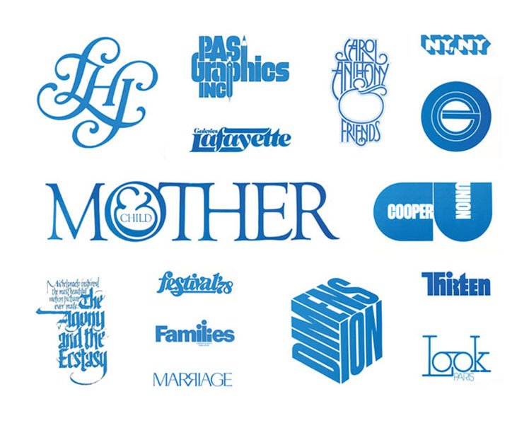
His typogram caught my utmost attention as it tells a story despite being simple and straight to the point. Typogram is making changes to the characters of the letters into a visual image. Lubalin had a playful approach to design as each letter are designed individually according to the weight and strokes to create a shape.
In the example above, my favorite graphic illustration is ‘Families’. Despite using a simple san-serif typeface, the idea of a family is illustrated in the ‘ili’ characters of the letters to show a family unit which is really symbolic.
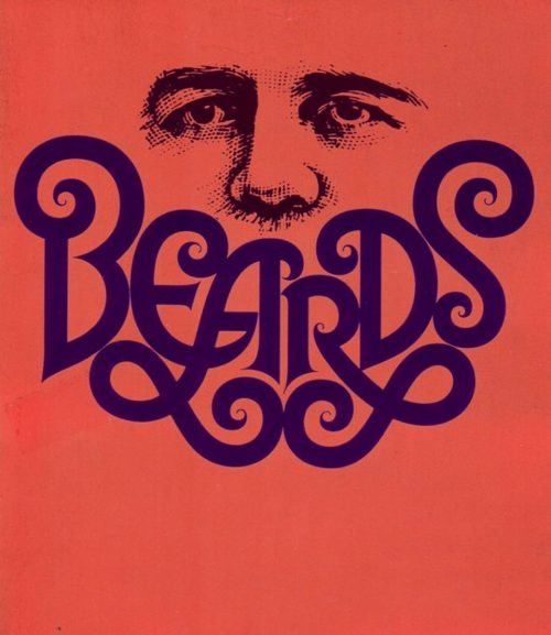
Another example that I personally love is his ‘Beards’ illustration in 1946 which is a mixture hybrid of modern and late-modern style. The manipulation of letters to form imagery of a beard just by using a typeface is experimental. In addition, he is known for creating new conceptual typography called ‘ Graphic Expressionism’. Thus, he was a key figure in the ‘creative revolution’ that transformed American advertising in the 1960s with his artworks.
According to Lubalin in an essay, he wrote for Print magazine, “Graphic Expressionism is my euphemism for the use of typography, or letterforms, not just as a mechanical means for setting words on a page, but rather as another creative way of expressing an idea, telling a story, amplifying the meaning of a word or a phrase, to elicit an emotional response from the viewer.”
All in all, I’m amazed by his playful composition of letters’ shapes can change the weight and meaning of words, and how it evokes certain emotions from the viewer with its imagery and symbolic meaning which is really useful for advertising and communication. To me, Lubalin is one of the prominent experimental typographers that changed the industry with his conceptual typography.
References
https://www.uniteditions.com/blogs/news/ten-things-you-should-know-about-herb-lubalin
http://www.designishistory.com/1960/herb-lubalin/
Class Feedback
For the past four weeks, I’ve learned a lot of graphic design styles and movement that was created which was impacted by various aspects such as political, social, technological and economic issues. Despite being bombarded by all these useful terms during the lessons, my knowledge about everything is very surfaced-level and I have to research on my own to understand more about a particular term.
In terms of the weekly reflection essay, I feel like it would be so much better if there’s a brief or a certain direction we should follow because I don’t really know what I should include in it besides the interesting facts I’ve found online. In addition, I wish the lesson would include more Asian movements and influences or maybe some Singaporean context other than the Western graphic movements. Thanks, Desmond for the past 4 weeks!
HISTORY OF DESIGN: TO BAUHAUS & BEYOND (REFLECTION)
El Lissitzky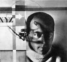
El Lissitzky is an influential and prominent Russian artist in the constructivism (the idea of solving problems with solutions; practicality) and suprematism (eliciting feeling of intensity) movement. Together with his mentor, Kazimir Malevich, known for his suprematist artwork – “Black Square”, they developed suprematism by designing propaganda posters and exhibitions for the Soviet Union.
His artworks are greatly influenced by his training as an architect in Germany. It incorporates the usage of simple shapes as symbolism for the rationale behind his works which are mostly about the socio-cultural context of the emergent Soviet Union after World War 1.
El Lissitzky is known for his photography, photomontage and coming up with the term ‘proun’. He produced a large number of artworks that he termed as “project for the affirmation of the new” in Russian which is heavily influenced by the political issues at that point in time. ‘Proun’ is a style that creates an illusion of depth from a 2D canvas.
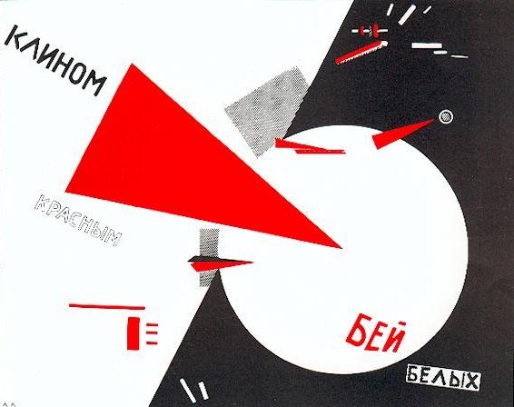
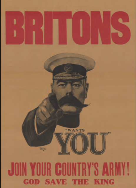

El Lissitzky’s propaganda poster styles are abstract and interpretative as compared to Britain and America’s propaganda poster which are more visual with bold eye-catching letters with flat colors which is similar to the plakatstil style.
One of his iconic works is “Beat the Whites with the Red Wedge” – 1919. The composition of simple geometric shapes strategically placed to create a narrative and meaning about his visualization of the fundamental transformations in society within the space and material used. The play of contrasting striking colors – Red and White to show the opposing team during the civil war in Russia.
Despite being an abstract artwork using political symbolism, people involved or knew the context of what is going on will be able to interpret and understand the message behind this piece. The image of the red wedge shattering the white form communicated a powerful message that left no doubt in the viewer’s mind of its intention. The shapes he used are similar to the military maps to elicit suprematism.
There are so many design styles to send out an impactful message to the audience. To me, the idea of using symbolism and play of colors stands out among the rest despite the minimal visual graphics. It can be used in so many contexts such as a secret or hidden message to people who belong to a certain group or association, who know of the meaning of the symbol and logo. It gives designers and artists, their own freedom to create their own meaning and have a personal take on what the shape or symbols mean to them, similar to the idea of expressionism movement.
References:
https://www.moma.org/collection/works/79040
https://post.at.moma.org/content_items/1240-the-many-lives-of-el-lissitzky-s-proun-19d-1920-or-1921
HISTORY OF DESIGN: INDUSTRIAL REVOLUTION & GRAPHIC REACTIONS(REFLECTION)
Chromolithography is known as a colored picture printed by lithography, especially in the late 19th and early 20th centuries. It is a unique method to create multi-colored prints.
Process of Chromolithography
It is a chemical process based on the rejection of grease by water.
- Image is applied to limestone and zine surfaces (commonly used materials in the production of chromolithography) with a grease-based crayon or ink.
- The image is gummed-up with a gum arabic solution and weak nitric acid to desensitize the surface.
- Before printing – the Image is proved before finally inking up the image with an oil-based transfer or printing ink.
- Inked image under pressure is transposed onto a sheet of paper using a flat-bed press – a direct form of printing.
- Colors may be overprinted by using additional stones or plates to achieve a closer reproduction of the original.
Louis Prang & Company
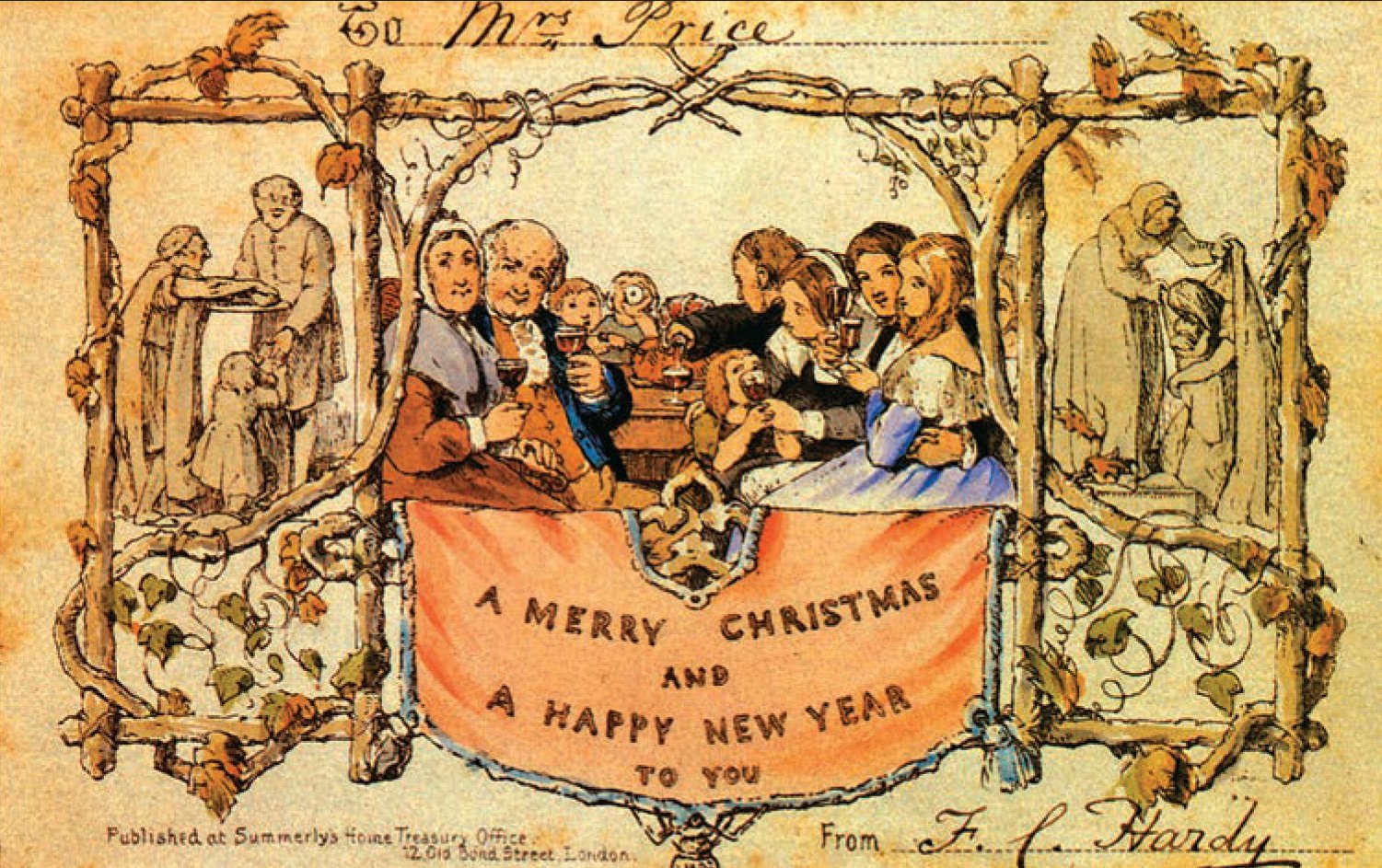
For this reflection, what caught my attention was Louis Prang & Company who is known as the “Father of the American Christmas Cards” in 1873 for the British market. Louis Prang is a famous Boston lithographer who popularised commercially printed holiday greeting cards using chromolithography after being exposed to the first Christmas greeting card created by Sir Henry Cole which caused a sensation in the Victorian era.
He incorporates chromolithography into this design process as an artist has more freedom for expression. They are able to create whatever shape or letterform they want for their design and they are not restricted to the structured and restrictive process of using a standardized typeface using metal or woodblock printing.


Louis Prang & Company became the first printers to commercially print holiday greeting cards that are readily available to the public in the American market after producing the collectible albums cards for the British market in 1873.
The venture to the American market was successful as his company was printing up to 5 million Christmas cards per year. His products ranged from simple to lavishly decorated greeting cards embellished with fringe, tassels, and sprinkles printed on high-quality paper.
Other Contributions
In addition, he’s a man ahead of time during that period as he is one of the active supporters of women artists. During that period of time, women’s occupations were limited to low-paying domestic services. He created an art contest and advertised it through the women’s rights journal Revolution in collaboration with the Ladies’ Art Association. The winner of the contest gets to state a prize for their artwork and Louis Prang will buy it. The fact that he did this when the society that period of time was male-dominated is forward-looking and revolutionary. In 1881, Louis Prang & Company employed more than 100 women as designers, artists, finishers, and embellishers to find new designs and keeping up with the trend.
Another contribution of Louis Prang is the Prang Educational Company and the Prang Normal Art School. He was one of the driving forces behind providing public-school students with an art education with the knowledge and resources he has by creating art instructions in schools and publishing books.
References
http://www.newenglandhistoricalsociety.com/louis-prang-invents-american-christmas-card-boston/
https://blog.bookstellyouwhy.com/vlog-four-videos-on-the-art-of-chromolithography
https://aknextphase.com/louis-prang-street-christmas-cards/

HISTORY OF DESIGN: WRITING TO TYPOGRAPHY (REFLECTION)
After the first lecture of ‘Writing to Typography’, we were exposed to the history of the evolution and development of how type was formed with the earliest form of writing on petroglyphs to the fonts we often use nowadays.
 Personally, I was intrigued and visually attracted to the font, “Baskerville” – an English type, as it reminds me of the Netflix show “Peaky Blinders” which is about an English mafia family based in Birmingham, English in the late 18th century which often uses this typeface font in the film.
Coincidentally, after learning about this font during the lecture, John Baskerville – the creator of the Baskerville types, practiced his artistry as a printer in Birmingham, England. The Baskerville typeface became a common font to be used in England for books, newspapers, and prints. Hence, it was amazing to know that the production team in “Peaky Blinders” took consideration of the typeface and details used during that period of time to accentuate the style and vibe of an old English town in that film and I really appreciate it.


The Baskerville font was developed in 1752 by John Baskerville. His typefaces are all about creating hierarchy and contrast using purely type. The Baskerville’s types are classified as a Transitional typeface – stylistically a mixture of Old Style and Modern typefaces. The axis of symmetry is vertical.
His typeface used to be criticized for being too thin and narrow due to the high contrast from thick to thin strokes as it was hurtful to the eyes. To some, it was known as the thinner version of the Caslon font which is another English transitional typeface. However, it was notably admired by Benjamin Franklin and it regained popularity in 1917.
The Baskerville font has a delicate, sophisticated feel to it and high readability factor. Due to the attributes of long, elegant wedge-shaped serifs and subtle transfer of stroke weight from thick to thin with perpendicular stresses. This typeface is an excellent choice for body text and it became a standard typeface for long text in the late 18th century for books and display purposes, and still widely used till today.
REFERENCES
https://bossygregrules.files.wordpress.com/2014/01/baskerville_typeface_poster_gh.jpg
https://www.linotype.com/702/john-baskerville.html
https://www.huffpost.com/entry/baskerville-font-history_n_58e7fe09e4b058f0a02f4e30

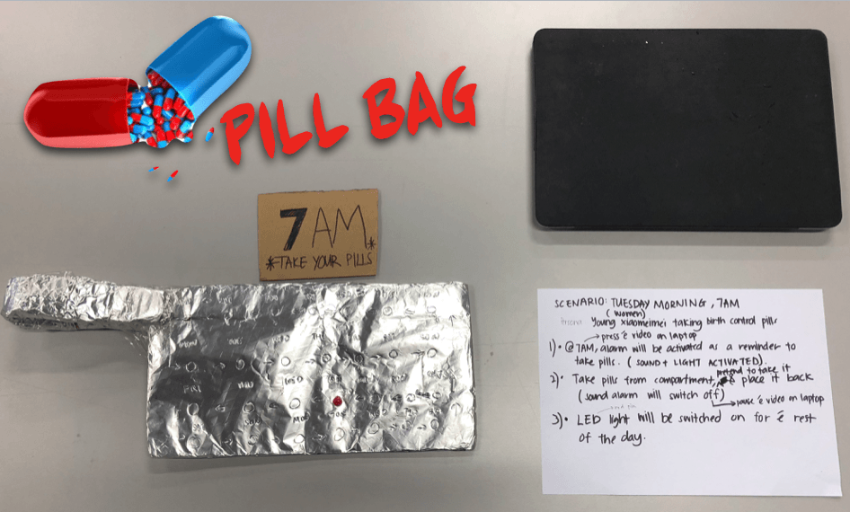
Final Project – The Pill Bag
OBJECTIVES & RATIONALE BEHIND THE ISSUE WE’RE HIGHLIGHTING
For our final project for Experimental Interaction, we decide to create a provocative object to address ethical issues in contraceptive justice. For this project, we will be focusing on the issue of birth control for women. Our project is trying to break the stereotype of being secretive about consuming birth control pills and girls should be empowered by using our pill bag by making this issue transparent and boys have to get used to it. Our objective is to make the bag as a fashion statement which stands out as a protest to change the perspective of how such issues should not be kept under the rugs or not be spoken in front of the opposite gender – normalize it.
The invention of the birth control pill was a significant milestone in the women’s rights movement. Since then, other long-acting, reversible contraceptives have been developed for women, and women now have a total of 11 methods. In contrast, men only have 2 options, thus the public ceding major responsibility for contraception to women. Moreover, Women currently bear most of the financial and health-related burdens of contraception, dedicating time and energy to contraception care, feeling stress and anxiety about taking the pills, the possibility of unintended pregnancy.
Women bear the majority of contraception responsibility and the burdens it entails while men have limited reproductive autonomy. We decided to design a pill bag resembling the birth control pills calls the attention to reconceptualize the issue of responsibility and transparency for contraception between men and women.
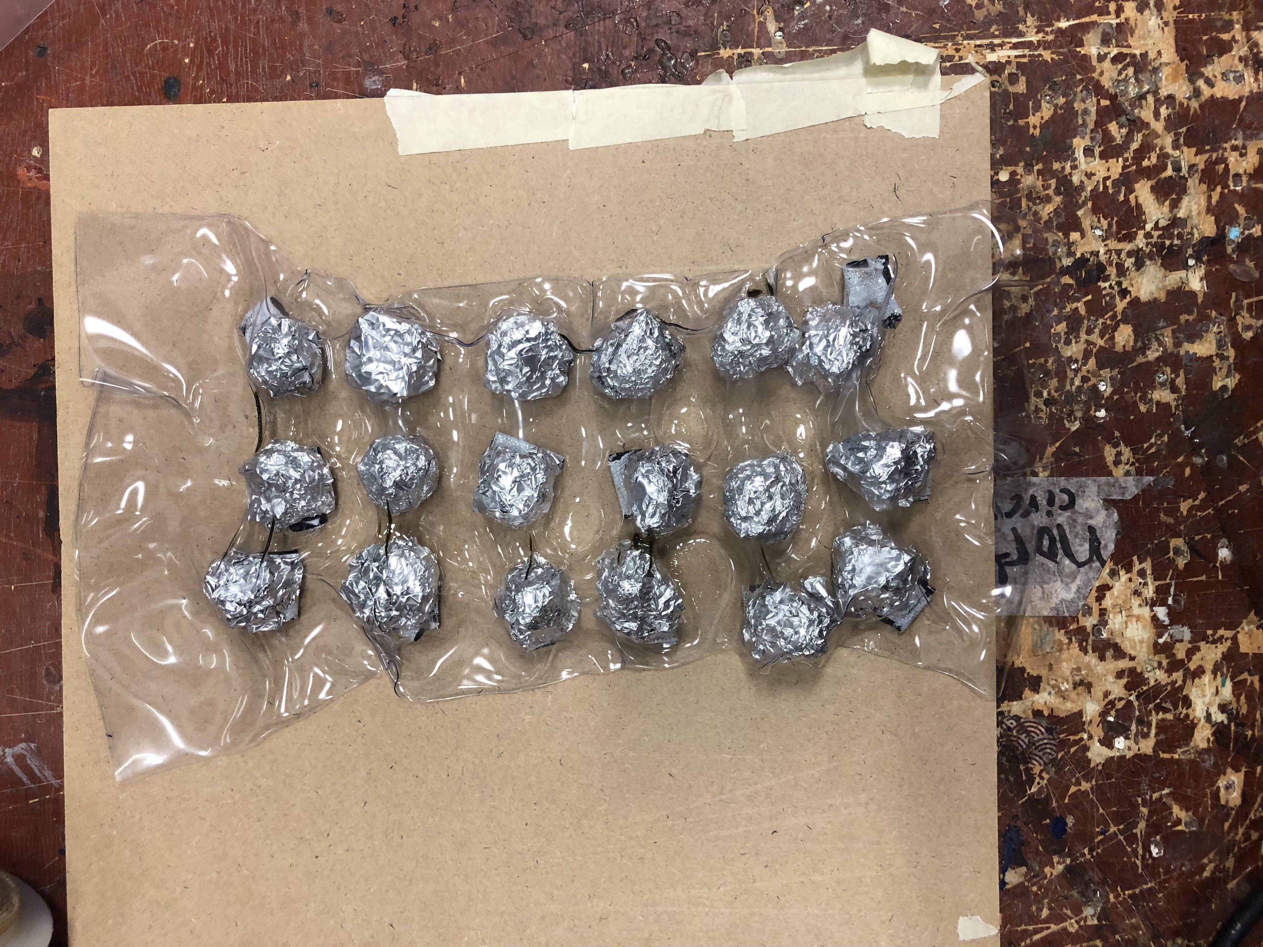
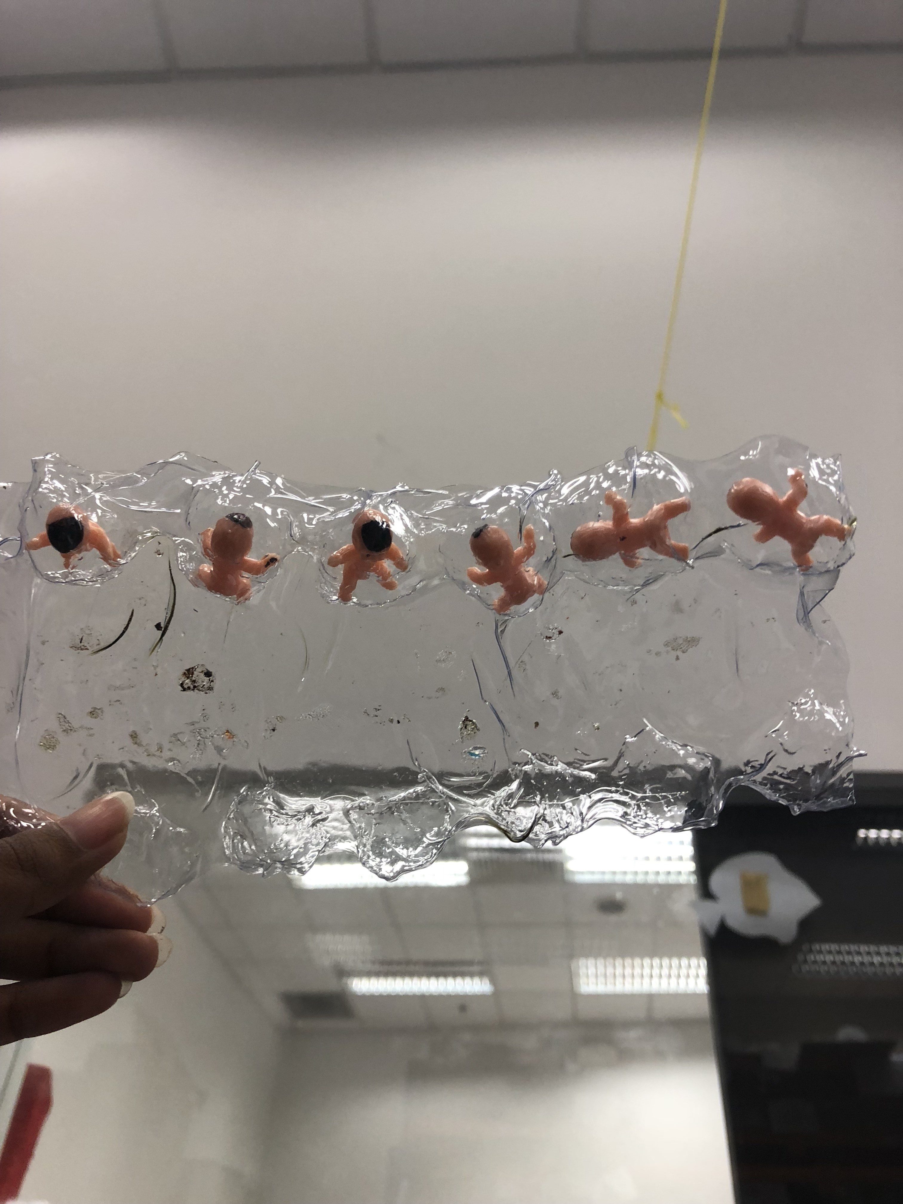
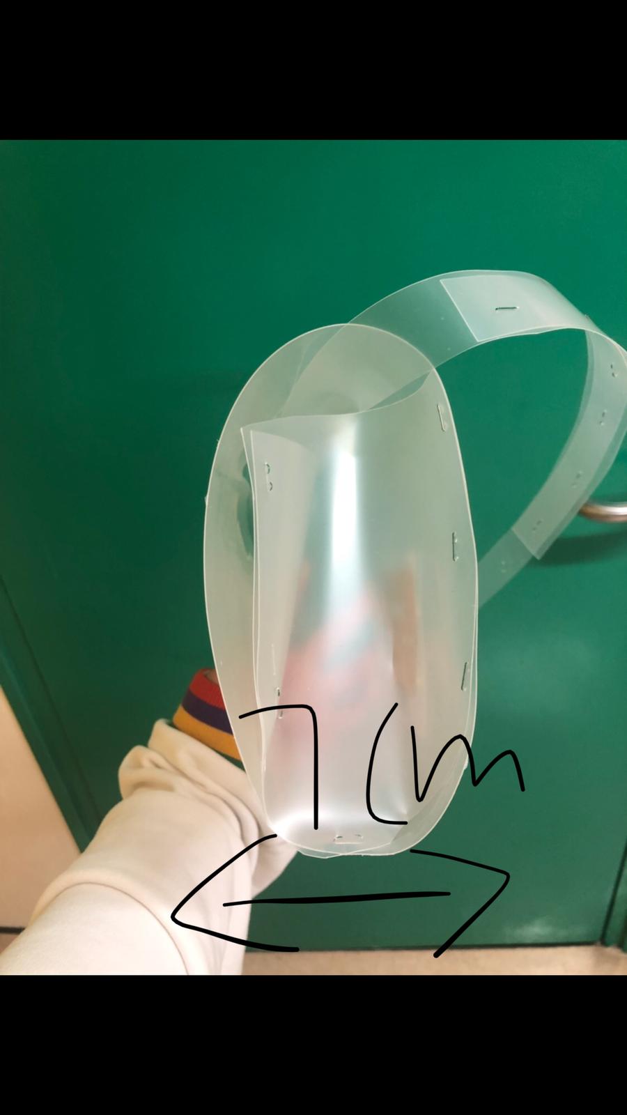
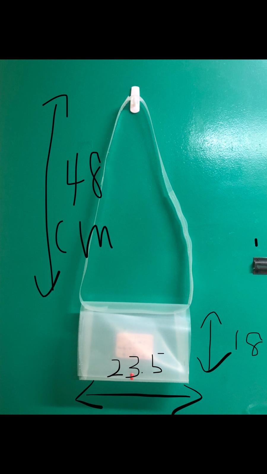
THE PILL BAG
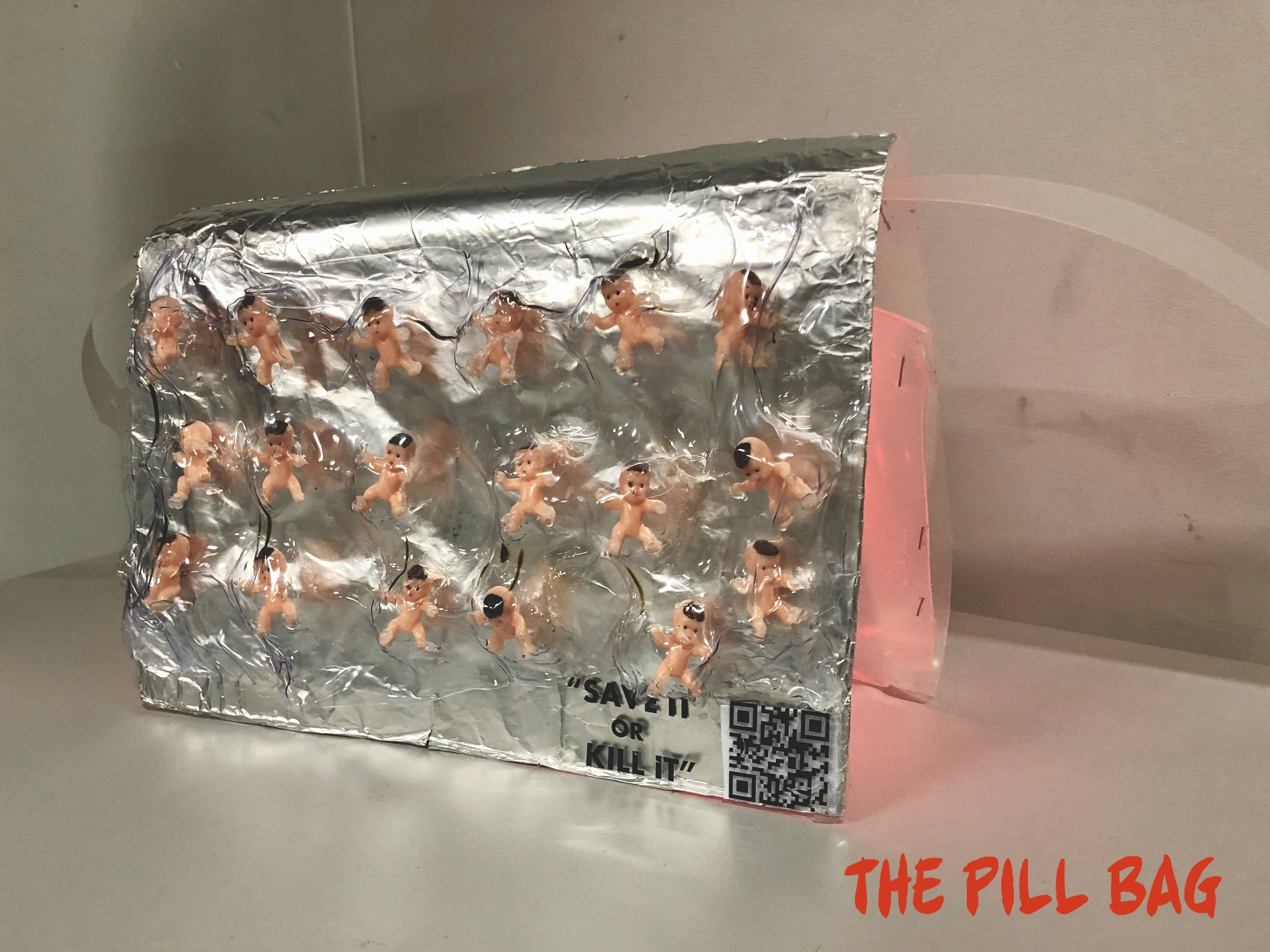
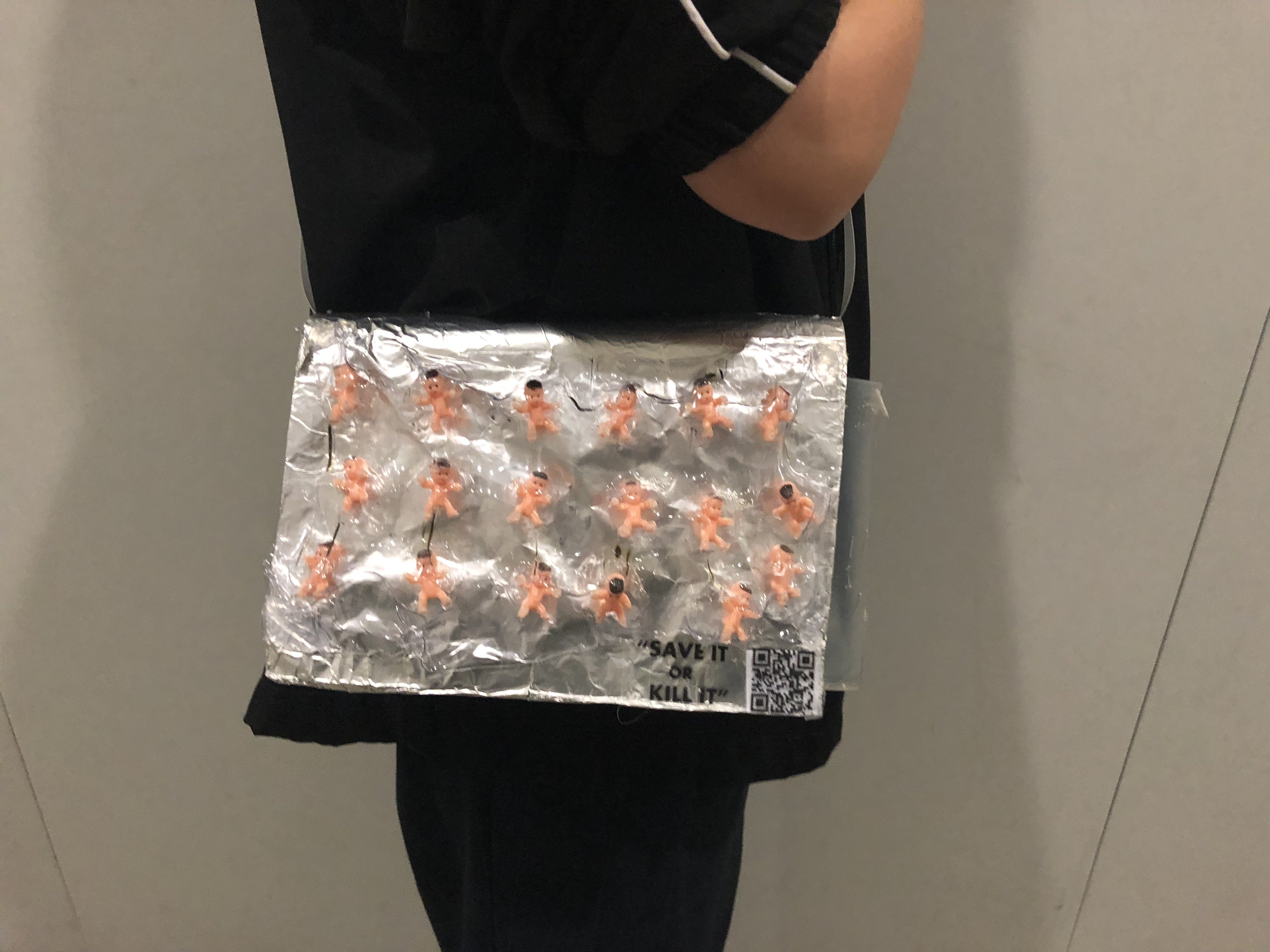
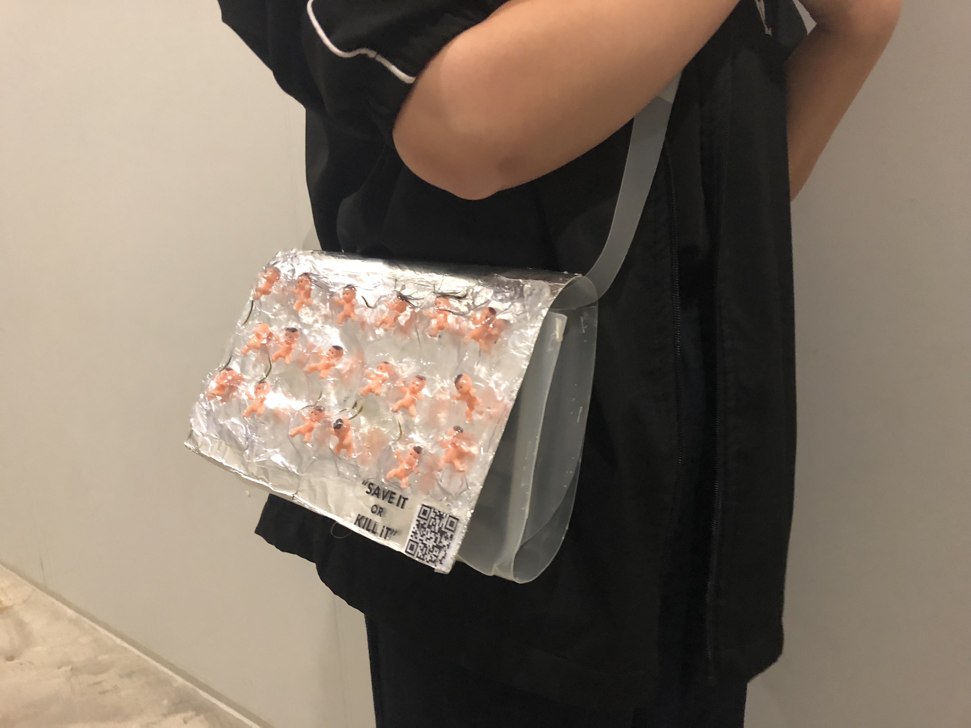

WHAT IS IT ABOUT?
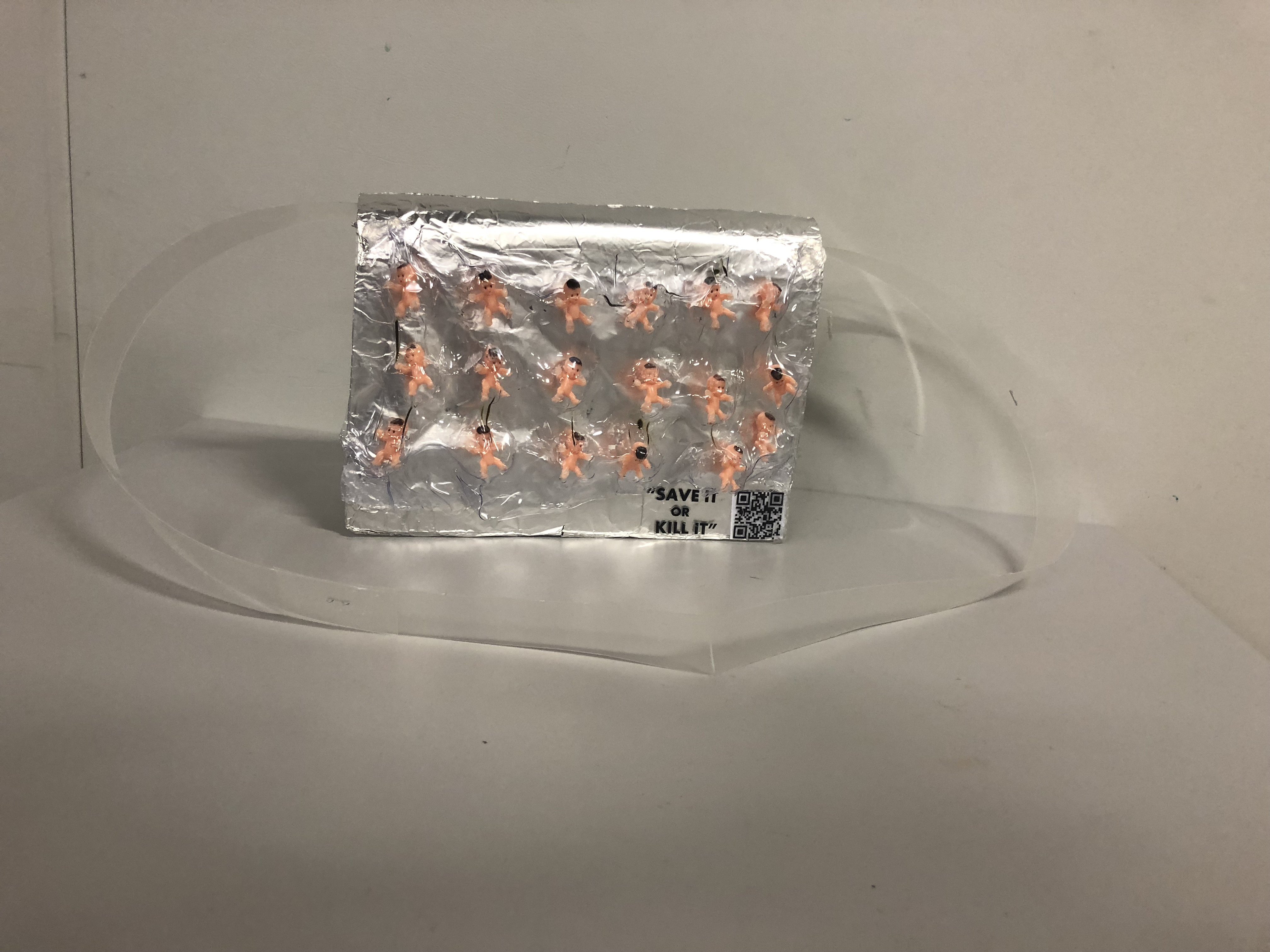
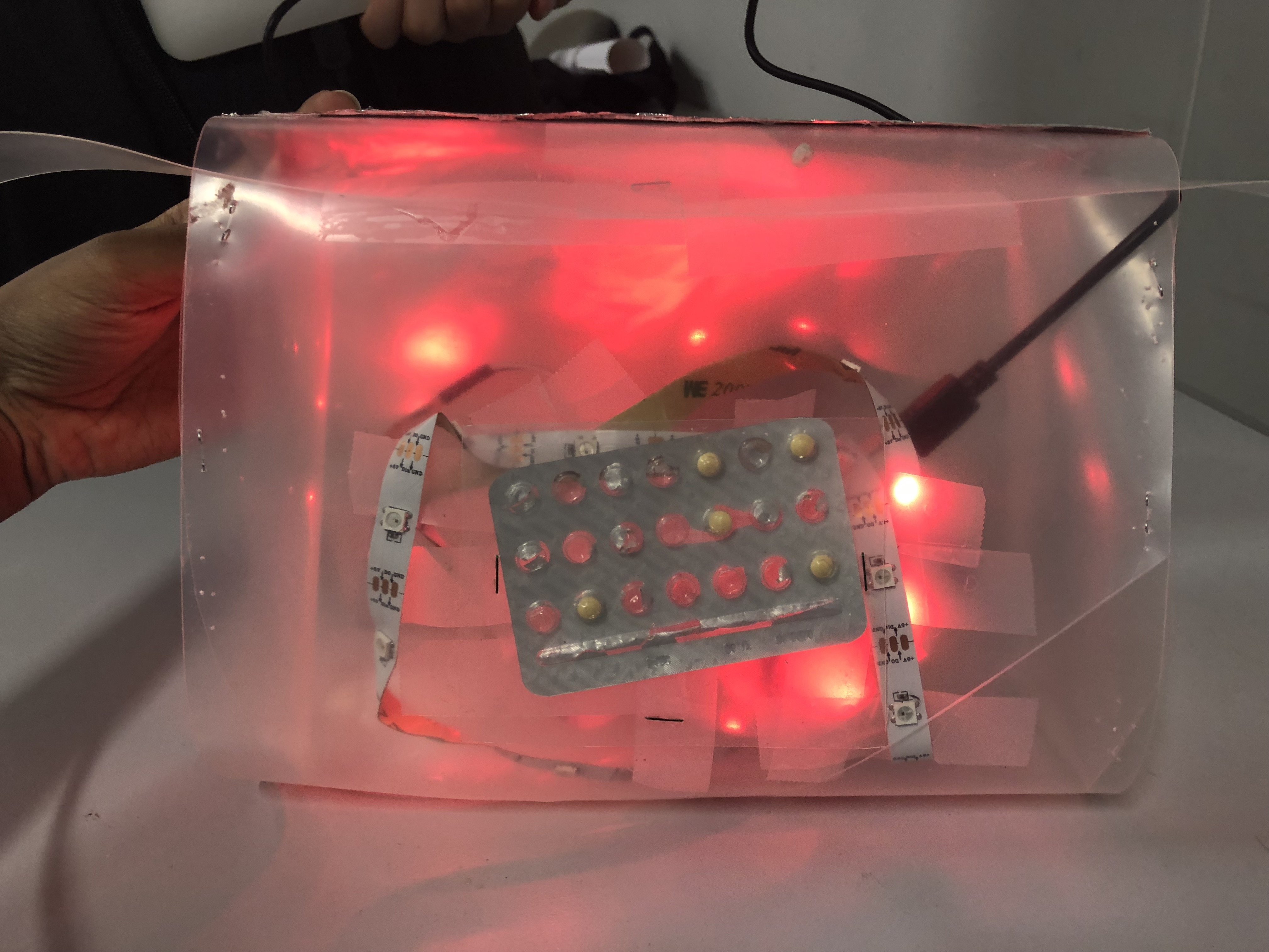
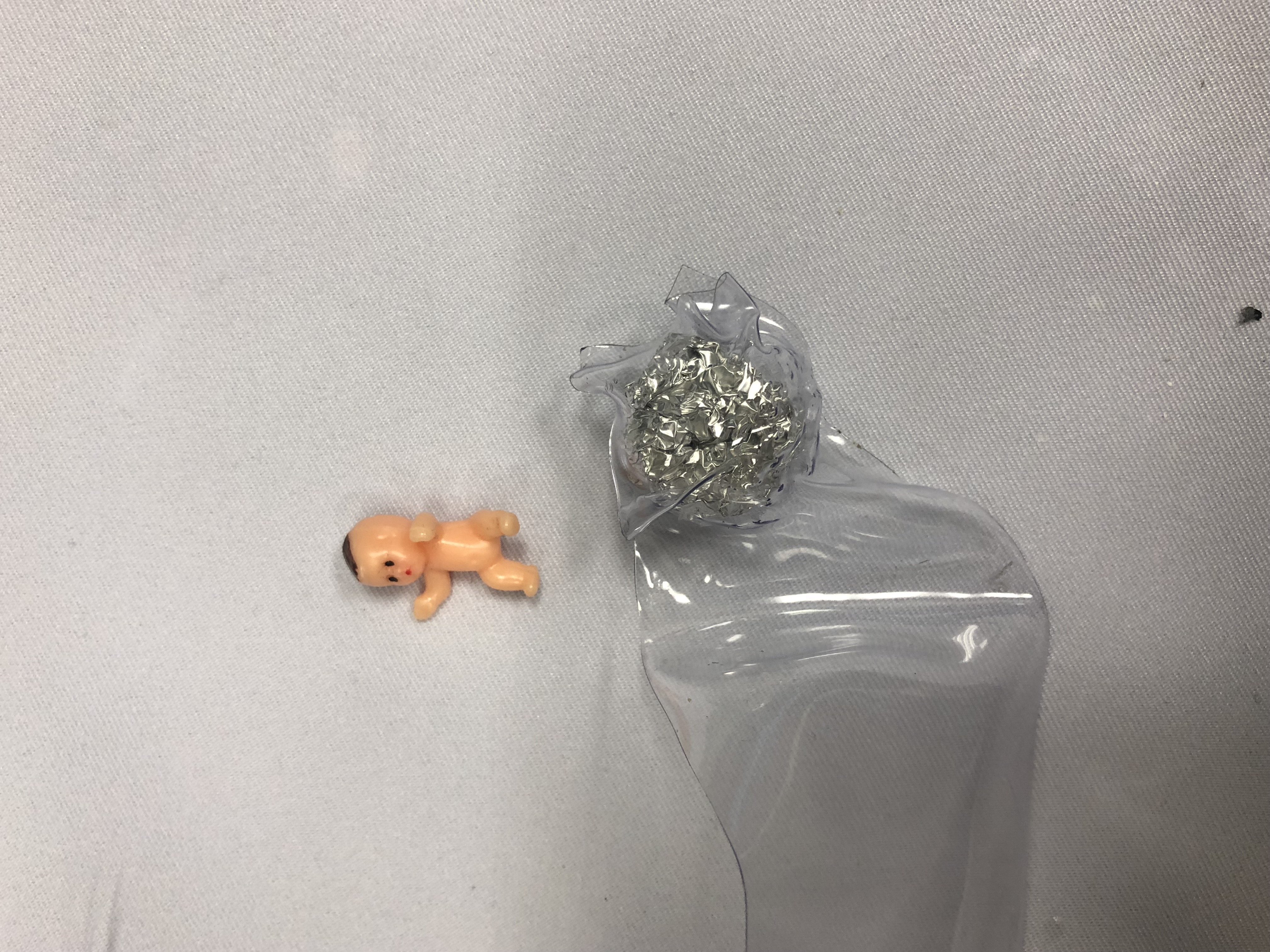
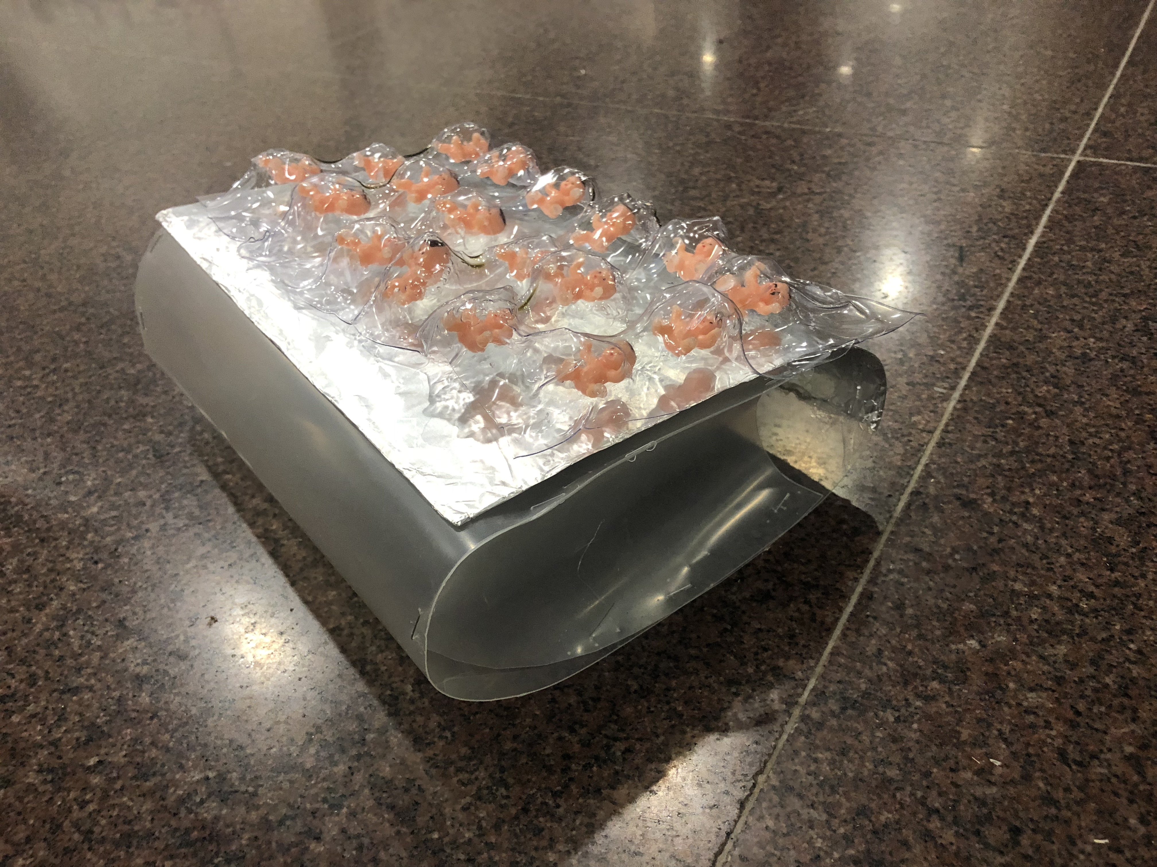
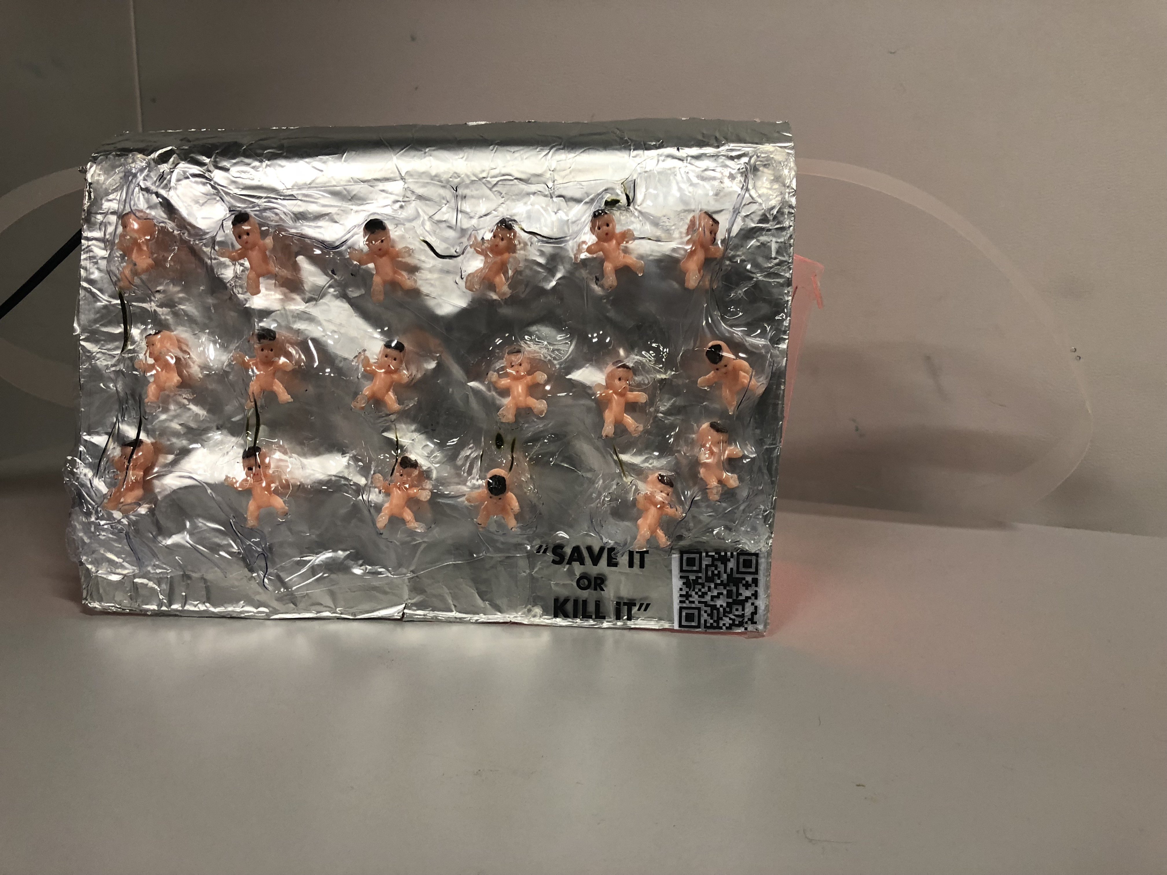
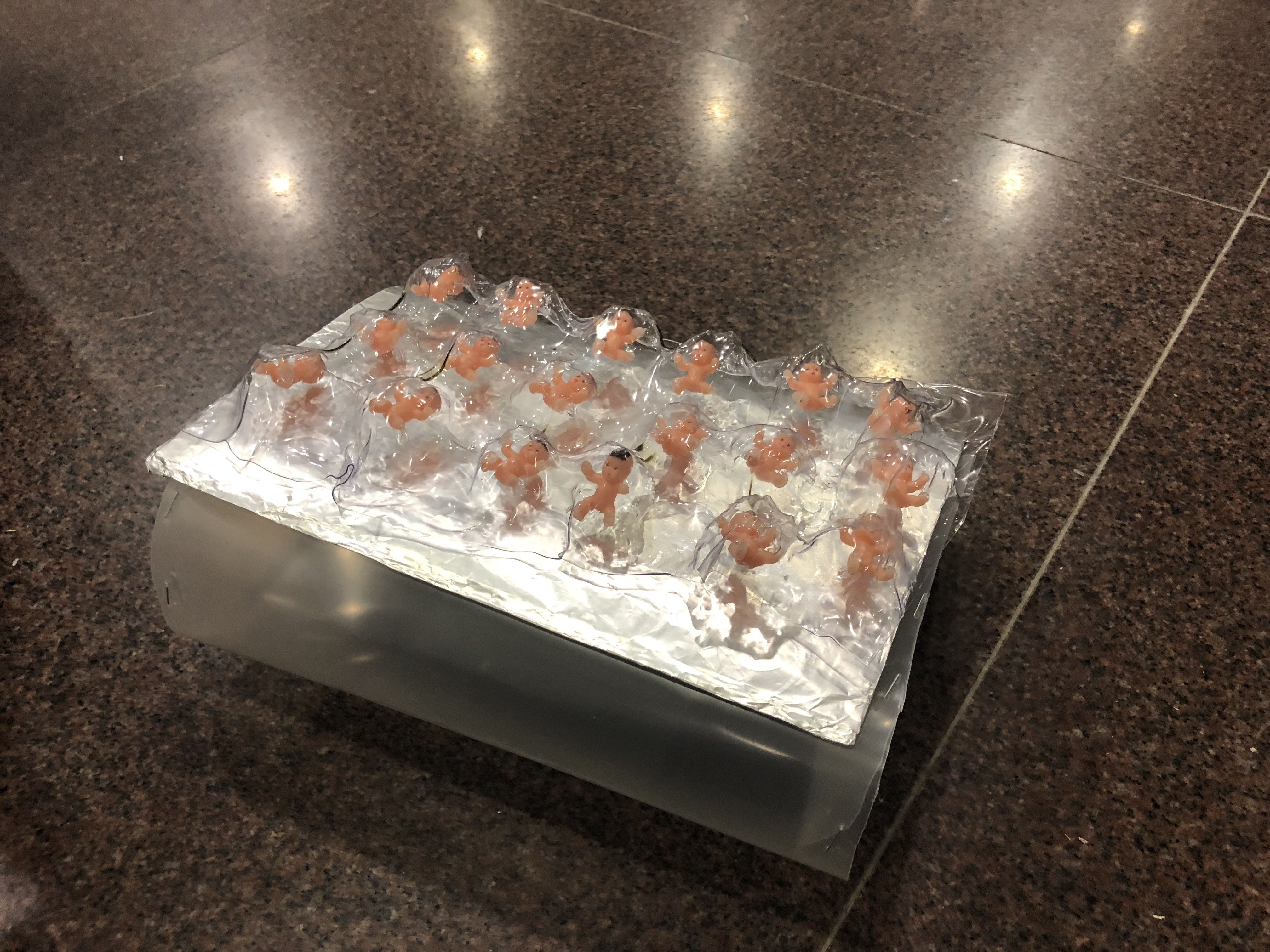
A provocative object that can be used in our everyday life to create a commentary about the transparency of consuming birth control as a female which usually being frowned upon when we’re talking to our parents or male counterparts. The embellishment of the bag imitates the form of our birth control package. Instead of pills, we chose to insert babies to show the severity of the pills not taken on time. Babies will be formed which is horrendous if you hate children or are not planning to have one anytime soon.

In addition, the material of the bag is made of up a transparent material because we are focusing on the issue of transparency of consuming birth control. We were inspired by the case study of “Transparent Grenade” during the researcher’s critique and decided to incorporate this element into our object.
For the user, the function of the bag is to remind them to take the birth control pill in time because it is essential to be punctual in order for it to work by including an alarm.
As for the observers when the alarms set off, the second layer of interaction will occur as the bag will attract attention with the sound and striking form and embellishment of the pill bag, causing a complicated pleasure. A QR code with “Save it or Kill it” can be scanned and it will lead the public to a survey about birth control and lead them to a page about information related to birth control.
In addition, not only this is beneficial for the users but it raises awareness by making the public uncomfortable with our object and learning the importance of transparency and responsibility that a woman has to bear to control her body. With the QR code and survey, we are able to track down how many people we have reached out to with the pill bag.
TIMELINE FOR OUR PROGRESS – THE PILL BAG

OBSERVATIONAL DOCUMENTATION FOR USER TESTS
FIRST BODY STORMING

Click on this link to view our first body storming process, video and feedback.
INTERACTIVE WORKING PROTOTYPE
First attempt:
Our alarm code is based from this youtube video:
https://www.youtube.com/watch?v=TnQWR0BW8zQ
The code is from this website:
https://github.com/masseullahadel/LCDClock/blob/master/LCDClock.ino
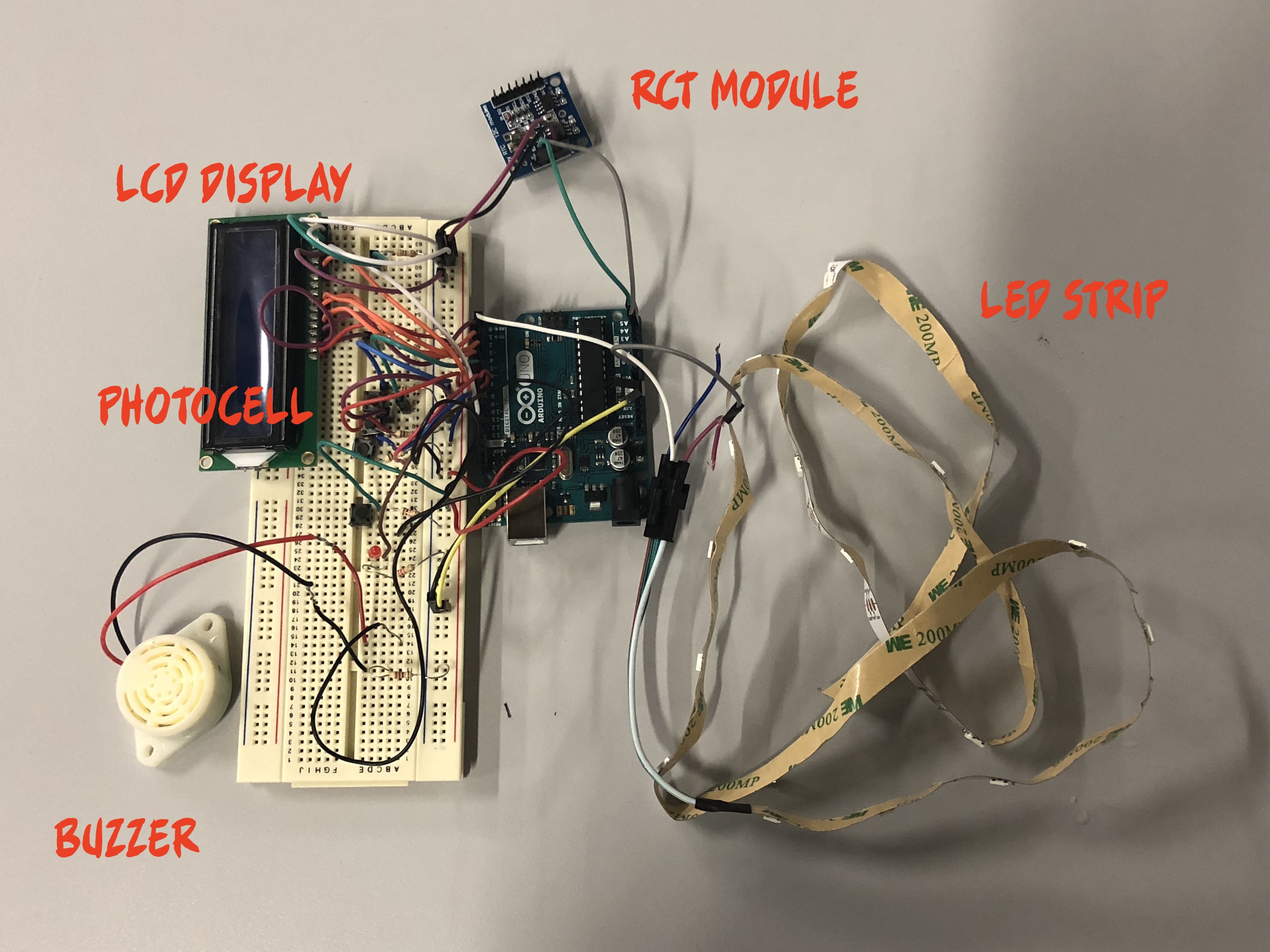
COMPONENTS FOR OUR CIRCUIT
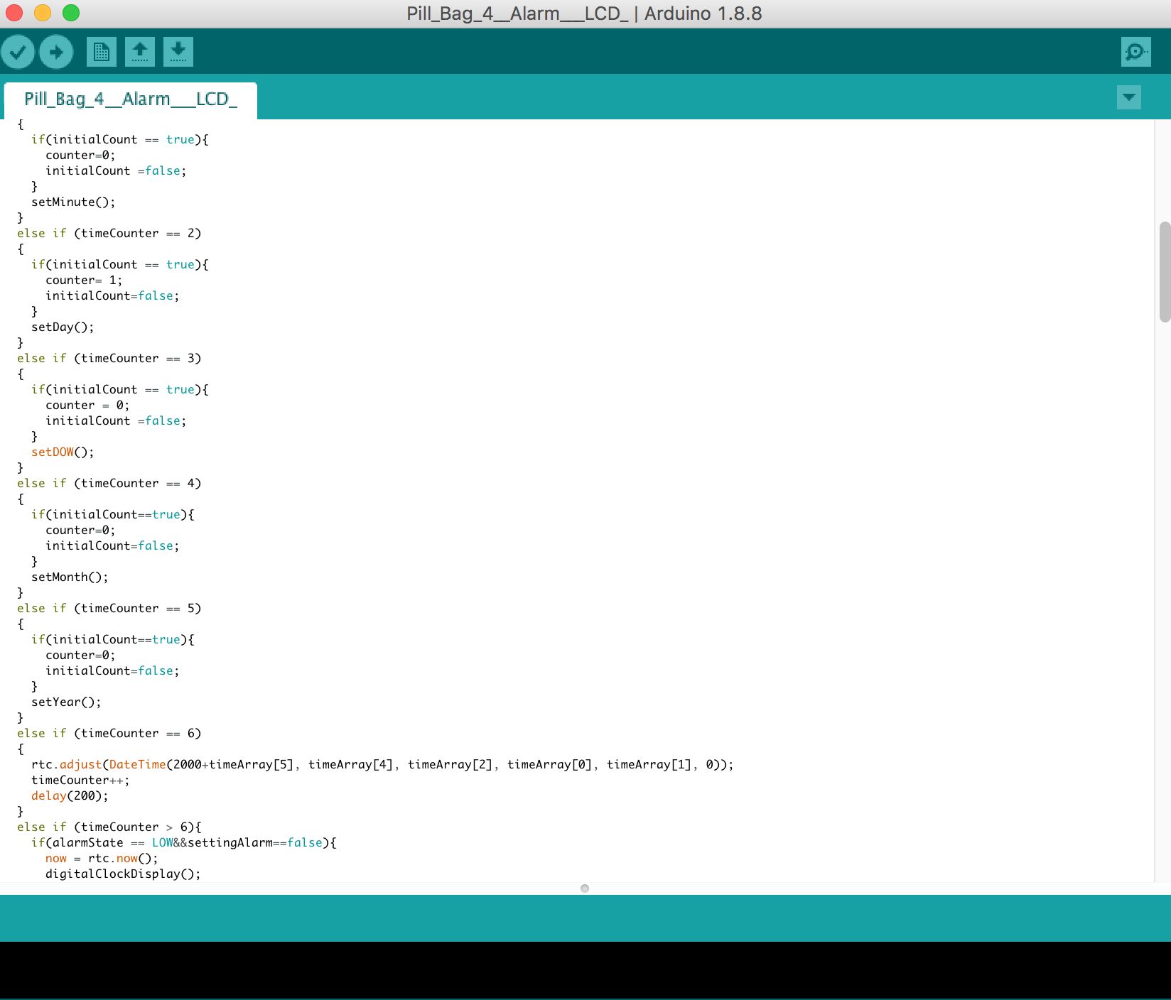
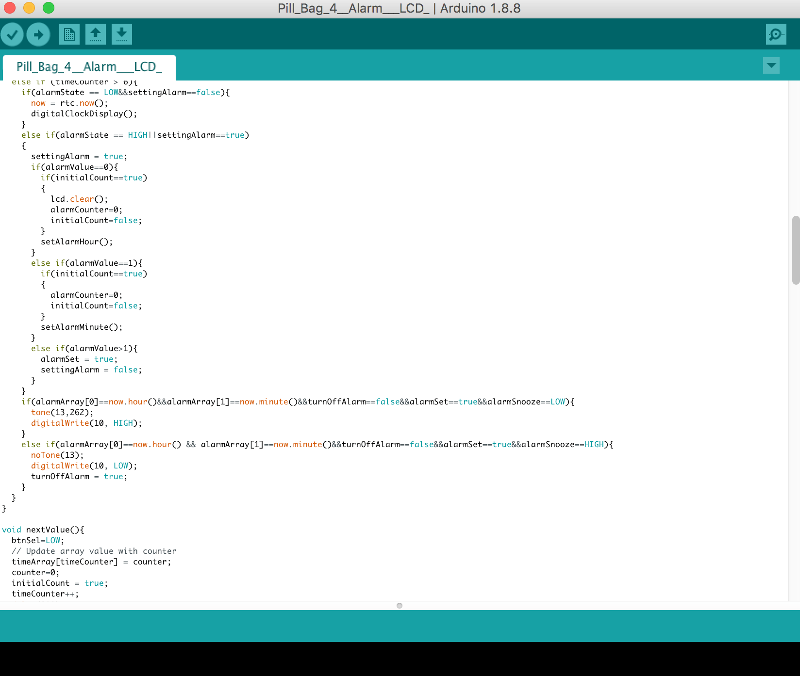
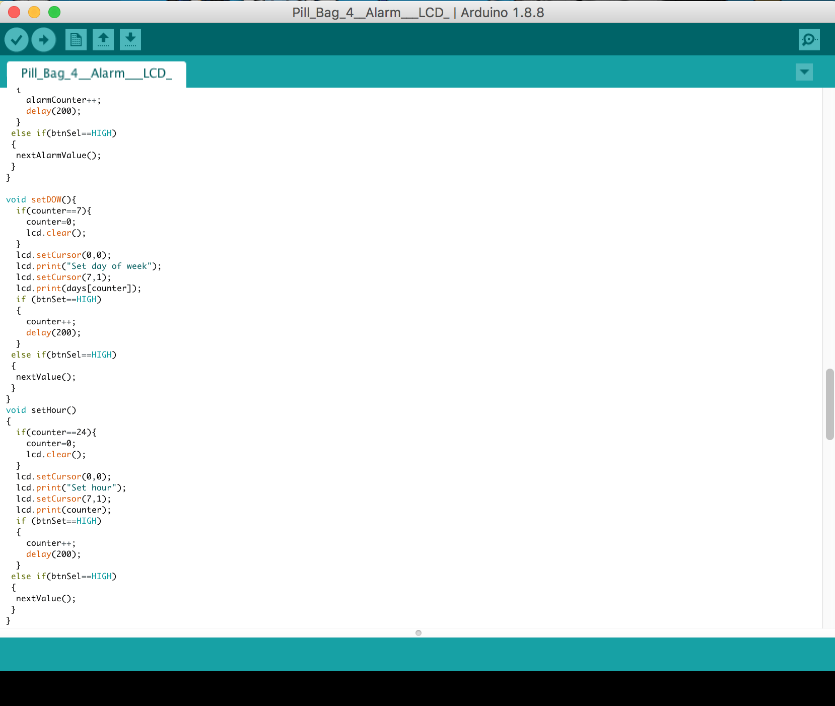
RTC Module – to set off an alarm at a specific timing
24V Buzzer (for the sound of the alarm)
Photocell – to stop the alarm and buzzer once the pill has been removed from the compartment (works together with the code of the alarm by replacing the alarm snooze switch button to a photocell which detects light)
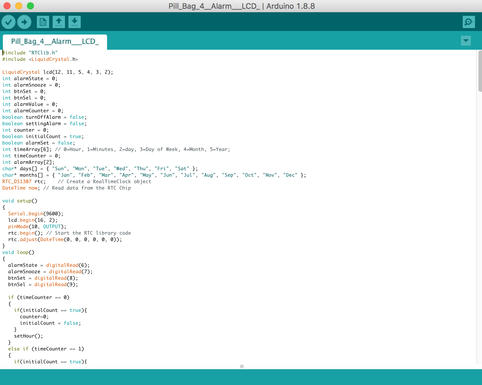
LCD Display – for user interface to set the alarm
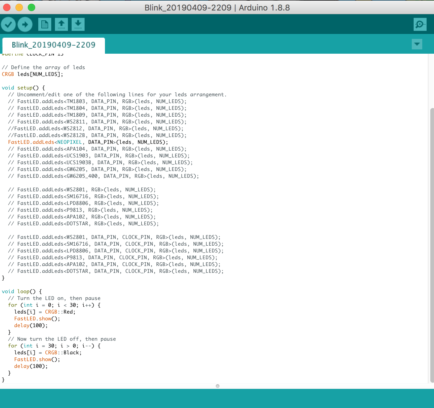
LED Strips – to light up the pill compartment when alarm it being set off
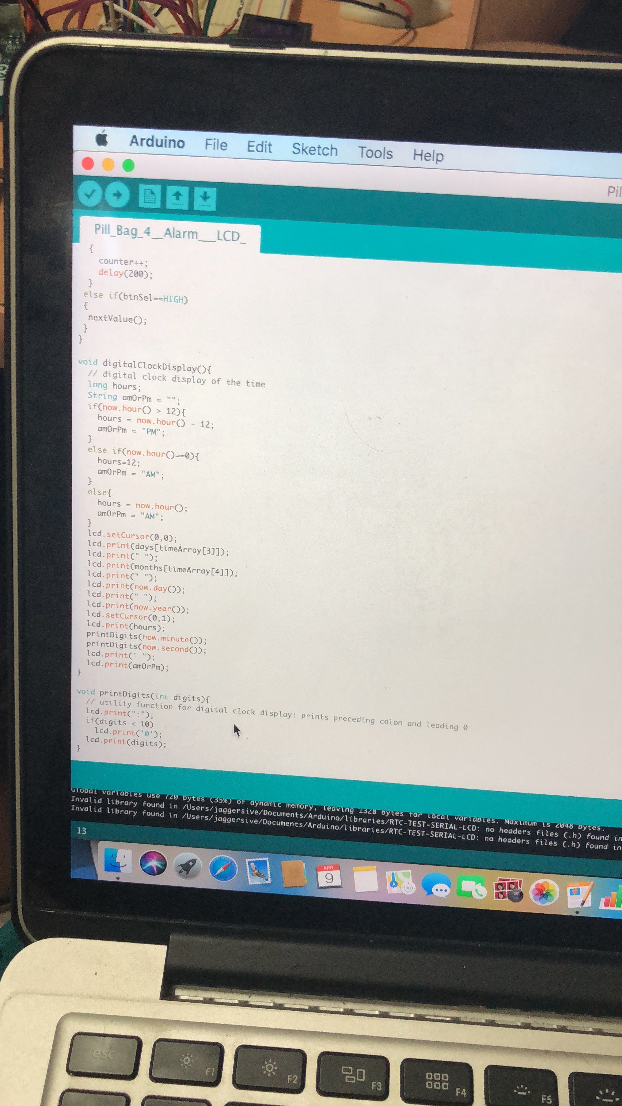
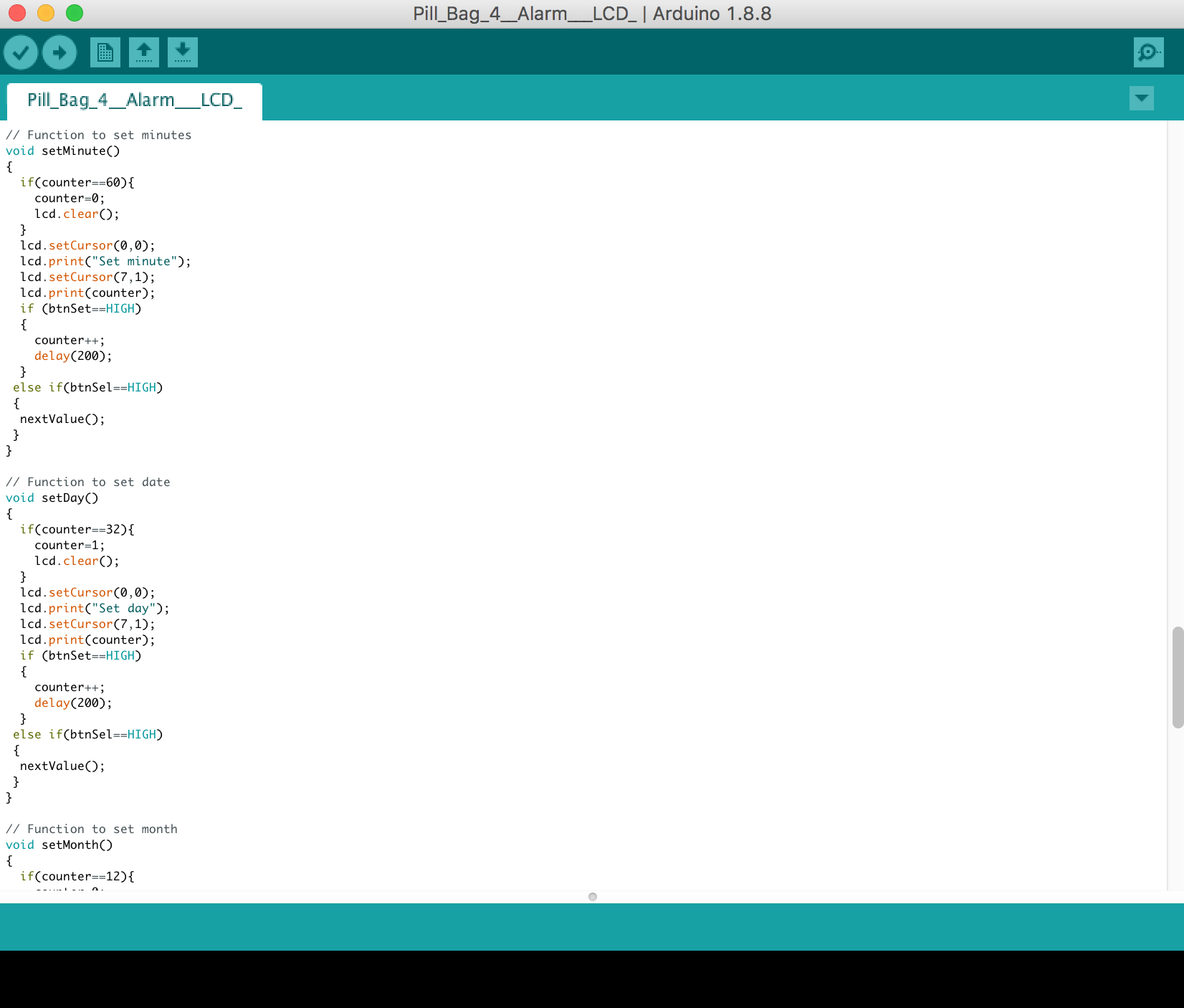
LCD Display:
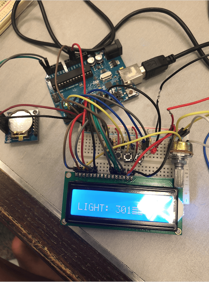

Code for LCD Display:
Initially, the circuit wasn’t working with the code we used from the Youtube Video despite having all the components and code correctly placed. After our technical consultation with Lei and Serena, we found out the LCD display wasn’t working and changed it. An important lesson is to check each component is working by itself before assembling everything together!
LED Strips:
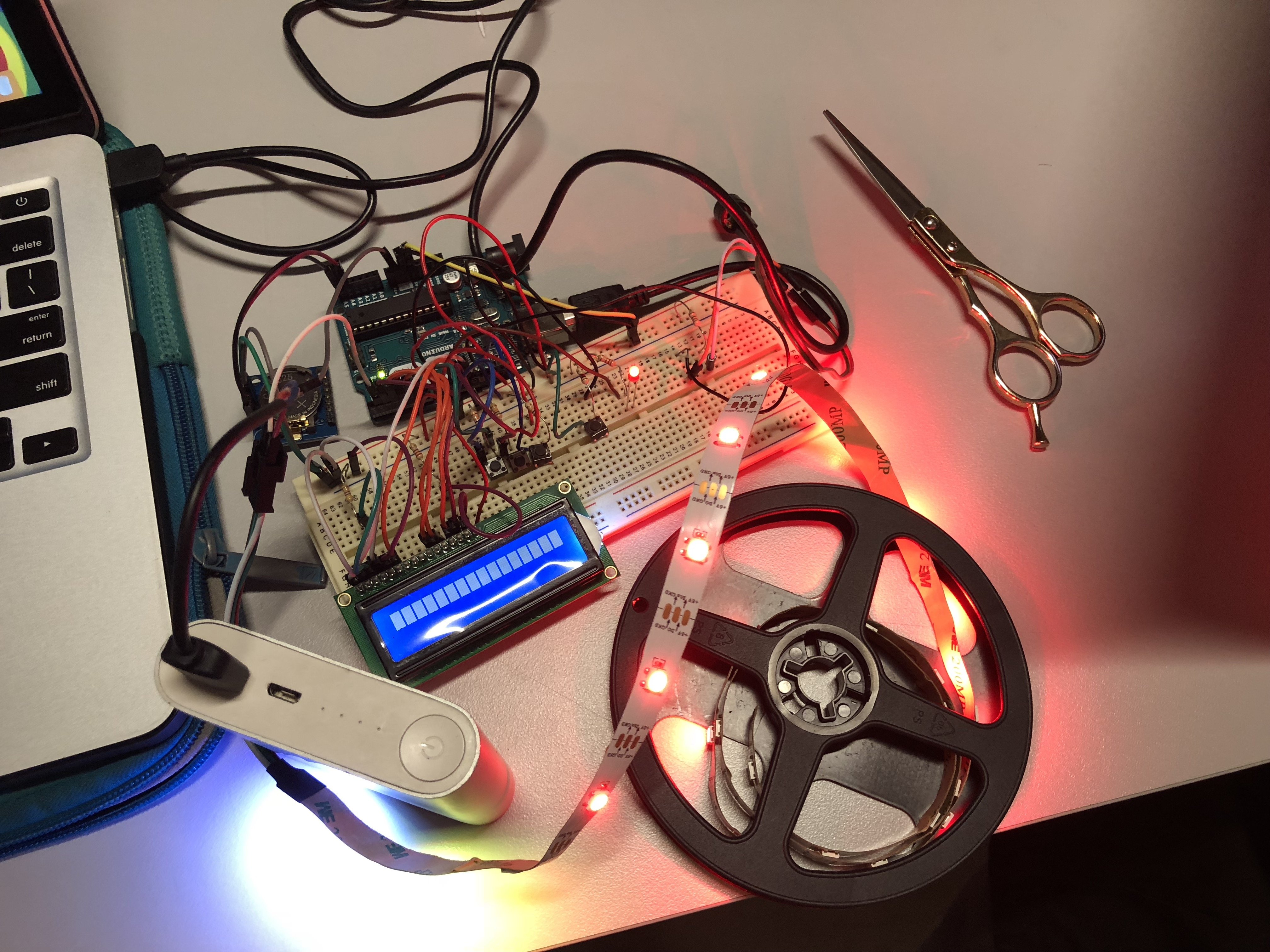
Code for LED Strip:

With the help of Serena soldering our mini USB cable to the LED strip and Lei’s technical consult to make the LED lights blink one by one, we were really satisfied with the LED component which will highlight the compartment of our pills at the back of our bag!
RTC Module – The component that is a pain in the ass ):
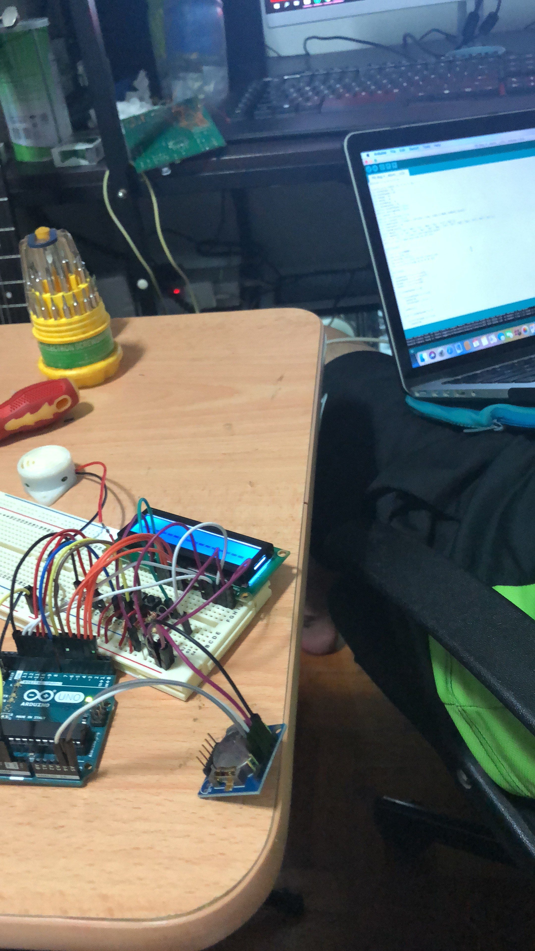

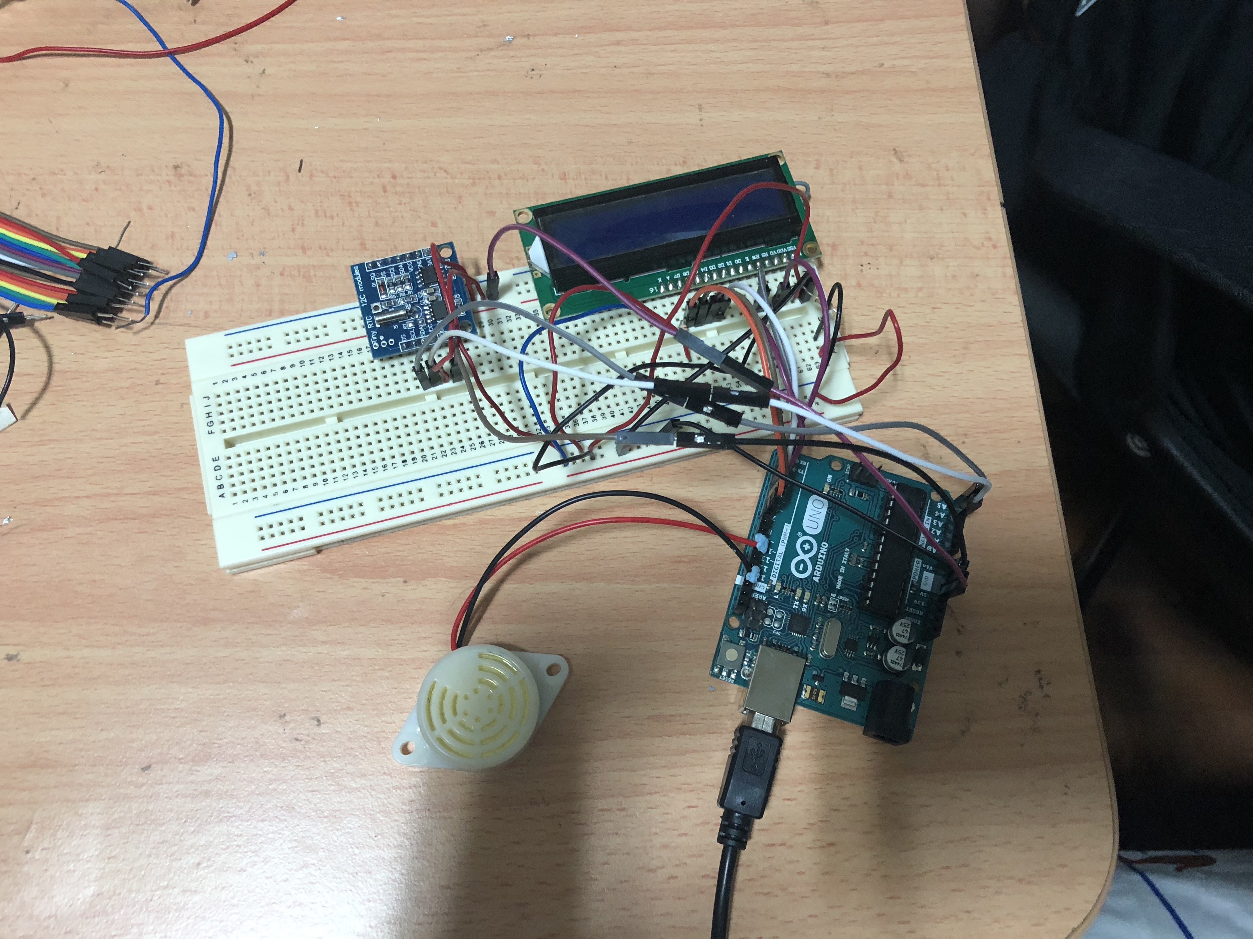
During our first interactive working prototype exercise, in order for all our other components to work, we have to make the RTC module work in order to set the alarm. Since I’m not really good with coding, I decided to DIWO and asked Weijie (my fwen with an engineering background) and we stayed up from 7pm to 7am to figure out the problem!!! We troubleshoot every single component to figure out the component and we realized that it was the hardware, not the software!!!
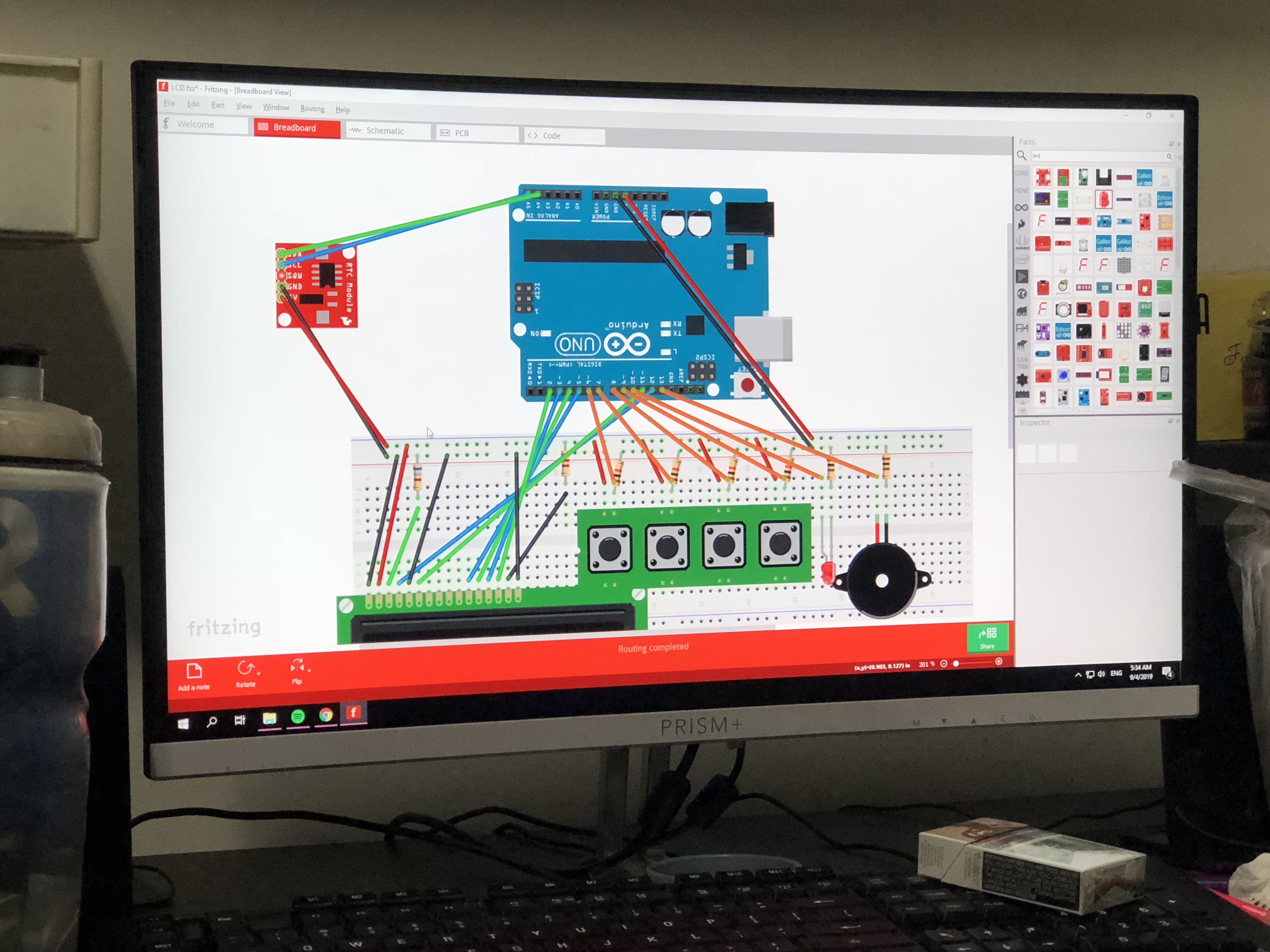
We even used Fritzing to arrange all the components and figure out what’s the main issue with this circuit. Firstly, it was the display and now the RTC ): At least, we’ve learnt a new software which is Fritzing to troubleshoot my components in the circuit without having to buy any additional components beforehand to try it out! Thanks Weijie!
So after consulting with Lei, we decided to buy a new RTC module! I decided to try the code outside of the Sunlight store so I can exchange immediately if they sold us another faulty component! I literally sat outside of the story for an hour just to make the RTC component work in our circuit. Thankfully, it finally worked without giving me gibberish numbers and I felt a sense of satisfaction!
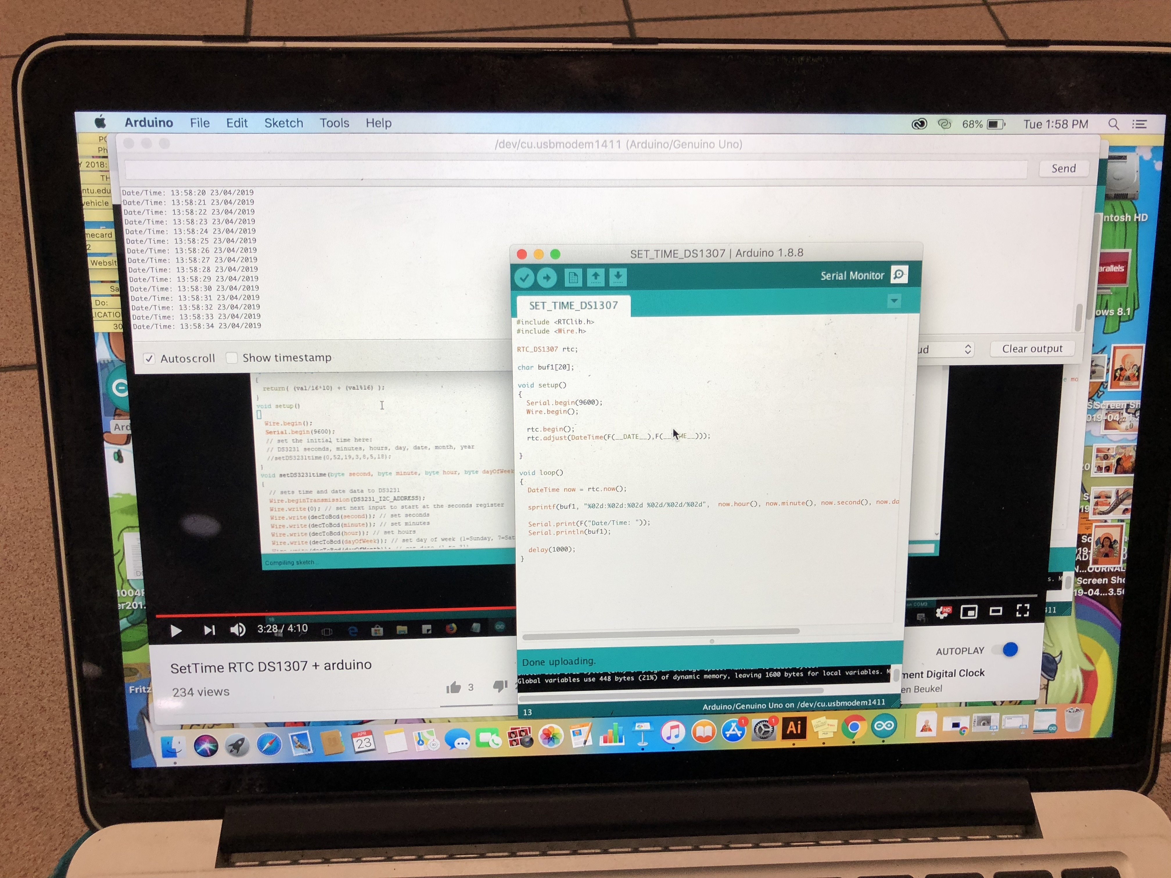
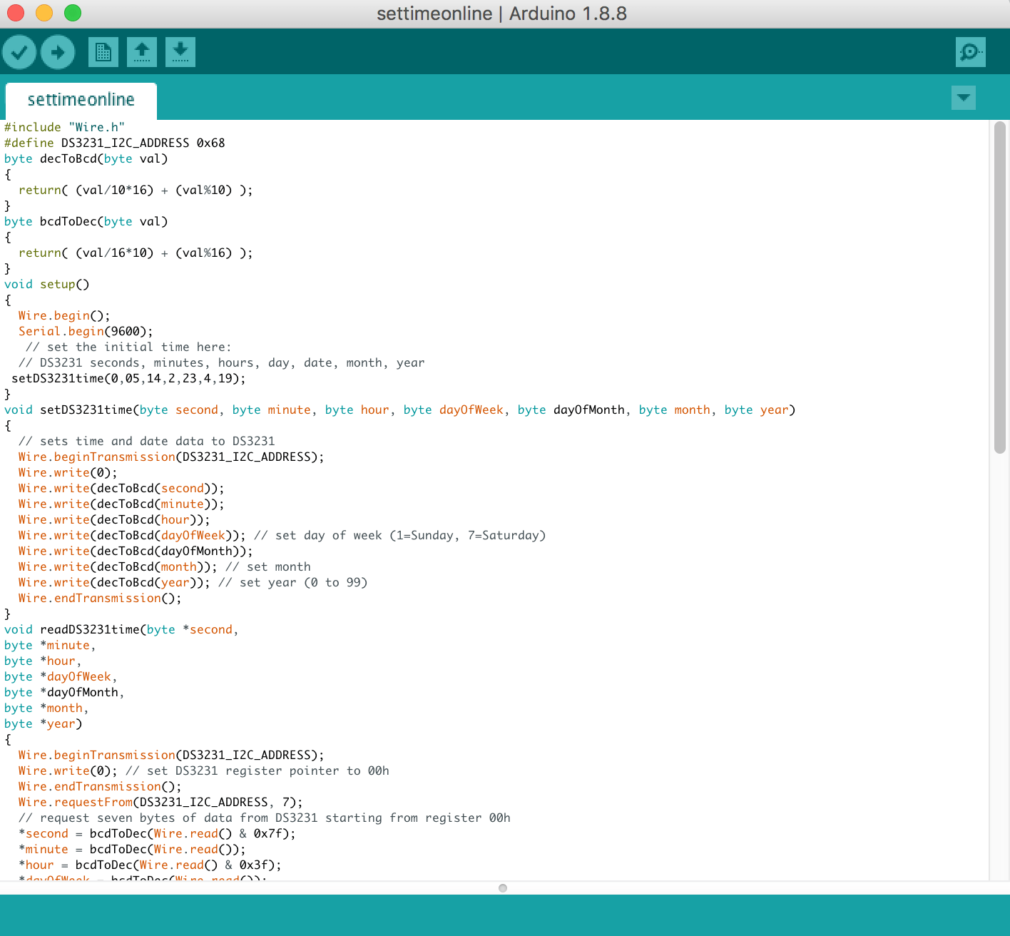
To set the timing on the RTC, I used this code:
COMPLETED CIRCUIT VIDEO
DEVELOPMENT PROGRESS FOR OUR CIRCUIT IN PDF FILE: Pill Bag – Development of Circuit
REFLECTION ABOUT USER TESTING:
I’ve realized the importance of user testing. As designers and creators, we tend to assume that the users will automatically know how it works or how to approach it. Sometimes, we’re too ambitious with trying to create something complicated to impress people but simplicity is the better option to send out a message to the public. I’ve learned to think in the perspective of the user and how I should have added visual cues for them to approach our object. To be honest, it was a good experience because every failure is a learning process but not a loss. I was not disheartened by every failure because I knew that our circuit and user approach could be improved with the help of our peers and the community online.
DESIGN PROCESS – CHANGES IN DESIGN
The design process documentation and changes for the pill bag after the first body storming exercise and first interactive working prototype can be seen here: Link
Our final change with the features of the design:
- The front of the bag will be embellished will pill containing babies.
- The pill compartment will be placed at the back of the bag with LED lights surrounding it.
- At a certain timing, the compartment containing the pill will light up and sound off a beeping alarm with a baby crying sound. (Easier for the user to approach)
- Once, the pill is placed back in the compartment, sound and light sensors will be off.
- There will be a barcode at the front with a tagline which prompts the public to scan it. “Kill It or Save It” (Why barcode? → Price of contraceptive is a problem too)
- The second layer of interaction; QR Code: Leads them to a page about our movement (information, questionnaire, maybe donation for people who don’t have access to conceptive)
- Data collected can be used to raise awareness and inform the public about how many people we managed to reach out using our object.
PROTOTYPE PROCESS

ENVIRONMENT/SET UP OF CONTEXT IN A LIVING ROOM
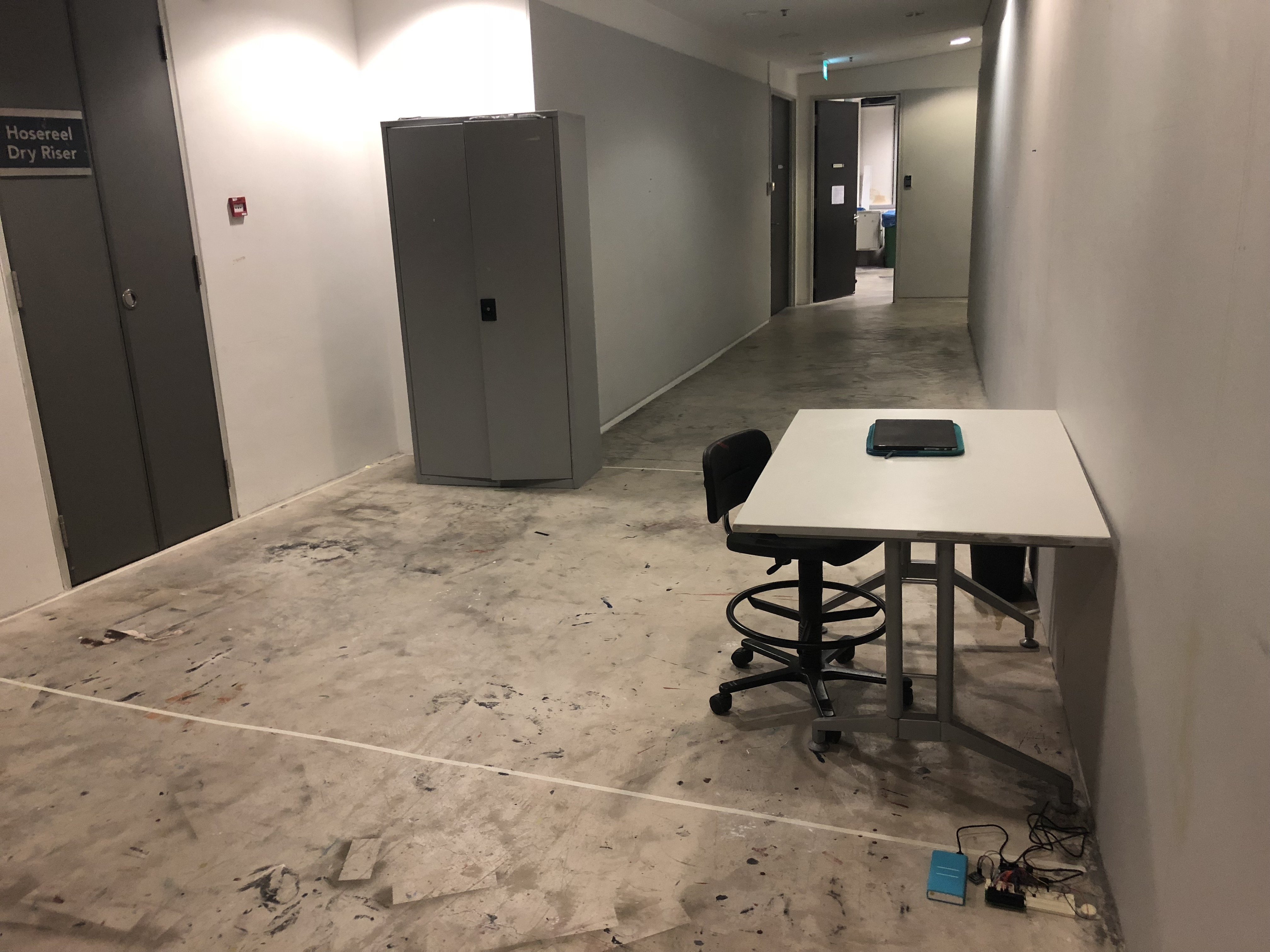
Location: Level 2 of ADM, nearby 2D Foundation room
BACKGROUND SOUND TO SET THE ENVIRONMENT AND CONTEXT OF OUR PILL BAG
During our test runs before our presenting, we realized we need to create an environment so the tester will know how to approach the object we wanted.
When the alarm sets off, it will create a beeping sound and a baby crying. Why? Whenever we hear an alarm, our first instinct is to shut it off because it’s annoying and it will increase our sense of urgency.
In addition, to guide our tester to our pill bag which is hidden in a wardrobe, a voice recording of “Take the pill to stop it! Take it!”. Another reasoning behind this phrase is when you take your birth control pills, it will reduce the chances of you getting pregnant. Thus, when you removed the pills from the compartment of the bag, it will immediately stop the alarm and the LED using a photocell.
TEST RUN WITH CAROL BEFORE PRESENTATION
We decided to have Carol to test run before our presentation to make final changes to our set up and see if we need any additional changes to make the user experience more enriching.
VIDEO OF THE PILL BAG IN AN ACTUAL SETTING – PRESENTATION DAY
For our main tester, we decided to choose Brian who has no pre-existing knowledge or experience about birth control. After experiencing our setup with the pill bag, he told us that he didn’t know taking your birth control on time is essential to prevent pregnancies and he understands the responsibility and burden a woman has to carry. Hence, raising awareness and empathy for the girls consuming birth control.
FEEDBACK FROM OUR PARTICIPANTS AND OBSERVERS:
HOW IT WORKS WHEN IN USE IN A PUBLIC PLACE
Imagine being a female carrying out our pill bag in a public place, when it’s time to consume your birth control pills, the alarm will set off with a beeping and annoying baby crying sound. It will attract the attention of people from the surrounding because of the sound and baby embellishment of the pill bag causing complicated pleasure. With a tagline of “Kill it or Save it” and a QR code next to it, it will spark curiosity amongst them to scan it which will lead to a questionnaire about birth control. Even if they do not wanna do the questionnaire, we are able to keep track of how many people that we reached out to with our provocative object – The Pill Bag. This is to empower woman to be proud and transparent about consuming birth control and we are controlling our body because it’s our choice. Nothing to be ashamed about.
REFLECTIONS
Experimental Interaction module was a love-hate relationship for me. It really makes me understand the concept of DIWO and I wouldn’t be able to complete this project with the help and guidance of Serena, Lei, Weijie, Tongtong and my peers for giving their opinions about our provocative object. Coding was particularly hard for me and trying to make sure all the software and hardware components work together is really tedious but I’m glad to be able to have this experience! All the mental breakdowns and crying to my peers was worth it because I’m able to make most of the circuit work for our provocative object! The learning process of figuring out the codes and trying to use Arduino in different ways is really enjoyable!
I’ve learned new aspects of interaction design of how we should focus on the impact it can make instead of focusing on marketability and getting rich through profits. To be honest, I used to think that being an interactive designer is not really sustainable and I find it weird but now, I have a new found respect for such people. How admirable are they to be doing such installations and to highlight certain issues in our society so our future generation can benefit from it. I feel that enriching the public with such values as the message of the object/design/project is essential in our society and more projects like these should be funded.
Whatever grade I received for the module, I feel like it’s not really important compared to what I’ve received and learned from Serena and Lei throughout the module about all the case studies about interaction design and discussion. I feel like the knowledge and experience I’ve received from this module will definitely improve my skills as a designer by being able to observe and empathize with the mindset of each individual in the project.

INSTRUCTABLES – THE PILL BAG
PROTOTYPE – THE PILL BAG
MATERIALS:

- Babies you can buy from Amazon
- Any thick transparent plastic sheets (Or just buy a ready-made transparent bag)
- Heat Gun
- Glue Gun/Sewing Machine
- The pdf file for the tagline and QR code
CODING – THE PILL BAG


Final Project: Project Development Body Storming
TASK: BODY STORMING
We were tasked to create a quick mock-up of your installation or object with cardboard, paper, any found objects, electronics, computer, laptop, speakers and etc. A quick prototype to observe our users approaching and interacting with our object to see whether they manage to get the message or issue we are trying to highlight. (User experience with our object/prototype)
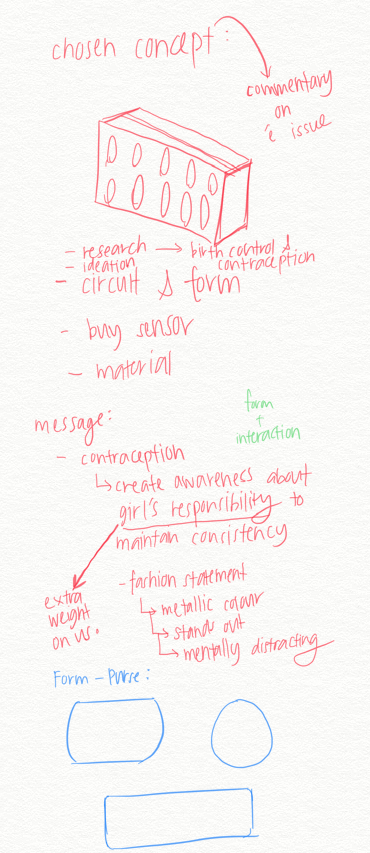
CONCEPT: THE PILL BAG
For our final project, we chose to create a provocative object to address the ethical issues in contraceptive justice – issue.
The invention of the birth control pill was a significant milestone in the women’s rights movement. Women currently bear most of the financial and health-related burdens of contraception. On the whole, female methods tend to be more expensive than male methods and female methods have more severe side effects than male methods, as well, in part because various contraceptive methods for women involve hormones, while no methods for men do.
Beyond the health-related and financial considerations, there are also nontrivial inconveniences and burdens associated with contraceptive use: dedicating time and energy to contraception care, feeling stress and anxiety about the taking the pills, the possibility of unintended pregnancy, and facing the social repercussions of contraceptive decisions and the possible moral reproach for contraceptive failures.
Women bear the majority of contraception responsibility and the burdens it entails while men have limited reproductive autonomy.
INTENDED OUTCOME
We decided to design a pill bag resembling the birth control pills blister packs calls the attention to reconceptualize the responsibility for contraception as shared between men and women.
*(After body storming, we decided to change the focus to the transparency of bag on birth control (+ function of the bag of reminding the user to take the birth control pill) and one should not be awkward about this issue. Adding a second layer of interaction which requires the public to scan the barcode to lead them to a page about the information, questionnaire, and donation related to birth control. – raising awareness and ability to track down how many people have we reached out to with our object.)
THE PILL BAG: FIRST DEVELOPMENT – HOW IT WORKS?
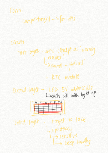
FIRST DEVELOPMENT: HOW IT WORKS?
- Rings at 7 am
- The alarm (RTC module) will be activated and LED light surrounding the pill on the calender-like embellishment will light up.
- The alarm will stop once the pill pack is removed and placed back into the compartment. (Using photocell)
- After consuming the pill, whoever comes near the bag will trigger a beeping sound (using a photocell by controlling the threshold) to show the sensitivity of our user taking the birth control pills. (DECIDED TO OPT THIS FUNCTION OUT)
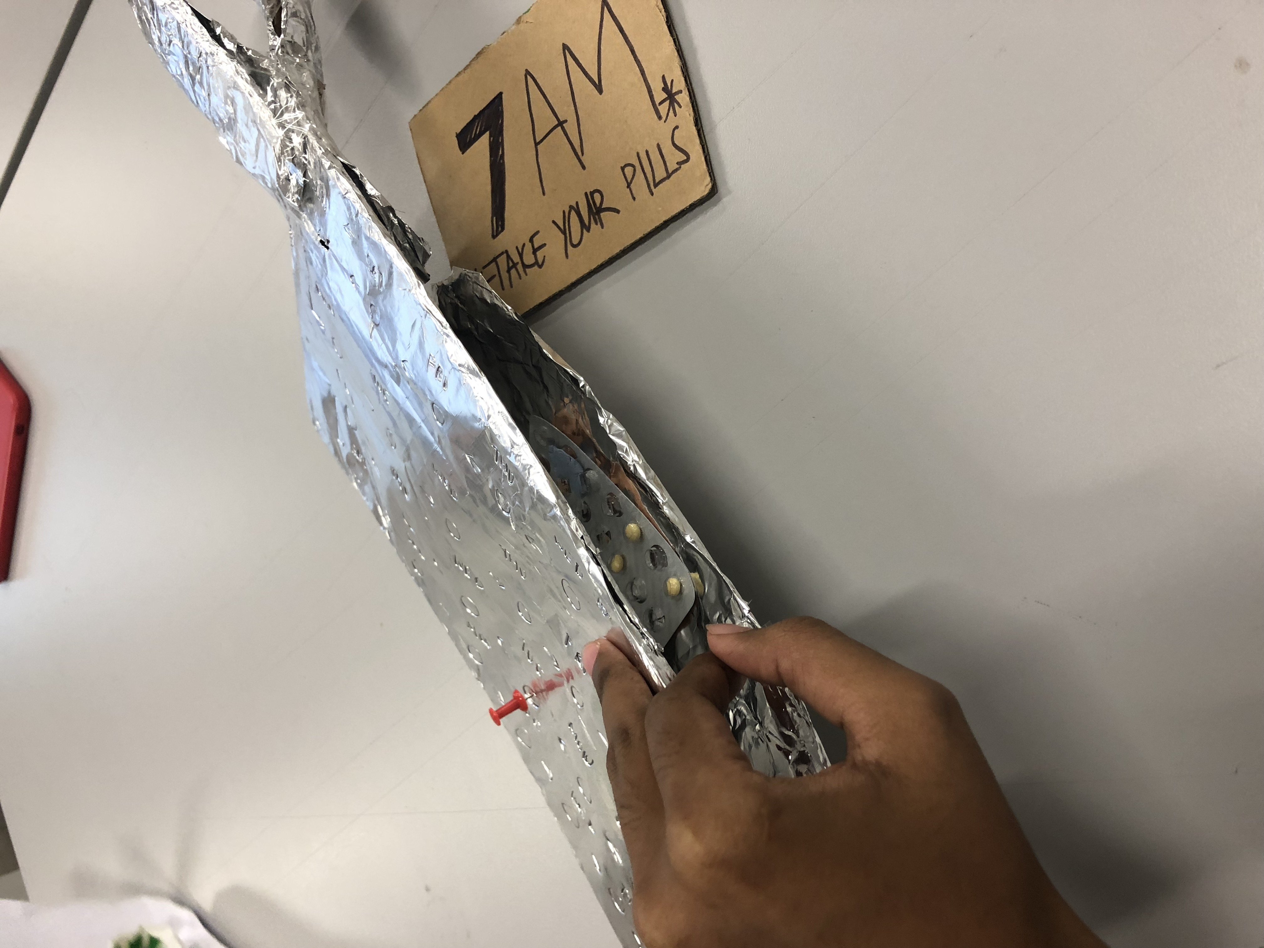
BODY STORMING PROCESS
OUR PROTOTYPE
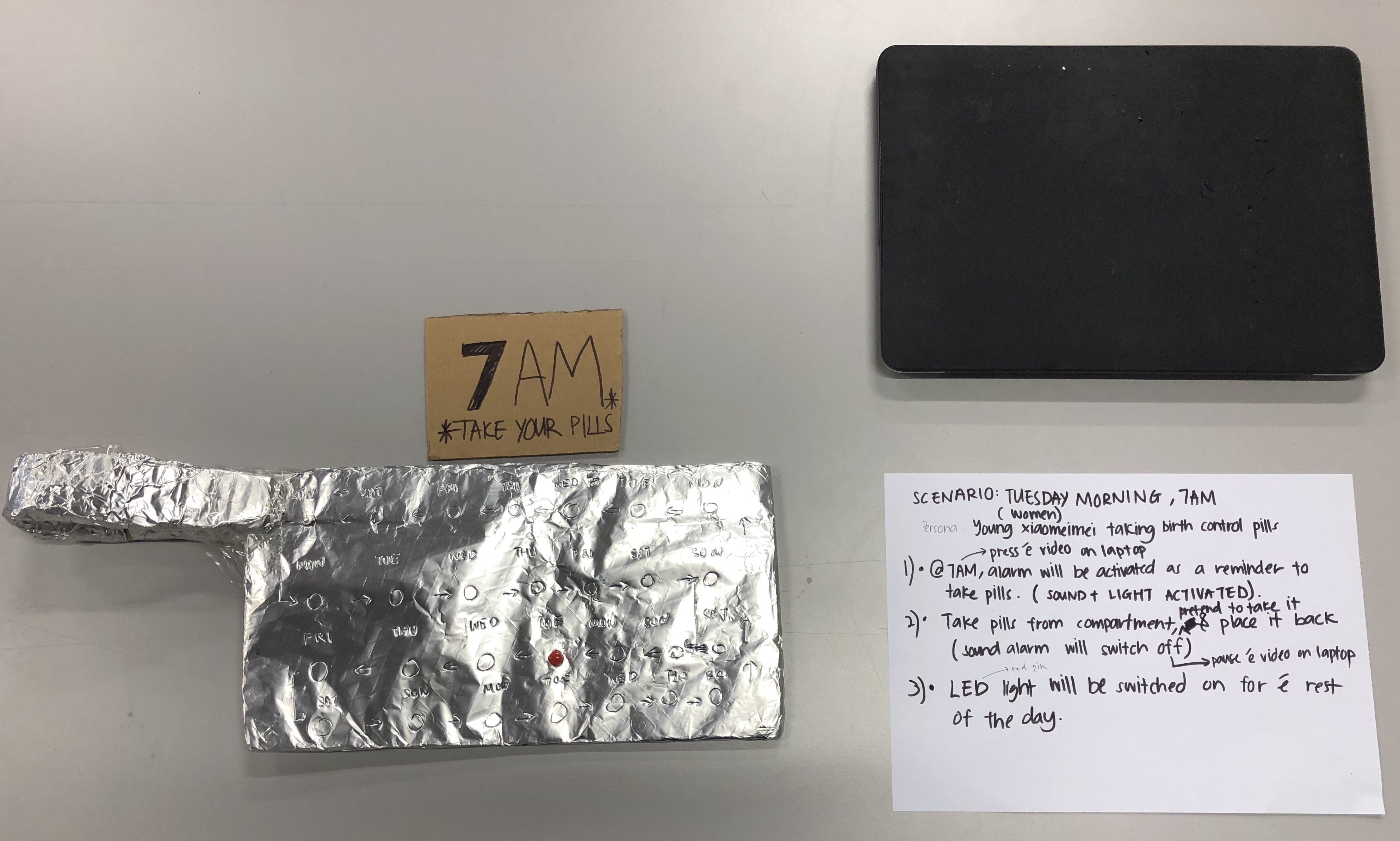
LIST OF TASK FOR OUR PARTICIPANT:
- Persona: Young girl/Women taking birth control pills
- When the alarm will be activated at 7 am as a reminder to take the pills. (Sound + Light will be activated)
- The participant will take pills from the compartment, pretend to consume it and place it back into the compartment. (Sound alarm will be switched off)
- The LED light on the embellishment of the bag will be switched on for the rest of the day.
VIDEO: PILL BAG – BODY STORMING PROCESS
PARTICIPANT: MEHRILEY
FEEDBACK DURING BODY STORMING PROCESS
NOTE TAKING: CHERYL
During the test:
I guess I’m supposed to act as the xiaomeimei
Looks around trying to find out, where’s the compartment?
Not sure what the tin foil thing is
Didn’t know the pills are inside
–
Feedback:
If didn’t read the thing, don’t know what to do or take on the persona
If were a guy, don’t really know how to approach it
Distracted by pin which is supposed to be the LED pin
Didn’t realize it was a pouch
Maybe if upright and can see the opening
Not sure what to do with the pills
Might not take the pills, didn’t know need to take the pills
–
Other feedback:
Thought the pin was the pill
Don’t know what to do without the instructions
How to show to take the pill?:
Use the pill organizer box instead?
Design of bag: name or logo of The Pill Bag etc.
Conceptual: If you’re trying to tell guys that responsibility is on the female, why is it still the female who takes the pill?
REFLECTIONS
“What did you learn from this process?”
SITI: The process of body storming allows me to identify the problems of the interaction aspect of the object with our user. This experience enables me to see how people with zero knowledge about our object interacting with it and whether we are able to convey the message/issue that we wanted to highlight. I realized that our object should have obvious cues so the user will know how to approach it. During the body storming, we realized we have one layer of interaction with the user and one of the feedbacks was how do we share the responsibility with the guys or how are they involved. Hence, we decided to add another layer interaction with the public by incorporating a barcode for them to scan which leads them to an informational page about birth control which includes a questionnaire and donation for our movement.
TONGTONG: Through the process of body storming, it helps us to recognize what are the problems that we face in terms of customer experience. The participant was clueless of what to do, even with instruction. This might due to as creators, we are very familiar with the concept and how it works, but it is hard for the participant to understand how it works especially when the object is it not intuitive. The object should send strong emotions and visual cues to create an interaction between the user and the object. So it is essential that when we design the object, we need to think from the user perspective, how are they going to approach the object, and what will they feel when they interact with the object.
“What surprised you while going through the process?”
SITI: During the body storming process, we thought it was obvious to remove the pills from the compartment because a list of task was already listed. However, our participant had a hard time locating the pills to consume and it made us realized that we should make the pill compartment more obvious and incorporate LED around it to highlight the area they should look for. I felt that our prototype should indicate the features of the LED, pill embellishment and pill compartment clearly.
TONGTONG: Many things that I thought would be intuitive for the users were not. For example, the participant was having a difficult time to find the pills?? Where is the LED light and How to off the LED light?? Everyone includes the audiences were confused!
“How can you apply what you have discovered to the designing of your installation?”
SITI: After observing during our bodystorming and our peer’s process, I realized we have to make our object more inclusive so the message of highlighting the issues of birth control will reach out to more people, educating people from all walks to lives. From the feedback of our peers, we decided to re-structure the features of the bag to make it more idiot-proof. In addition, we decided to change the responsibility of bearing the birth control to the transparency about educating people about birth control. Hence, making it functional to the user as well as sending a message to the public and making them involved to make a change. Most importantly, the form and features of our pill bag have to be aesthetically appealing to make a statement.
TONGTONG: There are quite a number of things we have to add and change in our object, firstly, is the form of the object, instead of a pouch we think that a handbag bag might be a better idea cause not everyone uses pouch. Secondly, we decided to add a pill bag compartment outside the bag, so it helps with the customer experiences journey to be more intuitive.
Research Critique 5 – Design Noir (Suicide Box)
According to Anthony Duane and Fiona Raby, design can be divided into two categories; affirmative design and critical design.
Affirmative design conforms to cultural, social, technical and economic expectation whereas, critical design rejects and challenge what is available in the industry as the only possibility, with alternative ideas that embody values in design as the foundation to raise awareness on social, cultural, technological, ethical issues that make us think. It can be used to provoke new ideas for systems, products, and services.
![]()
In authors’ words, the design profession will lose all intellectual credibility and “be viewed simply as agent of capitalism”, if they insist on focusing on marketability. Popular design has to sell in large number thus, focusing on capitalism instead of the impact it might make. It lacks practicality as it promotes desires for new products, ensures obsolescence and encourages dissatisfaction with what we have. Unfortunately, most critical design objects are deemed as conceptual design because it is unlikely to be funded by the industry due to challenging its agendas.
Developing critical perspective in design is essential because having an intellectual stance creates a more responsible and pro-active role within the society. It emphasizes on neither commercial purpose or physical utility. Creating design that challenges the system will encourage discussion among everyone about why certain values are embodied in the design, and question about the design proposals about the progress of technology, consumerism and cultural value being implemented in our lives.
Affirmative design focus on the production rate, product, and its feasibility. Whereas, critical design focus on the consumption, aesthetic of use and, the user experience and awareness it can offer. Hence, critical design is a powerful form of social critique by implementing values as a raw material into the object.

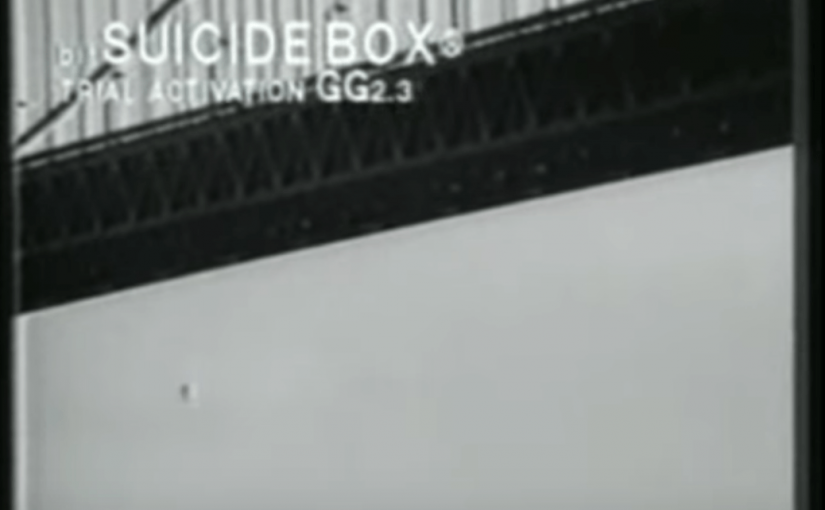
For example, Suicide Box by Natalie Jeremijenko, created this box to reveal the political nature of data abstraction as she felt that advanced technology is being taken for granted. The object is a motion-triggered camera developed by the Bureau of Inverse Technology placed on the Golden Gate Bridge for 100 days. The purpose of the suicide box is to count the number of people jumping off the bridge. When vertical motion is detected, it will trigger the camera to record to disk, supplying public, frame-accurate data of a social phenomenon not previously quantified.
An average of 0.68 suicides per day during the duration of the project. This statistics and data create an opportunity to characterize the value of suicide. Previously, the value of suicide has been extremely hard to quantify and represent but with its imaging of suicide, it recovers statistical representation and quantifies suicide in the logic of information thus, shedding some light into the issue of mental health and how the data collected and can be used to improve the situation. With the advancement of technology, having a critical perspective in design is essential to create a commentary of reflection and criticism regarding a certain issue with our object or artwork with the public to progress as a society.
References:
- Design Noir: The Secret Life of Electronic Objects by Anthony Duane and Fiona Raby
- http://www.bureauit.org/sbox/#back
- https://en.wikipedia.org/wiki/Natalie_Jeremijenko#Suicide_Box
- https://simplicable.com/new/critical-design
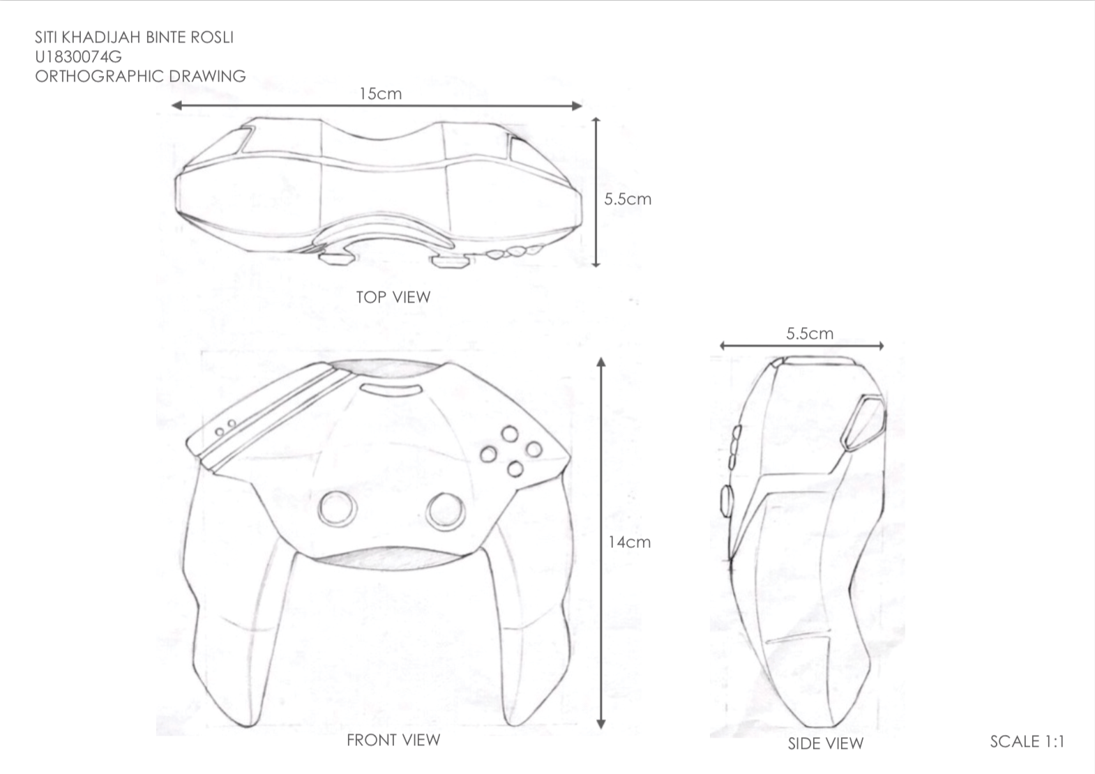
Assignment 2: Form Making – Gaming Controller
 To download pdf version of this file: ASSIGNMENT 2 – FORM MAKING – SITI KHADIJAH FINAL
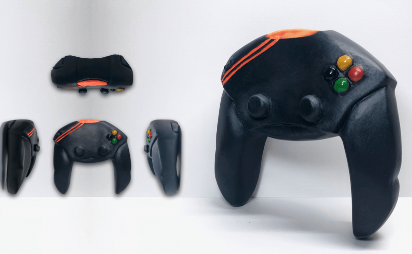
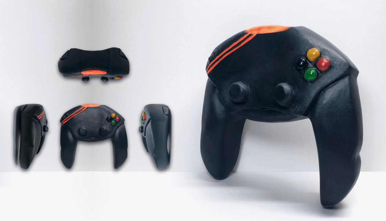
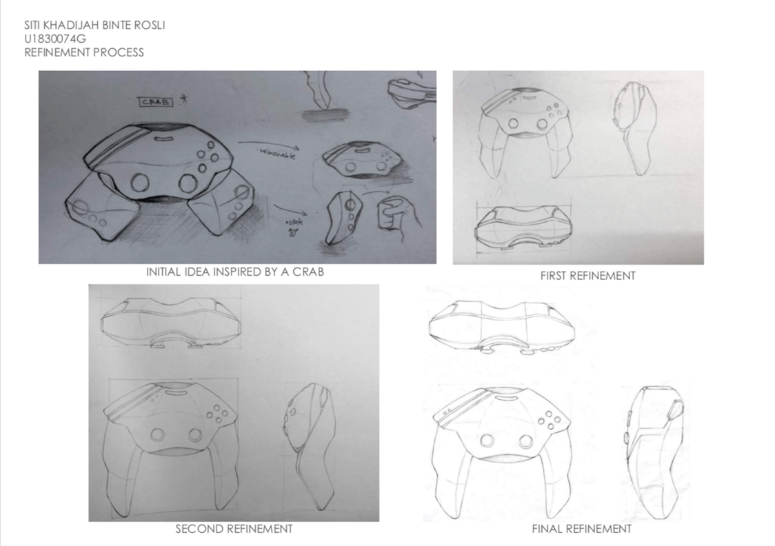
Continuing from our previous assignment, we had to build a scale model of the chosen object design using blue foam. I’ve decided to choose the design inspired by the form of a crab as it’s visually and aesthetically appealing to me. Also, it brings an emotive aspect to the form as the navigation and movement features are strategically placed according to the placement of the eyes on the crab. In addition, I focused on the ergonomics of the gaming controller and refined the design to ensure it is comfortable for the usage.
REFINEMENT PROCESS
The refinement process was on-going while I was creating the foam model to ensure the aesthetic and ergonomics is the best quality, given the time limitation. I had a few changes before I reached the final refinement form of the gaming controller (as seen below) and I was satisfied with the process. I’ve adjusted a few features and overall size of the form considering being able to create a better user experience for gamers.

MODELMAKING PROCESS
The overall shape of my prototype is made out of blue foam and the features are made out of soft clay that hardens over time.

After using the wire cutter to get the overall shape of my form, I did my first round of sanding however, I sanded the left side of the controller too much. To resolve the issue of asymmetry, I used epoxy to patch up the areas that have been sanded off too much.
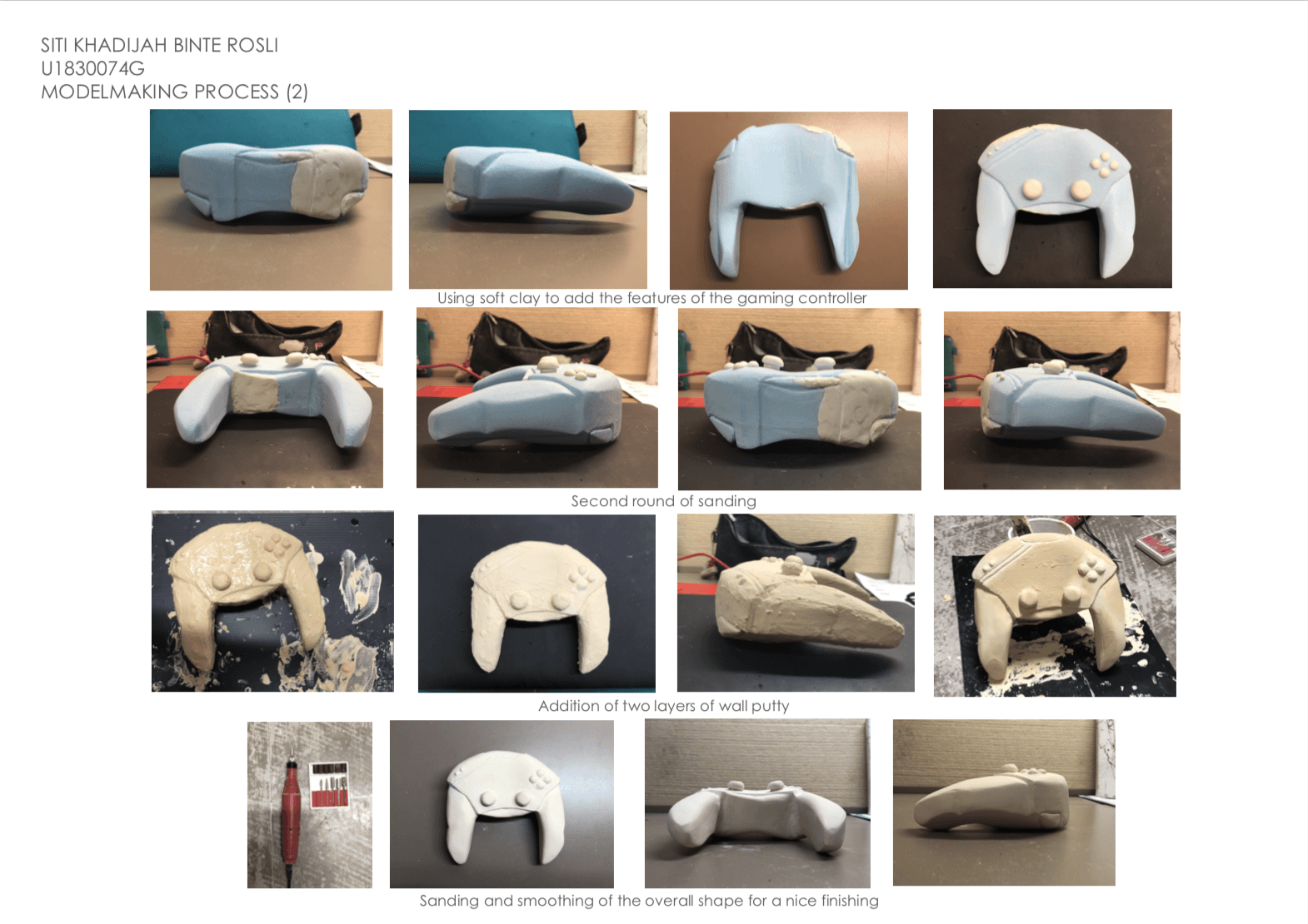 To add the features of the gaming controller such as the navigation buttons and gamepad, I used soft clay to shape out the form of these features and let it harden over time. I did many rounds of sanding to achieve a smooth finishing but due to the color difference of the foam, epoxy and soft clay, I’ve decided to add two layers of wood putty and sand it once again. To add the grooves of the gaming controller, I used the automatic filer which has different sizes to create a small, thin indentation.
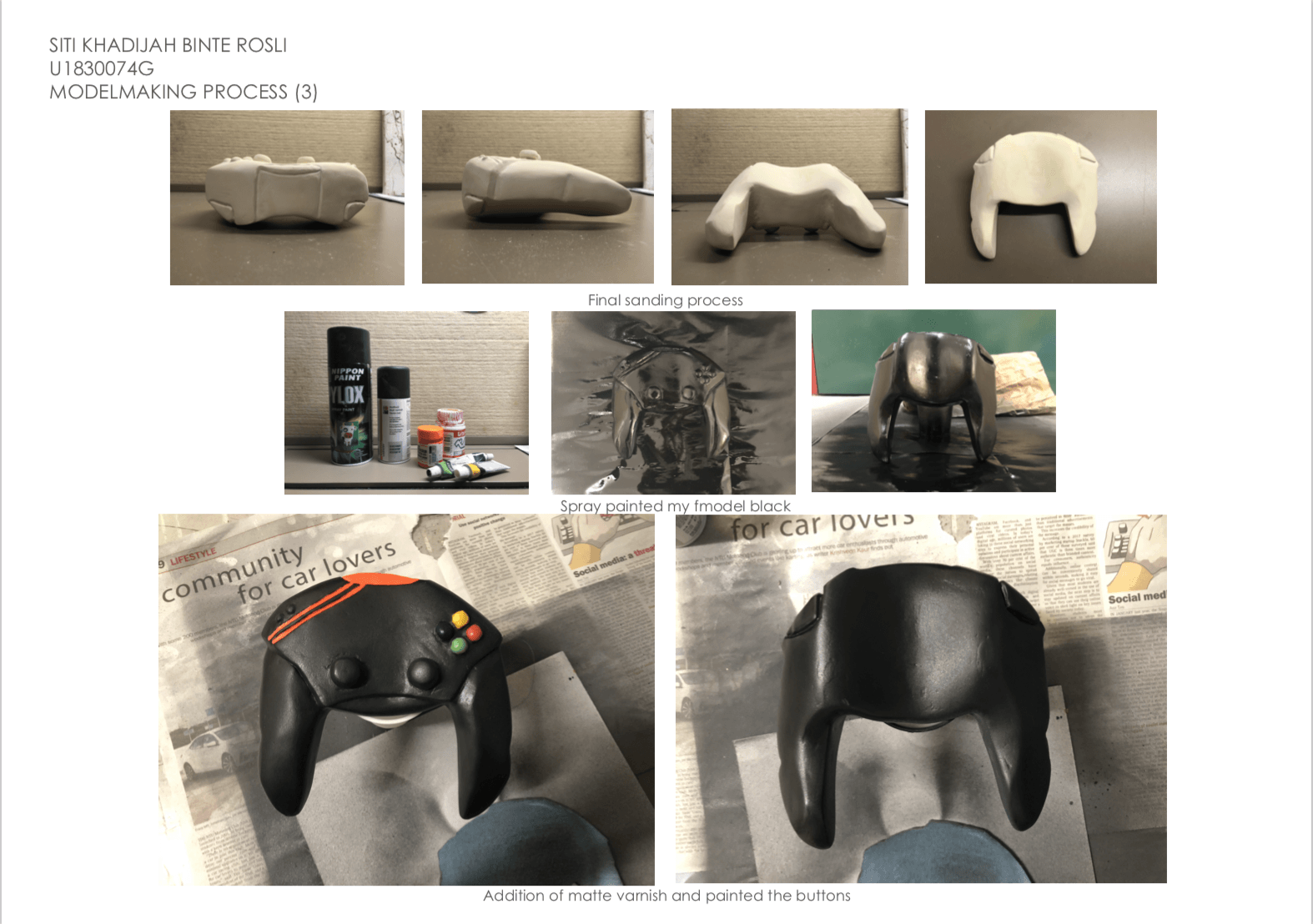
After the final round of sanding of the wall putty, I spray painted my prototype a glossy black and painted the features of the gaming controller. The last step was adding a matte varnish to give that cold and smooth finishing for my prototype. However, I felt like the varnish ruined the overall smooth finishing of my prototype and I should have stopped at spraypainting it black ): Lesson learned.
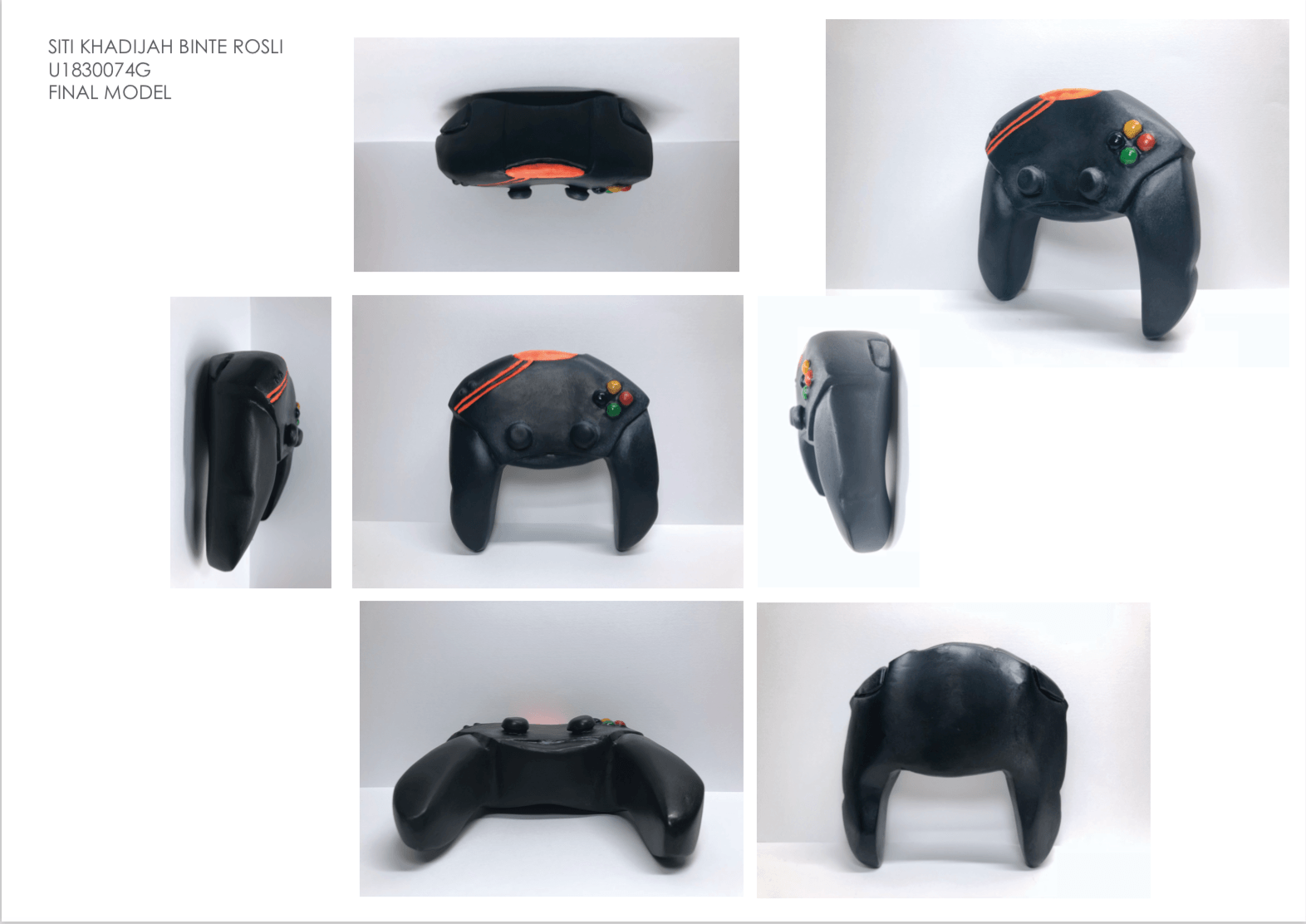
FINAL MODEL – ‘CRABBY’ GAMING CONTROLLER
ORTHOGRAPHIC DRAWING – ‘CRABBY’ GAMING CONTROLLER
REFLECTION
- One of the challenges was being able to achieve a smooth finishing for an organic form like my prototype. Trying to sand the curves and the navigation buttons to achieve a rounded curve was tedious but I tried my best. In addition, I had to add epoxy due to over-sanding and I’ve learned to refer to the original sketch to ensure the dimensions is accurate to prevent such incident from happening again.
- In addition, I wished I didn’t add the matte varnish as the finishing touch because it ruined the overall smooth and sleek finishing of my prototype.
- It was a good experience trying to improve my model making skills and I’ve learned a lot of different techniques from the critique session with my peers.
THANK YOU!

Digital Revolution and Origins of Computer Aided Graphic Design – Presentation
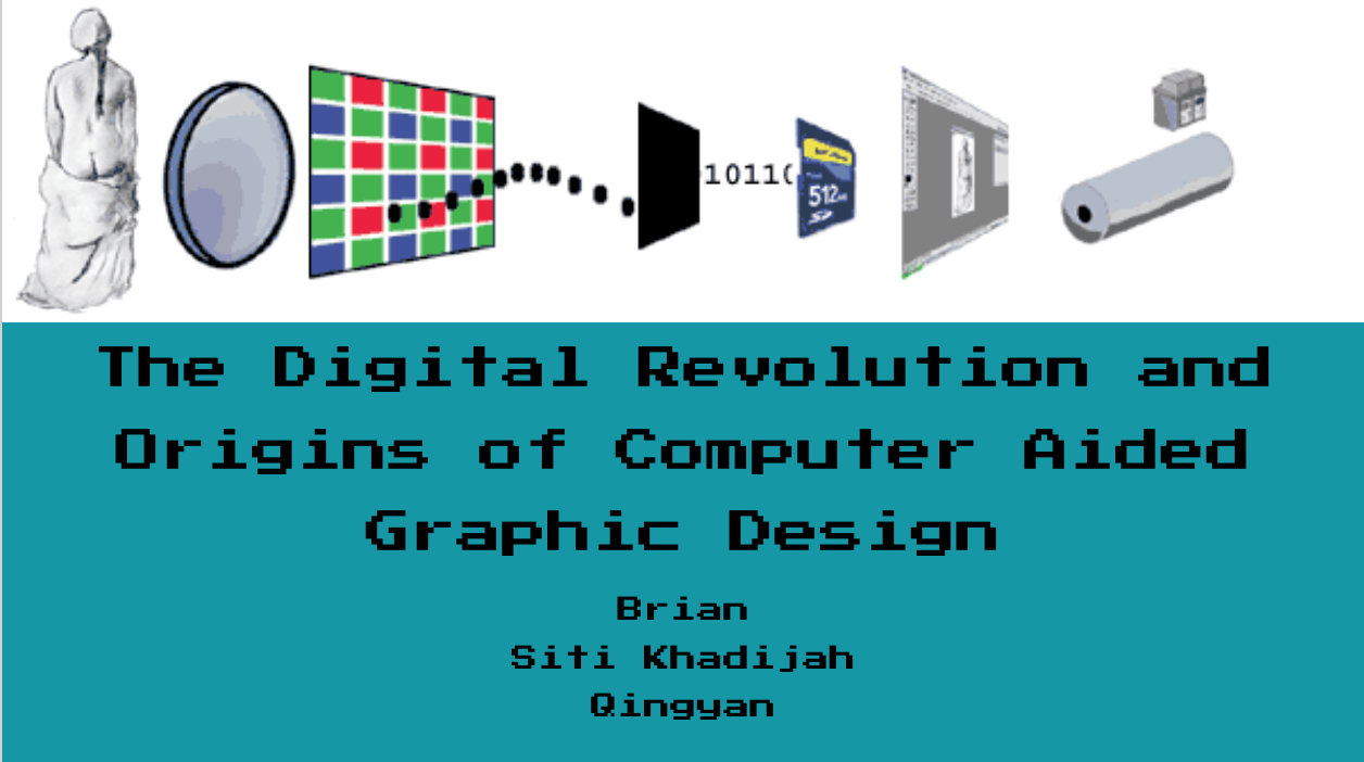
GROUP MEMBERS: BRIAN & QING YAN
To view presentation slides in Google Docs:
https://docs.google.com/presentation/d/1isWv6FPpLQ4q4HSpwPu7EwMgab6RQ5MlhDP-_fW7V2s/edit?usp=sharing
To download presentation slides in pdf file: The Digital Revolution and Origins of Computer Aided Graphic Design-compressed
PERSONAL RESEARCH ABOUT THE TOPIC
With reference to Megg’s History of Graphic Design.
Philip B. Meggs, Meggs’ History of Graphic Design, Wiley; 6 edition, 2016. ISBN 1118772059 ; Chapter 24 : The Digital Revolution and Beyond, page 571-619
REFLECTIONS
- Suggestion from Mimi: Focus on the thesis of “How everyone can be a graphic designer due to the accessibility of the resources thanks to digital revolution”
- The flow is too lengthy.