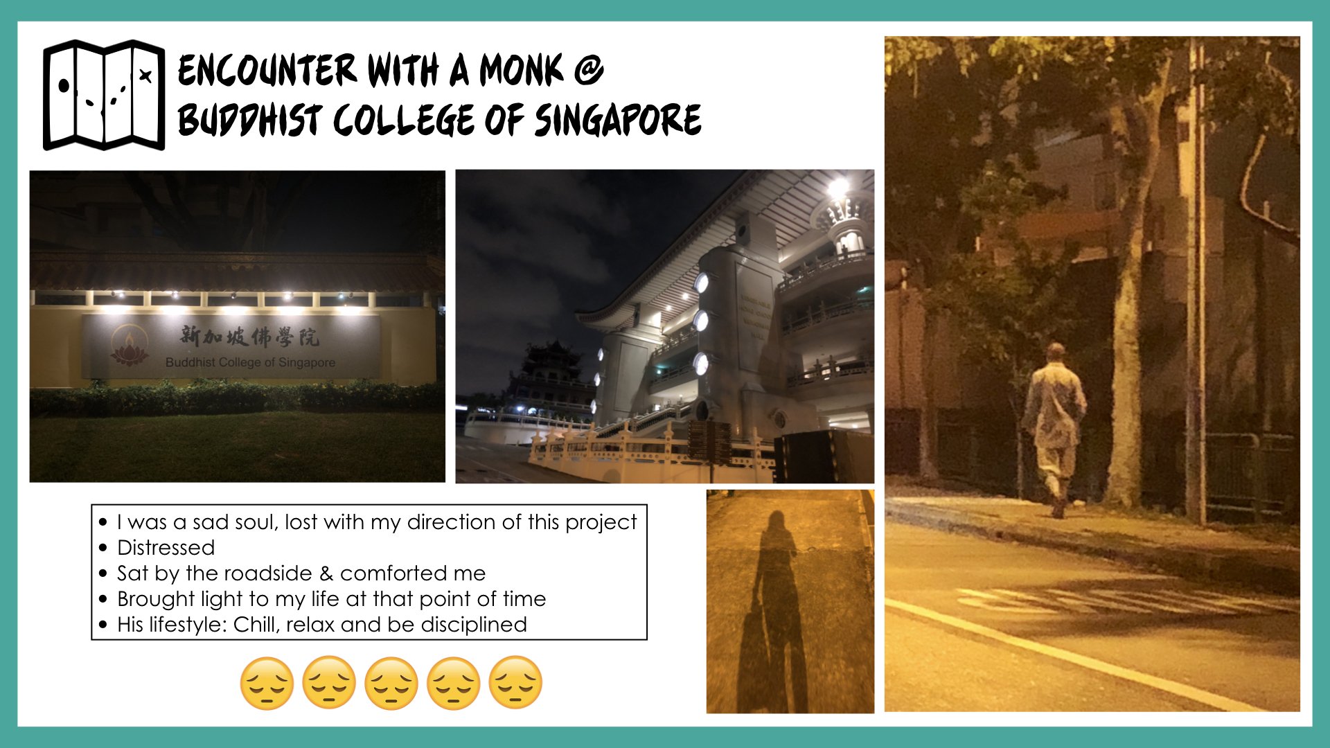
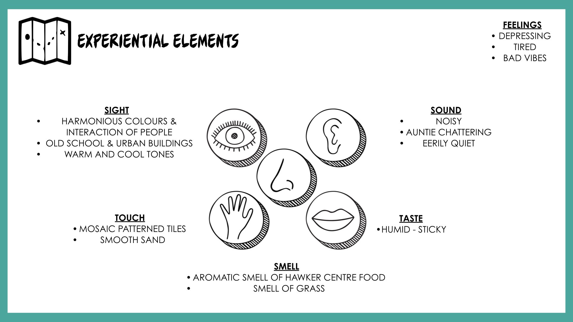
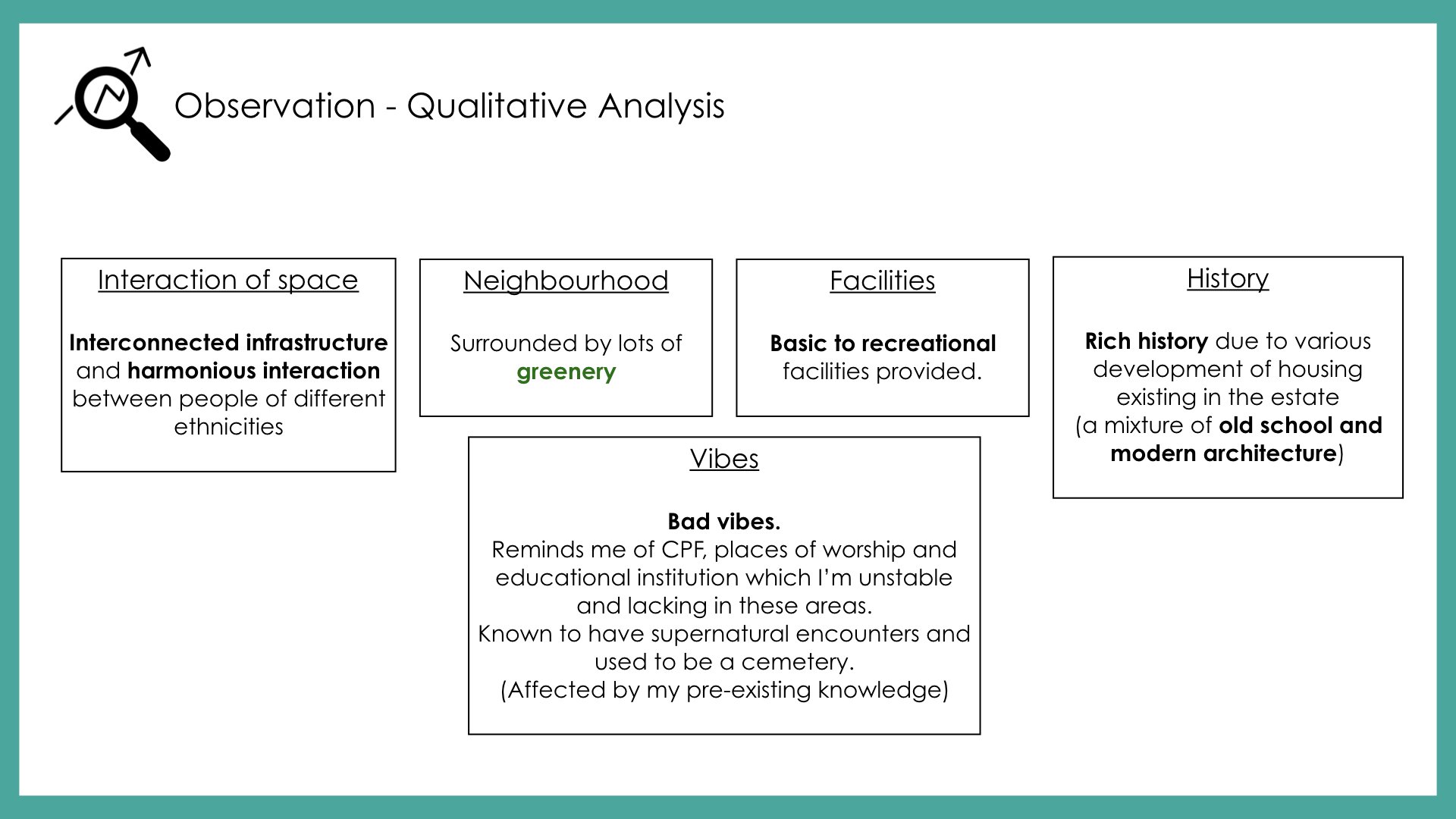
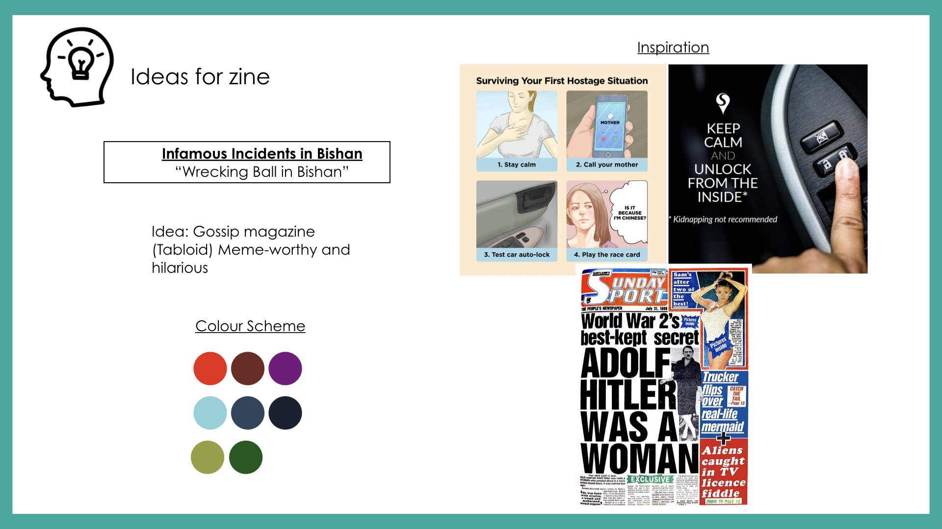
After listening to my peers’ presentation and receiving feedback from Mimi, I’ll be visiting Bishan again to explore the site. Hopefully, I’ll receive more insights about the relationship between history, people and certain areas of Bishan that makes the location unique or special. My objective is to have better research and insights that are more reflective and analytical that will assist in my narrative of creating the flow for my zine magazine.
After being introduced to ‘Critical Making’; a combination of Critical Thinking and Hands-On Making, we were tasked to create a disobedient object by hacking an everyday household object. The objective of this micro-project is to incorporate Arduino, sensors, and actuators with our chosen object so that it behaves in the least expected way.
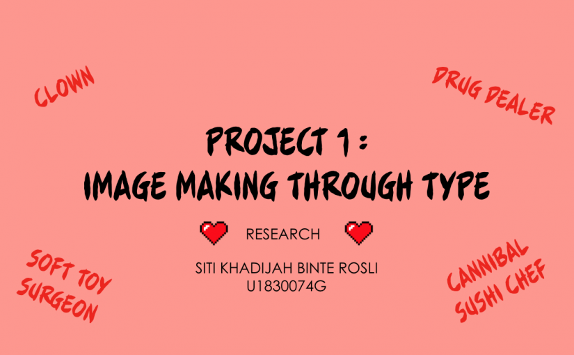
Group Members: Siti Khadijah& Tong Tong
IDEATION
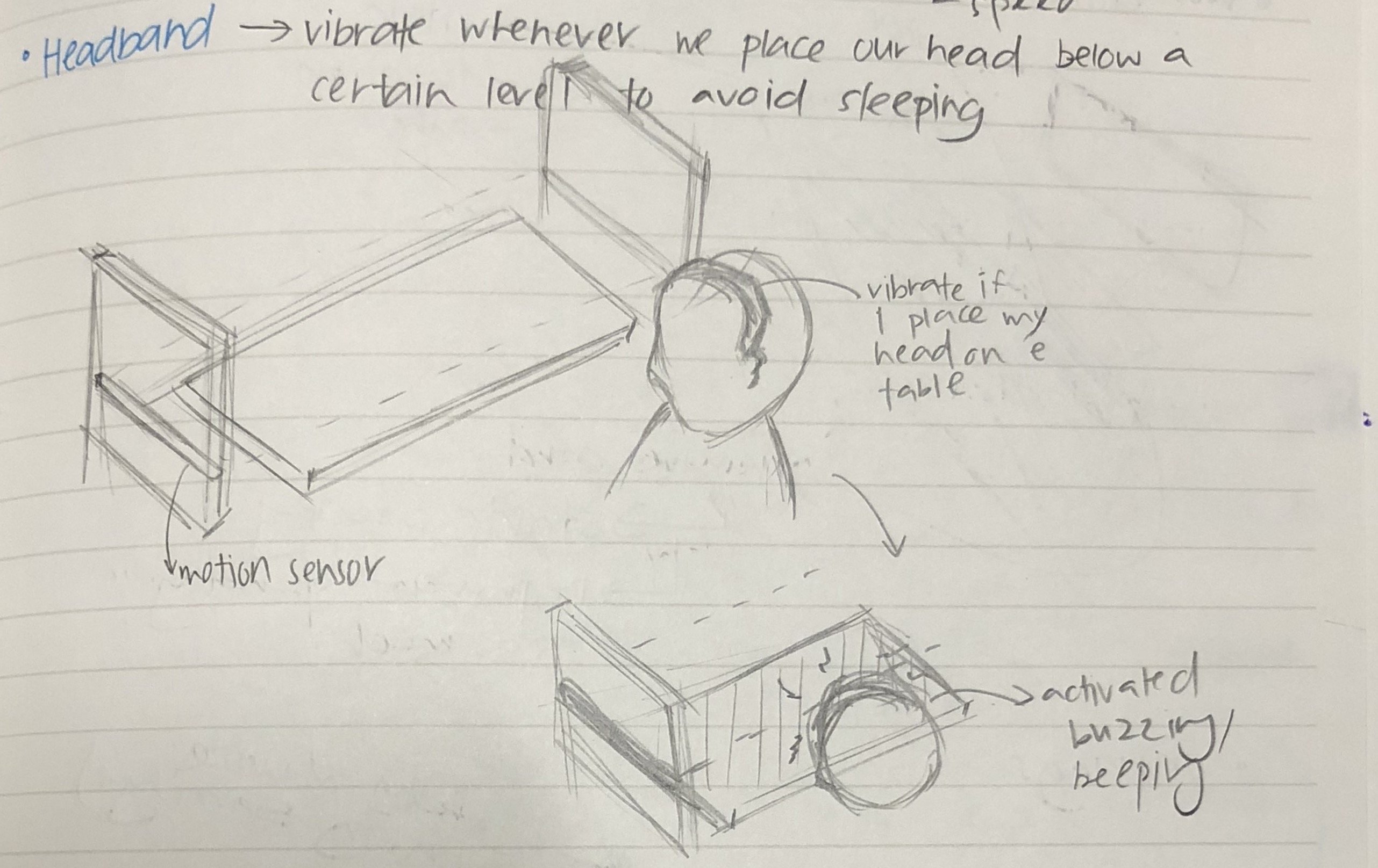
1. Screaming Headband
Hacking a headband so when we place our head below a certain level, it will start to beep, the objective of the hacked object is to increase productivity, avoid sleeping while when we are doing work.
2. Screaming Shoes
Hacking a pair of shoes so when the user enters a room with the shoes on, it will start to beep, the objective of the hacked object is to prevent the worn shoes into the room.
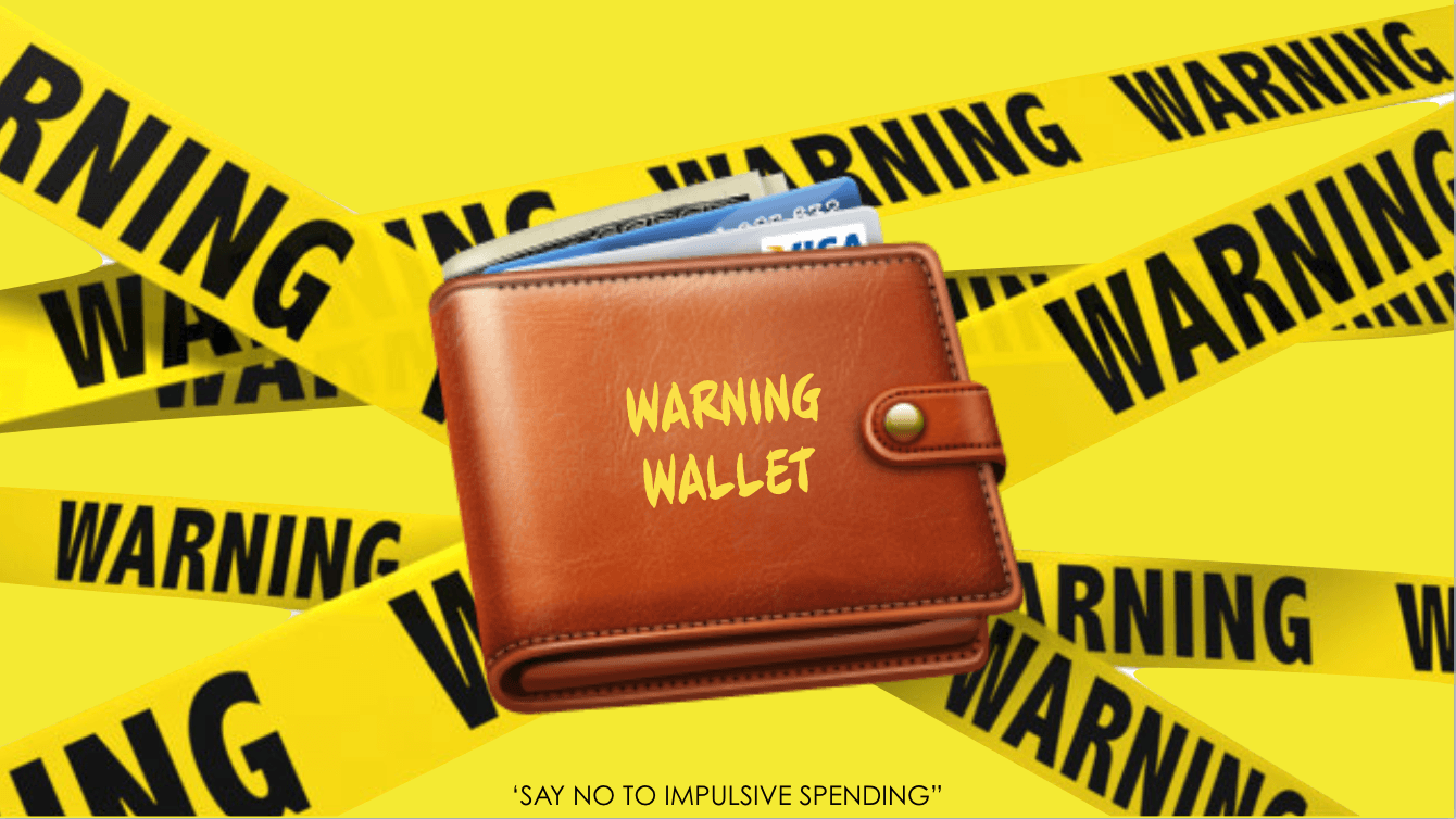
3. Warning Wallet
Hacking a wallet so when the user opens the wallet and take out a card from the cardholder, the wallet will produce an alarming noise to alert the user to control spending, give a second thought before spending.
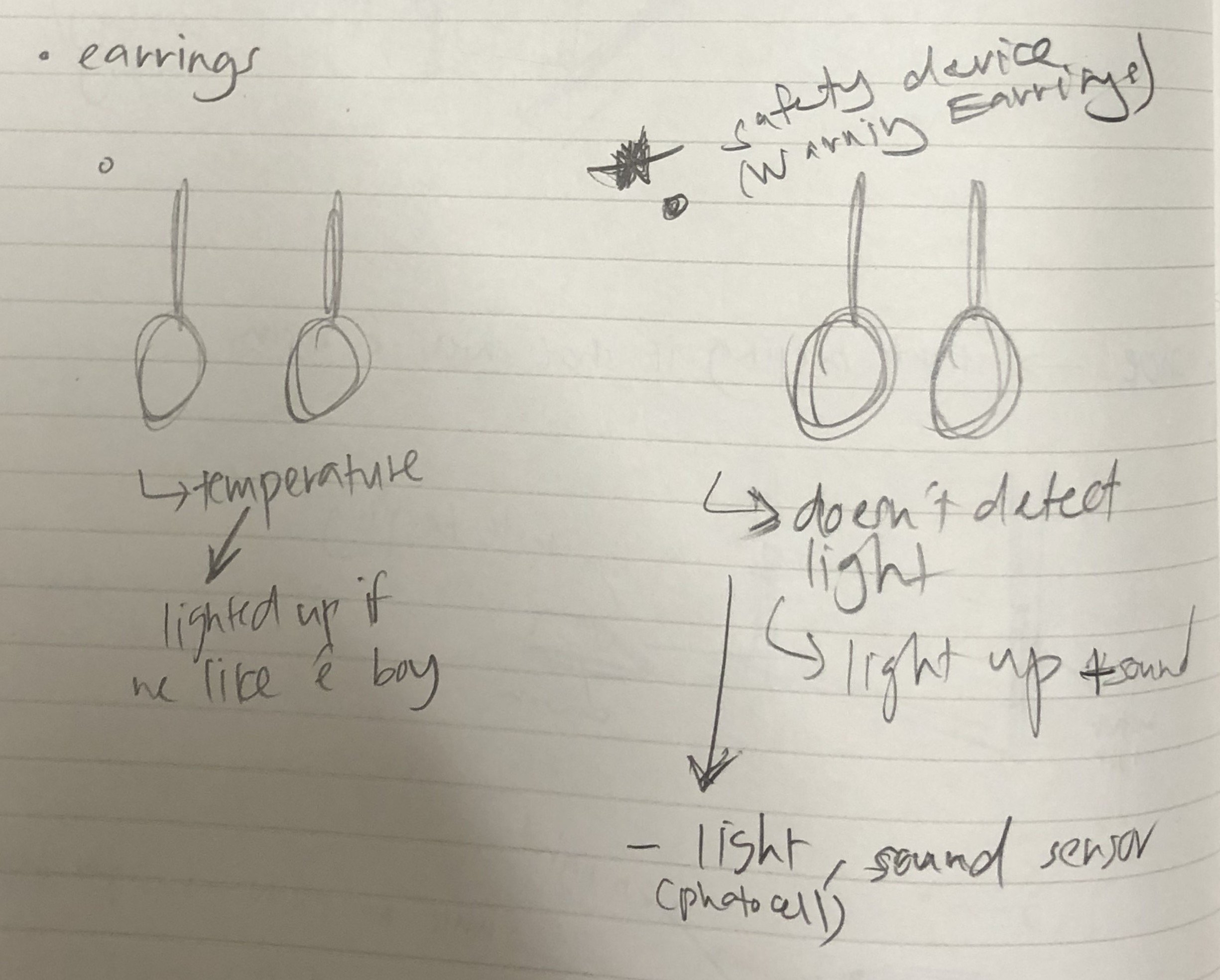
4. “True love” Earrings
Hacking an earring so when the user’s body temperature goes up, the earring will light up, the earning is helping the user to detect the love of his/her life.
CHOSEN IDEA: WARNING WALLET
After the presentation of ideas and discussing with one another, we decided to go with the third idea, we felt that the Warning Wallet is conceptually stronger and it’s a legit problem that we face everyday-impulsive spending. So we did a research on “How to avoid impulsive spending?” The first step to making a change in behavior is to recognize the problem. Once you acknowledge that uncontrolled spending is an issue, your awareness of the problem will help you follow through with a plan to stop. The alarming noise produced by “Warning Wallet” helps the user to acknowledge that uncontrolled spending issue thus, it helps reduce impulsive spending. In addition, creating an uncomfortable situation will embed discomfort and awkwardness into their experience hence, they won’t repeat the same action and it will serve as a reminder before they spend their money.
PROCESS – ‘WARNING WALLET‘
Figuring out the code
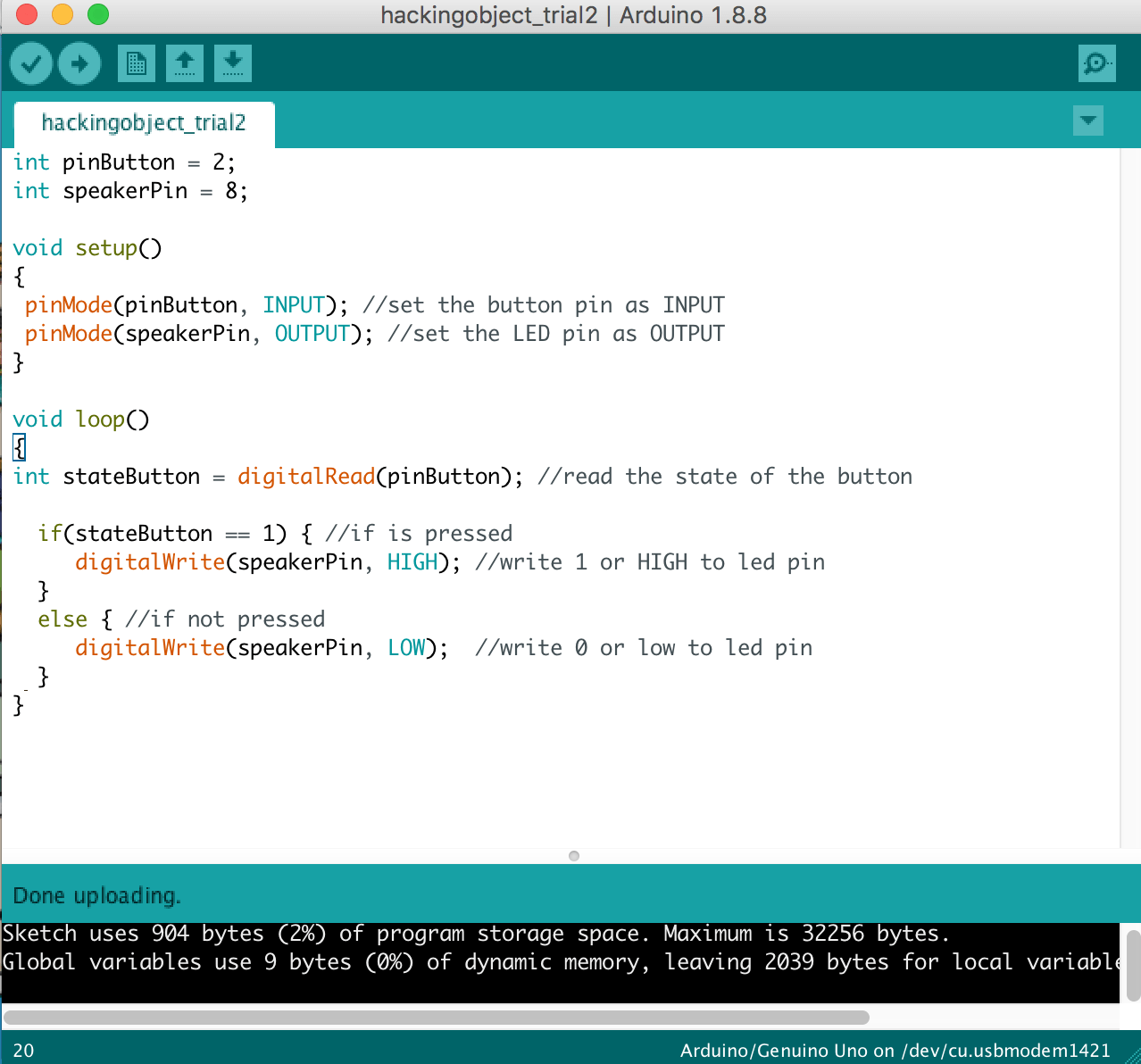
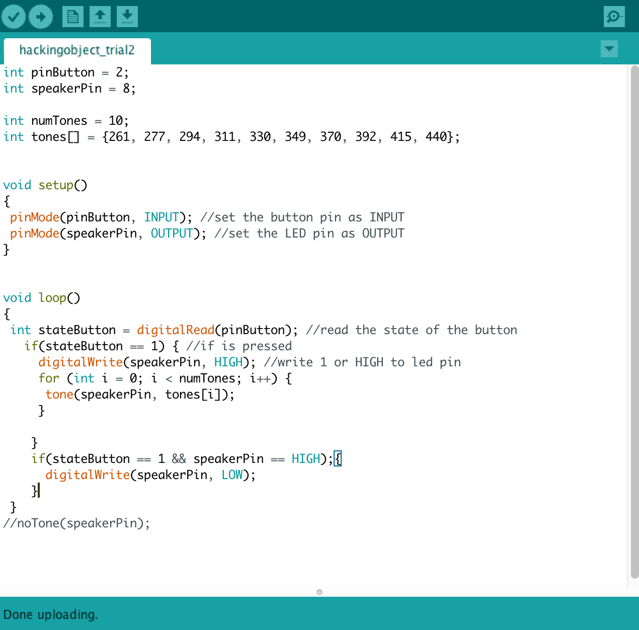
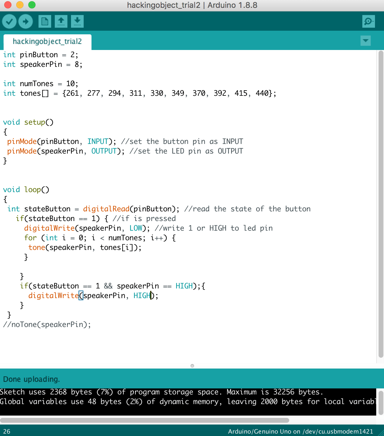
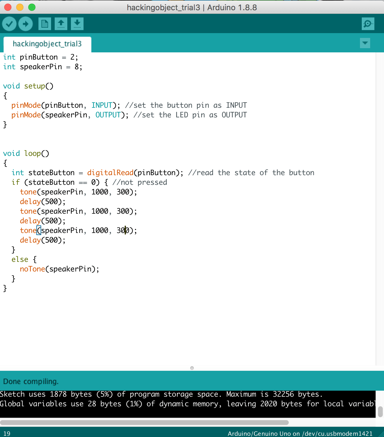
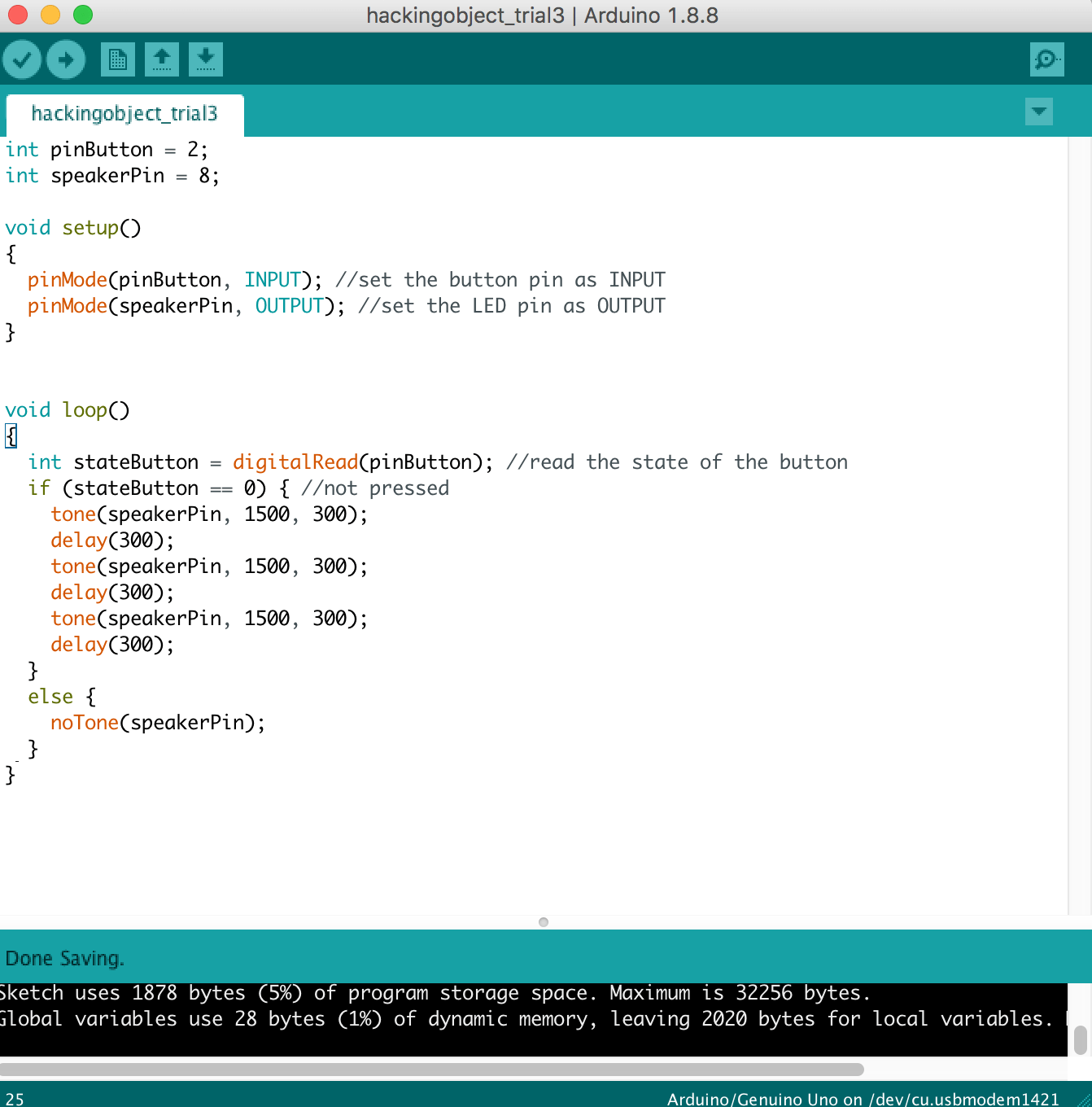
1 – Making it Beep
2 – Create the looping sound
3 – Switch Button as the sensor
4 – Final Outcome
5 – Changing of pitch
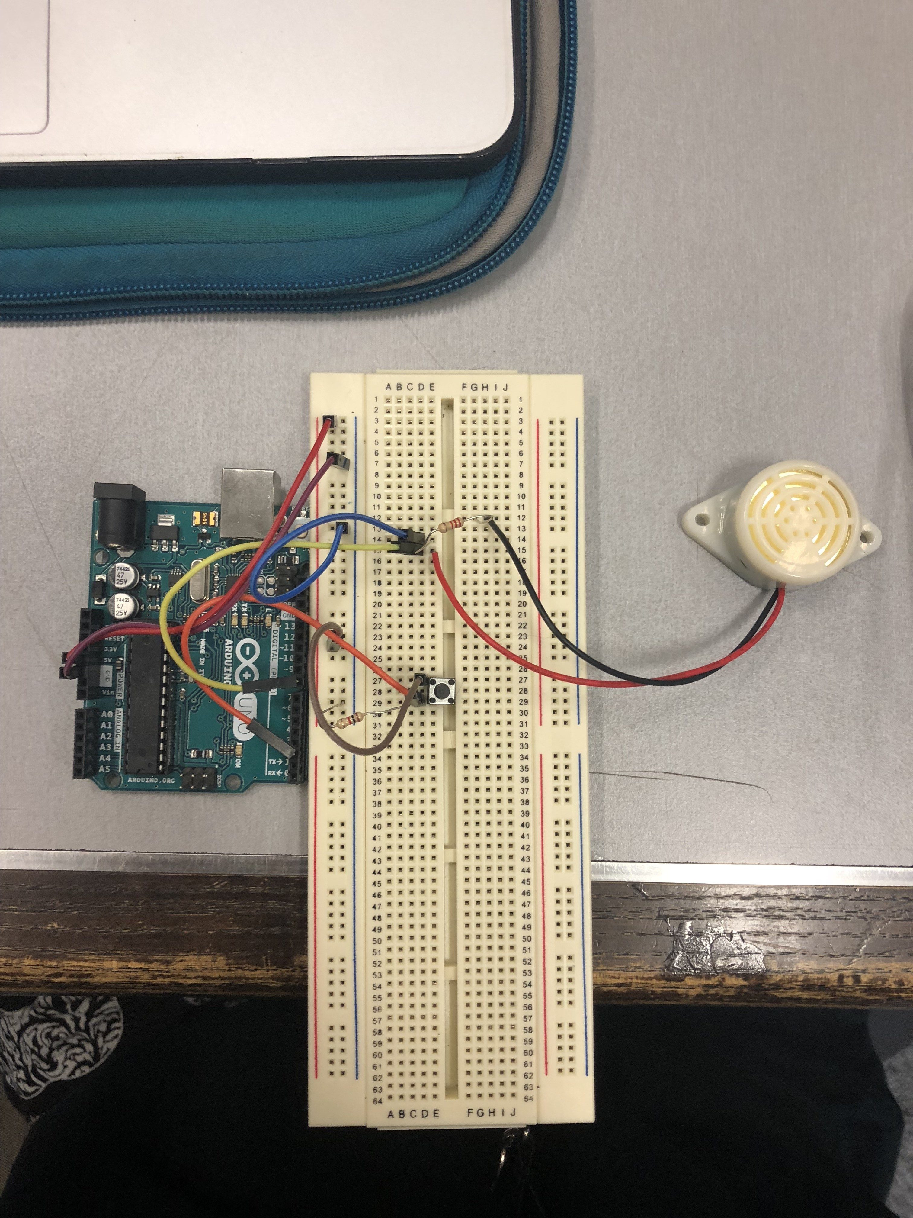
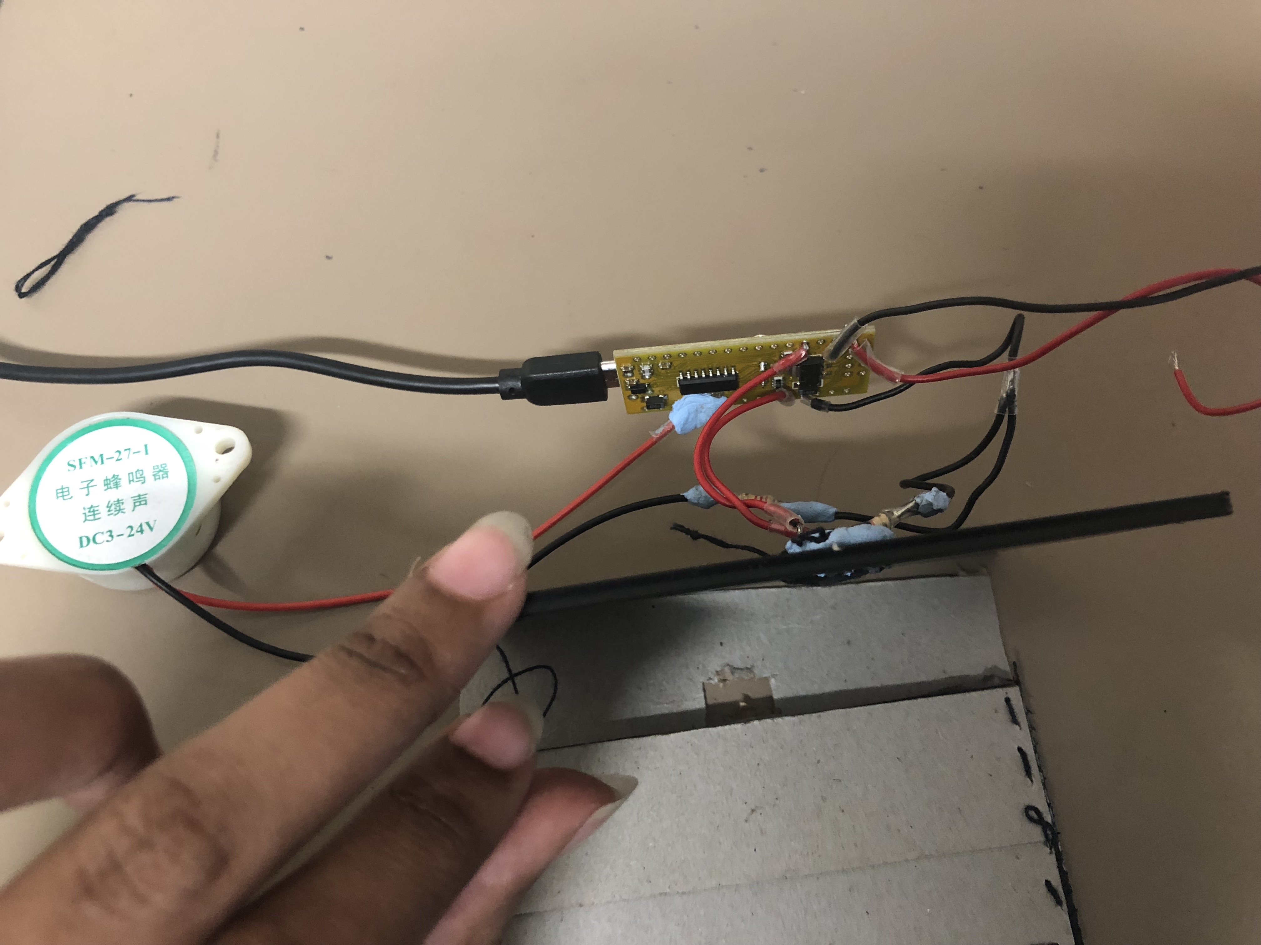
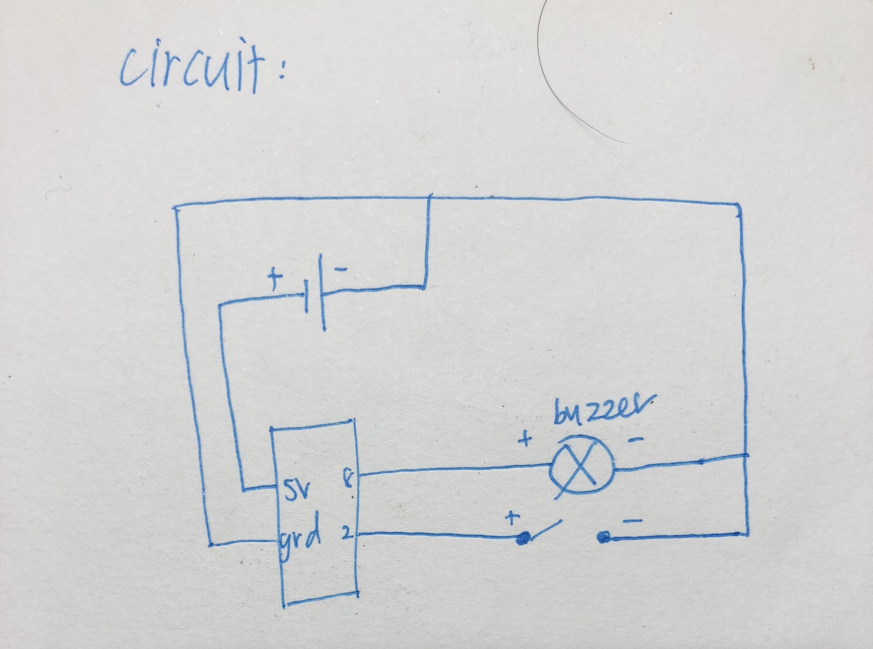
The essential components in our circuit are the switch button which acts a sensor to trigger the beeping sound when the card is removed from the wallet and the sound motor which beeps when it is triggered.
Using reference (below) from Open Source websites and forums, we were able to solve the issues we had which is being able to loop the beeping sound and the switchState to trigger the beeping sound.
We were able to simplify our code and learned the easier way to do the switchState and adjusting the pitch of our beeping sound to make it more annoying.
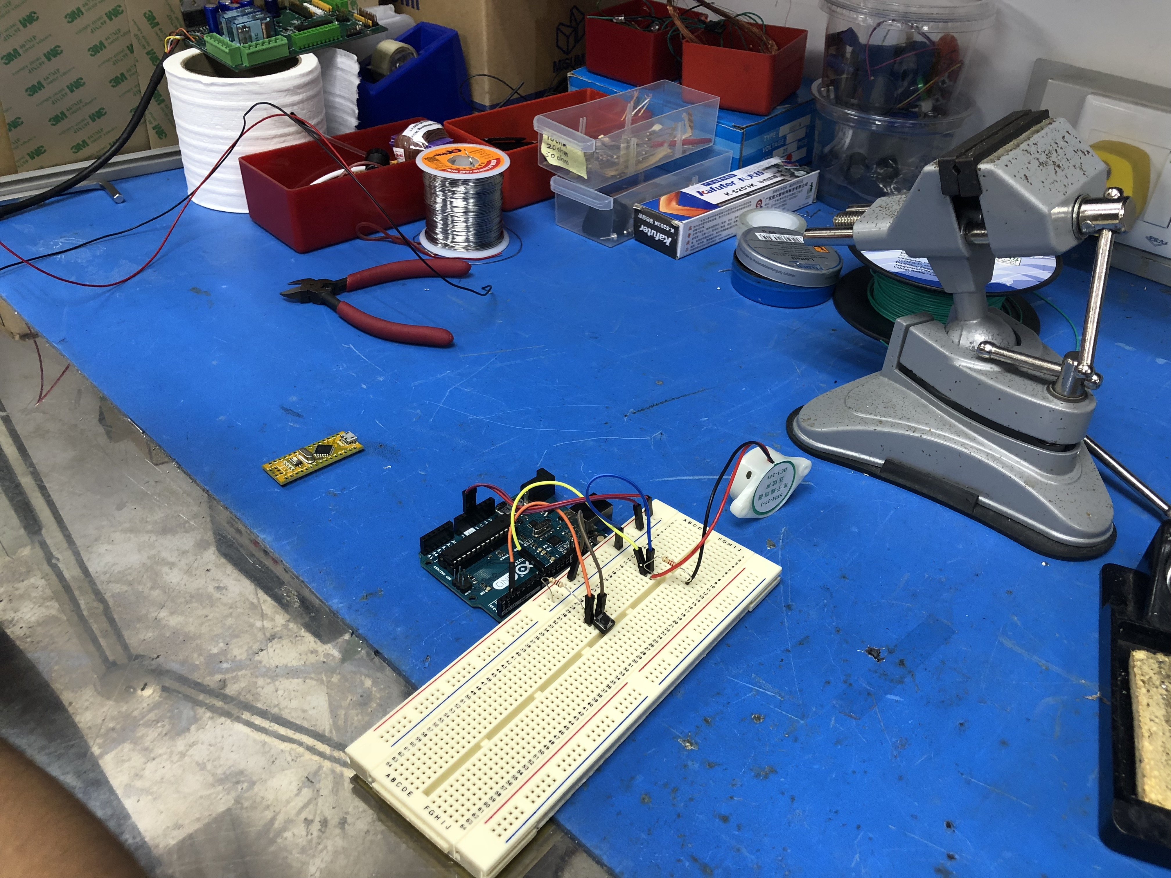
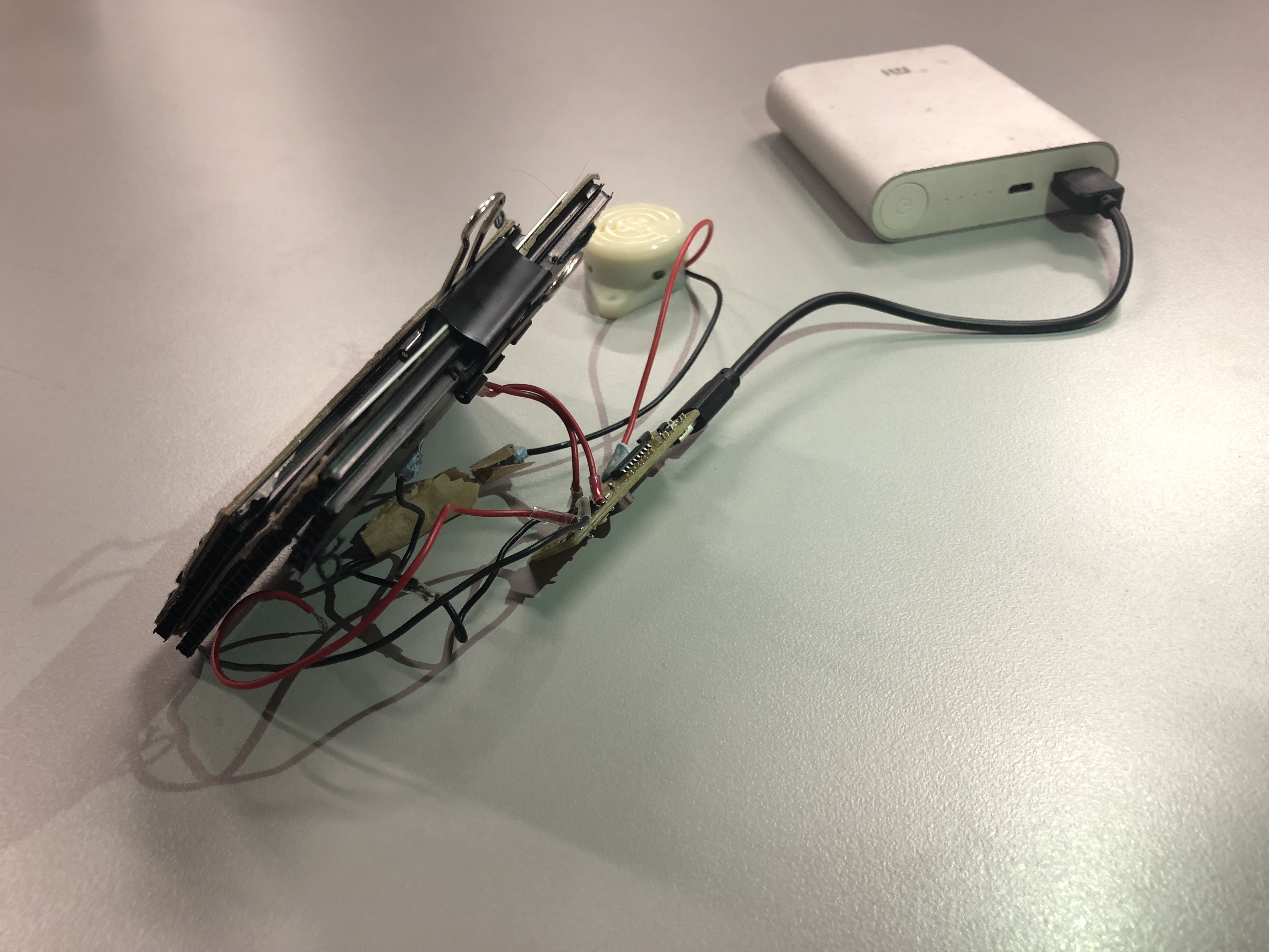
Circuit Board
Final circuit for Warning Wallet
Placed in an actual wallet
VIDEO: HOW OUR ‘WARNING CIRCUIT’ WORKS?
On a breadboard:
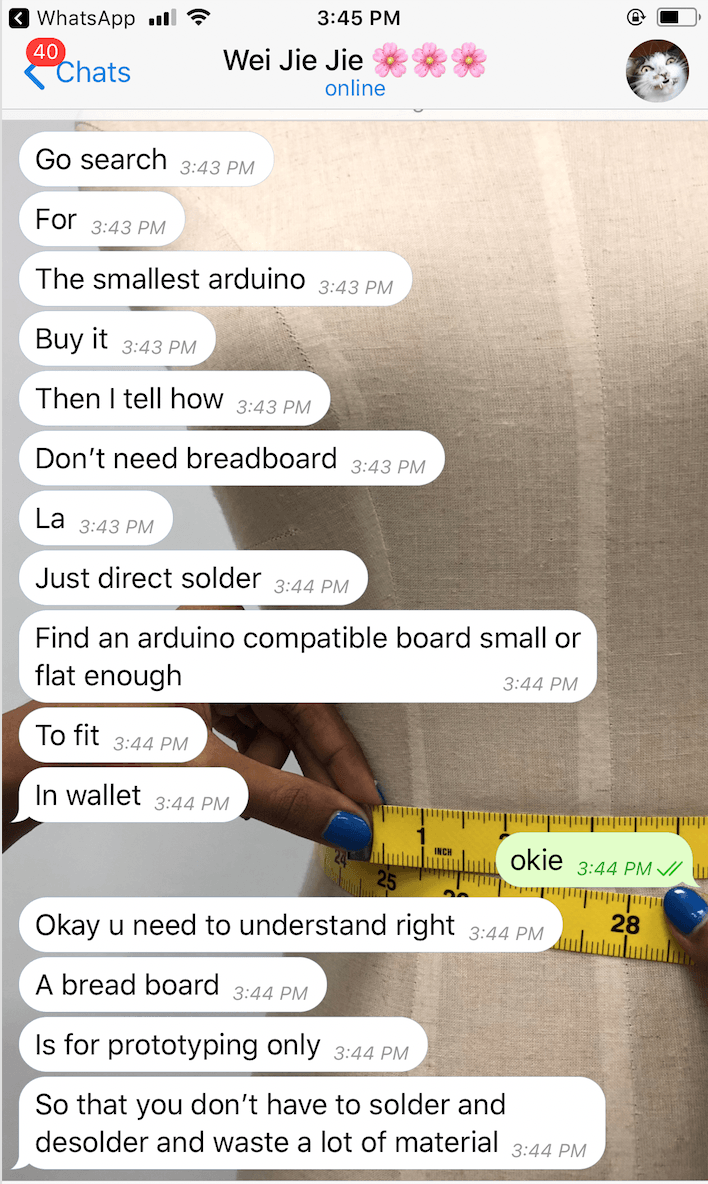
We realized that the breadboard was too big to be fitted in the wallet and we wanted our participants to have good user experience with our hacked object. Hence, we consulted some of our friends with an engineering background to solve this issue.
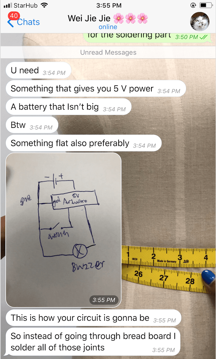
SUGGESTIONS FROM WEIJIE (ENGINEERING FRIEND):
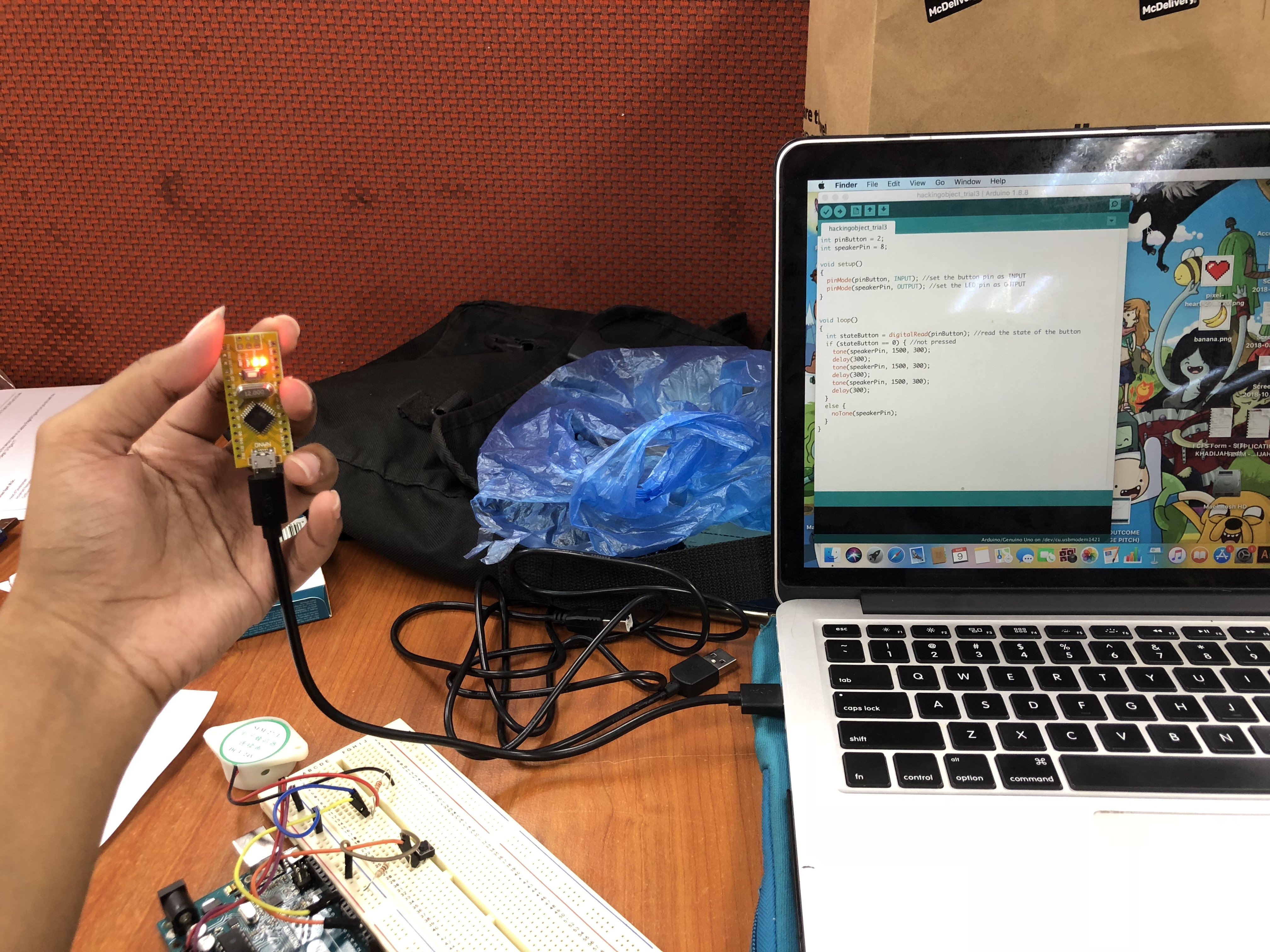
1 – Getting an Arduino Nano
2 – Soldering
3 – Use a copper board for cheaper alternative
After discussing with each other, our group members decided to:
Buy an Arduino Nano to make it compact and portable for our ‘Warning Wallet’
Upload code onto Arduino Nano
Solder the wires directly onto the Arduino with reference to our circuit on the breadboard
Create a casing prototype for our circuit
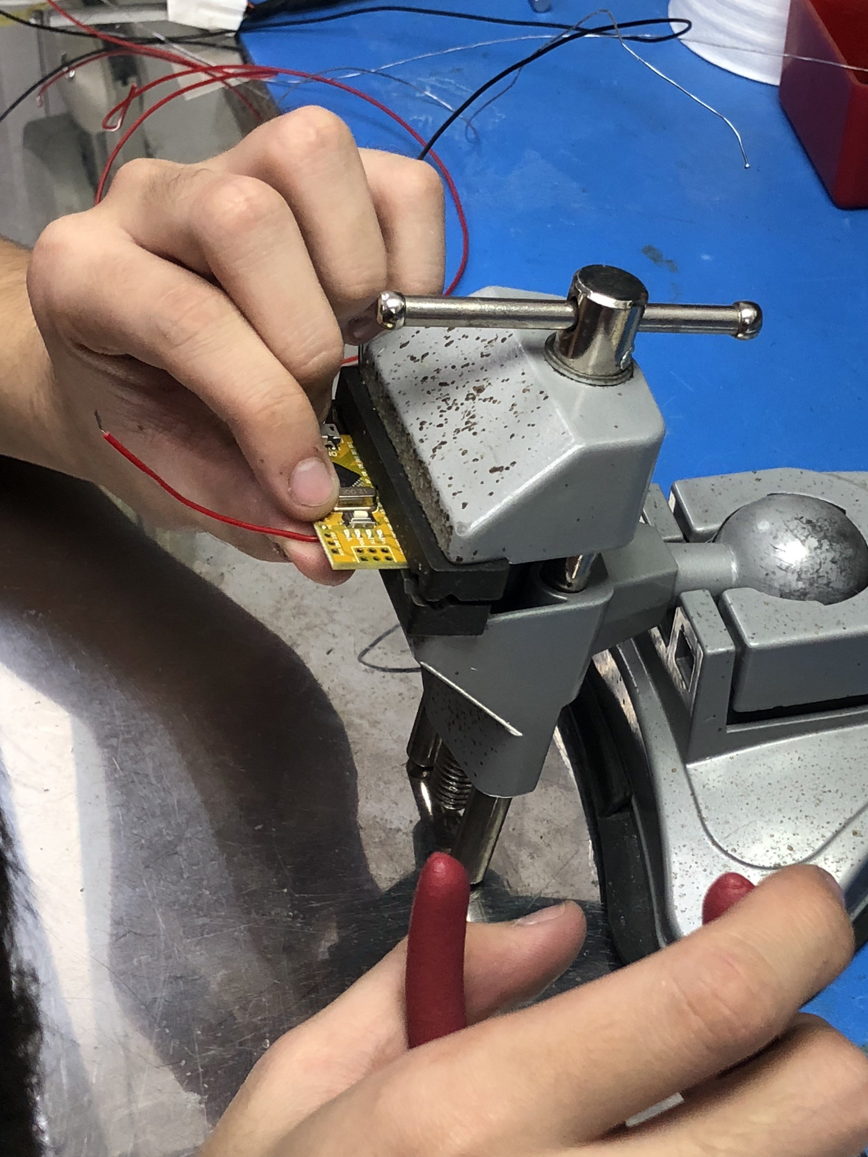
Process of soldering directly onto Arduino
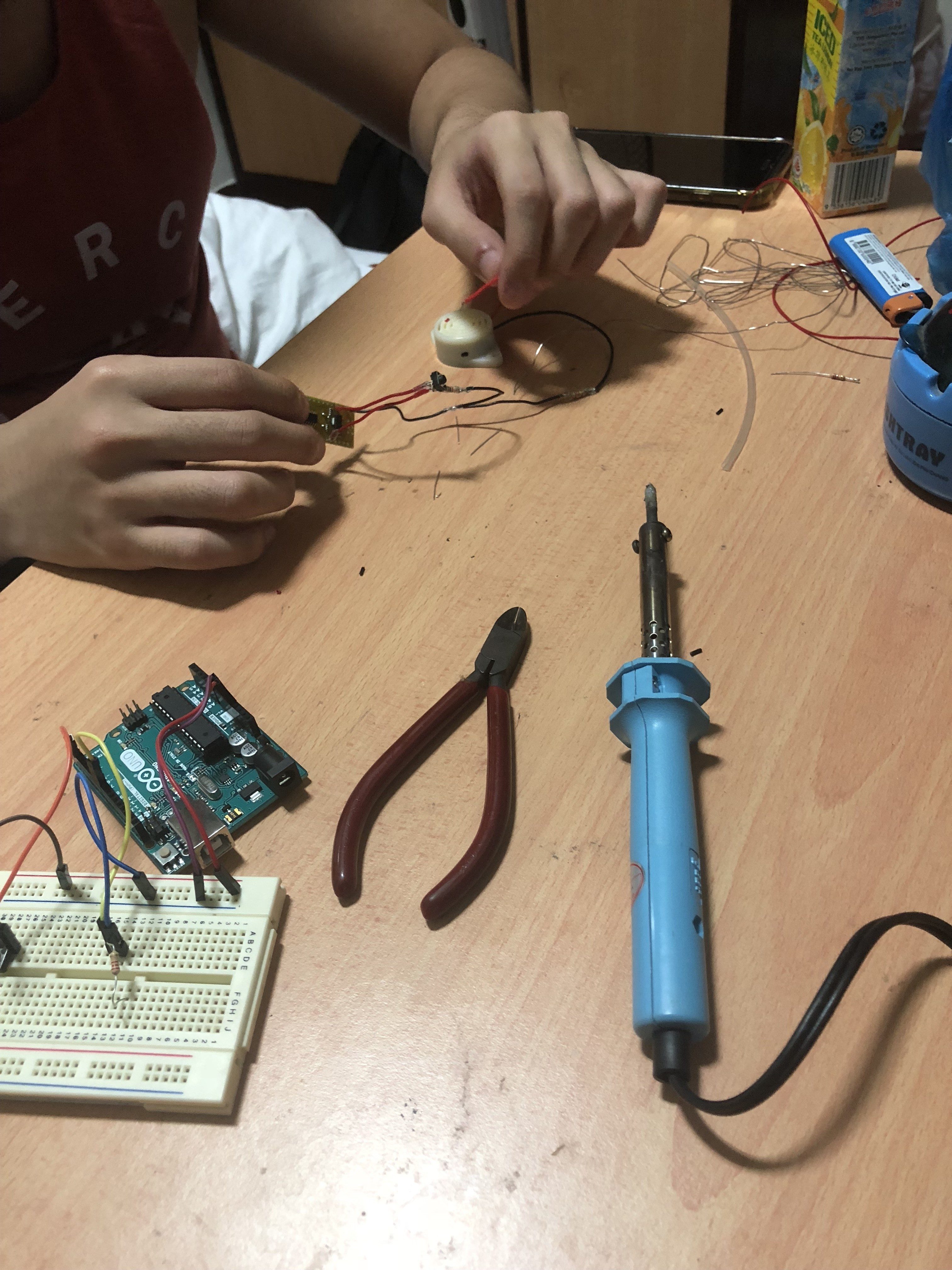
1 -Original circuit vs. Compact circuit
2 – Uploading of code
3 – Workspace
4 – Clamping our Arduino Nano to solder
5 – Soldering
6 – Transferring components onto Arduino Nano
Since we’re are not experienced with soldering, we decided to ask assistance from our engineering friend and learn how to solder all the components together. Through this experience, we were able to learn the ‘hands-on’ making of the project and improve our ability to create a robust and working circuit.
FINAL OUTCOME OF SOLDERING ONTO ARDUINO NANO:
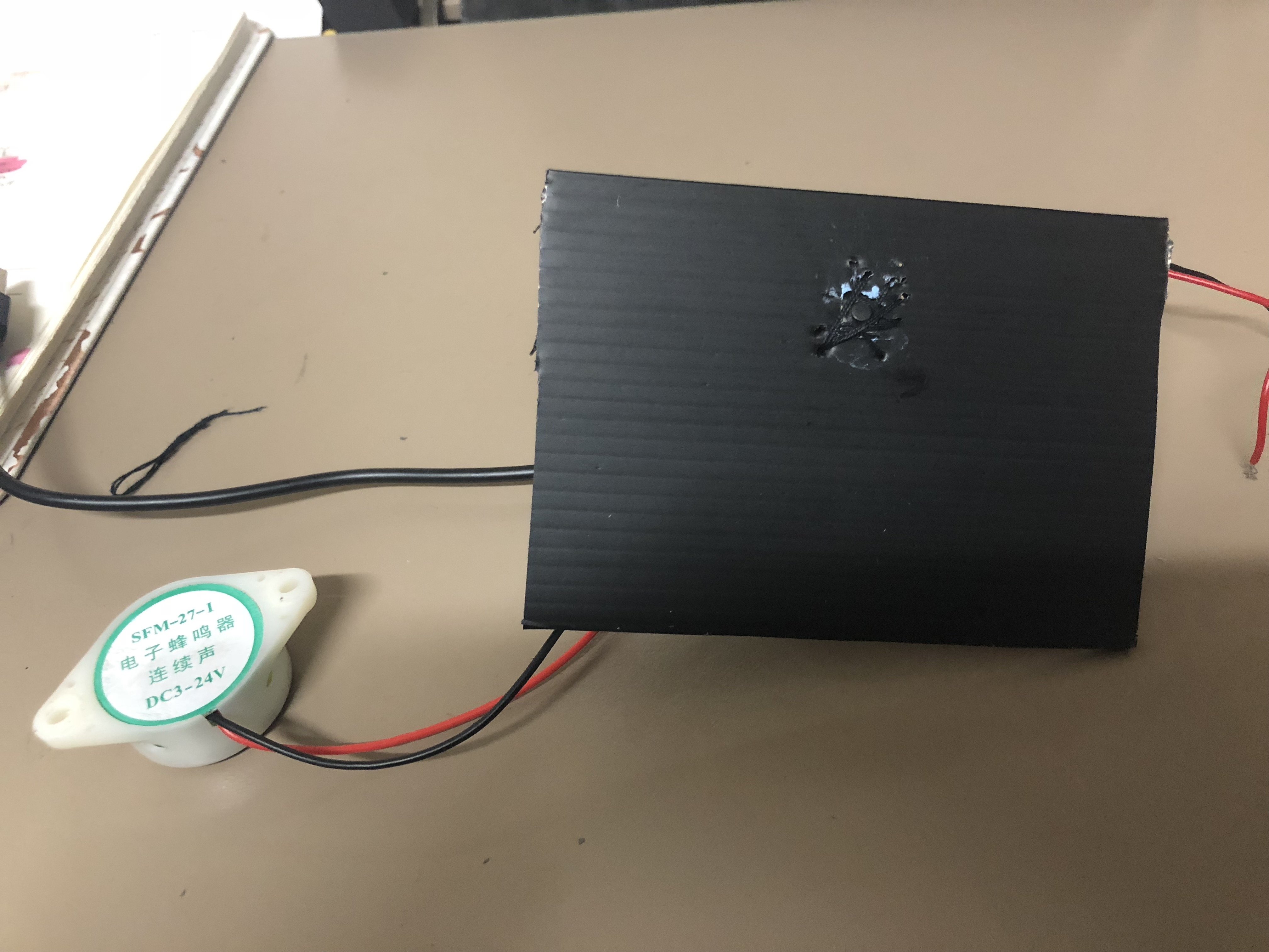
1 – Final outcome of circuit
2 – Additional wires for battery
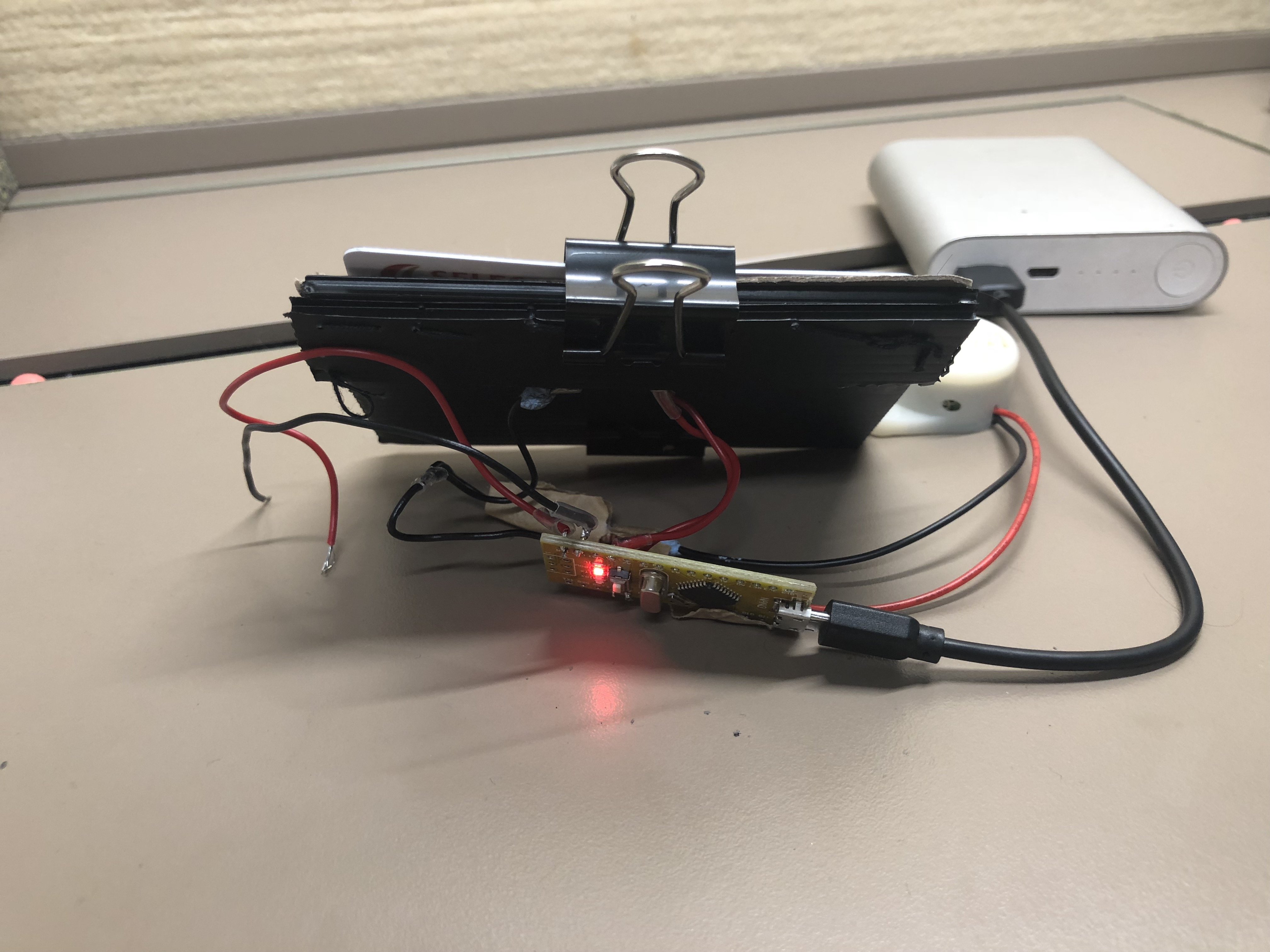
Wejie told us that he decided to solder extra wires connecting the power and the ground to a battery in case, our power bank isn’t working so there’s another alternative to power the hacked object.
VIDEOS: TWO WAYS TO POWER THE ‘WARNING WALLET’
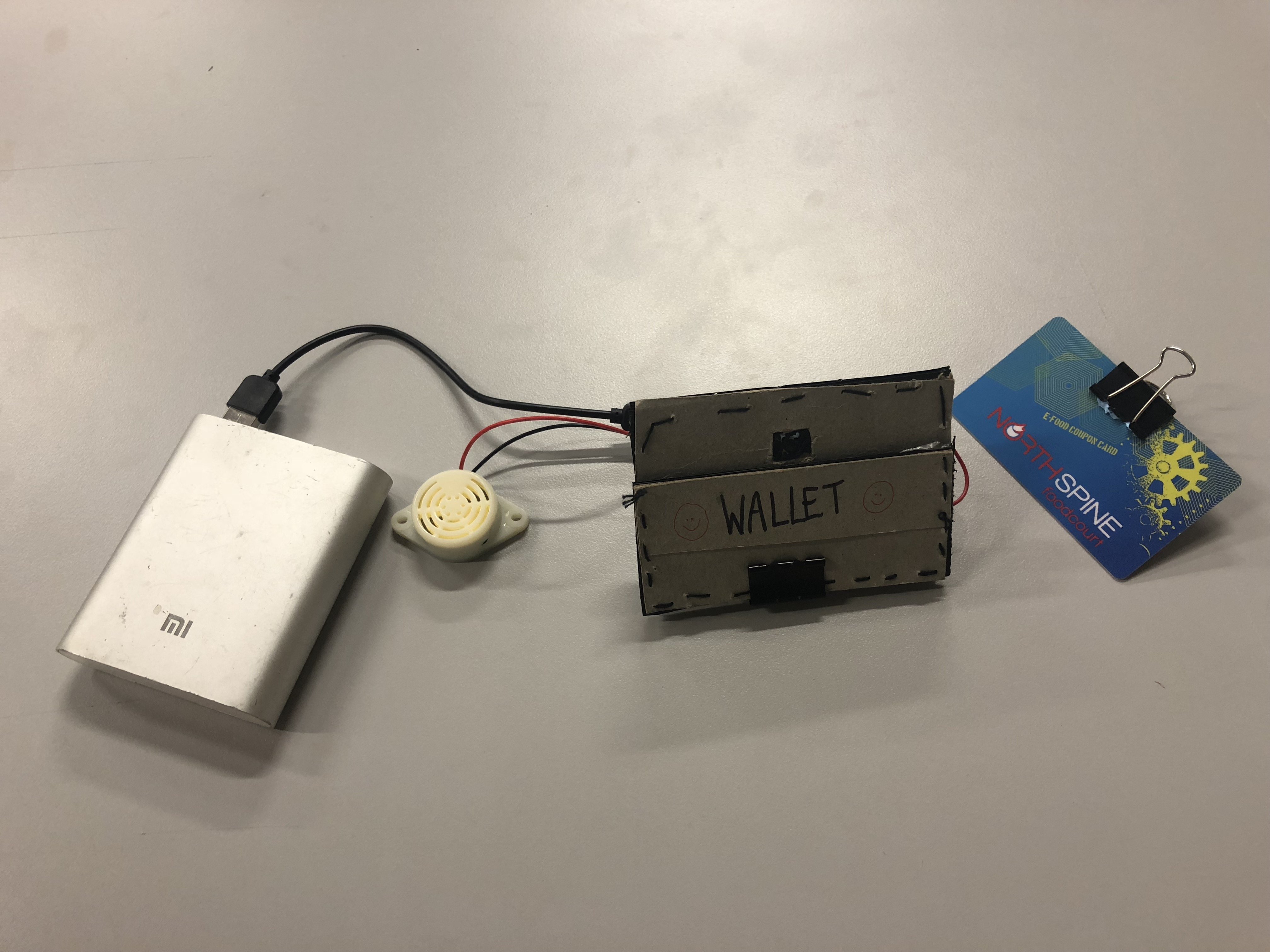
Powered by Xiaomi power bank – For compatibility and convenience
Powered by 9V battery – Another alternative
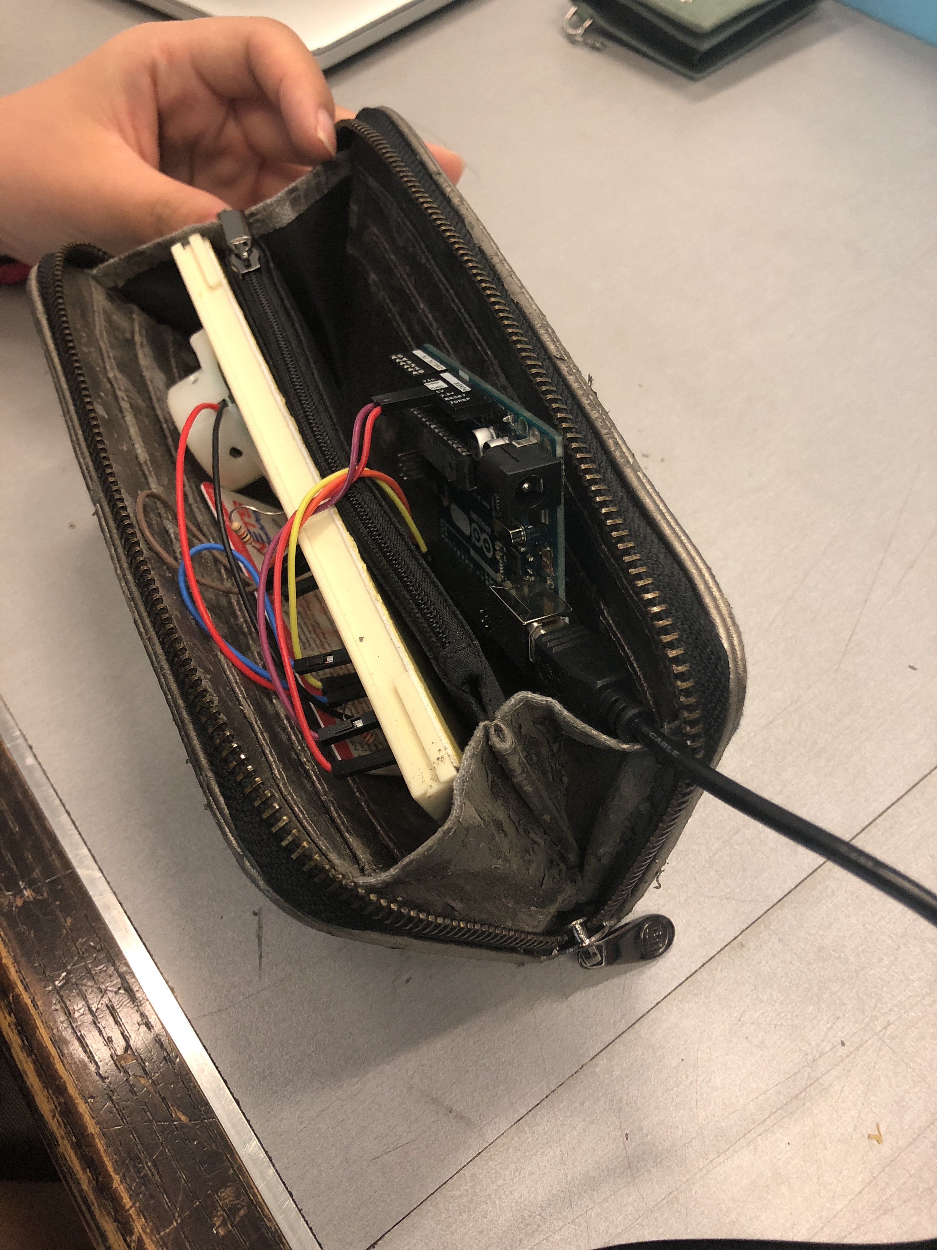
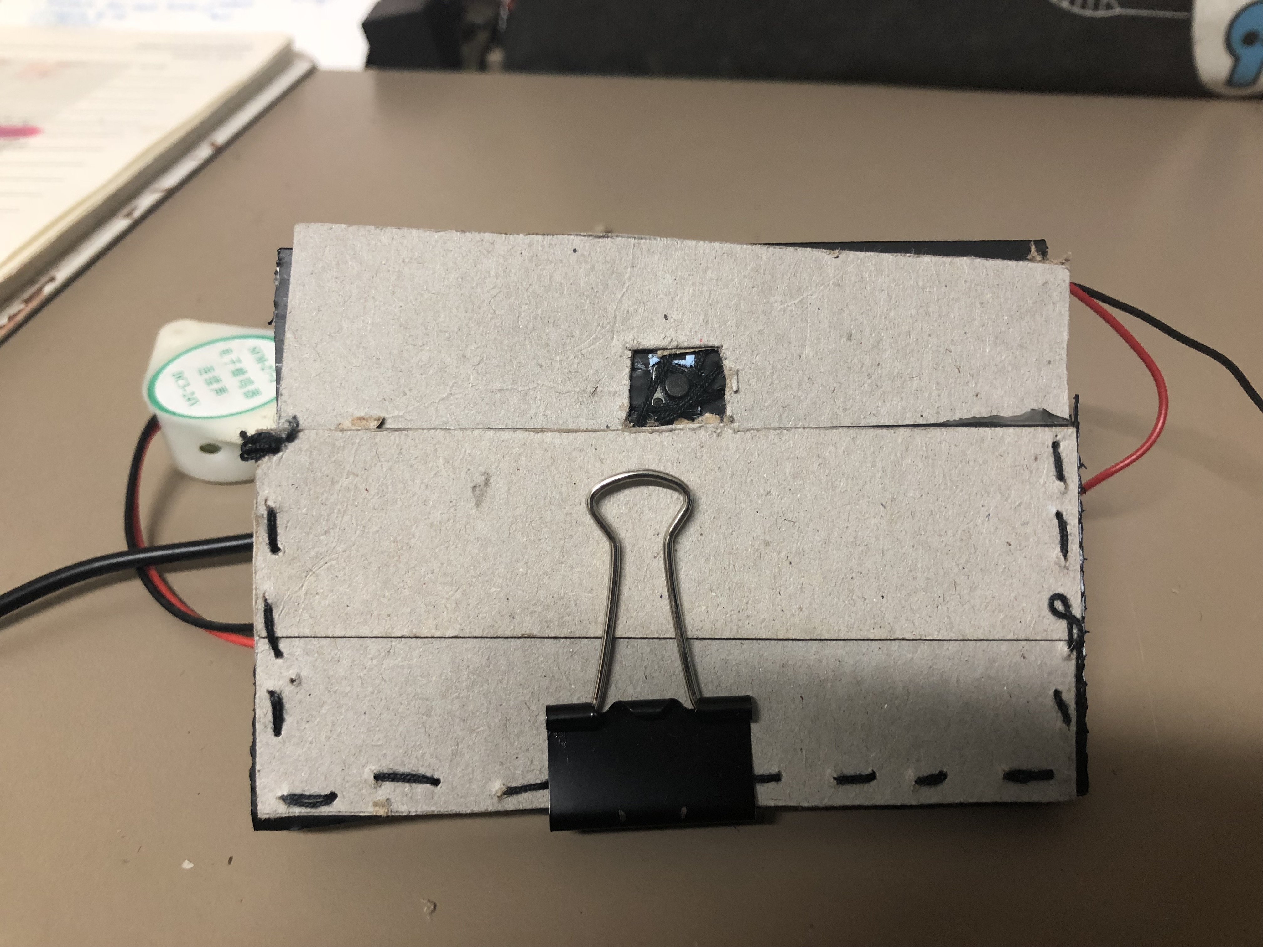
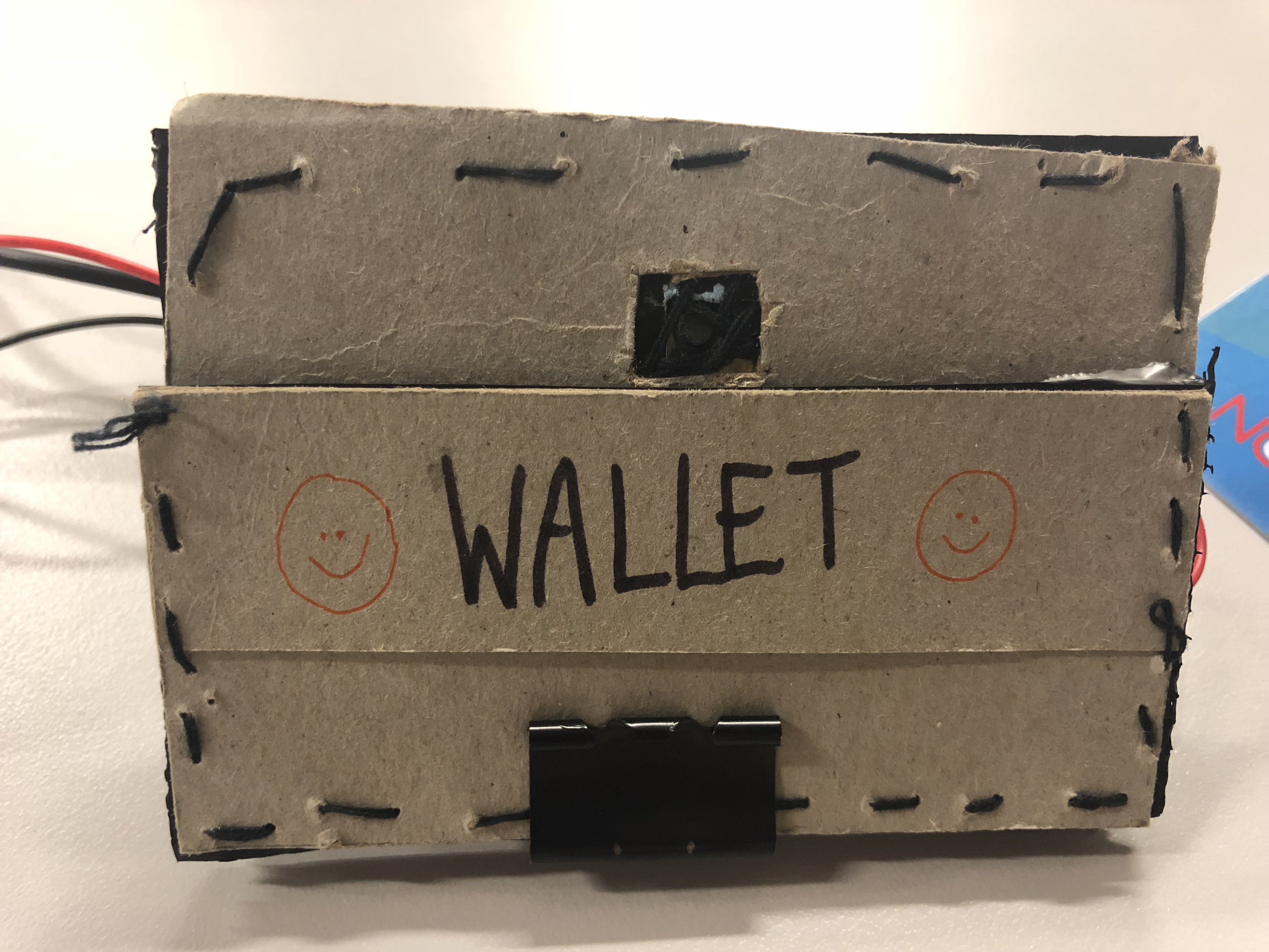
Prototype casing for ‘Warning Wallet’
Sewn and glued together, a wallet prototype for the circuit. The main objective of this prototype is to create a section in the cardholder for the switch button which will trigger the beeping sound when the card is removed from it.
ISSUES WITH OUR PROTOTYPE CASING – WALLET:
The card slots in the wallet weren’t tight enough to prevent the switch button from beeping. Hence, I added a clip to add more pressure to press against the switch button as an immediate solution.
*FINAL OUTCOME – ‘WARNING WALLET‘
VIDEOS
HARDWARE
1 – FRONT VIEW
2 – SIDE VIEW
3 – CARD IS REMOVED
4 – WALLET PROTOTYPE
CIRCUIT
Code
‘WARNING WALLET‘ IN USE IN A REAL LIFE CONTEXT
OUR EXPERIENCE:
As the users, honestly, we were quite embarrassed because of the loud beeping sound activated in the public and we wanted the purchasing process of buying bread to be over as soon as possible.
The auntie was wondering where the sound was coming from and kept looking around so, it was amusing to us. Afterward, she realized it was coming from our wallet and informed us about it.
We felt like we were able to deliver the objective of our hacked object and we’re pleased with the results.
PRESENTATION IN CLASS
ISSUES DURING PRESENTATION:
During our test trials and runs before the presentation, it was working fine. However, we were unlucky and the wire for the sound motor soldered to the Arduino Nano came off when we’re presenting ):
Despite this mishap, we had documentation videos of our working prototype and how it works in a real-life situation to present to our peers.
REFLECTIONS
“How does your hacked object behave in a way you least expect it to?”
SITI: A function of a wallet is supposed to store and safeguard valuables such as cash, cards, and identification details. Due to the consumerist culture of purchasing items that we do not need but want, we decided to hack a wallet and create an uncomfortable interaction. When a card is being removed from the wallet, the switch button will be released and trigger a loud beeping sound. Hence, creating an uncomfortable and awkward situation during the process of payment. The participant using the hacked object will be shocked and try to figure out how to stop the looping beeping sound which is by placing the card back into its slot. It serves as a reminder not to overspend and makes the user think whether it’s necessary to purchase an item.
TONG TONG: Our hacked object was designed to respond to the user’s movement, which is to take out the card from the card slot. We made a cardboard wallet and use a clip to exert a force onto the switch to imitate the actual wallet. In all our testing, we were assuming that the user will know how to use the wallet until the wallet is being used by the others, we then release the problem.
“What are some reactions you observed from your participants when they interacted with the object?”
SITI:
TongTong as the participant
During our test run in a real-life context, our prototype was working fine. When we were making our payment to the pastry store auntie, the beeping sound was activated and she was trying to figure out where the sound was coming from. You can see the confusion and frustration on her face. Personally, we as the participants wanted the whole process to be done as soon as possible but it was hilarious to see her reaction. After the payment is done, we were relieved that the annoying beeping sound has been stopped.
Brian as the participant
During our presentation, he wasn’t sure how to approach our ‘Warning Wallet’ but he took out the card but our circuit wasn’t working. The soldered wire of the sound motor was not connected properly and it might have been loose during the process of transportation. I should have been more careful in terms of safeguarding the circuit or should have created a protective casing for the wires to prevent such things from happening.
TONG TONG: Our first participant Brian, he was initially confused with how he should approach the object, when he took out the card from the wallet with the wallet being not very responsive, just happened that not to work during the presentation, even though we tried many times before the presentation, he is even more confused.
“What are the challenges involved and how did you overcome them? What problems still exist? How might you overcome them eventually?”
SITI:
We faced a lot of challenges during the process of creating our ‘Warning Wallet’.
As we’re not proficient in coding, we relied on opensource forums and the knowledge we’ve learned in class to figure out the codes suitable to apply for our circuit.
We realized that to make our prototype more realistic during user experience, we had to focus on the compatibility and portability of our ‘Warning Wallet’. With the assistance of our friends with an engineering background, we were given suggestions to change to an Arduino Nano and solder our components directly so it will be compact. In addition, we learned how to solder directly, simplify the circuit and completed the circuit together (DIWO). Personally, it was a meaningful and fun experience collaborating with my friends and I appreciate their skills.
During the process of creating the prototype casing of the ‘Warning Wallet’, the card slots in our spare wallet weren’t tight enough and I had to resort to making a wallet out of cardboard because I didn’t want to destroy our current wallet that works perfectly with the circuit. However, despite creating a prototype casing out of cardboard, the card slot and card were still not tight enough to press against the switch button sensor. I resorted to adding a clip onto the card to exert more force onto the switch button sensor to prevent it from beeping (immediate solution because we didn’t have much time left). Hence, affecting the user experience of our participants for the presentation ):
When we were faced with this issue of making the sensors work, we realized we should have change the sensor from the switch button to a photocell sensor (detects light) which is much better as it doesn’t require force and it will stop beeping when the card is covering the photocell. The user experience of the participants will be much better if we tried multiple sensors for our circuit before finalizing which sensor is the best option for our hacked object! (Lesson learned!)
TONG TONG: There were several challenges that we faced throughout the process, involved hiding the components of the setup. We decided to buy a smaller Arduino board and soldering it so we were able to hide everything inside the wallet. We could have improved on our object by doing user testing, then we will realize the problem of the product. It would have been better if we use an actual wallet instead of the cardboard. Moreover, there was the issue of the choice of sensor, photosensor (detects the presence of visible light) might be a better choice than using the switch (detects the pressure).
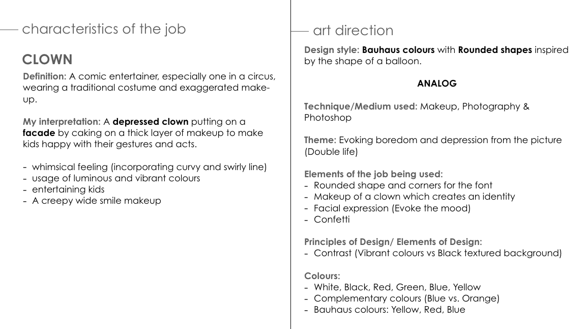
Legibility of the letter ‘K’. It looks like an ‘X’.
Add highlights to the typeface so it looks bouncy.
Incorporate the texture and thin lines onto the typeface instead of the background.
Outline the rounded and bouncy typeface on the clown’s face.
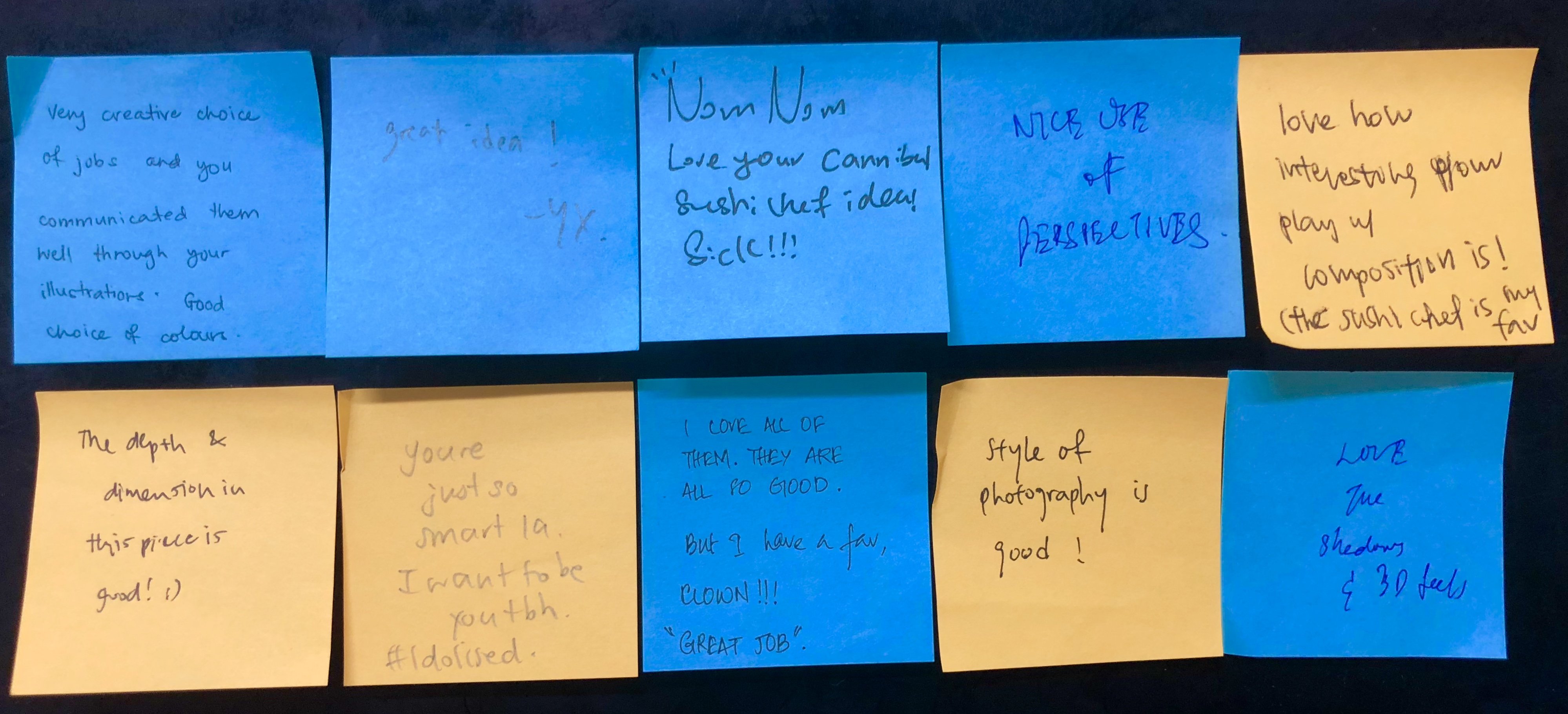
CRITIQUE SESSION:
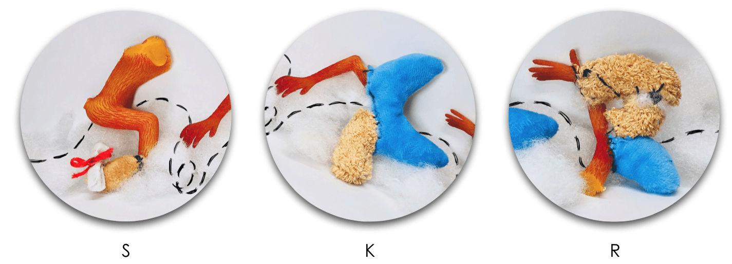
The letter ‘R’ looks like a P. (Legibility)
CRITIQUE SESSION:
Legibility of the letter ‘K’. I should have reduced the length of the decorative tail of the K.
I should have brought the physical soft textured typeface during the presentation to showcase to my peers.
CRITIQUE SESSION:
Legibility of the first ‘I’. Suggestion: Repeat the second ‘I’ typeface so it’s more readable.
TAKEAWAYS AND LEARNING CURVE DURING THIS PROJECT:
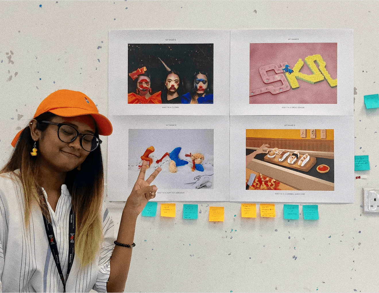
I had challenges trying to picking out the minimal and essential elements from each of my jobs to portray it visually and efficiently. However, this project made me focused on the various aspects of the design process for image-making through type such as the usage of suitable elements, choice of fonts, color scheme, overall composition, technique or method that I’m going to apply.
My knowledge of the principles of design and elements of design assisted the overall composition of typographic portraits and my peers complimented the perspective, depth, and dimensions of my typeface.
Personally, I really enjoyed the dynamic design process of trying out analog and digital methods.
All in all, I’m really satisfied with the 4 outcomes of my typographic portraits. My favorite designs are the ‘Depressed Clown’ and ‘Drug Dealer’ and most of my peers really enjoyed ‘Cannibal Sushi Chef’. In terms of my illustrating skills, I felt like I’ve grown and improved in being able to harmonize all the elements and create a narrative.
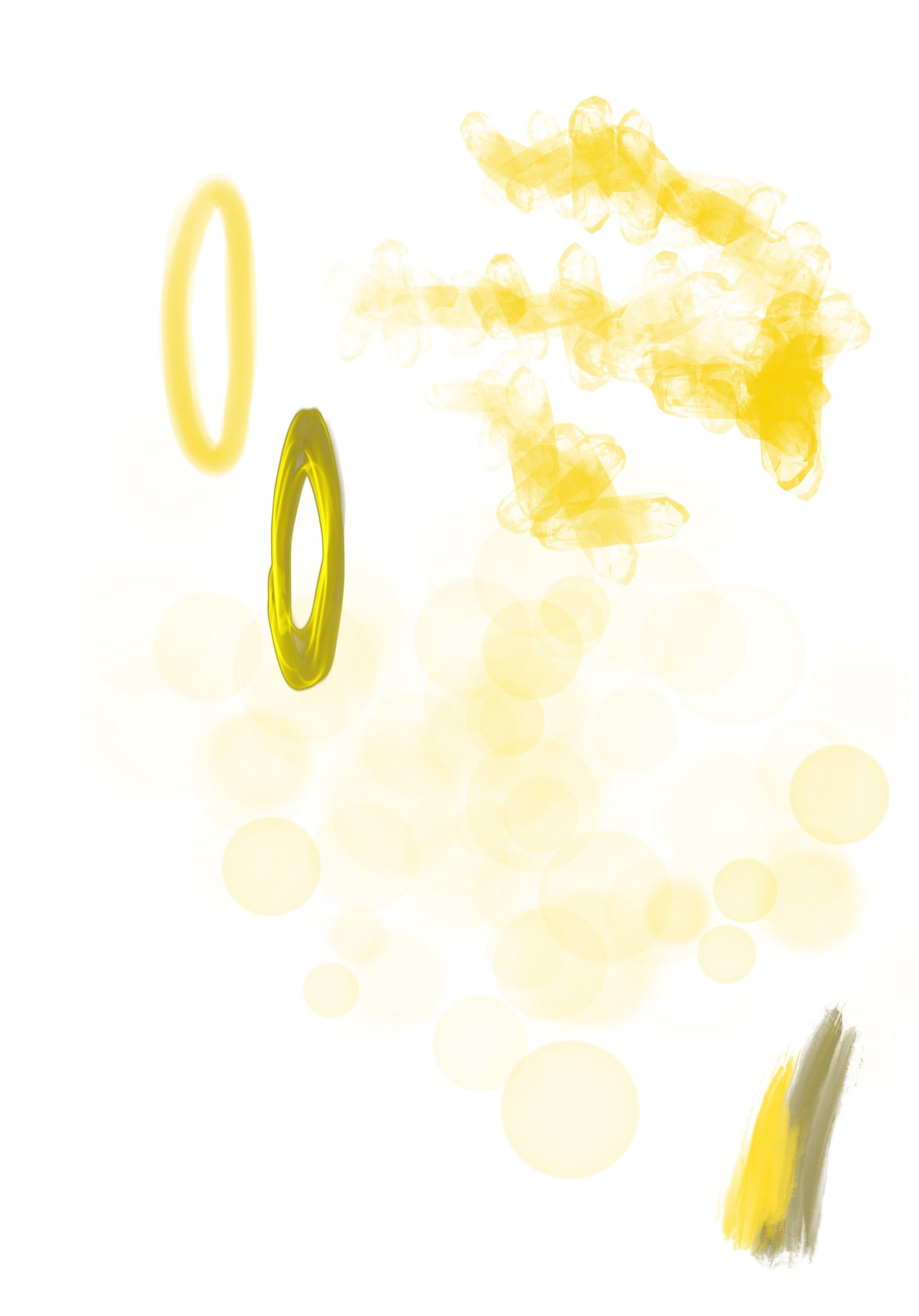
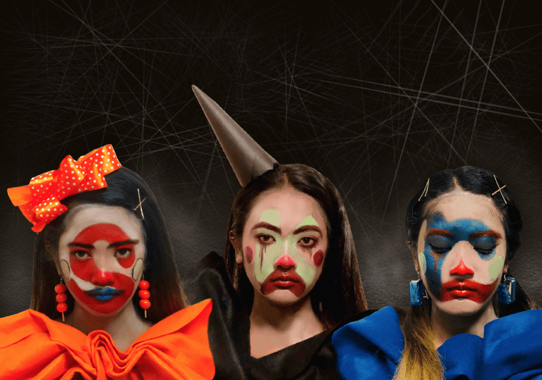
An initial idea of the typeface I’ve in mind: San Serif which incorporates the rounded feature of a balloon, rubbery and dirty textured to show the dual reality of a creepy clown with whimsical and vibrant colors.
FIRST CONSULTATION WITH MIMI:
Try to maintain the bouncy and rounded aspect of the font
SECOND DEVELOPMENT:
Outline
First draft
For this draft, my concept was a creepy clown typeface being deflated and the air leaving is the souls of crying kids. The elements used for this typeface is the rubbery and smooth texture of a balloon with deconstructed elements of a clown such as its iconic red nose and confetti in the background.
SECOND CONSULTATION WITH MIMI & PEERS:
Couldn’t tell it’s related to clowns
The spirit of the children looks like a sperm.
Try to focus on the elements of being a clown
THIRD DEVELOPMENT:
Rough sketch of a depressed clown
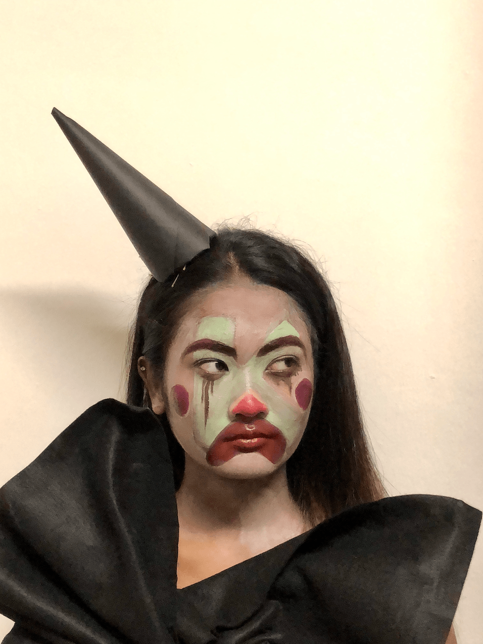
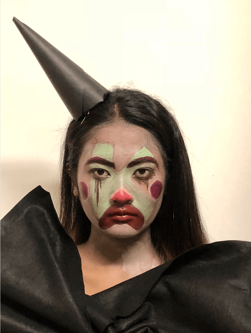
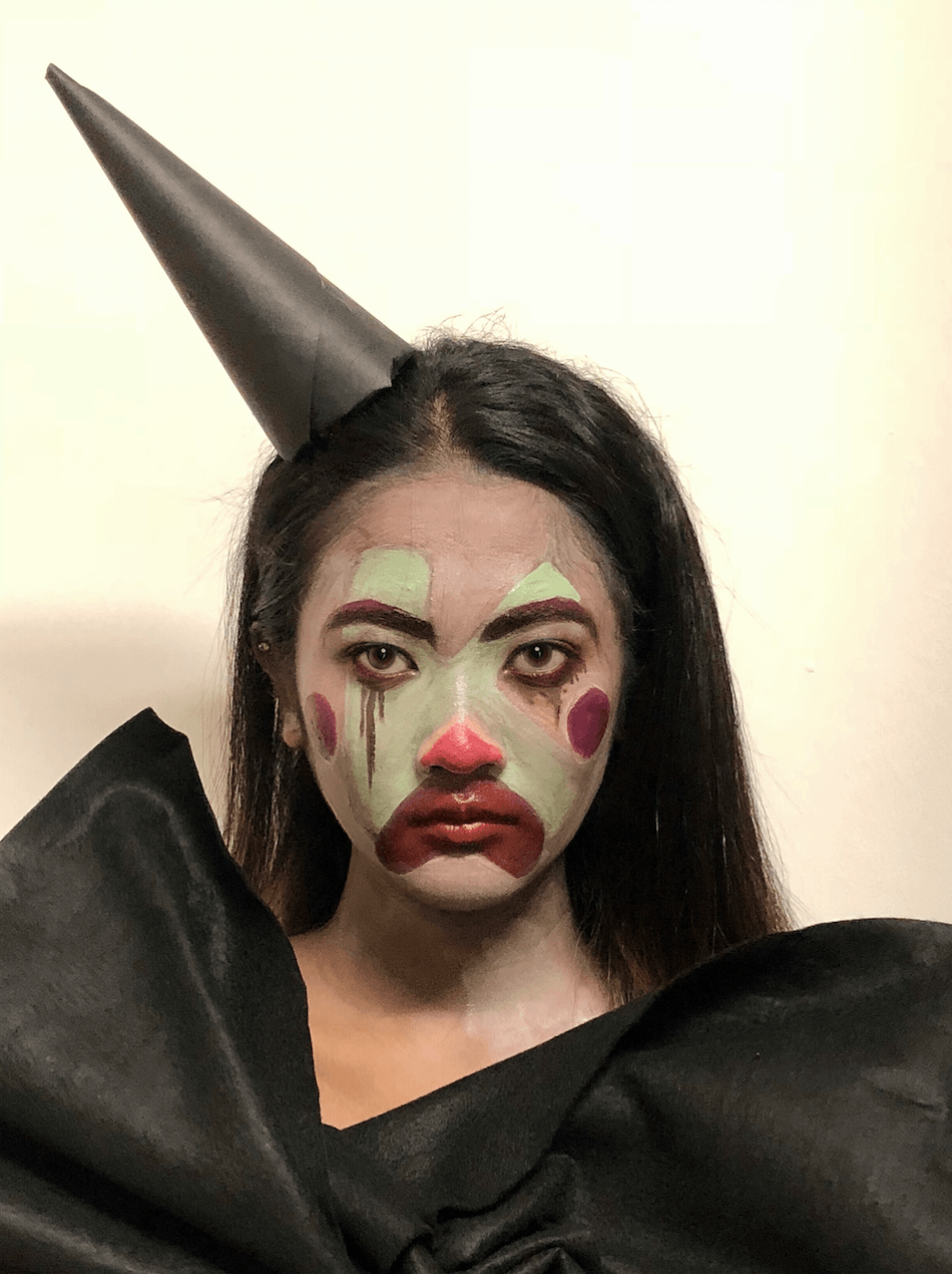
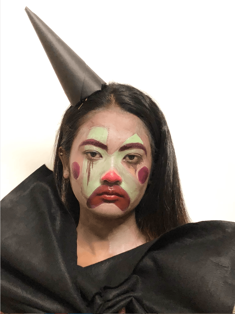
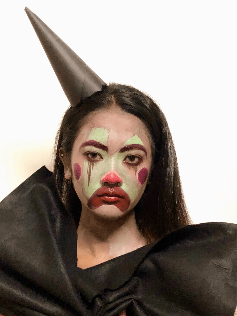
I’ve decided to change from a creepy clown to a depressed clown to emphasize the dual reality of being a clown whereby despite wearing vibrant and joyful colors, the clown is feeling otherwise emotionally (contrast). After consulting Mimi and my peers, I was having a mind block and decided to research and breakdown the elements of being a clown.
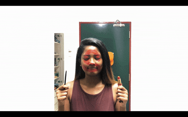
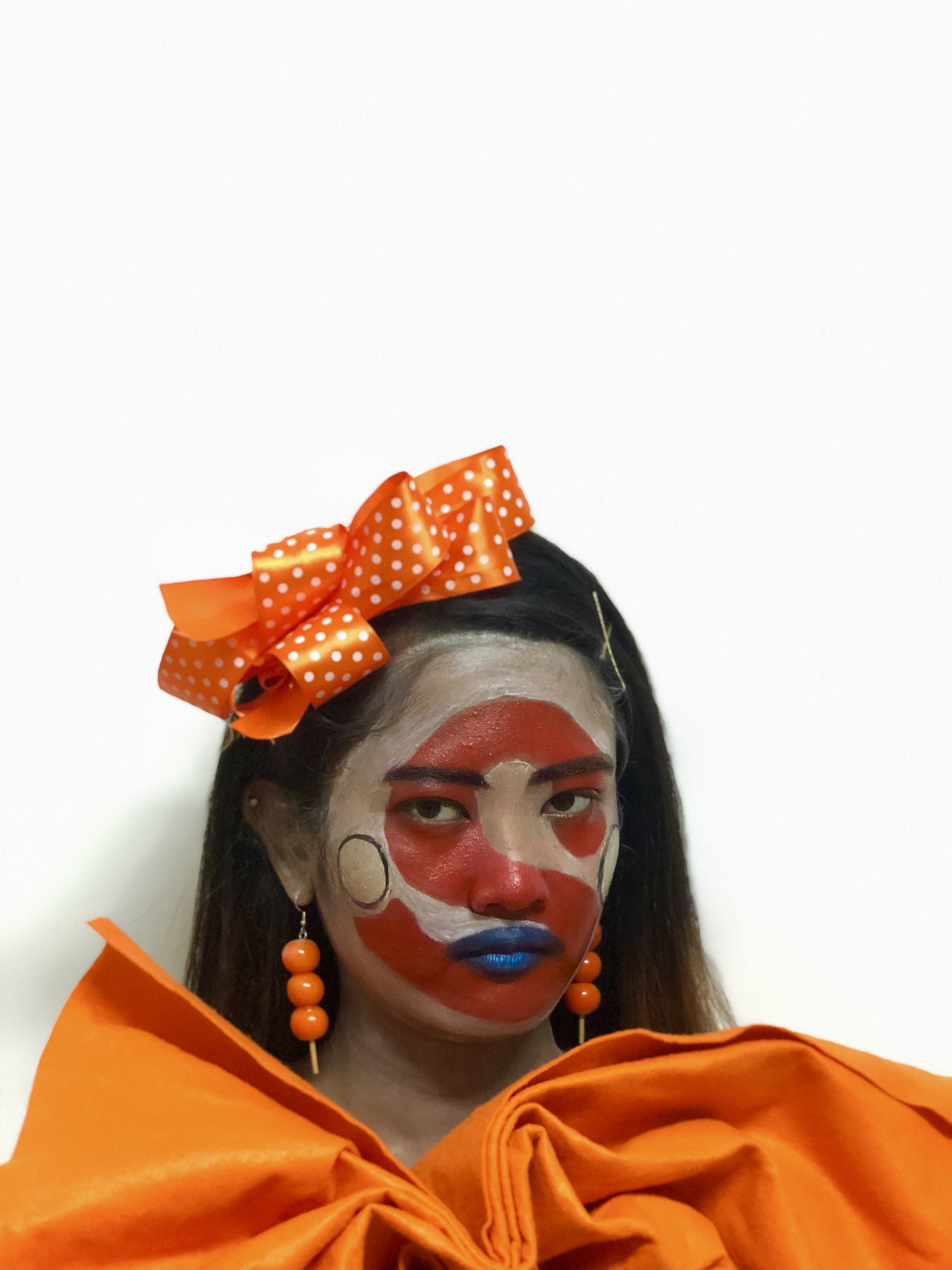
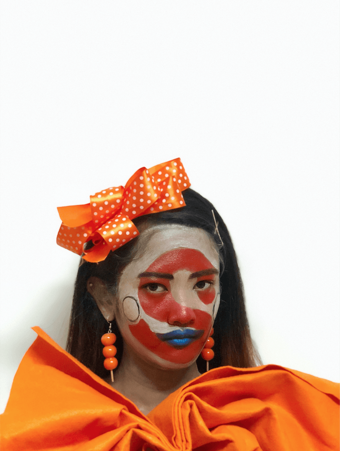
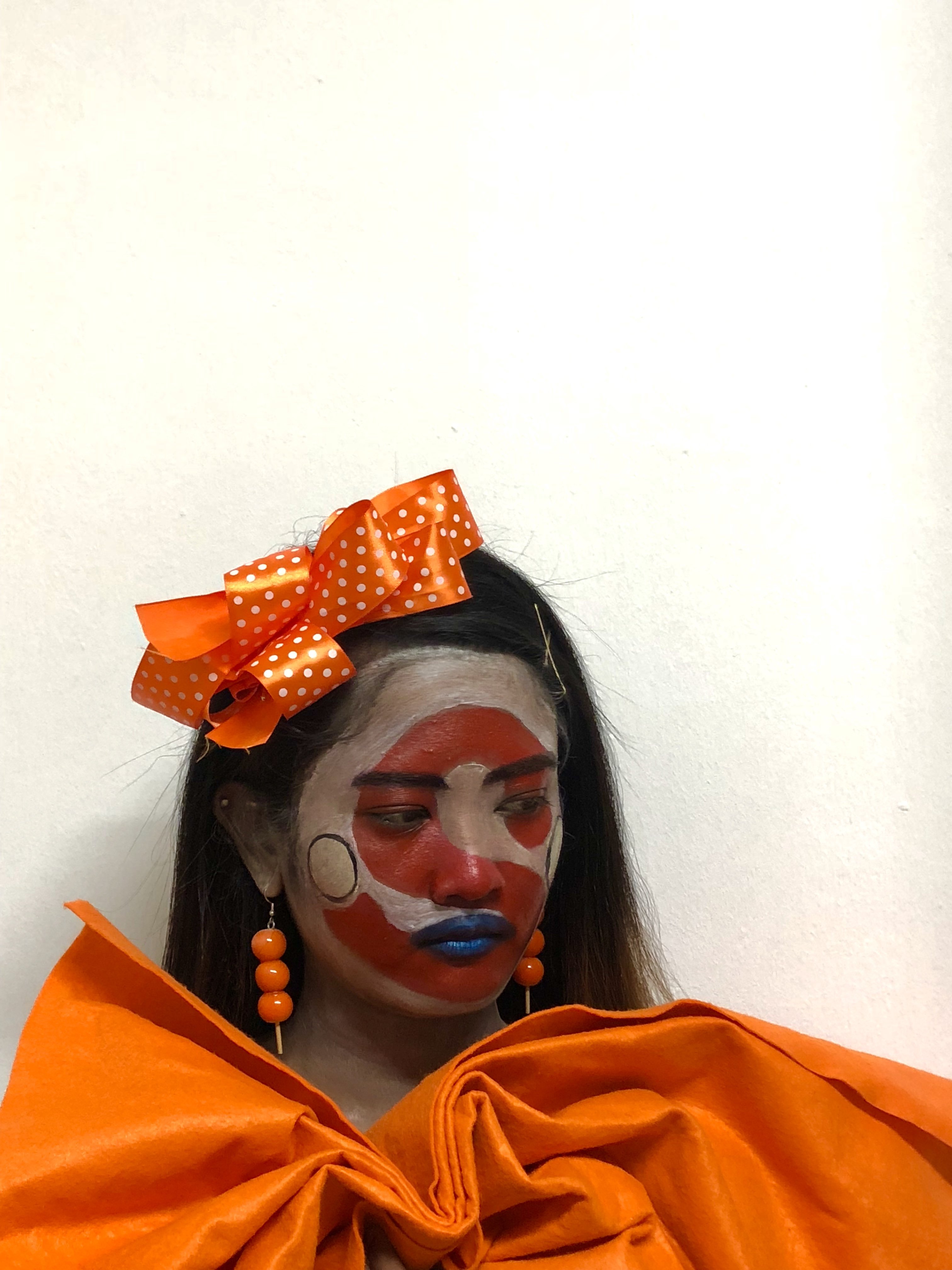
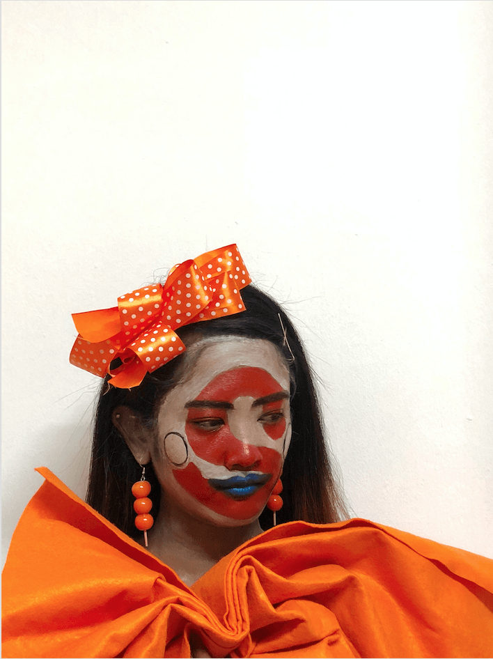
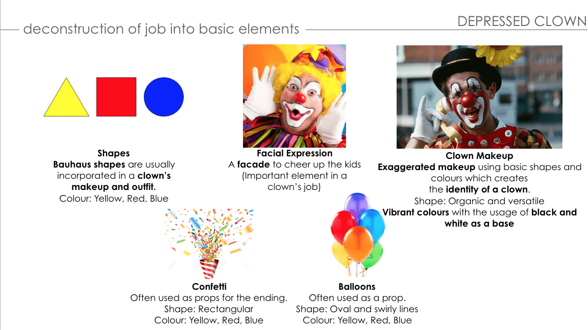
I realized what makes a clown are their makeup which consists of Bauhaus’ geometric shapes and colors, their facial expression and their custome which creates their identity. To regain my motivation, I’ve decided to do this typeface by putting on makeup which I enjoy and recreating the desired rounded and bouncy font with the elements of being a clown on my face as a canvas and editing the overall composition on Photoshop afterward.
APPLICATION OF MAKEUP:
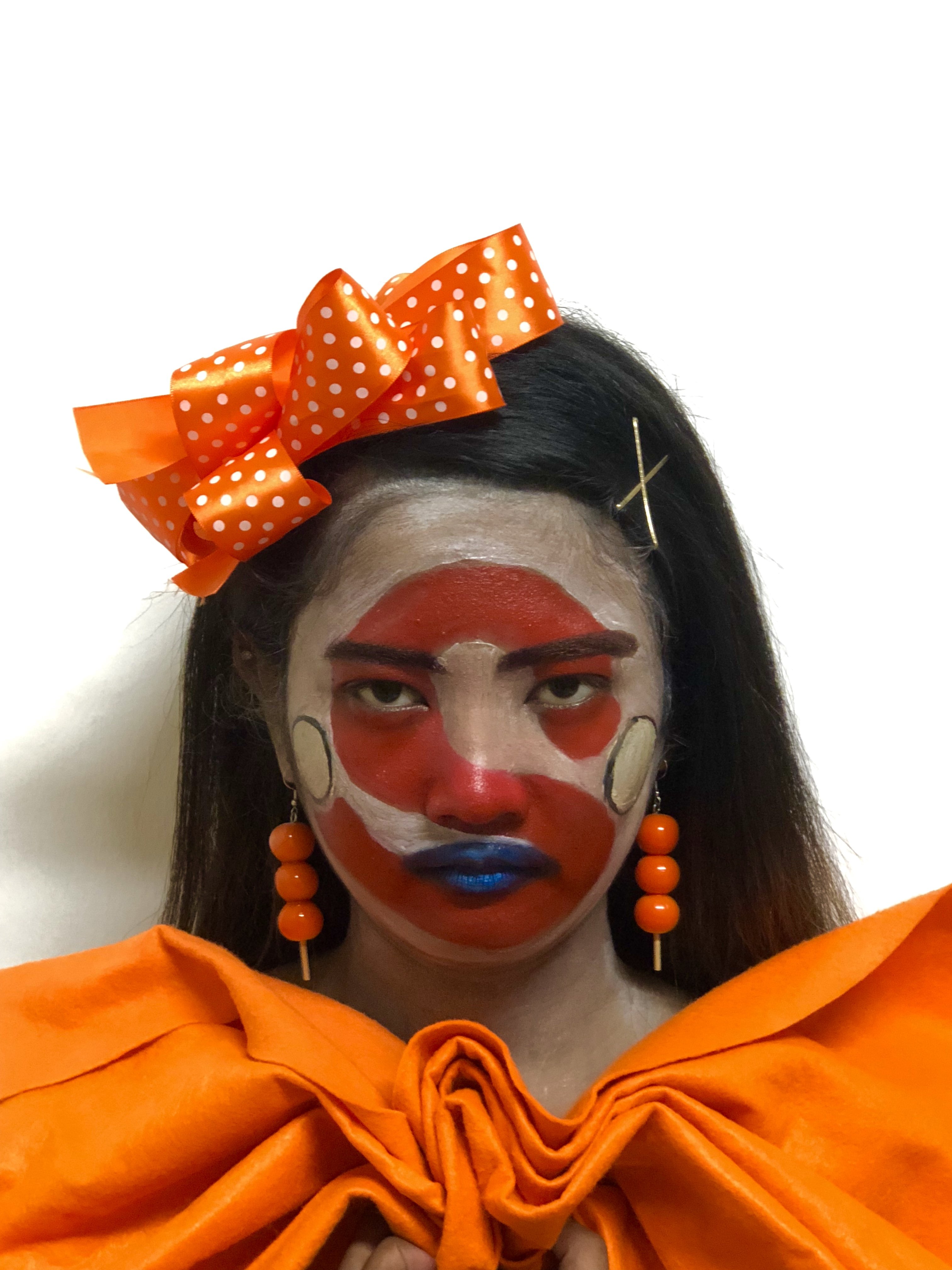
For the letter ‘S’ –
The typeface with the letter ‘S’ is rounded and red in color. Addition elements such as a blue lip and yellow circles are included because a clown’s makeup incorporates the Bauhaus’ geometric shapes and colors.
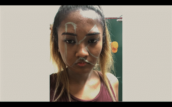
For the letter ‘K’ –
For the letter, ‘K’ has the same rounded typeface and it’s green in color. The red triangular shape and the magenta lips help emphasize the form of the letter. For the cheeks, there are two magenta circles and brown tears to evoke the feeling of depression and sadness.
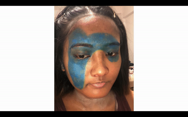
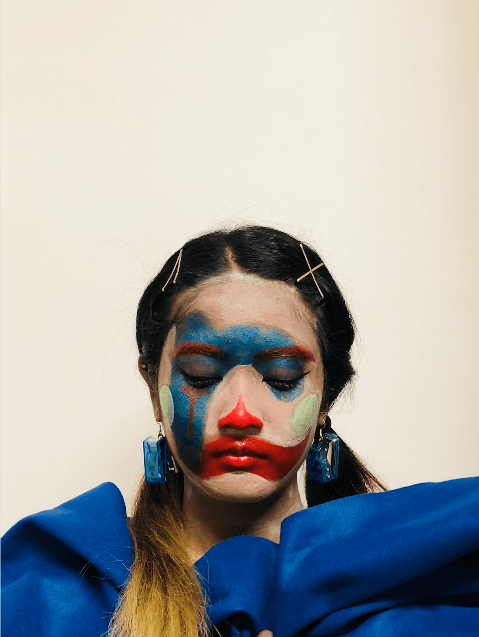
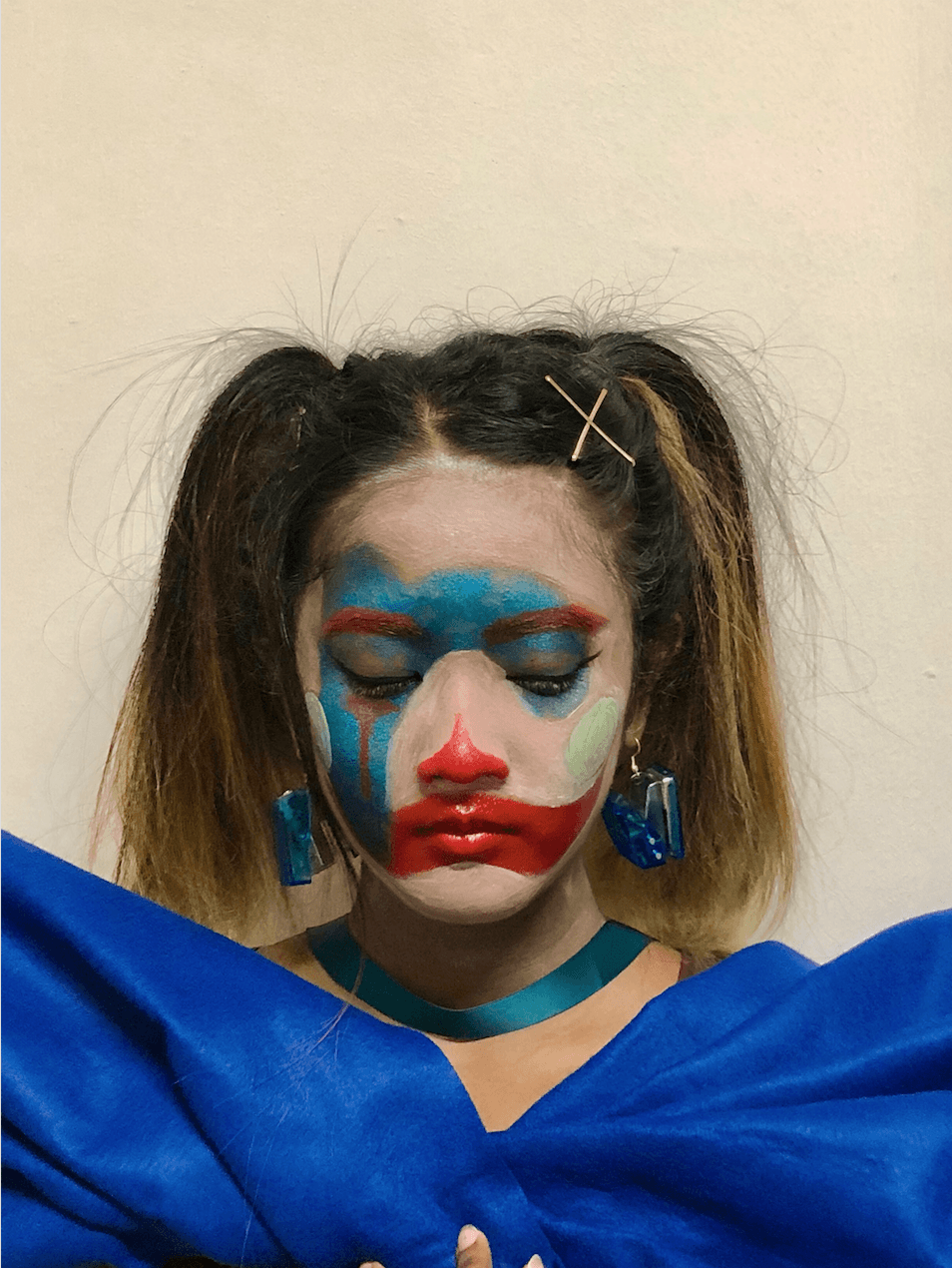
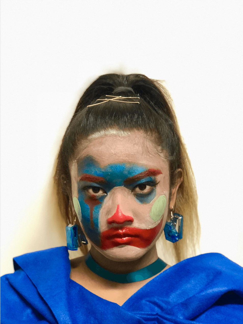
For the letter ‘R’ –
For the letter, ‘R’, the rounded typeface is blue in color. Colors such as blue, red(eyebrows, tears, and lips), and green (circles on the cheek) are used.
RAW IMAGES & EDITING OF PHOTOS:
Edited using Meitu and Photoshop to touch up (increase saturation and contrast).
Letter ‘S’ :
BEFORE
AFTER
BEFORE
AFTER
BEFORE
AFTER
Letter ‘K’ :
BEFORE
AFTER
BEFORE
AFTER
BEFORE
AFTER
Letter ‘R’ :
BEFORE
AFTER
BEFORE
AFTER
BEFORE
AFTER
FOURTH DEVELOPMENT:
An arrangement of the clowns and typeface:
Selecting the right clown with expressing the right emotions
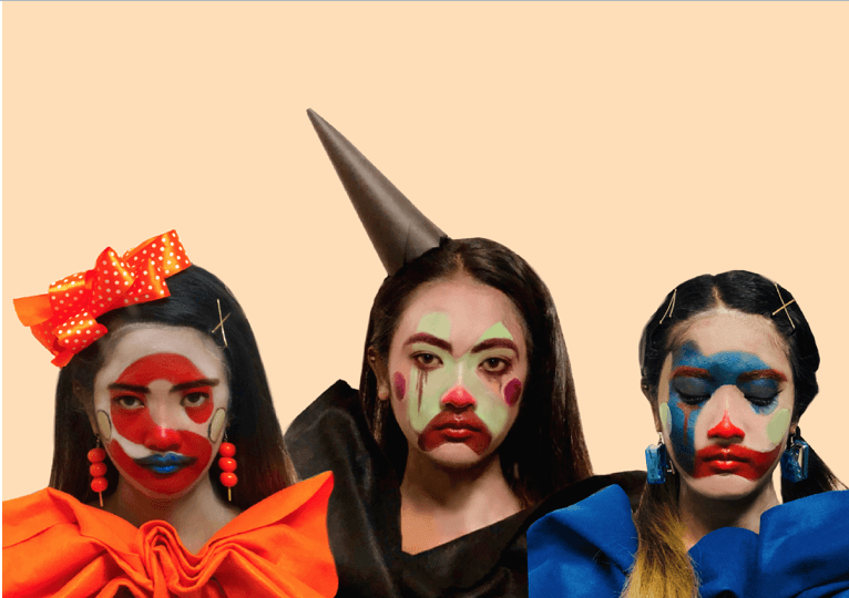
Against a beige background
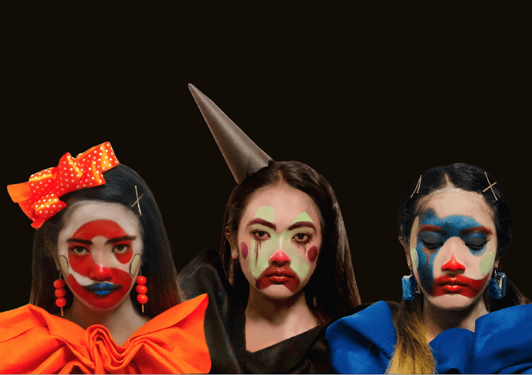
Against a black background -CHOSEN
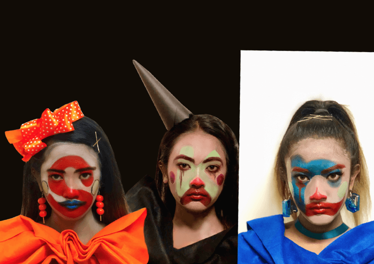
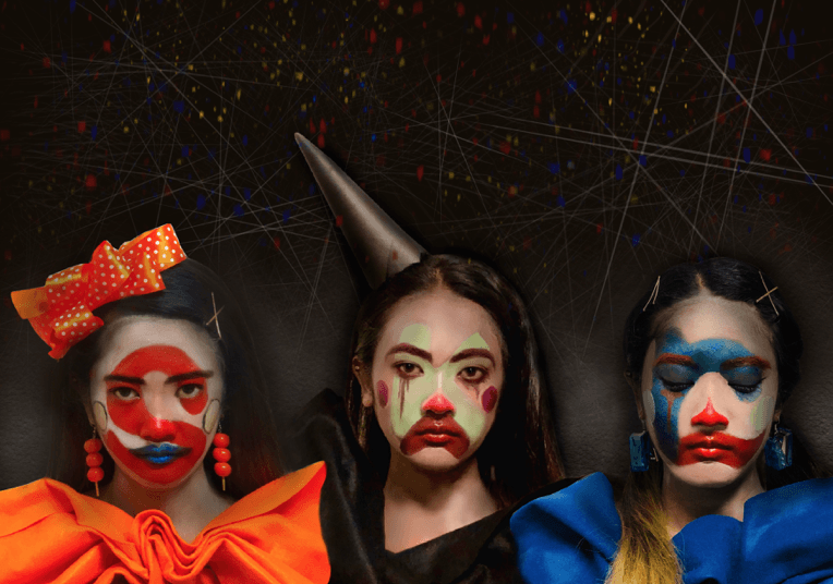
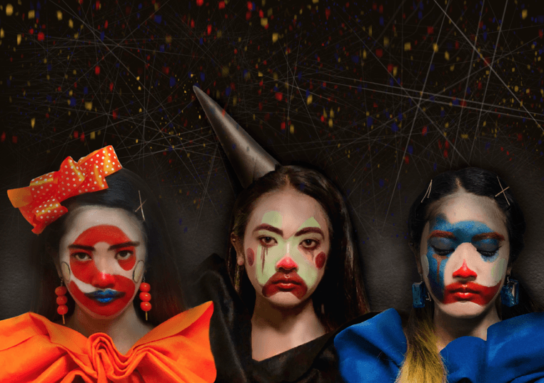
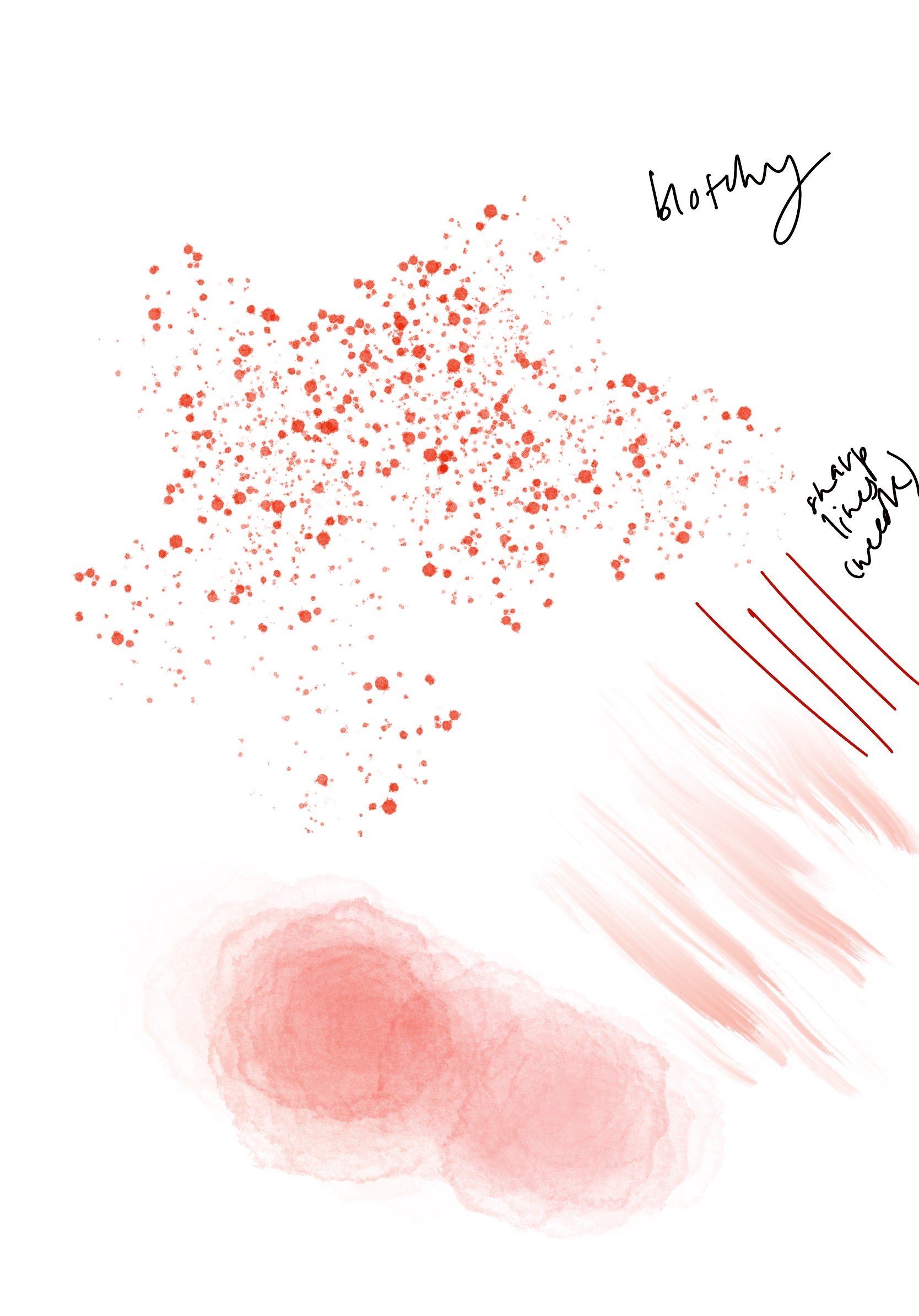
For this process, I was experimenting with different typeface clowns which is suitable to evoke the concept of the dual reality of a depressed clown. I’ve decided to choose a black background in contrast with the vibrant and lively typeface clowns with depressing facial expression.
Addition of texture and lines for the background:
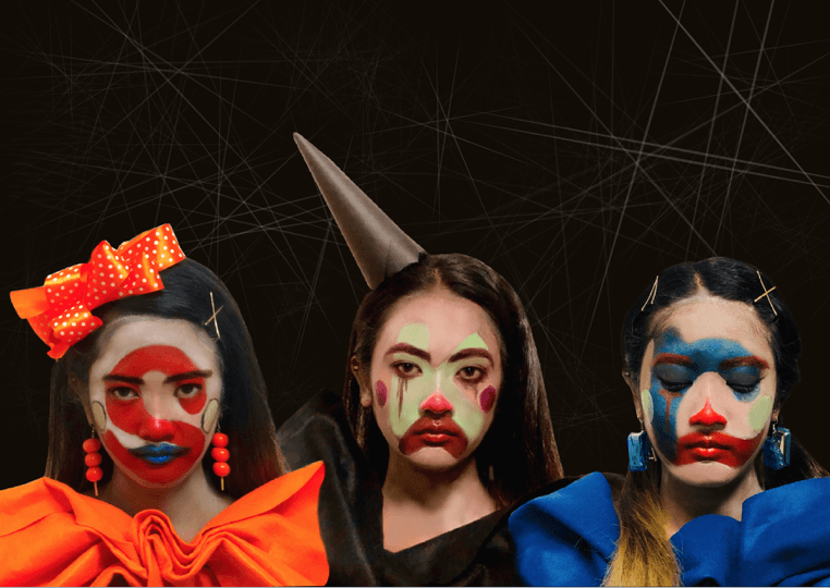
Thin lines in various sizes
Textured white pattern behind the clowns
For the background, I added a variety of thin lines because it suggests pain, agony, and frailty as it appears to break easily. In addition, a white textured pattern behind the typeface clowns so it wouldn’t blend into the background.
Addition of shadows around the clown to focus on the typeface:
Shadows around the typeface clowns
To focus on the letters of the typeface, I’ve added a drop shadow around it to create a similar effect of lighting on an art piece in a museum.
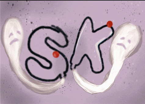
Addition of confetti:
1
2 – CHOSEN
The last development stage in this design process, I’ve added red, yellow and blue confetti which is one of the props to end off a clown’s performance. Hence, I’m using this to harmonize the typeface clown (foreground) together with the black textured background.
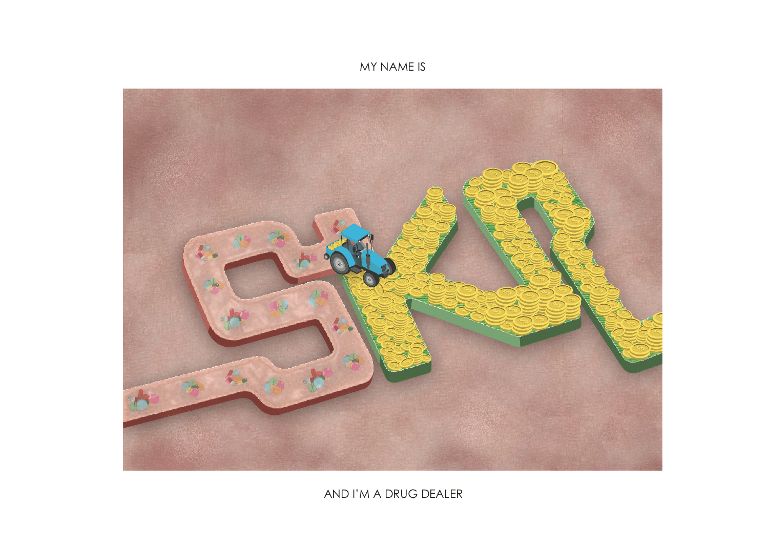
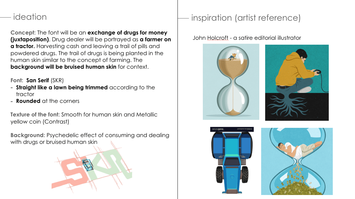
PROCESS – DRUG DEALER
ANIMATED PROGRESS:
FIRST DEVELOPMENT:
Double Vision Effect
Psychedelic Effect
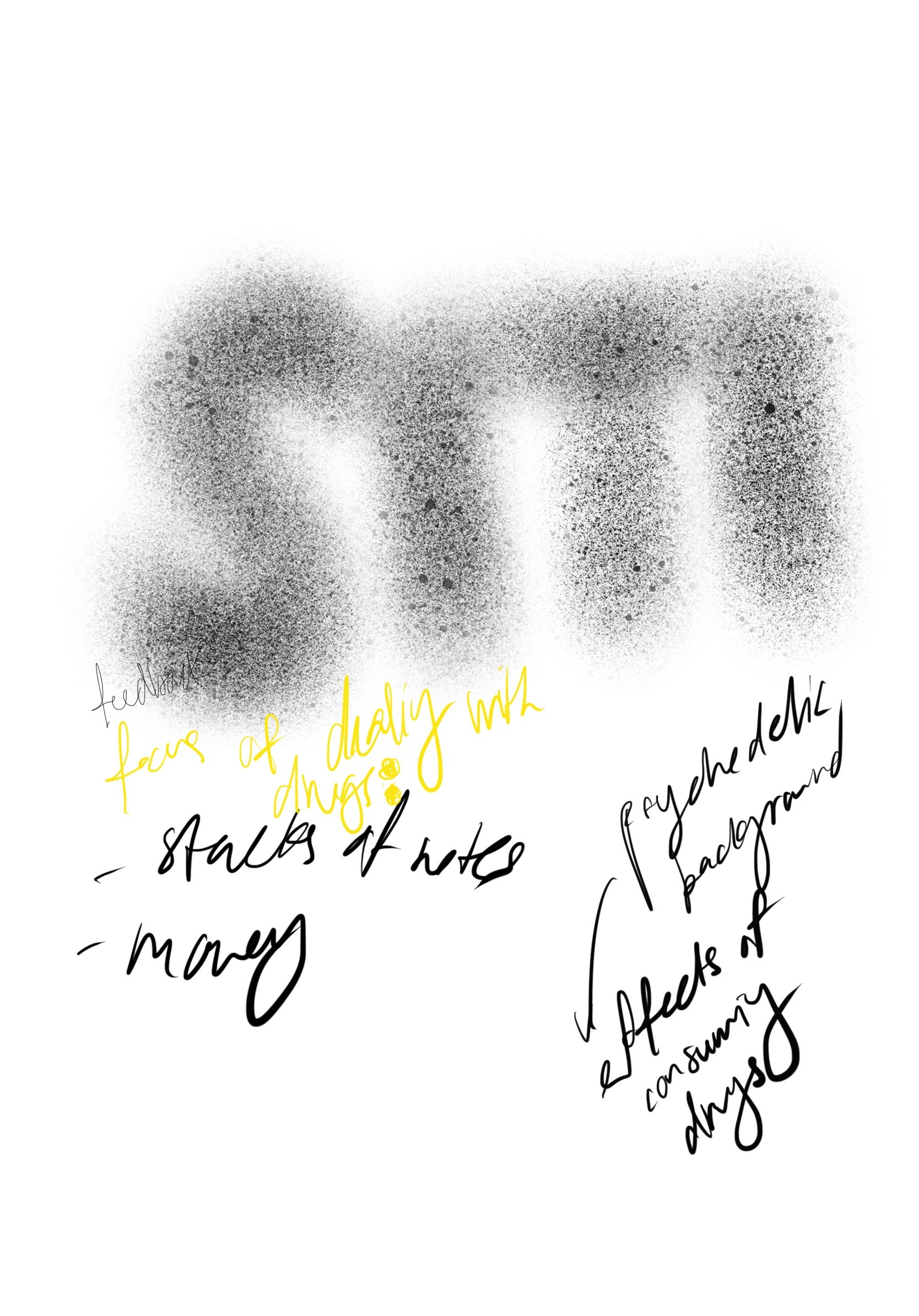
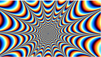
A rough initial idea of the typeface I’ve in mind: San Serif (Rounded & Blocky style like pills) with a powdered textured font. The background will be the effect of consuming drugs which will be a double vision or psychedelic effect.
FIRST CONSULTATION WITH MIMI:
focus on dealing with drugs
stacks of cash or coins
SECOND DEVELOPMENT:
First Draft (With Psychedelic Background)
Second Draft (With textured background)
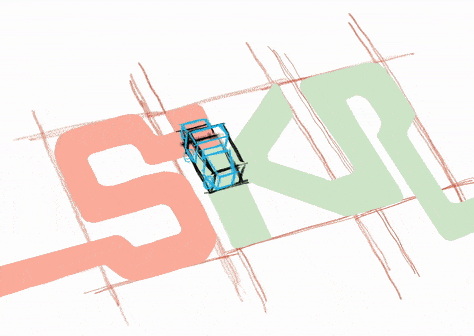
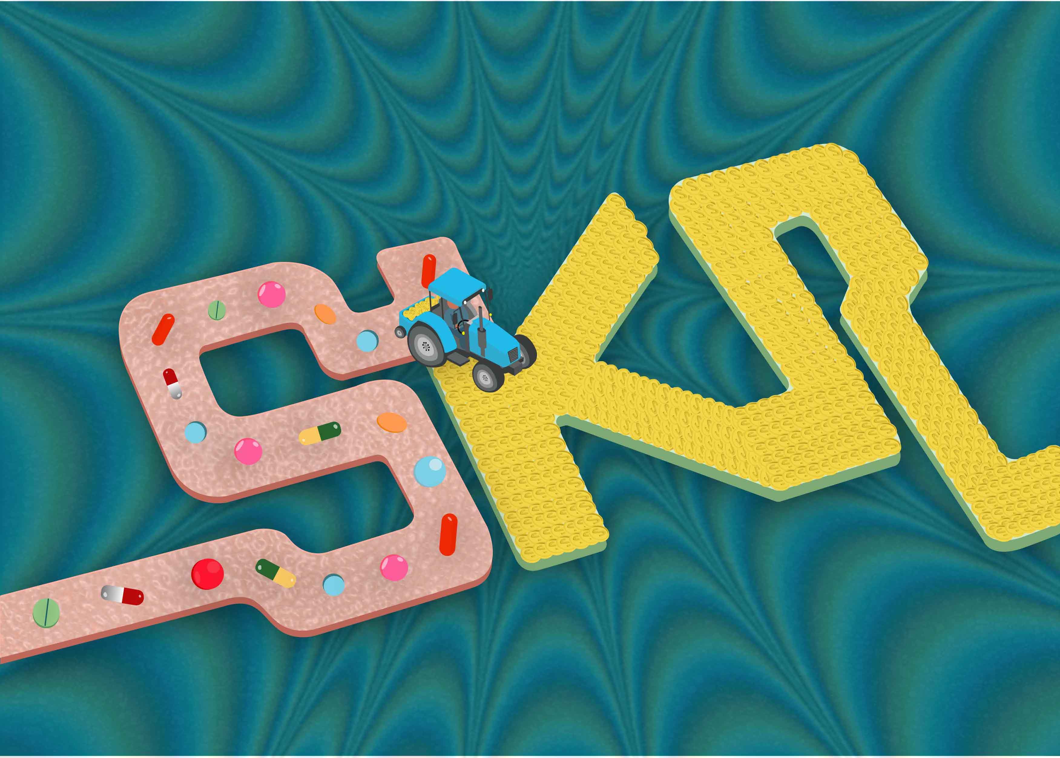
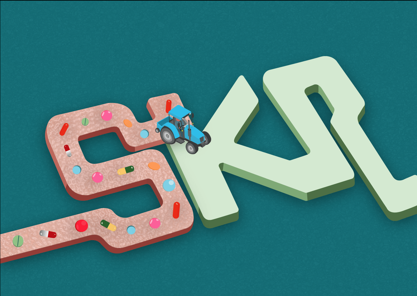
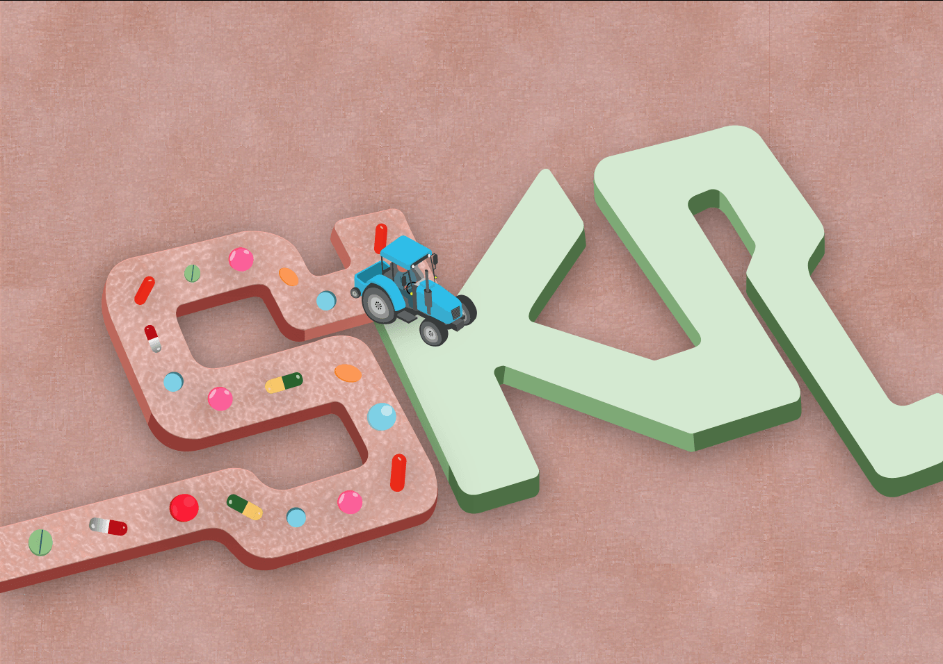
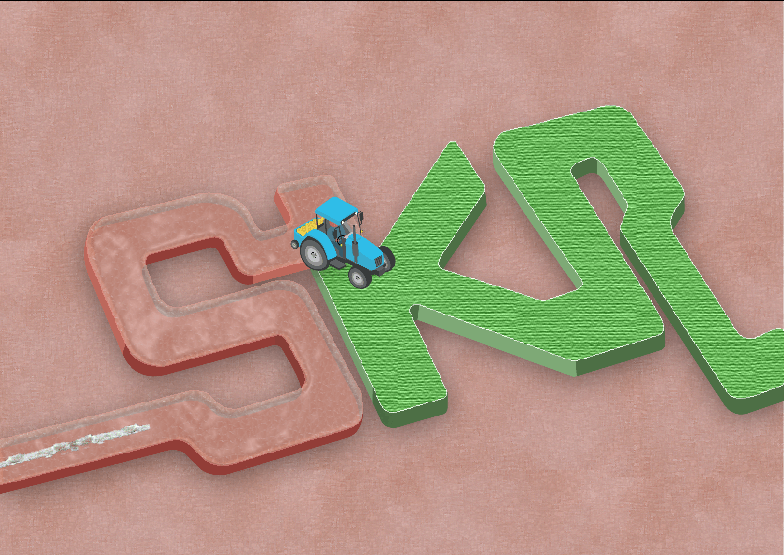
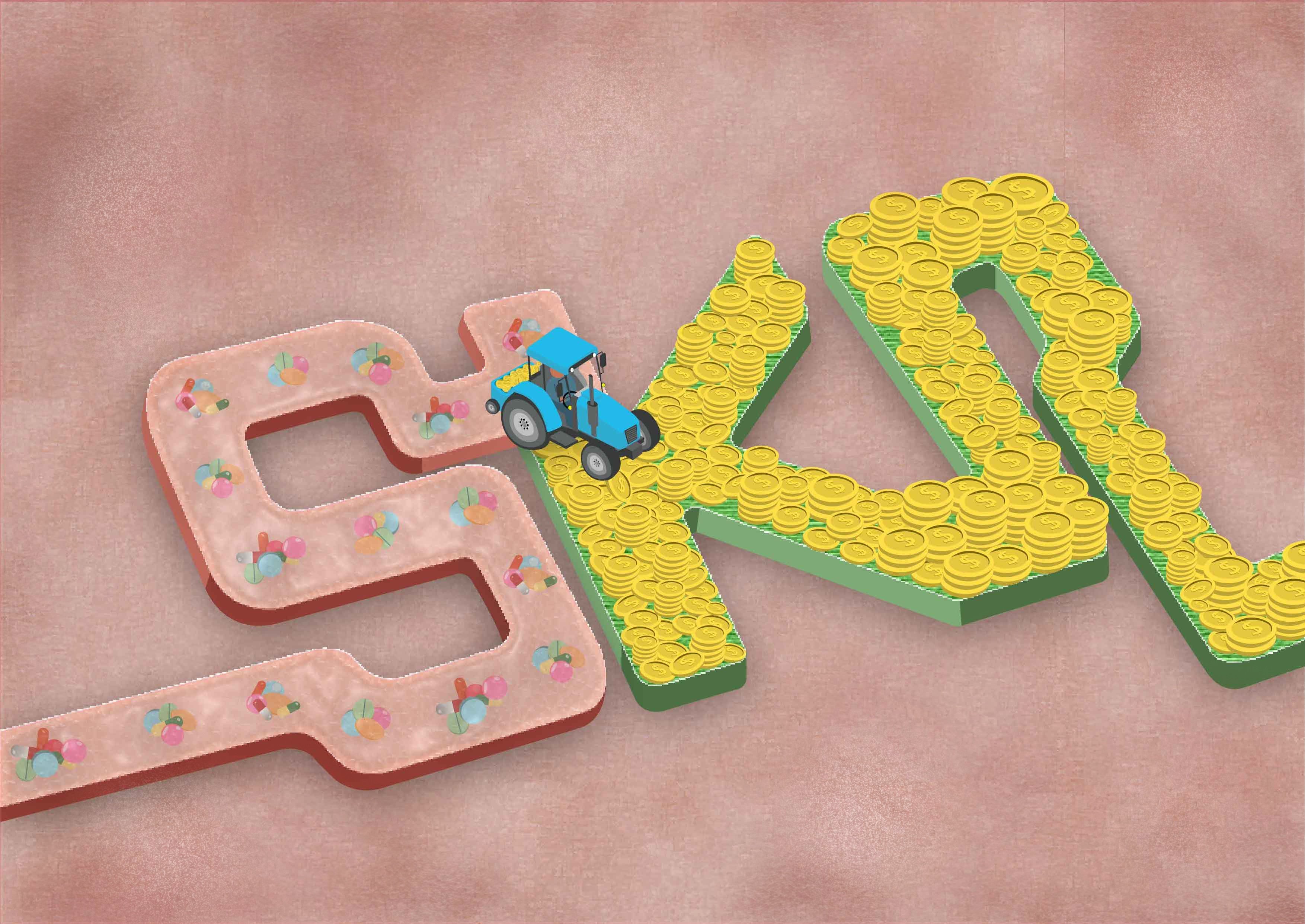
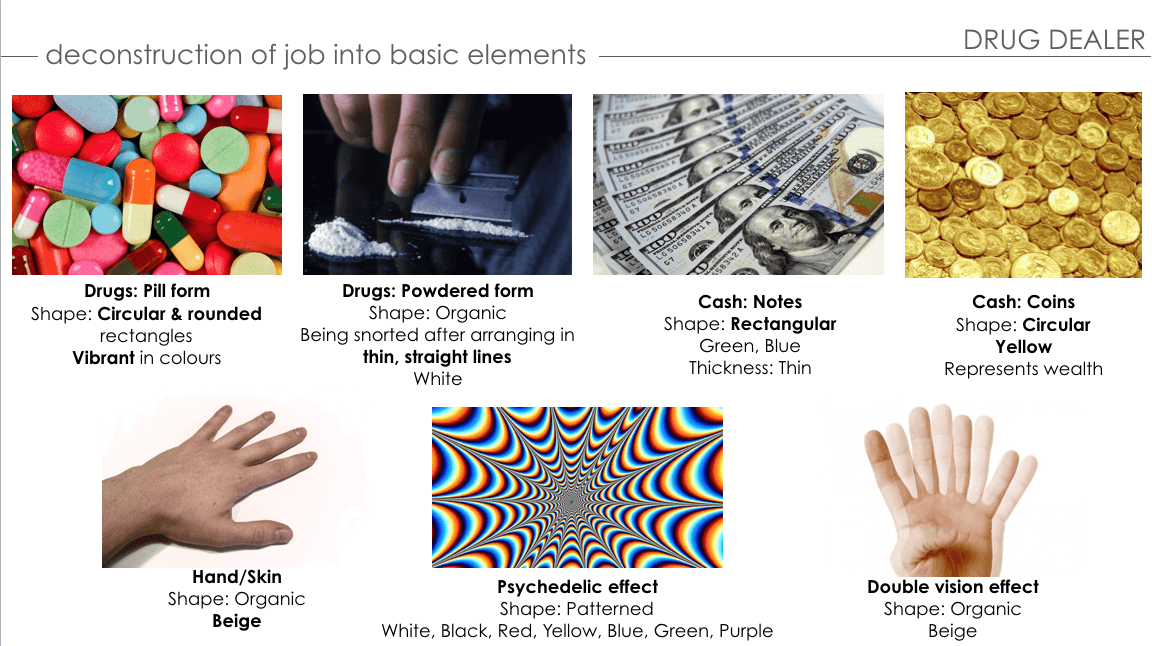
For my first draft, I wanted my font to be made up of a juxtaposition of the exchange of drugs and money. The theme is farming; planting of drugs onto the human skin in exchange for money as a drug lord. Overall vibe will be the contrast of job, and colours (Base colour of font; Skin – Beige vs Money – Light green) and Objects (Tractor – Blue vs. Coin – Yellow). In addition, I applied the ‘Rhythm’ and ‘Movement’ to emphasize the flow on my typeface.
SECOND CONSULTATION WITH MIMI & PEERS:
Increase the size of the coins to make it more obvious
Increase the thickness of the form of the font to make it stand out
Change the background to focus on the exchange of drugs and money between humans
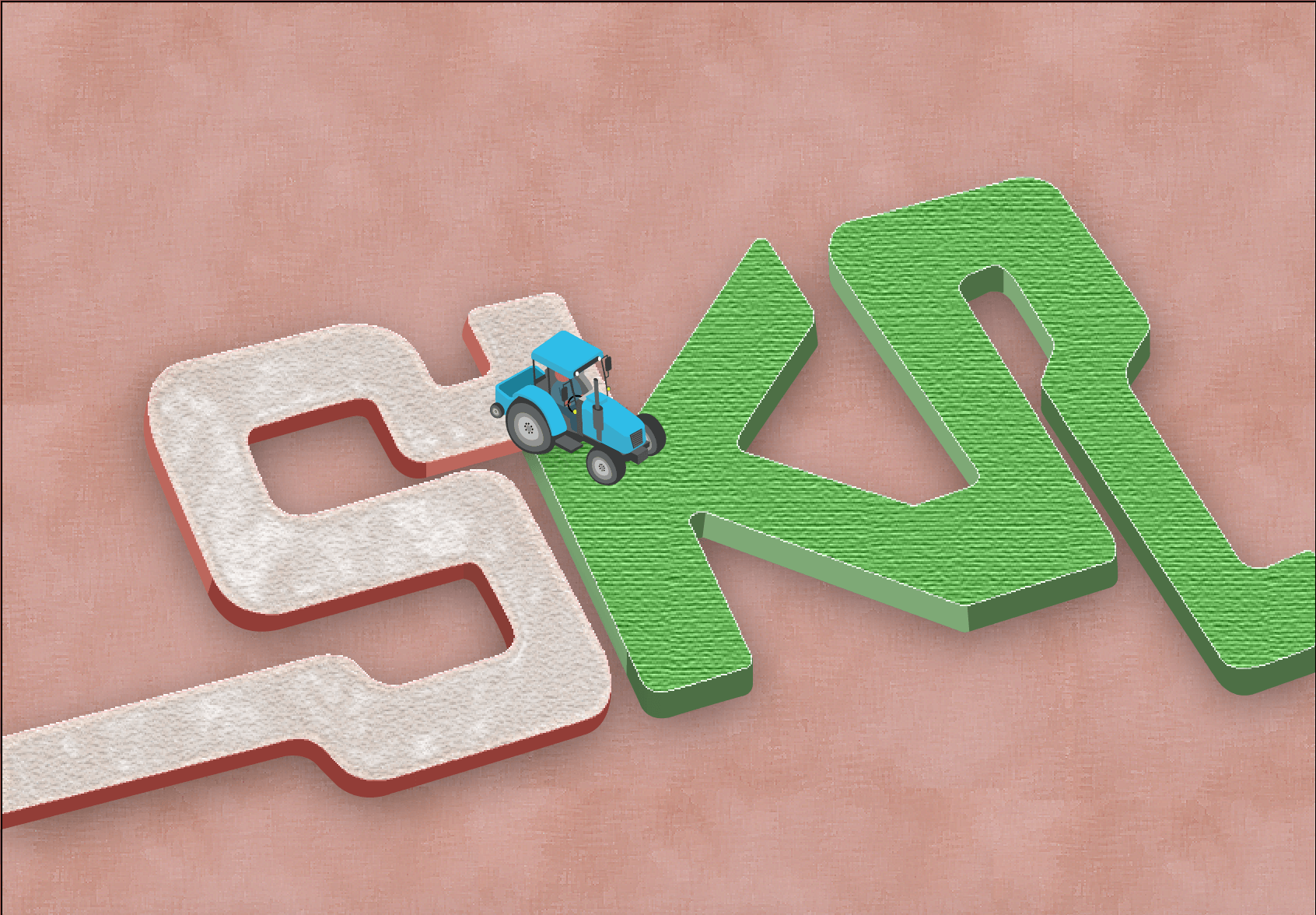
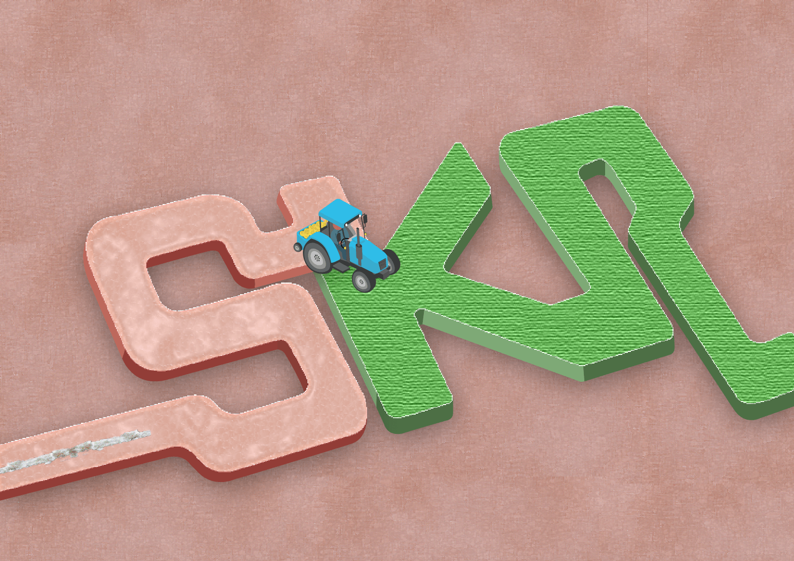
THIRD DEVELOPMENT:
Increased the thickness
Changed the background to human skin
Human Skin
Textured road
For the development of this draft, I increased the thickness of the form of the changed the background to human skin. To manipulate and add texture to the background of the typeface, I musk the images of the human skin and textured road above onto a beige solid background. Using plastic wrap and paint daubs effect on Illustrator.
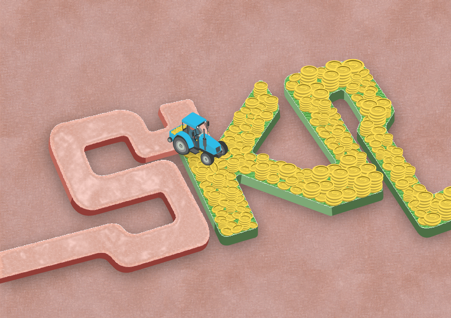
1
2
3
4
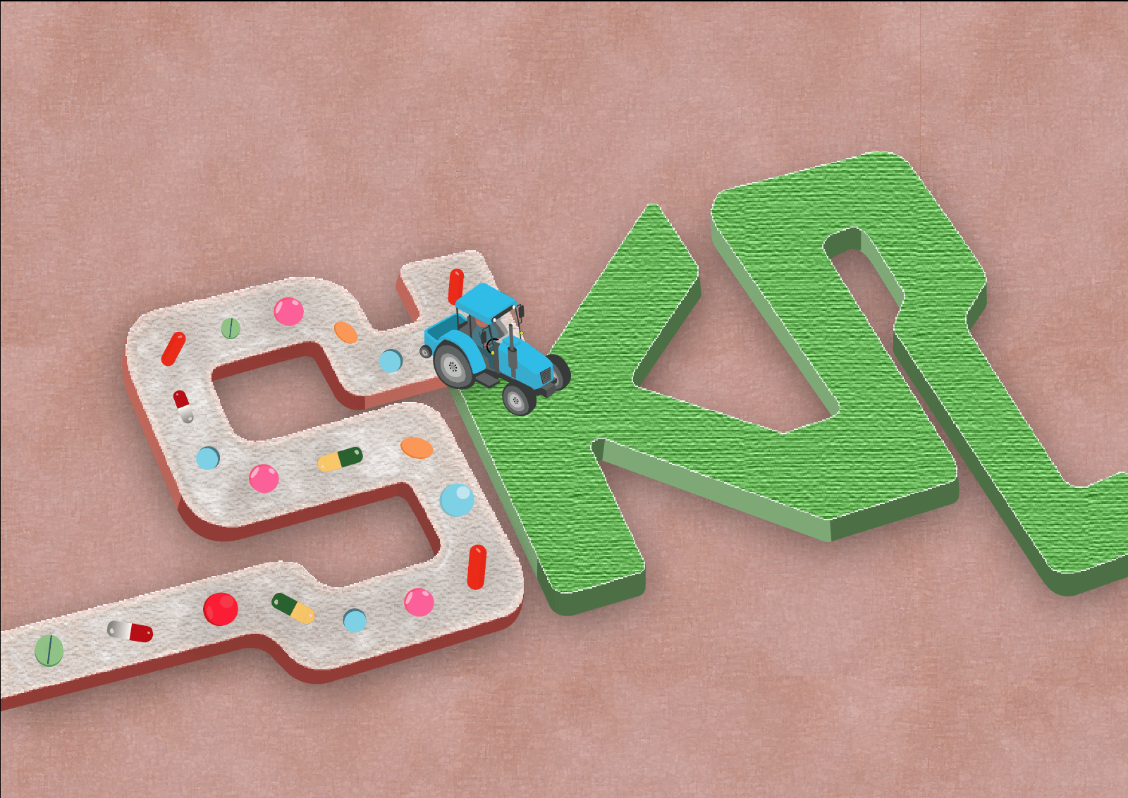
Experimenting with the textures of the letter ‘S’ – Human and ‘K’ and ‘R’ – Cash with the transparency and colors to see which is suitable for my concept. In addition, I was figuring how to arrange the drugs in a pill or powdered form.
Increased the size of the coins and arranged it in a messy way instead of a neat and clean style as a semiotic that this drug dealer job is not a ‘clean’ and respectable job.
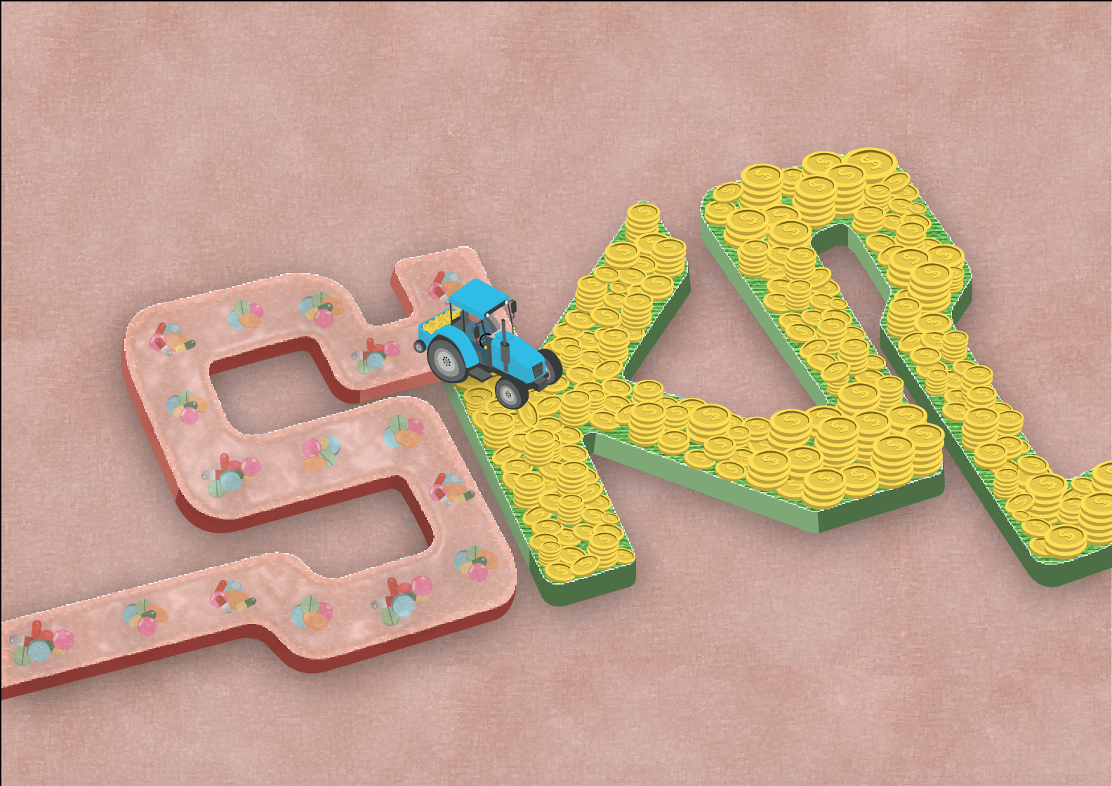
Drug pills on the skin
Drug pills implanted in the skin
For this development, I’ve decided to use a variety of drugs pilled up together and being left in a trail after the tractor lawned on the human skin. I had a dilemma whether to place the drugs on the skin or implanted in the skin. My final decision is implanting the pills in the human skin and you can see the layer of skin above which emphasizes on consuming the drugs.
Lastly, for the background, I’ve added the bruising of injecting the drugs into our body to create depth for the overall look of the typographic portrait. Personally, I love the concept of the font replicating the grass being lawned as the movement of the font and the juxtaposition of the colors and idea for the exchange of drugs and money as a drug dealer.
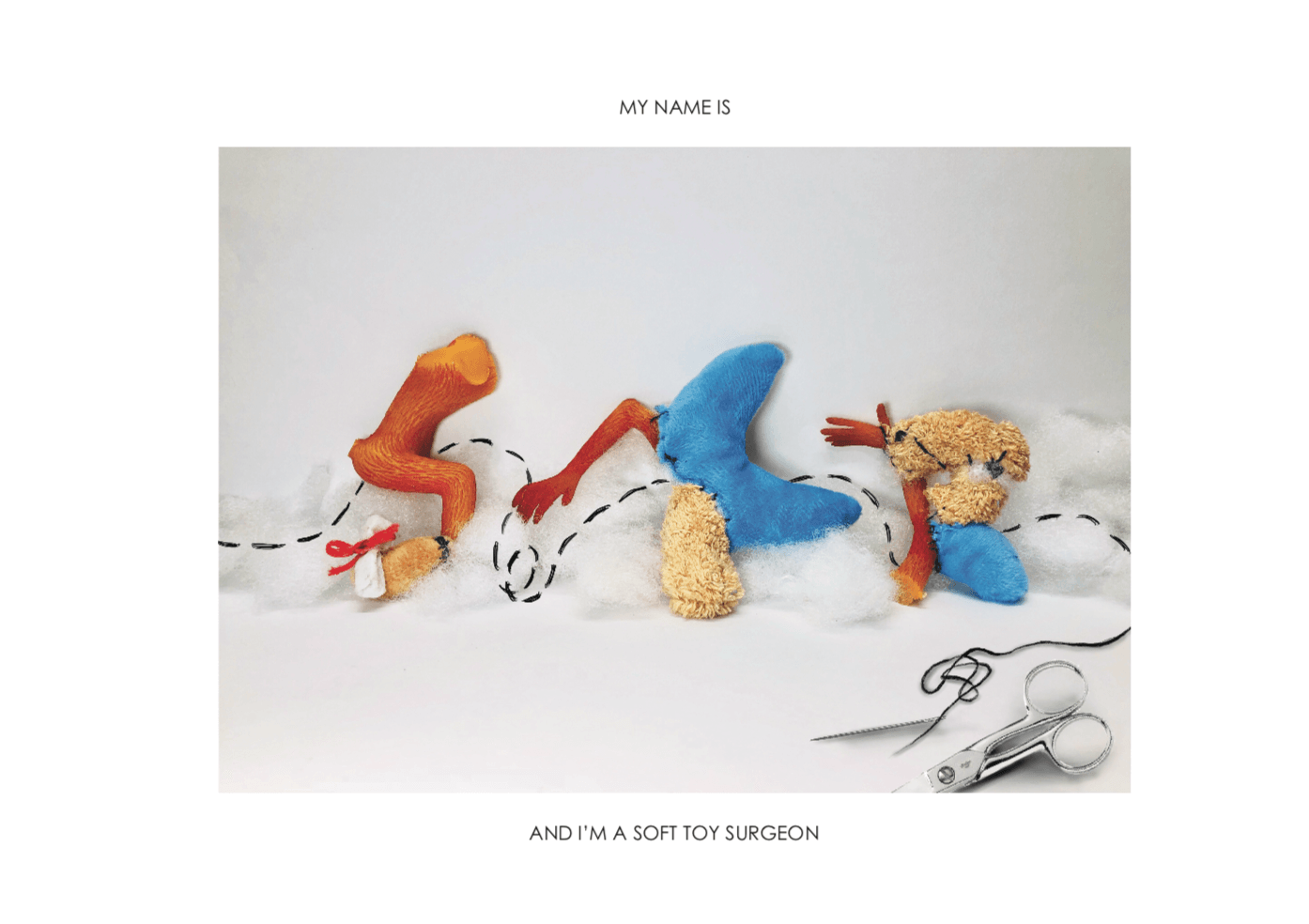
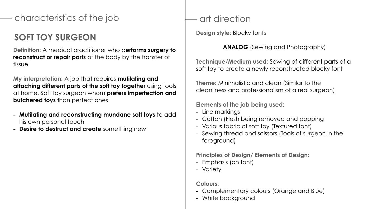
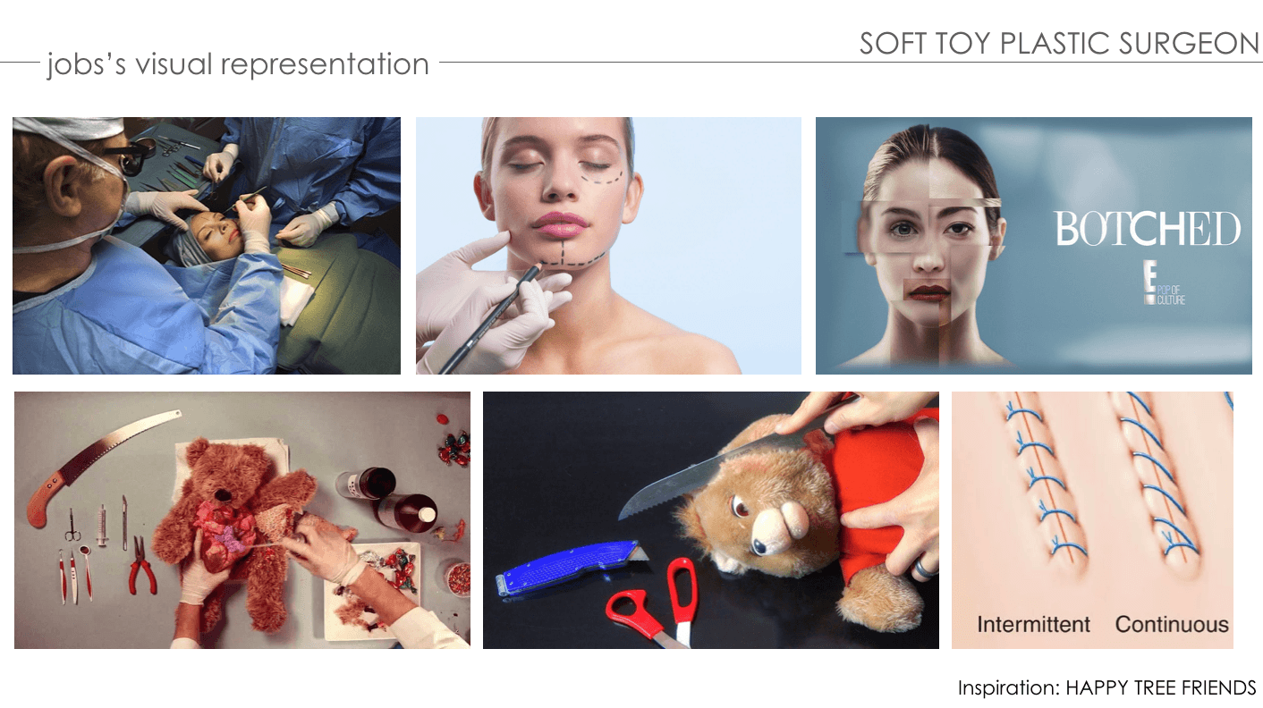
PROCESS – SOFT TOY SURGEON
ANIMATED PROGRESS:
FIRST DEVELOPMENT:
Before changing job to soft toy surgeon
First draft – Mutilating soft toys
Second draft – Hanging reconstructed work on a noose
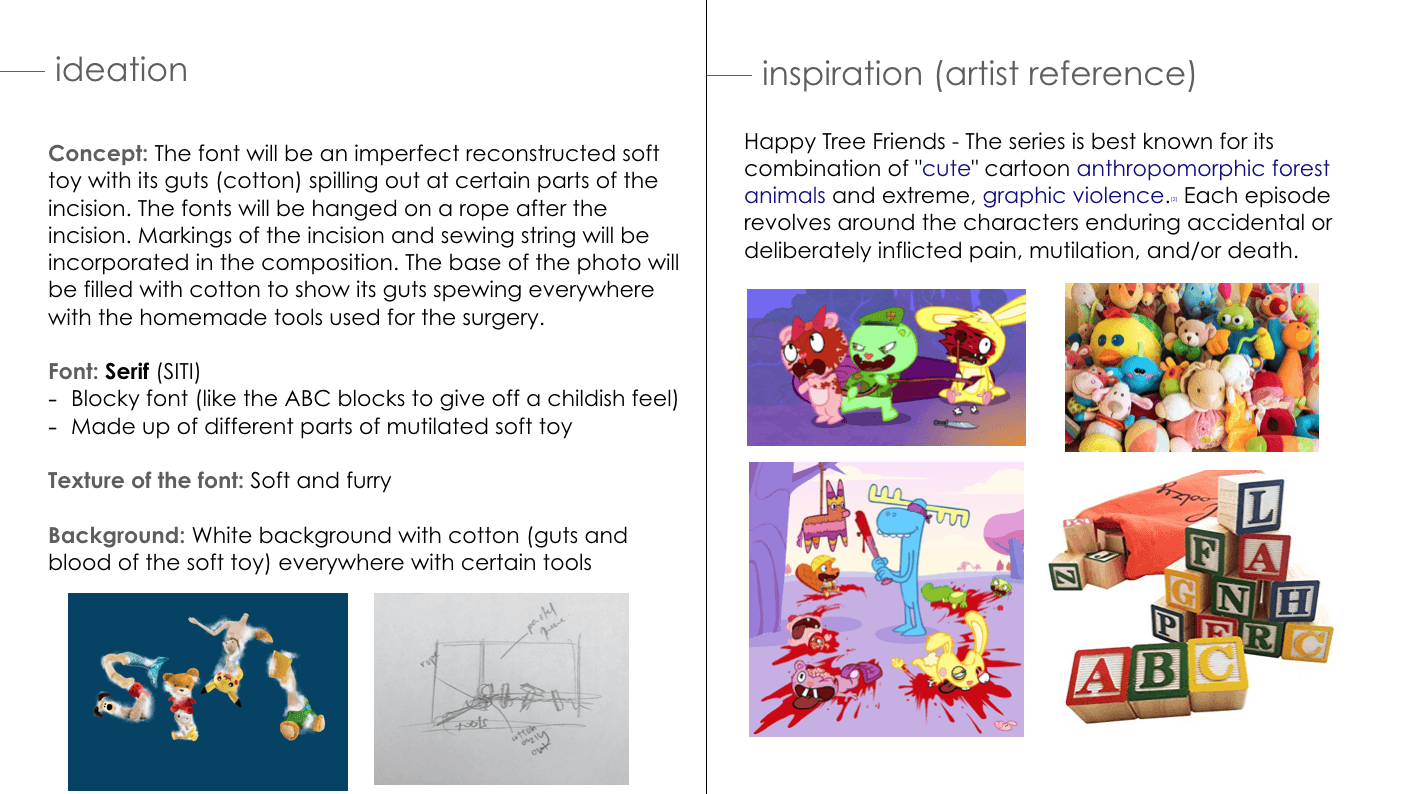
Initially, my job was a serial killer and I’ve decided to change to a soft toy serial killer. I wanted my typeface to give off a childish and innocent vibe with the psychotic characteristics of being a serial killer.
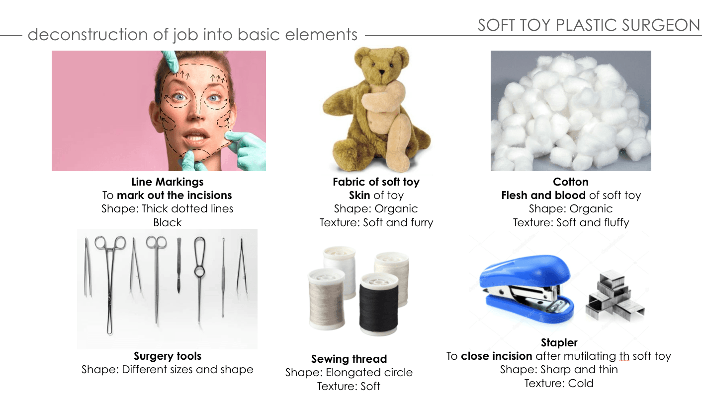
The concept behind this typeface is using a variety of soft toy fabric as the skin and its guts (cotton) are in the base of the composition. The font of my typeface is serif, similar to the children’s alphabet block toys. I have intentions of using certain parts of the fabric as the decorative part of the font. In addition, I wanted each letter to be hanging on a noose as if it’s the victim of the serial killer. Tools and equipment used are attached to the typeface for context.
FIRST CONSULTATION WITH MIMI & PEERS:
Try using the analog method instead of digital
Change job name from Soft Toy Serial Killer to Soft Toy Surgeon.
SECOND DEVELOPMENT:
NEW COMPOSITION
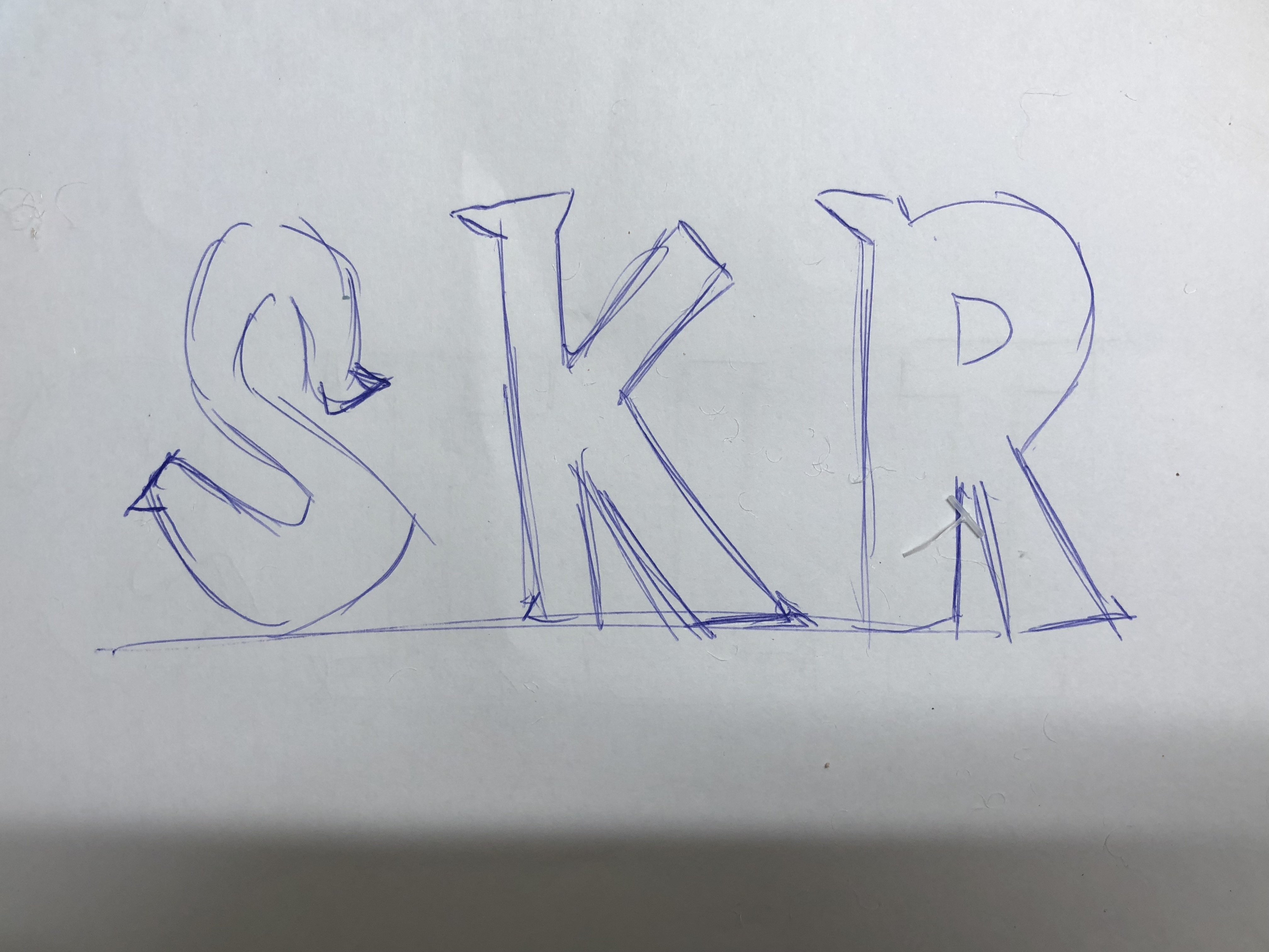
TYPEFACE FONT
I’ve decided to change the layout of the concept I have in mind. Removing the noose and focusing on being a soft toy surgeon. The composition will be a reconstructed soft toy typeface surrounded by cotton (its guts) against a white backdrop to show cleanliness and professionalism of a surgeon’s workplace with tools used in the foreground. The technique and method I’ll be using to create this typeface will be sewing and digital enhancement.
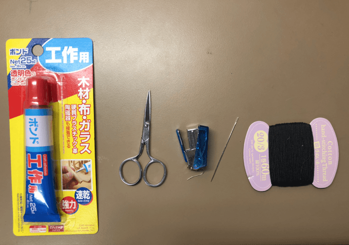
EQUIPMENT/TOOLS USED FOR SEWING:
Glue, scissors, stapler, needle & sewing thread
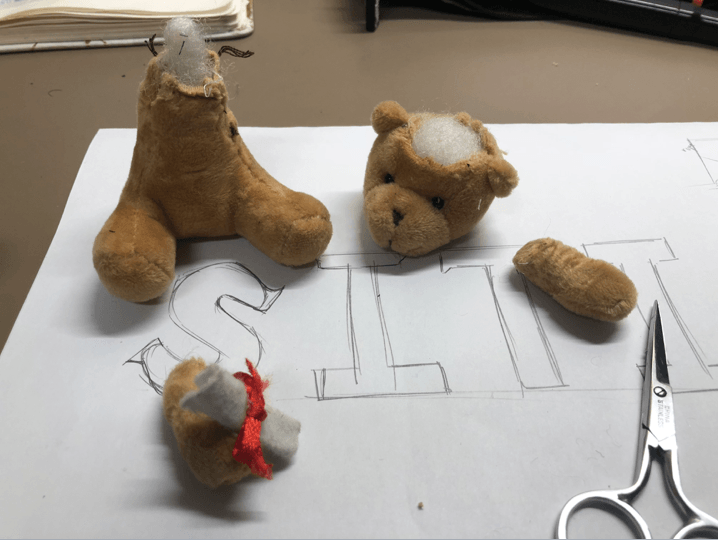
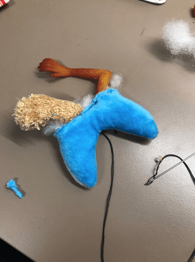
MUTILATING THE SOFT TOY INTO DIFFERENT PARTS:
CASUALTY 1: BEAR
CASUALTY 2: BEAR
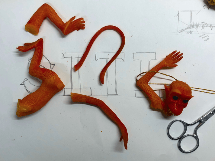
CASUALTY 3: ORANGE MONKEY
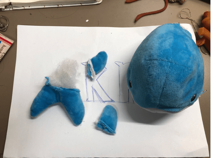
CASUALTY 4: BLUE WHALE
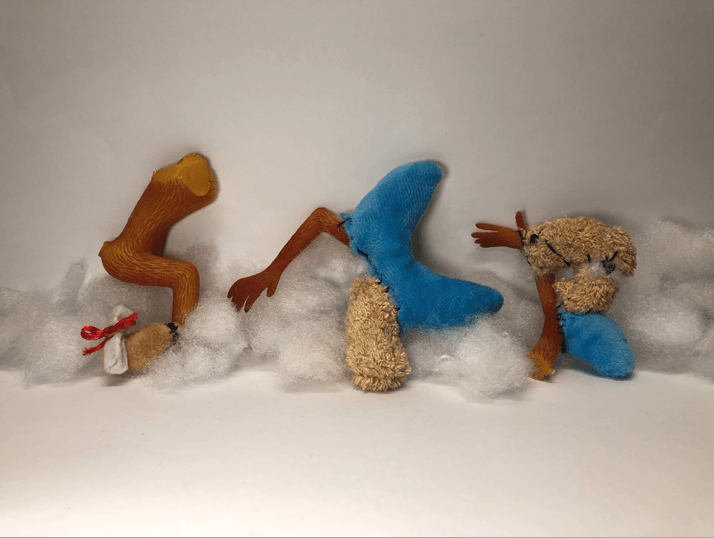
Personally, deconstructing and mutilating the soft toy physically was therapeutic and I was excited to construct it into the serif typeface font that I have in mind. Orange, Brown & Blue soft toys are used because they’re complementary colors that are vibrant and it will stand out against the white backdrop. I’ve kept the cotton filling of the soft toys to represent the guts for the later process of the composition. In addition, I want the texture of the font to be soft and furry.
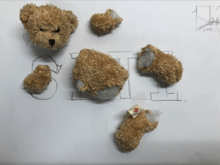
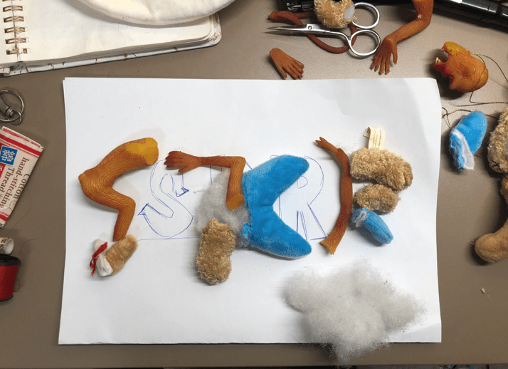
PLANNING OF RECONSTRUCTION WITH DIFFERENT PARTS OF SOFT TOY:
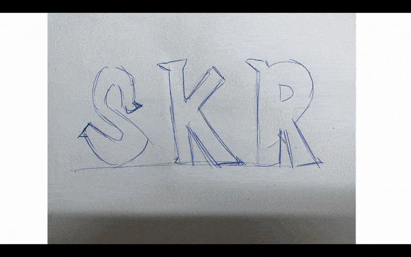
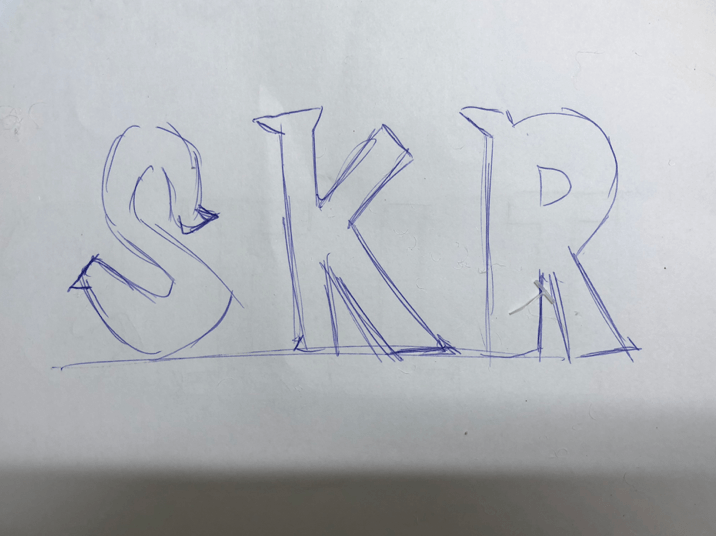
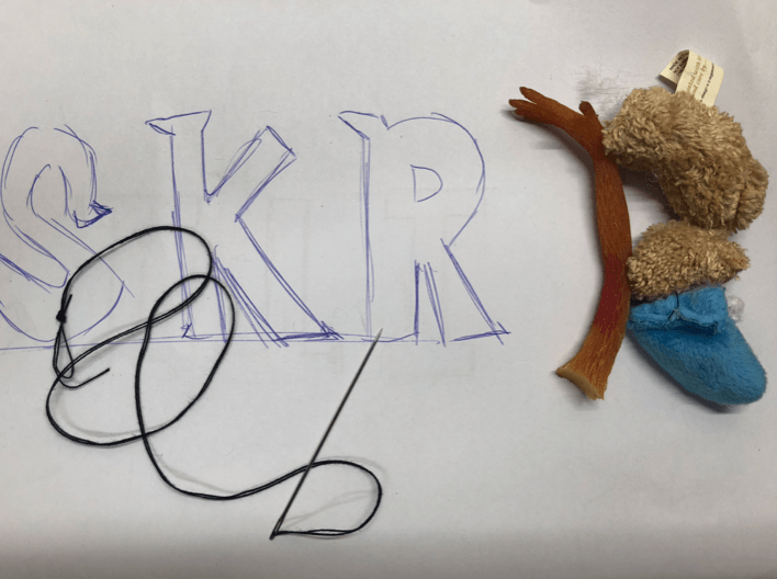
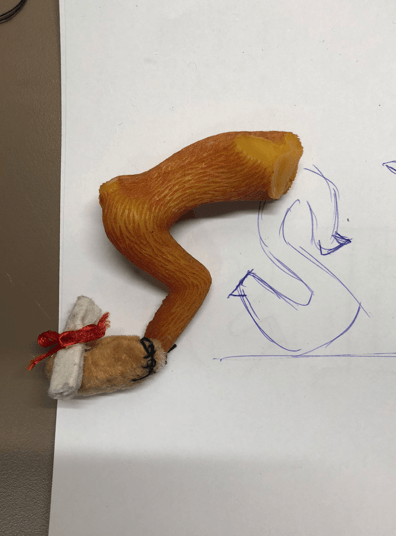
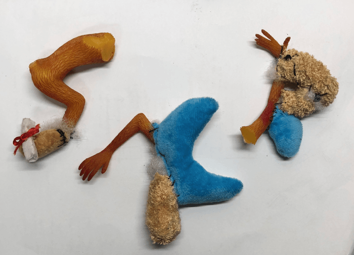
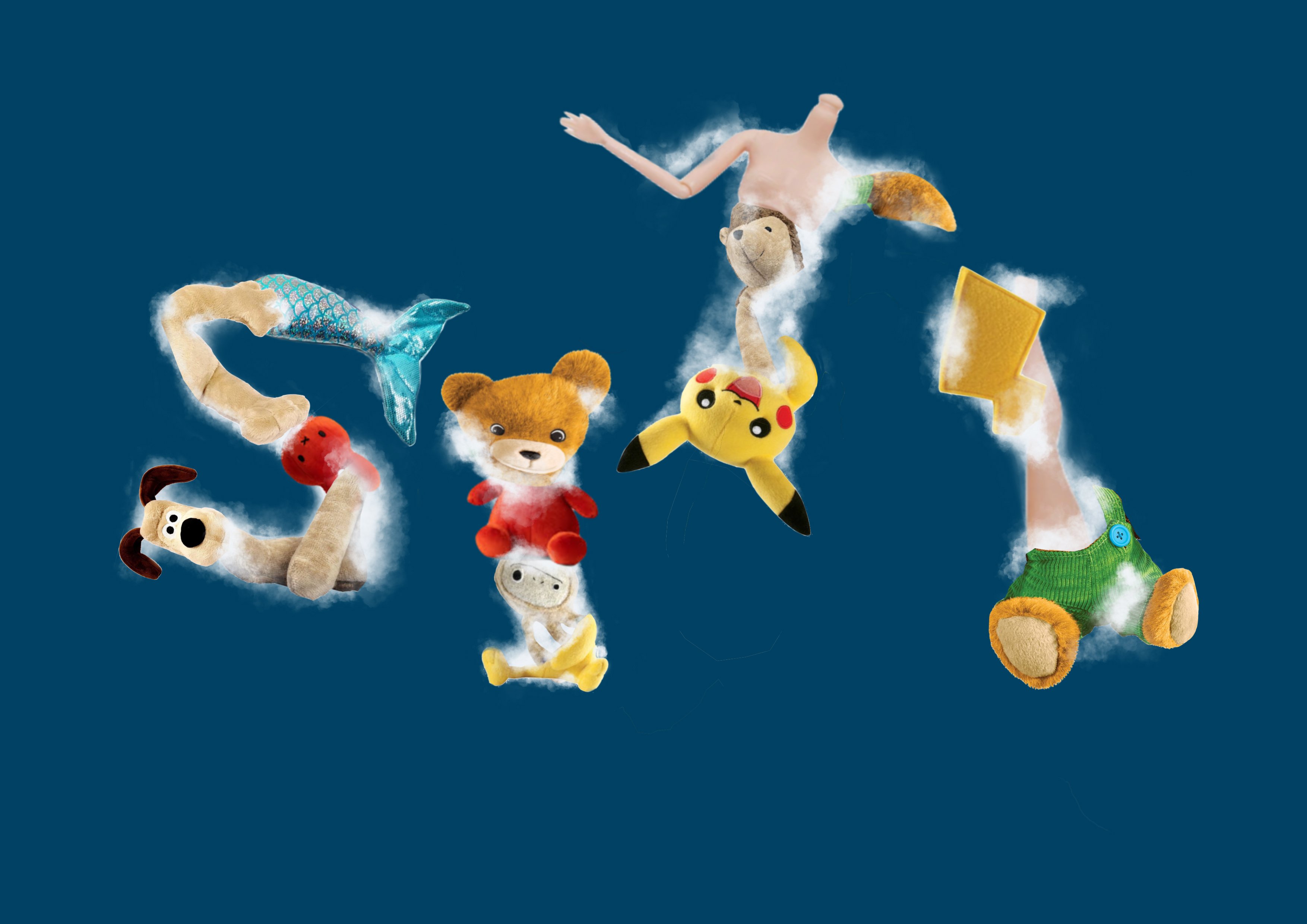
RECONSTRUCTING EACH LETTER INTO THE DESIRED TYPEFACE:
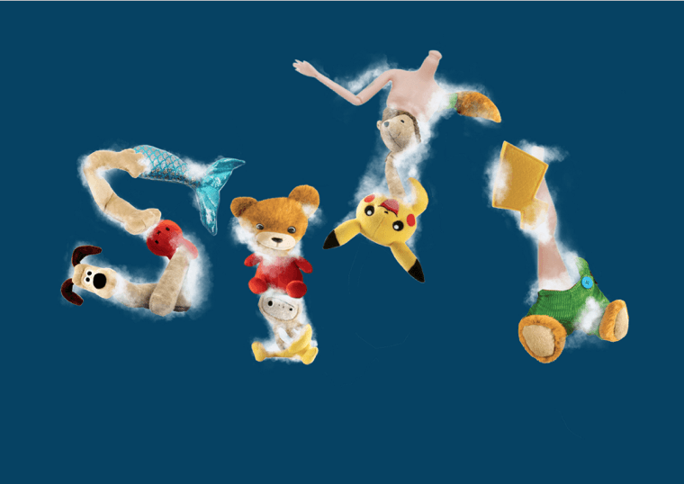
S
K
R
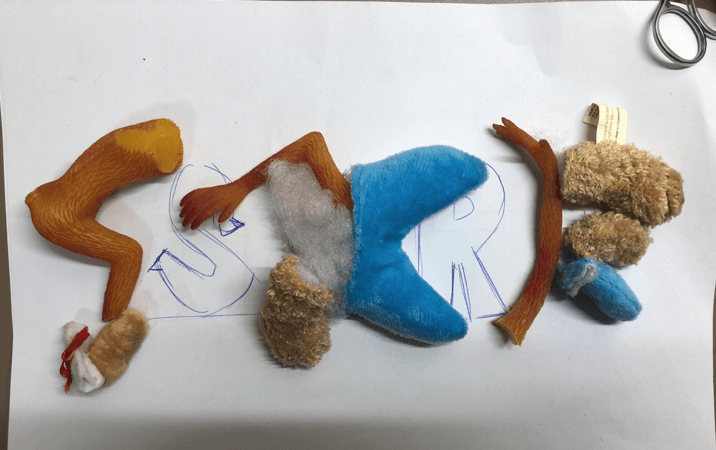
S
K
R
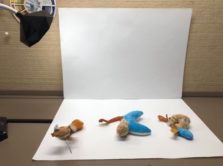
FINAL OUTCOME OF TYPEFACE AFTER SEWING
After sewing and reconstructed the mutilated soft toy as a surgeon, I’m satisfied with the outcome but I’ll be editing and using Photoshop to make the typeface more legible. In addition, I tried to incorporate different parts of the soft toy to add the decorative tail of the serif font.
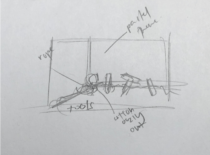
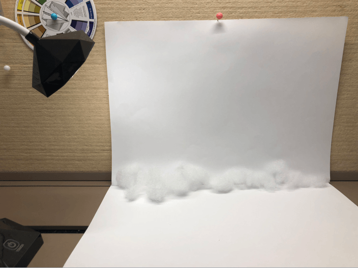
CREATING BACKDROP AND LIGHTING FOR THIS TYPEFACE COMPOSITION:
White backdrop
Addition of cotton (its guts) as the base
To ensure that I’ll get the highest quality and ability to capture the texture of the typeface I’ve created by hand, I used a lamp and a white backdrop. My aim after this photoshoot was to emphasize the texture of the typeface in a white clean-cut workplace of a soft toy surgeon.
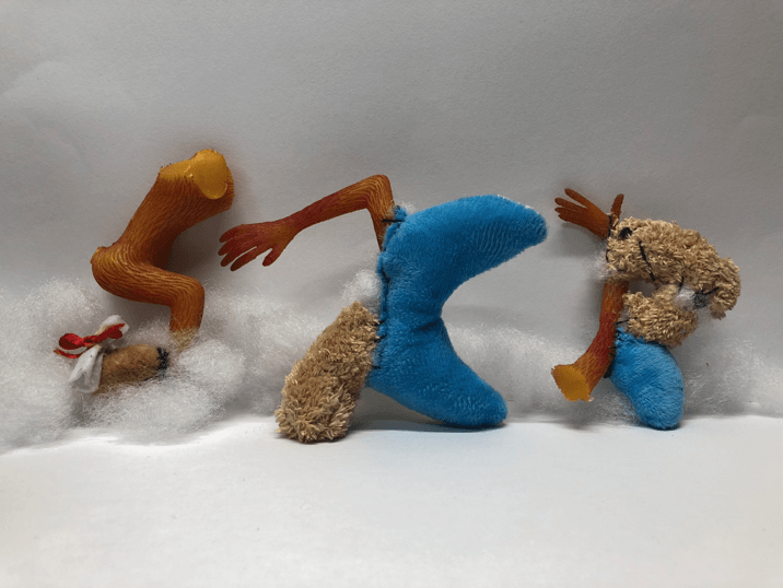
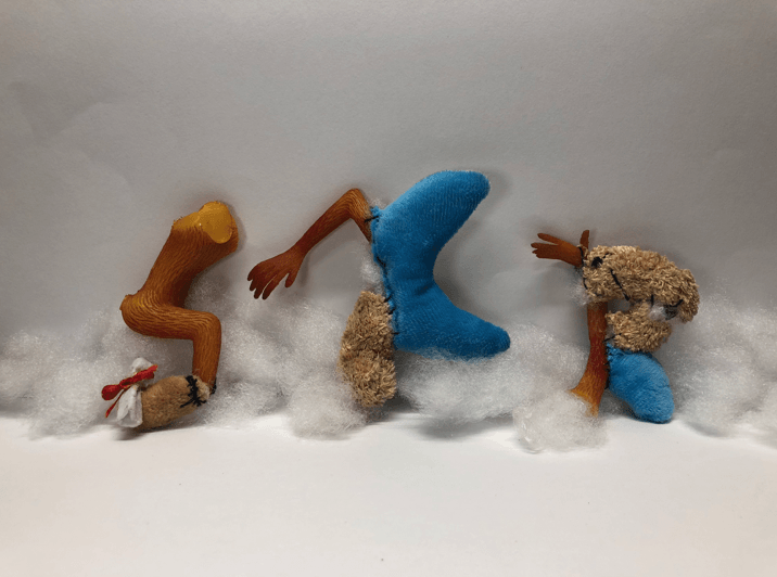
RAW IMAGES FROM THE PHOTO SHOOT:
1
2
3
4 – CHOSEN IMAGE
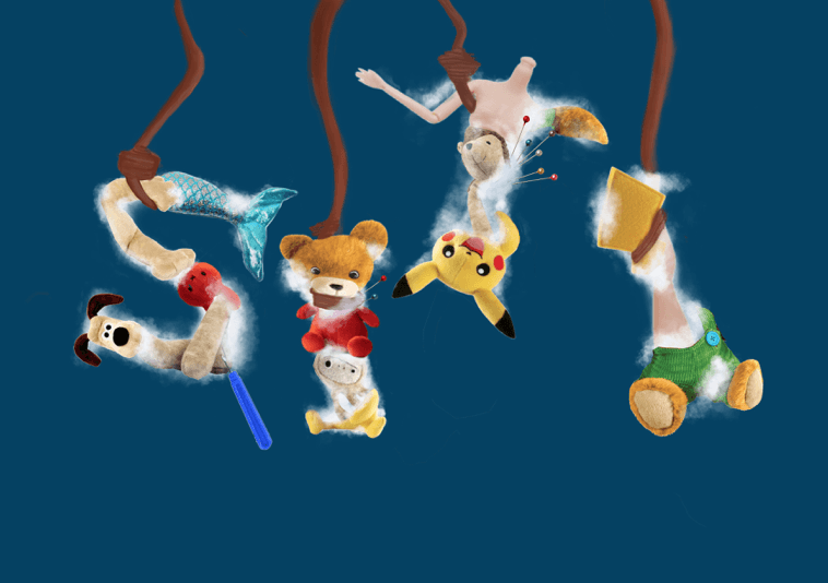
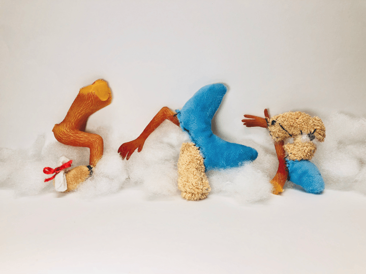
During the photo shoot, I’ve decided to add the sewing thread which is one of the tools to create a visual path of how the fonts are supposed to be read but I’ve decided to remove and do it digitally. The soft and furry textured typeface is supported by its cotton fillings (its guts). I experimented with the positioning and arrangement of the letters and decided to choose the fourth image.
THIRD DEVELOPMENT – DIGITALLY USING PHOTOSHOP:
Reduced the cast and shadows of the image
Decreased the saturation
Increased the contrast + Addition of tools and incision marks
During the digital editing, I reduce the saturation of the backdrop to make it as white with blue hues so the emphasis will be on the textured typeface. I increased the contrast of the typeface so its texture will stand out against the backdrop and our eyes will automatically look at the font. To create context about my job scope, I’ve added incision marks which are used during the process of reconstructing, to create the visual path. In addition, a sewing needle, thread, and scissors are added in the foreground amidst the white and clean workplace. All in all, I was satisfied with the outcome of the typographic portrait and I did a few adjustments to the typeface to ensure each letter are legible.
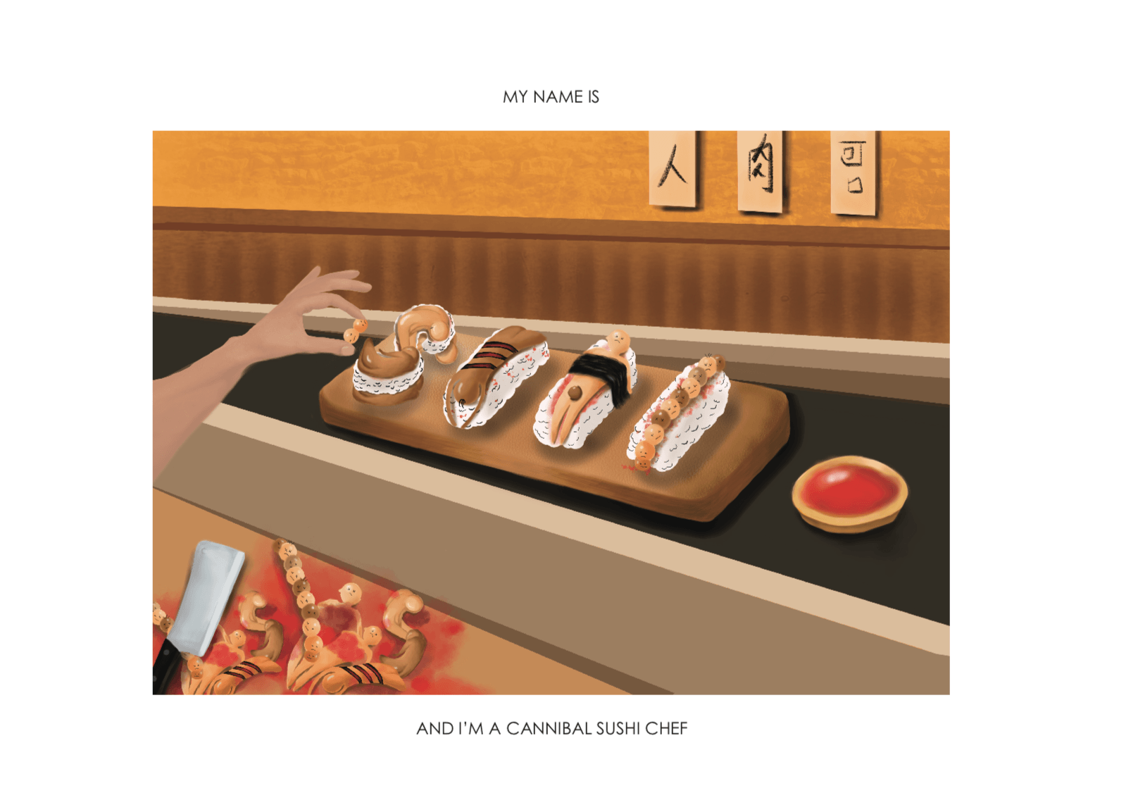
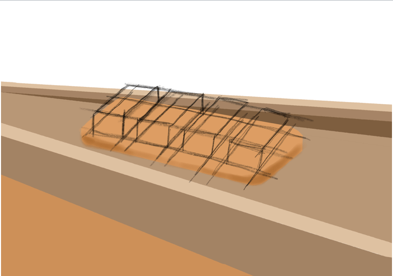
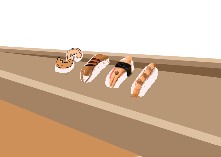
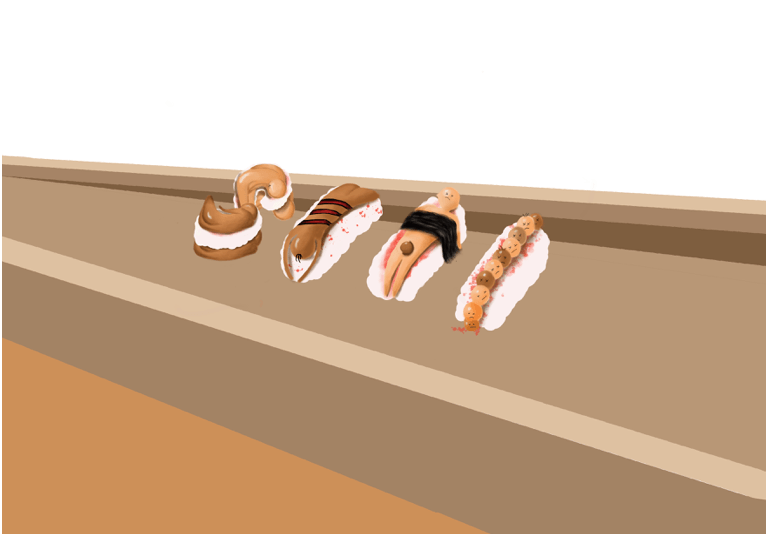
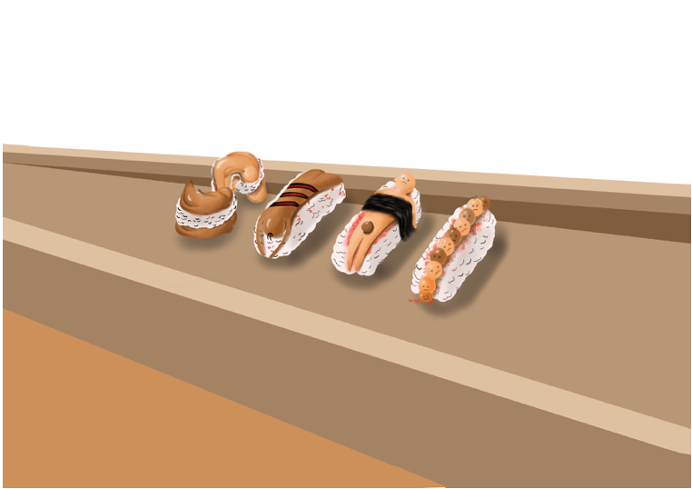
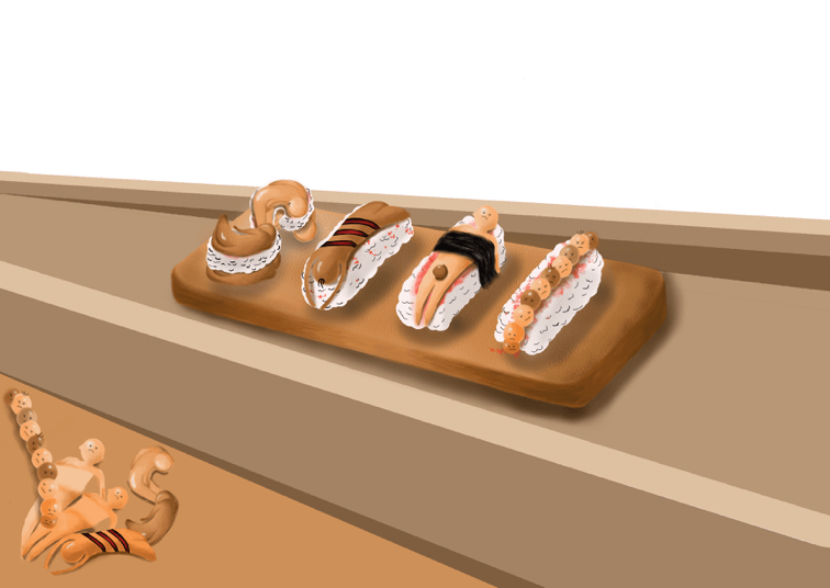
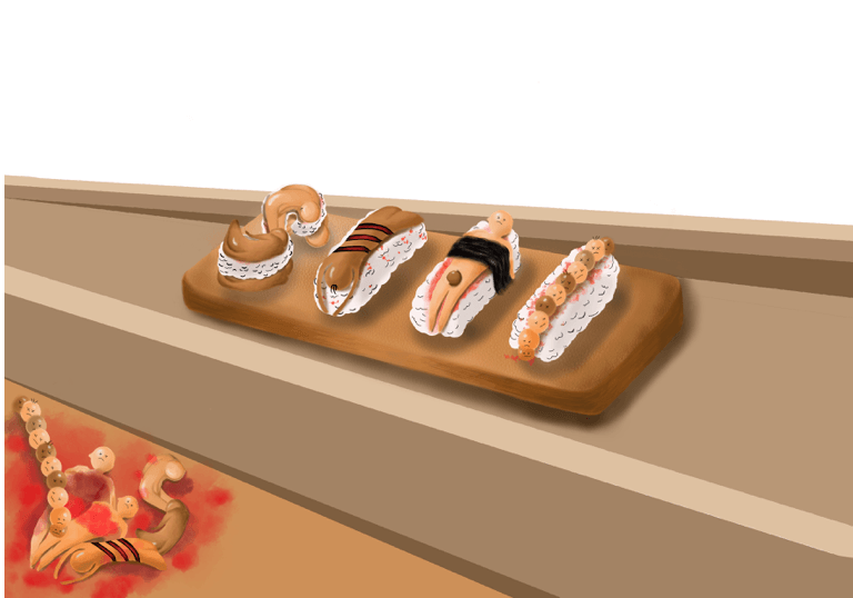
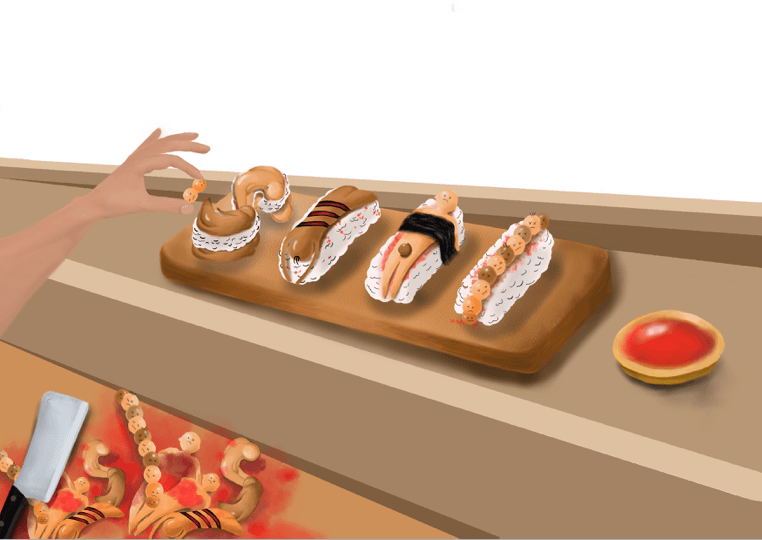
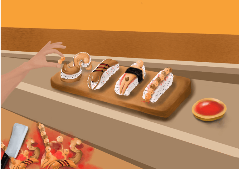
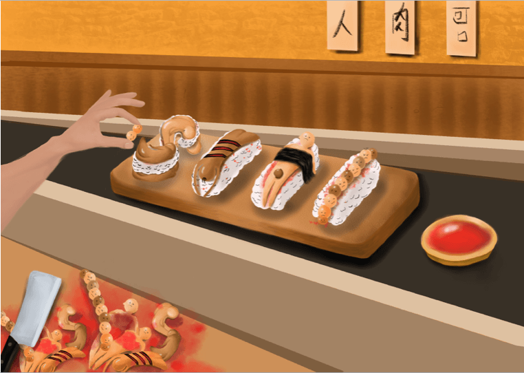
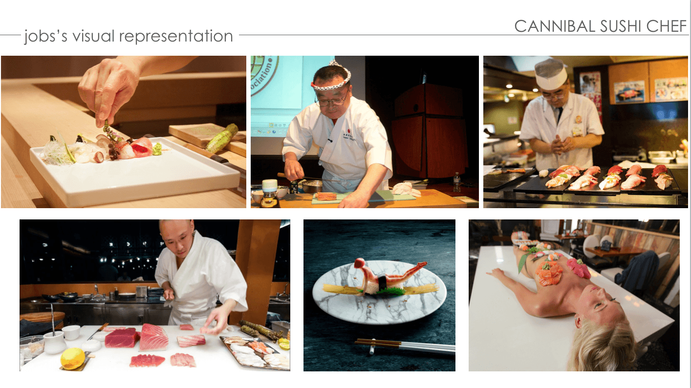
PROCESS – CANNIBAL SUSHI CHEF
ANIMATED PROGRESS:
FIRST DEVELOPMENT:
Perspective of human sushi
Rough outline of human sushi
For the composition of this typeface, I wanted to the form of the typeface of human sushi to be an isometric view so viewers are able to see the details of the deconstructed elements. This typographic view is created on Procreate as a digital painting.
1
2
3 – Addition of blood onto the sushi rice
4 – Addition of shadows
5 – Adding depth for the details
6
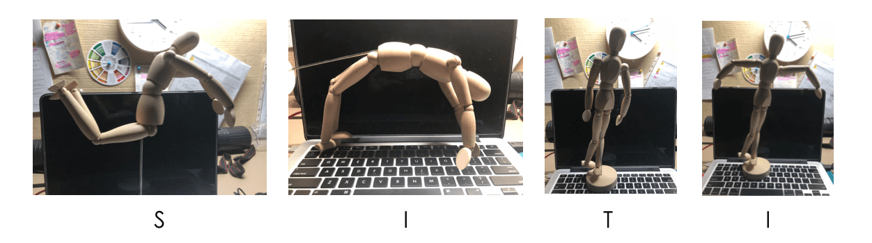
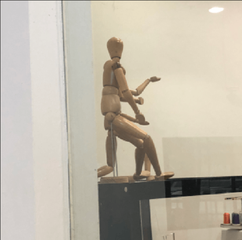
Visual assistance using figure mannequin
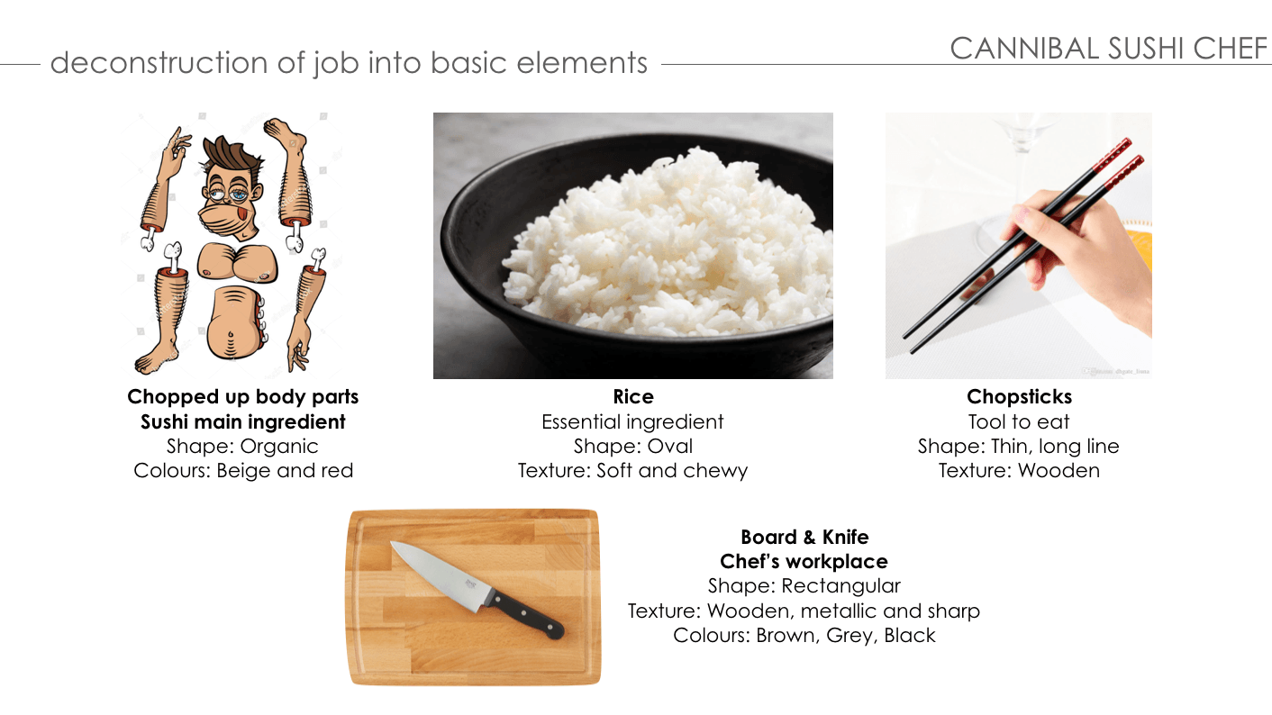
Inspired by our in-class assignment (pareidolia) and the curves of the human body, I’ve decided to create the typeface for this job to be about the human body parts and its curves (san-serif). To help with the positioning and forming the font of my typeface, I used a figure mannequin for visual assistance. The colors used for this typeface are analogous such as red, beige and brown to give off a humanistic vibe.
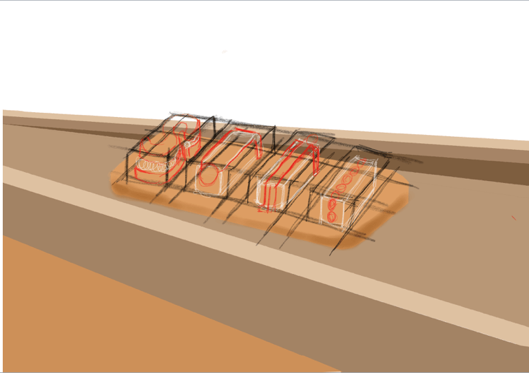
SECOND DEVELOPMENT:
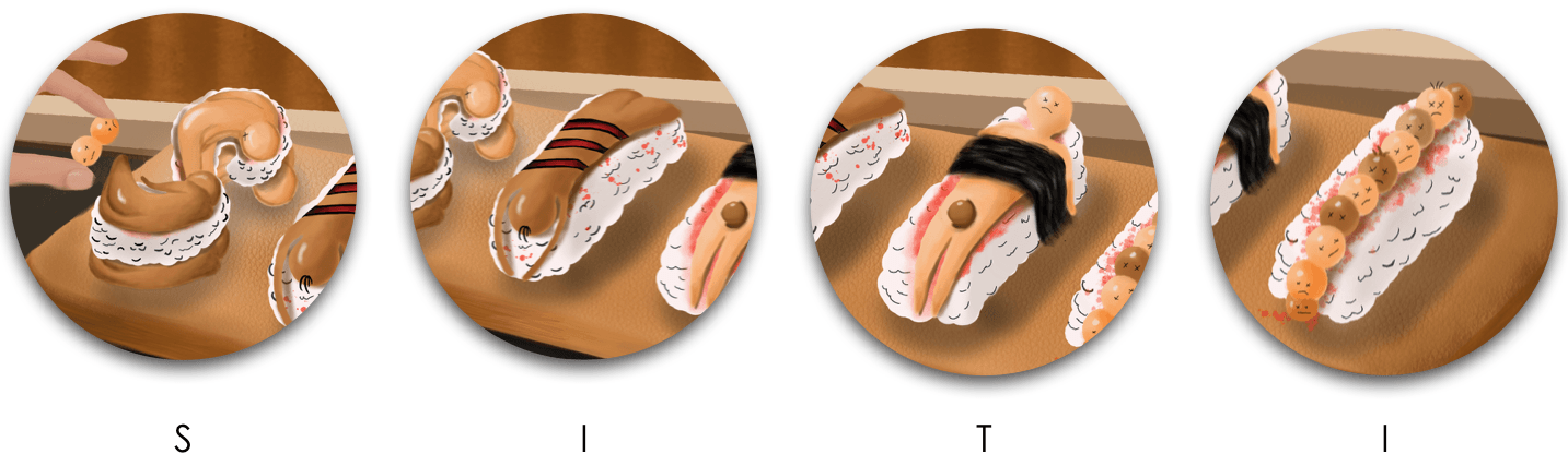
7 – Removed outline
8 – Duplicate ‘S’ element
9 – Added shadows and drop shadow
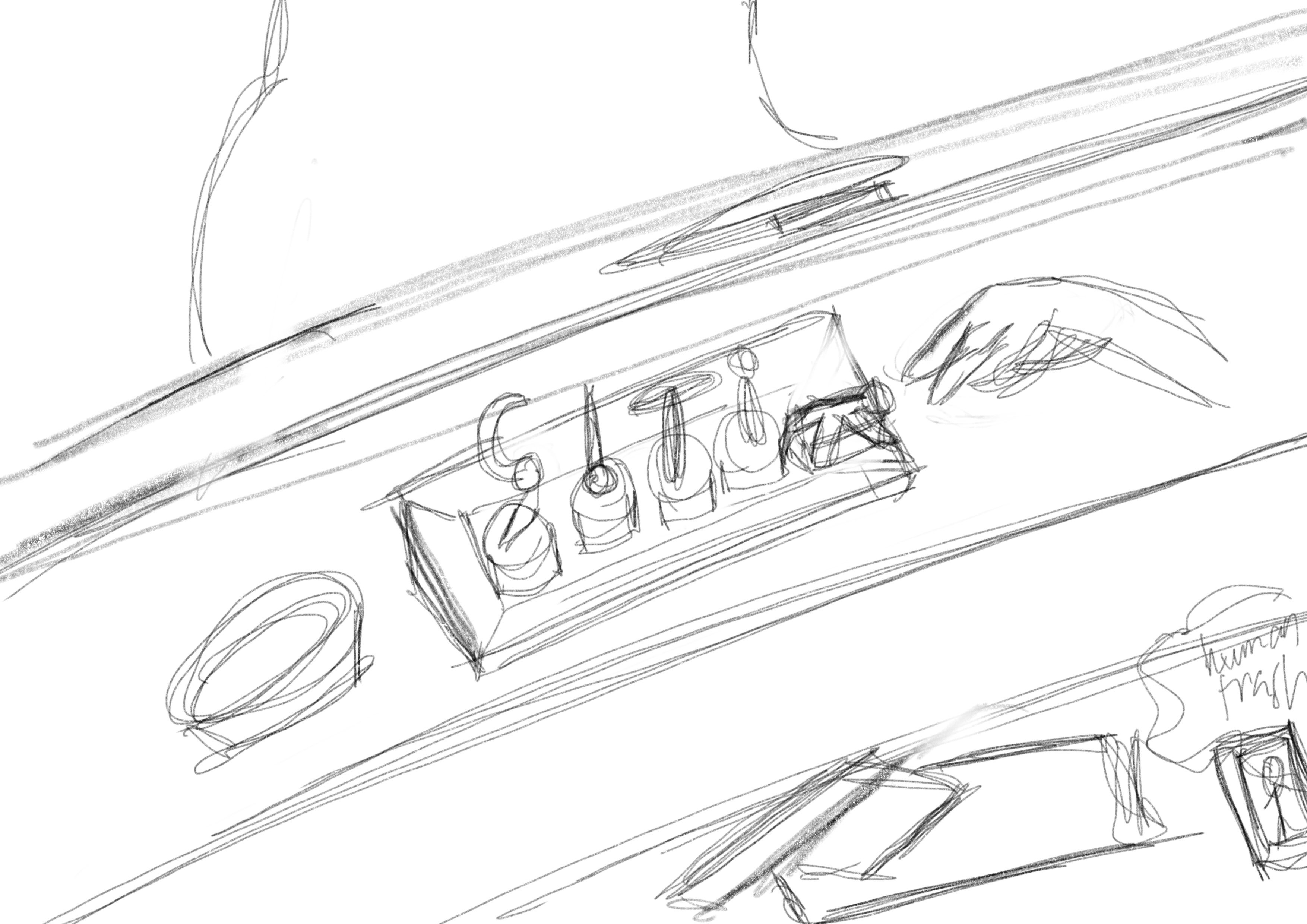
After consulting with my peers, they suggested that I should remove the outline of each typeface so it’s more realistic. ‘S’; it is made up of two human bodies being contorted to form the letter. First ‘I’; the body being slashed by a cannibal with a bloody indentation to create a similar look of salmon sashimi. ‘T’; it is made of a human body being strapped down by a layer of hair and the private part is covered by a human head as a joke. For the second ‘I’; I created a row of human heads with a circular shape. Also, I added shadows and drop shadows onto the human sushi typeface. The typeface is mainly made up of deconstructed elements of the human body parts such as the body, head, blood, and hair.
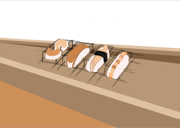
THIRD DEVELOPMENT:
CREATING THE TEXTURE OF THE CHOPPING BOARD
To emulate the Japanese restaurant ‘zen’ feel, I’ve decided to make the whole composition using earthy colors, wood and incorporating minimalism. I used the wooden brush texture on Procreate to create the texture of the plate to display our typeface.
1 – Addition of excess human body being chopped up at the side for context
2 – Addition of cannibal sushi chef plating
3 – CSC adding details onto typeface
4 – Arranging excess body
5 – Addition of knife and human blood sauce
The foreground of the composition consists of excess human body parts being slashed up with a knife for context. Besides the plate, there’s a blood sauce as a condiment. In addition, to communicate visually to the audience about my job, I’ve added a hand adding decorations on the typeface human sushi for context. All the different variety of human elements and objects creates harmony to tell the narrative of my job scope.
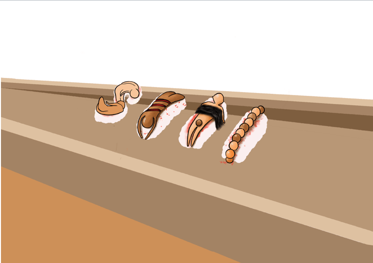
FOURTH DEVELOPMENT:
6 – Earthy wallpaper for the background
For the background, to strongly emulate the ‘zen’ and minimalistic restaurant vibe, I used the earthy colors and wooden planks which are usually seen in a Japanese place. In a Japanese restaurant, the owners tend to place white menu signs on the walls to inform their customers about their ingredients. Inspired by this fact, I’ve added characters on the signs saying ‘Human meat is delicious’ as the menu sign for my restaurant as a cannibal chef (:
IN-CLASS ASSIGNMENT
WEEK 1 – PAREIDOLIA
Objective: Create a series of photographs of objects or scenery that looks like the 26 letters in the alphabets around ADM.
Pareidolia – A psychological phenomenon that causes people to see patterns in a random stimulus. This often leads to people assigning human characteristics to objects.
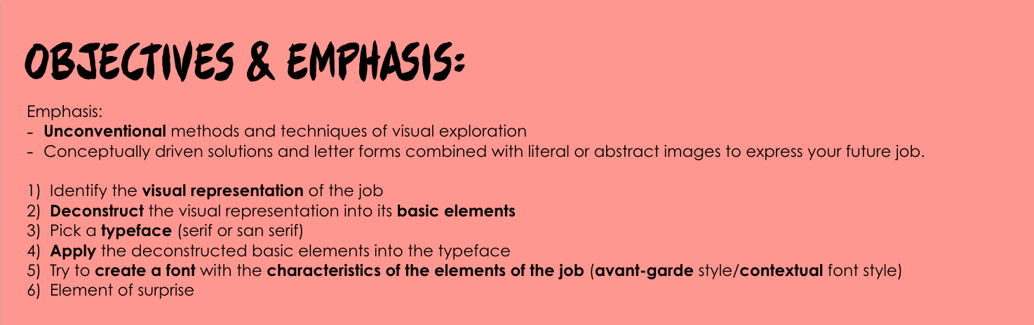
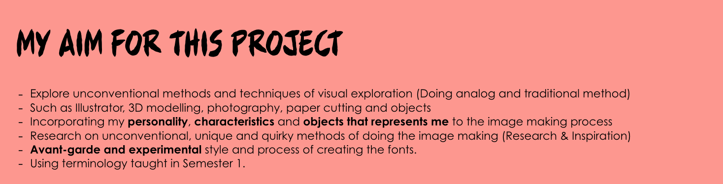
From the start of this project, I knew I wanted to challenge myself to create typographic portraits for my future jobs in analog and digital methods. Considering aspects such as the choice of typeface, color scheme, layout and how I’m going to harmonize all the deconstructed elements of my job into my artwork during the design process is going to be a tedious yet, fruitful journey. My end goal for this project is to create each artwork with engaging typography and a narrative to communicate my job to people visually.
For my job scope for this assignment, I’ve decided to choose unconventional jobs that spark curiosity and unrealistic to be one in my current life as of now. I’ll be researching the characteristics of the jobs above, creating my own interpretation of it and adding my style into the artwork to make the process meaningful and engaging.
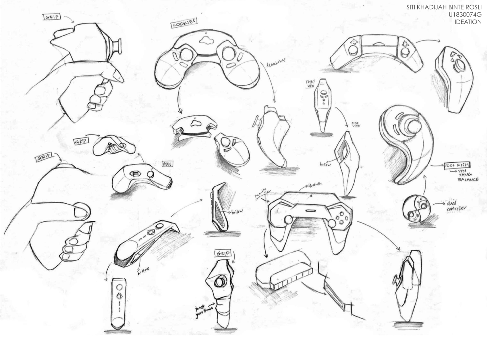
For Assignment 2, we had to produce 40 ideation sketches of our chosen object – gaming controller. Our objective was to break up the archetypal components of an object and reconstruct them into a new form.
CONSIDERATIONS:
Form
Placement of buttons (In the most natural & comfortable way)
Gripping of the gaming controller
User experience (how they approach the object)
INSPIRATION:
USER EXPERIENCE (GRIPPING/HANDLING THE OBJECT):
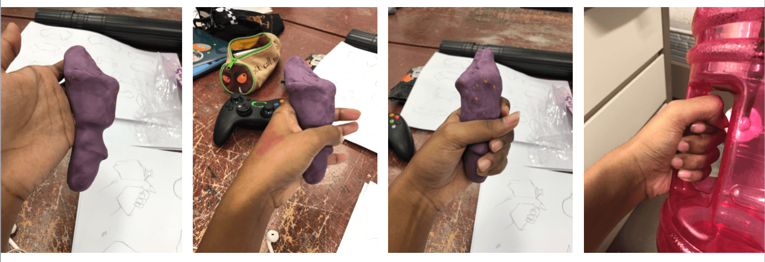
Using a plasticine sketch model to try various ways to approach and handle the object.
IDEATION:
TAKEAWAYS:
Personally, it was really difficult to break away from archetype of the gaming controller and reconstructing the object into a new form. However, after noting down the essential parts of the gaming console (power button, led lights, joystick, and gamepad), it made the ideation process easier. Using inspiration from my surroundings and objects in our everyday life, I tried to incorporate the form and details of the objects into my ideation process.
For my ideation, I wanted to make sure that the reconstruction of the gaming controller will still be organic while incorporating some curve lines. ‘Archetype’ and ‘Reconstruction’ was the main keywords and objective for this assignment. Overall, this process was challenging but I’ve learned to be avant-garde and try to come up with ideation that is not in the market as of now.
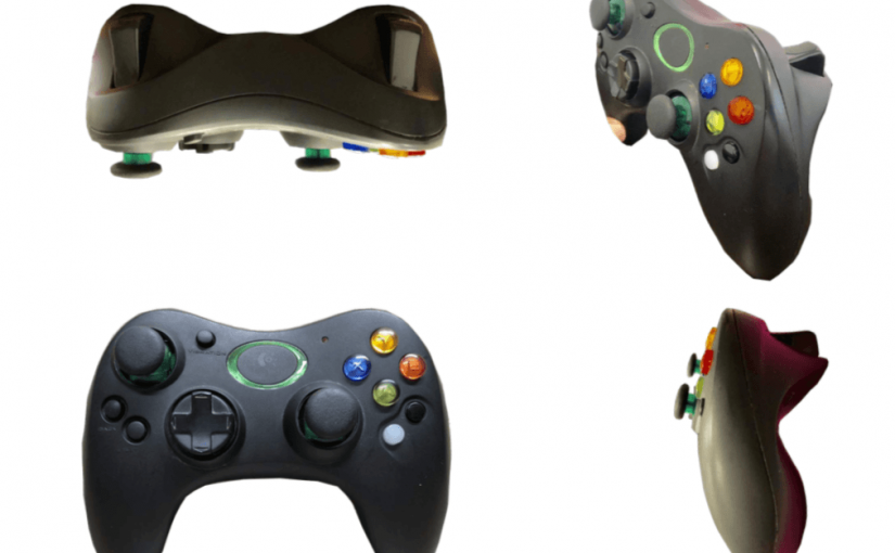
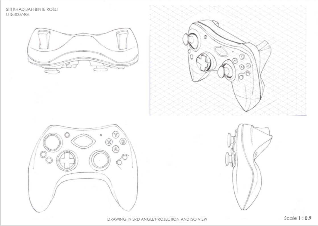
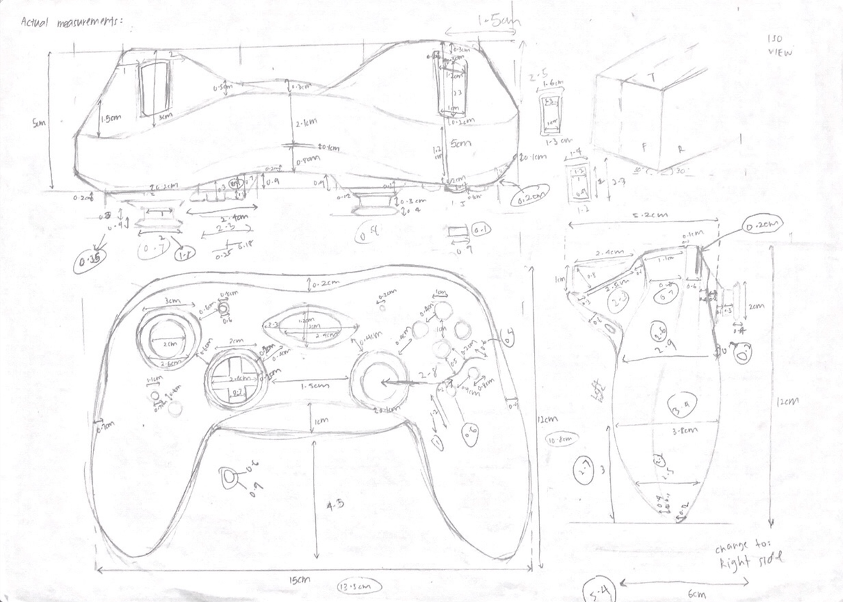
We were tasked to produce a scale drawing of a household object in 3rd angle projection views, isometric view and 2 point perspective view. For my chosen object, I’ve decided to choose a gaming console to challenge myself in terms of technical drawing of curves and making it proportional.
DIFFICULTIES
Actual measurements of the gaming console on a rough sketch
The gaming console is an organic shape which is made made of mainly curves. It was quite tedious measuring the actual product accurately. For the scale drawing, I had to create points in order to form the curve as accurate as possible. It was challenging but it was a good practice for me to draw more organic shapes.
Scaling down the actual measurement to 0.9 was really difficult and I had to do a rough sketch to jot down the measurements so I’m able to produce a proper scale drawing for the assignment.
TAKEAWAY
Using an isometric paper really helped a lot to make it look proportional. However, I felt that my iso view could be better with more practice.
Initially, my 2 point perspective drawing was a little bit out of proportion and I was frustrated with trying to make it look decent. After numerous attempts and sticking to what I learnt about referencing to the 2 vanishing point, the outcome was good to me.
For this assignment, it made me focused on the technical skills. In addition, accuracy is essential in order for the product to look proportional. This made me appreciate the invention of 3D modelling softwares because personally, I feel that it is far more accurate than orthographic views drawn by hand.
Our concept was a collaborative performance to recreate a music video of “Take On You” by a-ha, using Instagram’s Split Screen Video Group Chat Feature.
The objective of this project is to create a third body whereas each screen interacts with one another by creating a connection through choreographing a pattern of movements and gestures with 4 members. Despite being displaced physically, we had to be connected on a third space executing the choreography as coherent as possible according to the beat and rhythm of the soundtrack.
Basically, we’re like the beta version of Poreotics, a dance group that uses tutting; a dance style which are based on angular movements which involves intricate movements of the fingers and body parts to create a pattern according to the lyrics or rhythm of the music. What makes us different is we’re an amateur performance group that uses subpar tutting skills IN A THIRD SPACE. Bammmmm!!! <3
LOCATION
It was performed on the second floor of the ADM building in different locations.
PROCESS
Initially, we thought it would be easier to plan the execution of the performance according to the beat and rhythm of the soundtrack. Little did we know that perception of time is different to everyone and people who are musically challenged like me ): However, it was a helpful tool as a non-verbal cue for us to begin and continue with the next movement in our performance despite being displaced physically.
The sequence of our performance:
Typing “LET’S DO IT” in the group chat to inform the other members to get ready.
Bobbing of heads
Zooming in and out of our faces
Snapping of fingers with half our faces connected to the other screen to form a one whole face
Creating a pattern of continuous movement by moving our arms vertically, horizontally and diagonally interacting with different frames such as connecting one’s arm to one’s hand to create a whole arm in two screens.
Heart shape
Thumbs up to end the video
OUTCOME
The difficulties we’ve experienced doing this project are execution, scalability and framework, disconnection and lastly, the shortcoming of recording our performance.
EXECUTION:
The execution of the performance was really challenging because we had to figure how to use the terminal, choreography our movements according to the soundtrack and practise to perfect the movements in order to produce a good quality work. In addition, we had another issue with each member’s perception of time hence, we spent quite some time to synchronise according to the exact beat after discussing that we should follow Tong Tong’s rhythm. We had to record our performance a few times but we managed to produce one with a decent outcome with the objective we had in mind.
SCALABILITY AND FRAMEWORK
This was another factor that affected the accuracy and synchronization of our movements because it was hard to judge how far our face should be from the screen and we had to roughly estimate ourselves in order to link up with the member on the other screen. It was really tedious because we can only perfect it the best we could within the amount of practise we could afford at that timing.
DISCONNECTION
Another issue that we faced was disconnection and lagging due to our Wifi network. Whenever there’s a disconnection and someone left the group chat due to the network problem, it will change the orientation of the framework. Hence, we had to switch phones to make it easier for us because we had already planned out which frame each member should be in. In addition, during the final recording, one of our member’s phone is lagging and it affected the quality of the performance.
SHORTCOMING OF RECORDING OUR PERFORMANCE
Not everyone has the same placement of the framework of each member on the platform. I was the one screen-recording the performance so I had to lay out the perimeters and give directions to ensure that our movements and scale appear similar to one another. Also, the screen recording on the latest iOS version on the iPhone doesn’t record audio. Hence, we had to play the music and the recorded performance during the presentation.
The overall experience of this micro-project was enjoyable and we were happy with results of the outcome even though it could be better if we were given more time. It is essential to make sure everyone have the same perception of time and accurate scale of the proportion of their body to the screen. The outcome of this project is really dependent on our communication skills as a team and dealing with the uncontrollable circumstances of using a platform that relies on Wifi. All in all, we made the best we could with the duration given to us to complete this project and we are satisfied!
Oh yeah, I think it would be super cool if Poreotics did own rendition of performing in a third space with their awesome tutting dance style. I bet it will be go viral as compared to ours!
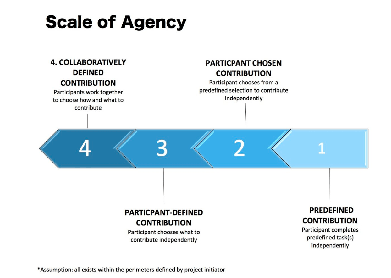
“Which project did you feel you had the most creative control? Why?”
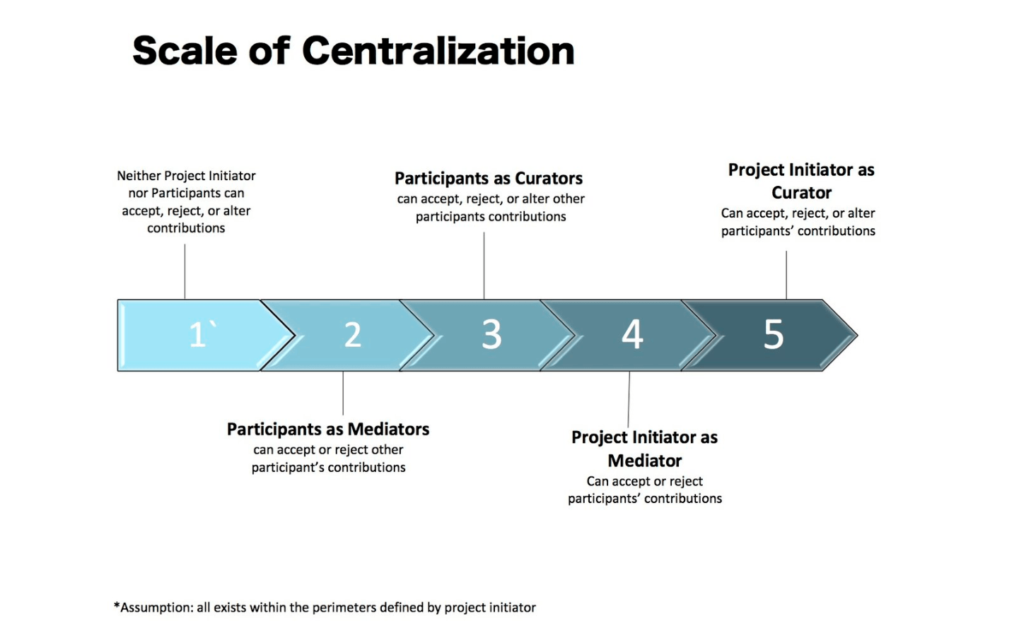
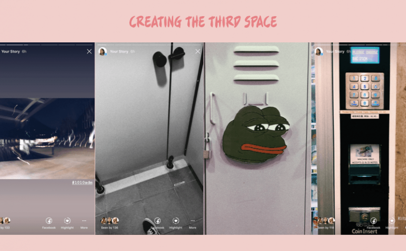
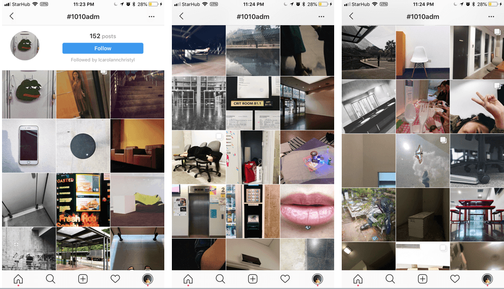
MICRO-PROJECT 1: CREATING THE THE THIRD SPACE. I had the creative freedom to curate my posts according to the direction I have in mind and set a mellow theme. There’s no restrictions regarding the quality and quantity of the photographs. Hence, I was able to manipulate the images by adding filters which assisted in evoking emotions, to create my series of significant places in ADM on a virtual space. Due to the ability and power to edit as a creator on the platform, I had the ability to manipulate the engagement and interaction by deleting responses that aren’t relevant or blocking some words so it won’t appear on the comments section. Overall, as a DIY and DIWO project, my work added value to the collective artworks on the platform with my definition of a significant place in ADM. However, I had no control in terms of the overall look of the third space (#1010adm) as a whole. It is an inclusive platform which allows people to participate and view artworks from different participants with different approach and theme of the topic given on the platform.
“Which project had the most unpredictable outcome? Why?”
MICRO-PROJECT 2: CROWDSOURCED ART.Personally, it was an eye-opening experience for me because the outcome of this project was highly dependent on the participants’ responses and how they interpreted the tasks given to them. As the project initiators, we laid out the perimeters and give a set of tasks for selected groups or individuals to do on Whatsapp. They were given the freedom to participate or ignore our request. Hence, we only had the creative control in the beginning with objectives of the project and planning. We had no control over the overall look and direction of the two collages which is dependent on the participants’ responses which are dynamic whenever another response is submitted. The outcome of the project will determine the success of the project on whether the participants are able to deliver what the creators had envisioned in the planning process or create an outcome that is even better. All in all, it was a challenging yet and an interesting take on allowing the participants to have control over the outcome of the project. Igniting our curiousity as the creators on how our project will turn out.
“Which project best illustrates the concepts of DIWO & Open–Source? Why?”
MICRO-PROJECT 1: CREATING THE THE THIRD SPACE. Despite physical distance being a boundary, all the participants are connected on a third space to collaborate and create our own representation of the significant places in ADM. #1010adm is hosted on Instagram which acts as public and virtual platform for unlimited possibilities and creations for anyone to participate or view which strongly resonates the open-source culture. As a collective, posting and curating this space with our work creates more exposure, engagement and responses as compared to an individual artist. Hence, it has a strong concept of DIWO by creating a platform which showcases different individuality and approach to the theme of the hashtag to make the project more impactful and reach out more to others with the following we have on social media.
Crowd-sourced art is about a collaborative process which focus on inclusivity of the artist and outsourcing its formation to willing participants using networked communication to create an artwork. The artist creates an intent and the starting point with setting a task and a series of instructions, followed by the participants’ contribution and approach to the project which will be the final product of the artwork. It revolves around the concept of (DIWO: Do-It-With-Others) which was taught in the previous class.
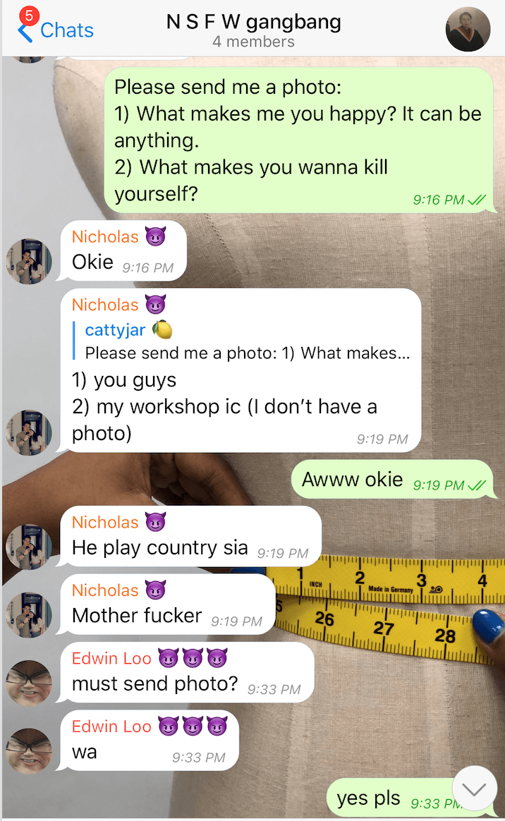
Our crowd-sourced community was targeted at our contact list on WhatsApp messenger, an instant messaging platform that allows electronic devices to exchange text, image, video, audio messages and location of the users. We decided to choose WhatsApp because it allows our participants to have different ways to respond and we can approach our participants in a group chat or a personal chat setting.
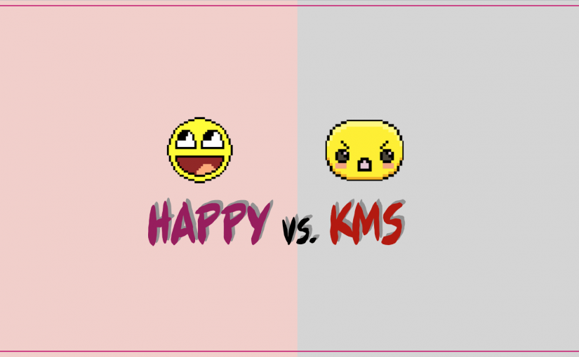
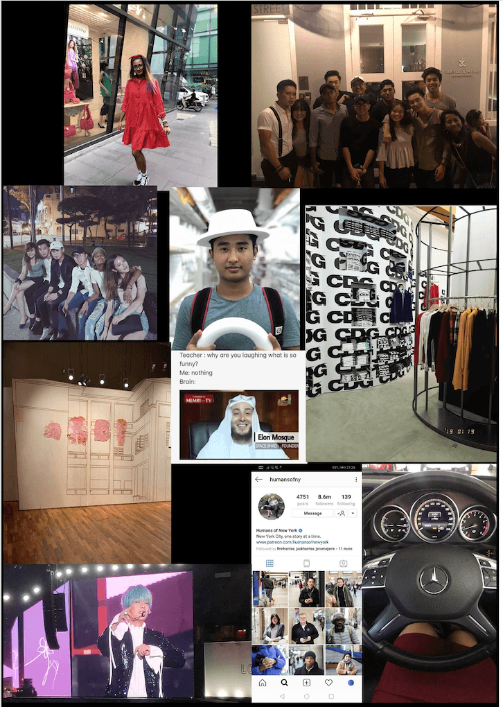
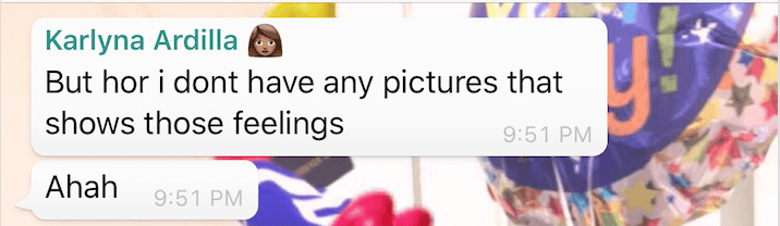
HAPPY
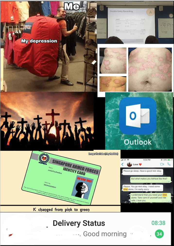
KMS
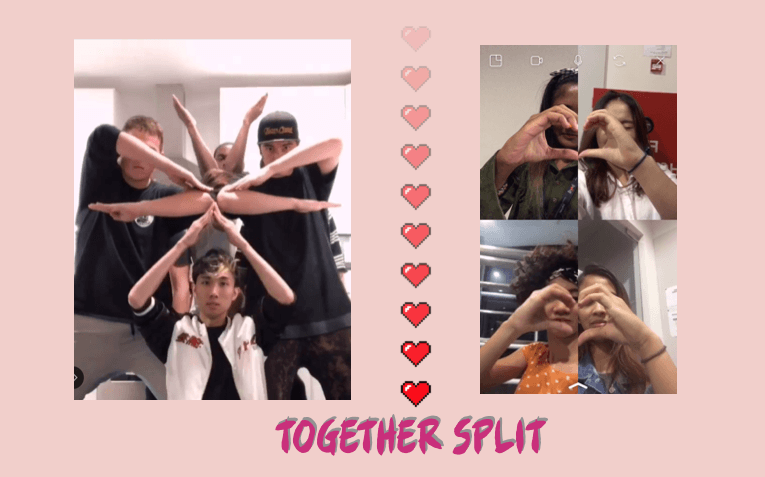
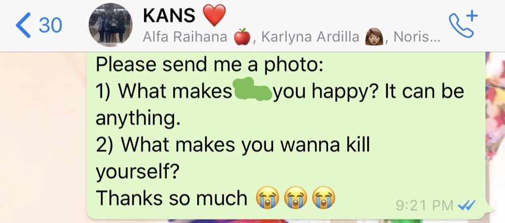
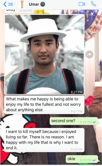
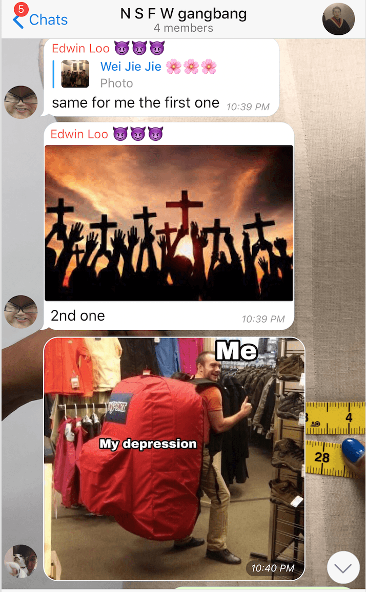
This collective artwork garners contribution from our willing participants on WhatsApp to provide a photo response to the respective questions;
“What makes you happy? It can be anything.”
“What makes you wanna kill yourself?”
The objective of our artwork is to gather an image representation of what makes them happy or what makes them wanna kill themselves without any text. The goal intended is to create a collage of the two notion of happiness and sadness with the contribution of the participants thus, showcasing the final two collage to the audience who will be viewing and guessing the overall sentiment of each collage. Hence, the social interaction involves the creators’ intent, participant’s response and the audience’s opinion about the artwork.
PROCESS
First layer of interaction between the creators and the participants is sending out the task and instructions for them to respond to. Second layer of interaction is the participants have a choice to respond and participate or just ignore.
RESPONSE
The participants had questions and different interpretation of the instructions given so they had to clarify what must they do in order to respond to my question. All these questioning made us realised a few ways to improve and make our instructions clearer for majority of the audience to understand easily.
DIFFERENT RESPONSES IN DIFFERENT SETTINGS
We realised there were different response and reaction when the instructions were being sent out to the individual personally and in a group chat setting.
Personal Chat
The attitude of the participants who were being approached in a personal chat tend to be more expressive and put in a lot of thought before answering the questions. It wasn’t necessary to explain the meaning behind those photos they’ve sent but they were genuine about expressing their thoughts.
Group Chat
The responses received from a group setting tend to be a bit more humorous and silly. It takes just the one person to set the tone of the conversation to be serious or humorous. In addition, being in a group chat, your response tend to be build upon the previous reply thus, influencing conformity.
FINAL OUTCOME
The final collage of the two notions of happiness and sadness were presented to our class, creating a third layer of interaction. Without any text and just images collected from our participants, we made the audience guess the overall sentiment of the collage. Despite the participants not being physically there, their contribution added value and completed the project with the intent that we had as our end goal. We as creators, were curious too about the final outcome of the collage as the participant’s contribution is unpredictable which spark our sense of curiousity and engagement.
Personally, I felt it was a success because the audience were able to relate to the sentiments of the photos in the collage. Despite not putting restrictions to our participant’s contribution of their representation of these emotions, the audience managed to interpret the notions of happiness and sadness.
OBSERVATION & TAKEAWAYS
There were different responses despite setting a task and instructions given which is just a photo to answer the questions asked. However, due to different interpretation of the participants of the task at hand, despite disrupting the overall approach of the concept, it gives a creative outlook of the crowdsourced artwork, making it more unique with a sense of depth. Personally, I just think it’s human nature to rebel against the task given to stand out more or being able to feel a sense of control unconsciously in whatever we partake in.
To my surprise, majority of the participants did not ask the purpose behind those questions and answered without questioning due to the factors such as the closeness of our relationship and trust. However, some were curious about their involvement and wanting to see the overall outcome of the crowd-sourced project.Some of the participants were particular about their privacy and anonymity, hence, wanting us to crop out some of the details.
We expected the interaction to stop after most of the participants made contribution to the project, however, it enables a conversation in the group chat to be active again, discussing about our well-being at the moment and wanting to meet up. Hence, it shows that certain conversation can be built upon our previous responses and interaction. “It just takes one person to start a movement.”
“People have different persona in all spaces”. The responses might differ according to the setting of the environment hence, affecting the authenticity of the contribution which leads back to the intent of the creators.
How is your crowd-sourced project different from one that is created by a single artist/creator?
Our crowd-sourced project starts off with an intent and approach to the whole concept which is versatile. We tried not give a lot of restrictions so the participants have the freedom to express themselves. Our end goal is unpredictable and changes every time we receive a response from the participants, so there was no definite outcome to the whole artwork. Every contribution adds value to the whole collage hence, it is dynamic process of a doing crowd-sourced art. Majority of the control of the direction and outcome of the artwork is depended on the participants which is determined by the layout and perimeters are formed by the creators on the platform.
A single artist/creator usually have an end goal to the whole process but not necessarily. However, the process of doing the artwork won’t be so dynamic as there isn’t a crowd to control the direction of the artwork freely. Hence, the process of the artwork is not as ever-changing and the end goal is most likely predictable since the creator have the upper hand of the overall work.
Inspiration for our crowd-sourced artwork: Sketch Aquarium
Art Science Museum – Sketch Aquarium
The Art Science Museum created an interactive augmented reality platform which is an aquarium where visitors are allowed to create their own version of animals by drawing from their imagination that can be scanned and transform from 2D piece into a movable 3D piece which will be placed into this AR platform. The objective is to ignite the visitor’s creative spark and create a collage of all the unique contribution of the visitors into this AR ecosystem that is enhanced with subtle background music and LED lights projected onto a screen. Each artwork is unique individually and all of the contribution of the visitors creates a beautiful ecosystem with a variety of species and colours.
Hence, giving the participants the freedom to contribute to the outcome of the artwork can be unpredictable and dynamic as an end goal. However, it’s one of the unique yet challenging feature of doing a crowd-sourced artwork as a creator or project initiator.
Why did you choose this space or object to photograph?
The significance of this location is a place of escapism from the chaos in class. The blur in the photo was accidental but it really depicts how I feel whenever I’m trying to take a breather from the stress and pressure, to relax and calm down. Personally, exiting the school compound during breaks is a temporary relief to reset my stress level back to 20% and building up my motivation to end the day well.
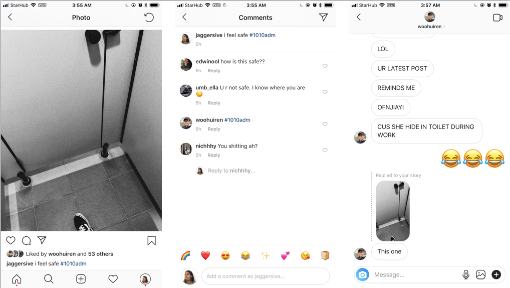
The toilet cubicle has a special significance to me as it’s one of places where I seek refuge to show my vulnerability. It’s a communal place yet private and intimate to me. Despite being constraint in a small space, I feel safe because nobody will be able to look at me. Being guarded by three vertical dividers allows me to let down my guards and be my true self. The interaction from the viewers tells me that different people have different sentiments attached to the space. Some disagreed that it is not a safe place and some got reminded of a memory attached to this space. Hence, factors such as memories, proximity of the space and notions might influence your emotional attachment to the place.
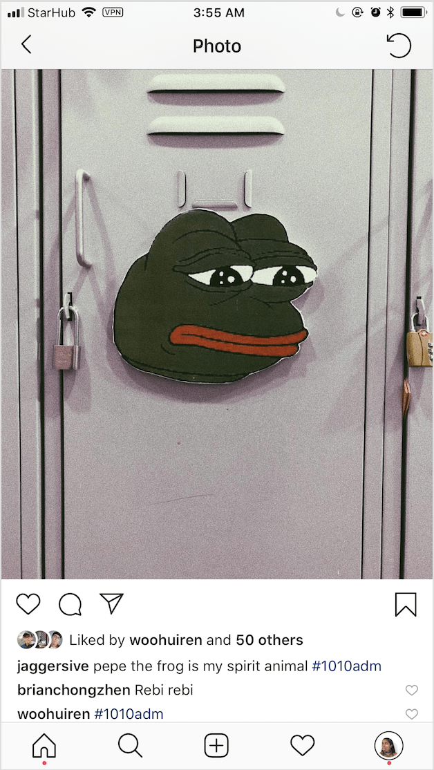
I’ve decided to photograph ‘Pepe the Frog’ poster on a locker because it brings back memories during the finals week in Semester 1. It evokes a sense of familiarity as I recalled the emotions I’ve felt during that period by looking at this expression of the frog. Tired and drained out. The fact that it’s being pasted on a locker that is safeguarded by a lock reminds me of how I have to put away all the unnecessary distractions in life to focus on my school work. Good times…
I’ve chosen this photograph focusing mainly on the concept of how a vending machine works. It serves as a reminder to my work ethics and mindset in life. “different input, different outcome” is the caption I’ve chosen because I’ve observed that there’s multiple ways to get our goals and we have the choice to decide how we are going to get to the end point. There’s no right or wrong way, especially, in the design industry. For example, there are coins that will add up to $1.50 to get the orange juice that we want and we can also put more than the amount needed and the machine will return back the change. Reminding me that different situations have different approaches such as ‘Less is More’, ‘Just enough’ or ‘More than what is expected’ to achieve the end goal that we want so, it’s essential to plan. Everyone’s goal is different and the amount of effort we put it varies too. Hence, this is a reminder that I should be grateful to have the freedom to choose what I want to be and make full use of my opportunities.
What are some of the characteristics of this alternative virtual space you had created collectively?
It shows individuality of each creator’s approach to the direction given to us about significant places in ADM. As a whole, it resonate strong sentiments about one’s significant place in ADM influenced by their memories, emotions or experiences attached to the space.
There’s added value whenever there’s new content being posted by the participants contributing to this platform.
Public sharing platform where anyone with an Instagram can view the content gathered and created by #1010adm or even add their own creations with no restrictions regarding quality and quantity of the photographs. Personally, I realised it spiked people’s interest and curiosity during the first week of school because the hashtag was going around on social media due to the exposure, connectivity and engagement of the ADM students with our peers online.
The ability and power to edit the space according to our representation of the actual space in ADM that we want to showcase. For example, adding filters or cropping certain part of the original photo to focus on the main idea/object, manipulating and evoking a certain reaction or emotion that we have in mind from the viewers. Hence, we have the freedom to curate and approach the topic of this project in multiple ways onto this alternative virtual space.
Under what circumstance will this alternative virtual space change?
It will change in terms of the value whenever there’s new content being posted by the participants contributing to #1010adm platform. The interaction of the viewers with the post will change the space with their comments, being able to relate with the post based on their sentiments or experience of the shared space and the popularity of the post considering the amount of people who will be able to view it due to the creator’s following and influence on the platform. Hence, despite the platform being on a limitless and vast virtual space, there will be changes and added value due to the interactivity of this platform until there’s no more viewers or participants going to the #1010adm platform.
As #1010adm is a virtual space being hosted on Instagram, there will be changes if the hashtag or certain content is being removed due to violating the guidelines of the platform.
How does this project relate to what we discussed in the lecture regarding co-creation. In the concept of Do-It-Yourself (DIY), Do-It-With-Others (DIWO)?
Despite doing the in-class assignment alone (DIY), the #1010adm project focuses on collaborative art which brings content from different creators onto the same platform instantaneously (DIWO). This project is a different approach of (DIWO) collaboration on a social media platform without having to communicate physically with one another but we are interconnected virtually. Being able to engage people to view the content under the same virtual platform and it brings exposure as a collective. It showcase a variety of works and viewers can find something that they can relate to or express their agreement or disagreement. This project relates to DIWO and co-creation because without a platform to gather all these content and interaction, all these thoughts and works are kept to oneself and it wouldn’t be as dynamic as a combination of each creator’s individuality and style which adds value to the whole collaborative project.
Similarly to Yoko Ono, Cutpiece (1964), The interactivity between Yoko Ono, participants and the viewers will lead to the end product of the whole performance art (DIWO). Factors such as the reaction from the viewers,participant’s decision to cut the amount of cloth from Yoko Ono’s clothing and her tolerance towards the whole performance art as she has a choice to stop or continue, will affect the whole end product. Thus, the outcome is unpredictable and ever-changing.