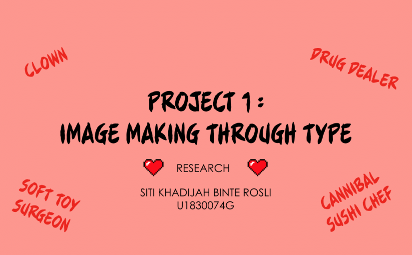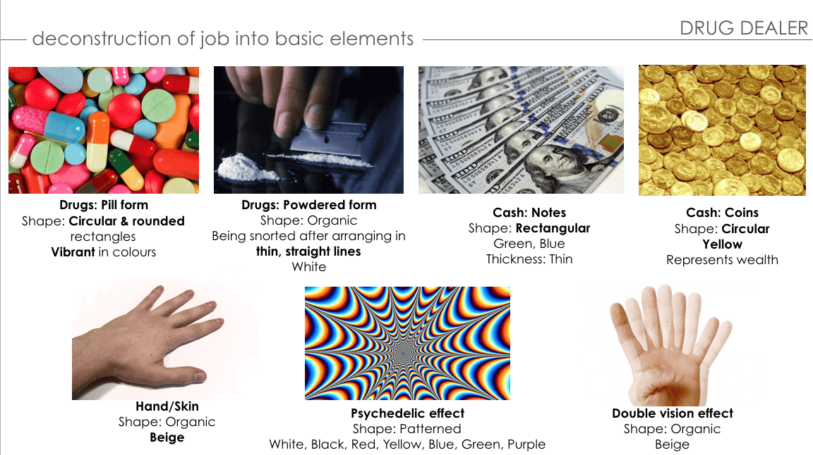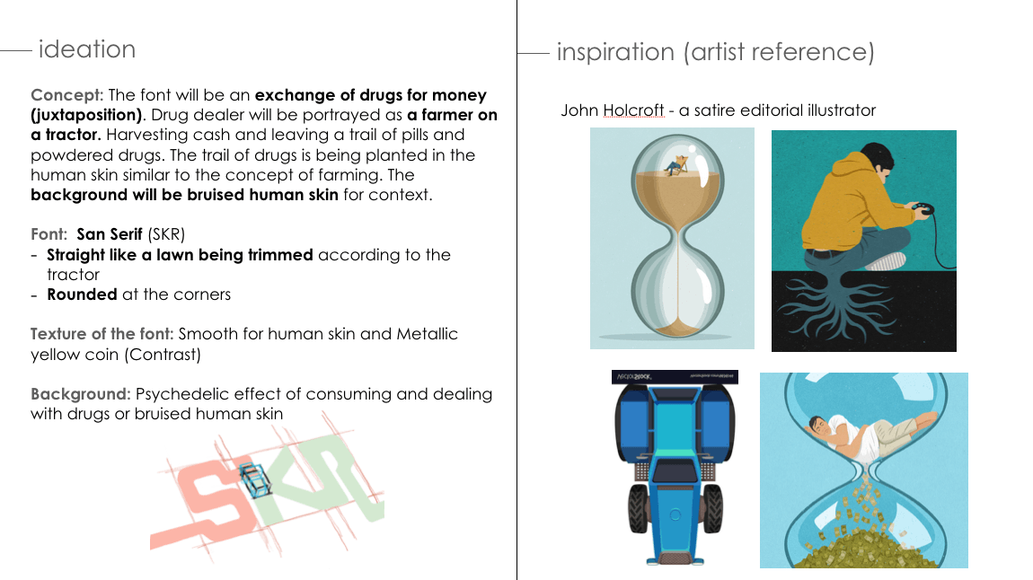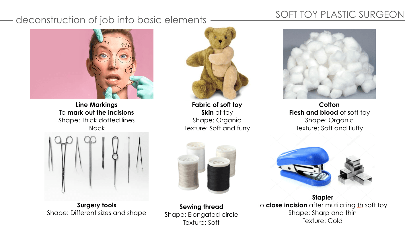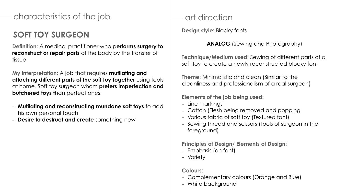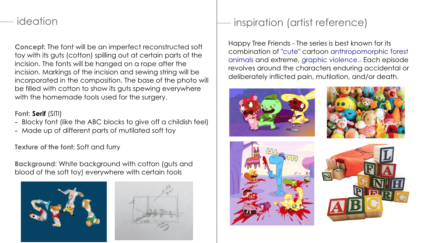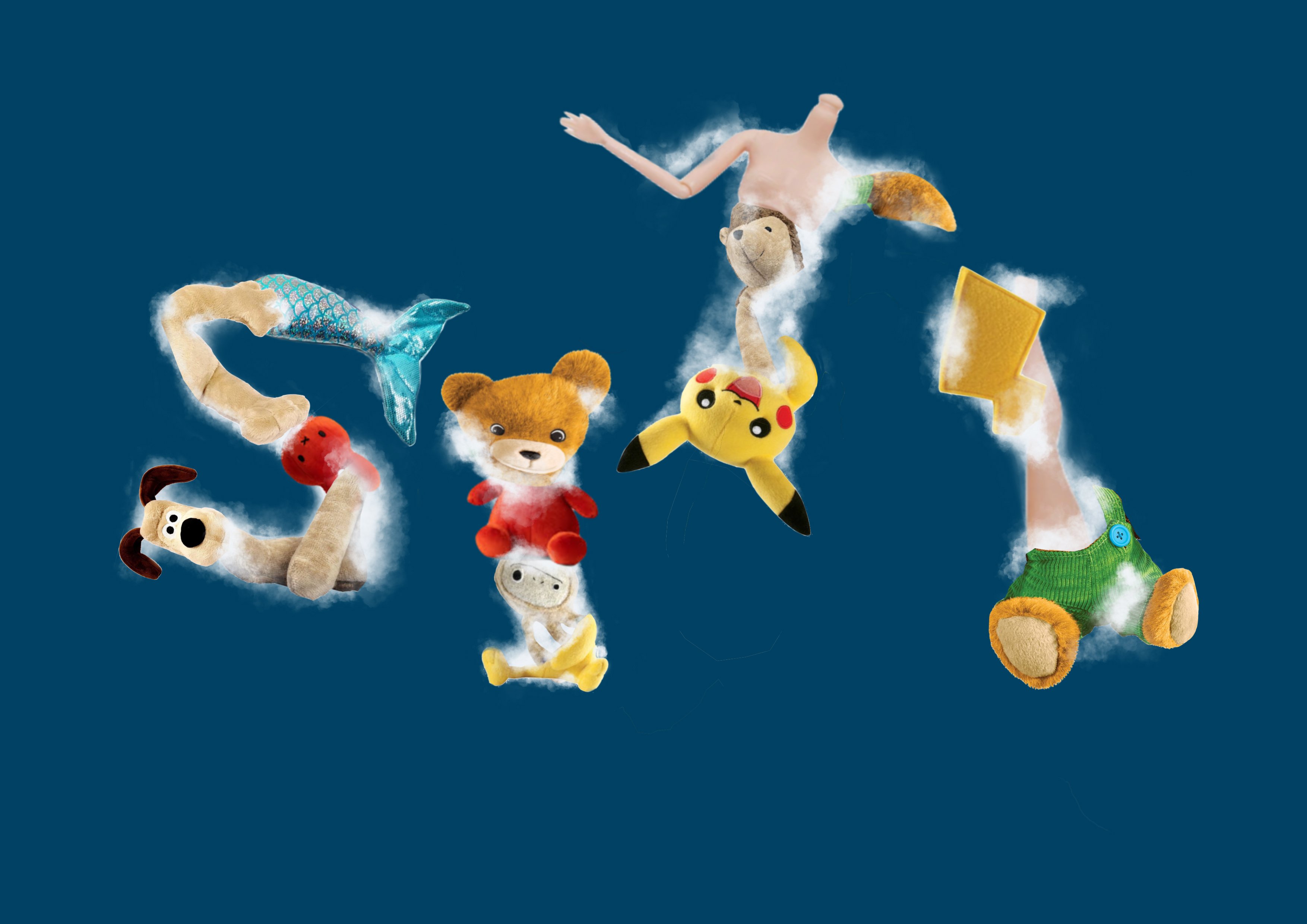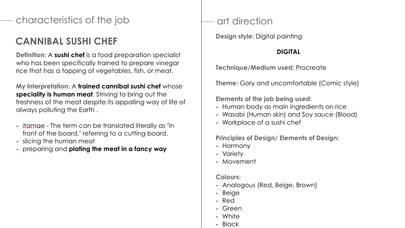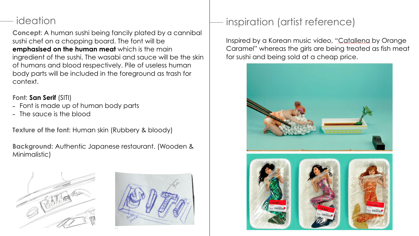

FINAL OUTCOME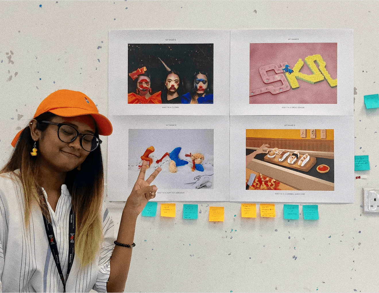


CRITIQUE SESSION:
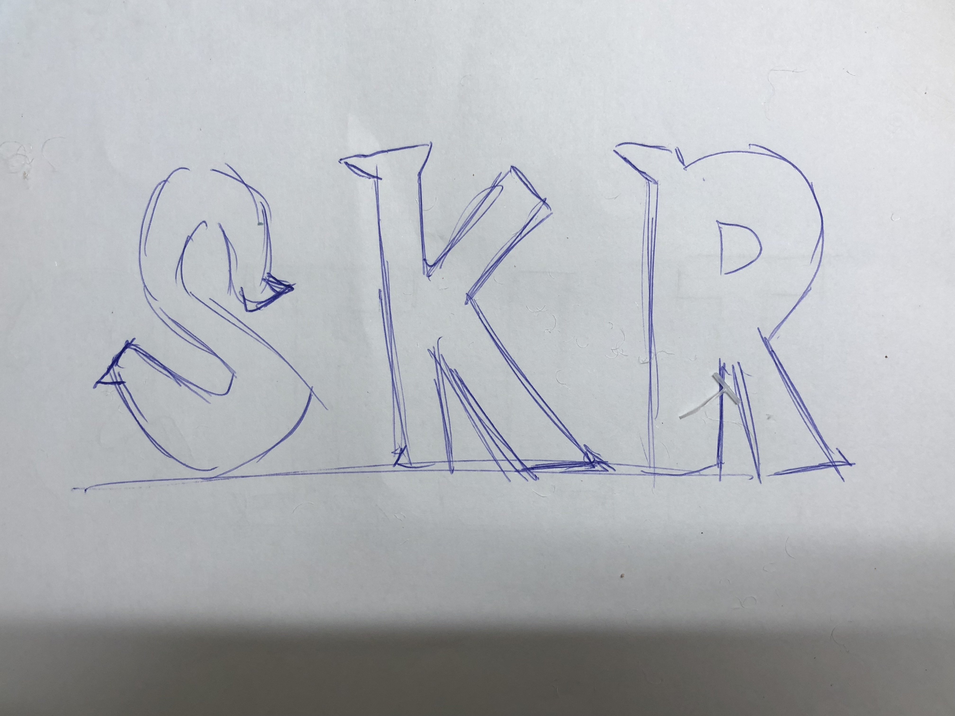
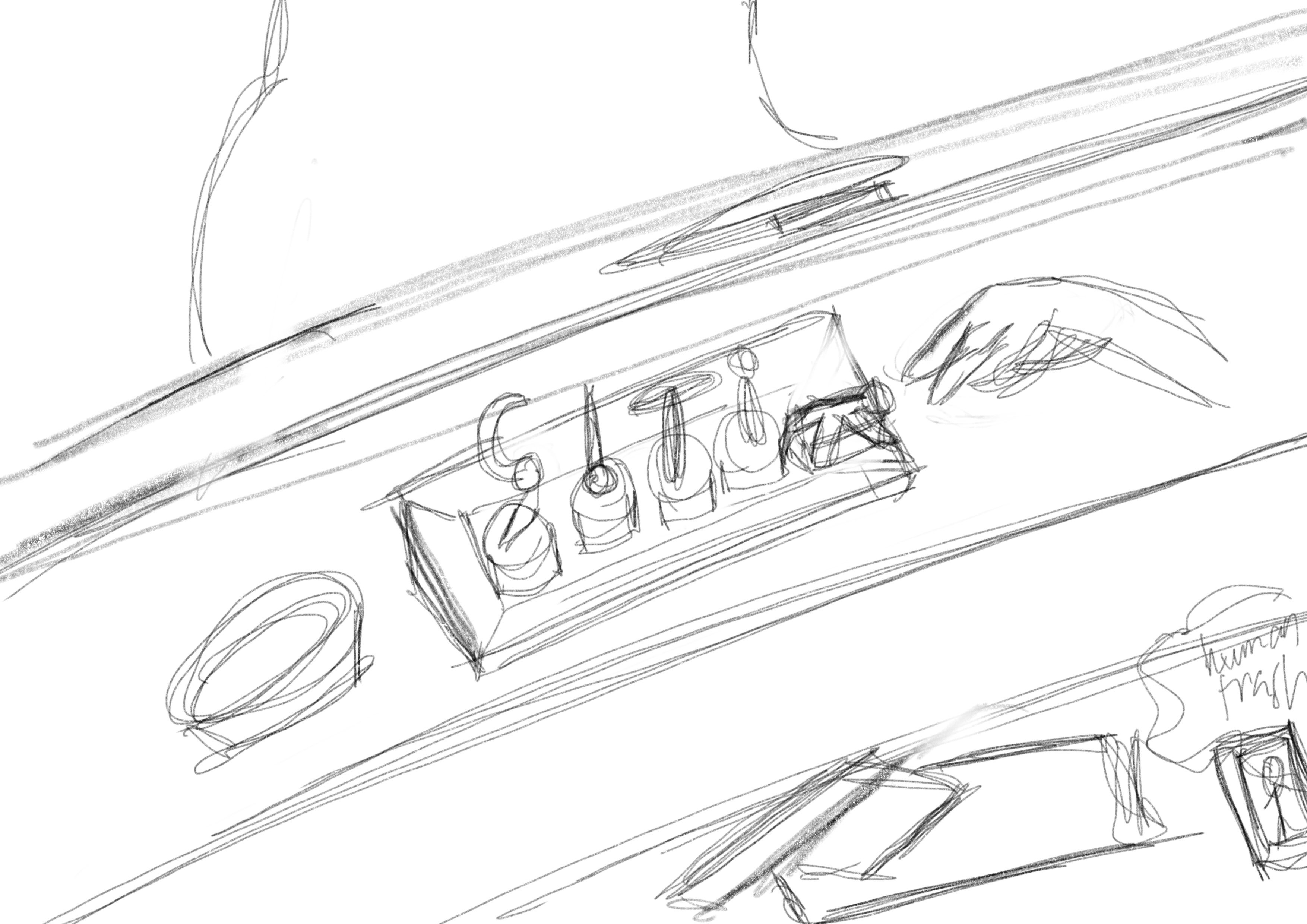
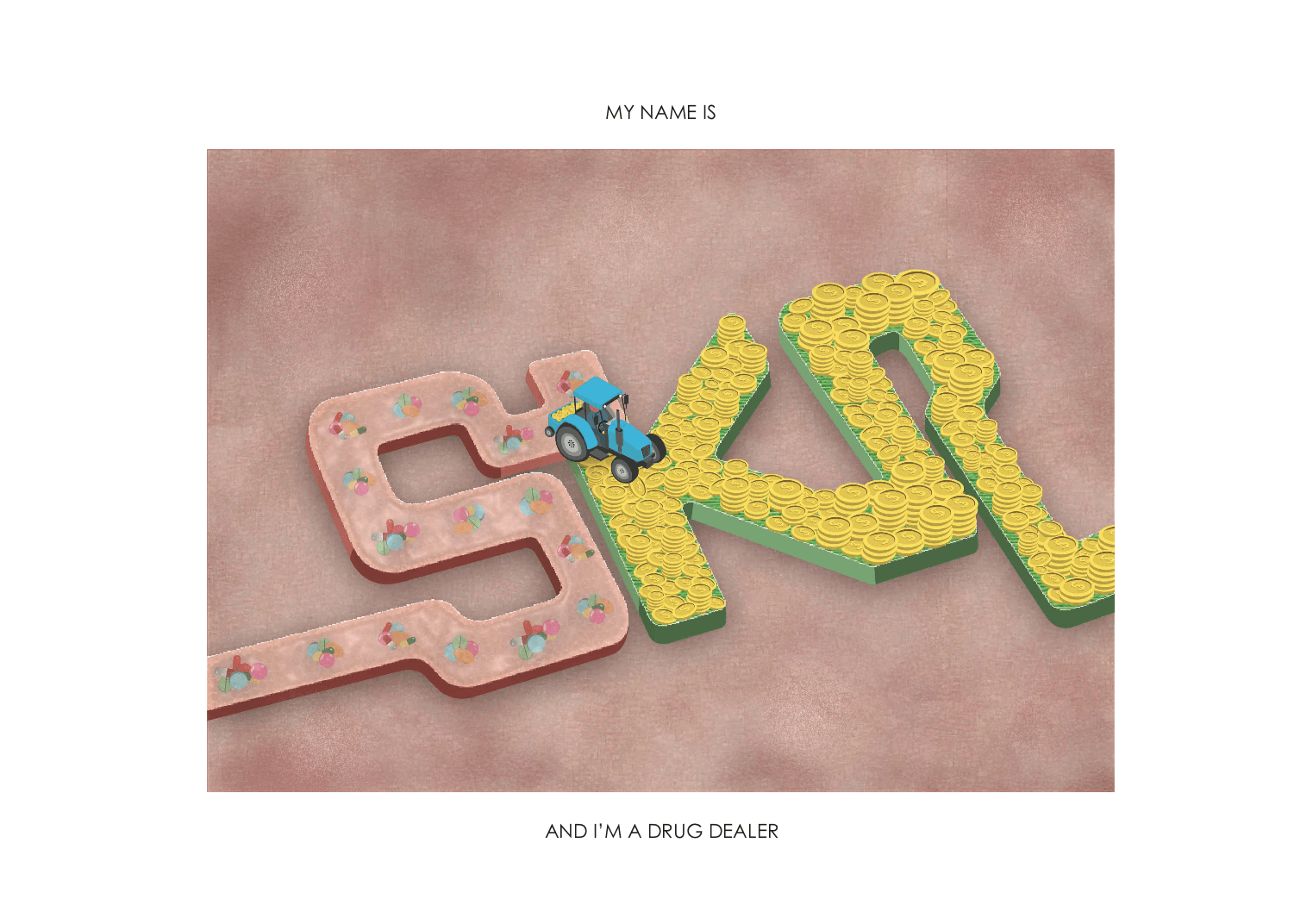
- Legibility of the letter ‘K’. It looks like an ‘X’.
- Add highlights to the typeface so it looks bouncy.
- Incorporate the texture and thin lines onto the typeface instead of the background.
- Outline the rounded and bouncy typeface on the clown’s face.


CRITIQUE SESSION:
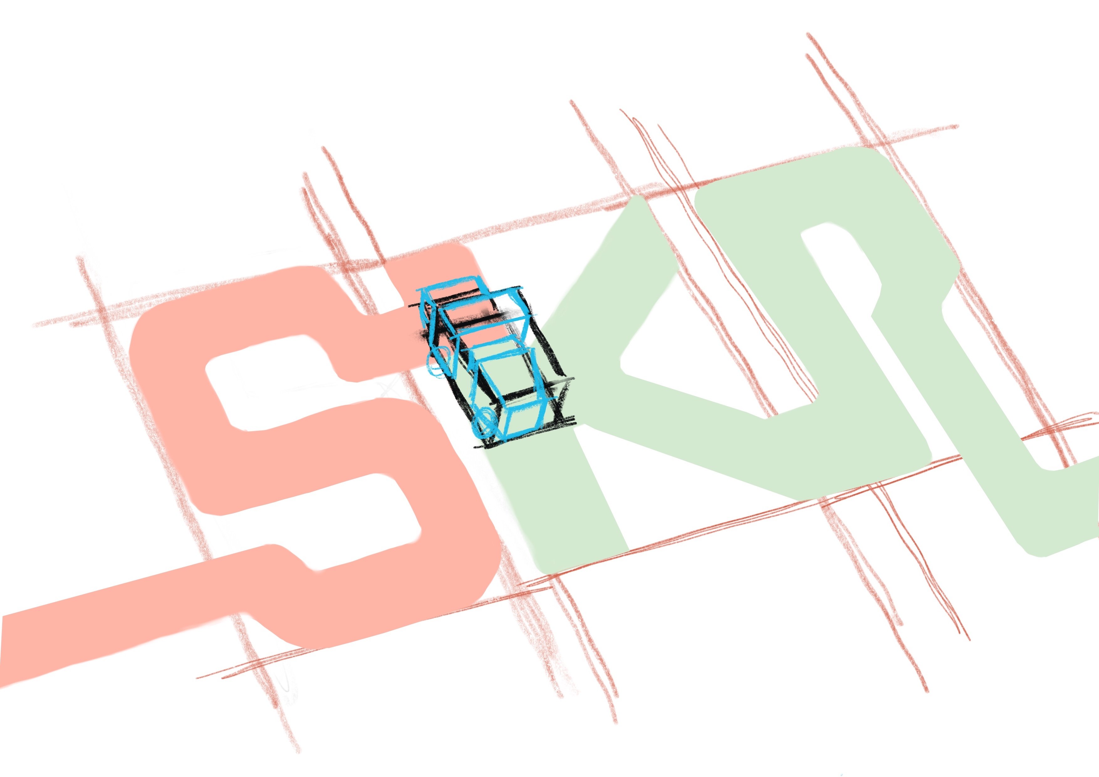
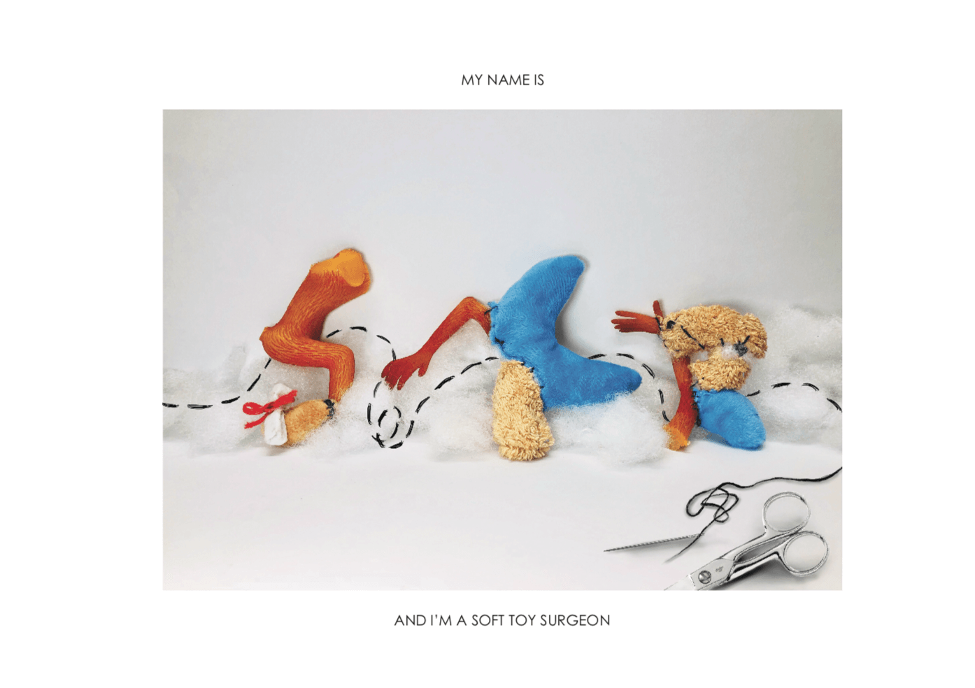
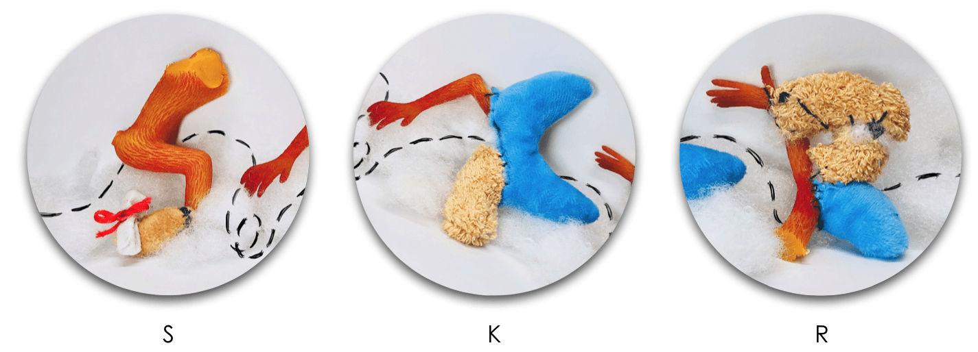
- The letter ‘R’ looks like a P. (Legibility)

CRITIQUE SESSION:
- Legibility of the letter ‘K’. I should have reduced the length of the decorative tail of the K.
- I should have brought the physical soft textured typeface during the presentation to showcase to my peers.

CRITIQUE SESSION:
- Legibility of the first ‘I’. Suggestion: Repeat the second ‘I’ typeface so it’s more readable.
TAKEAWAYS AND LEARNING CURVE DURING THIS PROJECT:
- I had challenges trying to picking out the minimal and essential elements from each of my jobs to portray it visually and efficiently. However, this project made me focused on the various aspects of the design process for image-making through type such as the usage of suitable elements, choice of fonts, color scheme, overall composition, technique or method that I’m going to apply.
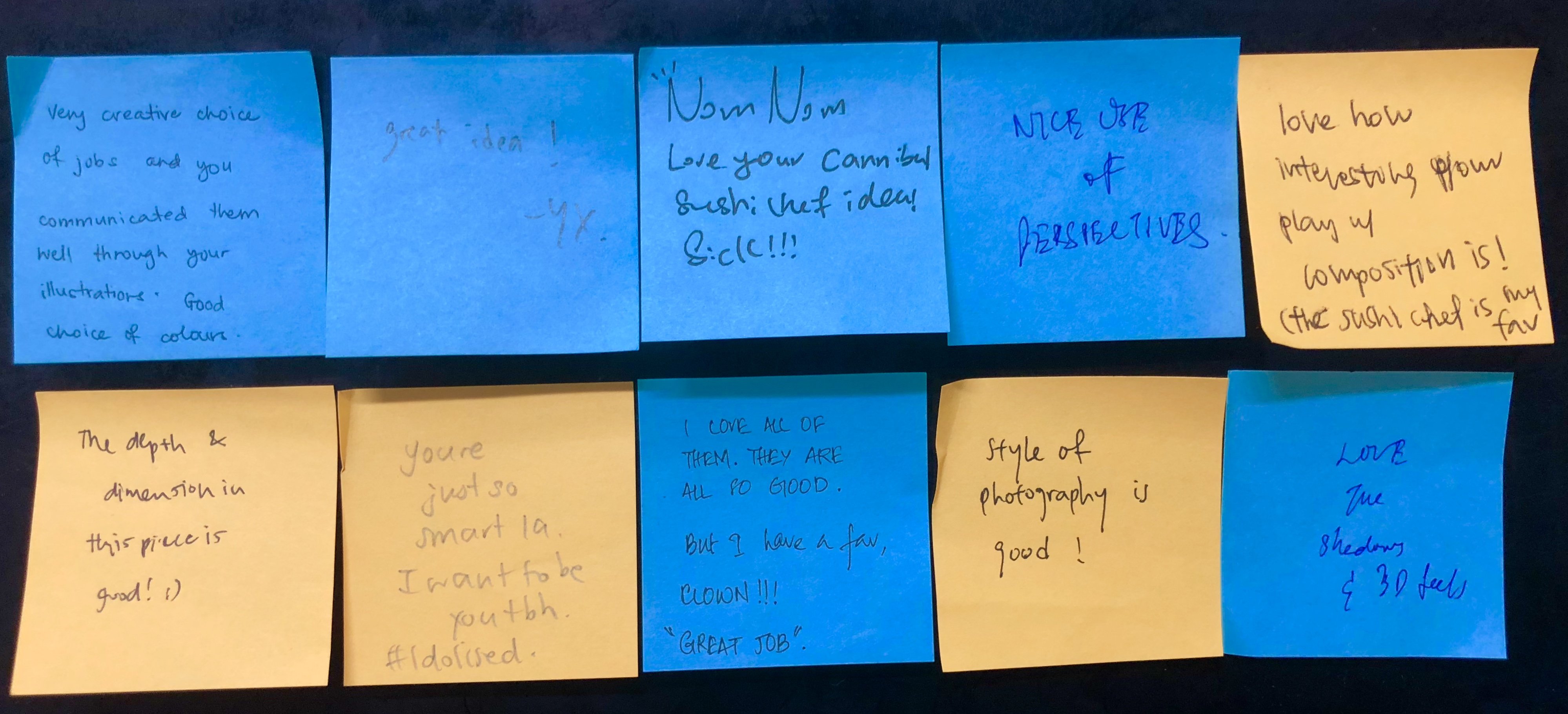
- My knowledge of the principles of design and elements of design assisted the overall composition of typographic portraits and my peers complimented the perspective, depth, and dimensions of my typeface.
- Personally, I really enjoyed the dynamic design process of trying out analog and digital methods.
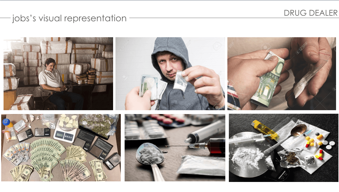
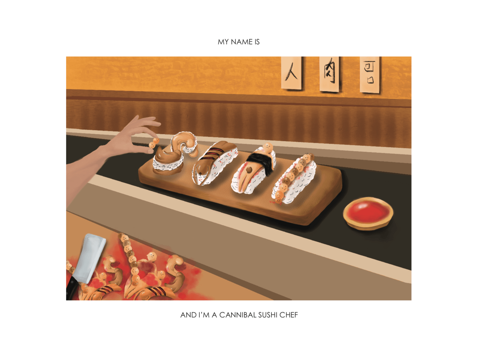
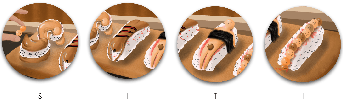
- All in all, I’m really satisfied with the 4 outcomes of my typographic portraits. My favorite designs are the ‘Depressed Clown’ and ‘Drug Dealer’ and most of my peers really enjoyed ‘Cannibal Sushi Chef’. In terms of my illustrating skills, I felt like I’ve grown and improved in being able to harmonize all the elements and create a narrative.