Week 7: Tracking Stress Levels

Tracking stress levels! I enjoyed figuring out what are the kinds and qualities of stresses that were affecting me for this practice. It helps me put my day into perspective and shows me a pattern of stress that i experience daily based on time (i.e. morning, afternoon and night time)

Week 6: Tracking Waste Usage

This was an interesting data collection for me because I was curious to see exactly how much waste I consume. Honestly, I’m the worst nightmare of tree lovers because the amount of tissue I consume within a day is insane. I blame it on my sinus and weak, feeble body. While people carry around small packets of tissue, I literally carry around tissue boxes. Any rainy weather or dusty environment triggers my nose to go all out into a phlegm party. In fact, you can see this from my data on Tuesday. That night was so cold and rainy, I believe I managed to use half a box of tissue. Surprisingly, this data was also revealing of my lifestyle. Personally, I don’t really consume or indulge in many things. In a way, I find it tiring to a certain sense to engage in any activity or use anything hence my first reaction to MANY things that approach me is to just simply reject it first. This is a really bad habit that limits my experience in a sense and I should be working on this. I included petrol usage intentionally as well because I’m somehow aware of how much I’ve been uber-ing these past few months and I thought it’ll be good to record it down to show it to myself. 

Week 5: Tracking Social Media Usage

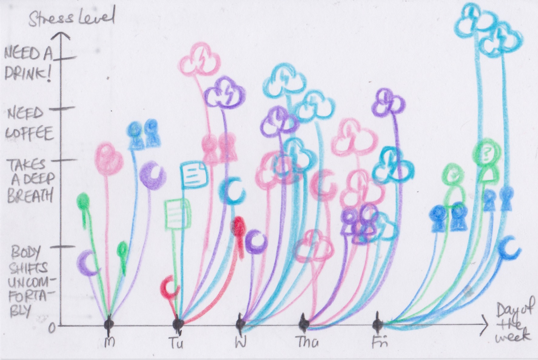
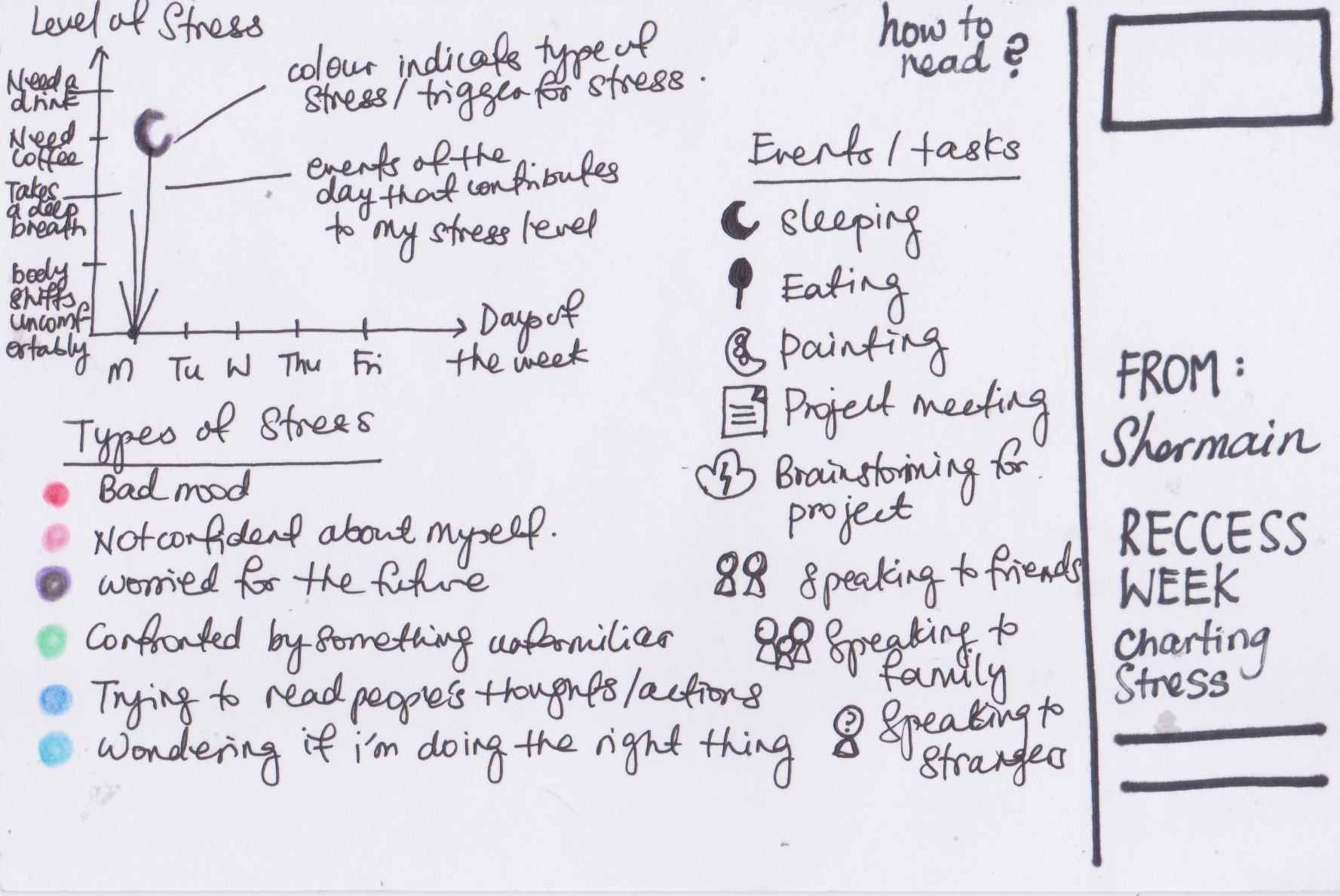
I’m a person who is constantly on social media, checking for updates or something to entertain me. I don’t like spending my time doing absolutely nothing because I feel that, that time can be used to my advantage, for instance educating myself by reading articles or improving my sense of taste by scrolling through aesthetically pleasing photos on instagram. Yet years of being so constantly engaged with the world wide web has indeed taken some negative effects on me, I began to realise scrolling through large amounts of information was not helping me improve, or be a better person. To put it simply, instantaneous information just wasn’t cutting it. The ‘instant’ world was not helping me. Instead, I’ve learnt to give myself ample time to be in my own ‘headspace’ and learn to formulate thoughts within me, only seeking the world wide web for inspiration when I have the ability and energy to absorb what it’s willing to offer.

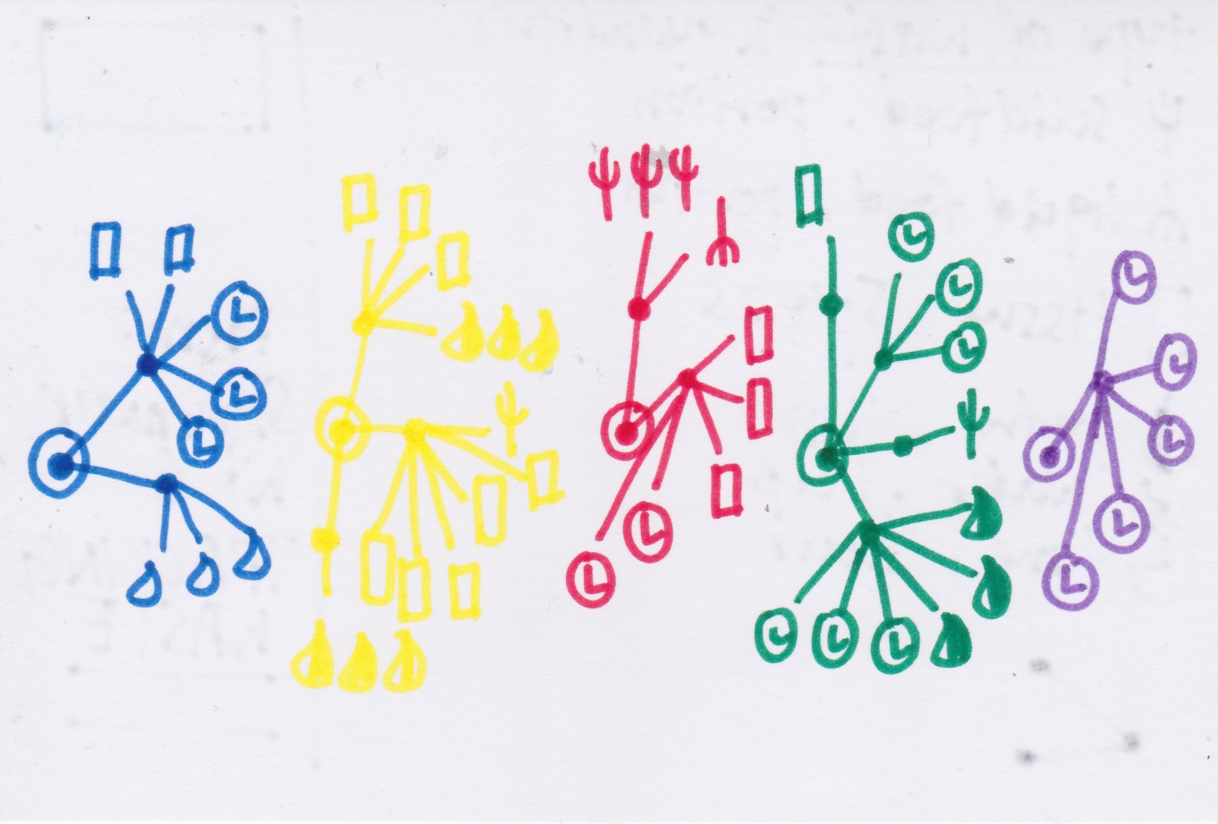
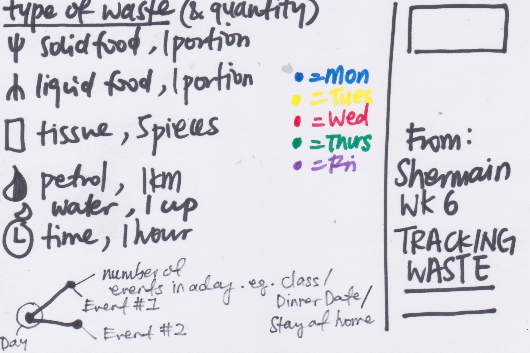
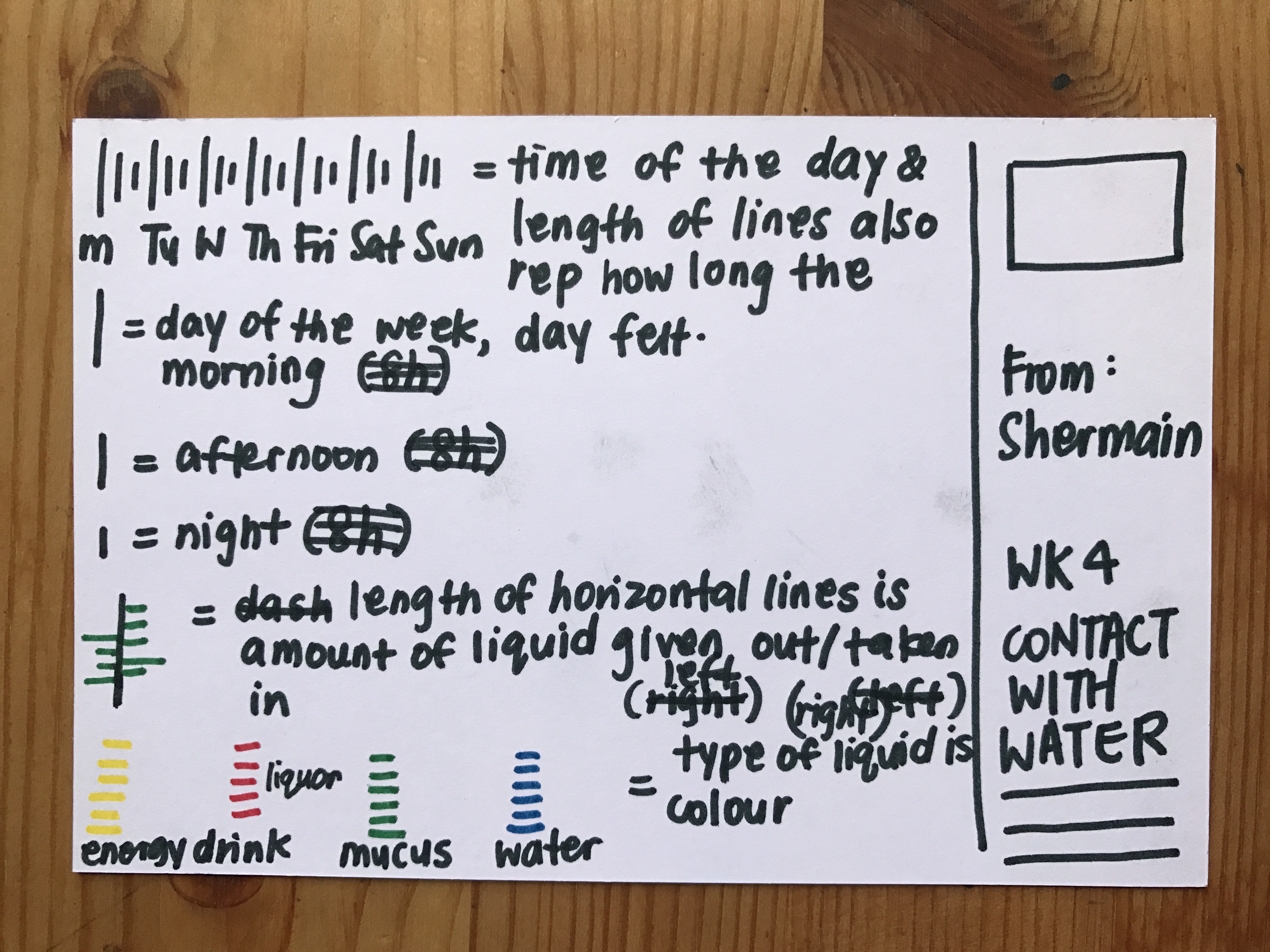
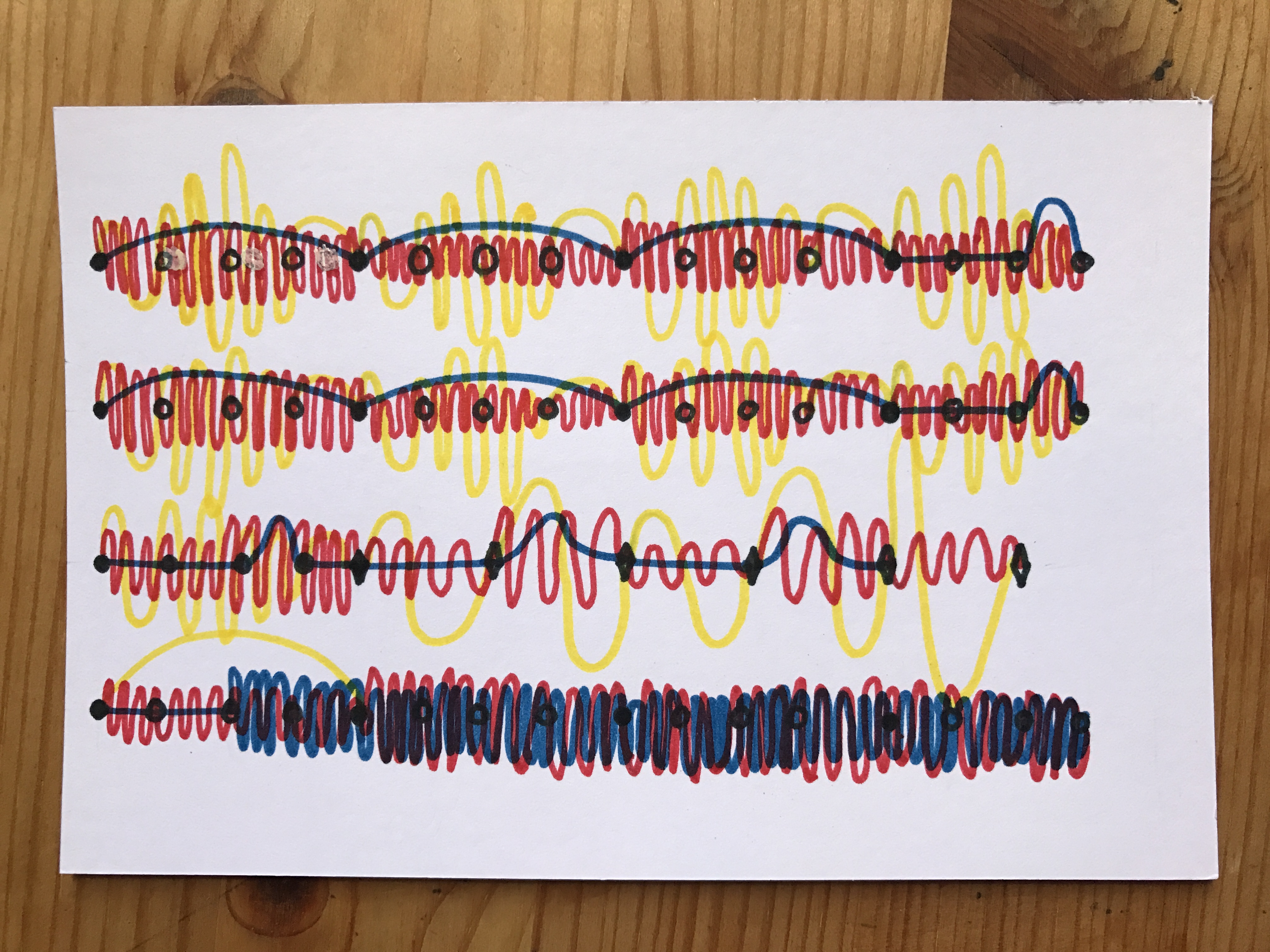
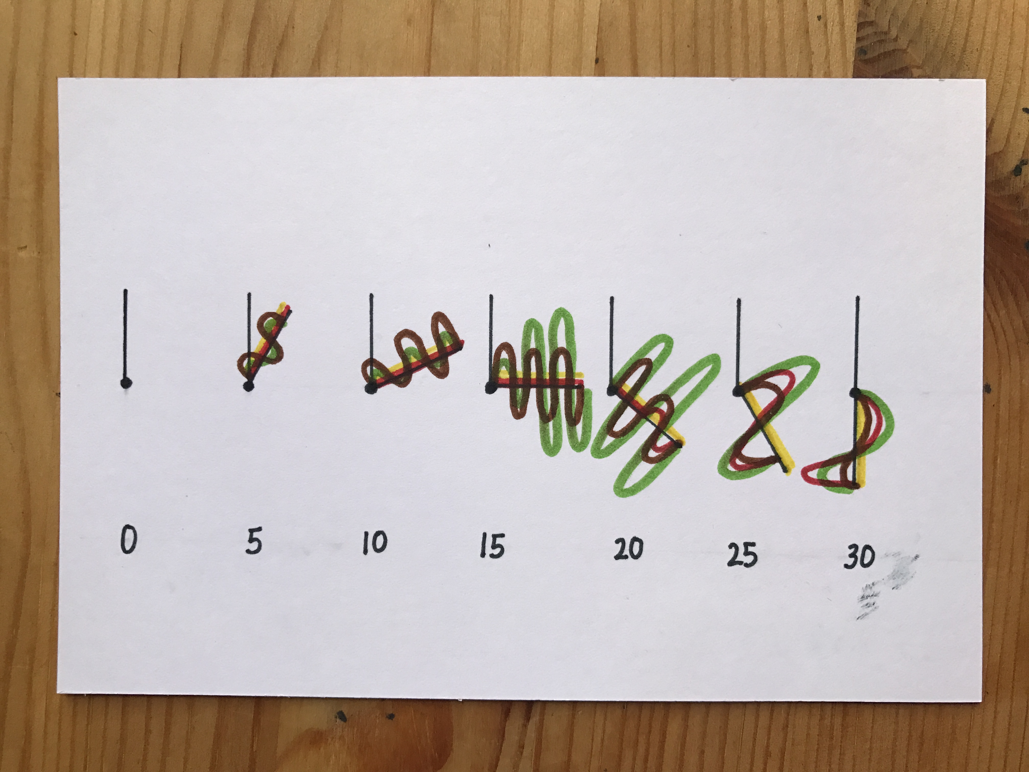
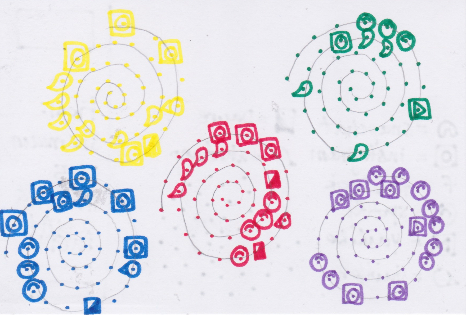
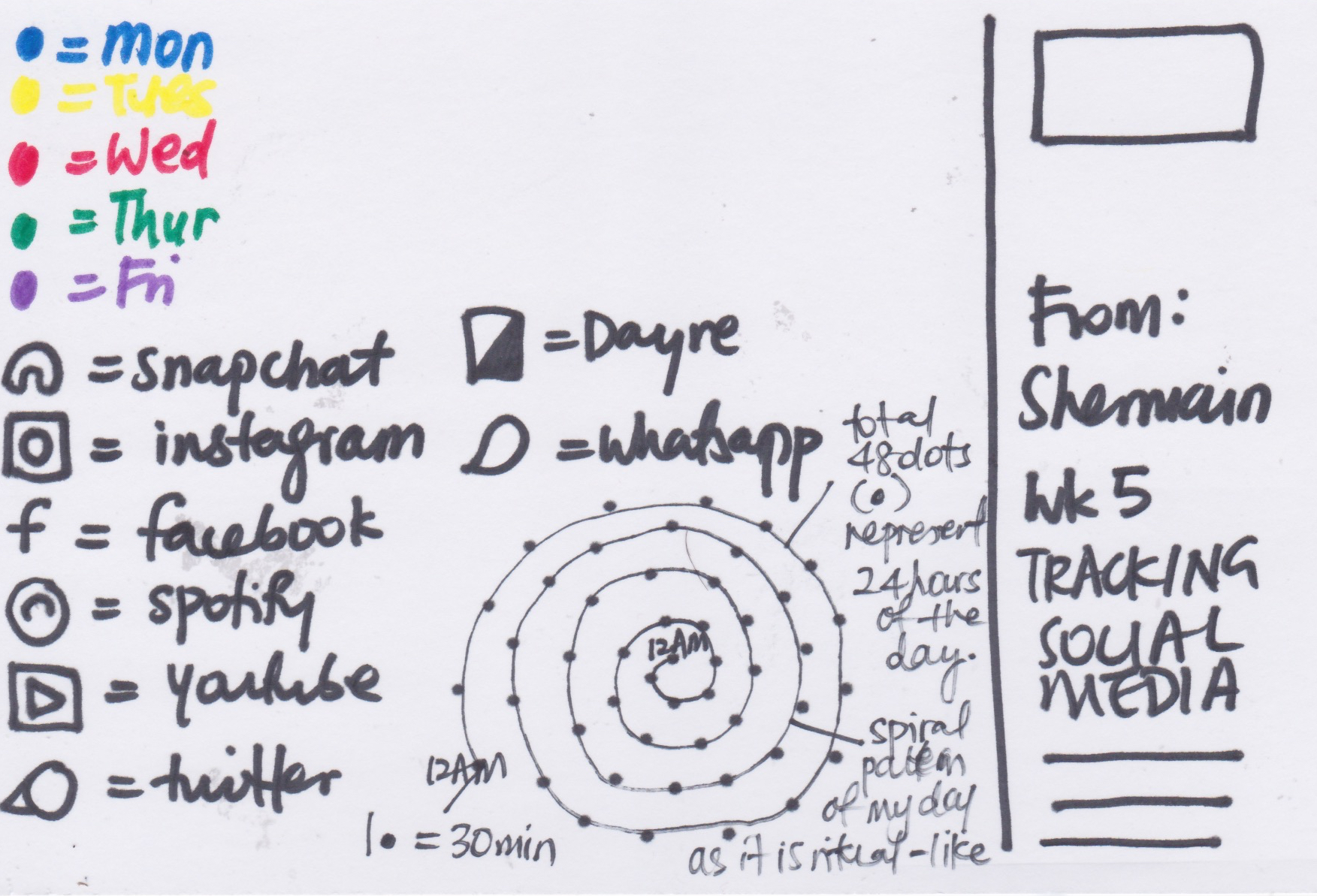
I’ve come to realise that my interaction with the social media world is rather ‘ritualistic’, i stick to a certain schedule and i check social media rather periodically (i.e. almost every 30 mins) given that I’m quite concerned about time even in my daily life. Hence, I decided to represent the time of the day into intervals of 30mins, with each dot representing a half an hour. Hence, each day contains 48 dots in an outward spiral manner. Then, within each dot, i record the most prominent social media activity that i have used in that half an hour. I actually see a pattern from my data: The type and duration of social media that i use usually depends on time of the day, my mood and event of the day. For instance, I usually start the day by watching a youtube video or replying my whatsapp messages. In the evening when i have classes, I tend to be chatting with my friends on whatsapp. Later in the night while commuting home, I like to either listen to music or read dayre to learn about other people’s day, an online platform that acts like an instant diary/blog. At night, when i feel bored, I like to go on instastory to check out what people are doing at night. Also, if i tend to be meeting my friends, I’m either off social media or I would be on Spotify, listening and sharing music with the friend I’m with as a way of bonding.

Week 4: Visualising Contact with Liquids

img_1928 img_1930

Honestly, I was really excited to visualise my contact with liquids because I’ve been sick for the entire week. Which means that I’ve been taking in and giving out loads of unattractive, gross amounts of liquids. 

This visualisation did not turn out as clear as i would have liked to. But here’s how to read it: The three lengths of times represents the three different times of the day. Namely, the longest being morning, middle being afternoon and shortest being night. Because these were how my days felt when i was ill. The horizontal lines in different colours represents the type of liquids and its length represents the amount of liquid I was in contact with. Also, the direction of the horizontal line tells if the liquid was given out(left) and taken in(right). The closeness of each horizontal line also tells of how often I come in contact with the liquid.

An interesting pattern that I noticed was that, after consuming large amounts of water, the amount of mucus i was giving out was much, much lesser which proves that water is indeed really necessary for a sick soul! But in comparison, when I consumed 2 pints of beer on day 2, I definitely felt for its effects and paid for it because on day 3, I was blowing out humongous amounts of mucus. 

I never knew info visualisation could be so funny and musing heh.

Week 3: Visualising Sound

img_1924 img_1926

Visualising sound was particularly a challenge because there were already many indicators and measurements that were available in the field of sound and music.  Out of sheer fun, here is the list of possible measurements i put together:

  • Amplitude/loudness
  • Pitch
  • Tempo
  • Mood
  • How does it make you feel
  • Syllabus/lyrics/ pronunciation
  • Vibrations
  • Layering of voices
  • Repetitions/ ups and downs
  • Pitch
  • Instruments
  • Loudness
  • Positive/negative ; major/minor
  • Moments of…
  • Pauses
  • Accents; !
  • Colours-sounds (synesthesia)
  • Ability to understand/Rolling of tongue/Clarity
  • Number of participants
  • Smoothness of melody; abrupt pauses
  • The letters involved

In the end, I let my body decide which part of the song appealed to me the most and focused on 1:05 – 1:43 + aaah! What stood out to me was the three ‘voices’ and the kinds of ‘dynamics’ that they brought to my ears. I chose the three final elements to be tempo, pitch and the type of instruments. The information can be read like a book, from left to right and up to down.

What surprised me in the end was how the visualisation turned out to be more complex in the end. Despite only choosing three elements to consider, the visual outcome turned out more emotive, animated and fun than i expected 🙂

Week 2: Visualising Taste

img_1915ABOVE: DULCE SEAWEED

img_1919 img_1921

ABOVE: FERN FRONDS

When creating this postcard, I wanted all my information to be centred around the element of time. Hence, I created used the hour and minute hands that is conventionally found in clocks and simplified them into two lines pivoted on a point. They tell the time in the interval of 5 seconds.

In my impression, intensity meant greater higher waves and greater lengths. Hence, i decided to visualise them as waves. In addition, the number/frequency of waves could help me show the number of bites I had to take. The visualisation of wave helped to show the dual nature of intensity and frequency. 

Lastly, the 4 flavours that we taste is represented by 4 different colours. These colours are based on the foods that reminds me of a certain taste. For instance, yellow for sour because of lemons. 

I decided to use the same elements for both postcards because I’m interested to see how both taste tests played out for me in comparison!