
 ABOVE: DULCE SEAWEED

ABOVE: FERN FRONDS
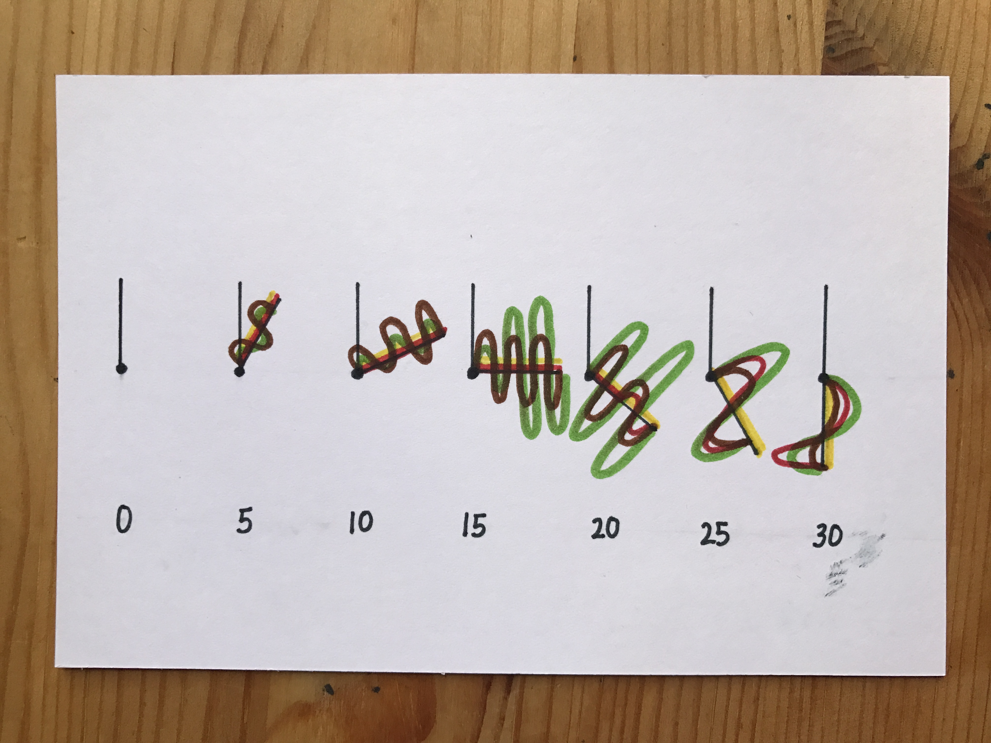
When creating this postcard, I wanted all my information to be centred around the element of time. Hence, I created used the hour and minute hands that is conventionally found in clocks and simplified them into two lines pivoted on a point. They tell the time in the interval of 5 seconds.
In my impression, intensity meant greater higher waves and greater lengths. Hence, i decided to visualise them as waves. In addition, the number/frequency of waves could help me show the number of bites I had to take. The visualisation of wave helped to show the dual nature of intensity and frequency.
Lastly, the 4 flavours that we taste is represented by 4 different colours. These colours are based on the foods that reminds me of a certain taste. For instance, yellow for sour because of lemons.
I decided to use the same elements for both postcards because I’m interested to see how both taste tests played out for me in comparison!
You must be logged in to post a comment.