
Wood-type Posters
The one thing that really caught my eye was the wood-type posters purely because of the incorporation of the different weights, sizes and typefaces that came together to form eye-catching albeit chaotic designs (but that’s what I liked about them).


It started from when Johannes Gutenberg created the movable type printing press in 1450 and it became a popular method to mass print text. Due to the Industrial Revolution, mass production and consumerism went up which led to the need for more advertising. In order to ensure their posters grabbed attention amongst the other posters, poster designers knew they had to stand out with their type and title as printing images was not an option then.
However, the metal type process worked best for smaller type for books and was unable to cater to the needs for more lavish and larger type. An American printer, Darius Wells, then created letterforms out of wood. It was even said that the reasons behind different fonts put together was more pragmatic – because there were limited types of letterforms and condensed or extended fonts were used based on the length of the text to fit the poster. More important titles also took larger fonts which was more eye-catching.
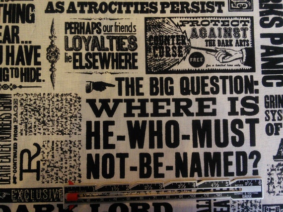
In a way, its inconsistency in font and spacing made it feel more human made than machine made which was consistent with the Arts & Crafts movement’s ethos, during which wood-type posters surfaced. These poster designs also reminded me of The Daily Prophet, the main newspaper in the Harry Potter series.

What was really interesting to me was that I also thought newspapers back in the days looked liked those wood-type posters, as the Harry Potter creative team would also have me believe. But I realised in actual fact they looked like these back in the period of 1890s to 1920s:


Back to The Daily Prophet, and why this design was used I thought might have something to do with the nature of the newspaper – which acted more like a tabloid that spread government propaganda like no other and even spread false information against our protagonists. This design which uses dingbats and multiple fonts, includes many story titles that seem to be fighting for attention takes the feel of advertisements and does not portray the usual steadiness and credibility most newspaper gives. This emphasises the nature of the wood-type posters where despite them being loud and attention-grabbing, does give off a tone of exaggeration and lack of impartiality.
You must be logged in to post a comment.