The Dada Movement
I have always had a liking for Dada’s works and ethos. I liked that it was a such a powerful – powerful in the sense that it was so desperate to show a form of rejection towards the norms that it became the extreme opposite –reaction to the vileness present in humans that could lead to a world war. This movement encompasses the ideal of getting the audience to think about the purpose of art, and to do things that seemed absurd to throw people off and force them to think beyond the construct of the current bourgeois society. The more it did not make sense, the better, for its leaders wanted there to be a distinction between them and the ‘sobriety of the conventional society’.
“The beginnings of Dada were not the beginnings of art, but of disgust,”
– Tristan Tzara
Even how its name came about was very true to its beliefs. The term ‘dada’ not only sounded childish and absurd, it meant the same thing in all languages which reflected Dada’s internationalism.


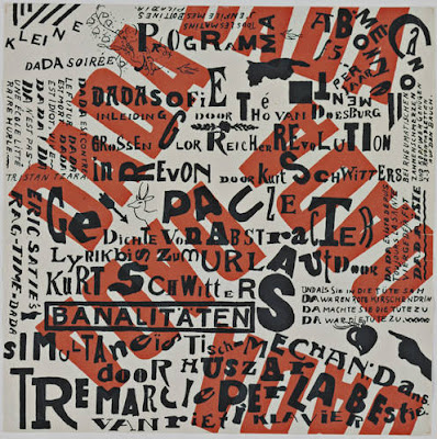
True to artworks of the movement, even its typography heeded its need for expression beyond set rules – there was no rhyme or reason behind the use of selected fonts, no guidance by grid lines, disproportionate white spaces, words in any direction and random letters dropped here and there. Functionality and legibility clearly not the main point of the Dada posters. There was almost no commercial value to their typographical works, which is true of Dada’s desire to go against mass-production and the consumerism mindset.


All in all, my favourite part of this movement is the pure absurdity of the extreme the artists sought to portray, the ideal of the part of society that was more human, being so sick of those who seemed put together and valued materialistic items. No one can deny, that the Dada movement was a breakthrough in the art world.
You must be logged in to post a comment.