Writing to Typography
Being a Typography student, I found this presentation particularly interesting, especially at the mention of some of my favourite typefaces like Garamond and Bodoni! I have recently taken more of a liking to modern typefaces because I love the contrast of their strokes and how they stand out as a titular type. To me, they are able to convey the message of elegance and bold.
However, the mention of Trajan’s Column and the Roman typeface really intrigued me. It got me to think about the typeface Trajan, designed by Carol Twombly for Adobe in 1989, that was based on the inscriptions on the Trajan Column itself.
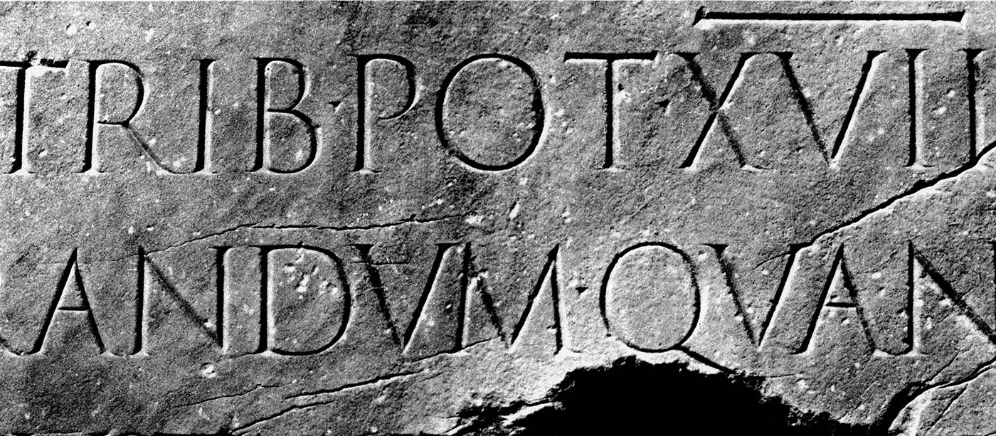
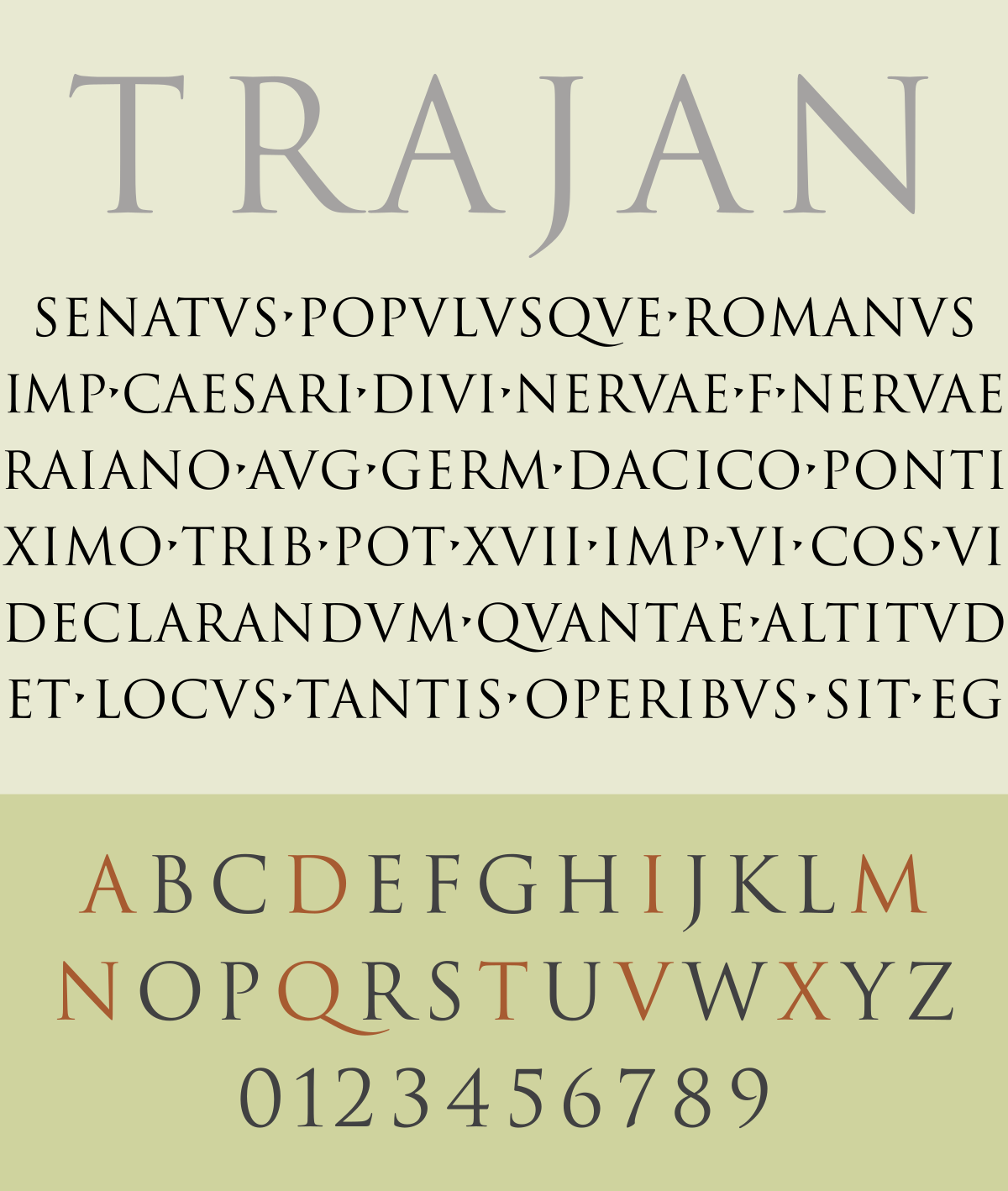
The Trajan type is typically used when power and elegance is meant to be asserted. Its use and purpose can be traced back to the column itself – a structure meant to commemorate Emperor Trajan’s victory in the Dacian Wars. Successful Roman Emperors, also named ‘The Five Good Emperors’, were celebrated for their strength and commonly built monuments to imprint their successes in history.
“the Roman capitals have held the supreme place among letters for readableness and beauty. They are the best forms for the grandest and most important inscriptions.”
– Edward Johnston, Writing & Illuminating & Lettering (1906)
An interesting I found about this type was also its popular usage in movie posters, so I thought I’d look more into that. True enough, when I googled the usage of Trajan in titles for movies or television series, this was the result that showed.

Most of the films that use the typeface tend to be epic drama movies where the main character goes through and overcomes many obstacles, and used in some of the biggest blockbusters in the 1990s, etc. Titanic, Indecent Proposal and The Joyluck Club. Coupled with an image that has undergone the treatment of sepia, you got yourself a box office movie.
It must have been the success or the impacts of the typeface that people started to recognise, as it then started appearing in movies for genres that you wouldn’t typically associate with a font like Trajan – comedy, horror etc. So B-rated movies or those that try to convey their story as more than it is.


The overuse of this typeface shows the downside of digitalising iconic typefaces like this, and diminishes the strength of the typeface in my opinion. Movie titles which essence are successfully brought out by Trajan include ‘Game of Thrones’ and ‘Lord of the Rings’ and perhaps ‘Titanic’, where the ideas of the grandeur of royalty and the tragedies as a result are well associated with the Roman Emperors and their successes and falls.
Therefore, I do think to some extent, the understanding of how a type came to be and its history is important consideration in its usage and impact.
You must be logged in to post a comment.