EGO

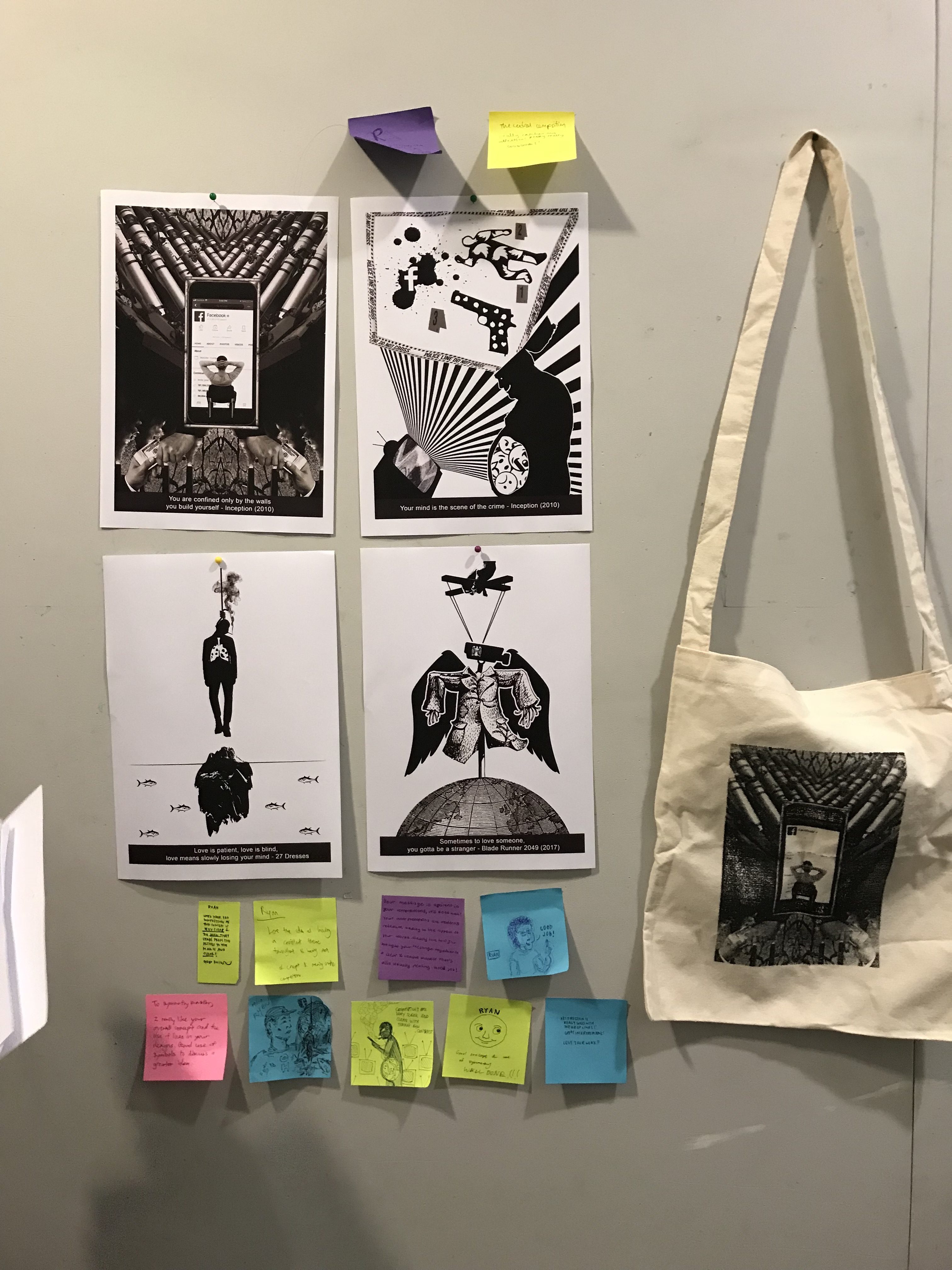
After completing the 2 previous projects which were dealing with only black and white, project 3 touched on another very important aspect of 2 dimensional design, colour theory. As a photographer I knew of basic colour harmony however I’ve never really paid much attention or understood the importance of how it would affect my images.

The purpose of this project was to explore how I would portray myself in a set of equations through the use of colour and different settings/scenarios. The timeline we were given for this project was a little tight where we had to complete a row of three designs every week as compared to one design per week for our previous projects. In the following post I will be running through my research, though process and my final designs for the 4 lines I’ve designed for EGO.

Reference Artists and Research

I get a lot of my inspiration for my works from Instagram. For this project, given the full creative freedom of medium and designs I decided to do most of my EGO lines with photo manipulation. Some of the reference artists are as follows:

@Demasrusli


@Dchantie

@Peteyulatan

I wanted to explore the “inception” effect and create a surreal space within my designs to portray my thoughts and imaginations.


As for my research on colour theory I looked online for examples on the different types of colour harmonies and tried experimenting with them in my designs.


Line 1

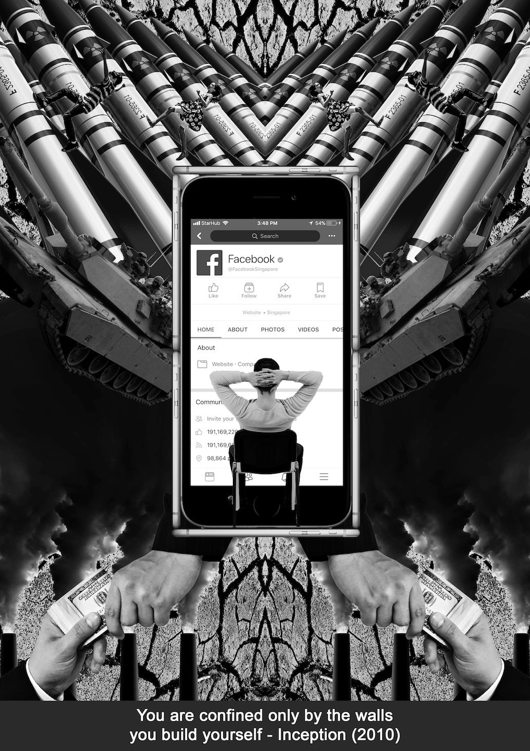
Optimistic + Obstacle = Conquerer

In the beginning of this project I wanted to stick to something simple and easy for me to switch colours like vectors. The inspiration for this equation is life as a student in university for me.


Optimistic

I used complementary colours for this design and chose orange as the background to portray zest and enthusiasm. The Blue colour of the water strikes out against the background and makes it easy for the viewer to understand the focus of this image.

Design wise i chose to go with the saying: “a pessimist sees a cup as half empty, an optimist sees the cup as half full” and designed the water on the top of the all too familiar takeaway plastic bag in Singapore in order to give the design a quirky local twist. Upon consultation I decided to add a hand carrying the bag to act as a leading line and also to balance the design.

Obstacle

To create a dreaded look I chose to go with blue as the main colour for this design. Complementary colours would add too much contrast to the design thus i decided to go with split complementary colours using orange as the main focus and blue and purple to complement.

The blue mountain represents the dreaded and tough  journey I will need to overcome in order to reach the top of the mountain to get my degree and graduate. Continuing from the previous optimistic design I used orange to portray me as an optimistic person in the image carrying books up the mountain. The pieces of paper flying off the stack of books are to create a sense of struggle. The purple clouds help to reduce the tension between the orange and blue to pull together the design making in look cohesive.


Conquerer

For the last image of the first equation I used an analogous colour scheme. The analogous colour scheme helps to create a serene and stable design which I wanted to emphasise in this image. Going with red and orange I wanted to show energy in this image. The red rock on which the graduate is standing on is darker than its surrounding colours which draws the viewer’s attention.

Taking from the previous image of mountains i incorporated the same element into this composition however this time the colours have changed to a more vibrant orange similar to the previous two designs relating to optimism and enthusiasm.  For the main design I placed the graduate, me overlooking the mountains showing how I’ve conquered climbing to the top of the mountain.

Line 2

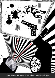
Imaginative + Bedtime Stories = Dreams

After completing my first line I decided to stick to a medium that I was more familiar with even though it was going to be more difficult to convey colour harmony through a combination of found images and pictures that I’ve took before. I faced some difficulties trying to push some colours to stand out and finding images that fit into the colour harmony that I was going for was also an issue however with the help of photoshop and lightroom i was able to better exaggerate the colours of my images.

In this line I wanted to show a little bit of my creative side. I have the wildest of dreams sometimes and a lot of them are due to the “bedtime stories” that I have before I go to sleep. Before going to sleep I like to check my social media and I follow a lot of really creative people on Instagram that push the limits of editing and distorting reality which i tried to replicate in this equation.

Imaginative

To show a creative aspect of myself I used maroon and purple hues with a gradient background of blue. The colour scheme i used for this design can fit into the triadic colour scheme of yellow, blue and red however the yellow was not really apparent in this design thus I decided to stick with analogous colours instead even though the colours are spanned out quite far.

I used a double exposure of my self portrait and a galaxy to represent what is going on in my head. I wanted to use the galaxy to show the vastness of my imagination. Having the reds and purples in the double exposure I used a subtle blue for the background to create a contrast between the head and the background. The gradient from dark to light was used to make the image look more interesting and at the same time subtly create movement.


Bedtime Stories

This was a photo that I shot personally. To portray the serenity and comfort of going to bed I used blue lights to fill up the background of the bedroom. To make the scene more interesting I used a complementary colour scheme and added some orange fairy lights. Shot at a low aperture the fairy lights became round balls of light (bokeh). In post i exaggerated the effect and photoshopped more bokeh balls to fill the frame to create a more dream-like environment.

Dreams

To continue the series of using blue as a supporting colour in the compositions I used an old photo of mine when i shot in Hong Kong and colour graded the landscape to have blue as a background colour. The lights from the buildings helped to fit into a complementary colour scheme similar to the previous image.

Being inspired by the movie “Inception” I went ahead to try and imitate the multiple realities effect and stacked two images diagonally to create a sense of distortion and added a person falling in the center to represent me falling in my crazy dreams.


Line 3

Nature Lover + Concrete Jungle = Caught in Between

The inspiration I got from my artist reference is most apparent in this equation. It is also my favourite equation out of all the other ones I created for this project. Manipulating a combination of found images and images of my own I tried to create a consistent theme throughout the equation where the landscape is warped around a subject and there is an object in the center of the image to give context to the design.

As a cityscape photographer a lot of people might think that I only love shooting photos in an urban setting however I started photography because I was inspired by nature photographers. To sort of show the struggle I have whenever I want to travel I designed this equation to give some insight into my photography life.

Nature Lover

To show my love for nature i chose to go with a triadic colour scheme for this design. Creating a balanced harmony between red, blue and yellow I chose a found image of an ocean view with a orange sunset, thereafter shifting the hue of the orange and made it closer to red. To draw attention to the center of the frame I used a yellow tree to metaphorically represent nature.

I added a human in the sea to add interest to the composition and also to create an implied line of the person looking into the ocean directing the viewer to the main focus of this image, the yellow tree.


Concrete Jungle

Initially to show the dullness and monotonous of the city I wanted to stick to an analogous or monochromatic colour scheme however it was a little too boring so I added a person wearing a blue jacket to draw the viewer’s attention toward the figure.  Again the composition of this image is similar to that of the first with the landscape warped around an object and the implied line of the person staring into the  open.

The clock in the middle was to represent how in a city everything is focused on time and that time is always viewed as money. Everyone is always in a hurry trying to get to their destination and complete whatever they have for the day. I think i successfully achieved the look I was trying to go for in this image.


Caught In Between

Finally in the last image using the complementary colour scheme of red and green to create contrast and show the struggle I face when I take photos.  Breaking from the previous two compositions of creating a solid landscape frame around the image I used a cityscape and nature landscape photo on each side of the composition to show the stark difference.  Apart from its look I saturated the trees to exaggerate the green colour and placed a red mask over the city photo.

I found an image of a person falling on google and decided to duplicate it and made one on each side of the image, then I added a motion blur mask on top of the layers and duplicated them again to create an illusion of the two subjects in constant motion. The colours of the female’s dresses also follow the complementary colour scheme of the image.


Line 4

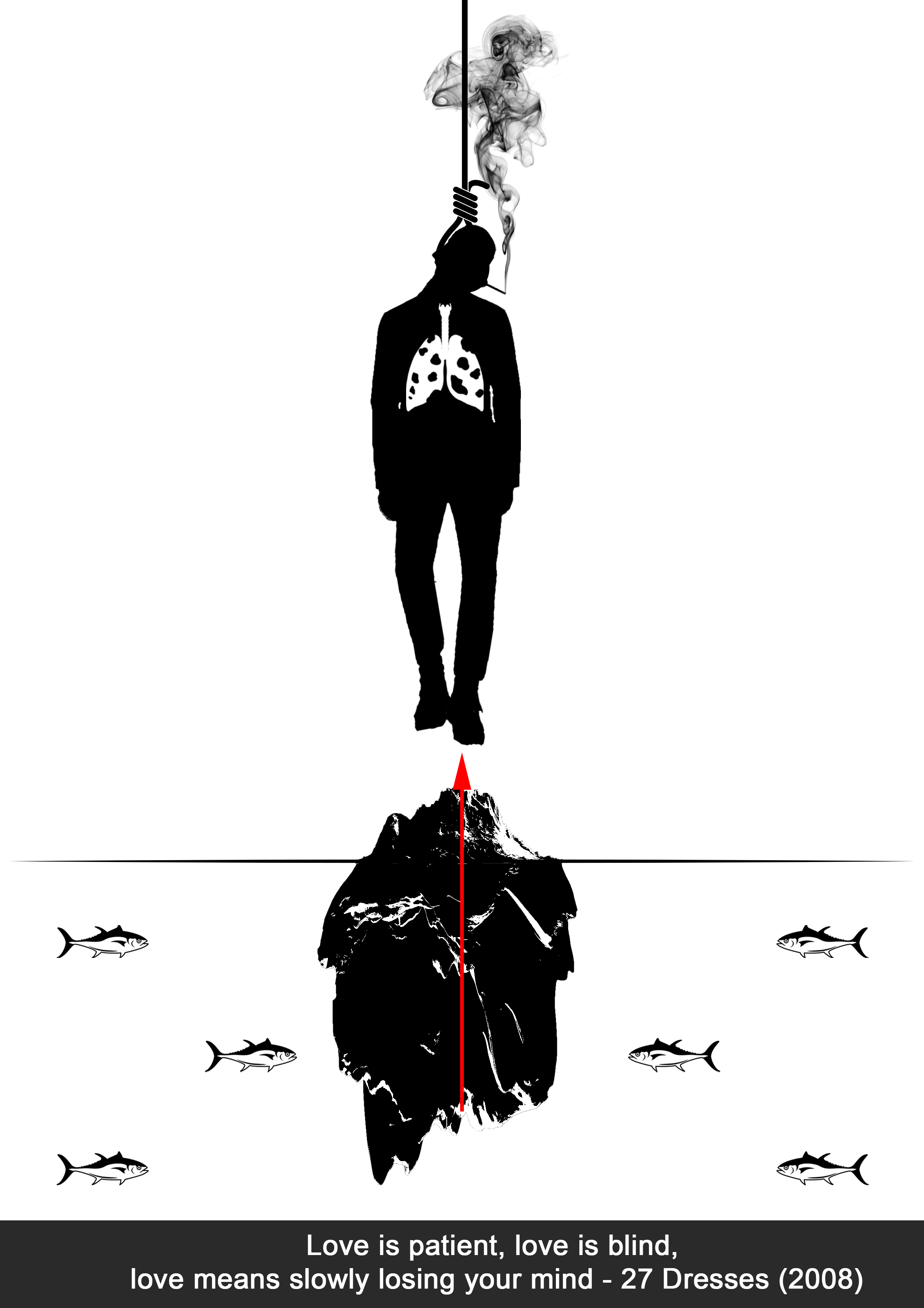
Real Me + Expectations = Limitless


My childhood inspired me to create this line. As a kid my father would force me to do math revision papers every night and I hated it. I always felt suffocated when I had to do something I didn’t like. Naturally as children we like to do art, however whenever my brothers and I did painting or drawings when we were young my father would get really upset and told us that he never wants us to grow up to become artists. To create a consistent theme around this equation I decided to use a frame throughout all the images and each frame represents something different.
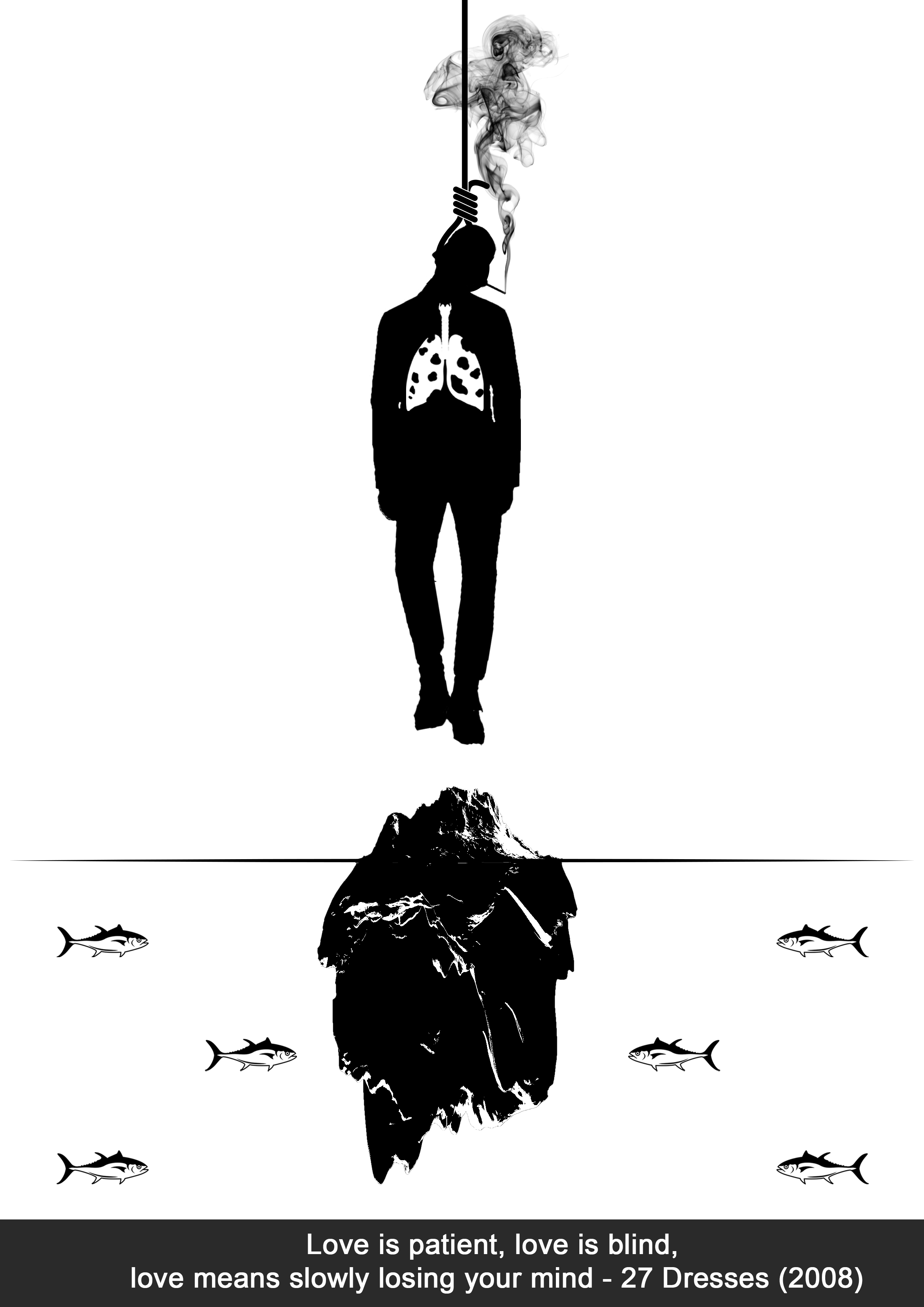
Real Me

Using dark blue as a basis of this composition I added accents of orange through the lanterns to create tension and also focus in the image. The orange frame complements the composition and balances out the contrast of the blue.

In this design the frame represents what I view myself to be. It is a frame much like a photo frame representing me as who I am. The hoodie creates a mysterious vibe almost as if I was guilty of something. The lanterns represent my wishes and dreams of being creative however I am being restricted by father.
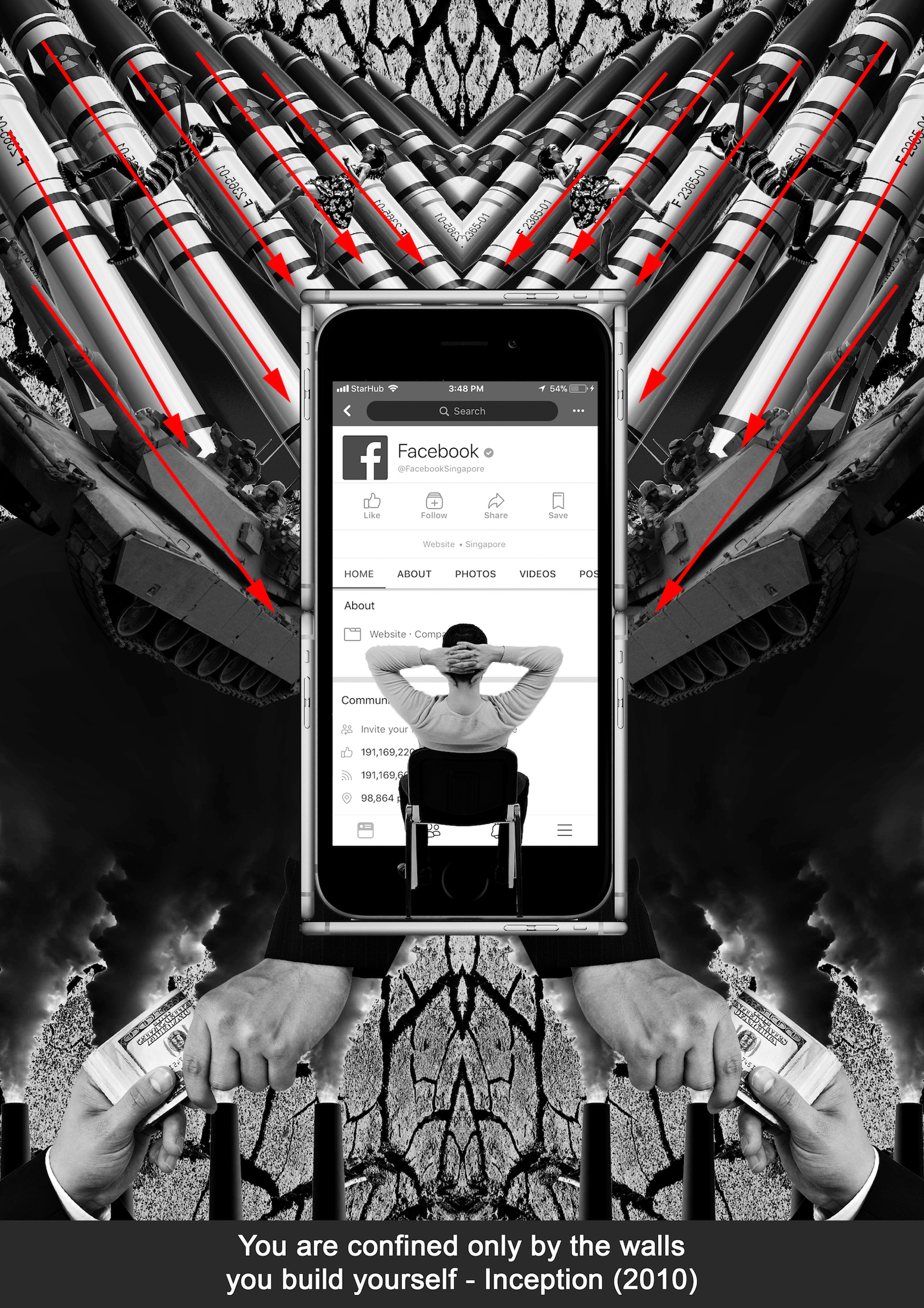
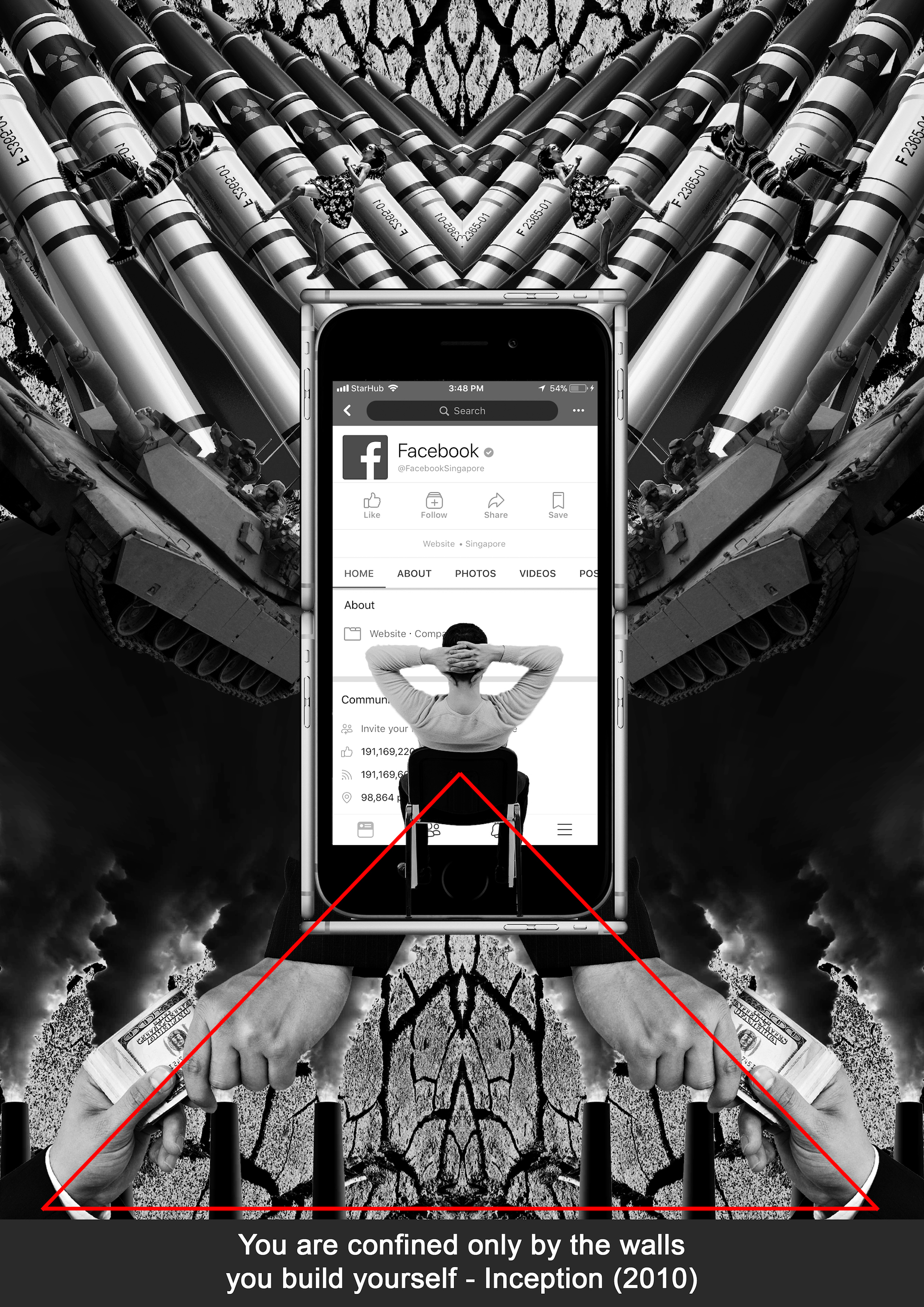
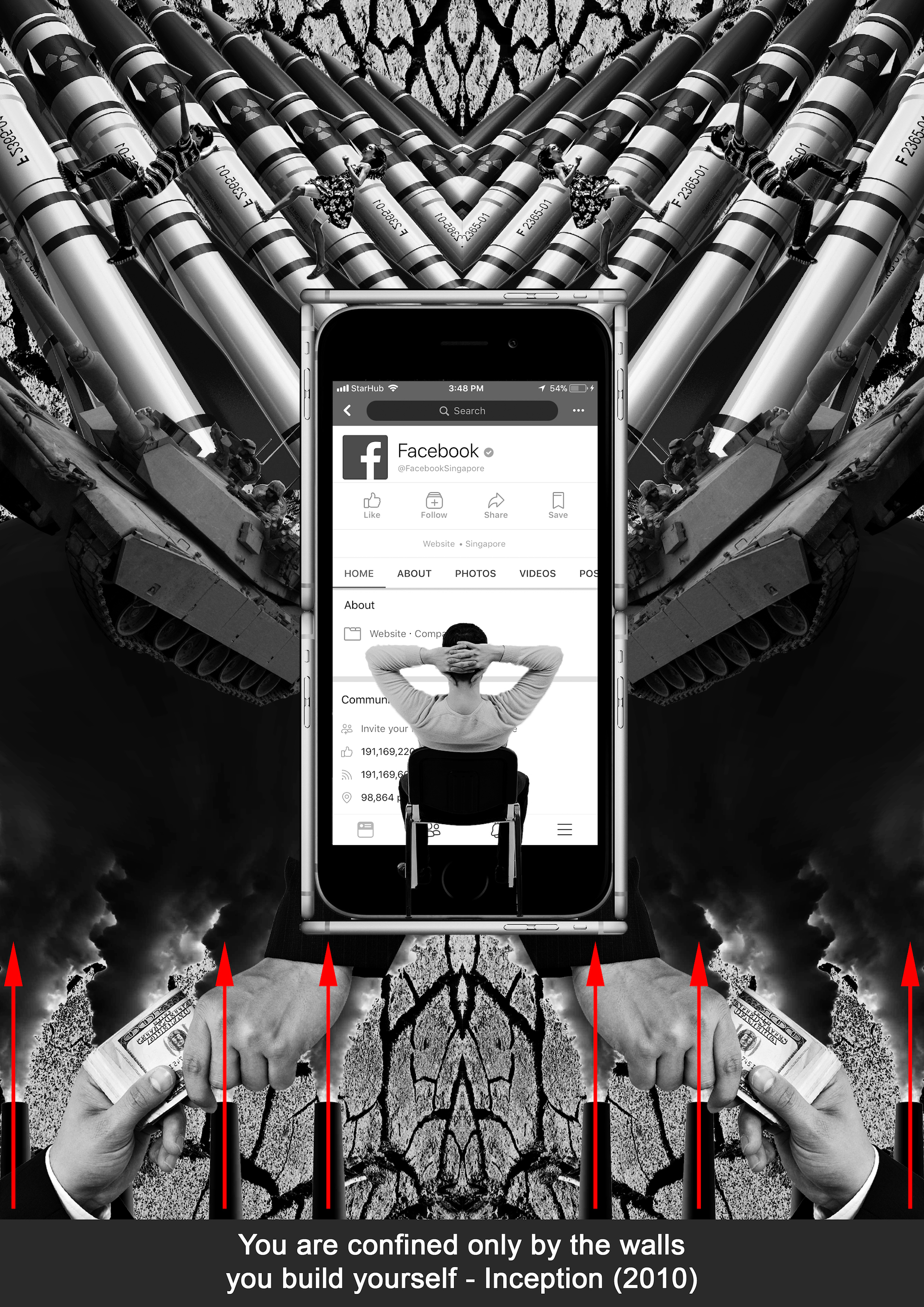
 

Expectations

Using a split complementary colour scheme I chose orange as the dominant colour accented by blue and purple. The orange here again represents me as a creative, full of passion and zest. The blue abyss is accompanied by purple numbers floating around to create a sense of dread and despair.

The frame in this image represents my father’s expectations of me. The person barely hanging off the frame represents me trying to hold on as hard as I can before i fall into eternal abyss of numbers and revision papers that i dread doing.


Limitless

Sticking to the use of orange, the last image of the 4th equation makes use of a complementary colour scheme. This time however I used a darker and less saturated orange to show stability accompanied by the blue of the sky to create harmony and show the outcome of struggling through the years.

Its ironic how my dad has always wanted me to become an engineer or a businessman but I ended up in arts school. I completed my diploma in Chemical Engineering while i was in polytechnic though so I guess that is enough to convince my father to pay for my university school fees tongue-out. After struggling through the years and being rebellious I come out limitless as portrayed by the dangling legs in the sky. The cameras with wings are carefully situated to create implied lines toward the focus of the image which is the camera in the center. Photography is my escape from all the anxiety my father has forced onto me as a kid and finally I am free to practice what I want.


Conclusion

In conclusion it has been a well spent 4 weeks designing and researching for EGO. Through the research of colour theory I feel that I have better understood how colours work together to portray different emotions which can be very useful to me in the future as a photographer.

Forrest Gump

The interpretation of words that connect to visuals have always baffled me. Being tasked to create 4 original designs from movie quotes was not an easy task for someone with little background in Photoshop. However, through this assignment I feel that I have grown as a designer technically and also creatively through the incorporation of symbols, composition techniques and principles of design into my works. During the research phase I went online to search for quotes that were in my favourite movies. As someone who loves to watch superhero and action films, I went ahead and looked into Batman, The Avengers and my all-time favourite, Inception.  I will be going into detail about how I conceptualized my ideas and ultimately give an overview of the designs of my 4 pieces of work for this assignment.

Your Mind Is The Scene Of The Crime – Inception (2010)

I really loved how in the movie Inception, everything was based around alternate realities and dreams. As a first design of this assignment, I had issues with keeping things metaphorical and was instead making the design too literal to the quote. After consultation and some feedback, I kept some elements from my initial design that were literal such as the crime scene tape that is extended from the head of a man.

I wanted to relate this quote back to modern day issues that people are facing around the world. Social media as the name suggests, is used for connectivity and socializing. There are many positive uses to social media however, being connected might not always be a good thing. I decided to design a visual that sheds some light into the issue of how social media can sometimes affect the masses negatively.

The composition of my design for this quote is relatively simple and easy to understand. The silhouette of the smiling beer bellied man with the negative emojis in his belly represents how society is trying to wear a mask to show that they are happy on the outside however they are stomaching all the negative emotions caused by social media on the inside.

The position of the man’s neck is pointing diagonally downwards which brings us to the second focal point of this design. The old school television represents “media” and the white noise reflected on the screen of the television is a metaphor of how social media is feeding irrelevant information that is slowly hypnotizing and manipulating us. To further emphasize the idea of hypnosis, I added black and white lines like rays extending out of the television which create leading lines to help the viewer navigate around the composition. The leading lines create movement towards the man and also connects to the third element of this composition.

I have included a literal description of the part of the quote “scene of the crime” into this design. At a scene of a crime, evidence of the crime can be found and upon closer speculation by forensics, the culprit/s can be identified. I took that idea and used it in this design by including some of the major social media platform logos and embedded them into typical objects found at a scene of a murder crime such as, a handgun, bloodshed and also a chalk outline of a body. To relate it back to the quote more I created a border around these evidence with a “police do not cross” tape.

Overall, I think this design is very literal and easy for anyone to make out what I was trying to convey using the different elements to describe social media and its negative effects on society.

You Are Confined Only By The Walls You Build Yourself – Inception (2010)

For my second design, I wanted to focus again on how social media is sometimes feeding us only the information that we want to see. While we build virtual walls around ourselves we block out what’s happening around the world like the issues of terrorism, mass destruction, corruption and global warming. Compositionally I made this design symmetrical and positioned the different elements in the design as leading lines to lead the viewer to the focus of the design.

Starting in the center I placed a guy sitting in a chair with his hands on the back of his head suggesting how relaxed he is while he is facing a huge iPhone screen. The Facebook page on the iPhone screen represents social media. Initially I used 4 iPhones with 4 different social media pages however that made the design too unnecessarily complicated thus I decided to just include one. For the walls surrounding the man I also used iPhones to metaphorically represent how we are so caught up with social media that it becomes a barrier.

On the exterior of the design I started with elements of destruction like tanks and missiles all of which are slanted at an angle toward the focus of the composition.

Initially I added children crying on the sides to emphasize how there are innocent children suffering because of war. However, it was too distracting and did not coincide with the overall feel of the design, thus to further display the innocence of children involved in these wars I replaced the children from the sides with children playing on the missiles. The hands located at the bottom of the composition also forms a triangle with the apex pointing toward the main focus of this image.

Also at the bottom of the composition are chemical plant chimneys emitting black smoke conveying pollution and acting as implied lines pointing upward.

The background of the image are drought patterns on soil which symbolizes global warming.

Having all the elements working together and acting as leading lines, the focus of the composition is made obvious. The symmetrical balance used in this image also creates a sense of stability which is aesthetically appealing to the viewer.

Love Is Patient, Love Is Blind, Love Means Slowly Losing Your Mind – 27 Dresses (2008)

For the third design, I wanted to dive deeper into how I could use symbols and objects metaphorically to express a message that was not literal to the quote. I settled on the health issues of smoking. I first started with designing the man smoking on a noose hanging himself. To portray the act of him slowly killing himself I included an iceberg below the man to represent “love means slowly losing your mind” as the more he smokes, the more he will slowly kill himself. To also show the damage of smoking I included a pair of deformed lungs with holes.

Tunas are not able to pump water through their gills if they are not swimming, therefore they do not stop swimming even for a moment throughout their entire life. Taking that concept, I added some tuna fishes in the water and specifically placed them in a way to form an arrow head which points towards the iceberg.

The iceberg also acts as an implied line directing the eye toward the hanging man making it the focus of this image.  

The minimalistic details in this design makes it easy for the viewer to understand the symbols and ultimately discern the message behind the design.

Sometimes To Love Someone, You Gotta Be A Stranger – Blade Runner (2049)

Out of all the designs I prefer my final one most. Being inspired by the recent Blade Runner sequel I wanted to use a quote from the movie. I felt that the quote was really evident in USA because of all the conspiracies surrounding the government being in control of everyone’s communications and information stating that it’s all for the greater good to prevent terrorism etc. However, nobody really knows what is true or not.

I used a scarecrow as the focus of this composition as scarecrows are deemed as the protector of crops from crows and birds in farms. The scarecrow not being alive can also be seen as a stranger. However, I manipulated the scarecrow’s head and included a surveillance camera. On the surveillance camera, there is an eagle emblem which is part of the National Security Agency’s (NSA) logo.

Ever since 9/11 the United States government has greatly increased the ability of the NSA to collect and investigate information on both foreign subjects and US citizens (Sottek 2013). A secret program called PRISM captures the private data of citizens regardless of whether or not they are connected to terrorism or any wrongdoing. The surveillance camera on the scarecrow represents how the NSA is acting as a scarecrow trying to protect people from terrorist attacks while being an unknown figure.

I wanted to also represent that there is a more sinister meaning behind the design by including a hand controlling the surveillance camera like a puppet. The puppet lines converging helps to direct the attention toward the NSA eagle logo emphasizing the focus of the composition.

The angel wings at the back of the scarecrow portrays how the United States is known for their freedom however are they truly free? The globe on which the scarecrow is situated on shows how the scarecrow is watching over everything on earth exerting dominance.

The US government claims that this is for the good of the nation thus relating back to the quote about “sometimes to love someone” and the unfamiliarity of a scarecrow represents the “stranger” in the quote.

In conclusion, the Forrest Gump assignment has put me in situations where I needed to think out of the box to interpret messages through media. I have to admit it was rather daunting in the beginning however with the help of my friends and the class consultations I was able to come up with some designs that I really liked. Overall this assignment has helped me put the lessons I’ve learnt through class to use and I grew as a designer to effectively use visuals to convey a message.

My Line Is Emo

It has been a very fun and frustrating few weeks of experimentation trying to describe emotions through visuals. Taking ordinary household items and making them into mark making tools to express my emotions has certainly changed how I will view these items in the future.

As an urban landscape photographer, I am inspired by modern architecture and how shapes can portray certain emotions/feelings. Bewildered by this phenomenon I decided to research on this topic and revolve my emo lines based on geometric and organic shapes.

Irritation

As a start, I decided to find objects lying around at home that gave me a sense of irritation. My sister has always been annoying and irritating however I couldn’t figure a way to make her into a mark making tool so I settled for a cleaning brush instead. The bristles when brushed upon my skin caused an uneasy bothersome feeling that I thought was perfect for expressing irritation.

Trail results for irritation emotion

First I dipped the brush in ink and used only parallel strokes in one direction, after which I repeated the process in a perpendicular motion to the original strokes.

Final cropped line for irritation

The result of the process created brush strokes that intersected each other to form sharp edges at the ends of each stroke. The sharp edges represent aggression which is often the by-product of being irritated. The converging lines make the pattern more complicated and messy which amplifies the effect of being irritated. I decided to use the bottom most corners of the paper making use of negative space that gives definition to the pattern.

Guilt

Researching about interesting techniques of design and perception, I chanced upon a technique that many designers use in their works, The Gestalt Principles. The gestalt principles are very useful in playing tricks on the mind. Some famous logos that make use of these principles are, the Fedex logo and the panda in the WWF logo. Using the Gestalt principle of closure I created rounded curved shapes without borders and within these shapes were concentric patterns with varying thickness.

Trial sketch of organic shapes

Firstly I experimented with drawing curvy organic shapes extending from the borders of the line.

Trail sketch with concentric patterns

I then inserted some rounded concentric patterns to create a sense of emptiness and incompletion.

Final sketch with addition of parallel lines

I tried adding lines to further complicate the pattern however it looked too messy and busy to express guilt.

End result for guilt

The previous iterations of my line were not exemplifying guilt enough thus I decided to draw the curved shapes with pencil and erase the borders after including the concentric patterns in them. This boosts the visual effect of guilt even more. Even though the curved shapes are incomplete, enough is present for the viewer to complete the shape. The mind portrays a shape however the eye does not see any borders, much like guilt there is an ongoing conflict based on conscience of distinguishing right from wrong. I also exaggerated the difference in thickness of the concentric shapes to express a feeling of uncertainty and doubt.

Ecstasy

After researching on the effects of the drug ecstasy, I decided to create a visual representation of what it feels like to be under the influence of the “love pill”.  After surfing around the internet on techniques that create interesting patterns I chanced upon one that gives the impression that the shapes are being warped and definitely embodies some similarities to the effects of ecstasy.

Mid process of creating ecstasy line

Making use of a ruler and marker, I created lines to impose an illusion of heightened perception and hallucination as the shapes seem like they are winding. The gradual change in spacing between each line as they converge at a single point creates a deception that the shapes are intertwining.

Side view of ecstasy

When looked upon as a whole, the patterns suck the viewer in with its complexity and much like the drug, you get hooked on the pleasures of looking at the lines as they intrigue the mind.

Love

Sticking to the theme of creating patterns using geometric shapes, I wanted to express love in a very unfamiliar way. A lot of times love may be expressed as this overflowing burst of emotions with fluidity however, I took a different approach and portrayed my view of love as being fragile.

Circular makeup sponge to create circles

First I used a circle makeup sponge and dipped it with black ink to create some clean circles which represent love. The circles’ completeness suggests unity and harmony, often times also associated with sensuality and love.

Tea leaves added to drying ink

Next I added some tea leaves on top of the drying ink to represent thorns. Although love is seemed to be perfect in its entirety however it can also hurt thus using the tea leaves as they resemble the thorns of a rose.

Thin lines that overlap to show complexity and fragility
Final view of love line

Finally to show the fragility and complication of love, I drew some thin lines across each circle. The lines overlap each other and represent the sophisticated network of emotions that are associated with love.

Surprise

Hexagons are one of the strongest geometric shapes as they have 6 sides and present reliability and dependability. The honeycombs in bee hives inspired me to create a systematic formation of hexagons to represent human beings.

Lightbox used to create accurate rendition of hexagons onto newsprint

Using a light box I traced over a pattern which I photoshopped together onto the newsprint paper to ensure perfect distribution and size of each hexagon.

Trial experimentation with different patterns in hexagons

After which I went ahead to draw different patterns in each hexagon to represent the experiences of different people. We are all products of our own experiences and everyone is special in their own way. I wanted to portray that everyone has an element of surprise within them however we are always trying to put up a strong front which is represented by the hexagon surrounding the patterns within.

Scothbrite to create pattern

To make the line more interesting I also used different elements to create marks like a scothbrite and my thumbprint!

Fear

I’m sure most of us have witnessed a scene in a movie where a murderer gruesomely kills someone. Blood is splattered all around and to get rid of the body the murderer would drag it away leaving a trail of blood. I wanted to recreate that with a brush and focused on messy strokes while still retaining the visibility of how it was created.

Cropped version of fear

The messy strokes show randomness and there are blotches of ink splattered everywhere which shows instability therefore invoking fear. The black ink resembles blood which is often times viewed as threat.

Final combined My Line is Emo

Some of the challenges that I faced during this assignment was trying to form a theme for my lines. After which another challenge was trying use the mark making tools to depict my theme of using geometric shapes to portray emotions. I ended up using only geometric shapes for some of my lines and stuck to good old fashion mark making tools for the more expressive emotions like fear and irritation.

Overall my understanding of how shapes, form, lines and contrast can be used in expressing emotions abstractly has been greatly enhanced through this exercise. I really enjoyed cracking my brain to come up with creative ideas and I am very happy with the results of my creations!


Mark Making Lesson

Today we learned about expressing emotions through drawing shapes and lines.

I like it very much.

Joy showed us many examples from previous students’ work and I got some inspiration on how to carry out my project.

https://www.google.com/url?sa=i&rct=j&q=&esrc=s&source=images&cd=&ved=0ahUKEwiokJKfq93VAhVCKo8KHUs7AIgQjRwIBw&url=https%3A%2F%2Foss.adm.ntu.edu.sg%2F2016-dn1002-g9%2F%3Foss_page%5B1%5D%3D2%26oss_page%5Bhome%5D%3D8%26oss_filter%5Bhome%5D%3Dproject-1—emo&psig=AFQjCNHxSHDURfkzzzv5RuH0kCc1xSBsCA&ust=1503027321062628 accessed on 17 August 2017

Carpe Diem