
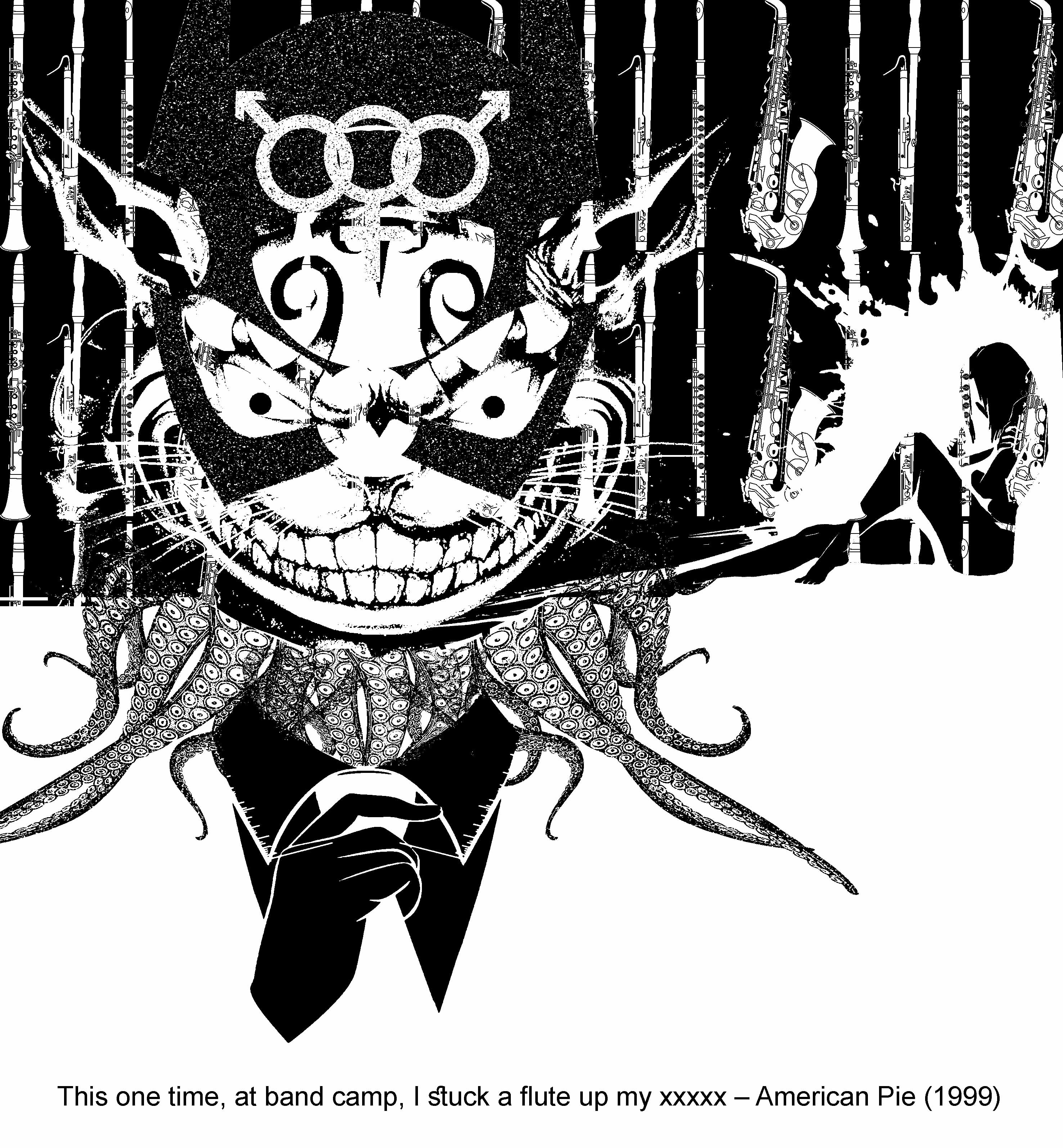
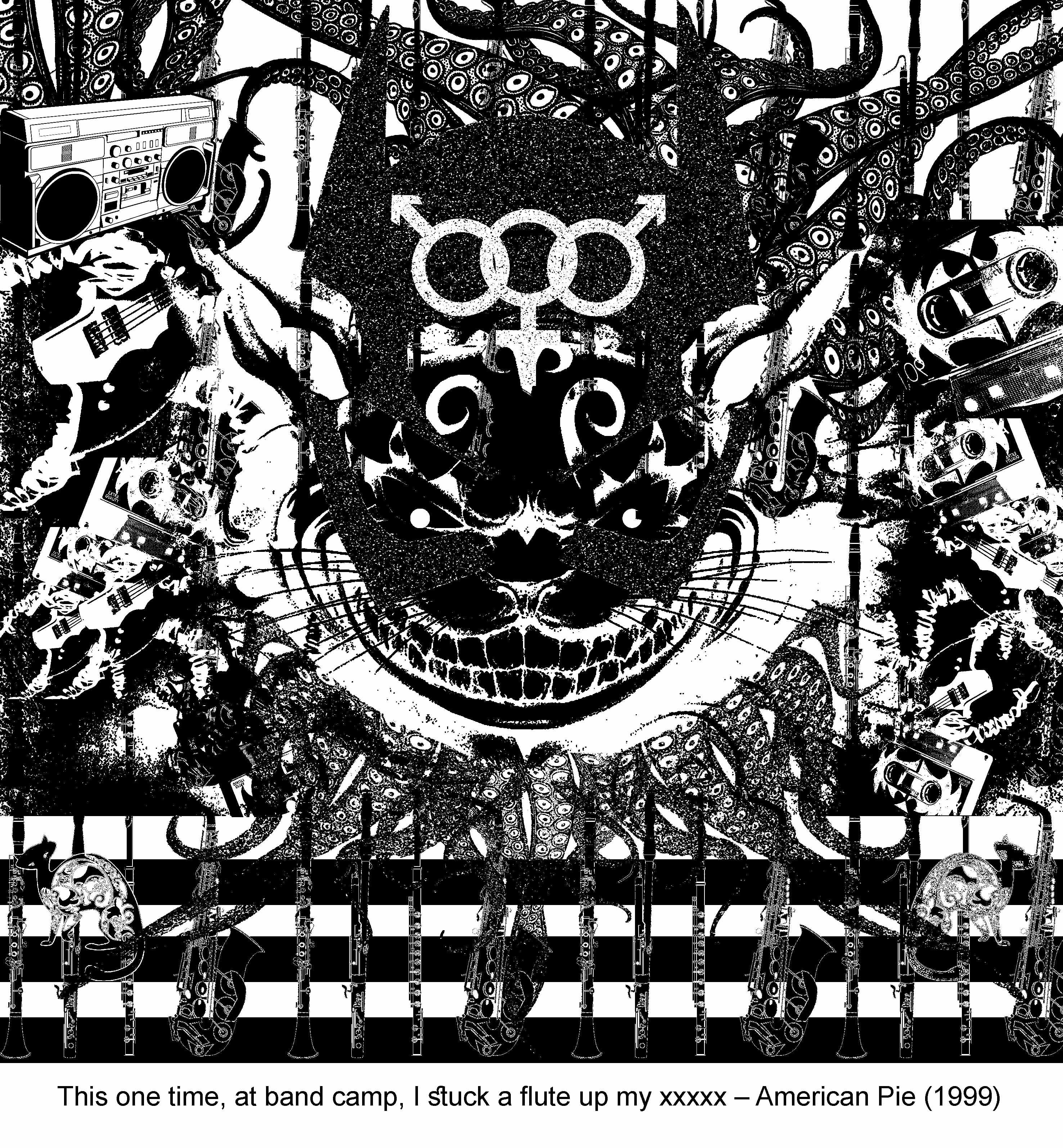
Final Composition 1 – American Pie

This one time, at band camp, I stuck a flute up my xxxxx
Michelle Flaherty (Alyson Hannigan) – American Pie (1999)
Keywords:
- Music
- Cat/Kitten
- Lust
Expression:
- Despite this being a really huge and popular movie with the general public, it is this kind of media portrayal that encourages or rather set the base of men objectifying women.
- This composition attempts to convey the lustful thought of men;
- and objectifying of women.
Design Principle:
- An off centered composition to break the balance and symmetry to show the inequality,
- a repetition of musical instruments creates some sort of rhythm until it reaches the splat suddenly indicating the abrupt act of lust that could occur when men gets really nasty
Elements:
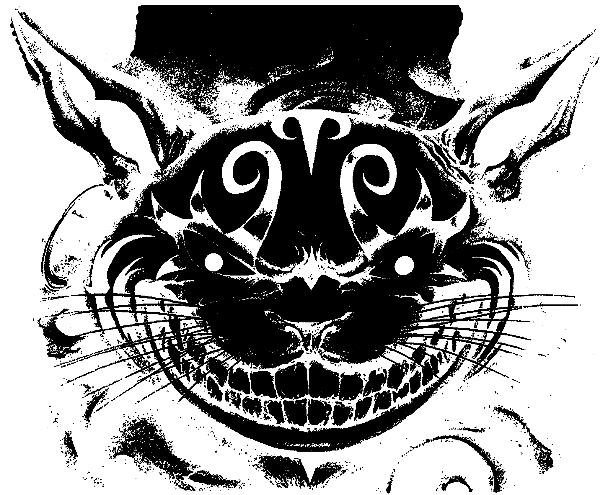
1) Cheshire evil looking face indicates the lustful thoughts
2) Catwoman’s mask hints on the apparels of female being removed

3) Gentlemen’s suit and tie implies that even the most prim and proper person are guilty of objectifying woman
4) Woman in the background with the splat… oh well just interpret however you want it! I will say its the tears that she cried :p

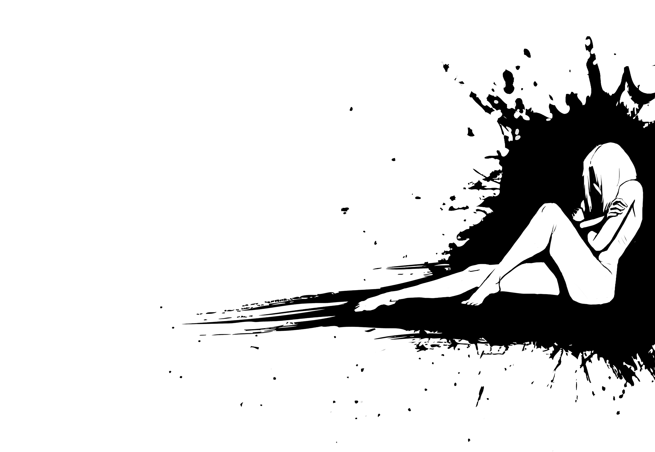
4) Woman in the background with the splat… oh well just interpret however you want it! I will say its the tears that she cried :p

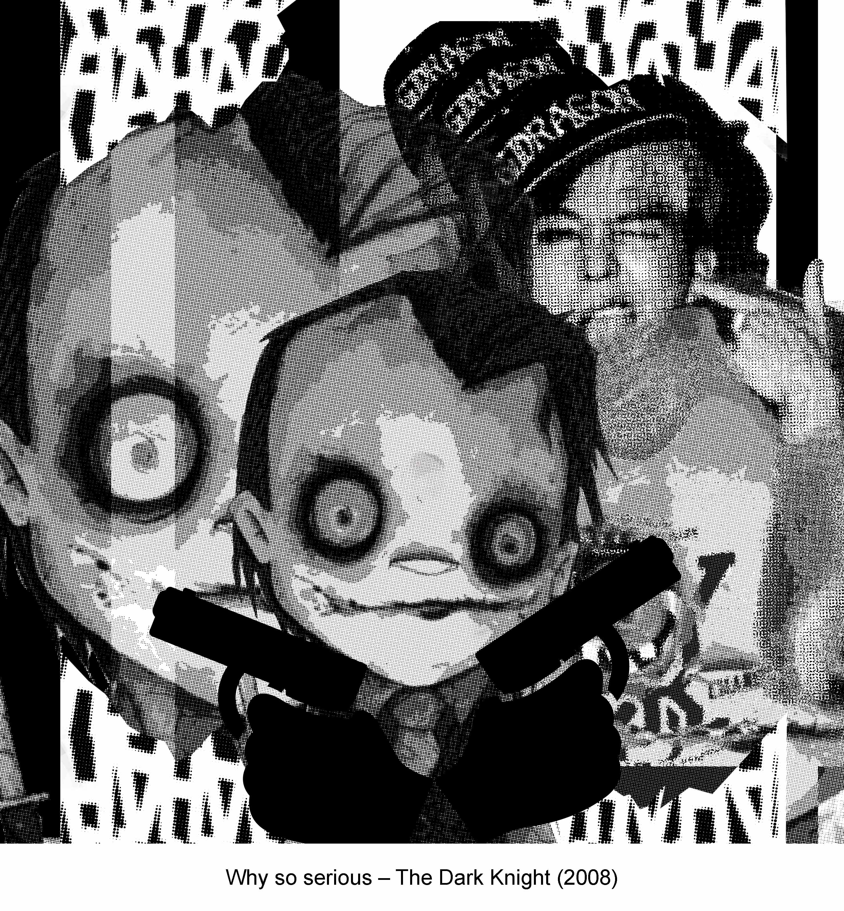
Final Composition 2 – The Dark Knight
Why so serious?
Joker (Heath Ledger) – Dark Knight (2008)
Keywords:
- Serious
- Significant or worrying because of possible danger or risk
Expression:
- Serious = Sirius (Black), hence the link to Harry Potter
- A possible danger of risk, took reference to a game of Poker where people have to read the tells of a person and is usually a very serious and tense situation.
- Poker card reference to the
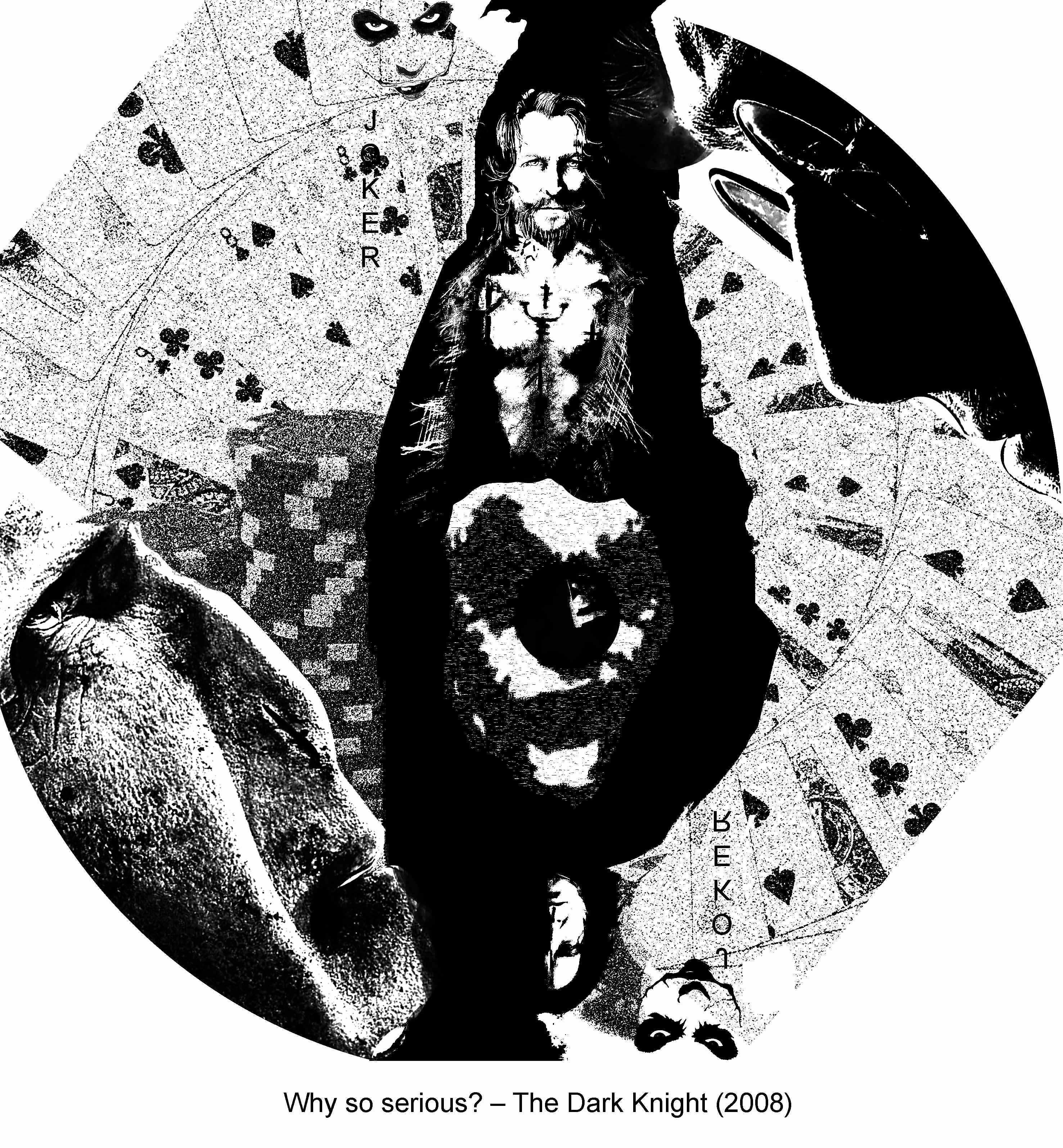
Design Principles:
- A asymmetrical piece to strike the balance and equality in terms of risk both parties are taking on a texas hold’em poker table.
- Radial to create a ‘drawn into’ effect as though all this vices just swirls into the center of this vice in this case, gambling.
Elements:
1) Poker Card Reference – Inverted Harry Potter characters to form a Joker card similar to the Jack, Queen and King cards.

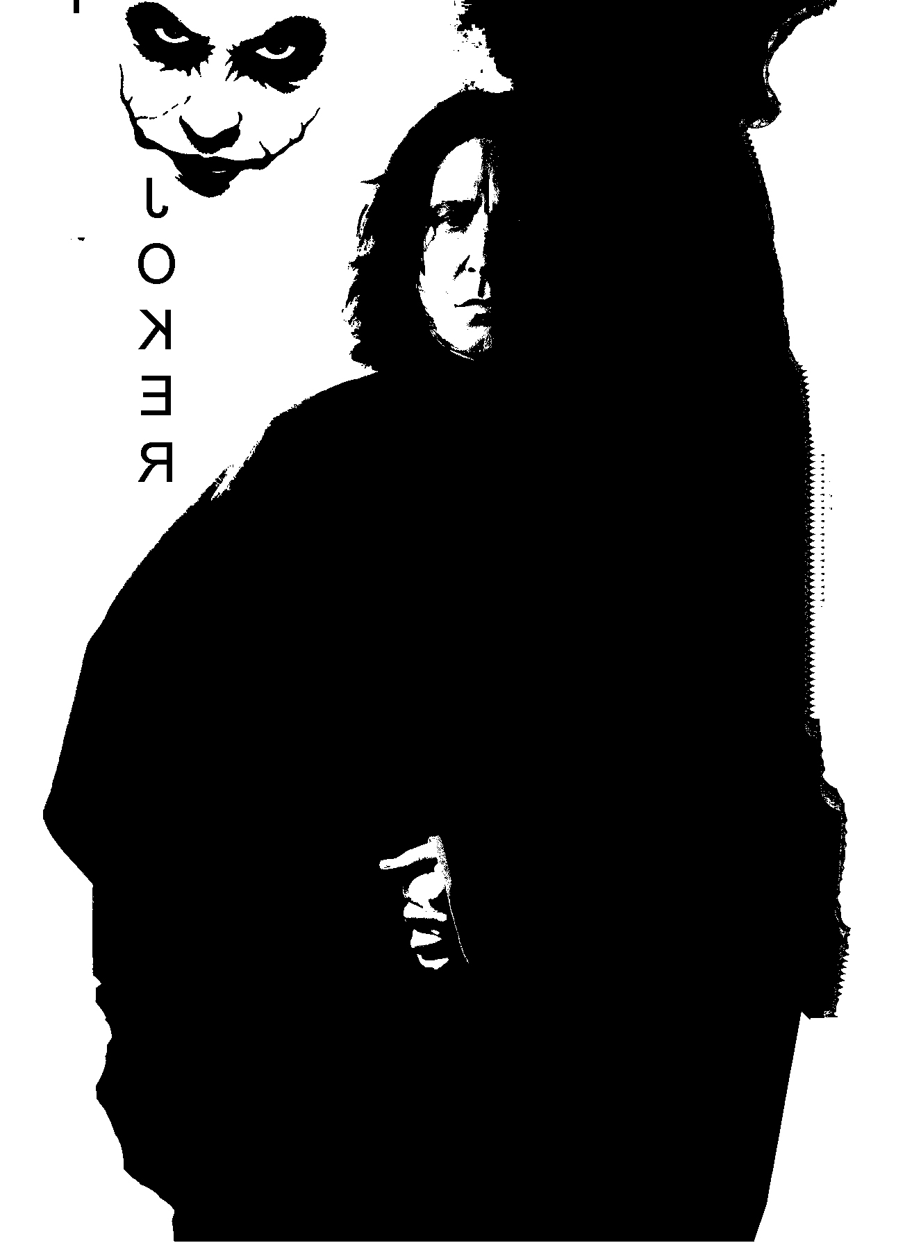
2) Harry Potter and Voldemort staring off in a poker game showdown where everything is on the line.
3) Poker cards reference
4) A subtle hint of Joker face.
5) Chips to indicate how much is on the line and a reason to be serious.
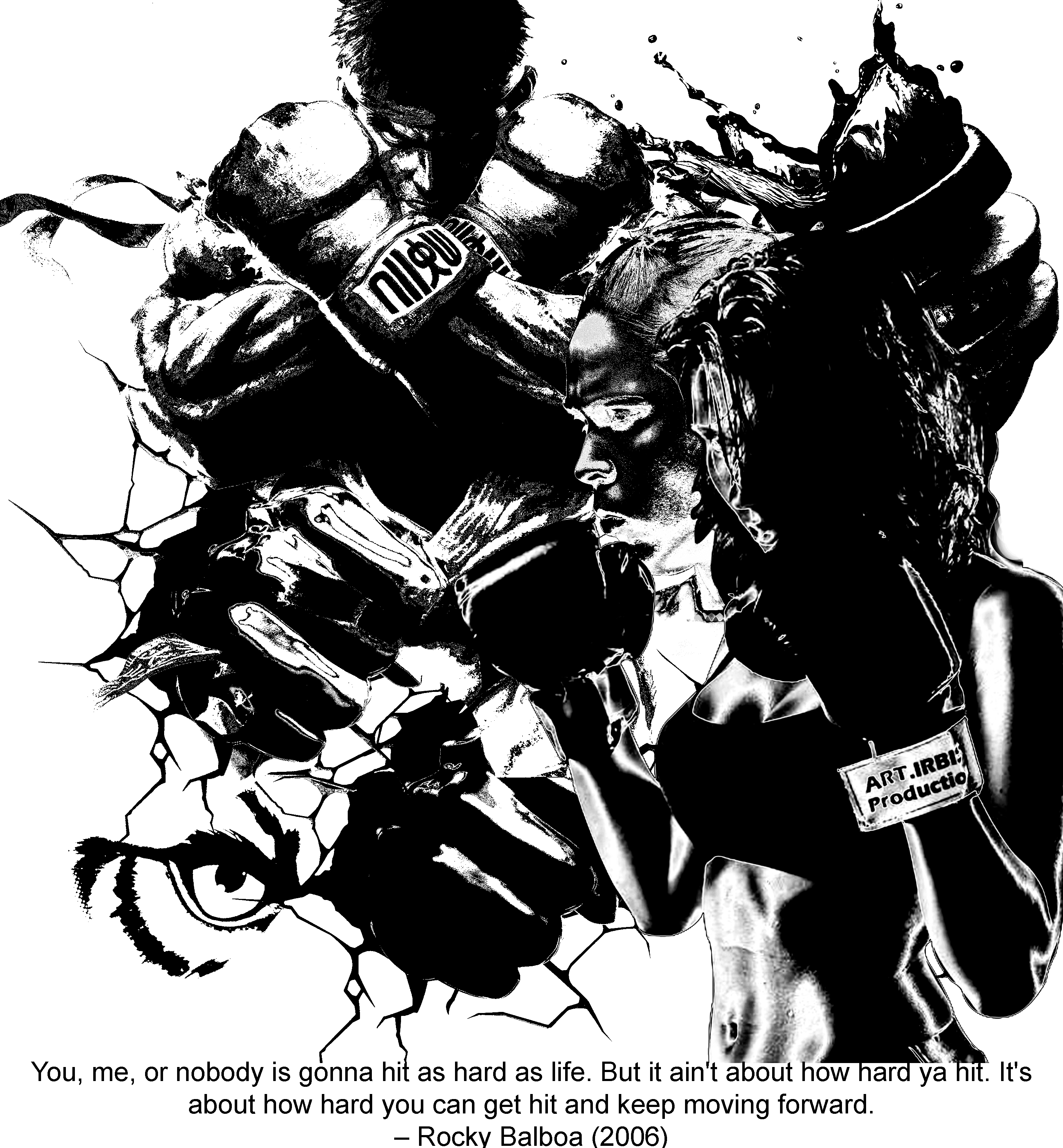
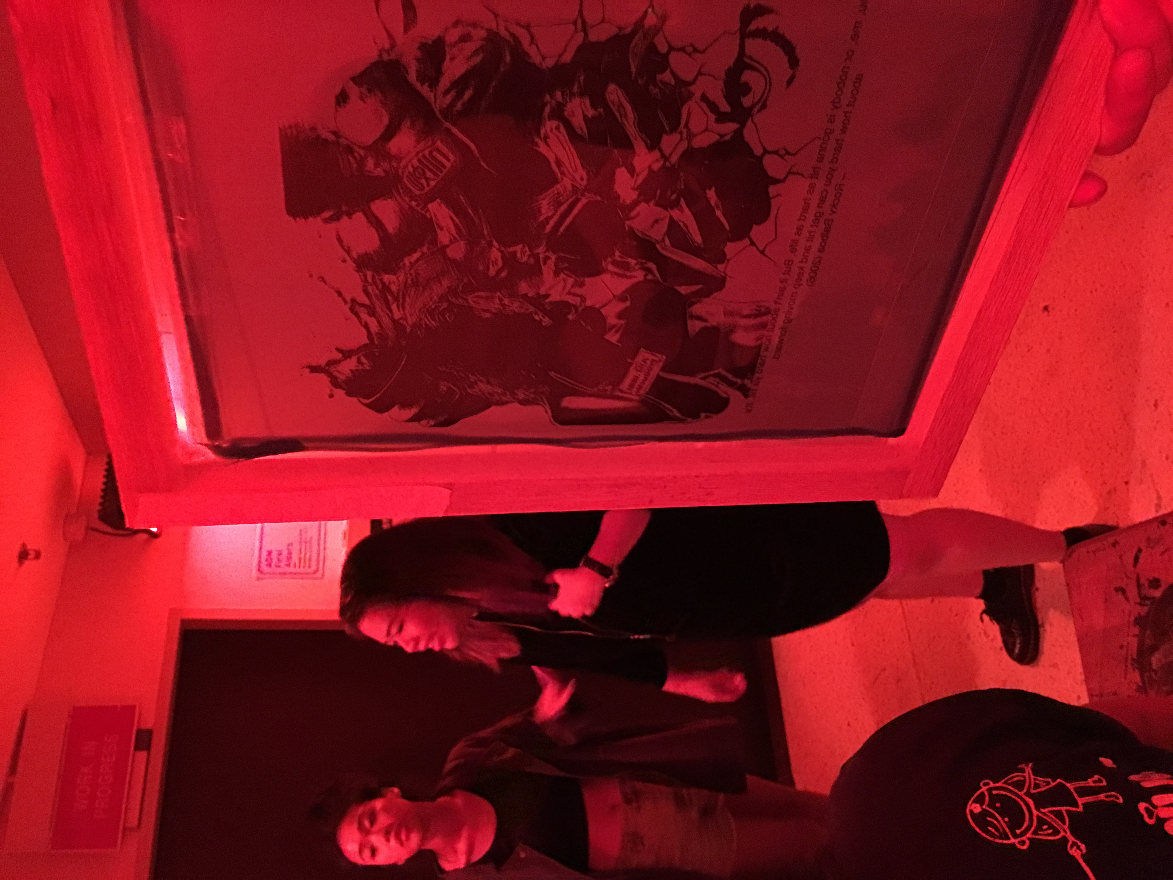
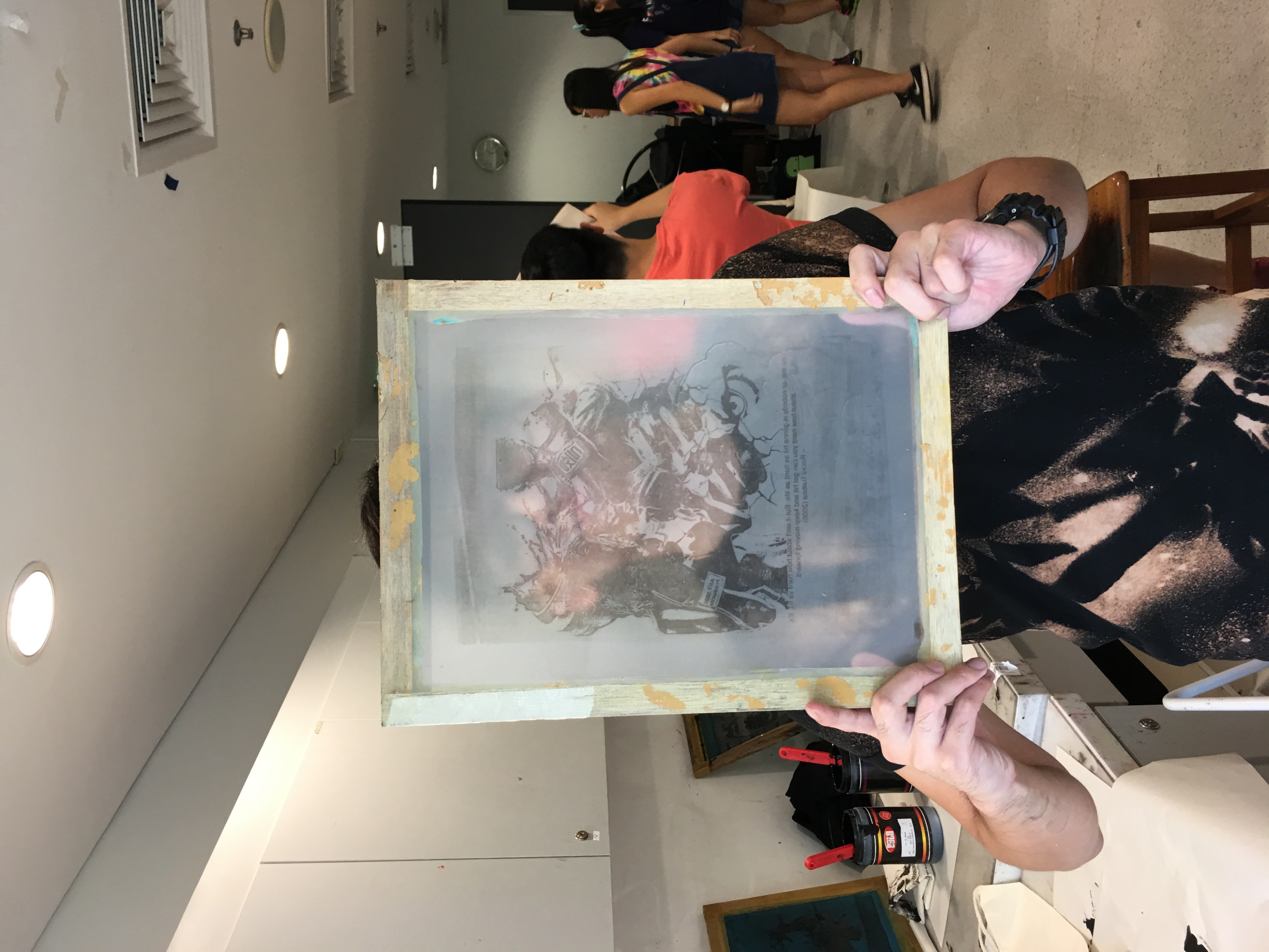
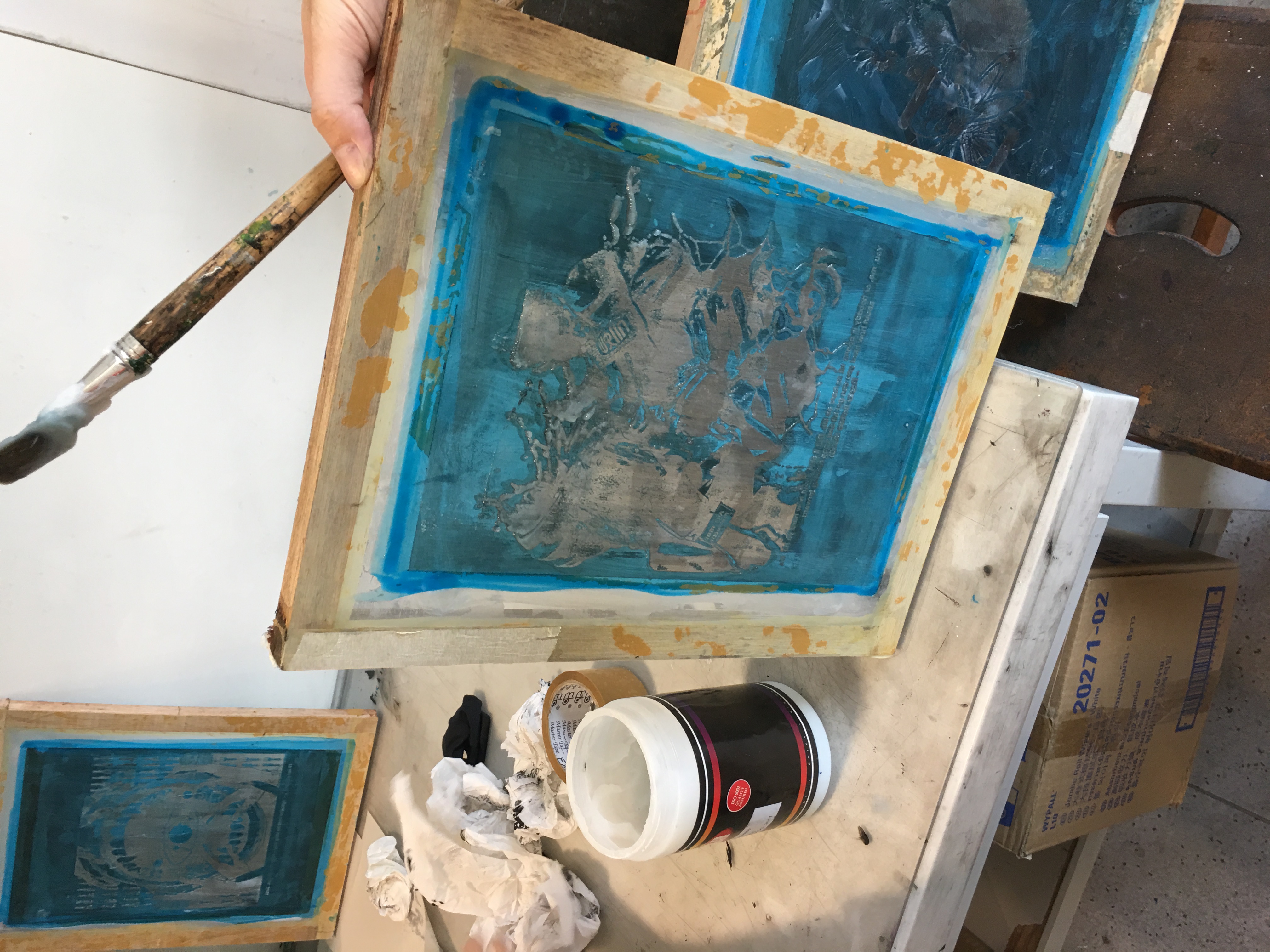
Final Composition 3 – Rocky Balboa

You, me, or nobody is gonna hit as hard as life. But it ain’t about how hard ya hit. It’s about how hard you can get hit and keep moving forward. How much you can take and keep moving forward.
Rocky Balboa (Sylvester Stallone) – Rocky Balboa (2006)
Keywords:
- Hit
- Fist
- Fighting
- Forward
Expression:
- A fight in life includes being on the offense and being on the defense
- In a southpaw stance, lady represents the aggressor in life always moving and fighting forward
- In a blocking stance, ryu represents being on the defense, protecting yourself from suffering any setbacks
Design Principles:
- Off centered composition with elements placed in an abrupt manner indicating the sudden intrusion of obstacles in life
- The repetition of punches symbolizes the fighting genre of this quote.
Elements:
1) Ryu – to block the obstacles thrown to you in life
2) Female boxer feat. Ronda Rousey Being on the offence in life requires you to bring out the other side in you to perform.(in this case, bringing the champion out of you because Ronda is a female champion in the UFC.
3) Punch with cracks and Fruit Punch
To indicate the different level of setbacks that could be thrown to you in life
4) There’s always room for ‘the eye of the tiger’ when it comes to Rocky Balboa
Final Composition 4 – The Wolf of Wall Street

Money is the oxygen of capitalism and I wanna breathe more than any man alive.
Jordan Belfort (Leonardo DiCaprio) – The Wolf of Wall Street (2013)
Keywords:
- Money
- breathe
- Man Alive
Expression:
- How money is the roof of all evil as the whole world revolves around it
- How money is so important in our lives that it is all that we think about
Design Principles:
- A central composition with radial component implies that we revolve around money(which is true to an extent because we are always working for money)
- A circle element with symbolism made to the Earth
Elements:
1) Guy Fawkes Mask on a Note – In the composition, this mask appeared segmented in the background while the facial features of the lady in the center is non-existent. Implies that the lady lost her identity in the pursuit of more money.
2) Soldiers – how we all want to breathe in money more than any man alive that we’re willing to harm and fight anyone just to attain it. Greed is good… or bad?
3) Tree of life (just the roots in this case) – the root of all evil
Reflections and Takeaways
There were plenty of difficulties especially in the conceptual stage as we attempt to look for quotes that are interesting and easy to work with. You come to realize that some quotes, despite being very deep and meaningful are more difficult to work with as compared to something very simple and quirky.

Fish are friends, not food.
Nemo (Alexander Gould) – Finding Nemo (2003)

This was one quote that I tried working on at the start but ended up with a very meh composition. The idea of this attempt was something I thought was fun to work with but I could not deliver which made me realize that not every quote works for me especially when I encounter those brain fart moments when I just cannot produce anything at all.

Project 2 allowed me to briefly encounter on how to communicate visually with people as everything that we put out there matters such as the placement of components, the elements that we include and even the texture that we want the audience to feel when seeing our art pieces. It also trained me on providing solutions in the least literal way possible as I attempt to solve with unusual but effective approach. This enabled the creativity juices in me to flow and I certainly hope I have not failed to deliver :p
However, I also realize that there is so much more for me to work on in terms of software skills, the visual flair to spot and place something properly. One particular thing that I really really need to improve on is to remember that my designs should communicate visually to the viewers and always always and I mean always, remember to see from the audience position! Give them more things to look at!
Okay and that’s all I have for Project 2!
Benji out!


