I simply selected my 4 movie quotes to work with on this project from some of my all time favorites.
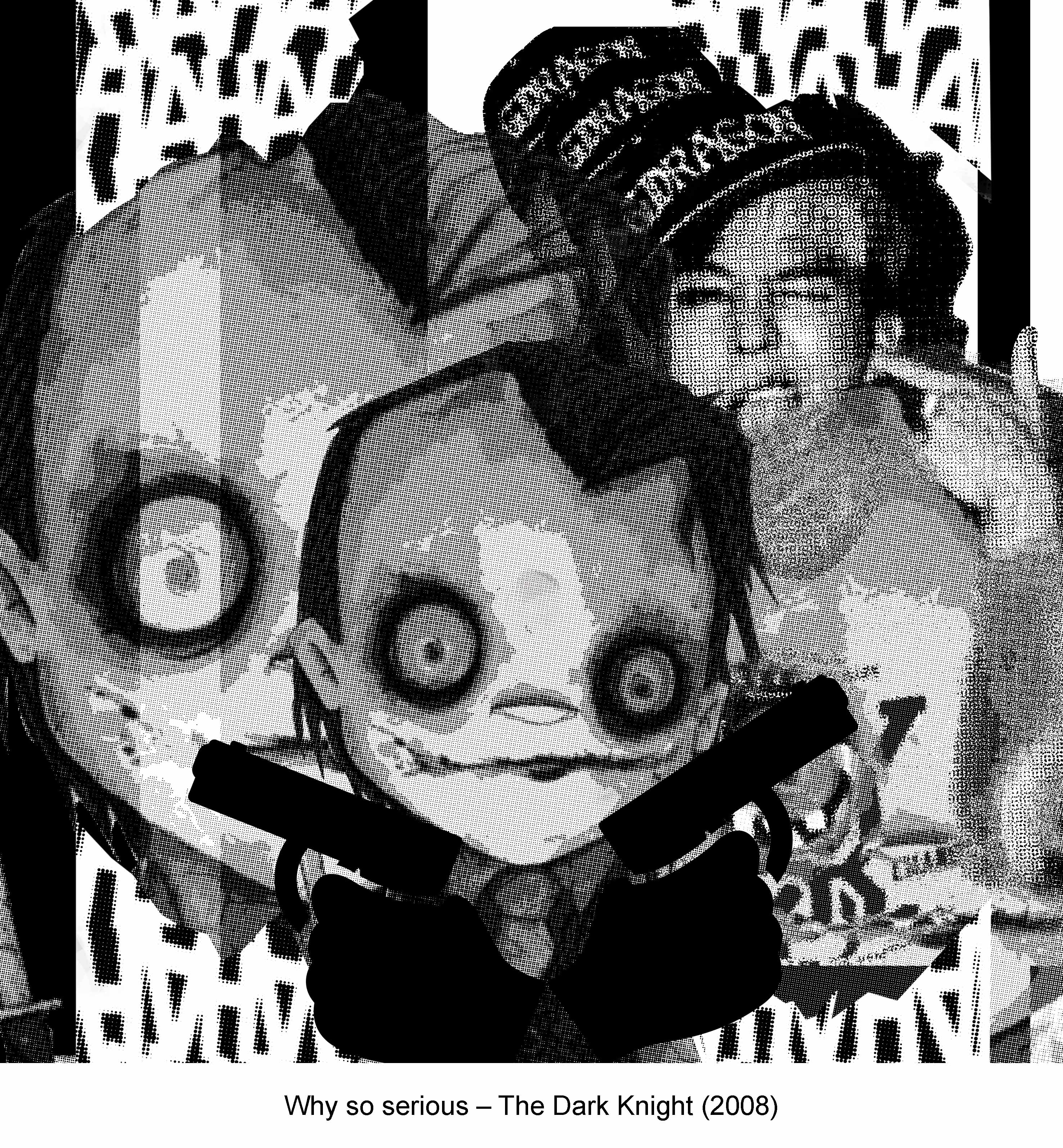
Why so serious?
Joker (Heath Ledger) – Dark Knight (2008)

Draft 1 (left) :
Why did you pick this elements to express the meaning of the quote?
Decided to take a quirky approach to respond and come up with an imagery that people could relate to. Therefore the reason why I included G-Dragon of Korean Boy-band Big Bang in this draft as he had a solo piece titled ‘CRAYON’ which had ‘Why so serious?’ in it’s lyrics.
What design principles did you use to arrange these elements?
I used the design principle of Pattern, Rhythm, Size and Scale to achieve this composition.

Draft 2:
Why did you pick this elements to express the meaning of the quote?
Similarly, I still insisted on coming up with something ironic which explains the reason why I included plenty of Harry Potter references in this composition with the most prominent character – Sirius Black – in the center of this piece. I’m sure you have gotten the reason why by now, no? Why so Sirius? Get it? Hahahahaha
Potter and Voldemort are engaged in a showdown of Texas Hold’em Poker with all those chips and poker cards around.
If you look more carefully, you would see that Sirius Black and Severus Snape forms a Poker card itself representing the Joker which links to this famous quote that originated from the Dark Knight itself.
What design principles did you use to arrange these elements?
I used the design principle of Symmetry/Asymmetry and a bit of Radial component.
Comments and Improvements to be made :
- Less symmetrical composition
- Can include more Pictogram and symbols

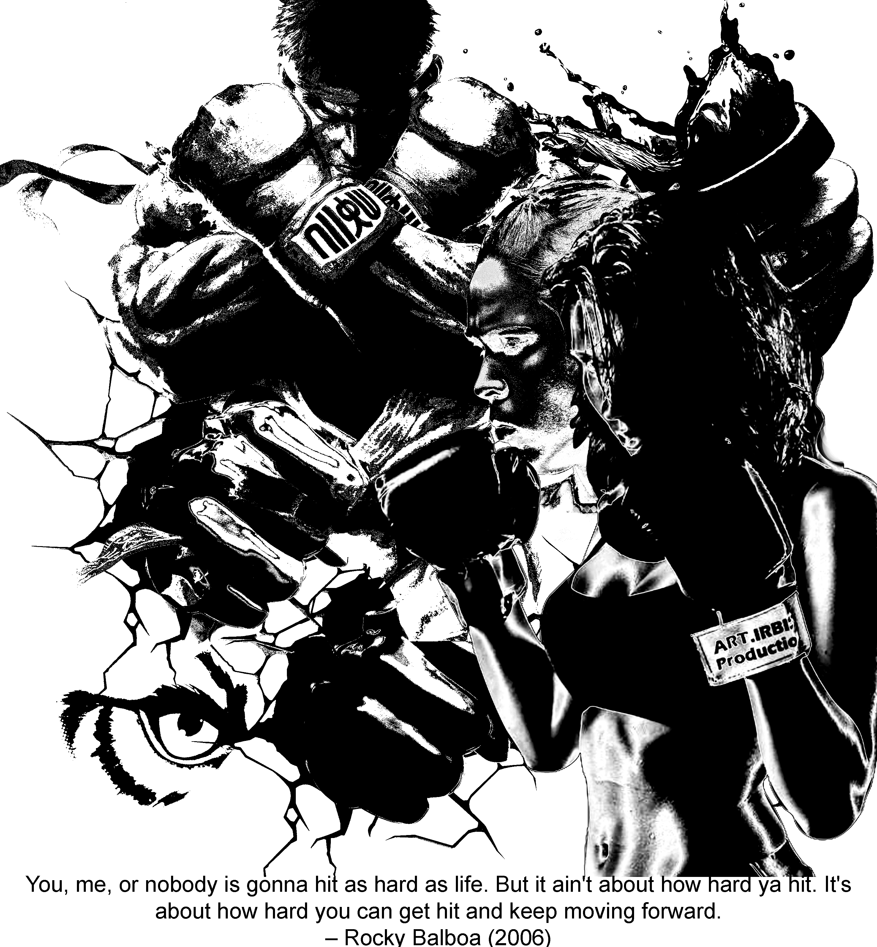
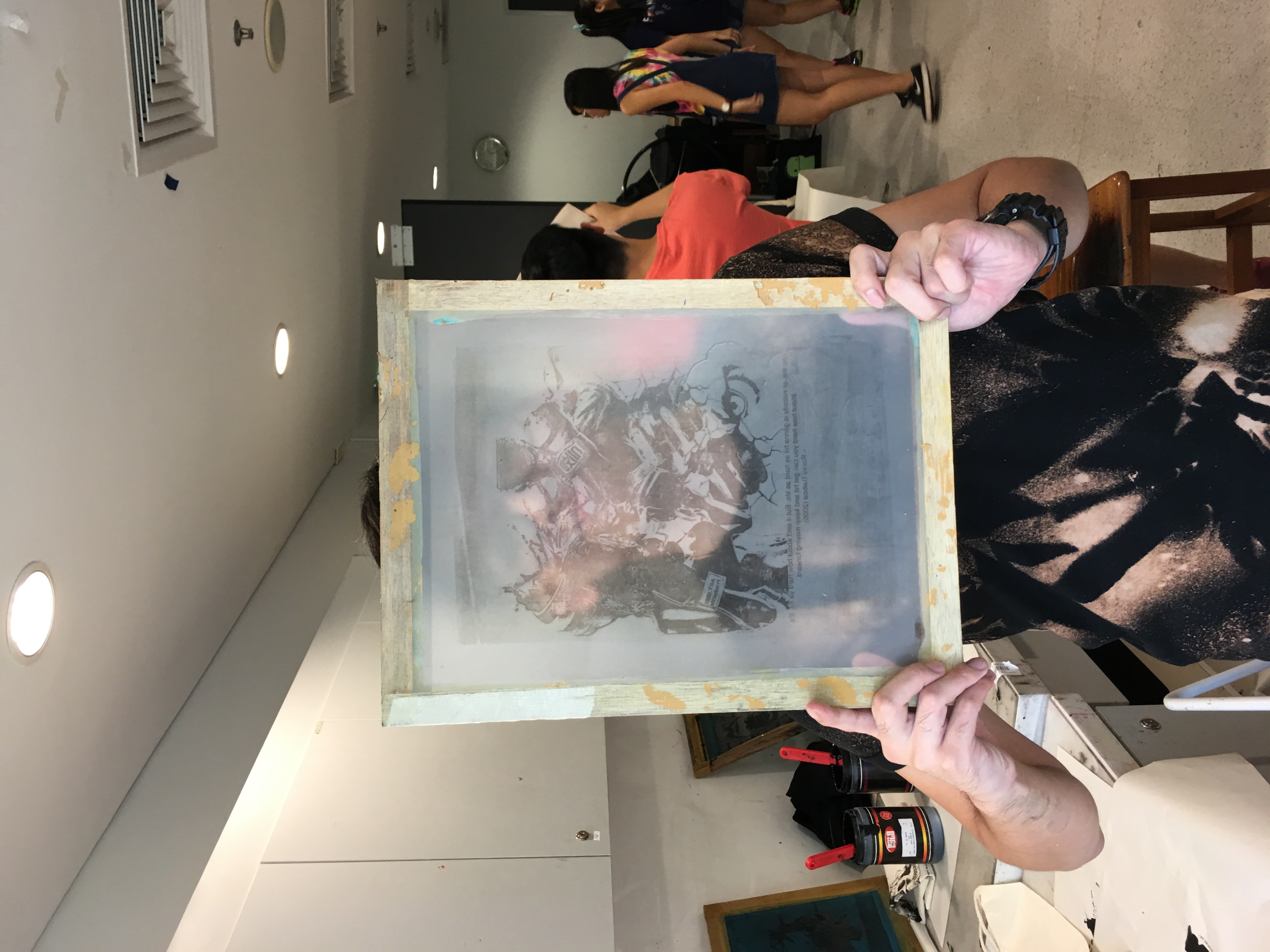
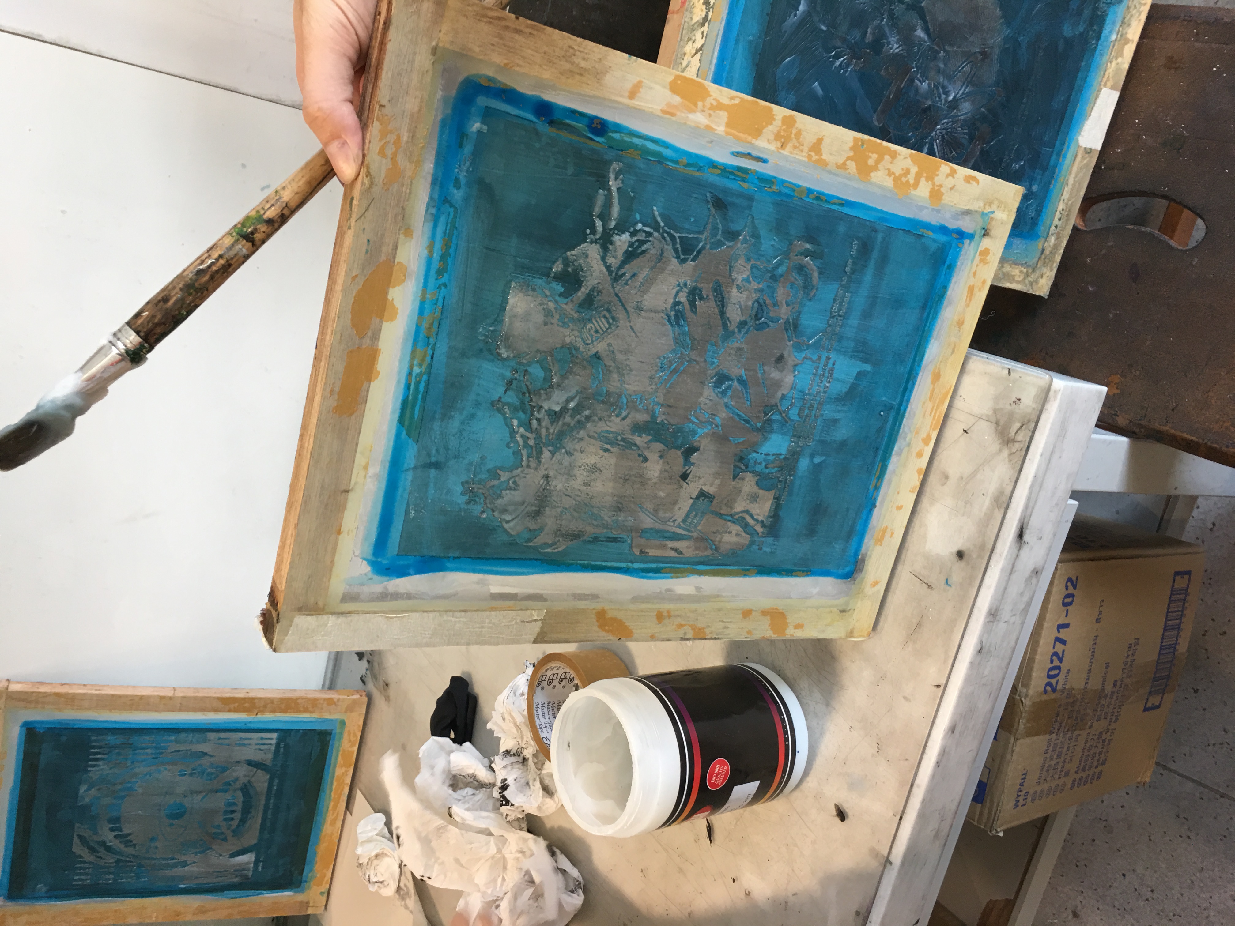
You, me, or nobody is gonna hit as hard as life. But it ain’t about how hard ya hit. It’s about how hard you can get hit and keep moving forward. How much you can take and keep moving forward.
Rocky Balboa (Sylvester Stallone) – Rocky Balboa (2006)


Why did you pick this elements to express the meaning of the quote?
- Anonymous Female boxer featuring UFC Women’s Bantamweight Champion, Ronda Rousey
- Street Fighter Ryu in a blocking posture
- Fruit Punch/Sliced (top right)
- Eye of the Tiger (bottom left)
- Hulk Punch x 2
The intention of this composition was to evoke a sense of struggle, trying to fight to survive despite multiple setbacks.
What design principles did you use to arrange these elements?
I used the design principle of Visual Hierarchy – Contrast.
Comments and Improvements to be made :
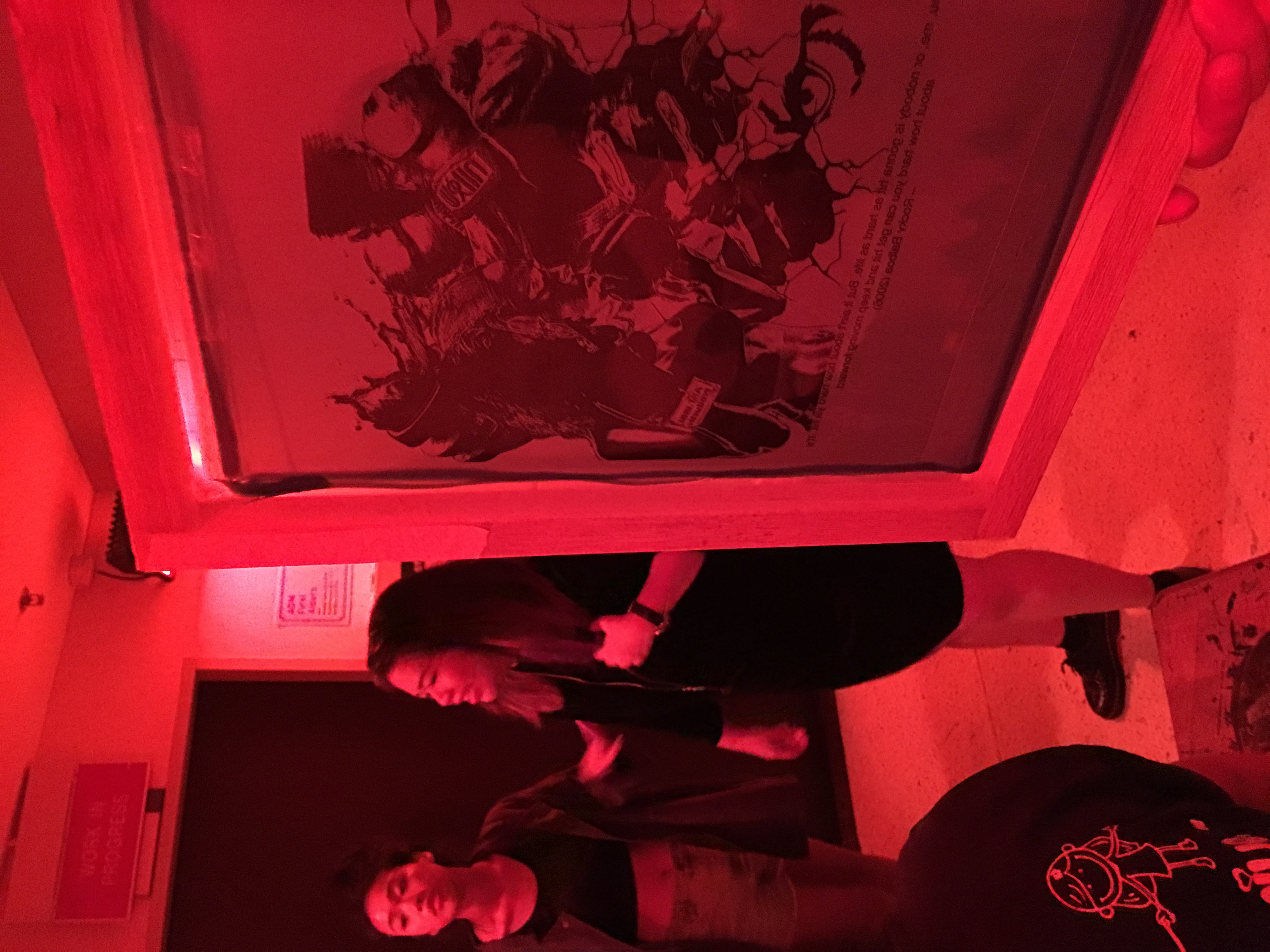
- Was commended on this composition and the contrast level it provided, was recommended to use this for the silkscreen printing.

Money is the oxygen of capitalism and I wanna breathe more than any man alive.
Jordan Belfort (Leonardo DiCaprio) – The Wolf of Wall Street (2013)


Why did you pick this elements to express the meaning of the quote?
- Money
- Silhouette of human
- Silhouette of Soldiers around the world
The intention of this composition was to relay the message of greed, illustrating someone being a money minded person as that’s all that appears on her face and the soldiers from all around the world represents ‘more than any man alive’ because that is the length that she would go to make sure that the money is hers to breathe.
What design principles did you use to arrange these elements?
I used the design principle of Symmetry/Asymmetry and a bit of Radial component.
Comments and Improvements to be made :
- Overall composition is okay but was recommended to add more texture which resulted in the 2nd draft (right)


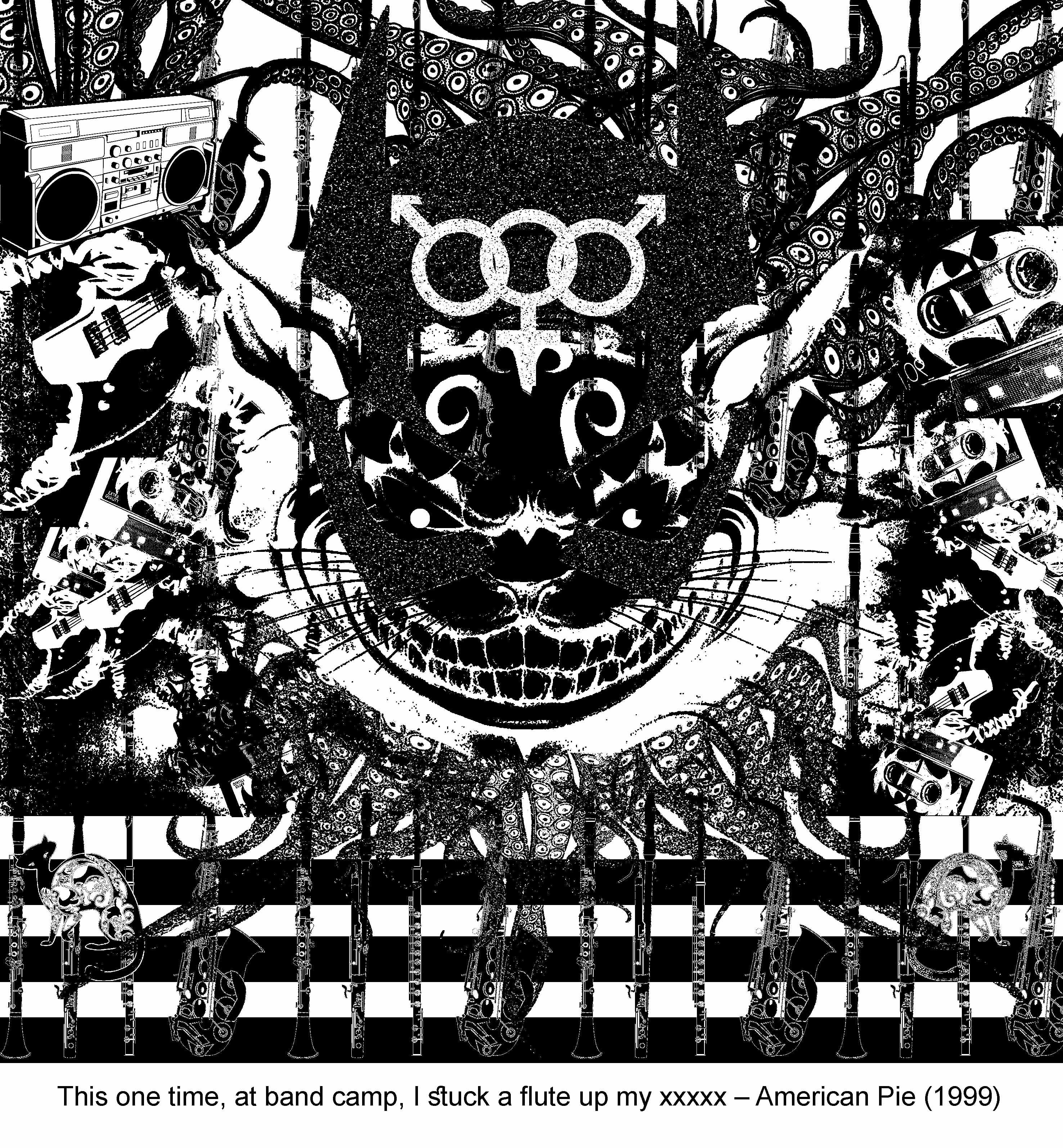
This one time, at band camp…
Alyson Hannigan American Pie (1999)
*Apologies for the crude language*

Why did you pick this elements to express the meaning of the quote?
- Cheshire Cat
- Tentacles
- Boom Box
- Guitar
- Musical instruments
A really naughty quote from American Pie and I’ll leave the elements of this composition to anyone that reads this place to derive their own conclusion on why and what it’s supposed to represent.
What design principles did you use to arrange these elements?
I used the design principle of Symmetry/Asymmetry and a bit of Radial component.
Comments and Improvements to be made :
- Was pretty drained out by the time I got to this and realized that I’ve once again tried to fill up way too much on the empty spaces as though it is a criteria to do so (which it isn’t), will make amendments to my final pieces!


