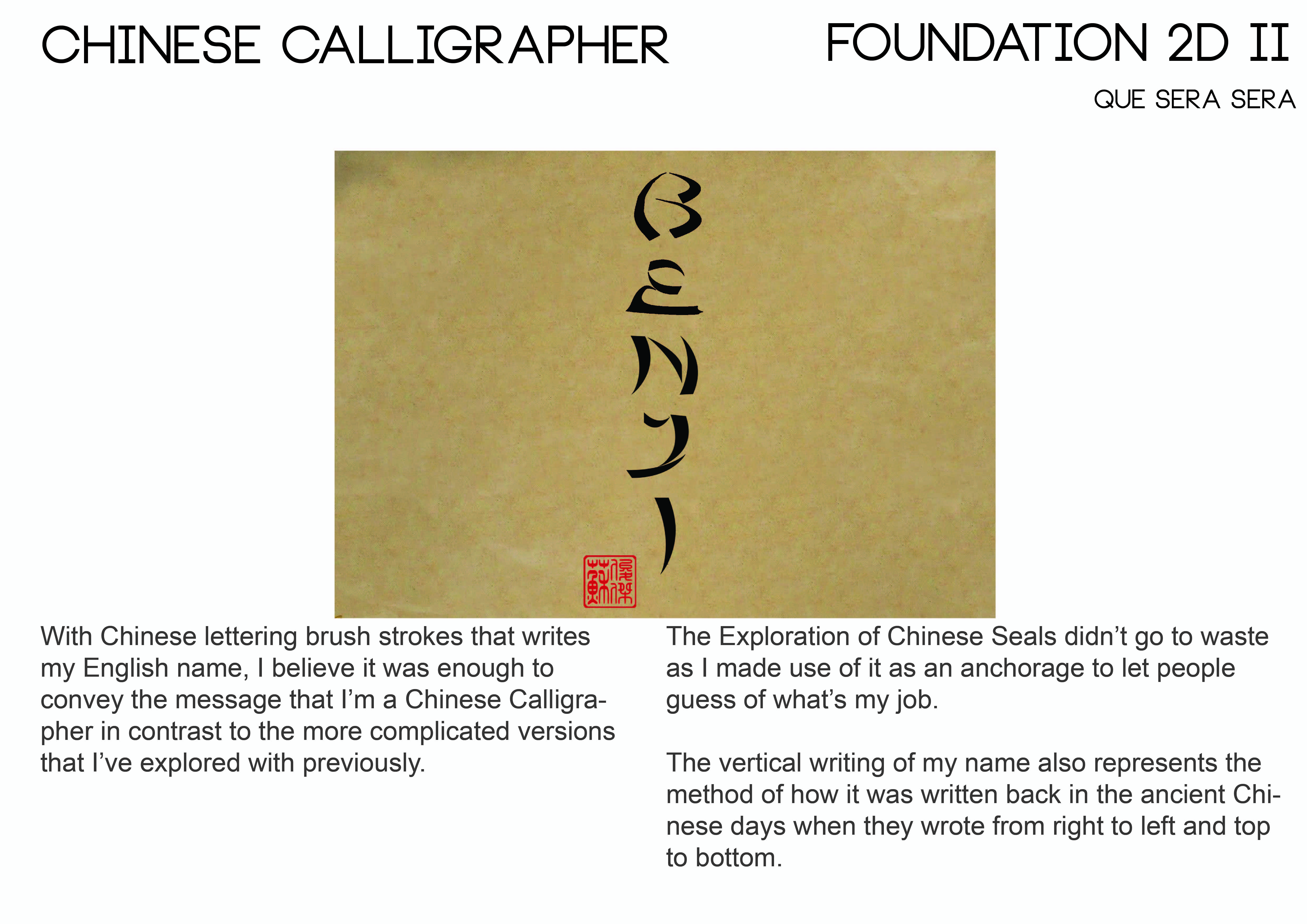
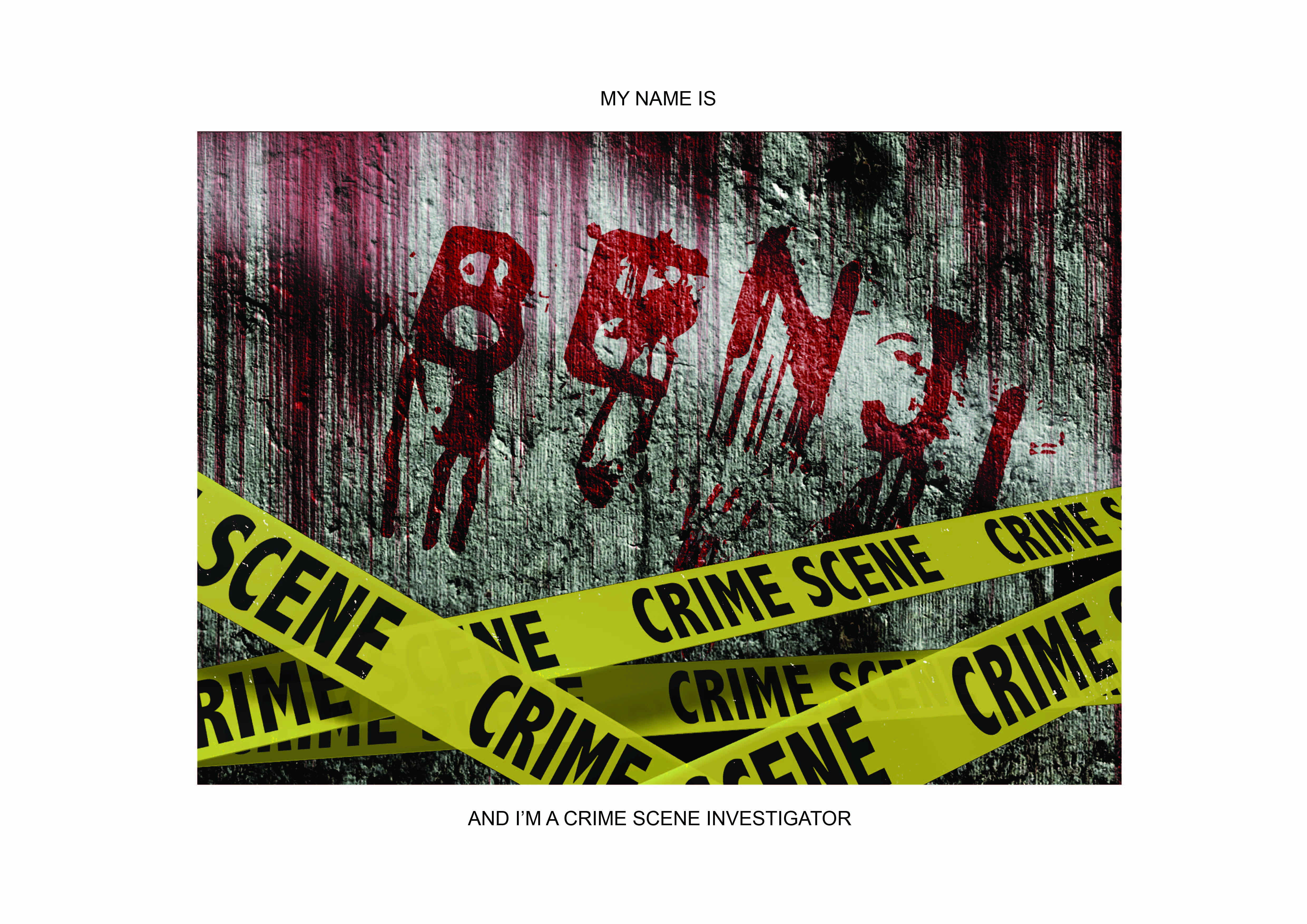
Zine – Neighborhood Explorer 4 (Final)

Final ZINE  

Layout Inspiration

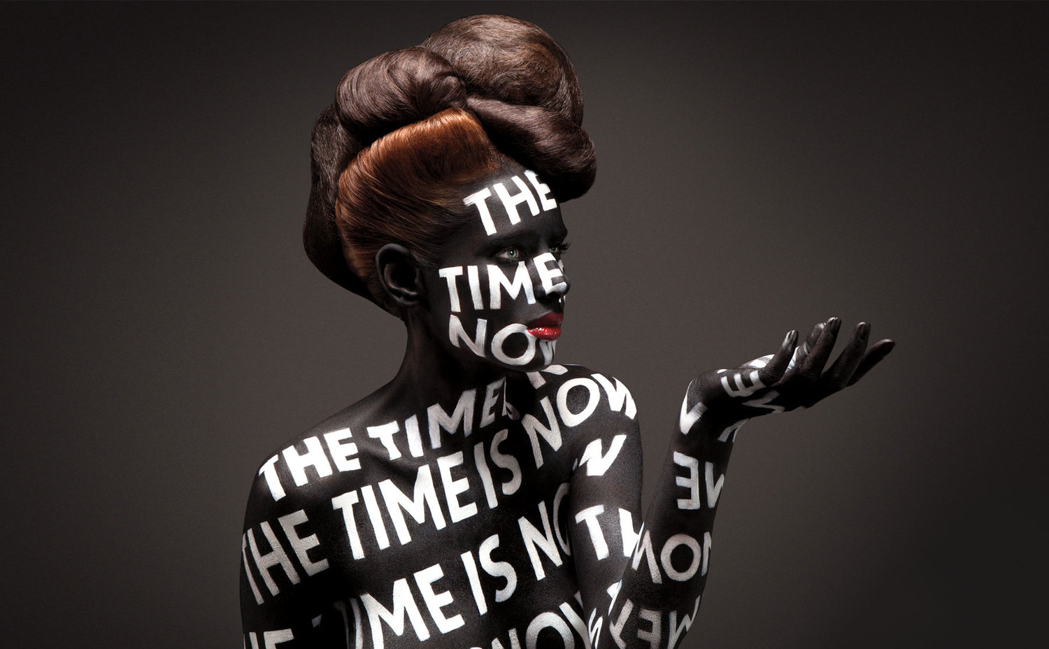
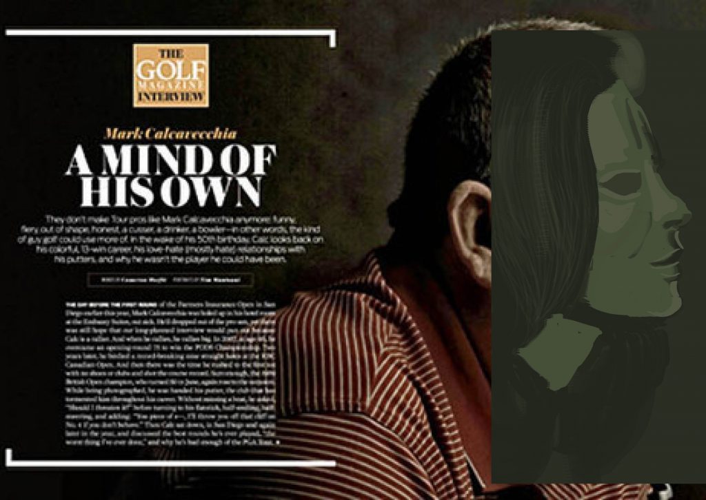
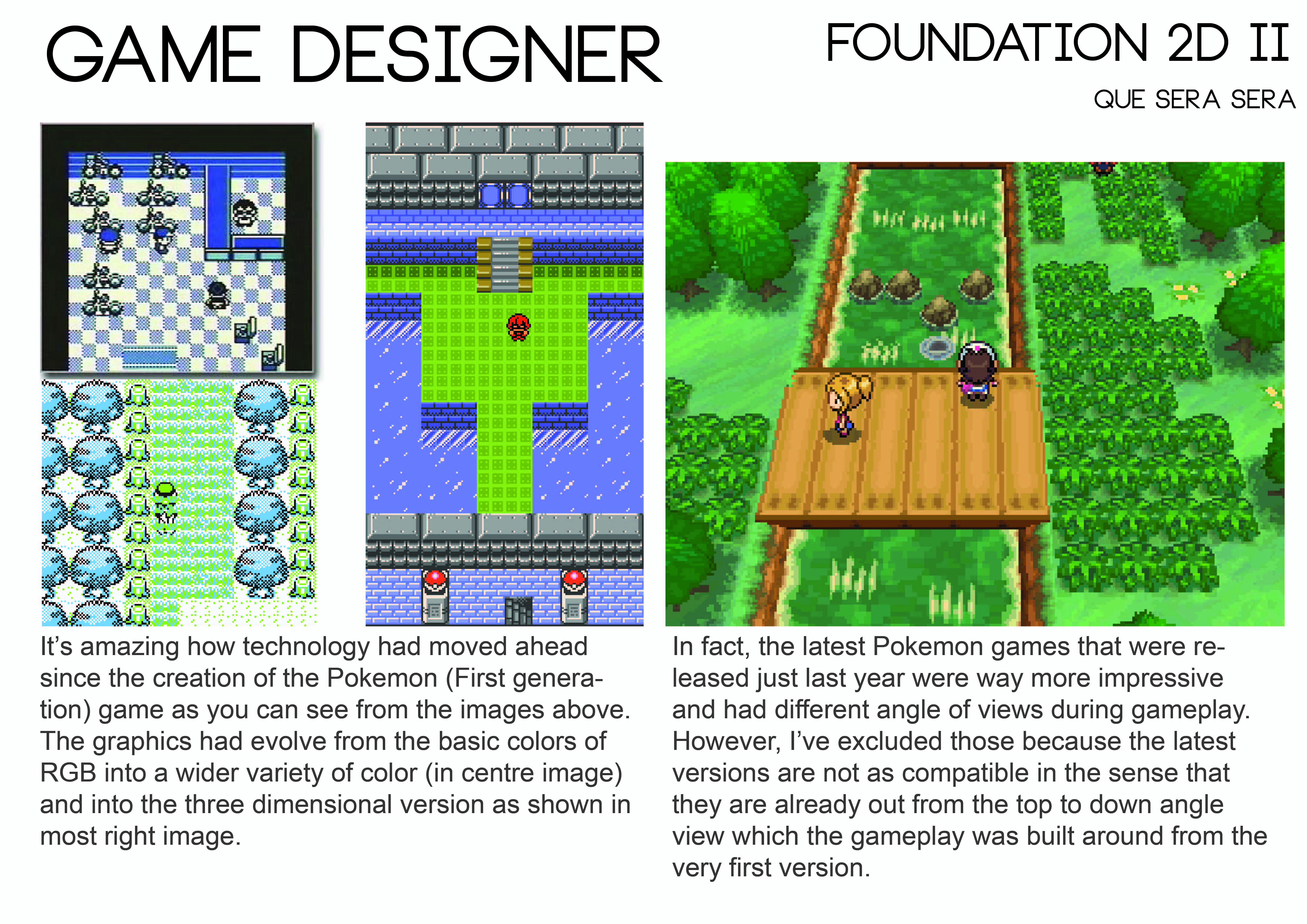
There were many composition that looked really attractive but did not suit the story and mood that I was trying to create for my Zine, thus I had to be exceptionally selective on using a referencing Layout for my spreads. I eventually found it in this sample below.

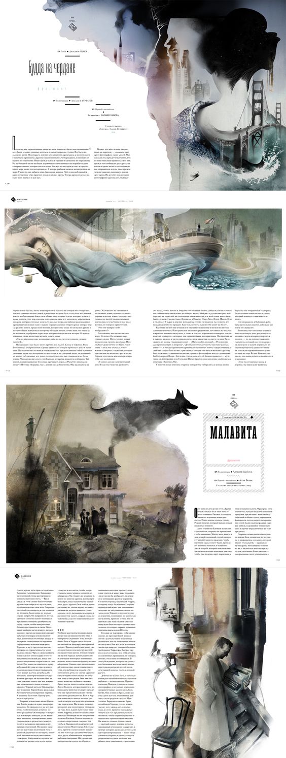
Despite the language, there is something about its imagery that screams a certain solemn feeling for me which caught my liking and was a direction that I wanted to work towards to.

In addition, the way its imagery interacts between a spread was something that I believe I took reference from to include into my Zine to make 2 pages feel as one rather than leaving them as individual pages which I thought was a really important inclusion.

Mood Board

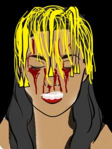
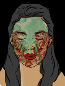
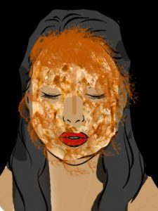
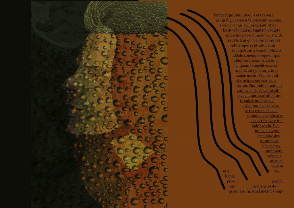
Working with illustrative portraiture art to try and capture the mood which is often done by photography was a huge difficulty for me but I sure as hell hope I did somewhat obtain the mood of the Zine and evoke a sort of feeling when people browse through it.

My choice of text took reference from this images which all used a somewhat ‘classy’ font which is a little similar to VOGUE’s Didot font. I eventually settled for the font –Bodoni.
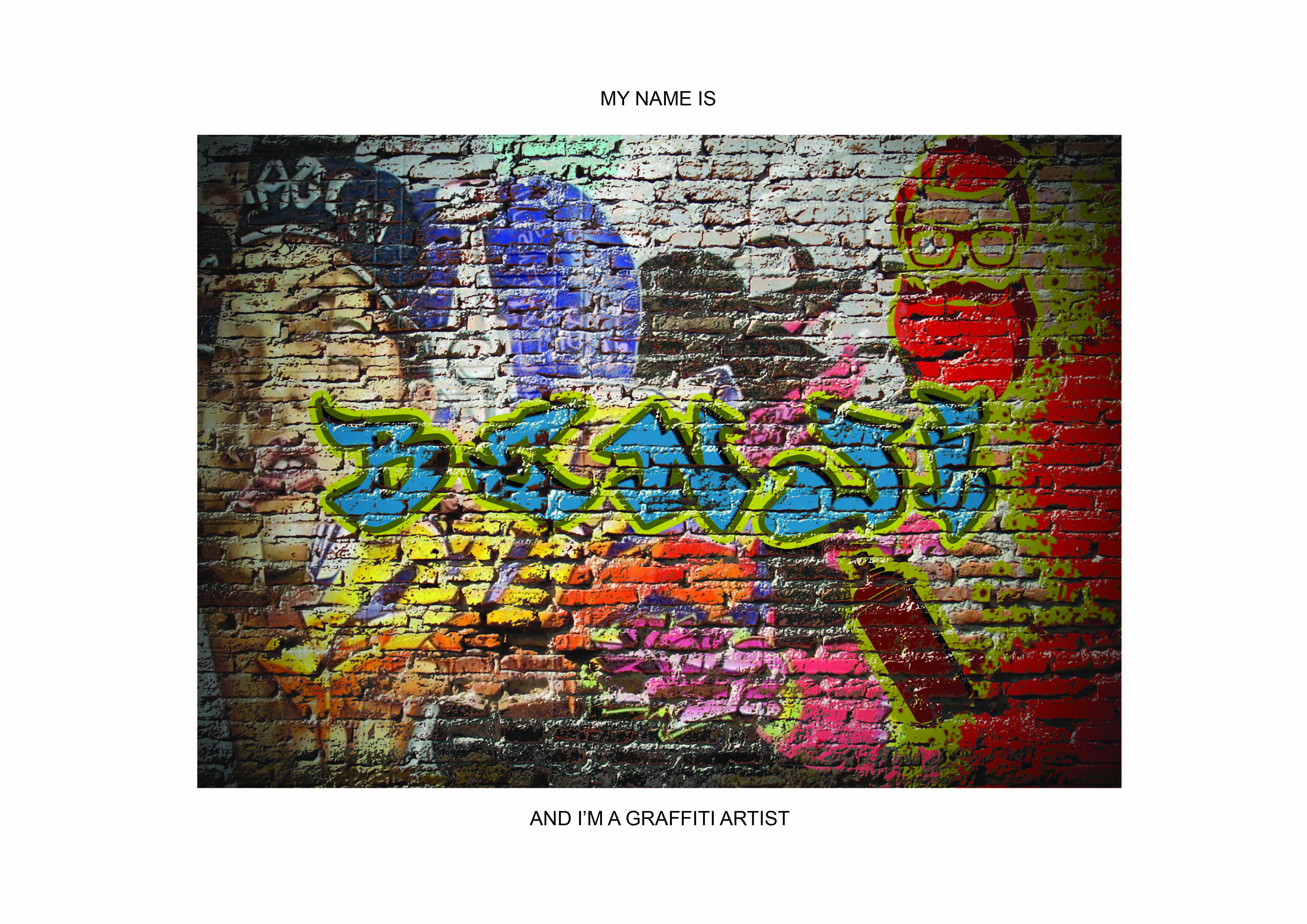
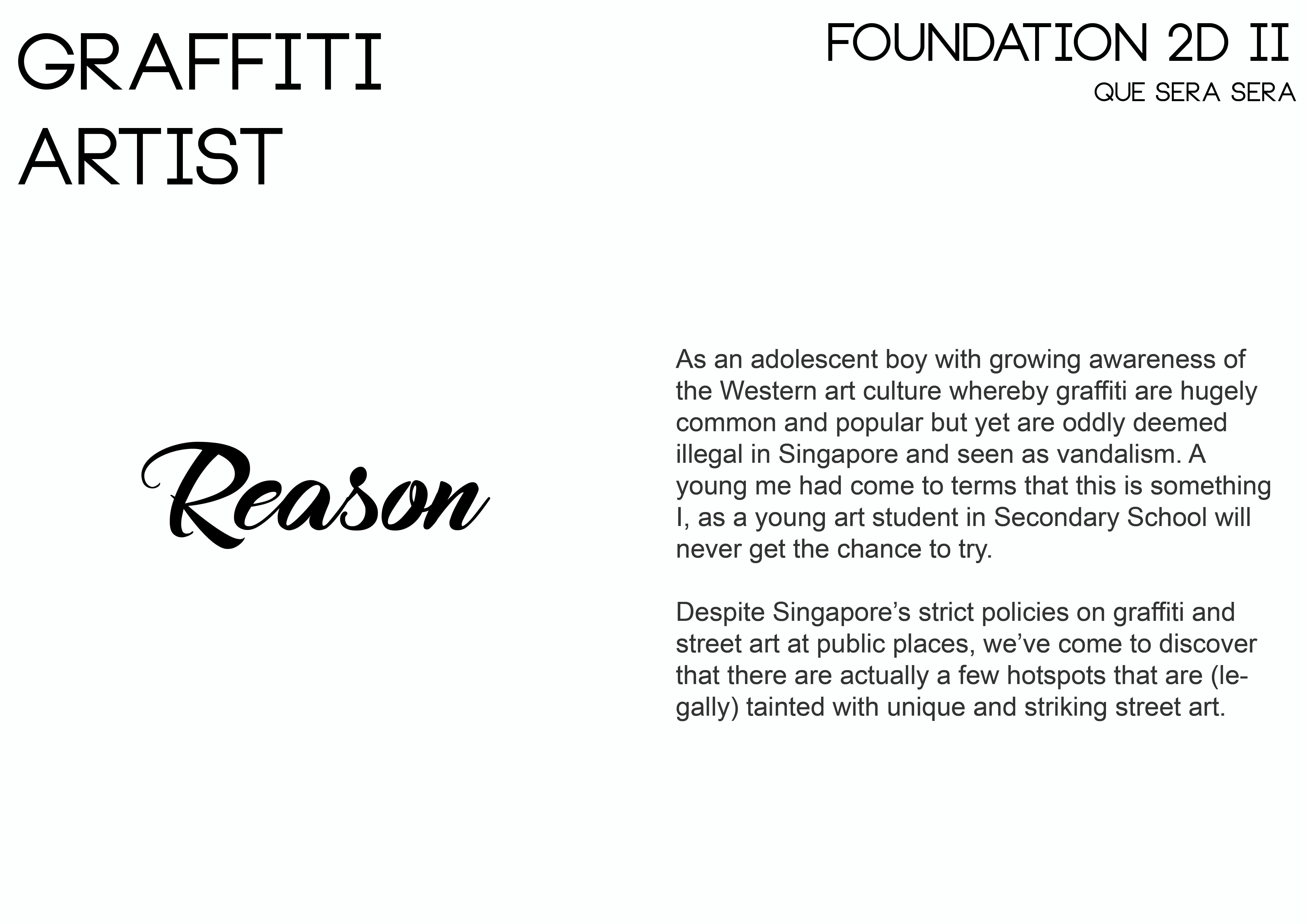
Wasted Opportunity

Also, I would like to mention on how wasted it was for me to not being able to realize that I could have created my contents through photography and food styling on a model as I eventually aborted the last minute shoot 3 days before submission (amidst other submissions) as I thought it was a really huge risk.

Here are some of the planning for the shots such as how to droop down the noodles, having fishball stuffed into the mouth of my model, how to cut the prata which look like a facial mask and many other considerations, which sadly, didn’t come to fruition in the end. Perhaps in the future since this concept is really interesting to work on in my opinion.

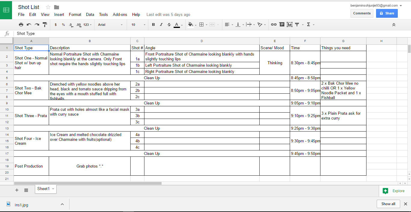
P.s – the pain of an art student, always spending so much money, I actually purchased some of the items for the shoot :'(


Changes from Initial Layout

Development of Pages

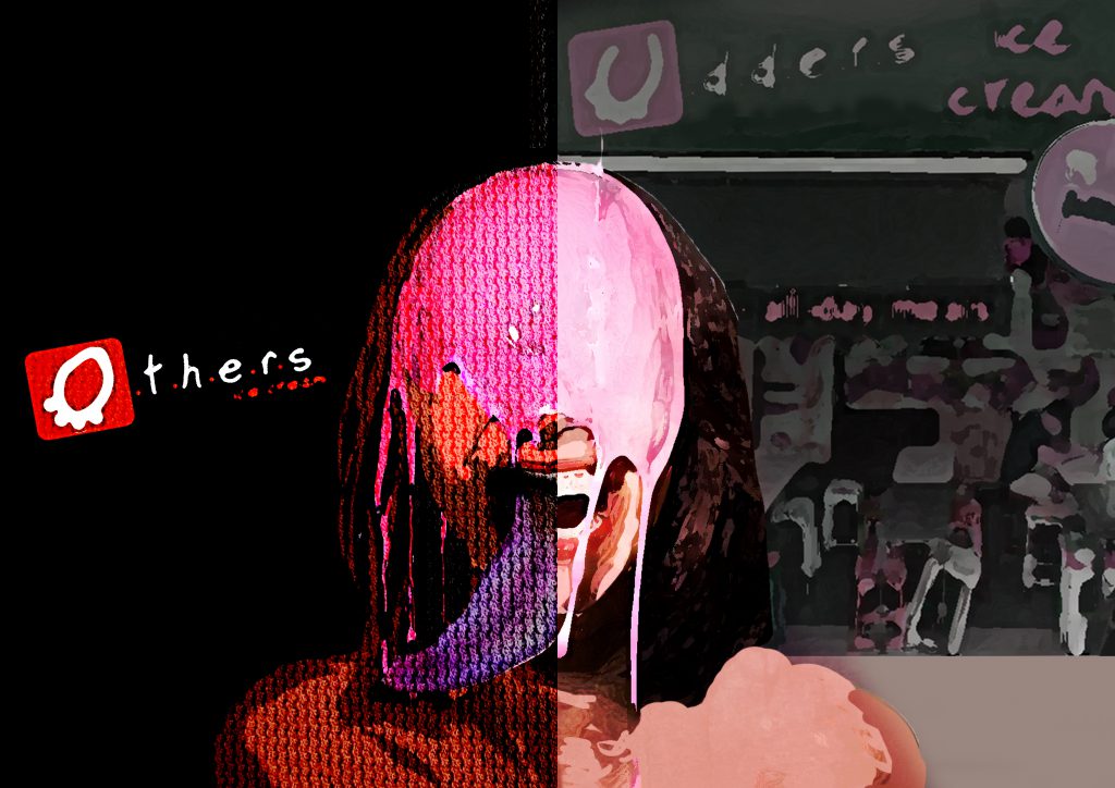
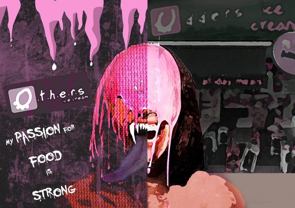
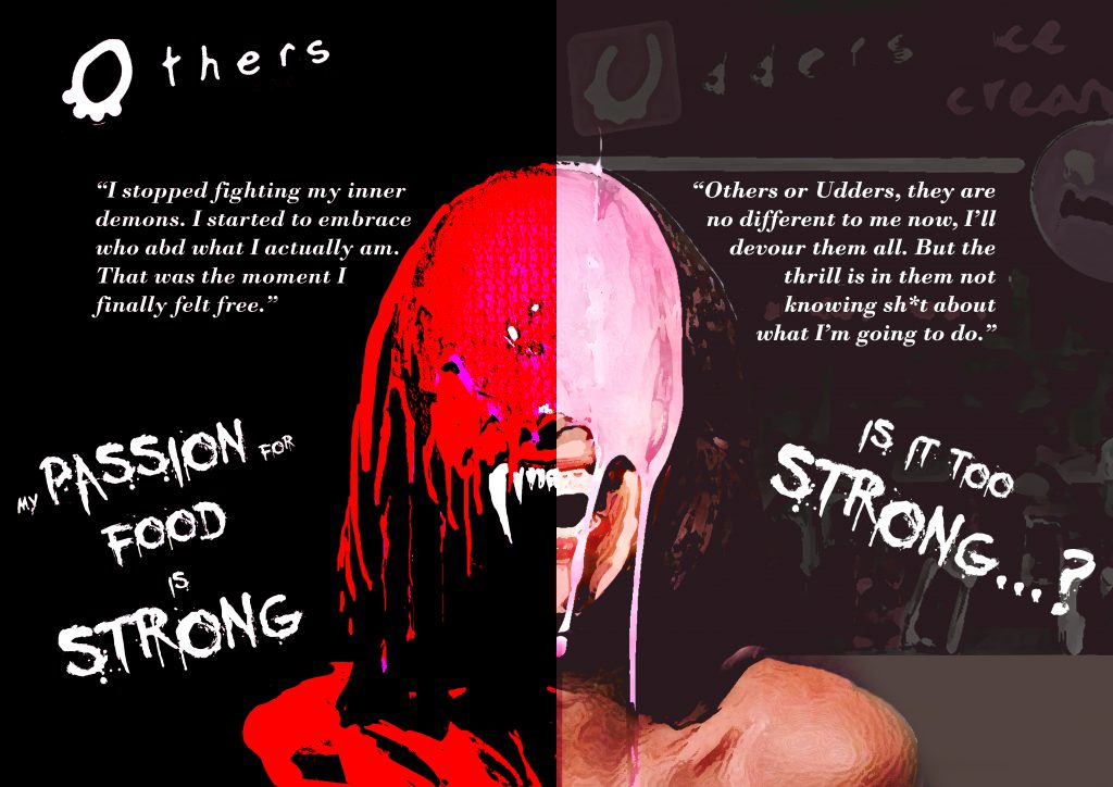
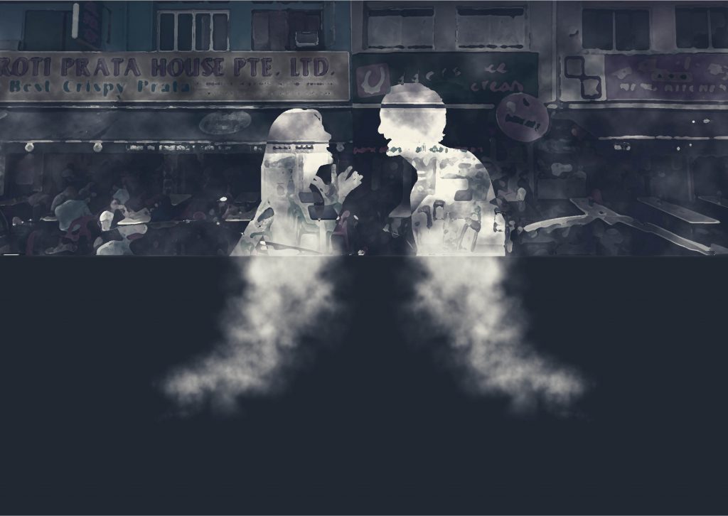
(First Spread – Page 1,8)

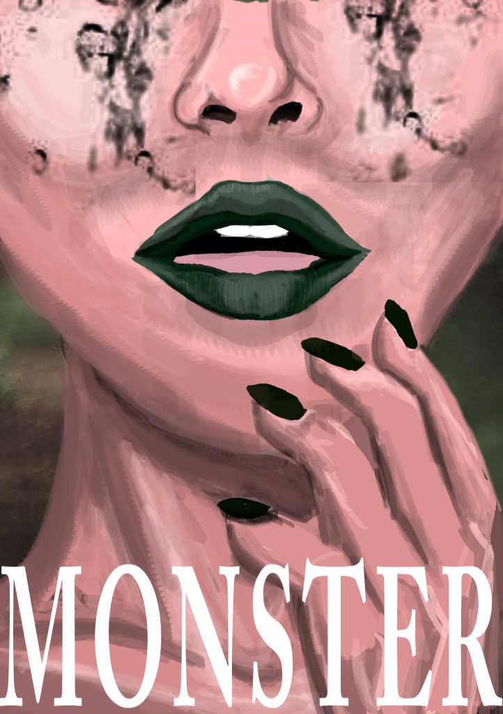
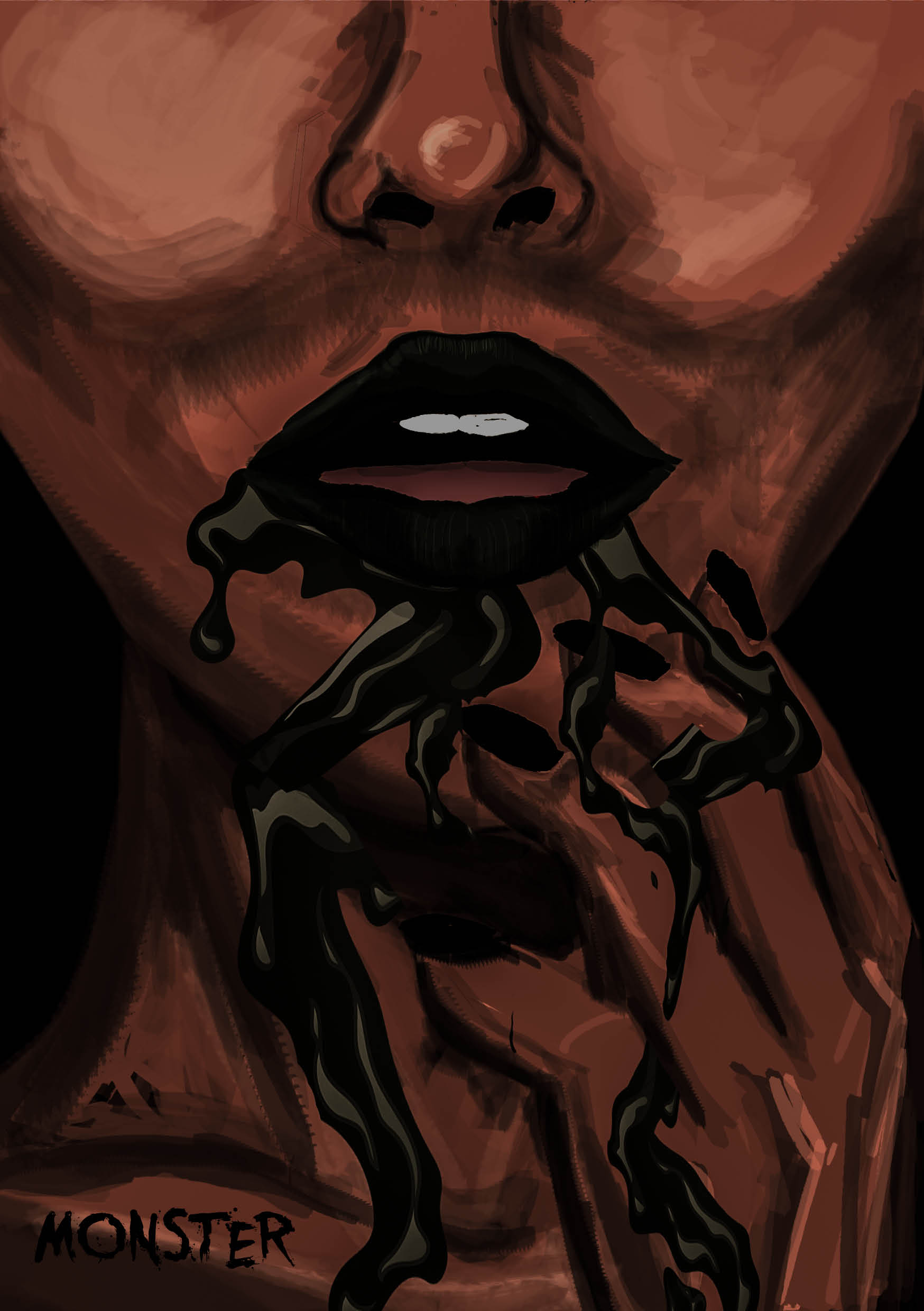
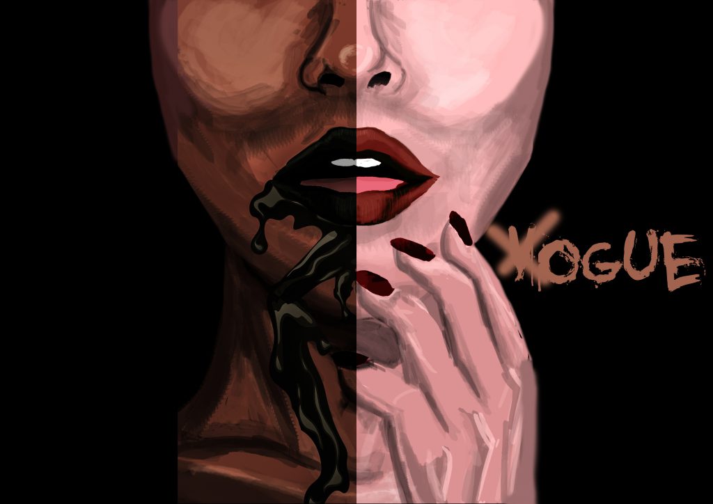
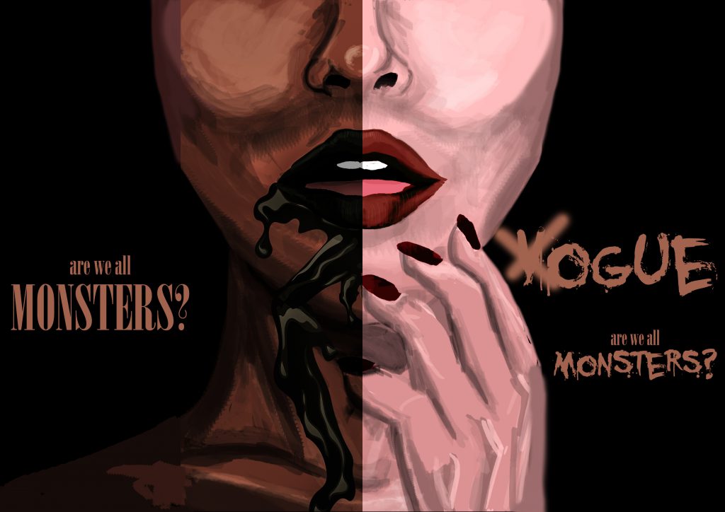
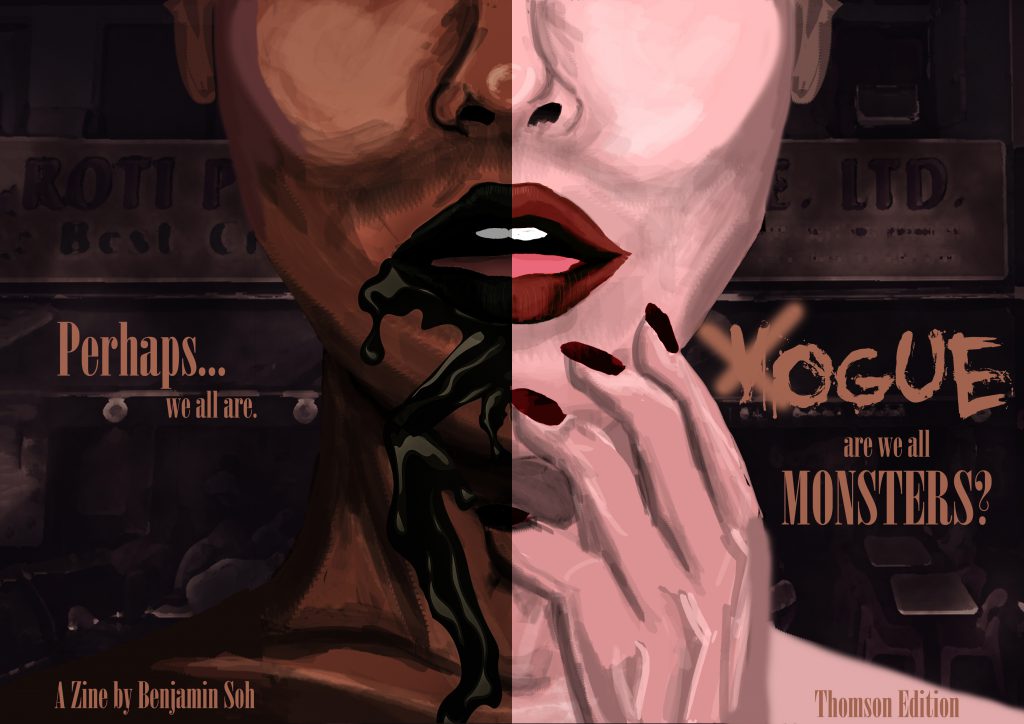
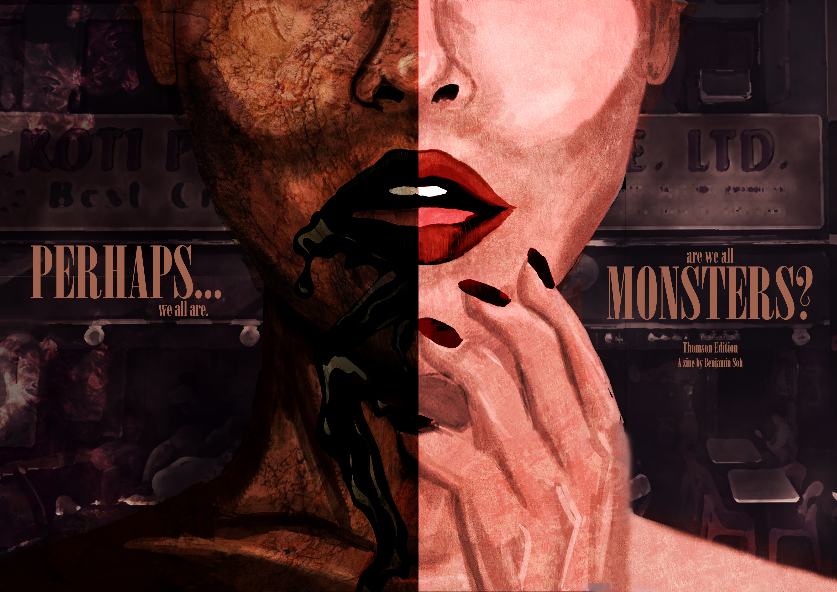
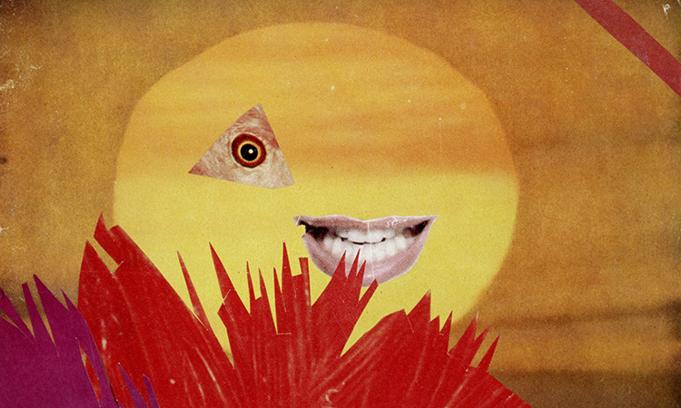
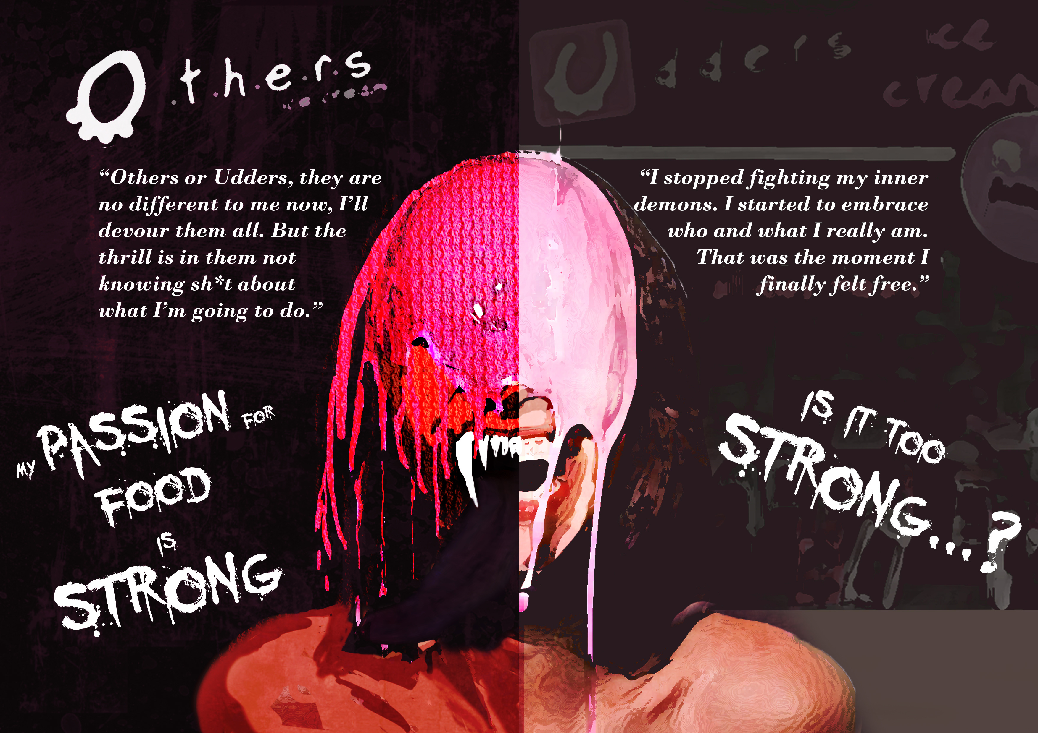
Imagery : The Questioning (Front) and Realization (Back) Moment 

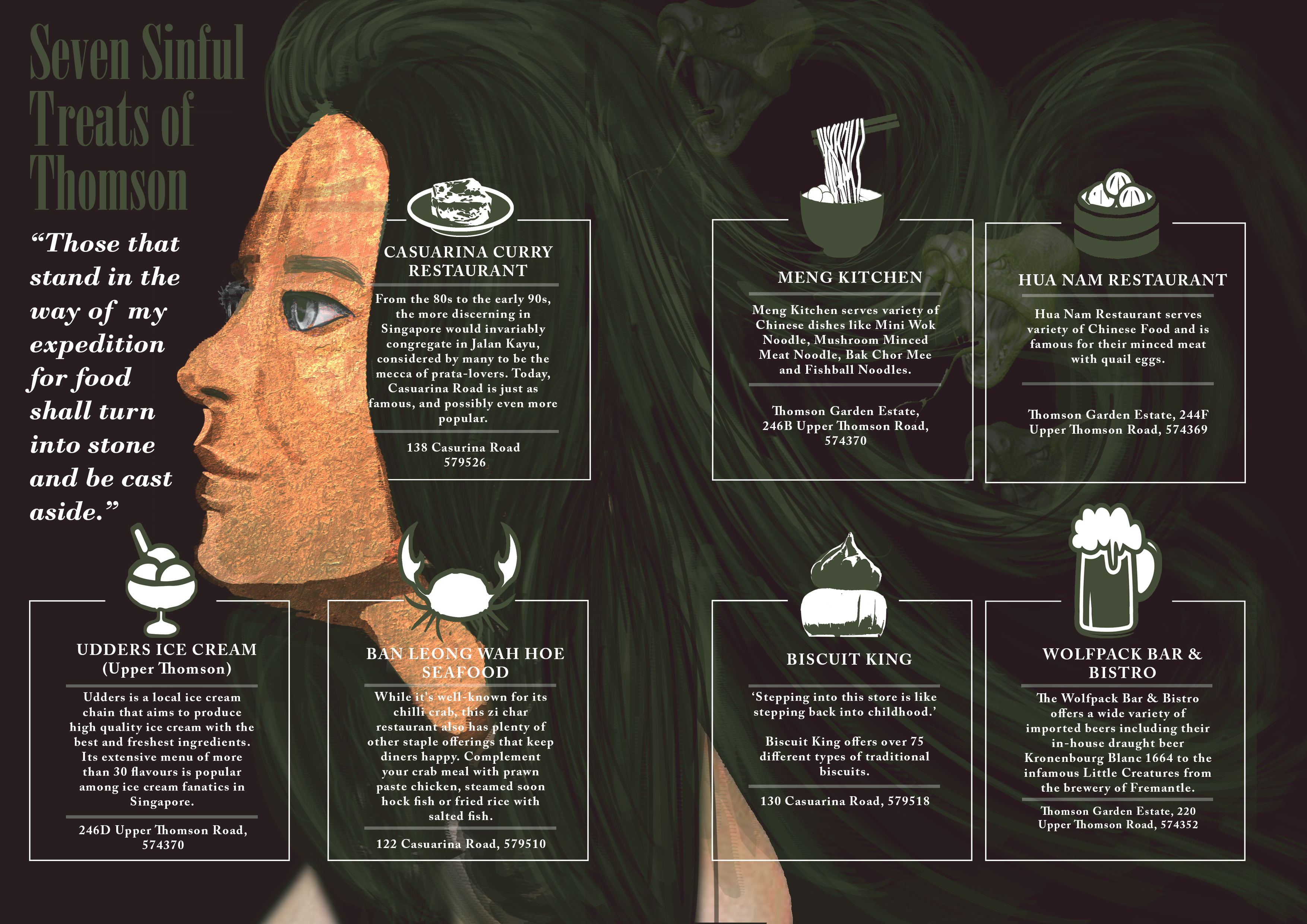
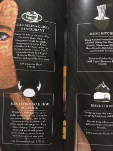
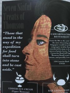
(Second Spread – Page 2,3)

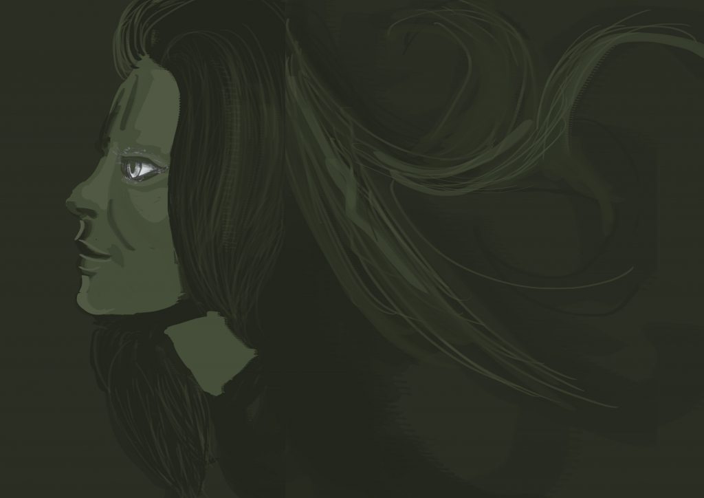
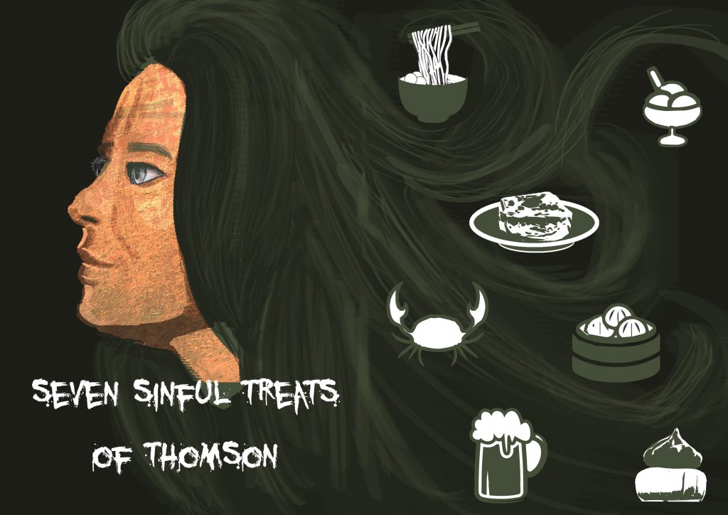
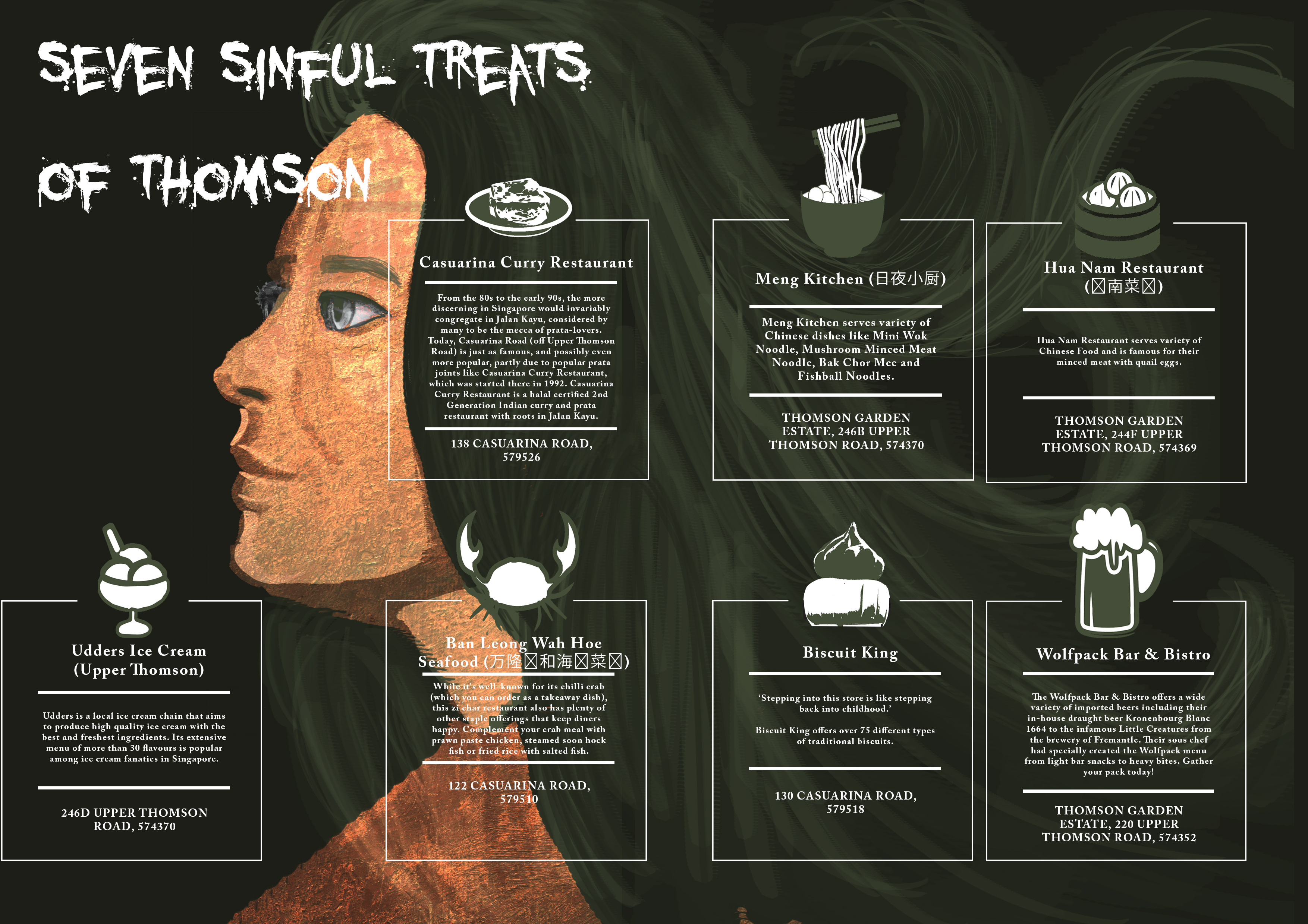
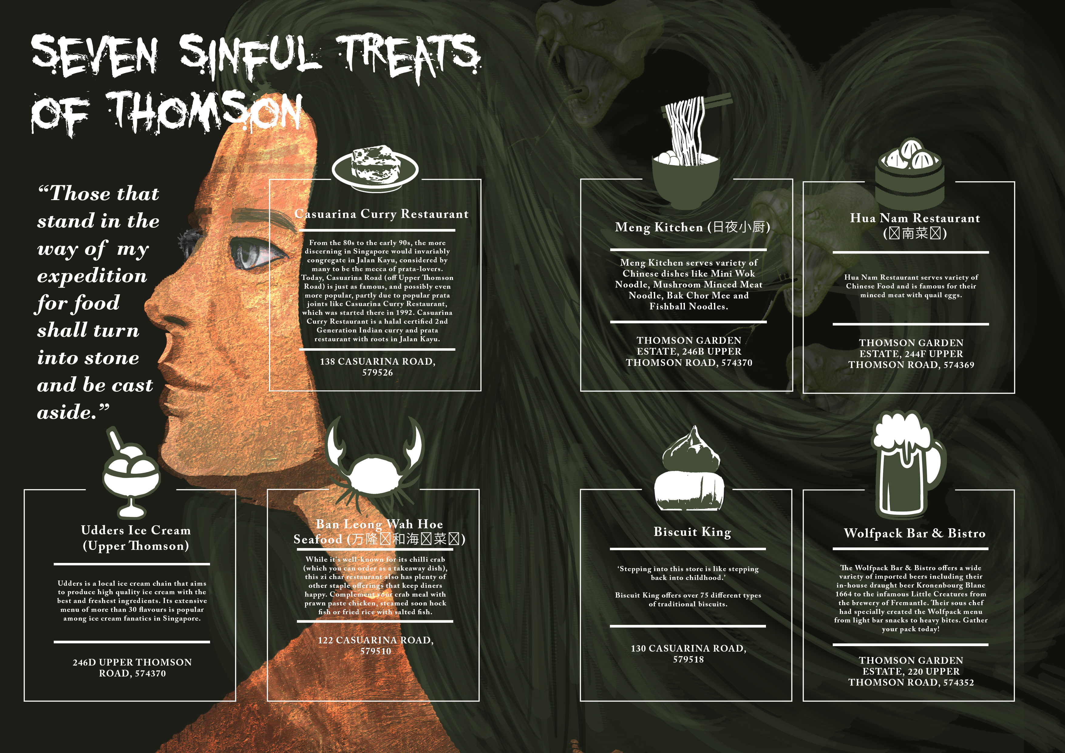
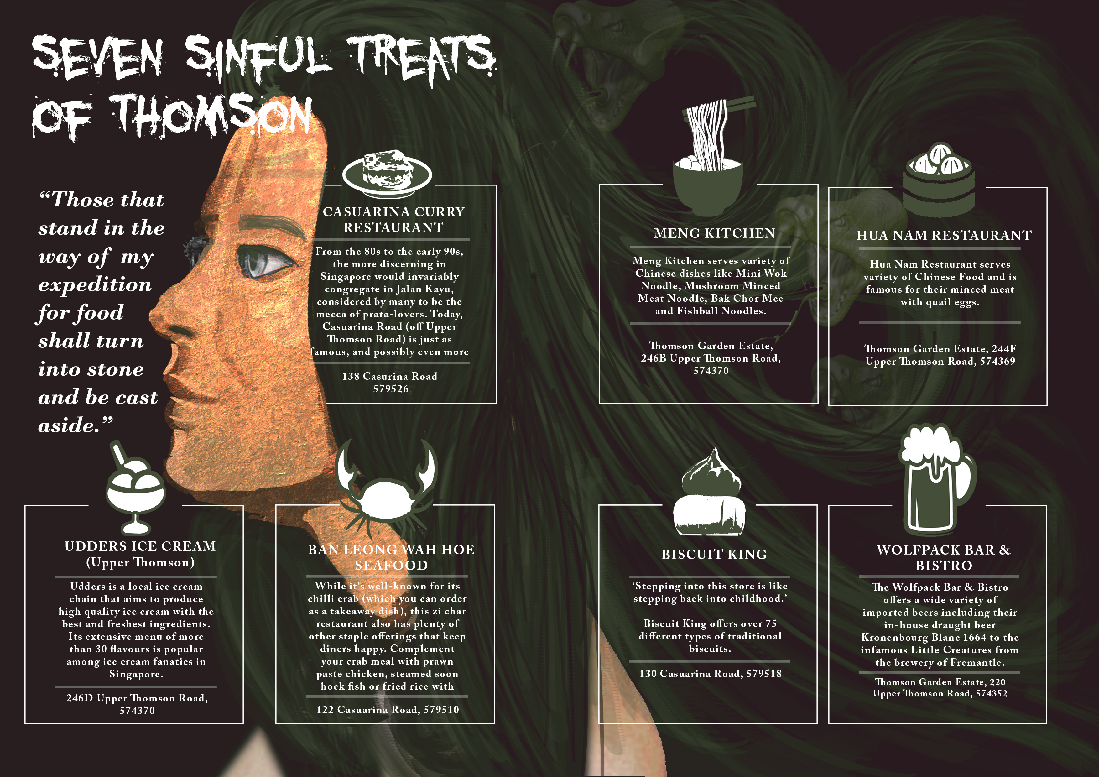
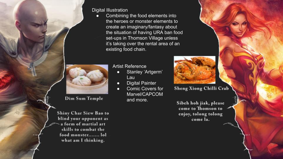
Imagery : A Medusa with each of her snake as a representation of the seven sins which in this spread context is the 7 food locations at Thomson.

(Third Spread – Page 4,5)


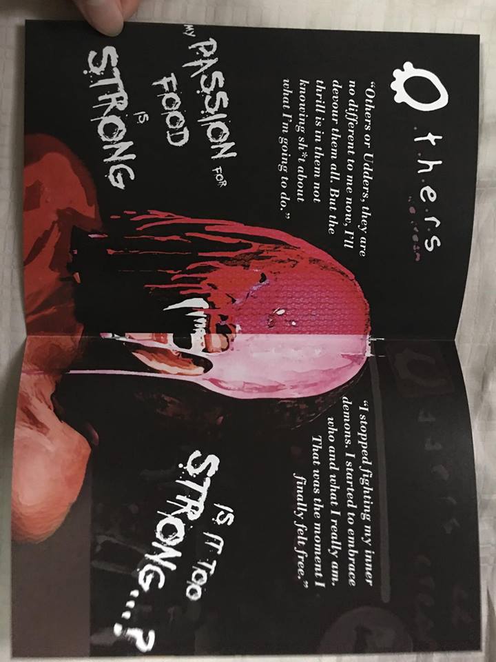
Imagery : An obvious setting of an angel vs devil illustration.

(Fourth Spread – Page 6,7)

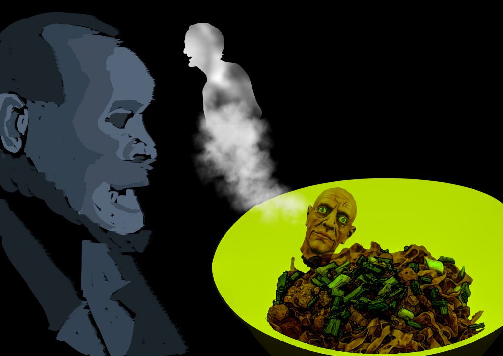
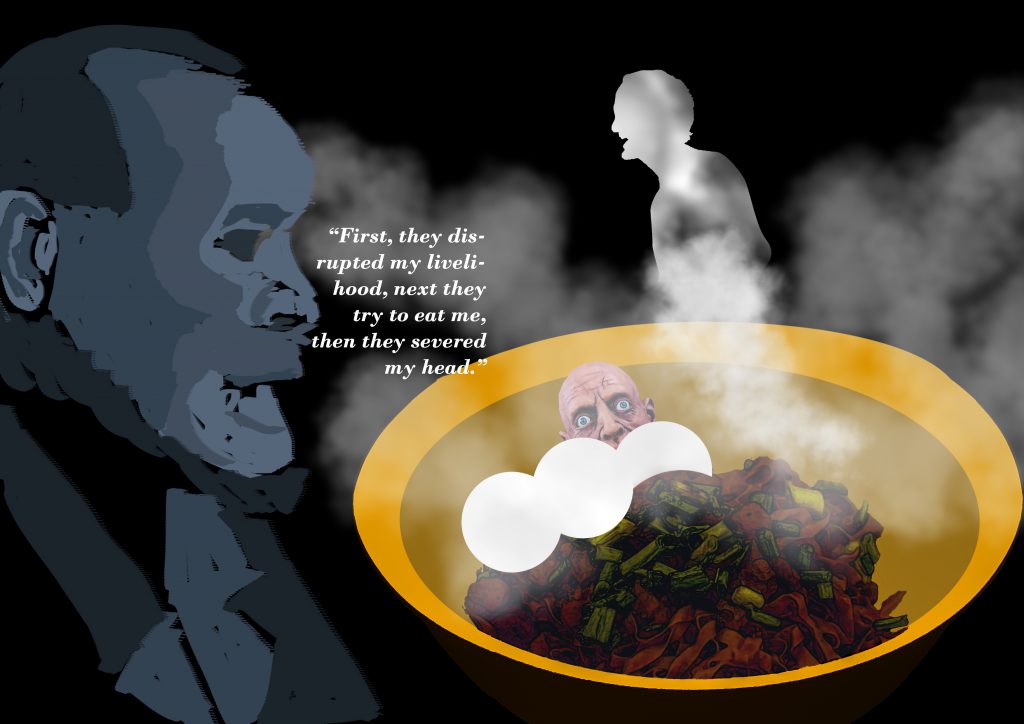
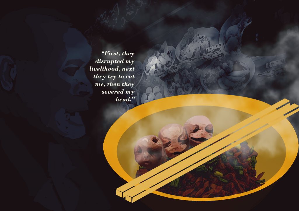
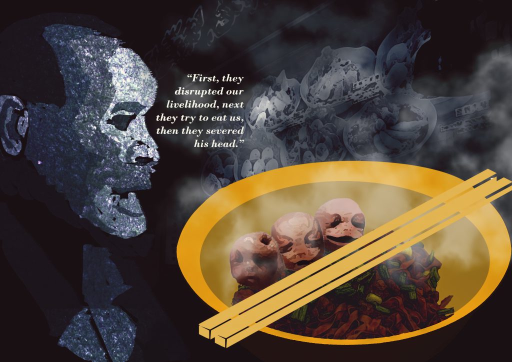
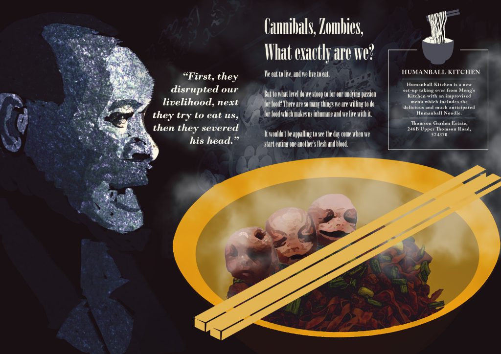
Imagery : The victimized of the uncanny situation of having human consuming human due to their huge appetite for food.

Reflection

In all honesty, I’m not a good writer nor do I aspire to be one(okay I actually do), thus I went ahead with a little of dark humor and irony and a huge load of imagination and exaggeration. A tongue in cheek approach as brought up by Mimi herself when reviewing my Zine.

Also, I should have chose this typeface and use it consistently, something for me to take note of in the future.

Murphy’s law – Anything that can go wrong, will go wrong. That was the case on the day before submission at the print shop. I had my Zine printed over 5 times due to various reasons such as

  • over sized staples,
  • wrong alignment of paper when placed in printer,
  • having my print being cut off more than supposed to.

I have learnt once again that test printing and setting up your files ready for print isn’t as simple as it sounds as there are a lot of technicalities to take note of especially the settings.

And the most annoying mistake I believe I have made in this submission and perhaps the most amateurish one as well which was having some of my text done in Photoshop for convenience sake which led to the printout not having a crisp and full text but ending up somewhat rasterized/blurred! 

Despite all the errors and regrets, I’m generally proud of the work I have produced as I have persevered and not second doubt myself on the unorthodox concept and worked towards a topic by using a method that was previously mentioned as risky to execute. Based on the general feedback from my peers, I do somewhat feel my illustrations did convey the mood that was achieved by photography and that is something I take really huge satisfaction from.

All in all, it had been a really long stretch of weeks with tedious steps and late nights to finally complete this Neighborhood Explorer Project aka as Zine. It had plenty of learning points for me to bring forward in not just my next few years in school but also further in my designing life.

FOUNDATION YEAR IS FINALLY OVER!!!! WEWWWWWWWWW!!!!!!!!

Zine – Neighborhood Explorer 1


So I was the first one to take part in the drawing of lots and with the possibilities of all the zones in Singapore, I was allocated with Thomson! My initial reaction was of course with great elation considering that I reside in Ang Mo Kio which really isn’t very far off from Thomson. It’s nearest MRT Station at the very start of Thomson Road happens to be Novena, a place that I frequent way too much as I make trips down to the Hospital almost once every week (no I’m not a doctor haha).

So I did up a little research on why it was named Thomson Road, I mean it could have been Benjamin Road right? (just kidding)

And of course, it was because of this guy!

John Turnbull Thomson (b. 10 August 1821, Glororum, England–d. 16 October 1884, Invercargill, New Zealand) was the Government Surveyor of the Straits Settlements from 1841 to 1853. He made a number of important contributions during his 12 years in Singapore, including the creation of maps of early Singapore, as well as the design and construction of several buildings and other public infrastructure on the island.1His greatest achievement was probably the design and construction of the Horsburgh Lighthouse on Pedra Branca.2 A self-taught artist and prolific writer, Thomson’s collection of paintings, books and articles now serve as invaluable records of the architecture and life of early Singapore.3

Source from Singapore Infopedia
http://eresources.nlb.gov.sg/infopedia/articles/SIP_230_2005-01-25.html

AHA – MOMENT

In an instant, I knew I had to do Architecture considering that it was Sir John Turnbull Thomson’s effort and results which contributed to a certain extent in some way albeit probably not as huge of an impact as the late Mr Lee Kuan Yew but hell, having a road named after you probably means your contribution meant something yeah?

With that, I found my first focus for my first trip of this Neigborhood Explorer project.

Private Apartments along Thomson Road

One of the many Condominiums by Thomson Road

Majority of the materials used in the architecture around this area of Thomson consisted of the above materials which are Blue tinted Mirror Glass, Timber and Concrete finish with different color of paint finish as their facade. This selection of materials spots a very modern look for an architecture in contrast with the other older buildings which was spotted a couple of streets down the long stretch of Thomson Road.

What a long way Singapore had come from planting trees all over Singapore, and in this age, we have many creative methods to provide a purposeful and aesthetically pleasing structure in this case, a vertical planting module which holds the flora which attract them faunas. This is a stark difference from what we can still find along, or rather will find a lot of along the Upper Thomson Road area where huge plots of land are still undeveloped and probably won’t be as those are protected areas and most probably used for the Army as the training ground purposes.

Vertical Planting Modules found outside Starbucks at United Square along Thomson Road

Did I mention that Thomson is a long stretch?

Old buildings beside United Square

One of the older buildings around the modern building at the start of Thomson Road which stood out really obvious. These buildings consist mostly of concrete with paint finish and certain portion of the facade are painted with really tacky colors such as bright green, yellow and blue. 

SC Global / NEWTON 200 along Thomson Road

Traditional Shop-houses featuring plenty of different cuisines of food

This Traditional Shop-houses were spotted with a lot of different cuisines…

and these varieties of food stretches further down with more delicious food

… which stretches further down Thomson Road all the way to Upper Thomson Road which based on map reference, could possibly be the distance of Novena MRT to Yishun MRT as a gauge of how long a stretch Thomson really is.

The topic food also branches out to possibly a new focus for myself as I’ve asked around so often about what do they think of when Thomson is mentioned – FOOD. 

More old private apartments with the construction of the church of St Alphonsus along Thomson Road

Church of St Alphonus before the reconstruction

image taken from http://www.panoramio.com/photo/67998490

Rather Old Private Apartments right opposite Novena Square and Velocity

This marks the start of my exploration around the residential area which range from terrace houses to really old HDB buildings. It was really quiet around this area around evening time even though people should be coming back from home by then.


The overall feeling this building gives off is really quite depressing and somewhat creepy?

This area feels a bit like Malaysia, but of course it isn’t. There really wasn’t much special stuff that really breathe Thomson, elements that I could instantly relate to Thomson Road/ Area.

As I delved further into the neighborhood of old Architectures which still doesn’t show much. By now, I was really unconvinced about doing things related to Architecture but I couldn’t let it go yet, so I sticked to my plan and explored further.


We could tell the huge difference between the older buildings as compared to the modern ones. There’s a stark difference between the two of them, in terms of colors, structure and aesthetics just as mentioned before, but it all aims to serve the same purpose – housing families.

On a side note, that right there (on top left) is really amazing, I wish I could go up there one day and see how it looks like and enjoy that spatial experience from that high up. 

I’ve finally reached Thomson Flyover by this point and I spotted something really interesting that resides underneath this Flyover which happens to be a Futsal Court – a smaller pitch for football. There were families and their children playing a game of football which is always a nice thing to see. However, it was nothing helpful towards my Zine to be honest which was quite a bummer as I had lots of hope looking from the outside.


Source - Straits Time

Source – Straits Time

Source - Straits Time

Source – Straits Time

With a slew of old-school restaurants and buzzy new hipster joints, some of which are open round the clock, Thomson Village near Upper Thomson Road is a magnet for diners in the evenings and on weekends.

IN UPPER THOMSON

They don’t just park illegally and block your gate, but shout and disturb the residents late at night.

MR LEE, Thomson Ridge resident

But the area’s popularity has created parking and traffic problems, with multiple instances of illegal parking occurring regularly, and residents in nearby estates complaining about restaurant patrons who park in front of their gates and block their cars.

To prevent the situation from deteriorating, the Urban Redevelopment Authority (URA) has banned additional eateries from opening in shophouses in sections along Jalan Todak, Soo Chow Walk, Sin Ming Road and Shunfu Road, as well as Upper Thomson Road.

Source from : http://www.straitstimes.com/singapore/ura-bans-new-eateries-in-upper-thomson-little-india-and-bedok-due-to-parking-woes

-UPDATING-

SONY DSC

SONY DSC

SONY DSC

SONY DSC

SONY DSC

SONY DSC

SONY DSC

SONY DSC

SONY DSC

SONY DSC

SONY DSC

SONY DSC

SONY DSC

SONY DSC

SONY DSC

SONY DSC

SONY DSC

SONY DSC

SONY DSC

SONY DSC

SONY DSC

SONY DSC

SONY DSC

SONY DSC

SONY DSC

SONY DSC

SONY DSC

SONY DSC

SONY DSC

SONY DSC

SONY DSC

SONY DSC

SONY DSC

SONY DSC

SONY DSC

SONY DSC

SONY DSC

SONY DSC

SONY DSC

SONY DSC

SONY DSC

SONY DSC

Que Sera Sera 3

oss-documents-csi-graf-01 oss-documents-csi-graf-03 oss-documents-latest-09
grafitti-gif

I made use of a brick wall image to ‘spray’ my name over it. I applied a stroke with another color to made it look as though it’s layered with multiple colors. I added some inner shadow and outer glow to give it some depth. It seem pretty plain to me but I received multiple feedback during the ‘work-in-progress’ session from both Mimi and my peers that it had too much going on in the background. Also, there was some issue with the letter ‘E’ as it wasn’t as legible as the other letters. However, to create depth, I had to forgo the functionality in this case the legibility in exchange for the aesthetics of this typography portrait. I eventually came to terms to let this piece go and proceeded on others.

oss-documents-csi-graf-02oss-documents-csi-graf-04oss-documents-latest-09csi-gif

With similar methods applied with the Graffiti piece, I managed to come up with this CSI piece which looked really decent to me as well. Similarly, I received the same feedback for this just like the Graffiti one which led me to work on other pieces which were eventually my final 4. I probably would not have settled for this piece anyway as I would have liked to explore on more methods digitally.

oss-documents-01

oss-documents-latest-04

oss-documents-latest-09

architect-gif

This piece was one of my favorite but due to the ambiguity of it’s identity as I was told that it could represent either Architect or Interior Designer or even a Landscape Architect(which was what it was meant to be) was really worrisome. I finally came to terms with it after a long struggle as I convinced myself that this is a module whereby I learn to communicate to the audience visually… but it was really hard.


Next Post : The final 4 
Architect
Game Designer
Soldier
Chinese Calligrapher

Que Sera Sera 1

Dada was an artistic and literary movement that began in Zürich, Switzerland. It arose as a reaction to World War I and the nationalism that many thought had led to the war. Influenced by other avant-garde movements – Cubism, Futurism, Constructivism, and Expressionism – its output was wildly diverse, ranging from performance art to poetry, photography, sculpture, painting, and collage. Dada’s aesthetic, marked by its mockery of materialistic and nationalistic attitudes, proved a powerful influence on artists in many cities, including Berlin, Hanover, Paris, New York, and Cologne, all of which generated their own groups. The movement dissipated with the establishment of Surrealism, but the ideas it gave rise to have become the cornerstones of various categories of modern and contemporary art.

It was the first conceptual art movement where the focus of the artists was not on crafting aesthetically pleasing objects but on making works that often upended bourgeois sensibilities and that generated difficult questions about society, the role of the artist, and the purpose of art.
Dada. [Internet]. 2017. TheArtStory.org website. Available from:
http://www.theartstory.org/movement-dada.htm [Accessed 01 Feb 2017]

MOST IMPORTANT ART OF THIS ART MOVEMENT

“R. Mutt’, however, was an unusual name, with comic overtones, and this might have given people a clue as to its falseness. Later in life, when asked whether ‘R. Mutt’ was a pun on the German word Armut meaning poverty, Duchamp was quoted as explaining:

Marcel Duchamp, 'Fountain' 1917, replica 1964

Marcel Duchamp, ‘Fountain’ 1917, replica 1964

Mutt comes from Mott Works, the name of a large sanitary equipment manufacturer. But Mott was too close so I altered it to Mutt, after the daily cartoon strip “Mutt and Jeff” which appeared at the time, and with which everyone was familiar. Thus, from the start, there was an interplay of Mutt: a fat little funny man, and Jeff: a tall thin man … I wanted any old name. And I added Richard [French slang for money-bags]. That’s not a bad name for a pissotière. Get it? The opposite of poverty. But not even that much, just R. MUTT.
(Camfield 1989, p.23.)” 
Howarth, Sophie. (April 2000) revised by Mundy, Jennifer. (August 2015) “Fountain.” http://www.tate.org.uk/art/artworks/duchamp-fountain-t07573 (1 February 2017).

“Duchamp was the first artist to use a readymade and his choice of a urinal was guaranteed to challenge and offend even his fellow artists. There is little manipulation of the urinal by the artist other than to turn it upside-down and to sign it with a fictitious name. By removing the urinal from its everyday environment and placing it in an art context, Duchamp was questioning basic definitions of art as well as the role of the artist in creating it. With the title, Fountain, Duchamp made a tongue in cheek reference to both the purpose of the urinal as well to famous fountains designed by Renaissance and Baroque artists. In its path-breaking boldness the work has become iconic of the irreverence of the Dada movement towards both traditional artistic values and production techniques. Its influence on later twentieth century artists such as Jeff Koons, Robert Rauschenberg, Damien Hirst, and others is incalculable.”
Dada. [Internet]. 2017. TheArtStory.org website. Available from:
http://www.theartstory.org/movement-dada.htm [Accessed 01 Feb 2017]

SUMMARY OF FINDINGS

  • Duchamp created a new way of looking at an object at it’s literal value – what we call conceptual art
  • Dada artists are known for their use of readymade objects – everyday objects that could be bought and presented as art with little manipulation by the artist.
  • The introduction of chance was a way for Dadaists to challenge artistic norms and to question the role of the artist in the artistic process. – Many artist were exponent on Hans Arp’s law of chance whereby he incorporate the chance factor into his creation of works of art which went against all norms of traidtional art production in which preparations were meticulously planned and thought for before the execution of completing the artwork.
  • Dada artists are known for their use of readymade objects – everyday objects that could be bought and presented as art with little manipulation by the artist. The use of the readymade forced questions about artistic creativity and the very definition of art and its purpose in society.


HANNAH HOCH

  • The only woman in the absurdist Dada art movement of the 1910s, German artist Hannah Hoch pioneered an edgy style of photomontage that’s showcased in a major new exhibition.
  • One of the originators of Photomontage
Das schöne Mädchen [The Beautiful Girl]
In terms of composition, the artwork by Hannah Hoch (image on the left above) was one that I really like among the others. Somehow the composition shows me a large head of a lady and a small body and with the recurring patterns, it really caught my eye. Well, she is one of the originators of Photomontage, right? I’m sure her composition skills would be second to none considering that she’s such a famous artist during the DADA art movement. 
Personally, I thought the artworks of Hannah Hoch’s were pretty minimal(image on the right above) and not what I usually try to produce. Then again, my works from Semester 1 was previously thought of as ‘too much’  as I tend to fill up way too much of a canvas when there are room to be lesser. So I thought Hannah Hoch’s work would be a good reference for me as to how to keep things minimal.
Image result for stefan sagmeister
However, one artist that Mimi introduced to us in class got me so amazed with his works. He’s none other than the legendary, Stefan Sagmeister.
The thing about Sagmeister’s artworks for me is that it works really well despite looking so minimal and clean.
Image result for stefan sagmeisterImage result for stefan sagmeister typography
Well, I guess the time is now for me to talk less and do more by start working on my A4 canvases for Que Sera Sera. 🙂