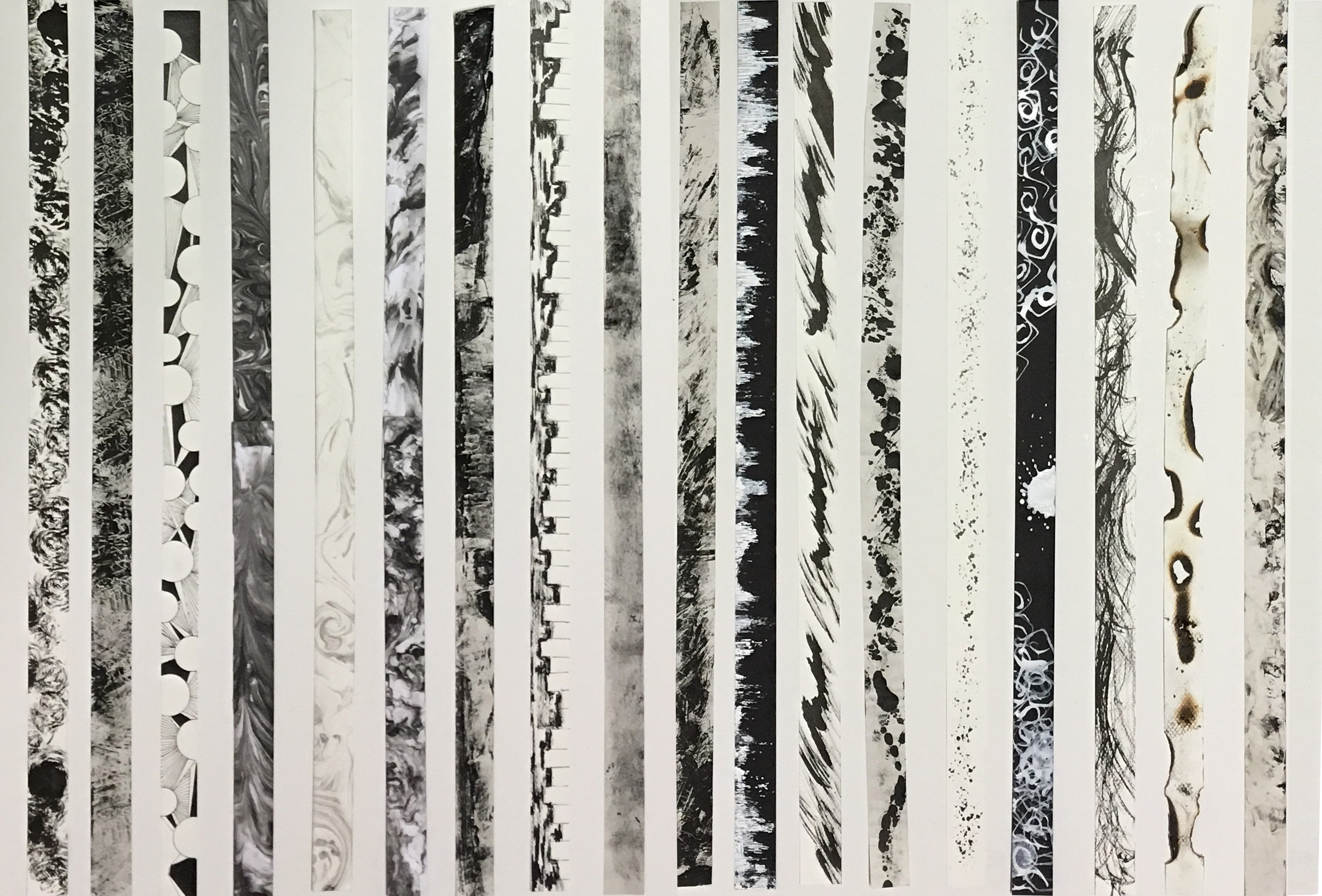
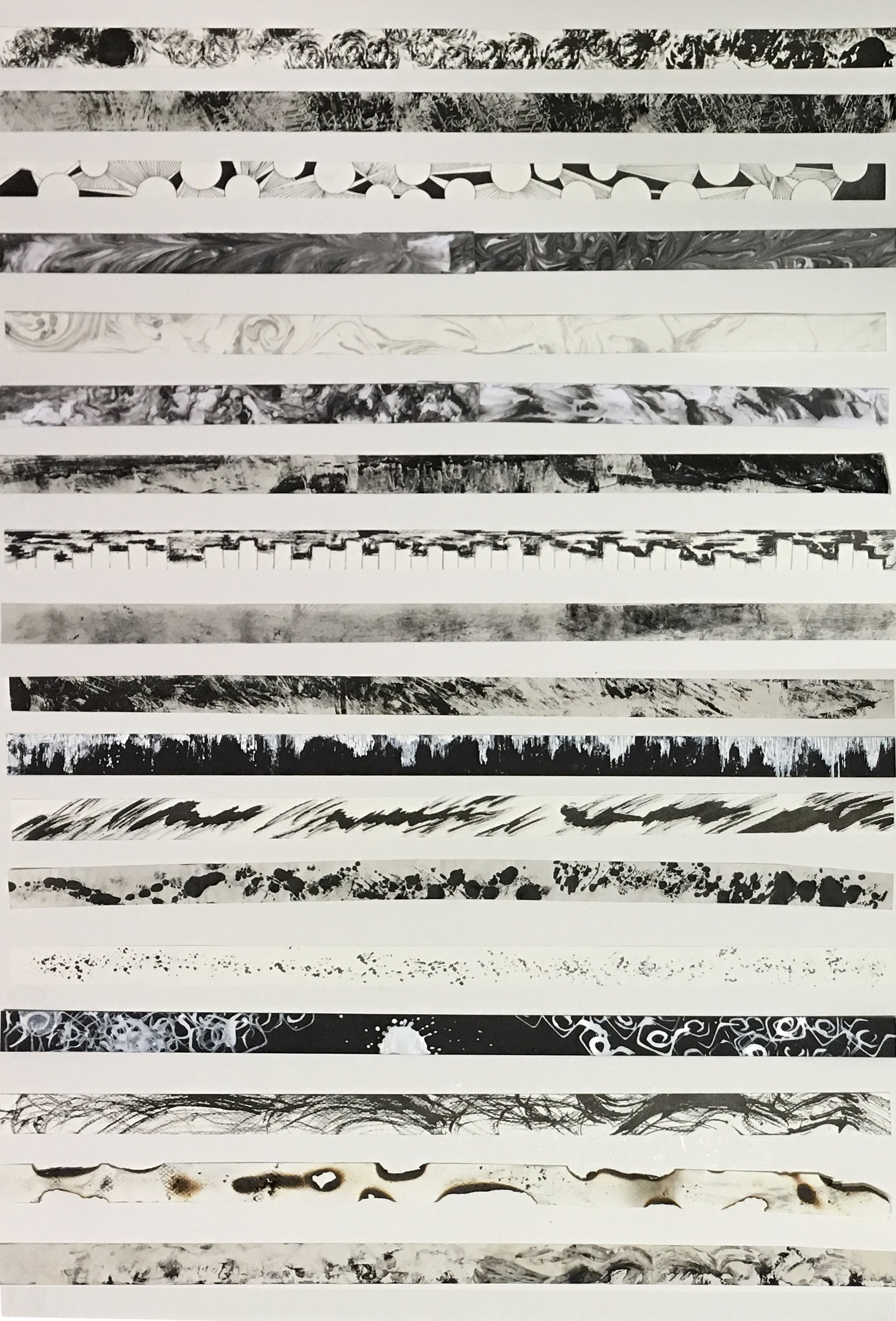
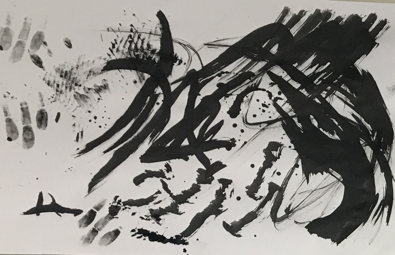
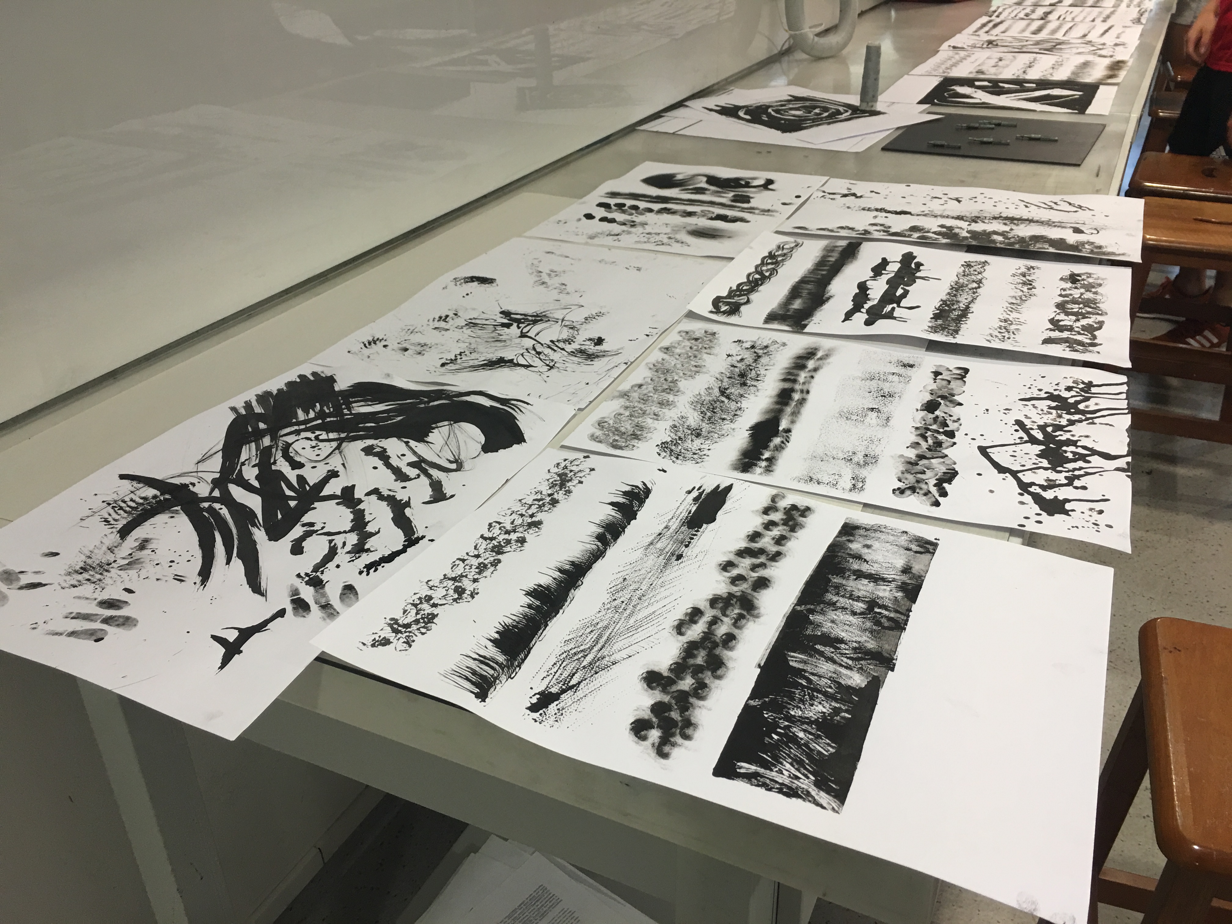
In all my years of expressing through words, images or drawings, never have I ever tried to explain a single emotion on a strip of paper, let alone 18 of them! Nevertheless, I have managed to done so and here is a look at all 18 of them in a whole.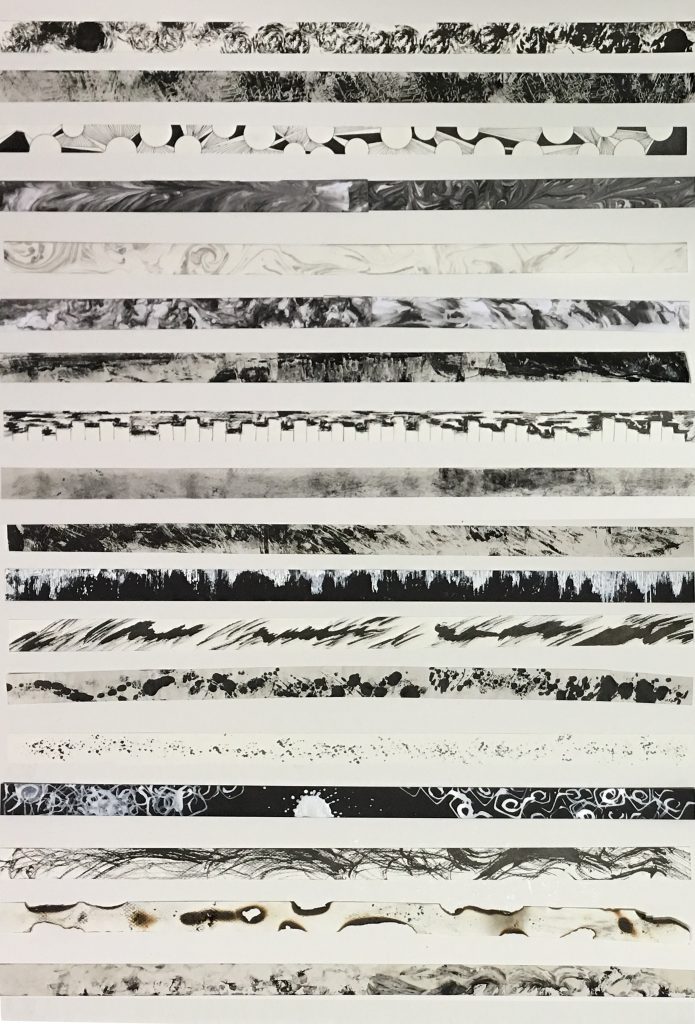
Below are my 18 attempts to create lines that reflects the emotions that I have selected.

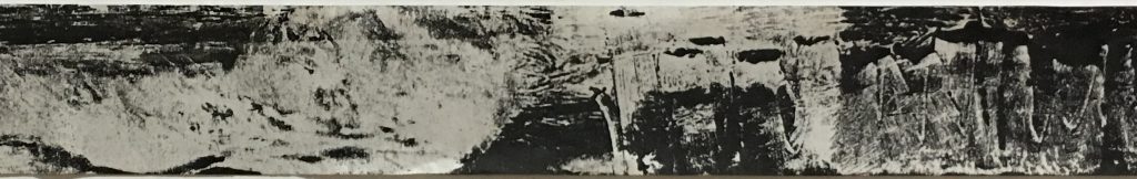
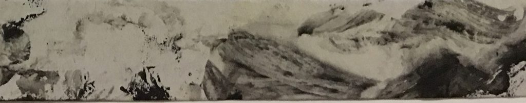
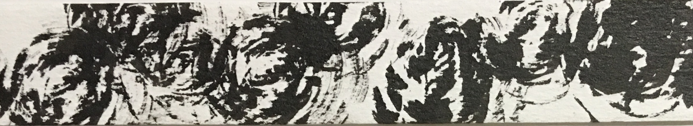
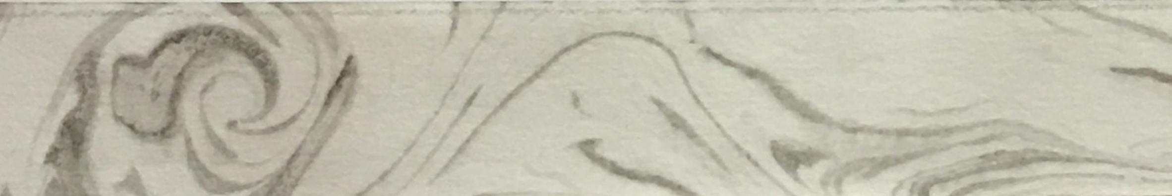
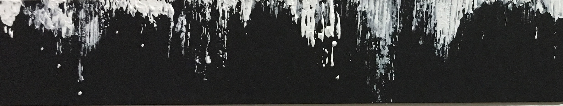
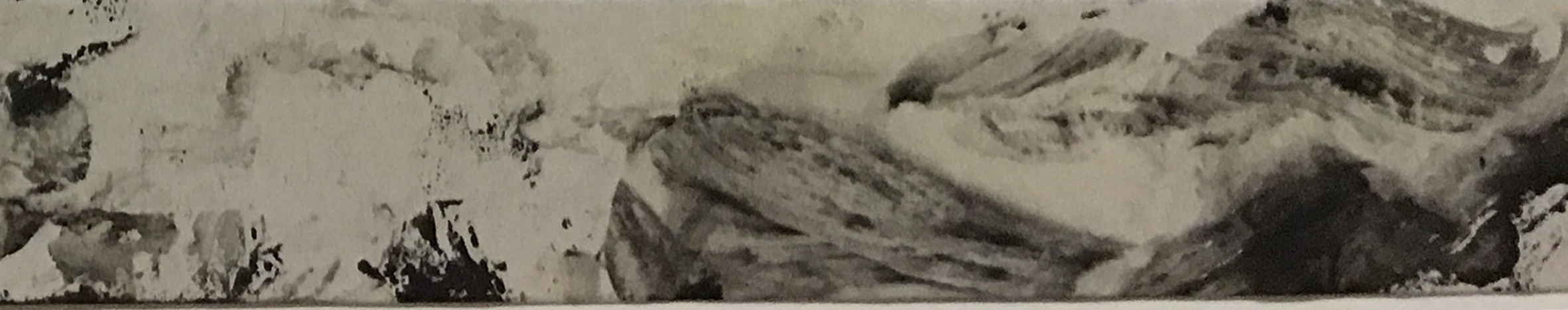
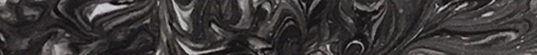
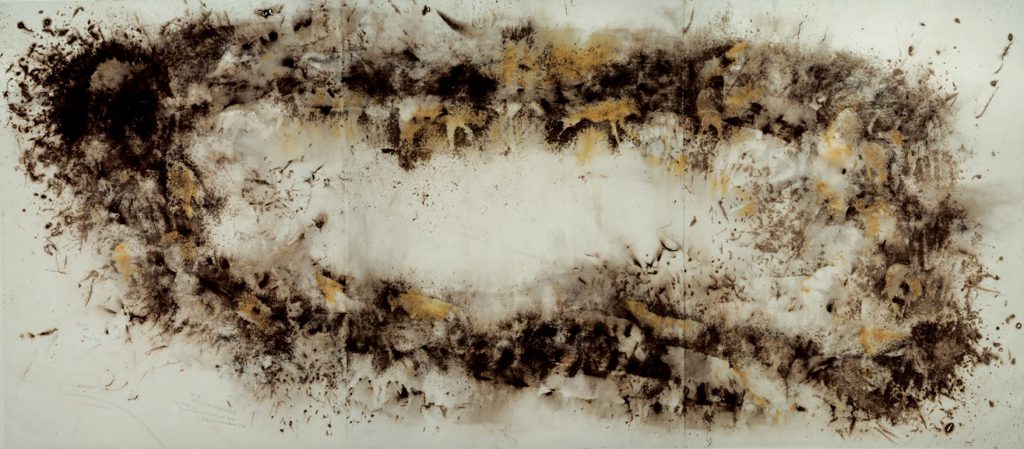
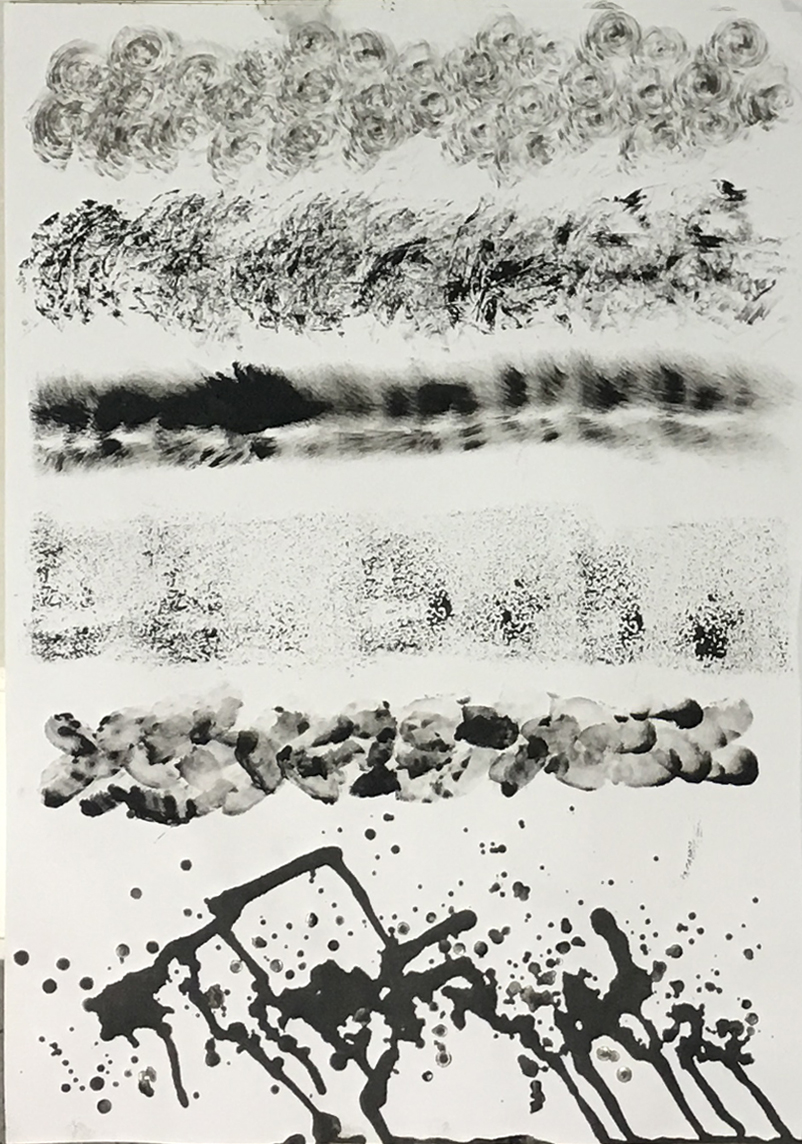
Strip 1 : Affection

Definition : A gentle feeling of fondness and liking.
Thoughts : Affection to me is being passionate towards a special someone, giving her my everything just to make her feel good and comfortable as though she was lying on a bed of roses with absolutely no worries at all.
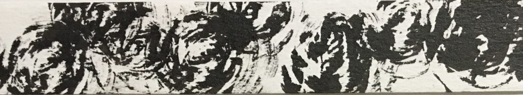
Medium : Tissue, Calligraphy Ink, Cartridge Paper
Method : The application of heavier darker tones on this strip attempts to reflect the passion of love while the lines being all swirly and twirly implies that I have already fallen head over heels for her.
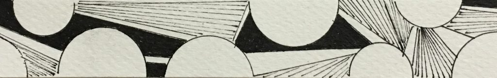
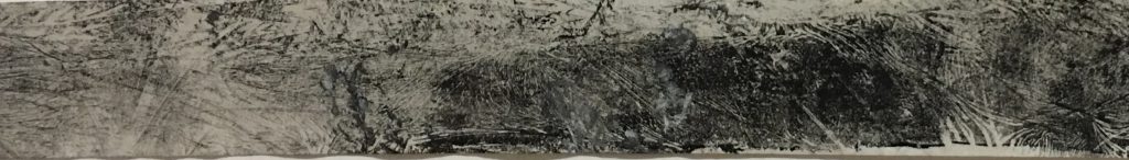
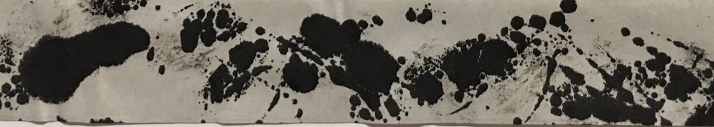
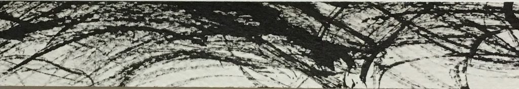
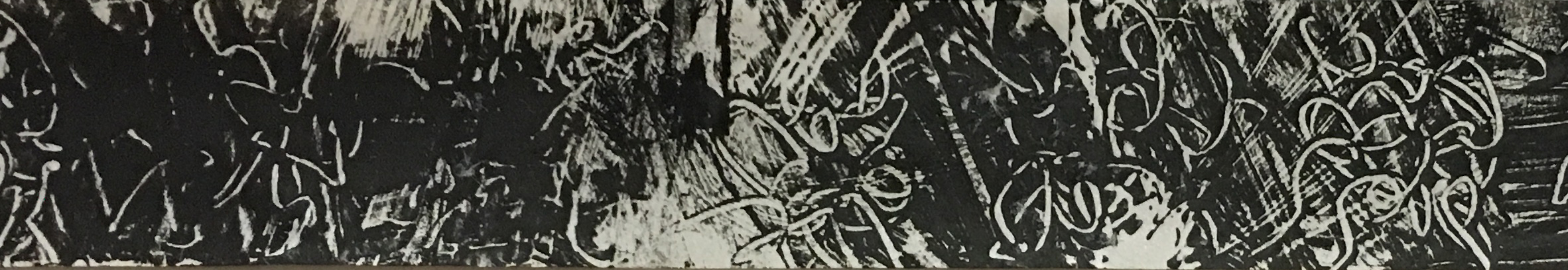
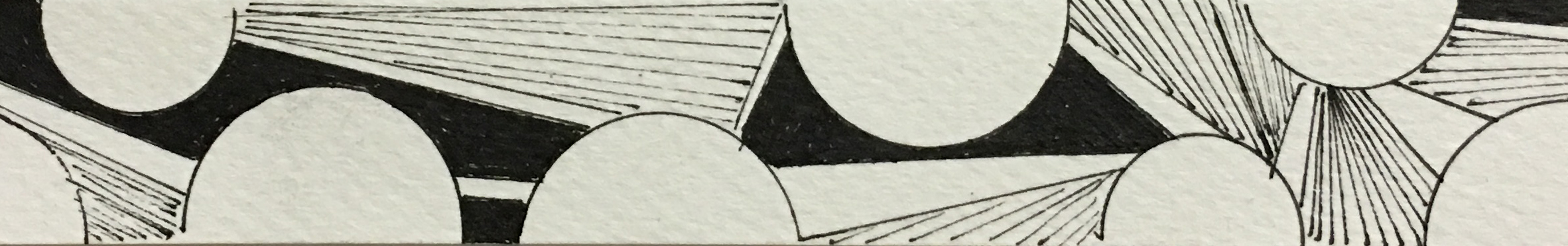
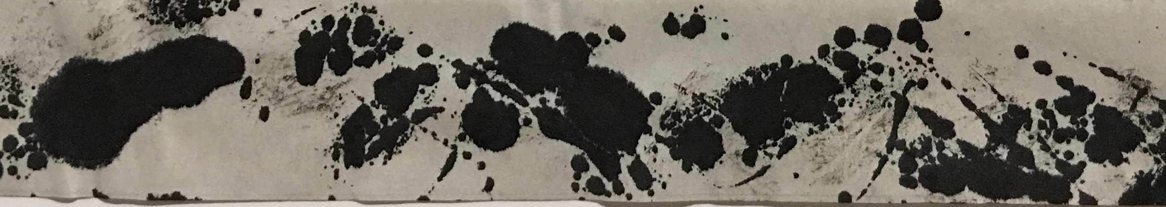
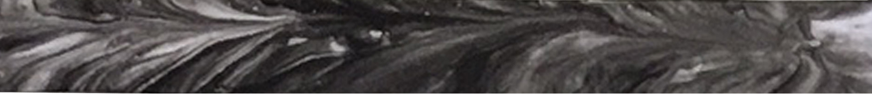
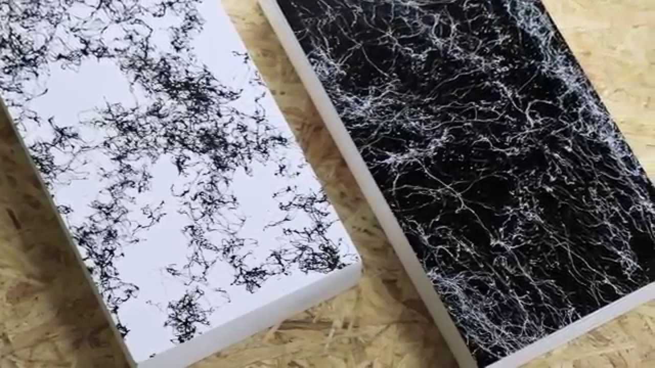
Strip 2 : Lust

Definition : Very strong sexual desire.
Thoughts : Unpredictable lustful desires that comes irregularly in our everyday lives. Also a crude form of “wanting”. This would be one of the reasons why criminal behavior is often described as being actuated by primal instincts, somewhat animalistic.
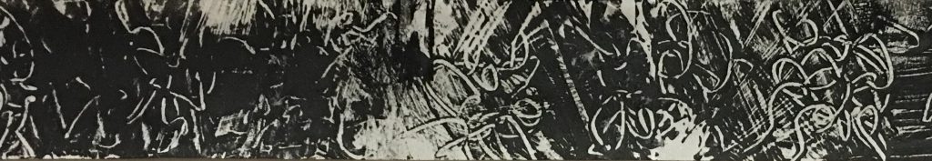
Medium : Plastic Food Wrap, Acrylic Paint, Sharp Pin, Newsprint Paper
Method : On certain days, people just tend to crave more which is implied by the heavier tones on this strip. The curly markings created by a sharp pin on the plastic food wrap creates the positive space which was then shown on the strip after inking it onto the wrap itself. This white curly lines are reference to tentacles which are somewhat naughty.
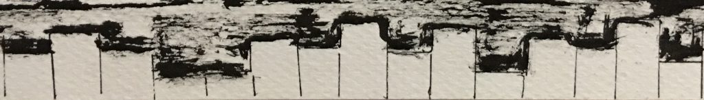
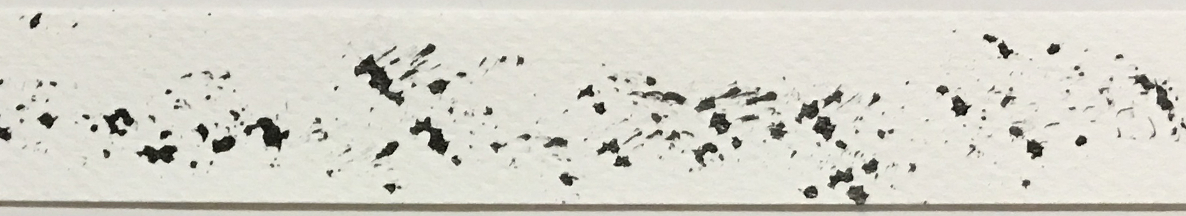
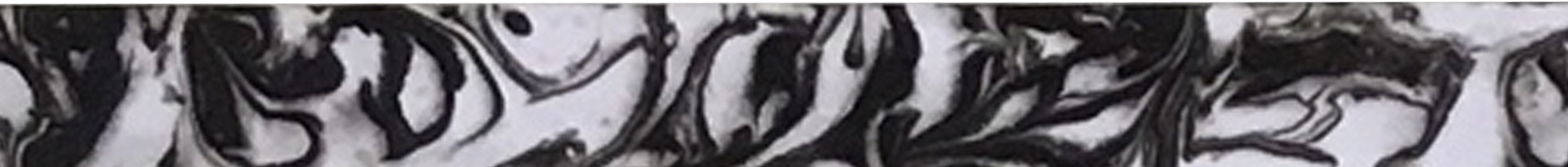
Strip 3 : Sentimentality

Definition : Exaggerated and self indulgent tenderness, or nostalgia.
Thoughts : Nostalgic memories are all interlink with each other regardless of happy or sad. Self indulgent in the sense that at the very moment of reminiscing, it is as though the world is paused and there is that ray of light shining upon you, almost like filming your very own story.
Medium : Coin, Ruler, Saintograph Drawing Pen, Cartridge Paint
Method : Shape, fills and lines are used in this strip to illustrate different components. Circles are used to represent memories with white and black fills to indicate the happy and sad moments and the thin lines illustrates that nostalgia, almost like a want to return back to those times.

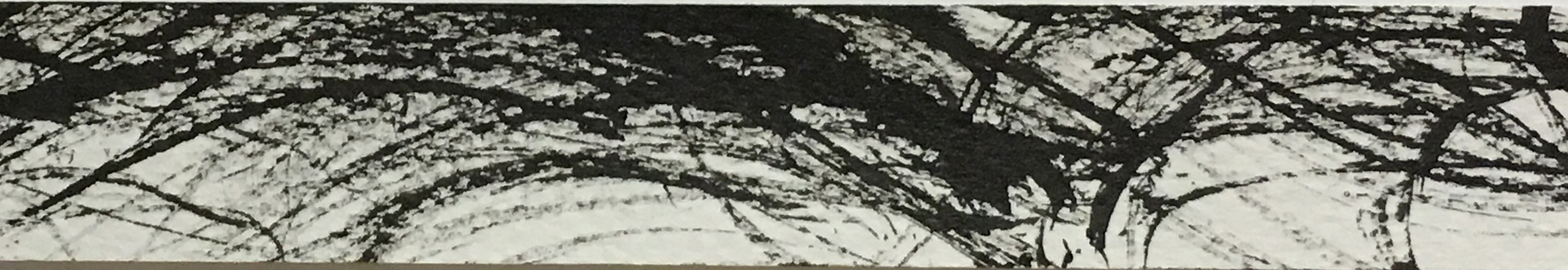
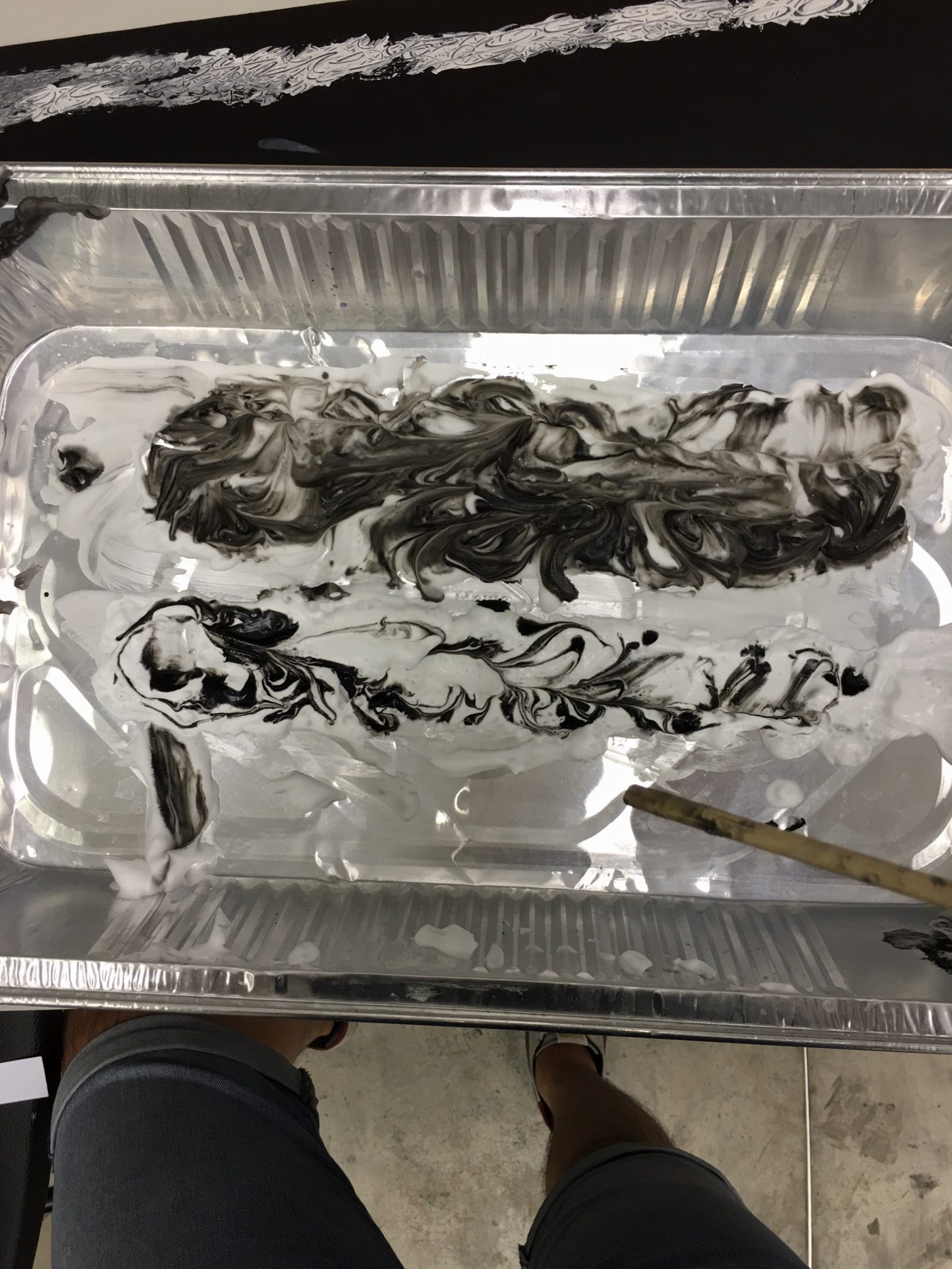
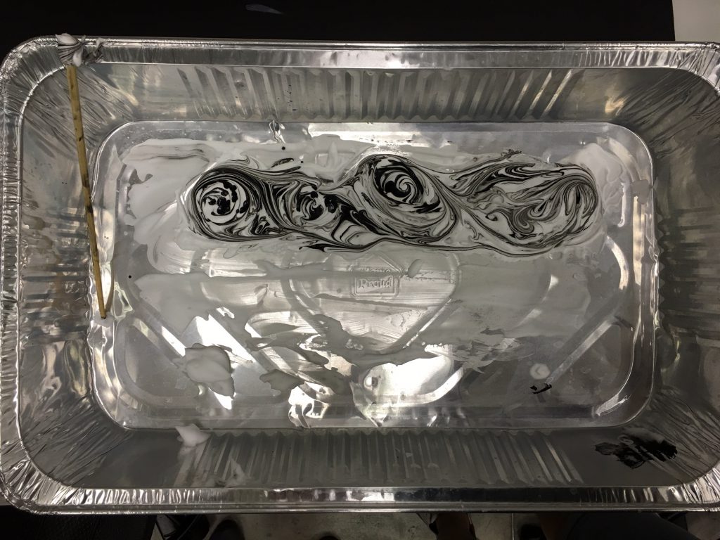
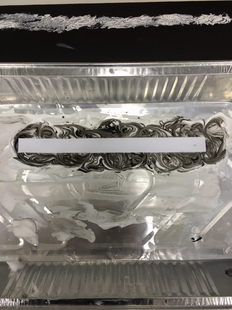
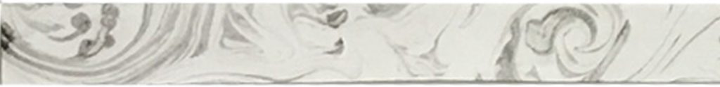
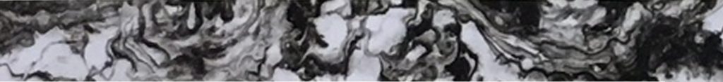
Strip 4 : Pleasure

Definition: A feeling of happy satisfaction and enjoyment.
Thoughts : A visually satisfying strip to evoke an immediate sense of accomplishment. It should be a piece that is able to generate a visually pleasant and satisfying feeling as though you’re on top of the world after seeing the creation of your own come to life.
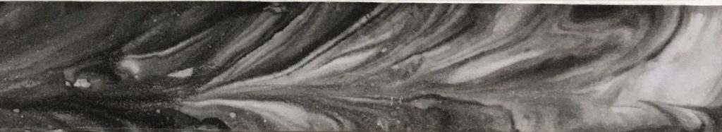
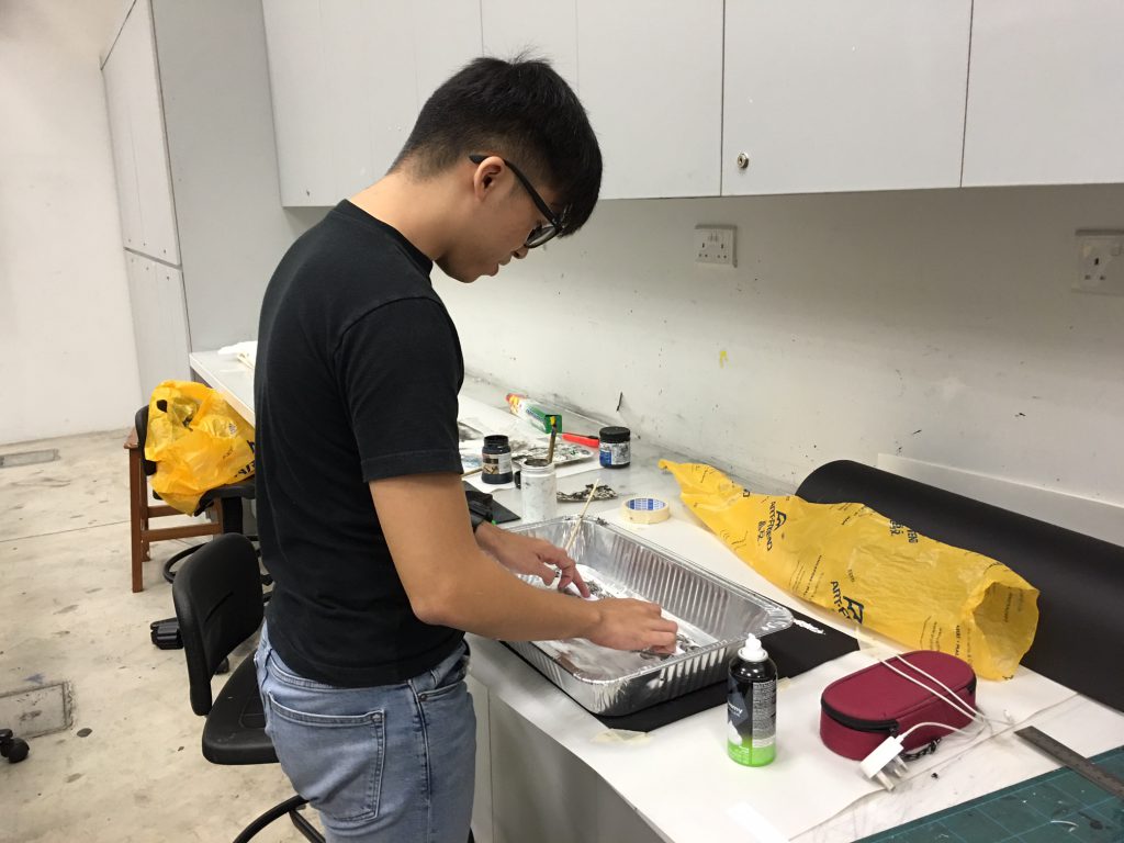
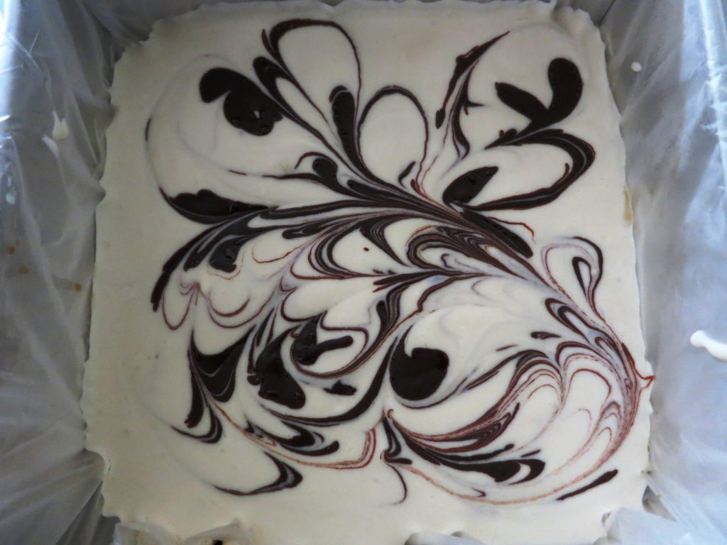
Medium : Aluminium Tray, Shaving Cream, Calligraphy Ink, Chopstick, Photo Paper
Method : Paper Marbling is applied on this piece by creating the desired patterns on the shaving cream. After capturing the design on one half of the strip, the remainder was used to capture a similar flow which was similar yet different at the same time. Combined together, it creates a piece that is visually satisfying, a pleasure to the eye upon looking.
Strip 5 : Bliss

Definition : Reaching a state of happiness, oblivious of everything else.
Thoughts : Drown in a state of happiness that you’re unaware of anything else that is happening around you because you simply don’t know and don’t care.
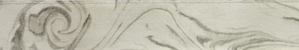
Medium : Aluminium Tray, Shaving Cream, Calligraphy Ink, Chopstick, Cartridge Paper
Method : Paper Marbling is applied on this piece, similar to what was described in Strip 4 but with a different type of paper. The cartridge paper is not a suitable to capture the entire design but is a medium that can retain a very feint marks which illustrates the meaning of being oblivious to everything else when you have reached the state of happiness.
Strip 6 : Ecstasy

Definition : An emotional or religious frenzy or trance-like state, originally one involving an experience of mystic self-transcendence.
Thoughts : Transcending into a state that you have never felt before which can be quite an incredible feeling. A crazy and exciting experience which goes on for a while but eventually dies off after all that adrenaline generated.
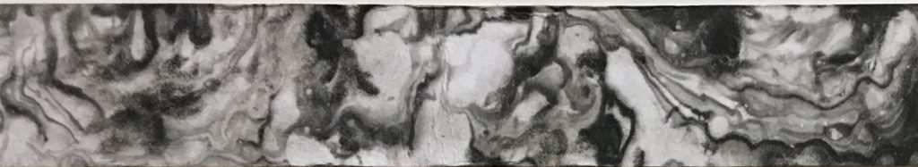
Medium : Aluminium Tray, Shaving Cream, Calligraphy Ink, Chopstick, Photo Paper
Method : Paper Marbling is applied on this piece by creating the desired patterns on the shaving cream. After capturing the design on one half of the strip, the remainder was used to capture a similar flow which was similar yet different at the same time. The bubbles of the shaving cream was able to create a subtle touch of round textures which represents that the inevitable end of the trance-like state eventually.
Strip 7 : Jolt

Definition : To jar, shake, or cause to move by or as if by a sudden rough thrust; shake up roughly.
Thoughts : A sudden uncomfortable feeling caused by abrupt movements.
Medium : Plastic Food Wrap, Roller, Acrylic Paint, Newsprint Paper
Method : A simple and straightforward method by applying different amount of pressure when rolling paint onto the newsprint paper. A sudden but subtle movement was manipulated to create a bit of the sudden rough thrust but subtle because of strip being extremely thin.
Strip 8 : Disbelief

Definition : Inability or refusal to accept that something is true or real.
Thoughts : Simply speechless upon hearing the bad news but knowing that what’s happened has already happened, there is absolutely nothing to undo the incident but only to come to acceptance.
Medium : Roller, Acrylic Paint, Newsprint Paper
Method : This strip explains the emotions felt when receiving a bad news. It starts off with one being simply speechless, not being able to react properly. The darker tone shows the transition into acceptance mode which represents the news has been acknowledged which eventually returns to the initial tone which indicates that there is absolutely nothing else that can be done to help suffice the situation.
Strip 9 : Awe

Definition : An overwhelming feeling of reverence, admiration.Usually something that just makes me look at in awe, captivated by it’s beauty.
Thoughts : A sight to behold. A piece that makes you go like awwww. The highs and lows of this strip teases the level of amazement you encounter because after every time you get impressed, you will think lowly of the next one you encounter not because it isn’t good but just because that your expectations has been raised. However, there will always be another one that just simply amazes you. This cycle just simply keeps going on and on.
Medium : Brush, Copic Multi-liner Pen, Saintograph Drawing Pen, Ruler, Cartridge Paper
Method : Inconsistent stiff brush strokes across the top to show the ever changing threshold required to impress you.
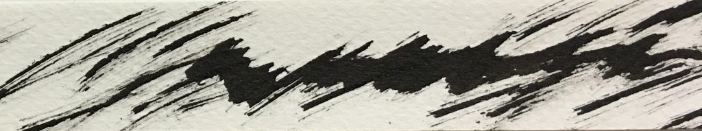
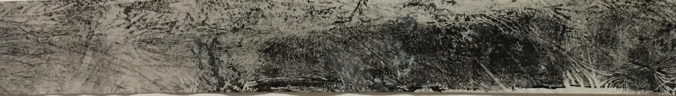
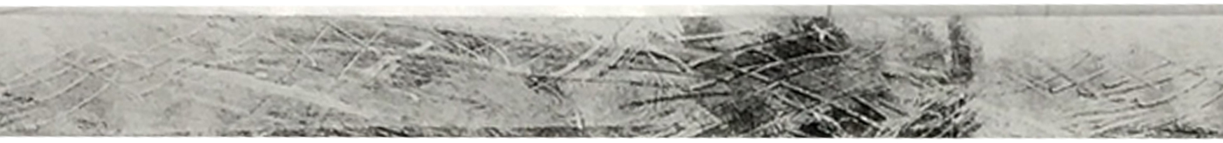
Strip 10 : Frustration
Definition : The feeling of being upset or annoyed, especially because of inability to change or achieve something.
Thoughts : A burst of strong and powerful negative energy. Scratch mark created to show signs of annoyance and inability to break out from this cage. The initial dark values indicates a very strong anger which slowly fades away as nobody can stay angry for all the time, can they?
Medium : Plastic Food Wrap, Acrylic Paint, Sharp Pin, Newsprint Paper
Method : Applying a heavy layer of black acrylic paint on one side of the food wrap and dabbing a little at the opposite end, followed with long diagonal scratch marks created by a sharp pin and then laying over the newsprint paper onto the food wrap to register the desired design.
Strip 11 : Jealousy
Definition : Resentment against a rival, a person enjoying success or advantage, etc., or against another’s success or advantage itself.
Thought : Too much envy eventually turns into very strong jealousy after the strings pulled by the evil side of you because you could not achieve the results of what your rival managed to obtain.
Medium : Card, White Acrylic Paint, Black Cartridge Paper
Method : Dipping the card into white acrylic paint and slice it across the black cartridge paper inconsistently. This creates a a strip which shows the evil(black) eating up the good(white). The texture of the white creates a bit of a 3 dimensional effects almost to imply that it doesn’t want to be devoured by it’s own jealousy, trying to escape from the 2 dimensional paper.
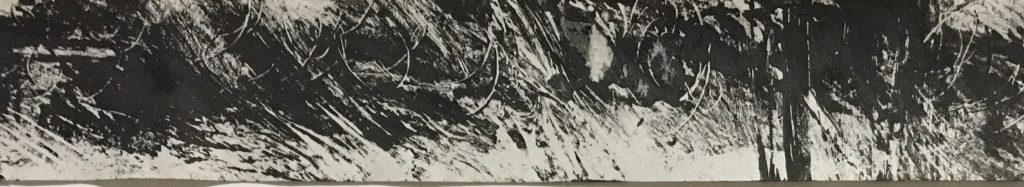
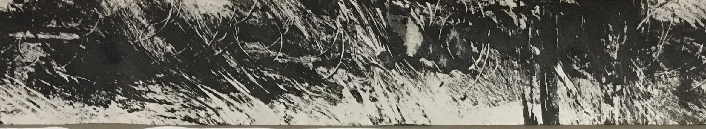
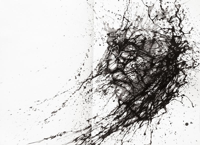
Strip 12 : Wrath
Definition : Vengeance or punishment as the consequence of anger.When you just want to tear somebody apart, literally.
Thoughts : Torn apart, wrecked, totally annihilated. Left in a heap of bloody mess.
Medium : Sponge, Acrylic Paint, Cartridge Paper
Method : Dabbing the edge of the sponge onto acrylic paint. Adjust the surface area that will be in contact with the paper at different angle constantly to create a strip that has suffered badly.
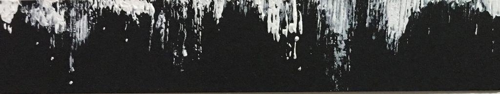
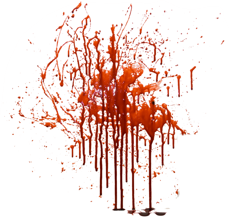
Strip 13 : Guilt
Definition : A feeling of responsibility or remorse for some offense, crime, wrong,etc., whether real or imagined.
Thoughts : A wall of bloody mess as the first thing that came to mind was a murder scene.
Medium : Brush, Calligraphy Ink, Newsprint Paper
Method : Dripping ink from a brush onto newsprint paper to create something similar to bloodstains on the wall after a terrible act of murder.
Strip 14 : Regret
Definition : A feeling of sorrow or remorse for a fault, act, loss, disappointment,etc.
Thoughts : Not doing more to achieve the wanted results.
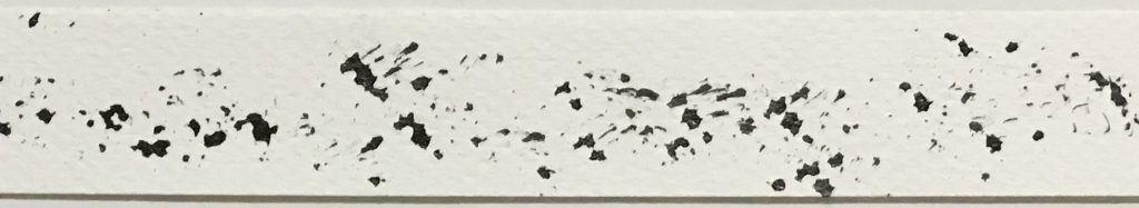
Medium : Brush, Calligraphy Ink, Cartridge Paper
Method : Subtle drops of ink onto the paper to create a seemingly lack of effort piece of strip.
Strip 15 : Loneliness
Definition : Affected with, characterized by, or causing a depressing feeling of being alone; lonesome.
Thoughts : Being shunned by all kinds as though i’m not worthy of being part of them.
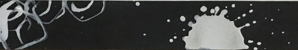
Medium : Brush, Strips of Newsprint Paper, White Acrylic Paint, Black Cartridge Paper
Method : Creating a lonesome splat of white blob in the center which is created by white dripping paint dip avoided by a cluster of curvy lines indicating a happy group created by strips of newsprint paper folded in a funny shape.

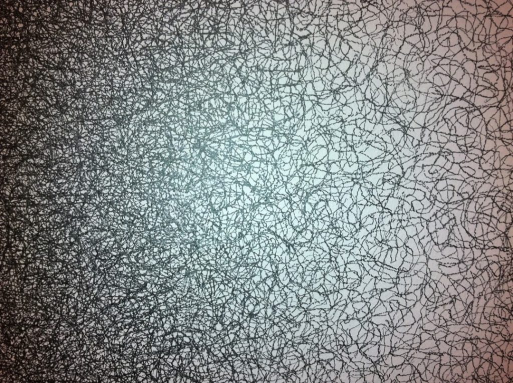
Strip 16 : Anxiety
Definition : Distress or uneasiness of mind caused by fear of danger or misfortune.
Thoughts : Indecisive lines created in a state of panic. Thin strokes of panic lines slowly build up to a section of thick lines indicates the uneasiness of the state of my mind.
Medium : Brush, Sponge, Acrylic Paint, Cartridge Paper
Method : Dabbing the edge of the sponge onto acrylic paint. Adjust the surface area that will be in contact with the paper at different angle constantly to create the thick and thin lines.
Strip 17 : Terror
Definition : Extreme fear. Total destruction.
Thoughts : The fear of having something or someone going all out just to ruin you. Thoughts that comes to mind are substances abuse, terrorism and self inflicted pain due to depression.

Medium : Cigarette, Cigarette ashes, Windproof Lighter, Normal Lighter, Cartridge Paper
Method : Using lit cigarettes to burn holes through the paper to create holes in the center. Using a lighter to make the paper catch fire before extinguishing it with a step of my slipper. The control of fire contact to the paper needs to be very precise if not you will go from your desired outcome to a huge unintended hole.
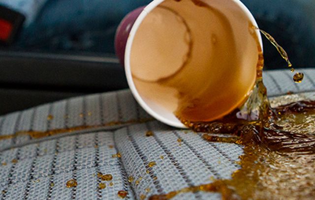
Strip 18 : Mortification
Definition : Great embarrassment and shame.
Thoughts : Relating this to a scene of spilling coffee over myself. A very embarrassing moment happening which didn’t get to your head as you were trying to resolve it but only to realize that all eyes were on you at that moment when you embarrassed yourself and that’s when the lines get crazy going downwards as though trying to dig a hole in the paper to go into hiding because of the shame.
Medium : Acrylic Paint, Brush, Newsprint Paper
Methods : Straightforward brush strokes to create the desired effects.
CONCLUSION
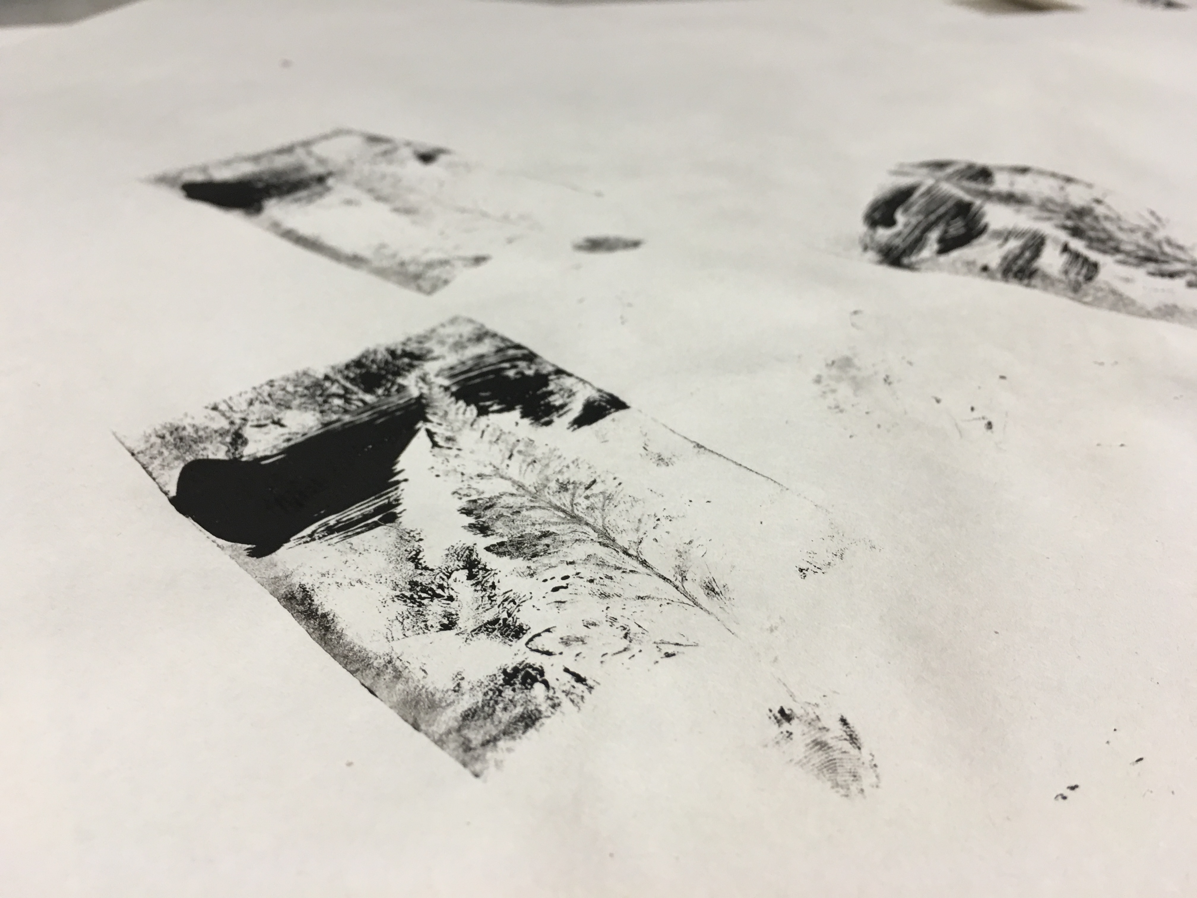
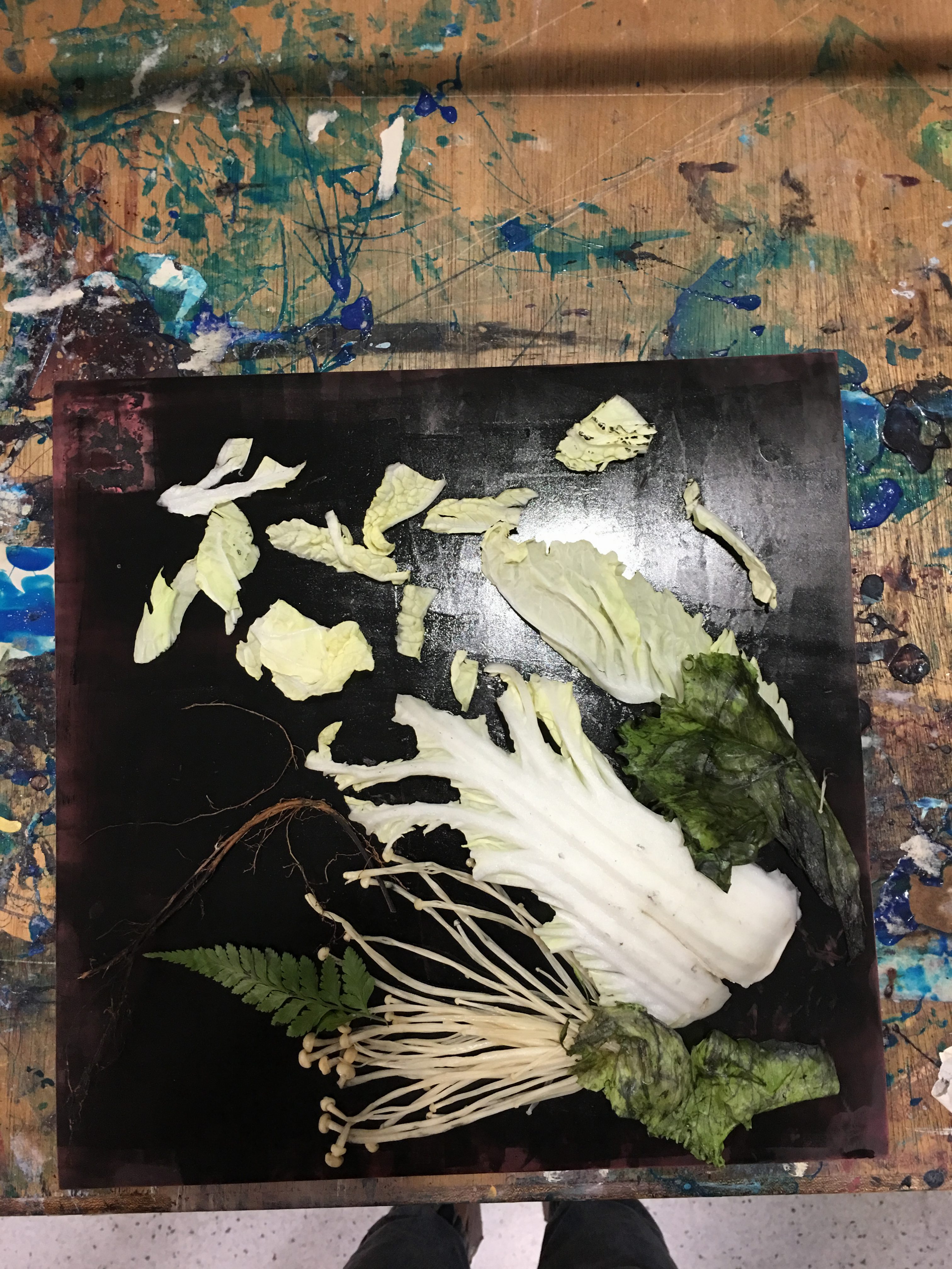
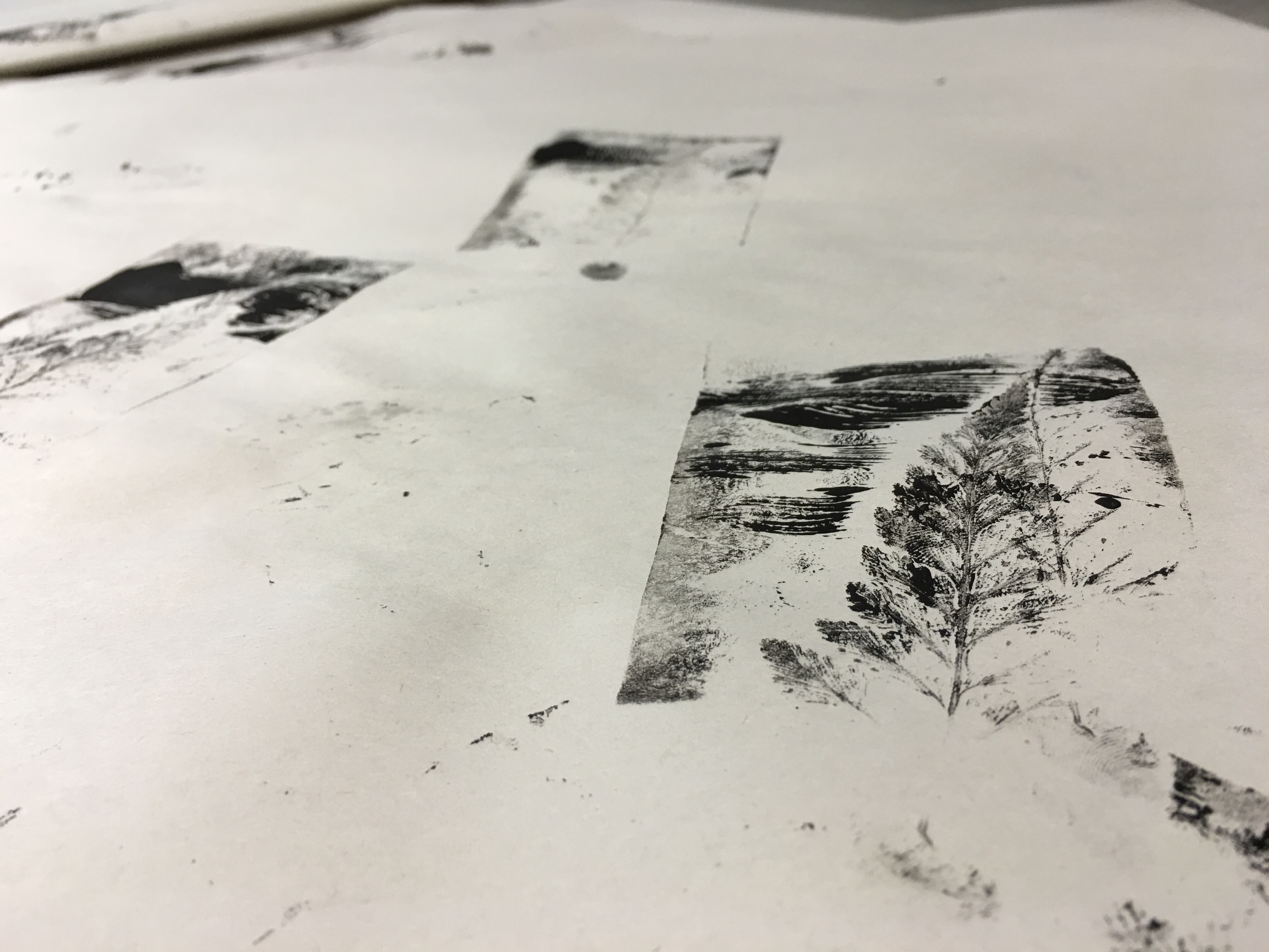
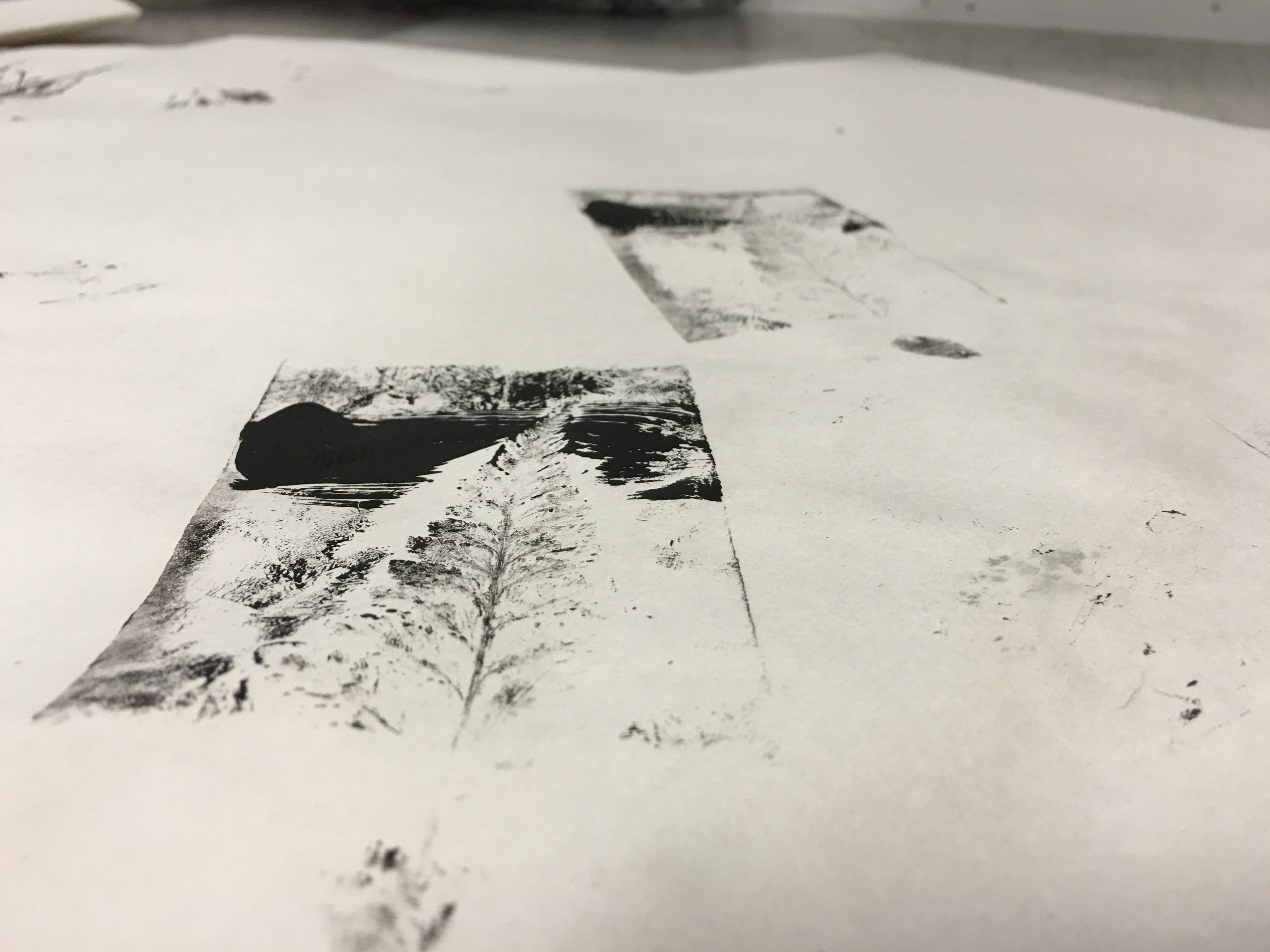
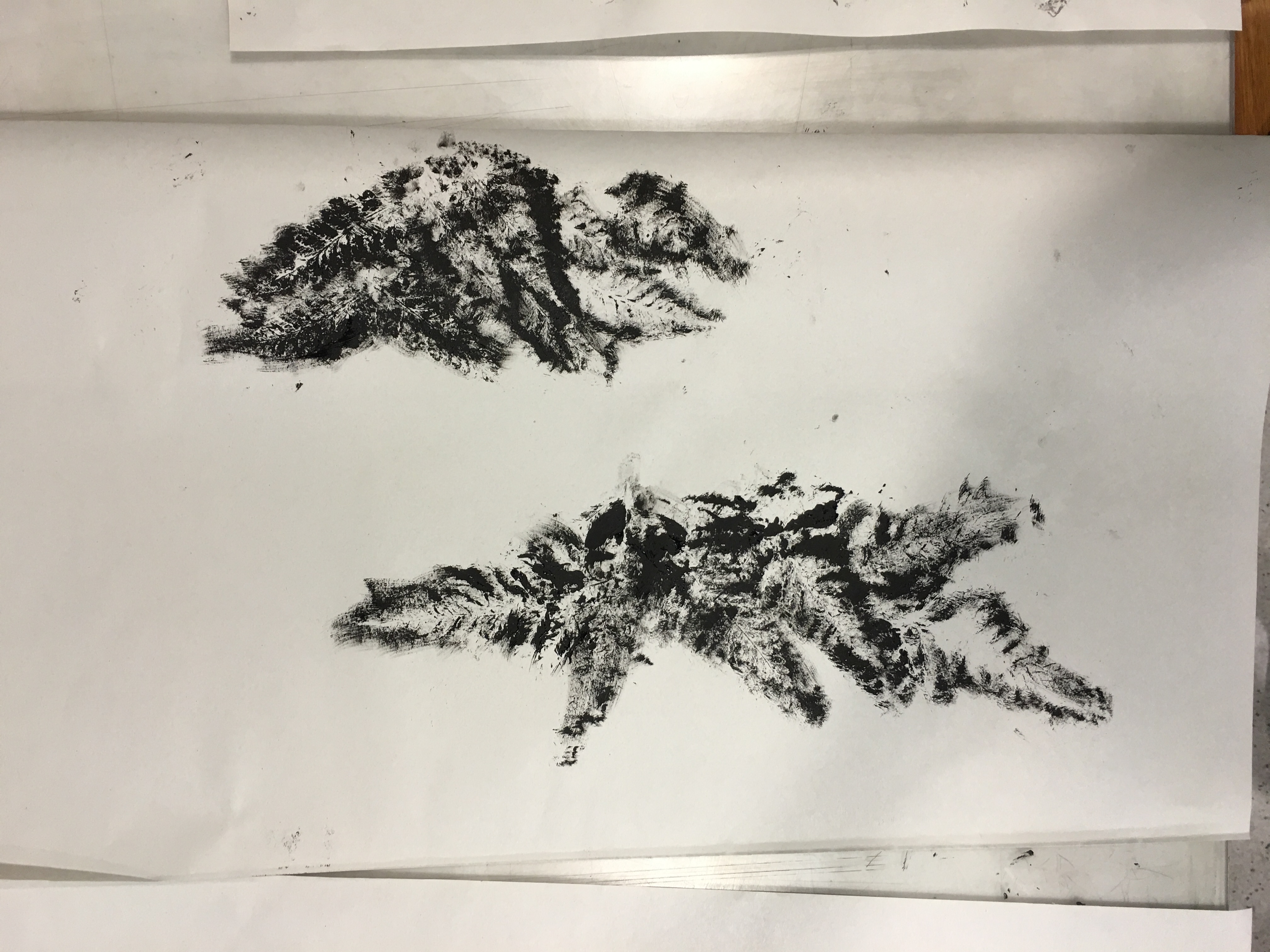
In all seriousness, these past few weeks has stretched my imaginations on how it is possible to create a nice looking mark with almost any materials such as our standard pens and brushes to the leaves and branches. Not mentioning the different methods of making prints such as Linocut and Monoprint. This trained me to be a bit more resourceful when it comes to completion of work which is a very good habit to keep being an Art student.
There were plenty of challenges faced in this project such as working within the boundary of such a thin strip of paper. That aside, there were also times that there were just no inspirations or thoughts on how to proceed onto creating the 18 lines especially when it is supposed to be abstract with no representations of anything. Eventually, it led to a stage where I was trying to fit in the creation of my lines into the shortlisted emotions instead of trying to feel the emotion whilst creating the line.
That sums up the end of Project 1 – EMO line for me as I’m officially certified EMO.
Benji Out.


 Definition: A gentle feeling of fondness and liking.
 Definition: Very strong sexual desire.Unpredictable lustful desires that comes irregularly.


