
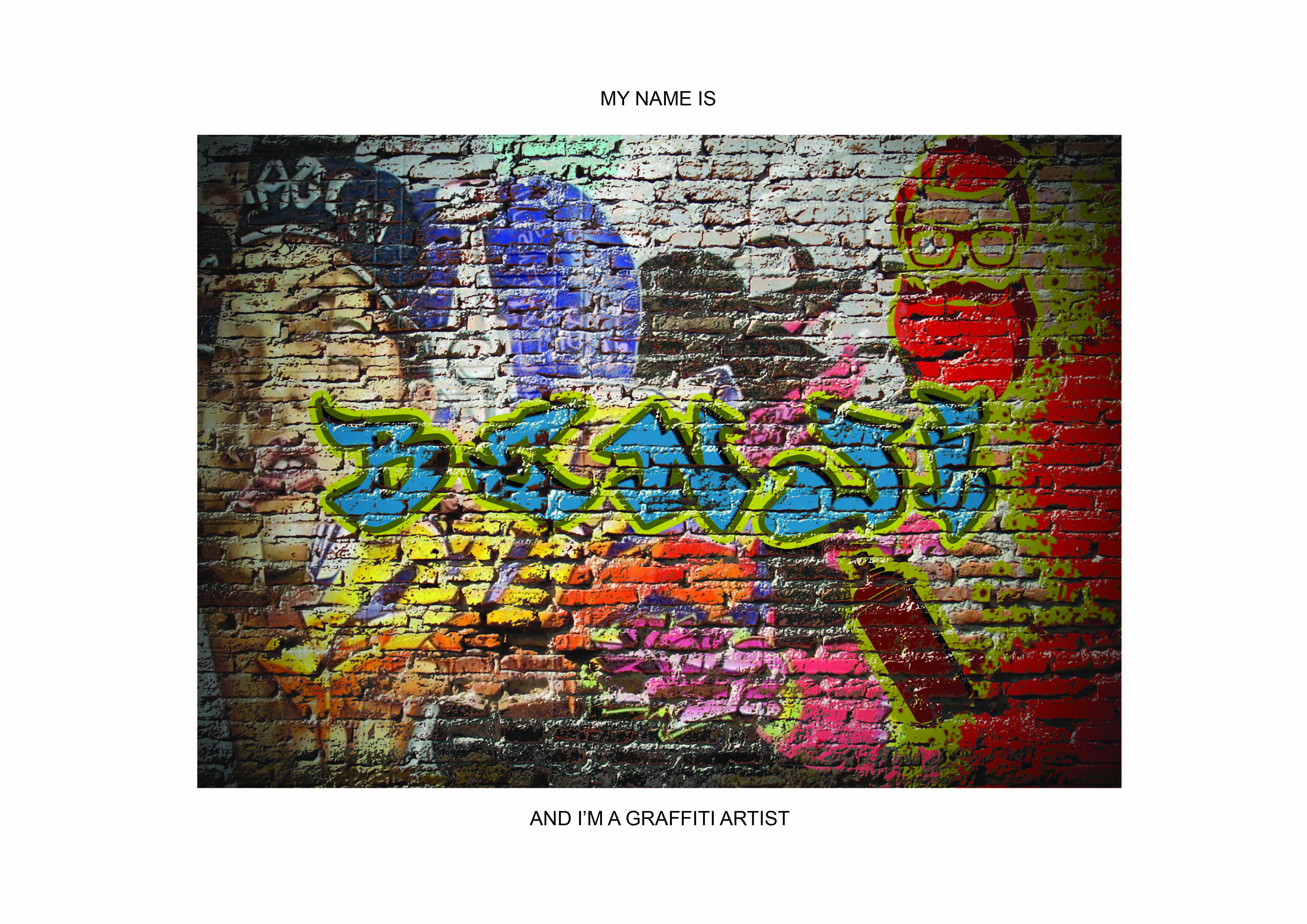

I made use of a brick wall image to ‘spray’ my name over it. I applied a stroke with another color to made it look as though it’s layered with multiple colors. I added some inner shadow and outer glow to give it some depth. It seem pretty plain to me but I received multiple feedback during the ‘work-in-progress’ session from both Mimi and my peers that it had too much going on in the background. Also, there was some issue with the letter ‘E’ as it wasn’t as legible as the other letters. However, to create depth, I had to forgo the functionality in this case the legibility in exchange for the aesthetics of this typography portrait. I eventually came to terms to let this piece go and proceeded on others.
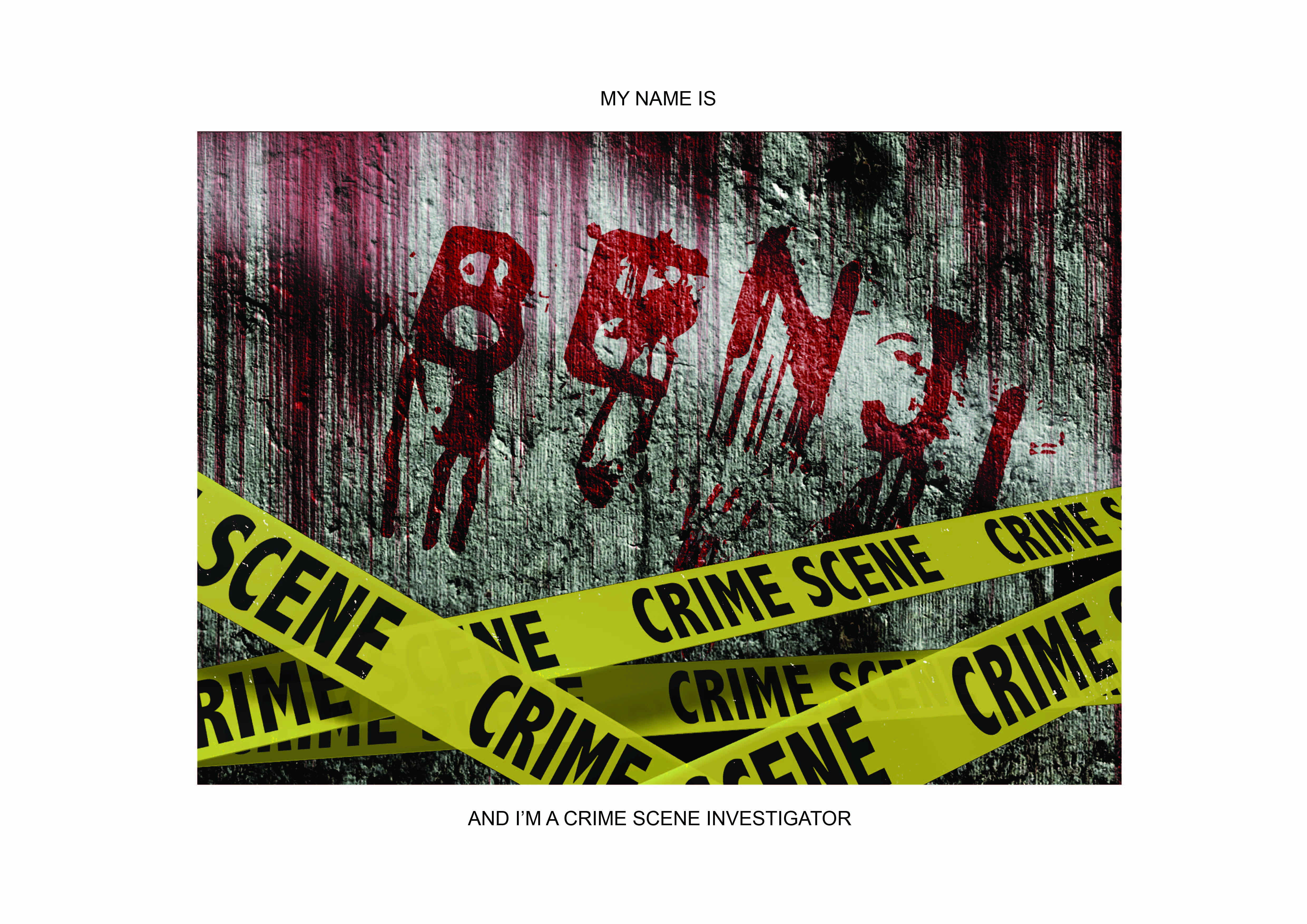
With similar methods applied with the Graffiti piece, I managed to come up with this CSI piece which looked really decent to me as well. Similarly, I received the same feedback for this just like the Graffiti one which led me to work on other pieces which were eventually my final 4. I probably would not have settled for this piece anyway as I would have liked to explore on more methods digitally.


This piece was one of my favorite but due to the ambiguity of it’s identity as I was told that it could represent either Architect or Interior Designer or even a Landscape Architect(which was what it was meant to be) was really worrisome. I finally came to terms with it after a long struggle as I convinced myself that this is a module whereby I learn to communicate to the audience visually… but it was really hard.
Next Post : The final 4
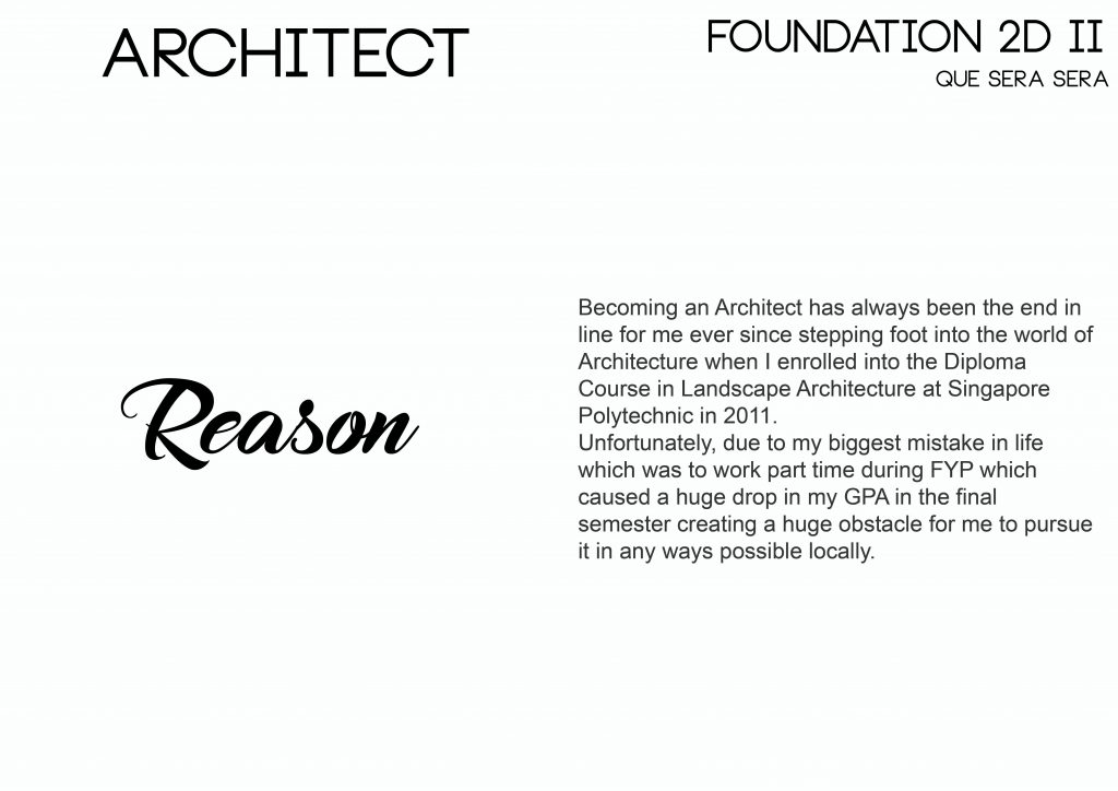
Architect
Game Designer
Soldier
Chinese Calligrapher
You must be logged in to post a comment.