
PROJECT BRIEF
So creating typographic portraits by using my whole name, nickname or initials to describe my future job was the task at hand whereby each solution must consider the following factors: choice of typeface, style, size, weight, use of upper and lower case characters as well as space in between the letters.
And so the first job was to brainstorm about the jobs that I would be interested to work on, and there I was doodling on some of the ideas such as
- Architect
- Dentist
- Plastic Surgeon
- Chef
- Milkman
- Photographer
- Chinese Calligrapher
- F1 Driver
- Photographer
- Interior Designer
- Product Designer
- DJ
- Crime Scene Investigator
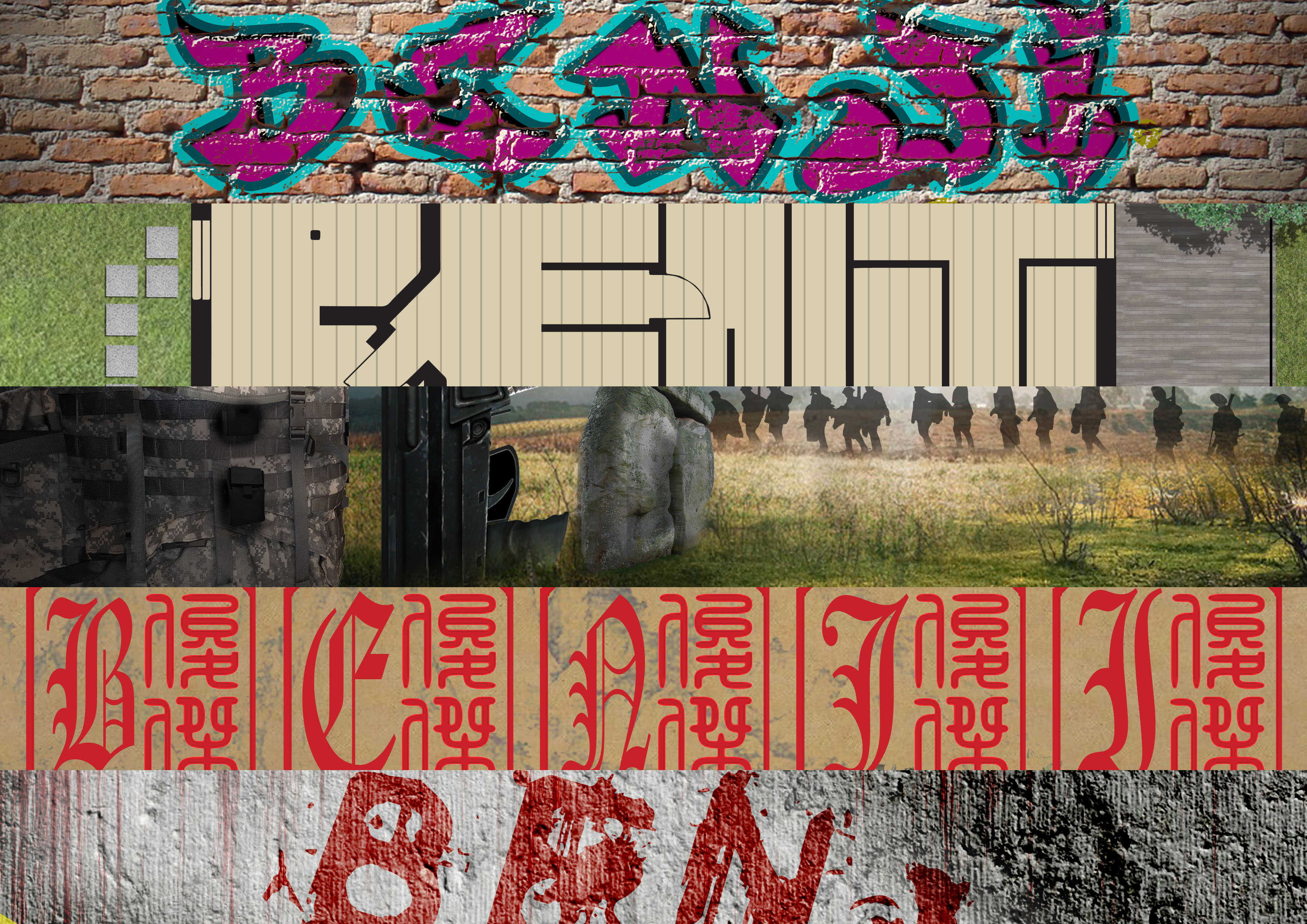
- Graffiti Artist
- Pastry Chef
- Product Designer
- Tattoo Artist
Okay wow, that’s actually a lot of jobs now that I listed them all out. Some of them I’ve tried initially by sketching out but did not further pursue the idea which I’ll point out or some that I just totally abort the idea because it was just beyond my current capabilities. Generally the jobs that I’ve listed are all things that I really like or careers I’ve thought of pursuing when I was younger.
Okay, enough of blabbering, let’s check out my processes on my initial ideas before we move on to how I have eventually come up with my final designs.
Architect

So this was done on the very first lesson and I thought of working in somewhat similar manners for one of my final board and then I found this,
So there I was thinking I’m a genius for thinking of such a method to bring out my fonts for my Architect portrait but it had already been done by IKEA. Nevertheless, I proceeded on to work on my first composition.

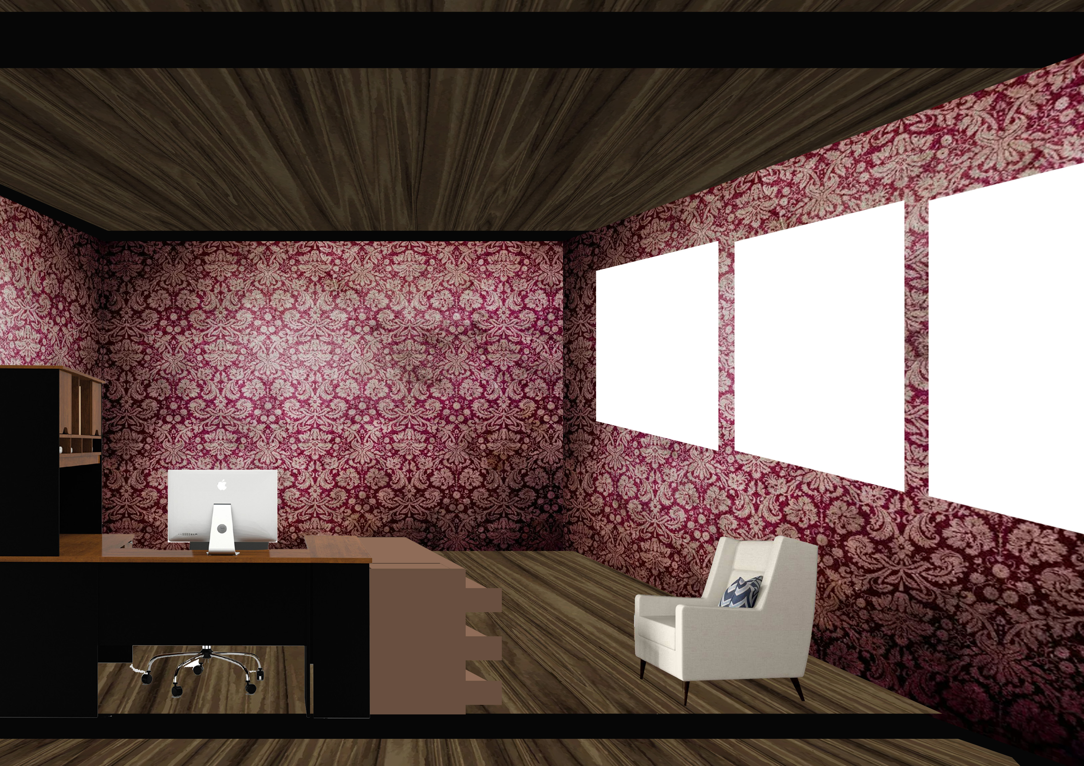
These are just some sketching as to how I’m going form up my name with the walls and rooms on a floor plan. Also, it shows my doodles on idea as to how to create other jobs such as the Dentist and Tattoo Artist.
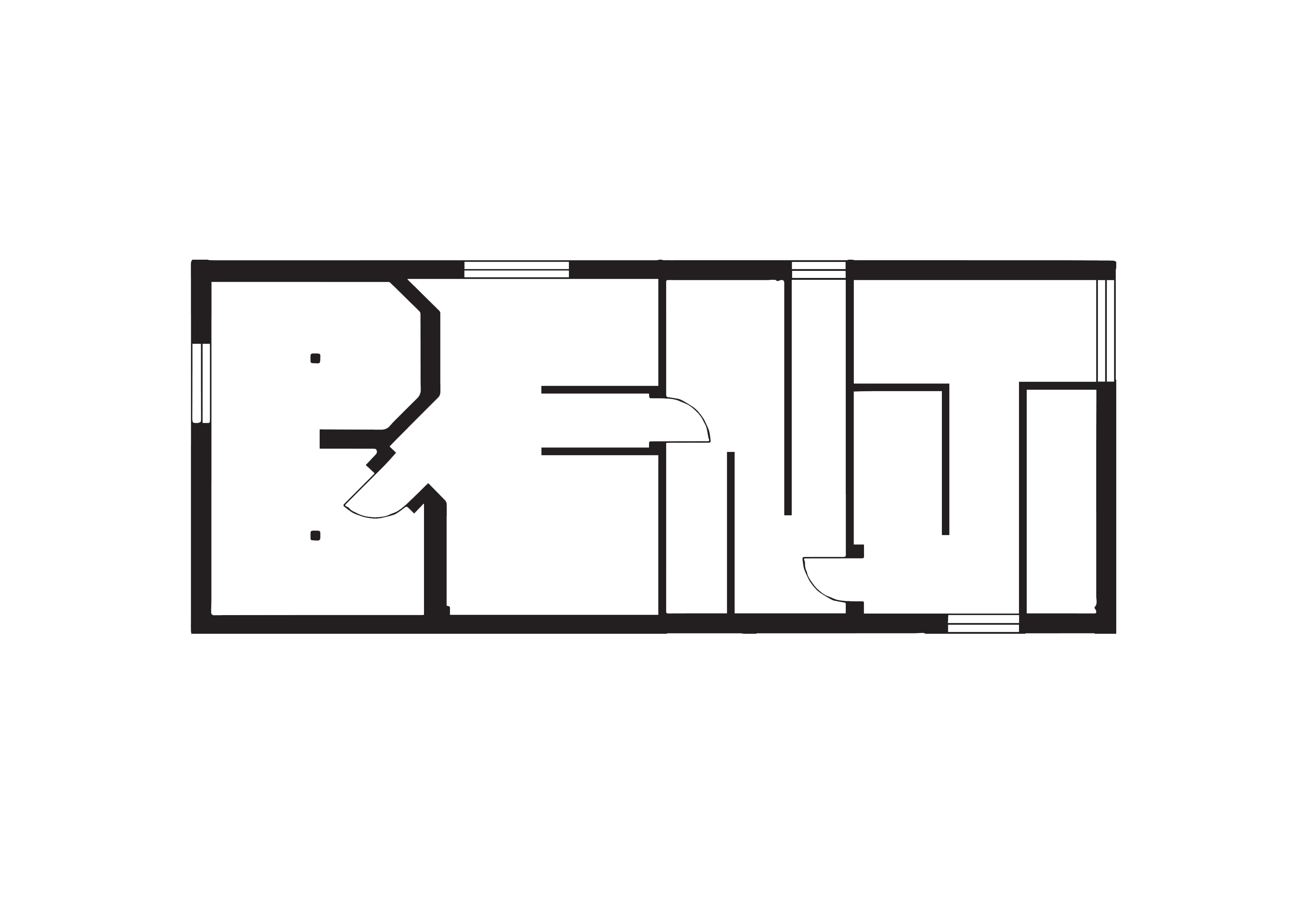
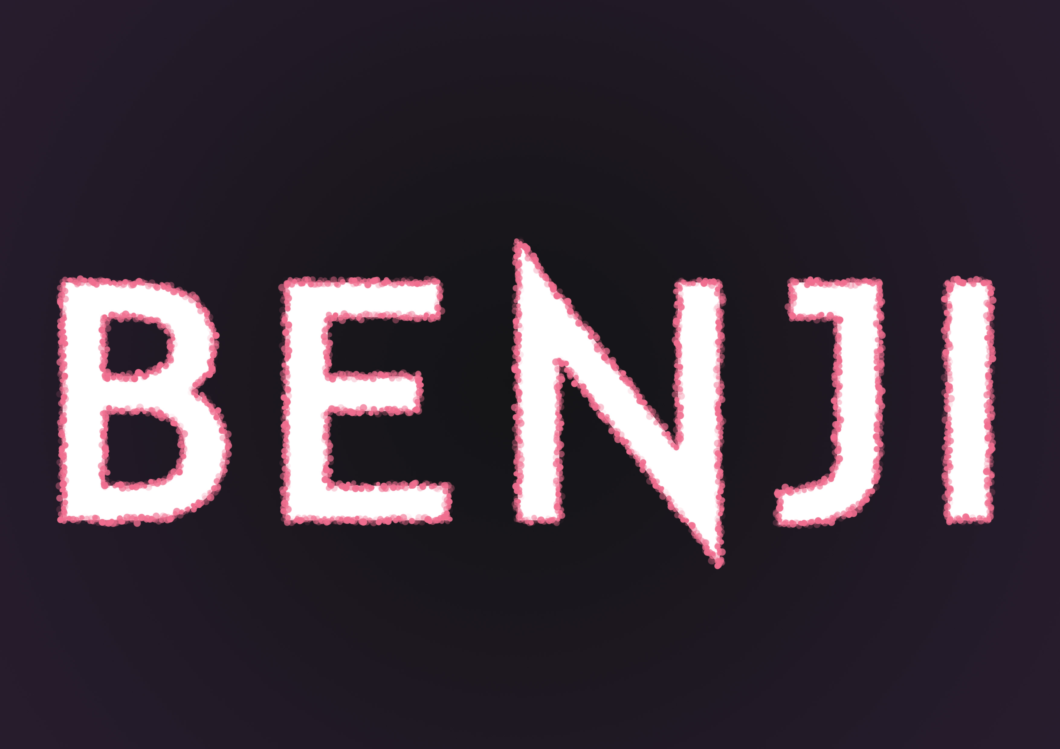
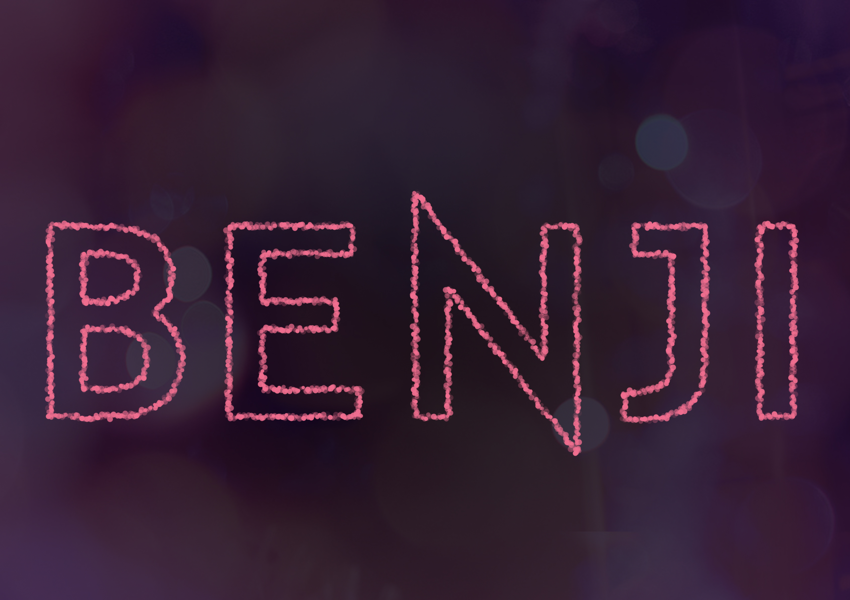
Eventually, I proceeded to digitally created a floor plan which depicts my nickname ‘Benji’.
I used a background of a table top with timber finishing and lay over all my past technical drawing works in polytechnic as some sort of hints of the job related to this portrait.
I finished it off by using a first person view of drawing up a floor plan by placing a person’s hand drawing on the paper with a ruler and a marker.

Alternatively, I attempted to create fonts from a 3D software which didn’t turn out the way I envisioned it to be as it would probably take a really long time for me to render it. Nevertheless, as shown below is my poor attempt.
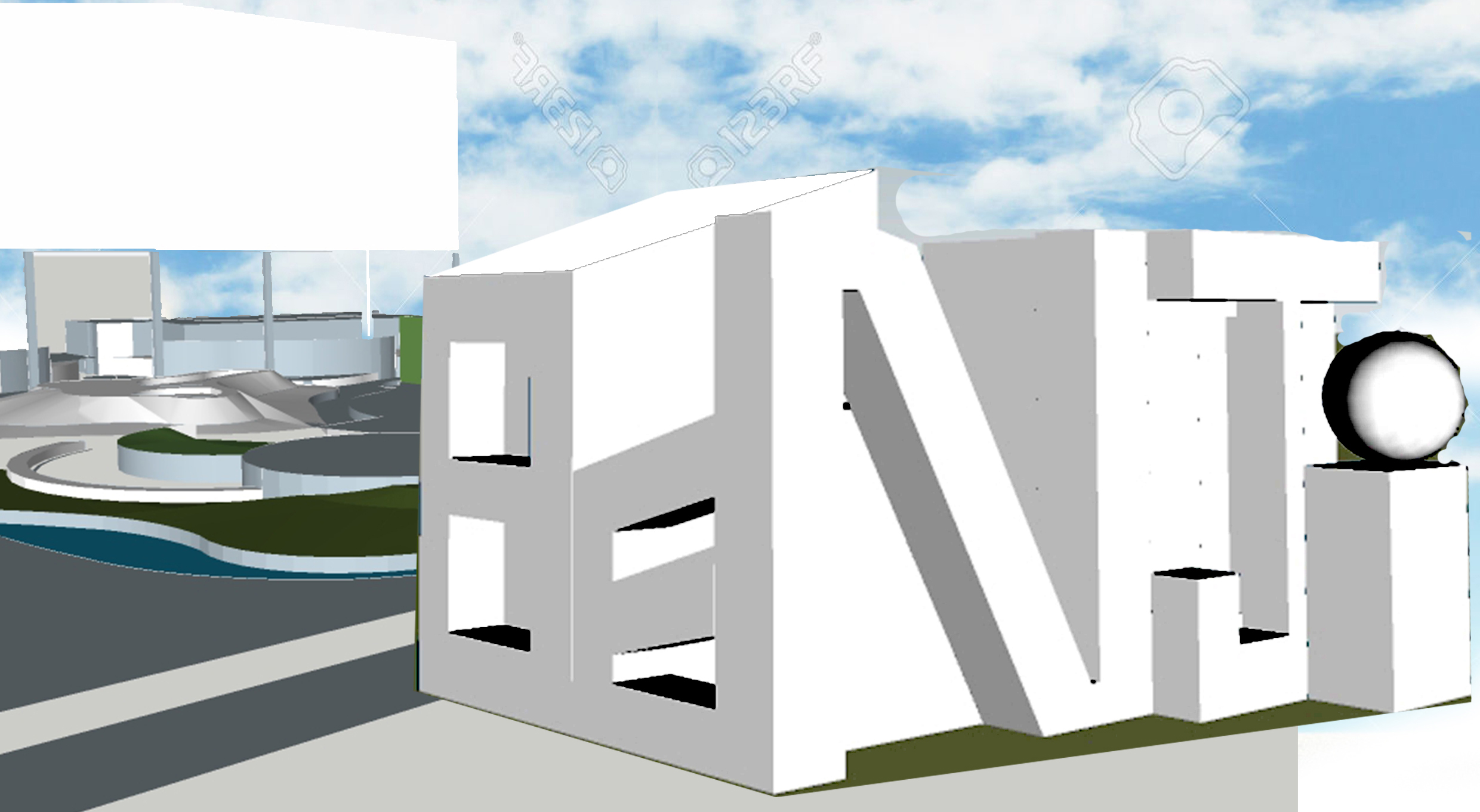
However, this setback did not refrain me from trying to create something that looks 3D as I sought after different methods to produce something that seem somewhat 3 dimensional.
Chef
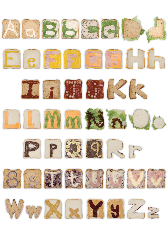
I happened to see this imagery and thought it was a really cool application of using real life items to create fonts. However, I thought since it was a 2D Module, I should use this opportunity to practice on my Adobe Photoshop and Illustrator skills, hence deciding against to create something physically and taking a good photo of it.
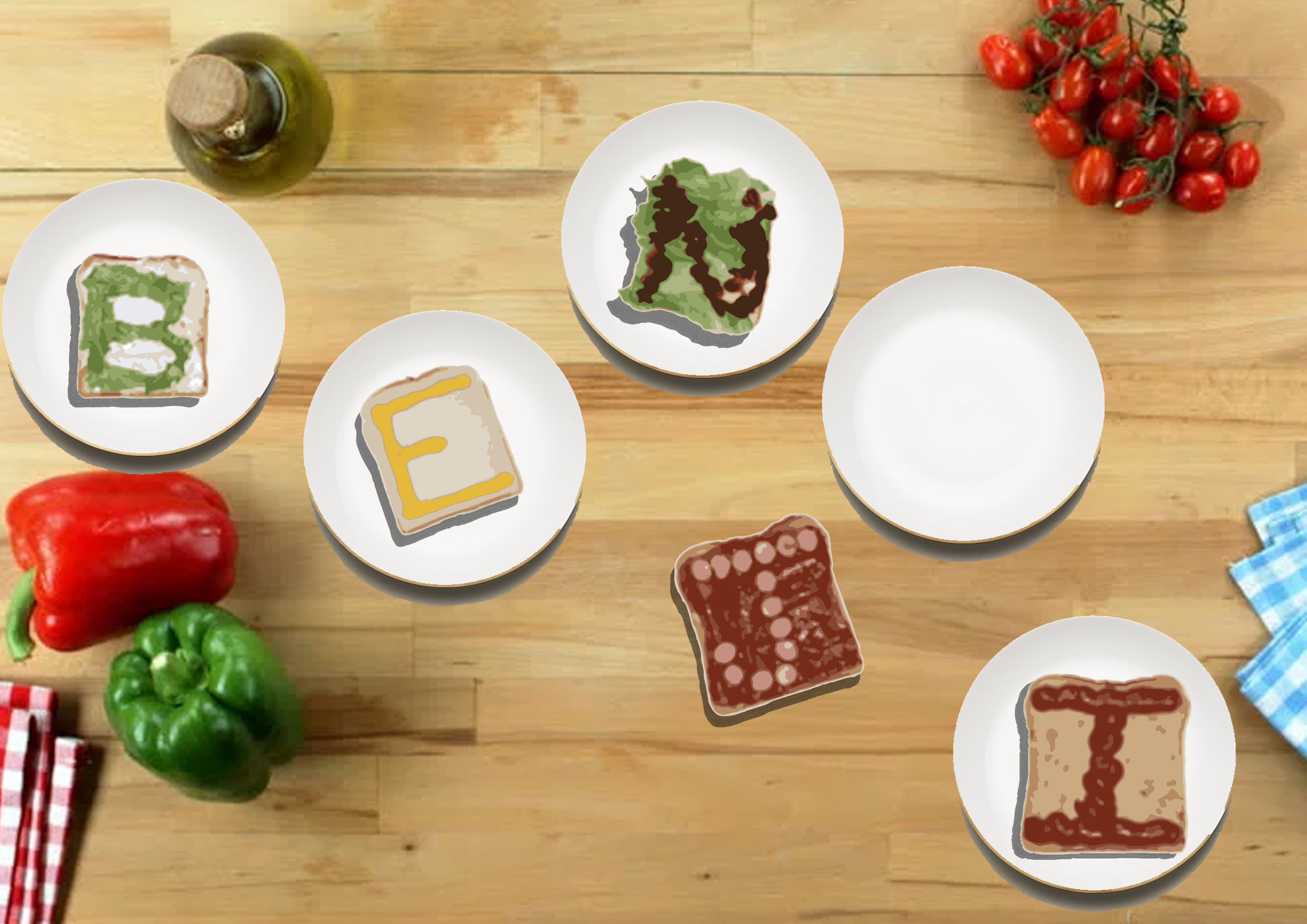
This was the final composition of this piece of ‘Chef’ and I was really disappointed as it was a really cheap way of creating one of my typography portrait and thought that I wasn’t really creating a font myself which led me on to the next typography portrait to solely focus on creating my very own type font and then proceeding to working on the aesthetics.
Milkman
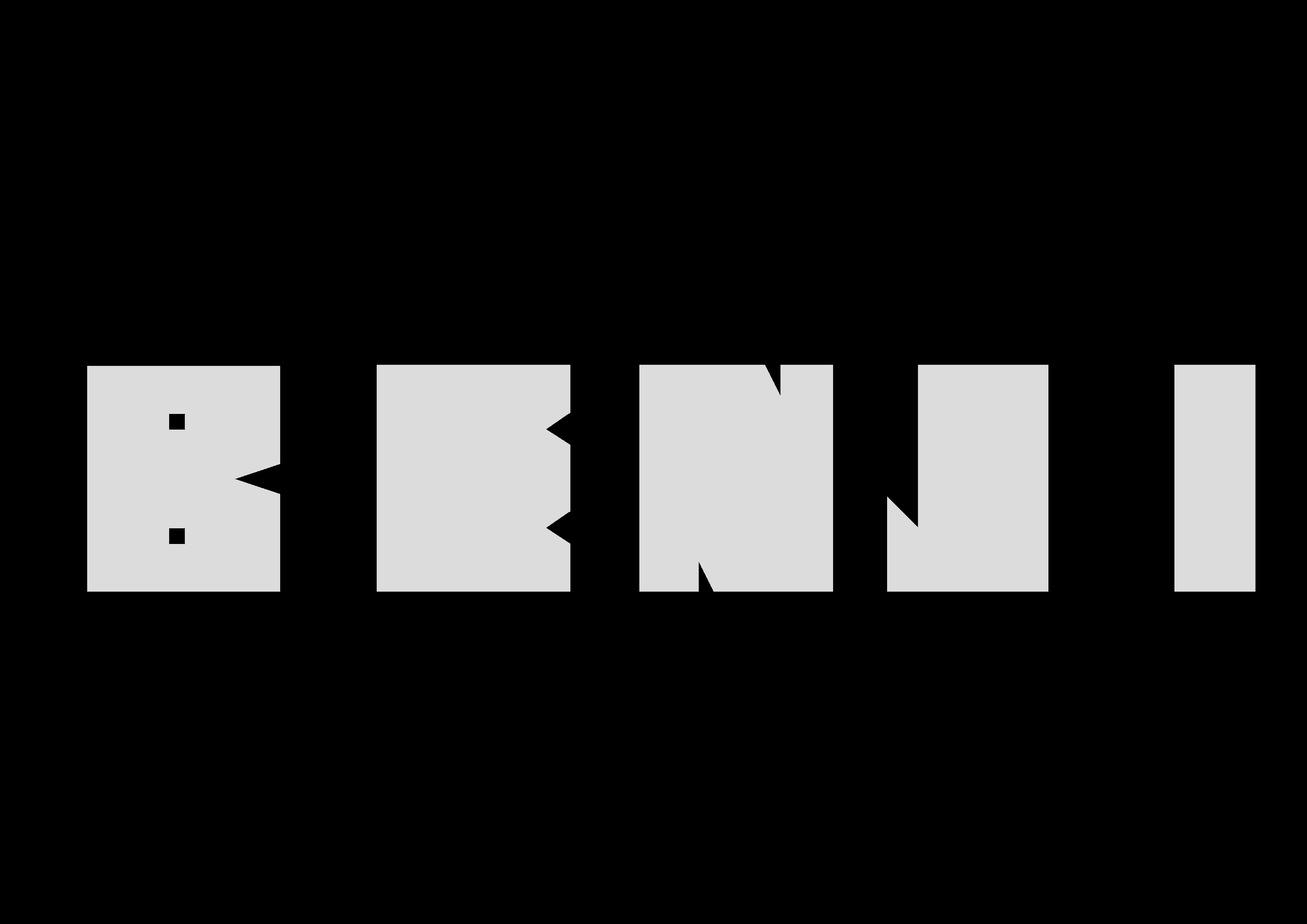
So in ‘Milkman’, I created the Font by using Shapes and then removing certain areas to give hints of my nickname Benji. A white color was used with a tint of grey to create a somewhat milky color. Black was used as background to thoroughly bring out the Milky color.

This is the final layout as I used milk splashes on some of the fonts to create some sort of innuendo to what my job scope is. Straws coming out from a packet milk in the letter ‘N’ was one of the other one that I thought worked really well. The Bull’s horn didn’t really work for Mimi and I can see why she mentioned that because it is a Bull which i mistakenly took for as a cow.
F1 Racer

For this piece, I first placed the chosen type font randomly and proceeded using pen tool to map out the roads.

Thereafter, I filled the area with a road texture and used multiple effects in Photoshop
- Bevel & Emboss
- Stroke
- Pattern Overlay
- Drop Shadow
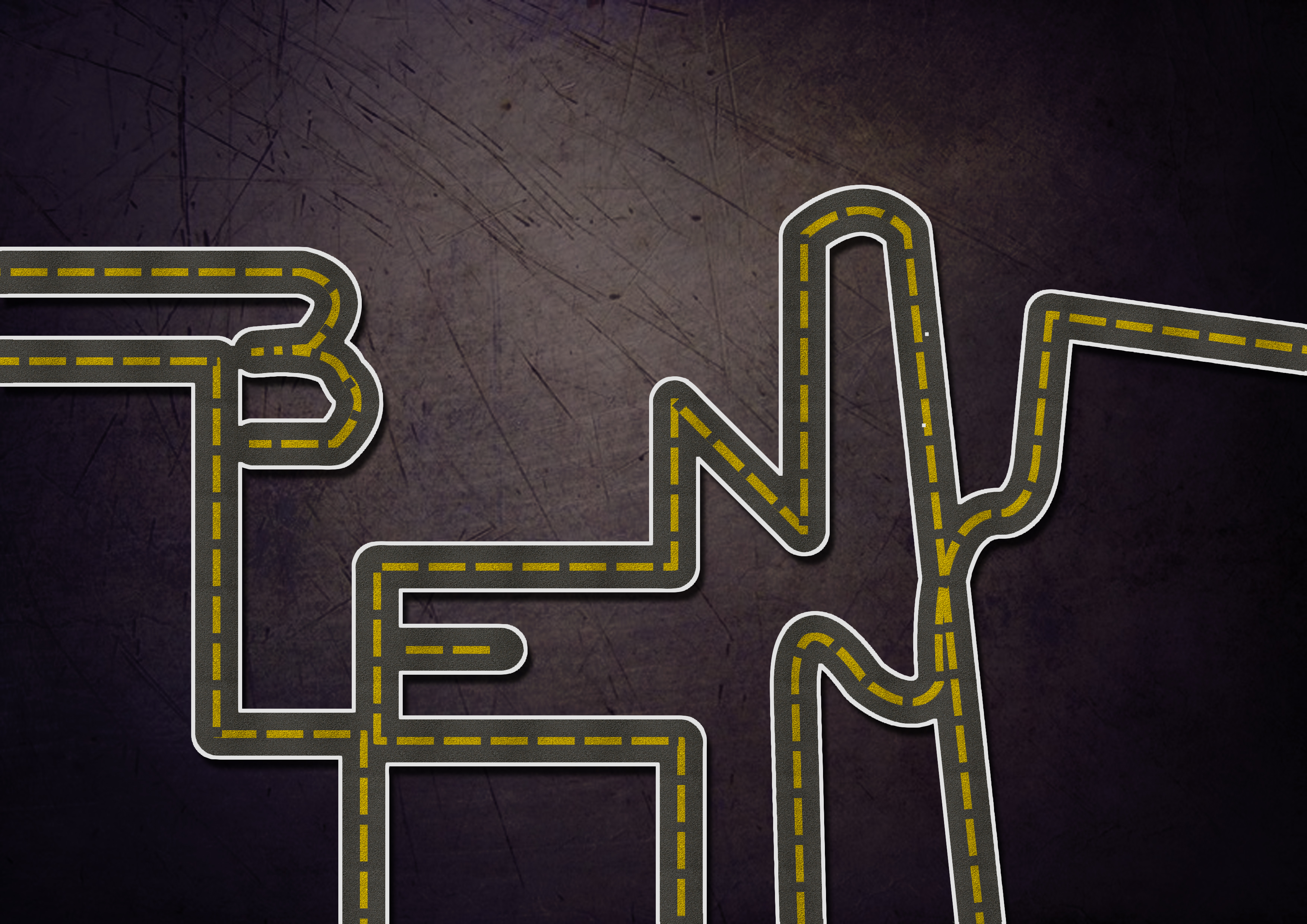
This was the final piece after I added in a background. I really didn’t like how the roads turned out to be and decided to abort this piece as I couldn’t really relate to this job anyway.
Pastry Chef
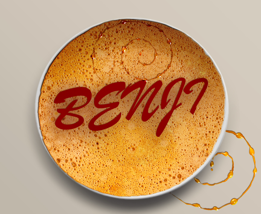
After my initial disappointment with my ‘Chef’ piece, I decided to work on another, but this time using a type font and try to create the honey glaze over a pancake instead of using imagery directly found online.
After multiple try outs with the various blending options in Photoshop such as
- Pattern Overlay
- Bevel & Emboss
- Inner Shadow
- Inner Glow
- Drop Shadow
I was able to create the effect of honey over the top of a pancake depicting my nickname once ‘Benji‘.
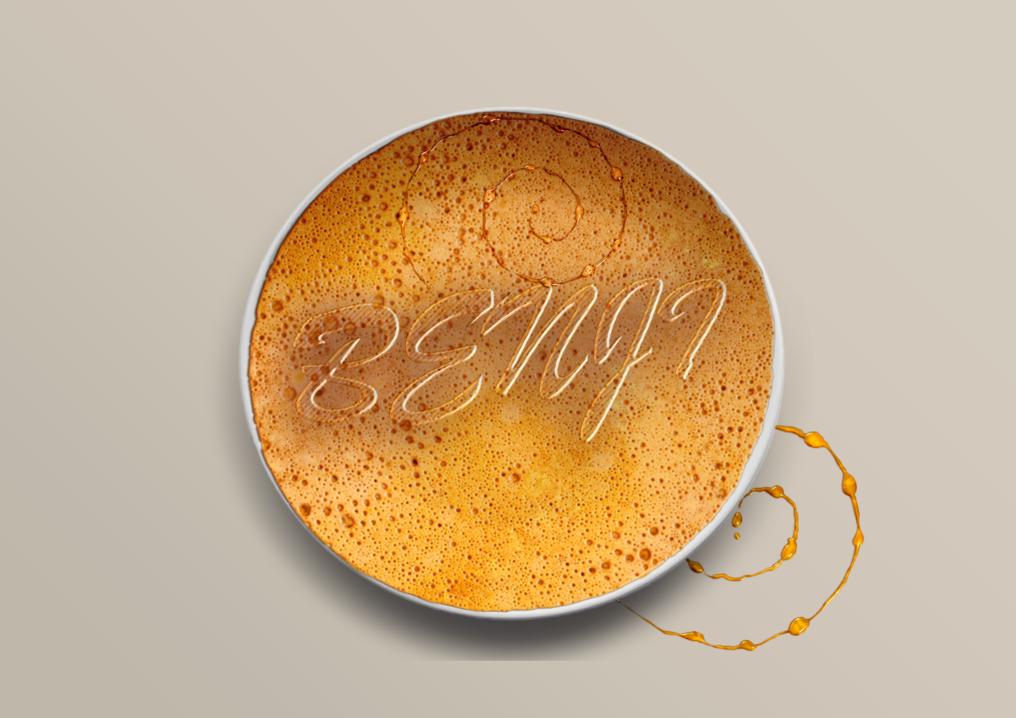
After consultation with Mimi, she suggested me to make the font a bit more liquefied as it seems like it’s splat onto the pancake which didn’t come across as very natural but artificial. Thereafter I decided to scrap this piece and start working on other pieces.
Product Designer/Interior Designer (?)

In this piece, I tried to use furniture imagery found online to create my font and added feint background in my attempt for a 3 dimensional piece which I think I kind of failed miserably once again.
Halfway through this, I thought I was really trying to force it out and something just didn’t feel right. Perhaps it was the distracting background which kind of steals the attention away from the products which are supposed to depict my nickname.
Interior Designer
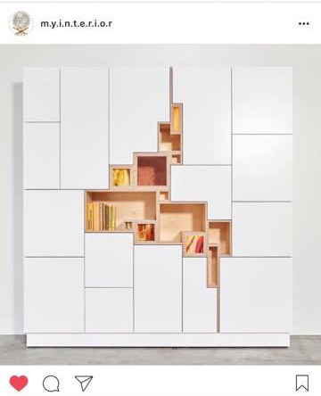
I came across this interior design of a cupboard/shelf which gave me some sort of inspiration for the upcoming piece.
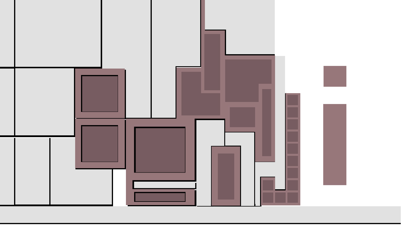
In this piece, I attempted to use shape and drop shadows to create some kind of a shelf design as referenced from the Instagram image.
Photographer
Select a type font that I like in this case is ETH Black.
By adjusting the brush setting and select directly onto the font, I was able to create the brush effect around the font. The settings I tweak with were
- Brush Tip Shape
- Scattering
- Smoothing
The final outcome of the brush wasn’t what I intended as I intended for the brush effect which seem somewhat like bokeh – the visual quality of the out-of-focus areas of a photographic image, especially as rendered by a particular lens.
The intended outcome was to have it in multiple colors with a larger brush tip but I decided to move on to trying other alternatives as I’ve achieved my objective of exploring the different effects Photoshop offers albeit not mastering it altogether.
DJ
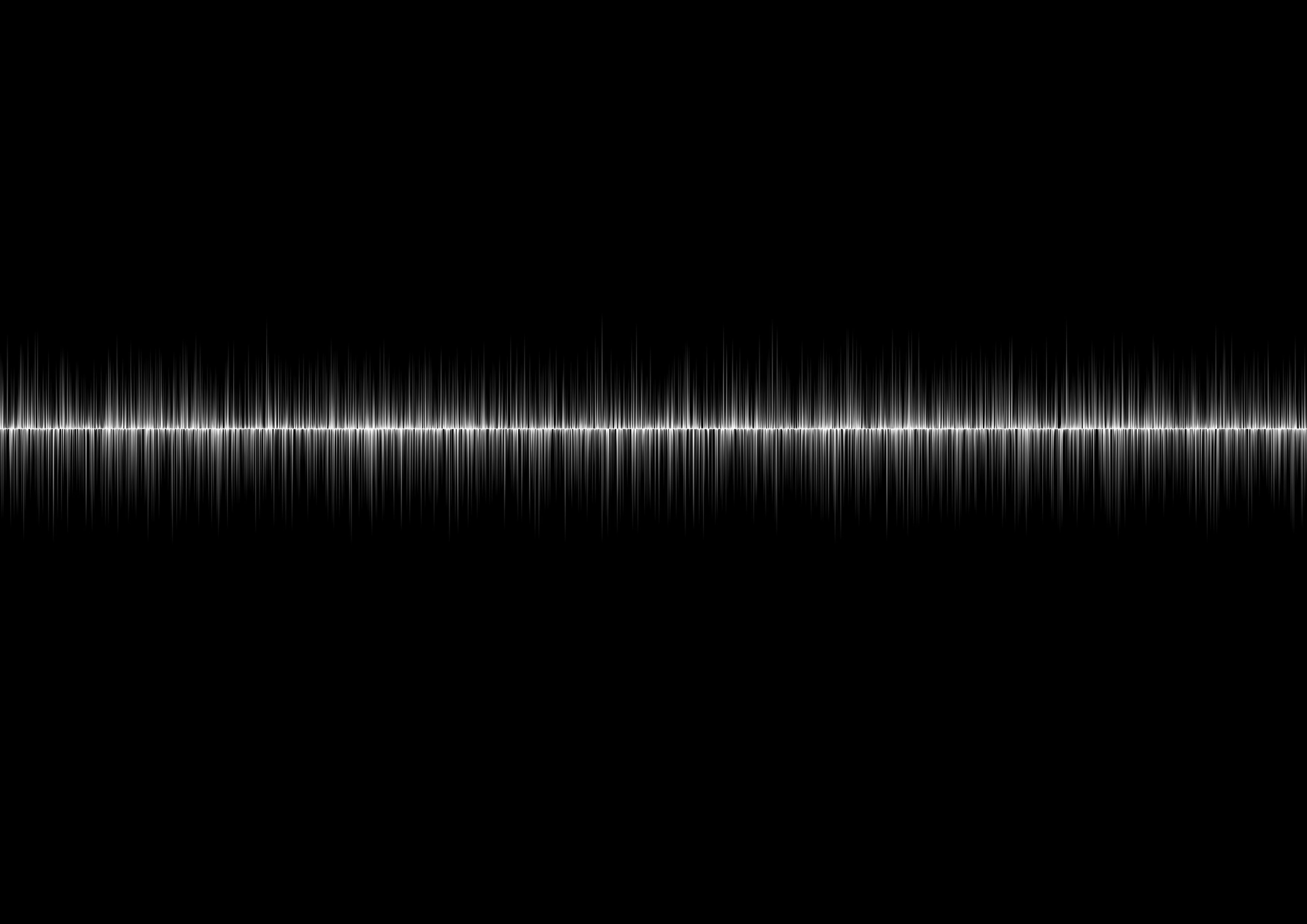
This effect was created by Stylize > Wind. It created the effect of something like a soundwave which was to represent the music that I’ll be playing as a DJ.

I added a gradient of multiple colors to further bring out the sound waves.

I created a rounded rectangle and created it as a pattern and applied gradient over it to created the image of the volume on the sound system.
In all honesty, this piece was quite embarrassing as it look really tacky but it was fun trying out.
Conclusion
After doing all these exploration, I realized that I have done something that was somewhat similar to what Mimi made us do on the very first lesson, which was to churn out as many ideas as possible on the A3 paper with 30 circles.
Despite not having any final pieces, I managed to explore multiple ways of application on different methods which were detrimental in creating my next few pieces.
Sneak Peek
Things to note
‘The aim of this project is to use typography as an end in itself, minimizing supporting imagery. Conceptually driven solutions and letter forms are combined with literal or abstract images to express your future job. The outcomes address either materials, the process or a result of using specific media and technique.’
After revising the brief and consultation with Mimi, I realized that my applications were somewhat narrative very much towards process and result and less of using literal or abstract images in my expressions for the fonts which I attempt to rectify.
You must be logged in to post a comment.