
Inital stages
When we started out with water as the overarching theme of this semester’s viscom project, it was exciting as there were so many topics that could be discussed about.
For my group, we actually began our research based on different aspects of water we’d like to look into, (google slides can be found here). For myself, I decided to look into the power aspect of water, as I have always viewed water not just as a source of survival, but also a massive force that should not be underestimated.
Some aspects of the power of water I researched on included:
1. Hydropower, which I thought was really interesting. There were many economical and environmental aspects to it that can be touched on.
2. Natural water-related disasters, which I felt strongly for, as I have watched many documentaries on natural disasters.
Ultimately, I decided to expand on my research on water-related natural disasters. The reason behind it was because I came across many documentaries on tsunamis and hurricanes and it broke my heart to see the after-effects of such disasters no one could prevent. So I was really inspired and I thought, “I’m gonna save these people!!! By providing an awesome possum all-in-one emergency backpack that can keep them afloat in water!!!” which came in the form of this (not exactly how I pictured it to be but it was fun making it):

But after some discussions and consultations, I have been convinced to not go in this ’emergency-pack-to-save-lives’ direction, as one, it was not really feasible as many of these have already been produced, and two, it was not exactly gonna be really helpful as the idea included many products, and it was hard to find the connection with visual communications and this idea. So scrape that.
Developmental stages
Moving on, I felt that the design thinking activity sheet really help me to think through about what I could do and helped me concretised what I hoped to achieve and the project’s purpose. While I was reading through articles of Tsunamis all over the world, one event really stuck out as the numbers in that one event was so enormous, it shocked me. It was the 2004 Indian Ocean Earthquake and Tsunami, which about 170,000 people lost their lives in Indonesia itself, where waves reached around 30 metres in height. I was appalled at the sheer destructive force tsunamis had. After delving deeper into the event, I realised that the most affected areas with the largest amounts of casualties were in places that were less prepared for such events. To be more specific, it was Banda Aceh which was most affected. I found out that it was simply because its people were unprepared for a tsunami. It really helped me shape the POV that I wanted to take for my project. And so with the help of the design thinking activity sheet, I came up with the direction I was headed towards.
My ‘point of view’ was: Indonesians (in Banda Aceh more specifically) needs a way to be self-reliant when a tsunami strikes, because it will increase the chances of survival or their wellness in the event of a tsunami.
I realised that even after narrowing it down it was still really broad, so I thought about the channels in which I can improve the preparedness of the people when it comes to a tsunami. So I did up a mind-map to organise my thought process and help myself in the brainstorming.
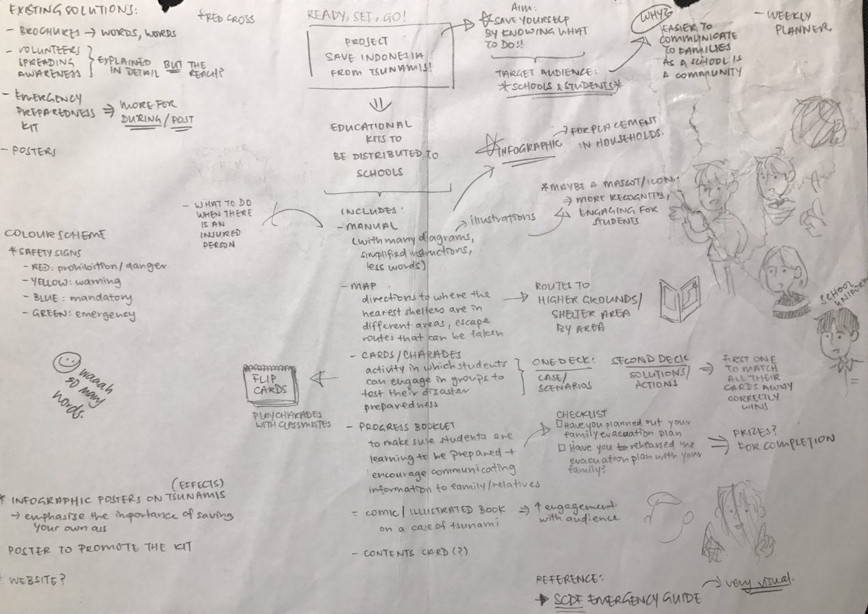
I ended up deciding on educating the people, as the best way to prepare people is to keep them informed, teach them self-reliance. And I targeted school kids, as I considered the convenience and efficiency of disseminating knowledge in school. Another reason why my target audience was school children was because it is always better to educate people while they are young, so the knowledge is incorporated into their lifestyles.
So I reshaped my POV to be: Indonesian school children (in Banda Aceh more specifically) needs to be prepared to know what to do when a tsunami strikes, because it will increase the chances of survival or their wellness in the event of a tsunami.
The Water Project
Aims:
Making the educational deliverables fun and rewarding for children was definitely the most important for me for my project. As there are so many manuals on how you can prepare yourself for tsunamis, I thought that it will be good if I could expand it to make it more engaging for children. I thought of going digital because of how convenient and accessible technology is these days, but I thought that if I combine digital and the school environment, I thought it would be quite distracting. So I decided on making everything physical, a more traditional way of teaching and schooling.
I am looking to target a more ‘mature’ children age group, which I assumed they know the importance of life & death and disaster preparedness better. I will be targeting the youths in their 10s.
Deliverables:
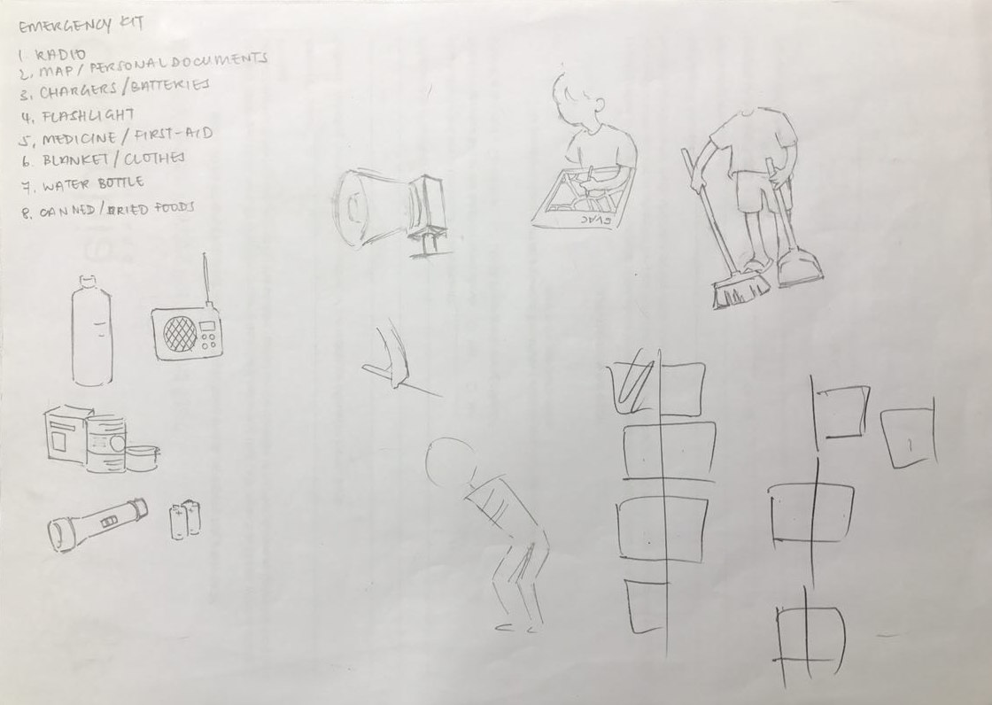
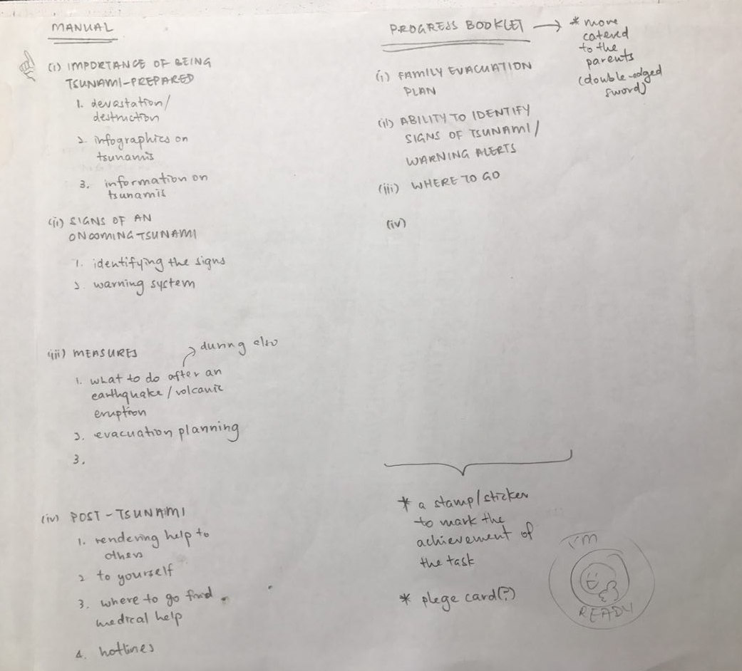
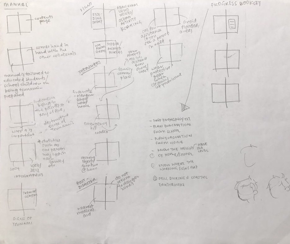
1. Illustrated Manual / Handbook – To help children better understand situations and things that have been explained in words in the existing manuals.
2. Progress Booklet – A little passport of progress to help increase the motivation to learn properly about the natural disaster, and to track progress and make sure these children are actually carrying out the knowledge that they have gained.
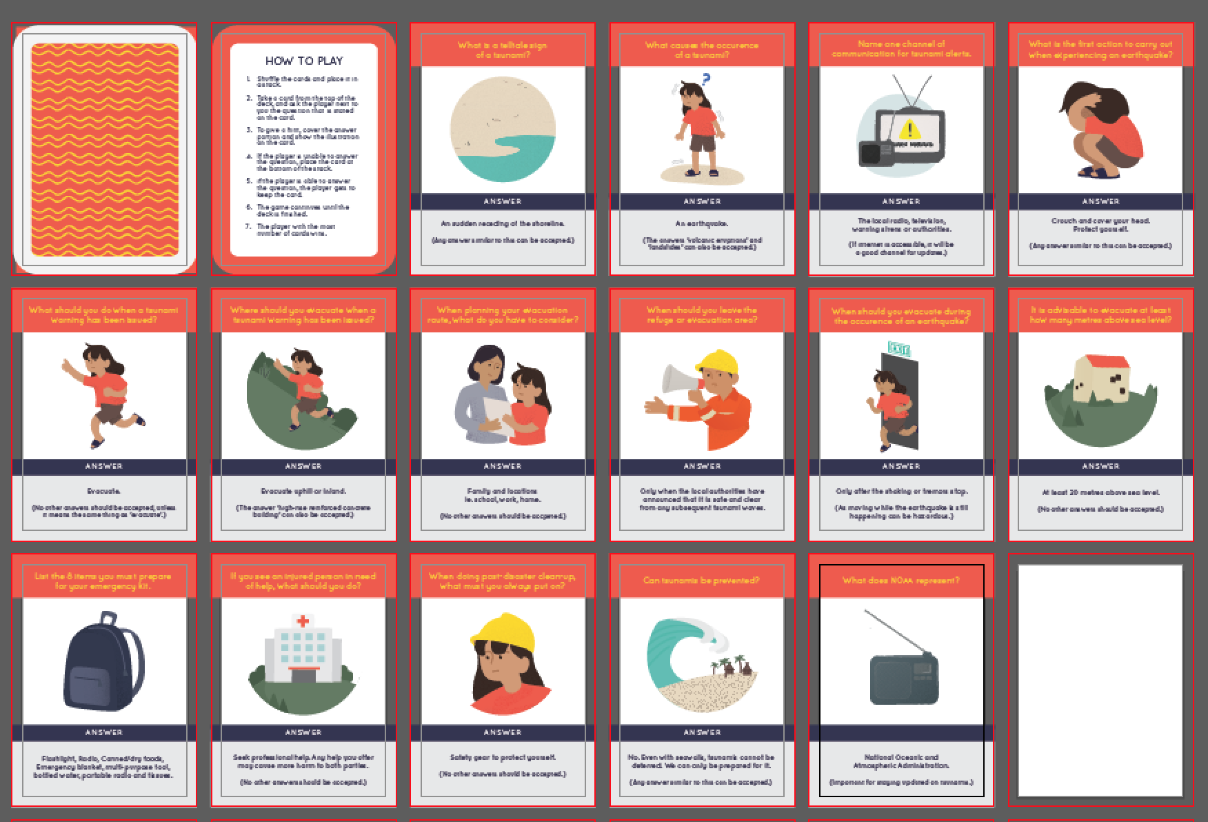
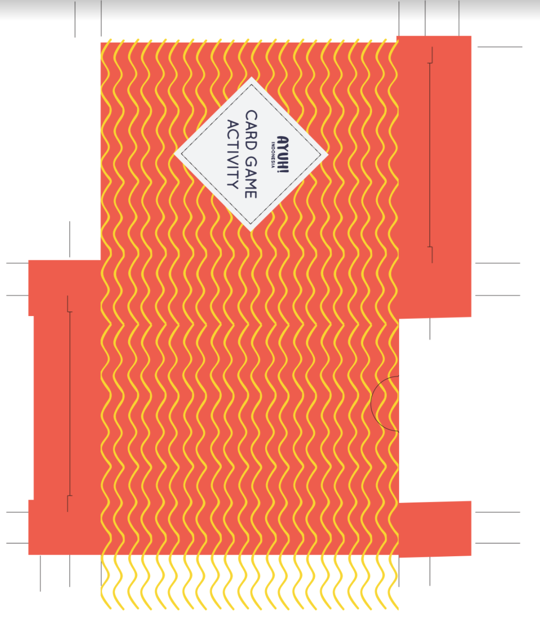
3. Card Game Activity – A little activity to test the knowledge of the children while keeping them engaged and help the children have fun while learning.
Approach:
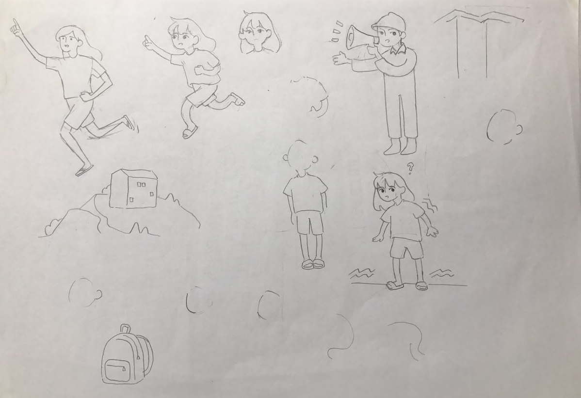
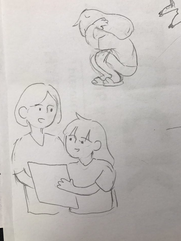
I wanted to make it children-friendly and engaging, so I thought of using a mascot. Here are some of the sketches for the illustration style I was going for:
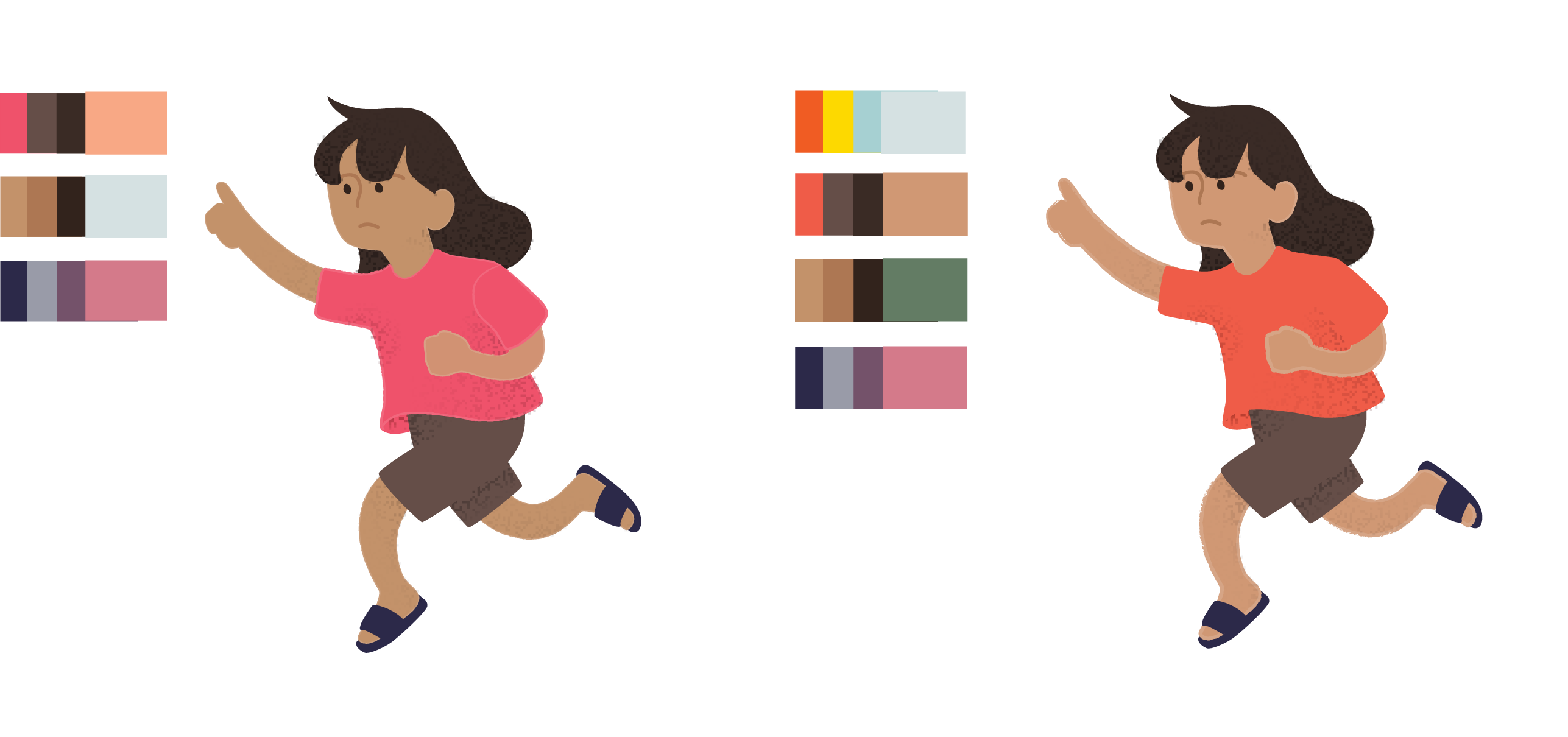
I brought it over to illustrator and tried out colours. I really liked the original colours (right) and wanted to use as little colours a possible in my colour scheme of all three deliverables. I ended up changing the colours (left) as the character was too muted like the other colours and did not help the character stand out from the backgrounds.
These was what I had in mind for my handbook and progress booklet.
When I began putting the handbook together, I felt that a handwritten, rounded, cute typeface would work for children, and to make the book more enticing to look at. I decided on the name AYUH! INDONESIA, as the aim of this initiative, as ‘ayuh’ means ‘come on’ in Indonesian. This name was chosen because this initiative aims to motivate school kids to be responsible for their own lives by taking the first step to get moving and preparing themselves.
 I ended up choosing these two typefaces to be used in my project, though I considered fonts such as Bebas Neue and Montserrat, by they had too sharp of edges for a soft look. Also, I tried to insert as little words as possible to make it look less daunting and more enjoyable to read. I tried to incorporate my illustrations and text as much as possible.
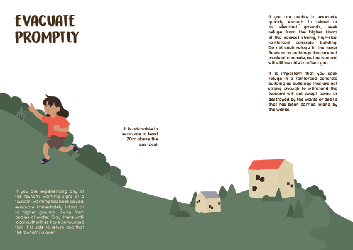
For the progress booklet and card game I wanted to use the same elements and illustrations to create them. And for the progress booklet, I have decided that I want to make it such that it looks like a little passport, and there will be chops to mark the progress, together with a space for the students to reflect on the exercise they have gone through.

I tried using different colours for each page, but I really disliked it so scrape that. I ended up choosing yellow because it really stood out and enhanced the vibrance and positivity. Also, the colour yellow is a colour of warning. I also designed a little chop like vector. It is meant to represent their readiness for a certain task.

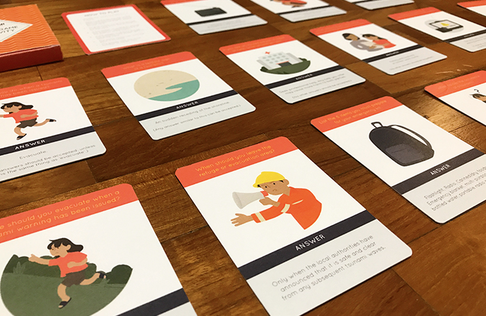
And for my card game, the game rules are as follows:
1. Shuffle the cards and place it in a stack.
2. Take a card from the top of the deck, and ask the player next to you the question that is stated on the card.
3. To give a hint, cover the answer portion and show the illustration on the card.
4. If the player is unable to answer the question, place the card at the bottom of the stack.
5. if the player is able to answer the question, the player gets to keep the card.
6. The game continues until the deck is finished. The player with the most number of cards wins.
It was a alteration of this typographic quiz-style card game called TAKTIPO where you get to test each others knowledge on typography by asking questions. I thought it was a really good way to engage the school children to reinforce their knowledge. I wanted to add a point system to the game due to the different levels of difficulty my questions were, but I opted out of it as I wanted the game to be as simple as possible.
After trying out a few looks, I decided to go with this, as it had a quiz game kind of look to it more than anything else I tried.
To conclude, I would like to say that though I had struggled a lot in illustrating as it was my first time trying to illustrate a book, especially for children, I had fun experimenting with tools, colours in the process and I have learnt a lot. (I wish I managed to churn out more illustrations to fill every step of the tsunami preparedness project…) Also, though I do find a lot of room for improvements in my project, I am thankful for all the thought process I had experienced while working on this project.
Final Deliverables:
DELIVERABLE ONE: HANDBOOK
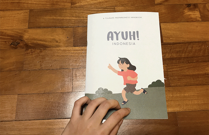 here is a digital copy of it, for easier viewing.
DELIVERABLE TWO: PROGRESS BOOKLET
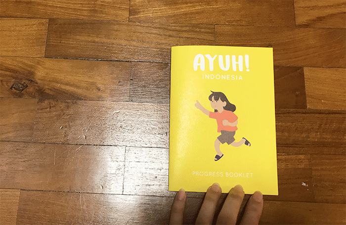 here is a digital copy of it, for easier viewing.
DELIVERABLE THREE: CARD GAME ACTIVITY
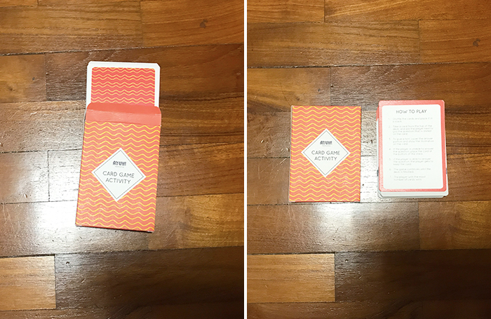
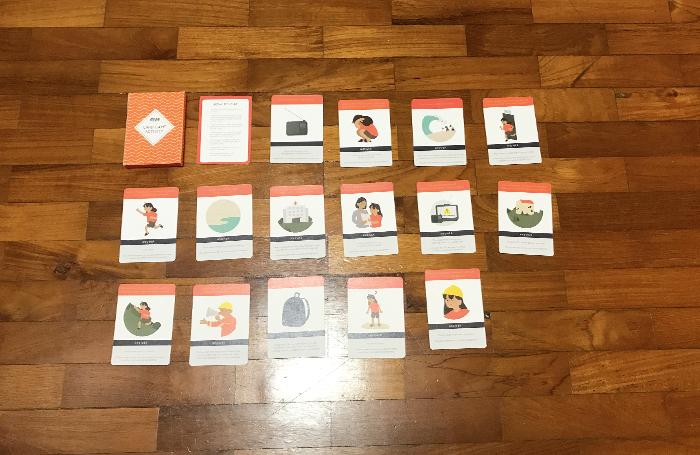

the full card set can be viewed here.