Hello hello! Once again I am back with another post for my school work. This time, I’ll be telling you all about my last project for my Digital Imaging class, so let’s get right into it! 😀
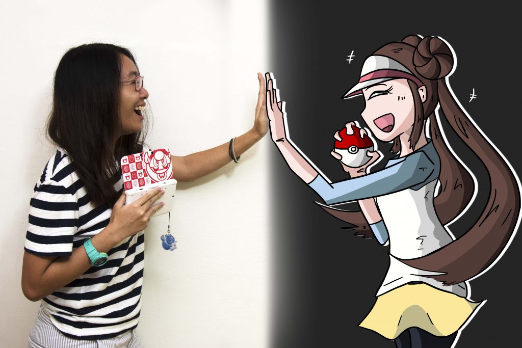
Video
Gif

Ideation
Ah yes, so this is where I struggled the most. I was stuck in a limbo for 1 to 2 weeks deciding on what I want my idea to be.
Initially, I was planning to draw an open world from a game, one where I’m in it because I played so many games that they became part of my life and they hold great significance to me. Bryan was excited about the idea, and so was I.
However, somewhere along the course of the project, I was not very motivated to do it. Maybe it was me getting tired or assignments, or that I simply wanted a breath of fresh air, I don’t know man. Basically, I wanted to do something travelling related, which is also what I am quite enthusiastic about. I do follow some photographers on Instagram that do a lot of travelling to places far and beyond this little island. Alas, during my consultation with Bryan, he reminded me that this project is really more about myself and what I want to portray to others, and that doing something closer to my heart would be “better” in a sense. (To be edited)
So, this led me to giving it some more thought. I started thinking about the games I played over the course of many years. I didn’t want to simply replicate a scenery from a game, which I could easily reference from open world games, which are some of my favourite types of games. I wanted to draw something that was of importance and significance to me, past or present. Then, it hit me.
Mario Kart Wii.
This was one of the first few games I played back when I was say, 12 or 13 years old, but my memories of it were strong. I remember spending many hours sitting in front of the TV, pressing down really hard on the A button that it leaves a mark on my fingers, or that I have (almost) perfectly memorised all of the 32 routes in the game, or that I can almost instinctively flick the Wii Remote at certain parts of the game to do cool tricks and stunts for my character, or that I spent hours on YouTube watching really pro Mario Kart Wii YouTubers playing in tournaments with their godlike skills that my 13 year old self cannot match (haha). But basically, you get the gist of it. This game was pretty darn fun to me.
But now, what aspect of Mario Kart shall I present for my project? My first thought was showcasing a scenery of one of the tracks that I used to play. But which one? There are like 32 of them, how the hell am I suppose to choose? Maple Treeway? Yoshi Falls? Luigi Circuit? Coconut Mall? There were simply too many to choose from. So I thought even harder, and realise there was always one that struck a chord in me.
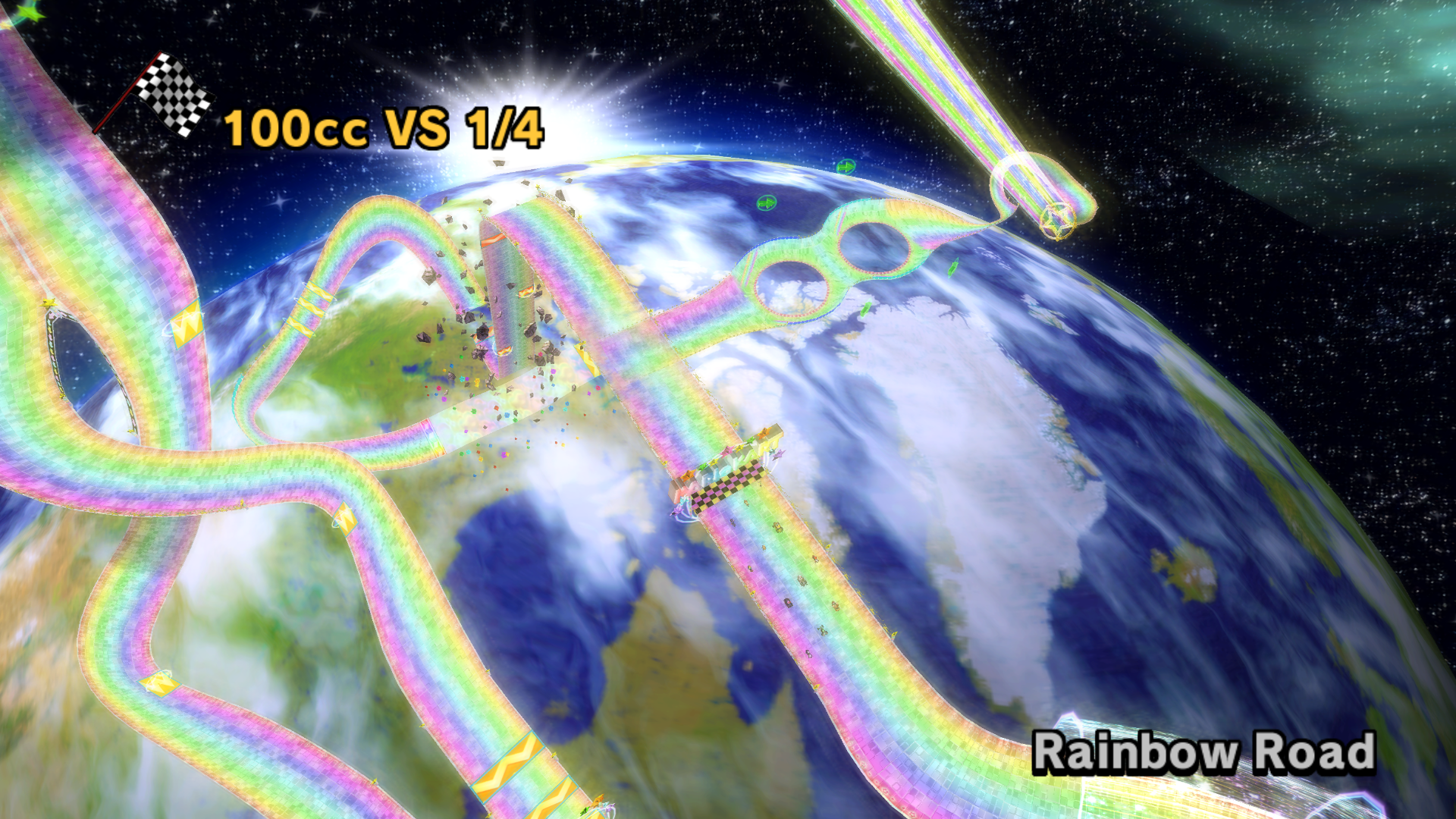
Rainbow Road.
Ah yes, the staple of every Mario Kart game, how could anyone forget? Rainbow Road has always been a staple in all the Mario Kart games, appearing as the final course in the Special Cup, and one of the more tricky tracks. It has many boosts, ramps, bumps, and most importantly, devoid of railings, which means you are very prone to falling off the track every 2 seconds after respawning (speaking from experience, haha). The Rainbow Road on Mario Kart Wii was no exception of course. I remembered when I first saw it, I was so amazed by the colourful floating track in the middle of the galaxy, scattered with stars and the earth far far below us. It was (literally) out of this world. You can only imagine my excitement when I finally got to play the track myself, heh. It was truly magical.
And hence, I would attempt to portray me and my experience with Rainbow Road in the process below.
But before that…
Artist References
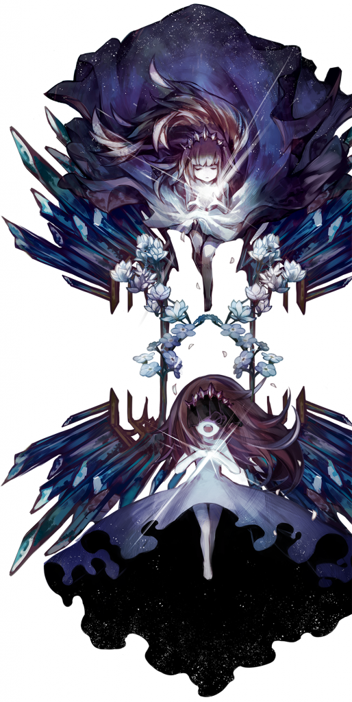
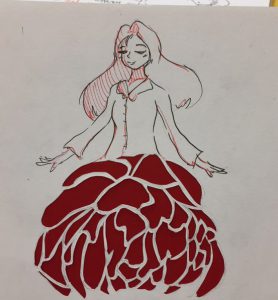
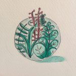
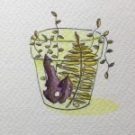
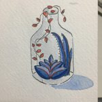
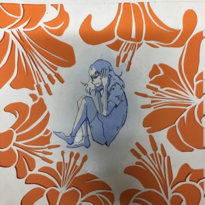
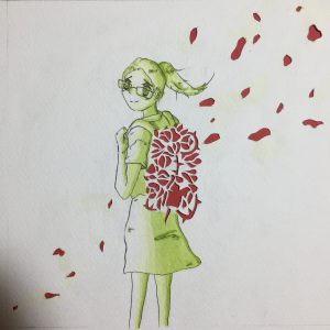
Not completely relevant, but I have been following her works for really long and I always love her (sometimes) surrealistic compositions and use of colours to suit the mood of her painting. Also, her scenery works are all insanely breathtaking and magical. 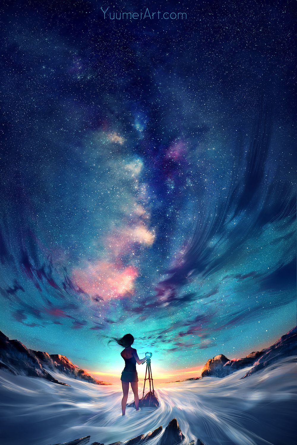
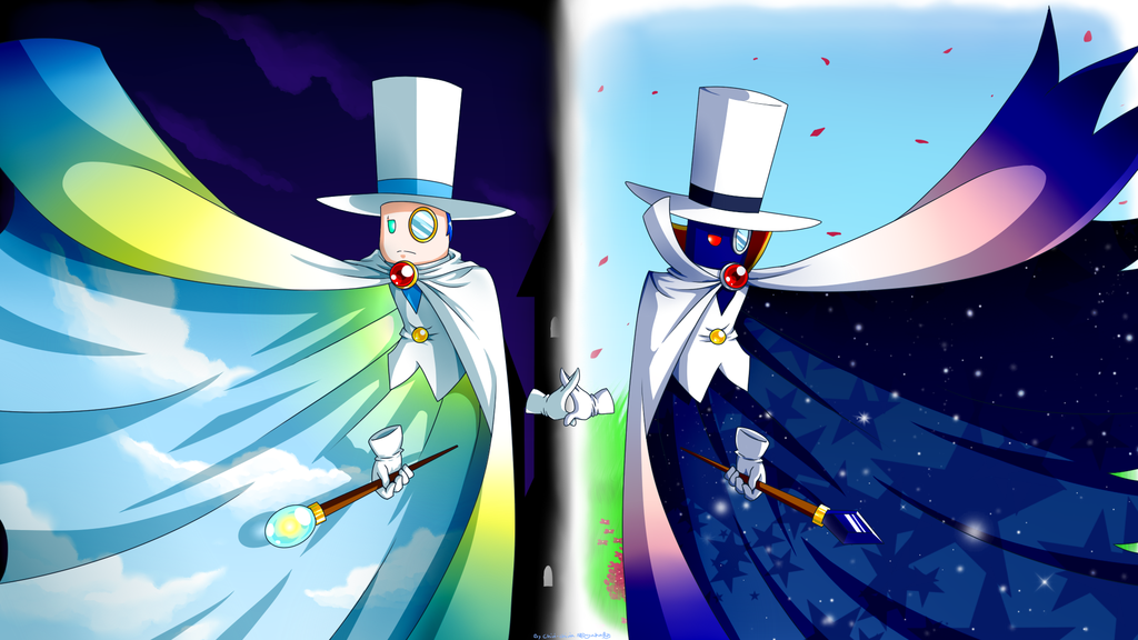
She’s a concept artist that I’ve been following for a while, and I love the way she uses different colours to set the mood of the scenery. I also like how she adds many details into her works to make it feel alive. Her dynamic illustrative style also stands out to me too from her other works.
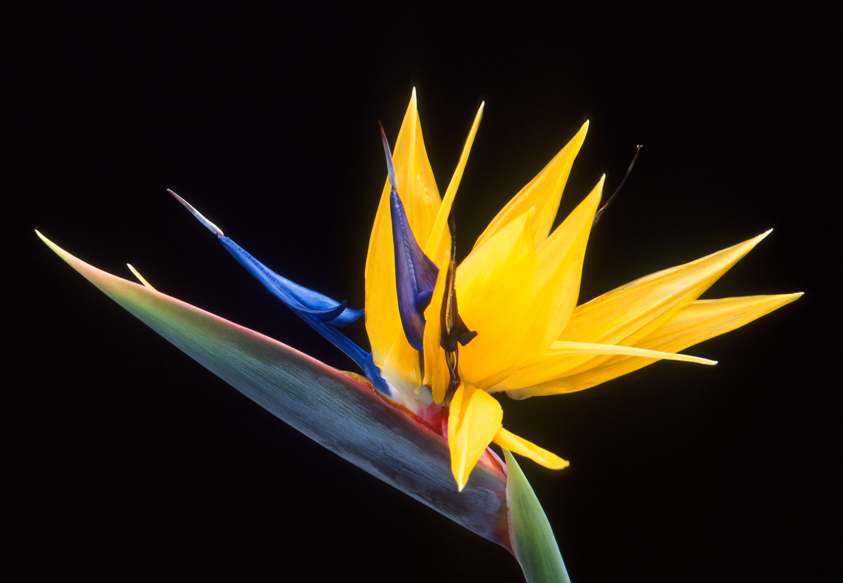
And of course, the original Rainbow Road track itself from the game:

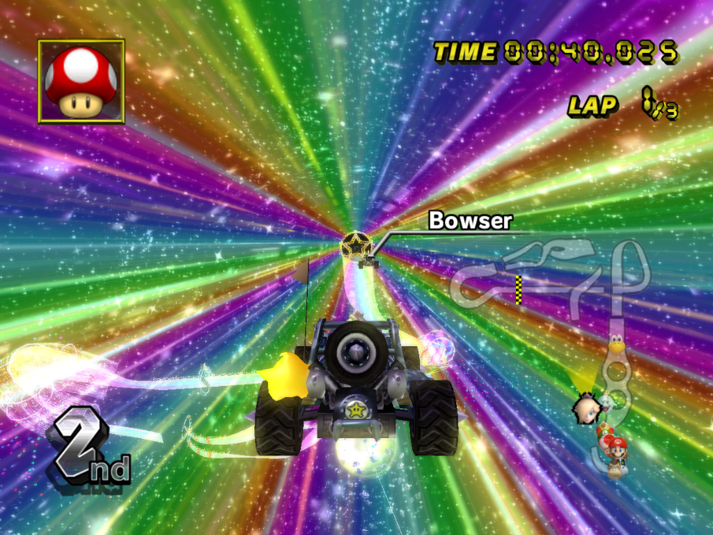
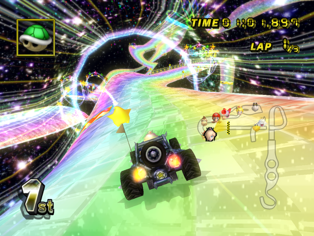
The track has many cool gimmicks along the way (like shown above), and it’s colourful nature stands out really brightly against the endless galaxy and the earth below. Therefore I’ll pick some elements of the track to put it in my drawing.
And with the artist references out of the way, time to do a lot of work!
Process
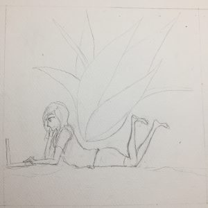
Sketching
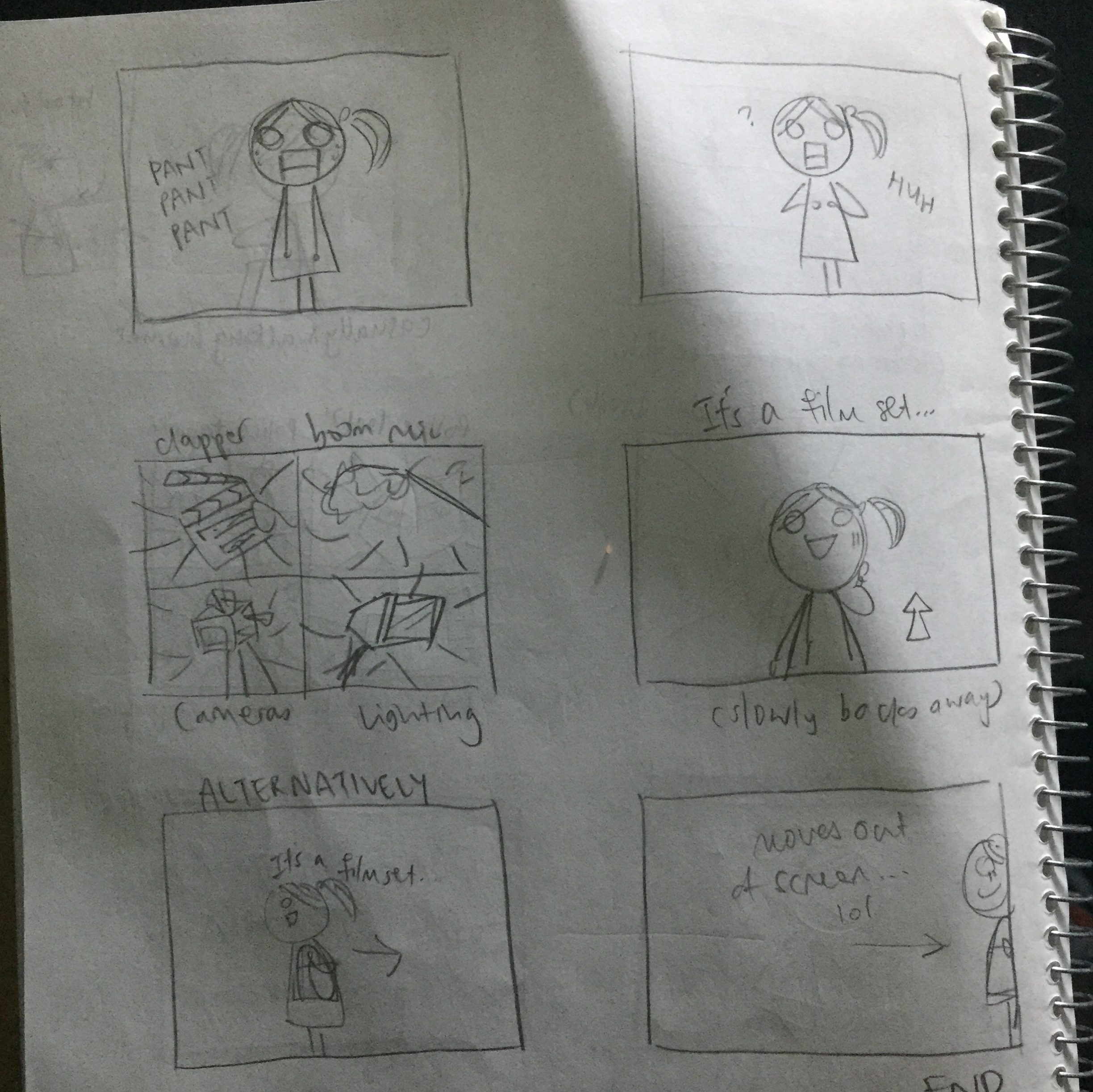
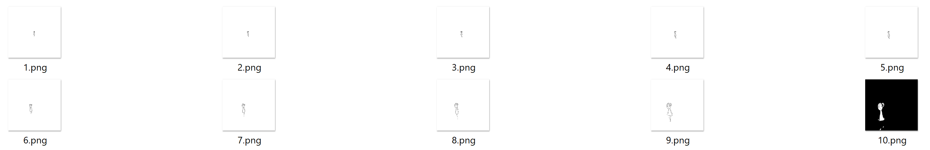
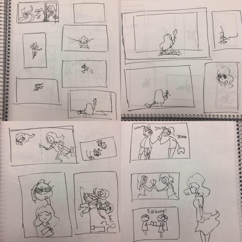
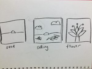
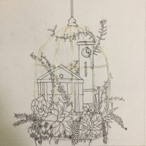
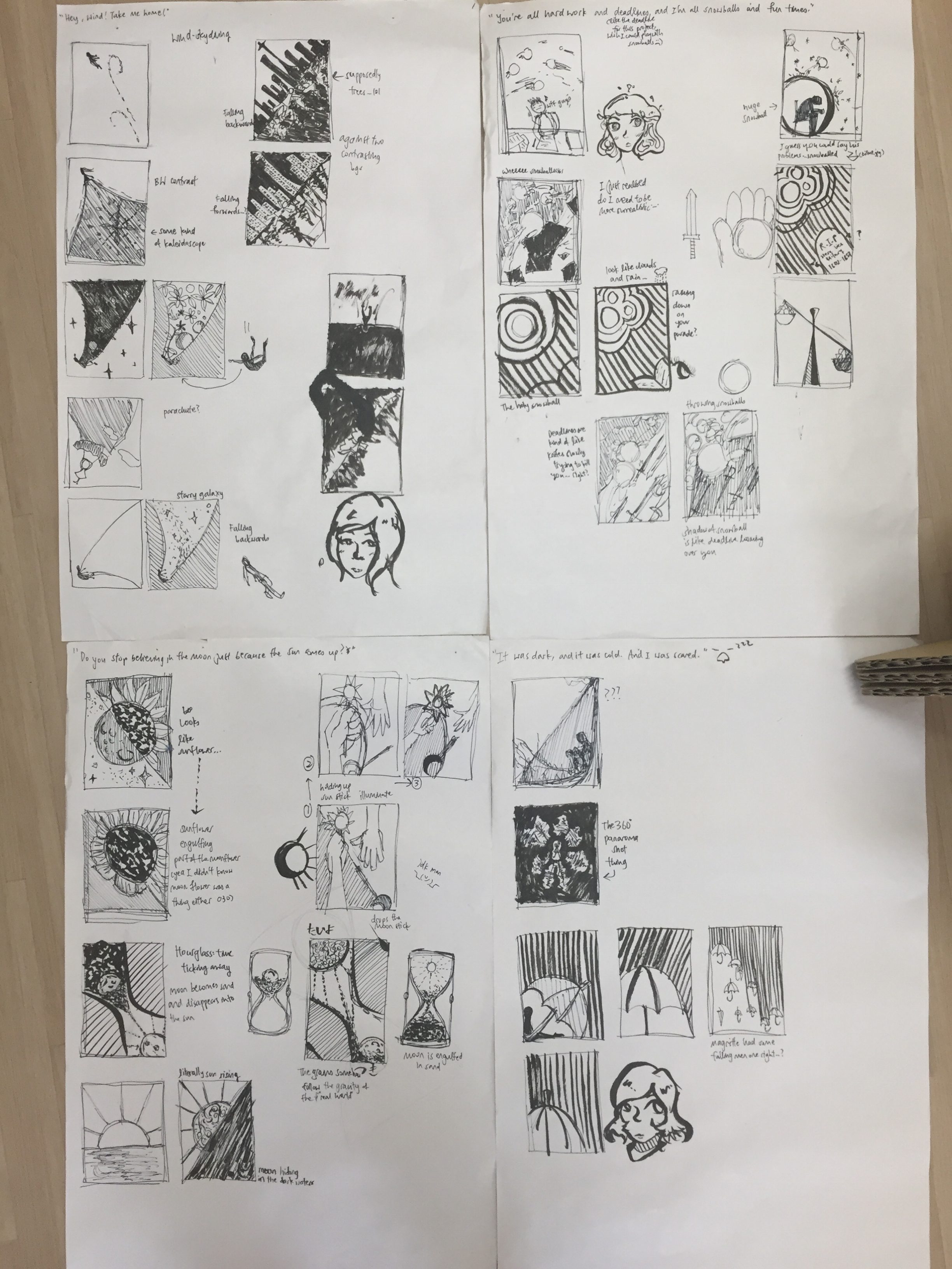
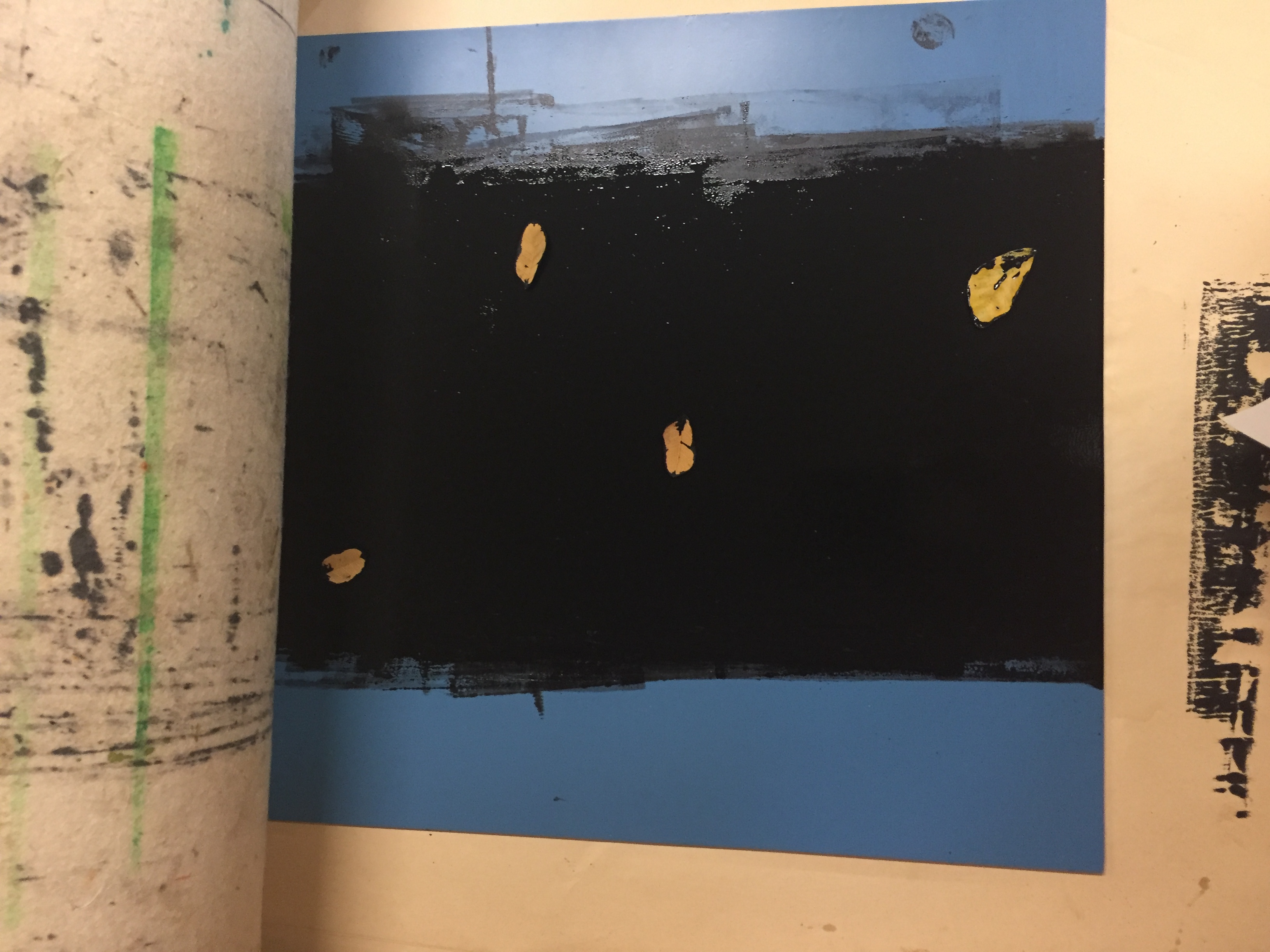
So first and foremost, I conjured up some possible compositions I could possibly use for my project:
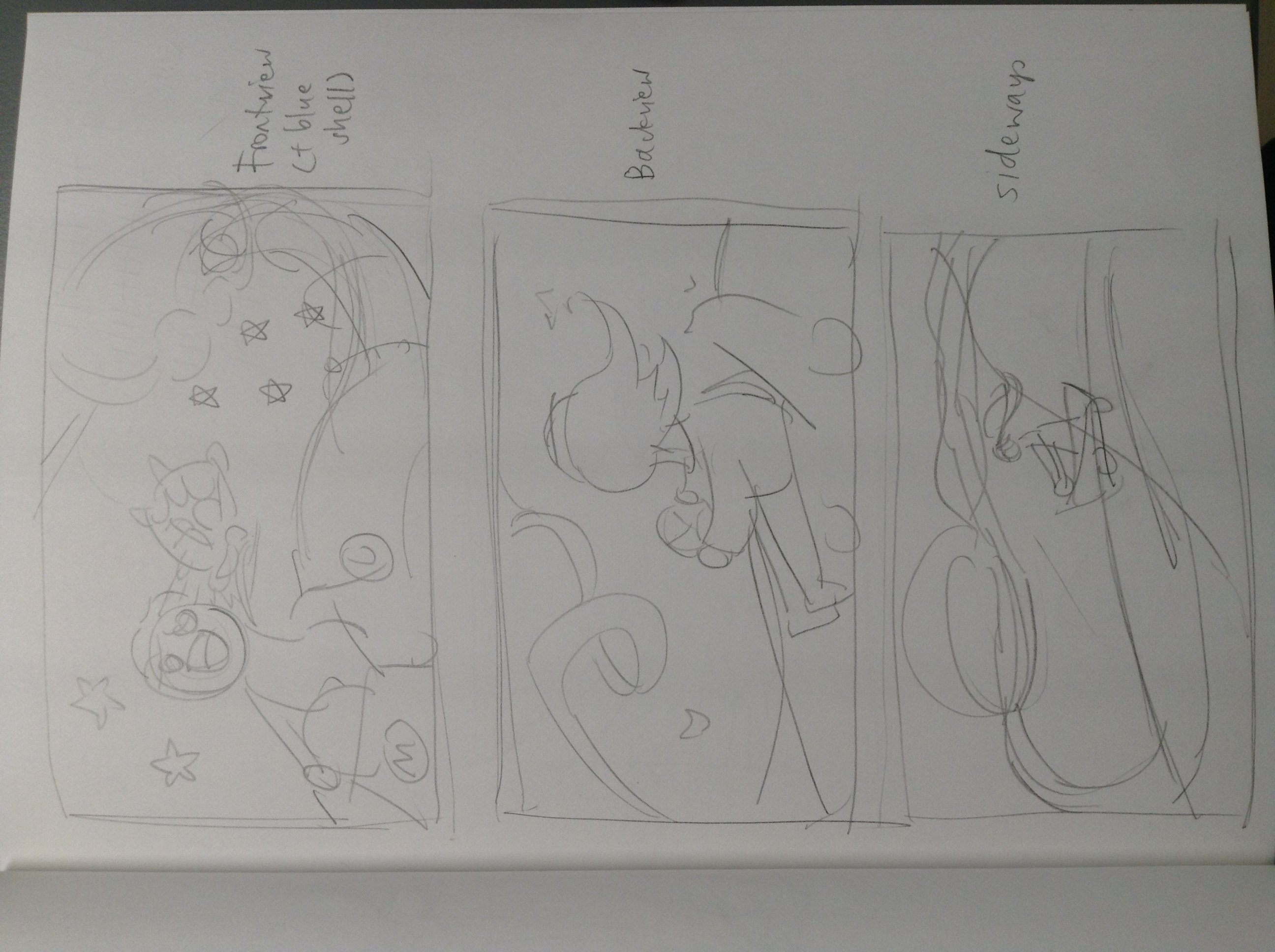
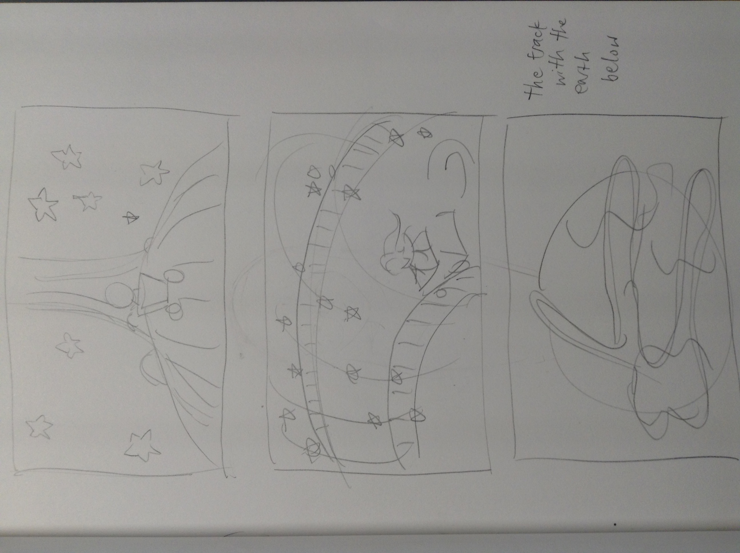
Ultimately, I decided to use the very first one on top since I want to capture the thrill of playing the game and also the satisfaction of throwing a spiny shell. (A spiny shell is a homing weapon on the player that is currently in first place and deals a huge explosion, hence it is like the ultimate “HA GET REKT” item.)
Digitalising
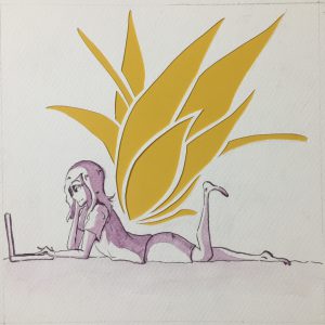
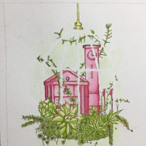
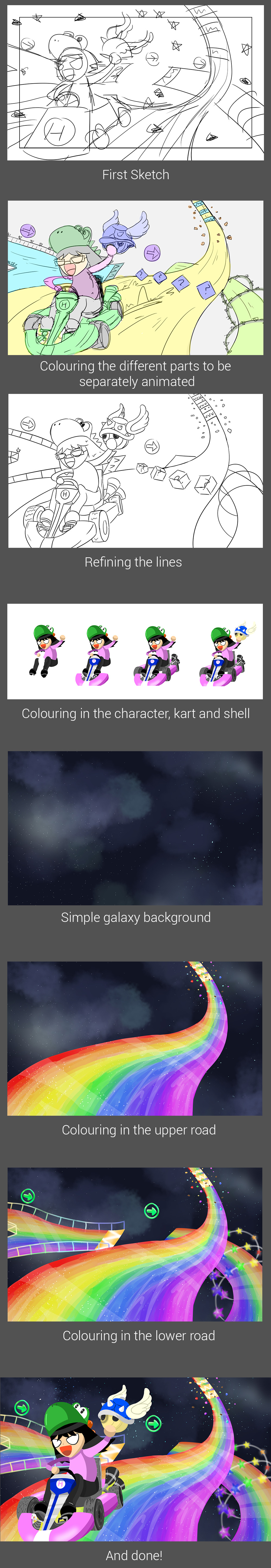
Next, I sketched out my drawing in Clip Studio Paint.
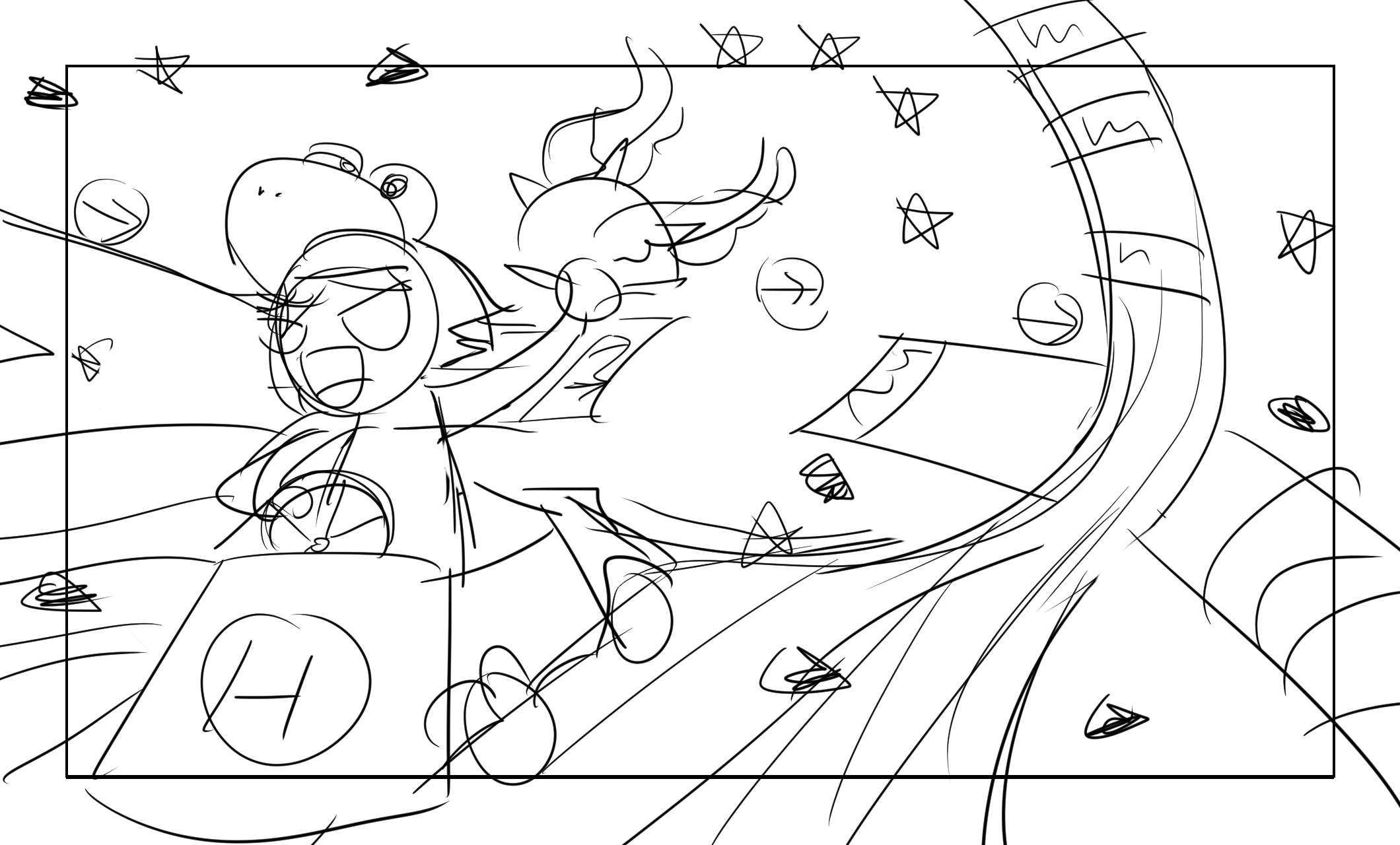
I added 200px horizontally and vertically to the 1920×1080 image so that I could animate the different parts. I also used a frame to indicate where the objects will be visible in the final animation.
As for the details, in the foreground is my avatar in the game, driving a standard kart in the game with one hand while holding the spiny shell in the other. I gave my avatar a Yoshi hat since I played as Yoshi the most in the game. (It’s too cute!) I added in some floating stars and meteorites since the original track had it too. I also added additional roads below the road my avatar is travelling on to make the composition look less empty. The bottom road had a split path and some overarching gates, both of which are present in the original track.
And then the process continues below:
Animating
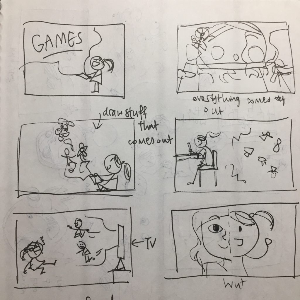
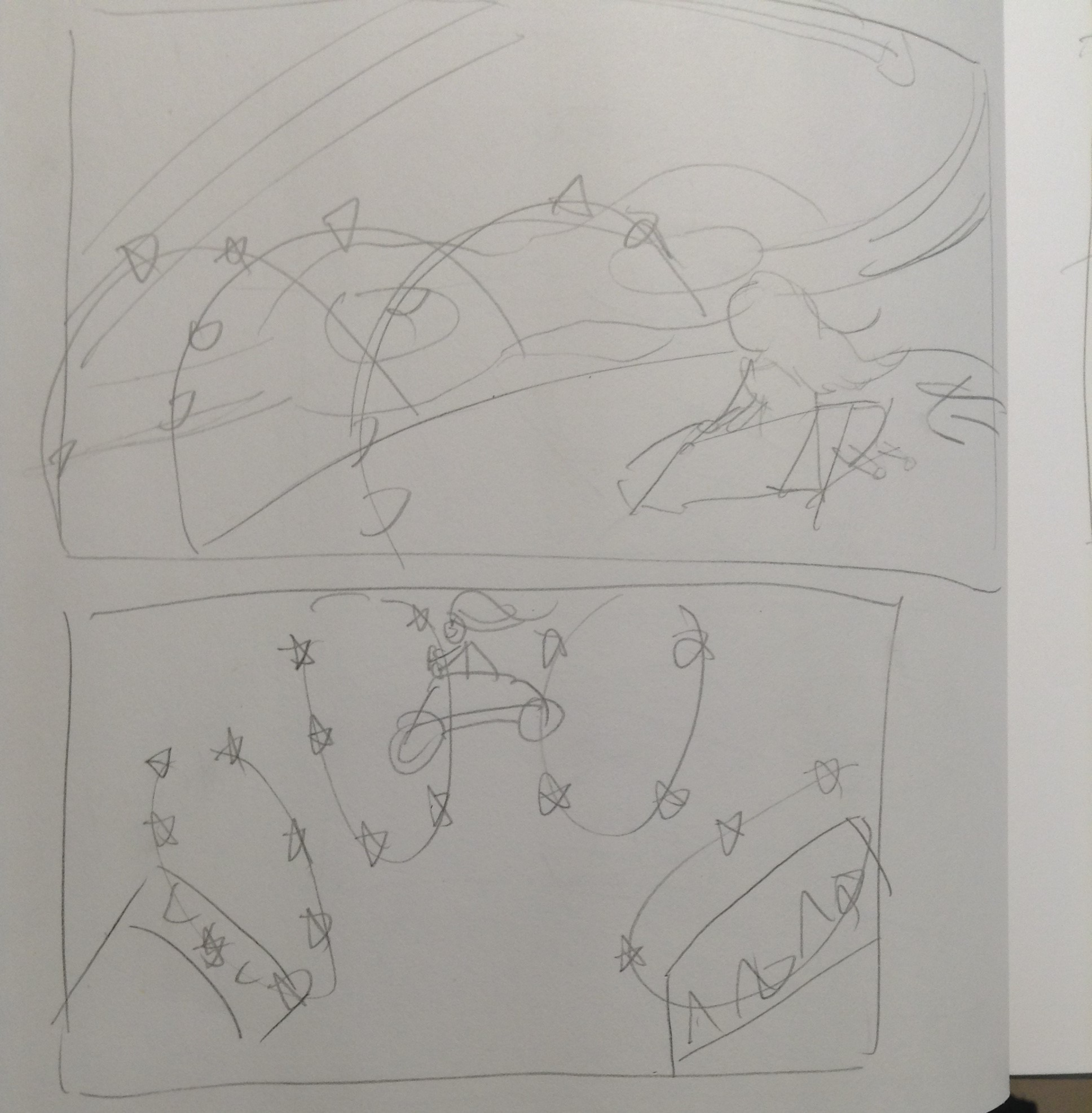
First and foremost, I indicated in my sketches where I wanted what to move.

Unfortunately, due to my limited skills and expertise in After Effects, I wasn’t able to do everything I wanted to, but I tried my best to do as much as I can.
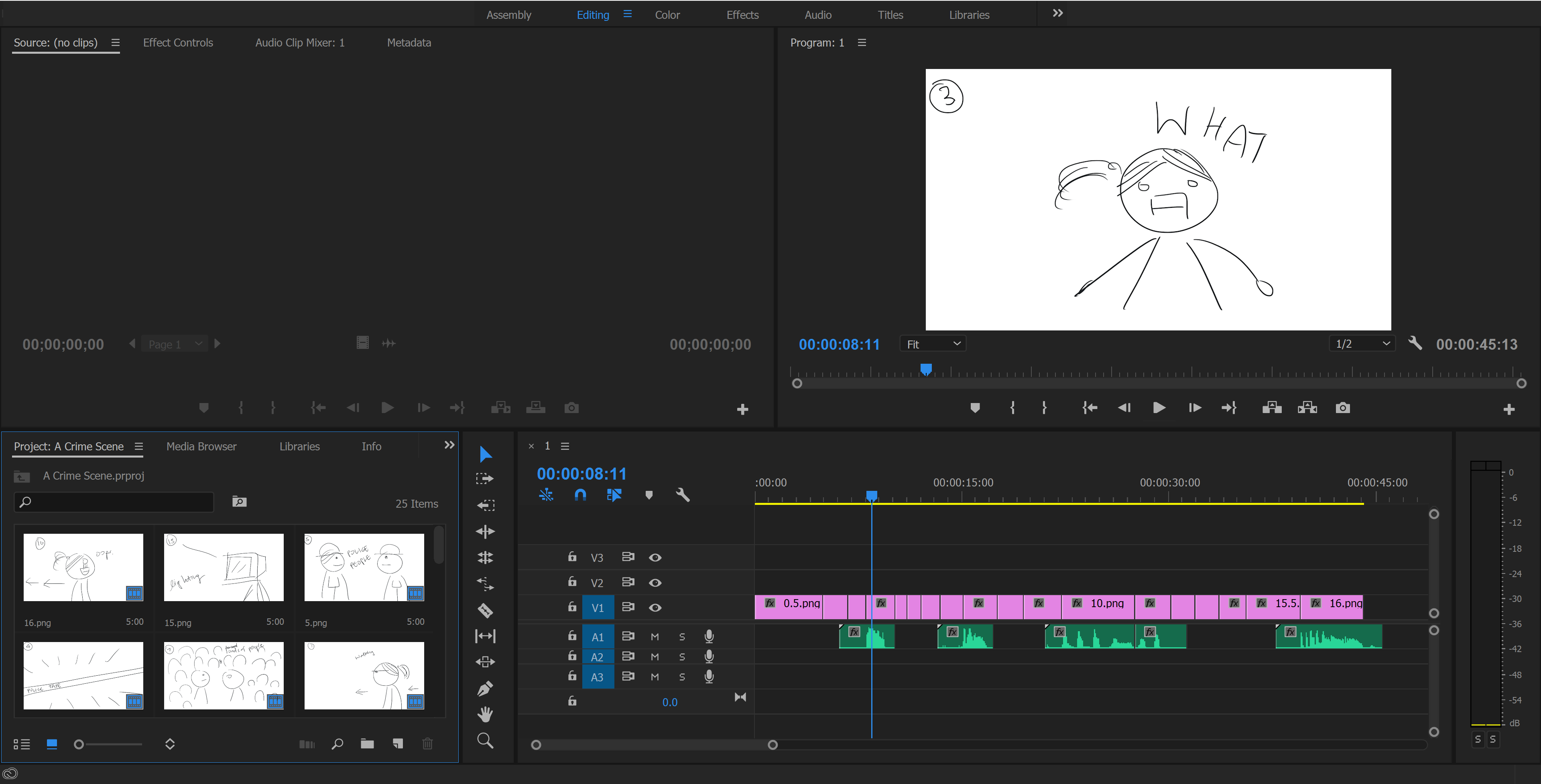
This is how my final workflow looked like:

I’ll be talking about what I did to each individual layer! So firstly…
Galaxy
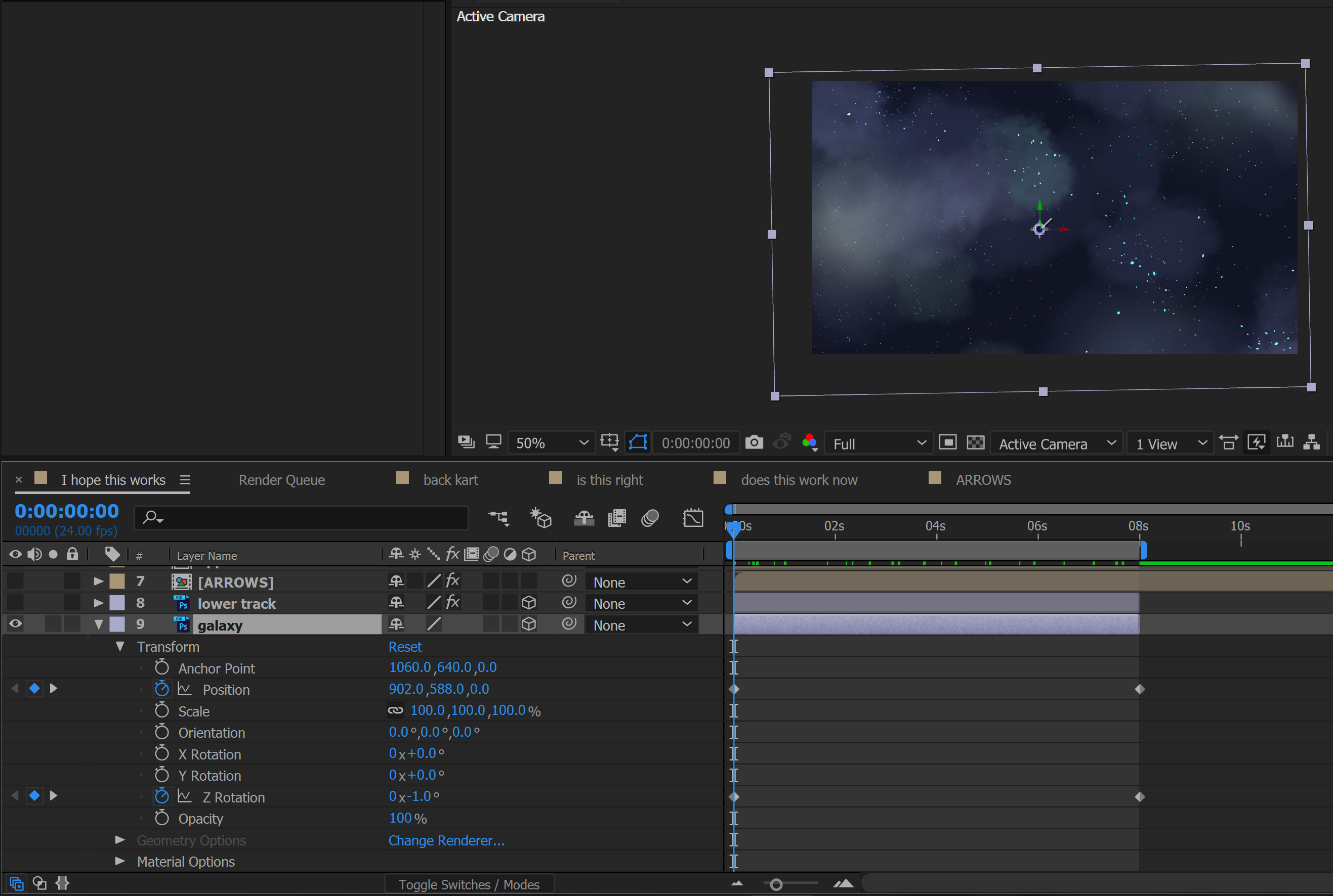
I wanted to give the galaxy layer just a bit of movement since it’s in the background, so all I did was add frames to change it’s position, and added some slight rotation on the Z axis to look more like an actual spacey effect.
Lower track

I added some gaussian blur to the track since it is in the mid-ground, so less focus is on it. I also made it move from left to right and rotated it slightly along the key frames to make the movement more dynamic.
Green Arrows

As you can see from the effects control on the left side, I also blurred the arrows to match with the lower track. After that, I decided to add a little glowing effect to the arrow to make it look neon-ish like how it does in the game, so I key framed the glow radius at 2 second intervals, as can be seen in the timeline below. After that, I also tracked the position of the arrows to move in sync with the lower track as seen in the transform section below.
Upper track
This layer of mine consisted of 2 rounds of animating, so I’ll start with the broader one!
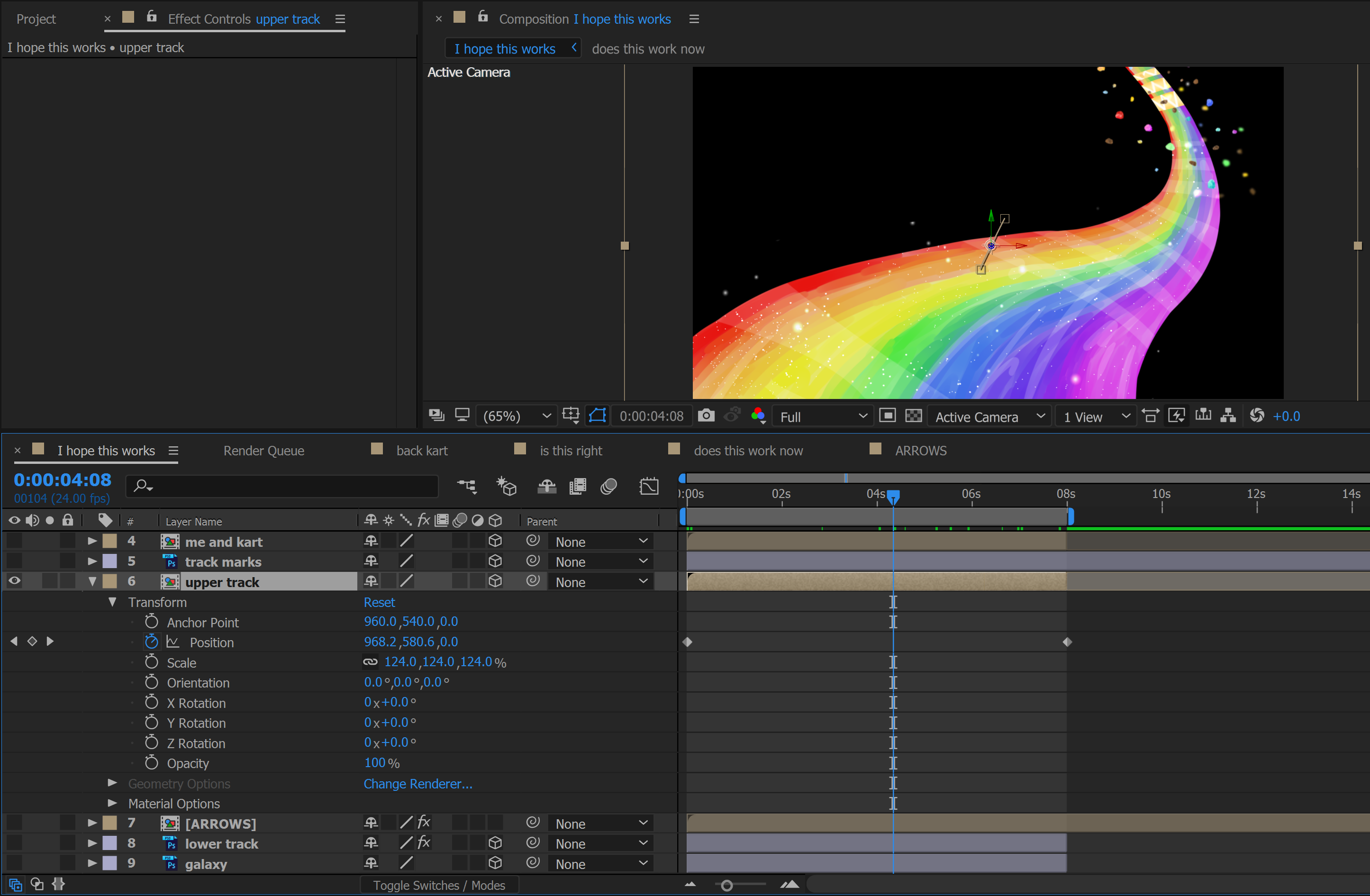
For the overall track, I moved the position of the track diagonally left downwards since it matched with the direction the kart was driving towards. And now the details:
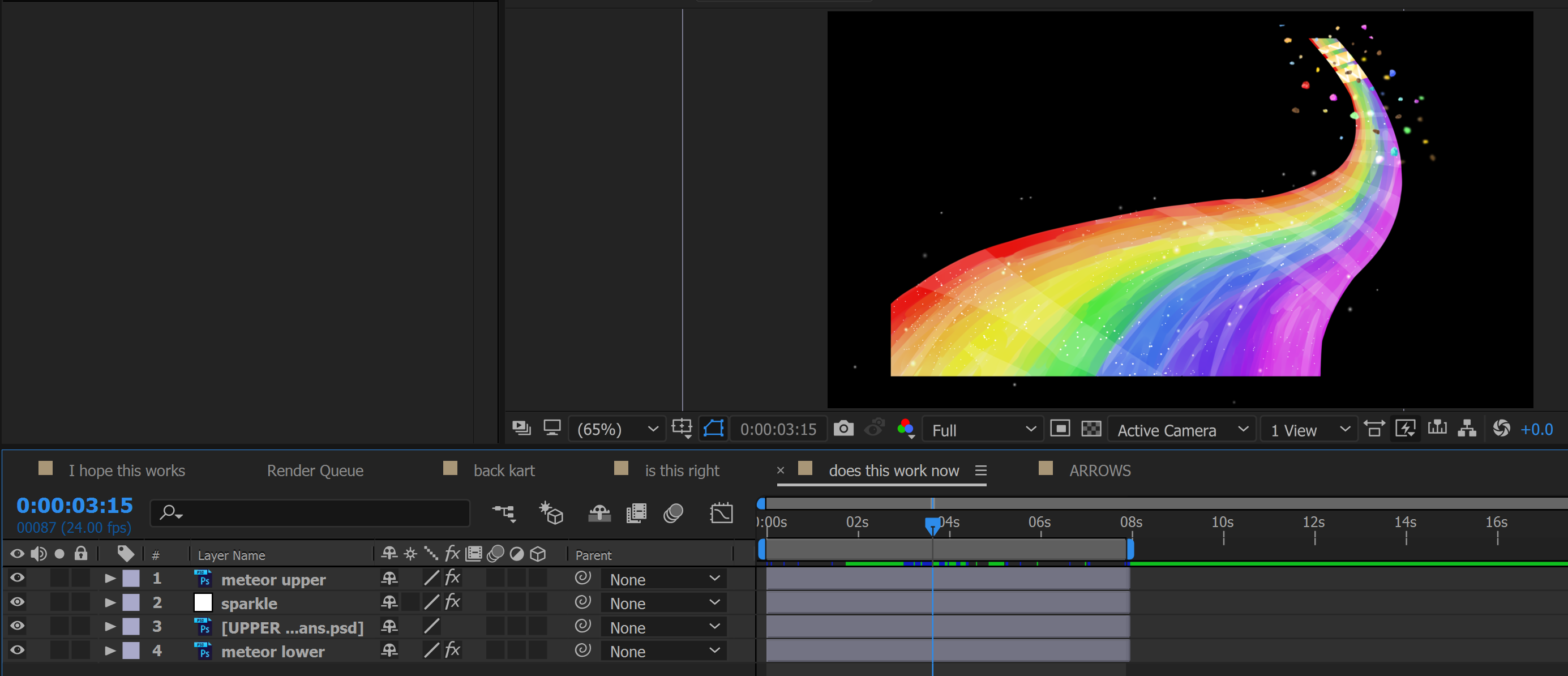
The upper track layer is pre-composed by a these few layers, and I’ll talk about each one individually.
Meteor Upper and Lower

Firstly, I added gaussian blur to the meteors since they are in the mid-ground. Next, I wanted to make the meteors bob around a bit, like as if they are floating in the galaxy. So after playing around with the effects a bit, I found this effect called “Wiggle – position” that lets the object move around back and forth the same area, so I applied that to the meteor layer too. (The 2 effects can be seen in the bottom left.) Lastly, I also moved the meteors a bit to match the track (as can be seen on the top left side of effects controls.) Although I only took a screenshot of the top meteor layer’s effects, the same are applied to the lower layer (which is the layer beneath the road.)
Sparkling effect
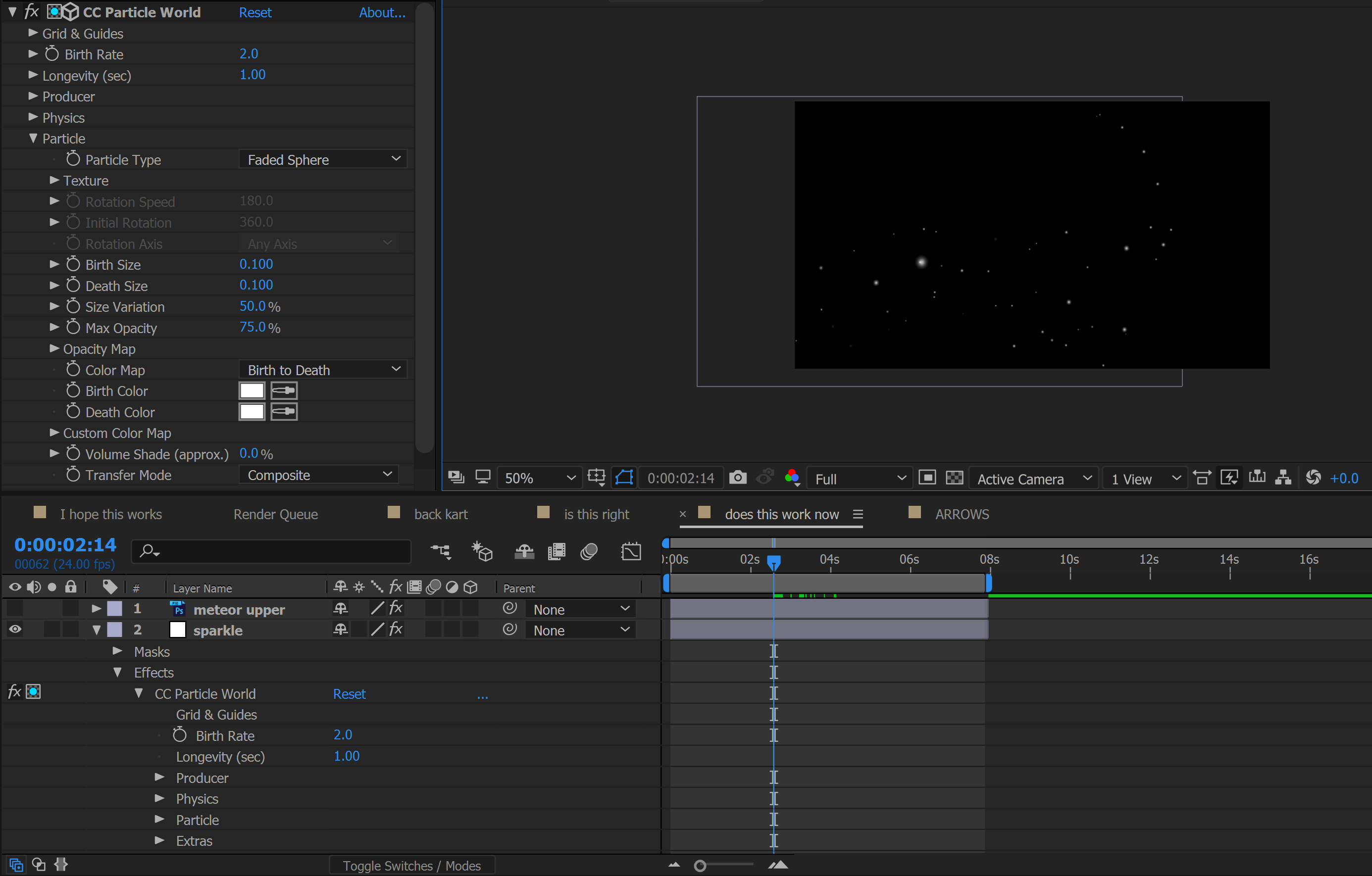
This is where I got a little ambitious… so I wanted to create the effect where the track would sparkle, much like the actual glossy track in the game. So after some Googling I learnt of this effect called “CC Particle World”, and by adding it to an adjustment layer, masking only the area I need accordingly and tweak it’s properties, I can make the track extra shiny! 😀 There are some more settings that I have to change that are not shown in the screenshot to achieve this effect, but what’s shown in the effects control on the left is generally the gist of it. It was quite fun toggling between the different settings to see what it could do.
And then the upper track’s done! 🙂
Track marks

These are for the zooming effect that appears behind the kart. As usual, I moved the position of it to match the kart, as well as it’s scale since it’s moving towards the front. Also rotated it slightly along the way to match the kart’s movements.
The Avatar, Kart and Spiny Shell
These 3 components were pre-composed into one to track their overall movements, so I’ll talk about that first!
As you can see, once again I moved the whole layer diagonally downwards towards the left to make it look as if like it’s driving forward. I also made the size bigger to give the feeling of depth. Now I’ll talk about the details.

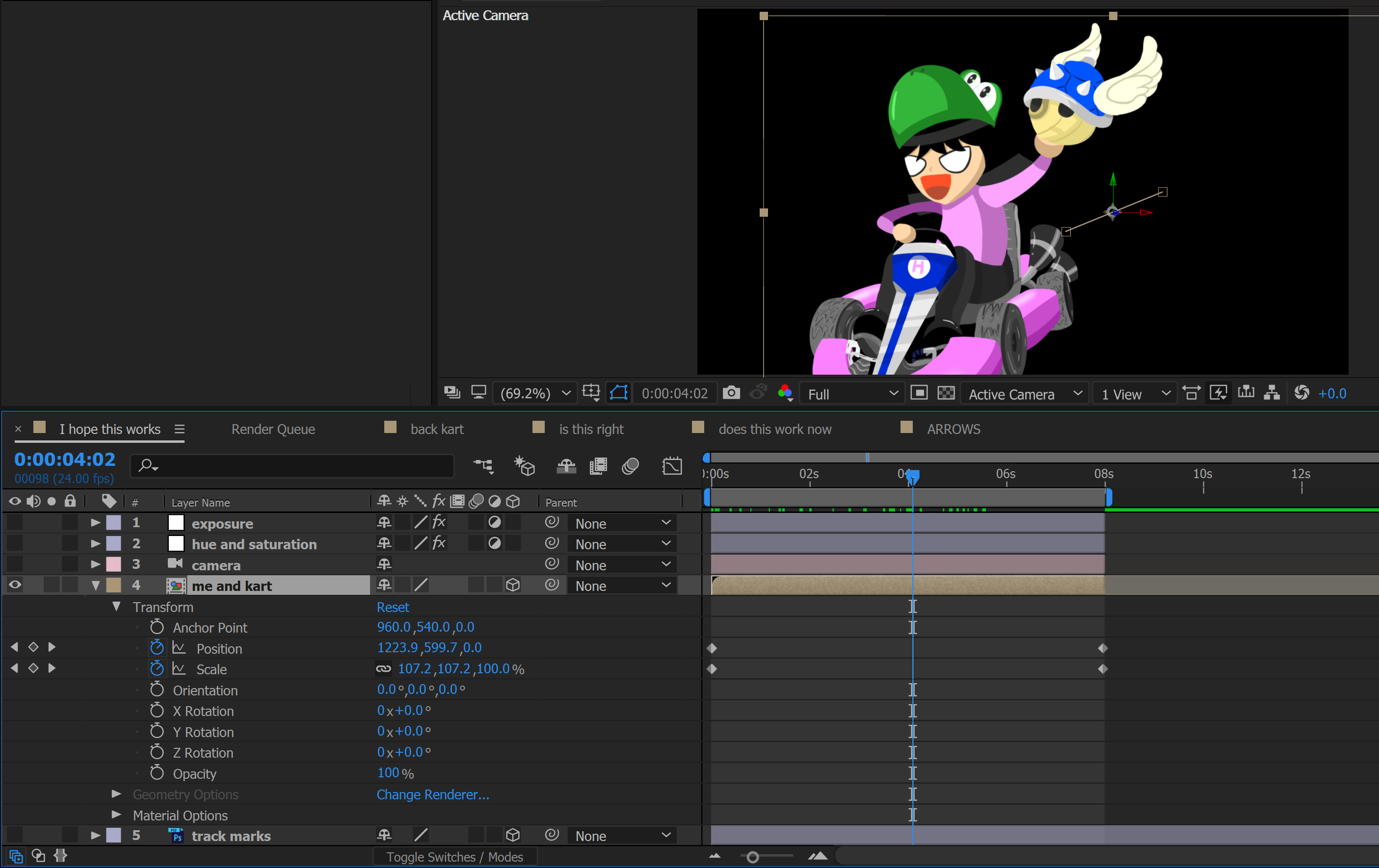
There are 4 layers here but I only touched the “blue shell” and “myself” layer.
For both layers, I used the puppet pin function to achieve slight movements.
Myself (or more specifically just the left arm)
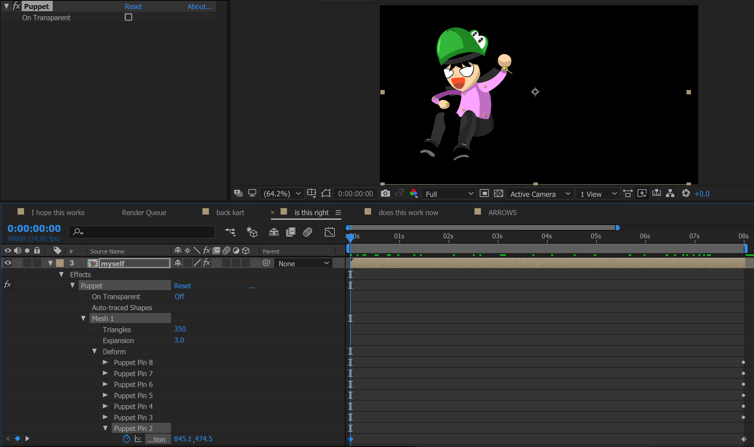
As you can see, I pinned the main moving parts of the body, however I only touched “Puppet Pin 2” to move the arm slightly out as shown in the workflow.
Blue Shell
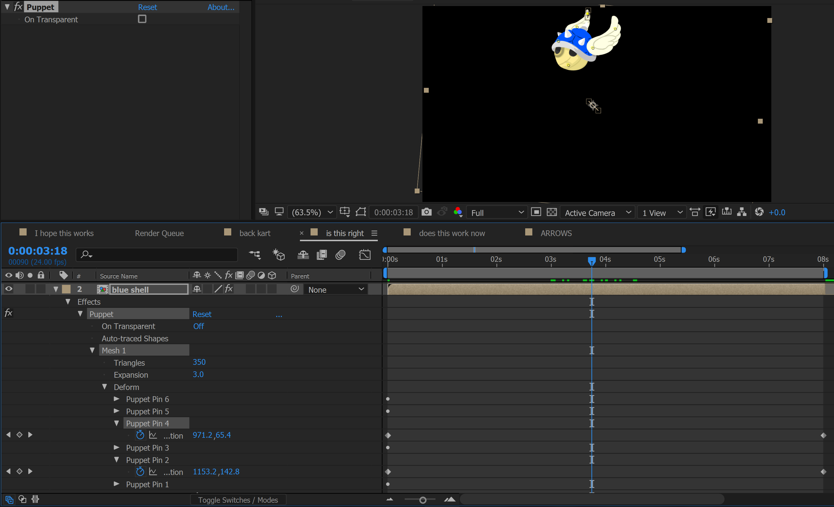
I pinned a few spots on the shell, but my main intention was just to slightly move the wings to give it movement, hence only 2 pins were actually touched. And although not shown in the image here, the shell is also moving to synchronise with the moving hand.
In hindsight, there were more things I would have loved to animate for the kart and body, like making the wheels turn or giving the body more movement, but I wasn’t sure of how to achieve the effect and I had limited time, so I had to make do with what I did.
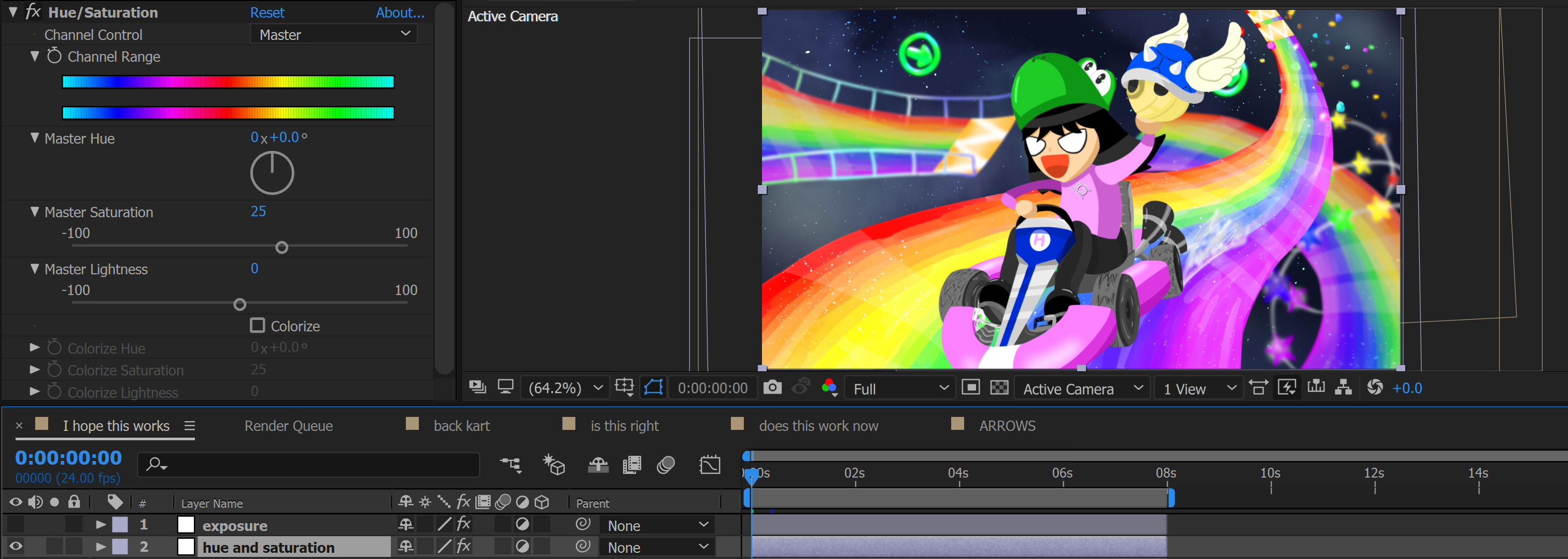
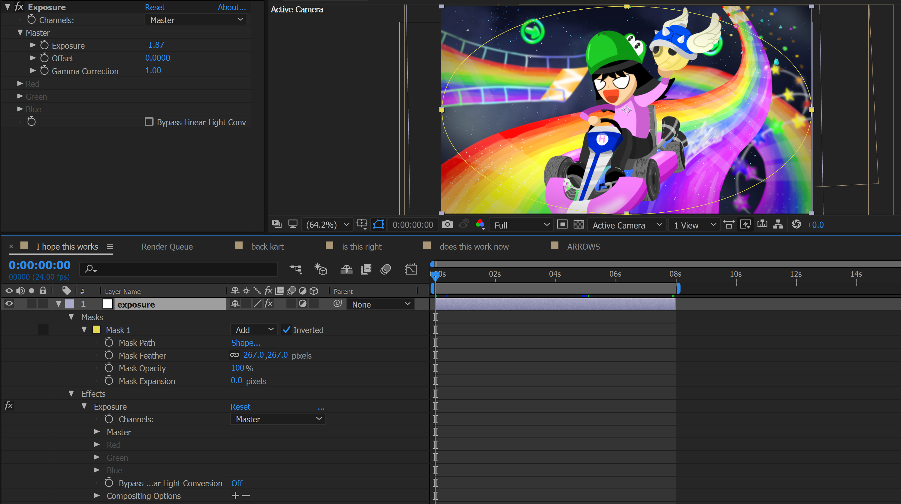
Some colour adjustments
Finally, I made the whole composition a bit more saturated, as well as to add a bit of exposure to the sides of the image to let the image have a better focus in the middle.
AND VOILA! FINALLY DONE! WOOHOO! *collapses*
Reflections
Oh man this has been a rollercoaster ride from start to end… from not being able to come up with an idea all the way until the end of this OSS post (heheh)
This is my first ever attempt at using After Effects, and I genuinely had fun doing it! Although there were some hair-pulling moments (like trying to figure out for 2 hours why it’s moving the wrong way… grrr) I have definitely picked up a lot of useful skills from this assignment, and learned a new software! Although the final product could have looked better, I’m pretty happy at it nonetheless. Everyone’s gotta start somewhere after all! :”D
I am very thankful to Bryan for imparting me many useful skills and lessons these past 13 weeks, from Photoshop to Premiere Pro to After Effects, and they will definitely be put to good use in the future.
And with that, I’ll sign off here one last time from my Digital Imaging class, see you next time! 😀