Daily Archives: October 24, 2017

Project 3C: Type as emotion

3C – Type as emotion

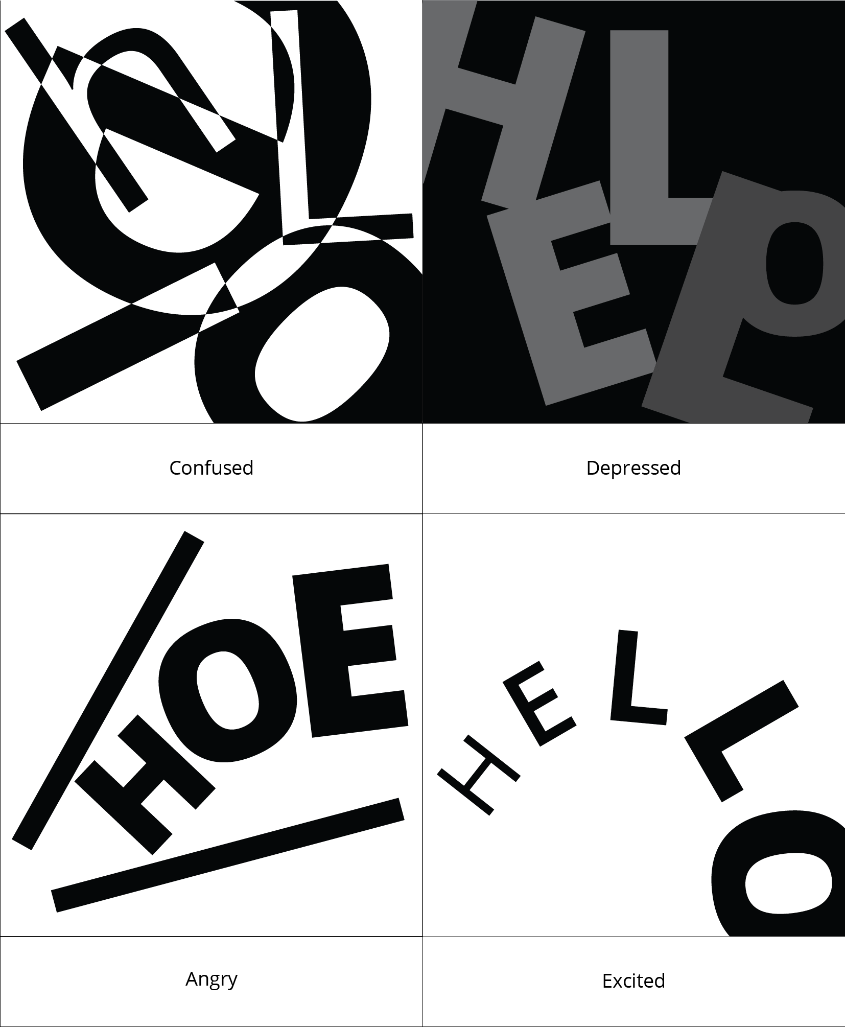
Type as emotion made me feel like I am doing “my line is emo” from year 1 again but in a digital format. As such, I begun to think about what I felt if I experienced that emotion and then tried to play with the letters “H E L L O” to express that emotion.
I chose Open Sans as my font since it had a large family.

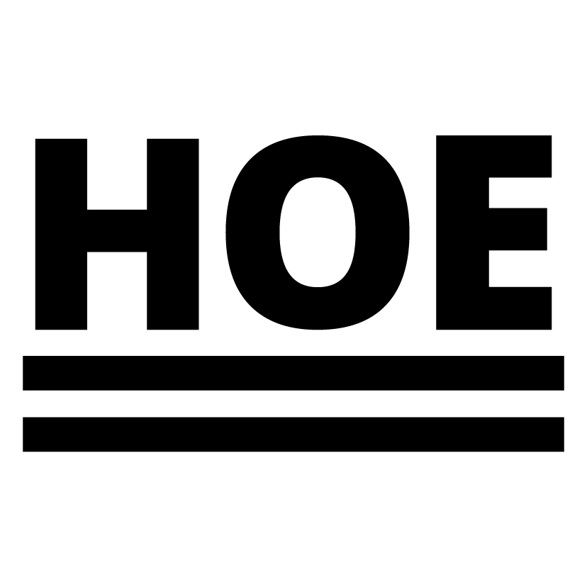
So starting off, we have BORED as the emotion.

BORED:


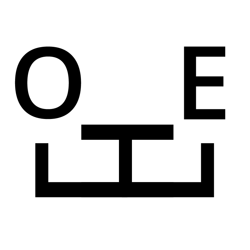
Just a cat/dog’s face and winking + a bored person + a bored person carrying a bag of which I emphasised the “EH” since I was bored when I made these.


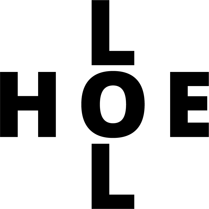
I was bored and just played around with the letters and realised it forms the words “LOL” and “HOE” and then so I just put these under the emotion, bored. Please pardon me.


Moving on, this emotion stands alone.
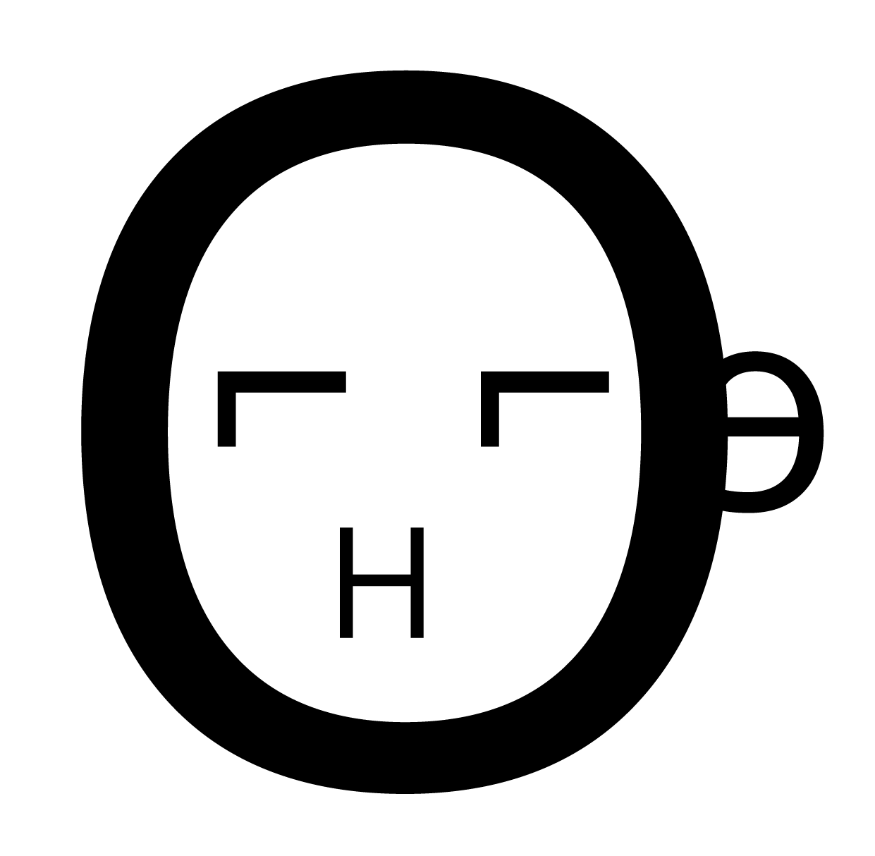
ARROGANT:

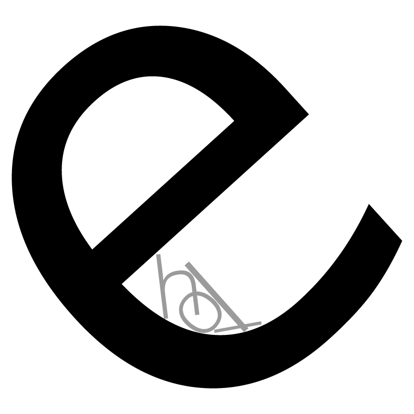
It is the letter “E” being arrogant and wolfing down the other letters, “H, L, L, O”.


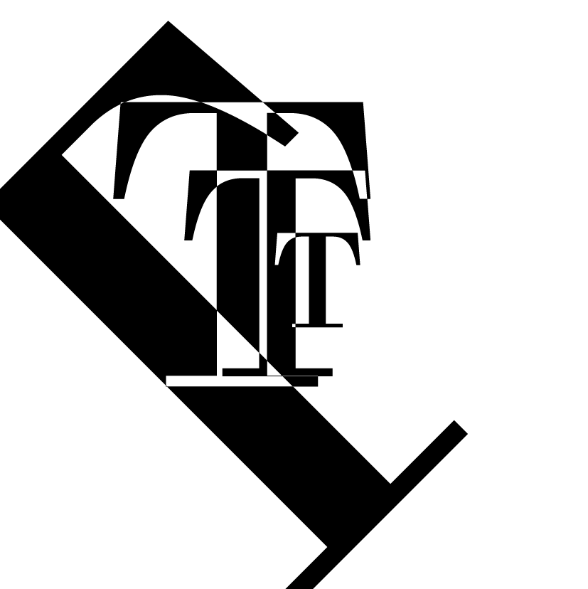
Next off, we have depressed.
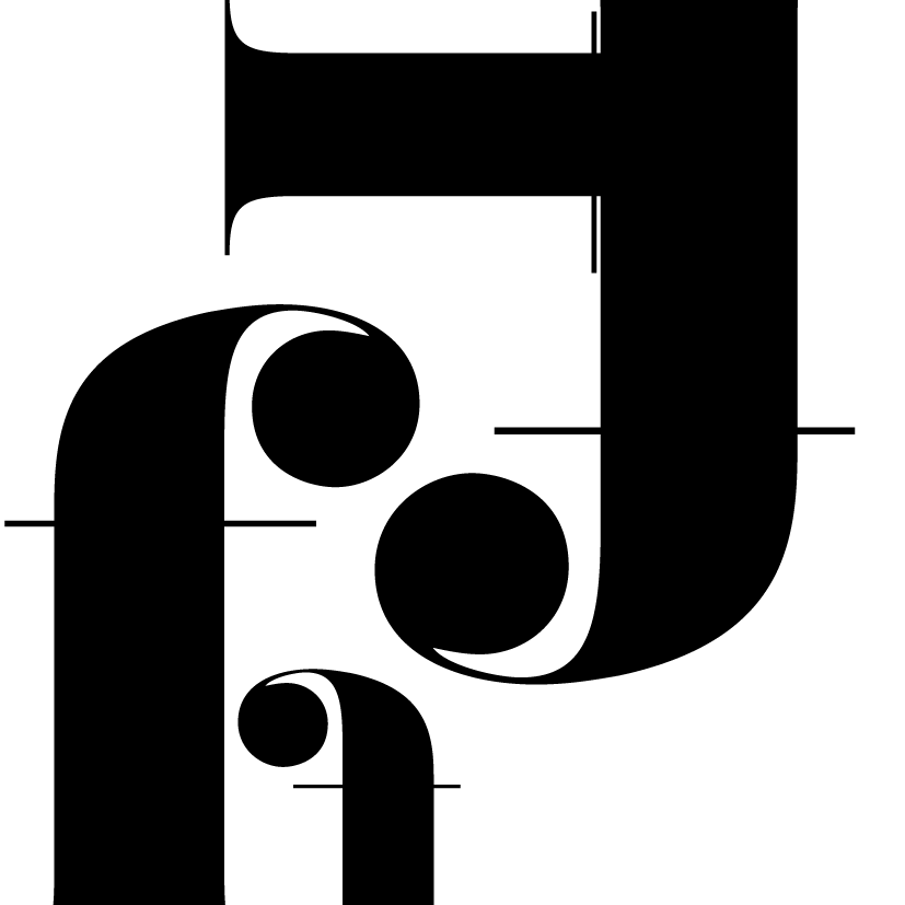
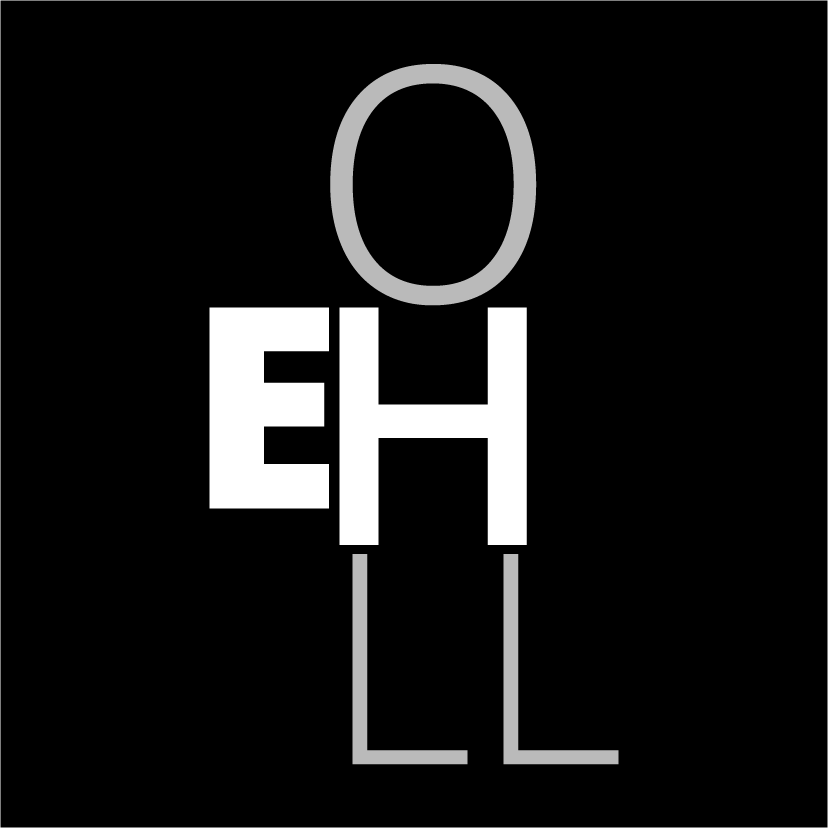
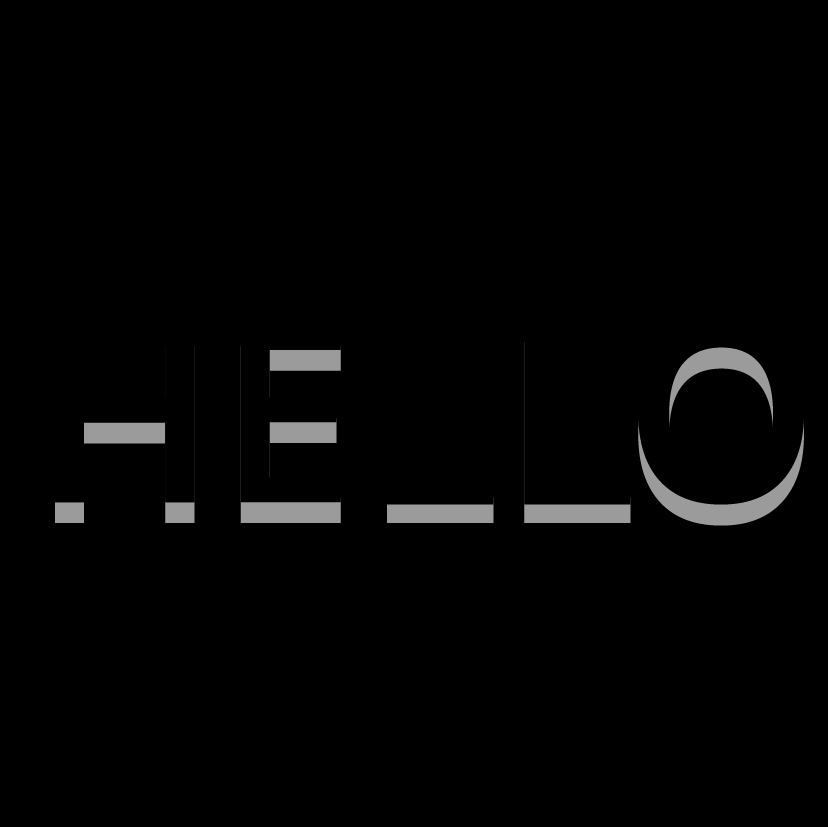
DEPRESSED:

I thought that hello is actually made up of the word “HELL-o” so why not express it in this emotion? Thus, the first picture. Then I had a suggestion from Shirley of moving the words down to the bottom to signify that one is much more depressed instead of it floating around in the middle of the canvas. Furthermore, I changed the colour to a black background and grey words to showcase the emotion even more.

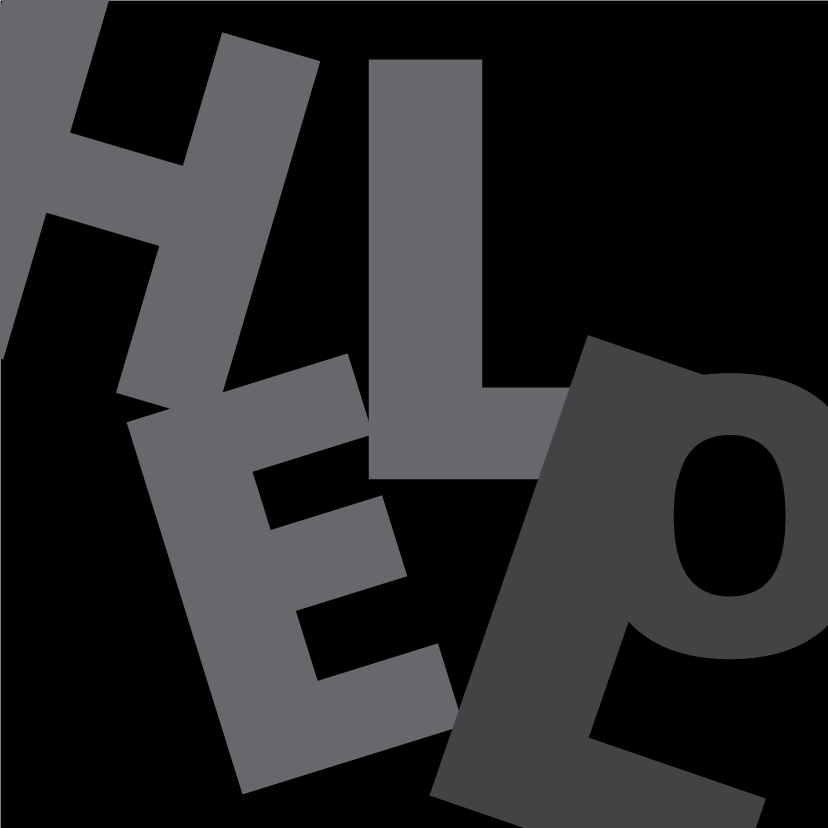
But soon later, I realised that HELL-o was a little common and many people might also think that way. So instead, I wanted something more special. Usually when you are depressed, you want help but you don’t express it out since it isn’t easy to do so. Moving the letters around and overlapping the “L” and “O” actually forms a letter “P”]


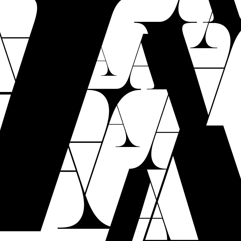
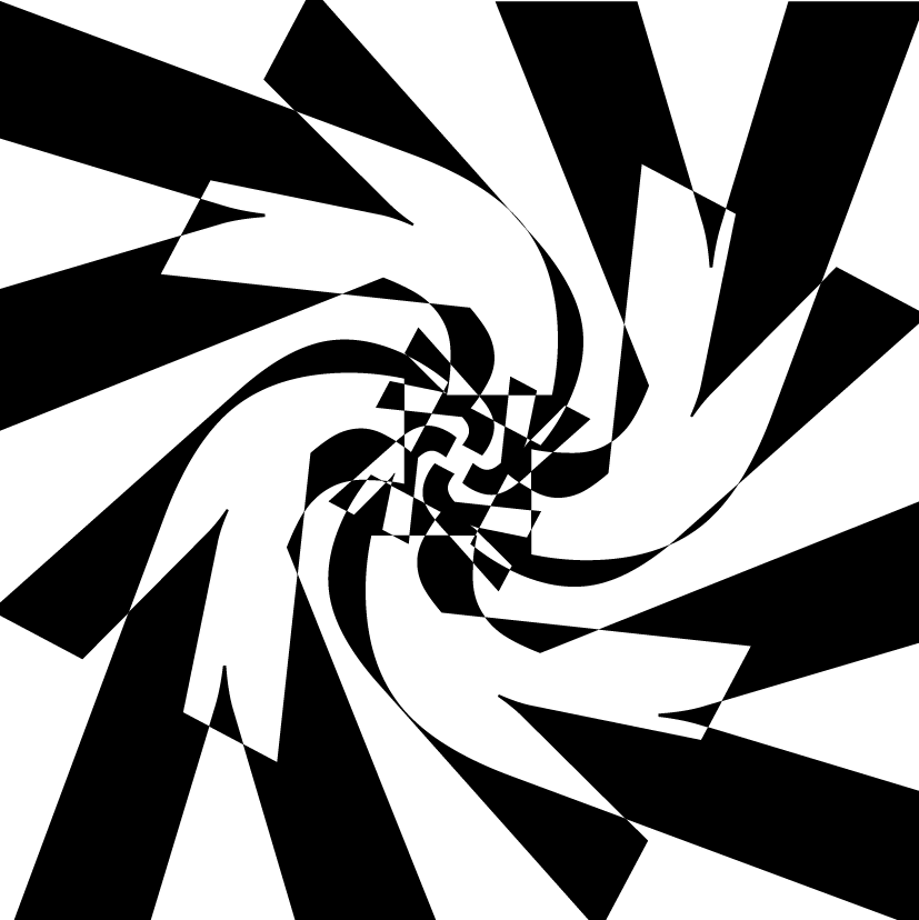
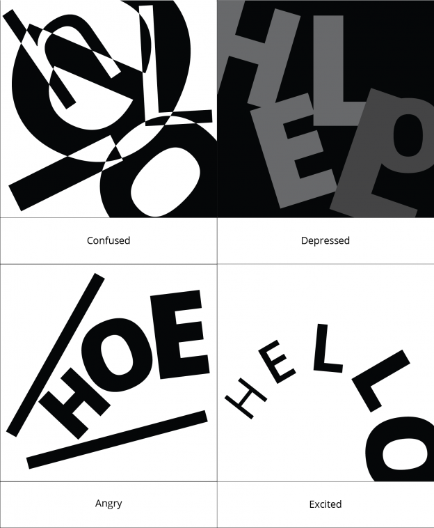
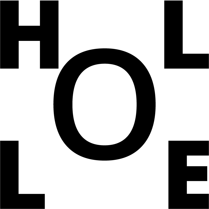
Moving on to the next emotion, it is confused.

CONFUSED:

I first started off with the emotion, “confused” using different weights of the font. I then changed the arrangement of the letters, keeping only the first and the last letter constant “H” and “O”.

Also, I tried laying black text over the grey text, only showing certain parts of the letter of which might appear confusing to some. But I feel that it is still quite obvious. This particular one could appear as depressed and a whole lot of other emotions too. Hence, I scraped this idea off.

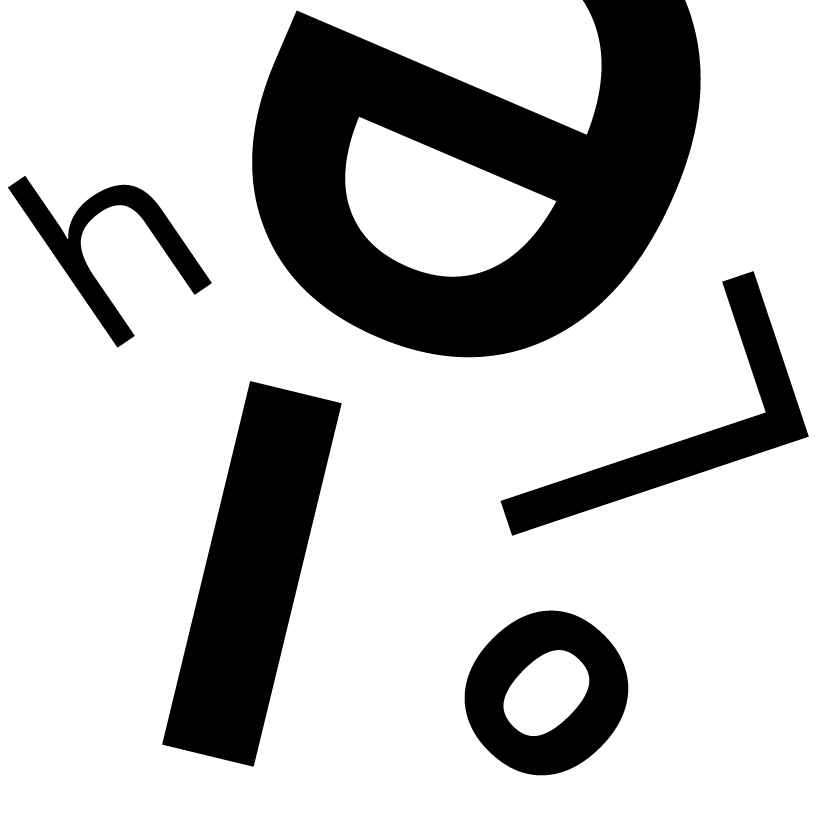
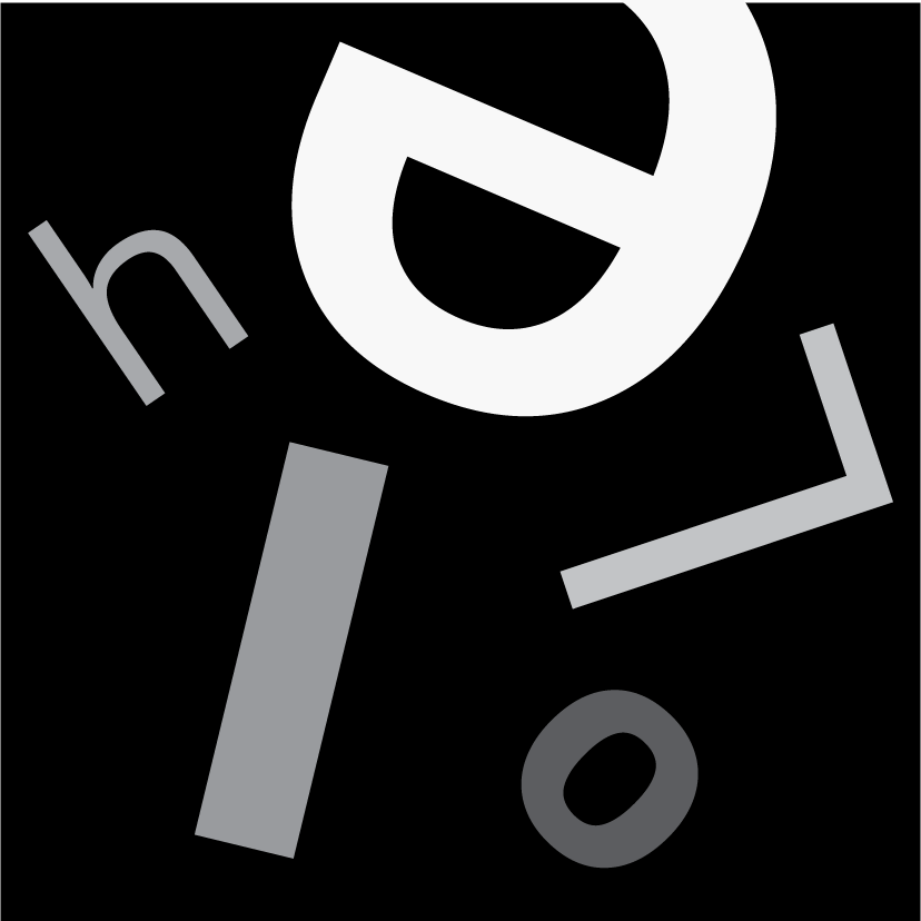
Then,  I tried putting the letters everywhere and rotating them around. But they aren’t confusing enough. So, I realised that I could make it even more confusing by overlapping them and then changing the colour of the overlapped parts to white. Thus, arriving at this, which was my final piece.
(it is hard to even read)


Next off, we have angry.

ANGRY:

These are just calling people “HOE” which is mean. But when you are angry, all hell breaks loose so that’s why.

(forgive me)


Then we have something happier compared to the negativity before.

EXCITED:

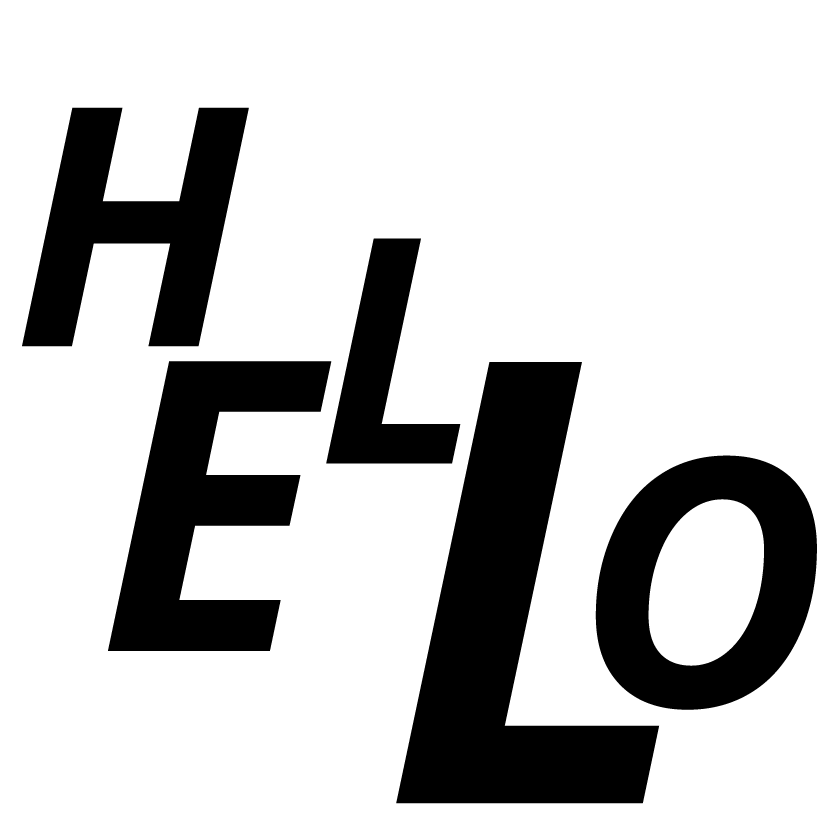
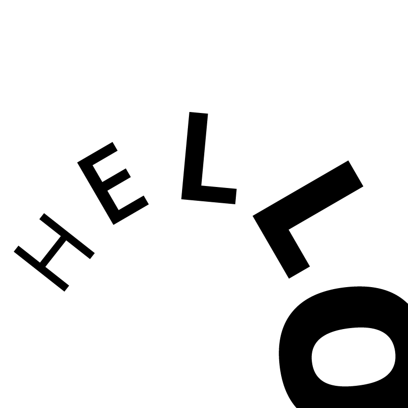
The last picture of excited is the one I chose. It is curved symbolising a rainbow. I made the thickness of the letters increase after every one on purpose to signify the excitement and loudness of this hello.

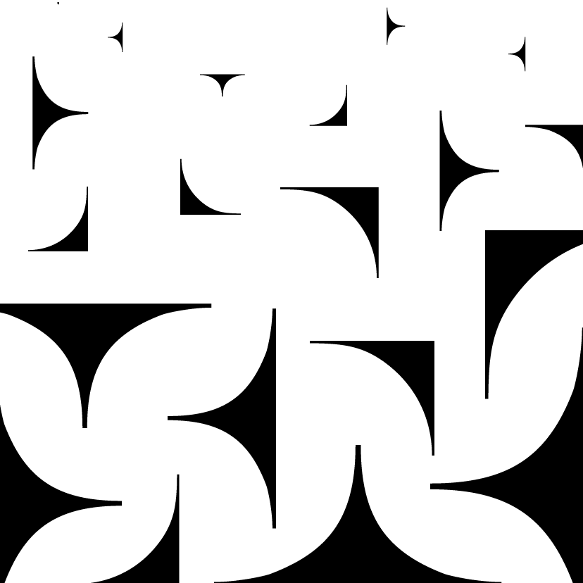
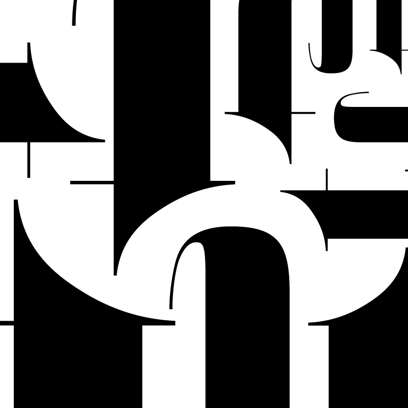
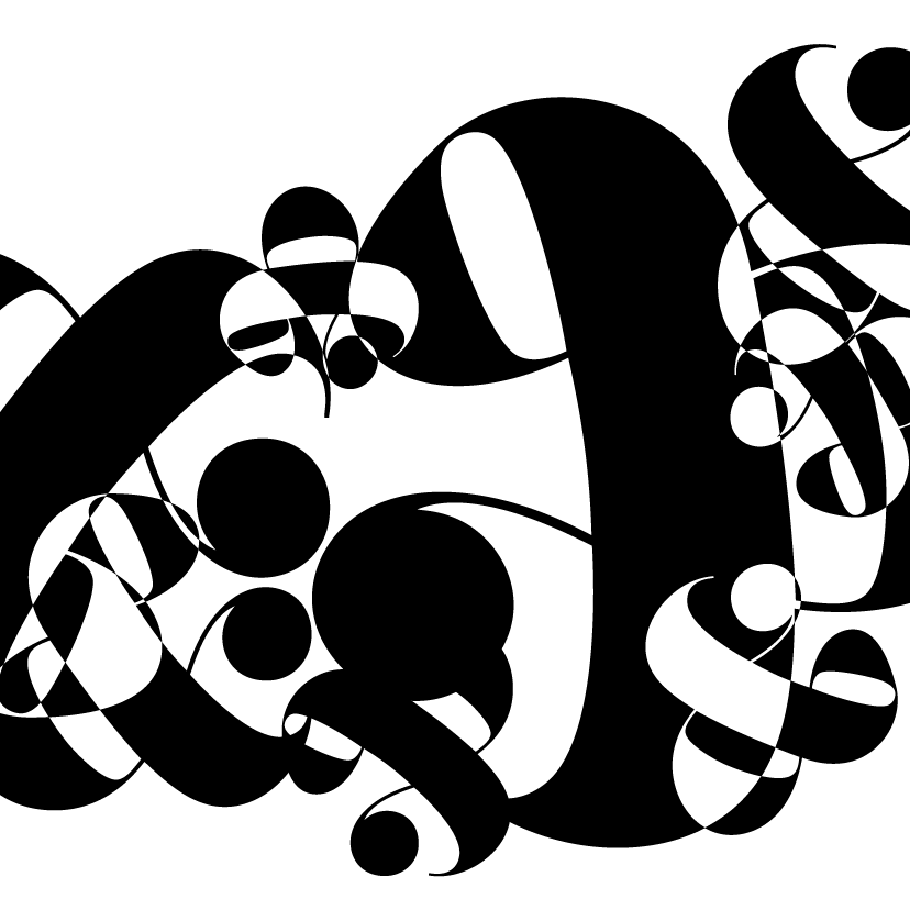
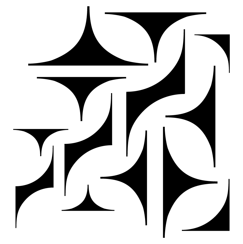
Here are my final pieces:

Project 3B: Type as pattern

3B – Type as pattern

Type as pattern for me was the hardest one to execute as I had no sense of direction to start off with. So for a start, I just pieced letters together to form a static pattern.

BUT after consultation I realised that they don’t have much sense of rhythm and it looks really flat.

Here’s some of my static patterns:

Alright, so moving on, I worked on my patterns once more and came up with better patterns to work on with a sense of flow, rhythm and hierarchy. Here are those new patterns:

(it’s a lot because some are either incomplete or that I disliked it)

Then comes another consult. I got some advice to tweak some of the patterns a little more to gain more sense of hierarchy and sense of flow. Hence coming up with these works:

With that, I definitely learn hierarchy and flow in a pattern. And that parts of the type’s anatomy could be a pattern!

These are the final works:


Project 3A: Type as image


3A – Type as image


Firstly, I started off making outlines of my favourite character, Totoro from Studio Ghibli. I had no idea where I was going, so I showed Shirley this. She then showed me some of the works her other students did and I realised I should’ve worked with serif fonts instead of san serif. Serif fonts gives you much more dimension (eg thick and thin lines) to work with. With that, I started out trying out a serif font, Pistilli.

Working with Pistili, I cut up the fonts into pieces as you can see on the next photo. I cut and pieced them together forming Wall-e and Eve and I’m so happy it turned out great :”)

So here are some of the things I used for Wall-e and Eve:

(I know it’s a mess)

These are my final works :

That’s all for 3A! 🙂


Project 2: Final Design

Here’s my final design of my poster.


I was happy with my work since I’ve never tried illustrating in this kind of style. I wanted to try something new and I was glad it worked out well for me in the end. I learnt a lot regarding the hierarchy, colour and layout of a poster.

Thanks for reading!

Project 2: Task 3 – Design refinement & Mock up

After receiving various feedback, I worked on the colour variations and moved people around to get a better sense of the hierachy within the design.

I tried to play with the colour of the banner to bring out the slogan. When I printed this out in A2, I realised that the lines became really thick when the poster is in A2 size so I reduced the thickness of the lines.

Comments I received were that the background shouldn’t just be white as it looks static and not as exciting as what my slogan was meant to be. Also my logo should include the whole thing and not just the logo itself. My margin was also a mess and the font size shouldn’t be so big to distract people from the design. Furthermore I changed the colour of the boombox as the whole design seems too bluish.

Working on these, I came up with the next design:

For this design, i reduced the line thickness, added a yellow background and changed the colour of the banner. (please pardon the design that hasn’t been centralised)

Then I was thinking what I could do to add more live and action within this and I came up with bubbles and pops of colour around it.

This design is too bottom heavy and had no sense of a margin which I edited again. Also the chunk of text is hard to incorporate within. So, my classmates suggested incorporating it in a speech bubble or some sort within the design itself.

Added the bubble boy blowing out a bubble that has the text within. The font could also be more fun and less rigid.

Tested out various colours but it didn’t work. So I consulted Michael and he told me to try a bright yellow which might bring out the essence of the design. The middle area is a little too red heavy as well and the slogan need not be of a different colour to emphasise the “ART” within “pARTy” since it might be distracting.

The bright yellow causes the design to stand out and the bubbles are muted and integrated within the background and it doesn’t cause much distraction as compared to the ones before. Also the bubble boy could be moved around to the bottom instead of being on top since it would look too top heavy.

Shifted the boy to the bottom and changed the colour of the bubble to a yellow. But it still looks a little heavy on the right and a little off. Also, the text could be shortened to 5 lines instead of the 6 lines I have as the ‘volunteer’ looks alone by itself. Was advised that the font could be a little more fun and try a little more colour which is what I did.

Had to shift a couple of characters about and tweaking it a little which I then arrived to my final design!!

Project 2: Task 2 – Design Exploration

The slogan that I decided to explore further was “pARTy with the ARTs”.

So to incorporate the party within the design, I added a boombox with a community of people of all ages to signify the party and added elements of arts within. I tried to keep it within a circle shape but I still have to explore more and keep my options open. But this was the initial design that I came up with:

Feedback that I got was that the banner is a little too slanted and hard to read and the words/font size are distracting the viewers from looking at the poster design. Of which I worked on the next.