After receiving various feedback, I worked on the colour variations and moved people around to get a better sense of the hierachy within the design.
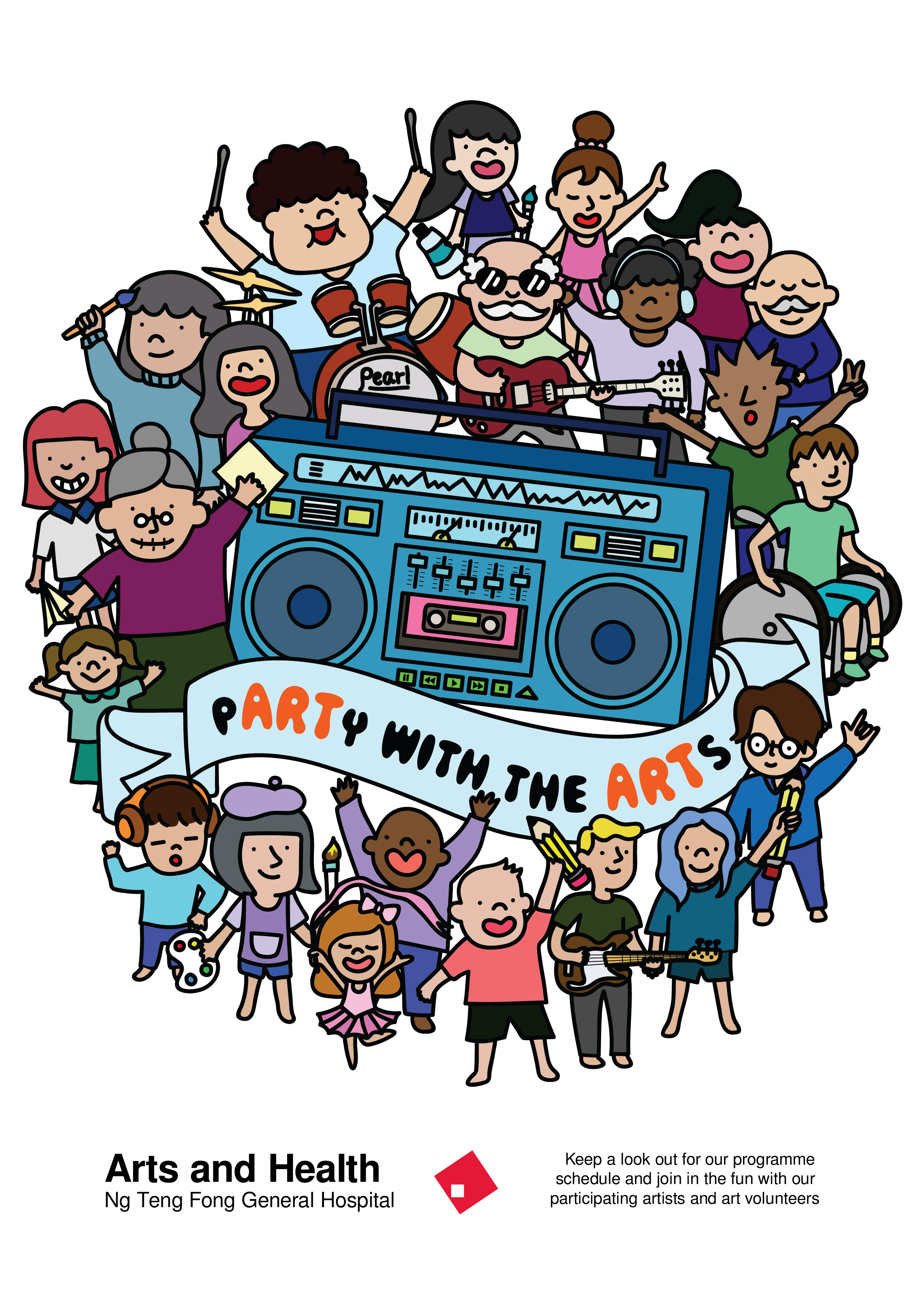
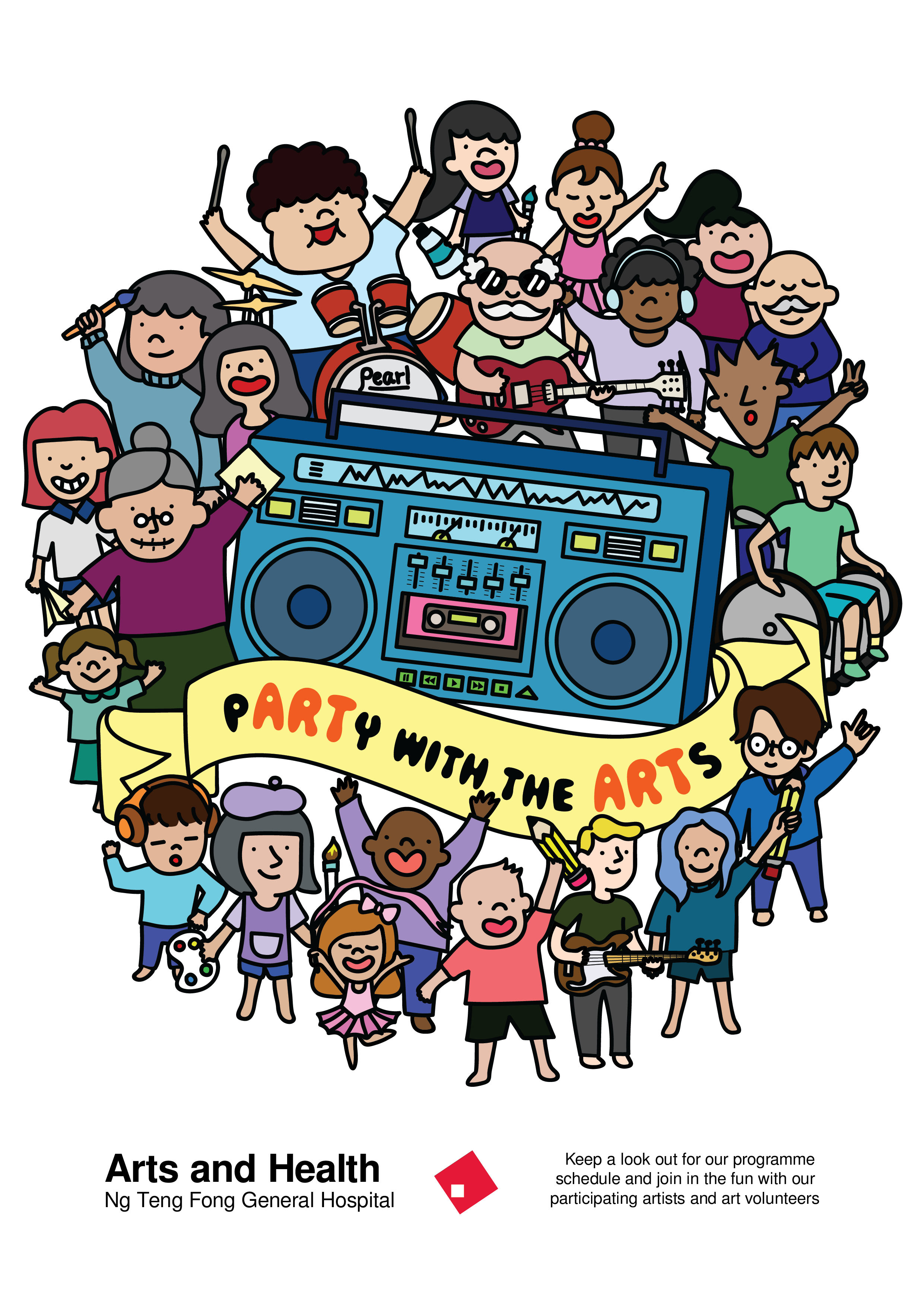
I tried to play with the colour of the banner to bring out the slogan. When I printed this out in A2, I realised that the lines became really thick when the poster is in A2 size so I reduced the thickness of the lines.
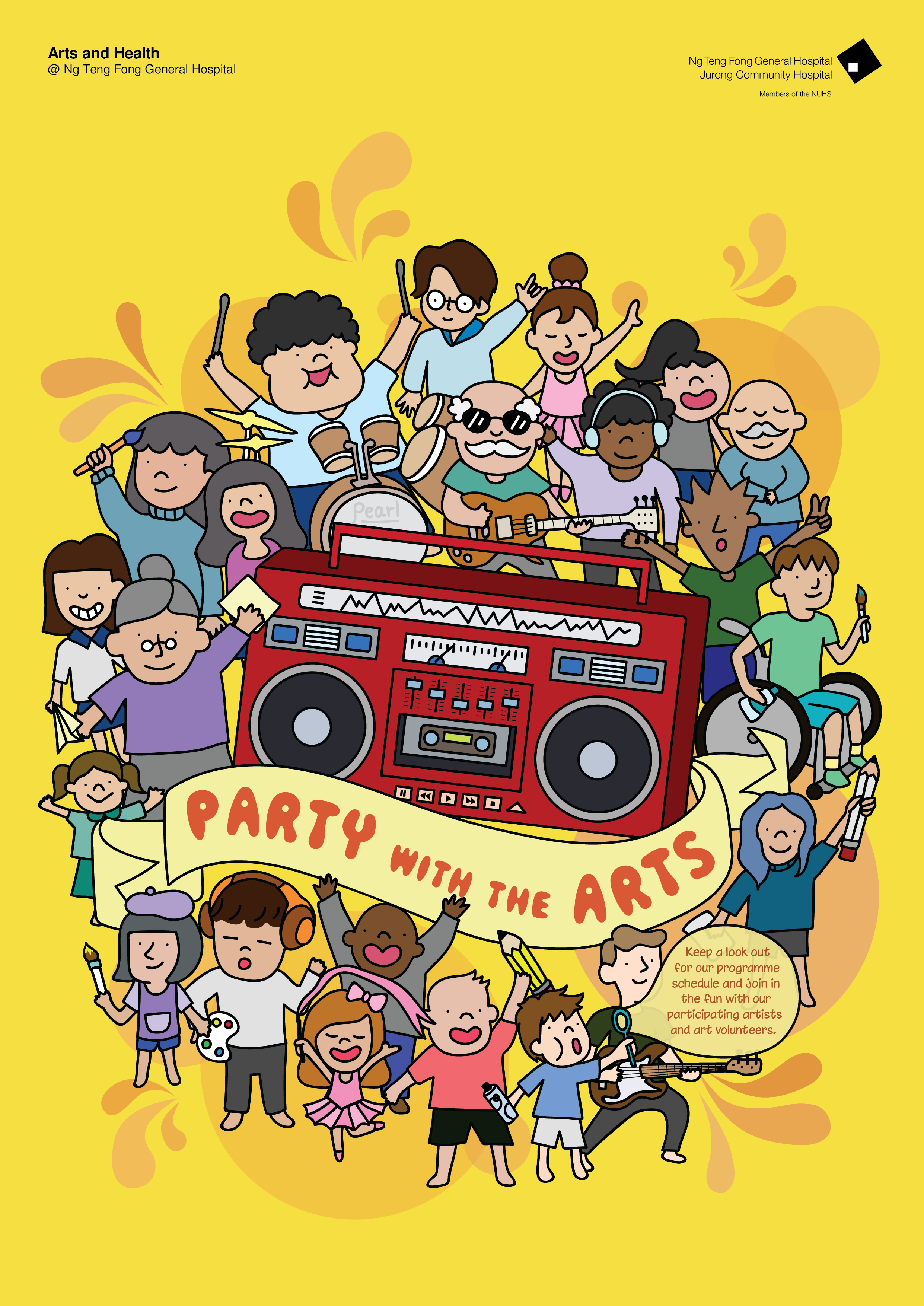
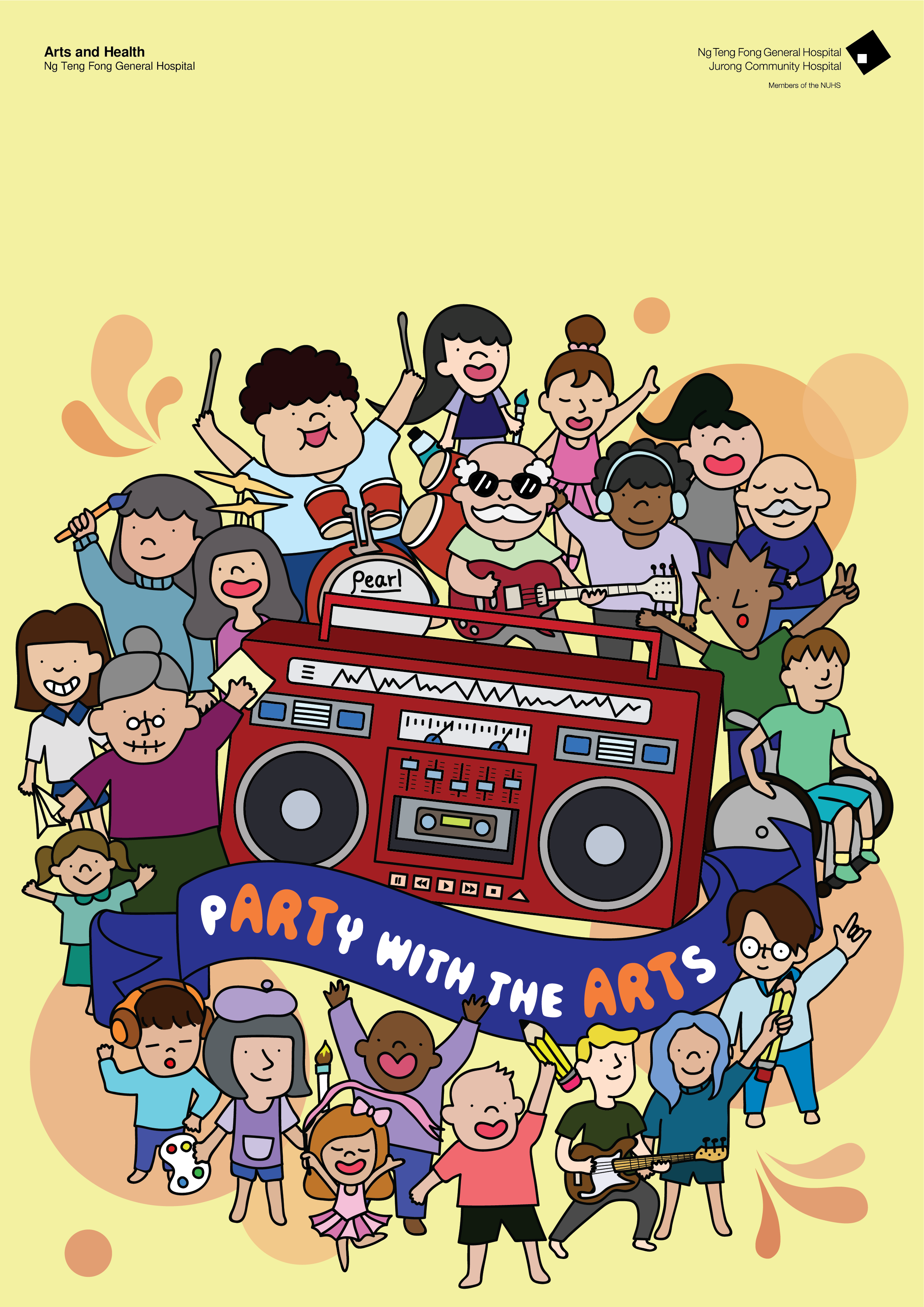
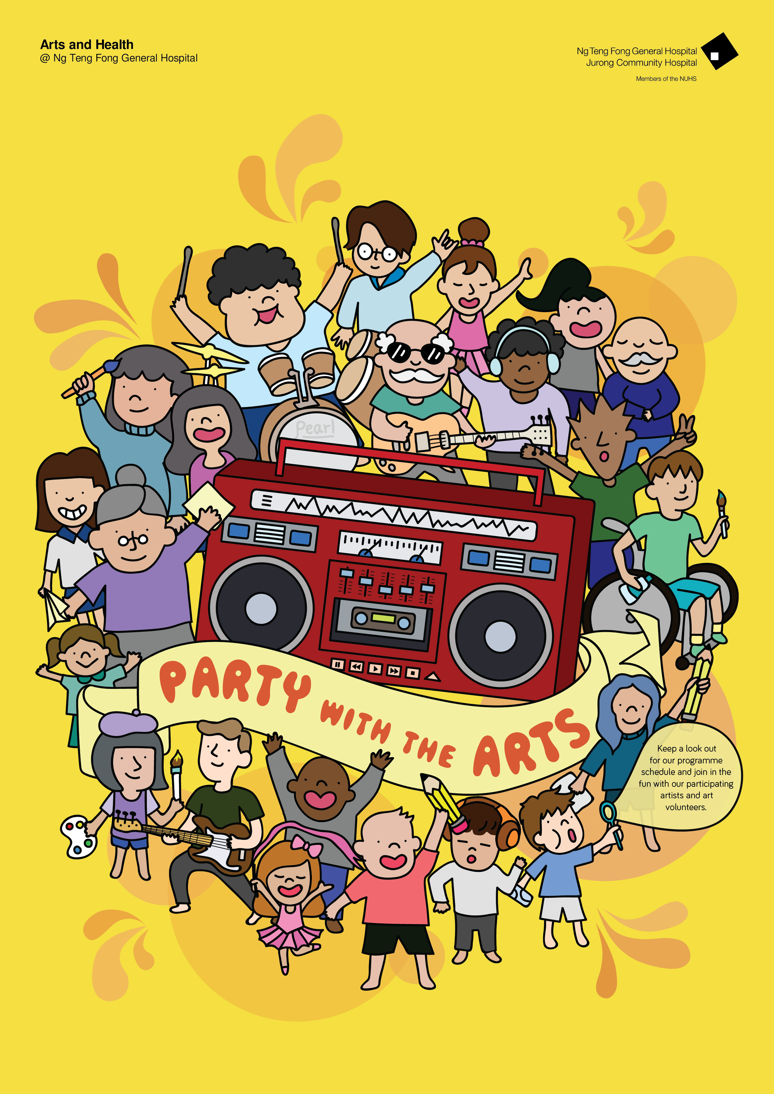
Comments I received were that the background shouldn’t just be white as it looks static and not as exciting as what my slogan was meant to be. Also my logo should include the whole thing and not just the logo itself. My margin was also a mess and the font size shouldn’t be so big to distract people from the design. Furthermore I changed the colour of the boombox as the whole design seems too bluish.
Working on these, I came up with the next design:
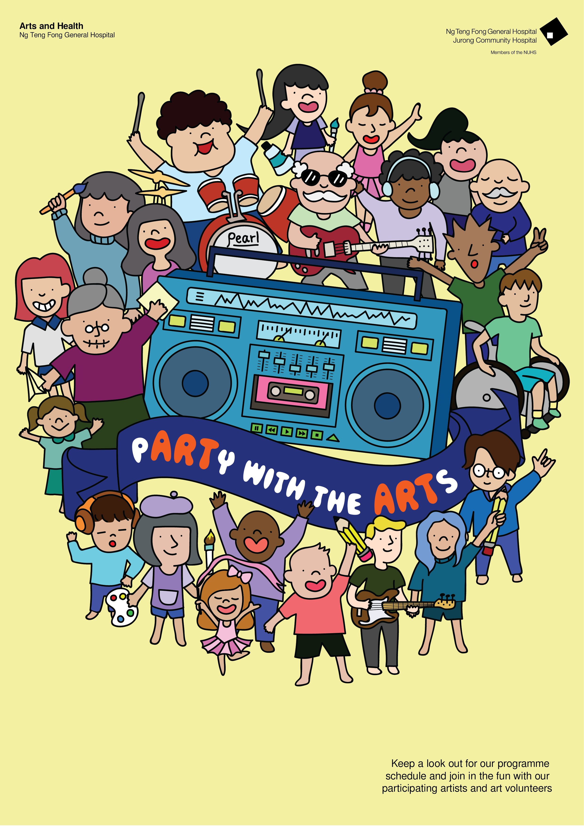
For this design, i reduced the line thickness, added a yellow background and changed the colour of the banner. (please pardon the design that hasn’t been centralised)
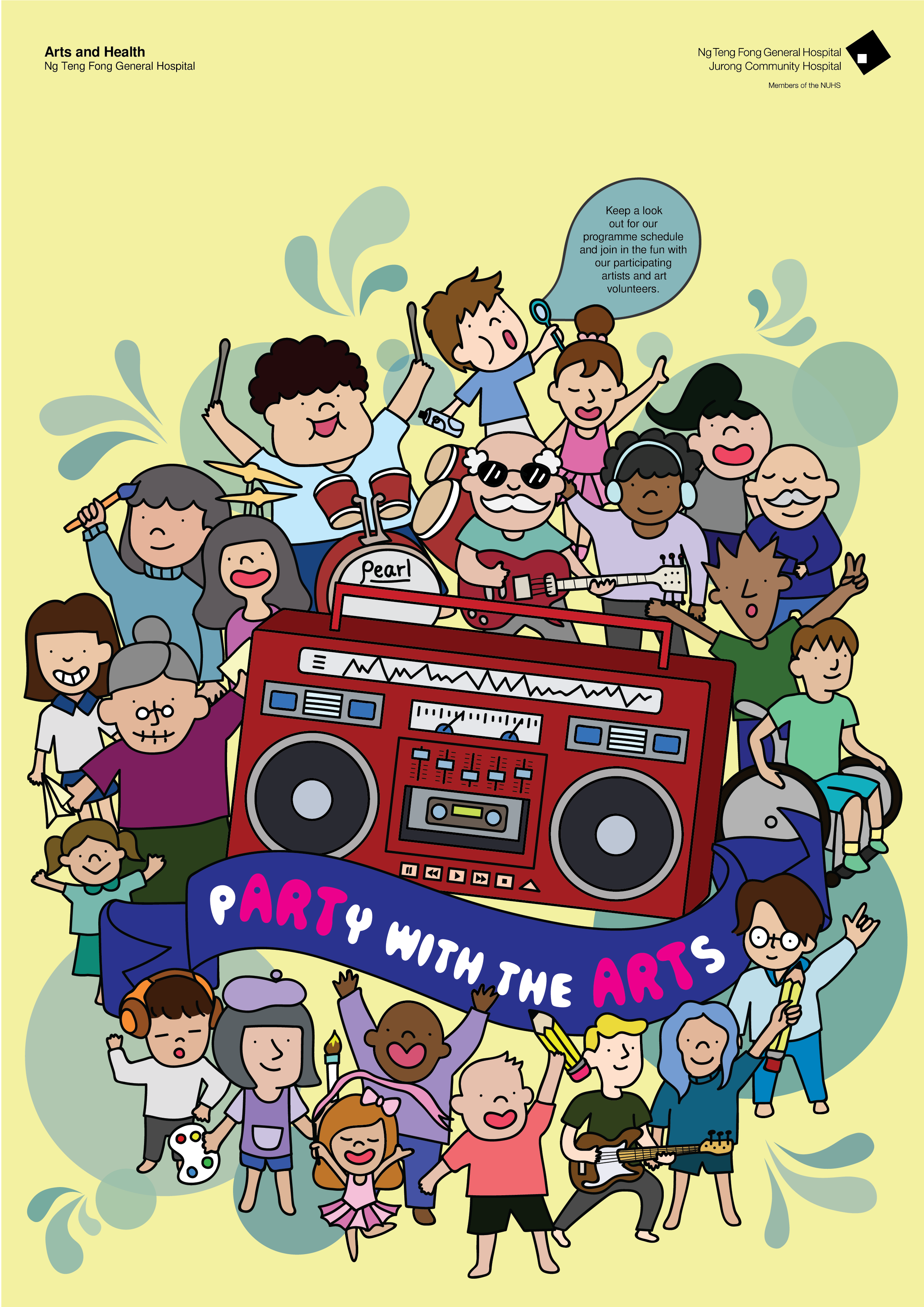
Then I was thinking what I could do to add more live and action within this and I came up with bubbles and pops of colour around it.
This design is too bottom heavy and had no sense of a margin which I edited again. Also the chunk of text is hard to incorporate within. So, my classmates suggested incorporating it in a speech bubble or some sort within the design itself.
Added the bubble boy blowing out a bubble that has the text within. The font could also be more fun and less rigid.
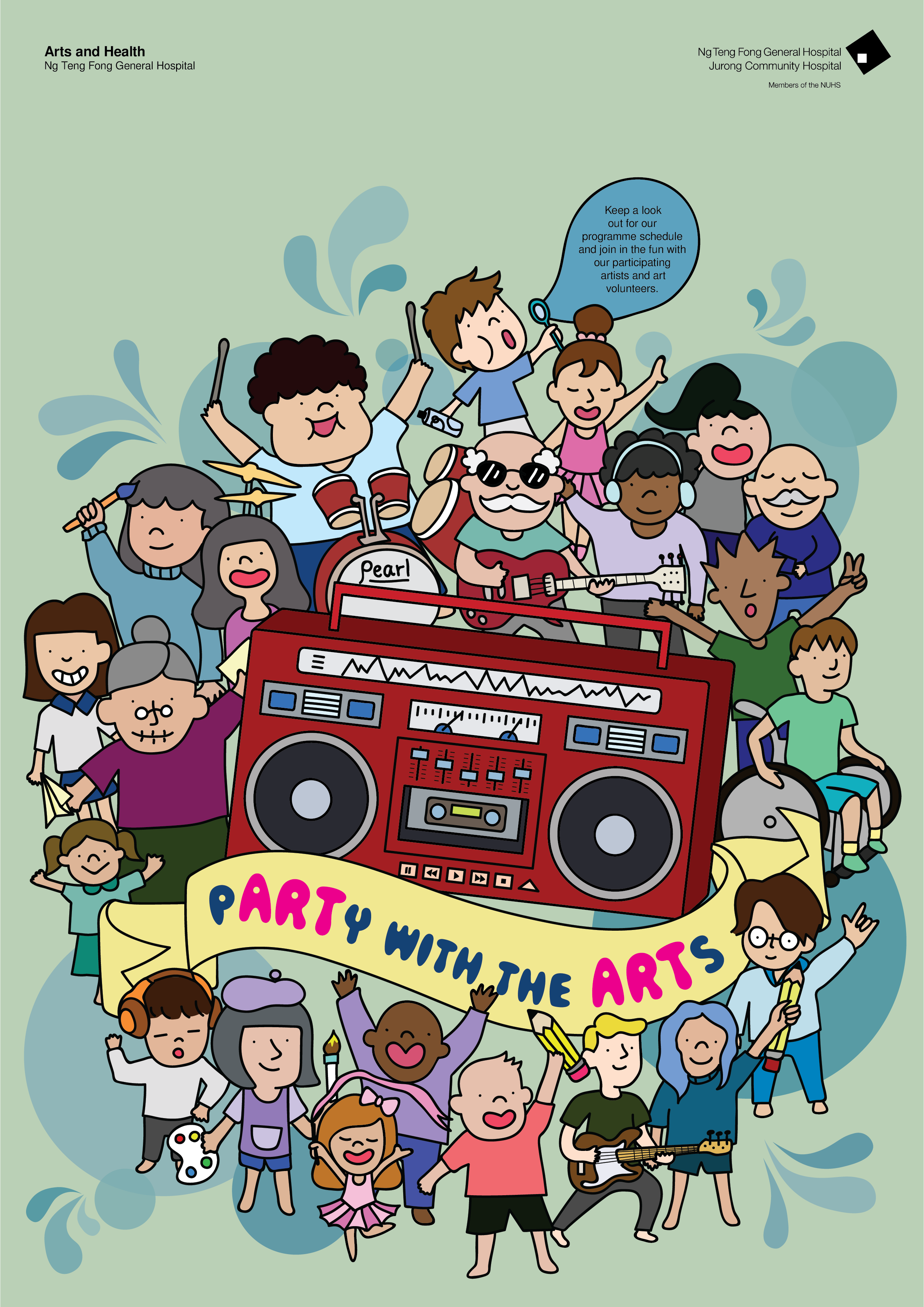
Tested out various colours but it didn’t work. So I consulted Michael and he told me to try a bright yellow which might bring out the essence of the design. The middle area is a little too red heavy as well and the slogan need not be of a different colour to emphasise the “ART” within “pARTy” since it might be distracting.

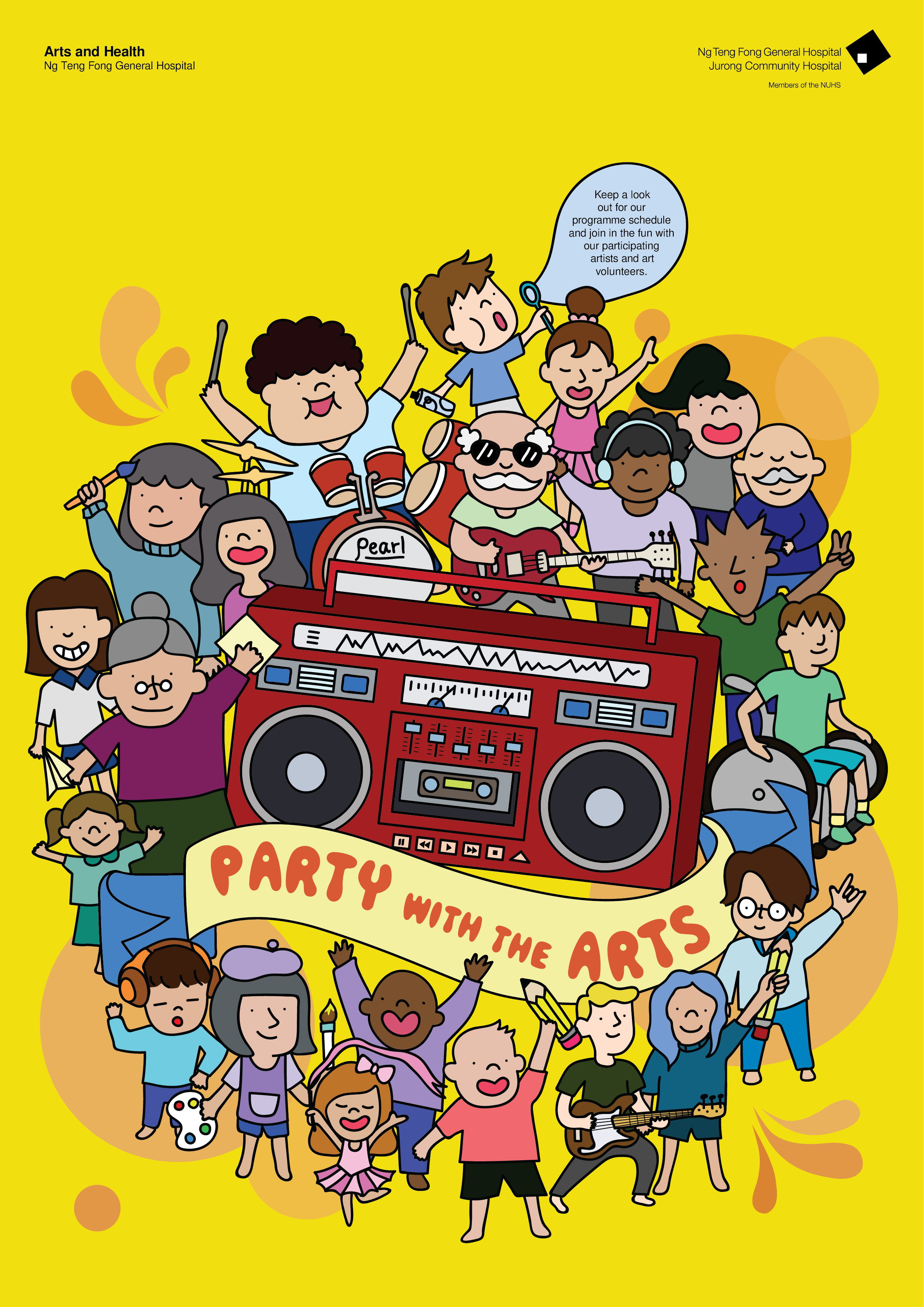
The bright yellow causes the design to stand out and the bubbles are muted and integrated within the background and it doesn’t cause much distraction as compared to the ones before. Also the bubble boy could be moved around to the bottom instead of being on top since it would look too top heavy.
Shifted the boy to the bottom and changed the colour of the bubble to a yellow. But it still looks a little heavy on the right and a little off. Also, the text could be shortened to 5 lines instead of the 6 lines I have as the ‘volunteer’ looks alone by itself. Was advised that the font could be a little more fun and try a little more colour which is what I did.
Had to shift a couple of characters about and tweaking it a little which I then arrived to my final design!!