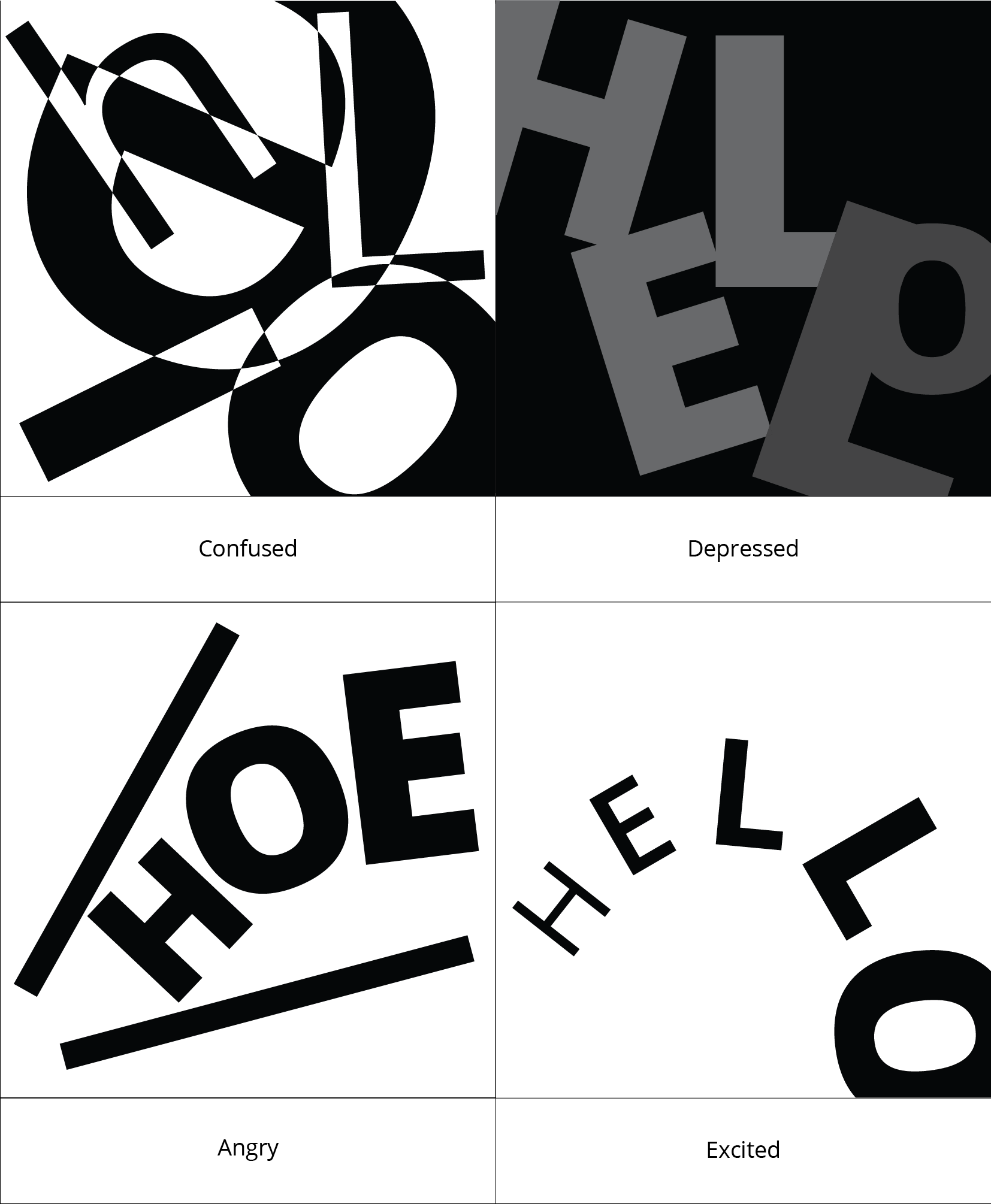
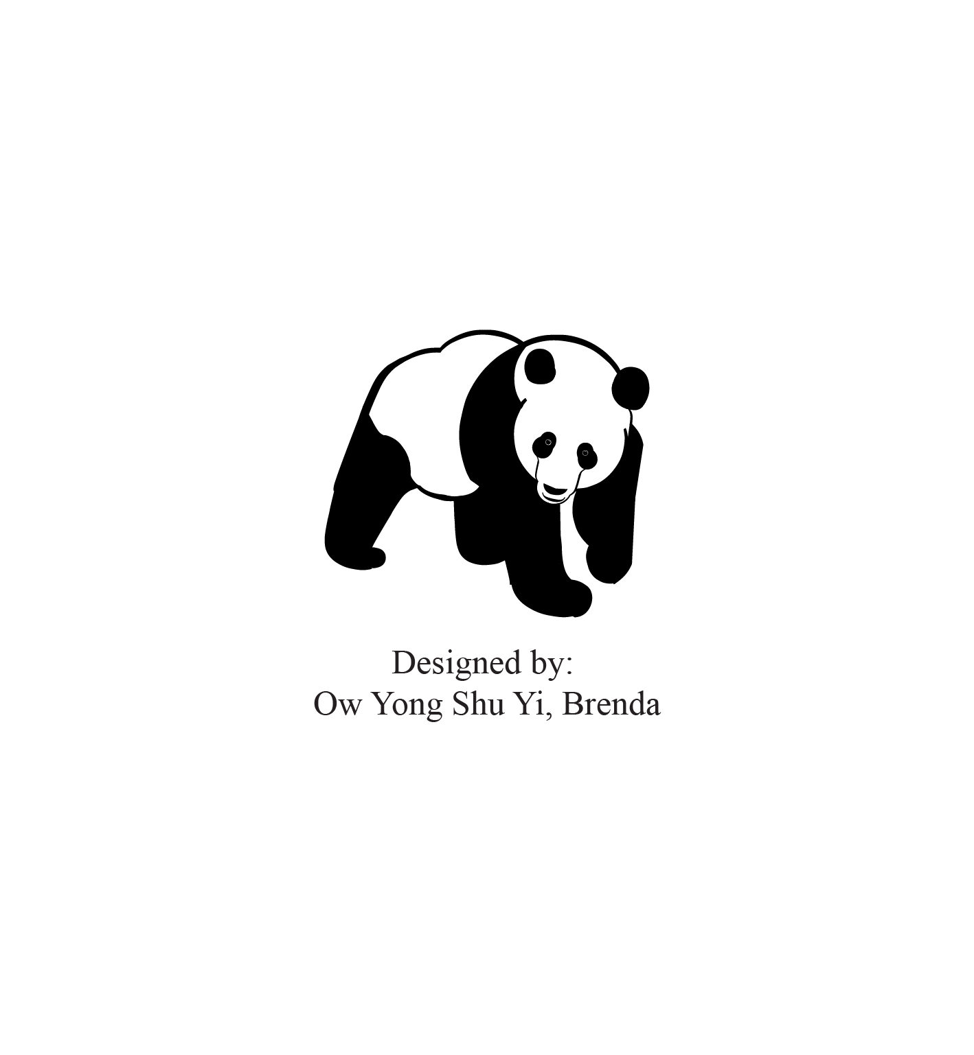
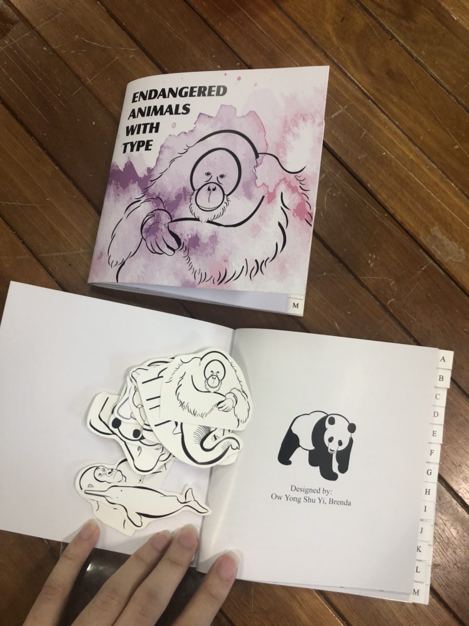
ENDANGERED ANIMALS WITH TYPE
Expanding further from my previous project, 3a (type as image) which I really enjoyed, I decided to make a book of A to Z animals.
Firstly I found animals from A to Z, but I don’t really feel much for it till I stumbled across WWF’s website. You can check it out here: (https://www.worldwildlife.org/species/directory)
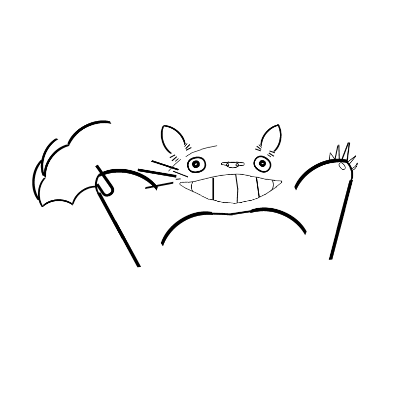
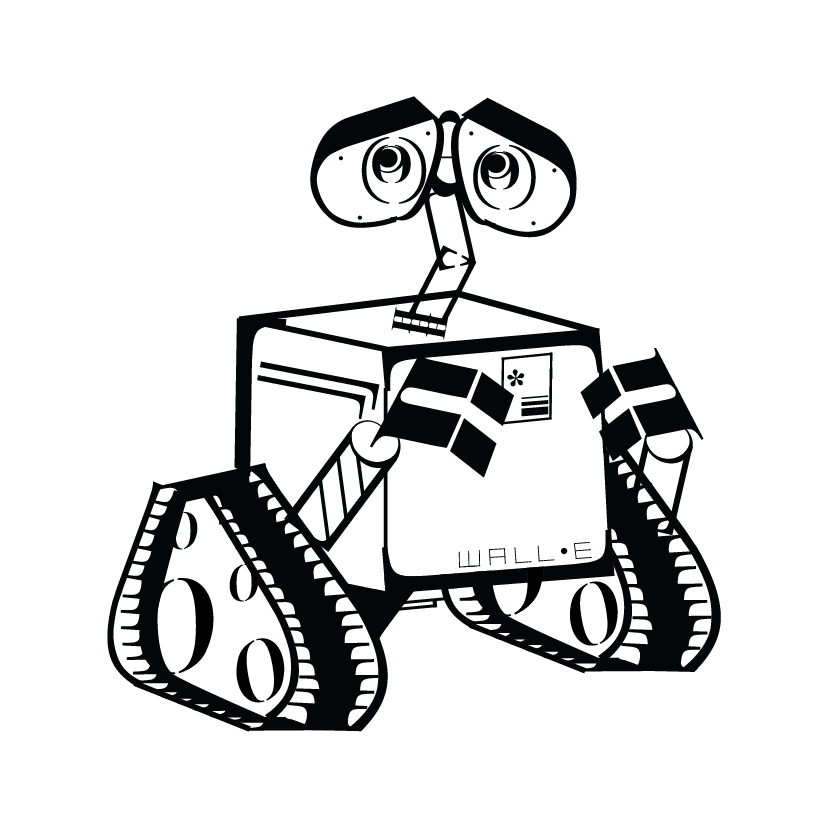
They had many animals that are endangered and requires conservation efforts to save them of which touched my heart. So, I decided to raise awareness of these endangered species with a typography book of animals and fonts from A to Z. With that I expanded my project, making the animals using different typefaces and here’s the process:
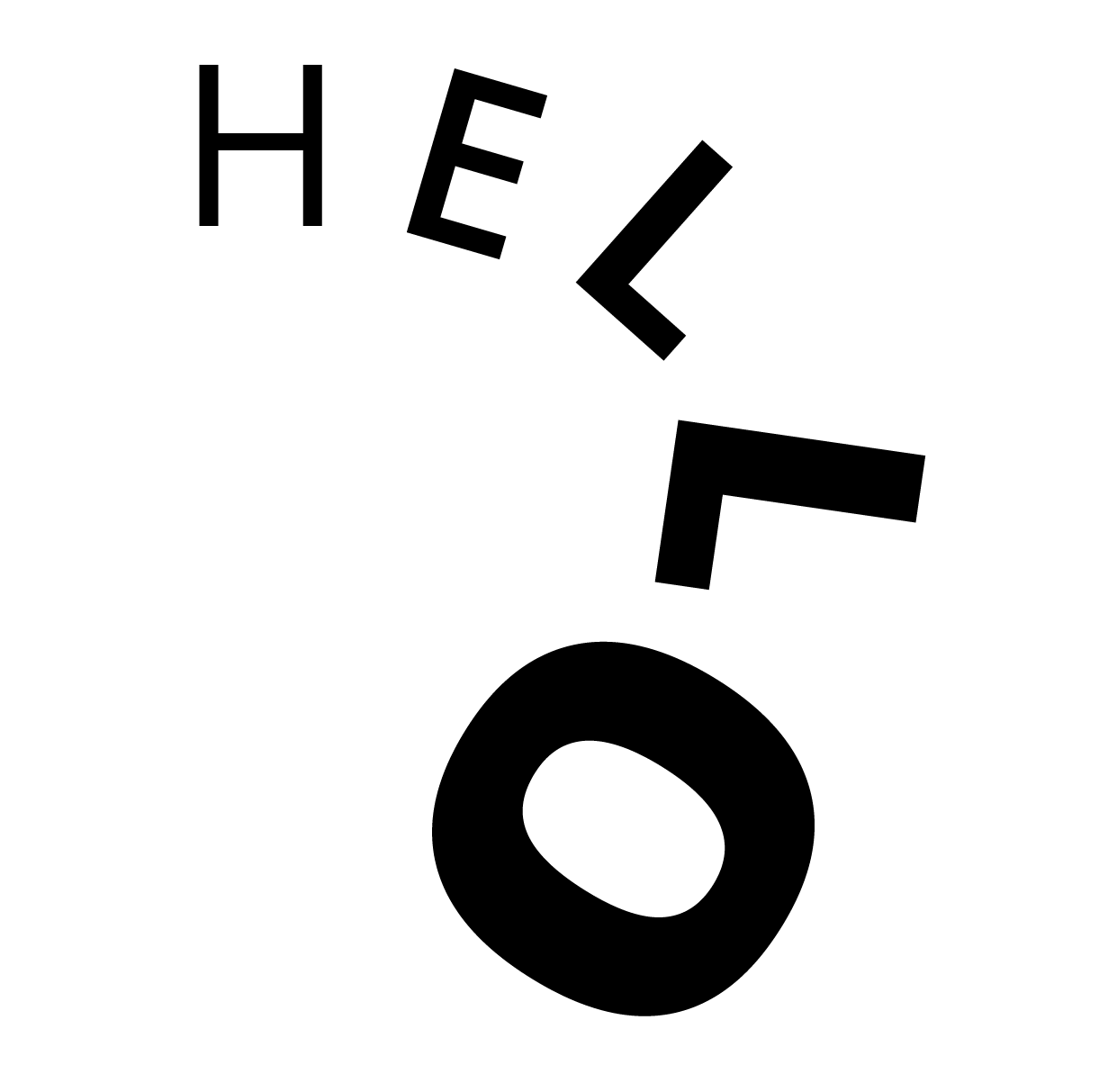
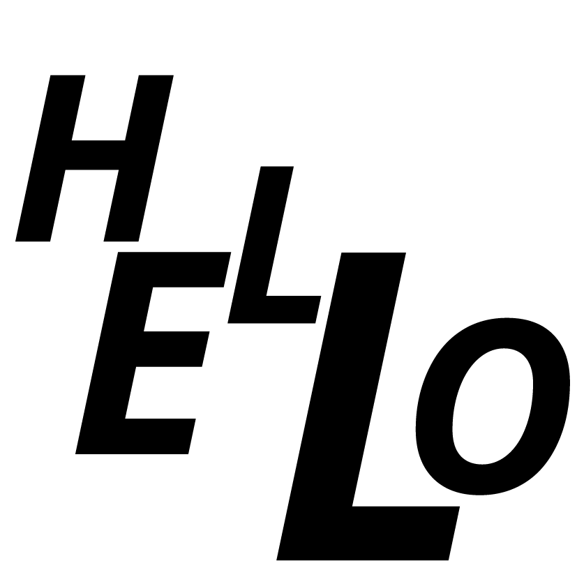
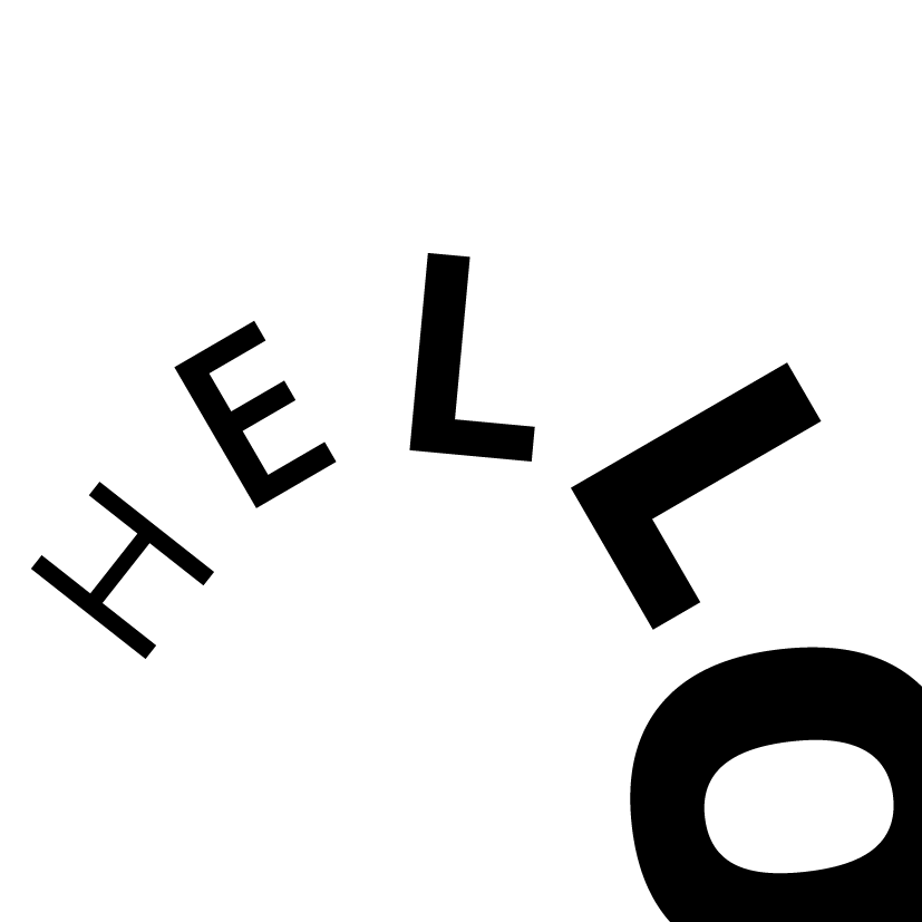
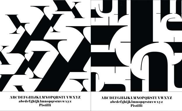
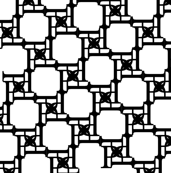
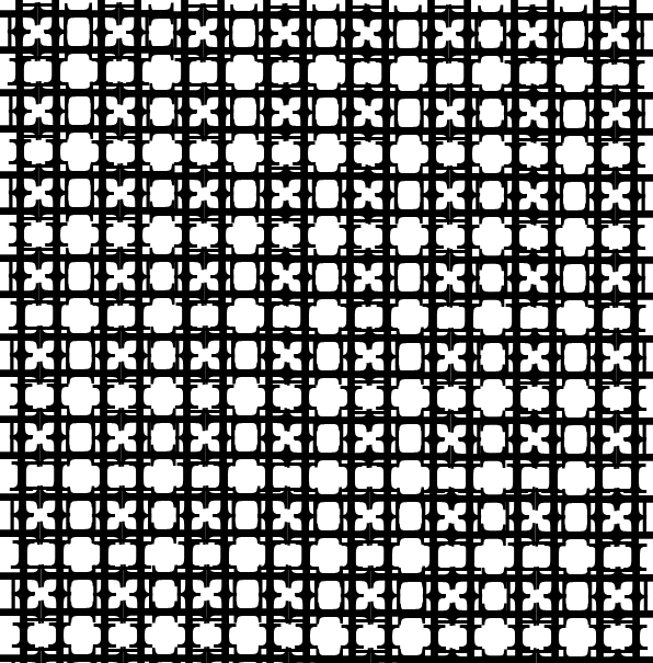
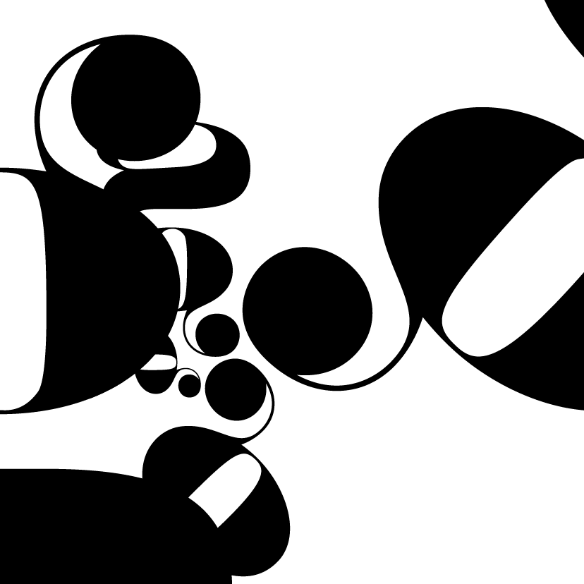
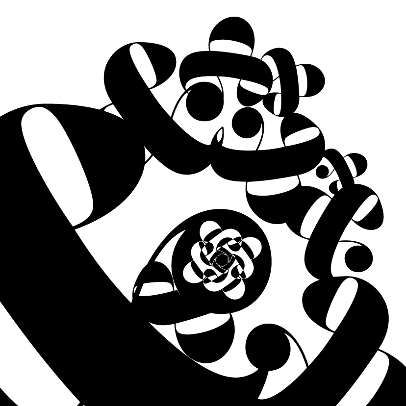
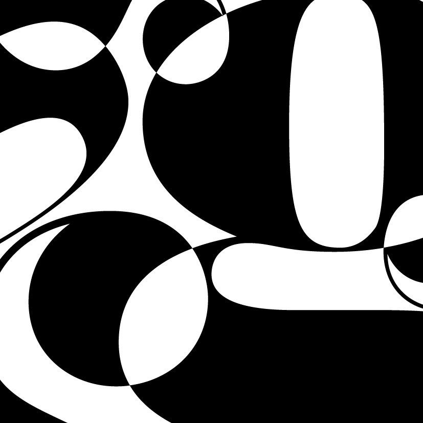
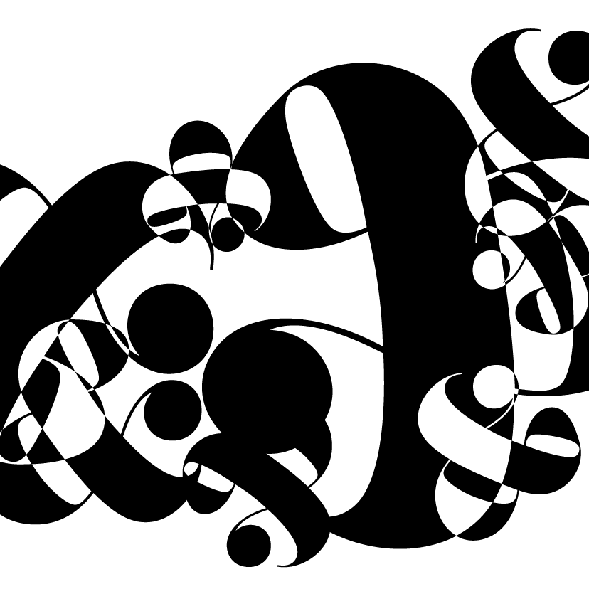
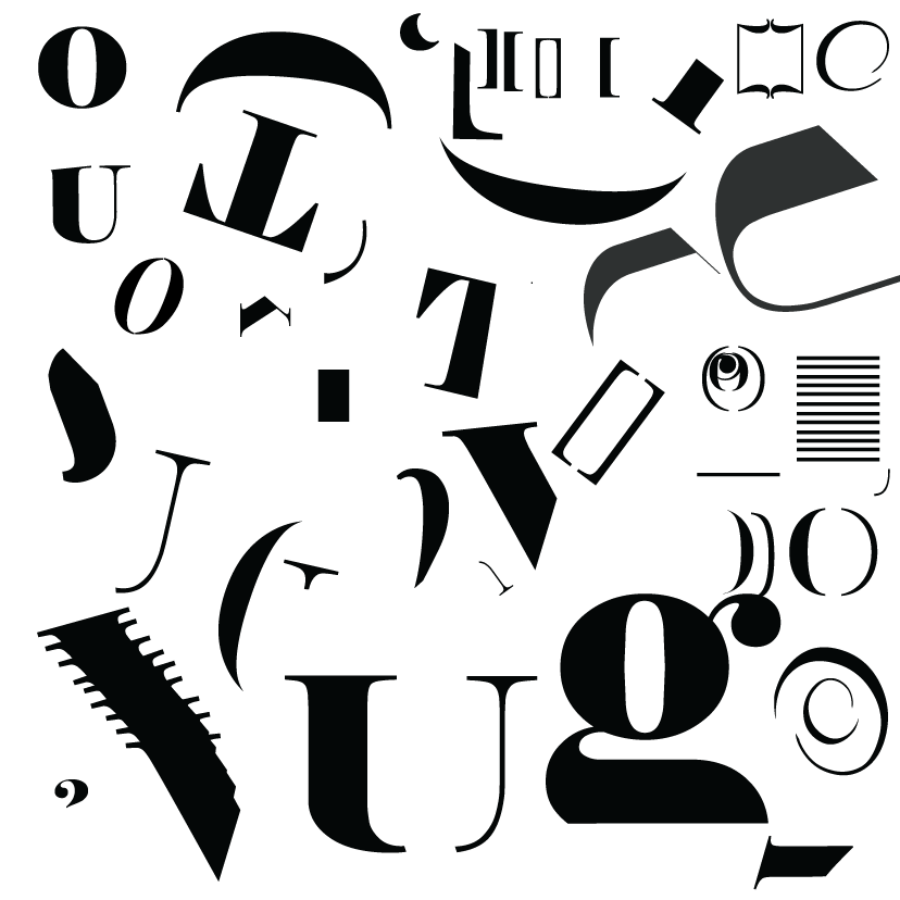
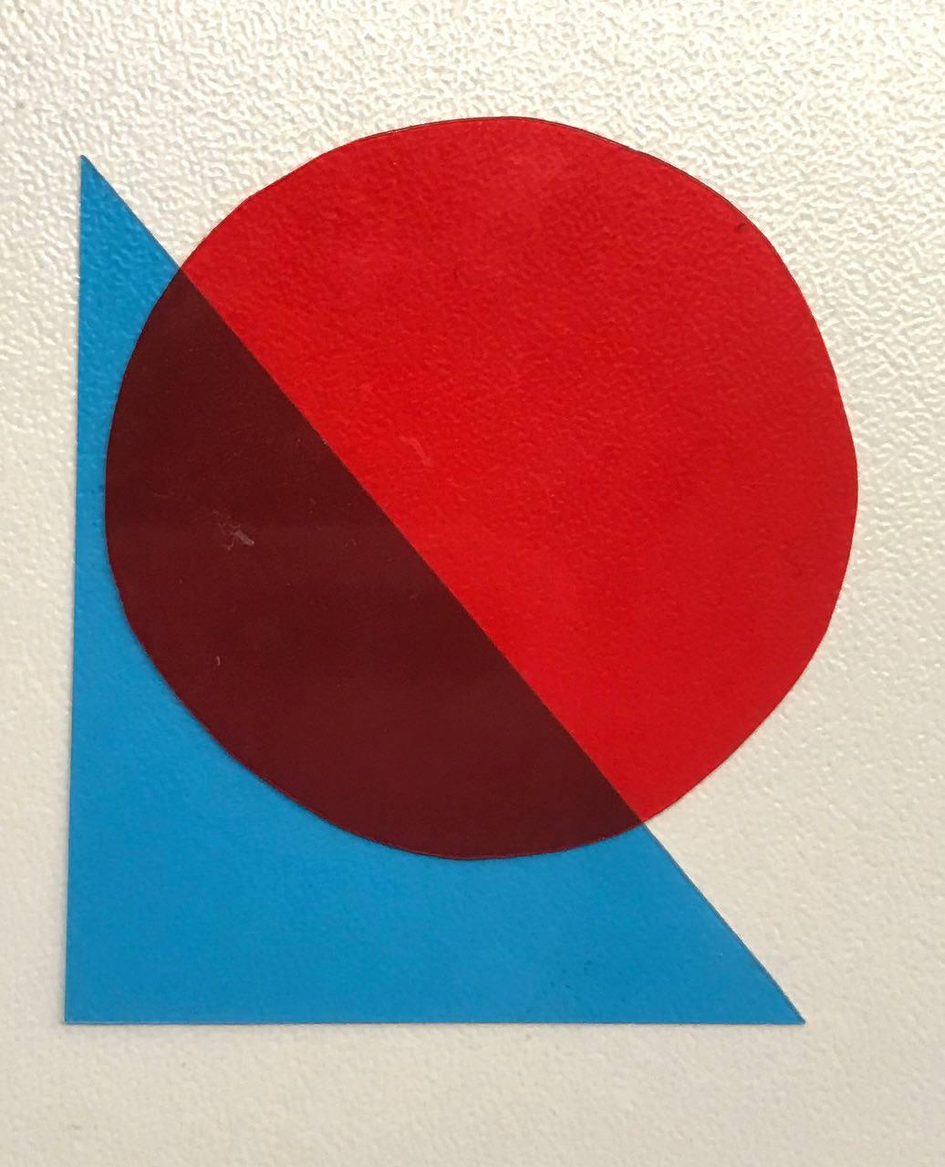
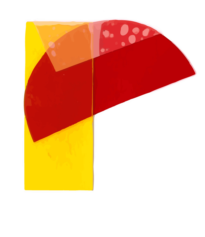
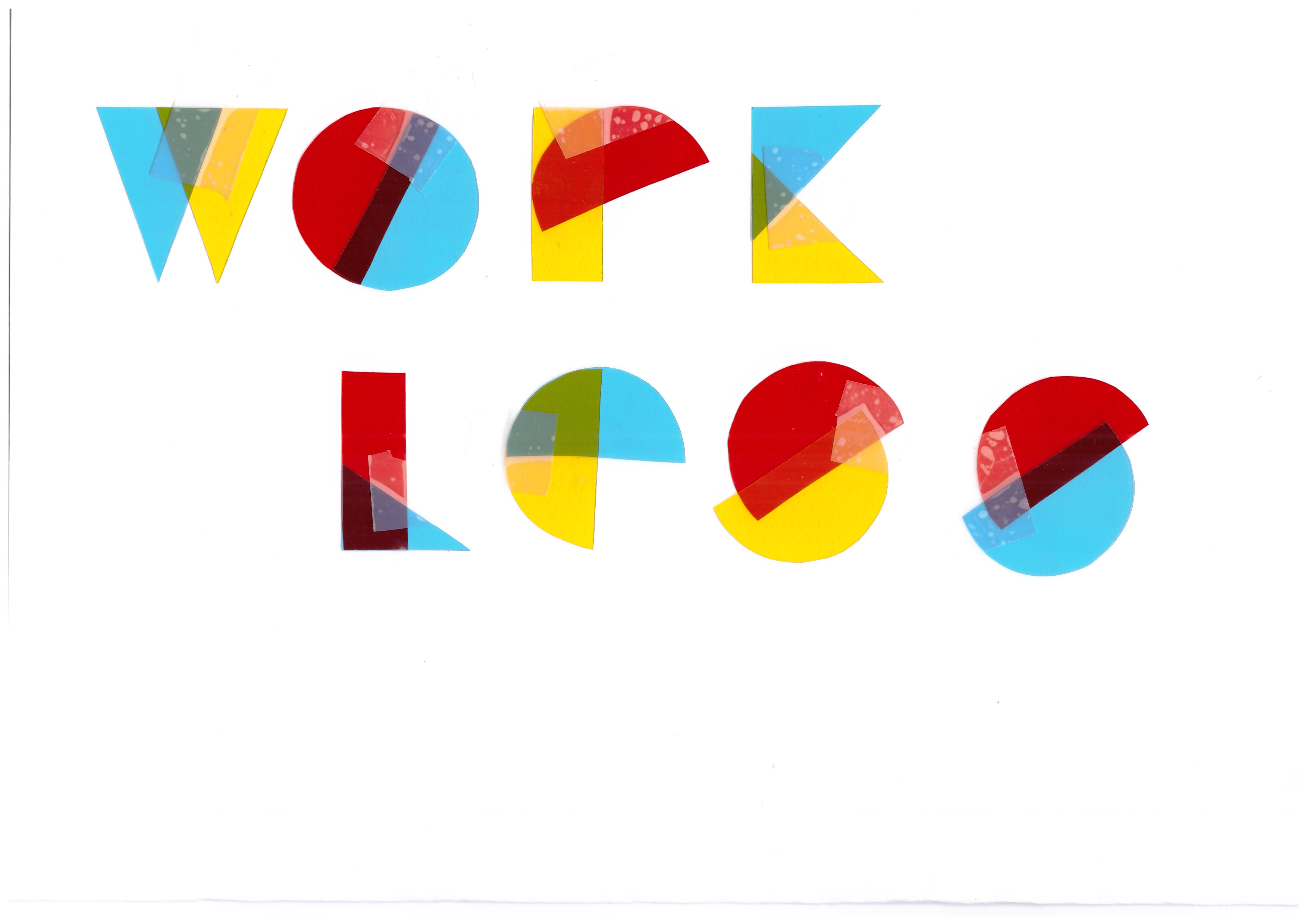
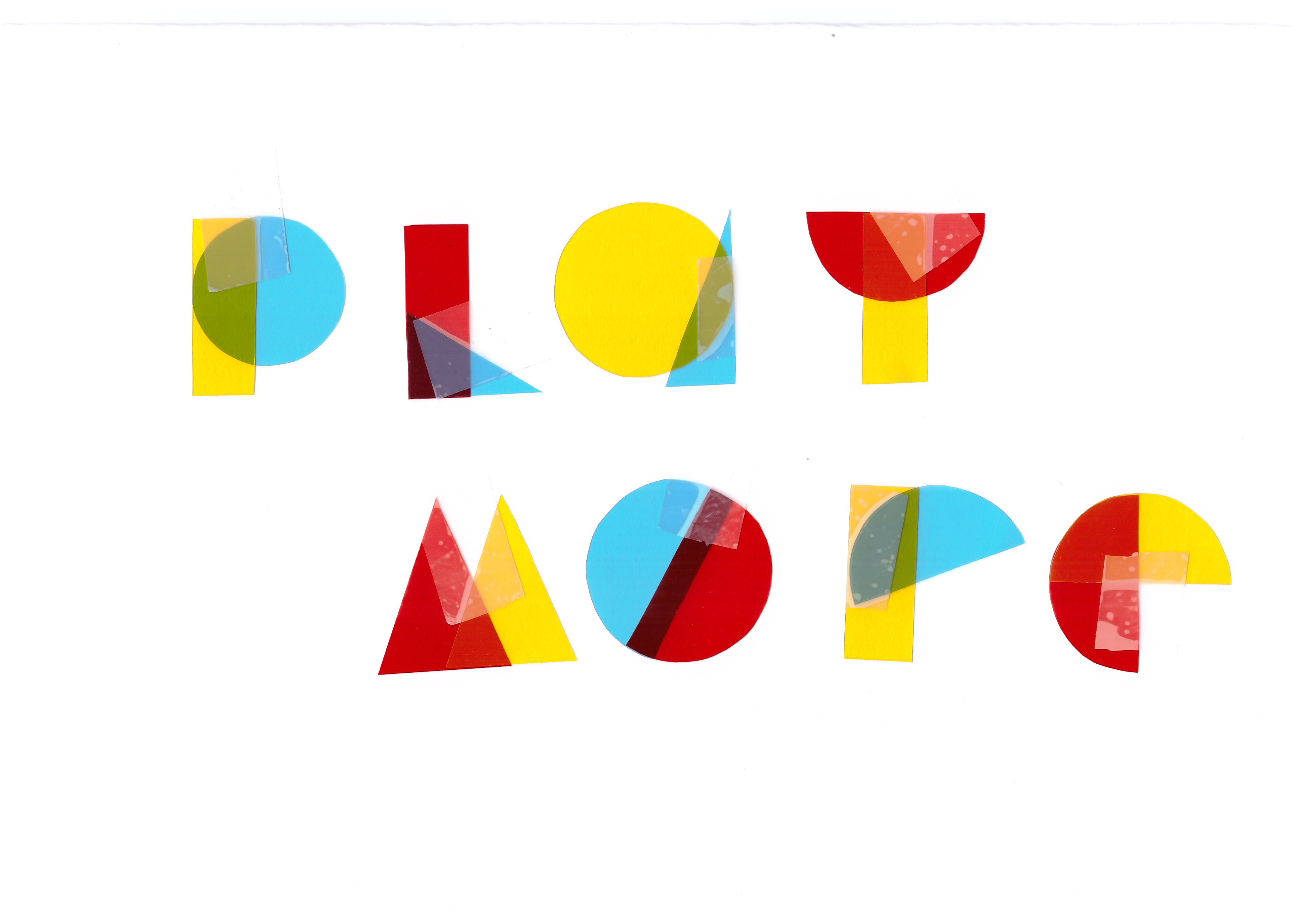
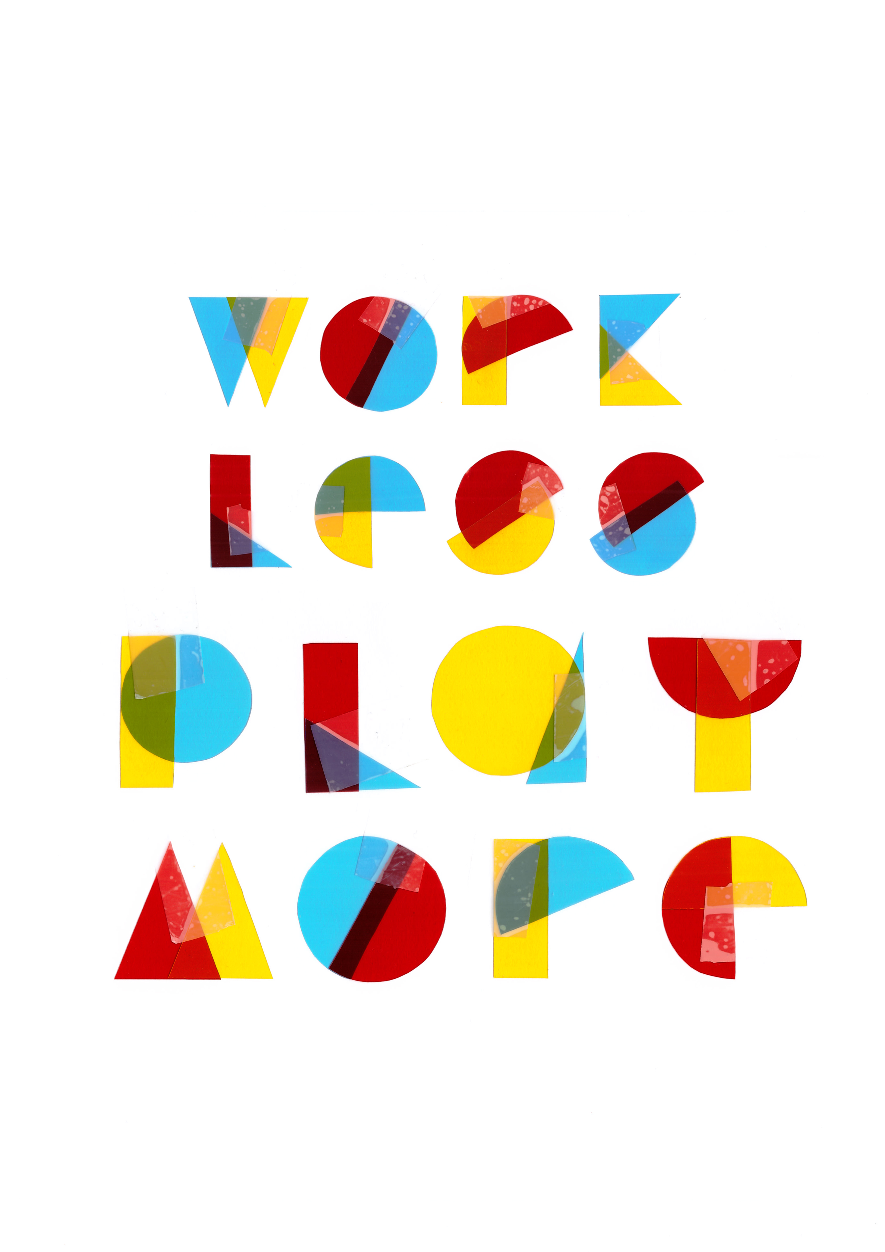
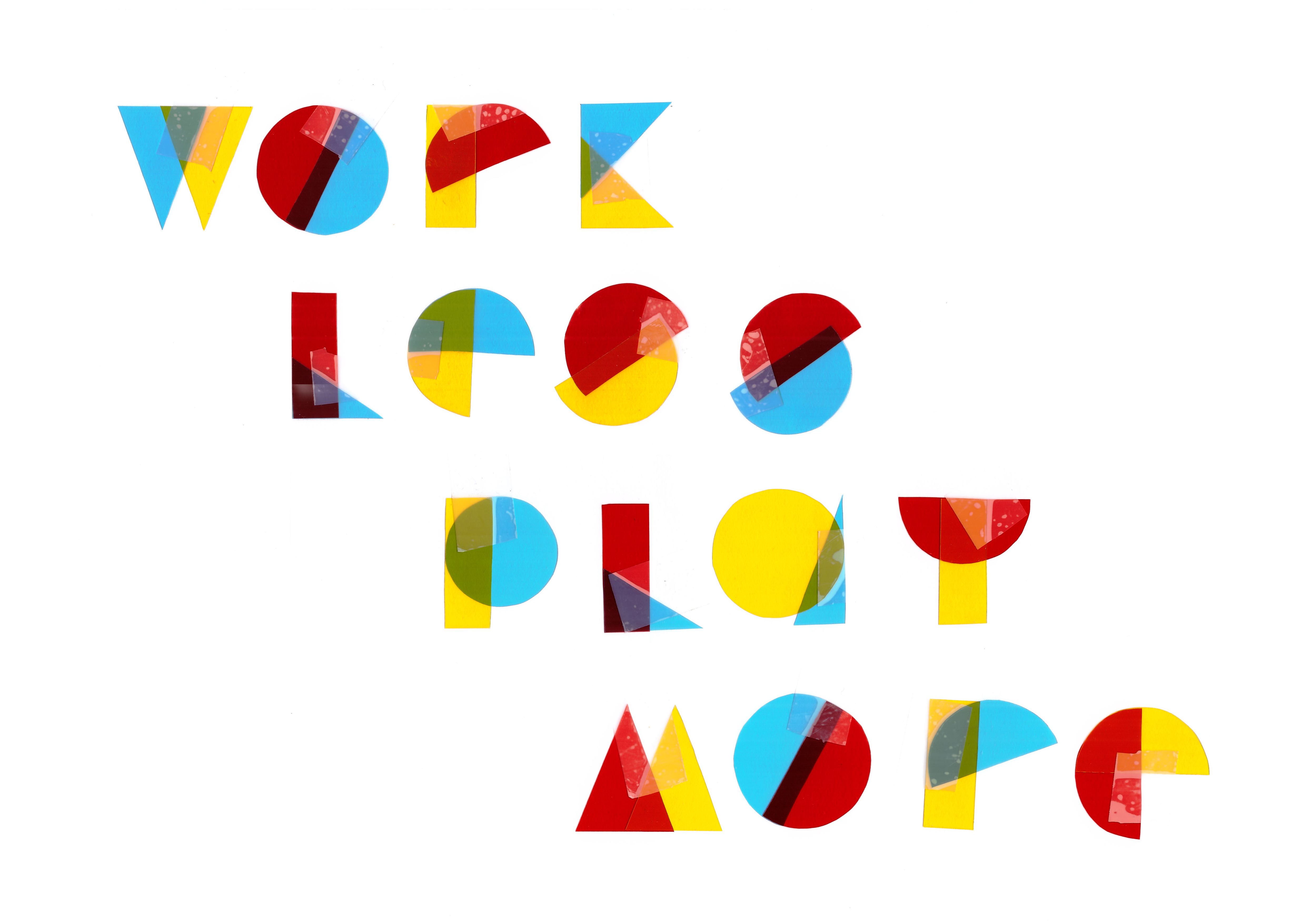
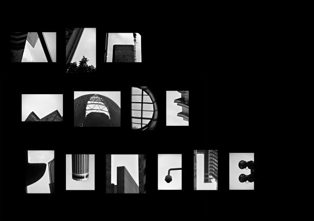
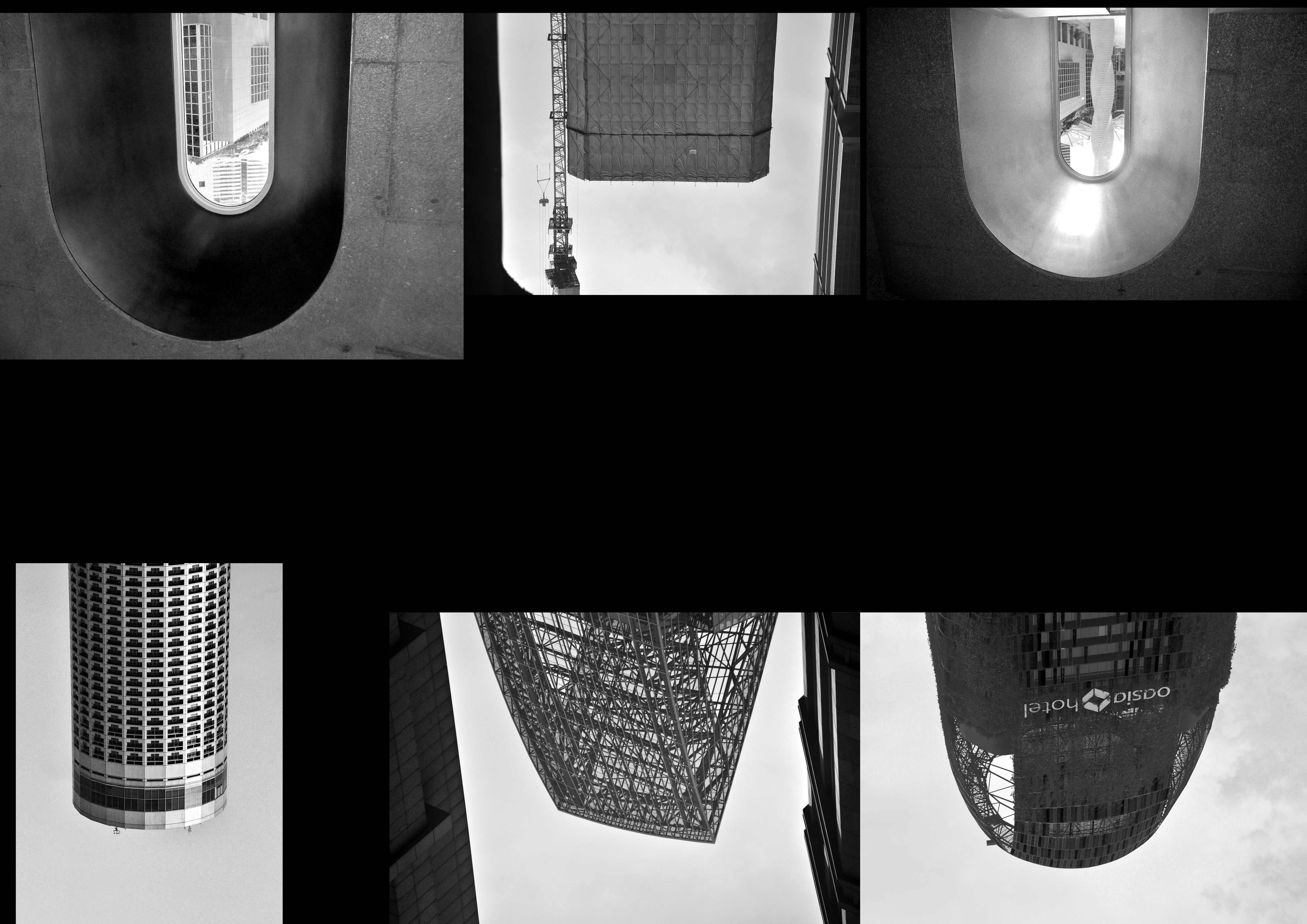
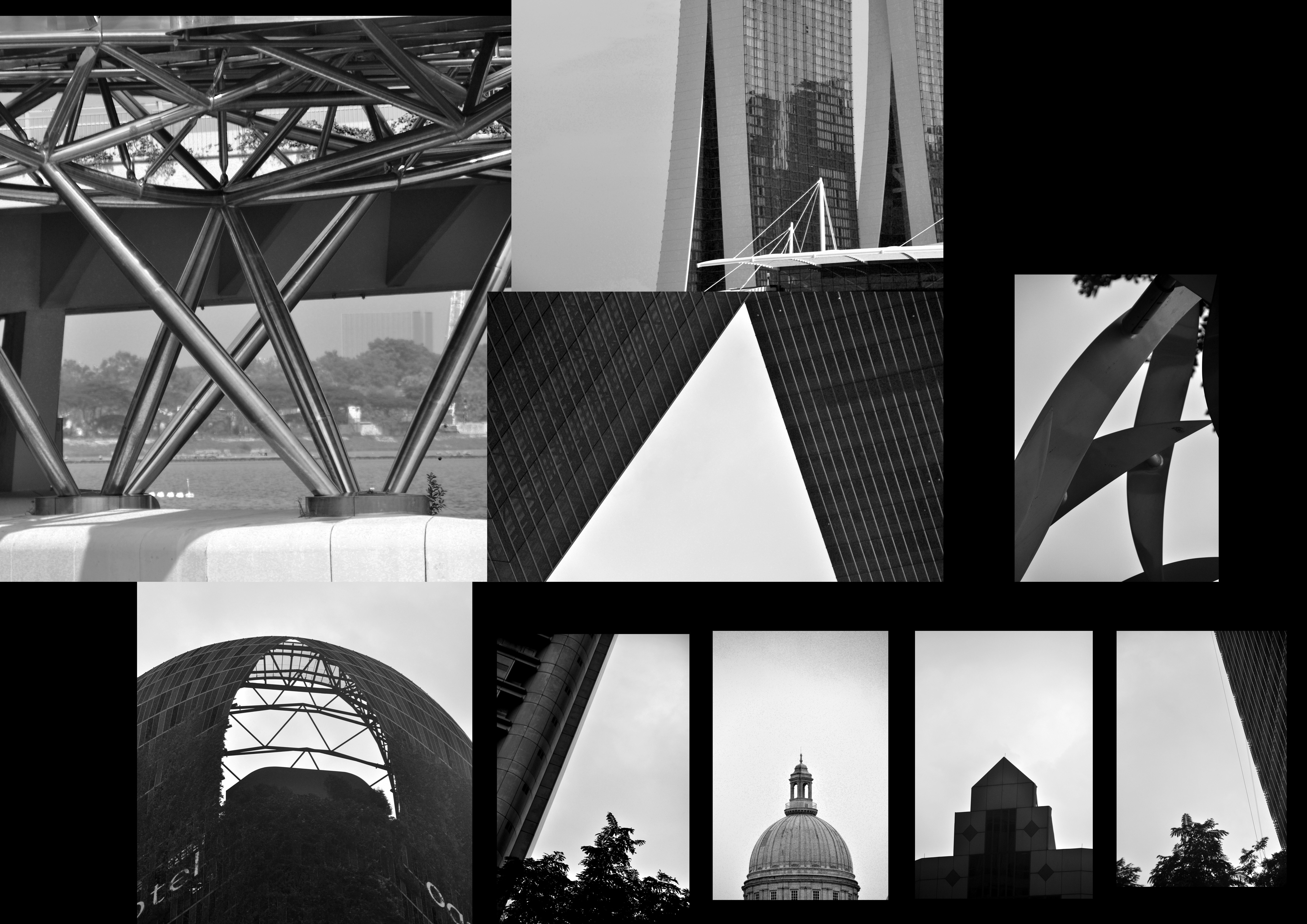
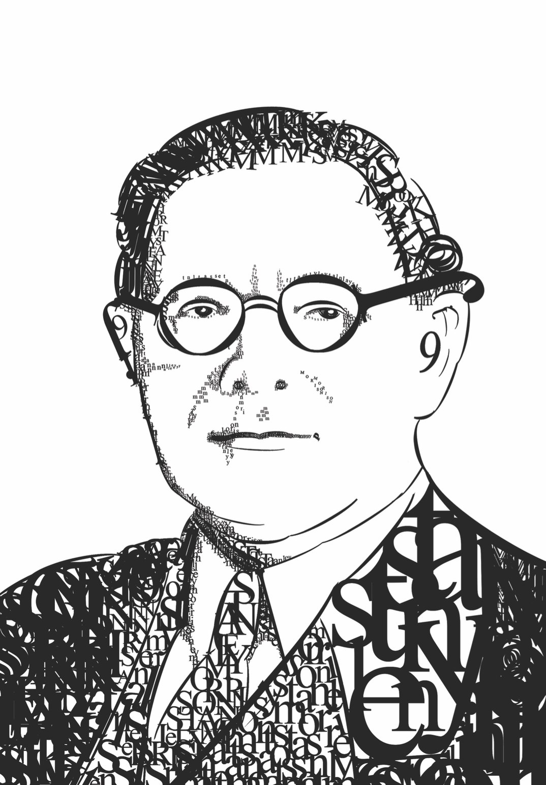
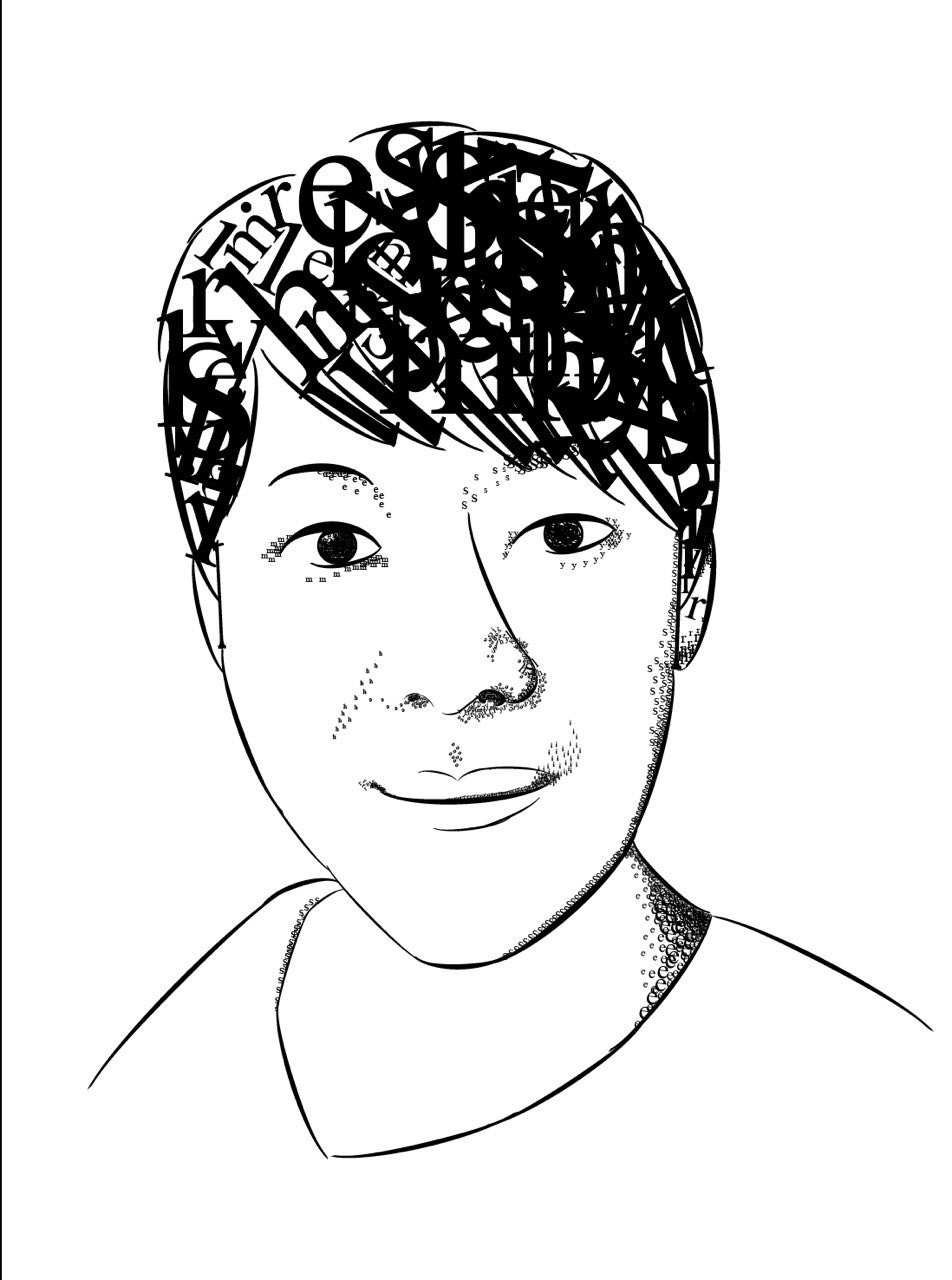
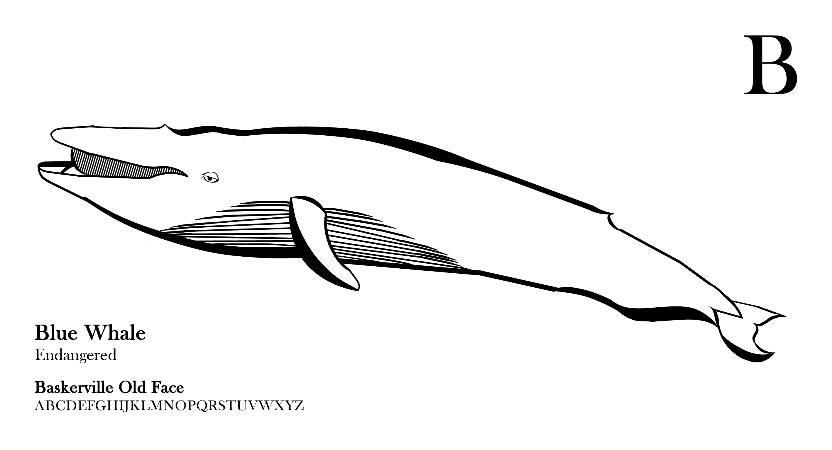
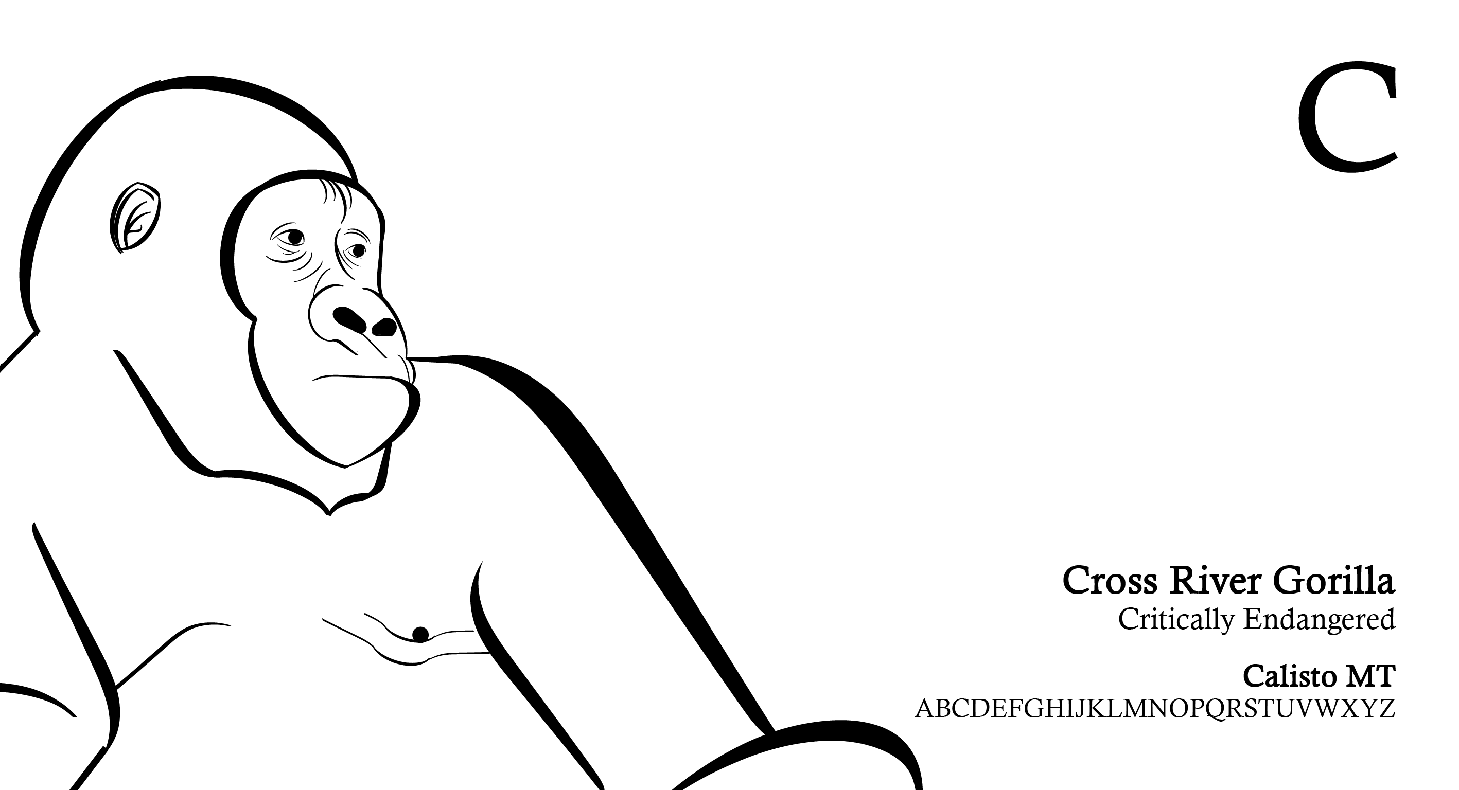
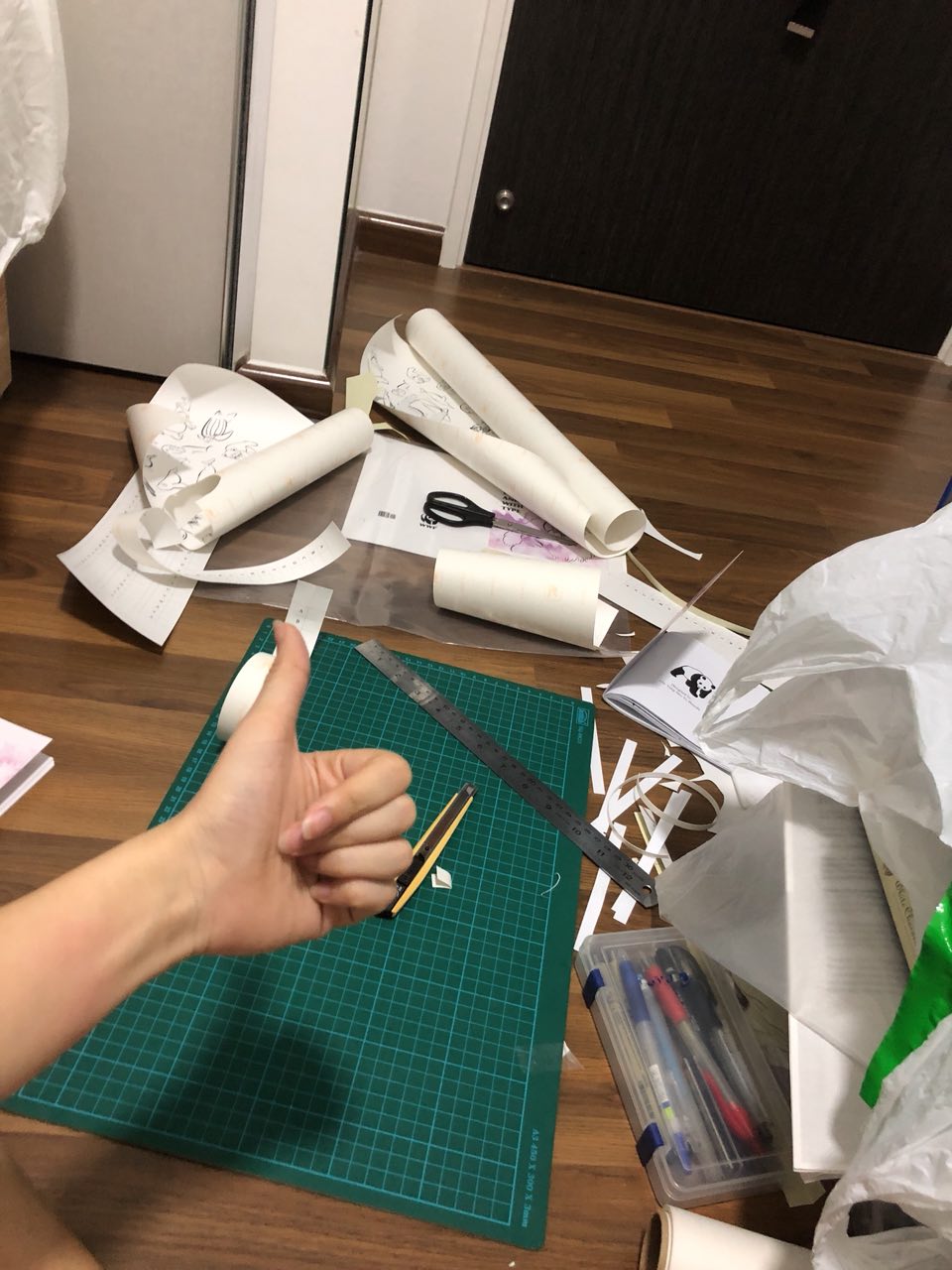
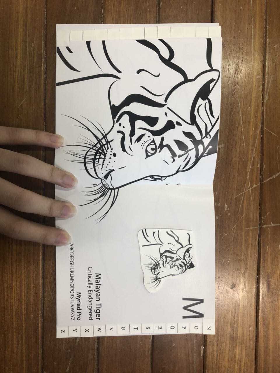
So firstly, I had to cut up the different typefaces unique to each letter and each animal then using them to fit to the contours of the animal.
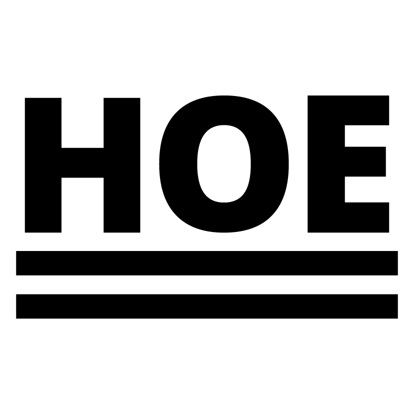
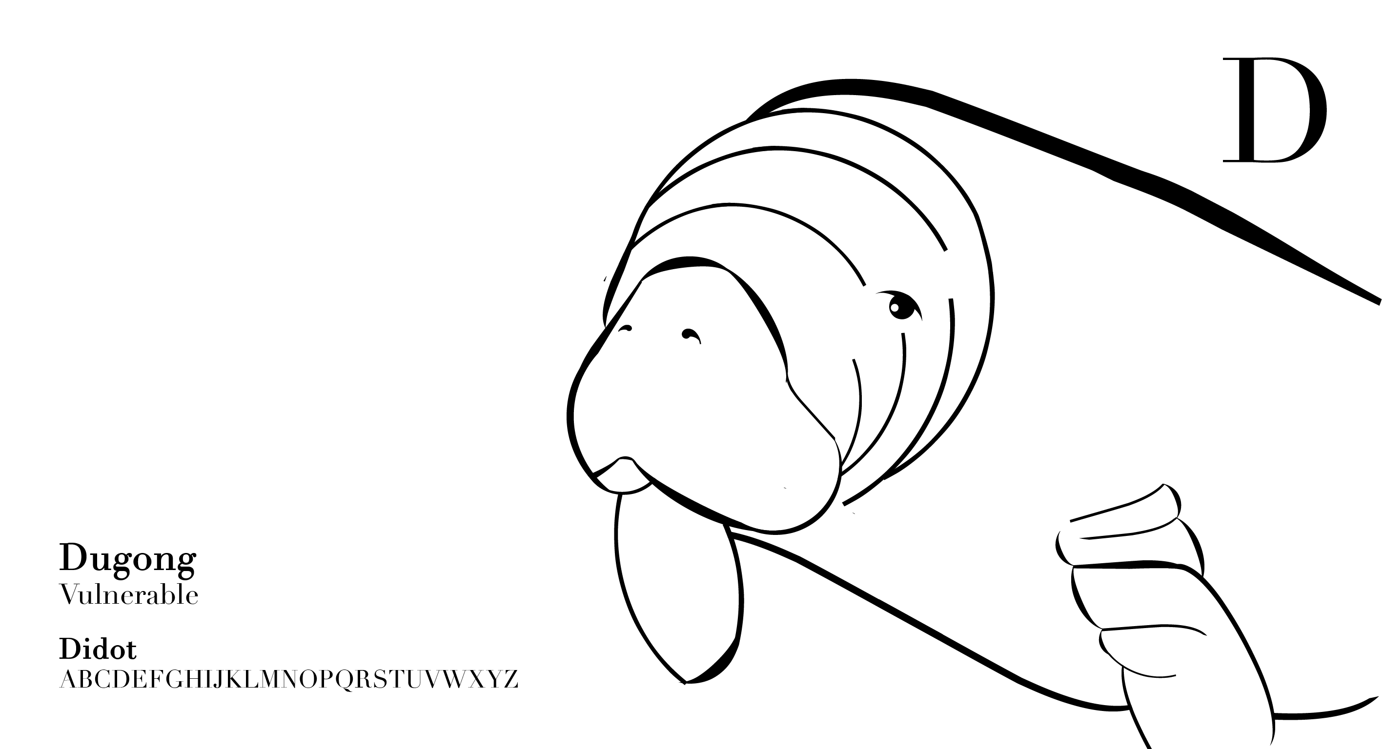
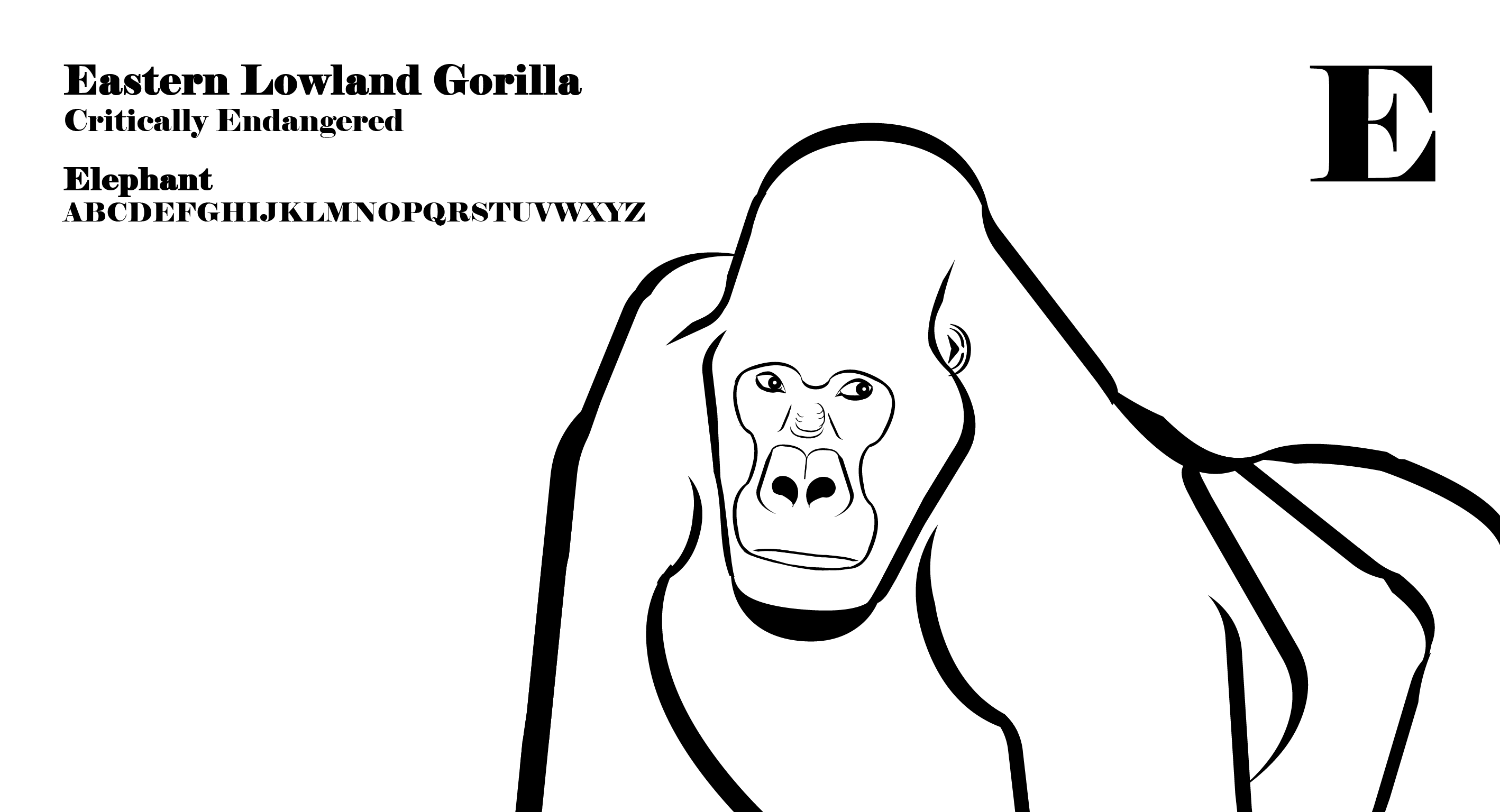
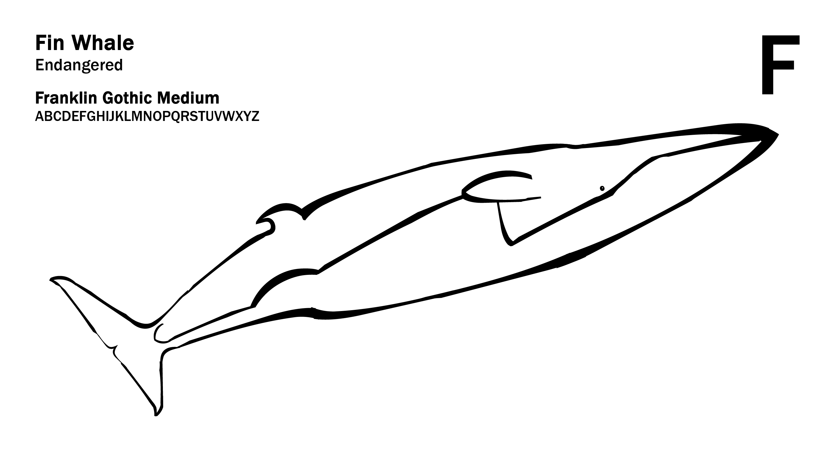
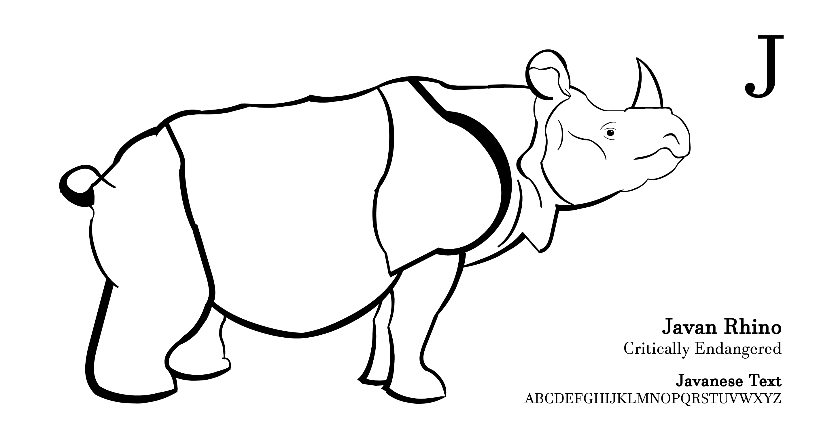
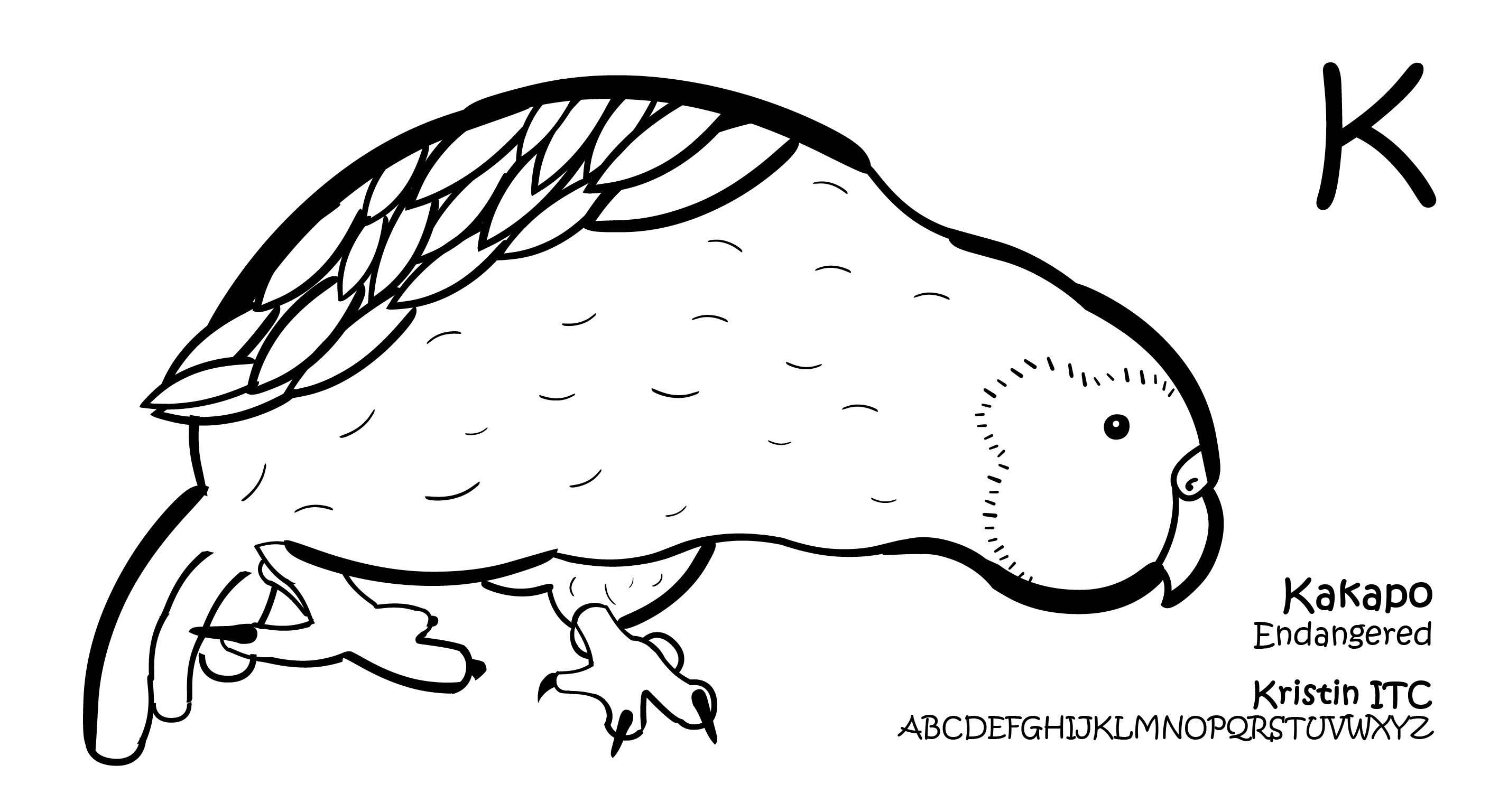
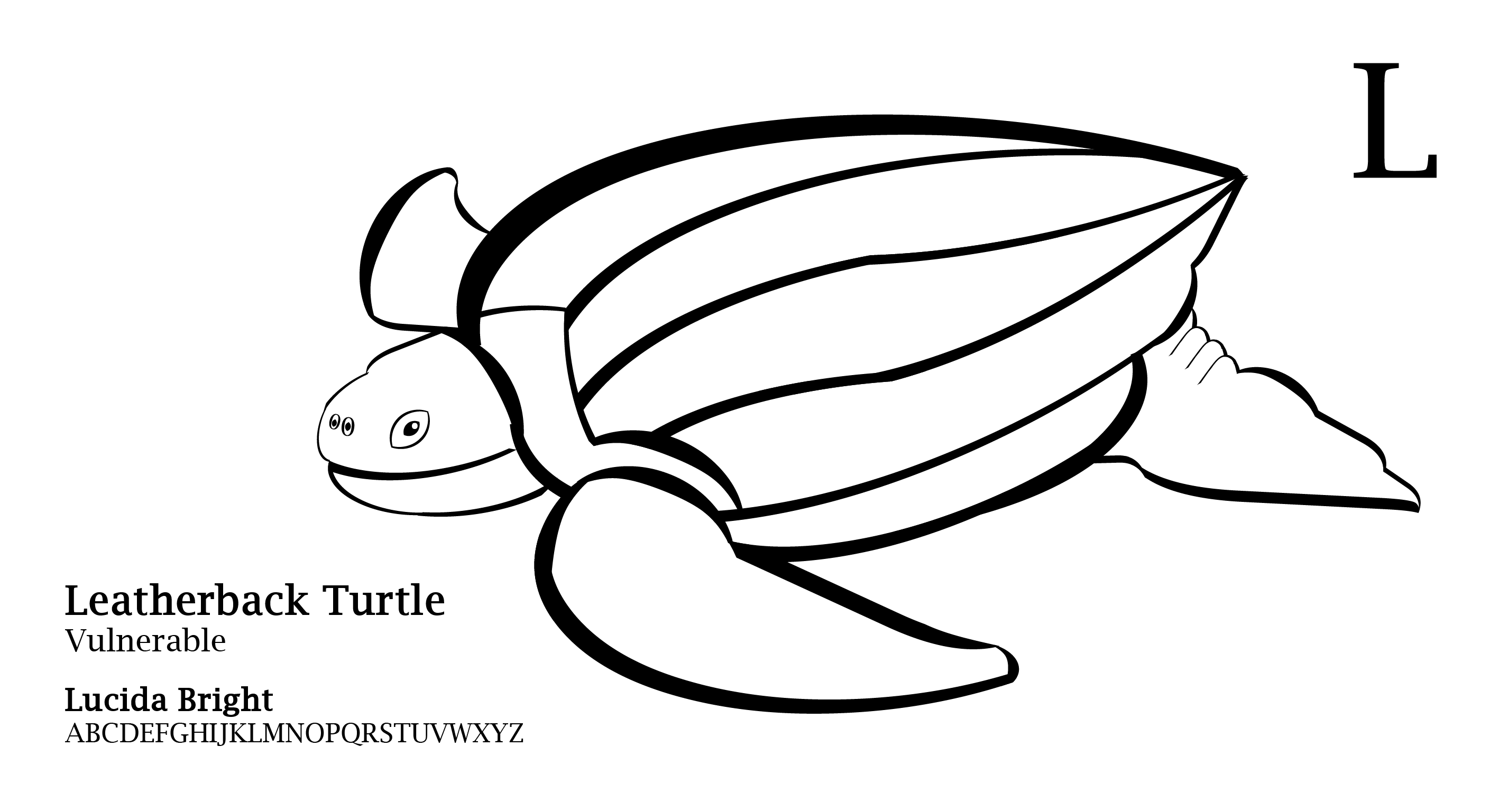
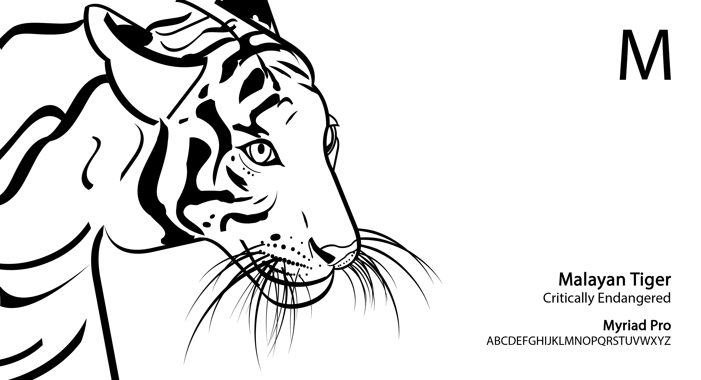
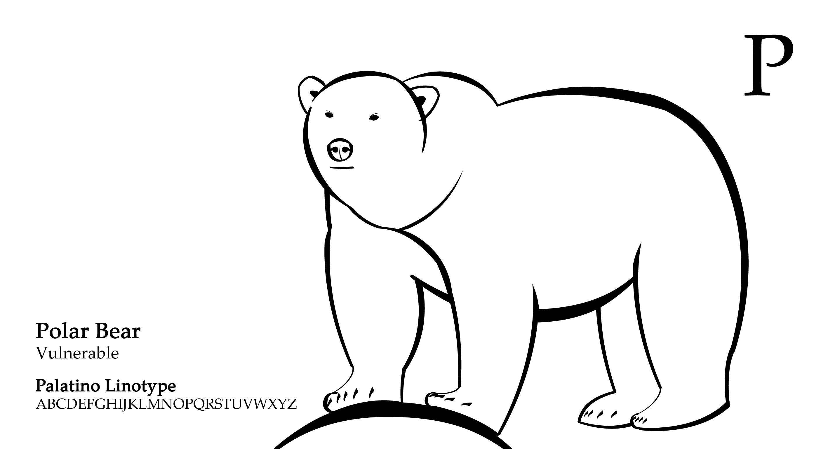
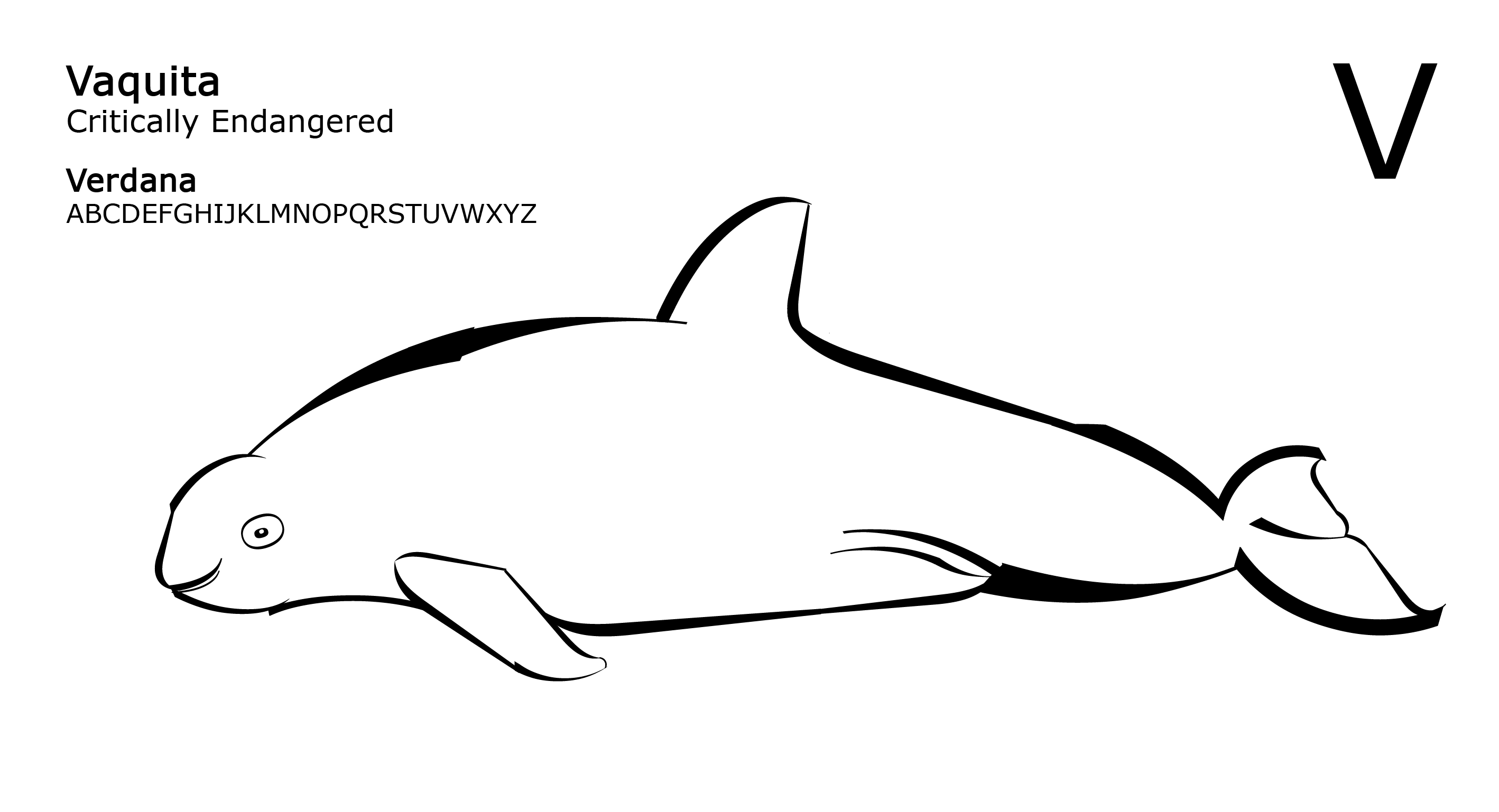
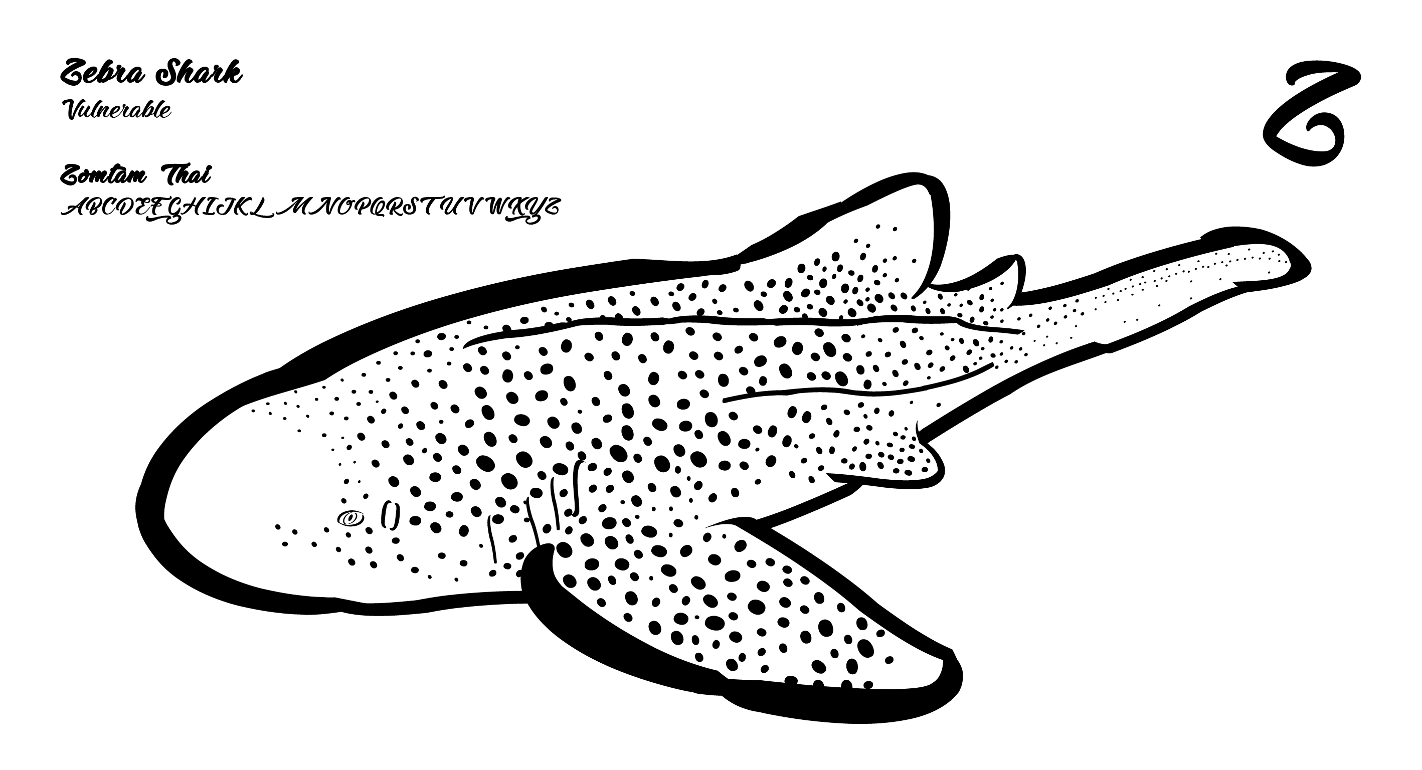
As you can tell, I used mainly cut up U(s), brackets, full stop, and other letters like J/L etc.
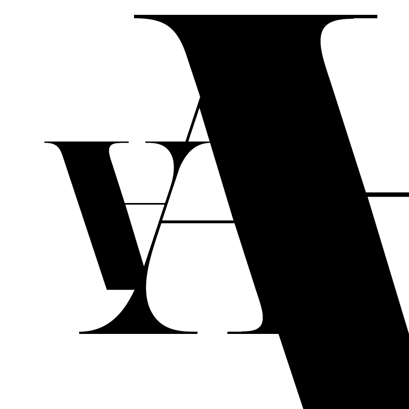
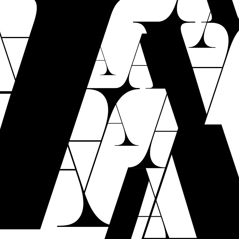
LAYOUT/PROCESS :
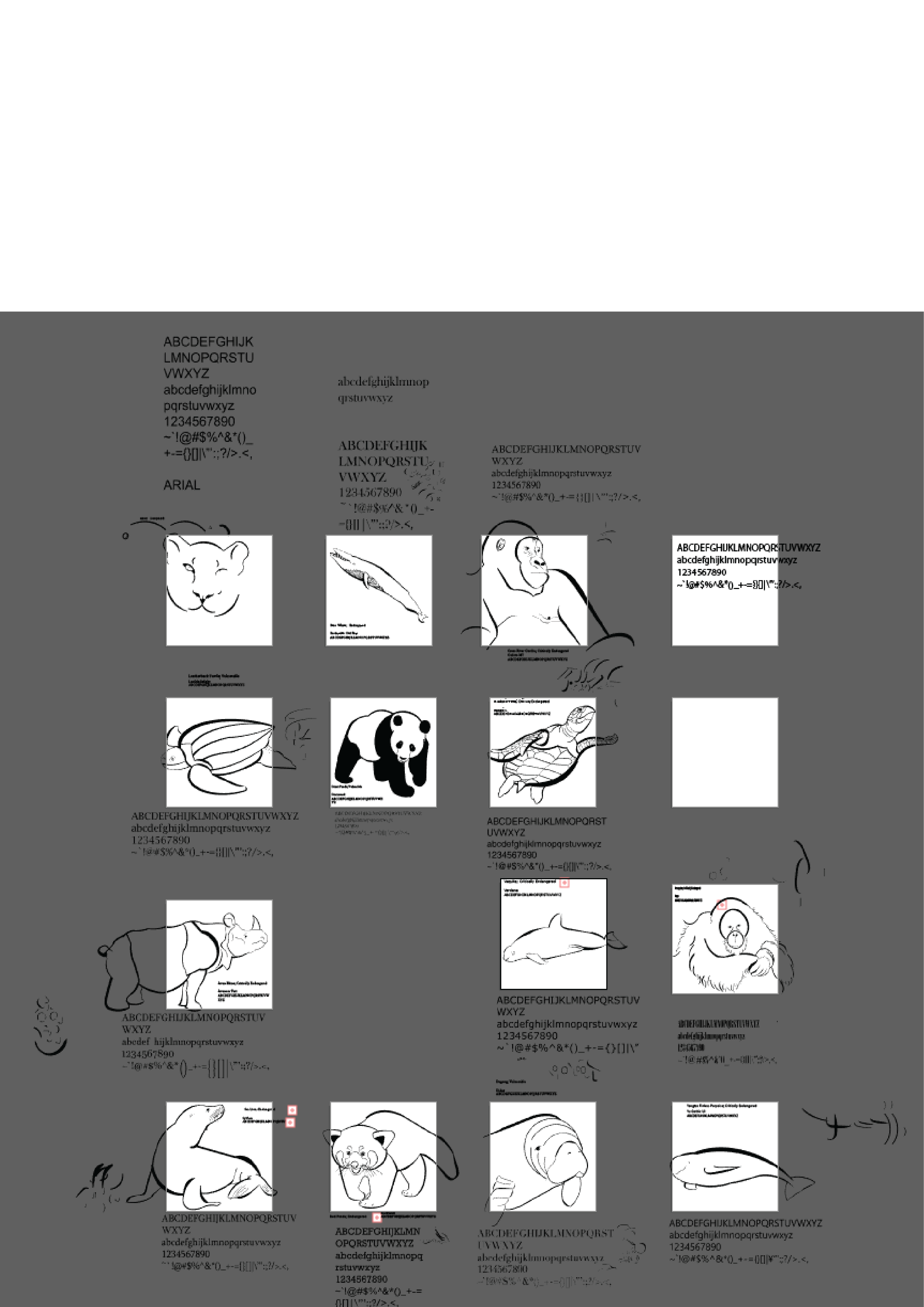

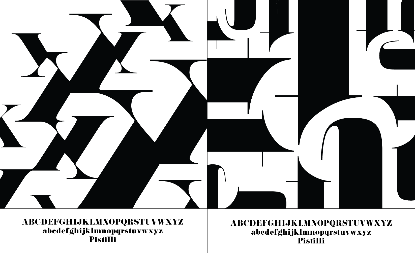
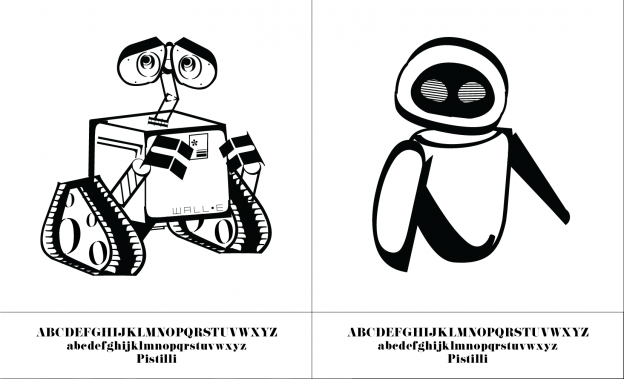
The process was very tedious and time consuming but fulfilling when I put it all together in the end. Here are the final spreads:
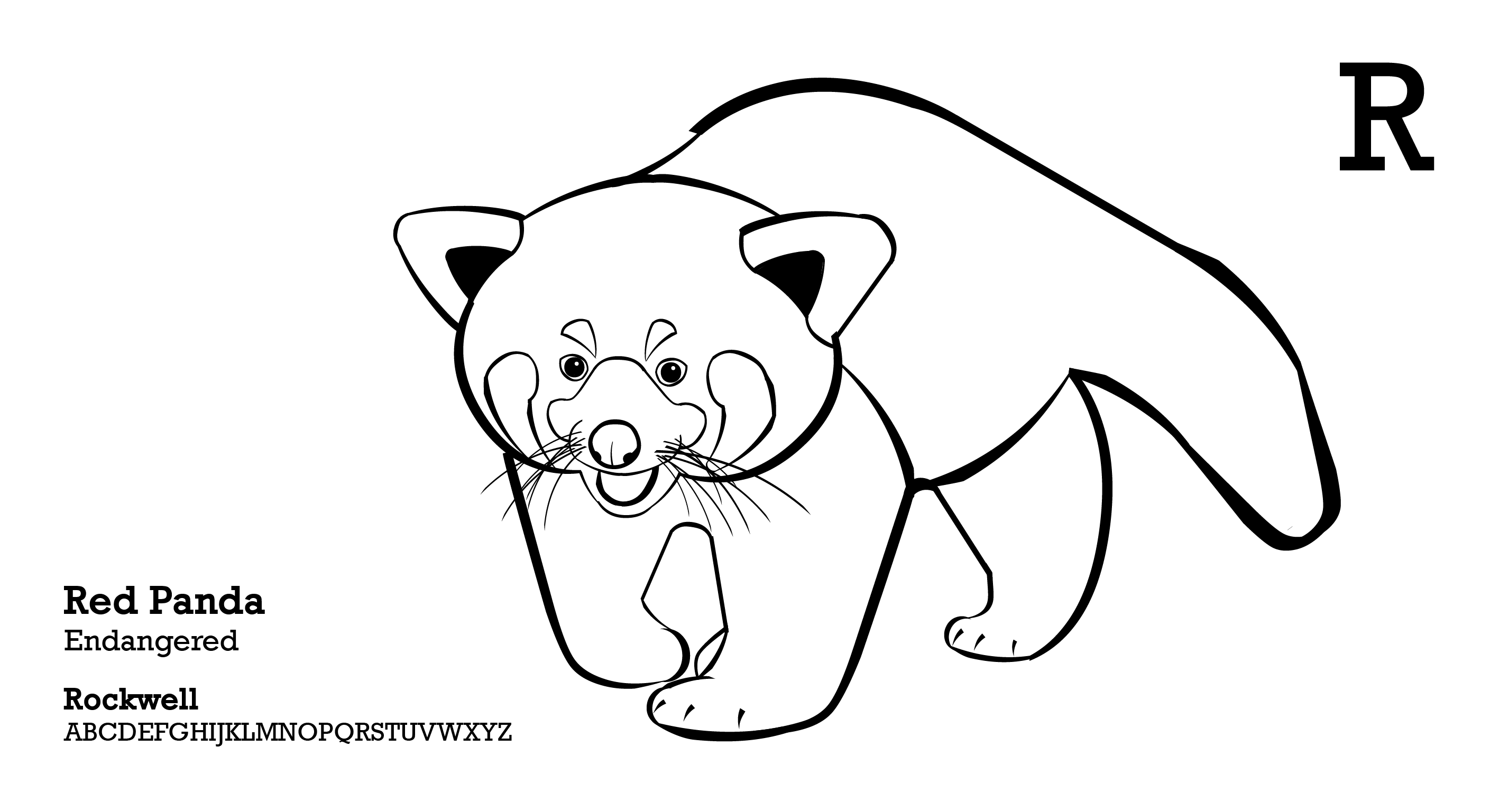
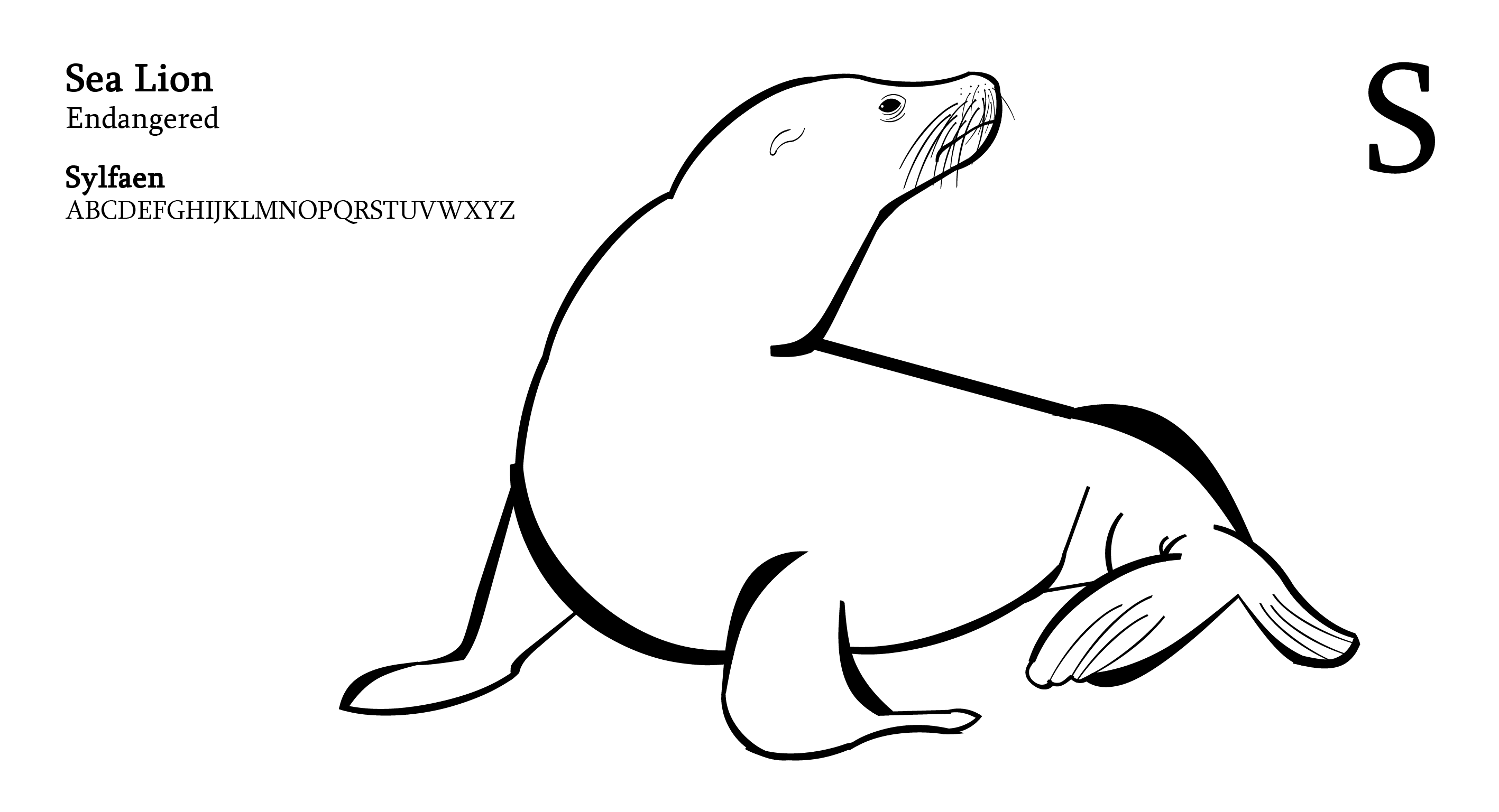
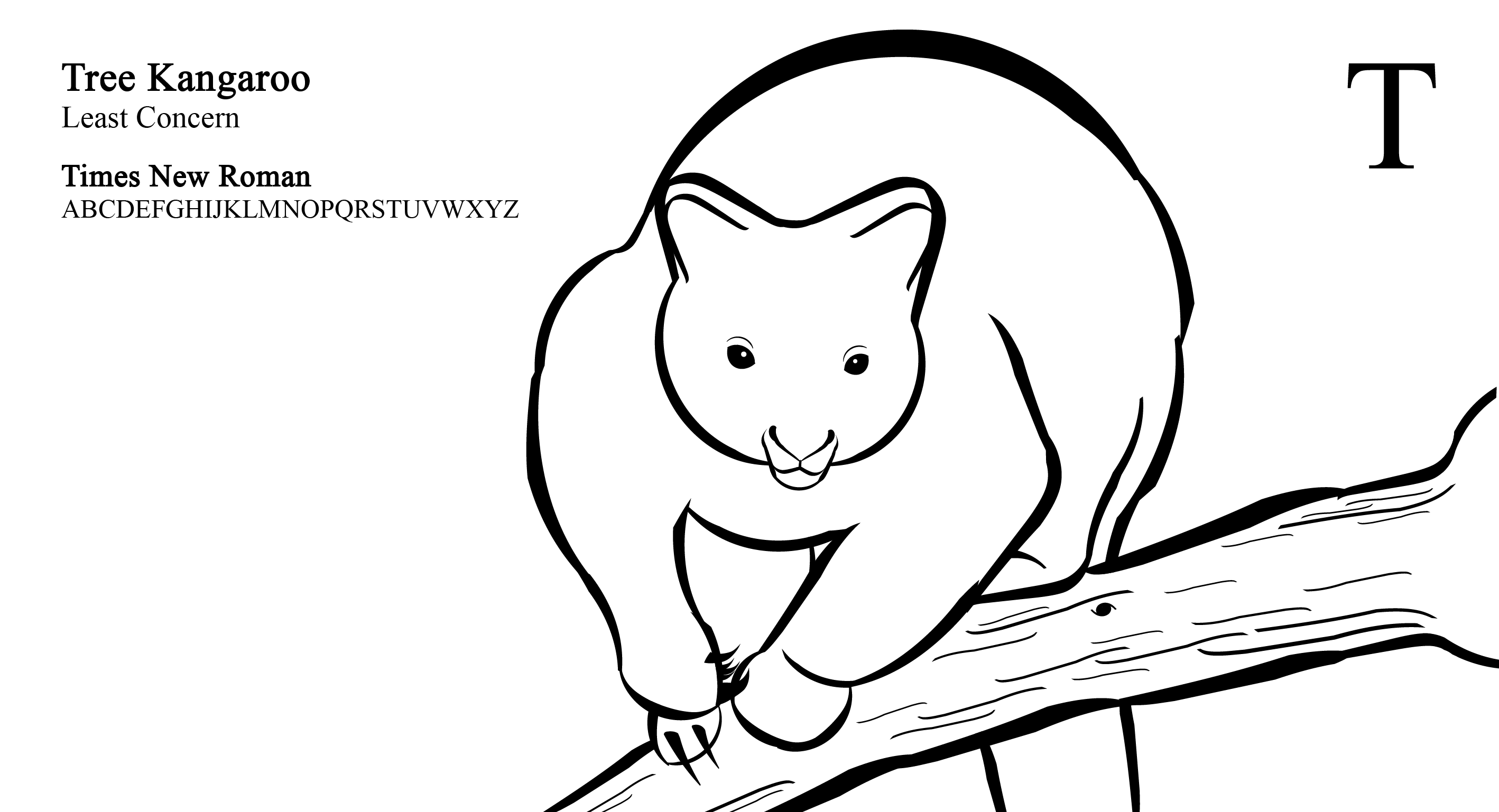
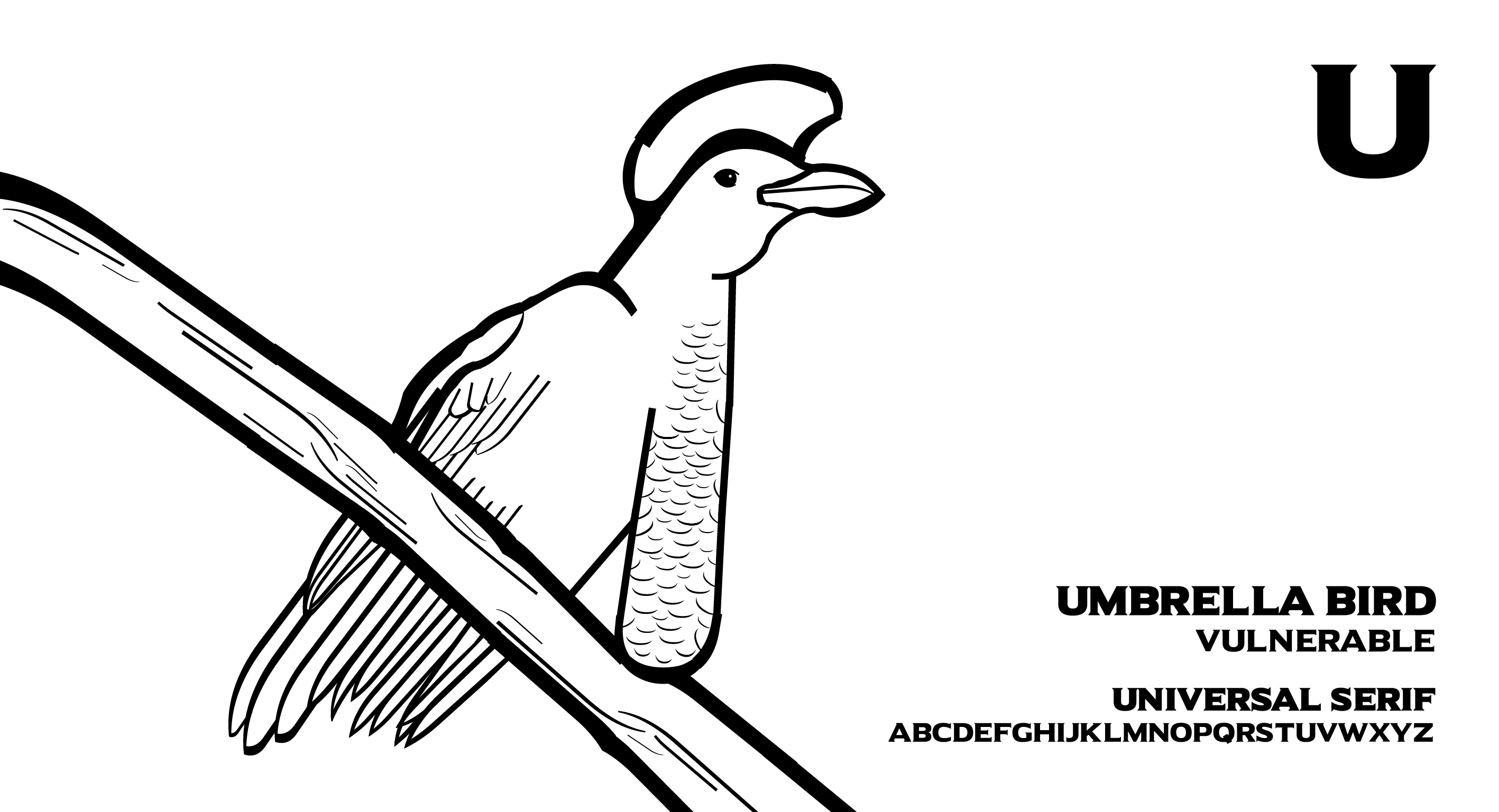
I aligned letters and included the name of the animal, conservation status, name of the typeface and the letters of the typeface for reference.

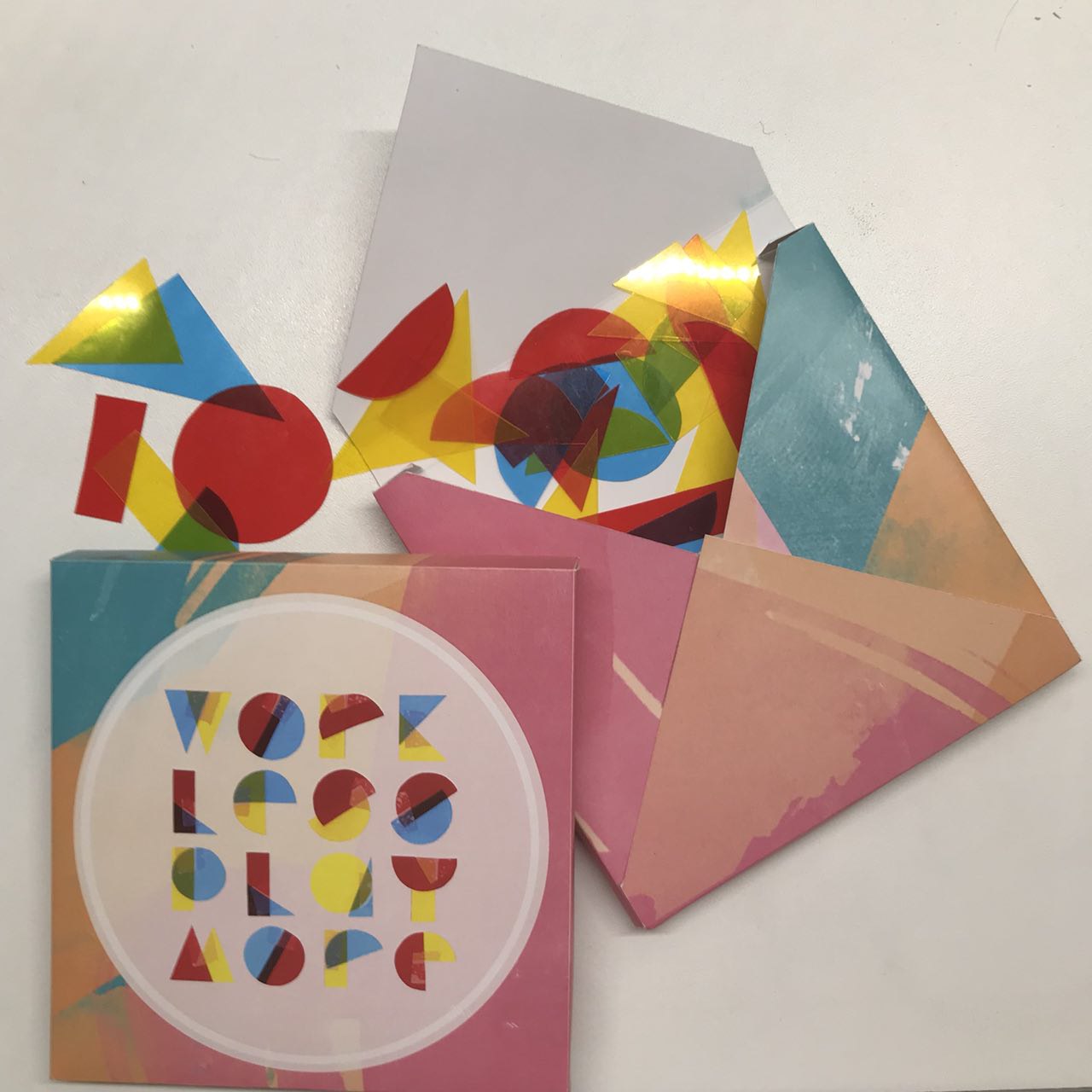
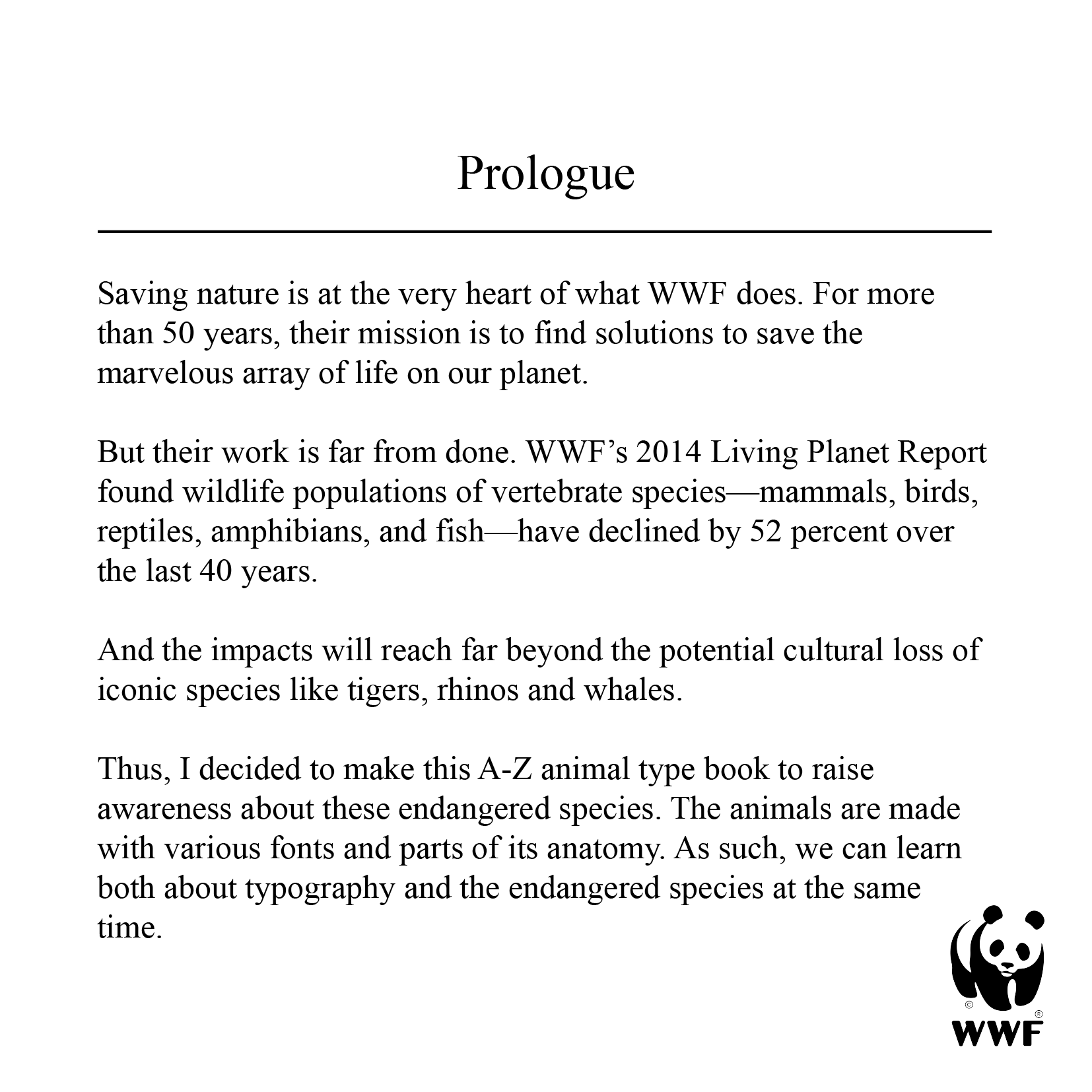
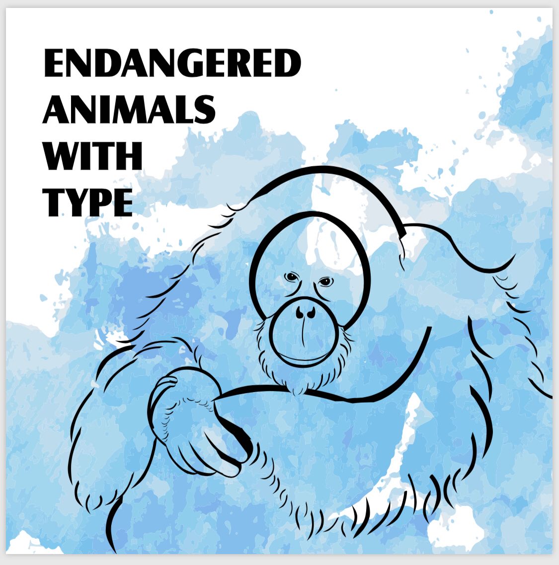
The last 4 panels are my front cover, inner page, prologue and the back cover.
PROCESS:
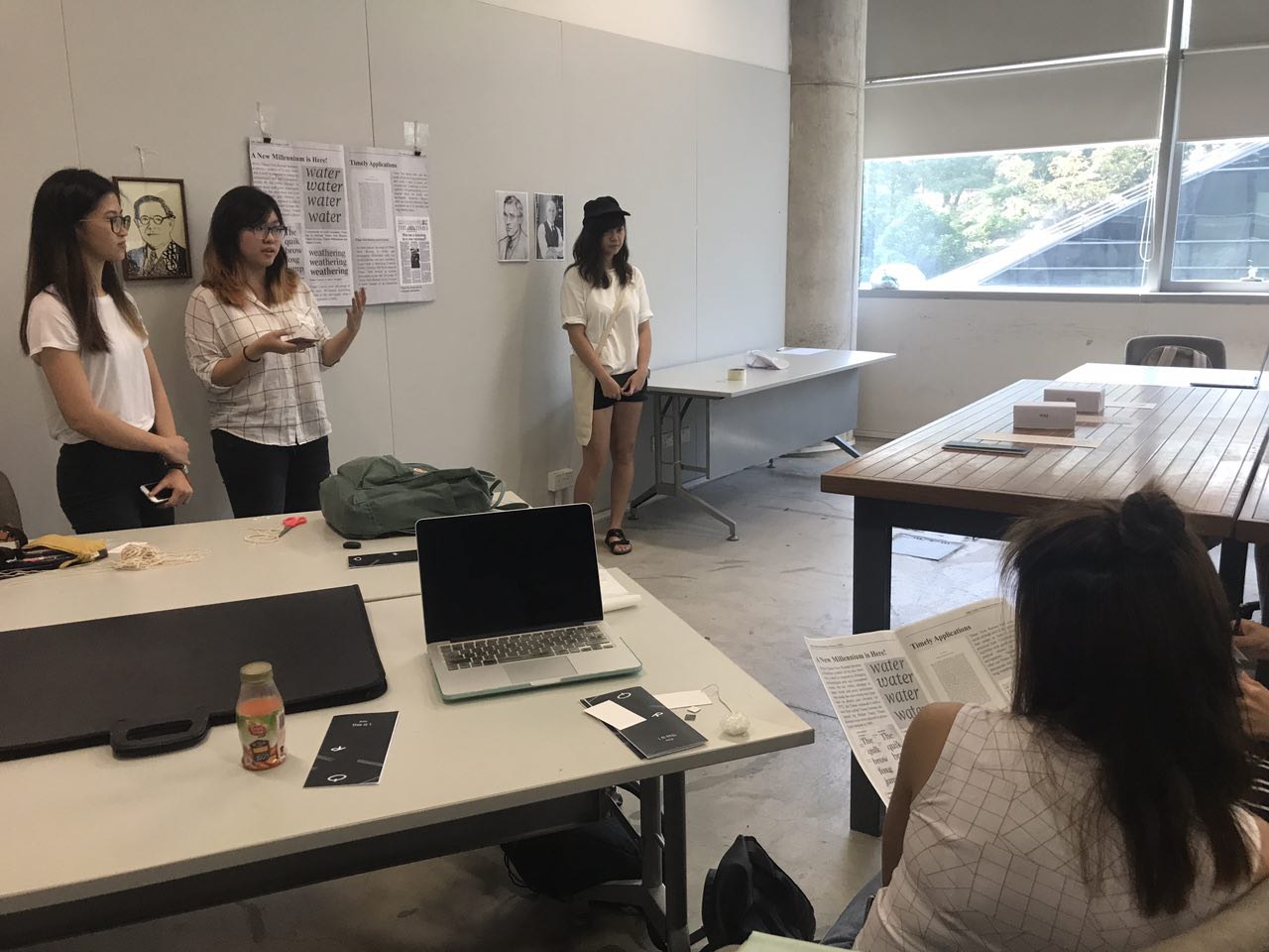
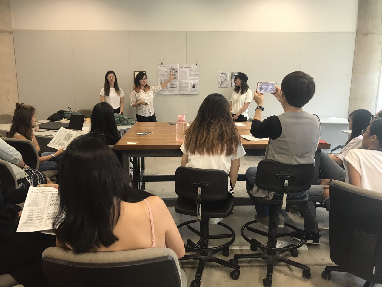
Before finalising those 4, I consulted Shirley regarding them and got some feedbacks. ‘
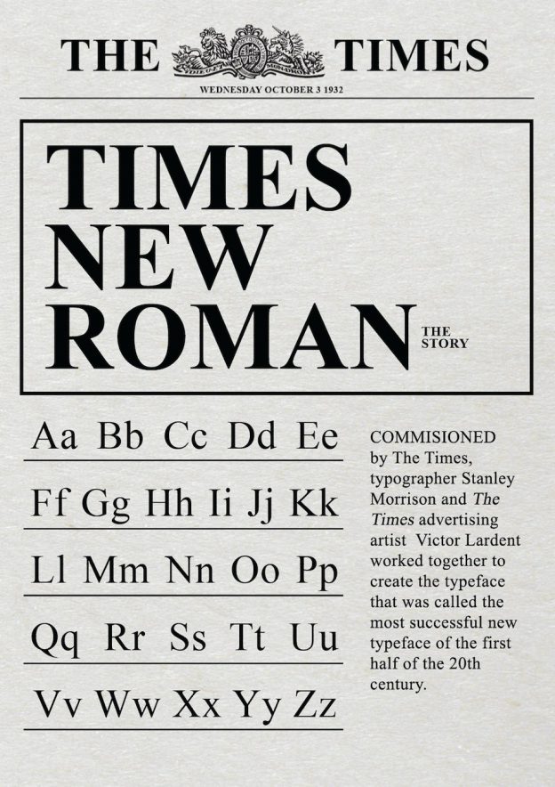
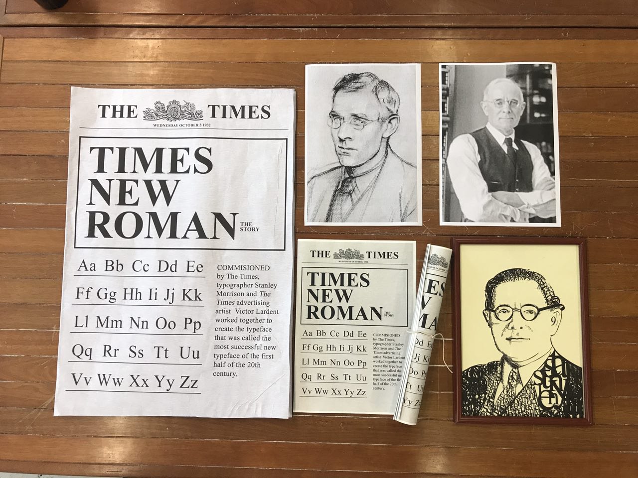
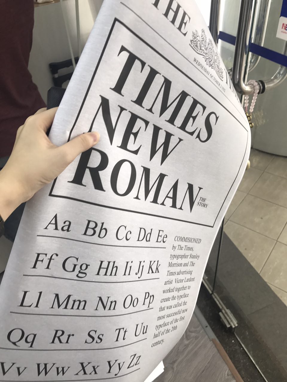
The cover page’s font is Castle T Ultra. I used that font since it was the closest I could get to mimic WWF’s customised font.
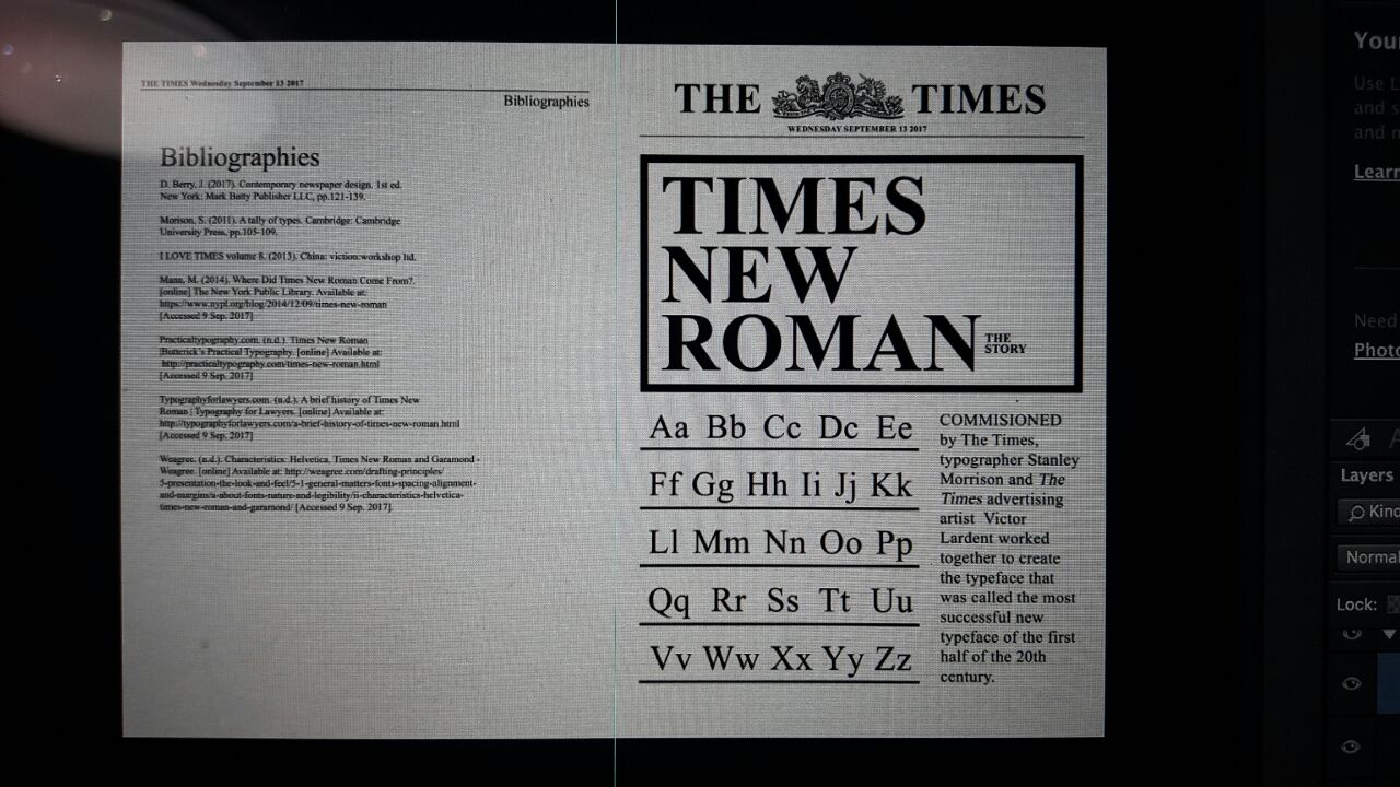
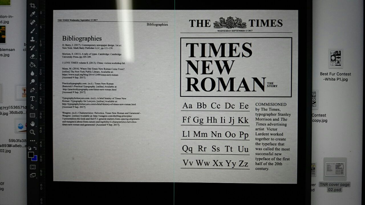
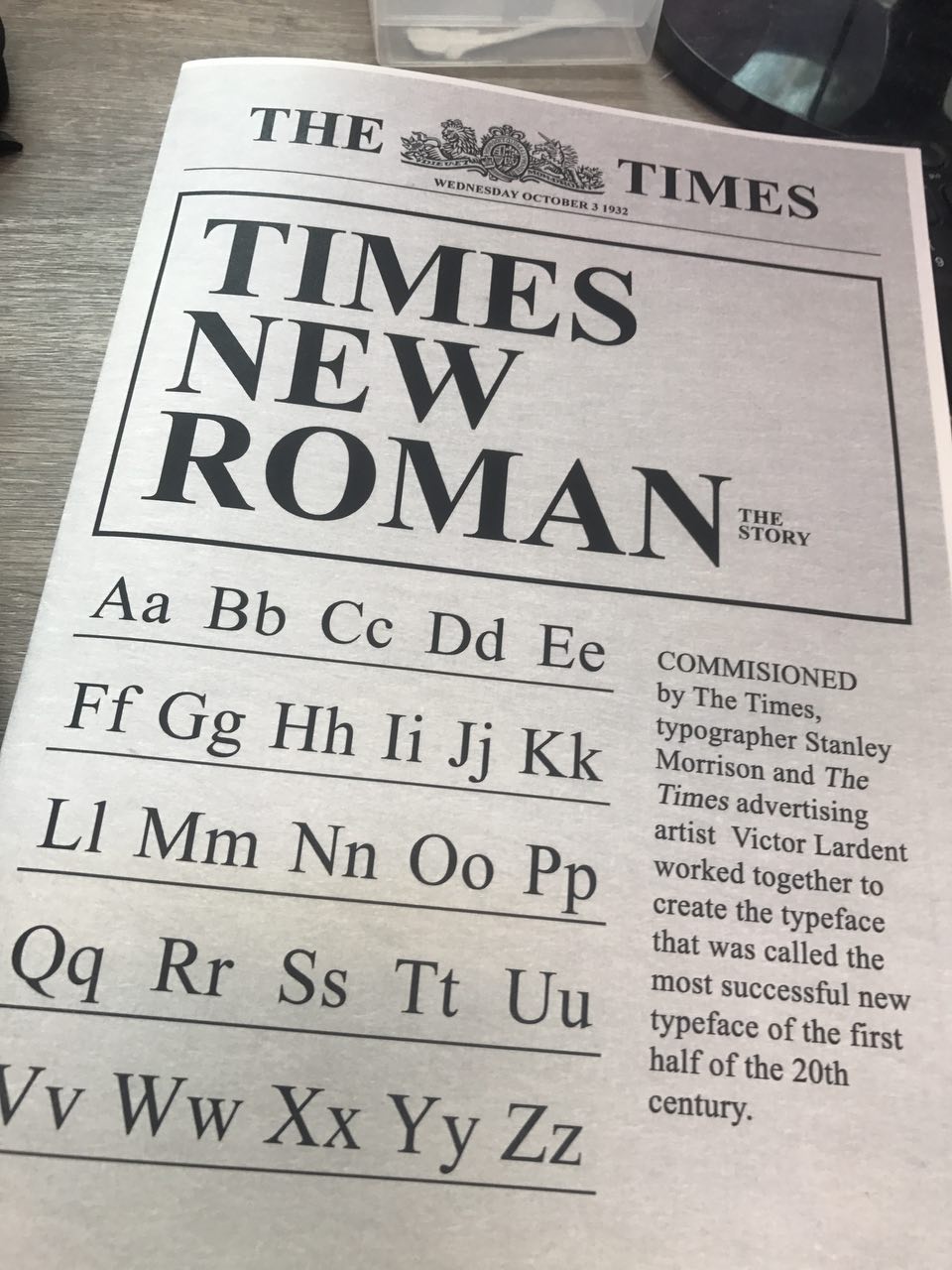
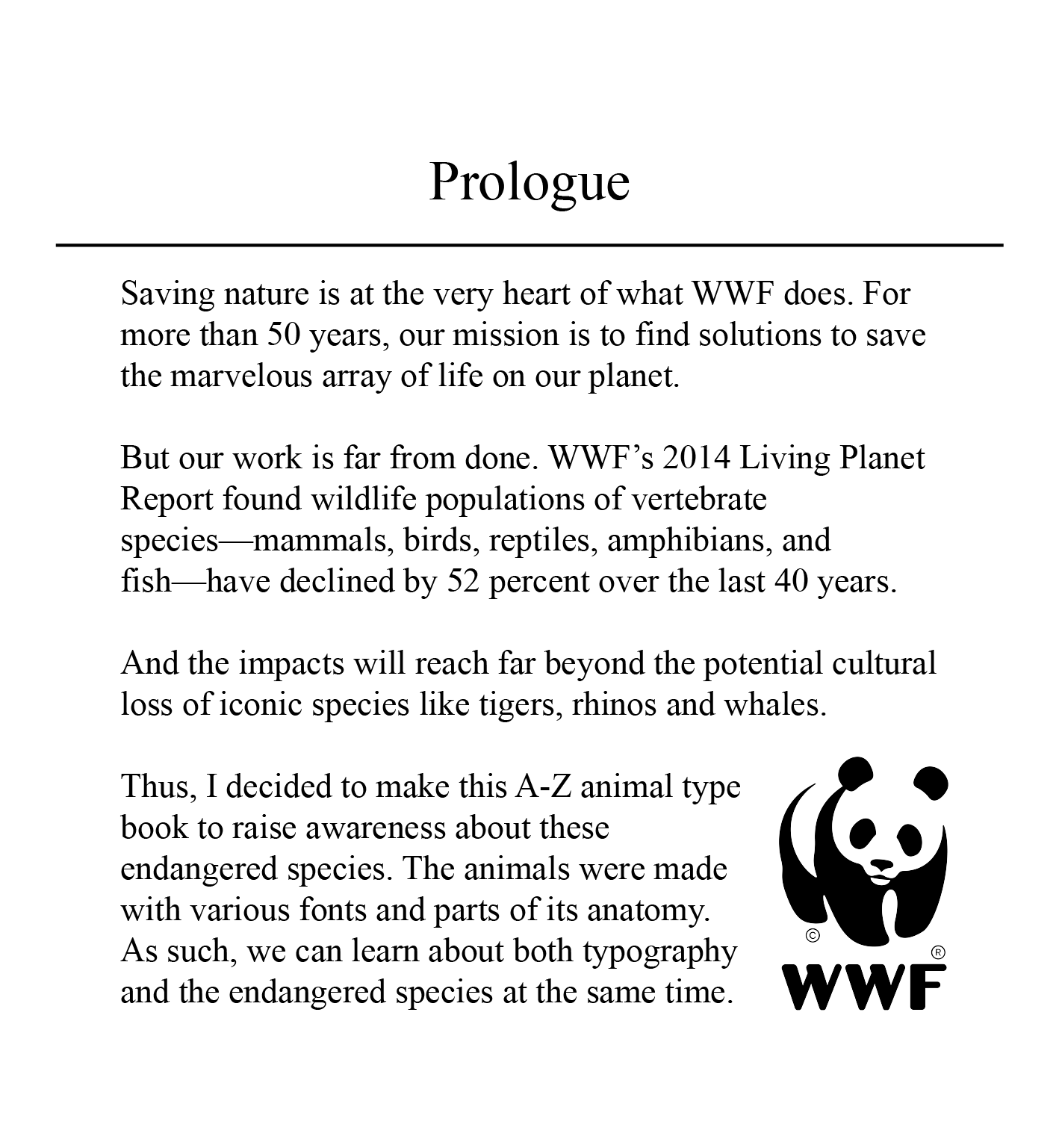
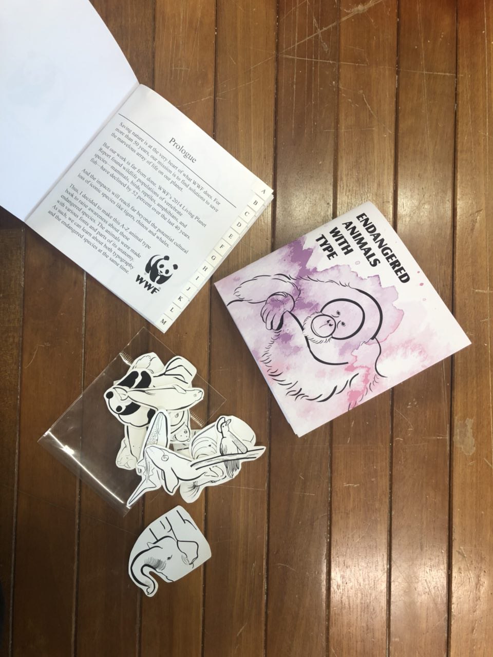
The font used for my intro/prologue page is Times New Roman since I wanted it to look more professional. Also, for my prologue, I took WWF’s mission and incorporated it in together with my objective of raising awareness for these animals/learn about the typefaces.
BEFORE:
(back cover and front cover)

CONSULTATION:
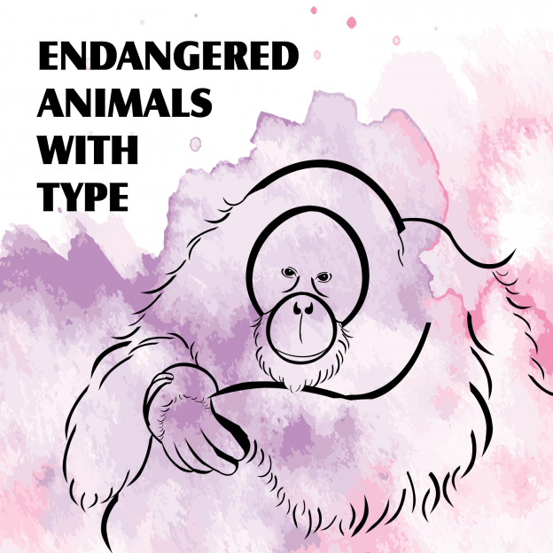
(front cover)
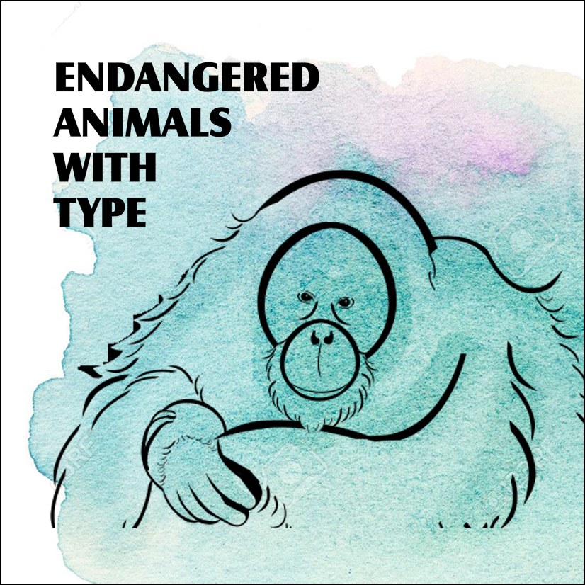
Comments: My font was too big and it fights for attention together with the animals. Choose a focus, either the font or the animal. Perhaps, add a wash of watercolour to bring out colour and texture to draw attention of reader. Remove unnecessary animals and just keep one as the focus.
BEFORE:
(intro/prologue page)

CONSULTATION:


Comments: Unnecessary to repeat title again, so remove it. Why is my name there? What role do I play? The awkward placing of the WWF logo at the corner of the page is weird, so try to text wrap around the logo and there is an orphan word.
AFTER:
So after all those consultations, I came up with these 2 cover page, which I narrowed down to the pink/purple as it looks more alarming for endangered animals rather than the blue which seems more calm and serene.

FINAL SPREADS
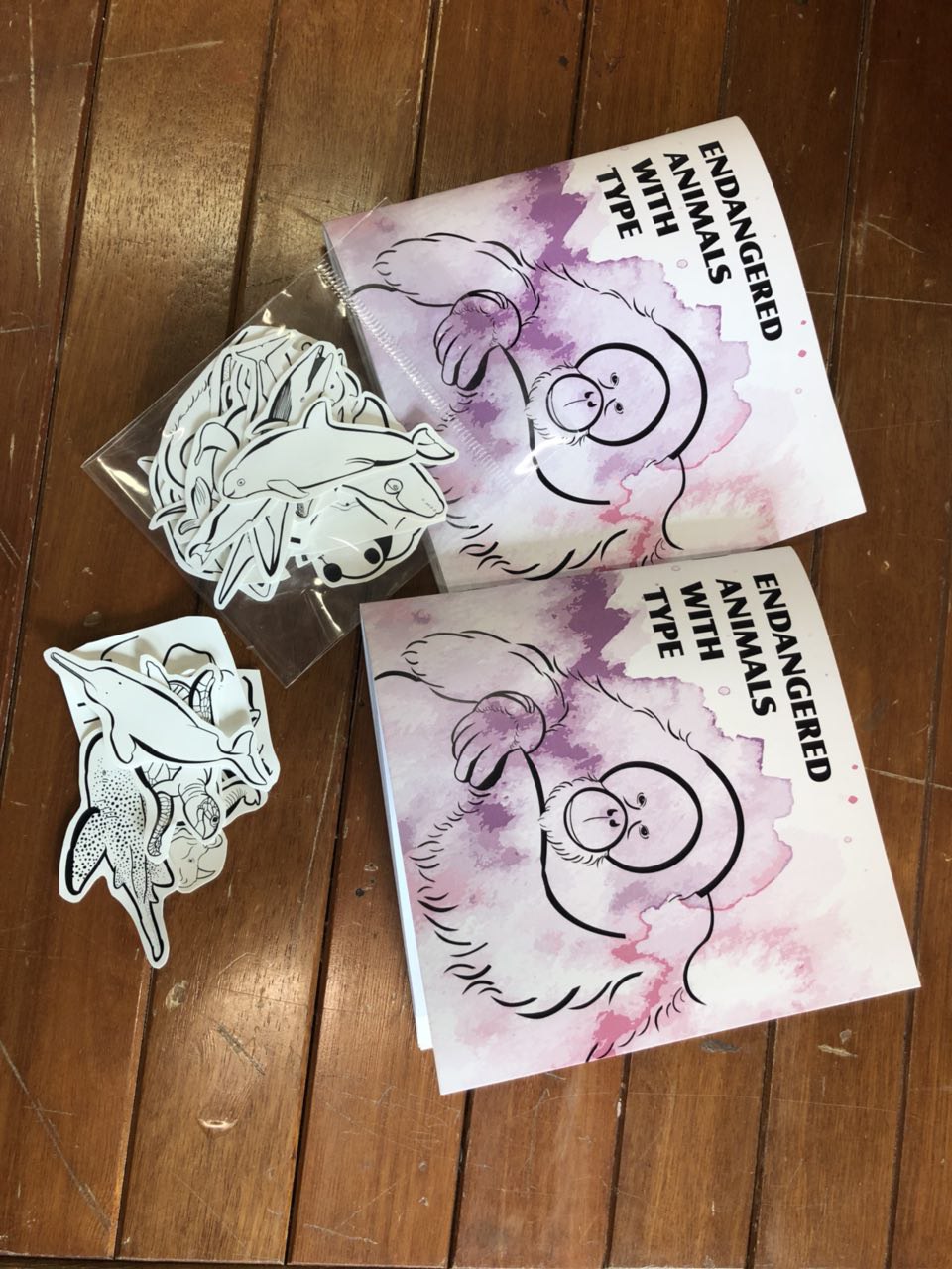
With that, I came up with my final spreads which were ready to print! Here is the finalised work:


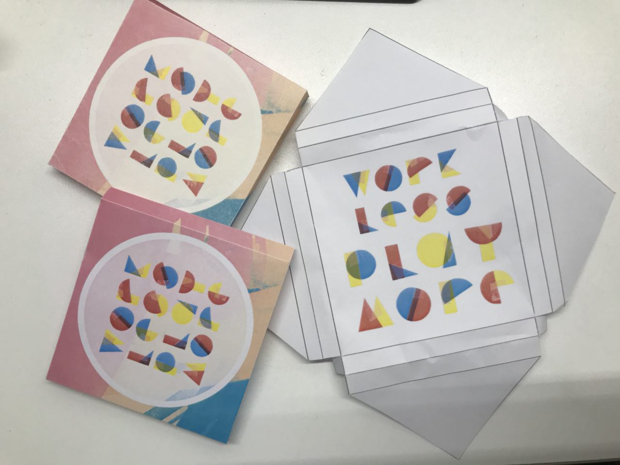
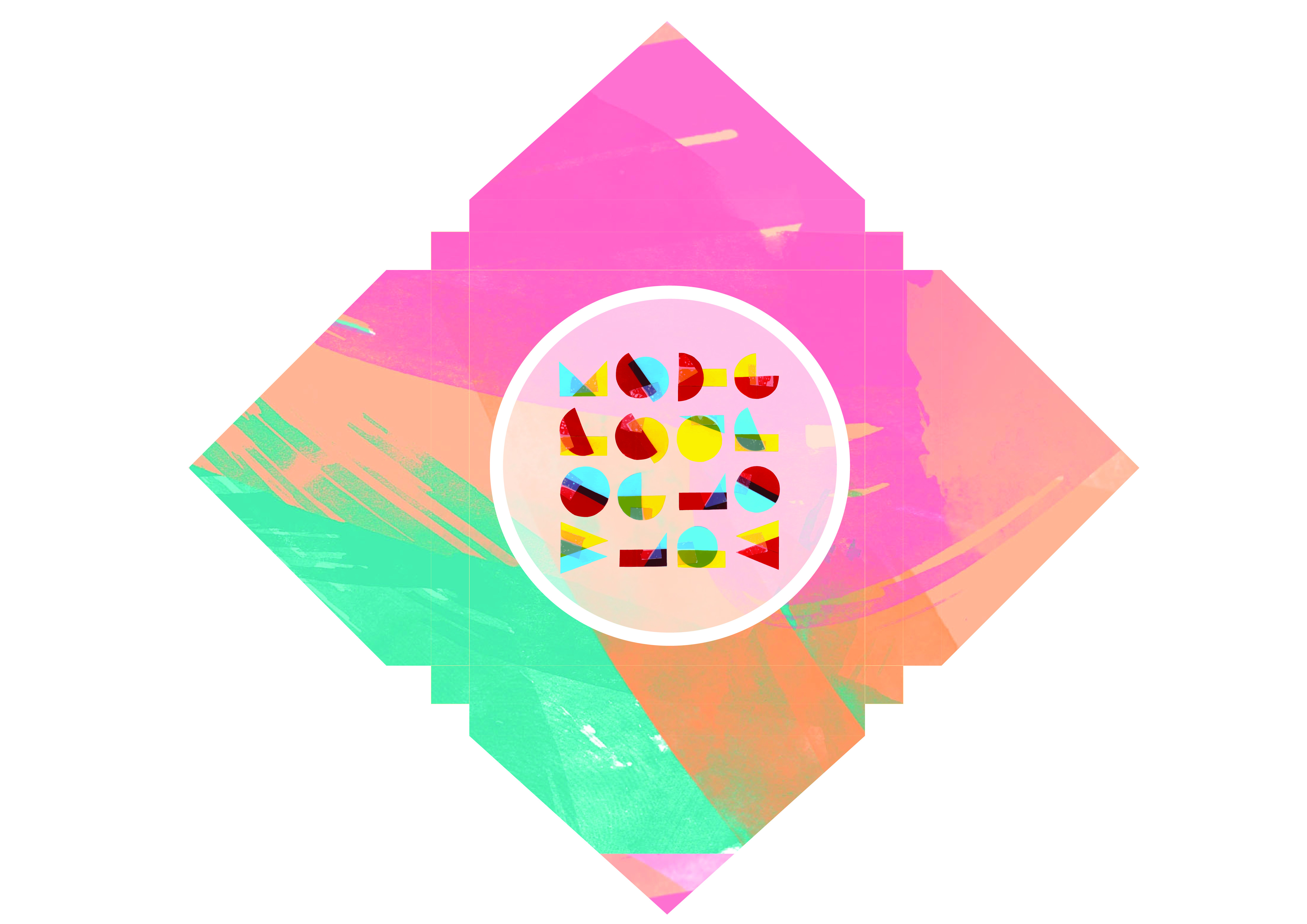
PROCESS AND FINAL PRINT OUT:
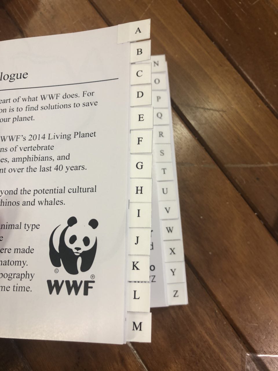
I decided to make tabs for easier readability and had to cut 1cm away from the inner pages for the tabs to be inserted in and it’s a mess as you can see from the above picture. With the remaining half of the vinyl sticker, I made stickers to share with the class, yay!
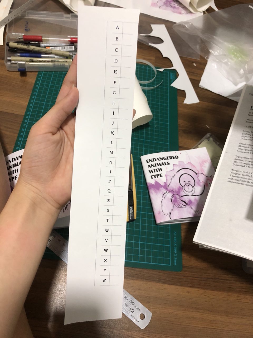
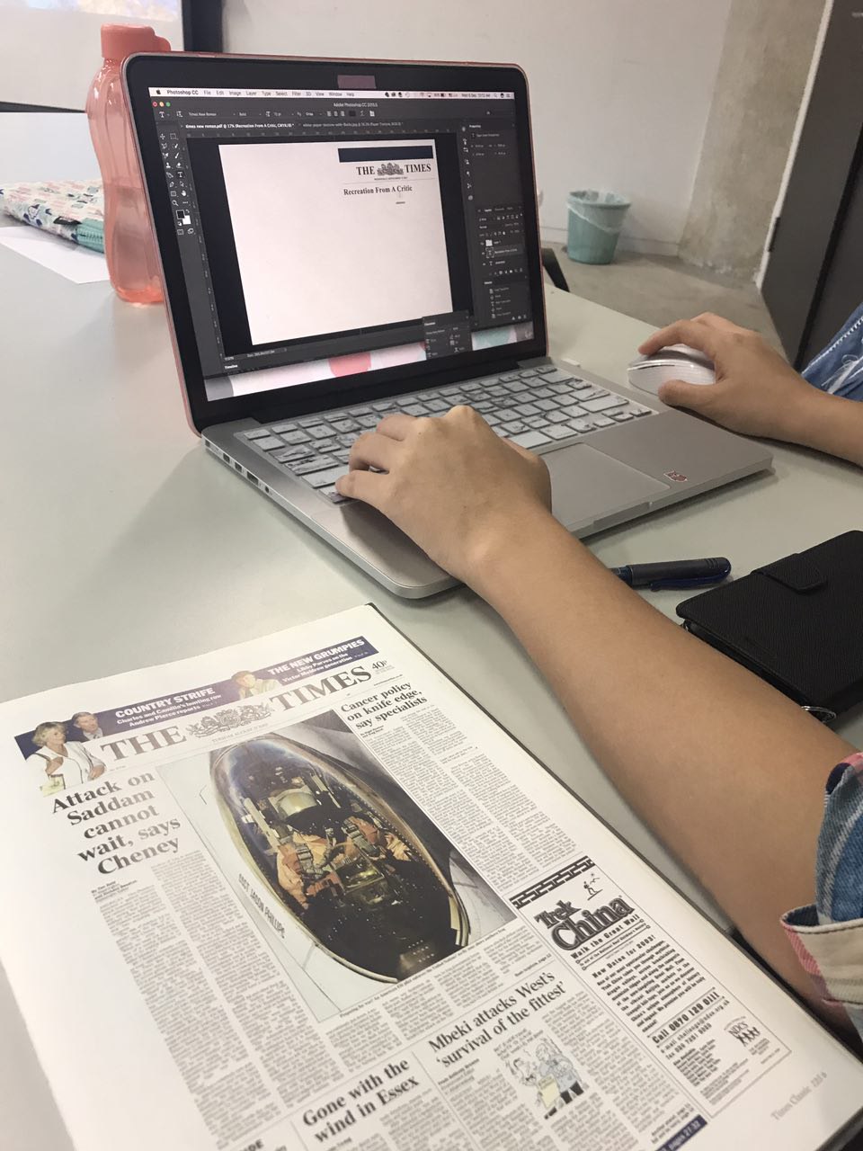
I printed the letters that is unique to each font but it looks a little messy and hard to read which then made me decide to standardise the font to Times New Roman.
FINALISED PRODUCT:
REFLECTION
I really like the final outcome of this project. I learnt so much about the different endangered animals and the anatomy of various typefaces.
If I had more time for this project, I would explore further about colouring them and making a larger book so I could include some facts regarding the animals for people to be more aware about saving nature.
All in all, this is a project that I would definitely show people since it was one of the first ever books I made.
That’s all folks!