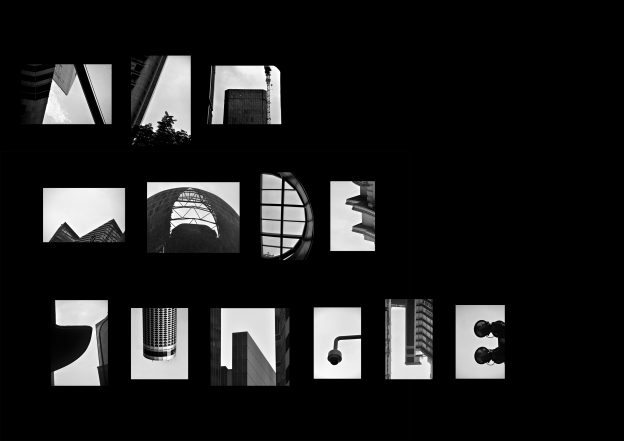
First off, I started out with the place I wanted to go. It was the CBD (Central Business District). Since Singaporeans are the fastest walkers, with a walking speed of 10.55 seconds/60ft, I wanted to go with a quote like “Not Now, I’m Busy”. But soon after, I decided to go with the phrase “concrete jungle/man made jungle”. (In the end I settled for Man Made Jungle)
All in all, I made 3 trips down to the CBD and 2 out of 3 times, IT RAINED ;-;
During my first trip, I went down to recce the area and took photos like the MBS. But only at the end of the first trip, I realised I wanted to play with the negative spaces. Also, I felt that the negative space typography was clear and straight to the point.
Here are some of the inspirations that i found online which sparked my interest to do so:

And then I made a second and third trip down to CBD to find my letters 😀 (I walked around aimlessly tho)
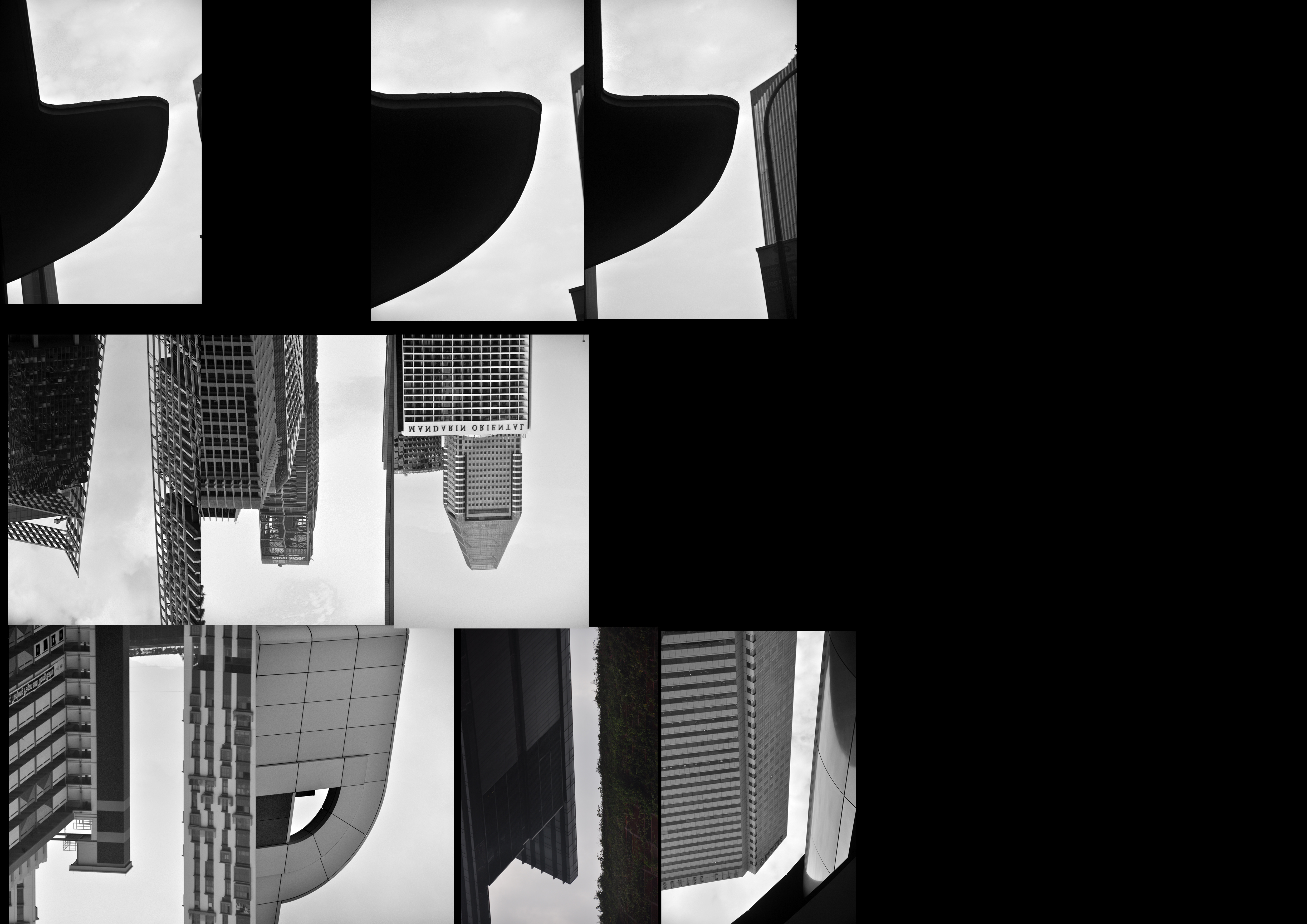
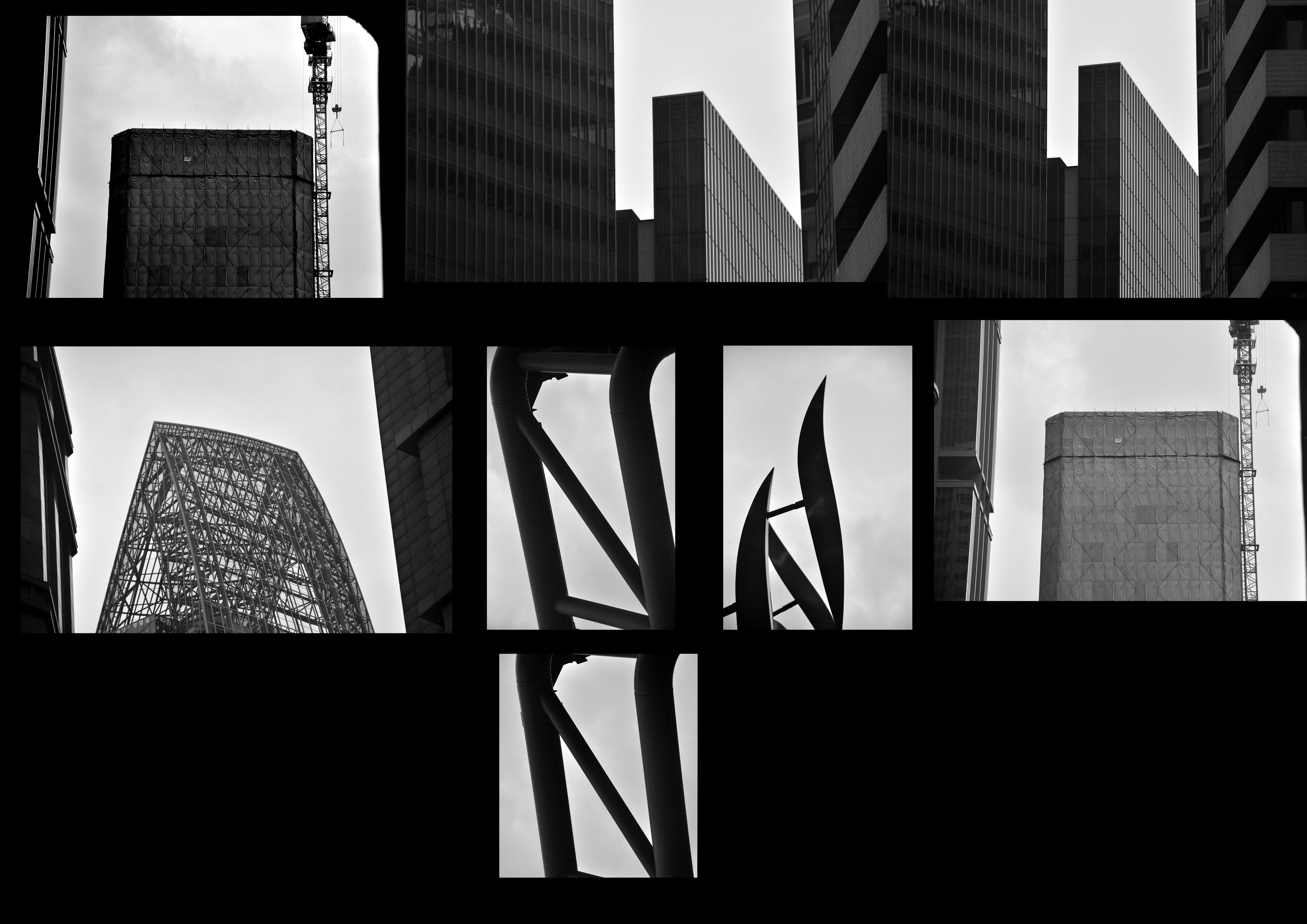
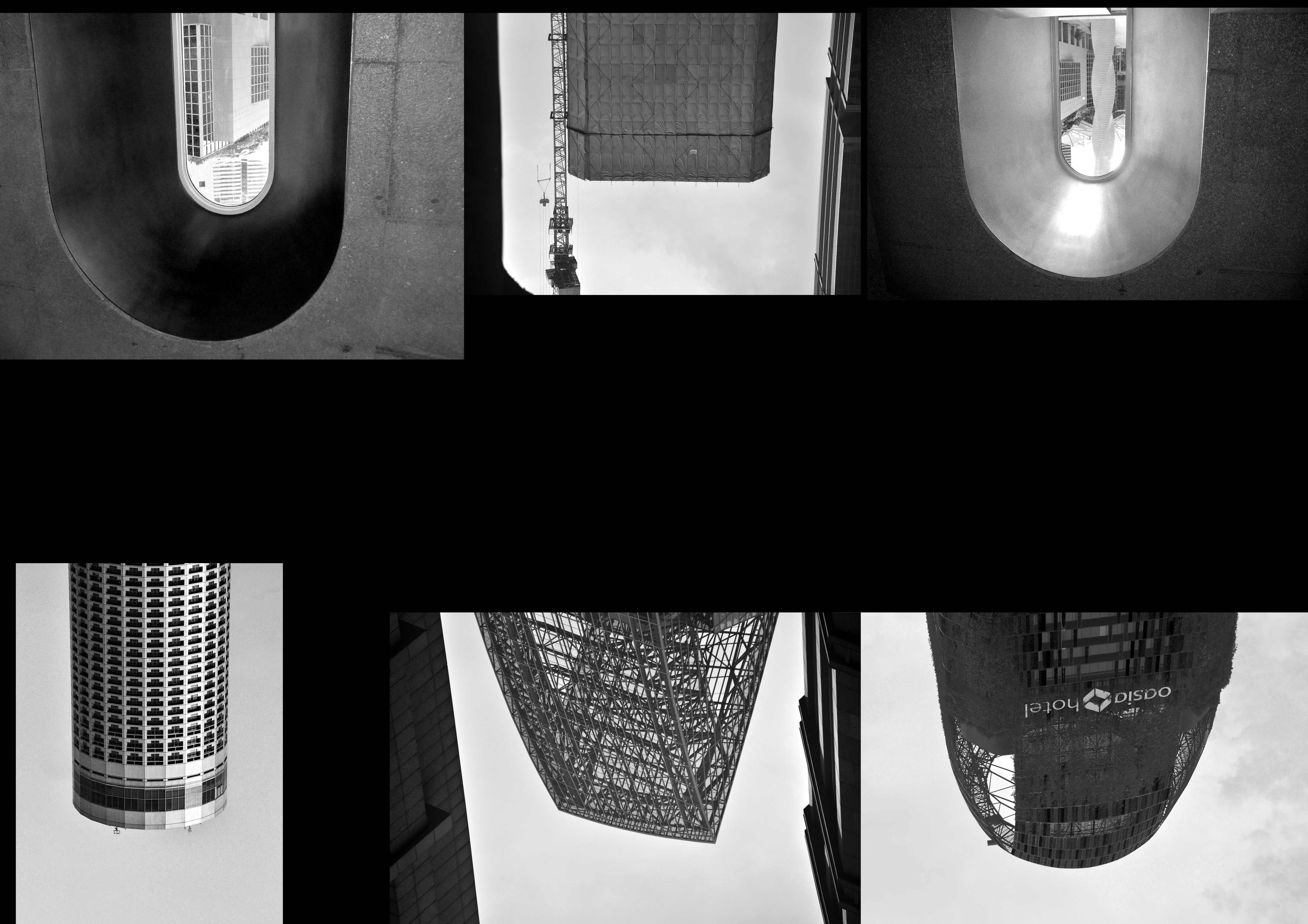
Here are the letters i found:
LETTER D
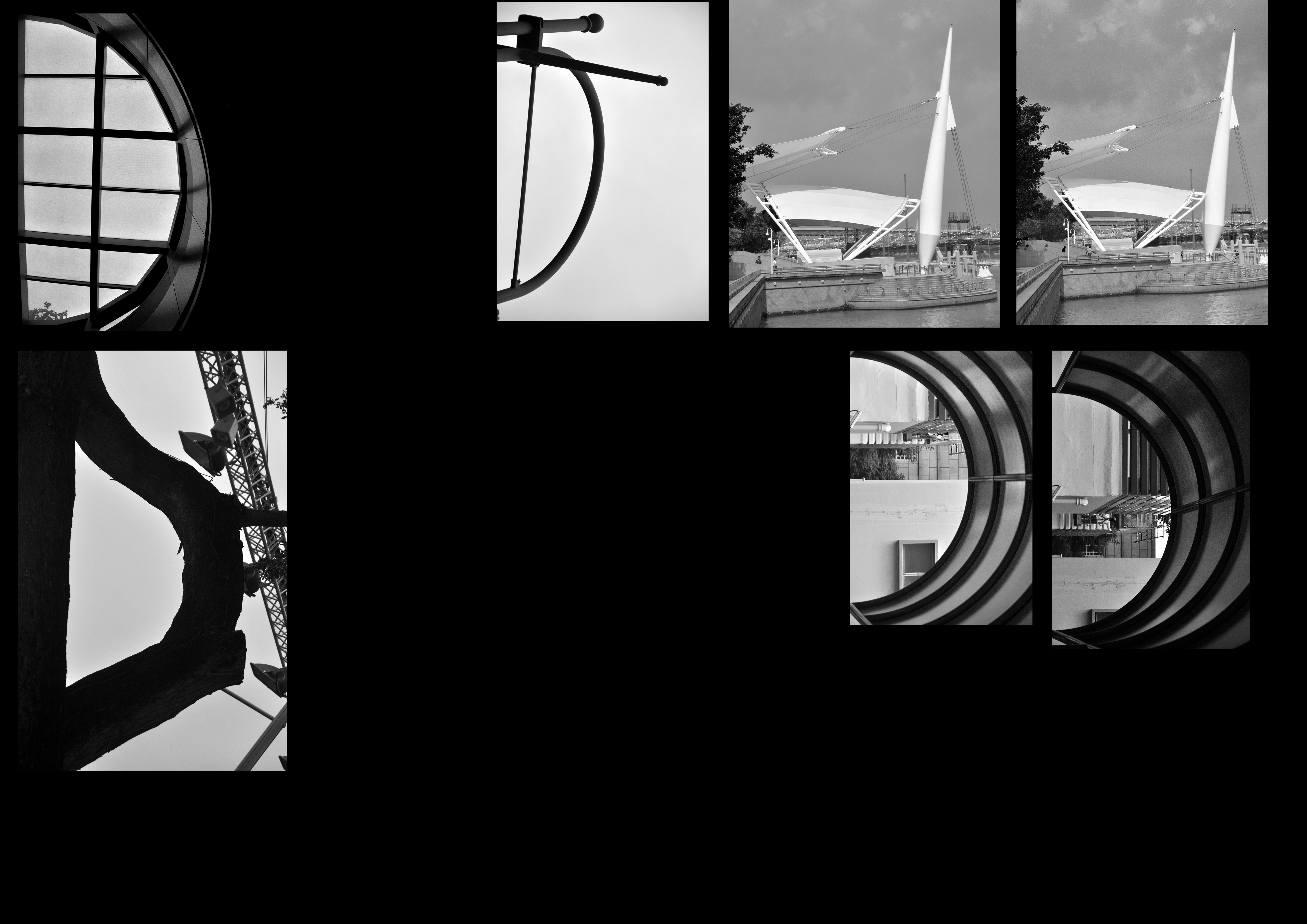
LETTER E
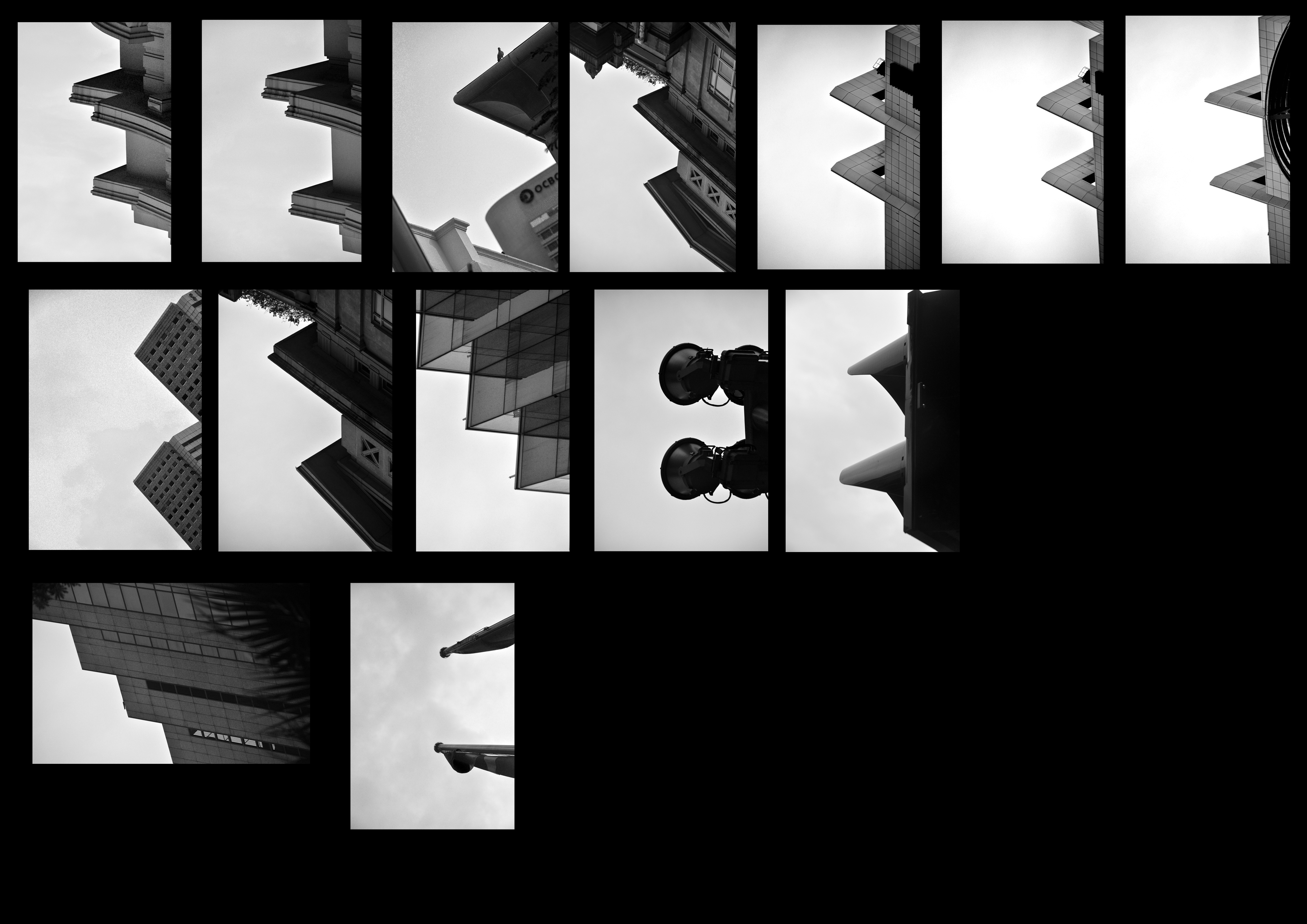
LETTER G (this was the hardest letter, I only found it at the end of my 3rd trip down to CBD T_T)

LETTER J (the one that made me realised that I could play with negative and positive space)
LETTER L
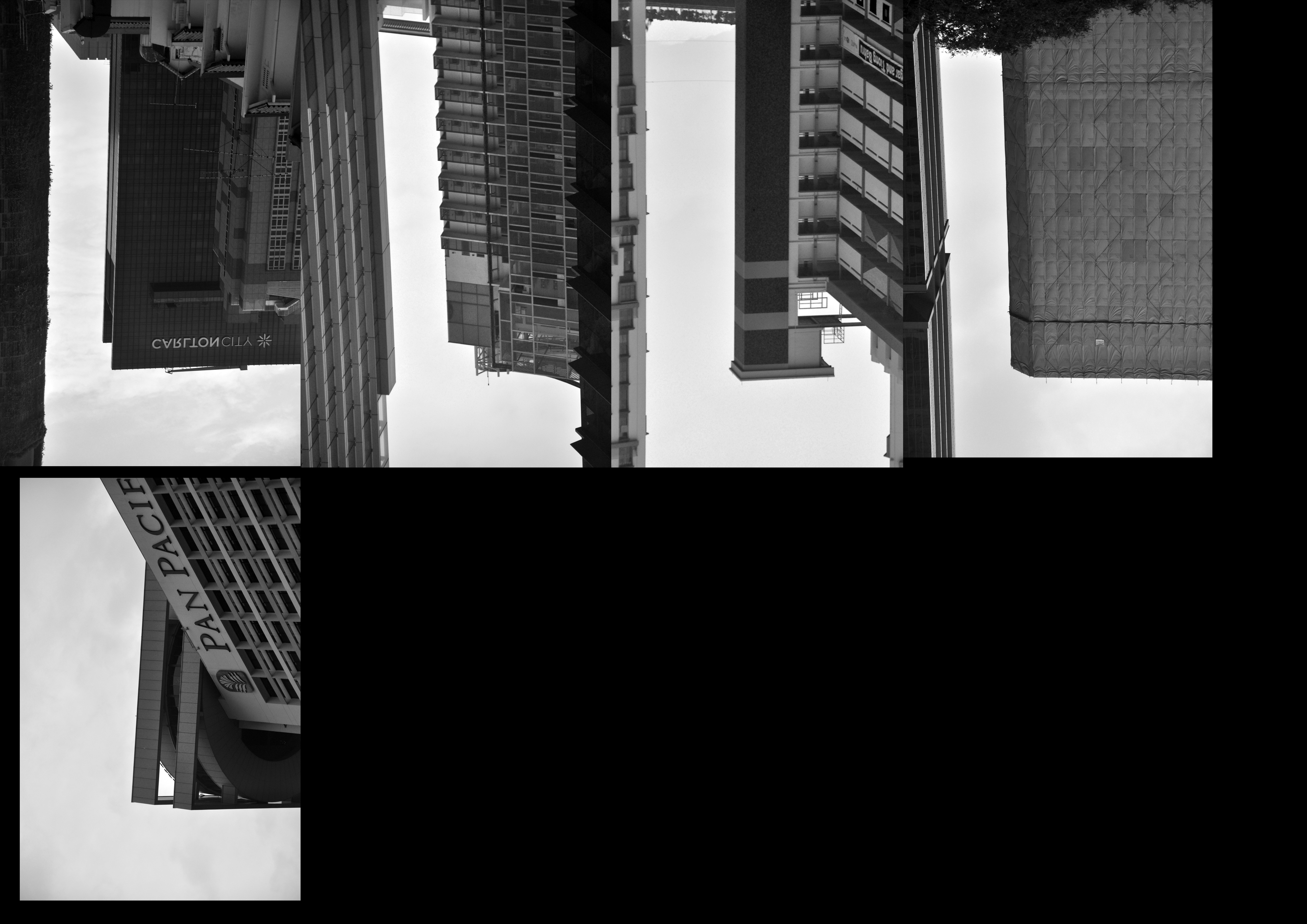
LETTER M (where my whole project 2a all started out)

LETTER N
LETTER U
LETTER A
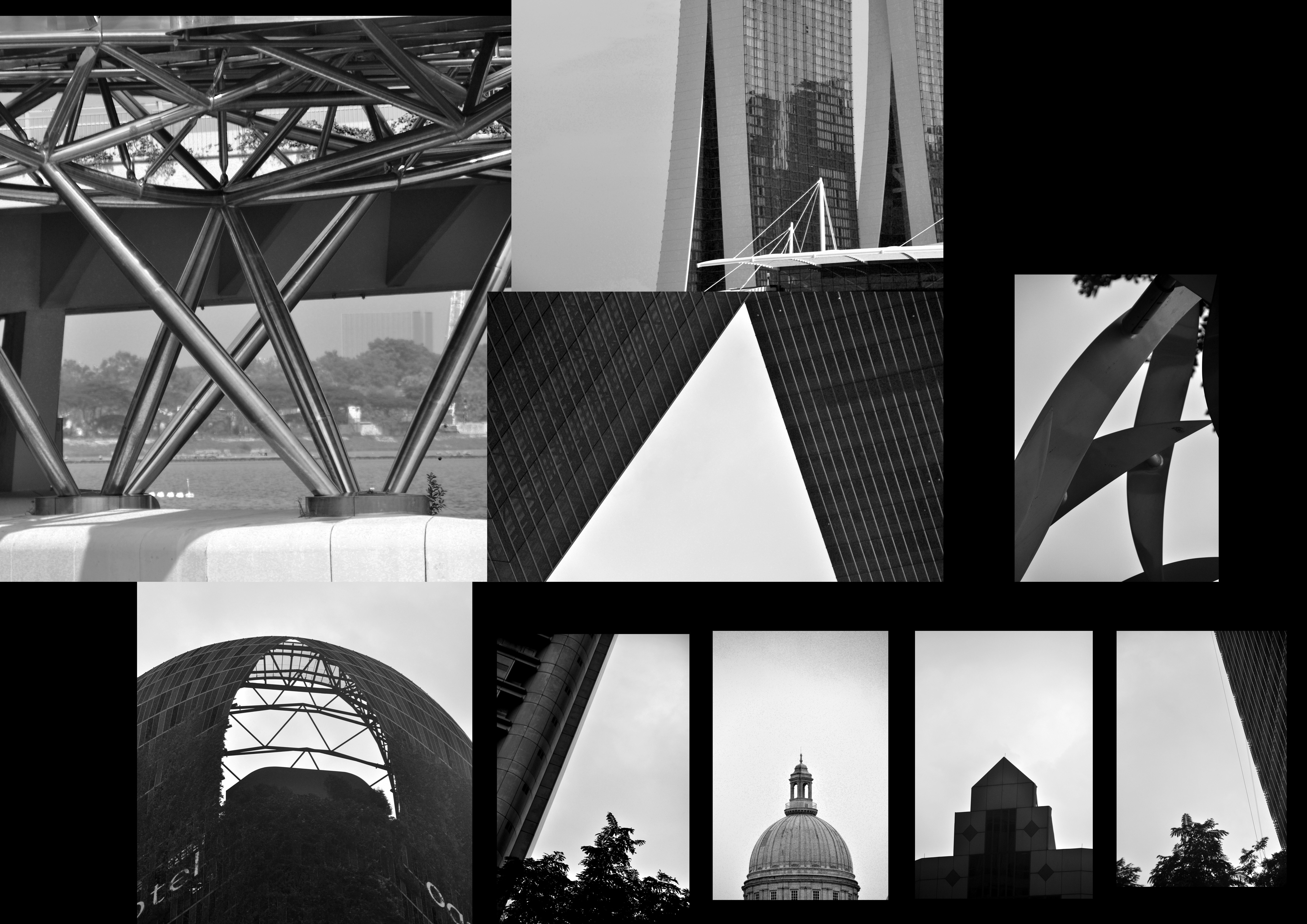
I know that some of the letters are black (positive space) and I had to just pick the best of the white letters (negative space) to make it consistent throughout. It was difficult to spot the letters but I guess that is just part of the journey. I realised that if we look closely at a different perspective, typography is everywhere.
Here’s my final piece:

AND I’M VERY HAPPY W HOW IT TURNED OUT (yay)
Thanks for reading 🙂