Category Archives: Process

Project 3: Task 2 – Research and Development

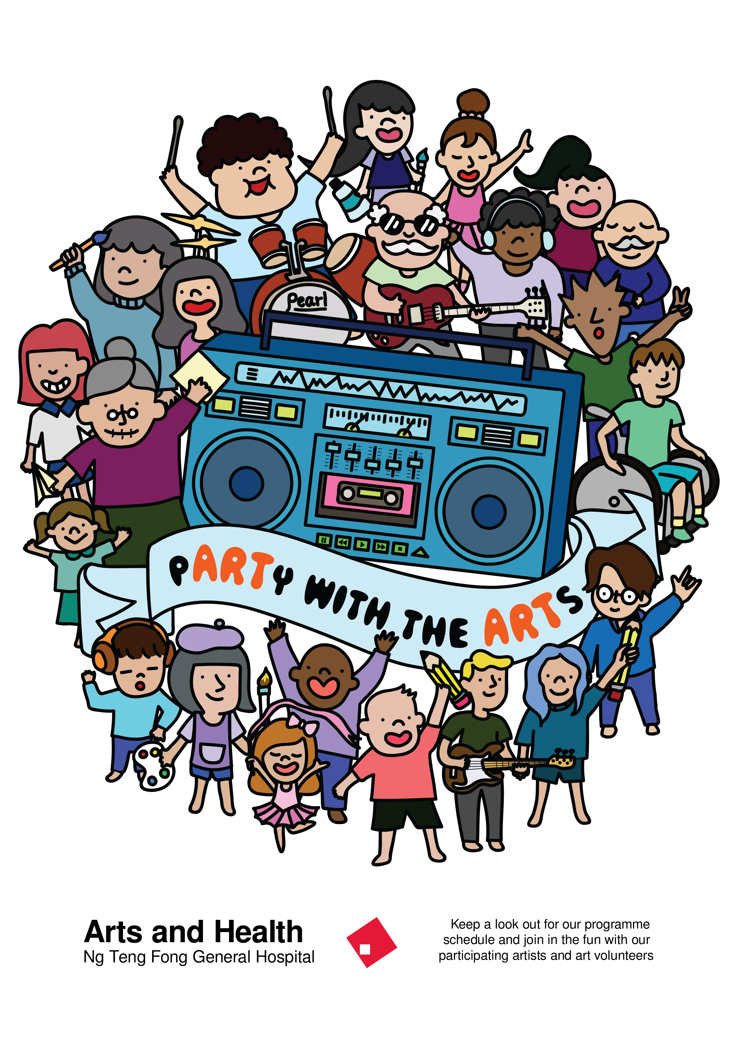
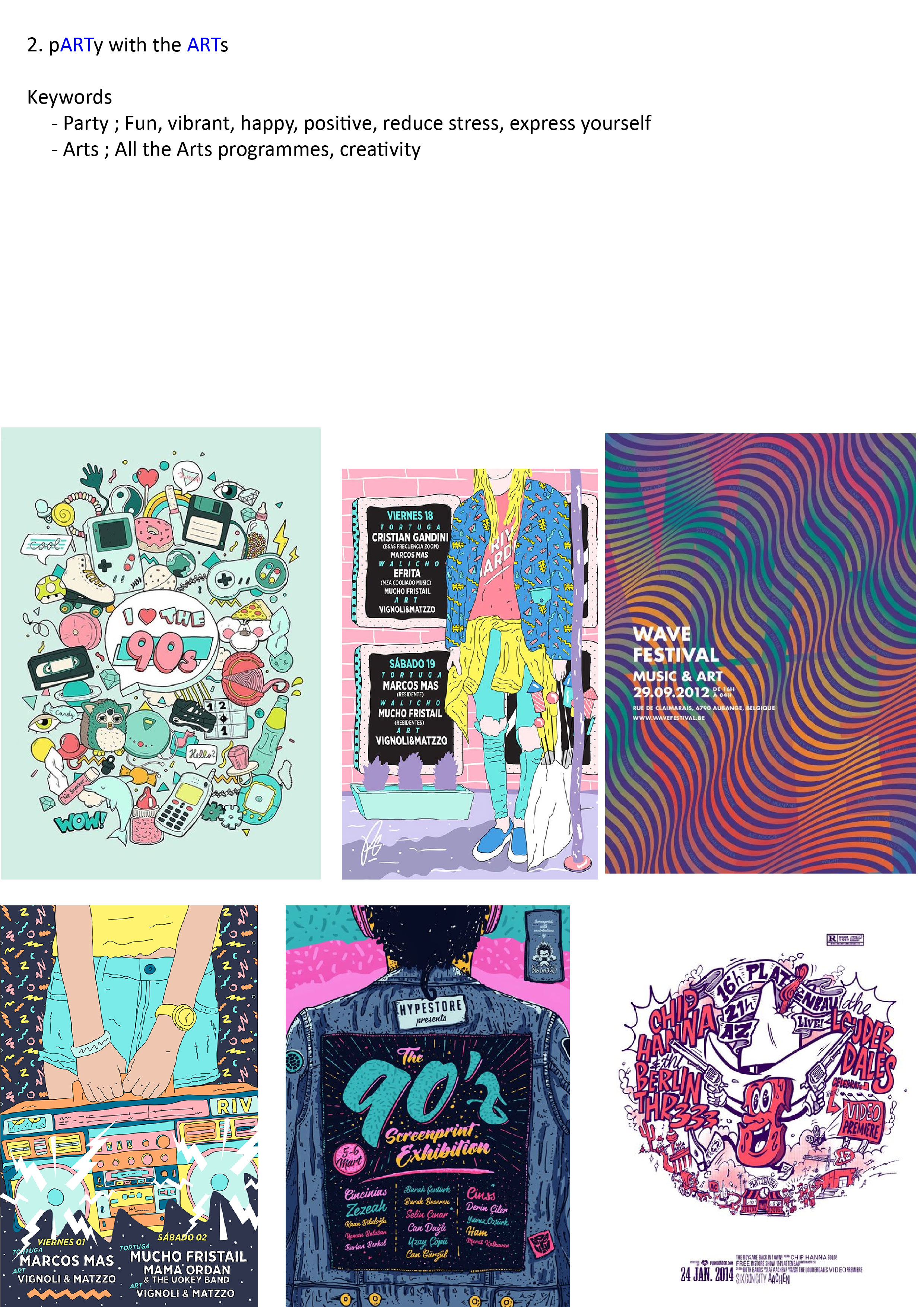
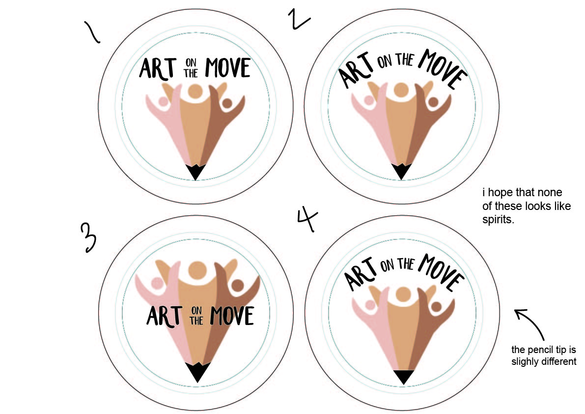
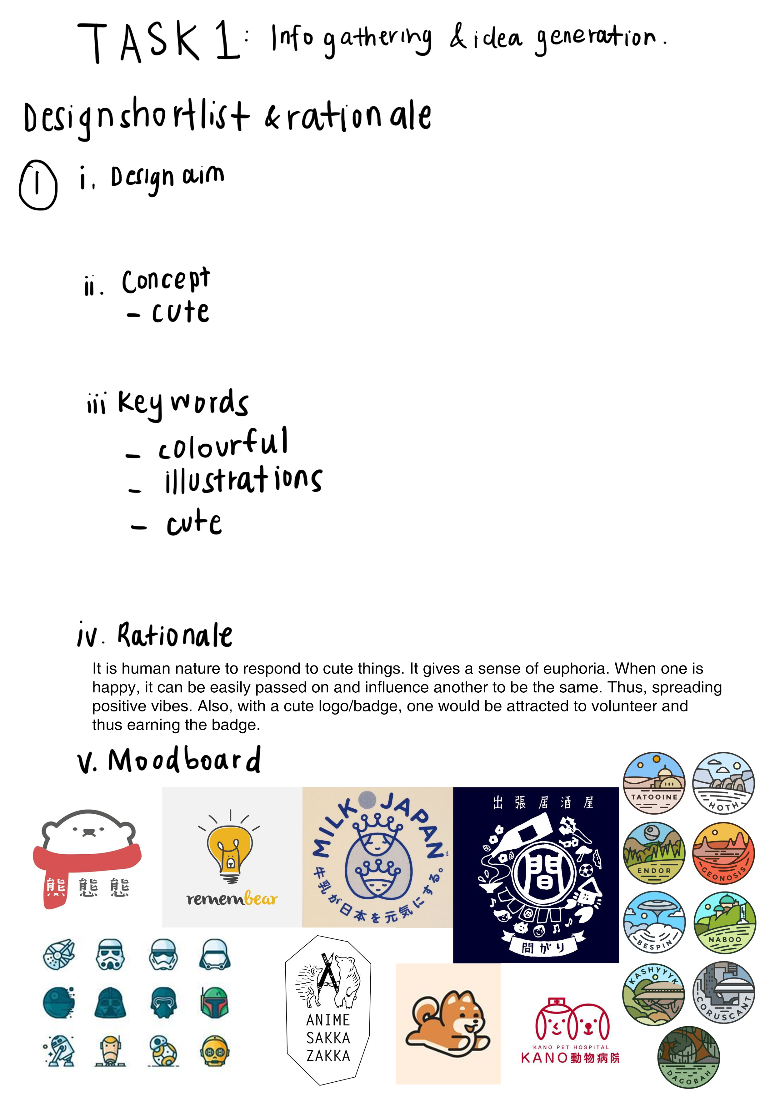
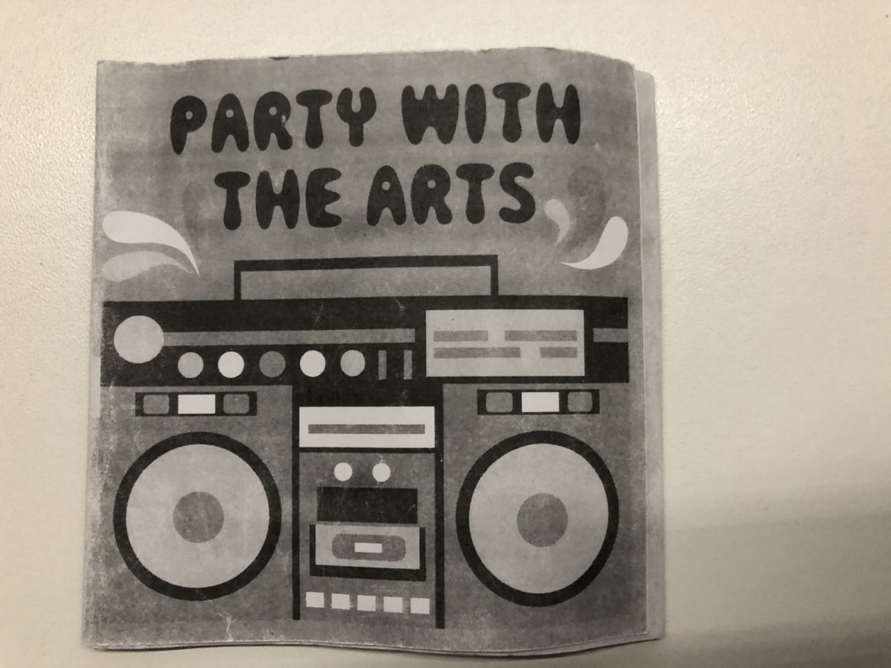
So I continued with my previous idea of “Party with the Arts” onto this project but changed the illustration style.

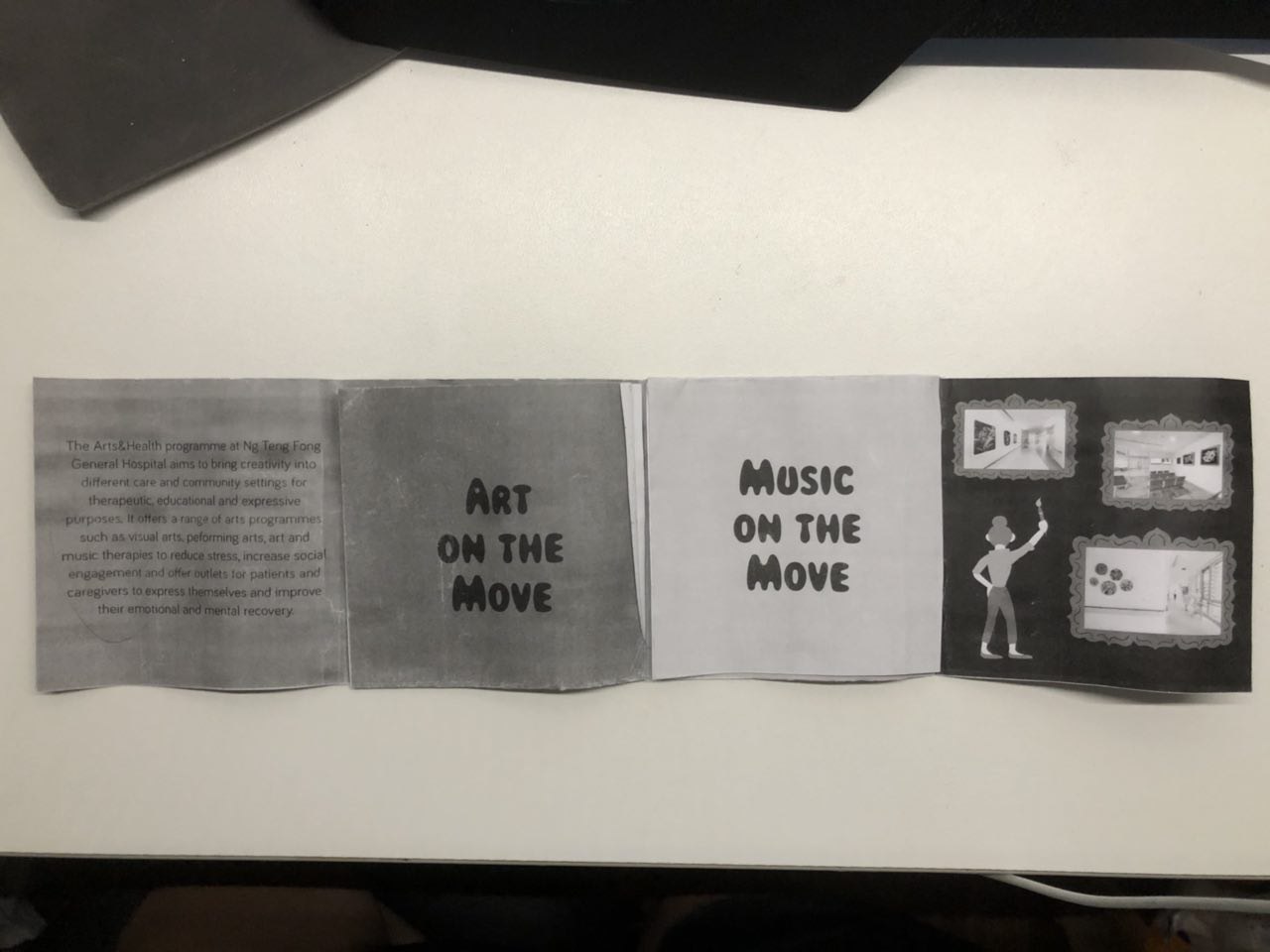
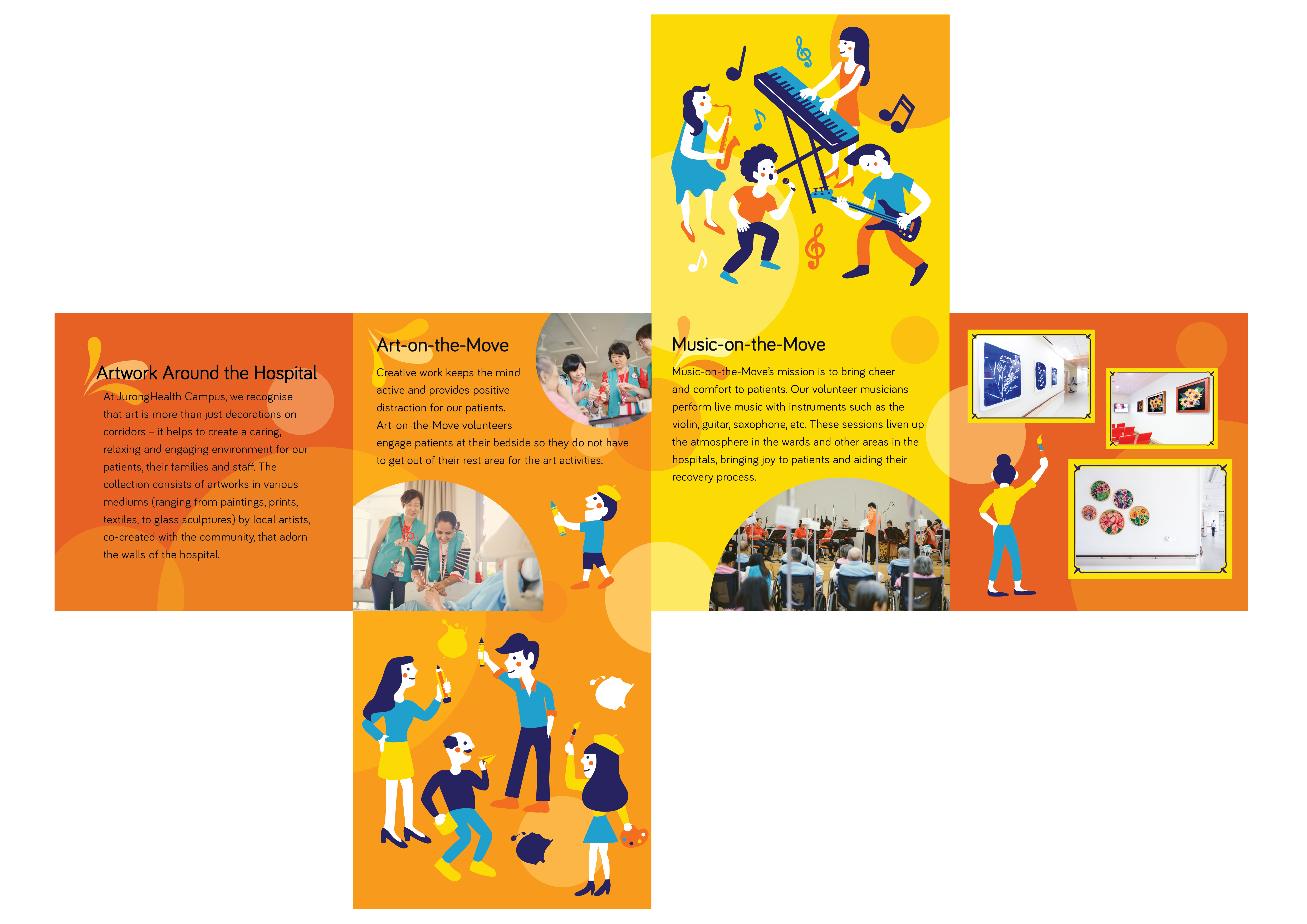
This is my layout on illustrator:

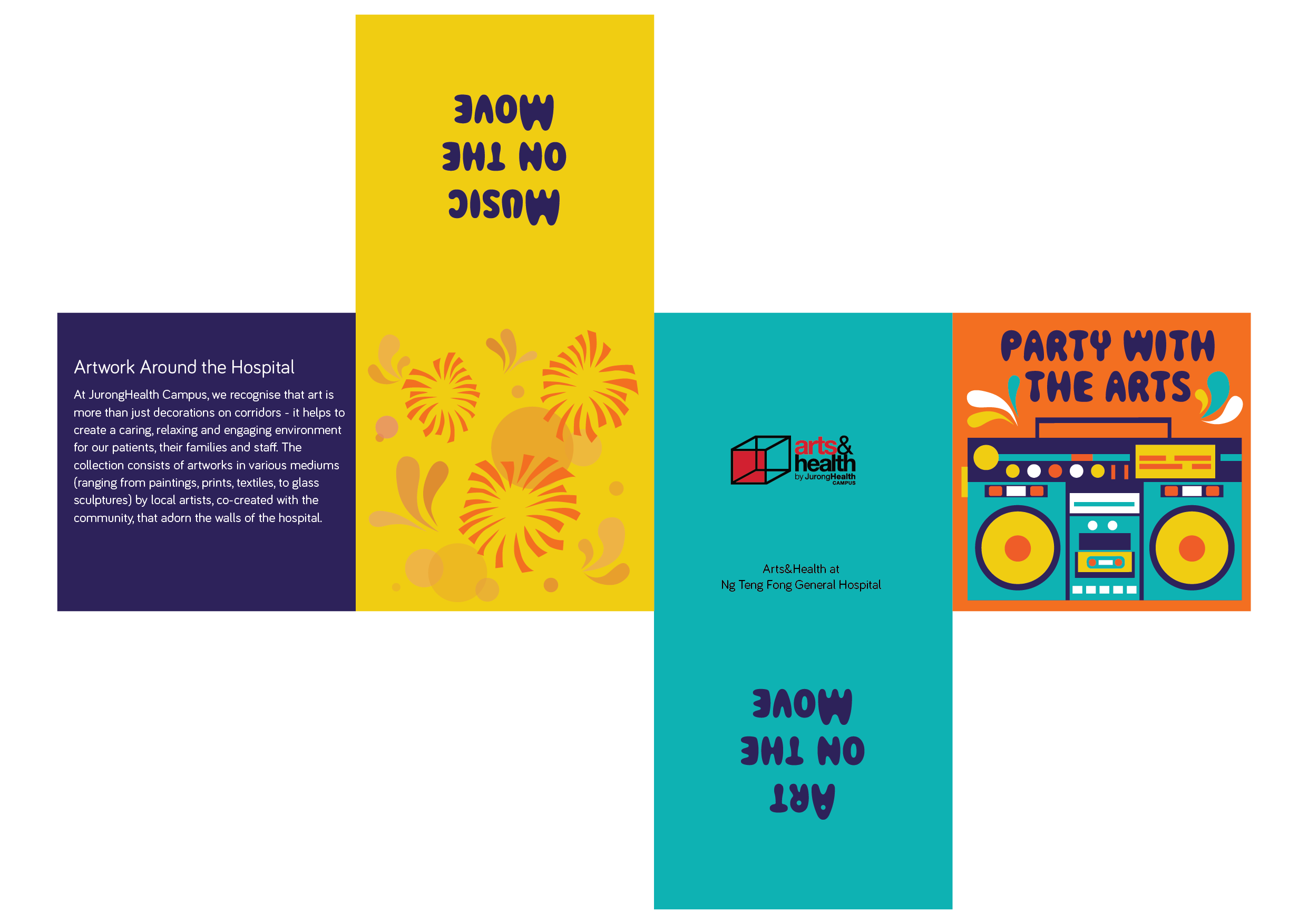
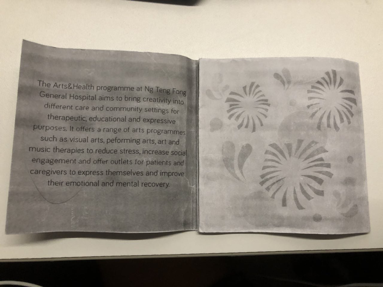
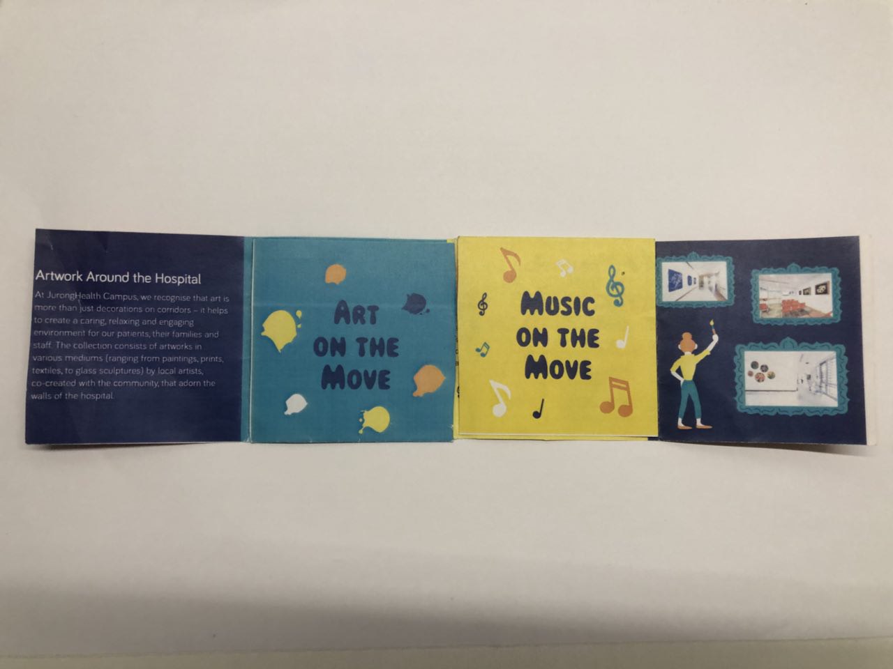
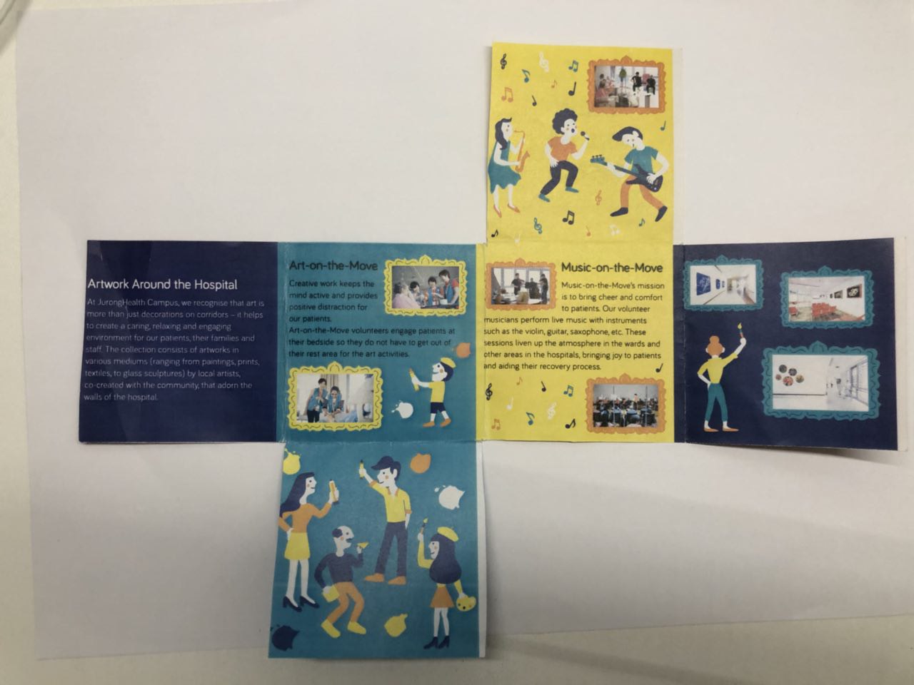
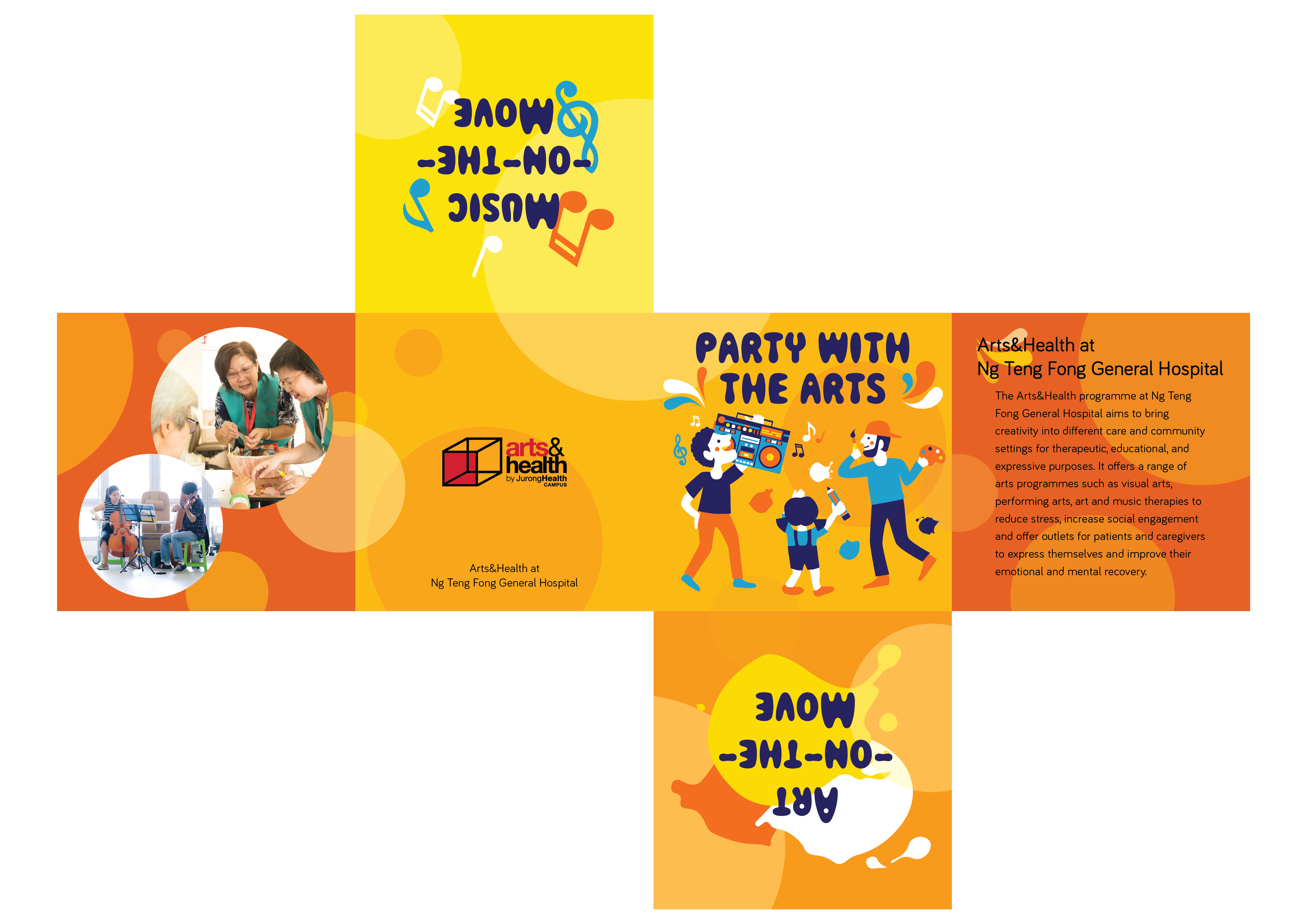
Here’s how it looks like when folded:

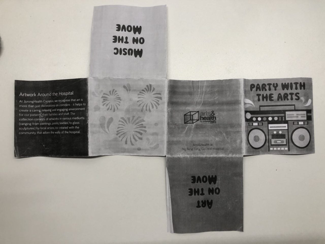
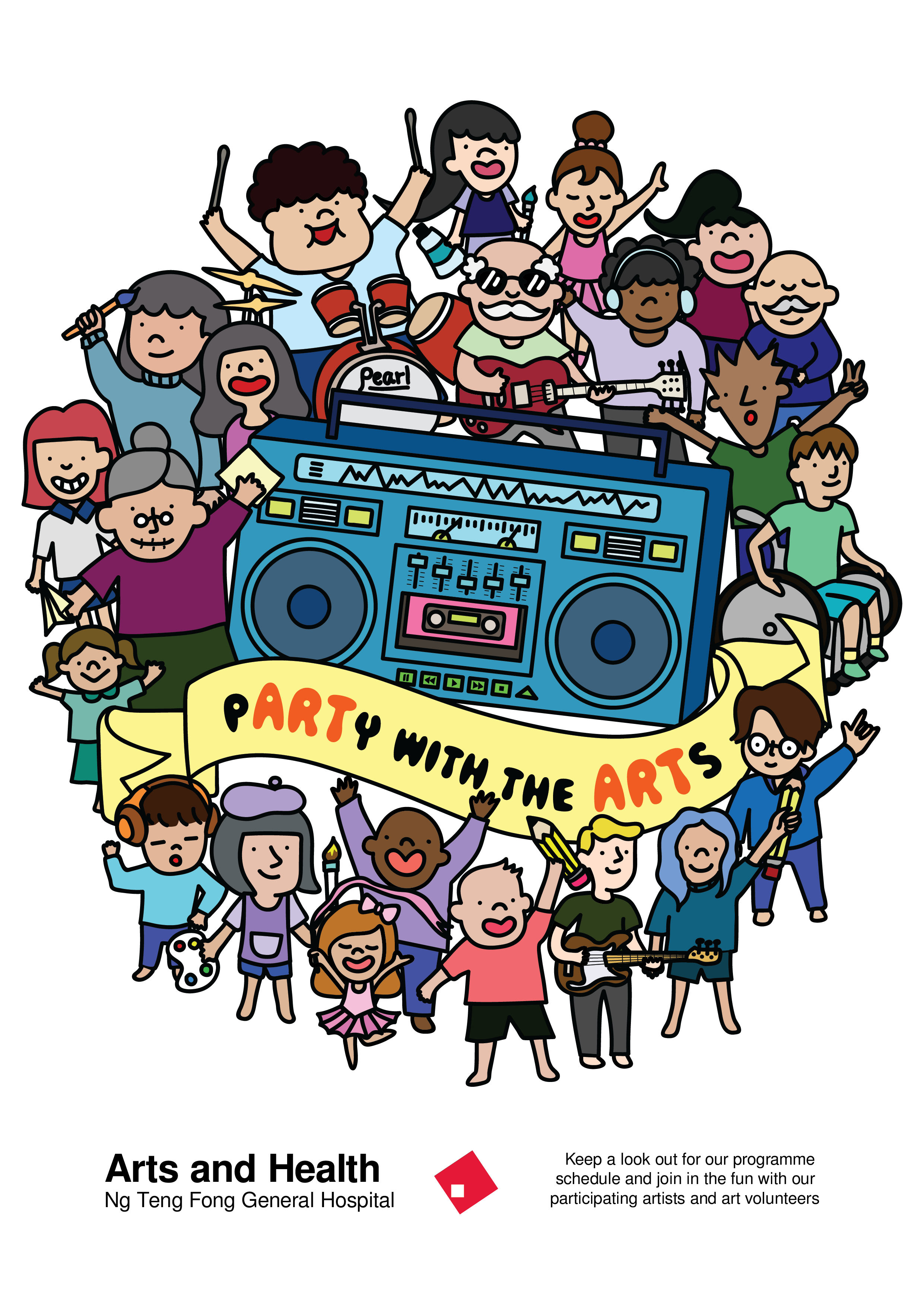
The feedback that I got for this first draft was:

  1. The boombox in the cover page was static and no energy could be felt from it.
  2. The folds were a little awkward too and it might be hard for some to fold it back.
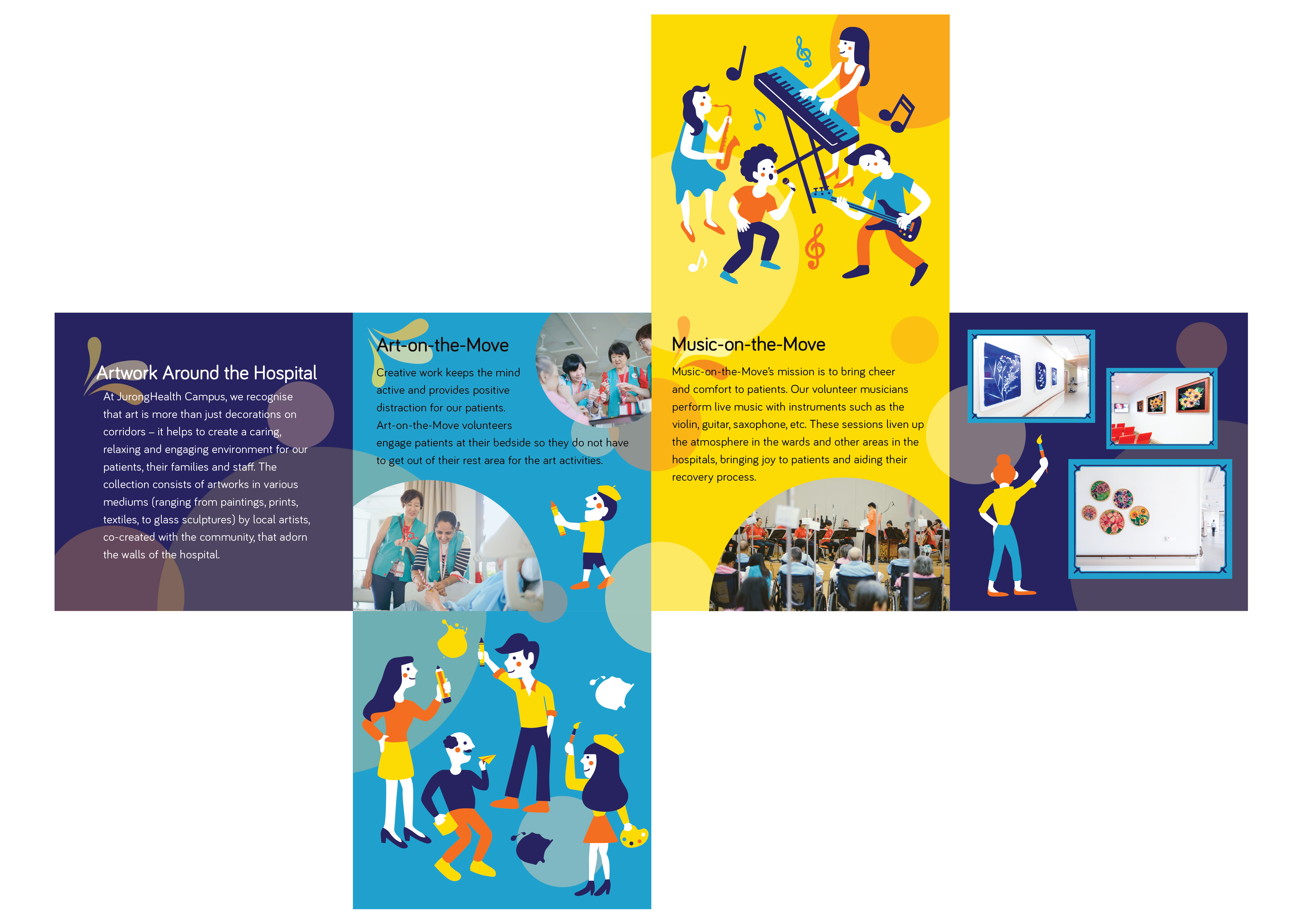
  3. The fireworks page was a little empty, hence I could think about incorporating some pictures there and also, adding a header for the Arts and Health programme.
  4. Incorporate elements of music and art into the headers of Art-on-the-Move and Music-on-the-Move.


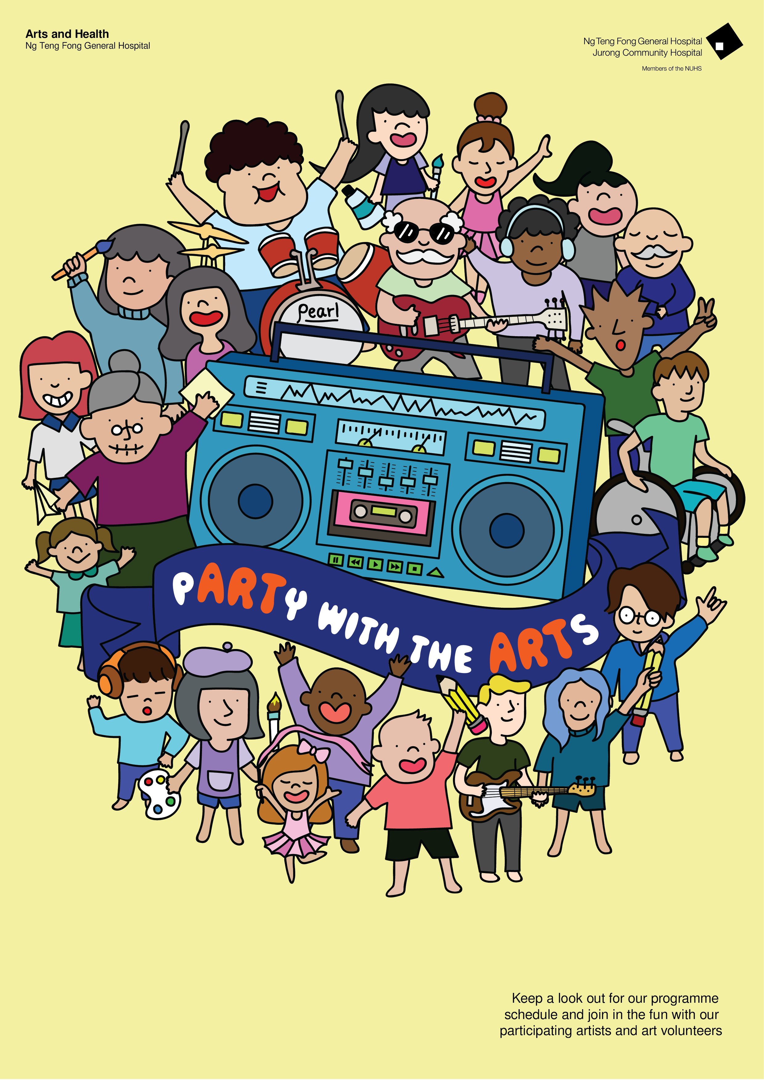
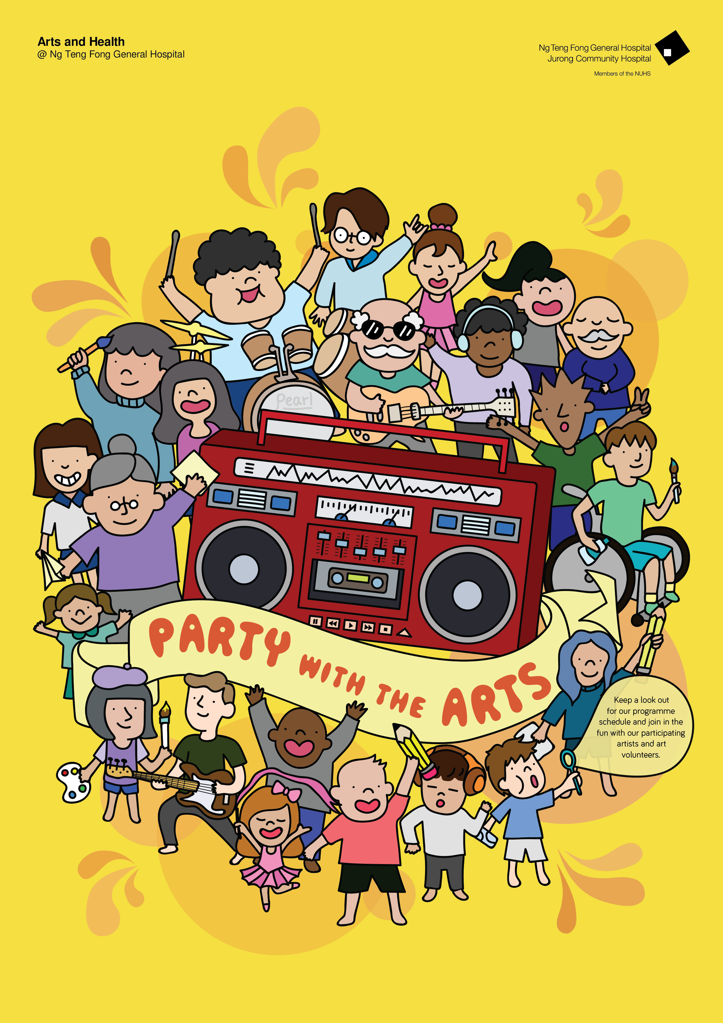
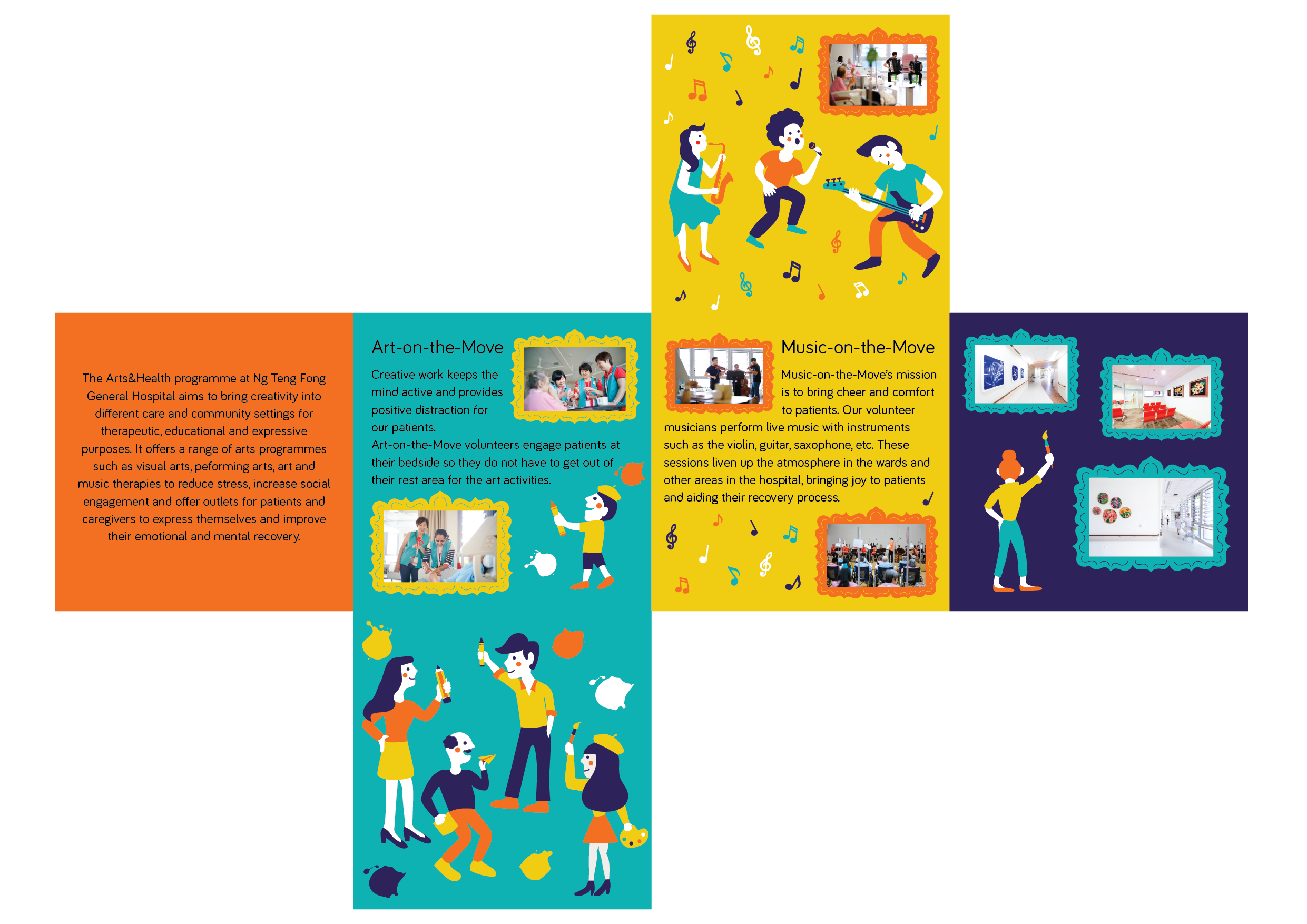
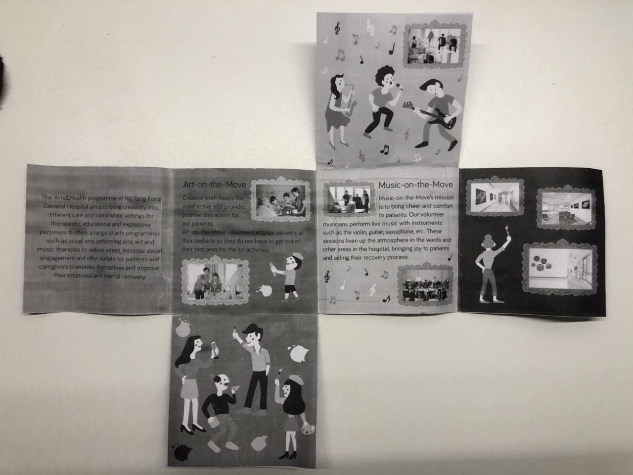
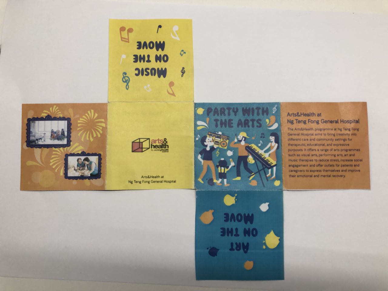
So working with the feedback, this is the second draft I came up with.

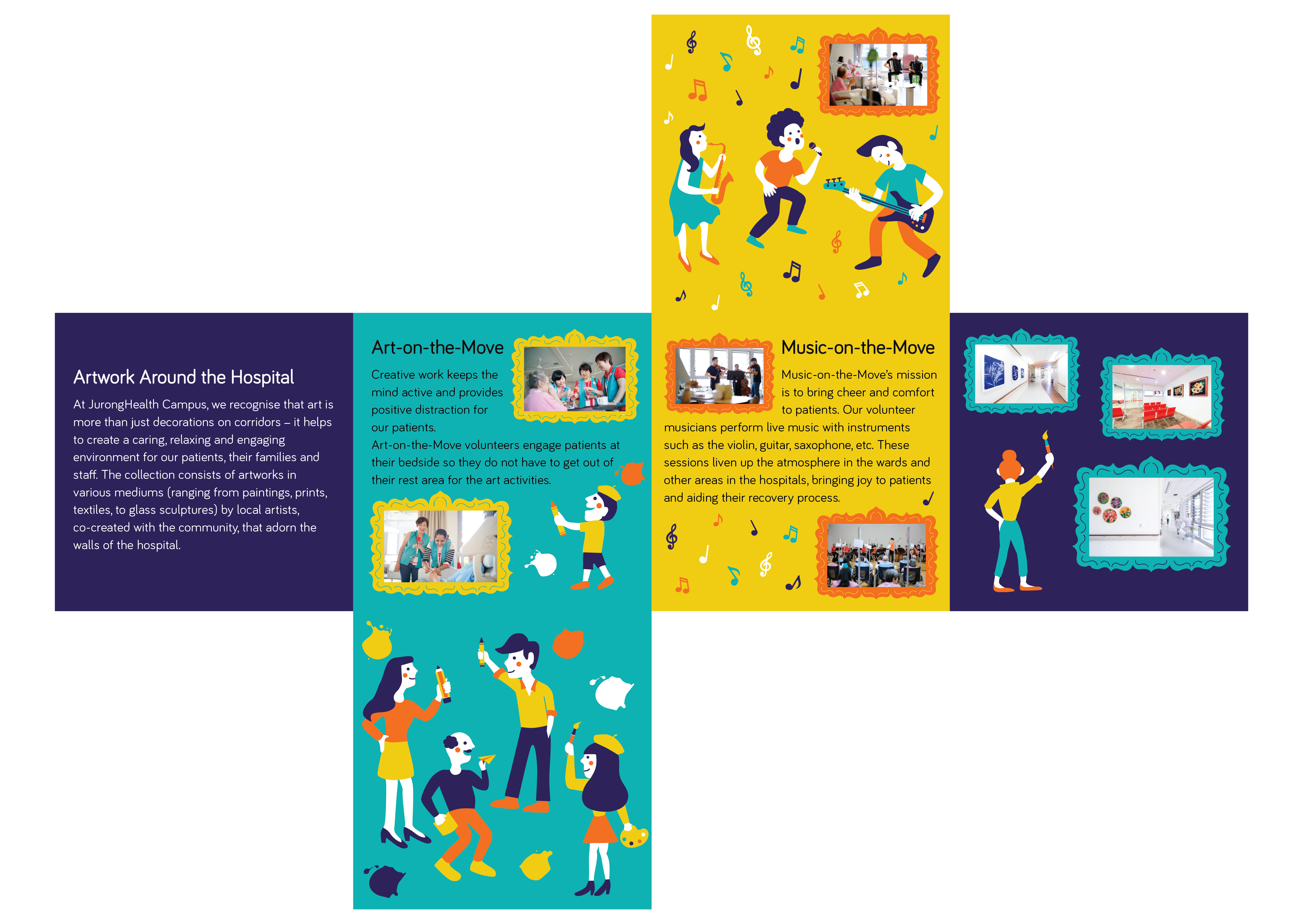
And here’s the new fold:

The feedback that I got for the second draft was:

  1. The splatters of paint and music notes were very random. I should play around with the size of it.
  2. Frames were too big and taking too much space, making the pictures too small for viewers.
  3. Reduce size of body text and the text wrap for Music-on-the-Move is awkward.
  4. Colour could be brighter and that the teal/turquoise was jarring.
  5. Remove fireworks and instead use bubbles and water droplet shapes to tie the pages of the entire brochure together. (sense of flow)


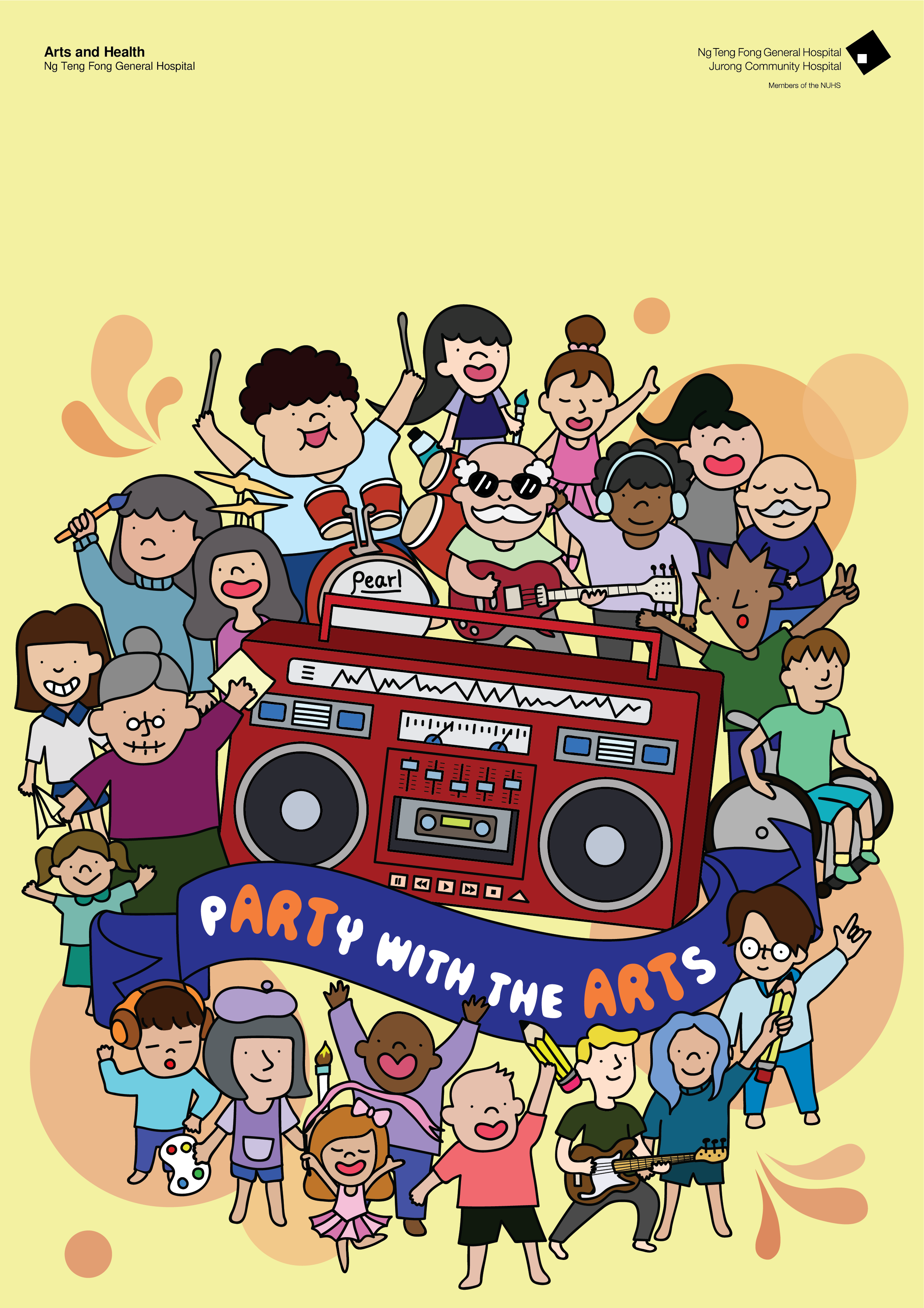
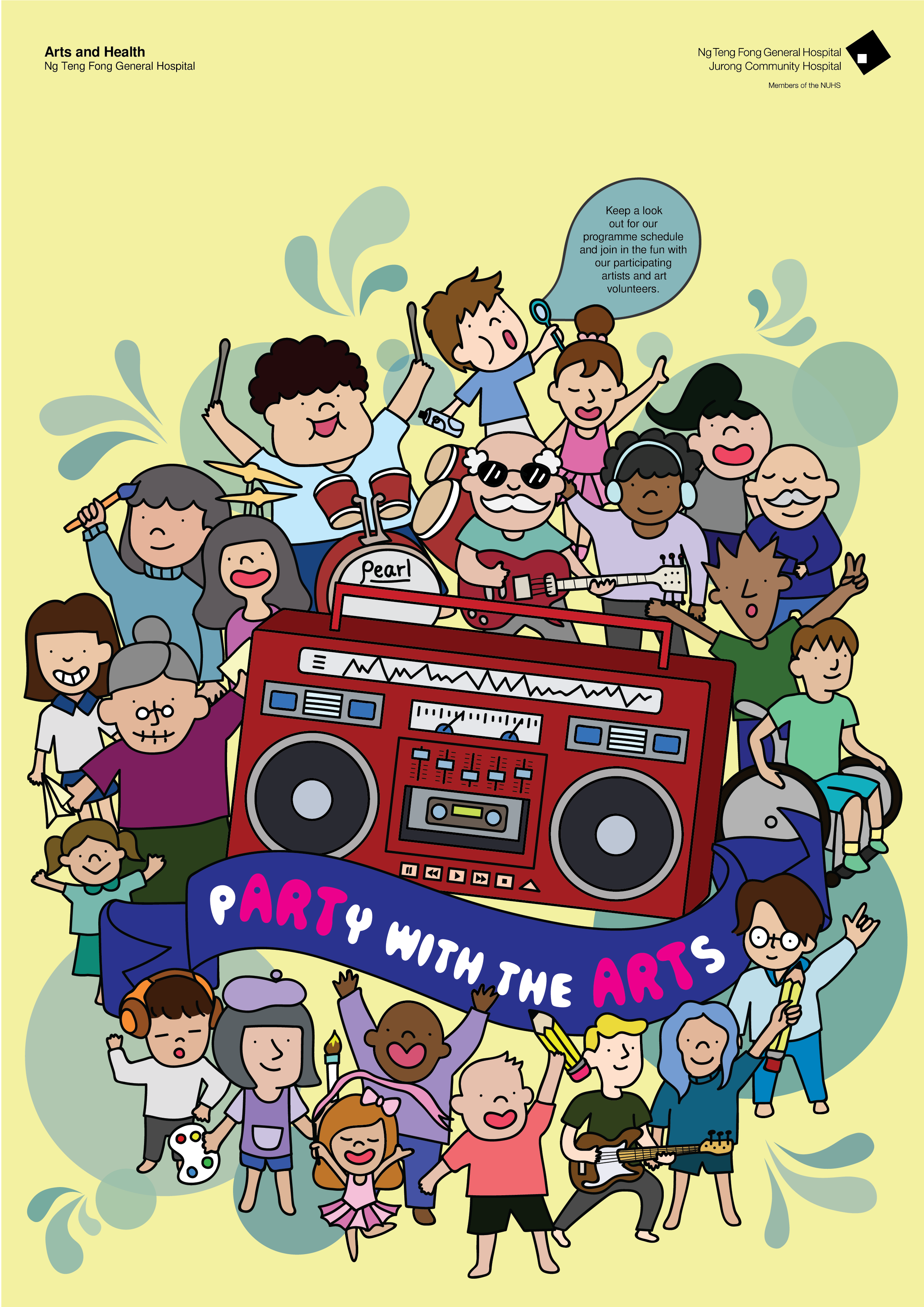
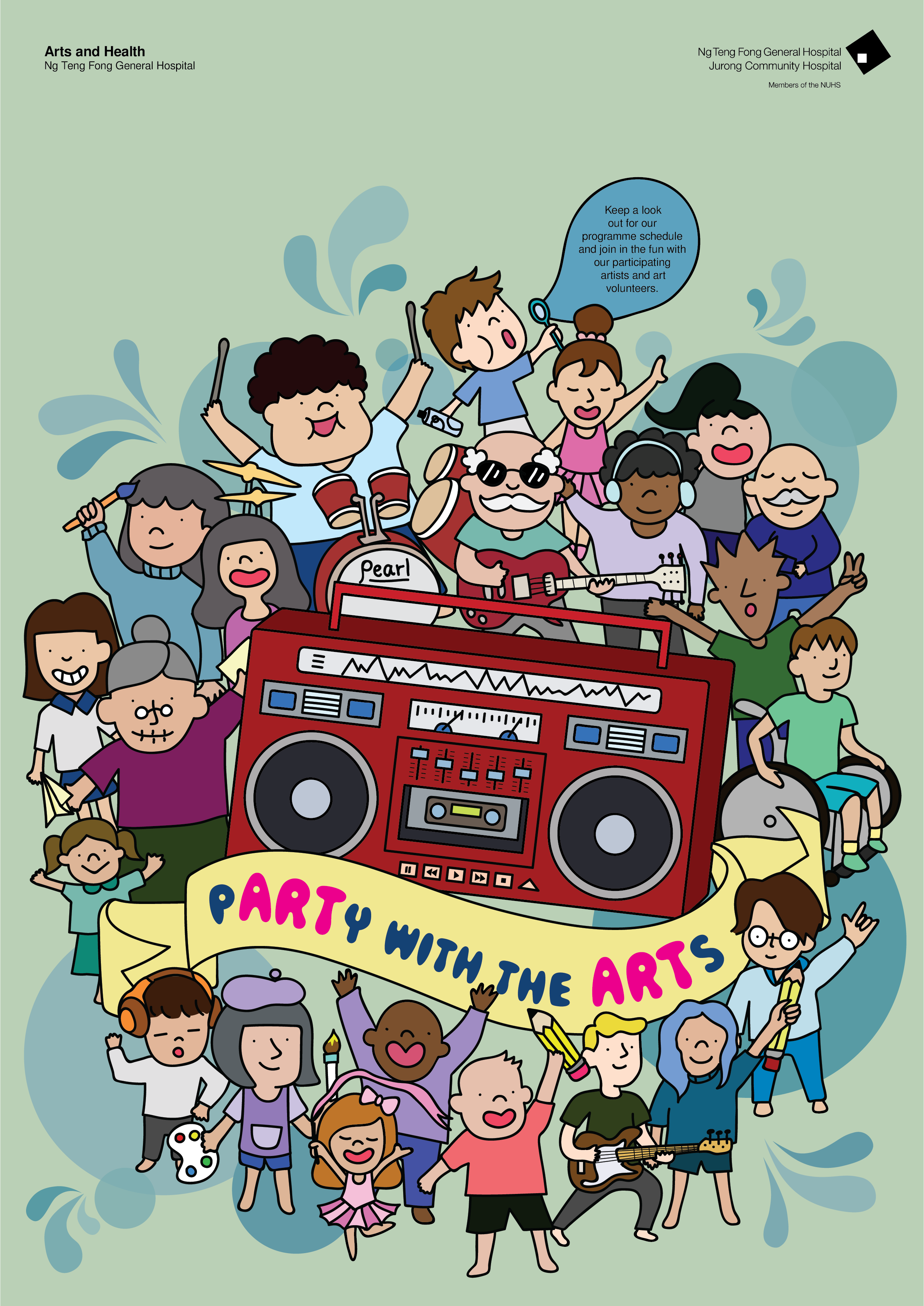
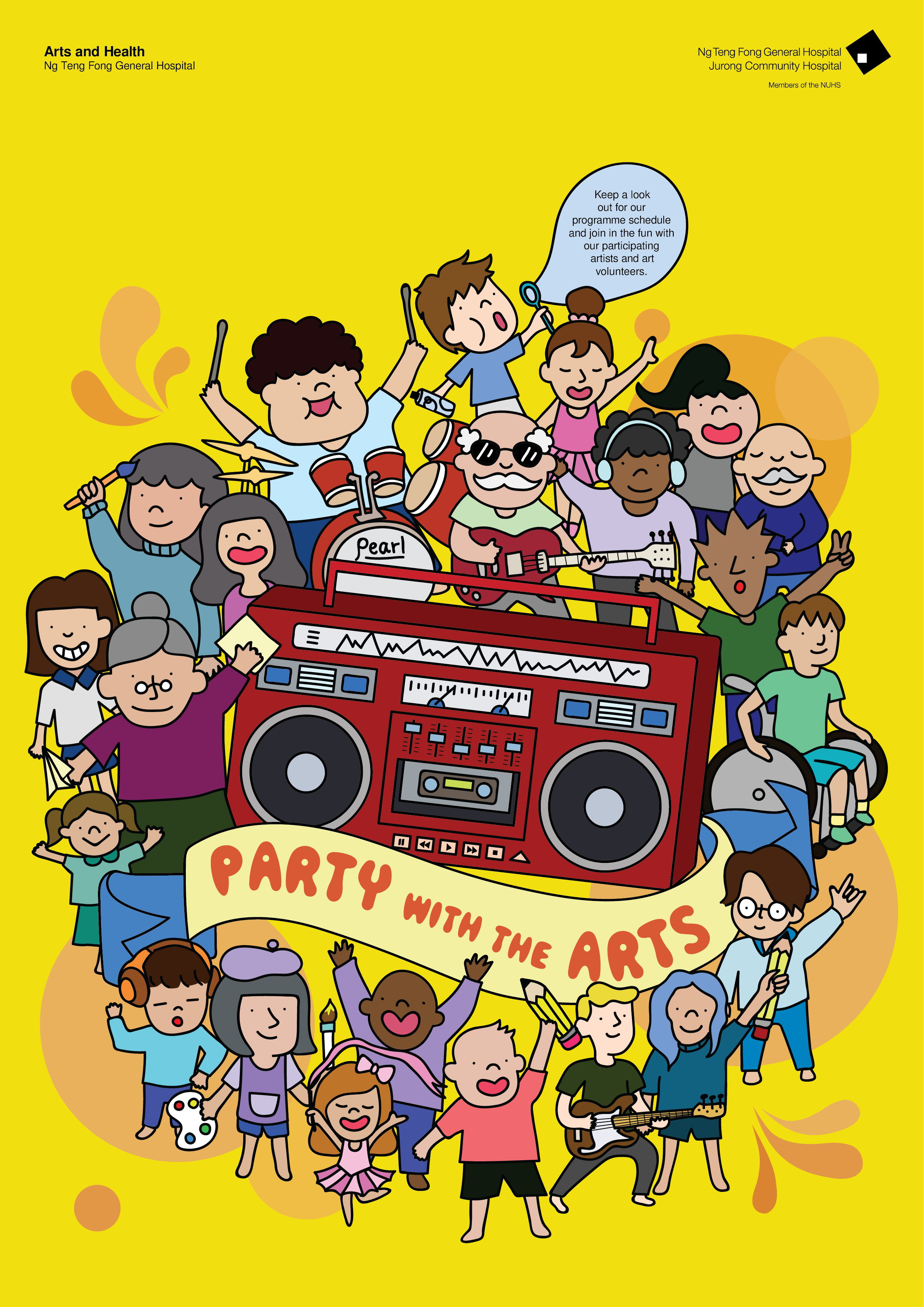
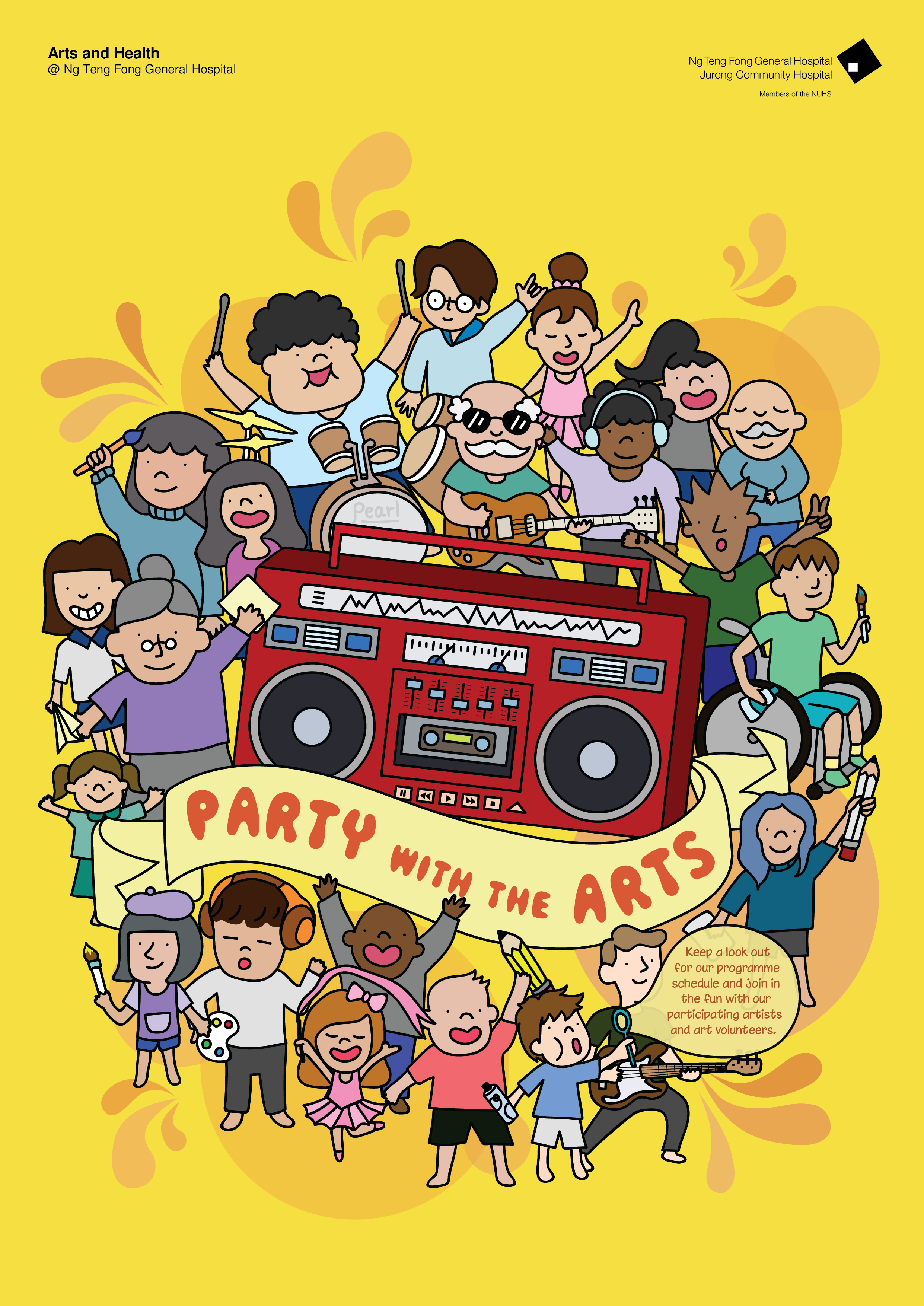
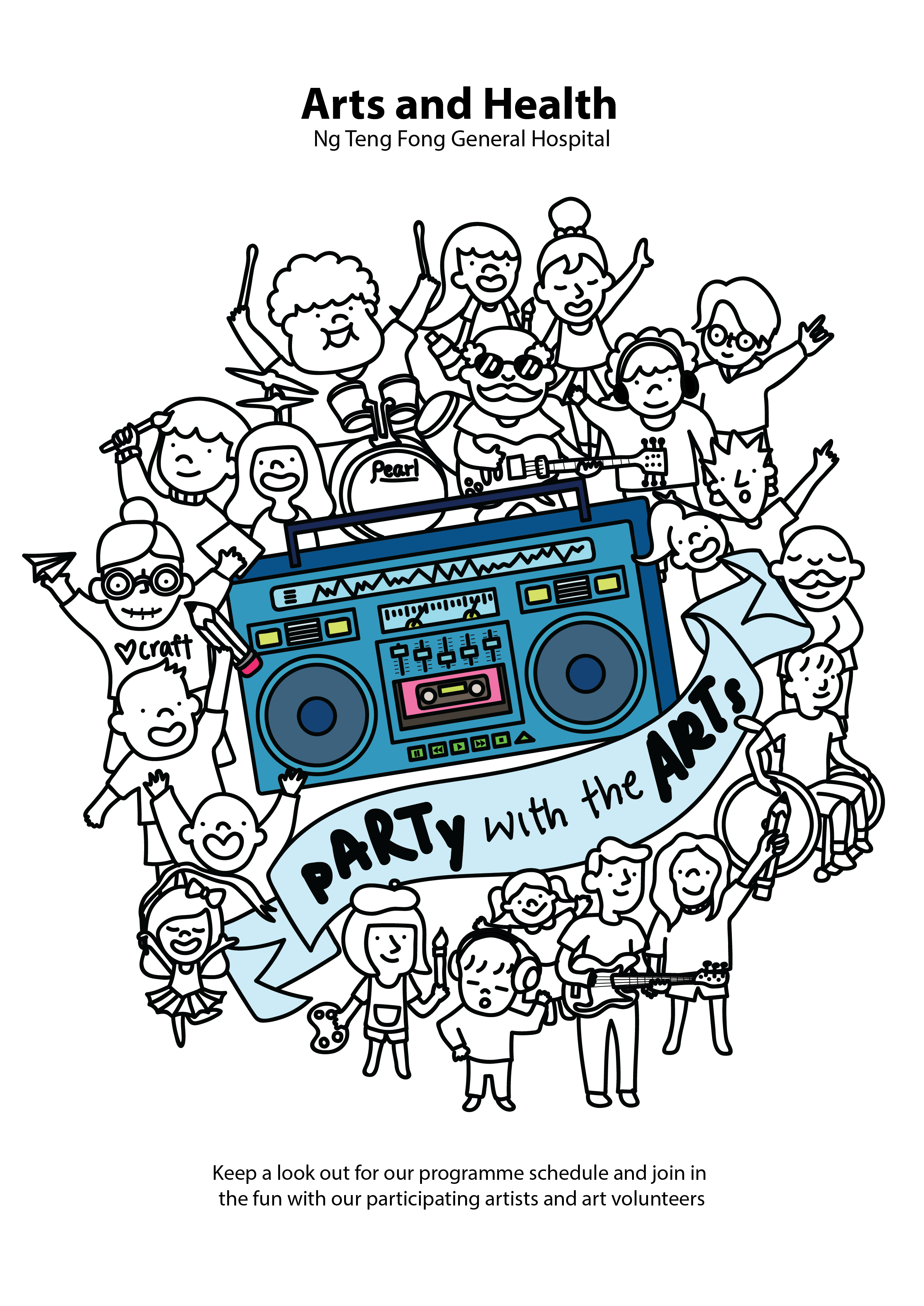
And here’s 2 of my shortlisted ones for my final work:

  1. Yellow/Orange

2. Blue with Yellow/Orange

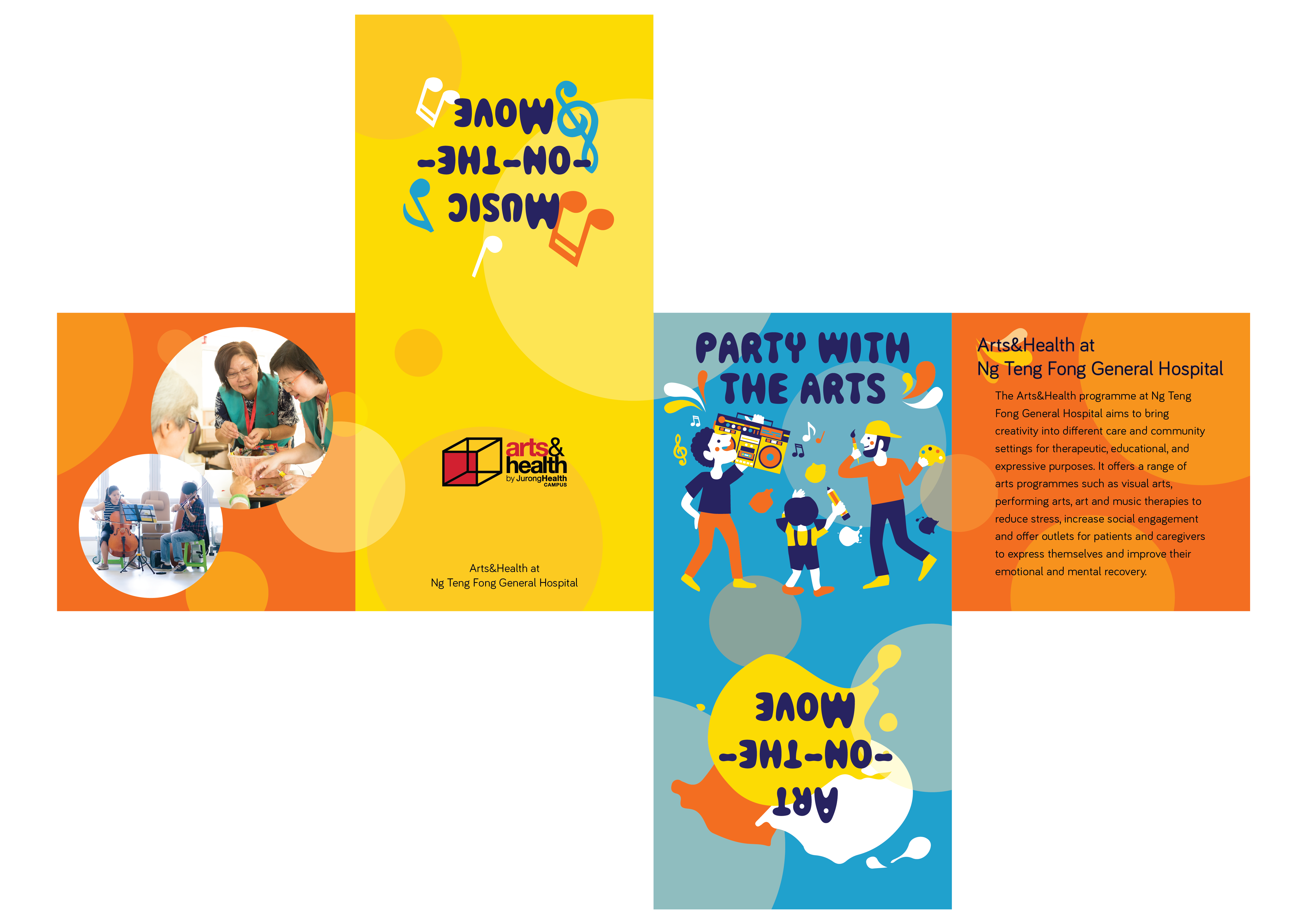
In the end I decided to go with the second one (Blue with Yellow/Orange) since the first one (Yellow/Orange) is too boring.


Project 2: Task 3 – Design refinement & Mock up

After receiving various feedback, I worked on the colour variations and moved people around to get a better sense of the hierachy within the design.

I tried to play with the colour of the banner to bring out the slogan. When I printed this out in A2, I realised that the lines became really thick when the poster is in A2 size so I reduced the thickness of the lines.

Comments I received were that the background shouldn’t just be white as it looks static and not as exciting as what my slogan was meant to be. Also my logo should include the whole thing and not just the logo itself. My margin was also a mess and the font size shouldn’t be so big to distract people from the design. Furthermore I changed the colour of the boombox as the whole design seems too bluish.

Working on these, I came up with the next design:

For this design, i reduced the line thickness, added a yellow background and changed the colour of the banner. (please pardon the design that hasn’t been centralised)

Then I was thinking what I could do to add more live and action within this and I came up with bubbles and pops of colour around it.

This design is too bottom heavy and had no sense of a margin which I edited again. Also the chunk of text is hard to incorporate within. So, my classmates suggested incorporating it in a speech bubble or some sort within the design itself.

Added the bubble boy blowing out a bubble that has the text within. The font could also be more fun and less rigid.

Tested out various colours but it didn’t work. So I consulted Michael and he told me to try a bright yellow which might bring out the essence of the design. The middle area is a little too red heavy as well and the slogan need not be of a different colour to emphasise the “ART” within “pARTy” since it might be distracting.

The bright yellow causes the design to stand out and the bubbles are muted and integrated within the background and it doesn’t cause much distraction as compared to the ones before. Also the bubble boy could be moved around to the bottom instead of being on top since it would look too top heavy.

Shifted the boy to the bottom and changed the colour of the bubble to a yellow. But it still looks a little heavy on the right and a little off. Also, the text could be shortened to 5 lines instead of the 6 lines I have as the ‘volunteer’ looks alone by itself. Was advised that the font could be a little more fun and try a little more colour which is what I did.

Had to shift a couple of characters about and tweaking it a little which I then arrived to my final design!!

Project 2: Task 2 – Design Exploration

The slogan that I decided to explore further was “pARTy with the ARTs”.

So to incorporate the party within the design, I added a boombox with a community of people of all ages to signify the party and added elements of arts within. I tried to keep it within a circle shape but I still have to explore more and keep my options open. But this was the initial design that I came up with:

Feedback that I got was that the banner is a little too slanted and hard to read and the words/font size are distracting the viewers from looking at the poster design. Of which I worked on the next.

Project 1 Task 3: Colour Exploration


For colours, Michael said that I should make the colours brighter instead of it being so dull. Thus I tried to change from the original nude skin colours and went ahead to explore the triadic colour scheme. The triadic colour scheme causes the colours to pop and made it more vibrant which fits my theme even more.

Here are some of the colour explorations from the previous design:


Project 1 Task 2: Translating and exploring Design

In class, we did some sketches. These are some of the sketches done in a class activity:

Visual Ideation:

Visual Metaphor Matrix:


After I brainstormed about what I wanted to portray for my 3 concepts again, I came to a conclusion to focus on:

  1. Spread Love and Care
  2. Fun and Happy
  3. Sense of protection/homely/safety

So this is the first concept, Spreading love and care:

Second concept, Fun and happy:

Third, Sense of protection and homely:

After gaining feedback from the class and Michael, I decided to drop the third concept (sense of protection) and just focus on the first two concepts.


Moving on, I translated my designs digitally online .

These are the few designs I came up with.

These were the final designs that I chose to present to the class:

With various feedbacks from my peers, I am inclined to create a better and final piece with the use of colours as well! I decided to focus on the paintbrush design. I decided to change the composition of my paintbrush. And meanwhile I came up with a new design (though it didn’t make the final cut)