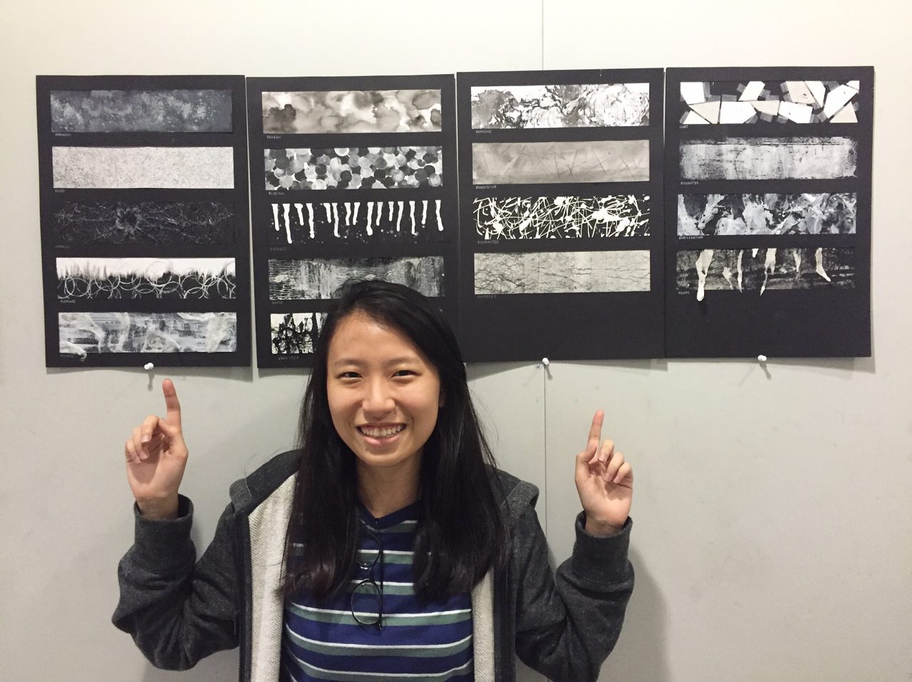
Project 3 Gallery (Ego)
Leave a reply

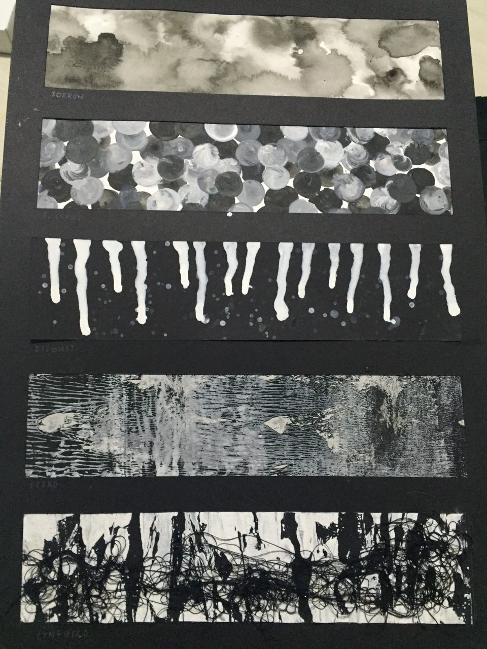
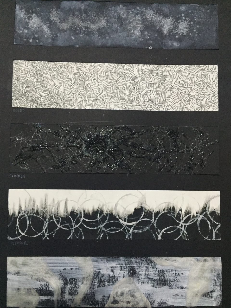
18 EMOTIONS IN ORDER:
Ambiguous
Bored
Fragile
Pleasure
Fondness
Sorrow
Blissful
Disgust
Dread
Confused
Remorse
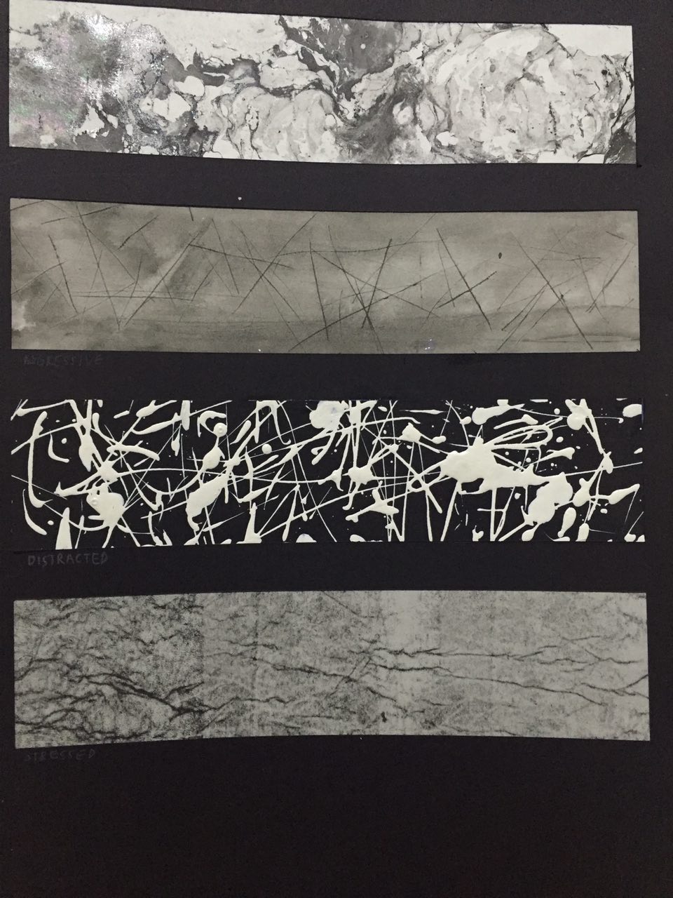
Aggressive
Distracted
Stressed
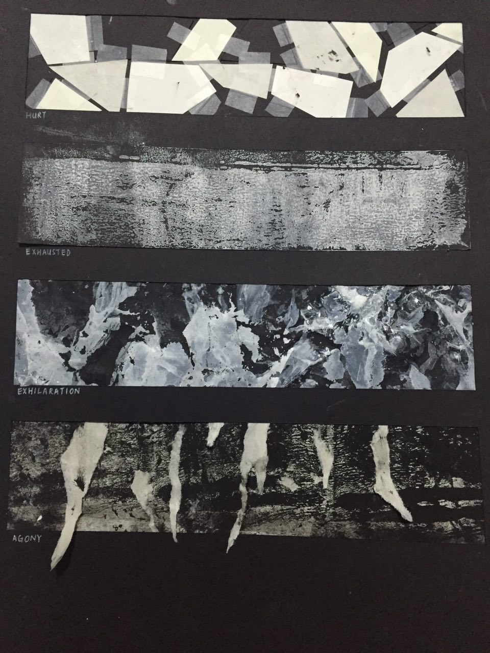
Hurt
Exhausted
Exhilaration
Agony
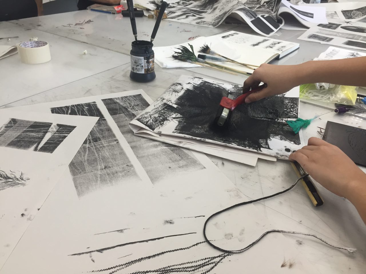
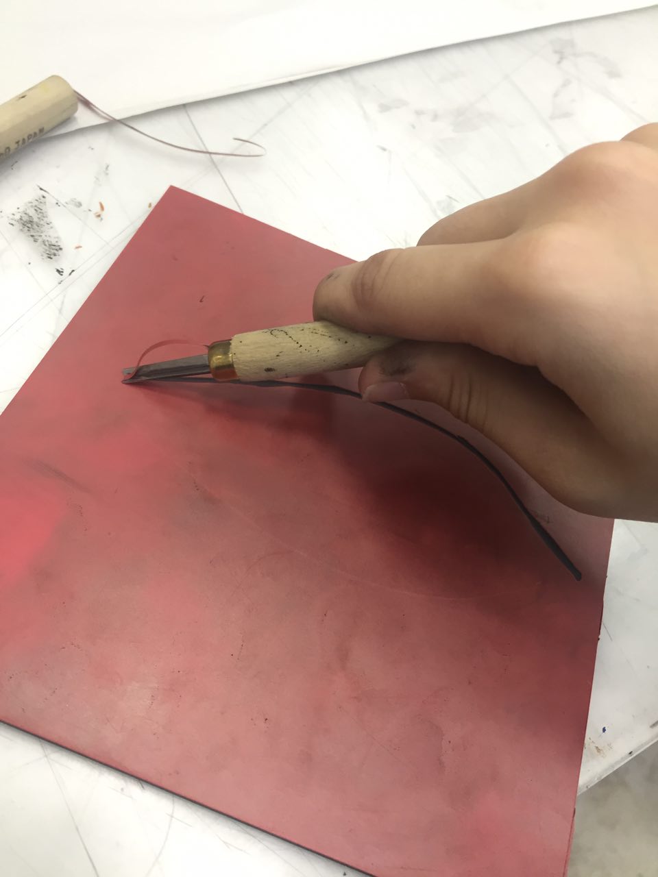
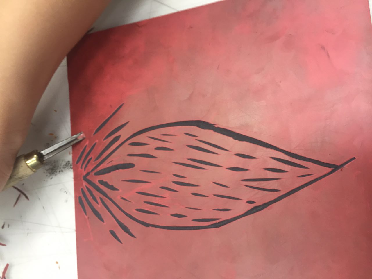
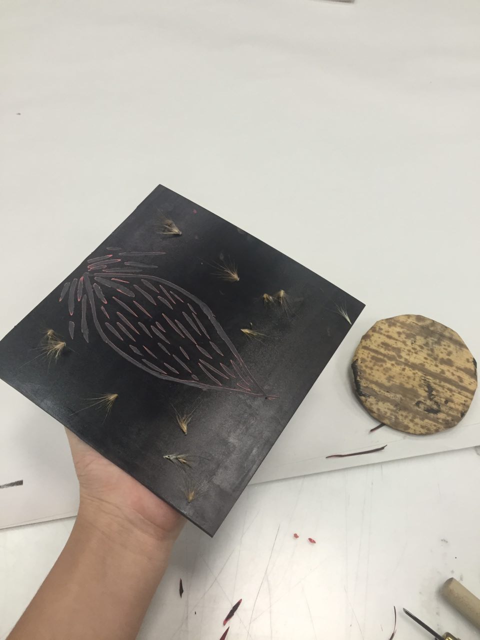
Hi, this is where I’ll be talking about my process for assignment 3.
Firstly when i heard this project, I thought I was going to go for the cutesy doodles that i usually draw. BUT apparently that wasn’t the case for my final designs…… ;u;
COLOUR THEORY
Firstly, I’ll briefly talk about the colour theory using a single picture 😀
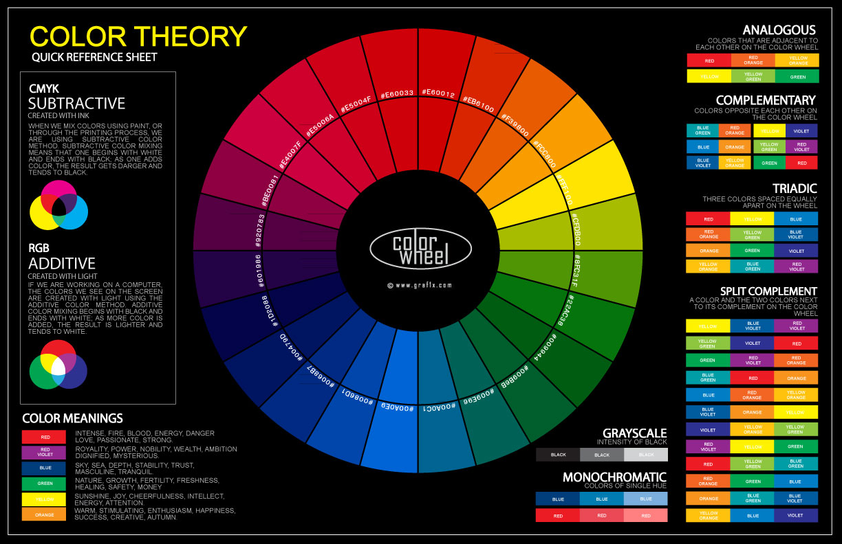
and yes, I used things like monochromatic, greyscale, analogous, split complimentary as well as complimentary colours.
This website is where I got my colours generated to obtain colour harmony 😀
https://www.sessions.edu/color-calculator/ (y’all can check it out, it’s free)
For my final work, I decided to go for a bright blue background for the first frame, a darker for the second and a grey background for the last frame.
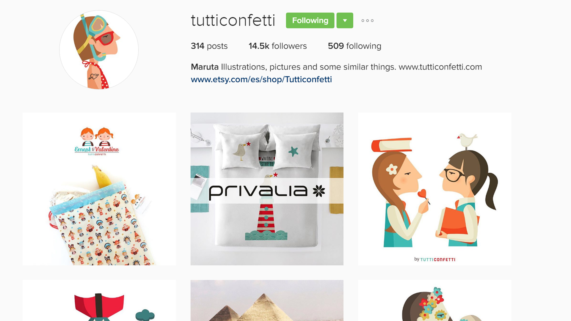
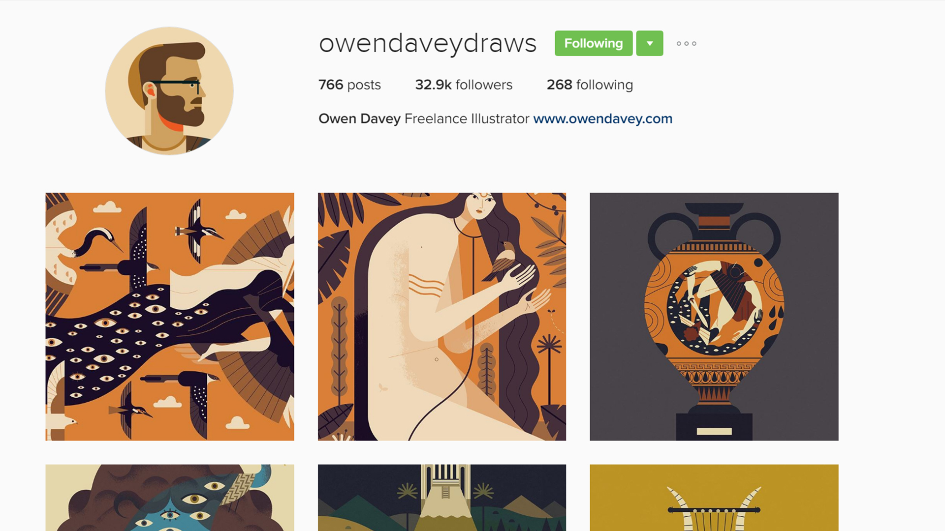
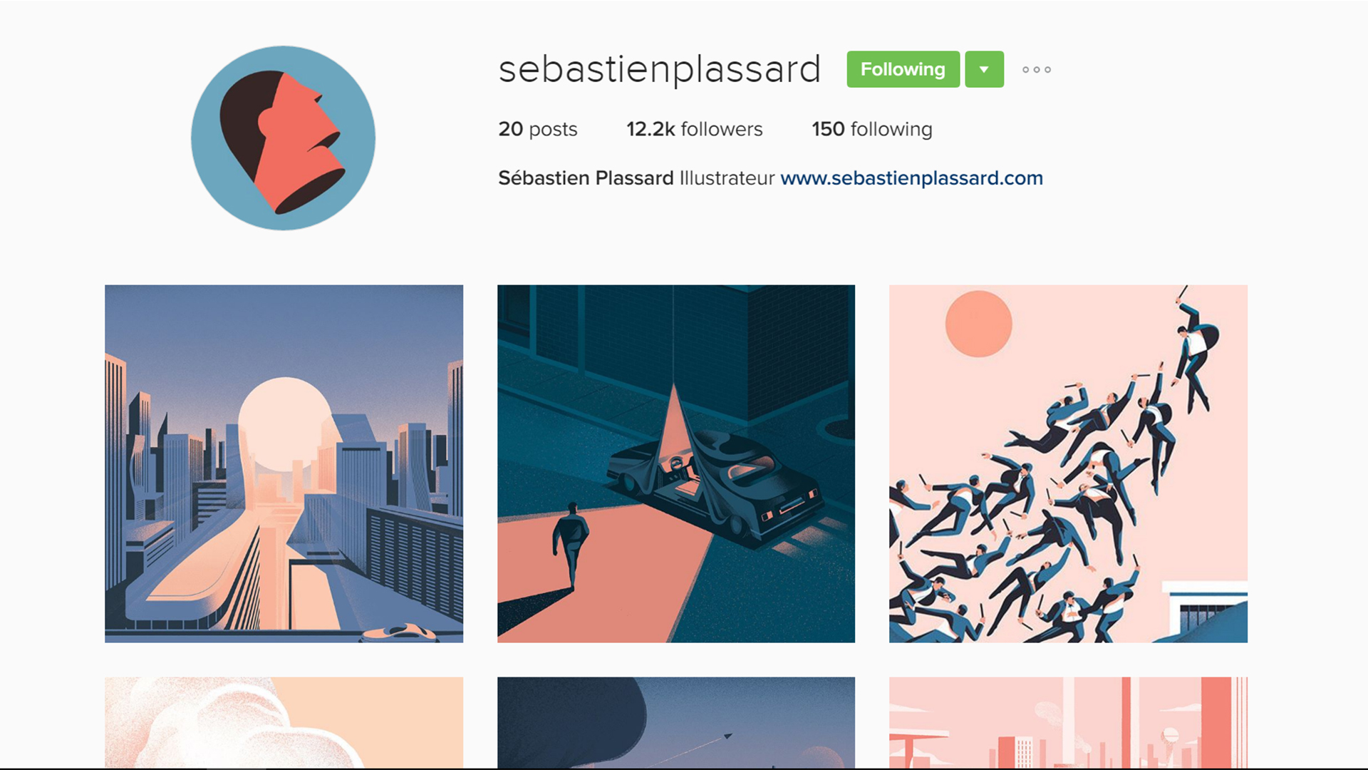
ARTIST REFERENCES
(some ss of their instagram account if you’re int)
2. @owendaveydraws ; Owen Davey ; http://www.owendavey.com/
3. @sebastienplassard ; Sébastien Plassard ; http://www.sebastienplassard.com/
BOOK REFERENCE
(recommended by Mimi and y’all should go take a look at it bc it inspired my final designs for this assignment)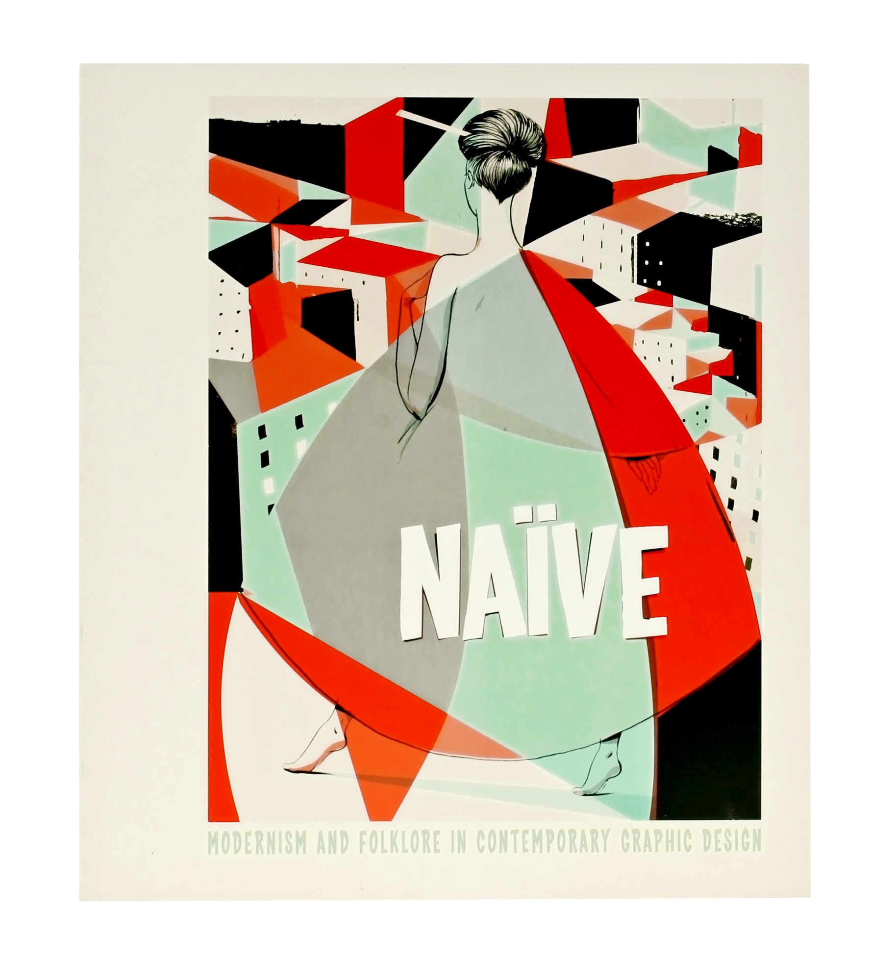


There were a lot of flat illustrations in this book which in the end inspired me to go for a style I never thought I would be doing.
And yes, I had to learn how to use Adobe Illustrator. (thank god for youtube)
CONCEPT
‘Expectations vs Reality’ (the popular internet meme thing)
which I then change it to
‘Dreams vs Reality’
I wanted it too be all cool and then when you read the final frame, it would be like ‘meh’.
And that was why I decided to use a bright blue background for the first frame, a darker for the second and a grey background for the last frame as mentioned earlier.
INITIAL SKETCHES/TRYOUTS
(I’m cool)
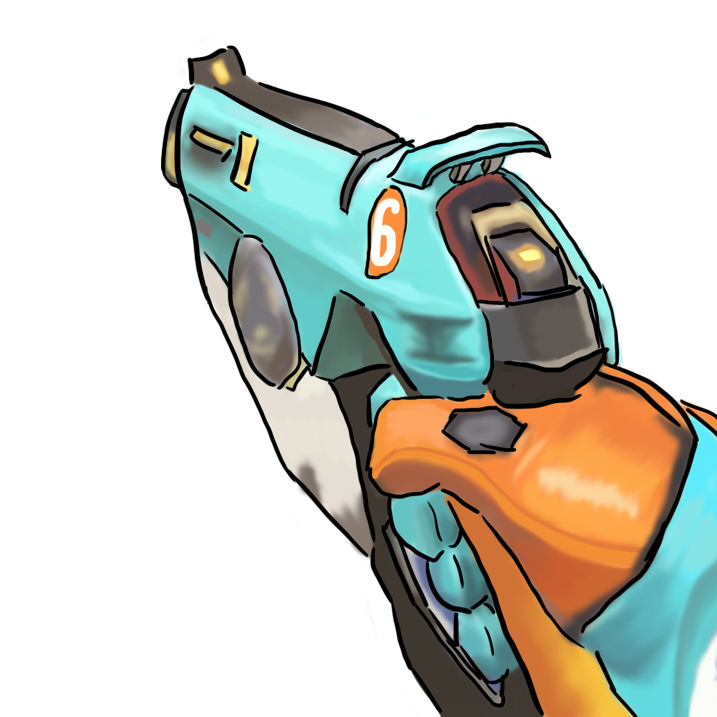

For you overwatch fans out there, yes it’s a tracer gun. But Mimi advised me to add myself in the frame, soooo ..
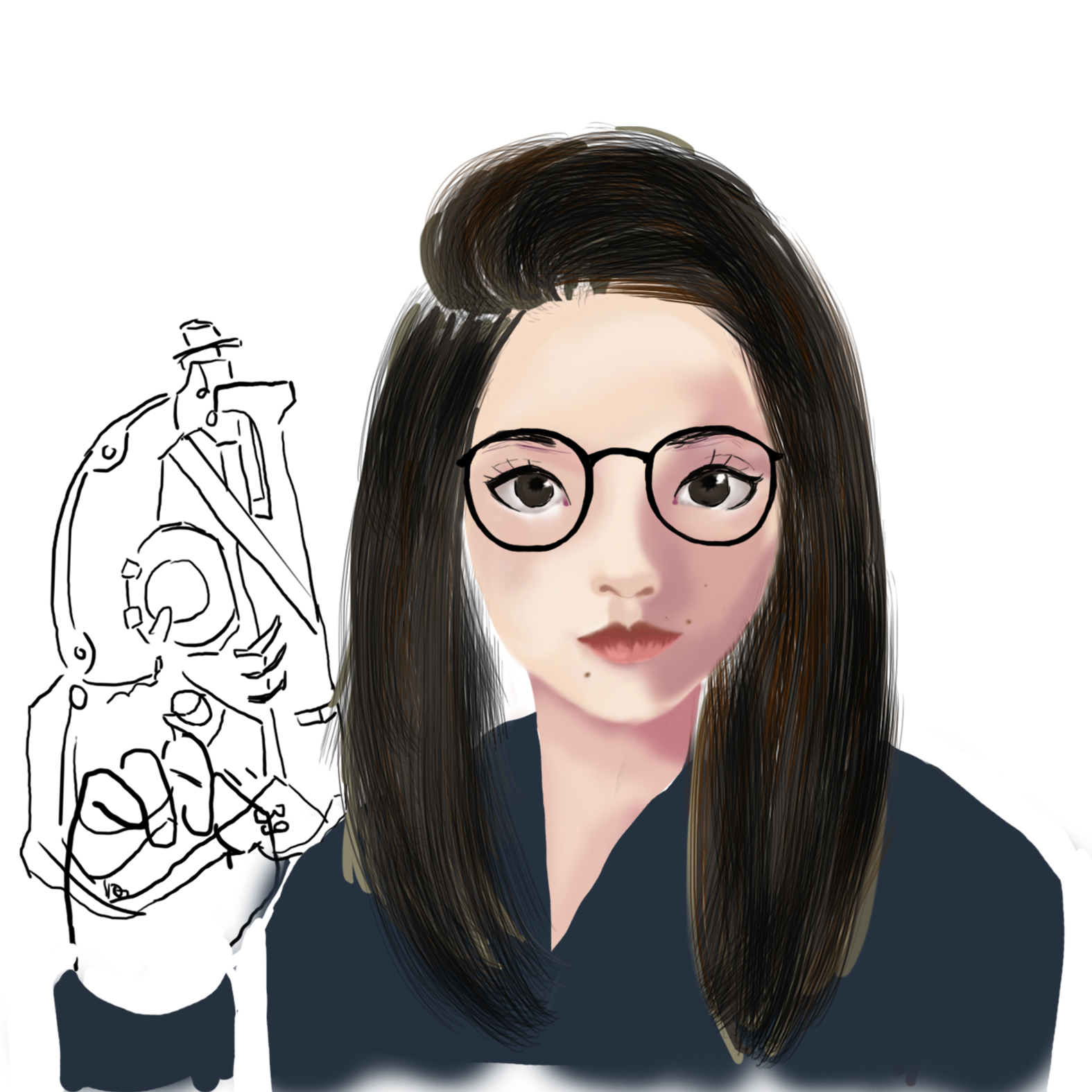
yes it’s semi realistic but meh not good enough i guess. It didn’t really look like me.
(I love to frolic in the ocean)
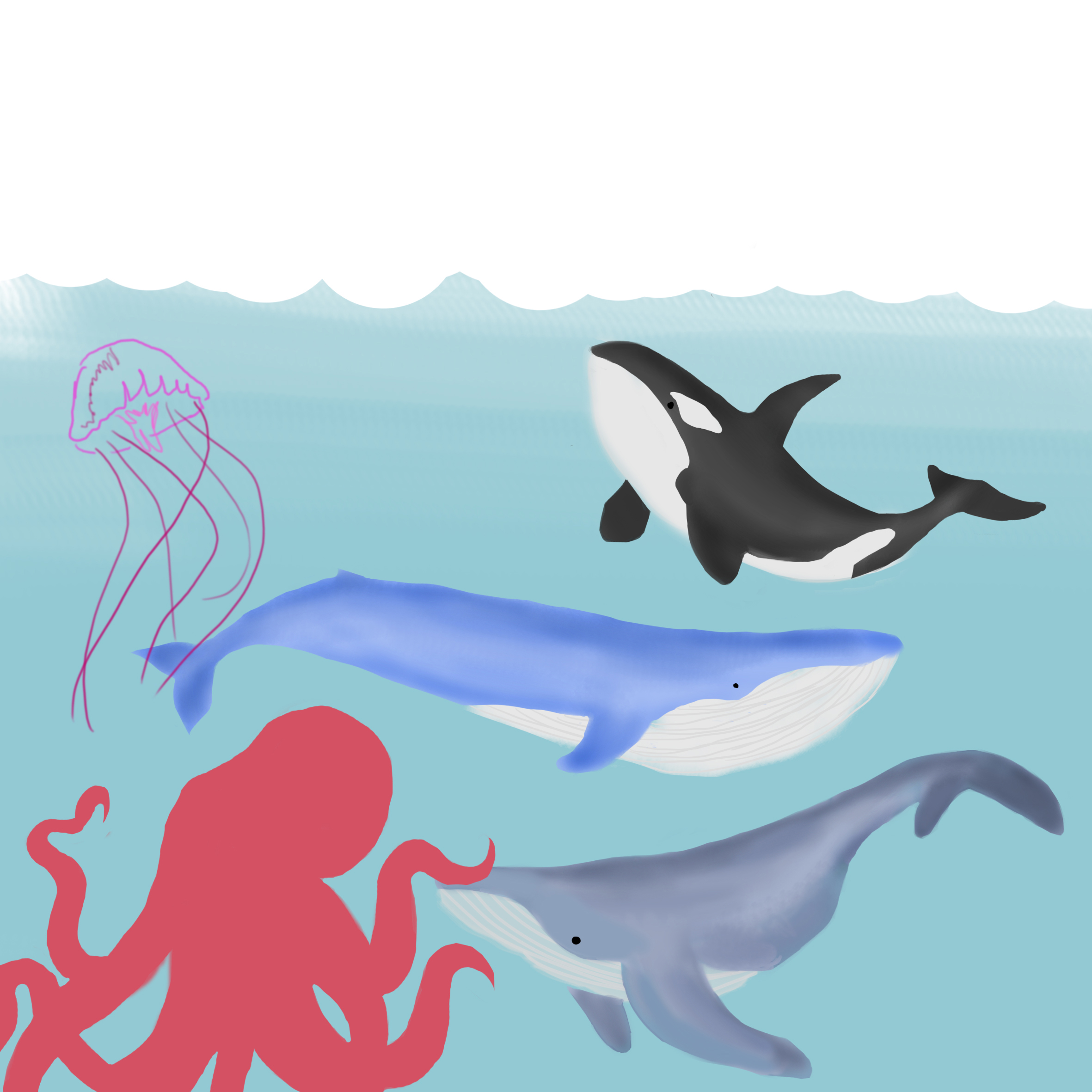
Tried doing another style digitally since I’m not good at watercolours on paper.
(ME)
Got some feedback to work on this style and yes, that was when the book, “Naive” was introduced to me and I knew I had to learn how to use Adobe Illustrator :’) but it was all worth it.
FINAL DESIGNS
Thanks for reading!
Final 4 designs:
Hi, these are the updated/new designs I’ve came up with and would like to get opinions regarding them.
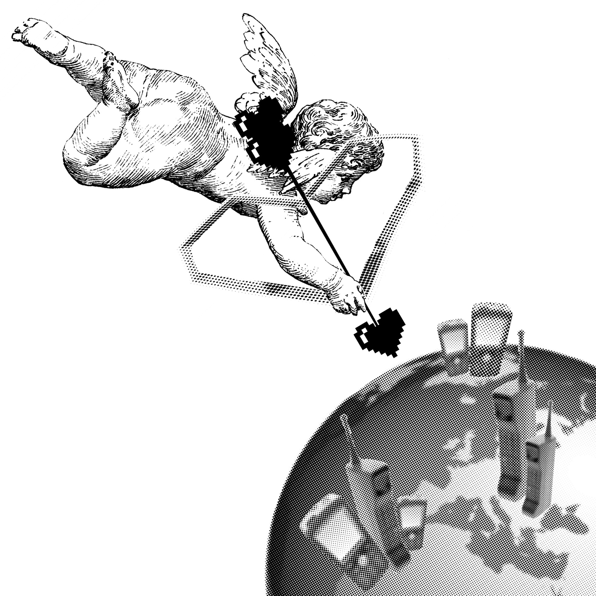
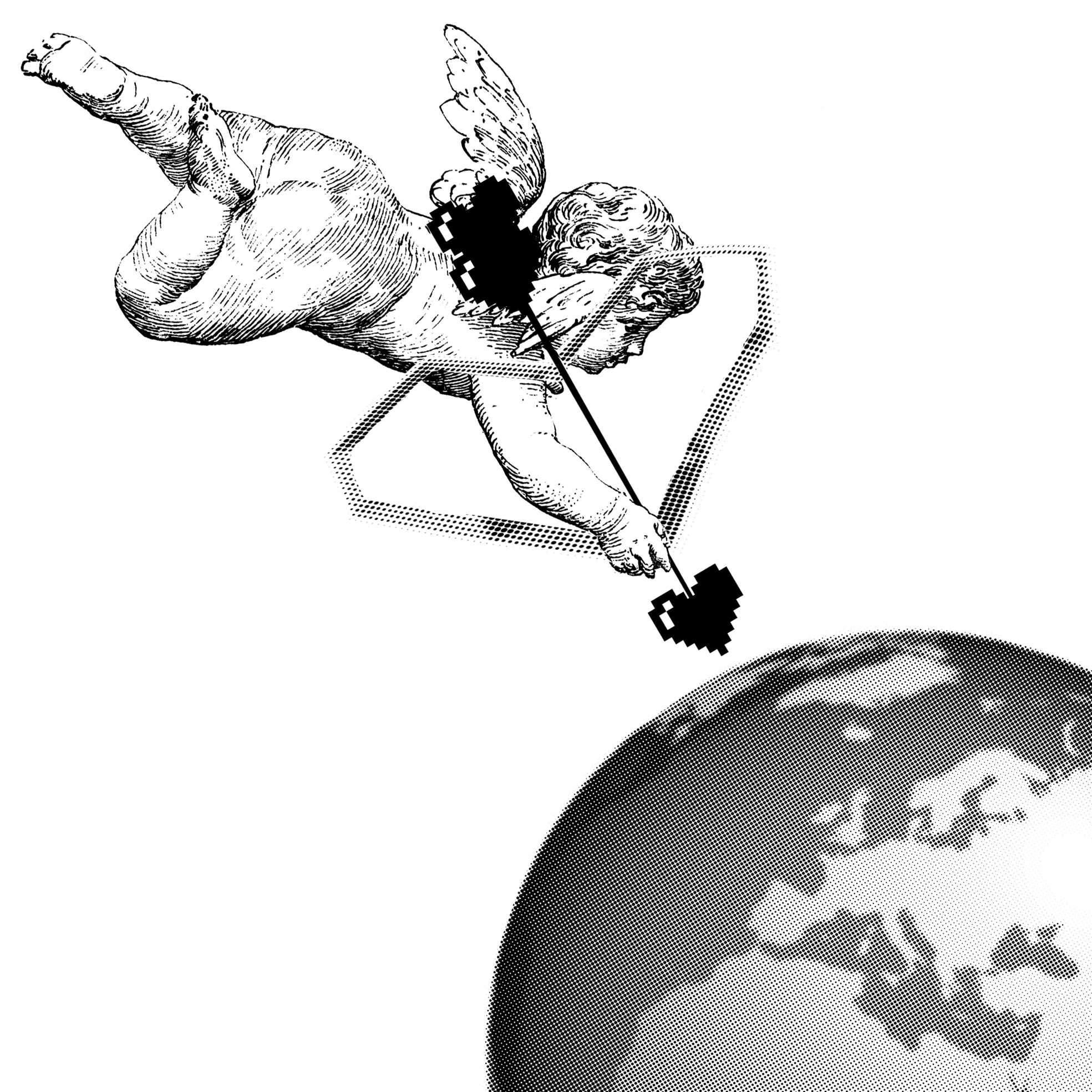
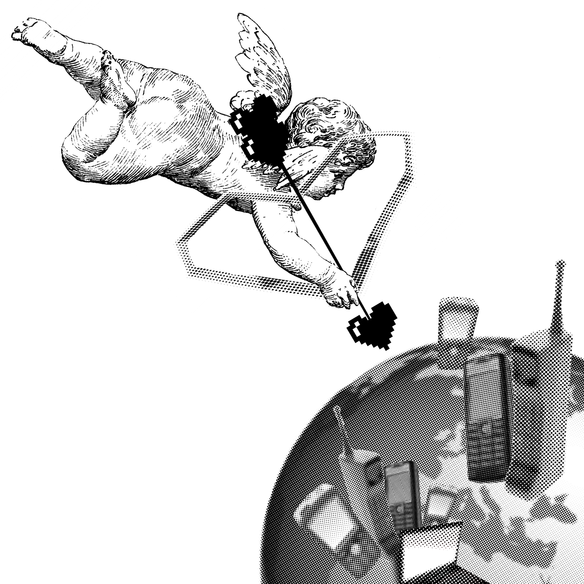
“No matter how many weapons you have, no matter how great your technology might be, the world cannot live without love.”
– Castle in the Sky (1986)
(FINAL DESIGN APPROVED FOR THIS QUOTE)
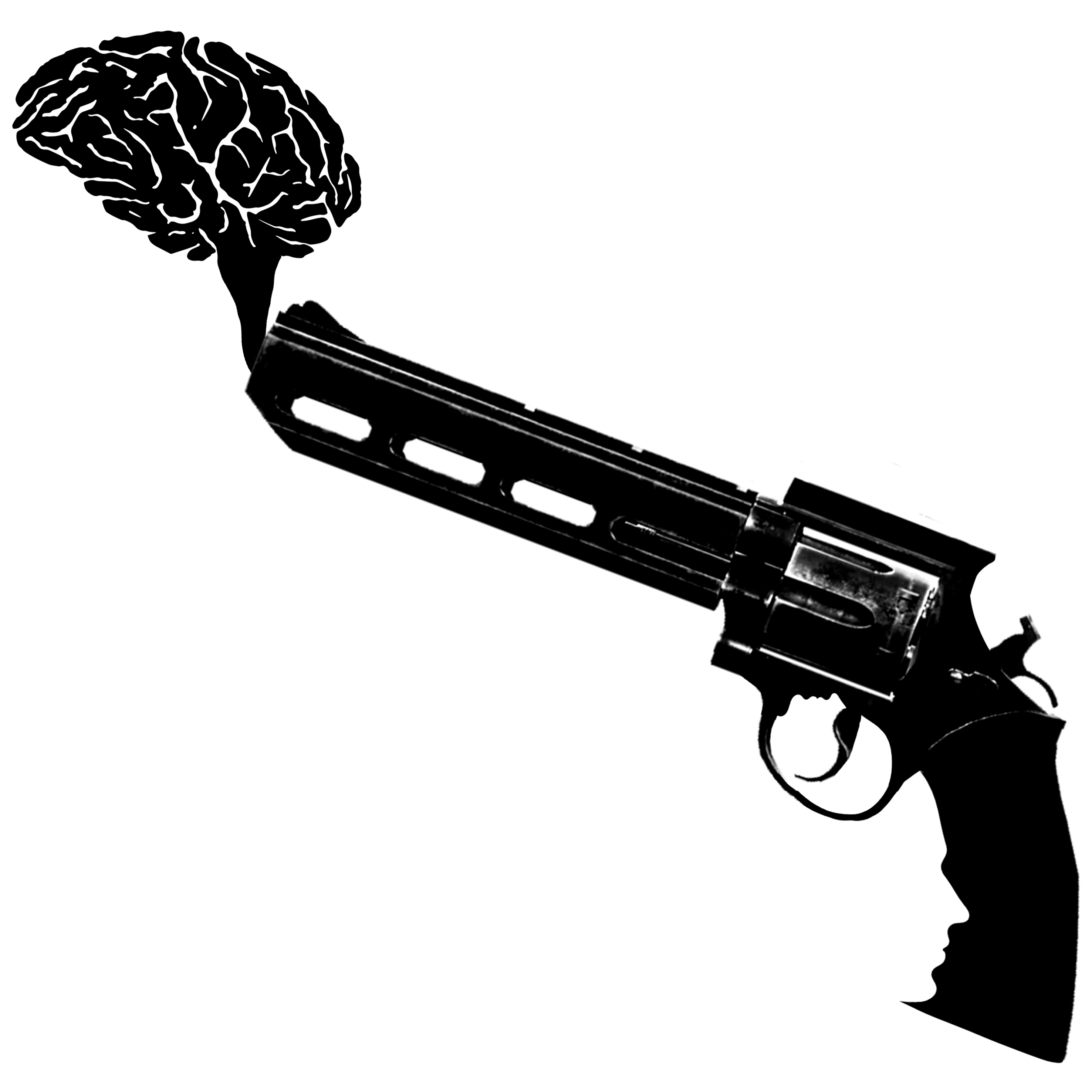
“But being this is a .44 Magnum, the most powerful handgun in the world, and would blow your head clean off.”
– Dirty Harry
DESIGN 1:
I thought handgun = HAND+GUN so that’s why I place the icon there.
DESIGN 2:
Shooting someone in the head somehow reminds me of playing a first person shooter (FPS) game, thus the background. I added the brain (smoke) as well but made it less vivid as compared to the handgun. And also the score above is 44 and 4 (.44 Magnum)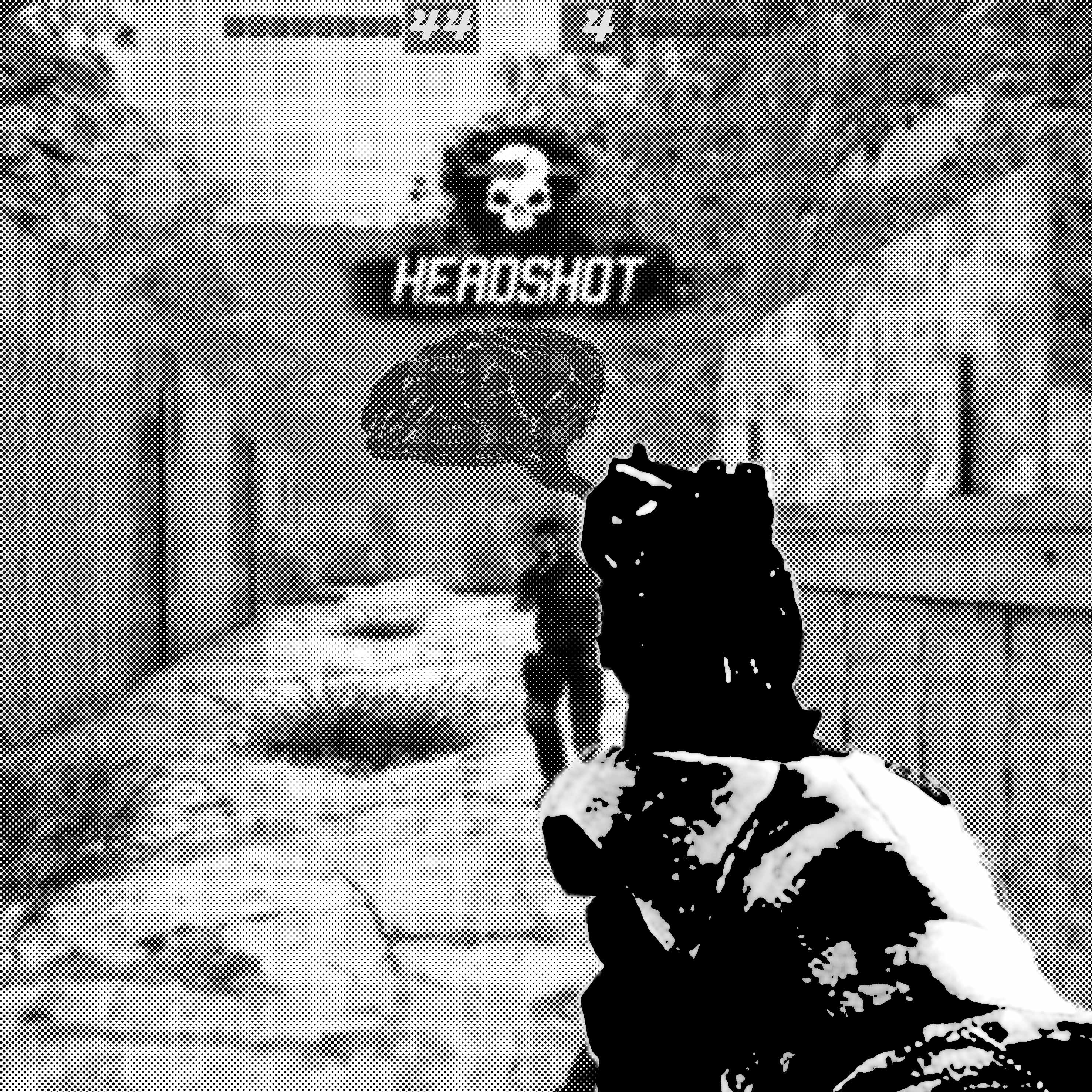
UPDATED DESIGN:
I’ve decided to take away the face from the trigger area since it looks the same as Avinoam Noma Bar’s work. I wanted something new so hence i decided to leave the face at the handle.
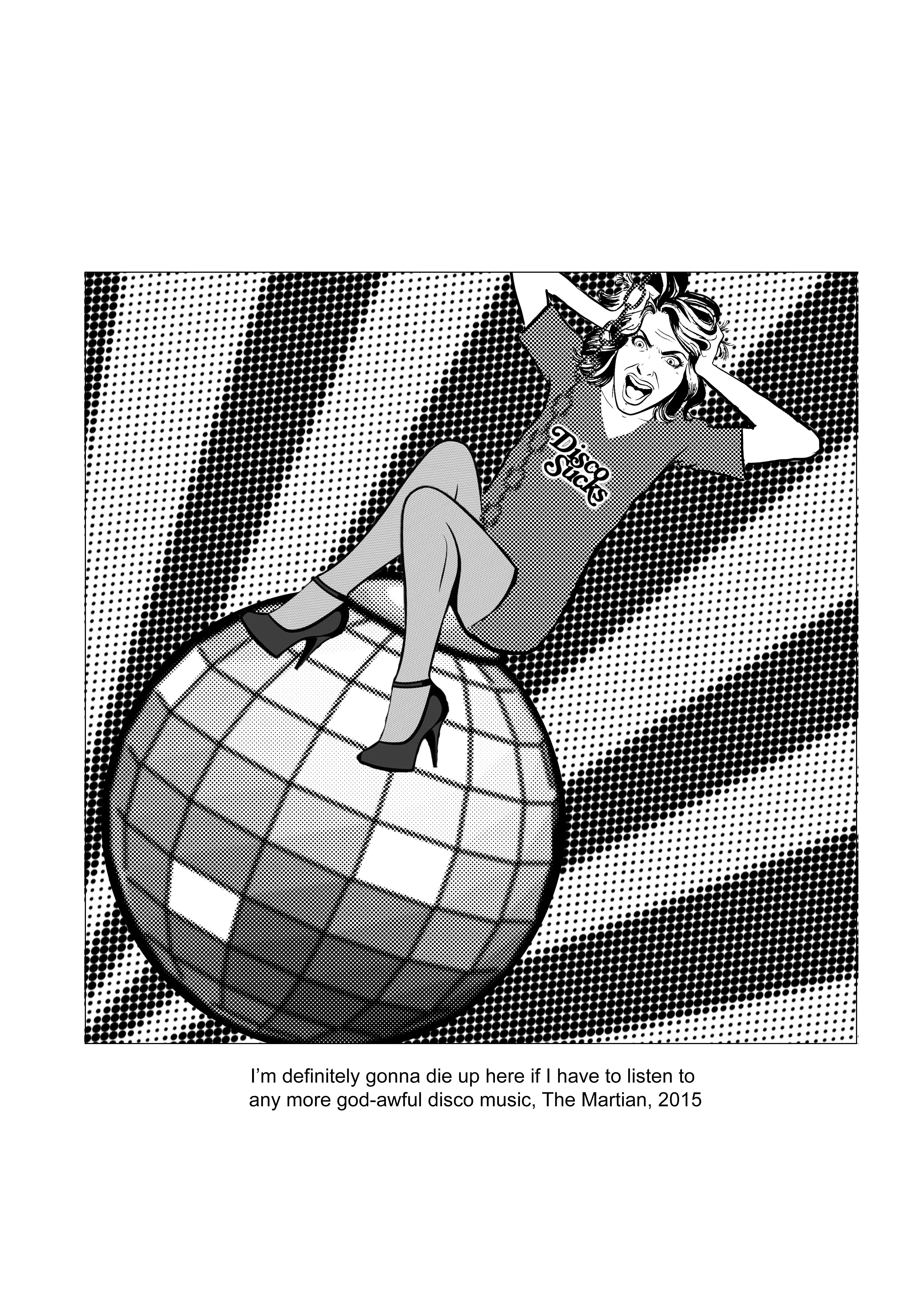
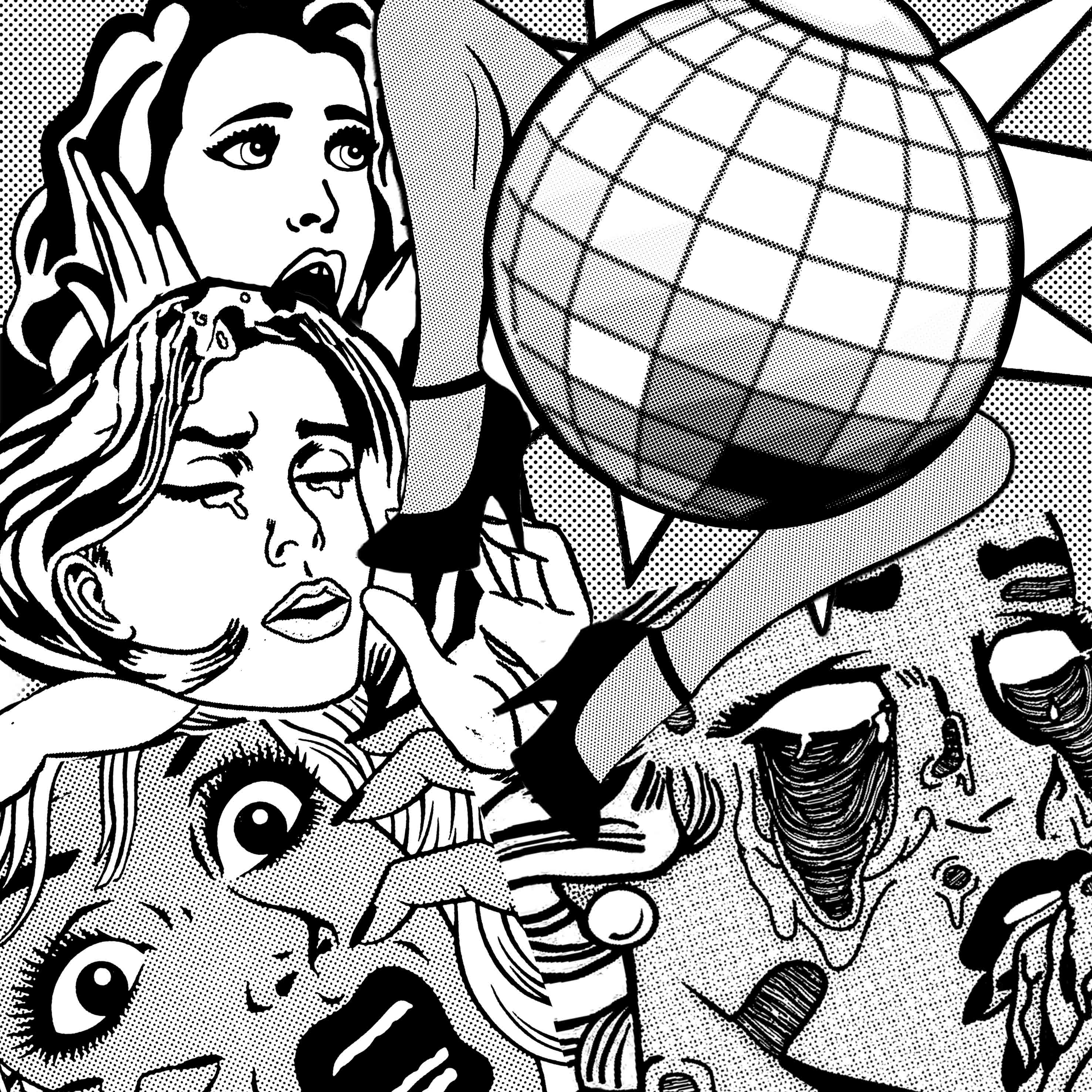
“I’m definitely gonna die up here if I have to listen to any more god-awful disco music.”
– The Martian
Since you asked me to add my own twist instead of having too much of Roy Lichtenstein’s style, I tried to made these designs, hahahahahaha. Anyway, instead of having so many faces in one photo, I’ve made only one main character.
Also, all these designs depict the woman above the disco ball because the quote was “gonna die UP here.
DESIGN 1:

DESIGN 2:

DESIGN 3:
Not sure if it works better with the background or would it be too distracting.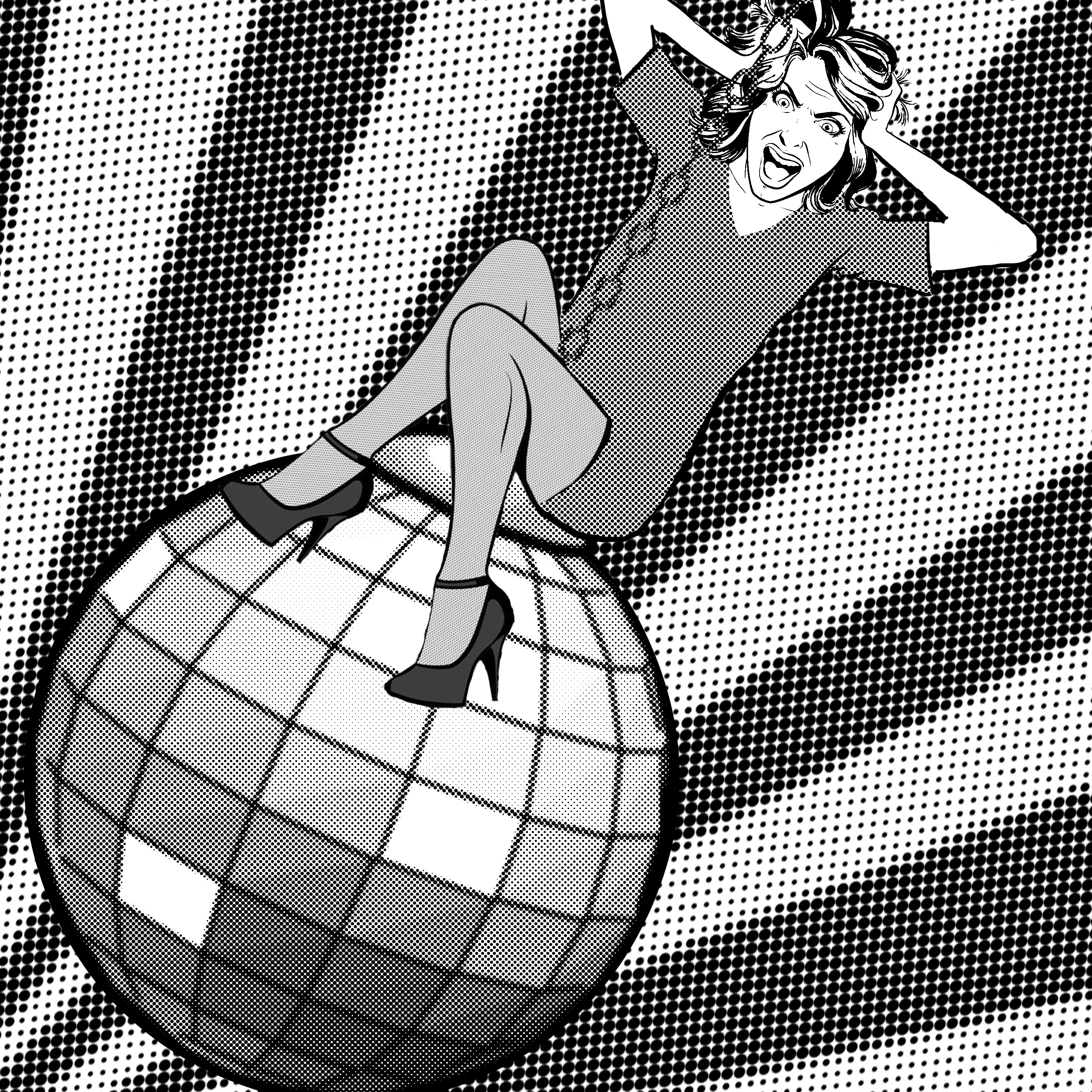
Thank you and I hope to get your opinions 😀
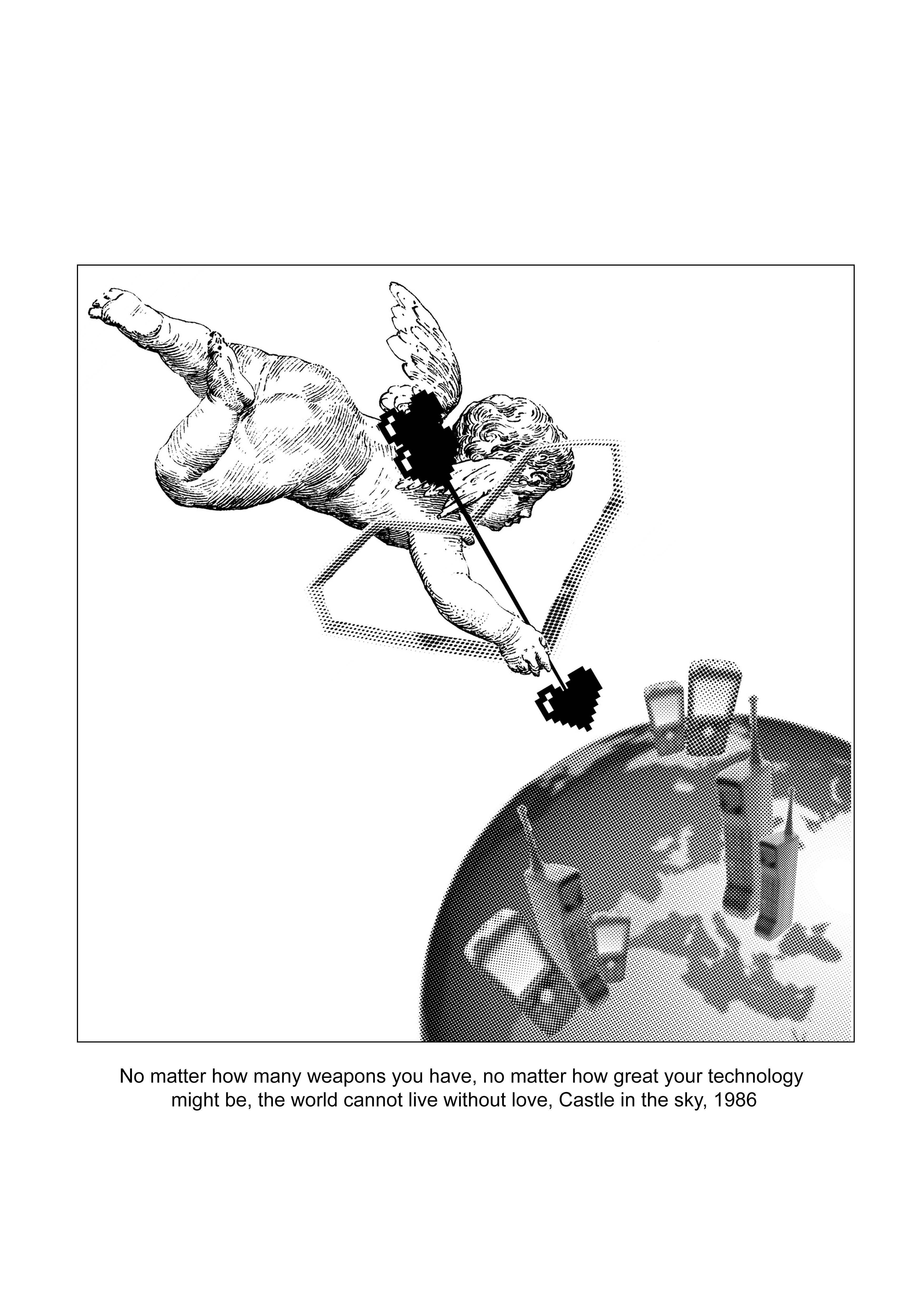
“No matter how many weapons you have, no matter how great your technology might be, the world cannot live without love.”
– Castle in the Sky (1986)
PREVIOUS DESIGN:
(Mimi said to add some ‘technology’, which are cellphones, laptops etc)
UPDATED DESIGN:
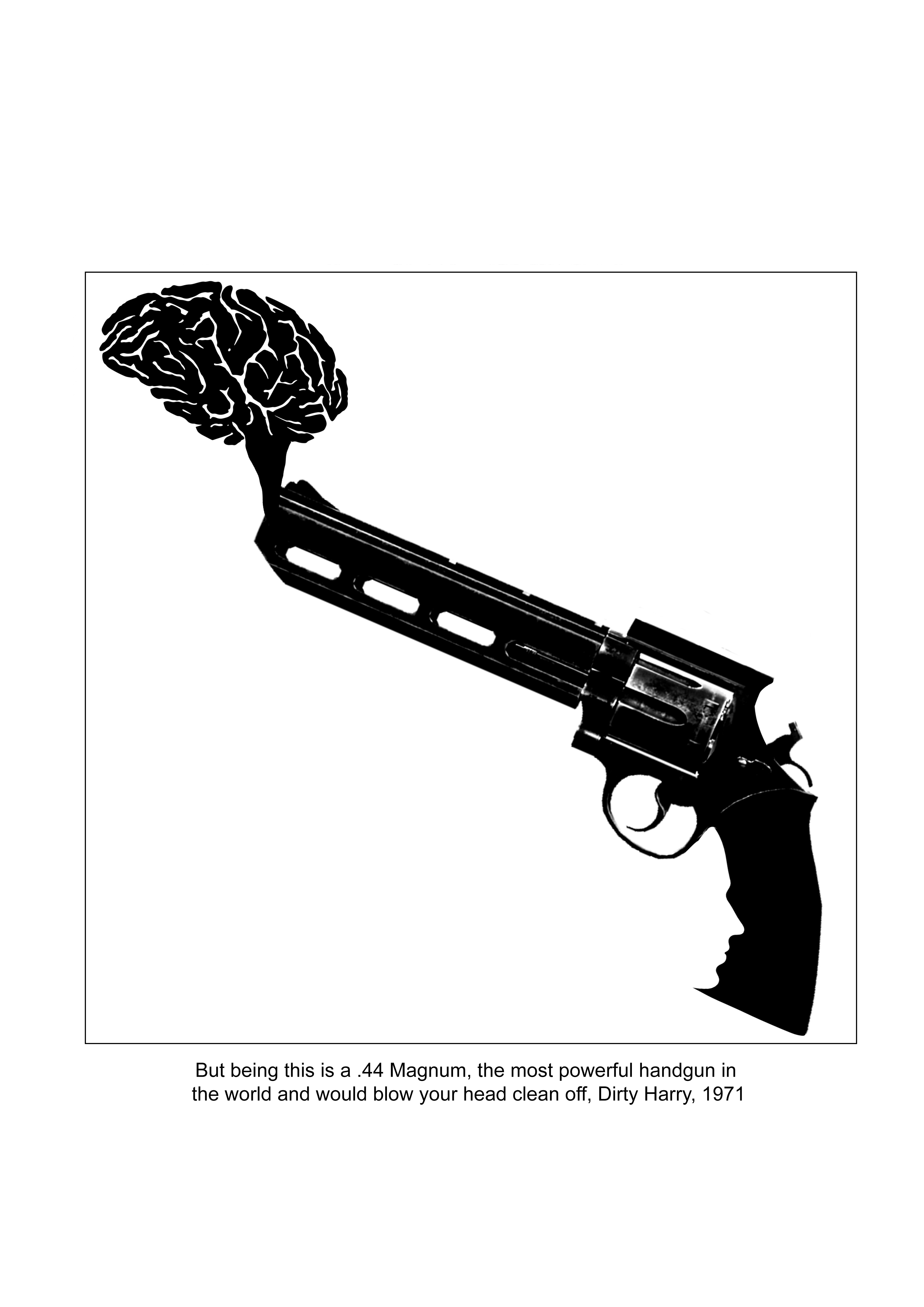
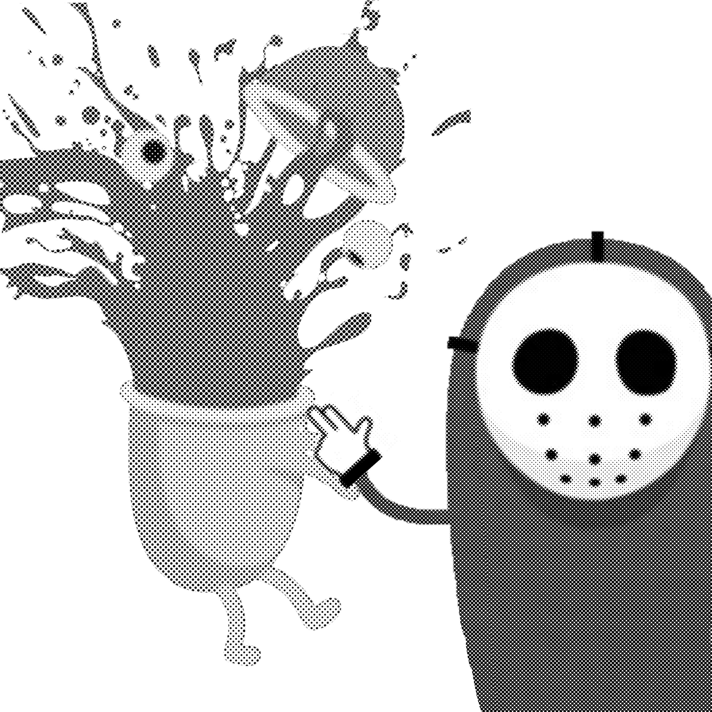
“But being this is a .44 Magnum, the most powerful handgun in the world, and would blow your head clean off.”
– Dirty Harry
FIRST DESIGN:
( the smoke being the brain and the gun has 2 hidden faces…………)
Inspired by Avinoam Noma Bar.
SECOND DESIGN:
I added a 死(si) character which means ‘death’ or ‘die’ in Chinese. Because in Chinese, 4 is referred to as si=死. So, .44=死死 HAHAHA please give me suggestions to improve. Thanks !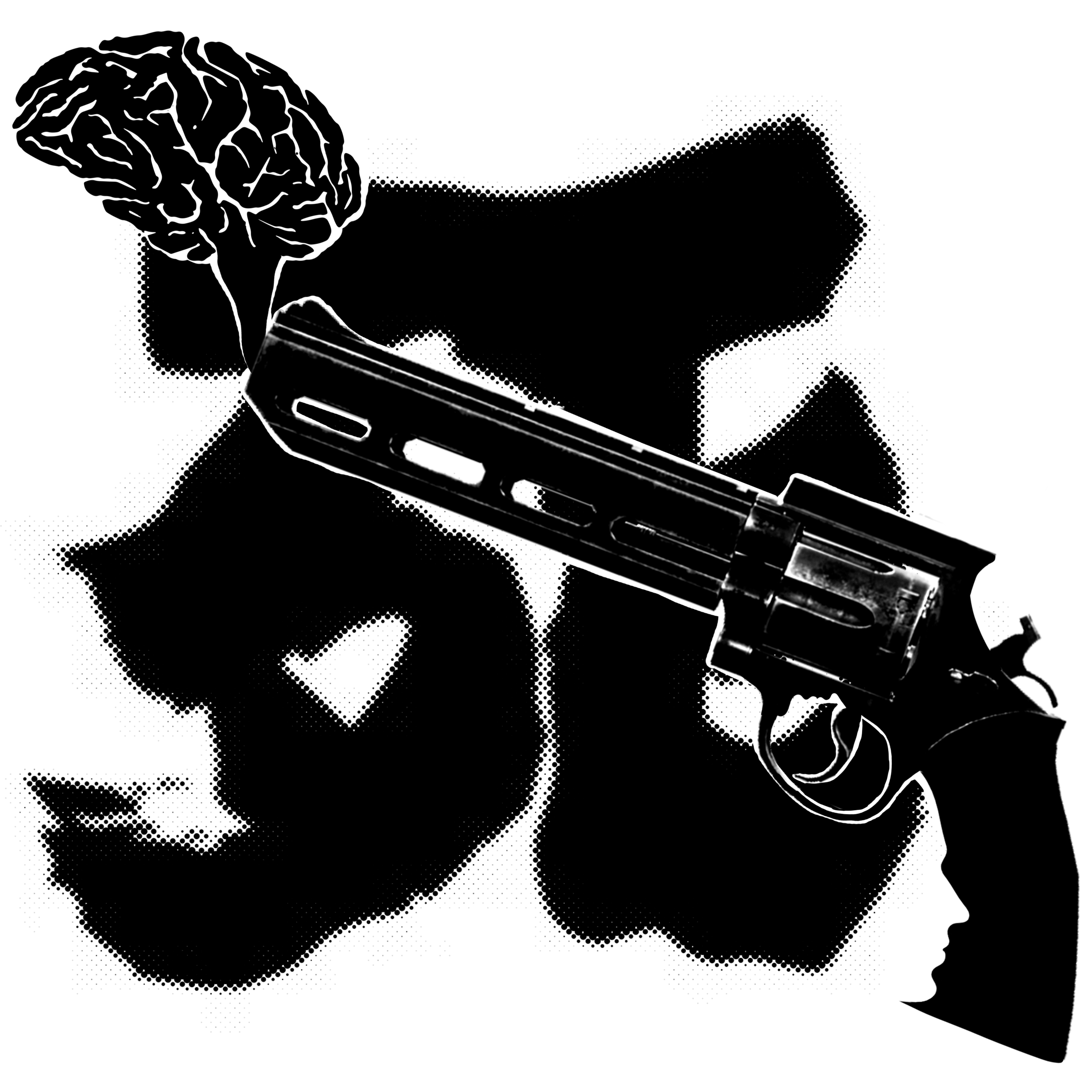
Here’s the video of the quote (@^u^@)/
“I’m definitely gonna die up here if I have to listen to any more god-awful disco music.”
– The Martian
FIRST DESIGN:
Inspired by Roy Lichtenstein.
The picture says it all 🙂

SECOND DESIGN:
Added some legs to signify the ‘dancing’ to disco music? 🙂
Here’s the video of the quote (@^u^@)/
Any comments would be appreciated. (will update more after I’m done w more of them)
“Trees and people used to be good friends.” is a quote from the ever so famous, ‘My Neighbour, Totoro’.
These are 2 designs that i came up with regarding the quote:
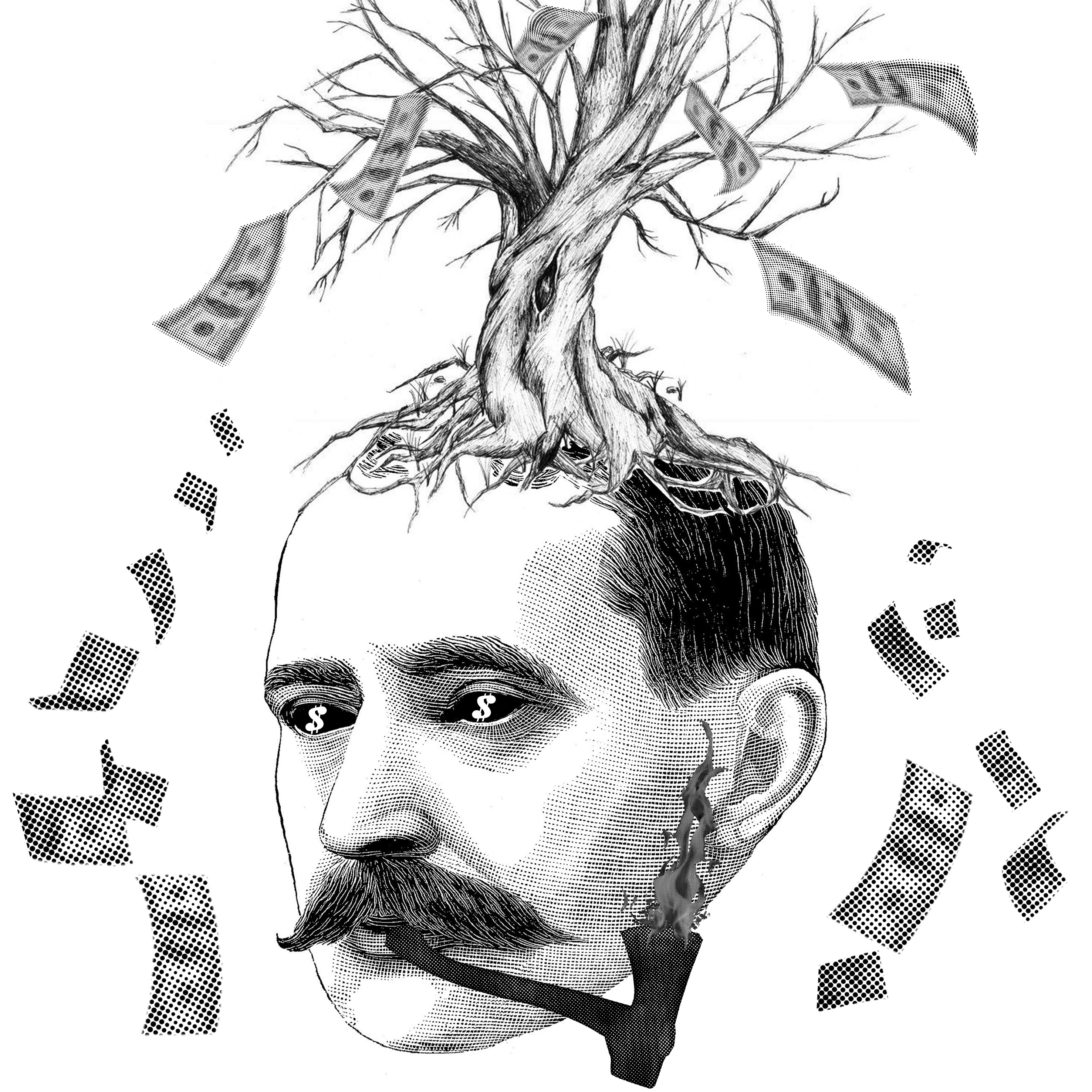
Firstly for this picture, I wanted to show that people exploited the trees for money and hence, they are not good friends anymore. The pipe is actually an axe and the smoke is replaced with fire.
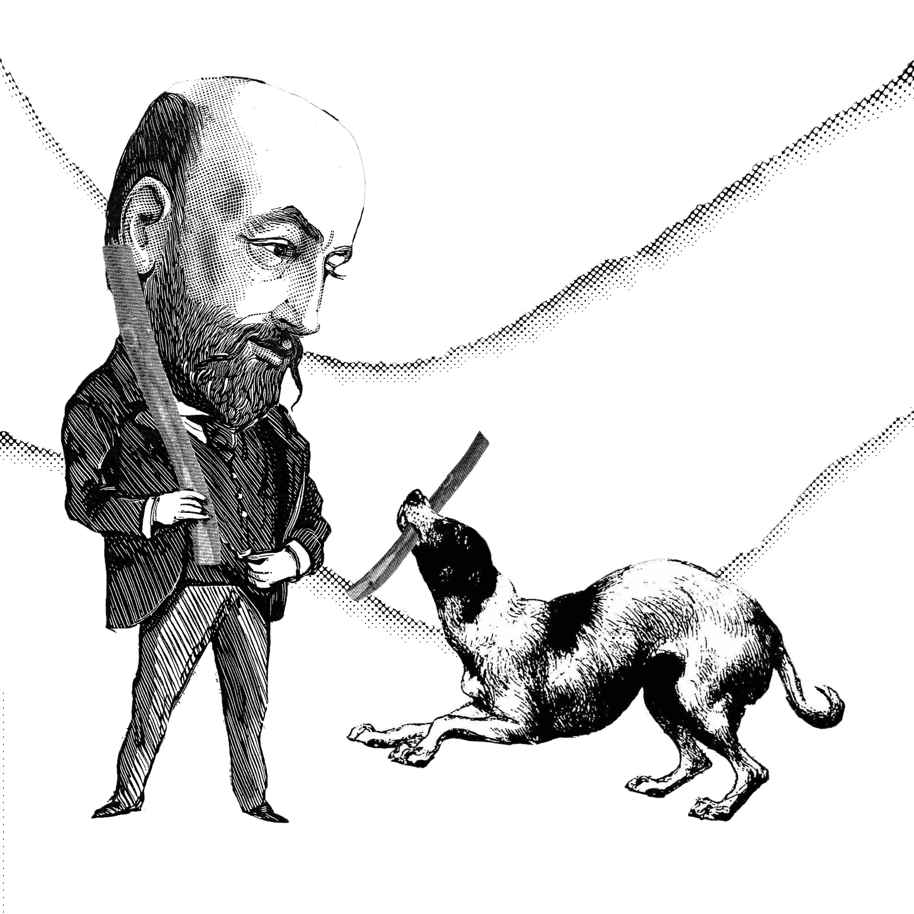
The second design revolves around people having a new good friend, the dog. Hence, the pair is playing fetch using the tree branch with no trees in sight.
(It would be great if i could get some feedbacks/opinions regarding my designs)
Thanks ! 😀