Category Archives: My Work

Task 1A: Exploratory Research

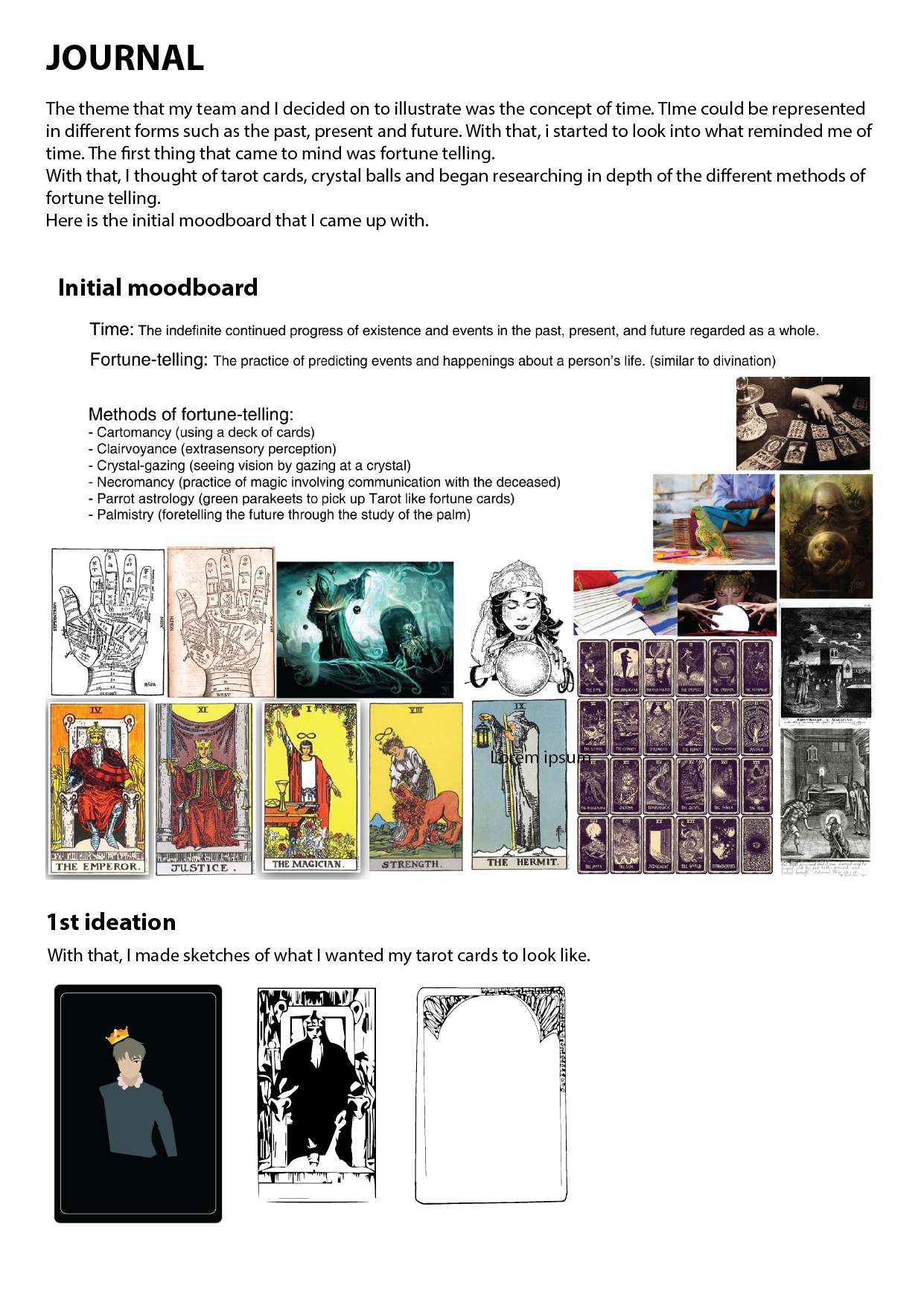
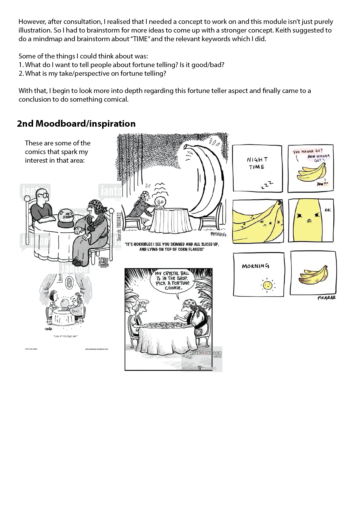
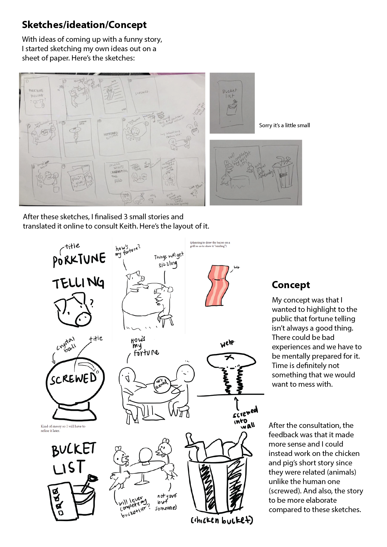
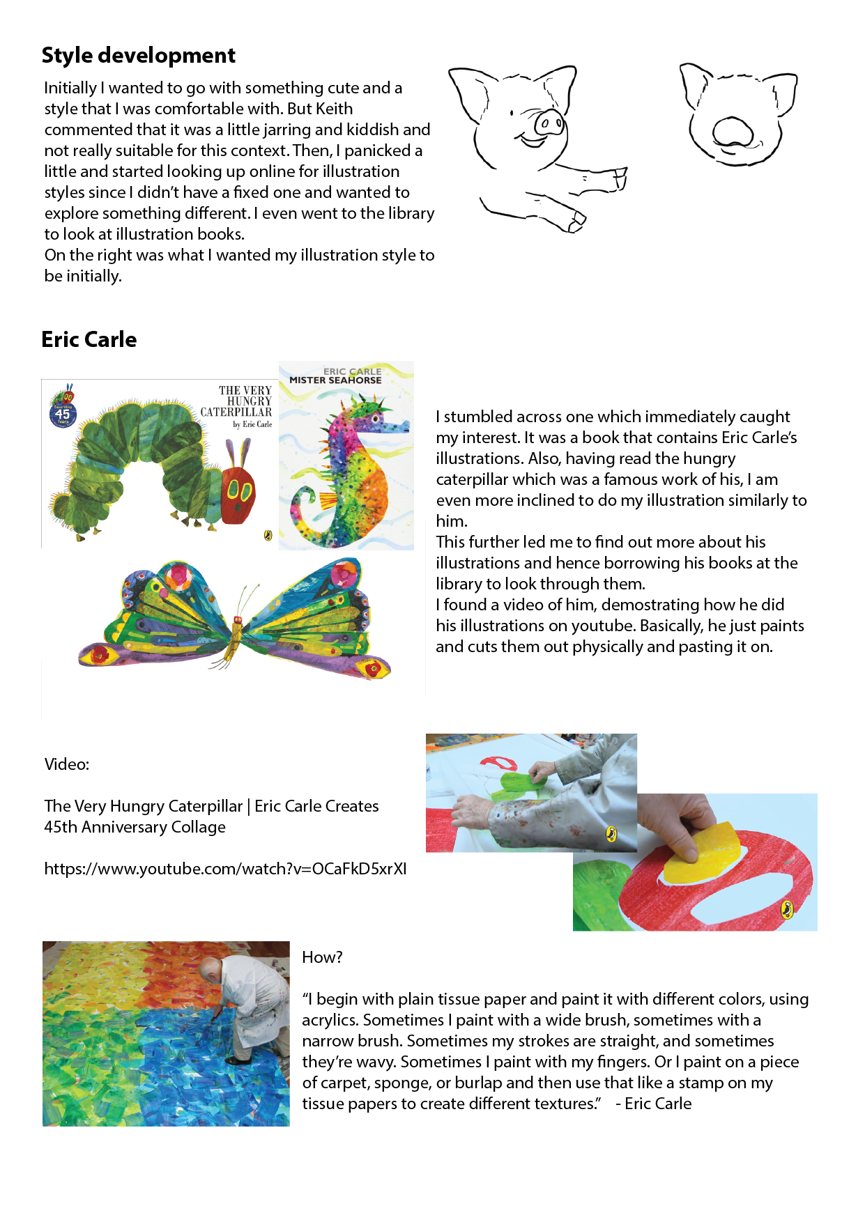
  1. What are some of the current issues confronting our world today? Amongst them, what is of interest and a cause of concern to you? (250)

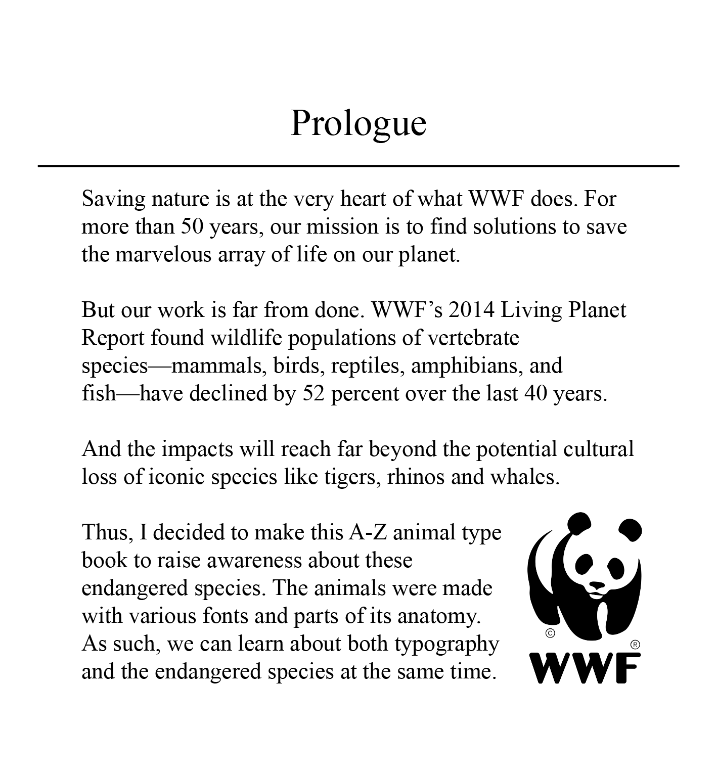
Through online articles from National Geographic, Times, NASA and many other well-known sites, I found out that there are various issues confronting our world today. Amongst them, I have narrowed it down to a few.

SOCIAL ISSUE

Firstly, we have mental disorders that is prevalent in the world but they are not well received or addressed. Mental disorders affect one in four people. Treatments are available, but nearly two-thirds of people with mental disorder never seek help from a health professional. Eg. Chester Bennington http://www.who.int/whr/2001/media_centre/press_release/en/

https://www.imh.com.sg/uploadedFiles/Newsroom/News_Releases/SMHS%20news%20release.pdf

Image result for mental disorder

Racial segregation between the white and black people is an issue. Though all humans, just because of the different skin colour each was treated differently in society and have different privileges. There are many articles about the black receiving harsh criticism even though it was nothing serious. https://www.vox.com/identities/2017/5/1/15499996/jordan-edwards-police-shooting-texas-balch-springs

Environmental issues

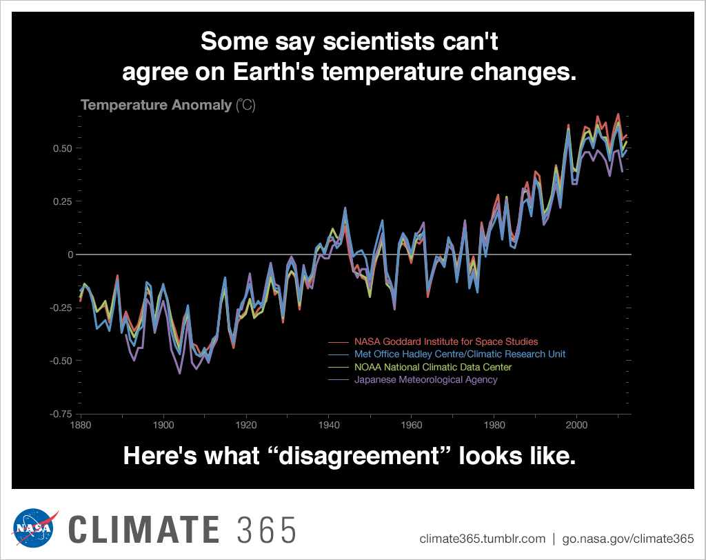
I believe that human activities, leading to climate change is the most prevalent and important issue that we all have to address. Due to human activities, the climate suffers. Even without statistics, I’m sure everyone experienced the weird climate recently, where it rained continuously and temperatures dipped to as low as 21.2 degrees. https://climate.nasa.gov/news/2671/long-term-warming-trend-continued-in-2017-nasa-noaa/

Image result for nasa temperature data earth climate changeImage result for nasa earth temperature climate change

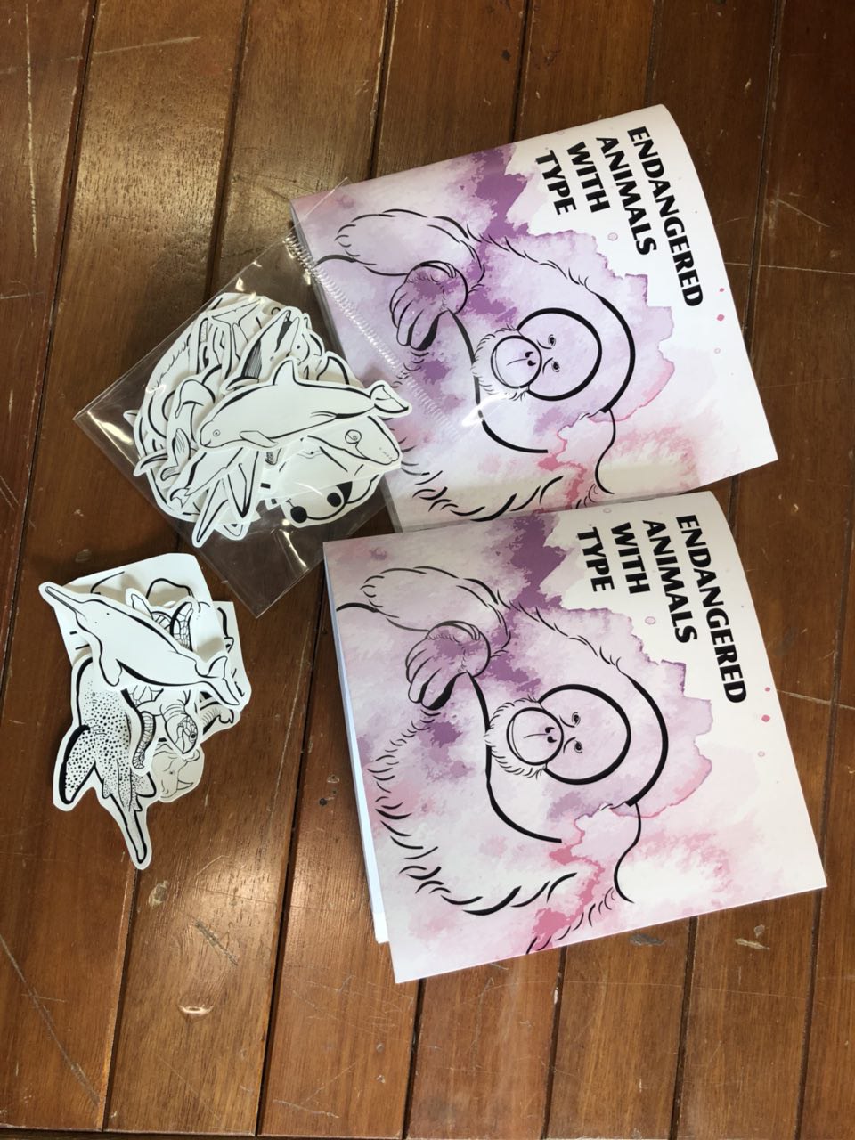
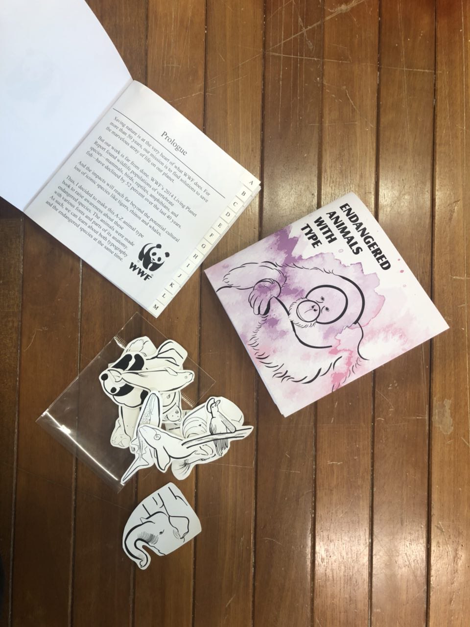
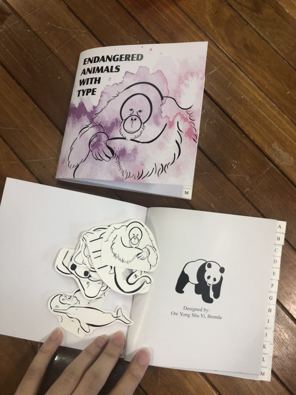
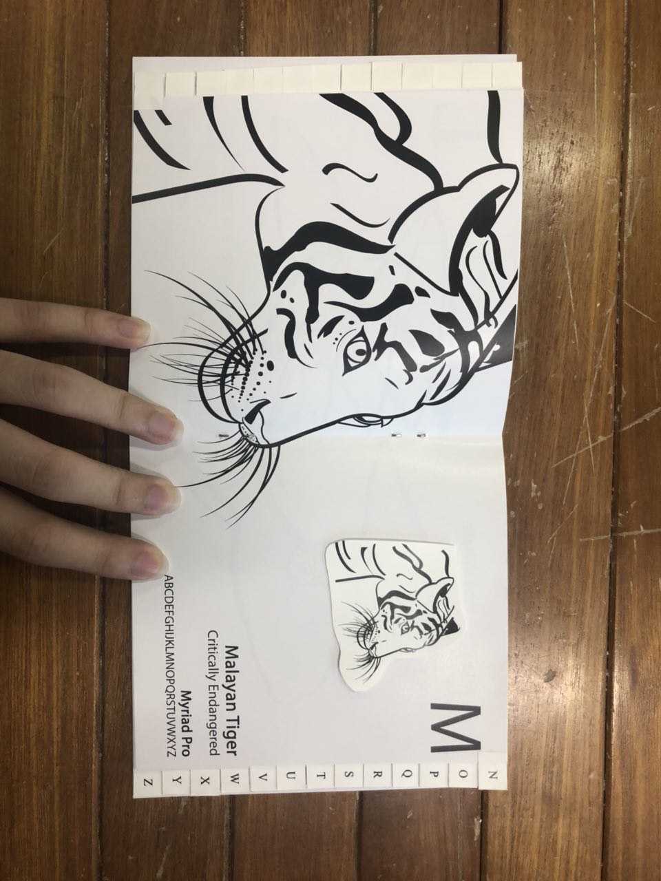
Also, due to human activities, the wildlife, flora and fauna suffer. Logging and deforestation, overfishing, dumping into ocean and shark finning are just some of the examples. Being someone who feels for nature, I want to reduce these problems before they get serious. These can cause damage to the environment since plants are the basis of ecosystems and that animals help to pollinate them. http://www.bbc.com/earth/story/20150715-why-save-an-endangered-species

(will focus more towards plastic affecting marine life)

Image result for shark finning

  1. Why is the issue important? Who does it affect and how? (200) 

Confronting human activities that damage the environment is important. Since the whole ecosystem is interconnected, one action could lead to multiple problems. For example, dumping in the ocean by factories would cause marine life to die. With the factories continuously in production, toxic fumes would be emitted and cause damage to the ozone layer. And these would thus lead to a loss of sea ice, accelerated sea level rise and longer, more intense heat waves etc. Global temperature is rising continuously every year. If we do not start act now, it would be too late and the whole ecosystem would perish, perhaps lead the world to another cycle of ice age.

Some impacts on the environment:

  • Corals bleaching
  • Land degradation
  • Habitat destruction
  • Ozone depletion
  • Ocean acidification
  • Water pollution: Greenpeace stated that at least 267 different animal species are known to have suffered from entanglement and ingestion of plastic debris. According to the National Oceanographic and Atmospheric Administration, plastic debris kills an estimated 100,000 marine mammals annually, as well as millions of birds and fishes.

http://www.ipcc.ch/ipccreports/tar/wg1/index.php?idp=49

  1. Who do you need to communicate to, and why? (150)

Communicate to the public, consumers as well as the government and organisations. (Technically everyone) There is a need to raise awareness and educate them about the concerns that this problem would bring about and what each one of us could be contributing in order to help. E.g. sustainability, reduce waste and decrease plastic production, substituting it with another more environmentally friendly material. Hopefully, the public will be educated and grasp a hold of how dire the situation of climate change is and start to adapt and change their lifestyle bit by bit.

  1. How has visual communication contributed to address the cause?

Designer: Evelyn Rydz, Pigmented Ink Print, 2014

Evelyn Rydz is a Boston-based artist who takes photographs and creates illustrations of man-made objects that have washed ashore, presenting these artefacts like an archaeologist of contemporary history. Through her photos, we can see how the journey through the ocean has changed these objects.

I like how these ocean waste morphed and changed throughout their journey in the water, exposed to erosion and thus becoming so unique and one of a kind. They indeed do look like artefacts but are actually just man-made objects in the sea/ocean.

http://evelynrydz.com/section/392886-Floating-Artifacts.html


Designer: Benjamin Von Wong, Photography, 2016

By using the recycled plastic bottles as a stand-in for the ocean, Von Wong hopes the images start a conversation on how plastic bottles are polluting our oceans.

Due to the plastic waste in the ocean, the mermaid’s life is at stake. He was probably trying to grasp the attention of the audience with how beautiful the mermaid is but with a dark twist. Her being surrounded and swimming in a pile of plastic waste. Indeed being a designer/artist, we have a hard time trying to change the world. But this project showed that through passion, by spreading the word, you can make a difference.

http://www.vonwong.com/Store/MermaidsHatePlastic/


Designer:  Surfrider Foundation and Saatchi & Saatchi LA, Advertisment, 2008

“Catch of the Day,” a guerrilla ad campaign sponsored by Surfrider Foundation to educate people at farmers’ markets about the amount and kinds of pollution dumped into our seas.

Working with the ad giant Saatchi & Saatchi, real-life trash was collected from various beaches in America and packaged to look like seafood and then offered at various farmers’ markets.

This ad caught my eye immediately with the strong visuals. The ad speaks for itself. Fishes being replaced by waste in the ocean. This ad is definitely strong since it uses an everything object to “package” something different.

Image result for plastic surprise surfriderImage result for plastic surprise surfriderImage result for plastic surprise surfriderPlastic Surprise

http://www.surfrider.org/psa/entry/plastic-surprise

https://www.treehugger.com/culture/a-picture-is-worth-surfriders-catch-of-the-day.html

More artists that are worth reading about:

http://time.com/4358434/world-oceans-day-art-marine-plastic/

http://www.alejandroduran.com/washedupseries/

Sea Globes

5 Types of Plastic You Can Trash From Your Daily Routine To Help Save The Oceans

Project 4: Expressive Typography

ENDANGERED ANIMALS WITH TYPE

Expanding further from my previous project, 3a (type as image) which I really enjoyed, I decided to make a book of A to Z animals.

Firstly I found animals from A to Z, but I don’t really feel much for it till I stumbled across WWF’s website. You can check it out here: (https://www.worldwildlife.org/species/directory)

They had many animals that are endangered and requires conservation efforts to save them of which touched my heart. So, I decided to raise awareness of these endangered species with a typography book of animals and fonts from A to Z. With that I expanded my project, making the animals using different typefaces and here’s the process:

So firstly, I had to cut up the different typefaces unique to each letter and each animal then using them to fit to the contours of the animal.

As you can tell, I used mainly cut up U(s), brackets, full stop, and other letters like J/L etc.

LAYOUT/PROCESS :

The process was very tedious and time consuming but fulfilling when I put it all together in the end. Here are the final spreads:

I aligned letters and included the name of the animal, conservation status, name of the typeface and the letters of the typeface for reference.

The last 4 panels are my front cover, inner page, prologue and the back cover.


PROCESS:

Before finalising those 4, I consulted Shirley regarding them and got some feedbacks. ‘

The cover page’s font is Castle T Ultra. I used that font since it was the closest I could get to mimic WWF’s customised font.

The font used for my intro/prologue page is Times New Roman since I wanted it to look more professional. Also, for my prologue, I took WWF’s mission and incorporated it in together with my objective of raising awareness for these animals/learn about the typefaces.

BEFORE:

(back cover and front cover)

CONSULTATION:

(front cover)

Comments: My font was too big and it fights for attention together with the animals. Choose a focus, either the font or the animal. Perhaps, add a wash of watercolour to bring out colour and texture to draw attention of reader. Remove unnecessary animals and just keep one as the focus.


BEFORE:

(intro/prologue page)

CONSULTATION:

Comments: Unnecessary to repeat title again, so remove it. Why is my name there? What role do I play? The awkward placing of the WWF logo at the corner of the page is weird, so try to text wrap around the logo and there is an orphan word.


AFTER:

So after all those consultations, I came up with these 2 cover page, which I narrowed down to the pink/purple as it looks more alarming for endangered animals rather than the blue which seems more calm and serene.


FINAL SPREADS

With that, I came up with my final spreads which were ready to print! Here is the finalised work:


PROCESS AND FINAL PRINT OUT:

I decided to make tabs for easier readability and had to cut 1cm away from the inner pages for the tabs to be inserted in and it’s a mess as you can see from the above picture. With the remaining half of the vinyl sticker, I made stickers to share with the class, yay!

I printed the letters that is unique to each font but it looks a little messy and hard to read which then made me decide to standardise the font to Times New Roman.


FINALISED PRODUCT:


REFLECTION

I really like the final outcome of this project. I learnt so much about the different endangered animals and the anatomy of various typefaces.

If I had more time for this project, I would explore further about colouring them and making a larger book so I could include some facts regarding the animals for people to be more aware about saving nature.

All in all, this is a project that I would definitely show people since it was one of the first ever books I made.

That’s all folks!

Project 3A: Type as image


3A – Type as image


Firstly, I started off making outlines of my favourite character, Totoro from Studio Ghibli. I had no idea where I was going, so I showed Shirley this. She then showed me some of the works her other students did and I realised I should’ve worked with serif fonts instead of san serif. Serif fonts gives you much more dimension (eg thick and thin lines) to work with. With that, I started out trying out a serif font, Pistilli.

Working with Pistili, I cut up the fonts into pieces as you can see on the next photo. I cut and pieced them together forming Wall-e and Eve and I’m so happy it turned out great :”)

So here are some of the things I used for Wall-e and Eve:

(I know it’s a mess)

These are my final works :

That’s all for 3A! 🙂


ZINE process (Part 3 – final)

Hi all, this will be the last part of my whole zine process.

After consultation, Mimi suggested that it would be best if I just focused on the monster in this zine. So I had to churn out a narrative. In this case, I thought it would be best if my whole narrative was about a monster that causes terror and destruction in the society (Jurong). So this monster would morph into buildings and things which meant that he destroyed the buildings. Furthermore, I went with the colour red and black since it looks more sinister and dark. So here is the original colour scheme that I had in mind.

The feedback I got was to make the red brighter, to make it pop, since that is the essence of the whole zine.

Moreover, I was thinking to make the tentacles on the bridge a little bigger since they look really small compared to the bridge. I wanted to make it look as if the monster overpowers the bridge.


TYPOGRAPHY

Moving on, I made the red brighter, drew my designs and I encountered a problem. It is of course again, the typography.

Firstly, I tried out the capitalised handwritten typography. To me it looks too angry and in your face. It probably looks okay in this spread, but when I tried it on other spreads, it doesn’t look too good. Hence, I changed it.

Next, I tried to write a little bit neater. However, it doesn’t bring out the feels of the ravaging part. I realised when I scribbled the words as a draft, it looks much more genuine. Thus, I went ahead with that.

So here’s the final typography that I went with.

Just like that, I’m done with the designs for this zine. I printed this zine on Munken Lynx paper, 120gsm, that I got from RJ Paper. The contrast of the red and grey on the white background made the designs pop even more.


OUTCOME

Enough of typing, I’ll now show you my final outcome!!

(back and front cover when it is flipped open)


DESIGNS ON SCREEN

Pages 8,1

Pages 2,3

Page 4

Page 5

Pages 6,7


REFLECTION

After rounds and rounds of consultations with Mimi, I finally came to a conclusion of just focusing on this monster for my narrative. It makes the whole theme and whole narrative flow much better and in sync.

One thing I regretted most was my font/typography. I should have made the font smaller. After printing it, I realised the font was really too big and in your face. If I were to make this zine again, I’ll definitely make the font smaller. Also, I should have experimented more on handwritten typography.

Another thing is that I think that I would want to push myself further if there was a next time. I would try again with my initial blue tinted photos with white drawings for my zine. (who knows, I might make one during this holiday)

Overall, in conclusion, this was a really fun and fruitful project. Getting to finally create a zine of my own and feeling accomplished after I submitted it makes me feel like I am a true and real designer. I’m definitely looking forward to see how different my zines will turn out in Y2! 🙂

ZINE process (Part 2)

Hi all, so this will be my second process about my Zine.

DEVELOPMENT

As seen in Part 1, I wanted a blue hue. So I went onto illustrator to try it out. However, as you can see, it is too structured. I felt that hand-drawing it would look even better. So i stopped here and made a new drawing.

So here’s the one that i drew on. But the cons of this is that the tentacles ain’t as clear as the eyes. Also, one of the feedback that I got from Mimi was that since I’m going for a more ‘fun’ theme, I can extend out of the picture/canvas.

So yeahhh, i drew out of the lines and it looks nicer. But the feedback I received from friends are : Do you have to make the picture blue? Cause it doesn’t look like it fits the picture as a whole. So I changed the colour of the whole thing.

I tried black and white. But still doesn’t look as nice.

So finally, I decided to go for colours. Also, the feedback i got for this was to remove the frame around the photo and the extra space at the bottom. And I can change the colour of the building to be blue. (like previous designs)

So here it is. I agree that it looks much more put together compared to the rest. 


RANDOM IN PROGRESS WORKS

Here are some random works I came up with while I was forcefully trying to fit in with the blue theme before deciding on the coloured theme. (These are works that I rejected)

Time is precious, use it wisely. But I thought I could add the bear to signify that it is precious and you shouldn’t let others ‘steal’ it??? (I’m sorry if I don’t make sense)

So here’s after I remove the bear.

I was wanting to make this into something like a rib-cage, but somehow I didn’t like it so I scraped the idea.


1ST DRAFT FRONT AND BACK COVER

Continuing on, here are my mockups for the front and back cover together with the layouts inside. The title/topic I was going for was “Jurong through my perspective”.

FRONT:

When Mimi saw this, her reaction wasn’t good at all. So of course I had to scrape the idea.

This is too messy and has nothing much to do with my main point. It is just all over and everywhere.

For this one, I couldn’t seem to fit any other elements from my zine layouts except for the tentacle monster. The rest just seems out of place.

BACK:

A collage of the things that I will include in my zine. But just too messy and it looks bad.


1ST DRAFT LAYOUT

These are my layouts for my zine.

This is a drawing of a sperm whale getting stuck in between the bridge. (Mimi said this works well)

This architecture at Jurong Central Park is supposed to represent a hen’s nest. However, it feels too forced and cute. So Mimi said it doesn’t work well with the monster that I drew.

Also, this is too forced and doesn’t look good T_T (It’s a last minute thing that i came up with……)

This is also too forced and the actual architecture cannot be seen clearly.

This has the same problem as the hen’s. Too cute.

FEEDBACK:

Instead of thinking so much about this and that, why not just focus on the monster/cthulu/tentacle looking thing since that is my main focus. So I will need a story that revolves around this monster. Hence, all of these were made in vain :’) but it’s okay.

ZINE process (Part 1)

Hi all, sorry for the late uploads. In part 1, I’ll be talking about my research and some of my process/developments.

RESEARCH

So my concept was doing illustrations on photography. These are some of the stuff that I found on pinterest. I thought that these could inspire me to get started.


Since I would be doing illustrations, these are some examples of illustrations by various artists.


Layout designs inspiration? 🙂


And here’s a cool children illustration book that Mimi recommended. Sadly, I couldnt get a hold of it since someone else borrowed the book from the library. So here’s a image I found online. It is called “little big books” by Geltalten.


MOCKUPS

Firstly, I went with the blue hue for my photos.

I thought they look really nice. These are some of the edited photos:

Following that, I continued to work on my concept of illustrations on photographs.

This was the first outcome. The feedback I got was that it was nice with the blue hues/tint and stuff, but Mimi would prefer me to focus in terms of architecture and not nature and I could see the disappointment T.T

Then I tried to do something else but this time, in colour:

The lines weren’t as clean in photoshop, so I tried out illustrator to recreate the mailman:

After this consultation, I scrapped the idea of drawing on nature. But I realised that drawing on a living creature is easier than drawing on architecture. However, the difficulty of drawing something on architecture? That is the challenge I will have to overcome.


Que Sera Sera – FINAL WORKS

FINAL WORKS

Hi everyone!

These are my finalised designs for “Que Sera Sera”.

I tried to play a lot with semiotics and negative space.  I will just briefly talk about the significance of each job I chose since I didn’t get to do so during the very short and rushed presentation. Hope you guys like it!


1. Hairdresser

f-i-n-a-l-01Reason why I chose to be a hairdresser is because my mum used to learn about hairdressing skills. She used to cut my hair when I was young and that caused me to be fascinated by how hairdressing works. I used the two “O”s from my surname and made it into a scissors. For the rest of the other letters, I added this wavy curvy lines or strokes to the font to resemble hair.


2. Electricianf-i-n-a-l-03

Reason why I chose electrician is that I was totally inspired by how my dad is able to fix our household appliances and electronic gadgets without having to get someone else to fix it! And you don’t often see a female electrician so :^) Anyway, I played with negative spaces for this design. For the “H” and “Y”, I added a plug and for the “U”, I added a light bulb.


3. Race Car Driver

f-i-n-a-l-04

This was my favourite piece out of the 4 designs I have. For this design, I played with negative space to create a sports car out of the “E”. And also i replaced the “D” with a race flag and warped it to the shape of a D. The inspiration for this piece came from the game I played on my PS1 and PS2 when I was younger, “Gran Turismo”. It is a racing game that I used to play together with my brother and my dad. Check it out if you have time!


4. Baker f-i-n-a-l-02

The last design took me forever to come up with it. And I was wondering what comes hand in hand with a baker. Yes, bread! (it sounds like Brenda too) So I realised that why not use a french loaf? Yes, that’s what the “E” is. And of course the “D” is a rolling pin so as to add more context to it. I received comments ranging from one end to the other. Some saying that it is obvious that the job is a baker while others told me that they can’t seem to figure out the job. :”)


But I hope you guys like it

Curating self – nature

Task 2 : My World


Since young, I am fascinated by the vast nature around us. I really like nature photography as nature is very unpredictable. Living things like birds and insects tend to move around a lot. The feelings that I try to evoke through these photos are calmness and serenity.

Task2_1

From this picture, I think you can guess where the place that fascinates me is. This significant place is of course, the Botanic Gardens. Anyway, you would probably know that it is a UNESCO World Heritage Site.

According to the internet, a black swan represents something extremely rare. I believe that everyone is unique in their own ways and I tried to portray it through this black swan which happened to pop its head out for me to take a quick shot of it. It makes me feel really special to have gone so close to the swan.

It also reminds me of the childhood fairy tale i used to read, ‘The Ugly Duckling’.


Task2_2

For this photo, I tried to play with the one point perspective of leading the viewers’ attention to the hut.

The reason is such :

There is a pot of gold at the end of a rainbow.

Pot of gold = Hut

Rainbow = Road/Pavement

I tried to portray that meaning through this photo,  that success doesn’t go to you, you go to it.


Task2_3 resize

This photo reminds me of my younger self, when I actually thought how would it be like if i sat on the lily pad. But I would probably sink since it cannot support my weight. I also tried to incorporate what was taught in class, depth of field.

(it could support a bird’s weight though. Continue to scroll down to see a photo of it) :^)


Task2_4 resized

This is the last photo I chose. This photo to me shows how rustic and old the Botanic Gardens is. It is founded in 1859, which is over 150 years old. The wooden planks seems like it has went through a lot of rain and shine. Also, I played with the one point perspective in this photo.


Bloopers/other photos of nature that i took in Botanic Gardens :

Here you go 

DSC_0412

Some dragonflies

DSC_0386 DSC_0391 DSC_0392

More birds

DSC_0537 DSC_0590 DSC_0600 DSC_0615


Artist References :

My main inspirations for these photos come from the photographers from national geographic. 

The specific photographer that I get most of my inspirations from is Tim Laman. Here are a few of his works from his instagram account :

timlaman

lol

Feel free to follow him on instagram like I do ! 

(https://www.instagram.com/timlaman/)

tim


Notes: 

I like nature and the photos I’ve taken do not actually portray any human in it :^)

Curating Self – hohohockey

Task 1 : Object and representation of self

Task1_3

The object I chose to use is my hockey stick. Hockey was the first ever sports CCA that I’ve joined in my life. The reason why I chose to join hockey was the fact that it was a unique sport unlike any other.

Task1_4

For this photo, I’ve covered my eye with my hockey stick. I look really tired and sad. The story behind this was that hockey, likewise any sports, it comes with risks. I was from Jurong Junior College and the incident happened during a friendly match between my school and Millennia Institute. Unfortunately for my friend, she lost her sight in one of her eyes due to the opponent hitting her in the eye with her stick. Adding on, due to this incident, JJC hockey was disbanded after my year and we did not participate in the A divisions. I was the last batch of hockey players from JJC. Thus, my hockey stick really meant a lot to me.

Moving on, I captured the sun flare when the sun was setting. This warm light reminds me of the times when we visited her in the hospital and donated to help her family out with the medical bills as she is not very well off.

Task1_5

Despite all these issues, I met some of my closest friends through this competitive sport and i tried to portray it through the warm lighting in this photo. Furthermore, I am smiling in this photo unlike the previous one. Hockey is a sport that I enjoy and can see myself playing more in the future. I will not let this incident stand in my way.


Other photos that I took :


Task1_2

I tried to play with the foreground, midground and background, but I feel that it is a little messy around the branches and I should have stood a little closer to the camera.

Task1_1 

To me it is kind of a very normal sports photo, thus I did not pick this photo.


Notes :

I like to play with depth of field as seen from my photos. :^)