FRESH OFF THE PRESS
Have you received a copy of our Limited Edition Times New Roman issue 001?
Well wait no further.
TIMES NEW ROMAN
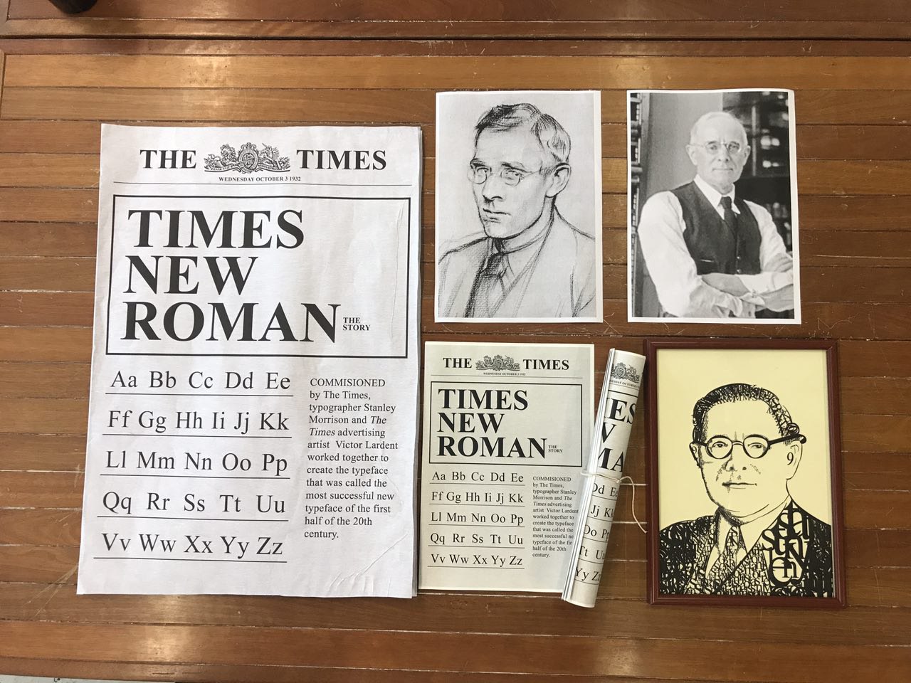
Our final presentation pieces!
- Newspapers
- Portraits of Stanley Morrison
- Portrait of Stanley Morrison made out of TNR characters
FINAL
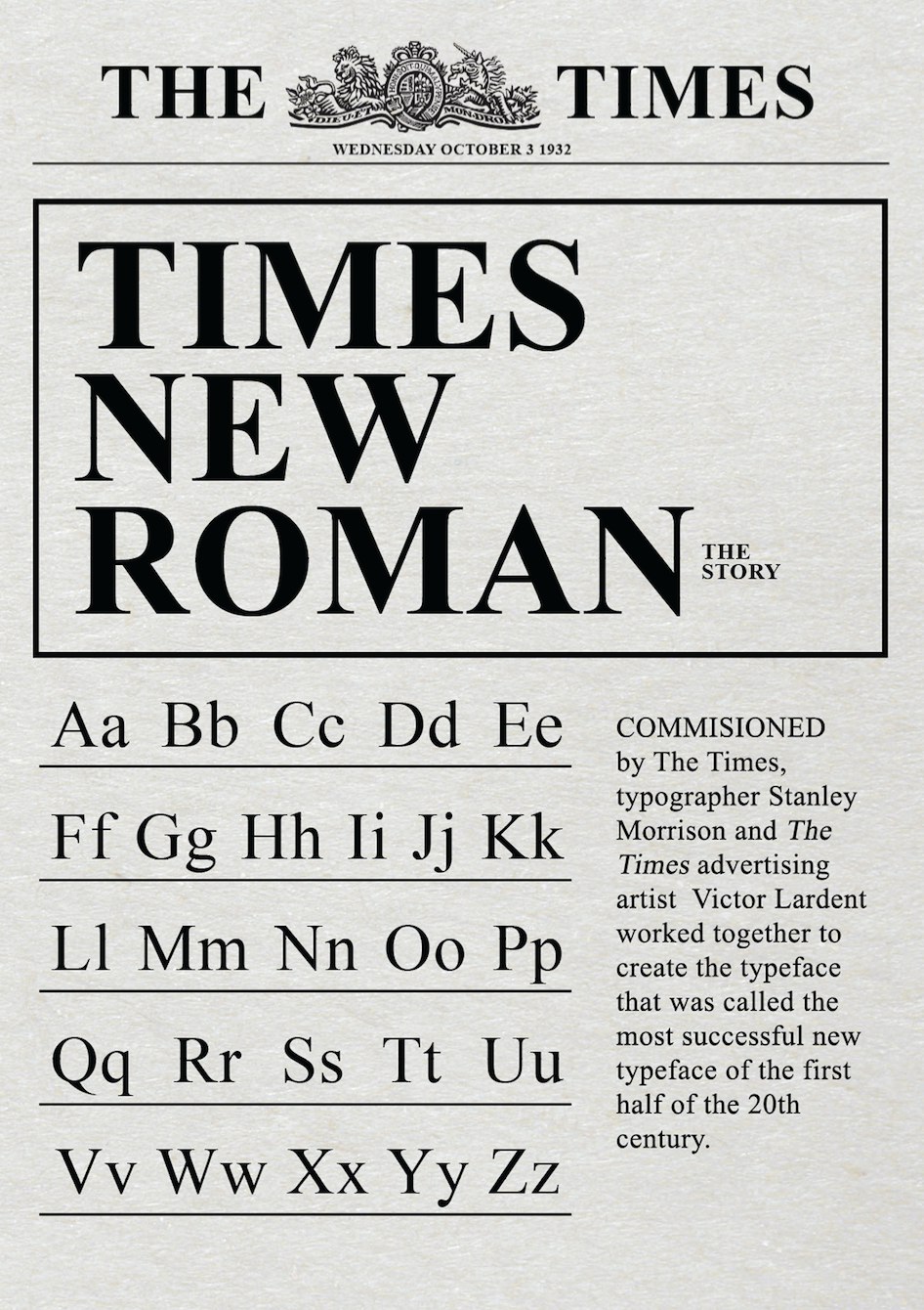
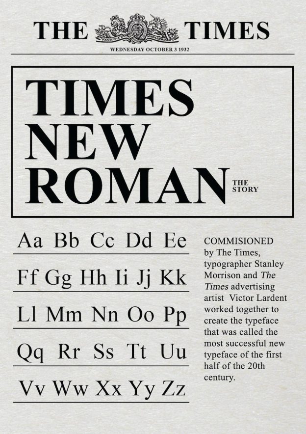
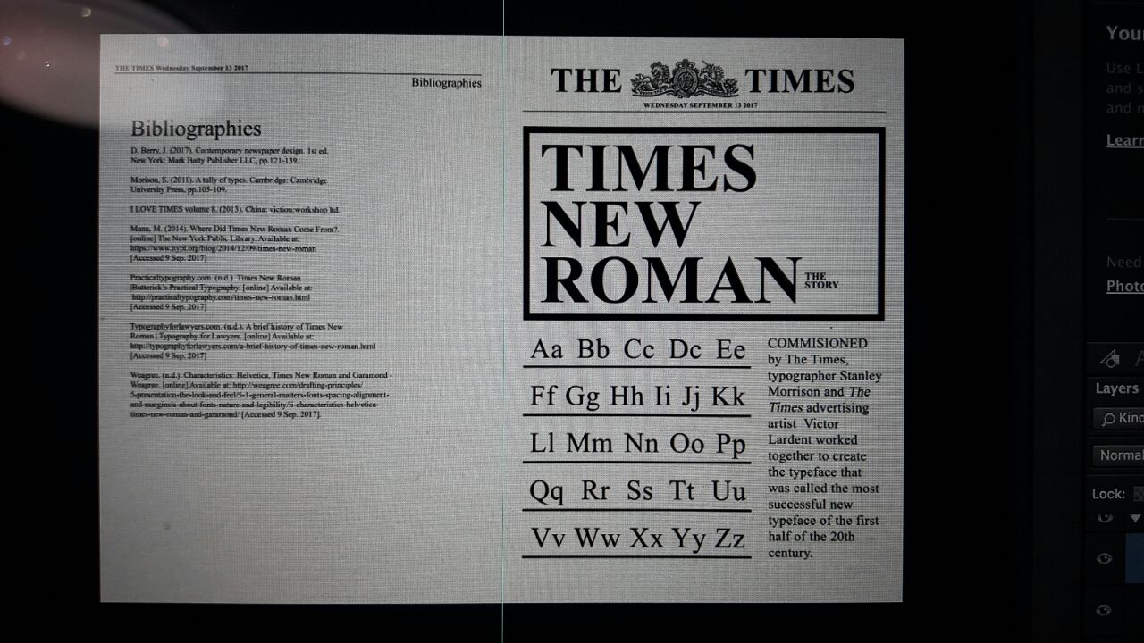
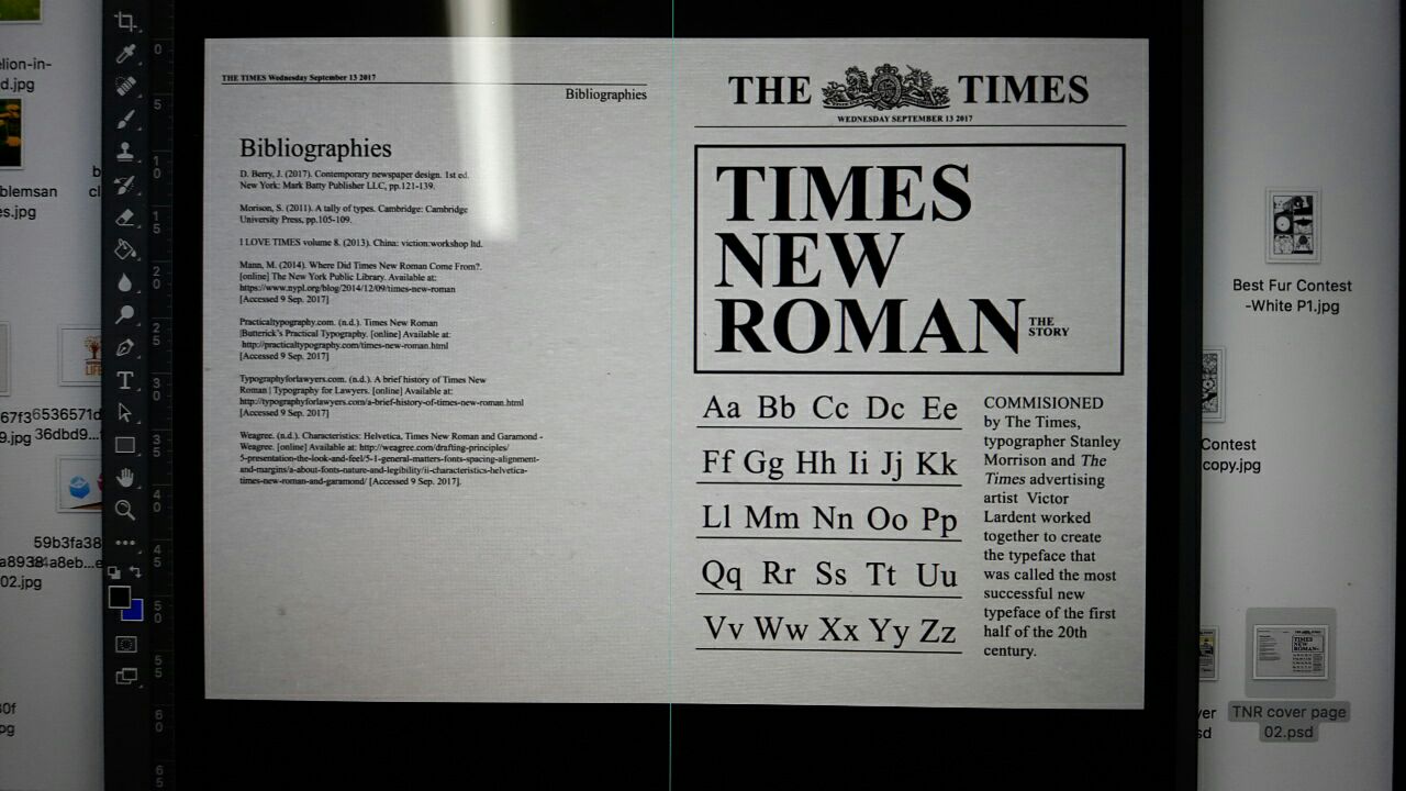
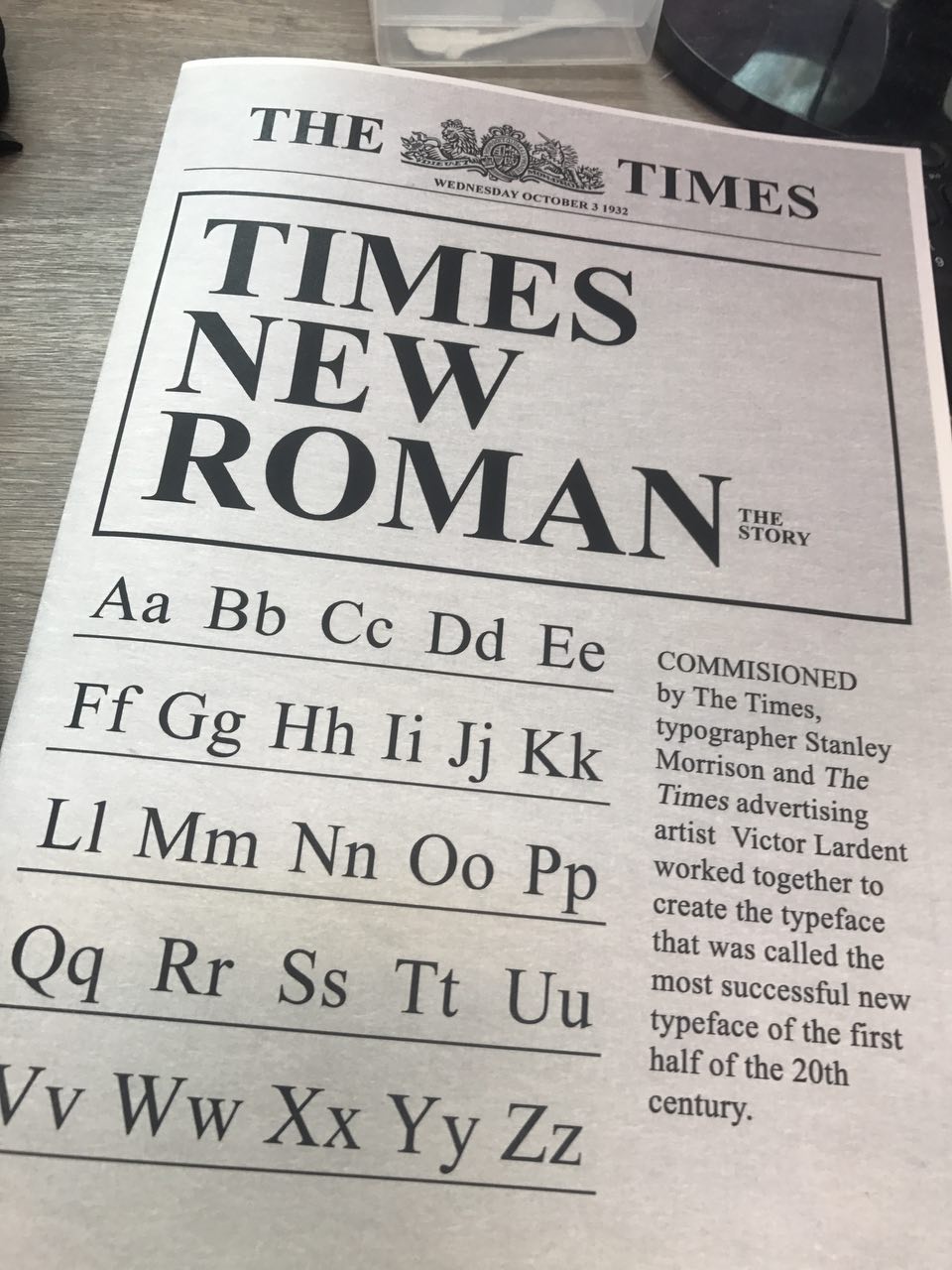
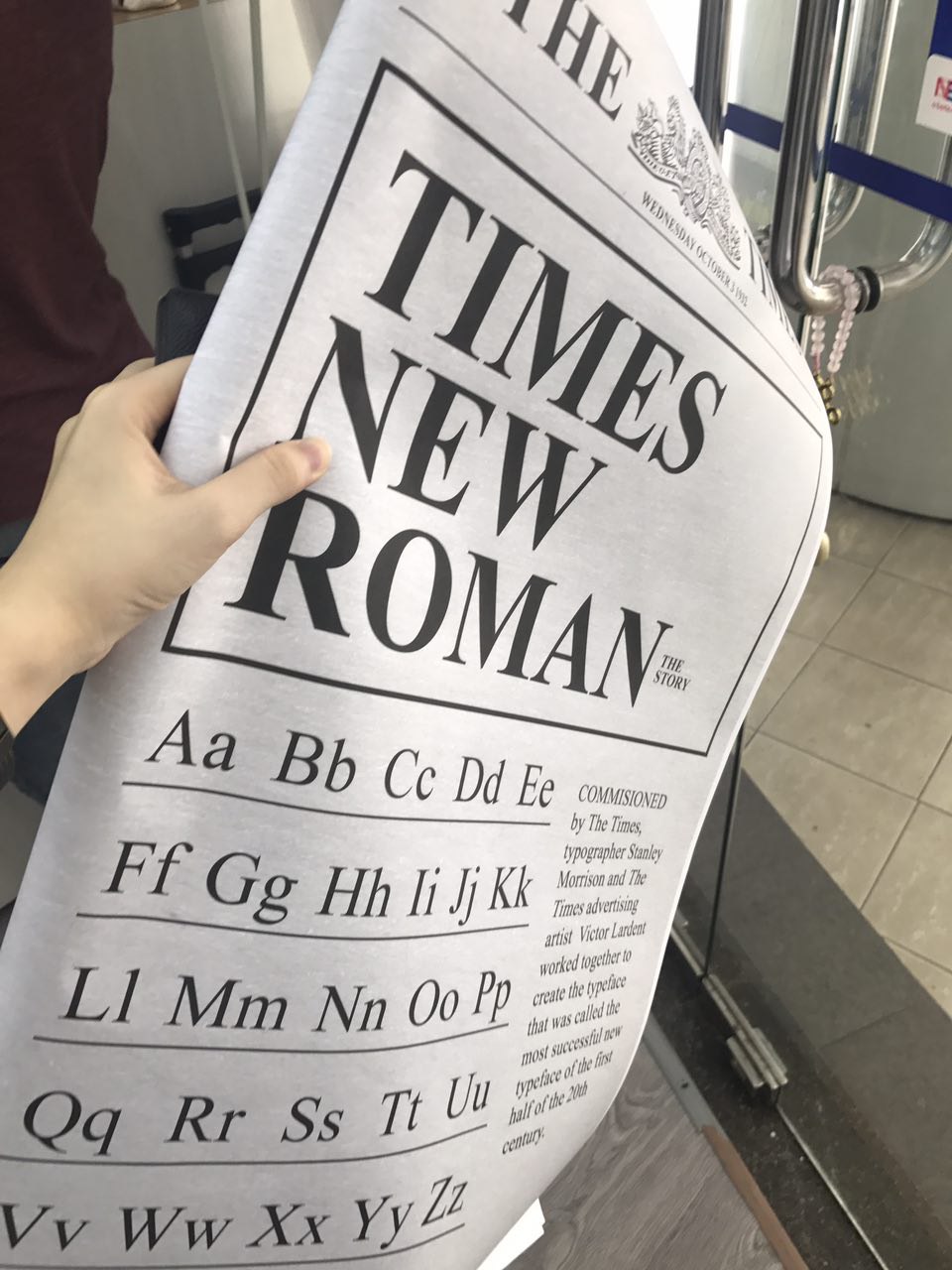
Cover Page: A brief introduction of Times New Roman.
Introducing the creators Stanley Morison and Victor Lardent who collaborated and commissioned Times New Romans for The Times in 1929.
Typeface layout- Showcasing Times New Romans.
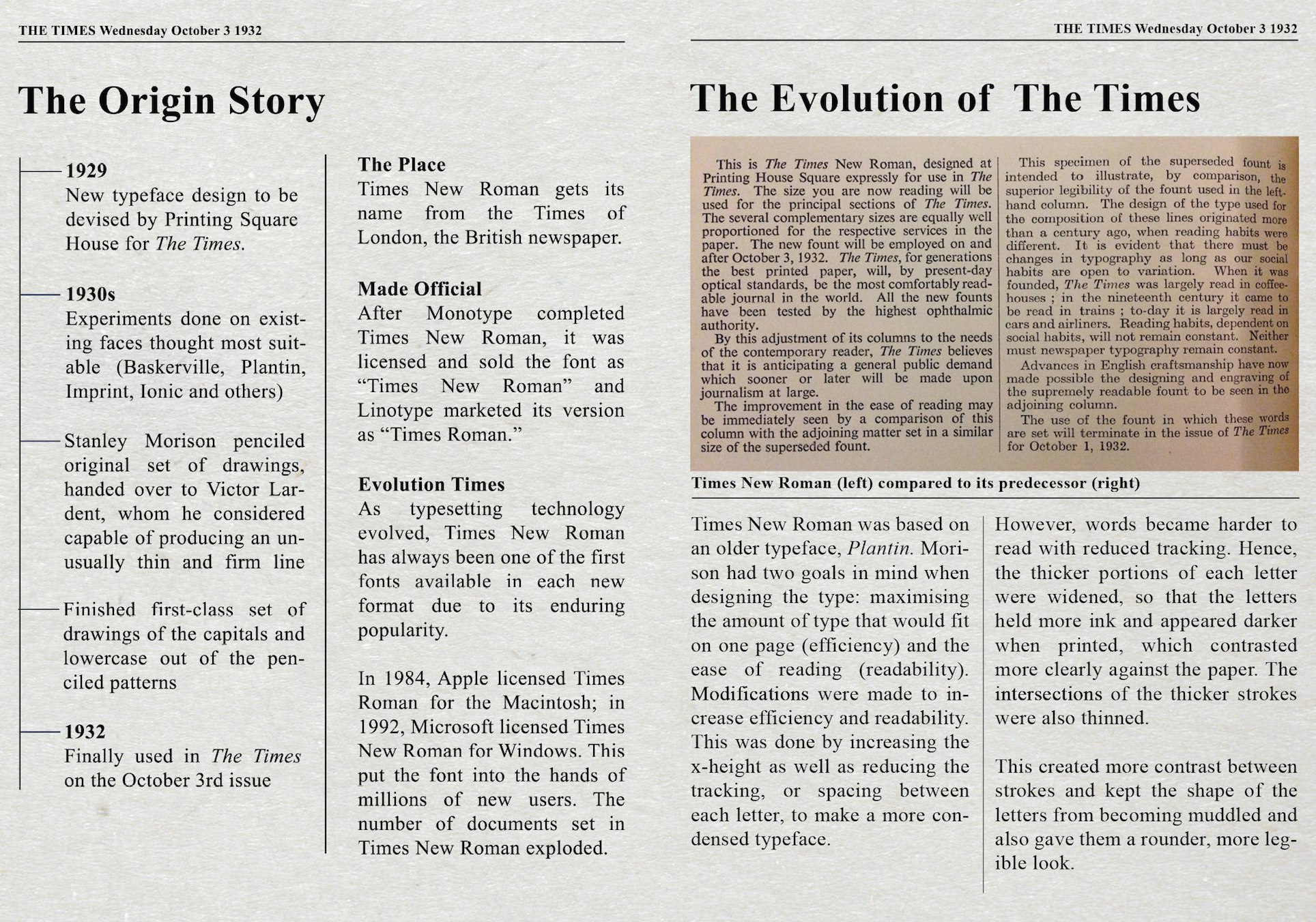
Spread 1: The beginnings of a classic typeface & how it evolved through time.
A typeface inspired by efficiency and readability, its origins began from Baskerville, Plantin, Imprint, and others.
Significant changes from older types:
Higher X-height
Reduced tracking
Thicker portions of each letter widened
Thinner intersections of the thicker portions
Rounder and condensed look for maximum readibilty
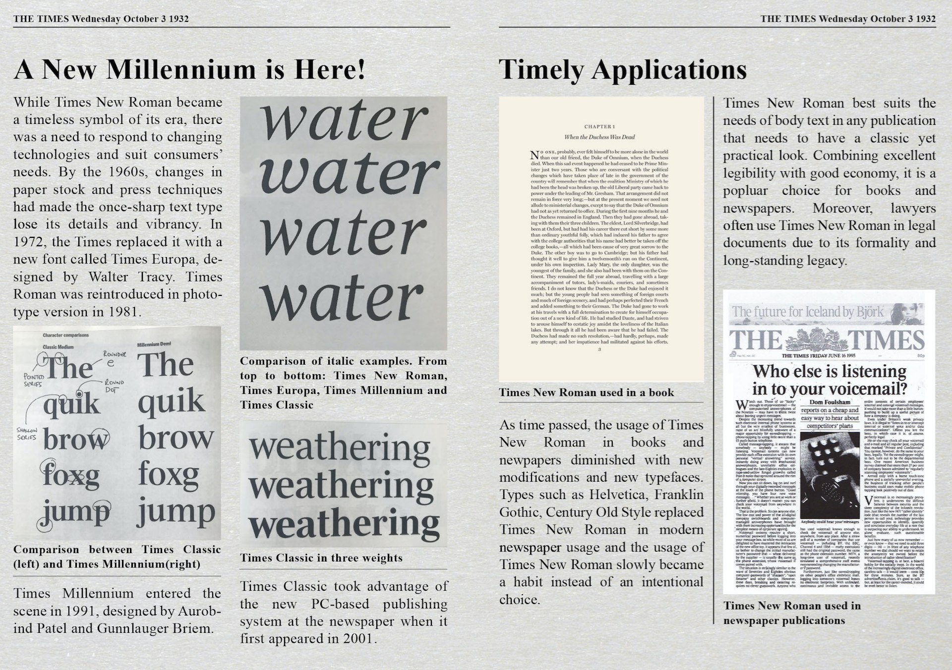
Spread 2: Modern changes to the original typeface and applications of Times New Roman
Keeping Up With The Times
The advent of new technology and newer typefaces meant that Times New Romans needed an upgrade. Hence, the birth of alternatives such as Times Roman, Times Europa, Times Classic, and Times Millenium… just to name a few.
Applications through the years
Originally meant for print, TNR is a great body text and has been widely used in the formal publishing industry- newspapers, books, and legal documents. However, it has slowly been replaced by updated typefaces and though ubiquitous, it is seldom used as a major typeface.
Instead, people use it out of habit or because of its long-standing legacy.
TNR connotes an apathetic, non-choice typeface.

Spread 3: Opinions on the classic typeface and activities
To be honest, we can all agree that Times New Roman is increasingly labelled as “outdated” and “old”, and rarely used today. Even so, it has found its way into the design industry, with some designers intentionally using Times New Roman to produce some amazing works. We also included some fun activities for our classmates to try as we realised that Times New Roman looked similar to many other fonts. The activity helps them to see the difference between these fonts and Times New Roman and identify what makes Times New Roman unique, that stands out from these fonts.
PROCESS & RESEARCH
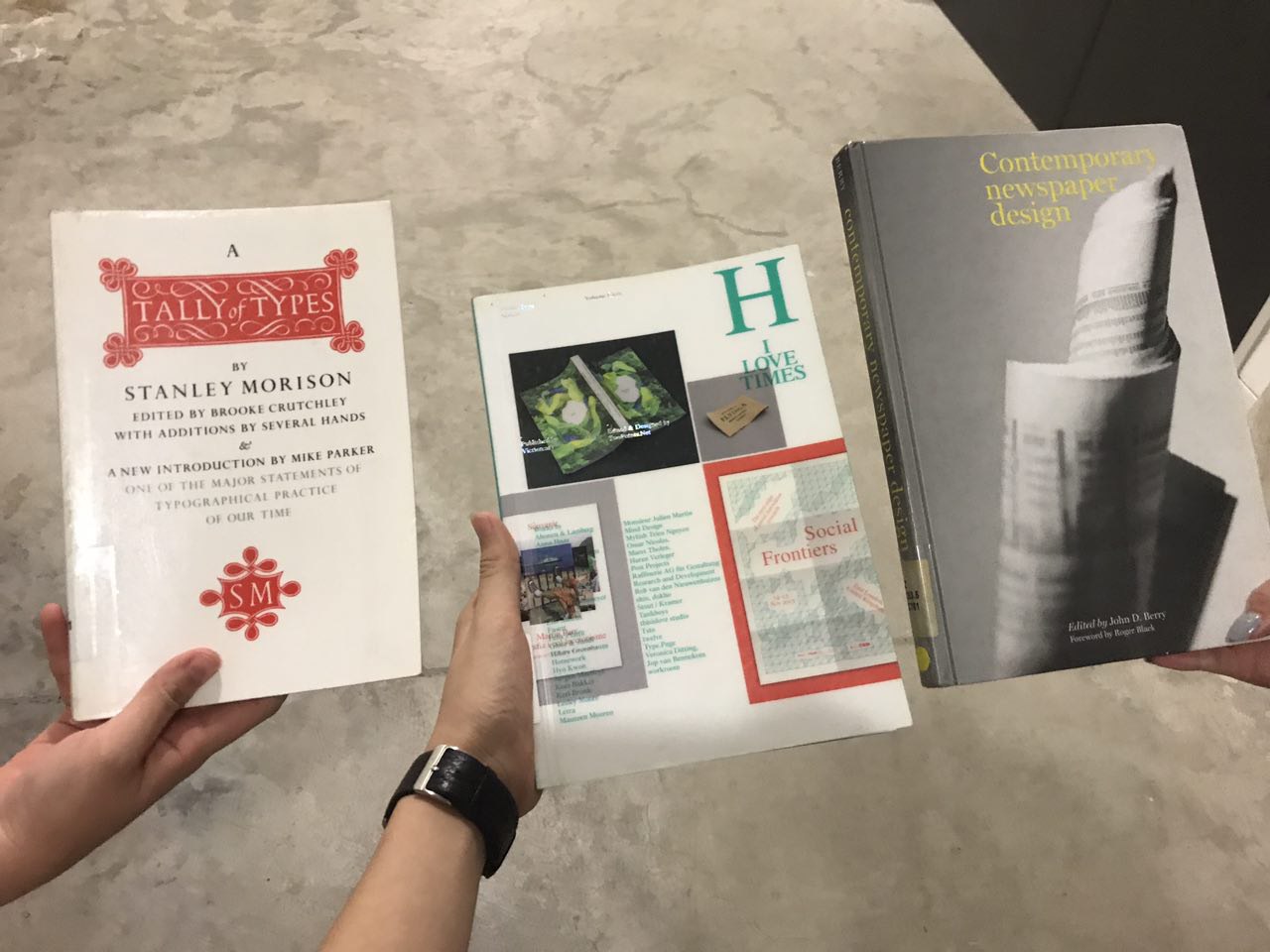
Reference books that we borrowed from the library.
These books really helped us a lot in our research and finding images for the uses of Times New Roman. The books also had information on the newer typefaces such as Times Classic and Times Millennium, which was hard to dig out from the internet, where a lot of information was unreliable.
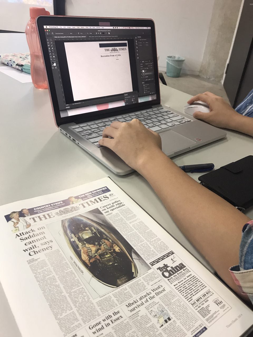
Working on the layout of our version of The Times newspaper.
We wanted to keep it as authentic as possible, hence referring to the original layout of The Times. We started with a blank canvas and added in each element one by one. As we needed to fill up the pages but also keep it concise and readable, we had to pick and choose the information we wanted to add in, rephrasing certain parts to fit the page better. It was very time consuming but worth it when we saw the final product!
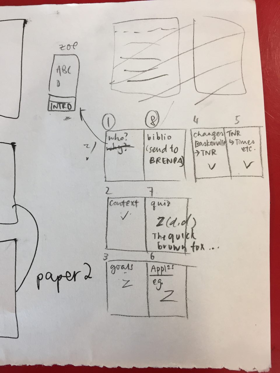
The planning of the pages of our newspaper! (it took us so long to come up with the layout)

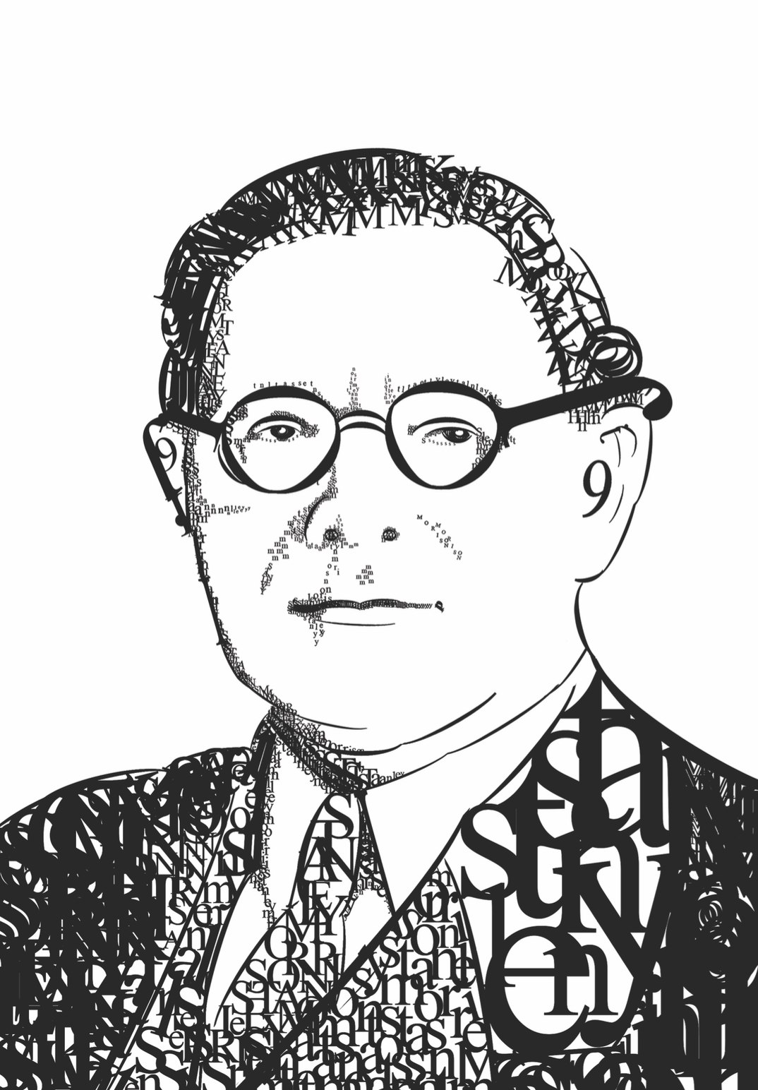
Before and after photos of how we made Stanley Morison’s Typographic portrait
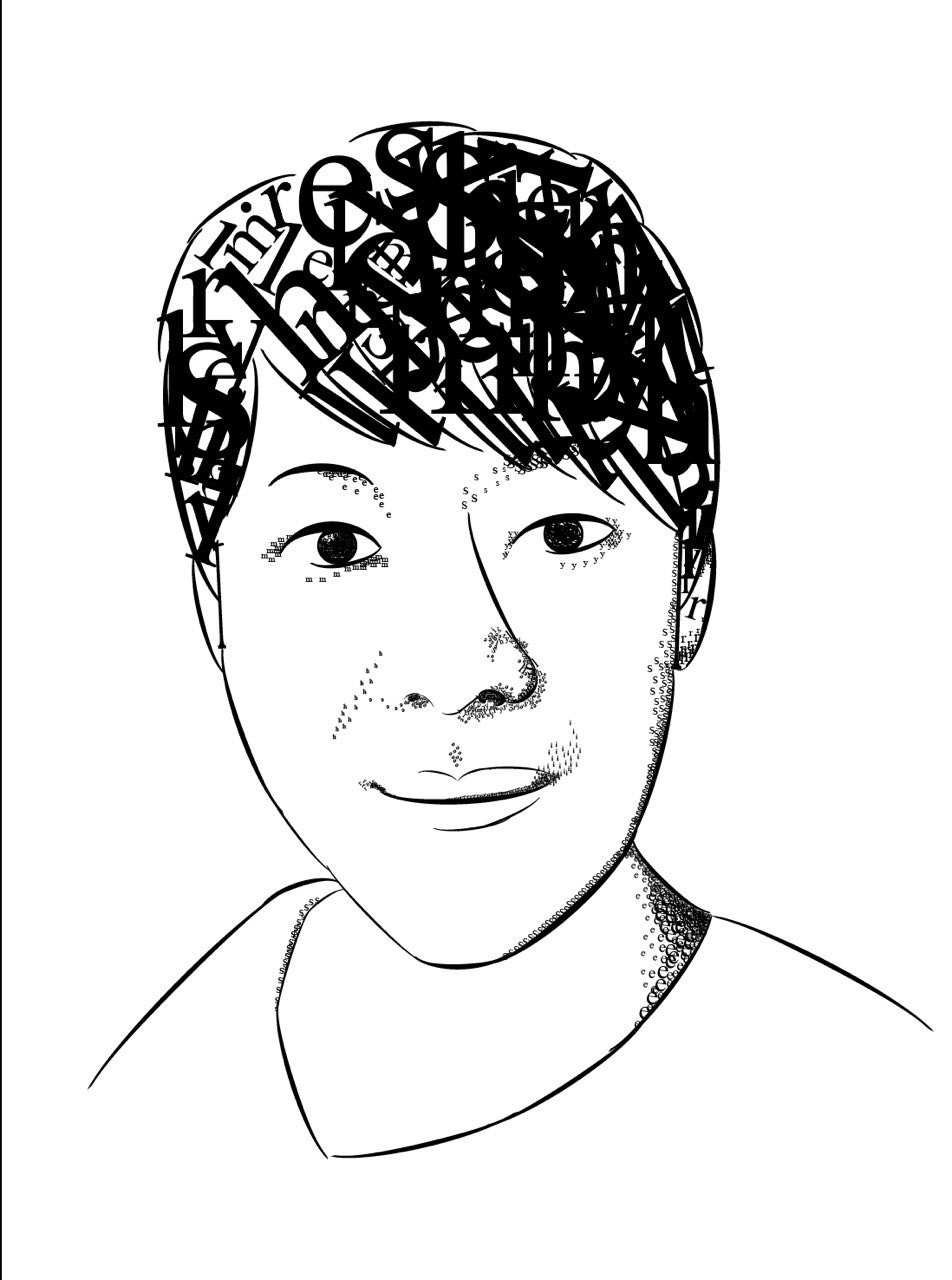
A typographic portrait of our lecturer Shirley 😀
We changed the original layout a little, reducing the thickness of the box, making it more appealing
A3 size for peers on the left and A1 size for presentation on the right.
MESS AT THE PRINTING SHOP (it cost us like $23 to print because none of the printing shop could print in A1 except one) But we were happy with how it turned out so it all worked out in the end.
PRESENTATION DAY
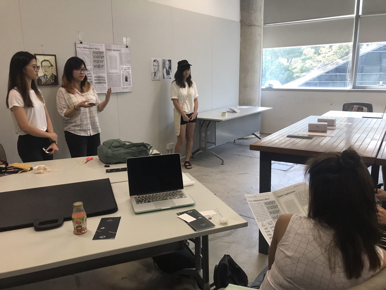
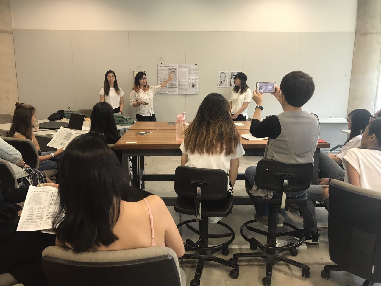
Shirley recording us present :’) while our peers are listening attentively!
 DONE AND OVER WITH PRESENTATION YAY.
Done by team TNR : Vanessa, Zoelyn, Brenda and Zoe (left to right)