Firstly, I started out wanting to do some origami typography. But it seems like many already exist and Shirley wanted me to do something more than that.
So I went online to look for inspirations. I realised many people have done typography that is similar to the transparency designs I made but none of them have done it with traditional methods.
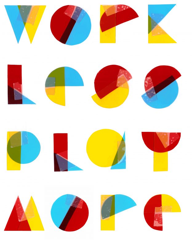
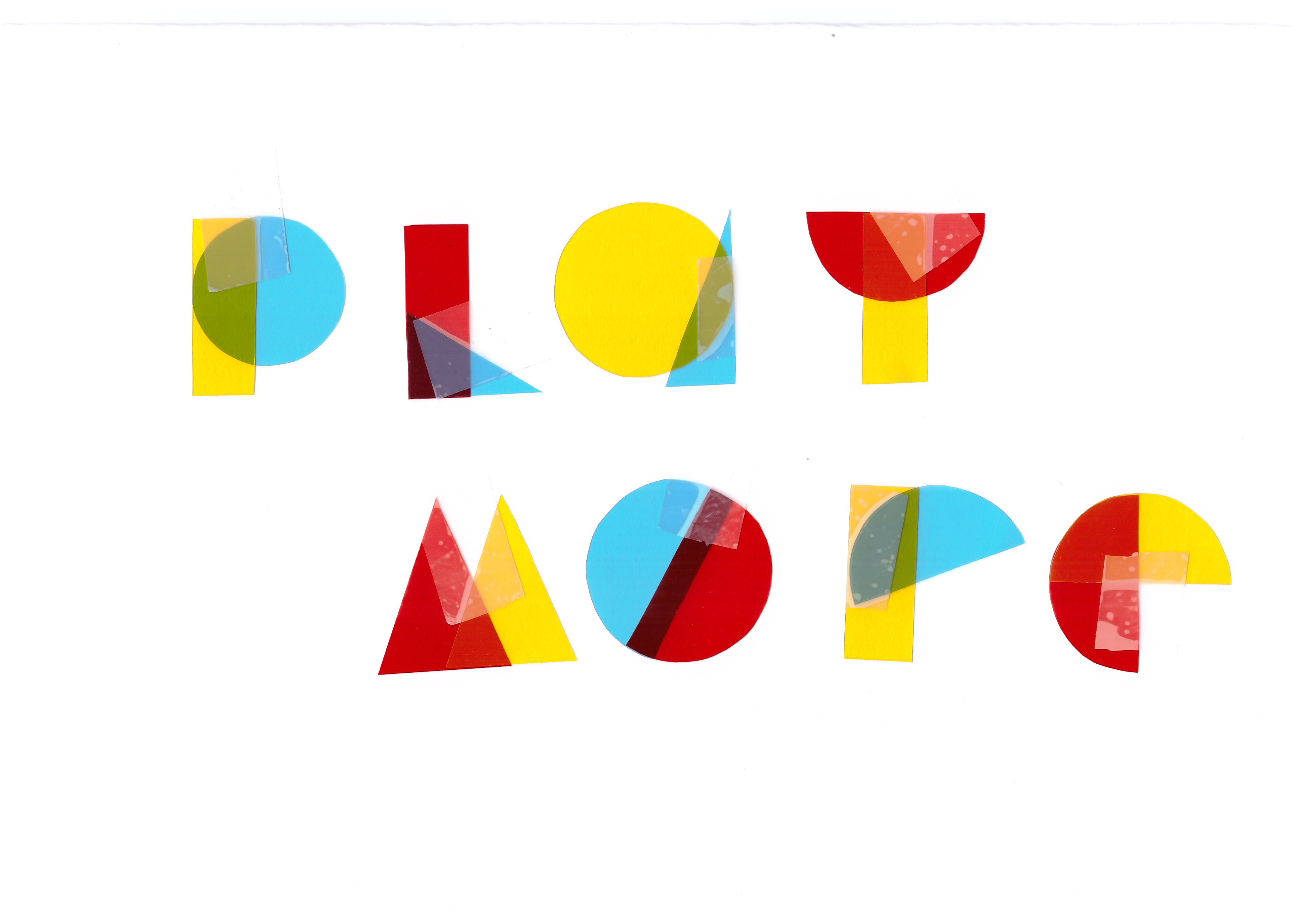
I decided to pick basic shapes and the primary colours, red, blue and yellow to work on. The quote I came up with was “Work Less Play More”. (I think all of us need that in our current fast paced life) How I came up with the quote was that with shapes and the primary colours, it gives off a vibe that is fun and quirky, nothing serious. So I wanted to incorporate the play factor into my quote.
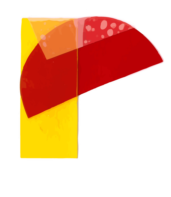
I cut the basic shapes like: circle, semicircle, rectangle and different sizes of triangles.
Then I had to plan the colours before I put them up so that the letters side by side wouldn’t have the same colour combination. Also, I stuck them up with tape incase I need to change something or rearrange them. When I consulted Shirley, she liked how organic the tape looked on the letters since we cannot create the “bubbles” under the tape digitally.
Also, previously my R looked weird since it was taller than the other letters(left) so Shirley gave some suggestions to switch up how the R looks and here’s how the final one looks like (right)
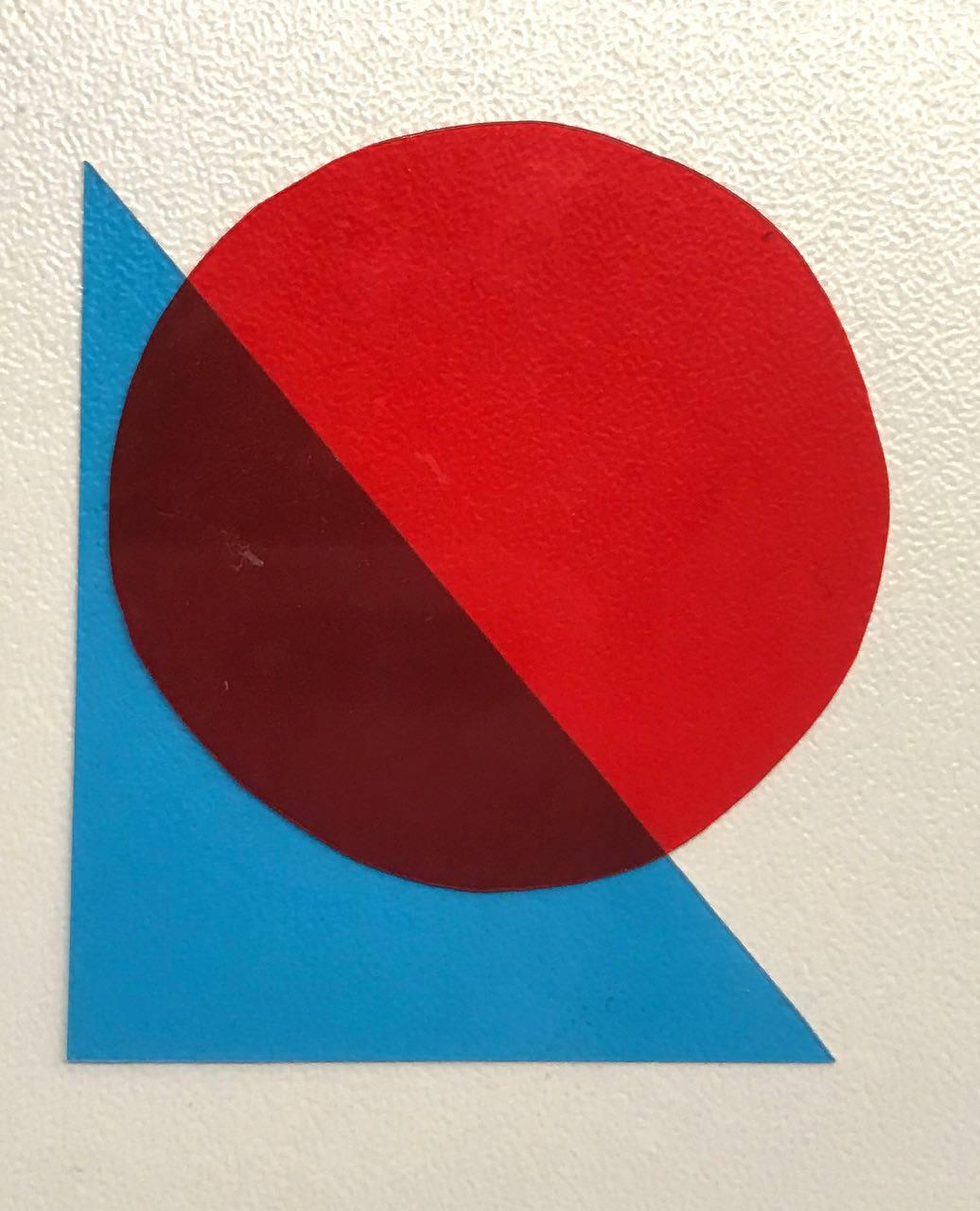
BEFORE AFTER
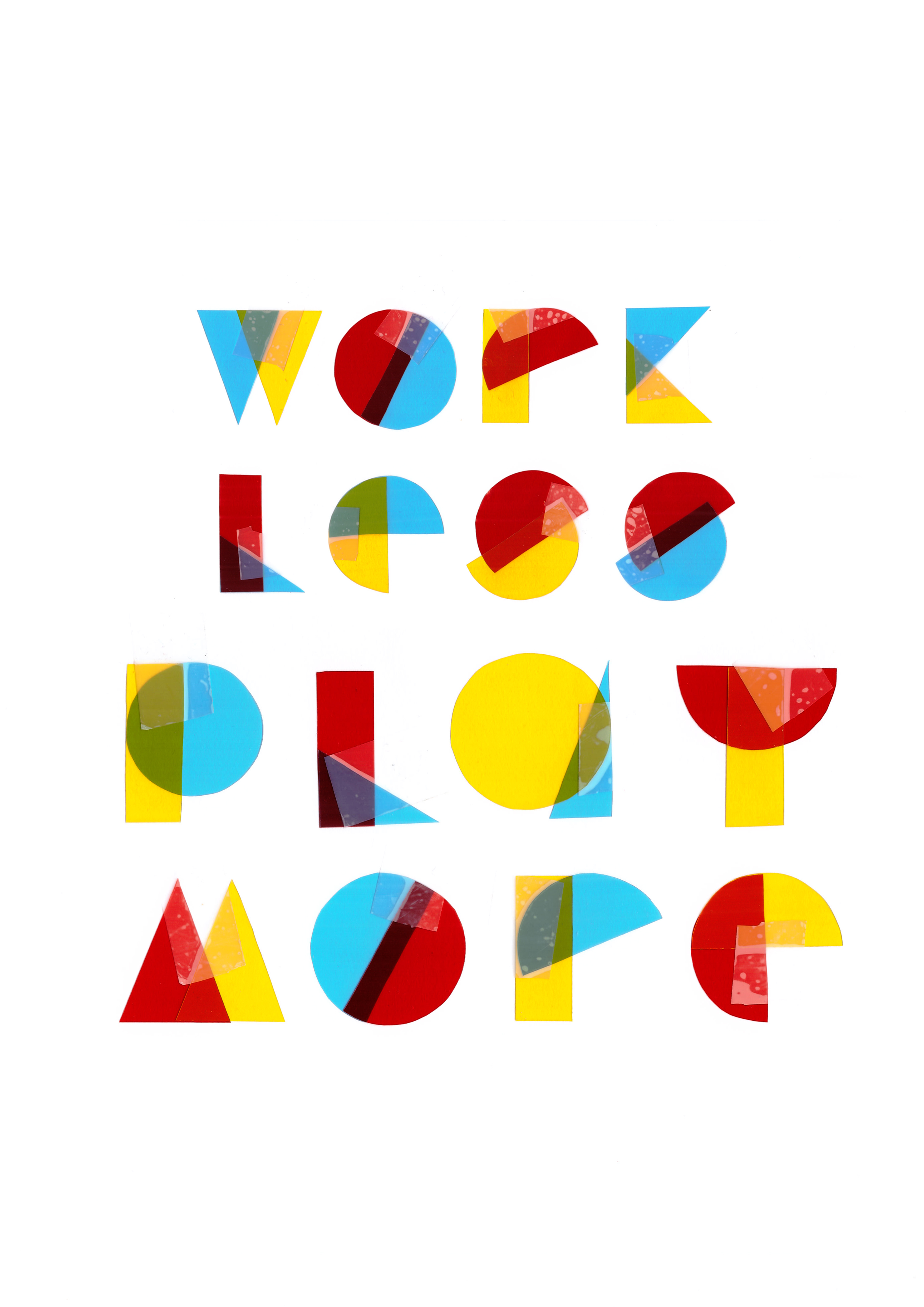
Moving on, here’s what I came up with after scanning it digitally:
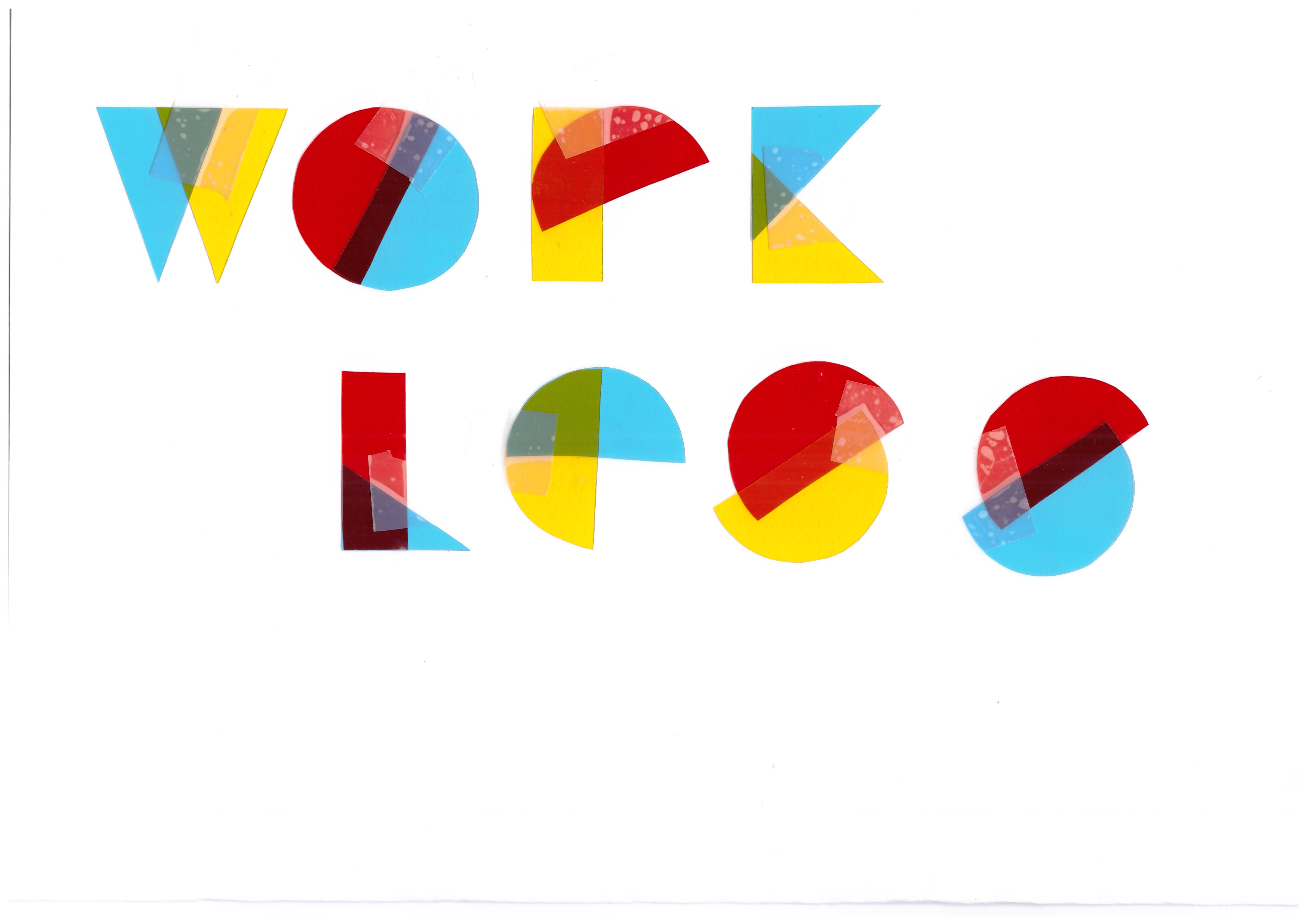
I had to scan the 2 separately since I laid them out on A3 and my printer could only scan in A4.
Then, I played with the composition on Photoshop. I first tried to emphasize the work LESS, play MORE by playing with the sizes of the text:
Then moving on to another composition which people feel that is easy to read
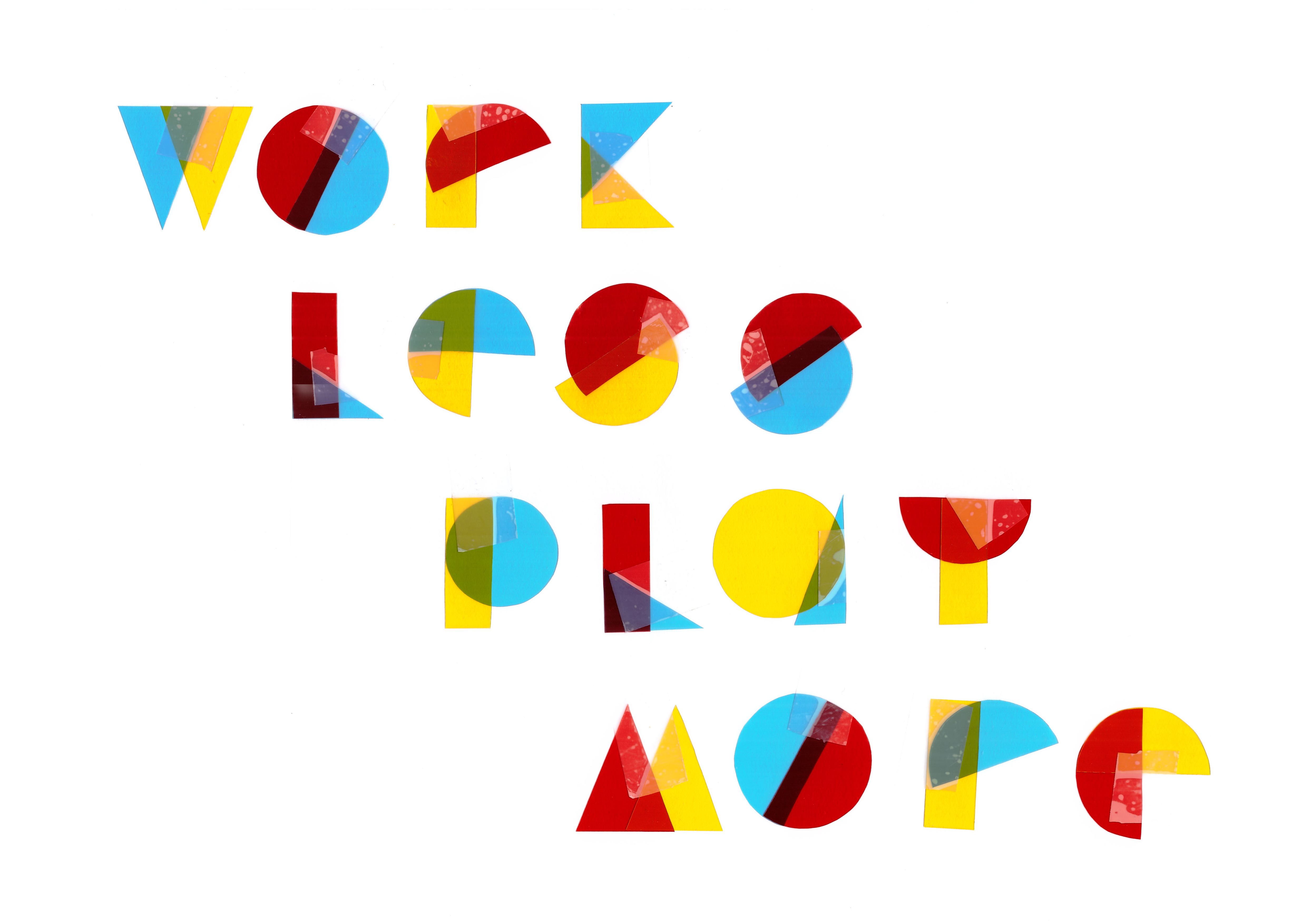
But I settled on this, which is very uniformed and pleasing when you look at it from afar.

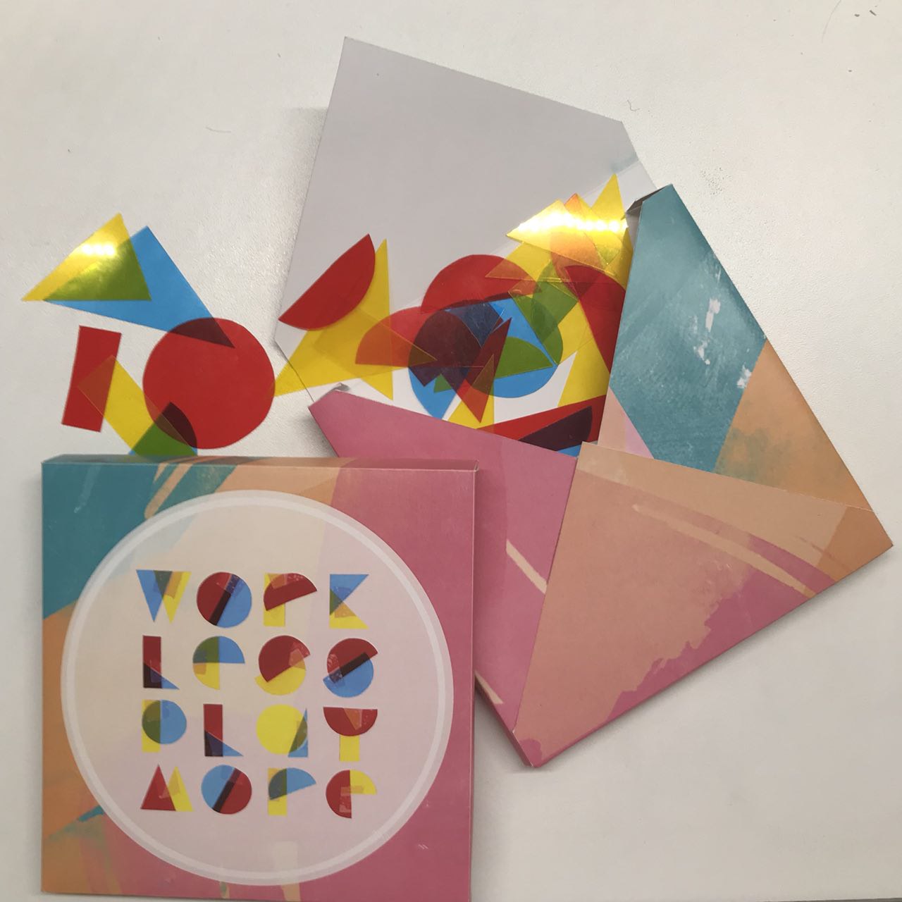
For my application, I printed the format on the box on an A4 paper before I printed on A3. Here are some of the drafts:
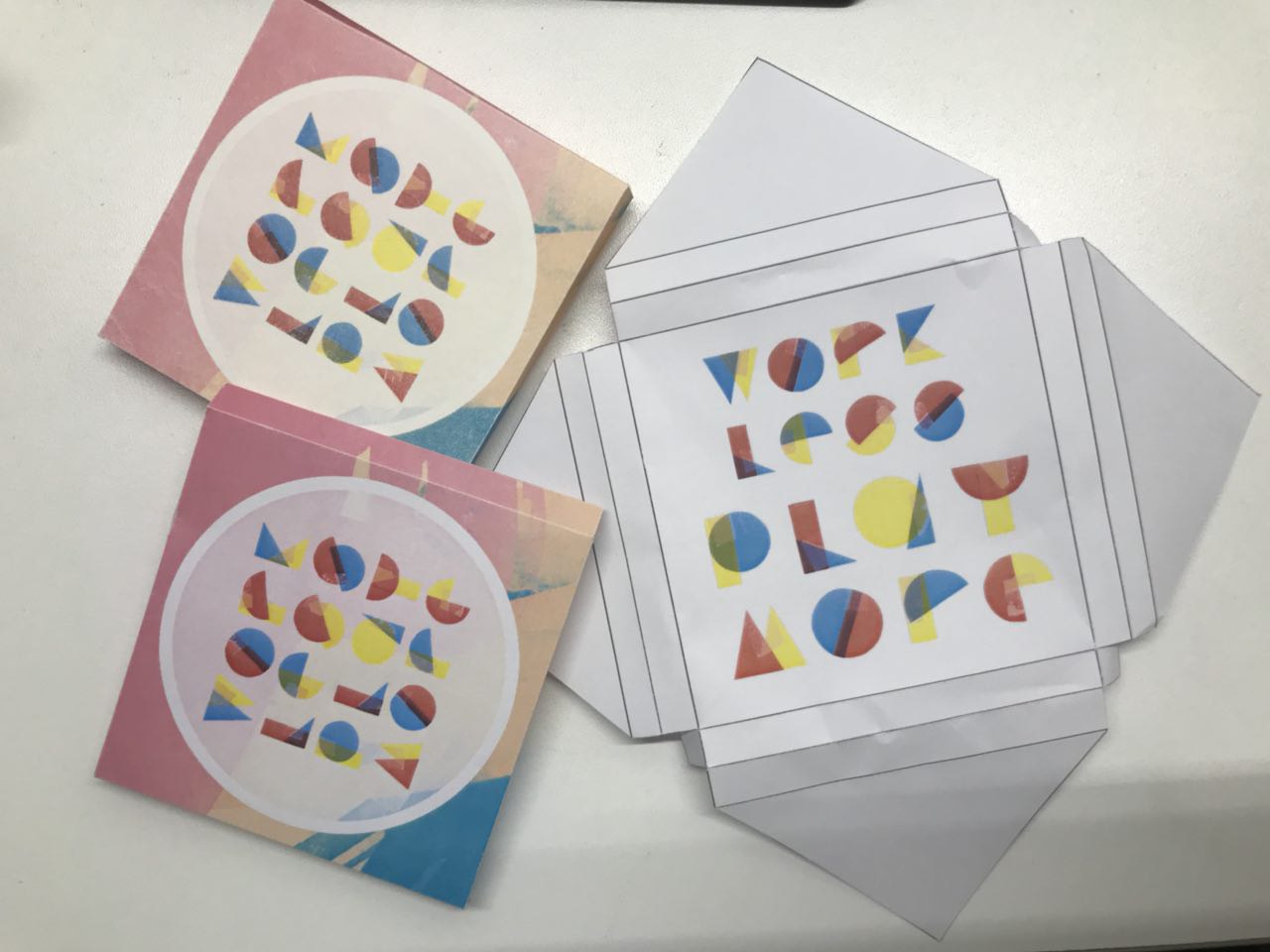
(I have no idea why the colour turned out like that but here’s the layout for my box)
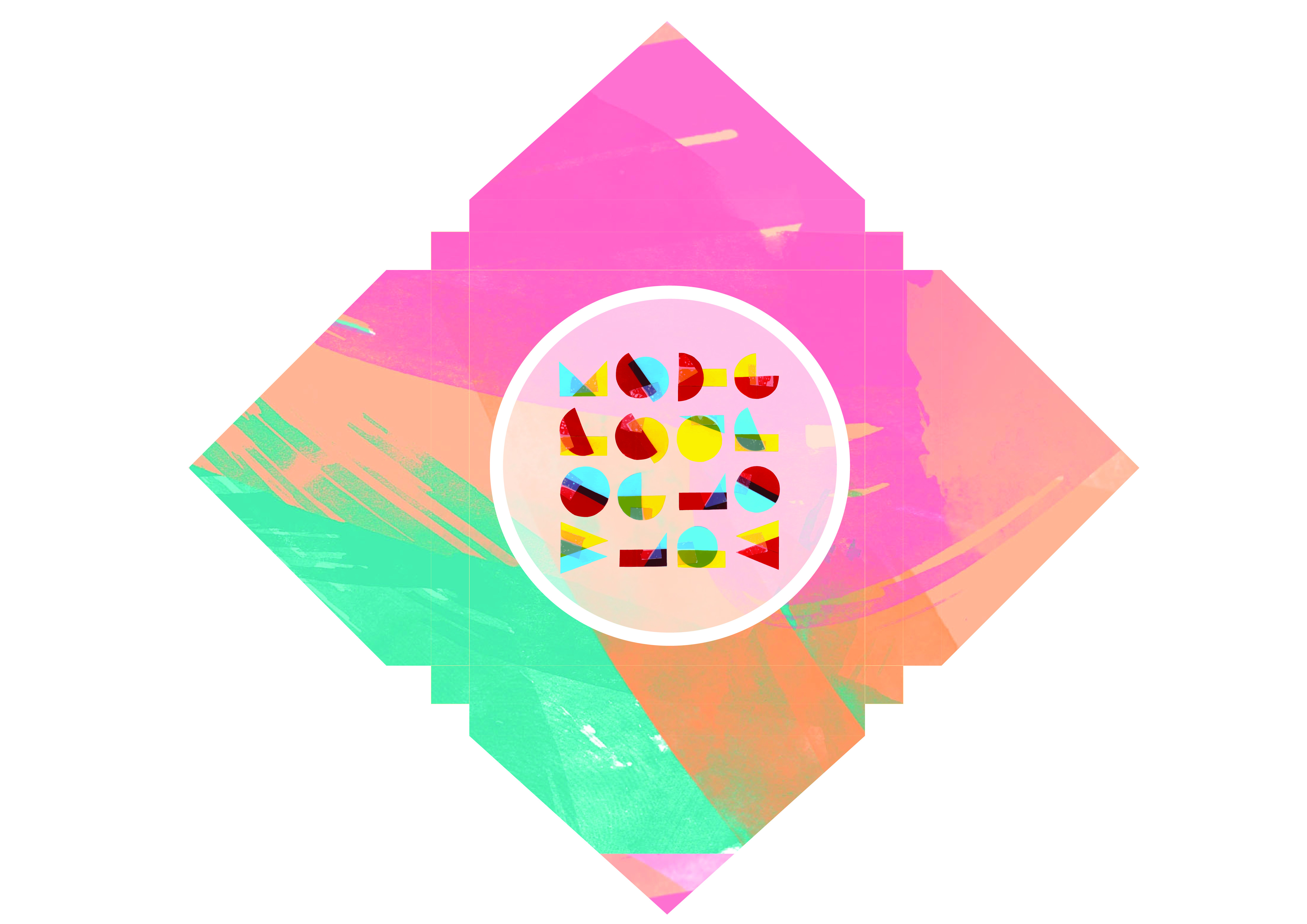
The final game box:
(the box is filled up with geometric shapes for one to use their creativity to form things and slowdown to work less and play more in our fast paced world)
That’s all folks!
Thanks for reading 🙂