Hi all, this will be the last part of my whole zine process.
After consultation, Mimi suggested that it would be best if I just focused on the monster in this zine. So I had to churn out a narrative. In this case, I thought it would be best if my whole narrative was about a monster that causes terror and destruction in the society (Jurong). So this monster would morph into buildings and things which meant that he destroyed the buildings. Furthermore, I went with the colour red and black since it looks more sinister and dark. So here is the original colour scheme that I had in mind.


The feedback I got was to make the red brighter, to make it pop, since that is the essence of the whole zine.
Moreover, I was thinking to make the tentacles on the bridge a little bigger since they look really small compared to the bridge. I wanted to make it look as if the monster overpowers the bridge.
TYPOGRAPHY
Moving on, I made the red brighter, drew my designs and I encountered a problem. It is of course again, the typography.
Firstly, I tried out the capitalised handwritten typography. To me it looks too angry and in your face. It probably looks okay in this spread, but when I tried it on other spreads, it doesn’t look too good. Hence, I changed it.
Next, I tried to write a little bit neater. However, it doesn’t bring out the feels of the ravaging part. I realised when I scribbled the words as a draft, it looks much more genuine. Thus, I went ahead with that. 
So here’s the final typography that I went with.

Just like that, I’m done with the designs for this zine. I printed this zine on Munken Lynx paper, 120gsm, that I got from RJ Paper. The contrast of the red and grey on the white background made the designs pop even more.
OUTCOME
Enough of typing, I’ll now show you my final outcome!!


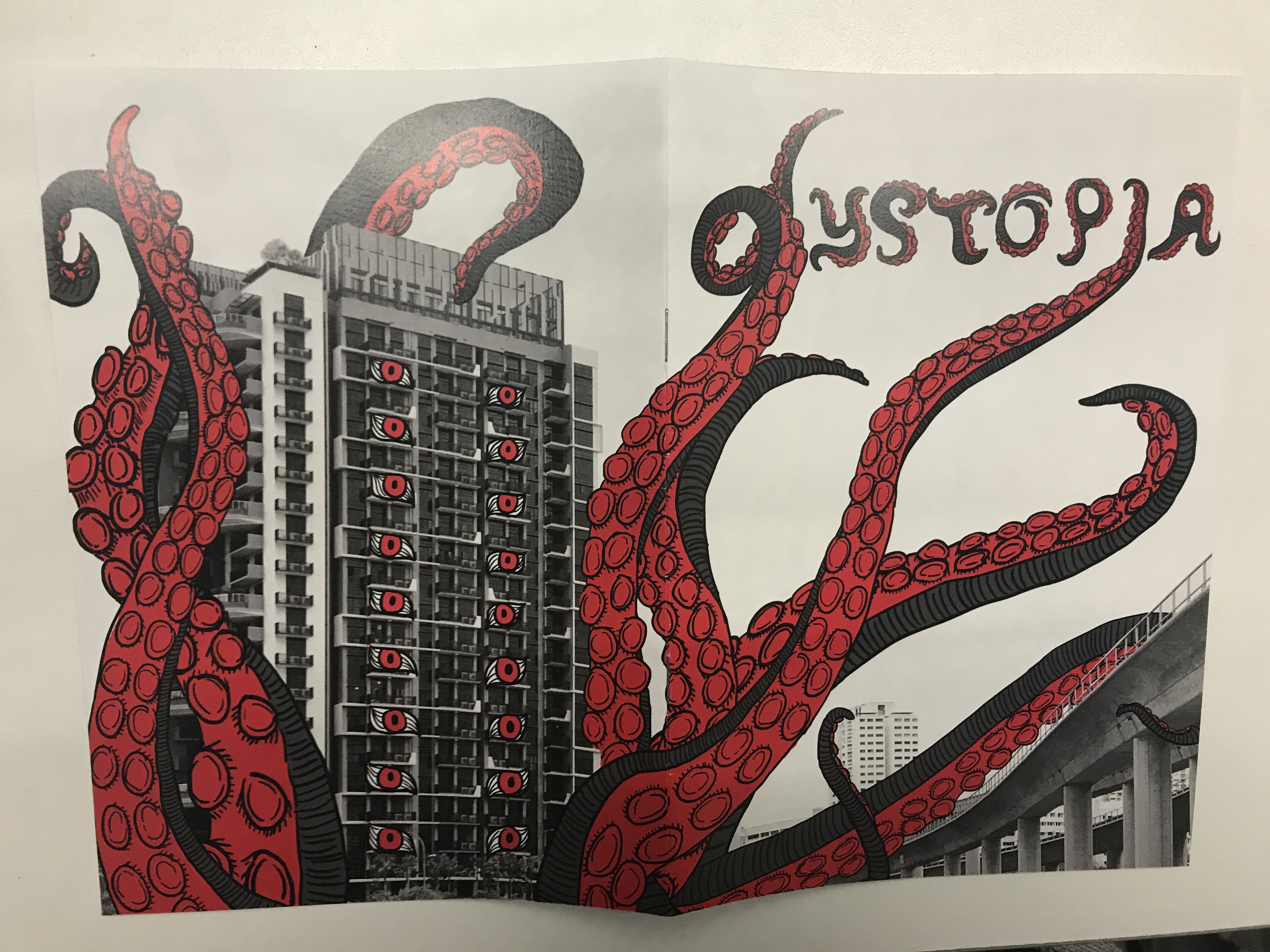
(back and front cover when it is flipped open)
DESIGNS ON SCREEN
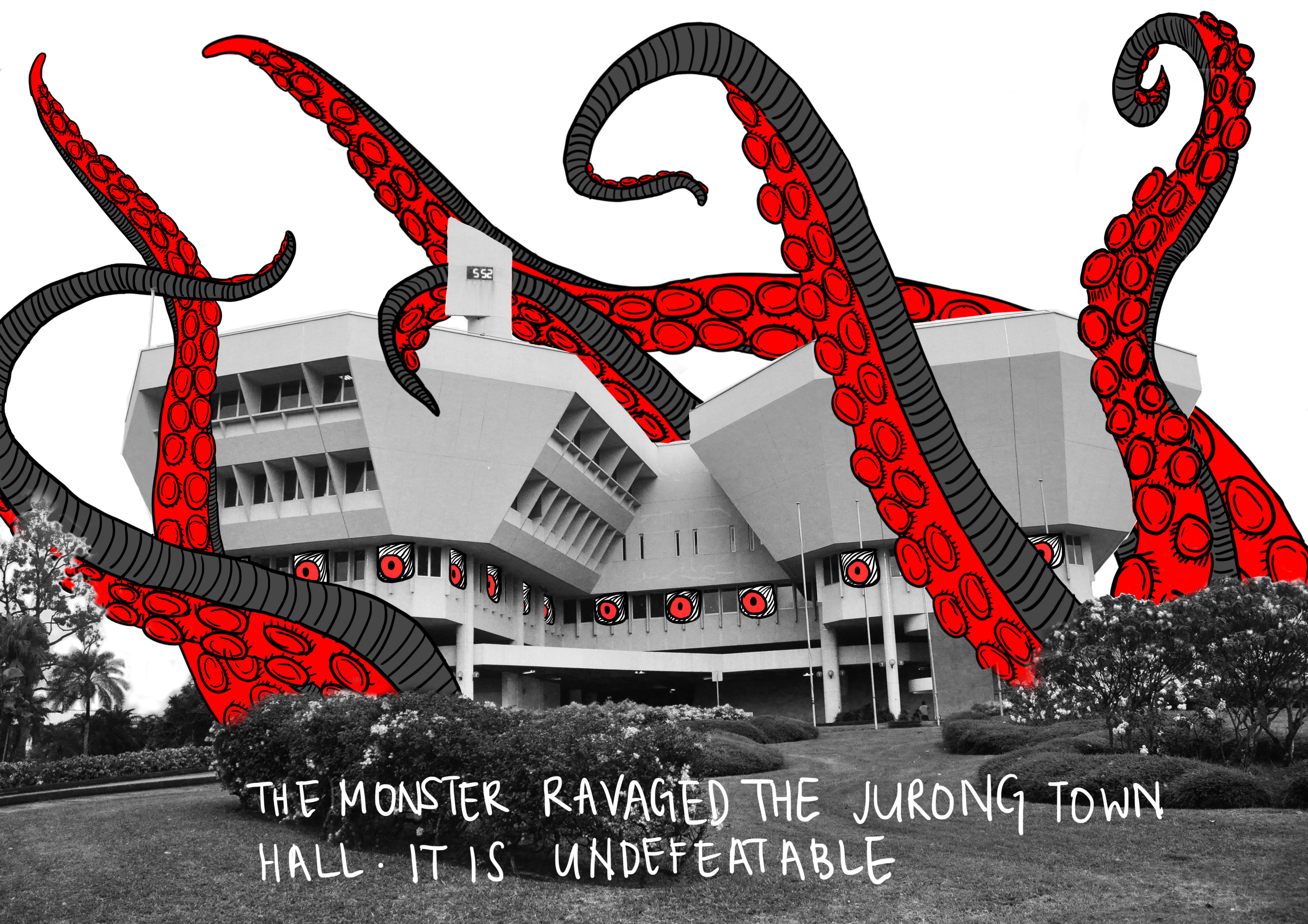
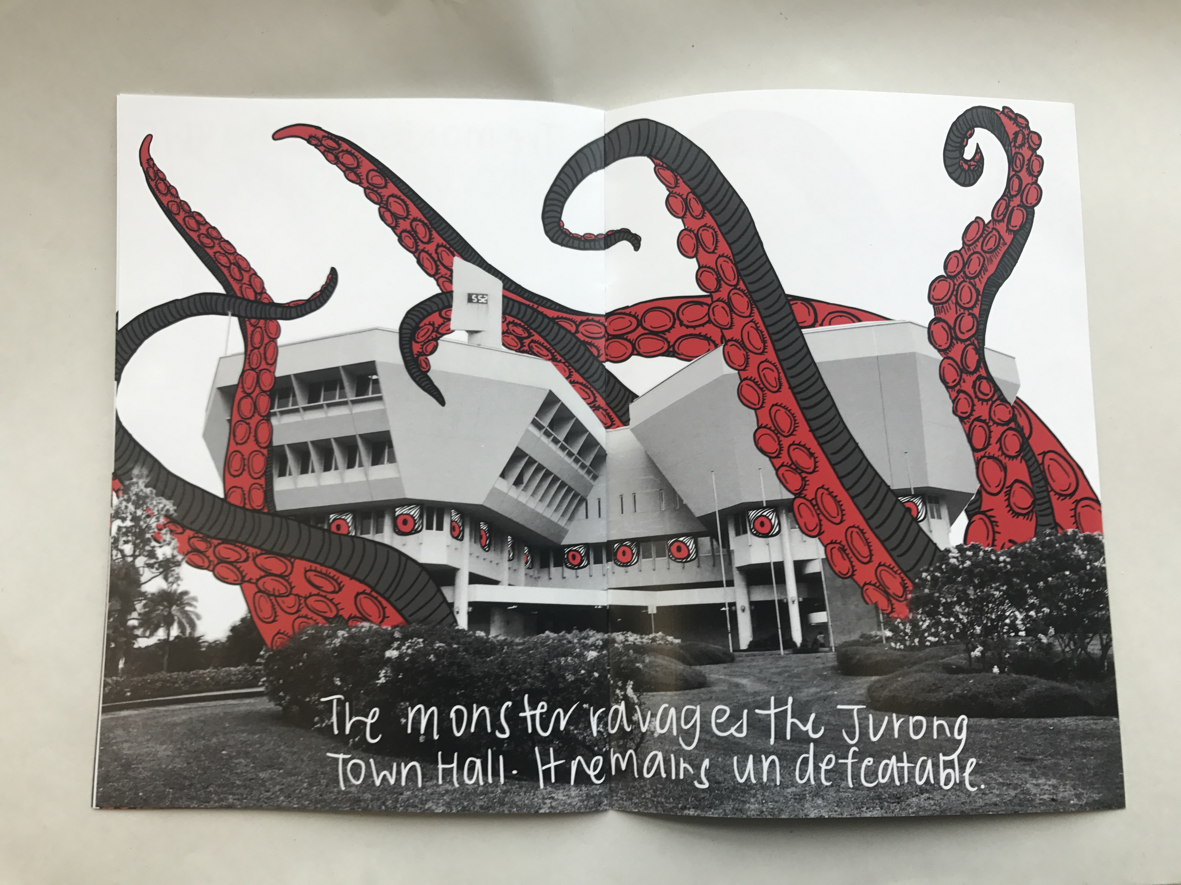
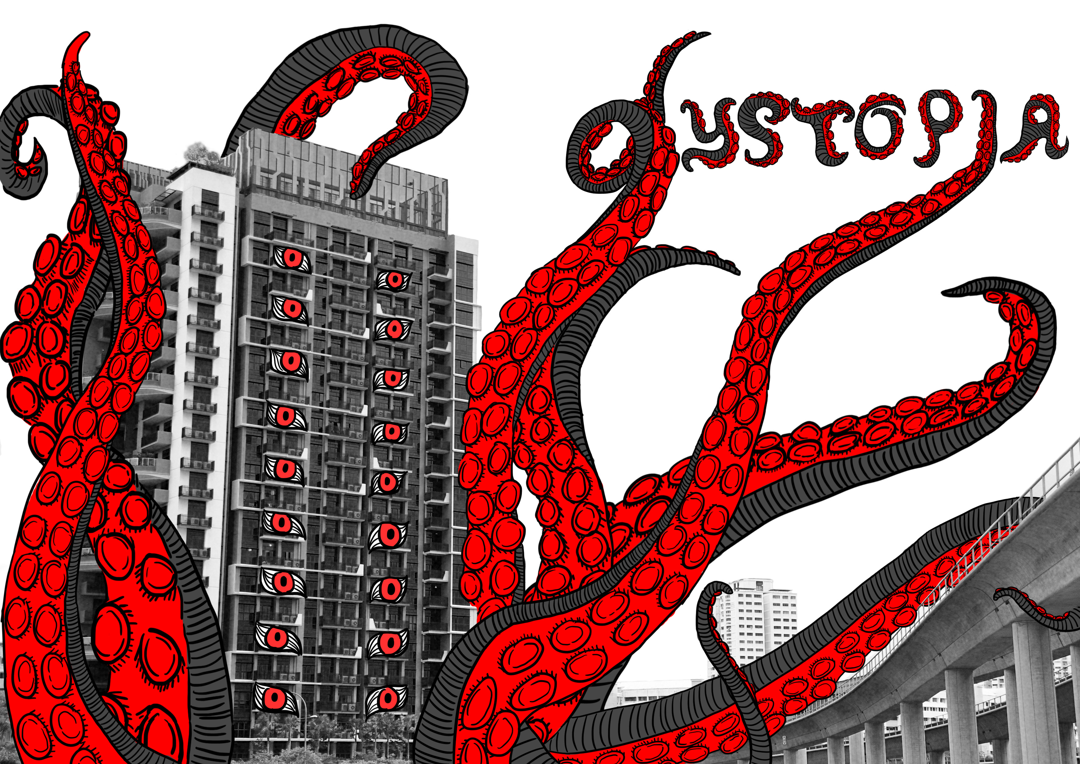
Pages 8,1
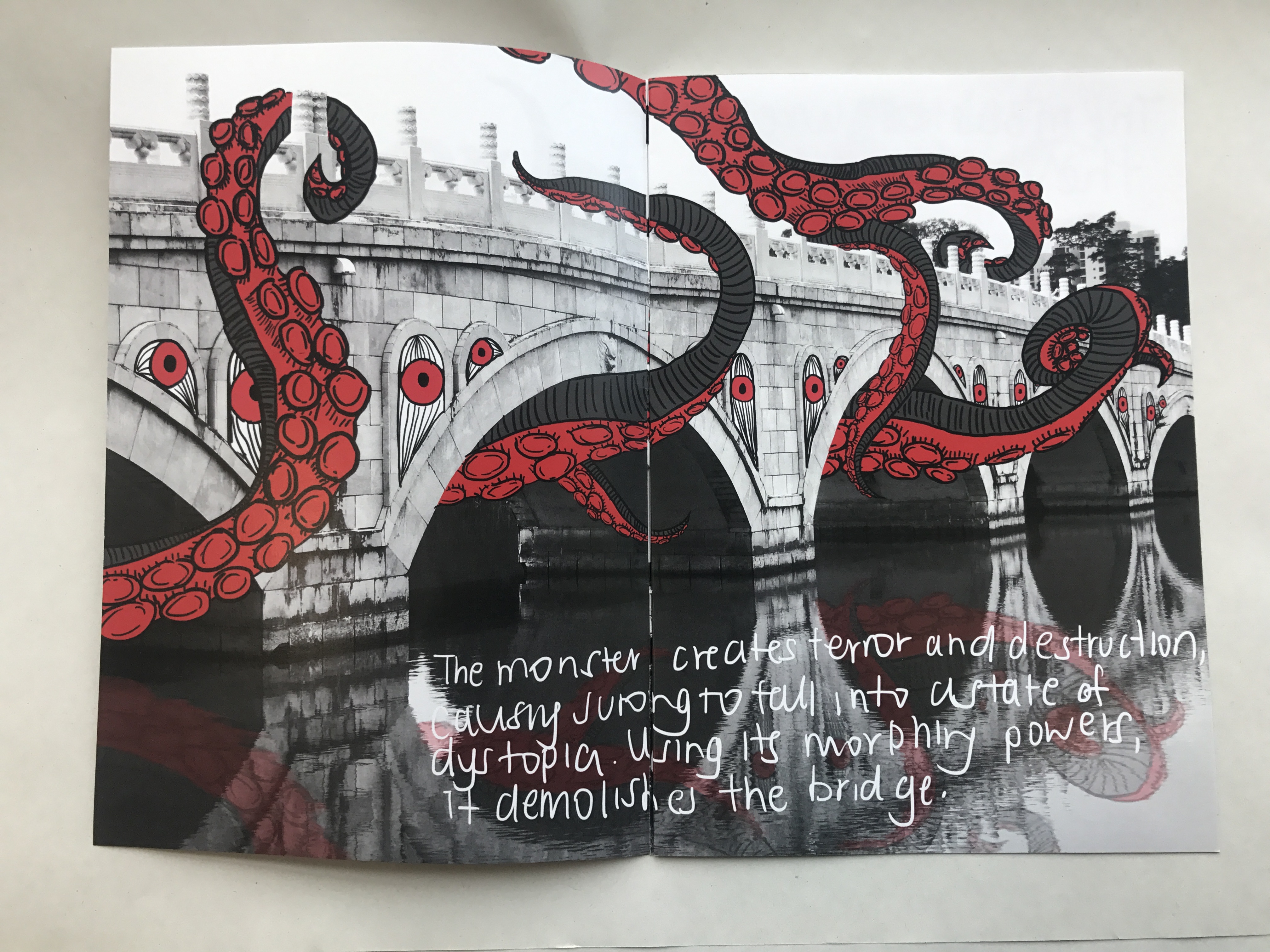
Pages 2,3
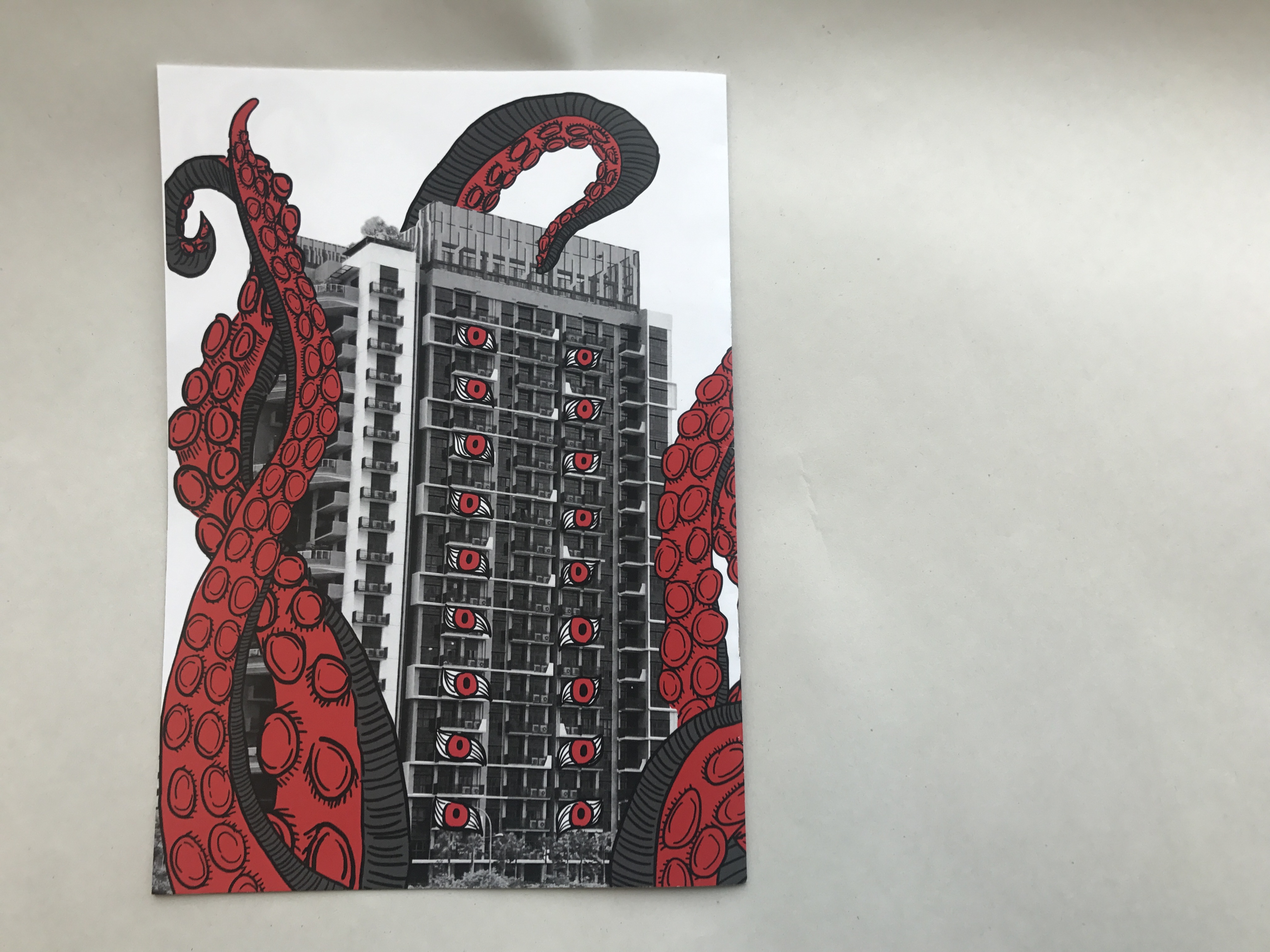
Page 4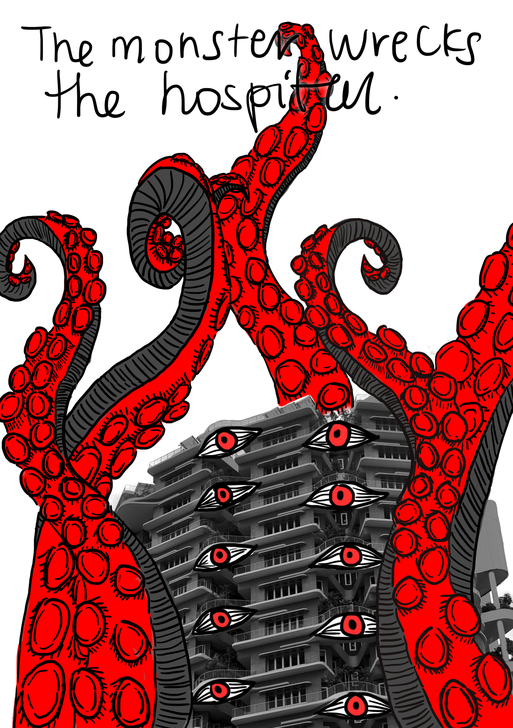
Page 5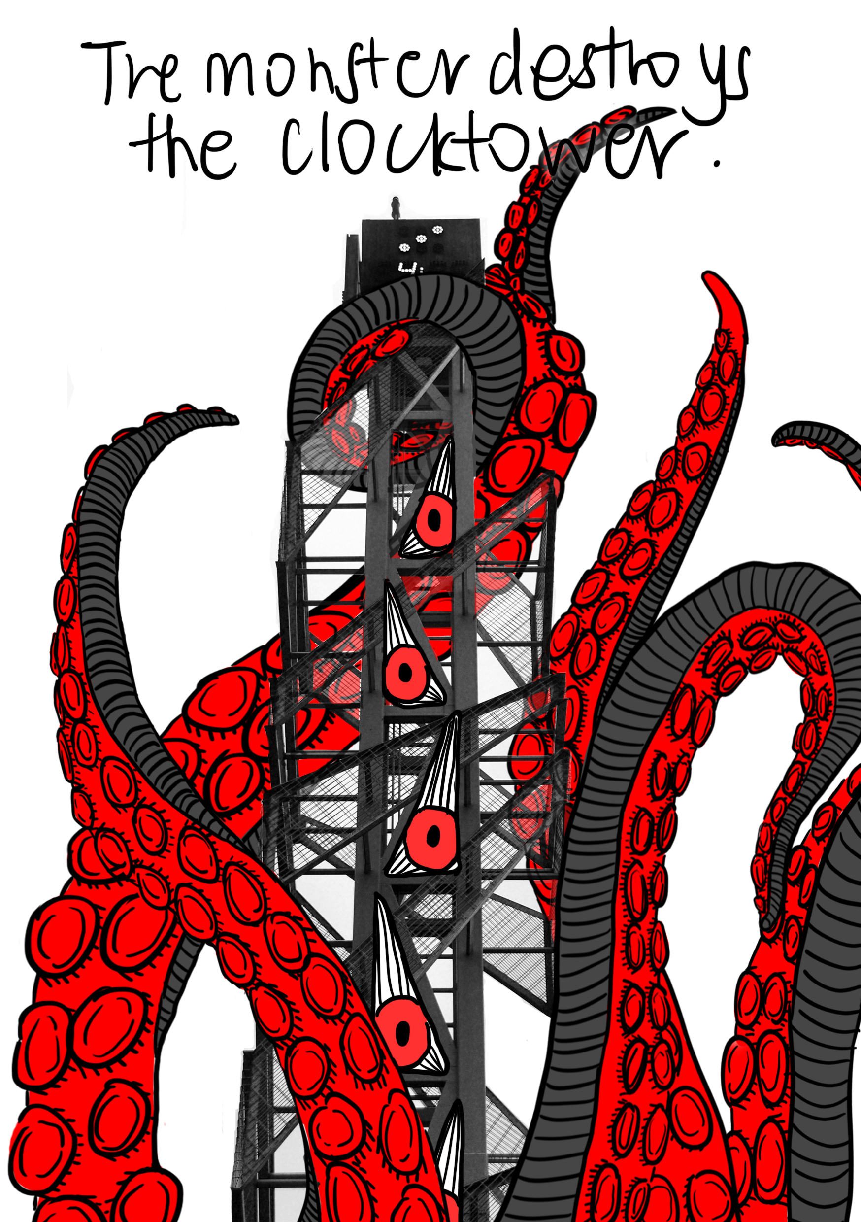
Pages 6,7
REFLECTION
After rounds and rounds of consultations with Mimi, I finally came to a conclusion of just focusing on this monster for my narrative. It makes the whole theme and whole narrative flow much better and in sync.
One thing I regretted most was my font/typography. I should have made the font smaller. After printing it, I realised the font was really too big and in your face. If I were to make this zine again, I’ll definitely make the font smaller. Also, I should have experimented more on handwritten typography.
Another thing is that I think that I would want to push myself further if there was a next time. I would try again with my initial blue tinted photos with white drawings for my zine. (who knows, I might make one during this holiday)
Overall, in conclusion, this was a really fun and fruitful project. Getting to finally create a zine of my own and feeling accomplished after I submitted it makes me feel like I am a true and real designer. I’m definitely looking forward to see how different my zines will turn out in Y2! 🙂