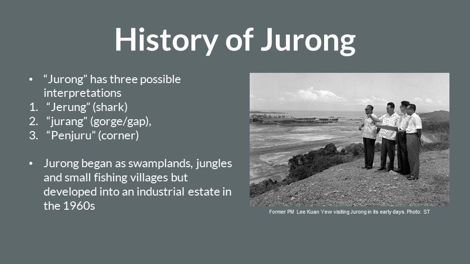
By observing dog behaviours and then translating it into digital illustrations, my project aims to educate dog owners and lovers about their behaviours. This would definitely prevent unnecessary dog attacks and bites, and also, deepening the bonds between the owner and the dog. Singapore has seen a 32% increase in dog owners from 2006 to 2015. Hence, it is important for us to learn about dog behaviours before getting a dog or approaching one.
Title:
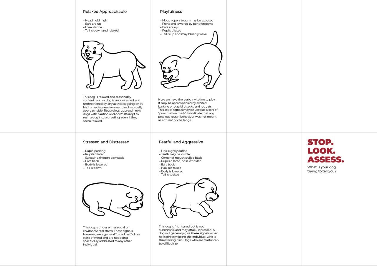
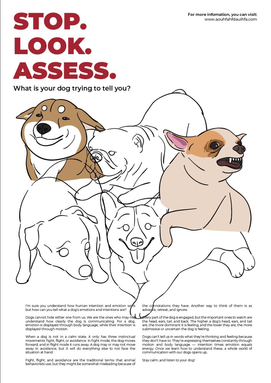
STOP. LOOK. ASSESS. Understanding our furry friends better through their body behaviours.
Objectives:
To educate the dog lovers/potential dog owners/ current dog owners and the young about dog body behaviours and the correct way to approach a dog, thus preventing dog attacks.
To educate dog owners/potential dog owners to understand their dogs’ behaviours and thus, be able to ideally interact/care for their dogs.
Using information design to make people more aware of the different behaviours of dogs and thus, how to approach and interact with them.
Design outcome:
Brochure—Infographics
Poster
Both the poster and brochure would be a 2 in 1, hence, saving paper and effectively communicating the message to the audiences. These would likely be situated in places like the dog park, the veterinarian clinic, pet shop or even a pet cafe.
Drafts/sketches:
I wanted to make a 10-panel brochure and when you flip it, it would be the poster behind. These were my initial proposed drafts:
After consultation:
As for the brochure, the dogs don’t have to be confined in a space by itself. I can place it anywhere and make use of the space.
For the poster, there are way too many dogs and they do not bring across what I want to communicate (the dog body language and human interaction). There are way too many words as well in the poster, instead, I should explain the stop, look and access.
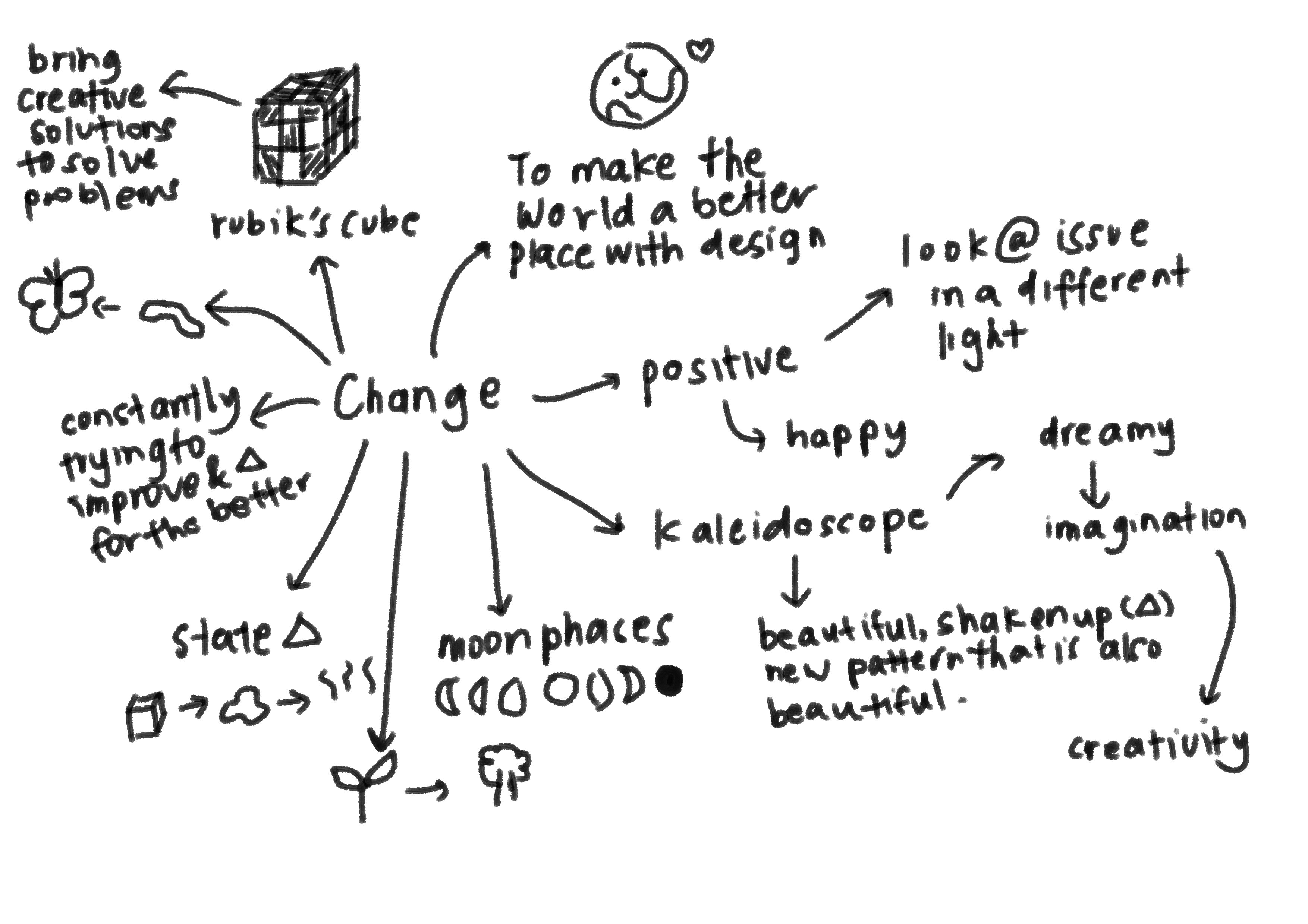
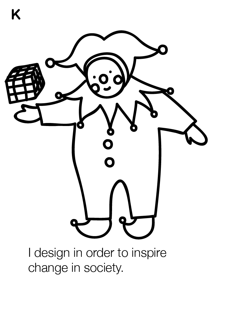
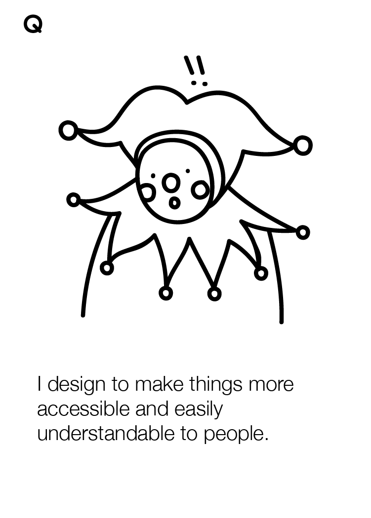
I design in order to inspire change in society and to portray things in a more appealing manner to better communicate with my target audience. As such, they would be able to look at things in a different light or perspective. I also design in order to bring creative solutions to the table. When designing, I treat user experience seriously (e.g. paper quality, print quality) as it is important to maintain a two-way relationship between the designer and the audience.
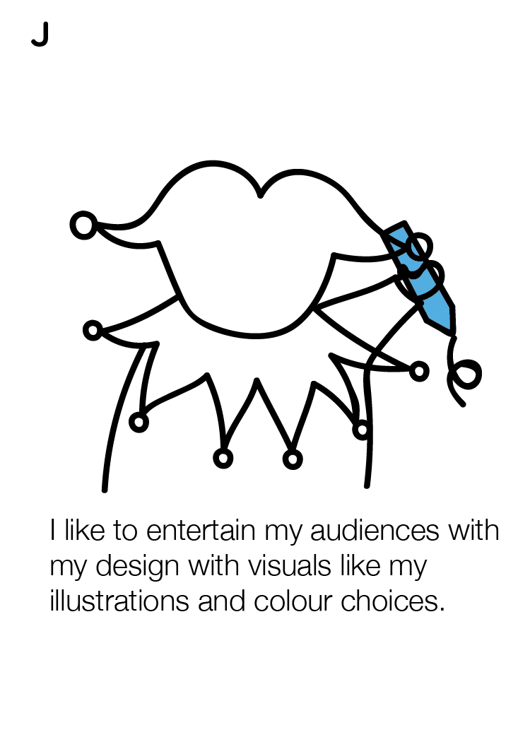
I have always been fascinated with topics that are associated with science, mainly life sciences. Humans, animals, the environment and how they are all linked and interconnected with one another. I often find myself watching life science documentaries and being captivated. Despite being interested in science; it wasn’t my forte. But by watching all these documentaries about our environment makes me wonder if I could do anything to make the world a better place. Perhaps I can disseminate these important facts and information to educate and create awareness to my target audience. Being a designer now, allows me to bridge the gap between the audience and the environmental issues faced in today’s world. They would then be better informed about these issues and ideally, working towards a positive change. I have the liberty to create illustrations and designs that could address various serious issues in a light-hearted manner. I also tend to add a touch of humour to my projects whenever I can to make the situation merrier.
Keywords:
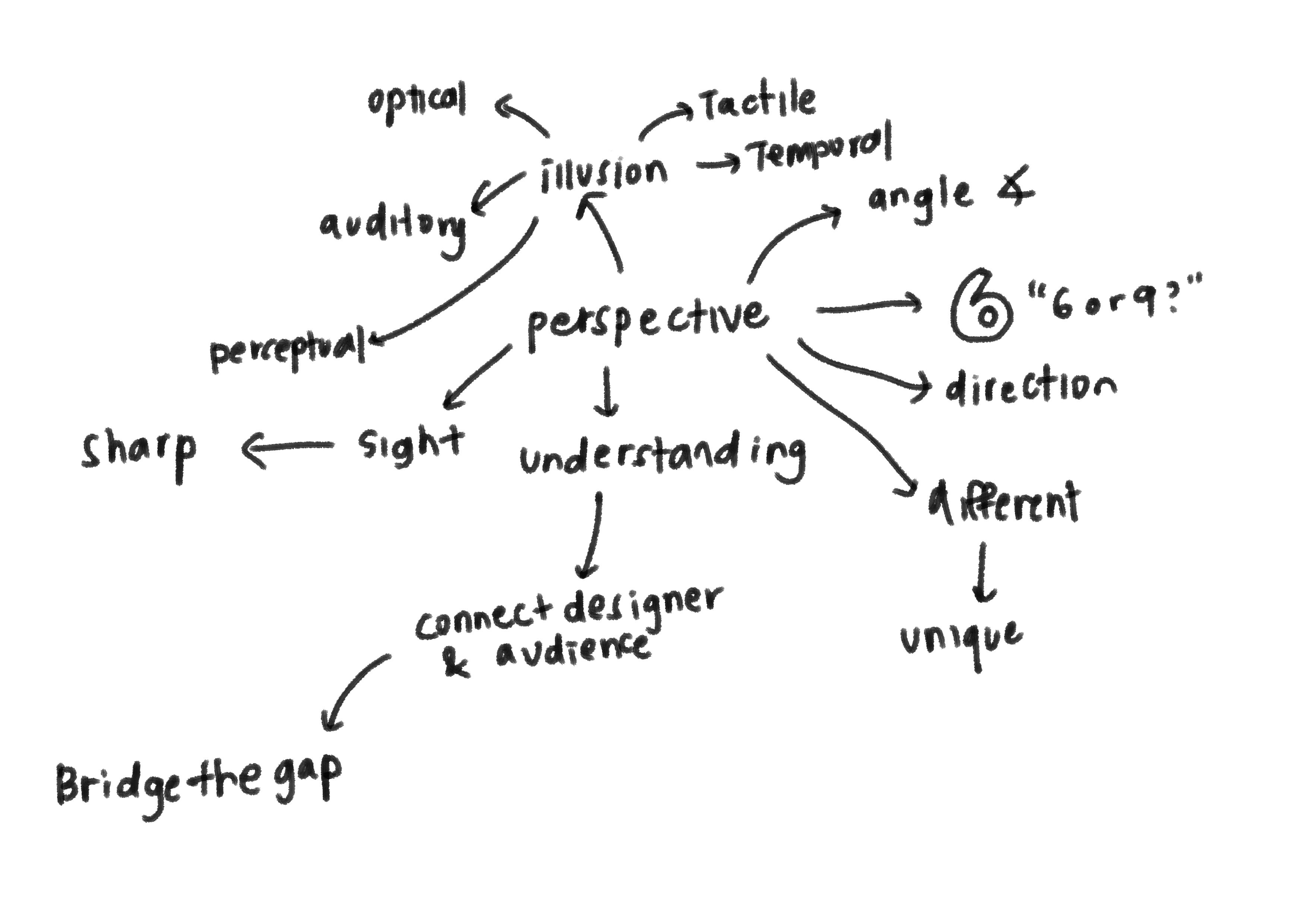
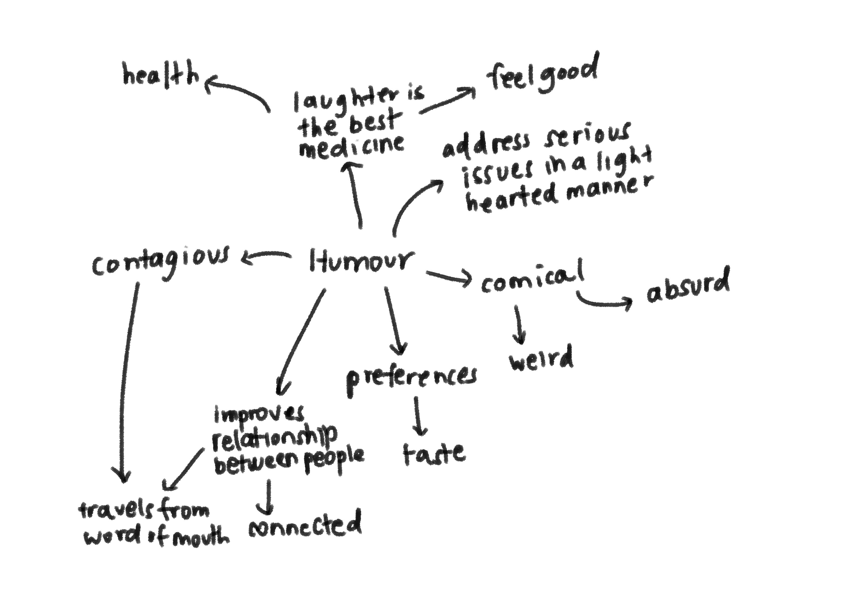
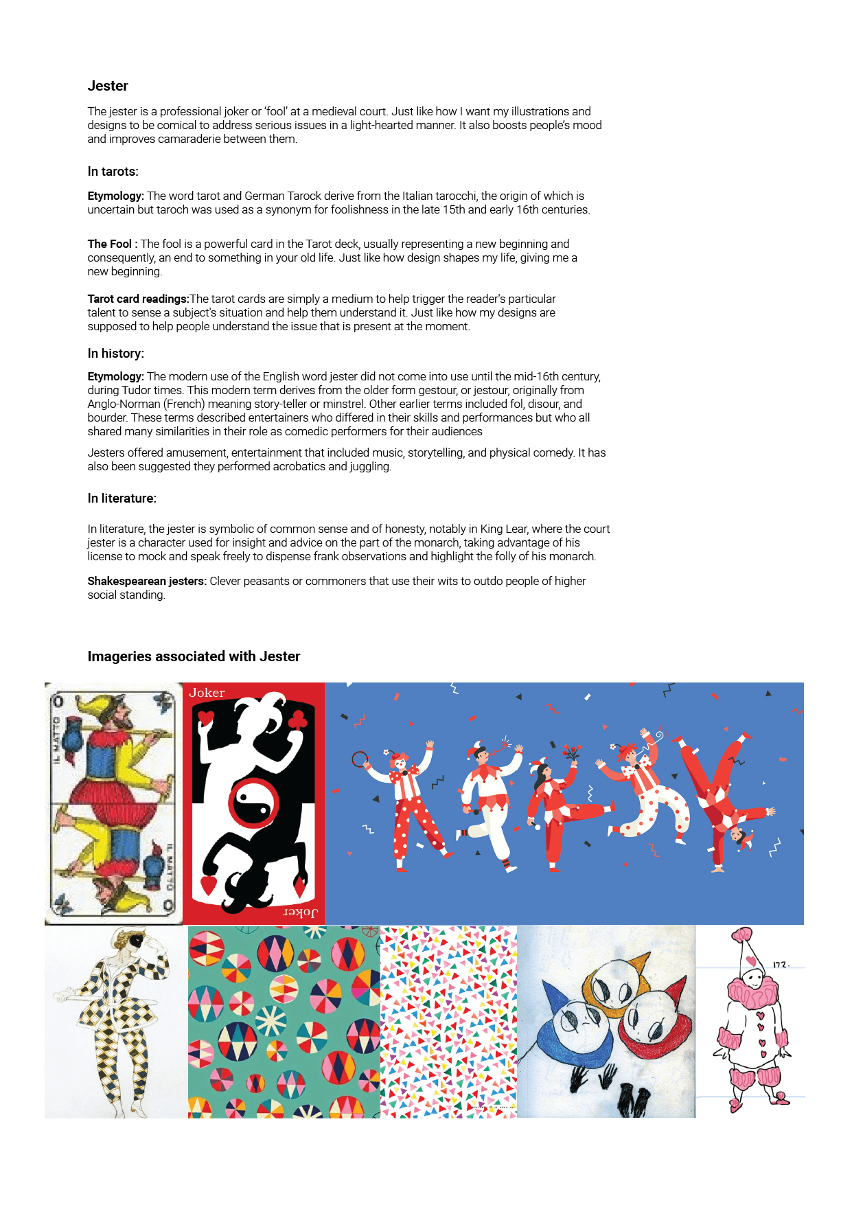
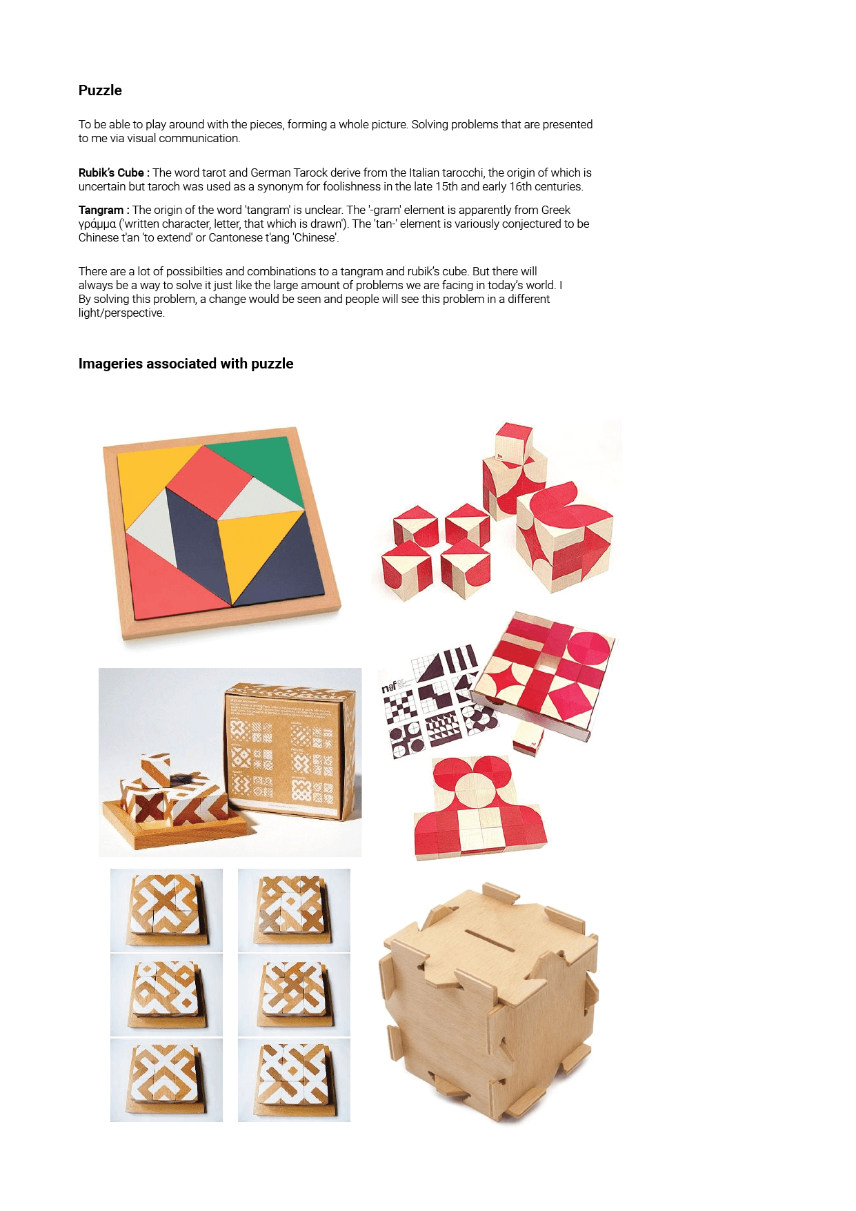
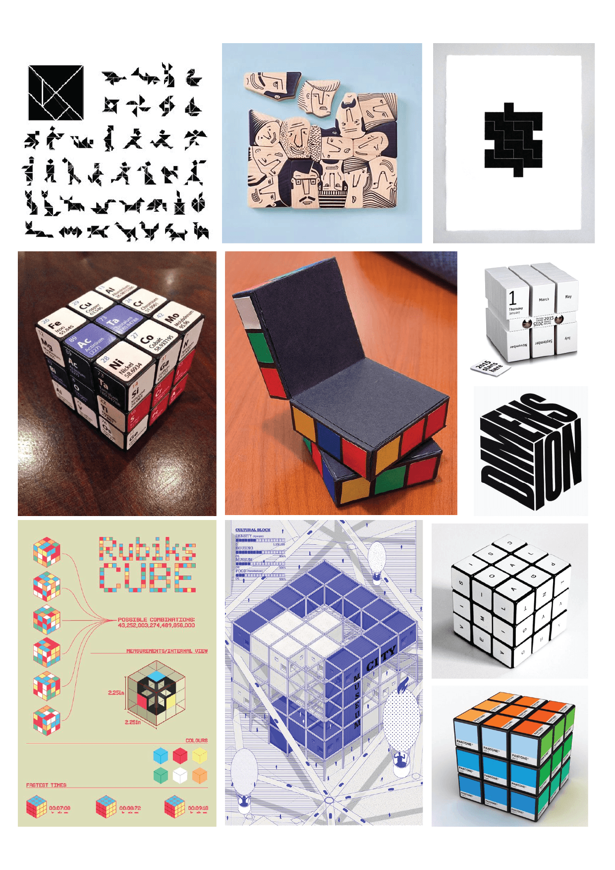
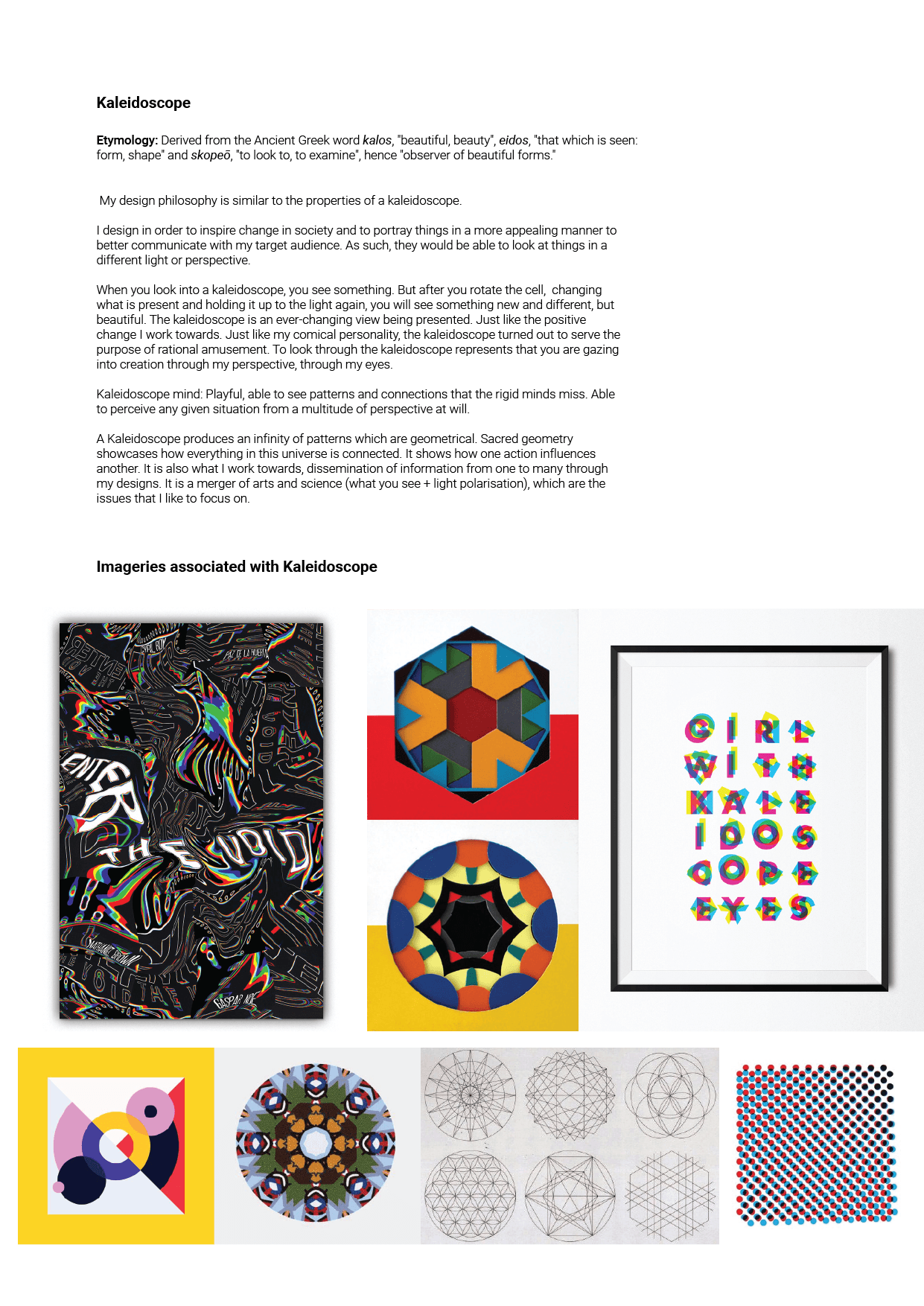
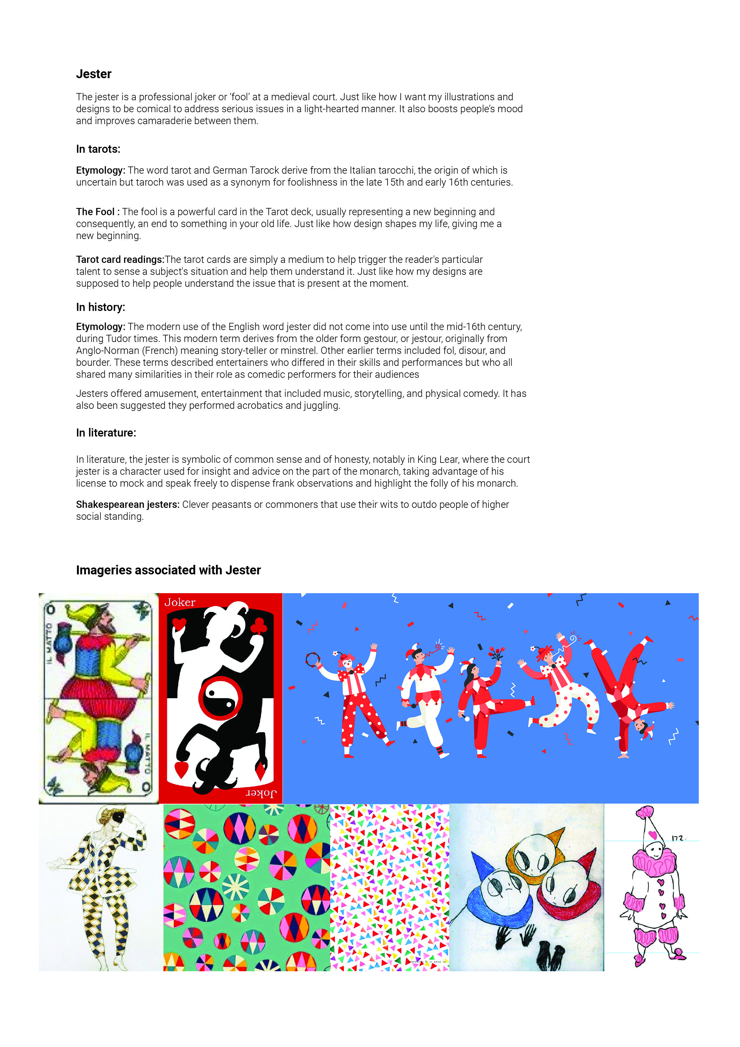
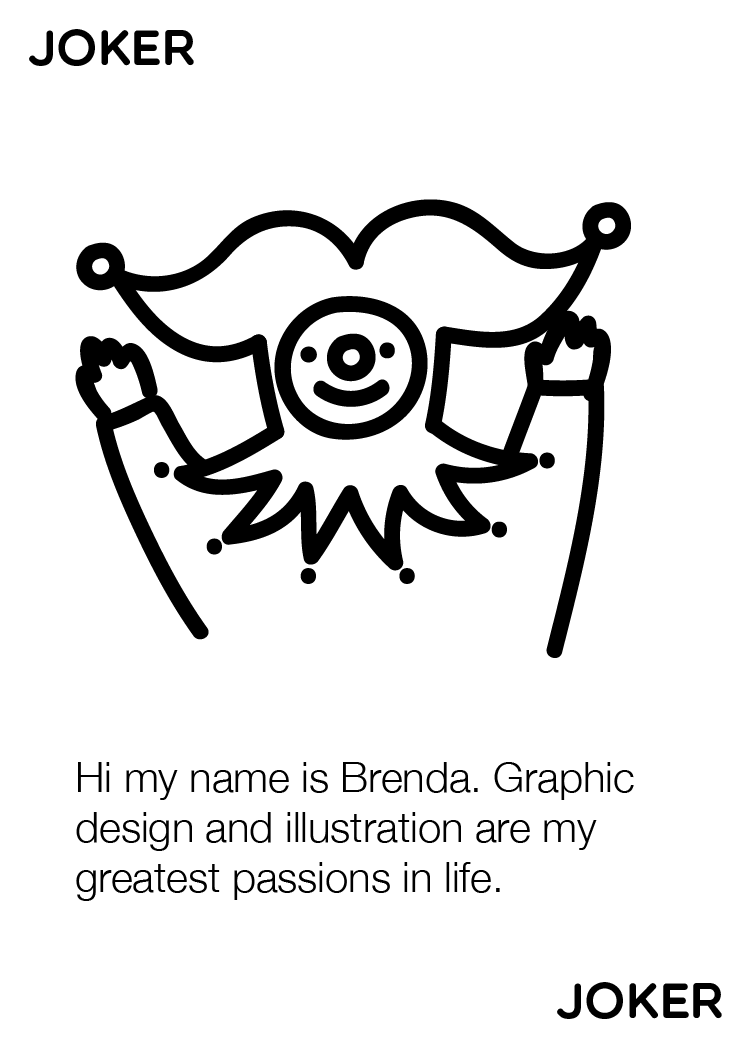
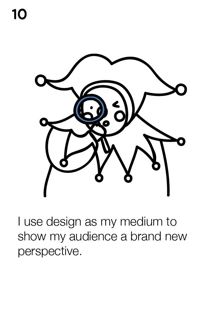
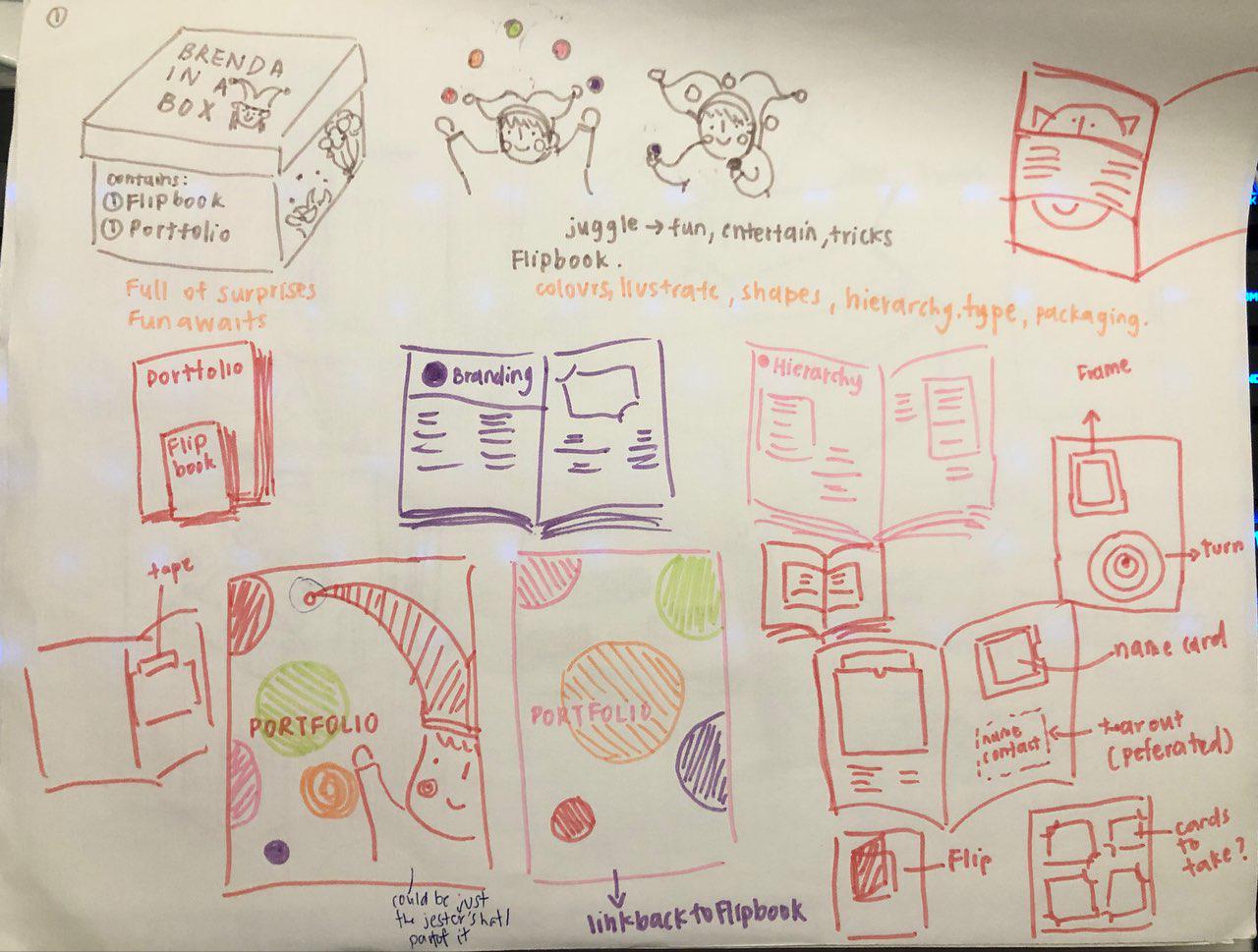
At first, I wanted to do something fun and exciting. My keywords were change, perspective and humour. So I had the idea of jesters, puzzles and kaleidoscope.
Below, you can see the mindmaps that I generated from my design philosophy.
The keywords that I generated from my mindmap:
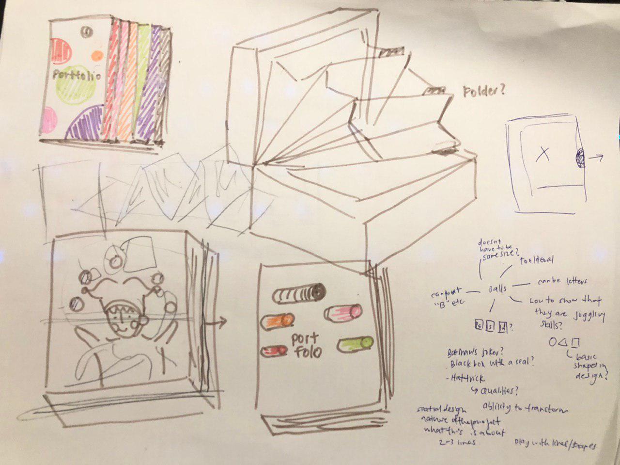
Picking the most unique keyword, jester, I came up with these sketches and ideas about how my portfolio would look like. At first, I really wanted to do playing cards but it did not work out as what I wanted it to be.
Another idea I had was to put my works on the card and explain about them.
What is the point of these playing cards? I couldn’t find a reason why I made it other than just using it and playing it for fun.
Hence I continued trying and these were the new ideas I came up with:
What are some of the current issues confronting our world today? Amongst them, what is of interest and a cause of concern to you? (250)
Through online articles from National Geographic, Times, NASA and many other well-known sites, I found out that there are various issues confronting our world today. Amongst them, I have narrowed it down to a few.
SOCIAL ISSUE
Firstly, we have mental disorders that is prevalent in the world but they are not well received or addressed. Mental disorders affect one in four people. Treatments are available, but nearly two-thirds of people with mental disorder never seek help from a health professional. Eg. Chester Bennington http://www.who.int/whr/2001/media_centre/press_release/en/
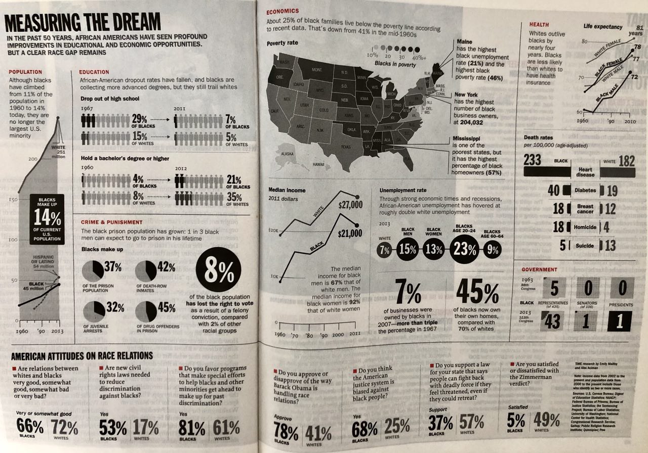
Racial segregation between the white and black people is an issue. Though all humans, just because of the different skin colour each was treated differently in society and have different privileges. There are many articles about the black receiving harsh criticism even though it was nothing serious. https://www.vox.com/identities/2017/5/1/15499996/jordan-edwards-police-shooting-texas-balch-springs
Environmental issues
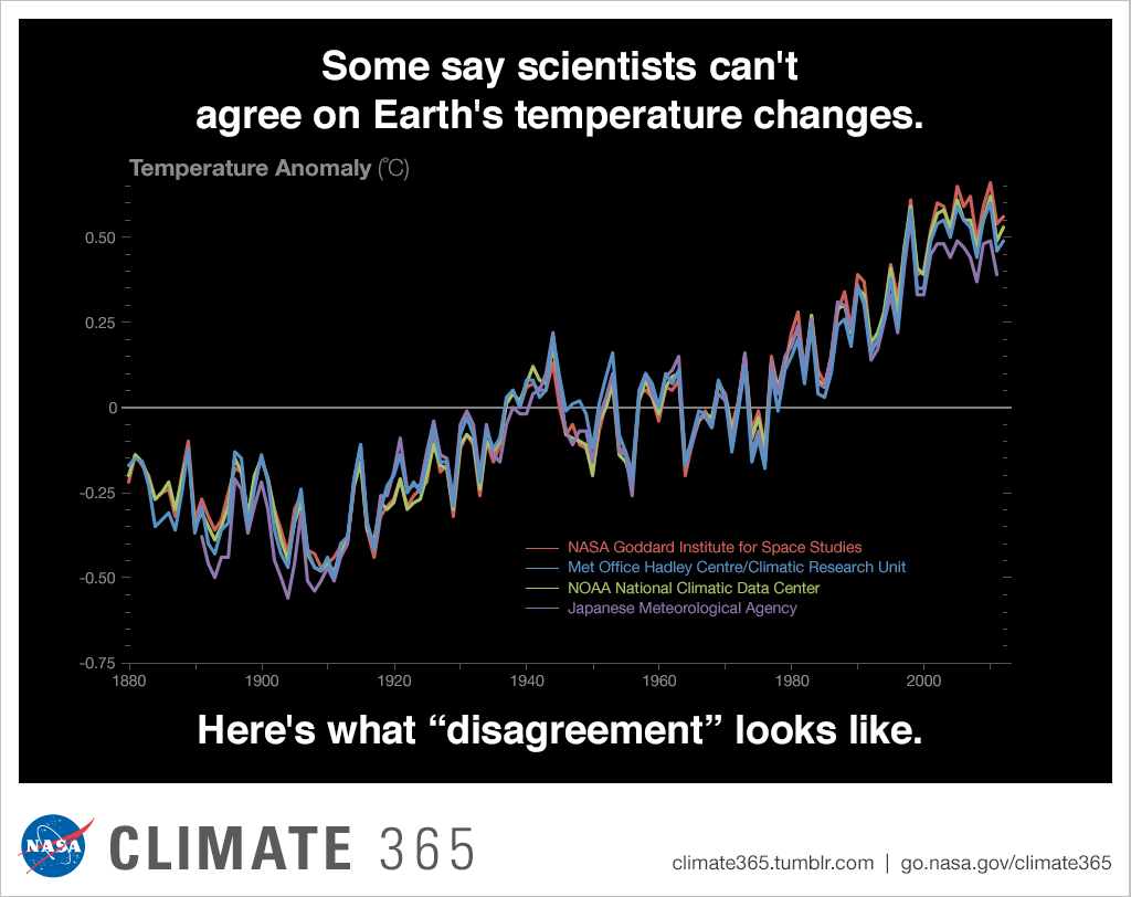
I believe that human activities, leading to climate change is the most prevalent and important issue that we all have to address. Due to human activities, the climate suffers. Even without statistics, I’m sure everyone experienced the weird climate recently, where it rained continuously and temperatures dipped to as low as 21.2 degrees. https://climate.nasa.gov/news/2671/long-term-warming-trend-continued-in-2017-nasa-noaa/
Also, due to human activities, the wildlife, flora and fauna suffer. Logging and deforestation, overfishing, dumping into ocean and shark finning are just some of the examples. Being someone who feels for nature, I want to reduce these problems before they get serious. These can cause damage to the environment since plants are the basis of ecosystems and that animals help to pollinate them. http://www.bbc.com/earth/story/20150715-why-save-an-endangered-species
(will focus more towards plastic affecting marine life)
Why is the issue important? Who does it affect and how? (200)
Confronting human activities that damage the environment is important. Since the whole ecosystem is interconnected, one action could lead to multiple problems. For example, dumping in the ocean by factories would cause marine life to die. With the factories continuously in production, toxic fumes would be emitted and cause damage to the ozone layer. And these would thus lead to a loss of sea ice, accelerated sea level rise and longer, more intense heat waves etc. Global temperature is rising continuously every year. If we do not start act now, it would be too late and the whole ecosystem would perish, perhaps lead the world to another cycle of ice age.
Some impacts on the environment:
Corals bleaching
Land degradation
Habitat destruction
Ozone depletion
Ocean acidification
Water pollution: Greenpeace stated that at least 267 different animal species are known to have suffered from entanglement and ingestion of plastic debris. According to the National Oceanographic and Atmospheric Administration, plastic debris kills an estimated 100,000 marine mammals annually, as well as millions of birds and fishes.
Communicate to the public, consumers as well as the government and organisations. (Technically everyone) There is a need to raise awareness and educate them about the concerns that this problem would bring about and what each one of us could be contributing in order to help. E.g. sustainability, reduce waste and decrease plastic production, substituting it with another more environmentally friendly material. Hopefully, the public will be educated and grasp a hold of how dire the situation of climate change is and start to adapt and change their lifestyle bit by bit.
How has visual communication contributed to address the cause?
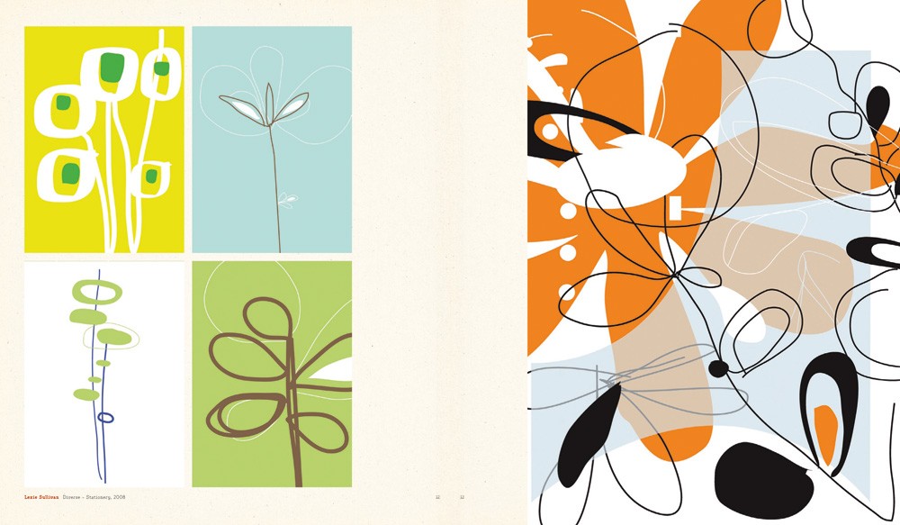
Designer: Evelyn Rydz, Pigmented Ink Print, 2014
Evelyn Rydz is a Boston-based artist who takes photographs and creates illustrations of man-made objects that have washed ashore, presenting these artefacts like an archaeologist of contemporary history. Through her photos, we can see how the journey through the ocean has changed these objects.
I like how these ocean waste morphed and changed throughout their journey in the water, exposed to erosion and thus becoming so unique and one of a kind. They indeed do look like artefacts but are actually just man-made objects in the sea/ocean.
By using the recycled plastic bottles as a stand-in for the ocean, Von Wong hopes the images start a conversation on how plastic bottles are polluting our oceans.
Due to the plastic waste in the ocean, the mermaid’s life is at stake. He was probably trying to grasp the attention of the audience with how beautiful the mermaid is but with a dark twist. Her being surrounded and swimming in a pile of plastic waste. Indeed being a designer/artist, we have a hard time trying to change the world. But this project showed that through passion, by spreading the word, you can make a difference.
Designer: Surfrider Foundation and Saatchi & Saatchi LA, Advertisment, 2008
“Catch of the Day,” a guerrilla ad campaign sponsored by Surfrider Foundation to educate people at farmers’ markets about the amount and kinds of pollution dumped into our seas.
Working with the ad giant Saatchi & Saatchi, real-life trash was collected from various beaches in America and packaged to look like seafood and then offered at various farmers’ markets.
This ad caught my eye immediately with the strong visuals. The ad speaks for itself. Fishes being replaced by waste in the ocean. This ad is definitely strong since it uses an everything object to “package” something different.
Hi, this is where I’ll be talking about my process for assignment 3.
Firstly when i heard this project, I thought I was going to go for the cutesy doodles that i usually draw. BUT apparently that wasn’t the case for my final designs…… ;u;
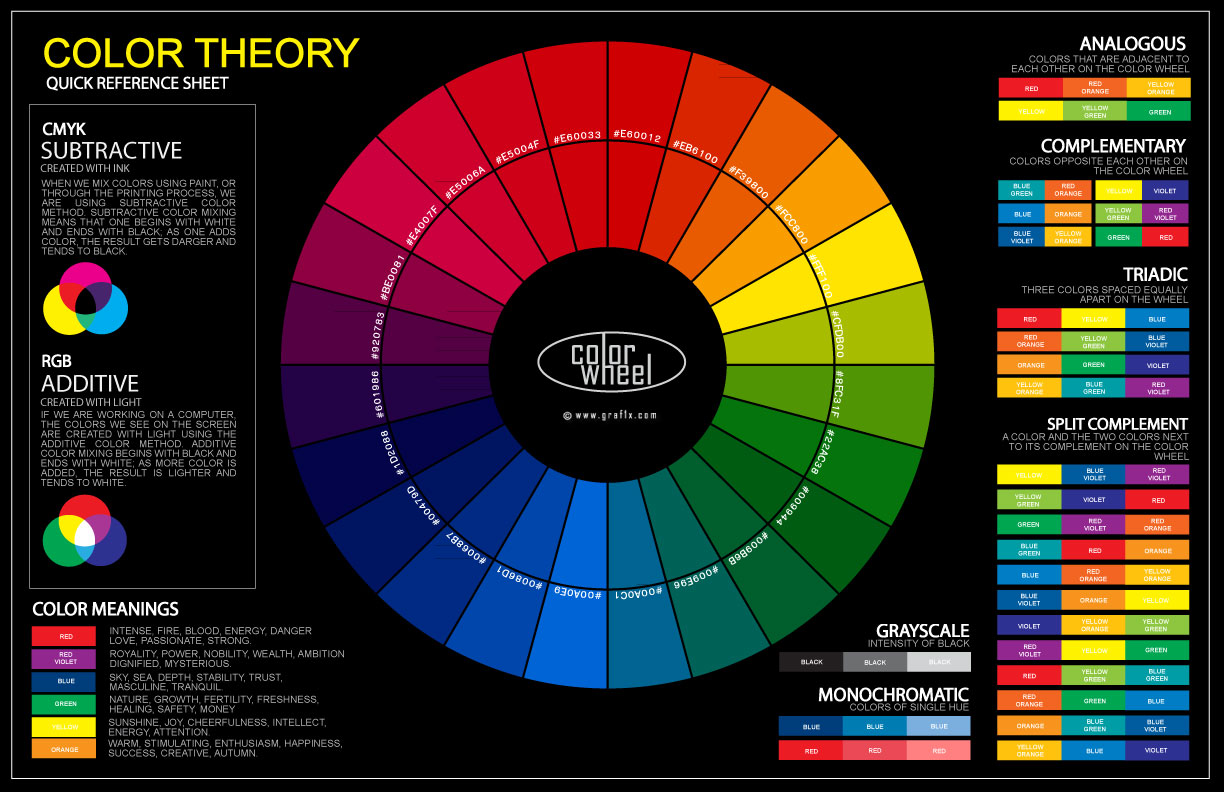
COLOUR THEORY
Firstly, I’ll briefly talk about the colour theory using a single picture 😀
and yes, I used things like monochromatic, greyscale, analogous, split complimentary as well as complimentary colours.
This website is where I got my colours generated to obtain colour harmony 😀
https://www.sessions.edu/color-calculator/ (y’all can check it out, it’s free)
For my final work, I decided to go for a bright blue background for the first frame, a darker for the second and a grey background for the last frame.
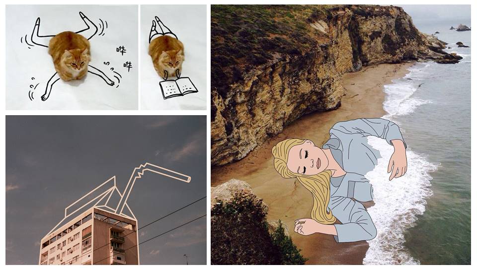
ARTIST REFERENCES
(some ss of their instagram account if you’re int)
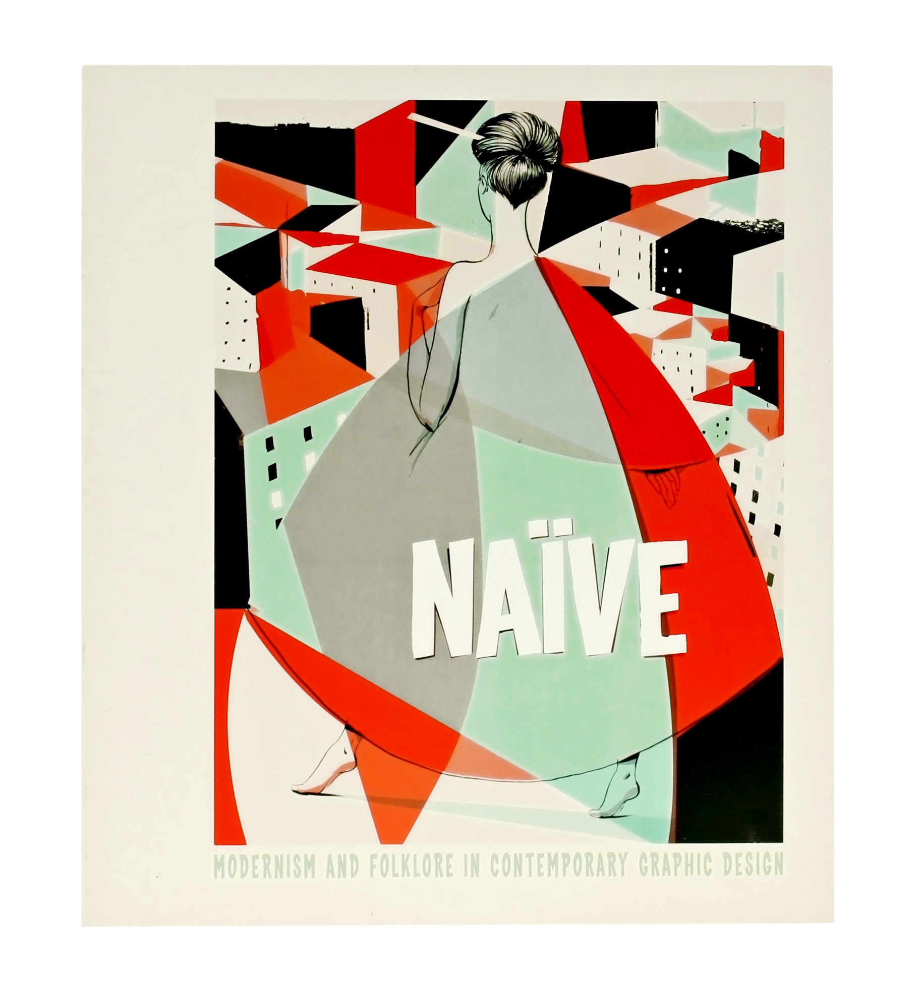
(recommended by Mimi and y’all should go take a look at it bc it inspired my final designs for this assignment)
There were a lot of flat illustrations in this book which in the end inspired me to go for a style I never thought I would be doing.
And yes, I had to learn how to use Adobe Illustrator. (thank god for youtube)
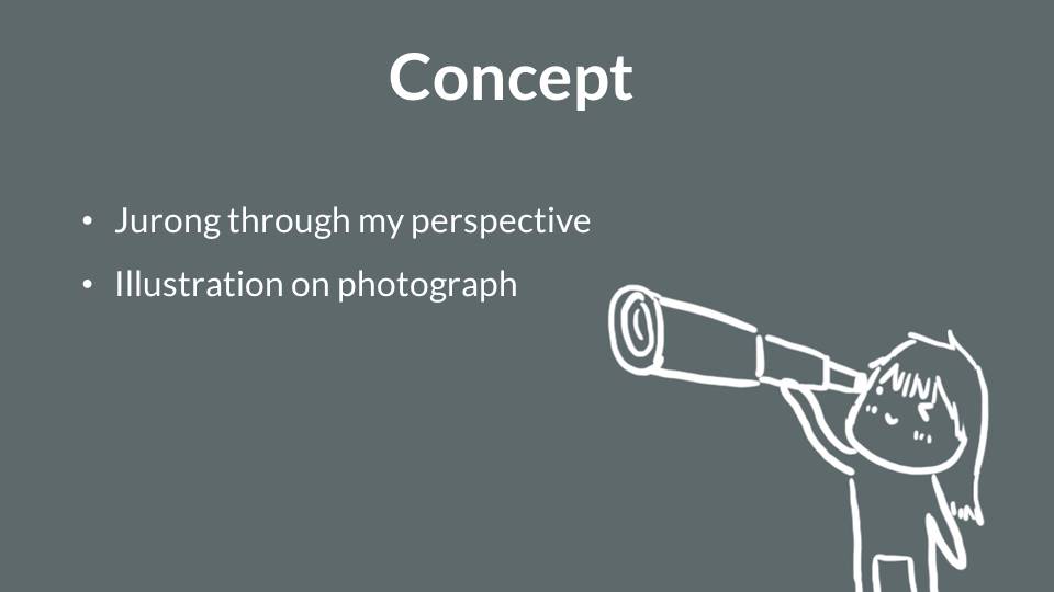
CONCEPT
‘Expectations vs Reality’ (the popular internet meme thing)
which I then change it to
‘Dreams vs Reality’
I wanted it too be all cool and then when you read the final frame, it would be like ‘meh’.
And that was why I decided to use a bright blue background for the first frame, a darker for the second and a grey background for the last frame as mentioned earlier.
INITIAL SKETCHES/TRYOUTS
(I’m cool)
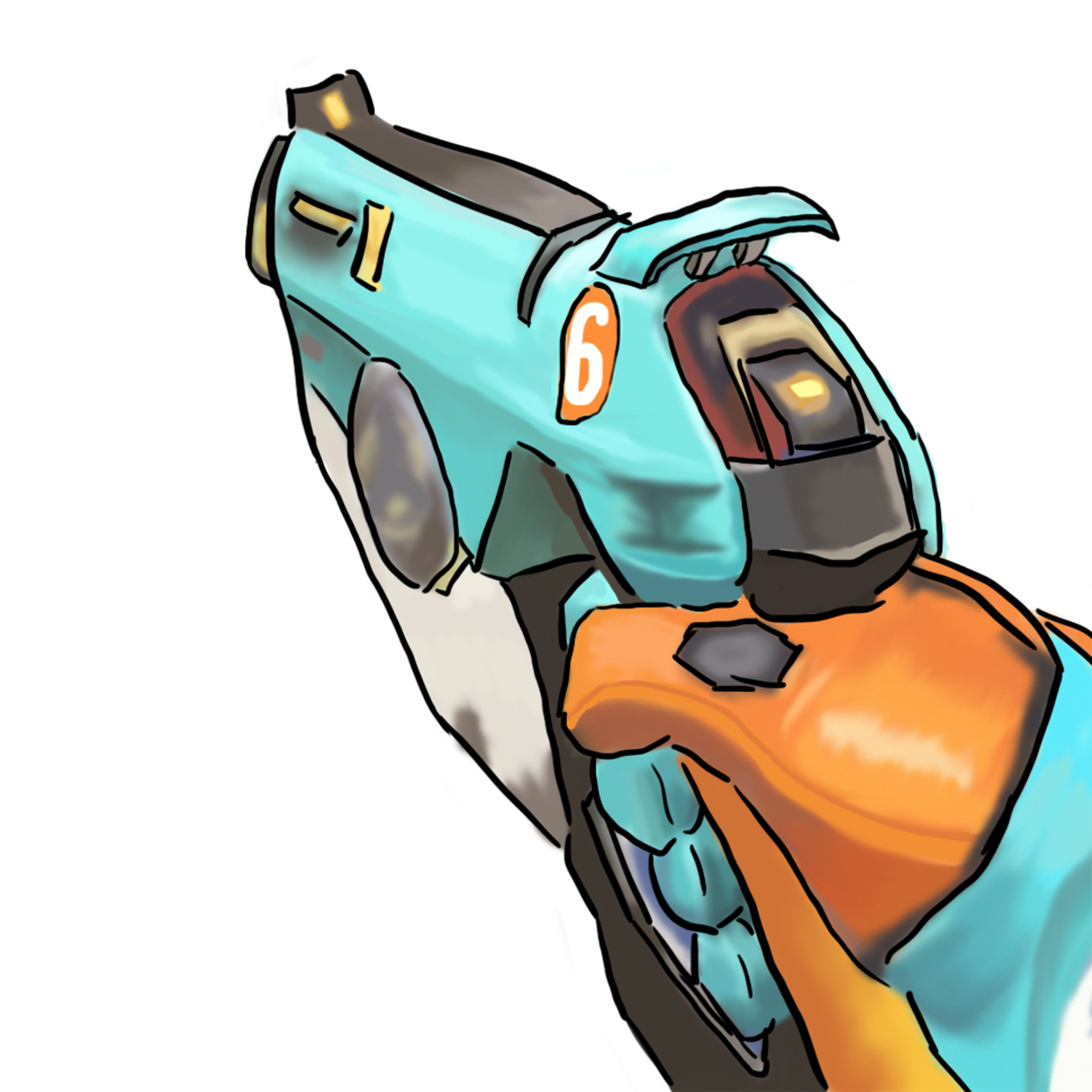
For you overwatch fans out there, yes it’s a tracer gun. But Mimi advised me to add myself in the frame, soooo ..
yes it’s semi realistic but meh not good enough i guess. It didn’t really look like me.
(I love to frolic in the ocean)
Tried doing another style digitally since I’m not good at watercolours on paper.
(ME)
Got some feedback to work on this style and yes, that was when the book, “Naive” was introduced to me and I knew I had to learn how to use Adobe Illustrator :’) but it was all worth it.
Hi, these are the updated/new designs I’ve came up with and would like to get opinions regarding them.
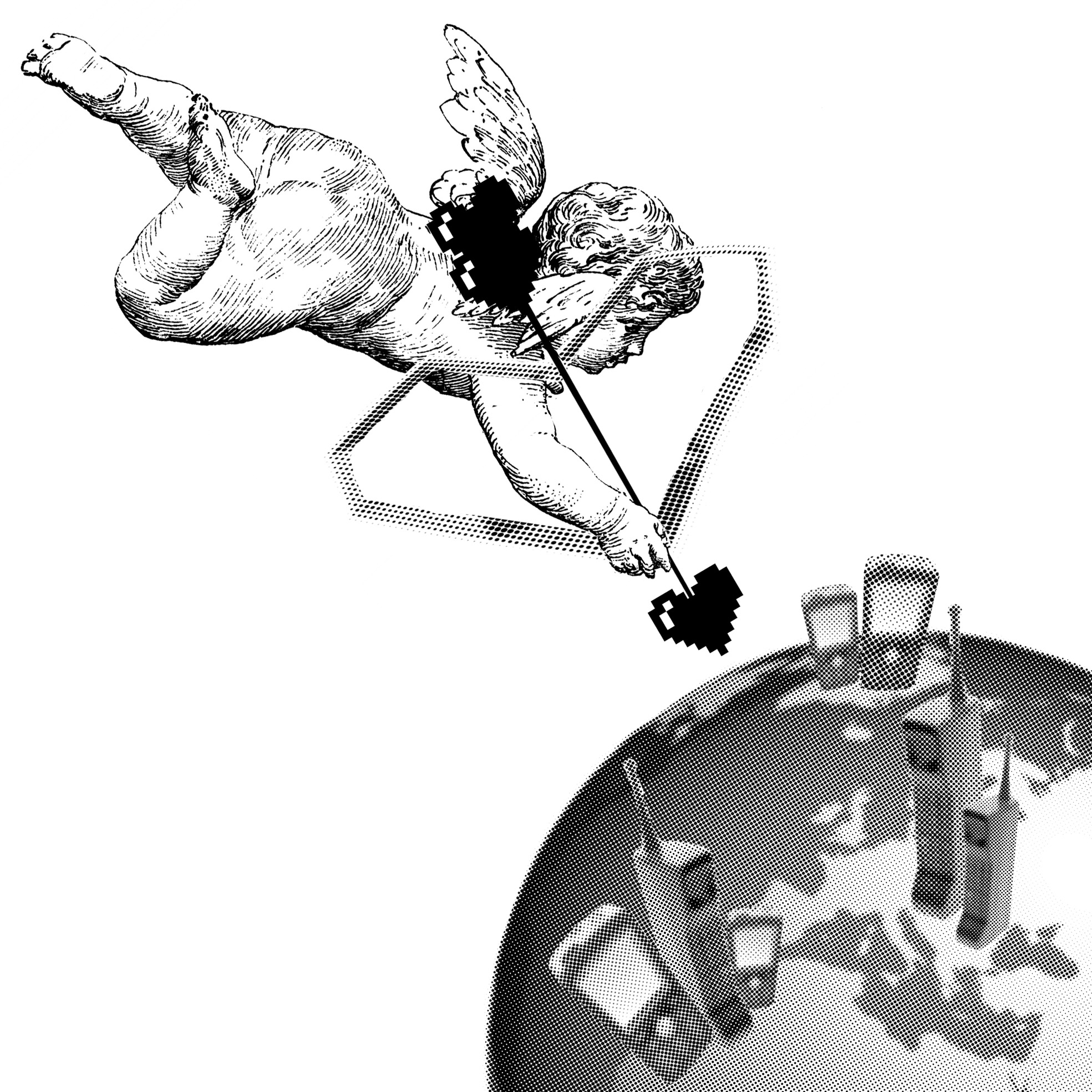
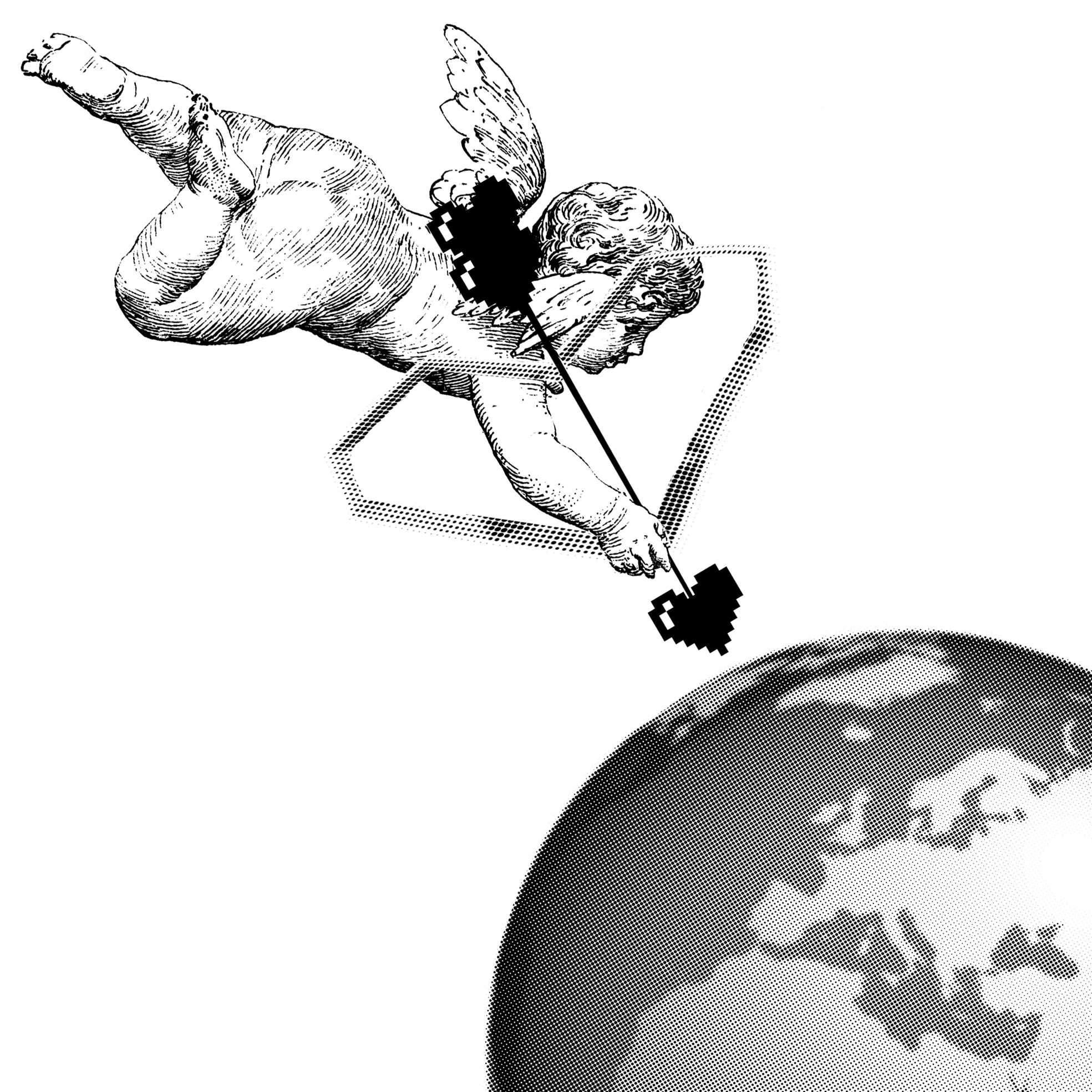
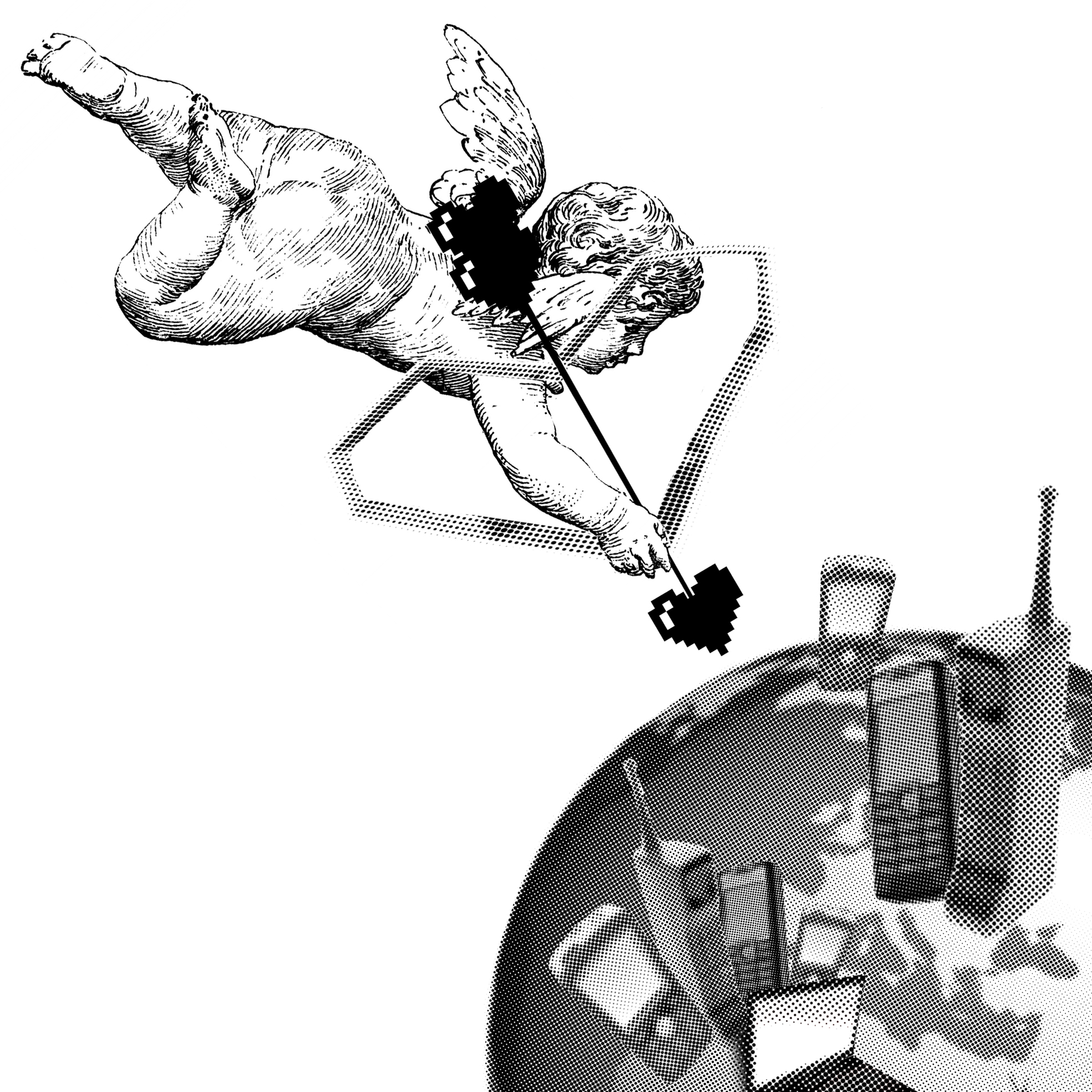
“No matter how many weapons you have, no matter how great your technology might be, the world cannot live without love.”
– Castle in the Sky (1986)
(FINAL DESIGN APPROVED FOR THIS QUOTE)
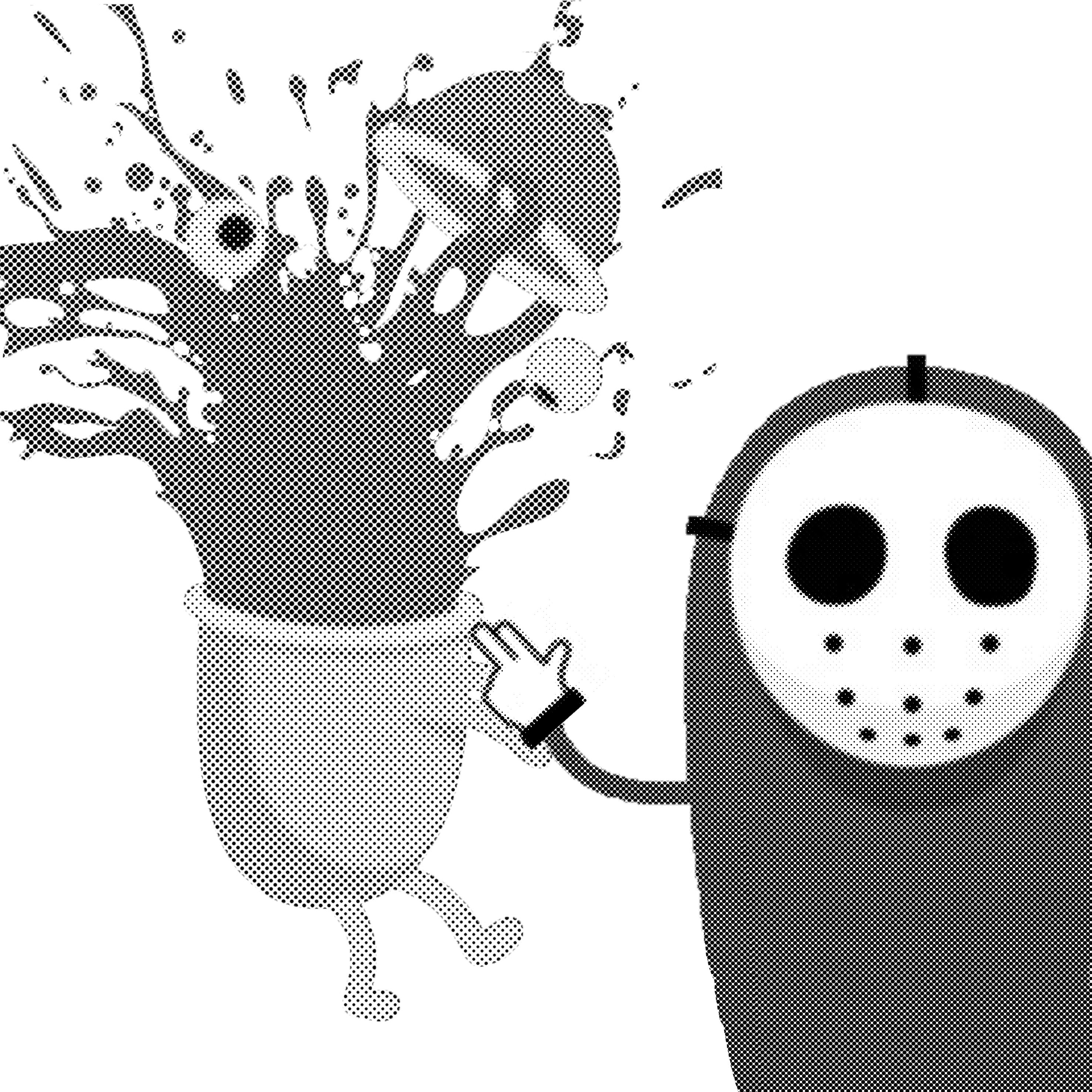
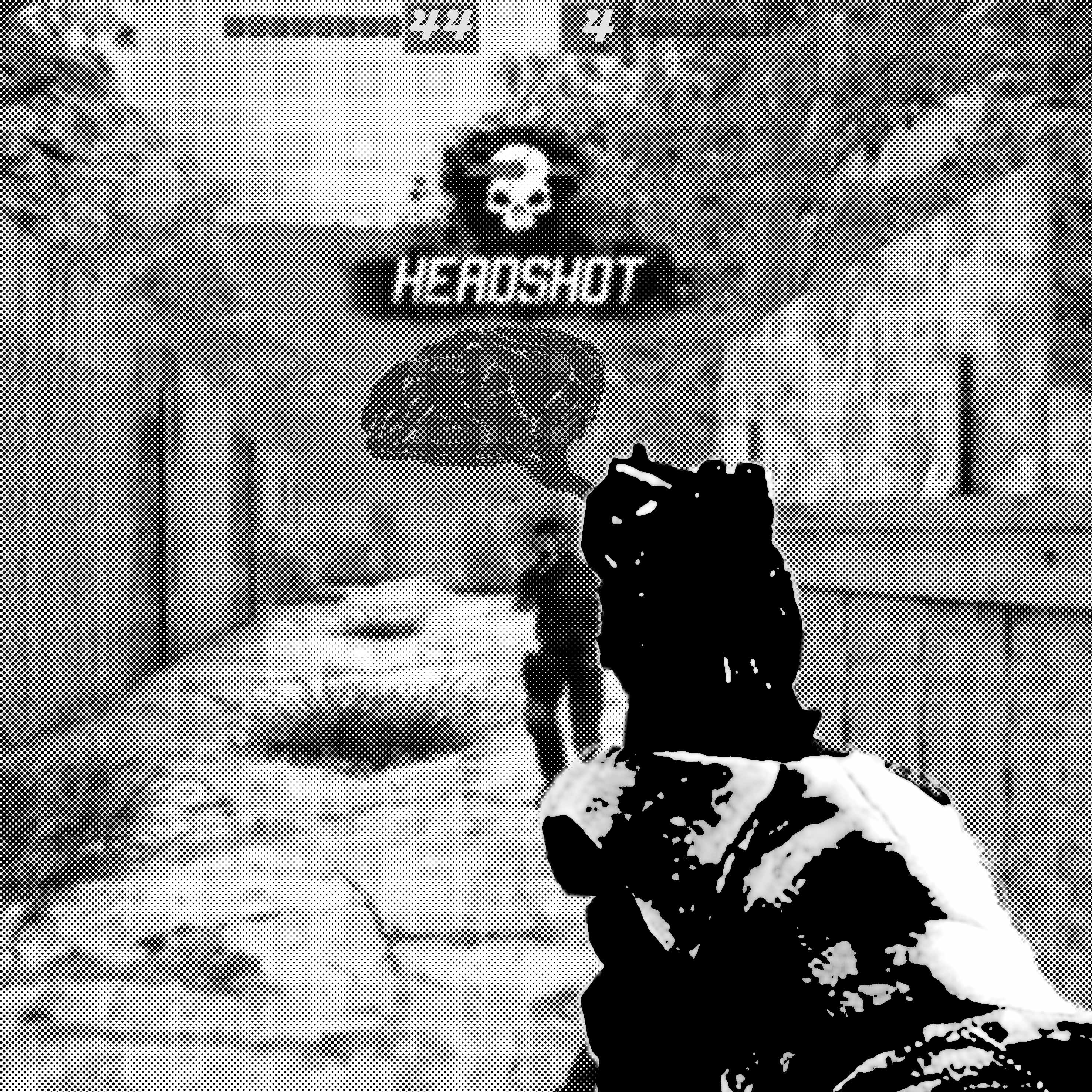
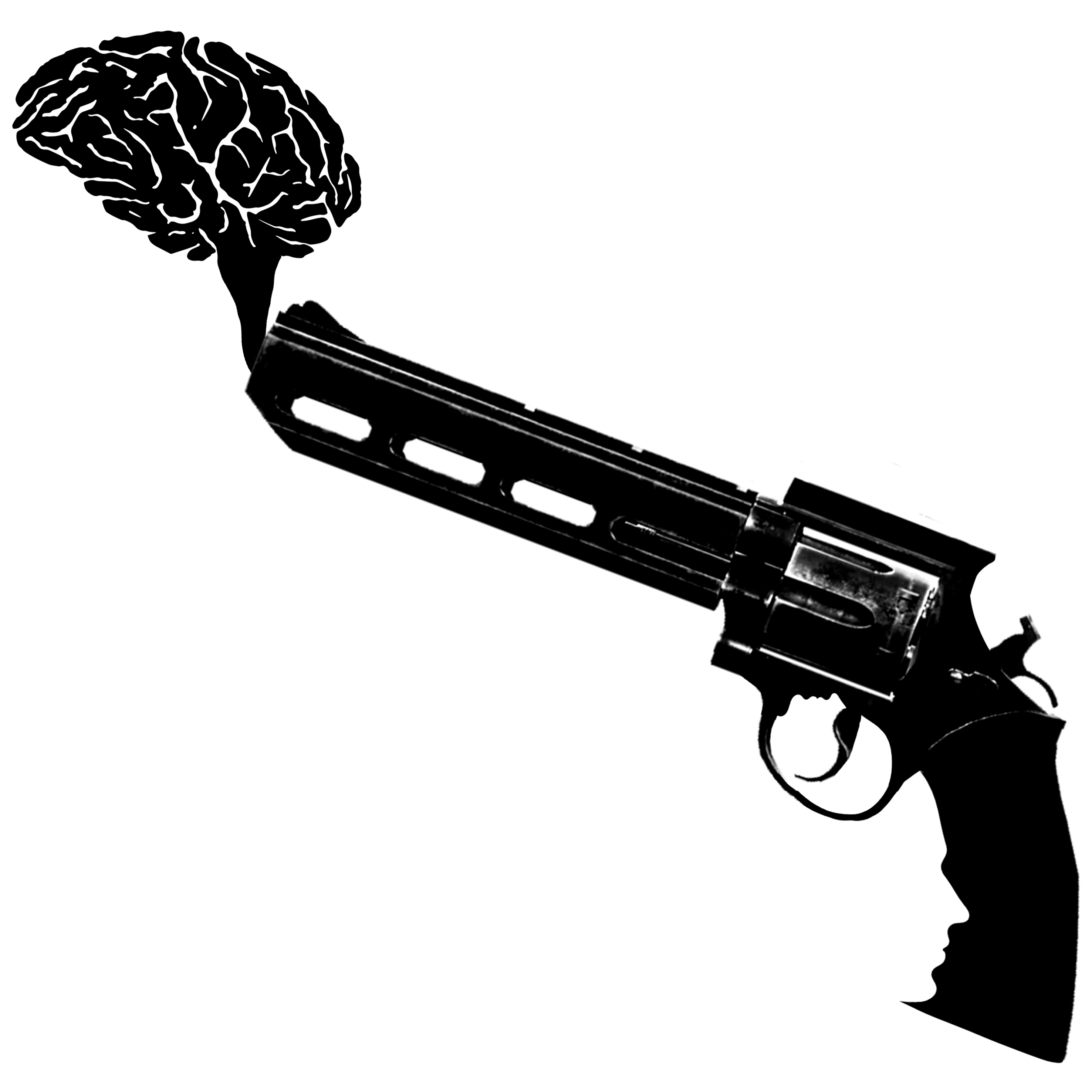
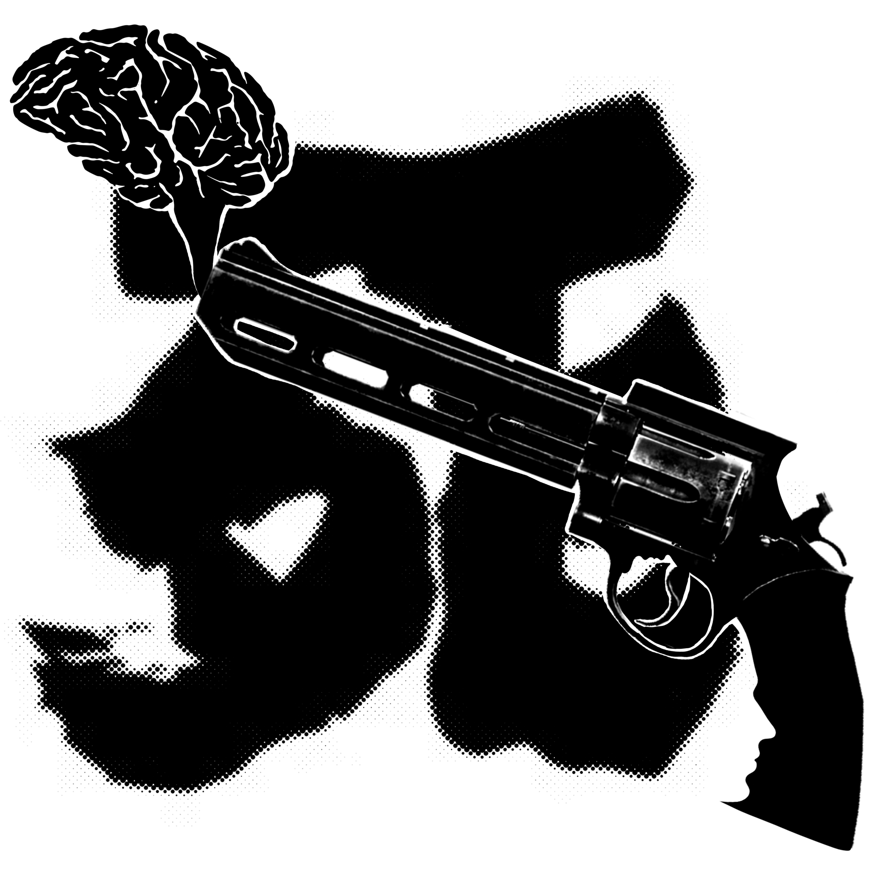
“But being this is a .44 Magnum, the most powerful handgun in the world, and would blow your head clean off.”
– Dirty Harry
DESIGN 1:
I thought handgun = HAND+GUN so that’s why I place the icon there.
DESIGN 2:
Shooting someone in the head somehow reminds me of playing a first person shooter (FPS) game, thus the background. I added the brain (smoke) as well but made it less vivid as compared to the handgun. And also the score above is 44 and 4 (.44 Magnum)
UPDATED DESIGN:
I’ve decided to take away the face from the trigger area since it looks the same as Avinoam Noma Bar’s work. I wanted something new so hence i decided to leave the face at the handle.
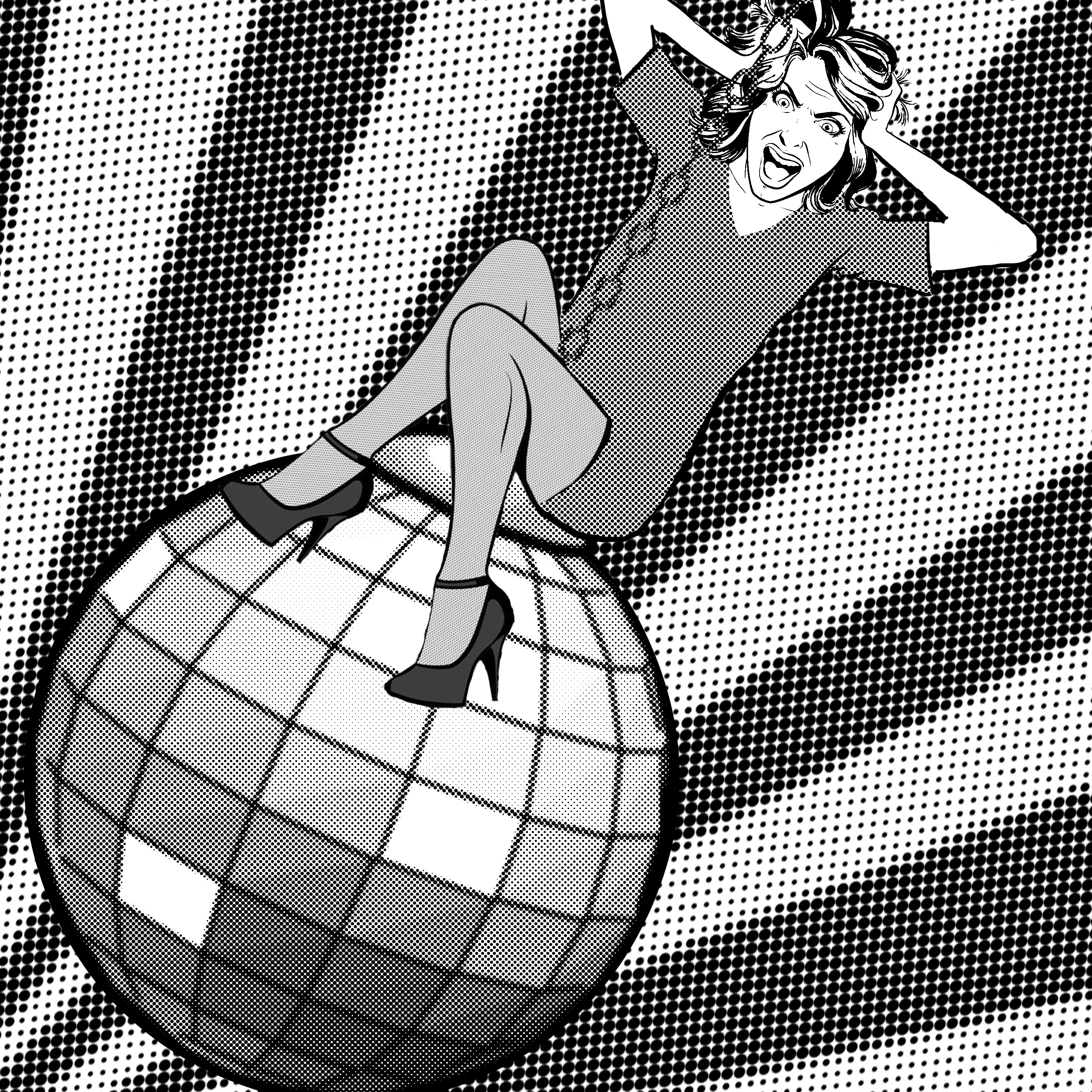
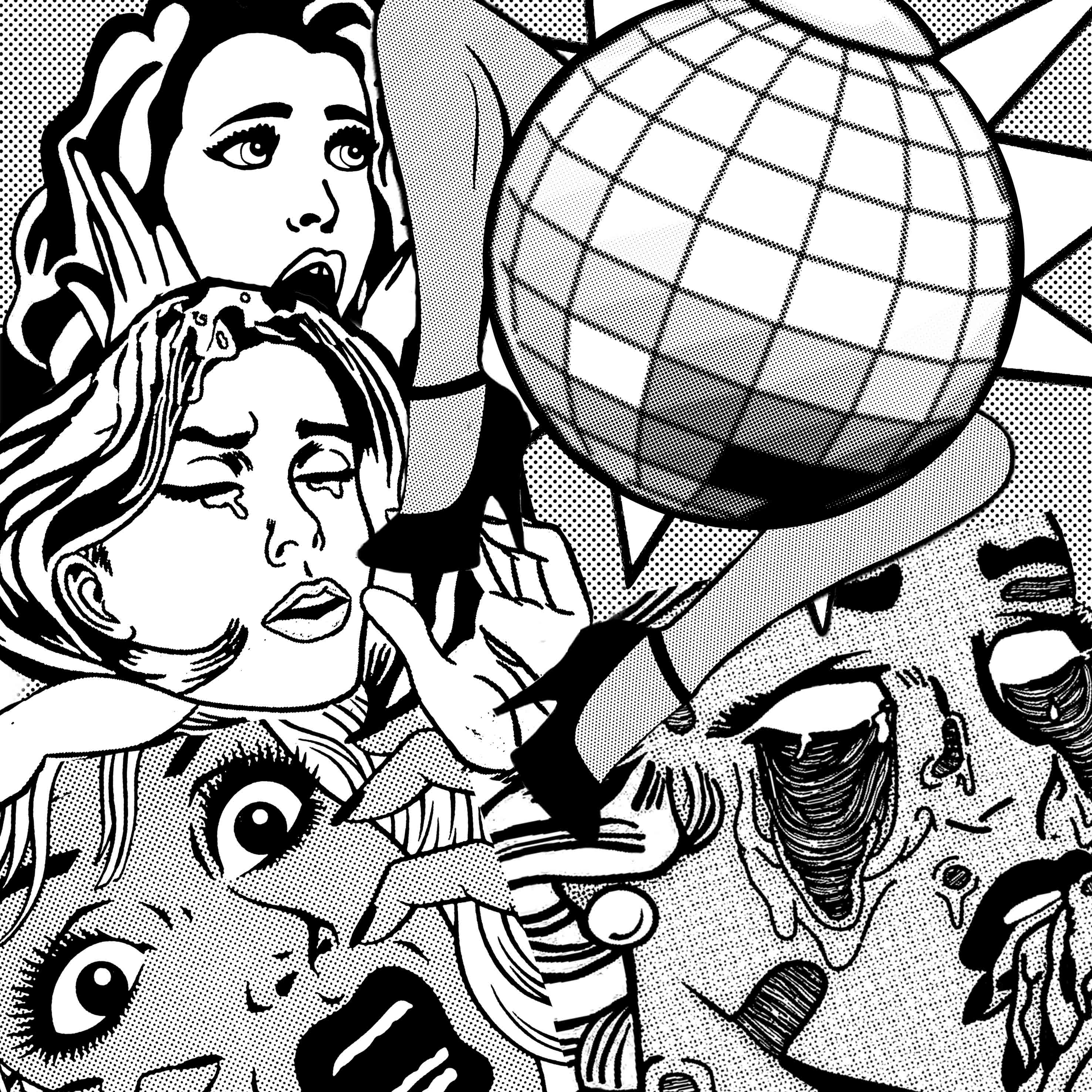
“I’m definitely gonna die up here if I have to listen to any more god-awful disco music.”
– The Martian
Since you asked me to add my own twist instead of having too much of Roy Lichtenstein’s style, I tried to made these designs, hahahahahaha. Anyway, instead of having so many faces in one photo, I’ve made only one main character.
Also, all these designs depict the woman above the disco ball because the quote was “gonna die UP here.
DESIGN 1:
DESIGN 2:
DESIGN 3:
Not sure if it works better with the background or would it be too distracting.
“No matter how many weapons you have, no matter how great your technology might be, the world cannot live without love.”
– Castle in the Sky (1986)
PREVIOUS DESIGN:
(Mimi said to add some ‘technology’, which are cellphones, laptops etc)
UPDATED DESIGN:
“But being this is a .44 Magnum, the most powerful handgun in the world, and would blow your head clean off.”
– Dirty Harry
FIRST DESIGN:
( the smoke being the brain and the gun has 2 hidden faces…………)
Inspired by Avinoam Noma Bar.
SECOND DESIGN:
I added a 死(si) character which means ‘death’ or ‘die’ in Chinese. Because in Chinese, 4 is referred to as si=死. So, .44=死死 HAHAHA please give me suggestions to improve. Thanks !
Here’s the video of the quote (@^u^@)/
“I’m definitely gonna die up here if I have to listen to any more god-awful disco music.”
– The Martian
FIRST DESIGN:
Inspired by Roy Lichtenstein.
The picture says it all 🙂
SECOND DESIGN:
Added some legs to signify the ‘dancing’ to disco music? 🙂
Here’s the video of the quote (@^u^@)/
Any comments would be appreciated. (will update more after I’m done w more of them)
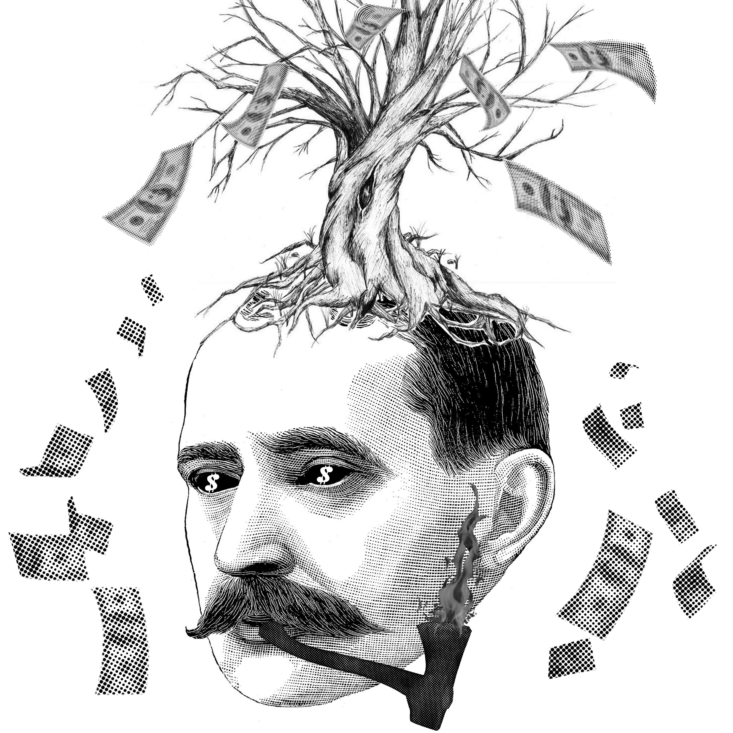
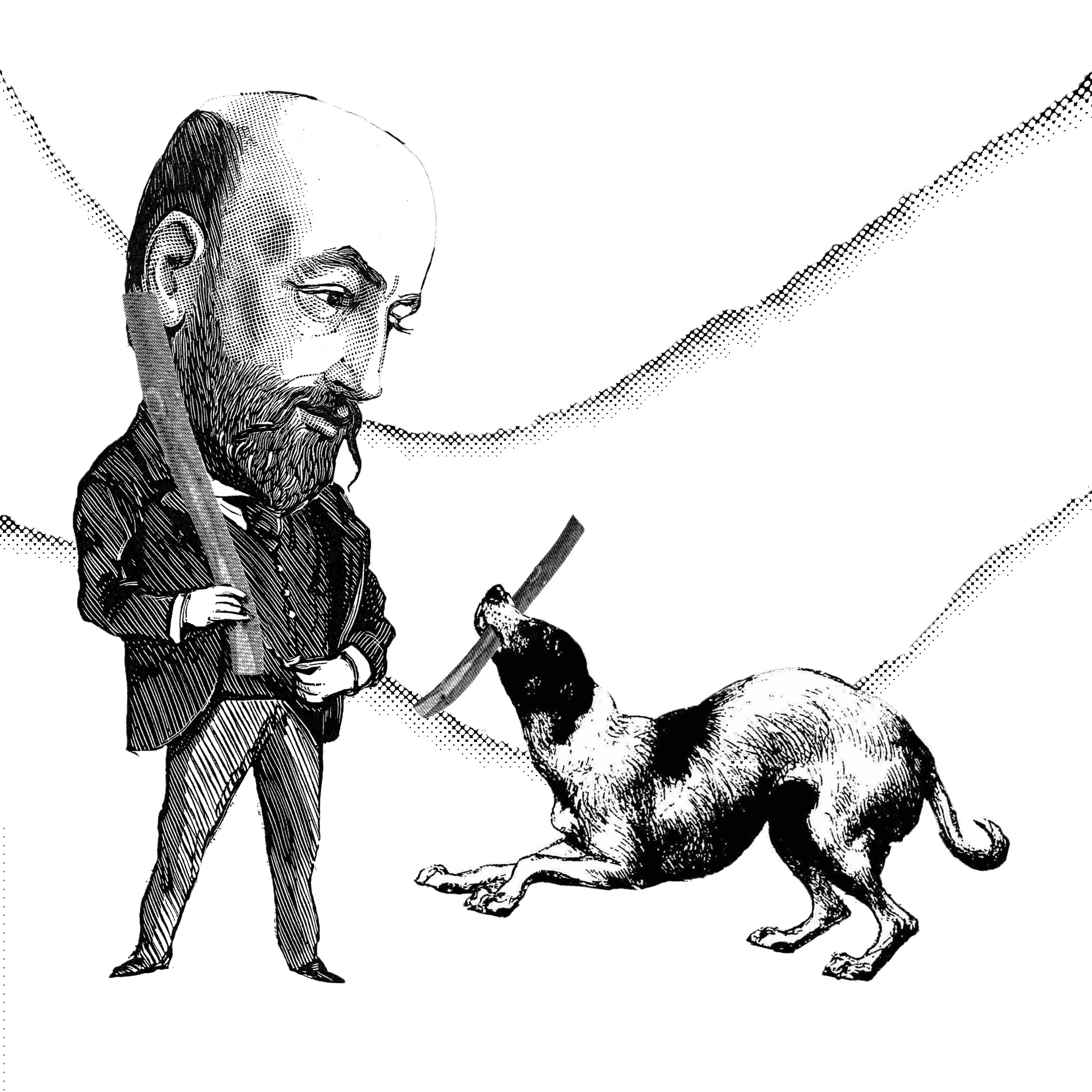
“Trees and people used to be good friends.” is a quote from the ever so famous, ‘My Neighbour, Totoro’.
These are 2 designs that i came up with regarding the quote:
Firstly for this picture, I wanted to show that people exploited the trees for money and hence, they are not good friends anymore. The pipe is actually an axe and the smoke is replaced with fire.
The second design revolves around people having a new good friend, the dog. Hence, the pair is playing fetch using the tree branch with no trees in sight.
(It would be great if i could get some feedbacks/opinions regarding my designs)