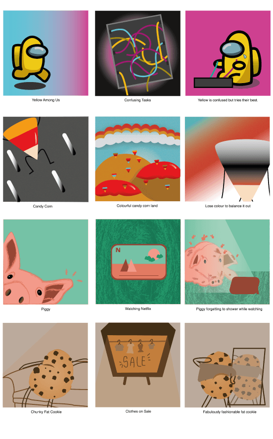
 Colour Theories: Adobe Color Wheel
flawed, fat and fabulous.
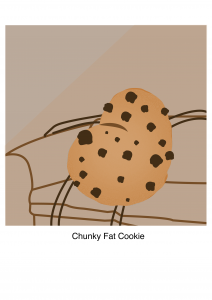
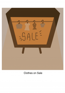
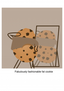 Monochrome colours keep the composition simpler, which is what I wanted this row to look like as the elements within are not flashy too. If I had two or more colours within this composition, I was worried that it would be too cluttered.
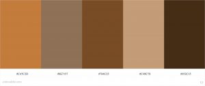
I chose this colour palette because it made the most sense to me. The cookie is brown. Brown is chunky. Brown also represents isolation.
Could it have been purple? Maybe but it would look gross like I mean… 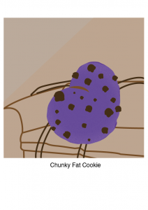
Experimentation:
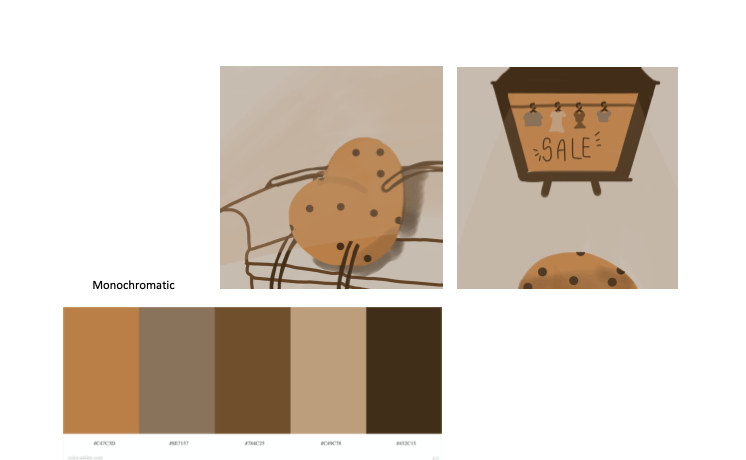
This was the “sketching” or experimenting process for this piece. I did the rough sketch on the Adobe Sketch app before transferring it into illustrator and making a few changes to make it more interesting. I kept the things like the couch and the limbs of the cookie outlined instead of filled so that the focus would be on the cookie or the TV or the cookie looking into the mirror.
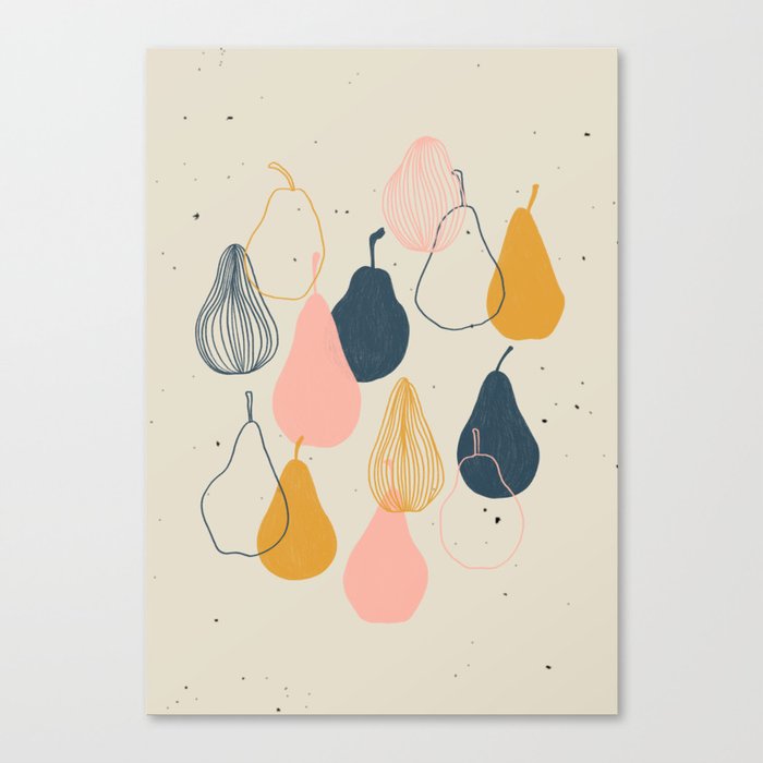
For the Art Style, I got my reference from the Pear with me Canvas Print by Jeah Design.
balance.
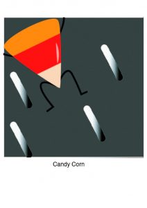
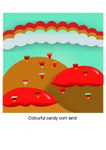
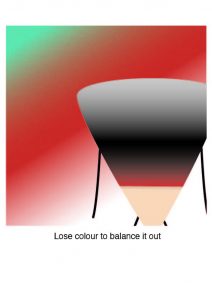
The concept behind this row is that I’m a bright and lively candy corn which is excitedly entering a new world. I enter a world that it full of life and candy but instead of fitting in, I find myself desaturating in order to create balance because having an over-saturation of liveliness can be harmful or bad…in my eyes.
Triad colours are colours that are equally apart from each other on the colour wheel. The reason why I used the triadic colour scheme here is because triadic colours are typically more bright and lively. Which is what I needed to create the contrast between the bright, liveliness of the candy corn and the black and white to balance out.
Experimentation: I did the most experimentation on the second column of this row. I was struggling with the composition. How do I create an island of candy corn? How would an island look like? In the beginning I tried to make the skies alternate colours, referencing this image.

But it looked sketchy when it came to my composition. Other friends have suggested candy canes instead of candy corn but I felt that candy corn was still more applicable when it came to the concept. I did try to make a candy corn on a cob situation but the perspective transforming in Illustrator was too tricky for a beginner and it just looked bad, weird. Like it didn’t even make sense.
At first, there were no clouds in the composition as well. Just a plain blue sky but I added the clouds in later on to minimise the white space in the composition so that it would not look so empty and maybe even brighter. I think it worked.
Something risky(?) I tried was to make the candy corn in the second column different colours aka not the typical candy corn colours. I wanted to show the different *personalities* the candy corns had.
As for the texture, I wanted to keep things glossy and prim. Like a clean, bright world.
netflix: are you still watching?.
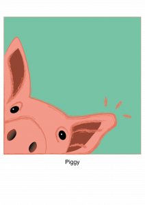
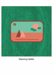
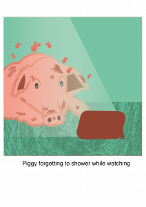
The concept for this row is that I’m a piggy who’s obsessed with Netflix and I can watch random brain-numbing shows until I forget to bathe and get stinky.
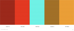
Complementary colours work well when we want something to stand out. In this case, the piggy and the tablet. It’s not jarring but also looks vibrant, which really brings out the cuteness of the piggy.
Unlike the others, I did not do much experimentation with the piggy as the idea came pretty naturally and I knew what I wanted it to look like. The background of the second and third column would be the only experimentation, I would say. The texture was meant to look like hay to make it seem like a barn of some sort, to create visual interest.
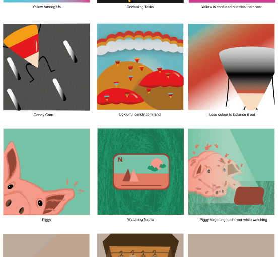
confusion is among us.
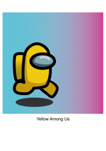
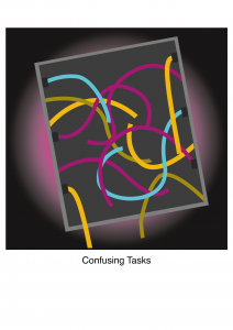
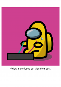
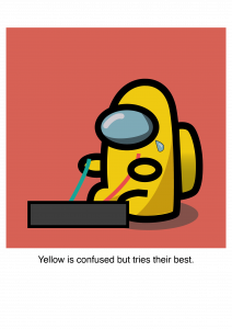
The concept for this row is that I’m represented by Yellow from Among Us who’s just happily running around but then encounters a task that is confusing. Though Yellow is confused, it knows that it MUST complete the task in order to save the ship aka its life. I chose Yellow because I feel represented by the colour yellow.
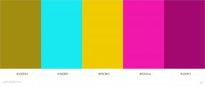
The colour palette I chose for this row is also triadic. However, the reason why I chose the triadic palette for this row is not just because of the vibrancy but also the use of the different colours to show the confusion in the wires. If I chose a colour palette that was analogous or complementary, the effect might not have came through. Blue also represents the calmness at the beginning whilst the pink represents the childishness and weakness. I also chose cooler tones as they are more calm and in a way, sad.
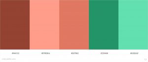
As for experimentation, I tried using different colours. Like this salmon red. Though it looked fine, I did not get the emotion that I wanted out of it. It didn’t show the childishness or the weakness as much as the pink did. I only changed this after the final consult.
difficulties
Some difficulties I faced were linking the colours that I needed to the emotions I wanted it to have. That led to finding a row for the analogous palette very challenging. It also led to choosing the primary colour of each palette hard. But by letting go of conventional thoughts on what the colour of each thing may be, I became more liberal with the way I used the colour for whichever object. For example, Piggy’s hay is green! This is something I think I picked up and learnt from the previous assignment about thinking beyond conventions.
Another difficulty was using Illustrator, of course. It’s a new software that I haven’t touched before because I was too scared. But now, though I don’t fully understand how to use it, I’m less intimidated by it. Switch from pixels to vectors? hmmmm .
