The next step after researching on artist references that had really gave me many ideas and inspiration, i felt that the illustrative ones are the ones that reached out to me more. I proceeded to trying them out myself in my own style infused with it.
Firstly, i started by looking back at the brief closely and started my ideation with these given professions : Librarian, Parasite, Assembly Line, Crime Scene Investigator, Video Gamer Player, Insomniac. My first steps are to listed down what i thought and felt about those professions. It is only till later then i realised i could choose to do my own choice of six professions or attributes after talking to my friends.
Therefore i decided further my exploration with the ones i already had many ideas for (Librarian, Assembly Line, Video Gamer Player and Insomniac) and switched out the ones which i don’t for others of my own choice (Fashion Designer/Textile Designer , Fruit Seller, Gardener and someone who drills holes for houses ; house driller? ).
My plan was to try out the ones which work best and choose the best six out of all.
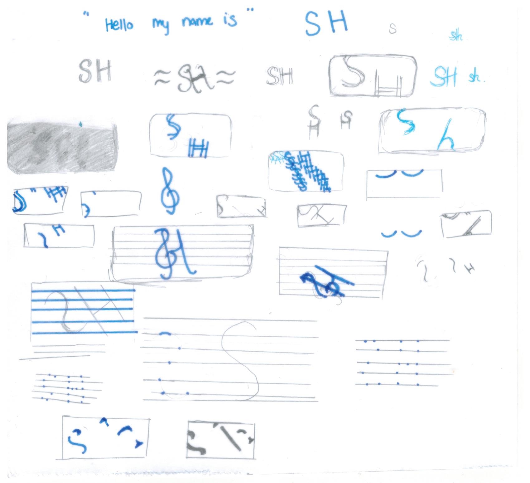
Librarian
What i view/feel:
- quiet , glasses , books, shelves of books, loan receipts in books, many notices/signs asking visitors to remain quiet.
- “shhhh!”
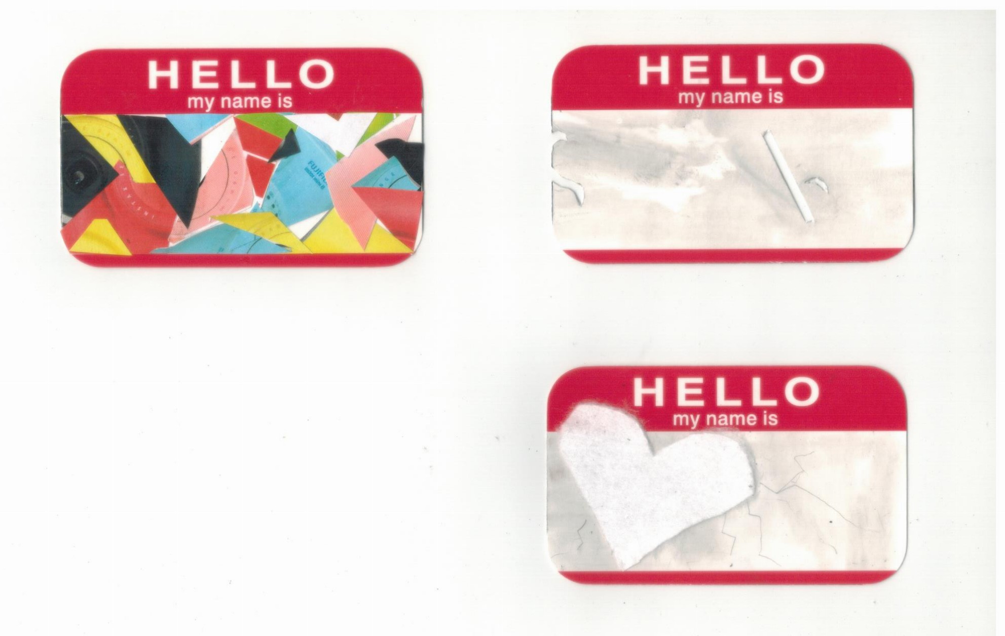
In the work above, I wanted to have a cutout of the alphabets ‘S’ & ‘H’ in block lettering from a page of a book/story/novel (since its just a tryout i did a cutout on my magazine instead of the real book) to represent how in the library they always emphasise for us to remain quiet by constantly “shhh” us. Since my initials are TSH, i decided to just use SH instead of my full initials or full name to embed the idea of “shhh” in it.
Insomniac
What i view/feel:
- “counting sheeps”, restless , tired eyes
- when you close your eyes, its not exactly black but actually reddish
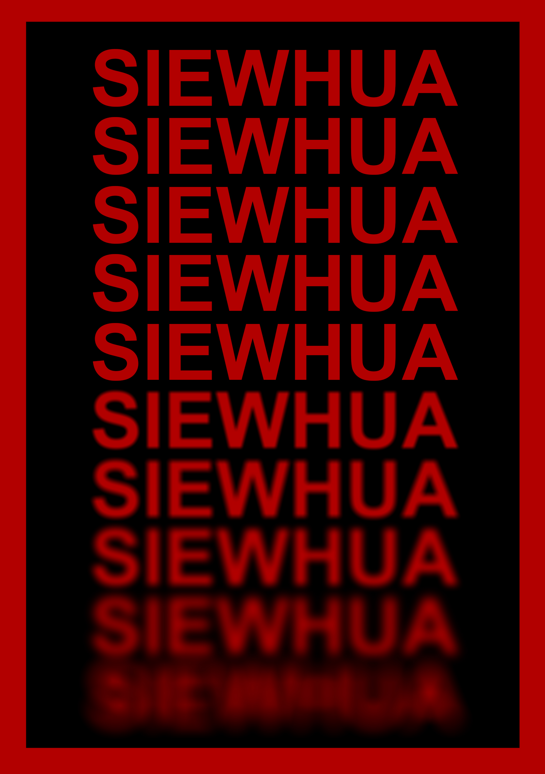
In this i decided to try out a piece digitally and i choose to use block lettering as well to make it more impactful. The repetition of my name is to represent how people tend to try counting sheep to fall asleep (even though it never works LOL?). I made only the last four ones start to blur out in increasing order while six remains completely clear. This is to play with the idea of how insomniac remains awake for a longer amount of time then he/she spends sleeping.
House Driller
What i view/feel:
- holes , systematic, calculated
- noisy
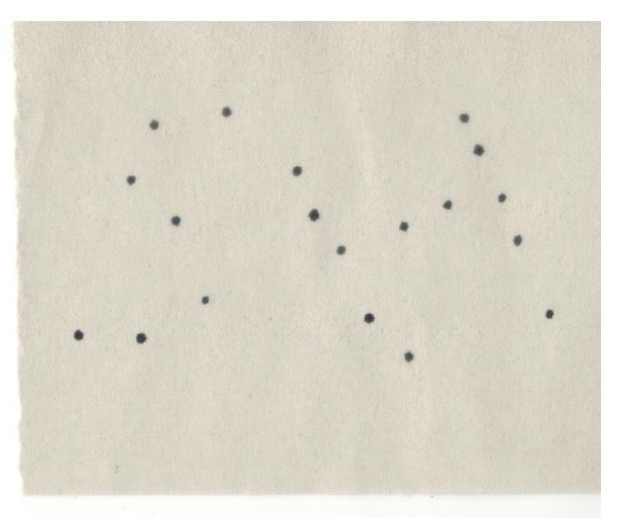
Initially, i wanted to really make a hole in the paper by punching a hole through it with the hole puncher. However, it was difficult to get them in the right points therefore i resorted to just using dots with my marker. I had a conflict whether i should use pointillism where i cluster the dots or just a simple-one-dot kind of thing. I decided on the latter because because the actual profession drills holes only at points that are needed hence its actually quite minimal. The dots are also calculated carefully before i made the mark because house drillers cannot make mistakes (wrong holes) because it will make the house ugly.
Fruit Seller (market ones)
What i view/feel:
- Bubbly, loud, large mixture & diversity of fruits
- Their constant ongoing promoting is the one that sometimes attracts me to look & buy from them
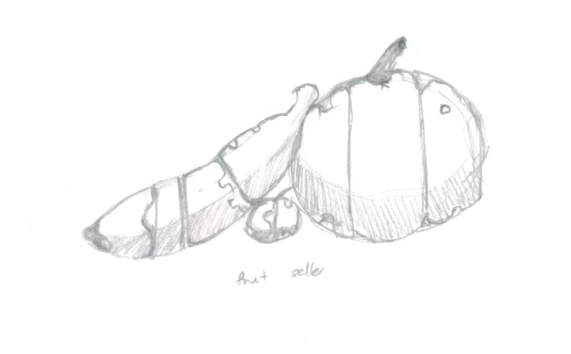
With inspiration from my artist reference, i illustrated my name in side of the fruits. The words are bubbly-looking because thats how the sellers’ personalities are or at least that is how they appear when they are trying to sell their products. Another meaning for having the words as part of the fruits to represent how without the loud and constant promoting of the sellers people might not even notice the fruits or even want to purchase them. Another thing to note is that when people choose fruits they also choose base on the how good the skin looks. Hence, the fruits sellers are in a way the skin of the fruits, they help attract customers.
^Artist reference: David J. Short (refer to research post)
Fashion Designer / Textile Designer
What i view/feel:
- diverse patterns , flowy , beautiful, slight flaws sometimes
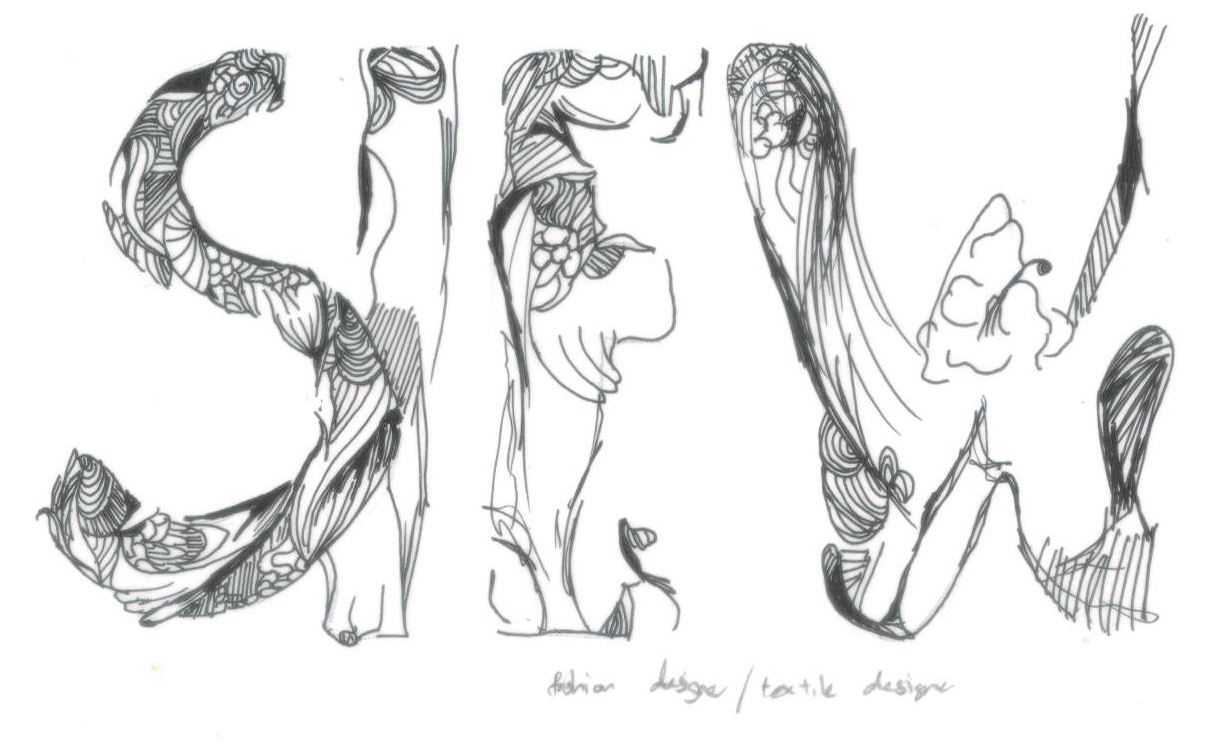
First of all, why fashion designer? There’s actually a funny reason behind it because back in Junior College one of my friends used to like nicknaming me ‘sew flower’ (siew 花 was how she perceived my name). Hence, i had the idea for this particular profession.This tryout is done with black pen. I drew many various patterns where it is constant at times but irregular at times. I also tried to incorporate the idea of flown-ness.
^ Artist reference: Teagan White (refer to research post)
Gardener
What i view/feel:
- serene , elegant, beautiful, slight flaws, nature
- bittersweet job
- impression of how gardens are gated because gardeners don’t want you destroying their hard work (see but no touching)
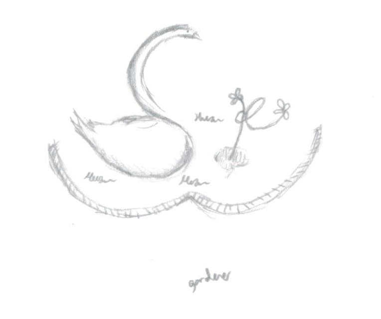
In this tryout, the swan represent ‘S’, ‘i’ and ‘e’ are the flowers, ‘w’ is the gates and ‘Hua’ is the water. Swans embody the idea of elegance as well as nature hence it is my choice of animal.
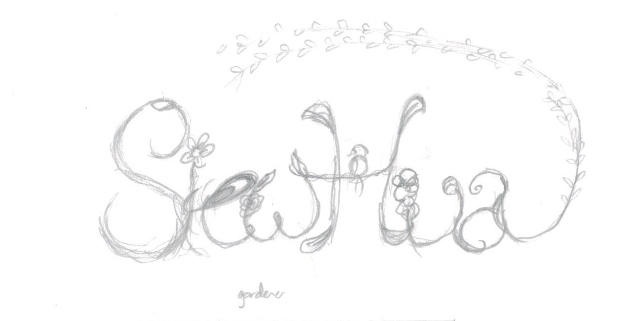
In this tryout, it is illustrating my name with vines, flowers and leafs. Also, the end of ‘a’ is extended to be look like a overarching tree. The small bird represents life, presence of animals and nature.
^Artist reference: Aleph Corporation (refer to research post)
Video Game Player
What i view/feel:
- really old (even ancient to children of a younger gen)
- games like pacman, mario, pokemon, etc
- pixelated, mathematical
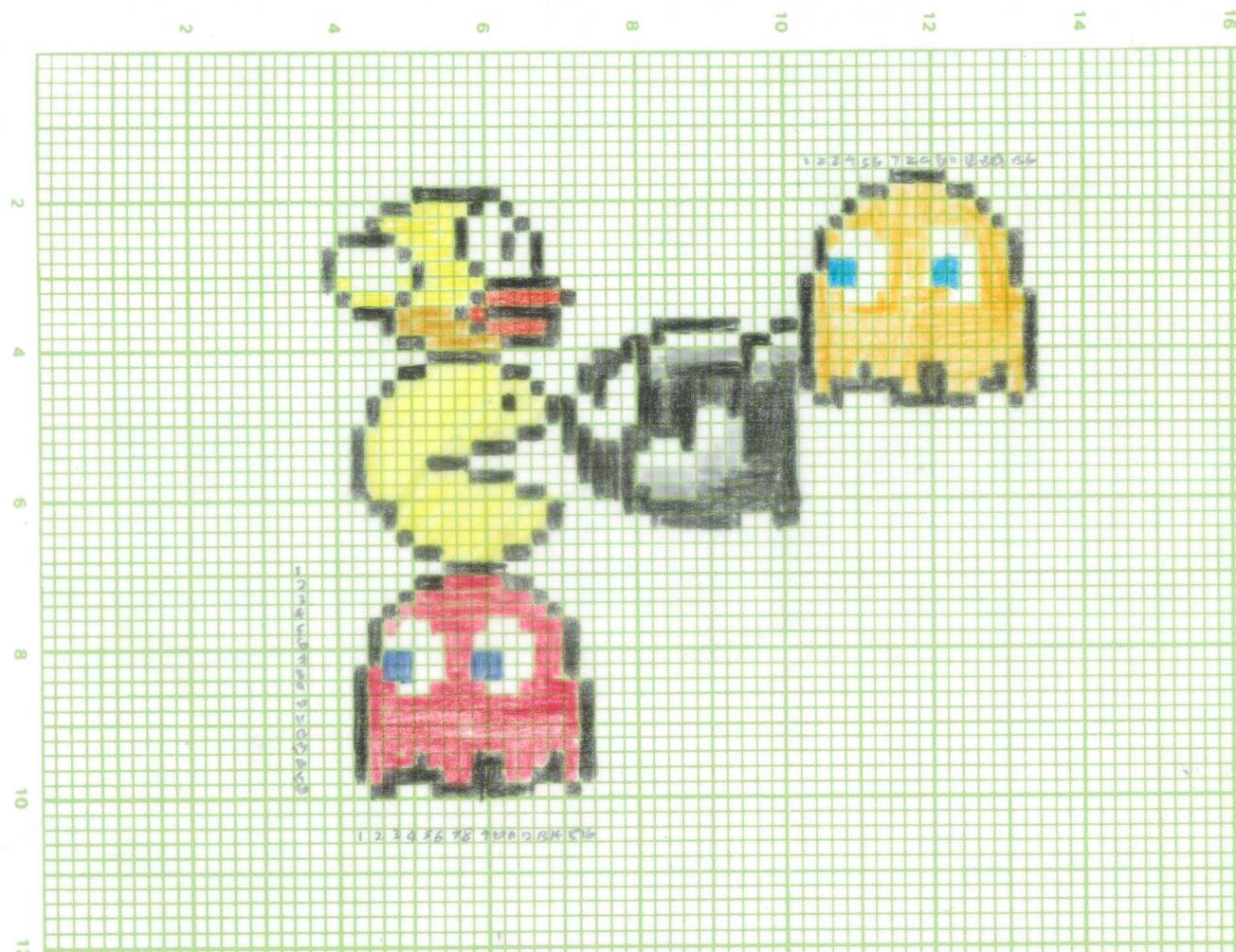
I tried this on the graph paper that we used to use for drawing graphs when we were younger hence in a way it has the idea of being mathematical. Also, as i mentioned earlier, most of this video games are forgotten or unknown because of the more advanced games that are constantly being produced hence i wanted to stick with a traditional method. As seen in the illustration above, i did not finish the letter ‘H’ because it is actually really tedious and tiring to just draw one character out.
(Joy did suggest trying it out digitally, i did but i did not like the outcome and i also felt that it did not really click with my ideas.)
Assembly Line
What i view/feel:
- systematic , order , identical, mass-production objects, complex, busy, conveyer belts, repetition, dull, boring
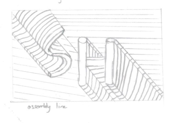
Referencing from one of my artist reference, i tried to make the fonts more 3-dimentional (3D). Also like how 3D is related to product design/ industrial design therefore this choice for the style of font. The varying directions of lines is also to represent how it is rather complex and busy in the factory.
^Artist reference: Viplov Singh & Svabhu Kohli (refer to research post)
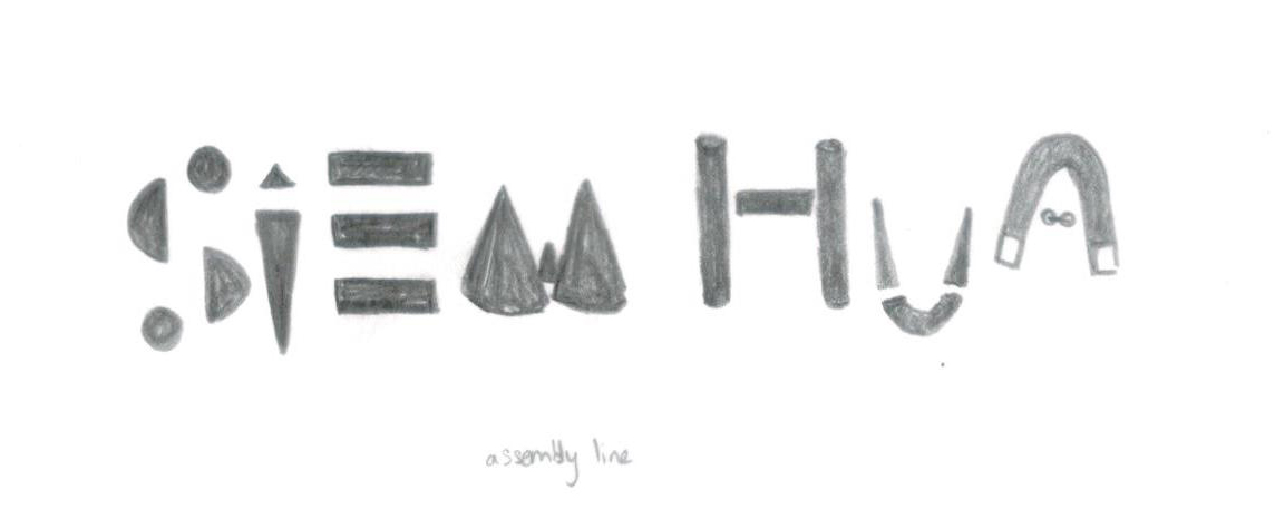
For this tryout, i wanted to make use of the basic shapes and symbols to communicate my idea of mass-production.
^Artist reference: Maribor Maricar (refer to research post)
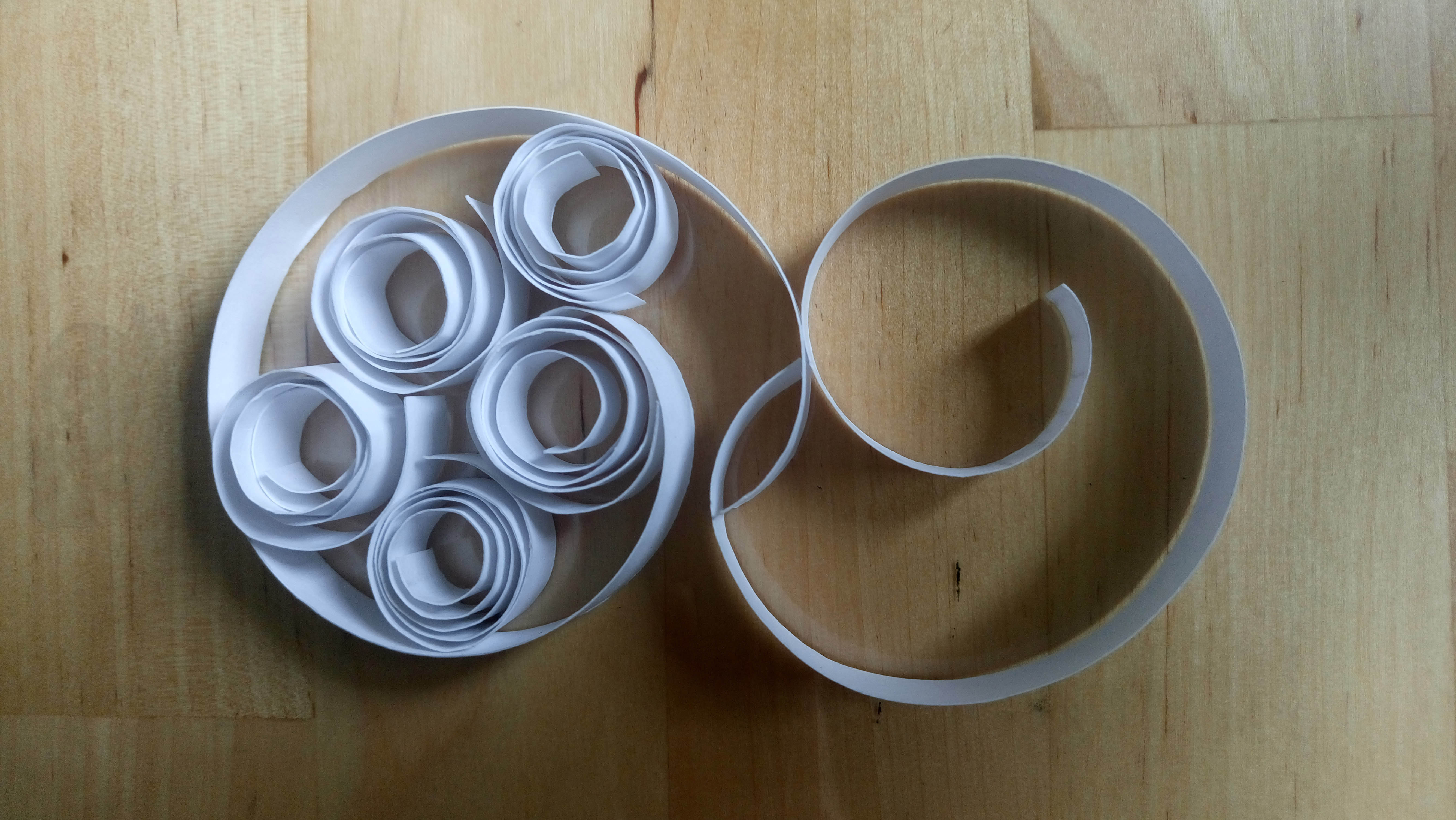
Lastly, in this, i sliced and rolled strips of paper to form the word itself. In the process of doing this i realised it is rather repetitive and in a way it reminded me of how a manufacturing factory works. Additionally, the rolled up strips also reminded me of the conveyor belts. (Joy advised to deviate from actual 3D but to focus more on developing in a 2D-2D way). While i was taking the picture to document this process i also realised how i could actually can play with the light and shadow to enhance my idea.
^Artist reference: Lavanya Naidoo (refer to research post)
After the first and second consultation with Joy one week ago, I realised that i did not have a strong overarching concept/ idea that hold all of the works together. Also, how is this professions are related to me and how could i make my works conceptually stronger with deeper meanings.