Sensing: Using the web camera and face location to determine one is at the centre point

Effecting: Tracking

Computing: MAX

Assignment: Using Max as the platform, create a photo booth that gives audio commands to the centre of the and takes a photo when in the right position.

Similarly, in assignment it makes use of what we learnt about jit.grab and cv.jit.faces for display and face detection. What’s new was audio and programming it to take a photo.

Challenges: Firstly, it took me many trials and errors to figure out the centre position and the correct audio to be triggered. After that it took me awhile to programme the countdown 3seconds when in the right position to take a picture. However, multiple audio still plays whenever triggered where it’s a possible further development.

password: photobooth

Task: User Experience of Hawker Centers & Food Courts (choose your location!) and/or because its CNY, observe the differences in behavior among people. What changes from the everyday do you observe?Document your observations using a combination of photographs and/or video, audio recordings and notes in your journal. Observe the following: how do customers find what they want, find a place to sit, save a table, choose, communicate what they want and what languages are spoken, how do vendors advertise their products to customers, how do they compete with other vendors? Why might some places be more popular than others? What else do you observe in terms of user behaviors? Carefully observe both customer and vendor behavior and document them. Notice lighting, sounds, smells and other factors and how they might affect the way people experience their environment.

with Jie Lin / Fiona / Desiree

LOCATION: Blk 216 Hawker Centre @ Bedok North St 1

TIME: 2 March 2017, 1~2.45pm (7th day of Lunar New Year – still a rest day for most stalls)


Questions

  • Document your observations using a combination of photographs and/or video, audio recordings and notes in your journal.
  • Observe the following: how do customers find what they want, find a place to sit, save a table, choose, communicate what they want and what languages are spoken, how do vendors advertise their products to customers, how do they compete with other vendors?  
  • Why might some places be more popular than others?
  • What else do you observe in terms of user behaviors?
  • Carefully observe both customer and vendor behavior and document them.  
  • Notice lighting, sounds, smells and other factors and how they might affect the way people experience their environment.


Observations


  • Location and accessibility
    • Location of the hawker centre with relation to Bedok Mall and MRT is further, but within walking distance, than the other (newer) hawker centre in the vicinity, thus its patrons are more of nearby residents and people who are familiar with the area
    • For people who are new to Bedok, there’s a huge billboard showing a map of the vicinity once you exited from the MRT station. Which is keep in sight ; within the range of visibility.


  • Layout
    • Straightforward layout of the hawker centre: old format of two long rows of stalls in the centre and seats all surrounding it thus it is easy to navigate around the place, just finding walking along the stalls to find what they want to eat
    • It is not possible for one to see all the stalls at once, unlike in most food courts where the stalls are arranged in a semi-circle format
    • Open style of the hawker centre means that the stalls and seats are also directly visible once you enter the place. Easily known to any passerby that it’s a hawker centre, a place to have meals; like an open invitation to the place, anybody is free to enter
      • People are simply find any free seats to sit at and when there are no complete full tables, it is socially acceptable to ask for permission to existing patrons to share tables
    • There’s also a section in the hawker centre dedicated to Malay halal cooked food
    • The hawker centre selling only cooked food is also next to a wet market selling a variety of ingredients and groceries which comes with great convenience for both stall owners and patrons as many residents would have their breakfast at the hawker centre right after doing their daily morning grocery shopping at the wet market – experiential package


  • Atmosphere
    • The hawker centre has an open format. This also allows ventilation of the place and is quite breezy and not too warm
    • As the hawker centre was renovated a few years ago, the entire structure and place looks rather clean and bright, and it’s rooftops are free of dust and are still white albeit it’s an old hawker centre. Thus it looks bright and inviting.
    • Cleaners are present, pushing their carts and equipments to clean up tables by tables yet they are often not cleaned fast enough and many tables around our seats were left with empty bowls and pieces of leftovers, attracting lots of crows/birds.
      • Customers are expected to return their trays after finishing their food, but in this hawker centre, it is common to see people not returning their trays.
    • Languages spoken: communication there is mostly and instinctively in Chinese as long as vendors assumed patrons are Chinese. English or Singlish/broken English are used only when they meet customers of other races
      • Stalls and signage mostly bilingual or primarily Chinese which comes with photos of the food but a lot of stalls don’t have their menu fully and comprehensively displayed. Hence this might be difficult for foreigners to know what is for sale, etc.


  • Crowd
    • Even though we were there during lunch hour, half of the stalls there were closed as most stalls are still closed for CNY – to seven days
    • But that doesn’t lessen the crowd during lunch hour
    • CNY decorations still around the place
    • The crowd rapidly subsides and most remaining stalls declined orders as they have ran out of food and drinks as it approaches 2pm and by close to 3pm, almost all stalls all close though some people still lingered around chatting in groups (including us)


  • Experience of buying food from stalls
    • We also noticed a new stall which is ran by a group of young people selling umeboshi rice
    • Customer service: duck rice stall – efficient as each person at the stall had their own jobs and quick to serve as the uncle quickly and enthusiastically took our orders and the food was prepared fast, there was even a helper who prepared the cutleries for us (which is unusual for hawker centre service)
    • When I was queuing up to get my food, I observed that the queue formed before me were mostly regular customers as they greeted the shop tenders with chinese new year greetings as they make their orders. Little conversations and exchange took place before return back their seats with their food. (Overheard the shop tender asking one of her customers which I believed to be a frequent customer, whether he is going with his usual orders for his mother.)
    • While waiting to place my order, I noticed a man coming forward to cancel his order due to the long wait, the shop tender apologized for the wait and return him his money promptly while she gently assured the rest of the customers in the line.
    • Despite it being CNY, I can still see a number of queues formed in front of some food stores. And some stores came up with little strategies to keep track of their customers’ order as well as to minimize any wrong orders by distributing queue numbers and calling out the number when it’s done. This allows customers to return to their seats to wait before they are called back to collect their orders.  (I feel that this is only applicable to people who are seated nearby, within the range of visibility)
    • It’s true that in Singapore, sometimes we joined in queues out of curiosity. The general instinct every time I arrived at a new hawker/food venue is to stroll through the place and look for the food stores with the most amount of people queuing up, then pop in and join the line!
    • I remember years ago, where ‘self-service’ was less common and hawker tables were all embedded with numberings for shop tenders to serve efficiently however, nowadays the ‘self-service’ signs were displayed in most of the stores.

Images taken by Desiree and Jie Lin.

Task: Find two maps of a building or place you have visited – one map is badly designed and the other is well designed. Be prepared to explain your examples and bring maps to next class.

Think of a time you were lost in a place and write in your journal how and why you got lost. What about the user experience didn’t work for you?

Bad Map: Jurong Point (App)

Problems: 

  • Lack of labels
  • Confusing
  • Not a realistic representation


Good map: Sentosa

What’s Good:

  • Well-labelled
  • Easy finding
  • Colour coded
  • Includes all the information required


with Desiree / Fiona / Jie Lin

(notes written together as well)

  • People move to where is comfort and convenient: eg.  In the bus, they flock to the door area which can be an obstruction. Some refuse to move further into the mrt cabin for easy alighting later
  • Gantries: eg. Gantry gate is within sight, and crowd flow will naturally direct to it
    People unfamiliar to the flow system in Boon Lay station would try to enter through the wrong gantries
  • Feedback machine at Boon Lay not visibly obvious at first glance
    Good point for why we need to carefully consider how people will move within a space. The feedback machine is placed in a low traffic/low visibility area (which is it ah) — hence, we cannot expect that many commuters will see and therefore use it.

  • There is an escalator which leads up to the platform, with a notice to encourage people to keep to the left side of the escalator – but not very obvious. (which had many precautionary signs)
  • Also a social expectation to keep left (there is a sign for that but it is expected that the right lane is the express lane)
  • Priority seating: colour coded on the East West Line. Located at seats nearest to the entrance – instinctive that they’re for people who need convenient accessibilities and there are signs and colour code to signify such. When people need seats but priority seats are taken, others are expected to give up their seats
  • Queueing: Expected to not cut in front of others at tap out gantries and also waiting for the train
  • Not make too much noise: generally chattering is acceptable but anything louder will be seen as a nuisance to those who wish to rest on the train. (not socially acceptable)
  • Does flagging for the bus count as a social expectation? Cause theres no rule for that, it’s just a thing. LOL. and got bus drivers who scold when you don’t flag the bus. Or they just drive off without you true i had that experience if u dont flag then sometimes they dont stop


  • ADM: Bus stop sign is available outside of ADM but the bus information board not present (with the prices and stops, etc.)
  • Bus: There is a sign that says to give up your seats to the people who need it more / Ads are placed in the bus (top panel) — in the bus that we were in, it was about vigilance
  • Transit: Very conspicuous signs stating the station name, and how to enter the station / Advertisement billboard along the way / Signs discouraging certain behaviours such as bringing durians into the station etc. / As it was drizzling, there was a yellow sign warning of slippery floor. / There is an escalator which leads up to the platform, with a notice to encourage people to keep to the left side of the escalator – but not very obvious. (which had many precautionary signs) / Warning signs from police (crime alert)
  • Pioneer: many signs about rules & regulations / many ads along the way
  • MRT: signage – route of MRT as indicated by lighting on the map, emergency button
  • Boon Lay: Even towards the exit, the walls were filled up with posters with graphics communicating taking safety precautions and showing acts of courtesy while commuting. / On our way out of the gantry towards exit C to Jurong Point, we saw a sign that that indicates “Ramp At Entrance E”  which got us confused as the direction of the arrow was pointed towards the escalator and it does not indicate the exact location of the ramp clearly. It took awhile for me to realized that the ramp is actually at the other side, and is only accessible if we exited the following gantry.

  • FEATURES OF THE BUS: Two different kinds of seats (two different colours) — the yellow ones and the red ones. Not very obvious unless you know, but the yellow seats are “priority seats” which are easier to access especially for the elderly (all the seats in the front) and the red ones are not. But it’s not clear that this is so.
  • FEATURES OF THE BUS: The seats at the back tend to be different to access due to an awkwardly placed bar (which, I believe, was to aid those who are going to sit at the back).
  • Transit: Proximity of control station in case of need for assistance / But inconspicuous top-up stations and toilet hidden behind the information board (?) / Sheltered walkway

  • Peak hours @ Jurong East , changing of trains (can alight from two sides) -> if unfamiliar to that stn (traffic flow)
  • Windows behind the seats cave in -> uncomfortable , not conducive for resting
  • Poles towards back of the bus – obstructive
  • Design does not guide people to instinctively go further in to not obstruct.
  • Redundant / ambiguous signages (Boon Lay station)
  • Reserved signs – culture inculcated ? middle seats ppl have no/lesser  obligations?
  • “Putting bag down”
  • Mrt gantries
  • “Standing on left” sign not obvious enough
  • MRT arrival time display – not enough, hard to see

  • We plan to redesign the layout/arrangement of the seats in the interior to allow smoother flow of traffic
  • Taking reference to several European/western metro designs
  • allocating priority seats nearest to and facing the entrance and then the normal seats inside
  • Demarcating a space at the entrance for standing while commuters who are gonna travel longer dist can move inside to the seating section, allowing smoother flow of ppl as ppl who travel short dist wld only need to stand – and those who need to sit can take the priority seats and get ina nd out of the train faster
  • Priority seats demarcated in the inside section to ensure people inside would also potentially let up space for those in need in case the exterior seats are taken while still providing sufficient standing space

  • For us, we have the bars in the middle which could be obstructive and not as practical during peak hours. It is observed that people tend to fill the space in btwn and stand in two rows, and faces towards the chairs/windows, seldom relying on the bars in the middle but the handles (which are not even present in the few train models like NEL’s while CL models only have ONE bar in the middle of the carriage)
  • Following the design of the interior of Tokyo metro train designs, the bars are situated at the seats, which also function as partitions for the seats (similar function as the grooves of our train seats), it may be more practical as we can grip onto the bars before us, and also the handles on top – less taxing for some ppl who cant hold up.
  • Possibly also help to spread ppl inwards to the carriage as there are more supporting bars available there – rather than relying on the bar nearest to the exit – a huge cause to why the entrance area is so congested as some ppl refuse to move in just so they could hang onto the support there
  • Also increase spaciousness without the bars in the middle, ease of moving from one carriage to another, and possibly accommodate more people in the middle standing area

  • Most Tokyo metro trains have a rack above the seats for putting bags and they are usually used by standing during peak hours (as pictured) – also effective use of space
  • We have the “bag down benny” campaign to encourage people to put down their bags during the journey but little did campaigners know that this method isn’t actually v practical especially during peak hours as ppl who put down their bags are usually limited in their movement with their bags at their feet. During peak hr which traffic is fluid and u need to move fast, they often cannot react fast enough to the change in environment then obstruct and delay the flow of ppl. And there is no need to put down ur bag to save space during non peak hr so it defeats the whole purpose. A few ppl even take putting their bags down to the next level by leaving their bags all over the floor like its their home and take up lots of space albeit during non peak hr.
  • (Fiona) for ppl sitting down and carrying lots of bags, they often have no space to put them. Cumbersome and awkward, and ight take the space in front of them. Compartments below the seats.
  • Racks on top (for the standing) + compartments below (for the sitting)
  • BUT acknowledged that there might be terrorism/bomb scare though (?) which is why the space below seats are no longer opened in later designs

Task: Start to work on final project proposals – prepare three ideas for a screen-based experience that you’d like to create (it can be speculative). Illustrate your ideas and post them on OSS. The ideas can be based on any of the field trips done so far or can be something completely new.

“Rethinking our everyday environment / Empty spaces / Overlooked / Narratives”

Possible locations:

MRT transiting zones (empty but busy places where many passes by without a second look)

Void Decks / Corridors (empty places but where many hangout)


Idea I : Stories / Culture

  • Objective : A platform where people can share and/or listen to the hidden stories of others and themselves.

Inspiration:

Hidden Stories by Red Paper Heart

Scapes by Halsey Burgund

Living Library by  design I/O (immersive experience for storybooks)

The idea here is to allow people to share their own experiences and/or listen to what others have to say about certain common things found in that place or maybe different topics as indicated by the illustrations. I feel that there is always special attraction in the narratives and one can never gets sick of listening to them. They are also constantly evolving based on what we experience/see/hear/etc and thats where I think many of us miss out on what others may have experienced. I was also thinking that the playback of recordings are random so the chances of people listening to same story is lower. Possibly, background music that aids in conveying the mood? In Singapore, we’re so often thought as the culture-less country and we don’t know how to express ourselves but I think that is not true, we have but it just gets covered, buried, hidden and lost along the way as we progress so quickly. It is so often that many individuals have the misconceptions that they are the only one experiencing this “weird” thing/action/etc. but who knows someone might have similar experiences as you!


Possible executions :

Touch screen

Sound recorder and player


Idea II : Slowing Down / Emotions / Traces

  • Objective : To provide a more immersive and informative way of telling people about what is currently happening in Singapore – festivals/traditions/etc.

Inspiration:

Interactive Animations Retail Design by Dalziel & Pow

Remember by Red Paper Heart

The idea for this is because many people are so busy that they often are unaware or do not know what is happening is Singapore (eg. festivals, events, etc) so I thought what not create something that will slow down the pace of life for a moment through a immersive informative experience?

Instead of the wordy explanations or advert types of experience which causes many to skip/overlook it, why not through animations and something ‘alive’?

Possible executions :

Tracking – Eyes / Faces / Body

Body Motion

Concentration intensity which affects how lively the festival or event is

Touch screen that adds more life


  • Objective : To give people some inspirations for everyday.

Inspiration:

The Good Deed Machine by Red Paper Heart

The idea for this is because Singaporeans are often thought to be cold/dull/minds-own-biz but in actual fact most of us aren’t! Hence, this interface allows for one to receive simple do-able inspirations upon touch. Additionally, I thought also maybe quotes too? To help one who is feeling whichever emotion to feel better & be more inspired.

Possible executions :

Touch screen

Choices to do sth for someone or for yourself

Detector that can gauge one’s current emotion and advise according


  • Objective : Integrating art into everyday life with people’s traces.

Inspiration:

Studio Play by  design I/O

Flowers And People, Cannot Be Controlled But Live Together by TeamLab

This idea is simply just collecting the lingering traces of whoever passes by/ stays at that place for long and displaying it with paint strokes/splatters or other possible art. Paint strokes could vary with speed/weight/etc.

Possible executions :

Tracking


Idea III :  Environment / Inclusiveness 

  • Objective : Bringing people closer to their environment in a fun and playful way.

Inspiration:

Connected Worlds & Night Bright by design I/O – the environment that grows/changes

Story Of The Time When Gods Were Everywhere by TeamLab – possible interactions?

Google Androidify by  Red Paper Heart – possible interactions?

Puppet Parade by design I/O

The idea for this came about because their is a lot of potential in the relationship we have with our environments. One thought I had that why Singaporeans are always rushing from one place to another and overlooking the places they are at, could it be that because of the empty and dull/boring looking walls and that they do not have much attachments to it? Was it because there is nothing there for them that attracts them to slow down or feel the urge to “take care” of it.

Hence, I thought why not recreate this spaces with something that attracts them plus helps in developing a sense of belonging/attachment for it? What if there was an environment (real/dream?) that changes together with time (day..night) and grows or dies with the actions of people.

Possible executions :

Touch screen

Timezone detector?

Memory that remembers previous users actions and adding on present that carry on into the future


Featured Image from here.

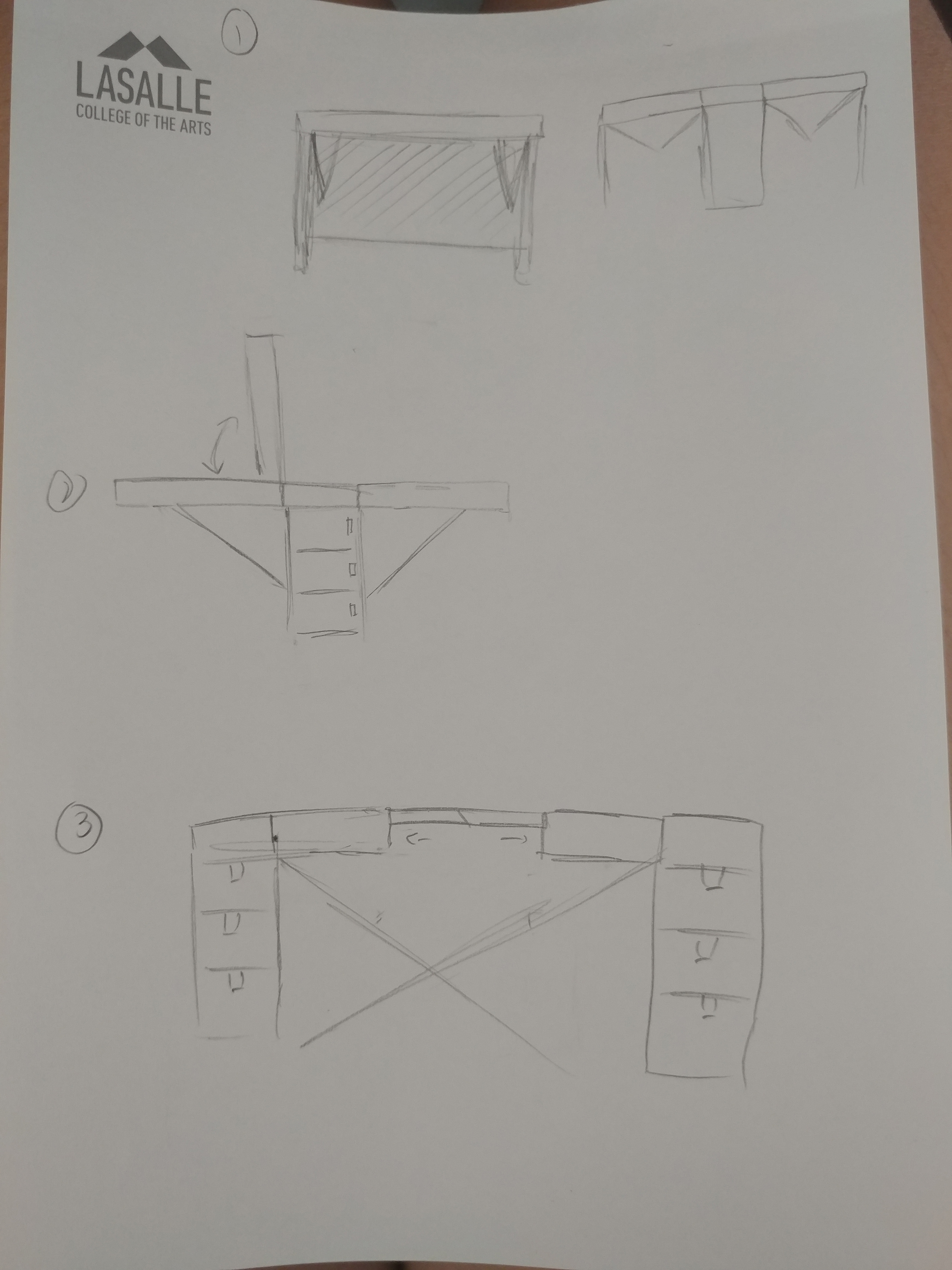
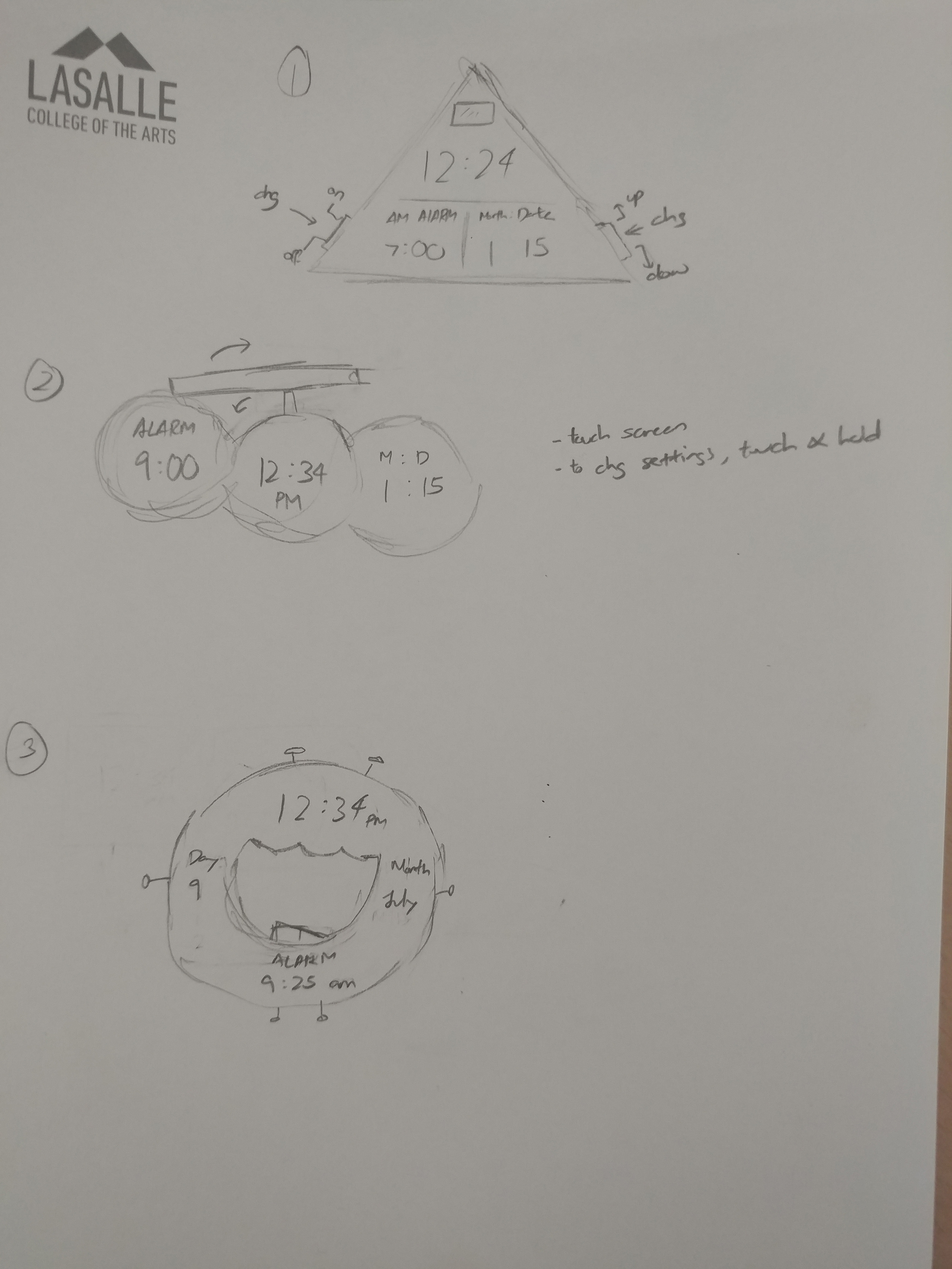
Task: Over a two-day period, do the following: DAY 1 – create a diary of when, why and what you use your mobile device for. Observe how others are using their mobile devices. What are the most common uses and where do you see these behaviors? DAY 2 – Do not use your phone, computer or electronic device for 24 hours. Create a diary documenting and describing the difference in your behavior patterns. How did you do the things you would normally do with your phone? What other alternative behaviors did you develop? What else did you notice about the difference in behavior?


DAY I (Friday || 3 March)
  • Phone

Messaging 

When:  ~5mins/irregular intervals

Where: Home

Why: to keep in touch with others (groupmates / friends)

This is probably the main reason why i use my phone for since there were many group projects to be done hence the need to be updated/clarify things/check what we’ve discussed on before asap to get work done. I also use it for texting friends for conversing purposes and to keep in contact since we can’t meet up physically. Its probably because on this day I was busy with doing assignments hence I did not check my phone on a more often basis. I only looked/used it just after I woke up and then in between breaks.


Games

Design Home  

When: 15min per morning(when just wake up) || late afternoon(4 PM) || night (before sleeping)

Where: Home

Why: this game releases new design challenges at these intervals so – to keep up with progress anf it doesn’t take too long to play it.

This game requires internet connection and usually if I was at home, I would open it at those timings as mentioned above since there is wifi. However, most of the time I would only play this around evening-ish timing since there was school/work in the day and all.

Pokemon Go

When: once in awhile ( >2 minutes) mostly if my brother announces excitedly there is some new creature if not I don’t really play it at all.

Where: Home / Outside

Why: adding the new creatures into my collection (for fun – bro/sis thing)


Social Media – Instagram 

When:  ~2 minute

Where: Home

Why: taking a break or at lost of what to do / see what others are up to

Used to browse through social media including other platforms than the one mentioned above on a often basis in the past but surprisingly in the recent months I don’t use it as much due to little free time/ losing interest. On this day, I didn’t open up any other social media platforms other than Instagram but I didn’t use it for long anyways because i just watch afew friend’s insta-story then turned it off to continue with my work.


  • Computer/Laptop

Work 

When: from morning till night

Where: Home

Why: to meet submissions deadline !! D:

This was probably the biggest component where I spent the most amount of time on. In the morning till about noon, I spent most of my time researching the possible ways to do up an interface for my “Narratives for Interaction” module and doing up my own mock-up based on that. In the afternoon till night, I spent it to do the other parts of assignments given in this module – the two readings and project response.


Music

When: while doing research/work

Where: Home

Why: just can’t live without music , its addictive (?) but honestly it is to relieve stress while doing work/ help concentrate for long hours.


Youtube

When:  ~15mins

Where: Home

Why: take a break & see what new songs / videos there are

I only used this platform around the period where I just finished doing the mock-up interface and before starting on the other user experience assignments to check out  new music videos as a break.


DAY II  (Saturday || 4 March)
  • Morning

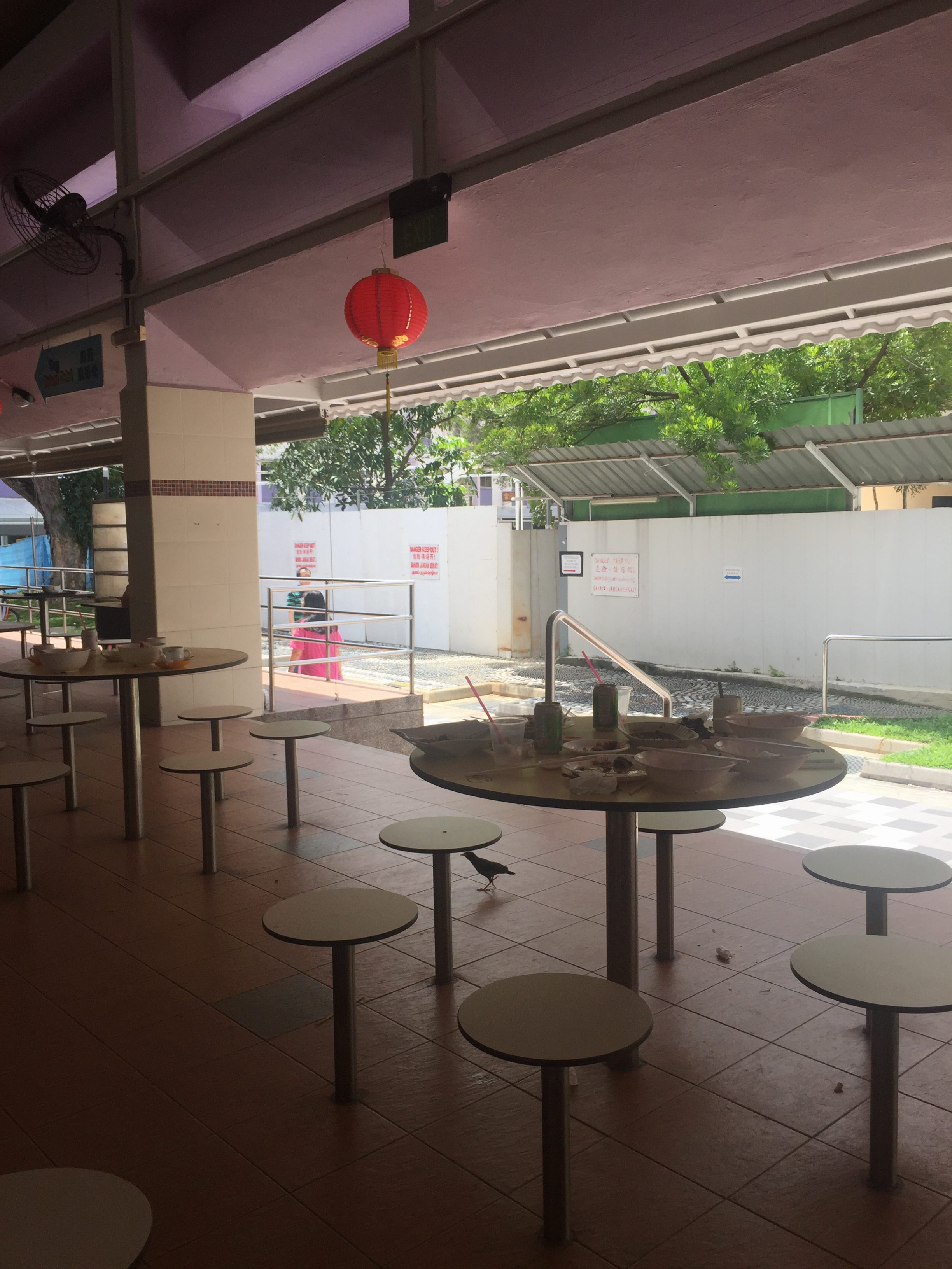
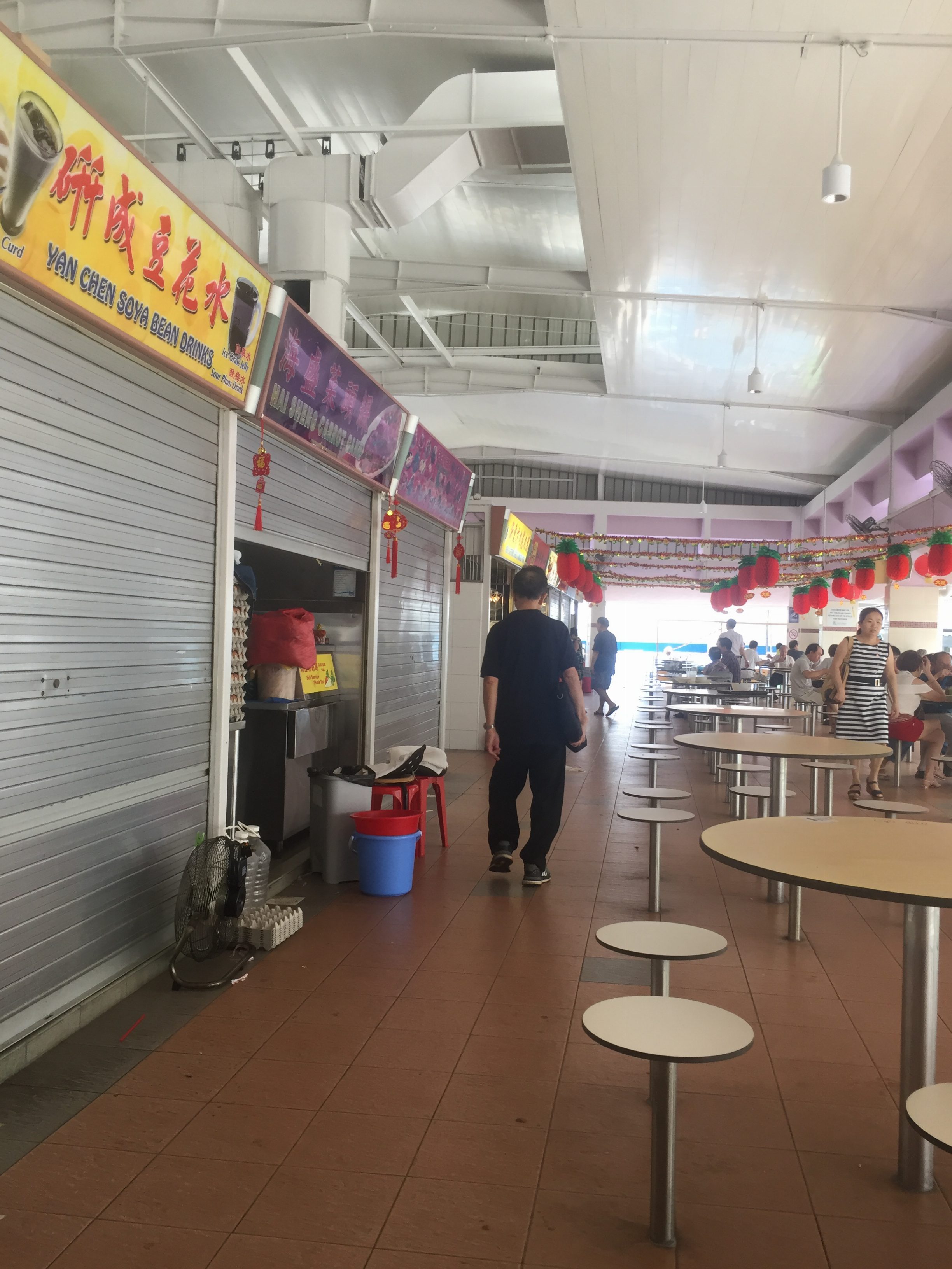
I woke up slightly later than usual today because I was feeling kinds tired out from yesterday. I decided to sleep a little more since today was a no-tech day which also means I have lesser things to be done and I could relax more? After getting up at around 8:15AM, I found that it was surprisingly that I did not really feel the urge to check my phone but instead I just went straight to doing the morning routines and then head out for breakfast with my family at our usual eatery in Jurong West. I didn’t really feel the urge to use my phone at that time too anyway since usually there wasn’t the need to. I helped my mother with carrying the food to our table and from there we just ate and talked. After breakfast, my mother went on to do her routine shopping for groceries at FairPrice around 10AM. Most of the time I do not follow if I had work to be done and just head home with the rest of my family to get a head start on my assignments. However, since I also couldn’t get any work done without my laptop, I decided to just go along with her like I how I usually do if I had no other pressing obligations/holidays. Since I usually helped with pushing the trolley and carrying the bags of groceries up home, I had no need for the phone otherwise. The only situation that arises was where my mum usually asks me to call my father/brother to come pick us up with the car. But it wasn’t really a problem but a slight inconvenience since my mother just used her’s to call.

  • Afternoon

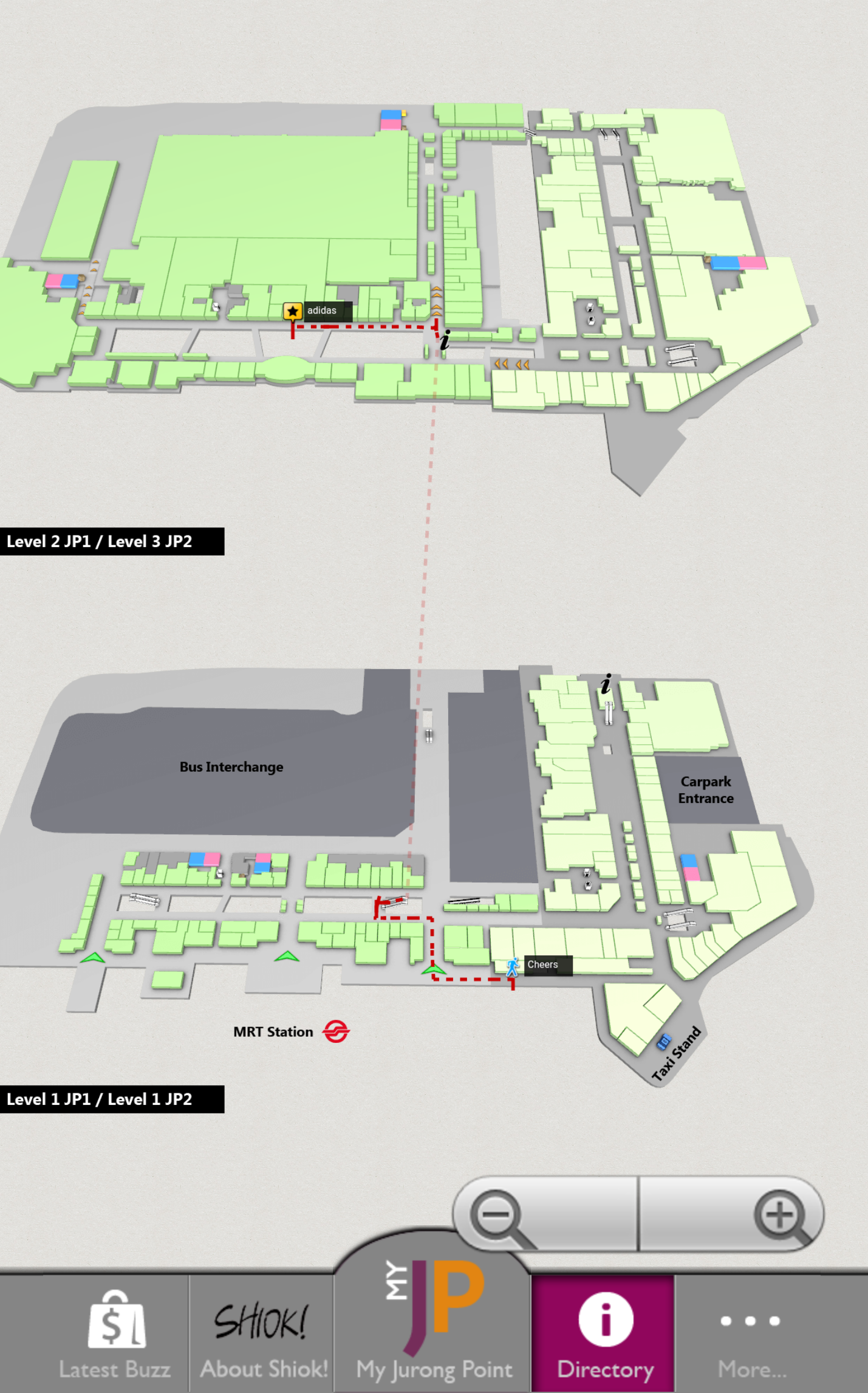
We reached home close to 1PM and I helped my mum with unpacking and putting the groceries away to their respective places. Around 1:30PM, my family and I went down to a eatery just below our house for lunch. During lunch while waiting for the food, I did feel a slight urge to check my phone for any notifications but after awhile my brothers started talking about something and we then diverted to our childhood memories and that was when I forgotten about the urge as the conversation went on and on. After lunch, my brothers and I still continued talking about our childhood and we reminisced about those good/bad/funny times till around 2:30PM-ish. My older brother then offered to play the card game we occasional play with each other since he was bored. My younger brother and I agreed and we played for around 30minutes before they got bored and decided to watch a movie. They started watching “X-men Apocalypse” on our television and I was so tempted to join them as well but… oh well I can’t D: I then suddenly felt a surge of anxiety of whether could I finish my assignments on time and I almost couldn’t resist the urge to just open my laptop. I then decided to just go out and travelled to the Jurong East to just walk around and check out whatever they have there. There was no need to rely on any electronic since I know the way there well. Most of the time I would use my phone to listen to music while travelling but since it wasn’t really a long journey, I could do without it. From then, time past quite quickly since I was just walking around and looking at various things. I usually don’t really use my phone if outside for a purpose, especially more so if I’m shopping so this time was no different. I did manage to get some shopping done anyways ( yay 😀 ) and I went back home at around 5/6PM-ish. After that I just decided to tidy up and organised my table and cabinets/display shelfs since they were so messy. Again since I was buy doing something, there wasn’t the need to use any electronic other than the urge to listen to music but since my younger brother was blasting out his music on his mini speaker, all is well.

  • Night

After setting dinner, eating and clearing. I bathed , asked my brothers to play a few rounds of a different card game than earlier before continuing with cleaning my desk and all then proceeded to tidy up my messy wardrobe as well (might as well since I was it). I then decided to just go to bed at around 11PM.


Thoughts

I think what was different was that suddenly it felt like there was a lot more “free time” and you could do a lot of other things aside from assignments. It definitely did feel less stressful, more relaxed and a more slower pace of life compared to when having electronics. For me, I felt so because most of my assignments can only be done through my laptop so without it, nothing could be done anyway so in a way thats why there was more “leisure time”. I also felt that because I couldn’t use any electronic device, I turned to the people in my closest vicinity more to pass time. However, this also means I’m distanced from those that aren’t. For example, I could be relaxed and not check my notifications because my groupmates knew about this(tech-ban day) hence, I know I won’t really be missing out on anything anyway. But what if it wasn’t a planned activity and long-term? I think things would be quite different.

Honestly, when this assignment was given my initial thought was how am I going to survive without it. After that, I decided to do it on the day where I’ve finished most of my other assignments (many of which being groupwork) and when I did not have to travel out to meet other people much to minimise the “damages”.  Hence, I really pushed this assignment to the last few to clear and dragged on doing till I really couldn’t do anymore. Reflecting on the what I had to do in the past few days, I think I would had hit extremely, a lot, of obstacles without my laptop but mostly my phone. If I had done this during the weekdays where I was constantly out, meeting others, travelling to several places that I’m unfamiliar with I would have really needed to depend heavily on my phone. Hence, I think the result would relatively be a more drastic change in outcome and more towards a unrelaxed, more stressful and anxiety-filled experience compared to the experience written above.


Featured Image from here.

 Part 2: Choose two objects that you use every day (you cannot pick mobile phones or laptop/computer) and analyze their design using the principles described in Chapter 1 of The Design of Everyday Things. Imagine describing what the object is and what it’s designed to do to someone who has never seen it before. Is it intuitive or frustrating? Come up with three ways to alternate the design for that object and see how it changes its function. Make drawings and notes in your journal.

“Design is the craft of visualising concrete solutions that serve human needs and goals within certain constraints” a important concept that is unpacked in this reading by Kim Goodwin. Visualising concrete solutions is where designers must excel at looking something blank and filling it with believable representations of an end product, so that others can see, understand and eventually build it. Craft is neither sci nor art but somewhere in between. Serve human needs and goals is where good design helps humans accomplish something in an efficient, effective, safe, and enjoyable ways. at same time, designers strive to go beyond the simply functional, since pleasure & aesthetic satisfactoion are also impt human goals. Within certain constraints just suggest that is no such thing as unconstrained design.

She also mentioned about “goal-directed design” for the approach towards product and service design where it places focus on achieveing goals. In it, are four components: principles, patterns, process & practices. Principles being guidelines for creating good solutions under specific circumstances but what is appropriate to one context may not apply to another. Patterns are types of solutions that tend to be useful for certain classes of problems. Process are the steps and techniques involved in planning and conducting design research, using it to develop personas, scenarios, and requirements, then using those to develop and iterate a design solution.


An overview of the Goal-Directed process


I personally really appreciate this framework where I think I find myself following for certain projects. Under modelling, she mentioned the importance of “personas”, user archetypes that help you make design decisions and communicate your rationale. Often times we lose sight of who we are the target audiences due to more ambitious idea where we want to include all and everyone (which is actually impossible as everyone is different and you just can’t please all). Hence I think it is really important to stick to those “personas” and focus on them only to truly be designing for those user archetypes.

There were also three kinds of framework mentioned under requirements definition – interaction framework (outlines how functionality is grouped and how the personas will accomplish the most critical tasks), visual framework (expresses th brand’s qualities in concrete terms, typically using design language studies divorced from the interaction design) and industrial design framework (consists of an approx. form factor and componeat architecture, physical expression of the brand developed in conjunction with the visial desian language, and a description of any hardware controls tht are essential to the interaction).

However no matter designing for anything, I think the overview (image above) can be a useful guide and backbone even if this is for goal-directed process, it could also apply for human-centered design? I feel like they may be two quite different things but somehow I feel there is still a connection and interrelatedness. (Just a thought after reading this.)

Question 1: Goal-directed design or human-centered design? Can it be a combination?

Question 2:  Are there situations where goal-directed design can be actually be a not so good way to go for product and service design? What can applied then if so?

Featured Image from here.

In the first chapter of Jonas Löwgren and Erik Stolterman’s book, they started with, “we live in an artificial world. It is a world made up of environments, systems, processes, and things that are imagined, formed, and produced by humans.” I think this accurately portrays the current state our world is in, where almost many things are depending on technology be it living or non-living.

Thoughtful interaction design rests a huge responsibility on the designer’s choices. The relationship of the designer, client and user was mentioned and I found this particularly interesting because there are common cases where the designer puts aside many of their considerations to suit their clients and think nothing much about what happens later. “Design involves chance; it forces you to challenge the unknown and to create the not-yet-existing.” I think this is a important thing to keep in mind as a designer myself. What is currently being produced into the world or popular in the world might not the most ideal or suitable. What a designer could do is to take bits of information and piece it together to shape new opportunities as well as restrictions, it could be so powerful that it would change the world drastically or it could just simply change some minor aspects in life. As a designer, I think keeping at their fingertips the knowledge of human-based design is key and some questions to consider is how will this design change people’s lives? For the better or worse? What is it my design aims to achieve?

The authors also mentioned an interesting point about how a design process is not a process if the outcome can be predicted. How I interpreted this was that if the outcome could be predicted then perhaps the designer did not think much about or it was a half-hearted attempt to? From my own experiences, there were often times I had ideas that I thought would be “perfect” to execute that would achieve the ideal outcome I thought it would after much pondering, brainstorming and researching. However, often times, when I was so sure that often halfway through when you’re executing, you realise actually it isn’t as “perfect” as you thought it would turn out and everything changes once again. I guess to me that was what they meant by the outcome can’t be predicted because often times what we think may not what actually happen when it is put out into the world.


Task: Responding to the reading, find 2 examples of a product/project that you think are good examples of thoughtfully designed user experience. Be prepared to support your choices.

Tupperware's Eco Bottle

Why I considered this to be an good example of thoughtful designed user experience was because one problem that I had always faced with water bottles was firstly, the issue of water leakage and secondly, the portability of it. Many bottles that I had with me in the past always had the issue of water leaking from the cap even though they were always sold to be “watertight” and honestly the main purpose of a bottle is to hold the water and so preventing the water from escaping should be key right? Aside from that being it’s main purpose, the next important thing would be how one can bring the bottle around with them easily. There were some bottles that I had previously owned that was easy to carry on but there were also several that weren’t due to either weird positions that users are suppose to hold or painful to grip it for long periods. Because of this, often times I found that I had to change bottles from brand to brand but never really found one that could stick around for long.

However, after changing to this particular bottle as shown in the image above, my life totally changed. For the better.

Initially, I had my doubts about it being “watertight” but after testing it out many times in different situations, it actually doesn’t leak, at all! 😀 So, I was really lifted from the anxiety and frustration of always checking if the water had leaked and what has been damaged because of that. There was indeed a sense of security due it being very trustworthy that translated to me being more motivated to bring my water bottle around and one less burden for me. So for once, I felt that this bottle could finally serve its main purpose well. Aside from that, it is also easy and instinctive to grip it. The pretty colours and varying sizes were also plus points. Thinking back, what influenced me to get this was that I often see this particular design being used by many so I decided to try it out and turns out the experience was the answer to why it is so popularly used currently.

 Apple's MacBook Pro

Why I considered this to be an good example of thoughtful designed user experience was because previously I’ve always only been experiencing non-apple products. It was common for me to hear many praises for their products and it was rare to hear about unhappiness that arose from it which always caused me have this question in my head: are apple products really that good ? I had the chance to verify that myself when I entered university and my parents decided to painstakingly spend the money (because they heard that it was a better choice to have for design students) to buy me the macbook pro that I’m currently typing on for this very assignment.

Though at first there were some confusion and frustration since I was totally new to Apple’s interface and a long time user of windows. There were many times I had to spend some time figuring out how to use it and it was so bad to the extent I decided to just youtube tutorial of how to use a macbook. This may sound like a joke but there were no regrets from then on.

Firstly, what really impressed me the most was the speed of everything. It is really really efficient and easy to use (after getting the know-hows) but honestly, everything could be done very quickly – fast booting up and down , easy drag and drop of images/videos, etc – it is a long list. It saves plenty of time where the user can just jump straight into their work right away.

Another factor was the ability to “multitask” easily. While many can say any other laptop could do that but what I mean was the fact that you can open several windows and minimise them into different corners of the screen and you can still scroll it each of it just by hovering over the particular window. I was pleasantly surprised when I discovered this because it further adds to the efficiency and convenience of doing my work.

Featured Image from here.

Tupperware’s Eco Bottle Image from here.

 Apple’s MacBook Pro Image from here.

Task: Write a response to one of the projects shown in class on “Interactive Environments & Experience Design.” You can review these projects on OSS and select one to discuss.


Project: Scapes by Halsey Burgund

DESCRIPTION

Scapes is a sound art installation that allows participants to walk around the deCordova Museum’s sculpture park listening to a mixture of a musical composition and voice commentary from previous participants all filtered and influenced by physical location.

Participants make their own contributions to the piece using a smartphone app which allows them to tag any location in the park with their own recordings. These recordings are immediately available for everyone to hear as part of the evolving composition. As participants walk around the sculpture park, the individual path they follow creates their own personal version of the Scapes audio experience. The music is directly influenced by the landscape and is composed using custom algorithms which constantly generate new music; there are no repeated loops.

RESPONSE

Personally, I really like the concept of this work as it immerses viewers with the mixture of music and voices of other viewers, both from the past and present as well as the future. Music and sound itself is something I feel that can hit people’s heart when done right. In this case, the viewers are listening to it while walking around the park. I feel that this enhances the chances of them remembering this very work and their own experiences in it. Also, another aspect that I really loved was the choice of allowing the viewers to part not just by viewing but adding their own flavours into the artwork itself. I feel that it is a great way to help people see not just through their eyes but on a rather more emotional level their surroundings. They can also hear about the experiences of other people together with their own plus the music of the sculpture park. Even though there is no set narrative structure, all this little fragments pieces still pieces together into a narrative, be it liner or non-linear. Hence, I think this would be a great experience and would allow for memories that one would unconsciously keep because it reaches the viewers on a more personal level.


Featured image from here.