Initial Ideas For This Project
  1. Compilation (nursery rhymes + pov project) based on common subject matters from my past works : animals.  

-rhymes (b&w works) transitioned to pov (colourful works)

2. Compilation with improvisations (nursery rhymes)

– adding in particular into the b&w works to evoke/represented a certain mood/feeling/atmosphere

3. New works (typographic portrait problem project)

-using the line work style of illustrations to create a zine on typography

4. Compilation with improvisations (pov project)

– using the content to make a zine focused on the interactivity of it

-inspired from feedback from previous critique

5. New works (pov project)

– using the same style (basic shapes/vectors) and context (singapore) to make a match-word-to-pictures-kind-of-book.

– focused on interactivity


*note:  ideas i choose to explore more on / develop.


Process

Before I started on the illustrations, I researched extensively on all the singlish words used commonly used here in Singapore, followed by narrowing it down the ones that I thought would be more appropriate for my project. (some examples: https://drive.google.com/open?id=0B9SxP4EKVfKBV0hZb1BBYnJXc3c)

After that I first tried out making a few illustrations for idea 5( refer to above on initial ideas). 

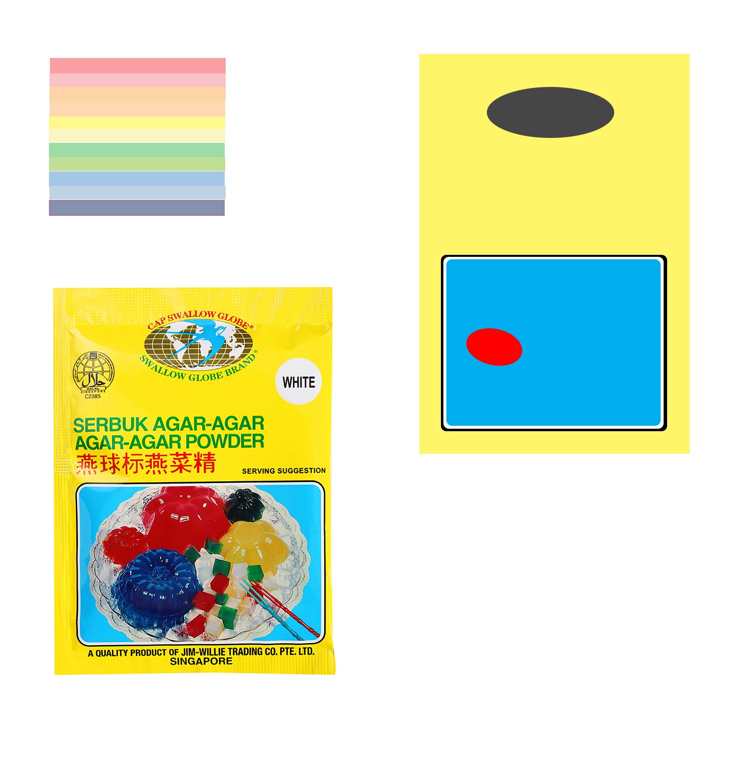
jelly

Tryout of a illustration for word (agar-agar: jelly / rough estimation).

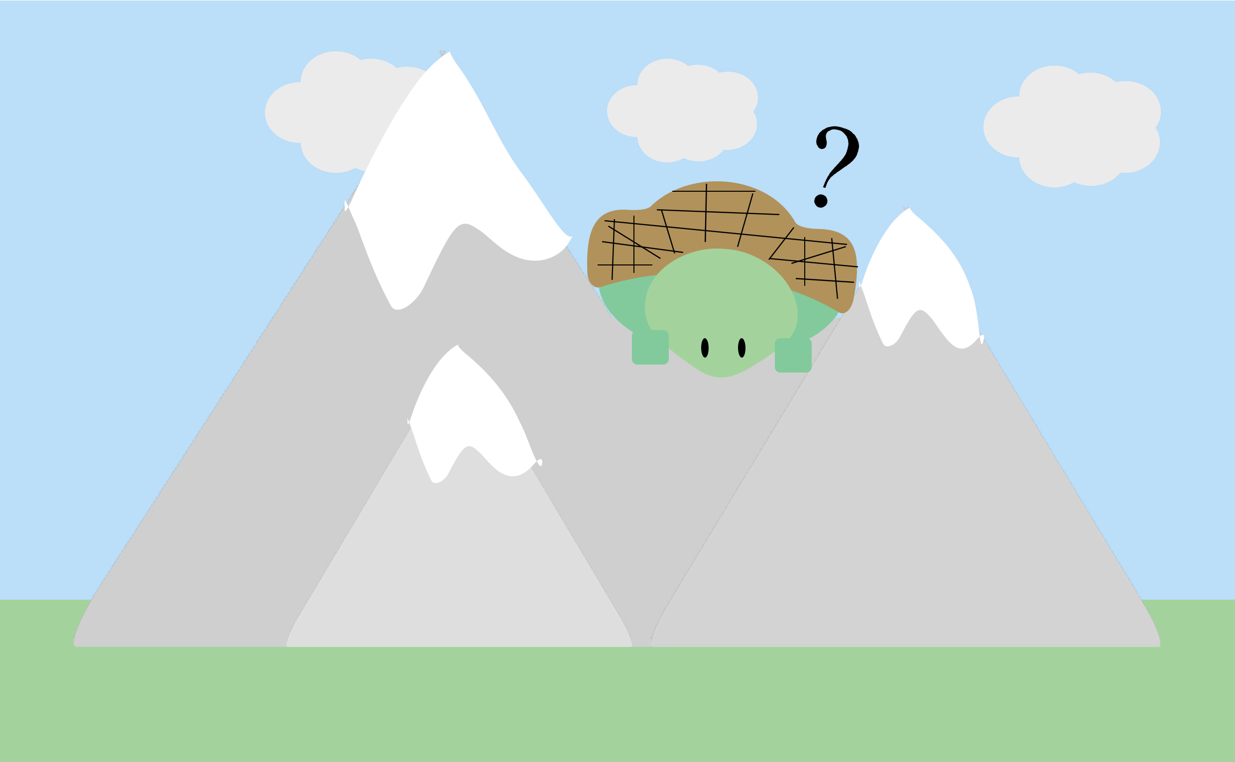
swaku

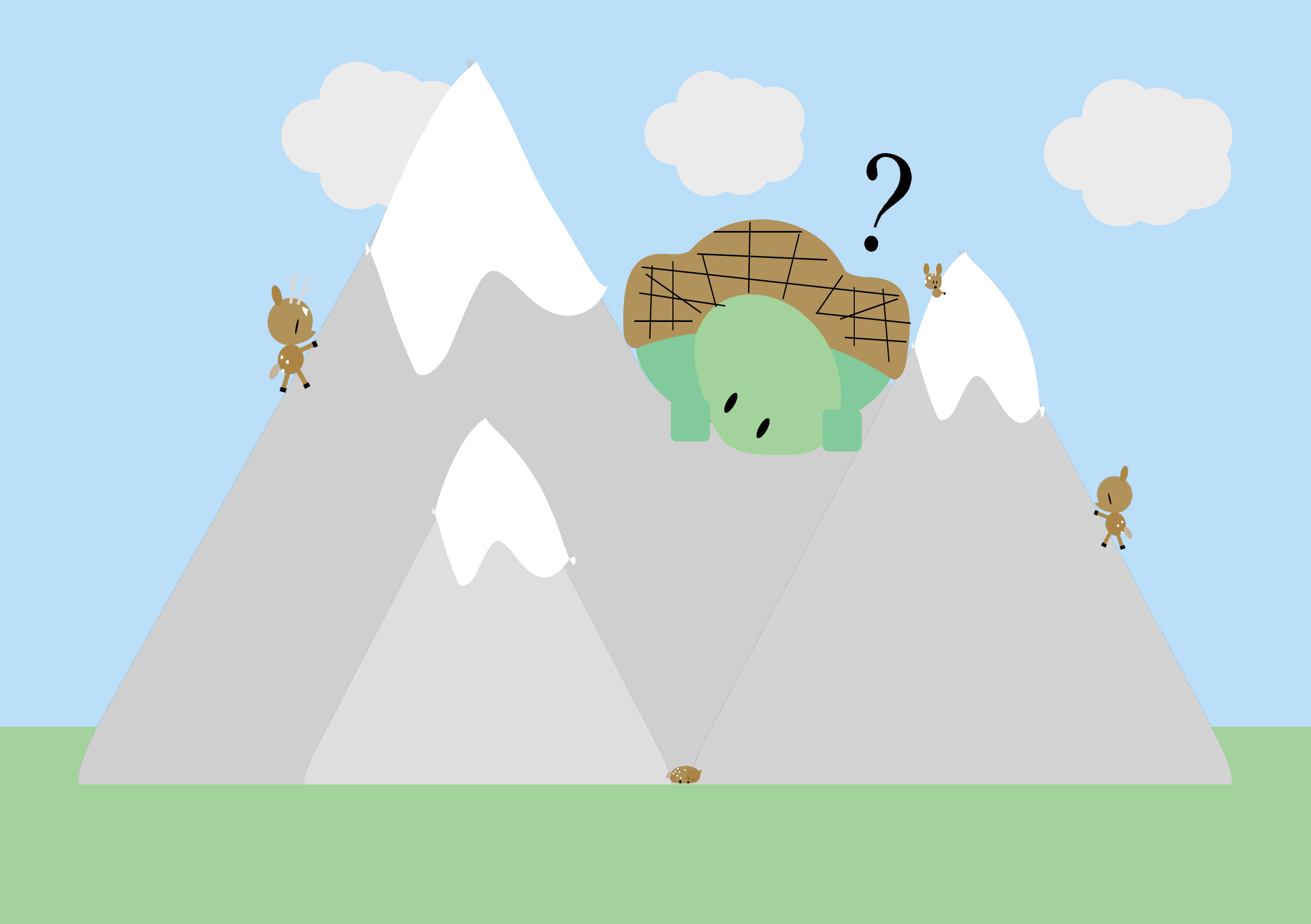
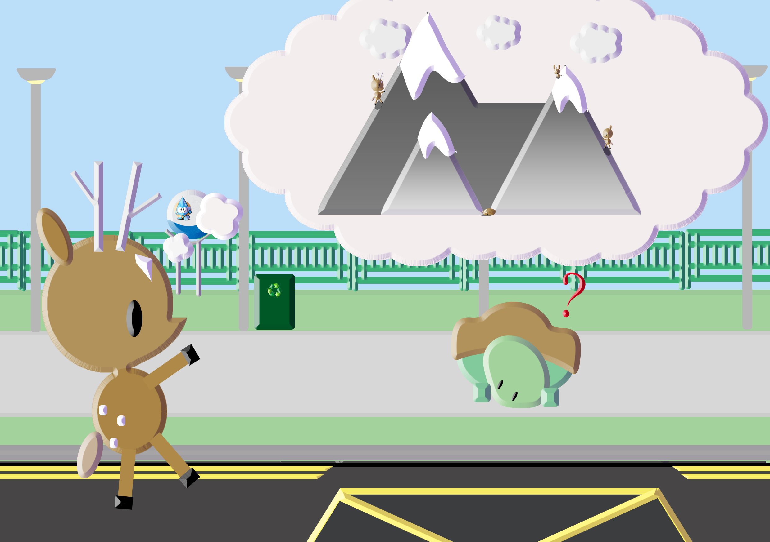
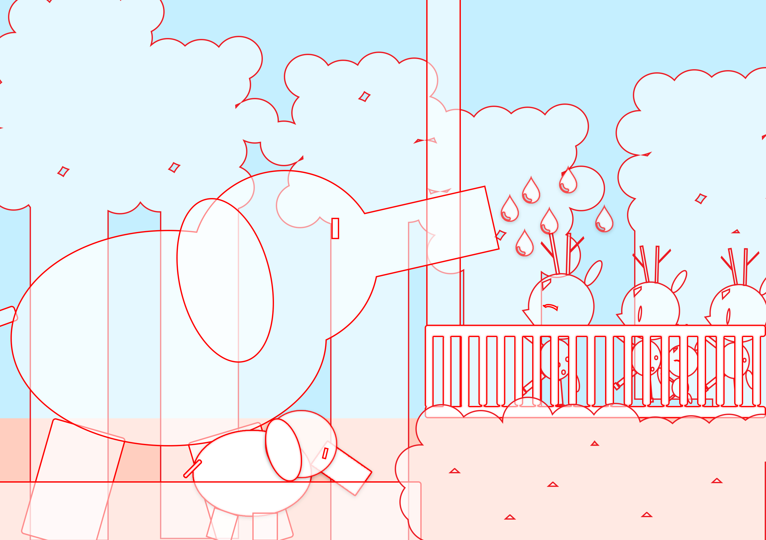
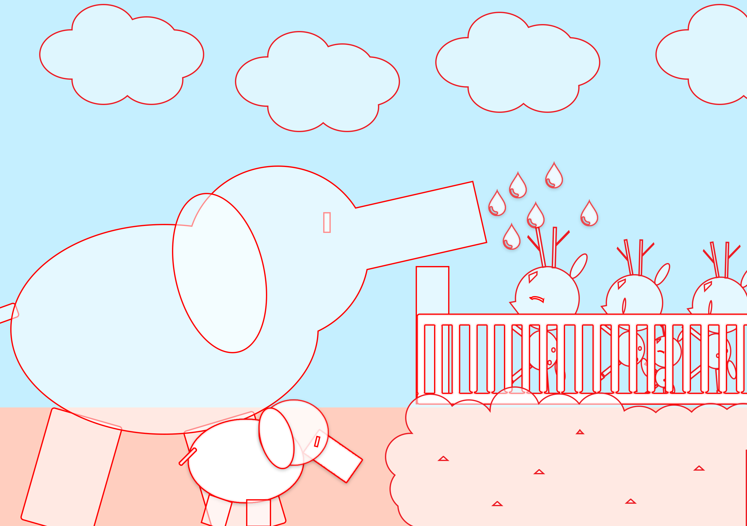
tryout of illustration for word (swaku-mountain tortoise) with full background/ setting a context.

I tried out two ways of portrayal , one being just focusing on the subject matter itself and the other being set in a context where viewers can find clues/hints from the background/surroundings (perhaps a hint of narrative too).

However, I realised it was hard for me to bring life to this objects that are already representational in real life and from the tryouts, I was not fully pleased with the results. I scraped the idea. Hence, I decided to work on idea 4 instead as I’ve always been more drawn to having many narratives in my works.

Firstly, I reviewed my series of works for the pov assignment and selected the ones that I’d like to use while changing some others for new illustrations.

Untitled-1

original set of works that I worked with.

sawku-

Replaced the original work(top-right) with this

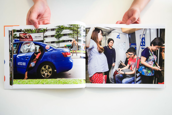
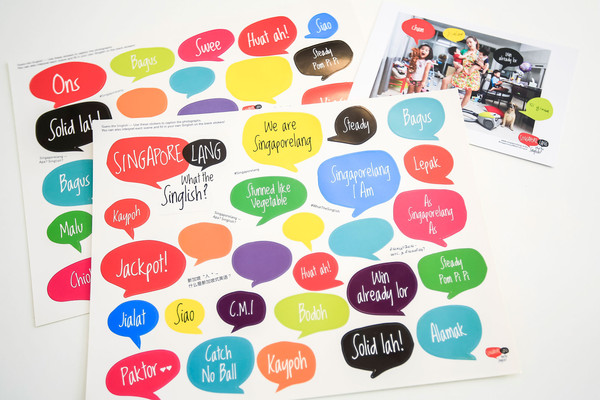
For this idea, I was really inspired by this interactive book that Joy gave as feedback from the previous critique.04_SingaporelangBook_Stills_grande-1 05_SingaporelangBook_Stills_grande 08_SingaporelangBook_Stills_grande
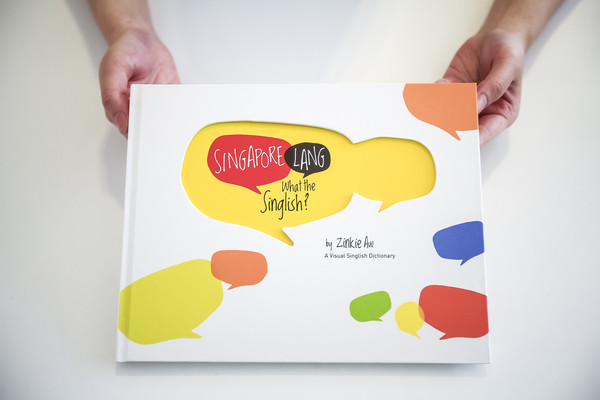
Singapore Lang – What the Singlish! Book

I tried out various binding methods for the mock-ups, such as side stapling , saddle stitch with thread and Japanese binding. After consultation, many recommended for the book to be able to be fully-opened for easier user experience.

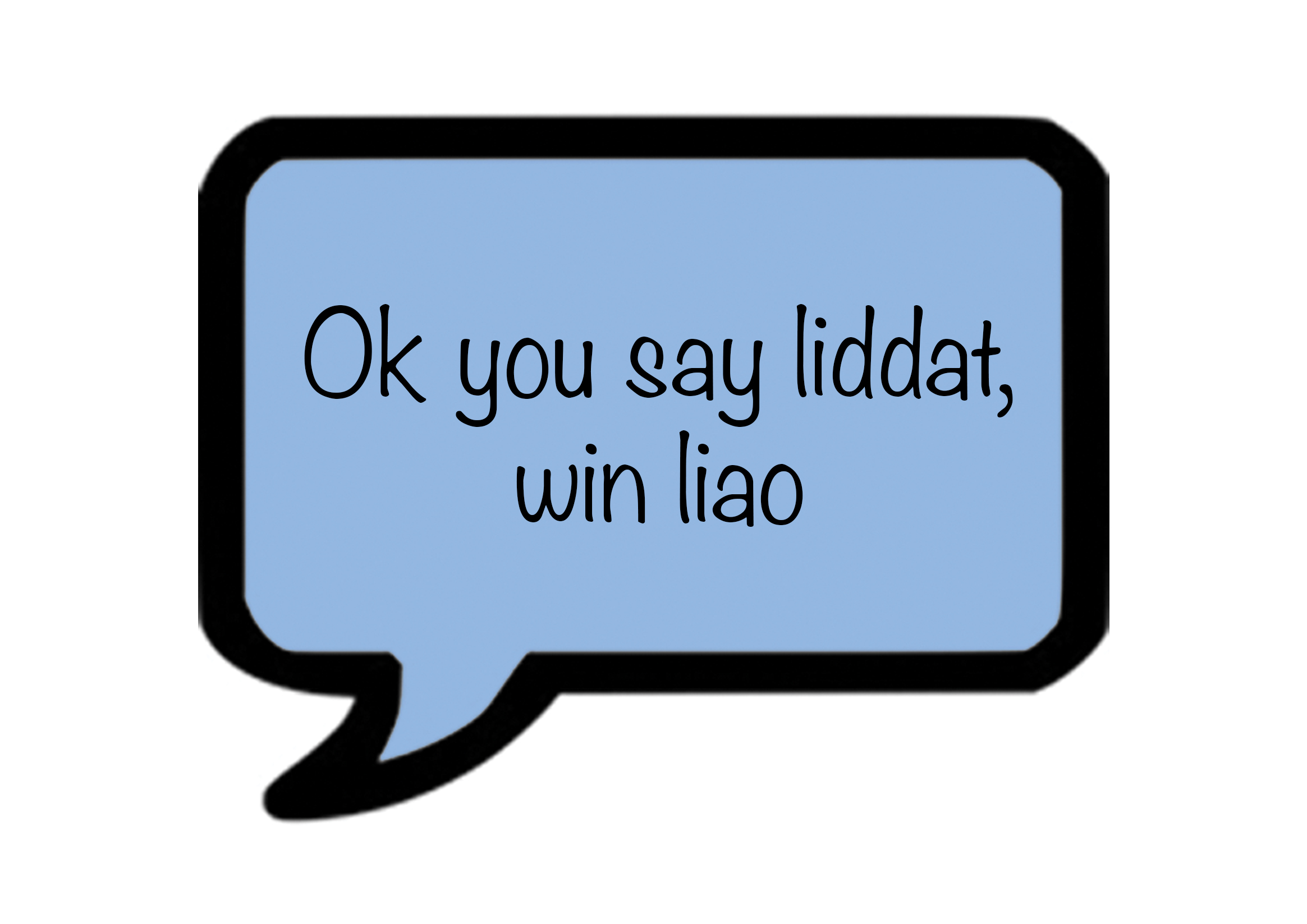
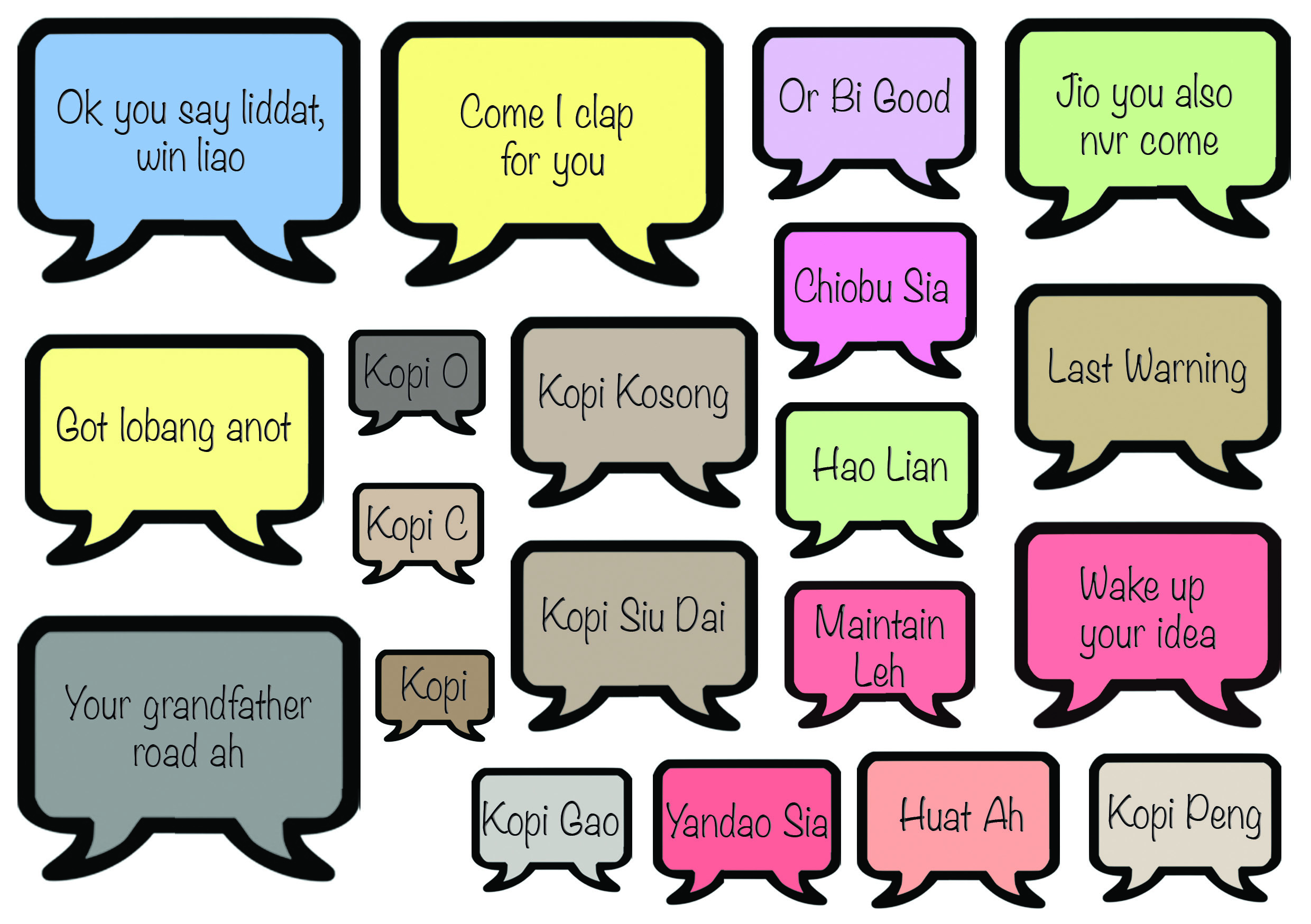
I decided to work on how my speech bubbles would appear and the meanings. Instead of stickers, which are only for one-time use, I thought of ways that the speech bubbles can be used several times. I thought of using velcro, however, i felt the thickness of the material would cause the zine to pop out constantly.

images

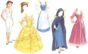
paper dolls with its unique flaps

Hence I decided to go with this idea of flaps.

Untitled-1

Initial

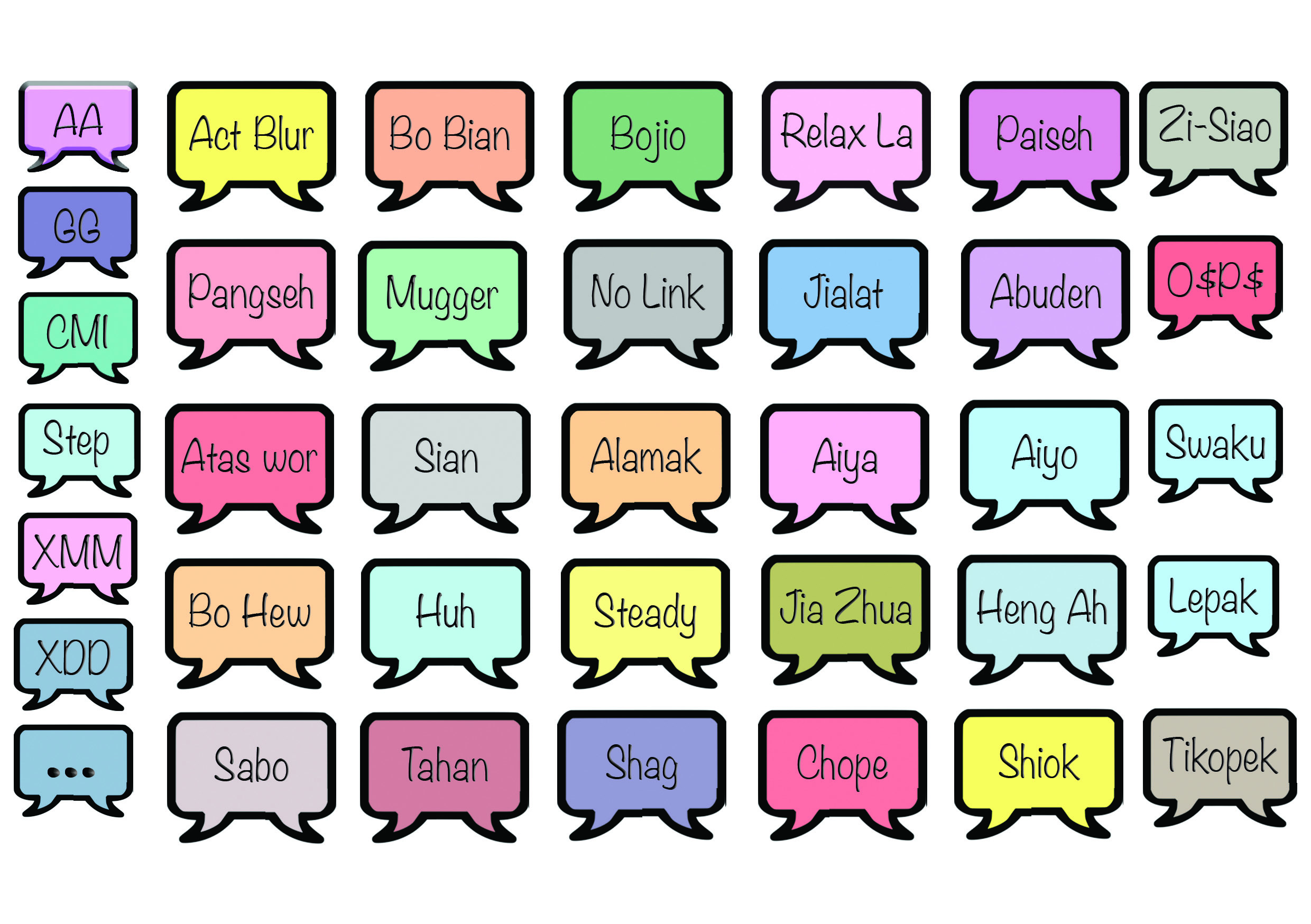
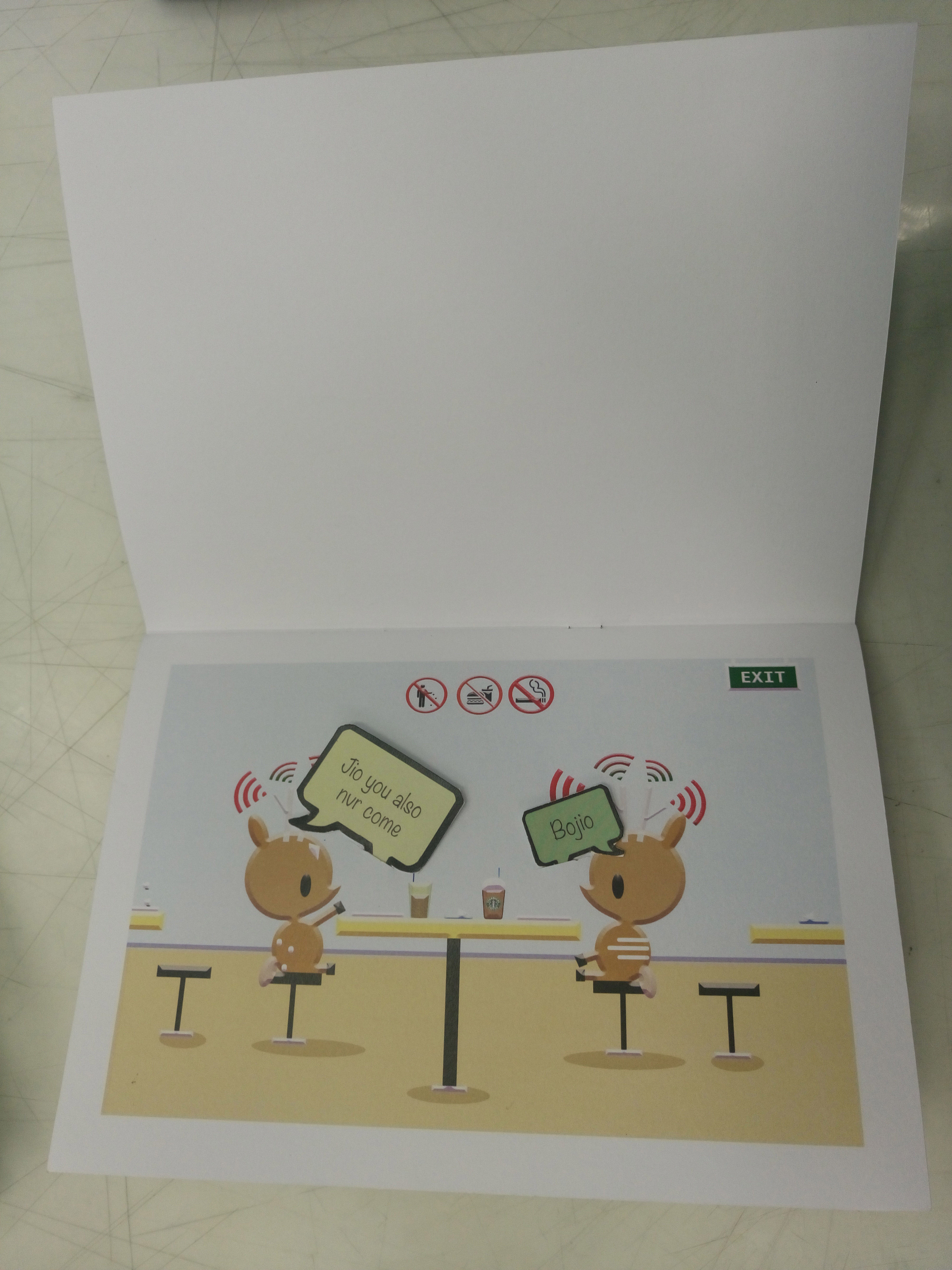
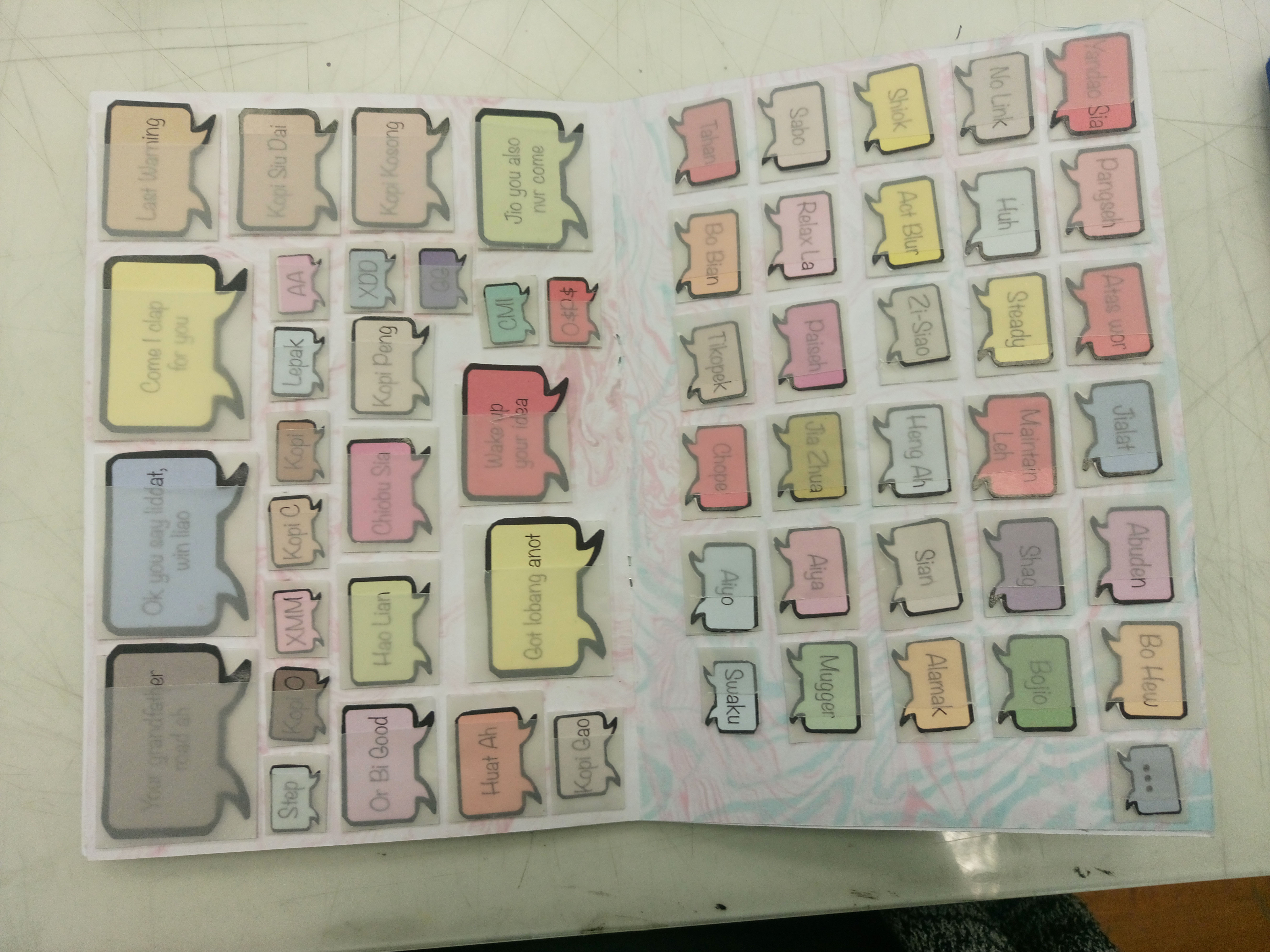
Then, for better user experience again, I decided to make it in such a way that the direction of the speech bubbles is interchangeable. The speech bubbles are also colour coded based on the negative or positive feeling or connotation it evokes. For example, green is highlighted in words like ‘bojio’ , ‘mugger’, ‘hao lian’ and so on which suggest hints of envy/jealousy.

TEXTTT TEXTT

I then proceeded to work on improving the visuals of the content itself with trying out changes of illustration styles while retaining the content itself. I also did some edits for the content to make it more appropriate and even more relatable to singapore (aim: with one glance, viewers should be able to tell its singapore context).

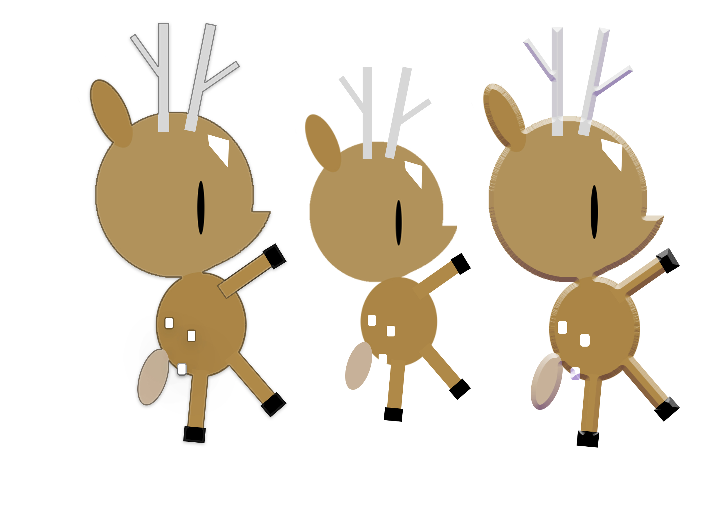
Illustration style 1: adding of obvious black outlines to make the subject matter stand out more

'''deer

left: with outline / middle: original / right: embossing

However, it was scraped as it did not make much obvious differences and did not fit the final outcome I was looking for.

Illustration style 2: adding of embossing / shadows to make it more 3-dimensional and also to make the work come more to life.

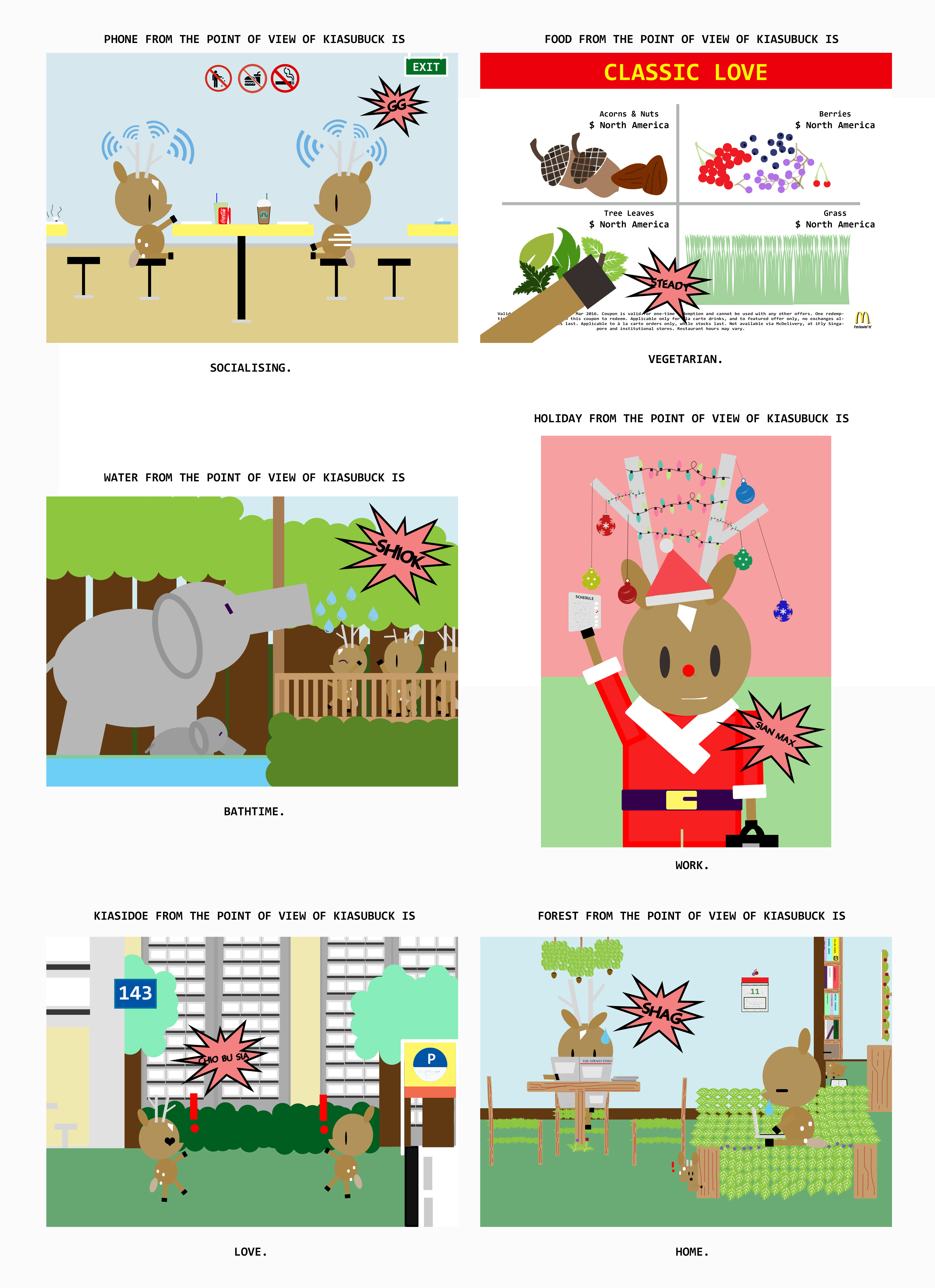
6. home 5.love 4. 'sawku- 3. water HOLIDAY HOLIDAY-(white)2. HOLIDAY- 1.phone

Illustration style 2: line work illustrations with limited colour palette (2-3colours used only)

1.phone3. water-3. water3. watersf

I really loved the aesthetics however I was facing many problems with making it neater and hiding the overlapping shapes.

Cover pages design tryouts:

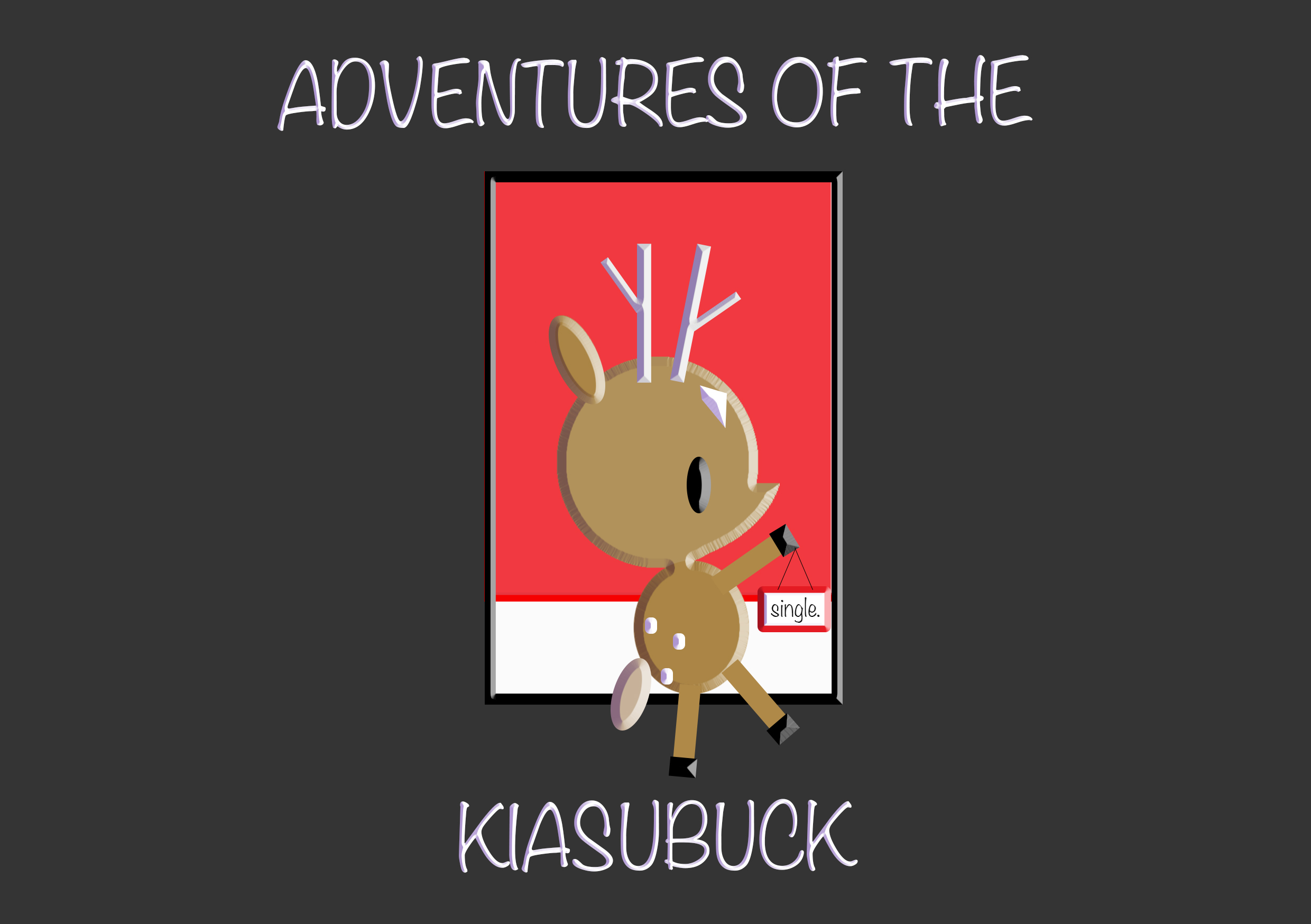
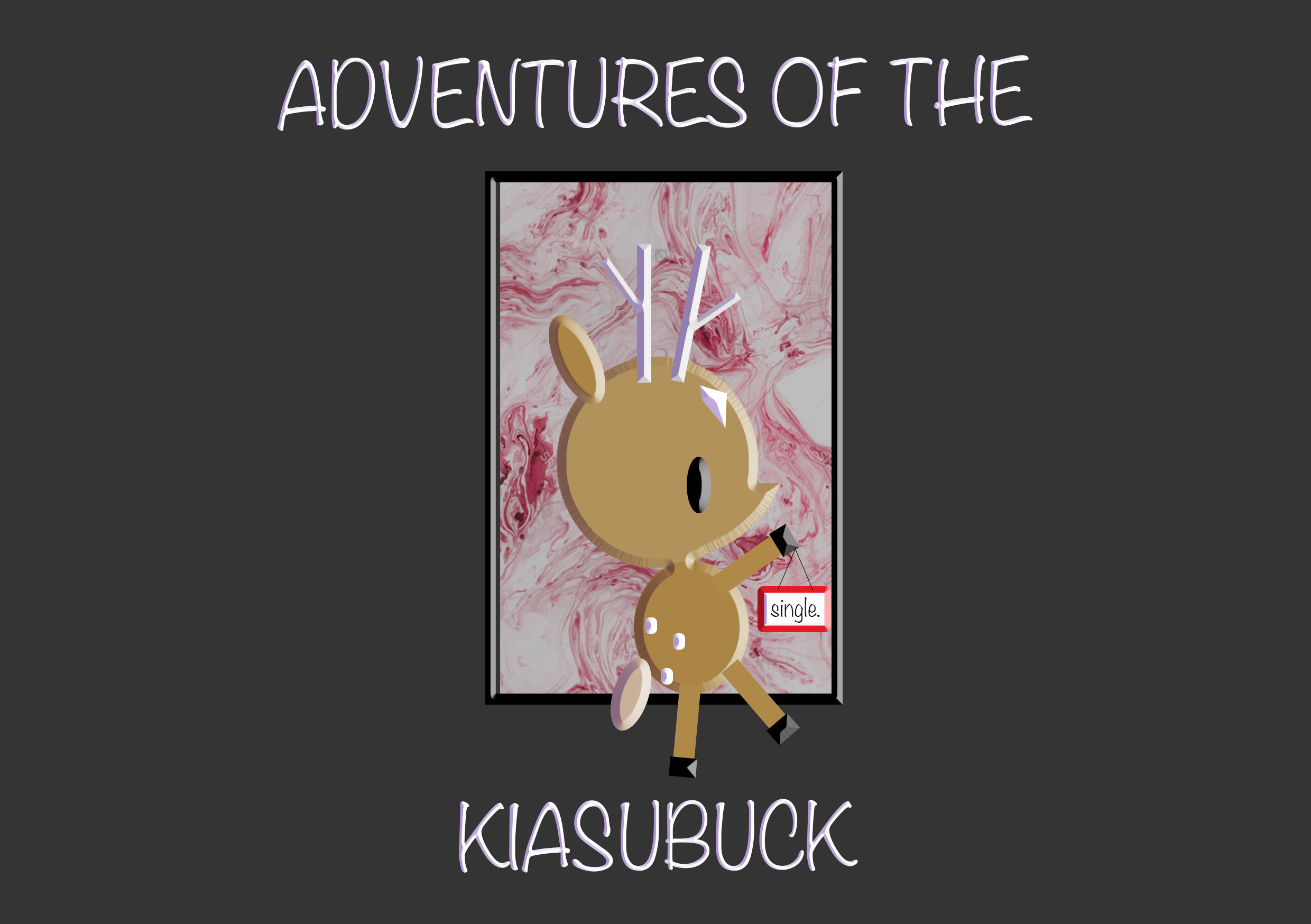
Untitled-1(black) Untitled-1(black)ferf Untitledr-1 Untitled-1 deer(white) deer

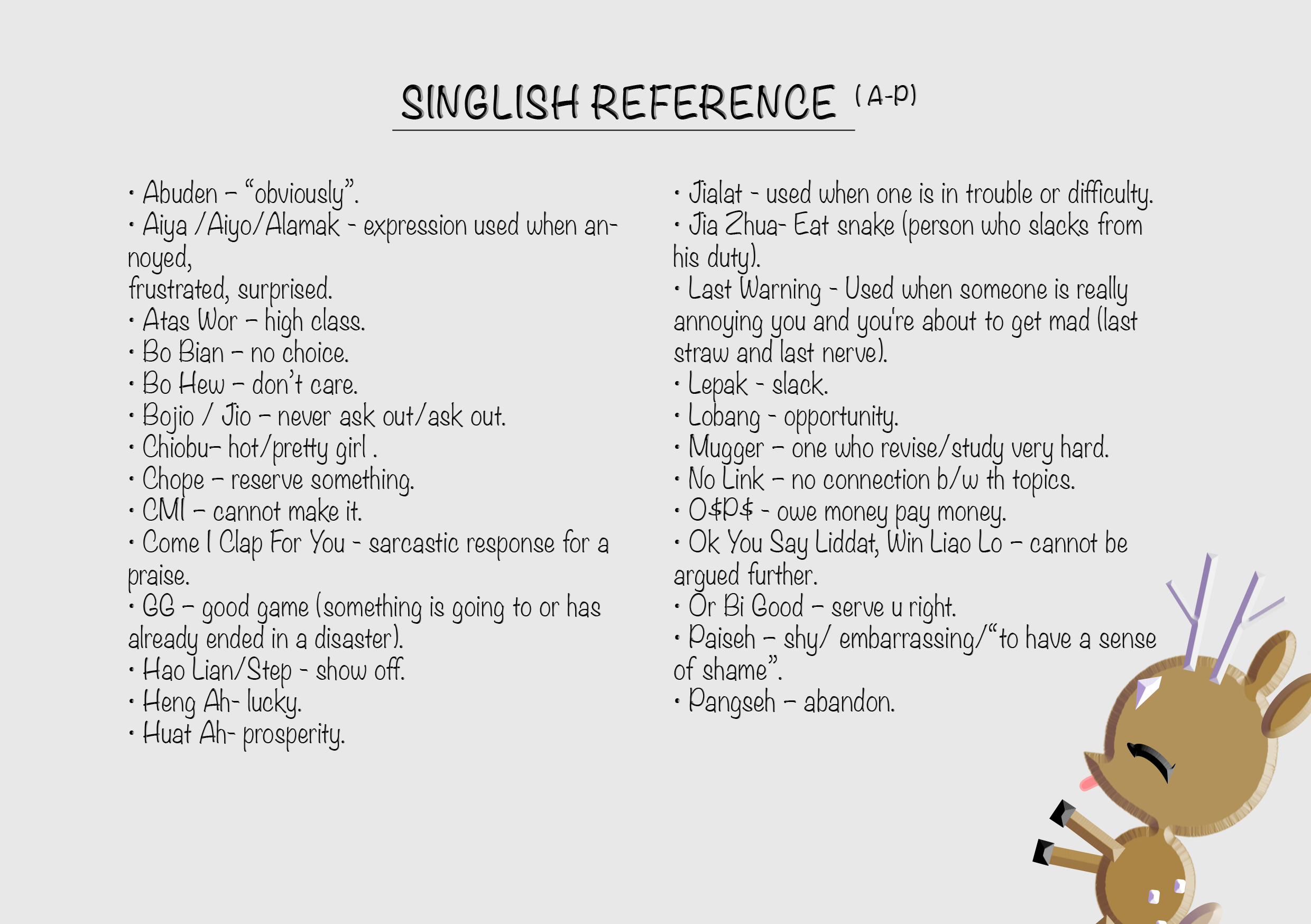
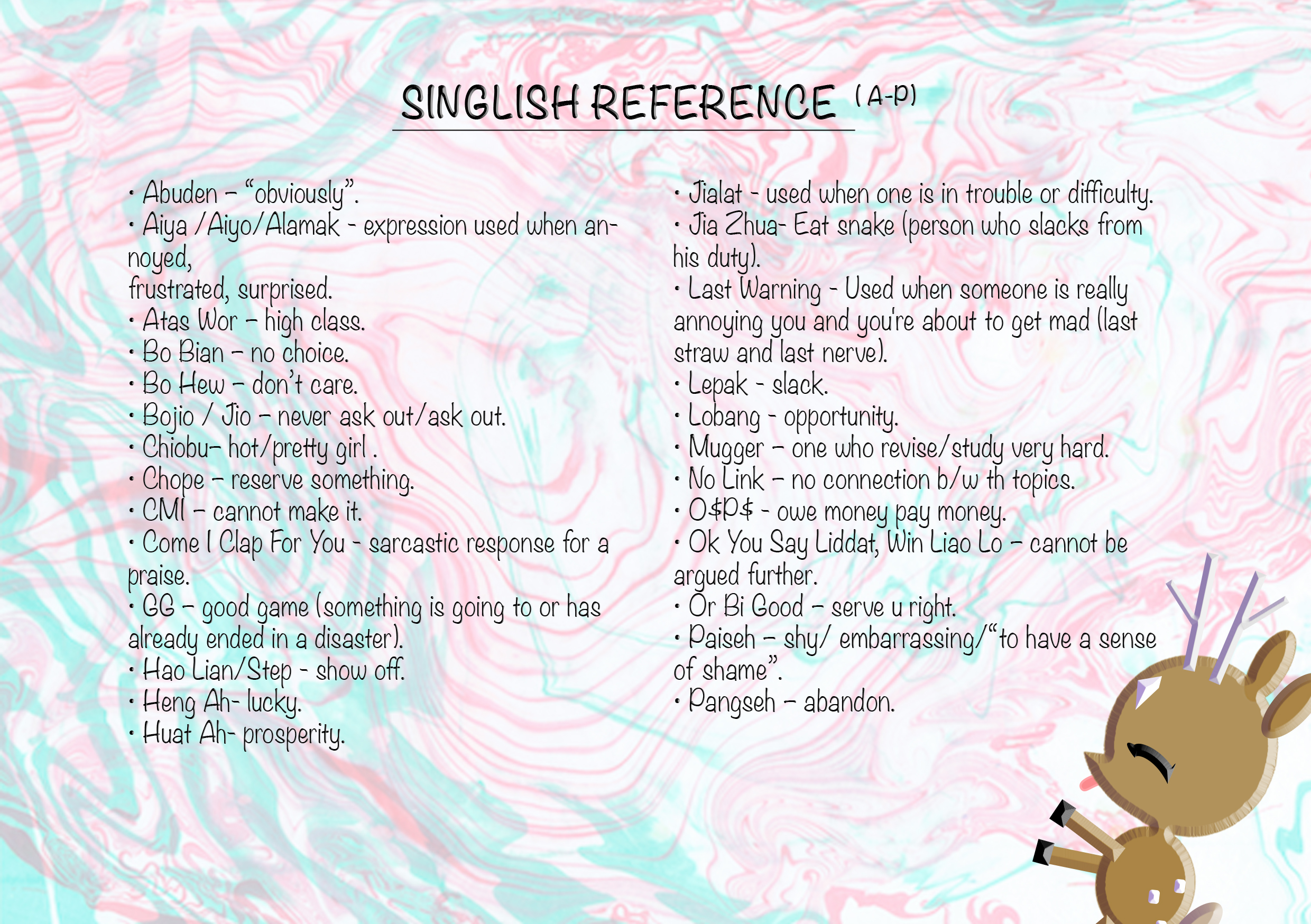
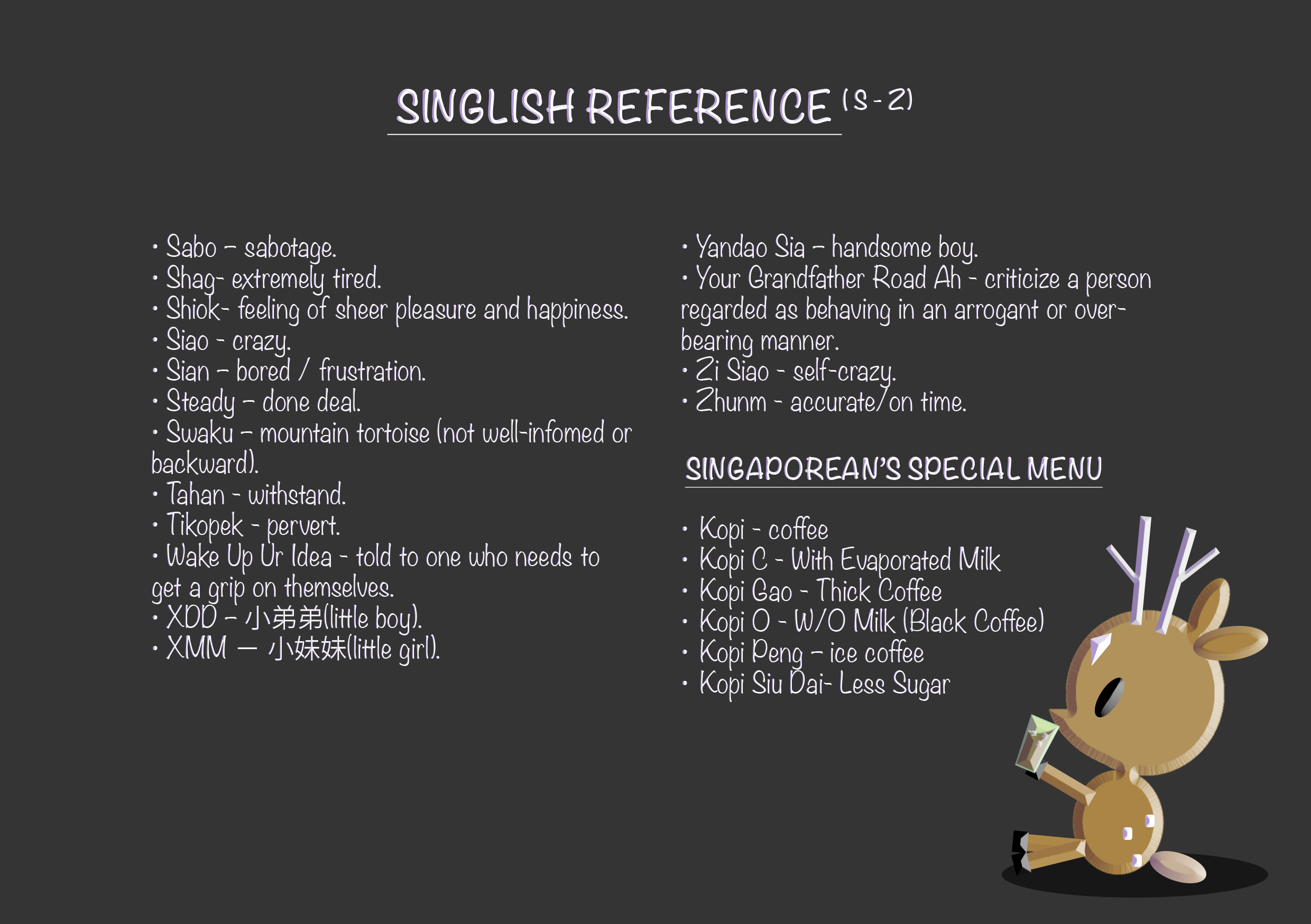
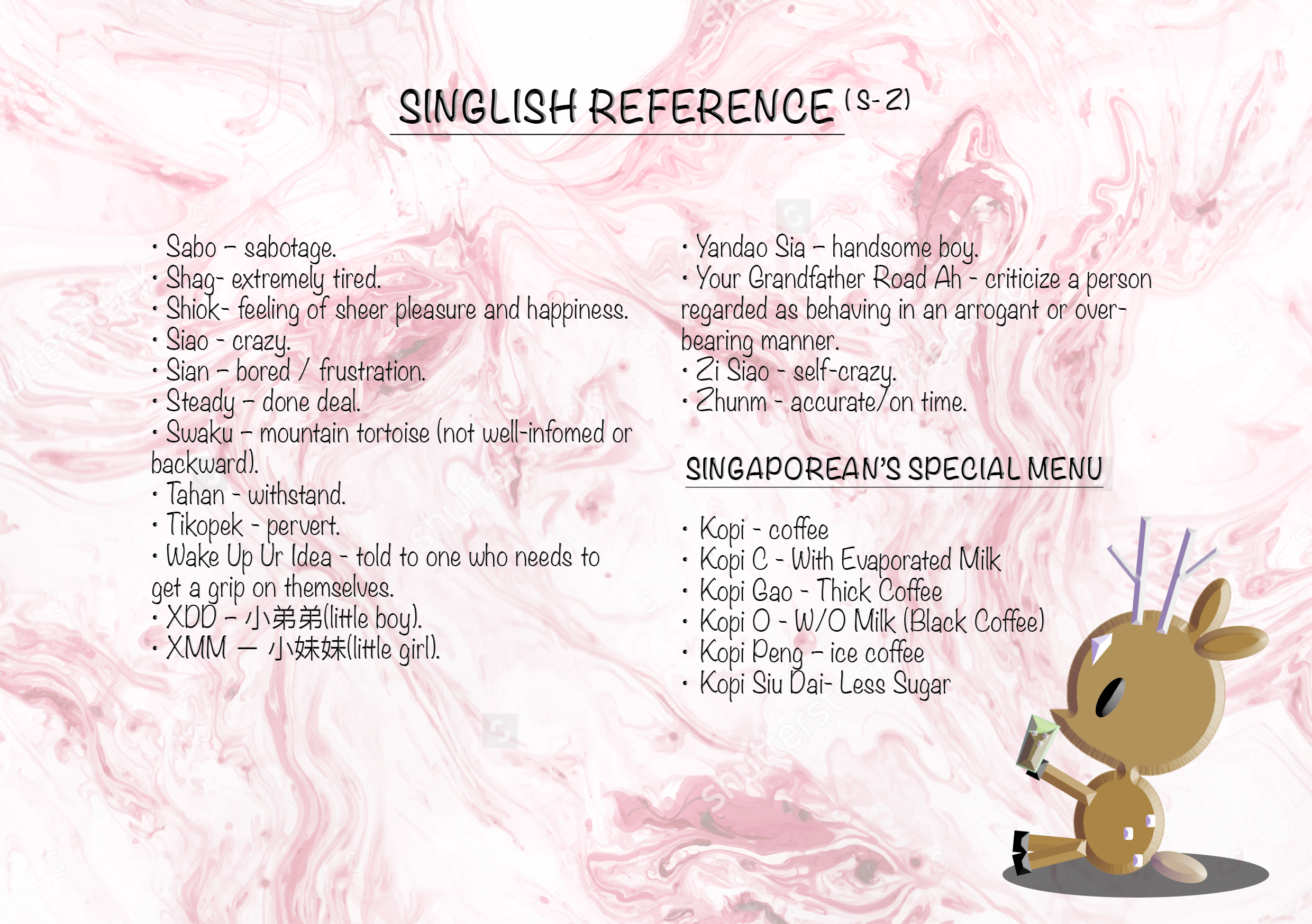
Reference pages design:

text(att)- text(att) text(single)- text(single)

With the content done, I worked with the layout of my zine.

Proposed layout in indesign (not in running order): https://drive.google.com/open?id=0B9SxP4EKVfKBV1dvMEZRcUlxNXM


Final

1

  • missing page photo (reference page)

2 3 4578910 copy

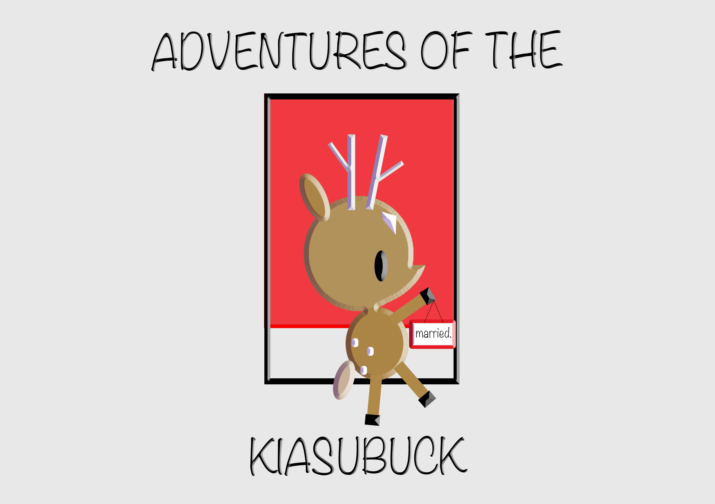
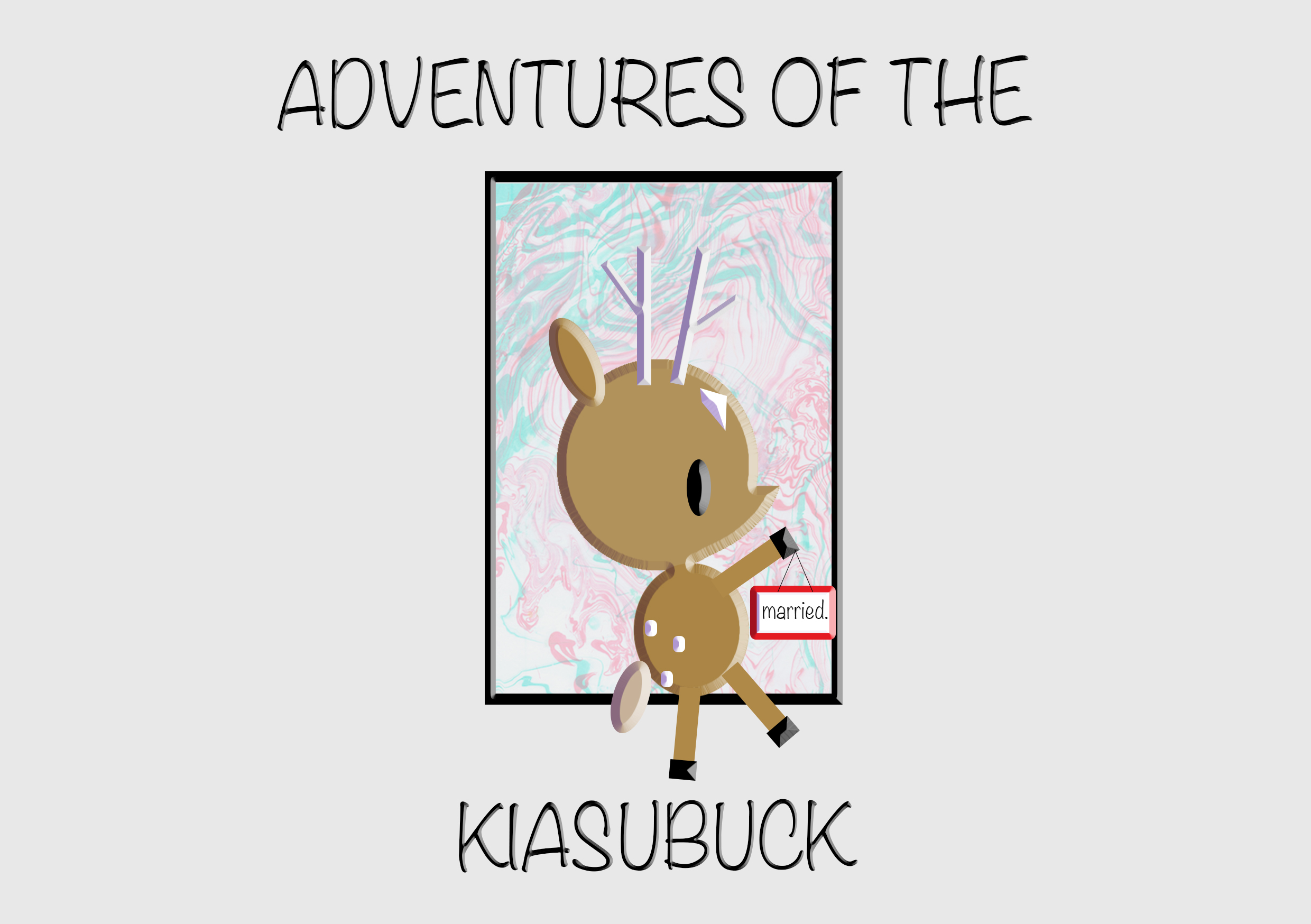
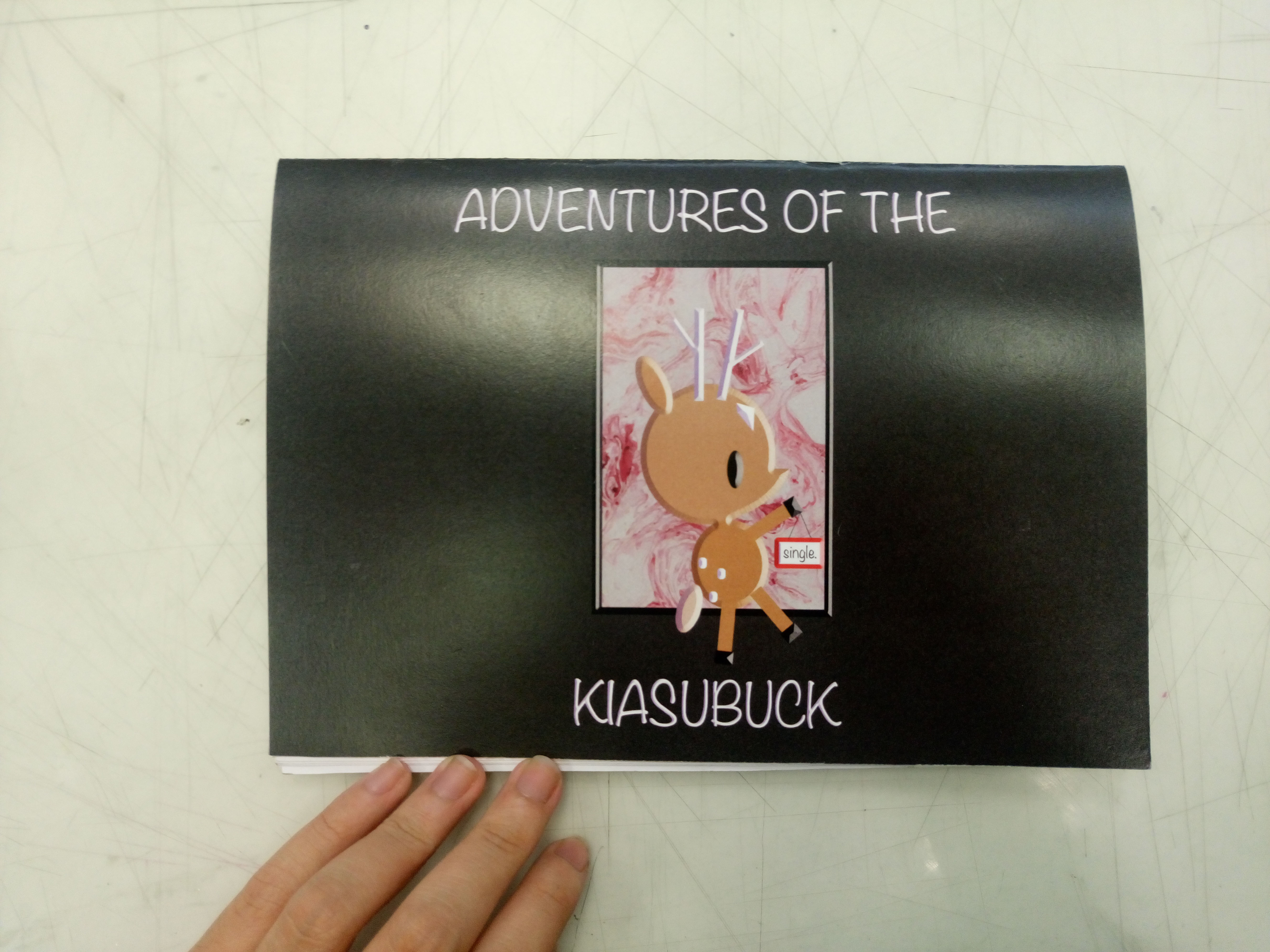
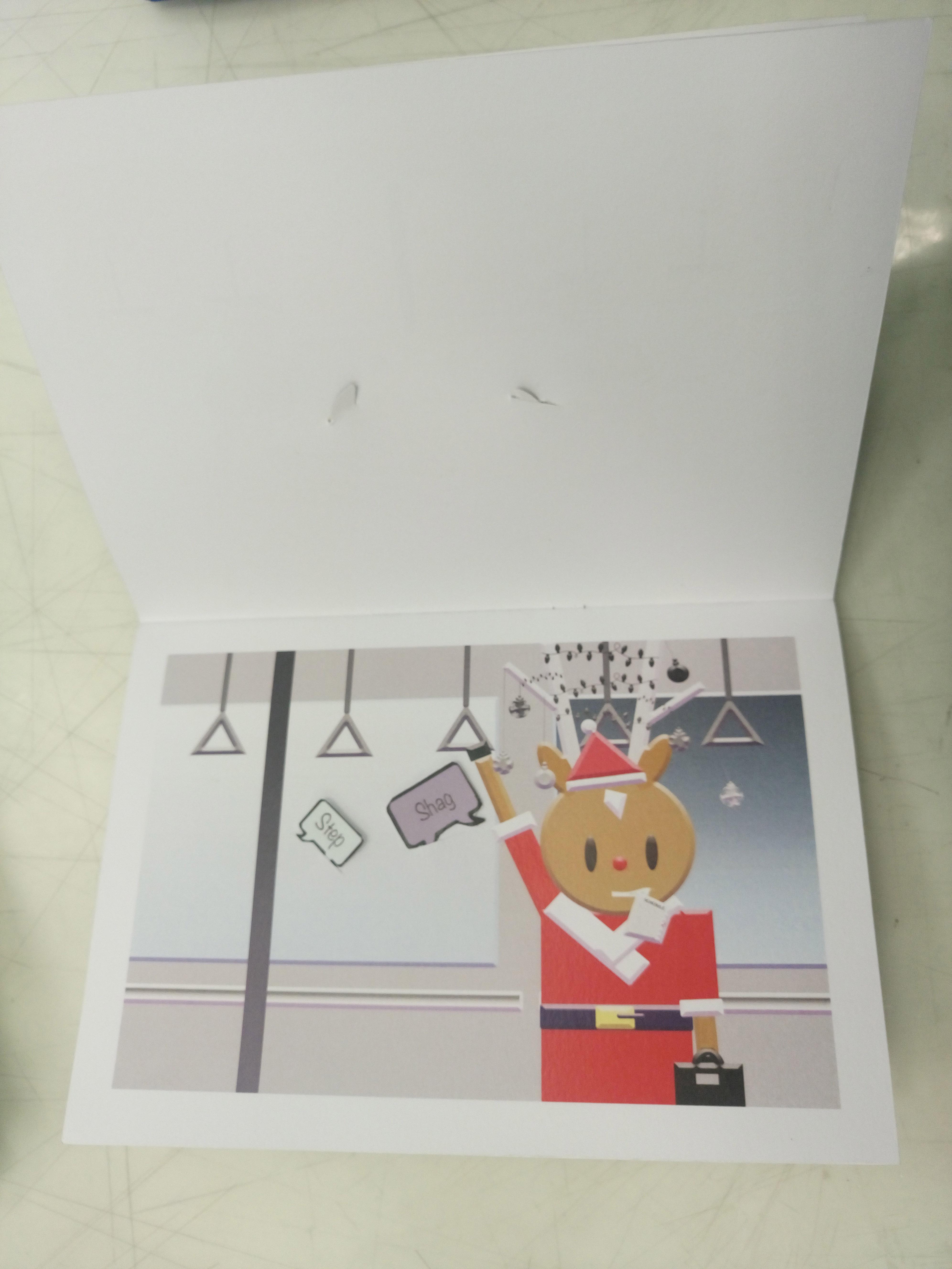
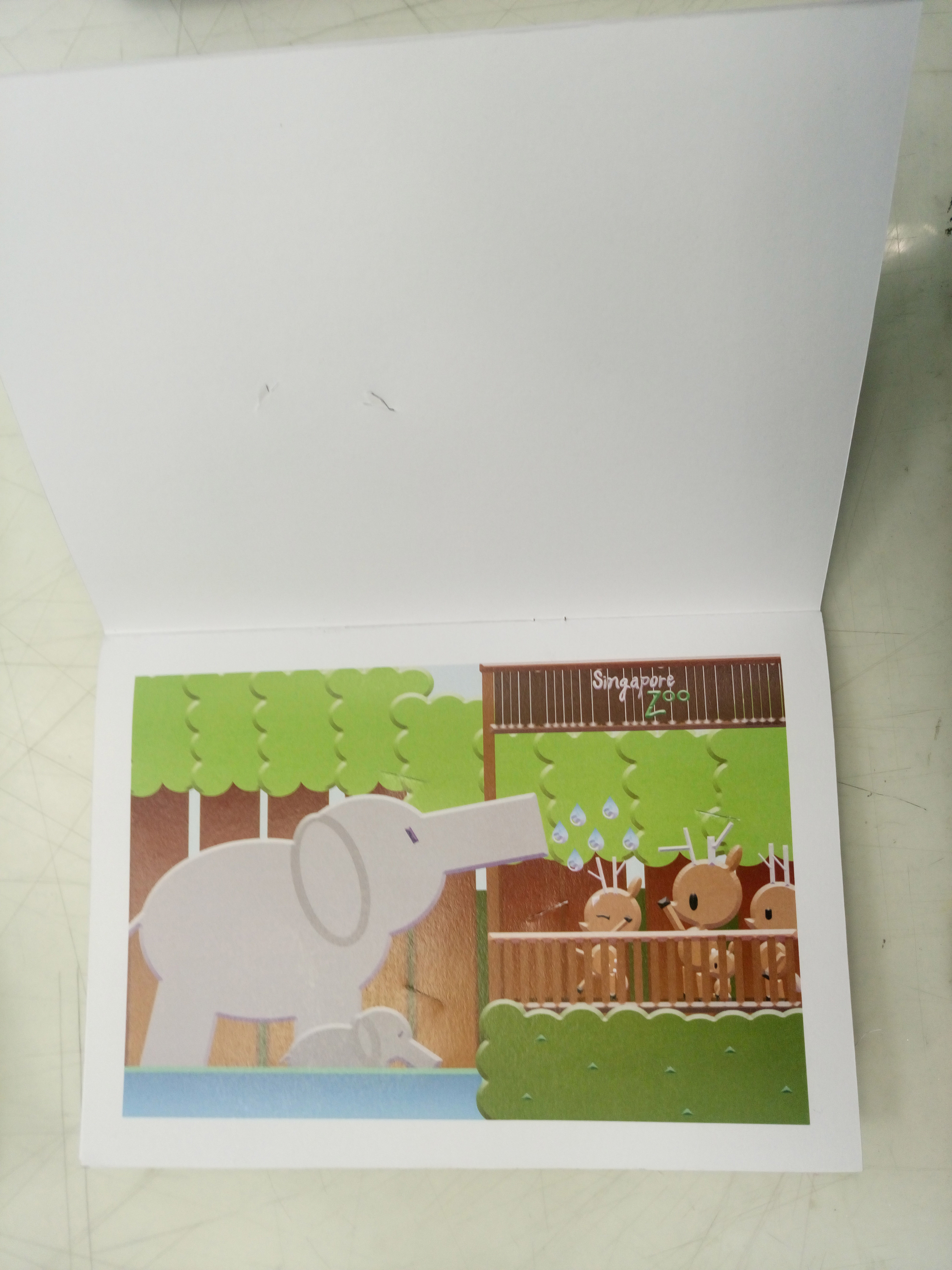
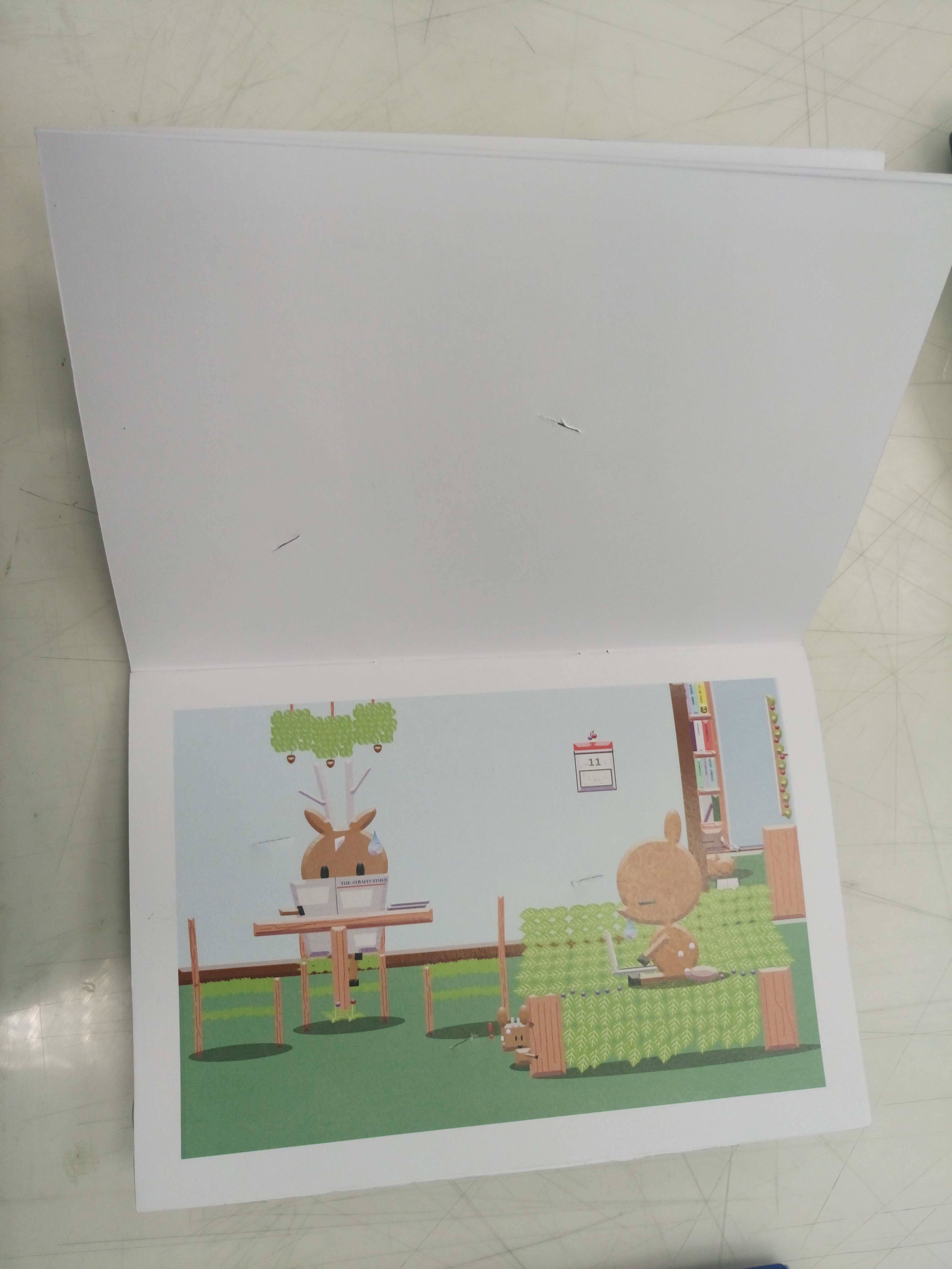
For this zine, I wanted the main focus to be on the interactivity. There are two sides (single life / married life) to this zine, where it can read from any direction and the narratives would still work. The reason for two sides is because there are the groups of people who are more career/single life orientated, the groups of people who are more family orientated and of course the group of people who overlap these two sides as well.

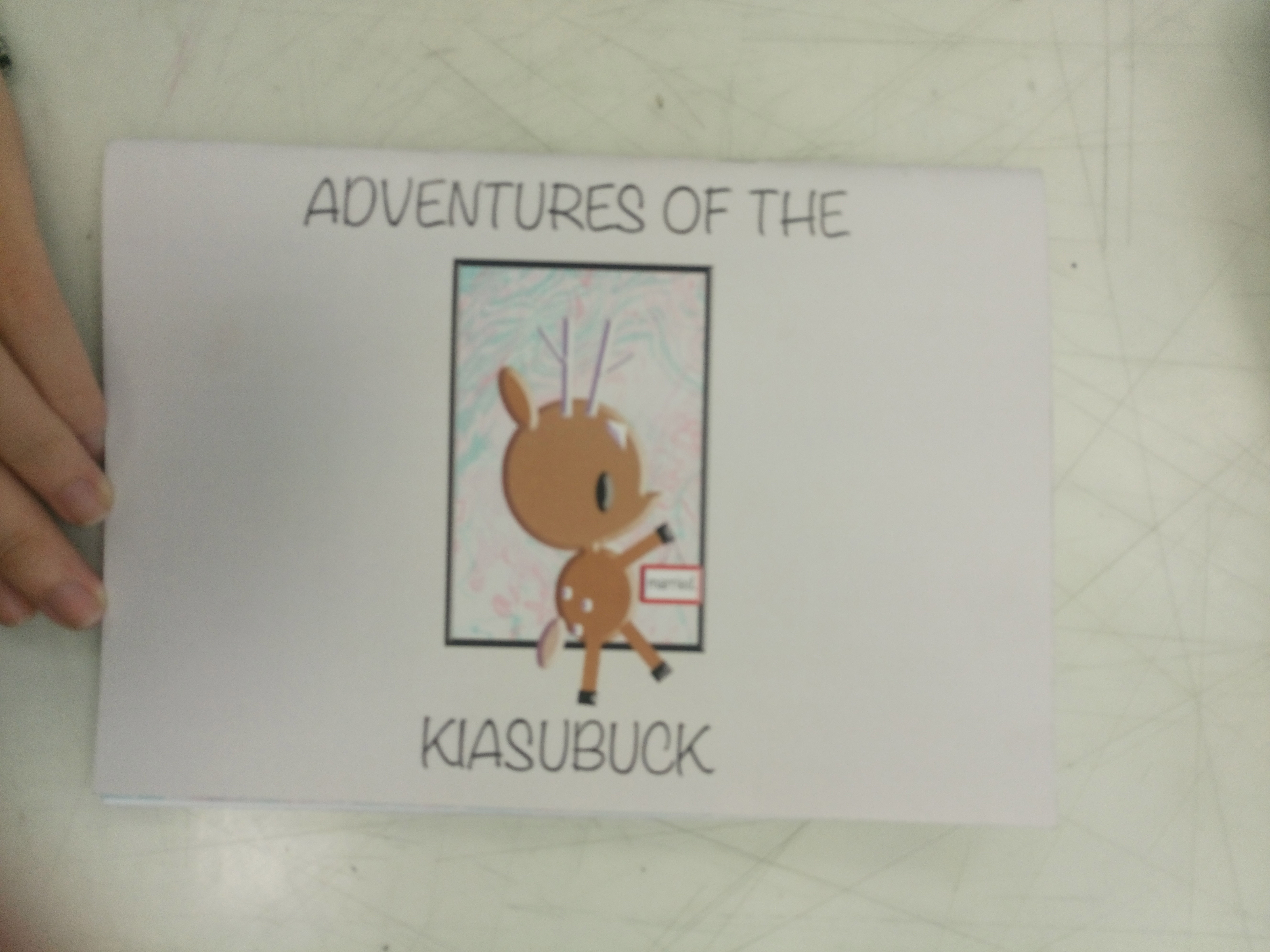
I titled the zine – ‘Adventures of the Kiasubuck’ because viewers can choose how the story flows, the personality of the characters. Generally, I invite viewers to set their own adventures based on the available choices of singlish words. This is to highlight how their choice of words and the way one speaks can change the impression they leave on others.

The zine is printed one sided so as to prevent damage to the subsequent contents as I created slits for viewers to slot in their choice of speech bubbles. The available places for slotting in the speech bubbles are not just limited to the pre-made slits but I welcome viewers to make their own slits and they can choose to place the speech bubbles on anything they see fit , allowing for a more enriching experience. The white border around the content serves to maintain the neatness as well as an influence from the book I’m inspired from (Singapore Lang – What the Singlish! Book). The orientation of the book is in a horizontal format instead of vertical so viewers are allowed to immerse themselves in the narrative and see the details (the small details are important hence I avoided making the works too small). Choice of paper is thick for both the cover pages and inside pages, this is to firstly retain my inspiration from the kind of hard paper the creation of paper dolls  use. Secondly, it is to withstand the possible wear and tear in the future.

For the speech bubble page, I made them in a layout that all the individual speech bubbles follow the orientation of the respective pages. The pockets are made of tracing paper so to allow viewers to be able to see the words at one glance without having them to take each out to check which one it is. I also left part of speech bubbles out of the pockets so that viewers can easily take and put the speech bubbles back after use.

Difficulties/Reflection

The hardest part of the zine was actually the speech bubbles aspect as I had to think about how to store them properly without them falling out when the book is flipped from all directions and I had to cut them all out neatly without damaging them . Credits to Fiona who taught me how to make the secure pockets.
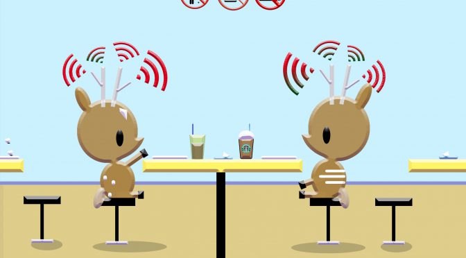
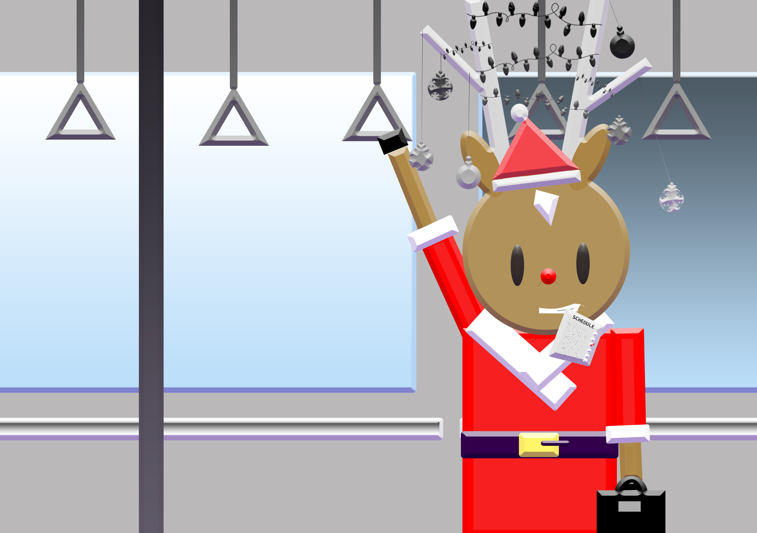
Topic: Animal - Deers
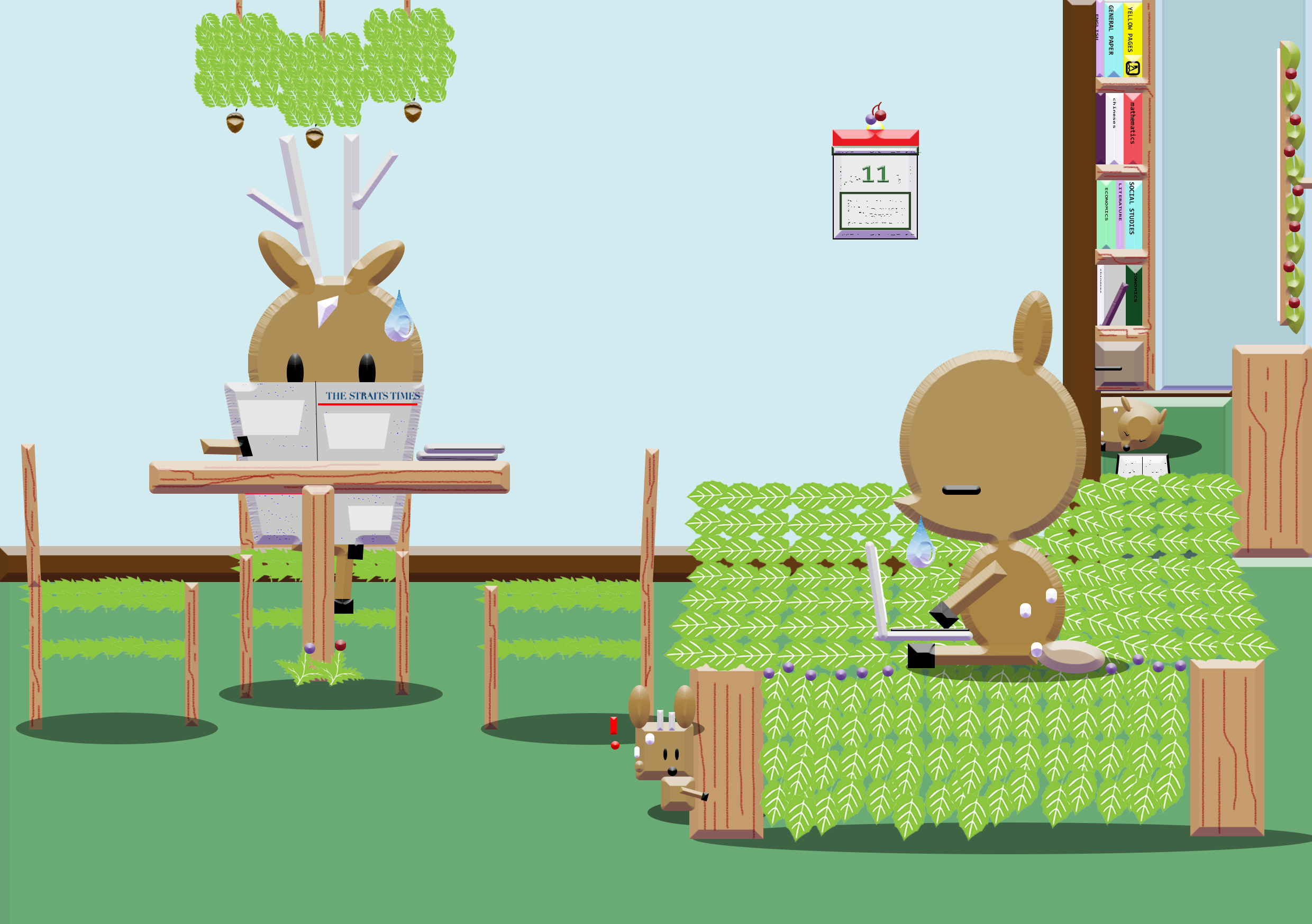
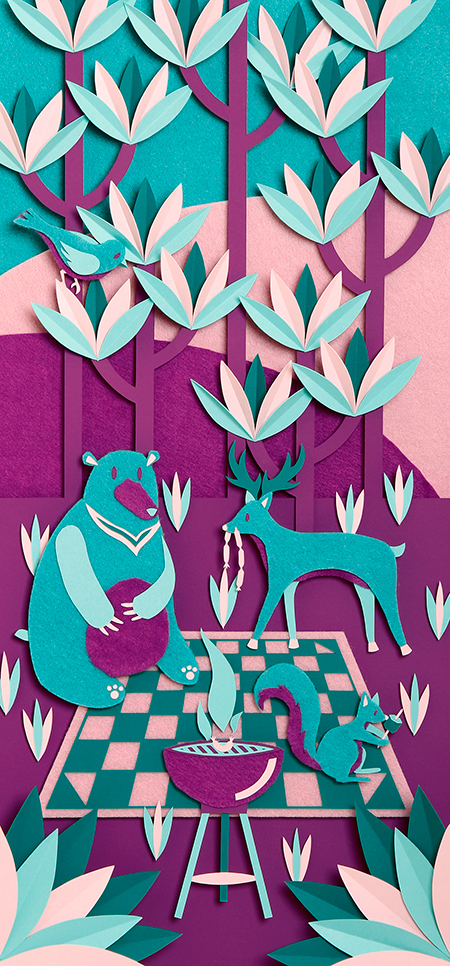
  1. A tree from the POV of deer is food.
  2. A forest from the POV of deer is home.
  3. A stag from the POV of deer is eye-candy.
  4. A bambi from the POV of deer is fanfare.
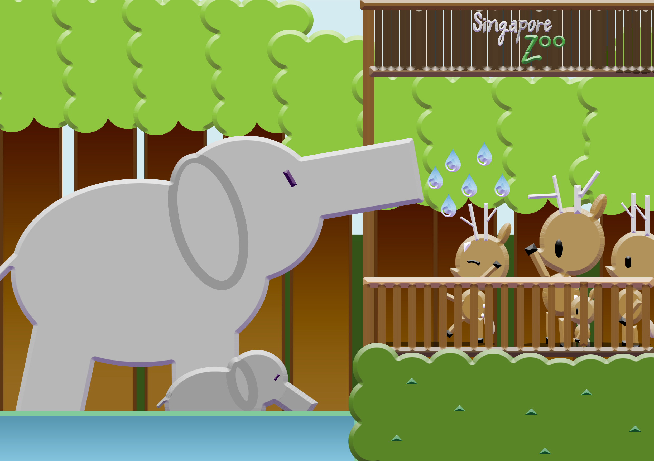
  5. A petting zoo from the POV of deer is socialising.
  6. A zoo from the POV of deer is international zone/trapped.
  7. A stag fight from the POV of deer is entertainment.
  8. A human from the POV of deer is curiosity.
  9. A child from the POV of deer is friend.
  10. A hunter from the POV of deer is war.
  11. A predator from the POV of deer is fear/hide and seek.
  12. A herbivores from the POV of deer is friends.
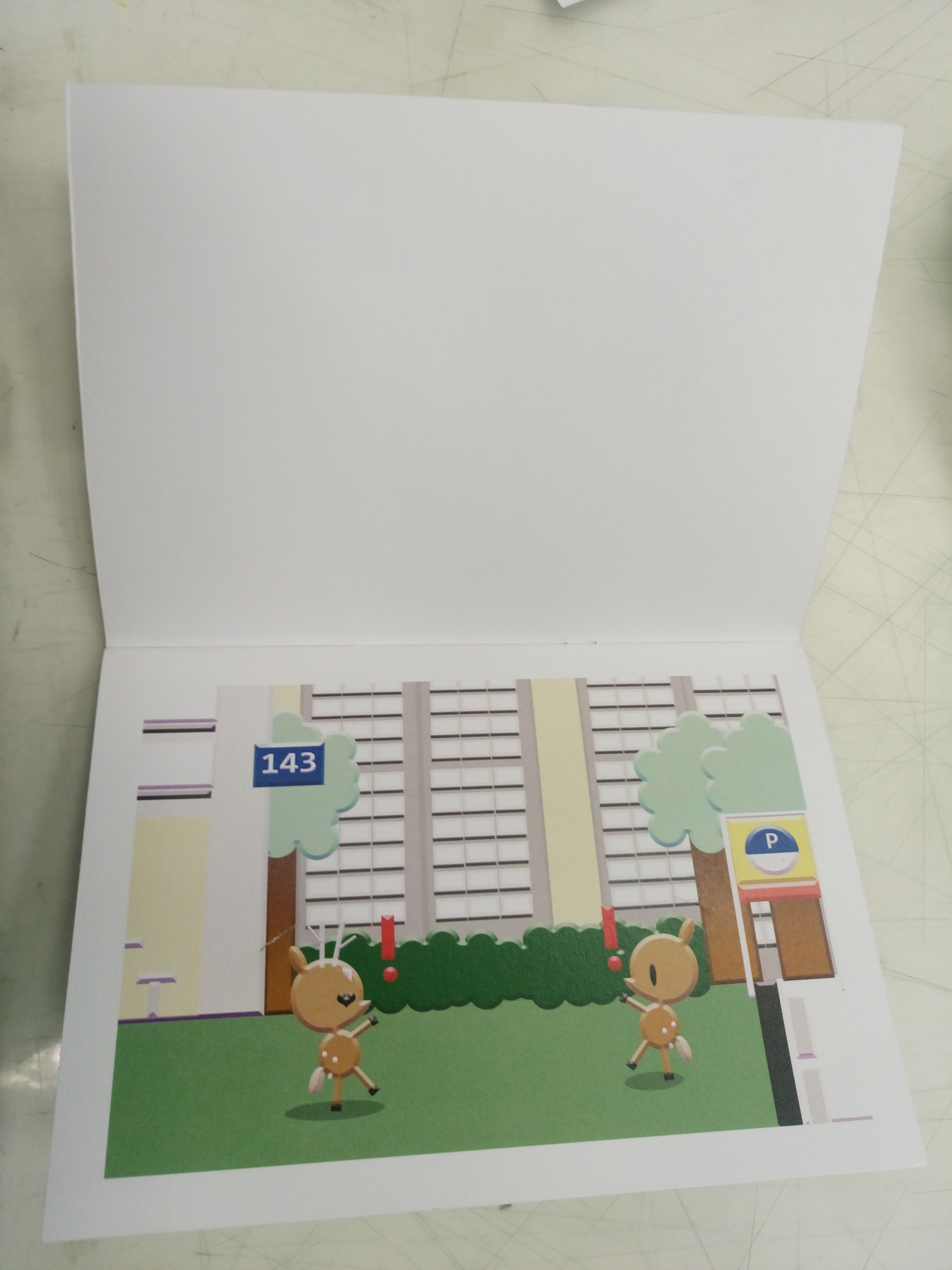
  13. A family from the POV of deer is community.
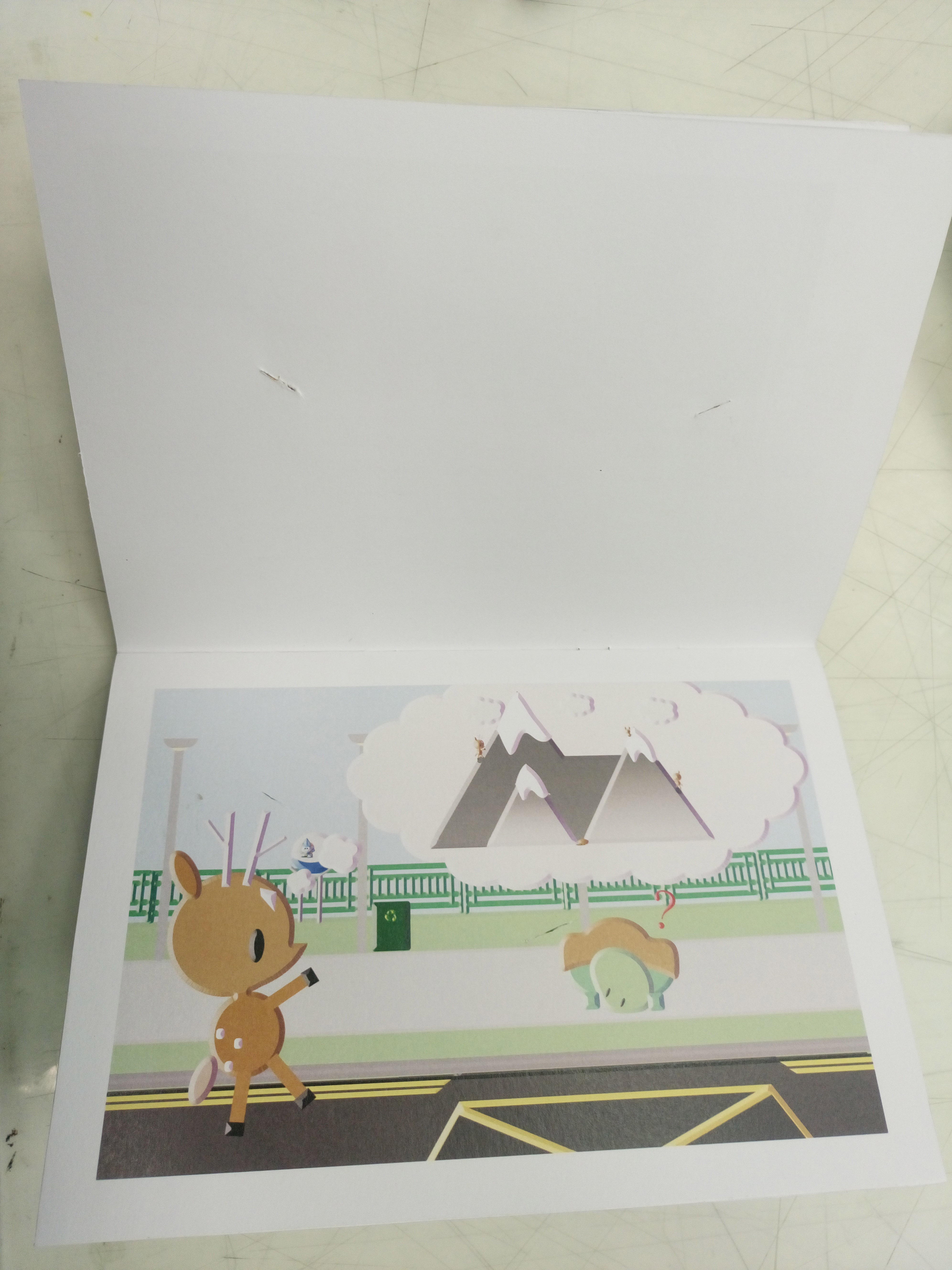
  14. A venison(deer meat) from the POV of deer is nausea.
  15. A mating season from the POV of deer is fawn.
  16. A fawn from the POV of deer is protection.
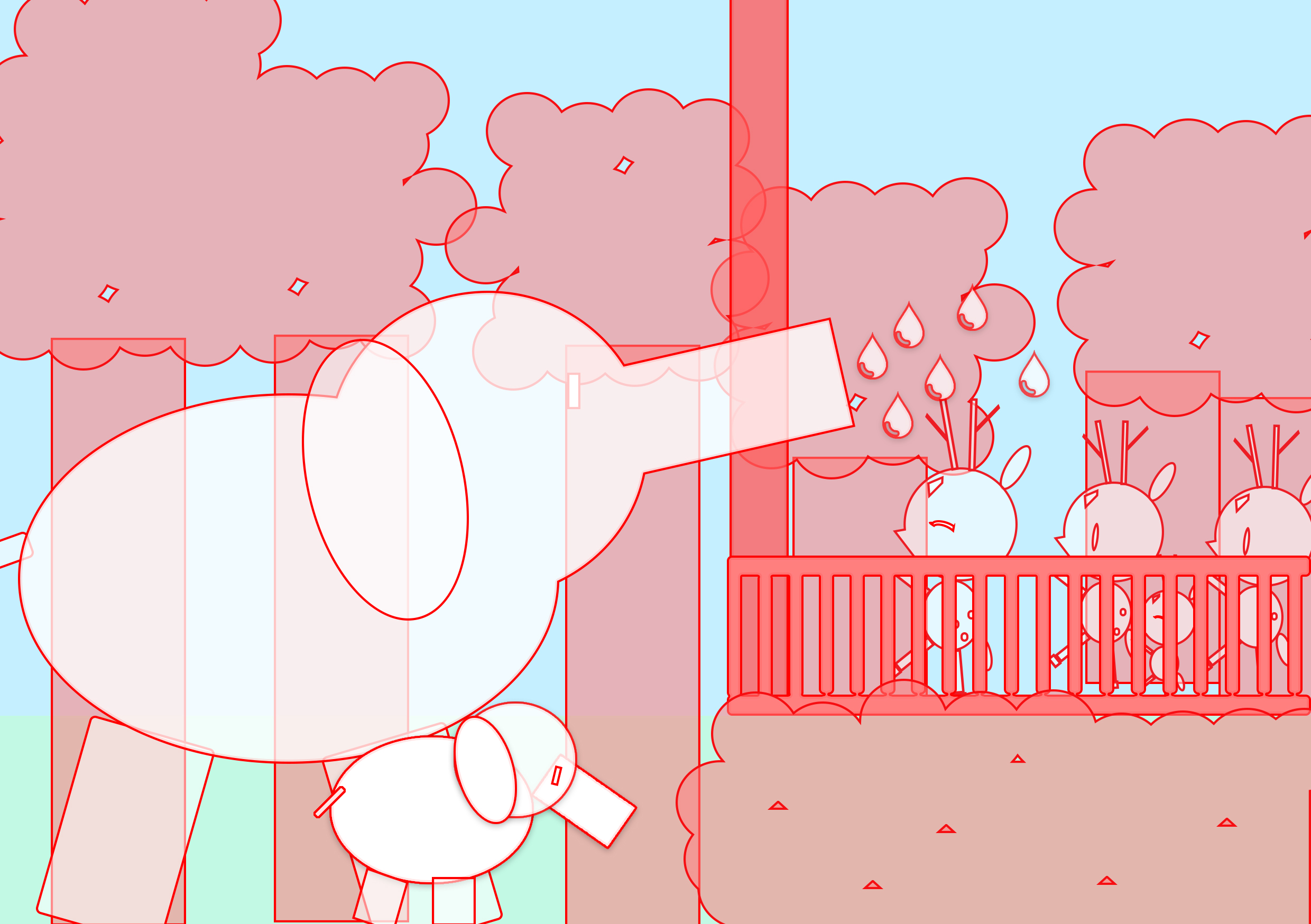
  17. A water from the POV of deer is bathtime.
  18. A fence from the POV of deer is obstacle.
  19. A music from the POV of deer is party.
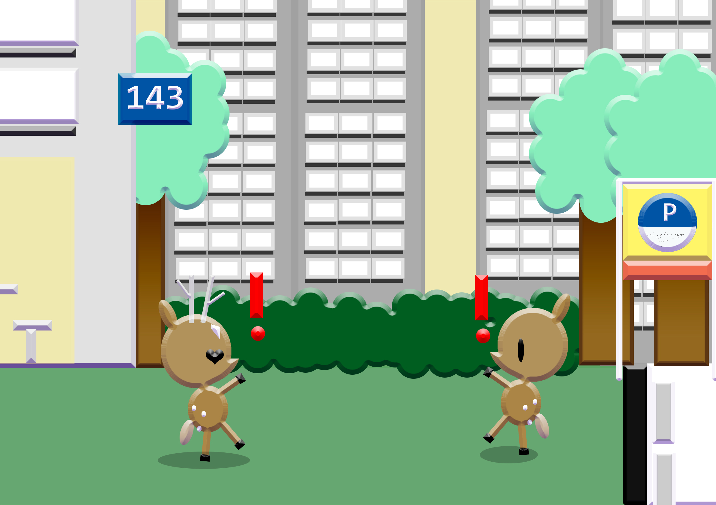
  20. A city from the POV of deer is walls/lack of freedom.
  21. A friend type from the POV of deer is kind soul.
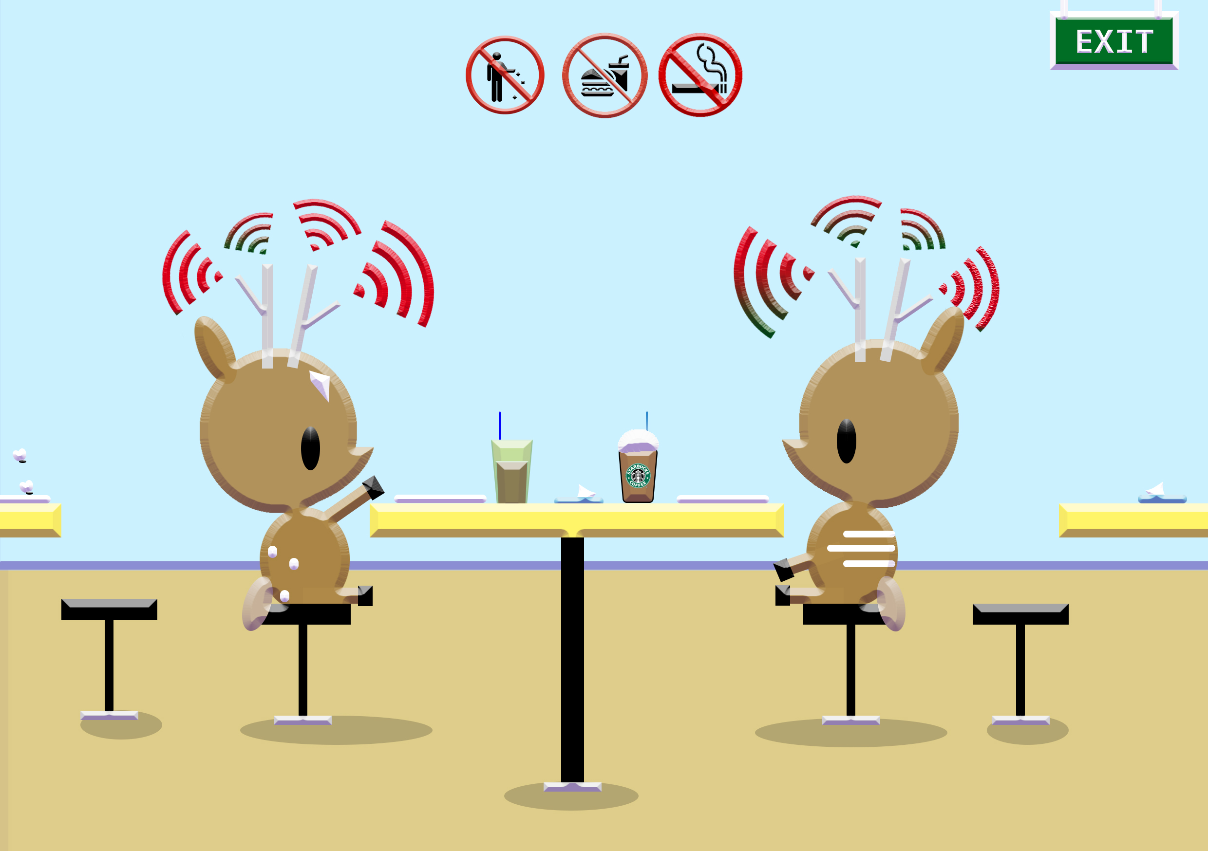
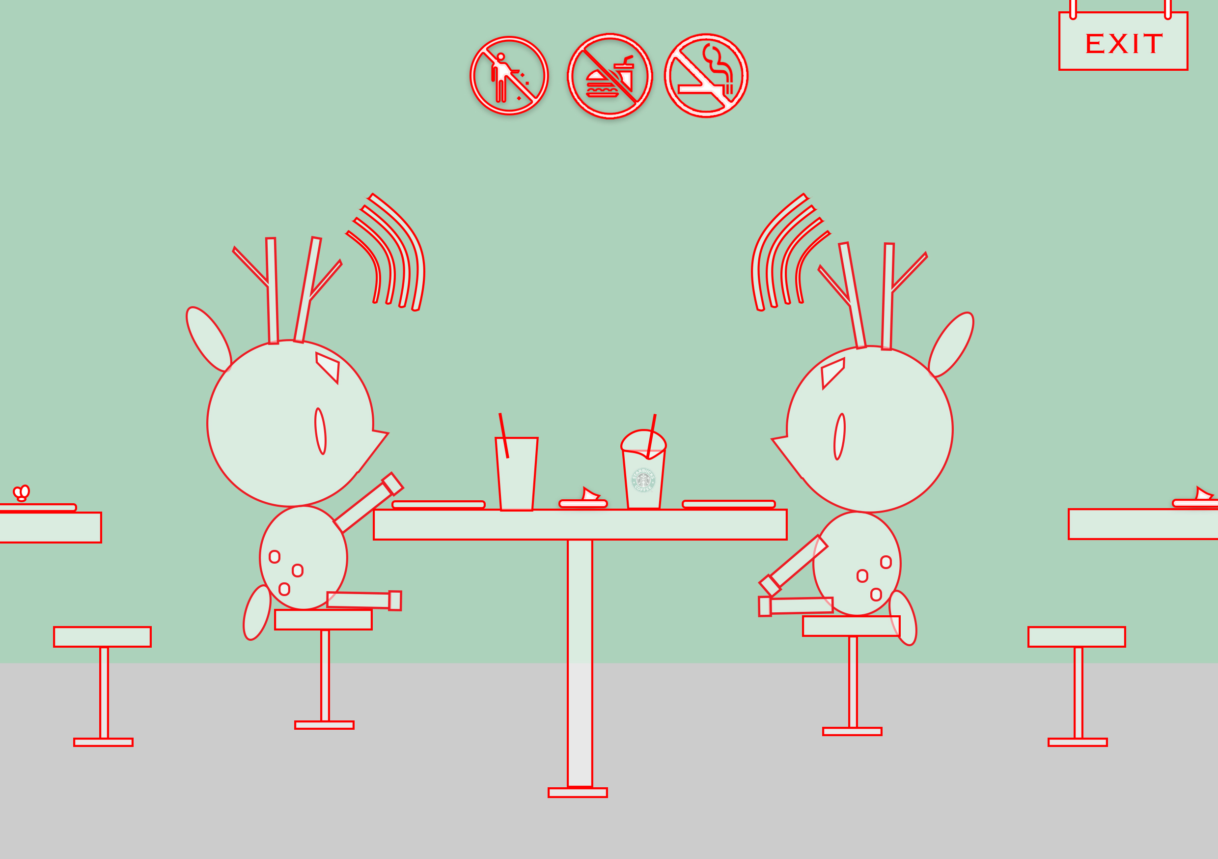
  22. A phone from the POV of deer is socialising.
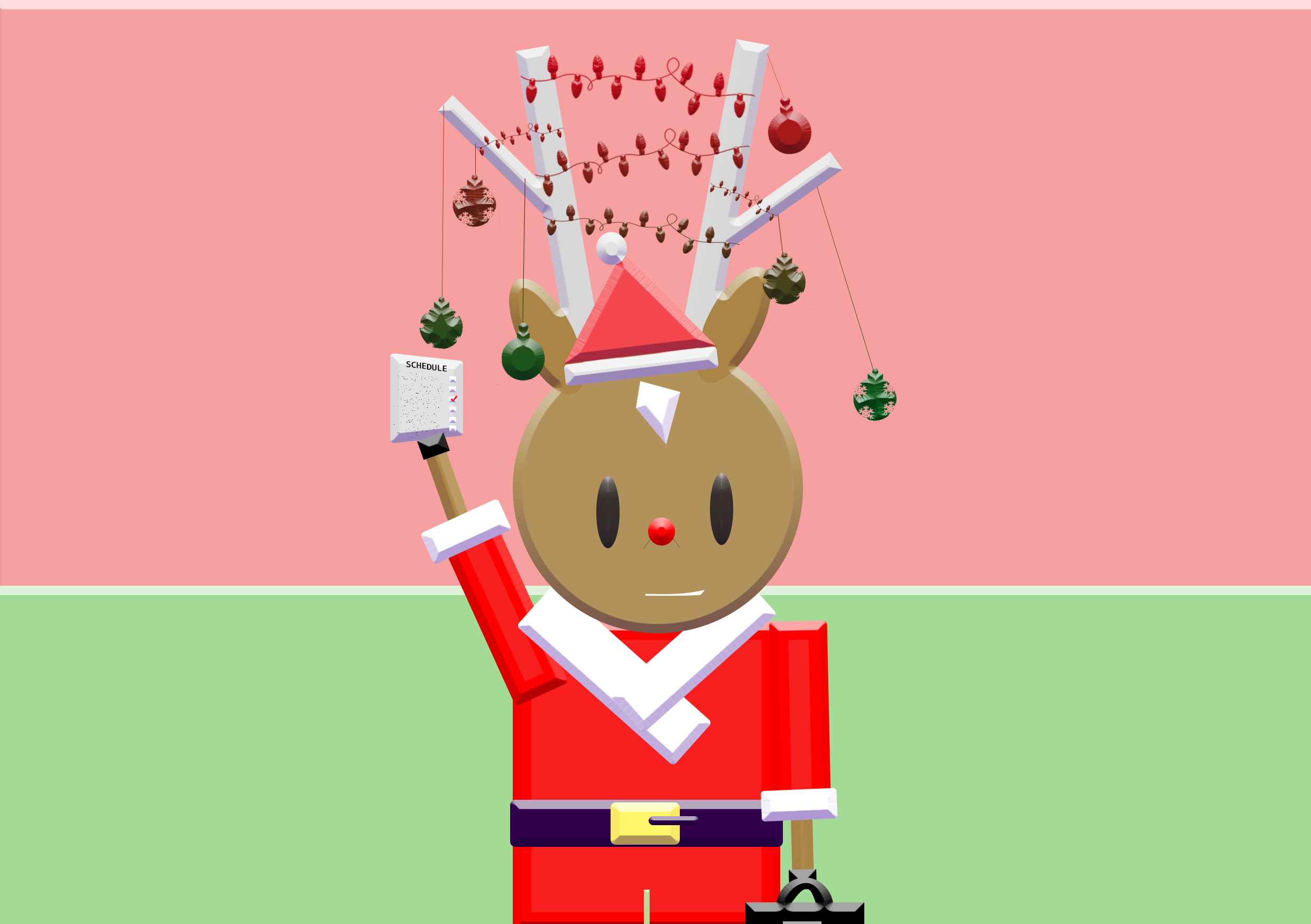
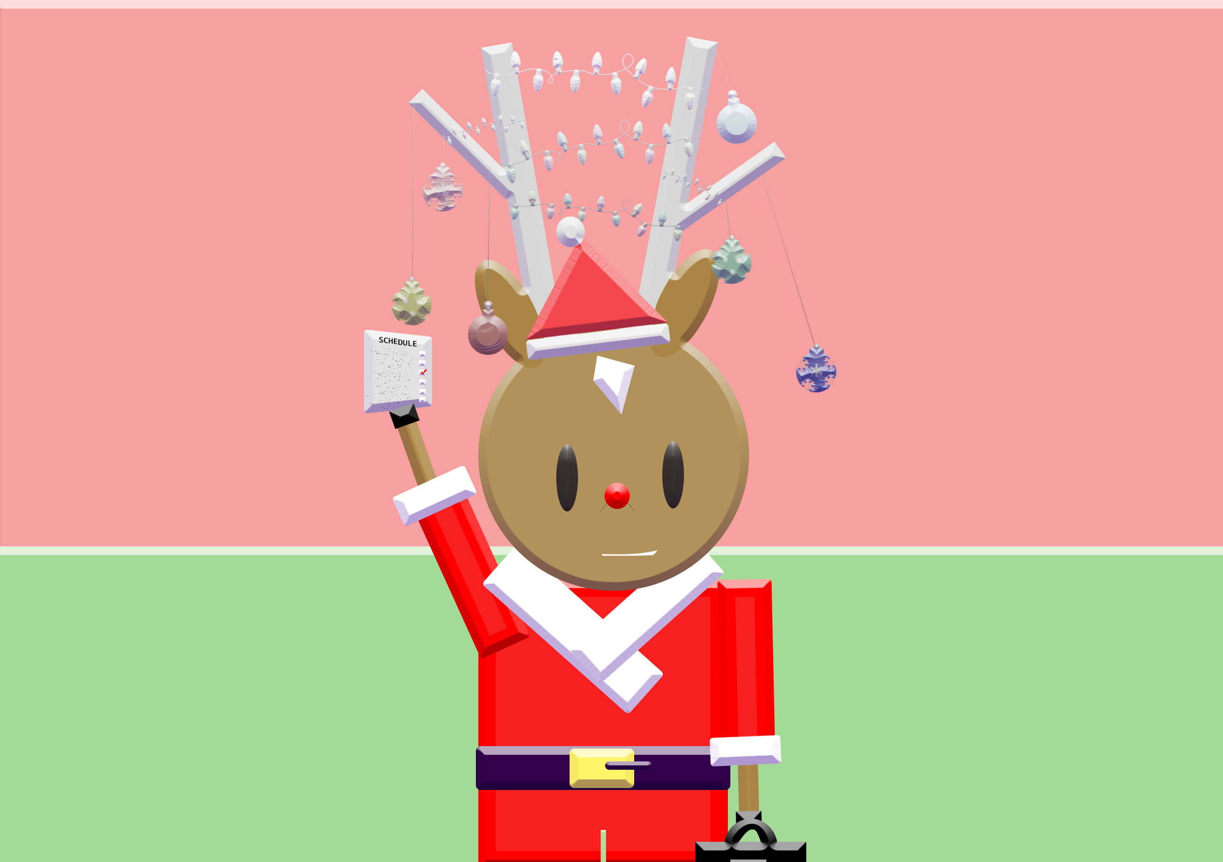
  23. A holiday from the POV of deer is celebration.
Artist References:

 Illustration 

Hsiao-ron cheng

  • composition;in terms of the layout, angles and scales.

rizi-700_2 600 the-fox-and-the-child_2048_600

Alena Tkach

  • Simple yet impactful to tell a narrative.
  • ‘kiddy’ effect – childlike in a way (crayon-like?)

b1241e17347469.562bb9773f562d10e1417347469.562bba8282881

Brosmind Studio

  • simple and clean yet playful layout
  • choice of colours; somewhat pleasant to the eyes (harmonious?)

75fa3827452021.55d59f811a7e0

Fabricio Rosa Marques

  • idea of animals personified

2f90fc22810475.56318c279008c 80fe8122810475.5632fee2a8f14

Nick Kumbari

  • done solely based on lines & curves
  • play of colour theory

93e5f931113155.5641dbec14cd3

Andriy Yurchenko

  • interesting process of how image is made
  • form & colour follows outline of various overlapping circle

0fdb7030671987.562e4877506c4b095dd30671987.562e388483788


Photography 

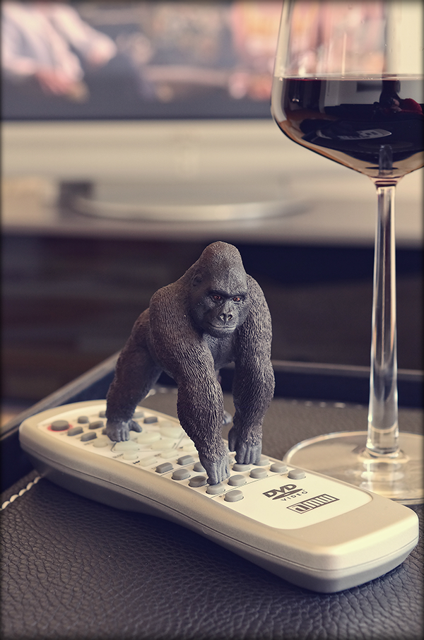
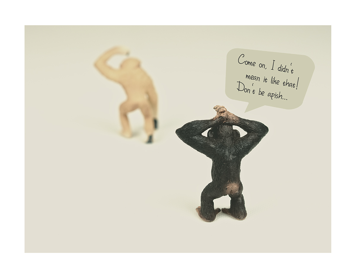
Bettina Güber

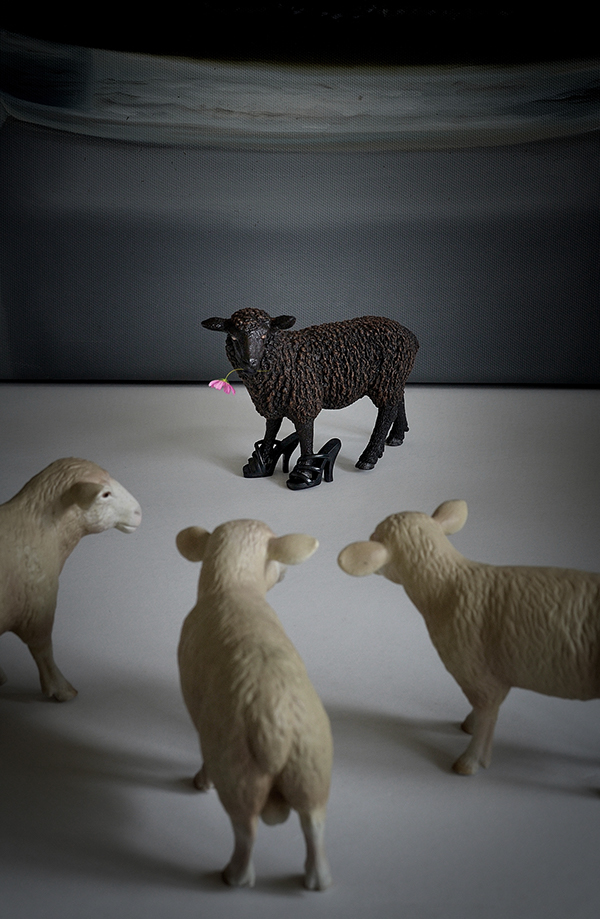
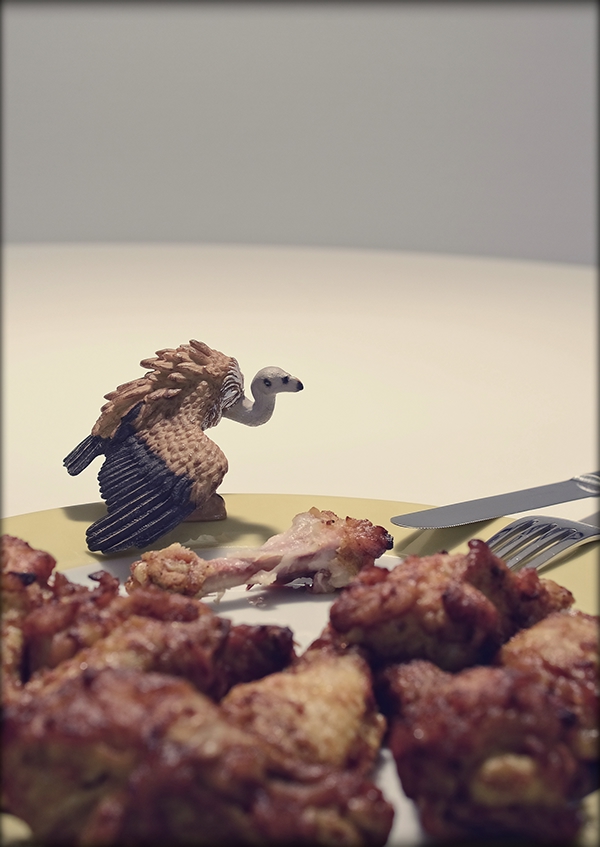
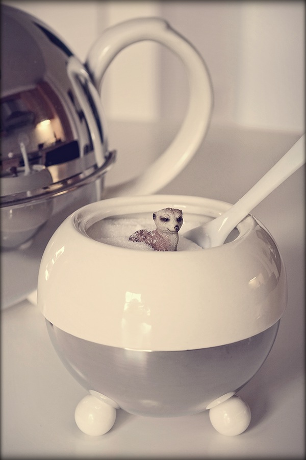
  • toy animals staged to portray an idea in both backgrounds alike their natural habitats and also when totally not.
  • hint of a narrative

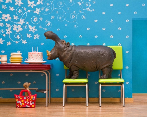
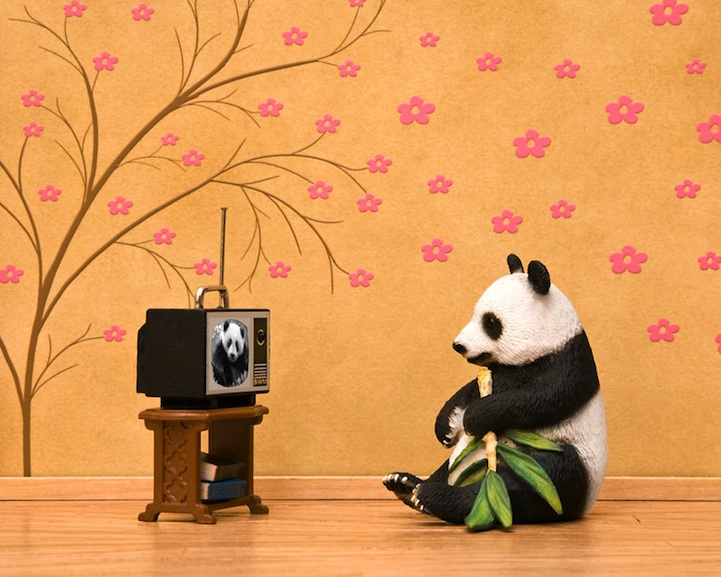
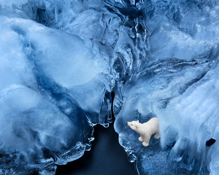
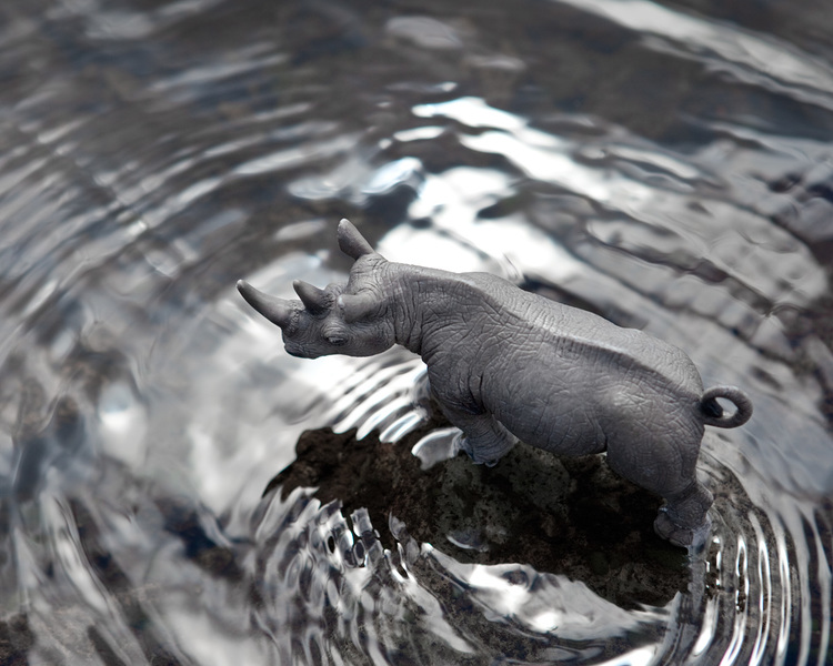
8eddba24856587.5633b33f84521 12b27f24351823.56333daf96684 c1308024095317.5633016eaf81f d2e1c124351823.56333df84f25f 07123f31523855.5654876e2be90Jeff Friesen

  • toy animals staged to portray an idea in both backgrounds alike their natural habitats and also when totally not.
  • hint of a narrative

wildanimalprints_hippo 1082124361 polar-bear-toy-photography-schleich-animals rhino-toy-photography-schleich-animalsMiki Takahashi 高橋未希

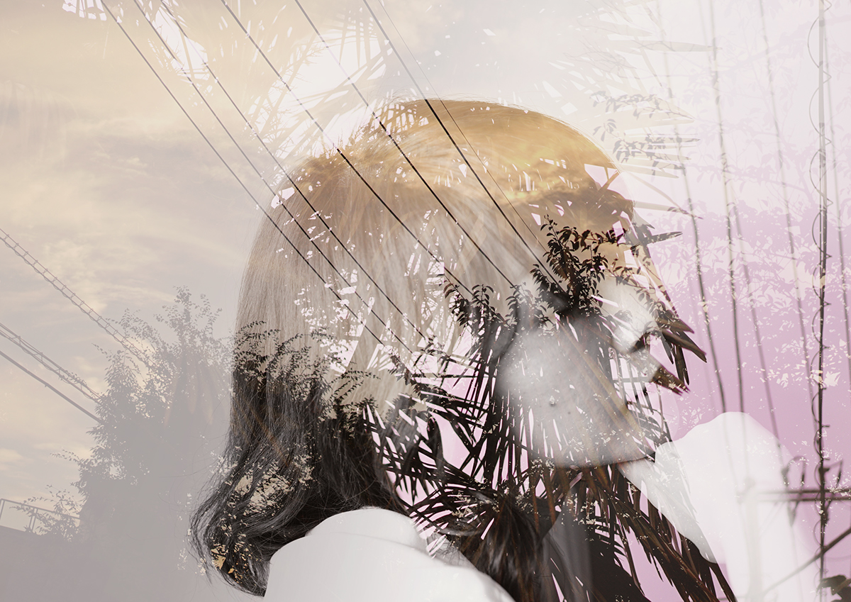
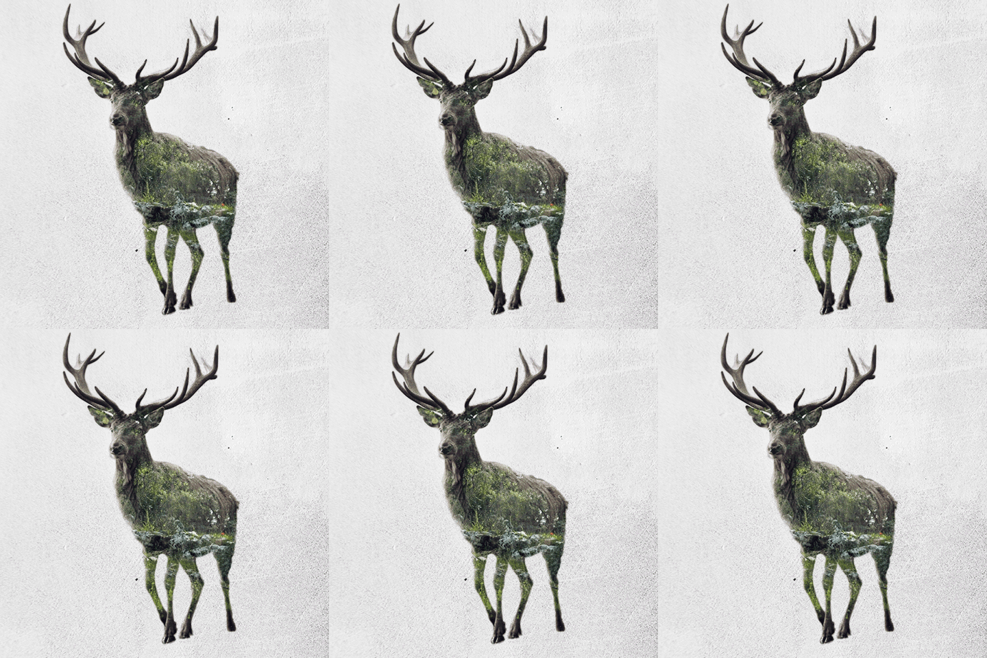
  • double exposure & overlaying
  • focus on mood/atmosphere in relation to main subject matter

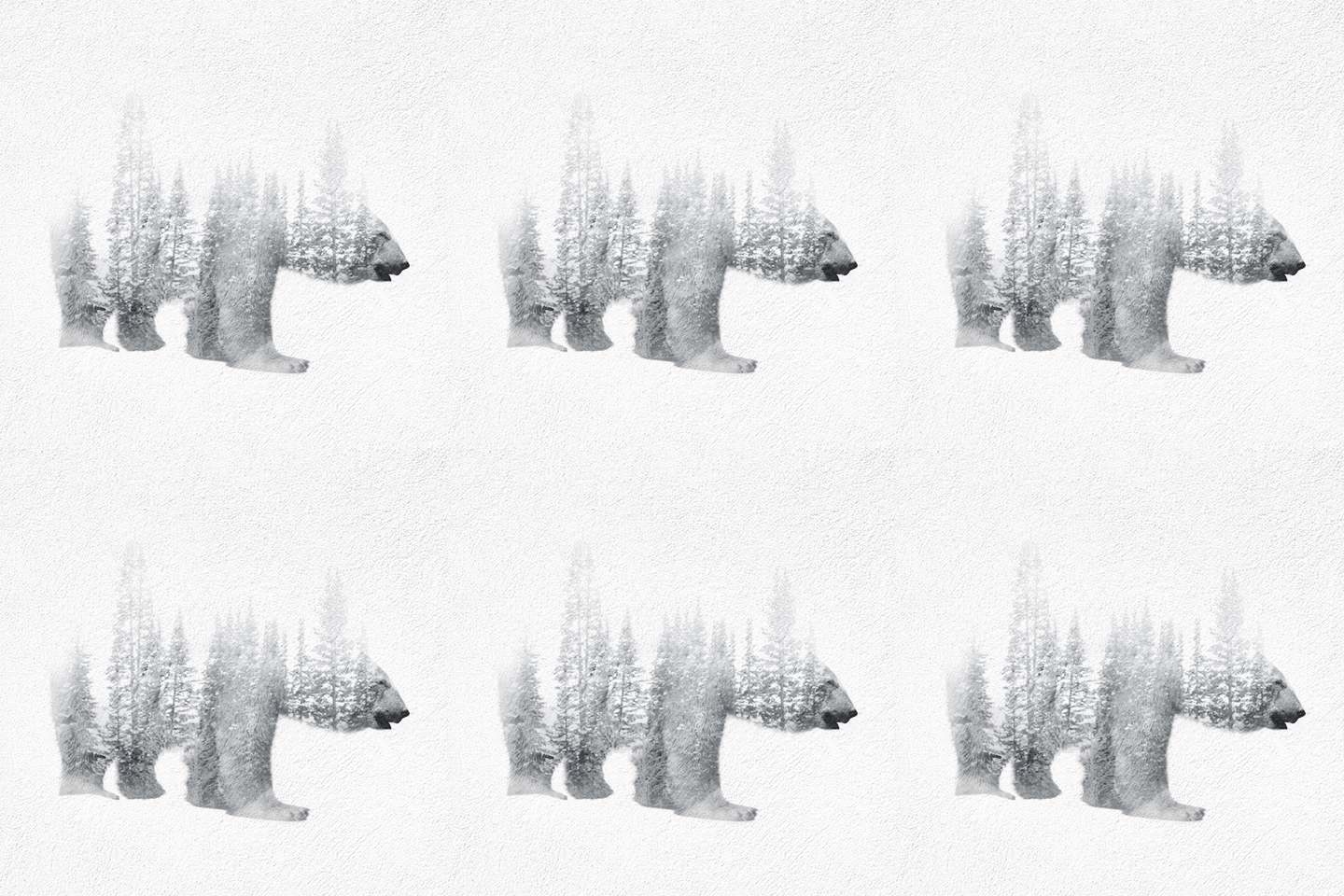
c4028e30176281.562922441131a 04d90930176281.5617e8d84d21cSaid Dagdeviren

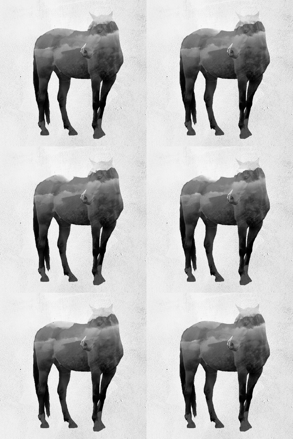
  • double exposure & overlaying
  • focus on mood/atmosphere in relation to main subject matter
  • found this artist’s works particularly interesting because of the animation which seems to enhance the mood/atmosphere in relation to subject matter(in my opinion).

7bcc9732584937.568b9580c0b44 15b59e32584937.568b95801d117 190cac32584937.568b95806d416

Paper Cutting

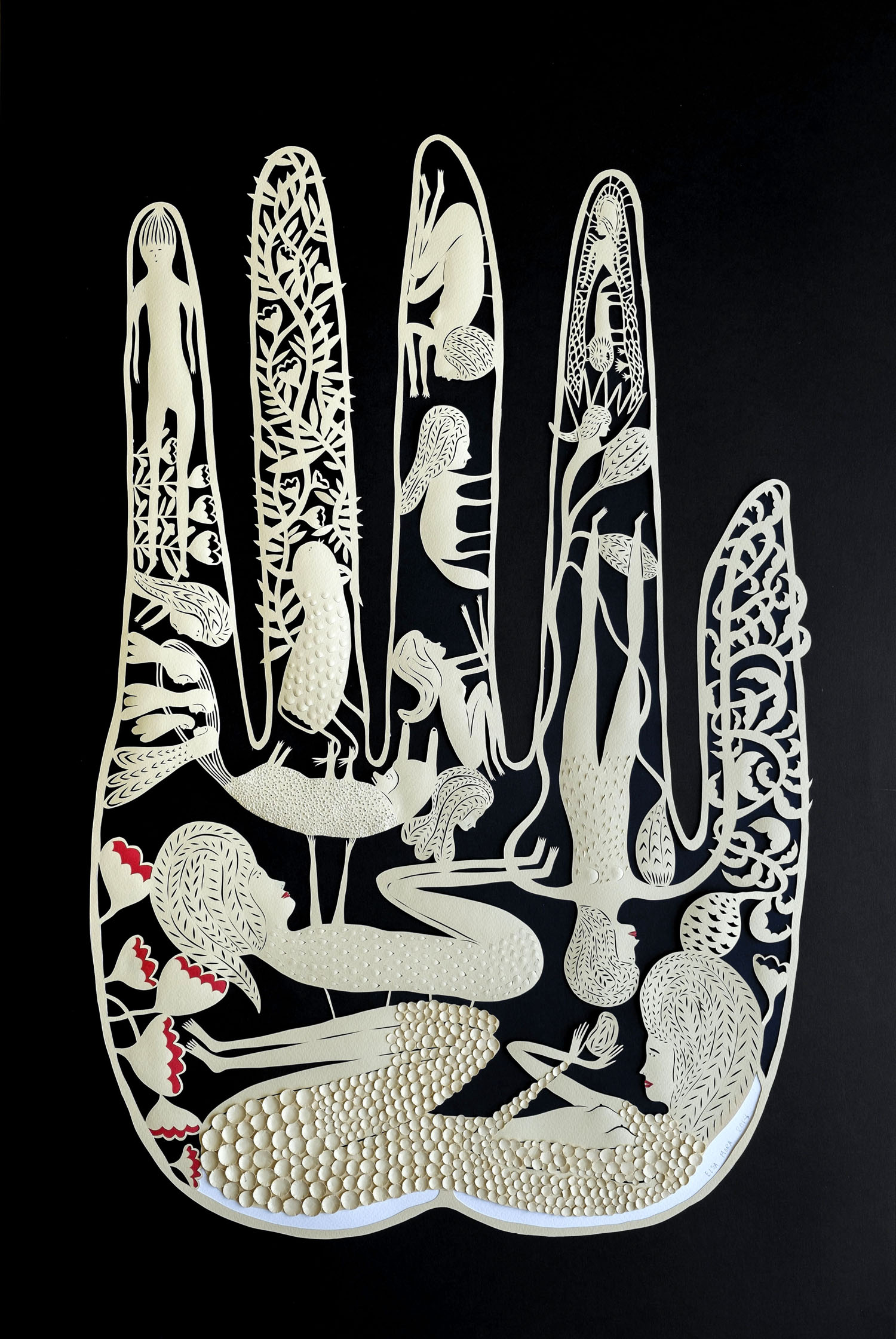
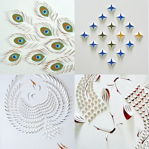
Elsa Mora

  • detailed
  • hint of narrative
  • overarching shape is representational instead of just a usual square/rectangle(normal paper shape)

The-Search

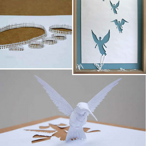
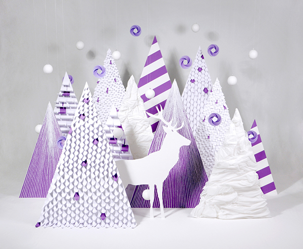
Peter Callesen

  • pop-up

peter

Lisa Rodden

  • to suggest idea of texture & form
  • minimalistic in a way?

lisarodden

Collages

Zim & Zou

  • choice of just of only two to three colours

0adbdb5306651.560221b6912de ca6a8a17739289.562be63c6fdb6

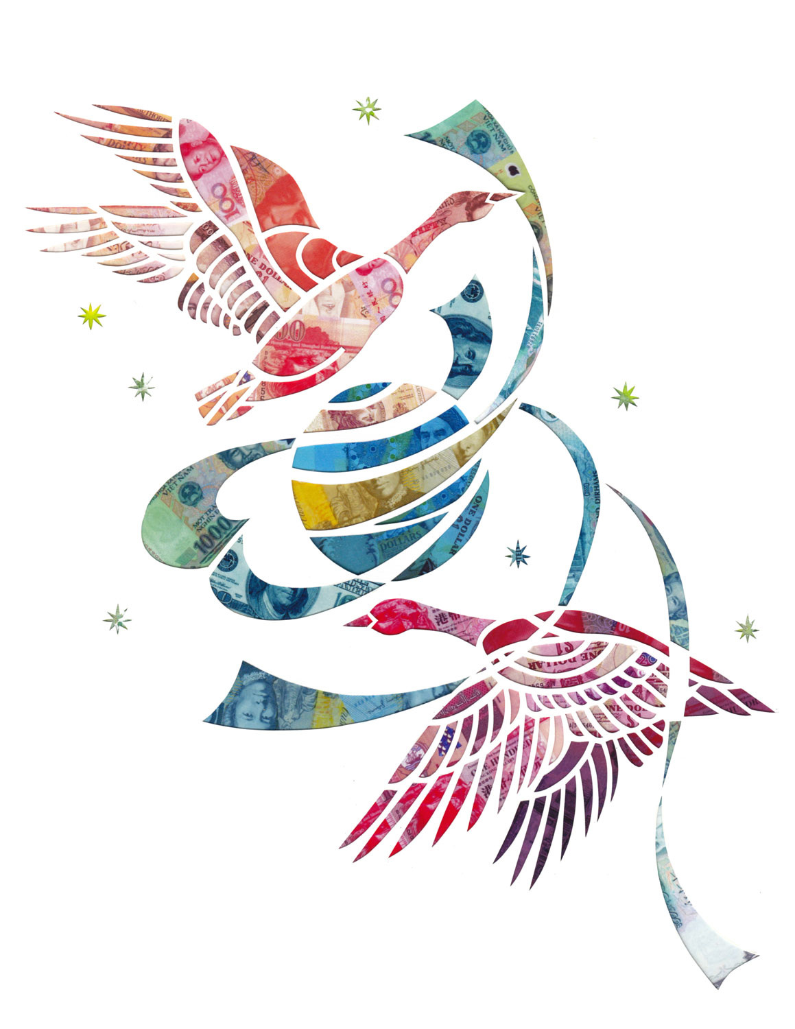
Mayuko Fujino

  • found her material of cutouts interesting which also serves to tell something about the subject matter

OnWard_1159

Others

 Suzanne Bonanno 

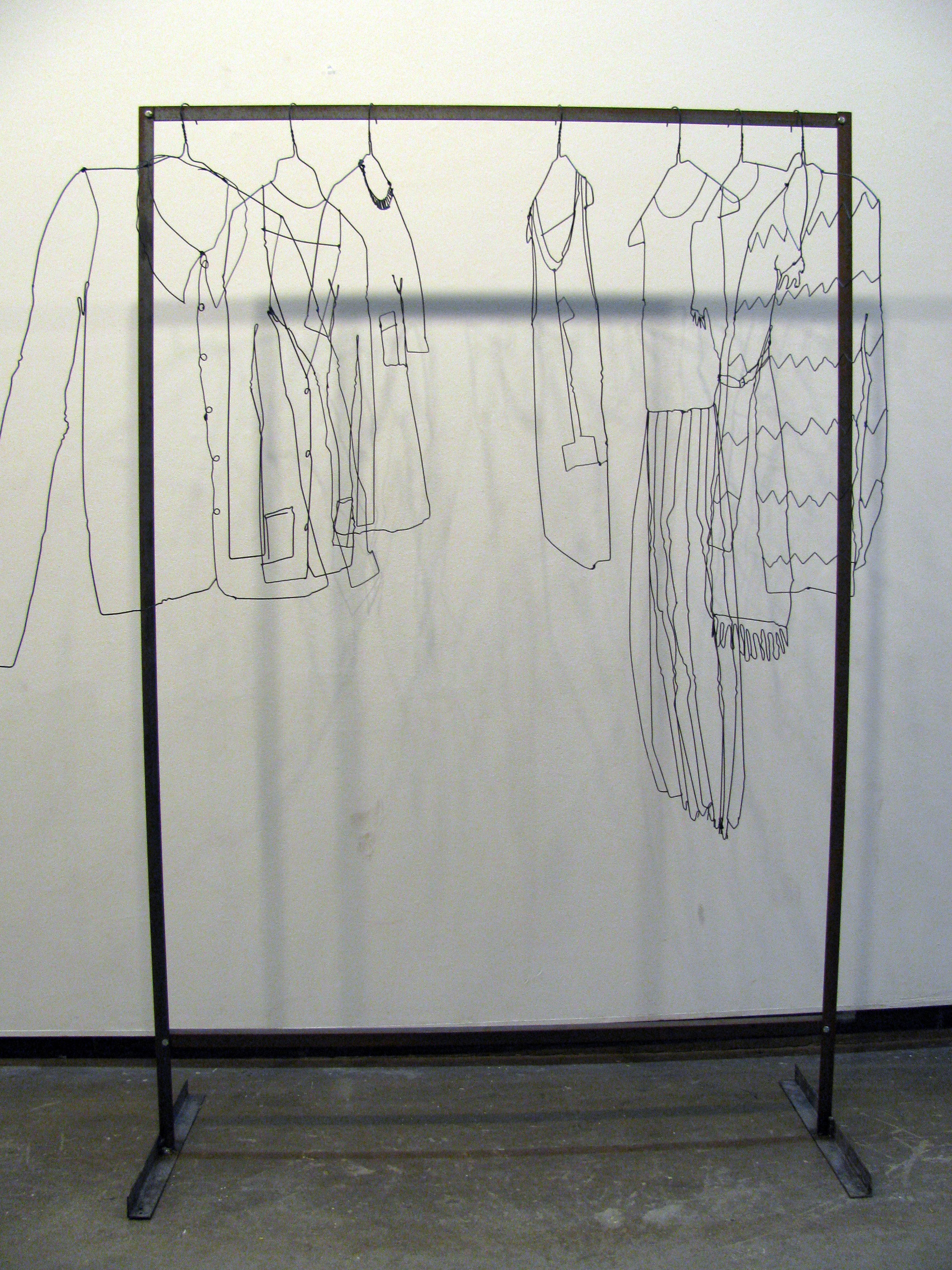
  • bending & twisting of non-representational wires to form something we all know

ckt_o

Lauren Wargo

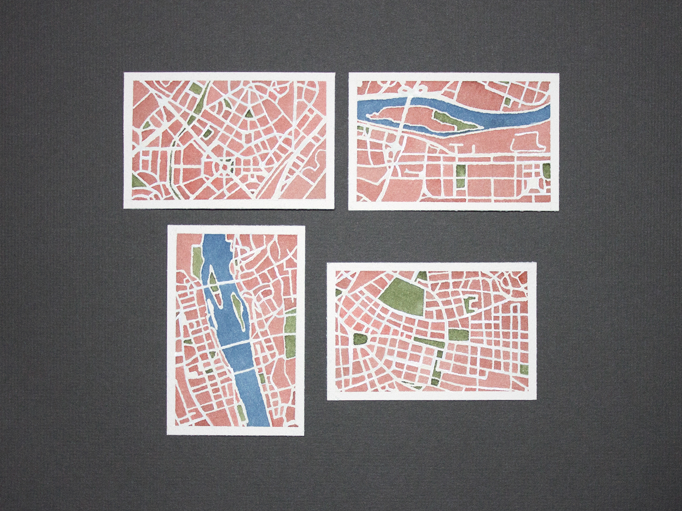
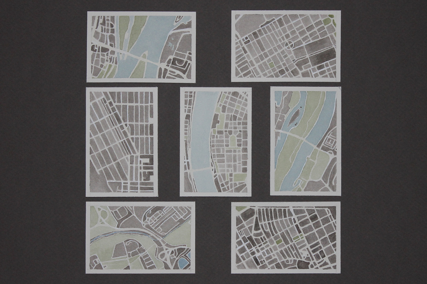
  • contours and maps of cities/places

427b0228969719.55dd27af5a6db 03491e23698535.563274f176759


To start off the first project for foundation 2D II, I delved into researching artists for inspirations and ideas. Personally, the artists i decided to reference from are because of their works that i find rather interesting i would like try it out for myself. The works range from focusing on the typeface to being decorative/ illustrative to photography/gifs and lastly to the usage of unconventional mediums.

Alexandre Pietra

9bcb5317179851.562b720f8e66e 44968317179851.562b6d3622e5a

>Idea of minimalistic & futuristic  look ; Simple but clear.

source: https://www.behance.net/gallery/17179851/Lombok-typeface

Viplov Singh & Svabhu Kohli

45cb8b32254073.5676c92e8abdb

>Pushing idea of something that is 2D to something that looks 3D.

source: https://www.behance.net/gallery/32254073/Discover-Typography-GIFs

Aleph Corporation

2e92e722242659.5630f023ceae5 c37c8722242659.56315050d9785

source: https://www.behance.net/alephcorp

Stephanie Baxter

4e00538295795.560baa9bc80ca

Picdsture1   Picture1

c9d9978016845.562bc25789bab 1ac01d8016845.562bc14add70e 2b2cd78016845.562bc1b938dbc

source: http://www.stephsayshello.co.uk

David J. Short


6.7.15_dsdribbble 7.6.15_dsdribbble 9.13.15_dsdribbble 11.19.15_dsdribbble 11.26.15_dsdribbble 1.30.15_dsdribbble

source: https://dribbble.com/DavidJShort

Teagan White


40d5293165567.56019b6e229cc

4bd7555275790.56021f8772b16 cycle11 de1b701946386.560112040c8d9

source: https://www.behance.net/gallery/375846/the-person-you-love-is-728-water

Dominic Le-Hair


4315519296039.560cd4f776594

idea of playing with shadows


idea of fruits printing

idea of fruits printing

c4c2fc15180869.5628df5b5b5c3

idea of using actual food (chewing gum in this case)

idea of using actual food (chewing gum in this case)

source: https://www.behance.net/dominicle-hair

Lavanya Naidoo

ef101052209887.5608d44b02f34 1034f352209875.5608d53771eb9

>rolling of papers

>choice of colours

c664ce11997955.56255bd9c61e9 b38ae911997955.56255d06098ab 8ca52c11997955.56255bda188ac

>usage of everyday life objects

source: https://www.behance.net/lavanya

Maricor Maricar

AlltheGoodThings_1_MG_9980 image_07_maricar_maricor image_01_maricar_maricor MM_MakersDreamers_01

For this artist’s works, I’m really attracted to the pretty embroidery however what really inspired is the usage of everyday life objects as the subject matter and even the usage of symbols ( + , = , . , /)

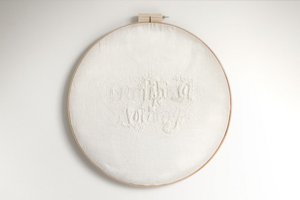
MM_White_1-Everything_frame MM_White_2-Nothing_frame MM_White_3-Everything_Crop MM_White_4-Nothing_Crop

>idea of using the same colour on the same colour to subtly suggest its idea.

source: http://maricormaricar.com

Matt Bites

8bd62a279d64922c6a42eac0964898da

source: http://www.mattarmendariz.com/Food/Food-I/1

Danielle Evans

tumblr_nzwgi6TLEs1ui7gc2o1_1280food-fights-animation Burst-into-Bloom-websitetumblr_nnwub6m4mw1sqanmmo1_1280tumblr_nvtd43LVhc1ui7gc2o1_r1_1280

source: http://marmaladebleue.com  /  http://foodtypography.com