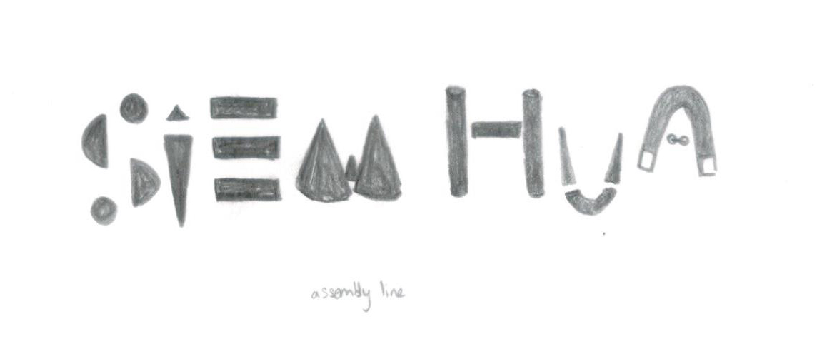
Overall concept: Subtle defect/flaws & Consumerism (refer to process II for more details)
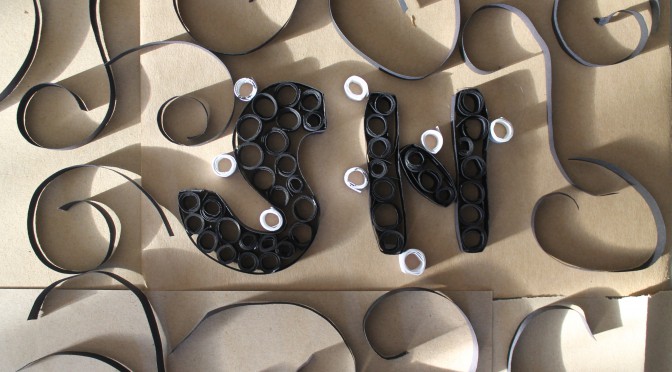
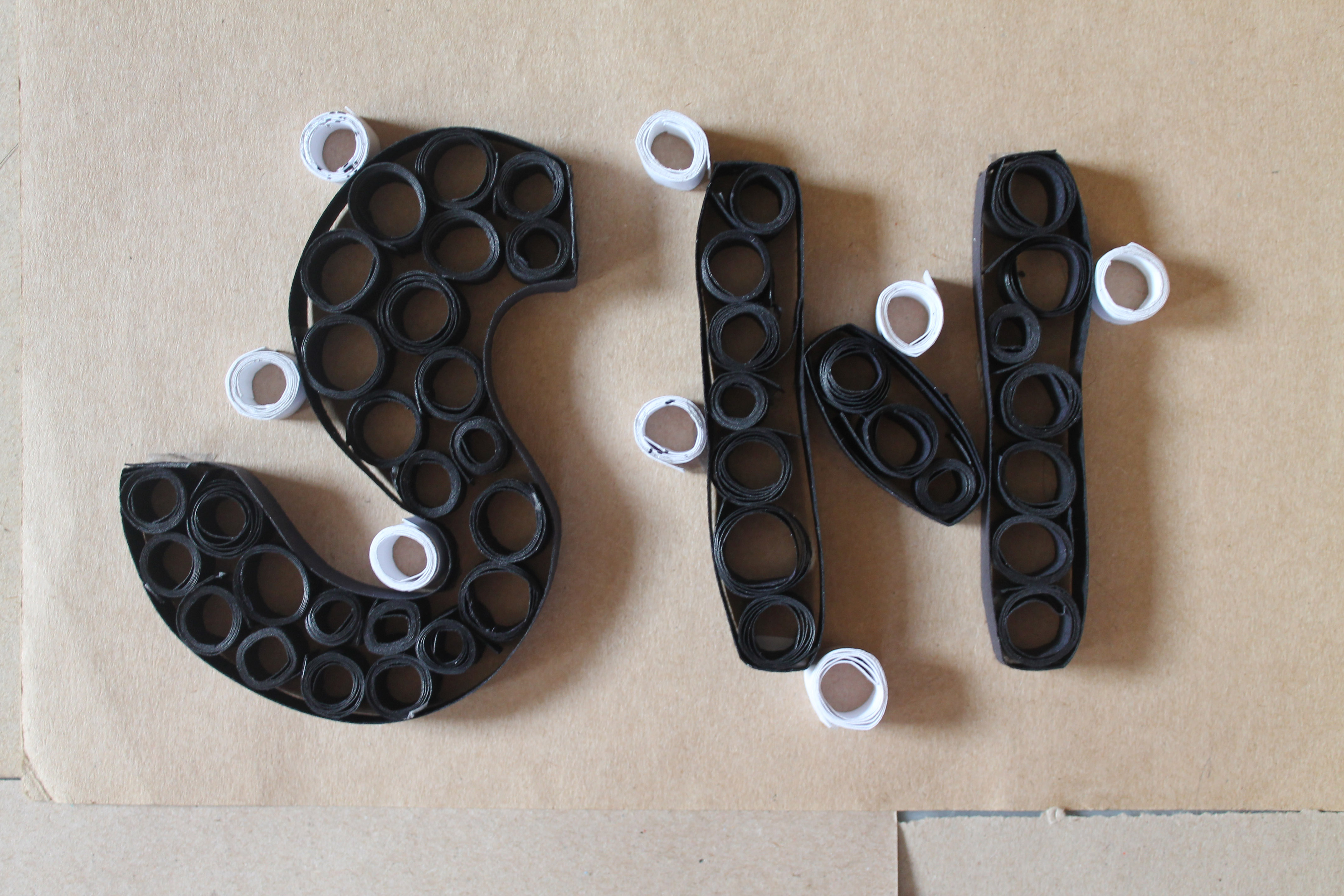
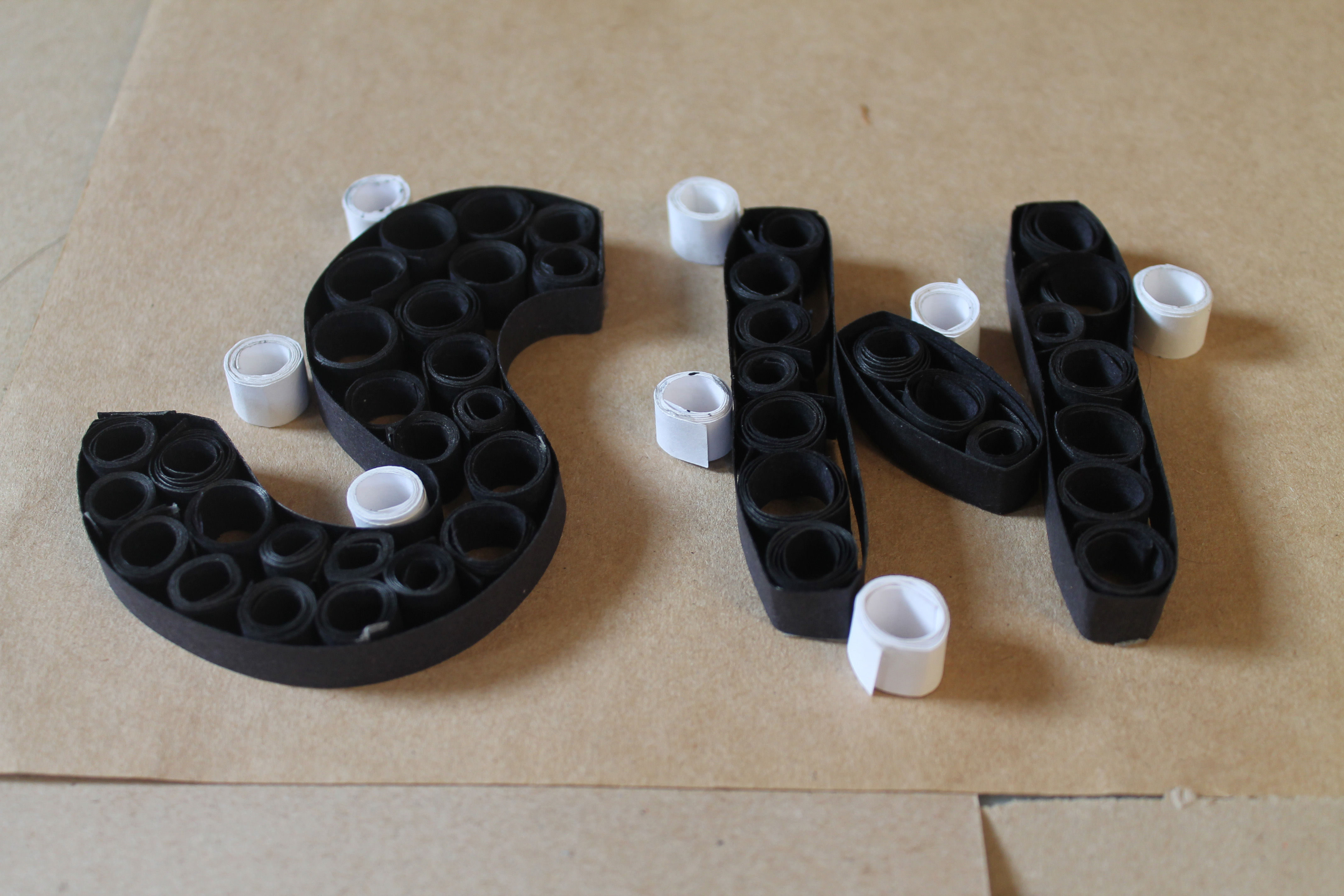
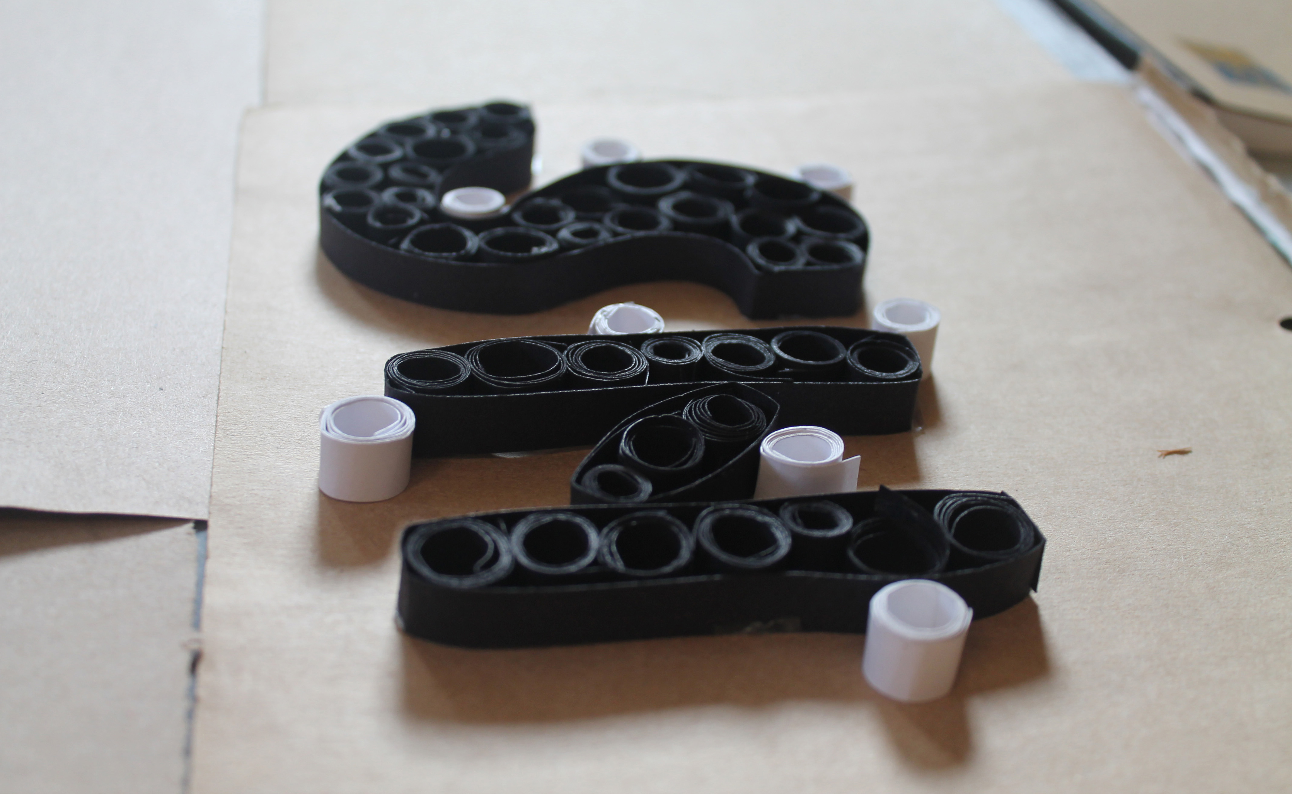
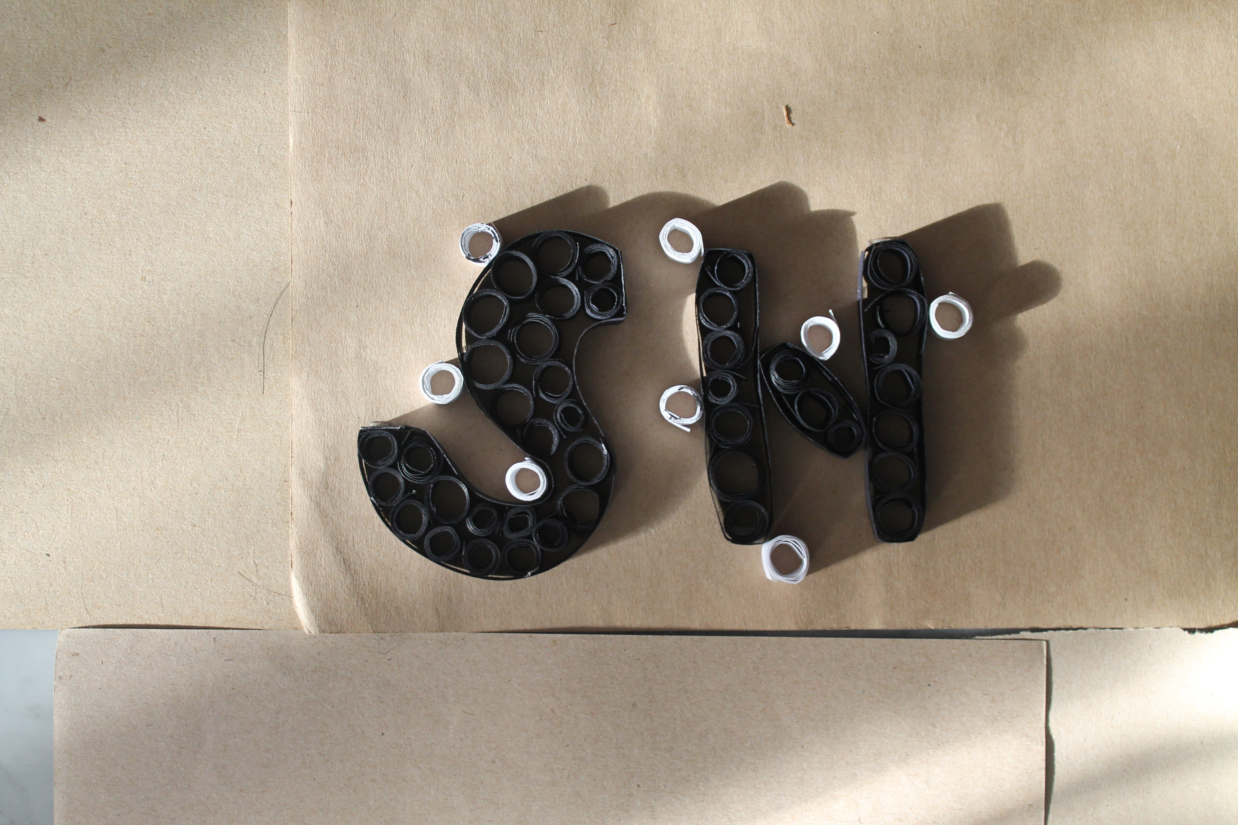
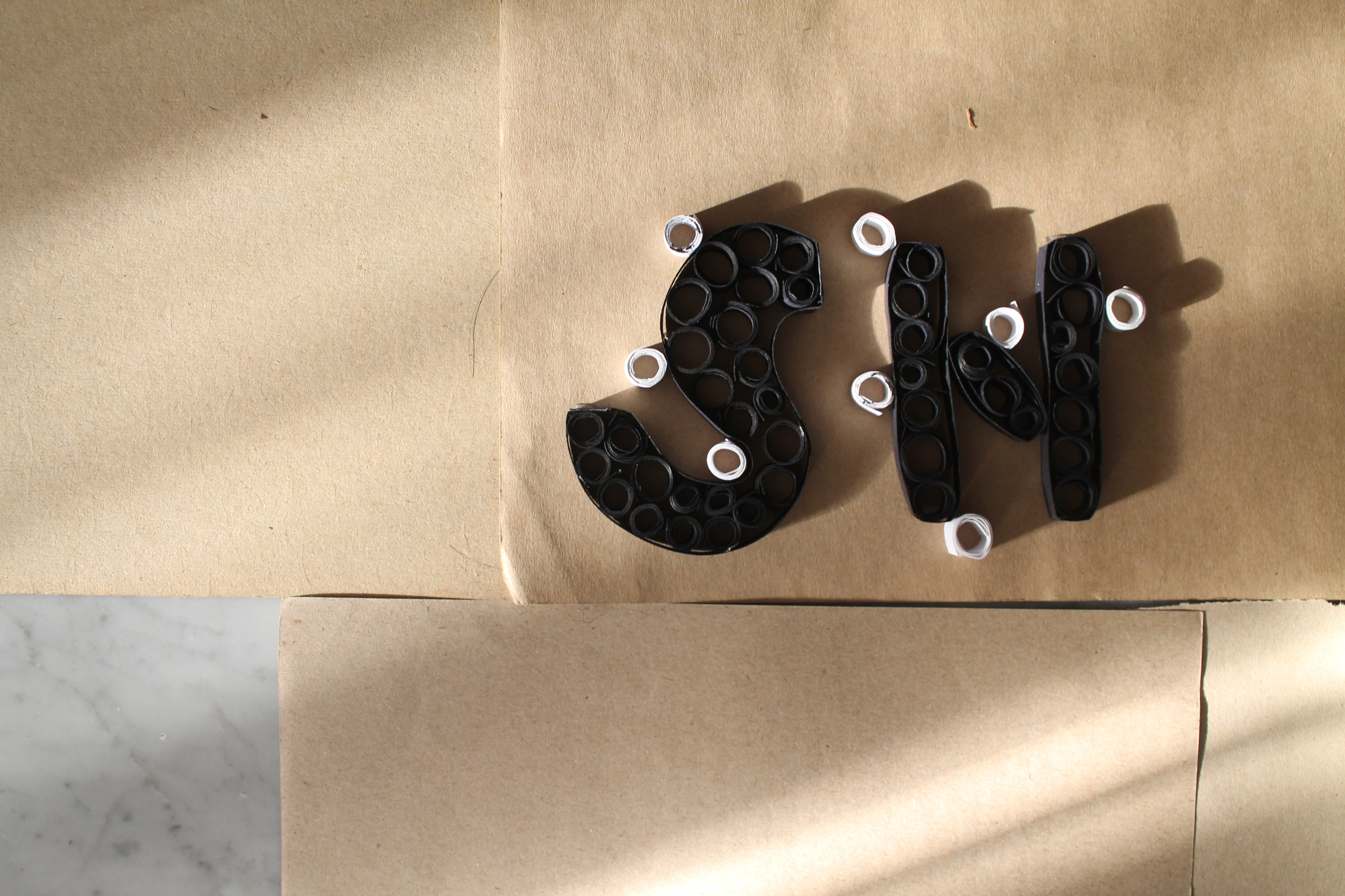
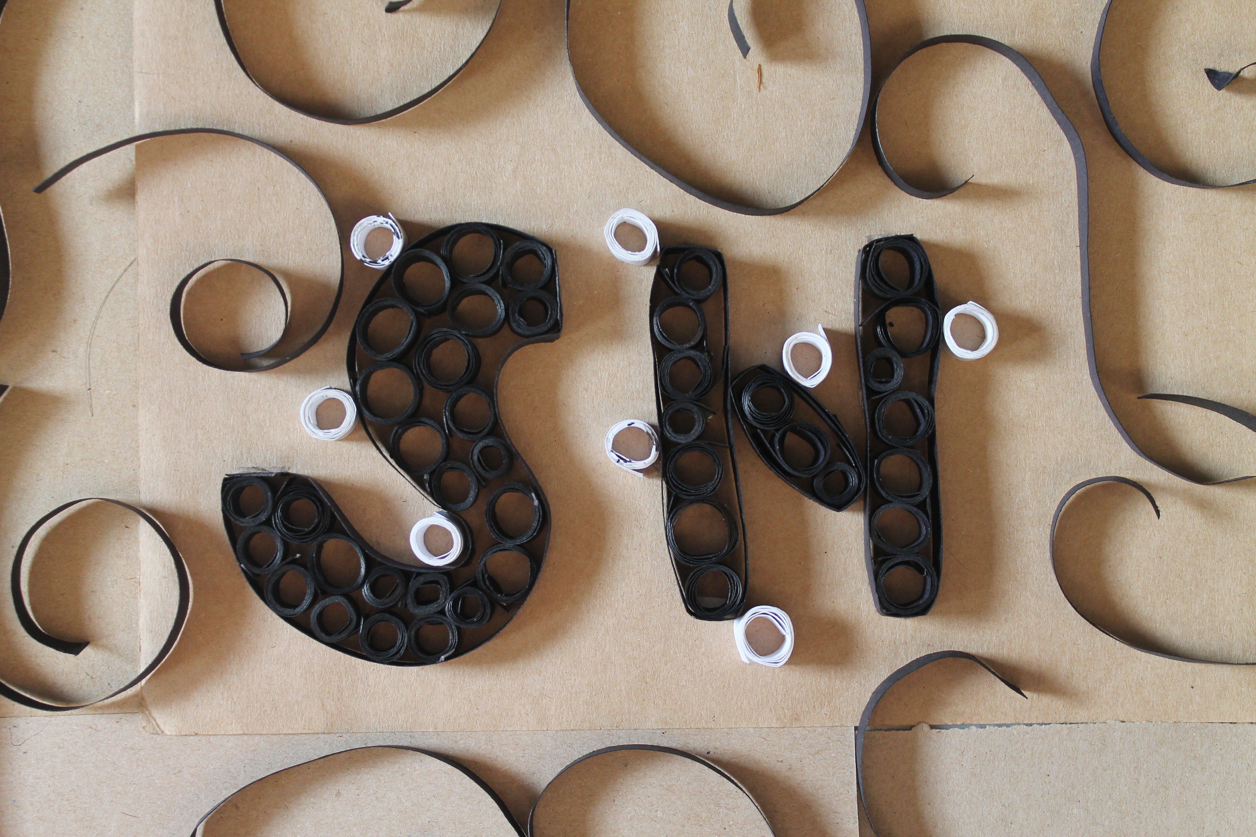
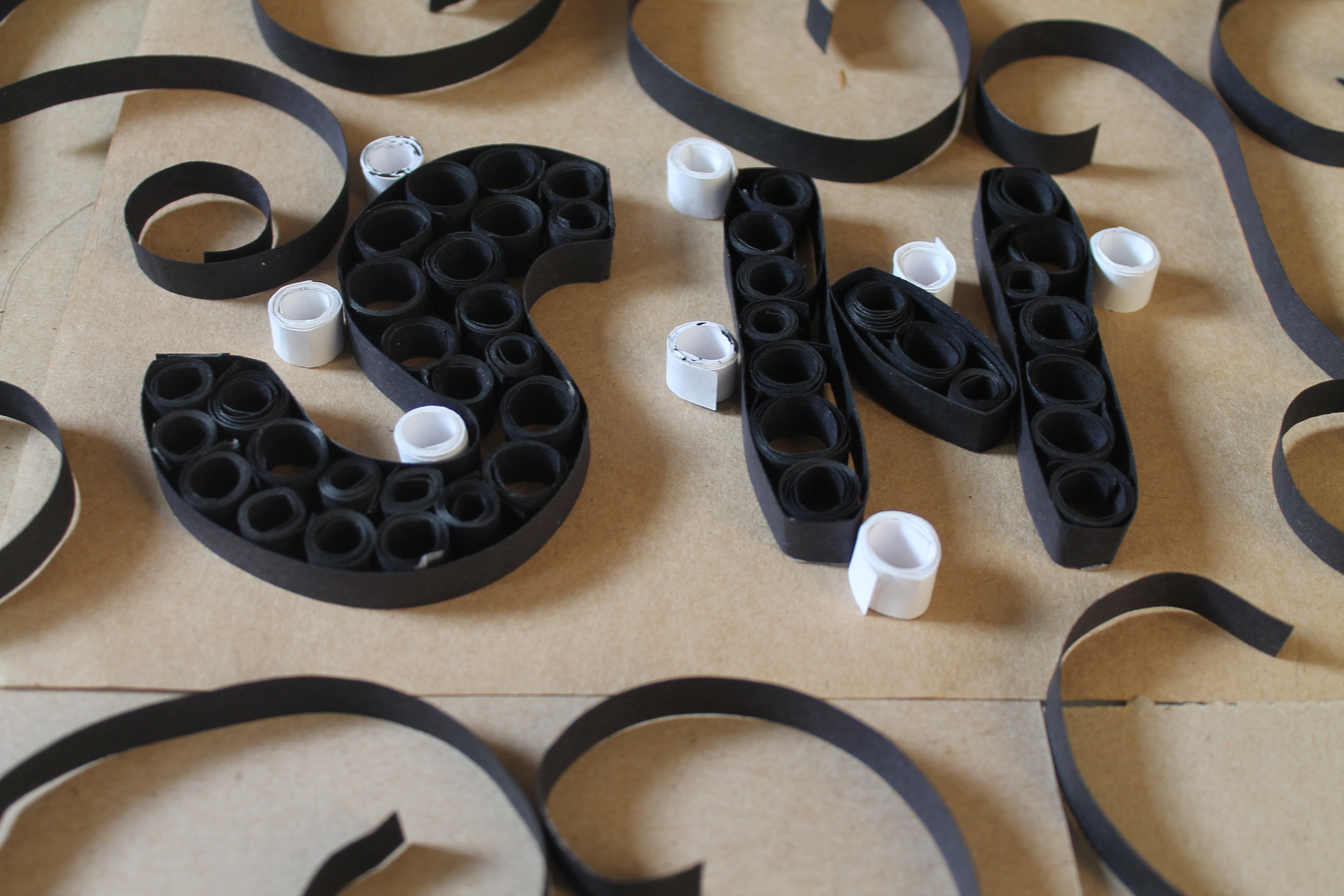
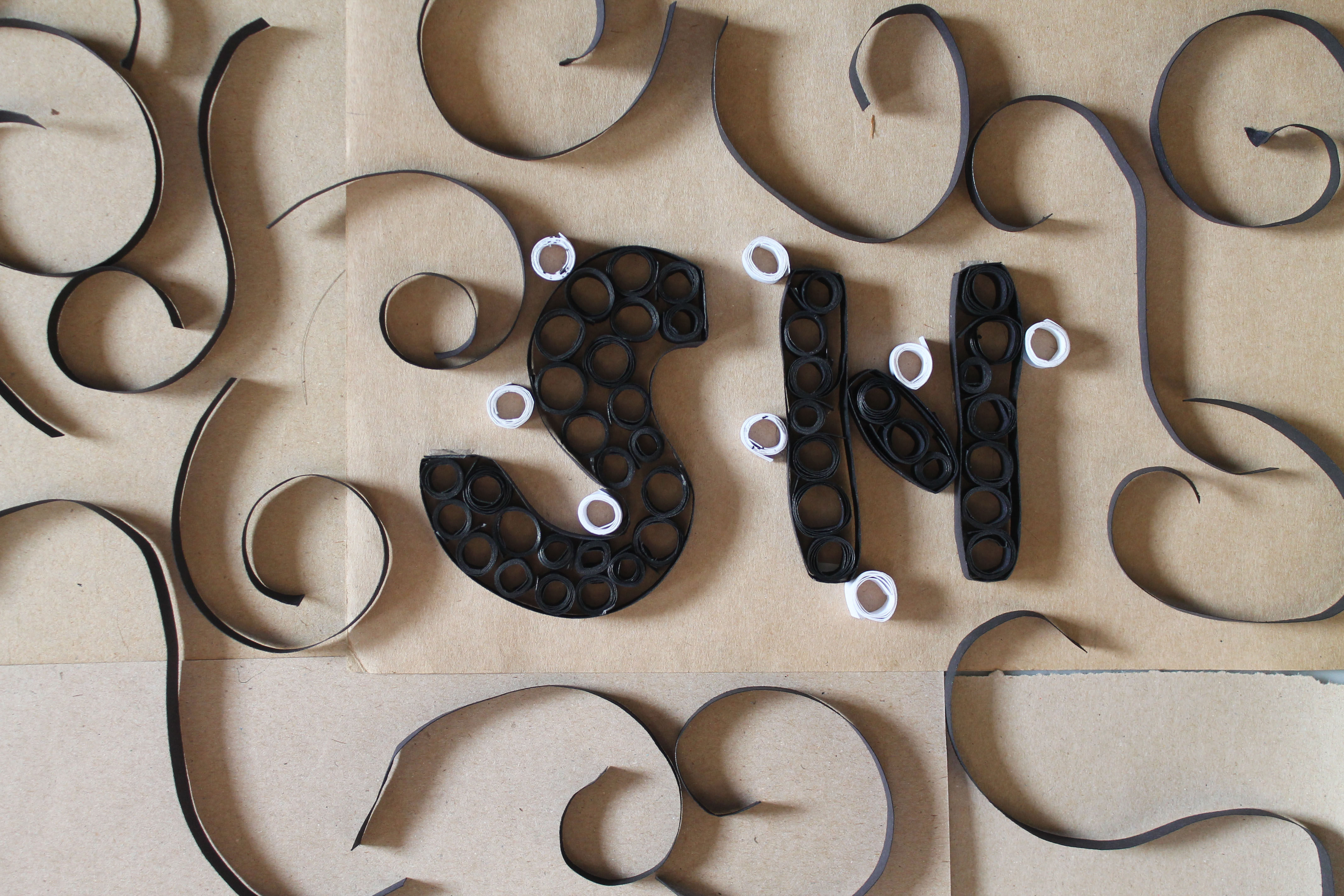
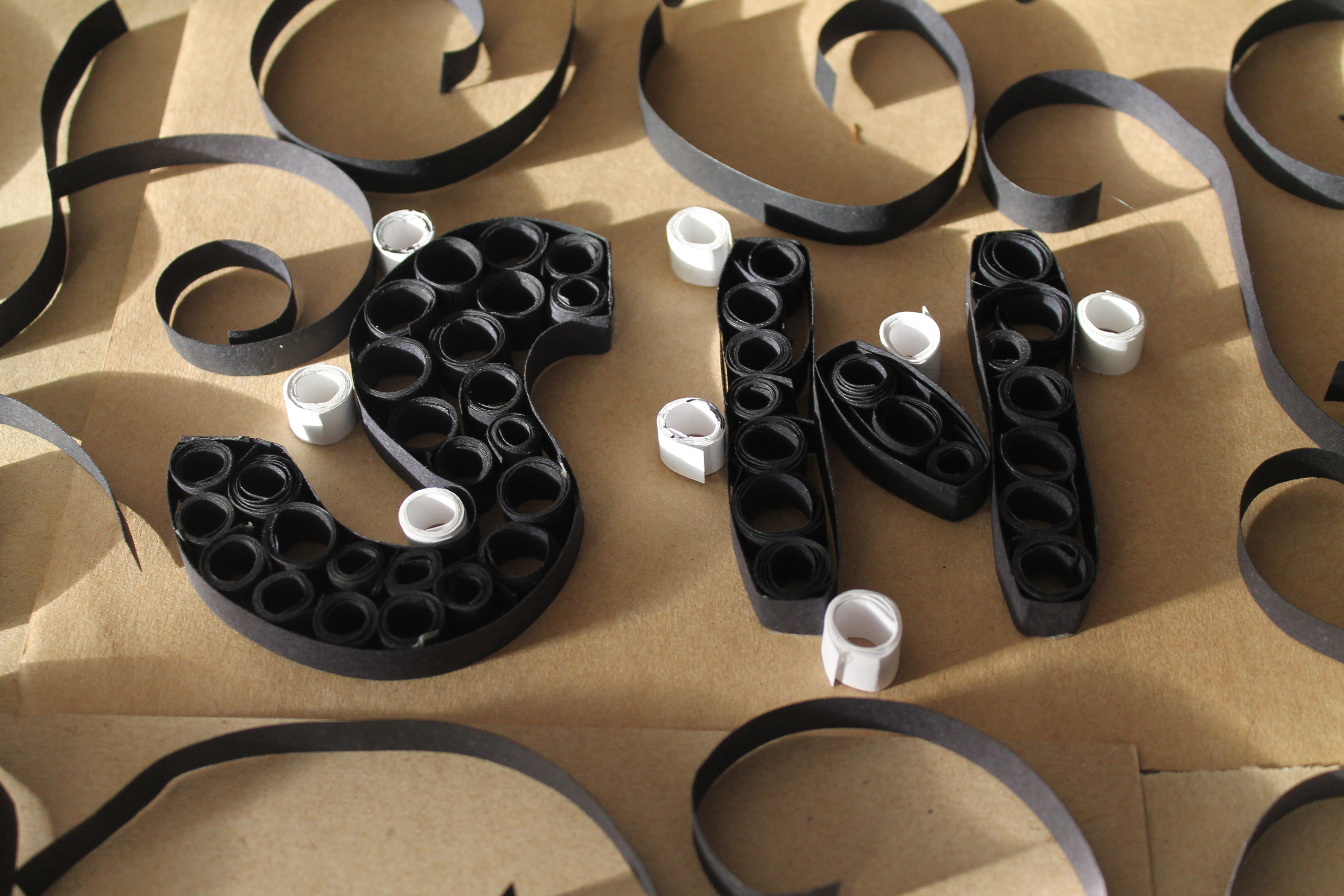
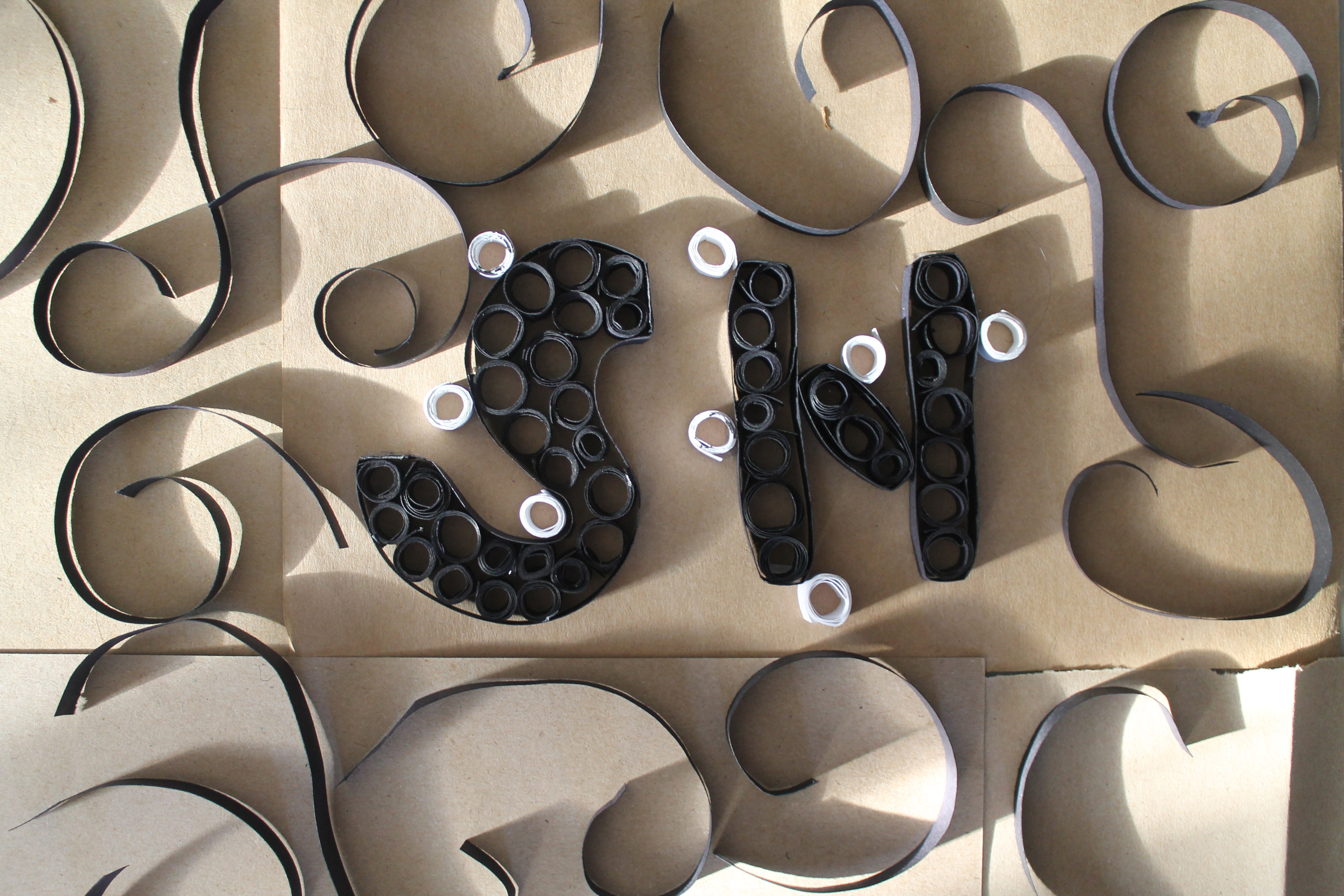
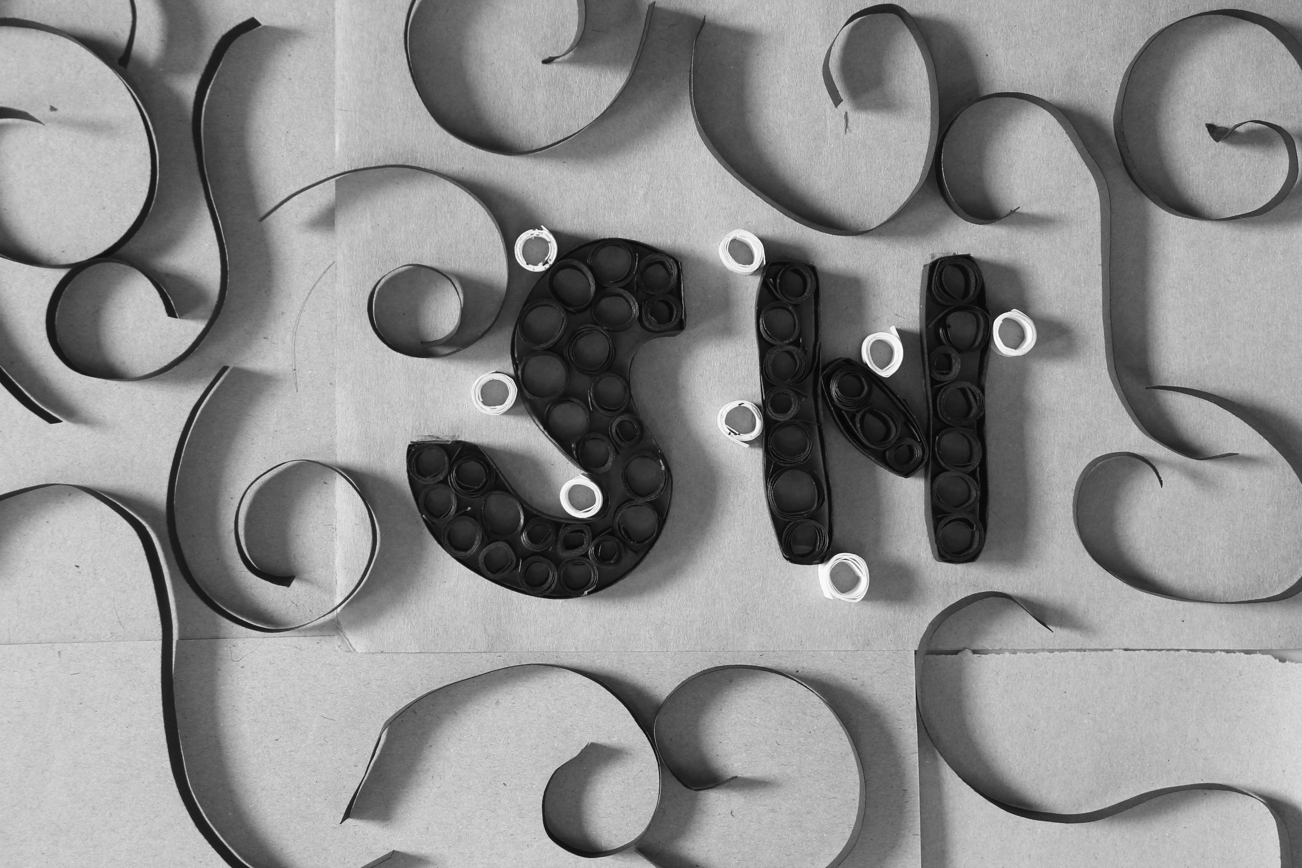
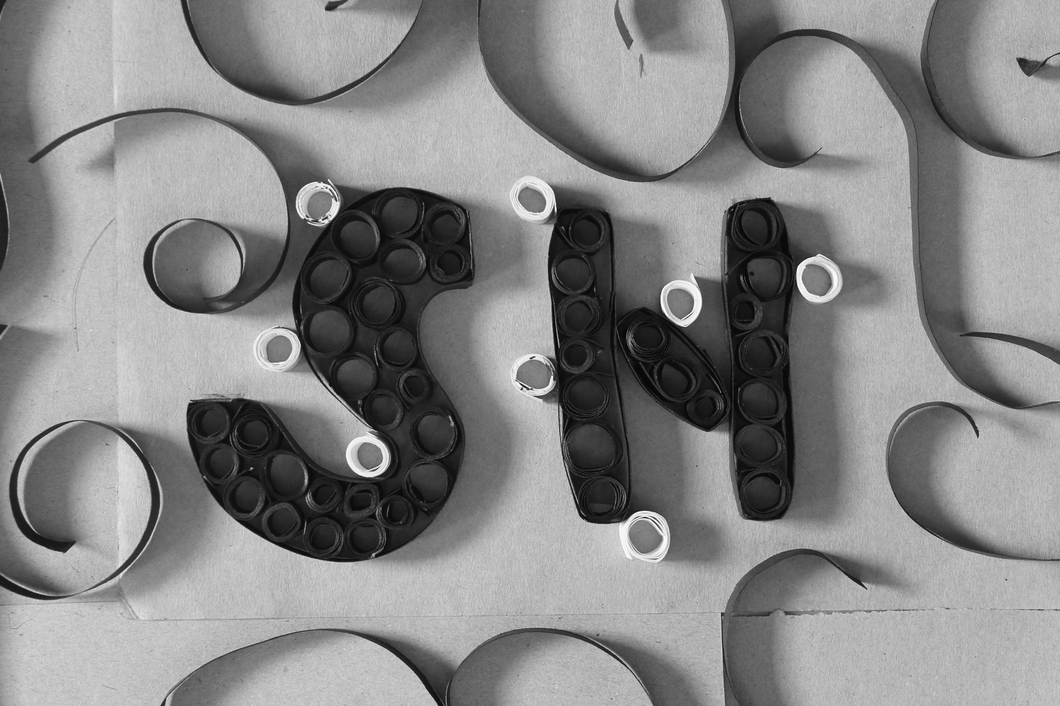
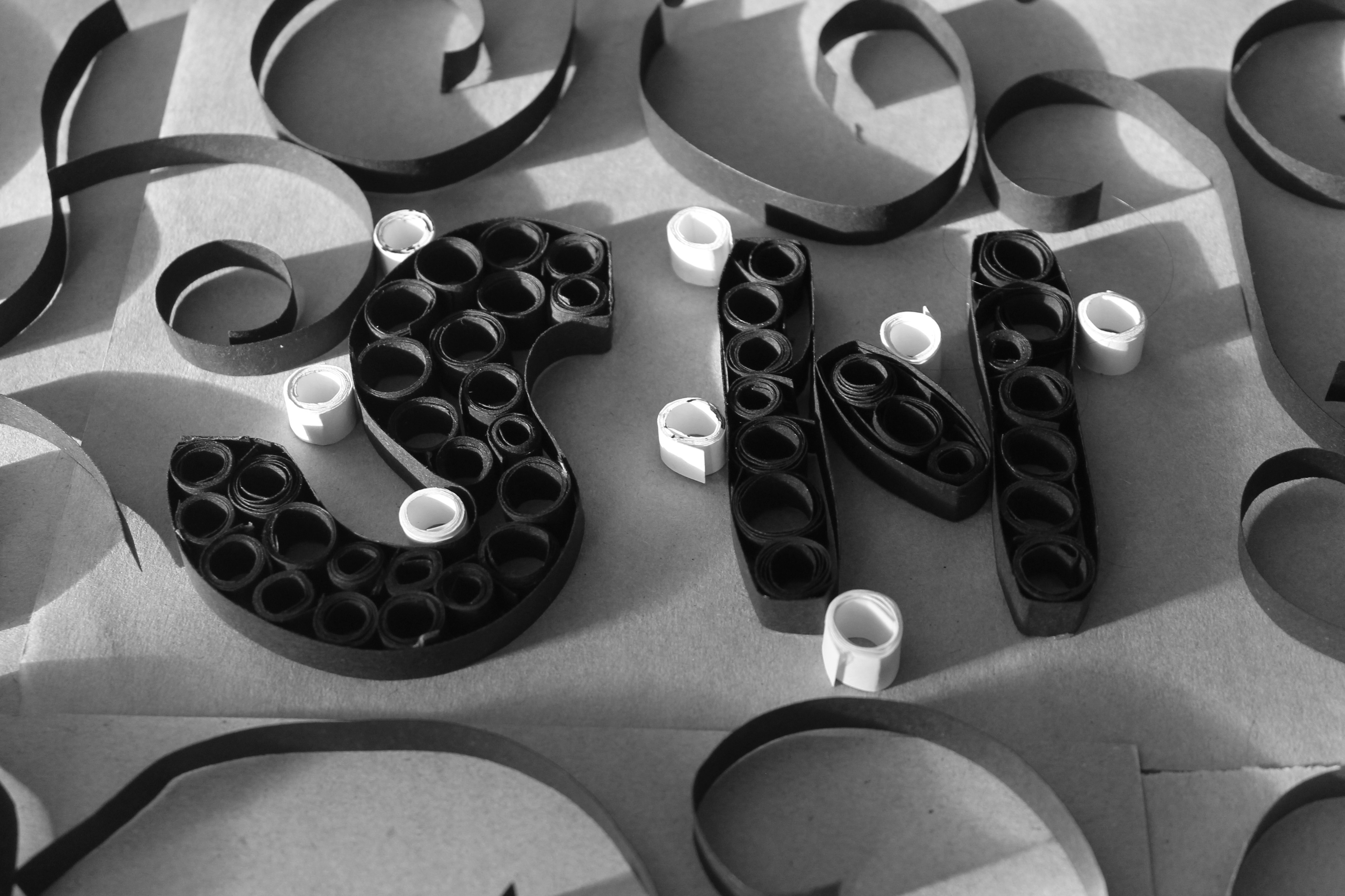
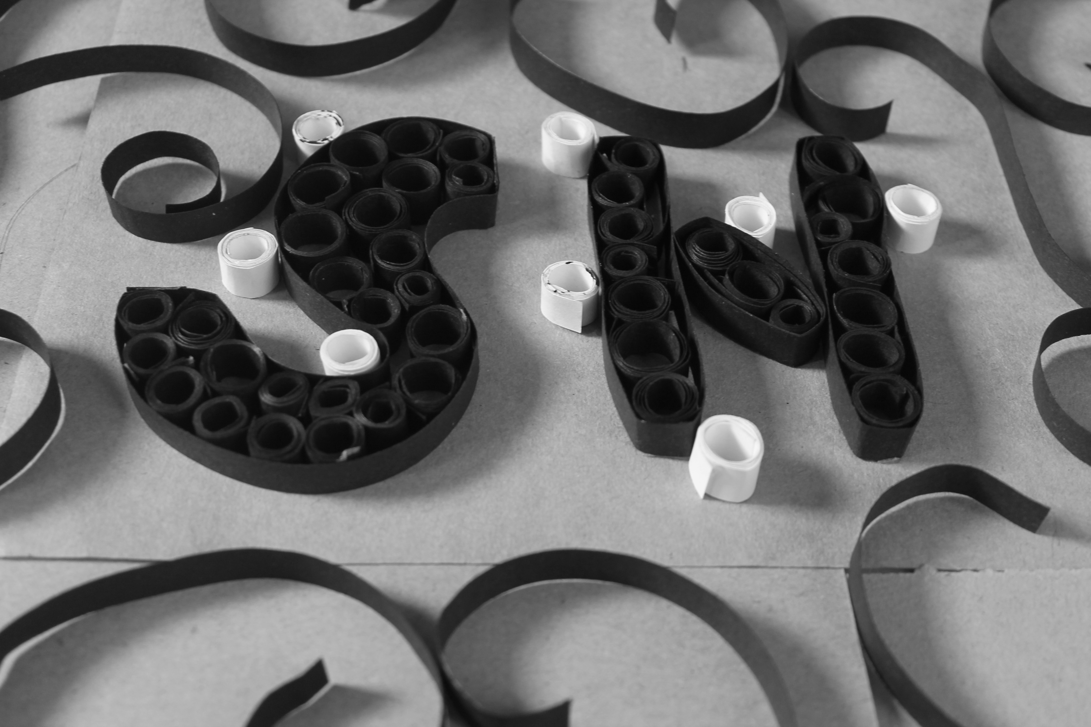
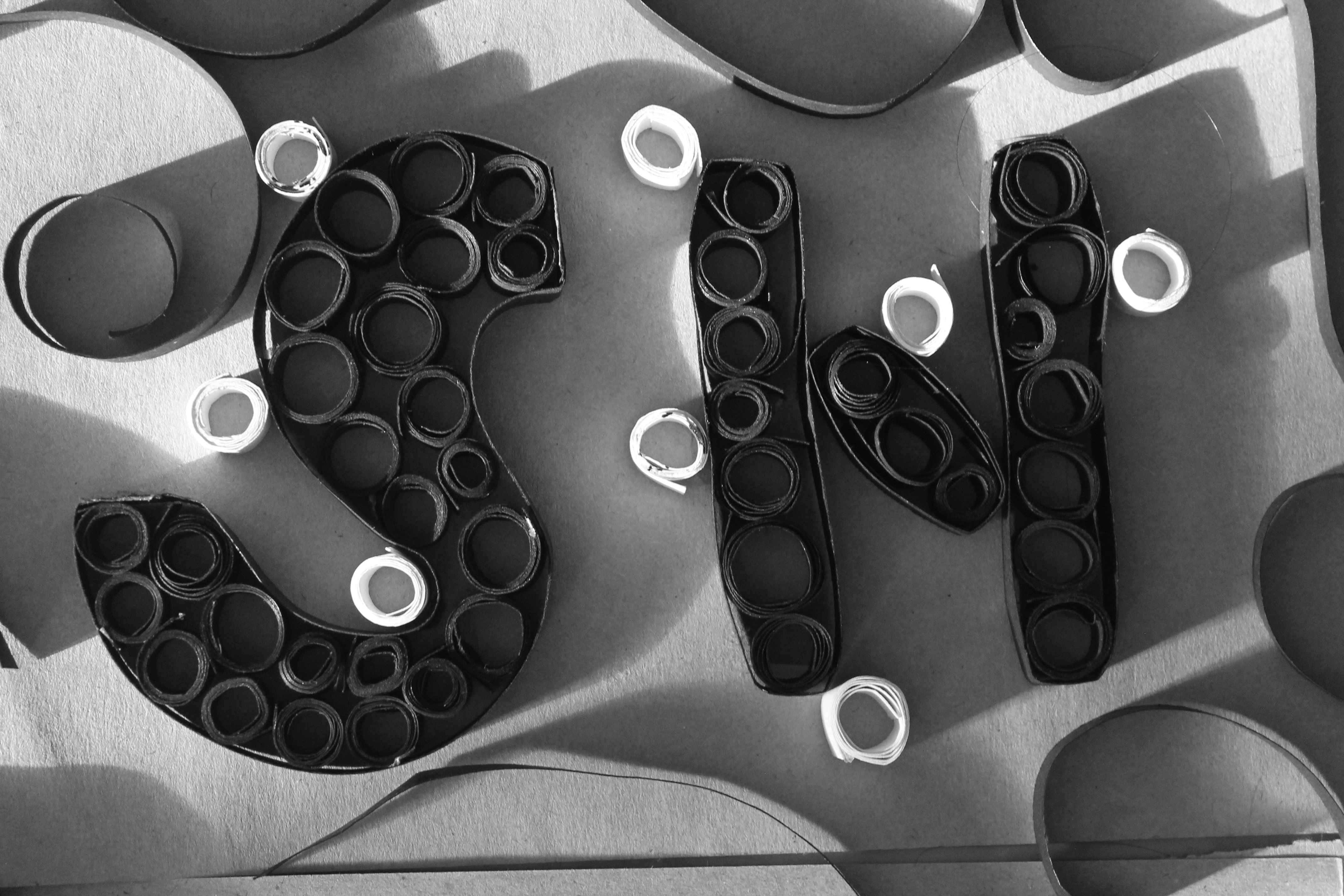
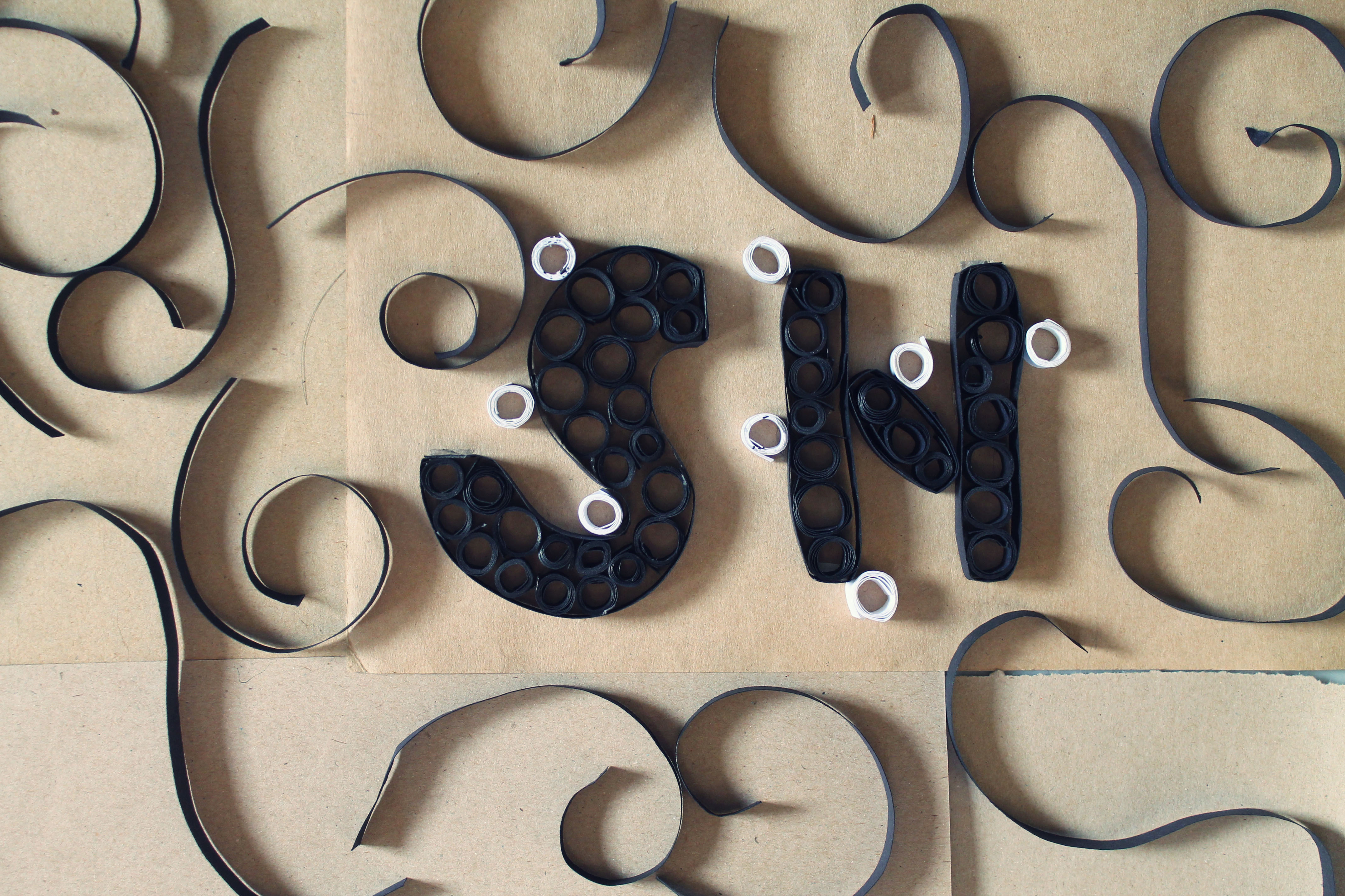
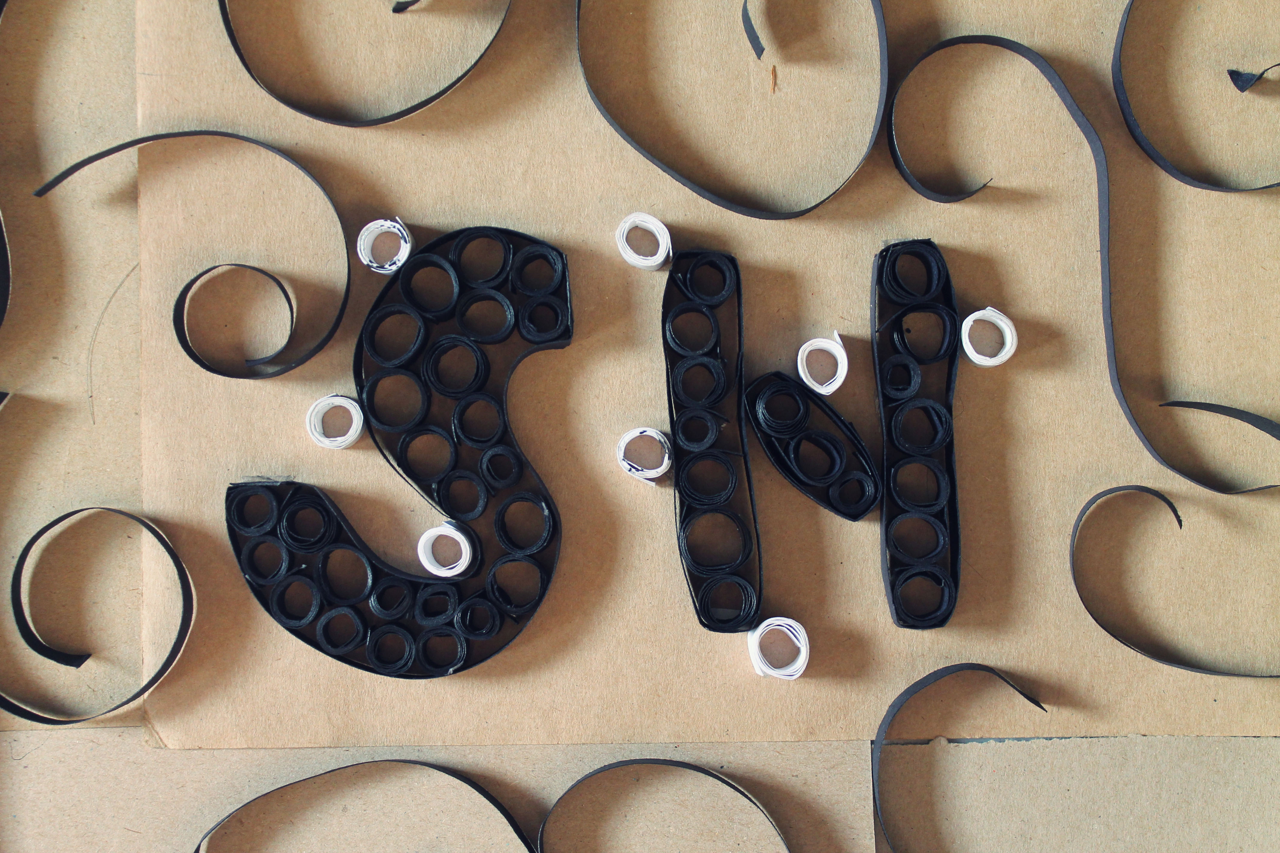
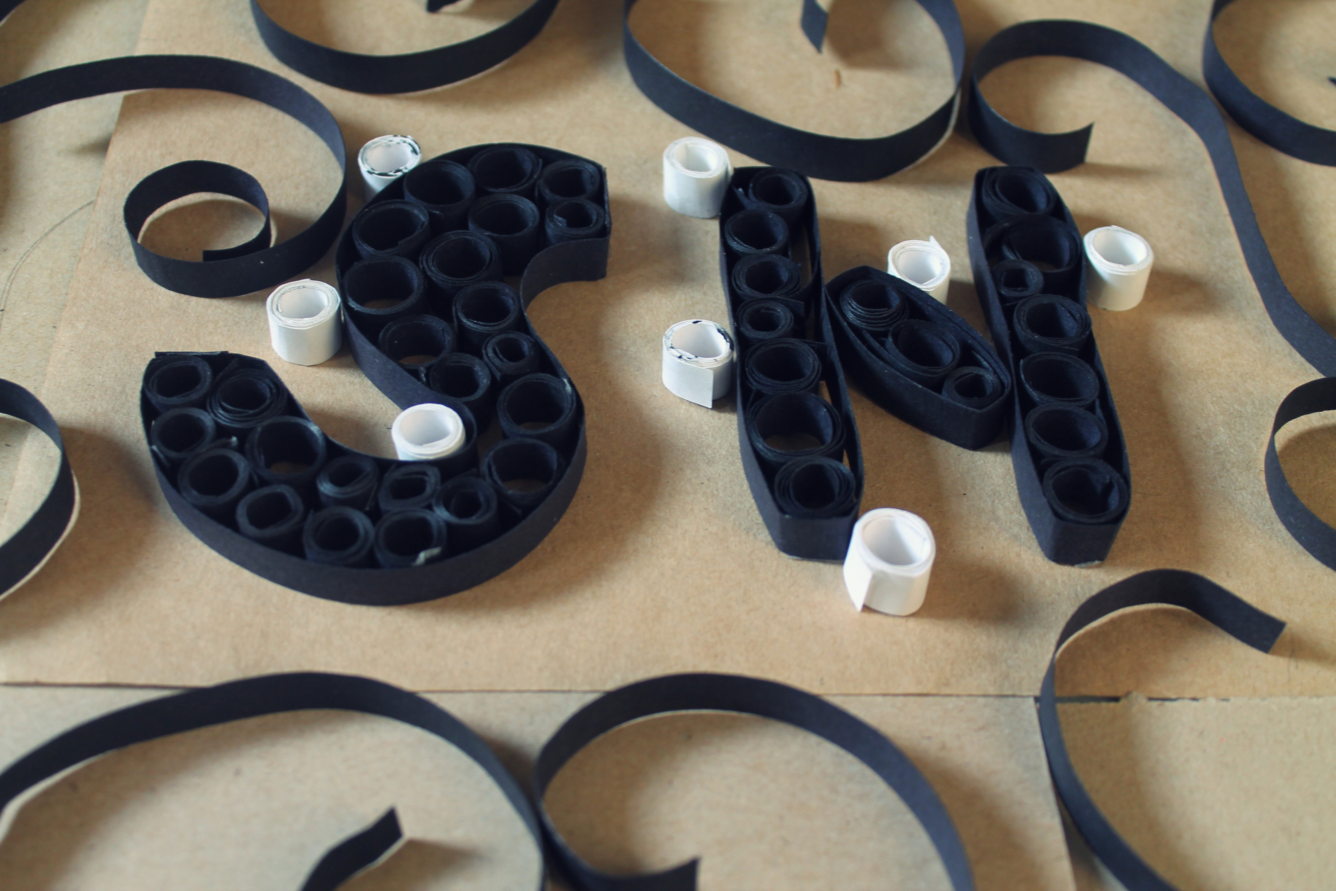
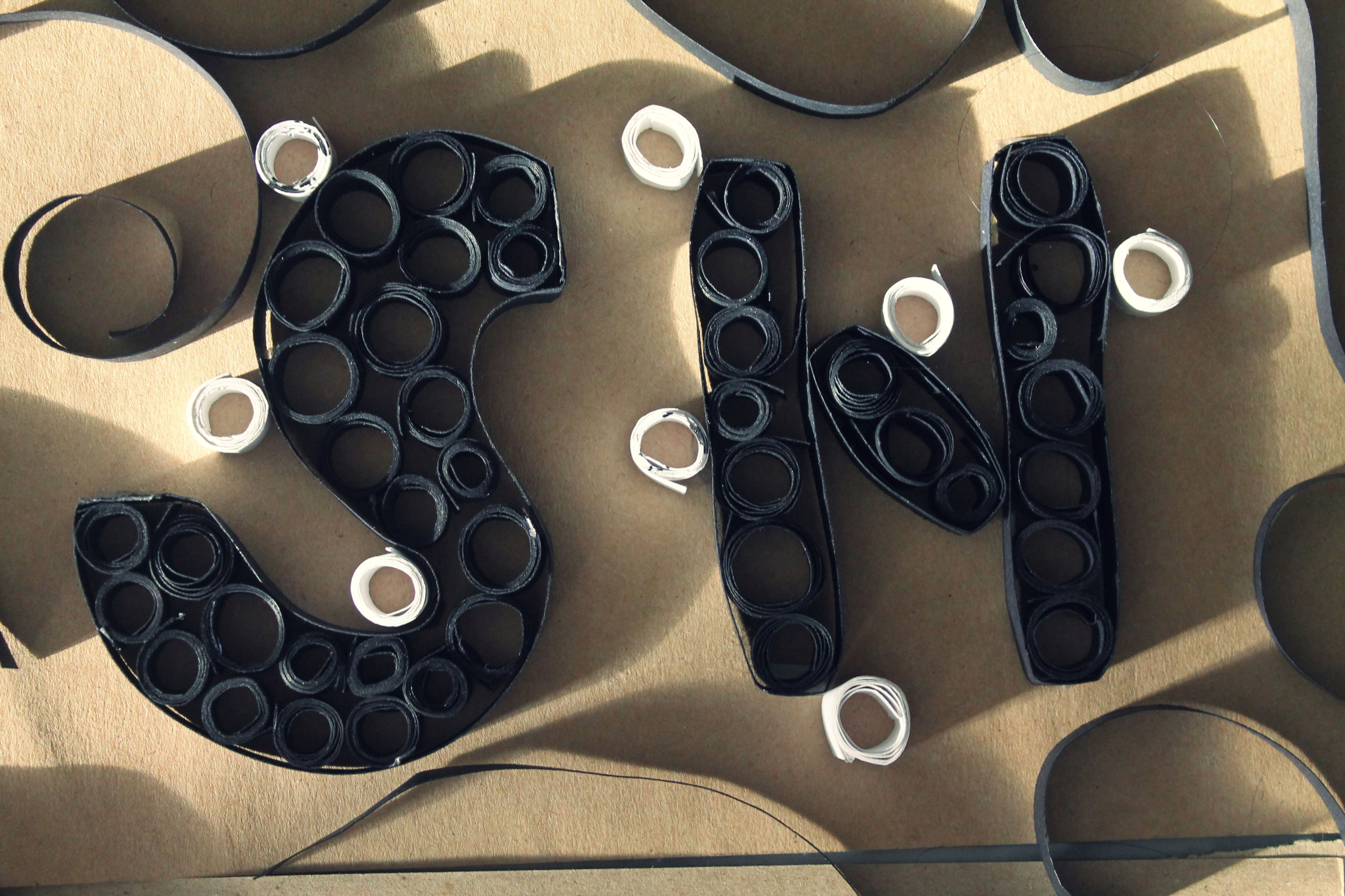
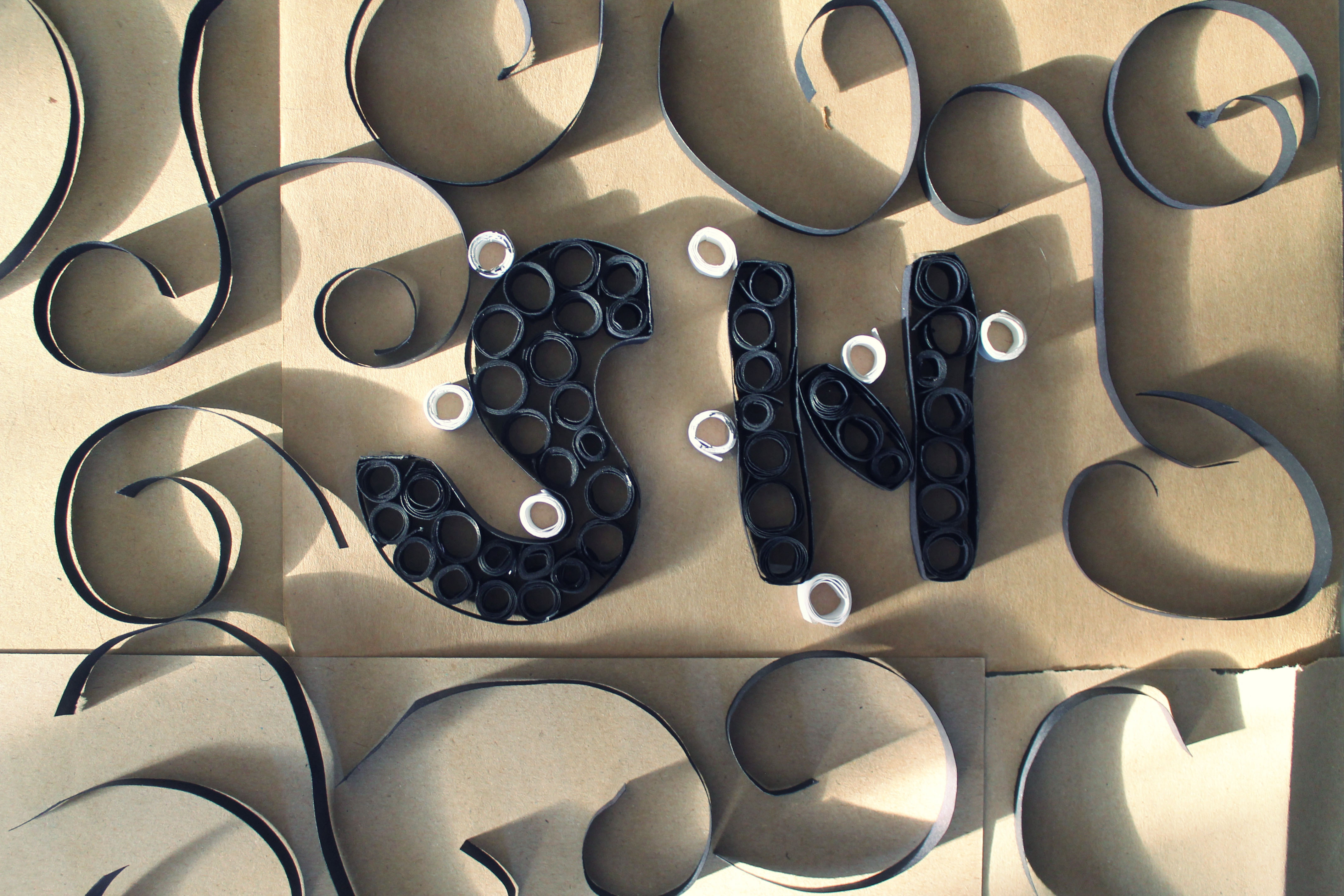
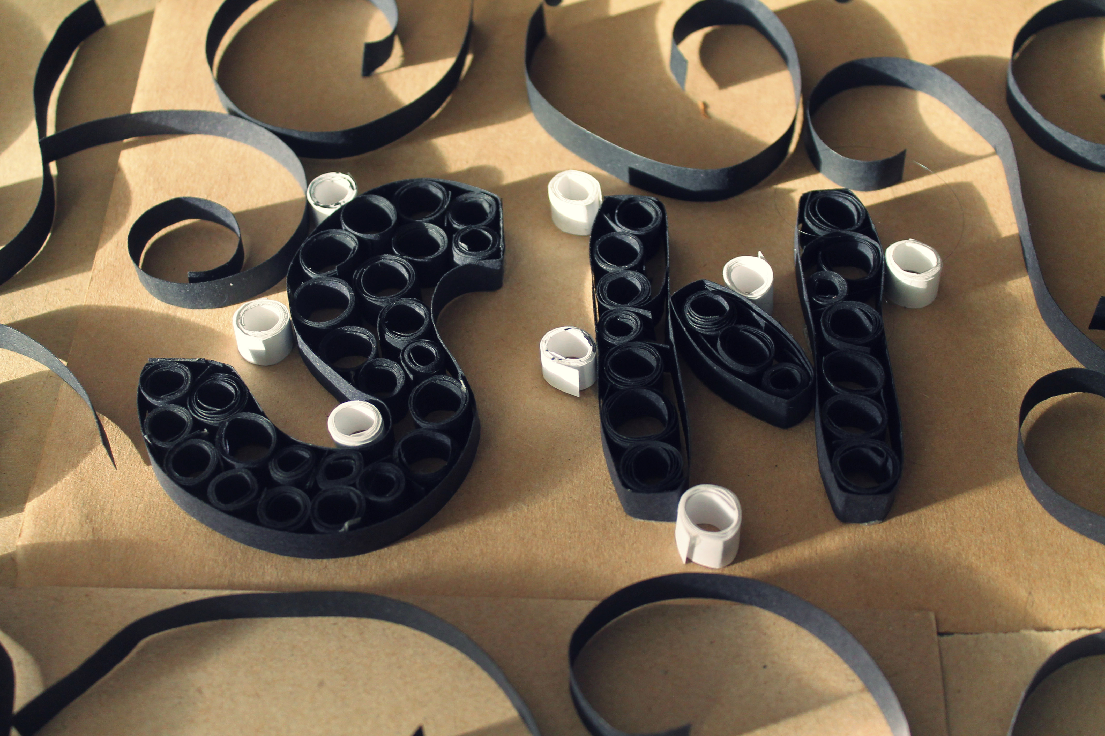
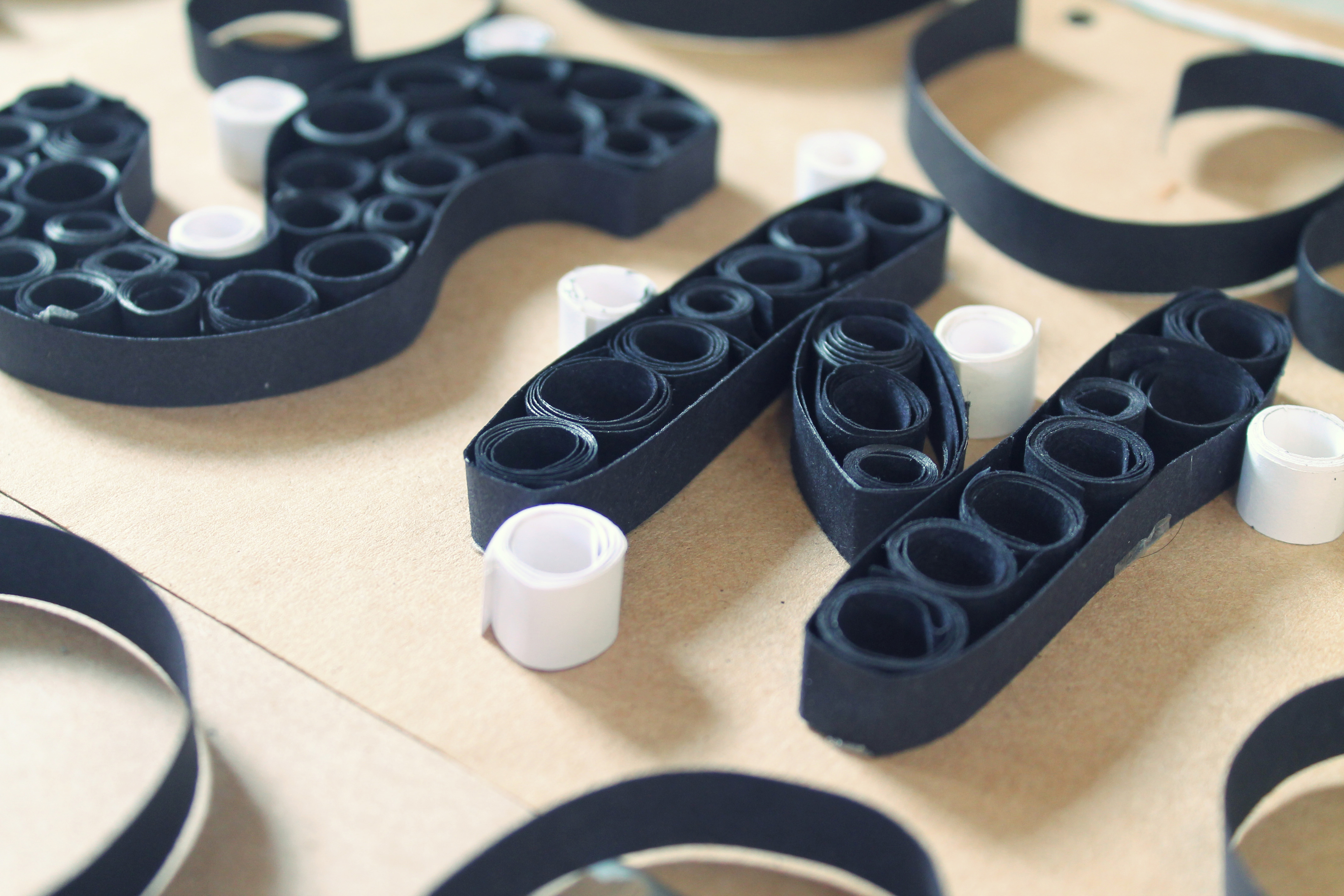
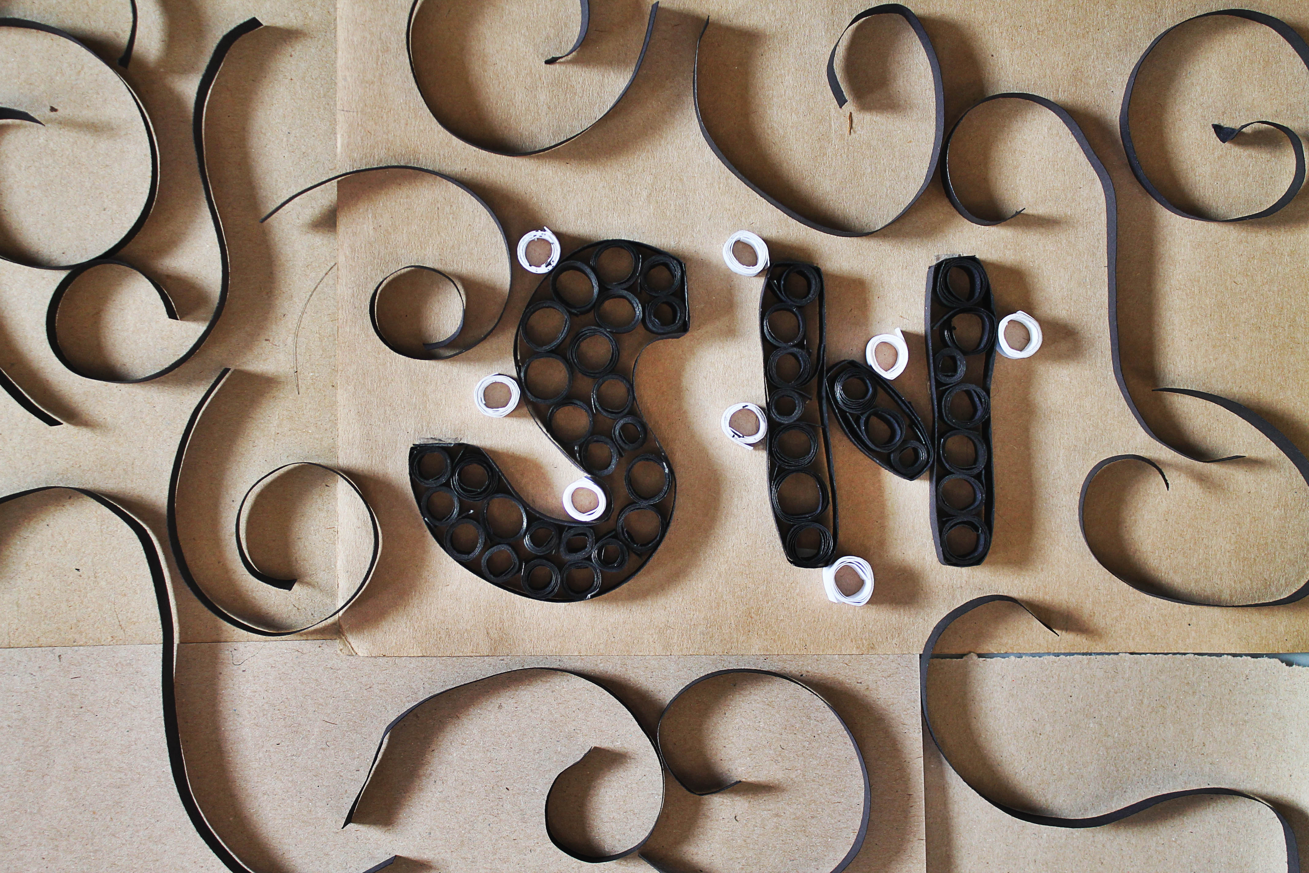
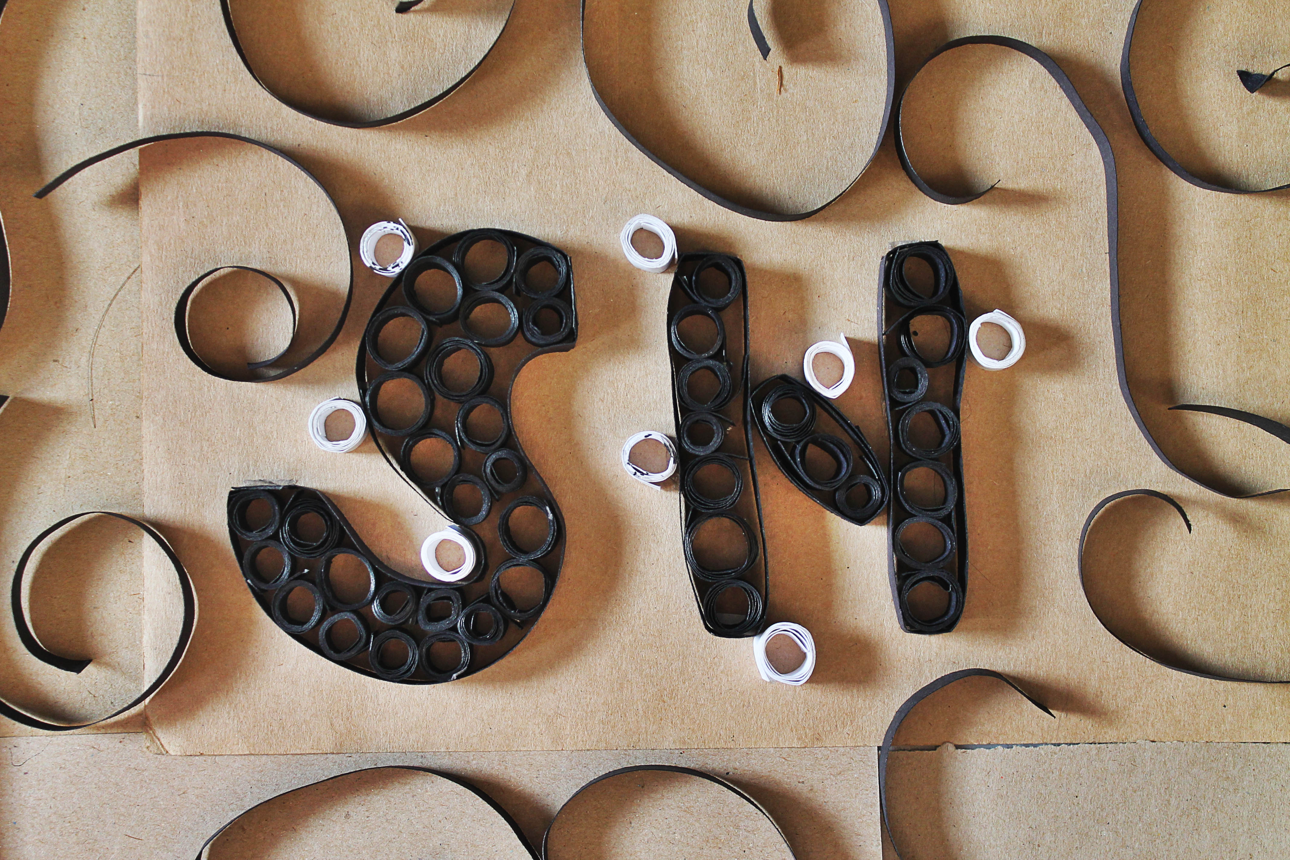
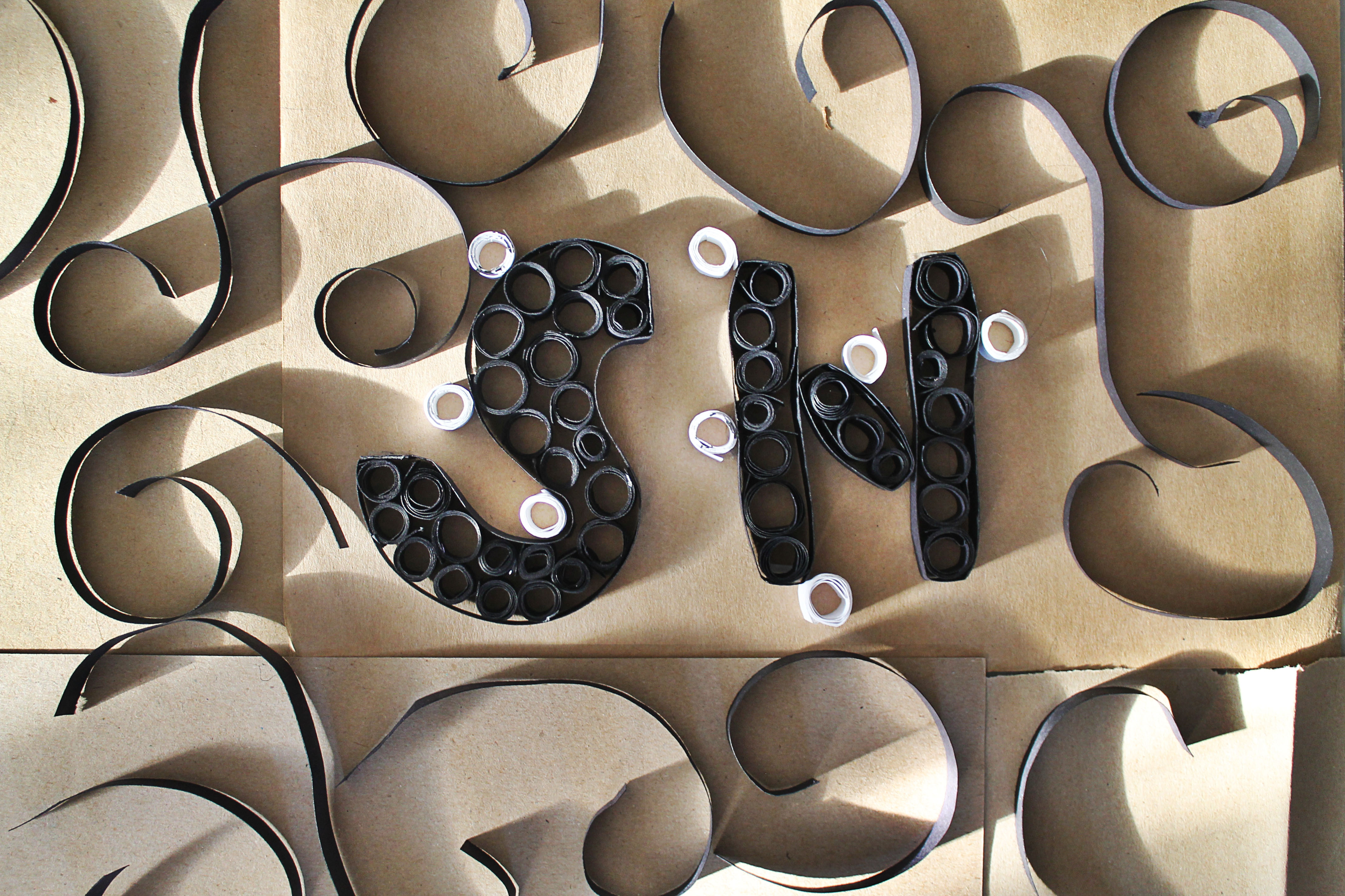
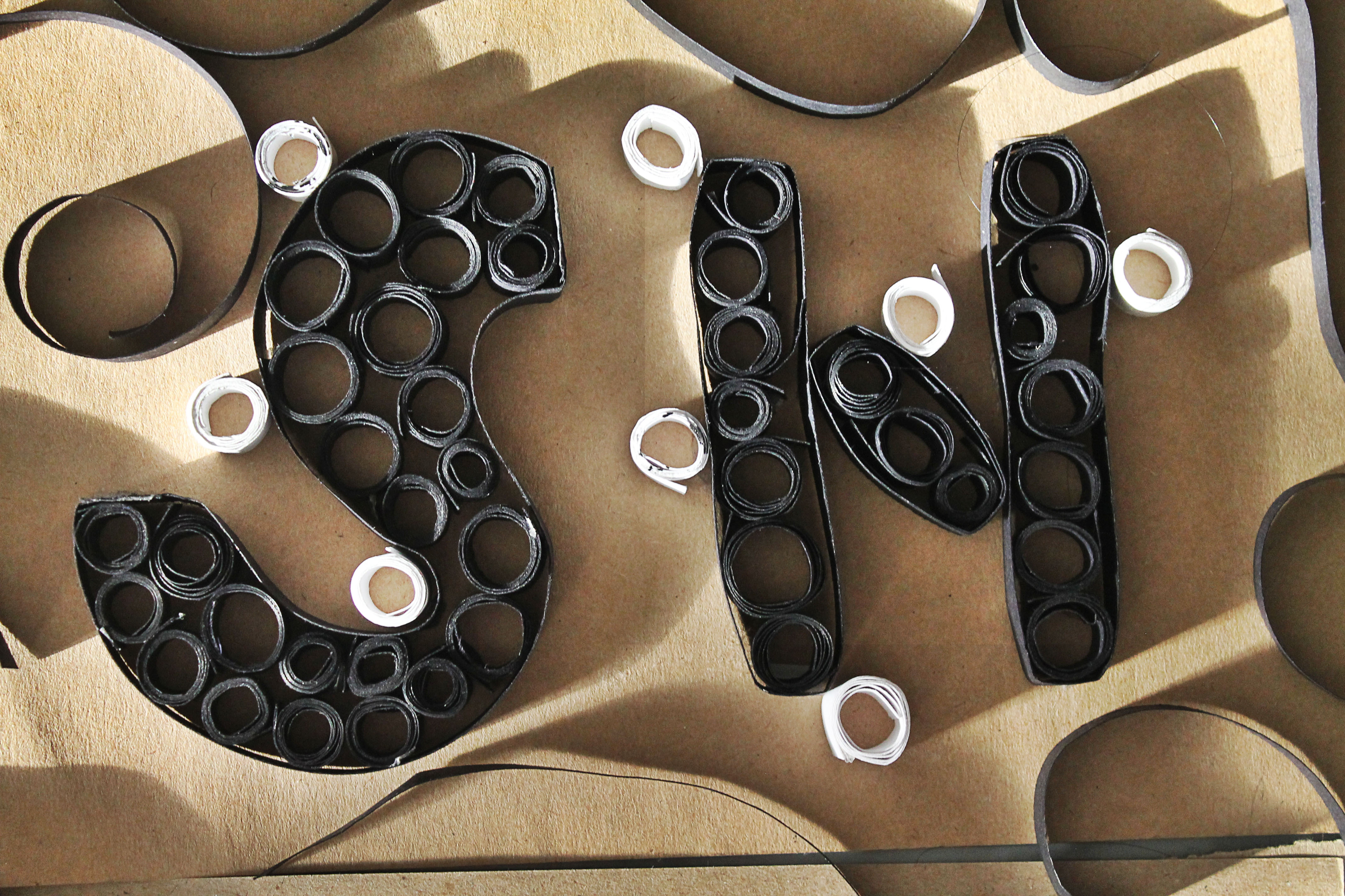
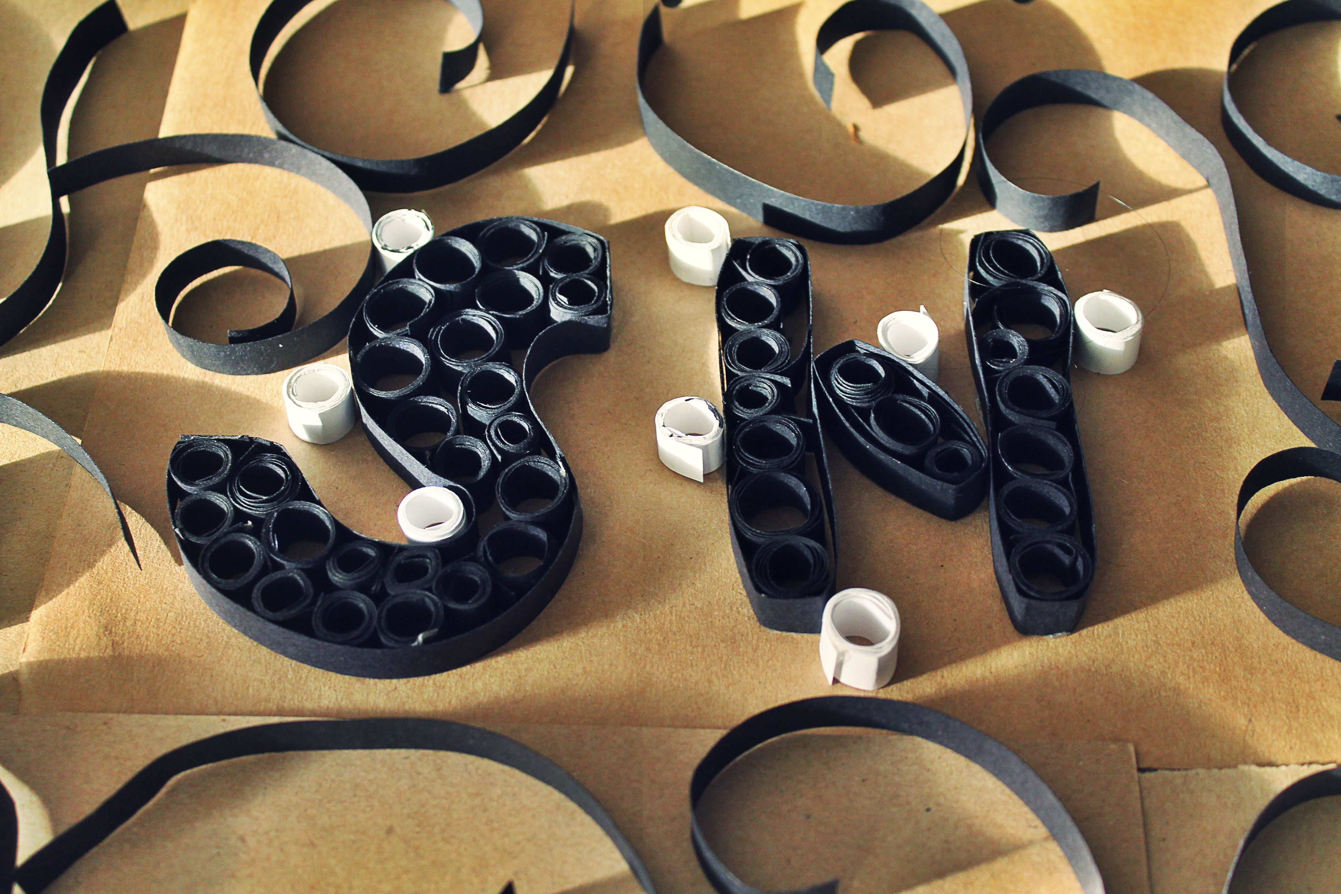
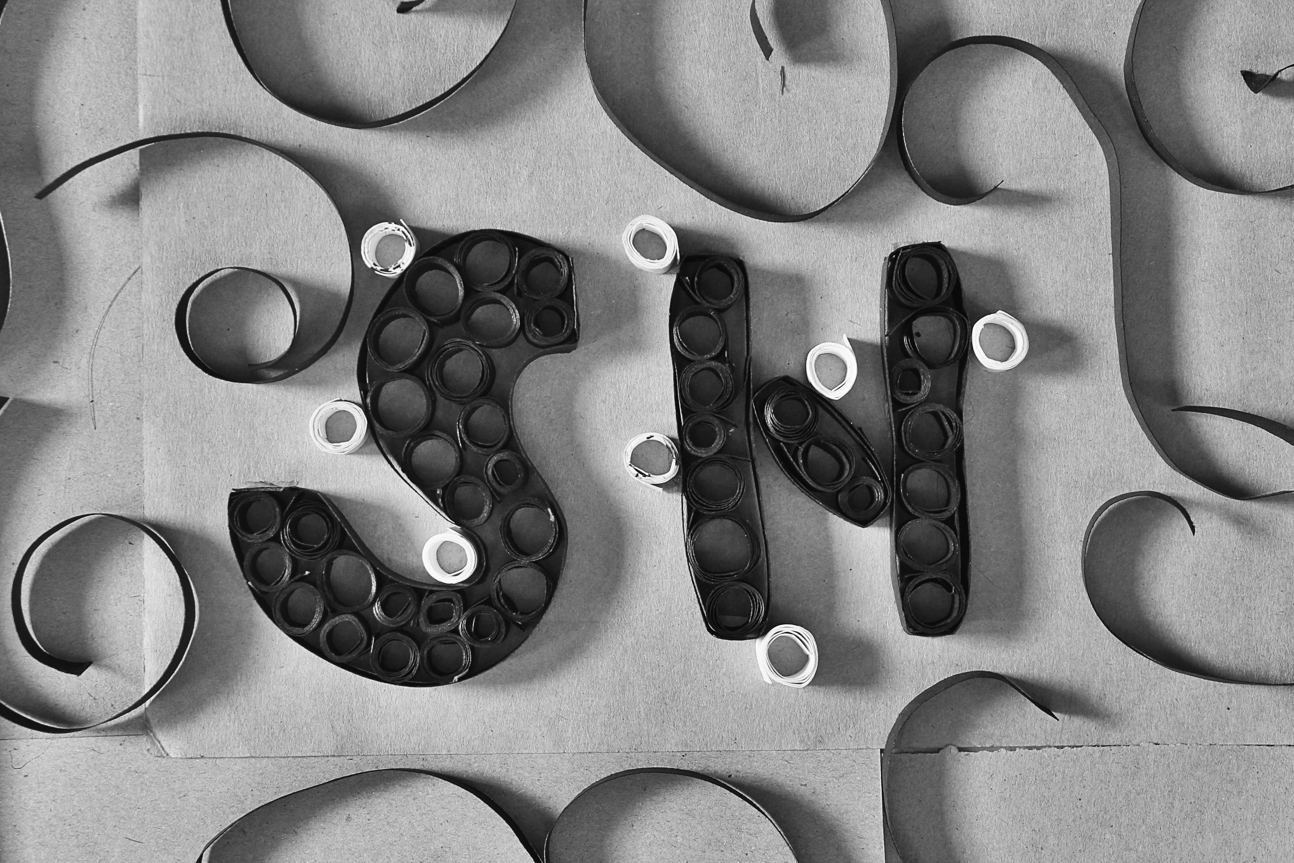
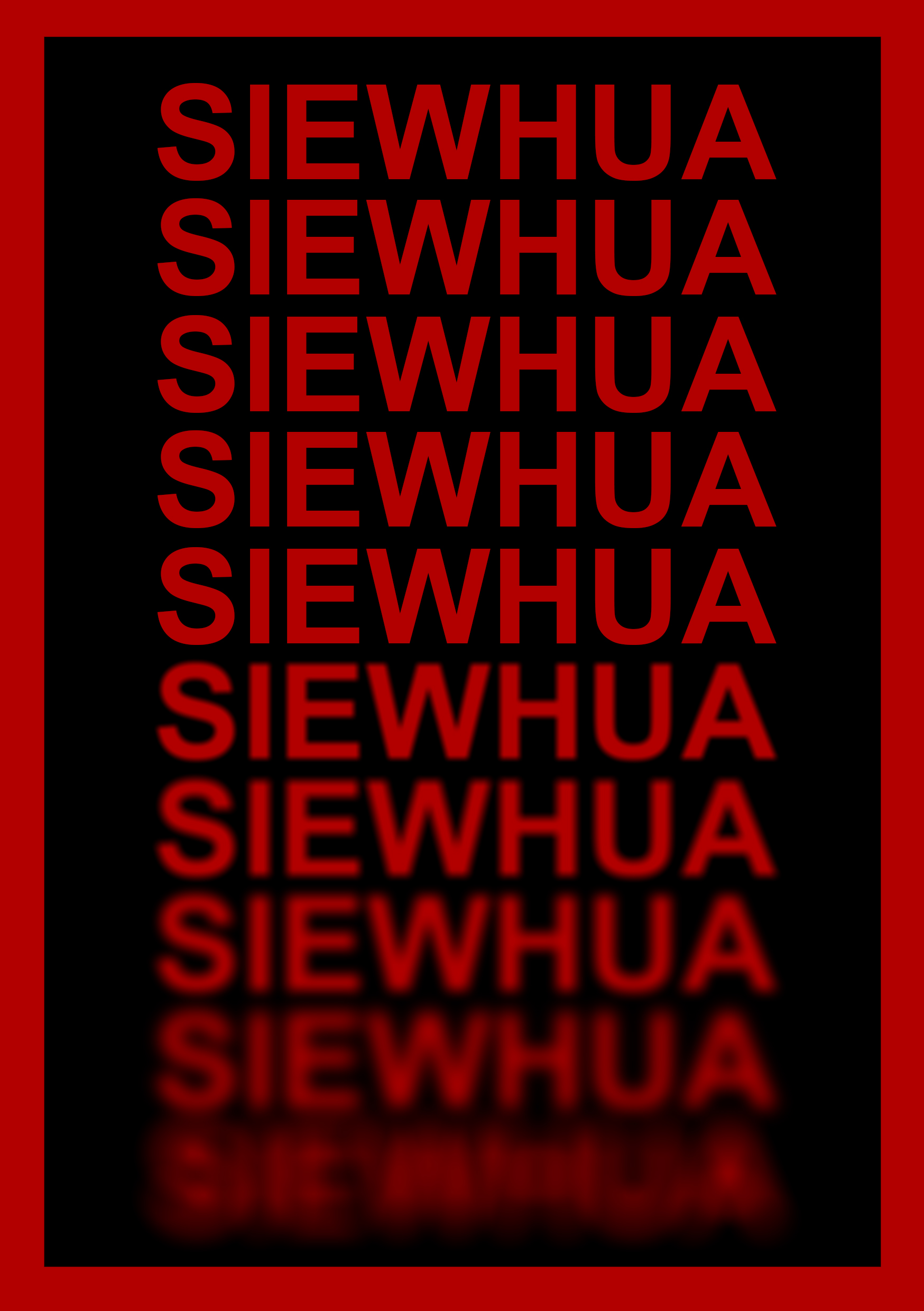
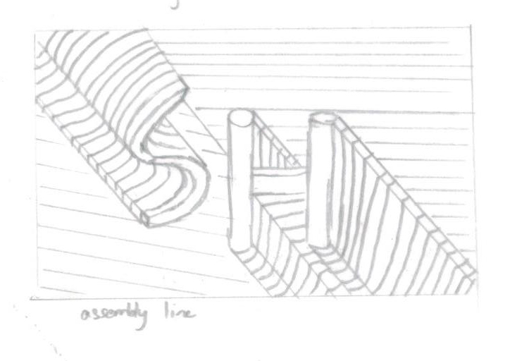
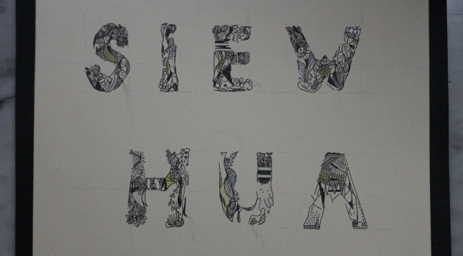
MY NAME IS
AND I WORK ON AN ASSEMBLY LINE
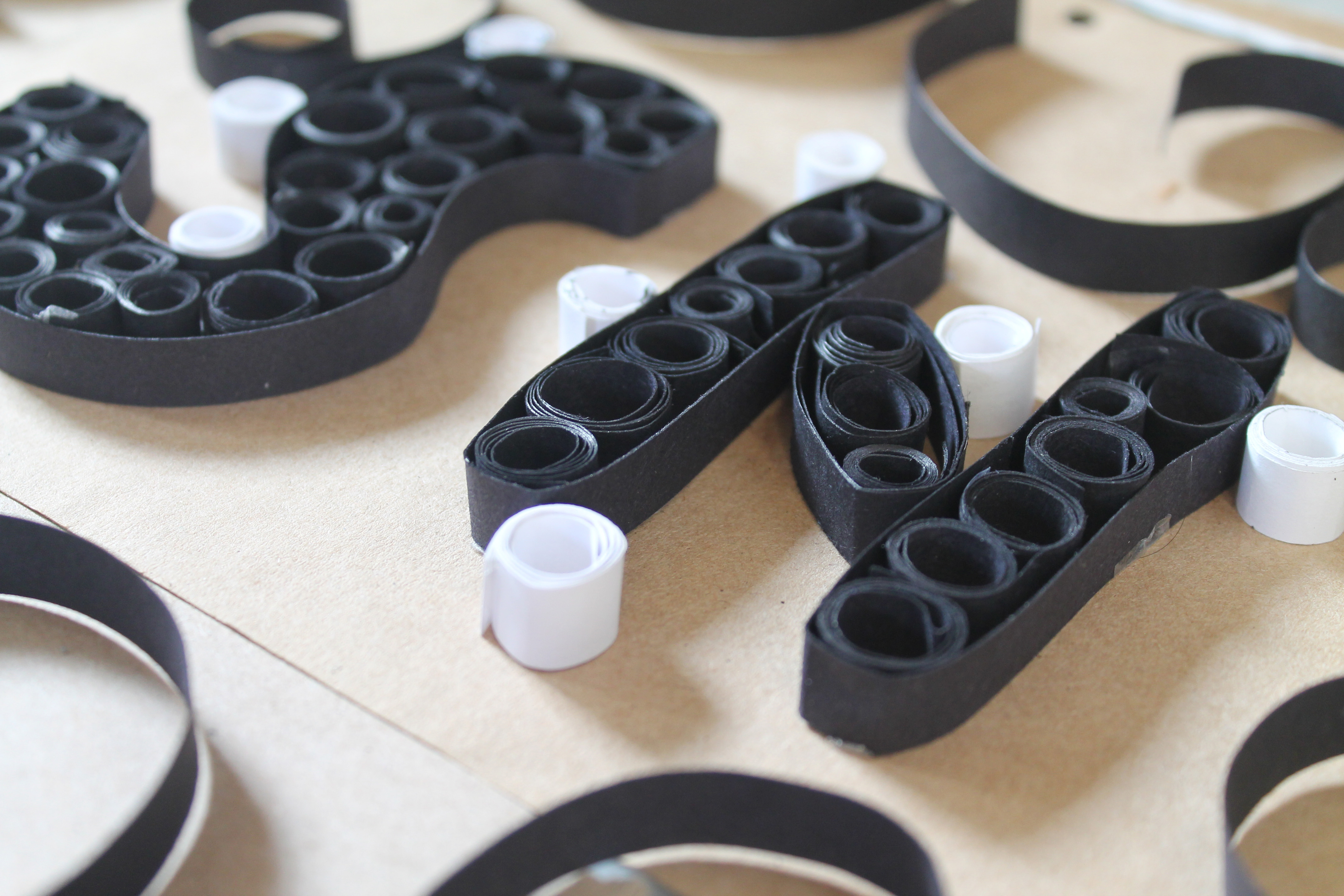
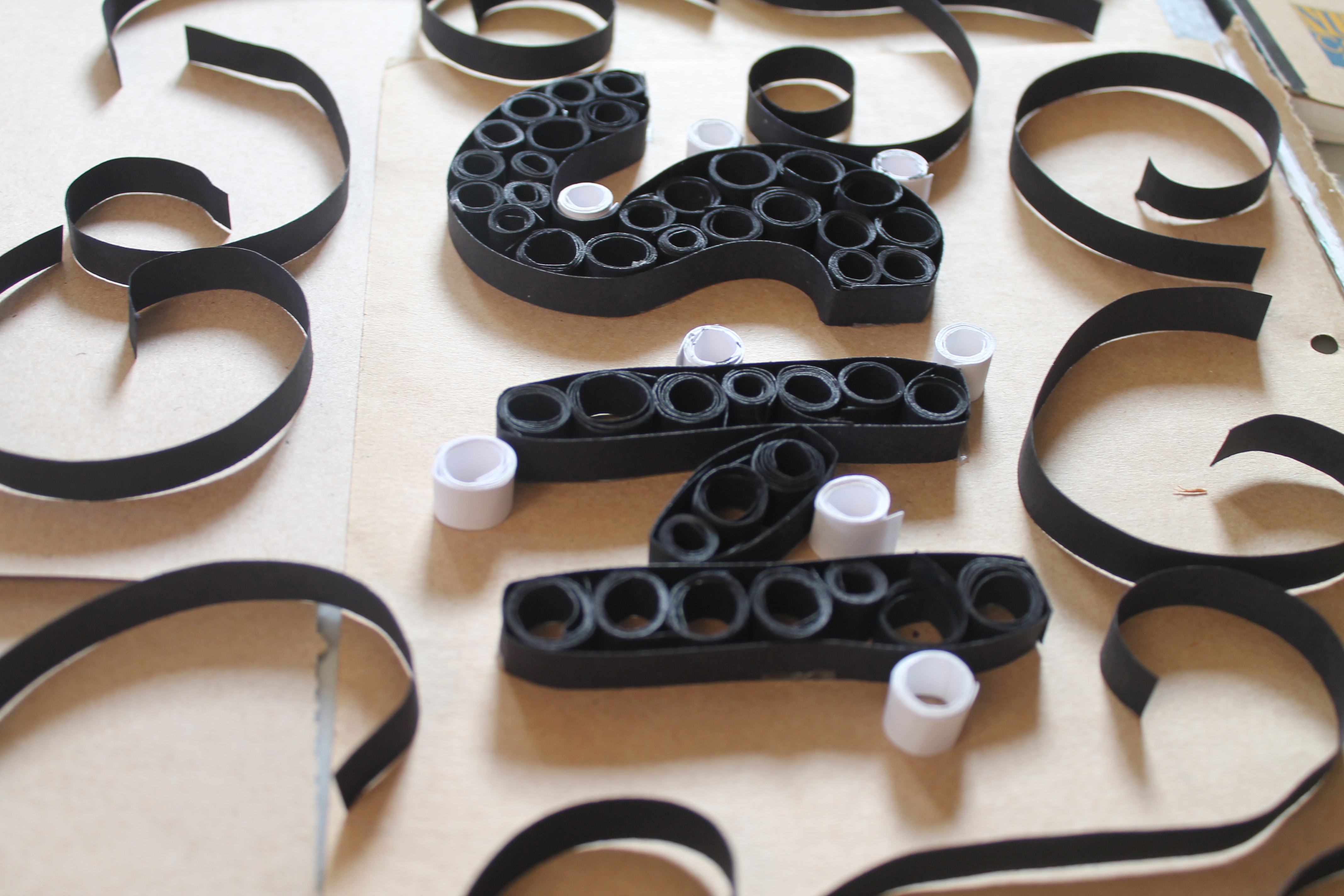
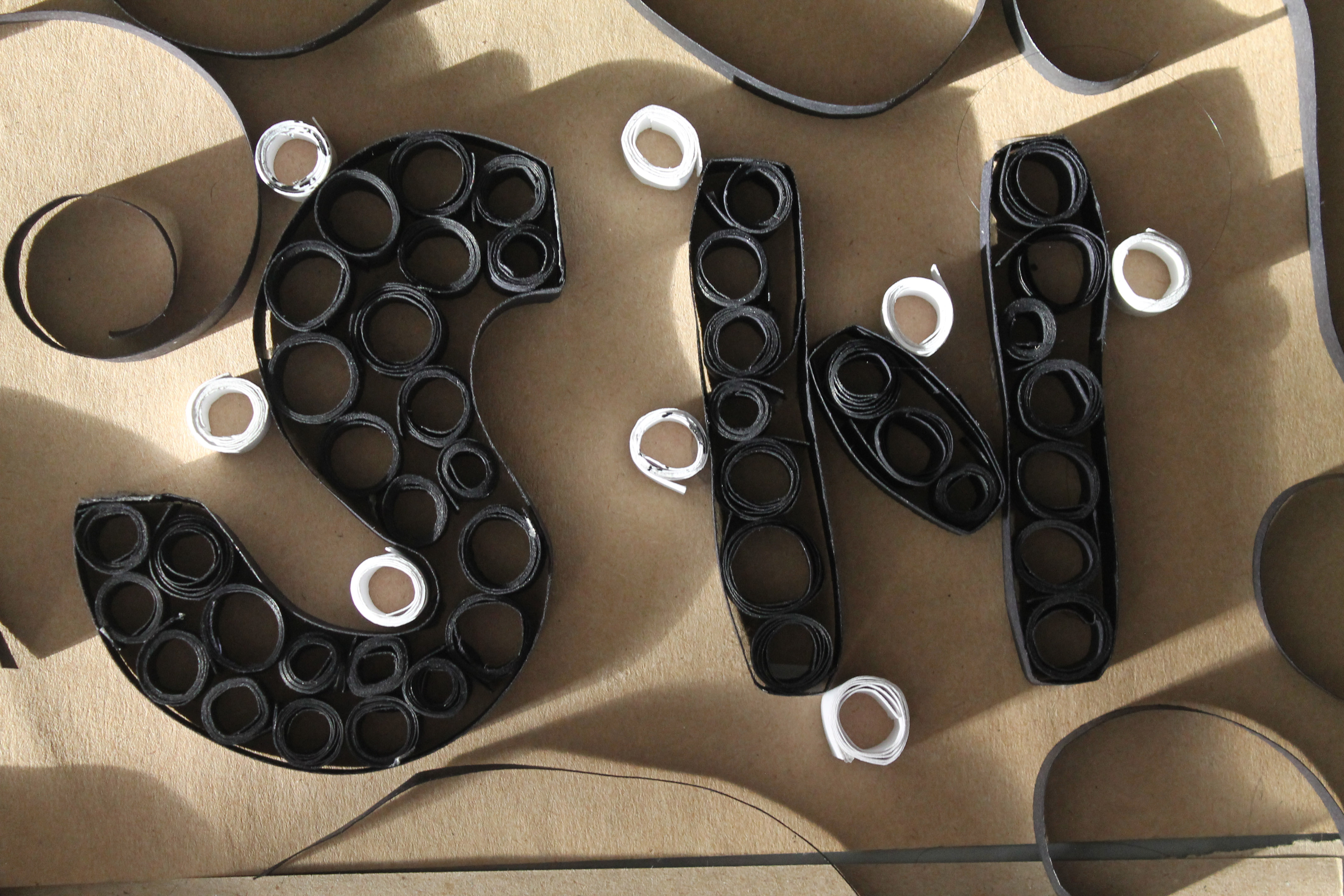
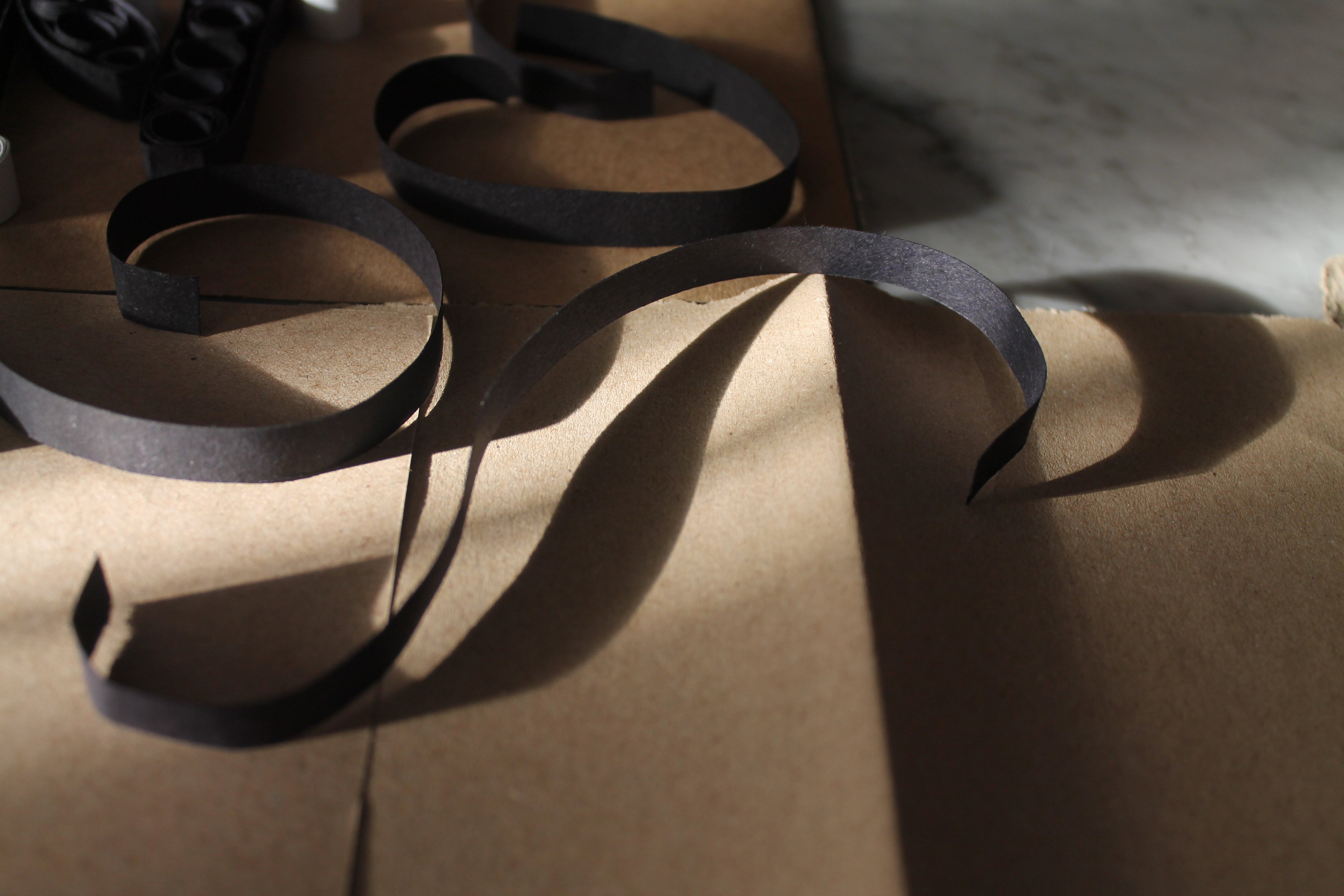
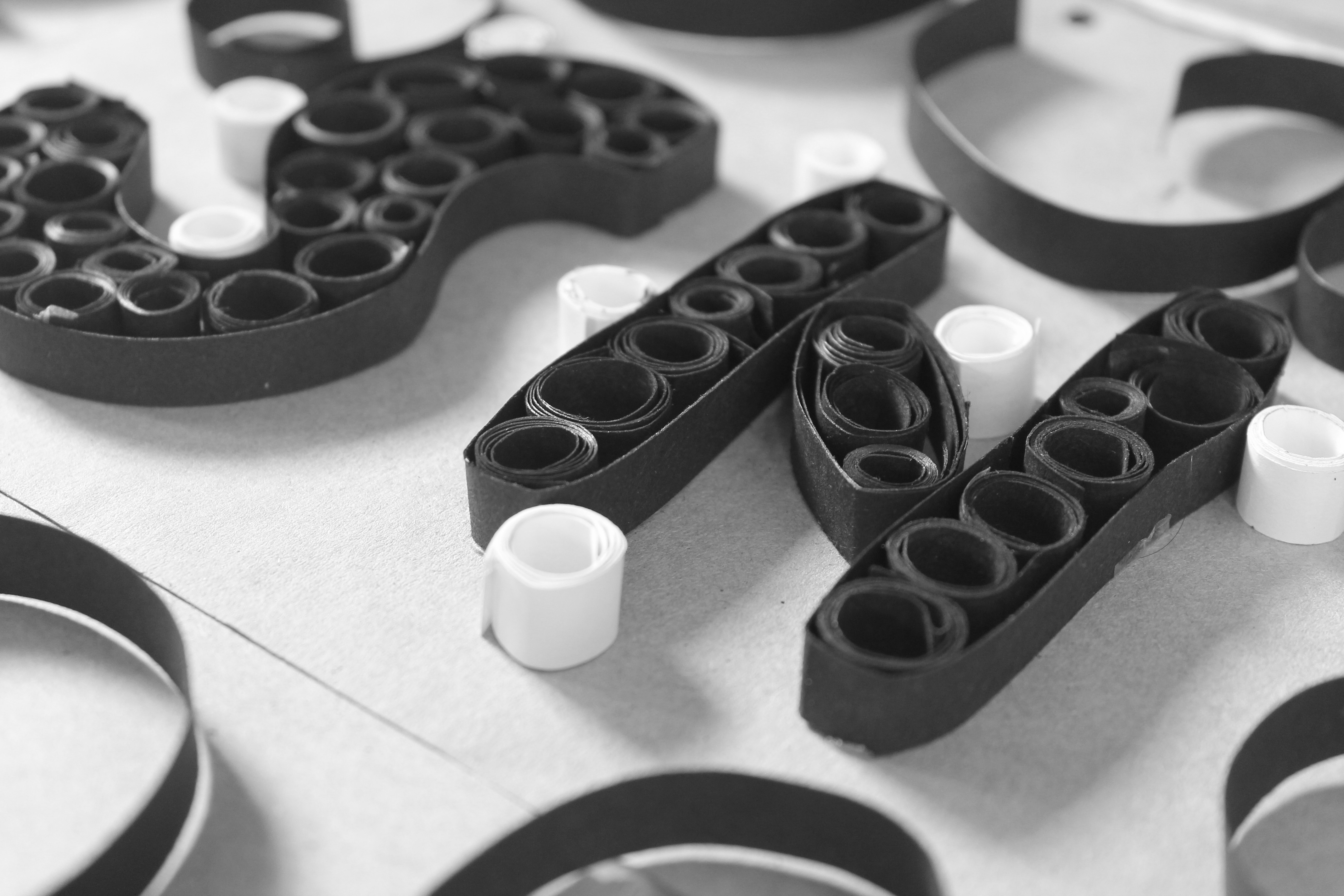
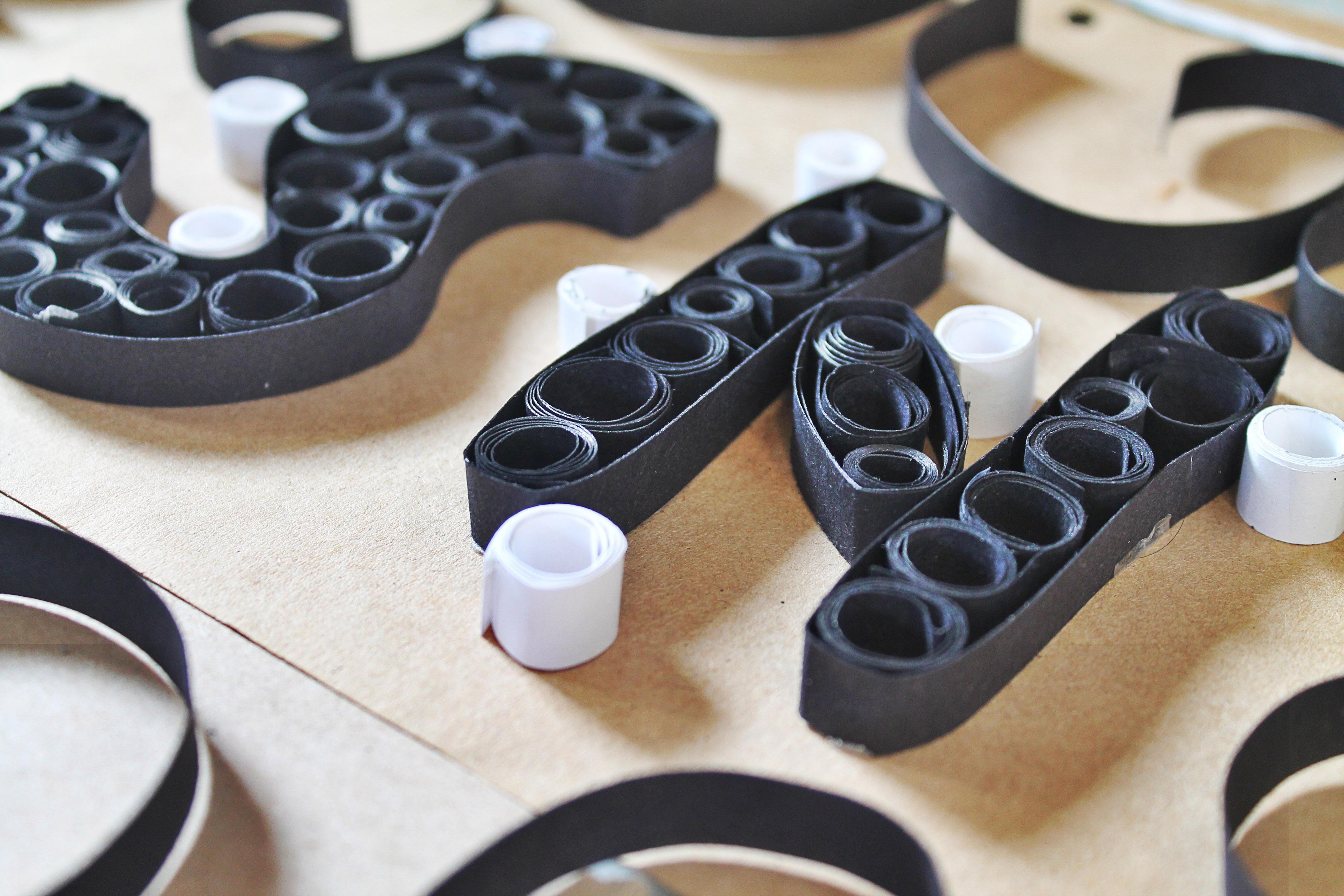
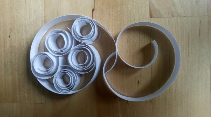
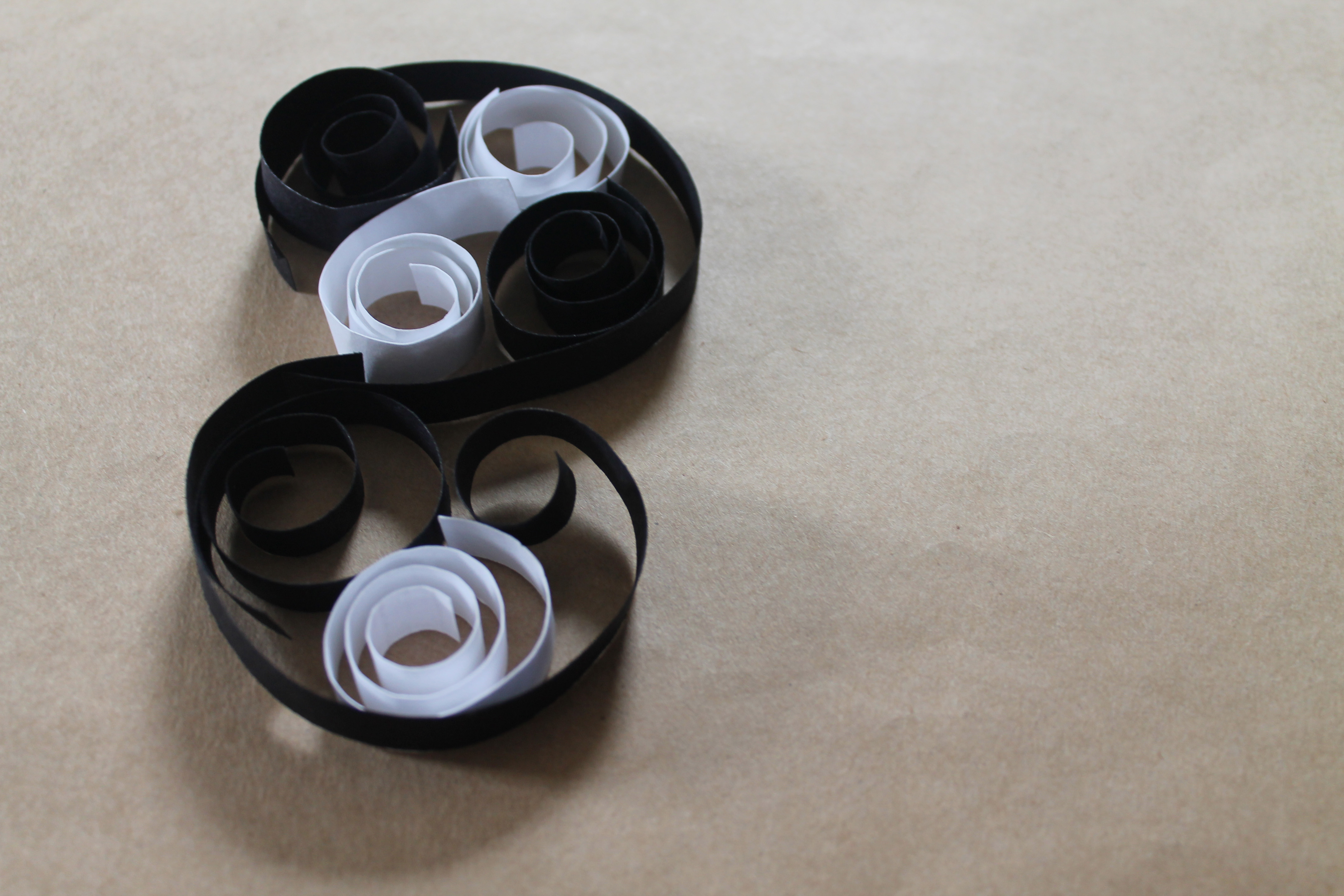
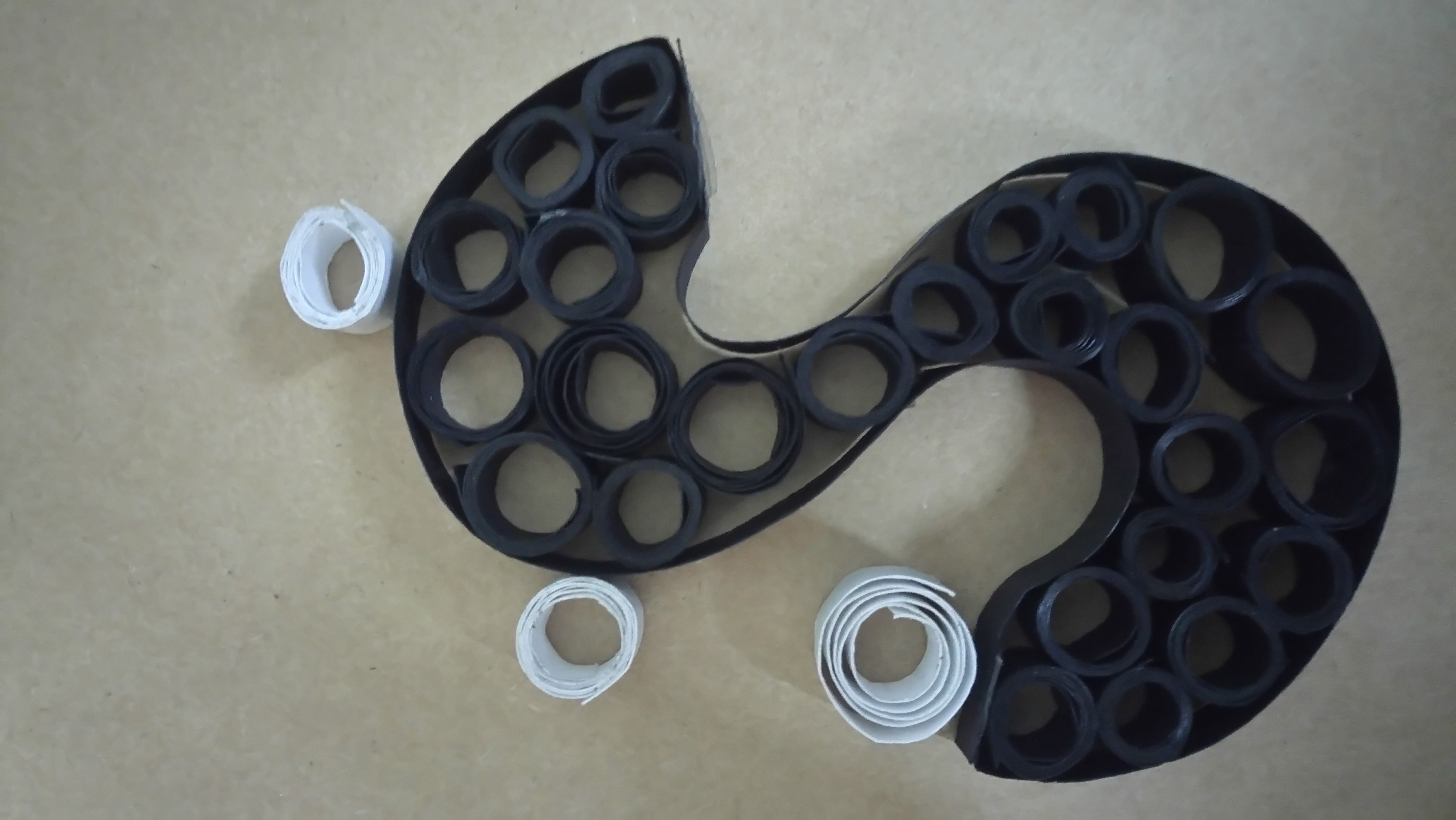
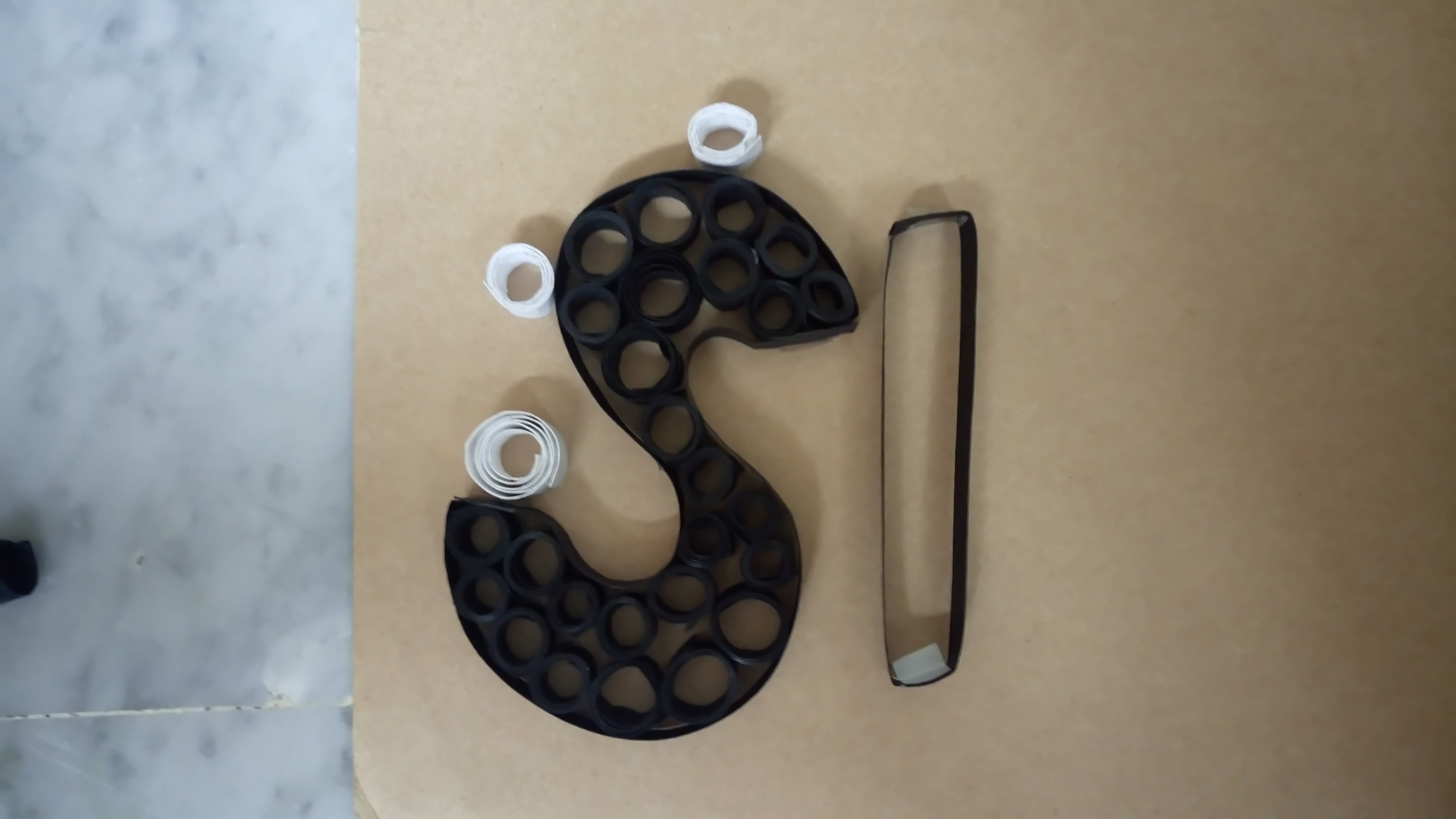
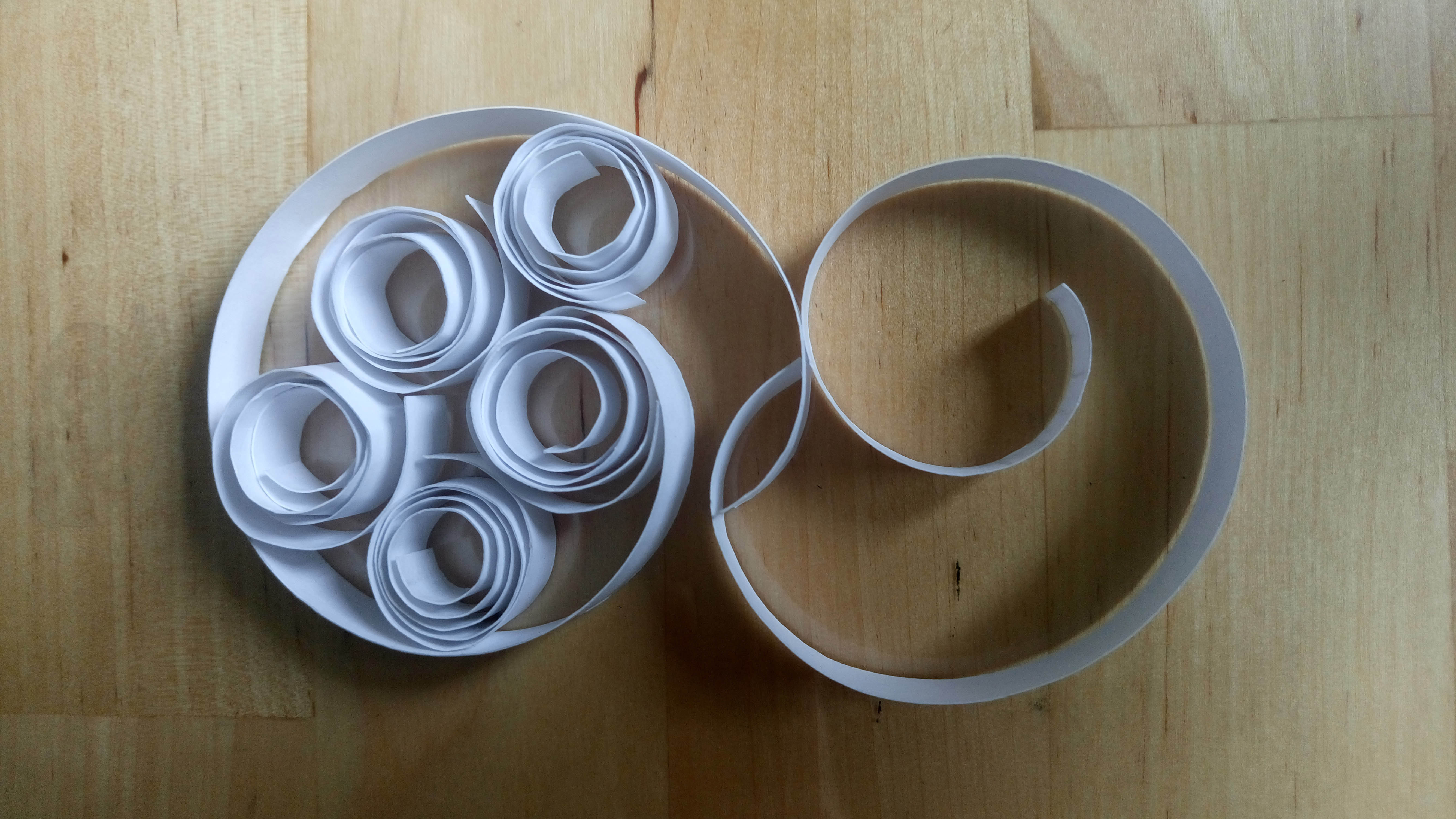
In this work, the subject matter is made up of rolled-up stripes of black and white paper on cardboard as background. The colour choice is to indicate a dull, boring and burdensome life of an assembly line worker. Additionally, they also represent others things too.The use of cardboard is because usually the packaging are all packed into the cardboard before it is sent off. The black colour papers represents or resembles the conveyor belt that can be found in factories while the white ones represent the products being manufactured. The swirly black paper surrounding the alphabets are to represent or indicate that this is just part of the huge factory. I choose to use just ‘SH’ because to resemble like company or brand names where they tend to just use acronyms. The process of making this was rather repetitive, simple yet tedious and I felt all these fit very well with how this industry is in reality too.
Many people tend to overlook or they choose to ignore the flaws or defects, thinking that everything was good, perfect. However, on closer look, one would see that not all the whites (products) are the same. Two of them actually have black stains that represent their defects. Also, if one looked over at the ‘conveyor belt’, the ‘wheels’ are not all evenly made. This is to suggest even the machines break down sometimes so both human and machine error occurs here.
I presented this work through photography and i choose a close up shot because i wanted to focus in on the details which people tend to overlook when they take in the whole picture at first glance. Secondly, it is taken from an angle instead of frontal because i wanted it to show from my perspective of how i view this job and for it to mean “I’m showing this from an angle and this is the angle I want you to view this job as.” Hence, viewers would unconsciously take notice of the often overlooked flaws. I also wanted for the light and shadow to represent day and night.
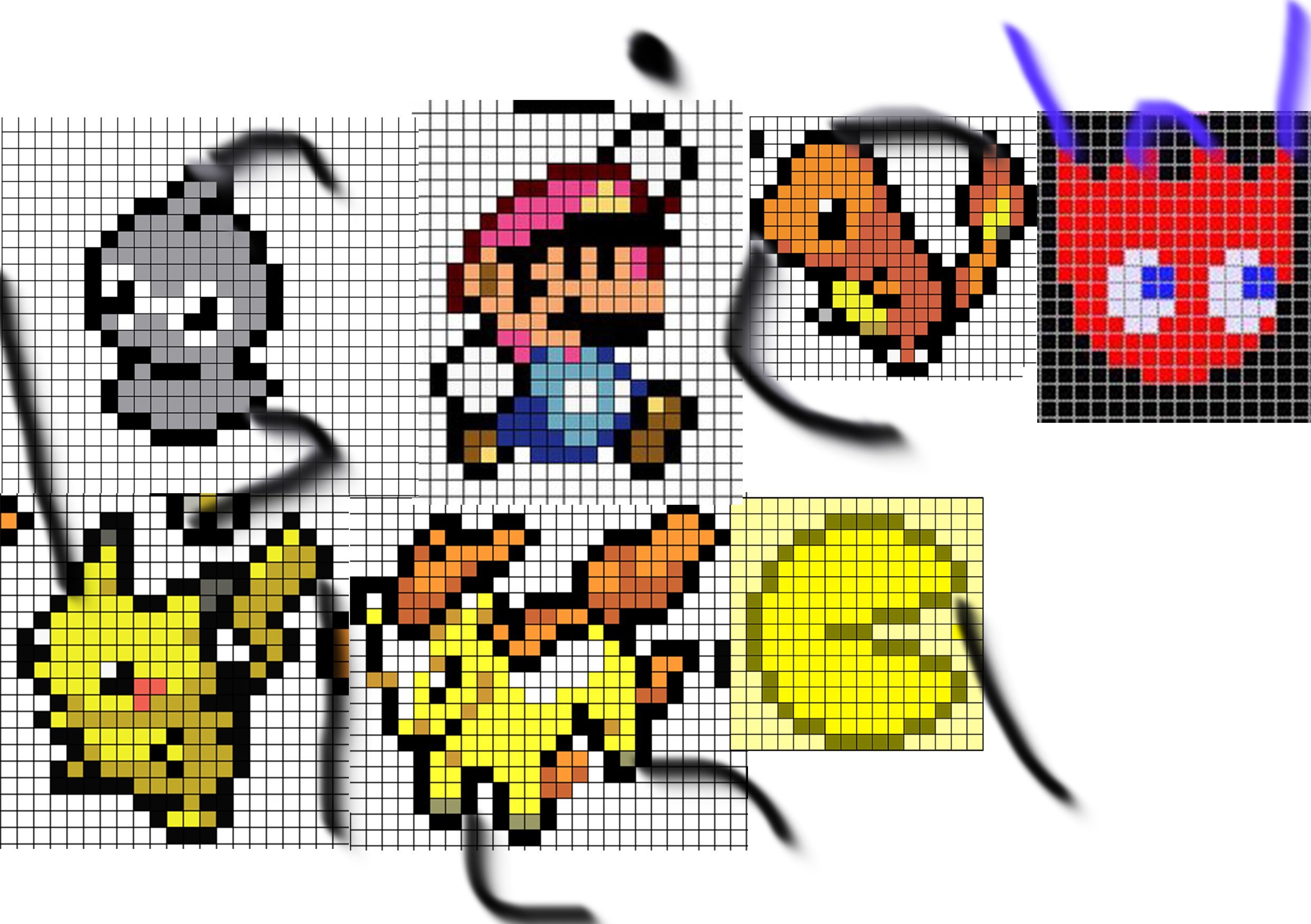
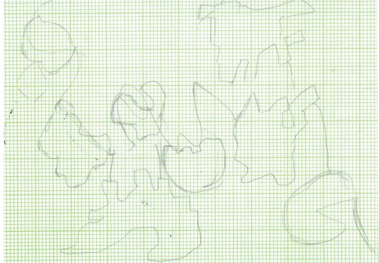
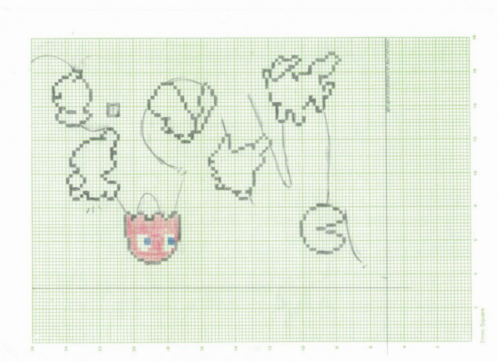
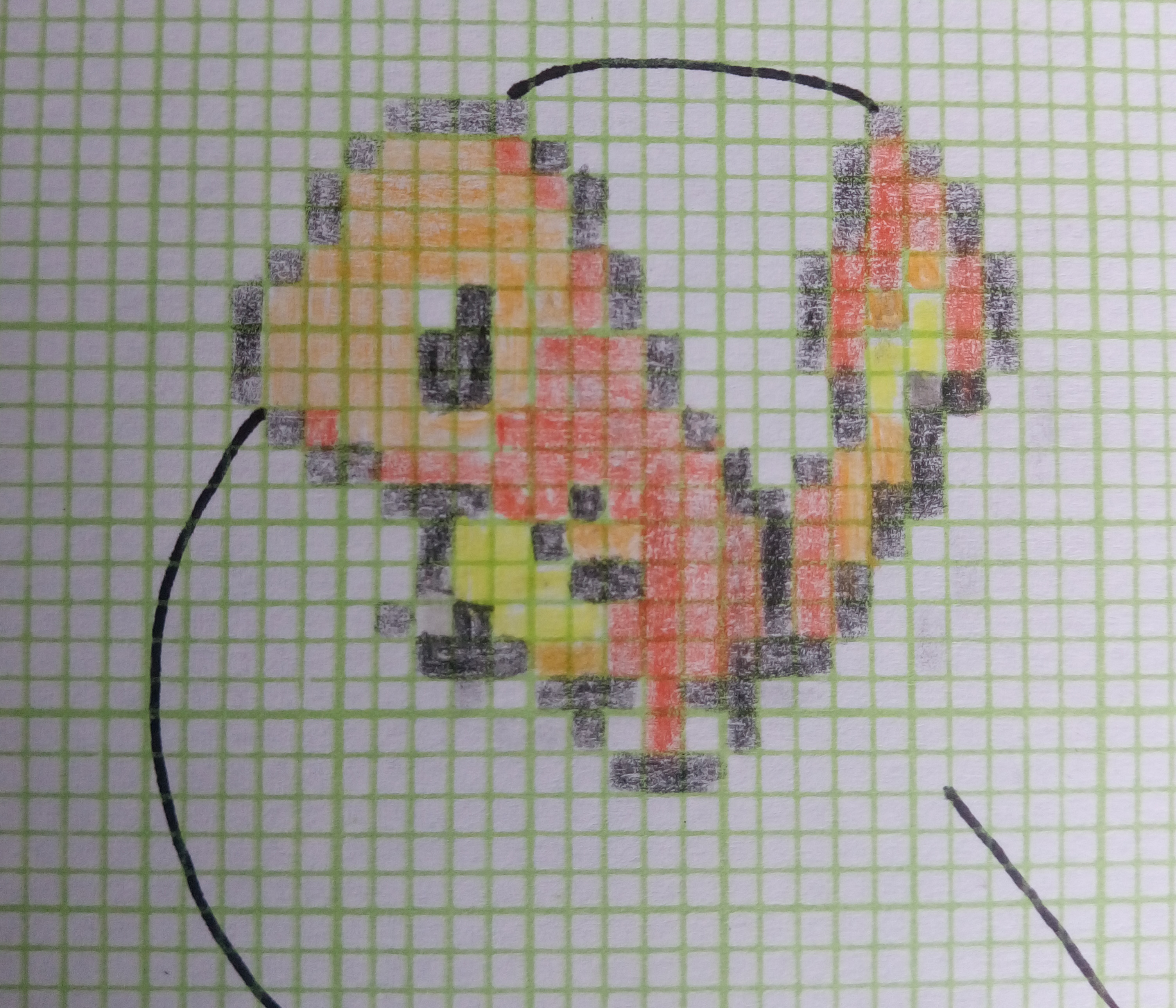
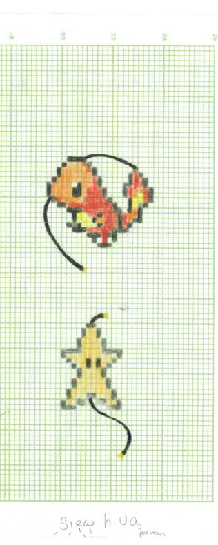
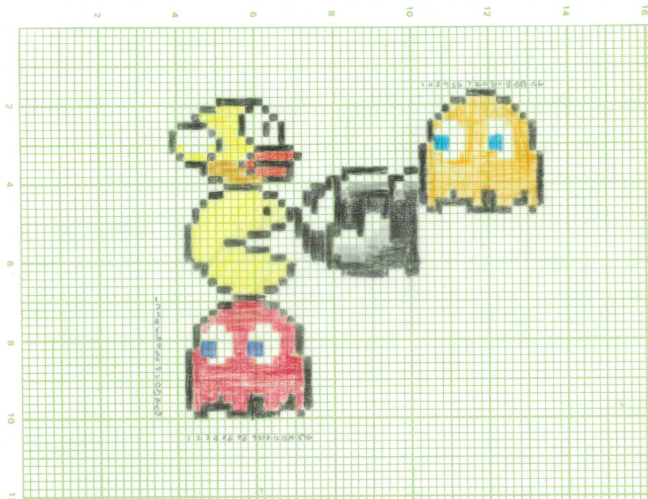
MY NAME IS
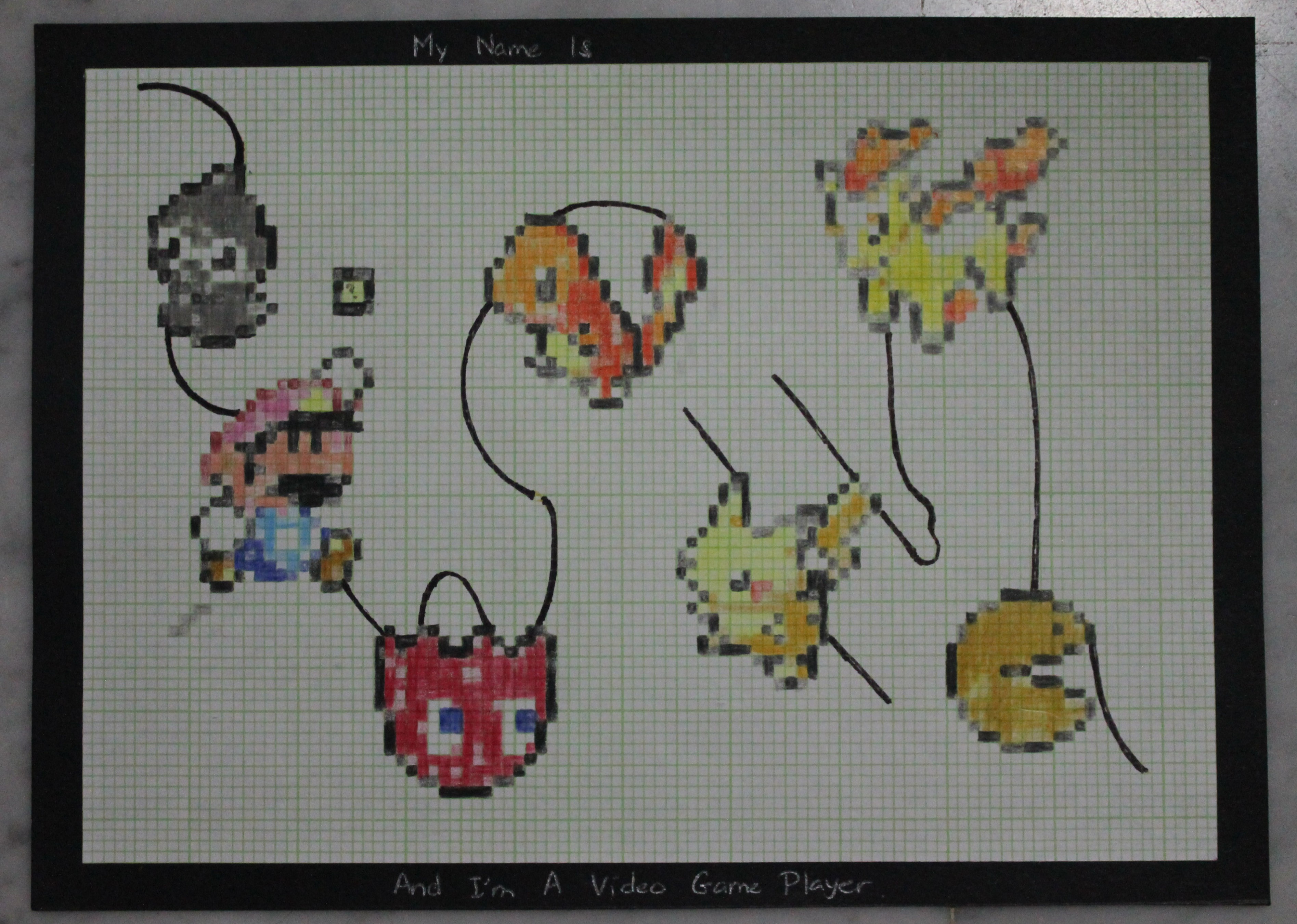
AND I 'M A VIDEO GAME PLAYER
In this work, I chose to do pixel art simply because video games are made of pixels and my thoughts were more towards the more older generation of such games where people around my age would have widely engaged with it when they were much younger instead of the modern ones. The characters i choose include those from mario, pokemon and pacman. Why these particular characters is because I feel they are the ones that most people can identify with.
I choose to do this on graph paper instead of digitally because i feel it encapsulates many factors of my concept. Firstly, I view such games to be played in the childhood years and not many people play such games now. Some may not even remember. Hence, I wanted for it to have some nostalgic feel. The graph paper was a great choice because many of us now don’t have a need for graph paper anymore and when they view it in this current time, they may have thoughts like, ” is that graph paper? reminds me of…” So similar, in terms of such games it would be, ” I remember this games, i used to play them or see them!” Secondly, it would be the process of making this work with this paper. To do this piece of work, i had to count and colour in at the correct boxes which resembles how video games are (systematic, orderly).
The characters are part of the alphabets and help form it. This is to suggest that how when we play these games, these characters are a part of us or we were a part of them, be it we were controlling them in games or be it we liked them so much we imagine ourselves to be them. The black lines that help form the alphabets are actually illustrations of the wire of consolers.
The composition is wavy, in a up and down way to suggest that when we play games sometimes we feel happy and excited but other times we feel sad, angry or down.
The defects/glitches are shown through the faded or wrong pixels as well as the wires that are thinning out or already broken. This is to suggest even though games can be systematic, there can be break downs or system glitches from time to time.
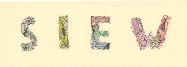
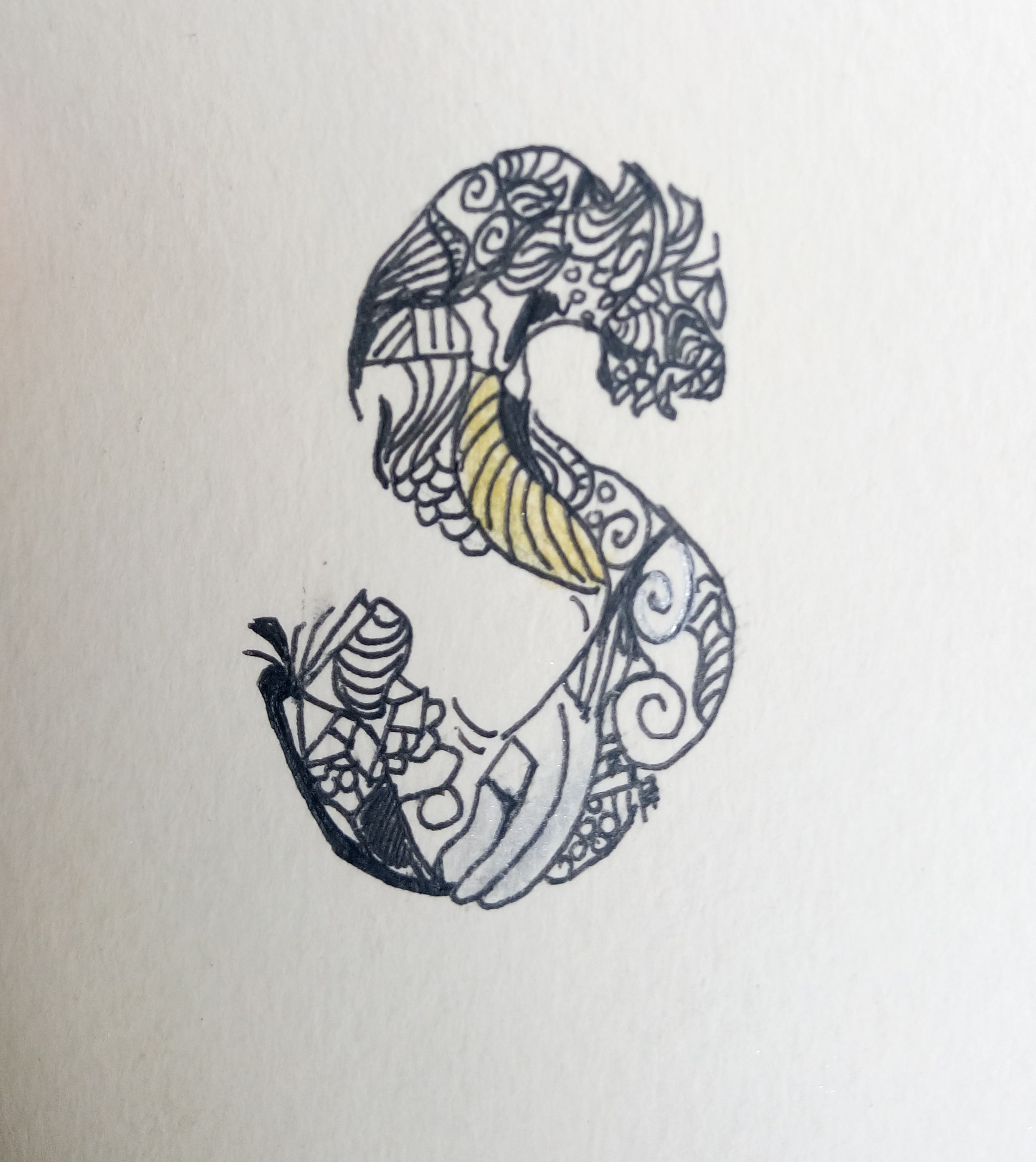
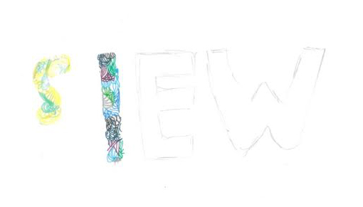
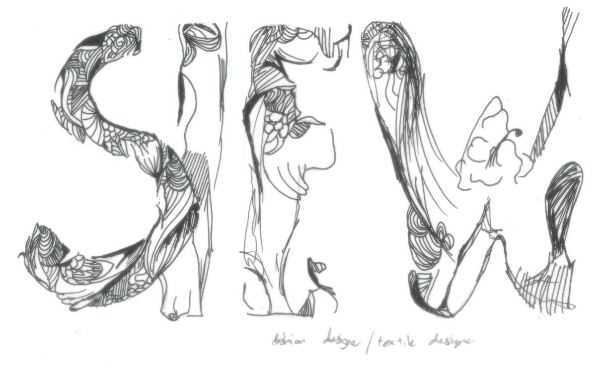
MY NAME IS
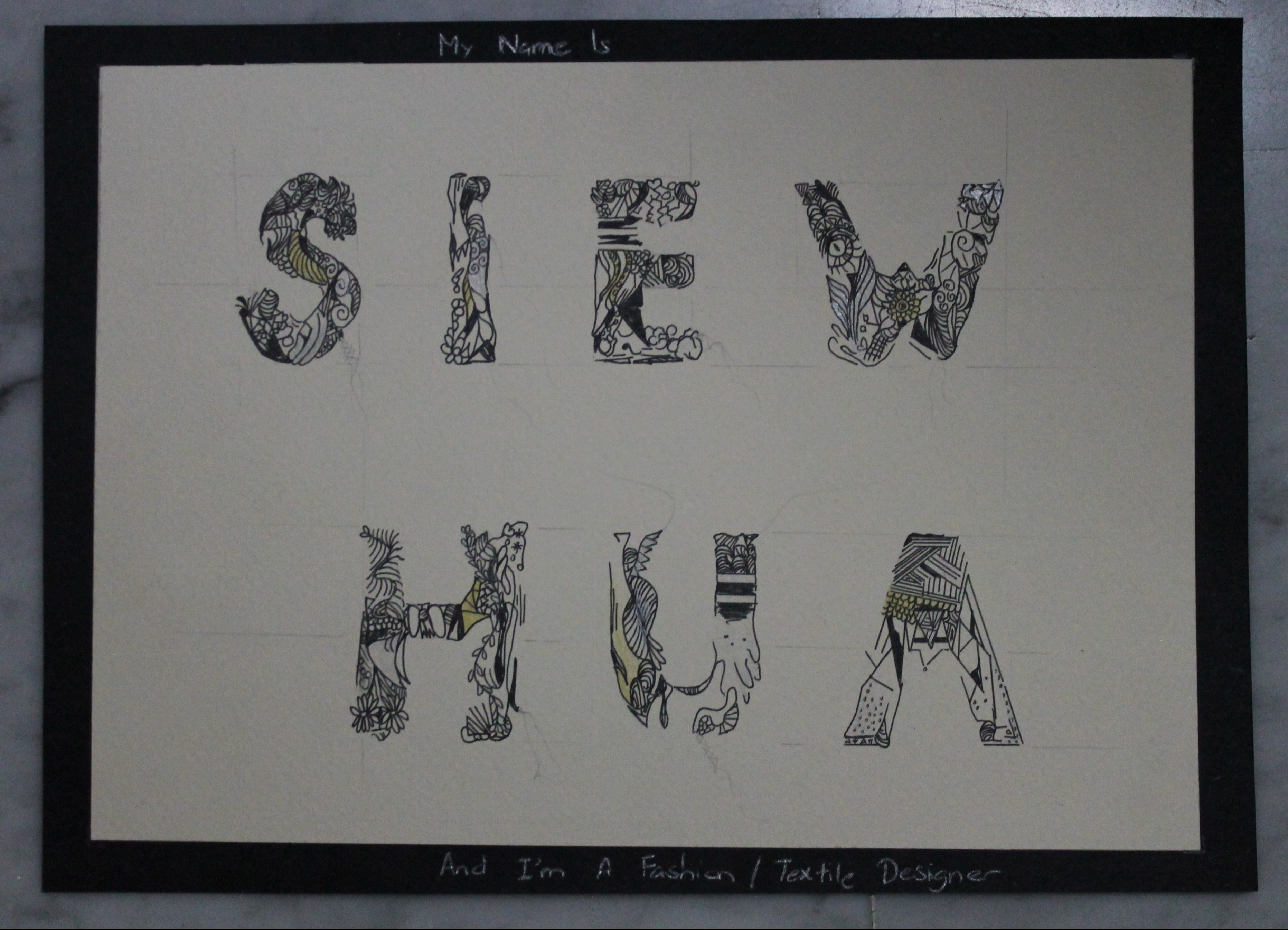
AND I'M A FASHION / TEXTILE DESIGNER
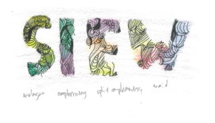
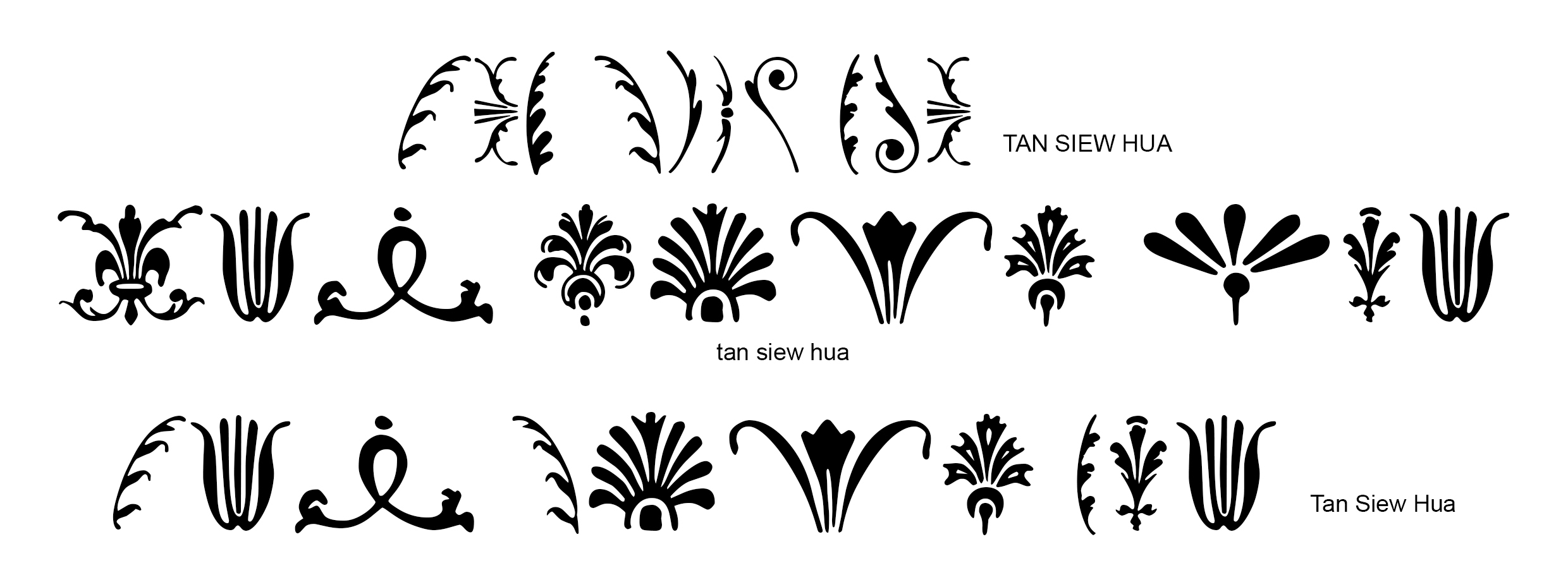
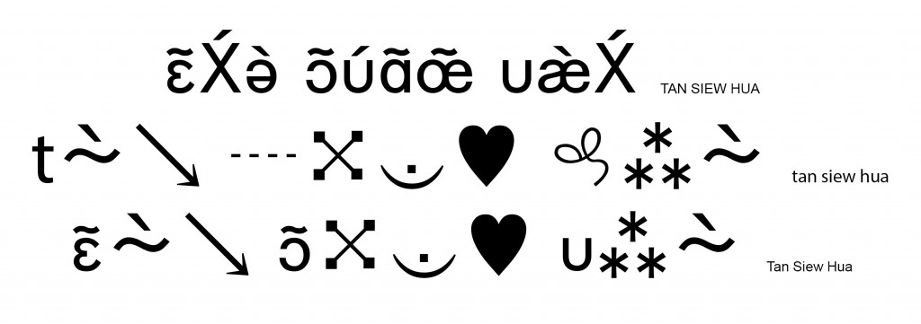
In this work, I illustrated the letters through many various patterns. Each letter have some similarities to indicate the same style of the same designer but yet they also has their own unique feature, just like how the designs of fashion/textile designers are.
It is also visible in my work how each letter is placed at the same distance apart from one another. This is to give views time to admire each letter by itself before admiring it as a whole, resembling how the designs alike that of those in this industry need their ‘own limelight’ and space. The equal spacing is also to indicate that the designs are usually carefully calculated or arranged and not just some random choice of placement.
I did away with the colours and kept it relatively in black but highlighted in shiny gold and silver. This is to keep it sophisticated, elegant and glamourous.
However, upon a closer inspections, one would start to take notice of the ugly pencil lines and some would have thoughts of “why is this there? Shouldn’t this be hidden from public?”. They are not because i forgot to erase them or anything along that line but actually an deliberate act to push my message across. The straight lines that look like measurements or alignments guide are to indicate the initial steps for designers before they can come up with their wonderful designs. These designs do not come easily but are only achieved through numerous failed attempts, hence it is rather tedious and requires much hard work. The more wavy lines or to resemble those of loose strands of tread from clothes/textiles, because even though the final product may look totally perfect from afar, their is still some not so visible defeat somewhere.
My choice of paper is solely for the purpose of aesthetics where i feel black on white would look rather empty or incomplete while off-white paper is more pleasant on the eye and would enhance the aesthetic quality too.
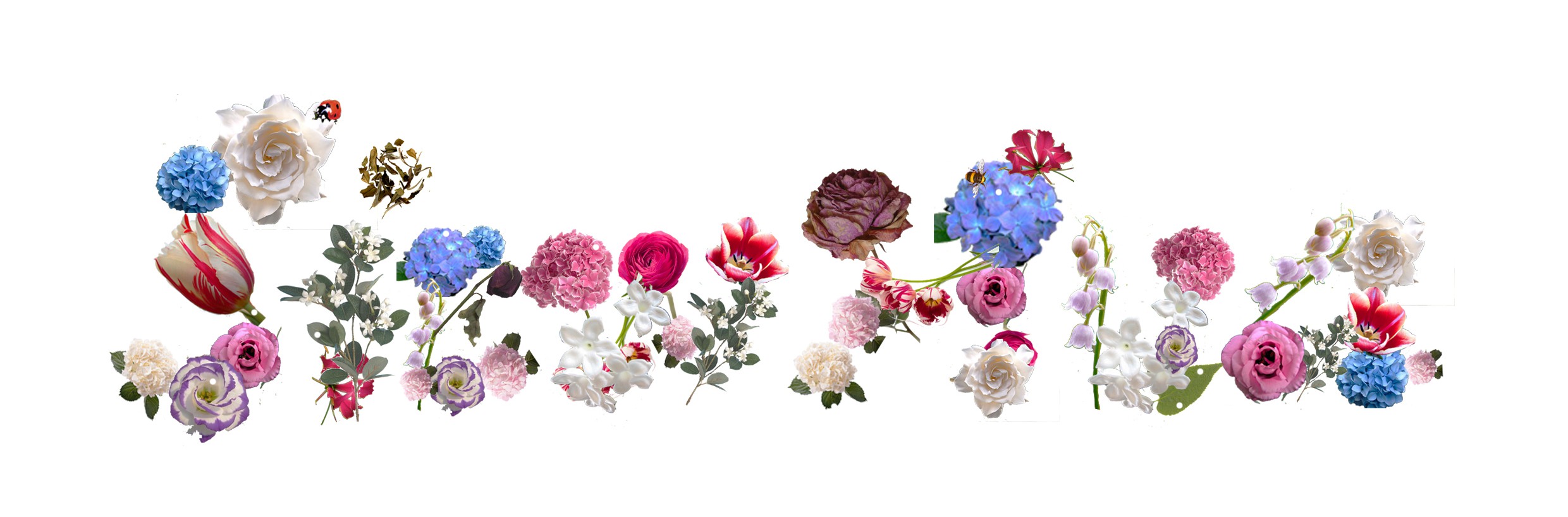
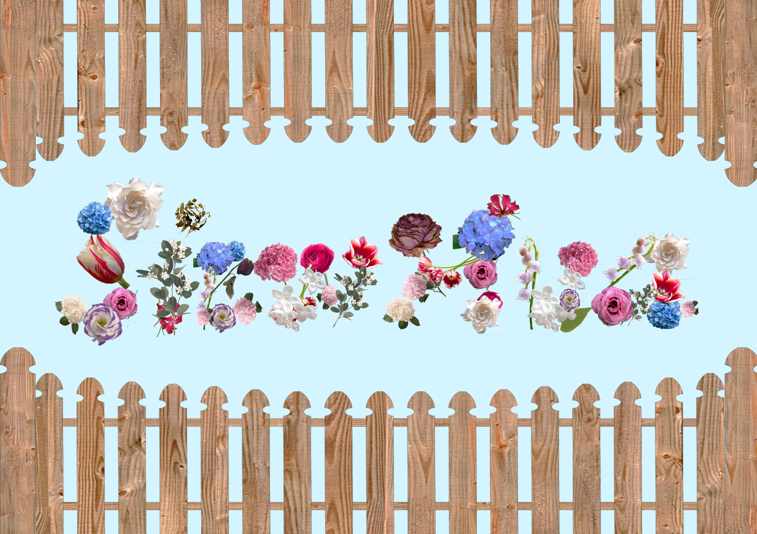
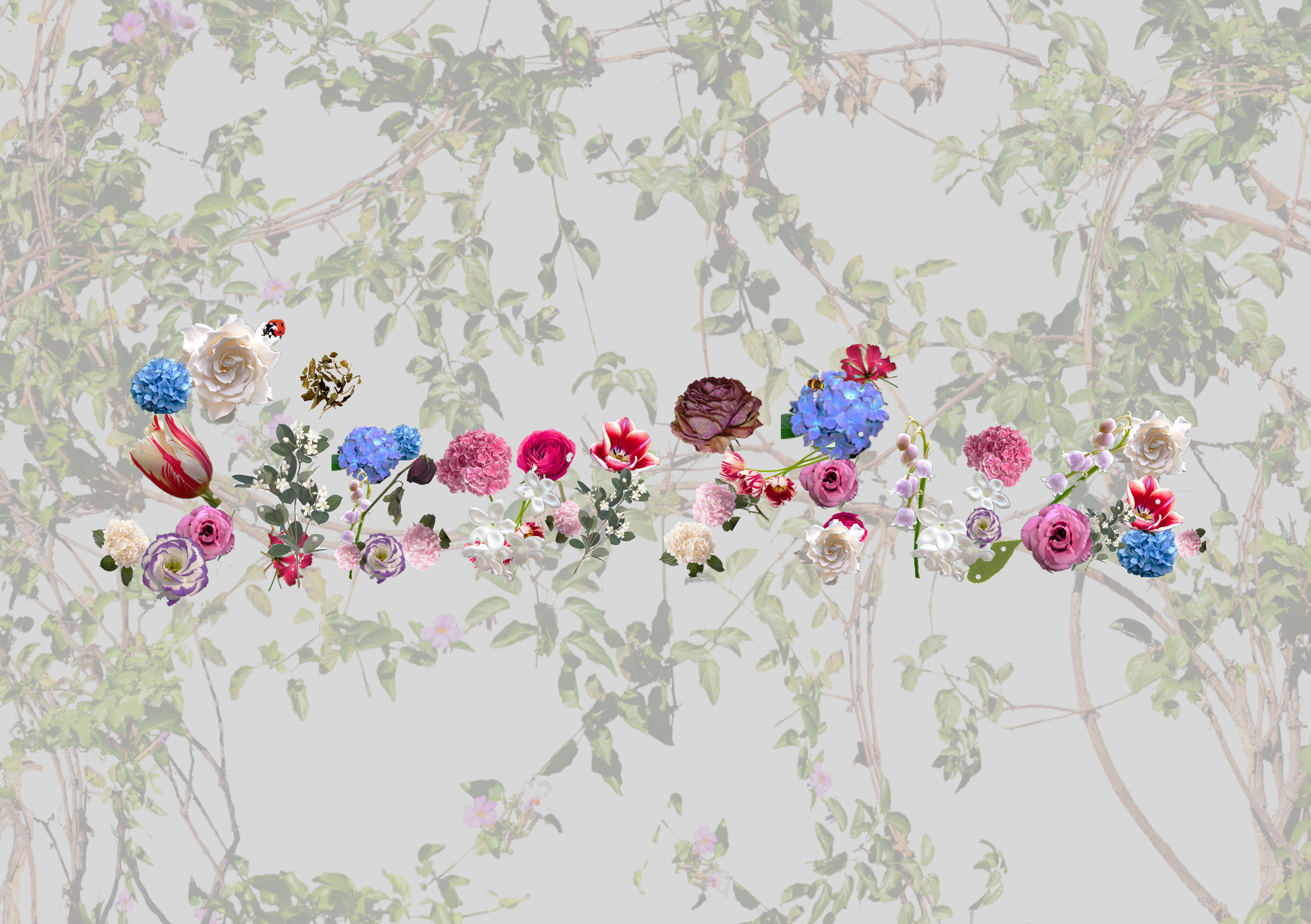
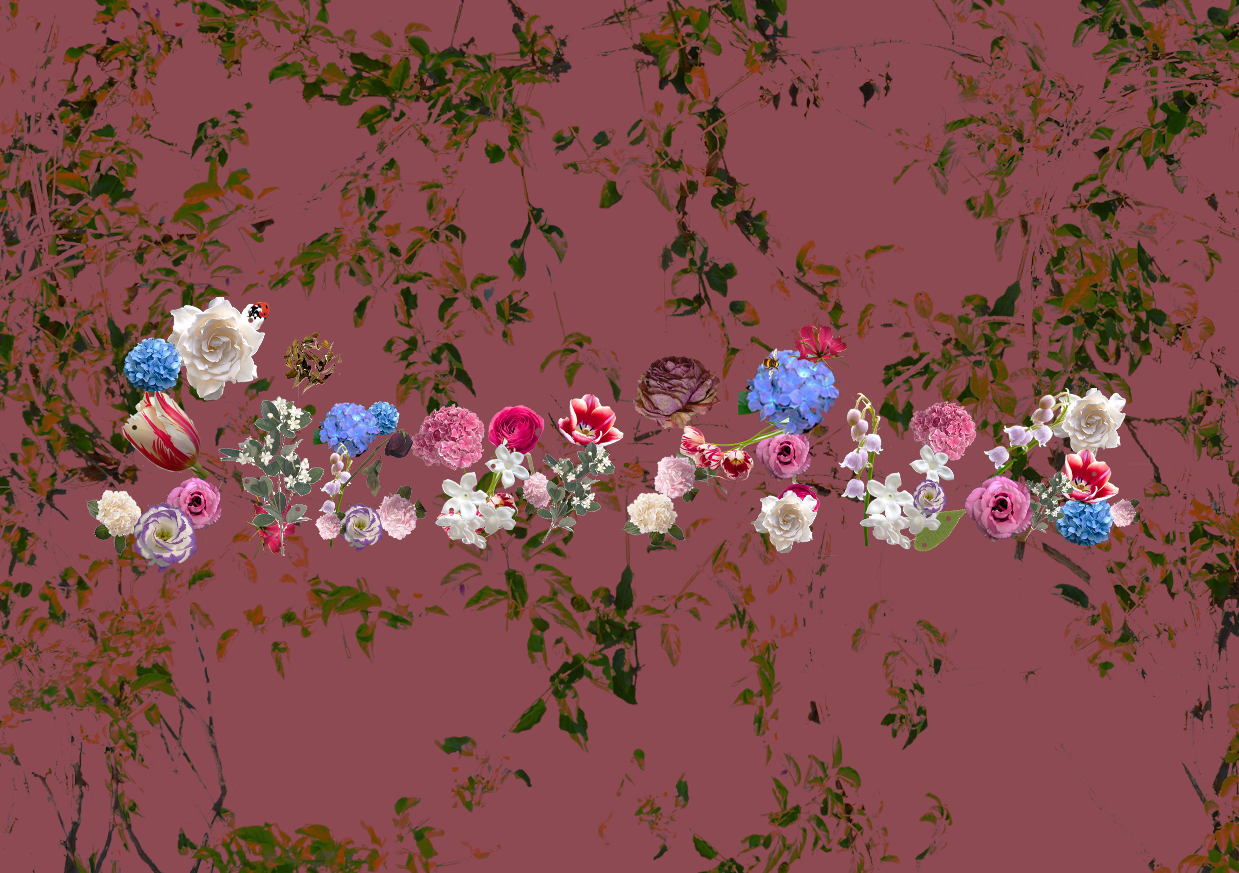
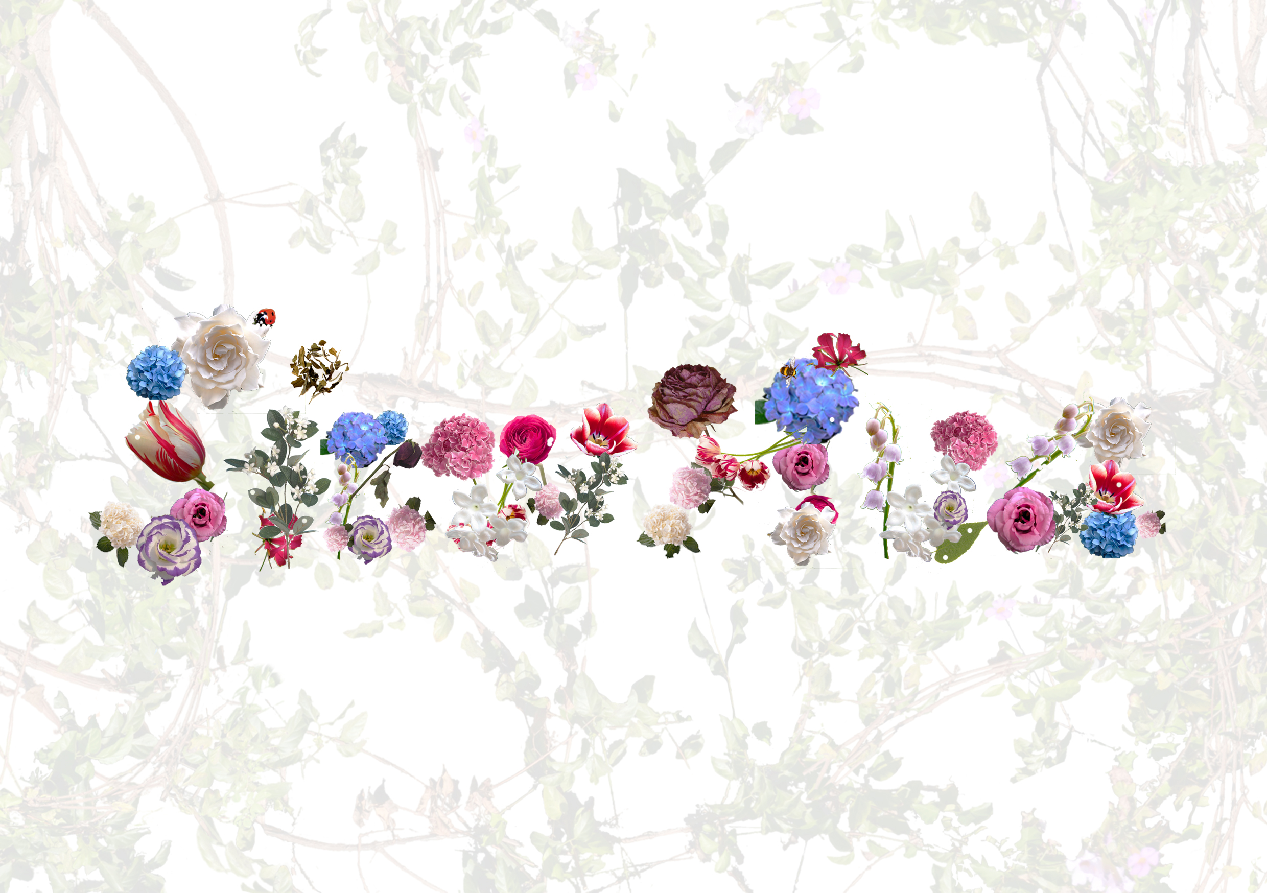
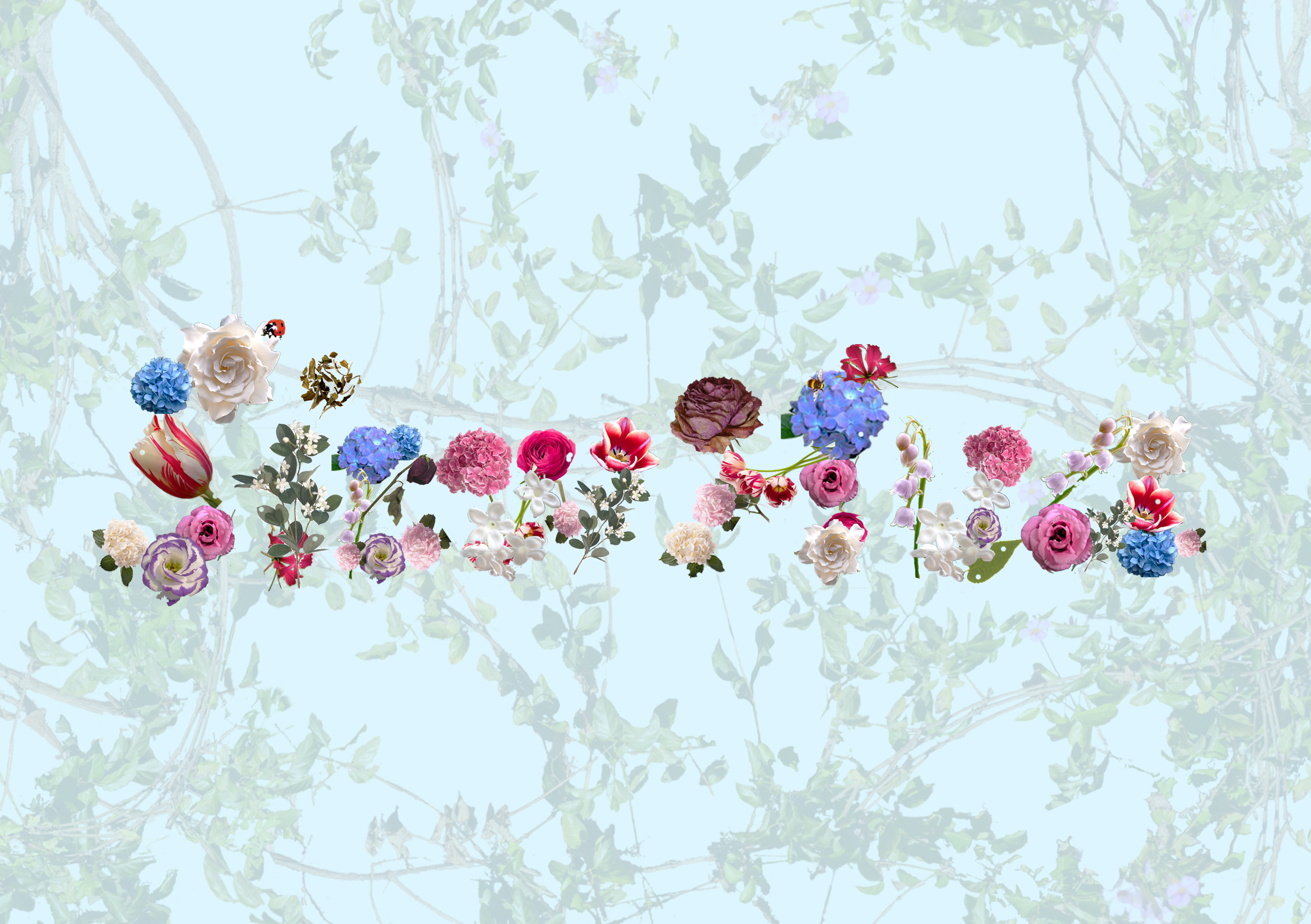
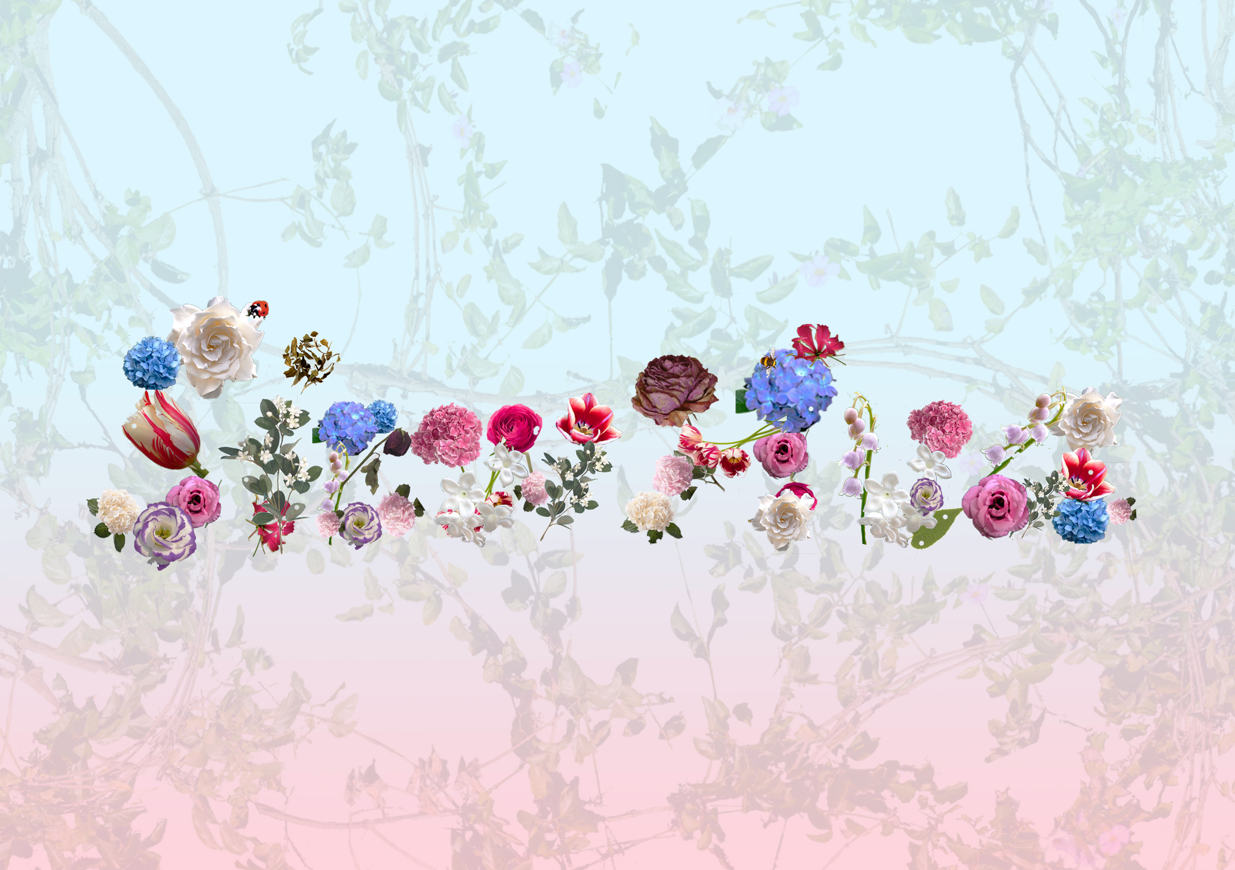
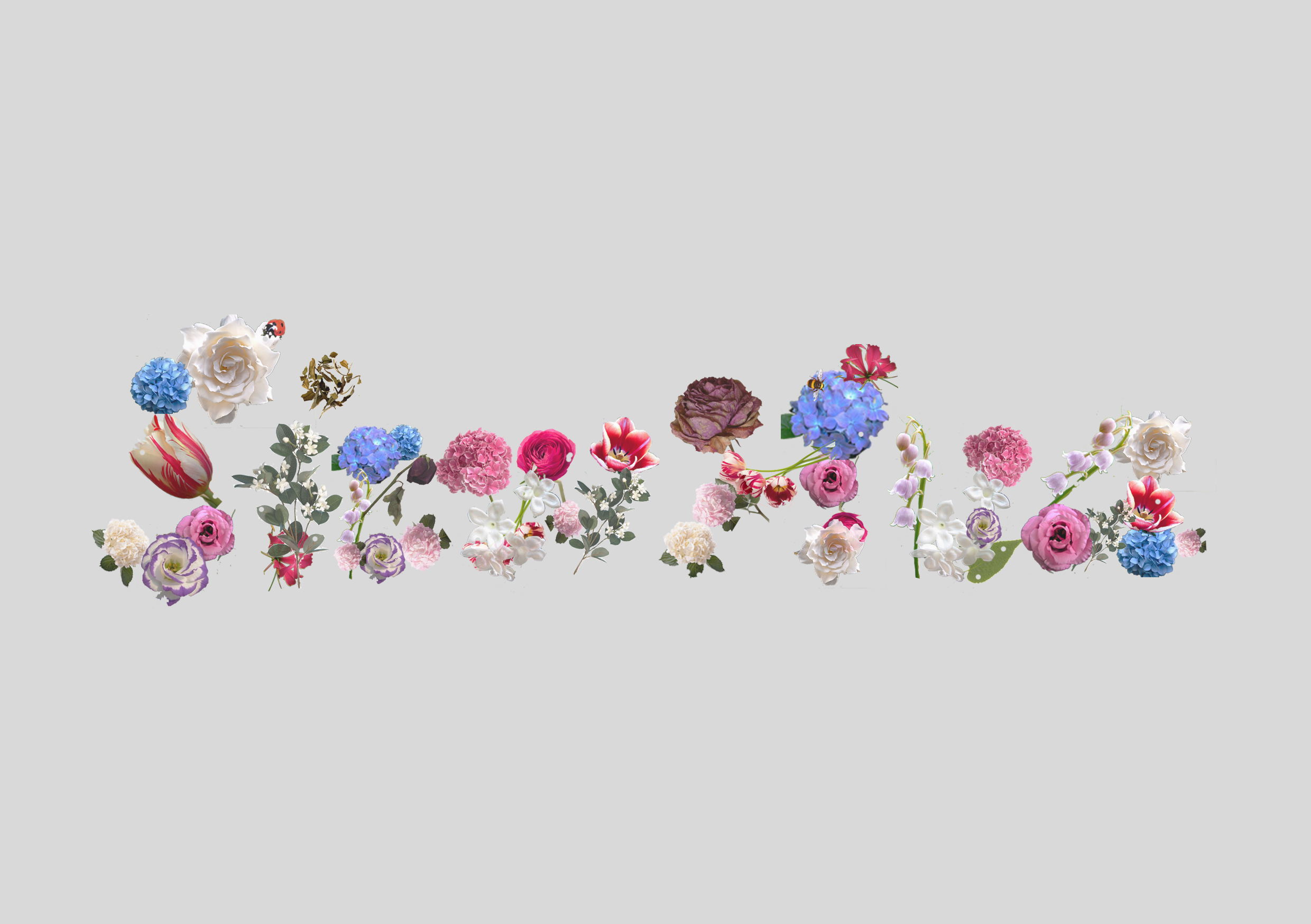
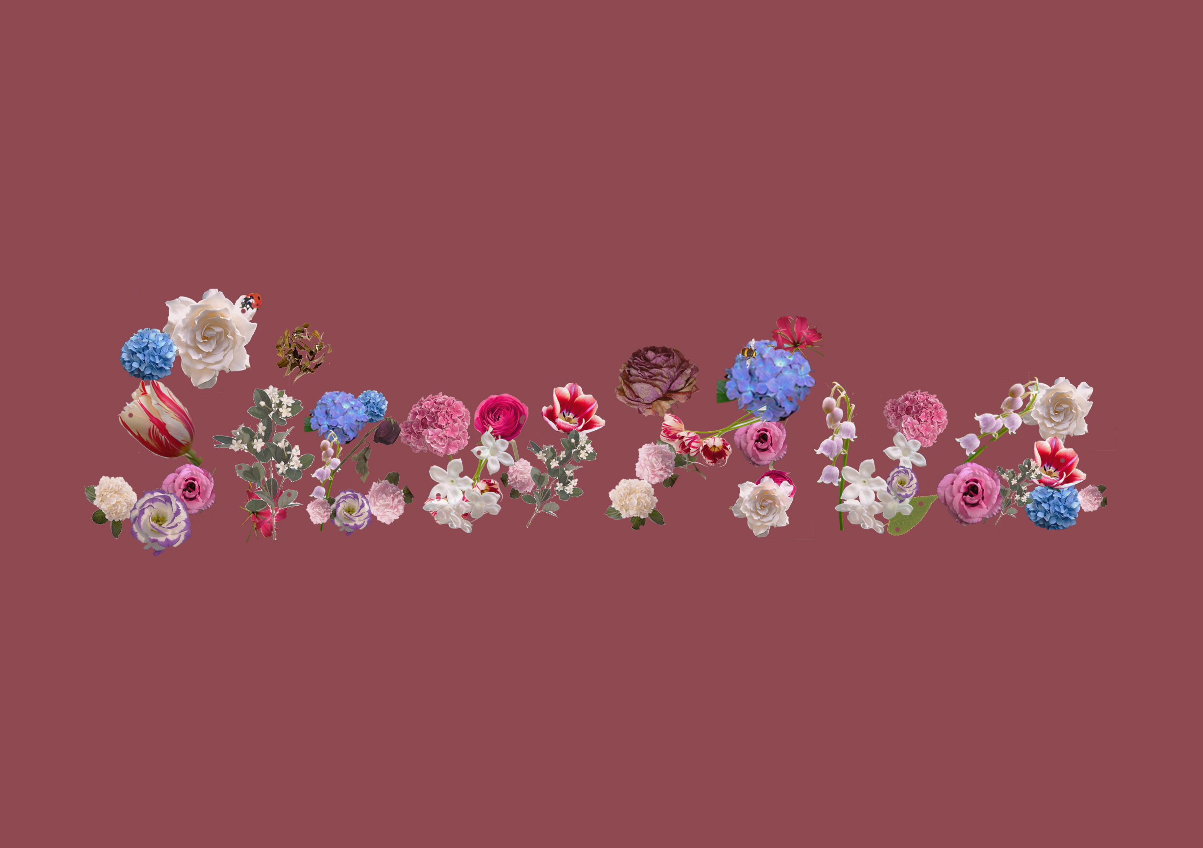
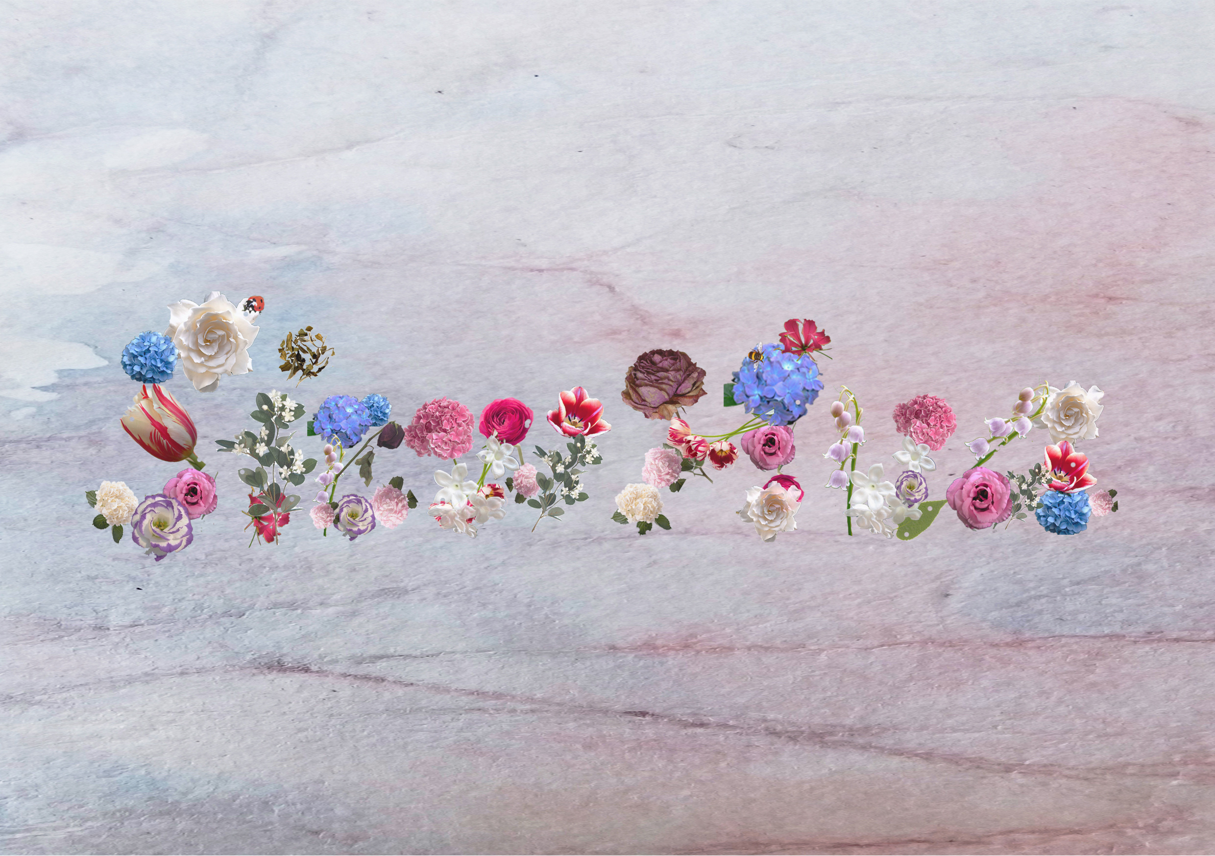
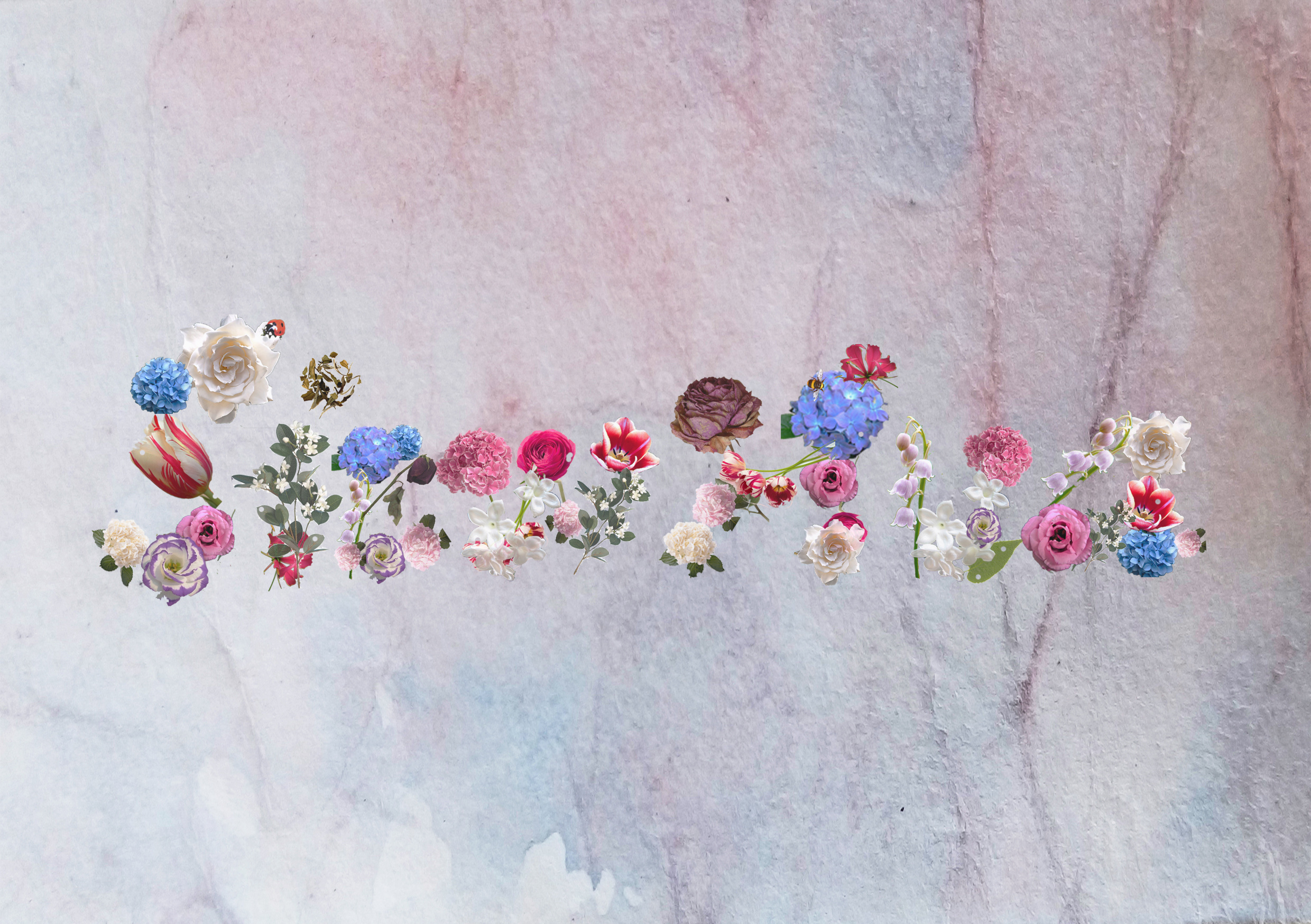
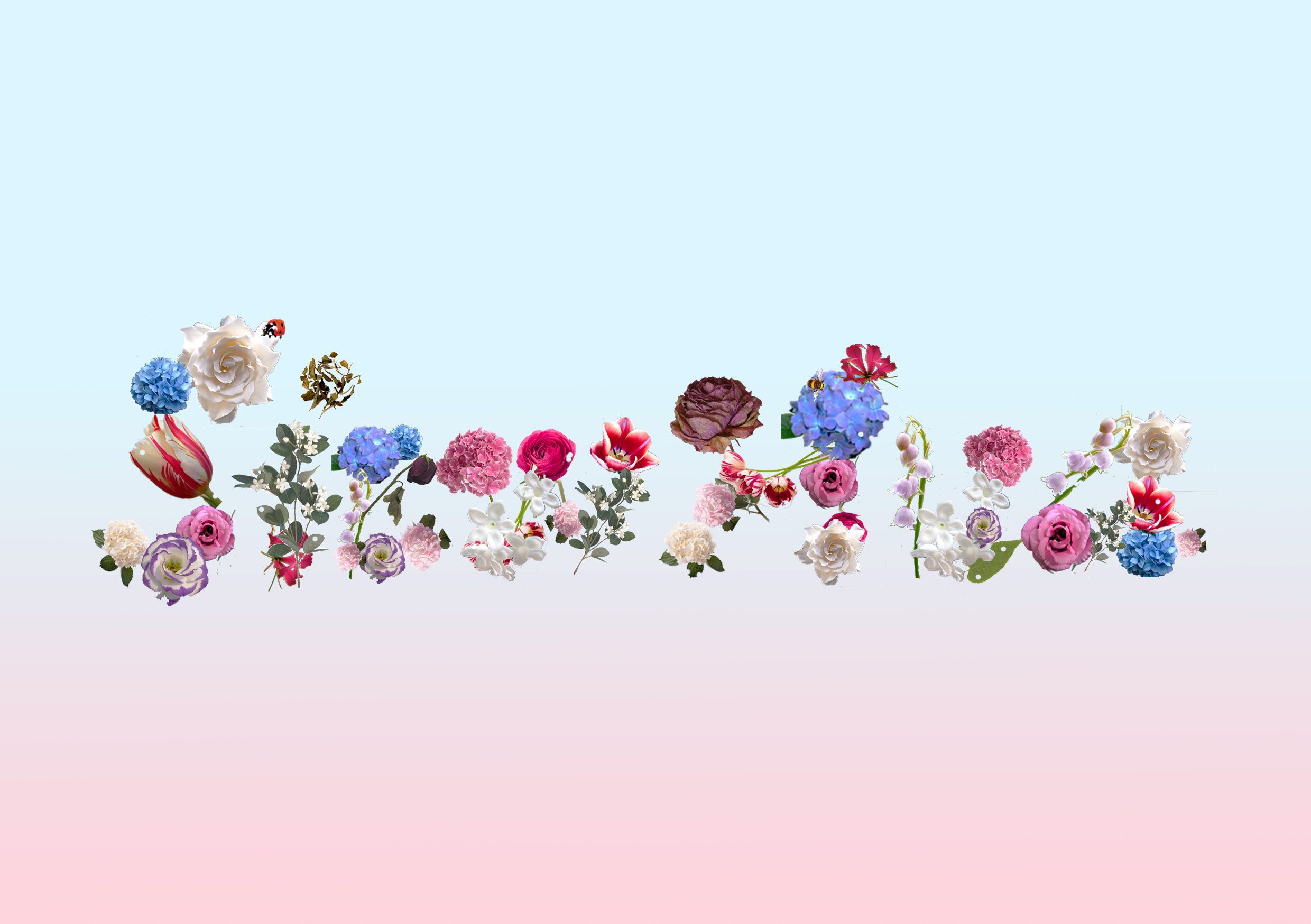
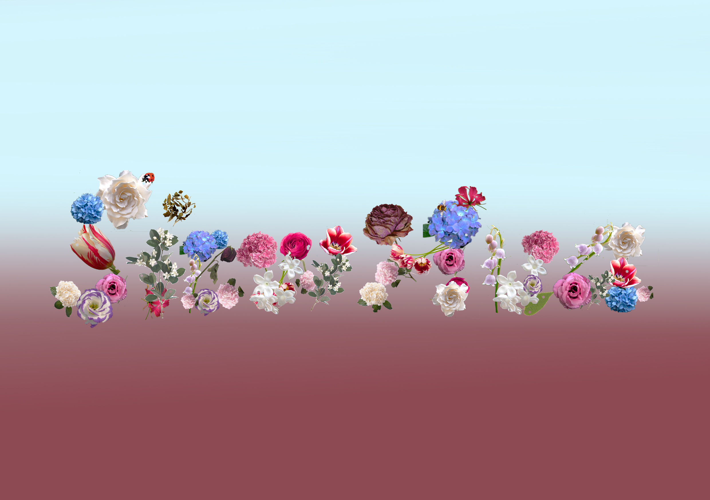
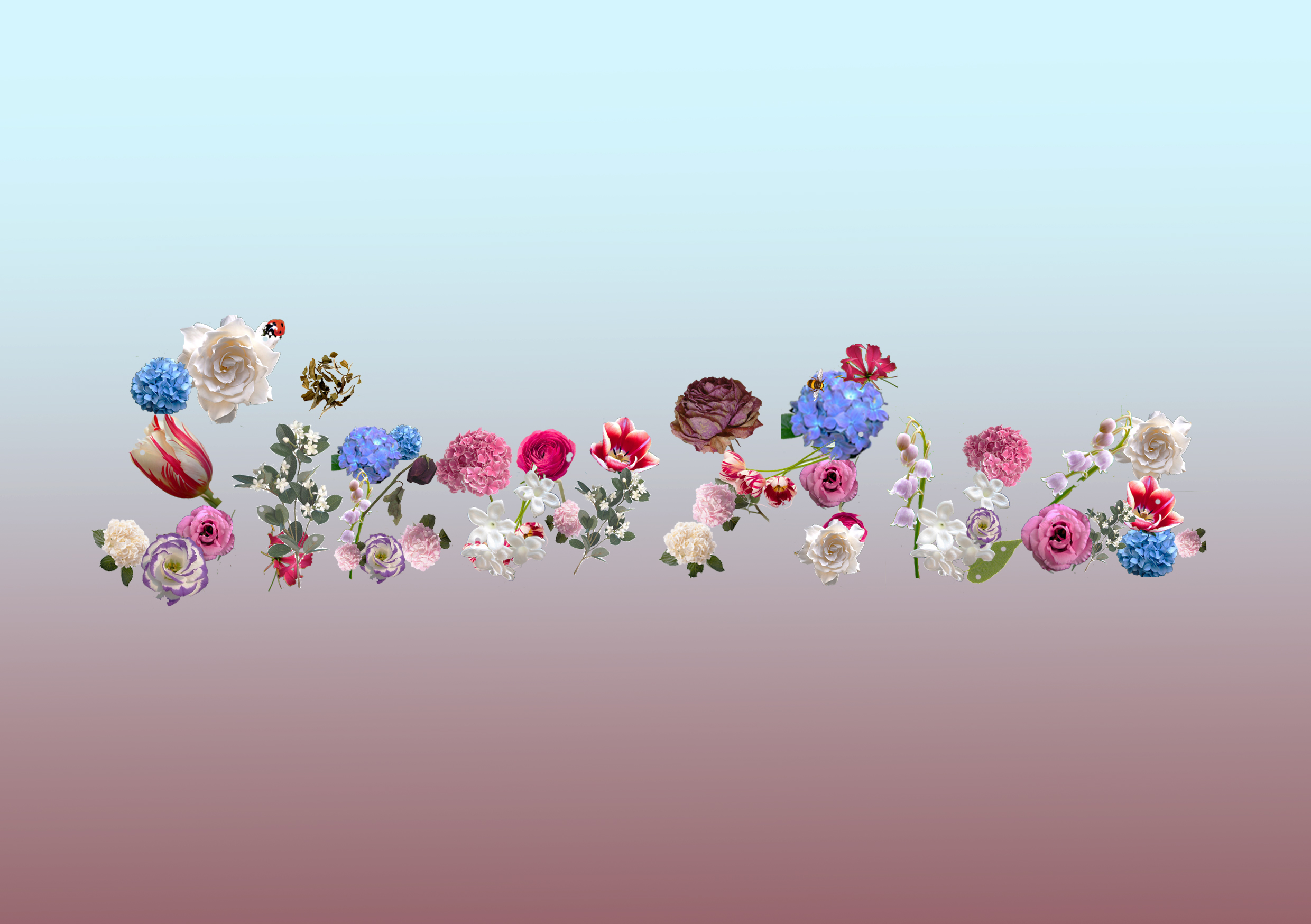
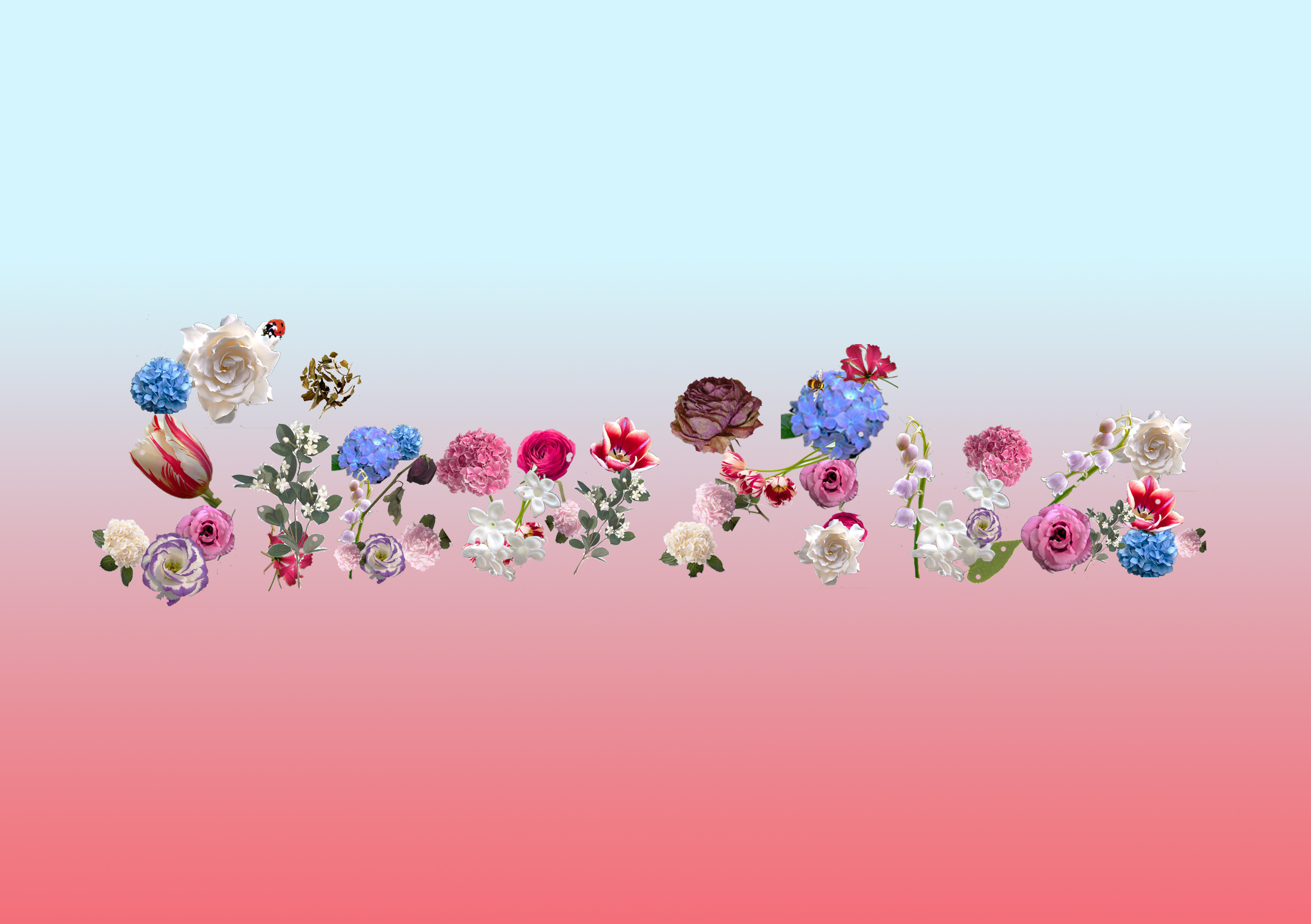
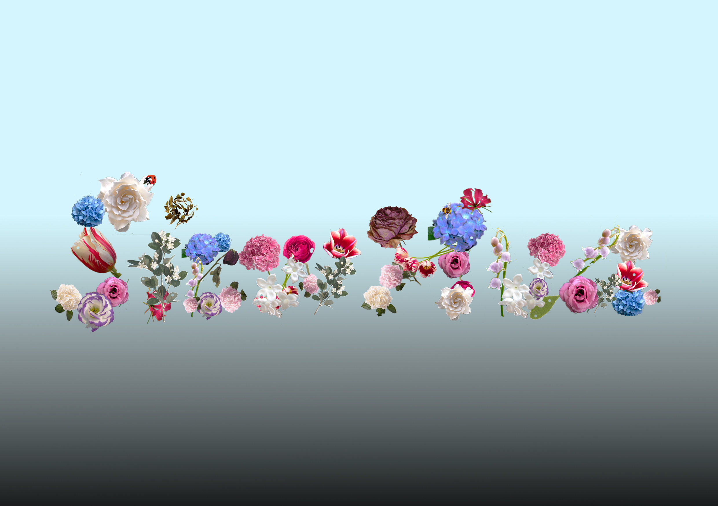
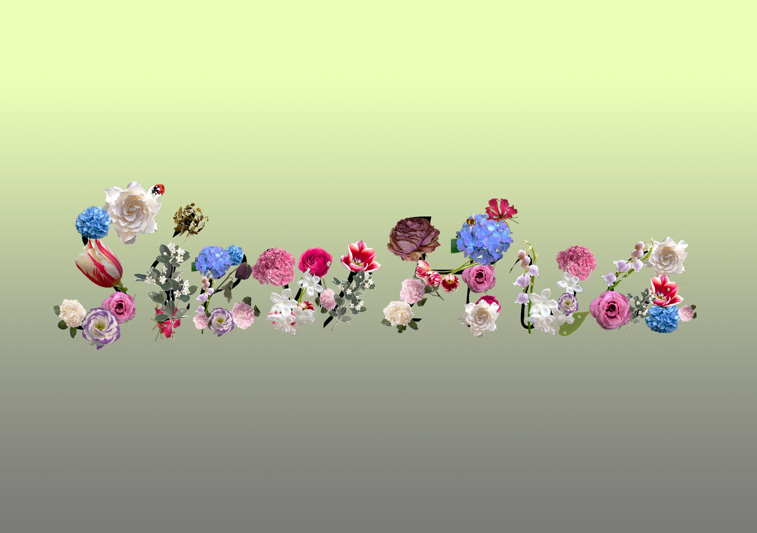
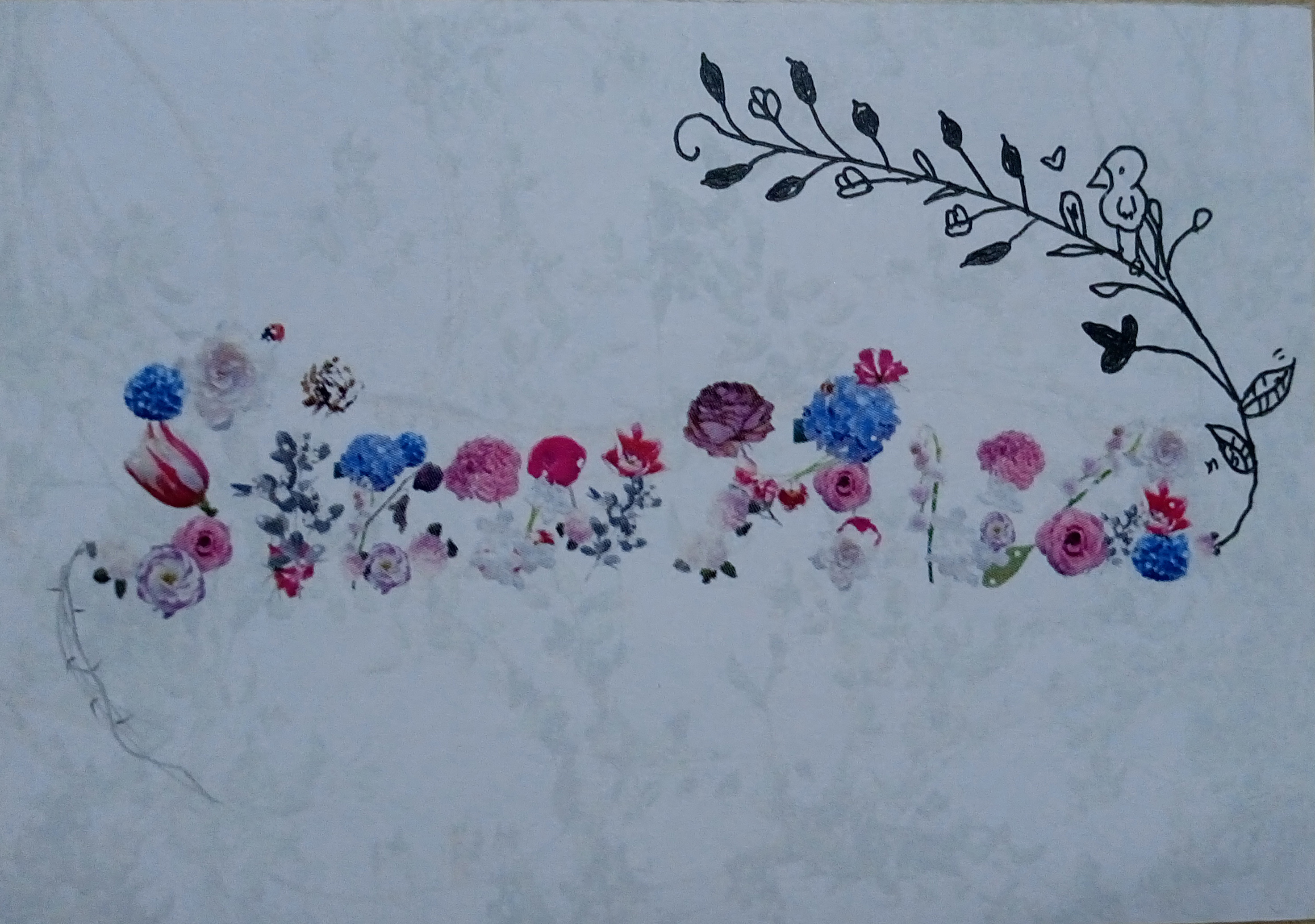
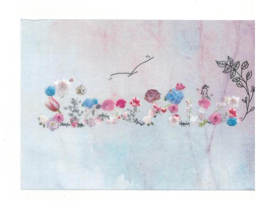
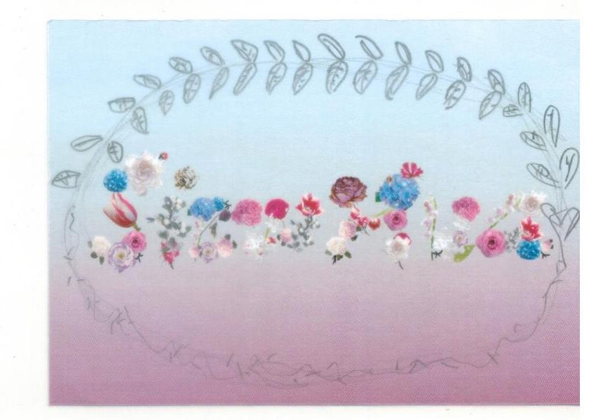
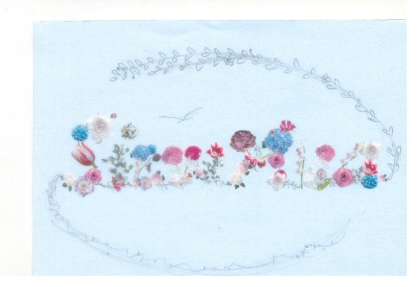
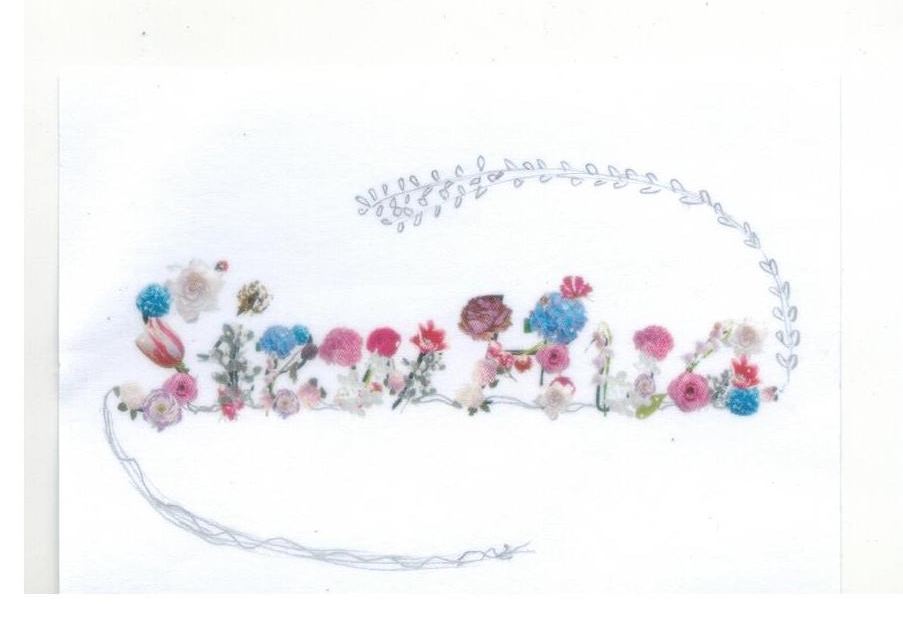
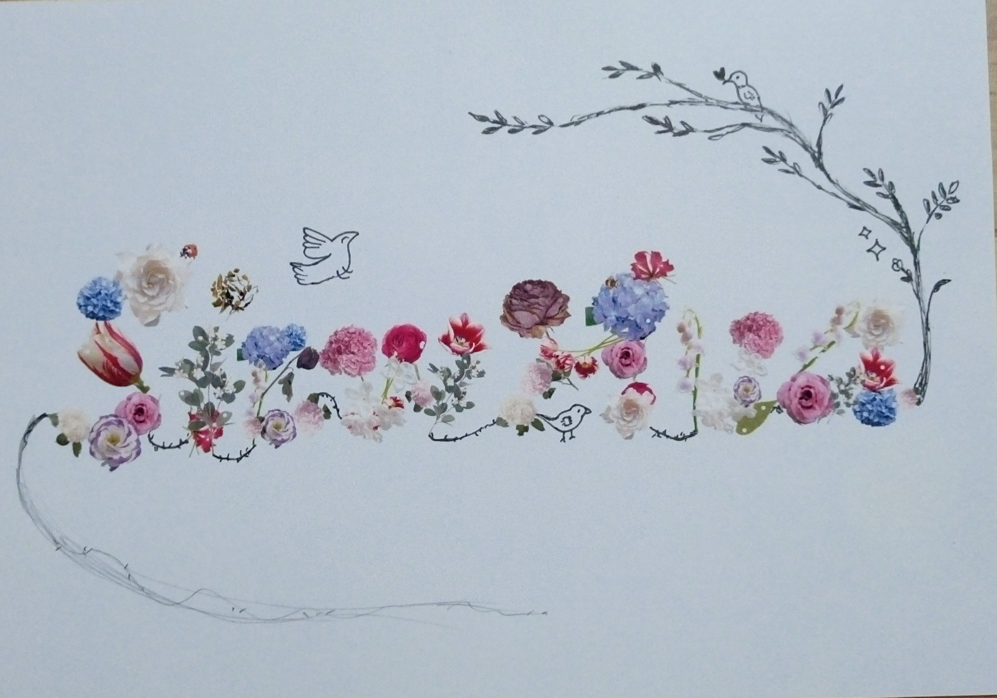
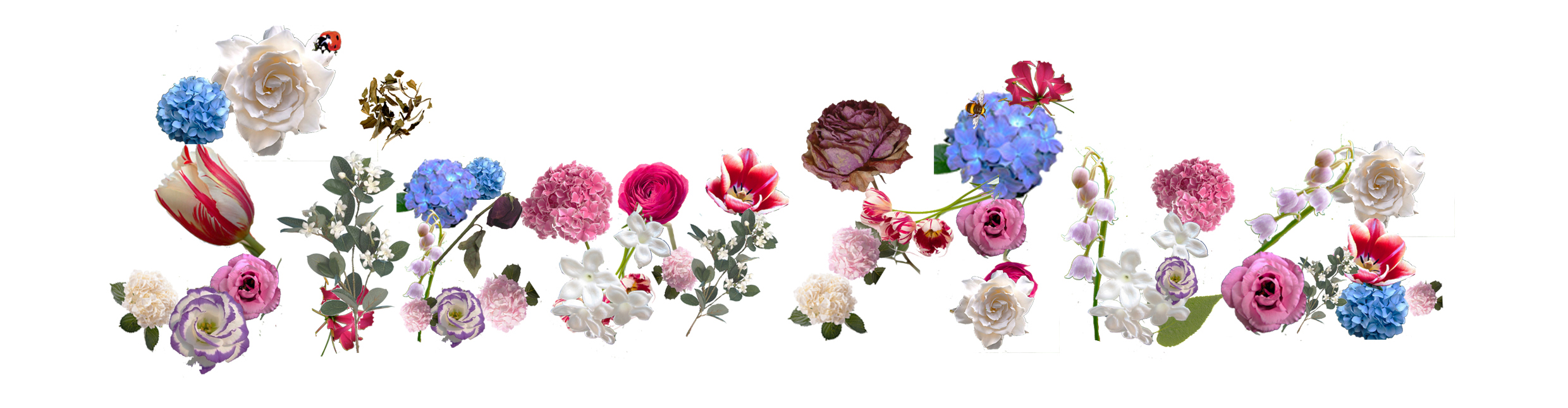
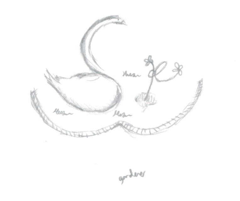
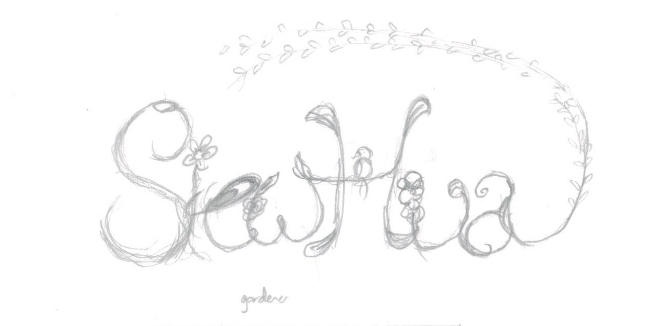
MY NAME IS
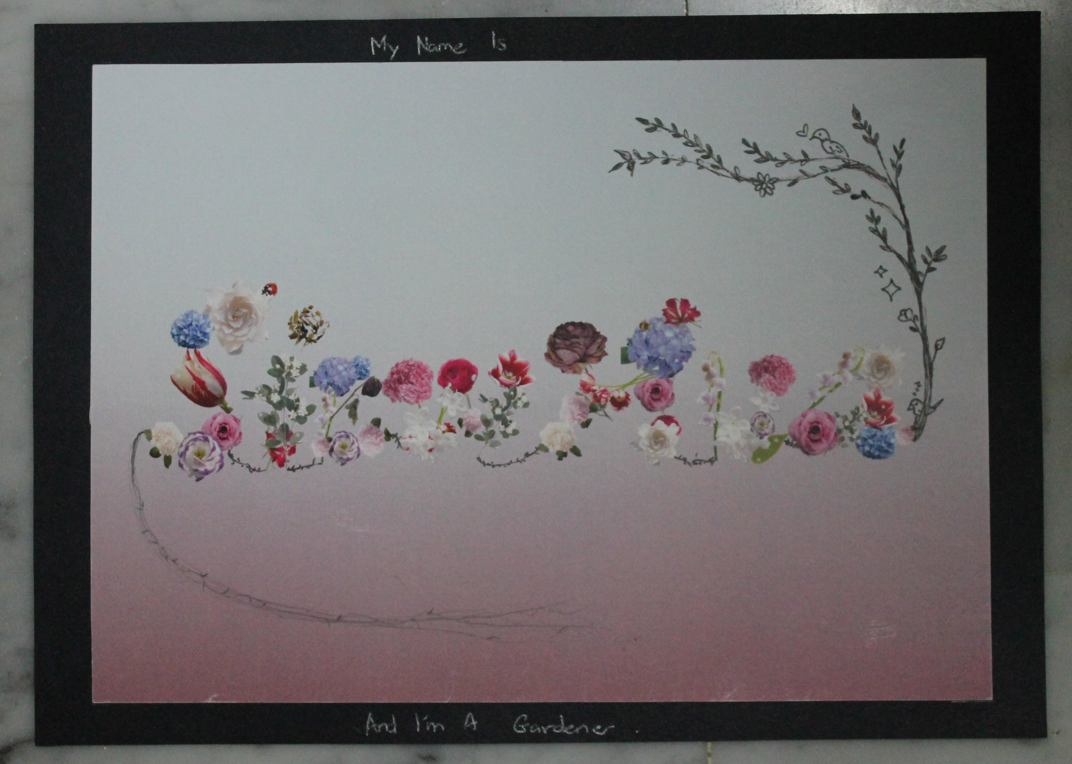
AND I'M A GARDENER
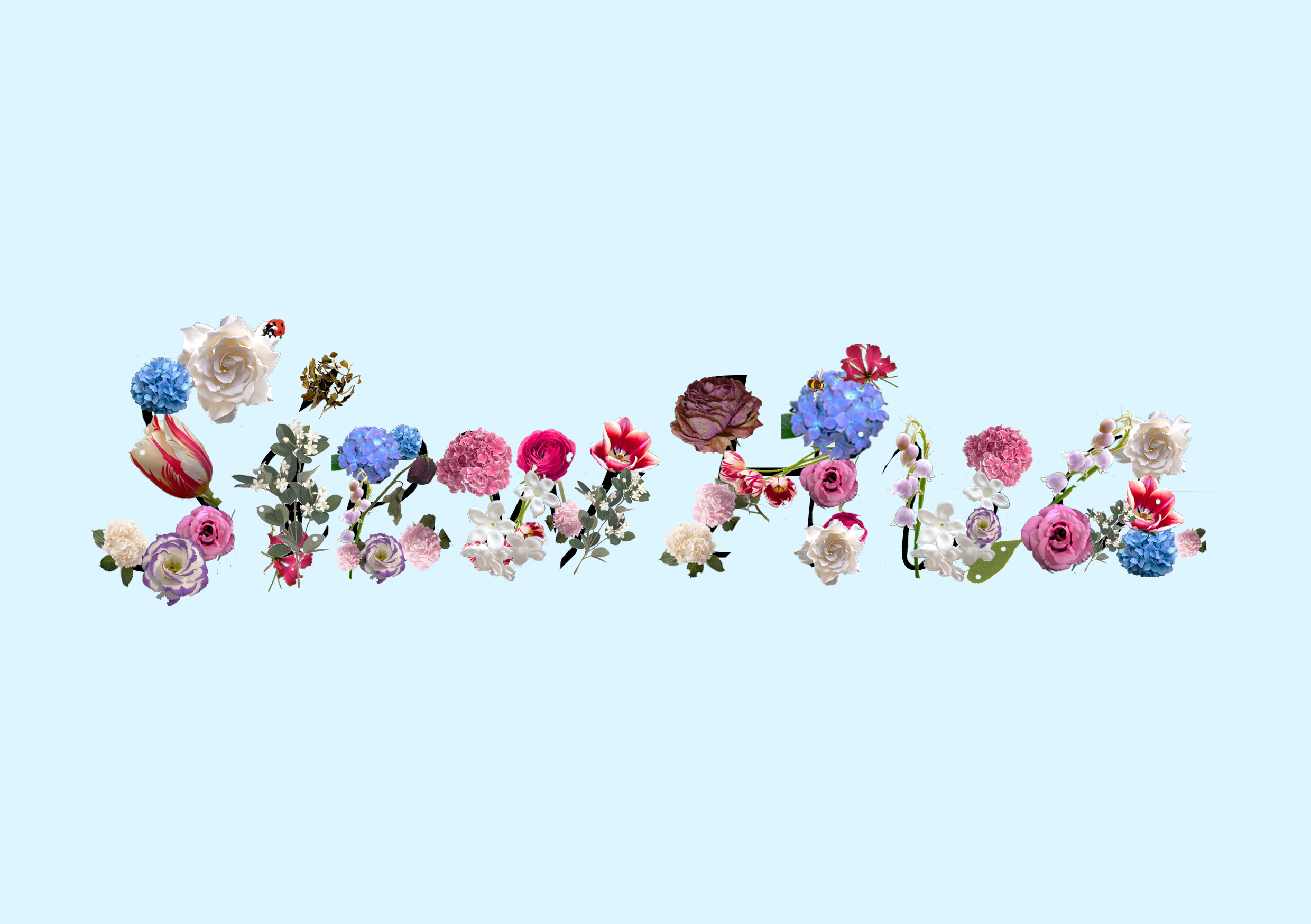
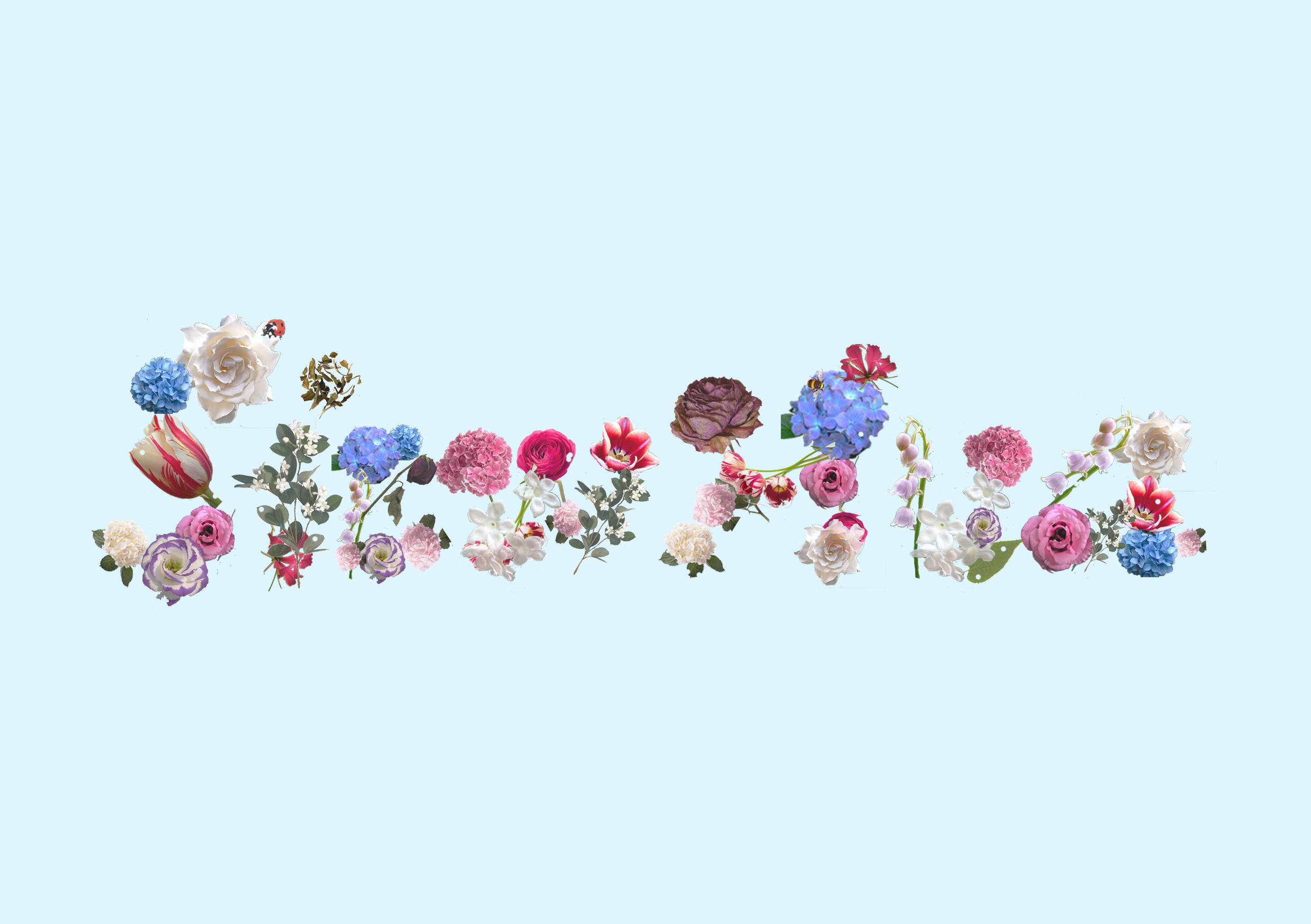
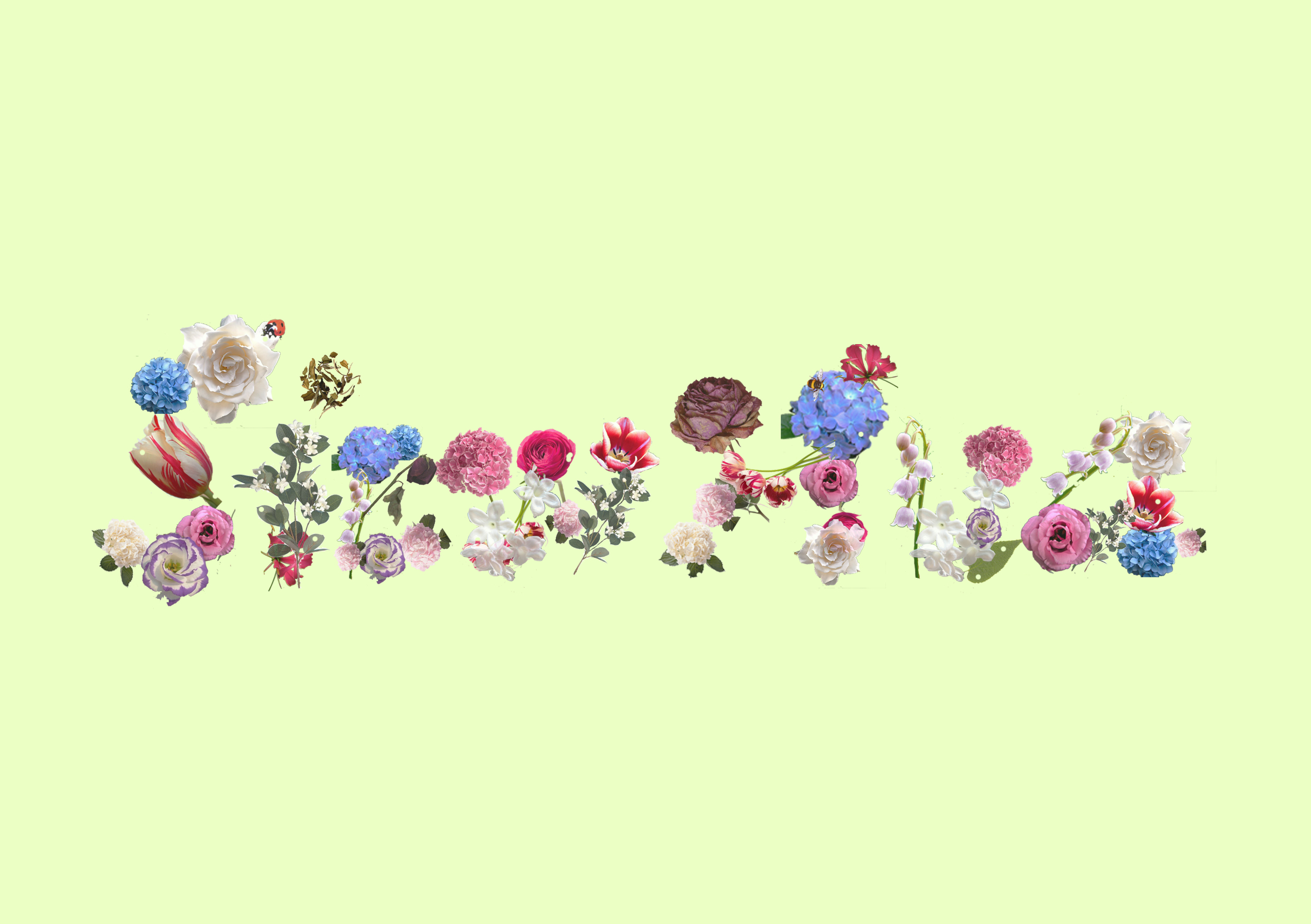
In this work, it is first done digitally where i cut out the individually flowers on photoshop to form letters of my name. After printing them out, i illustrated with both black marker and pencil.
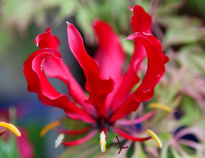
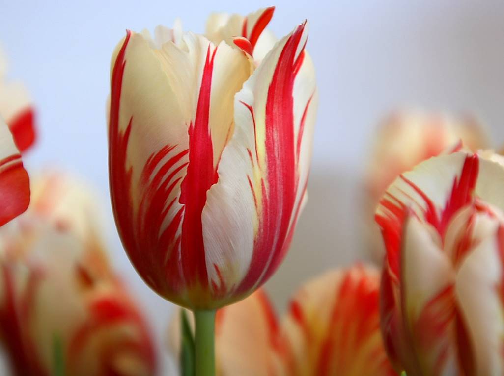
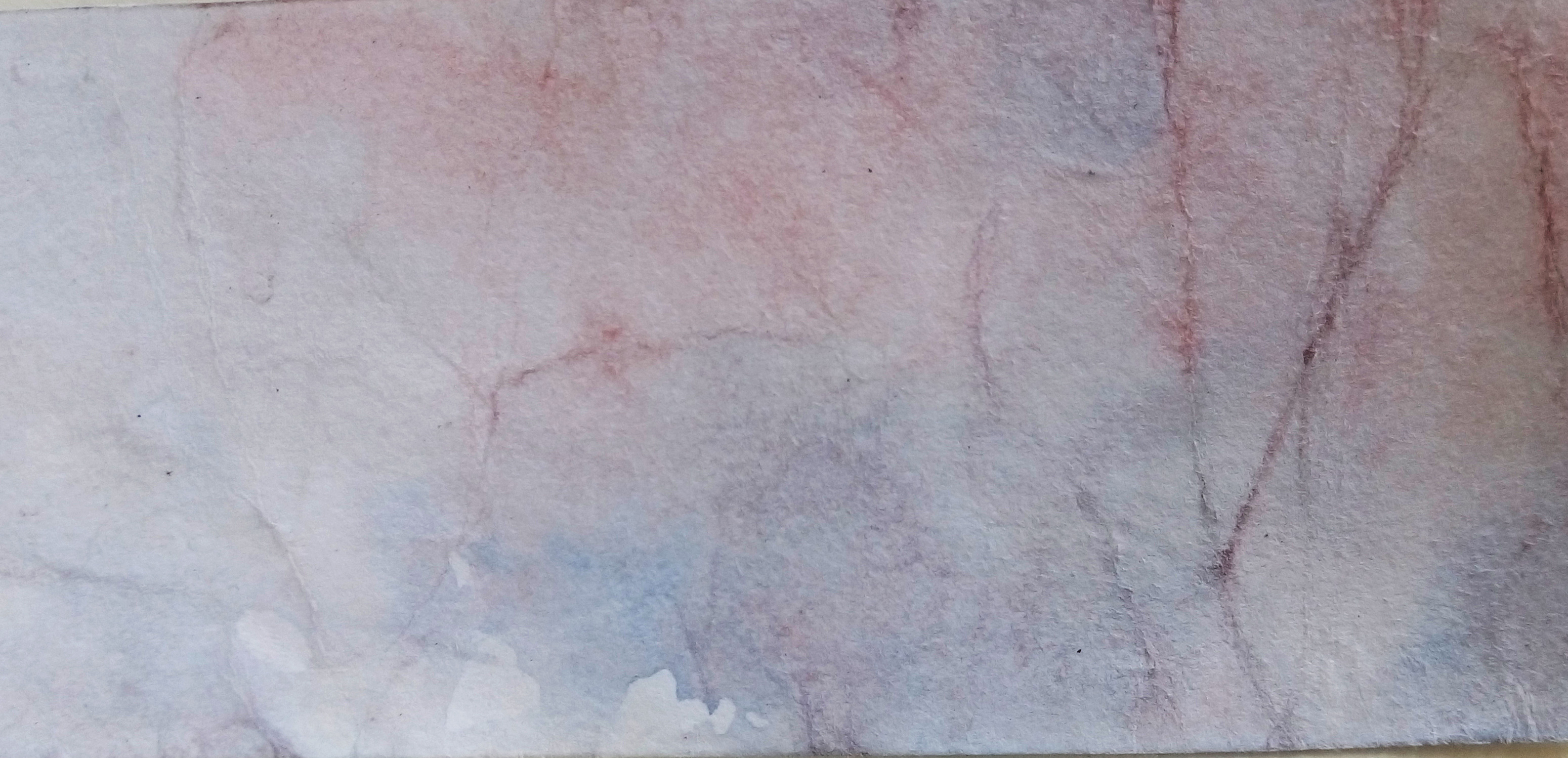
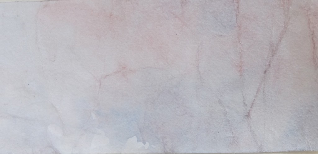
I choose for the top part of the background to be a light-blue that sort of resembles the sky as well as to portray the quality of calmness and serenity. On the other hand, the shade of red is to indicate that not everything was that ‘peaceful’ and their is actually handwork, pain and even blood(some flowers have thorns and all) involved. Hence, in a way the blue is the beautiful part while red is the negative part.
The plants that form the alphabets of my name look pretty and elegant at first glance or from afar but upon near inspection, one will see that there is actually some withering or spoiled(holes) ones inside as well. This is to suggest the idea of not everything that seems perfect is perfect, and the flaws are only noticeable if one cares or have the interest enough to go see it at a closer level.
The insects represented by a lady bug and a bee is to not only suggest that they are part of what makes up a garden but also to bring up the idea of how they are often discredited or overlooked when they actually aid in healthy and beautiful garden growth. Just like the gardener, who is often overlooked or disregard.
To play up this idea of having both positives and negatives, I illustrated the upper half to be positive, where flowers are blooming, leaves are healthy and there is even animals(bird). On the bottom half, there are ugly vines and menacing, prickly thorns. I also illustrated in such a way that they are connected in a way and it is almost circular to suggest that this is alike that of a cycle that goes on repeatedly.