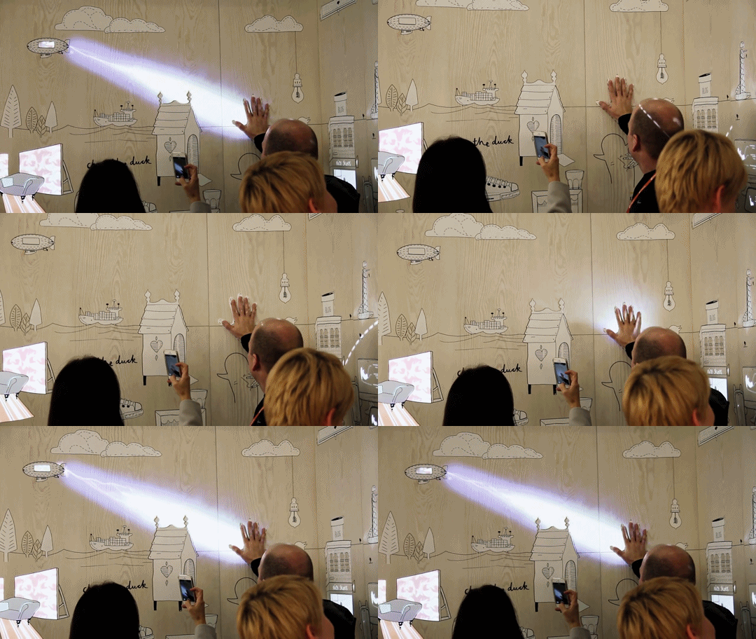
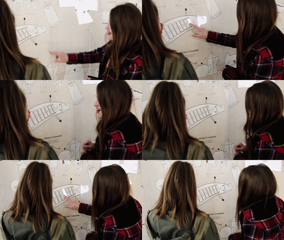
Task: Start to work on final project proposals – prepare three ideas for a screen-based experience that you’d like to create (it can be speculative). Illustrate your ideas and post them on OSS. The ideas can be based on any of the field trips done so far or can be something completely new.

“Rethinking our everyday environment / Empty spaces / Overlooked / Narratives”

Possible locations:

MRT transiting zones (empty but busy places where many passes by without a second look)

Void Decks / Corridors (empty places but where many hangout)


Idea I : Stories / Culture

  • Objective : A platform where people can share and/or listen to the hidden stories of others and themselves.

Inspiration:

Hidden Stories by Red Paper Heart

Scapes by Halsey Burgund

Living Library by  design I/O (immersive experience for storybooks)

The idea here is to allow people to share their own experiences and/or listen to what others have to say about certain common things found in that place or maybe different topics as indicated by the illustrations. I feel that there is always special attraction in the narratives and one can never gets sick of listening to them. They are also constantly evolving based on what we experience/see/hear/etc and thats where I think many of us miss out on what others may have experienced. I was also thinking that the playback of recordings are random so the chances of people listening to same story is lower. Possibly, background music that aids in conveying the mood? In Singapore, we’re so often thought as the culture-less country and we don’t know how to express ourselves but I think that is not true, we have but it just gets covered, buried, hidden and lost along the way as we progress so quickly. It is so often that many individuals have the misconceptions that they are the only one experiencing this “weird” thing/action/etc. but who knows someone might have similar experiences as you!


Possible executions :

Touch screen

Sound recorder and player


Idea II : Slowing Down / Emotions / Traces

  • Objective : To provide a more immersive and informative way of telling people about what is currently happening in Singapore – festivals/traditions/etc.

Inspiration:

Interactive Animations Retail Design by Dalziel & Pow

Remember by Red Paper Heart

The idea for this is because many people are so busy that they often are unaware or do not know what is happening is Singapore (eg. festivals, events, etc) so I thought what not create something that will slow down the pace of life for a moment through a immersive informative experience?

Instead of the wordy explanations or advert types of experience which causes many to skip/overlook it, why not through animations and something ‘alive’?

Possible executions :

Tracking – Eyes / Faces / Body

Body Motion

Concentration intensity which affects how lively the festival or event is

Touch screen that adds more life


  • Objective : To give people some inspirations for everyday.

Inspiration:

The Good Deed Machine by Red Paper Heart

The idea for this is because Singaporeans are often thought to be cold/dull/minds-own-biz but in actual fact most of us aren’t! Hence, this interface allows for one to receive simple do-able inspirations upon touch. Additionally, I thought also maybe quotes too? To help one who is feeling whichever emotion to feel better & be more inspired.

Possible executions :

Touch screen

Choices to do sth for someone or for yourself

Detector that can gauge one’s current emotion and advise according


  • Objective : Integrating art into everyday life with people’s traces.

Inspiration:

Studio Play by  design I/O

Flowers And People, Cannot Be Controlled But Live Together by TeamLab

This idea is simply just collecting the lingering traces of whoever passes by/ stays at that place for long and displaying it with paint strokes/splatters or other possible art. Paint strokes could vary with speed/weight/etc.

Possible executions :

Tracking


Idea III :  Environment / Inclusiveness 

  • Objective : Bringing people closer to their environment in a fun and playful way.

Inspiration:

Connected Worlds & Night Bright by design I/O – the environment that grows/changes

Story Of The Time When Gods Were Everywhere by TeamLab – possible interactions?

Google Androidify by  Red Paper Heart – possible interactions?

Puppet Parade by design I/O

The idea for this came about because their is a lot of potential in the relationship we have with our environments. One thought I had that why Singaporeans are always rushing from one place to another and overlooking the places they are at, could it be that because of the empty and dull/boring looking walls and that they do not have much attachments to it? Was it because there is nothing there for them that attracts them to slow down or feel the urge to “take care” of it.

Hence, I thought why not recreate this spaces with something that attracts them plus helps in developing a sense of belonging/attachment for it? What if there was an environment (real/dream?) that changes together with time (day..night) and grows or dies with the actions of people.

Possible executions :

Touch screen

Timezone detector?

Memory that remembers previous users actions and adding on present that carry on into the future


Featured Image from here.
Initial Ideas For This Project
  1. Compilation (nursery rhymes + pov project) based on common subject matters from my past works : animals.  

-rhymes (b&w works) transitioned to pov (colourful works)

2. Compilation with improvisations (nursery rhymes)

– adding in particular into the b&w works to evoke/represented a certain mood/feeling/atmosphere

3. New works (typographic portrait problem project)

-using the line work style of illustrations to create a zine on typography

4. Compilation with improvisations (pov project)

– using the content to make a zine focused on the interactivity of it

-inspired from feedback from previous critique

5. New works (pov project)

– using the same style (basic shapes/vectors) and context (singapore) to make a match-word-to-pictures-kind-of-book.

– focused on interactivity


*note:  ideas i choose to explore more on / develop.


Process

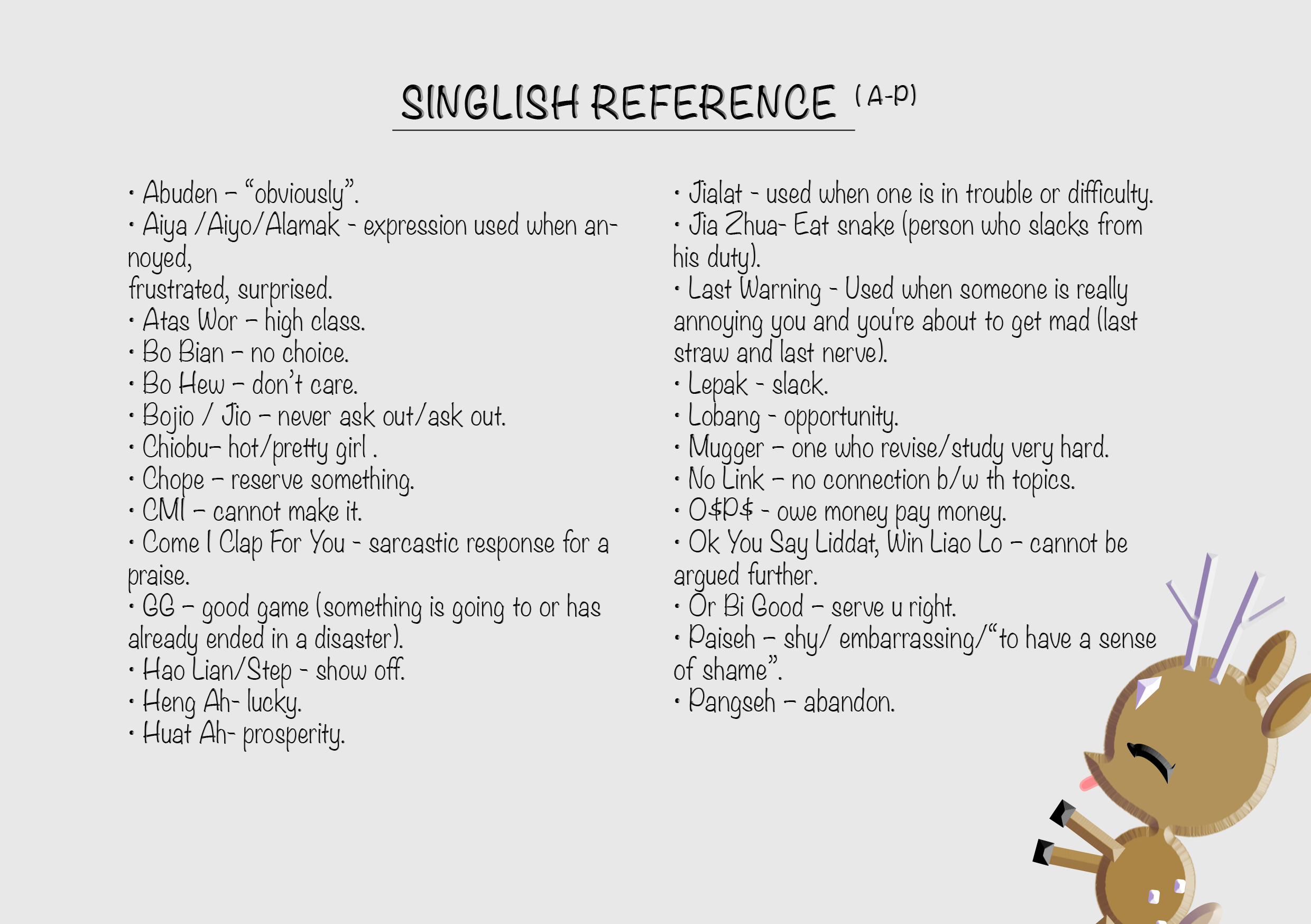
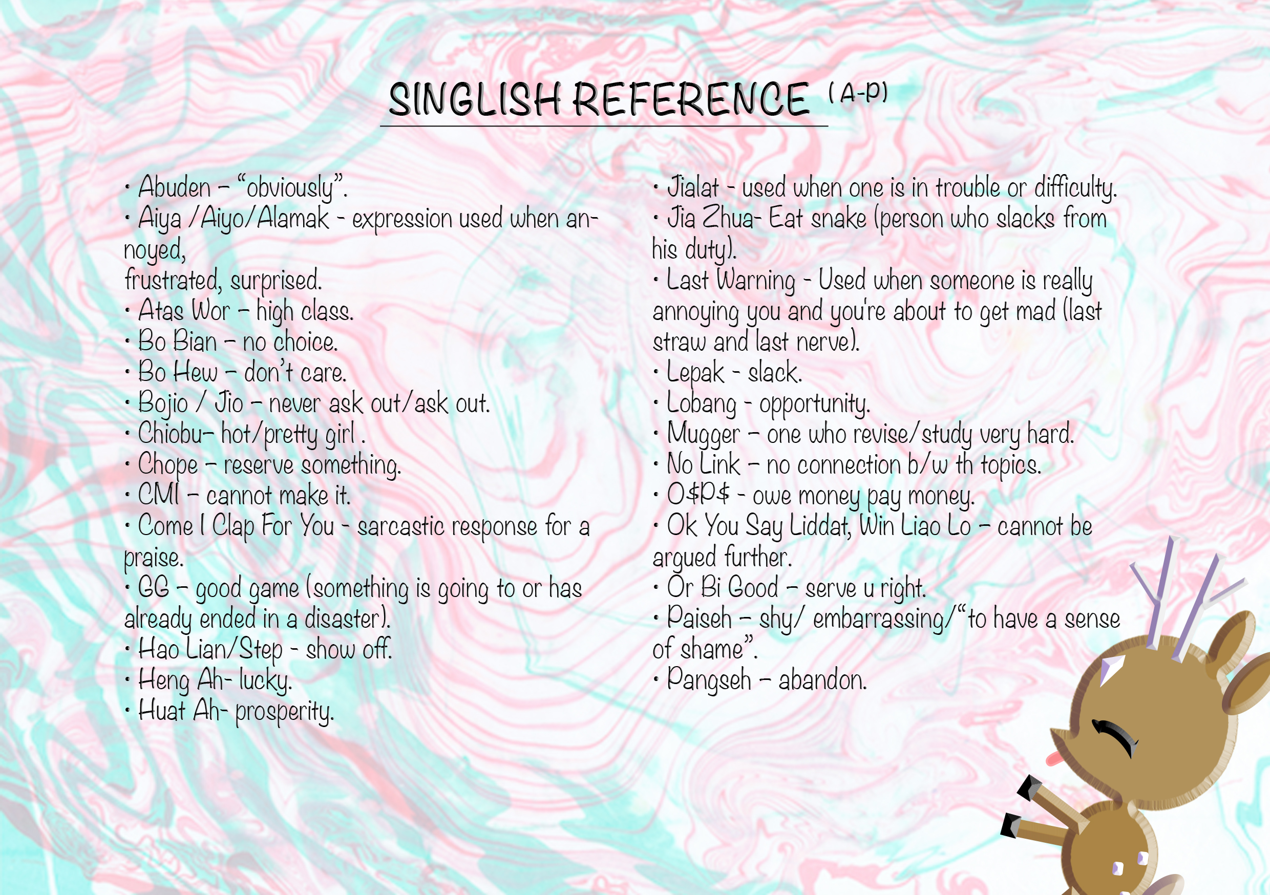
Before I started on the illustrations, I researched extensively on all the singlish words used commonly used here in Singapore, followed by narrowing it down the ones that I thought would be more appropriate for my project. (some examples: https://drive.google.com/open?id=0B9SxP4EKVfKBV0hZb1BBYnJXc3c)

After that I first tried out making a few illustrations for idea 5( refer to above on initial ideas). 

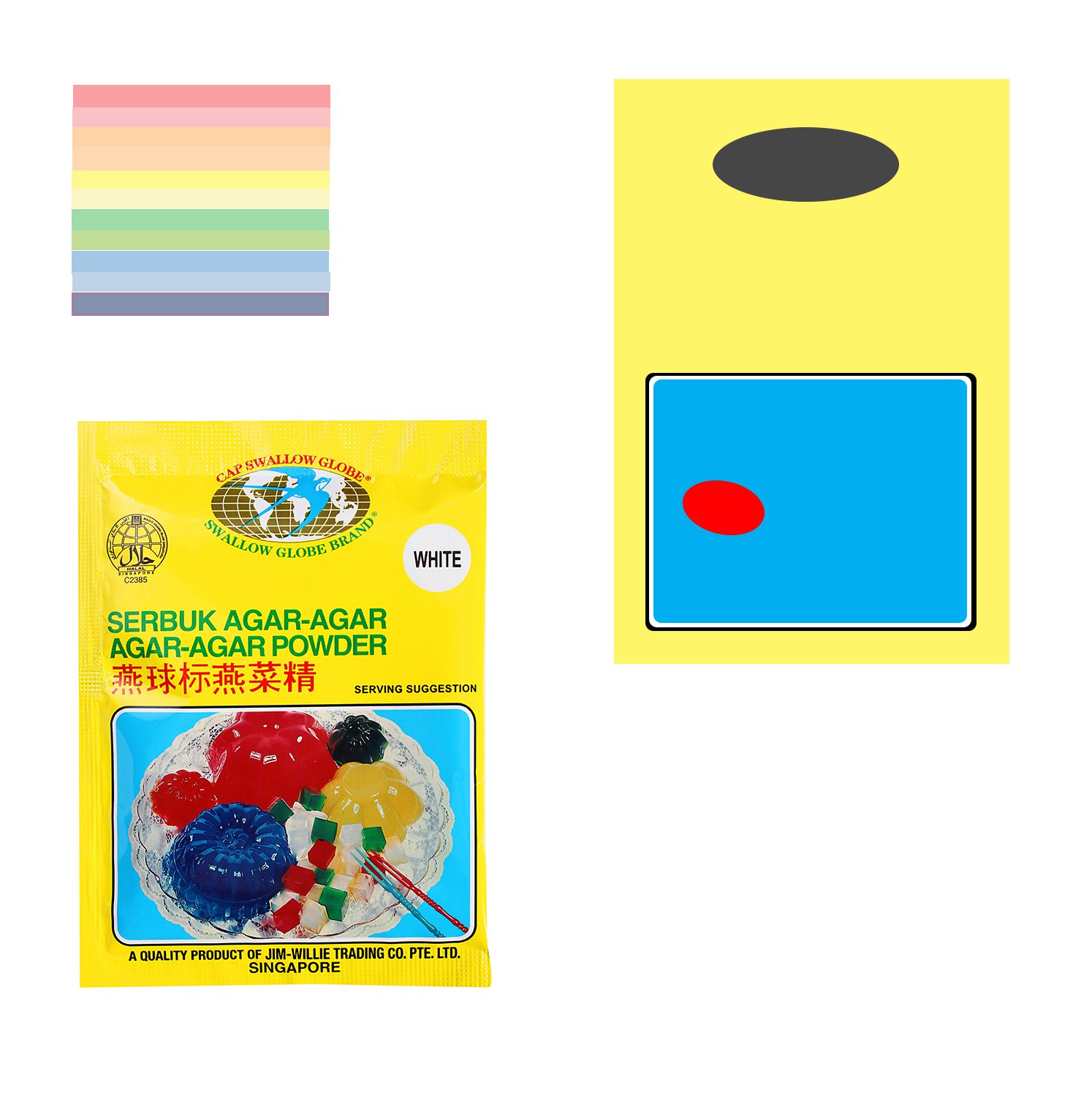
jelly

Tryout of a illustration for word (agar-agar: jelly / rough estimation).

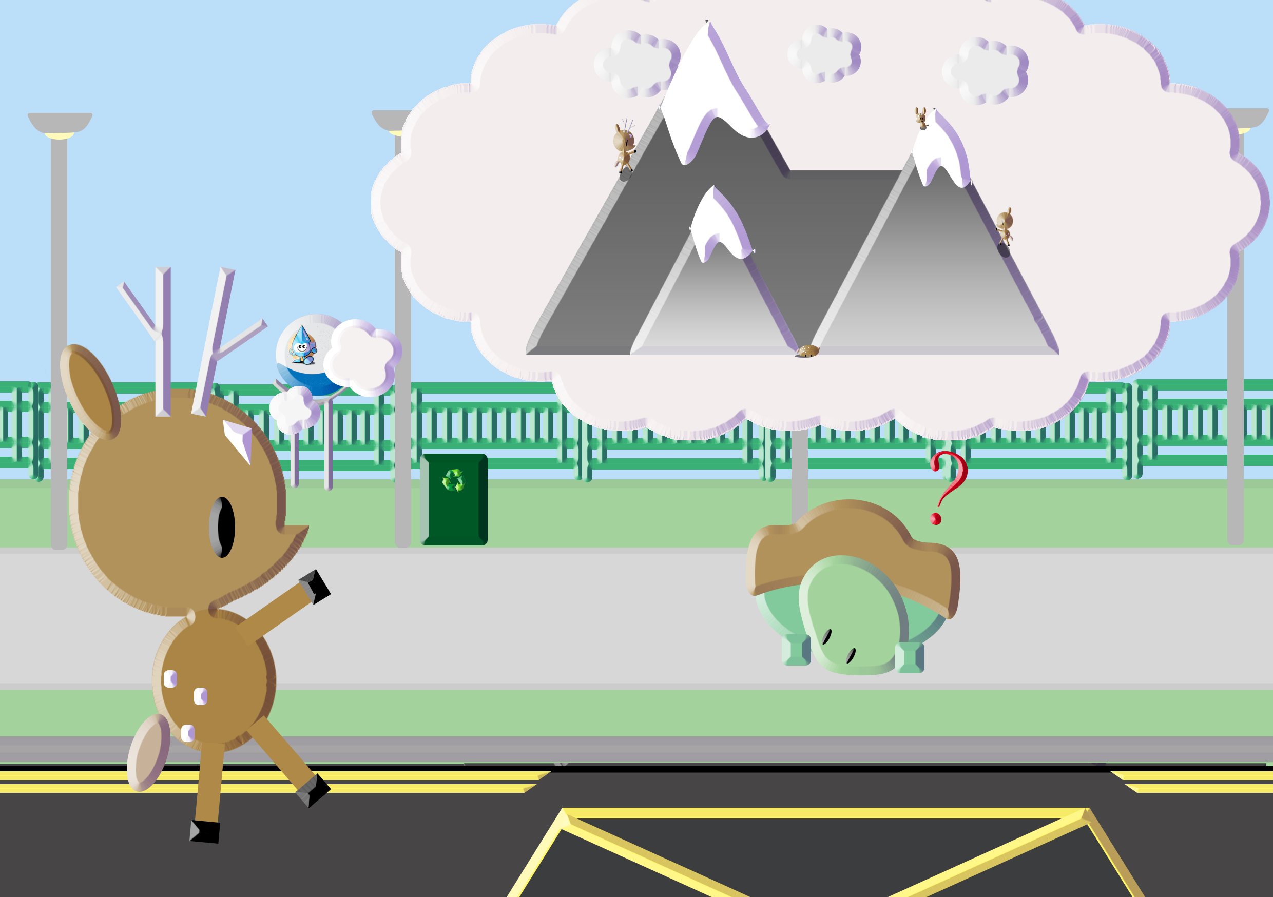
swaku

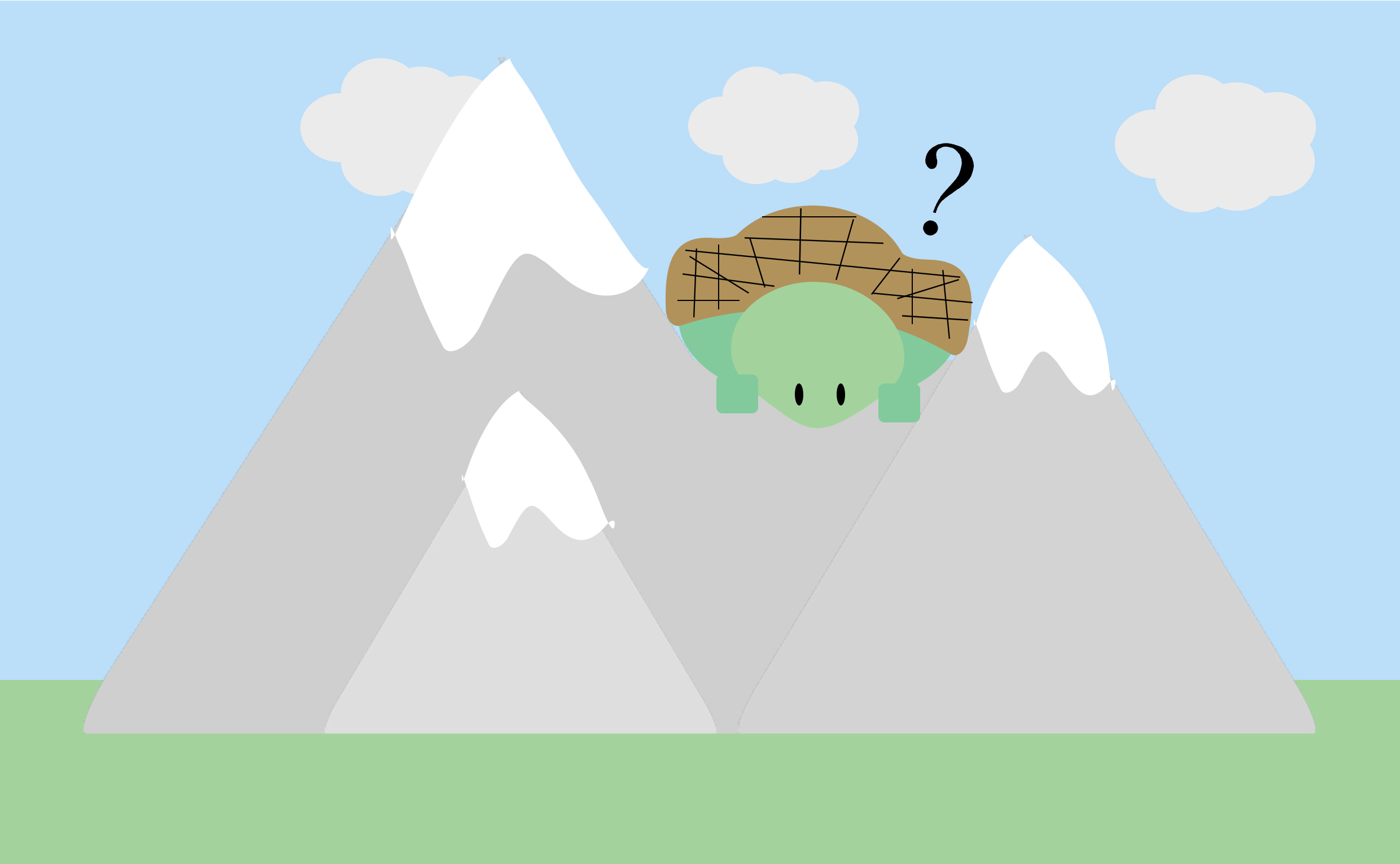
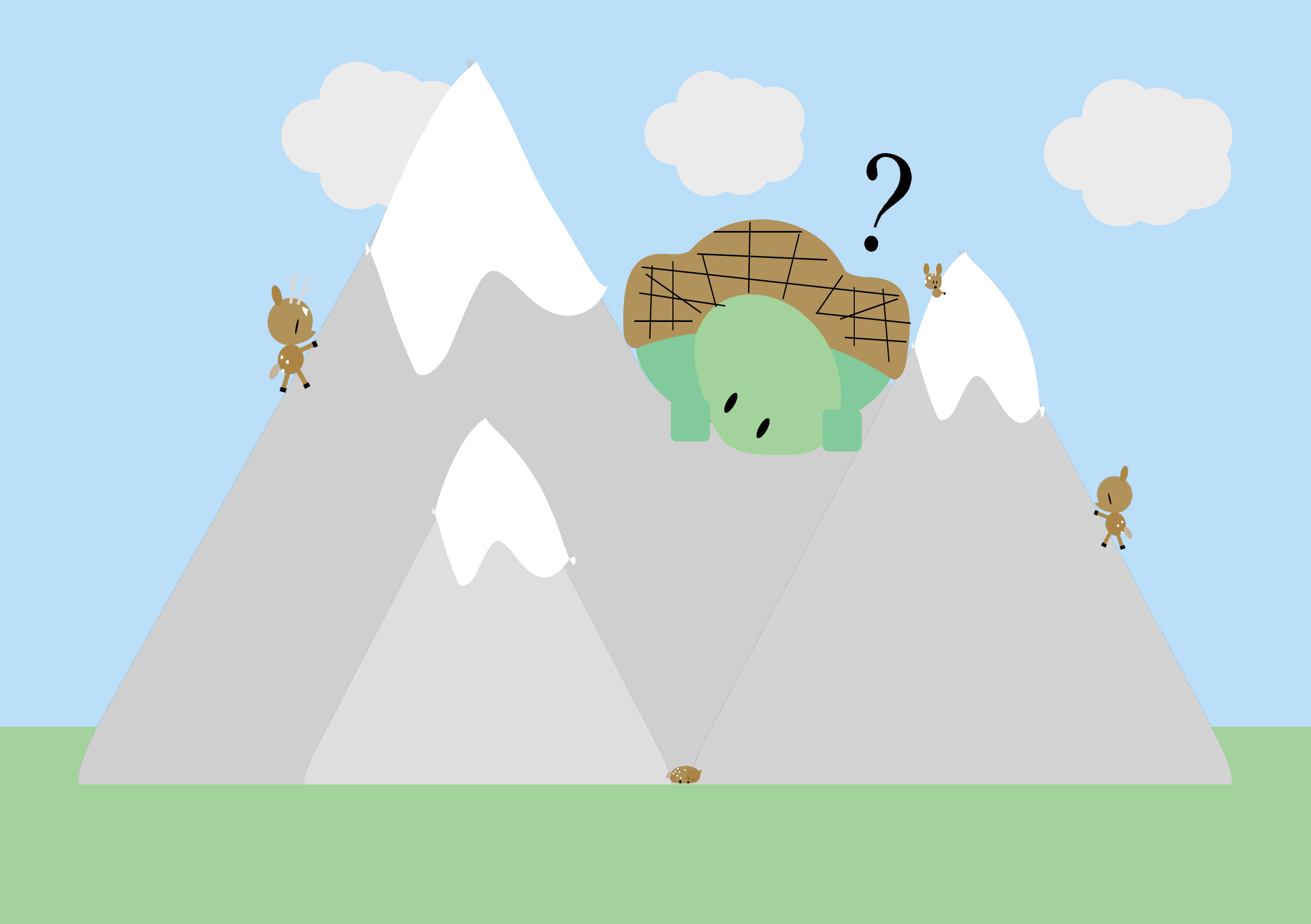
tryout of illustration for word (swaku-mountain tortoise) with full background/ setting a context.

I tried out two ways of portrayal , one being just focusing on the subject matter itself and the other being set in a context where viewers can find clues/hints from the background/surroundings (perhaps a hint of narrative too).

However, I realised it was hard for me to bring life to this objects that are already representational in real life and from the tryouts, I was not fully pleased with the results. I scraped the idea. Hence, I decided to work on idea 4 instead as I’ve always been more drawn to having many narratives in my works.

Firstly, I reviewed my series of works for the pov assignment and selected the ones that I’d like to use while changing some others for new illustrations.

Untitled-1

original set of works that I worked with.

sawku-

Replaced the original work(top-right) with this

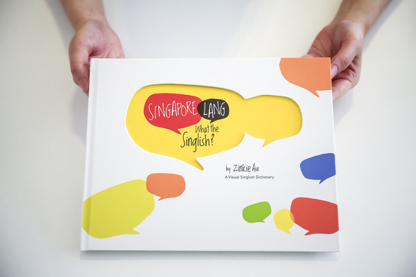
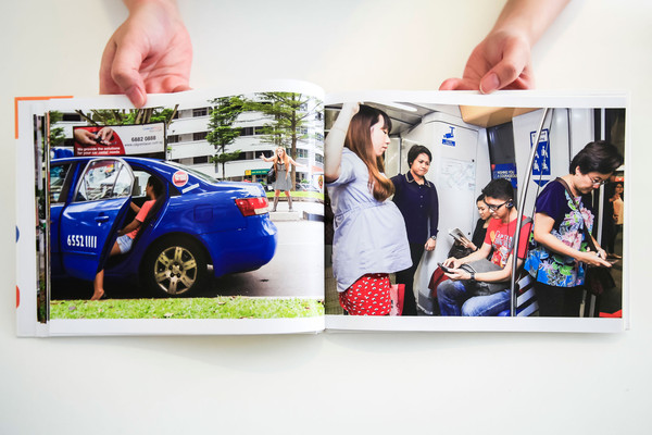
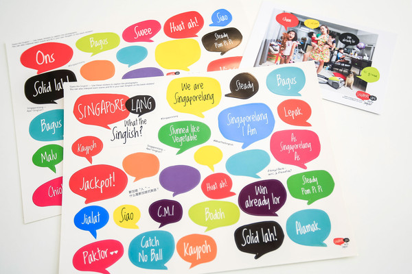
For this idea, I was really inspired by this interactive book that Joy gave as feedback from the previous critique.04_SingaporelangBook_Stills_grande-1 05_SingaporelangBook_Stills_grande 08_SingaporelangBook_Stills_grande

Singapore Lang – What the Singlish! Book

I tried out various binding methods for the mock-ups, such as side stapling , saddle stitch with thread and Japanese binding. After consultation, many recommended for the book to be able to be fully-opened for easier user experience.

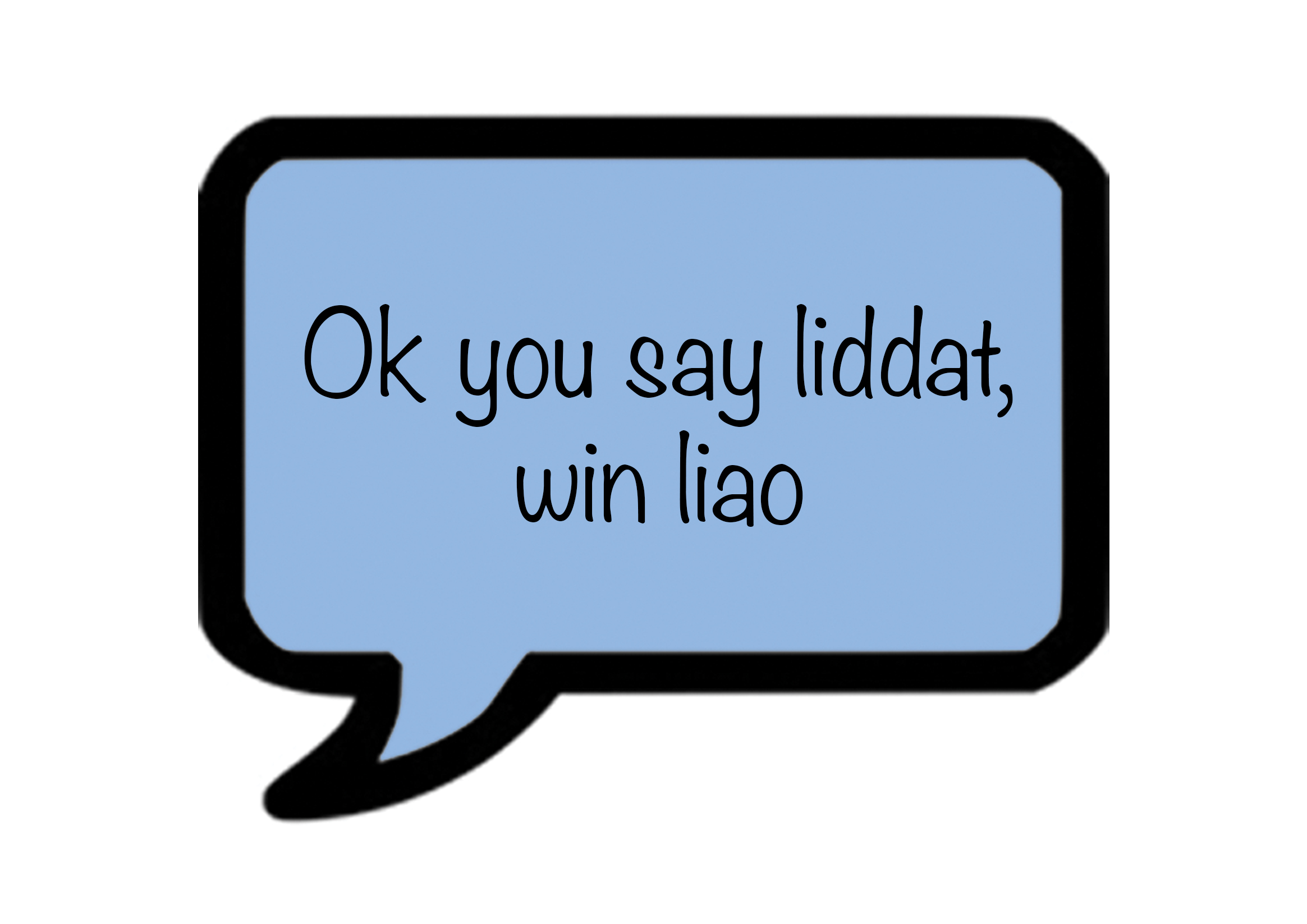
I decided to work on how my speech bubbles would appear and the meanings. Instead of stickers, which are only for one-time use, I thought of ways that the speech bubbles can be used several times. I thought of using velcro, however, i felt the thickness of the material would cause the zine to pop out constantly.

images

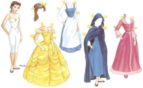
paper dolls with its unique flaps

Hence I decided to go with this idea of flaps.

Untitled-1

Initial

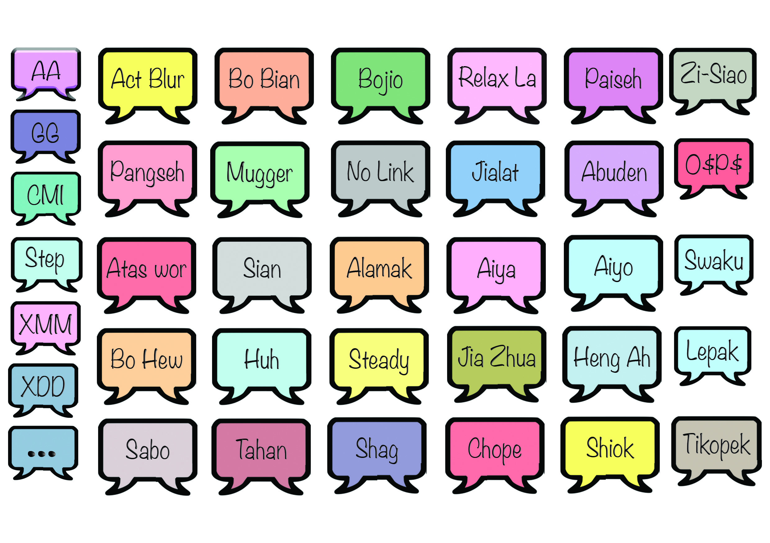
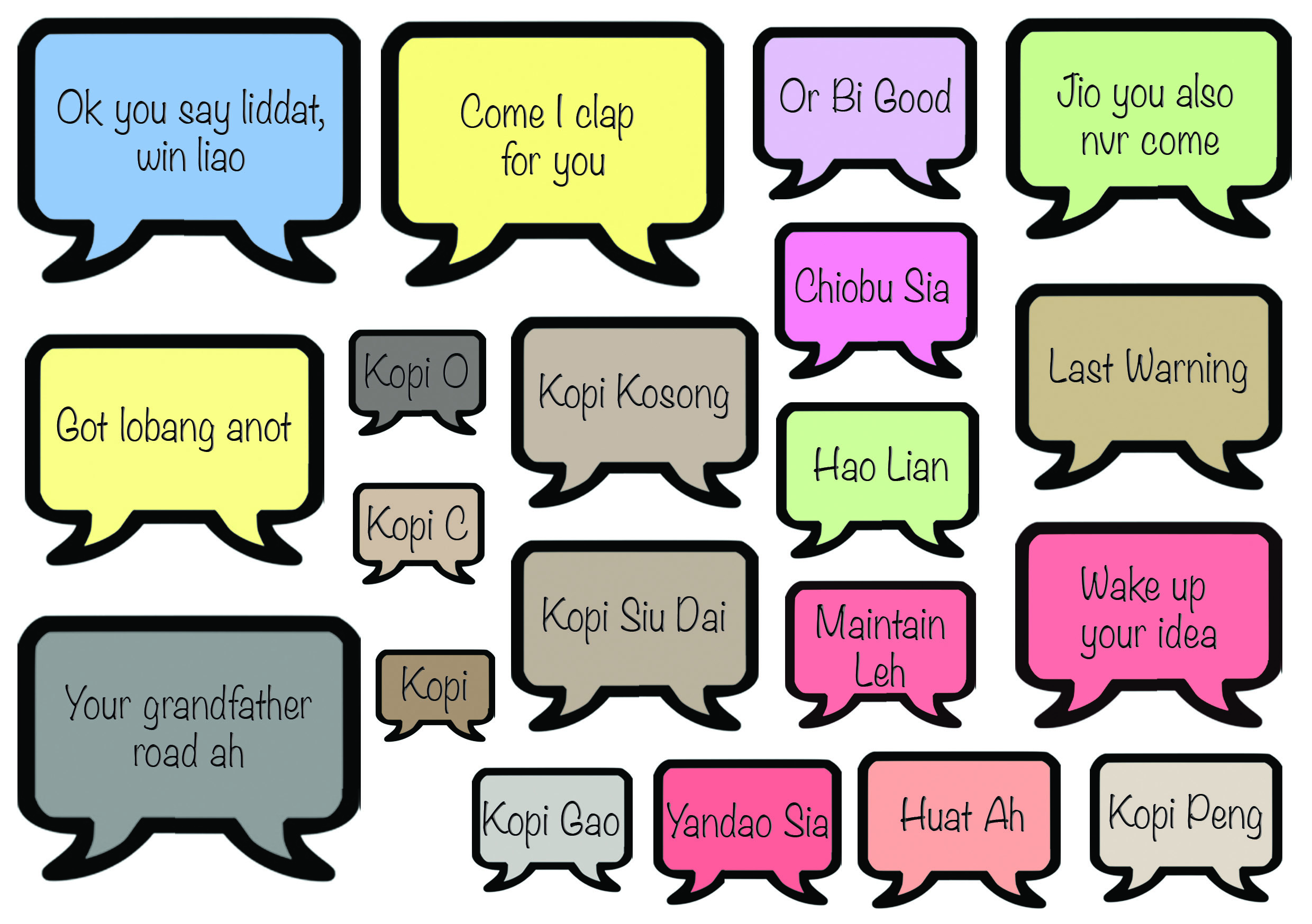
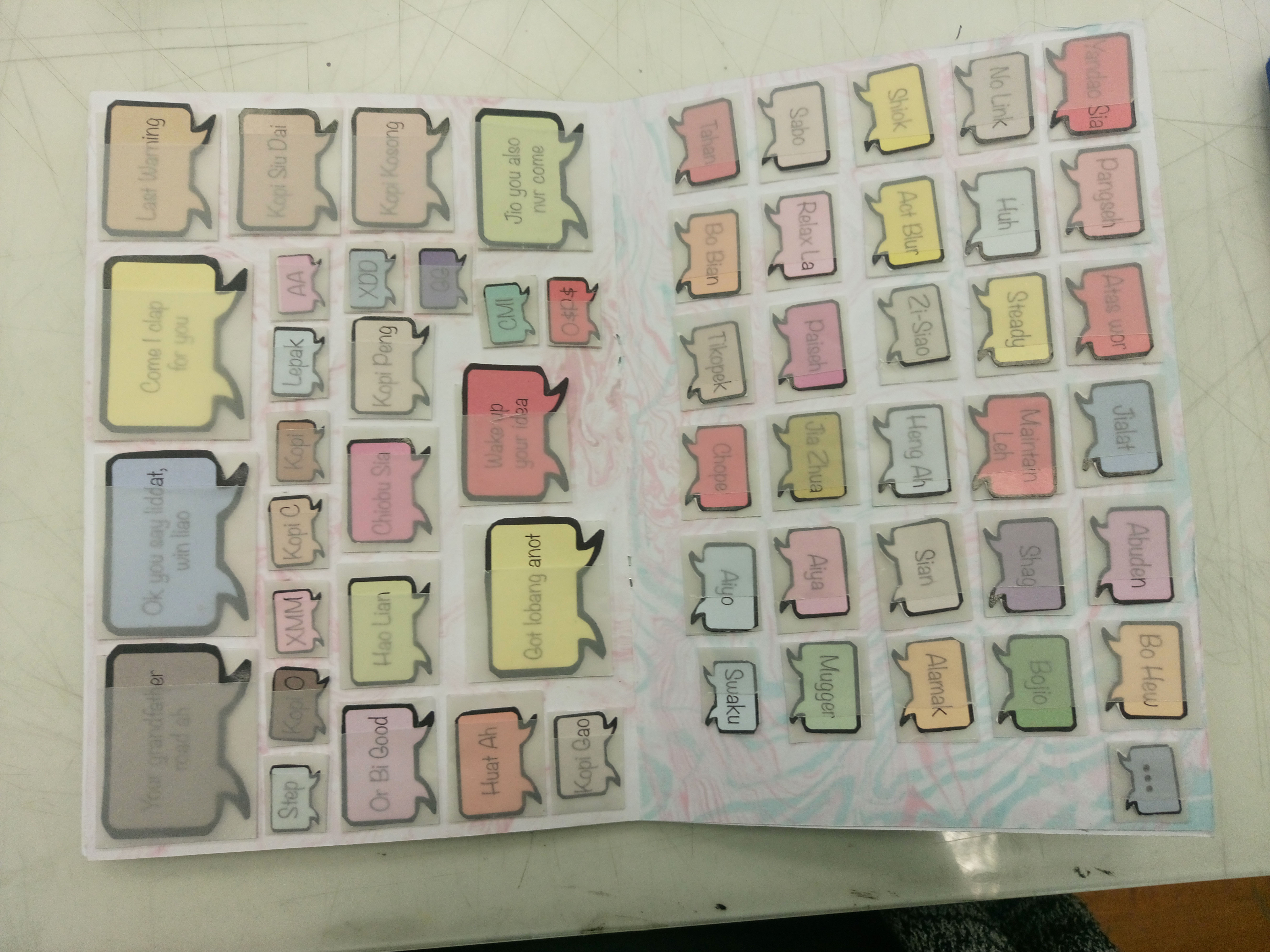
Then, for better user experience again, I decided to make it in such a way that the direction of the speech bubbles is interchangeable. The speech bubbles are also colour coded based on the negative or positive feeling or connotation it evokes. For example, green is highlighted in words like ‘bojio’ , ‘mugger’, ‘hao lian’ and so on which suggest hints of envy/jealousy.

TEXTTT TEXTT

I then proceeded to work on improving the visuals of the content itself with trying out changes of illustration styles while retaining the content itself. I also did some edits for the content to make it more appropriate and even more relatable to singapore (aim: with one glance, viewers should be able to tell its singapore context).

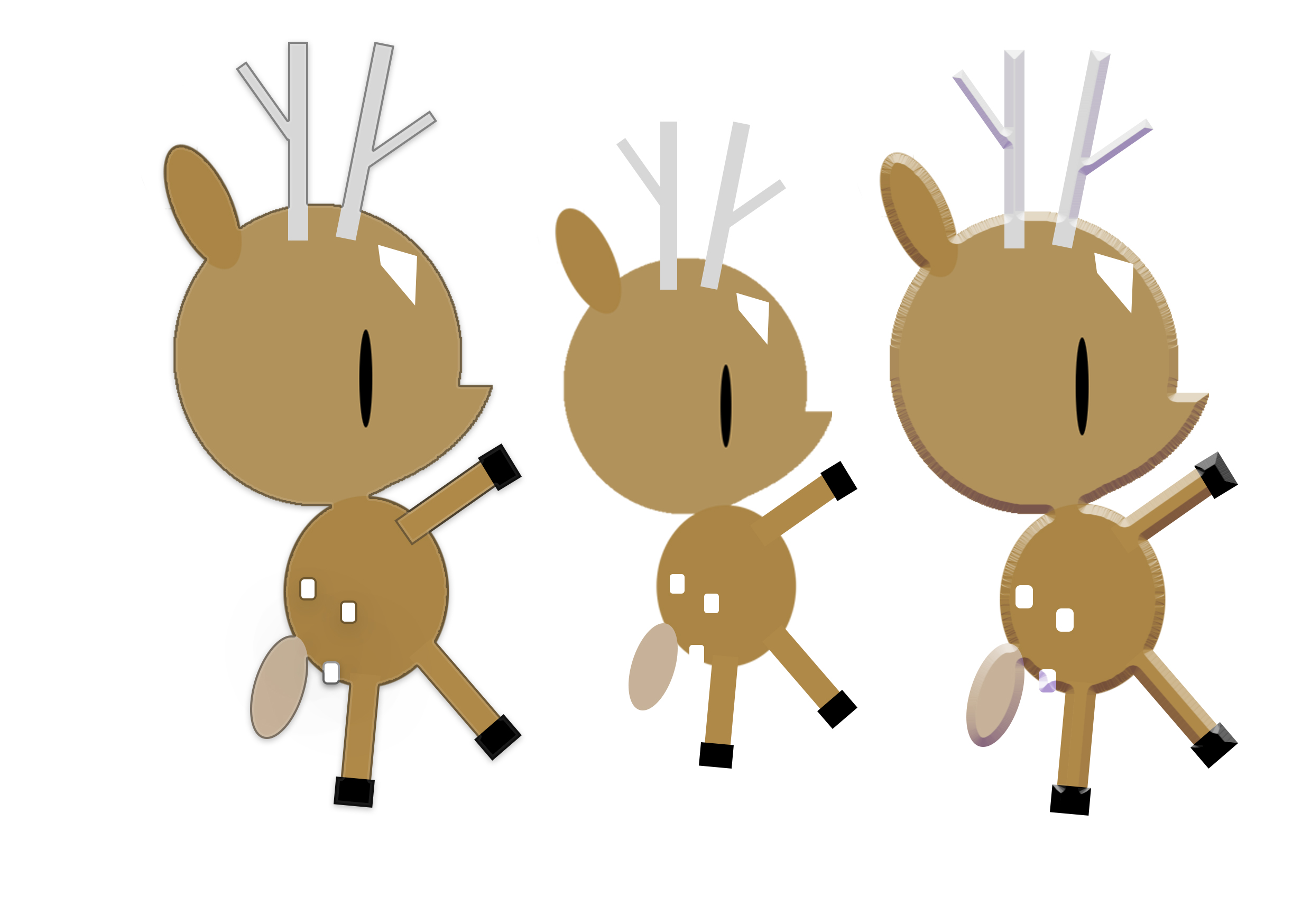
Illustration style 1: adding of obvious black outlines to make the subject matter stand out more

'''deer

left: with outline / middle: original / right: embossing

However, it was scraped as it did not make much obvious differences and did not fit the final outcome I was looking for.

Illustration style 2: adding of embossing / shadows to make it more 3-dimensional and also to make the work come more to life.

6. home 5.love 4. 'sawku- 3. water HOLIDAY HOLIDAY-(white)2. HOLIDAY- 1.phone

Illustration style 2: line work illustrations with limited colour palette (2-3colours used only)

1.phone3. water-3. water3. watersf

I really loved the aesthetics however I was facing many problems with making it neater and hiding the overlapping shapes.

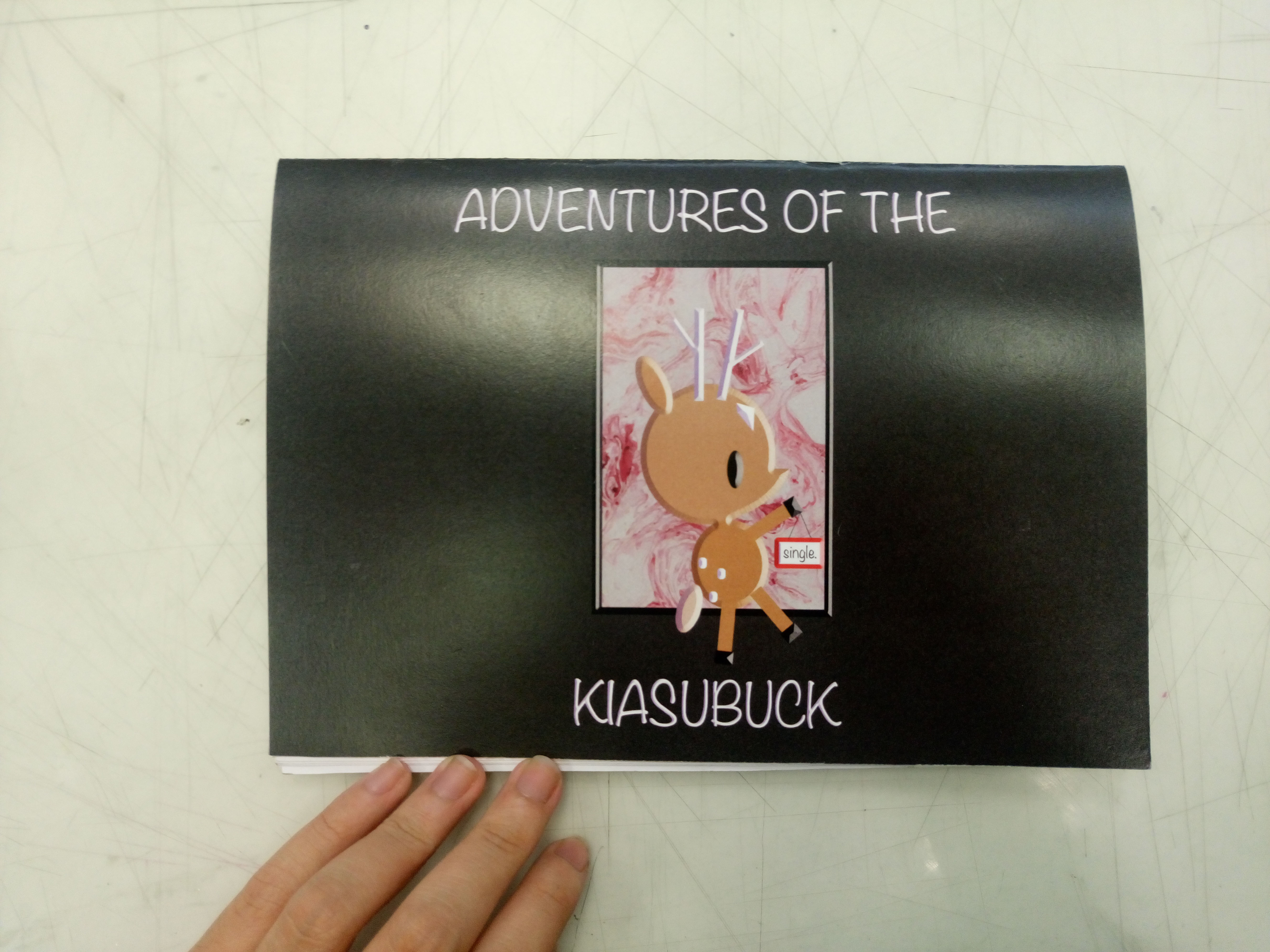
Cover pages design tryouts:

Untitled-1(black) Untitled-1(black)ferf Untitledr-1 Untitled-1 deer(white) deer

Reference pages design:

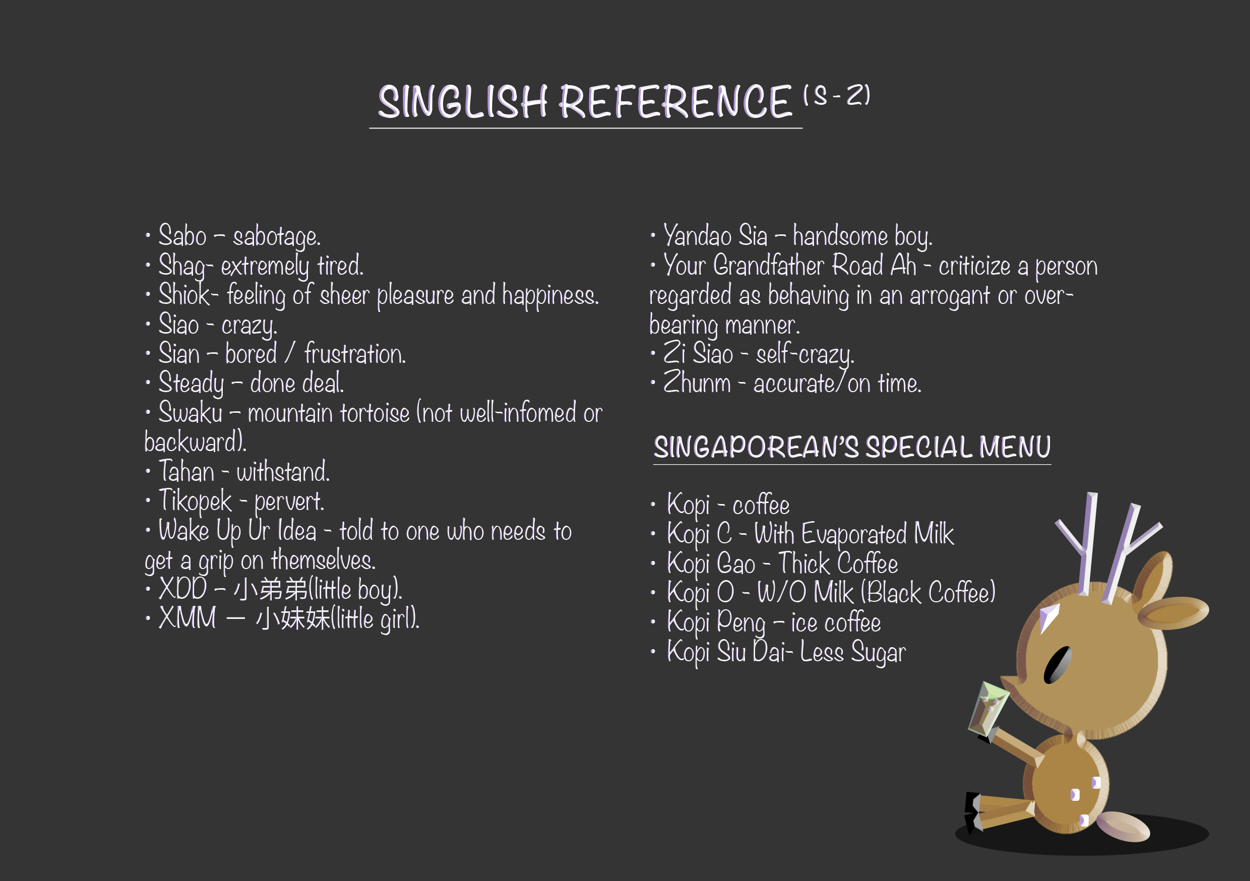
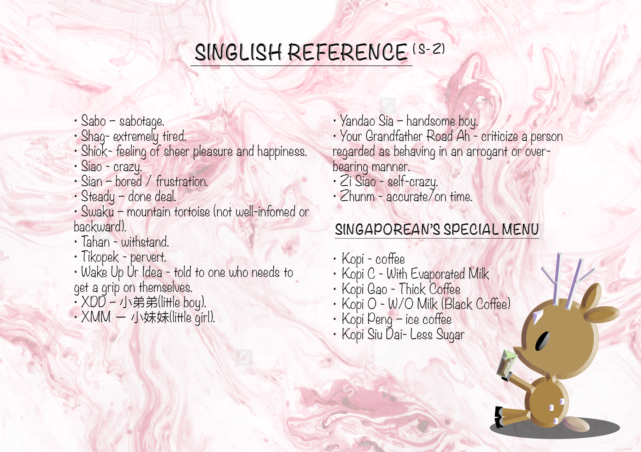
text(att)- text(att) text(single)- text(single)

With the content done, I worked with the layout of my zine.

Proposed layout in indesign (not in running order): https://drive.google.com/open?id=0B9SxP4EKVfKBV1dvMEZRcUlxNXM


Final

1

  • missing page photo (reference page)

2 3 4578910 copy

For this zine, I wanted the main focus to be on the interactivity. There are two sides (single life / married life) to this zine, where it can read from any direction and the narratives would still work. The reason for two sides is because there are the groups of people who are more career/single life orientated, the groups of people who are more family orientated and of course the group of people who overlap these two sides as well.

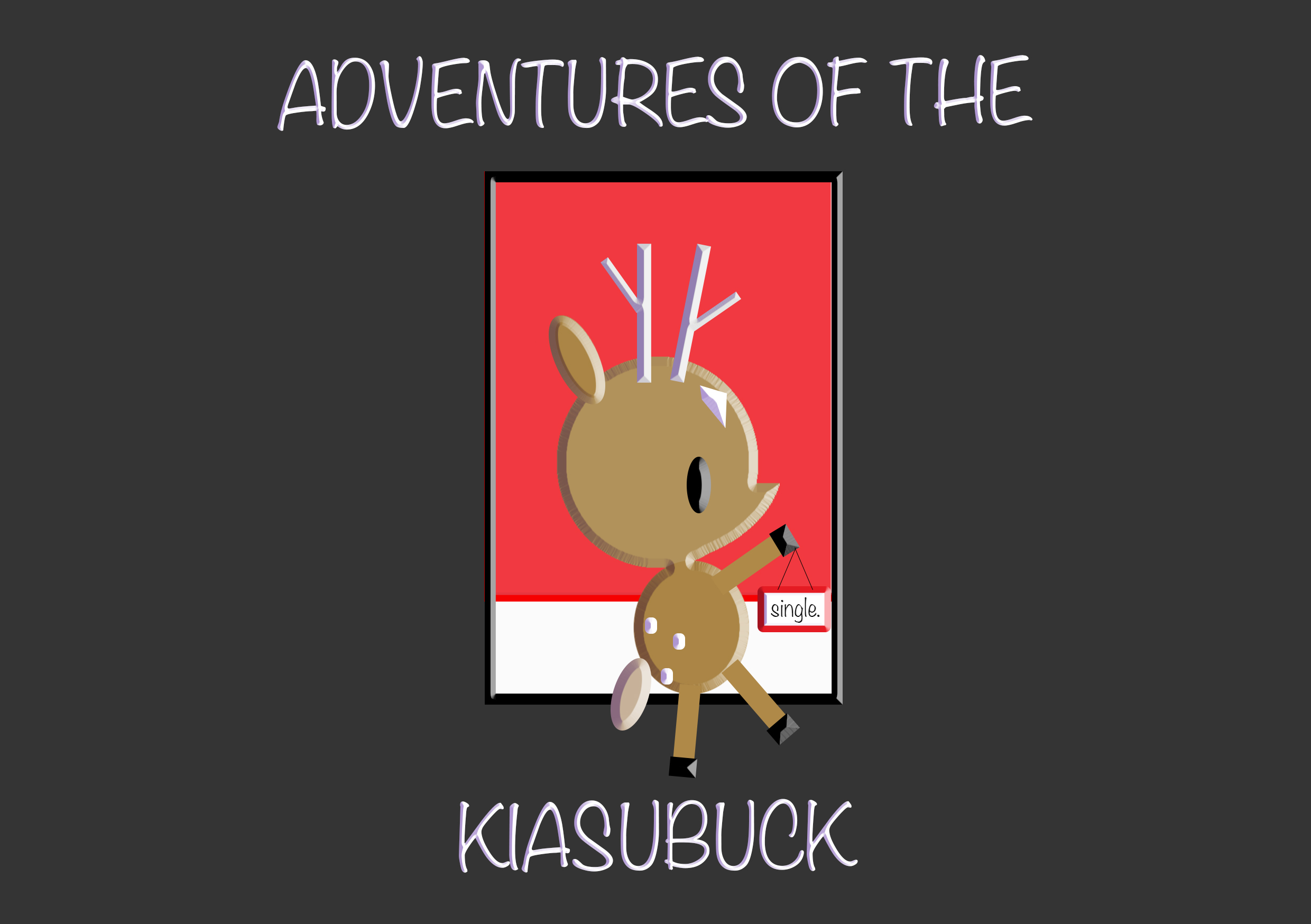
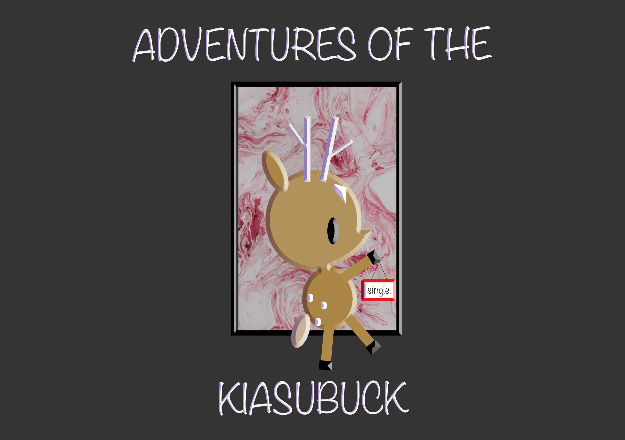
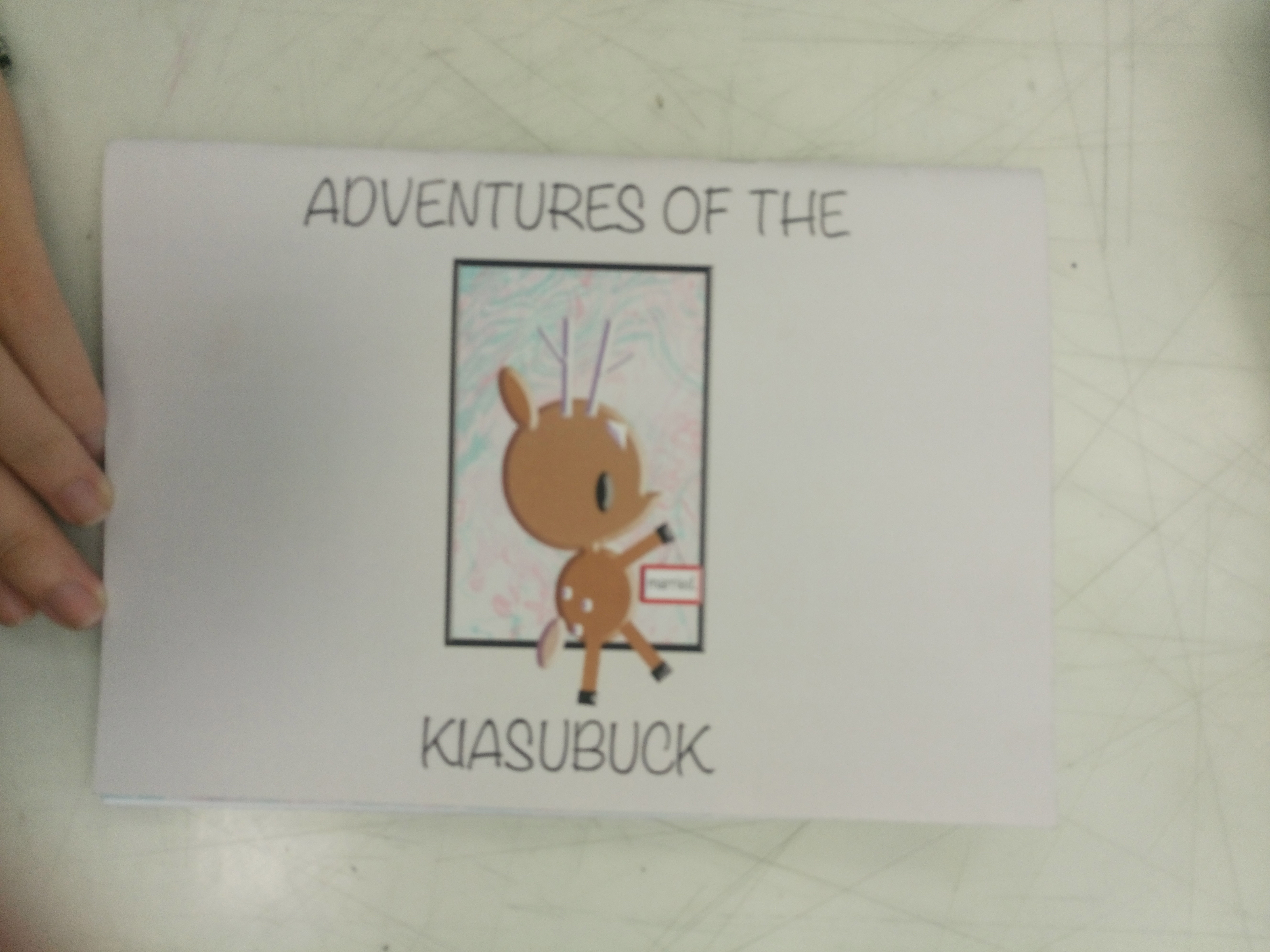
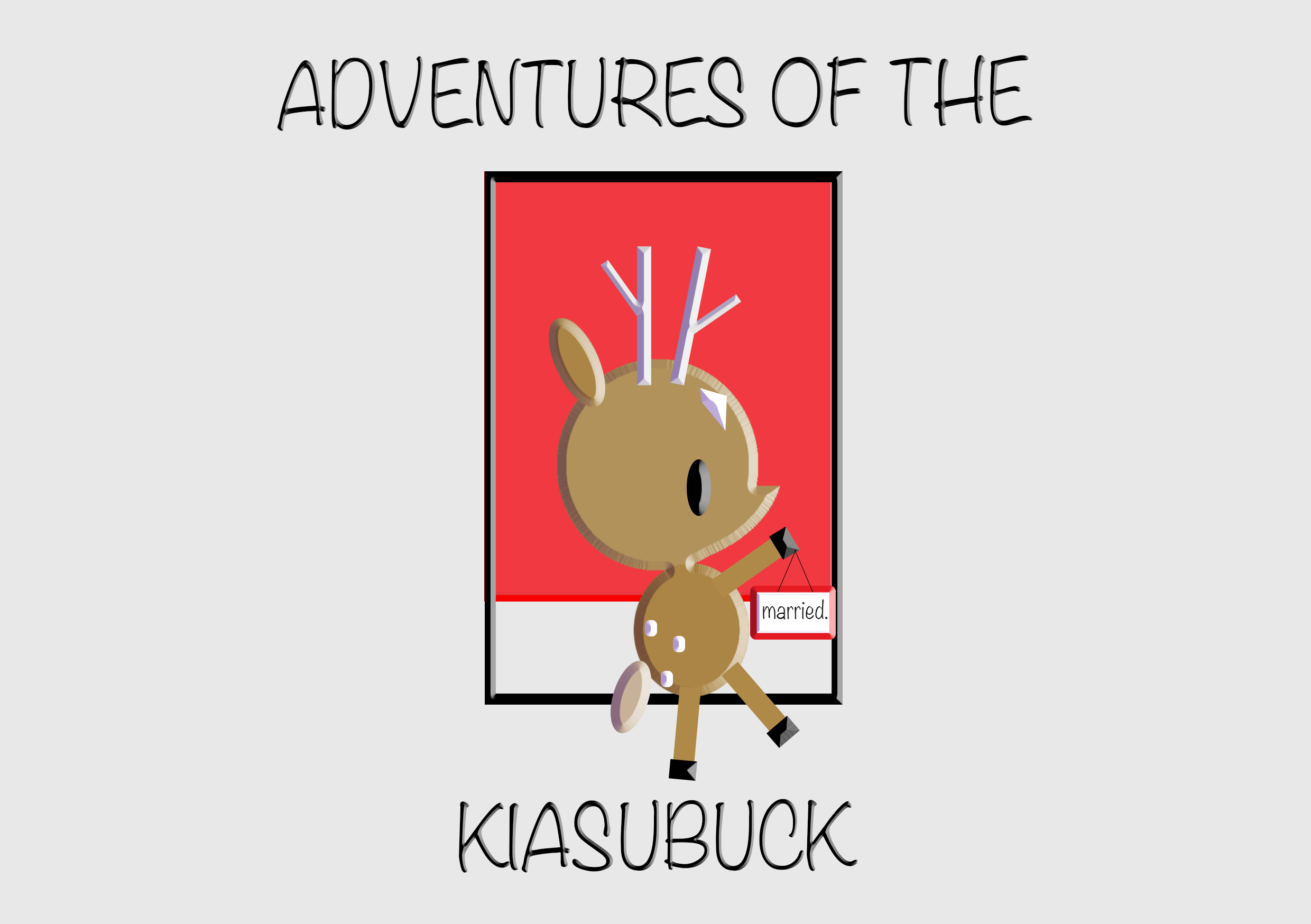
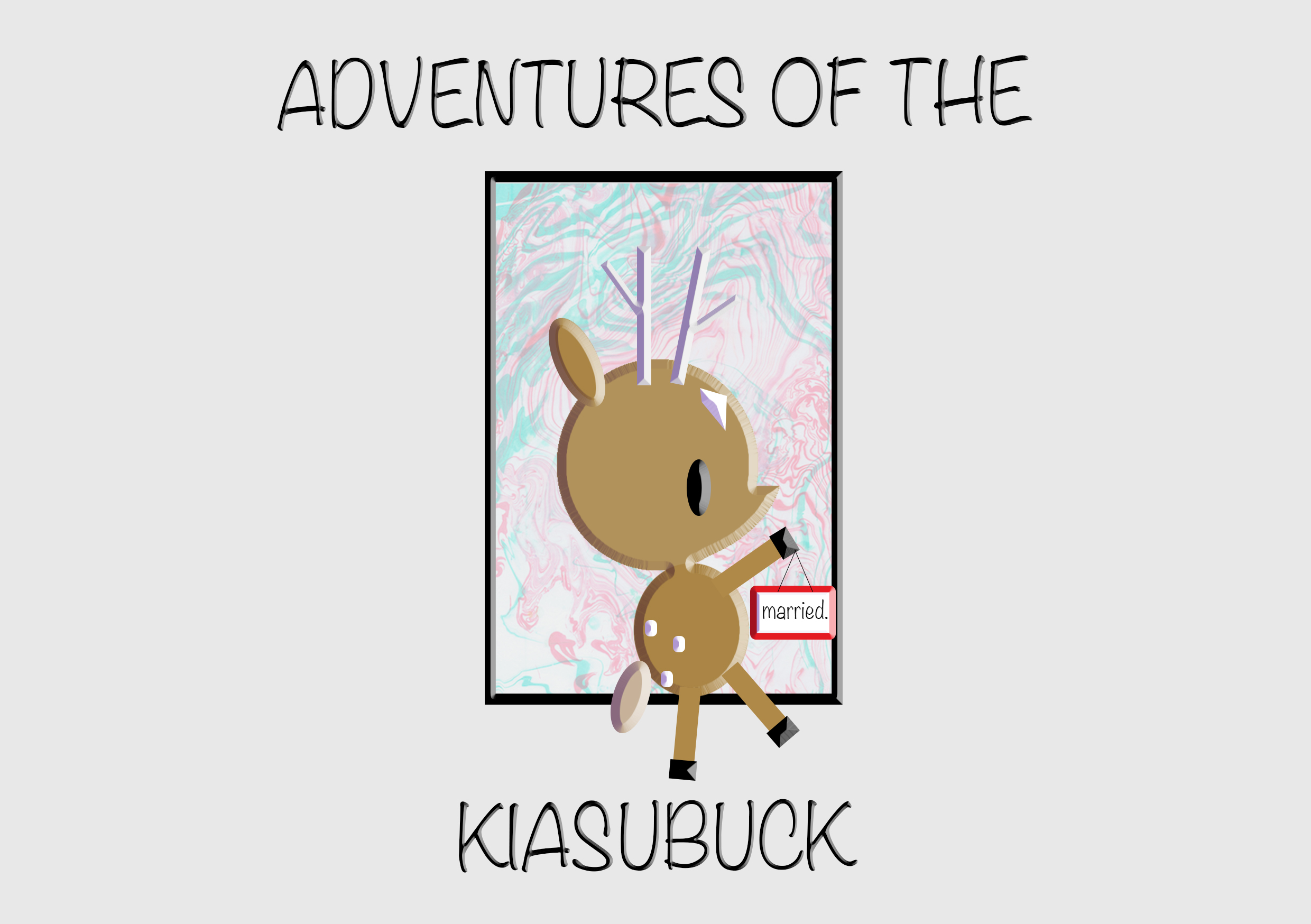
I titled the zine – ‘Adventures of the Kiasubuck’ because viewers can choose how the story flows, the personality of the characters. Generally, I invite viewers to set their own adventures based on the available choices of singlish words. This is to highlight how their choice of words and the way one speaks can change the impression they leave on others.

The zine is printed one sided so as to prevent damage to the subsequent contents as I created slits for viewers to slot in their choice of speech bubbles. The available places for slotting in the speech bubbles are not just limited to the pre-made slits but I welcome viewers to make their own slits and they can choose to place the speech bubbles on anything they see fit , allowing for a more enriching experience. The white border around the content serves to maintain the neatness as well as an influence from the book I’m inspired from (Singapore Lang – What the Singlish! Book). The orientation of the book is in a horizontal format instead of vertical so viewers are allowed to immerse themselves in the narrative and see the details (the small details are important hence I avoided making the works too small). Choice of paper is thick for both the cover pages and inside pages, this is to firstly retain my inspiration from the kind of hard paper the creation of paper dolls  use. Secondly, it is to withstand the possible wear and tear in the future.
For the speech bubble page, I made them in a layout that all the individual speech bubbles follow the orientation of the respective pages. The pockets are made of tracing paper so to allow viewers to be able to see the words at one glance without having them to take each out to check which one it is. I also left part of speech bubbles out of the pockets so that viewers can easily take and put the speech bubbles back after use.
Difficulties/Reflection

The hardest part of the zine was actually the speech bubbles aspect as I had to think about how to store them properly without them falling out when the book is flipped from all directions and I had to cut them all out neatly without damaging them . Credits to Fiona who taught me how to make the secure pockets.
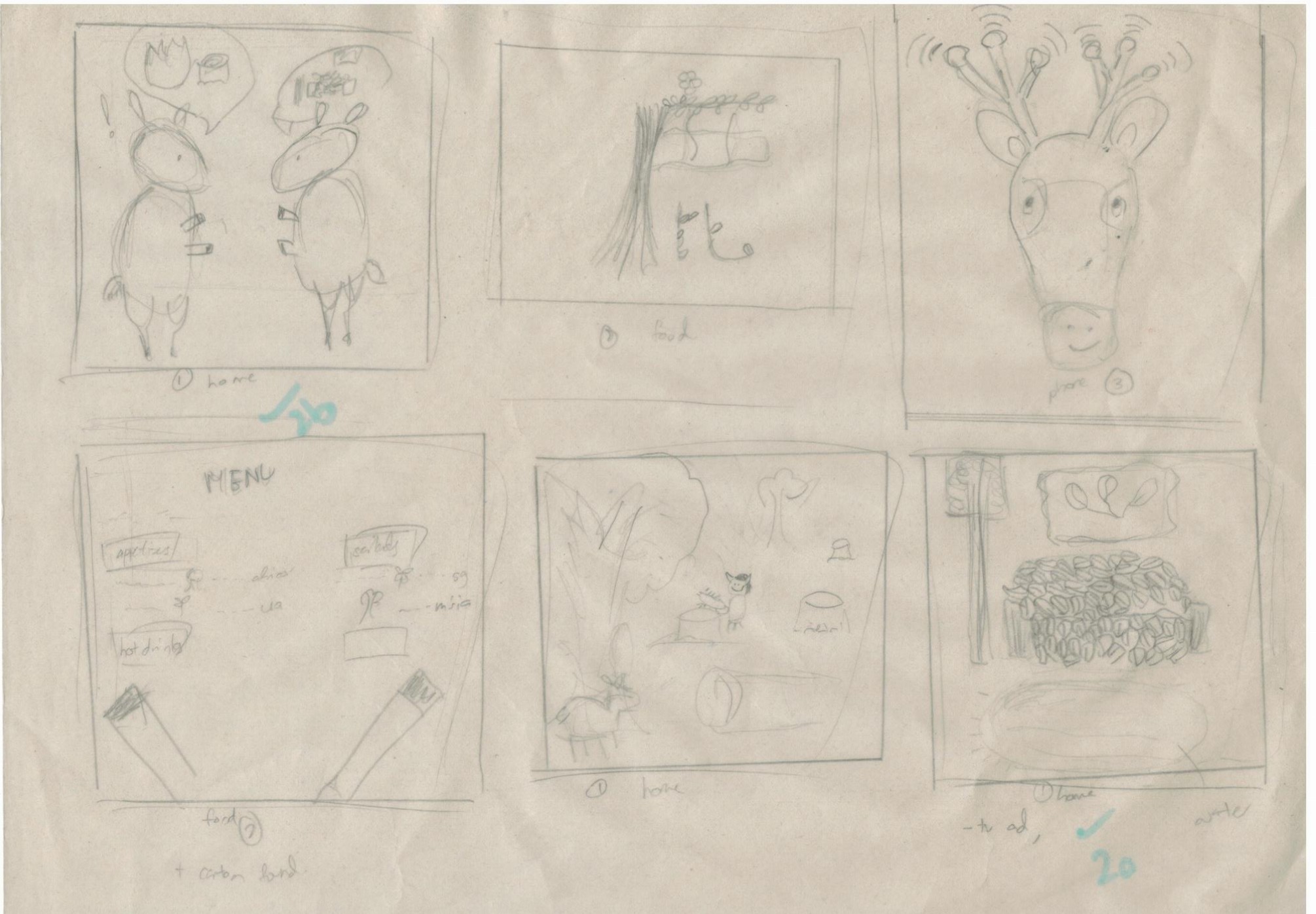
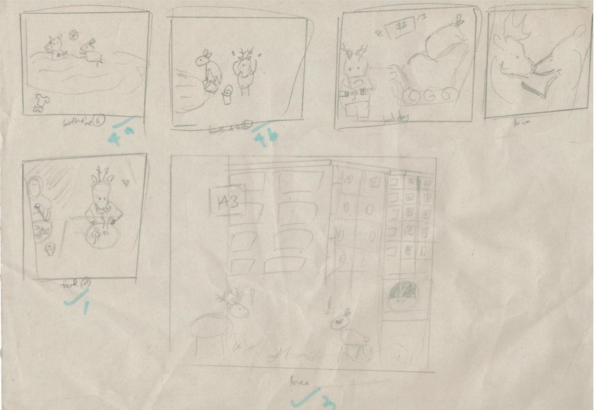
My topic for this project is on animals, particularly deers. There are already many illustrations being done on animals, ranging from realistic to being really simple. This led me to wonder how could i set myself apart from them and make my works that can be uniquely mine. In the end, I was inclined to base my concept in singapore’s context since I am a singaporean myself.  I hope to bring the experience of being one out as well as to make it relatable to the others as well  through my works.

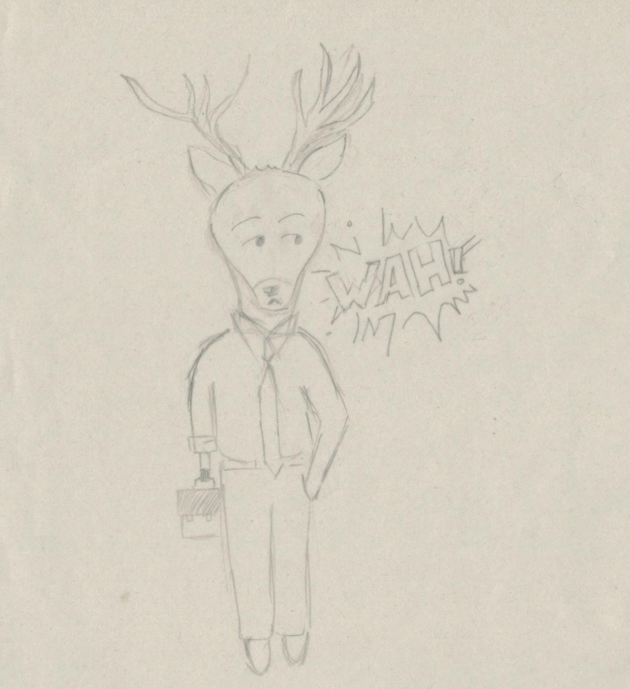
The style I was going for  was to resemble that of comics relatively. Hence, I arranged my works in an order that can tell a story, such as, “a day in the life of a singaporean deer“.  Since i was basing all the POVs from the same deer, I decided to name it so that it becomes more personal. The name i decided to go with is KiasuBuck since the number trait I think of for Singaporeans is being Kiasu and my main character also takes the gender of a male deer, also known as Buck.

These are made from the basic shapes as well as some found vectors.

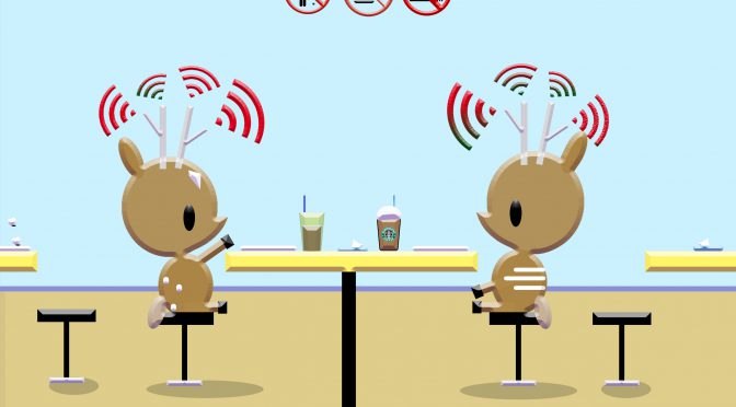
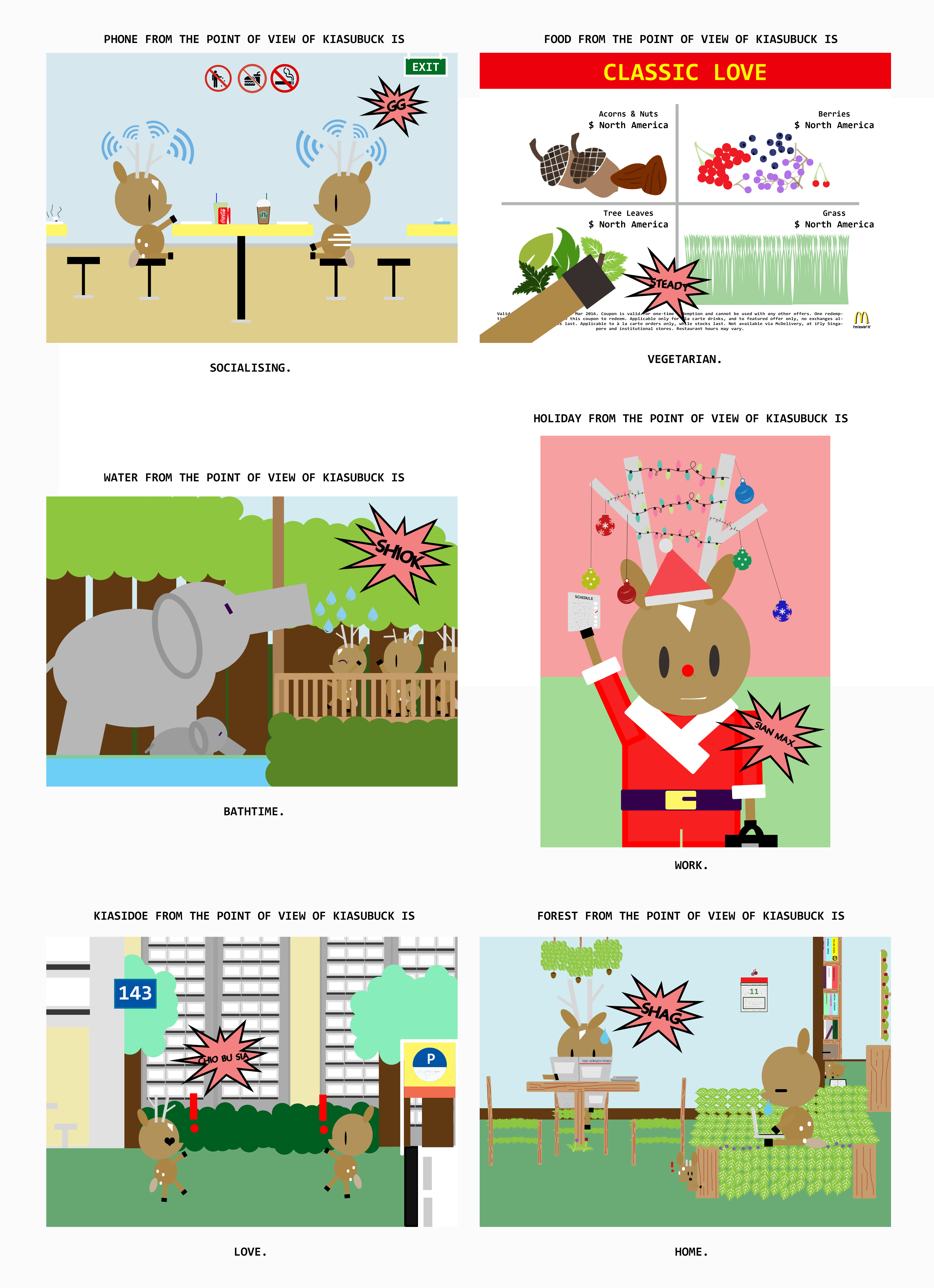
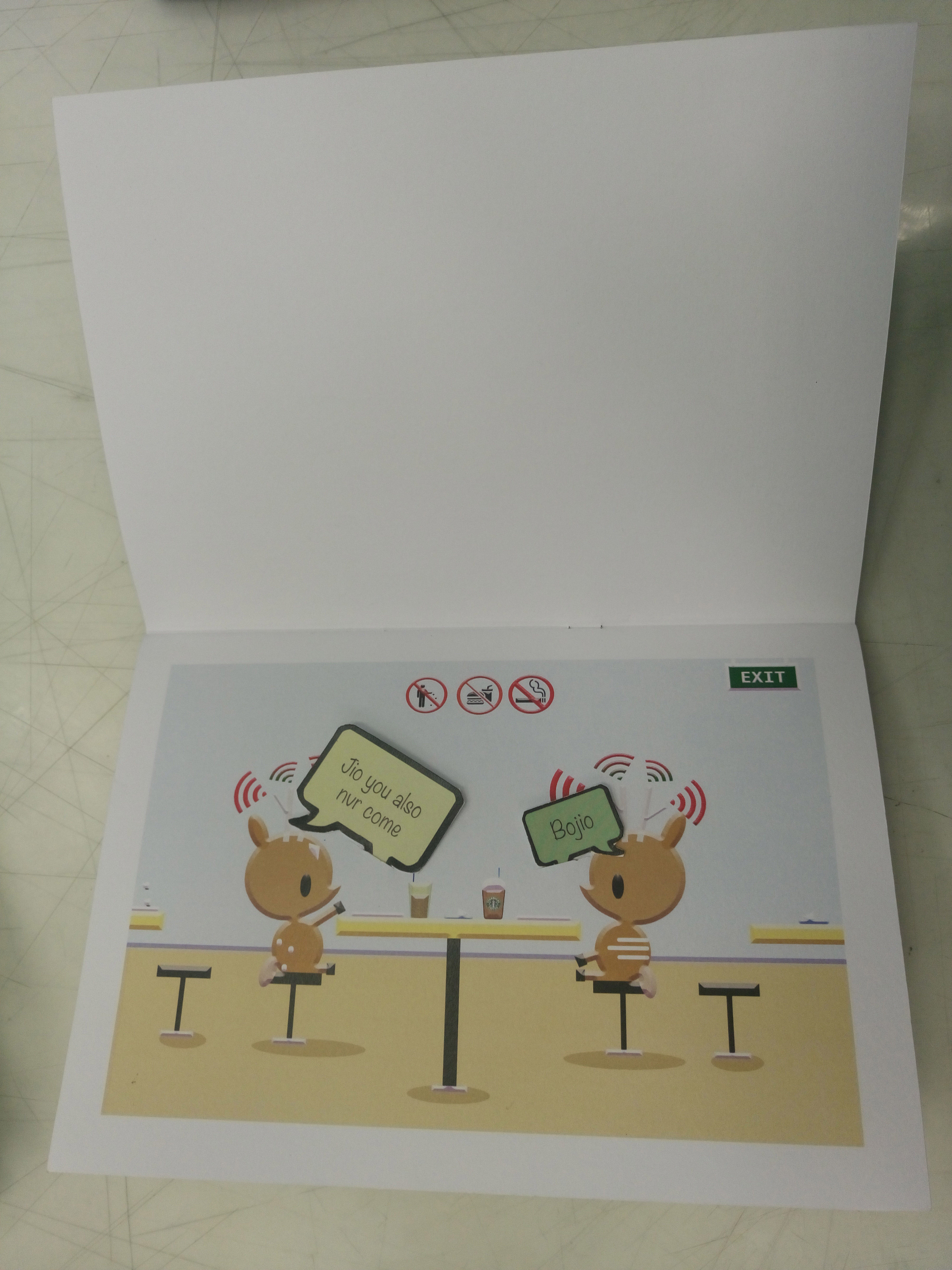
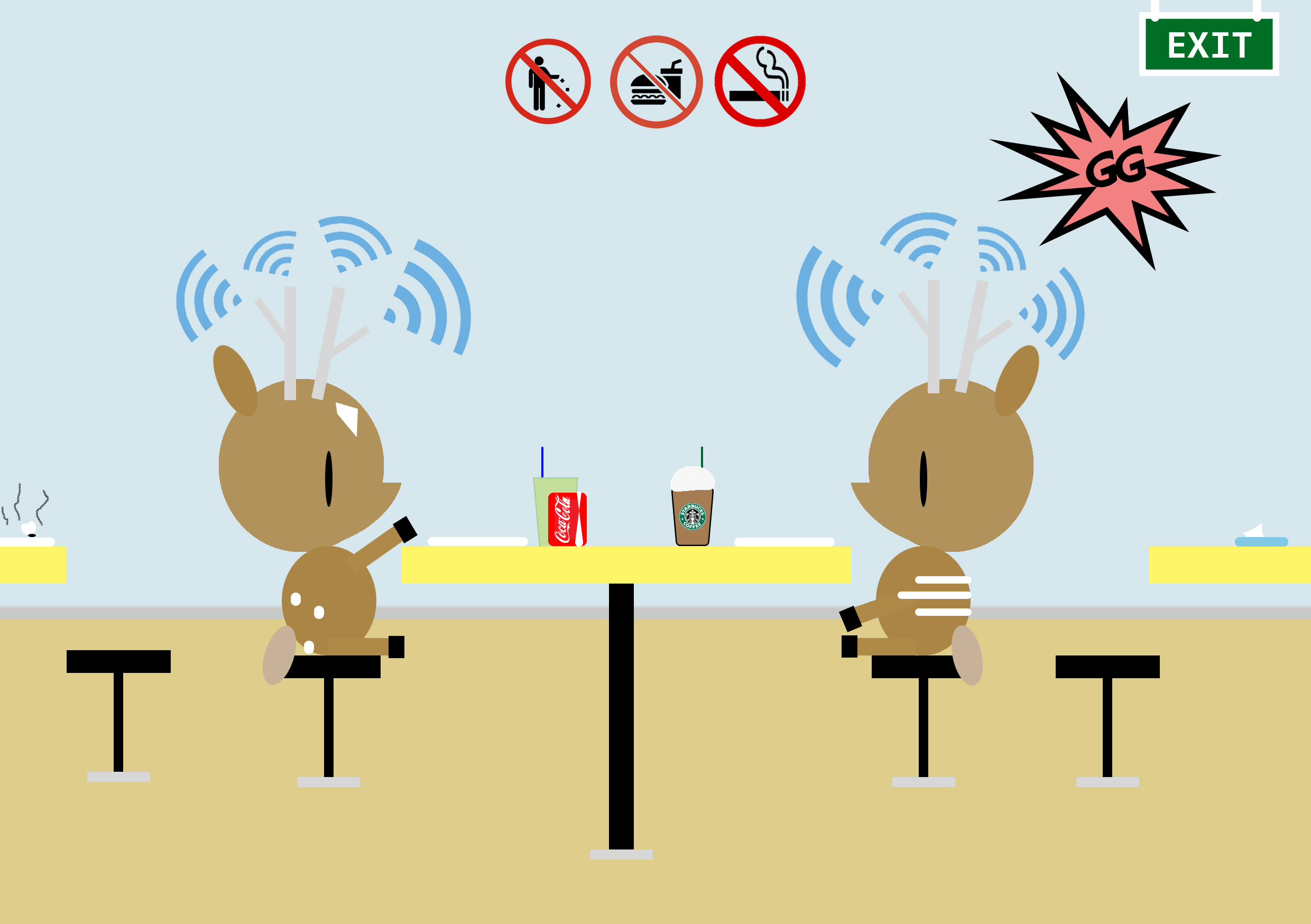
Phone from the point of view of KiasuBuck is

1.phone

                 Socialising.

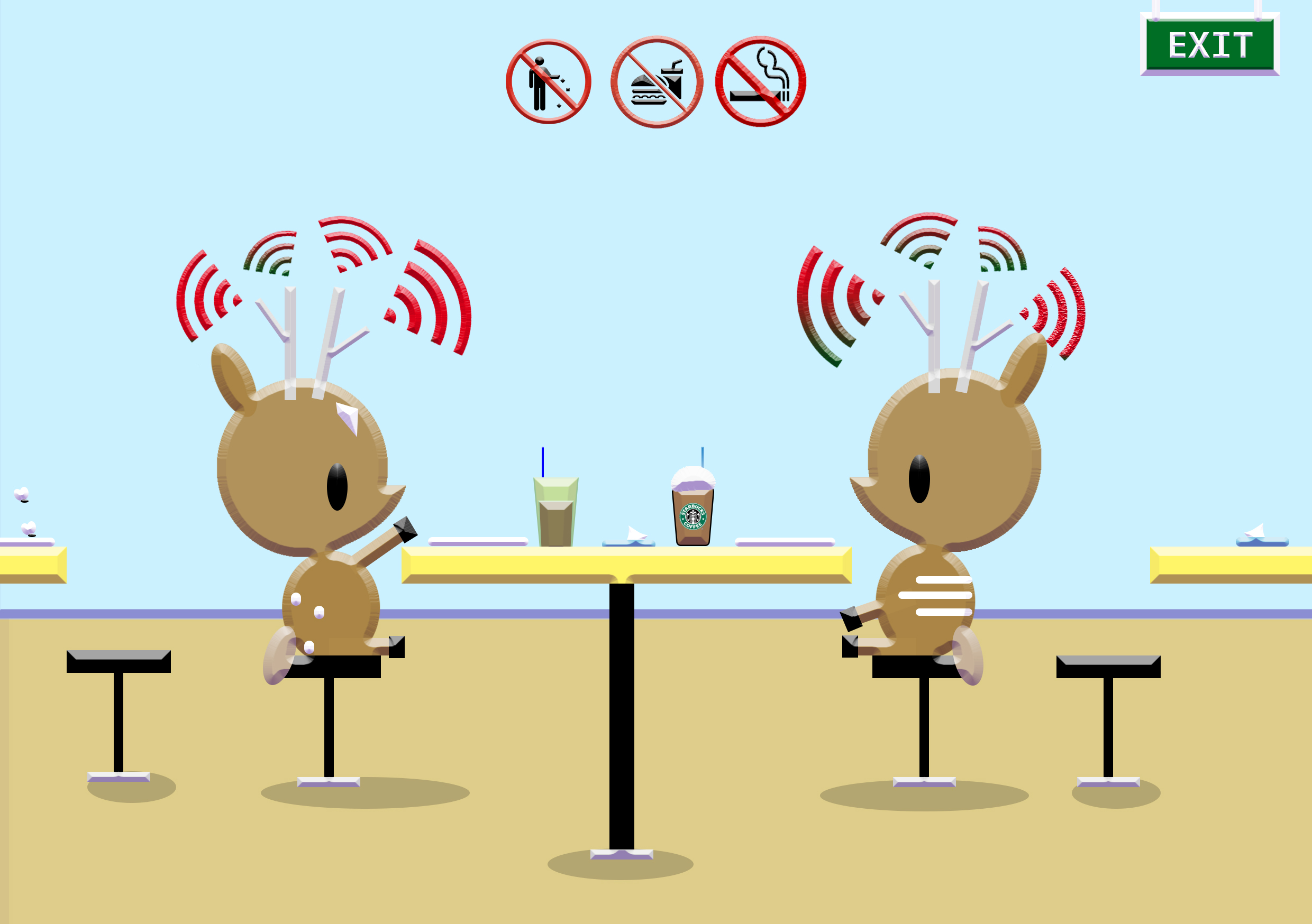
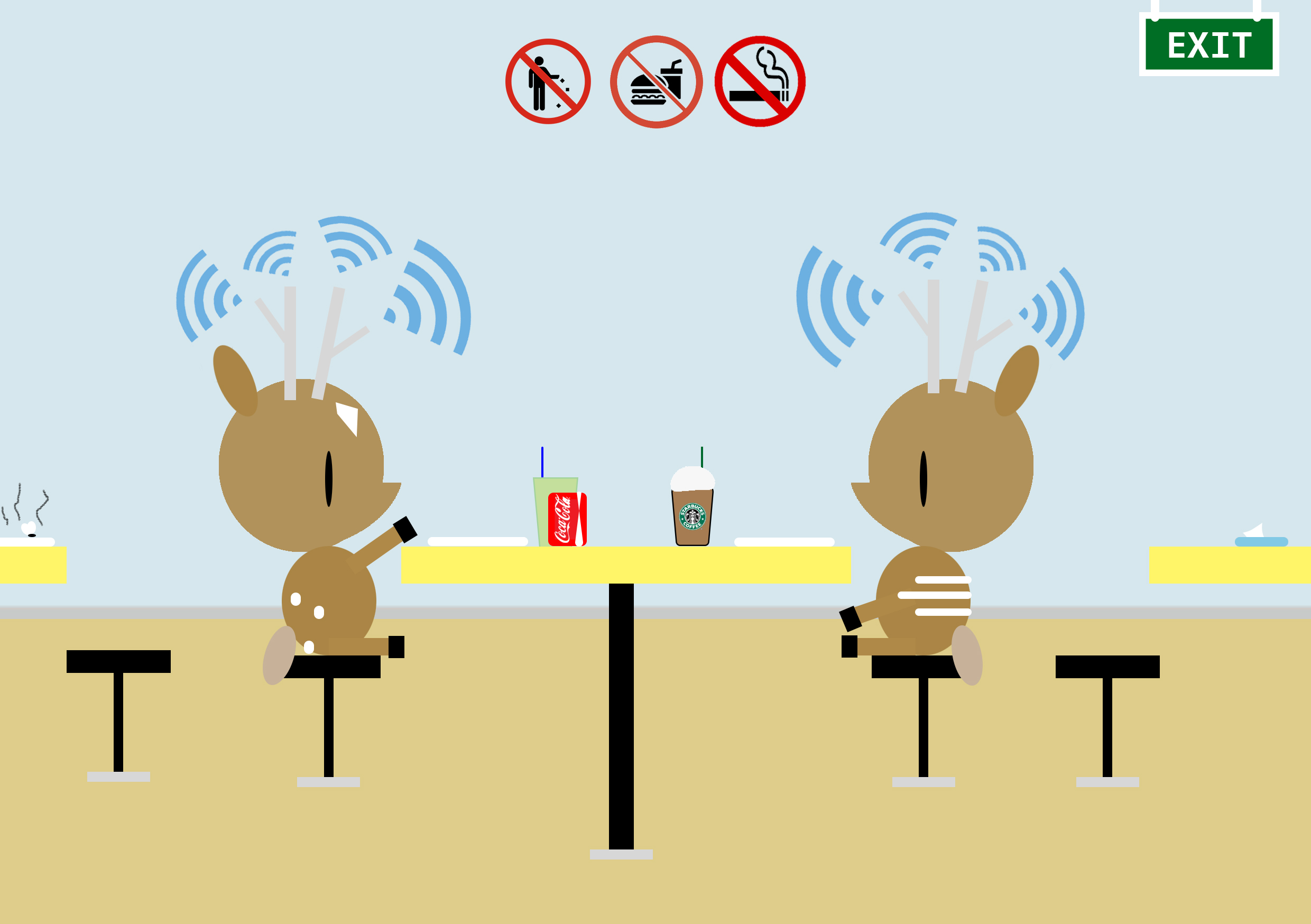
KiasuBuck is having a lighthearted breakfast with his friend at the hawker centre. They also appear to be interacting with each other.

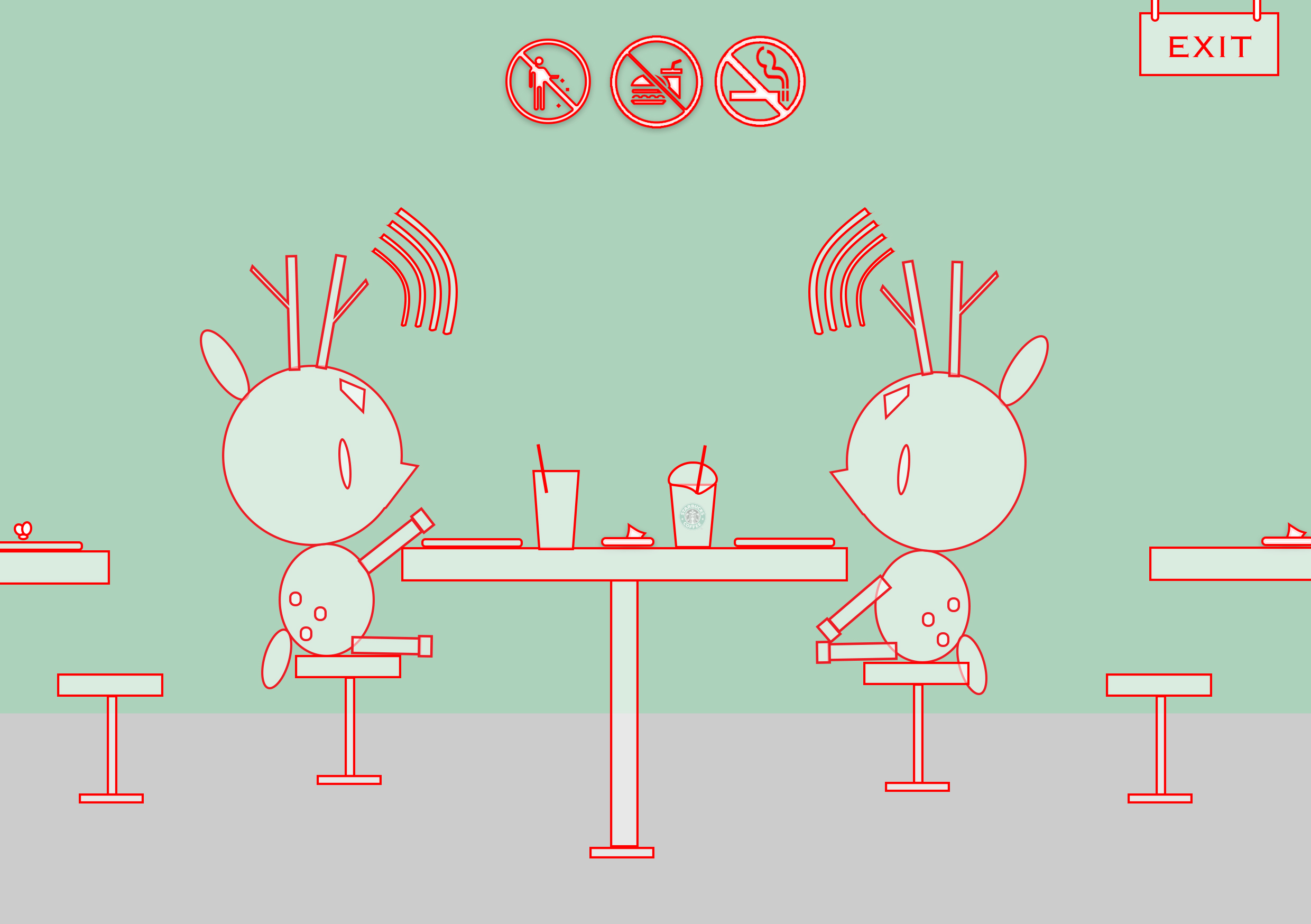
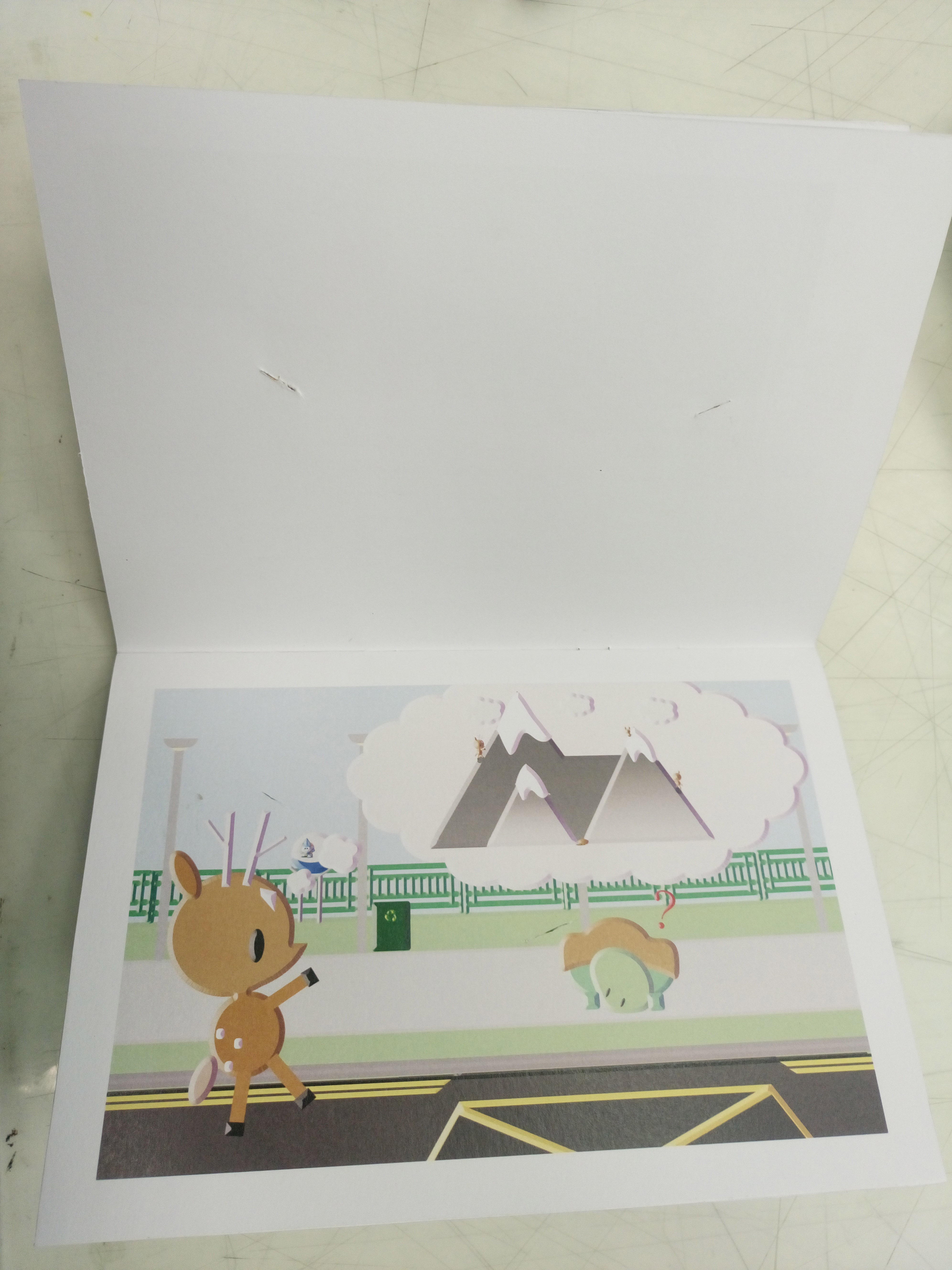
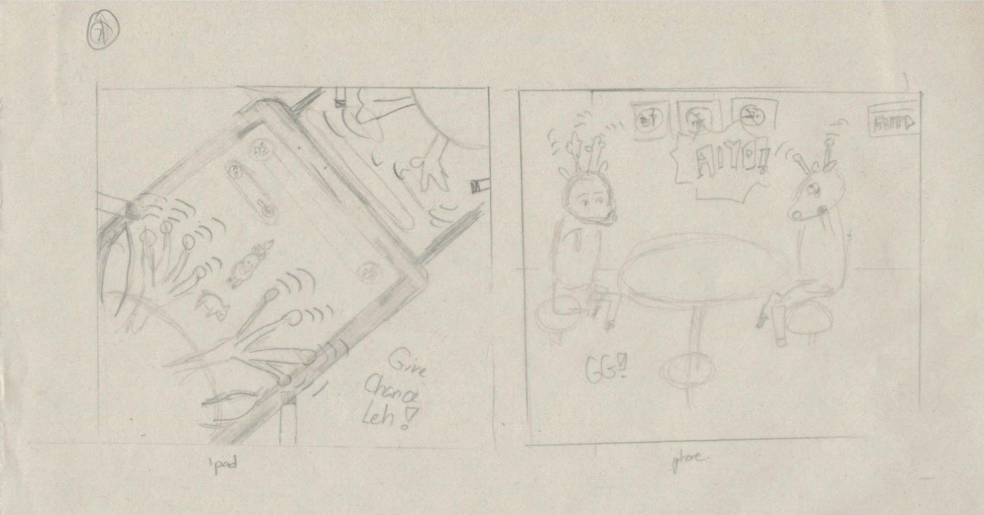
I felt that if deers were to have phones, how would it be? Instead of the literal phone that we humans use, i decided to make use of their long antennas as the source for their networking. Hence, in other words, the deers use their antennas as phones. In such a chaotic and noisy surrounding, we are easily distracted by many sounds around us, hence  i decided to place the blue radiating lines that resemble ‘signal’ in different directions and sizes. What you’ll notice here is i choose the word phone instead of talk as socialising. This is so because I felt this is a rather apparent phenomenon (people interacting behind the screens instead of face to face) happening right now with all the advanced technology. I also added many small details to enhance the flavour of living in Singapore such as the various signs one would always see, the tissue paper packet people would use to ‘chop’ their seats as well as the food that isn’t sometimes cleared away even with the implementation of self-clearing zones.

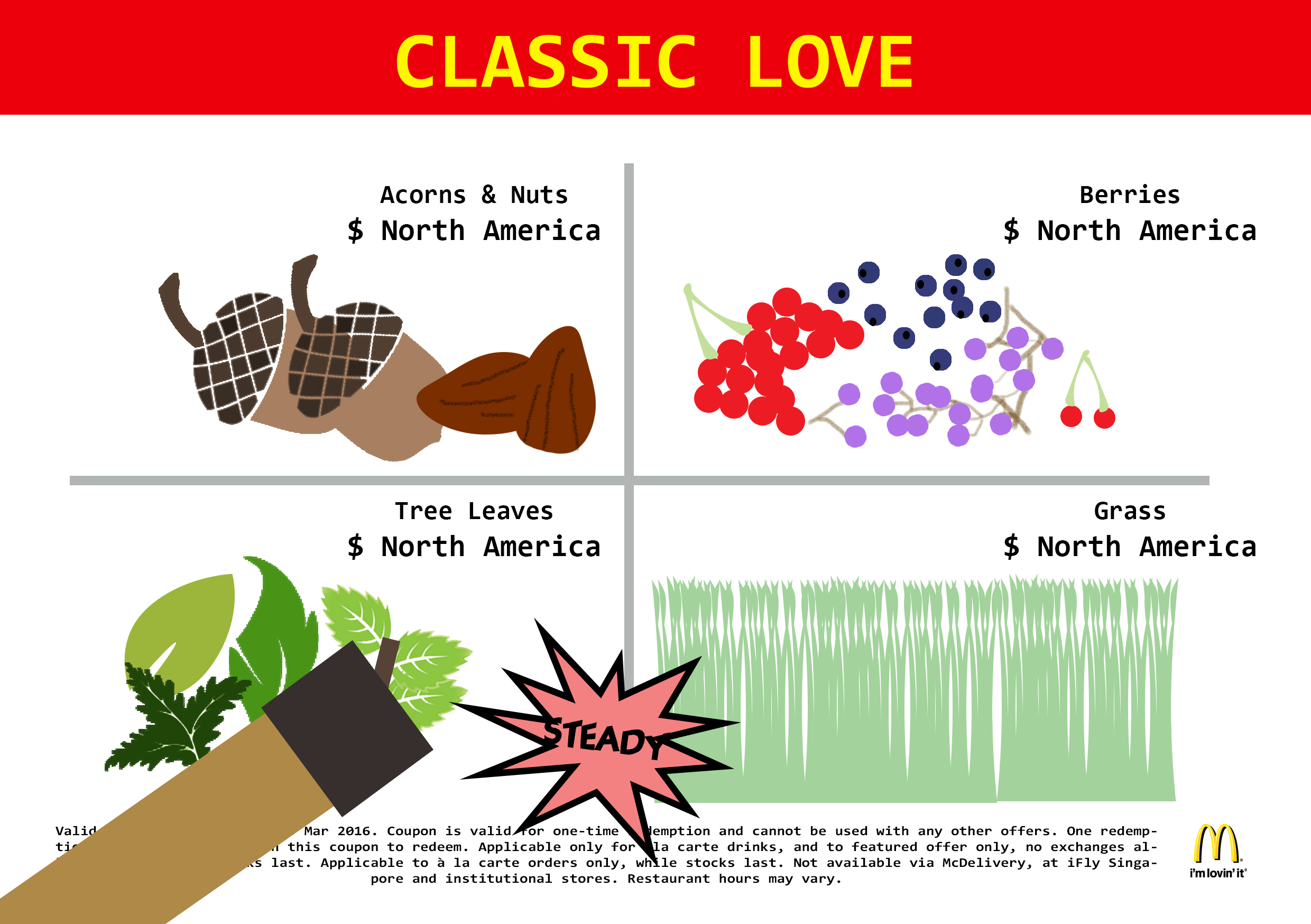
Food from the point of view of KiasuBuck is

2. food

                 Vegetarian.

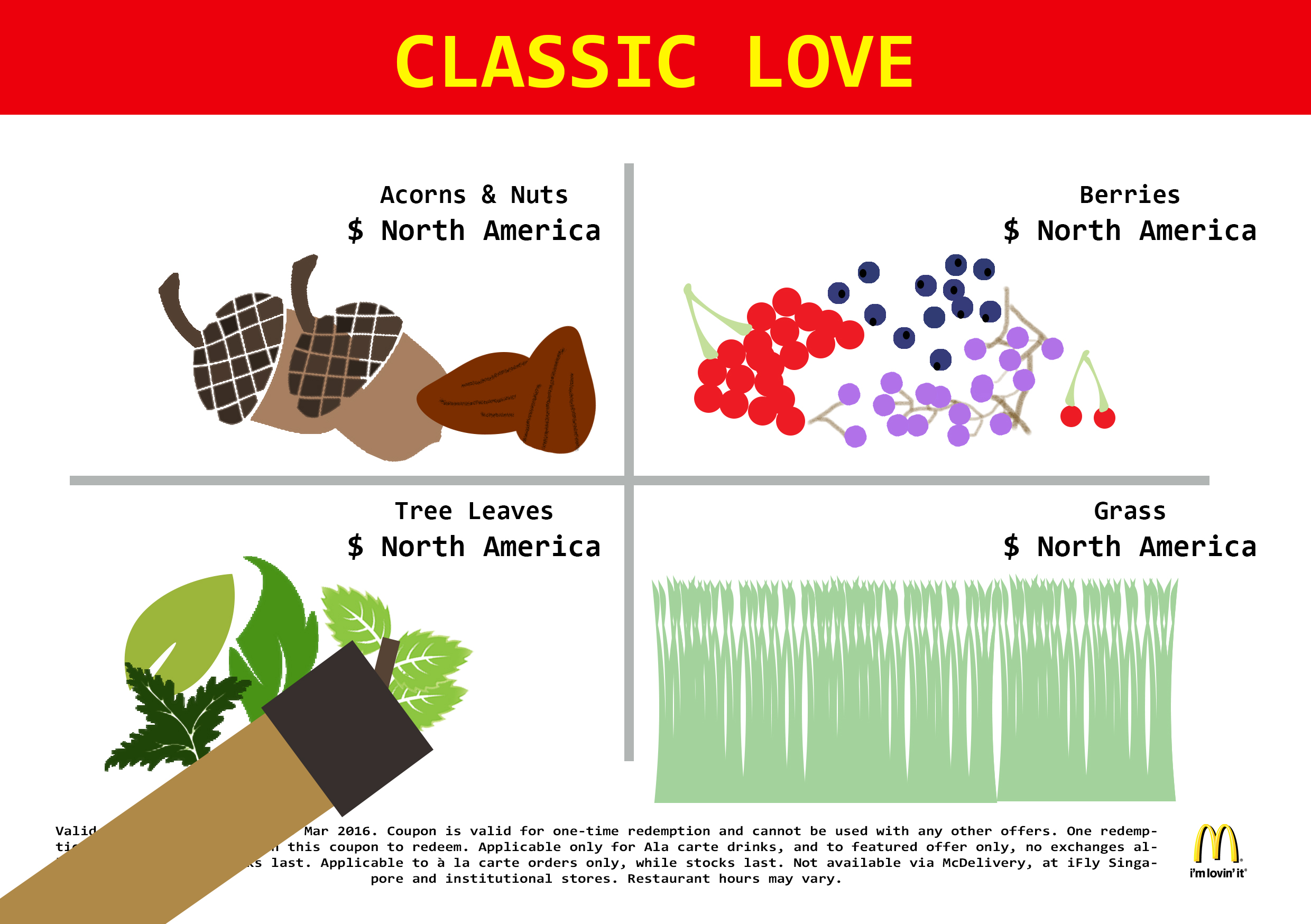
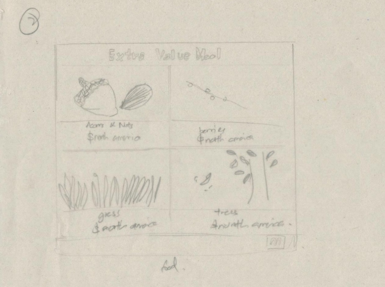
Secondly, after Kiasu finished his breakfast, he fell hungry again soon after and wondered about what to eat. He decided to have Macs.

In this work, I aimed to portray it through those MacDonald coupons we always receive. Instead of burgers, I switched all the food to the diets of a deer and prices to where they are commonly being found.

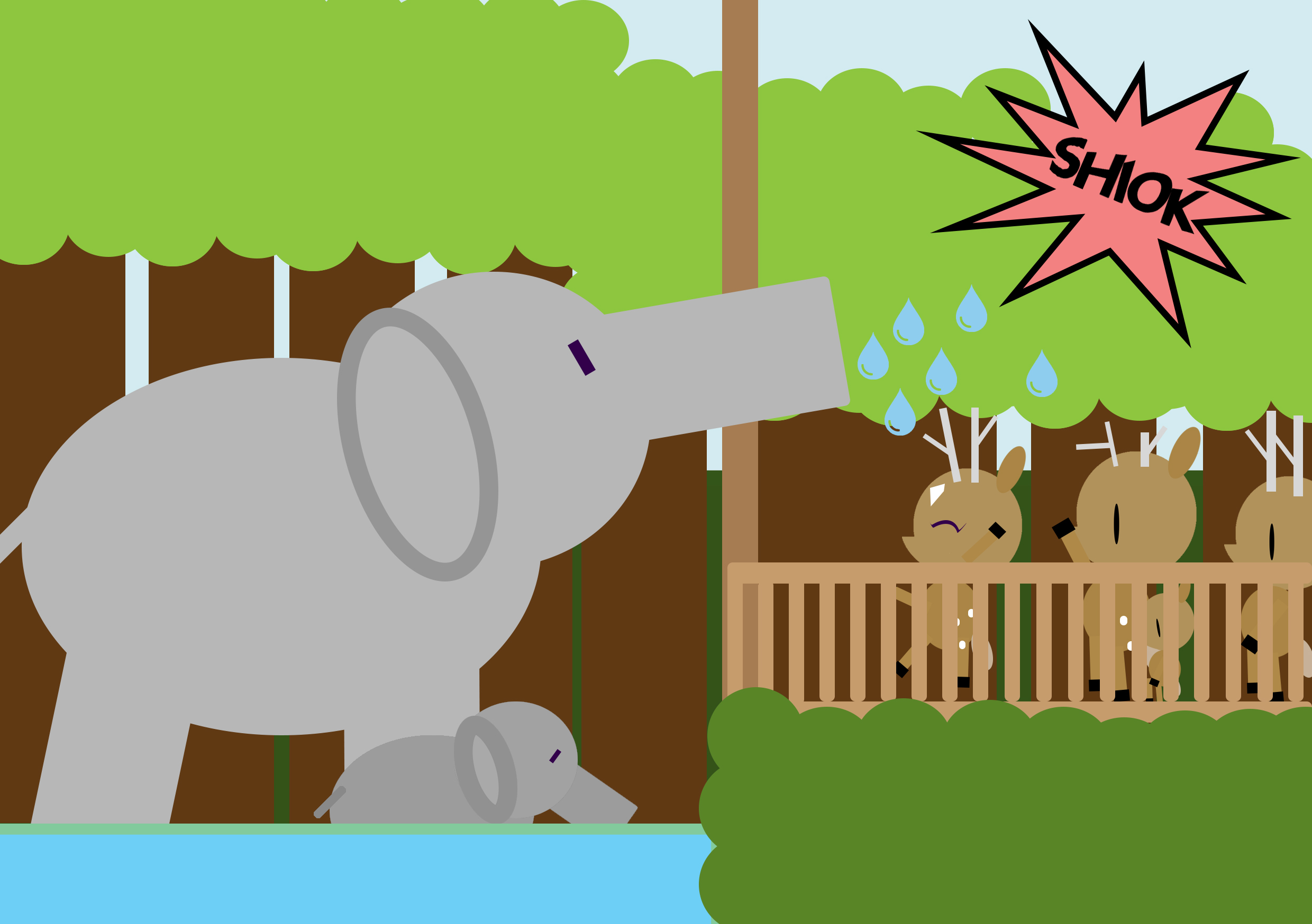
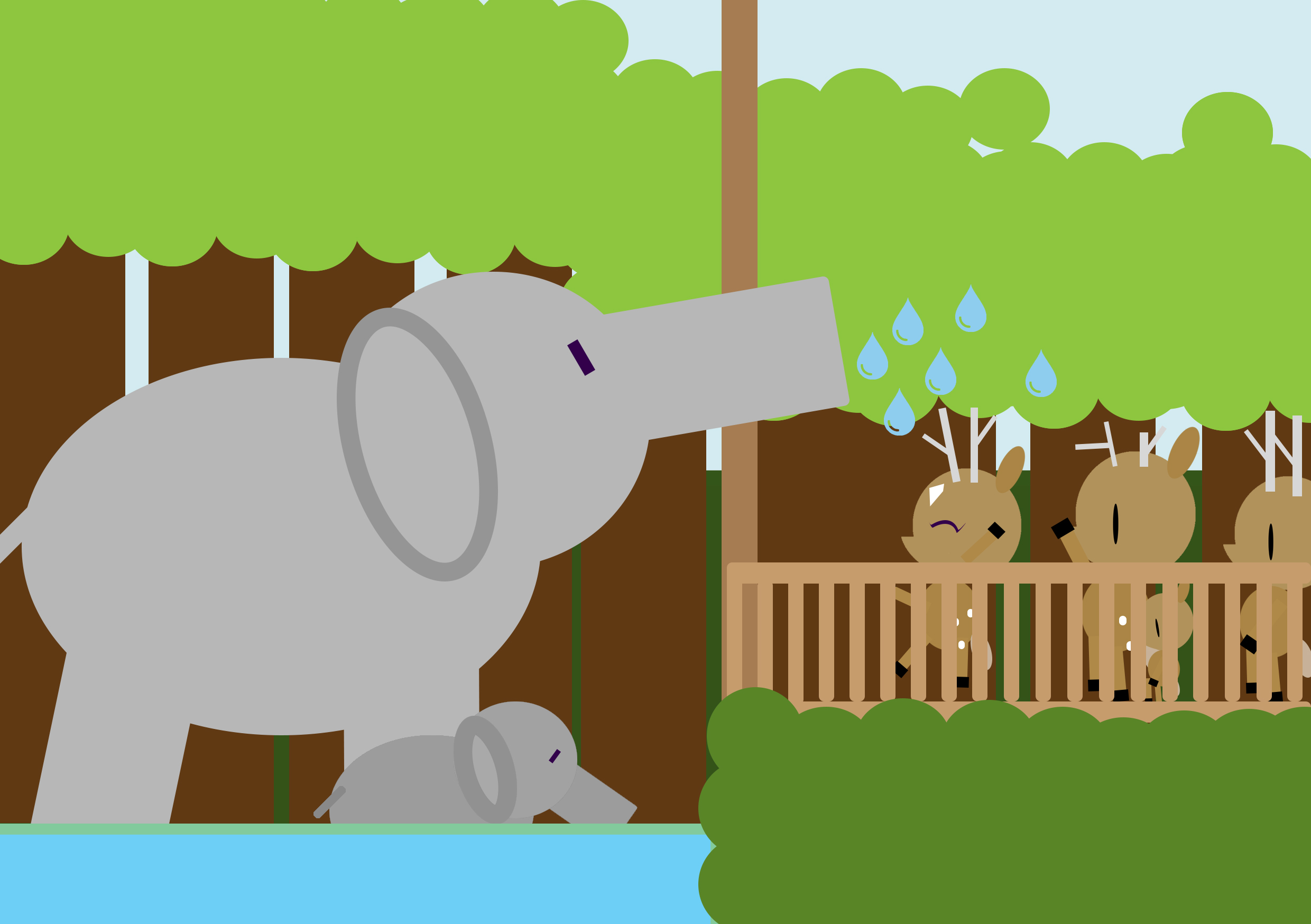
Water from the point of view of KiasuBuck is

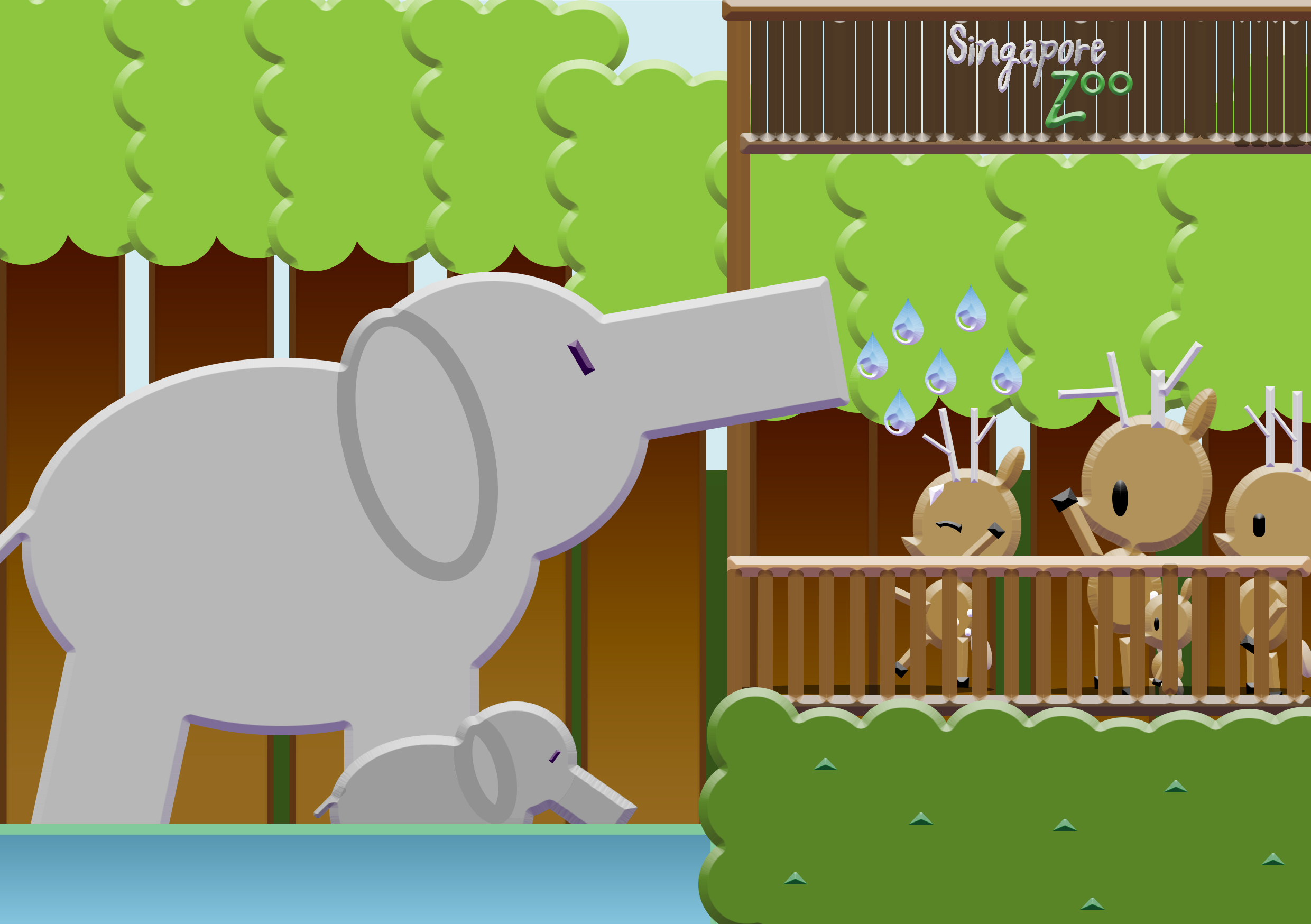
3. water

                   Bath Time.

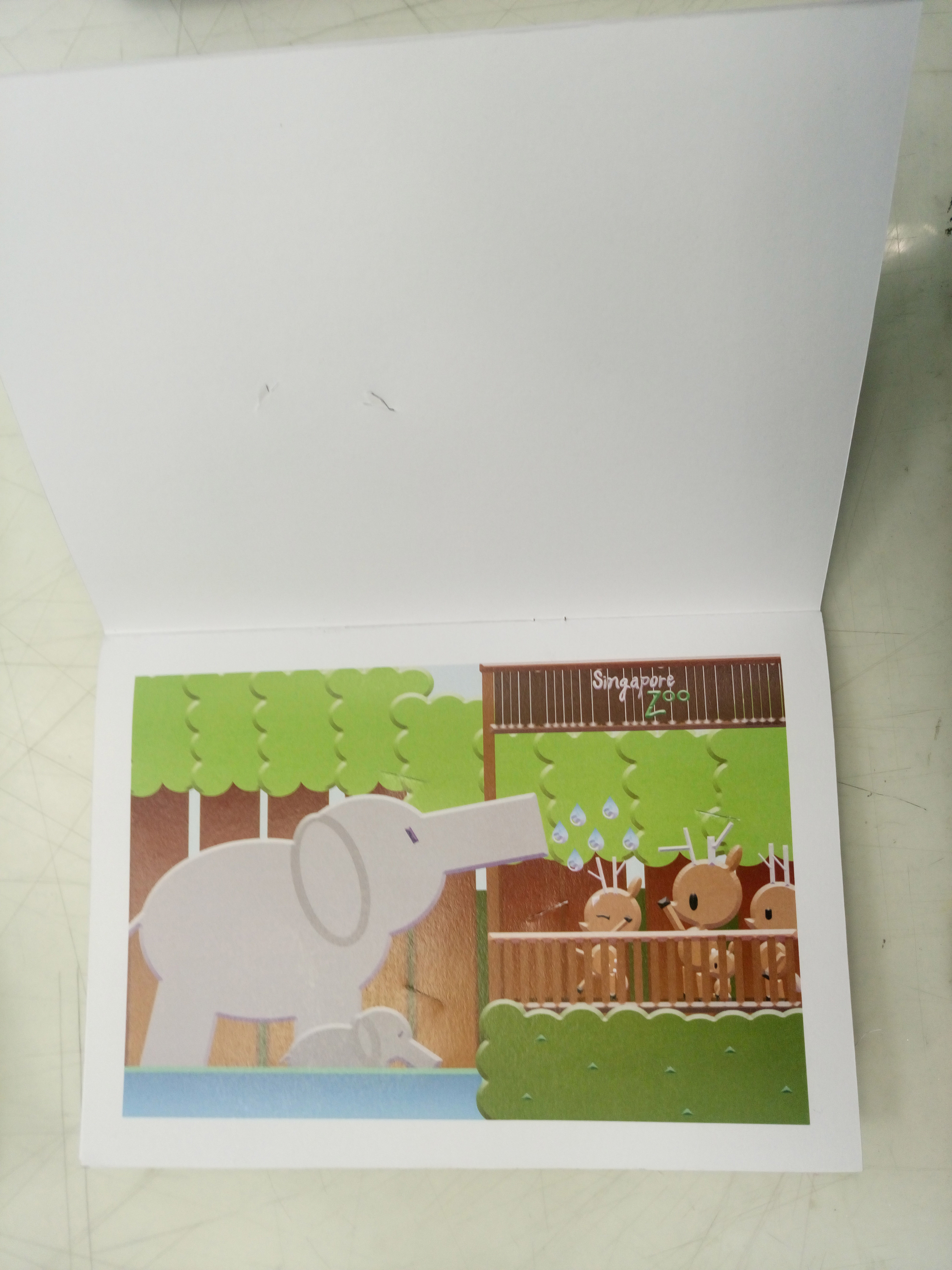
After his meals, KiasuBuck thought it was too hot and decided to take a shower.

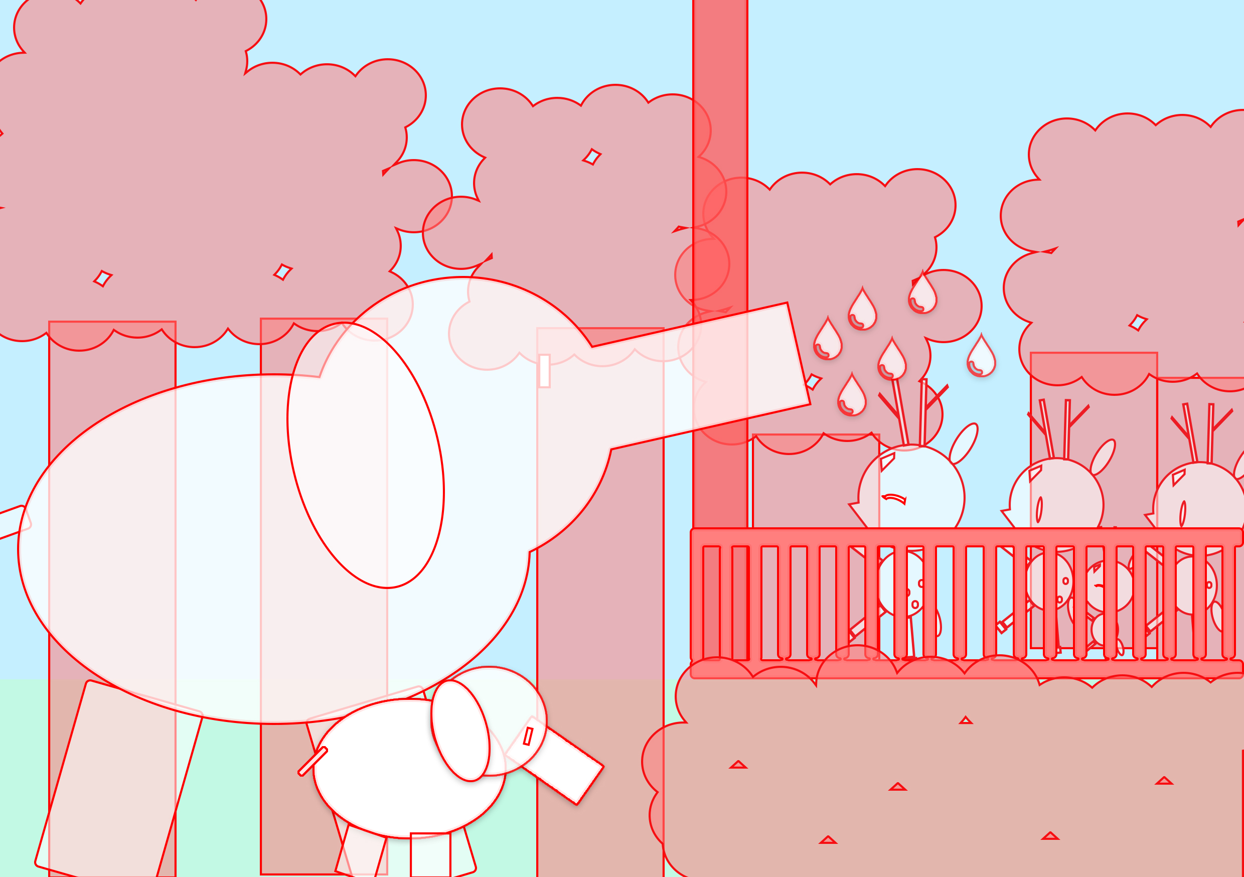
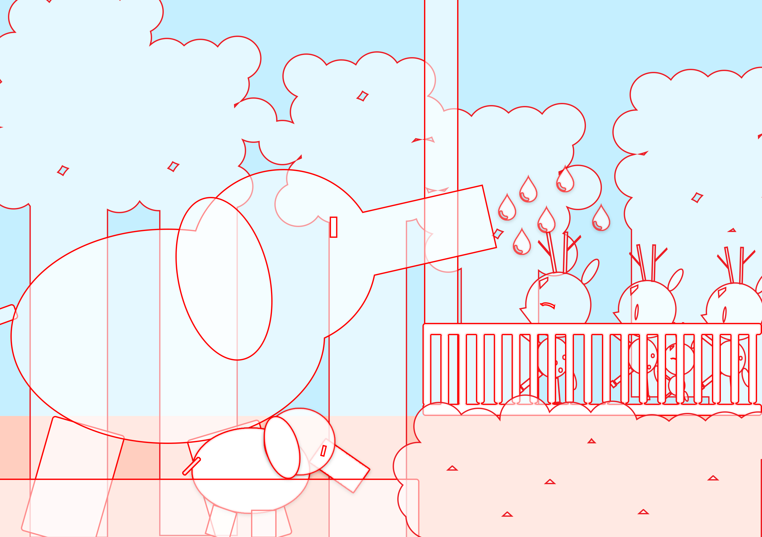
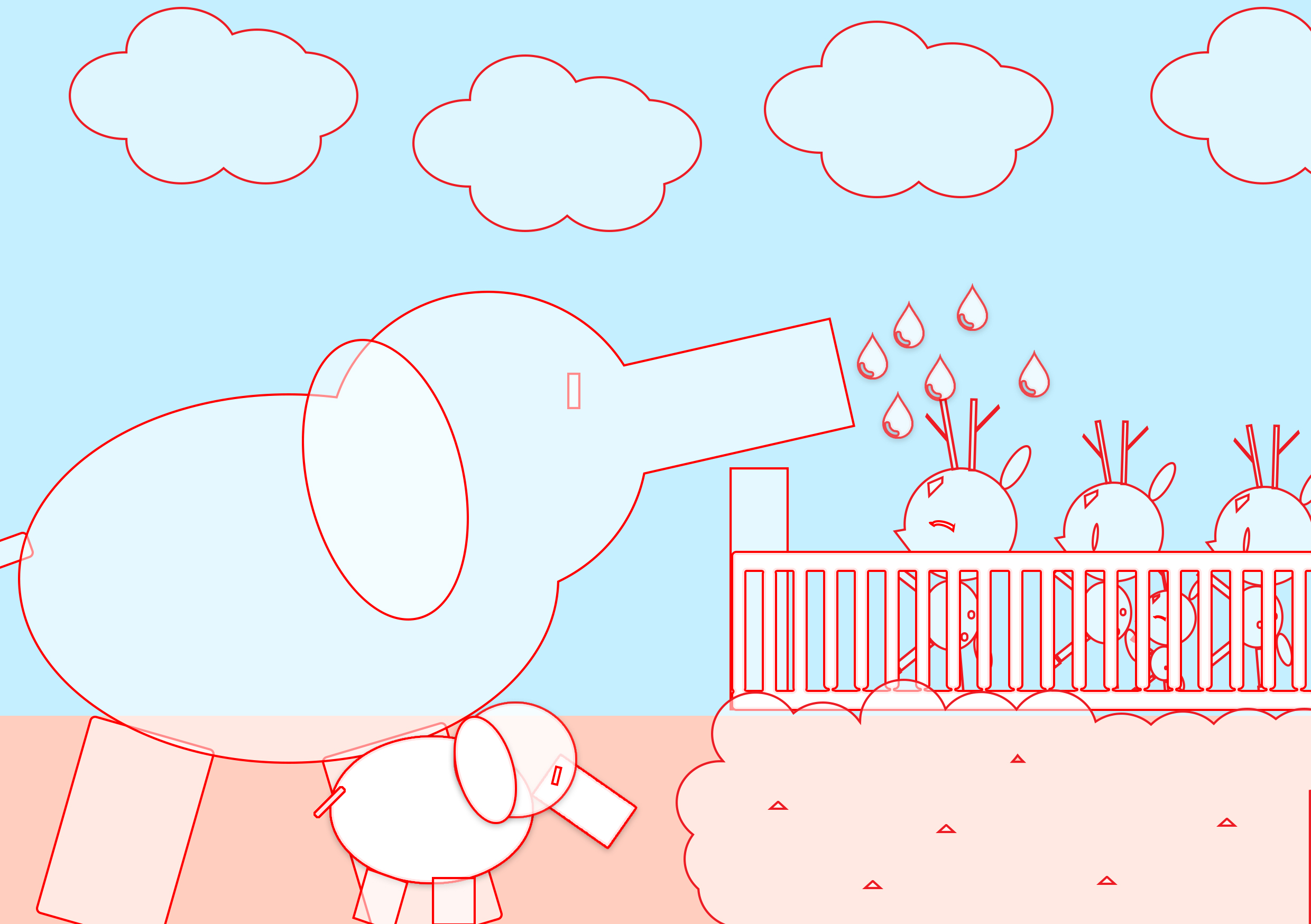
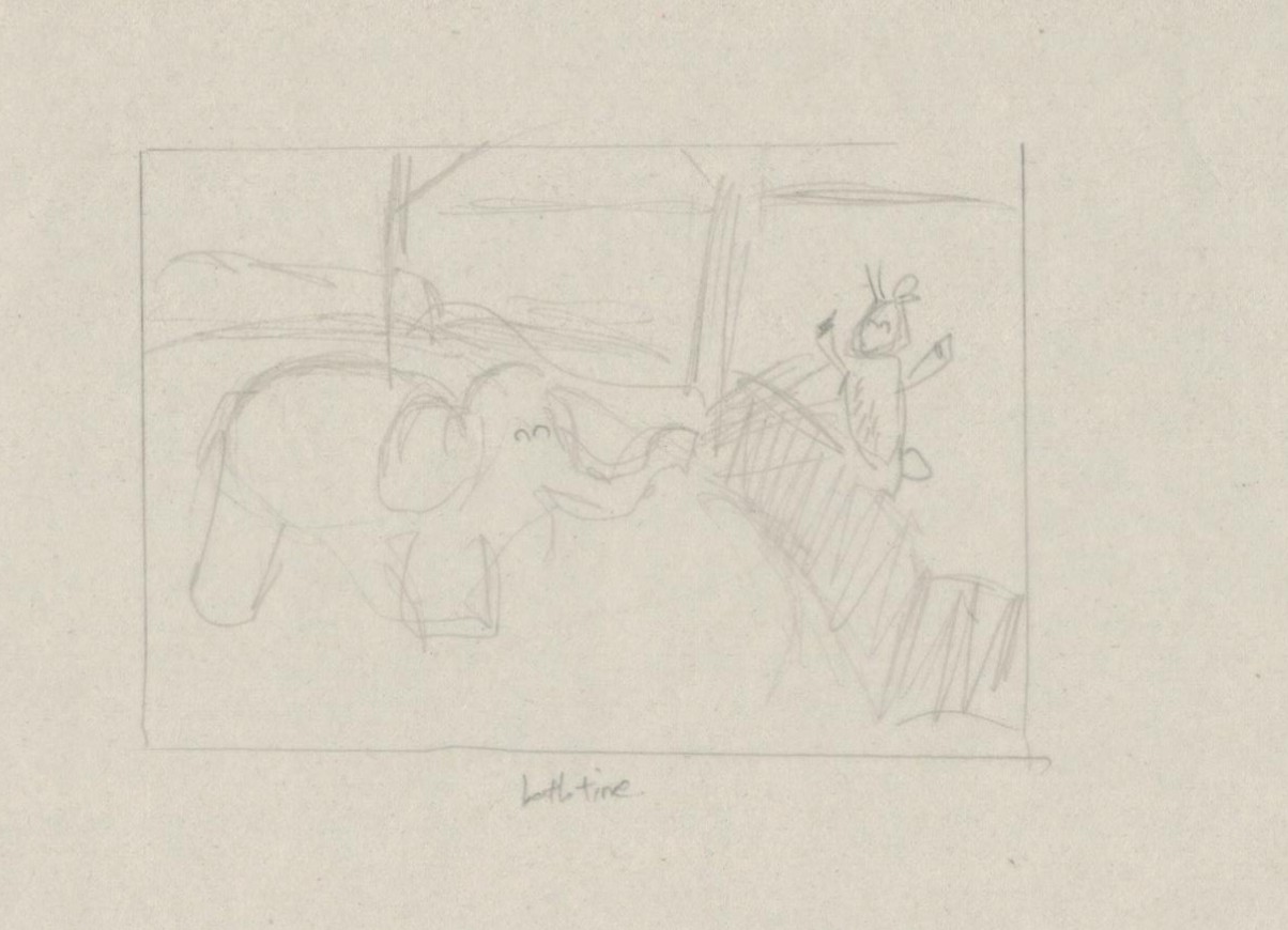
Here you’ll see an elephant spraying water for the deers to bath. I wanted set it up in a way that resembles the singapore zoo, where during the elephant show, there is always this segment where the elephant would spray water at the guests. Since deers are not really water creatures , i decided for the water to be just a few droplets instead of a full-blown water shower. Also, another common thing about Singaporeans is they tend to like to queue and queues have an indication of something being really good.

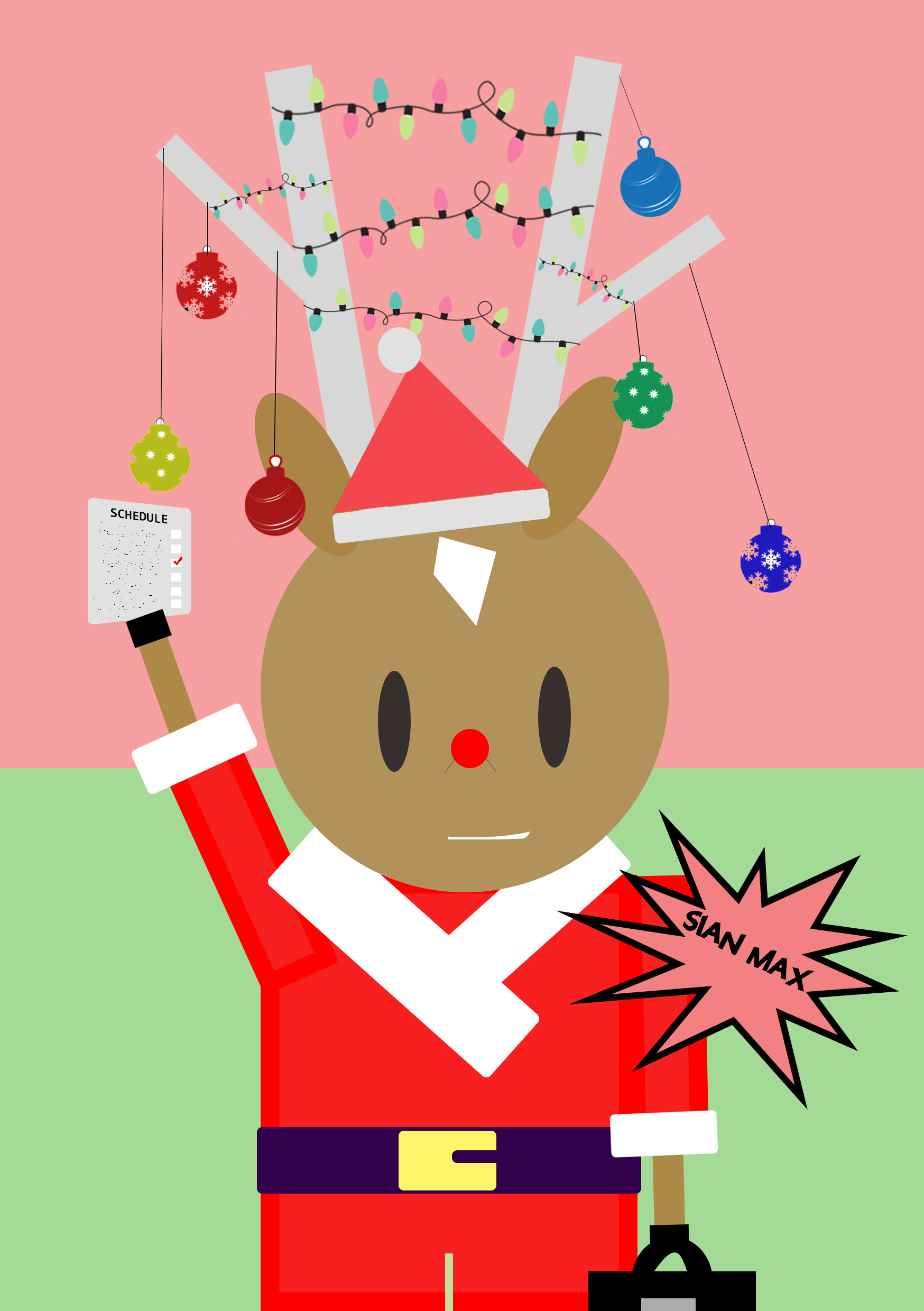
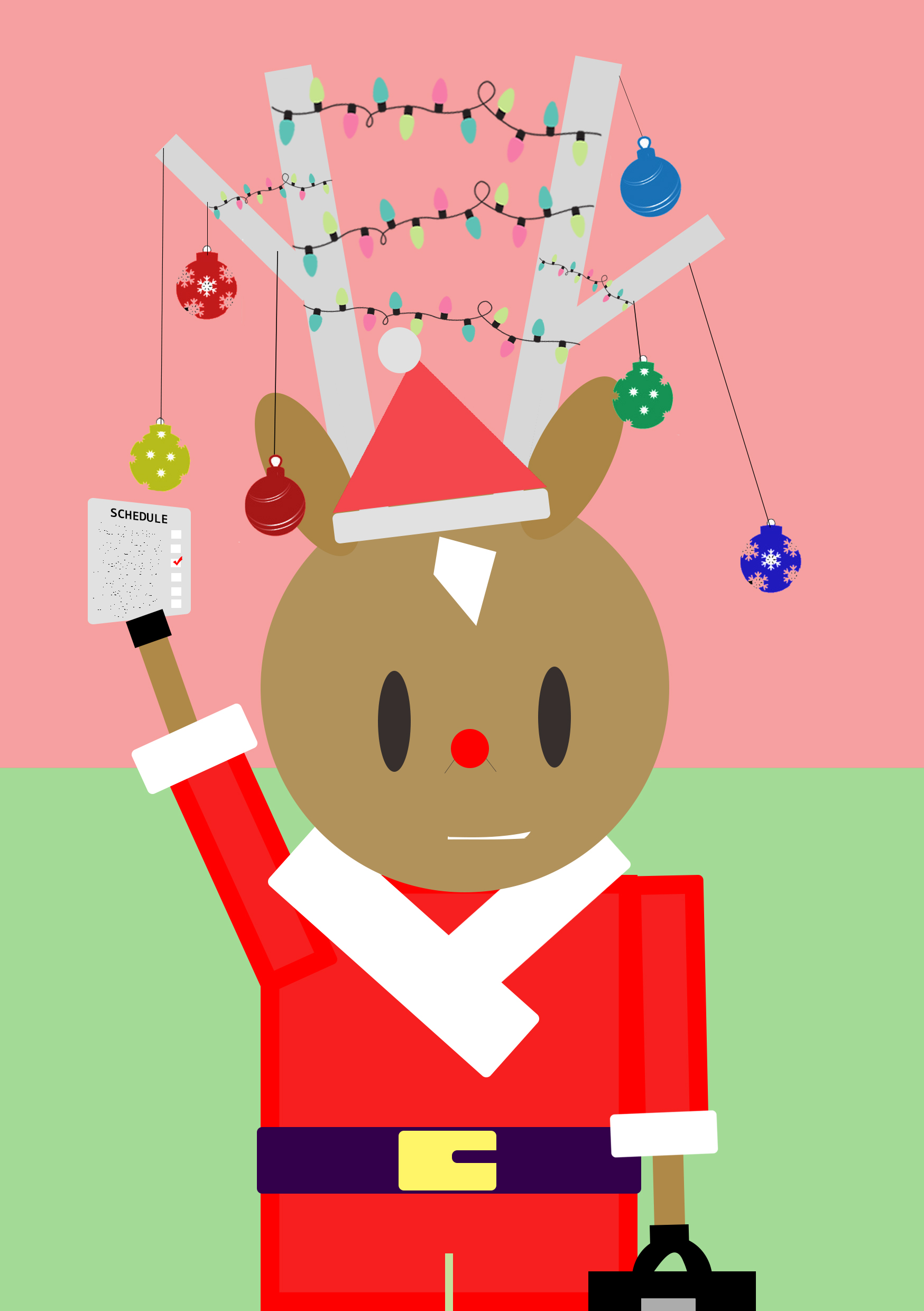
 Holiday from the point of view of KiasuBuck is

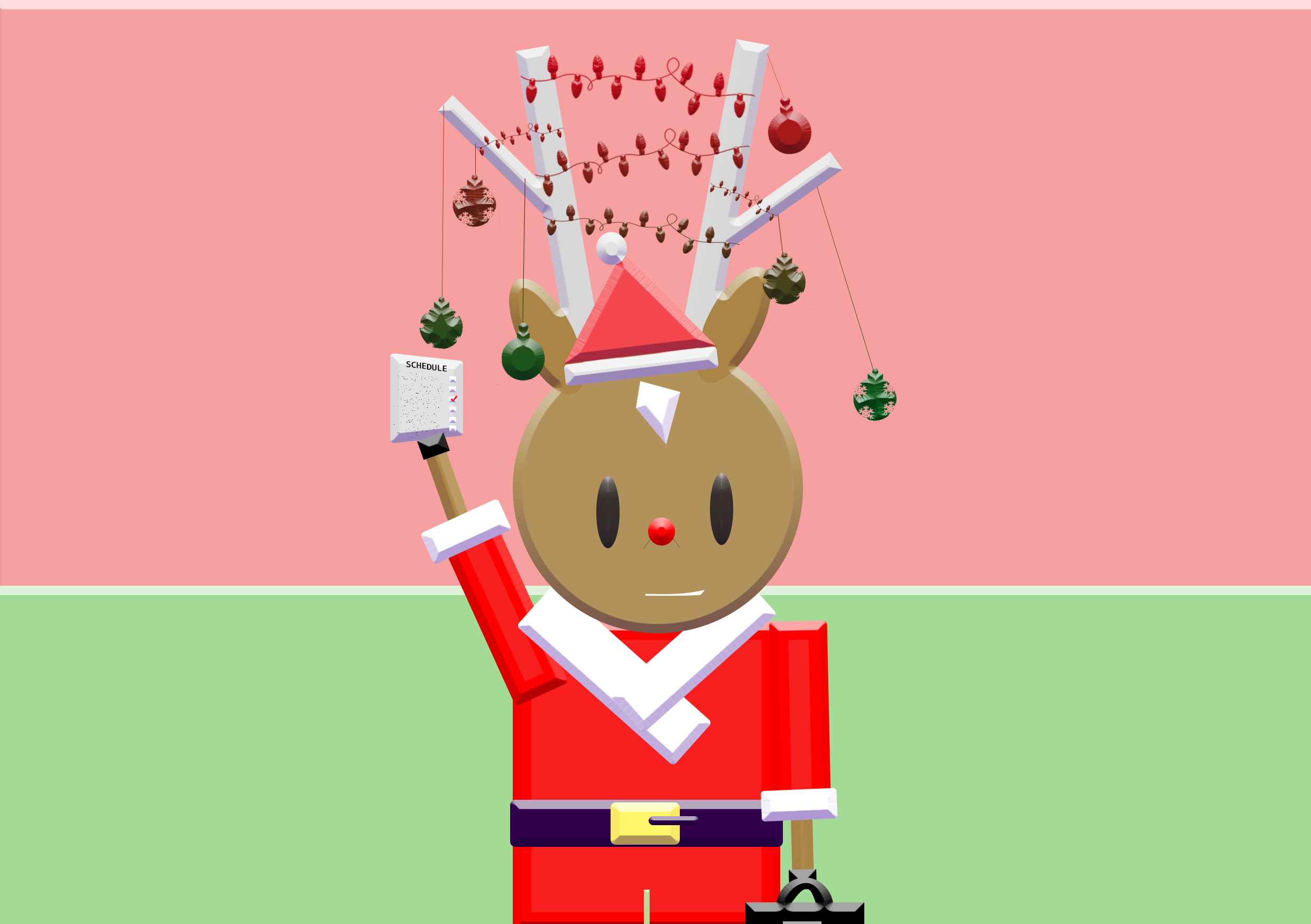
4. celebration

                      Work.

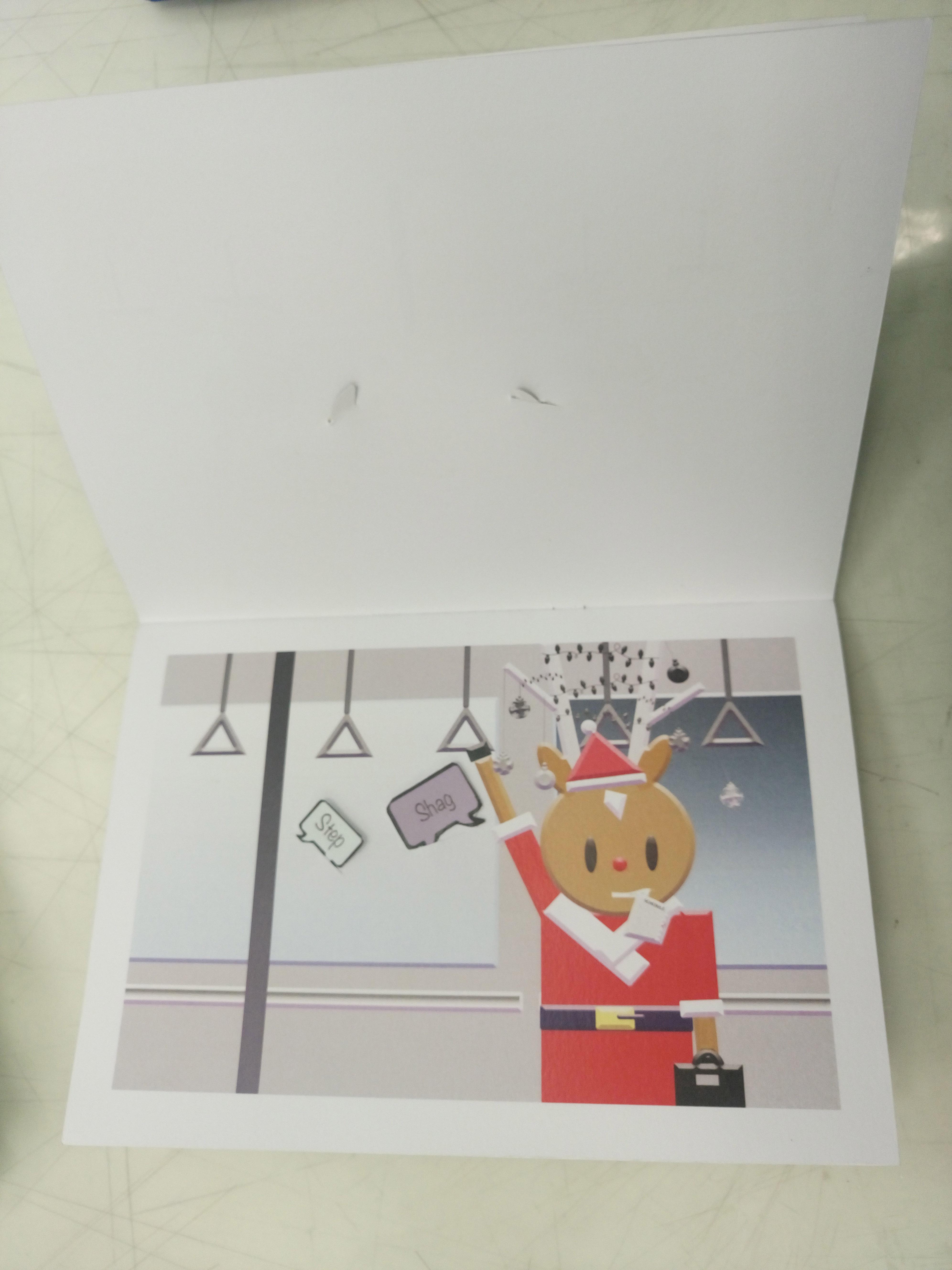
After bathing, KiasuBuck was comfortable enough  now but has  to rush off for work.

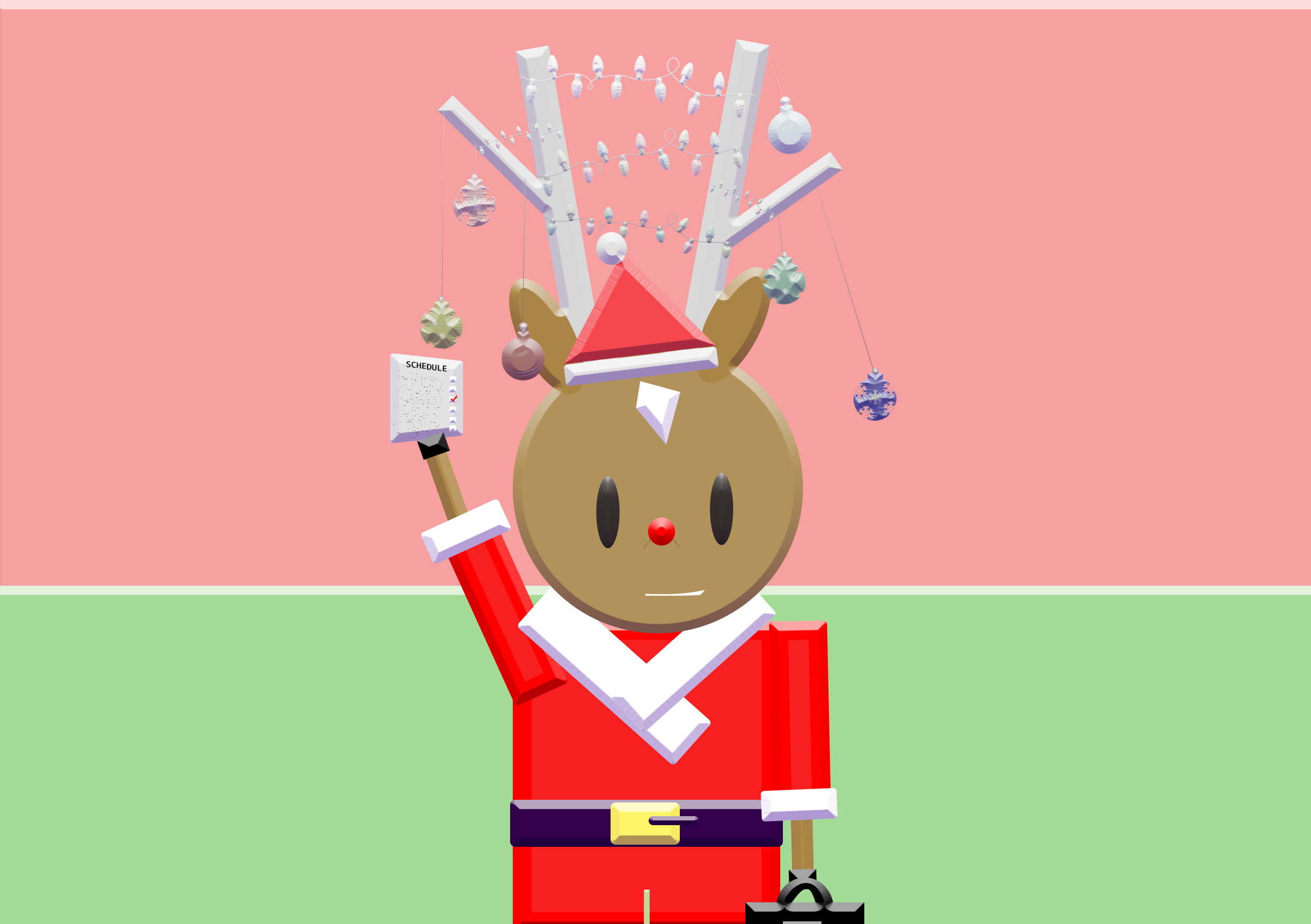
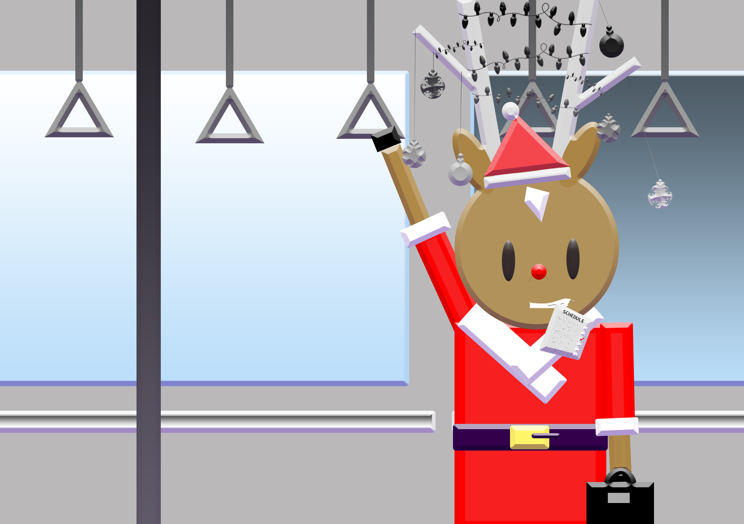
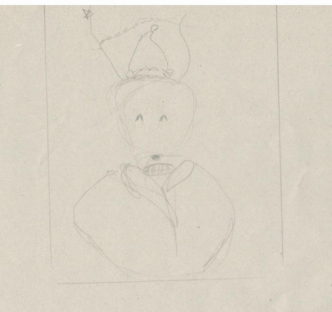
The holiday i was inclined to portray was christmas. To get into the mood, Kiasu changed into his uniform (santa claus suit) and the dangling ornaments on his antennas are to resemble that of a christmas tree. On first look, it appears to be a joyous occasion. However, taking a closer look, one would notice the forced smile, the typical-work-suitcase and the list of schedules. In Singapore , I felt that people are always working even in the holidays.

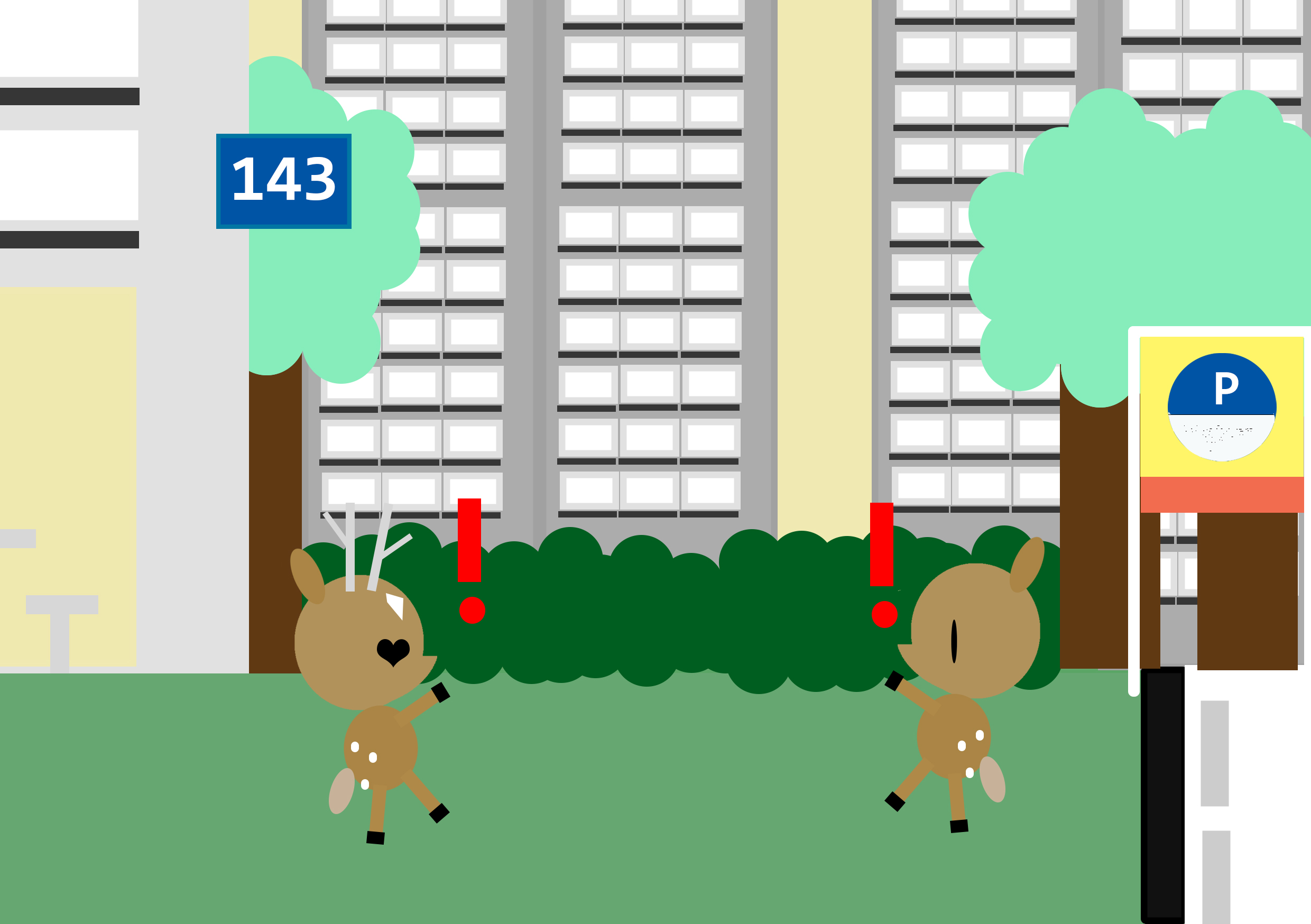
 KiasiDoe from the point of view of KiasuBuck is

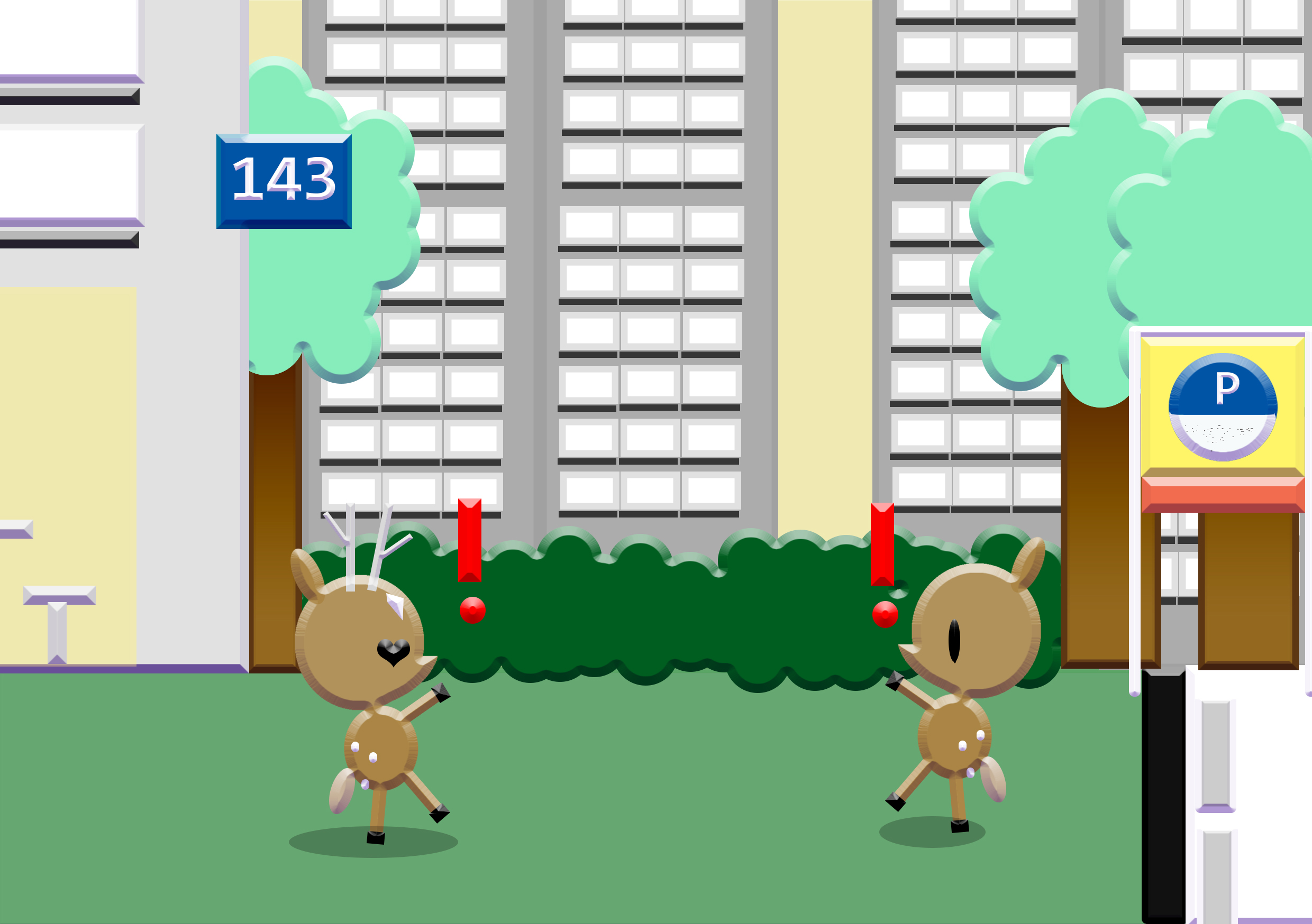
5.love

                     Love.

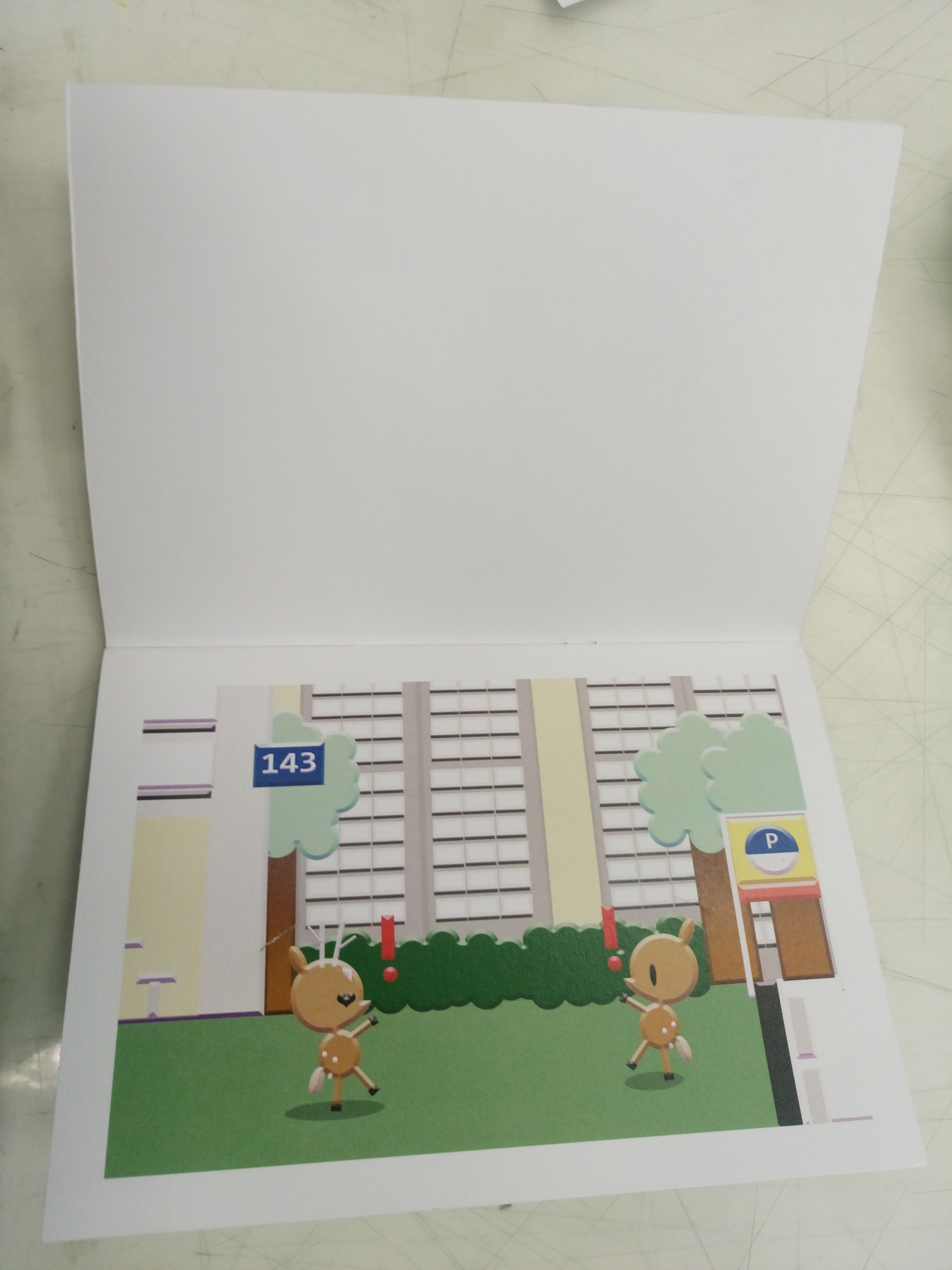
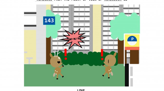
On the way back, KiasuBuck found love when he had least expected it.

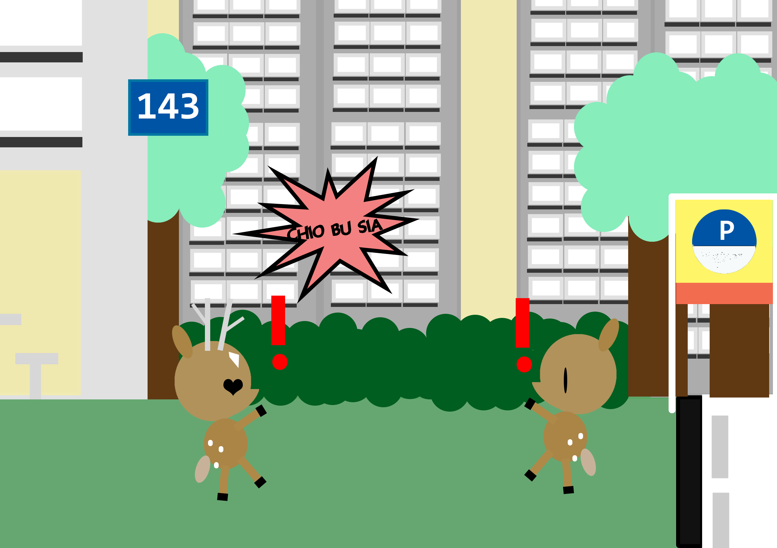
I wanted to play with the idea of finding love at unexpected places and thus my composition above. KiasiDoe, Kiasi because its the first trait i think of for Malaysians and Doe for female deer. In Singapore, its a common sight to see Singaporeans with Malaysians (Pr s). Personally, I also choose to portray it this way since that is what my parents are. 143 also have a meaning for I love you.

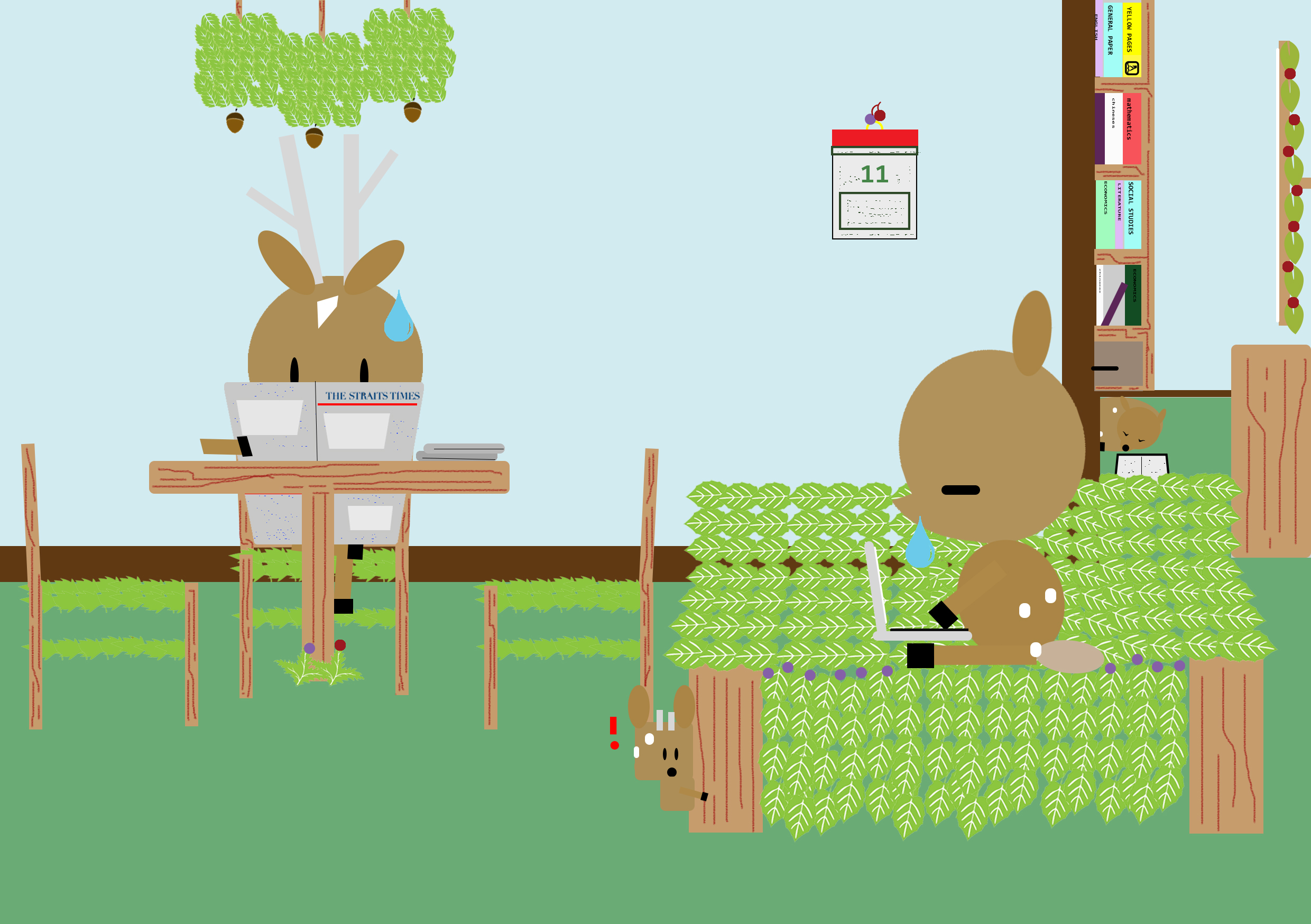
 Forest from the point of view of KiasuBuck is

6. home

                       Home.

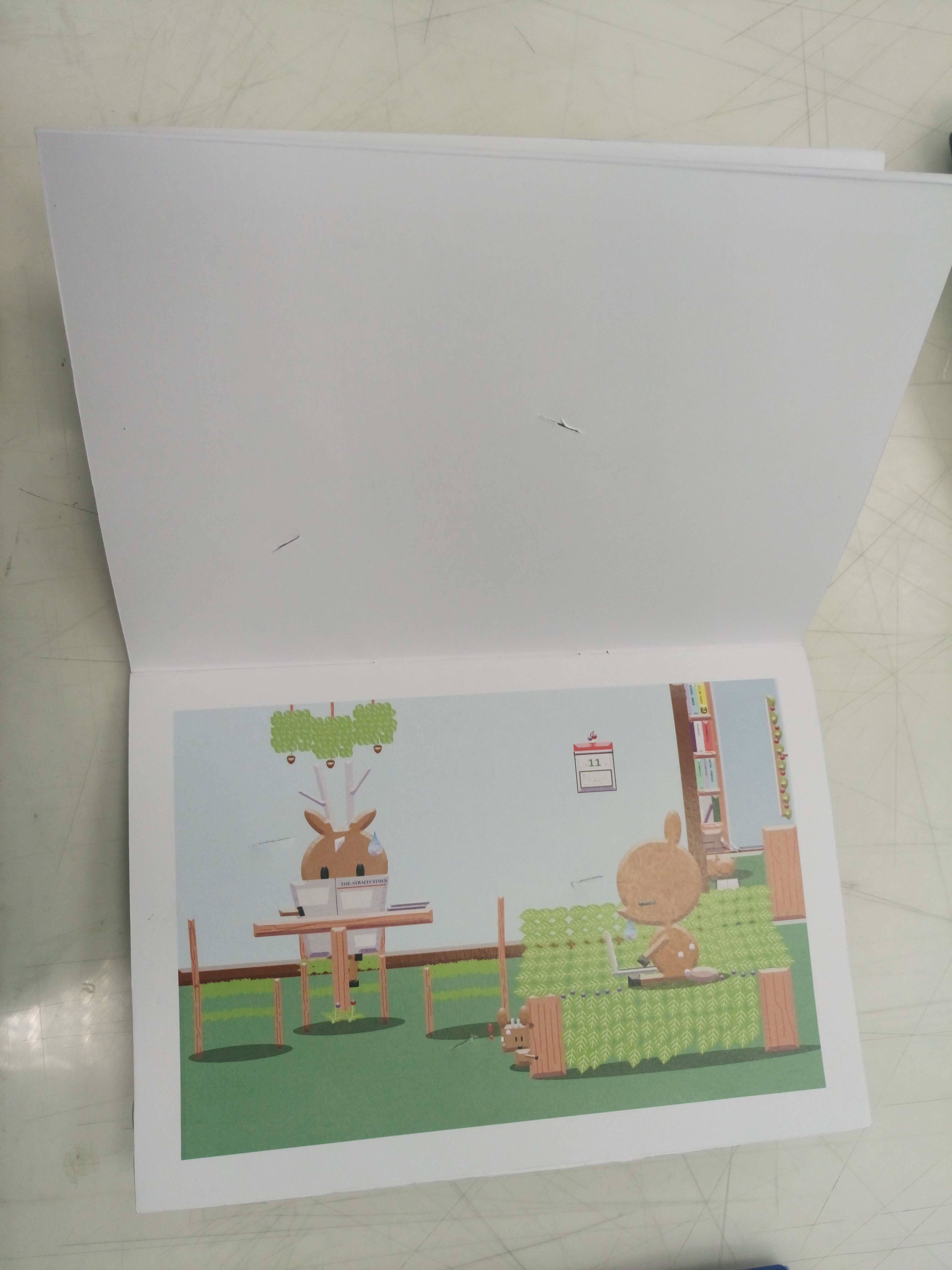
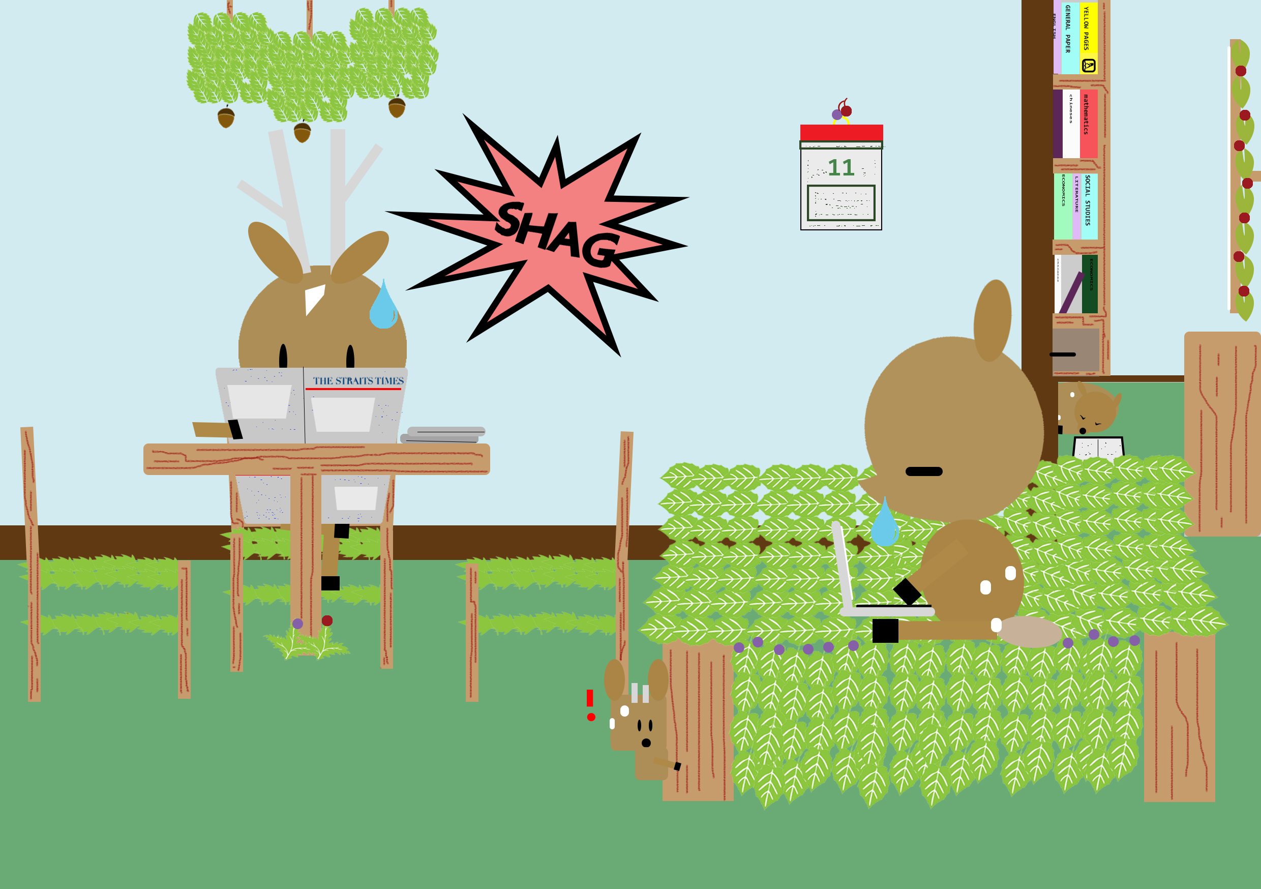
Lastly, KiasuBuck settled into his new home with his family.

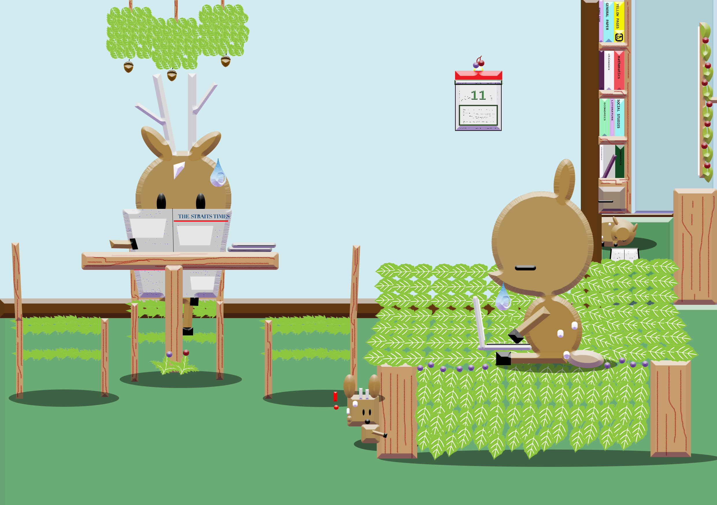
Instead of using the human furnitures, i made them with the leaves, trees, berries and acorns. Again, i wanted to play with the idea of how Singaporeans are always busy with work. I added some small details of what some typical Singaporean family would have in their homes, such as the yellow pages, the traditional chinese calendar and the pile newspaper, such as the straits times. In front of the bookshelf, I placed one baby doe who has fell asleep from studying, a common thing that happens to Singaporean students. However in the front, baby buck has this exclamation mark to indicate he saw something but was in his own world since the others are too busy to entertain him/ the person who always gets ignored because they’re on different pages.

-The End-

How it looks without the speech bubbles.

-1.phone -2. food -3. water -4. celebration -5.love -6. home

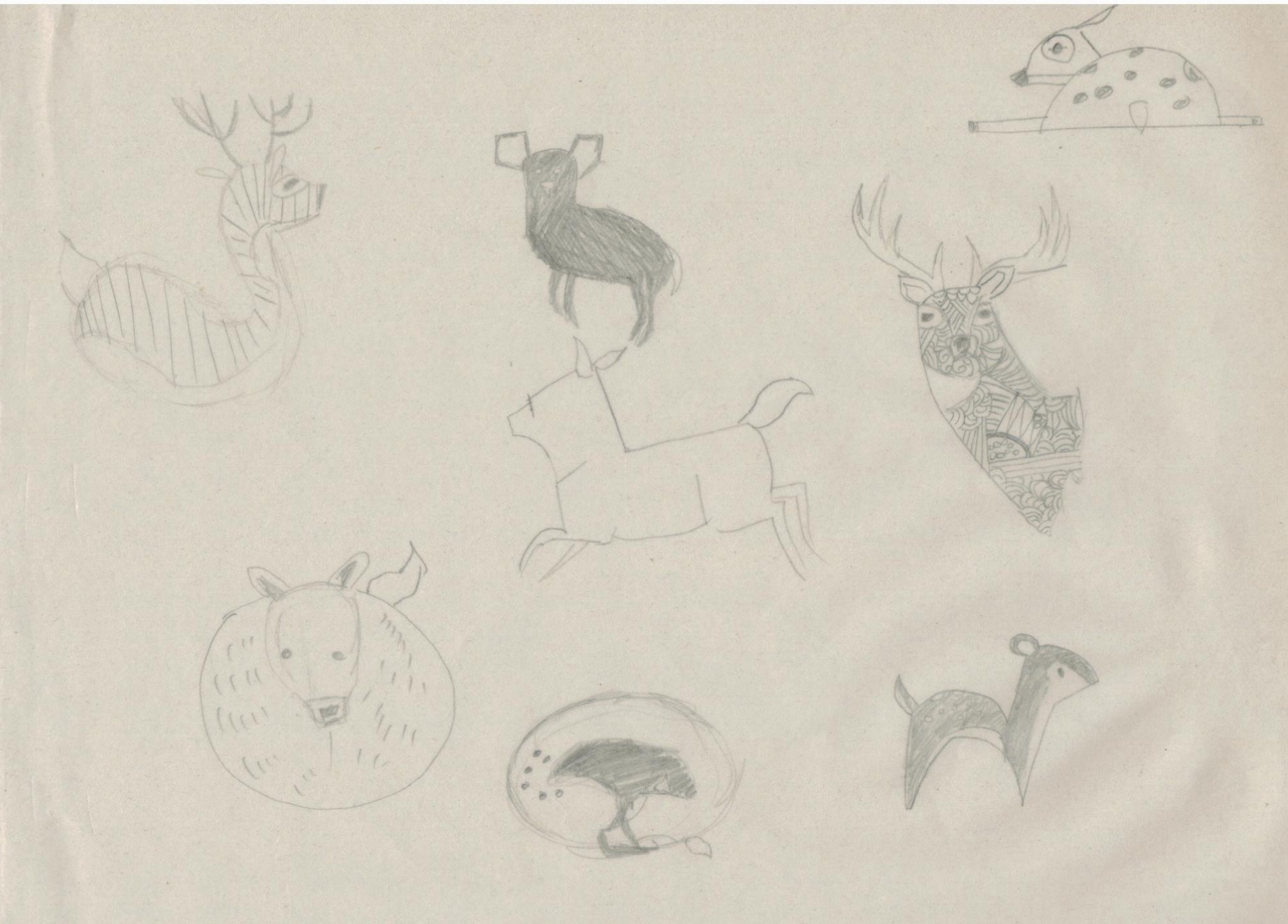
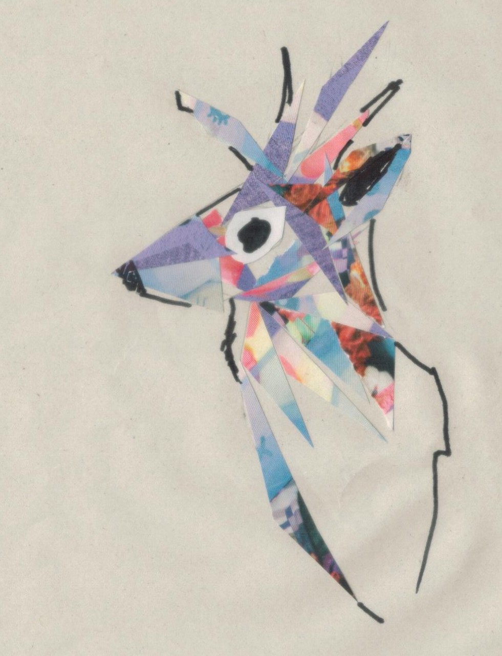
Since i was dealing with the subject matter of deers. I first decided to explore more on the forms of the deer itself and also to try out some of the styles from my artist reference.

1

traditional illustrations

2

Collage

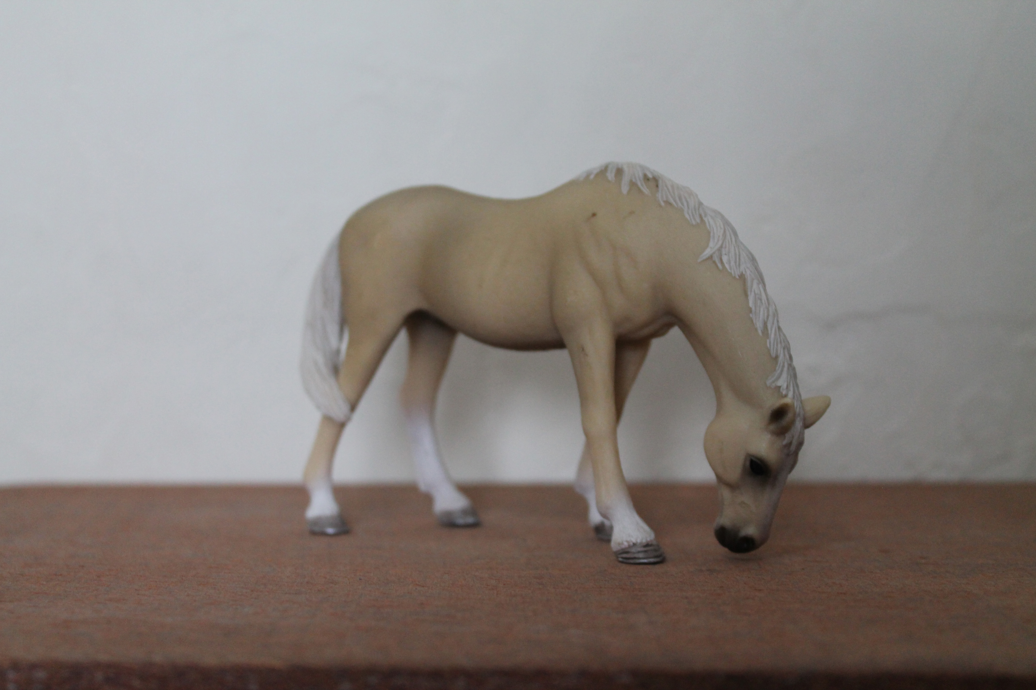
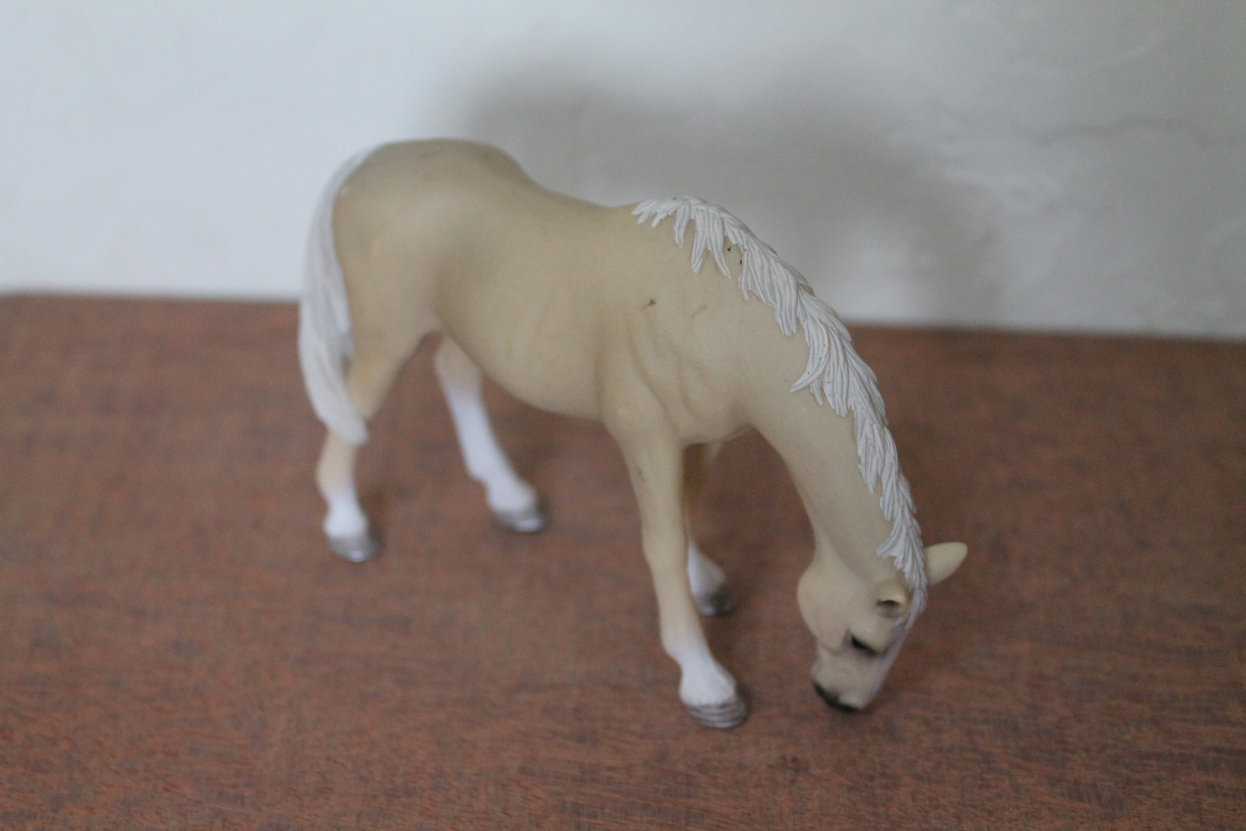
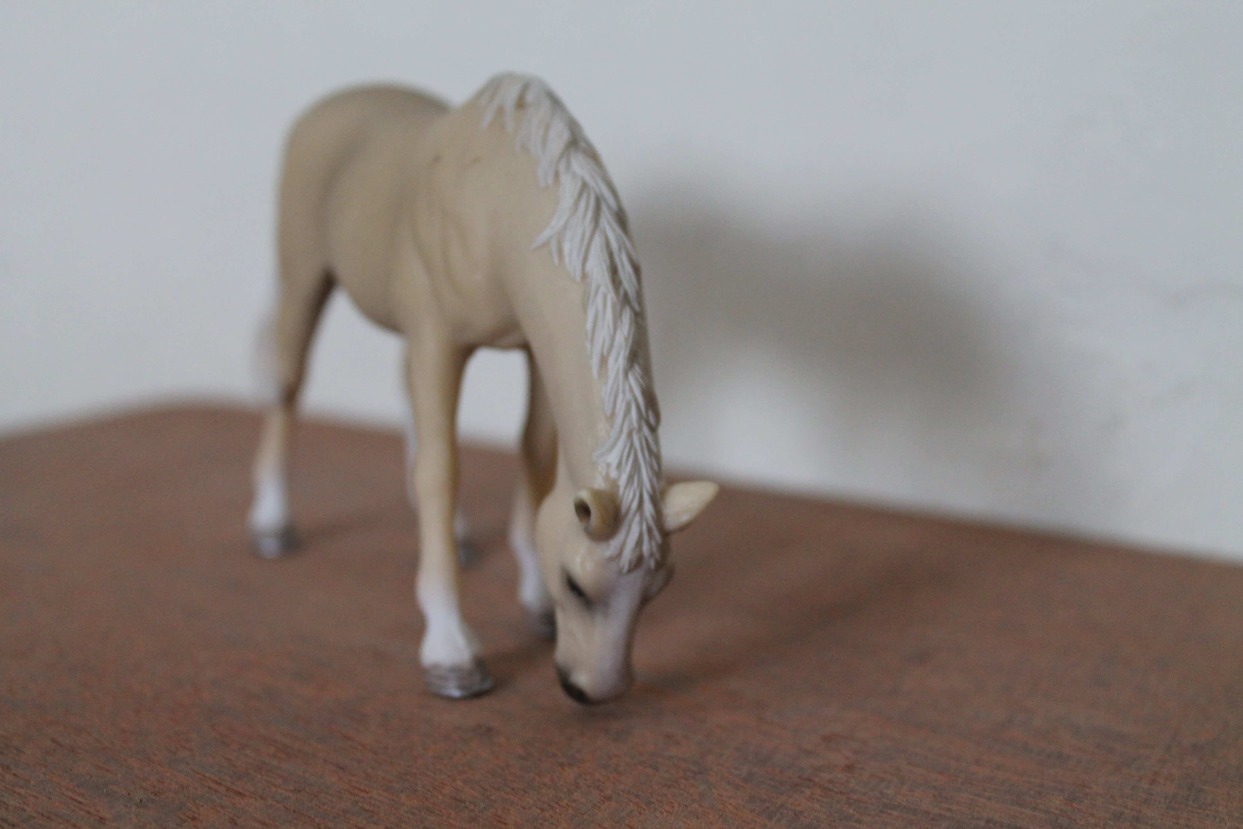
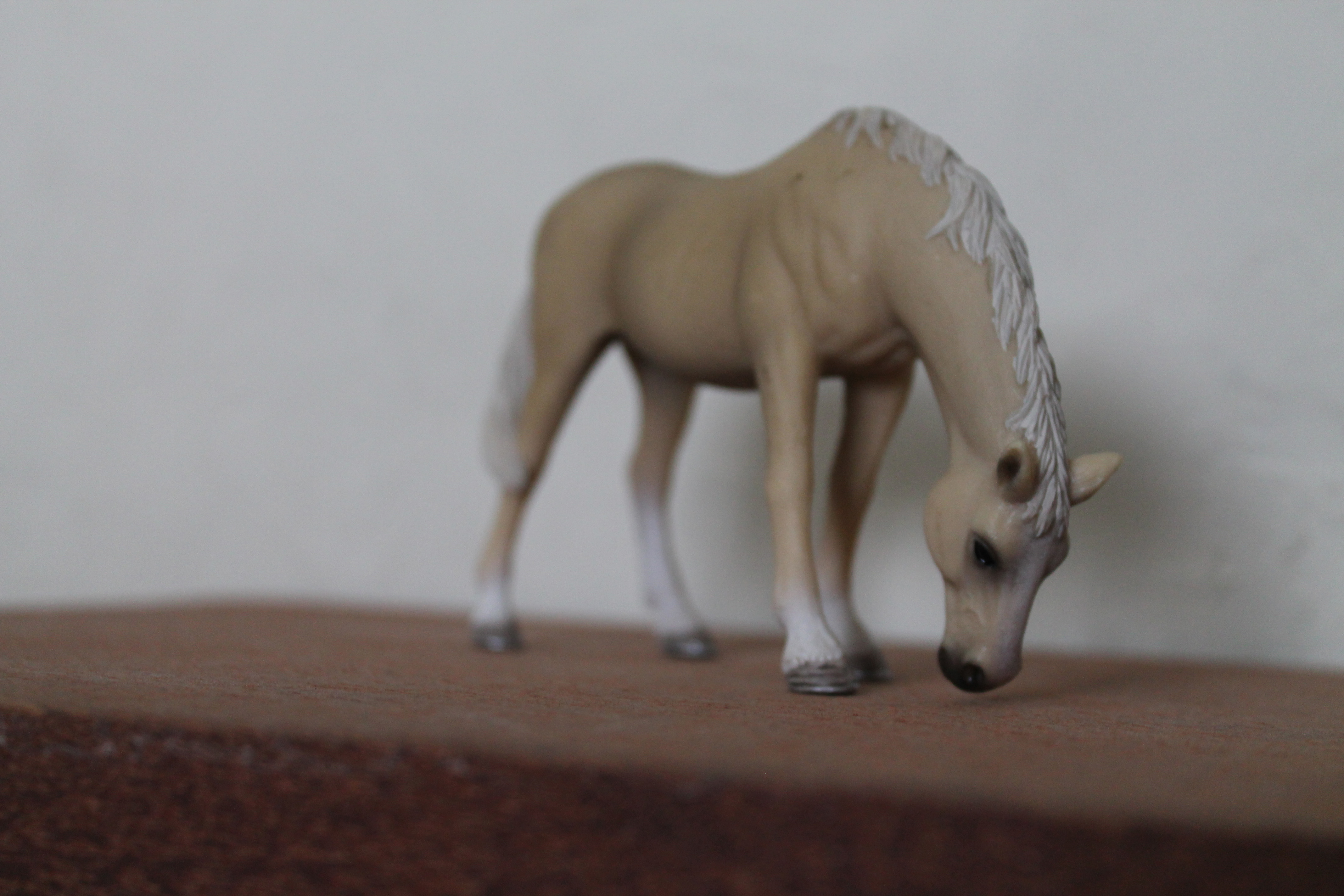
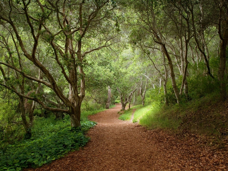
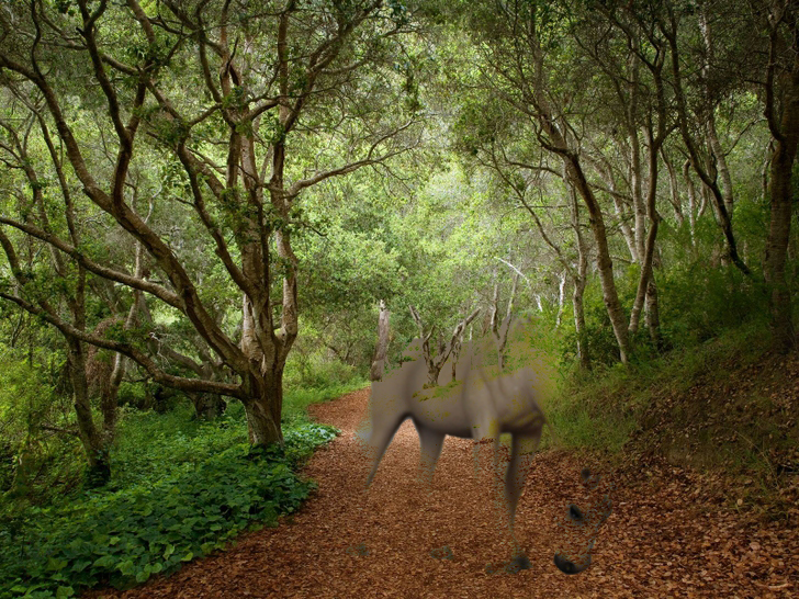
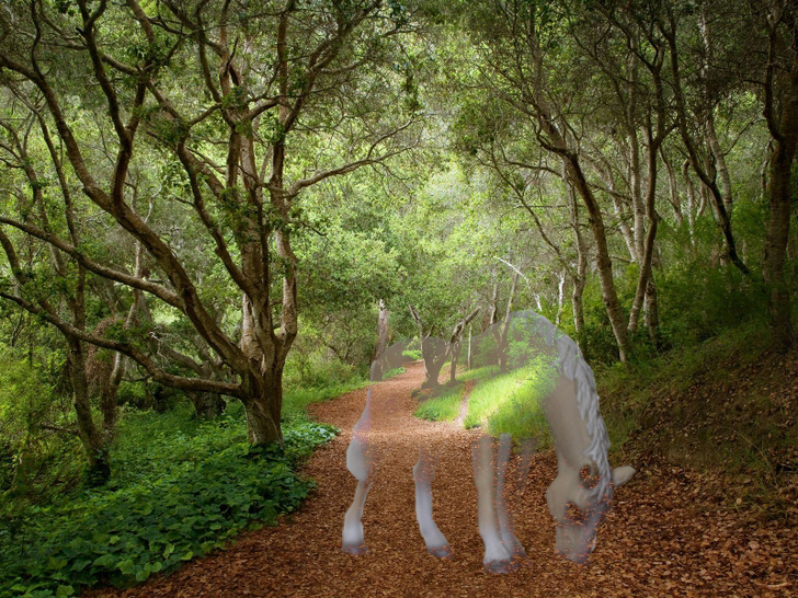
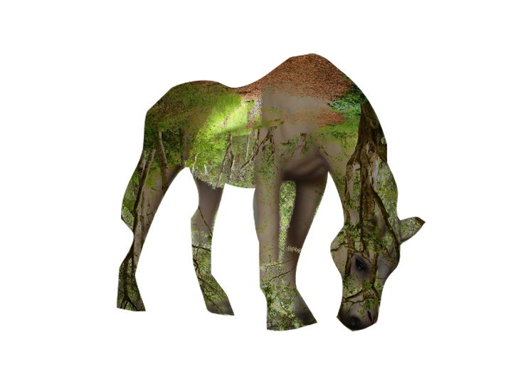
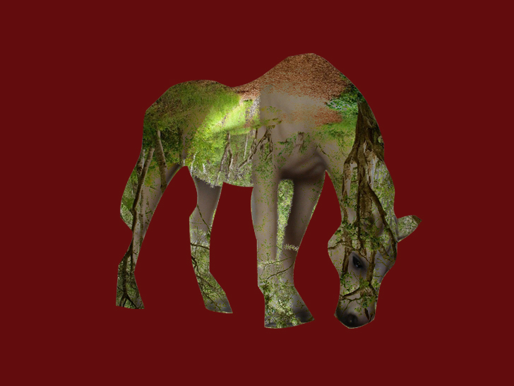
I also tried out some compositions through digital manipulation. I wanted to show a juxtaposition of either a fake animal in real environment or vice versa. Hence, i started by taking a few pictures of my own toy figurines and found an image of forest.IMG_7488IMG_7489IMG_7490IMG_7491forest roads 1600x1200 wallpaper_www.wallpaperfo.com_19

This are some tryouts:

lightendarken double exposure (original) double exposue (red)

After the first consultation with Joy, I decided to changed my approach and emailed her about the concept I’ve decided to focus on. This are some compositions that I’ve thought of:

3 4 5

Initially I was planning on producing it traditionally but Joy suggested for me to try something that would be related to my major, interactive media (IM). Hence, I decided to move to digital style of illustrations in terms of execution. Before I did it digitally, I explored more on my composition and also to finalise how it would more or less appear in the end.

6 7 8 9 10

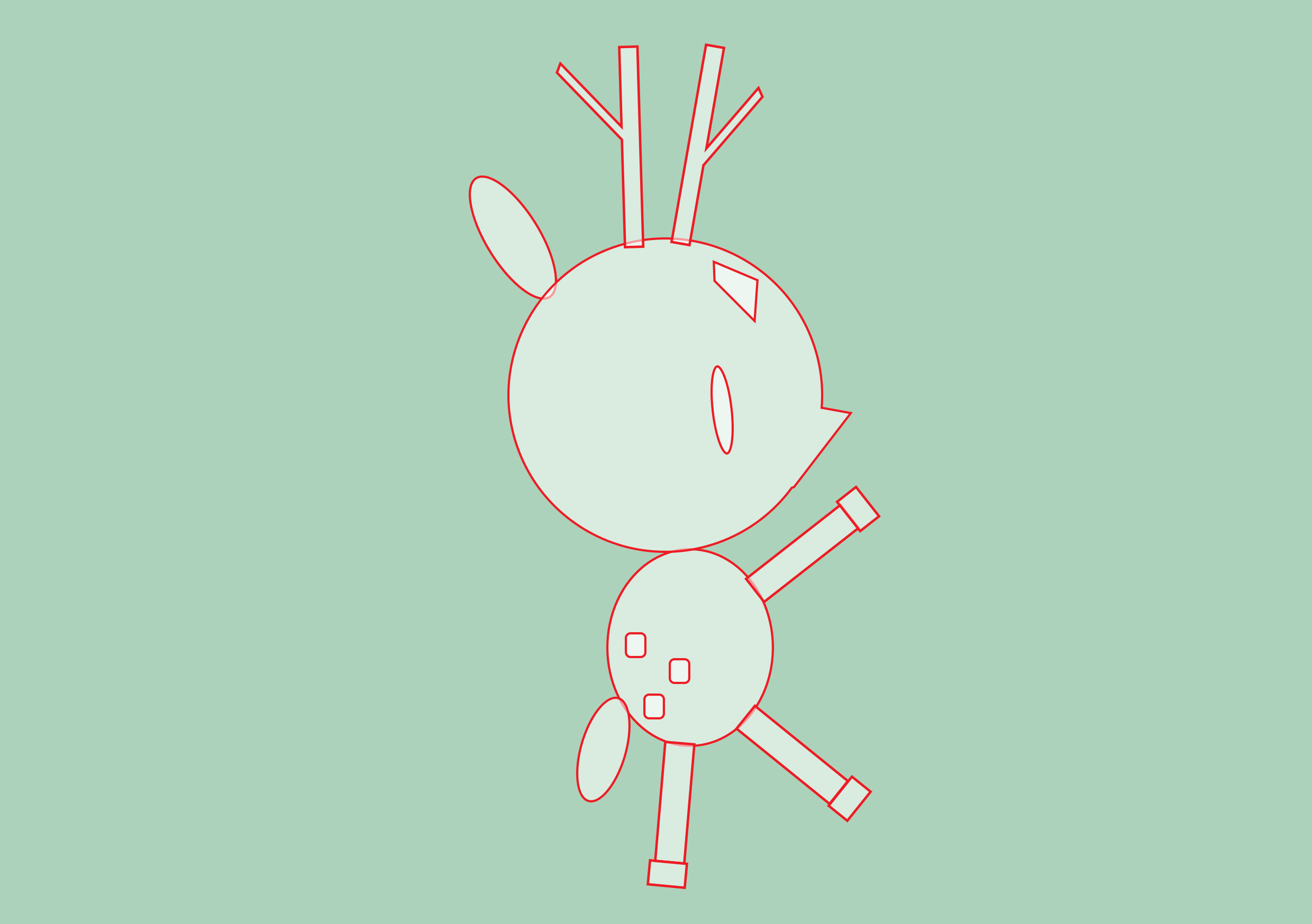
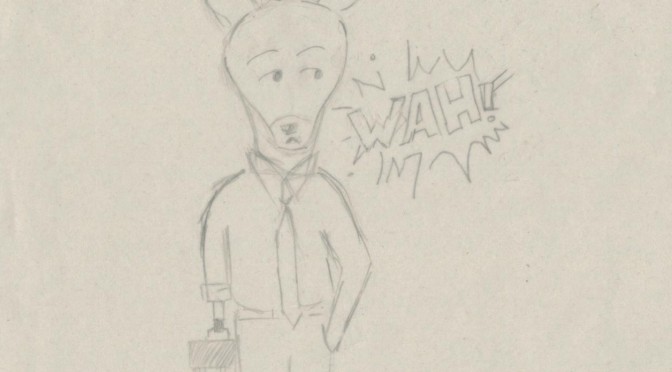
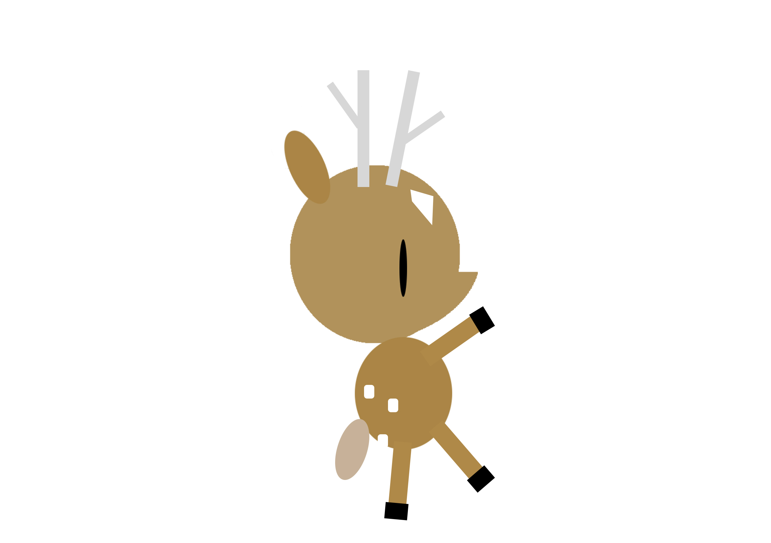
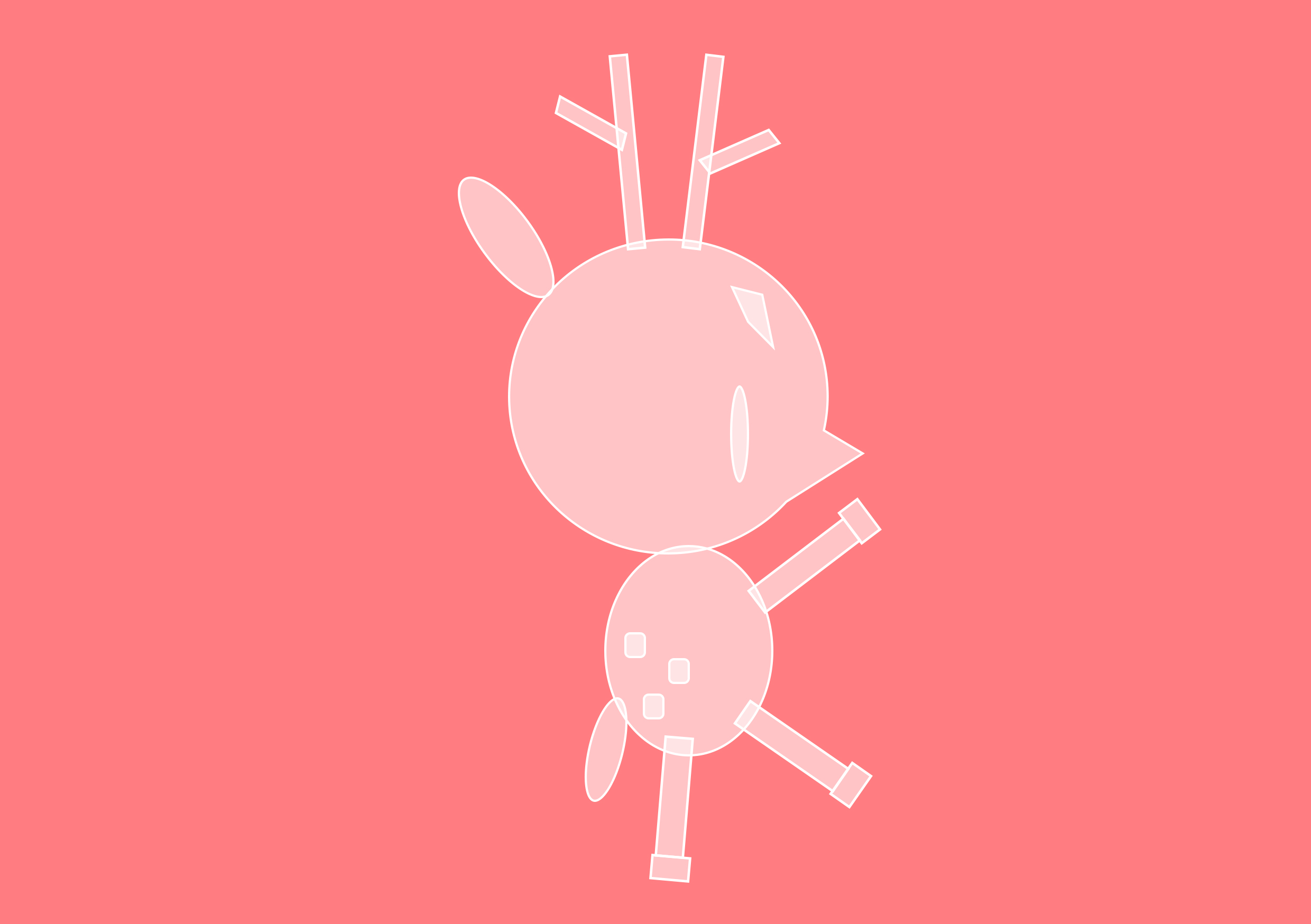
When I finally to actually doing it digitally, I faced many difficulties as  I’ve never done digital illustrations before. Hence, I decided to illustrate my concept through the most basic shapes and some found vectors. This is an example of my tryout for the characterisation of Mr KiasuBuck.

'''deer