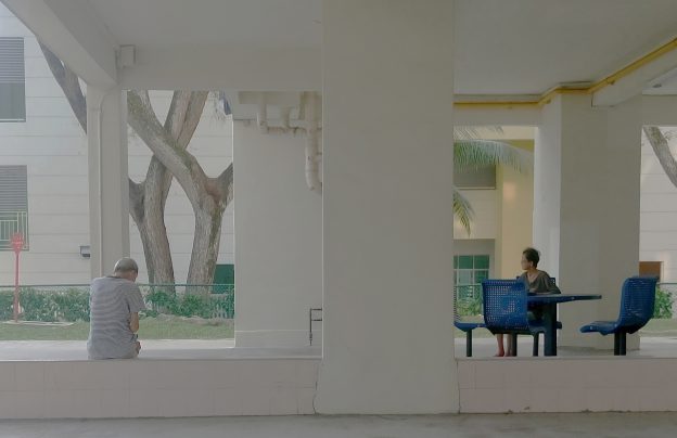
Dérive : My Neighbourhood
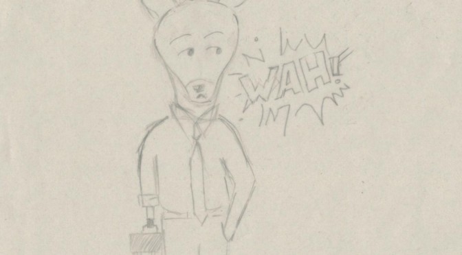
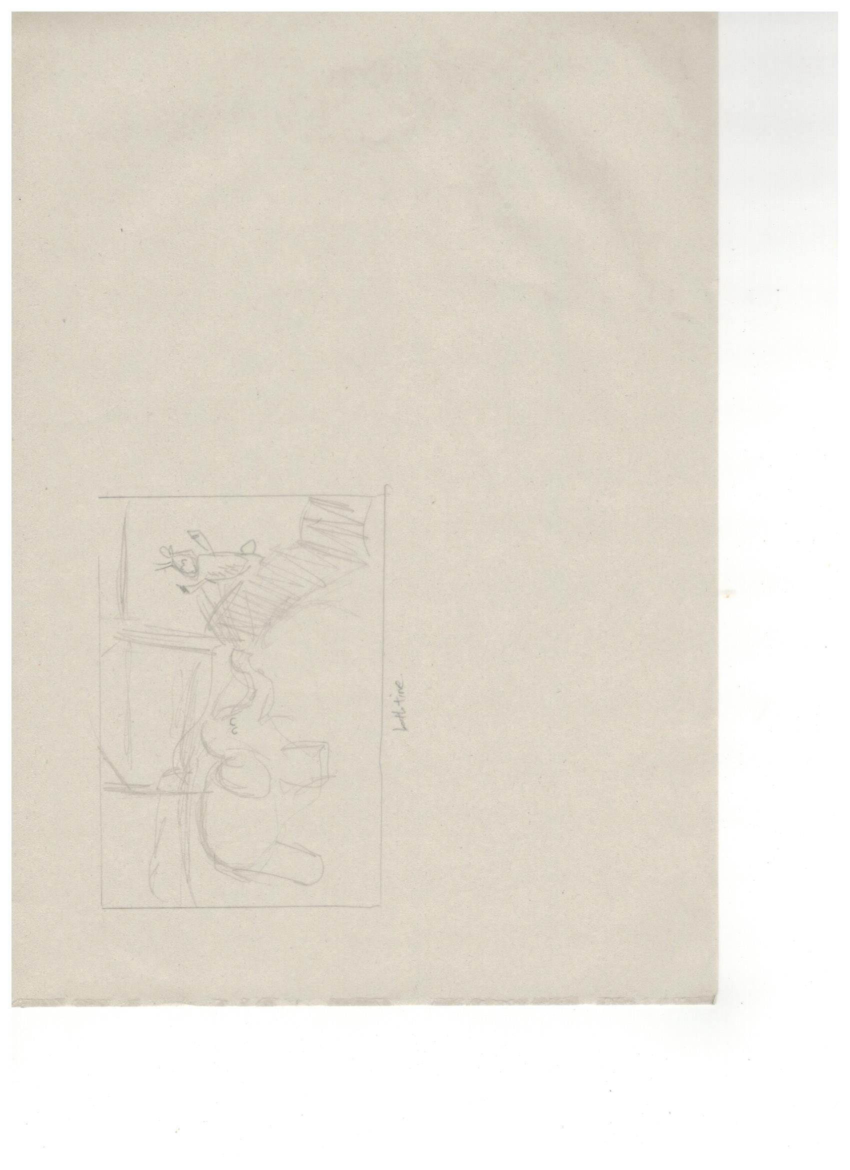
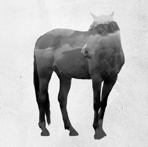
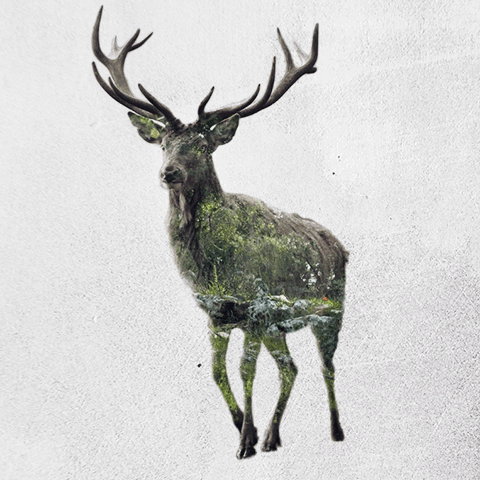
Since i was dealing with the subject matter of deers. I first decided to explore more on the forms of the deer itself and also to try out some of the styles from my artist reference.
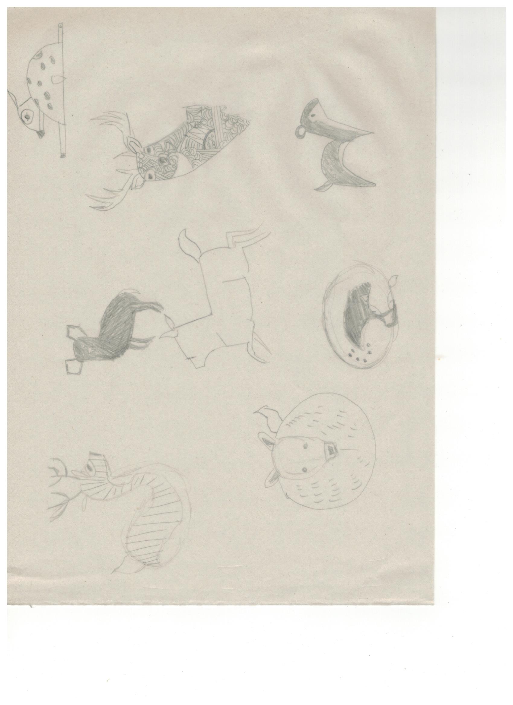
traditional illustrations
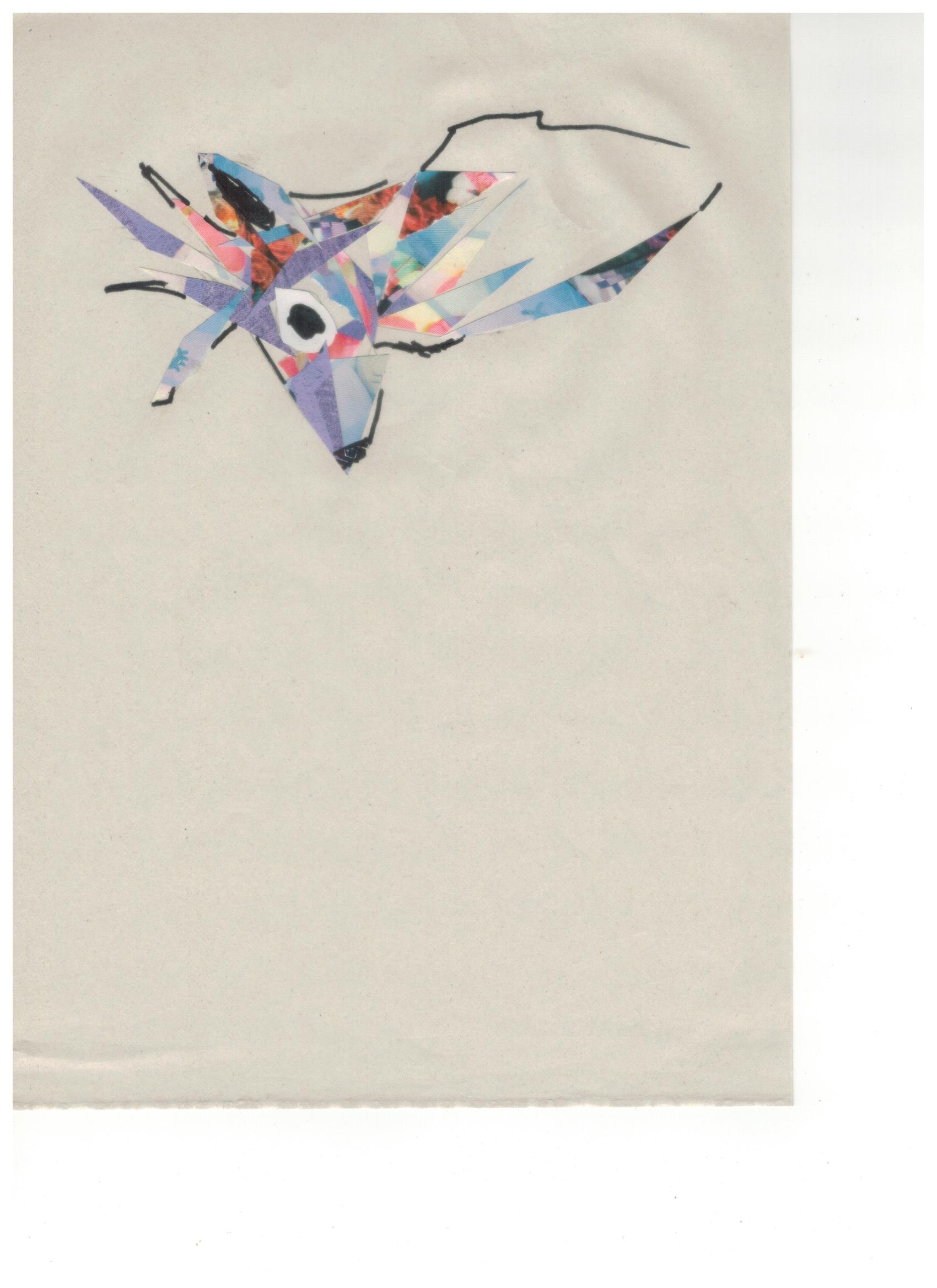
Collage
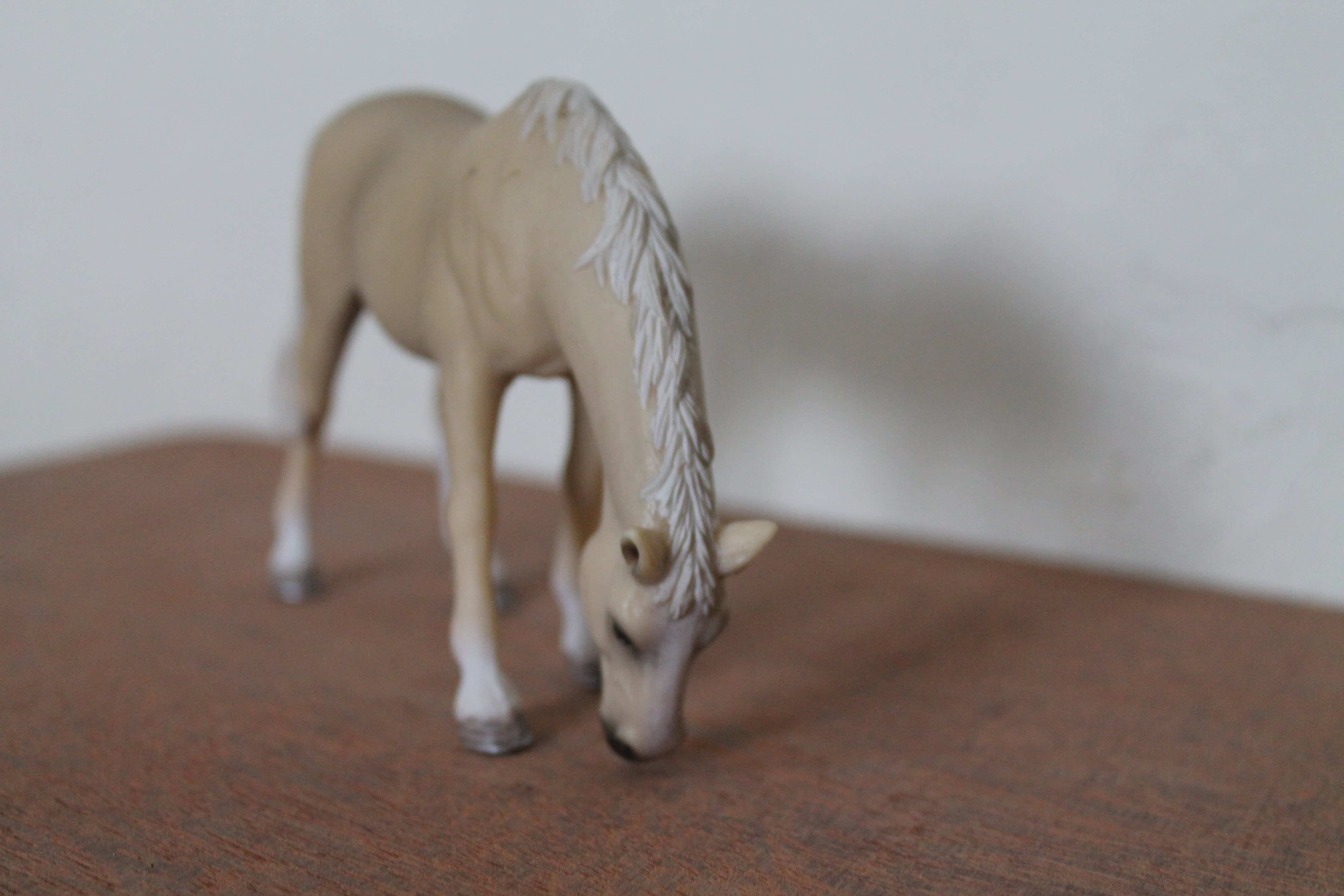
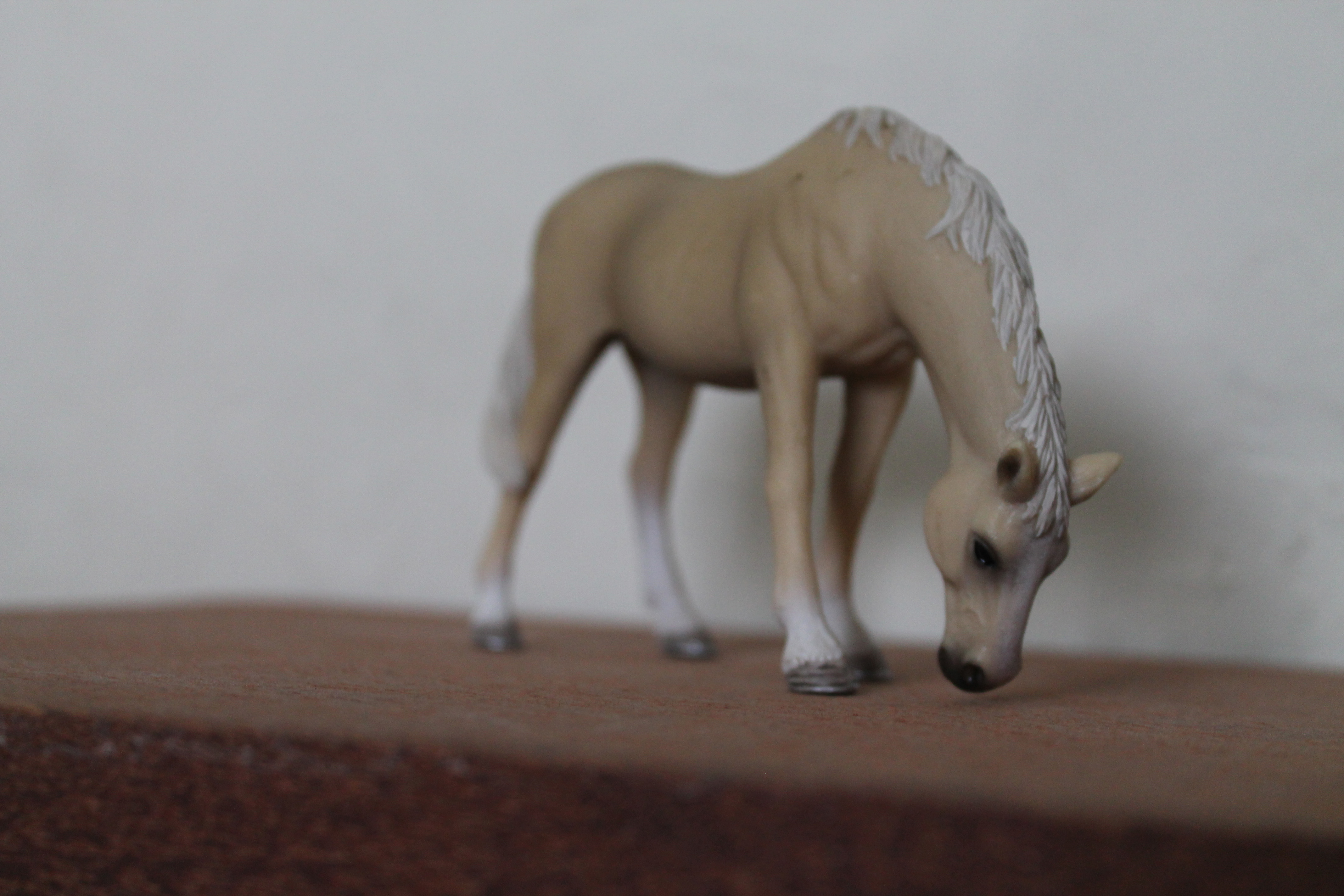
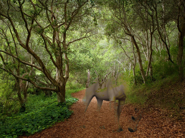
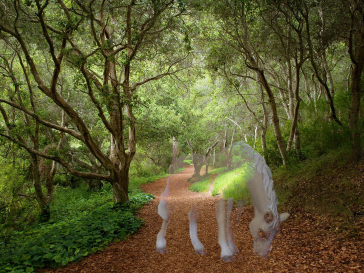
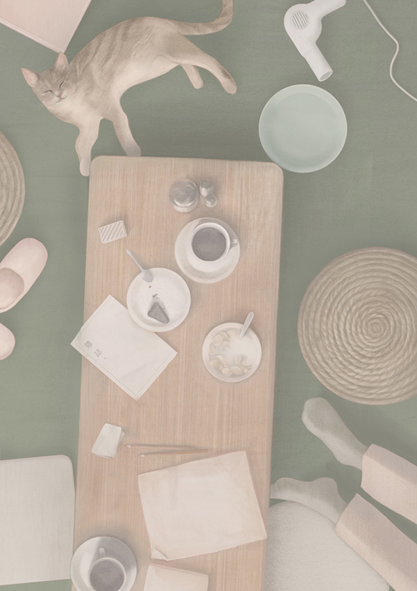
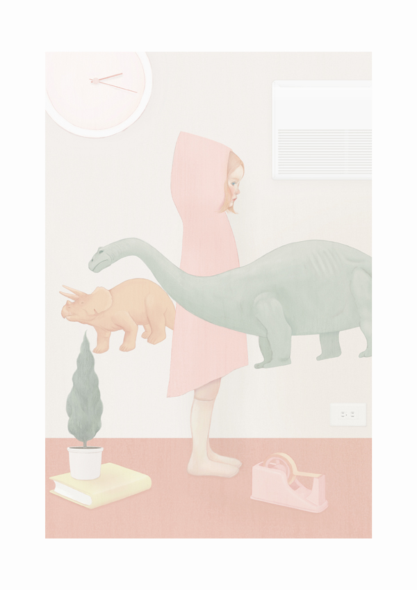
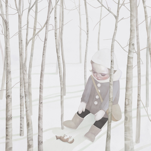
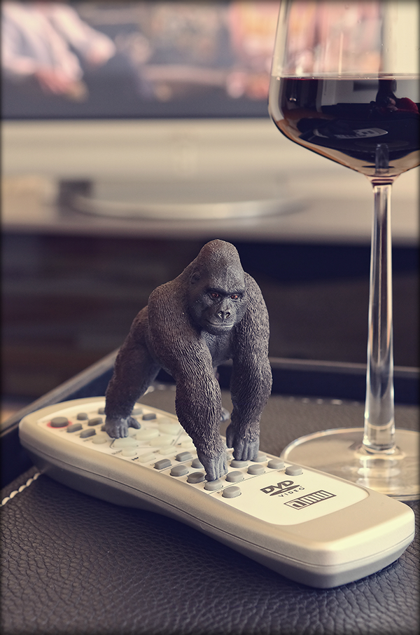
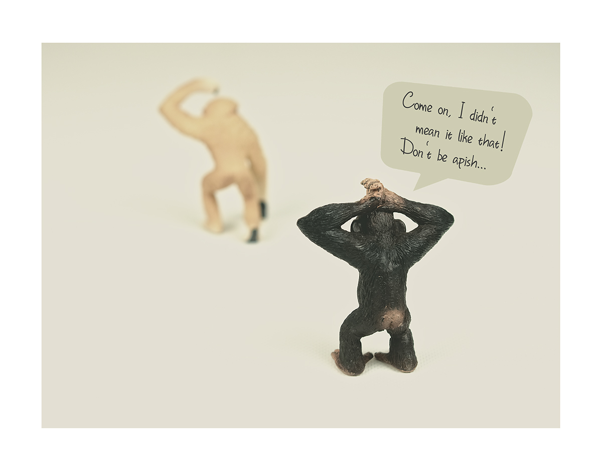
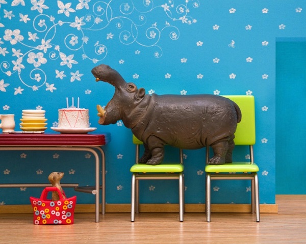
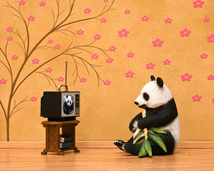
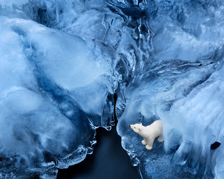
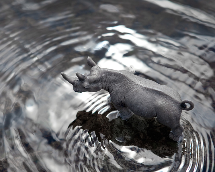
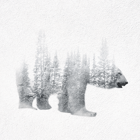
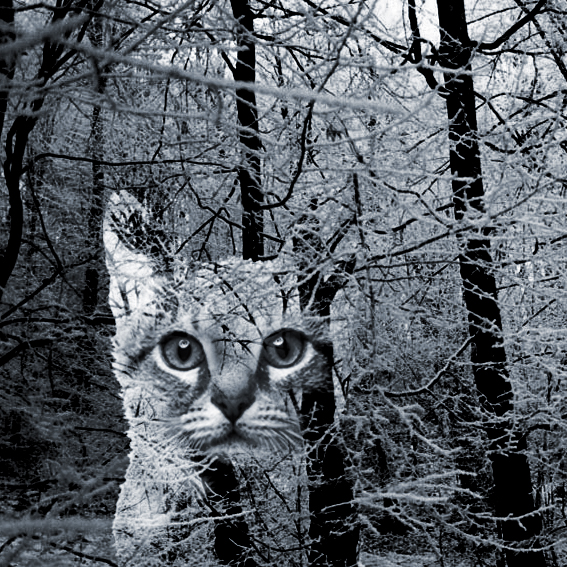
I also tried out some compositions through digital manipulation. I wanted to show a juxtaposition of either a fake animal in real environment or vice versa. Hence, i started by taking a few pictures of my own toy figurines and found an image of forest.

This are some tryouts:
After the first consultation with Joy, I decided to changed my approach and emailed her about the concept I’ve decided to focus on. This are some compositions that I’ve thought of:
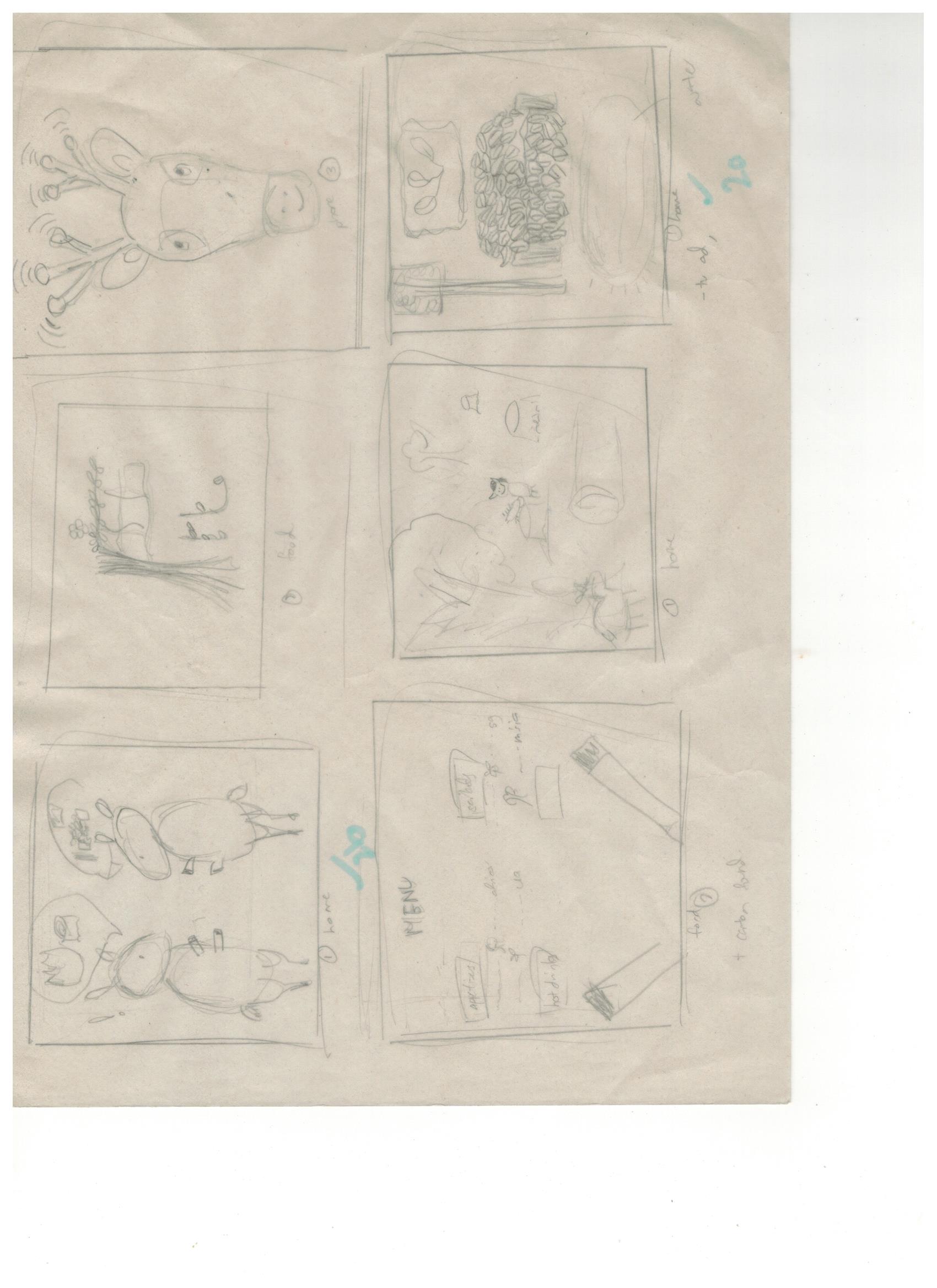
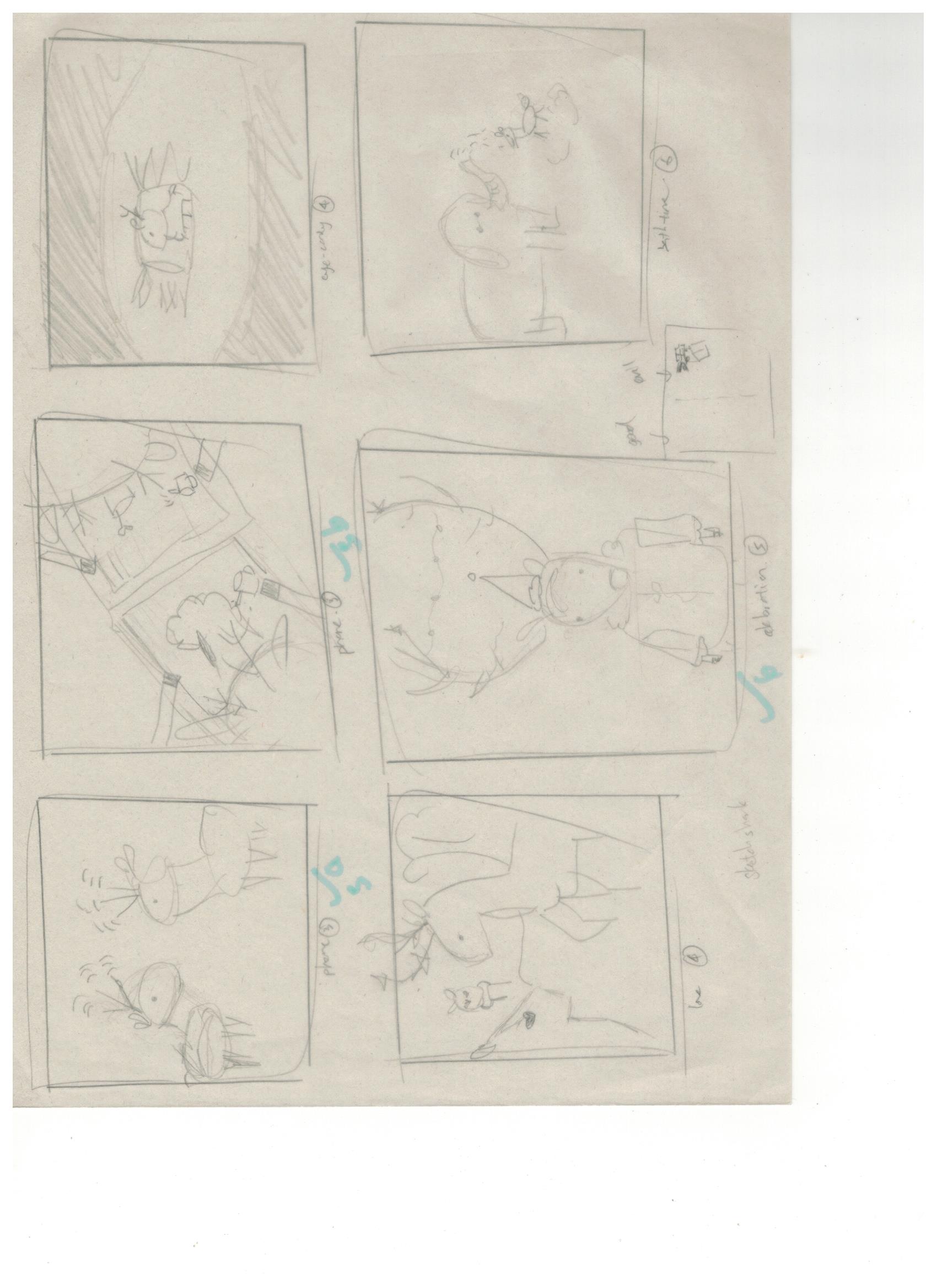
Initially I was planning on producing it traditionally but Joy suggested for me to try something that would be related to my major, interactive media (IM). Hence, I decided to move to digital style of illustrations in terms of execution. Before I did it digitally, I explored more on my composition and also to finalise how it would more or less appear in the end.
When I finally to actually doing it digitally, I faced many difficulties as I’ve never done digital illustrations before. Hence, I decided to illustrate my concept through the most basic shapes and some found vectors. This is an example of my tryout for the characterisation of Mr KiasuBuck.
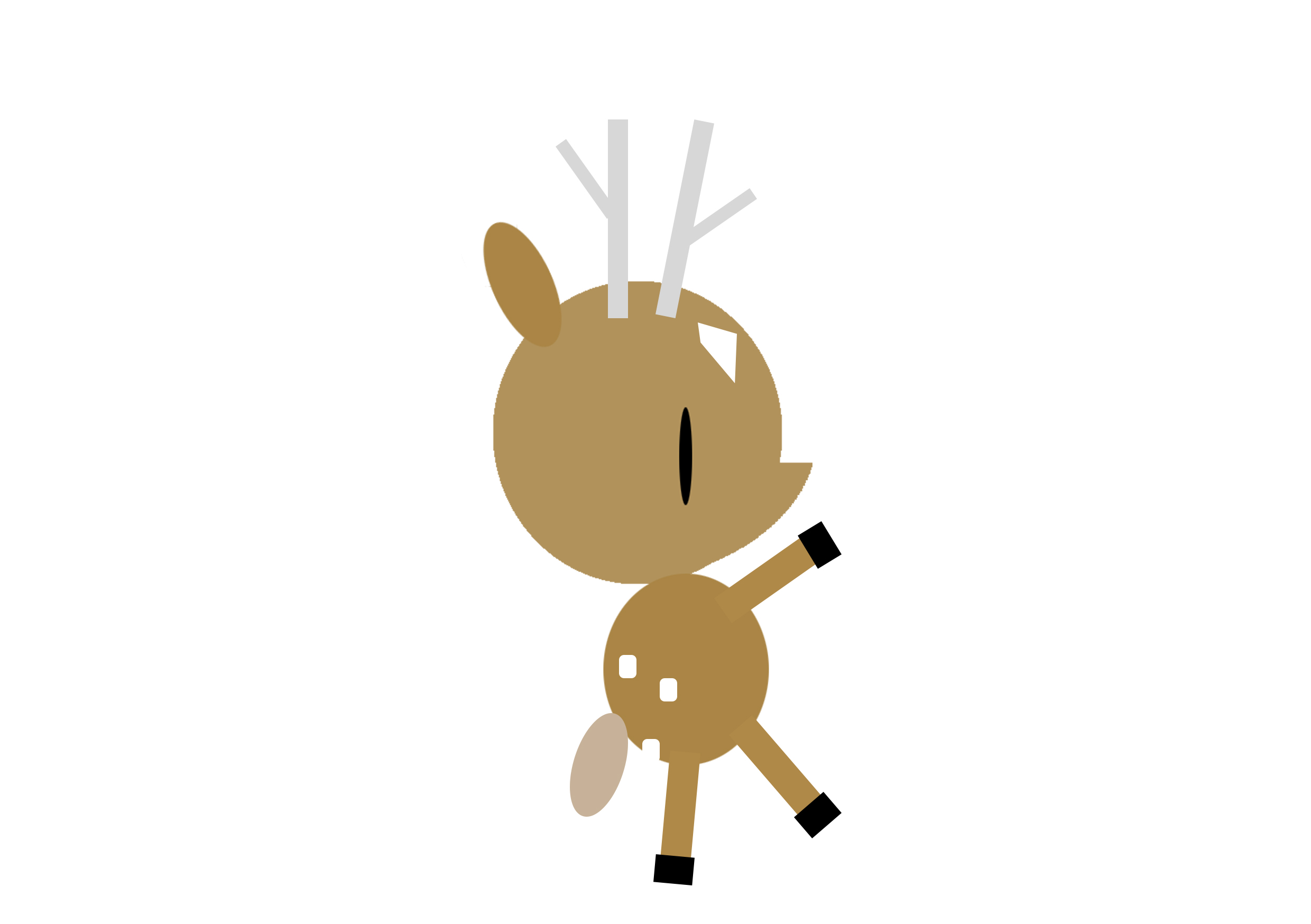
Topic: Animal - Deers
Artist References:
Illustration
Hsiao-ron cheng
Alena Tkach
Fabricio Rosa Marques
Nick Kumbari

Andriy Yurchenko

Photography
 Jeff Friesen
 Miki Takahashi 高橋未希
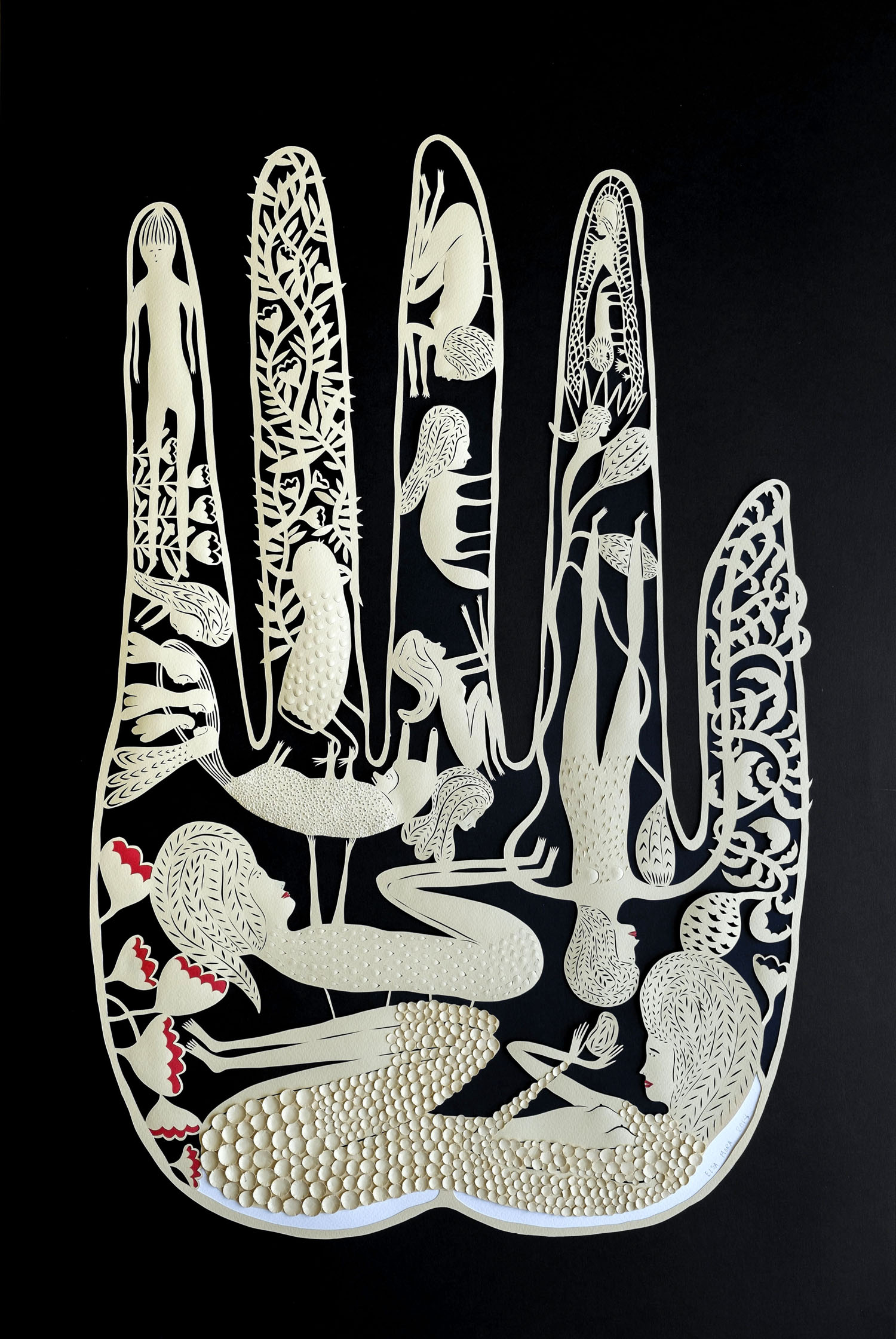
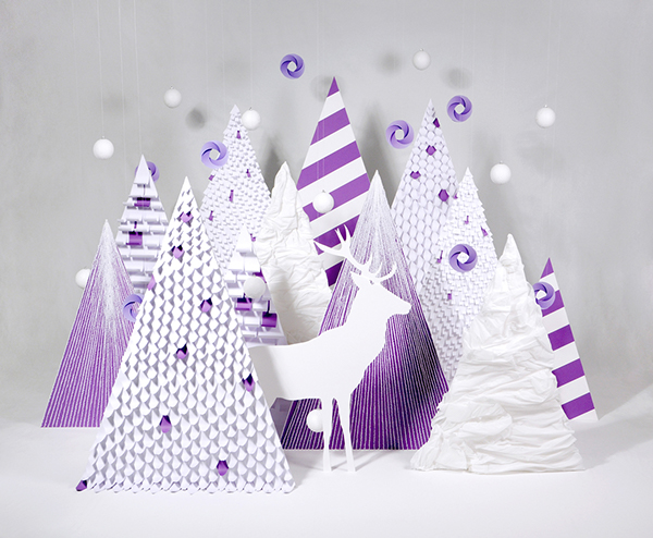
Paper Cutting
Elsa Mora
Peter Callesen
Lisa Rodden
Collages
Zim & Zou
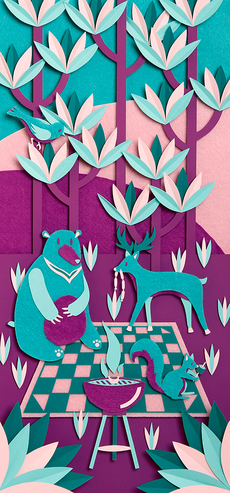
Mayuko Fujino
Others
Suzanne Bonanno
Lauren Wargo
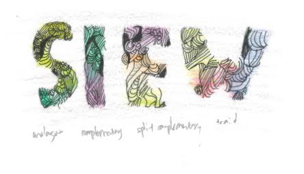
Overall concept: Subtle defect/flaws & Consumerism (refer to process II for more details)
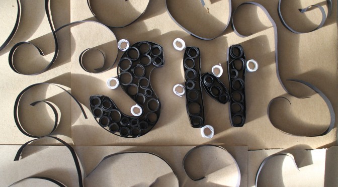
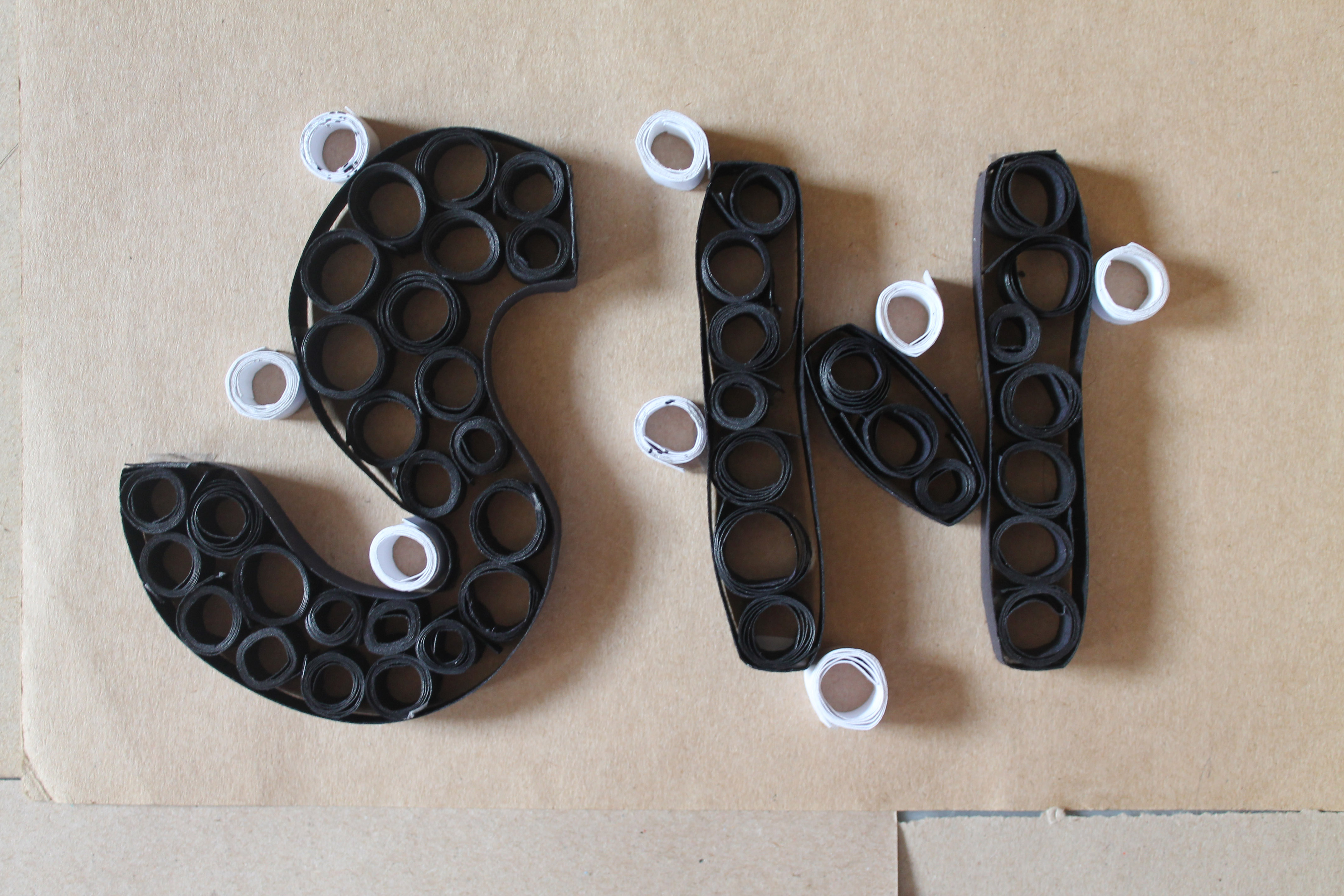
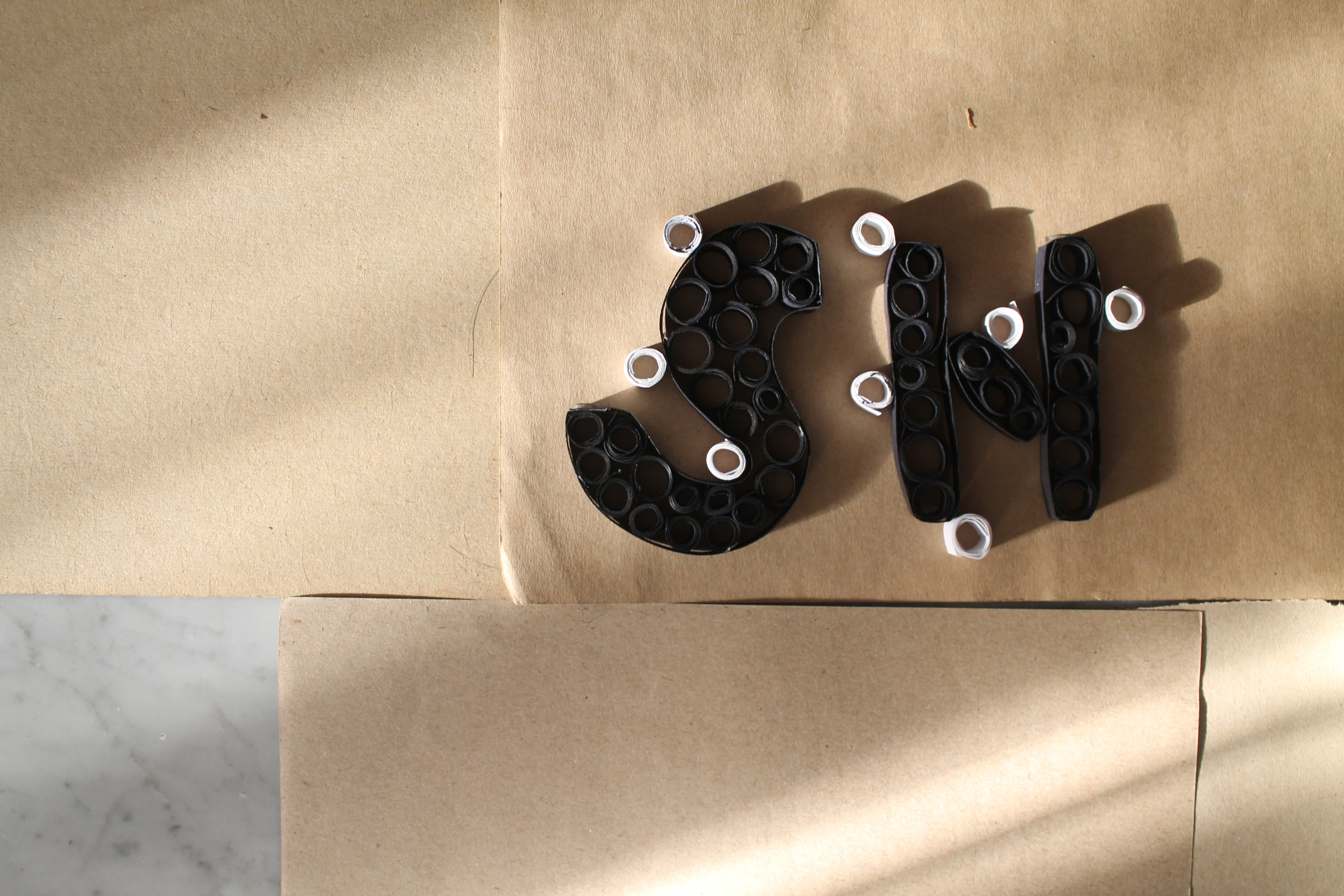
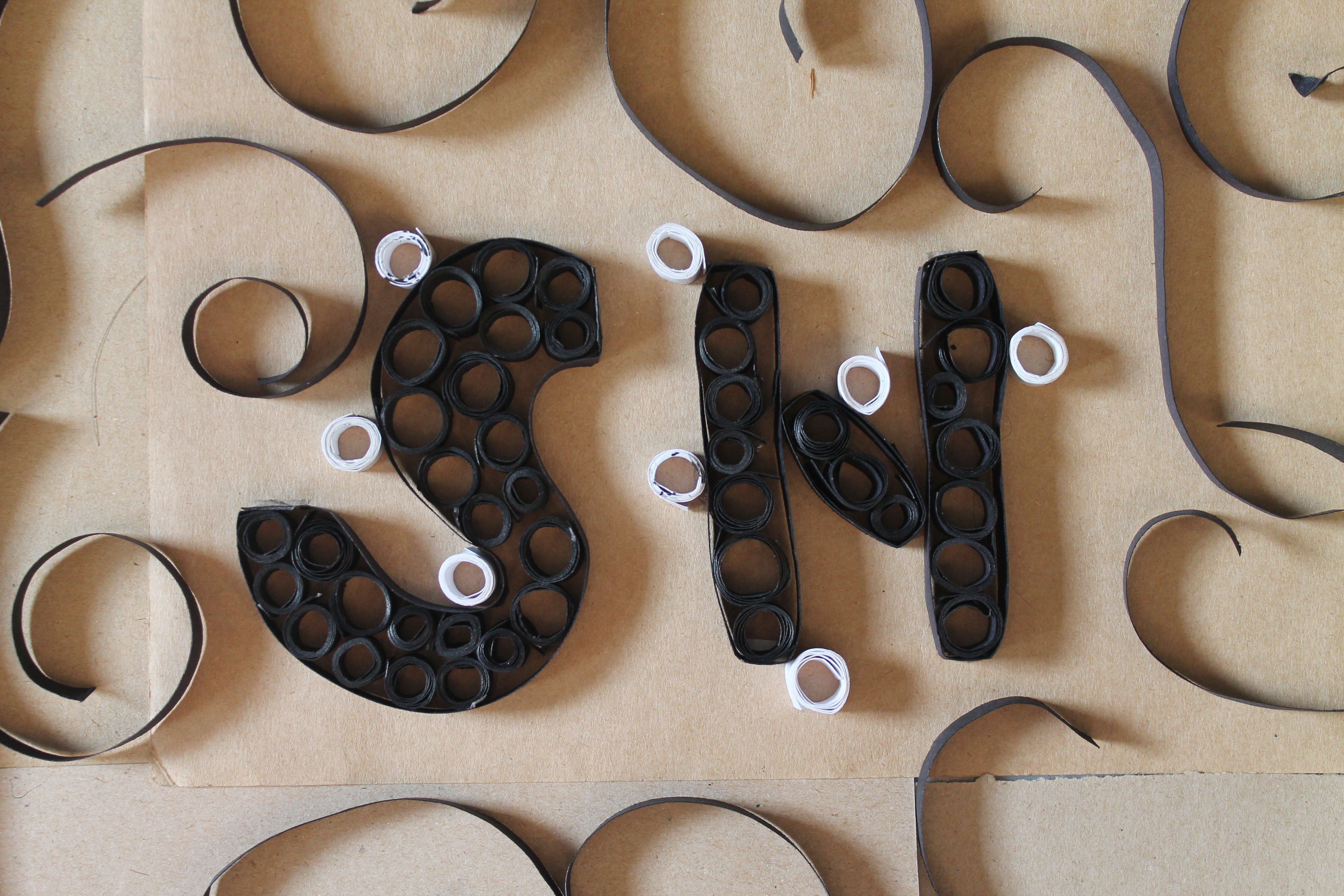
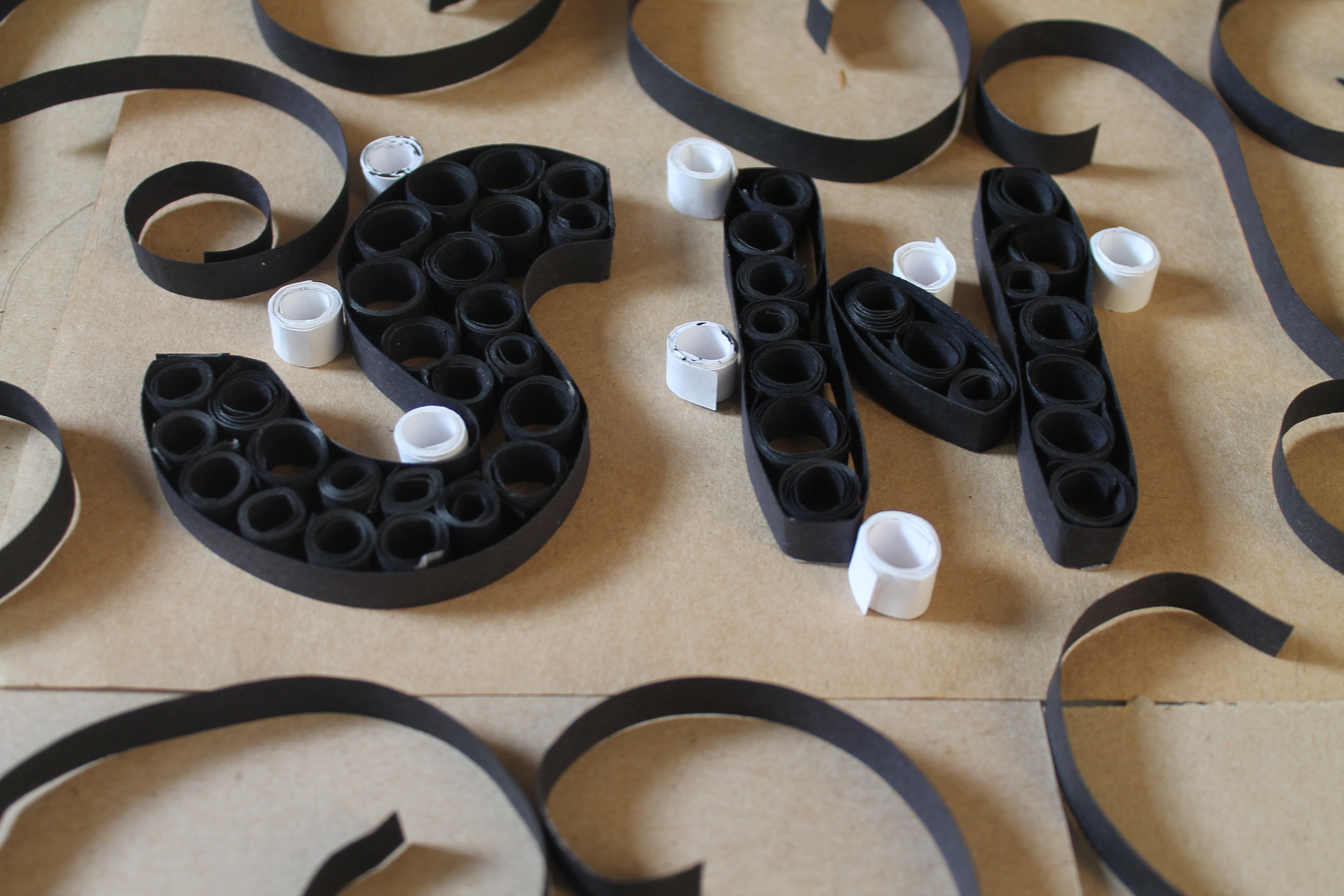
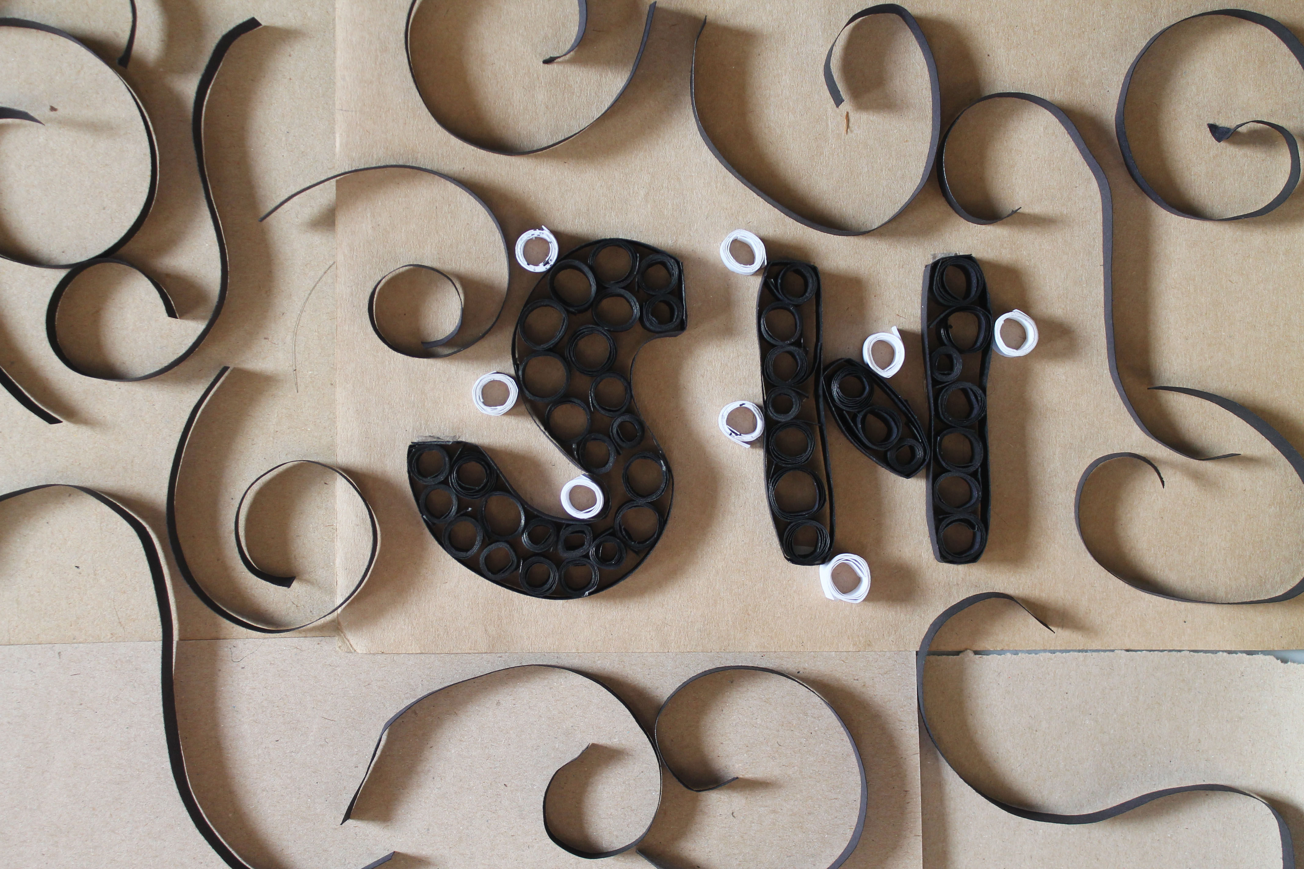
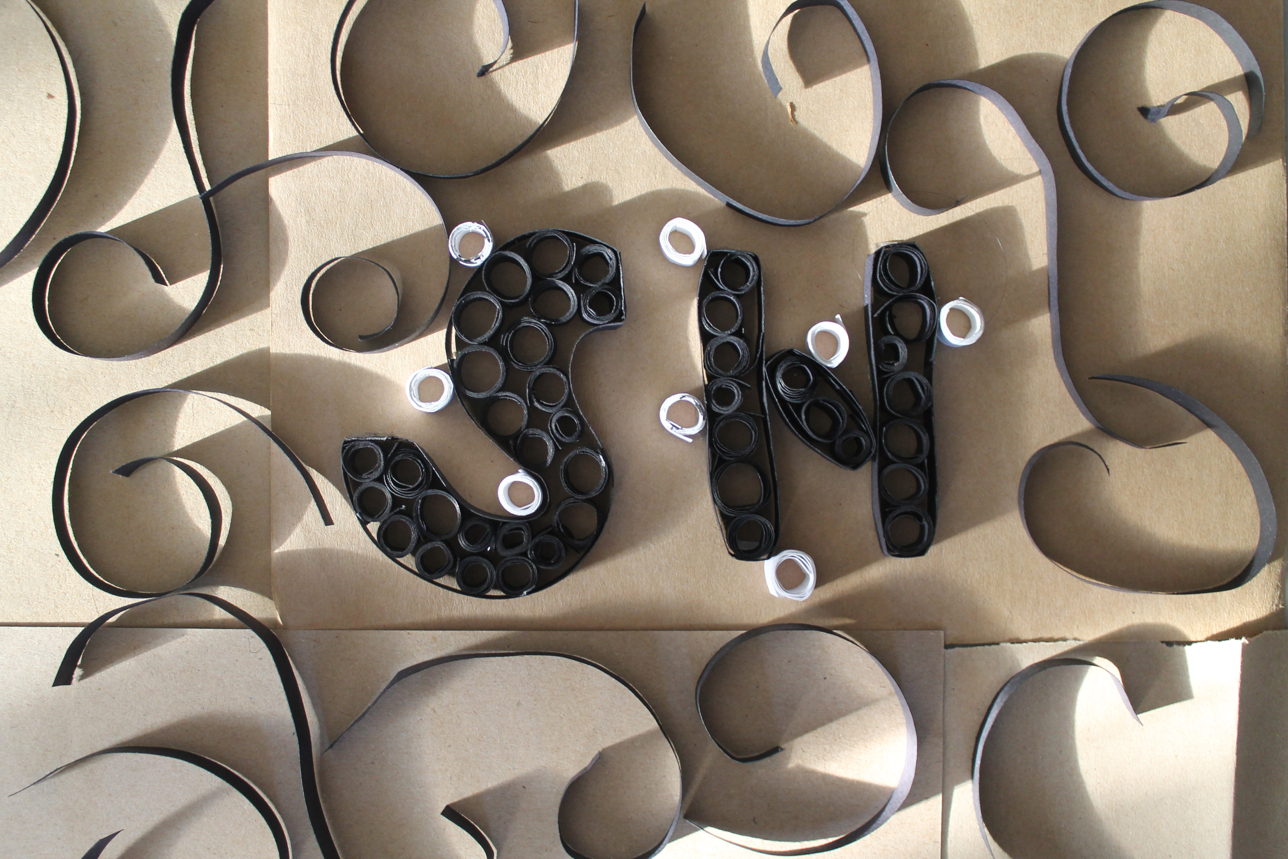
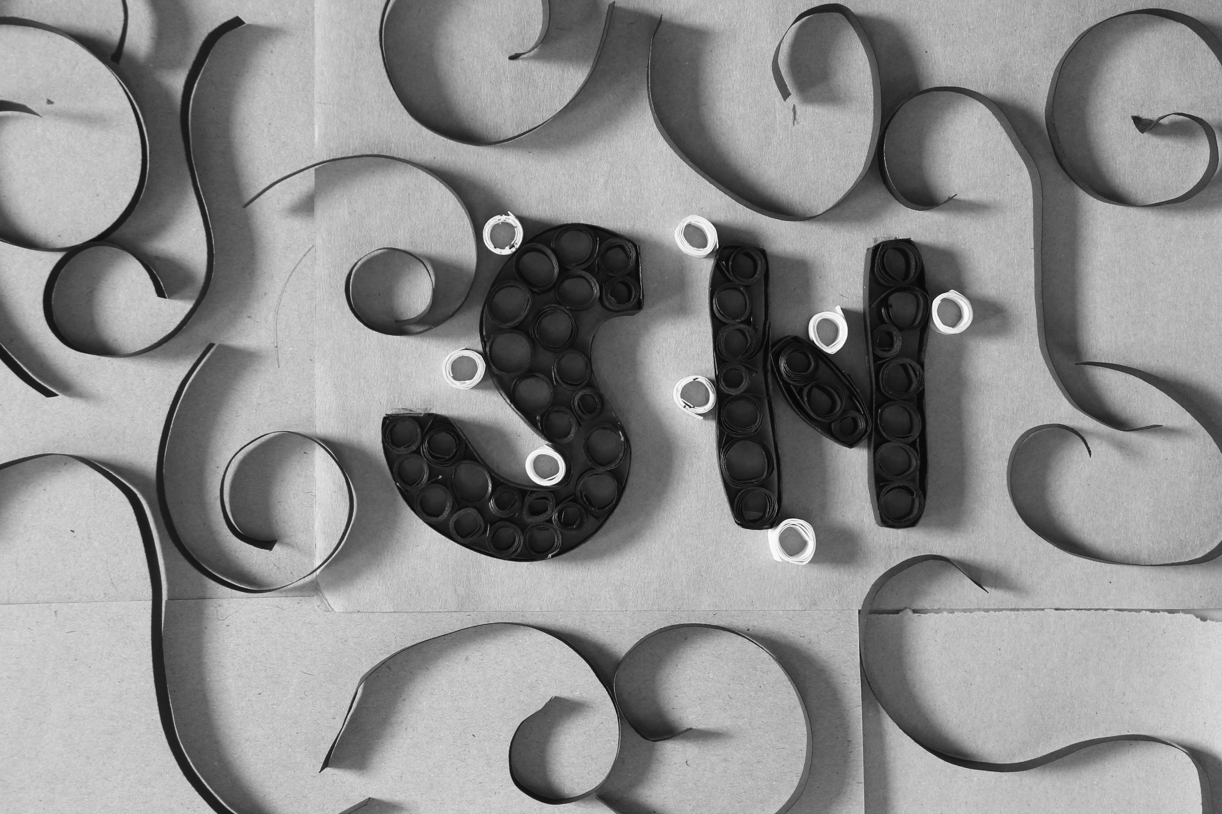
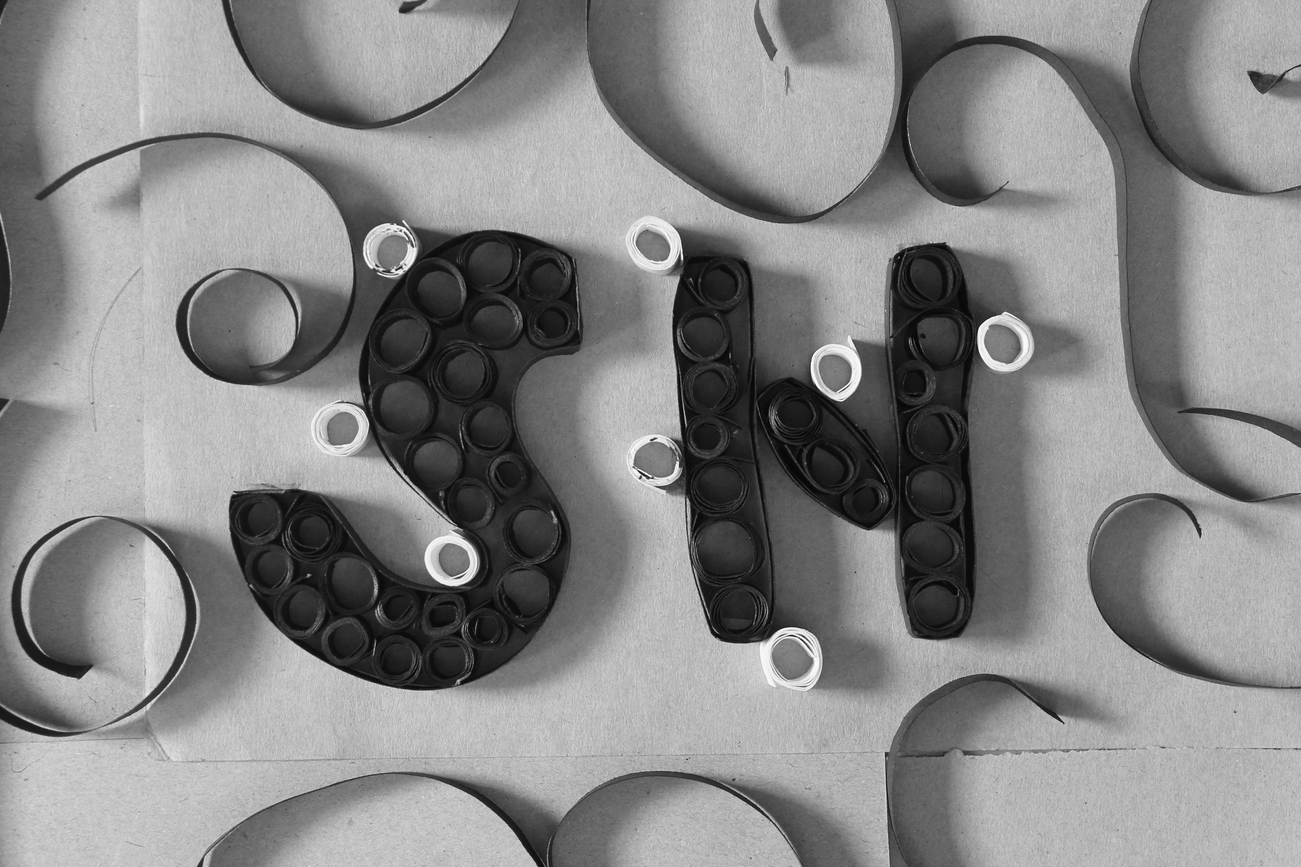
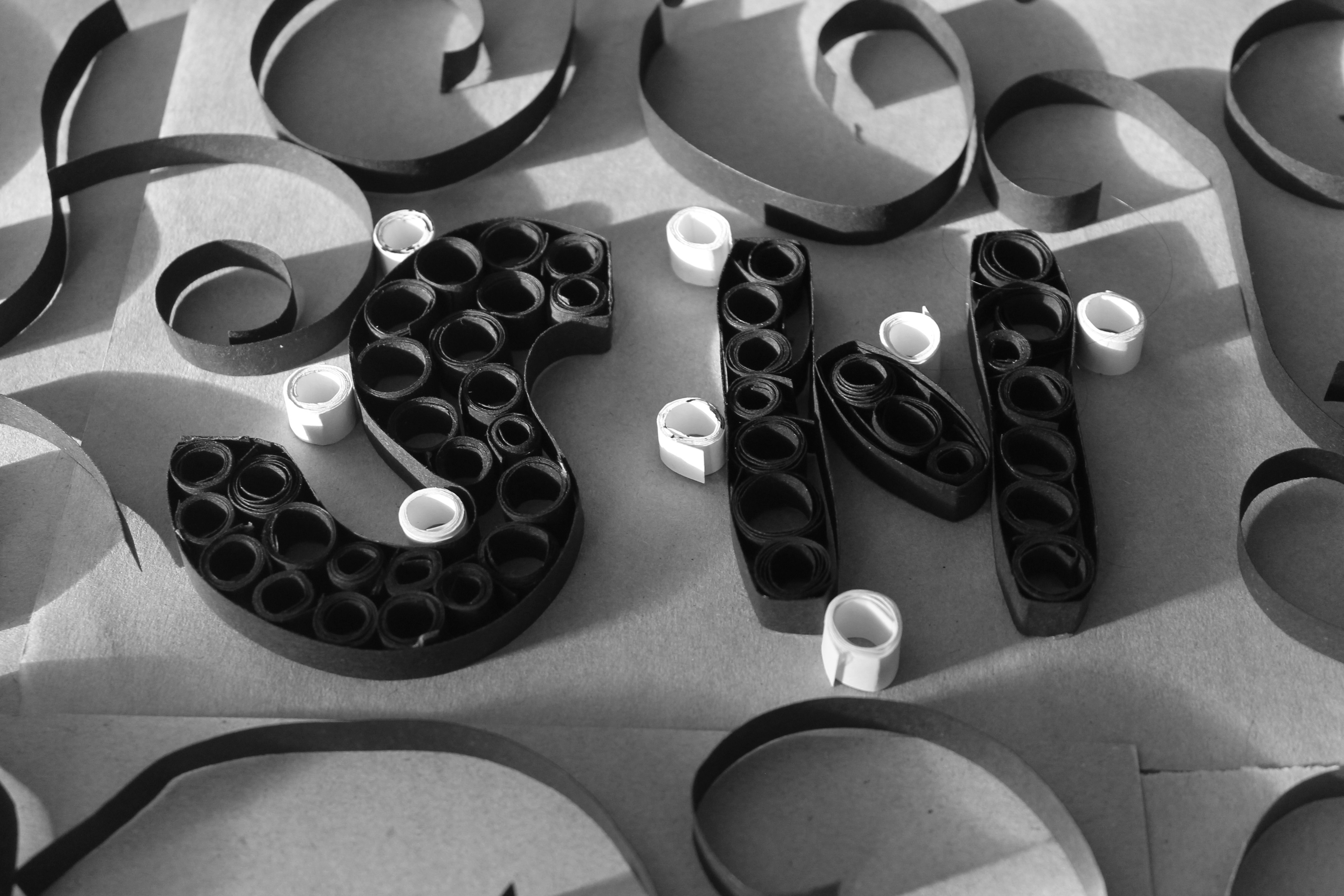
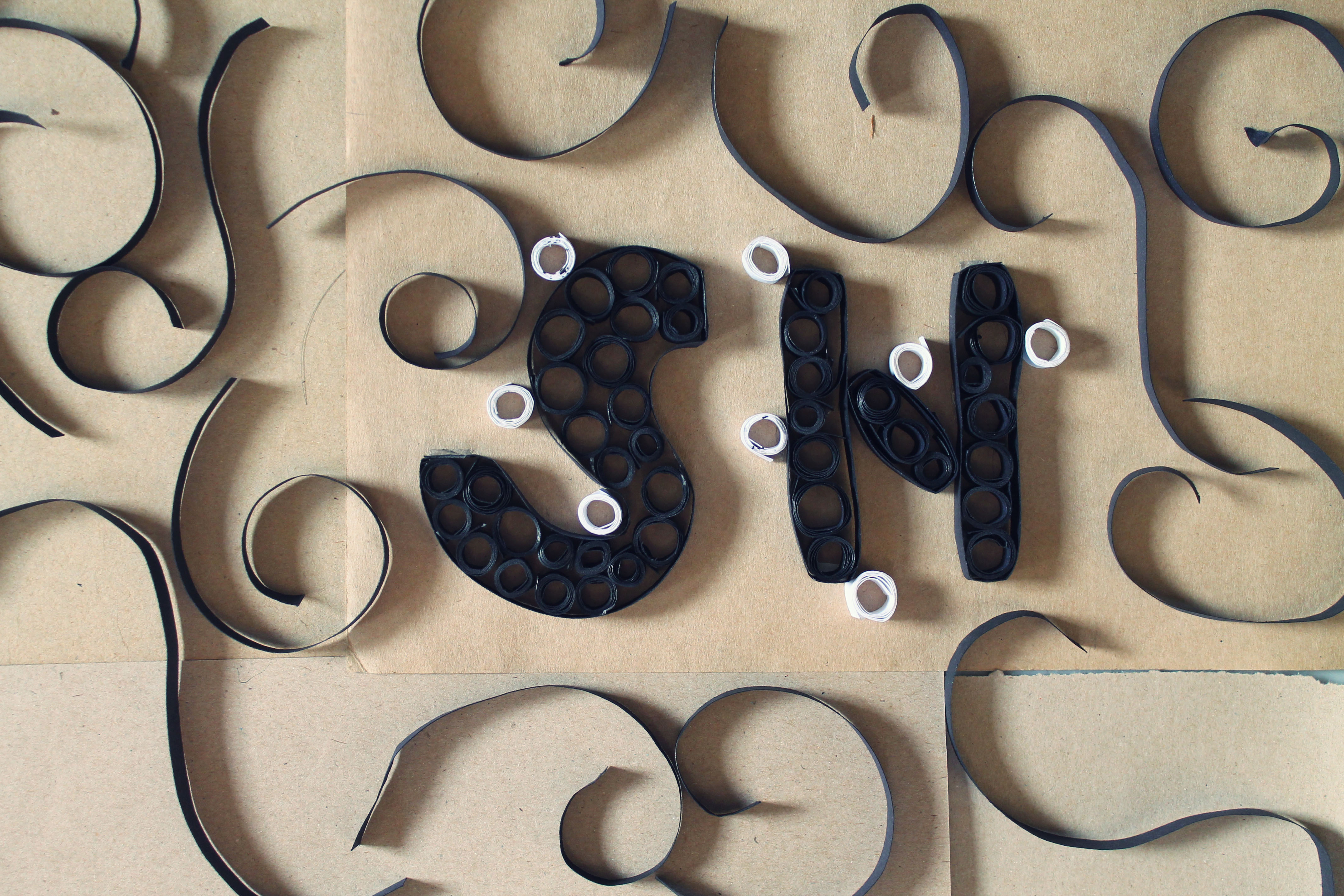
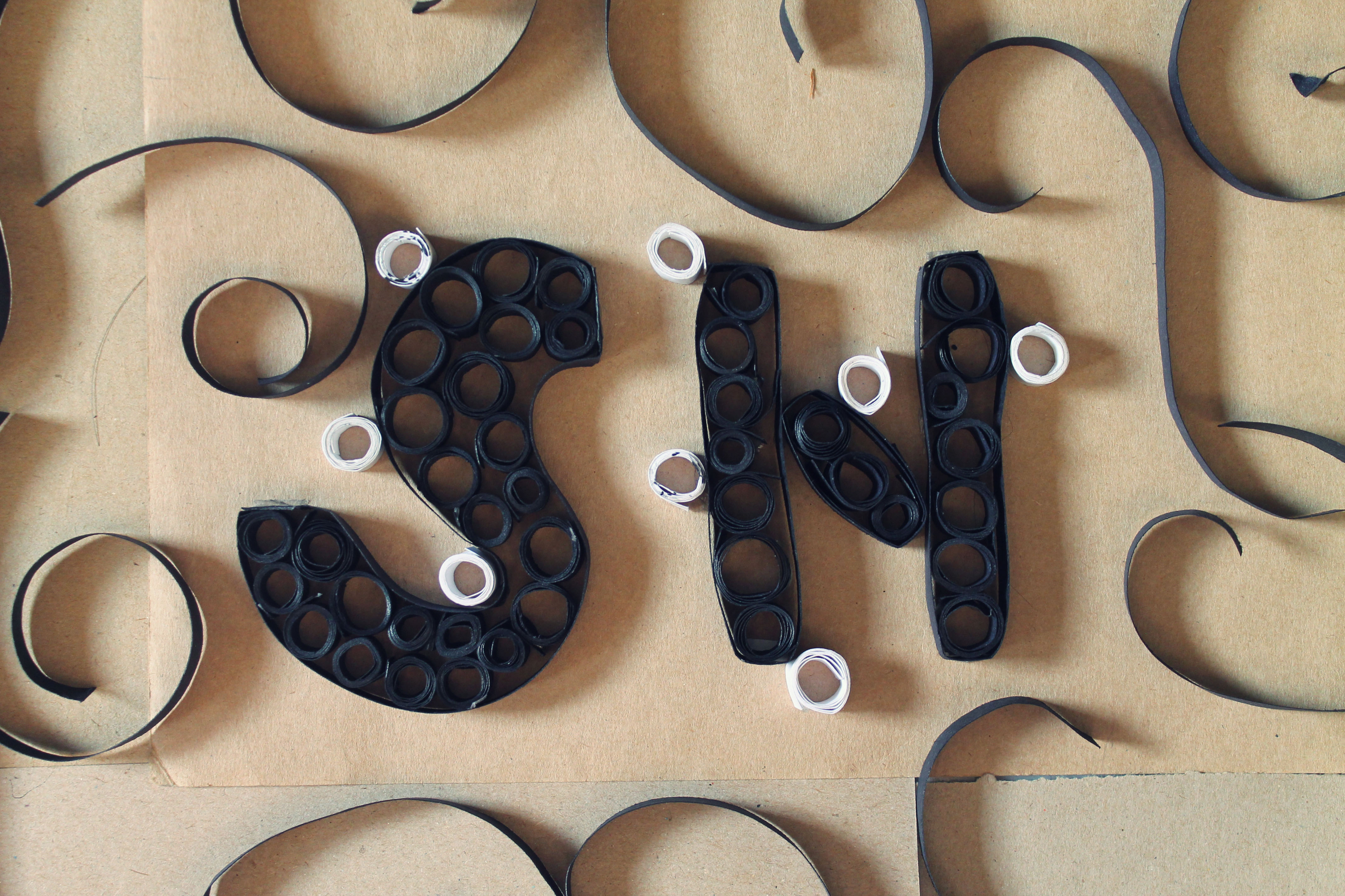
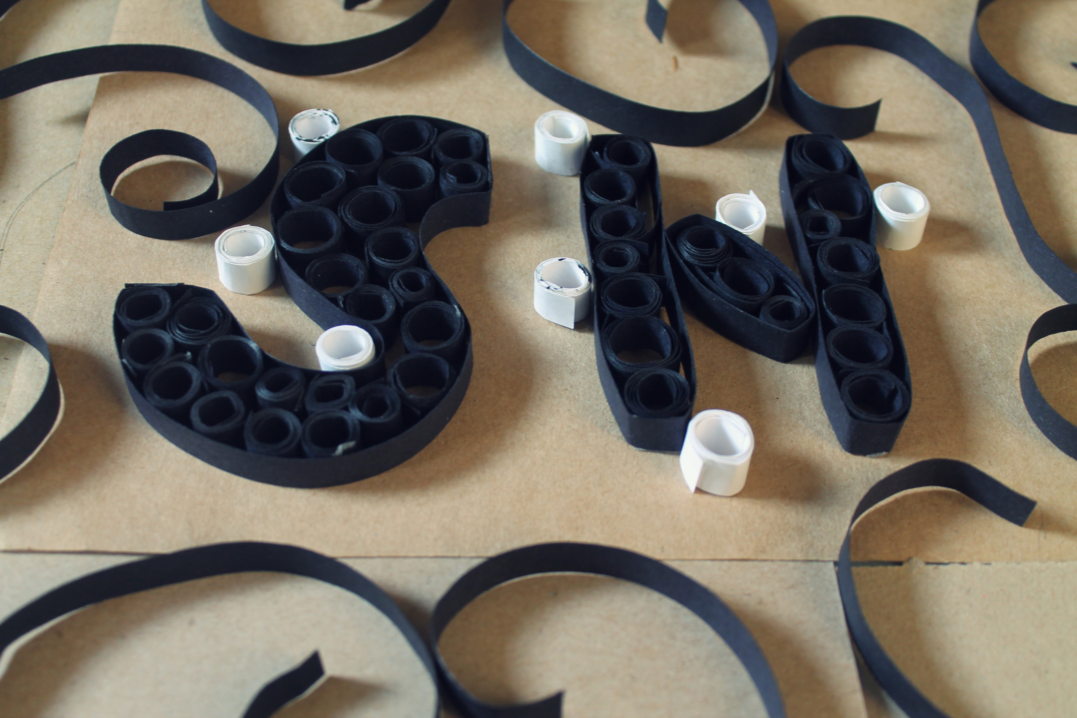
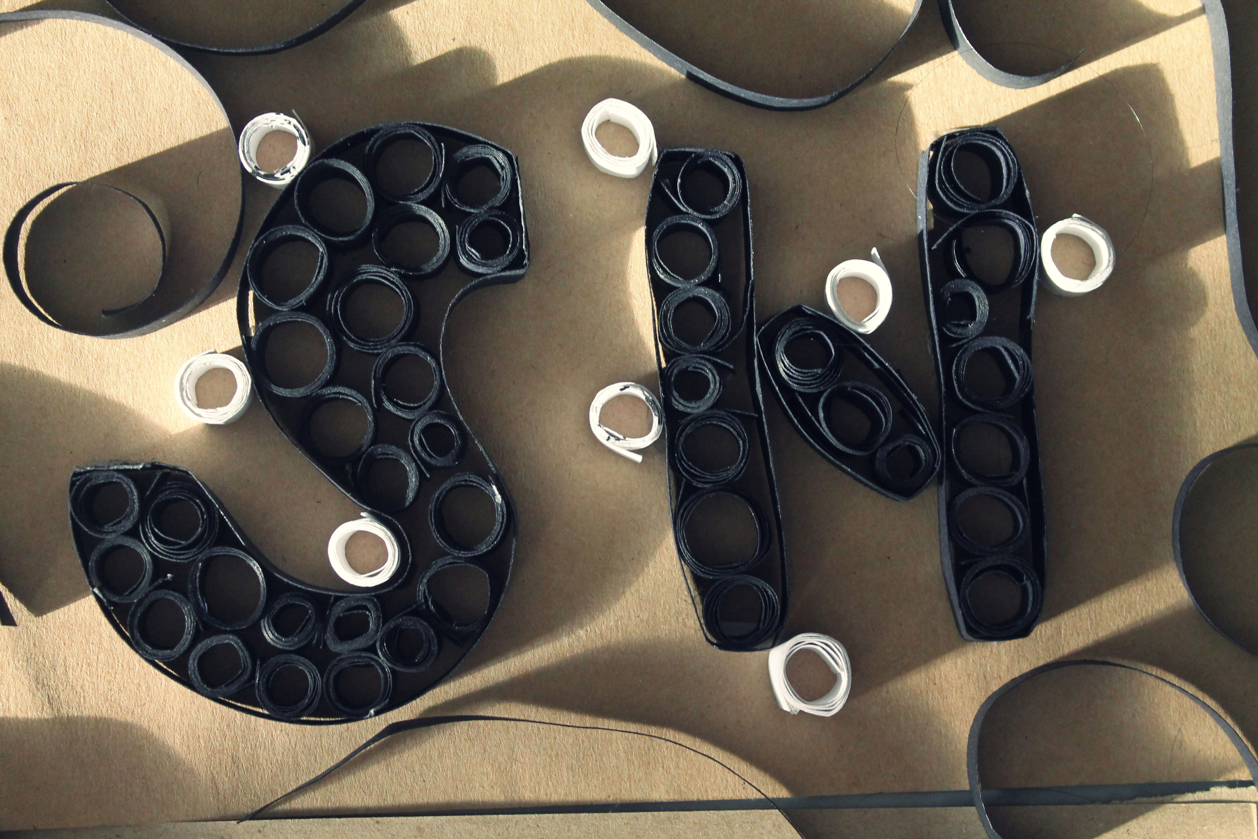
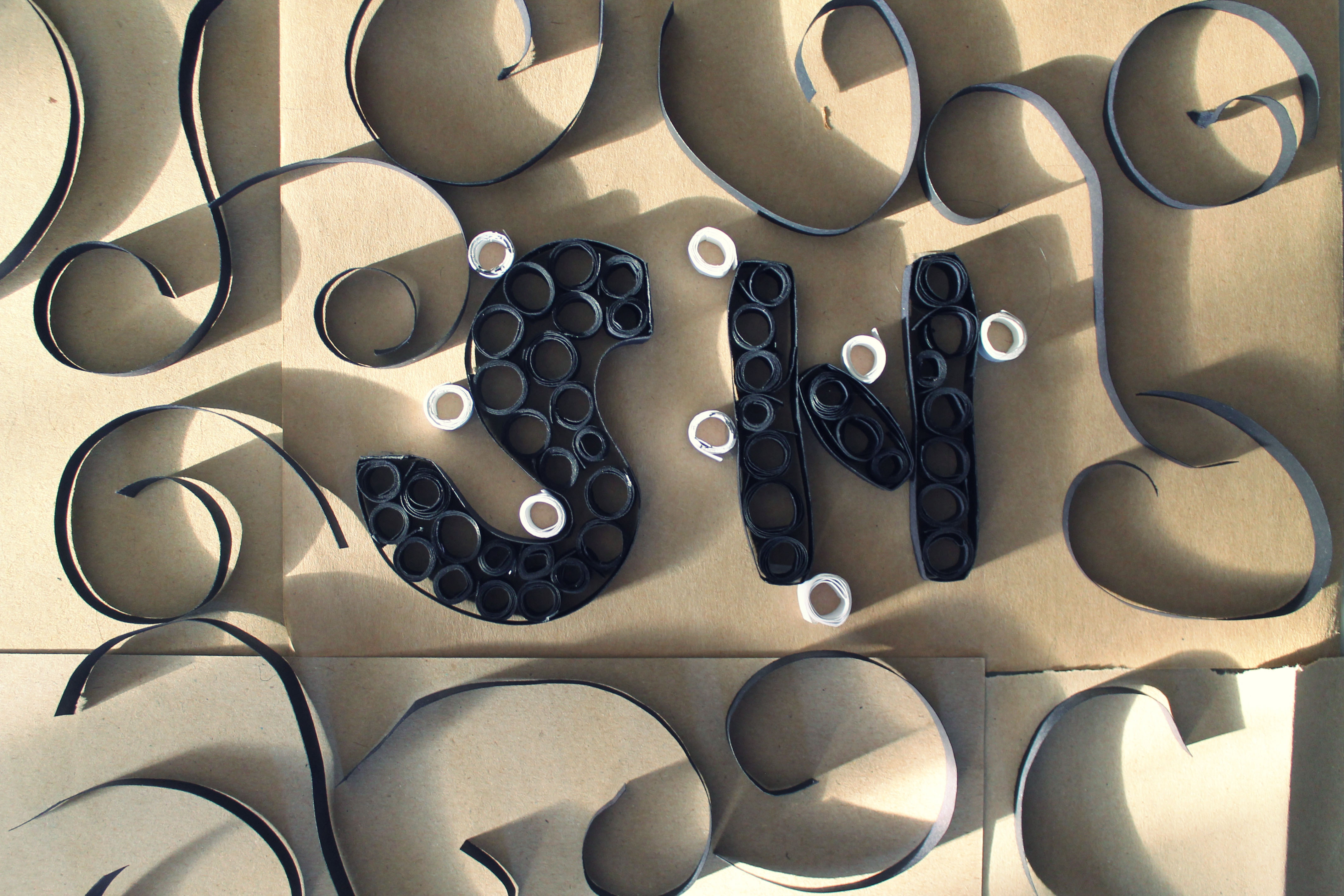
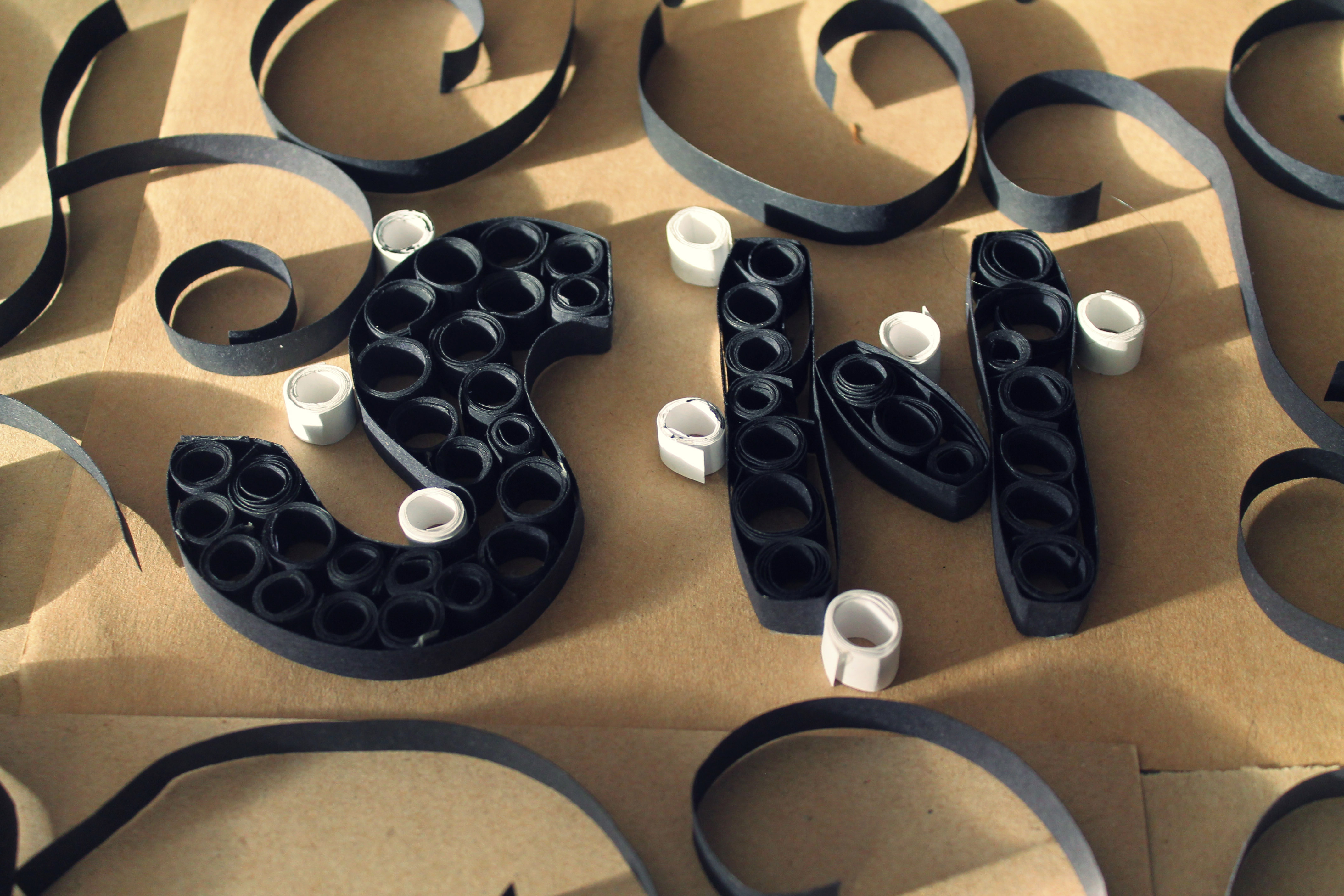
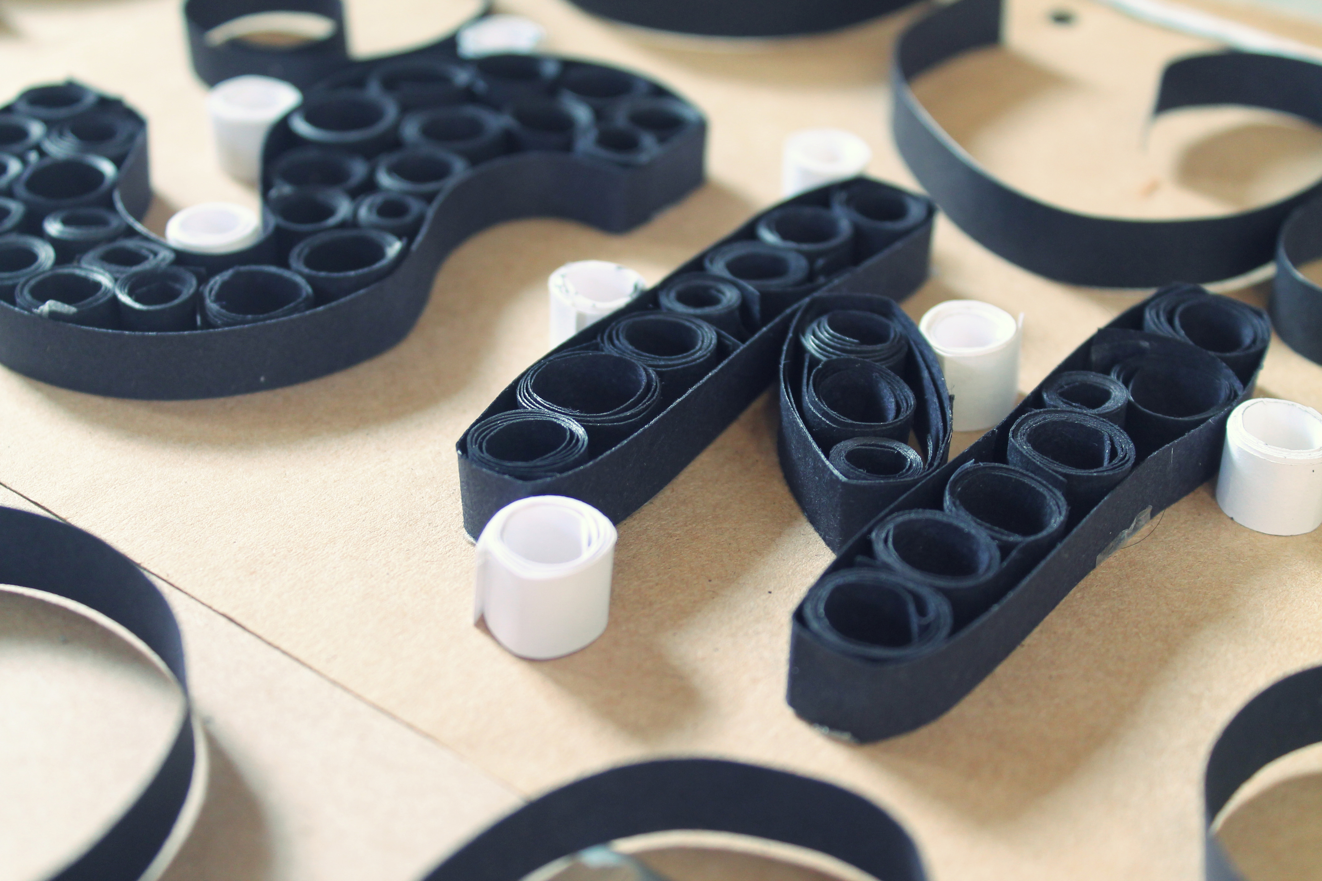
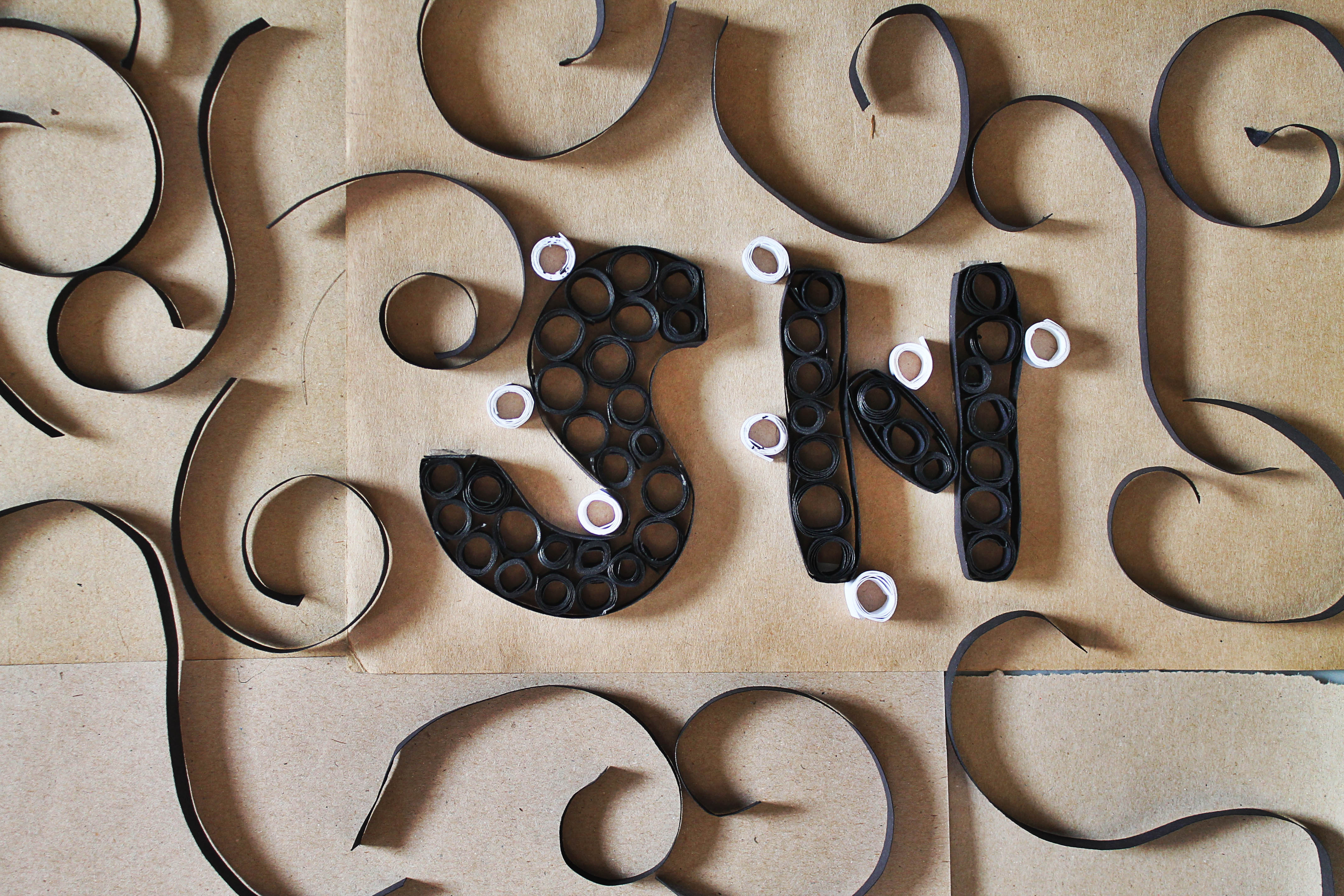
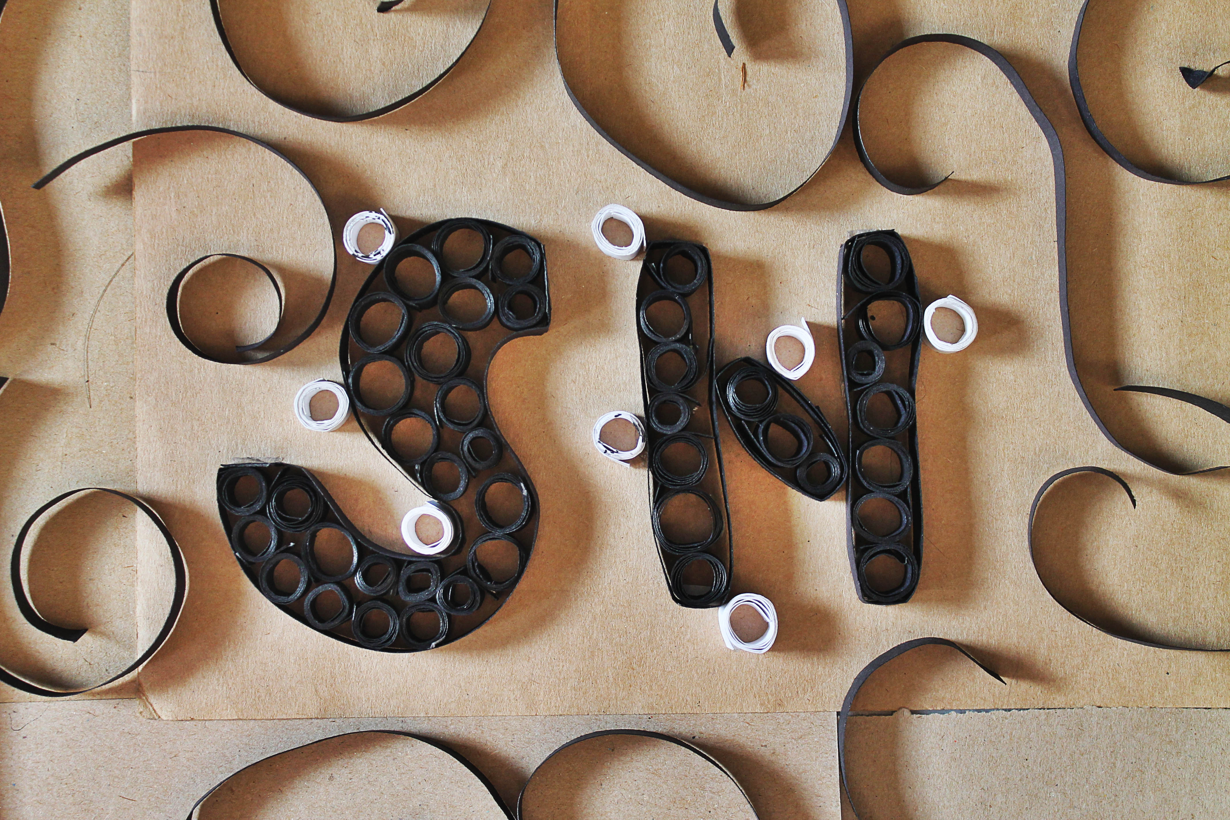
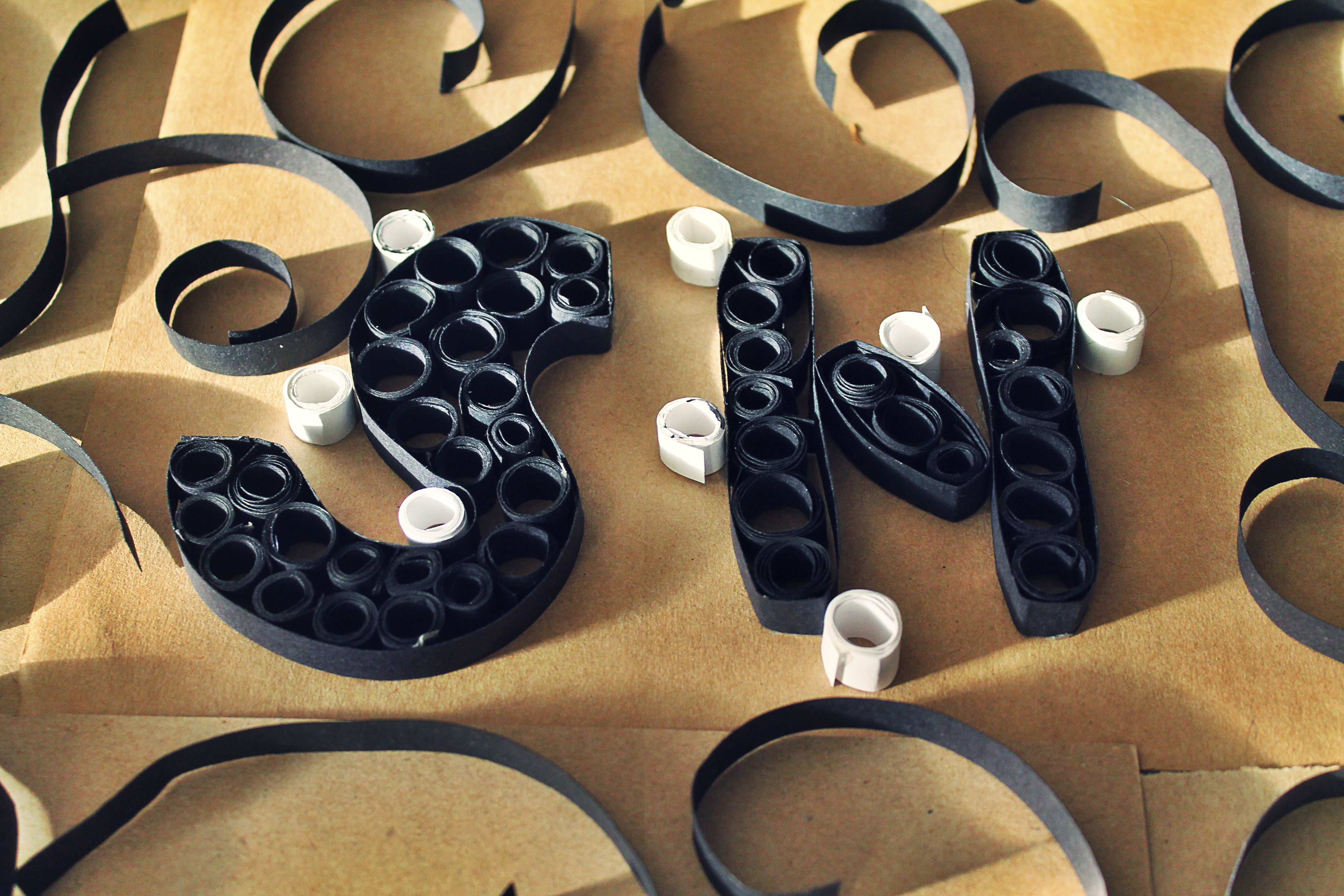
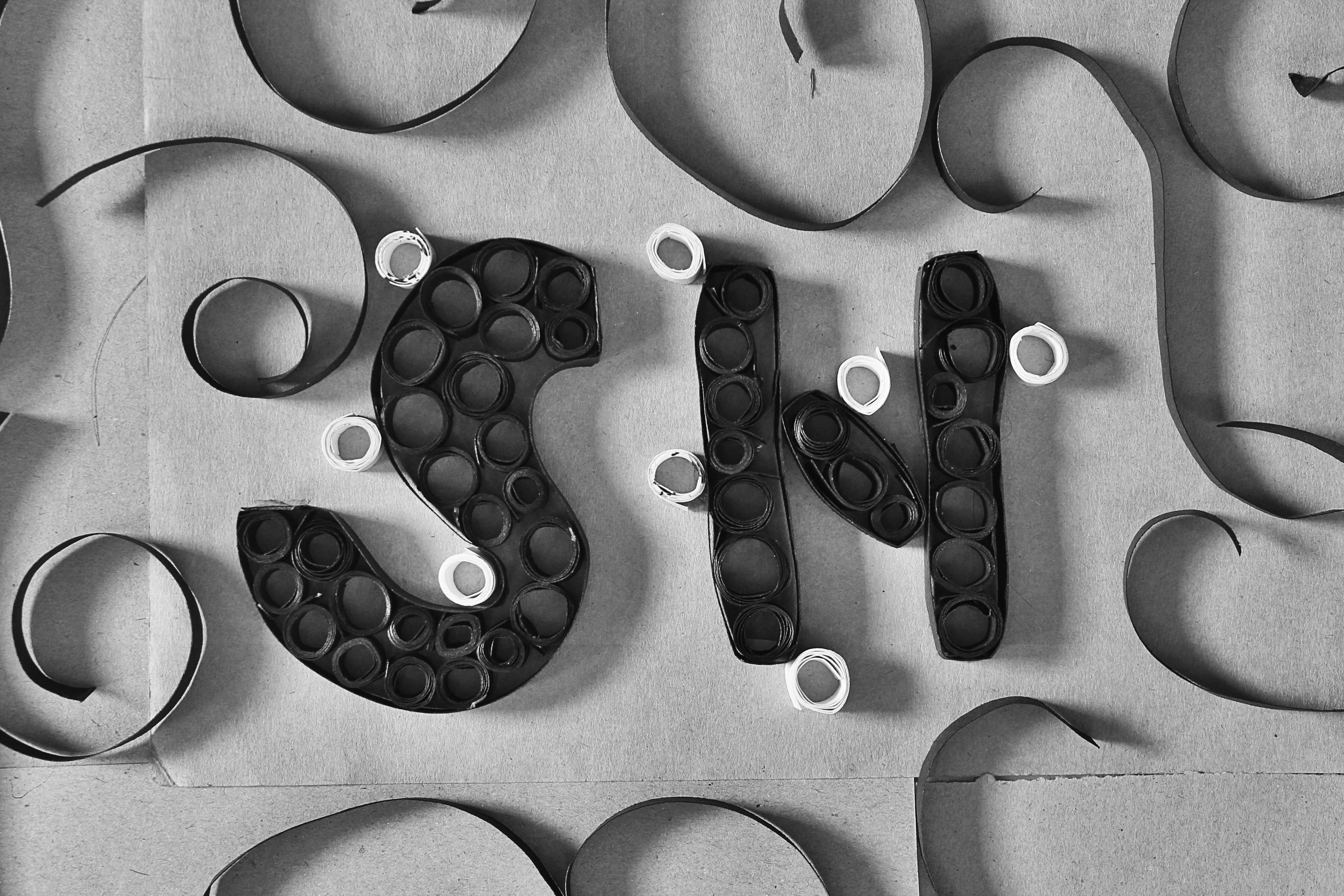
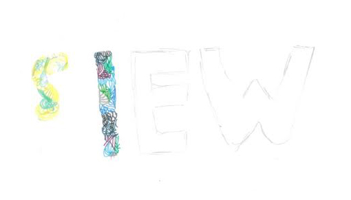
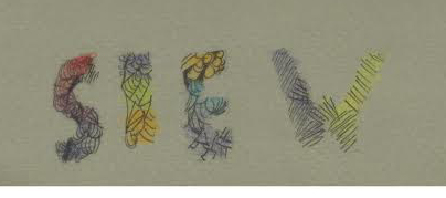
MY NAME IS
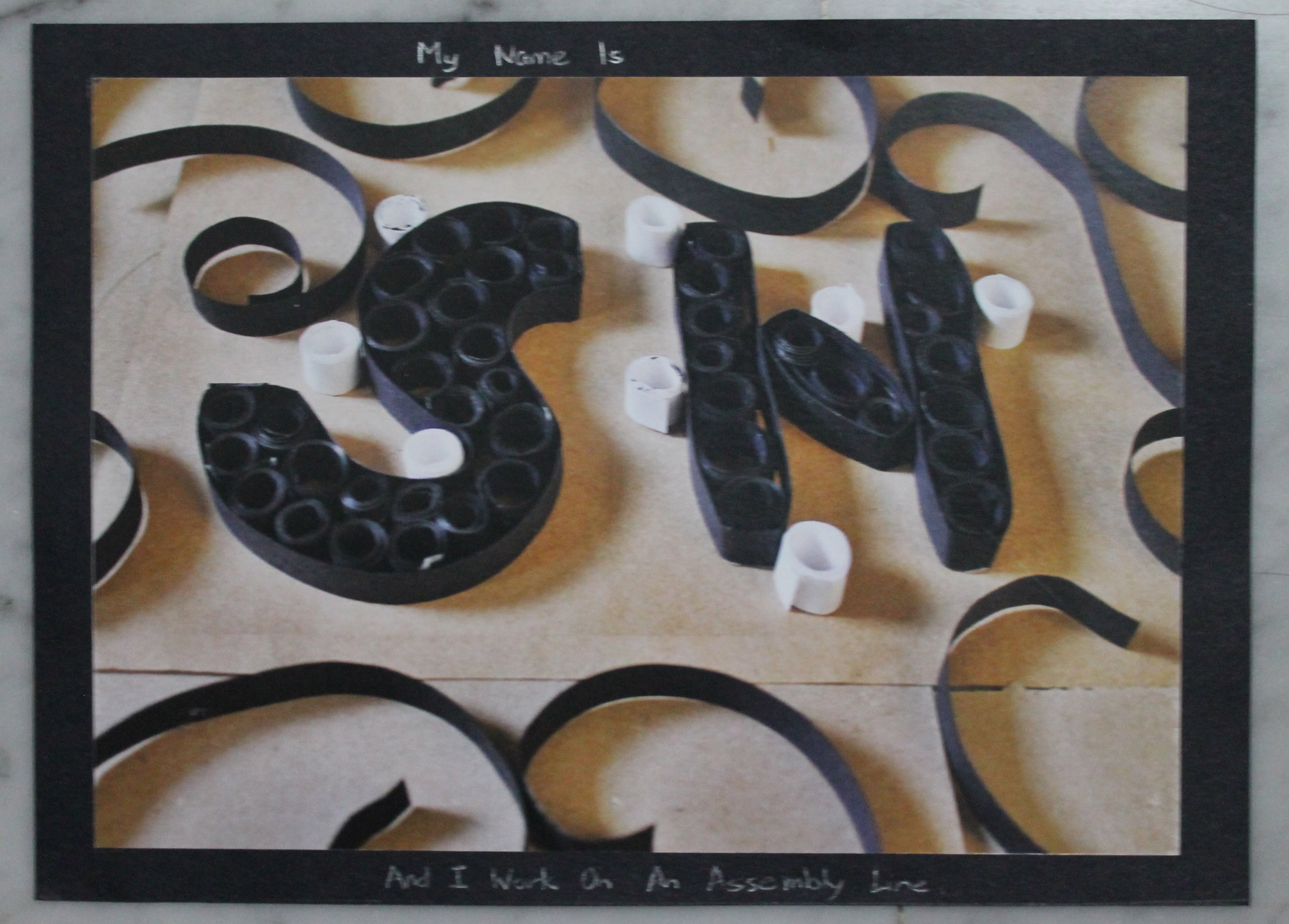
AND I WORK ON AN ASSEMBLY LINE
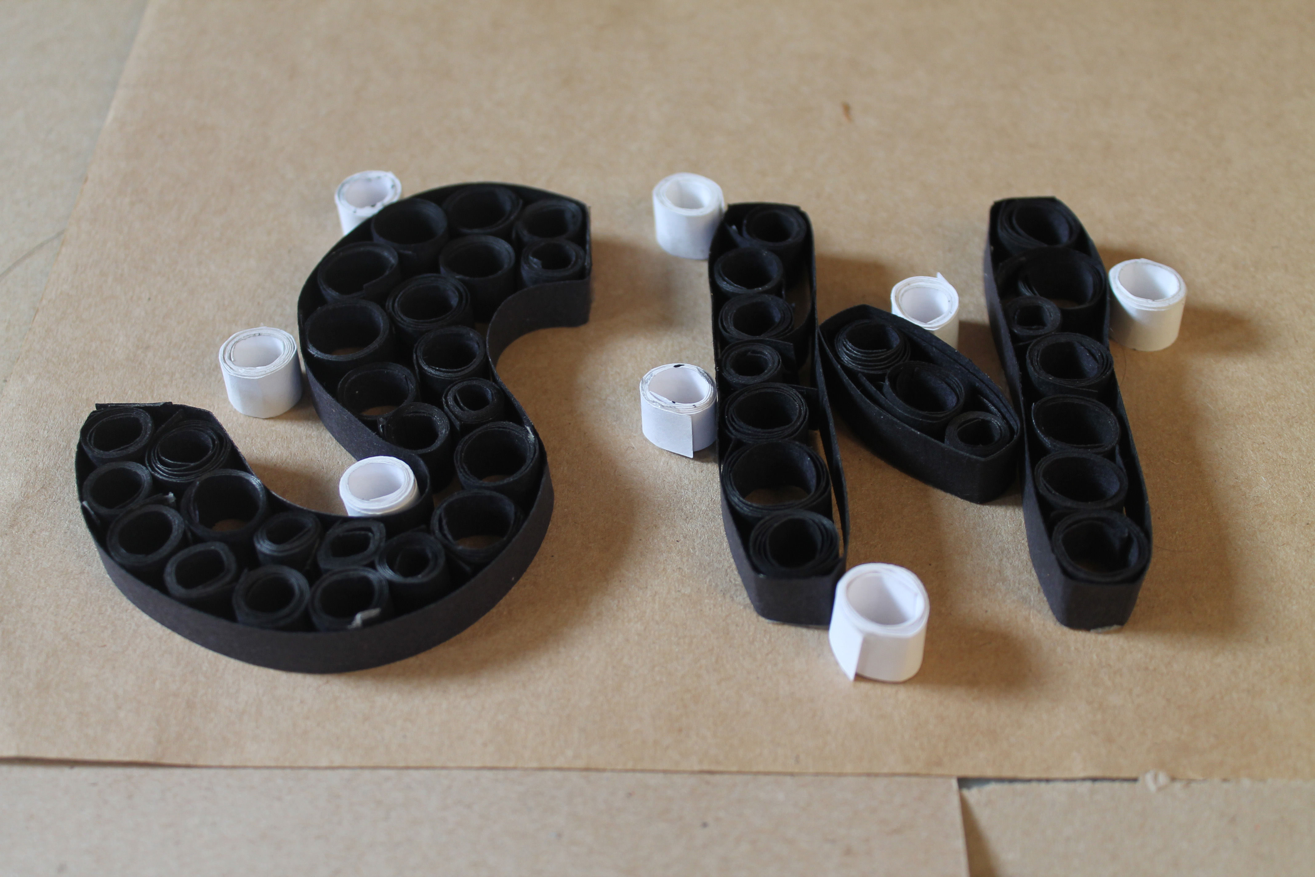
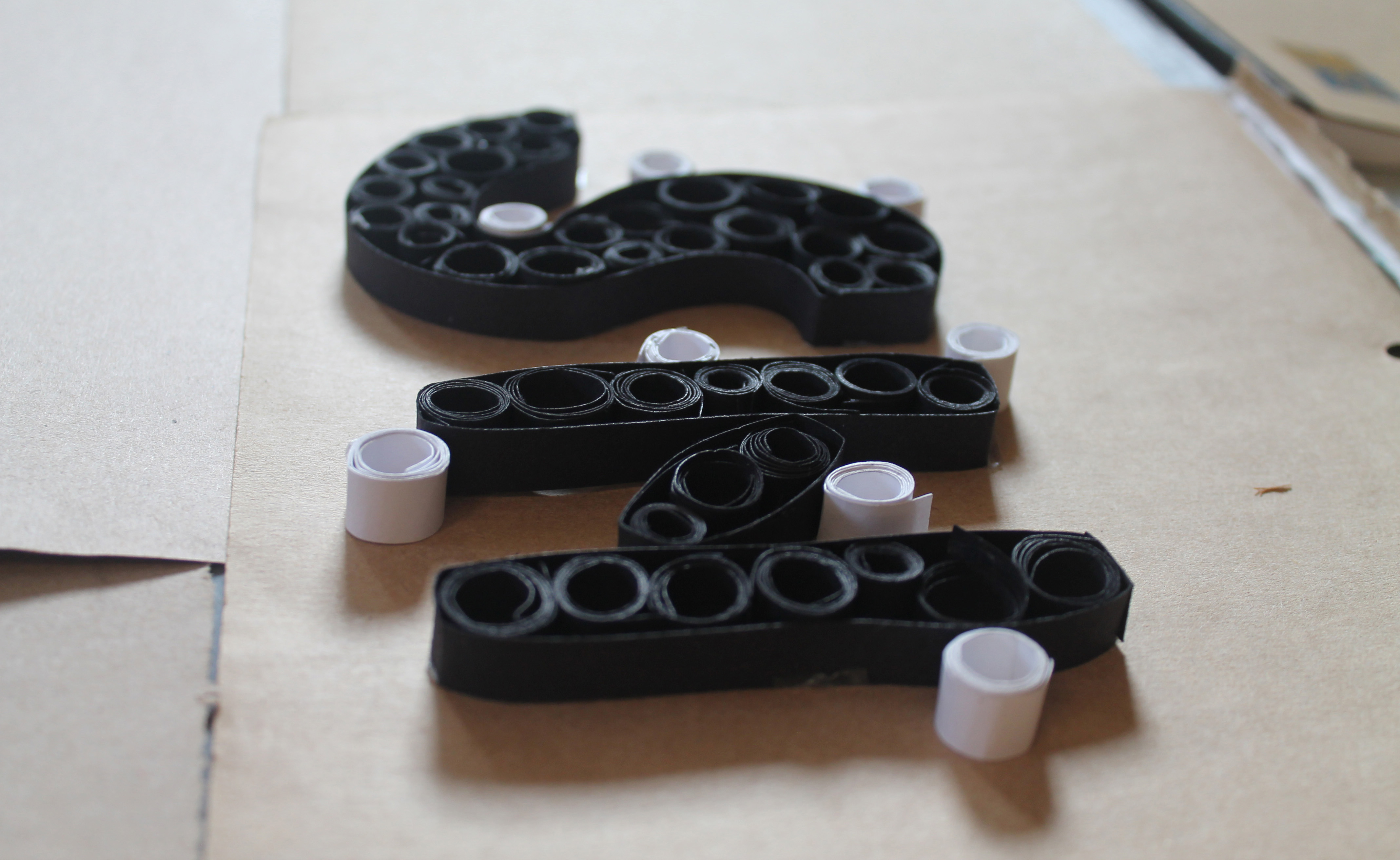
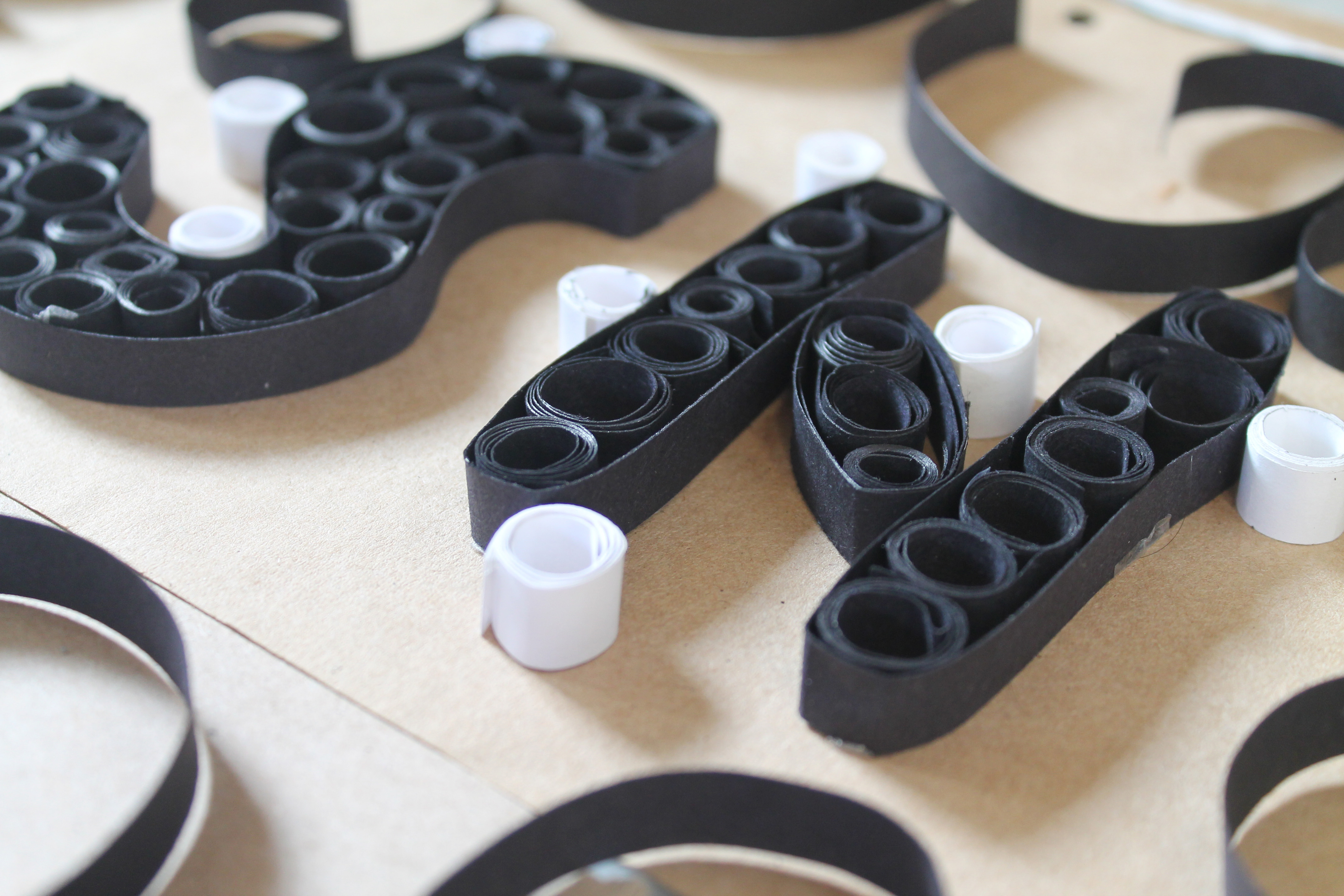
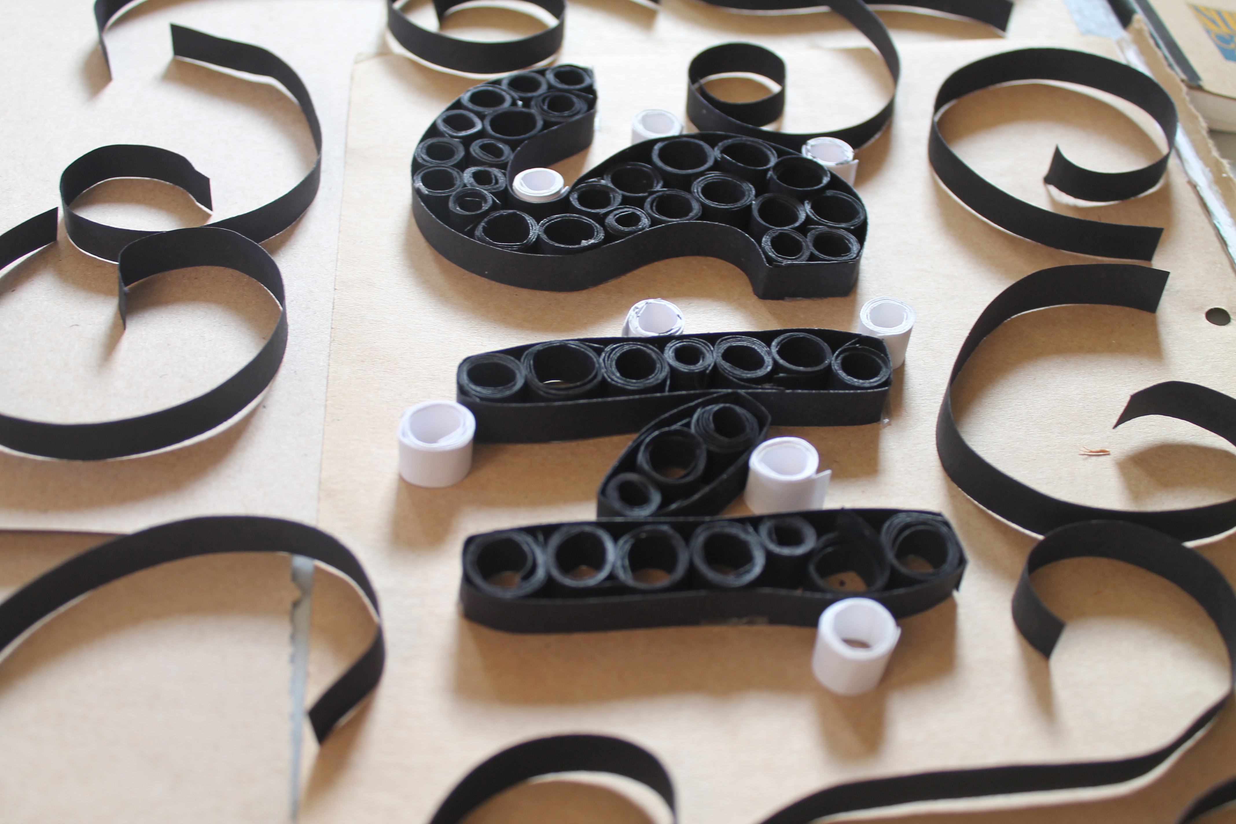
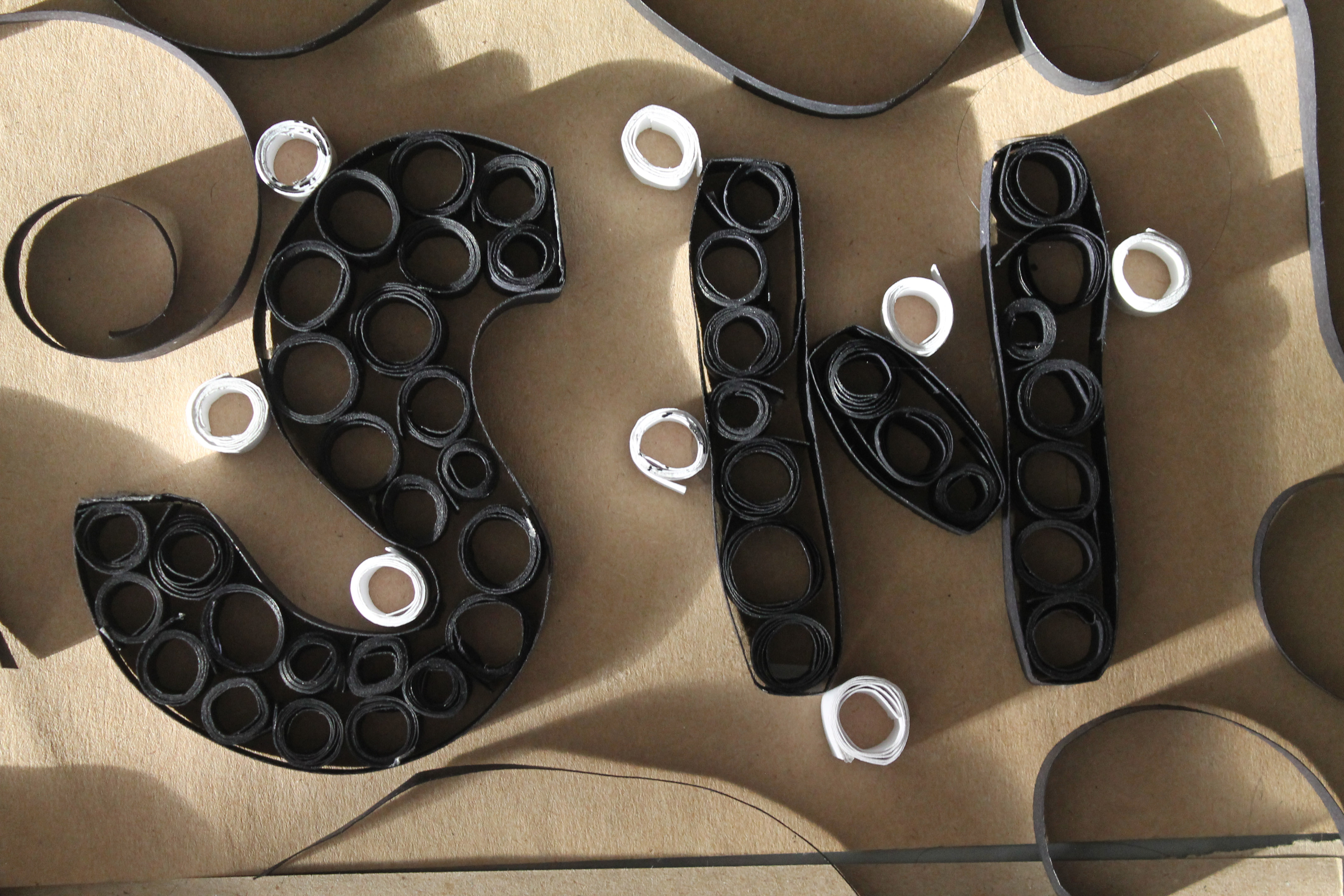
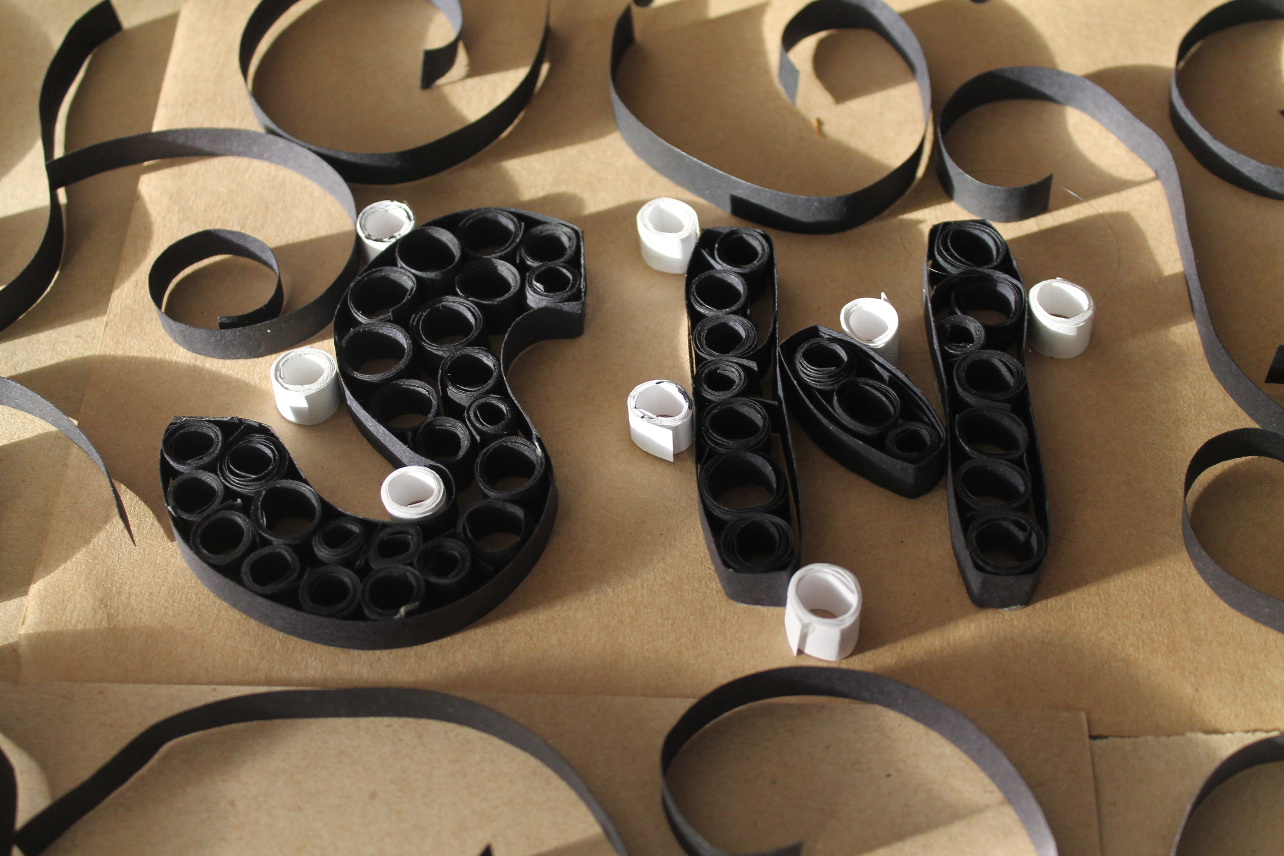
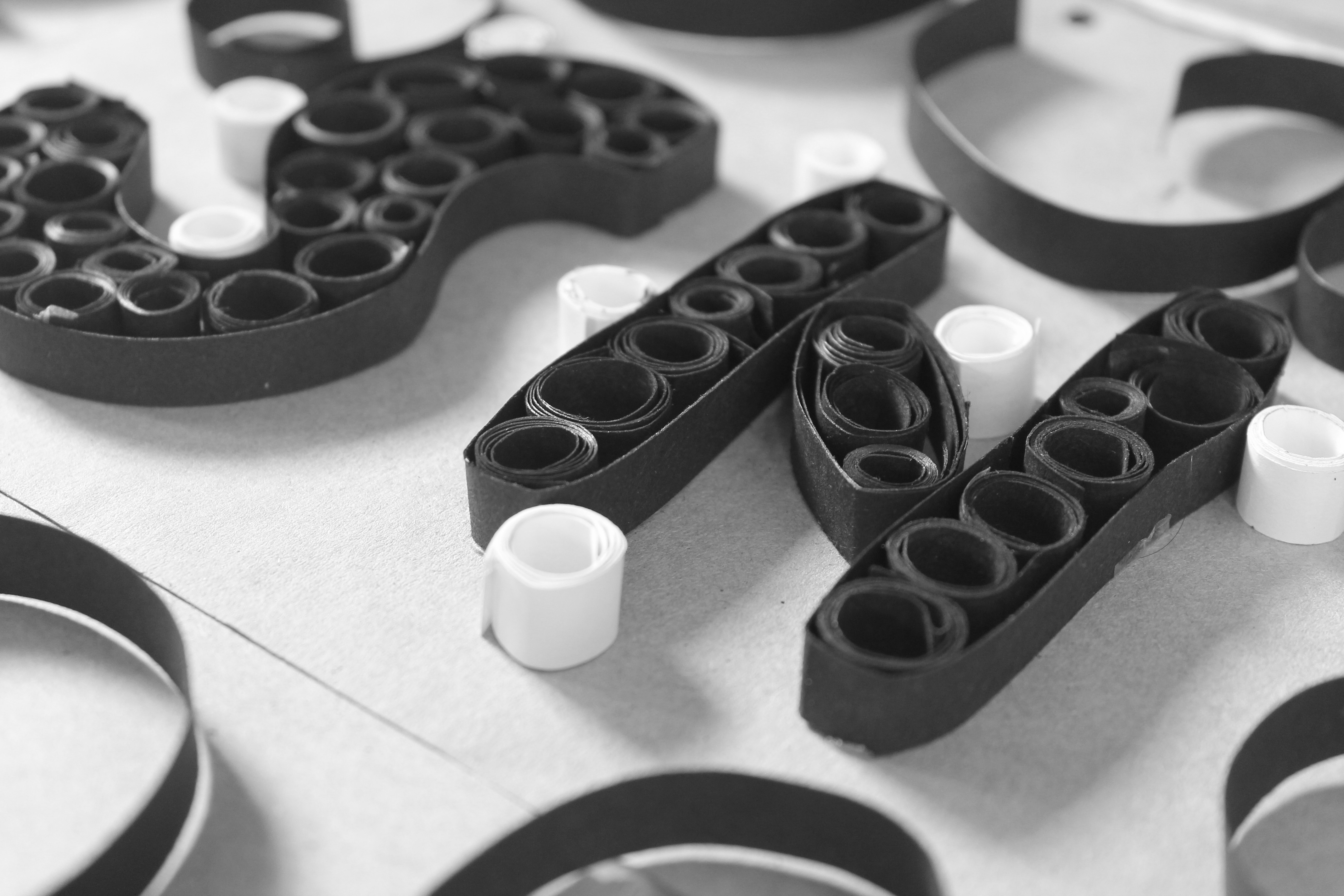
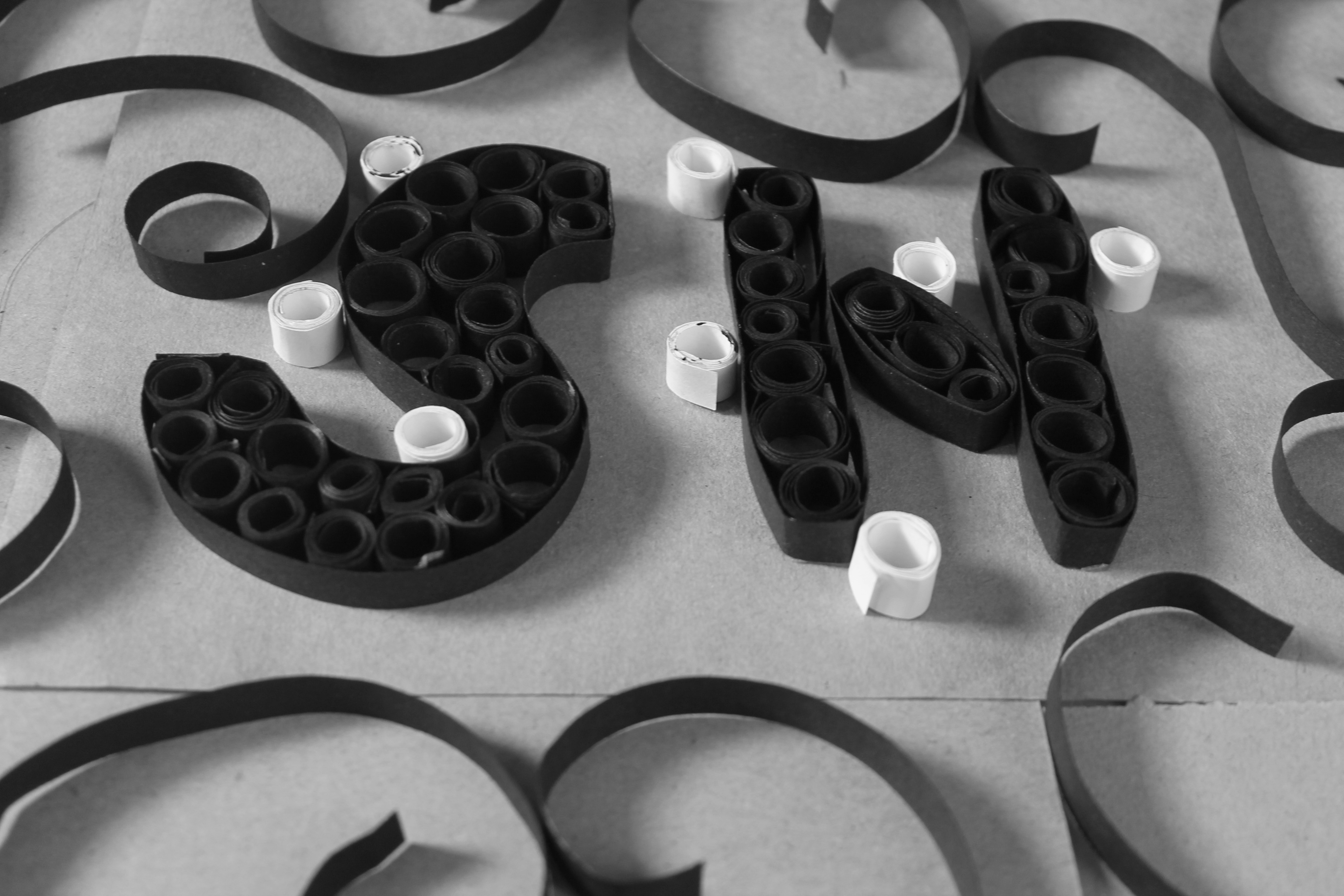
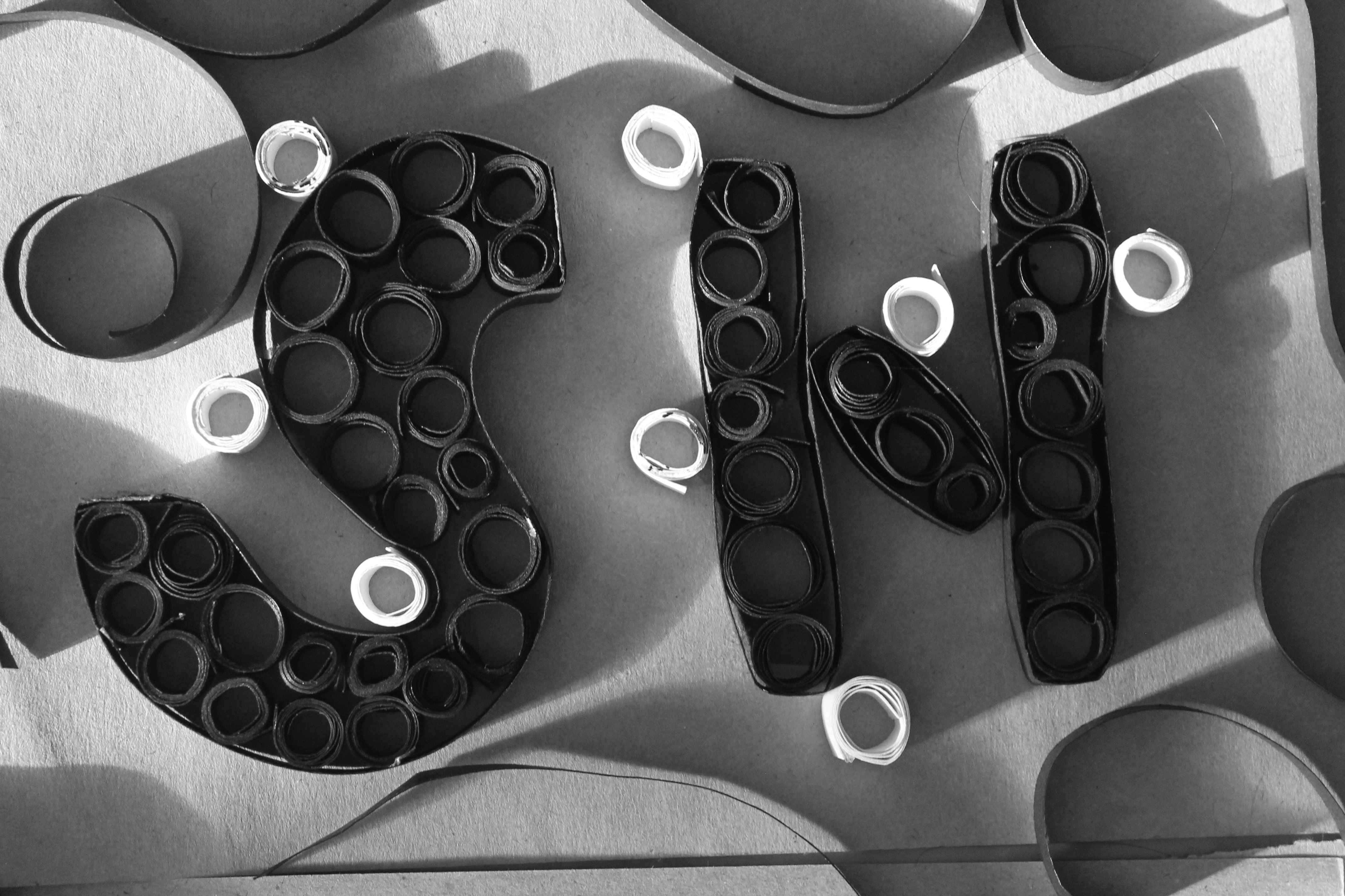
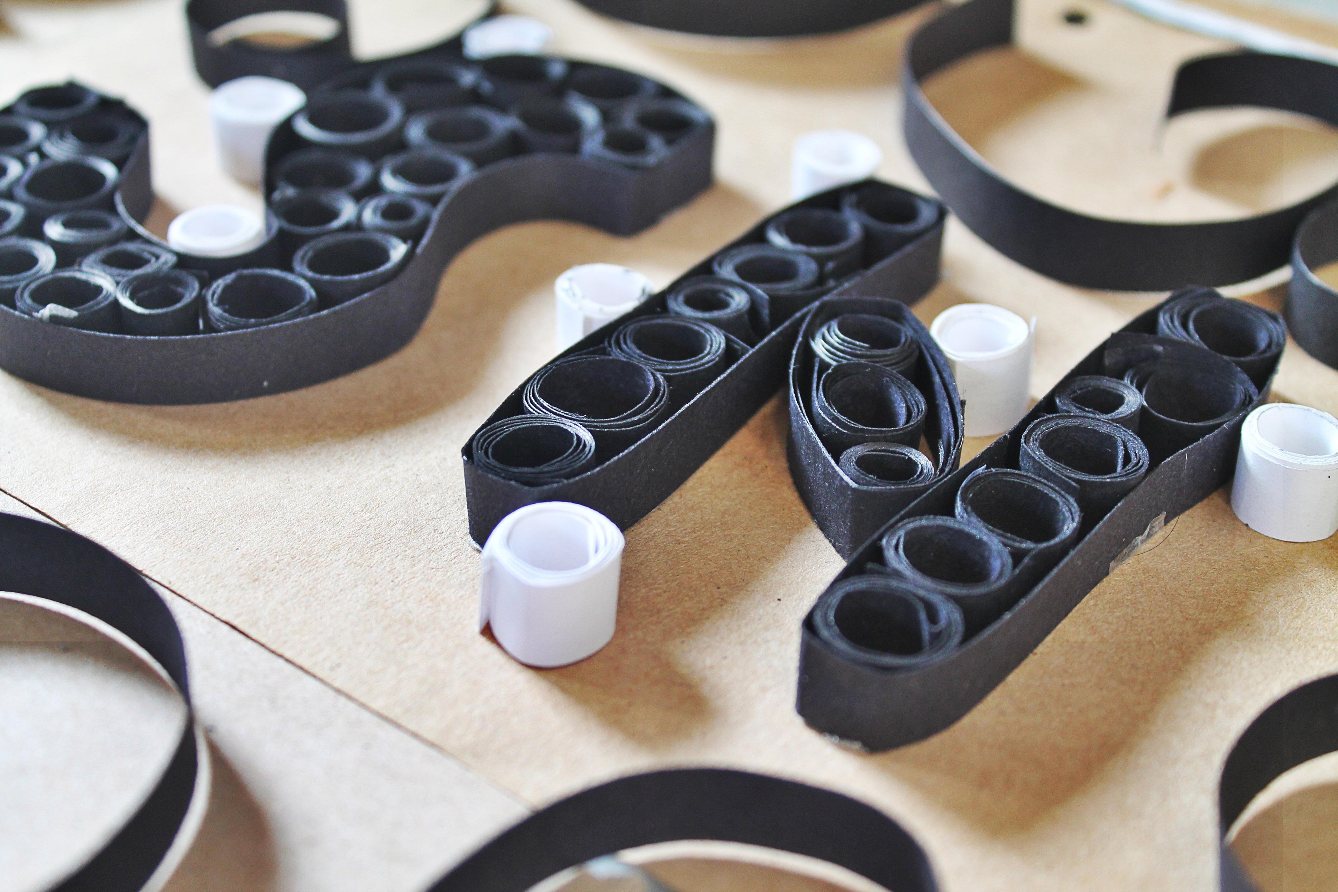
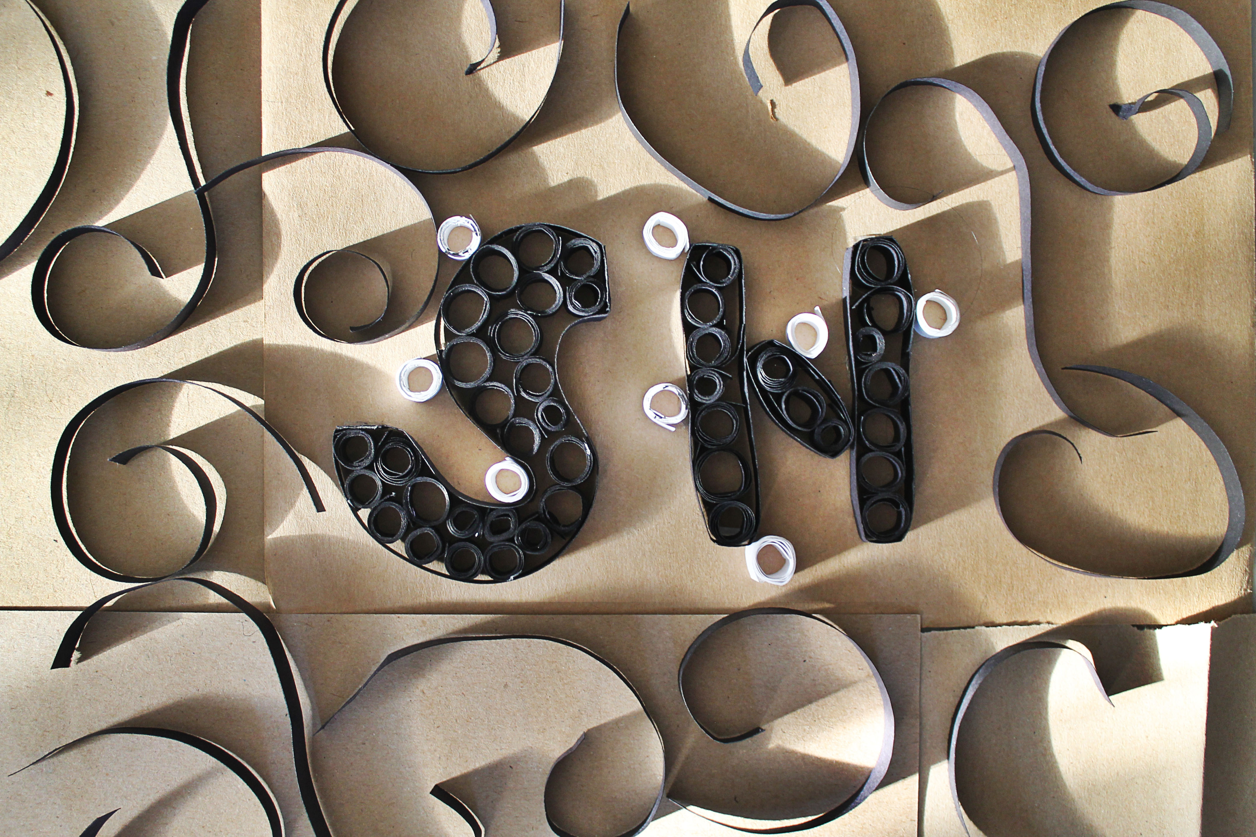
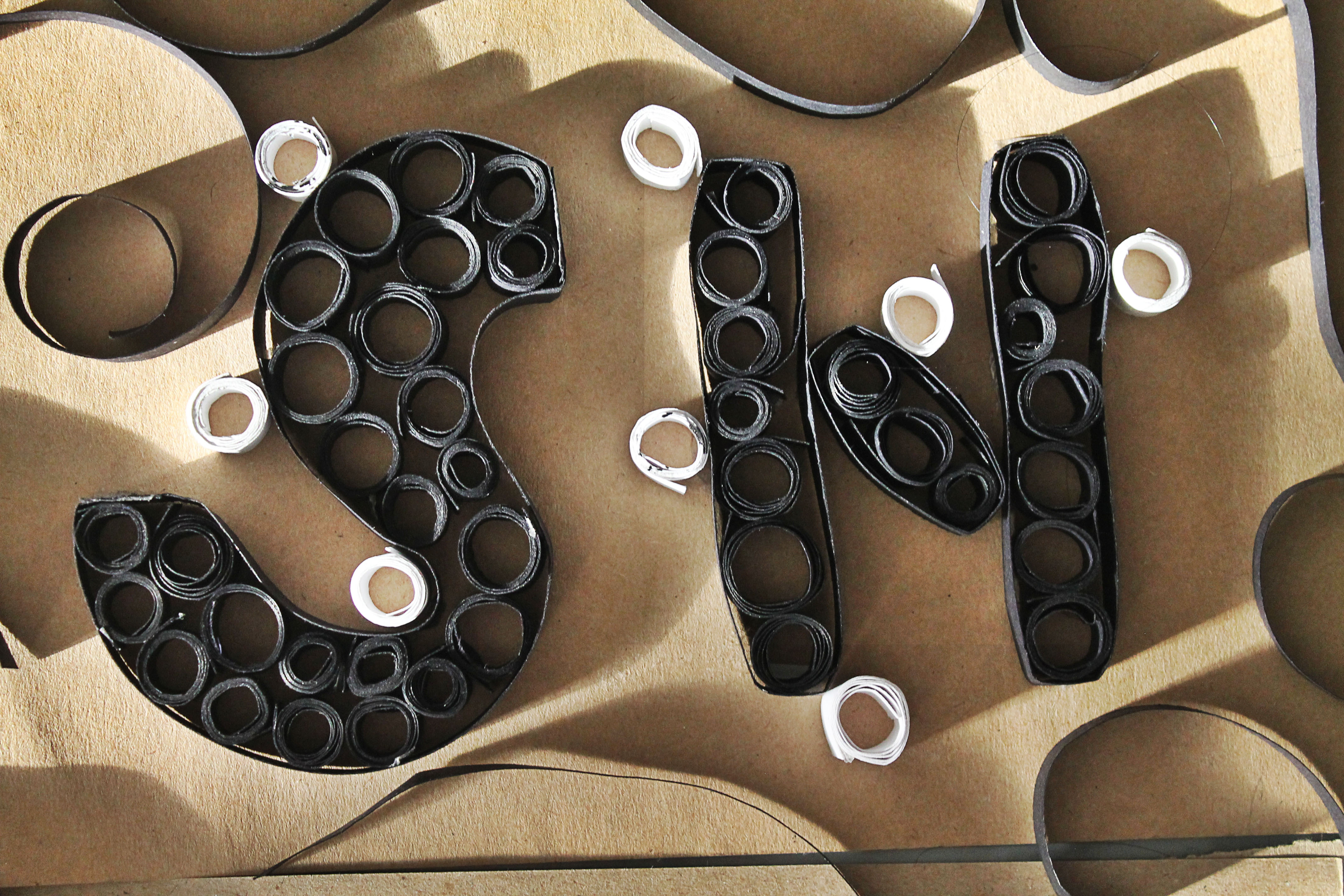
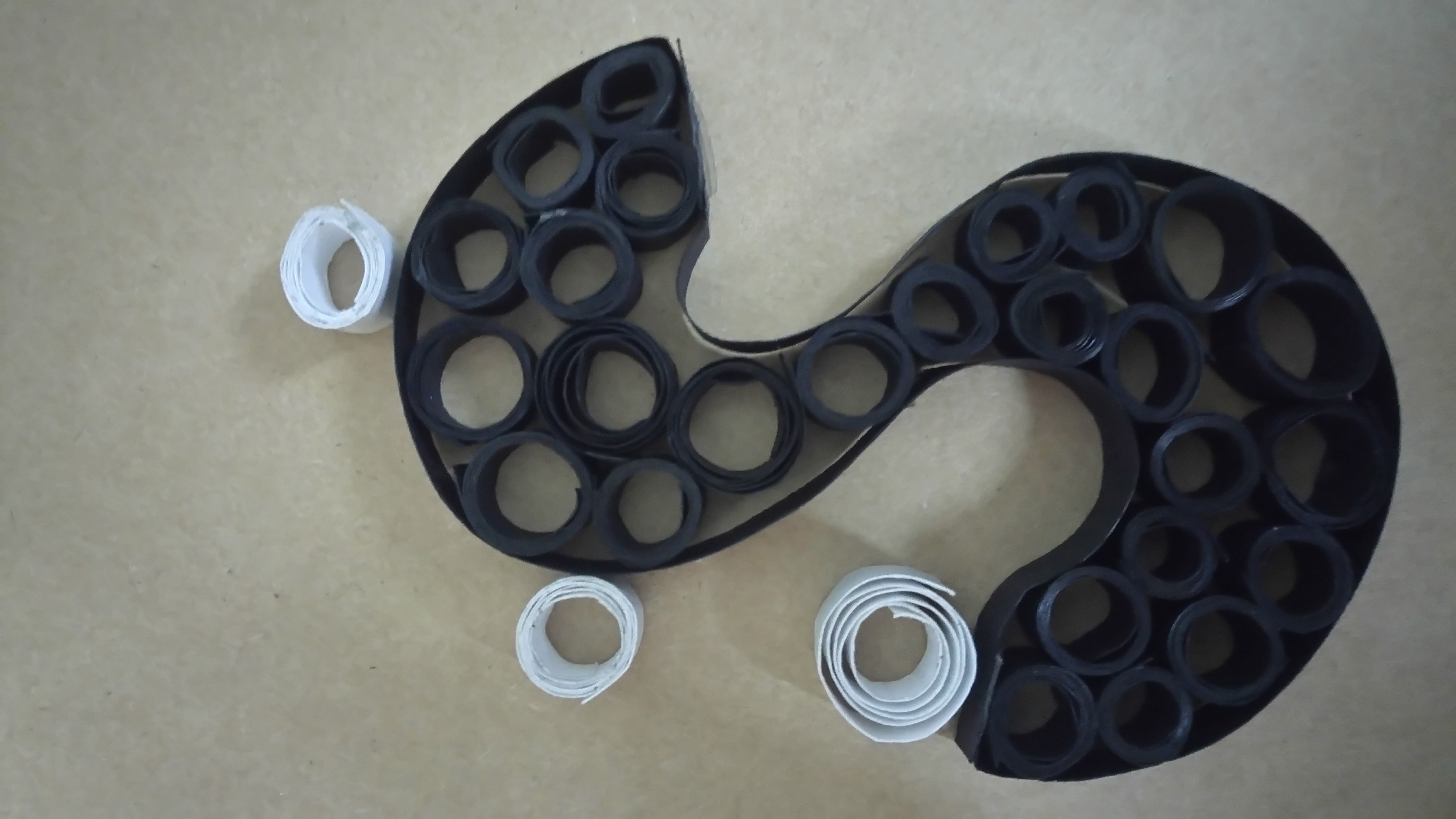
In this work, the subject matter is made up of rolled-up stripes of black and white paper on cardboard as background. The colour choice is to indicate a dull, boring and burdensome life of an assembly line worker. Additionally, they also represent others things too.The use of cardboard is because usually the packaging are all packed into the cardboard before it is sent off. The black colour papers represents or resembles the conveyor belt that can be found in factories while the white ones represent the products being manufactured. The swirly black paper surrounding the alphabets are to represent or indicate that this is just part of the huge factory. I choose to use just ‘SH’ because to resemble like company or brand names where they tend to just use acronyms. The process of making this was rather repetitive, simple yet tedious and I felt all these fit very well with how this industry is in reality too.
Many people tend to overlook or they choose to ignore the flaws or defects, thinking that everything was good, perfect. However, on closer look, one would see that not all the whites (products) are the same. Two of them actually have black stains that represent their defects. Also, if one looked over at the ‘conveyor belt’, the ‘wheels’ are not all evenly made. This is to suggest even the machines break down sometimes so both human and machine error occurs here.
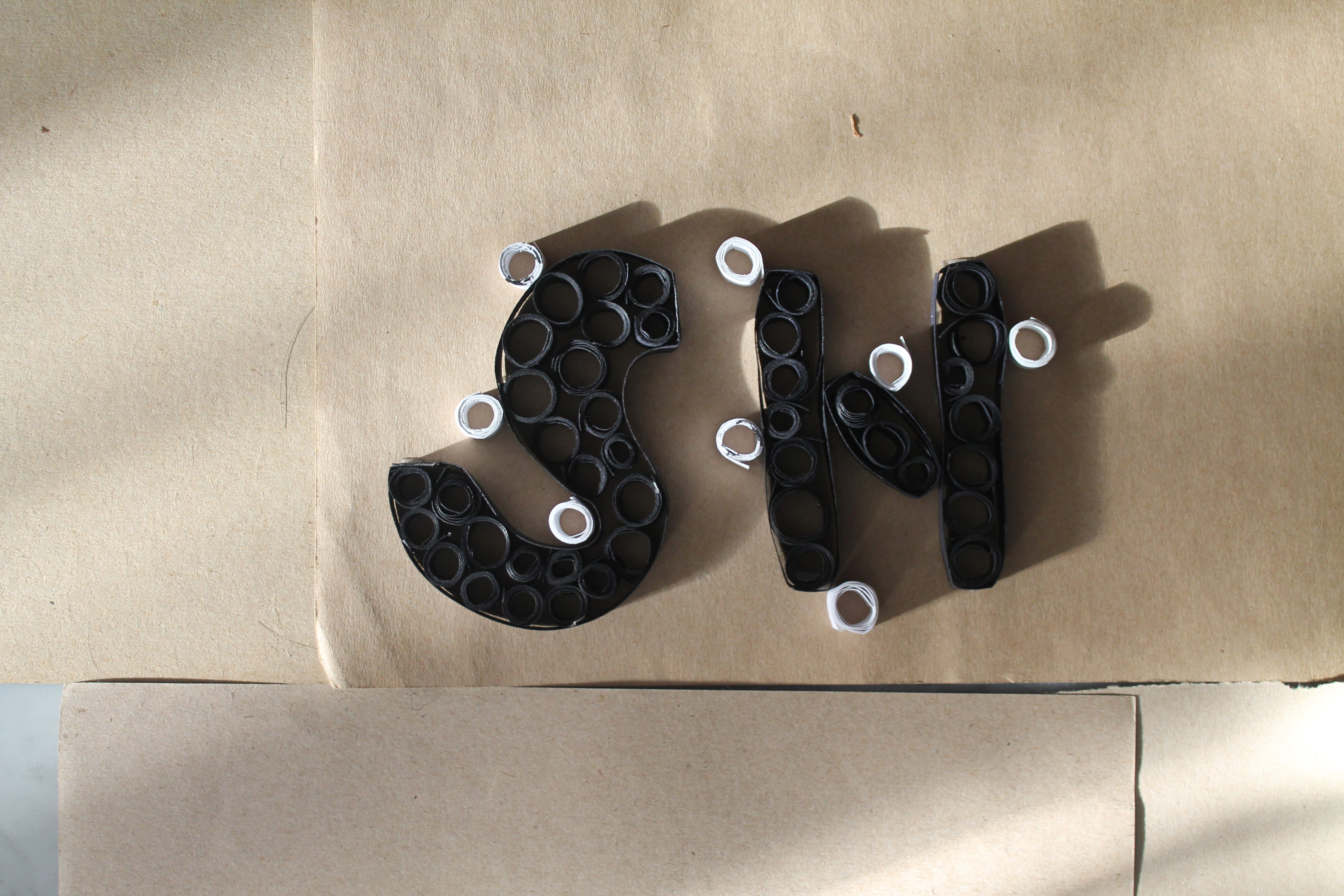
I presented this work through photography and i choose a close up shot because i wanted to focus in on the details which people tend to overlook when they take in the whole picture at first glance. Secondly, it is taken from an angle instead of frontal because i wanted it to show from my perspective of how i view this job and for it to mean “I’m showing this from an angle and this is the angle I want you to view this job as.” Hence, viewers would unconsciously take notice of the often overlooked flaws. I also wanted for the light and shadow to represent day and night.
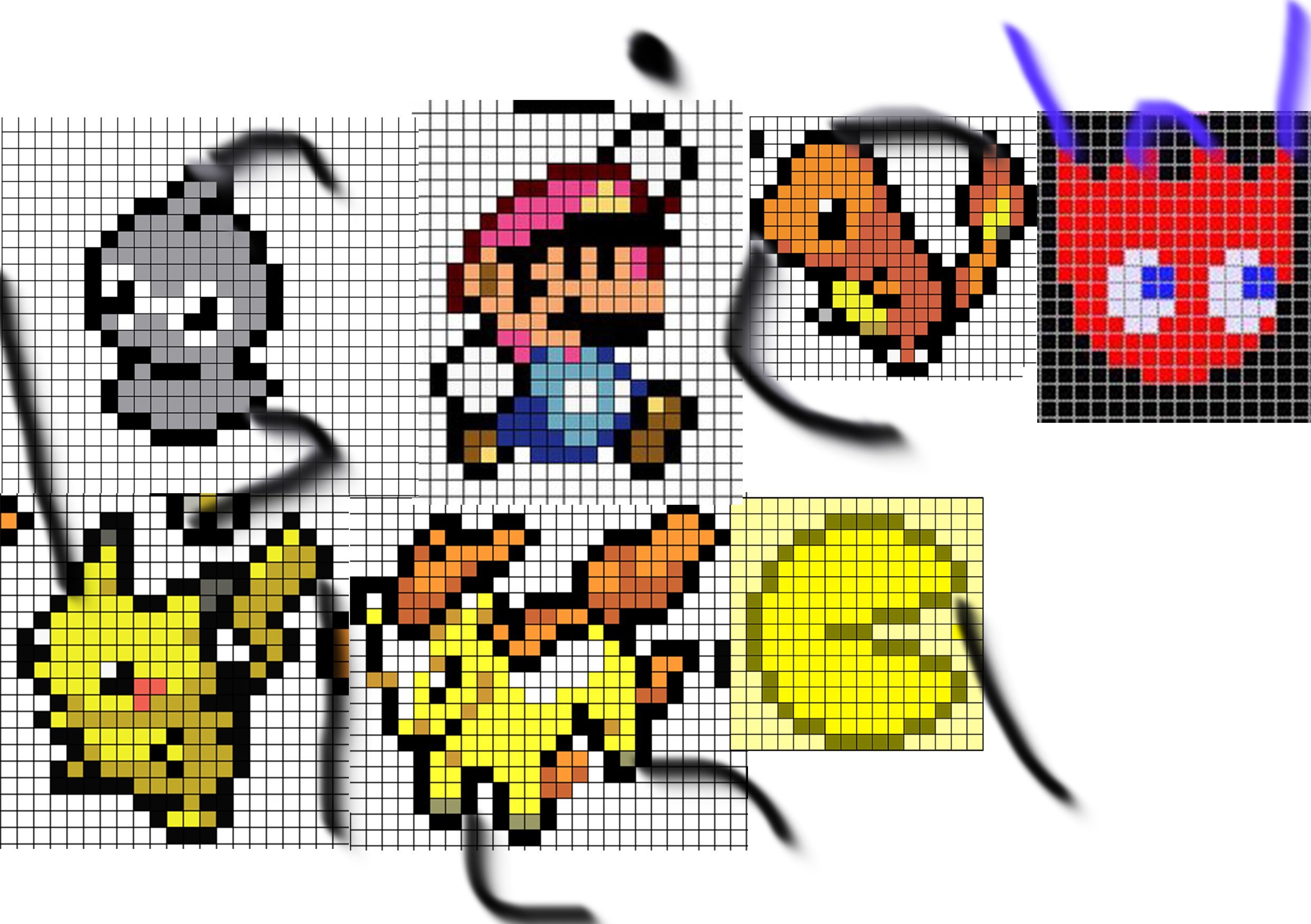
MY NAME IS
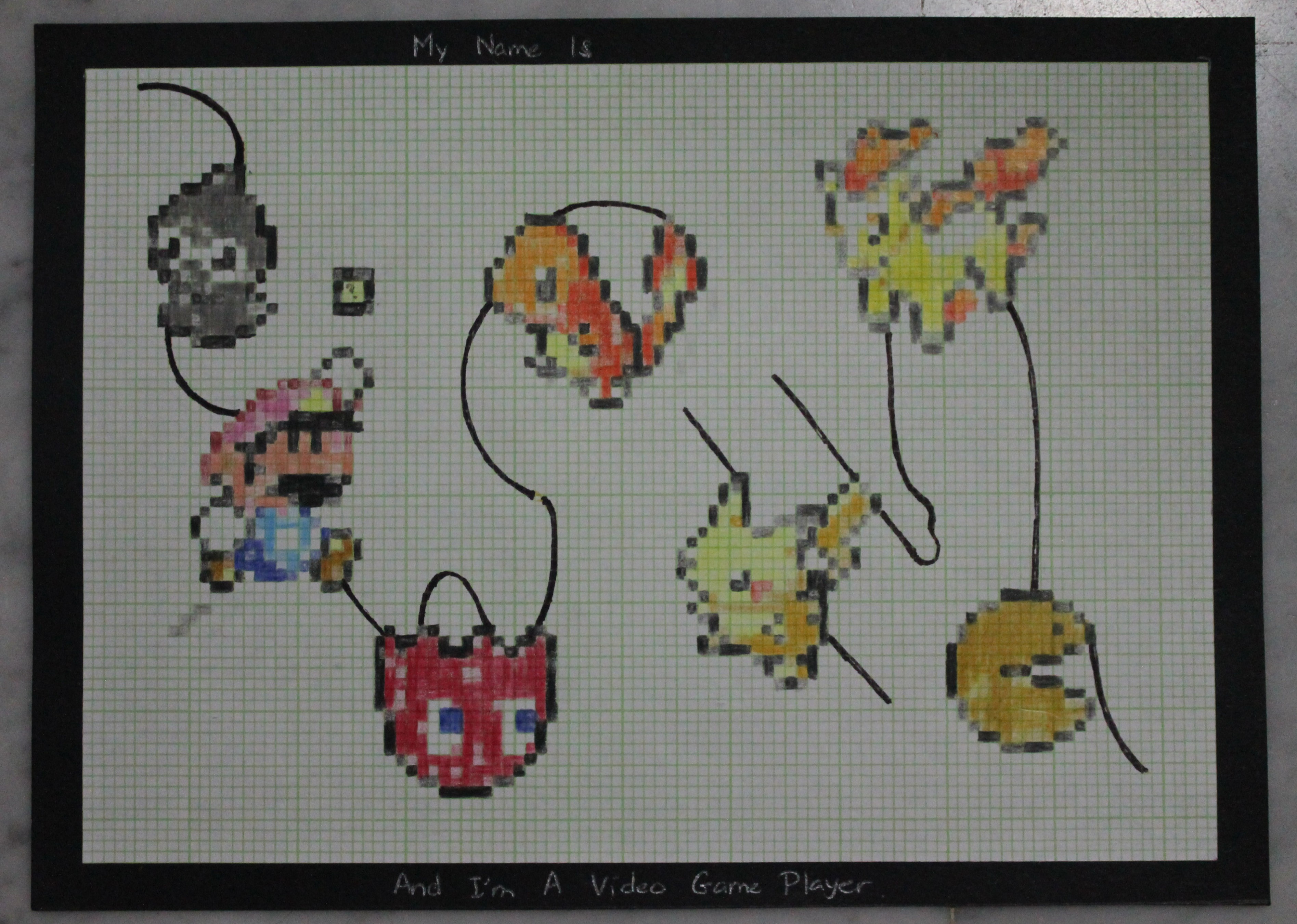
AND I 'M A VIDEO GAME PLAYER
In this work, I chose to do pixel art simply because video games are made of pixels and my thoughts were more towards the more older generation of such games where people around my age would have widely engaged with it when they were much younger instead of the modern ones. The characters i choose include those from mario, pokemon and pacman. Why these particular characters is because I feel they are the ones that most people can identify with.
I choose to do this on graph paper instead of digitally because i feel it encapsulates many factors of my concept. Firstly, I view such games to be played in the childhood years and not many people play such games now. Some may not even remember. Hence, I wanted for it to have some nostalgic feel. The graph paper was a great choice because many of us now don’t have a need for graph paper anymore and when they view it in this current time, they may have thoughts like, ” is that graph paper? reminds me of…” So similar, in terms of such games it would be, ” I remember this games, i used to play them or see them!” Secondly, it would be the process of making this work with this paper. To do this piece of work, i had to count and colour in at the correct boxes which resembles how video games are (systematic, orderly).
The characters are part of the alphabets and help form it. This is to suggest that how when we play these games, these characters are a part of us or we were a part of them, be it we were controlling them in games or be it we liked them so much we imagine ourselves to be them. The black lines that help form the alphabets are actually illustrations of the wire of consolers.
The composition is wavy, in a up and down way to suggest that when we play games sometimes we feel happy and excited but other times we feel sad, angry or down.
The defects/glitches are shown through the faded or wrong pixels as well as the wires that are thinning out or already broken. This is to suggest even though games can be systematic, there can be break downs or system glitches from time to time.
MY NAME IS
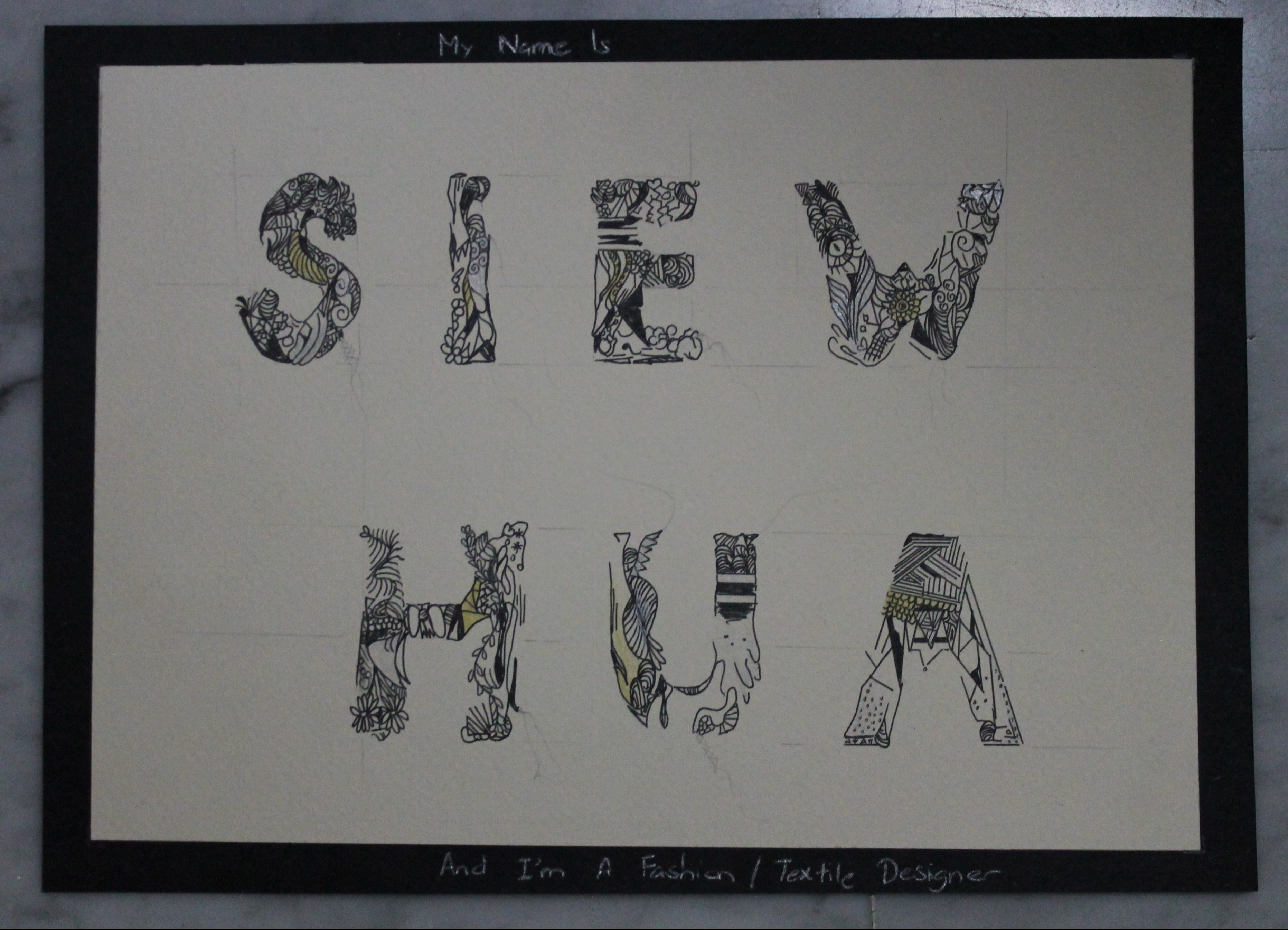
AND I'M A FASHION / TEXTILE DESIGNER
In this work, I illustrated the letters through many various patterns. Each letter have some similarities to indicate the same style of the same designer but yet they also has their own unique feature, just like how the designs of fashion/textile designers are.
It is also visible in my work how each letter is placed at the same distance apart from one another. This is to give views time to admire each letter by itself before admiring it as a whole, resembling how the designs alike that of those in this industry need their ‘own limelight’ and space. The equal spacing is also to indicate that the designs are usually carefully calculated or arranged and not just some random choice of placement.
I did away with the colours and kept it relatively in black but highlighted in shiny gold and silver. This is to keep it sophisticated, elegant and glamourous.
However, upon a closer inspections, one would start to take notice of the ugly pencil lines and some would have thoughts of “why is this there? Shouldn’t this be hidden from public?”. They are not because i forgot to erase them or anything along that line but actually an deliberate act to push my message across. The straight lines that look like measurements or alignments guide are to indicate the initial steps for designers before they can come up with their wonderful designs. These designs do not come easily but are only achieved through numerous failed attempts, hence it is rather tedious and requires much hard work. The more wavy lines or to resemble those of loose strands of tread from clothes/textiles, because even though the final product may look totally perfect from afar, their is still some not so visible defeat somewhere.
My choice of paper is solely for the purpose of aesthetics where i feel black on white would look rather empty or incomplete while off-white paper is more pleasant on the eye and would enhance the aesthetic quality too.
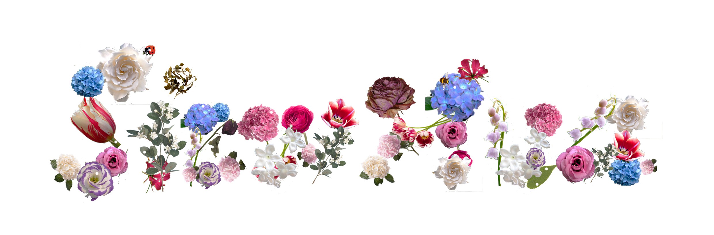
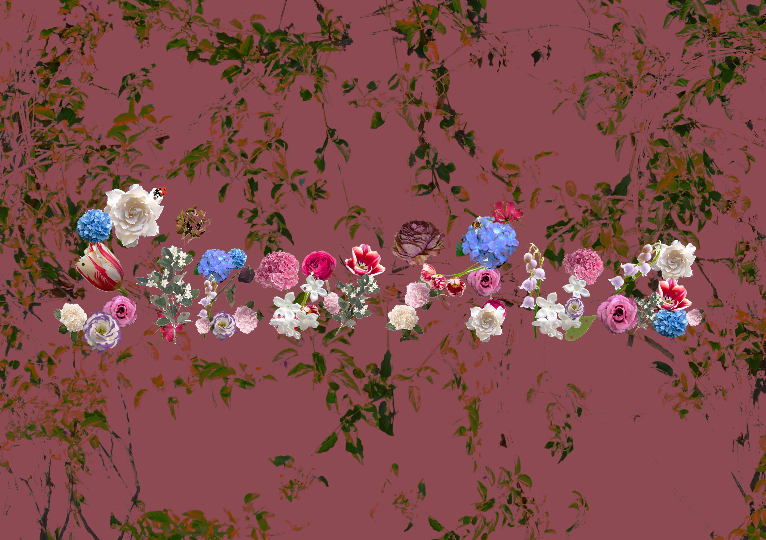
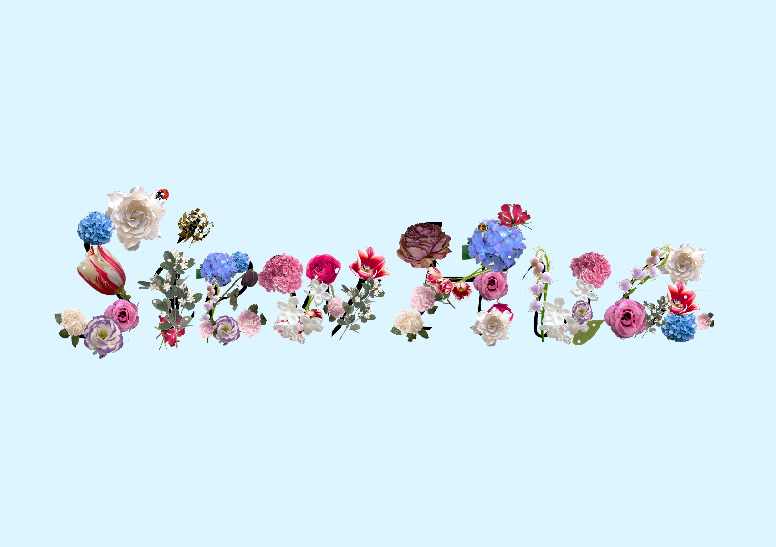
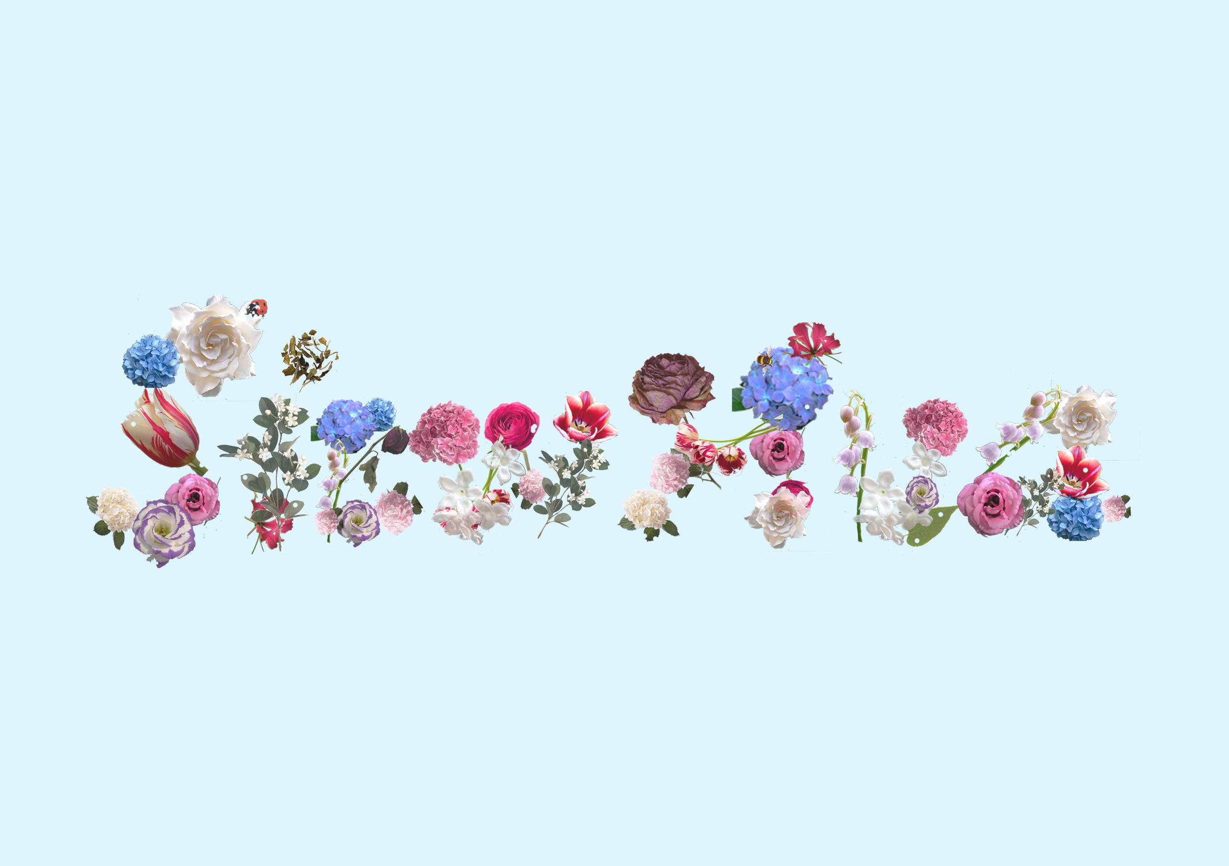
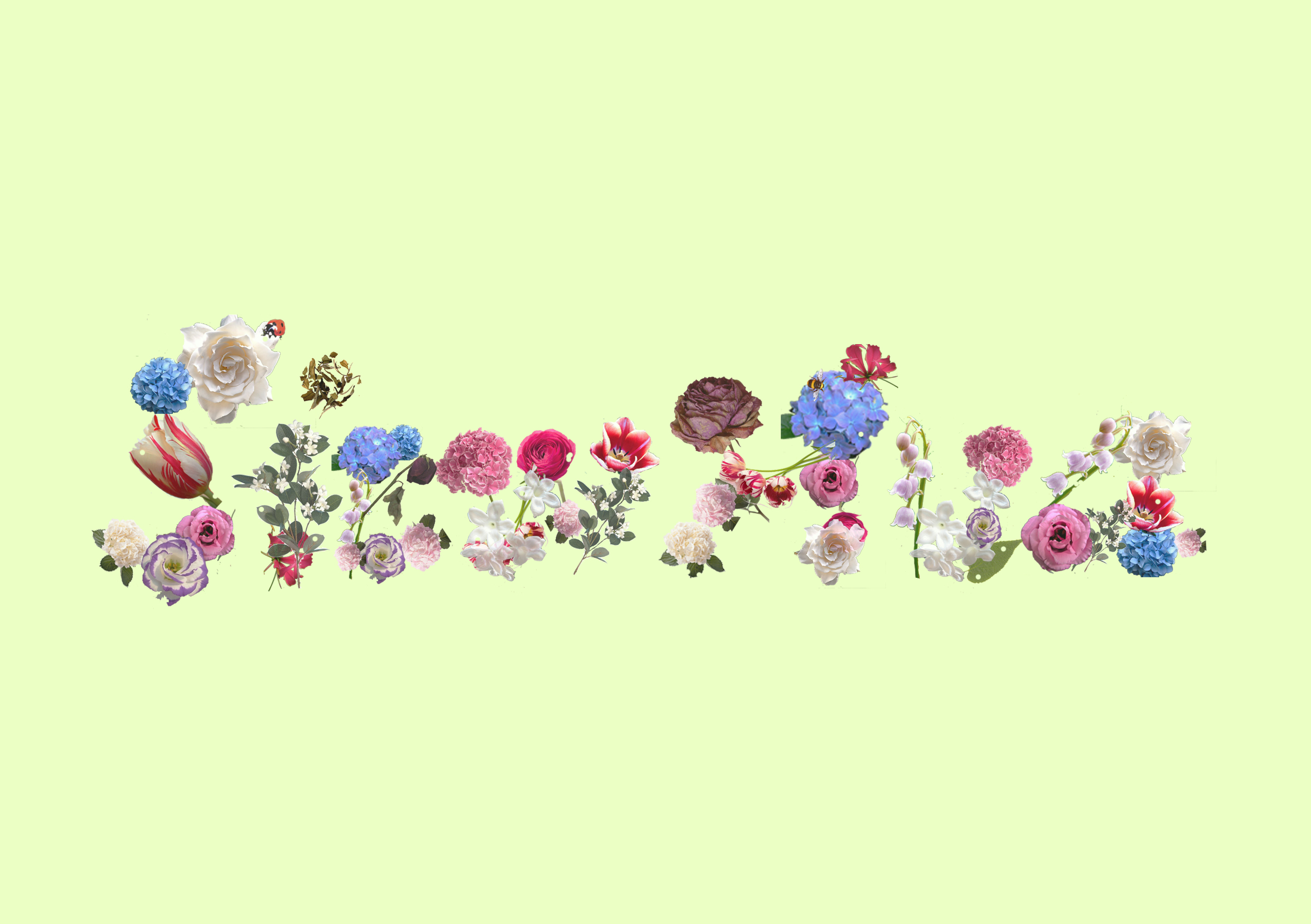
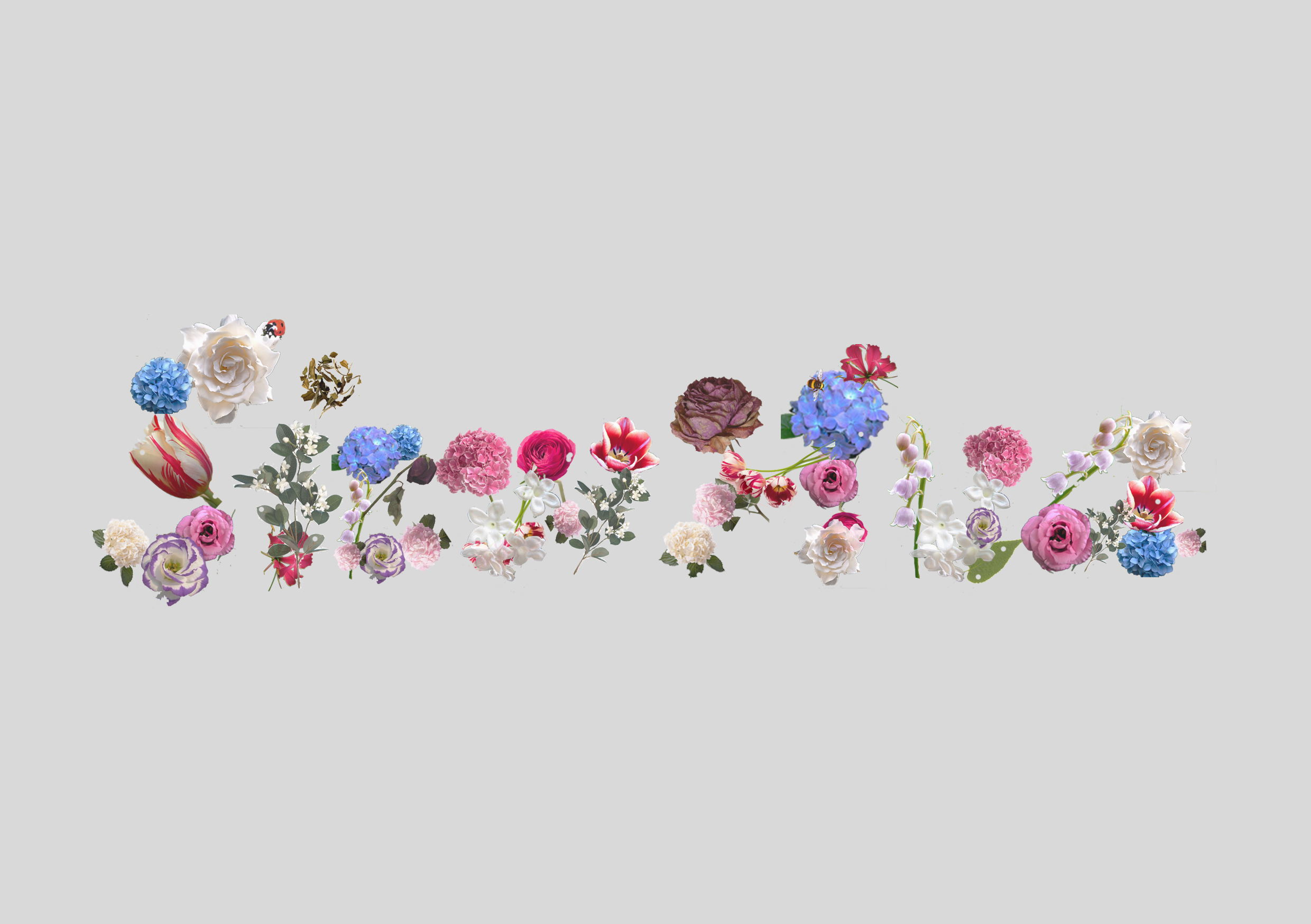
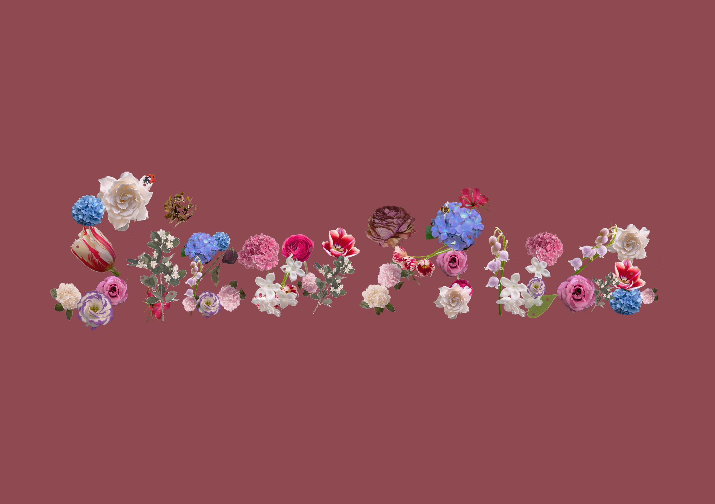
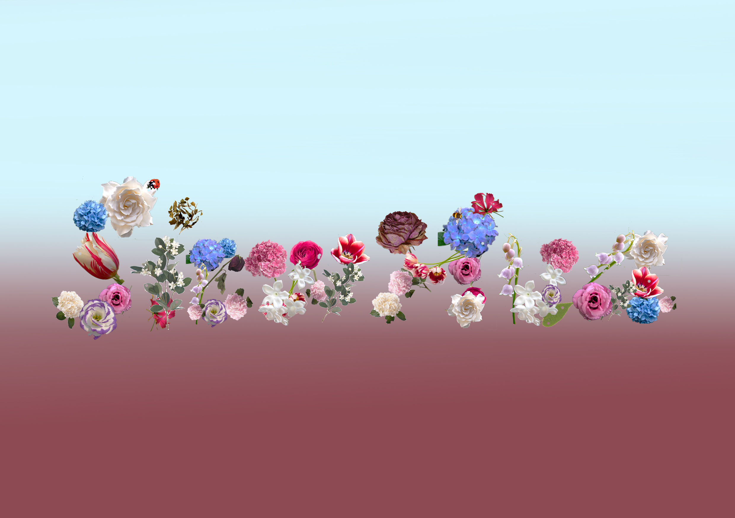
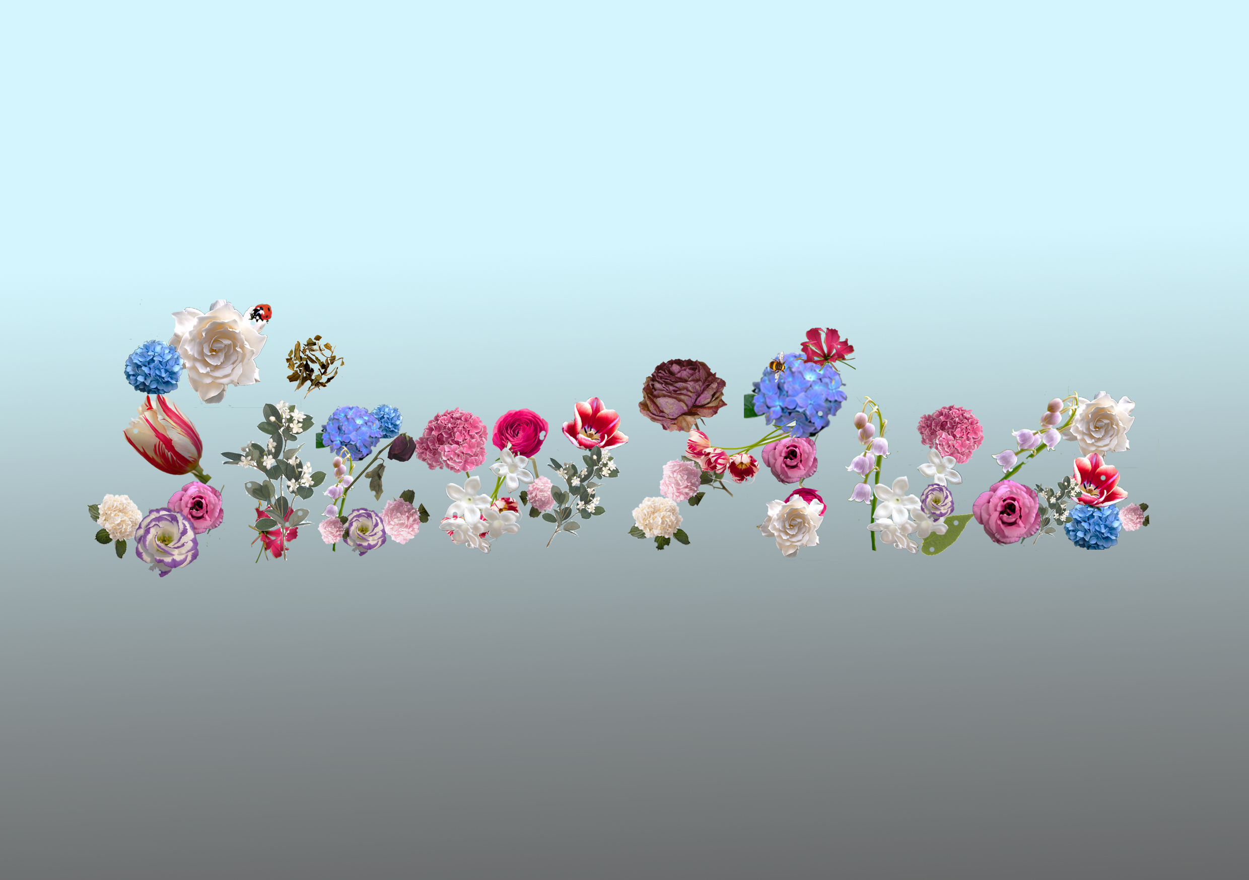
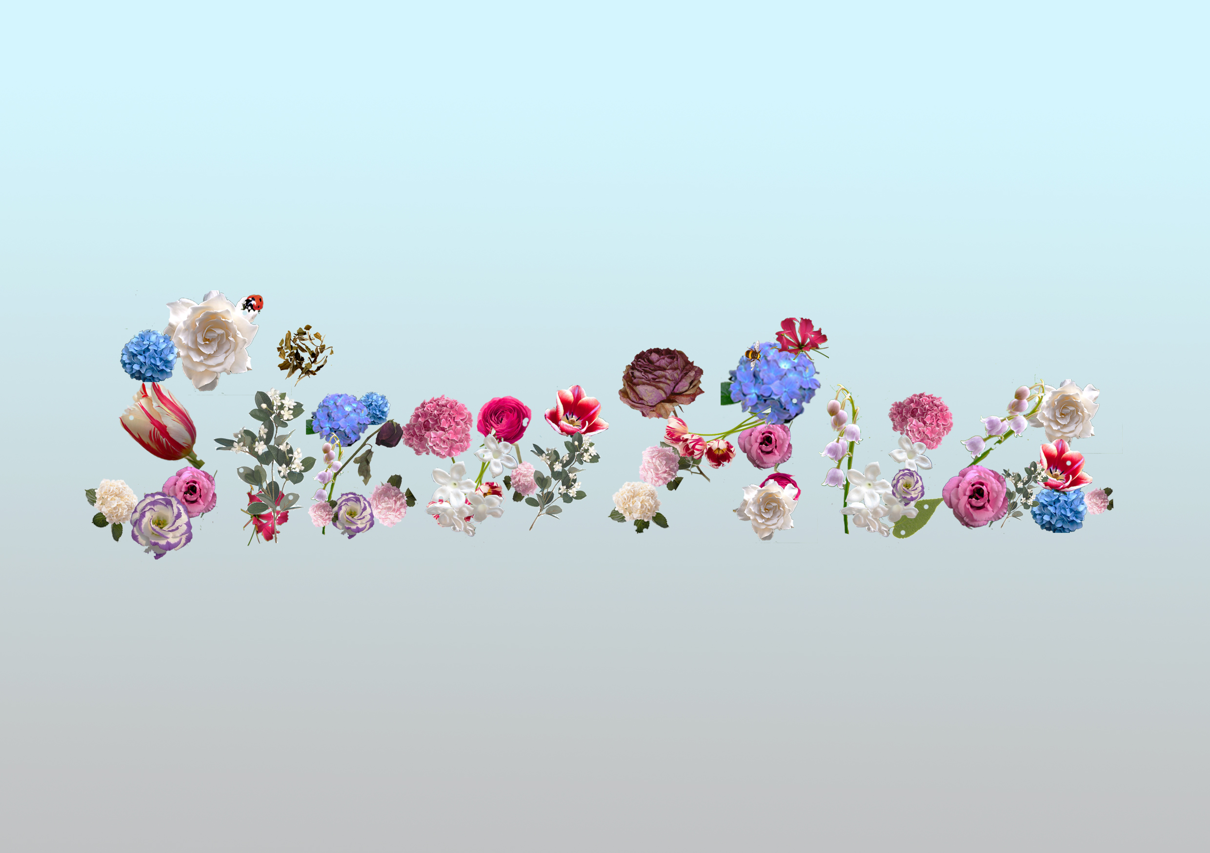
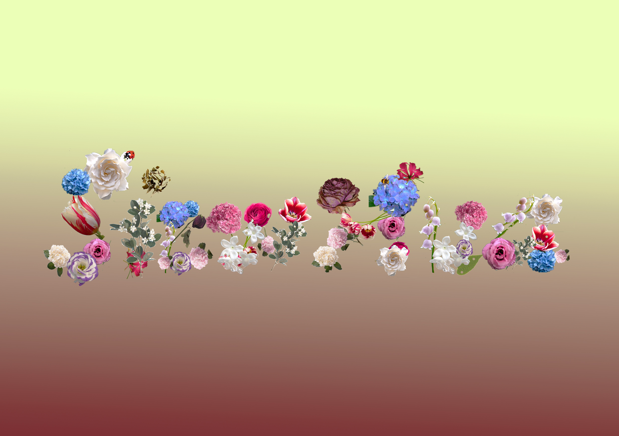
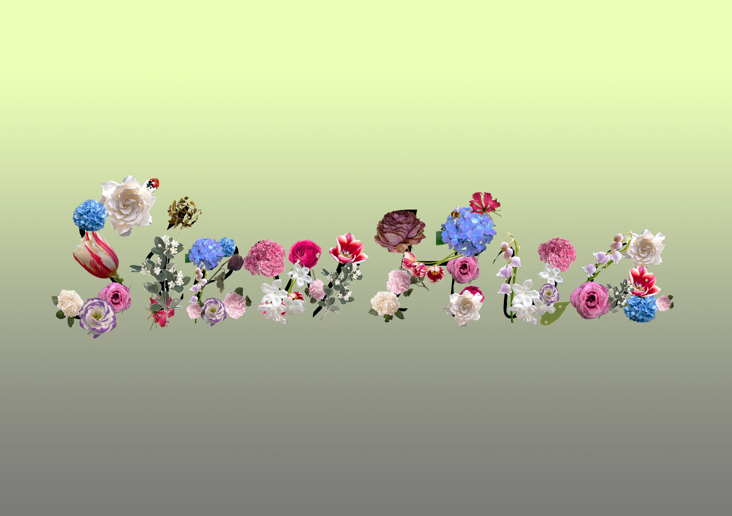
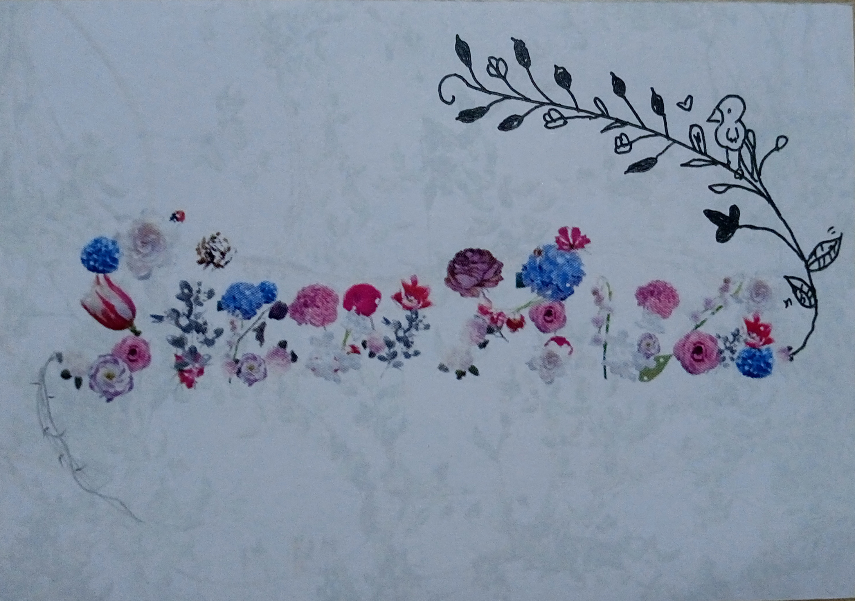
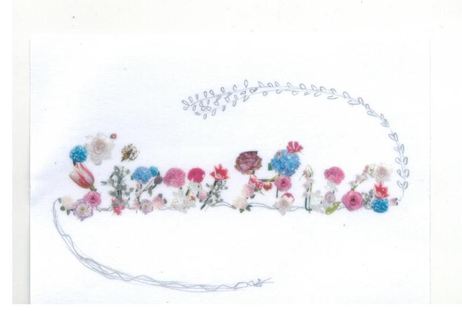
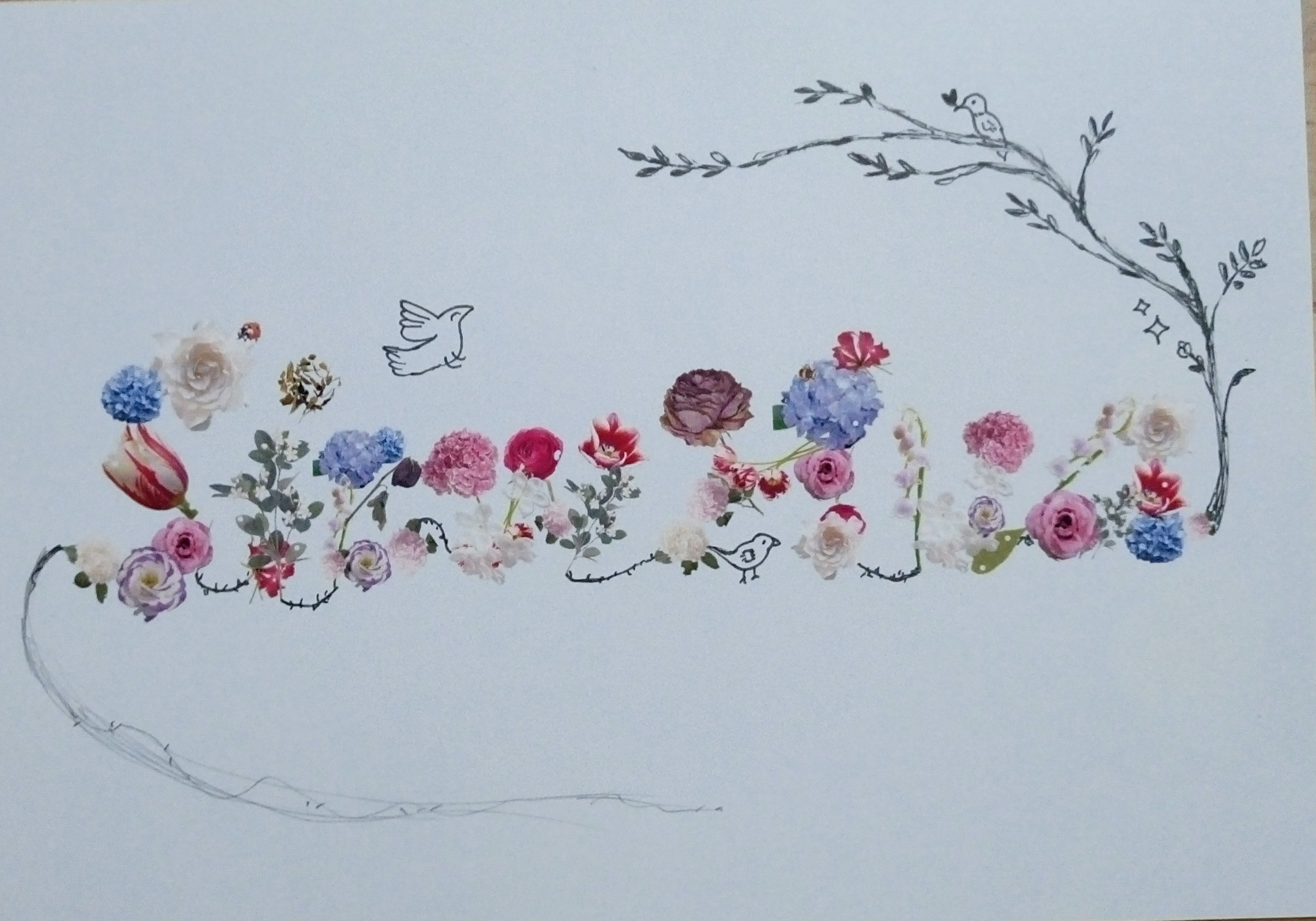
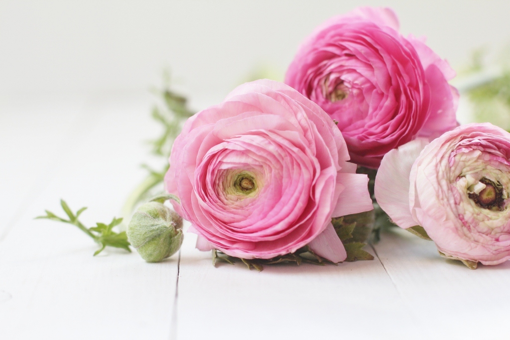
MY NAME IS
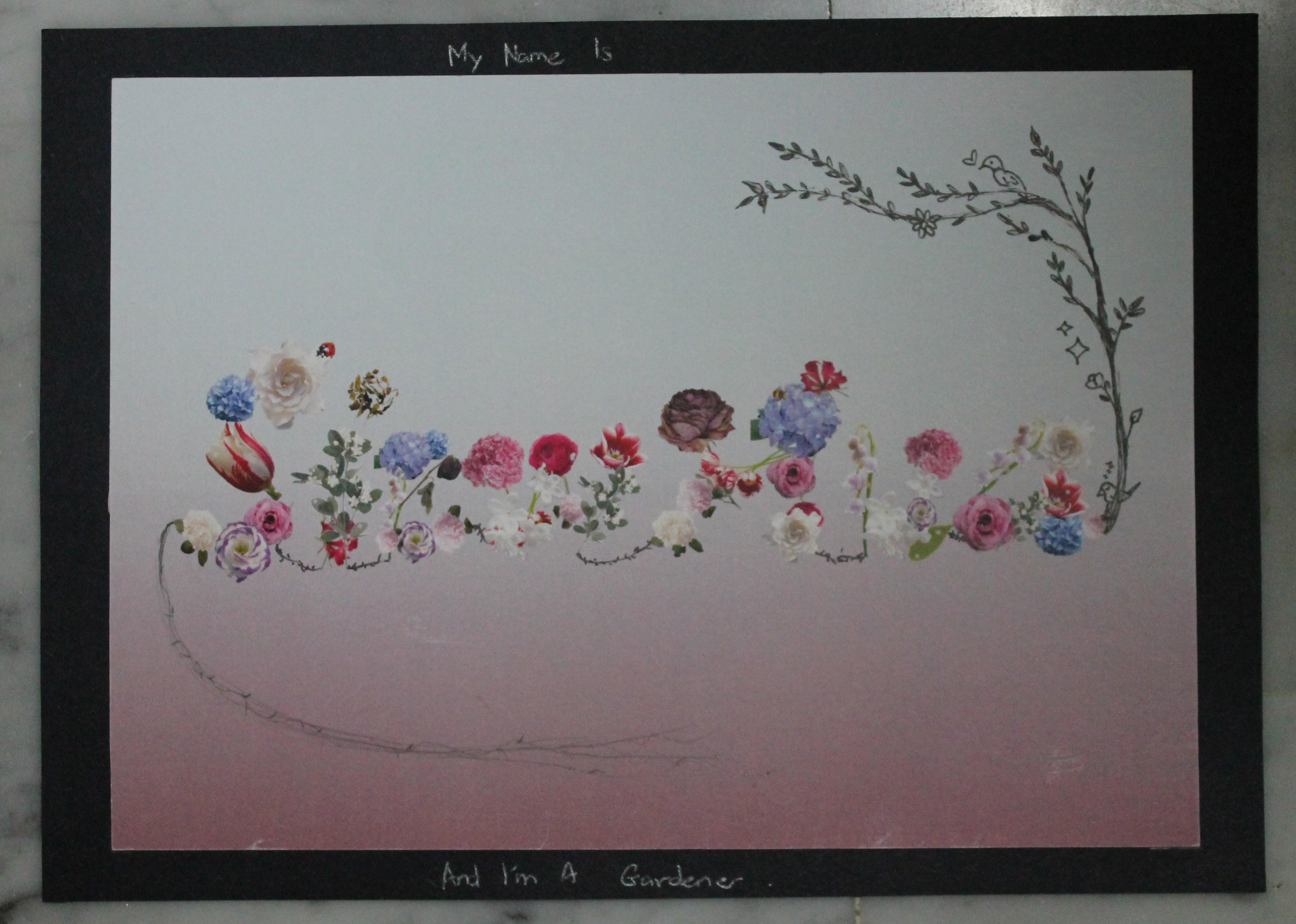
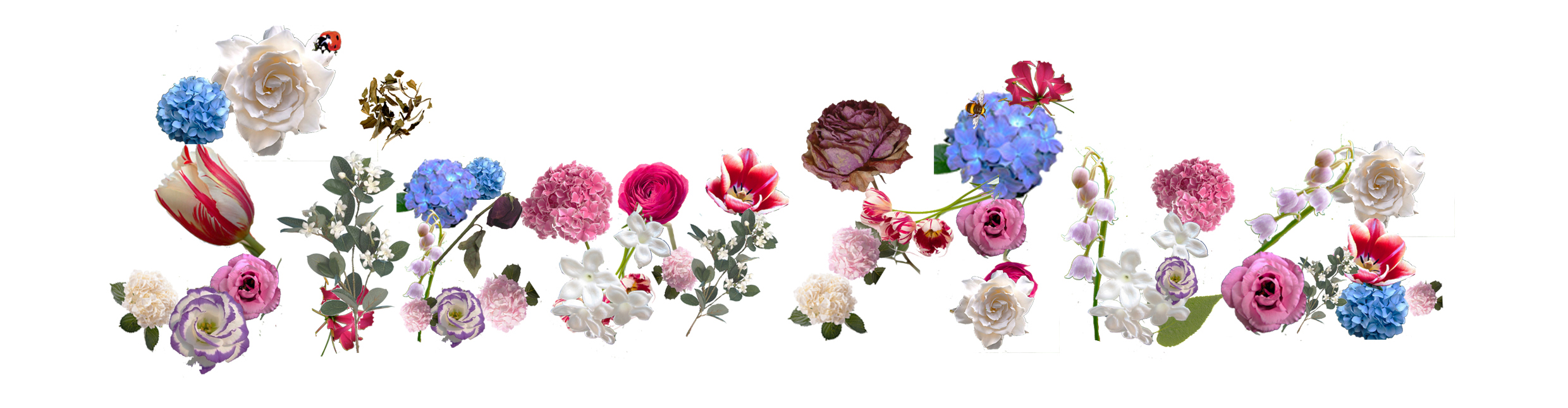
AND I'M A GARDENER
In this work, it is first done digitally where i cut out the individually flowers on photoshop to form letters of my name. After printing them out, i illustrated with both black marker and pencil.
I choose for the top part of the background to be a light-blue that sort of resembles the sky as well as to portray the quality of calmness and serenity. On the other hand, the shade of red is to indicate that not everything was that ‘peaceful’ and their is actually handwork, pain and even blood(some flowers have thorns and all) involved. Hence, in a way the blue is the beautiful part while red is the negative part.
The plants that form the alphabets of my name look pretty and elegant at first glance or from afar but upon near inspection, one will see that there is actually some withering or spoiled(holes) ones inside as well. This is to suggest the idea of not everything that seems perfect is perfect, and the flaws are only noticeable if one cares or have the interest enough to go see it at a closer level.
The insects represented by a lady bug and a bee is to not only suggest that they are part of what makes up a garden but also to bring up the idea of how they are often discredited or overlooked when they actually aid in healthy and beautiful garden growth. Just like the gardener, who is often overlooked or disregard.
To play up this idea of having both positives and negatives, I illustrated the upper half to be positive, where flowers are blooming, leaves are healthy and there is even animals(bird). On the bottom half, there are ugly vines and menacing, prickly thorns. I also illustrated in such a way that they are connected in a way and it is almost circular to suggest that this is alike that of a cycle that goes on repeatedly.
1. Assembly Line Worker
After doing up the piece itself, I planned to present it to viewers through photography instead of the actual one (also taking in mind how Joy suggested to deviate from 3D stuff). Hence, I wanted to explore a lot with the shots and take from various different views and ways so that I can get the best shot that best depicts my idea.
Layout explorations:
A. Softer light & shadow x Simple composition
close up shot
angled close up
flipped orientation shot
B. Ray of sunlights x Simple composition
softer light & shadow
harsher light & shadow
C. Softer light & shadow x Complex composition
close up shot
angled close up shot
far shot
extreme angled close up shot
flipped orientation shot
D. Harsher light & shadow x Complex composition
close up shot
angled close up shot
far shot
*Possible project tryout in the future?
random font exploration?
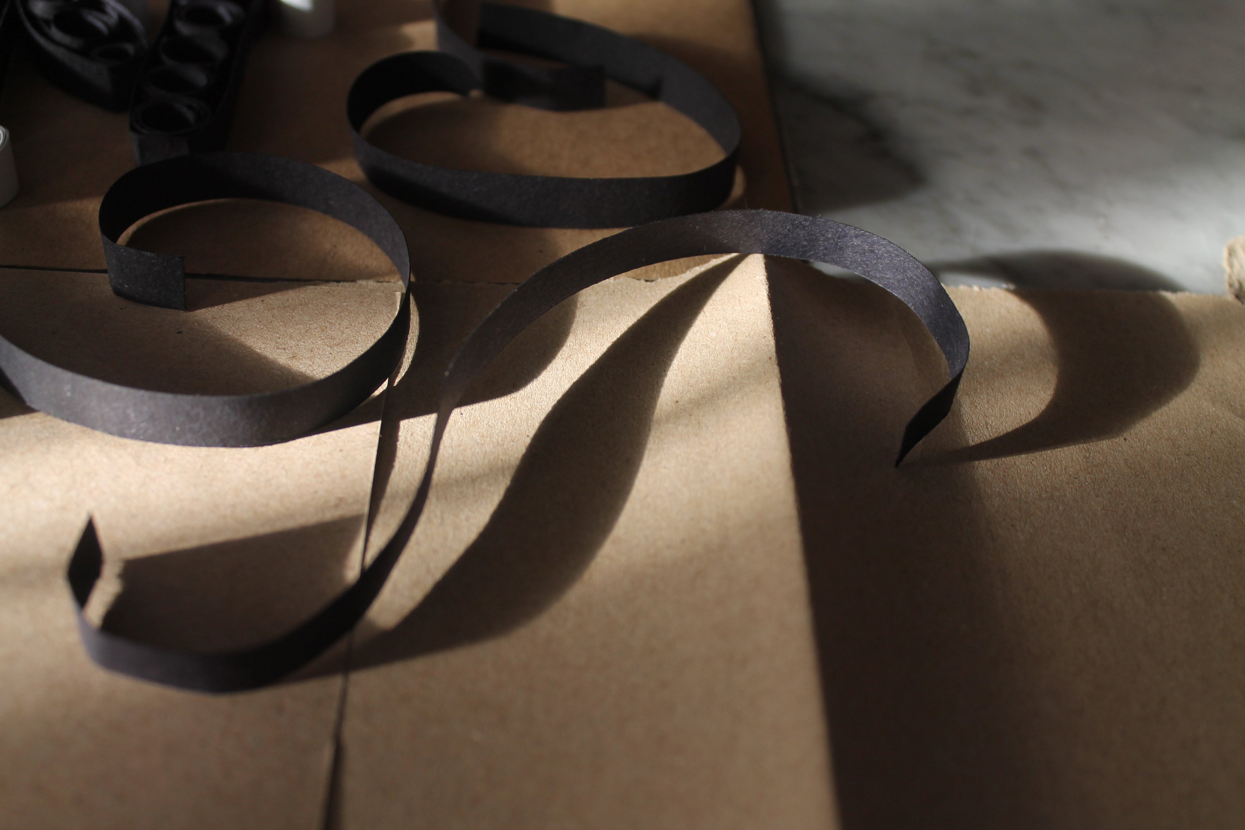
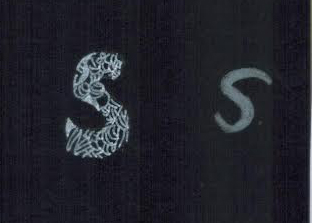
This is not a layout/composition exploration but while i was taking the shots of my work, i chanced upon this casted shadow of an ‘S’ and thought that it was rather beautiful yet interesting and it definitely has room for future further developments.
Presentation explorations:
Since Joy suggested during the first consultation to do away with 3-dimensional works, I decided to stick to presenting it by photography. Instead of just using it as a medium to capture the work, I wanted to fully utilise this medium by making edits, filters and adjustments to enhance both the aesthetics and also conceptually as well.
A. Filter – Tom (Pixlr ; default)
As many of the negativity of such factories/industries are make known to the world nowadays is by newspaper report, hence black and white is to resemble that of a newspaper clipping. One can argue that technology is so advanced nowadays that pictures can be printed in colour now. However, i felt that assembly line workers are more prominent in the older times where technology was not as advanced.
B. Filter – Sanna (Pixlr ; subtle)
Adding on to the point above, to current date there are still some assembly line workers still doing the work manually and are not yet being replaced by machines. Hence, with this point in mind, the factories would tend to try and cover up their negatives/faults to maintain their reputation. Similarly to how the companies work, this filter sort of beautifies the image, in a way covering up for the bad parts but the critical flaws can still be seen.
C. Filter – Ingrid (Pixlr ; subtle)
The idea for this filter is totally opposite from the first two mentioned above. Instead, in this filter, it sort of sharpens and makes the image rather grainy/coarse-looking which sort of portrays effectively how tough and hard it actually is for the people working in this industry. In a way it can depict the working environment/conditions realistically.


C. Filter – Combination
Sanna x Ingrid
Tom x Ingrid
2. Video Game Player
chosen characters
proposed layout
final layout
Since my overarching concept is about subtle glitches & consumerism, I decided to not colour every square (pixel) fully. Some appear faded while some appears the proper fully coloured square.
Below is an example:
example of the glitch/defect
3. Fashion Designer / Textile Designer
After looking over where my progress was currently at for this work, I felt that something was still not right because of the spacing between each letter. I felt that they were too cluttered together which does not fit in with what i think of the job. I feel that in this industry, every piece of cloth they create is meaningful and each hold their own importances. They’re all unique pieces and they are each given adequate time limits for the audience to admire.
Therefore, i wanted to capture all those in my typography work and this is what i came up with:
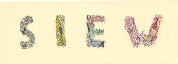
Off-white/ beige paper with spaced out letterings
I decided to do away with the various colours schemes to make it look more sophisticated and glamorous, just like how the fashion/textile designers tend to work towards. Instead I tried out with black pen and the shiny/slightly glittery colour pencils .
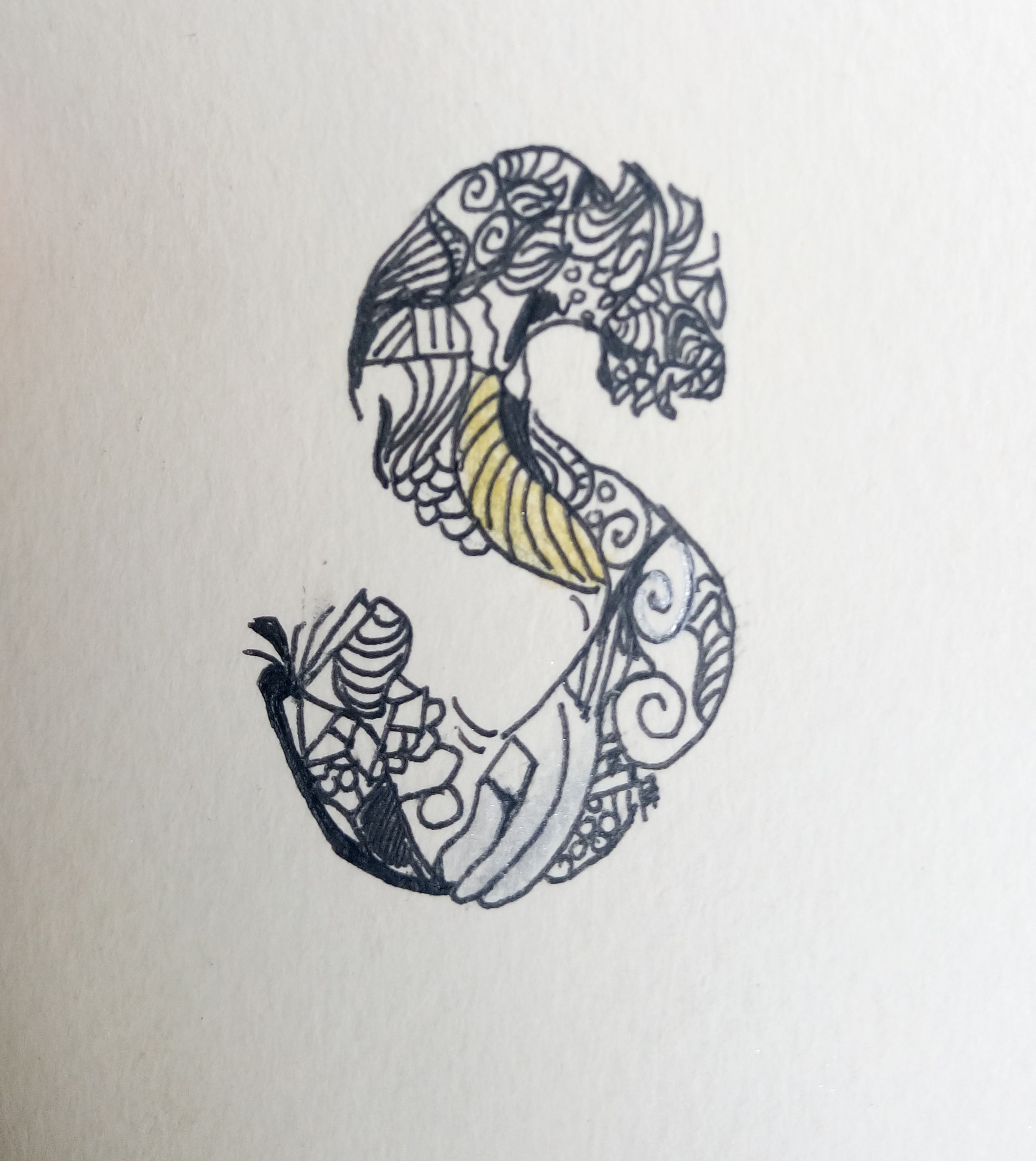
example of the typeface
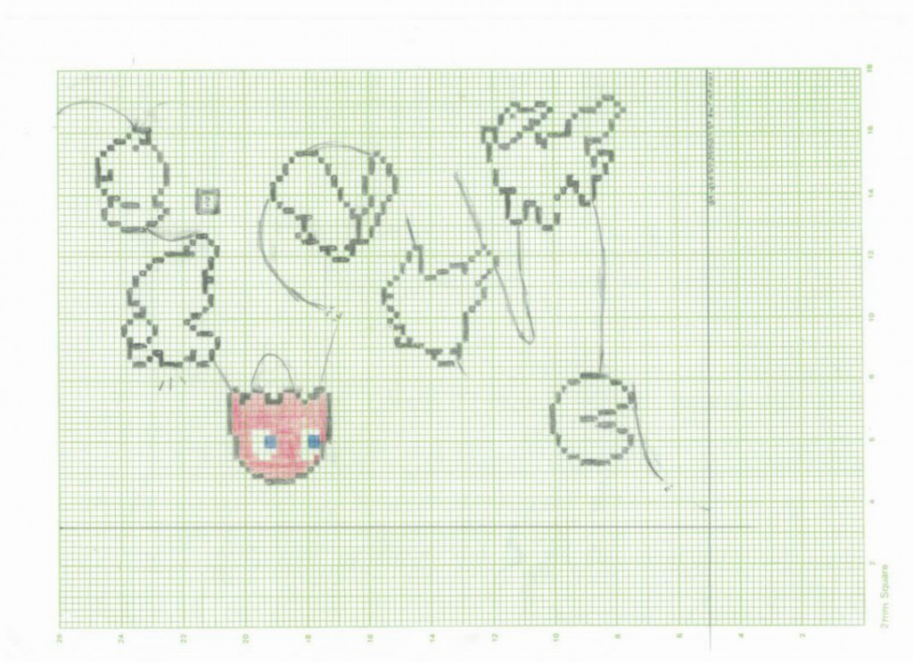
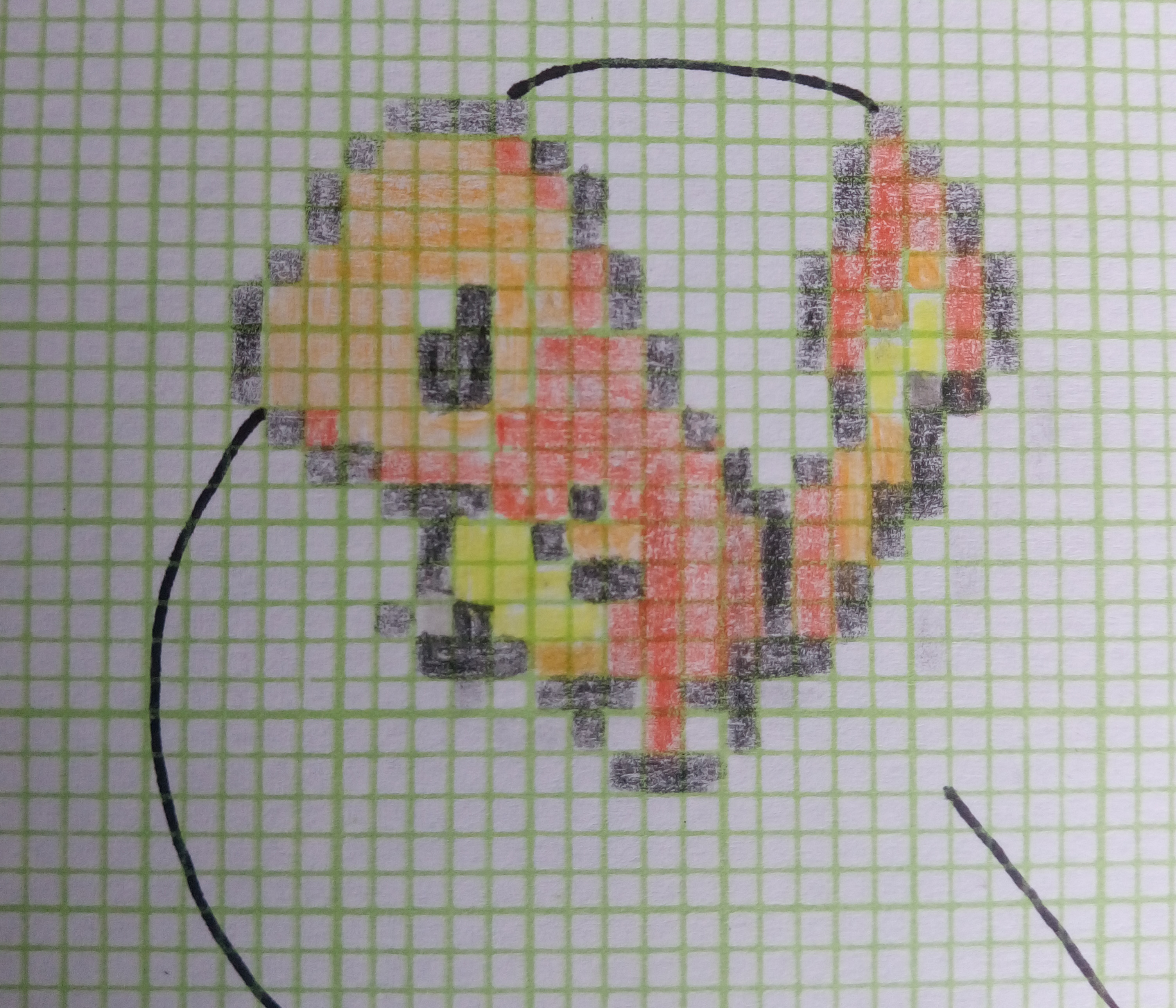
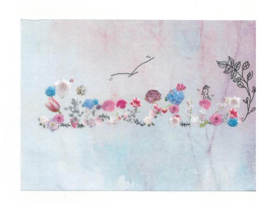
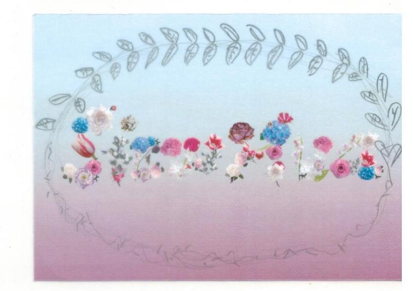
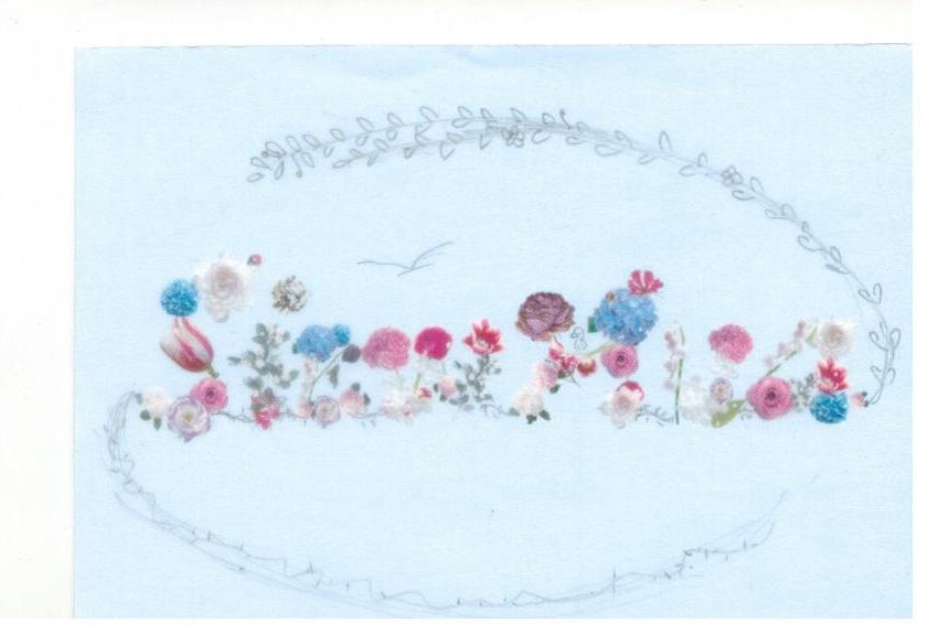
4. Gardener
Development: defects
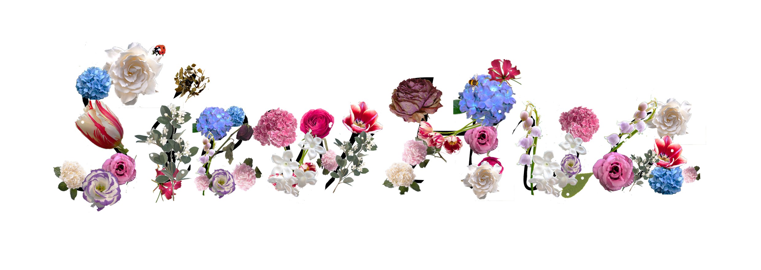
layout of how i tried piecing the flowers & insects together to make alphabets with black lines
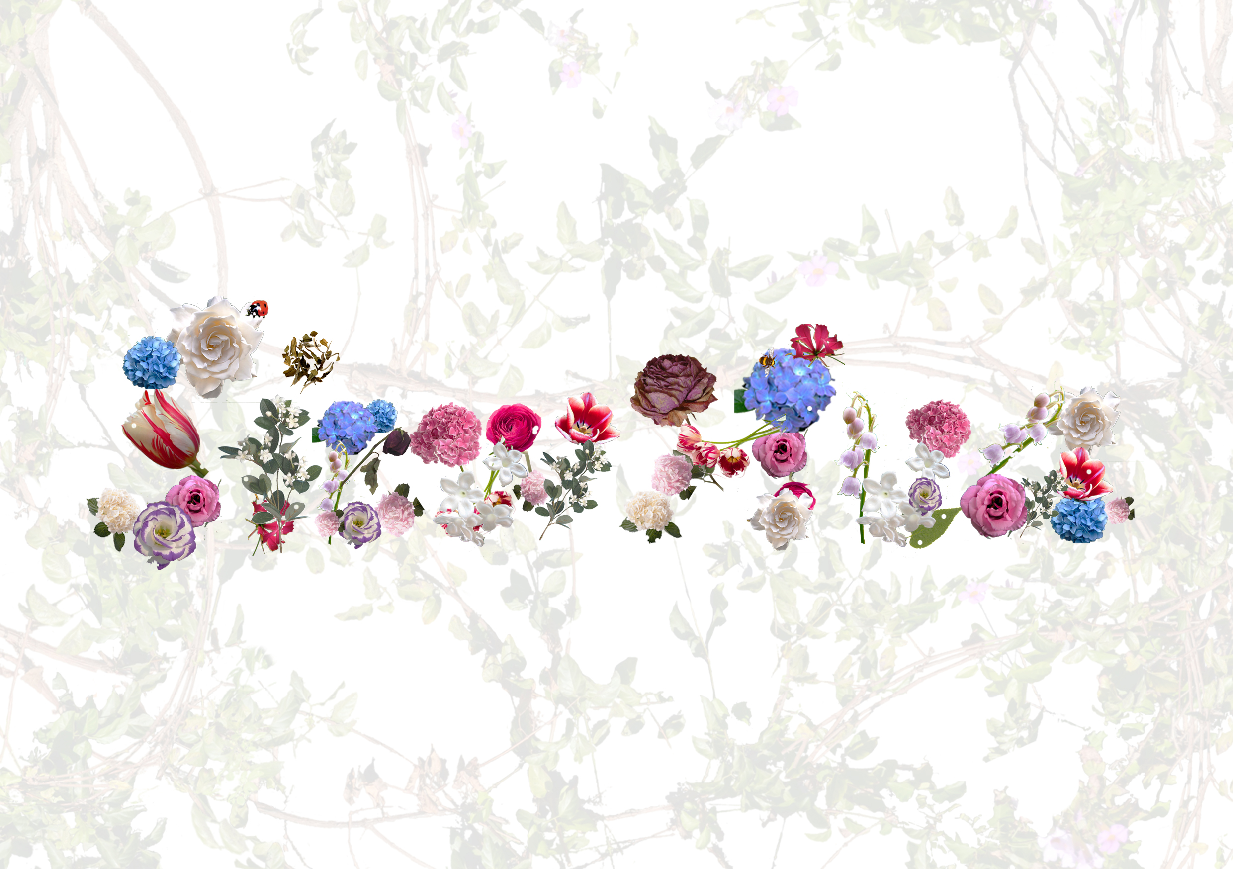
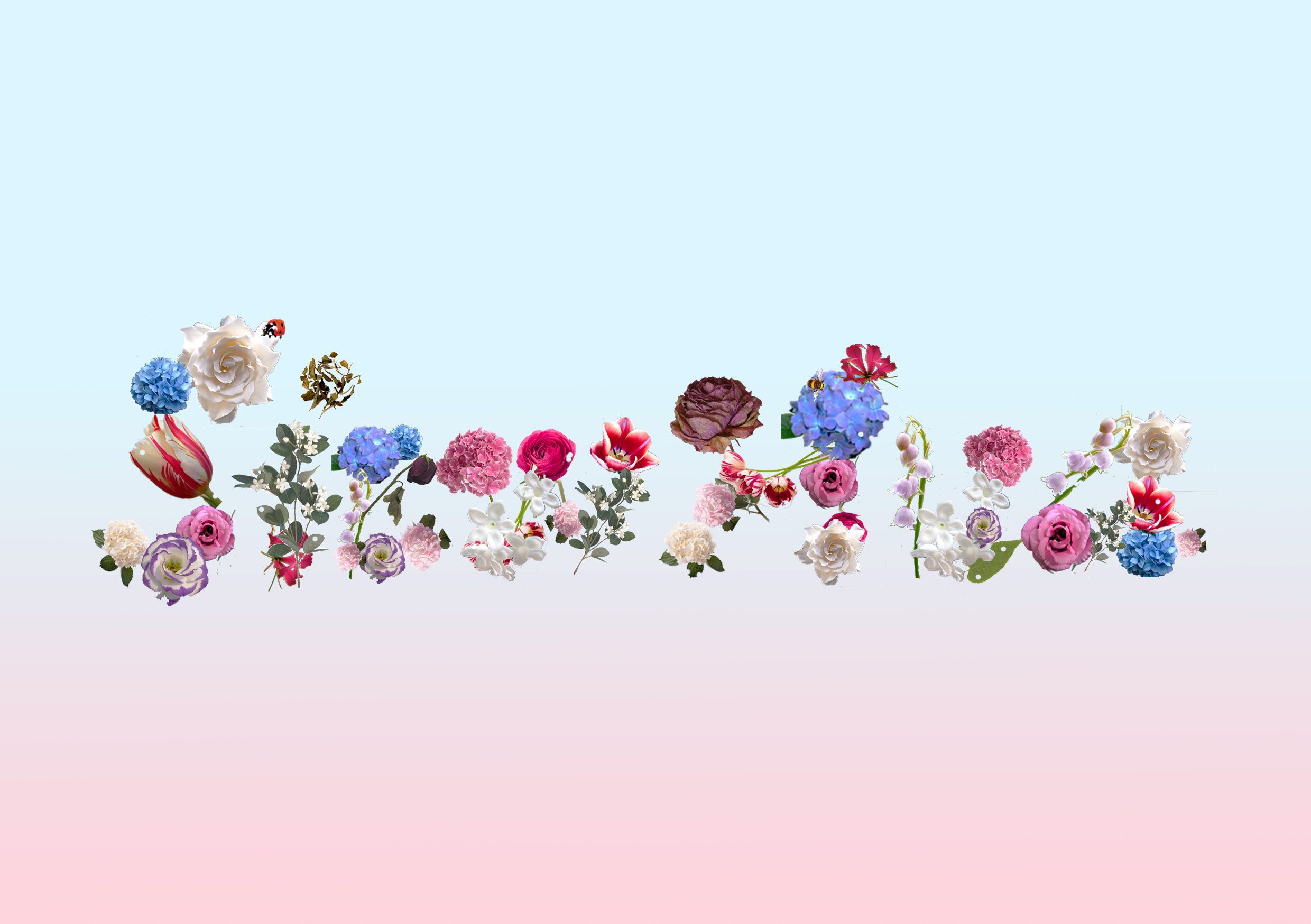
For the backgrounds I planned to use individually or combination of maybe blues, greens, reds & greys, blacks and white. Why those colours?
Here are some tryouts with background exploration:
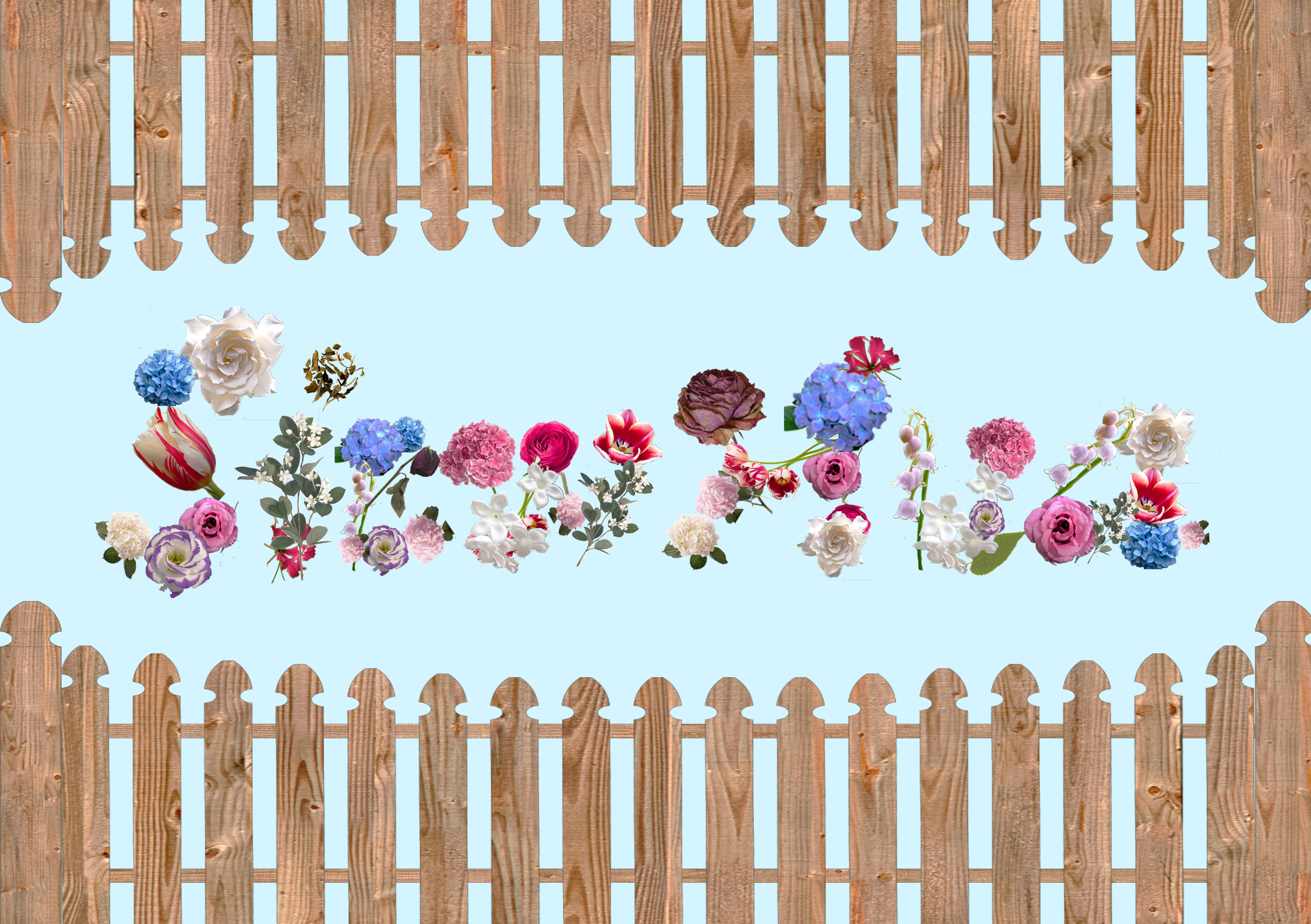
pastel blue x fences
Fences because gardens usually requires such high-maintenance that there is often a divide to prevent outsiders from ruining it.
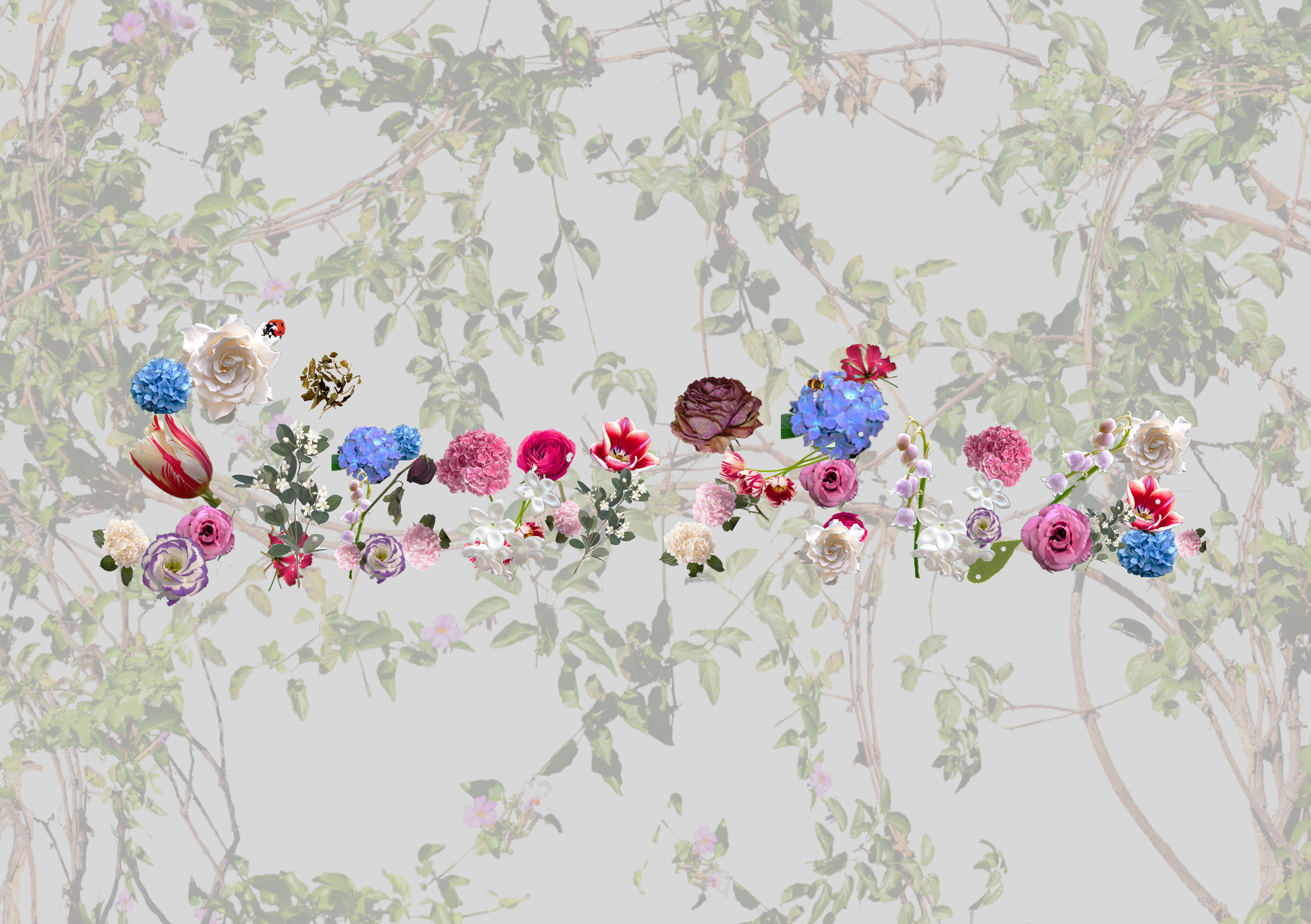
grey x vines
red x vines
white x vines
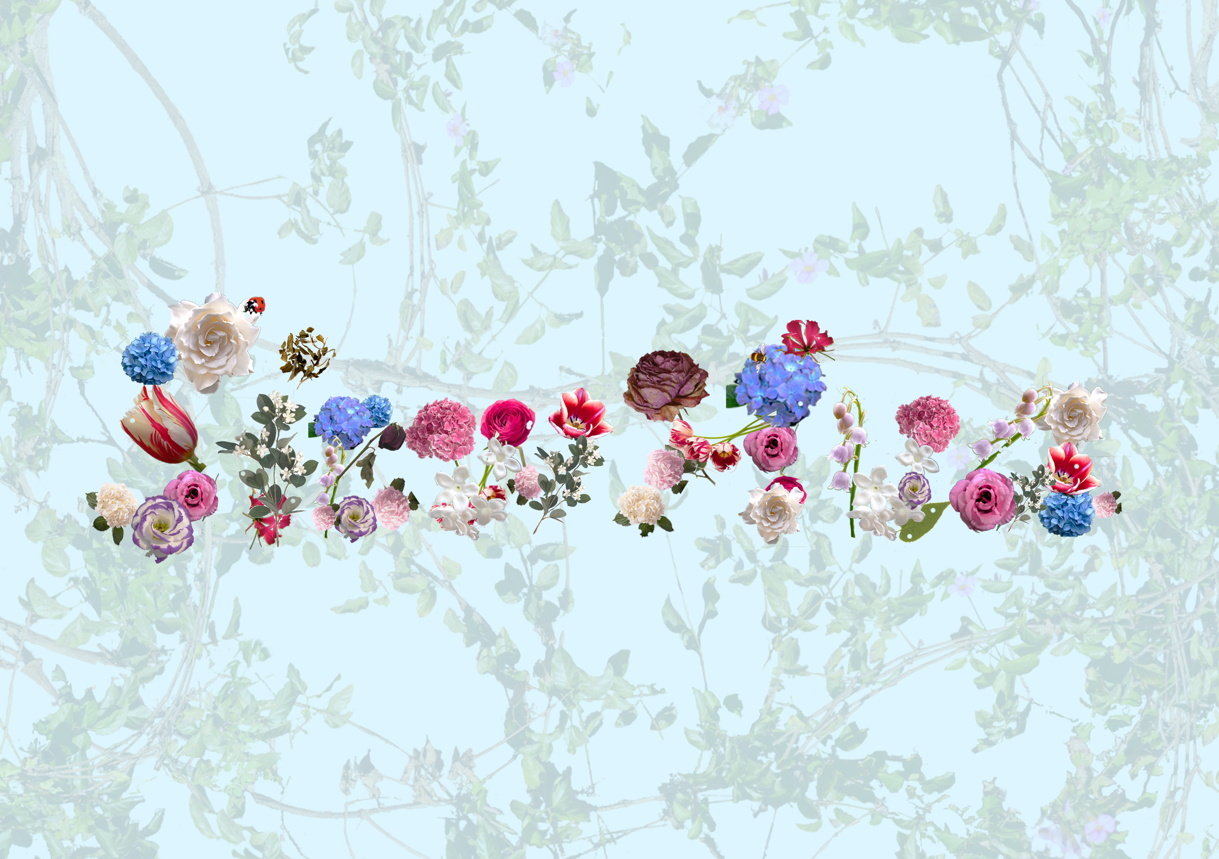
pastel blue x vines
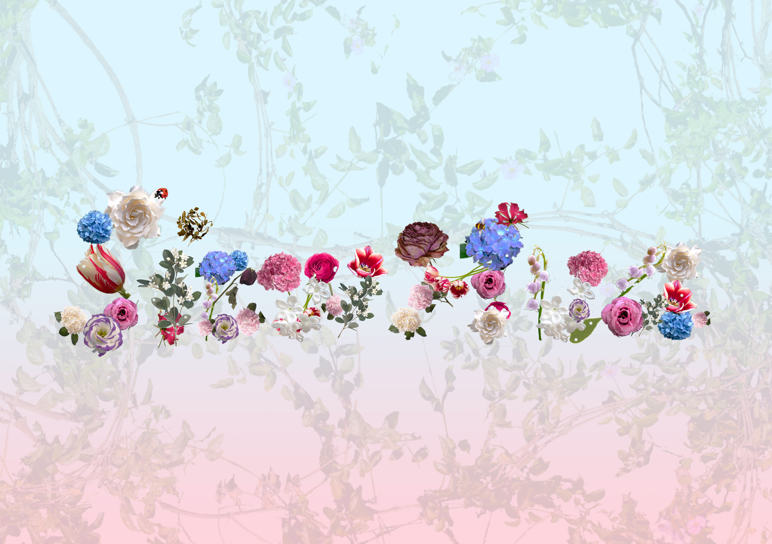
pastel blue-red gradient x vines
I decided to also tryout without the backgrounds i initially tried out with as it would also be hard for me to put in my illustration on it if i wanted to do mixed medium since it will be too cluttered. Therefore, i decided to leave it simple and plain but i explored on the various colours that are suitable for my idea.
pastel blue x letterings with black lines
pastel blue
pastel green
light grey
red
with my watercolour background paper (horizontal)
with my watercolour background paper (vertical)
blue-pastel pink gradient
blue-red gradient
blue-red gradient
blue-red gradient
blue-black gradient
blue-dark grey gradient
blue-light grey gradient
green-red gradient
green-grey gradient x letterings with black lines
Exploration of Mixed Medium:

some illustrations tryouts
Basically what i did from my previous update on OSS was to develop the ideas further and to finalise the respective designs. (I won’t be writing on the concept/idea/story behind the works in this post, but just the physical process developments). Here is briefly, my current progress:
1. Assembly Line Worker
I decided to work with a dull colours (black , white, brown) for this design.
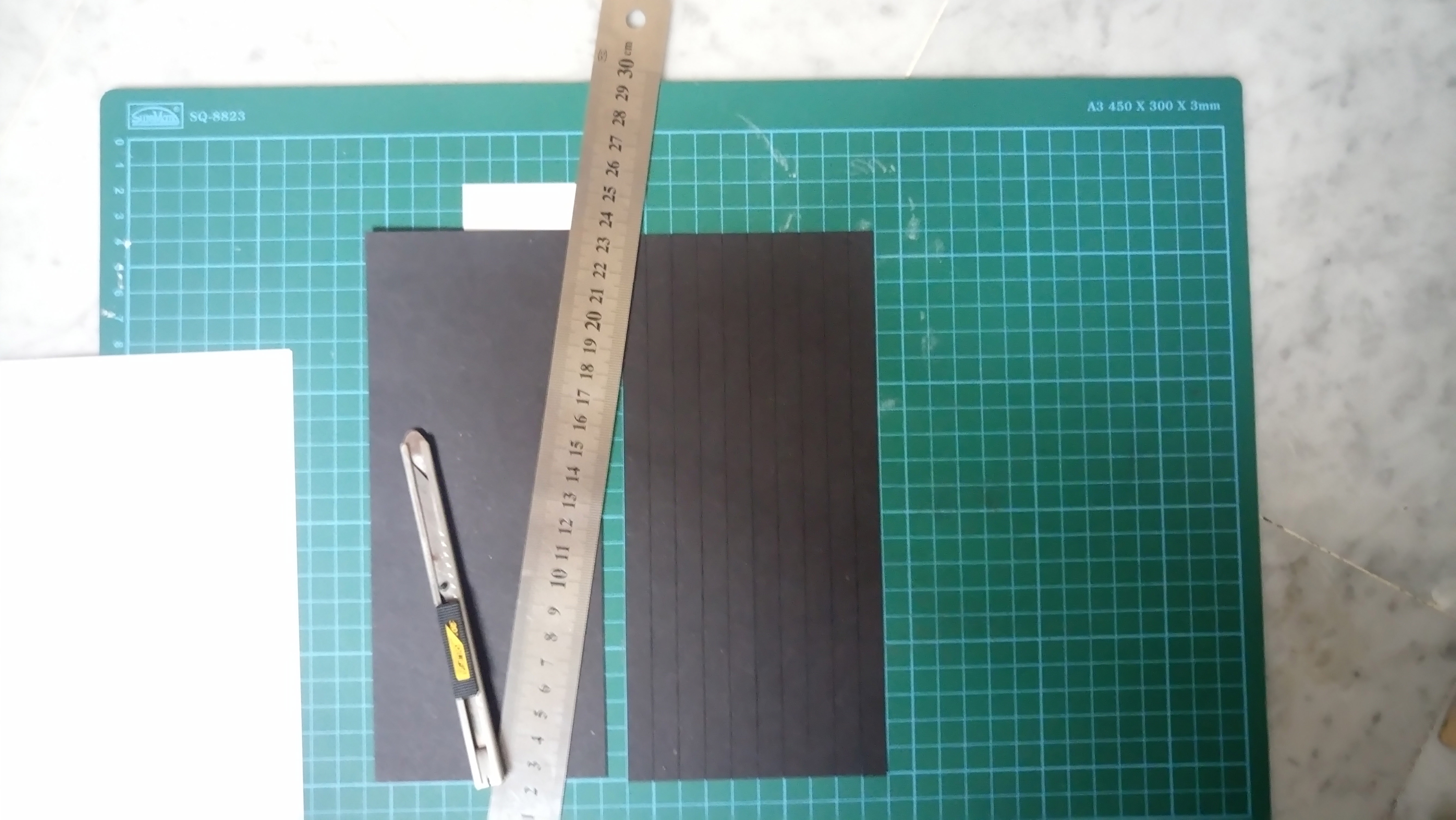
Cartridge paper (white) & black paper (black)
The colour brown actually comes from the colour of the cardboard.
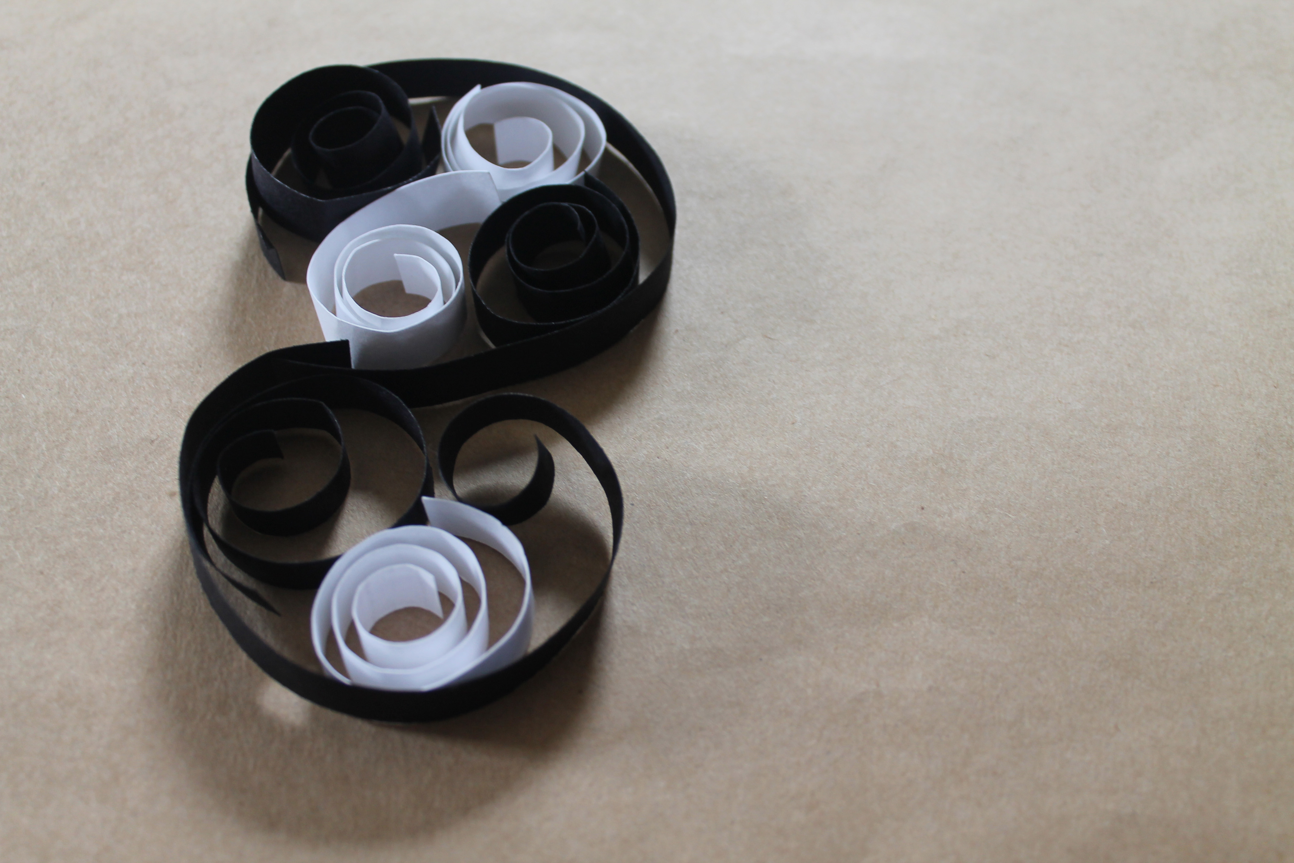
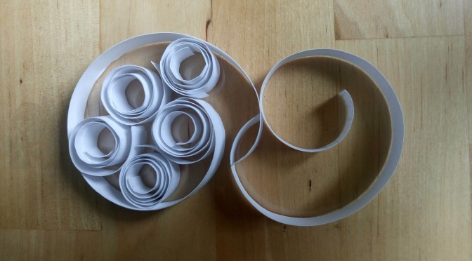
Style one : Loose curls (Initial)
Style 2: Controlled/Tight curls (Chosen)
I felt that the second style would be more appropriate and suitable for my concept instead of my initial style hence i decided to work with the tighter and more controller curls.
Process:
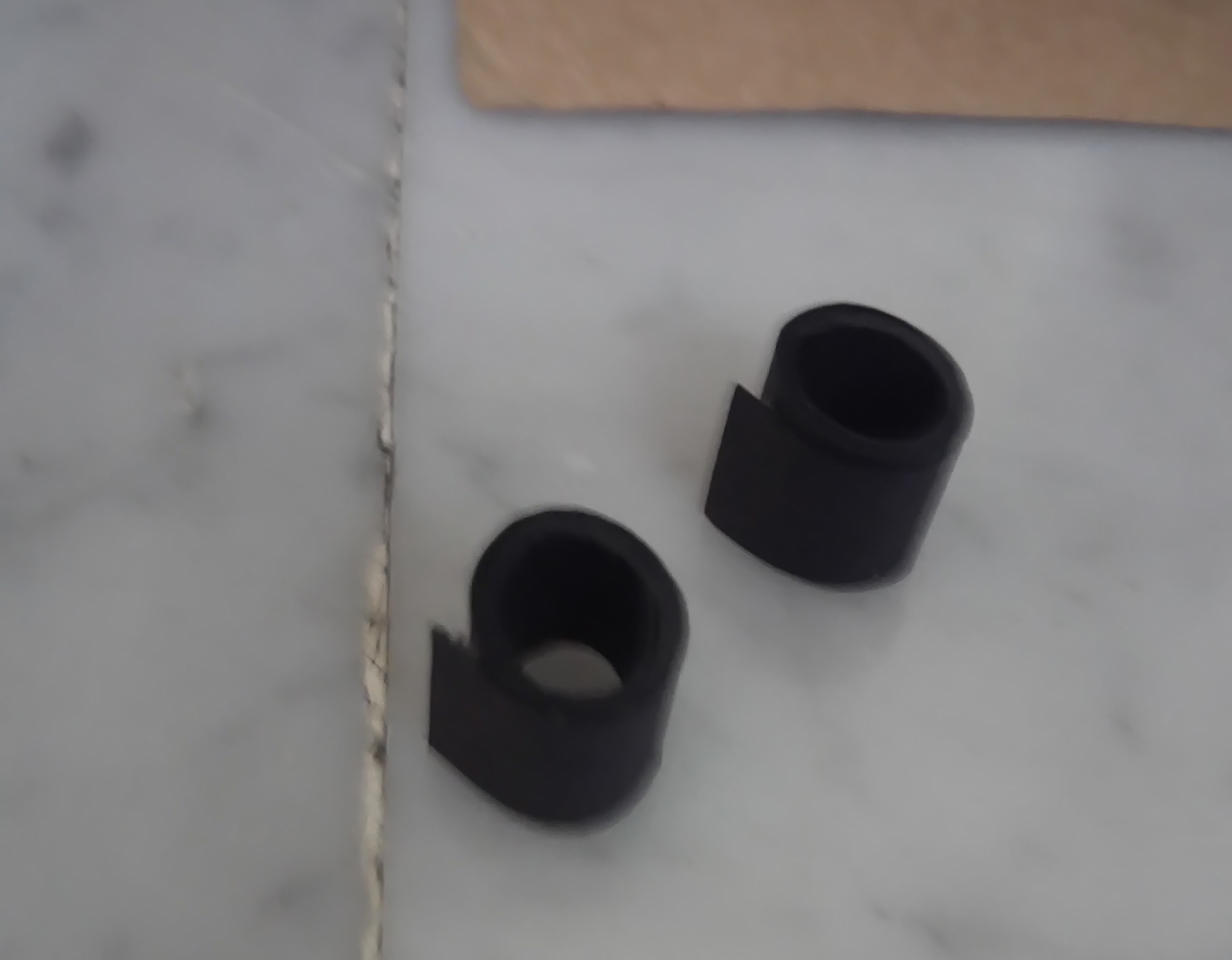
1. Roll up the strips of paper.
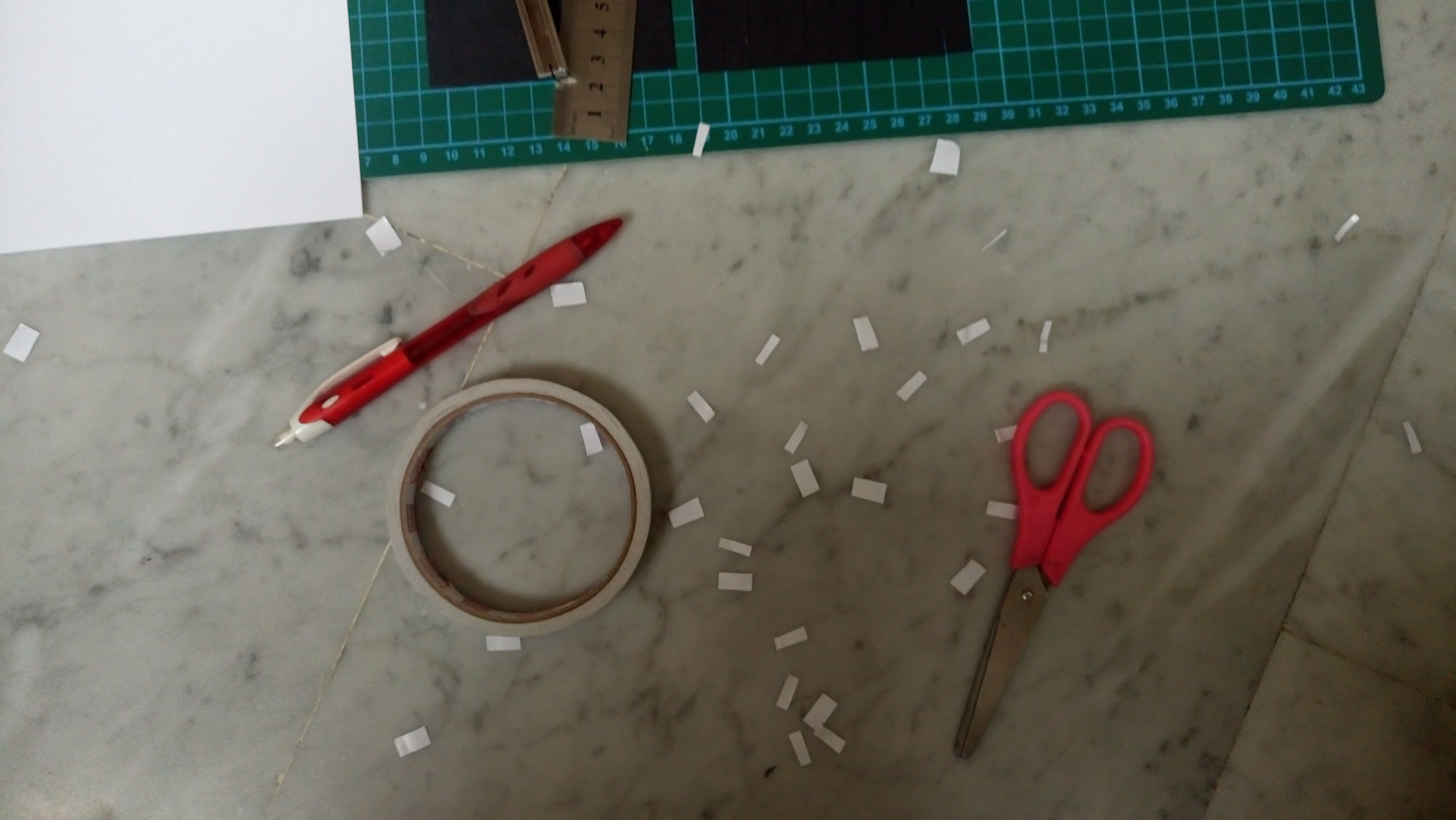
2. Double side tape the ends together.
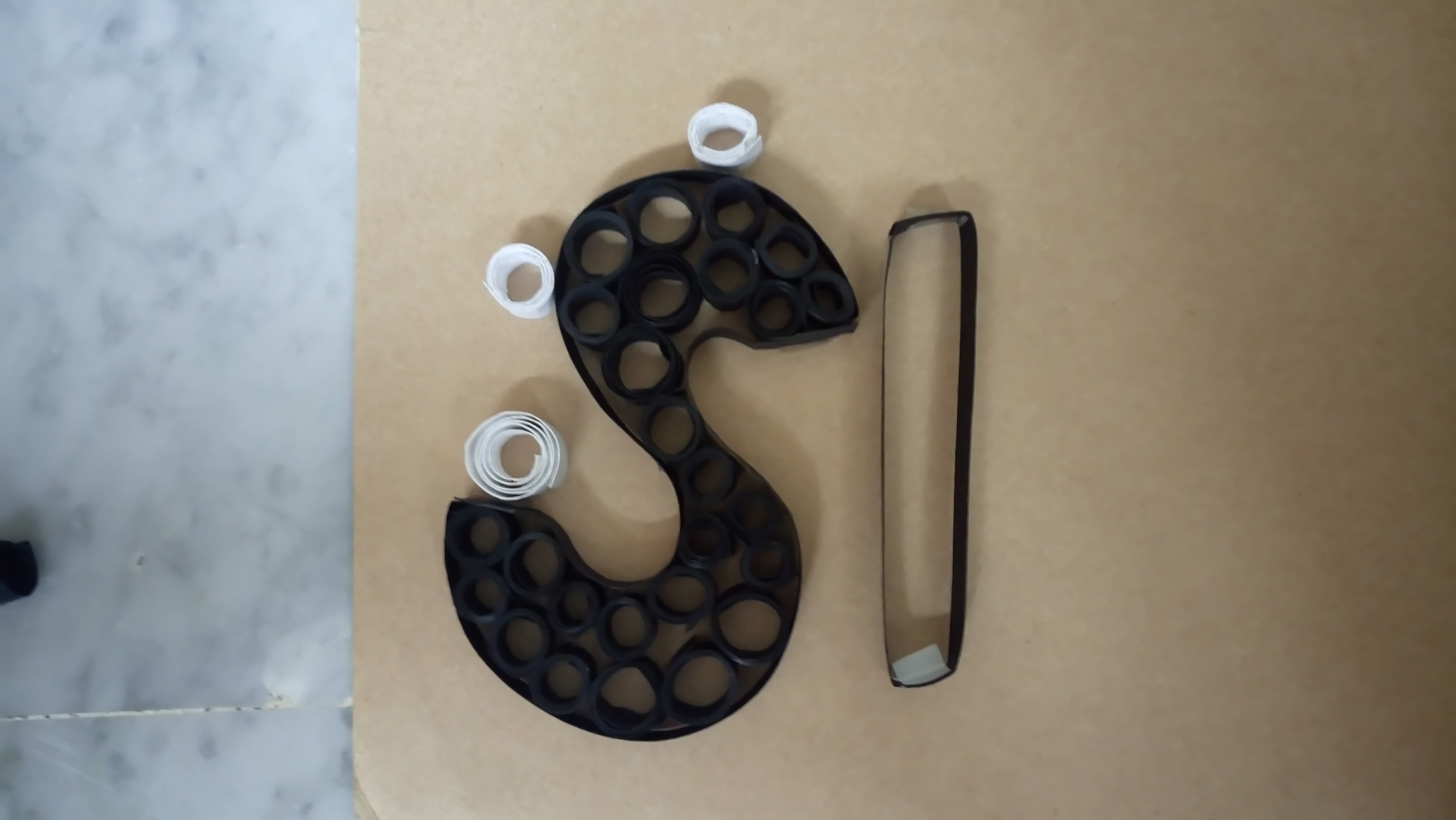
3. Fold a alphabet ‘skeleton’ then place the rolled-up strips in.
*Note: Final design still unconfirmed, may do more explorations.
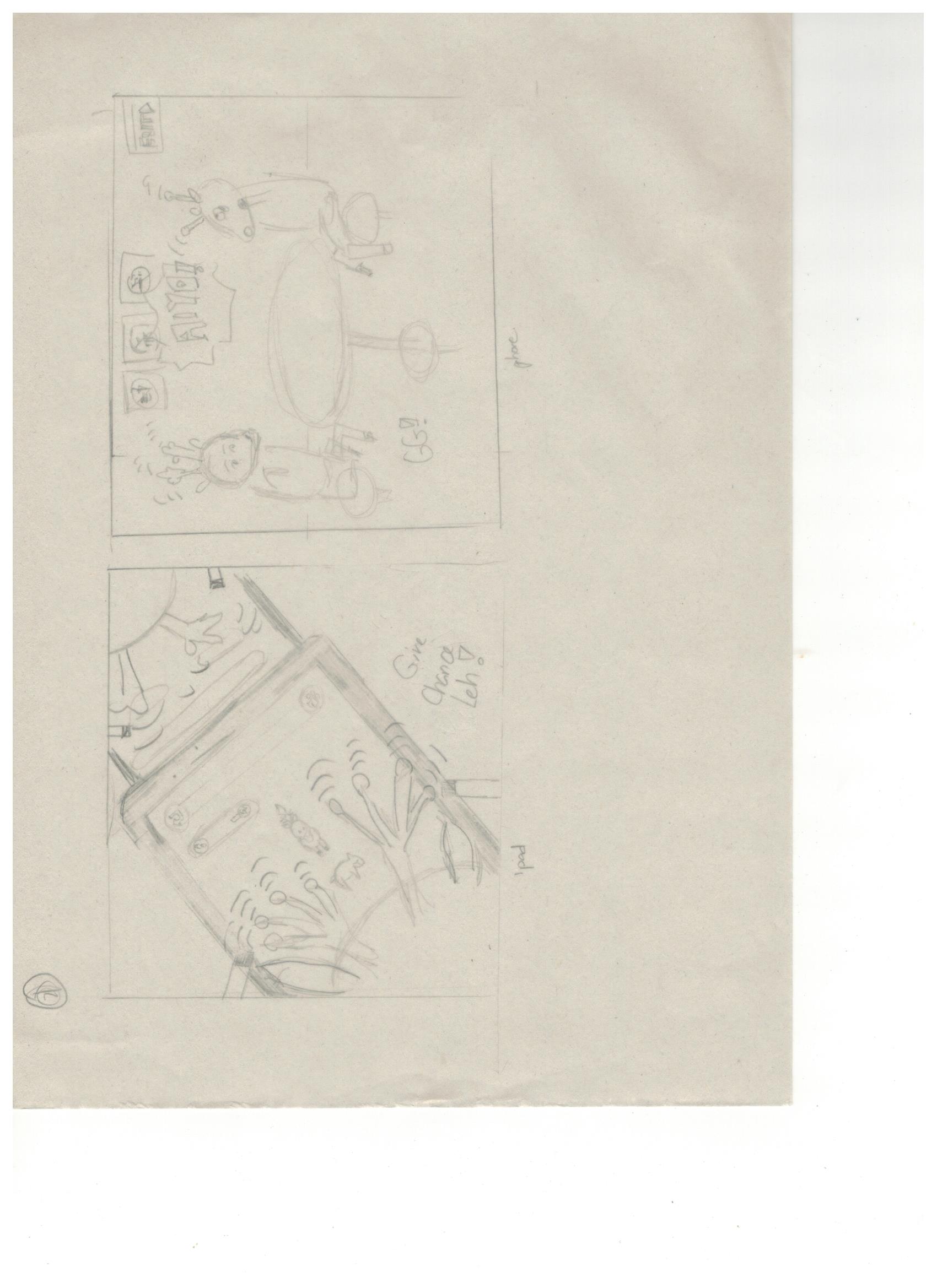
2. Video Game Player
A problem arise while i was about to do the actual piece. The problem was there was insufficient space (A5) for me to execute my initial idea (using the many pixelated characters, stacking/connecting them to form the alphabet). For example, one alphabet would have taken up almost half the paper and for this design i wanted it to be a total of seven alphabets (Siew Hua).
Therefore, this led me to kind of tweak my ideas to satisfy the assignment’s requirements.
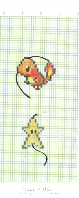
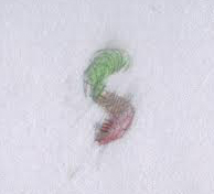
Alphabet ‘S’ & ‘e’
I decided to keep one character for one alphabet but it still retains the concept of how the character is a part of the letter (as seen in the above picture.)
3. Fashion Designer / Textile Designer
For this design i explored further with the choice of medium and choice of background before finalising it.
colour pencil (left) , pen (right)
I felt that even though it can still bring my message across, it was not pleasant to the eyes in terms of how it look aesthetically. Additionally, aesthetics is a strong factor in this fashion/textile industry.
white pen on black paper
I always believed and thought that illustrating white on black has this attractive quality to it hence i decided to explore in this area as well.
However, after trying the various mediums, i still felt my original choice of medium and colour for it was still better. (black pen)
Colour choice: using what i learn from colour theory last sem (complementary shown in pic above) Background: done on shiny silver paper
I encountered many problems such as smudging and how the medium and/or colours and/or background do not blend well together.
Combination of black pen with colour pencils on white cartridge paper.
Grey paper
*Note: Final design relatively confirmed but might have some changes.
4. Gardener
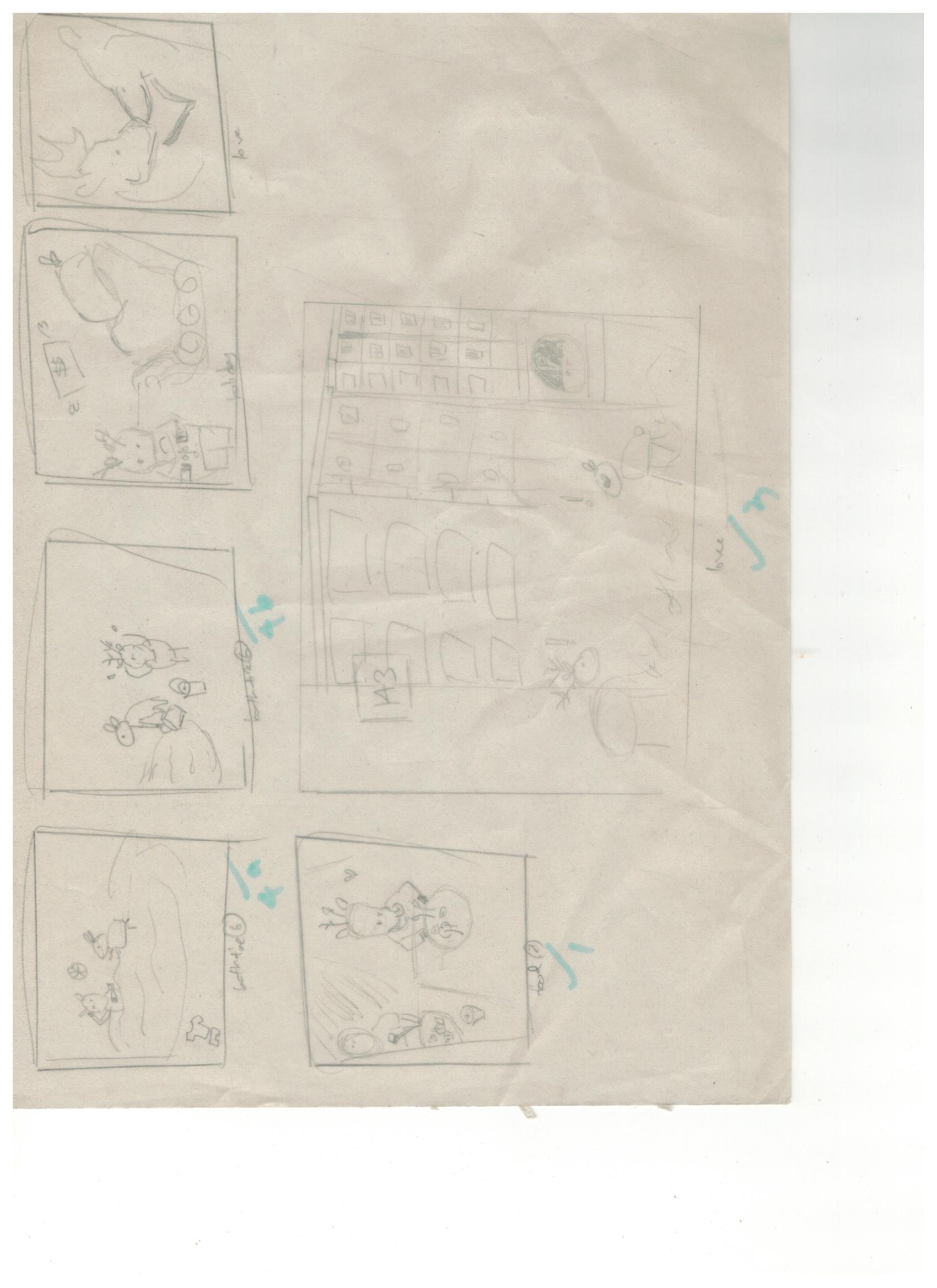
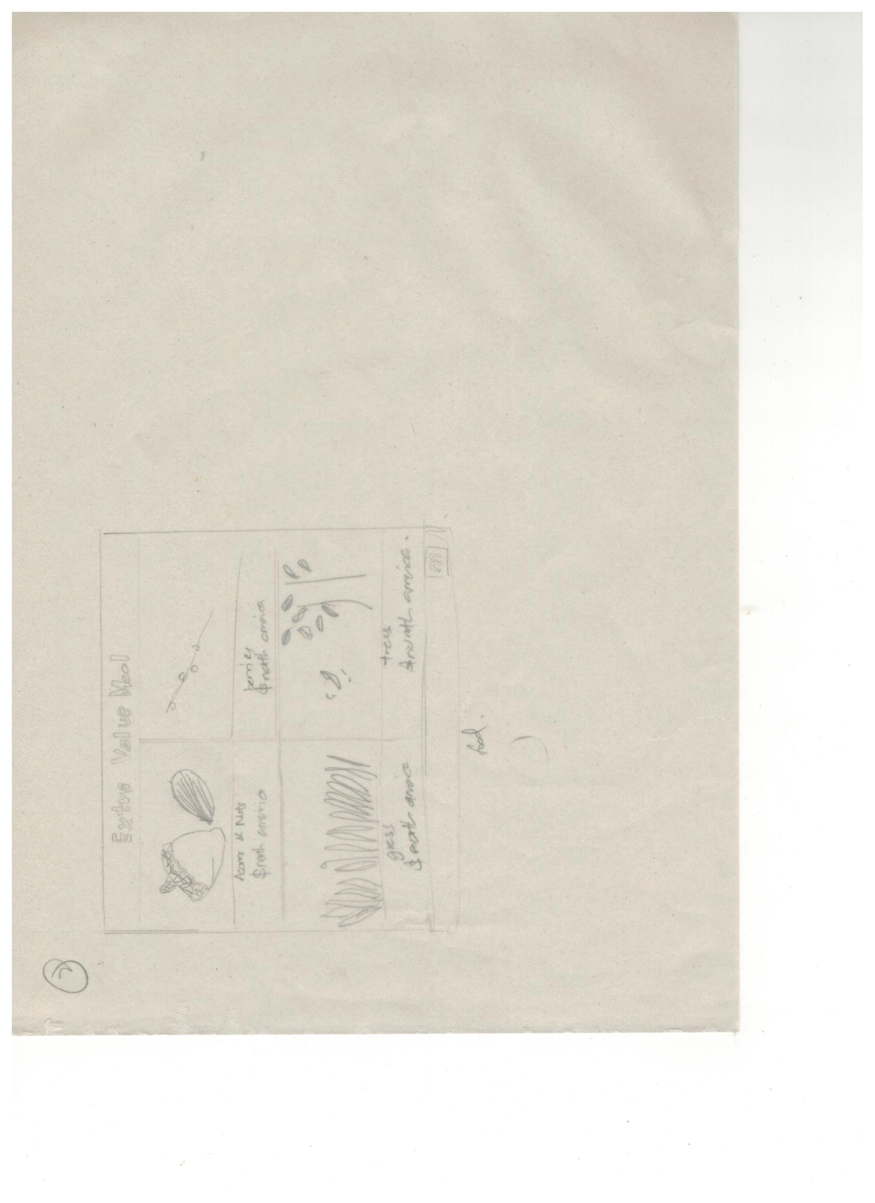
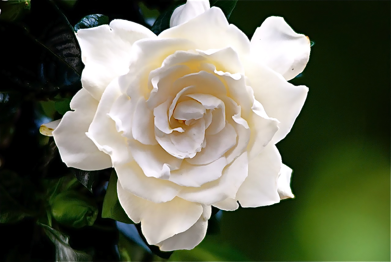
I researched on the exact plants that i was going to work with. Since my overall concept was going to be about consumerism, I searched up on the most expensive flowers and these were the results:
Ranunculus
Value: $3 Per Stem
This is an expensive flower and is a very popular option when it comes to special occasions. On the other hand, they are great alternatives to peonies and roses too. They come in multiple colors and few of its colors are there year round while other color variations are limited to early summer and spring.
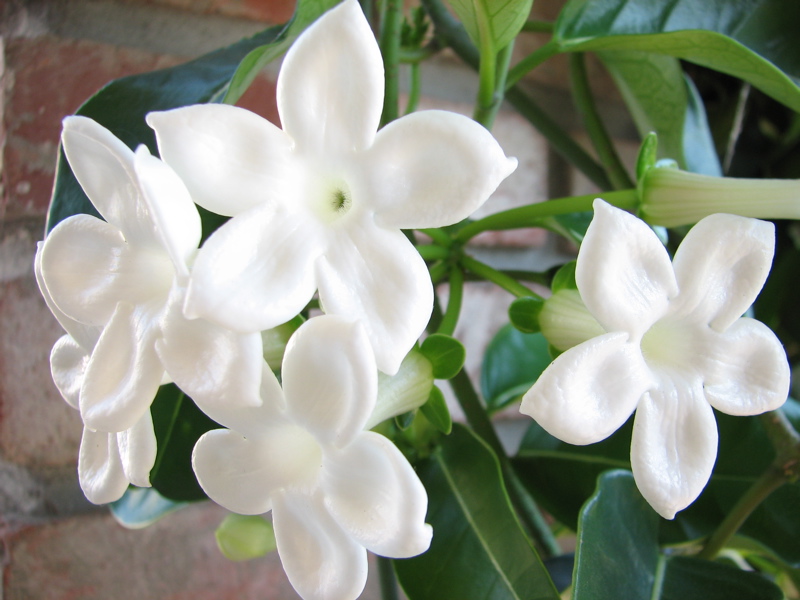
Stephanotis
Value: $3 to $8 Each
Stephanotis flowers are otherwise called Madagascar Jasmine. These tiny, sweet scented, star shaped white flowers are commonly seen on wedding occasions. The best thing about this flower is that they are easily available. However, they are pretty expensive on peak seasons.
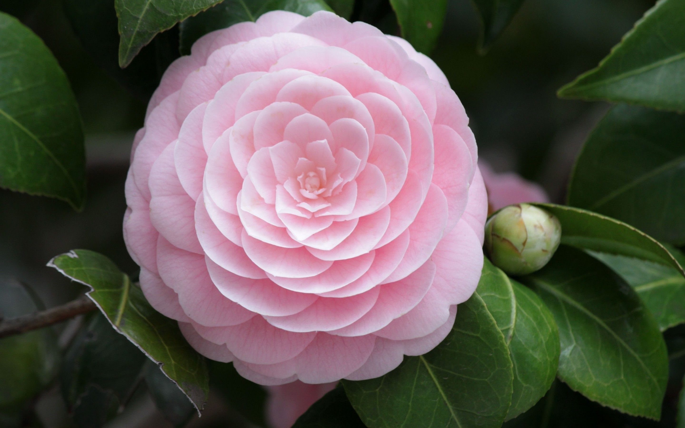
Peony
Value: $12 to $15 Per Stem
Peonies are certainly beautiful and this is the reason why they are expensive too. Their price varies though. The peak season is April, May & June. During these months, the cost of this flower goes really high (up to $15 to $20 each). Peonies usually cost twice than roses and are bigger too.
Gardenia
Value: $20 Per Bloom
Gardenias are obtainable all year. This richly perfumed flower is classically cut by the grower just to have its stem less than 1-inch long. You will see florists using them in corsages and bouquets with little wire & tape. Gardenias do not come cheap for the reason that they are unique and give off a great scent. Gardenias are magnificent when you see them float in glass bowls. Moreover, if they are kept this way, they last for 1 week but you require changing the water every day or at least once in 2 days.
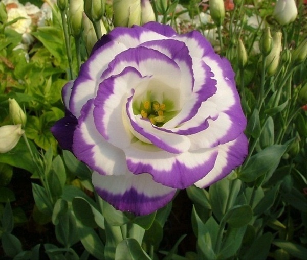
Lisianthus
Value: $ 10 – $35 Per Bundle
These lavender colored delicate flowers are greatly admired for its looks. People often buy them to decorate their garden. However, they require great attention and 100% care, else it easily withers away. This expensive flower blooms annually & is 5-cm in diameter. Lisianthus can easily grow from 15cm – 60cm in height. It has delicate, ruffled and wide oval petals. Lisianthus flowers come in multiple colors like pale purple, lavender, blue violet and white. The reason as to why they are been sold for high price is that they are long lasting — it can survive for 2 to 3 weeks even after it is cut from the stem. Since these are extremely fragile, they earn the name — “Paper Flowers”.
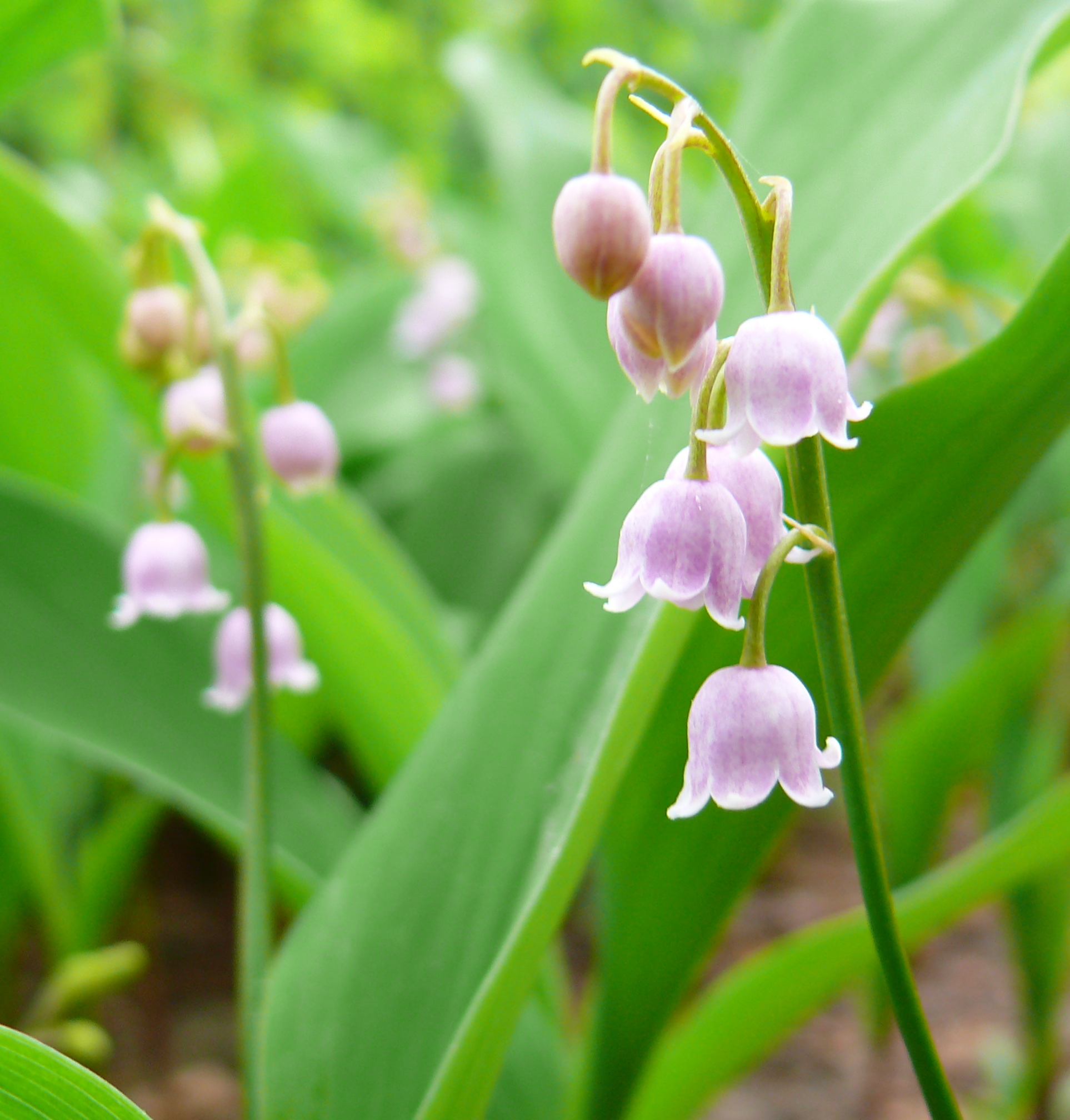
Lily Of The Valley
Value: $15 to $50 Per Bundle
Nicknamed as “Lady’s Tears” because of the way they appear. They are harvested once in a year and they bloom during May month. They have an amazing smell and even have the ability to survive few weeks after its been plucked. It is well liked for its dainty and delicate appearance. They have bell-shaped blooms. Its stalk goes up to 15-30 cm tall and are surrounded by 2 long leaves whereas the flowers reach about 5mm – 10 mm in diameter. They are expensive for the reason that they require high maintenance.
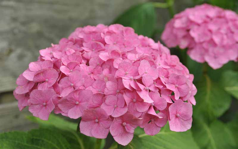
Hydrangea
Value: $6.5 Per Stem
This is another most expensive flower in the world. They are grown at Eastern Asia, Southern America & few parts of Asia. This flower is admired for its matchless circular bunch of small flowers in every stem. Shrubs basically grow around 1 – 3 meters tall — right from their early spring until late autumn. You can see these flowers mostly in white blooms, blue, light purple, violet and even pink. Hydrangeas easily droop & wilt. These flowers are commonly used during occasions, especially on weddings. The reason that they are expensive is that it takes huge effort to produce & cultivate.
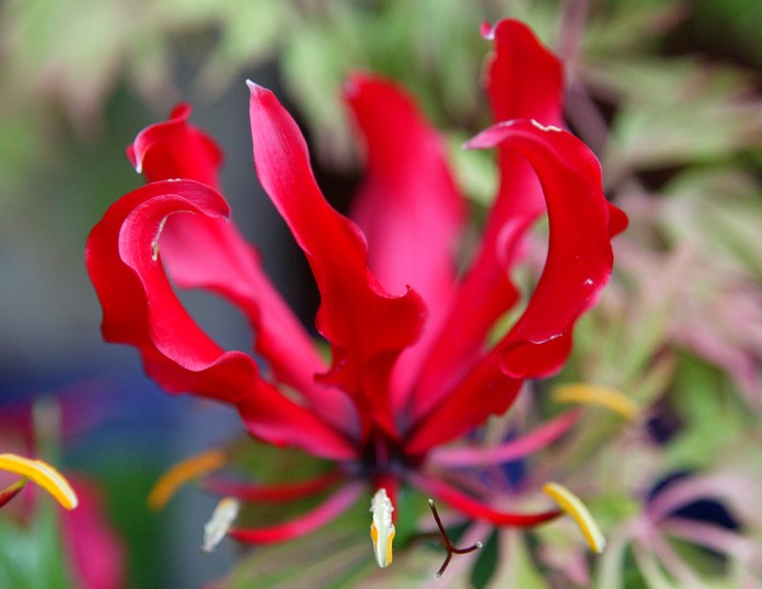
Gloria
Value: $ 7 to $10 Per Flower
This beautiful flower is expensive as well. It is native only to Asia and South Africa. Apart from being expensive, this cute little flower is rare and distinctive too. It has extended tendrils, which support bloom’s weight. The leaves are about 3-meters long and are admired for ostentatious flowers with flexed petals. These come in oranges, yellows, deep reds & yellow-green.
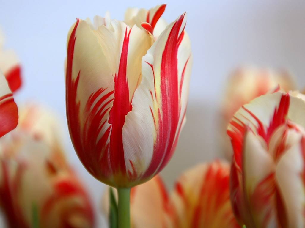
17th Century Tulip Bulb
Value: $600 to $1000 Per Bud
Even in the year 1673, this flower was sold for 10000 gilders. Can you believe that? Now, this explains why this flower is so expensive even today. Since it is considered historic, every bud will cost you between $600 and $1000. Not only is this flower exceptional but also rare.
Source: http://www.magazine8.com/15-most-expensive-flowers-in-the-world/
Instead of my initial illustrative idea, I wanted to change the technique and push the idea further by doing it with mixed mediums or digitally.
layout tryout of how i tried piecing the flowers & insects together to make alphabets.
^ Artist reference: Danielle Evans / Aleph Corporation (refer to research post)
Some problems i faced while making these designs digitally was the colour adjustments, trying to piece them to form how i want my alphabet to look and also it took me quite some time to crop out the images individually.
(For mixed media idea): Tryout with different pen/markers/pencil on the paper I’ll be printing on (probably matt paper)
Similarly i also faced problems with some medium smudging and unsuitable to use with my choice of paper.
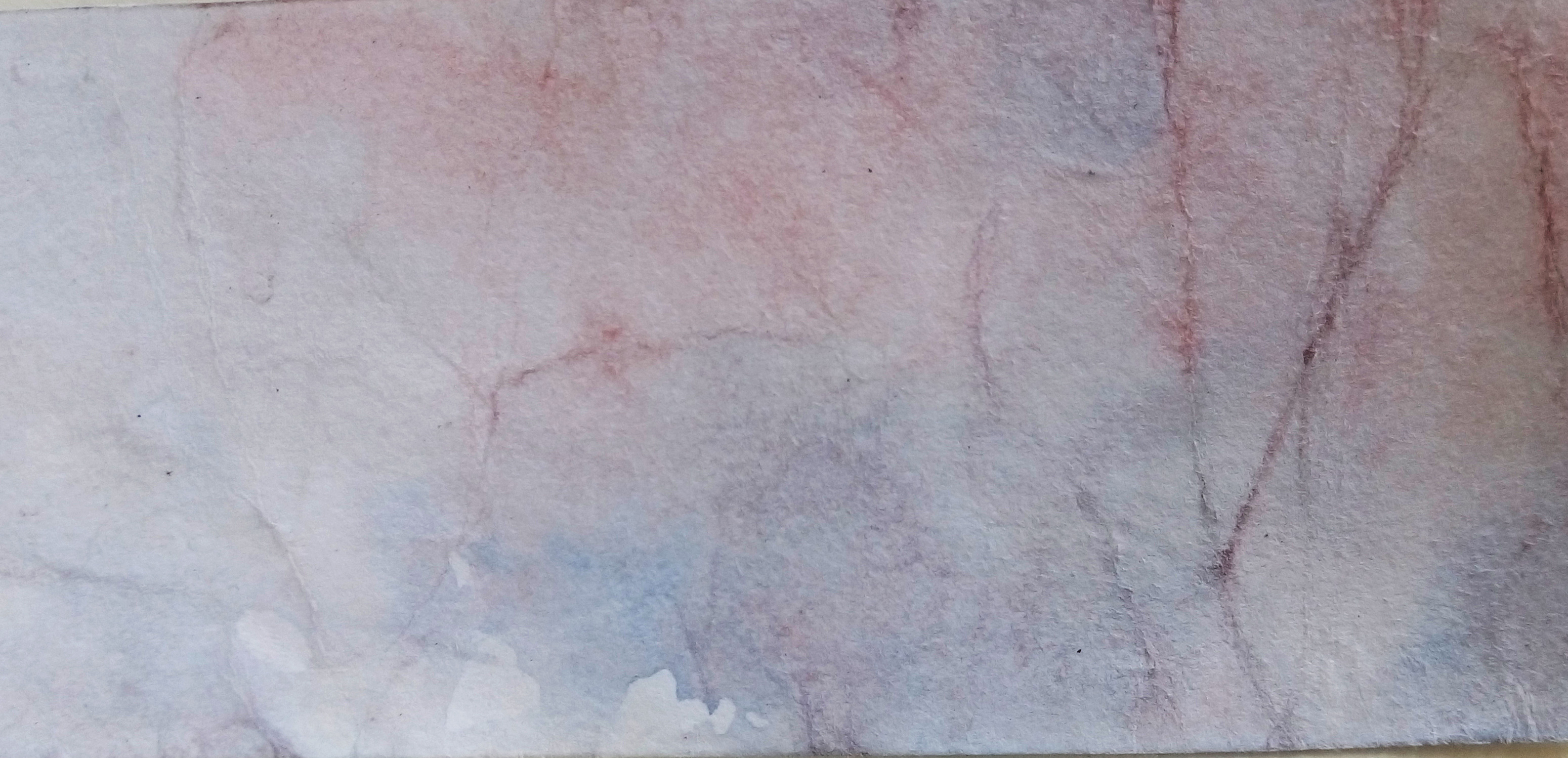
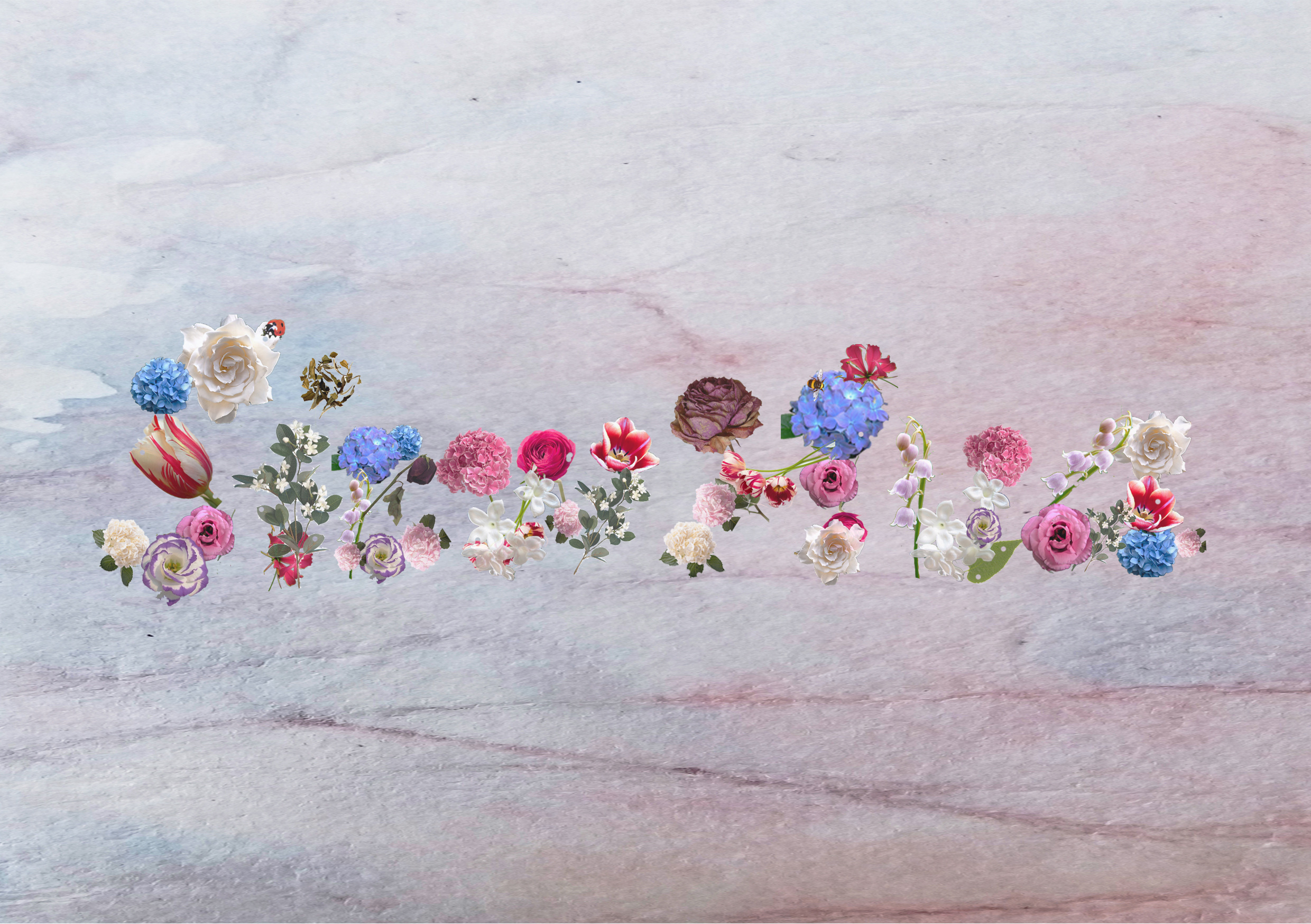
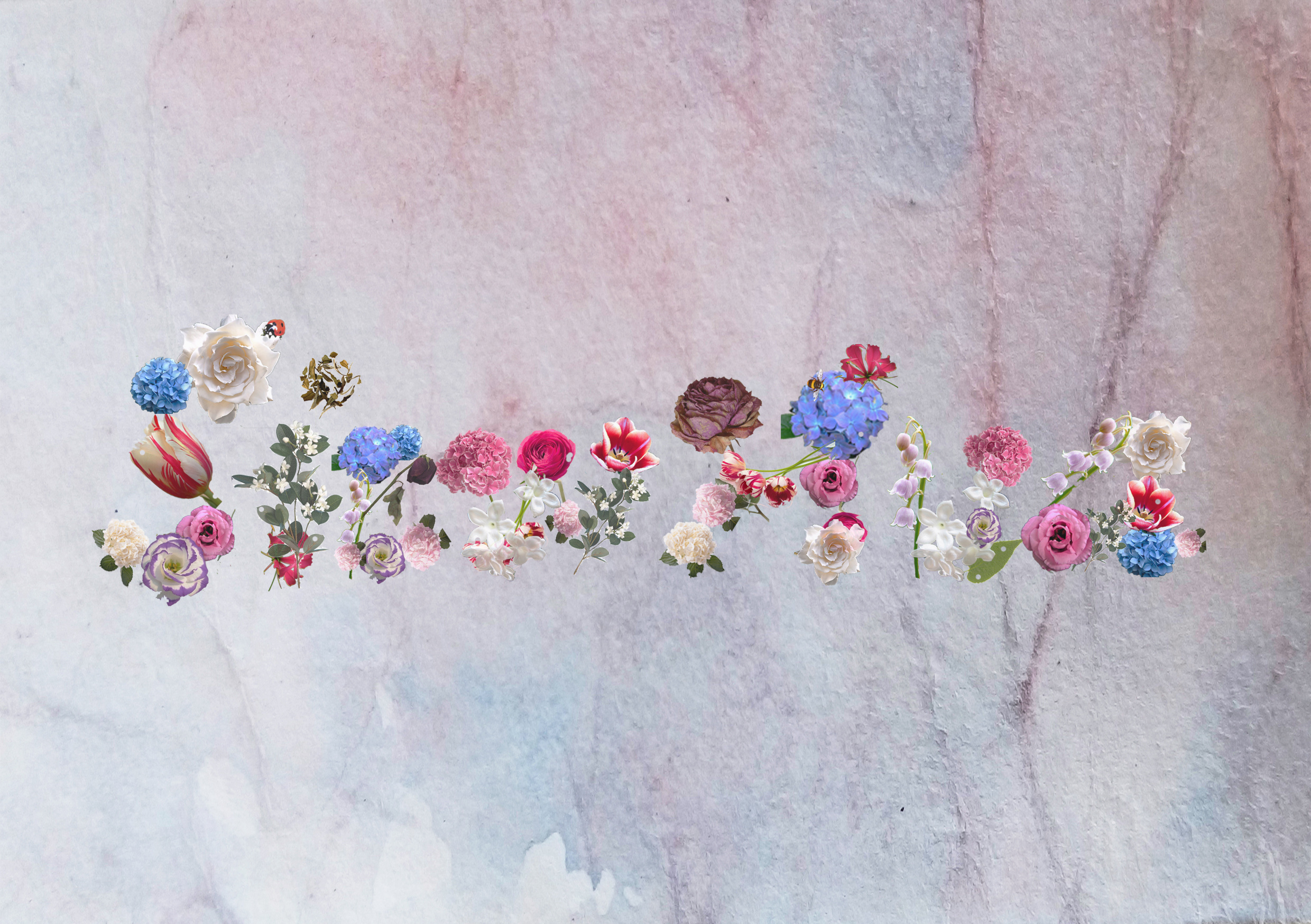
Background test out: watercolours (darker)
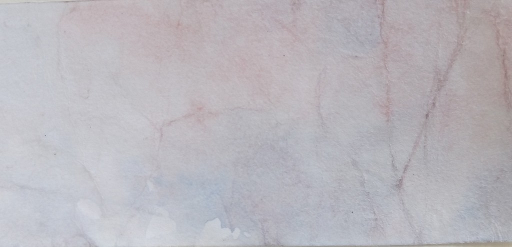
Background test out: watercolours (lighter)
*Note: Final design relatively confirmed but might have some changes.
While i was working on photoshop, i found these fonts rather interesting because it converts the alphabets into the respective plants/symbols as seen below.
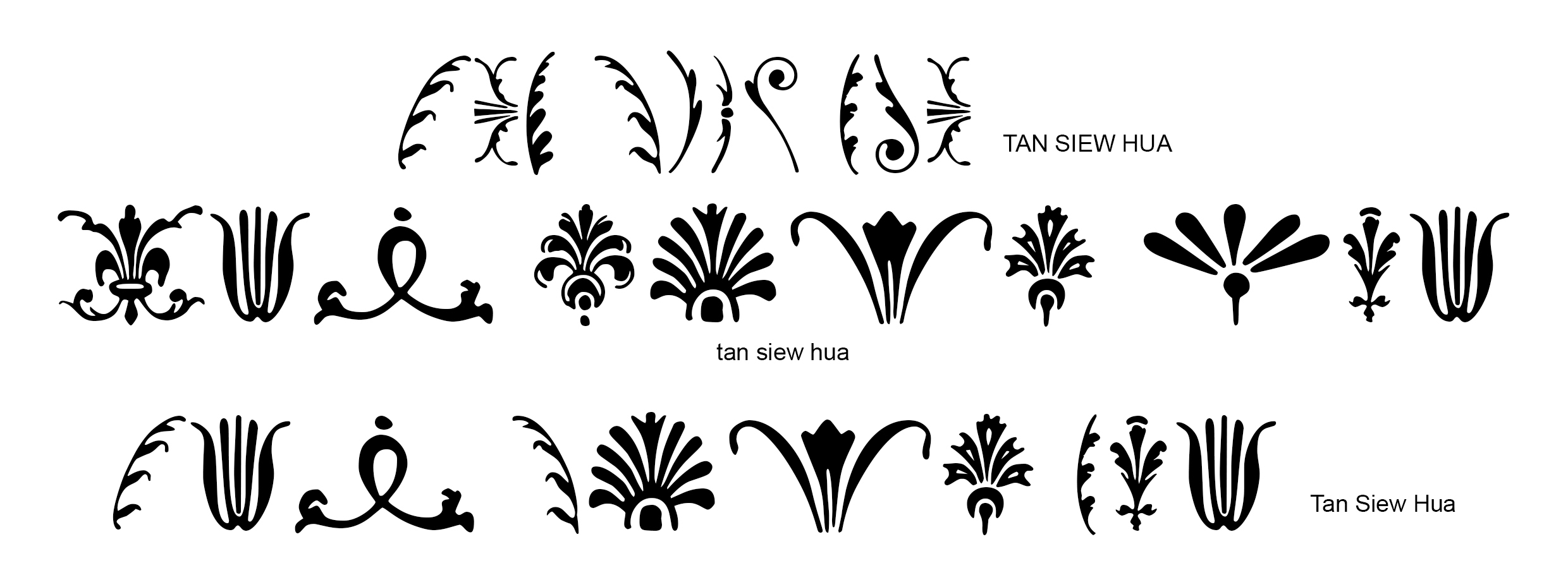
Exploration for gardener design
Exploration for fashion/textile design

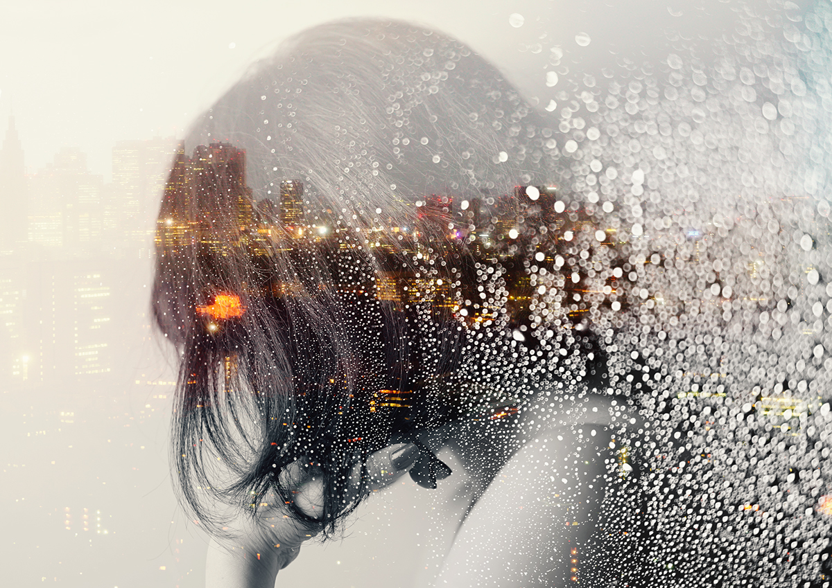
This is a story told from the perspective of my phone therefore, my choice of portrayal is speaking simply through these screenshots. Do we really consider the ‘feelings’ of our smartphones who are like many’s close companion? What would our phone say if given the chance to speak out for themselves? This story is basically about our lack of regard and actual care for our smartphones when it does so many things for us but we’re always not satisfied with it no matter what, taking the example of dying battery life is one rather common factor.


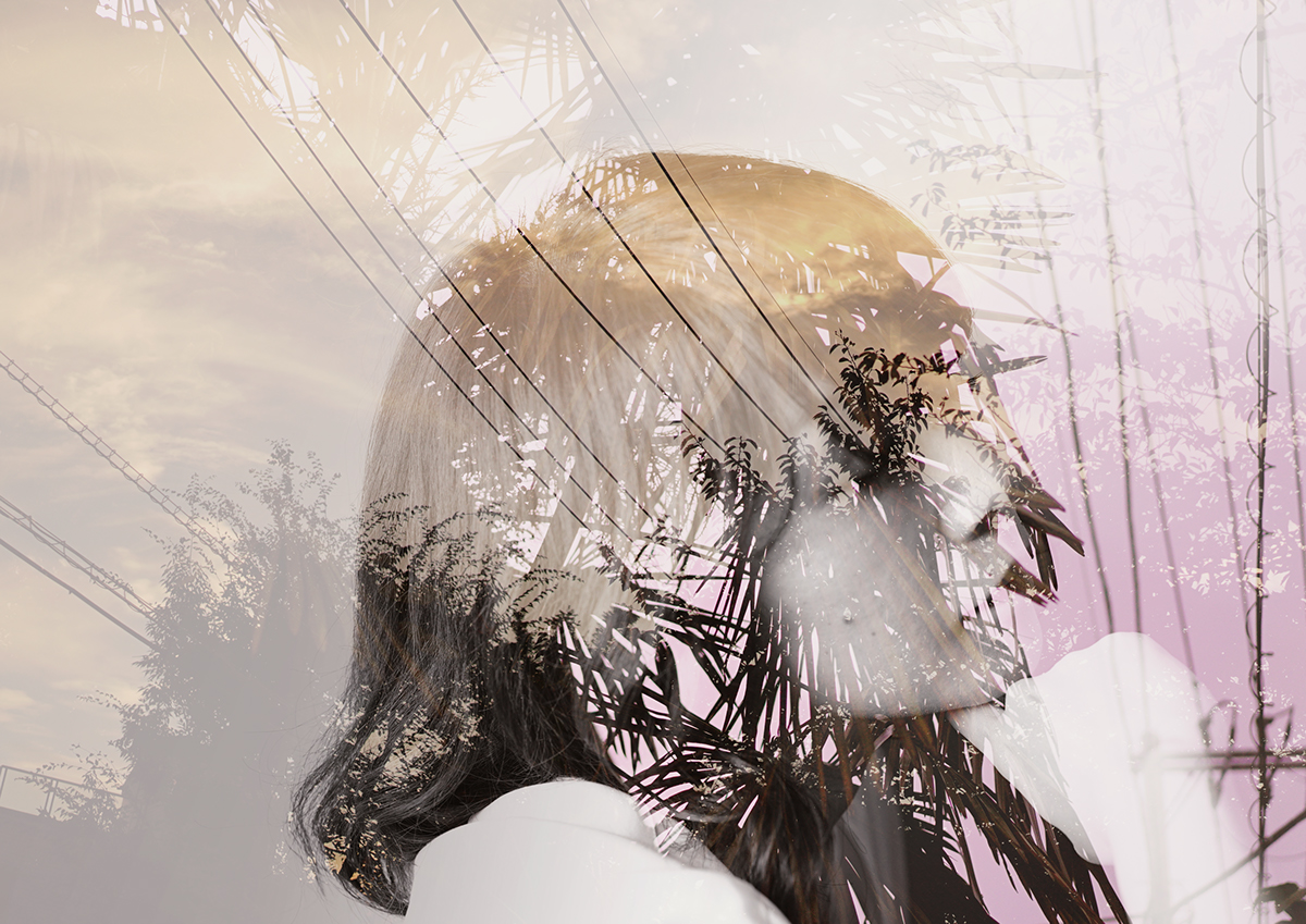
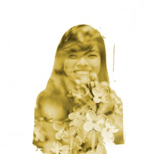
Process I : Double exposure first tryout
Tutorial
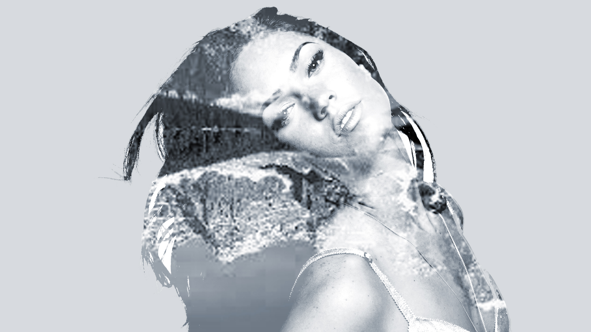
My practice piece
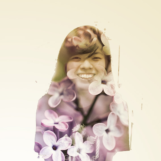
Process II : Exploration on the background
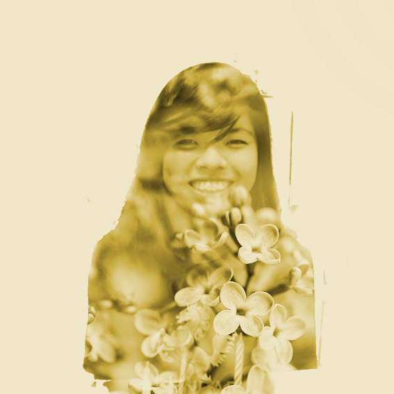
Of similar colour. (analogous?)
Of plain white background. (keep it simple/minimal)
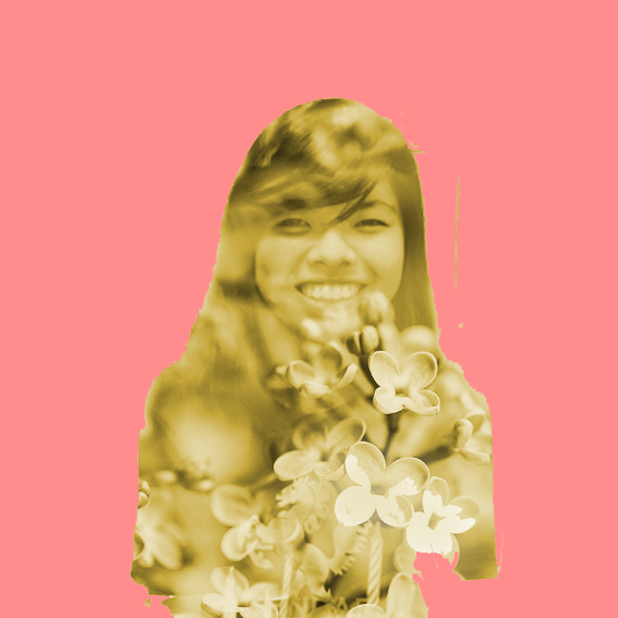
Of a different colour. (to contrast)
Of a gradient/colour scale. (softer colour transition)
Of a complex background. (to blend in with background)
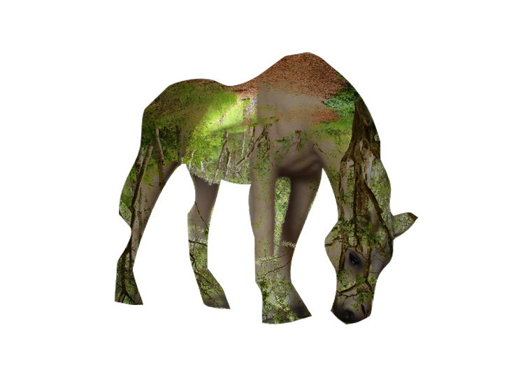
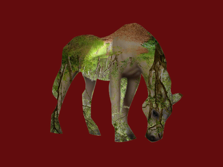
Process III : Photo Manipulation Tryouts
Healthy
Unhealthy
Process IV : Collage Tryouts
-Final-

Task 1: Me

Task 2: Object And Representation of Self

Task 3: My World