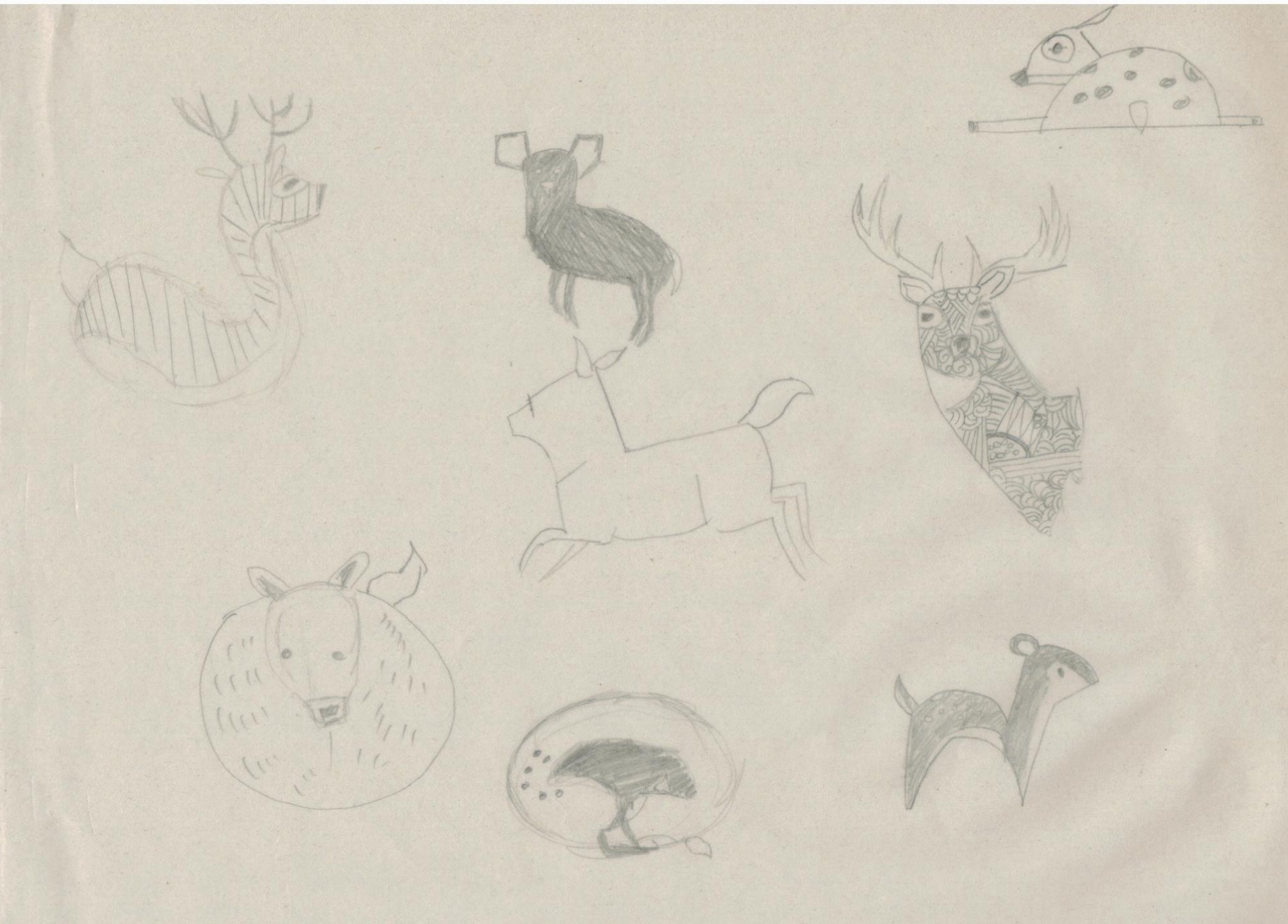
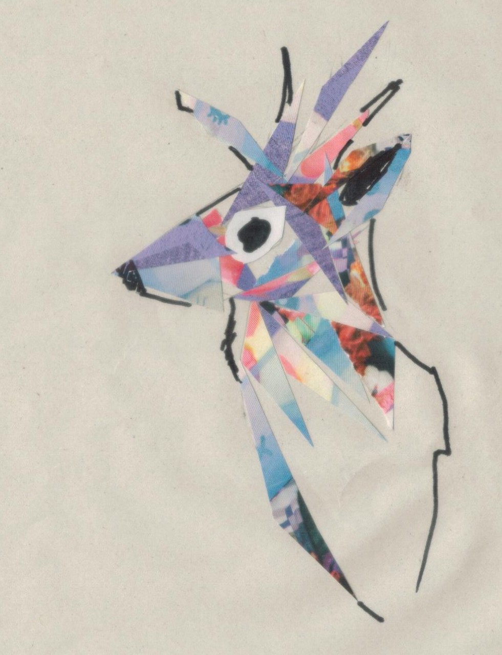
My topic for this project is on animals, particularly deers. There are already many illustrations being done on animals, ranging from realistic to being really simple. This led me to wonder how could i set myself apart from them and make my works that can be uniquely mine. In the end, I was inclined to base my concept in singapore’s context since I am a singaporean myself. I hope to bring the experience of being one out as well as to make it relatable to the others as well through my works.
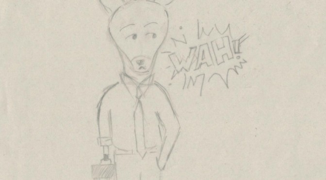
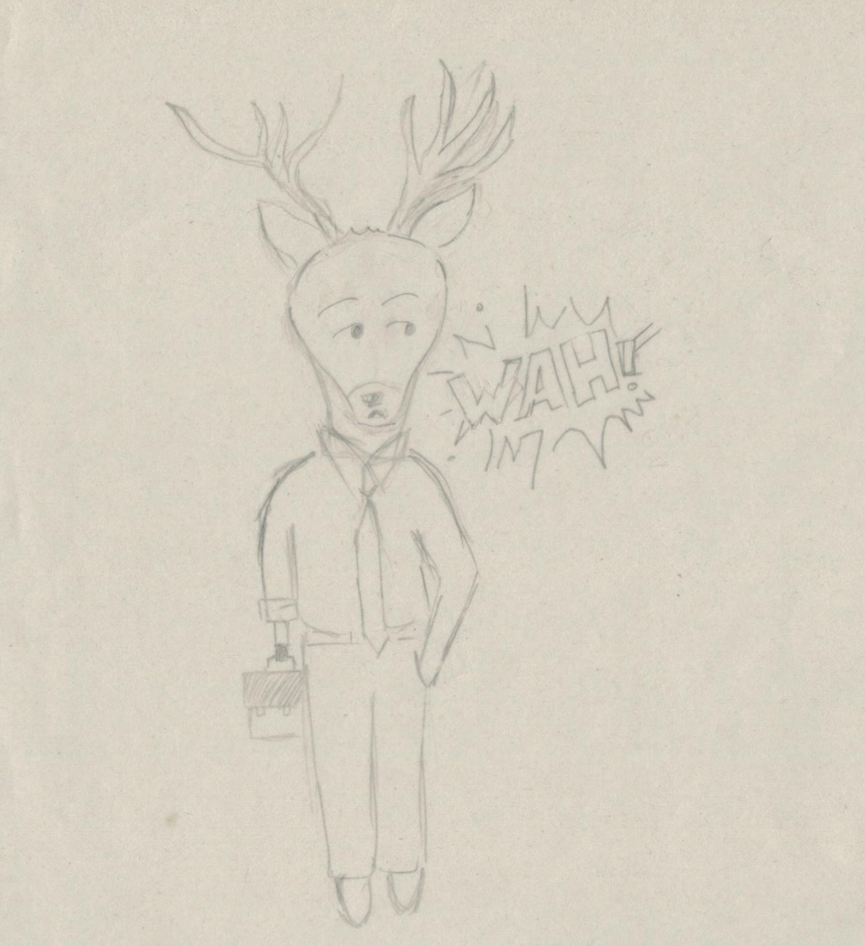
The style I was going for was to resemble that of comics relatively. Hence, I arranged my works in an order that can tell a story, such as, “a day in the life of a singaporean deer“. Since i was basing all the POVs from the same deer, I decided to name it so that it becomes more personal. The name i decided to go with is KiasuBuck since the number trait I think of for Singaporeans is being Kiasu and my main character also takes the gender of a male deer, also known as Buck.
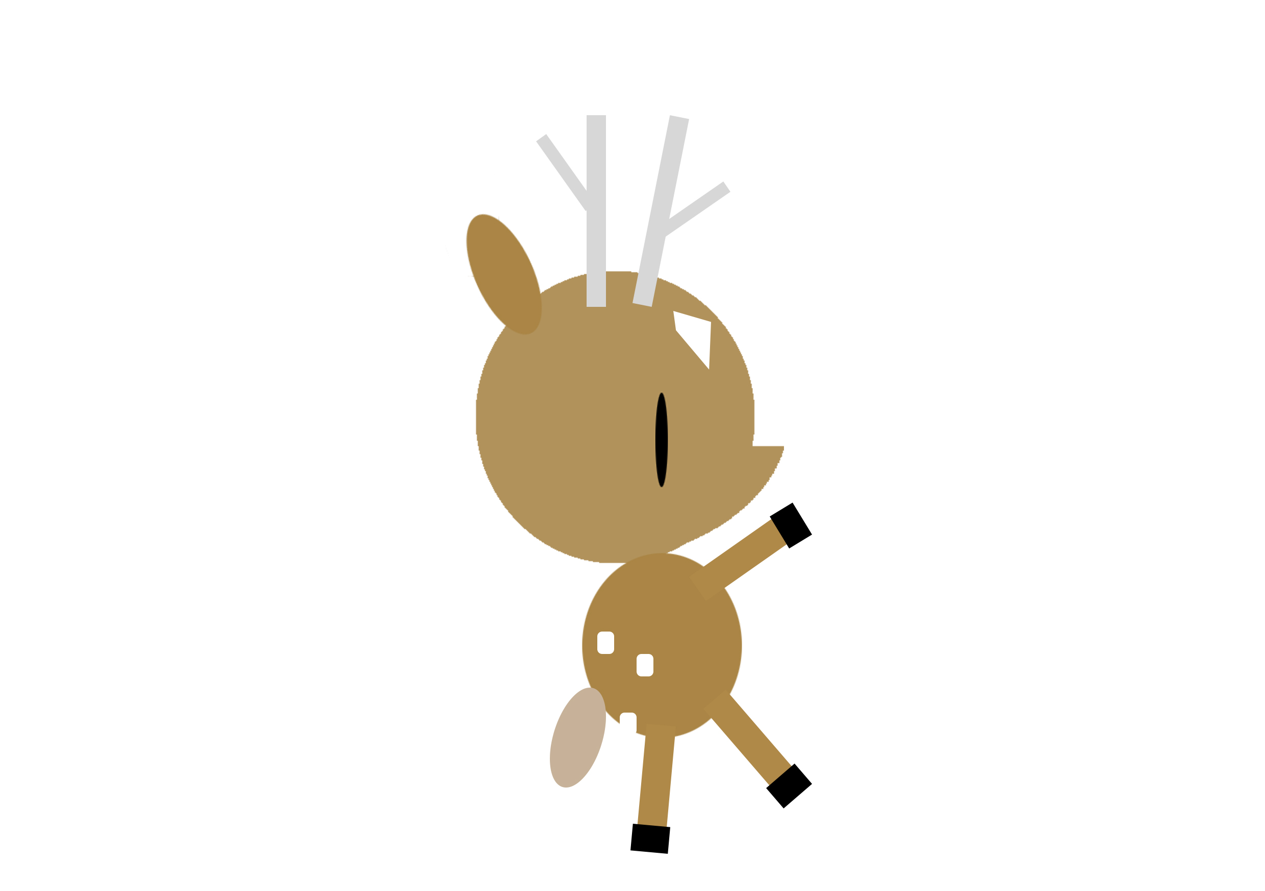
These are made from the basic shapes as well as some found vectors.
Phone from the point of view of KiasuBuck is
Socialising.
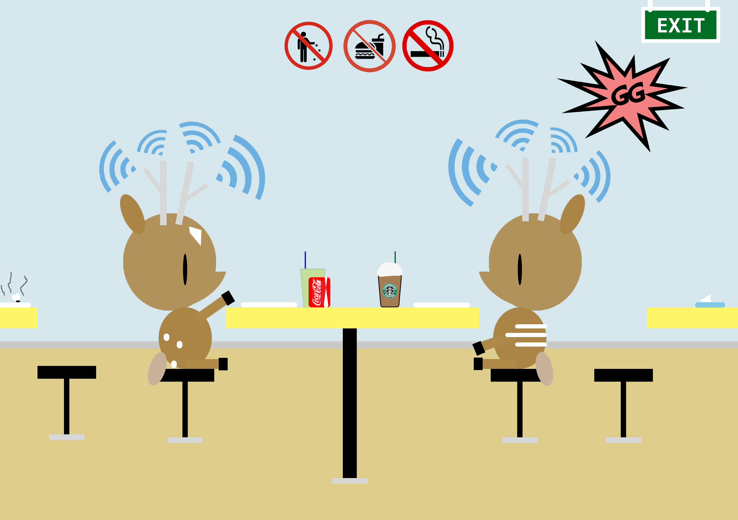
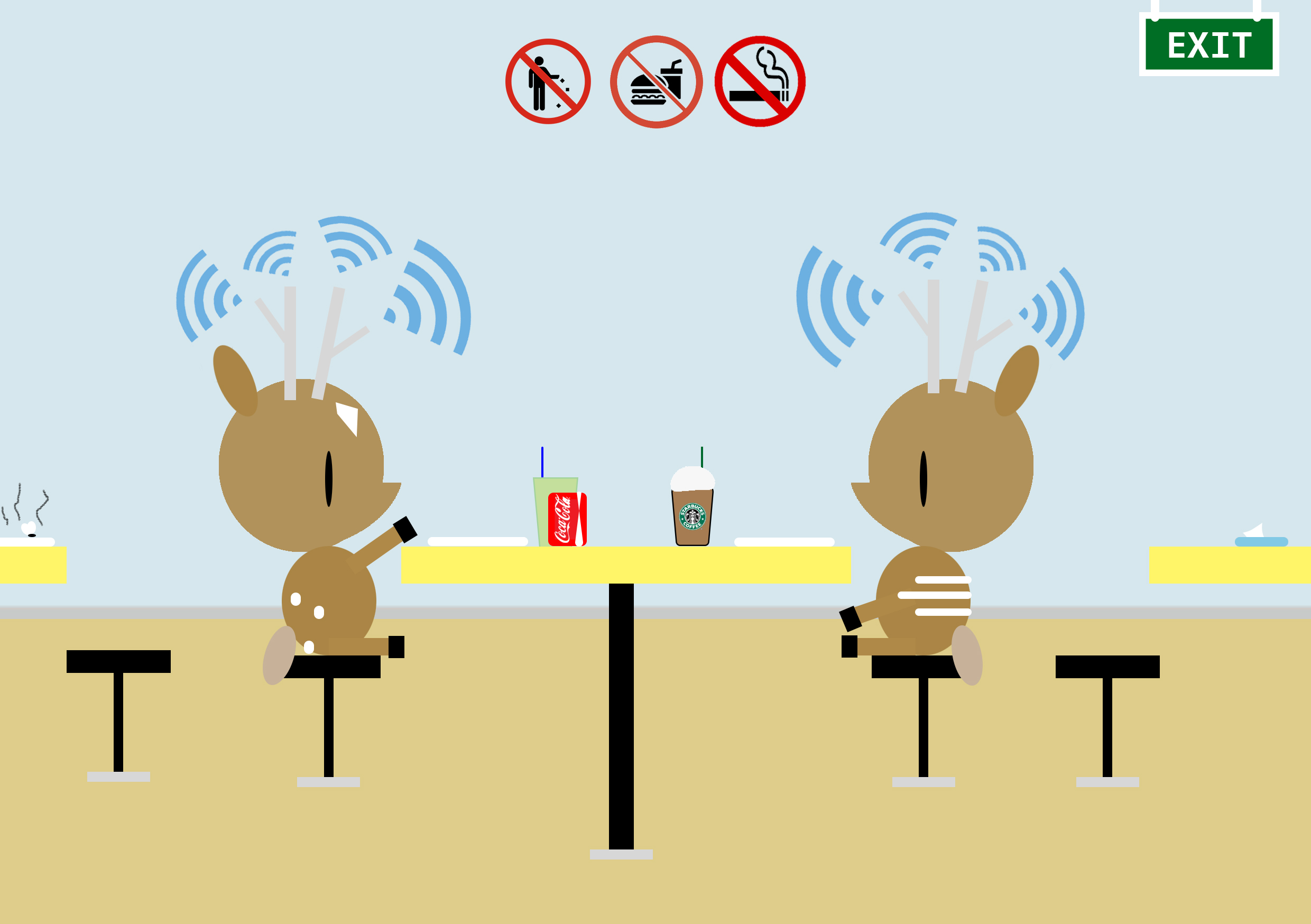
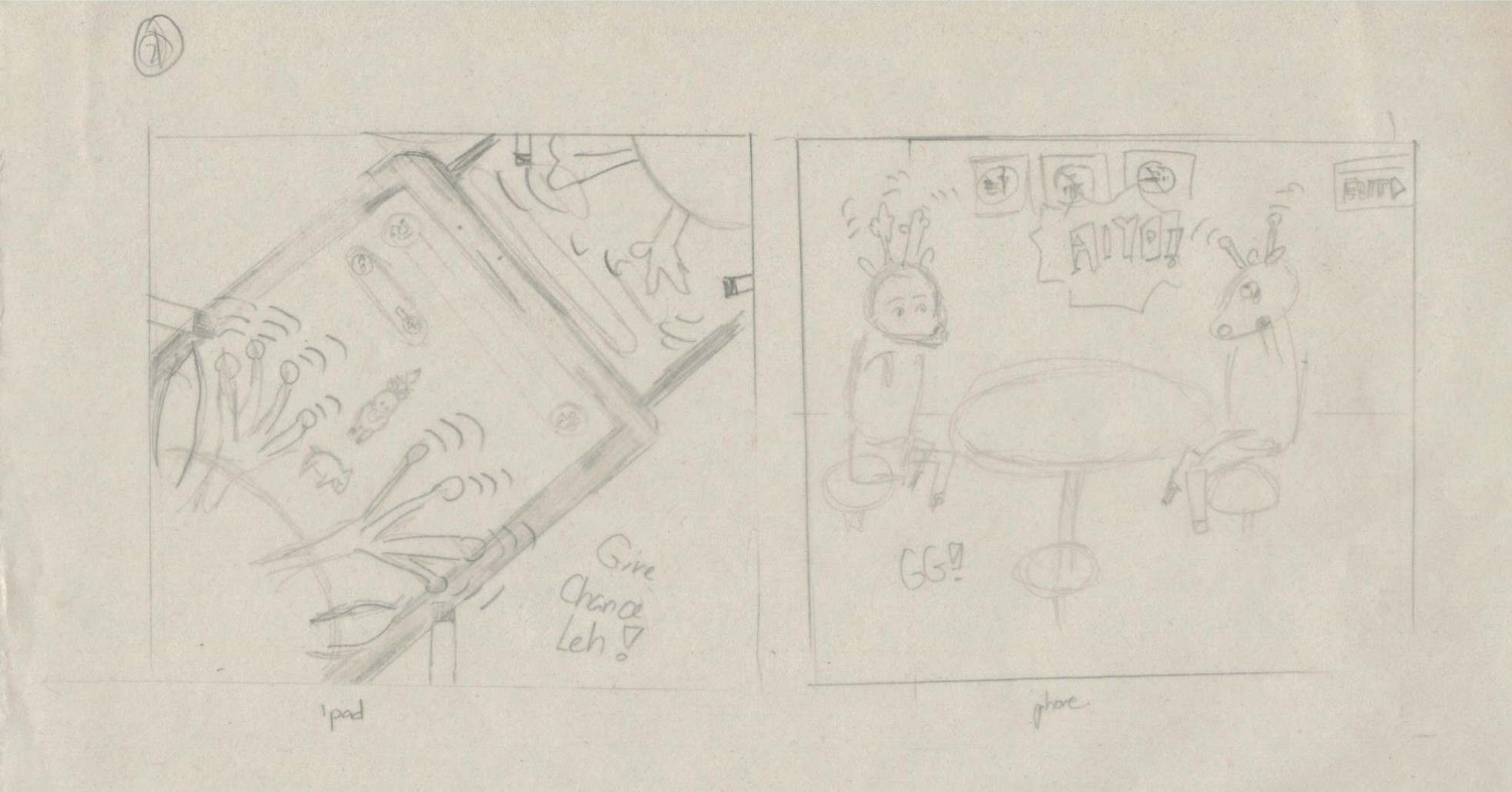
KiasuBuck is having a lighthearted breakfast with his friend at the hawker centre. They also appear to be interacting with each other.
I felt that if deers were to have phones, how would it be? Instead of the literal phone that we humans use, i decided to make use of their long antennas as the source for their networking. Hence, in other words, the deers use their antennas as phones. In such a chaotic and noisy surrounding, we are easily distracted by many sounds around us, hence i decided to place the blue radiating lines that resemble ‘signal’ in different directions and sizes. What you’ll notice here is i choose the word phone instead of talk as socialising. This is so because I felt this is a rather apparent phenomenon (people interacting behind the screens instead of face to face) happening right now with all the advanced technology. I also added many small details to enhance the flavour of living in Singapore such as the various signs one would always see, the tissue paper packet people would use to ‘chop’ their seats as well as the food that isn’t sometimes cleared away even with the implementation of self-clearing zones.
Food from the point of view of KiasuBuck is
Vegetarian.
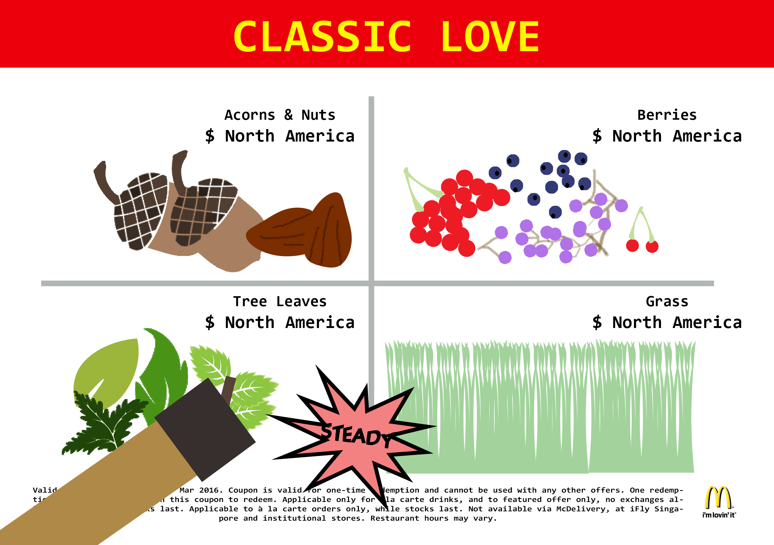
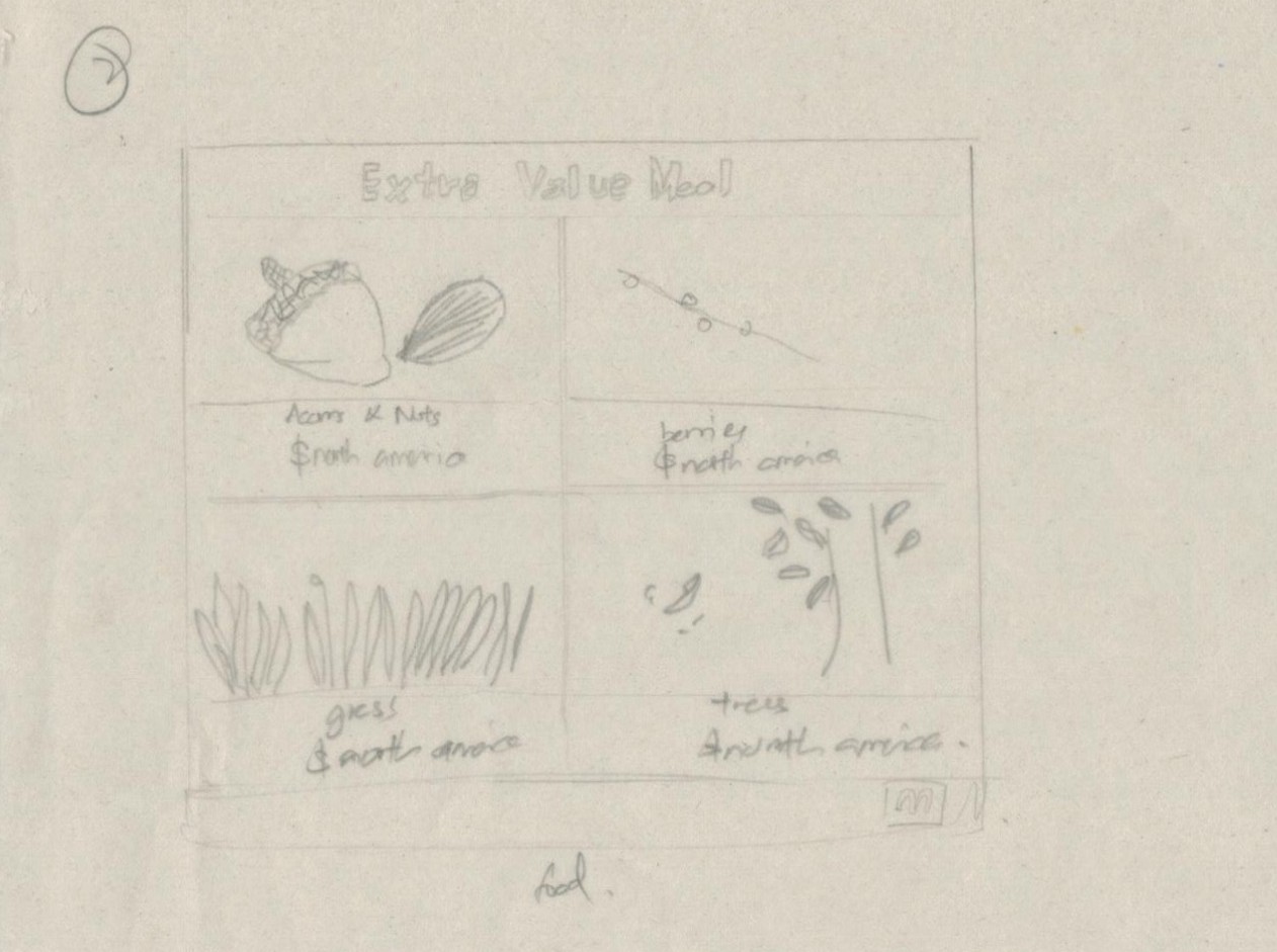
Secondly, after Kiasu finished his breakfast, he fell hungry again soon after and wondered about what to eat. He decided to have Macs.
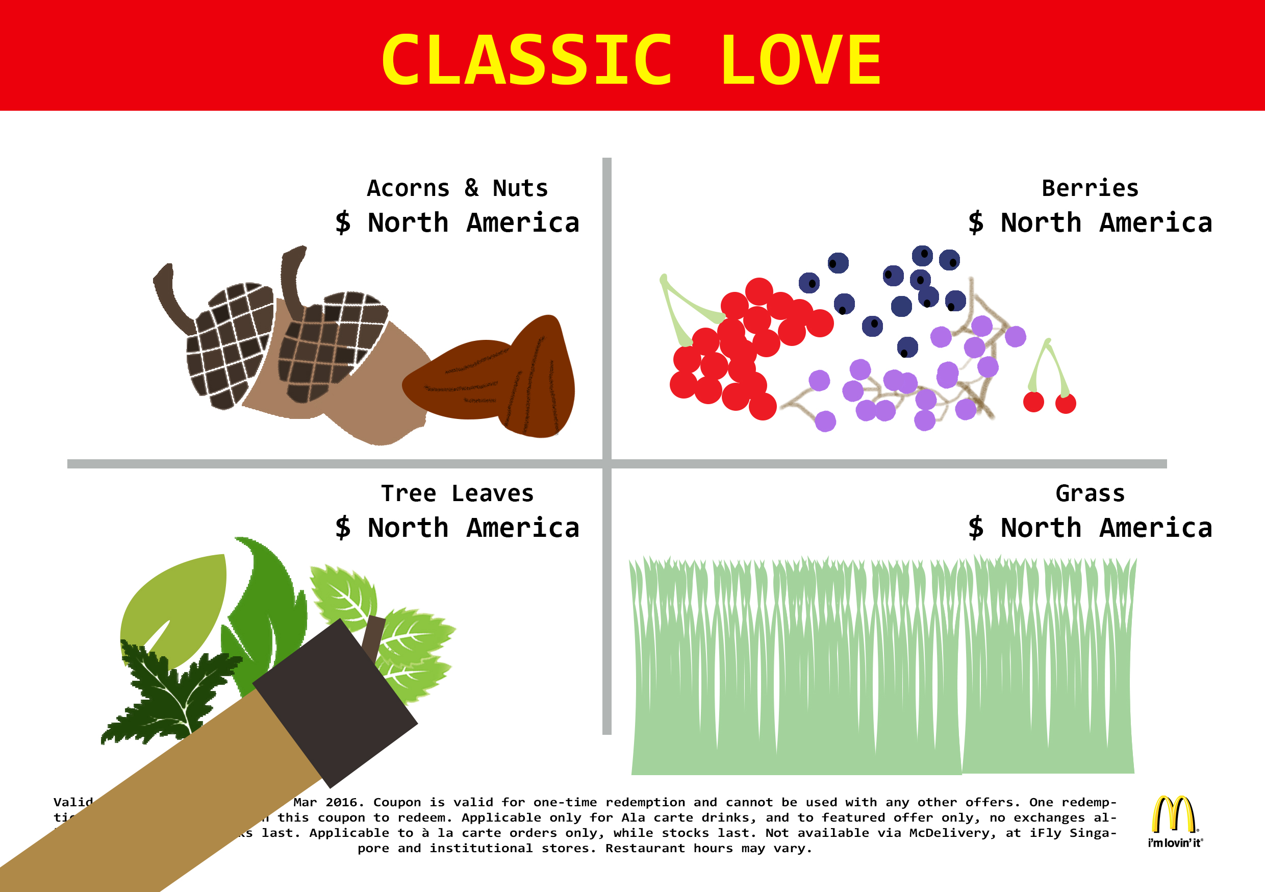
In this work, I aimed to portray it through those MacDonald coupons we always receive. Instead of burgers, I switched all the food to the diets of a deer and prices to where they are commonly being found.
Water from the point of view of KiasuBuck is
Bath Time.
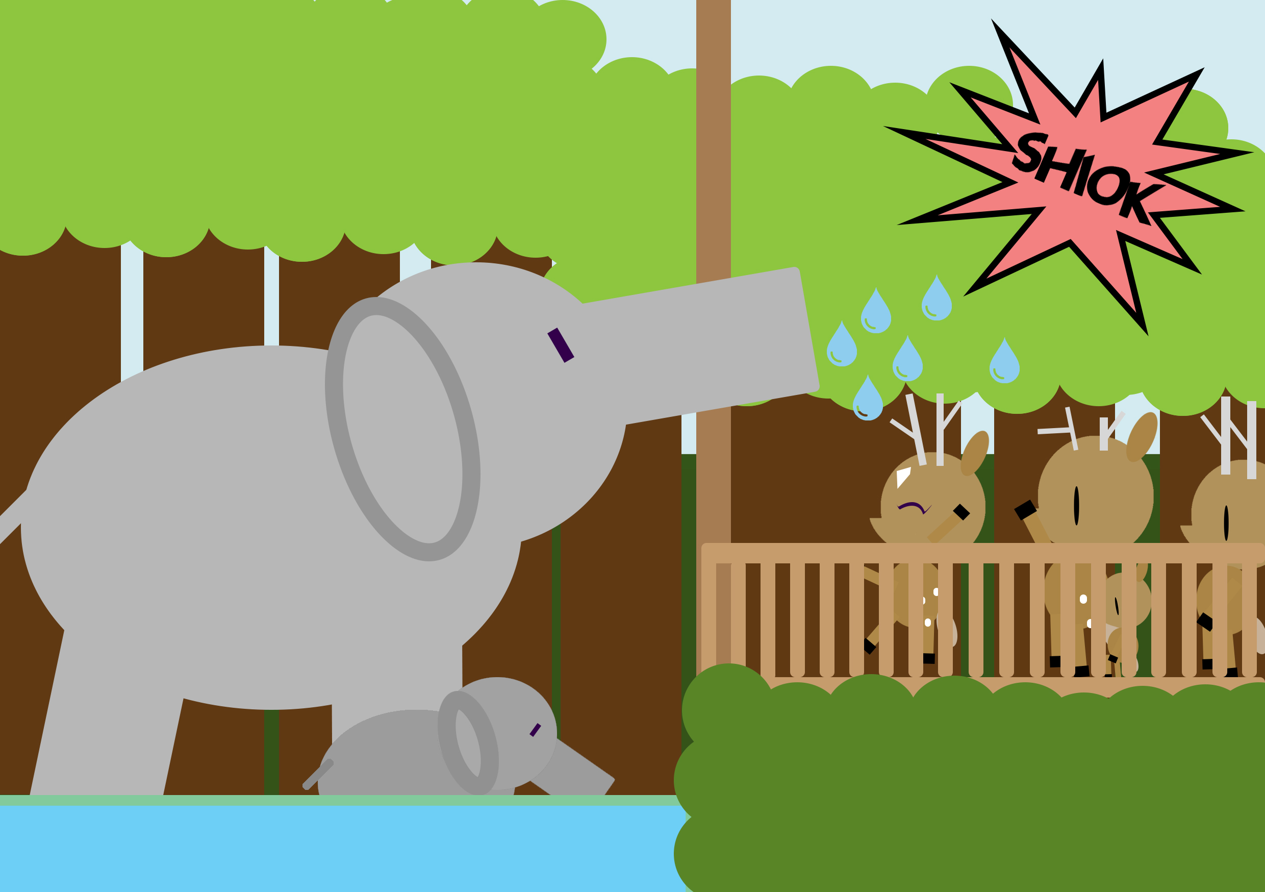
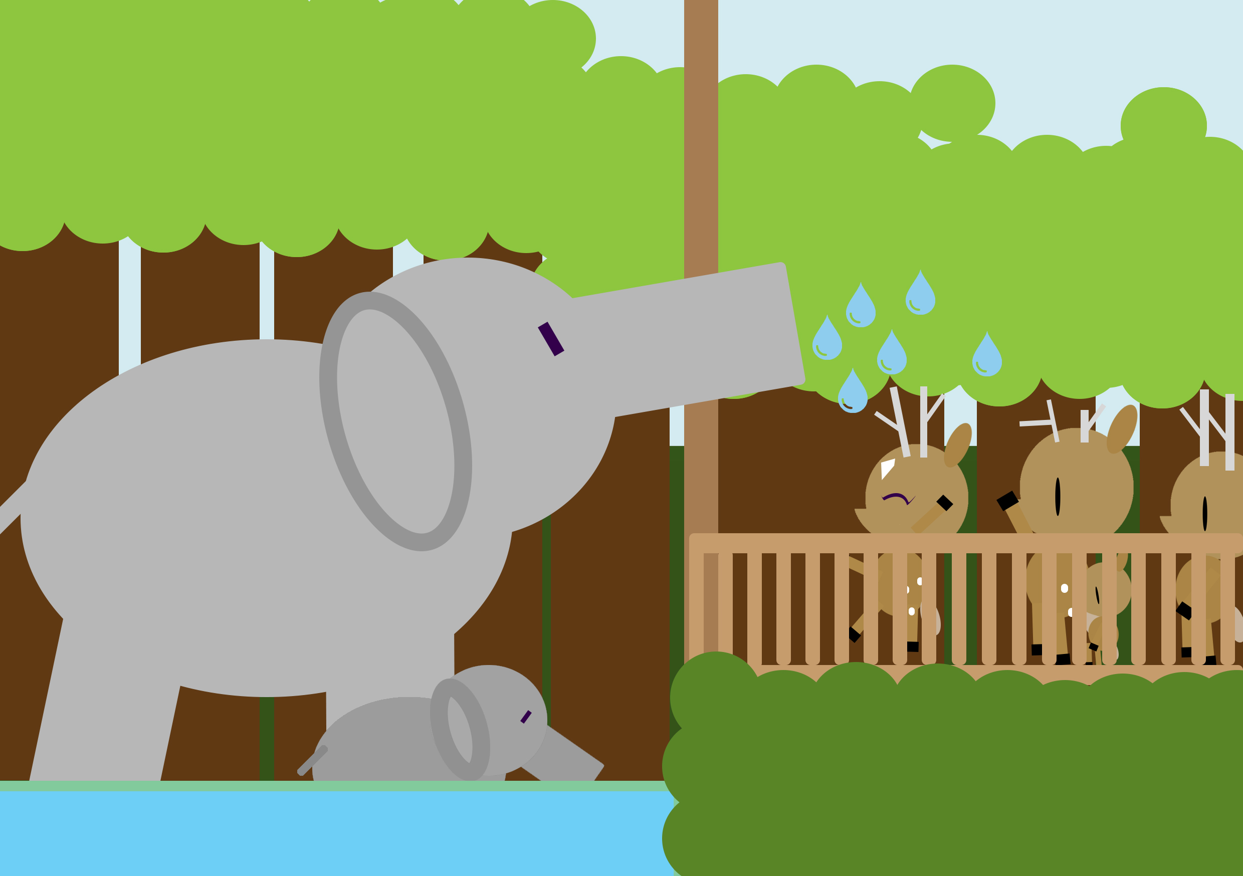
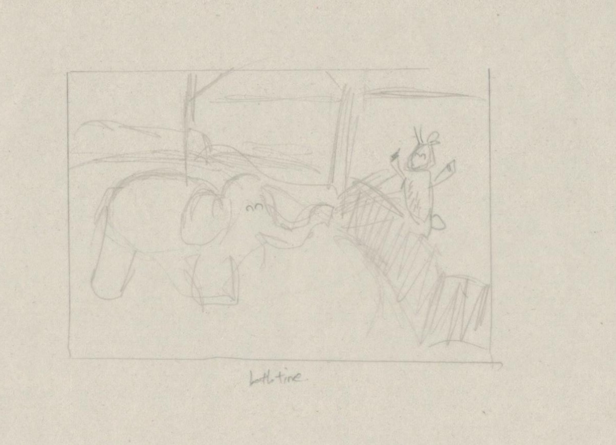
After his meals, KiasuBuck thought it was too hot and decided to take a shower.
Here you’ll see an elephant spraying water for the deers to bath. I wanted set it up in a way that resembles the singapore zoo, where during the elephant show, there is always this segment where the elephant would spray water at the guests. Since deers are not really water creatures , i decided for the water to be just a few droplets instead of a full-blown water shower. Also, another common thing about Singaporeans is they tend to like to queue and queues have an indication of something being really good.
Holiday from the point of view of KiasuBuck is
Work.
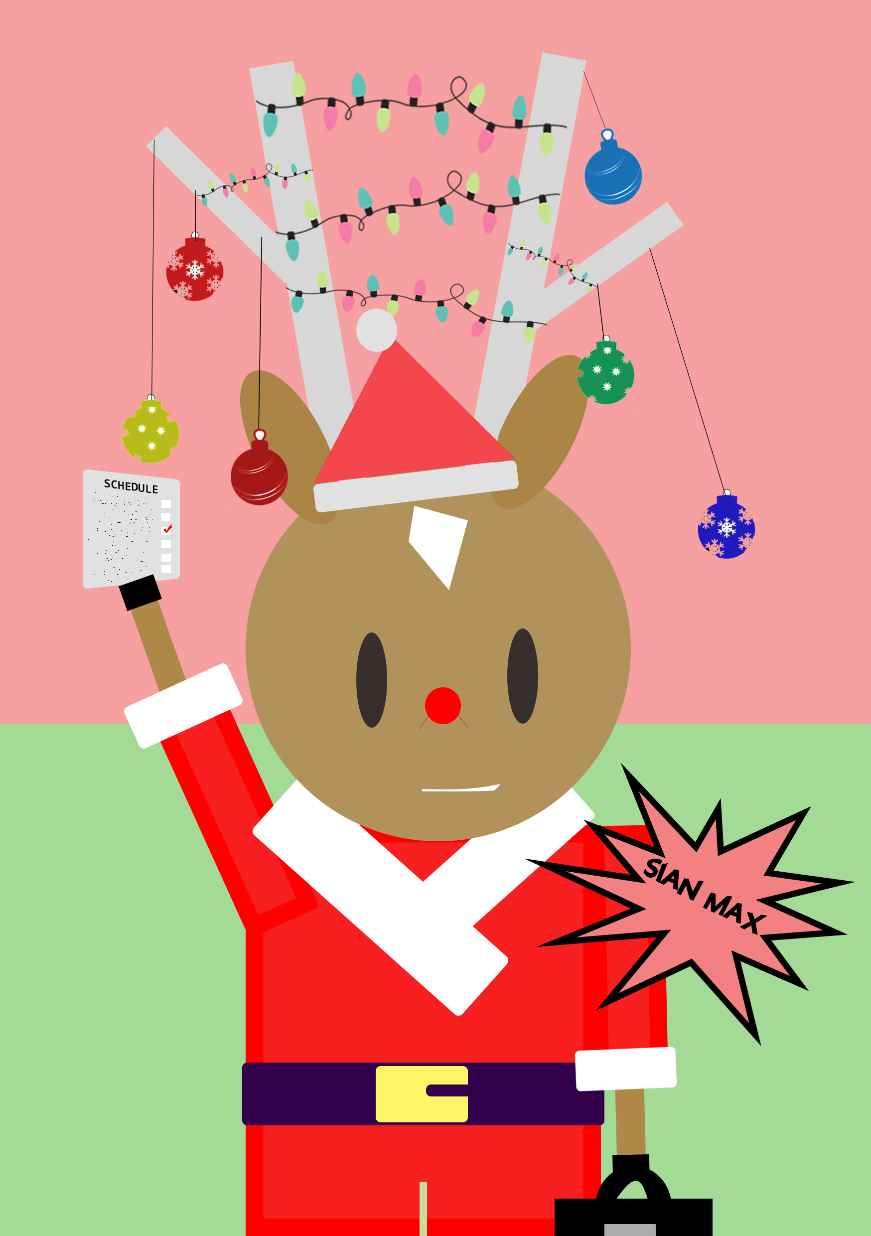
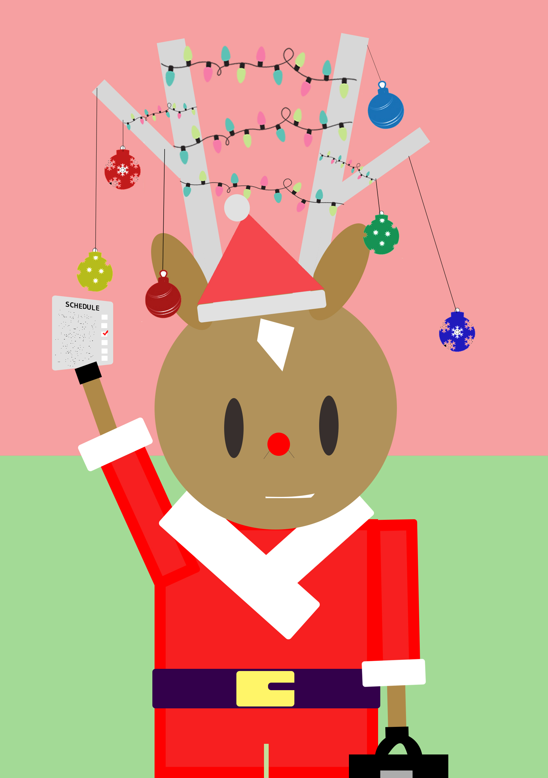
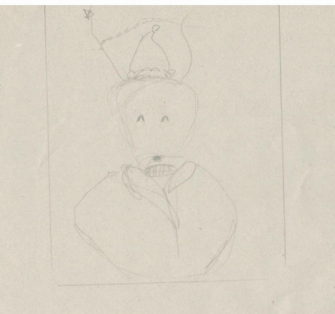
After bathing, KiasuBuck was comfortable enough now but has to rush off for work.
The holiday i was inclined to portray was christmas. To get into the mood, Kiasu changed into his uniform (santa claus suit) and the dangling ornaments on his antennas are to resemble that of a christmas tree. On first look, it appears to be a joyous occasion. However, taking a closer look, one would notice the forced smile, the typical-work-suitcase and the list of schedules. In Singapore , I felt that people are always working even in the holidays.
KiasiDoe from the point of view of KiasuBuck is
Love.
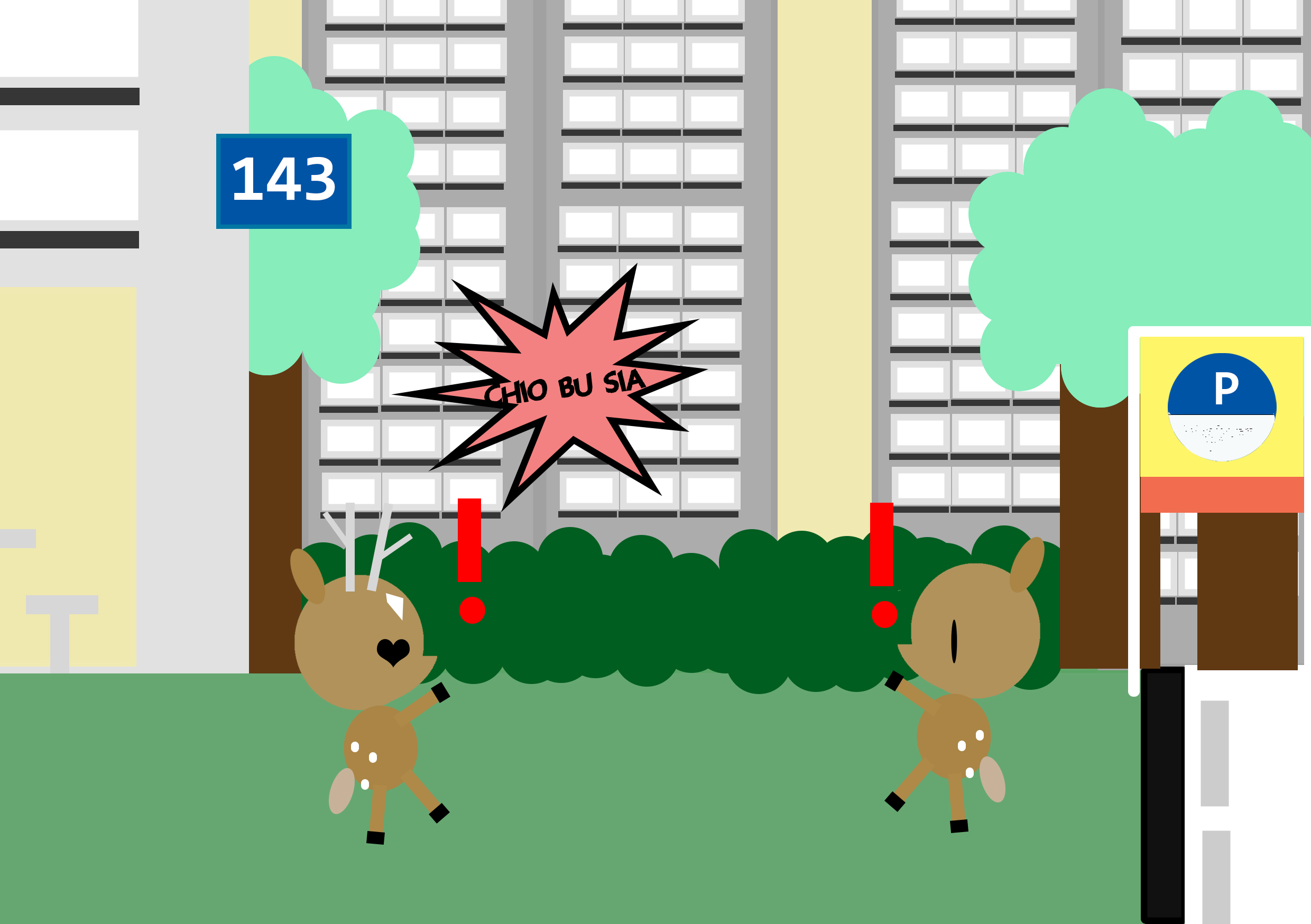
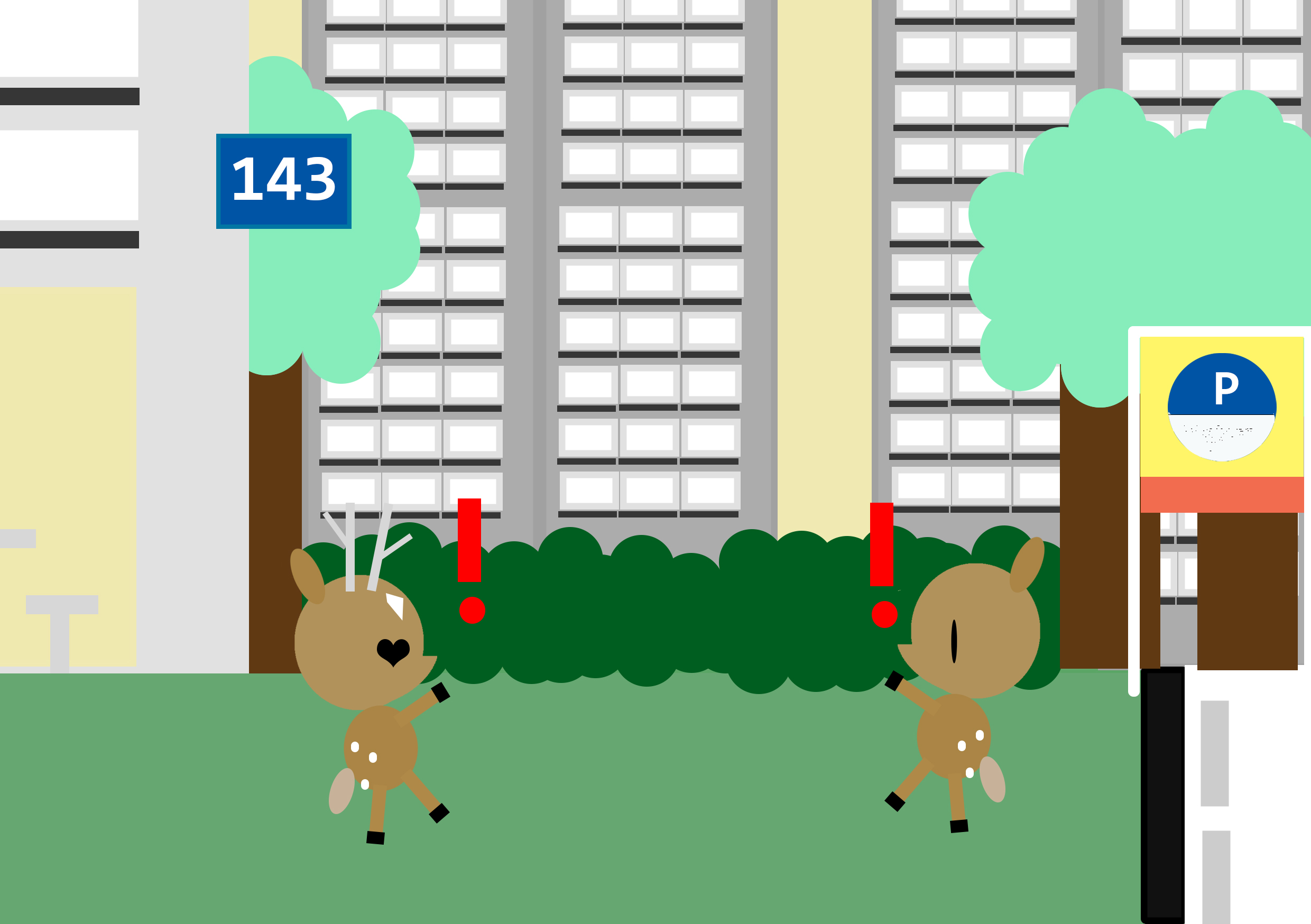
On the way back, KiasuBuck found love when he had least expected it.
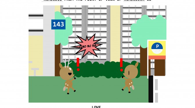
I wanted to play with the idea of finding love at unexpected places and thus my composition above. KiasiDoe, Kiasi because its the first trait i think of for Malaysians and Doe for female deer. In Singapore, its a common sight to see Singaporeans with Malaysians (Pr s). Personally, I also choose to portray it this way since that is what my parents are. 143 also have a meaning for I love you.
Forest from the point of view of KiasuBuck is
Home.
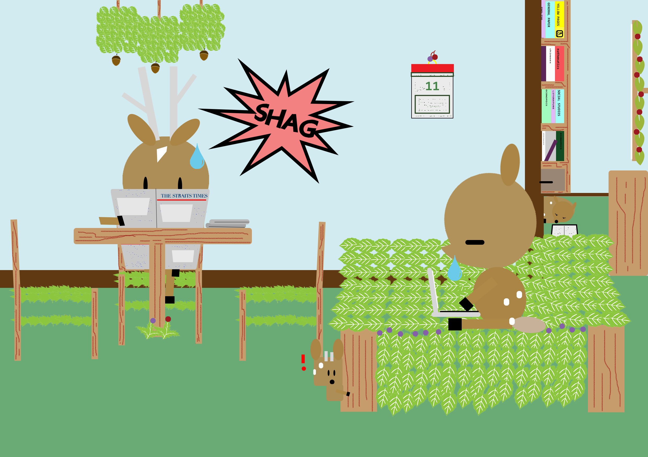
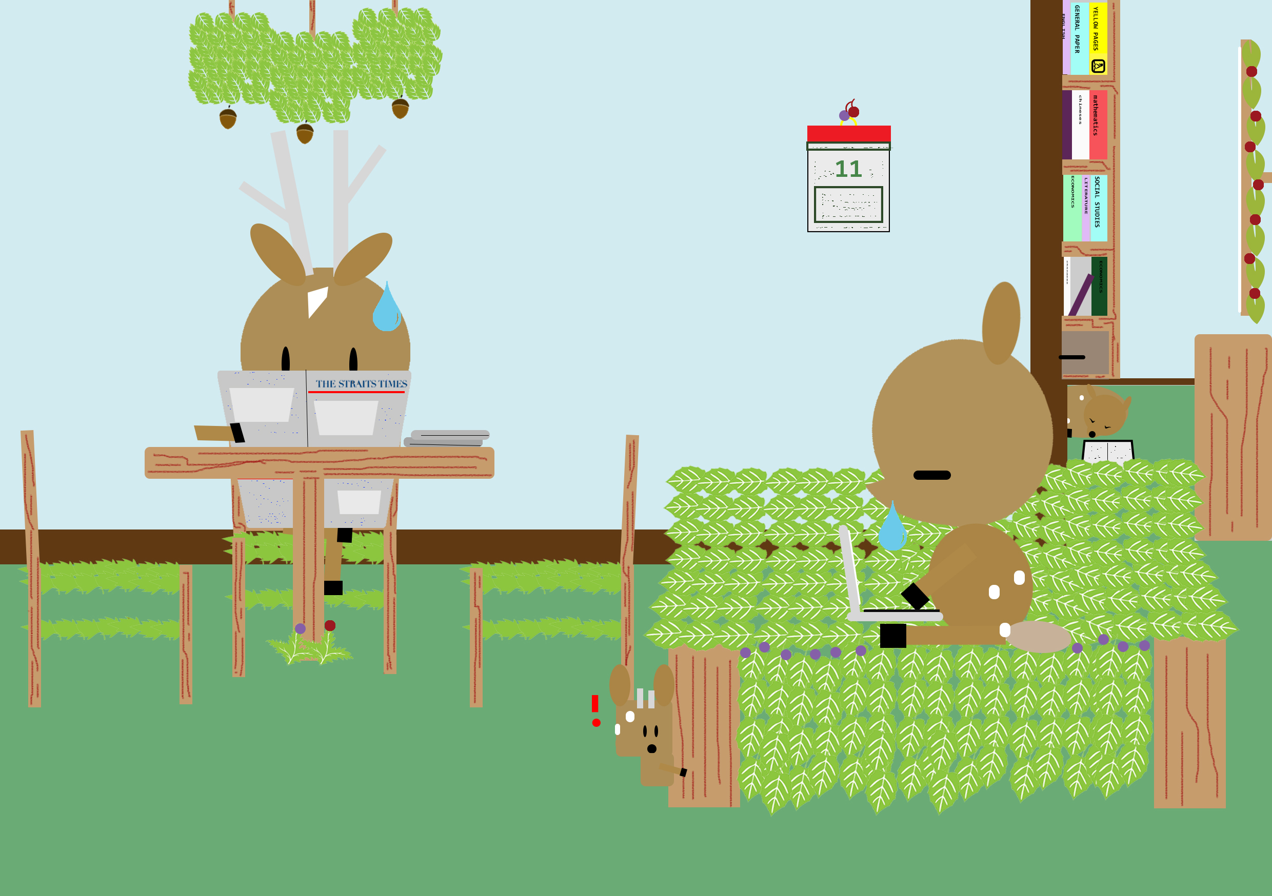
Lastly, KiasuBuck settled into his new home with his family.
Instead of using the human furnitures, i made them with the leaves, trees, berries and acorns. Again, i wanted to play with the idea of how Singaporeans are always busy with work. I added some small details of what some typical Singaporean family would have in their homes, such as the yellow pages, the traditional chinese calendar and the pile newspaper, such as the straits times. In front of the bookshelf, I placed one baby doe who has fell asleep from studying, a common thing that happens to Singaporean students. However in the front, baby buck has this exclamation mark to indicate he saw something but was in his own world since the others are too busy to entertain him/ the person who always gets ignored because they’re on different pages.
-The End-
How it looks without the speech bubbles.
