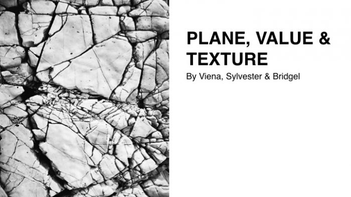
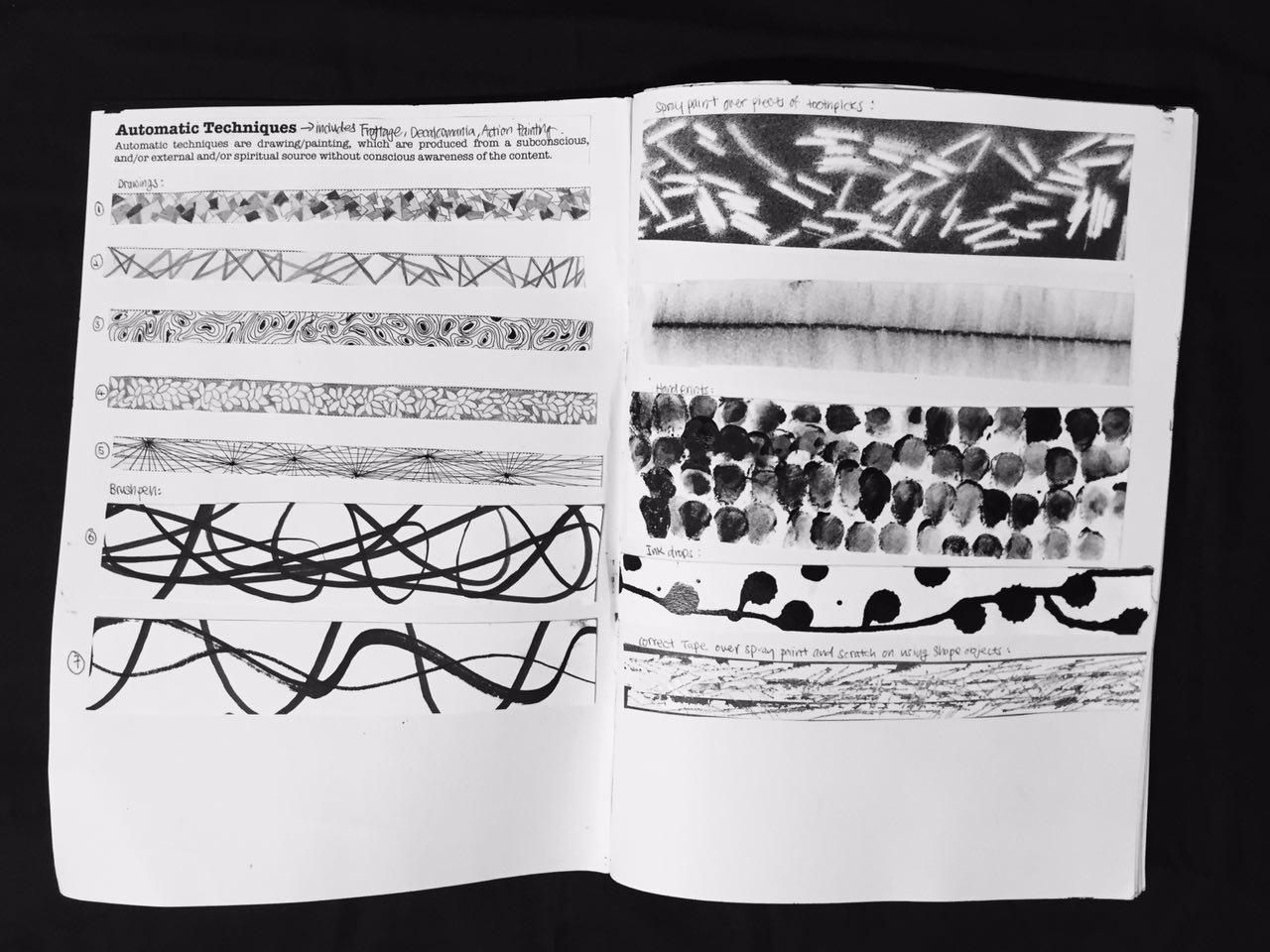
Hi there again! In this post, I’m gonna explore different techniques based on the artists that I’ve researched on! Let’s jump right into it!
Tara Donovan

Tara Donovan assembling “Untitled (2003),” at the Museum of Fine Arts.
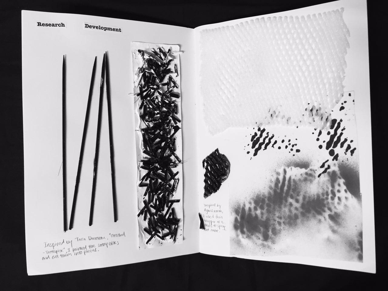
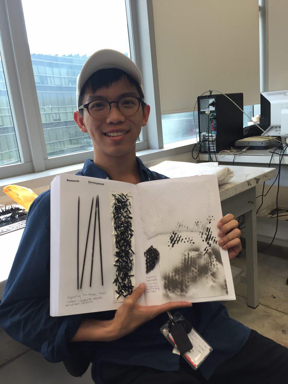
Tara Donovan is an American artist who creates large-scale installations and sculptures made by everyday manufactured materials. Material such as Scotch tape, Styrofoam cups, Paper plates, Toothpick, and drinking straws were used to create large scale sculptures that often have a biomorphic quality. I was drawn by one of her work “Untitled (toothpicks)”. It was a standing cube constructed with thousands of toothpicks pressed together:
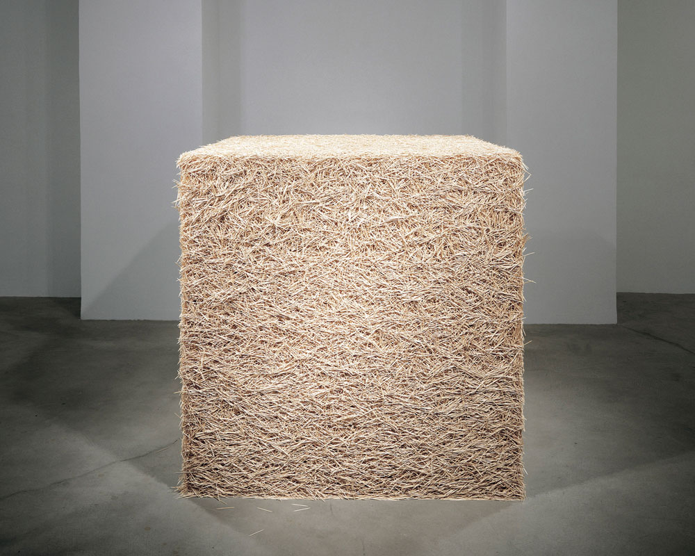
“Untitled – Toothpicks” by Tara Donovan Source: http://www.pacegallery.com/artists/111/tara-donovan
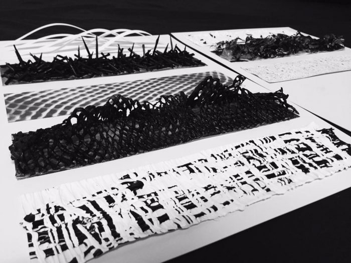
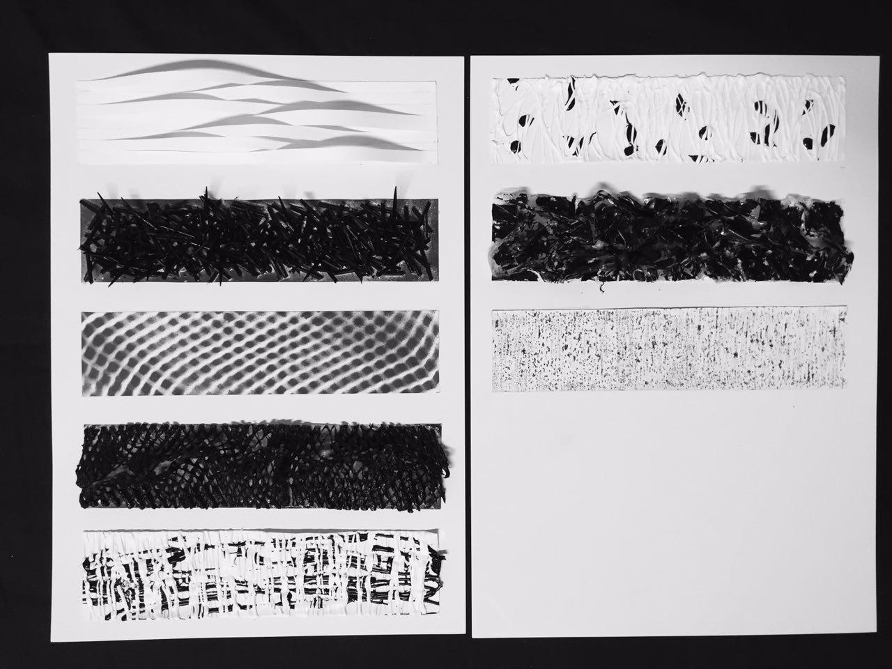
So, I tried to recreate her work using satay sticks, painted them with black and used the Sobo craft and fabric glue (that dries transparent) to stick them on my line:

Satay sticks painted in black.

Using fast drying glue to stick to the line
 and the result (I would say it sticks pretty firmly on the paper!):

It gives a terrify emotion when I look at it due to the shape edges.

Burnt plastic gives a fluid look.
Next, with Donovan’s idea in my mind, I used plastic to form another line. I first burn the plastic with lighter (Please don’t try this at home) and then I uses craft glue to stick it on my line:
Next, I painted a layer of acrylic paint on the plastic sheets to bring out the dimension of the line:
 and the result:

I left some of the transparent part as it is so that it gives a kind of “liquid” form to the line, otherwise it would just look like a black garbage bag.
Anthony Poon

Pioneer Singapore Artist Anthony Poon
Anthony Poon was one of the pioneer abstract artists in Singapore best known for his paintings in the “Wave Series” which he began working on in year 1976. I came across his work when I visited National Museum of Singapore, where “W – White on 2P Waves” was displayed:

Self taken “W- White on 2P waves” at National Museum of Singapore
Anthony created a sculptural effect of sinuous wave patterns by using aluminum strips under the stretched canvas. If the viewer moves from one side to the other, the metal strips that push the canvas forward transform it into an attractive sculpture. The artist purely used light to create different values on the canvas without any paint.
I was really inspired by his work after seeing “W- White on 2P waves” and I wanted to use his technique and ideas to create my own version of “waves” using papers:

I used papers with a bit of rough texture, cut them into strips with different length and paste them on my line.

I then glued the other end of the strips on my lines and rearrange them to different “wave length”. This is the result:
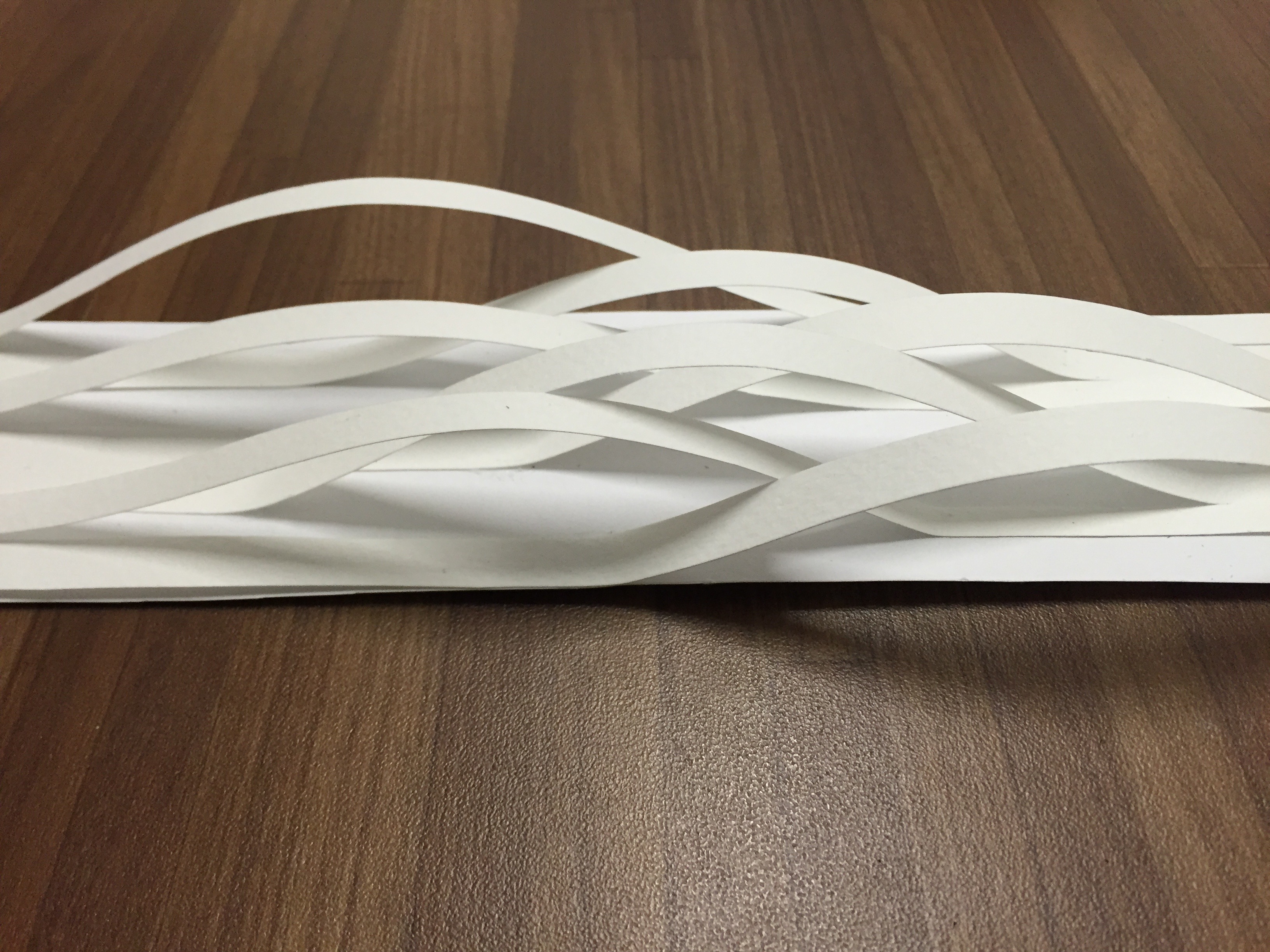
The “waves” create different values when the light source changes.
Ed Moses

Abstract Painter Ed Moses
Ed Moses is an American painter best known for his eclectic range of abstract paintings, Moses’ work is unified by his interest in transitory processes and the mutability of concepts. His canvases are formal abstractions using a variety of processes to experiment with surface, creating striations, cracks, marks, and blurs that sometimes juxtaposed with hard-edge geometric abstraction.

“Y? Copper” by Ed Moses. Source: https://newamericanpaintings.com/blog/ed-moses-greenbronze


I was inspired by his work, especially the “Y? Copper”. I did not really look into his techniques to create the cracks but rather, I explore other techniques to create similar effects.
I first spray paint (faster and dries quickly) over the drawing block, and then I used correction tape to layer it over the paint:

I then use sharp objects like scissors to scratch the correction tape off, leaving some cracks and scratch marks on the paper:

However, I thought I could improve the aesthetic by scratching the correction tape vertically instead, and the result:

Agnes Martin

Minimalist Artist Agnes Martin
Agnes Martin is an american abstract painter, referred as a minimalist but considered herself an abstract expressionist.

“On A Clear Day” by Agnes Martin source: http://www.themodern.org/collection/artists/Martin

“Untitled #1 (2003)” by Agnes Martin Source: http://thelancet.com/journals/lancet/article/PIIS0140-6736(15)00051-3/fulltext
A fan of minimalistic design myself, her work really speaks to me the most. However, I find it hard to achieve that minimalistic aesthetic and still show emotion from it. So I had a discussion with Prof Ina, and she actually advised me to find grid-like material and create marks from it. I found the fruit wrap (Okay fine I actually took it without permission) from the supermarket. I cut it into half and spray paint over it.

Black Spray paint and Fruit Wrapper
I really love the result! The spray paint kind of gave a nice gradient as oppose to watercolour/acrylic paint which in my opinion, difficult to control to create gradient.

Layer the fruit wrapper on top of the line and spray paint over it

This wasn’t inspired by Agnes Martin, I burnt the fruit wrapper and spray paint it black. I then cut it into pieces and create another emotion out of it.
(P/S: PLEASE ASK FOR PERMISSION BEFORE YOU TAKE ANYTHING FROM THE SUPERMARKET)
Jackson Pollock

Jackson Pollock at work. Source: http://www.biography.com/people/jackson-pollock-9443818
Jackson Pollock is the artist who invented “drip paintings”. Most of his canvases were either set on the floor, or laid out against a wall, rather than being fixed to an easel. From there, Jackson Pollock used a style where he would allow the paint to drip from the paint can. Instead of using the traditional paint brush, he would add depth to his images using knives, trowels, or sticks. This form of painting, had similar ties to the Surreal movement, in that it had a direct relation to the artist’s emotions, expression, and mood, and showcased their feeling behind the pieces they designed.

Self Taken in New York. “Number 31” by Jackson Pollock.
I’ve actually seen one of his piece “Number 31” while I was in New York a year ago, and I would say the size and the texture of this piece was jaw dropping. I did take a closer look at the texture and I wanted to recreate that in my lines.
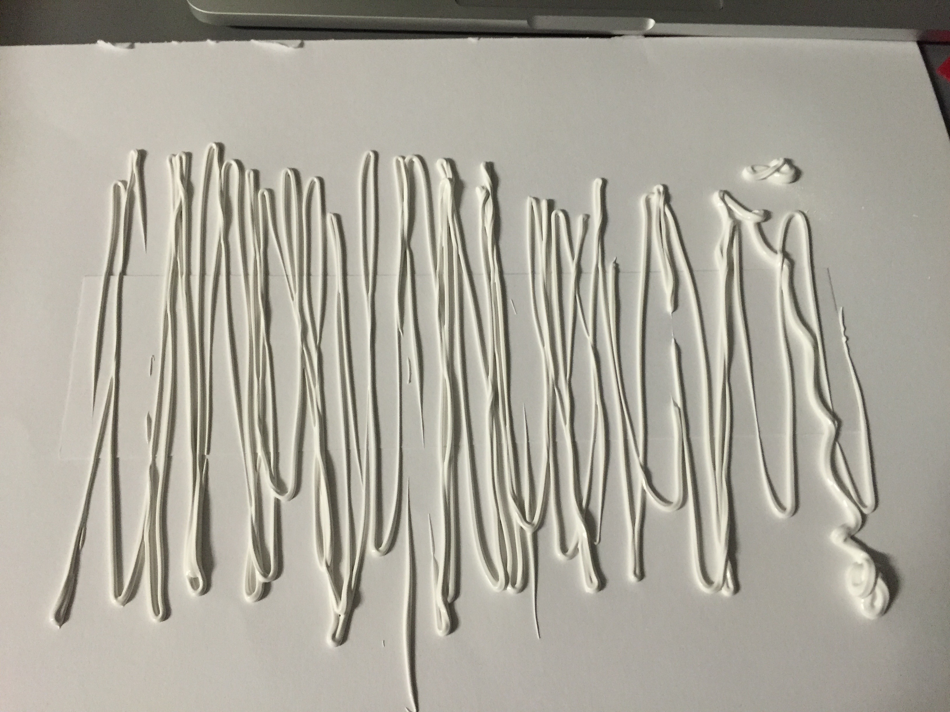 I layer the acrylic paint vertically and horizontally over and over again, it somehow has the Ed Moses’ aesthetic to it. (and it looks yummy I don’t know why HAHAHA!)

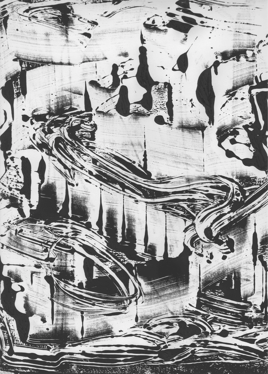
I also tried different ways to drip the acrylic paint on the drawing block:


I hope you guys enjoy what I’ve shared so far and hopefully you guys can draw some inspiration from here.


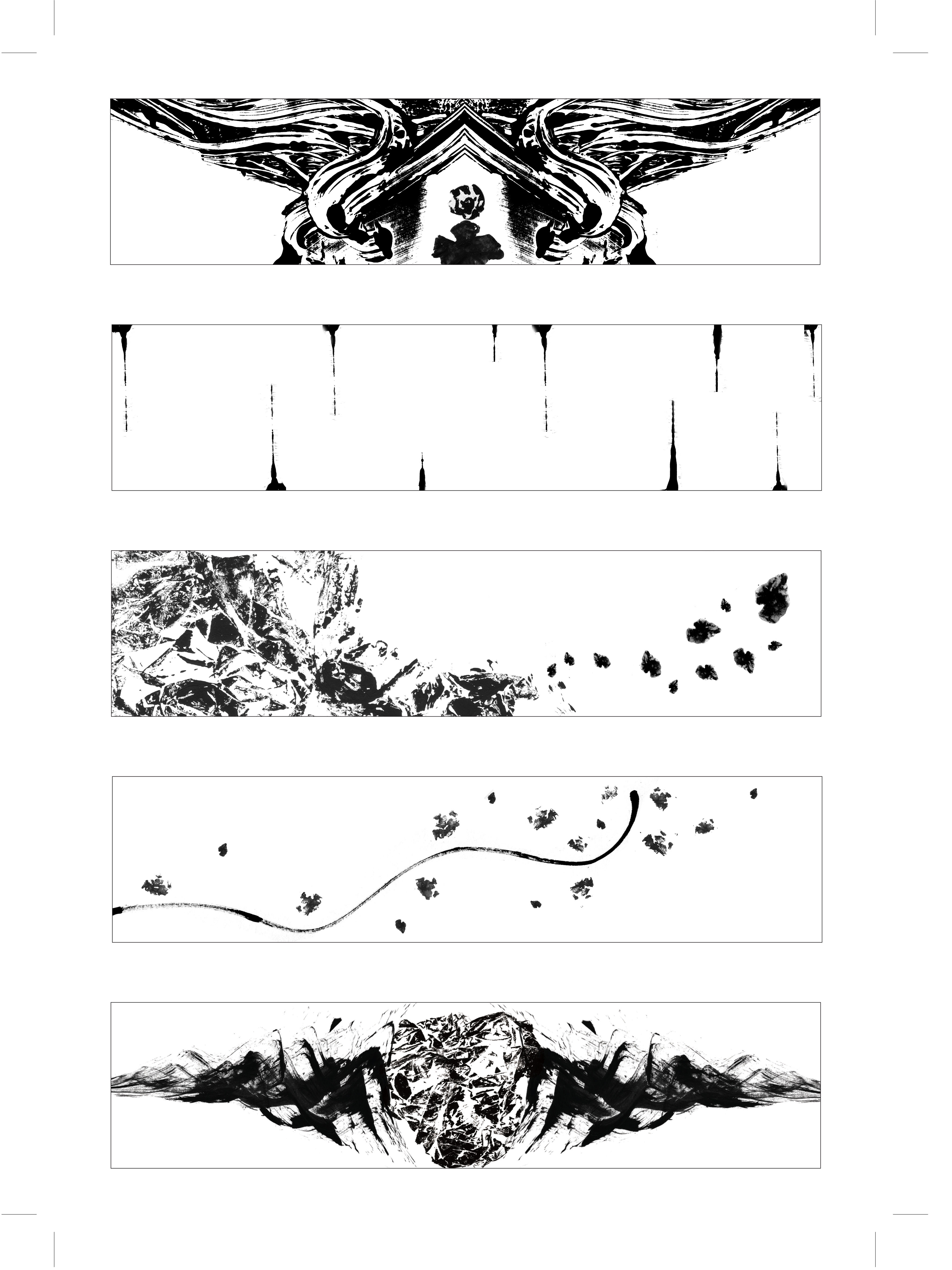
 Stereotype (Immature)

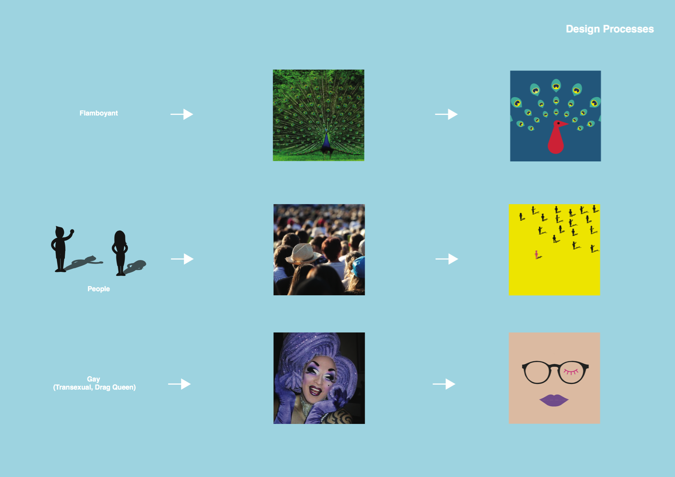
 Social Setting (Gay)

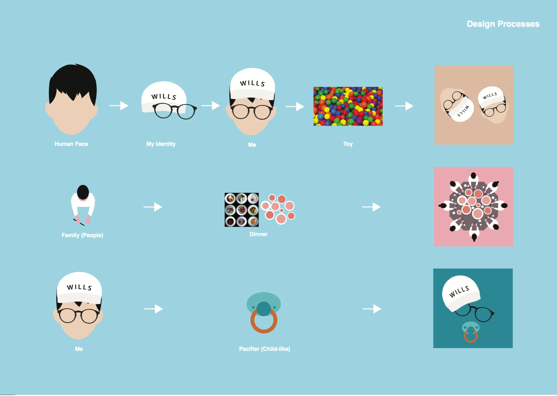
 Stereotype (Insensitive)


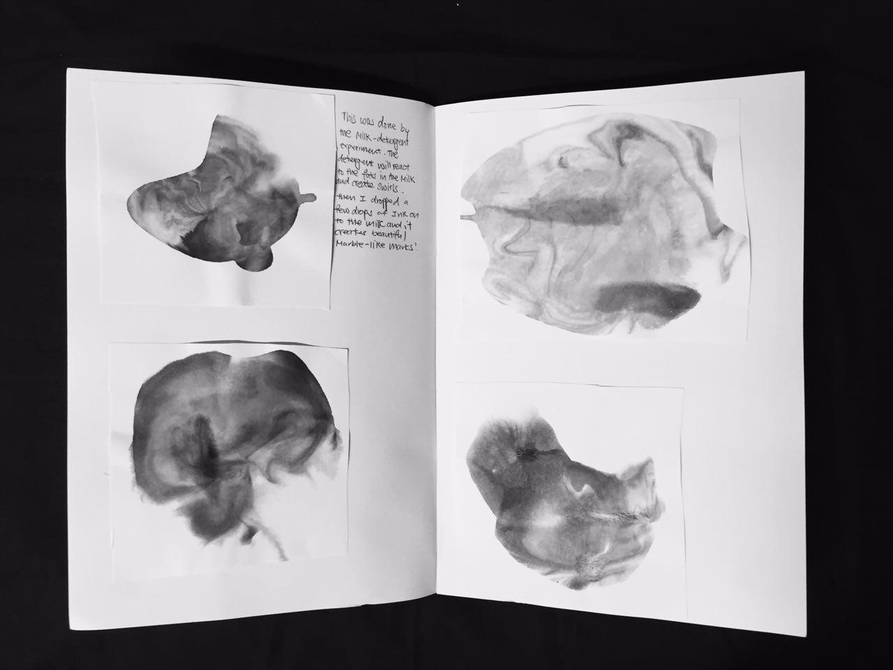


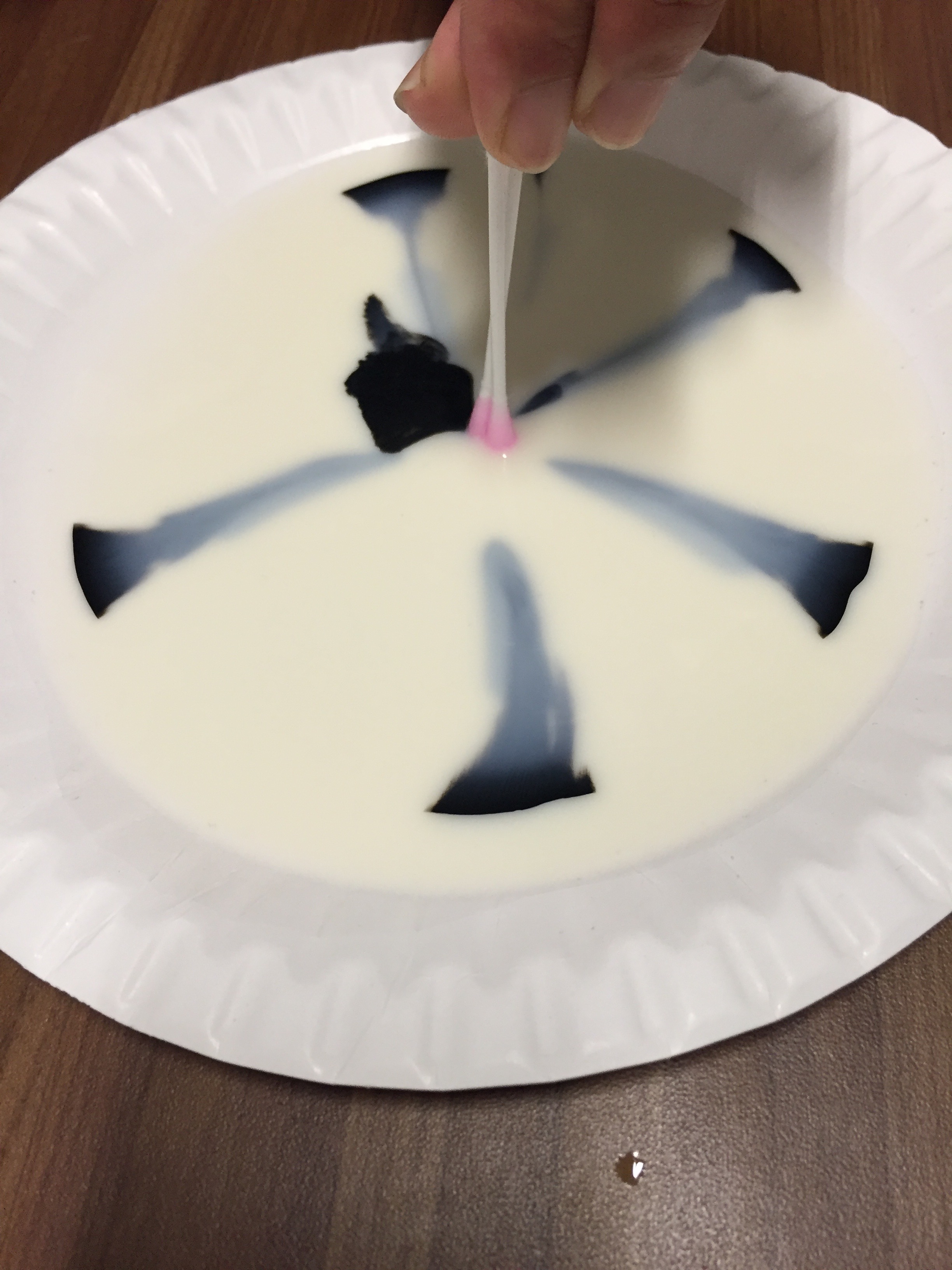
 Then I place the drawing block on top of the milk and left it to dry.


 Mono Print 12:


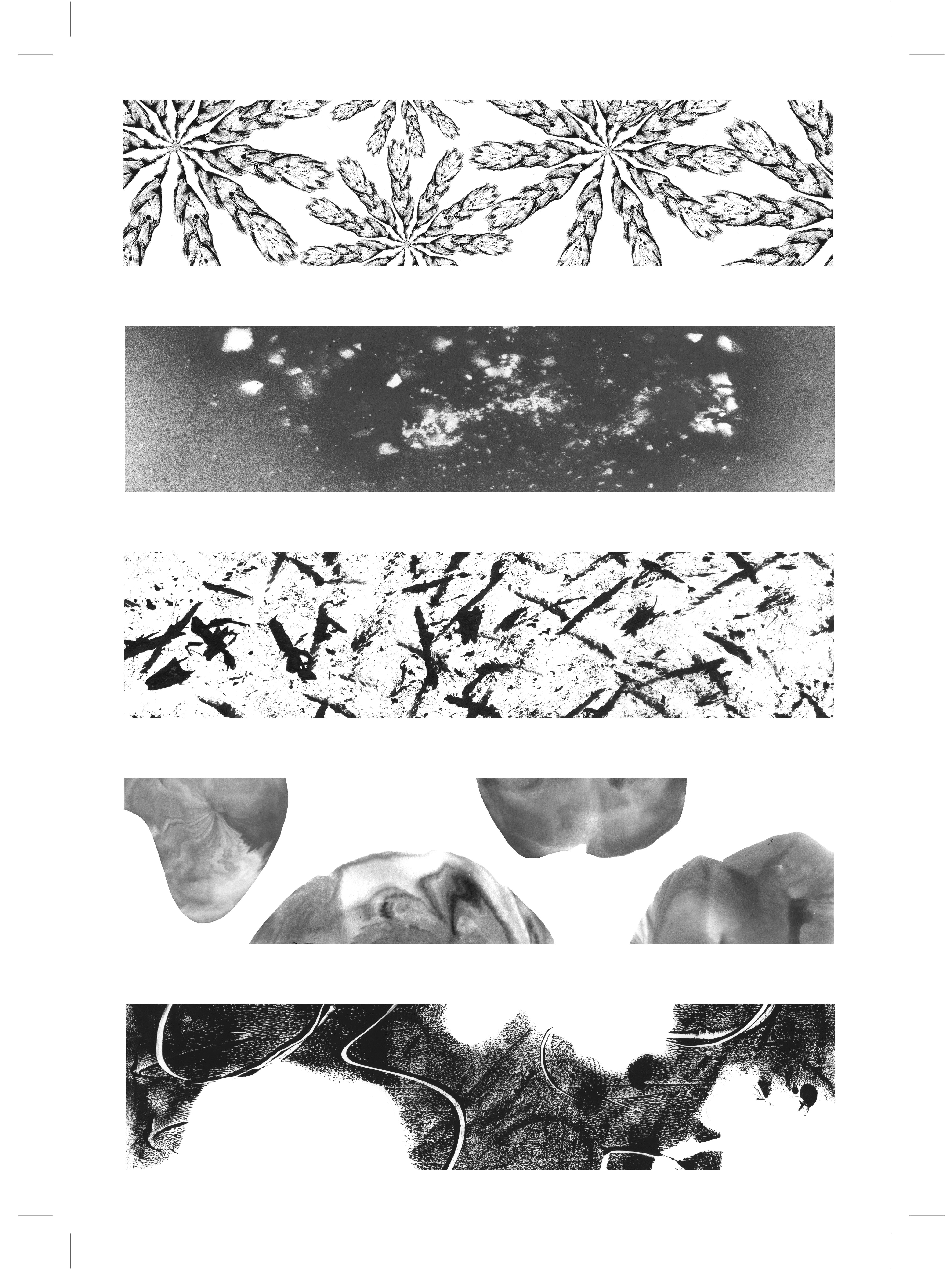
 Likewise, I created this pattern by stippling the mark making tool on to the paper, and it has this very beautiful “flower-looking” mark. This is my personal favourite!