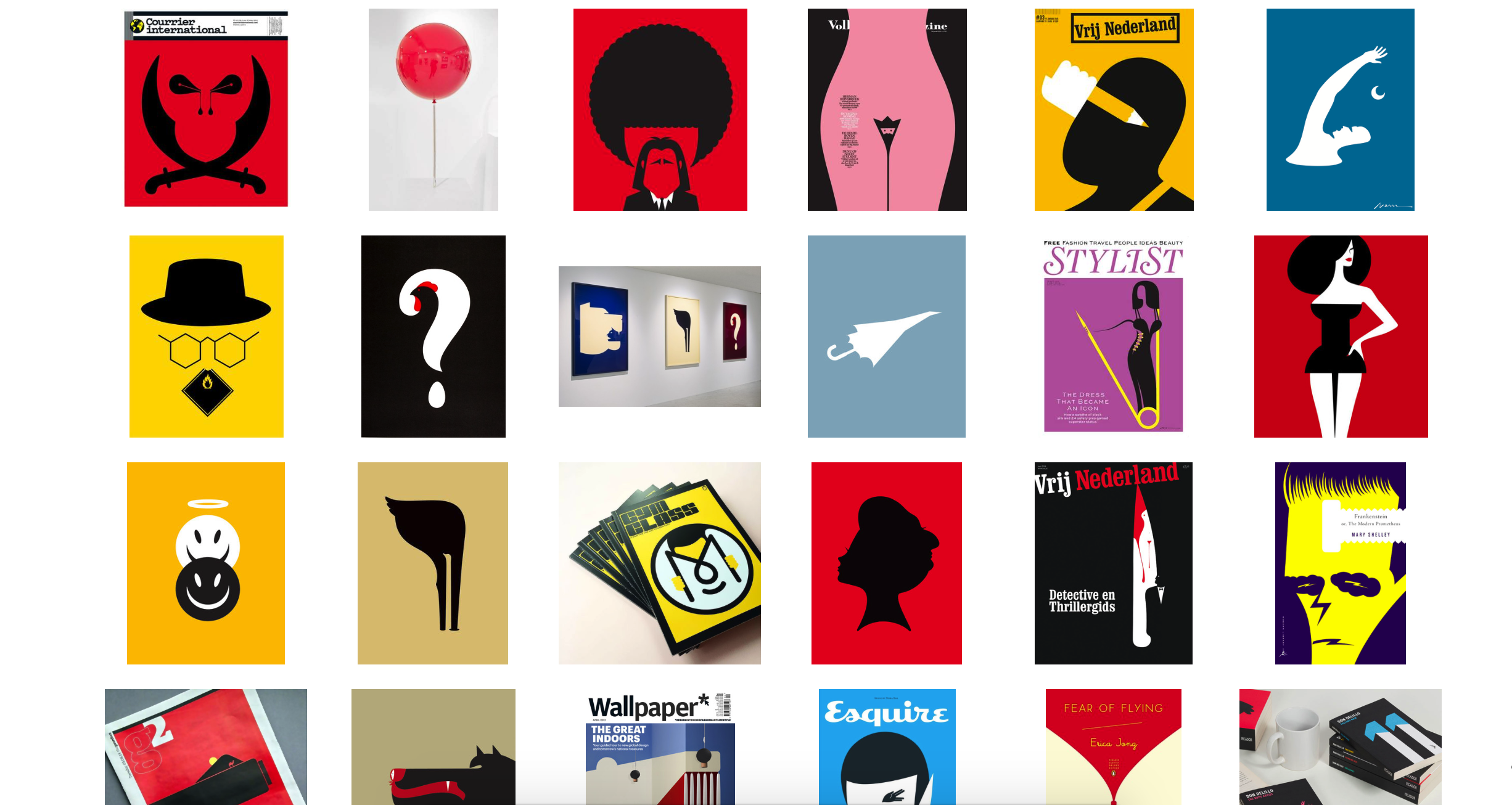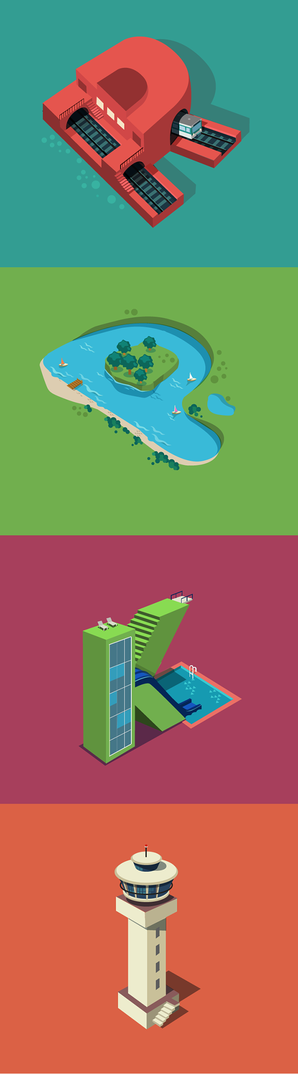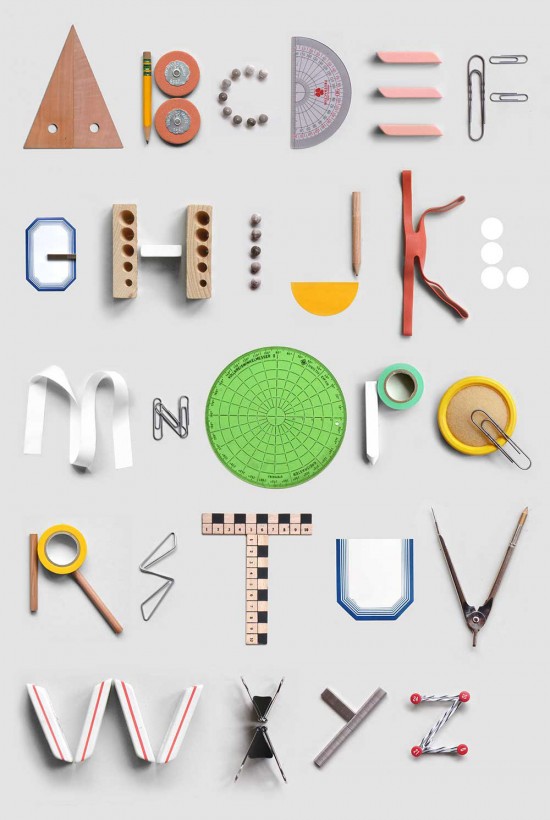
Aloha! Finally able to share this online. It was really tough to complete this project I must say but I guess everyone managed to pull it through. I decided to combine design process + research in one post because I usually do research together with brainstorming. You guys can check out my Artist Reference *here* or you can continue reading this post and I will link you guys over if I’ve made any references. So here is my design process for Project 1 Que Sera:
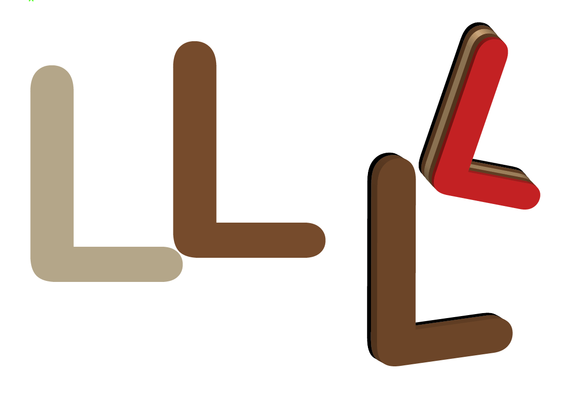
Name Selection
I listed out a good amount of names/initial I could work on, and it was very random:
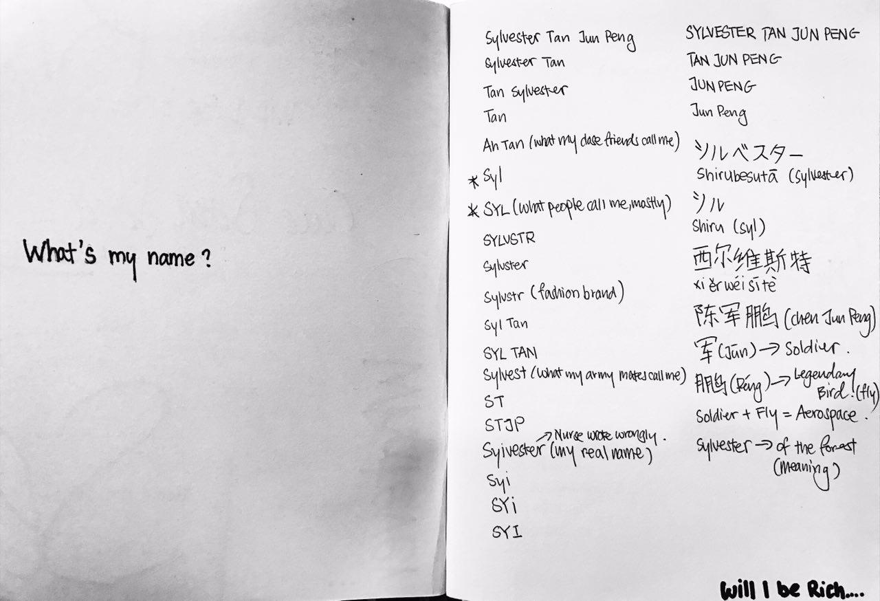
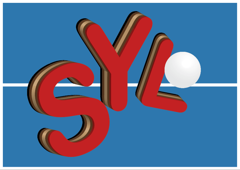
I actually google translated my name into Japanese and weird Chinese pronunciation haha! I thought I could do something oriental and unique but in the end I choose to settle with “SYL”. This is what most people call me and I thought it’s easier to work on lesser letters so that the whole composition of my design won’t look too complicated and untidy.
Job Selection
I also listed out a good amount of “future job”:
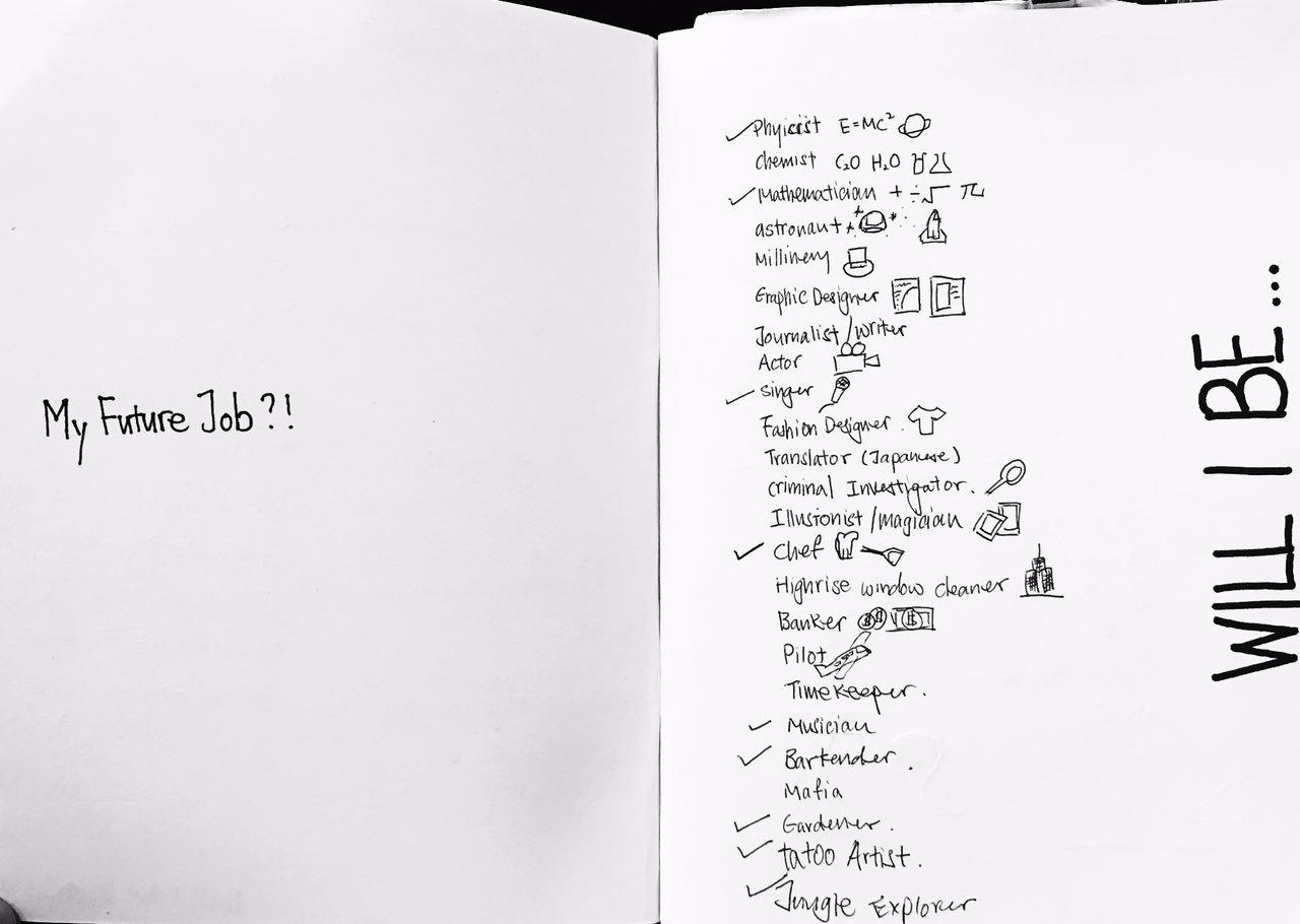
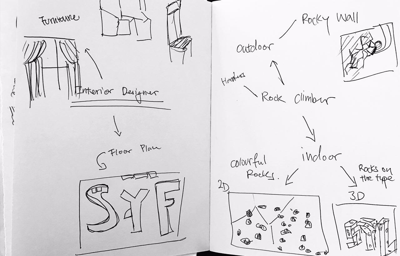
I initially selected 4 jobs – Fashion Designer, Mathematician, Table Tennis Player and Musician – to work on but I thought it would be best not to constraint myself within these 4 jobs and try to explore beyond that. so I decided to work on another 2: Rock Climber and Interior Designer.
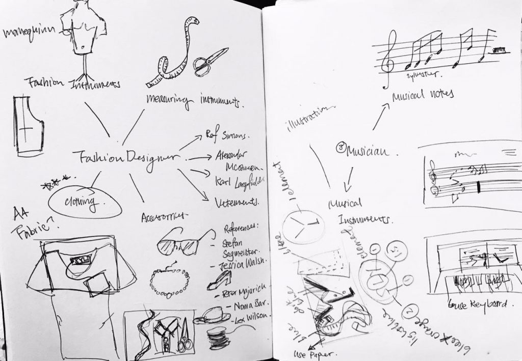
Design processes
I usually just jump into designing my work straight away, but this time round I decided to follow the proper design process. I first drew Mind-maps and listed out everything that is associated with the job. I then drew random thumbnails within the mind maps and it did helped me to visualise the whole composition of the final outcome.
Job 1: Fashion Designer
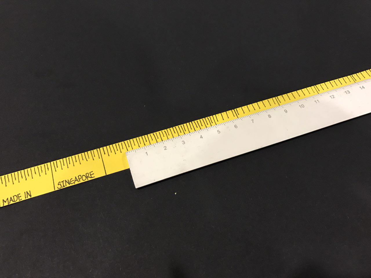
My initial ideas was just using the brand tag to write my initial “SYL”. It has always been a dream to see my name on the tag haha! I thought it’s a brilliant idea since it shout loud and clear FASHION DESIGNER. After consulting Ms Shirley, I realised that this project is not just getting the message across, but also to create type to communicate visually. Hence, drawing inspiration from Stefan Sagmeister I decided to moved on to using items associated with fashion designers such as clothing, measuring tape and Threads and Needles to compose my initials. I used Complimentary Colour (Yellow + Purple) in my composition – a darker shade of purple as the background and Yellow for the type – so that my initial will stand out and it’s easier for reader to look at.
I first drew out the measuring tape to using yellow construction paper. This will form the “S” in my composition:
and then I cut out small pieces of the cloth to form a collar for the shirt, to form a “Y”. My idea was to use yellow cloth to form the Y so that the colour will bring about Visual Harmony in my type:
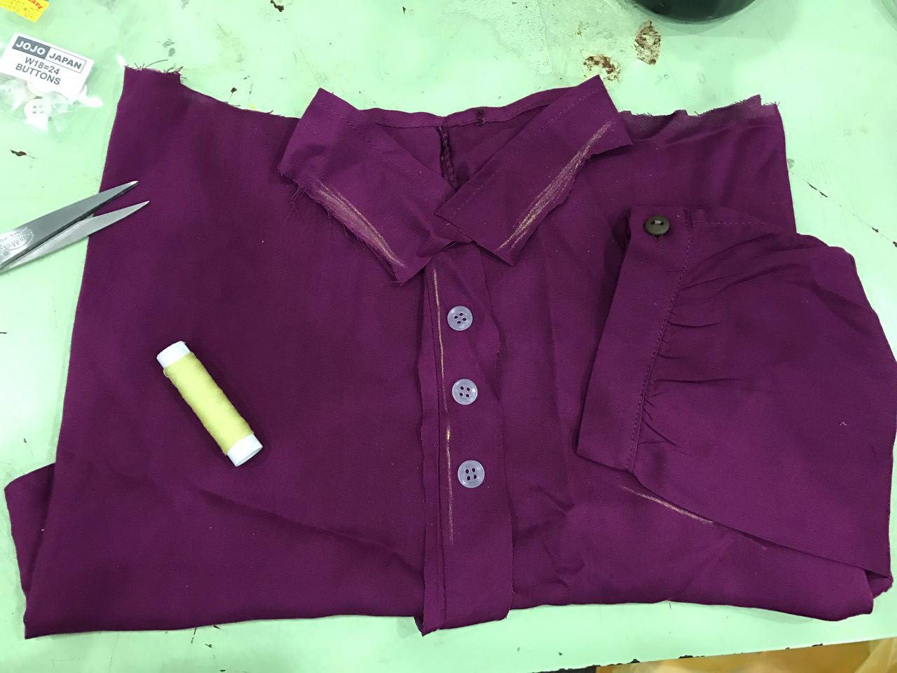
Same goes to the “L”. I wanted to use sew the yellow thread onto the cloth itself to form L:
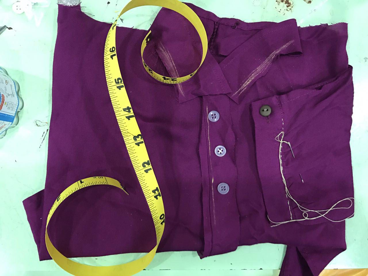
I did not really like how it turns out to be very honest even though I did not complete it. I thought it would look really unfinished even if I have completed it. Also, I thought it’ll be better if I can avoid any 3D composition and focus more on designing the font itself. So I went on to work on other jobs.
Job 2: Mathematician
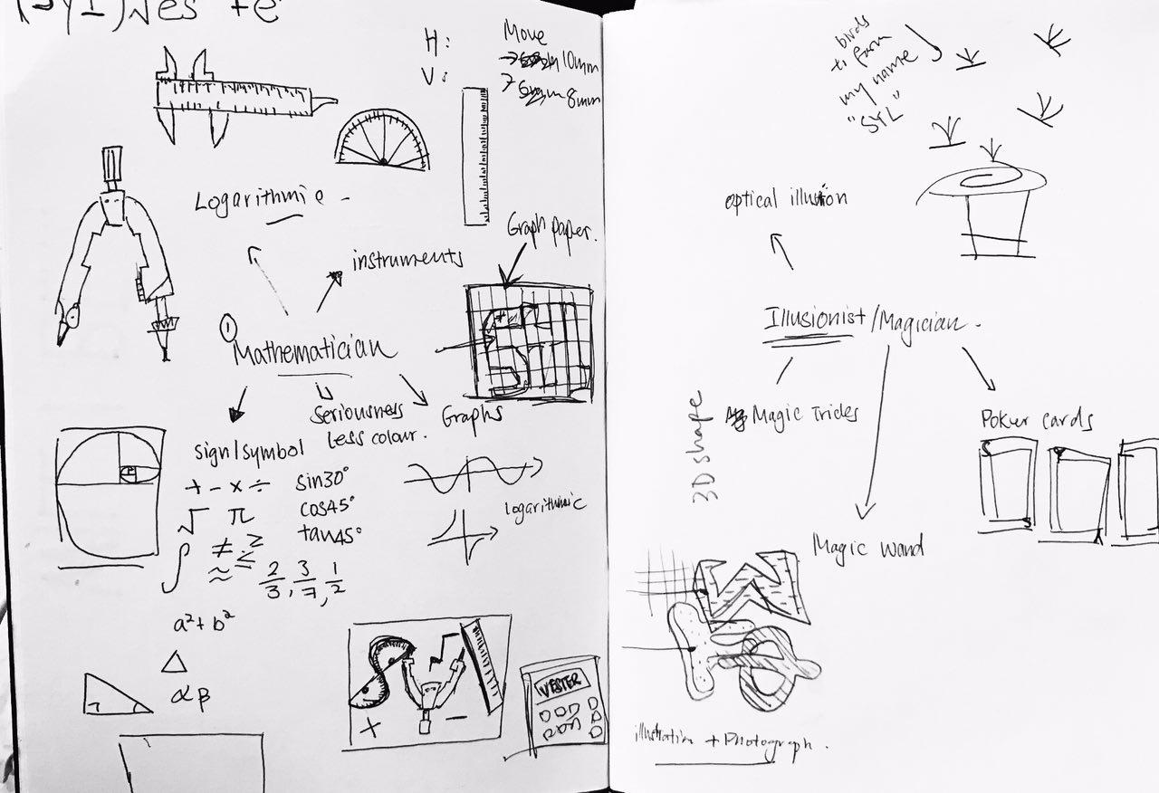
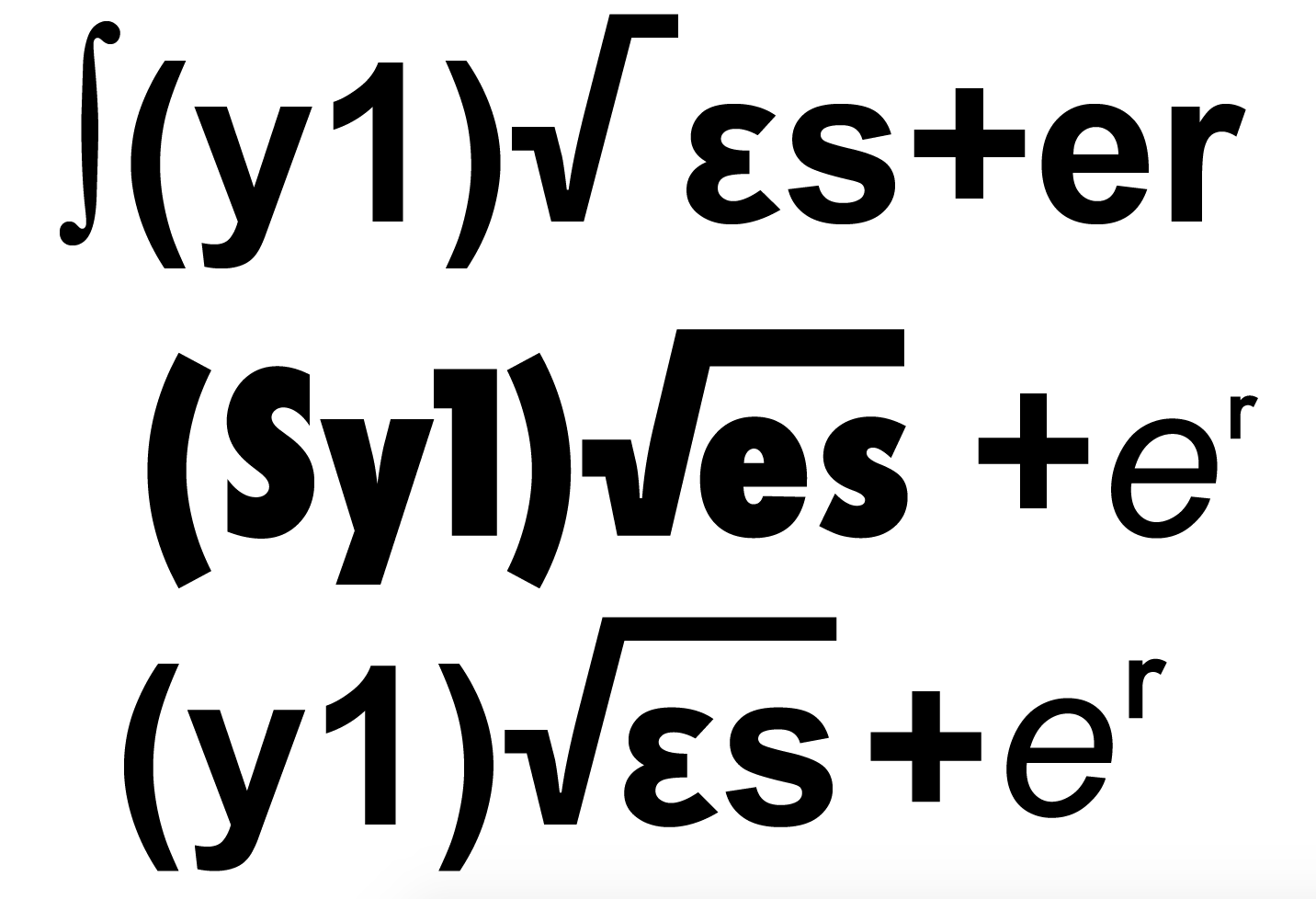
I have 2 ideas in mind while brainstorming for this job – Using mathematical instrument to form SYL or use Mathematic equation to form S+YL(VES)TE=R. I decided to try out the equation one because I find that by using mathematical instrument is a bit too simple.
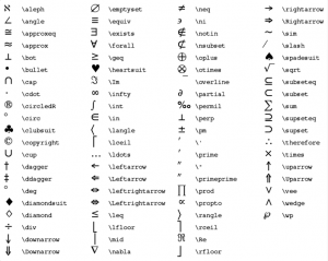
Hence, I did some research online on maths equations as well as some maths symbol I can use to compose my name.

I then went on to Illustrator to try out different composition:
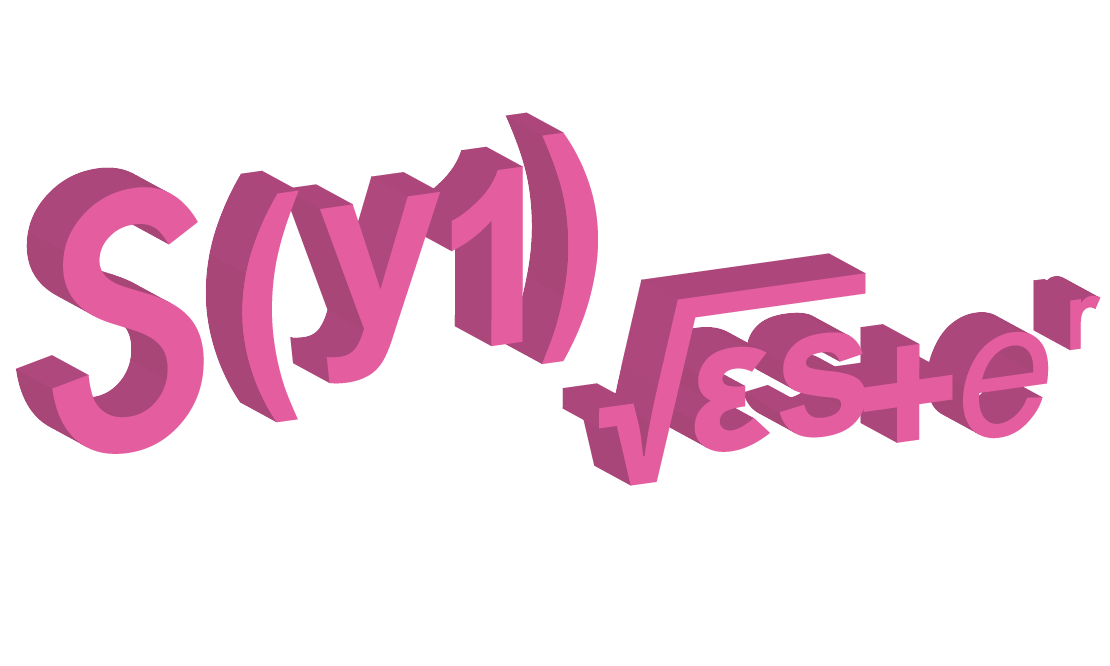
you can see from below that I also tried playing around with extrude function on Illustrator to create a 3D effect for my fonts:
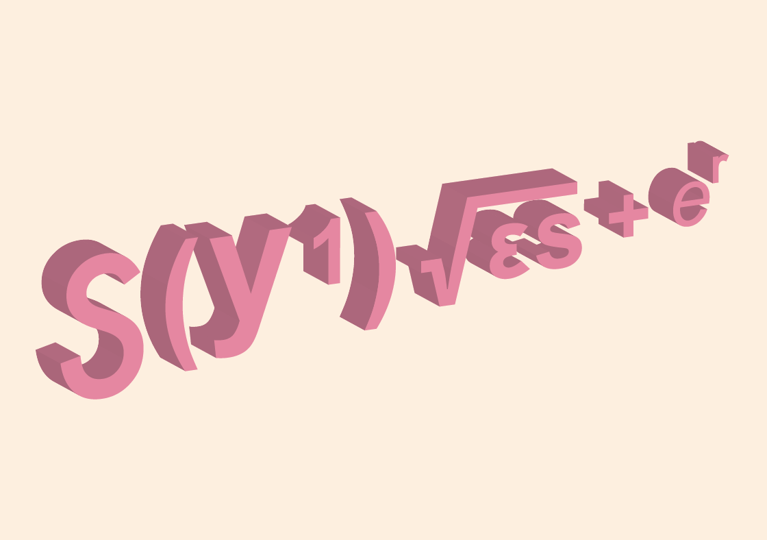
However, I was kinda stuck at this stage to push myself further. Firstly, I did not really design the type – I just conveniently use mathematic symbols to create my name which is quite effortless. I thought I could push my creativity further by exploring more on other jobs and then see which one works best.
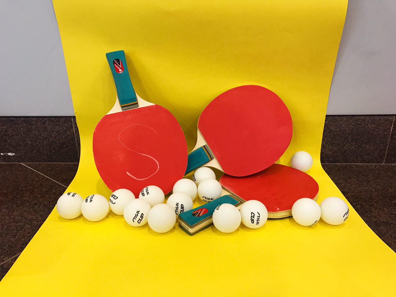
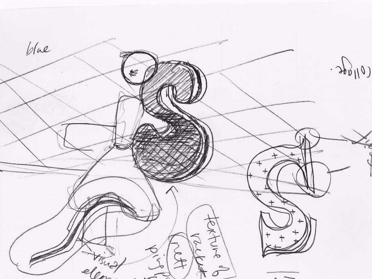
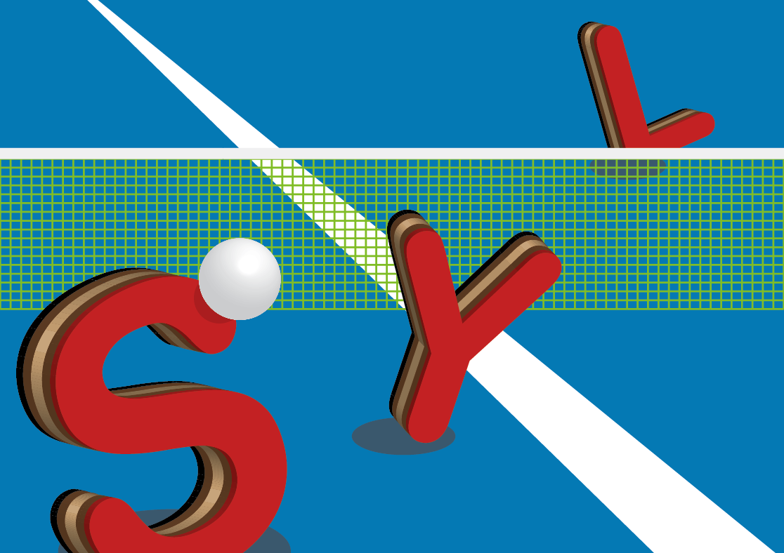
Job 3: Table Tennis Player
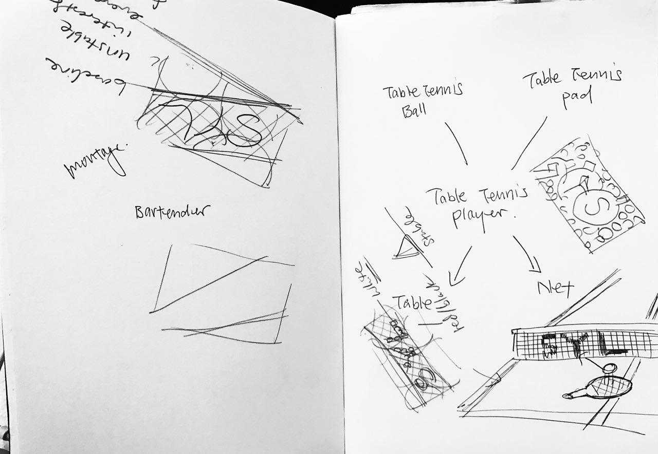
As shown above, I actually have quite a number of ideas on how I want to create the type. Together with Ms Shirley’s recommendation, I tried to form my initials using ping pong balls and table tennis bats:
For the ping pong ball, I referred to a typography image on Pinterest as shown above that to create my type.
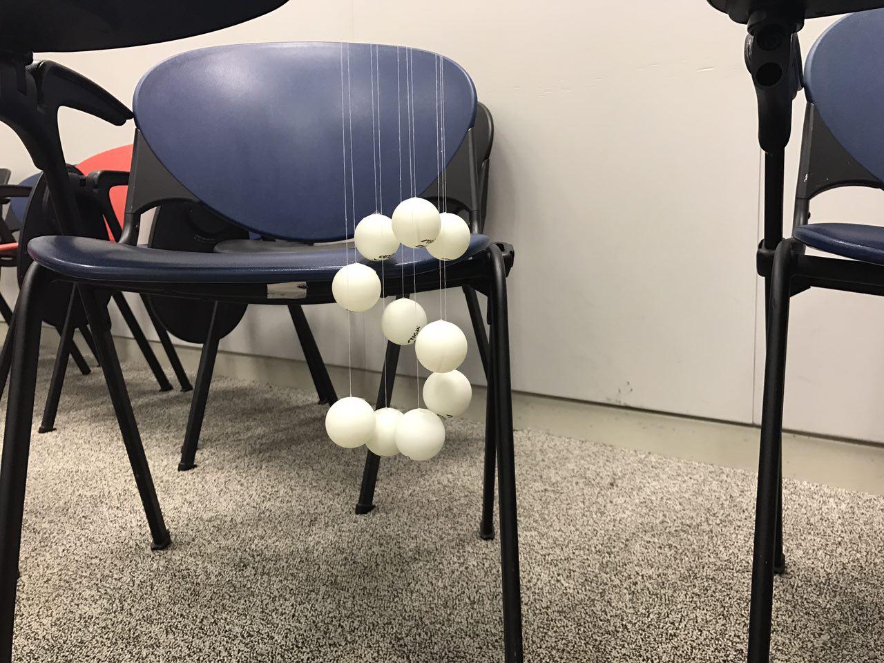
I used white thread to tie the ping pong ball and then use wooden stick to suspend the ping pong ball. I thought it looked very cool but the process of making it was very tedious. I could easily use photoshop to do the exact small by playing with shadow effect. Bad Decision.
I also thought of using Triadic colours to give a very fun look to the whole composition:
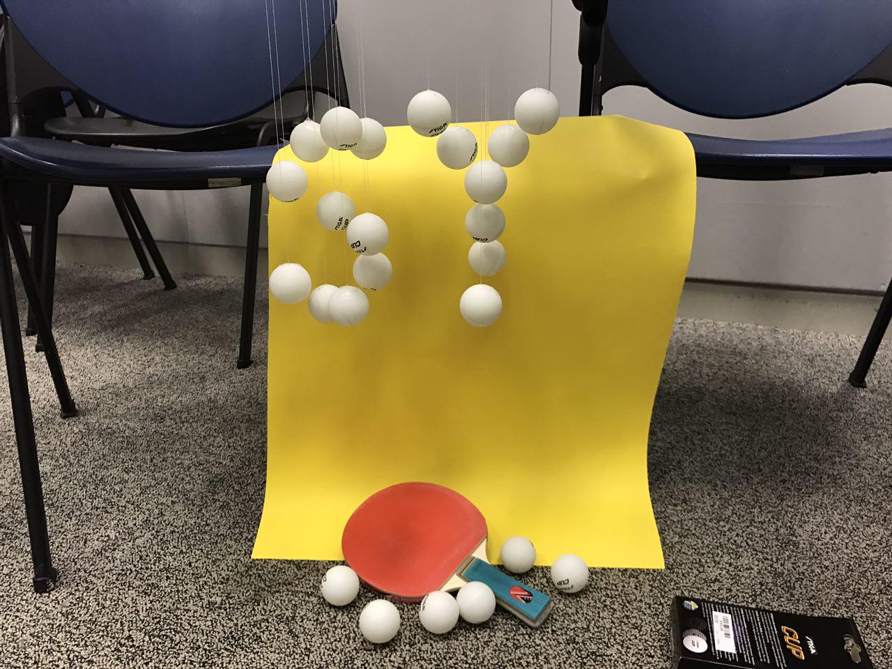
I also tried out different ways based on my initial sketches to see how it looks like. I also wanted to carve my initials on to the bats:
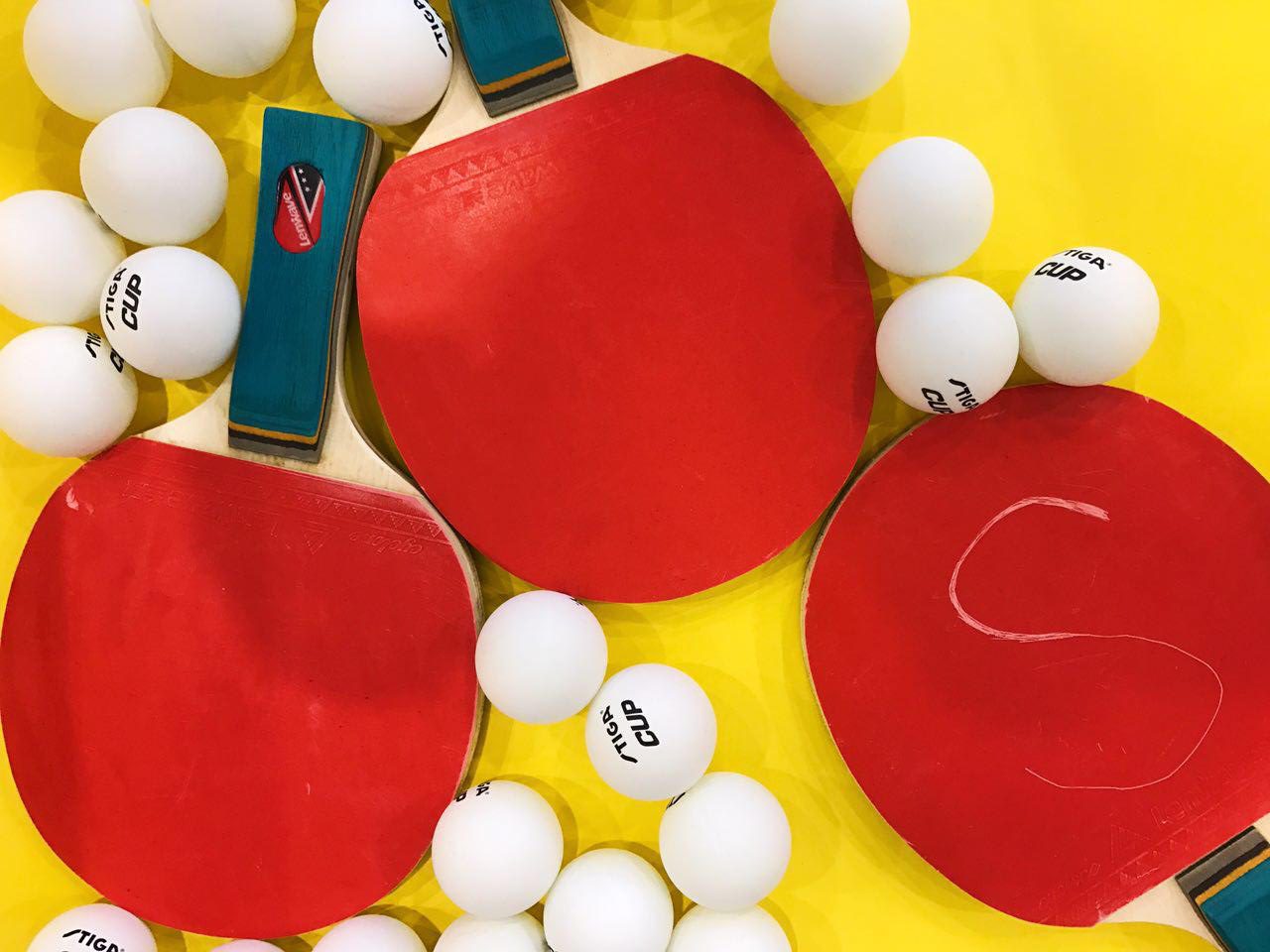
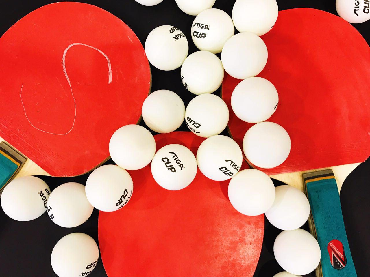
at this point of time, I really find that taking photos of found objects really didn’t showcase any design effort. So I consulted Ms Shirley the 2nd time to ask for advice.
after consultation, I decided to move on to do digital design, borrowing some elements from the table tennis bat to create my type. I felt that it was quite challenging to do it because it requires some 3D form of design on Illustrator which I wasn’t really good at.
to recreate the layers at side of the table tennis bat, I have to apply extrude effect on each font, and it requires some precision. I have to ensure that there are some variations on the thickness, and that the types are tilting towards the same angle:
For my first composition, I simple put my Initials together + ping pong ball and a table for table tennis as a background, which look very flat. the white line in the middle also also competing with the type visually.
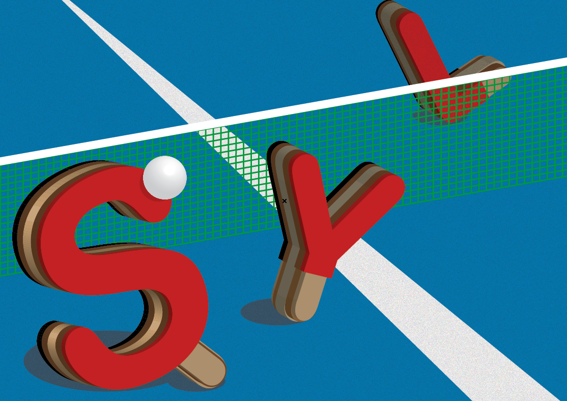
Hence, I made some adjustment to the size of the type and the white lines on the table to create visual depth and perspective. I also wanted to create a very comical and fun look by letting my initial “Play” with the ping pong ball.
Finally, I made some adjustment to the type by adding element of the bat handle. Together with other supporting elements such the ping pong ball, the table and the net, this made my job communicates clearly. I also keep the colour as close to the objects you see in real life as possible so that the reader can relate to the job instantly:
Job 4: Musician
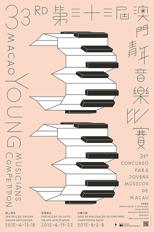
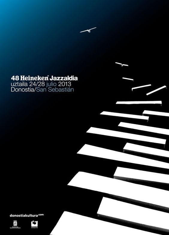
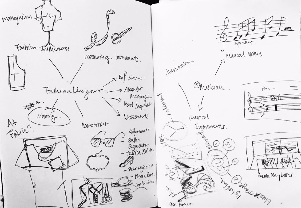 My original idea for Musician was to use musical notes to form my Initials. However, Ms Shirley suggested that I should focus on a specific instrument I play so that it is easier for me for the ideation process. Hence, I decided to put in elements from Piano (the piano keys) to create my type. Here are some references I researched on:
Using musical instruments to create type by Mohamed Reda Source: https://www.behance.net/gallery/11948459/Fullstop
Using musical instruments to create type by Mohamed Reda Source: https://www.behance.net/gallery/11948459/Fullstop
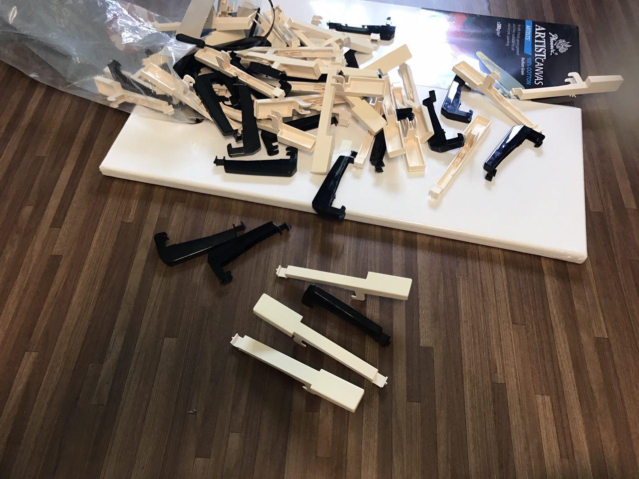
For my first try, I wanted to recreate the design above. So I dismantled my old keyboard and the remove the keys (FYI: this piano is already faulty):
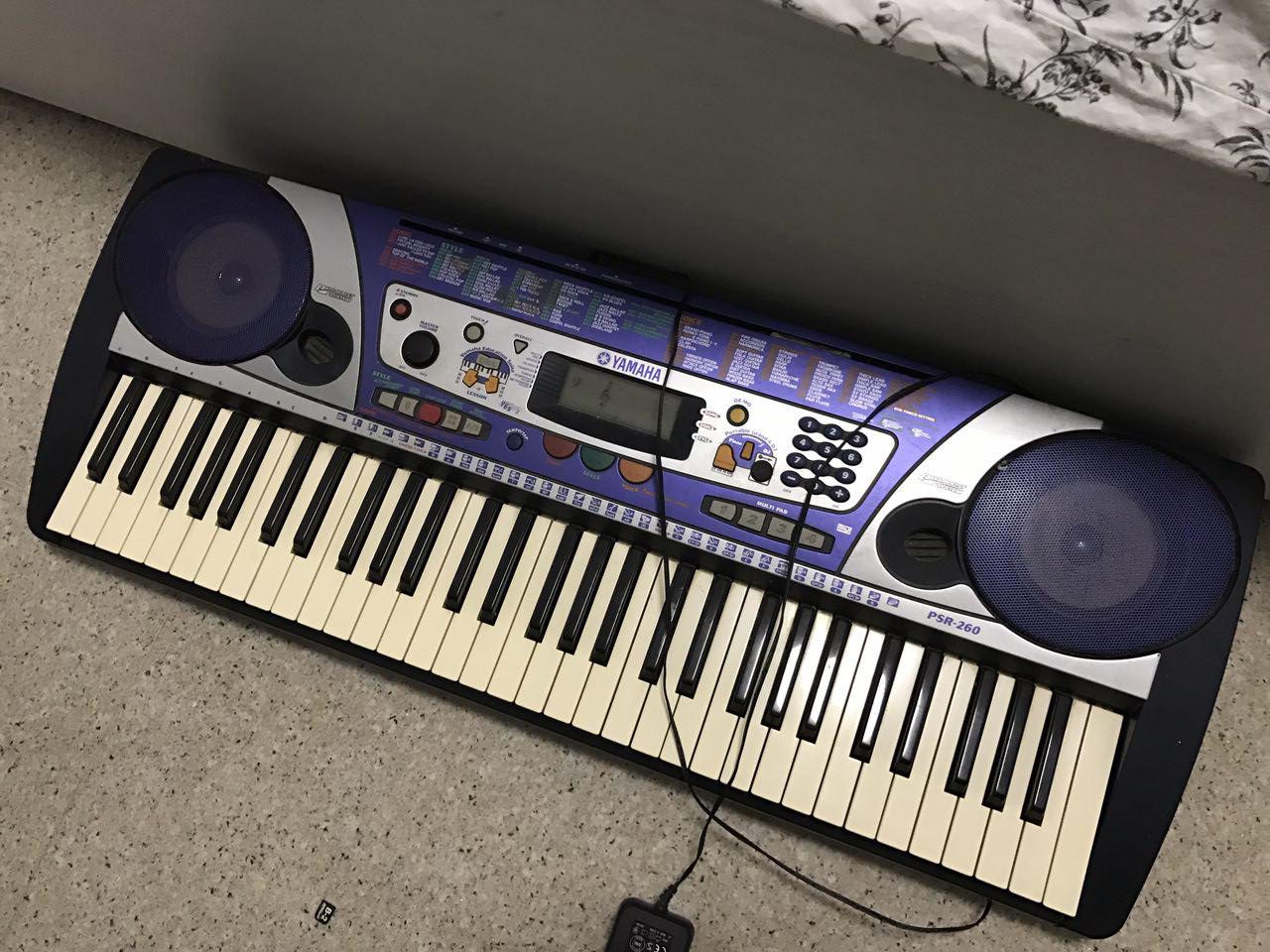
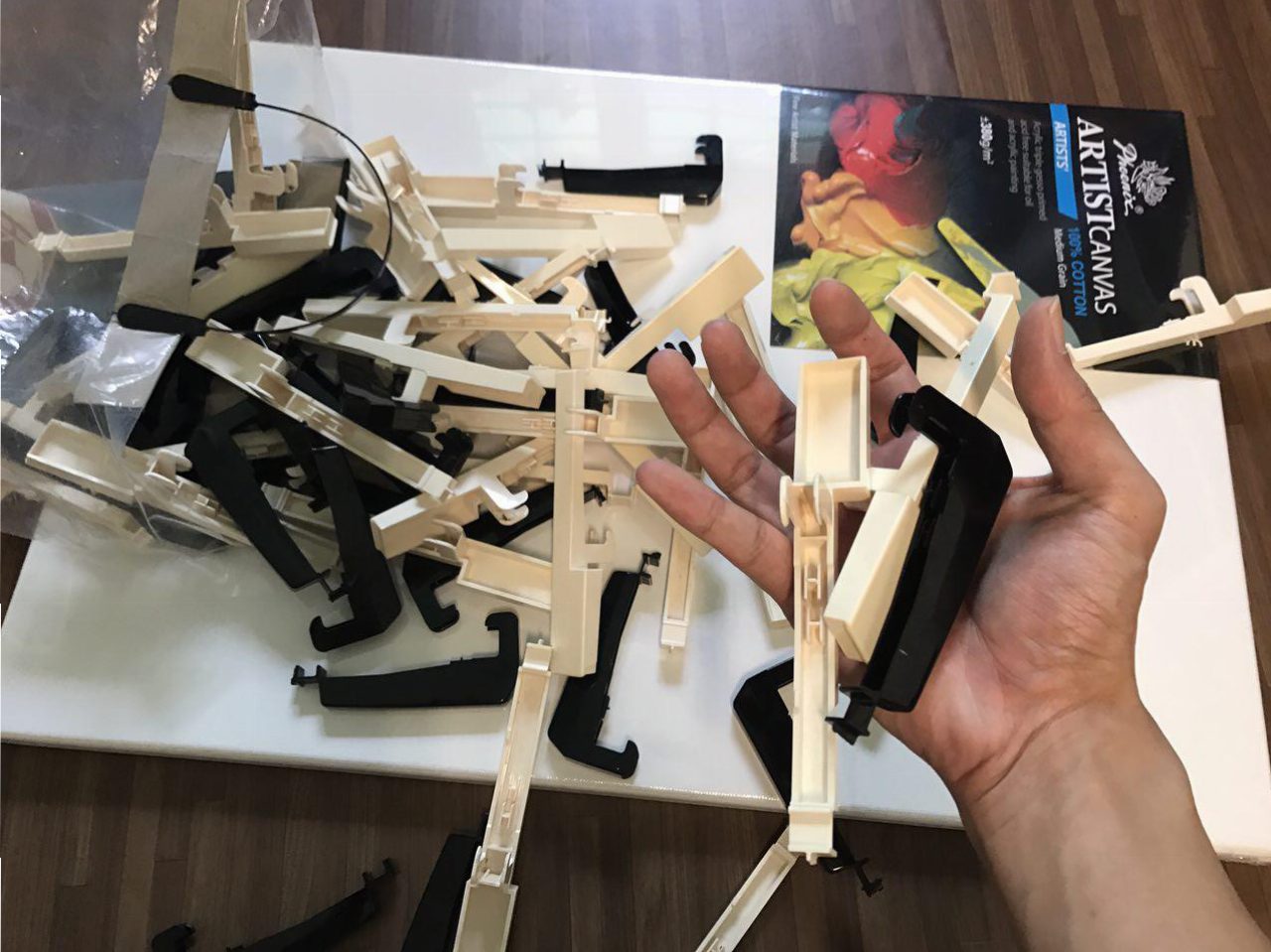
However, unlike the piano keys found on a grand piano, the keys from the electronic keyboard has a weird shape. So, when scattered around, you can’t really tell they are piano keys.
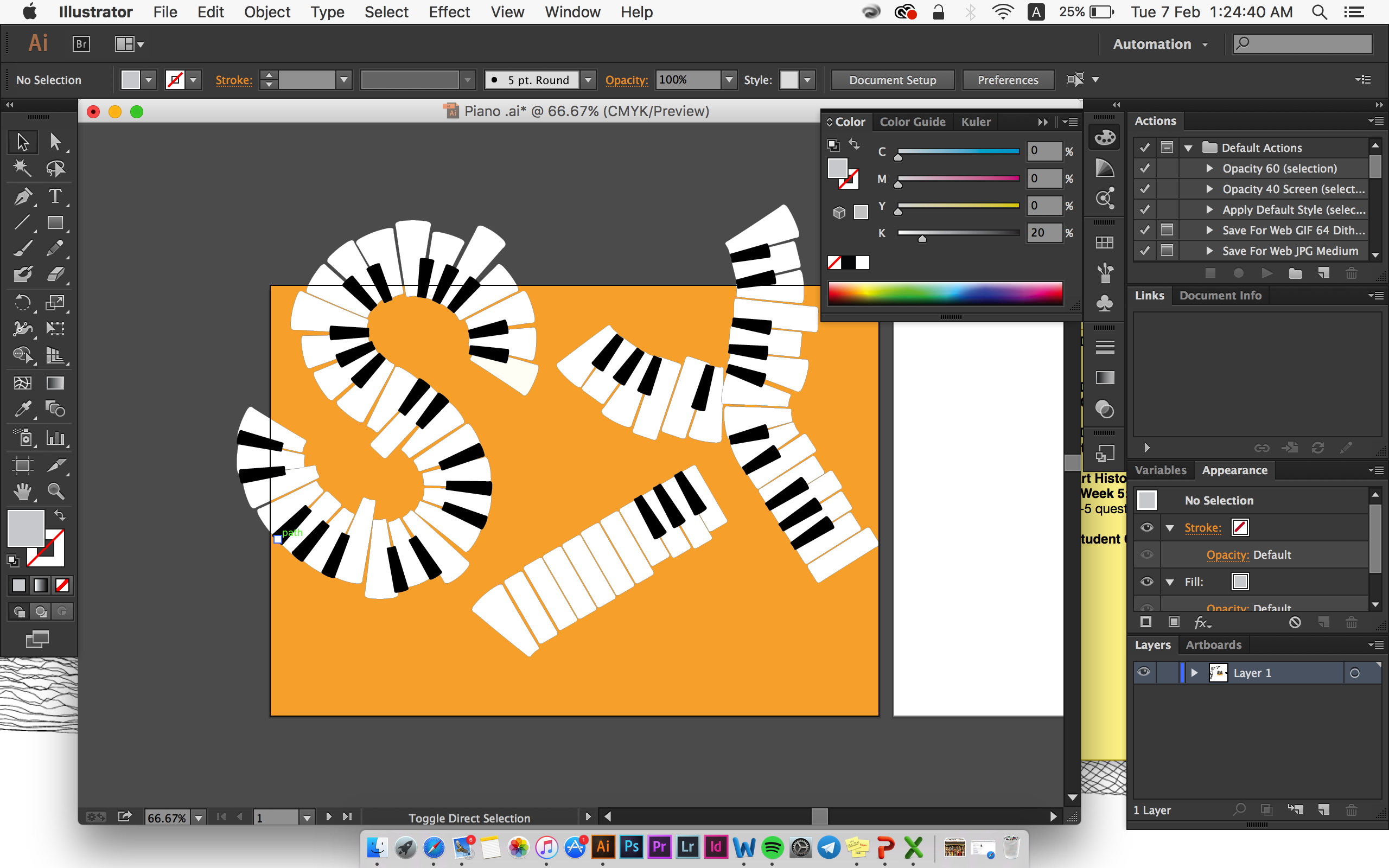
 I decided to move on to digital graphic design for the flat-lay look. My wasn’t really satisfied with my first try-out. The keys were closely packed and it looked very boring for a flat-lay look:
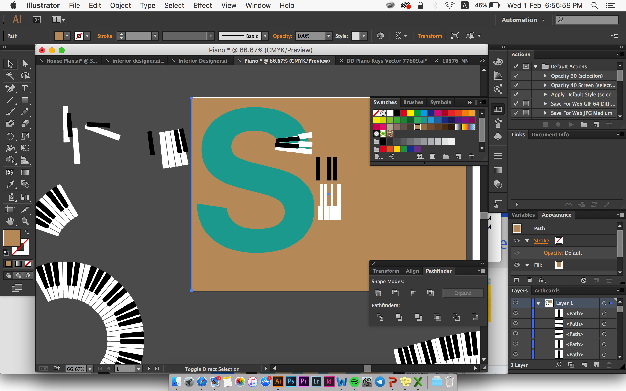 I decided to enlarge the keys and try to have variation in size and shape for each key to have a bit of the essence of “scattered piano keys” I tried initially.
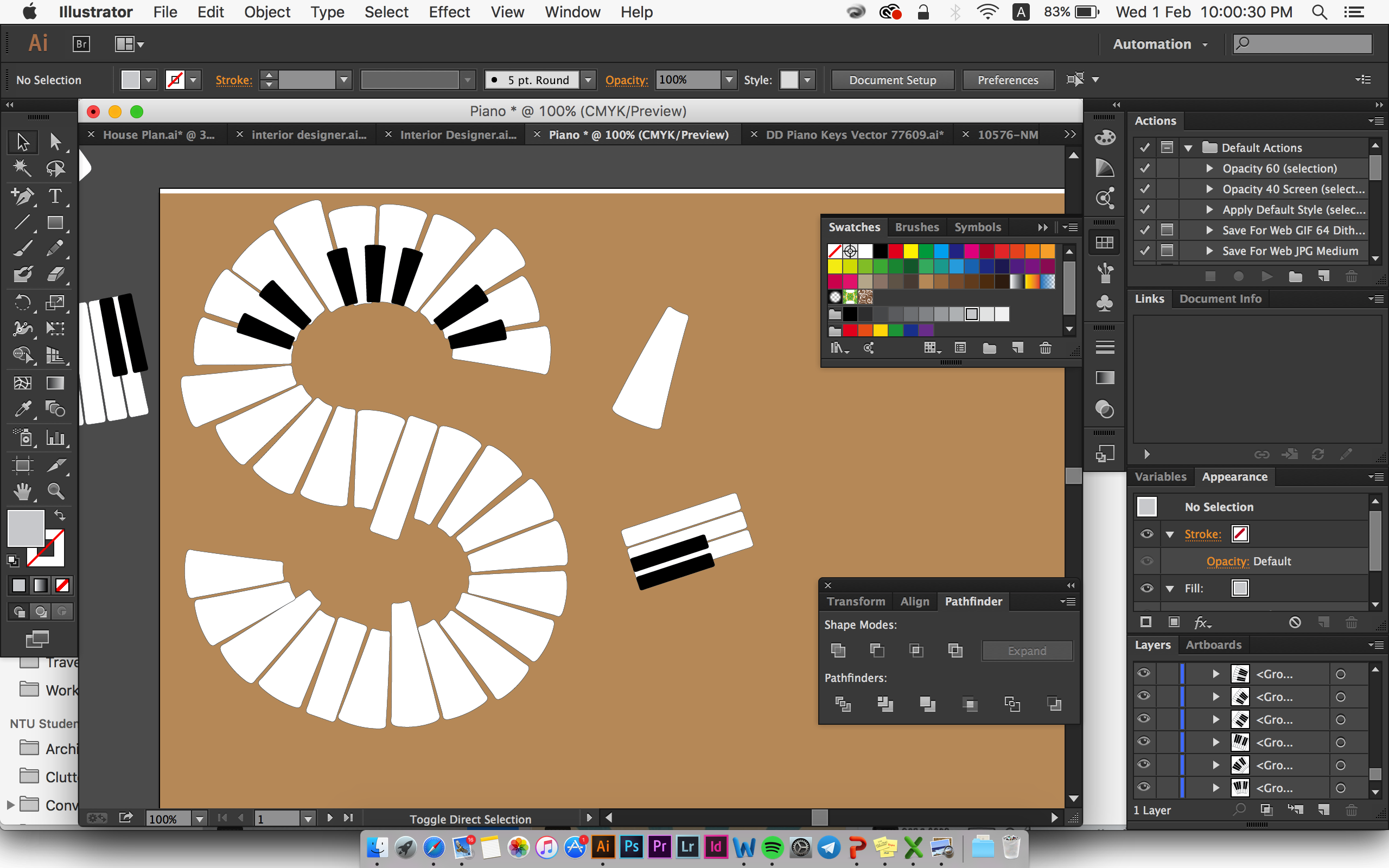
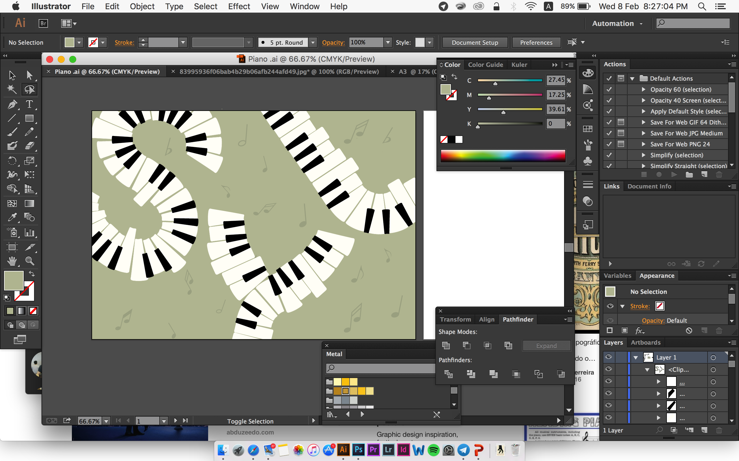
Lastly, I decided to place my initials slightly out of the A4 size but not to the extent that reader can’t read it. I also place a musical notes at the background but very subtle, to ensure that the supporting elements doesn’t compete with the font visually. I also keep the colour of the black and white piano keys so that it’s easier for reader to associate it with piano, hence Musician:
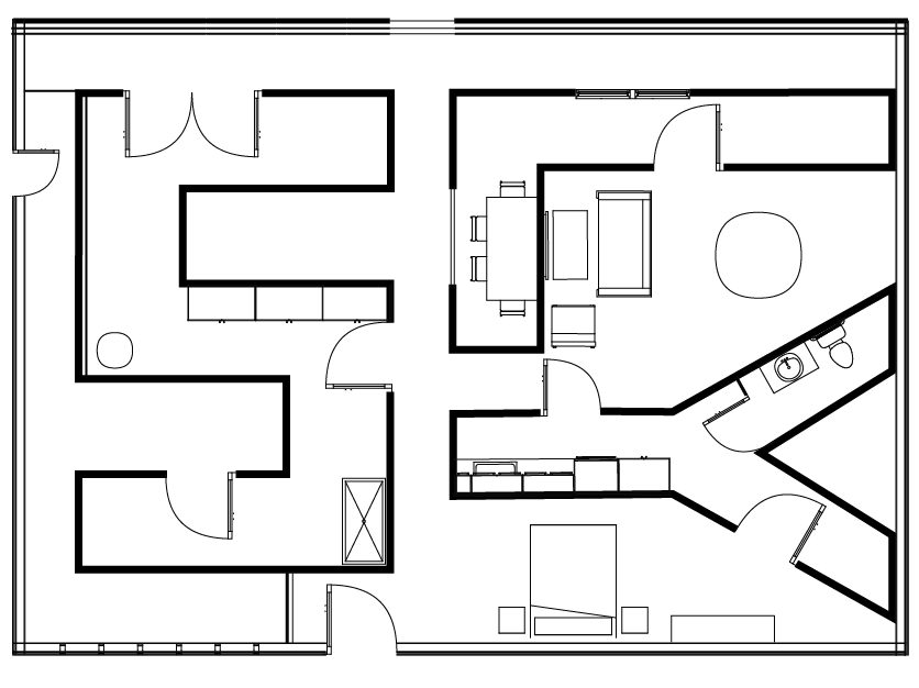
Job 5: Interior Designer
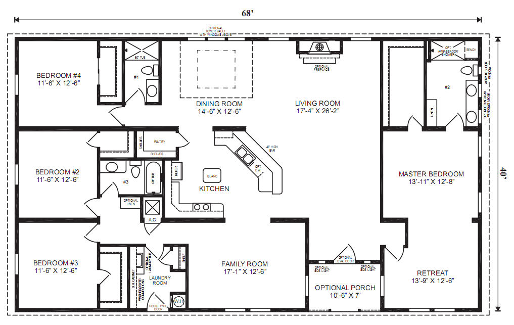
For interior Designer, the closest that people can related to is the floor plan that they usually use. Reader might associate Furniture with Product/industrial Designer instead. Here are some visual reference:
The aim that I set for myself for this job, was to make it as close to a floor plan as possible. So I actually took very long to make draw out the floor plan on Illustrator and made a lot of adjustments.
I didn’t really like the first sketch because I think the composition is very boring – my initials bounded by a rectangular shape:
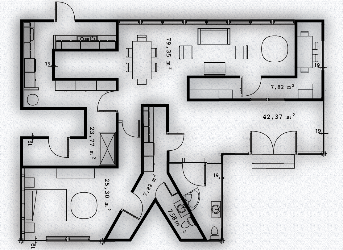
And then I made some major adjustment to the whole composition by changing the placement of my initials. I also increase the stroke thickness of my initials so that it is more prominent:
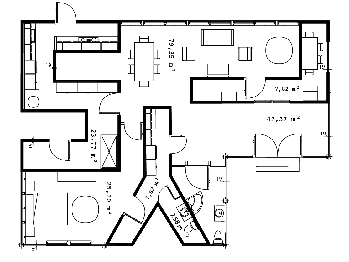
To complete, I add drop shadow and applied texture to the background to make it look rustic, as if the piece of floor plan has been used for multiple times:
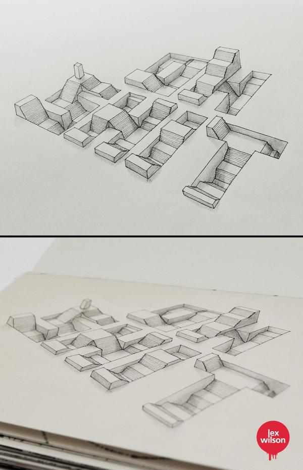
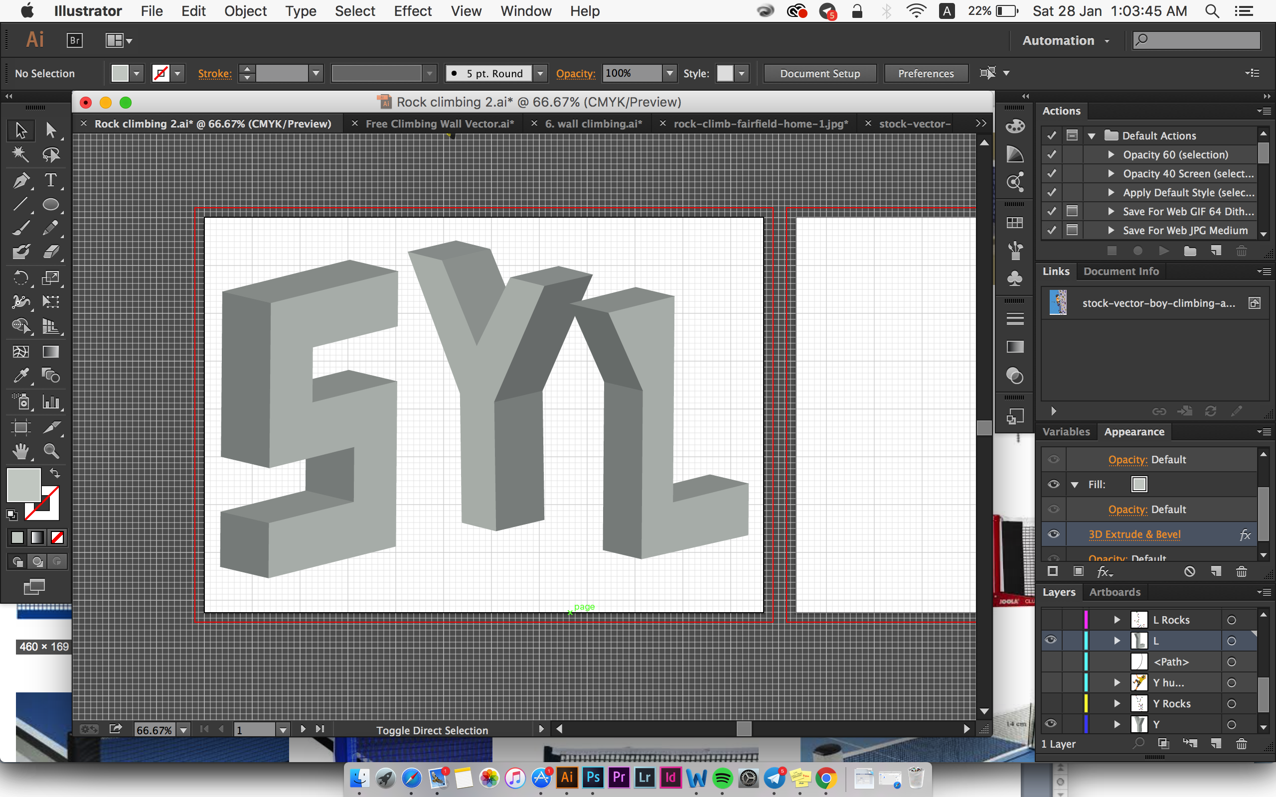
Job 6: Rock Climber
This was a very last minute idea that I thought of. I guess last minute idea does work sometimes! I decided to borrow the style from Ranganath Krishnamani (Refer to Artist References *here*) for this design and it took me awhile to figure out the perspective. Here are some visual reference: 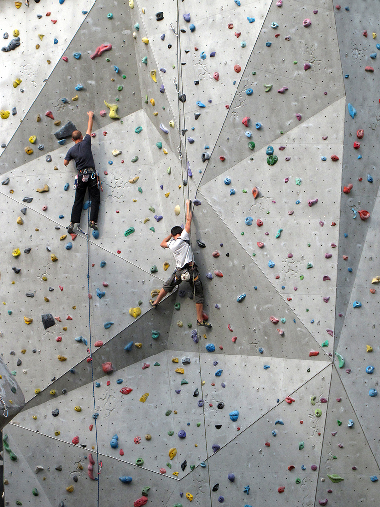
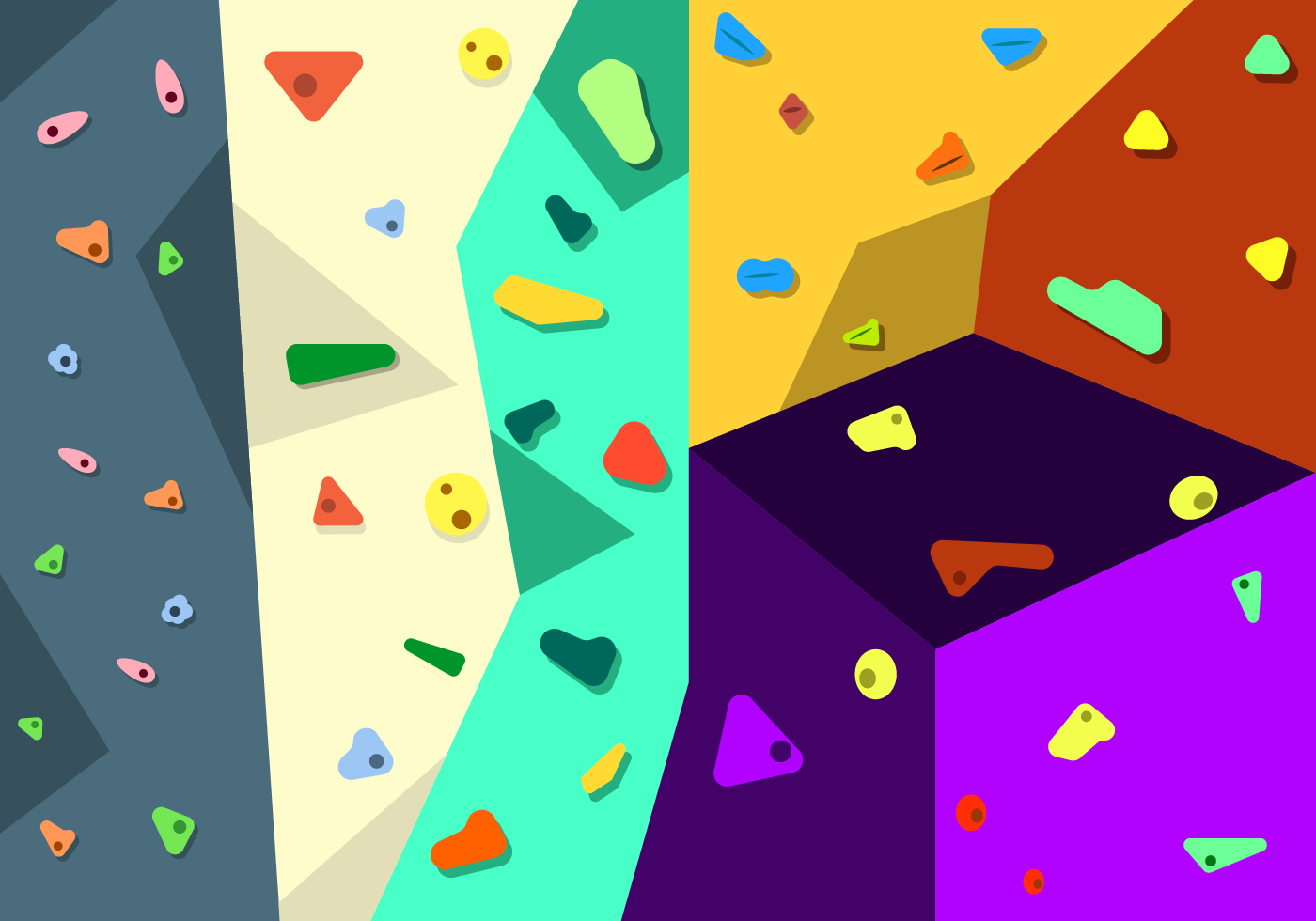
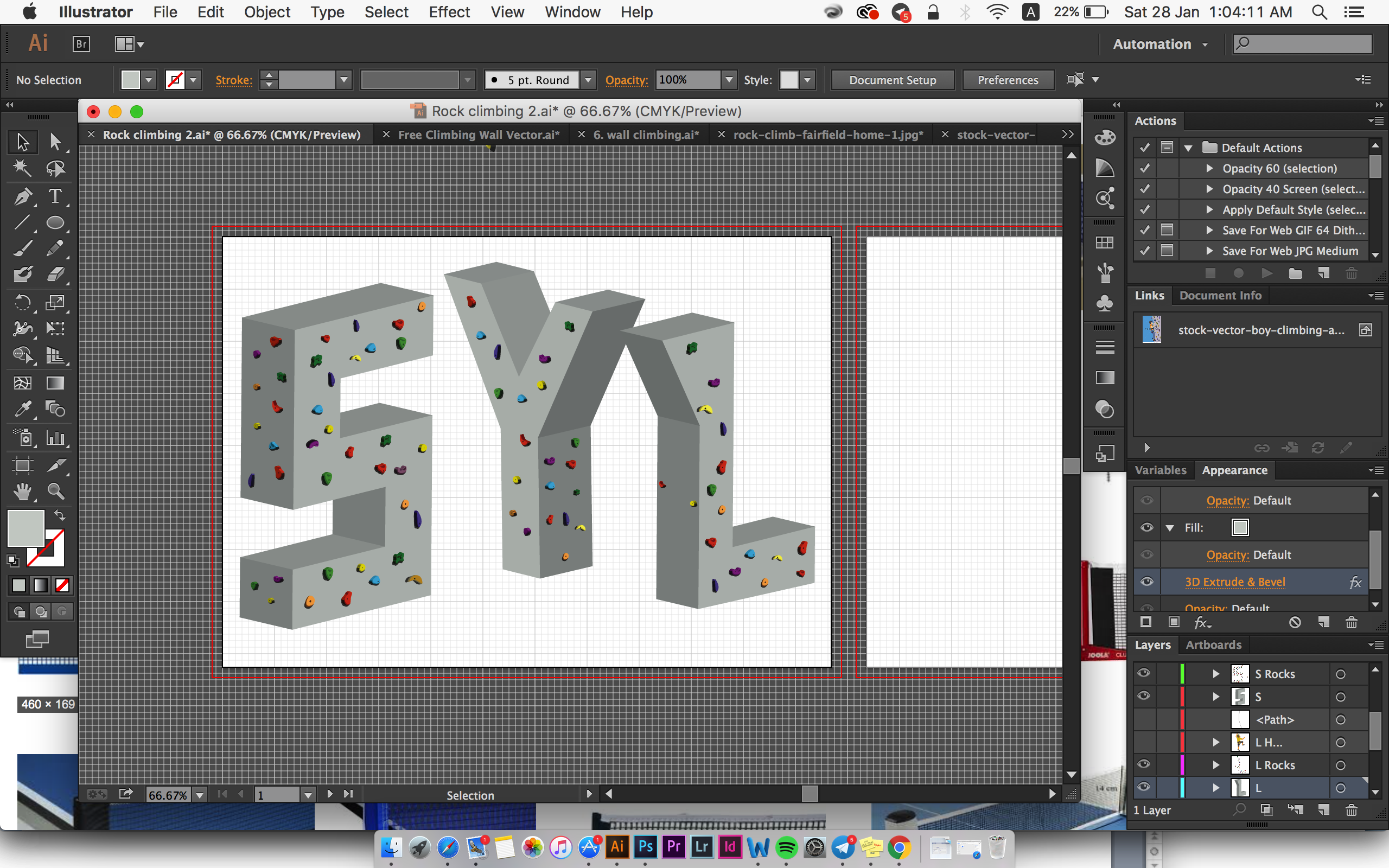
For indoor rock climbing, the visual element that reader could easily associate with will definitely be the wall with colour rocks. Hence, I applied the texture of the wall to my type:

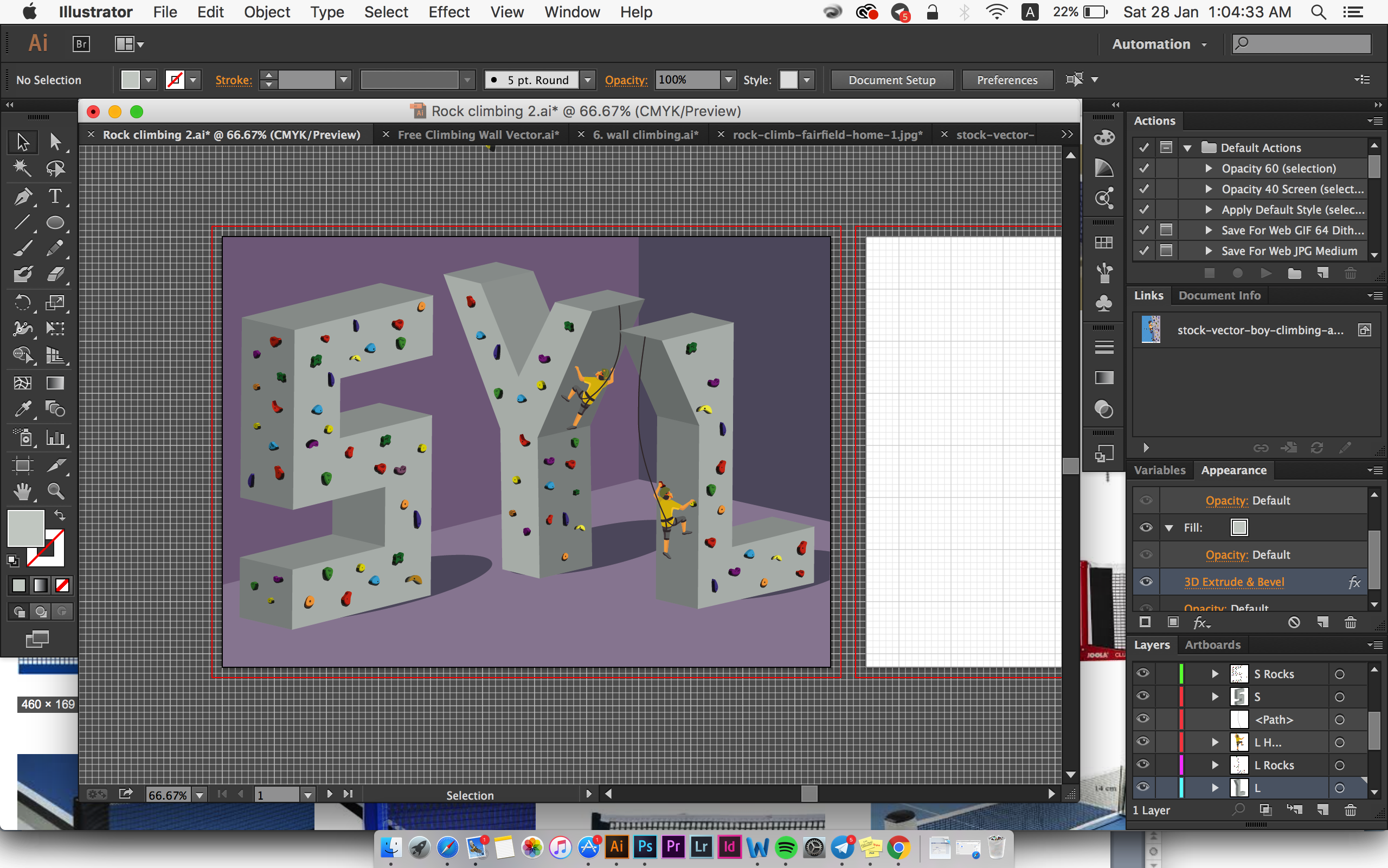
 I also decided to add in rock climbers so that reader can associate with my job clearly.
based on the feedback I got from my classmates, they find the shadow and the position of the type a bit off. They also feel that the colour of the background doesn’t go very well with the type. Hence I made some adjustments to improve visual harmony:
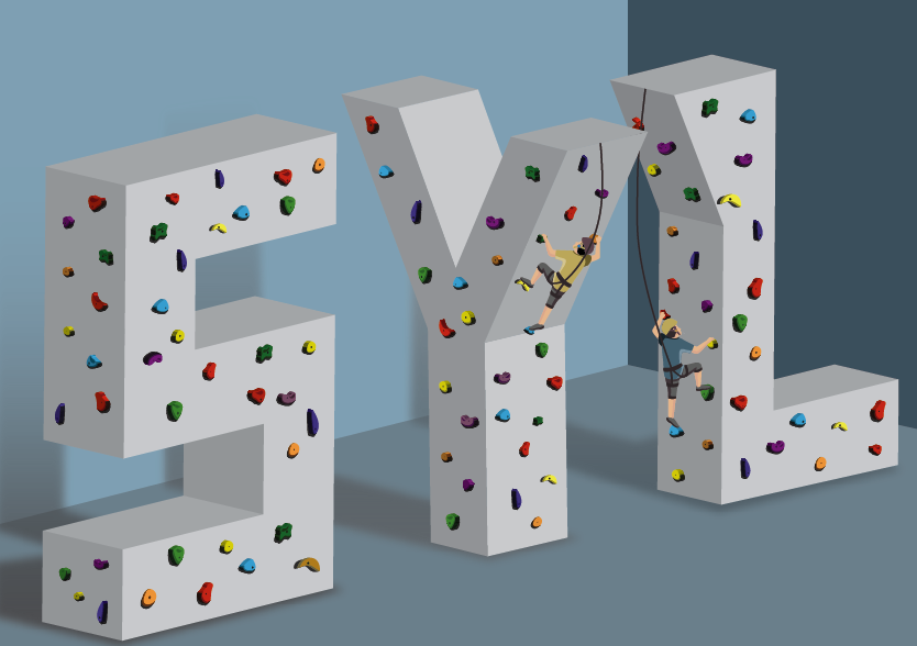
I made changes to the position of the font so that it flows diagonally, hence create directional harmony. Also, the shadow are now placed correctly according to 1 light source facing towards the type.
That’s the end of my design processes!