
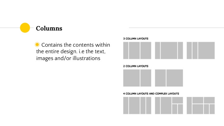

Artistic Statement
This soundscape is about a student who encountered paranormal activity in his school toilet. Through objective sound we follow the character through different spaces which allows the audience to experience from the character’s point of view. Through this soundscape, you will hear how the character first encounter the female spirit in a toilet; how he manage to get out from the toilet but was locked inside the fire escape exit while the spirit approaches him; and finally manage to get out from the building.
Concept Development/Research
Ideation
Firstly, I came out with a few scenarios/emotions that I want to portray in this soundscape project:
I decided to work on number 2 because It’s something I have never experienced before. I also wanted to try create horror sound that evokes fear and it has more room for me to play around with sound layering.
Sound Research
Below is a list of sounds that I thought could evokes fear:
– Unexpected Loud Bang/Noise
– Suspension sound effects
– Panting
– child/woman laughing
– Someone whispering into your ear
– Alien Language
– Scratching
– Bone cracking sound
– creepy religious song play at the background
– accelerating heartbeat
I also interviewed my mum and my partner for some inspiration. My mum actually experience paranormal activity in kampong when she was a teenager. She heard vividly heard someone talking in a low, out of this world language while she was on the way back home late at night, and saw a very tall and slender dark figures in the forest.
My partner didn’t actually encountered any paranormal activity but his experience with sleep paralysis was very creepy. I also did a check online and apparently everyone who has frequent sleep paralysis experience the same thing. How creepy!!! Here is a video of him explaining his experience:
Artist Reference
James Wan
He is well known for directing the horror film such as Insidious, The Conjuring and Insidious: Chapter 2 and The Conjuring 2. I have been a huge fan of his horror film and always wondered why his film evokes so much fear. I realised that he uses a lot unexpected surprise jump-scare with loud noises. He especially like to have a long suspense or silence before the loud sound take place at the unexpected and synchronised nicely with the frame. Here are some videos that I refer to:
James Wan on Creating Horror Using Sound:
James Wan on Sound and Suspense:
Insidious:
The Conjuring 2:
Thr Autopsy of Jane Doe:
Planning and Development – Sound Script
I also came out with a rough script and planning to get a clear picture of how my soundscape would sound like:
00:00:00
Everyone going back from school late at night “Let’s go! Bye! See you”
00:00:10
“I have to go to the toilet you guys go first I see you guys tomorrow”
00:00:20
“Okay bye! Rest well!”
00:00:25
My Footsteps/Opening the toilet door
00:00:30
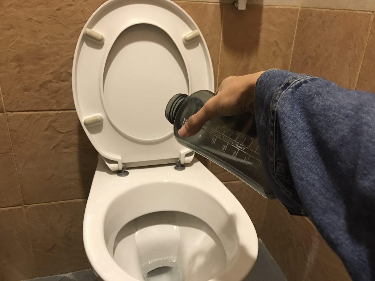
I close the cubicle; Pant unzip; Sound of urination; someone knocks on the door x3
00:00:40
Sound of urination; tap suddenly on; small gasp from me
00:00:45
zipped the pants; opens the cubicle
00:00:55
Silent/Sigh
00:00:60
Walk towards the basin; Turn on the tap and wash my hands
00:01:10
creaking of cubicle door; gasp
00:01:15
Silence
00:01:17
LOUD BANG x 3
00:01:20
opens the door and run out from the toilet nervously; panting
00:01:25
Open the door to the exit; fast footsteps going down the stairs
00:01:30
try to open the door but it’s locked; “SHIT”
00:01:35
creepy alien language + laughter; voice getting faster and nearer
00:01:45
only the sound of Panting
00:01:55
LOUD AND NEAR “GET OUT!!!”
00:01:58
Planning and Development – Sound Creation
During the recording process, I made some changes to the script. I added in/took out some elements so that it sound cohesive and balance. Here are the list of sounds that I recorded:
Diegetic Sound:
Non-diegetic Sound:
– Horror Ambience Sound Effect (Royalty Free)
– Dramatic Metal Clang Do-over Sound Effect (Royalty Free)
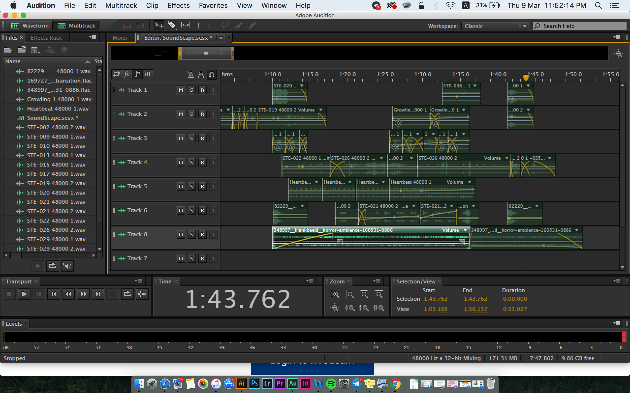
I wanted the soundscape to have mostly Objective Sound that captures everything that’s going on in the space and also to have a story structure – increase in intensity (from soft to loud). The soundscape starts off soft and light-hearted to loud and creepy towards the end. To further enhance the intensity I planned to include a change in timbre and organisation, from tonal to noisy and from ordered to chaotic respectively by layering more sound clips towards the end. Also, I want to include the sound of heartbeats to change the speed and rhythm of the soundscape.
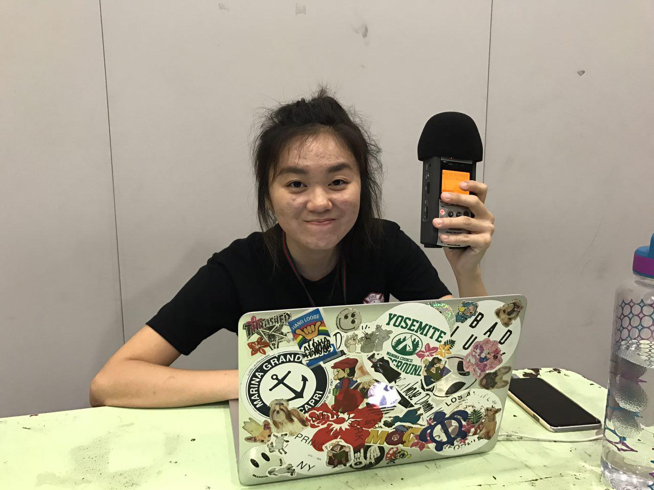
P/S: First time using Adobe Audition for sound editing and it was more challenging that I thought it would be.
Final Outcome:
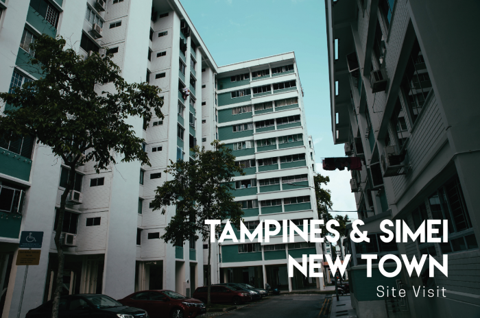
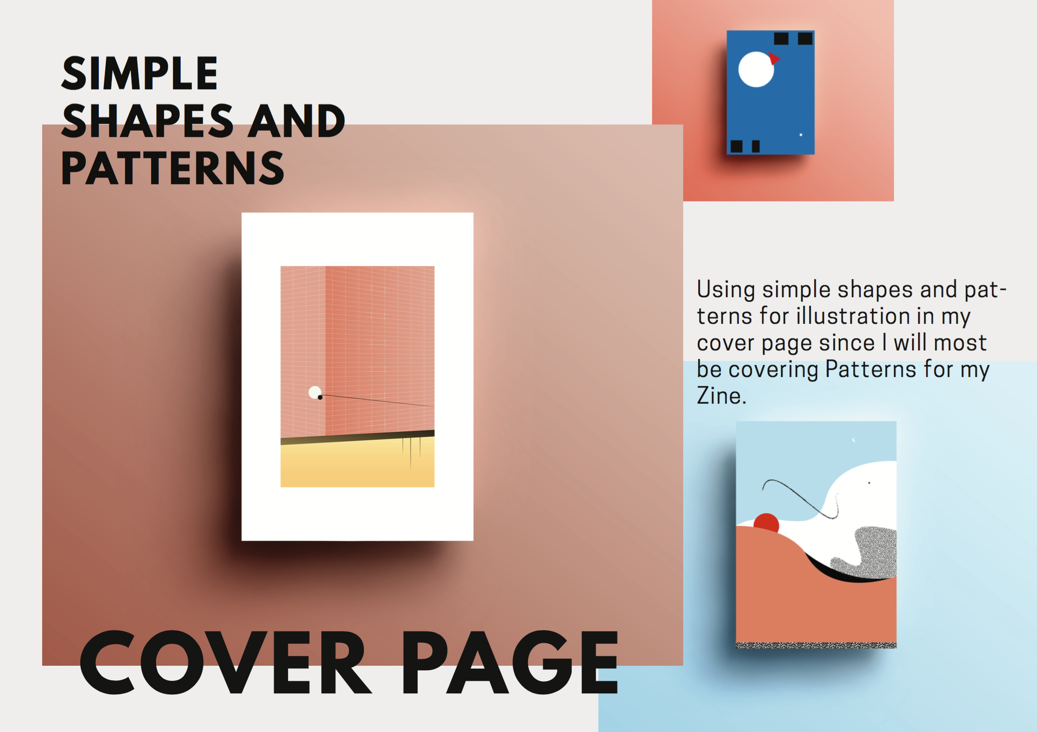
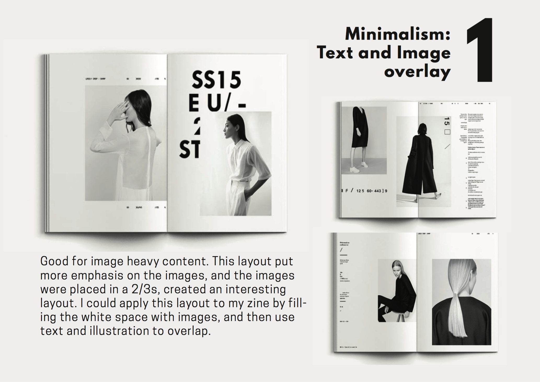
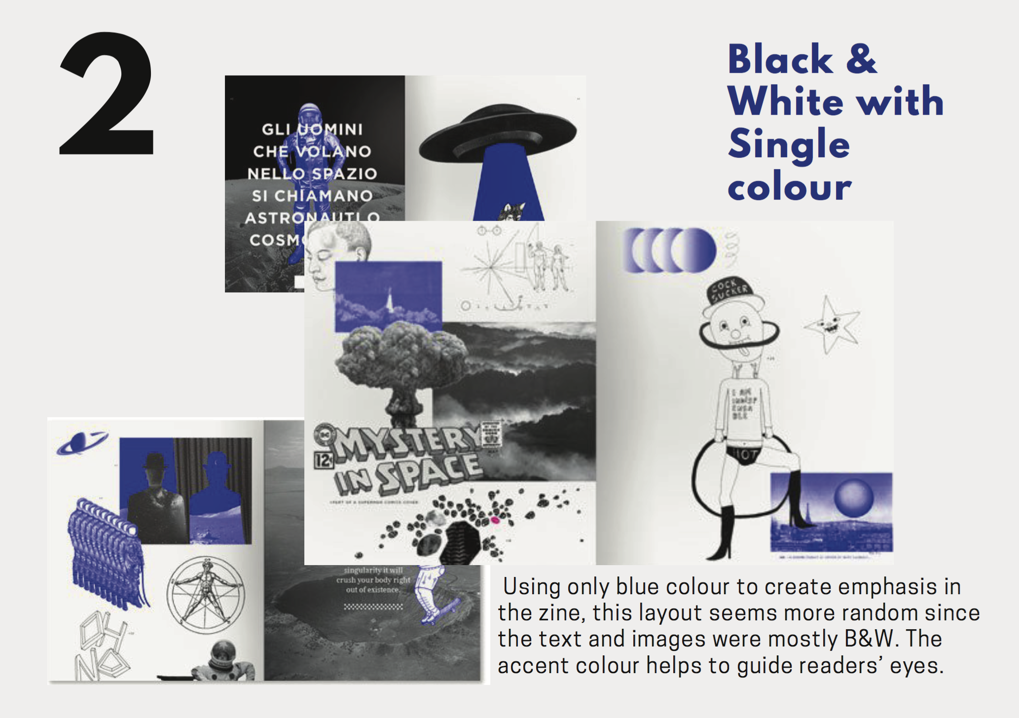
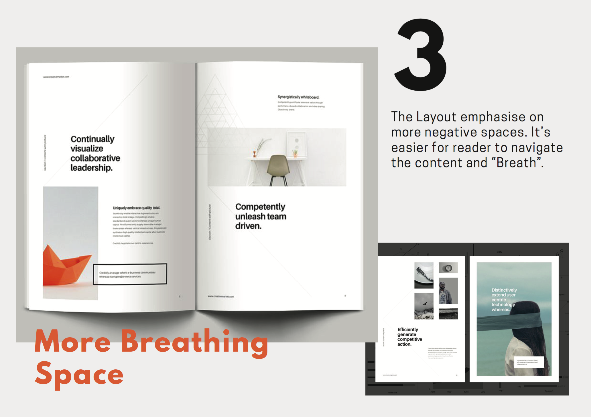
Hey there! Here are some of the photos that I took during my site visit to Tampines/Simei. I didn’t really have a plan prior to the visit but I managed to put them into different categories that will help in generating ideas for my zine. From here, I picked out the most unique features of the area that I have a connection with, and I will present it during my research presentation in my next post.


Final 4


Reflection
I am glad that I actually pushed myself to explore many composition to finally decided on the final 4. This is the first time I followed through the design process from brainstorming, mind mapping, sketching, visual reference and lastly to final composition. I learnt that it is really not easy to design something that communicates well with the reader. There are some really cool ideas that you thought reader may get it but sometimes it’s too abstract for them to get it instantly. I guess this project is really about how well you communicate with your design. To ensure people are able to recognise my initials and jobs, I have to asked around to see if they could get the message within 5 seconds. Hence, I feel that as a designer, we sometimes have to design things based on readers’ perspective in order to communicate effectively – that to me is a successful design. I also learnt that design doesn’t have to be complicated. If a few elements can already bring across the message that we should keep it minimal. A Quote from Graphic Designer Noma Bar: “Maximum communication with minimum elements.” One thing that I think I can be improved on will be in terms of creativity. I think my design were quite conventional and if I were given a chance to do this project again I think I would really push myself on that. Overall, I really enjoyed the whole process and am quite satisfied with the final outcome. I hope I would apply whatever I’ve learnt in this project to Visual Communication I/Typography I in year 2.
Aloha! Finally able to share this online. It was really tough to complete this project I must say but I guess everyone managed to pull it through. I decided to combine design process + research in one post because I usually do research together with brainstorming. You guys can check out my Artist Reference *here* or you can continue reading this post and I will link you guys over if I’ve made any references. So here is my design process for Project 1 Que Sera:
Name Selection
I listed out a good amount of names/initial I could work on, and it was very random:
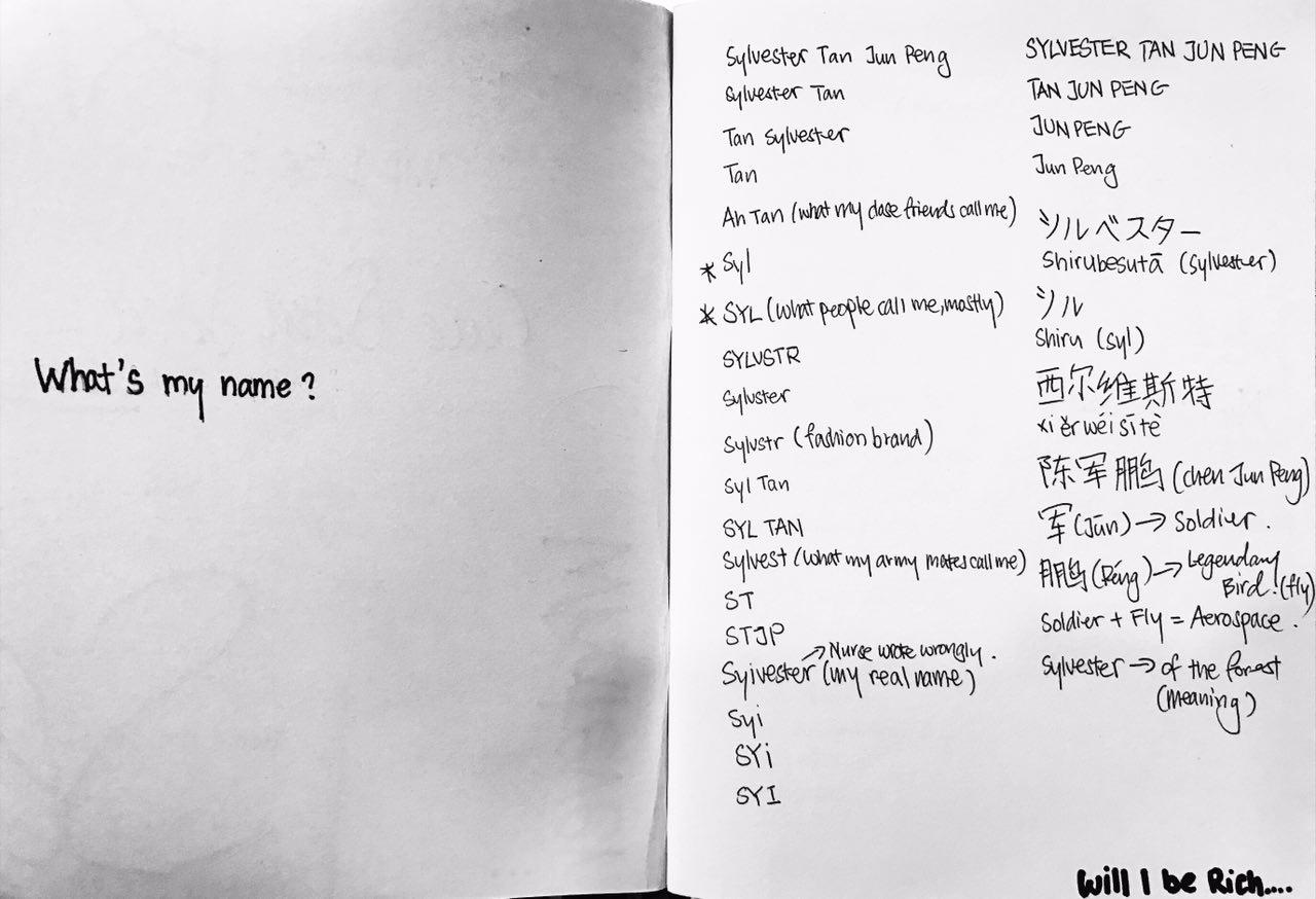
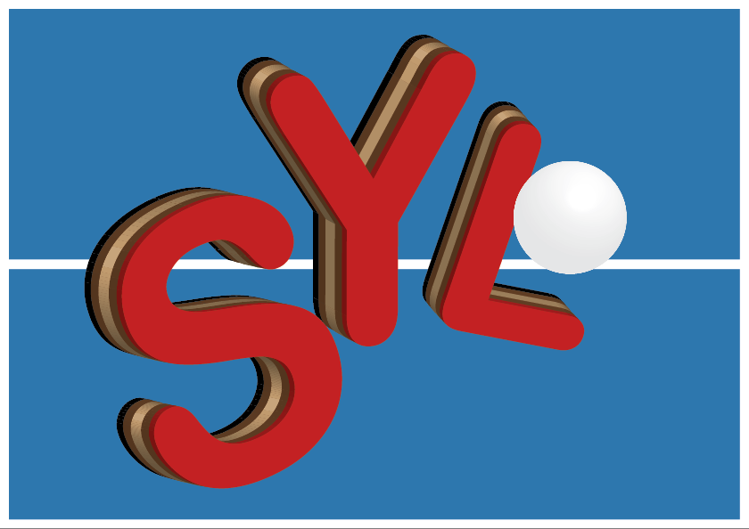
I actually google translated my name into Japanese and weird Chinese pronunciation haha! I thought I could do something oriental and unique but in the end I choose to settle with “SYL”. This is what most people call me and I thought it’s easier to work on lesser letters so that the whole composition of my design won’t look too complicated and untidy.
Job Selection
I also listed out a good amount of “future job”:
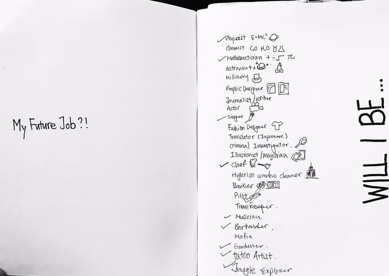
I initially selected 4 jobs – Fashion Designer, Mathematician, Table Tennis Player and Musician – to work on but I thought it would be best not to constraint myself within these 4 jobs and try to explore beyond that. so I decided to work on another 2: Rock Climber and Interior Designer.
Design processes
I usually just jump into designing my work straight away, but this time round I decided to follow the proper design process. I first drew Mind-maps and listed out everything that is associated with the job. I then drew random thumbnails within the mind maps and it did helped me to visualise the whole composition of the final outcome.
Job 1: Fashion Designer
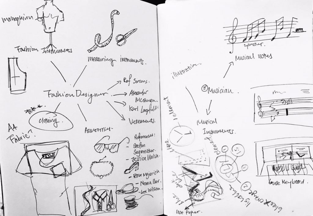
My initial ideas was just using the brand tag to write my initial “SYL”. It has always been a dream to see my name on the tag haha! I thought it’s a brilliant idea since it shout loud and clear FASHION DESIGNER. After consulting Ms Shirley, I realised that this project is not just getting the message across, but also to create type to communicate visually. Hence, drawing inspiration from Stefan Sagmeister I decided to moved on to using items associated with fashion designers such as clothing, measuring tape and Threads and Needles to compose my initials. I used Complimentary Colour (Yellow + Purple) in my composition – a darker shade of purple as the background and Yellow for the type – so that my initial will stand out and it’s easier for reader to look at.
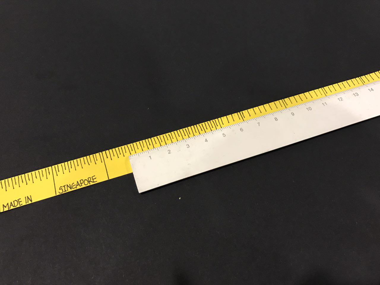
I first drew out the measuring tape to using yellow construction paper. This will form the “S” in my composition:
and then I cut out small pieces of the cloth to form a collar for the shirt, to form a “Y”. My idea was to use yellow cloth to form the Y so that the colour will bring about Visual Harmony in my type:
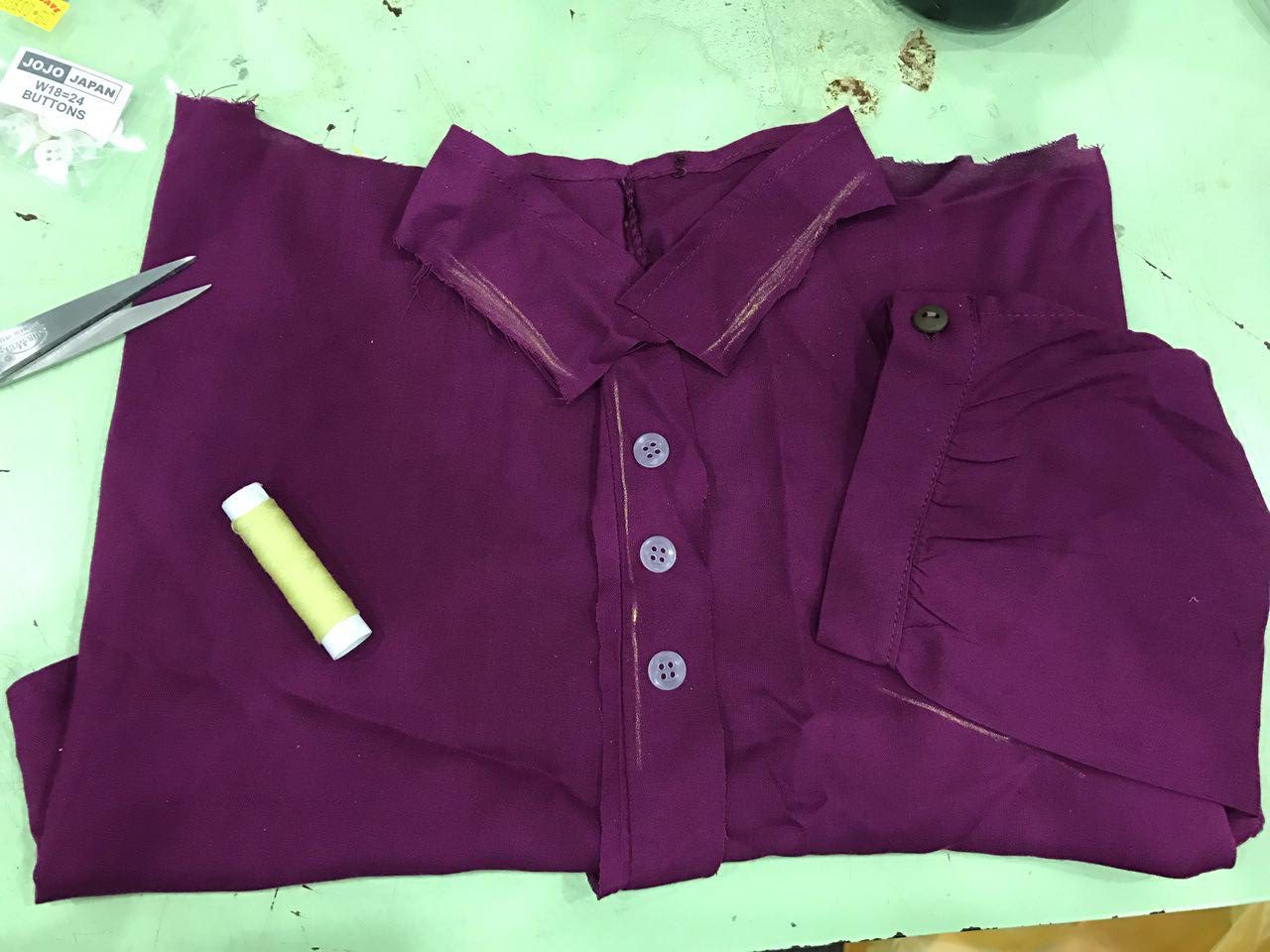
Same goes to the “L”. I wanted to use sew the yellow thread onto the cloth itself to form L:
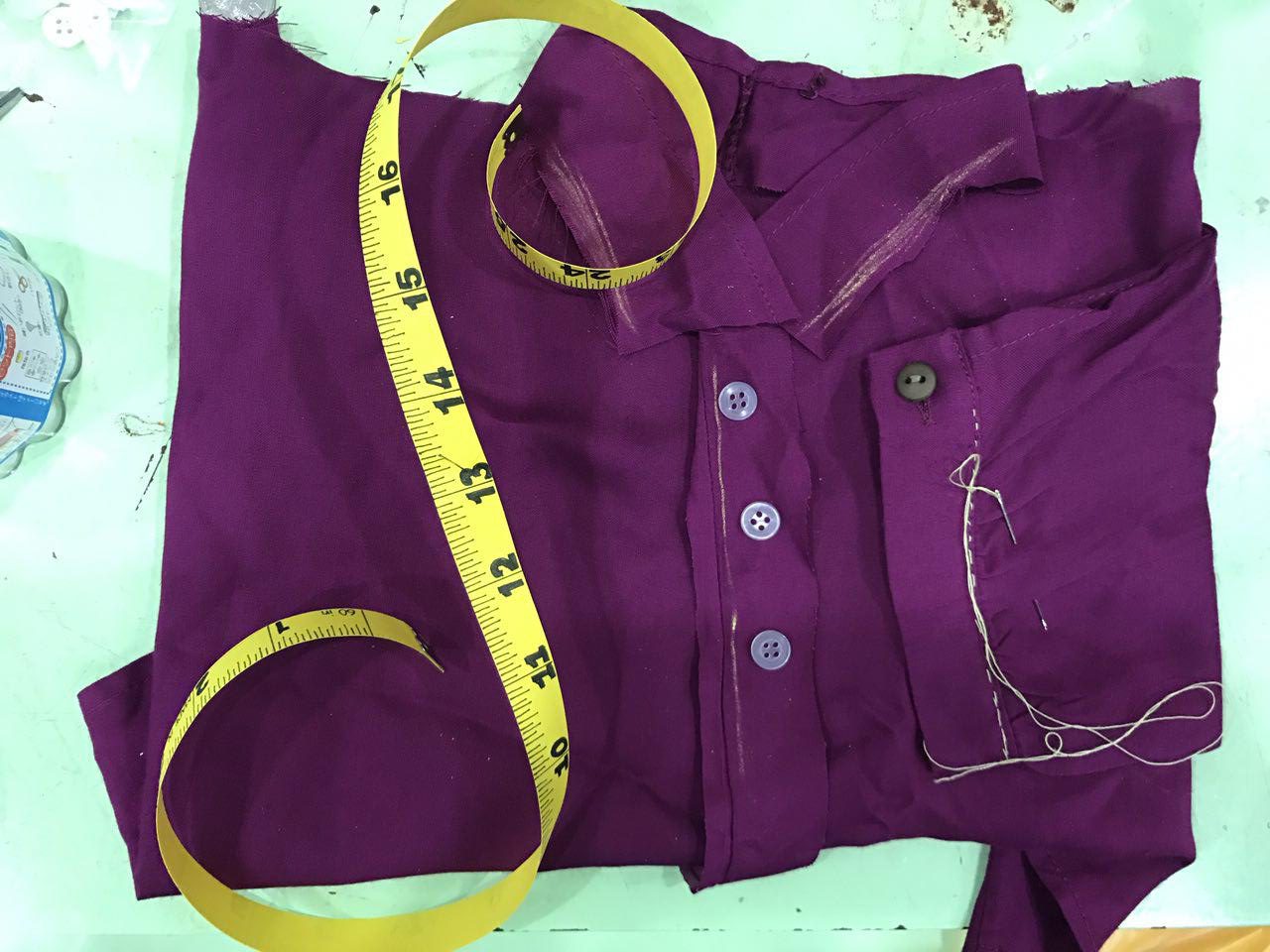
I did not really like how it turns out to be very honest even though I did not complete it. I thought it would look really unfinished even if I have completed it. Also, I thought it’ll be better if I can avoid any 3D composition and focus more on designing the font itself. So I went on to work on other jobs.
Job 2: Mathematician
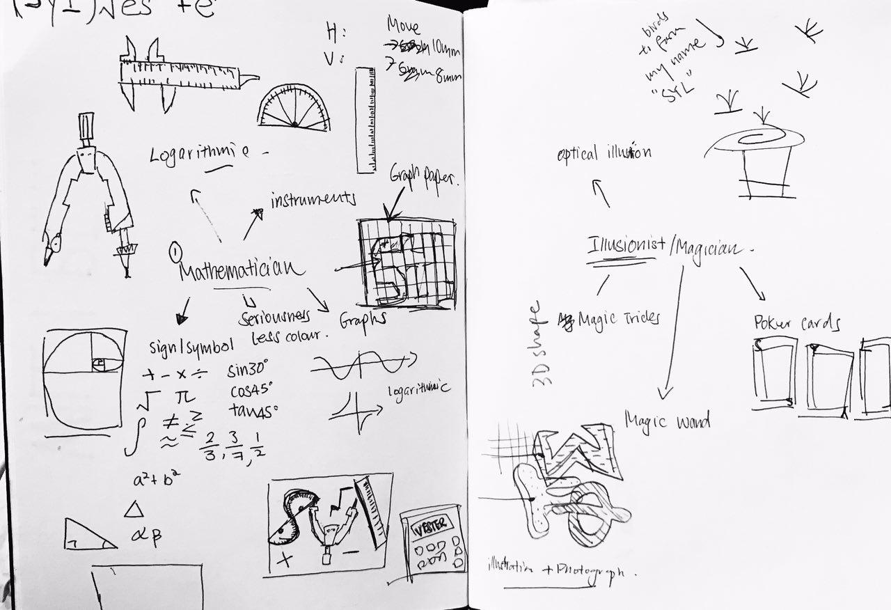
I have 2 ideas in mind while brainstorming for this job – Using mathematical instrument to form SYL or use Mathematic equation to form S+YL(VES)TE=R. I decided to try out the equation one because I find that by using mathematical instrument is a bit too simple.
Hence, I did some research online on maths equations as well as some maths symbol I can use to compose my name.

I then went on to Illustrator to try out different composition:
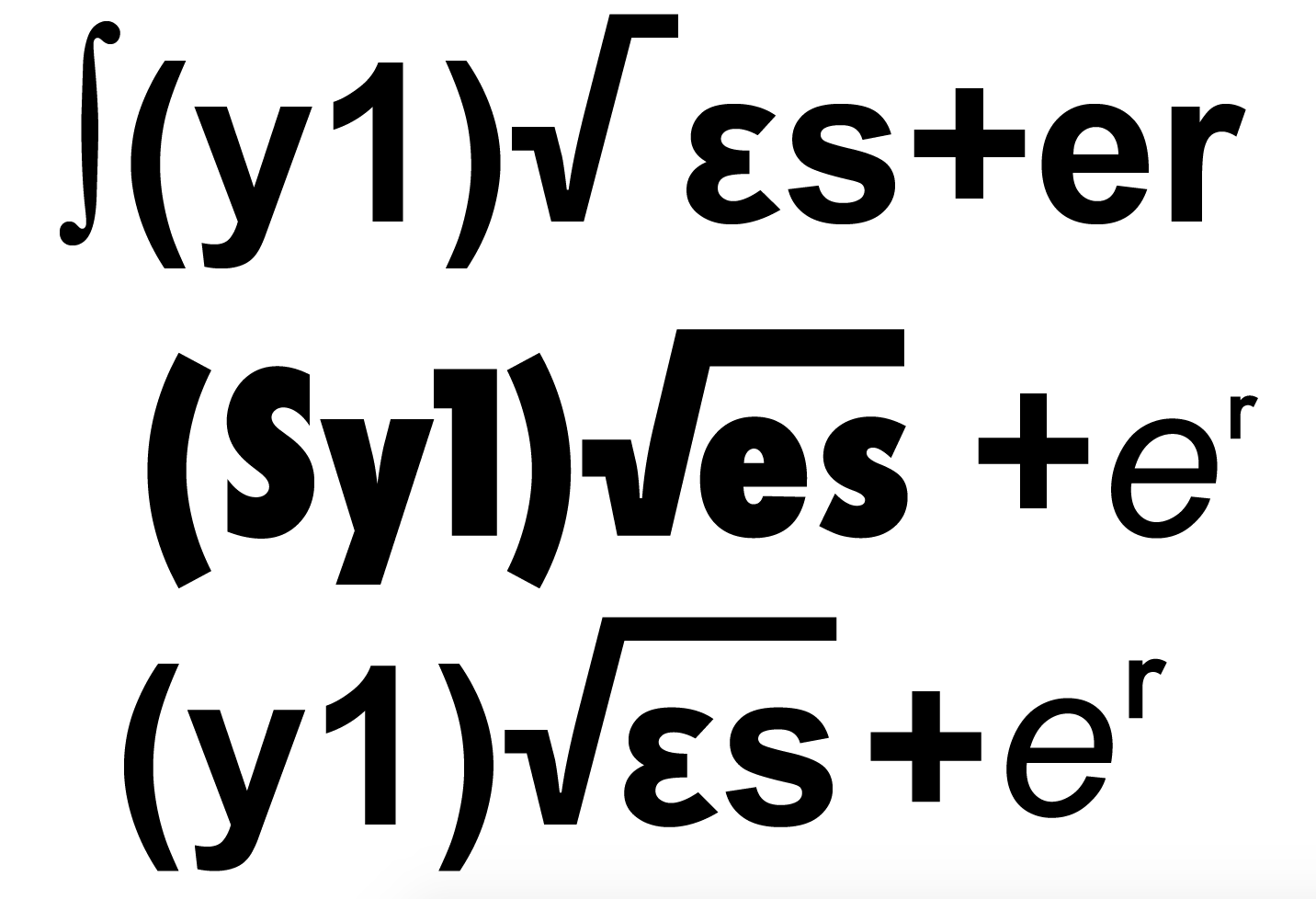
you can see from below that I also tried playing around with extrude function on Illustrator to create a 3D effect for my fonts:
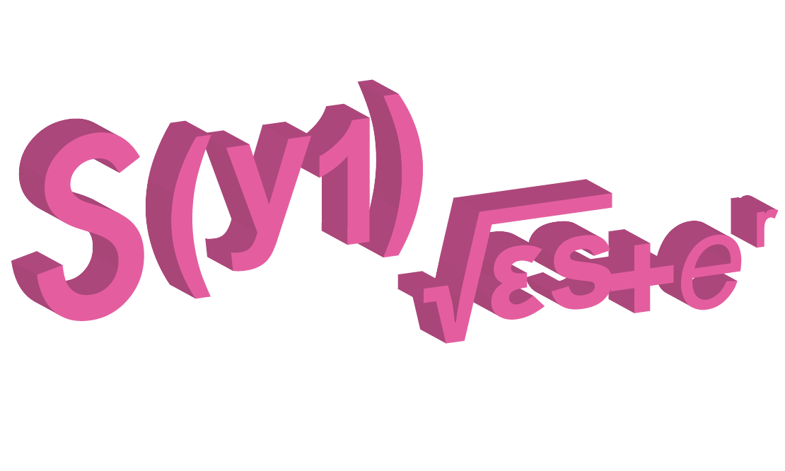
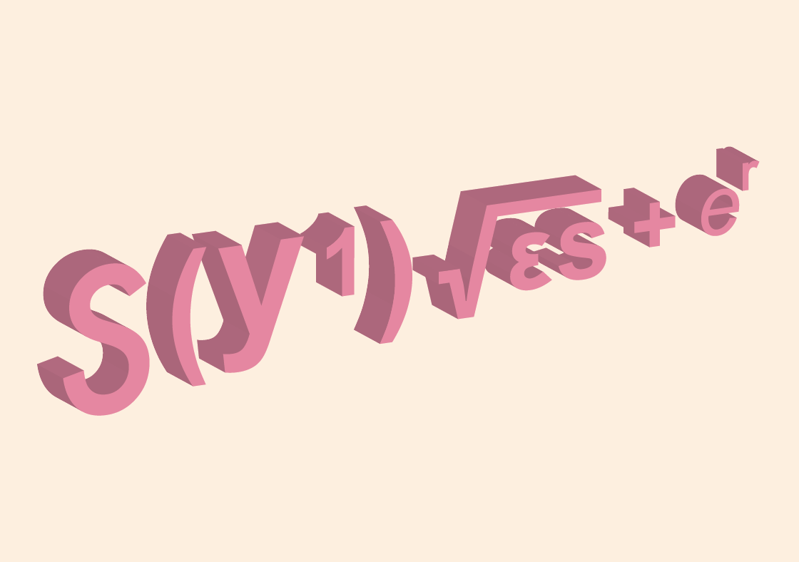
However, I was kinda stuck at this stage to push myself further. Firstly, I did not really design the type – I just conveniently use mathematic symbols to create my name which is quite effortless. I thought I could push my creativity further by exploring more on other jobs and then see which one works best.
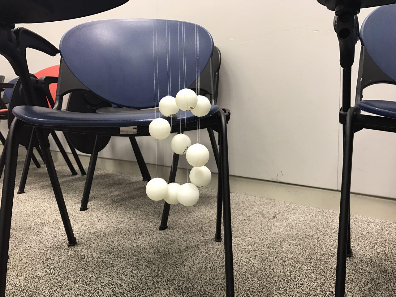
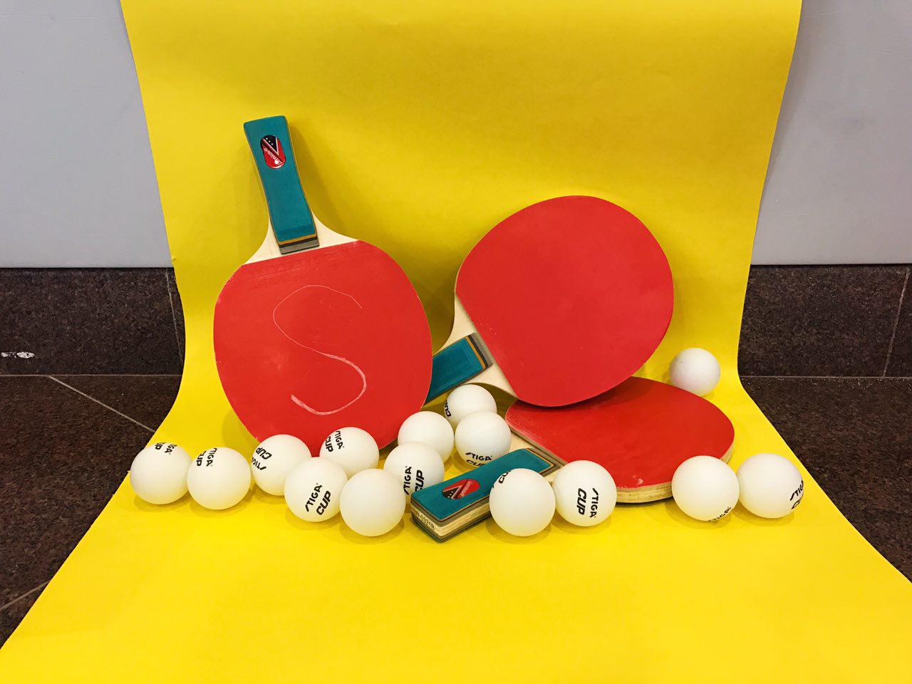
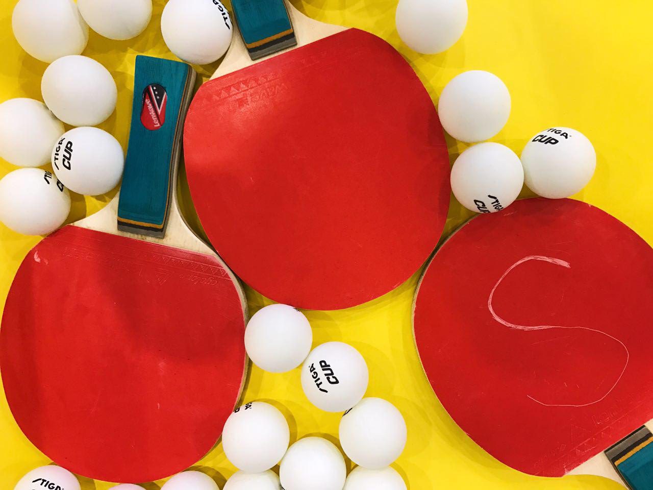
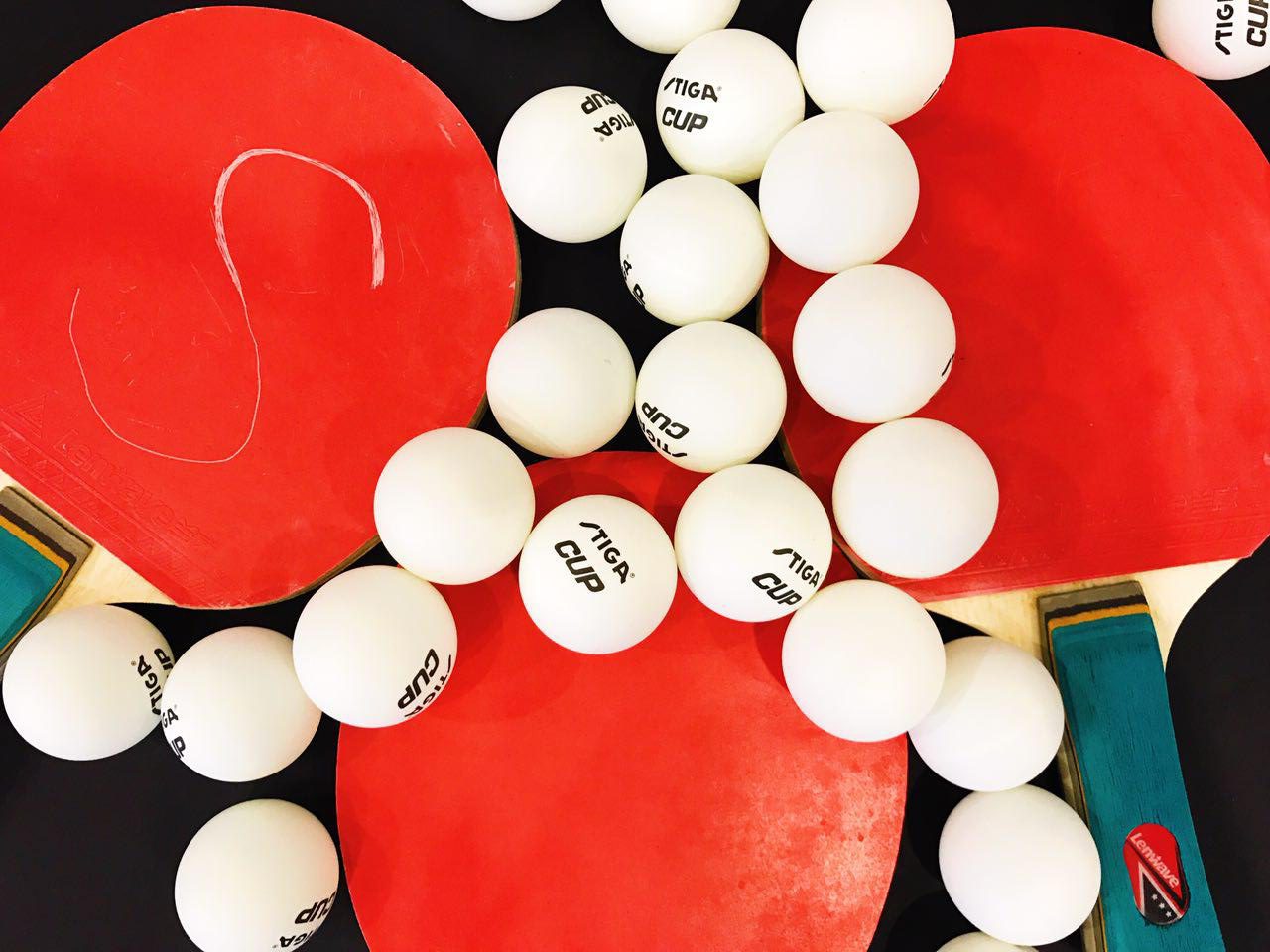
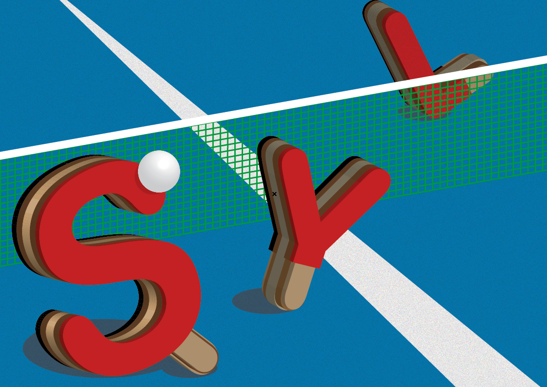
Job 3: Table Tennis Player
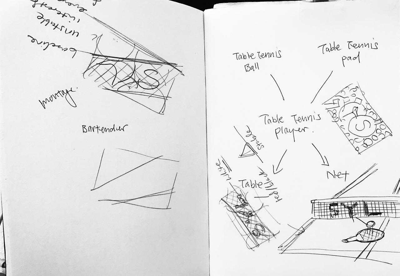
As shown above, I actually have quite a number of ideas on how I want to create the type. Together with Ms Shirley’s recommendation, I tried to form my initials using ping pong balls and table tennis bats:
For the ping pong ball, I referred to a typography image on Pinterest as shown above that to create my type.
I used white thread to tie the ping pong ball and then use wooden stick to suspend the ping pong ball. I thought it looked very cool but the process of making it was very tedious. I could easily use photoshop to do the exact small by playing with shadow effect. Bad Decision.
I also thought of using Triadic colours to give a very fun look to the whole composition:
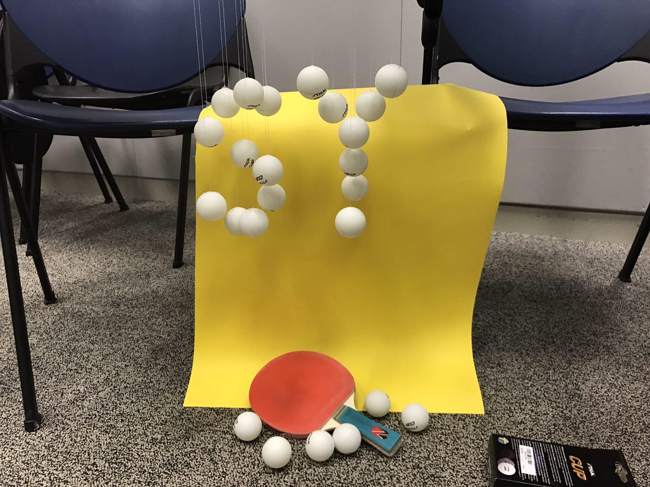
I also tried out different ways based on my initial sketches to see how it looks like. I also wanted to carve my initials on to the bats:
at this point of time, I really find that taking photos of found objects really didn’t showcase any design effort. So I consulted Ms Shirley the 2nd time to ask for advice.
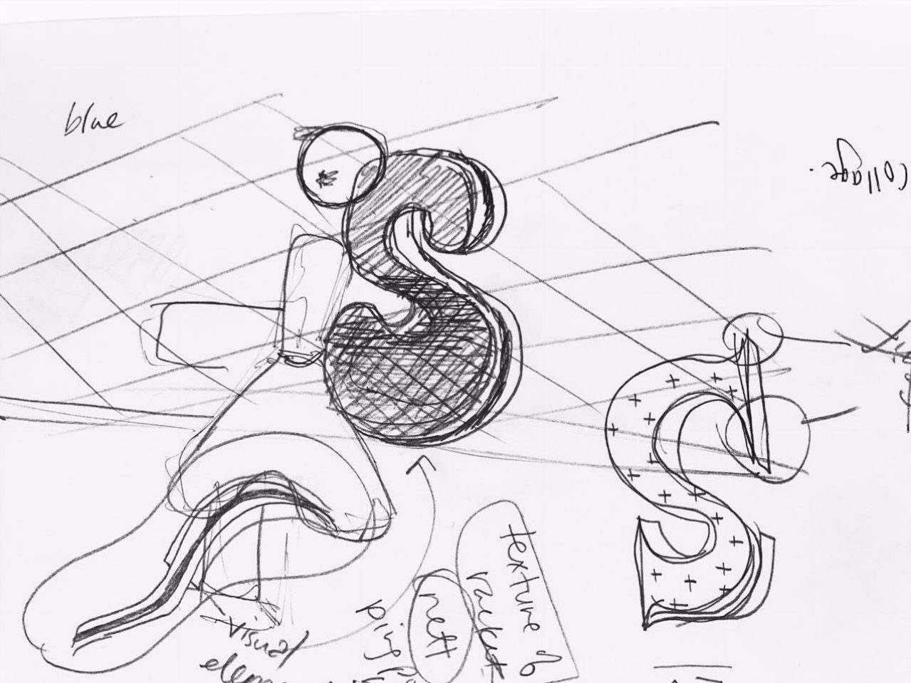
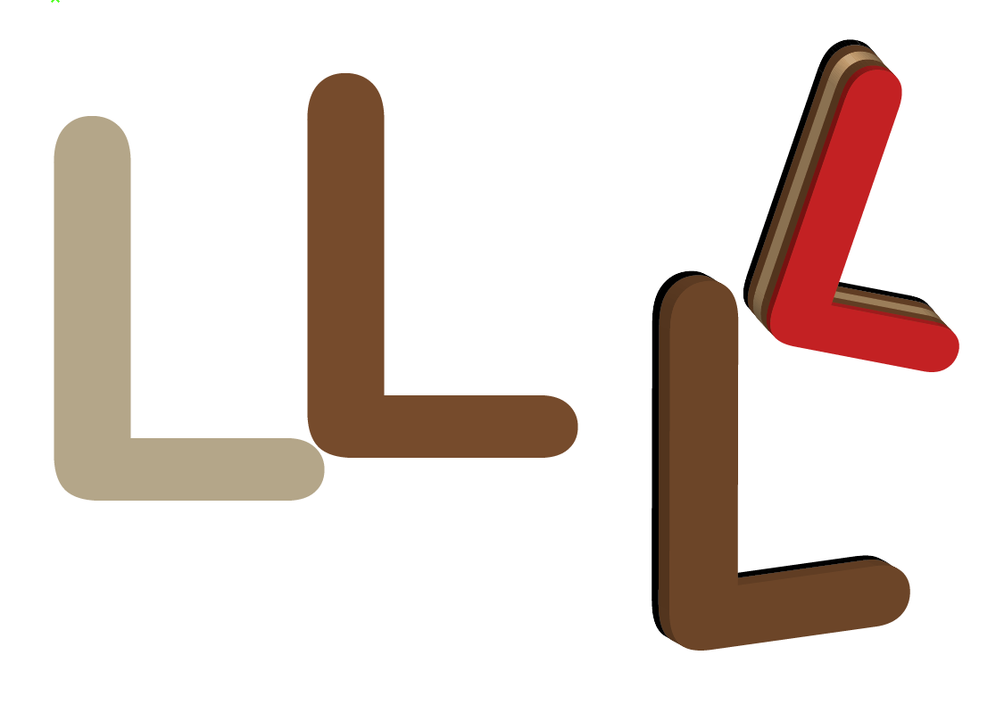
after consultation, I decided to move on to do digital design, borrowing some elements from the table tennis bat to create my type. I felt that it was quite challenging to do it because it requires some 3D form of design on Illustrator which I wasn’t really good at.
to recreate the layers at side of the table tennis bat, I have to apply extrude effect on each font, and it requires some precision. I have to ensure that there are some variations on the thickness, and that the types are tilting towards the same angle:
For my first composition, I simple put my Initials together + ping pong ball and a table for table tennis as a background, which look very flat. the white line in the middle also also competing with the type visually.
Hence, I made some adjustment to the size of the type and the white lines on the table to create visual depth and perspective. I also wanted to create a very comical and fun look by letting my initial “Play” with the ping pong ball.
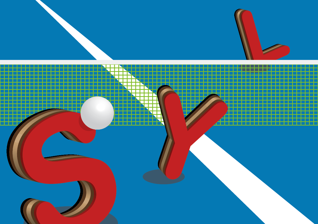
Finally, I made some adjustment to the type by adding element of the bat handle. Together with other supporting elements such the ping pong ball, the table and the net, this made my job communicates clearly. I also keep the colour as close to the objects you see in real life as possible so that the reader can relate to the job instantly:
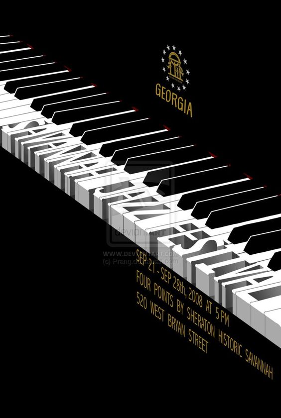
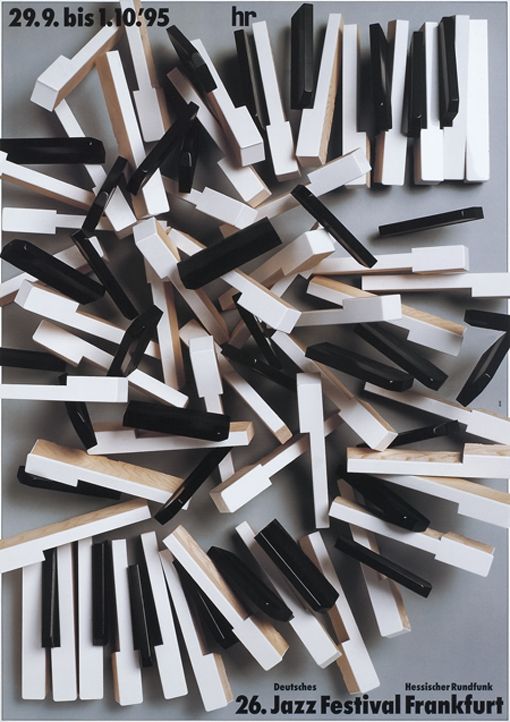
Job 4: Musician
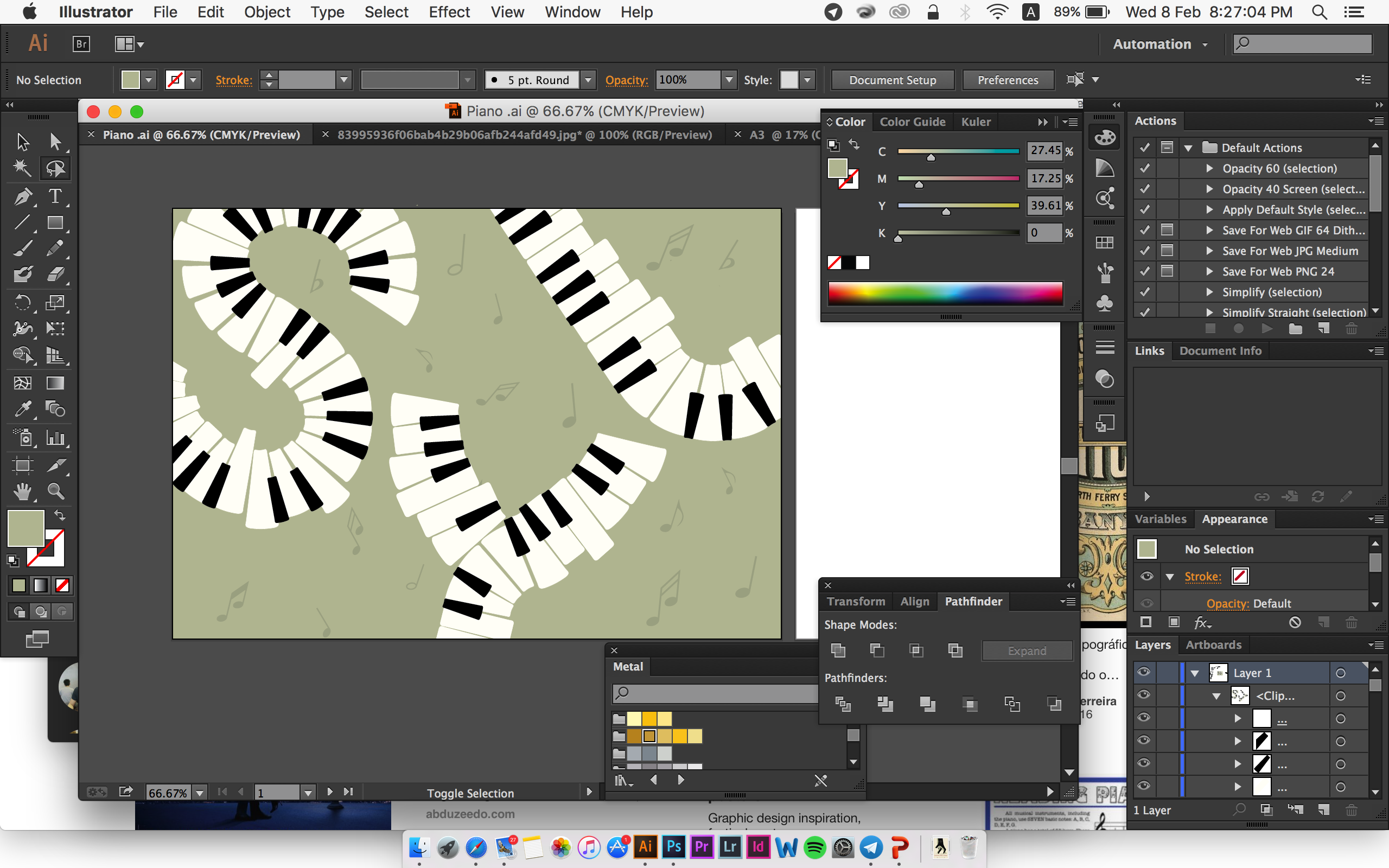
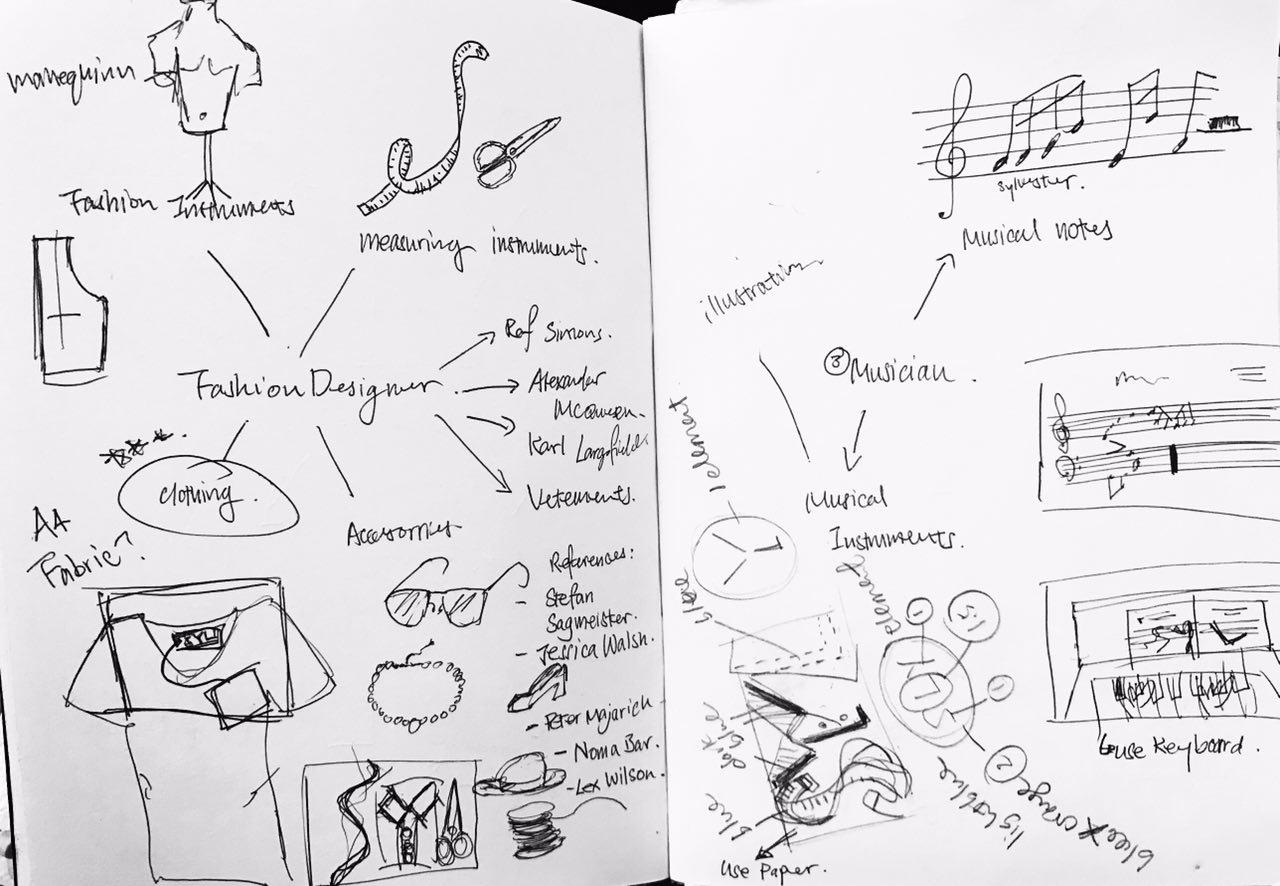 My original idea for Musician was to use musical notes to form my Initials. However, Ms Shirley suggested that I should focus on a specific instrument I play so that it is easier for me for the ideation process. Hence, I decided to put in elements from Piano (the piano keys) to create my type. Here are some references I researched on:
Using musical instruments to create type by Mohamed Reda Source: https://www.behance.net/gallery/11948459/Fullstop
Using musical instruments to create type by Mohamed Reda Source: https://www.behance.net/gallery/11948459/Fullstop
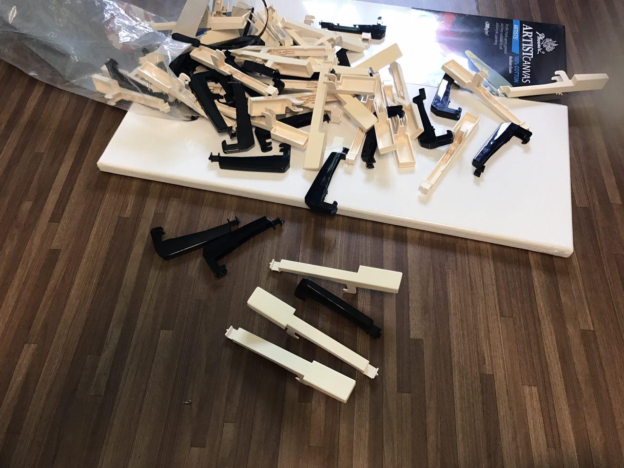
For my first try, I wanted to recreate the design above. So I dismantled my old keyboard and the remove the keys (FYI: this piano is already faulty):
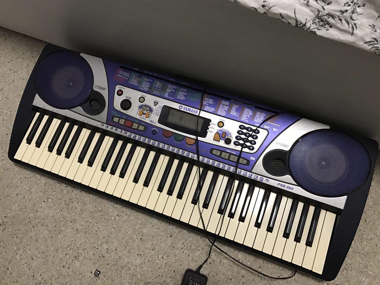
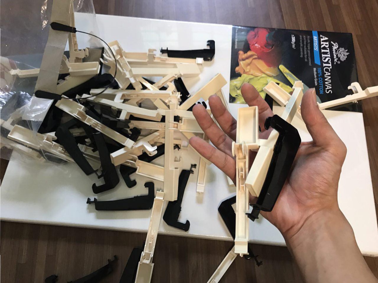
However, unlike the piano keys found on a grand piano, the keys from the electronic keyboard has a weird shape. So, when scattered around, you can’t really tell they are piano keys.
 I decided to move on to digital graphic design for the flat-lay look. My wasn’t really satisfied with my first try-out. The keys were closely packed and it looked very boring for a flat-lay look:
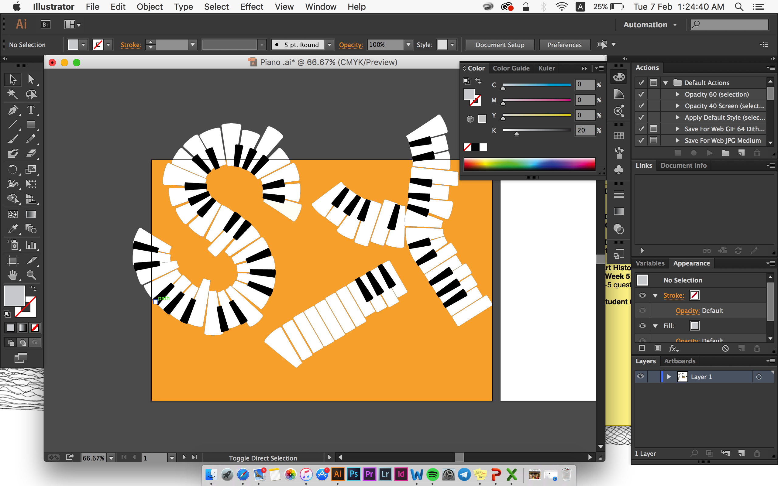
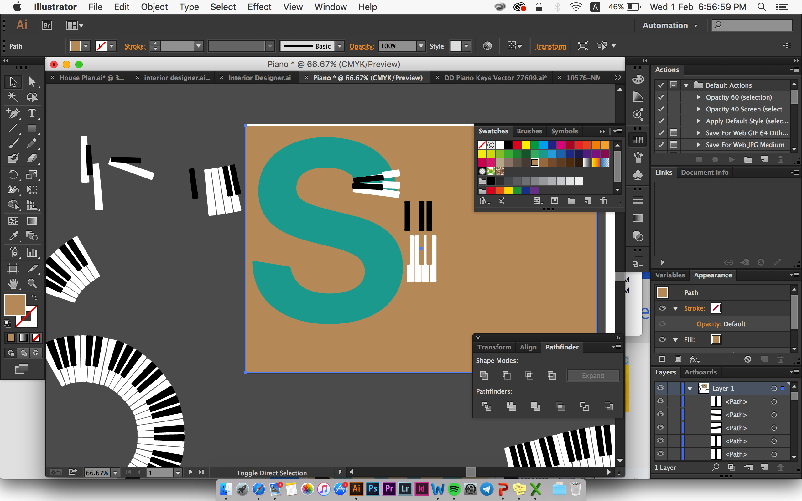 I decided to enlarge the keys and try to have variation in size and shape for each key to have a bit of the essence of “scattered piano keys” I tried initially.
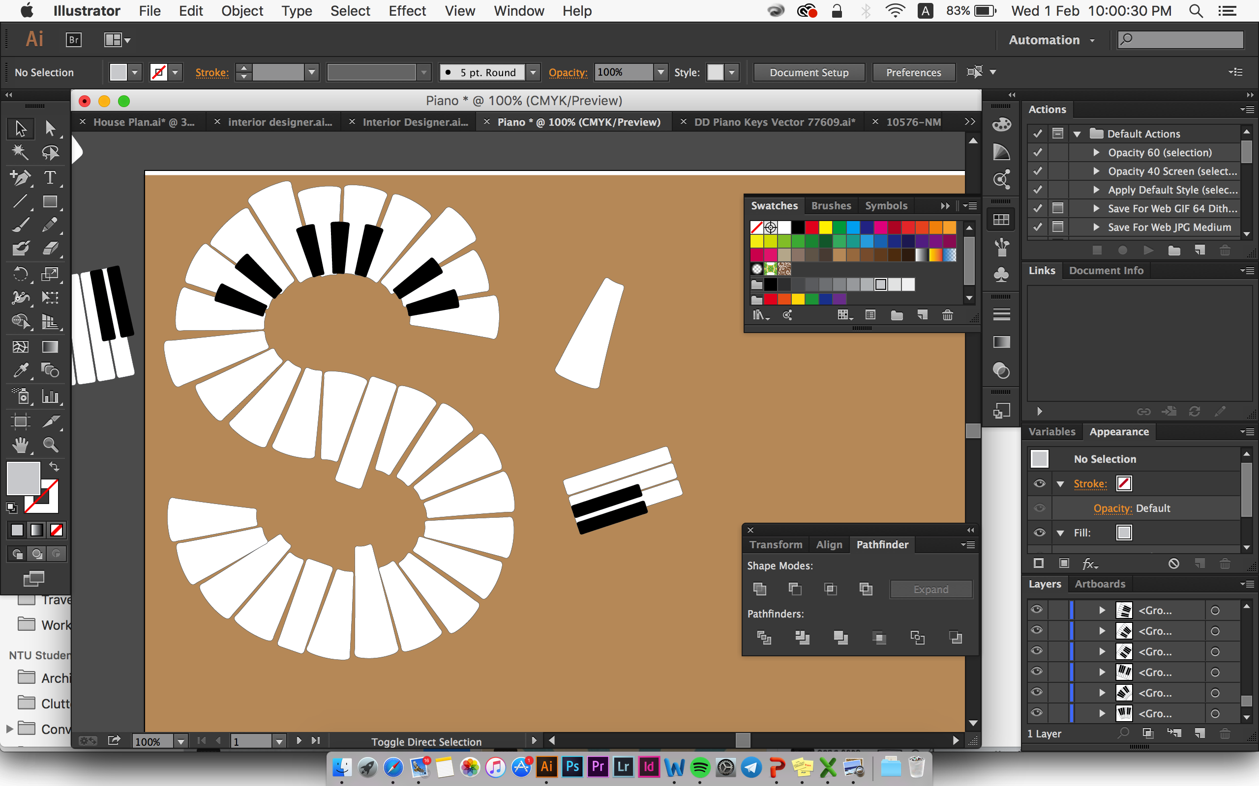
Lastly, I decided to place my initials slightly out of the A4 size but not to the extent that reader can’t read it. I also place a musical notes at the background but very subtle, to ensure that the supporting elements doesn’t compete with the font visually. I also keep the colour of the black and white piano keys so that it’s easier for reader to associate it with piano, hence Musician:
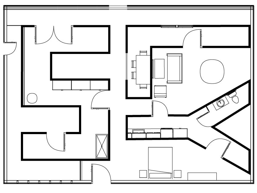
Job 5: Interior Designer
For interior Designer, the closest that people can related to is the floor plan that they usually use. Reader might associate Furniture with Product/industrial Designer instead. Here are some visual reference:
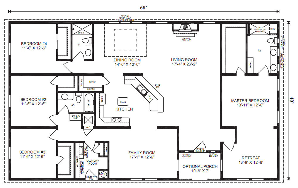
The aim that I set for myself for this job, was to make it as close to a floor plan as possible. So I actually took very long to make draw out the floor plan on Illustrator and made a lot of adjustments.
I didn’t really like the first sketch because I think the composition is very boring – my initials bounded by a rectangular shape:
And then I made some major adjustment to the whole composition by changing the placement of my initials. I also increase the stroke thickness of my initials so that it is more prominent:
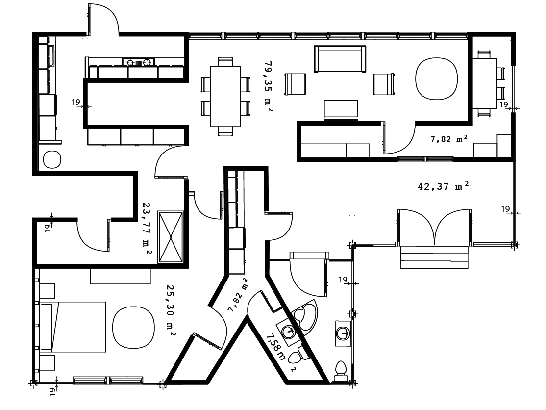
To complete, I add drop shadow and applied texture to the background to make it look rustic, as if the piece of floor plan has been used for multiple times:
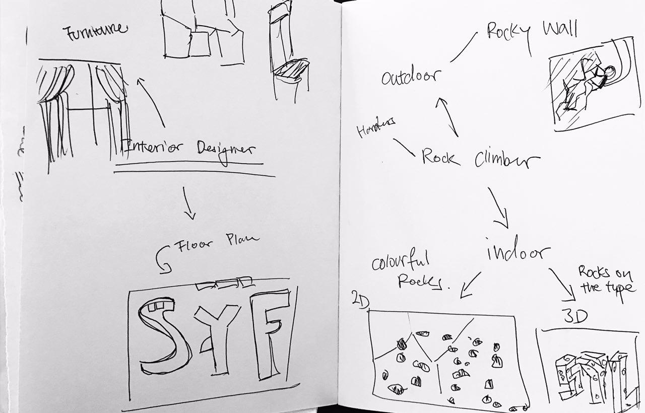
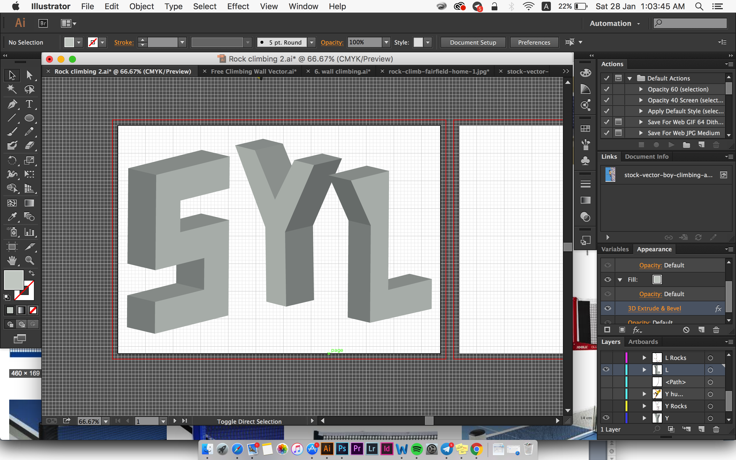
Job 6: Rock Climber
This was a very last minute idea that I thought of. I guess last minute idea does work sometimes! I decided to borrow the style from Ranganath Krishnamani (Refer to Artist References *here*) for this design and it took me awhile to figure out the perspective. Here are some visual reference: 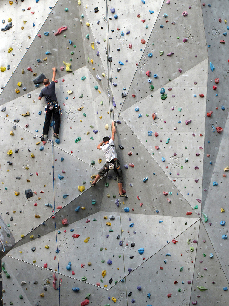

For indoor rock climbing, the visual element that reader could easily associate with will definitely be the wall with colour rocks. Hence, I applied the texture of the wall to my type:

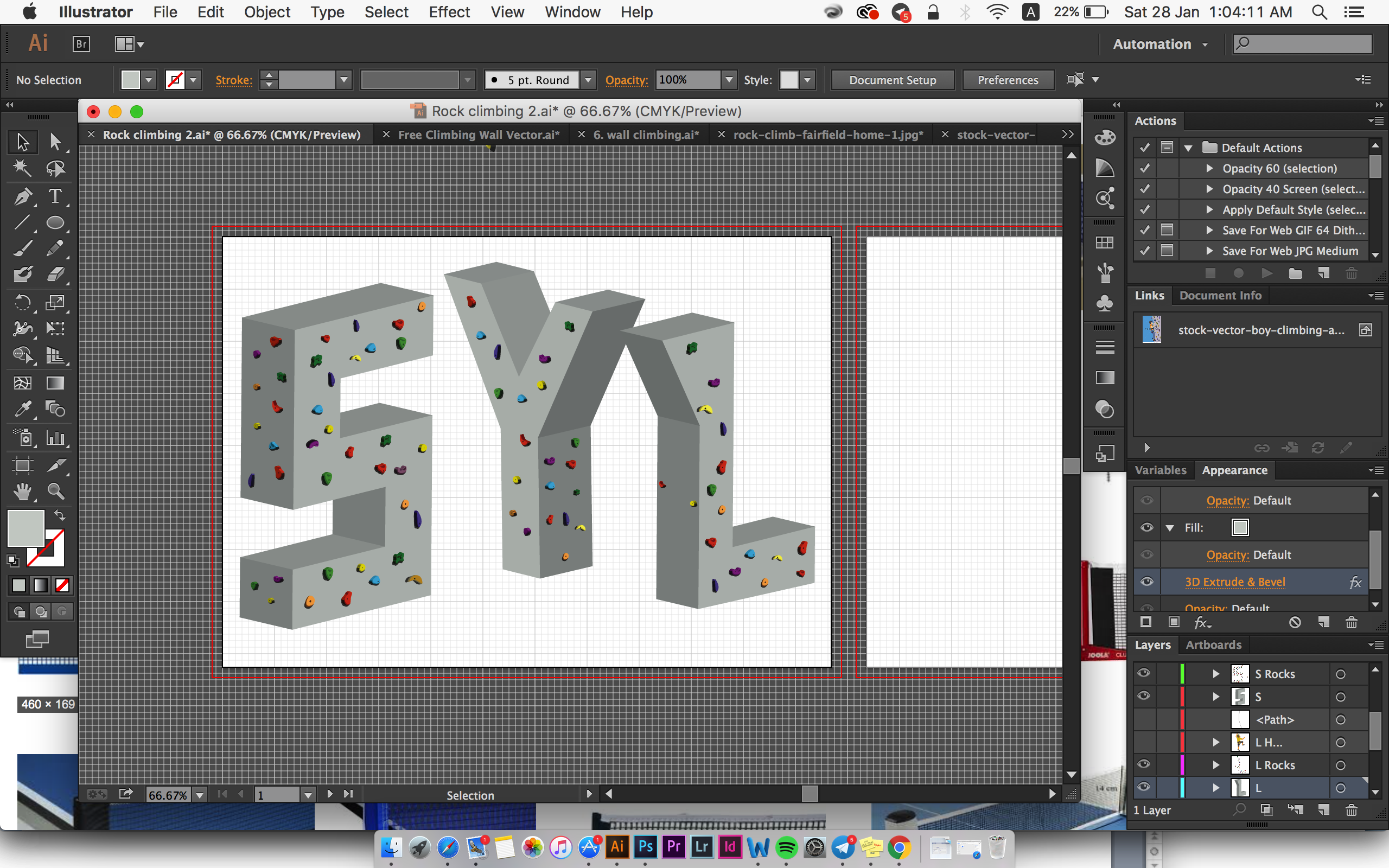 I also decided to add in rock climbers so that reader can associate with my job clearly.
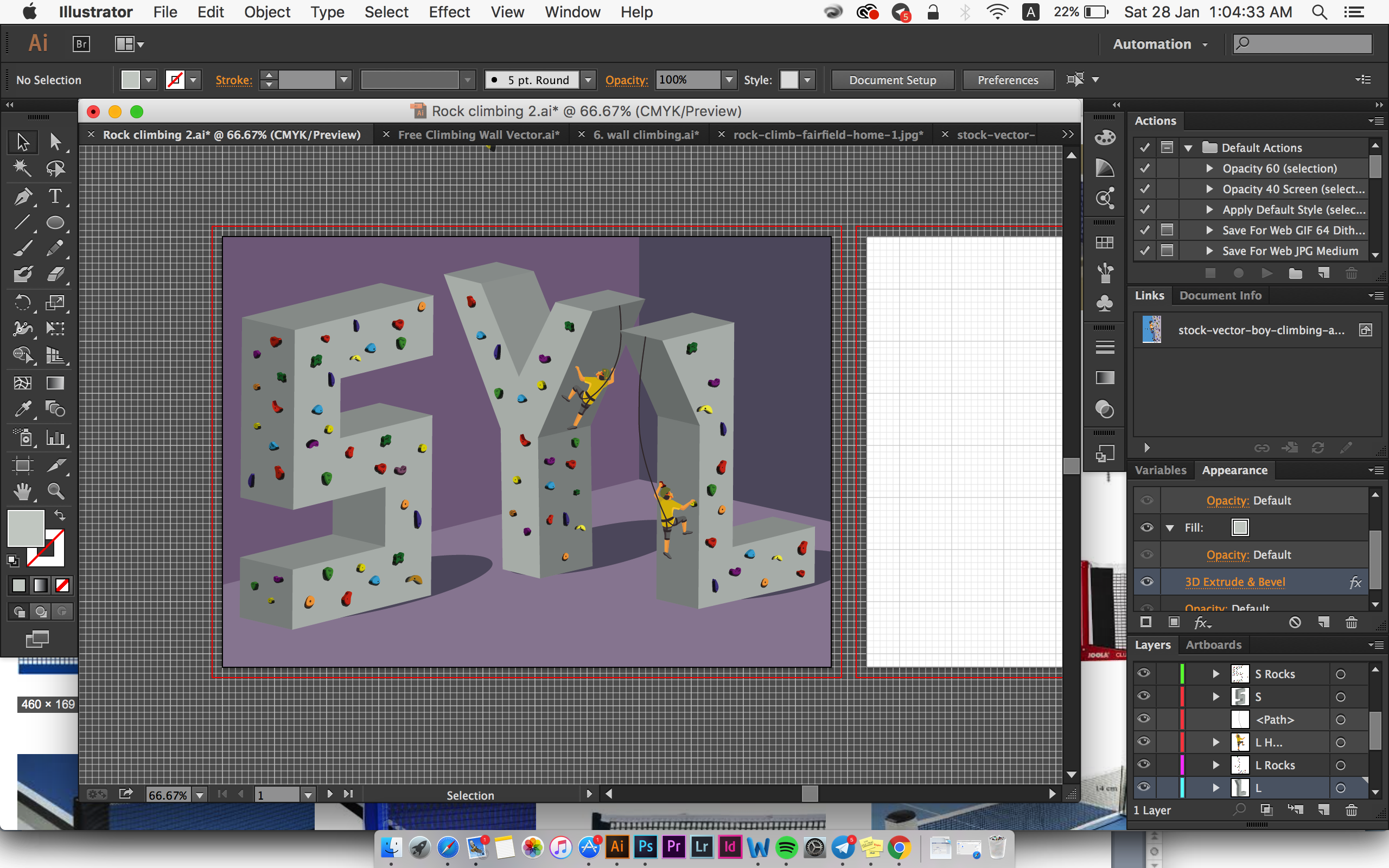
based on the feedback I got from my classmates, they find the shadow and the position of the type a bit off. They also feel that the colour of the background doesn’t go very well with the type. Hence I made some adjustments to improve visual harmony:
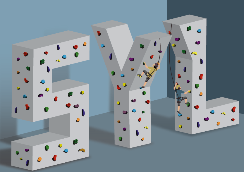
I made changes to the position of the font so that it flows diagonally, hence create directional harmony. Also, the shadow are now placed correctly according to 1 light source facing towards the type.
That’s the end of my design processes!
Here are some Visual/Artist references I refer to while I was brainstorming for my ideas:
Stefan Sagmeister

Source: https://rdkreative.files.wordpress.com/2013/05/a0032944_16101578.jpg
I am a huge fan of Stefan Sagmeister and when I first got the project brief, his work immediately came to my mind. He has created some of the boldest, most innovative, engaging work around, especially his type and handwriting-inspired solutions. He makes type come alive – almost literally sometimes like the one shown above.
I initially wanted to use found objects like him to create typography in this project but I started realised that it might seems too easy to just put everything together and take a photo. It’s a great idea but I feel that If I did that, I am creating stuff and not pushing myself to design stuff.
Noma Bar
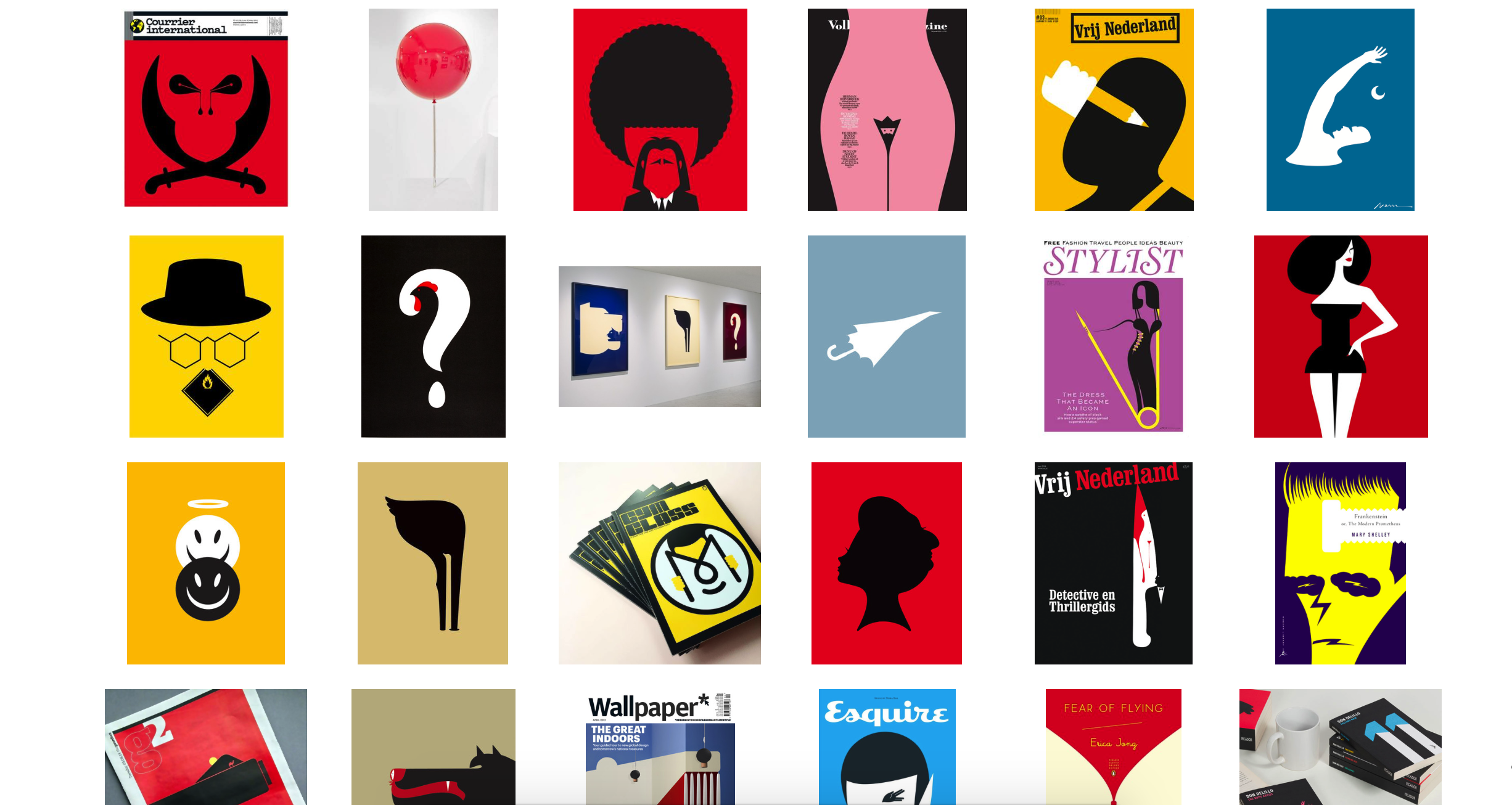
Source: http://dutchuncle.co.uk/noma-bar/
I also draw inspiration from one of my favourite graphic designer Noma Bar. He is known for using negative space and Gestalt principle to create his work. His design is usually very minimal but able to maximise visual communication. He has this famous Quote:”I am after maximum communication with minimum elements.” which have kind of inspired my style.
I tried to go for this kind of style which I kind of familiar with. I also want to use this project to improve my Adobe Illustrator skill. However, after a few consultations and brainstorming I think that I really should push myself to do something that I’ve never tried before. Nonetheless, I have drew some inspiration from him in terms of the use of colour combination.
Ranganath Krishnamani

Source: https://www.behance.net/gallery/16214359/Alphabet-City-TVS
I came across Ranganath Krishnamani coincidentally on Pinterest and found his “Alphabet City” very interesting and inspiring! I have always wanted to try out a bit of 3 Dimensional design using Illustrator but I always thought it is tough to do it. So I went ahead to create 2 types using this style and I really love how it turned out!
Other References/Research – Pinterest
Pinterest is my go-to website to find inspiration. Other than the 3 artists I have mentioned above, I usually go to Pinterest while I am working on my design. So here are some visual reference I refer to:
Using Found objects to create Type:
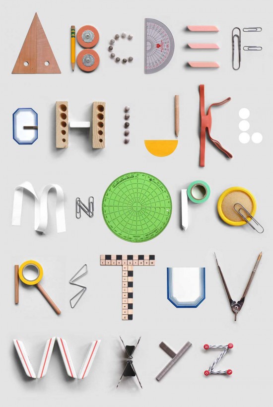
Source: http://uppercasemagazine.com/blog/2014/4/22/type-tuesday-office-supply-alphabet?utm_source=feedburner&utm_medium=feed&utm_campaign=Feed:+uppercase-blog+(UPPERCASE+blog)#.U1a4teZdUks
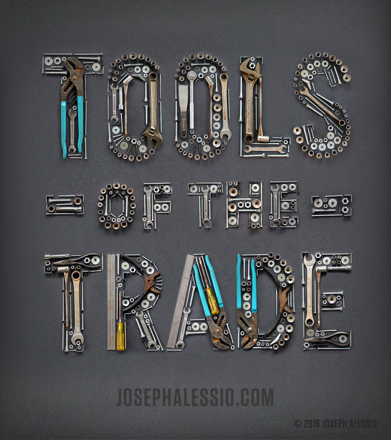
Source: http://typelimited.tumblr.com
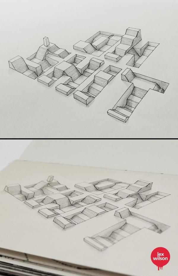
By Lex Wilson. Source: http://designontherocks.com.br/sketch-tipografico-com-efeito-tridimensional/?utm_source=feedburner&utm_medium=email&utm_campaign=Feed:+DesignOnTheRocks+(DESIGN+on+the+ROCKS)
BY Rafael Mayani Source: https://www.behance.net/gallery/25911999/36-DAYS-OF-TYPE
Check out my design process *here*! 🙂
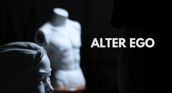
Storyline
As a performance artist, Sylvester sees his life as part of the performance on stage. He is a cheerful and positive person, but after knowing that he has diagnosed with 4th stage cancer he struggled to accept his destiny. During his performance, Sylvester failed to put up his cheerful front and break down on stage as he knew that one day he will not be able to perform again and soon he will be faded off from this world and leave everything he loves behind…
Character Exploration
During class, we were tasked to explore different characters we have affinity with:
Task 1 – List 5 characters from literature or fiction
Task 2 – List 5 public figures
Task 3 – List five people you know or have known
Task 4 – Top 2 in each list
The Imitation Game: Alan Turing (Task 1)
Alan Turing was an English pioneer computer scientist and cryptanalyst who invented computer to break Germany’s unbreakable Enigma machine and helped UK to win WWII. Turing struggled with his sexuality throughout his life and was prosecuted under homosexual acts for “gross indecency”. He later committed suicide due to his personal struggle. I feel that I could relate to this character because I was facing the same struggle for a period of time and constantly felt that I was rejected by the society.
Danish Girl: Lili Elbe (Task 1)
Lili Elbe was a Danish transgender woman and one of the first identifiable recipients of sex reassignment surgery. I admire her courage to challenge the norm during that period of time when homosexuality was not accepted, and also risked her life to undergo sex reassignment surgery even though the procedure was not performed on anybody else. Like Turing, she was struggling with her sexuality after she was married to her wife then.
Lady Gaga (Task 2)
Lady Gaga is an American singer, songwriter and actress who uses her influence to bring attention to social issues such self-confidence, well-being, anti-bullying, mentoring, and career development. This is because when she was a teen, she was being bullied, raped etc. and she wants to use her influence to help people. Gaga was one of the pop artist that helped me to walk out of my struggle during a period of time. The message from her performance and music has encouraged me to love and be myself, and helped me to find confidence in myself.
Beyonce (Task 2)
Beyonce is an American singer, songwriter that often uses her music to express her feeling and thoughts. She recently moved on to use music to address social issue and also highlight her personal life with her long time partner. She’s also a very prominent feminist and is an icon for girl-power. I am a huge fan of Beyonce not just because of her talent and performances, but how she uses music to express her feeling and struggle in life, and still carries put up a strong front as public figure. She reminds me of myself – always put on a cheerful front but keep all my negative thoughts and feeling within myself.
Muhammad Khairul Ikhsan (Task 3)
Khairul was a friend of mine that I met during army. He was a fine art student in NAFA who usually appeared in drag queen outfit. He had never let anybody’s judgement or opinion from stopping him to dress like a lady, and strive to be a kind and empowering person. He had an awesome life ahead of him, until he was diagnosed with cancer. Sadly, he passed away in 2016. He has always been an inspiration to me and it was him that I felt that it was okay to be gay.
Mother (Task 3)
My mummy is an iron-lady who always get things done efficiently. When my dad passed away, she never shed tears in front of me and continued to get things done for the funeral. However, I have seen her tearing in her room occasionally and realised she has been vulnerable inside but wouldn’t want to show it to us. I was kind of influenced by my mum’s personality and I see some similarities between us.
Task 5 – Final Character Selection
My final selection is Muhammad Khairul Ikhsan. I really thought that he represents my alter ego and I feel a strong connection between us. I also want to take this opportunity to pay tribute to him.
Concept Development
I had this concept in mind while I was in the process of exploring different characters – to show the other side of me which I know existed but was never shown to anyone. I’m usually cheerful and positive in front of people but deep down I’m struggling with self-doubt and I always feel that I’m not good enough. I fear that one day this side of me will overpower the positive side and it will eventually fade off. I discovered this side of me through the process of selecting Khairul, a friend I met in the army who passed away last year. I feel a strong connection with his story and how it kinda reflect my fear of non-existence.
Developing My Alter Ego and the Setting
Hence, I kind of blur the line between portraying him and myself – It’s like a hybrid haha. Khairul was in Drag outfit most of the time, so I borrowed his appearance by putting on light make-up. This also to show that I am being part of the LGBT community and how I am opened to the public (similarity between me and Kairul).
I also created a fictional profession for my alter ego – a performance artist – to relate his life to his career and theatre, and how he doesn’t want his life to end and leave everything behind.
To create more dramatic effect, I also decided that my Alter Ego should diagnose with cancer also, and to link it back to Khairul.
Lastly, Khairul and I are both study art and design so I wanted to create a set whereby it kind of show that element subtly.
Video References/Inspirations
I wanted to express mournfulness in this 1-minute video and I find it difficult to create a impactful message without using a classic linear plot structure. I decided to just focus on the character, and keep it very minimal with first person POV Character Voice and raw in emotion. Here are the some of the videos that I drew inspiration from:
This video created for the Anti-Gambling campaign really caught my attention when I first came across a few year ago. I really like the lighting and how it only focuses on the 2 characters to send a message across.
I came across this video while browsing youtube for inspiration, and I really like how the actress progressively changes her expression throughout the film. It feels like the character was hiding her true self at the beginning and then finally revealed herself at the end.
I really like the opening scene of Whiplash. I like how we first hear the drumbeats and the camera pan towards the main character. But for my film, I want to pan out from the character to suggest that he is faded away from the stage/his life.
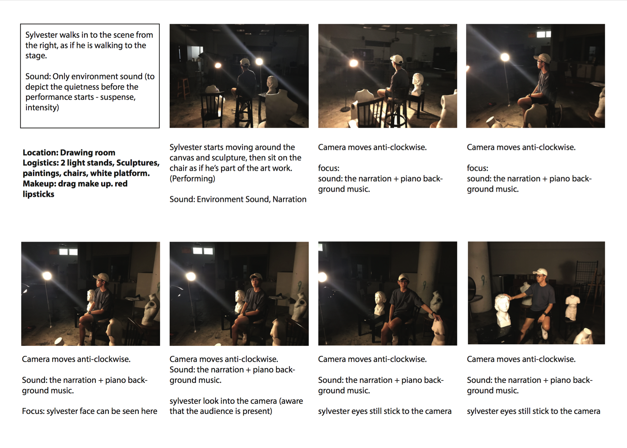
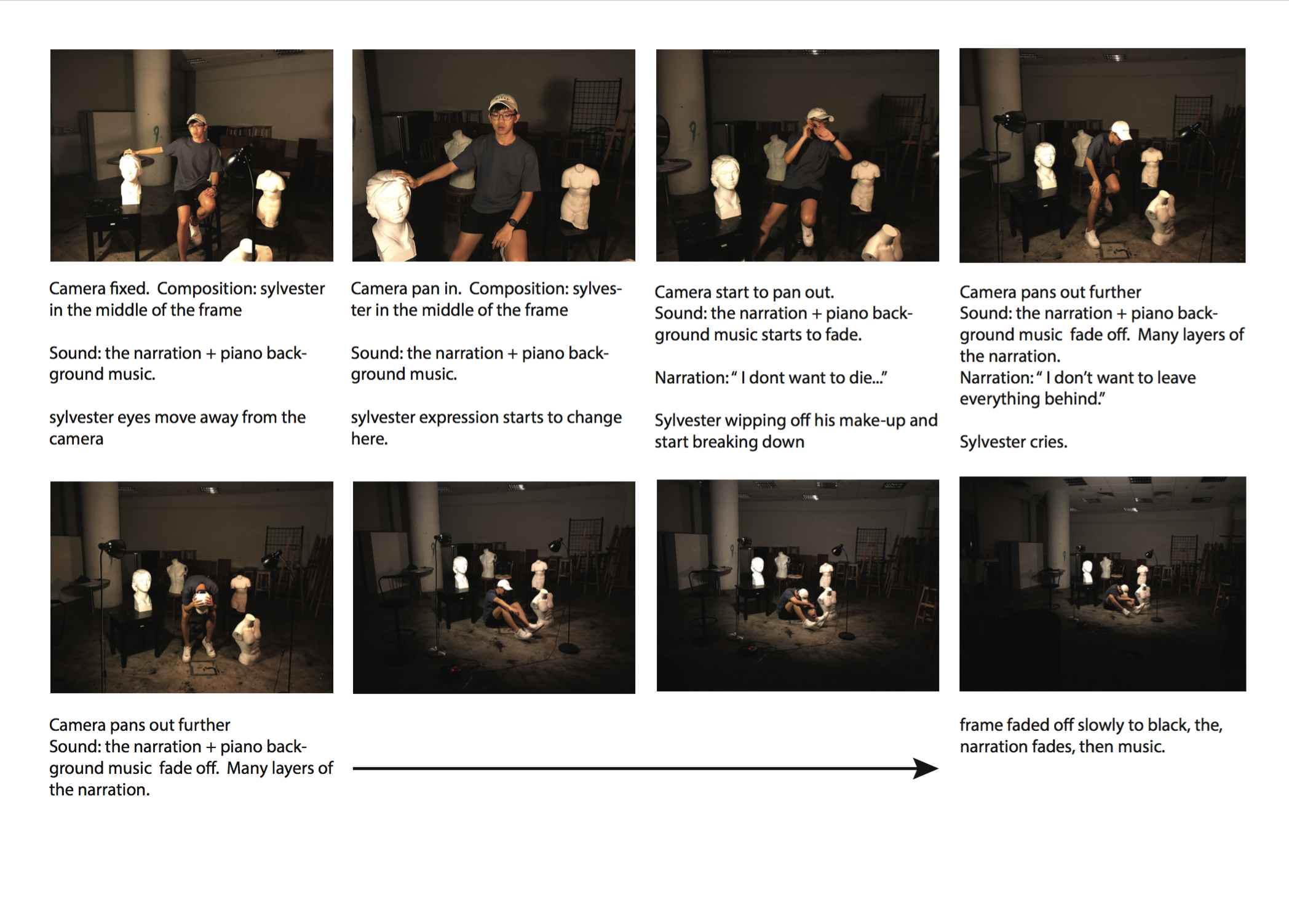
Combining these 3 favourite scenes, I come out with the storyboard using the test shots:
Test Shots and Storyboarding
The location is in the drawing room because Me and Kairul are both art student (2nd similarity) and the use of spot light is to recreate the lighting you see onstage.
Towards the end of the film, the camera move away from the character, which symbolize fading off (or the end of the show) while the character is still on stage, breaking down. Actually, you can’t really tell from the storyboard that it is a linear plot structure, but it can be heard clearly through the monologue which I will cover later.
 Drafting the Monologue
I applied the dramatic monologue that was taught in class because I thought by using the first-person point of view to reveal my inner thoughts, it will create a more dramatic effect. I had a hard time drafting the monologue because I do not want to distract the viewers away from the character’s expression, which is the focus on this film. Hence I tried to put in less words for my monologue but it somehow didn’t really worked out well.
Initial Monologue with Linear plot structure
My name is Sylvester and I am a performance artist.
I love life and I am happy with who I am and what I do.
I live for the stage. (Beginning)Not long ago, I discovered that… I had terminal cancer. (Middle)
My world is falling apart.
I don’t want to die. I can’t die.
I can’t leave the stage.
I want to live, so badly (Ending)
After consulting Wen Lei, she actually suggested to take out some sentences, especially the part where the character’s expression changes. I’m really happy with the final result and I’m amazed that by removing sentences from the monologue it actually pushes the story forward.
Edited Monologue with linear plot structure
My name is Sylvester andI am a performance artist.
I love life and I am happy with who I am and what I do.
I live for the stage. (Beginning)Not long ago, I discovered that… I had terminal cancer. (Middle)
My world is falling apart.
I don’t want to die. I can’t die.
I can’t leave the stage.
I want to live, so badly (Middle)
Finally, here is the 1-minute film that you guys have been waiting for hahaha!

WE ARE COOL BECAUSE WE CAN.